MASTER'S THESIS M-1840 PINNELL, Ruth Sargeant ...
47
MASTER'S THESIS M-1840 PINNELL, Ruth Sargeant DEVELOPMENT OF THE WHITE OF TIE PAPER AS AN ACTIVE ELEMENT IN PRTNTMAKING. The American University, M.F.A., 1969 Fine Arts University Microfilms, Inc., Ann Arbor, Michigan
-
Upload
khangminh22 -
Category
Documents
-
view
2 -
download
0
Transcript of MASTER'S THESIS M-1840 PINNELL, Ruth Sargeant ...
MASTER'S THESIS M-1840
PINNELL, Ruth Sargeant DEVELOPMENT OF THE WHITE OF TIE PAPER AS AN ACTIVE ELEM ENT IN PRTNTMAKING.
The American U niversity , M .F .A ., 1969 Fine Arts
University Microfilms, Inc., A nn Arbor, Michigan

DEVELOPMENT OF THE WHITE OF THE PAPER AS AN ACTIVE ELEMENT IN PRINTMAKING
by
Ruth Sargeant Pinnell
Submitted to the
Faculty of the College of Arts and Sciences
of The American University
in Partial Fulfillment of
the Requirement for the Degree
of
Master of Fine Arts
Fine Arts
Signatures of G-qmmitte^':
Chairman : | (yff L\
Dean of the College
D a t e ; J ^ ^ Date: S'
1968AMERICAN UNIVERS, i r
L I B R A R Y
MAY Z1 1969The American University
Washington, D. C . ASHlNGTON. O. C.
39 so
TABLE OF CONTENTS
CHAPTER PAGE
I. THE PROBLEM AND ITS APPROACH THROUGH
ORIGINAL WORKS OF ART.............................. 1
II. HISTORICAL SURVEY OF THE P R O B L E M .................... 10The Renaissance....................................... 10
The Seventeenth Century.............................. 15
The Eighteenth Century ..................... 20
The Nineteenth Century ............................ 26
The Twentieth Century.................... 33
LIST OF ILLUSTRATIONS
PRINTS PAGE
PRINT NUMBER ONE...................... 2
PRINT NUMBER TWO.................................... 3
PRINT NUMBER THREE.................................. 4
PRINT NUMBER F O U R .................................. 5
PRINT NUMBER F I V E .................................. 6
PRINT NUMBER SIX. . . . . . . .................... 7
PRINT NUMBER SEVEN.................................. 8
CHAPTER I
THE PROBLEM AND ITS APPROACH THROUGH
ORIGINAL WORKS OF ART
A twentieth century artist, embarking upon the execu
tion of his first black and white print, may feel a bit
cramped, or perhaps relieved, to realize that he has essen
tially only two elements to manipulate. Regardless of his
technique, the finished product will ordinarily be black ink
on white paper. Because of the difficulty encountered in
regaining white areas which have been lost in engraving,
etching, or lithography, the artist immediately senses that
the easier element to manipulate Is the black Ink. For this
reason, historical surveys will show that an almost infinite
number of effects have been achieved with the ink, while
relatively little has been done to manipulate and activate
the white of the paper.^
^It must be noted that in the case of woodcuts or linocuts, the problem is reversed, and white areas are easier to manipulate, as they are cut from a surface which would otherwise print black. Since the original works to be discussed here are lithographs, however, the white element will normally be discussed as the more difficult element to manipulate.

In a series of seven black and white lithographs,
done for this study, the white of the paper was exploited and
activated in a variety of ways. In the first example, the
white is used as natural light, which breaks c'nrough from be
hind a barrier of trees. On the right side of the print,
where the most intense break-through occurs, the edges of the
openings which admit the light are blurred by the glare that
would occur in such a visual situation. The attempt is to
duplicate the visual experience, rather than to resort to a
more traditional description of how natural light might illu
minate forms.
PRINT NUMBER ONE
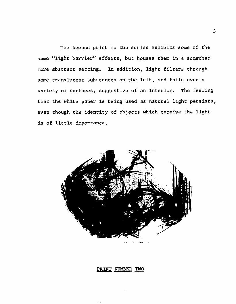
The second print in the series exhibits some of the
same "light barrier" effects, but houses them in a somewhat
more abstract setting. In addition, light filters through
some translucent substances on the left, and falls over a
variety of surfaces, suggestive of an interior. The feeling
that the white paper is being used as natural light persists,
even though the identity of objects which receive the light
is of little importance.
>ci « AVM
PRINT NUMBER TWO

In the prints numbered three and four, progressive
attempts were made to activate the white areas in a totally
abstract setting. In Print Number Three, the dark area still
holds together as a unit, but active whites break in from the
back, and play across surfaces on the front. Still, the over
all distribution of darks in relation to the format, asserts
the truth that black form was printed over a white page.
PRINT NUMBER THREE

The same may be said of Print Number Four, except that,
in this case, the whites do-a tmjre complete job of breaking
up the dark area. Some fragments now float free of the main
form. In addition, whites are no longer only dynamically
directional, but begin to assume quite positive shapes.
The last three prints explore ways in which black and
white elements may be made completely equal in importance,
activity, and meaning.
PRINT NUMBER FOUR

In Print Number Five, the entire format is filled with
black and white dots, which seem to coagulate into floating,
directional forms. This was done by abandoning the more tradi
tional crayon drawing and tusche brushwork for an alternate
spattering of gum arable and tusche over the stone. White areas
were brought to the same level of positive direction and shape
as the black areas by additional work with strong acid to "erase"
some of the black dots. The effect is to fill the print with
black and white elements which are equal to each other in direc
tion, movement, and positive shape quality. Neither tone
operates as form, relegating the opposite tone to the position
of background.
< A * - /
PRINT NUMBER FIVE

In Print Number Six, the same equality of black and white tones was sought, but an attempt was made to retain more
structure and solidity than was present in Print Number Four.
Black and white elements are not so purely directional, but
establish solid positions, and operate as more positive shapes.
Each tone operates in some places as ground, and in other places
as object. In this print, the system is meant to work within
the realm of traditional methods of crayon and tusche work,
and within a world of planes that might belong to everyday
objects, although nothing is easily identifiable.
PRINT NUMBER SIX
8
In Print Number Seven, the world of everyday objects
is more completely abandoned for a world of flatter, less
planular black and white shapes. Again, the format is com
pletely filled with shapes, and neither black nor white is
consistently background or consistently form. Here lines, as
well as shapes, may be either black or white. Both elements
exist side by side, as equally active forces in the entirely
non-objective milieu. Thus, the end of freeing white from its
original role, and making it a totally active element, is
achieved.
PRINT NUMBER SEVEN

In the seven prints discussed here, a variety of ways
have been explored in which the white of the paper may be made
an active element in the print. Although this is only one of
many interests which might occupy a printmaker, it seems that,
considering how few manipulatable elements are available to the
maker of black and white prints, a thorough knowledge of the
possibilities inherent in the white surfaces, would inevitably
be a helpful tool.

CHAPTER II
HISTORICAL SURVEY OF THE PROBLEM
Although complete activation of white surfaces is
most easily achieved in the non-objective milieu often found
in twentieth century art, many important printmakers in the
past have used white surfaces in a variety of more or less
active ways. A survey of past achievements is quite helpful
in placing the problem in proper historical perspective, and
in revealing its importance in the realm of black and white
printmaking.
Since relatively little has been written on the specific
problem under investigation, the greater part of the historical
research was done by looking at the vast number or original
prints available in the Washington, D. C. area, principally
at the Library of Congress and The National Gallery of Art.
I. THE RENAISSANCE
Black and white printmaking received its first signi
ficant exploration as an art form late in the fifteenth cen
tury. Even before prints were produced as art objects per se,
they were used as illuminations in books. The earliest

11
examples are mostly woodcuts, as they could be printed without
the benefit of a press. An anonymous woodcut of Christ on the
Cross, from a French missal of about 1490, is owned by the
National Gallery of Art in Washington, D. C. , and represents
a good beginning point for the study of the problem under con
sideration. As in most Renaissance prints, one finds here a
simple black line drawing printed on white paper. In addition
to the black lines which enclose all objects, there is some very
mechanical cross-hatching on the figure to indicate shadows, and
to turn forms in a mildly three-dimensional way. This approach
to printmaking was the general practice in the fifteenth century,
and remained common throughout the sixteenth century in the work
of many individual printmakers, Pieter Breugel, the elder,
is an excellent example of a well-known printmaker, working
throughout the middle years of the sixteenth century, who was
quite satisfied to use the white paper merely as a background
for his black line drawings.Other printmakers, however, soon became interested in
organizing areas of contrasting tone into interesting patterns,
Albrecht Altdorfer, working early in the sixteenth century.

- 12
was one of the first to organize darkened areas for composi
tional effects. In his Judgment of Paris, he took an addi
tional step forward as he began to explore the possibility of making whites more positive in shape.
Other artists working early in the century, such as
Hans Burgkmair, further developed the idea of positive white
shapes. Many artists, like Burgkmair, insisted on enclosing
the white shapes in heavy static boundaries. Heinrich Aldegrever,
however, increased the activity of white areas by lightening,
if not eliminating, these boundaries. In addition, he became
quite successful in controlling and using the tendency of
whites to advance. These developments may easily be seen in
his Fall of Man, from 1540. In addition to making white areas
more positive and more active, Aldegrever made advances in the
compositional organization of whites. In the third print from
his Large Wedding Dancer series, of 1538, he abandoned the usual depiction of natural light for a record of a very irra
tional light which picks out a conscious series of white tri
angular shapes.Ludovico Carracci carried the process a step further
in his Adoration of Kings, in which lights and darks run
13
through the whole Composition, fragmenting figures and objects
to a much greater degree than had ever been done before.
Later in the sixteenth century, Hendrik Goltzius ex
perimented with reversing the usual tradition of a black
line drawing on white paper, by doing night scenes in which
the background was made black, and well planned lights were
left in positive shapes, such as the moon. These efforts
represent some of the earliest attempts at indicating light
sources within prints.
The greatest master of Renaissance printmaking, however,
was probably Albrecht Durer, In spite of the fact that he
lived early in the sixteenth century, his extensive experi
mentation in graphics led him to do some of the most advanced
work of the Renaissance. In terms of activating the white
element in the print, his work is not surpassed until well
into the seventeenth century.In his early woodcuts, such as the Life of the Virgin
series, Durer started in the traditional way, simply imposing
a black drawing over a white background. Soon, however, he
became interested in exploring the advancing qualities of whites.
The Great Horse is one of the most striking results of his

14
experimentation along this line. The horse’s rump, the
largest white shape in the print, comes forward so strongly
that it actually seems to protrude beyond the picture plane.
In addition to such specialized effects. Durer became
interested in stressing the importance of white areas purely
through the visual qualities of their two-dimensional shapes.
In the Small Passion print of Christ Appearing to Mary Mag
dalene . a large rectangle and a large triangle of almost pure
white appear in a very dark format. There is no naturalistic
reason for these shapes, and they are clearly chosen to empha
size an abstract composition which emerges from the print
even more strongly than does the Renaissance drawing. In his
Saint Jerome in Penetence, of about 1497, Durer not only
emphasized a few white shapes, but put them together in an
extremely beautiful and effective pattern. A white circle
started by rocks and sky is completed on the right side of
the print by a sort of river of light flowing among the dark rocks. It is apparent that this river shape^ is supposed to
be land, not water, and we suddenly realize that Durer had
given up naturalistically explainable objects for the sake
of a marvelously abstract pattern of whites.

15
In Durer’s Christ Driving the Merchants from the Temple.
we see another development in the use of positive white forms.
The white shape of Christ's raised arm is repeated, in a
transposed position, by a large white shape on his lower robe.
Thus, the downward movement of the arm, toward the merchant,
seems to be anticipated.
Another bold experiment in composing with white occurs
in Durer's series of Knots, Here he reversed the traditional
light-dark scheme by making the entire background black, and
leaving only one continuous winding line of white over the
surface.
Thus, we see that in the work of Durer, and in Renais- ,
sance printmaking in general, the print evolved from its
original form of a black line drawing over a white background,
into a form of skillful composition which sometimes emphasized
positive white shapes and occasionally combined them into
active, effective white patterns,
II, THE SEVENTEENTH CENTURY
By the beginning of the seventeenth century, many
artists had learned to compose well with the contrasting

16
elements of black and white. One of the greatest masters of
this art was Rembrandt, Often the most important shapes in
his prints are the white shapes of the paper left after the
major surface area has become quite dark with cross-hatching.
An example of this is the 1635 etching of Saint Jerome Kneel
ing in Prayer, in which the saint's robe is composed of two
large white rectangles. Another beautiful composition is
present in The Circumcision, of 1630. Here the action takes
place in a circle of light surrounded by a circle of dark
shadows. Outside of this, another concentric circle of white
is started by a string of figures and completed by a curve of
incense smoke and a light doorway. In the 1652 print of David
in Prayer, positive white shapes again set up beautiful rhythms,
as the curve of the body bent in prayer is repeated by the curve
of a drape above the bed.
Rembrandt used whites, not only to create these ab
stract light patterns, but to give the feeling of a real, if irrational and extremely personal, kind of light. The effect
of very strong light is seen in his Self-Portrait. Shouting.
Here the left side of the face is brightly illuminated, and

17
Rembrandt grimaces as though a bright light had suddenly
been thrown into his eyes. In another self-portrait, this
one in a cap and scarf, an unusual effect is obtained by keeping the face and front of the figure in darkness, with
the light making a bright spot on one cheek and one shoulder.
Another mysterious light situation is created in the print of
Dr. Faustus in his Study Watching £ Magic Disc. Here the disc
is felt to be a very strong source of light. Although Rembrandt
used the old convention, of drawing black and white rays out
from the disc, he also blurred the edges of the disc to make
it more visually realistic. In addition, a strong light from
the disc seems to fall on Dr. Faustus' face. It is interesting
that Rembrandt could create such a feeling of light in the
small disc, and succeed in having no light sensation coming
from the larger, closer white globe in the lower right corner
of the print. This is achieved by putting the less important
globe in generally light surroundings, keeping its edges very
clear, and drawing in its details in a sketchy, less realistic
manner. This print shows a great mastery of the white of the
paper in achieving a variety of effects.
In his search for his own unique expression and his
18
own mysterious light, however, Rembrandt left achievements
in the field of natural daylight to others.
Claes Berchem, in his Flute Player, of 1652, abandoned
all black and white line drawing of light rays, for the depic
tion of a shaft of light which comes from a window and makes
a white streak in the air before a grey wall,
Sadeler developed this further in his Forest Scene,
of 1604, and in his Church and Stone Arch. Here wide shafts
of light come across the sky and down to earth, illuminating
everything in their paths. These light effects are obviously
still drawn records, but come very close to the visual reality
of shafts of light which we have all seen coming through trees
in the afternoon.
Adrian van Ostade was another artist who was inter
ested in natural light. He wished to abandon what he knew
to be true of the actions of light, for some first hand visual
discoveries. In his print called The Painter, one immediately
notices the basket hanging in front of a bright window. It is
depicted as we would probably see it in such a situation.
It becomes merely a silhouette, and we are unable to see its
details against the light. By treating the black form of the
19
basket in this way, van Ostade has made the white of the paper
appear to be light bursting into the room through the open
window.
The person who comes closest to the depiction of a
visually accurate light situation in the seventeenth century
is the painter and marvelous draftsman, Claude de Lorrain,
In his etching called Sunset, an attempt is made, to give the
viewer the feeling that he is actually looking into a bright
light. Everything is blurred around the area of the sun.
Even a boat which is relatively close to the viewer, but must
be seen by looking toward the sun, is made quite indistinct.
The effect is even more convincing because we have to look
very closely to tell that the subtle graduations in the sky
are made with line. In another etching called The Dance at the
Side of the Water, a similar thing occurs. Here Claude made
the water very white, and blurred the edges of the opposite
shore, as though bright reflections on the water were pre
venting us from seeing details on the far bank.It is important to point out that, although many light
effects were explored in the seventeenth century, the constant
linearity of etching and engraving techniques serves to remind
20
the viewer that he is seeing drawn records, and not actual
situations. Although the delicate technique of Claude de
Lorrain may lessen the reminder, the problem was not really
overcome until the advent of aquatint in the next century.
The real advances in seventeenth century printmaking were
made by Rembrandt, who was a genius at manipulating the white
of the paper for compositional reasons and for unusual light
effects; and by a number of men who abandoned the Renaissance
records of light in order to use the white element for the
beginnings of more visual approaches,
III. THE EIGHTEENTH CENTURY
The eighteenth century saw _a flourish, of sorts, in
printmaking, but the character of court life, and the social
interests of the age made it a flourish of critics, connois
seurs, and amateurs, rather than of real artists. The general
trend was toward the use of the print for a variety of very
specific purposes which had little to do with its qualities
as a unique art form. Typical users of the medium were;
Thomas Bewick, who did an enormous number of realistic line
studies of animals; E, Roll, who did many simple line drawings

21
for calendars; Carlo Gregori, who did a number of studies of
pieces of Italian sculpture, especially busts; Rowlandson and Hogarth, who did satirical scenes of daily life; and an
enormous number of people who delt strictly in portraiture.
Many of these prints show skillful drawing and good use of
the techniques of engraving and etching, but whatever the
particular interest, it was usually an illustrative one.Pictorial problems, such as an active use of white elements,
were delt with by relatively few people.
Giovanni Battista Piranesi was a man who basically
had an illustrative interest in printmaking, but who was an
artist by nature, and went beyond mere illustration to pro
duce many great works of art.. Trained as an architect, he
produced an enormous number of engravings of monuments, orna
ments, maps, and plans. In his series of Prisons, however,
he departed from strict visual reality to let his imagination
roam a world of colossal structures full of scaffolding,
galleries, and machines of torture. He also let his imagina
tion play with a variety of intricate light situations that
might occur in these interiors. Although his technique is
quite linear, his densly cross-hatched darks make the occassional

22
lights very meaningful and active. Usually the whites
gain positive shapes by being confined beneath dark arches.
Occasionally, they have strong directional impact, as shafts
of light falling across walls.
A number of other eighteenth century artists continued
to develop the use of white shapes for compositional reasons,
but most often their achievements fell far short of those of
Rembrandt in the preceeding century., They do, however, repre
sent an advance in terms of the problem presented here as a
number of them, notably the Germans, Salomon Gessner, Johan
Frey, and Fredrich Miller were willing, to an increasing
degree, to give up representation for purely abstract forms,
both black and white. All of them, however, were bound to a
linear technique which eventually reveals their works to be
black line drawings on white surfaces. This linear restric
tion was to be removed, however, in the last half of the
eighteenth century with the advent of the aquatint process.
Many early users of the technique seem to have been overcome
by the mere thrill of achieving a variety of tones, and their
work appears today as nothing more than a group of elementary

23
exercises in aquatint technique, Thomas Gainsborough, how
ever, achieved more subtle effects in his combinations of
aquatint with soft ground etching. An example is his Land
scape with Figures on Horseback, in which the landscape is
all done in puffy shapes of various aquatints. In the lower
ground of this print, a very advanced moment in printmaking
occurs, as lights intermingle with darks, becoming almost
equal in importance and activity.
The true eighteenth century master of aquatint, and
the man most willing to give up realism for emotional and
pictorial effects was, of course, Francisco Goya y Lucientes.
In his work, white positive shapes and positive directions
equal or surpass dark forms in activity and meaning. Some
of his strongest prints, in this respect, occur in the
Capricho series of etchings. ̂ In the print entitled Que Viene
el Loco, a few bright triangular shapes are picked out on
the figures, as in some situation of extremely unnatural light.
Here, for the first time, whites are clearly shaped by active
brush strokes. This is the result of the technique of brushing
varnish over the aquatint in areas which are to remain white.
Previously whites depended for their shapes on how they were

24
surrounded by black line work.
In Nadie se Conoce. striking brushstroke patches
again fragment the figures. In ^ Quebro el Cantaro, the
strokes are used in conjunction with black lines, to denote
wash hanging on a clothesline. Here Goya did not meticulously
fill in the black lines with the white strokes, as many art
ists would have done, but used the brush quite freely. As a
result, the whites form a cooperative, but independent, sys
tem in relation to the dark lines.
Another advance also takes place in the Capricho
series. In Pobrecitas and Duenducites, triangular shapes of
negative spaces are left as the most important positive white
shapes. Before this, the most important shapes were always
figures, or objects, or parts thereof. Here, however, whites
are used for purely pictorial and completely abstract reasons,
even though they remain in narrative contexts.
Turning to the Disasters of War series, a group of
etchings done somewhat later than the Caprichos, we notice
a continuing concern for pictorial uses of light and dark
areas. ^ ̂ Convlenen is particularly striking in its

25
diagonal division into one dark and one light triangle.
There seems to be no naturalistic reason for such division,
and the effect is strikingly modern and abstract. ,
In addition to continuing his development of pictorial
problems in the Disasters of War series, Goya used active
dark and light contrasts for heightened emotional effects.
Las Mugeres dan Valor is one of many prints in which Goya
used a rather coarse grade of aquatint. The resulting irregular white spots concentrate in the center of the picture,
around the figures, giving a purely pictorial kind of light.
The bizarre shapes of the white spots add to the tension and
horror of the scene. They seem to have a movement of their
own as they condense and converge on the violent action of
the central figures. In Gracias a _la Almorta, a similar
coarse aquatint makes bizarre suggestions of architecture and
clouds. In De que Sirve una Taza?, this type of aquatint
completely surrounds the figures, obliterating the line bet
ween sky and ground, and making a flat space in which tortured
figures bend. In M por Esas, a darker, finer aquatint
ground is interrupted by a bright arch of light in which the
action takes place. There seems to be no natural reason for

26
this light, and no suggestion of architecture is shown. It
is purely a pictorial form of emphasis for the violent activity framed.
In these prints, and many more, Goya exploits, almost unendingly, the possibilities of dynamic dark and light
for pictorial and emotional means. In his darkly aquatinted
plates, the few remaining whites sparkle and take on tremen
dous significance. Always the areas left white are extremely
well chosen for the purpose at hand. Although his explora
tions always remain within the limits of a narrative context,
Goya provides the inspiration and strength for the totally
abstract prints that are to come in the twentieth century.
IV. THE NINETEENTH CENTURY
The nineteenth century continued to see printing used
for a number of illustrative purposes. Especially notable
are the thousands of portraits which excelled in realistic
depiction of the subject, and little else. In this century,
printmaking was explored by a number of notable Americans,
including Winslow Homer and James Abbot McNeill Whistler.
27
Both worked in a basically linear method of etching, and were
content to use the white of the paper as a background for
their black line drawings. Although Whistler is considered
one of the greatest etchers produced by any country, for his
sensitive drawing and refinement in tone and pattern, he
made no notable advances in terms of the problem of activating
the white surfaces of the paper.
One American did, however, approach the problem, and
make significant advances in his etchings and lithographs.
He was Joseph Pennell, who lived in the second half of the
century, and devoted himself almost exclusively to printmaking.
One of the ways in which he used the white surface was for the
effect of natural light. In his etching of St. Paul's Cathe
dral, The West Door, the upper part of the print, which re
presents the cathedral, is quite black. The street below and
an opening in the architecture are quite white, and figures
in the street area are quite bleached out and difficult to see,
as they would appear to someone stepping out of the cathedral
into bright sunlight. Natural light is again explored in a
number of lithographs, including Night in the Valley— Yosemite,
Here Pennell became intrigued with the way light is admitted

28
in bright spots through the coarse stone formations. Sun
set Cities in the Canyon is another lithograph from the same
group, in which the canyon remains dark, except for a light
which falls on a group of rock shapes, making them appear
as luminous white cities in the distance. Here the white rock
shapes are the most positive and dynamic shapes in the print.^
Most often, however, Pennell found his stimulation in
the artificial lights of industrial cities at night. In his
lithograph of Furnaces at Night, the black of furnaces and
sky is relieved-by puffs of white smoke, which are the most
positive shapes in the print. In Shot, we see another night
sky, this time pierced by searchlights which scan the sky,
crossing each other in fascinating patterns, and being re
flected in the water below. Another striking effect occurs
in Evening in the Munitions Country, where a multitude of
vertical white stripes overlay the grey industrial scene,
giving a feeling of dense fog or rain. In Shops at Night,
another industrial scene is depicted all in greys and blacks,
except for some greenhouse-like buildings on the right,
artificially lit from the inside. No white shapes could be
more positive than these luminous white buildings shining

29
alone in the dark, industrial night. Pennell, in prints
like these, obtained the most positive and dynamic whites
possible within the confines of a realistic situation. He
differs from Goya in remaining much more naturalistic, and
in using lonely industrial buildings instead of figures to
convey his message. His solution differs from Goya's also
in that he usually subordinated the dark elements, making
them background areas for his active white shapes, whereas
Goya was often successful in activating both lights and darks
in the same print.
In Europe, the most striking advances came in the
field of depicting outdoor daylight. This is probably due,
at least in part, to the nineteenth century romantic attitude
toward nature. The Englishman, Sir Francis Seymour Haden is
a notable example of an artist who sought effects of natural
light. In his Early Morning. Richmond Park, a haze of in
definite forms on the right side of the print gives an early
morning feeling, to which his skillful drypoint technique
adds immeasurably. In Deer in a Hazy Landscape, he uses
mezzotint to depict the sun burning through grey clouds.
Tonal areas have no definite boundaries, and the atmosphere
30
is one of a mystical, unreal light,
Richard Bonington in England, and Charles Daubigny in France, were other nature lovers who worked to gain
natural light effects by softening the edges of light areas,
but it remained for the Englishman, J. M. W, Turner to say the last word in realistic light effects. His plates are a
combination of etching and mezzotint technique, sometimes
done completely by him, and sometimes finished by an engraver
under his careful supervision. Hind Head Hill is a good ex
ample of the subtle effects that can be gained by a sensitive
mezzotint artist. It is a study of the way light breaks through
clouds in a variety of directions. In Little Devil 's Bridge,
as in many prints, Turner fills the sky with wispy, subtle
cloud formations. No longer do we see the traditional cloud shapes of previous times, but an airy cloudy feeling obtained
by a skillful burnishing of the mezzotint. In the Fifth
Plague of Egypt, and in the Lake of Thun. Turner recreates
lightning effects, combined with the effects of light on
clouds. Usually, however, he is not so dramatic, and is
content with an absolutely convincing treatment of a sky
that gradually lightens near the horizon. An example is
31
Castle above the Meadow, where the lightened sky silhouettes
an English castle. The miracle of Turner is in his absolutely
convincing realism. No other printmaker has succeeded so
completely in making the viewer feel that he is in the pres
ence of a situation of natural light. The secret of his
realism lies in his subtlety and his giving up of all con
ventions for a depiction of what he actually sees, translated
to paper through the tonal medium of mezzotint.
Later in the century, the Impressionists were to per
petuate an interest in visual light effects, but instead of
Turner’s visual realism, they followed more subjective, per
sonal paths, Edouard Manet, in his delightful etching, Queve
a Boucherie. recorded the appearance of light striking
umbrella sections in an intriguing pattern. In addition, the
black mass is broken by other white triangular sections that
seem to have no realistic reason, but may very well have comefrom some visual prompting. Edgar Degas, in his etching and
aquatint, Loges d*Actrices. explored the reflection of light
on mirrors, and in his lithograph Aux Ambassadeurs. Mlle.
Beçat, depicted the soft globes of white light so familiar
in his paintings of night scenes.

32
Childe Hassam, working in the United States at the
time, felt the influence of the Impressionist movement, and
used the lithographic medium to explore the effects of light.
In his Broad Curtain, we see an interior in which everything
is subordinated to the effect of light coming through a
broad translucent curtain. In his Street Scene with Light
Filtering Through Trees. we see exactly the Impressionistic
effect that might be expected from the title.
In looking back over the nineteenth century, we have
seen many ways in which individuals have used the white
surfaces of the paper for various effects. The Impressionists
had an intense interest in light, but were basically painters,
and did not explore the printmaking medium as much as they
might have if it were a vehicle of more immediacy. The high
points of the century came, in America, with Joseph Pennell,
who made the white of artificial lights in industrial land
scapes as positive and dynamic as anything could be in a
realistic setting; and, in England, with Turner, who said
the last possible word in the creation of a feeling of light
as it appears in nature.
33
V. THE TWENTIETH CENTURY
In terms of the activation of the white surfaces, the
most striking .developments so far in the twentieth century
have resulted from the progressive willingness of printmakers
to give up objective images and use white areas as free,
active elements. These developments, however, have been quite
gradual. Many artists, such as Kathe Kollwitz, used whites
as dynamic compositional elements to serve the emotional
impact desired, but never broke away from quite literal images.
Braque and Picasso, although primarily painters, did
a significant number of prints and represent a beginning point
in freeing white elements from literal images. Although both
men did a number of prints which were merely black line-draw
ings over white backgrounds, there are some notable exceptions
One is Braque's untitled woodcut of a bird which bears the
initials "G, B." Here a large black bird on a white ground
is encircled and intersected at four points by a continuous
black band. Where the black band cuts across the black bird,
the shape of the intersection is made white. This results
in a highly abstract design.
34
Picasso also occasionally broke away from his usual
linear method, as in the lithograph, W Grande Corrida, of
1949. This print is primarily abstract tusche work, with
some linear faces added. Blacks and whites are both dynamic,
and each has a characteristic form. The whites tend to be
linear, interweaving forms, whereas the blacks tend to be
rounder, more compact shapes, Picasso also did a number of
lithographs in which he simply reversed the usual form, and
made a white drawing on a black background. This reversal
of black and white elements was used by dozens of printmakers
in the twentieth century for its striking effects. It was
especially popular among woodcut and linocut artists, who
work from a black surface, adding whites as they cut.Another artist who usually retains objects or figures,
but in a highly abstracted form, is the American, Leonard
Baskin. He performs the unusual feat of using black linear
elements over a white ground, while making white shapes the
most active elements in the print. His success is due to the
characteristic dynamic shapes into which his vein-like lines
divide the white surface, Tobias and the Angel, Moses, and

35
Portrait of an Irishman, are three woodcuts In which figurative themes are very abstractly handled by this method. In
The Large White Head, a lithograph, Baskin has changed the
ground around the hedd shape to black. Linear blacks cut
into the white area from the sides, slashing the head into
a number of smaller dynamic shapes. In two smaller woodcuts,
used as announcements for New York shows, Baskin becomes even
more abstract. In a 1962 announcement for a show at the Grace Borgenicht Gallery, the background area is white on
the right side, but black on the left. White positive shapes
outlined and shadowed in black, seem to charge around the
format.. Only upon careful inspection does the large central
figure reveal itself to be some sort of monstrous animal.
Misch Kohn is another contemporary American whose work
tends toward linearity. Many of his black and white etchings
use the white merely as background for drawings done with a
characteristic blotty line. In these prints, little attention
seems to be paid to the white shapes which occur. In the 1950's,
however, Kohn did a group of woodcuts which very closely re
semble those of Baskin, The main difference seems to be that Kohn's prints have, in addition to the black linear elements.
36
strong structures of solid black shapes. In The Mountain
Climber. of 1951, large rectangular black shapes pile up to structure the composition. The spaces between these
large shapes are filled with vein-like networks of black
lines, which result in characteristic white shapes similar
to those used by Baskin. In Ihe F Isherman, of 1950, and Job,
of 1959, the heavy black structures are more linear, but
remain sharply contrasted to the smaller lines which divide
the whites into the characteristic shapes.
Another approach to activating white elements has
been to divide the print into two major parts, using black
as background in one part and white in the other. Both black
and white elements then play active roles against these back
ground areas. A striking example of this is Antonio Frasconi's
woodcut. Day and Night, of 1952, The horizontal format is
divided into black and white halves with one large tree in
the center, which is depicted in the opposite tone to the
ground in each section, David Glines does something similar
in his etching, Classical Effigy, in which an abstract figure,
made of both black and white forms, occupies a central position
where the white ground of the right half meets the dark ground
37
of the left half. Maurits Escher frequently uses the same
approach. A good example is his Night and Day, of 1938.
Here an intricate landscape is depicted, the right half of
which is a mirror image of the left half, except that the
tones are reversed. A very striking feature of this printV -
is the large area of sky, in which black stylized ducks flying to the left interlock with white duck shapes flying to the
right, to make an irregular checkerboard pattern. Joseph
Gielmak also works on a ground of both tones. His Sanatorium,
a linocut, is one of many prints in which both black and white
figures are active on a ground that shades from black at the
bottom to white at the top.Other advocates of the divided ground were the German
Expressionists. Usually, however, they preferred smaller
divisions to divisions of halves. Frans Marc and Ernst Kirchner
achieved interesting results by dividing the ground into stripes
and working over them with both black and white elements. The
Norwegian, Edvard Munch, who is often associated with the
German Expressionists, used this method to create one of the
most famous prints of the early twentieth century in his
lithograph, The Cry. Here the ground is made up of agitated
38
black and white stripes, which go in different directions
in different areas. The body of the central, screaming,
figure is a black shape, while the head and hands are white
with black line detail. Here the meaning of the brusk,
agitated forms and patterns of the Expressionist group are
most clear. The sharp black and white contrasts promote a
mood of heightened emotion, and the severely abstracted and
distorted figure is filled with psychological meaning. This
print is a good example of the point to which the German
Expressionists brought the treatment of both black and white
elements and subject matter. Here, as in most German Ex
pressionist prints, the human condition, and the artist's
emotion about it, are the subject of the print. The print
may be very abstract, but it is never non-objective. In
addition, one compositional limitation seems to remain. Al
most inevitably, the scheme contains a figure, object, or
shape, plus a background area. It remained for printmakers
outside of this group, pursuing more individual, personal
goals to drop the figure-ground format and escape the literal
and humanistic images. Having escaped these limits it be
came possible to explore active white, black, and grey elements

39
over the entire surface of the print in a non-objective
milieu.
One way in which the new milieu was sought was to
fill the format of the print with black and white spots,
which coagulate into non-objective shapes moving over the
entire surface of the print. Print Number Five of the author,
illustrated elsewhere in this paper, is an example of this
approach. Another example is Ruth Cyril's etching, Winter
Moon, of 1957, which becomes objective only when its title is considered. The print, Itself, merely contains abstract,
irregular black and white shapes organized in horizontal
layers. Christian Kruck's lithograph, Buchte Boote. of 1960,
is another example. Here tusche washes of various tones, and
floating blots of black and white, intermingle over the entire
surface. June Wayne also executed a number of lithographs in
which she explored a technique which could have been used
to similar ends. She employed washes of irregular black and
white elements which seem to indicate the use of mutually
repellant materials, such as oil and water. Her purpose,
however, was almost always literary, and figures were inserted
for this reason, as well as for structural reasons.

40
Indeed, most printmakers tend to feel that a print needs a firmer structure than is present in the prints just
discussed. John Coleman is a contemporary maker of abstract
etchings, who has a firm sense of structure. His titles
usually denote objective subject matter, but frequently no objects are discernible. An example is his Crucifixion, in
which black and white fragments move in a roughly circular
pattern. Except for one black shape which might be a ladder,
no object can be identified. In another print by Coleman,
called MeIrose Avenue, the gigantic format is totally filled*
wA:h flying black and white fragments which tend to converge
on the center. This is an excellent example of a non-objective
print in which white elements and black elements are equal in
activity and importance throughout the entire format.
George O'Connell also has achieved this equality in
a number of prints. His large untitled etching and aquatint,
owned by the Library of Congress, is an example. It is nonobjective, and contains a variety of tones, textures, and
linear work, controlled by a sort of vertical-horizontal
organization. The space is quite ambiguous, and it is im
possible to point out any element which is definitely figure
41
or ground. The white of the paper is seen as equal to the black of the ink in activity and importance.
From this historical survey, one sees that important printmakers have, from the time of Durer to the present day,
been interested in using the white paper as an active element
in the print. In every age, however, there was a far greater
number of men who were perfectly satisfied to use the white
paper merely as a relatively inert background for a black
line drawing. For the most part, these men have not been
discussed here, but it is to them that we owe the common
opinion among laymen, and, in fact, among many artists, that
a print is usually a line drawing which can be reproduced.
Contemporary printmakers, in many cases, are anxious to dispel
this traditional view, and explore, through a variety of experiments, effects which can be obtained through the medium
of printmaking alone. One element of this experimentation has been the concept of freeing the white paper from its tradi
tional role as background, to become an active and important element in the print. Actually, in this area, printmaking
has been far behind drawing and painting for some time.Early in his career, DeKooning explored a space ambiguity
42
which made the background equal in importance to the object.
In his drawings one is struck by the activity of white ele
ments, and by the fact that neither white nor black can be
said to be clearly figure or ground. Following closely
upon DeKooning's Heels were a number of other artists who
explored this pictorial problem in their drawings and paintings.
If printmaking fell behind in such explorations, however,
there was good reason for it. In printmaking, the quick rub
of an eraser, or stroke of a brush does not bring forth a
white area. Usually white areas must be preserved by careful
planning, or retrieved with great difficulty. Quick adjustment of black and white elements is impossible. In instances,
however, the problem has been approached and solved quite
successfully.The purpose of this paper is not, however, to imply
in any way, that the printmaker who most completely activates
the white of the paper is the most successful printmaker.This is only one of many pictorial ideas which the contempor
ary printmaker might pursue. It does seem, however, consider
ing the few manipulât able elements available to the maker of

43
black and white prints, that a thorough knowledge of the
possibilities inherent in the white surfaces, would in
evitably be a helpful tool. Hopefully, this study of the past, linked with a few examples of personal experimentation,
may be of value to other artists interested in exploring the
realm of the black and white print.