
- Modern Statistics with R
580
Modern Statistics with R From wrangling and exploring data to inference and predictive modelling Måns Thulin 2021-11-25 - Version 1.0.1
-
Upload
khangminh22 -
Category
Documents
-
view
0 -
download
0
Transcript of - Modern Statistics with R
Modern Statistics with RFrom wrangling and exploring data to inference and predictive
modelling
Måns Thulin
2021-11-25 - Version 1.0.1

Contents
1 Introduction 171.1 Welcome to R . . . . . . . . . . . . . . . . . . . . . . . . . . . . . . . . 171.2 About this book . . . . . . . . . . . . . . . . . . . . . . . . . . . . . . 17
2 The basics 212.1 Installing R and RStudio . . . . . . . . . . . . . . . . . . . . . . . . . 212.2 A first look at RStudio . . . . . . . . . . . . . . . . . . . . . . . . . . . 222.3 Running R code . . . . . . . . . . . . . . . . . . . . . . . . . . . . . . . 24
2.3.1 R scripts . . . . . . . . . . . . . . . . . . . . . . . . . . . . . . 252.4 Variables and functions . . . . . . . . . . . . . . . . . . . . . . . . . . 26
2.4.1 Storing data . . . . . . . . . . . . . . . . . . . . . . . . . . . . 262.4.2 What’s in a name? . . . . . . . . . . . . . . . . . . . . . . . . . 272.4.3 Vectors and data frames . . . . . . . . . . . . . . . . . . . . . . 302.4.4 Functions . . . . . . . . . . . . . . . . . . . . . . . . . . . . . . 332.4.5 Mathematical operations . . . . . . . . . . . . . . . . . . . . . 35
2.5 Packages . . . . . . . . . . . . . . . . . . . . . . . . . . . . . . . . . . . 362.6 Descriptive statistics . . . . . . . . . . . . . . . . . . . . . . . . . . . . 38
2.6.1 Numerical data . . . . . . . . . . . . . . . . . . . . . . . . . . . 392.6.2 Categorical data . . . . . . . . . . . . . . . . . . . . . . . . . . 41
2.7 Plotting numerical data . . . . . . . . . . . . . . . . . . . . . . . . . . 422.7.1 Our first plot . . . . . . . . . . . . . . . . . . . . . . . . . . . . 422.7.2 Colours, shapes and axis labels . . . . . . . . . . . . . . . . . . 452.7.3 Axis limits and scales . . . . . . . . . . . . . . . . . . . . . . . 462.7.4 Comparing groups . . . . . . . . . . . . . . . . . . . . . . . . . 472.7.5 Boxplots . . . . . . . . . . . . . . . . . . . . . . . . . . . . . . . 482.7.6 Histograms . . . . . . . . . . . . . . . . . . . . . . . . . . . . . 50
2.8 Plotting categorical data . . . . . . . . . . . . . . . . . . . . . . . . . . 522.8.1 Bar charts . . . . . . . . . . . . . . . . . . . . . . . . . . . . . . 52
2.9 Saving your plot . . . . . . . . . . . . . . . . . . . . . . . . . . . . . . 542.10 Troubleshooting . . . . . . . . . . . . . . . . . . . . . . . . . . . . . . . 55
3 Transforming, summarising, and analysing data 57
7

8 CONTENTS
3.1 Data frames and data types . . . . . . . . . . . . . . . . . . . . . . . . 573.1.1 Types and structures . . . . . . . . . . . . . . . . . . . . . . . . 573.1.2 Types of tables . . . . . . . . . . . . . . . . . . . . . . . . . . . 59
3.2 Vectors in data frames . . . . . . . . . . . . . . . . . . . . . . . . . . . 613.2.1 Accessing vectors and elements . . . . . . . . . . . . . . . . . . 613.2.2 Use your dollars . . . . . . . . . . . . . . . . . . . . . . . . . . 633.2.3 Using conditions . . . . . . . . . . . . . . . . . . . . . . . . . . 63
3.3 Importing data . . . . . . . . . . . . . . . . . . . . . . . . . . . . . . . 663.3.1 Importing csv files . . . . . . . . . . . . . . . . . . . . . . . . . 673.3.2 File paths . . . . . . . . . . . . . . . . . . . . . . . . . . . . . . 693.3.3 Importing Excel files . . . . . . . . . . . . . . . . . . . . . . . . 70
3.4 Saving and exporting your data . . . . . . . . . . . . . . . . . . . . . . 723.4.1 Exporting data . . . . . . . . . . . . . . . . . . . . . . . . . . . 723.4.2 Saving and loading R data . . . . . . . . . . . . . . . . . . . . 72
3.5 RStudio projects . . . . . . . . . . . . . . . . . . . . . . . . . . . . . . 733.6 Running a t-test . . . . . . . . . . . . . . . . . . . . . . . . . . . . . . 743.7 Fitting a linear regression model . . . . . . . . . . . . . . . . . . . . . 743.8 Grouped summaries . . . . . . . . . . . . . . . . . . . . . . . . . . . . 763.9 Using %>% pipes . . . . . . . . . . . . . . . . . . . . . . . . . . . . . . . 77
3.9.1 Ceci n’est pas une pipe . . . . . . . . . . . . . . . . . . . . . . . 783.9.2 Aliases and placeholders . . . . . . . . . . . . . . . . . . . . . . 80
3.10 Flavours of R: base and tidyverse . . . . . . . . . . . . . . . . . . . . . 813.11 Ethics and good statistical practice . . . . . . . . . . . . . . . . . . . . 82
4 Exploratory data analysis and unsupervised learning 854.1 Reports with R Markdown . . . . . . . . . . . . . . . . . . . . . . . . 86
4.1.1 A first example . . . . . . . . . . . . . . . . . . . . . . . . . . . 864.1.2 Formatting text . . . . . . . . . . . . . . . . . . . . . . . . . . . 884.1.3 Lists, tables, and images . . . . . . . . . . . . . . . . . . . . . . 894.1.4 Code chunks . . . . . . . . . . . . . . . . . . . . . . . . . . . . 91
4.2 Customising ggplot2 plots . . . . . . . . . . . . . . . . . . . . . . . . 934.2.1 Using themes . . . . . . . . . . . . . . . . . . . . . . . . . . . . 944.2.2 Colour palettes . . . . . . . . . . . . . . . . . . . . . . . . . . . 954.2.3 Theme settings . . . . . . . . . . . . . . . . . . . . . . . . . . . 96
4.3 Exploring distributions . . . . . . . . . . . . . . . . . . . . . . . . . . . 974.3.1 Density plots and frequency polygons . . . . . . . . . . . . . . 974.3.2 Asking questions . . . . . . . . . . . . . . . . . . . . . . . . . . 984.3.3 Violin plots . . . . . . . . . . . . . . . . . . . . . . . . . . . . . 1014.3.4 Combine multiple plots into a single graphic . . . . . . . . . . . 101
4.4 Outliers and missing data . . . . . . . . . . . . . . . . . . . . . . . . . 1024.4.1 Detecting outliers . . . . . . . . . . . . . . . . . . . . . . . . . . 1024.4.2 Labelling outliers . . . . . . . . . . . . . . . . . . . . . . . . . . 1044.4.3 Missing data . . . . . . . . . . . . . . . . . . . . . . . . . . . . 1054.4.4 Exploring data . . . . . . . . . . . . . . . . . . . . . . . . . . . 106

CONTENTS 9
4.5 Trends in scatterplots . . . . . . . . . . . . . . . . . . . . . . . . . . . 1064.6 Exploring time series . . . . . . . . . . . . . . . . . . . . . . . . . . . . 107
4.6.1 Annotations and reference lines . . . . . . . . . . . . . . . . . . 1084.6.2 Longitudinal data . . . . . . . . . . . . . . . . . . . . . . . . . 1094.6.3 Path plots . . . . . . . . . . . . . . . . . . . . . . . . . . . . . . 1104.6.4 Spaghetti plots . . . . . . . . . . . . . . . . . . . . . . . . . . . 1114.6.5 Seasonal plots and decompositions . . . . . . . . . . . . . . . . 1124.6.6 Detecting changepoints . . . . . . . . . . . . . . . . . . . . . . 1134.6.7 Interactive time series plots . . . . . . . . . . . . . . . . . . . . 114
4.7 Using polar coordinates . . . . . . . . . . . . . . . . . . . . . . . . . . 1144.7.1 Visualising periodic data . . . . . . . . . . . . . . . . . . . . . . 1154.7.2 Pie charts . . . . . . . . . . . . . . . . . . . . . . . . . . . . . . 116
4.8 Visualising multiple variables . . . . . . . . . . . . . . . . . . . . . . . 1164.8.1 Scatterplot matrices . . . . . . . . . . . . . . . . . . . . . . . . 1164.8.2 3D scatterplots . . . . . . . . . . . . . . . . . . . . . . . . . . . 1184.8.3 Correlograms . . . . . . . . . . . . . . . . . . . . . . . . . . . . 1184.8.4 Adding more variables to scatterplots . . . . . . . . . . . . . . 1194.8.5 Overplotting . . . . . . . . . . . . . . . . . . . . . . . . . . . . 1204.8.6 Categorical data . . . . . . . . . . . . . . . . . . . . . . . . . . 1224.8.7 Putting it all together . . . . . . . . . . . . . . . . . . . . . . . 123
4.9 Principal component analysis . . . . . . . . . . . . . . . . . . . . . . . 1244.10 Cluster analysis . . . . . . . . . . . . . . . . . . . . . . . . . . . . . . . 127
4.10.1 Hierarchical clustering . . . . . . . . . . . . . . . . . . . . . . . 1284.10.2 Heatmaps and clustering variables . . . . . . . . . . . . . . . . 1314.10.3 Centroid-based clustering . . . . . . . . . . . . . . . . . . . . . 1324.10.4 Fuzzy clustering . . . . . . . . . . . . . . . . . . . . . . . . . . 1364.10.5 Model-based clustering . . . . . . . . . . . . . . . . . . . . . . . 1374.10.6 Comparing clusters . . . . . . . . . . . . . . . . . . . . . . . . . 138
4.11 Exploratory factor analysis . . . . . . . . . . . . . . . . . . . . . . . . 1394.11.1 Factor analysis . . . . . . . . . . . . . . . . . . . . . . . . . . . 1394.11.2 Latent class analysis . . . . . . . . . . . . . . . . . . . . . . . . 141
5 Dealing with messy data 1475.1 Changing data types . . . . . . . . . . . . . . . . . . . . . . . . . . . . 1475.2 Working with lists . . . . . . . . . . . . . . . . . . . . . . . . . . . . . 149
5.2.1 Splitting vectors into lists . . . . . . . . . . . . . . . . . . . . . 1505.2.2 Collapsing lists into vectors . . . . . . . . . . . . . . . . . . . . 150
5.3 Working with numbers . . . . . . . . . . . . . . . . . . . . . . . . . . . 1515.3.1 Rounding numbers . . . . . . . . . . . . . . . . . . . . . . . . . 1515.3.2 Sums and means in data frames . . . . . . . . . . . . . . . . . . 1515.3.3 Summaries of series of numbers . . . . . . . . . . . . . . . . . . 1525.3.4 Scientific notation 1e-03 . . . . . . . . . . . . . . . . . . . . . . 1535.3.5 Floating point arithmetics . . . . . . . . . . . . . . . . . . . . . 154
5.4 Working with factors . . . . . . . . . . . . . . . . . . . . . . . . . . . . 156

10 CONTENTS
5.4.1 Creating factors . . . . . . . . . . . . . . . . . . . . . . . . . . 1565.4.2 Changing factor levels . . . . . . . . . . . . . . . . . . . . . . . 1575.4.3 Changing the order of levels . . . . . . . . . . . . . . . . . . . . 1585.4.4 Combining levels . . . . . . . . . . . . . . . . . . . . . . . . . . 158
5.5 Working with strings . . . . . . . . . . . . . . . . . . . . . . . . . . . . 1595.5.1 Concatenating strings . . . . . . . . . . . . . . . . . . . . . . . 1605.5.2 Changing case . . . . . . . . . . . . . . . . . . . . . . . . . . . 1615.5.3 Finding patterns using regular expressions . . . . . . . . . . . . 1615.5.4 Substitution . . . . . . . . . . . . . . . . . . . . . . . . . . . . . 1665.5.5 Splitting strings . . . . . . . . . . . . . . . . . . . . . . . . . . 1665.5.6 Variable names . . . . . . . . . . . . . . . . . . . . . . . . . . . 167
5.6 Working with dates and times . . . . . . . . . . . . . . . . . . . . . . . 1685.6.1 Date formats . . . . . . . . . . . . . . . . . . . . . . . . . . . . 1685.6.2 Plotting with dates . . . . . . . . . . . . . . . . . . . . . . . . . 172
5.7 Data manipulation with data.table, dplyr, and tidyr . . . . . . . . 1735.7.1 data.table and tidyverse syntax basics . . . . . . . . . . . . . 1745.7.2 Modifying a variable . . . . . . . . . . . . . . . . . . . . . . . . 1745.7.3 Computing a new variable based on existing variables . . . . . 1755.7.4 Renaming a variable . . . . . . . . . . . . . . . . . . . . . . . . 1755.7.5 Removing a variable . . . . . . . . . . . . . . . . . . . . . . . . 1755.7.6 Recoding factor levels . . . . . . . . . . . . . . . . . . . . . . 1765.7.7 Grouped summaries . . . . . . . . . . . . . . . . . . . . . . . . 1775.7.8 Filling in missing values . . . . . . . . . . . . . . . . . . . . . . 1805.7.9 Chaining commands together . . . . . . . . . . . . . . . . . . . 181
5.8 Filtering: select rows . . . . . . . . . . . . . . . . . . . . . . . . . . . . 1815.8.1 Filtering using row numbers . . . . . . . . . . . . . . . . . . . . 1825.8.2 Filtering using conditions . . . . . . . . . . . . . . . . . . . . . 1825.8.3 Selecting rows at random . . . . . . . . . . . . . . . . . . . . . 1845.8.4 Using regular expressions to select rows . . . . . . . . . . . . . 184
5.9 Subsetting: select columns . . . . . . . . . . . . . . . . . . . . . . . . . 1865.9.1 Selecting a single column . . . . . . . . . . . . . . . . . . . . . 1865.9.2 Selecting multiple columns . . . . . . . . . . . . . . . . . . . . 1865.9.3 Using regular expressions to select columns . . . . . . . . . . . 1875.9.4 Subsetting using column numbers . . . . . . . . . . . . . . . . . 188
5.10 Sorting . . . . . . . . . . . . . . . . . . . . . . . . . . . . . . . . . . . . 1895.10.1 Changing the column order . . . . . . . . . . . . . . . . . . . . 1895.10.2 Changing the row order . . . . . . . . . . . . . . . . . . . . . . 189
5.11 Reshaping data . . . . . . . . . . . . . . . . . . . . . . . . . . . . . . . 1905.11.1 From long to wide . . . . . . . . . . . . . . . . . . . . . . . . . 1915.11.2 From wide to long . . . . . . . . . . . . . . . . . . . . . . . . . 1915.11.3 Splitting columns . . . . . . . . . . . . . . . . . . . . . . . . . . 1925.11.4 Merging columns . . . . . . . . . . . . . . . . . . . . . . . . . . 192
5.12 Merging data from multiple tables . . . . . . . . . . . . . . . . . . . . 1935.12.1 Binds . . . . . . . . . . . . . . . . . . . . . . . . . . . . . . . . 194

CONTENTS 11
5.12.2 Merging tables using keys . . . . . . . . . . . . . . . . . . . . . 1965.12.3 Inner and outer joins . . . . . . . . . . . . . . . . . . . . . . . . 1985.12.4 Semijoins and antijoins . . . . . . . . . . . . . . . . . . . . . . 199
5.13 Scraping data from websites . . . . . . . . . . . . . . . . . . . . . . . . 2015.14 Other commons tasks . . . . . . . . . . . . . . . . . . . . . . . . . . . 203
5.14.1 Deleting variables . . . . . . . . . . . . . . . . . . . . . . . . . 2035.14.2 Importing data from other statistical packages . . . . . . . . . 2045.14.3 Importing data from databases . . . . . . . . . . . . . . . . . . 2045.14.4 Importing data from JSON files . . . . . . . . . . . . . . . . . . 204
6 R programming 2076.1 Functions . . . . . . . . . . . . . . . . . . . . . . . . . . . . . . . . . . 207
6.1.1 Creating functions . . . . . . . . . . . . . . . . . . . . . . . . . 2086.1.2 Local and global variables . . . . . . . . . . . . . . . . . . . . . 2096.1.3 Will your function work? . . . . . . . . . . . . . . . . . . . . . 2116.1.4 More on arguments . . . . . . . . . . . . . . . . . . . . . . . . . 2126.1.5 Namespaces . . . . . . . . . . . . . . . . . . . . . . . . . . . . . 2136.1.6 Sourcing other scripts . . . . . . . . . . . . . . . . . . . . . . . 215
6.2 More on pipes . . . . . . . . . . . . . . . . . . . . . . . . . . . . . . . . 2156.2.1 Ce ne sont pas non plus des pipes . . . . . . . . . . . . . . . . . 2156.2.2 Writing functions with pipes . . . . . . . . . . . . . . . . . . . 217
6.3 Checking conditions . . . . . . . . . . . . . . . . . . . . . . . . . . . . 2186.3.1 if and else . . . . . . . . . . . . . . . . . . . . . . . . . . . . . 2186.3.2 & & && . . . . . . . . . . . . . . . . . . . . . . . . . . . . . . . . 2196.3.3 ifelse . . . . . . . . . . . . . . . . . . . . . . . . . . . . . . . 2206.3.4 switch . . . . . . . . . . . . . . . . . . . . . . . . . . . . . . . 2216.3.5 Failing gracefully . . . . . . . . . . . . . . . . . . . . . . . . . . 221
6.4 Iteration using loops . . . . . . . . . . . . . . . . . . . . . . . . . . . . 2236.4.1 for loops . . . . . . . . . . . . . . . . . . . . . . . . . . . . . . 2236.4.2 Loops within loops . . . . . . . . . . . . . . . . . . . . . . . . . 2266.4.3 Keeping track of what’s happening . . . . . . . . . . . . . . . . 2276.4.4 Loops and lists . . . . . . . . . . . . . . . . . . . . . . . . . . . 2286.4.5 while loops . . . . . . . . . . . . . . . . . . . . . . . . . . . . . 229
6.5 Iteration using vectorisation and functionals . . . . . . . . . . . . . . . 2316.5.1 A first example with apply . . . . . . . . . . . . . . . . . . . . 2326.5.2 Variations on a theme . . . . . . . . . . . . . . . . . . . . . . . 2336.5.3 purrr . . . . . . . . . . . . . . . . . . . . . . . . . . . . . . . . 2346.5.4 Specialised functions . . . . . . . . . . . . . . . . . . . . . . . . 2356.5.5 Exploring data with functionals . . . . . . . . . . . . . . . . . . 2366.5.6 Keep calm and carry on . . . . . . . . . . . . . . . . . . . . . . 2386.5.7 Iterating over multiple variables . . . . . . . . . . . . . . . . . 238
6.6 Measuring code performance . . . . . . . . . . . . . . . . . . . . . . . 2406.6.1 Timing functions . . . . . . . . . . . . . . . . . . . . . . . . . . 2416.6.2 Measuring memory usage - and a note on compilation . . . . . 243

12 CONTENTS
7 Modern classical statistics 2477.1 Simulation and distributions . . . . . . . . . . . . . . . . . . . . . . . . 248
7.1.1 Generating random numbers . . . . . . . . . . . . . . . . . . . 2487.1.2 Some common distributions . . . . . . . . . . . . . . . . . . . . 2497.1.3 Assessing distributional assumptions . . . . . . . . . . . . . . . 2517.1.4 Monte Carlo integration . . . . . . . . . . . . . . . . . . . . . . 254
7.2 Student’s t-test revisited . . . . . . . . . . . . . . . . . . . . . . . . . . 2567.2.1 The old-school t-test . . . . . . . . . . . . . . . . . . . . . . . . 2567.2.2 Permutation tests . . . . . . . . . . . . . . . . . . . . . . . . . 2587.2.3 The bootstrap . . . . . . . . . . . . . . . . . . . . . . . . . . . 2617.2.4 Saving the output . . . . . . . . . . . . . . . . . . . . . . . . . 2617.2.5 Multiple testing . . . . . . . . . . . . . . . . . . . . . . . . . . . 2627.2.6 Multivariate testing with Hotelling’s 𝑇 2 . . . . . . . . . . . . . 2637.2.7 Sample size computations for the t-test . . . . . . . . . . . . . 2637.2.8 A Bayesian approach . . . . . . . . . . . . . . . . . . . . . . . . 265
7.3 Other common hypothesis tests and confidence intervals . . . . . . . . 2667.3.1 Nonparametric tests of location . . . . . . . . . . . . . . . . . . 2667.3.2 Tests for correlation . . . . . . . . . . . . . . . . . . . . . . . . 2677.3.3 𝜒2-tests . . . . . . . . . . . . . . . . . . . . . . . . . . . . . . . 2677.3.4 Confidence intervals for proportions . . . . . . . . . . . . . . . 268
7.4 Ethical issues in statistical inference . . . . . . . . . . . . . . . . . . . 2707.4.1 p-hacking and the file-drawer problem . . . . . . . . . . . . . . 2707.4.2 Reproducibility . . . . . . . . . . . . . . . . . . . . . . . . . . . 272
7.5 Evaluating statistical methods using simulation . . . . . . . . . . . . . 2727.5.1 Comparing estimators . . . . . . . . . . . . . . . . . . . . . . . 2727.5.2 Type I error rate of hypothesis tests . . . . . . . . . . . . . . . 2757.5.3 Power of hypothesis tests . . . . . . . . . . . . . . . . . . . . . 2777.5.4 Power of some tests of location . . . . . . . . . . . . . . . . . . 2797.5.5 Some advice on simulation studies . . . . . . . . . . . . . . . . 280
7.6 Sample size computations using simulation . . . . . . . . . . . . . . . 2817.6.1 Writing your own simulation . . . . . . . . . . . . . . . . . . . 2817.6.2 The Wilcoxon-Mann-Whitney test . . . . . . . . . . . . . . . . 283
7.7 Bootstrapping . . . . . . . . . . . . . . . . . . . . . . . . . . . . . . . . 2847.7.1 A general approach . . . . . . . . . . . . . . . . . . . . . . . . . 2847.7.2 Bootstrap confidence intervals . . . . . . . . . . . . . . . . . . . 2867.7.3 Bootstrap hypothesis tests . . . . . . . . . . . . . . . . . . . . . 2887.7.4 The parametric bootstrap . . . . . . . . . . . . . . . . . . . . . 290
7.8 Reporting statistical results . . . . . . . . . . . . . . . . . . . . . . . . 2917.8.1 What should you include? . . . . . . . . . . . . . . . . . . . . . 2927.8.2 Citing R packages . . . . . . . . . . . . . . . . . . . . . . . . . 293
8 Regression models 2958.1 Linear models . . . . . . . . . . . . . . . . . . . . . . . . . . . . . . . . 295
8.1.1 Fitting linear models . . . . . . . . . . . . . . . . . . . . . . . . 295

CONTENTS 13
8.1.2 Interactions and polynomial terms . . . . . . . . . . . . . . . . 2978.1.3 Dummy variables . . . . . . . . . . . . . . . . . . . . . . . . . . 2988.1.4 Model diagnostics . . . . . . . . . . . . . . . . . . . . . . . . . 2998.1.5 Transformations . . . . . . . . . . . . . . . . . . . . . . . . . . 3038.1.6 Alternatives to lm . . . . . . . . . . . . . . . . . . . . . . . . . 3038.1.7 Bootstrap confidence intervals for regression coefficients . . . . 3048.1.8 Alternative summaries with broom . . . . . . . . . . . . . . . . 3078.1.9 Variable selection . . . . . . . . . . . . . . . . . . . . . . . . . . 3088.1.10 Prediction . . . . . . . . . . . . . . . . . . . . . . . . . . . . . . 3098.1.11 Prediction for multiple datasets . . . . . . . . . . . . . . . . . . 3118.1.12 ANOVA . . . . . . . . . . . . . . . . . . . . . . . . . . . . . . . 3118.1.13 Bayesian estimation of linear models . . . . . . . . . . . . . . . 313
8.2 Ethical issues in regression modelling . . . . . . . . . . . . . . . . . . . 3148.3 Generalised linear models . . . . . . . . . . . . . . . . . . . . . . . . . 315
8.3.1 Modelling proportions: Logistic regression . . . . . . . . . . . . 3158.3.2 Bootstrap confidence intervals . . . . . . . . . . . . . . . . . . . 3178.3.3 Model diagnostics . . . . . . . . . . . . . . . . . . . . . . . . . 3198.3.4 Prediction . . . . . . . . . . . . . . . . . . . . . . . . . . . . . . 3218.3.5 Modelling count data . . . . . . . . . . . . . . . . . . . . . . . 3218.3.6 Modelling rates . . . . . . . . . . . . . . . . . . . . . . . . . . . 3248.3.7 Bayesian estimation of generalised linear models . . . . . . . . 326
8.4 Mixed models . . . . . . . . . . . . . . . . . . . . . . . . . . . . . . . . 3278.4.1 Fitting a linear mixed model . . . . . . . . . . . . . . . . . . . 3288.4.2 Model diagnostics . . . . . . . . . . . . . . . . . . . . . . . . . 3318.4.3 Bootstrapping . . . . . . . . . . . . . . . . . . . . . . . . . . . 3328.4.4 Nested random effects and multilevel/hierarchical models . . . 3328.4.5 ANOVA with random effects . . . . . . . . . . . . . . . . . . . 3338.4.6 Generalised linear mixed models . . . . . . . . . . . . . . . . . 3348.4.7 Bayesian estimation of mixed models . . . . . . . . . . . . . . . 336
8.5 Survival analysis . . . . . . . . . . . . . . . . . . . . . . . . . . . . . . 3378.5.1 Comparing groups . . . . . . . . . . . . . . . . . . . . . . . . . 3378.5.2 The Cox proportional hazards model . . . . . . . . . . . . . . . 3398.5.3 Accelerated failure time models . . . . . . . . . . . . . . . . . . 3418.5.4 Bayesian survival analysis . . . . . . . . . . . . . . . . . . . . . 3438.5.5 Multivariate survival analysis . . . . . . . . . . . . . . . . . . . 3438.5.6 Power estimates for the logrank test . . . . . . . . . . . . . . . 344
8.6 Left-censored data and nondetects . . . . . . . . . . . . . . . . . . . . 3468.6.1 Estimation . . . . . . . . . . . . . . . . . . . . . . . . . . . . . 3468.6.2 Tests of means . . . . . . . . . . . . . . . . . . . . . . . . . . . 3488.6.3 Censored regression . . . . . . . . . . . . . . . . . . . . . . . . 349
8.7 Creating matched samples . . . . . . . . . . . . . . . . . . . . . . . . . 3508.7.1 Propensity score matching . . . . . . . . . . . . . . . . . . . . . 3508.7.2 Stepwise matching . . . . . . . . . . . . . . . . . . . . . . . . . 352

14 CONTENTS
9 Predictive modelling and machine learning 3559.1 Evaluating predictive models . . . . . . . . . . . . . . . . . . . . . . . 355
9.1.1 Evaluating regression models . . . . . . . . . . . . . . . . . . . 3569.1.2 Test-training splits . . . . . . . . . . . . . . . . . . . . . . . . . 3589.1.3 Leave-one-out cross-validation and caret . . . . . . . . . . . . 3599.1.4 k-fold cross-validation . . . . . . . . . . . . . . . . . . . . . . . 3619.1.5 Twinned observations . . . . . . . . . . . . . . . . . . . . . . . 3639.1.6 Bootstrapping . . . . . . . . . . . . . . . . . . . . . . . . . . . 3649.1.7 Evaluating classification models . . . . . . . . . . . . . . . . . . 3649.1.8 Visualising decision boundaries . . . . . . . . . . . . . . . . . . 368
9.2 Ethical issues in predictive modelling . . . . . . . . . . . . . . . . . . . 3699.3 Challenges in predictive modelling . . . . . . . . . . . . . . . . . . . . 371
9.3.1 Handling class imbalance . . . . . . . . . . . . . . . . . . . . . 3719.3.2 Assessing variable importance . . . . . . . . . . . . . . . . . . . 3739.3.3 Extrapolation . . . . . . . . . . . . . . . . . . . . . . . . . . . . 3749.3.4 Missing data and imputation . . . . . . . . . . . . . . . . . . . 3759.3.5 Endless waiting . . . . . . . . . . . . . . . . . . . . . . . . . . . 3769.3.6 Overfitting to the test set . . . . . . . . . . . . . . . . . . . . . 377
9.4 Regularised regression models . . . . . . . . . . . . . . . . . . . . . . . 3789.4.1 Ridge regression . . . . . . . . . . . . . . . . . . . . . . . . . . 3799.4.2 The lasso . . . . . . . . . . . . . . . . . . . . . . . . . . . . . . 3819.4.3 Elastic net . . . . . . . . . . . . . . . . . . . . . . . . . . . . . 3829.4.4 Choosing the best model . . . . . . . . . . . . . . . . . . . . . . 3839.4.5 Regularised mixed models . . . . . . . . . . . . . . . . . . . . . 385
9.5 Machine learning models . . . . . . . . . . . . . . . . . . . . . . . . . . 3879.5.1 Decision trees . . . . . . . . . . . . . . . . . . . . . . . . . . . . 3879.5.2 Random forests . . . . . . . . . . . . . . . . . . . . . . . . . . . 3899.5.3 Boosted trees . . . . . . . . . . . . . . . . . . . . . . . . . . . . 3919.5.4 Model trees . . . . . . . . . . . . . . . . . . . . . . . . . . . . . 3939.5.5 Discriminant analysis . . . . . . . . . . . . . . . . . . . . . . . 3959.5.6 Support vector machines . . . . . . . . . . . . . . . . . . . . . . 3979.5.7 Nearest neighbours classifiers . . . . . . . . . . . . . . . . . . . 399
9.6 Forecasting time series . . . . . . . . . . . . . . . . . . . . . . . . . . . 4009.6.1 Decomposition . . . . . . . . . . . . . . . . . . . . . . . . . . . 4009.6.2 Forecasting using ARIMA models . . . . . . . . . . . . . . . . 401
9.7 Deploying models . . . . . . . . . . . . . . . . . . . . . . . . . . . . . . 4039.7.1 Creating APIs with plumber . . . . . . . . . . . . . . . . . . . 4039.7.2 Different types of output . . . . . . . . . . . . . . . . . . . . . . 405
10 Advanced topics 40710.1 More on packages . . . . . . . . . . . . . . . . . . . . . . . . . . . . . . 407
10.1.1 Loading and auto-installing packages . . . . . . . . . . . . . . . 40710.1.2 Updating R and your packages . . . . . . . . . . . . . . . . . . 40810.1.3 Alternative repositories . . . . . . . . . . . . . . . . . . . . . . 408

CONTENTS 15
10.1.4 Removing packages . . . . . . . . . . . . . . . . . . . . . . . . . 40910.2 Speeding up computations with parallelisation . . . . . . . . . . . . . 409
10.2.1 Parallelising for loops . . . . . . . . . . . . . . . . . . . . . . . 40910.2.2 Parallelising functionals . . . . . . . . . . . . . . . . . . . . . . 413
10.3 Linear algebra and matrices . . . . . . . . . . . . . . . . . . . . . . . . 41410.3.1 Creating matrices . . . . . . . . . . . . . . . . . . . . . . . . . 41410.3.2 Sparse matrices . . . . . . . . . . . . . . . . . . . . . . . . . . . 41610.3.3 Matrix operations . . . . . . . . . . . . . . . . . . . . . . . . . 416
10.4 Integration with other programming languages . . . . . . . . . . . . . 41810.4.1 Integration with C++ . . . . . . . . . . . . . . . . . . . . . . . 41810.4.2 Integration with Python . . . . . . . . . . . . . . . . . . . . . . 41810.4.3 Integration with Tensorflow and PyTorch . . . . . . . . . . . . 41910.4.4 Integration with Spark . . . . . . . . . . . . . . . . . . . . . . . 419
11 Debugging 42111.1 Debugging . . . . . . . . . . . . . . . . . . . . . . . . . . . . . . . . . . 422
11.1.1 Find out where the error occured with traceback . . . . . . . 42211.1.2 Interactive debugging of functions with debug . . . . . . . . . . 42311.1.3 Investigate the environment with recover . . . . . . . . . . . . 424
11.2 Common error messages . . . . . . . . . . . . . . . . . . . . . . . . . . 42511.2.1 + . . . . . . . . . . . . . . . . . . . . . . . . . . . . . . . . . . . 42511.2.2 could not find function . . . . . . . . . . . . . . . . . . . . 42511.2.3 object not found . . . . . . . . . . . . . . . . . . . . . . . . . 42511.2.4 cannot open the connection and No such file or
directory . . . . . . . . . . . . . . . . . . . . . . . . . . . . . 42611.2.5 invalid 'description' argument . . . . . . . . . . . . . . . 42611.2.6 missing value where TRUE/FALSE needed . . . . . . . . . . . 42711.2.7 unexpected '=' in ... . . . . . . . . . . . . . . . . . . . . . 42711.2.8 attempt to apply non-function . . . . . . . . . . . . . . . . 42811.2.9 undefined columns selected . . . . . . . . . . . . . . . . . . 42811.2.10subscript out of bounds . . . . . . . . . . . . . . . . . . . . 42811.2.11Object of type ‘closure’ is not subsettable . . . . . . 42911.2.12$ operator is invalid for atomic vectors . . . . . . . . . 42911.2.13(list) object cannot be coerced to type ‘double’ . . . 42911.2.14arguments imply differing number of rows . . . . . . . . . 43011.2.15non-numeric argument to a binary operator . . . . . . . . 43011.2.16non-numeric argument to mathematical function . . . . . 43011.2.17cannot allocate vector of size ... . . . . . . . . . . . . . 43111.2.18Error in plot.new() : figure margins too large . . . . 43111.2.19Error in .Call.graphics(C_palette2, .Call(C_palette2,
NULL)) : invalid graphics state . . . . . . . . . . . . . . . 43111.3 Common warning messages . . . . . . . . . . . . . . . . . . . . . . . . 431
11.3.1 replacement has ... rows ... . . . . . . . . . . . . . . . . . 431

16 CONTENTS
11.3.2 the condition has length > 1 and only the firstelement will be used . . . . . . . . . . . . . . . . . . . . . . 432
11.3.3 number of items to replace is not a multiple ofreplacement length . . . . . . . . . . . . . . . . . . . . . . . 432
11.3.4 longer object length is not a multiple of shorterobject length . . . . . . . . . . . . . . . . . . . . . . . . . . . 432
11.3.5 NAs introduced by coercion . . . . . . . . . . . . . . . . . . 43311.3.6 package is not available (for R version 4.x.x) . . . . 433
11.4 Messages printed when installing ggplot2 . . . . . . . . . . . . . . . . 434
12 Mathematical appendix 43712.1 Bootstrap confidence intervals . . . . . . . . . . . . . . . . . . . . . . . 43712.2 The equivalence between confidence intervals and hypothesis tests . . 43812.3 Two types of p-values . . . . . . . . . . . . . . . . . . . . . . . . . . . 43912.4 Deviance tests . . . . . . . . . . . . . . . . . . . . . . . . . . . . . . . . 44212.5 Regularised regression . . . . . . . . . . . . . . . . . . . . . . . . . . . 443
13 Solutions to exercises 445Chapter 2 . . . . . . . . . . . . . . . . . . . . . . . . . . . . . . . . . . . . . 445Chapter 3 . . . . . . . . . . . . . . . . . . . . . . . . . . . . . . . . . . . . . 452Chapter 4 . . . . . . . . . . . . . . . . . . . . . . . . . . . . . . . . . . . . . 460Chapter 5 . . . . . . . . . . . . . . . . . . . . . . . . . . . . . . . . . . . . . 479Chapter 6 . . . . . . . . . . . . . . . . . . . . . . . . . . . . . . . . . . . . . 494Chapter 7 . . . . . . . . . . . . . . . . . . . . . . . . . . . . . . . . . . . . . 506Chapter 8 . . . . . . . . . . . . . . . . . . . . . . . . . . . . . . . . . . . . . 519Chapter 9 . . . . . . . . . . . . . . . . . . . . . . . . . . . . . . . . . . . . . 539
Bibliography 567Further reading . . . . . . . . . . . . . . . . . . . . . . . . . . . . . . . . . . 567Online resources . . . . . . . . . . . . . . . . . . . . . . . . . . . . . . . . . 568References . . . . . . . . . . . . . . . . . . . . . . . . . . . . . . . . . . . . . 568
Index 573
To cite this book, please use the following:
• Thulin, M. (2021). Modern Statistics with R. Eos Chasma Press. ISBN9789152701515.

Chapter 1
Introduction
1.1 Welcome to RWelcome to the wonderful world of R!
R is not like other statistical software packages. It is free, versatile, fast, and mod-ern. It has a large and friendly community of users that help answer questions anddevelop new R tools. With more than 17,000 add-on packages available, R offersmore functions for data analysis than any other statistical software. This includesspecialised tools for disciplines as varied as political science, environmental chem-istry, and astronomy, and new methods come to R long before they come to otherprograms. R makes it easy to construct reproducible analyses and workflows thatallow you to easily repeat the same analysis more than once.
R is not like other programming languages. It was developed by statisticians as atool for data analysis and not by software engineers as a tool for other programmingtasks. It is designed from the ground up to handle data, and that shows. But it isalso flexible enough to be used to create interactive web pages, automated reports,and APIs.
R is, simply put, currently the best tool there is for data analysis.
1.2 About this bookThis book was born out of lecture notes and materials that I created for courses atthe University of Edinburgh, Uppsala University, Dalarna University, the SwedishUniversity of Agricultural Sciences, and Karolinska Institutet. It can be used as atextbook, for self-study, or as a reference manual for R. No background in program-ming is assumed.
17

18 CHAPTER 1. INTRODUCTION
This is not a book that has been written with the intention that you should read itback-to-back. Rather, it is intended to serve as a guide to what to do next as youexplore R. Think of it as a conversation, where you and I discuss different topicsrelated to data analysis and data wrangling. At times I’ll do the talking, introduceconcepts and pose questions. At times you’ll do the talking, working with exercisesand discovering all that R has to offer. The best way to learn R is to use R. Youshould strive for active learning, meaning that you should spend more time withR and less time stuck with your nose in a book. Together we will strive for anexploratory approach, where the text guides you to discoveries and the exerciseschallenge you to go further. This is how I’ve been teaching R since 2008, and I hopethat it’s a way that you will find works well for you.
The book contains more than 200 exercises. Apart from a number of open-endedquestions about ethical issues, all exercises involve R code. These exercises all haveworked solutions. It is highly recommended that you actually work with all theexercises, as they are central to the approach to learning that this book seeks tosupport: using R to solve problems is a much better way to learn the language thanto just read about how to use R to solve problems. Once you have finished an exercise(or attempted but failed to finish it) read the proposed solution - it may differ fromwhat you came up with and will sometimes contain comments that you may findinteresting. Treat the proposed solutions as a part of our conversation. As you workwith the exercises and compare your solutions to those in the back of the book, youwill gain more and more experience working with R and build your own library ofexamples of how problems can be solved.
Some books on R focus entirely on data science - data wrangling and exploratorydata analysis - ignoring the many great tools R has to offer for deeper data analyses.Others focus on predictive modelling or classical statistics but ignore data-handling,which is a vital part of modern statistical work. Many introductory books on statis-tical methods put too little focus on recent advances in computational statistics andadvocate methods that have become obsolete. Far too few books contain discussionsof ethical issues in statistical practice. This book aims to cover all of these topicsand show you the state-of-the-art tools for all these tasks. It covers data science and(modern!) classical statistics as well as predictive modelling and machine learning,and deals with important topics that rarely appear in other introductory texts, suchas simulation. It is written for R 4.0 or later and will teach you powerful add-onpackages like data.table, dplyr, ggplot2, and caret.
The book is organised as follows:
Chapter 2 covers basic concepts and shows how to use R to compute descriptivestatistics and create nice-looking plots.
Chapter 3 is concerned with how to import and handle data in R, and how to performroutine statistical analyses.
Chapter 4 covers exploratory data analysis using statistical graphics, as well as un-

1.2. ABOUT THIS BOOK 19
supervised learning techniques like principal components analysis and clustering. Italso contains an introduction to R Markdown, a powerful markup language that canbe used e.g. to create reports.
Chapter 5 describes how to deal with messy data - including filtering, rearrangingand merging datasets - and different data types.
Chapter 6 deals with programming in R, and covers concepts such as iteration, con-ditional statements and functions.
Chapters 4-6 can be read in any order.
Chapter 7 is concerned with classical statistical topics like estimation, confidenceintervals, hypothesis tests, and sample size computations. Frequentist methods arepresented alongside Bayesian methods utilising weakly informative priors. It alsocovers simulation and important topics in computational statistics, such as the boot-strap and permutation tests.
Chapter 8 deals with various regression models, including linear, generalised linearand mixed models. Survival models and methods for analysing different kinds ofcensored data are also included, along with methods for creating matched samples.
Chapter 9 covers predictive modelling, including regularised regression, machinelearning techniques, and an introduction to forecasting using time series models.Much focus is given to cross-validation and ways to evaluate the performance ofpredictive models.
Chapter 10 gives an overview of more advanced topics, including parallel computing,matrix computations, and integration with other programming languages.
Chapter 11 covers debugging, i.e. how to spot and fix errors in your code. It includesa list of more than 25 common error and warning messages, and advice on how toresolve them.
Chapter 12 covers some mathematical aspects of methods used in Chapters 7-9.
Finally, Chapter 13 contains fully worked solutions to all exercises in the book.
The datasets that are used for the examples and exercises can be downloaded from
http://www.modernstatisticswithr.com/data.zip
I have opted not to put the datasets in an R package, because I want you to practiceloading data from files, as this is what you’ll be doing whenever you use R for realwork.
This book is available both in print and as an open access online book. The digitalversion of the book is offered under the Creative Commons CC BY-NC-SA 4.0.license, meaning that you are free to redistribute and build upon the material for non-commercial purposes, as long as appropriate credit is given to the author. The source

20 CHAPTER 1. INTRODUCTION
for the book is available at it’s GitHub page (https://github.com/mthulin/mswr-book).
I am indebted to the numerous readers who have provided feedback on drafts ofthis book. My sincerest thanks go out to all of you. Any remaining misprints are,obviously, entirely my own fault.
Finally, there are countless packages and statistical methods that deserve a mentionbut aren’t included in the book. Like any author, I’ve had to draw the line somewhere.If you feel that something is missing, feel free to post an issue on the book’s GitHubpage, and I’ll gladly consider it for future revisions.

Chapter 2
The basics
Let’s start from the very beginning. This chapter acts as an introduction to R. Itwill show you how to install and work with R and RStudio.
After working with the material in this chapter, you will be able to:
• Create reusable R scripts,• Store data in R,• Use functions in R to analyse data,• Install add-on packages adding additional features to R,• Compute descriptive statistics like the mean and the median,• Do mathematical calculations,• Create nice-looking plots, including scatterplots, boxplots, histograms and bar
charts,• Find errors in your code.
2.1 Installing R and RStudioTo download R, go to the R Project website
https://cran.r-project.org/mirrors.html
Choose a download mirror, i.e. a server to download the software from. I recommendchoosing a mirror close to you. You can then choose to download R for either Linux1,Mac or Windows by following the corresponding links (Figure 2.1).
The version of R that you should download is called the (base) binary. Downloadand run it to install R. You may see mentions of 64-bit and 32-bit versions of R; if
1For many Linux distributions, R is also available from the package management system.
21

22 CHAPTER 2. THE BASICS
Figure 2.1: A screenshot from the R download page at https://ftp.acc.umu.se/mirror/CRAN/
you have a modern computer (which in this case means a computer from 2010 orlater), you should go with the 64-bit version.
You have now installed the R programming language. Working with it is easier withan integrated development environment, or IDE for short, which allows you to easilywrite, run and debug your code. This book is written for use with the RStudio IDE,but 99.9 % of it will work equally well with other IDE’s, like Emacs with ESS orJupyter notebooks.
To download RStudio, go to the RStudio download page
https://rstudio.com/products/rstudio/download/#download
Click on the link to download the installer for your operating system, and then runit.
2.2 A first look at RStudioWhen you launch RStudio, you will see three or four panels:
1. The Environment panel, where a list of the data you have imported and createdcan be found.
2. The Files, Plots and Help panel, where you can see a list of available files, willbe able to view graphs that you produce, and can find help documents fordifferent parts of R.
3. The Console panel, used for running code. This is where we’ll start with thefirst few examples.

2.2. A FIRST LOOK AT RSTUDIO 23
Figure 2.2: The four RStudio panels.
4. The Script panel, used for writing code. This is where you’ll spend most ofyour time working.
If you launch RStudio by opening a file with R code, the Script panel will appear,otherwise it won’t. Don’t worry if you don’t see it at this point - you’ll learn how toopen it soon enough.
The Console panel will contain R’s startup message, which shows information aboutwhich version of R you’re running2:R version 4.1.0 (2021-05-18) -- "Camp Pontanezen"Copyright (C) 2021 The R Foundation for Statistical ComputingPlatform: x86_64-pc-linux-gnu (64-bit)
R is free software and comes with ABSOLUTELY NO WARRANTY.You are welcome to redistribute it under certain conditions.Type 'license()' or 'licence()' for distribution details.
Natural language support but running in an English locale
R is a collaborative project with many contributors.
2In addition to the version number, each relase of R has a nickname referencing a Peanuts comicby Charles Schulz. The “Camp Pontanezen” nickname of R 4.1.0 is a reference to the Peanuts comicfrom February 12, 1986.

24 CHAPTER 2. THE BASICS
Type 'contributors()' for more information and'citation()' on how to cite R or R packages in publications.
Type 'demo()' for some demos, 'help()' for on-line help, or'help.start()' for an HTML browser interface to help.Type 'q()' to quit R.
You can resize the panels as you like, either by clicking and dragging their bordersor using the minimise/maximise buttons in the upper right corner of each panel.
When you exit RStudio, you will be asked if you wish to save your workspace, meaningthat the data that you’ve worked with will be stored so that it is available the nexttime you run R. That might sound like a good idea, but in general, I recommend thatyou don’t save your workspace, as that often turns out to cause problems down theline. It is almost invariably a much better idea to simply rerun the code you workedwith in your next R session.
2.3 Running R codeEverything that we do in R revolves around code. The code will contain instructionsfor how the computer should treat, analyse and manipulate3 data. Thus each line ofcode tells R to do something: compute a mean value, create a plot, sort a dataset,or something else.
Throughout the text, there will be code chunks that you can paste into the Consolepanel. Here is the first example of such a code chunk. Type or copy the code intothe Console and press Enter on your keyboard:1+1
Code chunks will frequently contain multiple lines. You can select and copy bothlines from the digital version of this book and simultaneously paste them directlyinto the Console:2*21+2*3-5
As you can see, when you type the code into the Console panel and press Enter,R runs (or executes) the code and returns an answer. To get you started, the firstexercise will have you write a line of code to perform a computation. You can find asolution to this and other exercises at the end of the book, in Chapter 13.
∼3The word manipulate has different meanings. Just to be perfectly clear: whenever I speak of
manipulating data in this book, I will mean handling and transforming the data, not tamperingwith it.

2.3. RUNNING R CODE 25
Exercise 2.1. Use R to compute the product of the first ten integers: 1 ⋅ 2 ⋅ 3 ⋅ 4 ⋅ 5 ⋅6 ⋅ 7 ⋅ 8 ⋅ 9 ⋅ 10.
2.3.1 R scriptsWhen working in the Console panel4, you can use the up arrow ↑ on your keyboardto retrieve lines of code that you’ve previously used. There is however a much betterway of working with R code: to put it in script files. These are files containing Rcode, that you can save and then run again whenever you like.
To create a new script file in RStudio, press Ctrl+Shift+N on your keyboard, orselect File > New File > R Script in the menu. This will open a new Script panel(or a new tab in the Script panel, in case it was already open). You can then startwriting your code in the Script panel. For instance, try the following:1+12*21+2*3-5(1+2)*3-5
In the Script panel, when you press Enter, you insert a new line instead of running thecode. That’s because the Script panel is used for writing code rather than runningit. To actually run the code, you must send it to the Console panel. This can bedone in several ways. Let’s give them a try to see which you prefer.
To run the entire script do one of the following:
• Press the Source button in the upper right corner of the Script panel.• Press Ctrl+Shift+Enter on your keyboard.• Press Ctrl+Alt+Enter on your keyboard to run the code without printing the
code and its output in the Console.
To run a part of the script, first select the lines you wish to run, e.g. by highlightingthem using your mouse. Then do one of the following:
• Press the Run button at the upper right corner of the Script panel.• Press Ctrl+Enter on your keyboard (this is how I usually do it!).
To save your script, click the Save icon, choose File > Save in the menu or pressCtrl+S. R script files should have the file extension .R, e.g. My first R script.R.Remember to save your work often, and to save your code for all the examples andexercises in this book - you will likely want to revisit old examples in the future, tosee how something was done.
4I.e. when the Console panel is active and you see a blinking text cursor in it.

26 CHAPTER 2. THE BASICS
2.4 Variables and functionsOf course, R is so much more than just a fancy calculator. To unlock its full potential,we need to discuss two key concepts: variables (used for storing data) and functions(used for doing things with the data).
2.4.1 Storing dataWithout data, no data analytics. So how can we store and read data in R? Theanswer is that we use variables. A variable is a name used to store data, so that wecan refer to a dataset when we write code. As the name variable implies, what isstored can change over time5.
The codex <- 4
is used to assign the value 4 to the variable x. It is read as “assign 4 to x”. The <-part is made by writing a less than sign (<) and a hyphen (-) with no space betweenthem6.
If we now type x in the Console, R will return the answer 4. Well, almost. In fact,R returns the following rather cryptic output:
[1] 4
The meaning of the 4 is clear - it’s a 4. We’ll return to what the [1] part meanssoon.
Now that we’ve created a variable, called x, and assigned a value (4) to it, x will havethe value 4 whenever we use it again. This works just like a mathematical formula,where we for instance can insert the value 𝑥 = 4 into the formula 𝑥+1. The followingtwo lines of code will compute 𝑥 + 1 = 4 + 1 = 5 and 𝑥 + 𝑥 = 4 + 4 = 8:x + 1x + x
Once we have assigned a value to x, it will appear in the Environment panel inRStudio, where you can see both the variable’s name and its value.
The left-hand side of the assignment x <- 4 is always the name of a variable, but theright-hand side can be any piece of code that creates some sort of object to be storedin the variable. For instance, we could perform a computation on the right-hand sideand then store the result in the variable:
5If you are used to programming languages like C or Java, you should note that R is dynamicallytyped, meaning that the data type of an R variable also can change over time. This also means thatthere is no need to declare variable types in R (which is either liberating or terrifying, dependingon what type of programmer you are).
6In RStudio, you can also create the assignment operator <- by using the keyboard shortcutAlt+- (i.e. press Alt and the - button at the same time).

2.4. VARIABLES AND FUNCTIONS 27
x <- 1 + 2 + 3 + 4
R first evaluates the entire right-hand side, which in this case amounts to computing1+2+3+4, and then assigns the result (10) to x. Note that the value previouslyassigned to x (i.e. 4) now has been replaced by 10. After a piece of code has beenrun, the values of the variables affected by it will have changed. There is no way torevert the run and get that 4 back, save to rerun the code that generated it in thefirst place.
You’ll notice that in the code above, I’ve added some spaces, for instance betweenthe numbers and the plus signs. This is simply to improve readability. The codeworks just as well without spaces:x<-1+2+3+4
or with spaces in some places but not in others:x<- 1+2+3 + 4
However, you can not place a space in the middle of the <- arrow. The following willnot assign a value to x:x < - 1 + 2 + 3 + 4
Running that piece of code rendered the output FALSE. This is because < - with aspace has a different meaning than <- in R, one that we shall return to in the nextchapter.
In rare cases, you may want to switch the direction of the arrow, so that the variablenames is on the right-hand side. This is called right-assignment and works just finetoo:2 + 2 -> y
Later on, we’ll see plenty of examples where right-assignment comes in handy.
∼
Exercise 2.2. Do the following using R:
1. Compute the sum 924 + 124 and assign the result to a variable named a.
2. Compute 𝑎 ⋅ 𝑎.
2.4.2 What’s in a name?You now know how to assign values to variables. But what should you call yourvariables? Of course, you can follow the examples in the previous section and giveyour variables names like x, y, a and b. However, you don’t have to use single-letter

28 CHAPTER 2. THE BASICS
names, and for the sake of readability, it is often preferable to give your variablesmore informative names. Compare the following two code chunks:y <- 100z <- 20x <- y - z
andincome <- 100taxes <- 20net_income <- income - taxes
Both chunks will run without any errors and yield the same results, and yet there isa huge difference between them. The first chunk is opaque - in no way does the codehelp us conceive what it actually computes. On the other hand, it is perfectly clearthat the second chunk is used to compute a net income by subtracting taxes fromincome. You don’t want to be a chunk-one type R user, who produces impenetrablecode with no clear purpose. You want to be a chunk-two type R user, who writes clearand readable code where the intent of each line is clear. Take it from me - for yearsI was a chunk-one guy. I managed to write a lot of useful code, but whenever I hadto return to my old code to reuse it or fix some bug, I had difficulties understandingwhat each line was supposed to do. My new life as a chunk-two guy is better in everyway.
So, what’s in a name? Shakespeare’s balcony-bound Juliet would have us believethat that which we call a rose by any other name would smell as sweet. Translatedto R practice, this means that your code will run just fine no matter what namesyou choose for your variables. But when you or somebody else reads your code, itwill help greatly if you call a rose a rose and not x or my_new_variable_5.
You should note that R is case-sensitive, meaning that my_variable, MY_VARIABLE,My_Variable, and mY_VariABle are treated as different variables. To access the datastored in a variable, you must use its exact name - including lower- and uppercaseletters in the right places. Writing the wrong variable name is one of the mostcommon errors in R programming.
You’ll frequently find yourself wanting to compose variable names out of multiplewords, as we did with net_income. However, R does not allow spaces in variablenames, and so net income would not be a valid variable name. There are a fewdifferent naming conventions that can be used to name your variables:
• snake_case, where words are separated by an underscore (_). Example:househould_net_income.
• camelCase or CamelCase, where each new word starts with a capital letter.Example: househouldNetIncome or HousehouldNetIncome.
• period.case, where each word is separated by a period (.). You’ll find thisused a lot in R, but I’d advise that you don’t use it for naming variables, as a

2.4. VARIABLES AND FUNCTIONS 29
period in the middle of a name can have a different meaning in more advancedcases7. Example: household.net.income.
• concatenatedwordscase, where the words are concatenated using only low-ercase letters. Adownsidetothisconventionisthatitcanmakevariablenamesveryd-ifficultoreadsousethisatyourownrisk. Example: householdnetincome
• SCREAMING_SNAKE_CASE, which mainly is used in Unix shell scripts these days.You can use it in R if you like, although you will run the risk of making othersthink that you are either angry, super excited or stark staring mad8. Example:HOUSEHOULD_NET_INCOME.
Some characters, including spaces, -, +, *, :, =, ! and $ are not allowed in variablenames, as these all have other uses in R. The plus sign +, for instance, is used foraddition (as you would expect), and allowing it to be used in variable names wouldtherefore cause all sorts of confusion. In addition, variable names can’t start withnumbers. Other than that, it is up to you how you name your variables and whichconvention you use. Remember, your variable will smell as sweet regardless of whatname you give it, but using a good naming convention will improve readability9.
Another great way to improve the readability of your code is to use comments. Acomment is a piece of text, marked by #, that is ignored by R. As such, it can be usedto explain what is going on to people who read your code (including future you) andto add instructions for how to use the code. Comments can be placed on separatelines or at the end of a line of code. Here is an example:############################################################## This lovely little code snippet can be used to compute ## your net income. ##############################################################
# Set income and taxes:income <- 100 # Replace 100 with your incometaxes <- 20 # Replace 20 with how much taxes you pay
# Compute your net income:net_income <- income - taxes# Voilà!
In the Script panel in RStudio, you can comment and uncomment (i.e. remove the# symbol) a row by pressing Ctrl+Shift+C on your keyboard. This is particularlyuseful if you wish to comment or uncomment several lines - simply select the linesand press Ctrl+Shift+C.
7Specifically, the period is used to separate methods and classes in object-oriented programming,which is hugely important in R (although you can use R for several years without realising this).
8I find myself using screaming snake case on occasion. Make of that what you will.9I recommend snake_case or camelCase, just in case that wasn’t already clear.

30 CHAPTER 2. THE BASICS
∼
Exercise 2.3. Answer the following questions:
1. What happens if you use an invalid character in a variable name? Try e.g. thefollowing:
net income <- income - taxesnet-income <- income - taxesca$h <- income - taxes
2. What happens if you put R code as a comment? E.g.:income <- 100taxes <- 20net_income <- income - taxes# gross_income <- net_income + taxes
3. What happens if you remove a line break and replace it by a semicolon ;? E.g.:income <- 200; taxes <- 30
4. What happens if you do two assignments on the same line? E.g.:income2 <- taxes2 <- 100
2.4.3 Vectors and data framesAlmost invariably, you’ll deal with more than one figure at a time in your analyses.For instance, we may have a list of the ages of customers at a bookstore:
28, 48, 47, 71, 22, 80, 48, 30, 31Of course, we could store each observation in a separate variable:age_person_1 <- 28age_person_2 <- 48age_person_3 <- 47# ...and so on
…but this quickly becomes awkward. A much better solution is to store the entirelist in just one variable. In R, such a list is called a vector. We can create a vectorusing the following code, where c stands for combine:age <- c(28, 48, 47, 71, 22, 80, 48, 30, 31)
The numbers in the vector are called elements. We can treat the vector variable agejust as we treated variables containing a single number. The difference is that the

2.4. VARIABLES AND FUNCTIONS 31
operations will apply to all elements in the list. So for instance, if we wish to expressthe ages in months rather than years, we can convert all ages to months using:age_months <- age * 12
Most of the time, data will contain measurements of more than one quantity. Inthe case of our bookstore customers, we also have information about the amount ofmoney they spent on their last purchase:
20, 59, 2, 12, 22, 160, 34, 34, 29
First, let’s store this data in a vector:purchase <- c(20, 59, 2, 12, 22, 160, 34, 34, 29)
It would be nice to combine these two vectors into a table, like we would do in aspreadsheet software such as Excel. That would allow us to look at relationshipsbetween the two vectors - perhaps we could find some interesting patterns? In R,tables of vectors are called data frames. We can combine the two vectors into a dataframe as follows:bookstore <- data.frame(age, purchase)
If you type bookstore into the Console, it will show a simply formatted table withthe values of the two vectors (and row numbers):> bookstoreage purchase
1 28 202 48 593 47 24 71 125 22 226 80 1607 48 348 30 349 31 29
A better way to look at the table may be to click on the variable name bookstorein the Environment panel, which will open the data frame in a spreadsheet format.
You will have noticed that R tends to print a [1] at the beginning of the line whenwe ask it to print the value of a variable:> age[1] 28 48 47 71 22 80 48 30 31
Why? Well, let’s see what happens if we print a longer vector:

32 CHAPTER 2. THE BASICS
# When we enter data into a vector, we can put line breaks between# the commas:distances <- c(687, 5076, 7270, 967, 6364, 1683, 9394, 5712, 5206,
4317, 9411, 5625, 9725, 4977, 2730, 5648, 3818, 8241,5547, 1637, 4428, 8584, 2962, 5729, 5325, 4370, 5989,9030, 5532, 9623)
distances
Depending on the size of your Console panel, R will require a different number ofrows to display the data in distances. The output will look something like this:> distances[1] 687 5076 7270 967 6364 1683 9394 5712 5206 4317 9411 5625 9725[14] 4977 2730 5648 3818 8241 5547 1637 4428 8584 2962 5729 5325 4370[27] 5989 9030 5532 9623
or, if you have a narrower panel,> distances[1] 687 5076 7270 967 6364 1683 9394[8] 5712 5206 4317 9411 5625 9725 4977[15] 2730 5648 3818 8241 5547 1637 4428[22] 8584 2962 5729 5325 4370 5989 9030[29] 5532 9623
The numbers within the square brackets - [1], [8], [15], and so on - tell us whichelements of the vector that are printed first on each row. So in the latter example,the first element in the vector is 687, the 8th element is 5712, the 15th element is2730, and so forth. Those numbers, called the indices of the elements, aren’t exactlypart of your data, but as we’ll see later they are useful for keeping track of it.
This also tells you something about the inner workings of R. The fact thatx <- 4x
renders the output> x[1] 4
tells us that x in fact is a vector, albeit with a single element. Almost everything inR is a vector, in one way or another.
Being able to put data on multiple lines when creating vectors is hugely useful, butcan also cause problems if you forget to include the closing bracket ). Try runningthe following code, where the final bracket is missing, in your Console panel:

2.4. VARIABLES AND FUNCTIONS 33
distances <- c(687, 5076, 7270, 967, 6364, 1683, 9394, 5712, 5206,4317, 9411, 5625, 9725, 4977, 2730, 5648, 3818, 8241,5547, 1637, 4428, 8584, 2962, 5729, 5325, 4370, 5989,9030, 5532, 9623
When you hit Enter, a new line starting with a + sign appears. This indicates thatR doesn’t think that your statement has finished. To finish it, type ) in the Consoleand then press Enter.
Vectors and data frames are hugely important when working with data in R.Chapters 3 and 5 are devoted to how to work with these objects.
∼
Exercise 2.4. Do the following:
1. Create two vectors, height and weight, containing the heights and weights offive fictional people (i.e. just make up some numbers!).
2. Combine your two vectors into a data frame.
You will use these vectors in Exercise 2.6.
Exercise 2.5. Try creating a vector using x <- 1:5. What happens? What hap-pens if you use 5:1 instead? How can you use this notation to create the vector(1, 2, 3, 4, 5, 4, 3, 2, 1)?
2.4.4 FunctionsYou have some data. Great. But simply having data is not enough - you want todo something with it. Perhaps you want to draw a graph, compute a mean value orapply some advanced statistical model to it. To do so, you will use a function.
A function is a ready-made set of instructions - code - that tells R to do something.There are thousands of functions in R. Typically, you insert a variable into thefunction, and it returns an answer. The code for doing this follows the patternfunction_name(variable_name). As a first example, consider the function mean,which computes the mean of a variable:# Compute the mean age of bookstore customersage <- c(28, 48, 47, 71, 22, 80, 48, 30, 31)mean(age)
Note that the code follows the pattern function_name(variable_name): the func-tion’s name is mean and the variable’s name is age.

34 CHAPTER 2. THE BASICS
Some functions take more than one variable as input, and may also have additionalarguments (or parameters) that you can use to control the behaviour of the function.One such example is cor, which computes the correlation between two variables:# Compute the correlation between the variables age and purchaseage <- c(28, 48, 47, 71, 22, 80, 48, 30, 31)purchase <- c(20, 59, 2, 12, 22, 160, 34, 34, 29)cor(age, purchase)
The answer, 0.59 means that there appears to be a fairly strong positive correlationbetween age and the purchase size, which implies that older customers tend to spendmore. On the other hand, just by looking at the data we can see that the oldestcustomer - aged 80 - spent much more than anybody else - 160 monetary units. Itcan happen that such outliers strongly influence the computation of the correlation.By default, cor uses the Pearson correlation formula, which is known to be sensitiveto outliers. It is therefore of interest to also perform the computation using a formulathat is more robust to outliers, such as the Spearman correlation. This can be doneby passing an additional argument to cor, telling it which method to use for thecomputation:cor(age, purchase, method = "spearman")
The resulting correlation, 0.35 is substantially lower than the previous result. Perhapsthe correlation isn’t all that strong after all.
So, how can we know what arguments to pass to a function? Luckily, we don’thave to memorise all possible arguments for all functions. Instead, we can look atthe documentation, i.e. help file, for a function that we are interested in. This isdone by typing ?function_name in the Console panel, or doing a web search for Rfunction_name. To view the documentation for the cor function, type:?cor
The documentation for R functions all follow the same pattern:
• Description: a short (and sometimes quite technical) description of what thefunction does.
• Usage: an abstract example of how the function is used in R code.• Arguments: a list and description of the input arguments for the function.• Details: further details about how the function works.• Value: information about the output from the function.• Note: additional comments from the function’s author (not always included).• References: references to papers or books related to the function (not always
included).• See Also: a list of related functions.• Examples: practical (and sometimes less practical) examples of how to use the
function.

2.4. VARIABLES AND FUNCTIONS 35
The first time that you look at the documentation for an R function, all this infor-mation can be a bit overwhelming. Perhaps even more so for cor, which is a bitunusual in that it shares its documentation page with three other (heavily related)functions: var, cov and cov2cor. Let the section headlines guide you when you lookat the documentation. What information are you looking for? If you’re just lookingfor an example of how the function is used, scroll down to Examples. If you want toknow what arguments are available, have a look at Usage and Arguments.
Finally, there are a few functions that don’t require any input at all, because theydon’t do anything with your variables. One such example is Sys.time() which printsthe current time on your system:Sys.time()
Note that even though Sys.time doesn’t require any input, you still have to writethe parentheses (), which tells R that you want to run a function.
∼
Exercise 2.6. Using the data you created in Exercise 2.4, do the following:
1. Compute the mean height of the people.
2. Compute the correlation between height and weight.
Exercise 2.7. Do the following:
1. Read the documentation for the function length. What does it do? Apply itto your height vector.
2. Read the documentation for the function sort. What does it do? What doesthe argument decreasing (the values of which can be either FALSE or TRUE)do? Apply the function to your weight vector.
2.4.5 Mathematical operationsTo perform addition, subtraction, multiplication and division in R, we can use thestandard symbols +, -, *, /. As in mathematics, expressions within parentheses areevaluated first, and multiplication is performed before addition. So 1 + 2*(8/2) is1 + 2 ⋅ (8/2) = 1 + 2 ⋅ 4 = 1 + 8 = 9.In addition to these basic arithmetic operators, R has a number of mathematicalfunctions that you can apply to your variables, including square roots, logarithmsand trigonometric functions. Below is an incomplete list, showing the syntax forusing the functions on a variable x. Throughout, a is supposed to be a number.
• abs(x): computes the absolute value |𝑥|.• sqrt(x): computes
√𝑥.

36 CHAPTER 2. THE BASICS
• log(x): computes the logarithm of 𝑥 with the natural number 𝑒 as the base.• log(x, base = a): computes the logarithm of 𝑥 with the number 𝑎 as the
base.• a^x: computes 𝑎𝑥.• exp(x): computes 𝑒𝑥.• sin(x): computes sin(𝑥).• sum(x): when x is a vector 𝑥 = (𝑥1, 𝑥2, 𝑥3, … , 𝑥𝑛), computes the sum of the
elements of x: ∑𝑛𝑖=1 𝑥𝑖.
• prod(x): when x is a vector 𝑥 = (𝑥1, 𝑥2, 𝑥3, … , 𝑥𝑛), computes the product ofthe elements of x: ∏𝑛
𝑖=1 𝑥𝑖.• pi: a built-in variable with value 𝜋, the ratio of the circumference of a circle
to its diameter.• x %% a: computes 𝑥 modulo 𝑎.• factorial(x): computes 𝑥!.• choose(n,k): computes (𝑛
𝑘).
∼
Exercise 2.8. Compute the following:
1.√𝜋
2. 𝑒2 ⋅ 𝑙𝑜𝑔(4)
Exercise 2.9. R will return non-numerical answers if you try to perform computa-tions where the answer is infinite or undefined. Try the following to see some possibleresults:
1. Compute 1/0.2. Compute 0/0.3. Compute
√−1.
2.5 PackagesR comes with a ton of functions, but of course these cannot cover all possible thingsthat you may want to do with your data. That’s where packages come in. Packagesare collections of functions and datasets that add new features to R. Do you wantto apply some obscure statistical test to your data? Plot your data on a map? RunC++ code in R? Speed up some part of your data handling process? There are Rpackages for that. In fact, with more than 17,000 packages and counting, there areR packages for just about anything that you could possibly want to do. All packageshave been contributed by the R community - that is, by users like you and me.

2.5. PACKAGES 37
Most R packages are available from CRAN, the official R repository - a network ofservers (so-called mirrors) around the world. Packages on CRAN are checked beforethey are published, to make sure that they do what they are supposed to do anddon’t contain malicious components. Downloading packages from CRAN is thereforegenerally considered to be safe.
In the rest of this chapter, we’ll make use of a package called ggplot2, which addsadditional graphical features to R. To install the package from CRAN, you can eitherselect Tools > Install packages in the RStudio menu and then write ggplot2 in thetext box in the pop-up window that appears, or use the following line of code:install.packages("ggplot2")
A menu may appear where you are asked to select the location of the CRAN mirrorto download from. Pick the one the closest to you, or just use the default option- your choice can affect the download speed, but will in most cases not make muchdifference. There may also be a message asking whether to create a folder for yourpackages, which you should agree to do.
As R downloads and installs the packages, a number of technical messages are printedin the Console panel (an example of what these messages can look like during asuccessful installation is found in Section 11.4). ggplot2 depends on a number ofpackages that R will install for you, so expect this to take a few minutes. If theinstallation finishes successfully, it will finish with a message saying:* DONE (ggplot2)
Or, on some systems,package ‘ggplot2’ successfully unpacked and MD5 sums checked
If the installation fails for some reason, there will usually be a (sometimes cryptic)error message. You can read more about troubleshooting errors in Section 2.10.There is also a list of common problems when installing packages available on theRStudio support page at https://support.rstudio.com/hc/en-us/articles/200554786-Problem-Installing-Packages.
After you’ve installed the package, you’re still not finished quite yet. The packagemay have been installed, but its functions and datasets won’t be available until youload it. This is something that you need to do each time that you start a newR session. Luckily, it is done with a single short line of code using the libraryfunction10, that I recommend putting at the top of your script file:library(ggplot2)
10The use of library causes people to erroneously refer to R packages as libraries. Think of thelibrary as the place where you store your packages, and calling library means that you go to yourlibrary to fetch the package.
38 CHAPTER 2. THE BASICS
We’ll discuss more details about installing and updating R packages in Section 10.1.
2.6 Descriptive statisticsIn the remainder of this chapter, we will study two datasets that are shipped withthe ggplot2 package:
• diamonds: describing the prices of more than 50,000 cut diamonds.• msleep: describing the sleep times of 83 mammals.
These, as well as some other datasets, are automatically loaded as data frames whenyou load ggplot2:library(ggplot2)
To begin with, let’s explore the msleep dataset. To have a first look at it, type thefollowing in the Console panel:msleep
That shows you the first 10 rows of the data, and some of its columns. It also givesanother important piece of information: 83 x 11, meaning that the dataset has 83rows (i.e. 83 observations) and 11 columns (with each column corresponding to avariable in the dataset).
There are however better methods for looking at the data. To view all 83 rows andall 11 variables, use:View(msleep)
You’ll notice that some cells have the value NA instead of a proper value. NA standsfor Not Available, and is a placeholder used by R to point out missing data. In thiscase, it means that the value is unknown for the animal.
To find information about the data frame containing the data, some useful functionsare:head(msleep)tail(msleep)dim(msleep)str(msleep)names(msleep)
dim returns the numbers of rows and columns of the data frame, whereas str returnsinformation about the 11 variables. Of particular importance are the data types ofthe variables (chr and num, in this instance), which tells us what kind of data we aredealing with (numerical, categorical, dates, or something else). We’ll delve deeper

2.6. DESCRIPTIVE STATISTICS 39
into data types in Chapter 3. Finally, names returns a vector containing the namesof the variables.
Like functions, datasets that come with packages have documentation describingthem. The documentation for msleep gives a short description of the data and itsvariables. Read it to learn a bit more about the variables:?msleep
Finally, you’ll notice that msleep isn’t listed among the variables in the Environmentpanel in RStudio. To include it there, you can run:data(msleep)
2.6.1 Numerical dataNow that we know what each variable represents, it’s time to compute some statistics.A convenient way to get some descriptive statistics giving a summary of each variableis to use the summary function:summary(msleep)
For the text variables, this doesn’t provide any information at the moment. Butfor the numerical variables, it provides a lot of useful information. For the variablesleep_rem, for instance, we have the following:sleep_rem
Min. :0.1001st Qu.:0.900Median :1.500Mean :1.8753rd Qu.:2.400Max. :6.600NA's :22
This tells us that the mean of sleep_rem is 1.875, that smallest value is 0.100 andthat the largest is 6.600. The 1st quartile11 is 0.900, the median is 1.500 and thethird quartile is 2.400. Finally, there are 22 animals for which there are no values(missing data - represented by NA).
Sometimes we want to compute just one of these, and other times we may wantto compute summary statistics not included in summary. Let’s say that we wantto compute some descriptive statistics for the sleep_total variable. To access avector inside a data frame, we use a dollar sign: data_frame_name$vector_name. Soto access the sleep_total vector in the msleep data frame, we write:
11The first quartile is a value such that 25 % of the observations are smaller than it; the 3rdquartile is a value such that 25 % of the observations are larger than it.

40 CHAPTER 2. THE BASICS
msleep$sleep_total
Some examples of functions that can be used to compute descriptive statistics forthis vector are:mean(msleep$sleep_total) # Meanmedian(msleep$sleep_total) # Medianmax(msleep$sleep_total) # Maxmin(msleep$sleep_total) # Minsd(msleep$sleep_total) # Standard deviationvar(msleep$sleep_total) # Variancequantile(msleep$sleep_total) # Various quantiles
To see how many animals sleep for more than 8 hours a day, we can use the following:sum(msleep$sleep_total > 8) # Frequency (count)mean(msleep$sleep_total > 8) # Relative frequency (proportion)
msleep$sleep_total > 8 checks whether the total sleep time of each animal isgreater than 8. We’ll return to expressions like this in Section 3.2.
Now, let’s try to compute the mean value for the length of REM sleep for the animals:mean(msleep$sleep_rem)
The above call returns the answer NA. The reason is that there are NA values in thesleep_rem vector (22 of them, as we saw before). What we actually wanted was themean value among the animals for which we know the REM sleep. We can have alook at the documentation for mean to see if there is some way we can get this:?mean
The argument na.rm looks promising - it is “a logical value indicating whether NAvalues should be stripped before the computation proceeds”. In other words, it tellsR whether or not to ignore the NA values when computing the mean. In order toignore NA:s in the computation, we set na.rm = TRUE in the function call:mean(msleep$sleep_rem, na.rm = TRUE)
Note that the NA values have not been removed from msleep. Setting na.rm = TRUEsimply tells R to ignore them in a particular computation, not to delete them.
We run into the same problem if we try to compute the correlation betweensleep_total and sleep_rem:cor(msleep$sleep_total, msleep$sleep_rem)
A quick look at the documentation (?cor), tells us that the argument used to ignoreNA values has a different name for cor - it’s not na.rm but use. The reason will

2.6. DESCRIPTIVE STATISTICS 41
become evident later on, when we study more than two variables at a time. For now,we set use = "complete.obs" to compute the correlation using only observationswith complete data (i.e. no missing values):cor(msleep$sleep_total, msleep$sleep_rem, use = "complete.obs")
2.6.2 Categorical dataSome of the variables, like vore (feeding behaviour) and conservation (conservationstatus) are categorical rather than numerical. It therefore makes no sense to computemeans or largest values. For categorical variables (often called factors in R), we caninstead create a table showing the frequencies of different categories using table:table(msleep$vore)
To instead show the proportion of different categories, we can apply proportions tothe table that we just created:proportions(table(msleep$vore))
The table function can also be used to construct a cross table that shows the countsfor different combinations of two categorical variables:# Counts:table(msleep$vore, msleep$conservation)
# Proportions, per row:proportions(table(msleep$vore, msleep$conservation),
margin = 1)
# Proportions, per column:proportions(table(msleep$vore, msleep$conservation),
margin = 2)
∼
Exercise 2.10. Load ggplot2 using library(ggplot2) if you have not alreadydone so. Then do the following:
1. View the documentation for the diamonds data and read about different thevariables.
2. Check the data structures: how many observations and variables are there andwhat type of variables (numeric, categorical, etc.) are there?
3. Compute summary statistics (means, median, min, max, counts for categoricalvariables). Are there any missing values?

42 CHAPTER 2. THE BASICS
2.7 Plotting numerical dataThere are several different approaches to creating plots with R. In this book, wewill mainly focus on creating plots using the ggplot2 package, which allows us tocreate good-looking plots using the so-called grammar of graphics. The grammar ofgraphics is a set of structural rules that helps us establish a language for graphics.The beauty of this is that (almost) all plots will be created with functions that allfollow the same logic, or grammar. That way, we don’t have to learn new argumentsfor each new plot. You can compare this to the problems we encountered when wewanted to ignore NA values when computing descriptive statistics - mean requiredthe argument na.rm whereas cor required the argument use. By using a commongrammar for all plots, we reduce the number of arguments that we need to learn.
The three key components to grammar of graphics plots are:
• Data: the observations in your dataset,• Aesthetics: mappings from the data to visual properties (like axes and sizes
of geometric objects), and• Geoms: geometric objects, e.g. lines, representing what you see in the plot.
When we create plots using ggplot2, we must define what data, aesthetics and geomsto use. If that sounds a bit strange, it will hopefully become a lot clearer once wehave a look at some examples. To begin with, we will illustrate how this works byvisualising some continuous variables in the msleep data.
2.7.1 Our first plotAs a first example, let’s make a scatterplot by plotting the total sleep time of ananimal against the REM sleep time of an animal.
Using base R, we simply do a call to the plot function in a way that is analogous tohow we’d use e.g. cor:plot(msleep$sleep_total, msleep$sleep_rem)
The code for doing this using ggplot2 is more verbose:library(ggplot2)ggplot(msleep, aes(x = sleep_total, y = sleep_rem)) + geom_point()
The code consists of three parts:
• Data: given by the first argument in the call to ggplot: msleep• Aesthetics: given by the second argument in the ggplot call: aes, where we
map sleep_total to the x-axis and sleep_rem to the y-axis.• Geoms: given by geom_point, meaning that the observations will be repre-
sented by points.

2.7. PLOTTING NUMERICAL DATA 43
0
2
4
6
5 10 15 20sleep_total
slee
p_re
m
Figure 2.3: A scatterplot of mammal sleeping times.

44 CHAPTER 2. THE BASICS
At this point you may ask why on earth anyone would ever want to use ggplot2code for creating plots. It’s a valid question. The base R code looks simpler, and isconsistent with other functions that we’ve seen. The ggplot2 code looks… different.This is because it uses the grammar of graphics, which in many ways is a languageof its own, different from how we otherwise work with R.
But, the plot created using ggplot2 also looked different. It used filled circles insteadof empty circles for plotting the points, and had a grid in the background. In bothbase R graphics and ggplot2 we can changes these settings, and many others. Wecan create something similar to the ggplot2 plot using base R as follows, using thepch argument and the grid function:plot(msleep$sleep_total, msleep$sleep_rem, pch = 16)grid()
Some people prefer the look and syntax of base R plots, while others argue thatggplot2 graphics has a prettier default look. I can sympathise with both groups.Some types of plots are easier to create using base R, and some are easier to createusing ggplot2. I like base R graphics for their simplicity, and prefer them for quick-and-dirty visualisations as well as for more elaborate graphs where I want to combinemany different components. For everything in between, including exploratory dataanalysis where graphics are used to explore and understand datasets, I prefer ggplot2.In this book, we’ll use base graphics for some quick-and-dirty plots, but put moreemphasis on ggplot2 and how it can be used to explore data.
The syntax used to create the ggplot2 scatterplot was in essence ggplot(data, aes)+ geom. All plots created using ggplot2 follow this pattern, regardless of whetherthey are scatterplots, bar charts or something else. The plus sign in ggplot(data,aes) + geom is important, as it implies that we can add more geoms to the plot,for instance a trend line, and perhaps other things as well. We will return to thatshortly.
Unless the user specifies otherwise, the first two arguments to aes will always bemapped to the x and y axes, meaning that we can simplify the code above by removingthe x = and y = bits (at the cost of a slight reduction in readability). Moreover, itis considered good style to insert a line break after the + sign. The resulting code is:ggplot(msleep, aes(sleep_total, sleep_rem)) +
geom_point()
Note that this does not change the plot in any way - the difference is merely in thestyle of the code.
∼

2.7. PLOTTING NUMERICAL DATA 45
Exercise 2.11. Create a scatterplot with total sleeping time along the x-axis andtime awake along the y-axis (using the msleep data). What pattern do you see? Canyou explain it?
2.7.2 Colours, shapes and axis labelsYou now know how to make scatterplots, but if you plan to show your plot to some-one else, there are probably a few changes that you’d like to make. For instance,it’s usually a good idea to change the label for the x-axis from the variable name“sleep_total” to something like “Total sleep time (h)”. This is done by using the +sign again, adding a call to xlab to the plot:ggplot(msleep, aes(sleep_total, sleep_rem)) +
geom_point() +xlab("Total sleep time (h)")
Note that the plus signs must be placed at the end of a row rather than at thebeginning. To change the y-axis label, add ylab instead.
To change the colour of the points, you can set the colour in geom_point:ggplot(msleep, aes(sleep_total, sleep_rem)) +
geom_point(colour = "red") +xlab("Total sleep time (h)")
In addition to "red", there are a few more colours that you can choose from. Youcan run colors() in the Console to see a list of the 657 colours that have names in R(examples of which include "papayawhip", "blanchedalmond", and "cornsilk4"),or use colour hex codes like "#FF5733".
Alternatively, you may want to use the colours of the point to separate differentcategories. This is done by adding a colour argument to aes, since you are nowmapping a data variable to a visual property. For instance, we can use the variablevore to show differences between herbivores, carnivores and omnivores:ggplot(msleep, aes(sleep_total, sleep_rem, colour = vore)) +
geom_point() +xlab("Total sleep time (h)")
What happens if we use a continuous variable, such as the sleep cycle lengthsleep_cycle to set the colour?ggplot(msleep, aes(sleep_total, sleep_rem, colour = sleep_cycle)) +
geom_point() +xlab("Total sleep time (h)")
You’ll learn more about customising colours (and other parts) of your plots in Section4.2.

46 CHAPTER 2. THE BASICS
∼
Exercise 2.12. Using the diamonds data, do the following:
1. Create a scatterplot with carat along the x-axis and price along the y-axis.Change the x-axis label to read “Weight of the diamond (carat)” and the y-axis label to “Price (USD)”. Use cut to set the colour of the points.
2. Try adding the argument alpha = 1 to geom_point, i.e. geom_point(alpha =1). Does anything happen? Try changing the 1 to 0.5 and 0.25 and see howthat affects the plot.
Exercise 2.13. Similar to how you changed the colour of the points, you can alsochange their size and shape. The arguments for this are called size and shape.
1. Change the scatterplot from Exercise 2.12 so that diamonds with different cutqualities are represented by different shapes.
2. Then change it so that the size of each point is determined by the diamond’slength, i.e. the variable x.
2.7.3 Axis limits and scalesNext, assume that we wish to study the relationship between animals’ brain sizesand their total sleep time. We create a scatterplot using:ggplot(msleep, aes(brainwt, sleep_total, colour = vore)) +
geom_point() +xlab("Brain weight") +ylab("Total sleep time")
There are two animals with brains that are much heavier than the rest (Africanelephant and Asian elephant). These outliers distort the plot, making it difficult tospot any patterns. We can try changing the x-axis to only go from 0 to 1.5 by addingxlim to the plot, to see if that improves it:ggplot(msleep, aes(brainwt, sleep_total, colour = vore)) +
geom_point() +xlab("Brain weight") +ylab("Total sleep time") +xlim(0, 1.5)
This is slightly better, but we still have a lot of points clustered near the y-axis, andsome animals are now missing from the plot. If instead we wished to change thelimits of the y-axis, we would have used ylim in the same fashion.

2.7. PLOTTING NUMERICAL DATA 47
Another option is to resacle the x-axis by applying a log transform to the brainweights, which we can do directly in aes:ggplot(msleep, aes(log(brainwt), sleep_total, colour = vore)) +
geom_point() +xlab("log(Brain weight)") +ylab("Total sleep time")
This is a better-looking scatterplot, with a weak declining trend. We didn’t have toremove the outliers (the elephants) to create it, which is good. The downside is thatthe x-axis now has become difficult to interpret. A third option that mitigates thisis to add scale_x_log10 to the plot, which changes the scale of the x-axis to a log10scale (which increases interpretability because the values shown at the ticks still areon the original x-scale).ggplot(msleep, aes(brainwt, sleep_total, colour = vore)) +
geom_point() +xlab("Brain weight (logarithmic scale)") +ylab("Total sleep time") +scale_x_log10()
∼
Exercise 2.14. Using the msleep data, create a plot of log-transformed body weightversus log-transformed brain weight. Use total sleep time to set the colours of thepoints. Change the text on the axes to something informative.
2.7.4 Comparing groupsWe frequently wish to make visual comparison of different groups. One way todisplay differences between groups in plots is to use facetting, i.e. to create a gridof plots corresponding to the different groups. For instance, in our plot of animalbrain weight versus total sleep time, we may wish to separate the different feedingbehaviours (omnivores, carnivores, etc.) in the msleep data using facetting insteadof different coloured points. In ggplot2 we do this by adding a call to facet_wrapto the plot:ggplot(msleep, aes(brainwt, sleep_total)) +
geom_point() +xlab("Brain weight (logarithmic scale)") +ylab("Total sleep time") +scale_x_log10() +facet_wrap(~ vore)
Note that the x-axes and y-axes of the different plots in the grid all have the same

48 CHAPTER 2. THE BASICS
scale and limits.
∼
Exercise 2.15. Using the diamonds data, do the following:
1. Create a scatterplot with carat along the x-axis and price along the y-axis,facetted by cut.
2. Read the documentation for facet_wrap (?facet_wrap). How can you changethe number of rows in the plot grid? Create the same plot as in part 1, butwith 5 rows.
2.7.5 BoxplotsAnother option for comparing groups is boxplots (also called box-and-whiskers plots).Using ggplot2, we create boxplots for animal sleep times, grouped by feeding be-haviour, with geom_boxplot. Using base R, we use the boxplot function instead:# Base R:boxplot(sleep_total ~ vore, data = msleep)
# ggplot2:ggplot(msleep, aes(vore, sleep_total)) +
geom_boxplot()
The boxes visualise important descriptive statistics for the different groups, similarto what we got using summary:
• Median: the thick black line inside the box.• First quartile: the bottom of the box.• Third quartile: the top of the box.• Minimum: the end of the line (“whisker”) that extends from the bottom of the
box.• Maximum: the end of the line that extends from the top of the box.• Outliers: observations that deviate too much12 from the rest are shown as
separate points. These outliers are not included in the computation of themedian, quartiles and the extremes.
Note that just as for a scatterplot, the code consists of three parts:
• Data: given by the first argument in the call to ggplot: msleep
12In this case, too much means that they are more than 1.5 times the height of the box away fromthe edges of the box.

2.7. PLOTTING NUMERICAL DATA 49
5
10
15
20
carni herbi insecti omni NAvore
slee
p_to
tal
Figure 2.4: Boxplots showing mammal sleeping times.

50 CHAPTER 2. THE BASICS
• Aesthetics: given by the second argument in the ggplot call: aes, wherewe map the group variable vore to the x-axis and the numerical variablesleep_total to the y-axis.
• Geoms: given by geom_boxplot, meaning that the data will be visualisedwith boxplots.
∼
Exercise 2.16. Using the diamonds data, do the following:
1. Create boxplots of diamond prices, grouped by cut.
2. Read the documentation for geom_boxplot. How can you change the coloursof the boxes and their outlines?
3. Replace cut by reorder(cut, price, median) in the plot’s aestethics. Whatdoes reorder do? What is the result?
4. Add geom_jitter(size = 0.1, alpha = 0.2) to the plot. What happens?
2.7.6 HistogramsTo show the distribution of a continuous variable, we can use a histogram, in whichthe data is split into a number of bins and the number of observations in each bin isshown by a bar. The ggplot2 code for histograms follows the same pattern as otherplots, while the base R code uses the hist function:# Base R:hist(msleep$sleep_total)
# ggplot2:ggplot(msleep, aes(sleep_total)) +
geom_histogram()
As before, the three parts in the ggplot2 code are:
• Data: given by the first argument in the call to ggplot: msleep• Aesthetics: given by the second argument in the ggplot call: aes, where we
map sleep_total to the x-axis.• Geoms: given by geom_histogram, meaning that the data will be visualised
by a histogram.
∼
Exercise 2.17. Using the diamonds data, do the following:

2.7. PLOTTING NUMERICAL DATA 51
0
2
4
6
5 10 15 20sleep_total
coun
t
Figure 2.5: A histogram for mammal sleeping times.

52 CHAPTER 2. THE BASICS
1. Create a histogram of diamond prices.
2. Create histograms of diamond prices for different cuts, using facetting.
3. Add a suitable argument to geom_histogram to add black outlines around thebars13.
2.8 Plotting categorical dataWhen visualising categorical data, we typically try to show the counts, i.e. the numberof observations, for each category. The most common plot for this type of data isthe bar chart.
2.8.1 Bar chartsBar charts are discrete analogues to histograms, where the category counts are rep-resented by bars. The code for creating them is:# Base Rbarplot(table(msleep$vore))
# ggplot2ggplot(msleep, aes(vore)) +
geom_bar()
As always, the three parts in the ggplot2 code are:
• Data: given by the first argument in the call to ggplot: msleep• Aesthetics: given by the second argument in the ggplot call: aes, where we
map vore to the x-axis.• Geoms: given by geom_bar, meaning that the data will be visualised by a bar
chart.
To create a stacked bar chart using ggplot2, we use map all groups to the samevalue on the x-axis and then map the different groups to different colours. This canbe done as follows:ggplot(msleep, aes(factor(1), fill = vore)) +
geom_bar()
∼
Exercise 2.18. Using the diamonds data, do the following:13Personally, I don’t understand why anyone would ever plot histograms without outlines!

2.8. PLOTTING CATEGORICAL DATA 53
0
10
20
30
carni herbi insecti omni NAvore
coun
t
Figure 2.6: A bar chart for the mammal sleep data.

54 CHAPTER 2. THE BASICS
1. Create a bar chart of diamond cuts.
2. Add different colours to the bars by adding a fill argument to geom_bar.
3. Check the documentation for geom_bar. How can you decrease the width ofthe bars?
4. Return to the code you used for part 1. Add fill = clarity to the aes. Whathappens?
5. Next, add position = "dodge" to geom_bar. What happens?
6. Return to the code you used for part 1. Add coord_flip() to the plot. Whathappens?
2.9 Saving your plotWhen you create a ggplot2 plot, you can save it as a plot object in R:library(ggplot2)myPlot <- ggplot(msleep, aes(sleep_total, sleep_rem)) +
geom_point()
To plot a saved plot object, just write its name:myPlot
If you like, you can add things to the plot, just as before:myPlot + xlab("I forgot to add a label!")
To save your plot object as an image file, use ggsave. The width and heightarguments allows us to control the size of the figure (in inches, unless you specifyotherwise using the units argument).ggsave("filename.pdf", myPlot, width = 5, height = 5)
If you don’t supply the name of a plot object, ggsave will save the last ggplot2 plotyou created.
In addition to pdf, you can save images e.g. as jpg, tif, eps, svg, and png files, simplyby changing the file extension in the filename. Alternatively, graphics from bothbase R and ggplot2 can be saved using the pdf and png functions, using dev.offto mark the end of the file:pdf("filename.pdf", width = 5, height = 5)myPlotdev.off()
png("filename.png", width = 500, height = 500)

2.10. TROUBLESHOOTING 55
plot(msleep$sleep_total, msleep$sleep_rem)dev.off()
Note that you also can save graphics by clicking on the Export button in the Plotspanel in RStudio. Using code to save your plot is usually a better idea, becauseof reproducibility. At some point you’ll want to go back and make changes to anold figure, and that will be much easier if you already have the code to export thegraphic.
∼
Exercise 2.19. Do the following:
1. Create a plot object and save it as a 4 by 4 inch png file.
2. When preparing images for print, you may want to increase their resolution.Check the documentation for ggsave. How can you increase the resolution ofyour png file to 600 dpi?
You’ve now had a first taste of graphics using R. We have however only scratchedthe surface, and will return to the many uses of statistical graphics in Chapter 4.
2.10 TroubleshootingEvery now and then R will throw an error message at you. Sometimes these will beinformative and useful, as in this case:age <- c(28, 48, 47, 71, 22, 80, 48, 30, 31)means(age)
where R prints:> means(age)Error in means(age) : could not find function "means"
This tells us that the function that we are trying to use, means does not exist. Thereare two possible reasons for this: either we haven’t loaded the package in which thefunction exists, or we have misspelt the function name. In our example the latter istrue, the function that we really wanted to use was of course mean and not means.
At other times interpreting the error message seems insurmountable, like in theseexamples:Error in if (str_count(string = f[[j]], pattern = \"\\\\S+\") == 1) { :\n argument is of length zero

56 CHAPTER 2. THE BASICS
andError in if (requir[y] > supply[x]) { : \nmissing value whereTRUE/FALSE needed
When you encounter an error message, I recommend following these steps:
1. Read the error message carefully and try to decipher it. Have you seen itbefore? Does it point to a particular variable or function? Check Section 11.2of this book, which deals with common error messages in R.
2. Check your code. Have you misspelt any variable or function names? Are theremissing brackets, strange commas or invalid characters?
3. Copy the error message and do a web search using the message as your searchterm. It is more than likely that somebody else has encountered the sameproblem, and that you can find a solution to it online. This is a great shortcutfor finding solutions to your problem. In fact, this may well be the singlemost important tip in this entire book.
4. Read the documentation for the function causing the error message, and look atsome examples of how to use it (both in the documentation and online, e.g. inblog posts). Have you used it correctly?
5. Use the debugging tools presented in Chapter 11, or try to simplify the examplethat you are working with (e.g. removing parts of the analysis or the data) andsee if that removes the problem.
6. If you still can’t find a solution, post a question at a site like Stack Overflowor the RStudio community forums. Make sure to post your code and describethe context in which the error message appears. If at all possible, post areproducible example, i.e. a piece of code that others can run, that causes theerror message. This will make it a lot easier for others to help you.

Chapter 3
Transforming, summarising,and analysing data
Most datasets are stored as tables, with rows and columns. In this chapter we’llsee how you can import and export such data, and how it is stored in R. We’ll alsodiscuss how you can transform, summarise, and analyse your data.
After working with the material in this chapter, you will be able to use R to:
• Distinguish between different data types,• Import data from Excel spreadsheets and csv text files,• Compute descriptive statistics for subgroups in your data,• Find interesting points in your data,• Add new variables to your data,• Modify variables in your data,• Remove variables from your data,• Save and export your data,• Work with RStudio projects,• Run t-tests and fit linear models,• Use %>% pipes to chain functions together.
The chapter ends with a discussion of ethical guidelines for statistical work.
3.1 Data frames and data types3.1.1 Types and structuresWe have already seen that different kinds of data require different kinds of statisticalmethods. For numeric data we create boxplots and compute means, but for categor-
57

58CHAPTER 3. TRANSFORMING, SUMMARISING, AND ANALYSING DATA
ical data we don’t. Instead we produce bar charts and display the data in tables. Itis no surprise then, that what R also treats different kinds of data differently.
In programming, a variable’s_data type_ describes what kind of object is assignedto it. We can assign many different types of objects to the variable a: it couldfor instance contain a number, text, or a data frame. In order to treat a correctly,R needs to know what data type its assigned object has. In some programminglanguages, you have to explicitly state what data type a variable has, but not in R.This makes programming R simpler and faster, but can cause problems if a variableturns out to have a different data type than what you thought1.
R has six basic data types. For most people, it suffices to know about the first threein the list below:
• numeric: numbers like 1 and 16.823 (sometimes also called double).• logical: true/false values (boolean): either TRUE or FALSE.• character: text, e.g. "a", "Hello! I'm Ada." and "[email protected]".• integer: integer numbers, denoted in R by the letter L: 1L, 55L.• complex: complex numbers, like 2+3i. Rarely used in statistical work.• raw: used to hold raw bytes. Don’t fret if you don’t know what that means.
You can have a long and meaningful career in statistics, data science, or prettymuch any other field without ever having to worry about raw bytes. We won’tdiscuss raw objects again in this book.
In addition, these can be combined into special data types sometimes called datastructures, examples of which include vectors and data frames. Important data struc-tures include factor, which is used to store categorical data, and the awkwardlynamed POSIXct which is used to store date and time data.
To check what type of object a variable is, you can use the class function:x <- 6y <- "Scotland"z <- TRUE
class(x)class(y)class(z)
What happens if we use class on a vector?numbers <- c(6, 9, 12)class(numbers)
class returns the data type of the elements of the vector. So what happens if weput objects of different type together in a vector?
1And the subsequent troubleshooting makes programming R more difficult and slower.

3.1. DATA FRAMES AND DATA TYPES 59
all_together <- c(x, y, z)all_togetherclass(all_together)
In this case, R has coerced the objects in the vector to all be of the same type.Sometimes that is desirable, and sometimes it is not. The lesson here is to be carefulwhen you create a vector from different objects. We’ll learn more about coercion andhow to change data types in Section 5.1.
3.1.2 Types of tablesThe basis for most data analyses in R are data frames: spreadsheet-like tables withrows and columns containing data. You encountered some data frames in the previouschapter. Have a quick look at them to remind yourself of what they look like:# Bookstore exampleage <- c(28, 48, 47, 71, 22, 80, 48, 30, 31)purchase <- c(20, 59, 2, 12, 22, 160, 34, 34, 29)bookstore <- data.frame(age, purchase)View(bookstore)
# Animal sleep datalibrary(ggplot2)View(msleep)
# Diamonds dataView(diamonds)
Notice that all three data frames follow the same format: each column represents avariable (e.g. age) and each row represents an observation (e.g. an individual). Thisis the standard way to store data in R (as well as the standard format in statistics ingeneral). In what follows, we will use the terms column and variable interchangeably,to describe the columns/variables in a data frame.
This kind of table can be stored in R as different types of objects - that is, in severaldifferent ways. As you’d expect, the different types of objects have different propertiesand can be used with different functions. Here’s the run-down of four common types:
• matrix: a table where all columns must contain objects of the same type(e.g. all numeric or all character). Uses less memory than other types andallows for much faster computations, but is difficult to use for certain types ofdata manipulation, plotting and analyses.
• data.frame: the most common type, where different columns can contain dif-ferent types (e.g. one numeric column, one character column).
• data.table: an enhanced version of data.frame.• tbl_df (“tibble”): another enhanced version of data.frame.

60CHAPTER 3. TRANSFORMING, SUMMARISING, AND ANALYSING DATA
First of all, in most cases it doesn’t matter which of these four that you use to storeyour data. In fact, they all look similar to the user. Have a look at the followingdatasets (WorldPhones and airquality come with base R):# First, an example of data stored in a matrix:?WorldPhonesclass(WorldPhones)View(WorldPhones)
# Next, an example of data stored in a data frame:?airqualityclass(airquality)View(airquality)
# Finally, an example of data stored in a tibble:library(ggplot2)?msleepclass(msleep)View(msleep)
That being said, in some cases it really matters which one you use. Some functionsrequire that you input a matrix, while others may break or work differently fromwhat was intended if you input a tibble instead of an ordinary data frame. Luckily,you can convert objects into other types:WorldPhonesDF <- as.data.frame(WorldPhones)class(WorldPhonesDF)
airqualityMatrix <- as.matrix(airquality)class(airqualityMatrix)
∼
Exercise 3.1. The following tasks are all related to data types and data structures:
1. Create a text variable using e.g. a <- "A rainy day in Edinburgh". Checkthat it gets the correct type. What happens if you use single quotes marksinstead of double quotes when you create the variable?
2. What data types are the sums 1 + 2, 1L + 2 and 1L + 2L?
3. What happens if you add a numeric to a character, e.g. "Hello" + 1?
4. What happens if you perform mathematical operations involving a numericand a logical, e.g. FALSE * 2 or TRUE + 1?

3.2. VECTORS IN DATA FRAMES 61
Exercise 3.2. What do the functions ncol, nrow, dim, names, and row.names returnwhen applied to a data frame?
Exercise 3.3. matrix tables can be created from vectors using the function of thesame name. Using the vector x <- 1:6 use matrix to create the following matrices:
(1 2 34 5 6)
and
⎛⎜⎝
1 42 53 6
⎞⎟⎠
.
Remember to check ?matrix to find out how to set the dimensions of the matrix,and how it is filled with the numbers from the vector!
3.2 Vectors in data framesIn the next few sections, we will explore the airquality dataset. It contains dailyair quality measurements from New York during a period of five months:
• Ozone: mean ozone concentration (ppb),• Solar.R: solar radiation (Langley),• Wind: average wind speed (mph),• Temp: maximum daily temperature in degrees Fahrenheit,• Month: numeric month (May=5, June=6, and so on),• Day: numeric day of the month (1-31).
There are lots of things that would be interesting to look at in this dataset. What wasthe mean temperature during the period? Which day was the hottest? Which wasthe windiest? What days were the temperature more than 90 degrees Fahrenheit?To answer these questions, we need to be able to access the vectors inside the dataframe. We also need to be able to quickly and automatically screen the data in orderto find interesting observations (e.g. the hottest day)
3.2.1 Accessing vectors and elementsIn Section 2.6, we learned how to compute the mean of a vector. We also learnedthat to compute the mean of a vector that is stored inside a data frame2 we coulduse a dollar sign: data_frame_name$vector_name. Here is an example with theairquality data:
2This works regardless of whether this is a regular data.frame, a data.table or a tibble.

62CHAPTER 3. TRANSFORMING, SUMMARISING, AND ANALYSING DATA
# Extract the Temp vector:airquality$Temp
# Compute the mean temperature:mean(airquality$Temp)
If we want to grab a particular element from a vector, we must use its index withinsquare brackets: [index]. The first element in the vector has index 1, the secondhas index 2, the third index 3, and so on. To access the fifth element in the Tempvector in the airquality data frame, we can use:airquality$Temp[5]
The square brackets can also be applied directly to the data frame. The syntaxfor this follows that used for matrices in mathematics: airquality[i, j] meansthe element at the i:th row and j:th column of airquality. We can also leave outeither i or j to extract an entire row or column from the data frame. Here are someexamples:# First, we check the order of the columns:names(airquality)# We see that Temp is the 4th column.
airquality[5, 4] # The 5th element from the 4th column,# i.e. the same as airquality$Temp[5]
airquality[5,] # The 5th row of the dataairquality[, 4] # The 4th column of the data, like airquality$Tempairquality[[4]] # The 4th column of the data, like airquality$Tempairquality[, c(2, 4, 6)] # The 2nd, 4th and 6th columns of the dataairquality[, -2] # All columns except the 2nd oneairquality[, c("Temp", "Wind")] # The Temp and Wind columns
∼
Exercise 3.4. The following tasks all involve using the the [i, j] notation forextracting data from data frames:
1. Why does airquality[, 3] not return the third row of airquality?
2. Extract the first five rows from airquality. Hint: a fast way of creating thevector c(1, 2, 3, 4, 5) is to write 1:5.
3. Compute the correlation between the Temp and Wind vectors of airqualitywithout refering to them using $.
4. Extract all columns from airquality except Temp and Wind.

3.2. VECTORS IN DATA FRAMES 63
3.2.2 Use your dollarsThe $ operator can be used not just to extract data from a data frame, but also tomanipulate it. Let’s return to our bookstore data frame, and see how we can makechanges to it using the dollar sign.age <- c(28, 48, 47, 71, 22, 80, 48, 30, 31)purchase <- c(20, 59, 2, 12, 22, 160, 34, 34, 29)bookstore <- data.frame(age, purchase)
Perhaps there was a data entry error - the second customer was actually 18 years oldand not 48. We can assign a new value to that element by referring to it in either oftwo ways:bookstore$age[2] <- 18# orbookstore[2, 1] <- 18
We could also change an entire column if we like. For instance, if we wish to changethe age vector to months instead of years, we could usebookstore$age <- bookstore$age * 12
What if we want to add another variable to the data, for instance the length of thecustomers’ visits in minutes? There are several ways to accomplish this, one of whichinvolves the dollar sign:bookstore$visit_length <- c(5, 2, 20, 22, 12, 31, 9, 10, 11)bookstore
As you see, the new data has now been added to a new column in the data frame.
∼
Exercise 3.5. Use the bookstore data frame to do the following:
1. Add a new variable rev_per_minute which is the ratio between purchase andthe visit length.
2. Oh no, there’s been an error in the data entry! Replace the purchase amountfor the 80-year old customer with 16.
3.2.3 Using conditionsA few paragraphs ago, we were asking which was the hottest day in the airqualitydata. Let’s find out! We already know how to find the maximum value in the Tempvector:

64CHAPTER 3. TRANSFORMING, SUMMARISING, AND ANALYSING DATA
max(airquality$Temp)
But can we find out which day this corresponds to? We could of course manually gothrough all 153 days e.g. by using View(airquality), but that seems tiresome andwouldn’t even be possible in the first place if we’d had more observations. A betteroption is therefore to use the function which.max:which.max(airquality$Temp)
which.max returns the index of the observation with the maximum value. If there ismore than one observation attaining this value, it only returns the first of these.
We’ve just used which.max to find out that day 120 was the hottest during the period.If we want to have a look at the entire row for that day, we can useairquality[120,]
Alternatively, we could place the call to which.max inside the brackets. Becausewhich.max(airquality$Temp) returns the number 120, this yields the same resultas the previous line:airquality[which.max(airquality$Temp),]
Were we looking for the day with the lowest temperature, we’d use which.min anal-ogously. In fact, we could use any function or computation that returns an index inthe same way, placing it inside the brackets to get the corresponding rows or columns.This is extremely useful if we want to extract observations with certain properties,for instance all days where the temperature was above 90 degrees. We do this usingconditions, i.e. by giving statements that we wish to be fulfilled.
As a first example of a condition, we use the following, which checks if the temperatureexceeds 90 degrees:airquality$Temp > 90
For each element in airquality$Temp this returns either TRUE (if the condition isfulfilled, i.e. when the temperature is greater than 90) or FALSE (if the conditionsisn’t fulfilled, i.e. when the temperature is 90 or lower). If we place the conditioninside brackets following the name of the data frame, we will extract only the rowscorresponding to those elements which were marked with TRUE:airquality[airquality$Temp > 90, ]
If you prefer, you can also store the TRUE or FALSE values in a new variable:airquality$Hot <- airquality$Temp > 90
There are several logical operators and functions which are useful when stating con-ditions in R. Here are some examples:

3.2. VECTORS IN DATA FRAMES 65
a <- 3b <- 8
a == b # Check if a equals ba > b # Check if a is greater than ba < b # Check if a is less than ba >= b # Check if a is equal to or greater than ba <= b # Check if a is equal to or less than ba != b # Check if a is not equal to bis.na(a) # Check if a is NAa %in% c(1, 4, 9) # Check if a equals at least one of 1, 4, 9
When checking a conditions for all elements in a vector, we can use which to get theindices of the elements that fulfill the condition:which(airquality$Temp > 90)
If we want to know if all elements in a vector fulfill the condition, we can use all:all(airquality$Temp > 90)
In this case, it returns FALSE, meaning that not all days had a temperature above 90(phew!). Similarly, if we wish to know whether at least one day had a temperatureabove 90, we can use any:any(airquality$Temp > 90)
To find how many elements that fulfill a condition, we can use sum:sum(airquality$Temp > 90)
Why does this work? Remember that sum computes the sum of the elements in avector, and that when logical values are used in computations, they are treatedas 0 (FALSE) or 1 (TRUE). Because the condition returns a vector of logical values,the sum of them becomes the number of 1’s - the number of TRUE values - i.e. thenumber of elements that fulfill the condition.
To find the proportion of elements that fulfill a condition, we can count how manyelements fulfill it and then divide by how many elements are in the vector. This isexactly what happens if we use mean:mean(airquality$Temp > 90)
Finally, we can combine conditions by using the logical operators & (AND), | (OR),and, less frequently, xor (exclusive or, XOR). Here are some examples:a <- 3b <- 8

66CHAPTER 3. TRANSFORMING, SUMMARISING, AND ANALYSING DATA
# Is a less than b and greater than 1?a < b & a > 1
# Is a less than b and equal to 4?a < b & a == 4
# Is a less than b and/or equal to 4?a < b | a == 4
# Is a equal to 4 and/or equal to 5?a == 4 | a == 5
# Is a less than b XOR equal to 4?# I.e. is one and only one of these satisfied?xor(a < b, a == 4)
∼
Exercise 3.6. The following tasks all involve checking conditions for the airqualitydata:
1. Which was the coldest day during the period?
2. How many days was the wind speed greater than 17 mph?
3. How many missing values are there in the Ozone vector?
4. How many days are there for which the temperature was below 70 and the windspeed was above 10?
Exercise 3.7. The function cut can be used to create a categorical variable froma numerical variable, by dividing it into categories corresponding to different inter-vals. Reads its documentation and then create a new categorical variable in theairquality data, TempCat, which divides Temp into the three intervals (50, 70],(70, 90], (90, 110]3.
3.3 Importing dataSo far, we’ve looked at examples of data they either came shipped with base R orggplot2, or simple toy examples that we created ourselves, like bookstore. Whileyou can do all your data entry work in R, bookstore style, it is much more common
3In interval notation, (50, 70] means that the interval contains all values between 50 and 70,excluding 50 but including 70; the intervals is open on the left but closed to the right.

3.3. IMPORTING DATA 67
to load data from other sources. Two important types of files are comma-separatedvalue files, .csv, and Excel spreadsheets, .xlsx. .csv files are spreadsheets stored astext files - basically Excel files stripped down to the bare minimum - no formatting,no formulas, no macros. You can open and edit them in spreadsheet software likeLibreOffice Calc, Google Sheets or Microsoft Excel. Many devices and databases canexport data in .csv format, making it a commonly used file format that you arelikely to encounter sooner rather than later.
3.3.1 Importing csv filesIn order to load data from a file into R, you need its path - that is, you need to tell Rwhere to find the file. Unless you specify otherwise, R will look for files in its currentworking directory. To see what your current working directory is, run the followingcode in the Console panel:getwd()
In RStudio, your working directory will usually be shown in the Files panel. Ifyou have opened RStudio by opening a .R file, the working directory will be thedirectory in which the file is stored. You can change the working directory by usingthe function setwd or selecting Session > Set Working Directory > Choose Directoryin the RStudio menu.
Before we discuss paths further, let’s look at how you can import data from a filethat is in your working directory. The data files that we’ll use in examples in thisbook can be downloaded from the book’s web page. They are stored in a zip file(data.zip) - open it an copy/extract the files to the folder that is your currentworking directory. Open philosophers.csv with a spreadsheet software to have aquick look at it. Then open it in a text editor (for instance Notepad for Windows,TextEdit for Mac or Gedit for Linux). Note how commas are used to separate thecolumns of the data:"Name","Description","Born","Deceased","Rating""Aristotle","Pretty influential, as philosophers go.",-384,"322 BC","4.8""Basilides","Denied the existence of incorporeal entities.",-175,"125 BC",4"Cercops","An Orphic poet",,,"3.2""Dexippus","Neoplatonic!",235,"375 AD","2.7""Epictetus","A stoic philosopher",50,"135 AD",5"Favorinus","Sceptic",80,"160 AD","4.7"
Then run the following code to import the data using the read.csv function andstore it in a variable named imported_data:

68CHAPTER 3. TRANSFORMING, SUMMARISING, AND ANALYSING DATA
imported_data <- read.csv("philosophers.csv")
If you get an error message that says:Error in file(file, "rt") : cannot open the connectionIn addition: Warning message:In file(file, "rt") :cannot open file 'philosophers.csv': No such file or directory
…it means that philosophers.csv is not in your working directory. Either movethe file to the right directory (remember, you can use run getwd() to see what yourworking directory is) or change your working directory, as described above.
Now, let’s have a look at imported_data:View(imported_data)str(imported_data)
The columns Name and Description both contain text, and have been imported ascharacter vectors4. The Rating column contains numbers with decimals and hasbeen imported as a numeric vector. The column Born only contain integer values,and has been imported as an integer vector. The missing value is representedby an NA. The Deceased column contains years formatted like 125 BC and 135 AD.These have been imported into a character vector - because numbers and lettersare mixed in this column, R treats is as a text string (in Chapter 5 we will see howwe can convert it to numbers or proper dates). In this case, the missing value isrepresented by an empty string, "", rather than by NA.
So, what can you do in case you need to import data from a file that is not inyour working directory? This is a common problem, as many of us store script filesand data files in separate folders (or even on separate drives). One option is to usefile.choose, which opens a pop-up window that lets you choose which file to openusing a graphical interface:imported_data2 <- read.csv(file.choose())
A third option is not to write any code at all. Instead, you can import the data usingRStudio’s graphical interface by choosing File > Import dataset > From Text (base)and then choosing philosophers.csv. This will generate the code needed to importthe data (using read.csv) and run it in the Console window.
The latter two solutions work just fine if you just want to open a single file once. Butif you want to reuse your code or run it multiple times, you probably don’t want to
4If you are running an older version of R (specifically, a version older than the 4.0.0 versionreleased in April 2020), the character vectors will have been imported as factor vectors instead.You can change that behaviour by adding a stringsAsFactors = FALSE argument to read.csv.

3.3. IMPORTING DATA 69
have to click and select your file each time. Instead, you can specify the path to yourfile in the call to read.csv.
3.3.2 File pathsFile paths look different in different operating systems. If the user Mans has a filenamed philosophers.csv stored in a folder called MyData on his desktop, its pathon an English-language Windows system would be:C:\Users\Mans\Desktop\MyData\philosophers.csv
On a Mac it would be:/Users/Mans/Desktop/MyData/philosophers.csv
And on Linux:/home/Mans/Desktop/MyData/philosophers.csv
You can copy the path of the file from your file browser: Explorer5 (Windows),Finder6 (Mac) or Nautilus/similar7 (Linux). Once you have copied the path, youcan store it in R as a character string.
Here’s how to do this on Mac and Linux:file_path <- "/Users/Mans/Desktop/MyData/philosophers.csv" # Macfile_path <- "/home/Mans/Desktop/MyData/philosophers.csv" # Linux
If you’re working on a Windows system, file paths are written using backslashes, \,like so:C:\Users\Mans\Desktop\MyData\file.csv
You have to be careful when using backslashes in character strings in R, becausethey are used to create special characters (see Section 5.5). If we place the abovepath in a string, R won’t recognise it as a path. Instead we have to reformat it intoone of the following two formats:# Windows example 1:file_path <- "C:/Users/Mans/Desktop/MyData/philosophers.csv"# Windows example 2:file_path <- "C:\\Users\\Mans\\Desktop\\MyData\\philosophers.csv"
5To copy the path, navigate to the file in Explorer. Hold down the Shift key and right-click thefile, selecting Copy as path.
6To copy the path, navigate to the file in Finder and right-click/Control+click/two-finger clickon the file. Hold down the Option key, and then select Copy “file name” as Pathname.
7To copy the path from Nautilus, navigate to the file and press Ctrl+L to show the path, thencopy it. If you are using some other file browser or the terminal, my guess is that you’re tech-savvyenough that you don’t need me to tell you how to find the path of a file.

70CHAPTER 3. TRANSFORMING, SUMMARISING, AND ANALYSING DATA
If you’ve copied the path to your clipboard, you can also get the path in the secondof the formats above by usingfile_path <- readClipboard() # Windows example 3
Once the path is stored in file_path, you can then make a call to read.csv toimport the data:imported_data <- read.csv(file_path)
Try this with your philosophers.csv file, to make sure that you know how it works.
Finally, you can read a file directly from a URL, by giving the URL as the file path.Here is an example with data from the WHO Global Tuberculosis Report:# Download WHO tuberculosis burden data:tb_data <- read.csv("https://tinyurl.com/whotbdata")
.csv files can differ slightly in how they are formatted - for instance, different symbolscan be used to delimit the columns. You will learn how to handle this in the exercisesbelow.
A downside to read.csv is that it is very slow when reading large (50 MB or more)csv files. Faster functions are available in add-on packages; see Section 5.7.1. Inaddition, it is also possible to import data from other statistical software packagessuch as SAS and SPSS, from other file formats like JSON, and from databases. We’lldiscuss most of these in Section 5.14
3.3.3 Importing Excel filesOne common file format we will discuss right away though - .xlsx - Excel spreadsheetfiles. There are several packages that can be used to import Excel files to R. I likethe openxlsx package, so let’s install that:install.packages("openxlsx")
Now, download the philosophers.xlsx file from the book’s web page and save it ina folder of your choice. Then set file_path to the path of the file, just as you didfor the .csv file. To import data from the Excel file, you can then use:library(openxlsx)imported_from_Excel <- read.xlsx(file_path)
View(imported_from_Excel)str(imported_from_Excel)
As with read.csv, you can replace the file path with file.choose() in order toselect the file manually.

3.3. IMPORTING DATA 71
∼
Exercise 3.8. The abbreviation CSV stands for Comma Separated Values, i.e. thatcommas , are used to separate the data columns. Unfortunately, the .csv format isnot standardised, and .csv files can use different characters to delimit the columns.Examples include semicolons (;) and tabs (multiple spaces, denoted \t in strings inR). Moreover, decimal points can be given either as points (.) or as commas (,).Download the vas.csv file from the book’s web page. In this dataset, a number ofpatients with chronic pain have recorded how much pain they experience each dayduring a period, using the Visual Analogue Scale (VAS, ranging from 0 - no pain -to 10 - worst imaginable pain). Inspect the file in a spreadsheet software and a texteditor - check which symbol is used to separate the columns and whether a decimalpoint or a decimal comma is used. Then set file_path to its path and import thedata from it using the code below:
vas <- read.csv(file_path, sep = ";", dec = ",", skip = 4)
View(vas)str(vas)
1. Why are there two variables named X and X.1 in the data frame?
2. What happens if you remove the sep = ";" argument?
3. What happens if you instead remove the dec = "," argument?
4. What happens if you instead remove the skip = 4 argument?
5. What happens if you change skip = 4 to skip = 5?
Exercise 3.9. Download the projects-email.xlsx file from the book’s web pageand have a look at it in a spreadsheet software. Note that it has three sheet: Projects,Email, and Contact.
1. Read the documentation for read.xlsx. How can you import the data fromthe second sheet, Email?
2. Some email addresses are repeated more than once. Read the documentation forunique. How can you use it to obtain a vector containing the email addresseswithout any duplicates?
Exercise 3.10. Download the vas-transposed.csv file from the book’s web pageand have a look at it in a spreadsheet software. It is a transposed version of vas.csv,where rows represent variables and columns represent observations (instead of theother way around, as is the case in data frames in R). How can we import this datainto R?

72CHAPTER 3. TRANSFORMING, SUMMARISING, AND ANALYSING DATA
1. Import the data using read.csv. What does the resulting data frame looklike?
2. Read the documentation for read.csv. How can you make it read the rownames that can be found in the first column of the .csv file?
3. The function t can be applied to transpose (i.e. rotate) your data frame. Tryit out on your imported data. Is the resulting object what you were lookingfor? What happens if you make a call to as.data.frame with your data aftertransposing it?
3.4 Saving and exporting your dataIn many a case, data manipulation is a huge part of statistical work, and of courseyou want to be able to save a data frame after manipulating it. There are two optionsfor doing this in R - you can either export the data as e.g. a .csv or a .xlsx file, orsave it in R format as an .RData file.
3.4.1 Exporting dataJust as we used the functions read.csv and read.xlsx to import data, wecan use write.csv and write.xlsx to export it. The code below savesthe bookstore data frame as a .csv file and an .xlsx file. Both files willbe created in the current working directory. If you wish to store themsomewhere else, you can replace the "bookstore.csv" bit with a full path,e.g. "/home/mans/my-business/bookstore.csv".# Bookstore exampleage <- c(28, 48, 47, 71, 22, 80, 48, 30, 31)purchase <- c(20, 59, 2, 12, 22, 160, 34, 34, 29)bookstore <- data.frame(age, purchase)
# Export to .csv:write.csv(bookstore, "bookstore.csv")
# Export to .xlsx (Excel):library(openxlsx)write.xlsx(bookstore, "bookstore.xlsx")
3.4.2 Saving and loading R dataBeing able to export to different spreadsheet formats is very useful, but sometimesyou want to save an object that can’t be saved in a spreadsheet format. For instance,you may wish to save a machine learning model that you’ve created. .RData filescan be used to store one or more R objects.

3.5. RSTUDIO PROJECTS 73
To save the objects bookstore and age in a .Rdata file, we can use the save function:save(bookstore, age, file = "myData.RData")
To save all objects in your environment, you can use save.image:save.image(file = "allMyData.RData")
When we wish to load the stored objects, we use the load function:load(file = "myData.RData")
3.5 RStudio projectsIt is good practice to create a new folder for each new data analysis project that youare working on, where you store code, data and the output from the analysis. InRStudio you can associate a folder with a Project, which lets you start RStudio withthat folder as your working directory. Moreover, by opening another Project youcan have several RStudio sessions, each with their separate variables and workingdirectories, running simultaneously.
To create a new Project, click File > New Project in the RStudio menu. You then getto choose whether to create a Project associated with a folder that already exists, orto create a Project in a new folder. After you’ve created the Project, it will be savedas an .Rproj file. You can launch RStudio with the Project folder as the workingdirectory by double-clicking the .Rproj file. If you already have an active RStudiosession, this will open another session in a separate window.
When working in a Project, I recommend that you store your data in a subfolder ofthe Project folder. You can the use relative paths to access your data files, i.e. pathsthat are relative to you working directory. For instance, if the file bookstore.csv isin a folder in your working directory called Data, it’s relative path is:file_path <- "Data/bookstore.csv"
Much simpler that having to write the entire path, isn’t it?
If instead your working directory is contained inside the folder where bookstore.csvis stored, its relative path would befile_path <- "../bookstore.csv"
The beauty of using relative paths is that they are simpler to write, and if you transferthe entire project folder to another computer, your code will still run, because therelative paths will stay the same.

74CHAPTER 3. TRANSFORMING, SUMMARISING, AND ANALYSING DATA
3.6 Running a t-testR has thousands of functions for running different statistical hypothesis tests. We’lldelve deeper into that in Chapter 7, but we’ll have a look at one of them right away:t.test, which (yes, you guessed it!) can be used to run Student’s t-test, which canbe used to test whether the mean of two populations are equal.
Let’s say that we want to compare the mean sleeping times of carnivores and herbi-vores, using the msleep data. t.test takes two vectors as input, corresponding tothe measurements from the two groups:library(ggplot2)carnivores <- msleep[msleep$vore == "carni",]herbivores <- msleep[msleep$vore == "herbi",]t.test(carnivores$sleep_total, herbivores$sleep_total)
The output contains a lot of useful information, including the p-value (0.53) and a95 % confidence interval. t.test contains a number of useful arguments that wecan use to tailor the test to our taste. For instance, we can change the confidencelevel of the confidence interval (to 90 %, say), use a one-sided alternative hypothesis(“carnivores sleep more than herbivores”, i.e. the mean of the first group is greaterthan that of the second group) and perform the test under the assumption of equalvariances in the two samples:t.test(carnivores$sleep_total, herbivores$sleep_total,
conf.level = 0.90,alternative = "greater",var.equal = TRUE)
We’ll explore t.test and related functions further in Section 7.2.
3.7 Fitting a linear regression modelThe mtcars data from Henderson and Velleman (1981) has become one of the classicdatasets in R, and a part of the initiation rite for new R users is to use the mtcarsdata to fit a linear regression model. The data describes fuel consumption, numberof cylinders and other information about cars from the 1970’s:?mtcarsView(mtcars)
Let’s have a look at the relationship between gross horsepower (hp) and fuel con-sumption (mpg):library(ggplot2)ggplot(mtcars, aes(hp, mpg)) +
geom_point()

3.7. FITTING A LINEAR REGRESSION MODEL 75
The relationship doesn’t appear to be perfectly linear, but nevertheless, we can tryfitting a linear regression model to the data. This can be done using lm. We fit amodel with mpg as the response variable and hp as the explanatory variable:m <- lm(mpg ~ hp, data = mtcars)
The first argument is a formula, saying that mpg is a function of hp, i.e.
𝑚𝑝𝑔 = 𝛽0 + 𝛽1 ⋅ ℎ𝑝.
A summary of the model is obtained using summary. Among other things, it includesthe estimated parameters, p-values and the coefficient of determination 𝑅2.summary(m)
We can add the fitted line to the scatterplot by using geom_abline, which lets us adda straight line with a given intercept and slope - we take these to be the coefficientsfrom the fitted model, given by coef:# Check model coefficients:coef(m)
# Add regression line to plot:ggplot(mtcars, aes(hp, mpg)) +
geom_point() +geom_abline(aes(intercept = coef(m)[1], slope = coef(m)[2]),
colour = "red")
Diagnostic plots for the residuals are obtained using plot:plot(m)
If we wish to add further variables to the model, we simply add them to the right-hand-side of the formula in the function call:m2 <- lm(mpg ~ hp + wt, data = mtcars)summary(m2)
In this case, the model becomes
𝑚𝑝𝑔 = 𝛽0 + 𝛽1 ⋅ ℎ𝑝 + 𝛽2 ⋅ 𝑤𝑡.
There is much more to be said about linear models in R. We’ll return to them inSection 8.1.
∼

76CHAPTER 3. TRANSFORMING, SUMMARISING, AND ANALYSING DATA
Exercise 3.11. Fit a linear regression model to the mtcars data, using mpg as theresponse variable and hp, wt, cyl, and am as explanatory variables. Are all fourexplanatory variables significant?
3.8 Grouped summariesBeing able to compute the mean temperature for the airquality data during theentire period is great, but it would be even better if we also had a way to compute itfor each month. The aggregate function can be used to create that kind of groupedsummary.
To begin with, let’s compute the mean temperature for each month. Usingaggregate, we do this as follows:aggregate(Temp ~ Month, data = airquality, FUN = mean)
The first argument is a formula, similar to what we used for lm, saying that we wanta summary of Temp grouped by Month. Similar formulas are used also in other Rfunctions, for instance when building regression models. In the second argument,data, we specify in which data frame the variables are found, and in the third, FUN,we specify which function should be used to compute the summary.
By default, mean returns NA if there are missing values. In airquality, Ozonecontains missing values, but when we compute the grouped means the results are notNA:aggregate(Ozone ~ Month, data = airquality, FUN = mean)
By default, aggregate removes NA values before computing the grouped summaries.
It is also possible to compute summaries for multiple variables at the same time.For instance, we can compute the standard deviations (using sd) of Temp and Wind,grouped by Month:aggregate(cbind(Temp, Wind) ~ Month, data = airquality, FUN = sd)
aggregate can also be used to count the number of observations in the groups. Forinstance, we can count the number of days in each month. In order to do so, we puta variable with no NA values on the left-hand side in the formula, and use length,which returns the length of a vector:aggregate(Temp ~ Month, data = airquality, FUN = length)
Another function that can be used to compute grouped summaries is by. The resultsare the same, but the output is not as nicely formatted. Here’s how to use it tocompute the mean temperature grouped by month:

3.9. USING %>% PIPES 77
by(airquality$Temp, airquality$Month, mean)
What makes by useful is that unlike aggregate it is easy to use with functions thattake more than one variable as input. If we want to compute the correlation betweenWind and Temp grouped by month, we can do that as follows:names(airquality) # Check that Wind and Temp are in columns 3 and 4by(airquality[, 3:4], airquality$Month, cor)
For each month, this outputs a correlation matrix, which shows both the correlationbetween Wind and Temp and the correlation of the variables with themselves (whichalways is 1).
∼
Exercise 3.12. Load the VAS pain data vas.csv from Exercise 3.8. Then do thefollowing:
1. Compute the mean VAS for each patient.
2. Compute the lowest and highest VAS recorded for each patient.
3. Compute the number of high-VAS days, defined as days where the VAS was atleast 7, for each patient.
Exercise 3.13. Install the datasauRus package using install.packages("datasauRus")(note the capital R!). It contains the dataset datasaurus_dozen. Check its structureand then do the following:
1. Compute the mean of x, mean of y, standard deviation of x, standard deviationof y, and correlation between x and y, grouped by dataset. Are there anydifferences between the 12 datasets?
2. Make a scatterplot of x against y for each dataset (use facetting!). Are thereany differences between the 12 datasets?
3.9 Using %>% pipesConsider the code you used to solve part 1 of Exercise 3.5:bookstore$rev_per_minute <- bookstore$purchase / bookstore$visit_length
Wouldn’t it be more convenient if you didn’t have to write the bookstore$ part eachtime? To just say once that you are manipulating bookstore, and have R implicitlyunderstand that all the variables involved reside in that data frame? Yes. Yes, itwould. Fortunately, R has tools that will let you do just that.

78CHAPTER 3. TRANSFORMING, SUMMARISING, AND ANALYSING DATA
3.9.1 Ceci n’est pas une pipeThe magrittr package8 adds a set of tools called pipes to R. Pipes are operators thatlet you improve your code’s readability and restructure your code so that it is readfrom the left to the right instead of from the inside out. Let’s start by installing thepackage:install.packages("magrittr")
Now, let’s say that we are interested in finding out what the mean wind speed (inm/s rather than mph) on hot days (temperature above 80, say) in the airqualitydata is, aggregated by month. We could do something like this:# Extract hot days:airquality2 <- airquality[airquality$Temp > 80, ]# Convert wind speed to m/s:airquality2$Wind <- airquality2$Wind * 0.44704# Compute mean wind speed for each month:hot_wind_means <- aggregate(Wind ~ Month, data = airquality2,
FUN = mean)
There is nothing wrong with this code per se. We create a copy of airquality(because we don’t want to change the original data), change the units of the windspeed, and then compute the grouped means. A downside is that we end up witha copy of airquality that we maybe won’t need again. We could avoid that byputting all the operations inside of aggregate:# More compact:hot_wind_means <- aggregate(Wind*0.44704 ~ Month,
data = airquality[airquality$Temp > 80, ],FUN = mean)
The problem with this is that it is a little difficult to follow because we have to readthe code from the inside out. When we run the code, R will first extract the hotdays, then convert the wind speed to m/s, and then compute the grouped means -so the operations happen in an order that is the opposite of the order in which wewrote them.
magrittr introduces a new operator, %>%, called a pipe, which can be used to chainfunctions together. Calls that you would otherwise write asnew_variable <- function_2(function_1(your_data))
can be written asyour_data %>% function_1 %>% function_2 -> new_variable
8Arguably the best-named R package.

3.9. USING %>% PIPES 79
so that the operations are written in the order they are performed. Some prefer theformer style, which is more like mathematics, but many prefer the latter, which ismore like natural language (particularly for those of us who are used to reading fromleft to right).
Three operations are required to solve the airquality wind speed problem:
1. Extract the hot days,2. Convert the wind speed to m/s,3. Compute the grouped means.
Where before we used function-less operations like airquality2$Wind <-airquality2$Wind * 0.44704, we would now require functions that carriedout the same operations if we wanted to solve this problem using pipes.
A function that lets us extract the hot days is subset:subset(airquality, Temp > 80)
The magrittr function inset lets us convert the wind speed:library(magrittr)inset(airquality, "Wind", value = airquality$Wind * 0.44704)
And finally, aggregate can be used to compute the grouped means. We could usethese functions step-by-step:# Extract hot days:airquality2 <- subset(airquality, Temp > 80)# Convert wind speed to m/s:airquality2 <- inset(airquality2, "Wind",
value = airquality2$Wind * 0.44704)# Compute mean wind speed for each month:hot_wind_means <- aggregate(Wind ~ Month, data = airquality2,
FUN = mean)
But, because we have functions to perform the operations, we can instead use %>%pipes to chain them together in a pipeline. Pipes automatically send the output fromthe previous function as the first argument to the next, so that the data flows fromleft to right, which make the code more concise. They also let us refer to the outputfrom the previous function as ., which saves even more space. The resulting code is:airquality %>%
subset(Temp > 80) %>%inset("Wind", value = .$Wind * 0.44704) %>%aggregate(Wind ~ Month, data = ., FUN = mean) ->hot_wind_means
You can read the %>% operator as then: take the airquality data, then subset it,

80CHAPTER 3. TRANSFORMING, SUMMARISING, AND ANALYSING DATA
then convert the Wind variable, then compute the grouped means. Once you wrapyour head around the idea of reading the operations from left to right, this code isarguably clearer and easier to read. Note that we used the right-assignment operator-> to assign the result to hot_wind_means, to keep in line with the idea that thedata flows from the left to the right.
3.9.2 Aliases and placeholdersIn the remainder of the book, we will use pipes in some situations where they makethe code easier to write or read. Pipes don’t always make code easier to read though,as can be seen if we use them to compute exp(log(2)):# Standard solution:exp(log(2))# magrittr solution:2 %>% log %>% exp
If you need to use binary operators like +, ^ and <, magrittr has a number of aliasesthat you can use. For instance, add works as an alias for +:x <- 2exp(x + 2)x %>% add(2) %>% exp
Here are a few more examples:x <- 2# Base solution; magrittr solutionexp(x - 2); x %>% subtract(2) %>% expexp(x * 2); x %>% multiply_by(2) %>% expexp(x / 2); x %>% divide_by(2) %>% expexp(x^2); x %>% raise_to_power(2) %>% exphead(airquality[,1:4]); airquality %>% extract(,1:4) %>% headairquality$Temp[1:5]; airquality %>%
use_series(Temp) %>% extract(1:5)
In simple cases like these it is usually preferable to use the base R solution - thepoint here is that if you need to perform this kind of operation inside a pipeline, thealiases make it easy to do so. For a complete list of aliases, see ?extract.
If the function does not take the output from the previous function as its first argu-ment, you can use . as a placeholder, just as we did in the airquality problem.Here is another example:cat(paste("The current time is ", Sys.time())))Sys.time() %>% paste("The current time is", .) %>% cat
If the data only appears inside parentheses, you need to wrap the function in curly

3.10. FLAVOURS OF R: BASE AND TIDYVERSE 81
brackets {}, or otherwise %>% will try to pass it as the first argument to the function:airquality %>% cat("Number of rows in data:", nrow(.)) # Doesn't workairquality %>% {cat("Number of rows in data:", nrow(.))} # Works!
In addition to the magrittr pipes, from version 4.1 R also offers a native pipe, |>,which can be used in lieu of %>% without loading any packages. Nevertheless, we’ll use%>% pipes in the remainder of the book, partially because they are more commonlyused (meaning that you are more likely to encounter them when looking at otherpeople’s code), and partially because magrittr also offers some other useful pipeoperators. You’ll see plenty of examples of how pipes can be used in Chapters 5-9,and learn about other pipe operators in Section 6.2.
∼
Exercise 3.14. Rewrite the following function calls using pipes, with x <- 1:8:
1. sqrt(mean(x))
2. mean(sqrt(x))
3. sort(x^2-5)[1:2]
Exercise 3.15. Using the bookstore data:
age <- c(28, 48, 47, 71, 22, 80, 48, 30, 31)purchase <- c(20, 59, 2, 12, 22, 160, 34, 34, 29)visit_length <- c(5, 2, 20, 22, 12, 31, 9, 10, 11)bookstore <- data.frame(age, purchase, visit_length)
Add a new variable rev_per_minute which is the ratio between purchase and thevisit length, using a pipe.
3.10 Flavours of R: base and tidyverseR is a programming language, and just like any language, it has different dialects.When you read about R online, you’ll frequently see people mentioning the words“base” and “tidyverse”. These are the two most common dialects of R. Base R isjust that, R in its purest form. The tidyverse is a collection of add-on packages forworking with different types of data. The two are fully compatible, and you canmix and match as much as you like. Both ggplot2 and magrittr are part of thetidyverse.
In recent years, the tidyverse has been heavily promoted as being “modern” R which“makes data science faster, easier and more fun”. You should believe the hype. Thetidyverse is marvellous. But if you only learn tidyverse R, you will miss out on

82CHAPTER 3. TRANSFORMING, SUMMARISING, AND ANALYSING DATA
much of what R has to offer. Base R is just as marvellous, and can definitely makedata science as fast, easy and fun as the tidyverse. Besides, nobody uses just baseR anyway - there are a ton of non-tidyverse packages that extend and enrich R inexciting new ways. Perhaps “extended R” or “superpowered R” would be betternames for the non-tidyverse dialect.
Anyone who tells you to just learn one of these dialects is wrong. Both are great,they work extremely well together, and they are similar enough that you shouldn’tlimit yourself to just mastering one of them. This book will show you both baseR and tidyverse solutions to problems, so that you can decide for yourself which isfaster, easier, and more fun.
A defining property of the tidyverse is that there are separate functions for everything,which is perfect for code that relies on pipes. In contrast, base R uses fewer functions,but with more parameters, to perform the same tasks. If you use tidyverse solutionsthere is a good chance that there exists a function which performs exactly the taskyou’re going to do with its default settings. This is great (once again, especially ifyou want to use pipes), but it means that there are many more functions to masterfor tidyverse users, whereas you can make do with much fewer in base R. You willspend more time looking up function arguments when working with base R (whichfortunately is fairly straightforward using the ? documentation), but on the otherhand, looking up arguments for a function that you know the name of is easier thanfinding a function that does something very specific that you don’t know the nameof. There are advantages and disadvantages to both approaches.
3.11 Ethics and good statistical practiceThroughout this book, there will be sections devoted to ethics. Good statistical prac-tice is intertwined with good ethical practice. Both require transparent assumptions,reproducible results, and valid interpretations.
One of the most commonly cited ethical guidelines for statistical work is The Amer-ican Statistical Association’s Ethical Guidelines for Statistical Practice (Committeeon Professional Ethics of the American Statistical Association, 2018), a shortenedversion of which is presented below9. The full ethical guidelines are available athttps://www.amstat.org/ASA/Your-Career/Ethical-Guidelines-for-Statistical-Practice.aspx
• Professional Integrity and Accountability. The ethical statistician usesmethodology and data that are relevant and appropriate; without favoritismor prejudice; and in a manner intended to produce valid, interpretable, andreproducible results. The ethical statistician does not knowingly accept workfor which he/she is not sufficiently qualified, is honest with the client about
9The excerpt is from the version of the guidelines dated April 2018, and presented here withpermission from the ASA.

3.11. ETHICS AND GOOD STATISTICAL PRACTICE 83
any limitation of expertise, and consults other statisticians when necessary orin doubt. It is essential that statisticians treat others with respect.
• Integrity of data and methods. The ethical statistician is candid aboutany known or suspected limitations, defects, or biases in the data that mayaffect the integrity or reliability of the statistical analysis. Objective and validinterpretation of the results requires that the underlying analysis recognizesand acknowledges the degree of reliability and integrity of the data.
• Responsibilities to Science/Public/Funder/Client. The ethical statisti-cian supports valid inferences, transparency, and good science in general, keep-ing the interests of the public, funder, client, or customer in mind (as well asprofessional colleagues, patients, the public, and the scientific community).
• Responsibilities to Research Subjects. The ethical statistician protectsand respects the rights and interests of human and animal subjects at all stagesof their involvement in a project. This includes respondents to the census or tosurveys, those whose data are contained in administrative records, and subjectsof physically or psychologically invasive research.
• Responsibilities to Research Team Colleagues. Science and statisticalpractice are often conducted in teams made up of professionals with differentprofessional standards. The statistician must know how to work ethically inthis environment.
• Responsibilities to Other Statisticians or Statistics Practitioners. Thepractice of statistics requires consideration of the entire range of possible ex-planations for observed phenomena, and distinct observers drawing on theirown unique sets of experiences can arrive at different and potentially divergingjudgments about the plausibility of different explanations. Even in adversarialsettings, discourse tends to be most successful when statisticians treat one an-other with mutual respect and focus on scientific principles, methodology, andthe substance of data interpretations.
• Responsibilities Regarding Allegations of Misconduct. The ethicalstatistician understands the differences between questionable statistical, sci-entific, or professional practices and practices that constitute misconduct. Theethical statistician avoids all of the above and knows how each should be han-dled.
• Responsibilities of Employers, Including Organizations, Individu-als, Attorneys, or Other Clients Employing Statistical Practition-ers. Those employing any person to analyze data are implicitly relying on theprofession’s reputation for objectivity. However, this creates an obligation onthe part of the employer to understand and respect statisticians’ obligation ofobjectivity.
Similar ethical guidelines for statisticians have been put forward by the InternationalStatistical Institute (https://www.isi-web.org/about-isi/policies/professional-ethics), the United Nations Statistics Division (https://unstats.un.org/unsd/dnss/gp/fundprinciples.aspx), and the Data Science Association (http://www.datascie

84CHAPTER 3. TRANSFORMING, SUMMARISING, AND ANALYSING DATA
nceassn.org/code-of-conduct.html). For further reading on ethics in statistics, seeFranks (2020) and Fleming & Bruce (2021).
∼
Exercise 3.16. Discuss the following. In the introduction to American Statisti-cal Association’s Ethical Guidelines for Statistical Practice, it is stated that “usingstatistics in pursuit of unethical ends is inherently unethical”. What is consideredunethical depends on social, moral, political, and religious values, and ultimately youmust decide for yourself what you consider to be unethical ends. Which (if any) ofthe following do you consider to be unethical?
1. Using statistical analysis to help a company that harm the environment throughtheir production processes. Does it matter to you what the purpose of theanalysis is?
2. Using statistical analysis to help a tobacco or liquor manufacturing company.Does it matter to you what the purpose of the analysis is?
3. Using statistical analysis to help a bank identify which loan applicants that arelikely to default on their loans.
4. Using statistical analysis of social media profiles to identify terrorists.5. Using statistical analysis of social media profiles to identify people likely to
protest against the government.6. Using statistical analysis of social media profiles to identify people to target
with political adverts.7. Using statistical analysis of social media profiles to target ads at people likely
to buy a bicycle.8. Using statistical analysis of social media profiles to target ads at people likely
to gamble at a new online casino. Does it matter to you if it’s an ad for thecasino or for help for gambling addiction?

Chapter 4
Exploratory data analysis andunsupervised learning
Exploratory data analysis (EDA) is a process in which we summarise and visuallyexplore a dataset. An important part of EDA is unsupervised learning, which isa collection of methods for finding interesting subgroups and patterns in our data.Unlike statistical hypothesis testing, which is used to reject hypotheses, EDA can beused to generate hypotheses (which can then be confirmed or rejected by new studies).Another purpose of EDA is to find outliers and incorrect observations, which can leadto a cleaner and more useful dataset. In EDA we ask questions about our data andthen try to answer them using summary statistics and graphics. Some questions willprove to be important, and some will not. The key to finding important questionsis to ask a lot of questions. This chapter will provide you with a wide range of toolsfor question-asking.
After working with the material in this chapter, you will be able to use R to:
• Create reports using R Markdown,• Customise the look of your plots,• Visualise the distribution of a variable,• Create interactive plots,• Detect and label outliers,• Investigate patterns in missing data,• Visualise trends,• Plot time series data,• Visualise multiple variables at once using scatterplot matrices, correlograms
and bubble plots,• Visualise multivariate data using principal component analysis,• Use unsupervised learning techniques for clustering,
85

86CHAPTER 4. EXPLORATORY DATA ANALYSIS AND UNSUPERVISED LEARNING
• Use factor analysis to find latent variables in your data.
4.1 Reports with R MarkdownR Markdown files can be used to create nicely formatted documents using R, thatare easy to export to other formats, like HTML, Word or pdf. They allow you tomix R code with results and text. They can be used to create reproducible reportsthat are easy to update with new data, because they include the code for makingtables and figures. Additionally, they can be used as notebooks for keeping track ofyour work and your thoughts as you carry out an analysis. You can even use themfor writing books - in fact, this entire book was written using R Markdown.
It is often a good idea to use R Markdown for exploratory analyses, as it allows youto write down your thoughts and comments as the analysis progresses, as well as tosave the results of the exploratory journey. For that reason, we’ll start this chapter bylooking at some examples of what you can do using R Markdown. According to yourpreference, you can use either R Markdown or ordinary R scripts for the analysesin the remainder of the chapter. The R code used is the same and the results areidentical, but if you use R Markdown, you can also save the output of the analysisin a nicely formatted document.
4.1.1 A first exampleWhen you create a new R Markdown document in RStudio by clicking File > NewFile > R Markdown in the menu, a document similar to that below is created :
---title: "Untitled"author: "Måns Thulin"date: "10/20/2020"output: html_document---
```{r setup, include=FALSE}knitr::opts_chunk$set(echo = TRUE)```
## R Markdown
This is an R Markdown document. Markdown is a simple formatting syntaxfor authoring HTML, PDF, and MS Word documents. For more details onusing R Markdown see<http://rmarkdown.rstudio.com>.
When you click the **Knit** button a document will be generated that

4.1. REPORTS WITH R MARKDOWN 87
includes both content as well as the output of any embedded R codechunks within the document. You can embed an R code chunk like this:
```{r cars}summary(cars)```
## Including Plots
You can also embed plots, for example:
```{r pressure, echo=FALSE}plot(pressure)```
Note that the `echo = FALSE` parameter was added to the code chunk toprevent printing of the R code that generated the plot.
Press the Knit button at the top of the Script panel to create an HTML documentusing this Markdown file. It will be saved in the same folder as your Markdown file.Once the HTML document has been created, it will open so that you can see theresults. You may have to install additional packages for this to work, in which caseRStudio will prompt you.
Now, let’s have a look at what the different parts of the Markdown document do.The first part is called the document header or YAML header. It contains informationabout the document, including its title, the name of its author, and the date on whichit was first created:
---title: "Untitled"author: "Måns Thulin"date: "10/20/2020"output: html_document---
The part that says output: html_document specifies what type of documentshould be created when you press Knit. In this case, it’s set to html_document,meaning that an HTML document will be created. By changing this to output:word_document you can create a .docx Word document instead. By changing it tooutput: pdf_document, you can create a .pdf document using LaTeX (you’ll haveto install LaTeX if you haven’t already - RStudio will notify you if that is the case).
The second part sets the default behaviour of code chunks included in the docu-ment, specifying that the output from running the chunks should be printed unlessotherwise specified:

88CHAPTER 4. EXPLORATORY DATA ANALYSIS AND UNSUPERVISED LEARNING
```{r setup, include=FALSE}knitr::opts_chunk$set(echo = TRUE)```
The third part contains the first proper section of the document. First, a header iscreated using ##. Then there is some text with formatting: < > is used to create alink and ** is used to get bold text. Finally, there is a code chunk, delimited by```:
## R Markdown
This is an R Markdown document. Markdown is a simple formatting syntaxfor authoring HTML, PDF, and MS Word documents. For more details onusing R Markdown see<http://rmarkdown.rstudio.com>.
When you click the **Knit** button a document will be generated thatincludes both content as well as the output of any embedded R codechunks within the document. You can embed an R code chunk like this:
```{r cars}summary(cars)```
The fourth and final part contains another section, this time with a figure createdusing R. A setting is added to the code chunk used to create the figure, which preventsthe underlying code from being printed in the document:
## Including Plots
You can also embed plots, for example:
```{r pressure, echo=FALSE}plot(pressure)```
Note that the `echo = FALSE` parameter was added to the code chunk toprevent printing of the R code that generated the plot.
In the next few sections, we will look at how formatting and code chunks work in RMarkdown.
4.1.2 Formatting textTo create plain text in a Markdown file, you simply have to write plain text. If youwish to add some formatting to your text, you can use the following:

4.1. REPORTS WITH R MARKDOWN 89
• _italics_ or *italics*: to create text in italics.• __bold__ or **bold**: to create bold text.• [linked text](http://www.modernstatisticswithr.com): to create linked
text.• `code`: to include inline code in your document.• $a^2 + b^2 = c^2$: to create inline equations like 𝑎2 + 𝑏2 = 𝑐2 using LaTeX
syntax.• $$a^2 + b^2 = c^2$$: to create a centred equation on a new line, like
𝑎2 + 𝑏2 = 𝑐2.
To add headers and subheaders, and to divide your document into section, start anew line with #’s as follows:
# Header text## Sub-header text### Sub-sub-header text...and so on.
4.1.3 Lists, tables, and imagesTo create a bullet list, you can use * as follows. Note that you need a blank linebetween your list and the previous paragraph to begin a list.
* Item 1* Item 2
+ Sub-item 1+ Sub-item 2
* Item 3
yielding:
• Item 1• Item 2
– Sub-item 1– Sub-item 2
• Item 3
To create an ordered list, use:
1. First item2. Second itemi) Sub-item 1ii) Sub-item 2
3. Item 3
yielding:
1. First item

90CHAPTER 4. EXPLORATORY DATA ANALYSIS AND UNSUPERVISED LEARNING
2. Second item
i) Sub-item 1ii) Sub-item 2
3. Item 3
To create a table, use | and --------- as follows:
Column 1 | Column 2--------- | ---------Content | More contentEven more | And some hereEven more? | Yes!
which yields the following output:
Column 1 Column 2Content More contentEven more And some hereEven more? Yes!
To include an image, use the same syntax as when creating linked text with a linkto the image path (either local or on the web), but with a ! in front:


which yields the following:

4.1. REPORTS WITH R MARKDOWN 91
Figure 4.1: Put some text here if you want a caption
4.1.4 Code chunksThe simplest way to define a code chunk is to write:
```{r}plot(pressure)```
In RStudio, Ctrl+Alt+I is a keyboard shortcut for inserting this kind of code chunk.
We can add a name and a caption to the chunk, which lets us reference objectscreated by the chunk:
```{r pressureplot, fig.cap = "Plot of the pressure data."}plot(pressure)```
As we can see in Figure \\ref{fig:cars-plot}, the relationship betweentemperature and pressure resembles a banana.
This yields the following output:
plot(pressure)
As we can see in Figure 4.2, the relationship between temperature and pressureresembles a banana.
In addition, you can add settings to the chunk header to control its behaviour. For

92CHAPTER 4. EXPLORATORY DATA ANALYSIS AND UNSUPERVISED LEARNING
0 50 100 150 200 250 300 350
020
040
060
080
0
temperature
pres
sure
Figure 4.2: Plot of the pressure data.
instance, you can include a code chunk without running it by adding echo = FALSE:
```{r, eval = FALSE}plot(pressure)```
You can add the following settings to your chunks:
• echo = FALSE to run the code without printing it,• eval = FALSE to print the code without running it,• results = "hide" to hide printed output,• fig.show = "hide" to hide plots,• warning = FALSE to suppress warning messages from being printed in your
document,• message = FALSE to suppress other messages from being printed in your doc-
ument,• include = FALSE to run a chunk without showing the code or results in the
document,• error = TRUE to continue running your R Markdown document even if there
is an error in the chunk (by default, the documentation creation stops if thereis an error).
Data frames can be printed either as in the Console or as a nicely formatted table.For example,

4.2. CUSTOMISING GGPLOT2 PLOTS 93
Table 4.2: Some data I found.
Ozone Solar.R Wind Temp Month Day41 190 7.4 67 5 136 118 8.0 72 5 212 149 12.6 74 5 318 313 11.5 62 5 4NA NA 14.3 56 5 528 NA 14.9 66 5 6
```{r, echo = FALSE}head(airquality)```
yields:
## Ozone Solar.R Wind Temp Month Day## 1 41 190 7.4 67 5 1## 2 36 118 8.0 72 5 2## 3 12 149 12.6 74 5 3## 4 18 313 11.5 62 5 4## 5 NA NA 14.3 56 5 5## 6 28 NA 14.9 66 5 6
whereas
```{r, echo = FALSE}knitr::kable(head(airquality),caption = "Some data I found."
)```
yields the table below.
Further help and documentation for R Markdown can be found through the RStu-dio menus, by clicking Help > Cheatsheets > R Markdown Cheat Sheet or Help >Cheatsheets > R Markdown Reference Guide.
4.2 Customising ggplot2 plotsWe’ll be using ggplot2 a lot in this chapter, so before we get started with exploratoryanalyses, we’ll take some time to learn how we can customise the look of ggplot2-plots.
Consider the following facetted plot from Section 2.7.4:

94CHAPTER 4. EXPLORATORY DATA ANALYSIS AND UNSUPERVISED LEARNING
library(ggplot2)
ggplot(msleep, aes(brainwt, sleep_total)) +geom_point() +xlab("Brain weight (logarithmic scale)") +ylab("Total sleep time") +scale_x_log10() +facet_wrap(~ vore)
It looks nice, sure, but there may be things that you’d like to change. Maybe you’dlike the plot’s background to be white instead of grey, or perhaps you’d like to use adifferent font. These, and many other things, can be modified using themes.
4.2.1 Using themesggplot2 comes with a number of basic themes. All are fairly similar, but differ inthings like background colour, grids and borders. You can add them to your plotusing theme_themeName, where themeName is the name of the theme1. Here are someexamples:p <- ggplot(msleep, aes(brainwt, sleep_total, colour = vore)) +
geom_point() +xlab("Brain weight (logarithmic scale)") +ylab("Total sleep time") +scale_x_log10() +facet_wrap(~ vore)
# Create plot with different themes:p + theme_grey() # The default themep + theme_bw()p + theme_linedraw()p + theme_light()p + theme_dark()p + theme_minimal()p + theme_classic()
There are several packages available that contain additional themes. Let’s downloada few:install.packages("ggthemes")library(ggthemes)
# Create plot with different themes from ggthemes:p + theme_tufte() # Minimalist Tufte theme
1See ?theme_grey for a list of available themes.

4.2. CUSTOMISING GGPLOT2 PLOTS 95
p + theme_wsj() # Wall Street Journalp + theme_solarized() + scale_colour_solarized() # Solarized colours
##############################
install.packages("hrbrthemes")library(hrbrthemes)
# Create plot with different themes from hrbrthemes:p + theme_ipsum() # Ipsum themep + theme_ft_rc() # Suitable for use with dark RStudio themesp + theme_modern_rc() # Suitable for use with dark RStudio themes
4.2.2 Colour palettesUnlike e.g. background colours, the colour palette, i.e. the list of colours used forplotting, is not part of the theme that you’re using. Next, we’ll have a look at howto change the colour palette used for your plot.
Let’s start by creating a ggplot object:p <- ggplot(msleep, aes(brainwt, sleep_total, colour = vore)) +
geom_point() +xlab("Brain weight (logarithmic scale)") +ylab("Total sleep time") +scale_x_log10()
You can change the colour palette using scale_colour_brewer. Three types ofcolour palettes are available:
• Sequential palettes: that range from a colour to white. These are useful forrepresenting ordinal (i.e. ordered) categorical variables and numerical variables.
• Diverging palettes: these range from one colour to another, with white inbetween. Diverging palettes are useful when there is a meaningful middle or0 value (e.g. when your variables represent temperatures or profit/loss), whichcan be mapped to white.
• Qualitative palettes: which contain multiple distinct colours. These areuseful for nominal (i.e. with no natural ordering) categorical variables.
See ?scale_colour_brewer or http://www.colorbrewer2.org for a list of the avail-able palettes. Here are some examples:# Sequential palette:p + scale_colour_brewer(palette = "OrRd")# Diverging palette:p + scale_colour_brewer(palette = "RdBu")

96CHAPTER 4. EXPLORATORY DATA ANALYSIS AND UNSUPERVISED LEARNING
# Qualitative palette:p + scale_colour_brewer(palette = "Set1")
In this case, because vore is a nominal categorical variable, a qualitative palette isarguably the best choice.
4.2.3 Theme settingsThe point of using a theme is that you get a combination of colours, fonts and otherchoices that are supposed to go well together, meaning that you don’t have to spendtoo much time picking combinations. But if you like, you can override the defaultoptions and customise any and all parts of a theme.
The theme controls all visual aspects of the plot not related to the aesthetics. Youcan change the theme settings using the theme function. For instance, you can usetheme to remove the legend or change its position:# No legend:p + theme(legend.position = "none")
# Legend below figure:p + theme(legend.position = "bottom")
# Legend inside plot:p + theme(legend.position = c(0.9, 0.7))
In the last example, the vector c(0.9, 0.7) gives the relative coordinates of thelegend, with c(0 0) representing the bottom left corner of the plot and c(1, 1) theupper right corner. Try to change the coordinates to different values between 0 and1 and see what happens.
theme has a lot of other settings, including for the colours of the background, thegrid and the text in the plot. Here are a few examples that you can use as startingpoint for experimenting with the settings:p + theme(panel.grid.major = element_line(colour = "black"),
panel.grid.minor = element_line(colour = "purple",linetype = "dotted"),
panel.background = element_rect(colour = "red", size = 2),plot.background = element_rect(fill = "yellow"),axis.text = element_text(family = "mono", colour = "blue"),axis.title = element_text(family = "serif", size = 14))
To find a complete list of settings, see ?theme, ?element_line (lines), ?element_rect(borders and backgrounds), ?element_text (text), and element_blank (for sup-pressing plotting of elements). As before, you can use colors() to get a list of

4.3. EXPLORING DISTRIBUTIONS 97
built-in colours, or use colour hex codes.
∼
Exercise 4.1. Use the documentation for theme and the element_... functions tochange the plot object p created above as follows:
1. Change the background colour of the entire plot to lightblue.
2. Change the font of the legend to serif.
3. Remove the grid.
4. Change the colour of the axis ticks to orange and make them thicker.
4.3 Exploring distributionsIt is often useful to visualise the distribution of a numerical variable. Comparing thedistributions of different groups can lead to important insights. Visualising distri-butions is also essential when checking assumptions used for various statistical tests(sometimes called initial data analysis). In this section we will illustrate how thiscan be done using the diamonds data from the ggplot2 package, which you startedto explore in Chapter 2.
4.3.1 Density plots and frequency polygonsWe already know how to visualise the distribution of the data by dividing it into binsand plotting a histogram:library(ggplot2)ggplot(diamonds, aes(carat)) +
geom_histogram(colour = "black")
A similar plot is created using frequency polygons, which uses lines instead of barsto display the counts in the bins:ggplot(diamonds, aes(carat)) +
geom_freqpoly()
An advantage with frequency polygons is that they can be used to compare groups,e.g. diamonds with different cuts, without facetting:ggplot(diamonds, aes(carat, colour = cut)) +
geom_freqpoly()

98CHAPTER 4. EXPLORATORY DATA ANALYSIS AND UNSUPERVISED LEARNING
It is clear from this figure that there are more diamonds with ideal cuts than diamondswith fair cuts in the data. The polygons have roughly the same shape, except perhapsfor the polygon for diamonds with fair cuts.
In some cases, we are more interested in the shape of the distribution than in theactual counts in the different bins. Density plots are similar to frequency polygonsbut show an estimate of the density function of the underlying random variable.These estimates are smooth curves that are scaled so that the area below them is 1(i.e. scaled to be proper density functions):ggplot(diamonds, aes(carat, colour = cut)) +
geom_density()
From this figure, it becomes clear that low-carat diamonds tend to have better cuts,which wasn’t obvious from the frequency polygons. However, the plot does notprovide any information about how common different cuts are. Use density plotsif you’re more interested in the shape of a variable’s distribution, and frequencypolygons if you’re more interested in counts.
∼
Exercise 4.2. Using the density plot created above and the documentation forgeom_density, do the following:
1. Increase the smoothness of the density curves.
2. Fill the area under the density curves with the same colour as the curves them-selves.
3. Make the colours that fill the areas under the curves transparent.
4. The figure still isn’t that easy to interpret. Install and load the ggridgespackage, an extension of ggplot2 that allows you to make so-called ridge plots(density plots that are separated along the y-axis, similar to facetting). Readthe documentation for geom_density_ridges and use it to make a ridge plotof diamond prices for different cuts.
Exercise 4.3. Return to the histogram created by ggplot(diamonds, aes(carat))+ geom_histogram() above. As there are very few diamonds with carat greater than3, cut the x-axis at 3. Then decrease the bin width to 0.01. Do any interestingpatterns emerge?
4.3.2 Asking questionsExercise 4.3 causes us to ask why diamonds with carat values that are multiples of0.25 are more common than others. Perhaps the price is involved? Unfortunately, aplot of carat versus price is not that informative:

4.3. EXPLORING DISTRIBUTIONS 99
ggplot(diamonds, aes(carat, price)) +geom_point(size = 0.05)
Maybe we could compute the average price in each bin of the histogram? In thatcase, we need to extract the bin breaks from the histogram somehow. We could thencreate a new categorical variable using the breaks with cut (as we did in Exercise3.7). It turns out that extracting the bins is much easier using base graphics thanggplot2, so let’s do that:# Extract information from a histogram with bin width 0.01,# which corresponds to 481 breaks:carat_br <- hist(diamonds$carat, breaks = 481, right = FALSE,
plot = FALSE)# Of interest to us are:# carat_br$breaks, which contains the breaks for the bins# carat_br$mid, which contains the midpoints of the bins# (useful for plotting!)
# Create categories for each bin:diamonds$carat_cat <- cut(diamonds$carat, 481, right = FALSE)
We now have a variable, carat_cat, that shows to which bin each observation belongs.Next, we’d like to compute the mean for each bin. This is a grouped summary - meanby category. After we’ve computed the bin means, we could then plot them againstthe bin midpoints. Let’s try it:means <- aggregate(price ~ carat_cat, data = diamonds, FUN = mean)
plot(carat_br$mid, means$price)
That didn’t work as intended. We get an error message when attempting to plot theresults:Error in xy.coords(x, y, xlabel, ylabel, log) :'x' and 'y' lengths differ
The error message implies that the number of bins and the number of mean valuesthat have been computed differ. But we’ve just computed the mean for each bin,haven’t we? So what’s going on?
By default, aggregate ignores groups for which there are no values when computinggrouped summaries. In this case, there are a lot of empty bins - there is for instanceno observation in the [4.99,5) bin. In fact, only 272 out of the 481 bins are non-empty.
We can solve this in different ways. One way is to remove the empty bins. We cando this using the match function, which returns the positions of matching values in

100CHAPTER 4. EXPLORATORY DATA ANALYSIS AND UNSUPERVISED LEARNING
two vectors. If we use it with the bins from the grouped summary and the vectorcontaining all bins, we can find the indices of the non-empty bins. This requires theuse of the levels function, that you’ll learn more about in Section 5.4:means <- aggregate(price ~ carat_cat, data = diamonds, FUN = mean)
id <- match(means$carat_cat, levels(diamonds$carat_cat))
Finally, we’ll also add some vertical lines to our plot, to call attention to multiplesof 0.25.
Using base graphics is faster here:plot(carat_br$mid[id], means$price,
cex = 0.5)
# Add vertical lines at multiples# of 0.25:abline(v = c(0.5, 0.75, 1,
1.25, 1.5))
But we can of course stick to ggplot2 ifwe like:library(ggplot2)
d2 <- data.frame(bin = carat_br$mid[id],mean = means$price)
ggplot(d2, aes(bin, mean)) +geom_point() +geom_vline(xintercept =
c(0.5, 0.75, 1,1.25, 1.5))
# geom_vline add vertical lines at# multiples of 0.25
It appears that there are small jumps in the prices at some of the 0.25-marks. Thisexplains why there are more diamonds just above these marks than just below.
The above example illustrates three crucial things regarding exploratory data analy-sis:
• Plots (in our case, the histogram) often lead to new questions.
• Often, we must transform, summarise or otherwise manipulate our data toanswer a question. Sometimes this is straightforward and sometimes it meansdiving deep into R code.
• Sometimes the thing that we’re trying to do doesn’t work straight away. Thereis almost always a solution though (and oftentimes more than one!). The moreyou work with R, the more problem-solving tricks you will learn.

4.3. EXPLORING DISTRIBUTIONS 101
4.3.3 Violin plotsDensity curves can also be used as alternatives to boxplots. In Exercise 2.16, youcreated boxplots to visualise price differences between diamonds of different cuts:ggplot(diamonds, aes(cut, price)) +
geom_boxplot()
Instead of using a boxplot, we can use a violin plot. Each group is represented by a“violin”, given by a rotated and duplicated density plot:ggplot(diamonds, aes(cut, price)) +
geom_violin()
Compared to boxplots, violin plots capture the entire distribution of the data ratherthan just a few numerical summaries. If you like numerical summaries (and youshould!) you can add the median and the quartiles (corresponding to the borders ofthe box in the boxplot) using the draw_quantiles argument:ggplot(diamonds, aes(cut, price)) +
geom_violin(draw_quantiles = c(0.25, 0.5, 0.75))
∼
Exercise 4.4. Using the first boxplot created above, i.e. ggplot(diamonds,aes(cut, price)) + geom_violin(), do the following:
1. Add some colour to the plot by giving different colours to each violin.
2. Because the categories are shown along the x-axis, we don’t really need thelegend. Remove it.
3. Both boxplots and violin plots are useful. Maybe we can have the best of bothworlds? Add the corresponding boxplot inside each violin. Hint: the widthand alpha arguments in geom_boxplot are useful for creating a nice-lookingfigure here.
4. Flip the coordinate system to create horizontal violins and boxes instead.
4.3.4 Combine multiple plots into a single graphicWhen exploring data with many variables, you’ll often want to make the same kindof plot (e.g. a violin plot) for several variables. It will frequently make sense toplace these side-by-side in the same plot window. The patchwork package extendsggplot2 by letting you do just that. Let’s install it:install.packages("patchwork")
To use it, save each plot as a plot object and then add them together:

102CHAPTER 4. EXPLORATORY DATA ANALYSIS AND UNSUPERVISED LEARNING
plot1 <- ggplot(diamonds, aes(cut, carat, fill = cut)) +geom_violin() +theme(legend.position = "none")
plot2 <- ggplot(diamonds, aes(cut, price, fill = cut)) +geom_violin() +theme(legend.position = "none")
library(patchwork)plot1 + plot2
You can also arrange the plots on multiple lines, with different numbers of plots oneach line. This is particularly useful if you are combining different types of plots ina single plot window. In this case, you separate plots that are same line by | andmark the beginning of a new line with /:# Create two more plot objects:plot3 <- ggplot(diamonds, aes(cut, depth, fill = cut)) +
geom_violin() +theme(legend.position = "none")
plot4 <- ggplot(diamonds, aes(carat, fill = cut)) +geom_density(alpha = 0.5) +theme(legend.position = c(0.9, 0.6))
# One row with three plots and one row with a single plot:(plot1 | plot2 | plot3) / plot4
# One column with three plots and one column with a single plot:(plot1 / plot2 / plot3) | plot4
(You may need to enlarge your plot window for this to look good!)
4.4 Outliers and missing data
4.4.1 Detecting outliersBoth boxplots and scatterplots are helpful in detecting deviating observations - oftencalled outliers. Outliers can be caused by measurement errors or errors in the datainput but can also be interesting rare cases that can provide valuable insights aboutthe process that generated the data. Either way, it is often of interest to detectoutliers, for instance because that may influence the choice of what statistical teststo use.
Let’s return to the scatterplot of diamond carats versus prices:

4.4. OUTLIERS AND MISSING DATA 103
ggplot(diamonds, aes(carat, price)) +geom_point()
There are some outliers which we may want to study further. For instance, there isa surprisingly cheap 5 carat diamond, and some cheap 3 carat diamonds2. But howcan we identify those points?
One option is to use the plotly package to make an interactive version of the plot,where we can hover interesting points to see more information about them. Start byinstalling it:install.packages("plotly")
To use plotly with a ggplot graphic, we store the graphic in a variable and thenuse it as input to the ggplotly function. The resulting (interactive!) plot takes alittle longer than usual to load. Try hovering the points:myPlot <- ggplot(diamonds, aes(carat, price)) +
geom_point()
library(plotly)ggplotly(myPlot)
By default, plotly only shows the carat and price of each diamond. But we can addmore information to the box by adding a text aesthetic:myPlot <- ggplot(diamonds, aes(carat, price, text = paste("Row:",
rownames(diamonds)))) +geom_point()
ggplotly(myPlot)
We can now find the row numbers of the outliers visually, which is very useful whenexploring data.
∼
Exercise 4.5. The variables x and y in the diamonds data describe the length andwidth of the diamonds (in mm). Use an interactive scatterplot to identify outliers inthese variables. Check prices, carat and other information and think about if any ofthe outliers can be due to data errors.
2Note that it is not just the prices nor just the carats of these diamonds that make them outliers,but the unusual combinations of prices and carats!

104CHAPTER 4. EXPLORATORY DATA ANALYSIS AND UNSUPERVISED LEARNING
4.4.2 Labelling outliersInteractive plots are great when exploring a dataset but are not always possible touse in other contexts, e.g. for printed reports and some presentations. In these othercases, we can instead annotate the plot with notes about outliers. One way to dothis is to use a geom called geom_text.
For instance, we may want to add the row numbers of outliers to a plot. To do so,we use geom_text along with a condition that specifies for which points we shouldadd annotations. Like in Section 3.2.3, if we e.g. wish to add row numbers fordiamonds with carats greater than four, our condition would be carat > 4. Theifelse function, which we’ll look closer at in Section 6.3, is perfect to use here.The syntax will be ifelse(condition, what text to write if the conditionis satisfied, what text to write else). To add row names for observationsthat fulfil the condition but not for other observations, we use ifelse(condition,rownames(diamonds), ""). If instead, we wanted to print the price of the diamonds,we’d use ifelse(condition, price, "").
Here are some different examples of conditions used to plot text:## Using the row number (the 5 carat diamond is on row 27,416)ggplot(diamonds, aes(carat, price)) +
geom_point() +geom_text(aes(label = ifelse(rownames(diamonds) == 27416,
rownames(diamonds), "")),hjust = 1.1)
## (hjust=1.1 shifts the text to the left of the point)
## Plot text next to all diamonds with carat>4ggplot(diamonds, aes(carat, price)) +
geom_point() +geom_text(aes(label = ifelse(carat > 4, rownames(diamonds), "")),
hjust = 1.1)
## Plot text next to 3 carat diamonds with a price below 7500ggplot(diamonds, aes(carat, price)) +
geom_point() +geom_text(aes(label = ifelse(carat == 3 & price < 7500,
rownames(diamonds), "")),hjust = 1.1)
∼
Exercise 4.6. Create a static (i.e. non-interactive) scatterplot of x versus y fromthe diamonds data. Label the diamonds with suspiciously high 𝑦-values.

4.4. OUTLIERS AND MISSING DATA 105
4.4.3 Missing dataLike many datasets, the mammal sleep data msleep contains a lot of missing values,represented by NA (Not Available) in R. This becomes evident when we have a lookat the data:library(ggplot2)View(msleep)
We can check if a particular observation is missing using the is.na function:is.na(msleep$sleep_rem[4])is.na(msleep$sleep_rem)
We can count the number of missing values for each variable using:colSums(is.na(msleep))
Here, colSums computes the sum of is.na(msleep) for each column of msleep(remember that in summation, TRUE counts as 1 and FALSE as 0), yielding the numberof missing values for each variable. In total, there are 136 missing values in thedataset:sum(is.na(msleep))
You’ll notice that ggplot2 prints a warning in the Console when you create a plotwith missing data:ggplot(msleep, aes(brainwt, sleep_total)) +
geom_point() +scale_x_log10()
Sometimes data are missing simply because the information is not yet available (forinstance, the brain weight of the mountain beaver could be missing because no onehas ever weighed the brain of a mountain beaver). In other cases, data can be missingbecause something about them is different (for instance, values for a male patientin a medical trial can be missing because the patient died, or because some valuesonly were collected for female patients). Therefore, it is of interest to see if there areany differences in non-missing variables between subjects that have missing data andsubjects that don’t.
In msleep, all animals have recorded values for sleep_total and bodywt. To checkif the animals that have missing brainwt values differ from the others, we can plotthem in a different colour in a scatterplot:ggplot(msleep, aes(bodywt, sleep_total, colour = is.na(brainwt))) +
geom_point() +scale_x_log10()

106CHAPTER 4. EXPLORATORY DATA ANALYSIS AND UNSUPERVISED LEARNING
(If is.na(brainwt) is TRUE then the brain weight is missing in the dataset.) In thiscase, there are no apparent differences between the animals with missing data andthose without.
∼
Exercise 4.7. Create a version of the diamonds dataset where the x value is missingfor all diamonds with 𝑥 > 9. Make a scatterplot of carat versus price, with pointswhere the x value is missing plotted in a different colour. How would you interpretthis plot?
4.4.4 Exploring dataThe nycflights13 package contains data about flights to and from three airportsin New York, USA, in 2013. As a summary exercise, we will study a subset of these,namely all flights departing from New York on 1 January that year:install.packages("nycflights13")library(nycflights13)flights2 <- flights[flights$month == 1 & flights$day == 1,]
∼
Exercise 4.8. Explore the flights2 dataset, focusing on delays and the amount oftime spent in the air. Are there any differences between the different carriers? Arethere missing data? Are there any outliers?
4.5 Trends in scatterplotsLet’s return to a familiar example - the relationship between animal brain size andsleep times:ggplot(msleep, aes(brainwt, sleep_total)) +
geom_point() +xlab("Brain weight (logarithmic scale)") +ylab("Total sleep time") +scale_x_log10()
There appears to be a decreasing trend in the plot. To aid the eye, we can add asmoothed line by adding a new geom, geom_smooth, to the figure:ggplot(msleep, aes(brainwt, sleep_total)) +
geom_point() +geom_smooth() +

4.6. EXPLORING TIME SERIES 107
xlab("Brain weight (logarithmic scale)") +ylab("Total sleep time") +scale_x_log10()
This technique is useful for bivariate data as well as for time series, which we’ll delveinto next.
By default, geom_smooth adds a line fitted using either LOESS3 or GAM4, as well asthe corresponding 95 % confidence interval describing the uncertainty in the estimate.There are several useful arguments that can be used with geom_smooth. You willexplore some of these in the exercise below.
∼
Exercise 4.9. Check the documentation for geom_smooth. Starting with the plotof brain weight vs. sleep time created above, do the following:
1. Decrease the degree of smoothing for the LOESS line that was fitted to thedata. What is better in this case, more or less smoothing?
2. Fit a straight line to the data instead of a non-linear LOESS line.
3. Remove the confidence interval from the plot.
4. Change the colour of the fitted line to red.
4.6 Exploring time seriesBefore we have a look at time series, you should install four useful packages:forecast, nlme, fma and fpp2. The first contains useful functions for plotting timeseries data, and the latter three contain datasets that we’ll use.install.packages(c("nlme", "forecast", "fma", "fpp2"),
dependencies = TRUE)
The a10 dataset contains information about the monthly anti-diabetic drug sales inAustralia during the period July 1991 to June 2008. By checking its structure, wesee that it is saved as a time series object5:library(fpp2)str(a10)
3LOESS, LOcally Estimated Scatterplot Smoothing, is a non-parametric regression method thatfits a polynomial to local areas of the data.
4GAM, Generalised Additive Model, is a generalised linear model where the response variable isa linear function of smooth functions of the predictors.
5Time series objects are a special class of vectors, with data sampled at equispaced points intime. Each observation can have a year/date/time associated with it.

108CHAPTER 4. EXPLORATORY DATA ANALYSIS AND UNSUPERVISED LEARNING
ggplot2 requires that data is saved as a data frame in order for it to be plotted. Inorder to plot the time series, we could first convert it to a data frame and then ploteach point using geom_points:a10_df <- data.frame(time = time(a10), sales = a10)ggplot(a10_df, aes(time, sales)) +
geom_point()
It is however usually preferable to plot time series using lines instead of points. Thisis done using a different geom: geom_line:ggplot(a10_df, aes(time, sales)) +
geom_line()
Having to convert the time series object to a data frame is a little awkward. Luckily,there is a way around this. ggplot2 offers a function called autoplot, that auto-matically draws an appropriate plot for certain types of data. forecast extends thisfunction to time series objects:library(forecast)autoplot(a10)
We can still add other geoms, axis labels and other things just as before. autoplothas simply replaced the ggplot(data, aes()) + geom part that would be the firsttwo rows of the ggplot2 figure, and has implicitly converted the data to a dataframe.
∼
Exercise 4.10. Using the autoplot(a10) figure, do the following:
1. Add a smoothed line describing the trend in the data. Make sure that it issmooth enough not to capture the seasonal variation in the data.
2. Change the label of the x-axis to “Year” and the label of the y-axis to “Sales($ million)”.
3. Check the documentation for the ggtitle function. What does it do? Use itwith the figure.
4. Change the colour of the time series line to red.
4.6.1 Annotations and reference linesWe sometimes wish to add text or symbols to plots, for instance to highlight inter-esting observations. Consider the following time series plot of daily morning goldprices, based on the gold data from the forecast package:

4.6. EXPLORING TIME SERIES 109
library(forecast)autoplot(gold)
There is a sharp spike a few weeks before day 800, which is due to an incorrect valuein the data series. We’d like to add a note about that to the plot. First, we wishto find out on which day the spike appears. This can be done by checking the datamanually or using some code:spike_date <- which.max(gold)
To add a circle around that point, we add a call to annotate to the plot:autoplot(gold) +
annotate(geom = "point", x = spike_date, y = gold[spike_date],size = 5, shape = 21,colour = "red",fill = "transparent")
annotate can be used to annotate the plot with both geometrical objects and text(and can therefore be used as an alternative to geom_text).
∼
Exercise 4.11. Using the figure created above and the documentation for annotate,do the following:
1. Add the text “Incorrect value” next to the circle.
2. Create a second plot where the incorrect value has been removed.
3. Read the documentation for the geom geom_hline. Use it to add a red referenceline to the plot, at 𝑦 = 400.
4.6.2 Longitudinal dataMultiple time series with identical time points, known as longitudinal data or paneldata, are common in many fields. One example of this is given by the elecdaily timeseries from the fpp2 package, which contains information about electricity demandin Victoria, Australia during 2014. As with a single time series, we can plot thesedata using autoplot:library(fpp2)autoplot(elecdaily)
In this case, it is probably a good idea to facet the data, i.e. to plot each series in adifferent figure:

110CHAPTER 4. EXPLORATORY DATA ANALYSIS AND UNSUPERVISED LEARNING
autoplot(elecdaily, facets = TRUE)
∼
Exercise 4.12. Make the following changes to the autoplot(elecdaily, facets= TRUE):
1. Remove the WorkDay variable from the plot (it describes whether or not a givendate is a workday, and while it is useful for modelling purposes, we do not wishto include it in our figure).
2. Add smoothed trend lines to the time series plots.
4.6.3 Path plotsAnother option for plotting multiple time series is path plots. A path plot is ascatterplot where the points are connected with lines in the order they appear in thedata (which, for time series data, should correspond to time). The lines and pointscan be coloured to represent time.
To make a path plot of Temperature versus Demand for the elecdaily data, we firstconvert the time series object to a data frame and create a scatterplot:library(fpp2)ggplot(as.data.frame(elecdaily), aes(Temperature, Demand)) +
geom_point()
Next, we connect the points by lines using the geom_path geom:ggplot(as.data.frame(elecdaily), aes(Temperature, Demand)) +
geom_point() +geom_path()
The resulting figure is quite messy. Using colour to indicate the passing of time helpsa little. For this, we need to add the day of the year to the data frame. To get thevalues right, we use nrow, which gives us the number of rows in the data frame.elecdaily2 <- as.data.frame(elecdaily)elecdaily2$day <- 1:nrow(elecdaily2)
ggplot(elecdaily2, aes(Temperature, Demand, colour = day)) +geom_point() +geom_path()
It becomes clear from the plot that temperatures were the highest at the beginningof the year and lower in the winter months (July-August).

4.6. EXPLORING TIME SERIES 111
∼
Exercise 4.13. Make the following changes to the plot you created above:
1. Decrease the size of the points.
2. Add text annotations showing the dates of the highest and lowest temperatures,next to the corresponding points in the figure.
4.6.4 Spaghetti plotsIn cases where we’ve observed multiple subjects over time, we often wish to visualisetheir individual time series together using so-called spaghetti plots. With ggplot2this is done using the geom_line geom. To illustrate this, we use the Oxboys datafrom the nlme package, showing the heights of 26 boys over time.library(nlme)ggplot(Oxboys, aes(age, height, group = Subject)) +
geom_point() +geom_line()
The first two aes arguments specify the x and y-axes, and the third specifies thatthere should be one line per subject (i.e. per boy) rather than a single line interpo-lating all points. The latter would be a rather useless figure that looks like this:ggplot(Oxboys, aes(age, height)) +
geom_point() +geom_line() +ggtitle("A terrible plot")
Returning to the original plot, if we wish to be able to identify which time seriescorresponds to which boy, we can add a colour aesthetic:ggplot(Oxboys, aes(age, height, group = Subject, colour = Subject)) +
geom_point() +geom_line()
Note that the boys are ordered by height, rather than subject number, in the legend.
Now, imagine that we wish to add a trend line describing the general growth trendfor all boys. The growth appears approximately linear, so it seems sensible to usegeom_smooth(method = "lm") to add the trend:ggplot(Oxboys, aes(age, height, group = Subject, colour = Subject)) +
geom_point() +geom_line() +geom_smooth(method = "lm", colour = "red", se = FALSE)

112CHAPTER 4. EXPLORATORY DATA ANALYSIS AND UNSUPERVISED LEARNING
Unfortunately, because we have specified in the aesthetics that the data should begrouped by Subject, geom_smooth produces one trend line for each boy. The “prob-lem” is that when we specify an aesthetic in the ggplot call, it is used for all geoms.
∼
Exercise 4.14. Figure out how to produce a spaghetti plot of the Oxboys data witha single red trend line based on the data from all 26 boys.
4.6.5 Seasonal plots and decompositionsThe forecast package includes a number of useful functions when working with timeseries. One of them is ggseasonplot, which allows us to easily create a spaghetti plotof different periods of a time series with seasonality, i.e. with patterns that repeatseasonally over time. It works similar to the autoplot function, in that it replacesthe ggplot(data, aes) + geom part of the code.library(forecast)library(fpp2)ggseasonplot(a10)
This function is very useful when visually inspecting seasonal patterns.
The year.labels and year.labels.left arguments removes the legend in favourof putting the years at the end and beginning of the lines:ggseasonplot(a10, year.labels = TRUE, year.labels.left = TRUE)
As always, we can add more things to our plot if we like:ggseasonplot(a10, year.labels = TRUE, year.labels.left = TRUE) +
ylab("Sales ($ million)") +ggtitle("Seasonal plot of anti-diabetic drug sales")
When working with seasonal time series, it is common to decompose the series intoa seasonal component, a trend component and a remainder. In R, this is typicallydone using the stl function, which uses repeated LOESS smoothing to decomposethe series. There is an autoplot function for stl objects:autoplot(stl(a10, s.window = 365))
This plot can too be manipulated in the same way as other ggplot objects. You canaccess the different parts of the decomposition as follows:stl(a10, s.window = 365)$time.series[,"seasonal"]stl(a10, s.window = 365)$time.series[,"trend"]stl(a10, s.window = 365)$time.series[,"remainder"]

4.6. EXPLORING TIME SERIES 113
∼
Exercise 4.15. Investigate the writing dataset from the fma package graphically.Make a time series plot with a smoothed trend line, a seasonal plot and an stl-decomposition plot. Add appropriate plot titles and labels to the axes. Can you seeany interesting patterns?
4.6.6 Detecting changepointsThe changepoint package contains a number of methods for detecting changepointsin time series, i.e. time points at which either the mean or the variance of the serieschanges. Finding changepoints can be important for detecting changes in the processunderlying the time series. The ggfortify package extends ggplot2 by addingautoplot functions for a variety of tools, including those in changepoint. Let’sinstall the packages:install.packages(c("changepoint", "ggfortify"))
We can now look at some examples with the anti-diabetic drug sales data:library(forecast)library(fpp2)library(changepoint)library(ggfortify)
# Plot the time series:autoplot(a10)
# Remove the seasonal part and plot the series again:a10_ns <- a10 - stl(a10, s.window = 365)$time.series[,"seasonal"]autoplot(a10_ns)
# Plot points where there are changes in the mean:autoplot(cpt.mean(a10_ns))
# Choosing a different method for finding changepoints# changes the result:autoplot(cpt.mean(a10_ns, method = "BinSeg"))
# Plot points where there are changes in the variance:autoplot(cpt.var(a10_ns))
# Plot points where there are changes in either the mean or# the variance:

114CHAPTER 4. EXPLORATORY DATA ANALYSIS AND UNSUPERVISED LEARNING
autoplot(cpt.meanvar(a10_ns))
As you can see, the different methods from changepoint all yield different results.The results for changes in the mean are a bit dubious - which isn’t all that strange aswe are using a method that looks for jumps in the mean on a time series where theincrease actually is more or less continuous. The changepoint for the variance looksmore reliable - there is a clear change towards the end of the series where the salesbecome more volatile. We won’t go into details about the different methods here,but mention that the documentation at ?cpt.mean, ?cpt.var, and ?cpt.meanvarcontains descriptions of and references for the available methods.
∼
Exercise 4.16. Are there any changepoints for variance in the Demand time seriesin elecdaily? Can you explain why the behaviour of the series changes?
4.6.7 Interactive time series plotsThe plotly packages can be used to create interactive time series plots. As before,you create a ggplot2 object as usual, assigning it to a variable and then call theggplotly function. Here is an example with the elecdaily data:library(plotly)library(fpp2)myPlot <- autoplot(elecdaily[,"Demand"])
ggplotly(myPlot)
When you hover the mouse pointer over a point, a box appears, displaying informa-tion about that data point. Unfortunately, the date formatting isn’t great in thisexample - dates are shown as weeks with decimal points. We’ll see how to fix this inSection 5.6.
4.7 Using polar coordinatesMost plots are made using Cartesian coordinates systems, in which the axes areorthogonal to each other and values are placed in an even spacing along each axis.In some cases, nonlinear axes (e.g. log-transformed) are used instead, as we havealready seen.
Another option is to use a polar coordinate system, in which positions are specifiedusing an angle and a (radial) distance from the origin. Here is an example of a polarscatterplot:

4.7. USING POLAR COORDINATES 115
ggplot(msleep, aes(sleep_rem, sleep_total, colour = vore)) +geom_point() +xlab("REM sleep (circular axis)") +ylab("Total sleep time (radial axis)") +coord_polar()
4.7.1 Visualising periodic dataPolar coordinates are particularly useful when the data is periodic. Consider forinstance the following dataset, describing monthly weather averages for Cape Town,South Africa:Cape_Town_weather <- data.frame(Month = 1:12,Temp_C = c(22, 23, 21, 18, 16, 13, 13, 13, 14, 16, 18, 20),Rain_mm = c(20, 20, 30, 50, 70, 90, 100, 70, 50, 40, 20, 20),Sun_h = c(11, 10, 9, 7, 6, 6, 5, 6, 7, 9, 10, 11))
We can visualise the monthly average temperature using lines in a Cartesian coordi-nate system:ggplot(Cape_Town_weather, aes(Month, Temp_C)) +
geom_line()
What this plot doesn’t show is that the 12th month and the 1st month actually areconsecutive months. If we instead use polar coordinates, this becomes clearer:ggplot(Cape_Town_weather, aes(Month, Temp_C)) +
geom_line() +coord_polar()
To improve the presentation, we can change the scale of the x-axis (i.e. the circularaxis) so that January and December aren’t plotted at the same angle:ggplot(Cape_Town_weather, aes(Month, Temp_C)) +
geom_line() +coord_polar() +xlim(0, 12)
∼
Exercise 4.17. In the plot that we just created, the last and first month of the yeararen’t connected. You can fix manually this by adding a cleverly designed faux datapoint to Cape_Town_weather. How?

116CHAPTER 4. EXPLORATORY DATA ANALYSIS AND UNSUPERVISED LEARNING
4.7.2 Pie chartsConsider the stacked bar chart that we plotted in Section 2.8:ggplot(msleep, aes(factor(1), fill = vore)) +
geom_bar()
What would happen if we plotted this figure in a polar coordinate system instead?If we map the height of the bars (the y-axis of the Cartesian coordinate system) toboth the angle and the radial distance, we end up with a pie chart:ggplot(msleep, aes(factor(1), fill = vore)) +
geom_bar() +coord_polar(theta = "y")
There are many arguments against using pie charts for visualisations. Most boildown to the fact that the same information is easier to interpret when conveyed as abar chart. This is at least partially due to the fact that most people are more usedto reading plots in Cartesian coordinates than in polar coordinates.
If we make a similar transformation of a grouped bar chart, we get a different typeof pie chart, in which the height of the bars are mapped to both the angle and theradial distance6:# Cartestian bar chart:ggplot(msleep, aes(vore, fill = vore)) +
geom_bar()
# Polar bar chart:ggplot(msleep, aes(vore, fill = vore)) +
geom_bar() +coord_polar()
4.8 Visualising multiple variables4.8.1 Scatterplot matricesWhen we have a large enough number of numeric variables in our data, plottingscatterplots of all pairs of variables becomes tedious. Luckily there are some Rfunctions that speed up this process.
The GGally package is an extension to ggplot2 which contains several functions forplotting multivariate data. They work similarly to the autoplot functions that wehave used in previous sections. One of these is ggpairs, which creates a scatterplotmatrix, a grid with scatterplots of all pairs of variables in data. In addition, it also
6Florence Nightingale, who famously pioneered the use of the pie chart, drew her pie charts thisway.

4.8. VISUALISING MULTIPLE VARIABLES 117
plots density estimates (along the diagonal) and shows the (Pearson) correlation foreach pair. Let’s start by installing GGally:install.packages("GGally")
To create a scatterplot matrix for the airquality dataset, simply write:library(GGally)ggpairs(airquality)
(Enlarging your Plot window can make the figure look better.)
If we want to create a scatterplot matrix but only want to include some of thevariables in a dataset, we can do so by providing a vector with variable names. Hereis an example for the animal sleep data msleep:ggpairs(msleep[, c("sleep_total", "sleep_rem", "sleep_cycle", "awake",
"brainwt", "bodywt")])
Optionally, if we wish to create a scatterplot involving all numeric variables, we canreplace the vector with variable names with some R code that extracts the columnscontaining numeric variables:ggpairs(msleep[, which(sapply(msleep, class) == "numeric")])
(You’ll learn more about the sapply function in Section 6.5.)
The resulting plot is identical to the previous one, because the list of names containedall numeric variables. The grab-all-numeric-variables approach is often convenient,because we don’t have to write all the variable names. On the other hand, it’s notvery helpful in case we only want to include some of the numeric variables.
If we include a categorical variable in the list of variables (such as the feeding be-haviour vore), the matrix will include a bar plot of the categorical variable as wellas boxplots and facetted histograms to show differences between different categoriesin the continuous variables:ggpairs(msleep[, c("vore", "sleep_total", "sleep_rem", "sleep_cycle",
"awake", "brainwt", "bodywt")])
Alternatively, we can use a categorical variable to colour points and density estimatesusing aes(colour = ...). The syntax for this is follows the same pattern as thatfor a standard ggplot call - ggpairs(data, aes). The only exception is that if thecategorical variable is not included in the data argument, we much specify whichdata frame it belongs to:ggpairs(msleep[, c("sleep_total", "sleep_rem", "sleep_cycle", "awake",
"brainwt", "bodywt")],aes(colour = msleep$vore, alpha = 0.5))

118CHAPTER 4. EXPLORATORY DATA ANALYSIS AND UNSUPERVISED LEARNING
As a side note, if all variables in your data frame are numeric, and if you onlyare looking for a quick-and-dirty scatterplot matrix without density estimates andcorrelations, you can also use the base R plot:plot(airquality)
∼
Exercise 4.18. Create a scatterplot matrix for all numeric variables in diamonds.Differentiate different cuts by colour. Add a suitable title to the plot. (diamonds isa fairly large dataset, and it may take a minute or so for R to create the plot.)
4.8.2 3D scatterplotsThe plotly package lets us make three-dimensional scatterplots with the plot_lyfunction, which can be a useful alternative to scatterplot matrices in some cases.Here is an example using the airquality data:library(plotly)plot_ly(airquality, x = ~Ozone, y = ~Wind, z = ~Temp,
color = ~factor(Month))
Note that you can drag and rotate the plot, to see it from different angles.
4.8.3 CorrelogramsScatterplot matrices are not a good choice when we have too many variables, partiallybecause the plot window needs to be very large to fit all variables and partiallybecause it becomes difficult to get a good overview of the data. In such cases, acorrelogram, where the strength of the correlation between each pair of variables isplotted instead of scatterplots, can be used instead. It is effectively a visualisation ofthe correlation matrix of the data, where the strengths and signs of the correlationsare represented by different colours.
The GGally package contains the function ggcorr, which can be used to create acorrelogram:ggcorr(msleep[, c("sleep_total", "sleep_rem", "sleep_cycle", "awake",
"brainwt", "bodywt")])
∼
Exercise 4.19. Using the diamonds dataset and the documentation for ggcorr, dothe following:
1. Create a correlogram for all numeric variables in the dataset.

4.8. VISUALISING MULTIPLE VARIABLES 119
2. The Pearson correlation that ggcorr uses by default isn’t always the best choice.A commonly used alternative is the Spearman correlation. Change the type ofcorrelation used to create the plot to the Spearman correlation.
3. Change the colour scale from a categorical scale with 5 categories.
4. Change the colours on the scale to go from yellow (low correlation) to black(high correlation).
4.8.4 Adding more variables to scatterplotsWe have already seen how scatterplots can be used to visualise two continuous and onecategorical variable by plotting the two continuous variables against each other andusing the categorical variable to set the colours of the points. There are however moreways we can incorporate information about additional variables into a scatterplot.
So far, we have set three aesthetics in our scatterplots: x, y and colour. Two otherimportant aesthetics are shape and size, which, as you’d expect, allow us to controlthe shape and size of the points. As a first example using the msleep data, we usefeeding behaviour (vore) to set the shapes used for the points:ggplot(msleep, aes(brainwt, sleep_total, shape = vore)) +
geom_point() +scale_x_log10()
The plot looks a little nicer if we increase the size of the points:ggplot(msleep, aes(brainwt, sleep_total, shape = vore, size = 2)) +
geom_point() +scale_x_log10()
Another option is to let size represent a continuous variable, in what is known as abubble plot:ggplot(msleep, aes(brainwt, sleep_total, colour = vore,
size = bodywt)) +geom_point() +scale_x_log10()
The size of each “bubble” now represents the weight of the animal. Because someanimals are much heavier (i.e. have higher bodywt values) than most others, almostall points are quite small. There are a couple of things we can do to remedy this. First,we can transform bodywt, e.g. using the square root transformation sqrt(bodywt), todecrease the differences between large and small animals. This can be done by addingscale_size(trans = "sqrt") to the plot. Second, we can also use scale_size tocontrol the range of point sizes (e.g. from size 1 to size 20). This will cause some pointsto overlap, so we add alpha = 0.5 to the geom, to make the points transparent:

120CHAPTER 4. EXPLORATORY DATA ANALYSIS AND UNSUPERVISED LEARNING
ggplot(msleep, aes(brainwt, sleep_total, colour = vore,size = bodywt)) +
geom_point(alpha = 0.5) +scale_x_log10() +scale_size(range = c(1, 20), trans = "sqrt")
This produces a fairly nice-looking plot, but it’d look even better if we changed theaxes labels and legend texts. We can change the legend text for the size scale byadding the argument name to scale_size. Including a \n in the text lets us createa line break - you’ll learn more tricks like that in Section 5.5. Similarly, we can usescale_colour_discrete to change the legend text for the colours:ggplot(msleep, aes(brainwt, sleep_total, colour = vore,
size = bodywt)) +geom_point(alpha = 0.5) +xlab("log(Brain weight)") +ylab("Sleep total (h)") +scale_x_log10() +scale_size(range = c(1, 20), trans = "sqrt",
name = "Square root of\nbody weight") +scale_colour_discrete(name = "Feeding behaviour")
∼
Exercise 4.20. Using the bubble plot created above, do the following:
1. Replace colour = vore in the aes by fill = vore and add colour ="black", shape = 21 to geom_point. What happens?
2. Use ggplotly to create an interactive version of the bubble plot above, wherevariable information and the animal name are displayed when you hover a point.
4.8.5 OverplottingLet’s make a scatterplot of table versus depth based on the diamonds dataset:ggplot(diamonds, aes(table, depth)) +
geom_point()
This plot is cluttered. There are too many points, which makes it difficult to seeif, for instance, high table values are more common than low table values. In thissection, we’ll look at some ways to deal with this problem, known as overplotting.
The first thing we can try is to decrease the point size:

4.8. VISUALISING MULTIPLE VARIABLES 121
ggplot(diamonds, aes(table, depth)) +geom_point(size = 0.1)
This helps a little, but now the outliers become a bit difficult to spot. We can trychanging the opacity using alpha instead:ggplot(diamonds, aes(table, depth)) +
geom_point(alpha = 0.2)
This is also better than the original plot, but neither plot is great. Instead of plottingeach individual point, maybe we can try plotting the counts or densities in differentregions of the plot instead? Effectively, this would be a 2D version of a histogram.There are several ways of doing this in ggplot2.
First, we bin the points and count the numbers in each bin, using geom_bin2d:ggplot(diamonds, aes(table, depth)) +
geom_bin2d()
By default, geom_bin2d uses 30 bins. Increasing that number can sometimes give usa better idea about the distribution of the data:ggplot(diamonds, aes(table, depth)) +
geom_bin2d(bins = 50)
If you prefer, you can get a similar plot with hexagonal bins by using geom_hexinstead:ggplot(diamonds, aes(table, depth)) +
geom_hex(bins = 50)
As an alternative to bin counts, we could create a 2-dimensional density estimateand create a contour plot showing the levels of the density:ggplot(diamonds, aes(table, depth)) +
stat_density_2d(aes(fill = ..level..), geom = "polygon",colour = "white")
The fill = ..level.. bit above probably looks a little strange to you. It meansthat an internal function (the level of the contours) is used to choose the fill colours.It also means that we’ve reached a point where we’re reaching deep into the depthsof ggplot2!
We can use a similar approach to show a summary statistic for a third variable in aplot. For instance, we may want to plot the average price as a function of table anddepth. This is called a tile plot:ggplot(diamonds, aes(table, depth, z = price)) +
geom_tile(binwidth = 1, stat = "summary_2d", fun = mean) +

122CHAPTER 4. EXPLORATORY DATA ANALYSIS AND UNSUPERVISED LEARNING
ggtitle("Mean prices for diamonds with different depths andtables")
∼
Exercise 4.21. The following tasks involve the diamonds dataset:
1. Create a tile plot of table versus depth, showing the highest price for a dia-mond in each bin.
2. Create a bin plot of carat versus price. What type of diamonds have thehighest bin counts?
4.8.6 Categorical dataWhen visualising a pair of categorical variables, plots similar to those in the previoussection prove to be useful. One way of doing this is to use the geom_count geom.We illustrate this with an example using diamonds, showing how common differentcombinations of colours and cuts are:ggplot(diamonds, aes(color, cut)) +
geom_count()
However, it is often better to use colour rather than point size to visualise counts,which we can do using a tile plot. First, we have to compute the counts though, usingaggregate. We now wish to have two grouping variables, color and cut, which wecan put on the right-hand side of the formula as follows:diamonds2 <- aggregate(carat ~ cut + color, data = diamonds,
FUN = length)diamonds2
diamonds2 is now a data frame containing the different combinations of color andcut along with counts of how many diamonds belong to each combination (labelledcarat, because we put carat in our formula). Let’s change the name of the lastcolumn from carat to Count:names(diamonds2)[3] <- "Count"
Next, we can plot the counts using geom_tile:ggplot(diamonds2, aes(color, cut, fill = Count)) +
geom_tile()
It is also possible to combine point size and colours:

4.8. VISUALISING MULTIPLE VARIABLES 123
ggplot(diamonds2, aes(color, cut, colour = Count, size = Count)) +geom_count()
∼
Exercise 4.22. Using the diamonds dataset, do the following:
1. Use a plot to find out what the most common combination of cut and clarityis.
2. Use a plot to find out which combination of cut and clarity has the highestaverage price.
4.8.7 Putting it all togetherIn the next two exercises, you will repeat what you have learned so far by investigatingthe gapminder and planes datasets. First, load the corresponding libraries and havea look at the documentation for each dataset:install.packages("gapminder")library(gapminder)?gapminder
library(nycflights13)?planes
∼
Exercise 4.23. Do the following using the gapminder dataset:
1. Create a scatterplot matrix showing life expectancy, population and GDP percapita for all countries, using the data from the year 2007. Use colours todifferentiate countries from different continents. Note: you’ll probably needto add the argument upper = list(continuous = "na") when creating thescatterplot matrix. By default, correlations are shown above the diagonal, butthe fact that there only are two countries from Oceania will cause a problemthere - at least 3 points are needed for a correlation test.
2. Create an interactive bubble plot, showing information about each countrywhen you hover the points. Use data from the year 2007. Put log(GDPper capita) on the x-axis and life expectancy on the y-axis. Let populationdetermine point size. Plot each country in a different colour and facet bycontinent. Tip: the gapminder package provides a pretty colour scheme for dif-ferent countries, called country_colors. You can use that scheme by addingscale_colour_manual(values = country_colors) to your plot.

124CHAPTER 4. EXPLORATORY DATA ANALYSIS AND UNSUPERVISED LEARNING
Exercise 4.24. Use graphics to answer the following questions regarding the planesdataset:
1. What is the most common combination of manufacturer and plane type in thedataset?
2. Which combination of manufacturer and plane type has the highest averagenumber of seats?
3. Do the numbers of seats on planes change over time? Which plane had thehighest number of seats?
4. Does the type of engine used change over time?
4.9 Principal component analysisIf there are many variables in your data, it can often be difficult to detect differencesbetween groups or create a perspicuous visualisation. A useful tool in this context isprincipal component analysis (PCA, for short), which can reduce high-dimensionaldata to a lower number of variables that can be visualised in one or two scatter-plots. The idea is to compute new variables, called principal components, that arelinear combinations of the original variables7. These are constructed with two goalsin mind: the principal components should capture as much of the variance in thedata as possible, and each principal component should be uncorrelated to the othercomponents. You can then plot the principal components to get a low-dimensionalrepresentation of your data, which hopefully captures most of its variation.
By design, the number of principal components computed are as many as the originalnumber of variables, with the first having the largest variance, the second having thesecond largest variance, and so on. We hope that it will suffice to use just the firstfew of these to represent most of the variation in the data, but this is not guaranteed.Principal component analysis is more likely to yield a useful result if several variablesare correlated.
To illustrate the principles of PCA we will use a dataset from Charytanowicz etal. (2010), containing measurements on wheat kernels for three varieties of wheat. Adescription of the variables is available at
http://archive.ics.uci.edu/ml/datasets/seeds
We are interested to find out if these measurements can be used to distinguish betweenthe varieties. The data is stored in a .txt file, which we import using read.table(which works just like read.csv, but is tailored to text files) and convert the Variety
7A linear combination is a weighted sum of the form 𝑎1𝑥1 + 𝑎2𝑥2 + ⋯ + 𝑎𝑝𝑥𝑝. If you like, youcan think of principal components as weighted averages of variables, computed for each row in yourdata.

4.9. PRINCIPAL COMPONENT ANALYSIS 125
column to a categorical factor variable (which you’ll learn more about in Section5.4):# The data is downloaded from the UCI Machine Learning Repository:# http://archive.ics.uci.edu/ml/datasets/seedsseeds <- read.table("https://tinyurl.com/seedsdata",
col.names = c("Area", "Perimeter", "Compactness","Kernel_length", "Kernel_width", "Asymmetry","Groove_length", "Variety"))
seeds$Variety <- factor(seeds$Variety)
If we make a scatterplot matrix of all variables, it becomes evident that there aredifferences between the varieties, but that no single pair of variables is enough toseparate them:library(ggplot2)library(GGally)ggpairs(seeds[, -8], aes(colour = seeds$Variety, alpha = 0.2))
Moreover, for presentation purposes, the amount of information in the scatterplotmatrix is a bit overwhelming. It would be nice to be able to present the data ina single scatterplot, without losing too much information. We’ll therefore computethe principal components using the prcomp function. It is usually recommended thatPCA is performed using standardised data, i.e. using data that has been scaled tohave mean 0 and standard deviation 1. The reason for this is that it puts all variableson the same scale. If we don’t standardise our data then variables with a high variancewill completely dominate the principal components. This isn’t desirable, as varianceis affected by the scale of the measurements, meaning that the choice of measurementscale would influence the results (as an example, the variance of kernel length will bea million times greater if lengths are measured in millimetres instead of in metres).
We don’t have to standardise the data ourselves, but can let prcomp do that for ususing the arguments center = TRUE (to get mean 0) and scale. = TRUE (to getstandard deviation 1):# Compute principal components:pca <- prcomp(seeds[,-8], center = TRUE, scale. = TRUE)
To see the loadings of the components, i.e. how much each variable contributes tothe components, simply type the name of the object prcomp created:pca
The first principal component is more or less a weighted average of all variables,but has stronger weights on Area, Perimeter, Kernel_length, Kernel_width, andGroove_length, all of which are measures of size. We can therefore interpret it asa size variable. The second component has higher loadings for Compactness andAsymmetry, meaning that it mainly measures those shape features. In Exercise 4.26

126CHAPTER 4. EXPLORATORY DATA ANALYSIS AND UNSUPERVISED LEARNING
you’ll see how the loadings can be visualised in a biplot.
To see how much of the variance each component represents, use summary:summary(pca)
The first principal component accounts for 71.87 % of the variance, and the firstthree combined account for 98.67 %.
To visualise this, we can draw a scree plot, which shows the variance of each principalcomponent - the total variance of the data is the sum of the variances of the principalcomponents:screeplot(pca, type = "lines")
We can use this to choose how many principal components to use when visualisingor summarising our data. In that case, we look for an “elbow”, i.e. a bend afterwhich increases the number of components doesn’t increase the amount of varianceexplained much.
We can access the values of the principal components using pca$x. Let’s check thatthe first two components really are uncorrelated:cor(pca$x[,1], pca$x[,2])
In this case, almost all of the variance is summarised by the first two or three principalcomponents. It appears that we have successfully reduced the data from 7 variables to2-3, which should make visualisation much easier. The ggfortify package containsan autoplot function for PCA objects, that creates a scatterplot of the first twoprincipal components:library(ggfortify)autoplot(pca, data = seeds, colour = "Variety")
That is much better! The groups are almost completely separated, which showsthat the variables can be used to discriminate between the three varieties. The firstprincipal component accounts for 71.87 % of the total variance in the data, and thesecond for 17.11 %.
If you like, you can plot other pairs of principal components than just components 1and 2. In this case, component 3 may be of interest, as its variance is almost as highas that of component 2. You can specify which components to plot with the x and yarguments:# Plot 2nd and 3rd PC:autoplot(pca, data = seeds, colour = "Variety",
x = 2, y = 3)
Here, the separation is nowhere near as clear as in the previous figure. In thisparticular example, plotting the first two principal components is the better choice.

4.10. CLUSTER ANALYSIS 127
Judging from these plots, it appears that the kernel measurements can be used todiscriminate between the three varieties of wheat. In Chapters 7 and 9 you’ll learnhow to use R to build models that can be used to do just that, e.g. by predicting whichvariety of wheat a kernel comes from given its measurements. If we wanted to builda statistical model that could be used for this purpose, we could use the originalmeasurements. But we could also try using the first two principal components asthe only input to the model. Principal component analysis is very useful as a pre-processing tool, used to create simpler models based on fewer variables (or ostensiblysimpler, because the new variables are typically more difficult to interpret than theoriginal ones).
∼
Exercise 4.25. Use principal components on the carat, x, y, z, depth, and tablevariables in the diamonds data, and answer the following questions:
1. How much of the total variance does the first principal component account for?How many components are needed to account for at least 90 % of the totalvariance?
2. Judging by the loadings, what do the first two principal components measure?
3. What is the correlation between the first principal component and price?
4. Can the first two principal components be used to distinguish between dia-monds with different cuts?
Exercise 4.26. Return to the scatterplot of the first two principal componentsfor the seeds data, created above. Adding the arguments loadings = TRUE andloadings.label = TRUE to the autoplot call creates a biplot, which shows theloadings for the principal components on top of the scatterplot. Create a biplot andcompare the result to those obtained by looking at the loadings numerically. Do theconclusions from the two approaches agree?
4.10 Cluster analysisCluster analysis is concerned with grouping observations into groups, clusters, thatin some sense are similar. Numerous methods are available for this task, approachingthe problem from different angles. Many of these are available in the cluster pack-age, which ships with R. In this section, we’ll look at a smorgasbord of clusteringtechniques.
128CHAPTER 4. EXPLORATORY DATA ANALYSIS AND UNSUPERVISED LEARNING
4.10.1 Hierarchical clusteringAs a first example where clustering can be of interest, we’ll consider the votes.repubdata from cluster. It describes the proportion of votes for the Republican candidatein US presidential elections from 1856 to 1976 in 50 different states:library(cluster)?votes.repubView(votes.repub)
We are interested in finding subgroups - clusters - of states with similar voting pat-terns.
To find clusters of similar observations (states, in this case), we could start by assign-ing each observation to its own cluster. We’d then start with 50 clusters, one for eachobservation. Next, we could merge the two clusters that are the most similar, yielding49 clusters, one of which consisted of two observations and 48 consisting of a singleobservation. We could repeat this process, merging the two most similar clusters ineach iteration until only a single cluster was left. This would give us a hierarchy ofclusters, which could be plotted in a tree-like structure, where observations from thesame cluster would be one the same branch. Like this:clusters_agnes <- agnes(votes.repub)plot(clusters_agnes, which = 2)
This type of plot is known as a dendrogram.
We’ve just used agnes, a function from cluster that can be used to carry outhierarchical clustering in the manner described above. There are a couple of thingsthat need to be clarified, though.
First, how do we measure how similar two 𝑝-dimensional observations 𝑥 and 𝑦 are?agnes provides two measures of distance between points:
• metric = "euclidean" (the default), uses the Euclidean 𝐿2 distance ||𝑥−𝑦|| =√∑𝑝
𝑖=1(𝑥𝑖 − 𝑦𝑖)2,• metric = "manhattan", uses the Manhattan 𝐿1 distance ||𝑥 − 𝑦|| =
∑𝑝𝑖=1 |𝑥𝑖 − 𝑦𝑖|.
Note that neither of these will work create if you have categorical variables in yourdata. If all your variables are binary, i.e. categorical with two values, you can usemona instead of agnes for hierarchical clustering.
Second, how do we measure how similar two clusters of observations are? agnesoffers a number of options here. Among them are:
• method = "average (the default), unweighted average linkage, uses the aver-age distance between points from the two clusters,

4.10. CLUSTER ANALYSIS 129
• method = "single, single linkage, uses the smallest distance between pointsfrom the two clusters,
• method = "complete, complete linkage, uses the largest distance betweenpoints from the two clusters,
• method = "ward", Ward’s method, uses the within-cluster variance to comparedifferent possible clusterings, with the clustering with the lowest within-clustervariance being chosen.
Regardless of which of these that you use, it is often a good idea to standardisethe numeric variables in your dataset so that they all have the same variance. Ifyou don’t, your distance measure is likely to be dominated by variables with largervariance, while variables with low variances will have little or no impact on theclustering. To standardise your data, you can use scale:# Perform clustering on standardised data:clusters_agnes <- agnes(scale(votes.repub))# Plot dendrogram:plot(clusters_agnes, which = 2)
At this point, we’re starting to use several functions after another, and so this lookslike a perfect job for a pipeline. To carry out the same analysis uses %>% pipes, wewrite:library(magrittr)votes.repub %>% scale() %>%
agnes() %>%plot(which = 2)
We can now try changing the metric and clustering method used as described above.Let’s use the Manhattan distance and complete linkage:votes.repub %>% scale() %>%
agnes(metric = "manhattan", method = "complete") %>%plot(which = 2)
We can change the look of the dendrogram by adding hang = -1, which causes allobservations to be placed at the same level:votes.repub %>% scale() %>%
agnes(metric = "manhattan", method = "complete") %>%plot(which = 2, hang = -1)
As an alternative to agnes, we can consider diana. agnes is an agglomerative method,which starts with a lot of clusters and then merge them step-by-step. diana, incontrast, is a divisive method, which starts with one large cluster and then step-by-step splits it into several smaller clusters.

130CHAPTER 4. EXPLORATORY DATA ANALYSIS AND UNSUPERVISED LEARNING
votes.repub %>% scale() %>%diana() %>%plot(which = 2)
You can change the distance measure used by setting metric in the diana call.Euclidean distance is the default.
To wrap this section up, we’ll look at two packages that are useful for plottingthe results of hierarchical clustering: dendextend and factoextra. We installedfactoextra in the previous section, but still need to install dendextend:install.packages("dendextend")
To compare the dendrograms from produced by different methods (or the samemethod with different settings), in a tanglegram, where the dendrograms are plot-ted against each other, we can use tanglegram from dendextend:library(dendextend)# Create clusters using agnes:votes.repub %>% scale() %>%
agnes() -> clusters_agnes# Create clusters using diana:votes.repub %>% scale() %>%
diana() -> clusters_diana
# Compare the results:tanglegram(as.dendrogram(clusters_agnes),
as.dendrogram(clusters_diana))
Some clusters are quite similar here, whereas others are very different.
Often, we are interested in finding a comparatively small number of clusters, 𝑘. Inhierarchical clustering, we can reduce the number of clusters by “cutting” the den-drogram tree. To do so using the factoextra package, we first use hcut to cut thetree into 𝑘 parts, and then fviz_dend to plot the dendrogram, with each clusterplotted in a different colour. If, for instance, we want 𝑘 = 5 clusters8 and want touse agnes with average linkage and Euclidean distance for the clustering, we’d dothe following:library(factoextra)votes.repub %>% scale() %>%
hcut(k = 5, hc_func = "agnes",hc_method = "average",hc_metric = "euclidean") %>%
8Just to be clear, 5 is just an arbitrary number here. We could of course want 4, 14, or any othernumber of clusters.

4.10. CLUSTER ANALYSIS 131
fviz_dend()
There is no inherent meaning to the colours - they are simply a way to visuallydistinguish between clusters.
Hierarchical clustering is especially suitable for data with named observations. Forother types of data, other methods may be better. We will consider some alternativesnext.
∼
Exercise 4.27. Continue the last example above by changing the clustering methodto complete linkage with the Manhattan distance.
1. Do any of the 5 coloured clusters remain the same?
2. How can you produce a tanglegram with 5 coloured clusters, to better comparethe results from the two clusterings?
Exercise 4.28. The USArrests data contains statistics on violent crime rates in 50US states. Perform a hierarchical cluster analysis of the data. With which states areMaryland clustered?
4.10.2 Heatmaps and clustering variablesWhen looking at a dendrogram, you may ask why and how different observations aresimilar. Similarities between observations can be visualised using a heatmap, whichdisplays the levels of different variables using colour hues or intensities. The heatmapfunction creates a heatmap from a matrix object. Let’s try it with the votes.repubvoting data. Because votes.repub is a data.frame object, we have to convert it toa matrix with as.matrix first (see Section 3.1.2):library(cluster)library(magrittr)votes.repub %>% as.matrix() %>% heatmap()
You may want to increase the height of your Plot window so that the names of allstates are displayed properly. Using the default colours, low values are representedby a light yellow and high values by a dark red. White represents missing values.
You’ll notice that dendrograms are plotted along the margins. heatmap performshierarchical clustering (by default, agglomerative with complete linkage) of the ob-servations as well as of the variables. In the latter case, variables are grouped togetherbased on similarities between observations, creating clusters of variables. In essence,this is just a hierarchical clustering of the transposed data matrix, but it does offer

132CHAPTER 4. EXPLORATORY DATA ANALYSIS AND UNSUPERVISED LEARNING
a different view of the data, which at times can be very revealing. The rows andcolumns are sorted according to the two hierarchical clusterings.
As per usual, it is a good idea to standardise the data before clustering, which canbe done using the scale argument in heatmap. There are two options for scaling,either in the row direction (preferable if you wish to cluster variables) or the columndirection (preferable if you wish to cluster observations):# Standardisation suitable for clustering variables:votes.repub %>% as.matrix() %>% heatmap(scale = "row")
# Standardisation suitable for clustering observations:votes.repub %>% as.matrix() %>% heatmap(scale = "col")
Looking at the first of these plots, we can see which elections (i.e. which variables)had similar outcomes in terms of Republican votes. For instance, we can see that theelections in 1960, 1976, 1888, 1884, 1880, and 1876 all had similar outcomes, withthe large number of orange rows indicating that the Republicans neither did greatnor did poorly.
If you like, you can change the colour palette used. As in Section 4.2.2, you canchoose between palettes from http://www.colorbrewer2.org. heatmap is not aggplot2 function, so this is done in a slightly different way to what you’re used tofrom other examples. Here are two examples, with the white-blue-purple sequentialpalette "BuPu" and the red-white-blue diverging palette "RdBu":library(RColorBrewer)col_palette <- colorRampPalette(brewer.pal(8, "BuPu"))(25)votes.repub %>% as.matrix() %>%
heatmap(scale = "row", col = col_palette)
col_palette <- colorRampPalette(brewer.pal(8, "RdBu"))(25)votes.repub %>% as.matrix() %>%
heatmap(scale = "row", col = col_palette)
∼
Exercise 4.29. Draw a heatmap for the USArrests data. Have a look at Marylandand the states with which it is clustered. Do they have high or low crime rates?
4.10.3 Centroid-based clusteringLet’s return to the seeds data that we explored in Section 4.9:# Download the data:seeds <- read.table("https://tinyurl.com/seedsdata",

4.10. CLUSTER ANALYSIS 133
col.names = c("Area", "Perimeter", "Compactness","Kernel_length", "Kernel_width", "Asymmetry","Groove_length", "Variety"))
seeds$Variety <- factor(seeds$Variety)
We know that there are three varieties of seeds in this dataset, but what if we didn’t?Or what if we’d lost the labels and didn’t know what seeds are of what type? Thereare no rows names for this data, and plotting a dendrogram may therefore not bethat useful. Instead, we can use 𝑘-means clustering, where the points are clusteredinto 𝑘 clusters based on their distances to the cluster means, or centroids.
When performing 𝑘-means clustering (using the algorithm of Hartigan &Wong (1979)that is the default in the function that we’ll use), the data is split into 𝑘 clustersbased on their distance to the mean of all points. Points are then moved betweenclusters, one at a time, based on how close they are (as measured by Euclideandistance) to the mean of each cluster. The algorithm finishes when no point can bemoved between clusters without increasing the average distance between points andthe means of their clusters.
To run a 𝑘-means clustering in R, we can use kmeans. Let’s start by using 𝑘 = 3clusters:# First, we standardise the data, and then we do a k-means# clustering.# We ignore variable 8, Variety, which is the group label.library(magrittr)seeds[, -8] %>% scale() %>%
kmeans(centers = 3) -> seeds_cluster
seeds_cluster
To visualise the results, we’ll plot the first two principal components. We’ll use colourto show the clusters. Moreover, we’ll plot the different varieties in different shapes,to see if the clusters found correspond to different varieties:# Compute principal components:pca <- prcomp(seeds[,-8])library(ggfortify)autoplot(pca, data = seeds, colour = seeds_cluster$cluster,
shape = "Variety", size = 2, alpha = 0.75)
In this case, the clusters more or less overlap with the varieties! Of course, in a lot ofcases, we don’t know the number of clusters beforehand. What happens if we change𝑘?
First, we try 𝑘 = 2:

134CHAPTER 4. EXPLORATORY DATA ANALYSIS AND UNSUPERVISED LEARNING
seeds[, -8] %>% scale() %>%kmeans(centers = 2) -> seeds_cluster
autoplot(pca, data = seeds, colour = seeds_cluster$cluster,shape = "Variety", size = 2, alpha = 0.75)
Next, 𝑘 = 4:seeds[, -8] %>% scale() %>%
kmeans(centers = 4) -> seeds_clusterautoplot(pca, data = seeds, colour = seeds_cluster$cluster,
shape = "Variety", size = 2, alpha = 0.75)
And finally, a larger number of clusters, say 𝑘 = 12:seeds[, -8] %>% scale() %>%
kmeans(centers = 12) -> seeds_clusterautoplot(pca, data = seeds, colour = seeds_cluster$cluster,
shape = "Variety", size = 2, alpha = 0.75)
If it weren’t for the fact that the different varieties were shown as different shapes,we’d have no way to say, based on this plot alone, which choice of 𝑘 that is preferablehere. Before we go into methods for choosing 𝑘 though, we’ll mention pam. pam isan alternative to 𝑘-means that works in the same way, but uses median-like points,medoids instead of cluster means. This makes it more robust to outliers. Let’s try itwith 𝑘 = 3 clusters:seeds[, -8] %>% scale() %>%
pam(k = 3) -> seeds_clusterautoplot(pca, data = seeds, colour = seeds_cluster$clustering,
shape = "Variety", size = 2, alpha = 0.75)
For both kmeans and pam, there are visual tools that can help us choose the value of𝑘 in the factoextra package. Let’s install it:install.packages("factoextra")
The fviz_nbclust function in factoextra can be used to obtain plots that canguide the choice of 𝑘. It takes three arguments as input: the data, the clusteringfunction (e.g. kmeans or pam) and the method used for evaluating different choicesof 𝑘. There are three options for the latter: "wss", "silhouette" and "gap_stat".
method = "wss" yields a plot that relies on the within-cluster sum of squares, WSS,which is a measure of the within-cluster variation. The smaller this is, the morecompact are the clusters. The WSS is plotted for several choices of 𝑘, and we lookfor an “elbow”, just as we did when using a scree plot for PCA. That is, we look forthe value of 𝑘 such that increasing 𝑘 further doesn’t improve the WSS much. Let’shave a look at an example, using pam for clustering:

4.10. CLUSTER ANALYSIS 135
library(factoextra)fviz_nbclust(scale(seeds[, -8]), pam, method = "wss")
# Or, using a pipeline instead:library(magrittr)seeds[, -8] %>% scale() %>%
fviz_nbclust(pam, method = "wss")
𝑘 = 3 seems like a good choice here.
method = "silhouette" produces a silhouette plot. The silhouette value measureshow similar a point is compared to other points in its cluster. The closer to 1 thisvalue is, the better. In a silhouette plot, the average silhouette value for points inthe data are plotted against 𝑘:fviz_nbclust(scale(seeds[, -8]), pam, method = "silhouette")
Judging by this plot, 𝑘 = 2 appears to be the best choice.
Finally, method = "gap_stat" yields a plot of the gap statistic (Tibshirani et al.,2001), which is based on comparing the WSS to its expected value under a nulldistribution obtained using the bootstrap (Section 7.7). Higher values of the gapstatistic are preferable:fviz_nbclust(scale(seeds[, -8]), pam, method = "gap_stat")
In this case, 𝑘 = 3 gives the best value.
In addition to plots for choosing 𝑘, factoextra provides the function fviz_clusterfor creating PCA-based plots, with an option to add convex hulls or ellipses aroundthe clusters:# First, find the clusters:seeds[, -8] %>% scale() %>%
kmeans(centers = 3) -> seeds_cluster
# Plot clusters and their convex hulls:library(factoextra)fviz_cluster(seeds_cluster, data = seeds[, -8])
# Without row numbers:fviz_cluster(seeds_cluster, data = seeds[, -8], geom = "point")
# With ellipses based on the multivariate normal distribution:fviz_cluster(seeds_cluster, data = seeds[, -8],
geom = "point", ellipse.type = "norm")

136CHAPTER 4. EXPLORATORY DATA ANALYSIS AND UNSUPERVISED LEARNING
Note that in this plot, the shapes correspond to the clusters and not the varieties ofseeds.
∼
Exercise 4.30. The chorSub data from cluster contains measurements of 10 chem-icals in 61 geological samples from the Kola Peninsula. Cluster this data using usingeither kmeans or pam (does either seem to be a better choice here?). What is a goodchoice of 𝑘 here? Visualise the results.
4.10.4 Fuzzy clusteringAn alternative to 𝑘-means clustering is fuzzy clustering, in which each point is “spreadout” over the 𝑘 clusters instead of being placed in a single cluster. The more similarit is to other observations in a cluster, the higher is its membership in that cluster.Points can have a high degree of membership to several clusters, which is useful inapplications where points should be allowed to belong to more than one cluster. Animportant example is genetics, where genes can encode proteins with more than onefunction. If each point corresponds to a gene, it then makes sense to allow the pointsto belong to several clusters, potentially associated with different functions. Theopposite of fuzzy clustering is hard clustering, in which each point only belongs toone cluster.
fanny from cluster can be used to perform fuzzy clustering:library(cluster)library(magrittr)seeds[, -8] %>% scale() %>%
fanny(k = 3) -> seeds_cluster
# Check membership of each cluster for the different points:seeds_cluster$membership
# Plot the closest hard clustering:library(factoextra)fviz_cluster(seeds_cluster, geom = "point")
As for kmeans and pam, we can use fviz_nbclust to determine how many clustersto use:seeds[, -8] %>% scale() %>%
fviz_nbclust(fanny, method = "wss")seeds[, -8] %>% scale() %>%
fviz_nbclust(fanny, method = "silhouette")# Producing the gap statistic plot takes a while here, so

4.10. CLUSTER ANALYSIS 137
# you may want to skip it in this case:seeds[, -8] %>% scale() %>%
fviz_nbclust(fanny, method = "gap")
∼
Exercise 4.31. Do a fuzzy clustering of the USArrests data. Is Maryland stronglyassociated with a single cluster, or with several clusters? What about New Jersey?
4.10.5 Model-based clusteringAs a last option, we’ll consider model-based clustering, in which each cluster is as-sumed to come from a multivariate normal distribution. This will yield ellipsoidalclusters. Mclust from the mclust package fits such a model, called a Gaussian finitemixture model, using the EM-algorithm (Scrucca et al., 2016). First, let’s install thepackage:install.packages("mclust")
Now, let’s cluster the seeds data. The number of clusters is chosen as part of theclustering procedure. We’ll use a function from the factoextra for plotting theclusters with ellipsoids, and so start by installing that:install.packages("factoextra")
library(mclust)seeds_cluster <- Mclust(scale(seeds[, -8]))summary(seeds_cluster)
# Plot results with ellipsoids:library(factoextra)fviz_cluster(seeds_cluster, geom = "point", ellipse.type = "norm")
Gaussian finite mixture models are based on the assumption that the data is numer-ical. For categorical data, we can use latent class analysis, which we’ll discuss inSection 4.11.2, instead.
∼
Exercise 4.32. Return to the chorSub data from Exercise 4.30. Cluster it using aGaussian finite mixture model. How many clusters do you find?

138CHAPTER 4. EXPLORATORY DATA ANALYSIS AND UNSUPERVISED LEARNING
4.10.6 Comparing clustersHaving found some interesting clusters, we are often interested in exploring differ-ences between the clusters. To do so, we much first extract the cluster labels fromour clustering (which are contained in the variables clustering for methods withWestern female names, cluster for kmeans, and classification for Mclust). Wecan then add those labels to our data frame and use them when plotting.
For instance, using the seeds data, we can compare the area of seeds from differentclusters:# Cluster the seeds using k-means with k=3:library(cluster)seeds[, -8] %>% scale() %>%
kmeans(centers = 3) -> seeds_cluster
# Add the results to the data frame:seeds$clusters <- factor(seeds_cluster$cluster)# Instead of $cluster, we'd use $clustering for agnes, pam, and fanny# objects, and $classification for an Mclust object.
# Compare the areas of the 3 clusters using boxplots:library(ggplot2)ggplot(seeds, aes(x = Area, group = clusters, fill = clusters)) +
geom_boxplot()
# Or using density estimates:ggplot(seeds, aes(x = Area, group = clusters, fill = clusters)) +
geom_density(alpha = 0.7)
We can also create a scatterplot matrix to look at all variables simultaneously:library(GGally)ggpairs(seeds[, -8], aes(colour = seeds$clusters, alpha = 0.2))
It may be tempting to run some statistical tests (e.g. a t-test) to see if there aredifferences between the clusters. Note, however, that in statistical hypothesis testing,it is typically assumed that the hypotheses that are being tested have been generatedindependently from the data. Double-dipping, where the data first is used to generatea hypothesis (“judging from this boxplot, there seems to be a difference in meansbetween these two groups!” or “I found these clusters, and now I’ll run a test to see ifthey are different”) and then test that hypothesis, is generally frowned upon, as thatsubstantially inflates the risk of a type I error. Recently, there have however beensome advances in valid techniques for testing differences in means between clustersfound using hierarchical clustering; see Gao et al. (2020).

4.11. EXPLORATORY FACTOR ANALYSIS 139
4.11 Exploratory factor analysisThe purpose of factor analysis is to describe and understand the correlation structurefor a set of observable variables through a smaller number of unobservable underlyingvariables, called factors or latent variables. These are thought to explain the valuesof the observed variables in a causal manner. Factor analysis is a popular tool inpsychometrics, where it for instance is used to identify latent variables that explainpeople’s results on different tests, e.g. related to personality, intelligence, or attitude.
4.11.1 Factor analysisWe’ll use the psych package, along with the associated package GPArotation, forour analyses. Let’s install them:install.packages(c("psych", "GPArotation"))
For our first example of factor analysis, we’ll be using the attitude data that comeswith R. It describes the outcome of a survey of employees at a financial organisation.Have a look at its documentation to read about the variables in the dataset:?attitudeattitude
To fit a factor analysis model to these data, we can use fa from psych. fa requires usto specify the number of factors used in the model. We’ll get back to how to choosethe number of factors, but for now, let’s go with 2:library(psych)# Fit factor model:attitude_fa <- fa(attitude, nfactors = 2,
rotate = "oblimin", fm = "ml")
fa does two things for us. First, it fits a factor model to the data, which yields atable of factor loadings, i.e. the correlation between the two unobserved factors andthe observed variables. However, there is an infinite number of mathematically validfactor models for any given dataset. Therefore, the factors are rotated accordingto some rule to obtain a factor model that hopefully allows for easy and usefulinterpretation. Several methods can be used to fit the factor model (set using the fmargument in fa) and for rotation the solution (set using rotate). We’ll look at someof the options shortly.
First, we’ll print the result, showing the factor loadings (after rotation). We’ll alsoplot the resulting model using fa.diagram, showing the correlation between thefactors and the observed variables:# Print results:attitude_fa

140CHAPTER 4. EXPLORATORY DATA ANALYSIS AND UNSUPERVISED LEARNING
# Plot results:fa.diagram(attitude_fa, simple = FALSE)
The first factor is correlated to the variables advance, learning and raises. We canperhaps interpret this factor as measuring the employees’ career opportunity at theorganisation. The second factor is strongly correlated to complaints and (overall)rating, but also to a lesser degree correlated to raises, learning and privileges.This can maybe be interpreted as measuring how the employees’ feel that they aretreated at the organisation.
We can also see that the two factors are correlated. In some cases, it makes senseto expect the factors to be uncorrelated. In that case, we can change the rotationmethod used, from oblimin (which yields oblique rotations, allowing for correlations- usually a good default) to varimax, which yields uncorrelated factors:attitude_fa <- fa(attitude, nfactors = 2,
rotate = "varimax", fm = "ml")fa.diagram(attitude_fa, simple = FALSE)
In this case, the results are fairly similar.
The fm = "ml" setting means that maximum likelihood estimation of the factormodel is performed, under the assumption of a normal distribution for the data.Maximum likelihood estimation is widely recommended for estimation of factor mod-els, and can often work well even for non-normal data (Costello & Osborne, 2005).However, there are cases where it fails to find useful factors. fa offers several differ-ent estimation methods. A good alternative is minres, which often works well whenmaximum likelihood fails:attitude_fa <- fa(attitude, nfactors = 2,
rotate = "oblimin", fm = "minres")fa.diagram(attitude_fa, simple = FALSE)
Once again, the results are similar to what we saw before. In other examples, theresults differ more. When choosing which estimation method and rotation to use,bear in mind that in an exploratory study, there is no harm in playing around with afew different methods. After all, your purpose is to generate hypotheses rather thanconfirm them, and looking at the data in a few different ways will help you do that.
To determine the number of factors that are appropriate for a particular dataset, wecan draw a scree plot with scree. This is interpreted in the same way as for principalcomponents analysis (Section 4.9) and centroid-based clustering (Section 4.10.3) - welook for an “elbow” in the plot, which tells us at which point adding more factors nolonger contributes much to the model:scree(attitude, pc = FALSE)

4.11. EXPLORATORY FACTOR ANALYSIS 141
A useful alternative version of this is provided by fa.parallel, which adds linesshowing what the scree plot would look like for randomly generated uncorrelateddata of the same size as the original dataset. As long as the blue line, representingthe actual data, is higher than the red line, representing randomly generated data,adding more factors improves the model:fa.parallel(attitude, fm = "ml", fa = "fa")
Some older texts recommend that only factors with an eigenvalue (the y-axis in thescree plot) greater than 1 be kept in the model. It is widely agreed that this so-calledKaiser rule is inappropriate (Costello & Osborne, 2005), as it runs the risk of leavingout important factors.
Similarly, some older texts also recommend using principal components analysis to fitfactor models. While the two are mathematically similar in that both in some sensereduce the dimensionality of the data, PCA and factor analysis are designed to targetdifferent problems. Factor analysis is concerned with an underlying causal structurewhere the unobserved factors affect the observed variables. In contrast, PCA simplyseeks to create a small number of variables that summarise the variation in the data,which can work well even if there are no unobserved factors affecting the variables.
∼
Exercise 4.33. Factor analysis only relies on the covariance or correlation matrixof your data. When using fa and other functions for factor analysis, you can inputeither a data frame or a covariance/correlation matrix. Read about the ability.covdata that comes shipped with R, and perform a factor analysis of it.
4.11.2 Latent class analysisWhen there is a single categorical latent variable, factor analysis overlaps with clus-tering, which we studied in Section 4.10. Whether we think of the values of the latentvariable as clusters, classes, factor levels, or something else is mainly a philosophicalquestion - from a mathematical perspective, it doesn’t matter what name we use forthem.
When observations from the same cluster are assumed to be uncorrelated, the result-ing model is called latent profile analysis, which typically is handled using model-based clustering (Section 4.10.5). The special case where the observed variables arecategorical is instead known as latent class analysis. This is common e.g. in analysesof survey data, and we’ll have a look at such an example in this section. The packagethat we’ll use for our analyses is called poLCA - let’s install it:install.packages("poLCA")

142CHAPTER 4. EXPLORATORY DATA ANALYSIS AND UNSUPERVISED LEARNING
The National Mental Health Services Survey is an annual survey collecting informa-tion about mental health treatment facilities in the US. We’ll analyse data from the2019 survey, courtesy of the Substance Abuse and Mental Health Data Archive, andtry to find latent classes. Download nmhss-puf-2019.csv from the book’s web page,and set file_path to its path. We can then load and look at a summary of the datausing:nmhss <- read.csv(file_path)summary(nmhss)
All variables are categorical (except perhaps for the first one, which is an identifier).According to the survey’s documentation, negative values are used to represent miss-ing values. For binary variables, 0 means no/non-presence and 1 means yes/presence.
Next, we’ll load the poLCA package and read the documentation for the function thatwe’ll use for the analysis.library(poLCA)?poLCA
As you can see in the description of the data argument, the observed variables(called manifest variables here) are only allowed to contain consecutive integer values,starting from 1. Moreover, missing values should be represented by NA, and not bynegative numbers (just as elsewhere in R!). We therefore need to make two changesto our data:
• Change negative values to NA,• Change the levels of binary variables so that 1 means no/non-presence and 2
means yes/presence.
In our example, we’ll look at variables describing what treatments are available atthe different facilities. Let’s create a new data frame for those variables:treatments <- nmhss[, names(nmhss)[17:30]]summary(treatments)
To make the changes to the data that we need, we can do the following:# Change negative values to NA:treatments[treatments < 0] <- NA
# Change binary variables from 0 and 1 to# 1 and 2:treatments <- treatments + 1
# Check the results:summary(treatments)

4.11. EXPLORATORY FACTOR ANALYSIS 143
We are now ready to get started with our analysis. To begin with, we will try to findclasses based on whether or not the facilities offer the following five treatments:
• TREATPSYCHOTHRPY: The facility offers individual psychotherapy,• TREATFAMTHRPY: The facility offers couples/family therapy,• TREATGRPTHRPY: The facility offers group therapy,• TREATCOGTHRPY: The facility offers cognitive behavioural therapy,• TREATPSYCHOMED: The facility offers psychotropic medication. The poLCA func-
tion needs three inputs: a formula describing what observed variables to use,a data frame containing the observations, and nclass, the number of latentclasses to find. To begin with, let’s try two classes:
m <- poLCA(cbind(TREATPSYCHOTHRPY, TREATFAMTHRPY,TREATGRPTHRPY, TREATCOGTHRPY,TREATPSYCHOMED) ~ 1,
data = treatments, nclass = 2)
The output shows the probabilities of 1’s (no/non-presence) and 2’s (yes/presence)for the two classes. So, for instance, from the output$TREATPSYCHOTHRPY
Pr(1) Pr(2)class 1: 0.6628 0.3372class 2: 0.0073 0.9927
we gather that 34 % of facilities belonging to the first class offer individual psychother-apy, whereas 99 % of facilities from the second class offer individual psychotherapy.Looking at the other variables, we see that the second class always has high proba-bilities of offering therapies, while the first class doesn’t. Interpreting this, we’d saythat the second class contains facilities that offer a wide variety of treatments, andthe first facilities that only offer some therapies. Finally, we see from the output that88 % of the facilities belong to the second class:Estimated class population shares0.1167 0.8833
We can visualise the class differences in a plot:plot(m)
To see which classes different observations belong to, we can use:m$predclass
Just as in a cluster analysis, it is often a good idea to run the analysis with differentnumbers of classes. Next, let’s try 3 classes:m <- poLCA(cbind(TREATPSYCHOTHRPY, TREATFAMTHRPY,
TREATGRPTHRPY, TREATCOGTHRPY,

144CHAPTER 4. EXPLORATORY DATA ANALYSIS AND UNSUPERVISED LEARNING
TREATPSYCHOMED) ~ 1,data = treatments, nclass = 3)
This time, we run into numerical problems - the model estimation has failed, asindicated by the following warning message:ALERT: iterations finished, MAXIMUM LIKELIHOOD NOT FOUND
poLCA fits the model using a method known as the EM algorithm, which finds maxi-mum likelihood estimates numerically. First, the observations are randomly assignedto the classes. Step by step, the observations are then moved between classes, un-til the optimal split has been found. It can however happen that more steps areneeded to find the optimum (by default 1,000 steps are used), or that we end upwith unfortunate initial class assignments that prevent the algorithm from findingthe optimum. To attenuate this problem, we can increase the number of steps used,or run the algorithm multiple times, each with new initial class assignments. ThepoLCA arguments for this are maxiter, which controls the number of steps (or itera-tions) used, and nrep, which controls the number of repetitions with different initialassignments. We’ll increase both, and see if that helps. Note that this means thatthe algorithm will take longer to run:m <- poLCA(cbind(TREATPSYCHOTHRPY, TREATFAMTHRPY,
TREATGRPTHRPY, TREATCOGTHRPY,TREATPSYCHOMED) ~ 1,
data = treatments, nclass = 3,maxiter = 2500, nrep = 5)
These setting should do the trick for this dataset, and you probably won’t see awarning message this time. If you do, try increasing either number and run the codeagain.
The output that you get can differ between runs - in particular, the order of theclasses can differ depending on initial assignments. Here is part of the output frommy run:$TREATPSYCHOTHRPY
Pr(1) Pr(2)class 1: 0.0076 0.9924class 2: 0.0068 0.9932class 3: 0.6450 0.3550
$TREATFAMTHRPYPr(1) Pr(2)
class 1: 0.1990 0.8010class 2: 0.0223 0.9777class 3: 0.9435 0.0565

4.11. EXPLORATORY FACTOR ANALYSIS 145
$TREATGRPTHRPYPr(1) Pr(2)
class 1: 0.0712 0.9288class 2: 0.3753 0.6247class 3: 0.4935 0.5065
$TREATCOGTHRPYPr(1) Pr(2)
class 1: 0.0291 0.9709class 2: 0.0515 0.9485class 3: 0.5885 0.4115
$TREATPSYCHOMEDPr(1) Pr(2)
class 1: 0.0825 0.9175class 2: 1.0000 0.0000class 3: 0.3406 0.6594
Estimated class population shares0.8059 0.0746 0.1196
We can interpret this as follows:
• Class 1 (81 % of facilities): Offer all treatments, including psychotropic medi-cation.
• Class 2 (7 % of facilities): Offer all treatments, except for psychotropic medi-cation.
• Class 3 (12 % of facilities): Only offer some treatments, which may includepsychotropic medication.
You can either let interpretability guide your choice of how many classes to includein your analysis, our use model fit measures like 𝐴𝐼𝐶 and 𝐵𝐼𝐶, which are printedin the output and can be obtained from the model using:m$aicm$bic
The lower these are, the better is the model fit.
If you like, you can add a covariate to your latent class analysis, which allows you tosimultaneously find classes and study their relationship with the covariate. Let’s addthe variable PAYASST (which says whether a facility offers treatment at no charge orminimal payment to clients who cannot afford to pay) to our data, and then use thatas a covariate.

146CHAPTER 4. EXPLORATORY DATA ANALYSIS AND UNSUPERVISED LEARNING
# Add PAYASST variable to data, then change negative values# to NA's:treatments$PAYASST <- nmhss$PAYASSTtreatments$PAYASST[treatments$PAYASST < 0] <- NA
# Run LCA with covariate:m <- poLCA(cbind(TREATPSYCHOTHRPY, TREATFAMTHRPY,
TREATGRPTHRPY, TREATCOGTHRPY,TREATPSYCHOMED) ~ PAYASST,
data = treatments, nclass = 3,maxiter = 2500, nrep = 5)
My output from this model includes the following tables:=========================================================Fit for 3 latent classes:=========================================================2 / 1
Coefficient Std. error t value Pr(>|t|)(Intercept) 0.10616 0.18197 0.583 0.570PAYASST 0.43302 0.11864 3.650 0.003=========================================================3 / 1
Coefficient Std. error t value Pr(>|t|)(Intercept) 1.88482 0.20605 9.147 0PAYASST 0.59124 0.10925 5.412 0=========================================================
The interpretation is that both class 2 and class 3 differ significantly from class 1 (thep-values in the Pr(>|t|) column are low), with the positive coefficients for PAYASSTtelling us that class 2 and 3 facilities are more likely to offer pay assistance than class1 facilities.
∼
Exercise 4.34. The cheating dataset from poLCA contains students’ answers tofour questions about cheating, along with their grade point averages (GPA). Performa latent class analysis using GPA as a covariate. What classes do you find? Doeshaving a high GPA increase the probability of belonging to either class?

Chapter 5
Dealing with messy data
…or, put differently, welcome to the real world. Real datasets are seldom as tidy andclean as those you have seen in the previous examples in this book. On the contrary,real data is messy. Things will be out of place, and formatted in the wrong way.You’ll need to filter the rows to remove those that aren’t supposed to be used in theanalysis. You’ll need to remove some columns and merge others. You will need towrestle, clean, coerce, and coax your data until it finally has the right format. Onlythen will you be able to actually analyse it.
This chapter contains a number of examples that serve as cookbook recipes for com-mon data wrangling tasks. And as with any cookbook, you’ll find yourself returningto some recipes more or less every day, until you know them by heart, while younever find the right time to use other recipes. You do definitely not have to know allof them by heart, and can always go back and look up a recipe that you need.
After working with the material in this chapter, you will be able to use R to:
• Handle numeric and categorical data,• Manipulate and find patterns in text strings,• Work with dates and times,• Filter, subset, sort, and reshape your data using data.table, dplyr, and
tidyr,• Split and merge datasets,• Scrape data from the web,• Import data from different file formats.
5.1 Changing data typesIn Exercise 3.1 you discovered that R implicitly coerces variables into other datatypes when needed. For instance, if you add a numeric to a logical, the result is
147

148 CHAPTER 5. DEALING WITH MESSY DATA
a numeric. And if you place them together in a vector, the vector will contain twonumeric values:TRUE + 5v1 <- c(TRUE, 5)v1
However, if you add a numeric to a character, the operation fails. If you put themtogether in a vector, both become character strings:"One" + 5v2 <- c("One", 5)v2
There is a hierarchy for data types in R: logical< integer< numeric< character.When variables of different types are somehow combined (with addition, put in thesame vector, and so on), R will coerce both to the higher ranking type. That is whyv1 contained numeric variables (numeric is higher ranked than logical) and v2contained character values (character is higher ranked than numeric).
Automatic coercion is often useful, but will sometimes cause problems. As an exam-ple, a vector of numbers may accidentally be converted to a character vector, whichwill confuse plotting functions. Luckily it is possible to convert objects to other datatypes. The functions most commonly used for this are as.logical, as.numeric andas.character. Here are some examples of how they can be used:as.logical(1) # Should be TRUEas.logical("FALSE") # Should be FALSEas.numeric(TRUE) # Should be 1as.numeric("2.718282") # Should be numeric 2.718282as.character(2.718282) # Should be the string "2.718282"as.character(TRUE) # Should be the string "TRUE"
A word of warning though - conversion only works if R can find a natural conversionbetween the types. Here are some examples where conversion fails. Note that onlysome of them cause warning messages:as.numeric("two") # Should be 2as.numeric("1+1") # Should be 2as.numeric("2,718282") # Should be numeric 2.718282as.logical("Vaccines cause autism") # Should be FALSE
∼
Exercise 5.1. The following tasks are concerned with converting and checking datatypes:

5.2. WORKING WITH LISTS 149
1. What happens if you apply as.logical to the numeric values 0 and 1? Whathappens if you apply it to other numbers?
2. What happens if you apply as.character to a vector containing numericvalues?
3. The functions is.logical, is.numeric and is.character can be used tocheck if a variable is a logical, numeric or character, respectively. Whattype of object do they return?
4. Is NA a logical, numeric or character?
5.2 Working with listsA data structure that is very convenient for storing data of different types is list.You can think of a list as a data frame where you can put different types of objectsin each column: like a numeric vector of length 5 in the first, a data frame in thesecond and a single character in the third1. Here is an example of how to create alist using the function of the same name:my_list <- list(my_numbers = c(86, 42, 57, 61, 22),
my_data = data.frame(a = 1:3, b = 4:6),my_text = "Lists are the best.")
To access the elements in the list, we can use the same $ notation as for data frames:my_list$my_numbersmy_list$my_datamy_list$my_text
In addition, we can access them using indices, but using double brackets:my_list[[1]]my_list[[2]]my_list[[3]]
To access elements within the elements of lists, additional brackets can be added.For instance, if you wish to access the second element of the my_numbers vector, youcan use either of these:my_list[[1]][2]my_list$my_numbers[2]
1In fact, the opposite is true: under the hood, a data frame is a list of vectors of equal length.

150 CHAPTER 5. DEALING WITH MESSY DATA
5.2.1 Splitting vectors into listsConsider the airquality dataset, which among other things describe the temper-ature on each day during a five-month period. Suppose that we wish to split theairquality$Temp vector into five separate vectors: one for each month. We coulddo this by repeated filtering, e.g.temp_may <- airquality$Temp[airquality$Month == 5]temp_june <- airquality$Temp[airquality$Month == 6]# ...and so on.
Apart from the fact that this isn’t a very good-looking solution, this would be infeasi-ble if we needed to split our vector into a larger number of new vectors. Fortunately,there is a function that allows us to split the vector by month, storing the result asa list - split:temps <- split(airquality$Temp, airquality$Month)temps
# To access the temperatures for June:temps$`6`temps[[2]]
# To give more informative names to the elements in the list:names(temps) <- c("May", "June", "July", "August", "September")temps$June
Note that, in breach of the rules for variable names in R, the original variable nameshere were numbers (actually character variables that happened to contain numericcharacters). When accessing them using $ notation, you need to put them betweenbackticks (`), e.g. temps$`6`, to make it clear that 6 is a variable name and not anumber.
5.2.2 Collapsing lists into vectorsConversely, there are times where you want to collapse a list into a vector. This canbe done using unlist:unlist(temps)
∼
Exercise 5.2. Load the vas.csv data from Exercise 3.8. Split the VAS vector sothat you get a list containing one vector for each patient. How can you then accessthe VAS values for patient 212?

5.3. WORKING WITH NUMBERS 151
5.3 Working with numbersA lot of data analyses involve numbers, which typically are represented as numericvalues in R. We’ve already seen in Section 2.4.5 that there are numerous mathematicaloperators that can be applied to numbers in R. But there are also other functionsthat come in handy when working with numbers.
5.3.1 Rounding numbersAt times you may want to round numbers, either for presentation purposes or forsome other reason. There are several functions that can be used for this:a <- c(2.1241, 3.86234, 4.5, -4.5, 10000.1001)round(a, 3) # Rounds to 3 decimal placessignif(a, 3) # Rounds to 3 significant digitsceiling(a) # Rounds up to the nearest integerfloor(a) # Rounds down to the nearest integertrunc(a) # Rounds to the nearest integer, toward 0
# (note the difference in how 4.5# and -4.5 are treated!)
5.3.2 Sums and means in data framesWhen working with numerical data, you’ll frequently find yourself wanting to com-pute sums or means of either columns or rows of data frames. The colSums, rowSums,colMeans and rowMeans functions can be used to do this. Here is an example with anexpanded version of the bookstore data, where three purchases have been recordedfor each customer:bookstore2 <- data.frame(purchase1 = c(20, 59, 2, 12, 22, 160,
34, 34, 29),purchase2 = c(14, 67, 9, 20, 20, 81,
19, 55, 8),purchase3 = c(4, 62, 11, 18, 33, 57,
24, 49, 29))
colSums(bookstore2) # The total amount for customers' 1st, 2nd and# 3rd purchases
rowSums(bookstore2) # The total amount for each customercolMeans(bookstore2) # Mean purchase for 1st, 2nd and 3rd purchasesrowMeans(bookstore2) # Mean purchase for each customer
Moving beyond sums and means, in Section 6.5 you’ll learn how to apply any functionto the rows or columns of a data frame.

152 CHAPTER 5. DEALING WITH MESSY DATA
5.3.3 Summaries of series of numbersWhen a numeric vector contains a series of consecutive measurements, as is the casee.g. in a time series, it is often of interest to compute various cumulative summaries.For instance, if the vector contains the daily revenue of a business during a month,it may be of value to know the total revenue up to each day - that is, the cumulativesum for each day.
Let’s return to the a10 data from Section 4.6, which described the monthly anti-diabetic drug sales in Australia during 1991-2008.library(fpp2)a10
Elements 7 to 18 contain the sales for 1992. We can compute the total, highest andsmallest monthly sales up to and including each month using cumsum, cummax andcummin:a10[7:18]cumsum(a10[7:18]) # Total salescummax(a10[7:18]) # Highest monthly salescummin(a10[7:18]) # Lowest monthly sales
# Plot total sales up to and including each month:plot(1:12, cumsum(a10[7:18]),
xlab = "Month",ylab = "Total sales",type = "b")
In addition, the cumprod function can be used to compute cumulative products.
At other times, we are interested in studying run lengths in series, that is, the lengthsof runs of equal values in a vector. Consider the upp_temp vector defined in the codechunk below, which contains the daily temperatures in Uppsala, Sweden, in February20202.upp_temp <- c(5.3, 3.2, -1.4, -3.4, -0.6, -0.6, -0.8, 2.7, 4.2, 5.7,
3.1, 2.3, -0.6, -1.3, 2.9, 6.9, 6.2, 6.3, 3.2, 0.6, 5.5,6.1, 4.4, 1.0, -0.4, -0.5, -1.5, -1.2, 0.6)
It could be interesting to look at runs of sub-zero days, i.e. consecutive days withsub-zero temperatures. The rle function counts the lengths of runs of equal valuesin a vector. To find the length of runs of temperatures below or above zero we canuse the vector defined by the condition upp_temp < 0, the values of which are TRUEon sub-zero days and FALSE when the temperature is 0 or higher. When we applyrle to this vector, it returns the length and value of the runs:
2Courtesy of the Department of Earth Sciences at Uppsala University.

5.3. WORKING WITH NUMBERS 153
rle(upp_temp < 0)
We first have a 2-day run of above zero temperatures (FALSE), then a 5-day run ofsub-zero temperatures (TRUE), then a 5-day run of above zero temperatures, and soon.
5.3.4 Scientific notation 1e-03When printing very large or very small numbers, R uses scientific notation, meaningthat 7, 000, 000 (7 followed by 6 zeroes) is displayed as (the mathematically equiva-lent) 7 ⋅ 106 and 0.0000007 is displayed as 7 ⋅ 10−7. Well, almost, the ten raised tothe power of x bit isn’t really displayed as 10𝑥, but as e+x, a notation used in manyprogramming languages and calculators. Here are some examples:70000000.00000077e+07exp(30)
Scientific notation is a convenient way to display large numbers, but it’s not alwaysdesirable. If you just want to print the number, the format function can be used toconvert it to a character, suppressing scientific notation:format(7000000, scientific = FALSE)
If you still want your number to be a numeric (as you often do), a better choice isto change the option for when R uses scientific notation. This can be done using thescipen argument in the options function:options(scipen = 1000)70000000.00000077e+07exp(30)
To revert this option back to the default, you can use:options(scipen = 0)70000000.00000077e+07exp(30)
Note that this option only affects how R prints numbers, and not how they aretreated in computations.

154 CHAPTER 5. DEALING WITH MESSY DATA
5.3.5 Floating point arithmeticsSome numbers cannot be written in finite decimal forms. Take 1/3 for example, thedecimal form of which is
0.33333333333333333333333333333333 … .
Clearly, the computer cannot store this number exactly, as that would require aninfinite memory3. Because of this, numbers in computers are stored as floating pointnumbers, which aim to strike a balance between range (being able to store bothvery small and very large numbers) and precision (being able to represent numbersaccurately). Most of the time, calculations with floating points yield exactly theresults that we’d expect, but sometimes these non-exact representations of numberswill cause unexpected problems. If we wish to compute 1.5 − 0.2 and 1.1 − 0.2, say,we could of course use R for that. Let’s see if it gets the answers right:1.5 - 0.21.5 - 0.2 == 1.3 # Check if 1.5-0.2=1.31.1 - 0.21.1 - 0.2 == 0.9 # Check if 1.1-0.2=0.9
The limitations of floating point arithmetics causes the second calculation to fail. Tosee what has happened, we can use sprintf to print numbers with 30 decimals (bydefault, R prints a rounded version with fewer decimals):sprintf("%.30f", 1.1 - 0.2)sprintf("%.30f", 0.9)
The first 12 decimals are identical, but after that the two numbers 1.1 - 0.2 and0.9 diverge. In our other example, 1.5 − 0.2, we don’t encounter this problem - both1.5 - 0.2 and 0.3 have the same floating point representation:sprintf("%.30f", 1.5 - 0.2)sprintf("%.30f", 1.3)
The order of the operations also matters in this case. The following three calculationswould all yield identical results if performed with real numbers, but in floating pointarithmetics the results differ:1.1 - 0.2 - 0.91.1 - 0.9 - 0.21.1 - (0.9 + 0.2)
In most cases, it won’t make a difference whether a variable is represented as0.90000000000000013 … or 0.90000000000000002 …, but in some cases tiny differ-ences like that can propagate and cause massive problems. A famous example of this
3This is not strictly speaking true; if we use base 3, 1/3 is written as 0.1 which can be stored ina finite memory. But then other numbers become problematic instead.

5.3. WORKING WITH NUMBERS 155
involves the US Patriot surface-to-air defence system, which at the end of the firstGulf war missed an incoming missile due to an error in floating point arithmetics4. Itis important to be aware of the fact that floating point arithmetics occasionally willyield incorrect results. This can happen for numbers of any size, but is more likelyto occur when very large and very small numbers appear in the same computation.
So, 1.1 - 0.2 and 0.9 may not be the same thing in floating point arithmetics, butat least they are nearly the same thing. The == operator checks if two numbers areexactly equal, but there is an alternative that can be used to check if two numbersare nearly equal: all.equal. If the two numbers are (nearly) equal, it returns TRUE,and if they are not, it returns a description of how they differ. In order to avoid thelatter, we can use the isTRUE function to return FALSE instead:1.1 - 0.2 == 0.9all.equal(1.1 - 0.2, 0.9)all.equal(1, 2)isTRUE(all.equal(1, 2))
∼
Exercise 5.3. These tasks showcase some problems that are commonly faced whenworking with numeric data:
1. The vector props <- c(0.1010, 0.2546, 0.6009, 0.0400, 0.0035) con-tains proportions (which, by definition, are between 0 and 1). Convert theproportions to percentages with one decimal place.
2. Compute the highest and lowest temperatures up to and including each day inthe airquality dataset.
3. What is the longest run of days with temperatures above 80 in the airqualitydataset?
Exercise 5.4. These tasks are concerned with floating point arithmetics:
1. Very large numbers, like 10e500, are represented by Inf (infinity) in R. Try tofind out what the largest number that can be represented as a floating pointnumber in R is.
2. Due to an error in floating point arithmetics, sqrt(2)^2 - 2 is not equal to 0.Change the order of the operations so that the results is 0.
4Not in R though.

156 CHAPTER 5. DEALING WITH MESSY DATA
5.4 Working with factorsIn Sections 2.6.2 and 2.8 we looked at how to analyse and visualise categorical data,i.e data where the variables can take a fixed number of possible values that somehowcorrespond to groups or categories. But so far we haven’t really gone into how tohandle categorical variables in R.
Categorical data is stored in R as factor variables. You may ask why a special datastructure is needed for categorical data, when we could just use character variablesto represent the categories. Indeed, the latter is what R does by default, e.g. whencreating a data.frame object or reading data from .csv and .xlsx files.
Let’s say that you’ve conducted a survey on students’ smoking habits. The possibleresponses are Never, Occasionally, Regularly and Heavy. From 10 students, you getthe following responses:smoke <- c("Never", "Never", "Heavy", "Never", "Occasionally",
"Never", "Never", "Regularly", "Regularly", "No")
Note that the last answer is invalid - No was not one of the four answers that wereallowed for the question.
You could use table to get a summary of how many answers of each type that yougot:table(smoke)
But the categories are not presented in the correct order! There is a clear orderbetween the different categories, Never < Occasionally < Regularly < Heavy, buttable doesn’t present the results in that way. Moreover, R didn’t recognise that Nowas an invalid answer, and treats it just the same as the other categories.
This is where factor variables come in. They allow you to specify which values yourvariable can take, and the ordering between them (if any).
5.4.1 Creating factorsWhen creating a factor variable, you typically start with a character, numeric orlogical variable, the values of which are turned into categories. To turn the smokevector that you created in the previous section into a factor, you can use the factorfunction:smoke2 <- factor(smoke)
You can inspect the elements, and levels, i.e. the values that the categorical variabletakes, as follows:smoke2levels(smoke2)

5.4. WORKING WITH FACTORS 157
So far, we haven’t solved neither the problem of the categories being in the wrongorder nor that invalid No value. To fix both these problems, we can use the levelsargument in factor:smoke2 <- factor(smoke, levels = c("Never", "Occasionally",
"Regularly", "Heavy"),ordered = TRUE)
# Check the results:smoke2levels(smoke2)table(smoke2)
You can control the order in which the levels are presented by choosing which orderwe write them in in the levels argument. The ordered = TRUE argument specifiesthat the order of the variables is meaningful. It can be excluded in cases where youwish to specify the order in which the categories should be presented purely for presen-tation purposes (e.g. when specifying whether to use the order Male/Female/Otheror Female/Male/Other). Also note that the No answer now became an NA, which inthe case of factor variables represents both missing observations and invalid obser-vations. To find the values of smoke that became NA in smoke2 you can use whichand is.na:smoke[which(is.na(smoke2))]
By checking the original values of the NA elements, you can see if they should beexcluded from the analysis or recoded into a proper category (No could for instancebe recoded into Never). In Section 5.5.3 you’ll learn how to replace values in largerdatasets automatically using regular expressions.
5.4.2 Changing factor levelsWhen we created smoke2, one of the elements became an NA. NA was however notincluded as a level of the factor. Sometimes it is desirable to include NA as a level,for instance when you want to analyse rows with missing data. This is easily doneusing the addNA function:smoke2 <- addNA(smoke2)
If you wish to change the name of one or more of the factor levels, you can do itdirectly via the levels function. For instance, we can change the name of the NAcategory, which is the 5th level of smoke2, as follows:levels(smoke2)[5] <- "Invalid answer"
The above solution is a little brittle in that it relies on specifying the index of thelevel name, which can change if we’re not careful. More robust solutions using thedata.table and dplyr packages are presented in Section 5.7.6.

158 CHAPTER 5. DEALING WITH MESSY DATA
Finally, if you’ve added more levels than what are actually used, these can be droppedusing the droplevels function:smoke2 <- factor(smoke, levels = c("Never", "Occasionally",
"Regularly", "Heavy","Constantly"),
ordered = TRUE)levels(smoke2)smoke2 <- droplevels(smoke2)levels(smoke2)
5.4.3 Changing the order of levelsNow suppose that we’d like the levels of the smoke2 variable to be presented in thereverse order: Heavy, Regularly, Occasionally, and Never. This can be done by a newcall to factor, where the new level order is specified in the levels argument:smoke2 <- factor(smoke2, levels = c("Heavy", "Regularly",
"Occasionally", "Never"))
# Check the results:levels(smoke2)
5.4.4 Combining levelsFinally, levels can be used to merge categories by replacing their separate nameswith a single name. For instance, we can combine the smoking categories Occasion-ally, Regularly, and Heavy to a single category named Yes. Assuming that these arefirst, second and third in the list of names (as will be the case if you’ve run the lastcode chunk above), here’s how to do it:levels(smoke2)[1:3] <- "Yes"
# Check the results:levels(smoke2)
Alternative ways to do this are presented in Section 5.7.6.
∼
Exercise 5.5. In Exercise 3.7 you learned how to create a factor variable from anumeric variable using cut. Return to your solution (or the solution at the back ofthe book) and do the following:
1. Change the category names to Mild, Moderate and Hot.

5.5. WORKING WITH STRINGS 159
2. Combine Moderate and Hot into a single level named Hot.
Exercise 5.6. Load the msleep data from the ggplot2 package. Note that cate-gorical variable vore is stored as a character. Convert it to a factor by runningmsleep$vore <- factor(msleep$vore).
1. How are the resulting factor levels ordered? Why are they ordered in that way?
2. Compute the mean value of sleep_total for each vore group.
3. Sort the factor levels according to their sleep_total means. Hint: this canbe done manually, or more elegantly using e.g. a combination of the functionsrank and match in an intermediate step.
5.5 Working with stringsText in R is represented by character strings. These are created using double orsingle quotes. I recommend double quotes for three reasons. First, it is the default inR, and is the recommended style (see e.g. ?Quotes). Second, it improves readability- code with double quotes is easier to read because double quotes are easier to spotthan single quotes. Third, it will allow you to easily use apostrophes in your strings,which single quotes don’t (because apostrophes will be interpreted as the end of thestring). Single quotes can however be used if you need to include double quotes insideyour string:# This works:text1 <- "An example of a string. Isn't this great?"text2 <- 'Another example of a so-called "string".'
# This doesn't work:text1_fail <- 'An example of a string. Isn't this great?'text2_fail <- "Another example of a so-called "string"."
If you check what these two strings look like, you’ll notice something funny abouttext2:text1text2
R has put backslash characters, \, before the double quotes. The backslash is calledan escape character, which invokes a different interpretation of the character thatfollows it. In fact, you can use this to put double quotes inside a string that youdefine using double quotes:text2_success <- "Another example of a so-called \"string\"."
There are a number of other special characters that can be included using a backslash:

160 CHAPTER 5. DEALING WITH MESSY DATA
\n for a line break (a new line) and \t for a tab (a long whitespace) being the mostimportant5:text3 <- "Text...\n\tWith indented text on a new line!"
To print your string in the Console in a way that shows special characters instead oftheir escape character-versions, use the function cat:cat(text3)
You can also use cat to print the string to a text file…cat(text3, file = "new_findings.txt")
…and to append text at the end of a text file:cat("Let's add even more text!", file = "new_findings.txt",
append = TRUE)
(Check the output by opening new_findings.txt!)
5.5.1 Concatenating stringsIf you wish to concatenate multiple strings, cat will do that for you:first <- "This is the beginning of a sentence"second <- "and this is the end."cat(first, second)
By default, cat places a single white space between the two strings, so that "This isthe beginning of a sentence" and "and this is the end." are concatenatedto "This is the beginning of a sentence and this is the end.". You canchange that using the sep argument in cat. You can also add as many strings asyou like as input:cat(first, second, sep = "; ")cat(first, second, sep = "\n")cat(first, second, sep = "")cat(first, second, "\n", "And this is another sentence.")
At other times, you want to concatenate two or more strings without printing them.You can then use paste in exactly the same way as you’d use cat, the exceptionbeing that paste returns a string instead of printing it.my_sentence <- paste(first, second, sep = "; ")my_novel <- paste(first, second, "\n",
"And this is another sentence.")
5See ?Quotes for a complete list.

5.5. WORKING WITH STRINGS 161
# View results:my_sentencemy_novelcat(my_novel)
Finally, if you wish to create a number of similar strings based on information fromother variables, you can use sprintf, which allows you to write a string using %s asa placeholder for the values that should be pulled from other variables:names <- c("Irma", "Bea", "Lisa")ages <- c(5, 59, 36)
sprintf("%s is %s years old.", names, ages)
There are many more uses of sprintf (we’ve already seen some in Section 5.3.5),but this enough for us for now.
5.5.2 Changing caseIf you need to translate characters from lowercase to uppercase or vice versa, thatcan be done using toupper and tolower:my_string <- "SOMETIMES I SCREAM (and sometimes I whisper)."toupper(my_string)tolower(my_string)
If you only wish to change the case of some particular element in your string, youcan use substr, which allows you to access substrings:months <- c("january", "february", "march", "aripl")
# Replacing characters 2-4 of months[4] with "pri":substr(months[4], 2, 4) <- "pri"months
# Replacing characters 1-1 (i.e. character 1) of each element of month# with its uppercase version:substr(months, 1, 1) <- toupper(substr(months, 1, 1))months
5.5.3 Finding patterns using regular expressionsRegular expressions, or regexps for short, are special strings that describe patterns.They are extremely useful if you need to find, replace or otherwise manipulate anumber of strings depending on whether or not a certain pattern exists in each oneof them. For instance, you may want to find all strings containing only numbers and

162 CHAPTER 5. DEALING WITH MESSY DATA
convert them to numeric, or find all strings that contain an email address and removesaid addresses (for censoring purposes, say). Regular expressions are incredibly useful,but can be daunting. Not everyone will need them, and if this all seems a bit toomuch to you can safely skip this section, or just skim through it, and return to it ata later point.
To illustrate the use of regular expressions we will use a sheet from theprojects-email.xlsx file from the books’ web page. In Exercise 3.9, you ex-plored the second sheet in this file, but here we’ll use the third instead. Setfile_path to the path to the file, and then run the following code to import thedata:library(openxlsx)contacts <- read.xlsx(file_path, sheet = 3)str(contacts)
There are now three variables in contacts. We’ll primarily be concerned with thethird one: Address. Some people have email addresses attached to them, others havepostal addresses and some have no address at all:contacts$Address
You can find loads of guides on regular expressions online, but few of them are easy touse with R, the reason being that regular expressions in R sometimes require escapecharacters that aren’t needed in some other programming languages. In this sectionwe’ll take a look at regular expressions, as they are written in R.
The basic building blocks of regular expressions are patterns consisting of one ormore characters. If, for instance, we wish to find all occurrences of the letter y in avector of strings, the regular expression describing that “pattern” is simply "y". Thefunctions used to find occurrences of patterns are called grep and grepl. They differonly in the output they return: grep returns the indices of the strings containingthe pattern, and grepl returns a logical vector with TRUE at indices matching thepatterns and FALSE at other indices.
To find all addresses containing a lowercase y, we use grep and grepl as follows:grep("y", contacts$Address)grepl("y", contacts$Address)
Note how both outputs contain the same information presented in different ways.
In the same way, we can look for word or substrings. For instance, we can find alladdresses containing the string "Edin":grep("Edin", contacts$Address)grepl("Edin", contacts$Address)
Similarly, we can also look for special characters. Perhaps we can find all email

5.5. WORKING WITH STRINGS 163
addresses by looking for strings containing the @ symbol:grep("@", contacts$Address)grepl("@", contacts$Address)
# To display the addresses matching the pattern:contacts$Address[grep("@", contacts$Address)]
Interestingly, this includes two rows that aren’t email addresses. To separate theemail addresses from the other rows, we’ll need a more complicated regular expression,describing the pattern of an email address in more general terms. Here are fourexamples or regular expressions that’ll do the trick:grep(".+@.+[.].+", contacts$Address)grep(".+@.+\\..+", contacts$Address)grep("[[:graph:]]+@[[:graph:]]+[.][[:alpha:]]+", contacts$Address)grep("[[:alnum:]._-]+@[[:alnum:]._-]+[.][[:alpha:]]+",
contacts$Address)
To try to wrap our head around what these mean we’ll have a look at the buildingblocks of regular expressions. These are:
• Patterns describing a single character.• Patterns describing a class of characters, e.g. letters or numbers.• Repetition quantifiers describing how many repetitions of a pattern to look for.• Other operators.
We’ve already looked at single character expressions, as well as the multi-characterexpression "Edin" which simply is a combination of four single-character expressions.Patterns describing classes of characters, e.g. characters with certain properties, aredenoted by brackets [] (for manually defined classes) or double brackets [[]] (forpredefined classes). One example of the latter is "[[:digit:]] which is a patternthat matches all digits: 0 1 2 3 4 5 6 7 8 9. Let’s use it to find all addressescontaining a number:grep("[[:digit:]]", contacts$Address)contacts$Address[grep("[[:digit:]]", contacts$Address)]
Some important predefined classes are:
• [[:lower:]] matches lowercase letters,• [[:upper:]] matches UPPERCASE letters,• [[:alpha:]] matches both lowercase and UPPERCASE letters,• [[:digit:]] matches digits: 0 1 2 3 4 5 6 7 8 9,• [[:alnum:]] matches alphanumeric characters (alphabetic characters and dig-
its),• [[:punct:]] matches punctuation characters: ! " # $ % & ' ( ) * + , -
. / : ; < = > ? @ [ \ ] ^ _ { | } ~‘,

164 CHAPTER 5. DEALING WITH MESSY DATA
• [[:space:]] matches space characters: space, tab, newline, and so on,• [[:graph:]] matches letters, digits, and punctuation characters,• [[:print:]] matches letters, digits, punctuation characters, and space char-
acters,• . matches any character.
Examples of manually defined classes are:
• [abcd] matches a, b, c, and d,• [a-d] matches a, b, c, and d,• [aA12] matches a, A, 1 and 2,• [.] matches .,• [.,] matches . and ,,• [^abcd] matches anything except a, b, c, or d.
So for instance, we can find all addresses that don’t contain at least one of the lettersy and z using:grep("[^yz]", contacts$Address)contacts$Address[grep("[^yz]", contacts$Address)]
All of these patterns can be combined with patterns describing a single character:
• gr[ea]y matches grey and gray (but not greay!),• b[^o]g matches bag, beg, and similar strings, but not bog,• [.]com matches .com.
When using the patterns above, you only look for a single occurrence of the pattern.Sometimes you may want a pattern like a word of 2-4 letters or any number of digitsin a row. To create these, you add repetition patterns to your regular expression:
• ? means that the preceding patterns is matched at most once, i.e. 0 or 1 time,• * means that the preceding pattern is matched 0 or more times,• + means that the preceding pattern is matched at least once, i.e. 1 time or more,• {n} means that the preceding pattern is matched exactly n times,• {n,} means that the preceding pattern is matched at least n times, i.e. n times
or more,• {n,m} means that the preceding pattern is matched at least n times but not
more than m times.
Here are some examples of how repetition patterns can be used:# There are multiple ways of finding strings containing two n's# in a row:contacts$Address[grep("nn", contacts$Address)]contacts$Address[grep("n{2}", contacts$Address)]
# Find strings with words beginning with an uppercase letter, followed# by at least one lowercase letter:

5.5. WORKING WITH STRINGS 165
contacts$Address[grep("[[:upper:]][[:lower:]]+", contacts$Address)]
# Find strings with words beginning with an uppercase letter, followed# by at least six lowercase letters:contacts$Address[grep("[[:upper:]][[:lower:]]{6,}", contacts$Address)]
# Find strings containing any number of letters, followed by any# number of digits, followed by a space:contacts$Address[grep("[[:alpha:]]+[[:digit:]]+[[:space:]]",
contacts$Address)]
Finally, there are some other operators that you can use to create even more complexpatterns:
• | alteration, picks one of multiple possible patterns. For example, ab|bcmatches ab or bc.
• () parentheses are used to denote a subset of an expression that should be evalu-ated separately. For example, colo|ourmatches colo or our while col(o|ou)rmatches color or colour.
• ^, when used outside of brackets [], means that the match should be found atthe start of the string. For example, ^a matches strings beginning with a, butnot "dad".
• $ means that the match should be found at the end of the string. For example,a$ matches strings ending with a, but not "dad".
• \\ escape character that can be used to match special characters like ., ^ and$ (\\., \\^, \\$).
This may seem like a lot (and it is!), but there are in fact many more possibilitieswhen working with regular expression. For the sake of some sorts of brevity, we’llleave it at this for now though.
Let’s return to those email addresses. We saw three regular expressions that couldbe used to find them:grep(".+@.+[.].+", contacts$Address)grep(".+@.+\\..+", contacts$Address)grep("[[:graph:]]+@[[:graph:]]+[.][[:alpha:]]+", contacts$Address)grep("[[:alnum:]._-]+@[[:alnum:]._-]+[.][[:alpha:]]+",
contacts$Address)
The first two of these both specify the same pattern: any number of any characters,followed by an @, followed by any number of any characters, followed by a period .,followed by any number of characters. This will match email addresses, but wouldalso match strings like "?=)(/x@!.a??", which isn’t a valid email address. In thiscase, that’s not a big issue, as our goal was to find addresses that looked like emailaddresses, and not to verify that the addresses were valid.

166 CHAPTER 5. DEALING WITH MESSY DATA
The third alternative has a slightly different pattern: any number of letters, digits,and punctuation characters, followed by an @, followed by any number of letters,digits, and punctuation characters, followed by a period ., followed by any number ofletters. This too would match "?=)(/x@!.a??" as it allows punctuation charactersthat don’t usually occur in email addresses. The fourth alternative, however, won’tmatch "?=)(/x@!.a??" as it only allows letters, digits and the symbols ., _ and -in the name and domain name of the address.
5.5.4 SubstitutionAn important use of regular expressions is in substitutions, where the parts of stringsthat match the pattern in the expression are replaced by another string. There aretwo email addresses in our data that contain (a) instead of @:contacts$Address[grep("[(]a[])]", contacts$Address)]
If we wish to replace the (a) by @, we can do so using sub and gsub. The formerreplaces only the first occurrence of the pattern in the input vector, whereas thelatter replaces all occurrences.contacts$Address[grep("[(]a[])]", contacts$Address)]sub("[(]a[])]", "@", contacts$Address) # Replace first occurrencegsub("[(]a[])]", "@", contacts$Address) # Replace all occurrences
5.5.5 Splitting stringsAt times you want to extract only a part of a string, for example if measurementsrecorded in a column contains units, e.g. 66.8 kg instead of 66.8. To split a stringinto different parts, we can use strsplit.
As an example, consider the email addresses in our contacts data. Supposethat we want to extract the user names from all email addresses, i.e. remove [email protected] part. First, we store all email addresses from the data in a newvector, and then we split them at the @ sign:emails <- contacts$Address[grepl(
"[[:alnum:]._-]+@[[:alnum:]._-]+[.][[:alpha:]]+",contacts$Address)]
emails_split <- strsplit(emails, "@")emails_split
emails_split is a list. In this case, it seems convenient to convert the split stringsinto a matrix using unlist and matrix (you may want to have a quick look atExercise 3.3 to re-familiarise yourself with matrix):emails_split <- unlist(emails_split)

5.5. WORKING WITH STRINGS 167
# Store in a matrix with length(emails_split)/2 rows and 2 columns:emails_matrix <- matrix(emails_split,
nrow = length(emails_split)/2,ncol = 2,byrow = TRUE)
# Extract usernames:emails_matrix[,1]
Similarly, when working with data stored in data frames, it is sometimes desirableto split a column containing strings into two columns. Some convenience functionsfor this are discussed in Section 5.11.3.
5.5.6 Variable namesVariable names can be very messy, particularly when they are imported from files.You can access and manipulate the variable names of a data frame using names:names(contacts)names(contacts)[1] <- "ID number"grep("[aA]", names(contacts))
∼
Exercise 5.7. Download the file handkerchief.csv from the book’s web page. Itcontains a short list of prices of Italian handkerchiefs from the 1769 publication Pricesin those branches of the weaving manufactory, called, the black branch, and, the fancybranch. Load the data in a data frame in R and then do the following:
1. Read the documentation for the function nchar. What does it do? Apply it tothe Italian.handkerchief column of your data frame.
2. Use grep to find out how many rows of the Italian.handkerchief columnthat contain numbers.
3. Find a way to extract the prices in shillings (S) and pence (D) from the Pricecolumn, storing these in two new numeric variables in your data frame.
Exercise 5.8. Download the oslo-biomarkers.xlsx data from the book’s webpage. It contains data from a medical study about patients with disc herniations,performed at the Oslo University Hospital, Ullevål (this is a modified6 version of thedata analysed by Moen et al. (2016)). Blood samples were collected from a number ofpatients with disc herniations at three time points: 0 weeks (first visit at the hospital),
6For patient confidentiality purposes.

168 CHAPTER 5. DEALING WITH MESSY DATA
6 weeks and 12 months. The levels of some biomarkers related to inflammationwere measured in each blood sample. The first column in the spreadsheet containsinformation about the patient ID and the time point of sampling. Load the dataand check its structure. Each patient is uniquely identified by their ID number. Howmany patients were included in the study?
Exercise 5.9. What patterns do the following regular expressions describe? Applythem to the Address vector of the contacts data to check that you interpreted themcorrectly.
1. "$g"
2. "^[^[[:digit:]]"
3. "a(s|l)"
4. "[[:lower:]]+[.][[:lower:]]+"
Exercise 5.10. Write code that, given a string, creates a vector containing all wordsfrom the string, with one word in each element and no punctuation marks. Apply itto the following string to check that it works:
x <- "This is an example of a sentence, with 10 words. Here are 4 more!"
5.6 Working with dates and timesData describing dates and times can be complex, not least because they can bewritten is so many different formats. 1 April 2020 can be written as 2020-04-01,20/04/01, 200401, 1/4 2020, 4/1/20, 1 Apr 20, and a myriad of other ways. 5 past6 in the evening can be written as 18:05 or 6.05 pm. In addition to this ambiguity,time zones, daylight saving time, leap years and even leap seconds make workingwith dates and times even more complicated.
The default in R is to use the ISO8601 standards, meaning that dates are written asYYYY-MM-DD and that times are written using the 24-hour hh:mm:ss format. Inorder to avoid confusion, you should always use these, unless you have very strongreasons not to.
Dates in R are represented as Date objects, and dates with times as POSIXct objects.The examples below are concerned with Date objects, but you will explore POSIXcttoo, in Exercise 5.12.
5.6.1 Date formatsThe as.Date function tries to coerce a character string to a date. For some formats,it will automatically succeed, whereas for others, you have to provide the format of

5.6. WORKING WITH DATES AND TIMES 169
the date manually. To complicate things further, what formats work automaticallywill depend on your system settings. Consequently, the safest option is always tospecify the format of your dates, to make sure that the code still will run if you atsome point have to execute it on a different machine. To help describe date formats,R has a number of tokens to describe days, months and years:
• %d - day of the month as a number (01-31).• %m - month of the year as a number (01-12).• %y - year without century (00-99).• %Y - year with century (e.g. 2020).
Here are some examples of date formats, all describing 1 April 2020 - try them bothwith and without specifying the format to see what happens:as.Date("2020-04-01")as.Date("2020-04-01", format = "%Y-%m-%d")as.Date("4/1/20")as.Date("4/1/20", format = "%m/%d/%y")
# Sometimes dates are expressed as the number of days since a# certain date. For instance, 1 April 2020 is 43,920 days after# 1 January 1900:as.Date(43920, origin = "1900-01-01")
If the date includes month or weekday names, you can use tokens to describe that aswell:
• %b - abbreviated month name, e.g. Jan, Feb.• %B - full month name, e.g. January, February.• %a - abbreviated weekday, e.g. Mon, Tue.• %A - full weekday, e.g. Monday, Tuesday.
Things become a little more complicated now though, because R will interpret thenames as if they were written in the language set in your locale, which contains anumber of settings related your language and region. To find out what language isin your locale, you can use:Sys.getlocale("LC_TIME")
I’m writing this on a machine with Swedish locale settings (my output from the abovecode chunk is "sv_SE.UTF-8"). The Swedish word for Wednesday is onsdag7, andtherefore the following code doesn’t work on my machine:as.Date("Wednesday 1 April 2020", format = "%A %d %B %Y")
However, if I translate it to Swedish, it runs just fine:7The Swedish onsdag and English Wednesday both derive from the proto-Germanic Wodensdag,
Odin’s day, in honour of the old Germanic god of that name.

170 CHAPTER 5. DEALING WITH MESSY DATA
as.Date("Onsdag 1 april 2020", format = "%A %d %B %Y")
You may at times need to make similar translations of dates. One option is to usegsub to translate the names of months and weekdays into the correct language (seeSection 5.5.4). Alternatively, you can change the locale settings. On most systems,the following setting will allow you to read English months and days properly:Sys.setlocale("LC_TIME", "C")
The locale settings will revert to the defaults the next time you start R.
Conversely, you may want to extract a substring from a Date object, for instancethe day of the month. This can be done using strftime, using the same tokens asabove. Here are some examples, including one with the token %j, which can be usedto extract the day of the year:dates <- as.Date(c("2020-04-01", "2021-01-29", "2021-02-22"),
format = "%Y-%m-%d")
# Extract the day of the month:strftime(dates, format = "%d")
# Extract the month:strftime(dates, format = "%m")
# Extract the year:strftime(dates, format = "%Y")
# Extract the day of the year:strftime(dates, format = "%j")
Should you need to, you can of course convert these objects from character tonumeric using as.numeric.
For a complete list of tokens that can be used to describe date patterns, see?strftime.
∼
Exercise 5.11. Consider the following Date vector:
dates <- as.Date(c("2015-01-01", "1984-03-12", "2012-09-08"),format = "%Y-%m-%d")
1. Apply the functions weekdays, months and quarters to the vector. What dothey do?

5.6. WORKING WITH DATES AND TIMES 171
2. Use the julian function to find out how many days passed between 1970-01-01and the dates in dates.
Exercise 5.12. Consider the three character objects created below:
time1 <- "2020-04-01 13:20"time2 <- "2020-04-01 14:30"time3 <- "2020-04-03 18:58"
1. What happens if you convert the three variables to Date objects using as.Datewithout specifying the date format?
2. Convert time1 to a Date object and add 1 to it. What is the result?
3. Convert time3 and time1 to Date objects and subtract them. What is theresult?
4. Convert time2 and time1 to Date objects and subtract them. What is theresult?
5. What happens if you convert the three variables to POSIXct date and timeobjects using as.POSIXct without specifying the date format?
6. Convert time3 and time1 to POSIXct objects and subtract them. What is theresult?
7. Convert time2 and time1 to POSIXct objects and subtract them. What is theresult?
8. Use the difftime to repeat the calculation in task 6, but with the result pre-sented in hours.
Exercise 5.13. In some fields, e.g. economics, data is often aggregated on a quarter-year level, as in these examples:
qvec1 <- c("2020 Q4", "2021 Q1", "2021 Q2")qvec2 <- c("Q4/20", "Q1/21", "Q2/21")qvec3 <- c("Q4-2020", "Q1-2021", "Q2-2021")
To convert qvec1 to a Date object, we can use as.yearqtr from the zoo package intwo ways:library(zoo)as.Date(as.yearqtr(qvec1, format = "%Y Q%q"))as.Date(as.yearqtr(qvec1, format = "%Y Q%q"), frac = 1)
1. Describe the results. What is the difference? Which do you think is preferable?
2. Convert qvec2 and qvec3 to Date objects in the same way. Make sure thatyou get the format argument, which describes the date format, right.

172 CHAPTER 5. DEALING WITH MESSY DATA
5.6.2 Plotting with datesggplot2 automatically recognises Date objects and will usually plot them in a niceway. That only works if it actually has the dates though. Consider the following plot,which we created in Section 4.6.7 - it shows the daily electricity demand in Victoria,Australia in 2014:library(plotly)library(fpp2)
## Create the plot objectmyPlot <- autoplot(elecdaily[,"Demand"])
## Create the interactive plotggplotly(myPlot)
When you hover the points, the formatting of the dates looks odd. We’d like to haveproper dates instead. In order to do so, we’ll use seq.Date to create a sequence ofdates, ranging from 2014-01-01 to 2014-12-31:## Create a data frame with better formatted dateselecdaily2 <- as.data.frame(elecdaily)elecdaily2$Date <- seq.Date(as.Date("2014-01-01"),
as.Date("2014-12-31"),by = "day")
## Create the plot objectmyPlot <- ggplot(elecdaily2, aes(Date, Demand)) +
geom_line()
## Create the interactive plotggplotly(myPlot)
seq.Date can be used analogously to create sequences where there is a week, month,quarter or year between each element of the sequence, by changing the by argument.
∼
Exercise 5.14. Return to the plot from Exercise 4.12, which was created using
library(fpp2)autoplot(elecdaily, facets = TRUE)
You’ll notice that the x-axis shows week numbers rather than dates (the dates inthe elecdaily time series object are formatted as weeks with decimal numbers).Make a time series plot of the Demand variable with dates (2014-01-01 to 2014-12-31)

5.7. DATA MANIPULATION WITH DATA.TABLE, DPLYR, AND TIDYR 173
along the x-axis (your solution is likely to rely on standard R techniques rather thanautoplot).
Exercise 5.15. Create an interactive version time series plot of the a10 anti-diabeticdrug sales data, as in Section 4.6.7. Make sure that the dates are correctly displayed.
5.7 Data manipulation with data.table, dplyr, andtidyr
In the remainder of this chapter, we will use three packages that contain functions forfast and efficient data manipulation: data.table and the tidyverse packages dplyrand tidyr. To begin with, it is therefore a good idea to install them. And while youwait for the installation to finish, read on.install.packages(c("dplyr", "tidyr", "data.table"))
There is almost always more than one way to solve a problem in R. We now knowhow to access vectors and elements in data frames, e.g. to compute means. We alsoknow how to modify and add variables to data frames. Indeed, you can do just aboutanything using the functions in base R. Sometimes, however, those solutions becomerather cumbersome, as they can require a fair amount of programming and verbosecode. data.table and the tidyverse packages offer simpler solutions and speed upthe workflow for these types of problems. Both can be used for the same tasks. Youcan learn one of them or both. The syntax used for data.table is often more conciseand arguably more consistent than that in dplyr (it is in essence an extension of the[i, j] notation that we have already used for data frames). Second, it is fast andmemory-efficient, which makes a huge difference if you are working with big data(you’ll see this for yourself in Section 6.6). On the other hand, many people preferthe syntax in dplyr and tidyr, which lends itself exceptionally well for usage withpipes. If you work with small or medium-sized datasets, the difference in performancebetween the two packages is negligible. dplyr is also much better suited for workingdirectly with databases, which is a huge selling point if your data already is in adatabase8.
In the sections below, we will see how to perform different operations using bothdata.table and the tidyverse packages. Perhaps you already know which one thatyou want to use (data.table if performance is important to you, dplyr+tidyr ifyou like to use pipes or will be doing a lot of work with databases). If not, you canuse these examples to guide your choice. Or not choose at all! I regularly use bothpackages myself, to harness the strength of both. There is no harm in knowing howto use both a hammer and a screwdriver.
8There is also a package called dtplyr, which allows you to use the fast functions from data.tablewith dplyr syntax. It is useful if you are working with big data, already know dplyr and don’t wantto learn data.table. If that isn’t an accurate description of you, you can safely ignore dtplyr fornow.

174 CHAPTER 5. DEALING WITH MESSY DATA
5.7.1 data.table and tidyverse syntax basicsdata.table relies heavily on the [i, j] notation that is used for data frames in R.It also adds a third element: [i, j, by]. Using this, R selects the rows indicatedby i, the columns indicated by j and groups them by by. This makes it easy e.g. tocompute grouped summaries.
With the tidyverse packages you will instead use new functions with names likefilter and summarise to perform operations on your data. These are typicallycombined using the pipe operator, %>%, which makes the code flow nicely from leftto right.
It’s almost time to look at some examples of what this actually looks like in practice.First though, now that you’ve installed data.table and dplyr, it’s time to loadthem (we’ll get to tidyr a little later). We’ll also create a data.table version of theairquality data, which we’ll use in the examples below. This is required in orderto use data.table syntax, as it only works on data.table objects. Luckily, dplyrworks perfectly when used on data.table objects, so we can use the same object forthe examples for both packages.library(data.table)library(dplyr)
aq <- as.data.table(airquality)
When importing data from csv files, you can import them as data.table objects in-stead of data.frame objects by replacing read.csv with fread from the data.tablepackage. The latter function also has the benefit of being substantially faster whenimporting large (several MB’s) csv files.
Note that, similar to what we saw in Section 5.2.1, variables in imported data framescan have names that would not be allowed in base R, for instance including forbiddencharacters like -. data.table and dplyr allow you to work with such variables bywrapping their names in apostrophes: referring to the illegally named variable asillegal-character-name won’t work, but `illegal-character-name` will.
5.7.2 Modifying a variableAs a first example, let’s consider how to use data.table and dplyr to modify avariable in a data frame. The wind speed in airquality is measured in miles perhour. We can convert that to metres per second by multiplying the speed by 0.44704.Using only base R, we’d do this using airquality$Wind <- airquality$Wind *0.44704. With data.table we can instead do this using [i, j] notation, and withdplyr we can do it by using a function called mutate (because it “mutates” yourdata).
Change wind speed to m/s instead of mph:

5.7. DATA MANIPULATION WITH DATA.TABLE, DPLYR, AND TIDYR 175
With data.table:aq[, Wind := Wind * 0.44704]
With dplyr:aq %>% mutate(Wind =
Wind * 0.44704) -> aq
Note that when using data.table, there is not an explicit assignment. We don’t use<- to assign the new data frame to aq - instead the assignment happens automatically.This means that you have to be a little bit careful, so that you don’t inadvertentlymake changes to your data when playing around with it.
In this case, using data.table or dplyr doesn’t make anything easier. Where thesepackages really shine is when we attempt more complicated operations. Before thatthough, let’s look at a few more simple examples.
5.7.3 Computing a new variable based on existing variablesWhat if we wish to create new variables based on other variables in the data frame?For instance, maybe we want to create a dummy variable called Hot, containing alogical that describes whether a day was hot (temperature above 90 - TRUE) or not(FALSE). That is, we wish to check the condition Temp > 90 for each row, and putthe resulting logical in the new variable Hot.
Add a dummy variable describing whether it is hotter than 90:
With data.table:aq[, Hot := Temp > 90]
With dplyr:aq %>% mutate(Hot = Temp > 90) -> aq
5.7.4 Renaming a variableTo change the name of a variable, we can use setnames from data.table or renamefrom dplyr. Let’s change the name of the variable Hot that we created in the previoussection, to HotDay:
With data.table:setnames(aq, "Hot", "HotDay")
With dplyr:aq %>% rename(HotDay = Hot) -> aq
5.7.5 Removing a variableMaybe adding Hot to the data frame wasn’t such a great idea after all. How can weremove it?
Removing Hot:

176 CHAPTER 5. DEALING WITH MESSY DATA
With data.table:aq[, Hot := NULL]
With dplyr:aq %>% select(-Hot) -> aq
If we wish to remove multiple columns at once, the syntax is similar:
Removing multiple columns:
With data.table:aq[, c("Month", "Day") := NULL]
With dplyr:aq %>% select(-Month, -Day) -> aq
∼
Exercise 5.16. Load the VAS pain data vas.csv from Exercise 3.8. Then do thefollowing:
1. Remove the columns X and X.1.
2. Add a dummy variable called highVAS that indicates whether a patient’s VASis 7 or greater on any given day.
5.7.6 Recoding factor levelsChanging the names of factor levels in base R typically relies on using indices oflevel names, as in Section 5.4.2. This can be avoided using data.table or the recodefunction in dplyr. We return to the smoke example from Section 5.4 and put it in adata.table:library(data.table)library(dplyr)
smoke <- c("Never", "Never", "Heavy", "Never", "Occasionally","Never", "Never", "Regularly", "Regularly", "No")
smoke2 <- factor(smoke, levels = c("Never", "Occasionally","Regularly", "Heavy"),
ordered = TRUE)
smoke3 <- data.table(smoke2)
Suppose that we want to change the levels’ names to abbreviated versions: Nvr, Occ,Reg and Hvy. Here’s how to do this:

5.7. DATA MANIPULATION WITH DATA.TABLE, DPLYR, AND TIDYR 177
With data.table:new_names = c("Nvr", "Occ", "Reg", "Hvy")smoke3[.(smoke2 = levels(smoke2), to = new_names),
on = "smoke2",smoke2 := i.to]
smoke3[, smoke2 := droplevels(smoke2)]
With dplyr:smoke3 %>% mutate(smoke2 = recode(smoke2,
"Never" = "Nvr","Occasionally" = "Occ","Regularly" = "Reg","Heavy" = "Hvy"))
Next, we can combine the Occ, Reg and Hvy levels into a single level, called Yes:
With data.table:smoke3[.(smoke2 = c("Occ", "Reg", "Hvy"), to = "Yes"),
on = "smoke2",smoke2 := i.to]
With dplyr:smoke3 %>% mutate(smoke2 = recode(smoke2,
"Occ" = "Yes","Reg" = "Yes","Hvy" = "Yes"))
∼
Exercise 5.17. In Exercise 3.7 you learned how to create a factor variable from anumeric variable using cut. Return to your solution (or the solution at the back ofthe book) and do the following using data.table and/or dplyr:
1. Change the category names to Mild, Moderate and Hot.
2. Combine Moderate and Hot into a single level named Hot.
5.7.7 Grouped summariesWe’ve already seen how we can use aggregate and by to create grouped summaries.However, in many cases it is as easy or easier to use data.table or dplyr for suchsummaries.

178 CHAPTER 5. DEALING WITH MESSY DATA
To begin with, let’s load the packages again (in case you don’t already have themloaded), and let’s recreate the aq data.table, which we made a bit of a mess of byremoving some important columns in the previous section:library(data.table)library(dplyr)
aq <- data.table(airquality)
Now, let’s compute the mean temperature for each month. Both data.table anddplyr will return a data frame with the results. In the data.table approach, as-signing a name to the summary statistic (mean, in this case) is optional, but not indplyr.
With data.table:aq[, mean(Temp), Month]# or, to assign a name:aq[, .(meanTemp = mean(Temp)),
Month]
With dplyr:aq %>% group_by(Month) %>%
summarise(meanTemp =mean(Temp))
You’ll recall that if we apply mean to a vector containing NA values, it will return NA:
With data.table:aq[, mean(Ozone), Month]
With dplyr:aq %>% group_by(Month) %>%
summarise(meanTemp =mean(Ozone))
In order to avoid this, we can pass the argument na.rm = TRUE to mean, just as wewould in other contexts. To compute the mean ozone concentration for each month,ignoring NA values:
With data.table:aq[, mean(Ozone, na.rm = TRUE),
Month]
With dplyr:aq %>% group_by(Month) %>%
summarise(meanTemp =mean(Ozone,na.rm = TRUE))
What if we want to compute a grouped summary statistic involving two variables?For instance, the correlation between temperature and wind speed for each month?

5.7. DATA MANIPULATION WITH DATA.TABLE, DPLYR, AND TIDYR 179
With data.table:aq[, cor(Temp, Wind), Month]
With dplyr:aq %>% group_by(Month) %>%
summarise(cor =cor(Temp, Wind))
The syntax for computing multiple grouped statistics is similar. We compute boththe mean temperature and the correlation for each month:
With data.table:aq[, .(meanTemp = mean(Temp),
cor = cor(Temp, Wind)),Month]
With dplyr:aq %>% group_by(Month) %>%
summarise(meanTemp =mean(Temp),cor =cor(Temp, Wind))
At times, you’ll want to compute summaries for all variables that share some property.As an example, you may want to compute the mean of all numeric variables in yourdata frame. In dplyr there is a convenience function called across that can be usedfor this: summarise(across(where(is.numeric), mean)) will compute the meanof all numeric variables. In data.table, we can instead utilise the apply family offunctions from base R, that we’ll study in Section 6.5. To compute the mean of allnumeric variables:
With data.table:aq[, lapply(.SD, mean),
Month,.SDcols = names(aq)[sapply(aq, is.numeric)]]
With dplyr:aq %>% group_by(Month) %>%
summarise(across(where(is.numeric),mean, na.rm = TRUE))
Both packages have special functions for counting the number of observations ingroups: .N for data.table and n for dplyr. For instance, we can count the numberof days in each month:
With data.table:aq[, .N, Month]
With dplyr:aq %>% group_by(Month) %>%
summarise(days = n())
Similarly, you can count the number of unique values of variables using uniqueN fordata.table and n_distinct for dplyr:

180 CHAPTER 5. DEALING WITH MESSY DATA
With data.table:aq[, uniqueN(Month)]
With dplyr:aq %>% summarise(months =
n_distinct(Month))
∼
Exercise 5.18. Load the VAS pain data vas.csv from Exercise 3.8. Then do thefollowing using data.table and/or dplyr:
1. Compute the mean VAS for each patient.
2. Compute the lowest and highest VAS recorded for each patient.
3. Compute the number of high-VAS days, defined as days with where the VASwas at least 7, for each patient.
Exercise 5.19. We return to the datasauRus package and the datasaurus_dozendataset from Exercise 3.13. Check its structure and then do the following usingdata.table and/or dplyr:
1. Compute the mean of x, mean of y, standard deviation of x, standard deviationof y, and correlation between x and y, grouped by dataset. Are there anydifferences between the 12 datasets?
2. Make a scatterplot of x against y for each dataset. Are there any differencesbetween the 12 datasets?
5.7.8 Filling in missing valuesIn some cases, you may want to fill missing values of a variable with the previousnon-missing entry. To see an example of this, let’s create a version of aq where thevalue of Month are missing for some days:aq$Month[c(2:3, 36:39, 70)] <- NA
# Some values of Month are now missing:head(aq)
To fill the missing values with the last non-missing entry, we can now use nafill orfill as follows:
With data.table:aq[, Month := nafill(
Month, "locf")]
With tidyr:aq %>% fill(Month) -> aq

5.8. FILTERING: SELECT ROWS 181
To instead fill the missing values with the next non-missing entry:
With data.table:aq[, Month := nafill(
Month, "nocb")]
With tidyr:aq %>% fill(Month,
.direction = "up") -> aq
∼
Exercise 5.20. Load the VAS pain data vas.csv from Exercise 3.8. Fill the missingvalues in the Visit column with the last non-missing value.
5.7.9 Chaining commands togetherWhen working with tidyverse packages, commands are usually chained together using%>% pipes. When using data.table, commands are chained by repeated use of []brackets on the same line. This is probably best illustrated using an example. Assumeagain that there are missing values in Month in aq:aq$Month[c(2:3, 36:39, 70)] <- NA
To fill in the missing values with the last non-missing entry (Section 5.7.8) and thencount the number of days in each month (Section 5.7.7), we can do as follows.
With data.table:aq[, Month := nafill(Month, "locf")][, .N, Month]
With tidyr and dplyr:aq %>% fill(Month) %>%
group_by(Month) %>%summarise(days = n())
5.8 Filtering: select rowsYou’ll frequently want to filter away some rows from your data. Perhaps you onlywant to select rows where a variable exceeds some value, or want to exclude rowswith NA values. This can be done in several different ways: using row numbers, usingconditions, at random, or using regular expressions. Let’s have a look at them, oneby one. We’ll use aq, the data.table version of airquality that we created before,for the examples.

182 CHAPTER 5. DEALING WITH MESSY DATA
library(data.table)library(dplyr)
aq <- data.table(airquality)
5.8.1 Filtering using row numbersIf you know the row numbers of the rows that you wish to remove (perhaps you’vefound them using which, as in Section 3.2.3?), you can use those numbers for filtering.Here are four examples.
To select the third row:
With data.table:aq[3,]
With dplyr:aq %>% slice(3)
To select rows 3 to 5:
With data.table:aq[3:5,]
With dplyr:aq %>% slice(3:5)
To select rows 3, 7 and 15:
With data.table:aq[c(3, 7, 15),]
With dplyr:aq %>% slice(c(3, 7, 15))
To select all rows except rows 3, 7 and 15:
With data.table:aq[-c(3, 7, 15),]
With dplyr:aq %>% slice(-c(3, 7, 15))
5.8.2 Filtering using conditionsFiltering is often done using conditions, e.g. to select observations with certain prop-erties. Here are some examples:
To select rows where Temp is greater than 90:

5.8. FILTERING: SELECT ROWS 183
With data.table:aq[Temp > 90,]
With dplyr:aq %>% filter(Temp > 90)
To select rows where Month is 6 (June):
With data.table:aq[Month == 6,]
With dplyr:aq %>% filter(Month == 6)
To select rows where Temp is greater than 90 and Month is 6 (June):
With data.table:aq[Temp > 90 & Month == 6,]
With dplyr:aq %>% filter(Temp > 90,
Month == 6)
To select rows where Temp is between 80 and 90 (including 80 and 90):
With data.table:aq[Temp %between% c(80, 90),]
With dplyr:aq %>% filter(between(Temp,
80, 90))
To select the 5 rows with the highest Temp:
With data.table:aq[frankv(-Temp,
ties.method = "min") <= 5,]
With dplyr:aq %>% top_n(5, Temp)
In this case, the above code returns more than 5 rows because of ties.
To remove duplicate rows:
With data.table:unique(aq)
With dplyr:aq %>% distinct
To remove rows with missing data (NA values) in at least one variable:

184 CHAPTER 5. DEALING WITH MESSY DATA
With data.table:na.omit(aq)
With tidyr:library(tidyr)aq %>% drop_na
To remove rows with missing Ozone values:
With data.table:na.omit(aq, "Ozone")
With tidyr:library(tidyr)aq %>% drop_na("Ozone")
At times, you want to filter your data based on whether the observations are con-nected to observations in a different dataset. Such filters are known as semijoins andantijoins, and are discussed in Section 5.12.4.
5.8.3 Selecting rows at randomIn some situations, for instance when training and evaluating machine learning mod-els, you may wish to draw a random sample from your data. This is done using thesample (data.table) and sample_n (dplyr) functions.
To select 5 rows at random:
With data.table:aq[sample(.N, 5),]
With dplyr:aq %>% sample_n(5)
If you run the code multiple times, you will get different results each time. SeeSection 7.1 for more on random sampling and how it can be used.
5.8.4 Using regular expressions to select rowsIn some cases, particularly when working with text data, you’ll want to filter usingregular expressions (see Section 5.5.3). data.table has a convenience function called%like% that can be used to call grepl in an alternative (less opaque?) way. Withdplyr we use grepl in the usual fashion. To have some text data to try this out on,we’ll use this data frame, which contains descriptions of some dogs:dogs <- data.table(Name = c("Bianca", "Bella", "Mimmi", "Daisy",
"Ernst", "Smulan"),Breed = c("Greyhound", "Greyhound", "Pug", "Poodle",
"Bedlington Terrier", "Boxer"),Desc = c("Fast, playful", "Fast, easily worried",

5.8. FILTERING: SELECT ROWS 185
"Intense, small, loud","Majestic, protective, playful","Playful, relaxed","Loving, cuddly, playful"))
View(dogs)
To select all rows with names beginning with B:
With data.table:dogs[Name %like% "^B",]# or:dogs[grepl("^B", Name),]
With dplyr:dogs %>% filter(grepl("B[a-z]",
Name))
To select all rows where Desc includes the word playful:
With data.table:dogs[Desc %like% "[pP]layful",]
With dplyr:dogs %>% filter(grepl("[pP]layful",
Desc))
∼
Exercise 5.21. Download the ucdp-onesided-191.csv data file from the book’sweb page. It contains data about international attacks on civilians by governmentsand formally organised armed groups during the period 1989-2018, collected as partof the Uppsala Conflict Data Program (Eck & Hultman, 2007; Petterson et al., 2019).Among other things, it contains information about the actor (attacker), the fatalityrate, and attack location. Load the data and check its structure.
1. Filter the rows so that only conflicts that took place in Colombia are retained.How many different actors were responsible for attacks in Colombia during theperiod?
2. Using the best_fatality_estimate column to estimate fatalities, calculatethe number of worldwide fatalities caused by government attacks on civiliansduring 1989-2018.
Exercise 5.22. Load the oslo-biomarkers.xlsx data from Exercise 5.8. Usedata.table and/or dplyr to do the following:
1. Select only the measurements from blood samples taken at 12 months.
2. Select only the measurements from the patient with ID number 6.

186 CHAPTER 5. DEALING WITH MESSY DATA
5.9 Subsetting: select columnsAnother common situation is that you want to remove some variables from your data.Perhaps the variables aren’t of interest in a particular analysis that you’re going toperform, or perhaps you’ve simply imported more variables than you need. As withrows, this can be done using numbers, names or regular expressions. Let’s look atsome examples using the aq data:library(data.table)library(dplyr)
aq <- data.table(airquality)
5.9.1 Selecting a single columnWhen selecting a single column from a data frame, you sometimes want to extractthe column as a vector and sometimes as a single-column data frame (for instance ifyou are going to pass it to a function that takes a data frame as input). You shouldbe a little bit careful when doing this, to make sure that you get the column in thecorrect format:
With data.table:# Return a vector:aq$Temp# oraq[, Temp]
# Return a data.table:aq[, "Temp"]
With dplyr:# Return a vector:aq$Temp# oraq %>% pull(Temp)
# Return a tibble:aq %>% select(Temp)
5.9.2 Selecting multiple columnsSelecting multiple columns is more straightforward, as the object that is returnedalways will be a data frame. Here are some examples.
To select Temp, Month and Day:
With data.table:aq[, .(Temp, Month, Day)]
With dplyr:aq %>% select(Temp, Month, Day)
To select all columns between Wind and Month:

5.9. SUBSETTING: SELECT COLUMNS 187
With data.table:aq[, Wind:Month]
With dplyr:aq %>% select(Wind:Month)
To select all columns except Month and Day:
With data.table:aq[, -c("Month", "Day")]
With dplyr:aq %>% select(-Month, -Day)
To select all numeric variables (which for the aq data is all variables!):
With data.table:aq[, sapply(msleep, class) ==
"numeric"]
With dplyr:aq %>% select_if(is.numeric)
To remove columns with missing (NA) values:
With data.table:aq[, .SD,
.SDcols = colSums(is.na(aq)) == 0]
With dplyr:aq %>% select_if(~all(!is.na(.)))
5.9.3 Using regular expressions to select columnsIn data.table, using regular expressions to select columns is done using grep.dplyr differs in that it has several convenience functions for selecting columns, likestarts_with, ends_with, contains. As an example, we can select variables thename of which contains the letter n:
With data.table:vars <- grepl("n", names(aq))aq[, ..vars]
With dplyr:# contains is a convenience# function for checking if a name# contains a string:aq %>% select(contains("n"))# matches can be used with any# regular expression:aq %>% select(matches("n"))

188 CHAPTER 5. DEALING WITH MESSY DATA
5.9.4 Subsetting using column numbersIt is also possible to subsetting using column numbers, but you need to be carefulif you want to use that approach. Column numbers can change, for instance if avariable is removed from the data frame. More importantly, however, using columnnumbers can yield different results depending on what type of data table you’re using.Let’s have a look at what happens if we use this approach with different types ofdata tables:# data.frame:aq <- as.data.frame(airquality)str(aq[,2])
# data.table:aq <- as.data.table(airquality)str(aq[,2])
# tibble:aq <- as_tibble(airquality)str(aq[,2])
As you can see, aq[, 2] returns a vector, a data table or a tibble, depending on whattype of object aq is. Unfortunately, this approach is used by several R packages, andcan cause problems, because it may return the wrong type of object.
A better approach is to use aq[[2]], which works the same for data frames, datatables and tibbles, returning a vector:# data.frame:aq <- as.data.frame(airquality)str(aq[[2]])
# data.table:aq <- as.data.table(airquality)str(aq[[2]])
# tibble:aq <- as_tibble(airquality)str(aq[[2]])
∼
Exercise 5.23. Return to the ucdp-onesided-191.csv data from Exercise 5.21. Tohave a cleaner and less bloated dataset to work with, it can make sense to removesome columns. Select only the actor_name, year, best_fatality_estimate andlocation columns.

5.10. SORTING 189
5.10 SortingSometimes you don’t want to filter rows, but rearrange their order according to theirvalues for some variable. Similarly, you may want to change the order of the columnsin your data. I often do this after merging data from different tables (as we’ll do inSection 5.12). This is often useful for presentation purposes, but can at times alsoaid in analyses.
5.10.1 Changing the column orderIt is straightforward to change column positions using setcolorder in data.tableand relocate in dplyr.
To put Month and Day in the first two columns, without rearranging the othercolumns:
With data.table:setcolorder(aq, c("Month", "Day"))
With dplyr:aq %>% relocate("Month", "Day")
5.10.2 Changing the row orderIn data.table, order is used for sorting rows, and in dplyr, arrange is used (some-times in combination with desc). The syntax differs depending on whether you wishto sort your rows in ascending or descending order. We will illustrate this using theairquality data.library(data.table)library(dplyr)
aq <- data.table(airquality)
First of all, if you’re just looking to sort a single vector, rather than an entire dataframe, the quickest way to do so is to use sort:sort(aq$Wind)sort(aq$Wind, decreasing = TRUE)sort(c("C", "B", "A", "D"))
If you’re looking to sort an entire data frame by one or more variables, you need tomove beyond sort. To sort rows by Wind (ascending order):
With data.table:aq[order(Wind),]
With dplyr:aq %>% arrange(Wind)

190 CHAPTER 5. DEALING WITH MESSY DATA
To sort rows by Wind (descending order):
With data.table:aq[order(-Wind),]
With dplyr:aq %>% arrange(-Wind)# oraq %>% arrange(desc(Wind))
To sort rows, first by Temp (ascending order) and then by Wind (descending order):
With data.table:aq[order(Temp, -Wind),]
With dplyr:aq %>% arrange(Temp, desc(Wind))
∼
Exercise 5.24. Load the oslo-biomarkers.xlsx data from Exercise 5.8. Note thatit is not ordered in a natural way. Reorder it by patient ID instead.
5.11 Reshaping dataThe gapminder dataset from the gapminder package contains information about lifeexpectancy, population size and GDP per capita for 142 countries for 12 years fromthe period 1952-2007. To begin with, let’s have a look at the data9:library(gapminder)?gapminderView(gapminder)
Each row contains data for one country and one year, meaning that the data foreach country is spread over 12 rows. This is known as long data or long format. Asanother option, we could store it in wide format, where the data is formatted so thatall observations corresponding to a country are stored on the same row:Country Continent lifeExp1952 lifeExp1957 lifeExp1962 ...Afghanistan Asia 28.8 30.2 32.0 ...Albania Europe 55.2 59.3 64.8 ...
Sometimes it makes sense to spread an observation over multiple rows (long format),and sometimes it makes more sense to spread a variable across multiple columns(wide format). Some analyses require long data, whereas others require wide data.
9You may need to install the package first, using install.packages("gapminder").

5.11. RESHAPING DATA 191
And if you’re unlucky, data will arrive in the wrong format for the analysis you needto do. In this section, you’ll learn how to transform your data from long to wide,and back again.
5.11.1 From long to wideWhen going from a long format to a wide format, you choose columns to groupthe observations by (in the gapminder case: country and maybe also continent),columns to take values names from (lifeExp, pop and gdpPercap), and columns tocreate variable names from (year).
In data.table, the transformation from long to wide is done using the dcast func-tion. dplyr does not contain functions for such transformations, but its sibling, thetidyverse package tidyr, does.
The tidyr function used for long-to-wide formatting is pivot_wider. First, weconvert the gapminder data frame to a data.table object:library(data.table)library(tidyr)
gm <- as.data.table(gapminder)
To transform the gm data from long to wide and store it as gmw:
With data.table:gmw <- dcast(gm, country + continent ~ year,
value.var = c("pop", "lifeExp", "gdpPercap"))
With tidyr:gm %>% pivot_wider(id_cols = c(country, continent),
names_from = year,values_from =c(pop, lifeExp, gdpPercap)) -> gmw
5.11.2 From wide to longWe’ve now seen how to transform the long format gapminder data to the wide formatgmw data. But what if we want to go from wide format to long? Let’s see if we cantransform gmw back to the long format.
In data.table, wide-to-long formatting is done using melt, and in dplyr it is doneusing pivot_longer.
To transform the gmw data from long to wide:
With data.table:

192 CHAPTER 5. DEALING WITH MESSY DATA
gm <- melt(gmw, id.vars = c("country", "continent"),measure.vars = 2:37)
With tidyr:gmw %>% pivot_longer(names(gmw)[2:37],
names_to = "variable",values_to = "value") -> gm
The resulting data frames are perhaps too long, with each variable (pop, lifeExpand gdpPercapita) being put on a different row. To make it look like the originaldataset, we must first split the variable variable (into a column with variable namesand column with years) and then make the data frame a little wider again. That isthe topic of the next section.
5.11.3 Splitting columnsIn the too long gm data that you created at the end of the last section, the observationsin the variable column look like pop_1952 and gdpPercap_2007, i.e. are of the formvariableName_year. We’d like to split them into two columns: one with variablenames and one with years. dplyr has a function called tstrsplit for this purpose,and tidyr has separate.
To split the variable column at the underscore _, and then reformat gm to look likethe original gapminder data:
With data.table:gm[, c("variable", "year") := tstrsplit(variable,
"_", fixed = TRUE)]gm <- dcast(gm, country + year ~ variable,
value.var = c("value"))
With tidyr:gm %>% separate(variable,
into = c("variable", "year"),sep = "_") %>%
pivot_wider(id_cols = c(country, continent, year),names_from = variable,values_from = value) -> gm
5.11.4 Merging columnsSimilarly, you may at times want to merge two columns, for instance if one containsthe day+month part of a date and the other contains the year. An example of such asituation can be found in the airquality dataset, where we may want to merge the

5.12. MERGING DATA FROM MULTIPLE TABLES 193
Day and Month columns into a new Date column. Let’s re-create the aq data.tableobject one last time:library(data.table)library(tidyr)
aq <- as.data.table(airquality)
If we wanted to create a Date column containing the year (1973), month and day foreach observation, we could use paste and as.Date:as.Date(paste(1973, aq$Month, aq$Day, sep = "-"))
The natural data.table approach is just this, whereas tidyr offers a function calledunite to merge columns, which can be combined with mutate to paste the year tothe date. To merge the Month and Day columns with a year and convert it to a Dateobject:
With data.table:aq[, Date := as.Date(paste(1973,
aq$Month,aq$Day,sep = "-"))]
With tidyr and dplyr:aq %>% unite("Date", Month, Day,
sep = "-") %>%mutate(Date = as.Date(
paste(1973,Date,sep = "-")))
∼
Exercise 5.25. Load the oslo-biomarkers.xlsx data from Exercise 5.8. Then dothe following using data.table and/or dplyr/tidyr:
1. Split the PatientID.timepoint column in two parts: one with the patient IDand one with the timepoint.
2. Sort the table by patient ID, in numeric order.
3. Reformat the data from long to wide, keeping only the IL-8 and VEGF-Ameasurements.
Save the resulting data frame - you will need it again in Exercise 5.26!
5.12 Merging data from multiple tablesIt is common that data is spread over multiple tables: different sheets in Excel files,different .csv files, or different tables in databases. Consequently, it is important to

194 CHAPTER 5. DEALING WITH MESSY DATA
be able to merge data from different tables.
As a first example, let’s study the sales datasets available from the books web page:sales-rev.csv and sales-weather.csv. The first dataset describes the daily rev-enue for a business in the first quarter of 2020, and the second describes the weatherin the region (somewhere in Sweden) during the same period10. Store their respectivepaths as file_path1 and file_path2 and then load them:rev_data <- read.csv(file_path1, sep = ";")weather_data <- read.csv(file_path2, sep = ";")
str(rev_data)View(rev_data)
str(weather_data)View(weather_data)
5.12.1 BindsThe simplest types of merges are binds, which can be used when you have two tableswhere either the rows or the columns match each other exactly. To illustrate what thismay look like, we will use data.table/dplyr to create subsets of the business revenuedata. First, we format the tables as data.table objects and the DATE columns asDate objects:library(data.table)library(dplyr)
rev_data <- as.data.table(rev_data)rev_data$DATE <- as.Date(rev_data$DATE)
weather_data <- as.data.table(weather_data)weather_data$DATE <- as.Date(weather_data$DATE)
Next, we wish to subtract three subsets: the revenue in January (rev_jan), therevenue in February (rev_feb) and the weather in January (weather_jan).
With data.table: rev_jan <- rev_data[DATE %between%c("2020-01-01","2020-01-31"),]
rev_feb <- rev_data[DATE %between%c("2020-02-01","2020-02-29"),]
weather_jan <- weather_data[DATE%between%c("2020-01-01","2020-01-31"),]
10I’ve intentionally left out the details regarding the business - these are real sales data from aclient, which can be sensitive information.

5.12. MERGING DATA FROM MULTIPLE TABLES 195
With dplyr:rev_data %>% filter(between(DATE,
as.Date("2020-01-01"),

196 CHAPTER 5. DEALING WITH MESSY DATA
as.Date("2020-01-31"))) -> rev_jan
rev_data %>% filter(between(DATE,as.Date("2020-02-01"),as.Date("2020-02-29"))
) -> rev_febweather_data %>% filter(between(
DATE,as.Date("2020-01-01"),as.Date("2020-01-31"))
) -> weather_jan
A quick look at the structure of the data reveals some similarities:str(rev_jan)str(rev_feb)str(weather_jan)
The rows in rev_jan correspond one-to-one to the rows in weather_jan, with bothtables being sorted in exactly the same way. We could therefore bind their columns,i.e. add the columns of weather_jan to rev_jan.
rev_jan and rev_feb contain the same columns. We could therefore bind their rows,i.e. add the rows of rev_feb to rev_jan. To perform these operations, we can useeither base R or dplyr:
With base R:# Join columns of datasets that# have the same rows:cbind(rev_jan, weather_jan)
# Join rows of datasets that have# the same columns:rbind(rev_jan, rev_feb)
With dplyr:# Join columns of datasets that# have the same rows:bind_cols(rev_jan, weather_jan)
# Join rows of datasets that have# the same columns:bind_rows(rev_jan, rev_feb)
5.12.2 Merging tables using keysA closer look at the business revenue data reveals that rev_data contains observa-tions from 90 days whereas weather_data only contains data for 87 days; revenuedata for 2020-03-01 is missing, and weather data for 2020-02-05, 2020-02-06, 2020-03-10, and 2020-03-29 are missing.
Suppose that we want to study how weather affects the revenue of the business. Inorder to do so, we must merge the two tables. We cannot use a simple column bind,

5.12. MERGING DATA FROM MULTIPLE TABLES 197
because the two tables have different numbers of rows. If we attempt a bind, R willproduce a merged table by recycling the first few rows from rev_data - note thatthe two DATE columns aren’t properly aligned:tail(cbind(rev_data, weather_data))
Clearly, this is not the desired output! We need a way to connect the rows inrev_data with the right rows in weather_data. Put differently, we need somethingthat allows us to connect the observations in one table to those in another. Variablesused to connect tables are known as keys, and must in some way uniquely identifyobservations. In this case the DATE column gives us the key - each observation isuniquely determined by it’s DATE. So to combine the two tables, we can combinerows from rev_data with the rows from weather_data that have the same DATEvalues. In the following sections, we’ll look at different ways of merging tables usingdata.table and dplyr.
But first, a word of warning: finding the right keys for merging tables is not alwaysstraightforward. For a more complex example, consider the nycflights13 package,which contains five separate but connected datasets:library(nycflights13)?airlines # Names and carrier codes of airlines.?airports # Information about airports.?flights # Departure and arrival times and delay information for
# flights.?planes # Information about planes.?weather # Hourly meteorological data for airports.
Perhaps you want to include weather information with the flight data, to study howweather affects delays. Or perhaps you wish to include information about the longi-tude and latitude of airports (from airports) in the weather dataset. In airports,each observation can be uniquely identified in three different ways: either by itsairport code faa, its name name or its latitude and longitude, lat and lon:?airportshead(airports)
If we want to use either of these options as a key when merging with airports datawith another table, that table should also contain the same key.
The weather data requires no less than four variables to identify each observation:origin, month, day and hour:?weatherhead(weather)
It is not perfectly clear from the documentation, but the origin variable is actuallythe FAA airport code of the airport corresponding to the weather measurements. If

198 CHAPTER 5. DEALING WITH MESSY DATA
we wish to add longitude and latitude to the weather data, we could therefore usefaa from airports as a key.
5.12.3 Inner and outer joinsAn operation that combines columns from two tables is called a join. There are twomain types of joins: inner joins and outer joins.
• Inner joins: create a table containing all observations for which the key ap-peared in both tables. So if we perform an inner join on the rev_data andweather_data tables using DATE as the key, it won’t contain data for the daysthat are missing from either the revenue table or the weather table.
In contrast, outer joins create a table retaining rows, even if there is no match in theother table. There are three types of outer joins:
• Left join: retains all rows from the first table. In the revenue example, thismeans all dates present in rev_data.
• Right join: retains all rows from the second table. In the revenue example, thismeans all dates present in weather_data.
• Full join: retains all rows present in at least one of the tables. In the rev-enue example, this means all dates present in at least one of rev_data andweather_data.
We will use the rev_data and weather_data datasets to exemplify the different typesof joins. To begin with, we convert them to data.table objects (which is optionalif you wish to use dplyr):library(data.table)library(dplyr)
rev_data <- as.data.table(rev_data)weather_data <- as.data.table(weather_data)
Remember that revenue data for 2020-03-01 is missing, and weather data for 2020-02-05, 2020-02-06, 2020-03-10, and 2020-03-29 are missing. This means that out ofthe 91 days in the period, only 86 have complete data. If we perform an inner join,the resulting table should therefore have 86 rows.
To perform and inner join of rev_data and weather_data using DATE as key:
With data.table:merge(rev_data, weather_data,
by = "DATE")
# Or:setkey(rev_data, DATE)rev_data[weather_data, nomatch = 0]
With dplyr:rev_data %>% inner_join(
weather_data,by = "DATE")

5.12. MERGING DATA FROM MULTIPLE TABLES 199
A left join will retain the 90 dates present in rev_data. To perform a(n outer) leftjoin of rev_data and weather_data using DATE as key:
With data.table:merge(rev_data, weather_data,
all.x = TRUE, by = "DATE")
# Or:setkey(weather_data, DATE)weather_data[rev_data]
With dplyr:rev_data %>% left_join(
weather_data,by = "DATE")
A right join will retain the 87 dates present in weather_data. To perform a(n outer)right join of rev_data and weather_data using DATE as key:
With data.table:merge(rev_data, weather_data,
all.y = TRUE, by = "DATE")
# Or:setkey(rev_data, DATE)rev_data[weather_data]
With dplyr:rev_data %>% right_join(
weather_data,by = "DATE")
A full join will retain the 91 dates present in at least one of rev_data andweather_data. To perform a(n outer) full join of rev_data and weather_datausing DATE as key:
With data.table:merge(rev_data, weather_data,
all = TRUE, by = "DATE")
With dplyr:rev_data %>% full_join(
weather_data,by = "DATE")
5.12.4 Semijoins and antijoinsSemijoins and antijoins are similar to joins, but work on observations rather thanvariables. That is, they are used for filtering one table using data from another table:
• Semijoin: retains all observations in the first table that have a match in thesecond table.
• Antijoin: retains all observations in the first table that do not have a match inthe second table.

200 CHAPTER 5. DEALING WITH MESSY DATA
The same thing can be achieved using the filtering techniques of Section 5.8, butsemijoins and antijoins are simpler to use when the filtering relies on conditions fromanother table.
Suppose that we are interested in the revenue of our business for days in Februarywith subzero temperatures. First, we can create a table called filter_data listingall such days:
With data.table:rev_data$DATE <- as.Date(rev_data$DATE)weather_data$DATE <- as.Date(weather_data$DATE)filter_data <- weather_data[TEMPERATURE < 0 &
DATE %between%c("2020-02-01","2020-02-29"),]
With dplyr:rev_data$DATE <- as.Date(rev_data$DATE)weather_data$DATE <- as.Date(weather_data$DATE)weather_data %>% filter(TEMPERATURE < 0,
between(DATE,as.Date("2020-02-01"),as.Date("2020-02-29"))
) -> filter_data
Next, we can use a semijoin to extract the rows of rev_data corresponding to thedays of filter_data:
With data.table:setkey(rev_data, DATE)rev_data[rev_data[filter_data,
which = TRUE]]
With dplyr:rev_data %>% semi_join(
filter_data,by = "DATE")
If instead we wanted to find all days except the days in February with subzero tem-peratures, we could perform an antijoin:
With data.table:setkey(rev_data, DATE)rev_data[!filter_data]
With dplyr:rev_data %>% anti_join(
filter_data,by = "DATE")
∼

5.13. SCRAPING DATA FROM WEBSITES 201
Exercise 5.26. We return to the oslo-biomarkers.xlsx data from Exercises 5.8and 5.25. Load the data frame that you created in Exercise 5.25 (or copy the codefrom its solution). You should also load the oslo-covariates.xlsx data from thebook’s web page - it contains information about the patients, such as age, genderand smoking habits.
Then do the following using data.table and/or dplyr/tidyr:
1. Merge the wide data frame from Exercise 5.25 with the oslo-covariates.xlsxdata, using patient ID as key.
2. Use the oslo-covariates.xlsx data to select data for smokers from the widedata frame Exercise 5.25.
5.13 Scraping data from websitesWeb scraping is the process of extracting data from a webpage. For instance, let’ssay that we’d like to download the list of Nobel laureates from the Wikipedia pagehttps://en.wikipedia.org/wiki/List_of_Nobel_laureates. As with most sites, thetext and formatting of the page is stored in an HTML file. In most browsers, you canview the HTML code by right-clicking on the page and choosing View page source.As you can see, all the information from the table can be found there, albeit in aformat that is only just human-readable:...<tbody><tr><th>Year</th><th width="18%"><a href="/wiki/List_of_Nobel_laureates_in_Physics"title="List of Nobel laureates in Physics">Physics</a>
</th><th width="16%"><a href="/wiki/List_of_Nobel_laureates_in_Chemistry"title="List of Nobel laureates in Chemistry">Chemistry</a></th><th width="18%"><a href="/wiki/List_of_Nobel_laureates_in_Physiology_or_Medicine" title="List of Nobel laureates in Physiology or Medicine">Physiology<br />or Medicine</a></th><th width="16%"><a href="/wiki/List_of_Nobel_laureates_in_Literature"title="List of Nobel laureates in Literature">Literature</a></th><th width="16%"><a href="/wiki/List_of_Nobel_Peace_Prize_laureates"title="List of Nobel Peace Prize laureates">Peace</a></th><th width="15%"><a href="/wiki/List_of_Nobel_laureates_in_Economics"class="mw-redirect" title="List of Nobel laureates in Economics">

202 CHAPTER 5. DEALING WITH MESSY DATA
Economics</a><br />(The Sveriges Riksbank Prize)<sup id="cite_ref-11" class="reference"><a href="#cite_note-11">[11]</a></sup></th></tr><tr><td align="center">1901</td><td><span data-sort-value="Röntgen, Wilhelm"><span class="vcard"><spanclass="fn"><a href="/wiki/Wilhelm_R%C3%B6ntgen" title="WilhelmRöntgen"> Wilhelm Röntgen</a></span></span></span></td><td><span data-sort-value="Hoff, Jacobus Henricus van 't"><spanclass="vcard"><span class="fn"><a href="/wiki/Jacobus_Henricus_van_%27t_Hoff" title="Jacobus Henricus van 't Hoff">Jacobus Henricusvan 't Hoff</a></span></span></span></td><td><span data-sort-value="von Behring, Emil Adolf"><span class="vcard"><span class="fn"><a href="/wiki/Emil_Adolf_von_Behring" class="mw-redirect" title="Emil Adolf von Behring">Emil Adolf von Behring</a></span></span></span></td>...
To get hold of the data from the table, we could perhaps select all rows, copy themand paste them into a spreadsheet software such as Excel. But it would be muchmore convenient to be able to just import the table to R straight from the HTML file.Because tables written in HTML follow specific formats, it is possible to write codethat automatically converts them to data frames in R. The rvest package containsa number of functions for that. Let’s install it:install.packages("rvest")
To read the entire Wikipedia page, we use:library(rvest)url <- "https://en.wikipedia.org/wiki/List_of_Nobel_laureates"wiki <- read_html(url)
The object wiki now contains all the information from the page - you can have aquick look at it by using html_text:html_text(wiki)
That is more information than we need. To extract all tables from wiki, we can usehtml_nodes:

5.14. OTHER COMMONS TASKS 203
tables <- html_nodes(wiki, "table")tables
The first table, starting with the HTML code<table class="wikitable sortable"><tbody>\n<tr>\n<th>Year\n</th>
is the one we are looking for. To transform it to a data frame, we use html_tableas follows:laureates <- html_table(tables[[1]], fill = TRUE)View(laureates)
The rvest package can also be used for extracting data from more complex websitestructures using the SelectorGadget tool in the web browser Chrome. This let’s youselect the page elements that you wish to scrape in your browser, and helps youcreate the code needed to import them to R. For an example of how to use it, runvignette("selectorgadget").
∼
Exercise 5.27. Scrape the table containing different keytar models from https://en.wikipedia.org/wiki/List_of_keytars. Perform the necessary operations toconvert the Dates column to numeric.
5.14 Other commons tasks5.14.1 Deleting variablesIf you no longer need a variable, you can delete it using rm:my_variable <- c(1, 8, pi)my_variablerm(my_variable)my_variable
This can be useful for instance if you have loaded a data frame that no longer isneeded and takes up a lot of memory. If you, for some reason, want to wipe allyour variables, you can use ls, which returns a vector containing the names of allvariables, in combination with rm:# Use this at your own risk! This deletes all currently loaded# variables.
# Uncomment to run:# rm(list = ls())

204 CHAPTER 5. DEALING WITH MESSY DATA
Variables are automatically deleted when you exit R (unless you choose to save yourworkspace). On the rare occasions where I want to wipe all variables from memory,I usually do a restart instead of using rm.
5.14.2 Importing data from other statistical packagesThe foreign library contains functions for importing data from other statisticalpackages, such as Stata (read.dta), Minitab (read.mtp), SPSS (read.spss), andSAS (XPORT files, read.xport). They work just like read.csv (see Section 3.3),with additional arguments specific to the file format used for the statistical packagein question.
5.14.3 Importing data from databasesR and RStudio have excellent support for connecting to databases. However, thisrequires some knowledge about databases and topics like ODBC drivers, and is there-fore beyond the scope of the book. More information about using databases with Rcan be found at https://db.rstudio.com/.
5.14.4 Importing data from JSON filesJSON is a common file format for transmitting data between different systems. It isoften used in web server systems where users can request data. One example of thisis found in the JSON file at https://opendata-download-metobs.smhi.se/api/version/1.0/parameter/2/station/98210/period/latest-months/data.json. It contains dailymean temperatures from Stockholm, Sweden, during the last few months, accessiblefrom the Swedish Meteorological and Hydrological Institute’s server. Have a look atit in your web browser, and then install the jsonlite package:install.packages("jsonlite")
We’ll use the fromJSON function from jsonlite to import the data:library(jsonlite)url <- paste("https://opendata-download-metobs.smhi.se/api/version/",
"1.0/parameter/2/station/98210/period/latest-months/","data.json",sep = "")
stockholm <- fromJSON(url)stockholm
By design, JSON files contain lists, and so stockholm is a list object. The temper-ature data that we were looking for is (in this particular case) contained in the listelement called value:

5.14. OTHER COMMONS TASKS 205
stockholm$value

206 CHAPTER 5. DEALING WITH MESSY DATA

Chapter 6
R programming
The tools in Chapters 2-5 will allow you to manipulate, summarise and visualise yourdata in all sorts of ways. But what if you need to compute some statistic that thereisn’t a function for? What if you need automatic checks of your data and results?What if you need to repeat the same analysis for a large number of files? This is wherethe programming tools you’ll learn about in this chapter, like loops and conditionalstatements, come in handy. And this is where you take the step from being able touse R for routine analyses to being able to use R for any analysis.
After working with the material in this chapter, you will be able to use R to:
• Write your own R functions,• Use several new pipe operators,• Use conditional statements to perform different operations depending on
whether or not a condition is satisfied,• Iterate code operations multiple times using loops,• Iterate code operations multiple times using functionals,• Measure the performance of your R code.
6.1 FunctionsSuppose that we wish to compute the mean of a vector x. One way to do this wouldbe to use sum and length:x <- 1:100# Compute mean:sum(x)/length(x)
Now suppose that we wish to compute the mean of several vectors. We could do thisby repeated use of sum and length:
207

208 CHAPTER 6. R PROGRAMMING
x <- 1:100y <- 1:200z <- 1:300
# Compute means:sum(x)/length(x)sum(y)/length(y)sum(z)/length(x)
But wait! I made a mistake when I copied the code to compute the mean of z - Iforgot to change length(x) to length(z)! This is an easy mistake to make whenyou repeatedly copy and paste code. In addition, repeating the same code multipletimes just doesn’t look good. It would be much more convenient to have a singlefunction for computing the means. Fortunately, such a function exists - mean:# Compute meansmean(x)mean(y)mean(z)
As you can see, using mean makes the code shorter and easier to read and reducesthe risk of errors induced by copying and pasting code (we only have to change theargument of one function instead of two).
You’ve already used a ton of different functions in R: functions for computing means,manipulating data, plotting graphics, and more. All these functions have been writ-ten by somebody who thought that they needed to repeat a task (e.g. computing amean or plotting a bar chart) over and over again. And in such cases, it is muchmore convenient to have a function that does that task than to have to write or copycode every time you want to do it. This is true also for your own work - wheneveryou need to repeat the same task several times, it is probably a good idea to writea function for it. It will reduce the amount of code you have to write and lessen therisk of errors caused by copying and pasting old code. In this section, you will learnhow to write your own functions.
6.1.1 Creating functionsFor the sake of the example, let’s say that we wish to compute the mean of severalvectors but that the function mean doesn’t exist. We would therefore like to writeour own function for computing the mean of a vector. An R function takes somevariables as input (arguments or parameters) and returns an object. Functions aredefined using function. The definition follows a particular format:function_name <- function(argument1, argument2, ...){
# ...

6.1. FUNCTIONS 209
# Some rows with code that creates some_object# ...return(some_object)
}
In the case of our function for computing a mean, this could look like:average <- function(x){
avg <- sum(x)/length(x)return(avg)
}
This defines a function called average, that takes an object called x as input. Itcomputes the sum of the elements of x, divides that by the number of elements in x,and returns the resulting mean.
If we now make a call to average(x), our function will compute the mean value ofthe vector x. Let’s try it out, to see that it works:x <- 1:100y <- 1:200average(x)average(y)
6.1.2 Local and global variablesNote that despite the fact that the vector was called x in the code we used to definethe function, average works regardless of whether the input is called x or y. Thisis because R distinguishes between global variables and local variables. A globalvariable is created in the global environment outside a function, and is available toall functions (these are the variables that you can see in the Environment panel inRStudio). A local variable is created in the local environment inside a function, and isonly available to that particular function. For instance, our average function createsa variable called avg, yet when we attempt to access avg after running average thisvariable doesn’t seem to exist:average(x)avg
Because avg is a local variable, it is only available inside of the average function.Local variables take precedence over global variables inside the functions to whichthey belong. Because we named the argument used in the function x, x becomes thename of a local variable in average. As far as average is concerned, there is onlyone variable named x, and that is whatever object that was given as input to thefunction, regardless of what its original name was. Any operations performed on the

210 CHAPTER 6. R PROGRAMMING
local variable x won’t affect the global variable x at all.
Functions can access global variables:y_squared <- function(){
return(y^2)}
y <- 2y_squared()
But operations performed on global variables inside functions won’t affect the globalvariable:add_to_y <- function(n){
y <- y + n}
y <- 1add_to_y(1)y
Suppose you really need to change a global variable inside a function1. In that case,you can use an alternative assignment operator, <<-, which assigns a value to thevariable in the parent environment to the current environment. If you use <<- forassignment inside a function that is called from the global environment, this meansthat the assignment takes place in the global environment. But if you use <<- in afunction (function 1) that is called by another function (function 2), the assignmentwill take place in the environment for function 2, thus affecting a local variable infunction 2. Here is an example of a global assignment using <<-:add_to_y_global <- function(n){
y <<- y + n}
y <- 1add_to_y_global(1)y
1Do you really?

6.1. FUNCTIONS 211
6.1.3 Will your function work?It is always a good idea to test if your function works as intended, and to try tofigure out what can cause it to break. Let’s return to our average function:average <- function(x){
avg <- sum(x)/length(x)return(avg)
}
We’ve already seen that it seems to work when the input x is a numeric vector. Butwhat happens if we input something else instead?average(c(1, 5, 8)) # Numeric inputaverage(c(TRUE, TRUE, FALSE)) # Logical inputaverage(c("Lady Gaga", "Tool", "Dry the River")) # Character inputaverage(data.frame(x = c(1, 1, 1), y = c(2, 2, 1))) # Numeric dfaverage(data.frame(x = c(1, 5, 8), y = c("A", "B", "C"))) # Mixed type
The first two of these render the desired output (the logical values being representedby 0’s and 1’s), but the rest don’t. Many R functions include checks that the inputis of the correct type, or checks to see which method should be applied depending onwhat data type the input is. We’ll learn how to perform such checks in Section 6.3.
As a side note, it is possible to write functions that don’t end with return. In thatcase, the output (i.e. what would be written in the Console if you’d run the codethere) from the last line of the function will automatically be returned. I prefer to(almost) always use return though, as it is easy to accidentally make the functionreturn nothing by finishing it with a line that yields no output. Below are twoexamples of how we could have written average without a call to return. The firstdoesn’t work as intended, because the function’s final (and only) line doesn’t giveany output.average_bad <- function(x){
avg <- sum(x)/length(x)}
average_ok <- function(x){
sum(x)/length(x)}
average_bad(c(1, 5, 8))average_ok(c(1, 5, 8))

212 CHAPTER 6. R PROGRAMMING
6.1.4 More on argumentsIt is possible to create functions with as many arguments as you like, but it willbecome quite unwieldy if the user has to supply too many arguments to your function.It is therefore common to provide default values to arguments, which is done bysetting a value in the function call. Here is an example of a function that computes𝑥𝑛, using 𝑛 = 2 as the default:power_n <- function(x, n = 2){
return(x^n)}
If we don’t supply n, power_n uses the default n = 2:power_n(3)
But if we supply an n, power_n will use that instead:power_n(3, 1)power_n(3, 3)
For clarity, you can specify which value corresponds to which argument:power_n(x = 2, n = 5)
…and can then even put the arguments in the wrong order:power_n(n = 5, x = 2)
However, if we only supply n we get an error, because there is no default value for x:power_n(n = 5)
It is possible to pass a function as an argument. Here is a function that takes avector and a function as input, and applies the function to the first two elements ofthe vector:apply_to_first2 <- function(x, func){
result <- func(x[1:2])return(result)
}
By supplying different functions to apply_to_first2, we can make it perform dif-ferent tasks:x <- c(4, 5, 6)apply_to_first2(x, sqrt)apply_to_first2(x, is.character)

6.1. FUNCTIONS 213
apply_to_first2(x, power_n)
But what if the function that we supply requires additional arguments? Usingapply_to_first2 with sum and the vector c(4, 5, 6) works fine:apply_to_first2(x, sum)
But if we instead use the vector c(4, NA, 6) the function returns NA :x <- c(4, NA, 6)apply_to_first2(x, sum)
Perhaps we’d like to pass na.rm = TRUE to sum to ensure that we get a numericresult, if at all possible. This can be done by adding ... to the list of arguments forboth functions, which indicates additional parameters (to be supplied by the user)that will be passed to func:apply_to_first2 <- function(x, func, ...){
result <- func(x[1:2], ...)return(result)
}
x <- c(4, NA, 6)apply_to_first2(x, sum)apply_to_first2(x, sum, na.rm = TRUE)
∼
Exercise 6.1. Write a function that converts temperature measurements in degreesFahrenheit to degrees Celsius, and apply it to the Temp column of the airqualitydata.
Exercise 6.2. Practice writing functions by doing the following:
1. Write a function that takes a vector as input and returns a vector containingits minimum and maximum, without using min and max.
2. Write a function that computes the mean of the squared values of a vectorusing mean, and that takes additional arguments that it passes on to mean(e.g. na.rm).
6.1.5 NamespacesIt is possible, and even likely, that you will encounter functions in packages with thesame name as functions in other packages. Or, similarly, that there are functions in

214 CHAPTER 6. R PROGRAMMING
packages with the same names as those you have written yourself. This is of course abit of a headache, but it’s actually something that can be overcome without changingthe names of the functions. Just like variables can live in different environments, Rfunctions live in namespaces, usually corresponding to either the global environmentor the package they belong to. By specifying which namespace to look for the functionin, you can use multiple functions that all have the same name.
For example, let’s create a function called sqrt. There is already such a function inthe base package2 (see ?sqrt), but let’s do it anyway:sqrt <- function(x){
return(x^10)}
If we now apply sqrt to an object, the function that we just defined will be used:sqrt(4)
But if we want to use the sqrt from base, we can specify that by writing the names-pace (which almost always is the package name) followed by :: and the functionname:base::sqrt(4)
The :: notation can also be used to call a function or object from a package withoutloading the package’s namespace:msleep # Doesn't work if ggplot2 isn't loadedggplot2::msleep # Works, without loading the ggplot2 namespace!
When you call a function, R will look for it in all active namespaces, following aparticular order. To see the order of the namespaces, you can use search:search()
Note that the global environment is first in this list - meaning that the functions thatyou define always will be preferred to functions in packages.
All this being said, note that it is bad practice to give your functions and variablesthe same names as common functions. Don’t name them mean, c or sqrt. Nothinggood can ever come from that sort of behaviour.
Nothing.
2base is automatically loaded when you start R, and contains core functions such as sqrt.

6.2. MORE ON PIPES 215
6.1.6 Sourcing other scriptsIf you want to reuse a function that you have written in a new script, you can ofcourse copy it into that script. But if you then make changes to your function, youwill quickly end up with several different versions of it. A better idea can thereforebe to put the function in a separate script, which you then can call in each scriptwhere you need the function. This is done using source. If, for instance, you havecode that defines some functions in a file called helper-functions.R in your workingdirectory, you can run it (thus defining the functions) when the rest of your code isrun by adding source("helper-functions.R") to your code.
Another option is to create an R package containing the function, but that is beyondthe scope of this book. Should you choose to go down that route, I highly recommendreading R Packages by Wickham and Bryan.
6.2 More on pipesWe have seen how the magrittr pipe %>% can be used to chain functions together.But there are also other pipe operators that are useful. In this section we’ll look atsome of them, and see how you can create functions using pipes.
6.2.1 Ce ne sont pas non plus des pipesAlthough %>% is the most used pipe operator, the magrittr package provides anumber of other pipes that are useful in certain situations.
One example is when you want to pass variables rather than an entire dataset to thenext function. This is needed for instance if you want to use cor to compute thecorrelation between two variables, because cor takes two vectors as input instead ofa data frame. You can do it using ordinary %>% pipes:library(magrittr)airquality %>%
subset(Temp > 80) %>%{cor(.$Temp, .$Wind)}
However, the curly brackets {} and the dots . makes this a little awkward anddifficult to read. A better option is to use the %$% pipe, which passes on the namesof all variables in your data frame instead:airquality %>%
subset(Temp > 80) %$%cor(Temp, Wind)
If you want to modify a variable using a pipe, you can use the compound assignmentpipe %<>%. The following three lines all yield exactly the same result:

216 CHAPTER 6. R PROGRAMMING
x <- 1:8; x <- sqrt(x); xx <- 1:8; x %>% sqrt -> x; xx <- 1:8; x %<>% sqrt; x
As long as the first pipe in the pipeline is the compound assignment operator %<>%,you can combine it with other pipes:x <- 1:8x %<>% subset(x > 5) %>% sqrtx
Sometimes you want to do something in the middle of a pipeline, like creating a plot,before continuing to the next step in the chain. The tee operator %T>% can be usedto execute a function without passing on its output (if any). Instead, it passes onthe output to its left. Here is an example:airquality %>%
subset(Temp > 80) %T>%plot %$%cor(Temp, Wind)
Note that if we’d used an ordinary pipe %>% instead, we’d get an error:airquality %>%
subset(Temp > 80) %>%plot %$%cor(Temp, Wind)
The reason is that cor looks for the variables Temp and Wind in the plot object, andnot in the data frame. The tee operator takes care of this by passing on the datafrom its left side.
Remember that if you have a function where data only appears within parentheses,you need to wrap the function in curly brackets:airquality %>%
subset(Temp > 80) %T>%{cat("Number of rows in data:", nrow(.), "\n")} %$%cor(Temp, Wind)
When using the tee operator, this is true also for call to ggplot, where you addition-ally need to wrap the plot object in a call to print:library(ggplot2)airquality %>%
subset(Temp > 80) %T>%{print(ggplot(., aes(Temp, Wind)) + geom_point())} %$%cor(Temp, Wind)

6.2. MORE ON PIPES 217
6.2.2 Writing functions with pipesIf you will be reusing the same pipeline multiple times, you may want to createa function for it. Let’s say that you have a data frame containing only numericvariables, and that you want to create a scatterplot matrix (which can be done usingplot) and compute the correlations between all variables (using cor). As an example,you could do this for airquality as follows:airquality %T>% plot %>% cor
To define a function for this combination of operators, we simply write:plot_and_cor <- . %T>% plot %>% cor
Note that we don’t have to write function(...) when defining functions with pipes!
We can now use this function just like any other:# With the airquality data:airquality %>% plot_and_corplot_and_cor(airquality)
# With the bookstore data:age <- c(28, 48, 47, 71, 22, 80, 48, 30, 31)purchase <- c(20, 59, 2, 12, 22, 160, 34, 34, 29)bookstore <- data.frame(age, purchase)bookstore %>% plot_and_cor
∼
Exercise 6.3. Write a function that takes a data frame as input and uses pipes toprint the number of NA values in the data, remove all rows with NA values and returna summary of the remaining data.
Exercise 6.4. Pipes are operators, that is, functions that take two variables as inputand can be written without parentheses (other examples of operators are + and *).You can define your own operators just as you would any other function. For instance,we can define an operator called quadratic that takes two numbers a and b as inputand computes the quadratic expression (𝑎 + 𝑏)2:
`%quadratic%` <- function(a, b) { (a + b)^2 }2 %quadratic% 3
Create an operator called %against% that takes two vectors as input and draws ascatterplot of them.

218 CHAPTER 6. R PROGRAMMING
6.3 Checking conditionsSometimes you’d like your code to perform different operations depending on whetheror not a certain condition is fulfilled. Perhaps you want it to do something differentif there is missing data, if the input is a character vector, or if the largest valuein a numeric vector is greater than some number. In Section 3.2.3 you learned howto filter data using conditions. In this section, you’ll learn how to use conditionalstatements for a number of other tasks.
6.3.1 if and elseThe most important functions for checking whether a condition is fulfilled are if andelse. The basic syntax isif(condition) { do something } else { do something else }
The condition should return a single logical value, so that it evaluates to eitherTRUE or FALSE. If the condition is fulfilled, i.e. if it is TRUE, the code inside the firstpair of curly brackets will run, and if it’s not (FALSE), the code within the secondpair of curly brackets will run instead.
As a first example, assume that you want to compute the reciprocal of 𝑥, 1/𝑥, unless𝑥 = 0, in which case you wish to print an error message:x <- 2if(x == 0) { cat("Error! Division by zero.") } else { 1/x }
Now try running the same code with x set to 0:x <- 0if(x == 0) { cat("Error! Division by zero.") } else { 1/x }
Alternatively, we could check if 𝑥 ≠ 0 and then change the order of the segmentswithin the curly brackets:x <- 0if(x != 0) { 1/x } else { cat("Error! Division by zero.") }
You don’t have to write all of the code on the same line, but you must make surethat the else part is on the same line as the first }:if(x == 0){
cat("Error! Division by zero.")} else{
1/x}

6.3. CHECKING CONDITIONS 219
You can also choose not to have an else part at all. In that case, the code inside thecurly brackets will run if the condition is satisfied, and if not, nothing will happen:x <- 0if(x == 0) { cat("x is 0.") }
x <- 2if(x == 0) { cat("x is 0.") }
Finally, if you need to check a number of conditions one after another, in order tolist different possibilities, you can do so by repeated use of if and else:if(x == 0){
cat("Error! Division by zero.")} else if(is.infinite((x))){
cat("Error! Divison by infinity.")} else if(is.na((x))){
cat("Error! Divison by NA.")} else{
1/x}
6.3.2 & & &&Just as when we used conditions for filtering in Sections 3.2.3 and 5.8.2, it is possibleto combine several conditions into one using & (AND) and | (OR). However, the &and | operators are vectorised, meaning that they will return a vector of logicalvalues whenever possible. This is not desirable in conditional statements, where thecondition must evaluate to a single value. Using a condition that returns a vectorresults in a warning message:if(c(1, 2) == 2) { cat("The vector contains the number 2.\n") }if(c(2, 1) == 2) { cat("The vector contains the number 2.\n") }
As you can see, only the first element of the logical vector is evaluated by if.Usually, if a condition evaluates to a vector, it is because you’ve made an errorin your code. Remember, if you really need to evaluate a condition regarding theelements in a vector, you can collapse the resulting logical vector to a single valueusing any or all.
Some texts recommend using the operators && and || instead of & and | in conditionalstatements. These work almost like & and |, but force the condition to evaluate to asingle logical. I prefer to use & and |, because I want to be notified if my condition

220 CHAPTER 6. R PROGRAMMING
evaluates to a vector - once again, that likely means that there is an error somewherein my code!
There is, however, one case where I much prefer && and ||. & and | always evaluateall the conditions that you’re combining, while && and || don’t: && stops as soon asit encounters a FALSE and || stops as soon as it encounters a TRUE. Consequently,you can put the conditions you wish to combine in a particular order to make surethat they can be evaluated. For instance, you may want first to check that a variableexists, and then check a property. This can be done using exists to check whetheror not it exists - note that the variable name must be written within quotes:# a is a variable that doesn't exist
# Using && works:if(exists("a") && a > 0){
cat("The variable exists and is positive.")} else { cat("a doesn't exist or is negative.") }
# But using & doesn't, because it attempts to evaluate a>0# even though a doesn't exist:if(exists("a") & a > 0){
cat("The variable exists and is positive.")} else { cat("a doesn't exist or is negative.") }
6.3.3 ifelseIt is common that you want to assign different values to a variable depending onwhether or not a condition is satisfied:x <- 2
if(x == 0){
reciprocal <- "Error! Division by zero."} else{
reciprocal <- 1/x}
reciprocal
In fact, this situation is so common that there is a special function for it: ifelse:

6.3. CHECKING CONDITIONS 221
reciprocal <- ifelse(x == 0, "Error! Division by zero.", 1/x)
ifelse evaluates a condition and then returns different answers depending onwhether the condition is TRUE or FALSE. It can also be applied to vectors, in whichcase it checks the condition for each element of the vector and returns an answer foreach element:x <- c(-1, 1, 2, -2, 3)ifelse(x > 0, "Positive", "Negative")
6.3.4 switchFor the sake of readability, it is usually a good idea to try to avoid chains of the typeif() {} else if() {} else if() {} else {}. One function that can be usefulfor this is switch, which lets you list a number of possible results, either by position(a number) or by name:position <- 2switch(position,
"First position","Second position","Third position")
name <- "First"switch(name,
First = "First name",Second = "Second name",Third = "Third name")
You can for instance use this to decide what function should be applied to your data:x <- 1:3y <- c(3, 5, 4)method <- "nonparametric2"cor_xy <- switch(method,
parametric = cor(x, y, method = "pearson"),nonparametric1 = cor(x, y, method = "spearman"),nonparametric2 = cor(x, y, method = "kendall"))
cor_xy
6.3.5 Failing gracefullyConditional statements are useful for ensuring that the input to a function you’vewritten is of the correct type. In Section 6.1.3 we saw that our average functionfailed if we applied it to a character vector:

222 CHAPTER 6. R PROGRAMMING
average <- function(x){
avg <- sum(x)/length(x)return(avg)
}
average(c("Lady Gaga", "Tool", "Dry the River"))
By using a conditional statement, we can provide a more informative error message.We can check that the input is numeric and, if it’s not, stop the function and printan error message, using stop:average <- function(x){
if(is.numeric(x)){
avg <- sum(x)/length(x)return(avg)
} else{
stop("The input must be a numeric vector.")}
}
average(c(1, 5, 8))average(c("Lady Gaga", "Tool", "Dry the River"))
∼
Exercise 6.5. Which of the following conditions are TRUE? First think about theanswer, and then check it using R.
x <- 2y <- 3z <- -3
1. x > 2
2. x > y | x > z
3. x > y & x > z
4. abs(x*z) >= y
Exercise 6.6. Fix the errors in the following code:

6.4. ITERATION USING LOOPS 223
x <- c(1, 2, pi, 8)
# Only compute square roots if x exists# and contains positive values:if(exists(x)) { if(x > 0) { sqrt(x) } }
6.4 Iteration using loopsWe have already seen how you can use functions to make it easier to repeat thesame task over and over. But there is still a part of the puzzle missing - what if, forexample, you wish to apply a function to each column of a data frame? What if youwant to apply it to data from a number of files, one at a time? The solution to theseproblems is to use iteration. In this section, we’ll explore how to perform iterationusing loops.
6.4.1 for loopsfor loops can be used to run the same code several times, with different settings,e.g. different data, in each iteration. Their use is perhaps best explained by someexamples. We create the loop using for, give the name of a control variable anda vector containing its values (the control variable controls how many iterations torun) and then write the code that should be repeated in each iteration of the loop.In each iteration, a new value of the control variable is used in the code, and theloop stops when all values have been used.
As a first example, let’s write a for loop that runs a block of code five times, wherethe block prints the current iteration number:for(i in 1:5){
cat("Iteration", i, "\n")}
This is equivalent to writing:cat("Iteration", 1, "\n")cat("Iteration", 2, "\n")cat("Iteration", 3, "\n")cat("Iteration", 4, "\n")cat("Iteration", 5, "\n")
The upside is that we didn’t have to copy and edit the same code multiple times- and as you can imagine, this benefit becomes even more pronounced if you havemore complicated code blocks.

224 CHAPTER 6. R PROGRAMMING
The values for the control variable are given in a vector, and the code block will berun once for each element in the vector - we say the we loop over the values in thevector. The vector doesn’t have to be numeric - here is an example with a charactervector:for(word in c("one", "two", "five hundred and fifty five")){
cat("Iteration", word, "\n")}
Of course, loops are used for so much more than merely printing text on the screen.A common use is to perform some computation and then store the result in a vector.In this case, we must first create an empty vector to store the result in, e.g. usingvector, which creates an empty vector of a specific type and length:squares <- vector("numeric", 5)
for(i in 1:5){
squares[i] <- i^2}squares
In this case, it would have been both simpler and computationally faster to computethe squared values by running (1:5)^2. This is known as a vectorised solution, andis very important in R. We’ll discuss vectorised solutions in detail in Section 6.5.
When creating the values used for the control variable, we often wish to create differ-ent sequences of numbers. Two functions that are very useful for this are seq, whichcreates sequences, and rep, which repeats patterns:seq(0, 100)seq(0, 100, by = 10)seq(0, 100, length.out = 21)
rep(1, 4)rep(c(1, 2), 4)rep(c(1, 2), c(4, 2))
Finally, seq_along can be used to create a sequence of indices for a vector of a dataframe, which is useful if you wish to iterate some code for each element of a vectoror each column of a data frame:seq_along(airquality) # Gives the indices of all column of the data
# frameseq_along(airquality$Temp) # Gives the indices of all elements of the
# vector

6.4. ITERATION USING LOOPS 225
Here is an example of how to use seq_along to compute the mean of each columnof a data frame:# Compute the mean for each column of the airquality data:means <- vector("double", ncol(airquality))
# Loop over the variables in airquality:for(i in seq_along(airquality)){
means[i] <- mean(airquality[[i]], na.rm = TRUE)}
# Check that the results agree with those from the colMeans function:meanscolMeans(airquality, na.rm = TRUE)
The line inside the loop could have read means[i] <- mean(airquality[,i],na.rm = TRUE), but that would have caused problems if we’d used it with adata.table or tibble object; see Section 5.9.4.
Finally, we can also change the values of the data in each iteration of the loop. Somemachine learning methods require that the data is standardised, i.e. that all columnshave mean 0 and standard deviation 1. This is achieved by subtracting the meanfrom each variable and then dividing each variable by its standard deviation. We canwrite a function for this that uses a loop, changing the values of a column in eachiteration:standardise <- function(df, ...){
for(i in seq_along(df)){
df[[i]] <- (df[[i]] - mean(df[[i]], ...))/sd(df[[i]], ...)}return(df)
}
# Try it out:aqs <- standardise(airquality, na.rm = TRUE)colMeans(aqs, na.rm = TRUE) # Non-zero due to floating point
# arithmetics!sd(aqs$Wind)
∼
Exercise 6.7. Practice writing for loops by doing the following:

226 CHAPTER 6. R PROGRAMMING
1. Compute the mean temperature for each month in the airquality datasetusing a loop rather than an existing function.
2. Use a for loop to compute the maximum and minimum value of each columnof the airquality data frame, storing the results in a data frame.
3. Make your solution to the previous task reusable by writing a function thatreturns the maximum and minimum value of each column of a data frame.
Exercise 6.8. Use rep or seq to create the following vectors:
1. 0.25 0.5 0.75 1
2. 1 1 1 2 2 5
Exercise 6.9. As an alternative to seq_along(airquality) and seq_along(airquality$Temp),we could create the same sequences using 1:ncol(airquality) and 1:length(airquality$Temp).Use x <- c() to create a vector of length zero. Then create loops that useseq_along(x) and 1:length(x) as values for the control variable. How manyiterations are the two loops run? Which solution is preferable?
Exercise 6.10. An alternative to standardisation is normalisation, where allnumeric variables are rescaled so that their smallest value is 0 and their largestvalue is 1. Write a function that normalises the variables in a data frame containingnumeric columns.
Exercise 6.11. The function list.files can be used to create a vector containingthe names of all files in a folder. The pattern argument can be used to supplya regular expression describing a file name pattern. For instance, if pattern ="\\.csv$" is used, only .csv files will be listed.
Create a loop that goes through all .csv files in a folder and prints the names of thevariables for each file.
6.4.2 Loops within loopsIn some situations, you’ll want to put a loop inside another loop. Such loops are saidto be nested. An example is if we want to compute the correlation between all pairsof variables in airquality, and store the result in a matrix:cor_mat <- matrix(NA, nrow = ncol(airquality),
ncol = ncol(airquality))for(i in seq_along(airquality)){
for(j in seq_along(airquality)){
cor_mat[i, j] <- cor(airquality[[i]], airquality[[j]],

6.4. ITERATION USING LOOPS 227
use = "pairwise.complete")}
}
# Element [i, j] of the matrix now contains the correlation between# variables i and j:cor_mat
Once again, there is a vectorised solution to this problem, given by cor(airquality,use = "pairwise.complete"). As we will see in Section 6.6, vectorised solutionslike this can be several times faster than solutions that use nested loops. In general,solutions involving nested loops tend to be fairly slow - but on the other hand, theyare often easy and straightforward to implement.
6.4.3 Keeping track of what’s happeningSometimes each iteration of your loop takes a long time to run, and you’ll want tomonitor its progress. This can be done using printed messages or a progress bar inthe Console panel, or sound notifications. We’ll showcase each of these using a loopcontaining a call to Sys.sleep, which pauses the execution of R commands for ashort time (determined by the user).
First, we can use cat to print a message describing the progress. Adding \r tothe end of a string allows us to print all messages on the same line, with each newmessage replacing the old one:# Print each message on a new same line:for(i in 1:5){
cat("Step", i, "out of 5\n")Sys.sleep(1) # Sleep for 1 second
}
# Replace the previous message with the new one:for(i in 1:5){
cat("Step", i, "out of 5\r")Sys.sleep(1) # Sleep for one second
}
Adding a progress bar is a little more complicated, because we must first start thebar by using txtProgressBar and the update it using setTxtProgressBar:sequence <- 1:5pbar <- txtProgressBar(min = 0, max = max(sequence), style = 3)for(i in sequence)

228 CHAPTER 6. R PROGRAMMING
{Sys.sleep(1) # Sleep for 1 secondsetTxtProgressBar(pbar, i)
}close(pbar)
Finally, the beepr package3 can be used to play sounds, with the function beep:install.packages("beepr")
library(beepr)# Play all 11 sounds available in beepr:for(i in 1:11){
beep(sound = i)Sys.sleep(2) # Sleep for 2 seconds
}
6.4.4 Loops and listsIn our previous examples of loops, it has always been clear from the start how manyiterations the loop should run and what the length of the output vector (or dataframe) should be. This isn’t always the case. To begin with, let’s consider the casewhere the length of the output is unknown or difficult to know in advance. Let’s saythat we want to go through the airquality data to find days that are extreme inthe sense that at least one variable attains its maximum on those days. That is, wewish to find the index of the maximum of each variable, and store them in a vector.Because several days can have the same temperature or wind speed, there may bemore than one such maximal index for each variable. For that reason, we don’t knowthe length of the output vector in advance.
In such cases, it is usually a good idea to store the result from each iteration in a list(Section 5.2), and then collect the elements from the list once the loop has finished.We can create an empty list with one element for each variable in airquality usingvector:# Create an empty list with one element for each variable in# airquality:max_list <- vector("list", ncol(airquality))
# Naming the list elements will help us see which variable the maximal# indices belong to:names(max_list) <- names(airquality)
3Arguably the best add-on package for R.

6.4. ITERATION USING LOOPS 229
# Loop over the variables to find the maxima:for(i in seq_along(airquality)){
# Find indices of maximum values:max_index <- which(airquality[[i]] == max(airquality[[i]],
na.rm = TRUE))
# Add indices to list:max_list[[i]] <- max_index
}
# Check results:max_list
# Collapse to a vector:extreme_days <- unlist(max_list)
(In this case, only the variables Month and Days have duplicate maximum values.)
6.4.5 while loopsIn some situations, we want to run a loop until a certain condition is met, meaningthat we don’t know in advance how many iterations we’ll need. This is more commonin numerical optimisation and simulation, but sometimes also occurs in data analyses.
When we don’t know in advance how many iterations that are needed, we can usewhile loops. Unlike for loops, that iterate a fixed number of times, while loopskeep iterating as long as some specified condition is met. Here is an example wherethe loop keeps iterating until i squared is greater than 100:i <- 1
while(i^2 <= 100){
cat(i,"squared is", i^2, "\n")i <- i +1
}
i
The code block inside the loop keeps repeating until the condition i^2 <= 100 nolonger is satisfied. We have to be a little bit careful with this condition - if we set itin such a way that it is possible that the condition always will be satisfied, the loopwill just keep running and running - creating what is known as an infinite loop. Ifyou’ve accidentally created an infinite loop, you can break it by pressing the Stop

230 CHAPTER 6. R PROGRAMMING
button at the top of the Console panel in RStudio.
In Section 5.3.3 we saw how rle can be used to find and compute the lengths ofruns of equal values in a vector. We can use nested while loops to create somethingsimilar. while loops are a good choice here, because we don’t know how many runsare in the vector in advance. Here is an example, which you’ll study in more detailin Exercise 6.12:# Create a vector of 0's and 1's:x <- rep(c(0, 1, 0, 1, 0), c(5, 1, 4, 2, 7))
# Create empty vectors where the results will be stored:run_values <- run_lengths <- c()
# Set the initial condition:i <- 1
# Iterate over the entire vector:while(i < length(x)){
# A new run starts:run_length <- 1cat("A run starts at i =", i, "\n")
# Check how long the run continues:while(x[i+1] == x[i] & i < length(x)){
run_length <- run_length + 1i <- i + 1
}
i <- i + 1
# Save results:run_values <- c(run_values, x[i-1])run_lengths <- c(run_lengths, run_length)
}
# Present the results:data.frame(run_values, run_lengths)
∼
Exercise 6.12. Consider the nested while loops in the run length example above.

6.5. ITERATION USING VECTORISATION AND FUNCTIONALS 231
Go through the code and think about what happens in each step. What happenswhen i is 1? When it is 5? When it is 6? Answer the following questions:
1. What does the condition for the outer while loop check? Why is it needed?
2. What does the condition for the inner while loop check? Why is it needed?
3. What does the line run_values <- c(run_values, x[i-1]) do?
Exercise 6.13. The control statements break and next can be used inside both forand while loops to control their behaviour further. break stops a loop, and nextskips to the next iteration of it. Use these functions to modify the following piece ofcode so that the loop skips to the next iteration if x[i] is 0, and breaks if x[i] isNA:
x <- c(1, 5, 8, 0, 20, 0, 3, NA, 18, 2)
for(i in seq_along(x)){
cat("Step", i, "- reciprocal is", 1/x[i], "\n")}
Exercise 6.14. Using the cor_mat computation from Section 6.4.2, write a func-tion that computes all pairwise correlations in a data frame, and uses next to onlycompute correlations for numeric variables. Test your function by applying it to themsleep data from ggplot2. Could you achieve the same thing without using next?
6.5 Iteration using vectorisation and functionalsMany operators and functions in R take vectors as input and handle them in a highlyefficient way, usually by passing the vector on to an optimised function written inthe C programming language4. So if we want to compute the squares of the numbersin a vector, we don’t need to write a loop:squares <- vector("numeric", 5)
for(i in 1:5){
squares[i] <- i^2}squares
Instead, we can simply apply the ^ operator, which uses fast C code to compute thesquares:
4Unlike R, C is a low-level language that allows the user to write highly specialised (and complex)code to perform operations very quickly.

232 CHAPTER 6. R PROGRAMMING
squares <- (1:5)^2
These types of functions and operators are called vectorised. They take a vector asinput and apply a function to all its elements, meaning that we can avoid slowersolutions utilising loops in R5. Try to use vectorised solutions rather than loopswhenever possible - it makes your code both easier to read and faster to run.
A related concept is functionals, which are functions that contain a for loop. Insteadof writing a for loop, you can use a functional, supplying data, a function thatshould be applied in each iteration of the loop, and a vector to loop over. This won’tnecessarily make your loop run faster, but it does have other benefits:
• Shorter code: functionals allow you to write more concise code. Some wouldargue that they also allow you to write code that is easier to read, but that isobviously a matter of taste.
• Efficient: functionals handle memory allocation and other small tasks effi-ciently, meaning that you don’t have to worry about creating a vector of anappropriate size to store the result.
• No changes to your environment: because all operations now take place inthe local environment of the functional, you don’t run the risk of accidentallychanging variables in your global environment.
• No left-overs: for leaves the control variable (e.g. i) in the environment, func-tionals do not.
• Easy to use with pipes: because the loop has been wrapped in a function, itlends itself well to being used in a %>% pipeline.
Explicit loops are preferable when:
• You think that they are easier to read and write.• Your functions take data frames or other non-vector objects as input.• Each iteration of your loop depends on the results from previous iterations.
In this section, we’ll see how we can apply functionals to obtain elegant alternativesto (explicit) loops.
6.5.1 A first example with applyThe prototypical functional is apply, which loops over either the rows or the columnsof a data frame6. The arguments are a dataset, the margin to loop over (1 for rows,2 for columns) and then the function to be applied.
In Section 6.4.1 we wrote a for loop for computing the mean value of each columnin a data frame:
5The vectorised functions often use loops, but loops written in C, which are much faster.6Actually, over the rows or columns of a matrix - apply converts the data frame to a matrix
object.

6.5. ITERATION USING VECTORISATION AND FUNCTIONALS 233
# Compute the mean for each column of the airquality data:means <- vector("double", ncol(airquality))
# Loop over the variables in airquality:for(i in seq_along(airquality)){
means[i] <- mean(airquality[[i]], na.rm = TRUE)}
Using apply, we can reduce this to a single line. We wish to use the airqualitydata, loop over the columns (margin 2) and apply the function mean to each column:apply(airquality, 2, mean)
Rather elegant, don’t you think?
Additional arguments can be passed to the function inside apply by adding them tothe end of the function call:apply(airquality, 2, mean, na.rm = TRUE)
∼
Exercise 6.15. Use apply to compute the maximum and minimum value of eachcolumn of the airquality data frame. Can you write a function that allows you tocompute both with a single call to apply?
6.5.2 Variations on a themeThere are several variations of apply that are tailored to specific problems:
• lapply: takes a function and vector/list as input, and returns a list.• sapply: takes a function and vector/list as input, and returns a vector or
matrix.• vapply: a version of sapply with additional checks of the format of the output.• tapply: for looping over groups, e.g. when computing grouped summaries.• rapply: a recursive version of tapply.• mapply: for applying a function to multiple arguments; see Section 6.5.7.• eapply: for applying a function to all objects in an environment.
We have already seen several ways to compute the mean temperature for differentmonths in the airquality data (Sections 3.8 and 5.7.7, and Exercise 6.7). The*apply family offer several more:# Create a list:temps <- split(airquality$Temp, airquality$Month)

234 CHAPTER 6. R PROGRAMMING
lapply(temps, mean)sapply(temps, mean)vapply(temps, mean, vector("numeric", 1))tapply(airquality$Temp, airquality$Month, mean)
There is, as that delightful proverb goes, more than one way to skin a cat.
∼
Exercise 6.16. Use an *apply function to simultaneously compute the monthlymaximum and minimum temperature in the airquality data frame.
Exercise 6.17. Use an *apply function to simultaneously compute the monthlymaximum and minimum temperature and windspeed in the airquality data frame.
Hint: start by writing a function that simultaneously computes the maximum andminimum temperature and windspeed for a data frame containing data from a singlemonth.
6.5.3 purrrIf you feel enthusiastic about skinning cats using functionals instead of loops, thetidyverse package purrr is a great addition to your toolbox. It contains a number ofspecialised alternatives to the *apply functions. More importantly, it also containscertain shortcuts that come in handy when working with functionals. For instance,it is fairly common to define a short function inside your functional, which is usefulfor instance when you don’t want the function to take up space in your environment.This can be done a little more elegantly with purrr functions using a shortcut denotedby ~. Let’s say that we want to standardise all variables in airquality. The mapfunction is the purrr equivalent of lapply. We can use it with or with the shortcut,and with or without pipes (we mention the use of pipes now because it will beimportant in what comes next):# Base solution:lapply(airquality, function(x) { (x-mean(x))/sd(x) })
# Base solution with pipe:library(magrittr)airquality %>% lapply(function(x) { (x-mean(x))/sd(x) })
# purrr solution:library(purrr)map(airquality, function(x) { (x-mean(x))/sd(x) })

6.5. ITERATION USING VECTORISATION AND FUNCTIONALS 235
# We can make the purrr solution less verbose using a shortcut:map(airquality, ~(.-mean(.))/sd(.))
# purr solution with pipe and shortcut:airquality %>% map(~(.-mean(.))/sd(.))
Where this shortcut really shines is if you need to use multiple functionals. Let’s saythat we want to standardise the airquality variables, compute a summary and thenextract columns 2 and 5 from the summary (which contains the 1st and 3rd quartileof the data):# Impenetrable base solution:lapply(lapply(lapply(airquality,
function(x) { (x-mean(x))/sd(x) }),summary),
function(x) { x[c(2, 5)] })
# Base solution with pipe:airquality %>%
lapply(function(x) { (x-mean(x))/sd(x) }) %>%lapply(summary) %>%lapply(function(x) { x[c(2, 5)] })
# purrr solution:airquality %>%
map(~(.-mean(.))/sd(.)) %>%map(summary) %>%map(~.[c(2, 5)])
Once you know the meaning of ~, the purrr solution is a lot cleaner than the basesolutions.
6.5.4 Specialised functionsSo far, it may seem like map is just like lapply but with a shortcut for definingfunctions. Which is more or less true. But purrr contains a lot more functionalsthat you can use, each tailored to specific problems.
For instance, if you need to specify that the output should be a vector of a specifictype, you can use:
• map_dbl(data, function) instead of vapply(data, function, vector("numeric",length)),
• map_int(data, function) instead of vapply(data, function, vector("integer",length)),

236 CHAPTER 6. R PROGRAMMING
• map_chr(data, function) instead of vapply(data, function, vector("character",length)),
• map_lgl(data, function) instead of vapply(data, function, vector("logical",length)).
If you need to specify that the output should be a data frame, you can use:
• map_dfr(data, function) instead of sapply(data, function).
The ~ shortcut for functions is available for all these map_* functions. In case youneed to pass additional arguments to the function inside the functional, just addthem at the end of the functional call:airquality %>% map_dbl(max)airquality %>% map_dbl(max, na.rm = TRUE)
Another specialised function is the walk function. It works just like map, but doesn’treturn anything. This is useful if you want to apply a function with no output, suchas cat or read.csv:# Returns a list of NULL values:airquality %>% map(~cat("Maximum:", max(.), "\n"))
# Returns nothing:airquality %>% walk(~cat("Maximum:", max(.), "\n"))
∼
Exercise 6.18. Use a map_* function to simultaneously compute the monthly max-imum and minimum temperature in the airquality data frame, returning a vector.
6.5.5 Exploring data with functionalsFunctionals are great for creating custom summaries of your data. For instance, ifyou want to check the data type and number of unique values of each variable inyour dataset, you can do that with a functional:library(ggplot2)diamonds %>% map_dfr(~(data.frame(unique_values = length(unique(.)),
class = class(.))))
You can of course combine purrr functionals with functions from other packages,e.g. to replace length(unique(.)) with a function from your favourite data manip-ulation package:# Using uniqueN from data.table:library(data.table)

6.5. ITERATION USING VECTORISATION AND FUNCTIONALS 237
dia <- as.data.table(diamonds)dia %>% map_dfr(~(data.frame(unique_values = uniqueN(.),
class = class(.))))
# Using n_distinct from dplyr:library(dplyr)diamonds %>% map_dfr(~(data.frame(unique_values = n_distinct(.),
class = class(.))))
When creating summaries it can often be useful to be able to loop over both theelements of a vector and their indices. In purrr, this is done using the usual map*functions, but with an i (for index) in the beginning of their names, e.g. imap andiwalk:# Returns a list of NULL values:imap(airquality, ~ cat(.y, ": ", median(.x), "\n", sep = ""))
# Returns nothing:iwalk(airquality, ~ cat(.y, ": ", median(.x), "\n", sep = ""))
Note that .x is used to denote the variable, and that .y is used to denote the nameof the variable. If i* functions are used on vectors without element names, indicesare used instead. The names of elements of vectors can be set using set_names:# Without element names:x <- 1:5iwalk(x, ~ cat(.y, ": ", exp(.x), "\n", sep = ""))
# Set element names:x <- set_names(x, c("exp(1)", "exp(2)", "exp(3)", "exp(4)", "exp(5)"))iwalk(x, ~ cat(.y, ": ", exp(.x), "\n", sep = ""))
∼
Exercise 6.19. Write a function that takes a data frame as input and returns thefollowing information about each variable in the data frame: variable name, numberof unique values, data type and number of missing values. The function should, asyou will have guessed, use a functional.
Exercise 6.20. In Exercise 6.11 you wrote a function that printed the names andvariables for all .csv files in a folder given by folder_path. Use purrr functionalsto do the same thing.

238 CHAPTER 6. R PROGRAMMING
6.5.6 Keep calm and carry onAnother neat feature of purrr is the safely function, which can be used to wrapa function that will be used inside a functional, and makes sure that the functionalreturns a result even if there is an error. For instance, let’s say that we want tocompute the logarithm of all variables in the msleep data:library(ggplot2)msleep
Note that some columns are character vectors, which will cause log to throw anerror:log(msleep$name)log(msleep)lapply(msleep, log)map(msleep, log)
Note that the error messages we get from lapply and map here don’t give any infor-mation about which variable caused the error, making it more difficult to figure outwhat’s gone wrong.
If first we wrap log with safely, we get a list containing the correct output for thenumeric variables, and error messages for the non-numeric variables:safe_log <- safely(log)lapply(msleep, safe_log)map(msleep, safe_log)
Not only does this tell us where the errors occur, but it also returns the logarithmsfor all variables that log actually could be applied to.
If you’d like your functional to return some default value, e.g. NA, instead of an errormessage, you can use possibly instead of safely:pos_log <- possibly(log, otherwise = NA)map(msleep, pos_log)
6.5.7 Iterating over multiple variablesA final important case is when you want to iterate over more than one variable. Thisis often the case when fitting statistical models that should be used for prediction,as you’ll see in Section 8.1.11. Another example is when you wish to create plots forseveral subsets in your data. For instance, we could create a plot of carat versusprice for each combination of color and cut in the diamonds data. To do this fora single combination, we’d use something like this:

6.5. ITERATION USING VECTORISATION AND FUNCTIONALS 239
library(ggplot2)library(dplyr)
diamonds %>% filter(cut == "Fair",color == "D") %>%
ggplot(aes(carat, price)) +geom_point() +ggtitle("Fair, D")
To create such a plot for all combinations of color and cut, we must first create adata frame containing all unique combinations, which can be done using the distinctfunction from dplyr:combos <- diamonds %>% distinct(cut, color)cuts <- combos$cutcolours <- combos$color
map2 and walk2 from purrr loop over the elements of two vectors, x and y, say. Theycombine the first element of x with the first element of y, the second element of xwith the second element of y, and so on - meaning that they won’t automatically loopover all combinations of elements. That is the reason why we use distinct above tocreate two vectors where each pair (x[i], y[i]) correspond to a combination. Apartfrom the fact that we add a second vector to the call, map2 and walk2 work just likemap and walk:# Print all pairs:walk2(cuts, colours, ~cat(.x, .y, "\n"))
# Create a plot for each pair:combos_plots <- map2(cuts, colours, ~{
diamonds %>% filter(cut == .x,color == .y) %>%
ggplot(aes(carat, price)) +geom_point() +ggtitle(paste(.x, .y, sep =", "))})
# View some plots:combos_plots[[1]]combos_plots[[30]]
# Save all plots in a pdf file, with one plot per page:pdf("all_combos_plots.pdf", width = 8, height = 8)combos_plotsdev.off()

240 CHAPTER 6. R PROGRAMMING
The base function mapply could also have been used here. If you need to iterate overmore than two vectors, you can use pmap or pwalk, which work analogously to map2and walk2.
∼
Exercise 6.21. Using the gapminder data from the gapminder package, createscatterplots of pop and lifeExp for each combination of continent and year. Saveeach plot as a separate .png file.
6.6 Measuring code performanceThere are probably as many ideas about what good code is as there are programmers.Some prefer readable code; others prefer concise code. Some prefer to work withseparate functions for each task, while others would rather continue to combine afew basic functions in new ways. Regardless of what you consider to be good code,there are a few objective measures that can be used to assess the quality of your code.In addition to writing code that works and is bug-free, you’d like your code to be:
• Fast: meaning that it runs quickly. Some tasks can take anything from secondto weeks, depending on what code you write for them. Speed is particularlyimportant if you’re going to run your code many times.
• Memory efficient: meaning that it uses as little of your computer’s memoryas possible. Software running on your computer uses its memory - its RAM- to store data. If you’re not careful with RAM, you may end up with a fullmemory and a sluggish or frozen computer. Memory efficiency is critical ifyou’re working with big datasets, that take up a lot of RAM to begin with.
In this section we’ll have a look at how you can measure the speed and memoryefficiency of R functions. A caveat is that while speed and memory efficiency areimportant, the most important thing is to come up with a solution that works in thefirst place. You should almost always start by solving a problem, and then worryabout speed and memory efficiency, not the other way around. The reasons for thisis that efficient code often is more difficult to write, read, and debug, which can slowdown the process of writing it considerably.
Note also, that speed and memory usage is system dependent - the clock frequencyand architecture of your processor and speed and size of your RAM will affect howyour code performs, as will what operating system you use and what other programsyou are running at the same time. That means that if you wish to compare how twofunctions perform, you need to compare them on the same system under the sameconditions.
As a side note, a great way to speed up functions that use either loops or functionalsis parallelisation. We cover that topic in Section 10.2.

6.6. MEASURING CODE PERFORMANCE 241
6.6.1 Timing functionsTo measure how long a piece of code takes to run, we can use system.time as follows:rtime <- system.time({
x <- rnorm(1e6)mean(x)sd(x)
})
# elapsed is the total time it took to execute the code:rtime
This isn’t the best way of measuring computational time though, and doesn’t allowus to compare different functions easily. Instead, we’ll use the bench package, whichcontains a function called mark that is very useful for measuring the execution timeof functions and blocks of code. Let’s start by installing it:install.packages("bench")
In Section 6.1.1 we wrote a function for computing the mean of a vector:average <- function(x){
return(sum(x)/length(x))}
Is this faster or slower than mean? We can use mark to apply both functions to avector multiple times, and measure how long each execution takes:library(bench)x <- 1:100bm <- mark(mean(x), average(x))bm # Or use View(bm) if you don't want to print the results in the
# Console panel.
mark has executed both function n_itr times each, and measured how long eachexecution took to perform. The execution time varies - in the output you can seethe shortest (min) and median (median) execution times, as well as the number ofiterations per second (itr/sec). Be a little wary of the units for the execution timesso that you don’t get them confused - a millisecond (ms, 10−3 seconds) is 1,000microseconds (µs, 1 µs is 10−6 seconds), and 1 microsecond is 1,000 nanoseconds (ns,1 ns is 10−9 seconds).
The result here may surprise you - it appears that average is faster than mean! Thereason is that mean does a lot of things that average does not: it checks the data typeand gives error messages if the data is of the wrong type (e.g. character), and thentraverses the vector twice to lower the risk of errors due to floating point arithmetics.

242 CHAPTER 6. R PROGRAMMING
All of this takes time, and makes the function slower (but safer to use).
We can plot the results using the ggbeeswarm package:install.packages("ggbeeswarm")
plot(bm)
It is also possible to place blocks of code inside curly brackets, { }, in mark. Hereis an example comparing a vectorised solution for computing the squares of a vectorwith a solution using a loop:x <- 1:100bm <- mark(x^2,
{y <- xfor(i in seq_along(x)){
y[i] <- x[i]*x[i]}y
})bmplot(bm)
Although the above code works, it isn’t the prettiest, and the bm table looks a bitconfusing because of the long expression for the code block. I prefer to put the codeblock inside a function instead:squares <- function(x){
y <- xfor(i in seq_along(x)){
y[i] <- x[i]*x[i]}return(y)
}
x <- 1:100bm <- mark(x^2, squares(x))bmplot(bm)
Note that squares(x) is faster than the original code block:

6.6. MEASURING CODE PERFORMANCE 243
bm <- mark(squares(x),{
y <- xfor(i in seq_along(x)){
y[i] <- x[i]*x[i]}y
})bm
Functions in R are compiled the first time they are run, which often makes themrun faster than the same code would have outside of the function. We’ll discuss thisfurther next.
6.6.2 Measuring memory usage - and a note on compilationmark also shows us how much memory is allocated when running different code blocks,in the mem_alloc column of the output7.
Unfortunately, measuring memory usage is a little tricky. To see why, restart R (yes,really - this is important!), and then run the following code to benchmark x^2 versussquares(x):library(bench)
squares <- function(x){
y <- xfor(i in seq_along(x)){
y[i] <- x[i]*x[i]}return(y)
}
x <- 1:100bm <- mark(x^2, squares(x))bm
Judging from the mem_alloc column, it appears that the squares(x) loop not onlyis slower, but also uses more memory. But wait! Let’s run the code again, just to be
7But only if your version of R has been compiled with memory profiling. If you are using astandard build of R, i.e. have downloaded the base R binary from R-project.org, you should be goodto go. You can check that memory profiling is enabled by checking that capabilities("profmem")returns TRUE. If not, you may need to reinstall R if you wish to enable memory profiling.

244 CHAPTER 6. R PROGRAMMING
sure of the result:bm <- mark(x^2, squares(x))bm
This time out, both functions use less memory, and squares now uses less memorythan x^2. What’s going on?
Computers can’t read code written in R or most other programming languages di-rectly. Instead, the code must be translated to machine code that the computer’sprocessor uses, in a process known as compilation. R uses just-in-time compilationof functions and loops8, meaning that it translates the R code for new functions andloops to machine code during execution. Other languages, such as C, use ahead-of-time compilation, translating the code prior to execution. The latter can makethe execution much faster, but some flexibility is lost, and the code needs to be runthrough a compiler ahead of execution, which also takes time. When doing the just-in-time compilation, R needs to use some of the computer’s memory, which causesthe memory usage to be greater the first time the function is run. However, if anR function is run again, it has already been compiled, meaning R doesn’t have toallocate memory for compilation.
In conclusion, if you want to benchmark the memory usage of functions, make sureto run them once before benchmarking. Alternatively, if your function takes a longtime to run, you can compile it without running it using the cmpfun function fromthe compiler package:library(compiler)squares <- cmpfun(squares)squares(1:10)
∼
Exercise 6.22. Write a function for computing the mean of a vector using a forloop. How much slower than mean is it? Which function uses more memory?
Exercise 6.23. We have seen three different ways of filtering a data frame to onlykeep rows that fulfil a condition: using base R, data.table and dplyr. Supposethat we want to extract all flights from 1 January from the flights data in thenycflights13 package:
library(data.table)library(dplyr)library(nycflights13)# Read about the data:
8Since R 3.4.

6.6. MEASURING CODE PERFORMANCE 245
?flights
# Make a data.table copy of the data:flights.dt <- as.data.table(flights)
# Filtering using base R:flights0101 <- flights[flights$month == 1 & flights$day == 1,]# Filtering using data.table:flights0101 <- flights.dt[month == 1 & day == 1,]# Filtering using dplyr:flights0101 <- flights %>% filter(month ==1, day == 1)
Compare the speed and memory usage of these three approaches. Which has thebest performance?

246 CHAPTER 6. R PROGRAMMING

Chapter 7
Modern classical statistics
“Modern classical” may sound like a contradiction, but it is in fact anything but.Classical statistics covers topics like estimation, quantification of uncertainty, andhypothesis testing - all of which are at the heart of data analysis. Since the adventof modern computers, much has happened in this field that has yet to make it tothe standard textbooks of introductory courses in statistics. This chapter attemptsto bridge part of that gap by dealing with those classical topics, but with a modernapproach that uses more recent advances in statistical theory and computationalmethods. Particular focus is put on how simulation can be used for analyses and forevaluating the properties of statistical procedures.
Whenever it is feasible, our aim in this chapter and the next is to:
• Use hypothesis tests that are based on permutations or the bootstrap ratherthan tests based on strict assumptions about the distribution of the data orasymptotic distributions,
• To complement estimates and hypothesis tests with computing confidence in-tervals based on sound methods (including the bootstrap),
• Offer easy-to-use Bayesian methods as an alternative to frequentist tools.
After reading this chapter, you will be able to use R to:
• Generate random numbers,• Perform simulations to assess the performance of statistical methods,• Perform hypothesis tests,• Compute confidence intervals,• Make sample size computations,• Report statistical results.
247

248 CHAPTER 7. MODERN CLASSICAL STATISTICS
7.1 Simulation and distributionsA random variable is a variable whose value describes the outcome of a randomphenomenon. A (probability) distribution is a mathematical function that describesthe probability of different outcomes for a random variable. Random variables anddistributions are at the heart of probability theory and most, if not all, statisticalmodels.
As we shall soon see, they are also invaluable tools when evaluating statistical meth-ods. A key component of modern statistical work is simulation, in which we generateartificial data that can be used both in the analysis of real data (e.g. in permutationtests and bootstrap confidence intervals, topics that we’ll explore in this chapter) andfor assessing different methods. Simulation is possible only because we can generaterandom numbers, so let’s begin by having a look at how we can generate randomnumbers in R.
7.1.1 Generating random numbersThe function sample can be used to randomly draw a number of elements from avector. For instance, we can use it to draw 2 random numbers from the first tenintegers: 1, 2, … , 9, 10:sample(1:10, 2)
Try running the above code multiple times. You’ll get different results each time,because each time it runs the random number generator is in a different state. Inmost cases, this is desirable (if the results were the same each time we used sample,it wouldn’t be random), but not if we want to replicate a result at some later stage.
When we are concerned about reproducibility, we can use set.seed to fix the stateof the random number generator:# Each run generates different results:sample(1:10, 2); sample(1:10, 2)
# To get the same result each time, set the seed to a# number of your choice:set.seed(314); sample(1:10, 2)set.seed(314); sample(1:10, 2)
We often want to use simulated data from a probability distribution, such as thenormal distribution. The normal distribution is defined by its mean 𝜇 and its vari-ance 𝜎2 (or, equivalently, its standard deviation 𝜎). There are special functions forgenerating data from different distributions - for the normal distribution it is calledrnorm. We specify the number of observations that we want to generate (n) and theparameters of the distribution (the mean mu and the standard deviation sigma):

7.1. SIMULATION AND DISTRIBUTIONS 249
rnorm(n = 10, mu = 2, sigma = 1)
# A shorter version:rnorm(10, 2, 1)
Similarly, there are functions that can be used compute the quantile function, densityfunction, and cumulative distribution function (CDF) of the normal distribution.Here are some examples for a normal distribution with mean 2 and standard deviation1:qnorm(0.9, 2, 1) # Upper 90 % quantile of distributiondnorm(2.5, 2, 1) # Density function f(2.5)pnorm(2.5, 2, 1) # Cumulative distribution function F(2.5)
∼
Exercise 7.1. Sampling can be done with or without replacement. If replacementis used, an observation can be drawn more than once. Check the documentationfor sample. How can you change the settings to sample with replacement? Draw 5random numbers from the first ten integers, with replacement.
7.1.2 Some common distributionsNext, we provide the syntax for random number generation, quantile functions, den-sity/probability functions and cumulative distribution functions for some of the mostcommonly used distributions. This section is mainly intended as a reference, for youto look up when you need to use one of these distributions - so there is no need torun all the code chunks below right now.
Normal distribution 𝑁(𝜇, 𝜎2) with mean 𝜇 and variance 𝜎2:rnorm(n, mu, sigma) # Generate n random numbersqnorm(0.95, mu, sigma) # Upper 95 % quantile of distributiondnorm(x, mu, sigma) # Density function f(x)pnorm(x, mu, sigma) # Cumulative distribution function F(X)
Continuous uniform distribution 𝑈(𝑎, 𝑏) on the interval (𝑎, 𝑏), with mean 𝑎+𝑏2 and
variance (𝑏−𝑎)2
12 :runif(n, a, b) # Generate n random numbersqunif(0.95, a, b) # Upper 95 % quantile of distributiondunif(x, a, b) # Density function f(x)punif(x, a, b) # Cumulative distribution function F(X)
Exponential distribution 𝐸𝑥𝑝(𝑚) with mean 𝑚 and variance 𝑚2:

250 CHAPTER 7. MODERN CLASSICAL STATISTICS
rexp(n, 1/m) # Generate n random numbersqexp(0.95, 1/m) # Upper 95 % quantile of distributiondexp(x, 1/m) # Density function f(x)pexp(x, 1/m) # Cumulative distribution function F(X)
Gamma distribution Γ(𝛼, 𝛽) with mean 𝛼𝛽 and variance 𝛼
𝛽2 :rgamma(n, alpha, beta) # Generate n random numbersqgamma(0.95, alpha, beta) # Upper 95 % quantile of distributiondgamma(x, alpha, beta) # Density function f(x)pgamma(x, alpha, beta) # Cumulative distribution function F(X)
Lognormal distribution 𝐿𝑁(𝜇, 𝜎2) with mean exp(𝜇+𝜎2/2) and variance (exp(𝜎2)−1) exp(2𝜇 + 𝜎2):rlnorm(n, mu, sigma) # Generate n random numbersqlnorm(0.95, mu, sigma) # Upper 95 % quantile of distributiondlnorm(x, mu, sigma) # Density function f(x)plnorm(x, mu, sigma) # Cumulative distribution function F(X)
t-distribution 𝑡(𝜈) with mean 0 (for 𝜈 > 1) and variance 𝜈𝜈−2 (for 𝜈 > 2):
rt(n, nu) # Generate n random numbersqt(0.95, nu) # Upper 95 % quantile of distributiondt(x, nu) # Density function f(x)pt(x, nu) # Cumulative distribution function F(X)
Chi-squared distribution 𝜒2(𝑘) with mean 𝑘 and variance 2𝑘:rchisq(n, k) # Generate n random numbersqchisq(0.95, k) # Upper 95 % quantile of distributiondchisq(x, k) # Density function f(x)pchisq(x, k) # Cumulative distribution function F(X)
F-distribution 𝐹(𝑑1, 𝑑2) with mean 𝑑2𝑑2−2 (for 𝑑2 > 2) and variance 2𝑑2
2(𝑑1+𝑑2−2)𝑑1(𝑑2−2)2(𝑑2−4) (for
𝑑2 > 4):rf(n, d1, d2) # Generate n random numbersqf(0.95, d1, d2) # Upper 95 % quantile of distributiondf(x, d1, d2) # Density function f(x)pf(x, d1, d2) # Cumulative distribution function F(X)
Beta distribution 𝐵𝑒𝑡𝑎(𝛼, 𝛽) with mean 𝛼𝛼+𝛽 and variance 𝛼𝛽
(𝛼+𝛽)2(𝛼+𝛽+1) :rbeta(n, alpha, beta) # Generate n random numbersqbeta(0.95, alpha, beta) # Upper 95 % quantile of distributiondbeta(x, alpha, beta) # Density function f(x)pbeta(x, alpha, beta) # Cumulative distribution function F(X)

7.1. SIMULATION AND DISTRIBUTIONS 251
Binomial distribution 𝐵𝑖𝑛(𝑛, 𝑝) with mean 𝑛𝑝 and variance 𝑛𝑝(1 − 𝑝):rbinom(n, n, p) # Generate n random numbersqbinom(0.95, n, p) # Upper 95 % quantile of distributiondbinom(x, n, p) # Probability function f(x)pbinom(x, n, p) # Cumulative distribution function F(X)
Poisson distribution 𝑃𝑜(𝜆) with mean 𝜆 and variance 𝜆:rpois(n, lambda) # Generate n random numbersqpois(0.95, lambda) # Upper 95 % quantile of distributiondpois(x, lambda) # Probability function f(x)ppois(x, lambda) # Cumulative distribution function F(X)
Negative binomial distribution 𝑁𝑒𝑔𝐵𝑖𝑛(𝑟, 𝑝) with mean 𝑟𝑝1−𝑝 and variance 𝑟𝑝
(1−𝑝)2 :rnbinom(n, r, p) # Generate n random numbersqnbinom(0.95, r, p) # Upper 95 % quantile of distributiondnbinom(x, r, p) # Probability function f(x)pnbinom(x, r, p) # Cumulative distribution function F(X)
Multivariate normal distribution with mean vector 𝜇 and covariance matrix Σ:library(MASS)mvrnorm(n, mu, Sigma) # Generate n random numbers
∼
Exercise 7.2. Use runif and (at least) one of round, ceiling and floor to generateobservations from a discrete random variable on the integers 1, 2, 3, 4, 5, 6, 7, 8, 9, 10.
7.1.3 Assessing distributional assumptionsSo how can we know that the functions for generating random observations fromdistributions work? And when working with real data, how can we know what distri-bution fits the data? One answer is that we can visually compare the distribution ofthe generated (or real) data to the target distribution. This can for instance be doneby comparing a histogram of the data to the target distribution’s density function.
To do so, we must add aes(y = ..density..)) to the call to geom_histogram,which rescales the histogram to have area 1 (just like a density function has). Wecan then add the density function using geom_function:# Generate data from a normal distribution with mean 10 and# standard deviation 1

252 CHAPTER 7. MODERN CLASSICAL STATISTICS
generated_data <- data.frame(normal_data = rnorm(1000, 10, 1))
library(ggplot2)# Compare to histogram:ggplot(generated_data, aes(x = normal_data)) +
geom_histogram(colour = "black", aes(y = ..density..)) +geom_function(fun = dnorm, colour = "red", size = 2,
args = list(mean = mean(generated_data$normal_data),sd = sd(generated_data$normal_data)))
Try increasing the number of observations generated. As the number of observationsincrease, the histogram should start to look more and more like the density function.
We could also add a density estimate for the generated data, to further aid the eyehere - we’d expect this to be close to the theoretical density function:# Compare to density estimate:ggplot(generated_data, aes(x = normal_data)) +
geom_histogram(colour = "black", aes(y = ..density..)) +geom_density(colour = "blue", size = 2) +geom_function(fun = dnorm, colour = "red", size = 2,
args = list(mean = mean(generated_data$normal_data),sd = sd(generated_data$normal_data)))
If instead we wished to compare the distribution of the data to a 𝜒2 distribution, wewould change the value of fun and args in geom_function accordingly:# Compare to density estimate:ggplot(generated_data, aes(x = normal_data)) +
geom_histogram(colour = "black", aes(y = ..density..)) +geom_density(colour = "blue", size = 2) +geom_function(fun = dchisq, colour = "red", size = 2,
args = list(df = mean(generated_data$normal_data)))
Note that the values of args have changed. args should always be a list containingvalues for the parameters of the distribution: mu and sigma for the normal distribu-tion and df for the 𝜒2 distribution (the same as in Section 7.1.2).
Another option is to draw a quantile-quantile plot, or Q-Q plot for short, whichcompares the theoretical quantiles of a distribution to the empirical quantiles ofthe data, showing each observation as a point. If the data follows the theoriseddistribution, then the points should lie more or less along a straight line.
To draw a Q-Q plot for a normal distribution, we use the geoms geom_qq andgeom_qq_line:

7.1. SIMULATION AND DISTRIBUTIONS 253
# Q-Q plot for normality:ggplot(generated_data, aes(sample = normal_data)) +
geom_qq() + geom_qq_line()
For all other distributions, we must provide the quantile function of the distribution(many of which can be found in Section 7.1.2):# Q-Q plot for the lognormal distribution:ggplot(generated_data, aes(sample = normal_data)) +
geom_qq(distribution = qlnorm) +geom_qq_line(distribution = qlnorm)
Q-Q-plots can be a little difficult to read. There will always be points deviatingfrom the line - in fact, that’s expected. So how much must they deviate before werule out a distributional assumption? Particularly when working with real data, Ilike to compare the Q-Q-plot of my data to Q-Q-plots of simulated samples fromthe assumed distribution, to get a feel for what kind of deviations can appear if thedistributional assumption holds. Here’s an example of how to do this, for the normaldistribution:# Look at solar radiation data for May from the airquality# dataset:May <- airquality[airquality$Month == 5,]
# Create a Q-Q-plot for the solar radiation data, and store# it in a list:qqplots <- list(ggplot(May, aes(sample = Solar.R)) +geom_qq() + geom_qq_line() + ggtitle("Actual data"))
# Compute the sample size n:n <- sum(!is.na(May$Temp))
# Generate 8 new datasets of size n from a normal distribution.# Then draw Q-Q-plots for these and store them in the list:for(i in 2:9){
generated_data <- data.frame(normal_data = rnorm(n, 10, 1))qqplots[[i]] <- ggplot(generated_data, aes(sample = normal_data)) +geom_qq() + geom_qq_line() + ggtitle("Simulated data")
}
# Plot the resulting Q-Q-plots side-by-side:library(patchwork)(qqplots[[1]] + qqplots[[2]] + qqplots[[3]]) /(qqplots[[4]] + qqplots[[5]] + qqplots[[6]]) /

254 CHAPTER 7. MODERN CLASSICAL STATISTICS
(qqplots[[7]] + qqplots[[8]] + qqplots[[9]])
You can run the code several times, to get more examples of what Q-Q-plots canlook like when the distributional assumption holds. In this case, the tail points inthe Q-Q-plot for the solar radiation data deviate from the line more than the tailpoints in most simulated examples do, and personally, I’d be reluctant to assumethat the data comes from a normal distribution.
∼
Exercise 7.3. Investigate the sleeping times in the msleep data from the ggplot2package. Do they appear to follow a normal distribution? A lognormal distribution?
Exercise 7.4. Another approach to assessing distributional assumptions for realdata is to use formal hypothesis tests. One example is the Shapiro-Wilk test fornormality, available in shapiro.test. The null hypothesis is that the data comesfrom a normal distribution, and the alternative is that it doesn’t (meaning that alow p-value is supposed to imply non-normality).
1. Apply shapiro.test to the sleeping times in the msleep dataset. Accordingto the Shapiro-Wilk test, is the data normally distributed?
2. Generate 2,000 observations from a 𝜒2(100) distribution. Compare the his-togram of the generated data to the density function of a normal distribution.Are they similar? What are the results when you apply the Shapiro-Wilk testto the data?
7.1.4 Monte Carlo integrationIn this chapter, we will use simulation to compute p-values and confidence intervals,to compare different statistical methods, and to perform sample size computations.Another important use of simulation is in Monte Carlo integration, in which randomnumbers are used for numerical integration. It plays an important role in for instancestatistical physics, computational biology, computational linguistics, and Bayesianstatistics; fields that require the computation of complicated integrals.
To create an example of Monte Carlo integration, let’s start by writing a function,circle, that defines a quarter-circle on the unit square. We will then plot it usingthe geom geom_function:circle <- function(x){
return(sqrt(1-x^2))}

7.1. SIMULATION AND DISTRIBUTIONS 255
ggplot(data.frame(x = c(0, 1)), aes(x)) +geom_function(fun = circle)
Let’s say that we are interest in computing the area under quarter-circle. We canhighlight the area in our plot using geom_area:ggplot(data.frame(x = seq(0, 1, 1e-4)), aes(x)) +
geom_area(aes(x = x,y = ifelse(x^2 + circle(x)^2 <= 1, circle(x), 0)),fill = "pink") +
geom_function(fun = circle)
To find the area, we will generate a large number of random points uniformly in theunit square. By the law of large numbers, the proportion of points that end up underthe quarter-circle should be close to the area under the quarter-circle1. To do this,we generate 10,000 random values for the 𝑥 and 𝑦 coordinates of each point usingthe 𝑈(0, 1) distribution, that is, using runif:B <- 1e4unif_points <- data.frame(x = runif(B), y = runif(B))
Next, we add the points to our plot:ggplot(unif_points, aes(x, y)) +
geom_area(aes(x = x,y = ifelse(x^2 + circle(x)^2 <= 1, circle(x), 0)),fill = "pink") +
geom_point(size = 0.5, alpha = 0.25,colour = ifelse(unif_points$x^2 + unif_points$y^2 <= 1,
"red", "black")) +geom_function(fun = circle)
Note the order in which we placed the geoms - we plot the points after the area sothat the pink colour won’t cover the points, and the function after the points so thatthe points won’t cover the curve.
To estimate the area, we compute the proportion of points that are below the curve:mean(unif_points$x^2 + unif_points$y^2 <= 1)
In this case, we can also compute the area exactly: ∫10
√1 − 𝑥2𝑑𝑥 = 𝜋/4 = 0.7853 ….
For more complicated integrals, however, numerical integration methods like MonteCarlo integration may be required. That being said, there are better numerical inte-gration methods for low-dimensional integrals like this one. Monte Carlo integration
1In general, the proportion of points that fall below the curve will be proportional to the areaunder the curve relative to the area of the sample space. In this case the sample space is the unitsquare, which has area 1, meaning that the relative area is the same as the absolute area.

256 CHAPTER 7. MODERN CLASSICAL STATISTICS
is primarily used for higher-dimensional integrals, where other techniques fail.
7.2 Student’s t-test revisitedFor decades teachers all over the world have been telling the story of William SealyGosset: the head brewer at Guinness who derived the formulas used for the t-testand, following company policy, published the results under the pseudonym “Student”.
Gosset’s work was hugely important, but the passing of time has rendered at leastparts of it largely obsolete. His distributional formulas were derived out of necessity:lacking the computer power that we have available to us today, he was forced toimpose the assumption of normality on the data, in order to derive the formulas heneeded to be able to carry out his analyses. Today we can use simulation to carry outanalyses with fewer assumptions. As an added bonus, these simulation techniquesoften happen to result in statistical methods with better performance than Student’st-test and other similar methods.
7.2.1 The old-school t-testThe really old-school way of performing a t-test - the way statistical pioneers likeGosset and Fisher would have done it - is to look up p-values using tables coveringseveral pages. There haven’t really been any excuses for doing that since the adventof the personal computer though, so let’s not go further into that. The “modern”version of the old-school t-test uses numerical evaluation of the formulas for Student’st-distribution to compute p-values and confidence intervals. Before we delve intomore modern approaches, let’s look at how we can run an old-school t-test in R.
In Section 3.6 we used t.test to run a t-test to see if there is a difference in howlong carnivores and herbivores sleep, using the msleep data from ggplot22. First,we subtracted a subset of the data corresponding to carnivores and herbivores, andthen we ran the test. There are in fact several different ways of doing this, and it isprobably a good idea to have a look at them.
In the approach used in Section 3.6 we created two vectors, using bracket notation,and then used those as arguments for t.test:library(ggplot2)carnivores <- msleep[msleep$vore == "carni",]herbivores <- msleep[msleep$vore == "herbi",]t.test(carnivores$sleep_total, herbivores$sleep_total)
Alternatively, we could have used formula notation, as we e.g. did for the linear modelin Section 3.7. We’d then have to use the data argument in t.test to supply the
2Note that this is not a random sample of mammals, and so one of the fundamental assumptionsbehind the t-test isn’t valid in this case. For the purpose of showing how to use the t-test, the datais good enough though.

7.2. STUDENT’S T-TEST REVISITED 257
data. By using subset, we can do the subsetting simultaneously:t.test(sleep_total ~ vore, data =
subset(msleep, vore == "carni" | vore == "herbi"))
Unless we are interested in keeping the vectors carnivores and herbivores for otherpurposes, this latter approach is arguably more elegant.
Speaking of elegance, the data argument also makes it easy to run a t-test usingpipes. Here is an example, where we use filter from dplyr to do the subsetting:library(dplyr)msleep %>% filter(vore == "carni" | vore == "herbi") %>%
t.test(sleep_total ~ vore, data = .)
We could also use the magrittr pipe %$% from Section 6.2 to pass the variables fromthe filtered subset of msleep, avoiding the data argument:library(magrittr)msleep %>% filter(vore == "carni" | vore == "herbi") %$%
t.test(sleep_total ~ vore)
There are even more options than this - the point that I’m trying to make here isthat like most functions in R, you can use functions for classical statistics in manydifferent ways. In what follows, I will show you one or two of these, but don’t hesitateto try out other approaches if they seem better to you.
What we just did above was a two-sided t-test, where the null hypothesis was thatthere was no difference in means between the groups, and the alternative hypoth-esis that there was a difference. We can also perform one-sided tests using thealternative argument. alternative = "greater" means that the alternative isthat the first group has a greater mean, and alternative = "less" means that thefirst group has a smaller mean. Here is an example with the former:t.test(sleep_total ~ vore,
data = subset(msleep, vore == "carni" | vore == "herbi"),alternative = "greater")
By default, R uses the Welch two-sample t-test, meaning that it is not assumed thatthe groups have equal variances. If you don’t want to make that assumption, youcan add var.equal = TRUE:t.test(sleep_total ~ vore,
data = subset(msleep, vore == "carni" | vore == "herbi"),var.equal = TRUE)
In addition to two-sample t-tests, t.test can also be used for one-sample tests andpaired t-tests. To perform a one-sample t-test, all we need to do is to supply asingle vector with observations, along with the value of the mean 𝜇 under the null

258 CHAPTER 7. MODERN CLASSICAL STATISTICS
hypothesis. I usually sleep for about 7 hours each night, and so if I want to testwhether that is true for an average mammal, I’d use the following:t.test(msleep$sleep_total, mu = 7)
As we can see from the output, your average mammal sleeps for 10.4 hours per day.Moreover, the p-value is quite low - apparently, I sleep unusually little for a mammal!
As for paired t-tests, we can perform them by supplying two vectors (where element1 of the first vector corresponds to element 1 of the second vector, and so on) andthe argument paired = TRUE. For instance, using the diamonds data from ggplot2,we could run a test to see if the length x of diamonds with a fair quality of the cuton average equals the width y:fair_diamonds <- subset(diamonds, cut == "Fair")t.test(fair_diamonds$x, fair_diamonds$y, paired = TRUE)
∼
Exercise 7.5. Load the VAS pain data vas.csv from Exercise 3.8. Perform a one-sided t-test to see test the null hypothesis that the average VAS among the patientsduring the time period is less than or equal to 6.
7.2.2 Permutation testsMaybe it was a little harsh to say that Gosset’s formulas have become obsolete. Theformulas are mathematical approximations to the distribution of the test statisticsunder the null hypothesis. The truth is that they work very well as long as your datais (nearly) normally distributed. The two-sample test also works well for non-normaldata as long as you have balanced sample sizes, that is, equally many observations inboth groups. However, for one-sample tests, and two-sample tests with imbalancedsample sizes, there are better ways to compute p-values and confidence intervals thanto use Gosset’s traditional formulas.
The first option that we’ll look at is permutation tests. Let’s return to our mammalsleeping times example, where we wanted to investigate whether there are differencesin how long carnivores and herbivores sleep on average:t.test(sleep_total ~ vore, data =
subset(msleep, vore == "carni" | vore == "herbi"))
There are 19 carnivores and 32 herbivores - 51 animals in total. If there are nodifferences between the two groups, the vore labels offer no information about howlong the animals sleep each day. Under the null hypothesis, the assignment of vorelabels to different animals is therefore for all intents and purposes random. To findthe distribution of the test statistic under the null hypothesis, we could look at all

7.2. STUDENT’S T-TEST REVISITED 259
possible ways to assign 19 animals the label carnivore and 32 animals the labelherbivore. That is, look at all permutations of the labels. The probability of aresult at least as extreme as that obtained in our sample (in the direction of thealternative), i.e. the p-value, would then be the proportion of permutations thatyield a result at least extreme as that in our sample. This is known as a permutationtest.
Permutation tests were known to the likes of Gosset and Fisher (Fisher’s exact test isa common example), but because the number of permutations of labels often tend tobecome quite large (76,000 billion, in our carnivore-herbivore example), they lackedthe means actually to use them. 76,000 billion permutations may be too many eventoday, but we can obtain very good approximations of the p-values of permutationtests using simulation.
The idea is that we look at a large number of randomly selected permutations, andcheck for how many of them we obtain a test statistic that is more extreme thanthe sample test statistic. The law of large number guarantees that this proportionwill converge to the permutation test p-value as the number of randomly selectedpermutations increases.
Let’s have a go!# Filter the data, to get carnivores and herbivores:data <- subset(msleep, vore == "carni" | vore == "herbi")
# Compute the sample test statistic:sample_t <- t.test(sleep_total ~ vore, data = data)$statistic
# Set the number of random permutations and create a vector to# store the result in:B <- 9999permutation_t <- vector("numeric", B)
# Start progress bar:pbar <- txtProgressBar(min = 0, max = B, style = 3)
# Compute the test statistic for B randomly selected permutationsfor(i in 1:B){
# Draw a permutation of the labels:data$vore <- sample(data$vore, length(data$vore),
replace = FALSE)
# Compute statistic for permuted sample:permutation_t[i] <- t.test(sleep_total ~ vore,
data = data)$statistic

260 CHAPTER 7. MODERN CLASSICAL STATISTICS
# Update progress barsetTxtProgressBar(pbar, i)
}close(pbar)
# In this case, with a two-sided alternative hypothesis, a# "more extreme" test statistic is one that has a larger# absolute value than the sample test statistic.
# Compute approximate permutation test p-value:mean(abs(permutation_t) > abs(sample_t))
In this particular example, the resulting p-value is pretty close to that from the old-school t-test. However, we will soon see examples where the two versions of the t-testdiffer more.
You may ask why we used 9,999 permutations and not 10,000. The reason is that weavoid p-values that are equal to traditional significance levels like 0.05 and 0.01 thisway. If we’d used 10,000 permutations, 500 of which yielded a statistics that hada larger absolute value than the sample statistic, then the p-value would have beenexactly 0.05, which would cause some difficulties in trying to determine whetheror not the result was significant at the 5 % level. This cannot happen when weuse 9,999 permutations instead (500 statistics with a large absolute value yields thep-value 0.050005 > 0.05, and 499 yields the p-value 0.0499 < 0.05).Having to write a for loop every time we want to run a t-test seems unnecessarilycomplicated. Fortunately, others have tread this path before us. The MKinfer pack-age contains a function to perform (approximate) permutation t-tests, which alsohappens to be faster than our implementation above. Let’s install it:install.packages("MKinfer")
The function for the permutation t-test, perm.t.test, works exactly like t.test. Inall the examples from Section 7.2.1 we can replace t.test with perm.t.test to runa permutation t-test instead. Like so:library(MKinfer)perm.t.test(sleep_total ~ vore, data =
subset(msleep, vore == "carni" | vore == "herbi"))
Note that two p-values and confidence intervals are presented: one set from thepermutations and one from the old-school approach - so make sure that you look atthe right ones!
You may ask how many randomly selected permutations we need to get an accurateapproximation of the permutation test p-value. By default, perm.t.test uses 9,999

7.2. STUDENT’S T-TEST REVISITED 261
permutations (you can change that number using the argument R), which is widelyconsidered to be a reasonable number. If you are running a permutation test with amuch more complex (and computationally intensive) statistic, you may have to usea lower number, but avoid that if you can.
7.2.3 The bootstrapA popular method for computing p-values and confidence intervals that resembles thepermutation approach is the bootstrap. Instead of drawing permuted samples, newobservations are drawn with replacement from the original sample, and then labelsare randomly allocated to them. That means that each randomly drawn samplewill differ not only in the permutation of labels, but also in what observations areincluded - some may appear more than once and some not at all.
We will have a closer look at the bootstrap in Section 7.7, where we will learnhow to use it for creating confidence intervals and computing p-values for any teststatistic. For now, we’ll just note that MKinfer offers a bootstrap version of thet-test, boot.t.test :library(MKinfer)boot.t.test(sleep_total ~ vore, data =
subset(msleep, vore == "carni" | vore == "herbi"))
Both perm.test and boot.test have a useful argument called symmetric, the detailsof which are discussed in depth in Section 12.3.
7.2.4 Saving the outputWhen we run a t-test, the results are printed in the Console. But we can also storethe results in a variable, which allows us to access e.g. the p-value of the test:library(ggplot2)carnivores <- msleep[msleep$vore == "carni",]herbivores <- msleep[msleep$vore == "herbi",]test_result <- t.test(sleep_total ~ vore, data =
subset(msleep, vore == "carni" | vore == "herbi"))
test_result
What does the resulting object look like?str(test_result)
As you can see, test_result is a list containing different parameters and vectorsfor the test. To get the p-value, we can run the following:

262 CHAPTER 7. MODERN CLASSICAL STATISTICS
test_result$p.value
7.2.5 Multiple testingSome programming tools from Section 6.4 can be of use if we wish to perform multiplet-tests. For example, maybe we want to make pairwise comparisons of the sleepingtimes of all the different feeding behaviours in msleep: carnivores, herbivores, in-sectivores and omnivores. To find all possible pairs, we can use a nested for loop(Section 6.4.2). Note how the indices i and j that we loop over are set so that weonly run the test for each combination once:library(MKinfer)
# List the different feeding behaviours (ignoring NA's):vores <- na.omit(unique(msleep$vore))B <- length(vores)
# Compute the number of pairs, and create an appropriately# sized data frame to store the p-values in:n_comb <- choose(B, 2)p_values <- data.frame(group1 = vector("character", n_comb),
group2 = vector("character", n_comb),p = vector("numeric", n_comb))
# Loop over all pairs:k <- 1 # Counter variablefor(i in 1:(B-1)){
for(j in (i+1):B){
# Run a t-test for the current pair:test_res <- perm.t.test(sleep_total ~ vore,
data = subset(msleep,vore == vores[i] | vore == vores[j]))
# Store the p-value:p_values[k, ] <- c(vores[i], vores[j], test_res$p.value)# Increase the counter variable:k <- k + 1
}}
To view the p-values for each pairwise test, we can now run:p_values

7.2. STUDENT’S T-TEST REVISITED 263
When we run multiple tests, the risk for a type I error increases, to the point wherewe’re virtually guaranteed to get a significant result. We can reduce the risk offalse positive results and adjust the p-values for multiplicity using for instance Bon-ferroni correction, Holm’s method (an improved version of the standard Bonferroniapproach), or the Benjamini-Hochberg approach (which controls the false discoveryrate and is useful if you for instance are screening a lot of variables for differences),using p.adjust:p.adjust(p_values$p, method = "bonferroni")p.adjust(p_values$p, method = "holm")p.adjust(p_values$p, method = "BH")
7.2.6 Multivariate testing with Hotelling’s 𝑇 2
If you are interested in comparing the means of several variables for two groups, usinga multivariate test is sometimes a better option than running multiple univariatet-tests. The multivariate generalisation of the t-test, Hotelling’s 𝑇 2, is availablethrough the Hotelling package:install.packages("Hotelling")
As an example, consider the airquality data. Let’s say that we want to test whetherthe mean ozone, solar radiation, wind speed, and temperature differ between Juneand July. We could use four separate t-tests to test this, but we could also useHotelling’s 𝑇 2 to test the null hypothesis that the mean vector, i.e. the vector con-taining the four means, is the same for both months. The function used for this ishotelling.test:# Subset the data:airquality_t2 <- subset(airquality, Month == 6 | Month == 7)
# Run the test under the assumption of normality:library(Hotelling)t2 <- hotelling.test(Ozone + Solar.R + Wind + Temp ~ Month,
data = airquality_t2)t2
# Run a permutation test instead:t2 <- hotelling.test(Ozone + Solar.R + Wind + Temp ~ Month,
data = airquality_t2, perm = TRUE)t2
7.2.7 Sample size computations for the t-testIn any study, it is important to collect enough data for the inference that we wishto make. If we want to use a t-test for a test about a mean or the difference of two

264 CHAPTER 7. MODERN CLASSICAL STATISTICS
means, what constitutes “enough data” is usually measured by the power of the test.The sample is large enough when the test achieves high enough power. If we arecomfortable assuming normality (and we may well be, especially as the main goalwith sample size computations is to get a ballpark figure), we can use power.t.testto compute what power our test would achieve under different settings. For a two-sample test with unequal variances, we can use power.welch.t.test from MKpowerinstead. Both functions can be used to either find the sample size required for acertain power, or to find out what power will be obtained from a given sample size.
First of all, let’s install MKpower:install.packages("MKpower")
power.t.test and power.welch.t.test both use delta to denote the mean differ-ence under the alternative hypothesis. In addition, we must supply the standarddeviationsd of the distribution. Here are some examples:library(MKpower)
# A one-sided one-sample test with 80 % power:power.t.test(power = 0.8, delta = 1, sd = 1, sig.level = 0.05,
type = "one.sample", alternative = "one.sided")
# A two-sided two-sample test with sample size n = 25 and equal# variances:power.t.test(n = 25, delta = 1, sd = 1, sig.level = 0.05,
type = "two.sample", alternative = "two.sided")
# A one-sided two-sample test with 90 % power and equal variances:power.t.test(power = 0.9, delta = 1, sd = 0.5, sig.level = 0.01,
type = "two.sample", alternative = "one.sided")
# A one-sided two-sample test with 90 % power and unequal variances:power.welch.t.test(power = 0.9, delta = 1, sd1 = 0.5, sd2 = 1,
sig.level = 0.01,type = "two.sample", alternative = "one.sided")
You may wonder how to choose delta and sd. If possible, it is good to base thesenumbers on a pilot study or related previous work. If no such data is available, yourguess is as good as mine. For delta, some useful terminology comes from medicalstatistics, where the concept of clinical significance is used increasingly often. Makesure that delta is large enough to be clinically significant, that is, large enough toactually matter in practice.
If we have reason to believe that the data follows a non-normal distribution, anotheroption is to use simulation to compute the sample size that will be required. We’ll

7.2. STUDENT’S T-TEST REVISITED 265
do just that in Section 7.6.
Exercise 7.6. Return to the one-sided t-test that you performed in Exercise 7.5.Assume that delta is 0.5 (i.e. that the true mean is 6.5) and that the standarddeviation is 2. How large does the sample size 𝑛 have to be for the power of thetest to be 95 % at a 5 % significance level? What is the power of the test when thesample size is 𝑛 = 2, 351?
7.2.8 A Bayesian approachThe Bayesian paradigm differs in many ways from the frequentist approach thatwe use in the rest of this chapter. In Bayesian statistics, we first define a priordistribution for the parameters that we are interested in, representing our beliefsabout them (for instance based on previous studies). Bayes’ theorem is then usedto derive the posterior distribution, i.e. the distribution of the coefficients given theprior distribution and the data. Philosophically, this is very different from frequentistestimation, in which we don’t incorporate prior beliefs into our models (except forthrough which variables we include).
In many situations, we don’t have access to data that can be used to create an infor-mative prior distribution. In such cases, we can use a so-called weakly informativeprior instead. These act as a sort of “default priors”, representing large uncertaintyabout the values of the coefficients.
The rstanarm package contains methods for using Bayesian estimation to fit somecommon statistical models. It takes a while to install, but it is well worth it:install.packages("rstanarm")
To use a Bayesian model with a weakly informative prior to analyse the difference insleeping time between herbivores and carnivores, we load rstanarm and use stan_glmin complete analogue with how we use t.test:library(rstanarm)library(ggplot2)m <- stan_glm(sleep_total ~ vore, data =
subset(msleep, vore == "carni" | vore == "herbi"))
# Print the estimates:m
There are two estimates here: an “intercept” (the average sleeping time for carni-vores) and voreherbi (the difference between carnivores and herbivores). To plotthe posterior distribution of the difference, we can use plot:plot(m, "dens", pars = c("voreherbi"))

266 CHAPTER 7. MODERN CLASSICAL STATISTICS
To get a 95 % credible interval (the Bayesian equivalent of a confidence interval) forthe difference, we can use posterior_interval as follows:posterior_interval(m,
pars = c("voreherbi"),prob = 0.95)
p-values are not a part of Bayesian statistics, so don’t expect any. It is howeverpossible to perform a kind of Bayesian test of whether there is a difference by checkingwhether the credible interval for the difference contains 0. If not, there is evidencethat there is a difference (Thulin, 2014c). In this case, 0 is contained in the interval,and there is no evidence of a difference.
In most cases, Bayesian estimation is done using Monte Carlo integration (specifically,a class of methods known as Markov Chain Monte Carlo, MCMC). To check that themodel fitting has converged, we can use a measure called ��. It should be less than1.1 if the fitting has converged:plot(m, "rhat")
If the model fitting hasn’t converged, you may need to increase the number of itera-tions of the MCMC algorithm. You can increase the number of iterations by addingthe argument iter to stan_glm (the default is 2,000).
If you want to use a custom prior for your analysis, that is of course possible too.See ?priors and ?stan_glm for details about this, and about the default weaklyinformative prior.
7.3 Other common hypothesis tests and confidenceintervals
There are thousands of statistical tests in addition to the t-test, and equally manymethods for computing confidence intervals for different parameters. In this sectionwe will have a look at some useful tools: the nonparametric Wilcoxon-Mann-Whitneytest for location, tests for correlation, 𝜒2-tests for contingency tables, and confidenceintervals for proportions.
7.3.1 Nonparametric tests of locationThe Wilcoxon-Mann-Whitney test, wilcox.test in R, is a nonparametric alternativeto the t-test that is based on ranks. wilcox.test can be used in complete analogueto t.test.
We can use two vectors as input:

7.3. OTHER COMMON HYPOTHESIS TESTS AND CONFIDENCE INTERVALS267
library(ggplot2)carnivores <- msleep[msleep$vore == "carni",]herbivores <- msleep[msleep$vore == "herbi",]wilcox.test(carnivores$sleep_total, herbivores$sleep_total)
Or use a formula:wilcox.test(sleep_total ~ vore, data =
subset(msleep, vore == "carni" | vore == "herbi"))
7.3.2 Tests for correlationTo test the null hypothesis that two numerical variables are correlated, we can usecor.test. Let’s try it with sleeping times and brain weight, using the msleep dataagain:library(ggplot2)cor.test(msleep$sleep_total, msleep$brainwt,
use = "pairwise.complete")
The setting use = "pairwise.complete" means that NA values are ignored.
cor.test doesn’t have a data argument, so if you want to use it in a pipeline Irecommend using the %$% pipe (Section 6.2) to pass on the vectors from your dataframe:library(magrittr)msleep %$% cor.test(sleep_total, brainwt, use = "pairwise.complete")
The test we just performed uses the Pearson correlation coefficient as its test statistic.If you prefer, you can use the nonparametric Spearman and Kendall correlationcoefficients in the test instead, by changing the value of method:# Spearman test of correlation:cor.test(msleep$sleep_total, msleep$brainwt,
use = "pairwise.complete",method = "spearman")
These tests are all based on asymptotic approximations, which among other thingscauses the Pearson correlation test perform poorly for non-normal data. In Sec-tion 7.7 we will create a bootstrap version of the correlation test, which has betterperformance.
7.3.3 𝜒2-tests𝜒2 (chi-squared) tests are most commonly used to test whether two categorical vari-ables are independent. To use it, we must first construct a contingency table, i.e. a

268 CHAPTER 7. MODERN CLASSICAL STATISTICS
table showing the counts for different combinations of categories, typically usingtable. Here is an example with the diamonds data from ggplot2:library(ggplot2)table(diamonds$cut, diamonds$color)
The null hypothesis of our test is that the quality of the cut (cut) and the colourof the diamond (color) are independent, with the alternative being that they aredependent. We use chisq.test with the contingency table as input to run the 𝜒2
test of independence:chisq.test(table(diamonds$cut, diamonds$color))
By default, chisq.test uses an asymptotic approximation of the p-value. Forsmall sample sizes, it is almost often better to use permutation p-values by settingsimulate.p.value = TRUE (but here the sample is not small, and so the computa-tion of the permutation test will take a while):chisq.test(table(diamonds$cut, diamonds$color),
simulate.p.value = TRUE)
As with t.test, we can use pipes to perform the test if we like:library(magrittr)diamonds %$% table(cut, color) %>%
chisq.test()
If both of the variables are binary, i.e. only take two values, the power of the test canbe approximated using power.prop.test. Let’s say that we have two variables, 𝑋and 𝑌 , taking the values 0 and 1. Assume that we collect 𝑛 observations with 𝑋 = 0and 𝑛 with 𝑋 = 1. Furthermore, let p1 be the probability that 𝑌 = 1 if 𝑋 = 0 andp2 be the probability that 𝑌 = 1 if 𝑋 = 1. We can then use power.prop.test asfollows:# Assume that n = 50, p1 = 0.4 and p2 = 0.5 and compute the power:power.prop.test(n = 50, p1 = 0.4, p2 = 0.5, sig.level = 0.05)
# Assume that p1 = 0.4 and p2 = 0.5 and that we want 85 % power.# To compute the sample size required:power.prop.test(power = 0.85, p1 = 0.4, p2 = 0.5, sig.level = 0.05)
7.3.4 Confidence intervals for proportionsThe different t-test functions provide confidence intervals for means and differences ofmeans. But what about proportions? The binomCI function in the MKinfer packageallows us to compute confidence intervals for proportions from binomial experimentsusing a number of methods. The input is the number of “successes” x, the sample

7.3. OTHER COMMON HYPOTHESIS TESTS AND CONFIDENCE INTERVALS269
size n, and the method to be used.
Let’s say that we want to compute a confidence interval for the proportion of herbi-vore mammals that sleep for more than 7 hours a day.library(ggplot2)herbivores <- msleep[msleep$vore == "herbi",]
# Compute the number of animals for which we know the sleeping time:n <- sum(!is.na(herbivores$sleep_total))
# Compute the number of "successes", i.e. the number of animals# that sleep for more than 7 hours:x <- sum(herbivores$sleep_total > 7, na.rm = TRUE)
The estimated proportion is x/n, which in this case is 0.625. We’d like to quantifythe uncertainty in this estimate by computing a confidence interval. The standardWald method, taught in most introductory courses, can be computed using:library(MKinfer)binomCI(x, n, conf.level = 0.95, method = "wald")
Don’t do that though! The Wald interval is known to be severely flawed (Brown etal., 2001), and much better options are available. If the proportion can be expectedto be close to 0 or 1, the Clopper-Pearson interval is recommended, and otherwisethe Wilson interval is the best choice (Thulin, 2014a):binomCI(x, n, conf.level = 0.95, method = "clopper-pearson")binomCI(x, n, conf.level = 0.95, method = "wilson")
An excellent Bayesian credible interval is the Jeffreys interval, which uses the weaklyinformative Jeffreys prior:binomCI(x, n, conf.level = 0.95, method = "jeffreys")
The ssize.propCI function in MKpower can be used to compute the sample sizeneeded to obtain a confidence interval with a given width3. It relies on asymptoticformulas that are highly accurate, as you later on will verify in Exercise 7.17.library(MKpower)# Compute the sample size required to obtain an interval with# width 0.1 if the true proportion is 0.4:ssize.propCI(prop = 0.4, width = 0.1, method = "wilson")ssize.propCI(prop = 0.4, width = 0.1, method = "clopper-pearson")
3Or rather, a given expected, or average, width. The width of the interval is a function of arandom variable, and is therefore also random.

270 CHAPTER 7. MODERN CLASSICAL STATISTICS
∼
Exercise 7.7. The function binomDiffCI from MKinfer can be used to computea confidence interval for the difference of two proportions. Using the msleep data,use it to compute a confidence interval for the difference between the proportion ofherbivores that sleep for more than 7 hours a day and the proportion of carnivoresthat sleep for more than 7 hours a day.
7.4 Ethical issues in statistical inferenceThe use and misuse of statistical inference offer many ethical dilemmas. Some com-mon issues related to ethics and good statistical practice are discussed below. Asyou read them and work with the associated exercises, consider consulting the ASA’sethical guidelines, presented in Section 3.11.
7.4.1 p-hacking and the file-drawer problemHypothesis tests are easy to misuse. If you run enough tests on your data, youare almost guaranteed to end up with significant results - either due to chance orbecause some of the null hypotheses you test are false. The process of trying lotsof different tests (different methods, different hypotheses, different sub-groups) insearch of significant results is known as p-hacking or data dredging. This greatlyincreases the risk of false findings, and can often produce misleading results.
Many practitioners inadvertently resort to p-hacking, by mixing exploratory dataanalysis and hypothesis testing, or by coming up with new hypotheses to test as theywork with their data. This can be avoided by planning your analyses in advance, apractice that in fact is required in medical trials.
On the other end of the spectrum, there is the file-drawer problem, in which studieswith negative (i.e. not statistically significant) results aren’t published or reported,but instead are stored in the researcher’s file-drawers. There are many reasons forthis, one being that negative results usually are seen as less important and less worthyof spending time on. Simply put, negative results just aren’t news. If your studyshows that eating kale every day significantly reduces the risk of cancer, then that isnews, something that people are interested in learning, and something that can bepublished in a prestigious journal. However, if your study shows that a daily servingof kale has no impact on the risk of cancer, that’s not news, people aren’t reallyinterested in hearing it, and it may prove difficult to publish your findings.
But what if 100 different researchers carried out the same study? If eating kaledoesn’t affect the risk of cancer, then we can still expect 5 out of these researchersto get significant results (using a 5 % significance level). If only those researcherspublish their results, that may give the impressions that there is strong evidence of

7.4. ETHICAL ISSUES IN STATISTICAL INFERENCE 271
the cancer-preventing effect of kale backed up by several papers, even though themajority of studies actually indicated that there was no such effect.
∼
Exercise 7.8. Discuss the following. You are helping a research team with statisticalanalysis of data that they have collected. You agree on five hypotheses to test.None of the tests turns out significant. Fearing that all their hard work won’t leadanywhere, your collaborators then ask you to carry out five new tests. Neither turnsout significant. Your collaborators closely inspect the data and then ask you to carryout ten more tests, two of which are significant. The team wants to publish thesesignificant results in a scientific journal. Should you agree to publish them? If so,what results should be published? Should you have put your foot down and told themnot to run more tests? Does your answer depend on how long it took the researchteam to collect the data? What if the team won’t get funding for new projects unlessthey publish a paper soon? What if other research teams competing for the samegrants do their analyses like this?
Exercise 7.9. Discuss the following. You are working for a company that is launch-ing a new product, a hair-loss treatment. In a small study, the product worked for19 out of 22 participants (86 %). You compute a 95 % Clopper-Pearson confidenceinterval (Section 7.3.4) for the proportion of successes and find that it is (0.65, 0.97).Based on this, the company wants to market the product as being 97 % effective.Is that acceptable to you? If not, how should it be marketed? Would your answerchange if the product was something else (new running shoes that make you faster,a plastic film that protects smartphone screens from scratches, or contraceptives)?What if the company wanted to market it as being 86 % effective instead?
Exercise 7.10. Discuss the following. You have worked long and hard on a project.In the end, to see if the project was a success, you run a hypothesis test to check iftwo variables are correlated. You find that they are not (p = 0.15). However, if youremove three outliers, the two variables are significantly correlated (p = 0.03). Whatshould you do? Does your answer change if you only have to remove one outlier toget a significant result? If you have to remove ten outliers? 100 outliers? What if thep-value is 0.051 before removing the outliers and 0.049 after removing the outliers?
Exercise 7.11. Discuss the following. You are analysing data from an experimentto see if there is a difference between two treatments. You estimate4 that given thesample size and the expected difference in treatment effects, the power of the testthat you’ll be using, i.e. the probability of rejecting the null hypothesis if it is false,is about 15 %. Should you carry out such an analysis? If not, how high does thepower need to be for the analysis to be meaningful?
4We’ll discuss methods for producing such estimates in Section 7.5.3.

272 CHAPTER 7. MODERN CLASSICAL STATISTICS
7.4.2 ReproducibilityAn analysis is reproducible if it can be reproduced by someone else. By producingreproducible analyses, we make it easier for others to scrutinise our work. We alsomake all the steps in the data analysis transparent. This can act as a safeguardagainst data fabrication and data dredging.
In order to make an analysis reproducible, we need to provide at least two things.First, the data - all unedited data files in their original format. This also includesmetadata with information required to understand the data (e.g. codebooks explain-ing variable names and codes used for categorical variables). Second, the computercode used to prepare and analyse the data. This includes any wrangling and prelimi-nary testing performed on the data.
As long as we save our data files and code, data wrangling and analyses in R areinherently reproducible, in contrast to the same tasks carried out in menu-basedsoftware such as Excel. However, if reports are created using a word processor,there is always a risk that something will be lost along the way. Perhaps numbersare copied by hand (which may introduce errors), or maybe the wrong version of afigure is pasted into the document. R Markdown (Section 4.1) is a great tool forcreating completely reproducible reports, as it allows you to integrate R code fordata wrangling, analyses, and graphics in your report-writing. This reduces the riskof manually inserting errors, and allows you to share your work with others easily.
∼
Exercise 7.12. Discuss the following. You are working on a study at a small-townhospital. The data involves biomarker measurements for a number of patients, andyou show that patients with a sexually transmittable disease have elevated levels ofsome of the biomarkers. The data also includes information about the patients: theirnames, ages, ZIP codes, heights, and weights. The research team wants to publishyour results and make the analysis reproducible. Is it ethically acceptable to shareall your data? Can you make the analysis reproducible without violating patientconfidentiality?
7.5 Evaluating statistical methods using simulationAn important use of simulation is in the evaluation of statistical methods. In thissection, we will see how simulation can be used to compare the performance of twoestimators, as well as the type I error rate and power of hypothesis tests.
7.5.1 Comparing estimatorsLet’s say that we want to estimate the mean 𝜇 of a normal distribution. We couldcome up with several different estimators for 𝜇:

7.5. EVALUATING STATISTICAL METHODS USING SIMULATION 273
• The sample mean 𝑥,• The sample median 𝑥,• The average of the largest and smallest value in the sample: 𝑥𝑚𝑎𝑥+𝑥𝑚𝑖𝑛
2 .
In this particular case (under normality), statistical theory tells us that the samplemean is the best estimator5. But how much better is it, really? And what if wedidn’t know statistical theory - could we use simulation to find out which estimatorto use?
To begin with, let’s write a function that computes the estimate 𝑥𝑚𝑎𝑥+𝑥𝑚𝑖𝑛2 :
max_min_avg <- function(x){
return((max(x)+min(x))/2)}
Next, we’ll generate some data from a 𝑁(0, 1) distribution and compute the threeestimates:x <- rnorm(25)
x_mean <- mean(x)x_median <- median(x)x_mma <- max_min_avg(x)x_mean; x_median; x_mma
As you can see, the estimates given by the different approaches differ, so clearly thechoice of estimator matters. We can’t determine which to use based on a singlesample though. Instead, we typically compare the long-run properties of estimators,such as their bias and variance. The bias is the difference between the mean of theestimator and the parameter it seeks to estimate. An estimator is unbiased if its biasis 0, which is considered desirable at least in this setting. Among unbiased estimators,we prefer the one that has the smallest variance. So how can we use simulation tocompute the bias and variance of estimators?
The key to using simulation here is to realise that x_mean is an observation of therandom variable �� = 1
25 (𝑋1 + 𝑋2 + ⋯ + 𝑋25) where each 𝑋𝑖 is 𝑁(0, 1)-distributed.We can generate observations of 𝑋𝑖 (using rnorm), and can therefore also generateobservations of ��. That means that we can obtain an arbitrarily large sample ofobservations of ��, which we can use to estimate its mean and variance. Here is anexample:# Set the parameters for the normal distribution:mu <- 0sigma <- 1
5At least in terms of mean squared error.

274 CHAPTER 7. MODERN CLASSICAL STATISTICS
# We will generate 10,000 observations of the estimators:B <- 1e4res <- data.frame(x_mean = vector("numeric", B),
x_median = vector("numeric", B),x_mma = vector("numeric", B))
# Start progress bar:pbar <- txtProgressBar(min = 0, max = B, style = 3)
for(i in seq_along(res$x_mean)){
x <- rnorm(25, mu, sigma)res$x_mean[i] <- mean(x)res$x_median[i] <- median(x)res$x_mma[i] <- max_min_avg(x)
# Update progress barsetTxtProgressBar(pbar, i)
}close(pbar)
# Compare the estimators:colMeans(res-mu) # Biasapply(res, 2, var) # Variances
All three estimators appear to be unbiased (even if the simulation results aren’texactly 0, they are very close). The sample mean has the smallest variance (andis therefore preferable!), followed by the median. The 𝑥𝑚𝑎𝑥+𝑥𝑚𝑖𝑛
2 estimator has theworst performance, which is unsurprising as it ignores all information not containedin the extremes of the dataset.
In Section 7.5.5 we’ll discuss how to choose the number of simulated samples to usein your simulations. For now, we’ll just note that the estimate of the estimators’biases becomes more stable as the number of simulated samples increases, as can beseen from this plot, which utilises cumsum, described in Section 5.3.3:# Compute estimates of the bias of the sample mean for each# iteration:res$iterations <- 1:Bres$x_mean_bias <- cumsum(res$x_mean)/1:B - mu
# Plot the results:library(ggplot2)ggplot(res, aes(iterations, x_mean_bias)) +
geom_line() +

7.5. EVALUATING STATISTICAL METHODS USING SIMULATION 275
xlab("Number of iterations") +ylab("Estimated bias")
# Cut the x-axis to better see the oscillations for smaller# numbers of iterations:ggplot(res, aes(iterations, x_mean_bias)) +
geom_line() +xlab("Number of iterations") +ylab("Estimated bias") +xlim(0, 1000)
∼
Exercise 7.13. Repeat the above simulation for different samples sizes 𝑛 between10 and 100. Plot the resulting variances as a function of 𝑛.
Exercise 7.14. Repeat the simulation in 7.13, but with a 𝑡(3) distribution insteadof the normal distribution. Which estimator is better in this case?
7.5.2 Type I error rate of hypothesis testsIn the same vein that we just compared estimators, we can also compare hypothesistests or confidence intervals. Let’s have a look at the former, and evaluate howwell the old-school two-sample t-test fares compared to a permutation t-test and theWilcoxon-Mann-Whitney test.
For our first comparison, we will compare the type I error rate of the three tests,i.e. the risk of rejecting the null hypothesis if the null hypothesis is true. Nominally,this is the significance level 𝛼, which we set to be 0.05.
We write a function for such a simulation, to which we can pass the sizes n1 and n2of the two samples, as well as a function distr to generate data:# Load package used for permutation t-test:library(MKinfer)
# Create a function for running the simulation:simulate_type_I <- function(n1, n2, distr, level = 0.05, B = 999,
alternative = "two.sided", ...){
# Create a data frame to store the results in:p_values <- data.frame(p_t_test = vector("numeric", B),
p_perm_t_test = vector("numeric", B),p_wilcoxon = vector("numeric", B))

276 CHAPTER 7. MODERN CLASSICAL STATISTICS
# Start progress bar:pbar <- txtProgressBar(min = 0, max = B, style = 3)
for(i in 1:B){
# Generate data:x <- distr(n1, ...)y <- distr(n2, ...)
# Compute p-values:p_values[i, 1] <- t.test(x, y,
alternative = alternative)$p.valuep_values[i, 2] <- perm.t.test(x, y,
alternative = alternative,R = 999)$perm.p.value
p_values[i, 3] <- wilcox.test(x, y,alternative = alternative)$p.value
# Update progress bar:setTxtProgressBar(pbar, i)
}
close(pbar)
# Return the type I error rates:return(colMeans(p_values < level))
}
First, let’s try it with normal data. The simulation takes a little while to run,primarily because of the permutation t-test, so you may want to take a short breakwhile you wait.simulate_type_I(20, 20, rnorm, B = 9999)
Next, let’s try it with a lognormal distribution, both with balanced and imbalancedsample sizes. Increasing the parameter 𝜎 (sdlog) increases the skewness of thelognormal distribution (i.e. makes it more asymmetric and therefore less similar tothe normal distribution), so let’s try that to. In case you are in a rush, the resultsfrom my run of this code block can be found below it.simulate_type_I(20, 20, rlnorm, B = 9999, sdlog = 1)simulate_type_I(20, 20, rlnorm, B = 9999, sdlog = 3)simulate_type_I(20, 30, rlnorm, B = 9999, sdlog = 1)simulate_type_I(20, 30, rlnorm, B = 9999, sdlog = 3)

7.5. EVALUATING STATISTICAL METHODS USING SIMULATION 277
My results were:# Normal distribution, n1 = n2 = 20:
p_t_test p_perm_t_test p_wilcoxon0.04760476 0.04780478 0.04680468
# Lognormal distribution, n1 = n2 = 20, sigma = 1:p_t_test p_perm_t_test p_wilcoxon
0.03320332 0.04620462 0.04910491
# Lognormal distribution, n1 = n2 = 20, sigma = 3:p_t_test p_perm_t_test p_wilcoxon
0.00830083 0.05240524 0.04590459
# Lognormal distribution, n1 = 20, n2 = 30, sigma = 1:p_t_test p_perm_t_test p_wilcoxon
0.04080408 0.04970497 0.05300530
# Lognormal distribution, n1 = 20, n2 = 30, sigma = 3:p_t_test p_perm_t_test p_wilcoxon
0.01180118 0.04850485 0.05240524
What’s noticeable here is that the permutation t-test and the Wilcoxon-Mann-Whitney test have type I error rates that are close to the nominal 0.05 in all fivescenarios, whereas the t-test has too low a type I error rate when the data comesfrom a lognormal distribution. This makes the test too conservative in this setting.Next, let’s compare the power of the tests.
7.5.3 Power of hypothesis testsThe power of a test is the probability of rejecting the null hypothesis if it is false.To estimate that, we need to generate data under the alternative hypothesis. Fortwo-sample tests of the mean, the code is similar to what we used for the type I errorsimulation above, but we now need two functions for generating data - one for eachgroup, because the groups differ under the alternative hypothesis. Bear in mind thatthe alternative hypothesis for the two-sample test is that the two distributions differin location, so the two functions for generating data should reflect that.# Load package used for permutation t-test:library(MKinfer)
# Create a function for running the simulation:simulate_power <- function(n1, n2, distr1, distr2, level = 0.05,
B = 999, alternative = "two.sided"){
# Create a data frame to store the results in:

278 CHAPTER 7. MODERN CLASSICAL STATISTICS
p_values <- data.frame(p_t_test = vector("numeric", B),p_perm_t_test = vector("numeric", B),p_wilcoxon = vector("numeric", B))
# Start progress bar:pbar <- txtProgressBar(min = 0, max = B, style = 3)
for(i in 1:B){
# Generate data:x <- distr1(n1)y <- distr2(n2)
# Compute p-values:p_values[i, 1] <- t.test(x, y,
alternative = alternative)$p.valuep_values[i, 2] <- perm.t.test(x, y,
alternative = alternative,R = 999)$perm.p.value
p_values[i, 3] <- wilcox.test(x, y,alternative = alternative)$p.value
# Update progress bar:setTxtProgressBar(pbar, i)
}
close(pbar)
# Return power:return(colMeans(p_values < level))
}
Let’s try this out with lognormal data, where the difference in the log means is 1:# Balanced sample sizes:simulate_power(20, 20, function(n) { rlnorm(n,
meanlog = 2, sdlog = 1) },function(n) { rlnorm(n,
meanlog = 1, sdlog = 1) },B = 9999)
# Imbalanced sample sizes:simulate_power(20, 30, function(n) { rlnorm(n,
meanlog = 2, sdlog = 1) },

7.5. EVALUATING STATISTICAL METHODS USING SIMULATION 279
function(n) { rlnorm(n,meanlog = 1, sdlog = 1) },
B = 9999)
Here are the results from my runs:# Balanced sample sizes:
p_t_test p_perm_t_test p_wilcoxon0.6708671 0.7596760 0.8508851
# Imbalanced sample sizes:p_t_test p_perm_t_test p_wilcoxon
0.6915692 0.7747775 0.9041904
Among the three, the Wilcoxon-Mann-Whitney test appears to be preferable forlognormal data, as it manages to obtain the correct type I error rate (unlike the old-school t-test) and has the highest power (although we would have to consider morescenarios, including different samples sizes, other differences of means, and differentvalues of 𝜎 to say for sure!).
Remember that both our estimates of power and type I error rates are proportions,meaning that we can use binomial confidence intervals to quantify the uncertaintyin the estimates from our simulation studies. Let’s do that for the lognormal settingwith balanced sample sizes, using the results from my runs. The number of simulatedsamples were 9,999. For the t-test, the estimated type I error rate was 0.03320332,which corresponds to 0.03320332 ⋅ 9, 999 = 332 “successes”. Similarly, there were6,708 “successes” in the power study. The confidence intervals become:library(MKinfer)binomCI(332, 9999, conf.level = 0.95, method = "clopper-pearson")binomCI(6708, 9999, conf.level = 0.95, method = "wilson")
∼
Exercise 7.15. Repeat the simulation study of type I error rate and power for theold school t-test, permutation t-test and the Wilcoxon-Mann-Whitney test with 𝑡(3)-distributed data. Which test has the best performance? How much lower is the typeI error rate of the old-school t-test compared to the permutation t-test in the case ofbalanced sample sizes?
7.5.4 Power of some tests of locationThe MKpower package contains functions for quickly performing power simulationsfor the old-school t-test and Wilcoxon-Mann-Whitney test in different settings. The

280 CHAPTER 7. MODERN CLASSICAL STATISTICS
arguments rx and ry are used to pass functions used to generate the random numbers,in line with the simulate_power function that we created above.
For the t-test, we can use sim.power.t.test:library(MKpower)sim.power.t.test(nx = 25, rx = rnorm, rx.H0 = rnorm,
ny = 25, ry = function(x) { rnorm(x, mean = 0.8) },ry.H0 = rnorm)
For the Wilcoxon-Mann-Whitney test, we can use sim.power.wilcox.test for powersimulations:library(MKpower)sim.power.wilcox.test(nx = 10, rx = rnorm, rx.H0 = rnorm,
ny = 15,ry = function(x) { rnorm(x, mean = 2) },ry.H0 = rnorm)
7.5.5 Some advice on simulation studiesThere are two things that you need to decide when performing a simulation study:
• How many scenarios to include, i.e. how many different settings for the modelparameters to study, and
• How many iterations to use, i.e. how many simulated samples to create for eachscenario.
The number of scenarios is typically determined by what the purpose of the studyis. If you only are looking to compare two tests for a particular sample size and aparticular difference in means, then maybe you only need that one scenario. On theother hand, if you want to know which of the two tests that is preferable in general,or for different sample sizes, or for different types of distributions, then you need tocover more scenarios. In that case, the number of scenarios may well be determinedby how much time you have available or how many you can fit into your report.
As for the number of iterations to run, that also partially comes down to computa-tional power. If each iteration takes a long while to run, it may not be feasible torun tens of thousands of iterations (some advice for speeding up simulations by usingparallelisation can be found in Section 10.2). In the best of all possible worlds, youhave enough computational power available, and can choose the number of iterationsfreely. In such cases, it is often a good idea to use confidence intervals to quantify theuncertainty in your estimate of power, bias, or whatever it is that you are studying.For instance, the power of a test is estimated as the proportion of simulations inwhich the null hypothesis was rejected. This is a binomial experiment, and a confi-dence interval for the power can be obtained using the methods described in Section7.3.4. Moreover, the ssize.propCI function described in said section can be used to

7.6. SAMPLE SIZE COMPUTATIONS USING SIMULATION 281
determine the number of simulations that you need to obtain a confidence intervalthat is short enough for you to feel that you have a good idea about the actual powerof the test.
As an example, if a small pilot simulation indicates that the power is about 0.8 andyou want a confidence interval with width 0.01, the number of simulations neededcan be computed as follows:library(MKpower)ssize.propCI(prop = 0.8, width = 0.01, method = "wilson")
In this case, you’d need 24,592 iterations to obtain the desired accuracy.
7.6 Sample size computations using simulationUsing simulation to compare statistical methods is a key tool in methodologicalstatistical research and when assessing new methods. In applied statistics, a use ofsimulation that is just as important is sample size computations. In this section we’llhave a look at how simulations can be useful in determining sample sizes.
7.6.1 Writing your own simulationSuppose that we want to perform a correlation test and want to know how manyobservations we need to collect. As in the previous section, we can write a functionto compute the power of the test:simulate_power <- function(n, distr, level = 0.05, B = 999, ...){
p_values <- vector("numeric", B)
# Start progress bar:pbar <- txtProgressBar(min = 0, max = B, style = 3)
for(i in 1:B){
# Generate bivariate data:x <- distr(n)
# Compute p-values:p_values[i] <- cor.test(x[,1], x[,2], ...)$p.value
# Update progress bar:setTxtProgressBar(pbar, i)
}

282 CHAPTER 7. MODERN CLASSICAL STATISTICS
close(pbar)
return(mean(p_values < level))}
Under the null hypothesis of no correlation, the correlation coefficient is 0. We wantto find a sample size that will give us 90 % power at the 5 % significance level, fordifferent hypothesised correlations. We will generate data from a bivariate normaldistribution, because it allows us to easily set the correlation of the generated data.Note that the mean and variance of the marginal normal distributions are nuisancevariables, which can be set to 0 and 1, respectively, without loss of generality (becausethe correlation test is invariant under scaling and shifts in location).
First, let’s try our power simulation function:library(MASS) # Contains mvrnorm function for generating datarho <- 0.5 # The correlation between the variablesmu <- c(0, 0)Sigma <- matrix(c(1, rho, rho, 1), 2, 2)
simulate_power(50, function(n) { mvrnorm(n, mu, Sigma) }, B = 999)
To find the sample size we need, we will write a new function containing a whileloop (see Section 6.4.5), that performs the simulation for increasing values of 𝑛 untilthe test has achieved the desired power:library(MASS)
power.cor.test <- function(n_start = 10, rho, n_incr = 5, power = 0.9,B = 999, ...)
{# Set parameters for the multivariate normal distribution:mu <- c(0, 0)Sigma <- matrix(c(1, rho, rho, 1), 2, 2)
# Set initial valuesn <- n_startpower_cor <- 0
# Check power for different sample sizes:while(power_cor < power){
power_cor <- simulate_power(n,function(n) { mvrnorm(n, mu, Sigma) },B = B, ...)

7.6. SAMPLE SIZE COMPUTATIONS USING SIMULATION 283
cat("n =", n, " - Power:", power_cor, "\n")n <- n + n_incr
}
# Return the result:cat("\nWhen n =", n, "the power is", round(power_cor, 2), "\n")return(n)
}
Let’s try it out with different settings:power.cor.test(n_start = 10, rho = 0.5, power = 0.9)power.cor.test(n_start = 10, rho = 0.2, power = 0.8)
As expected, larger sample sizes are required to detect smaller correlations.
7.6.2 The Wilcoxon-Mann-Whitney testThe sim.ssize.wilcox.test in MKpower can be used to quickly perform samplesize computations for the Wilcoxon-Mann-Whitney test, analogously to how we usedsim.power.wilcox.test in Section 7.5.4:library(MKpower)sim.ssize.wilcox.test(rx = rnorm, ry = function(x) rnorm(x, mean = 2),
power = 0.8, n.min = 3, n.max = 10,step.size = 1)
∼
Exercise 7.16. Modify the functions we used to compute the sample sizes for thePearson correlation test to instead compute sample sizes for the Spearman correlationtests. For bivariate normal data, are the required sample sizes lower or higher thanthose of the Pearson correlation test?
Exercise 7.17. In Section 7.3.4 we had a look at some confidence intervals forproportions, and saw how ssize.propCI can be used to compute sample sizes for suchintervals using asymptotic approximations. Write a function to compute the exactsample size needed for the Clopper-Pearson interval to achieve a desired expected(average) width. Compare your results to those from the asymptotic approximations.Are the approximations good enough to be useful?

284 CHAPTER 7. MODERN CLASSICAL STATISTICS
7.7 BootstrappingThe bootstrap can be used formany things, most notably for constructing confidenceintervals and running hypothesis tests. These tend to perform better than traditionalparametric methods, such as the old-school t-test and its associated confidence inter-val, when the distributional assumptions of the parametric methods aren’t met.
Confidence intervals and hypothesis tests are always based on a statistic, i.e. a quan-tity that we compute from the samples. The statistic could be the sample mean,a proportion, the Pearson correlation coefficient, or something else. In traditionalparametric methods, we start by assuming that our data follows some distribution.For different reasons, including mathematical tractability, a common assumption isthat the data is normally distributed. Under that assumption, we can then derivethe distribution of the statistic that we are interested in analytically, like Gosset didfor the t-test. That distribution can then be used to compute confidence intervalsand p-values.
When using a bootstrap method, we follow the same steps, but use the observed dataand simulation instead. Rather than making assumptions about the distribution6,we use the empirical distribution of the data. Instead of analytically deriving aformula that describes the statistic’s distribution, we find a good approximation ofthe distribution of the statistic by using simulation. We can then use that distributionto obtain confidence intervals and p-values, just as in the parametric case.
The simulation step is important. We use a process known as resampling, wherewe repeatedly draw new observations with replacement from the original sample.We draw 𝐵 samples this way, each with the same size 𝑛 as the original sample.Each randomly drawn sample - called a bootstrap sample - will include differentobservations. Some observations from the original sample may appear more thanonce in a specific bootstrap sample, and some not at all. For each bootstrap sample,we compute the statistic in which we are interested. This gives us 𝐵 observationsof this statistic, which together form what is called the bootstrap distribution of thestatistic. I recommend using 𝐵 = 9, 999 or greater, but we’ll use smaller 𝐵 in someexamples, to speed up the computations.
7.7.1 A general approachThe Pearson correlation test is known to be sensitive to deviations from normality.We can construct a more robust version of it using the bootstrap. To illustrate theprocedure, we will use the sleep_total and brainwt variables from the msleep data.Here is the result from the traditional parametric Pearson correlation test:library(ggplot2)
6Well, sometimes we make assumptions about the distribution and use the bootstrap. This isknown as the parametric bootstrap, and is discussed in Section 7.7.4.

7.7. BOOTSTRAPPING 285
msleep %$% cor.test(sleep_total, brainwt, use = "pairwise.complete")
To find the bootstrap distribution of the Pearson correlation coefficient, we can useresampling with a for loop (Section 6.4.1):# Extract the data that we are interested in:mydata <- na.omit(msleep[,c("sleep_total", "brainwt")])
# Resampling using a for loop:B <- 999 # Number of bootstrap samplesstatistic <- vector("numeric", B)for(i in 1:B){
# Draw row numbers for the bootstrap sample:row_numbers <- sample(1:nrow(mydata), nrow(mydata),
replace = TRUE)
# Obtain the bootstrap sample:sample <- mydata[row_numbers,]
# Compute the statistic for the bootstrap sample:statistic[i] <- cor(sample[, 1], sample[, 2])
}
# Plot the bootstrap distribution of the statistic:ggplot(data.frame(statistic), aes(statistic)) +
geom_histogram(colour = "black")
Because this is such a common procedure, there are R packages that let’s us doresampling without having to write a for loop. In the remainder of the section, wewill use the boot package to draw bootstrap samples. It also contains conveniencefunctions that allows us to get confidence intervals from the bootstrap distributionquickly. Let’s install it:install.packages("boot")
The most important function in this package is boot, which does the resampling. Asinput, it takes the original data, the number 𝐵 of bootstrap samples to draw (calledR here), and a function that computes the statistic of interest. This function shouldtake the original data (mydata in our example above) and the row numbers of thesampled observation for a particular bootstrap sample (row_numbers in our example)as input.
For the correlation coefficient, the function that we input can look like this:

286 CHAPTER 7. MODERN CLASSICAL STATISTICS
cor_boot <- function(data, row_numbers, method = "pearson"){
# Obtain the bootstrap sample:sample <- data[row_numbers,]
# Compute and return the statistic for the bootstrap sample:return(cor(sample[, 1], sample[, 2], method = method))
}
To get the bootstrap distribution of the Pearson correlation coefficient for our data,we can now use boot as follows:library(boot)
# Base solution:boot_res <- boot(na.omit(msleep[,c("sleep_total", "brainwt")]),
cor_boot,999)
Next, we can plot the bootstrap distribution of the statistic computed in cor_boot:plot(boot_res)
If you prefer, you can of course use a pipeline for the resampling instead:library(boot)library(dplyr)
# With pipes:msleep %>% select(sleep_total, brainwt) %>%
drop_na %>%boot(cor_boot, 999) -> boot_res
7.7.2 Bootstrap confidence intervalsThe next step is to use boot.ci to compute bootstrap confidence intervals. This isas simple as running:boot.ci(boot_res)
Four intervals are presented: normal, basic, percentile and BCa. The details con-cerning how these are computed based on the bootstrap distribution are presented inSection 12.1. It is generally agreed that the percentile and BCa intervals are prefer-able to the normal and basic intervals; see e.g. Davison & Hinkley (1997) and Hall(1992); but which performs the best varies.
We also receive a warning message:

7.7. BOOTSTRAPPING 287
Warning message:In boot.ci(boot_res) : bootstrap variances needed for studentizedintervals
A fifth type of confidence interval, the studentised interval, requires bootstrap esti-mates of the standard error of the test statistic. These are obtained by running aninner bootstrap, i.e. by bootstrapping each bootstrap sample to get estimates of thevariance of the test statistic. Let’s create a new function that does this, and thencompute the bootstrap confidence intervals:cor_boot_student <- function(data, i, method = "pearson"){
sample <- data[i,]
correlation <- cor(sample[, 1], sample[, 2], method = method)
inner_boot <- boot(sample, cor_boot, 100)variance <- var(inner_boot$t)
return(c(correlation, variance))}
library(ggplot2)library(boot)
boot_res <- boot(na.omit(msleep[,c("sleep_total", "brainwt")]),cor_boot_student,999)
# Show bootstrap distribution:plot(boot_res)
# Compute confidence intervals - including studentised:boot.ci(boot_res)
While theoretically appealing (Hall, 1992), studentised intervals can be a little erraticin practice. I prefer to use percentile and BCa intervals instead.
For two-sample problems, we need to make sure that the number of observationsdrawn from each sample is the same as in the original data. The strata argumentin boot is used to achieve this. Let’s return to the example studied in Section 7.2,concerning the difference in how long carnivores and herbivores sleep. Let’s say thatwe want a confidence interval for the difference of two means, using the msleep data.The simplest approach is to create a Welch-type interval, where we allow the twopopulations to have different variances. We can then resample from each population

288 CHAPTER 7. MODERN CLASSICAL STATISTICS
separately:# Function that computes the mean for each group:mean_diff_msleep <- function(data, i){
sample1 <- subset(data[i, 1], data[i, 2] == "carni")sample2 <- subset(data[i, 1], data[i, 2] == "herbi")return(mean(sample1[[1]]) - mean(sample2[[1]]))
}
library(ggplot2) # Load the datalibrary(boot) # Load bootstrap functions
# Create the data set to resample from:boot_data <- na.omit(subset(msleep,
vore == "carni" | vore == "herbi")[,c("sleep_total","vore")])
# Do the resampling - we specify that we want resampling from two# populations by using strata:boot_res <- boot(boot_data,
mean_diff_msleep,999,strata = factor(boot_data$vore))
# Compute confidence intervals:boot.ci(boot_res, type = c("perc", "bca"))
∼
Exercise 7.18. Let’s continue the example with a confidence interval for the differ-ence in how long carnivores and herbivores sleep. How can you create a confidenceinterval under the assumption that the two groups have equal variances?
7.7.3 Bootstrap hypothesis testsWriting code for bootstrap hypothesis tests can be a little tricky, because the re-sampling must be done under the null hypothesis. The process is greatly simplifiedby computing p-values using confidence interval inversion instead. This approachexploits the equivalence between confidence intervals and hypothesis tests, detailedin Section 12.2. It relies on the fact that:
• The p-value of the test for the parameter 𝜃 is the smallest 𝛼 such that 𝜃 is notcontained in the corresponding 1 − 𝛼 confidence interval.

7.7. BOOTSTRAPPING 289
• For a test for the parameter 𝜃 with significance level 𝛼, the set of values of 𝜃that aren’t rejected by the test (when used as the null hypothesis) is a 1 − 𝛼confidence interval for 𝜃.
Here is an example of how we can use a while loop (Section 6.4.5) for confidenceinterval inversion, in order to test the null hypothesis that the Pearson correlation be-tween sleeping time and brain weight is 𝜌 = −0.2. It uses the studentised confidenceinterval that we created in the previous section:# Compute the studentised confidence interval:cor_boot_student <- function(data, i, method = "pearson"){
sample <- data[i,]
correlation <- cor(sample[, 1], sample[, 2], method = method)
inner_boot <- boot(sample, cor_boot, 100)variance <- var(inner_boot$t)
return(c(correlation, variance))}
library(ggplot2)library(boot)
boot_res <- boot(na.omit(msleep[,c("sleep_total", "brainwt")]),cor_boot_student,999)
# Now, a hypothesis test:# The null hypothesis:rho_null <- -0.2
# Set initial conditions:in_interval <- TRUEalpha <- 0
# Find the lowest alpha for which rho_null is in the interval:while(in_interval){
# Increase alpha a small step:alpha <- alpha + 0.001
# Compute the 1-alpha confidence interval, and extract# its bounds:

290 CHAPTER 7. MODERN CLASSICAL STATISTICS
interval <- boot.ci(boot_res,conf = 1 - alpha,type = "stud")$student[4:5]
# Check if the null value for rho is greater than the lower# interval bound and smaller than the upper interval bound,# i.e. if it is contained in the interval:in_interval <- rho_null > interval[1] & rho_null < interval[2]
}# The loop will finish as soon as it reaches a value of alpha such# that rho_null is not contained in the interval.
# Print the p-value:alpha
The boot.pval package contains a function computing p-values through inversion ofbootstrap confidence intervals. We can use it to obtain a bootstrap p-value withouthaving to write a while loop. It works more or less analogously to boot.ci. Thearguments to the boot.pval function is the boot object (boot_res), the type ofinterval to use ("stud"), and the value of the parameter under the null hypothesis(-0.2):install.packages("boot.pval")library(boot.pval)boot.pval(boot_res, type = "stud", theta_null = -0.2)
Confidence interval inversion fails in spectacular ways for certain tests for parametersof discrete distributions (Thulin & Zwanzig, 2017), so be careful if you plan on usingthis approach with count data.
∼
Exercise 7.19. With the data from Exercise 7.18, invert a percentile confidenceinterval to compute the p-value of the corresponding test of the null hypothesis thatthere is no difference in means. What are the results?
7.7.4 The parametric bootstrapIn some cases, we may be willing to make distributional assumptions about our data.We can then use the parametric bootstrap, in which the resampling is done not fromthe original sample, but the theorised distribution (with parameters estimated fromthe original sample). Here is an example for the bootstrap correlation test, wherewe assume a multivariate normal distribution for the data. Note that we no longer

7.8. REPORTING STATISTICAL RESULTS 291
include an index as an argument in the function cor_boot, because the bootstrapsamples won’t be drawn directly from the original data:cor_boot <- function(data, method = "pearson"){
return(cor(data[, 1], data[, 2], method = method))}
library(MASS)generate_data <- function(data, mle){
return(mvrnorm(nrow(data), mle[[1]], mle[[2]]))}
library(ggplot2)library(boot)
filtered_data <- na.omit(msleep[,c("sleep_total", "brainwt")])boot_res <- boot(filtered_data,
cor_boot,R = 999,sim = "parametric",ran.gen = generate_data,mle = list(colMeans(filtered_data),
cov(filtered_data)))
# Show bootstrap distribution:plot(boot_res)
# Compute bootstrap percentile confidence interval:boot.ci(boot_res, type = "perc")
The BCa interval implemented in boot.ci is not valid for parametric bootstrapsamples, so running boot.ci(boot_res) without specifying the interval type willrender an error7. Percentile intervals work just fine, though.
7.8 Reporting statistical resultsCarrying out a statistical analysis is only the first step. After that, you probablyneed to communicate your results to others: your boss, your colleagues, your clients,the public… This section contains some tips for how best to do that.
7If you really need a BCa interval for the parametric bootstrap, you can find the formulas for itin Davison & Hinkley (1997).

292 CHAPTER 7. MODERN CLASSICAL STATISTICS
7.8.1 What should you include?When reporting your results, it should always be clear:
• How the data was collected,• If, how, and why any observations were removed from the data prior to the
analysis,• What method was used for the analysis (including a reference unless it is a
routine method),• If any other analyses were performed/attempted on the data, and if you don’t
report their results, why.
Let’s say that you’ve estimate some parameter, for instance the mean sleeping timeof mammals, and want to report the results. The first thing to think about is thatyou shouldn’t include too many decimals: don’t give the mean with 5 decimals ifsleeping times only were measured with one decimal.
BAD: The mean sleeping time of mammals was found to be 10.43373.
GOOD: The mean sleeping time of mammals was found to be 10.4.
It is common to see estimates reported with standard errors or standard deviations:
BAD: The mean sleeping time of mammals was found to be 10.3 (𝜎 =4.5).
or
BAD: The mean sleeping time of mammals was found to be 10.3 (stan-dard error 0.49).
or
BAD: The mean sleeping time of mammals was found to be 10.3 ± 0.49.Although common, this isn’t a very good practice. Standard errors/deviations areincluded to give some indication of the uncertainty of the estimate, but are verydifficult to interpret. In most cases, they will probably cause the reader to eitheroverestimate or underestimate the uncertainty in your estimate. A much betteroption is to present the estimate with a confidence interval, which quantifies theuncertainty in the estimate in an interpretable manner:
GOOD: The mean sleeping time of mammals was found to be 10.3 (95% percentile bootstrap confidence interval: 9.5-11.4).
Similarly, it is common to include error bars representing standard deviations andstandard errors e.g. in bar charts. This questionable practice becomes even moretroublesome because a lot of people fail to indicate what the error bars represent. Ifyou wish to include error bars in your figures, they should always represent confidenceintervals, unless you have a very strong reason for them to represent something else.In the latter case, make sure that you clearly explain what the error bars represent.

7.8. REPORTING STATISTICAL RESULTS 293
If the purpose of your study is to describe differences between groups, you shouldpresent a confidence interval for the difference between the groups, rather than oneconfidence interval (or error bar) for each group. It is possible for the individualconfidence intervals to overlap even if there is a significant difference between thetwo groups, so reporting group-wise confidence intervals will only lead to confusion.If you are interested in the difference, then of course the difference is what you shouldreport a confidence interval for.
BAD: There was no significant difference between the sleeping timesof carnivores (mean 10.4, 95 % percentile bootstrap confidence interval:8.4-12.5) and herbivores (mean 9.5, 95 % percentile bootstrap confidenceinterval: 8.1-12.6).
GOOD: There was no significant difference between the sleeping timesof carnivores (mean 10.4) and herbivores (mean 9.5), with the 95 % per-centile bootstrap confidence interval for the difference being (-1.8, 3.5).
7.8.2 Citing R packagesIn statistical reports, it is often a good idea to specify what version of a software or apackage that you used, for the sake of reproducibility (indeed, this is a requirementin some scientific journals). To get the citation information for the version of R thatyou are running, simply type citation(). To get the version number, you can useR.Version as follows:citation()R.Version()$version.string
To get the citation and version information for a package, use citation andpackageVersion as follows:citation("ggplot2")packageVersion("ggplot2")

294 CHAPTER 7. MODERN CLASSICAL STATISTICS

Chapter 8
Regression models
Regression models, in which explanatory variables are used to model the behaviourof a response variable, is without a doubt the most commonly used class of modelsin the statistical toolbox. In this chapter, we will have a look at different types ofregression models tailored to many different sorts of data and applications.
After reading this chapter, you will be able to use R to:
• Fit and evaluate linear and generalised linear models,• Fit and evaluate mixed models,• Fit survival analysis models,• Analyse data with left-censored observations,• Create matched samples.
8.1 Linear modelsBeing flexible enough to handle different types of data, yet simple enough to be usefuland interpretable, linear models are among the most important tools in the statisticstoolbox. In this section, we’ll discuss how to fit and evaluate linear models in R.
8.1.1 Fitting linear modelsWe had a quick glance at linear models in Section 3.7. There we used the mtcarsdata:?mtcarsView(mtcars)
First, we plotted fuel consumption (mpg) against gross horsepower (hp):
295

296 CHAPTER 8. REGRESSION MODELS
library(ggplot2)ggplot(mtcars, aes(hp, mpg)) +
geom_point()
Given 𝑛 observations of 𝑝 explanatory variables (also known as predictors, covariates,independent variables, and features), the linear model is:
𝑦𝑖 = 𝛽0 + 𝛽1𝑥𝑖1 + 𝛽2𝑥𝑖2 + ⋯ + 𝛽𝑝𝑥𝑖𝑝 + 𝜖𝑖, 𝑖 = 1, … , 𝑛where 𝜖𝑖 is a random error with mean 0, meaning that the model also can be writtenas:
𝐸(𝑦𝑖) = 𝛽0 + 𝛽1𝑥𝑖1 + 𝛽2𝑥𝑖2 + ⋯ + 𝛽𝑝𝑥𝑖𝑝, 𝑖 = 1, … , 𝑛We fitted a linear model using lm, with mpg as the response variable and hp as theexplanatory variable:m <- lm(mpg ~ hp, data = mtcars)summary(m)
We added the fitted line to the scatterplot by using geom_abline:# Check model coefficients:coef(m)
# Add regression line to plot:ggplot(mtcars, aes(hp, mpg)) +
geom_point() +geom_abline(aes(intercept = coef(m)[1], slope = coef(m)[2]),
colour = "red")
We had a look at some diagnostic plots given by applying plot to our fitted modelm:plot(m)
Finally, we added another variable, the car weight wt, to the model:m <- lm(mpg ~ hp + wt, data = mtcars)summary(m)
Next, we’ll look at what more R has to offer when it comes to regression. Beforethat though, it’s a good idea to do a quick exercise to make sure that you rememberhow to fit linear models.
∼

8.1. LINEAR MODELS 297
Exercise 8.1. The sales-weather.csv data from Section 5.12 describes theweather in a region during the first quarter of 2020. Download the file from thebook’s web page. Fit a linear regression model with TEMPERATURE as the responsevariable and SUN_HOURS as an explanatory variable. Plot the results. Is there aconnection?
You’ll return to and expand this model in the next few exercises, so make sure tosave your code.
Exercise 8.2. Fit a linear model to the mtcars data using the formula mpg ~ ..What happens? What is ~ . a shorthand for?
8.1.2 Interactions and polynomial termsIt seems plausible that there could be an interaction between gross horsepower andweight. We can include an interaction term by adding hp:wt to the formula:m <- lm(mpg ~ hp + wt + hp:wt, data = mtcars)summary(m)
Alternatively, to include the main effects of hp and wt along with the interactioneffect, we can use hp*wt as a shorthand for hp + wt + hp:wt to write the modelformula more concisely:m <- lm(mpg ~ hp*wt, data = mtcars)summary(m)
It is often recommended to centre the explanatory variables in regression models,i.e. to shift them so that they all have mean 0. There are a number of benefits tothis: for instance that the intercept then can be interpreted as the expected value ofthe response variable when all explanatory variables are equal to their means, i.e. inan average case1. It can also reduce any multicollinearity in the data, particularlywhen including interactions or polynomial terms in the model. Finally, it can reduceproblems with numerical instability that may arise due to floating point arithmetics.Note however, that there is no need to centre the response variable2.
Centring the explanatory variables can be done using scale:# Create a new data frame, leaving the response variable mpg# unchanged, while centring the explanatory variables:mtcars_scaled <- data.frame(mpg = mtcars[,1],
scale(mtcars[,-1], center = TRUE,scale = FALSE))
1If the variables aren’t centred, the intercept is the expected value of the response variable whenall explanatory variables are 0. This isn’t always realistic or meaningful.
2On the contrary, doing so will usually only serve to make interpretation more difficult.

298 CHAPTER 8. REGRESSION MODELS
m <- lm(mpg ~ hp*wt, data = mtcars_scaled)summary(m)
If we wish to add a polynomial term to the model, we can do so by wrapping thepolynomial in I(). For instance, to add a quadratic effect in the form of the squareweight of a vehicle to the model, we’d use:m <- lm(mpg ~ hp*wt + I(wt^2), data = mtcars_scaled)summary(m)
8.1.3 Dummy variablesCategorical variables can be included in regression models by using dummy variables.A dummy variable takes the values 0 and 1, indicating that an observation eitherbelongs to a category (1) or not (0). If the original categorical variable has morethan two categories, 𝑐 categories, say, the number of dummy variables included inthe regression model should be 𝑐 − 1 (with the last category corresponding to alldummy variables being 0). R does this automatically for us if we include a factorvariable in a regression model:# Make cyl a categorical variable:mtcars$cyl <- factor(mtcars$cyl)
m <- lm(mpg ~ hp*wt + cyl, data = mtcars)summary(m)
Note how only two categories, 6 cylinders and 8 cylinders, are shown in the summarytable. The third category, 4 cylinders, corresponds to both those dummy variablesbeing 0. Therefore, the coefficient estimates for cyl6 and cyl8 are relative to theremaining reference category cyl4. For instance, compared to cyl4 cars, cyl6 carshave a higher fuel consumption, with their mpg being 1.26 lower.
We can control which category is used as the reference category by setting the orderof the factor variable, as in Section 5.4. The first factor level is always used as thereference, so if for instance we want to use cyl6 as our reference category, we’d dothe following:# Make cyl a categorical variable with cyl6 as# reference variable:mtcars$cyl <- factor(mtcars$cyl, levels =
c(6, 4, 8))
m <- lm(mpg ~ hp*wt + cyl, data = mtcars)summary(m)
Dummy variables are frequently used for modelling differences between different

8.1. LINEAR MODELS 299
groups. Including only the dummy variable corresponds to using different inter-cepts for different groups. If we also include an interaction with the dummy variable,we can get different slopes for different groups. Consider the model
𝐸(𝑦𝑖) = 𝛽0 + 𝛽1𝑥𝑖1 + 𝛽2𝑥𝑖2 + 𝛽12𝑥𝑖1𝑥𝑖2, 𝑖 = 1, … , 𝑛
where 𝑥1 is numeric and 𝑥2 is a dummy variable. Then the intercept and slopechanges depending on the value of 𝑥2 as follows:
𝐸(𝑦𝑖) = 𝛽0 + 𝛽1𝑥𝑖1, if 𝑥2 = 0,𝐸(𝑦𝑖) = (𝛽0 + 𝛽2) + (𝛽1 + 𝛽12)𝑥𝑖1, if 𝑥2 = 1.
This yields a model where the intercept and slope differs between the two groupsthat 𝑥2 represents.
∼
Exercise 8.3. Return to the weather model from Exercise 8.1. Create a dummyvariable for precipitation (zero precipitation or non-zero precipitation) and add it toyour model. Also include an interaction term between the precipitation dummy andthe number of sun hours. Are any of the coefficients significantly non-zero?
8.1.4 Model diagnosticsThere are a few different ways in which we can plot the fitted model. First, we canof course make a scatterplot of the data and add a curve showing the fitted valuescorresponding to the different points. These can be obtained by running predict(m)with our fitted model m.# Fit two models:mtcars$cyl <- factor(mtcars$cyl)m1 <- lm(mpg ~ hp + wt, data = mtcars) # Simple modelm2 <- lm(mpg ~ hp*wt + cyl, data = mtcars) # Complex model
# Create data frames with fitted values:m1_pred <- data.frame(hp = mtcars$hp, mpg_pred = predict(m1))m2_pred <- data.frame(hp = mtcars$hp, mpg_pred = predict(m2))
# Plot fitted values:library(ggplot2)ggplot(mtcars, aes(hp, mpg)) +
geom_point() +geom_line(data = m1_pred, aes(x = hp, y = mpg_pred),
colour = "red") +

300 CHAPTER 8. REGRESSION MODELS
geom_line(data = m2_pred, aes(x = hp, y = mpg_pred),colour = "blue")
We could also plot the observed values against the fitted values:n <- nrow(mtcars)models <- data.frame(Observed = rep(mtcars$mpg, 2),
Fitted = c(predict(m1), predict(m2)),Model = rep(c("Model 1", "Model 2"), c(n, n)))
ggplot(models, aes(Fitted, Observed)) +geom_point(colour = "blue") +facet_wrap(~ Model, nrow = 3) +geom_abline(intercept = 0, slope = 1) +xlab("Fitted values") + ylab("Observed values")
Linear models are fitted and analysed using a number of assumptions, most of whichare assessed by looking at plots of the model residuals, 𝑦𝑖 − 𝑦𝑖, where 𝑦𝑖 is the fittedvalue for observation 𝑖. Some important assumptions are:
• The model is linear in the parameters: we check this by looking for non-linearpatterns in the residuals, or in the plot of observed against fitted values.
• The observations are independent: which can be difficult to assess visually.We’ll look at models that are designed to handle correlated observations inSections 8.4 and 9.6.
• Homoscedasticity: that the random errors all have the same variance. Wecheck this by looking for non-constant variance in the residuals. The oppositeof homoscedasticity is heteroscedasticity.
• Normally distributed random errors: this assumption is important if we wantto use the traditional parametric p-values, confidence intervals and predictionintervals. If we use permutation p-values or bootstrap intervals (as we will laterin this chapter), we no longer need this assumption.
Additionally, residual plots can be used to find influential points that (possibly) havea large impact on the model coefficients (influence is measured using Cook’s distanceand potential influence using leverage). We’ve already seen that we can use plot(m)to create some diagnostic plots. To get more and better-looking plots, we can usethe autoplot function for lm objects from the ggfortify package:library(ggfortify)autoplot(m1, which = 1:6, ncol = 2, label.size = 3)
In each of the plots, we look for the following:
• Residuals versus fitted: look for patterns that can indicate non-linearity,e.g. that the residuals all are high in some areas and low in others. Theblue line is there to aid the eye - it should ideally be relatively close to a

8.1. LINEAR MODELS 301
straight line (in this case, it isn’t perfectly straight, which could indicate amild non-linearity).
• Normal Q-Q: see if the points follow the line, which would indicate that theresiduals (which we for this purpose can think of as estimates of the randomerrors) follow a normal distribution.
• Scale-Location: similar to the residuals versus fitted plot, this plot showswhether the residuals are evenly spread for different values of the fitted val-ues. Look for patterns in how much the residuals vary - if they e.g. vary morefor large fitted values, then that is a sign of heteroscedasticity. A horizontalblue line is a sign of homoscedasticity.
• Cook’s distance: look for points with high values. A commonly-cited rule-of-thumb (Cook & Weisberg, 1982) says that values above 1 indicate points witha high influence.
• Residuals versus leverage: look for points with a high residual and high leverage.Observations with a high residual but low leverage deviate from the fitted modelbut don’t affect it much. Observations with a high residual and a high leveragelikely have a strong influence on the model fit, meaning that the fitted modelcould be quite different if these points were removed from the dataset.
• Cook’s distance versus leverage: look for observations with a high Cook’s dis-tance and a high leverage, which are likely to have a strong influence on themodel fit.
A formal test for heteroscedasticity, the Breusch-Pagan test, is available in the carpackage as a complement to graphical inspection. A low p-value indicates statisticalevidence for heteroscedasticity. To run the test, we use ncvTest (where “ncv” standsfor non-constant variance):install.packages("car")library(car)ncvTest(m1)
A common problem in linear regression models is multicollinearity, i.e. explanatoryvariables that are strongly correlated. Multicollinearity can cause your 𝛽 coefficientsand p-values to change greatly if there are small changes in the data, rendering themunreliable. To check if you have multicollinearity in your data, you can create ascatterplot matrix of your explanatory variables, as in Section 4.8.1:library(GGally)ggpairs(mtcars[, -1])
In this case, there are some highly correlated pairs, hp and disp among them. As anumerical measure of collinearity, we can use the generalised variance inflation factor(GVIF), given by the vif function in the car package:library(car)m <- lm(mpg ~ ., data = mtcars)

302 CHAPTER 8. REGRESSION MODELS
vif(m)
A high GVIF indicates that a variable is highly correlated with other explanatoryvariables in the dataset. Recommendations for what a “high GVIF” is varies, from2.5 to 10 or more.
You can mitigate problems related to multicollinearity by:
• Removing one or more of the correlated variables from the model (because theyare strongly correlated, they measure almost the same thing anyway!),
• Centring your explanatory variables (particularly if you include polynomialterms),
• Using a regularised regression model (which we’ll do in Section 9.4).
∼
Exercise 8.4. Below are two simulated datasets. One exhibits a nonlinear depen-dence between the variables, and the other exhibits heteroscedasticity. Fit a modelwith y as the response variable and x as the explanatory variable for each dataset,and make some residual plots. Which dataset suffers from which problem?
exdata1 <- data.frame(x = c(2.99, 5.01, 8.84, 6.18, 8.57, 8.23, 8.48, 0.04, 6.80,
7.62, 7.94, 6.30, 4.21, 3.61, 7.08, 3.50, 9.05, 1.06,0.65, 8.66, 0.08, 1.48, 2.96, 2.54, 4.45),
y = c(5.25, -0.80, 4.38, -0.75, 9.93, 13.79, 19.75, 24.65,6.84, 11.95, 12.24, 7.97, -1.20, -1.76, 10.36, 1.17,15.41, 15.83, 18.78, 12.75, 24.17, 12.49, 4.58, 6.76,-2.92))
exdata2 <- data.frame(x = c(5.70, 8.03, 8.86, 0.82, 1.23, 2.96, 0.13, 8.53, 8.18,
6.88, 4.02, 9.11, 0.19, 6.91, 0.34, 4.19, 0.25, 9.72,9.83, 6.77, 4.40, 4.70, 6.03, 5.87, 7.49),
y = c(21.66, 26.23, 19.82, 2.46, 2.83, 8.86, 0.25, 16.08,17.67, 24.86, 8.19, 28.45, 0.52, 19.88, 0.71, 12.19,0.64, 25.29, 26.72, 18.06, 10.70, 8.27, 15.49, 15.58,19.17))
Exercise 8.5. We continue our investigation of the weather models from Exercises8.1 and 8.3.
1. Plot the observed values against the fitted values for the two models that you’vefitted. Does either model seem to have a better fit?

8.1. LINEAR MODELS 303
2. Create residual plots for the second model from Exercise 8.3. Are there anyinfluential points? Any patterns? Any signs of heteroscedasticity?
8.1.5 TransformationsIf your data displays signs of heteroscedasticity or non-normal residuals, you cansometimes use a Box-Cox transformation (Box & Cox, 1964) to mitigate those prob-lems. The Box-Cox transformation is applied to your dependent variable 𝑦. Whatit looks like is determined by a parameter 𝜆. The transformation is defined as 𝑦𝜆
𝑖 −1𝜆
if 𝜆 ≠ 0 and ln(𝑦𝑖) if 𝜆 = 0. 𝜆 = 1 corresponds to no transformation at all. Theboxcox function in MASS is useful for finding an appropriate choice of 𝜆. Choose a 𝜆that is close to the peak (inside the interval indicated by the outer dotted lines) ofthe curve plotted by boxcox:m <- lm(mpg ~ hp + wt, data = mtcars)
library(MASS)boxcox(m)
In this case, the curve indicates that 𝜆 = 0, which corresponds to a log-transformation, could be a good choice. Let’s give it a go:mtcars$logmpg <- log(mtcars$mpg)m_bc <- lm(logmpg ~ hp + wt, data = mtcars)summary(m_bc)
library(ggfortify)autoplot(m_bc, which = 1:6, ncol = 2, label.size = 3)
The model fit seems to have improved after the transformation. The downside isthat we now are modelling the log-mpg rather than mpg, which make the modelcoefficients a little difficult to interpret.
∼
Exercise 8.6. Run boxcox with your model from Exercise 8.3. Does it indicate thata transformation can be useful for your model?
8.1.6 Alternatives to lmNon-normal regression errors can sometimes be an indication that you need to trans-form your data, that your model is missing an important explanatory variable, thatthere are interaction effects that aren’t accounted for, or that the relationship be-tween the variables is non-linear. But sometimes, you get non-normal errors simplybecause the errors are non-normal.

304 CHAPTER 8. REGRESSION MODELS
The p-values reported by summary are computed under the assumption of normallydistributed regression errors, and can be sensitive to deviations from normality. Analternative is to use the lmp function from the lmPerm package, which provides per-mutation test p-values instead. This doesn’t affect the model fitting in any way - theonly difference is how the p-values are computed. Moreover, the syntax for lmp isidentical to that of lm:# First, install lmPerm:install.packages("lmPerm")
# Get summary table with permutation p-values:library(lmPerm)m <- lmp(mpg ~ hp + wt, data = mtcars)summary(m)
In some cases, you need to change the arguments of lmp to get reliable p-values.We’ll have a look at that in Exercise 8.12. Relatedly, in Section 8.1.7 we’ll see howto construct bootstrap confidence intervals for the parameter estimates.
Another option that does affect the model fitting is to use a robust regression modelbased on M-estimators. Such models tend to be less sensitive to outliers, and can beuseful if you are concerned about the influence of deviating points. The rlm functionin MASS is used for this. As was the case for lmp, the syntax for rlm is identical tothat of lm:library(MASS)m <- rlm(mpg ~ hp + wt, data = mtcars)summary(m)
Another option is to use Bayesian estimation, which we’ll discuss in Section 8.1.13.
∼
Exercise 8.7. Refit your model from Exercise 8.3 using lmp. Are the two maineffects still significant?
8.1.7 Bootstrap confidence intervals for regression coefficientsAssuming normality, we can obtain parametric confidence intervals for the modelcoefficients using confint:m <- lm(mpg ~ hp + wt, data = mtcars)
confint(m)
I usually prefer to use bootstrap confidence intervals, which we can obtain using boot

8.1. LINEAR MODELS 305
and boot.ci, as we’ll do next. Note that the only random part in the linear model
𝑦𝑖 = 𝛽0 + 𝛽1𝑥𝑖1 + 𝛽2𝑥𝑖2 + ⋯ + 𝛽𝑝𝑥𝑖𝑝 + 𝜖𝑖, 𝑖 = 1, … , 𝑛
is the error term 𝜖𝑖. In most cases, it is therefore this term (and this term only) thatwe wish to resample. The explanatory variables should remain constant throughoutthe resampling process; the inference is conditioned on the values of the explanatoryvariables.
To achieve this, we’ll resample from the model residuals, and add those to the valuespredicted by the fitted function, which creates new bootstrap values of the responsevariable. We’ll then fit a linear model to these values, from which we obtain obser-vations from the bootstrap distribution of the model coefficients.
It turns out that the bootstrap performs better if we resample not from the originalresiduals 𝑒1, … , 𝑒𝑛, but from scaled and centred residuals 𝑟𝑖 − 𝑟, where each 𝑟𝑖 is ascaled version of residual 𝑒𝑖, scaled by the leverage ℎ𝑖:
𝑟𝑖 = 𝑒𝑖√1 − ℎ𝑖
,
see Chapter 6 of Davison & Hinkley (1997) for details. The leverages can be computedusing lm.influence.
We implement this procedure in the code below (and will then have a look at conve-nience functions that help us achieve the same thing more easily). It makes use offormula, which can be used to extract the model formula from regression models:library(boot)
coefficients <- function(formula, data, i, predictions, residuals) {# Create the bootstrap value of response variable by# adding a randomly drawn scaled residual to the value of# the fitted function for each observation:data[,all.vars(formula)[1]] <- predictions + residuals[i]
# Fit a new model with the bootstrap value of the response# variable and the original explanatory variables:m <- lm(formula, data = data)return(coef(m))
}
# Fit the linear model:m <- lm(mpg ~ hp + wt, data = mtcars)
# Compute scaled and centred residuals:res <- residuals(m)/sqrt(1 - lm.influence(m)$hat)

306 CHAPTER 8. REGRESSION MODELS
res <- res - mean(res)
# Run the bootstrap, extracting the model formula and the# fitted function from the model m:boot_res <- boot(data = mtcars, statistic = coefficients,
R = 999, formula = formula(m),predictions = predict(m),residuals = res)
# Compute 95 % confidence intervals:boot.ci(boot_res, type = "perc", index = 1) # Interceptboot.ci(boot_res, type = "perc", index = 2) # hpboot.ci(boot_res, type = "perc", index = 3) # wt
The argument index in boot.ci should be the row number of the parameter in thetable given by summary. The intercept is on the first row, and so its index is 1, hpis on the second row and its index is 2, and so on.
Clearly, the above code is a little unwieldy. Fortunately, the car package containsa function called Boot that can be used to bootstrap regression models in the exactsame way:library(car)
boot_res <- Boot(m, method = "residual", R = 9999)
# Compute 95 % confidence intervals:confint(boot_res, type = "perc")
Finally, the most convenient approach is to use boot_summary from the boot.pvalpackage. It provides a data frame with estimates, bootstrap confidence intervals,and bootstrap p-values (computed using interval inversion) for the model coefficients.The arguments specify what interval type and resampling strategy to use (more onthe latter in Exercise 8.9):library(boot.pval)boot_summary(m, type = "perc", method = "residual", R = 9999)
∼
Exercise 8.8. Refit your model from Exercise 8.3 using a robust regression estimatorwith rlm. Compute confidence intervals for the coefficients of the robust regressionmodel.

8.1. LINEAR MODELS 307
Exercise 8.9. In an alternative bootstrap scheme for regression models, often re-ferred to as case resampling, the observations (or cases) (𝑦𝑖, 𝑥𝑖1, … , 𝑥𝑖𝑝) are resampledinstead of the residuals. This approach can be applied when the explanatory vari-ables can be treated as being random (but measured without error) rather than fixed.It can also be useful for models with heteroscedasticity, as it doesn’t rely on assump-tions about constant variance (which, on the other hand, makes it less efficient if theerrors actually are homoscedastic).
Read the documentation for boot_summary to see how you can compute confidence in-tervals for the coefficients in the model m <- lm(mpg ~ hp + wt, data = mtcars)using case resampling. Do they differ substantially from those obtained using residualresampling in this case?
8.1.8 Alternative summaries with broomThe broom package contains some useful functions when working with linear models(and many other common models), which allow us to get various summaries of themodel fit in useful formats. Let’s install it:install.packages("broom")
A model fitted with m is stored as a list with lots of elements:m <- lm(mpg ~ hp + wt, data = mtcars)str(m)
How can we access the information about the model? For instance, we may want toget the summary table from summary, but as a data frame rather than as printedtext. Here are two ways of doing this, using summary and the tidy function frombroom:# Using base R:summary(m)$coefficients
# Using broom:library(broom)tidy(m)
tidy is the better option if you want to retrieve the table as part of a pipeline.For instance, if you want to adjust the p-values for multiplicity using Bonferronicorrection (Section 7.2.5), you could do as follows:library(magrittr)mtcars %>%
lm(mpg ~ hp + wt, data = .) %>%tidy() %$%p.adjust(p.value, method = "bonferroni")

308 CHAPTER 8. REGRESSION MODELS
If you prefer bootstrap p-values, you can use boot_summary from boot.pval similarly.That function also includes an argument for adjusting the p-values for multiplicity:library(boot.pval)lm(mpg ~ hp + wt, data = mtcars) %>%
boot_summary(adjust.method = "bonferroni")
Another useful function in broom is glance, which lets us get some summary statisticsabout the model:glance(m)
Finally, augment can be used to add predicted values, residuals, and Cook’s distancesto the dataset used for fitting the model, which of course can be very useful for modeldiagnostics:# To get the data frame with predictions and residuals added:augment(m)
# To plot the observed values against the fitted values:library(ggplot2)mtcars %>%
lm(mpg ~ hp + wt, data = .) %>%augment() %>%ggplot(aes(.fitted, mpg)) +geom_point() +xlab("Fitted values") + ylab("Observed values")
8.1.9 Variable selectionA common question when working with linear models is what variables to includein your model. Common practices for variable selection include stepwise regressionmethods, where variables are added to or removed from the model depending onp-values, 𝑅2 values, or information criteria like AIC or BIC.
Don’t ever do this if your main interest is p-values. Stepwise regressionincreases the risk of type I errors, renders the p-values of your final model invalid,and can lead to over-fitting; see e.g. Smith (2018). Instead, you should let yourresearch hypothesis guide your choice of variables, or base your choice on a pilotstudy.
If your main interest is prediction, then that is a completely different story. Forpredictive models, it is usually recommended that variable selection and model fittingshould be done simultaneously. This can be done using regularised regression models,to which Section 9.4 is devoted.

8.1. LINEAR MODELS 309
8.1.10 PredictionAn important use of linear models is prediction. In R, this is done using predict.By providing a fitted model and a new dataset, we can get predictions.
Let’s use one of the models that we fitted to the mtcars data to make predictions fortwo cars that aren’t from the 1970’s. Below, we create a data frame with data for a2009 Volvo XC90 D3 AWD (with a fuel consumption of 29 mpg) and a 2019 FerrariRoma (15.4 mpg):new_cars <- data.frame(hp = c(161, 612), wt = c(4.473, 3.462),
row.names = c("Volvo XC90", "Ferrari Roma"))
To get the model predictions for these new cars, we run the following:predict(m, new_cars)
predict also lets us obtain prediction intervals for our prediction, under the as-sumption of normality3. To get 90 % prediction intervals, we add interval ="prediction" and level = 0.9:m <- lm(mpg ~ hp + wt, data = mtcars)predict(m, new_cars,
interval = "prediction",level = 0.9)
If we were using a transformed 𝑦-variable, we’d probably have to transform thepredictions back to the original scale for them to be useful:mtcars$logmpg <- log(mtcars$mpg)m_bc <- lm(logmpg ~ hp + wt, data = mtcars)
preds <- predict(m_bc, new_cars,interval = "prediction",level = 0.9)
# Predictions for log-mpg:preds# Transform back to original scale:exp(preds)
The lmp function that we used to compute permutation p-values does not offer con-fidence intervals. We can however compute bootstrap prediction intervals using thecode below. Prediction intervals try to capture two sources of uncertainty:
3Prediction intervals provide interval estimates for the new observations. They incorporate boththe uncertainty associated with our model estimates, and the fact that the new observation is likelyto deviate slightly from its expected value.

310 CHAPTER 8. REGRESSION MODELS
• Model uncertainty, which we will capture by resampling the data and makepredictions for the expected value of the observation,
• Random noise, i.e. that almost all observations deviate from their expectedvalue. We will capture this by resampling residuals from the fitted bootstrapmodels.
Consequently, the value that we generate in each bootstrap replication will be thesum of a prediction and a resampled residual (see Davison & Hinkley (1997), Section6.3, for further details):boot_pred <- function(data, new_data, model, i,
formula, predictions, residuals){# Resample residuals and fit new model:data[,all.vars(formula)[1]] <- predictions + residuals[i]m_boot <- lm(formula, data = data)
# We use predict to get an estimate of the# expectation of new observations, and then# add resampled residuals to also include the# natural variation around the expectation:predict(m_boot, newdata = new_data) +
sample(residuals, nrow(new_data))}
library(boot)
m <- lm(mpg ~ hp + wt, data = mtcars)
# Compute scaled and centred residuals:res <- residuals(m)/sqrt(1 - lm.influence(m)$hat)res <- res - mean(res)
boot_res <- boot(data = m$model,statistic = boot_pred,R = 999,model = m,new_data = new_cars,formula = formula(m),predictions = predict(m),residuals = res)
# 90 % bootstrap prediction intervals:boot.ci(boot_res, type = "perc", index = 1, conf = 0.9) # Volvoboot.ci(boot_res, type = "perc", index = 2, conf = 0.9) # Ferrari

8.1. LINEAR MODELS 311
∼
Exercise 8.10. Use your model from Exercise 8.3 to compute a bootstrap predictioninterval for the temperature on a day with precipitation but no sun hours.
8.1.11 Prediction for multiple datasetsIn certain cases, we wish to fit different models to different subsets of the data.Functionals like apply and map (Section 6.5) are handy when you want to fit severalmodels at once. Below is an example of how we can use split (Section 5.2.1) andtools from the purrr package (Section 6.5.3) to fit the models simultaneously, as wellas for computing the fitted values in a single line of code:# Split the dataset into three groups depending on the# number of cylinders:library(magrittr)mtcars_by_cyl <- mtcars %>% split(.$cyl)
# Fit a linear model to each subgroup:library(purrr)models <- mtcars_by_cyl %>% map(~ lm(mpg ~ hp + wt, data = .))
# Compute the fitted values for each model:map2(models, mtcars_by_cyl, predict)
We’ll make use of this approach when we study linear mixed models in Section 8.4.
8.1.12 ANOVALinear models are also used for analysis of variance (ANOVA) models to test whetherthere are differences among the means of different groups. We’ll use the mtcars datato give some examples of this. Let’s say that we want to investigate whether the meanfuel consumption (mpg) of cars differs depending on the number of cylinders (cyl),and that we want to include the type of transmission (am) as a blocking variable.
To get an ANOVA table for this problem, we must first convert the explanatoryvariables to factor variables, as the variables in mtcars all numeric (despite someof them being categorical). We can then use aov to fit the model, and then summary:# Convert variables to factors:mtcars$cyl <- factor(mtcars$cyl)mtcars$am <- factor(mtcars$am)
# Fit model and print ANOVA table:

312 CHAPTER 8. REGRESSION MODELS
m <- aov(mpg ~ cyl + am, data = mtcars)summary(m)
(aov actually uses lm to fit the model, but by using aov we specify that we want anANOVA table to be printed by summary.)
When there are different numbers of observations in the groups in an ANOVA, sothat we have an unbalanced design, the sums of squares used to compute the teststatistics can be computed in at least three different ways, commonly called type I,II and III. See Herr (1986) for an overview and discussion of this.
summary prints a type I ANOVA table, which isn’t the best choice for unbalanceddesigns. We can however get type II or III tables by instead using Anova from thecar package to print the table:library(car)Anova(m, type = "II")Anova(m, type = "III") # Default in SAS and SPSS.
As a guideline, for unbalanced designs, you should use type II tables if there are nointeractions, and type III tables if there are interactions. To look for interactions, wecan use interaction.plot to create a two-way interaction plot:interaction.plot(mtcars$am, mtcars$cyl, response = mtcars$mpg)
In this case, there is no sign of an interaction between the two variables, as the linesare more or less parallel. A type II table is therefore probably the best choice here.
We can obtain diagnostic plots the same way we did for other linear models:library(ggfortify)autoplot(m, which = 1:6, ncol = 2, label.size = 3)
To find which groups that have significantly different means, we can use a post hoctest like Tukey’s HSD, available through the TukeyHSD function:TukeyHSD(m)
We can visualise the results of Tukey’s HSD with plot, which shows 95 % confidenceintervals for the mean differences:# When the difference isn't significant, the dashed line indicating# "no differences" falls within the confidence interval for# the difference:plot(TukeyHSD(m, "am"))
# When the difference is significant, the dashed line does not# fall within the confidence interval:plot(TukeyHSD(m, "cyl"))

8.1. LINEAR MODELS 313
∼
Exercise 8.11. Return to the residual plots that you created with autoplot. Figureout how you can plot points belonging to different cyl groups in different colours.
Exercise 8.12. The aovp function in the lmPerm package can be utilised to performpermutation tests instead of the classical parametric ANOVA tests. Rerun the anal-ysis in the example above, using aovp instead. Do the conclusions change? Whathappens if you run your code multiple times? Does using summary on a model fittedusing aovp generate a type I, II or III table by default? Can you change what typeof table it produces?
Exercise 8.13. In the case of a one-way ANOVA (i.e. ANOVA with a single explana-tory variable), the Kruskal-Wallis test can be used as a nonparametric option. It isavailable in kruskal.test. Use the Kruskal-Wallis test to run a one-way ANOVAfor the mtcars data, with mpg as the response variable and cyl as an explanatoryvariable.
8.1.13 Bayesian estimation of linear modelsWe can fit Bayesian linear models using the rstanarm package. To fit a model to themtcars data using all explanatory variables, we can use stan_glm in place of lm asfollows:library(rstanarm)m <- stan_glm(mpg ~ ., data = mtcars)
# Print the estimates:coef(m)
Next, we can plot the posterior distributions of the effects:plot(m, "dens", pars = names(coef(m)))
To get 95 % credible intervals for the effects, we can use posterior_interval:posterior_interval(m,
pars = names(coef(m)),prob = 0.95)
We can also plot them using plot:plot(m, "intervals",
pars = names(coef(m)),prob = 0.95)

314 CHAPTER 8. REGRESSION MODELS
Finally, we can use �� to check model convergence. It should be less than 1.1 if thefitting has converged:plot(m, "rhat")
Like for lm, residuals(m) provides the model residuals, which can be used for diag-nostics. For instance, we can plot the residuals against the fitted values to look forsigns of non-linearity, adding a curve to aid the eye:model_diag <- data.frame(Fitted = predict(m),
Residual = residuals(m))
library(ggplot2)ggplot(model_diag, aes(Fitted, Residual)) +
geom_point() +geom_smooth(se = FALSE)
For fitting ANOVA models, we can instead use stan_aov with the argument prior= R2(location = 0.5) to fit the model.
8.2 Ethical issues in regression modellingThe p-hacking problem, discussed in Section 7.4, is perhaps particularly prevalentin regression modelling. Regression analysis often involves a large number of ex-planatory variables, and practitioners often try out several different models (e.g. byperforming stepwise variable selection; see Section 8.1.9). Because so many hypothe-ses are tested, often in many different but similar models, there is a large risk of falsediscoveries.
In any regression analysis, there is a risk of finding spurious relationships. These aredependencies between the response variable and an explanatory variable that eitherare non-causal or are purely coincidental. As an example of the former, considerthe number of deaths by drowning, which is strongly correlated with ice cream sales.Not because ice cream cause people to drown, but because both are affected by theweather: we are more likely to go swimming or buy ice cream on hot days. Lurkingvariables, like the temperature in the ice cream-drowning example, are commonlyreferred to as confounding factors. An effect may be statistically significant, but thatdoes not necessarily mean that it is meaningful.
∼
Exercise 8.14. Discuss the following. You are tasked with analysing a study onwhether Vitamin D protects against the flu. One group of patients are given Vi-tamin D supplements, and one group is given a placebo. You plan on fitting a

8.3. GENERALISED LINEAR MODELS 315
regression model to estimate the effect of the vitamin supplements, but note thatsome confounding factors that you have reason to believe are of importance, such asage and ethnicity, are missing from the data. You can therefore not include them asexplanatory variables in the model. Should you still fit the model?
Exercise 8.15. Discuss the following. You are fitting a linear regression model to adataset from a medical study on a new drug which potentially can have serious sideeffects. The test subjects take a risk by participating in the study. Each observationin the dataset corresponds to a test subject. Like all ordinary linear regressionmodels, your model gives more weight to observations that deviate from the average(and have a high leverage or Cook’s distance). Given the risks involved for the testsubjects, is it fair to give different weight to data from different individuals? Is itOK to remove outliers because they influence the results too much, meaning that therisk that the subject took was for nought?
8.3 Generalised linear modelsGeneralised linear models, abbreviated GLM, are (yes) a generalisation of the linearmodel, that can be used when your response variable has a non-normal error distri-bution. Typical examples are when your response variable is binary (only takes twovalues, e.g. 0 or 1), or a count of something. Fitting GLM’s is more or less entirelyanalogous to fitting linear models in R, but model diagnostics are very different. Inthis section we will look at some examples of how it can be done.
8.3.1 Modelling proportions: Logistic regressionAs the first example of binary data, we will consider the wine quality dataset winefrom Cortez et al. (2009), which is available in the UCI Machine Learning Repositoryat http://archive.ics.uci.edu/ml/datasets/Wine+Quality. It contains measurementson white and red vinho verde wine samples from northern Portugal.
We start by loading the data. It is divided into two separate .csv files, one for whitewines and one for red, which we have to merge:# Import data about white and red wines:white <- read.csv("https://tinyurl.com/winedata1",
sep = ";")red <- read.csv("https://tinyurl.com/winedata2",
sep = ";")
# Add a type variable:white$type <- "white"red$type <- "red"
# Merge the datasets:

316 CHAPTER 8. REGRESSION MODELS
wine <- rbind(white, red)wine$type <- factor(wine$type)
# Check the result:summary(wine)
We are interested in seeing if measurements like pH (pH) and alcohol content(alcohol) can be used to determine the colours of the wine. The colour isrepresented by the type variable, which is binary.
Our model is that the type of a randomly selected wine is binomial 𝐵𝑖𝑛(1, 𝜋𝑖)-distributed (Bernoulli distributed), where 𝜋𝑖 depends on explanatory variables likepH and alcohol content. A common model for this situation is a logistic regressionmodel. Given 𝑛 observations of 𝑝 explanatory variables, the model is:
log( 𝜋𝑖1 − 𝜋𝑖
) = 𝛽0 + 𝛽1𝑥𝑖1 + 𝛽2𝑥𝑖2 + ⋯ + 𝛽𝑝𝑥𝑖𝑝, 𝑖 = 1, … , 𝑛
Where we in linear regression models model the expected value of the response vari-able as a linear function of the explanatory variables, we now model the expectedvalue of a function of the expected value of the response variable (that is, a functionof 𝜋𝑖). In GLM terminology, this function is known as a link function.
Logistic regression models can be fitted using the glm function. To specify what ourmodel is, we use the argument family = binomial:m <- glm(type ~ pH + alcohol, data = wine, family = binomial)summary(m)
The p-values presented in the summary table are based on a Wald test known tohave poor performance unless the sample size is very large (Agresti, 2013). In thiscase, with a sample size of 6,497, it is probably safe to use, but for smaller samplesizes, it is preferable to use a bootstrap test instead, which you will do in Exercise8.18.
The coefficients of a logistic regression model aren’t as straightforward to interpretas those in a linear model. If we let 𝛽 denote a coefficient corresponding to anexplanatory variable 𝑥, then:
• If 𝛽 is positive, then 𝜋𝑖 increases when 𝑥𝑖 increases.• If 𝛽 is negative, then 𝜋𝑖 decreases when 𝑥𝑖 increases.• 𝑒𝛽 is the odds ratio, which shows how much the odds 𝜋𝑖
1−𝜋1change when 𝑥𝑖 is
increased 1 step.
We can extract the coefficients and odds ratios using coef:coef(m) # Coefficients, betaexp(coef(m)) # Odds ratios

8.3. GENERALISED LINEAR MODELS 317
To find the fitted probability that an observation belongs to the second class we canuse predict(m, type = "response"):# Check which class is the second one:levels(wine$type)# "white" is the second class!
# Get fitted probabilities:probs <- predict(m, type = "response")
# Check what the average prediction is for# the two groups:mean(probs[wine$type == "red"])mean(probs[wine$type == "white"])
It turns out that the model predicts that most wines are white - even the red ones!The reason may be that we have more white wines (4,898) than red wines (1,599)in the dataset. Adding more explanatory variables could perhaps solve this problem.We’ll give that a try in the next section.
∼
Exercise 8.16. Download sharks.csv file from the book’s web page. It containsinformation about shark attacks in South Africa. Using data on attacks that occurredin 2000 or later, fit a logistic regression model to investigate whether the age and sexof the individual that was attacked affect the probability of the attack being fatal.
Note: save the code for your model, as you will return to it in the subsequentexercises.
Exercise 8.17. In Section 8.1.8 we saw how some functions from the broom packagecould be used to get summaries of linear models. Try using them with the wine datamodel that we created above. Do the broom functions work for generalised linearmodels as well?
8.3.2 Bootstrap confidence intervalsIn a logistic regression, the response variable 𝑦𝑖 is a binomial (or Bernoulli) randomvariable with success probability 𝜋𝑖. In this case, we don’t want to resample residualsto create confidence intervals, as it turns out that this can lead to predicted probabil-ities outside the range (0, 1). Instead, we can either use the case resampling strategydescribed in Exercise 8.9 or use a parametric bootstrap approach where we generatenew binomial variables (Section 7.1.2) to construct bootstrap confidence intervals.
To use case resampling, we can use boot_summary from boot.pval:

318 CHAPTER 8. REGRESSION MODELS
library(boot.pval)
m <- glm(type ~ pH + alcohol, data = wine, family = binomial)
boot_summary(m, type = "perc", method = "case")
In the parametric approach, for each observation, the fitted success probability fromthe logistic model will be used to sample new observations of the response variable.This method can work well if the model is well-specified but tends to perform poorlyfor misspecified models, so make sure to carefully perform model diagnostics (asdescribed in the next section) before applying it. To use the parametric approach,we can do as follows:library(boot)
coefficients <- function(formula, data, predictions, ...) {# Check whether the response variable is a factor or# numeric, and then resample:if(is.factor(data[,all.vars(formula)[1]])) {
# If the response variable is a factor:data[,all.vars(formula)[1]] <-
factor(levels(data[,all.vars(formula)[1]])[1 + rbinom(nrow(data),1, predictions)]) } else {
# If the response variable is numeric:data[,all.vars(formula)[1]] <-
unique(data[,all.vars(formula)[1]])[1 + rbinom(nrow(data),1, predictions)] }
m <- glm(formula, data = data, family = binomial)return(coef(m))
}
m <- glm(type ~ pH + alcohol, data = wine, family = binomial)
boot_res <- boot(data = wine, statistic = coefficients,R = 999,formula = formula(m),predictions = predict(m, type = "response"))
# Compute confidence intervals:boot.ci(boot_res, type = "perc", index = 1) # Interceptboot.ci(boot_res, type = "perc", index = 2) # pHboot.ci(boot_res, type = "perc", index = 3) # Alcohol

8.3. GENERALISED LINEAR MODELS 319
∼
Exercise 8.18. Use the model that you fitted to the sharks.csv data in Exercise8.16 for the following:
1. When the MASS package is loaded, you can use confint to obtain (asymptotic)confidence intervals for the parameters of a GLM. Use it to compute confidenceintervals for the parameters of your model for the sharks.csv data.
2. Compute parametric bootstrap confidence intervals and p-values for the pa-rameters of your logistic regression model for the sharks.csv data. Do theydiffer from the intervals obtained using confint? Note that there are a lot ofmissing values for the response variable. Think about how that will affect yourbootstrap intervals and adjust your code accordingly.
3. Use the confidence interval inversion method of Section 7.7.3 to compute boot-strap p-values for the effect of age.
8.3.3 Model diagnosticsIt is notoriously difficult to assess model fit for GLM’s, because the behaviour of theresiduals is very different from residuals in ordinary linear models. In the case oflogistic regression, the response variable is always 0 or 1, meaning that there will betwo bands of residuals:# Store deviance residuals:m <- glm(type ~ pH + alcohol, data = wine, family = binomial)res <- data.frame(Predicted <- predict(m),
Residuals <- residuals(m, type ="deviance"),Index = 1:nrow(m$data),CooksDistance = cooks.distance(m))
# Plot fitted values against the deviance residuals:library(ggplot2)ggplot(res, aes(Predicted, Residuals)) +
geom_point()
# Plot index against the deviance residuals:ggplot(res, aes(Index, Residuals)) +
geom_point()
Plots of raw residuals are of little use in logistic regression models. A better option isto use a binned residual plot, in which the observations are grouped into bins basedon their fitted value. The average residual in each bin can then be computed, whichwill tell us if which parts of the model have a poor fit. A function for this is availablein the arm package:

320 CHAPTER 8. REGRESSION MODELS
install.packages("arm")
library(arm)binnedplot(predict(m, type = "response"),
residuals(m, type = "response"))
The grey lines show confidence bounds which are supposed to contain about 95 %of the bins. If too many points fall outside these bounds, it’s a sign that we havea poor model fit. In this case, there are a few points outside the bounds. Mostnotably, the average residuals are fairly large for the observations with the lowestfitted values, i.e. among the observations with the lowest predicted probability ofbeing white wines.
Let’s compare the above plot to that for a model with more explanatory variables:m2 <- glm(type ~ pH + alcohol + fixed.acidity + residual.sugar,
data = wine, family = binomial)
binnedplot(predict(m2, type = "response"),residuals(m2, type = "response"))
This looks much better - adding more explanatory variable appears to have improvedthe model fit.
It’s worth repeating that if your main interest is hypothesis testing, you shouldn’t fitmultiple models and then pick the one that gives the best results. However, if you’redoing an exploratory analysis or are interested in predictive modelling, you can andshould try different models. It can then be useful to do a formal hypothesis test ofthe null hypothesis that m and m2 fit the data equally well, against the alternativethat m2 has a better fit. If both fit the data equally well, we’d prefer m, since it isa simpler model. We can use anova to perform a likelihood ratio deviance test (seeSection 12.4 for details), which tests this:anova(m, m2, test = "LRT")
The p-value is very low, and we conclude that m2 has a better model fit.
Another useful function is cooks.distance, which can be used to compute the Cook’sdistance for each observation, which is useful for finding influential observations. Inthis case, I’ve chosen to print the row numbers for the observations with a Cook’sdistance greater than 0.004 - this number has been arbitrarily chosen in order onlyto highlight the observations with the highest Cook’s distance.res <- data.frame(Index = 1:length(cooks.distance(m)),
CooksDistance = cooks.distance(m))
# Plot index against the Cook's distance to find
8.3. GENERALISED LINEAR MODELS 321
# influential points:ggplot(res, aes(Index, CooksDistance)) +
geom_point() +geom_text(aes(label = ifelse(CooksDistance > 0.004,
rownames(res), "")),hjust = 1.1)
∼
Exercise 8.19. Investigate the residuals for your sharks.csv model. Are there anyproblems with the model fit? Any influential points?
8.3.4 PredictionJust as for linear models, we can use predict to make predictions for new obser-vations using a GLM. To begin with, let’s randomly sample 10 rows from the winedata and fit a model using all data except those ten observations:# Randomly select 10 rows from the wine data:rows <- sample(1:nrow(wine), 10)
m <- glm(type ~ pH + alcohol, data = wine[-rows,], family = binomial)
We can now use predict to make predictions for the ten observations:preds <- predict(m, wine[rows,])preds
Those predictions look a bit strange though - what are they? By default, predictreturns predictions on the scale of the link function. That’s not really what we wantin most cases - instead, we are interested in the predicted probabilities. To get those,we have to add the argument type = "response" to the call:preds <- predict(m, wine[rows,], type = "response")preds
Logistic regression models are often used for prediction, in what is known as classifi-cation. Section 9.1.7 is concerned with how to evaluate the predictive performanceof logistic regression and other classification models.
8.3.5 Modelling count dataLogistic regression is but one of many types of GLM’s used in practice. One importantexample is Cox regression, which is used for survival data. We’ll return to that modelin Section 8.5. For now, we’ll consider count data instead. Let’s have a look at the

322 CHAPTER 8. REGRESSION MODELS
shark attack data in sharks.csv, available on the book’s website. It contains dataabout shark attacks in South Africa, downloaded from The Global Shark Attack File(http://www.sharkattackfile.net/incidentlog.htm). To load it, we download the fileand set file_path to the path of sharks.csv:sharks <- read.csv(file_path, sep =";")
# Compute number of attacks per year:attacks <- aggregate(Type ~ Year, data = sharks, FUN = length)
# Keep data for 1960-2019:attacks <- subset(attacks, Year >= 1960)
The number of attacks in a year is not binary but a count that, in principle, can takeany non-negative integer as its value. Are there any trends over time for the numberof reported attacks?# Plot data from 1960-2019:library(ggplot2)ggplot(attacks, aes(Year, Type)) +
geom_point() +ylab("Number of attacks")
No trend is evident. To confirm this, let’s fit a regression model with Type (thenumber of attacks) as the response variable and Year as an explanatory variable.For count data like this, a good first model to use is Poisson regression. Let 𝜇𝑖denote the expected value of the response variable given the explanatory variables.Given 𝑛 observations of 𝑝 explanatory variables, the Poisson regression model is:
log(𝜇𝑖) = 𝛽0 + 𝛽1𝑥𝑖1 + 𝛽2𝑥𝑖2 + ⋯ + 𝛽𝑝𝑥𝑖𝑝, 𝑖 = 1, … , 𝑛
To fit it, we use glm as before, but this time with family = poisson:m <- glm(Type ~ Year, data = attacks, family = poisson)summary(m)
We can add the curve corresponding to the fitted model to our scatterplot as follows:attacks_pred <- data.frame(Year = attacks$Year, at_pred =
predict(m, type = "response"))
ggplot(attacks, aes(Year, Type)) +geom_point() +ylab("Number of attacks") +geom_line(data = attacks_pred, aes(x = Year, y = at_pred),
colour = "red")

8.3. GENERALISED LINEAR MODELS 323
The fitted model seems to confirm our view that there is no trend over time in thenumber of attacks.
For model diagnostics, we can use a binned residual plot and a plot of Cook’s distanceto find influential points:# Binned residual plot:library(arm)binnedplot(predict(m, type = "response"),
residuals(m, type = "response"))
# Plot index against the Cook's distance to find# influential points:res <- data.frame(Index = 1:nrow(m$data),
CooksDistance = cooks.distance(m))ggplot(res, aes(Index, CooksDistance)) +
geom_point() +geom_text(aes(label = ifelse(CooksDistance > 0.1,
rownames(res), "")),hjust = 1.1)
A common problem in Poisson regression models is excess zeros, i.e. more observationswith value 0 than what is predicted by the model. To check the distribution of countsin the data, we can draw a histogram:ggplot(attacks, aes(Type)) +
geom_histogram(binwidth = 1, colour = "black")
If there are a lot of zeroes in the data, we should consider using another model, suchas a hurdle model or a zero-inflated Poisson regression. Both of these are availablein the pscl package.
Another common problem is overdispersion, which occurs when there is more variabil-ity in the data than what is predicted by the GLM. A formal test of overdispersion(Cameron & Trivedi, 1990) is provided by dispersiontest in the AER package. Thenull hypothesis is that there is no overdispersion, and the alternative that there isoverdispersion:install.packages("AER")
library(AER)dispersiontest(m, trafo = 1)
There are several alternative models that can be considered in the case of overdisper-sion. One of them is negative binomial regression, which uses the same link functionas Poisson regression. We can fit it using the glm.nb function from MASS:

324 CHAPTER 8. REGRESSION MODELS
library(MASS)m_nb <- glm.nb(Type ~ Year, data = attacks)
summary(m_nb)
For the shark attack data, the predictions from the two models are virtually identical,meaning that both are equally applicable in this case:attacks_pred <- data.frame(Year = attacks$Year, at_pred =
predict(m, type = "response"))attacks_pred_nb <- data.frame(Year = attacks$Year, at_pred =
predict(m_nb, type = "response"))
ggplot(attacks, aes(Year, Type)) +geom_point() +ylab("Number of attacks") +geom_line(data = attacks_pred, aes(x = Year, y = at_pred),
colour = "red") +geom_line(data = attacks_pred_nb, aes(x = Year, y = at_pred),
colour = "blue", linetype = "dashed")
Finally, we can obtain bootstrap confidence intervals e.g. using case resampling, usingboot_summary:library(boot.pval)boot_summary(m_nb, type = "perc", method = "case")
∼
Exercise 8.20. The quakes dataset, available in base R, contains information aboutseismic events off Fiji. Fit a Poisson regression model with stations as the responsevariable and mag as an explanatory variable. Are there signs of overdispersion? Doesusing a negative binomial model improve the model fit?
8.3.6 Modelling ratesPoisson regression models, and related models like negative binomial regression, cannot only be used to model count data. They can also be used to model rate data,such as the number of cases per capita or the number of cases per unit area. In thatcase, we need to include an exposure variable 𝑁 that describes e.g. the populationsize or area corresponding to each observation. The model will be that:
log(𝜇𝑖/𝑁𝑖) = 𝛽0 + 𝛽1𝑥𝑖1 + 𝛽2𝑥𝑖2 + ⋯ + 𝛽𝑝𝑥𝑖𝑝, 𝑖 = 1, … , 𝑛.

8.3. GENERALISED LINEAR MODELS 325
Because log(𝜇𝑖/𝑁𝑖) = log(𝜇𝑖) − log(𝑁𝑖), this can be rewritten as:
log(𝜇𝑖) = 𝛽0 + 𝛽1𝑥𝑖1 + 𝛽2𝑥𝑖2 + ⋯ + 𝛽𝑝𝑥𝑖𝑝 + log(𝑁𝑖), 𝑖 = 1, … , 𝑛.
In other words, we should include log(𝑁𝑖) on the right-hand side of our model, witha known coefficient equal to 1. In regression, such a term is known as an offset. Wecan add it to our model using the offset function.
As an example, we’ll consider the ships data from the MASS package. It describesthe number of damage incidents for different ship types operating in the 1960’s and1970’s, and includes information about how many months each ship type was inservice (i.e. each ship type’s exposure):library(MASS)?shipsView(ships)
For our example, we’ll use ship type as the explanatory variable, incidents as theresponse variable and service as the exposure variable. First, we remove observa-tions with 0 exposure (by definition, these can’t be involved in incidents, and so thereis no point in including them in the analysis). Then, we fit the model using glm andoffset:ships <- ships[ships$service != 0,]
m <- glm(incidents ~ type + offset(log(service)),data = ships,family = poisson)
summary(m)
Model diagnostics can be performed as in the previous sections.
Rate models are usually interpreted in terms of the rate ratios 𝑒𝛽𝑗 , which describethe multiplicative increases of the intensity of rates when 𝑥𝑗 is increased by one unit.To compute the rate ratios for our model, we use exp:exp(coef(m))
∼
Exercise 8.21. Compute bootstrap confidence intervals for the rate ratios in themodel for the ships data.

326 CHAPTER 8. REGRESSION MODELS
8.3.7 Bayesian estimation of generalised linear models
We can fit a Bayesian GLM with the rstanarm package, using stan_glm in the sameway we did for linear models. Let’s look at an example with the wine data. First,we load and prepare the data:# Import data about white and red wines:white <- read.csv("https://tinyurl.com/winedata1",
sep = ";")red <- read.csv("https://tinyurl.com/winedata2",
sep = ";")white$type <- "white"red$type <- "red"wine <- rbind(white, red)wine$type <- factor(wine$type)
Now, we fit a Bayesian logistic regression model:library(rstanarm)m <- stan_glm(type ~ pH + alcohol, data = wine, family = binomial)
# Print the estimates:coef(m)
Next, we can plot the posterior distributions of the effects:plot(m, "dens", pars = names(coef(m)))
To get 95 % credible intervals for the effects, we can use posterior_interval. Wecan also use plot to visualise them:posterior_interval(m,
pars = names(coef(m)),prob = 0.95)
plot(m, "intervals",pars = names(coef(m)),prob = 0.95)
Finally, we can use �� to check model convergence. It should be less than 1.1 if thefitting has converged:plot(m, "rhat")

8.4. MIXED MODELS 327
8.4 Mixed modelsMixed models are used in regression problems where measurements have been madeon clusters of related units. As the first example of this, we’ll use a dataset fromthe lme4 package, which also happens to contain useful methods for mixed models.Let’s install it:install.packages("lme4")
The sleepstudy dataset from lme4 contains data from a study on reaction times ina sleep deprivation study. The participants were restricted to 3 hours of sleep pernight, and their average reaction time on a series of tests were measured each dayduring the 9 days that the study lasted:library(lme4)?sleepstudystr(sleepstudy)
Let’s start our analysis by making boxplots showing reaction times for each subject.We’ll also superimpose the observations for each participant on top of their boxplots:library(ggplot2)ggplot(sleepstudy, aes(Subject, Reaction)) +
geom_boxplot() +geom_jitter(aes(colour = Subject),
position = position_jitter(0.1))
We are interested in finding out if the reaction times increase when the participantshave been starved for sleep for a longer period. Let’s try plotting reaction timesagainst days, adding a regression line:ggplot(sleepstudy, aes(Days, Reaction, colour = Subject)) +
geom_point() +geom_smooth(method = "lm", colour = "black", se = FALSE)
As we saw in the boxplots, and can see in this plot too, some participants always havecomparatively high reaction times, whereas others always have low values. There areclear differences between individuals, and the measurements for each individual willbe correlated. This violates a fundamental assumption of the traditional linear model,namely that all observations are independent.
In addition to this, it also seems that the reaction times change in different ways fordifferent participants, as can be seen if we facet the plot by test subject:ggplot(sleepstudy, aes(Days, Reaction, colour = Subject)) +
geom_point() +theme(legend.position = "none") +facet_wrap(~ Subject, nrow = 3) +

328 CHAPTER 8. REGRESSION MODELS
geom_smooth(method = "lm", colour = "black", se = FALSE)
Both the intercept and the slope of the average reaction time differs between individ-uals. Because of this, the fit given by the single model can be misleading. Moreover,the fact that the observations are correlated will cause problems for the traditionalintervals and tests. We need to take this into account when we estimate the overallintercept and slope.
One approach could be to fit a single model for each subject. That doesn’t seem veryuseful though. We’re not really interested in these particular test subjects, but inhow sleep deprivation affects reaction times in an average person. It would be muchbetter to have a single model that somehow incorporates the correlation betweenmeasurements made on the same individual. That is precisely what a linear mixedregression model does.
8.4.1 Fitting a linear mixed modelA linear mixed model (LMM) has two types of effects (explanatory variables):
• Fixed effects, which are non-random. These are usually the variables of primaryinterest in the data. In the sleepstudy example, Days is a fixed effect.
• Random effects, which represent nuisance variables that cause measurementsto be correlated. These are usually not of interest in and of themselves, butare something that we need to include in the model to account for correlationsbetween measurements. In the sleepstudy example, Subject is a randomeffect.
Linear mixed models can be fitted using lmer from the lme4 package. The syntaxis the same as for lm, with the addition of random effects. These can be included indifferent ways. Let’s have a look at them.
First, we can include a random intercept, which gives us a model where the intercept(but not the slope) varies between test subjects. In our example, the formula for thisis:library(lme4)m1 <- lmer(Reaction ~ Days + (1|Subject), data = sleepstudy)
Alternatively, we could include a random slope in the model, in which case the slope(but not the intercept) varies between test subjects. The formula would be:m2 <- lmer(Reaction ~ Days + (0 + Days|Subject), data = sleepstudy)
Finally, we can include both a random intercept and random slope in the model.This can be done in two different ways, as we can model the intercept and slope asbeing correlated or uncorrelated:

8.4. MIXED MODELS 329
# Correlated random intercept and slope:m3 <- lmer(Reaction ~ Days + (1 + Days|Subject), data = sleepstudy)
# Uncorrelated random intercept and slope:m4 <- lmer(Reaction ~ Days + (1|Subject) + (0 + Days|Subject),
data = sleepstudy)
Which model should we choose? Are the intercepts and slopes correlated? It couldof course be the case that individuals with a high intercept have a smaller slope - ora greater slope! To find out, we can fit different linear models to each subject, andthen make a scatterplot of their intercepts and slopes. To fit a model to each subject,we use split and map as in Section 8.1.11:# Collect the coefficients from each linear model:library(purrr)sleepstudy %>% split(.$Subject) %>%
map(~ lm(Reaction ~ Days, data = .)) %>%map(coef) -> coefficients
# Convert to a data frame:coefficients <- data.frame(matrix(unlist(coefficients),
nrow = length(coefficients),byrow = TRUE),row.names = names(coefficients))
names(coefficients) <- c("Intercept", "Days")
# Plot the coefficients:ggplot(coefficients, aes(Intercept, Days,
colour = row.names(coefficients))) +geom_point() +geom_smooth(method = "lm", colour = "black", se = FALSE) +labs(fill = "Subject")
# Test the correlation:cor.test(coefficients$Intercept, coefficients$Days)
The correlation test is not significant, and judging from the plot, there is little in-dication that the intercept and slope are correlated. We saw earlier that both theintercept and the slope seem to differ between subjects, and so m4 seems like the bestchoice here. Let’s stick with that, and look at a summary table for the model.summary(m4, correlation = FALSE)
I like to add correlation = FALSE here, which suppresses some superfluous outputfrom summary.

330 CHAPTER 8. REGRESSION MODELS
You’ll notice that unlike the summary table for linear models, there are no p-values!This is a deliberate design choice from the lme4 developers, who argue that theapproximate test available aren’t good enough for small sample sizes (Bates et al.,2015).
Using the bootstrap, as we will do in Section 8.4.3, is usually the best approach formixed models. If you really want some quick p-values, you can load the lmerTestpackage, which adds p-values computed using the Satterthwaite approximation(Kuznetsova et al., 2017). This is better than the usual approximate test, but stillnot perfect.install.packages("lmerTest")
library(lmerTest)m4 <- lmer(Reaction ~ Days + (1|Subject) + (0 + Days|Subject),
data = sleepstudy)summary(m4, correlation = FALSE)
If we need to extract the model coefficients, we can do so using fixef (for the fixedeffects) and ranef (for the random effects):fixef(m4)ranef(m4)
If we want to extract the variance components from the model, we can use VarCorr:VarCorr(m4)
Let’s add the lines from the fitted model to our facetted plot, to compare the resultsof our mixed model to the lines that were fitted separately for each individual:mixed_mod <- coef(m4)$Subjectmixed_mod$Subject <- row.names(mixed_mod)
ggplot(sleepstudy, aes(Days, Reaction)) +geom_point() +theme(legend.position = "none") +facet_wrap(~ Subject, nrow = 3) +geom_smooth(method = "lm", colour = "cyan", se = FALSE,
size = 0.8) +geom_abline(aes(intercept = `(Intercept)`, slope = Days,
color = "magenta"),data = mixed_mod, size = 0.8)
Notice that the lines differ. The intercept and slopes have been shrunk toward theglobal effects, i.e. toward the average of all lines.

8.4. MIXED MODELS 331
∼
Exercise 8.22. Consider the Oxboys data from the nlme package. Does a mixedmodel seem appropriate here? If so, is the intercept and slope for different subjectscorrelated? Fit a suitable model, with height as the response variable.
Save the code for your model, as you will return to it in the next few exercises.
Exercise 8.23. The broom.mixed package allows you to get summaries of mixedmodels as data frames, just as broom does for linear and generalised linear models.Install it and use it to get the summary table for the model for the Oxboys data thatyou created in the previous exercise. How are fixed and random effects included inthe table?
8.4.2 Model diagnosticsAs for any linear model, residual plots are useful for diagnostics for linear mixedmodels. Of particular interest are signs of heteroscedasticity, as homoscedasticity isassumed in the mixed model. We’ll use fortify.merMod to turn the model into anobject that can be used with ggplot2, and then create some residual plots:library(ggplot2)fm4 <- fortify.merMod(m4)
# Plot residuals:ggplot(fm4, aes(.fitted, .resid)) +
geom_point() +geom_hline(yintercept = 0) +xlab("Fitted values") + ylab("Residuals")
# Compare the residuals of different subjects:ggplot(fm4, aes(Subject, .resid)) +
geom_boxplot() +coord_flip() +ylab("Residuals")
# Observed values versus fitted values:ggplot(fm4, aes(.fitted, Reaction)) +
geom_point(colour = "blue") +facet_wrap(~ Subject, nrow = 3) +geom_abline(intercept = 0, slope = 1) +xlab("Fitted values") + ylab("Observed values")
## Q-Q plot of residuals:

332 CHAPTER 8. REGRESSION MODELS
ggplot(fm4, aes(sample = .resid)) +geom_qq() + geom_qq_line()
## Q-Q plot of random effects:ggplot(ranef(m4)$Subject, aes(sample = `(Intercept)`)) +
geom_qq() + geom_qq_line()ggplot(ranef(m4)$Subject, aes(sample = `Days`)) +
geom_qq() + geom_qq_line()
The normality assumption appears to be satisfied, but there are some signs of het-eroscedasticity in the boxplots of the residuals for the different subjects.
∼
Exercise 8.24. Return to your mixed model for the Oxboys data from Exercise8.22. Make diagnostic plots for the model. Are there any signs of heteroscedasticityor non-normality?
8.4.3 BootstrappingSummary tables, including p-values, for the fixed effects are available throughboot_summary:library(boot.pval)boot_summary(m4, type = "perc")
boot_summary calls a function called bootMer, which performs parametric resamplingfrom the model. In case you want to call it directly, you can do as follows:boot_res <- bootMer(m4, fixef, nsim = 999)
library(boot)boot.ci(boot_res, type = "perc", index = 1) # Interceptboot.ci(boot_res, type = "perc", index = 2) # Days
8.4.4 Nested random effects and multilevel/hierarchical mod-els
In many cases, a random factor is nested within another. To see an example of this,consider the Pastes data from lme4:library(lme4)?Pastesstr(Pastes)

8.4. MIXED MODELS 333
We are interested in the strength of a chemical product. There are ten deliverybatches (batch), and three casks within each delivery (cask). Because of variations inmanufacturing, transportation, storage, and so on, it makes sense to include randomeffects for both batch and cask in a linear mixed model. However, each cask onlyappears within a single batch, which makes the cask effect nested within batch.
Models that use nested random factors are commonly known as multilevel models(the random factors exist at different “levels”), or hierarchical models (there is ahierarchy between the random factors). These aren’t really any different from othermixed models, but depending on how the data is structured, we may have to be abit careful to get the nesting right when we fit the model with lmer.
If the two effects weren’t nested, we could fit a model using:# Incorrect model:m1 <- lmer(strength ~ (1|batch) + (1|cask),
data = Pastes)summary(m1, correlation = FALSE)
However, because the casks are labelled a, b, and c within each batch, we’ve nowfitted a model where casks from different batches are treated as being equal! Toclarify that the labels a, b, and c belong to different casks in different batches, weneed to include the nesting in our formula. This is done as follows:# Cask in nested within batch:m2 <- lmer(strength ~ (1|batch/cask),
data = Pastes)summary(m2, correlation = FALSE)
Equivalently, we can also use:m3 <- lmer(strength ~ (1|batch) + (1|batch:cask),
data = Pastes)summary(m3, correlation = FALSE)
8.4.5 ANOVA with random effectsThe lmerTest package provides ANOVA tables that allow us to use random effectsin ANOVA models. To use it, simply load lmerTest before fitting a model with lmer,and then run anova(m, type = "III") (or replace III with II or I if you want atype II or type I ANOVA table instead).
As an example, consider the TVbo data from lmerTest. 3 types of TV sets werecompared by 8 assessors for 4 different pictures. To see if there is a difference in themean score for the colour balance of the TV sets, we can fit a mixed model. We’llinclude a random intercept for the assessor. This is a balanced design (in which casethe results from all three types of tables coincide):

334 CHAPTER 8. REGRESSION MODELS
library(lmerTest)
# TV data:?TVbo
# Fit model with both fixed and random effects:m <- lmer(Colourbalance ~ TVset*Picture + (1|Assessor),
data = TVbo)
# View fitted model:m
# All three types of ANOVA table give the same results here:anova(m, type = "III")anova(m, type = "II")anova(m, type = "I")
The interaction effect is significant at the 5 % level. As for other ANOVA models,we can visualise this with an interaction plot:interaction.plot(TVbo$TVset, TVbo$Picture,
response = TVbo$Colourbalance)
∼
Exercise 8.25. Fit a mixed effects ANOVA to the TVbo data, using Coloursaturationas the response variable, TVset and Picture as fixed effects, and Assessor as arandom effect. Does there appear to be a need to include the interaction betweenAssessor and TVset as a random effect? If so, do it.
8.4.6 Generalised linear mixed modelsEverything that we have just done for the linear mixed models carries over to gener-alised linear mixed models (GLMM), which are GLM’s with both fixed and randomeffects.
A common example is the item response model, which plays an important role inpsychometrics. This model is frequently used in psychological tests containing mul-tiple questions or sets of questions (“items”), where both the subject the item areconsidered random effects. As an example, consider the VerbAgg data from lme4:library(lme4)?VerbAggView(VerbAgg)

8.4. MIXED MODELS 335
We’ll use the binary version of the response, r2, and fit a logistic mixed regressionmodel to the data, to see if it can be used to explain the subjects’ responses. Theformula syntax is the same as for linear mixed models, but now we’ll use glmer to fita GLMM. We’ll include Anger and Gender as fixed effects (we are interested in seeinghow these affect the response) and item and id as random effects with random slopes(we believe that answers to the same item and answers from the same individual maybe correlated):m <- glmer(r2 ~ Anger + Gender + (1|item) + (1|id),
data = VerbAgg, family = binomial)summary(m, correlation = FALSE)
We can plot the fitted random effects for item to verify that there appear to bedifferences between the different items:mixed_mod <- coef(m)$itemmixed_mod$item <- row.names(mixed_mod)
ggplot(mixed_mod, aes(`(Intercept)`, item)) +geom_point() +xlab("Random intercept")
The situ variable, describing situation type, also appears interesting. Let’s includeit as a fixed effect. Let’s also allow different situational (random) effects for differentrespondents. It seems reasonable that such responses are random rather than fixed(as in the solution to Exercise 8.25), and we do have repeated measurements of theseresponses. We’ll therefore also include situ as a random effect nested within id:m <- glmer(r2 ~ Anger + Gender + situ + (1|item) + (1|id/situ),
data = VerbAgg, family = binomial)summary(m, correlation = FALSE)
Finally, we’d like to obtain bootstrap confidence intervals for fixed effects. Becausethis is a fairly large dataset (𝑛 = 7, 584) this can take a looong time to run, so stretchyour legs and grab a cup of coffee or two while you wait:library(boot.pval)boot_summary(m, type = "perc", R = 100)# Ideally, R should be greater, but for the sake of# this example, we'll use a low number.
∼
Exercise 8.26. Consider the grouseticks data from the lme4 package (Elston etal., 2001). Fit a mixed Poisson regression model to the data, with TICKS as theresponse variable and YEAR and HEIGHT as fixed effects. What variables are suitable

336 CHAPTER 8. REGRESSION MODELS
to use for random effects? Compute a bootstrap confidence interval for the effect ofHEIGHT.
8.4.7 Bayesian estimation of mixed models
From a numerical point of view, using Bayesian modelling with rstanarm is preferableto frequentist modelling with lme4 if you have complex models with many randomeffects. Indeed, for some models, lme4 will return a warning message about a singularfit, basically meaning that the model is too complex, whereas rstanarm, poweredby the use of a prior distribution, always will return a fitted model regardless ofcomplexity.
After loading rstanarm, fitting a Bayesian linear mixed model with a weakly infor-mative prior is as simple as substituting lmer with stan_lmer:library(lme4)library(rstanarm)m4 <- stan_lmer(Reaction ~ Days + (1|Subject) + (0 + Days|Subject),
data = sleepstudy)
# Print the results:m4
To plot the posterior distributions for the coefficients of the fixed effects, we can useplot, specifying which effects we are interested in using pars:plot(m4, "dens", pars = c("(Intercept)", "Days"))
To get 95 % credible intervals for the fixed effects, we can use posterior_intervalas follows:posterior_interval(m4,
pars = c("(Intercept)", "Days"),prob = 0.95)
We can also plot them using plot:plot(m4, "intervals",
pars = c("(Intercept)", "Days"),prob = 0.95)
Finally, we’ll check that the model fitting has converged:plot(m4, "rhat")

8.5. SURVIVAL ANALYSIS 337
8.5 Survival analysisMany studies are concerned with the duration of time until an event happens: timeuntil a machine fails, time until a patient diagnosed with a disease dies, and so on.In this section we will consider some methods for survival analysis (also known asreliability analysis in engineering and duration analysis in economics), which is usedfor analysing such data. The main difficulty here is that studies often end beforeall participants have had events, meaning that some observations are right-censored- for these observations, we don’t know when the event happened, but only that ithappened after the end of the study.
The survival package contains a number of useful methods for survival analysis.Let’s install it:install.packages("survival")
We will study the lung cancer data in lung:library(survival)?lungView(lung)
The survival times of the patients consist of two parts: time (the time from diagnosisuntil either death or the end of the study) and status (1 if the observations iscensored, 2 if the patient died before the end of the study). To combine these so thatthey can be used in a survival analysis, we must create a Surv object:Surv(lung$time, lung$status)
Here, a + sign after a value indicates right-censoring.
8.5.1 Comparing groupsSurvival times are best visualised using Kaplan-Meier curves that show the propor-tion of surviving patients. Let’s compare the survival times of women and men. Wefirst fit a survival model using survfit, and then draw the Kaplan-Meier curve (withparametric confidence intervals) using autoplot from ggfortify:library(ggfortify)library(survival)m <- survfit(Surv(time, status) ~ sex, data = lung)autoplot(m)
To print the values for the survival curves at different time points, we can usesummary:summary(m)

338 CHAPTER 8. REGRESSION MODELS
To test for differences between two groups, we can use the logrank test (also knownas the Mantel-Cox test), given by survfit:survdiff(Surv(time, status) ~ sex, data = lung)
Another option is the Peto-Peto test, which puts more weight on early events (deaths,in the case of the lung data), and therefore is suitable when such events are of greaterinterest. In contrast, the logrank test puts equal weights on all events regardless ofwhen they occur. The Peto-Peto test is obtained by adding the argument rho = 1:survdiff(Surv(time, status) ~ sex, rho = 1, data = lung)
The Hmisc package contains a function for obtaining confidence intervals based on theKaplan-Meier estimator, called bootkm. This allows us to get confidence intervals forthe quantiles (including the median) of the survival distribution for different groups,as well as for differences between the quantiles of different groups. First, let’s installit:install.packages("Hmisc")
We can now use bootkm to compute bootstrap confidence intervals for survival timesbased on the lung data. We’ll compute an interval for the median survival timefor females, and one for the difference in median survival time between females andmales:library(Hmisc)
# Create a survival object:survobj <- Surv(lung$time, lung$status)
# Get bootstrap replicates of the median survival time for# the two groups:median_surv_time_female <- bootkm(survobj[lung$sex == 2],
q = 0.5, B = 999)median_surv_time_male <- bootkm(survobj[lung$sex == 1],
q = 0.5, B = 999)
# 95 % bootstrap confidence interval for the median survival time# for females:quantile(median_surv_time_female,
c(.025,.975), na.rm=TRUE)
# 95 % bootstrap confidence interval for the difference in median# survival time:quantile(median_surv_time_female - median_surv_time_male,
c(.025,.975), na.rm=TRUE)

8.5. SURVIVAL ANALYSIS 339
To obtain confidence intervals for other quantiles, we simply change the argument qin bootkm.
∼
Exercise 8.27. Consider the ovarian data from the survival package. PlotKaplan-Meier curves comparing the two treatment groups. Compute a bootstrapconfidence interval for the difference in the 75 % quantile for the survival time forthe two groups.
8.5.2 The Cox proportional hazards modelThe hazard function, or hazard rate, is the rate of events at time 𝑡 if a subject hassurvived until time 𝑡. The higher the hazard, the greater the probability of an event.Hazard rates play an integral part in survival analysis, particularly in regression mod-els. To model how the survival times are affected by different explanatory variables,we can use a Cox proportional hazards model (Cox, 1972), fitted using coxph:m <- coxph(Surv(time, status) ~ age + sex, data = lung)summary(m)
The exponentiated coefficients show the hazard ratios, i.e. the relative increases (val-ues greater than 1) or decreases (values below 1) of the hazard rate when a covariateis increased one step while all others are kept fixed:exp(coef(m))
In this case, the hazard increases with age (multiply the hazard by 1.017 for eachadditional year that the person has lived), and is lower for women (sex=2) than formen (sex=1).
The censboot_summary function from boot.pval provides a table of estimates, boot-strap confidence intervals, and bootstrap p-values for the model coefficients. Thecoef argument can be used to specify whether to print confidence intervals for thecoefficients or for the exponentiated coeffientes (i.e. the hazard ratios):# censboot_summary requires us to use model = TRUE# when fitting our regression model:m <- coxph(Surv(time, status) ~ age + sex,
data = lung, model = TRUE)
library(boot.pval)# Original coefficients:censboot_summary(m, type = "perc", coef = "raw")# Exponentiated coefficients:censboot_summary(m, type = "perc", coef = "exp")

340 CHAPTER 8. REGRESSION MODELS
To manually obtain bootstrap confidence intervals for the exponentiated coefficients,we can use the censboot function from boot as follows:# Function to get the bootstrap replicates of the exponentiated# coefficients:boot_fun <- function(data, formula) {
m_boot <- coxph(formula, data = data)return(exp(coef(m_boot)))
}
# Run the resampling:library(boot)boot_res <- censboot(lung[,c("time", "status", "age", "sex")],
boot_fun, R = 999,formula =formula(Surv(time, status) ~ age + sex))
# Compute the percentile bootstrap confidence intervals:boot.ci(boot_res, type = "perc", index = 1) # Ageboot.ci(boot_res, type = "perc", index = 2) # Sex
As the name implies, the Cox proportional hazards model relies on the assumptionof proportional hazards, which essentially means that the effect of the explanatoryvariables is constant over time. This can be assessed visually by plotting the modelresiduals, using cox.zph and the ggcoxzph function from the survminer package.Specifically, we will plot the scaled Schoenfeld (1982) residuals, which measure thedifference between the observed covariates and the expected covariates given the riskat the time of an event. If the proportional hazards assumption holds, then thereshould be no trend over time for these residuals. Use the trend line to aid the eye:install.packages("survminer")library(survminer)
ggcoxzph(cox.zph(m), var = 1) # ageggcoxzph(cox.zph(m), var = 2) # sex
# Formal p-values for a test of proportional# hazards, for each variable:cox.zph(m)
In this case, there are no apparent trends over time (which is in line with the cor-responding formal hypothesis tests), indicating that the proportional hazards modelcould be applicable here.
∼

8.5. SURVIVAL ANALYSIS 341
Exercise 8.28. Consider the ovarian data from the survival package.
1. Use a Cox proportional hazards regression to test whether there is a differencebetween the two treatment groups, adjusted for age.
2. Compute bootstrap confidence interval for the hazard ratio of age.
Exercise 8.29. Consider the retinopathy data from the survival package. Weare interested in a mixed survival model, where id is used to identify patients andtype, trtand age are fixed effects. Fit a mixed Cox proportional hazards regression(add cluster = id to the call to coxph to include this as a random effect). Is theassumption of proportional hazards fulfilled?
8.5.3 Accelerated failure time modelsIn many cases, the proportional hazards assumption does not hold. In such caseswe can turn to accelerated failure time models (Wei, 1992), for which the effect ofcovariates is to accelerate or decelerate the life course of a subject.
While the proportional hazards model is semiparametric, accelerated failure timemodels are typically fully parametric, and thus involve stronger assumptions aboutan underlying distribution. When fitting such a model using the survreg function, wemust therefore specify what distribution to use. Two common choices are the Weibulldistribution and the log-logistic distribution. The Weibull distribution is commonlyused in engineering, e.g. in reliability studies. The hazard function of Weibull modelsis always monotonic, i.e. either always increasing or always decreasing. In contrast,the log-logistic distribution allows the hazard function to be non-monotonic, makingit more flexible, and often more appropriate for biological studies. Let’s fit bothtypes of models to the lung data and have a look at the results:library(survival)
# Fit Weibull model:m_w <- survreg(Surv(time, status) ~ age + sex, data = lung,
dist = "weibull", model = TRUE)summary(m_w)
# Fit log-logistic model:m_ll <- survreg(Surv(time, status) ~ age + sex, data = lung,
dist = "loglogistic", model = TRUE)summary(m_ll)
Interpreting the coefficients of accelerated failure time models is easier than inter-preting coefficients from proportional hazards models. The exponentiated coefficientsshow the relative increase or decrease in the expected survival times when a covariateis increased one step while all others are kept fixed:

342 CHAPTER 8. REGRESSION MODELS
exp(coef(m_ll))
In this case, according to the log-logistic model, the expected survival time decreasesby 1.4 % (i.e. multiply by 0.986) for each additional year that the patient has lived.The expected survival time for females (sex=2) is 61.2 % higher than for males(multiply by 1.612).To obtain bootstrap confidence intervals and p-values for the effects, we follow thesame procedure as for the Cox model, using censboot_summary. Here is an examplefor the log-logistic accelerated failure time model:library(boot.pval)# Original coefficients:censboot_summary(m_ll, type = "perc", coef = "raw")# Exponentiated coefficients:censboot_summary(m_ll, type = "perc", coef = "exp")
We can also use censboot:# Function to get the bootstrap replicates of the exponentiated# coefficients:boot_fun <- function(data, formula, distr) {
m_boot <- survreg(formula, data = data, dist = distr)return(exp(coef(m_boot)))
}
# Run the resampling:library(boot)boot_res <- censboot(lung[,c("time", "status", "age", "sex")],
boot_fun, R = 999,formula =formula(Surv(time, status) ~ age + sex),
distr = "loglogistic")
# Compute the percentile bootstrap confidence intervals:boot.ci(boot_res, type = "perc", index = 2) # Ageboot.ci(boot_res, type = "perc", index = 3) # Sex
∼
Exercise 8.30. Consider the ovarian data from the survival package. Fit a log-logistic accelerated failure time model to the data, using all available explanatoryvariables. What is the estimated difference in survival times between the two treat-ment groups?

8.5. SURVIVAL ANALYSIS 343
8.5.4 Bayesian survival analysisAt the time of this writing, the latest release of rstanarm does not contain functionsfor fitting survival analysis models. You can check whether this still is the case byrunning ?stan_surv in the Console. If you don’t find the documentation for thestan_surv function, you will have to install the development version of the packagefrom GitHub (which contains such functions), using the following code:# Check if the devtools package is installed, and start# by installing it otherwise:if (!require(devtools)) {
install.packages("devtools")}library(devtools)# Download and install the development version of the package:install_github("stan-dev/rstanarm", build_vignettes = FALSE)
Now, let’s have a look at how to fit a Bayesian model to the lung data from survival:library(survival)library(rstanarm)
# Fit proportional hazards model using cubic M-splines (similar# but not identical to the Cox model!):m <- stan_surv(Surv(time, status) ~ age + sex, data = lung)m
Fitting a survival model with a random effect works similarly, and uses the samesyntax as lme4. Here is an example with the retinopathy data:m <- stan_surv(Surv(futime, status) ~ age + type + trt + (1|id),
data = retinopathy)m
8.5.5 Multivariate survival analysisSome trials involve multiple time-to-event outcomes that need to be assessed simul-taneously in a multivariate analysis. Examples includes studies of the time untileach of several correlated symptoms or comorbidities occur. This is analogous to themultivariate testing problem of Section 7.2.6, but with right-censored data. To testfor group differences for a vector of right-censored outcomes, a multivariate versionof the logrank test described in Persson et al. (2019) can be used. It is availablethrough the MultSurvTests package:install.packages("MultSurvTests")
As an example, we’ll use the diabetes dataset from MultSurvTest. It contains two

344 CHAPTER 8. REGRESSION MODELS
time-to-event outcomes: time until blindness in a treated eye and in an untreatedeye.library(MultSurvTests)# Diabetes data:?diabetes
We’ll compare two groups that received two different treatments. The survival times(time until blindness) and censoring statuses of the two groups are put in a matricescalled z and z.delta, which are used as input for the test function perm_mvlogrank:# Survival times for the two groups:x <- as.matrix(subset(diabetes, LASER==1)[,c(6,8)])y <- as.matrix(subset(diabetes, LASER==2)[,c(6,8)])
# Censoring status for the two groups:delta.x <- as.matrix(subset(diabetes, LASER==1)[,c(7,9)])delta.y <- as.matrix(subset(diabetes, LASER==2)[,c(7,9)])
# Create the input for the test:z <- rbind(x, y)delta.z <- rbind(delta.x, delta.y)
# Run the test with 499 permutations:perm_mvlogrank(B = 499, z, delta.z, n1 = nrow(x))
8.5.6 Power estimates for the logrank testThe spower function in Hmisc can be used to compute the power of the univariatelogrank test in different scenarios using simulation. The helper functions Weibull2,Lognorm2, and Gompertz2 can be used to define Weibull, lognormal and Gompertsdistributions to sample from, using survival probabilities at different time pointsrather than the traditional parameters of those distributions. We’ll look at an exam-ple involving the Weibull distribution here. Additional examples can be found in thefunction’s documentation (?spower).
Let’s simulate the power of a 3-year follow-up study with two arms (i.e. two groups,control and intervention). First, we define a Weibull distribution for (compliant)control patients. Let’s say that their 1-year survival is 0.9 and their 3-year survivalis 0.6. To define a Weibull distribution that corresponds to these numbers, we useWeibull2 as follows:weib_dist <- Weibull2(c(1, 3), c(.9, .6))
We’ll assume that the treatment has no effect for the first 6 months, and that it thenhas a constant effect, leading to a hazard ratio of 0.75 (so the hazard ratio is 1 ifthe time in years is less than or equal to 0.5, and 0.75 otherwise). Moreover, we’ll

8.5. SURVIVAL ANALYSIS 345
assume that there is a constant drop-out rate, such that 20 % of the patients can beexpected to drop out during the three years. Finally, there is no drop-in. We definea function to simulate survival times under these conditions:# In the functions used to define the hazard ratio, drop-out# and drop-in, t denotes time in years:sim_func <- Quantile2(weib_dist,
hratio = function(t) { ifelse(t <= 0.5, 1, 0.75) },dropout = function(t) { 0.2*t/3 },dropin = function(t) { 0 })
Next, we define a function for the censoring distribution, which is assumed to be thesame for both groups. Let’s say that each follow-up is done at a random time pointbetween 2 and 3 years. We’ll therefore use a uniform distribution on the interval(2, 3) for the censoring distribution:rcens <- function(n){
runif(n, 2, 3)}
Finally, we define two helper functions required by spower and then run the simu-lation study. The output is the simulated power using the settings that we’ve justcreated.# Define helper functions:rcontrol <- function(n) { sim_func(n, "control") }rinterv <- function(n) { sim_func(n, "intervention") }
# Simulate power when both groups have sample size 300:spower(rcontrol, rinterv, rcens, nc = 300, ni = 300,
test = logrank, nsim = 999)
# Simulate power when both groups have sample size 450:spower(rcontrol, rinterv, rcens, nc = 450, ni = 450,
test = logrank, nsim = 999)
# Simulate power when the control group has size 100# and the intervention group has size 300:spower(rcontrol, rinterv, rcens, nc = 100, ni = 300,
test = logrank, nsim = 999)

346 CHAPTER 8. REGRESSION MODELS
8.6 Left-censored data and nondetectsSurvival data is typically right-censored. Left-censored data, on the other hand, iscommon in medical research (e.g. in biomarker studies) and environmental chemistry(e.g. measurements of chemicals in water), where some measurements fall below thelaboratory’s detection limits (or limit of detection, LoD). Such data also occur instudies in economics. A measurement below the detection limit, a nondetect, is stillmore informative than having no measurement at all - we may not know the exactvalue, but we know that the measurement is below a given threshold.
In principle, all methods that are applicable to survival analysis can also be used forleft-censored data (although the interpretation of coefficients and parameters maydiffer), but in practice the distributions of lab measurements and economic variablesoften differ from those that typically describe survival times. In this section we’ll lookat methods tailored to the kind of left-censored data that appears in applications inthe aforementioned fields.
8.6.1 EstimationThe EnvStats package contains a number of functions that can be used to com-pute descriptive statistics and estimating parameters of distributions from data withnondetects. Let’s install it:install.packages("EnvStats")
Estimates of the mean and standard deviation of a normal distribution that take thecensoring into account in the right way can be obtained with enormCensored, whichallows us to use several different estimators (the details surrounding the available es-timators can be found using ?enormCensored). Analogous functions are available forother distributions, for instance elnormAltCensored for the lognormal distribution,egammaCensored for the gamma distribution, and epoisCensored for the Poissondistribution.
To illustrate the use of enormCensored, we will generate data from a normal distri-bution. We know the true mean and standard deviation of the distribution, and cancompute the estimates for the generated sample. We will then pretend that thereis a detection limit for this data, and artificially left-censor about 20 % of it. Thisallows us to compare the estimates for the full sample and the censored sample, tosee how the censoring affects the estimates. Try running the code below a few times:# Generate 50 observations from a N(10, 9)-distribution:x <- rnorm(50, 10, 3)
# Estimate the mean and standard deviation:mean_full <- mean(x)sd_full <- sd(x)

8.6. LEFT-CENSORED DATA AND NONDETECTS 347
# Censor all observations below the "detection limit" 8# and replace their values by 8:censored <- x<8x[censored] <- 8
# The proportion of censored observations is:mean(censored)
# Estimate the mean and standard deviation in a naive# manner, using the ordinary estimators with all# nondetects replaced by 8:mean_cens_naive <- mean(x)sd_cens_naive <- sd(x)
# Estimate the mean and standard deviation using# different estimators that take the censoring# into account:
library(EnvStats)# Maximum likelihood estimate:estimates_mle <- enormCensored(x, censored,
method = "mle")# Biased-corrected maximum likelihood estimate:estimates_bcmle <- enormCensored(x, censored,
method = "bcmle")# Regression on order statistics, ROS, estimate:estimates_ros <- enormCensored(x, censored,
method = "ROS")
# Compare the different estimates:mean_full; sd_fullmean_cens_naive; sd_cens_naiveestimates_mle$parametersestimates_bcmle$parametersestimates_ros$parameters
The naive estimators tend to be biased for data with nondetects (sometimes verybiased!). Your mileage may vary depending on e.g. the sample size and the amountof censoring, but in general, the estimators that take censoring into account will faremuch better.
After we have obtained estimates for the parameters of the normal distribution, wecan plot the data against the fitted distribution to check the assumption of normality:

348 CHAPTER 8. REGRESSION MODELS
library(ggplot2)# Compare to histogram, including a bar for nondetects:ggplot(data.frame(x), aes(x)) +
geom_histogram(colour = "black", aes(y = ..density..)) +geom_function(fun = dnorm, colour = "red", size = 2,
args = list(mean = estimates_mle$parameters[1],sd = estimates_mle$parameters[2]))
# Compare to histogram, excluding nondetects:x_noncens <- x[!censored]ggplot(data.frame(x_noncens), aes(x_noncens)) +
geom_histogram(colour = "black", aes(y = ..density..)) +geom_function(fun = dnorm, colour = "red", size = 2,
args = list(mean = estimates_mle$parameters[1],sd = estimates_mle$parameters[2]))
To obtain percentile and BCa bootstrap confidence intervals for the mean, we canadd the options ci = TRUE and ci.method = "bootstrap":# Using 999 bootstrap replicates:enormCensored(x, censored, method = "mle",
ci = TRUE, ci.method = "bootstrap",n.bootstraps = 999)$interval$limits
∼
Exercise 8.31. Download the il2rb.csv data from the book’s web page. It containsmeasurements of the biomarker IL-2RB made in serum samples from two groups ofpatients. The values that are missing are in fact nondetects, with detection limit0.25.
Under the assumption that the biomarker levels follow a lognormal distribution, com-pute bootstrap confidence intervals for the mean of the distribution for the controlgroup. What proportion of the data is left-censored?
8.6.2 Tests of meansWhen testing the difference between two groups’ means, nonparametric tests likethe Wilcoxon-Mann-Whitney test often perform very well for data with nondetects,unlike the t-test (Zhang et al., 2009). For data with a high degree of censoring(e.g. more than 50 %), most tests perform poorly. For multivariate tests of meanvectors the situation is the opposite, with Hotelling’s 𝑇 2 (Section 7.2.6) being amuch better option than nonparametric tests (Thulin, 2016).

8.6. LEFT-CENSORED DATA AND NONDETECTS 349
∼
Exercise 8.32. Return to the il2rb.csv data from Exercise 8.32. Test the hypoth-esis that there is no difference in location between the two groups.
8.6.3 Censored regressionCensored regression models can be used when the response variable is censored. Acommon model in economics is the Tobit regression model (Tobin, 1958), which is alinear regression model with normal errors, tailored to left-censored data. It can befitted using survreg.
As an example, consider the EPA.92c.zinc.df dataset available in EnvStats. Itcontains measurements of zinc concentrations from five wells, made on 8 samples fromeach well, half of which are nondetects. Let’s say that we are interested in comparingthese five wells (so that the wells aren’t random effects). Let’s also assume that the8 samples were collected at different time points, and that we want to investigatewhether the concentrations change over time. Such changes could be non-linear, sowe’ll include the sample number as a factor. To fit a Tobit model to this data, weuse survreg as follows.library(EnvStats)?EPA.92c.zinc.df
# Note that in Surv, in the vector describing censoring 0 means# censoring and 1 no censoring. This is the opposite of the# definition used in EPA.92c.zinc.df$Censored, so we use the !# operator to change 0's to 1's and vice versa.library(survival)m <- survreg(Surv(Zinc, !Censored, type = "left") ~ Sample + Well,
data = EPA.92c.zinc.df, dist = "gaussian")summary(m)
Similarly, we can fit a model under the assumption of lognormality:m <- survreg(Surv(Zinc, !Censored, type = "left") ~ Sample + Well,
data = EPA.92c.zinc.df, dist = "lognormal")summary(m)
Fitting regression models where the explanatory variables are censored is more chal-lenging. For prediction, a good option is models based on decision trees, studied inSection 9.5. For testing whether there is a trend over time, tests based on Kendall’scorrelation coefficient can be useful. EnvStats provides two functions for this -kendallTrendTest for testing a monotonic trend, and kendallSeasonalTrendTestfor testing a monotonic trend within seasons.

350 CHAPTER 8. REGRESSION MODELS
8.7 Creating matched samplesMatching is used to balance the distribution of explanatory variables in the groupsthat are being compared. This is often required in observational studies, wherethe treatment variable is not randomly assigned, but determined by some externalfactor(s) that may be related to the treatment. For instance, if you wish to study theeffect of smoking on mortality, you can recruit a group of smokers and non-smokersand follow them for a few years. But both mortality and smoking are related toconfounding variables such as age and gender, meaning that imbalances in the ageand gender distributions of smokers and non-smokers can bias the results. There areseveral methods for creating balanced or matched samples that seek to mitigate thisbias, including propensity score matching, which we’ll use here. The MatchIt andoptmatch packages contain the functions that we need for this.
To begin with, let’s install the two packages:install.packages(c("MatchIt", "optmatch"))
We will illustrate the use of the packages using the lalonde dataset, that is shippedwith the MatchIt package:library(MatchIt)data(lalonde)?lalondeView(lalonde)
Note that the data has row names, which are useful e.g. for identifying which indi-viduals have been paired - we can access them using rownames(lalonde).
8.7.1 Propensity score matchingTo perform automated propensity score matching, we will use the matchit function,which computes propensity scores and then matches participants from the treatmentand control groups using these. Matches can be found in several ways. We’ll considertwo of them here. As input, the matchit function takes a formula describing thetreatment variable and potential confounders, what datasets to use, which methodto use and what ratio of control to treatment participants to use.
A common method is nearest neighbour matching, where each participant is matchedto the participant in the other group with the most similar propensity score. Bydefault, it starts by finding a match for the participant in the treatment group thathas the largest propensity score, then finds a match for the participant in the treat-ment groups with the second largest score, and so on. Two participants cannot bematched with the same participant in the control group. The nearest neighbourmatch is locally optimal in the sense that it find the best (still) available match foreach participant in the treatment group, ignoring if that match in fact would be evenbetter for another participant in the treatment group.
8.7. CREATING MATCHED SAMPLES 351
To perform propensity score matching using nearest neighbour matching with 1match each, evaluate the results and then extract the matched samples we can usematchit as follows:matches <- matchit(treat ~ re74 + re75 + age + educ + married,
data = lalonde, method = "nearest", ratio = 1)
summary(matches)plot(matches)plot(matches, type = "hist")
matched_data <- match.data(matches)summary(matched_data)
To view the matched pairs, you can use:matches$match.matrix
To view the values of the re78 variable of the matched pairs, use:varName <- "re78"resMatrix <- lalonde[row.names(matches$match.matrix), varName]for(i in 1:ncol(matches$match.matrix)){
resMatrix <- cbind(resMatrix, lalonde[matches$match.matrix[,i],varName])
}rownames(resMatrix) <- row.names(matches$match.matrix)View(resMatrix)
As an alternative to nearest neighbour-matching, optimal matching can be used.This is similar to nearest neighbour-matching, but strives to obtain globally optimalmatches rather than locally optimal. This means that each participant in the treat-ment group is paired with a participant in the control group, while also taking intoaccount how similar the latter participant is to other participants in the treatmentgroup.
To perform propensity score matching using optimal matching with 2 matches each:matches <- matchit(treat ~ re74 + re75 + age + educ + married,
data = lalonde, method = "optimal", ratio = 2)
summary(matches)plot(matches)plot(matches, type = "hist")
matched_data <- match.data(matches)

352 CHAPTER 8. REGRESSION MODELS
summary(matched_data)
You may also want to find all controls that match participants in the treatment groupexactly. This is called exact matching:matches <- matchit(treat ~ re74 + re75 + age + educ + married,
data = lalonde, method = "exact")
summary(matches)plot(matches)plot(matches, type = "hist")
matched_data <- match.data(matches)summary(matched_data)
Participants with no exact matches won’t be included in matched_data.
8.7.2 Stepwise matchingAt times you will want to combine the above approaches. For instance, you may wantto have an exact match for age, and then an approximate match using the propensityscores for other variables. This is also achievable but requires the matching to bedone in several steps. To first match the participant exactly on age and then 1-to-2via nearest-neighbour propensity score matching on re74 and re75 we can use aloop:# Match exactly one age:matches <- matchit(treat ~ age, data = lalonde, method = "exact")matched_data <- match.data(matches)
# Match the first subclass 1-to-2 via nearest-neighbour propensity# score matching:matches2 <- matchit(treat ~ re74 + re75,
data = matched_data[matched_data$subclass == 1,],method = "nearest", ratio = 2)
matched_data2 <- match.data(matches2, weights = "weights2",subclass = "subclass2")
matchlist <- matches2$match.matrix
# Match the remaining subclasses in the same way:for(i in 2:max(matched_data$subclass)){
matches2 <- matchit(treat ~ re74 + re75,data = matched_data[matched_data$subclass == i,],method = "nearest", ratio = 2)

8.7. CREATING MATCHED SAMPLES 353
matched_data2 <- rbind(matched_data2, match.data(matches2,weights = "weights2",subclass = "subclass2"))
matchlist <- rbind(matchlist, matches2$match.matrix)}
# Check results:View(matchlist)View(matched_data2)

354 CHAPTER 8. REGRESSION MODELS
Chapter 9
Predictive modelling andmachine learning
In predictive modelling, we fit statistical models that use historical data to makepredictions about future (or unknown) outcomes. This practice is a cornerstoneof modern statistics, and includes methods ranging from classical parametric linearregression to black-box machine learning models.
After reading this chapter, you will be able to use R to:
• Fit predictive models for regression and classification,• Evaluate predictive models,• Use cross-validation and the bootstrap for out-of-sample evaluations,• Handle imbalanced classes in classification problems,• Fit regularised (and possibly also generalised) linear models, e.g. using the
lasso,• Fit a number of machine learning models, including kNN, decision trees, ran-
dom forests, and boosted trees.• Make forecasts based on time series data.
9.1 Evaluating predictive modelsIn many ways, modern predictive modelling differs from the more traditional in-ference problems that we studied in the previous chapter. The goal of predictivemodelling is (usually) not to test whether some variable affects another or to studycausal relationships. Instead, our only goal is to make good predictions. It is littlesurprise then that the tools we use to evaluate predictive models differ from thoseused to evaluate models used for other purposes, like hypothesis testing. In thissection, we will have a look at how to evaluate predictive models.
355

356 CHAPTER 9. PREDICTIVE MODELLING AND MACHINE LEARNING
The terminology used in predictive modelling differs a little from that used in tra-ditional statistics. For instance, explanatory variables are often called features orpredictors, and predictive modelling is often referred to as supervised learning. Wewill stick with the terms used in Section 7, to keep the terminology consistent withinthe book.
Predictive models can be divided into two categories:
• Regression, where we want to make predictions for a numeric variable,• Classification, where we want to make predictions for a categorical variable.
There are many similarities between these two, but we need to use different measureswhen evaluating their predictive performance. Let’s start with models for numericpredictions, i.e. regression models.
9.1.1 Evaluating regression modelsLet’s return to the mtcars data that we studied in Section 8.1. There, we fitted alinear model to explain the fuel consumption of cars:m <- lm(mpg ~ ., data = mtcars)
(Recall that the formula mpg ~ . means that all variables in the dataset, except mpg,are used as explanatory variables in the model.)
A number of measures of how well the model fits the data have been proposed.Without going into details (it will soon be apparent why), we can mention exampleslike the coefficient of determination 𝑅2, and information criteria like 𝐴𝐼𝐶 and 𝐵𝐼𝐶.All of these are straightforward to compute for our model:summary(m)$r.squared # R^2summary(m)$adj.r.squared # Adjusted R^2AIC(m) # AICBIC(m) # BIC
𝑅2 is a popular tool for assessing model fit, with values close to 1 indicating a goodfit and values close to 0 indicating a poor fit (i.e. that most of the variation in thedata isn’t accounted for).
It is nice if our model fits the data well, but what really matters in predictive mod-elling is how close the predictions from the model are to the truth. We thereforeneed ways to measure the distance between predicted values and observed values -ways to measure the size of the average prediction error. A common measure is theroot-mean-square error (RMSE). Given 𝑛 observations 𝑦1, 𝑦2, … , 𝑦𝑛 for which ourmodel makes the predictions 𝑦1, … , 𝑦𝑛, this is defined as
𝑅𝑀𝑆𝐸 = √∑𝑛𝑖=1( 𝑦𝑖 − 𝑦𝑖)2
𝑛 ,

9.1. EVALUATING PREDICTIVE MODELS 357
that is, as the named implies, the square root of the mean of the squared errors( 𝑦𝑖 − 𝑦𝑖)2.
Another common measure is the mean absolute error (MAE):
𝑀𝐴𝐸 = ∑𝑛𝑖=1 | 𝑦𝑖 − 𝑦𝑖|
𝑛 .
Let’s compare the predicted values 𝑦𝑖 to the observed values 𝑦𝑖 for our mtcars modelm:rmse <- sqrt(mean((predict(m) - mtcars$mpg)^2))mae <- mean(abs(predict(m) - mtcars$mpg))rmse; mae
There is a problem with this computation, and it is a big one. What we just computedwas the difference between predicted values and observed values for the sample thatwas used to fit the model. This doesn’t necessarily tell us anything about how wellthe model will fare when used to make predictions about new observations. It is, forinstance, entirely possible that our model has overfitted to the sample, and essentiallyhas learned the examples therein by heart, ignoring the general patterns that we weretrying to model. This would lead to a small 𝑅𝑀𝑆𝐸 and 𝑀𝐴𝐸, and a high 𝑅2, butwould render the model useless for predictive purposes.
All the computations that we’ve just done - 𝑅2, 𝐴𝐼𝐶, 𝐵𝐼𝐶, 𝑅𝑀𝑆𝐸 and 𝑀𝐴𝐸 - wereexamples of in-sample evaluations of our model. There are a number of problemsassociated with in-sample evaluations, all of which have been known for a long time- see e.g. Picard & Cook (1984). In general, they tend to be overly optimistic andoverestimate how well the model will perform for new data. It is about time that wegot rid of them for good.
A fundamental principle of predictive modelling is that the model chiefly should bejudged on how well it makes predictions for new data. To evaluate its performance,we therefore need to carry out some form of out-of-sample evaluation, i.e. to use themodel to make predictions for new data (that weren’t used to fit the model). Wecan then compare those predictions to the actual observed values for those data, ande.g. compute the 𝑅𝑀𝑆𝐸 or 𝑀𝐴𝐸 to measure the size of the average prediction error.Out-of-sample evaluations, when done right, are less overoptimistic than in-sampleevaluations, and are also better in the sense that they actually measure the rightthing.
∼
Exercise 9.1. To see that a high 𝑅2 and low p-values say very little about thepredictive performance of a model, consider the following dataset with 30 randomlygenerated observations of four variables:

358 CHAPTER 9. PREDICTIVE MODELLING AND MACHINE LEARNING
exdata <- data.frame(x1 = c(0.87, -1.03, 0.02, -0.25, -1.09, 0.74,0.09, -1.64, -0.32, -0.33, 1.40, 0.29, -0.71, 1.36, 0.64,-0.78, -0.58, 0.67, -0.90, -1.52, -0.11, -0.65, 0.04,-0.72, 1.71, -1.58, -1.76, 2.10, 0.81, -0.30),x2 = c(1.38, 0.14, 1.46, 0.27, -1.02, -1.94, 0.12, -0.64,0.64, -0.39, 0.28, 0.50, -1.29, 0.52, 0.28, 0.23, 0.05,3.10, 0.84, -0.66, -1.35, -0.06, -0.66, 0.40, -0.23,-0.97, -0.78, 0.38, 0.49, 0.21),x3 = c(1, 0, 0, 0, 0, 1, 0, 0, 0, 1, 0, 0, 0, 0, 1, 1, 0,1, 0, 0, 0, 0, 1, 0, 0, 0, 1, 1, 0, 1),y = c(3.47, -0.80, 4.57, 0.16, -1.77, -6.84, 1.28, -0.52,1.00, -2.50, -1.99, 1.13, -4.26, 1.16, -0.69, 0.89, -1.01,7.56, 2.33, 0.36, -1.11, -0.53, -1.44, -0.43, 0.69, -2.30,-3.55, 0.99, -0.50, -1.67))
1. The true relationship between the variables, used to generate the y variables,is 𝑦 = 2𝑥1 − 𝑥2 + 𝑥3 ⋅ 𝑥2. Plot the y values in the data against this expectedvalue. Does a linear model seem appropriate?
2. Fit a linear regression model with x1, x2 and x3 as explanatory variables (with-out any interactions) using the first 20 observations of the data. Do the p-valuesand 𝑅2 indicate a good fit?
3. Make predictions for the remaining 10 observations. Are the predictions accu-rate?
4. A common (mal)practice is to remove explanatory variables that aren’t signifi-cant from a linear model (see Section 8.1.9 for some comments on this). Removeany variables from the regression model with a p-value above 0.05, and refitthe model using the first 20 observations. Do the p-values and 𝑅2 indicate agood fit? Do the predictions for the remaining 10 observations improve?
5. Finally, fit a model with x1, x2 and x3*x2 as explanatory variables (i.e. acorrectly specified model) to the first 20 observations. Do the predictions forthe remaining 10 observations improve?
9.1.2 Test-training splitsIn some cases, our data is naturally separated into two sets, one of which can be usedto fit a model and the other to evaluate it. A common example of this is when datahas been collected during two distinct time periods, and the older data is used to fita model that is evaluated on the newer data, to see if historical data can be used topredict the future.
In most cases though, we don’t have that luxury. A popular alternative is to artifi-cially create two sets by randomly withdrawing a part of the data, 10 % or 20 % say,which can be used for evaluation. In machine learning lingo, model fitting is knownas training and model evaluation as testing. The set used for training (fitting) the

9.1. EVALUATING PREDICTIVE MODELS 359
model is therefore often referred to as the training data, and the set used for testing(evaluating) the model is known as the test data.
Let’s try this out with the mtcars data. We’ll use 80 % of the data for fitting ourmodel and 20 % for evaluating it.# Set the sizes of the test and training samples.# We use 20 % of the data for testing:n <- nrow(mtcars)ntest <- round(0.2*n)ntrain <- n - ntest
# Split the data into two sets:train_rows <- sample(1:n, ntrain)mtcars_train <- mtcars[train_rows,]mtcars_test <- mtcars[-train_rows,]
In this case, our training set consists of 26 observations and our test set of 6 obser-vations. Let’s fit the model using the training set and use the test set for evaluation:# Fit model to training set:m <- lm(mpg ~ ., data = mtcars_train)
# Evaluate on test set:rmse <- sqrt(mean((predict(m, mtcars_test) - mtcars_test$mpg)^2))mae <- mean(abs(predict(m, mtcars_test) - mtcars_test$mpg))rmse; mae
Because of the small sample sizes here, the results can vary a lot if you rerun the twocode chunks above several times (try it!). When I ran them ten times, the 𝑅𝑀𝑆𝐸varied between 1.8 and 7.6 - quite a difference on the scale of mpg! This problem isusually not as pronounced if you have larger sample sizes, but even for fairly largedatasets, there can be a lot of variability depending on how the data happens tobe split. It is not uncommon to get a “lucky” or “unlucky” test set that eitheroverestimates or underestimates the model’s performance.
In general, I’d therefore recommend that you only use test-training splits of your dataas a last resort (and only use it with sample sizes of 10,000 or more). Better toolsare available in the form of the bootstrap and its darling cousin, cross-validation.
9.1.3 Leave-one-out cross-validation and caretThe idea behind cross-validation is similar to that behind test-training splitting ofthe data. We partition the data into several sets, and use one of them for evaluation.The key difference is that we in a cross-validation partition the data into more thantwo sets, and use all of them (one-by-one) for evaluation.

360 CHAPTER 9. PREDICTIVE MODELLING AND MACHINE LEARNING
To begin with, we split the data into 𝑘 sets, where 𝑘 is equal to or less than thenumber of observations 𝑛. We then put the first set aside, to use for evaluation, andfit the model to the remaining 𝑘 − 1 sets. The model predictions are then evaluatedon the first set. Next, we put the first set back among the others and remove thesecond set to use that for evaluation. And so on. This means that we fit 𝑘 modelsto 𝑘 different (albeit similar) training sets, and evaluate them on 𝑘 test sets (none ofwhich are used for fitting the model that is evaluated on them).
The most basic form of cross-validation is leave-one-out cross-validation (LOOCV),where 𝑘 = 𝑛 so that each observation is its own set. For each observation, we fit amodel using all other observations, and then compare the prediction of that model tothe actual value of the observation. We can do this using a for loop (Section 6.4.1)as follows:# Leave-one-out cross-validation:pred <- vector("numeric", nrow(mtcars))for(i in 1:nrow(mtcars)){
# Fit model to all observations except observation i:m <- lm(mpg ~ ., data = mtcars[-i,])
# Make a prediction for observation i:pred[i] <- predict(m, mtcars[i,])
}
# Evaluate predictions:rmse <- sqrt(mean((pred - mtcars$mpg)^2))mae <- mean(abs(pred - mtcars$mpg))rmse; mae
We will use cross-validation a lot, and so it is nice not to have to write a lot of codeeach time we want to do it. To that end, we’ll install the caret package, which notonly lets us do cross-validation, but also acts as a wrapper for a large number ofpackages for predictive models. That means that we won’t have to learn a ton offunctions to be able to fit different types of models. Instead, we just have to learna few functions from caret. Let’s install the package and some of the packages itneeds to function fully:install.packages("caret", dependencies = TRUE)
Now, let’s see how we can use caret to fit a linear regression model and evaluateit using cross-validation. The two main functions used for this are trainControl,which we use to say that we want to perform a leave-one-out cross-validation (method= "LOOCV") and train, where we state the model formula and specify that we wantto use lm for fitting the model:

9.1. EVALUATING PREDICTIVE MODELS 361
library(caret)tc <- trainControl(method = "LOOCV")m <- train(mpg ~ .,
data = mtcars,method = "lm",trControl = tc)
train has now done several things in parallel. First of all, it has fitted a linear modelto the entire dataset. To see the results of the linear model we can use summary, justas if we’d fitted it with lm:summary(m)
Many, but not all, functions that we would apply to an object fitted using lm stillwork fine with a linear model fitted using train, including predict. Others, likecoef and confint no longer work (or work differently) - but that is not that big aproblem. We only use train when we are fitting a linear regression model with theintent of using it for prediction - and in such cases, we are typically not interestedin the values of the model coefficients or their confidence intervals. If we need them,we can always refit the model using lm.
What makes train great is that m also contains information about the predictive per-formance of the model, computed, in this case, using leave-one-out cross-validation:# Print a summary of the cross-validation:m
# Extract the measures:m$results
∼
Exercise 9.2. Download the estates.xlsx data from the book’s web page. Itdescribes the selling prices (in thousands of SEK) of houses in and near Uppsala,Sweden, along with a number of variables describing the location, size, and standardof the house.
Fit a linear regression model to the data, with selling_price as the response vari-able and the remaining variables as explanatory variables. Perform an out-of-sampleevaluation of your model. What are the 𝑅𝑀𝑆𝐸 and 𝑀𝐴𝐸? Do the prediction errorsseem acceptable?
9.1.4 k-fold cross-validationLOOCV is a very good way of performing out-of-sample evaluation of your model.It can however become overoptimistic if you have “twinned” or duplicated data in

362 CHAPTER 9. PREDICTIVE MODELLING AND MACHINE LEARNING
your sample, i.e. observations that are identical or nearly identical (in which case themodel for all intents and purposes already has “seen” the observation for which it ismaking a prediction). It can also be quite slow if you have a large dataset, as youneed to fit 𝑛 different models, each using a lot of data.
A much faster option is 𝑘-fold cross-validation, which is the name for cross-validationwhere 𝑘 is lower than 𝑛 - usually much lower, with 𝑘 = 10 being a common choice. Torun a 10 fold cross-validation with caret, we change the arguments of trainControl,and then run train exactly as before:tc <- trainControl(method = "cv" , number = 10)m <- train(mpg ~ .,
data = mtcars,method = "lm",trControl = tc)
m
Like with test-training splitting, the results from a 𝑘-fold cross-validation will varyeach time it is run (unless 𝑘 = 𝑛). To reduce the variance of the estimates of theprediction error, we can repeat the cross-validation procedure multiple times, andaverage the errors from all runs. This is known as a repeated 𝑘-fold cross-validation.To run 100 10-fold cross-validations, we change the settings in trainControl asfollows:tc <- trainControl(method = "repeatedcv",
number = 10, repeats = 100)m <- train(mpg ~ .,
data = mtcars,method = "lm",trControl = tc)
m
Repeated 𝑘-fold cross-validations are more computer-intensive than simple 𝑘-foldcross-validations, but in return the estimates of the average prediction error aremuch more stable.
Which type of cross-validation to use for different problems remains an open question.Several studies (e.g. Zhang & Yang (2015), and the references therein) indicate thatin most settings larger 𝑘 is better (with LOOCV being the best), but there areexceptions to this rule - e.g. when you have a lot of twinned data. This is in contrastto an older belief that a high 𝑘 leads to estimates with high variances, tracing itsroots back to a largely unsubstantiated claim in Efron (1983), which you still can seerepeated in many books. When 𝑛 is very large, the difference between different 𝑘 istypically negligible.

9.1. EVALUATING PREDICTIVE MODELS 363
A downside to 𝑘-fold cross-validation is that the model is fitted using 𝑘−1𝑘 𝑛 observa-
tions instead of 𝑛. If 𝑛 is small, this can lead to models that are noticeably worsethan the model fitted using 𝑛 observations. LOOCV is the best choice in such cases,as it uses 𝑛 − 1 observations (so, almost 𝑛) when fitting the models. On the otherhand, there is also the computational aspect - LOOCV is simply not computation-ally feasible for large datasets with numerically complex models. In summary, myrecommendation is to use LOOCV when possible, particularly for smaller datasets,and to use repeated 10-fold cross-validation otherwise. For very large datasets, or toyexamples, you can resort to a simple 10-fold cross-validation (which still is a betteroption than test-training splitting).
∼
Exercise 9.3. Return to the estates.xlsx data from the previous exercise. Refityour linear model, but this time:
1. Use 10-fold cross-validation for the evaluation. Run it several times and checkthe MAE. How much does the MAE vary between runs?
2. Run repeated 10-fold cross-validations a few times. How much does the MAEvary between runs?
9.1.5 Twinned observationsIf you want to use LOOCV but are concerned about twinned observations, you canuse duplicated, which returns a logical vector showing which rows are duplicates ofprevious rows. It will however not find near-duplicates. Let’s try it on the diamondsdata from ggplot2:library(ggplot2)# Are there twinned observations?duplicated(diamonds)
# Count the number of duplicates:sum(duplicated(diamonds))
# Show the duplicates:diamonds[which(duplicated(diamonds)),]
If you plan on using LOOCV, you may want to remove duplicates. We saw how todo this in Section 5.8.2:
With data.table: library(data.table)diamonds <- as.data.table(diamonds)unique(diamonds)

364 CHAPTER 9. PREDICTIVE MODELLING AND MACHINE LEARNING
With dplyr: library(dplyr)diamonds %>% distinct
9.1.6 BootstrappingAn alternative to cross-validation is to draw bootstrap samples, some of which areused to fit models, and some to evaluate them. This has the benefit that the modelsare fitted to 𝑛 observations instead of 𝑘−1
𝑘 𝑛 observations. This is in fact the defaultmethod in trainControl. To use it for our mtcars model, with 999 bootstrapsamples, we run the following:library(caret)tc <- trainControl(method = "boot",
number = 999)m <- train(mpg ~ .,
data = mtcars,method = "lm",trControl = tc)
mm$results
∼
Exercise 9.4. Return to the estates.xlsx data from the previous exercise. Refityour linear model, but this time use the bootstrap to evaluate the model. Run itseveral times and check the MAE. How much does the MAE vary between runs?
9.1.7 Evaluating classification modelsClassification models, or classifiers, differ from regression model in that they aimto predict which class (category) an observation belongs to, rather than to predicta number. Because the target variable, the class, is categorical, it would make lit-tle sense to use measures like 𝑅𝑀𝑆𝐸 and 𝑀𝐴𝐸 to evaluate the performance of aclassifier. Instead, we will use other measures that are better suited to this type ofproblem.
To begin with, though, we’ll revisit the wine data that we studied in Section 8.3.1.It contains characteristics of wines that belong to either of two classes: white andred. Let’s create the dataset:# Import data about white and red wines:white <- read.csv("https://tinyurl.com/winedata1",
sep = ";")

9.1. EVALUATING PREDICTIVE MODELS 365
red <- read.csv("https://tinyurl.com/winedata2",sep = ";")
# Add a type variable:white$type <- "white"red$type <- "red"
# Merge the datasets:wine <- rbind(white, red)wine$type <- factor(wine$type)
# Check the result:summary(wine)
In Section 8.3.1, we fitted a logistic regression model to the data using glm:m <- glm(type ~ pH + alcohol, data = wine, family = binomial)summary(m)
Logistic regression models are regression models, because they give us a numericoutput: class probabilities. These probabilities can however be used for classification- we can for instance classify a wine as being red if the predicted probability that itis red is at least 0.5. We can therefore use logistic regression as a classifier, and referto it as such, although we should bear in mind that it actually is more than that1.
We can use caret and train to fit the same a logistic regression model, and usecross-validation or the bootstrap to evaluate it. We should supply the argumentsmethod = "glm" and family = "binomial" to train to specify that we want alogistic regression model. Let’s do that, and run a repeated 10-fold cross-validationof the model - this takes longer to run than our mtcars example because the datasetis larger:library(caret)tc <- trainControl(method = "repeatedcv",
number = 10, repeats = 100)m <- train(type ~ pH + alcohol,
data = wine,trControl = tc,method = "glm",family = "binomial")
m
The summary reports two figures from the cross-validation:1Many, but not all, classifiers also output predicted class probabilities. The distinction between
regression models and classifiers is blurry at best.

366 CHAPTER 9. PREDICTIVE MODELLING AND MACHINE LEARNING
• Accuracy: the proportion of correctly classified observations,• Cohen’s kappa: a measure combining the observed accuracy with the accuracy
expected under random guessing (which is related to the balance between thetwo classes in the sample).
We mentioned a little earlier that we can use logistic regression for classification by,for instance, classifying a wine as being red if the predicted probability that it is redis at least 0.5. It is of course possible to use another threshold as well, and classifywines as being red if the probability is at least 0.2, or 0.3333, or 0.62. When settingthis threshold, there is a tradeoff between the occurrence of what is known as falsenegatives and false positives. Imagine that we have two classes (white and red), andthat we label one of them as negative (white) and one as positive (red). Then:
• A false negative is a positive (red) observation incorrectly classified as negative(white),
• A false positive is a negative (white) observation incorrectly classified as positive(red).
In the wine example, there is little difference between these types of errors. Butin other examples, the distinction is an important one. Imagine for instance thatwe, based on some data, want to classify patients as being sick (positive) or healthy(negative). In that case it might be much worse to get a false negative (the patientwon’t get the treatment that they need) than a false positive (which just means thatthe patient will have to run a few more tests). For any given threshold, we cancompute two measures of the frequency of these types of errors:
• Sensitivity or true positive rate: the proportion of positive observations thatare correctly classified as being positive,
• Specificity or true negative rate: the proportion of negative observations thatare correctly classified as being negative.
If we increase the threshold for at what probability a wine is classified as being red(positive), then the sensitivity will increase, but the specificity will decrease. And ifwe lower the threshold, the sensitivity will decrease while the specificity increases.
It would make sense to try several different thresholds, to see for which threshold weget a good compromise between sensitivity and specificity. We will use the MLevalpackage to visualise the result of this comparison, so let’s install that:install.packages("MLeval")
Sensitivity and specificity are usually visualised using receiver operation character-istic curves, or ROC curves for short. We’ll plot such a curve for our wine model.The function evalm from MLeval can be used to collect the data that we need fromthe cross-validations of a model m created using train. To use it, we need to setsavePredictions = TRUE and classProbs = TRUE in trainControl:

9.1. EVALUATING PREDICTIVE MODELS 367
tc <- trainControl(method = "repeatedcv",number = 10, repeats = 100,savePredictions = TRUE,classProbs = TRUE)
m <- train(type ~ pH + alcohol,data = wine,trControl = tc,method = "glm",family = "binomial")
library(MLeval)plots <- evalm(m)
# ROC:plots$roc
The x-axis shows the false positive rate of the classifier (which is 1 minus the specificity- we’d like this to be as low as possible) and the y-axis shows the correspondingsensitivity of the classifier (we’d like this to be as high as possible). The red lineshows the false positive rate and sensitivity of our classifier, which each point on theline corresponding to a different threshold. The grey line shows the performance ofa classifier that is no better than random guessing - ideally, we want the red line tobe much higher than that.
The beauty of the ROC curve is that it gives us a visual summary of how the classifierperforms for all possible thresholds. It is instrumental if we want to compare two ormore classifiers, as you will do in Exercise 9.5.
The legend shows a summary measure, 𝐴𝑈𝐶, the area under the ROC curve. An𝐴𝑈𝐶 of 0.5 means that the classifier is no better than random guessing, and an𝐴𝑈𝐶 of 1 means that the model always makes correct predictions for all thresholds.Getting an 𝐴𝑈𝐶 that is lower than 0.5, meaning that the classifier is worse thanrandom guessing, is exceedingly rare, and can be a sign of some error in the modelfitting.
evalm also computes a 95 % confidence interval for the 𝐴𝑈𝐶, which can be obtainedas follows:plots$optres[[1]][13,]
Another very important plot provided by evalm is the calibration curve. It showshow well-calibrated the model is. If the model is well-calibrated, then the predictedprobabilities should be close to the true frequencies. As an example, this means thatamong wines for which the predicted probability of the wine being red is about 20%, 20 % should actually be red. For a well-calibrated model, the red curve should

368 CHAPTER 9. PREDICTIVE MODELLING AND MACHINE LEARNING
closely follow the grey line in the plot:# Calibration curve:plots$cc
Our model doesn’t appear to be that well-calibrated, meaning that we can’t reallytrust its predicted probabilities.
If we just want to quickly print the 𝐴𝑈𝐶 without plotting the ROC curves, we canset summaryFunction = twoClassSummary in trainControl, after which the 𝐴𝑈𝐶will be printed instead of accuracy and Cohen’s kappa (although it is erroneouslycalled ROC instead of 𝐴𝑈𝐶). The sensitivity and specificity for the 0.5 thresholdare also printed:tc <- trainControl(method = "repeatedcv",
number = 10, repeats = 100,summaryFunction = twoClassSummary,savePredictions = TRUE,classProbs = TRUE)
m <- train(type ~ pH + alcohol,data = wine,trControl = tc,method = "glm",family = "binomial",metric = "ROC")
m
∼
Exercise 9.5. Fit a second logistic regression model, m2, to the wine data, thatalso includes fixed.acidity and residual.sugar as explanatory variables. Youcan then run
library(MLeval)plots <- evalm(list(m, m2),
gnames = c("Model 1", "Model 2"))
to create ROC curves and calibration plots for both models. Compare their curves.Is the new model better than the simpler model?
9.1.8 Visualising decision boundariesFor models with two explanatory variables, the decision boundaries of a classifier caneasily be visualised. These show the different regions of the sample space that the

9.2. ETHICAL ISSUES IN PREDICTIVE MODELLING 369
classifier associates with the different classes. Let’s look at an example of this usingthe model m fitted to the wine data at the end of the previous section. We’ll create agrid of points using expand.grid and make predictions for each of them (i.e. classifyeach of them). We can then use geom_contour to draw the decision boundaries:contour_data <- expand.grid(pH = seq(min(wine$pH), max(wine$pH), length = 500),alcohol = seq(min(wine$alcohol), max(wine$alcohol), length = 500))
predictions <- data.frame(contour_data,type = as.numeric(predict(m, contour_data)))
library(ggplot2)ggplot(wine, aes(pH, alcohol, colour = type)) +
geom_point(size = 2) +stat_contour(aes(x = pH, y = alcohol, z = type),
data = predictions, colour = "black")
In this case, points to the left of the black line are classified as white, and points tothe right of the line are classified as red. It is clear from the plot (both from thepoint clouds and from the decision boundaries) that the model won’t work very well,as many wines will be misclassified.
9.2 Ethical issues in predictive modellingEven when they are used for the best of intents, predictive models can inadvertentlycreate injustice and bias, and lead to discrimination. This is particularly so for modelsthat, in one way or another, make predictions about people. Real-world examplesinclude facial recognition systems that perform worse for people with darker skin(Buolamwini & Gebru, 2018) and recruitment models that are biased against women(Dastin, 2018).
A common issue that can cause this type of problem is difficult-to-spot biases in thetraining data. If female applicants have been less likely to get a job at a company inthe past, then a recruitment model built on data from that company will likely alsobecome biased against women. It can be problematic to simply take data from thepast and to consider it as the “ground-truth” when building models.
Similarly, predictive models can create situations where people are prevented fromimproving their circumstances, and for instance are stopped from getting out ofpoverty because they are poor. As an example, if people from a certain (poor)zip code historically often have defaulted on their loans, then a predictive modeldetermining who should be granted a student loan may reject an applicant from thatarea solely on those grounds, even though they otherwise might be an ideal candidatefor a loan (which would have allowed them to get an education and a better-paid job).

370 CHAPTER 9. PREDICTIVE MODELLING AND MACHINE LEARNING
Finally, in extreme cases, predictive models can be used by authoritarian governmentsto track and target dissidents in a bid to block democracy and human rights.
When working on a predictive model, you should always keep these risks in mind, andask yourself some questions. How will your model be used, and by whom? Are therehidden biases in the training data? Are the predictions good enough, and if theyaren’t, what could be the consequences for people who get erroneous predictions?Are the predictions good enough for all groups of people, or does the model haveworse performance for some groups? Will the predictions improve fairness or cementstructural unfairness that was implicitly incorporated in the training data?
∼
Exercise 9.6. Discuss the following. You are working for a company that tracksthe behaviour of online users using cookies. The users have all agreed to be trackedby clicking on an “Accept all cookies” button, but most can be expected not to haveread the terms and conditions involved. You analyse information from the cookies,consisting of data about more or less all parts of the users’ digital lives, to servetargeted ads to the users. Is this acceptable? Does the accuracy of your targetingmodels affect your answer? What if the ads are relevant to the user 99 % of the time?What if they only are relevant 1 % of the time?
Exercise 9.7. Discuss the following. You work for a company that has developed afacial recognition system. In a final trial before releasing your product, you discoverthat your system performs poorly for people over the age of 70 (the accuracy is 99 %for people below 70 and 65 % for people above 70). Should you release your systemwithout making any changes to it? Does your answer depend on how it will be used?What if it is used instead of keycards to access offices? What if it is used to unlocksmartphones? What if it is used for ID controls at voting stations? What if it isused for payments?
Exercise 9.8. Discuss the following. Imagine a model that predicts how likely itis that a suspect committed a crime that they are accused of, and that said modelis used in courts of law. The model is described as being faster, fairer, and moreimpartial than human judges. It is a highly complex black-box machine learningmodel built on data from previous trials. It uses hundreds of variables, and so itisn’t possible to explain why it gives a particular prediction for a specific individual.The model makes correct predictions 99 % of the time. Is using such a model in thejudicial system acceptable? What if an innocent person is predicted by the modelto be guilty, without an explanation of why it found them to be guilty? What if themodel makes correct predictions 90 % or 99.99 % of the time? Are there things thatthe model shouldn’t be allowed to take into account, such as skin colour or income?If so, how can you make sure that such variables aren’t implicitly incorporated intothe training data?

9.3. CHALLENGES IN PREDICTIVE MODELLING 371
9.3 Challenges in predictive modellingThere are a number of challenges that often come up in predictive modelling projects.In this section we’ll briefly discuss some of them.
9.3.1 Handling class imbalanceImbalanced data, where the proportions of different classes differ a lot, are commonin practice. In some areas, such as the study of rare diseases, such datasets areinherent to the field. Class imbalance can cause problems for many classifiers, asthey tend to become prone to classify too many observations as belonging to themore common class.
One way to mitigate this problem is to use down-sampling and up-sampling whenfitting the model. In down-sampling, only a (random) subset of the observations fromthe larger class are used for fitting the model, so that the number of cases from eachclass becomes balanced. In up-sampling the number of observations in the smallerclass are artificially increased by resampling, also to achieve balance. These methodsare only used when fitting the model, to avoid problems with the model overfittingto the class imbalance.
To illustrate the need and use for these methods, let’s create a more imbalancedversion of the wine data:# Create imbalanced wine data:wine_imb <- wine[1:5000,]
# Check class balance:table(wine_imb$type)
Next, we fit three logistic models - one the usual way, one with down-sampling and onewith up-sampling. We’ll use 10-fold cross-validation to evaluate their performance.library(caret)
# Fit a model the usual way:tc <- trainControl(method = "cv" , number = 10,
savePredictions = TRUE,classProbs = TRUE)
m1 <- train(type ~ pH + alcohol,data = wine_imb,trControl = tc,method = "glm",family = "binomial")
# Fit with down-sampling:

372 CHAPTER 9. PREDICTIVE MODELLING AND MACHINE LEARNING
tc <- trainControl(method = "cv" , number = 10,savePredictions = TRUE,classProbs = TRUE,sampling = "down")
m2 <- train(type ~ pH + alcohol,data = wine_imb,trControl = tc,method = "glm",family = "binomial")
# Fit with up-sampling:tc <- trainControl(method = "cv" , number = 10,
savePredictions = TRUE,classProbs = TRUE,sampling = "up")
m3 <- train(type ~ pH + alcohol,data = wine_imb,trControl = tc,method = "glm",family = "binomial")
Looking at the accuracy of the three models, m1 seems to be the winner:m1$resultsm2$resultsm3$results
Bear in mind though, that the accuracy can be very high when you have imbalancedclasses, even if your model has overfitted to the data and always predicts that allobservations belong to the same class. Perhaps ROC curves will paint a differentpicture?library(MLeval)plots <- evalm(list(m1, m2, m3),
gnames = c("Imbalanced data","Down-sampling","Up-sampling"))
The three models have virtually identical performance in terms of AUC, so thus farthere doesn’t seem to be an advantage to using down-sampling or up-sampling.
Now, let’s make predictions for all the red wines that the models haven’t seen inthe training data. What are the predicted probabilities of them being red, for eachmodel?

9.3. CHALLENGES IN PREDICTIVE MODELLING 373
# Number of red wines:size <- length(5001:nrow(wine))
# Collect the predicted probabilities in a data frame:red_preds <- data.frame(pred = c(
predict(m1, wine[5001:nrow(wine),], type = "prob")[, 1],predict(m2, wine[5001:nrow(wine),], type = "prob")[, 1],predict(m3, wine[5001:nrow(wine),], type = "prob")[, 1]),method = rep(c("Standard",
"Down-sampling","Up-sampling"),
c(size, size, size)))
# Plot the distributions of the predicted probabilities:library(ggplot2)ggplot(red_preds, aes(pred, colour = method)) +
geom_density()
When the model is fitted using the standard methods, almost all red wines get verylow predicted probabilities of being red. This isn’t the case for the models thatused down-sampling and up-sampling, meaning that m2 and m3 are much better atcorrectly classifying red wines. Note that we couldn’t see any differences between themodels in the ROC curves, but that there are huge differences between them whenthey are applied to new data. Problems related to class imbalance can be difficult todetect, so always be careful when working with imbalanced data.
9.3.2 Assessing variable importancecaret contains a function called varImp that can be used to assess the relativeimportance of different variables in a model. dotPlot can then be used to plot theresults:library(caret)tc <- trainControl(method = "LOOCV")m <- train(mpg ~ .,
data = mtcars,method = "lm",trControl = tc)
varImp(m) # Numeric summarydotPlot(varImp(m)) # Graphical summary
Getting a measure of variable importance sounds really good - it can be useful toknow which variables that influence the model the most. Unfortunately, varImpuses a nonsensical importance measure: the 𝑡-statistics of the coefficients of the

374 CHAPTER 9. PREDICTIVE MODELLING AND MACHINE LEARNING
linear model. In essence, this means that variables with a lower p-value are assignedhigher importance. But the p-value is not a measure of effect size, nor the predictiveimportance of a variable (see e.g. Wasserstein & Lazar (2016)). I strongly adviseagainst using varImp for linear models.
There are other options for computing variable importance for linear and generalisedlinear models, for instance in the relaimpo package, but mostly these rely on in-sample metrics like 𝑅2. Since our interest is in the predictive performance of ourmodel, we are chiefly interested in how much the different variables affect the predic-tions. In Section 9.5.2 we will see an example of such an evaluation, for another typeof model.
9.3.3 ExtrapolationIt is always dangerous to use a predictive model with data that comes from outside therange of the variables in the training data. We’ll use bacteria.csv as an exampleof that - download that file from the books’ web page and set file_path to itspath. The data has two variables, Time and OD. The first describes the time of ameasurement, and the second describes the optical density (OD) of a well containingbacteria. The more the bacteria grow, the greater the OD. First, let’s load and plotthe data:# Read and format data:bacteria <- read.csv(file_path)bacteria$Time <- as.POSIXct(bacteria$Time, format = "%H:%M:%S")
# Plot the bacterial growth:library(ggplot2)ggplot(bacteria, aes(Time, OD)) +
geom_line()
Now, let’s fit a linear model to data from hours 3-6, during which the bacteria are intheir exponential phase, where they grow faster:# Fit model:m <- lm(OD ~ Time, data = bacteria[45:90,])
# Plot fitted model:ggplot(bacteria, aes(Time, OD)) +
geom_line() +geom_abline(aes(intercept = coef(m)[1], slope = coef(m)[2]),
colour = "red")
The model fits the data that it’s been fitted to extremely well - but does very poorlyoutside this interval. It overestimates the future growth and underestimates theprevious OD.

9.3. CHALLENGES IN PREDICTIVE MODELLING 375
In this example, we had access to data from outside the range used for fitting themodel, which allowed us to see that the model performs poorly outside the originaldata range. In most cases however, we do not have access to such data. Whenextrapolating outside the range of the training data, there is always a risk that thepatterns governing the phenomenons we are studying are completely different, andit is important to be aware of this.
9.3.4 Missing data and imputationThe estates.xlsx data that you studied in Exercise 9.2 contained a lot of missingdata, and as a consequence, you had to remove a lot of rows from the dataset. Anotheroption is to use imputation, i.e. to add artificially generated observations in place ofthe missing values. This allows you to use the entire dataset - even those observationswhere some variables are missing. caret has functions for doing this, using methodsthat are based on some of the machine learning models that we will look at in Section9.5.
To see an example of imputation, let’s create some missing values in mtcars:mtcars_missing <- mtcarsrows <- sample(1:nrow(mtcars), 5)cols <- sample(1:ncol(mtcars), 2)mtcars_missing[rows, cols] <- NAmtcars_missing
If we try to fit a model to this data, we’ll get an error message about NA values:library(caret)tc <- trainControl(method = "repeatedcv",
number = 10, repeats = 100)m <- train(mpg ~ .,
data = mtcars_missing,method = "lm",trControl = tc)
By adding preProcess = "knnImpute" and na.action = na.pass to train we canuse the observations that are the most similar to those with missing values to imputedata:library(caret)tc <- trainControl(method = "repeatedcv",
number = 10, repeats = 100)m <- train(mpg ~ .,
data = mtcars_missing,method = "lm",trControl = tc,preProcess = "knnImpute",

376 CHAPTER 9. PREDICTIVE MODELLING AND MACHINE LEARNING
na.action = na.pass)
m$results
You can compare the results obtained for this model to does obtained using thecomplete dataset:m <- train(mpg ~ .,
data = mtcars,method = "lm",trControl = tc)
m$results
Here, these are probably pretty close (we didn’t have a lot of missing data, after all),but not identical.
9.3.5 Endless waitingComparing many different models can take a lot of time, especially if you are workingwith large datasets. Waiting for the results can seem to take forever. Fortuitously,modern computers have processing units, CPU’s, that can perform multiple compu-tations in parallel using different cores or threads. This can significantly speed upmodel fitting, as it for instance allows us to fit the same model to different subsetsin a cross-validation in parallel, i.e. at the same time.
In Section 10.2 you’ll learn how to perform any type of computation in parallel.However, caret is so simple to run in parallel that we’ll have a quick lock at thatright away. We’ll use the foreach, parallel, and doParallel packages, so let’sinstall them:install.packages(c("foreach", "parallel", "doParallel"))
The number of cores available on your machine determines how many processes canbe run in parallel. To see how many you have, use detectCores:library(parallel)detectCores()
You should avoid the temptation of using all available cores for your parallel com-putation - you’ll always need to reserve at least one for running RStudio and otherapplications.
To enable parallel computations, we use registerDoParallel to register the parallelbackend to be used. Here is an example where we create 3 workers (and so use 3cores in parallel2):
2If your CPU has 3 or fewer cores, you should lower this number.

9.3. CHALLENGES IN PREDICTIVE MODELLING 377
library(doParallel)registerDoParallel(3)
After this, it will likely take less time to fit your caret models, as model fitting nowwill be performed using parallel computations on 3 cores. That means that you’llspend less time waiting and more time modelling. Hurrah! One word of warningthough: parallel computations require more memory, so you may run into problemswith RAM if you are working on very large datasets.
9.3.6 Overfitting to the test setAlthough out-of-sample evaluations are better than in-sample evaluations of predic-tive models, they are not without risks. Many practitioners like to fit several differentmodels to the same dataset, and then compare their performance (indeed, we our-selves have done and will continue to do so!). When doing this, there is a risk that weoverfit our models to the data used for the evaluation. The risk is greater when usingtest-training splits, but is not non-existent for cross-validation and bootstrapping.An interesting example of this phenomenon is presented by Recht et al. (2019), whoshow that the celebrated image classifiers trained on a dataset known as ImageNetperform significantly worse when used on new data.
When building predictive models that will be used in a real setting, it is a goodpractice to collect an additional evaluation set that is used to verify that the modelstill works well when faced with new data, that wasn’t part of the model fitting orthe model testing. If your model performs worse than expected on the evaluationset, it is a sign that you’ve overfitted your model to the test set.
Apart from testing so many models that one happens to perform well on the testdata (thus overfitting), there are several mistakes that can lead to overfitting. Oneexample is data leakage, where part of the test data “leaks” into the training set.This can happen in several ways: maybe you include an explanatory variable that isa function of the response variable (e.g. price per square meter when trying to predicthousing prices), or maybe you have twinned or duplicate observations in your data.Another example is to not include all steps of the modelling in the evaluation, forinstance by first using the entire dataset to select which variables to include, andthen use cross-validation to assess the performance of the model. If you use the datafor variable selection, then that needs to be a part of your cross-validation as well.
In contrast to much of traditional statistics, out-of-sample evaluations are example-based. We must be aware that what worked at one point won’t necessarily workin the future. It is entirely possible that the phenomenon that we are modellingis non-stationary, meaning that the patterns in the training data differ from thepatterns in future data. In that case, our model can be overfitted in the sense thatit describes patterns that no longer are valid. It is therefore important to not onlyvalidate a predictive model once, but to return to it at a later point to check that it

378 CHAPTER 9. PREDICTIVE MODELLING AND MACHINE LEARNING
still performs as expected. Model evaluation is a task that lasts as long as the modelis in use.
9.4 Regularised regression modelsThe standard method used for fitting linear models, ordinary least squares or OLS,can be shown to yield the best unbiased estimator of the regression coefficients (undercertain assumptions). But what if we are willing to use estimators that are biased?A common way of measuring the performance of an estimator is the mean squarederror, 𝑀𝑆𝐸. If 𝜃 is an estimator of a parameter 𝜃, then
𝑀𝑆𝐸(𝜃) = 𝐸(( 𝜃 − 𝜃)2) = 𝐵𝑖𝑎𝑠2( 𝜃) + 𝑉 𝑎𝑟( 𝜃),which is known as the bias-variance decomposition of the 𝑀𝑆𝐸. This means thatif increasing the bias allows us to decrease the variance, it is possible to obtain anestimator with a lower 𝑀𝑆𝐸 than what is possible for unbiased estimators.
Regularised regression models are linear or generalised linear models in which a small(typically) bias is introduced in the model fitting. Often this can lead to models withbetter predictive performance. Moreover, it turns out that this also allows us to fitmodels in situations where it wouldn’t be possible to fit ordinary (generalised) linearmodels, for example when the number of variables is greater than the sample size.
To introduce the bias, we add a penalty term to the loss function used to fit theregression model. In the case of linear regression, the usual loss function is thesquared ℓ2 norm, meaning that we seek the estimates 𝛽𝑖 that minimise
𝑛∑𝑖=1
(𝑦𝑖 − 𝛽0 − 𝛽1𝑥𝑖1 − 𝛽2𝑥𝑖2 − ⋯ − 𝛽𝑝𝑥𝑖𝑝)2.
When fitting a regularised regression model, we instead seek the 𝛽 = (𝛽1, … , 𝛽𝑝) thatminimise
𝑛∑𝑖=1
(𝑦𝑖 − 𝛽0 − 𝛽1𝑥𝑖1 − 𝛽2𝑥𝑖2 − ⋯ − 𝛽𝑝𝑥𝑖𝑝)2 + 𝑝(𝛽, 𝜆),
for some penalty function 𝑝(𝛽, 𝜆). The penalty function increases the “cost” of havinglarge 𝛽𝑖, which causes the estimates to “shrink” towards 0. 𝜆 is a shrinkage parameterused to control the strength of the shrinkage - the larger 𝜆 is, the greater the shrinkage.It is usually chosen using cross-validation.
Regularised regression models are not invariant under linear rescalings of the explana-tory variables, meaning that if a variable is multiplied by some number 𝑎, then thiscan change the fit of the entire model in an arbitrary way. For that reason, it is
9.4. REGULARISED REGRESSION MODELS 379
widely agreed that the explanatory variables should be standardised to have mean 0and variance 1 before fitting a regularised regression model. Fortunately, the func-tions that we will use for fitting these models does that for us, so that we don’t haveto worry about it. Moreover, they then rescale the model coefficients to be on theoriginal scale, to facilitate interpretation of the model. We can therefore interpret theregression coefficients in the same way as we would for any other regression model.
In this section, we’ll look at how to use regularised regression in practice. Furthermathematical details are deferred to Section 12.5. We will make use of model-fittingfunctions from the glmnet package, so let’s start by installing that:install.packages("glmnet")
We will use the mtcars data to illustrate regularised regression. We’ll begin by onceagain fitting an ordinary linear regression model to the data:library(caret)tc <- trainControl(method = "LOOCV")m1 <- train(mpg ~ .,
data = mtcars,method = "lm",trControl = tc)
summary(m1)
9.4.1 Ridge regressionThe first regularised model that we will consider is ridge regression (Hoerl & Kennard,1970), for which the penalty function is 𝑝(𝛽, 𝜆) = 𝜆 ∑𝑝
𝑗=1 𝛽2𝑖 . We will fit such a model
to the mtcars data using train. LOOCV will be used, both for evaluating the modeland for finding the best choice of the shrinkage parameter 𝜆. This process is oftencalled hyperparameter3 tuning - we tune the hyperparameter 𝜆 until we get a goodmodel.library(caret)# Fit ridge regression:tc <- trainControl(method = "LOOCV")m2 <- train(mpg ~ .,
data = mtcars,method = "glmnet",tuneGrid = expand.grid(alpha = 0,
lambda = seq(0, 10, 0.1)),metric = "RMSE",trControl = tc)
3Parameters like 𝜆 that describe “settings” used for the method rather than parts of the model,are often referred to as hyperparameters.

380 CHAPTER 9. PREDICTIVE MODELLING AND MACHINE LEARNING
In the tuneGrid setting of train we specified that values of 𝜆 in the interval [0, 10]should be evaluated. When we print the m object, we will see 𝑅𝑀𝑆𝐸 and 𝑀𝐴𝐸 ofthe models for different values of 𝜆 (with 𝜆 = 0 being ordinary non-regularised linearregression):# Print the results:m2
# Plot the results:library(ggplot2)ggplot(m2, metric = "RMSE")ggplot(m2, metric = "MAE")
To only print the results for the best model, we can use:m2$results[which(m2$results$lambda == m2$finalModel$lambdaOpt),]
Note that the 𝑅𝑀𝑆𝐸 is substantially lower than that for the ordinary linear regres-sion (m1).
In the metric setting of train, we said that we wanted 𝑅𝑀𝑆𝐸 to be used todetermine which value of 𝜆 gives the best model. To get the coefficients of the modelwith the best choice of 𝜆, we use coef as follows:# Check the coefficients of the best model:coef(m2$finalModel, m2$finalModel$lambdaOpt)
Comparing these coefficients to those from the ordinary linear regression(summary(m1)), we see that the coefficients of the two models actually differquite a lot.
If we want to use our ridge regression model for prediction, it is straightforward to doso using predict(m), as predict automatically uses the best model for prediction.
It is also possible to choose 𝜆 without specifying the region in which to search for thebest 𝜆, i.e. without providing a tuneGrid argument. In this case, some (arbitrarilychosen) default values will be used instead:m2 <- train(mpg ~ .,
data = mtcars,method = "glmnet",metric = "RMSE",trControl = tc)
m2
∼

9.4. REGULARISED REGRESSION MODELS 381
Exercise 9.9. Return to the estates.xlsx data from Exercise 9.2. Refit yourlinear model, but this time use ridge regression instead. Does the 𝑅𝑀𝑆𝐸 and 𝑀𝐴𝐸improve?
Exercise 9.10. Return to the wine data from Exercise 9.5. Fitting the models belowwill take a few minutes, so be prepared to wait for a little while.
1. Fit a logistic ridge regression model to the data (make sure to add family ="binomial" so that you actually fit a logistic model and not a linear model),using all variables in the dataset (except type) as explanatory variables. Use5-fold cross-validation for choosing 𝜆 and evaluating the model (other optionsare too computer-intensive). What metric is used when finding the optimal 𝜆?
2. Set summaryFunction = twoClassSummary in trainControl and metric ="ROC" in train and refit the model using 𝐴𝑈𝐶 to find the optimal 𝜆. Doesthe choice of 𝜆 change, for this particular dataset?
9.4.2 The lassoThe next regularised regression model that we will consider is the lasso (Tibshirani,1996), for which 𝑝(𝛽, 𝜆) = 𝜆 ∑𝑝
𝑗=1 |𝛽𝑖|. This is an interesting model because it simul-taneously performs estimation and variable selection, by completely removing somevariables from the model. This is particularly useful if we have a large number ofvariables, in which case the lasso may create a simpler model while maintaining highpredictive accuracy. Let’s fit a lasso model to our data, using 𝑀𝐴𝐸 to select thebest 𝜆:library(caret)tc <- trainControl(method = "LOOCV")m3 <- train(mpg ~ .,
data = mtcars,method = "glmnet",tuneGrid = expand.grid(alpha = 1,
lambda = seq(0, 10, 0.1)),metric = "MAE",trControl = tc)
# Plot the results:library(ggplot2)ggplot(m3, metric = "RMSE")ggplot(m3, metric = "MAE")
# Results for the best model:m3$results[which(m3$results$lambda == m3$finalModel$lambdaOpt),]

382 CHAPTER 9. PREDICTIVE MODELLING AND MACHINE LEARNING
# Coefficients for the best model:coef(m3$finalModel, m3$finalModel$lambdaOpt)
The variables that were removed from the model are marked by points (.) in the listof coefficients. The 𝑅𝑀𝑆𝐸 is comparable to that from the ridge regression - and isbetter than that for the ordinary linear regression, but the number of variables usedis fewer. The lasso model is more parsimonious, and therefore easier to interpret(and present to your boss/client/supervisor/colleagues!).
If you only wish to extract the names of the variables with non-zero coefficients fromthe lasso model (i.e. a list of the variables retained in the variable selection), youcan do so using the code below. This can be useful if you have a large number ofvariables and quickly want to check which have non-zero coefficients:rownames(coef(m3$finalModel, m3$finalModel$lambdaOpt))[
coef(m3$finalModel, m3$finalModel$lambdaOpt)[,1]!= 0]
∼
Exercise 9.11. Return to the estates.xlsx data from Exercise 9.2. Refit yourlinear model, but this time use the lasso instead. Does the 𝑅𝑀𝑆𝐸 and 𝑀𝐴𝐸improve?
Exercise 9.12. To see how the lasso handles variable selection, simulate a datasetwhere only the first 5 out of 200 explanatory variables are correlated with the responsevariable:
n <- 100 # Number of observationsp <- 200 # Number of variables# Simulate explanatory variables:x <- matrix(rnorm(n*p), n, p)# Simulate response variable:y <- 2*x[,1] + x[,2] - 3*x[,3] + 0.5*x[,4] + 0.25*x[,5] + rnorm(n)# Collect the simulated data in a data frame:simulated_data <- data.frame(y, x)
1. Fit a linear model to the data (using the model formula y ~ .). What happens?
2. Fit a lasso model to this data. Does it select the correct variables? What ifyou repeat the simulation several times, or change the values of n and p?
9.4.3 Elastic netA third option is the elastic net (Zou & Hastie, 2005), which essentially is a com-promise between ridge regression and the lasso. Its penalty function is 𝑝(𝛽, 𝜆, 𝛼) =

9.4. REGULARISED REGRESSION MODELS 383
𝜆(𝛼 ∑𝑝𝑗=1 |𝛽𝑖| + (1 − 𝛼) ∑𝑝
𝑗=1 𝛽2𝑖 ), with 0 ≤ 𝛼 ≤ 1. 𝛼 = 0 yields the ridge estimator,
𝛼 = 1 yields the lasso, and 𝛼 between 0 and 1 yields a combination of the both.When fitting an elastic net model, we search for an optimal choice of 𝛼, along withthe choice of 𝜆𝑖. To fit such a model, we can run the following:library(caret)tc <- trainControl(method = "LOOCV")m4 <- train(mpg ~ .,
data = mtcars,method = "glmnet",tuneGrid = expand.grid(alpha = seq(0, 1, 0.1),
lambda = seq(0, 10, 0.1)),metric = "RMSE",trControl = tc)
# Print best choices of alpha and lambda:m4$bestTune
# Print the RMSE and MAE for the best model:m4$results[which(rownames(m4$results) == rownames(m4$bestTune)),]
# Print the coefficients of the best model:coef(m4$finalModel, m4$bestTune$lambda, m4$bestTune$alpha)
In this example, the ridge regression happened to yield the best fit, in terms of thecross-validation 𝑅𝑀𝑆𝐸.
∼
Exercise 9.13. Return to the estates.xlsx data from Exercise 9.2. Refit yourlinear model, but this time use the elastic net instead. Does the 𝑅𝑀𝑆𝐸 and 𝑀𝐴𝐸improve?
9.4.4 Choosing the best modelSo far, we have used the values of 𝜆 and 𝛼 that give the best results according to aperformance metric, such as 𝑅𝑀𝑆𝐸 or 𝐴𝑈𝐶. However, it is often the case that wecan find a more parsimonious, i.e. simpler, model with almost as good performance.Such models can sometimes be preferable, because of their relative simplicity. Usingthose models can also reduce the risk of overfitting. caret has two functions thatcan be used for this:
• oneSE, which follows a rule-of-thumb from Breiman et al. (1984), which statesthat the simplest model within one standard error of the model with the bestperformance should be chosen,

384 CHAPTER 9. PREDICTIVE MODELLING AND MACHINE LEARNING
• tolerance, which chooses the simplest model that has a performance within(by default) 1.5 % of the model with the best performance.
Neither of these can be used with LOOCV, but work for other cross-validationschemes and the bootstrap.
We can set the rule for selecting the “best” model using the argumentselectionFunction in trainControl. By default, it uses a function calledbest that simply extracts the model with the best performance. Here are someexamples for the lasso:library(caret)# Choose the best model (this is the default!):tc <- trainControl(method = "repeatedcv",
number = 10, repeats = 100)m3 <- train(mpg ~ .,
data = mtcars,method = "glmnet",tuneGrid = expand.grid(alpha = 1,
lambda = seq(0, 10, 0.1)),metric = "RMSE",trControl = tc)
# Print the best model:m3$bestTunecoef(m3$finalModel, m3$finalModel$lambdaOpt)
# Choose model using oneSE:tc <- trainControl(method = "repeatedcv",
number = 10, repeats = 100,selectionFunction = "oneSE")
m3 <- train(mpg ~ .,data = mtcars,method = "glmnet",tuneGrid = expand.grid(alpha = 1,
lambda = seq(0, 10, 0.1)),trControl = tc)
# Print the "best" model (according to the oneSE rule):m3$bestTunecoef(m3$finalModel, m3$finalModel$lambdaOpt)
In this example, the difference between the models is small - and it usually is. Insome cases, using oneSE or tolerance leads to a model that has better performanceon new data, but in other cases the model that has the best performance in theevaluation also has the best performance for new data.

9.4. REGULARISED REGRESSION MODELS 385
9.4.5 Regularised mixed modelscaret does not handle regularisation of (generalised) linear mixed models. If youwant to work with such models, you’ll therefore need a package that provides func-tions for this:install.packages("glmmLasso")
Regularised mixed models are strange birds. Mixed models are primarily used for in-ference about the fixed effects, whereas regularisation primarily is used for predictivepurposes. The two don’t really seem to match. They can however be very useful ifour main interest is estimation rather than prediction or hypothesis testing, whereregularisation can help decrease overfitting. Similarly, it is not uncommon for linearmixed models to be numerically unstable, with the model fitting sometimes failing toconverge. In such situations, a regularised LMM will often work better. Let’s studyan example concerning football (soccer) teams, from Groll & Tutz (2014), that showshow to incorporate random effects and the lasso in the same model:library(glmmLasso)
data(soccer)?soccerView(soccer)
We want to model the points totals for these football teams. We suspect that variableslike transfer.spendings can affect the performance of a team:ggplot(soccer, aes(transfer.spendings, points, colour = team)) +
geom_point() +geom_smooth(method = "lm", colour = "black", se = FALSE)
Moreover, it also seems likely that other non-quantitative variables also affect theperformance, which could cause the teams to all have different intercepts. Let’s plotthem side-by-side:library(ggplot2)ggplot(soccer, aes(transfer.spendings, points, colour = team)) +
geom_point() +theme(legend.position = "none") +facet_wrap(~ team, nrow = 3)
When we model the points totals, it seems reasonable to include a random interceptfor team. We’ll also include other fixed effects describing the crowd capacity of theteams’ stadiums, and their playing style (e.g. ball possession and number of yellowcards).
The glmmLasso functions won’t automatically centre and scale the data for us, whichyou’ll recall is recommended to do before fitting a regularised regression model. We’ll

386 CHAPTER 9. PREDICTIVE MODELLING AND MACHINE LEARNING
create a copy of the data with centred and scaled numeric explanatory variables:soccer_scaled <- soccersoccer_scaled[, c(4:16)] <- scale(soccer_scaled[, c(4:16)],
center = TRUE,scale = TRUE)
Next, we’ll run a for loop to find the best 𝜆. Because we are interested in fittinga model to this particular dataset rather than making predictions, we will use anin-sample measure of model fit, 𝐵𝐼𝐶, to compare the different values of 𝜆. The codebelow is partially adapted from demo("glmmLasso-soccer"):# Number of effects used in model:params <- 10
# Set parameters for optimisation:lambda <- seq(500, 0, by = -5)BIC_vec <- rep(Inf, length(lambda))m_list <- list()Delta_start <- as.matrix(t(rep(0, params + 23)))Q_start <- 0.1
# Search for optimal lambda:pbar <- txtProgressBar(min = 0, max = length(lambda), style = 3)for(j in 1:length(lambda)){setTxtProgressBar(pbar, j)
m <- glmmLasso(points ~ 1 + transfer.spendings +transfer.receits +ave.unfair.score +tackles +yellow.card +sold.out +ball.possession +capacity +ave.attend,rnd = list(team =~ 1),family = poisson(link = log),data = soccer_scaled,lambda = lambda[j],switch.NR = FALSE,final.re = TRUE,control = list(start = Delta_start[j,],
q_start = Q_start[j]))

9.5. MACHINE LEARNING MODELS 387
BIC_vec[j] <- m$bicDelta_start <- rbind(Delta_start, m$Deltamatrix[m$conv.step,])Q_start <- c(Q_start,m$Q_long[[m$conv.step + 1]])m_list[[j]] <- m
}close(pbar)
# Print the optimal model:opt_m <- m_list[[which.min(BIC_vec)]]summary(opt_m)
Don’t pay any attention to the p-values in the summary table. Variable selectioncan affect p-values in all sorts of strange ways, and because we’ve used the lasso toselect what variables to include, the p-values presented here are no longer valid.
Note that the coefficients printed by the code above are on the scale of the standard-ised data. To make them possible to interpret, let’s finish by transforming them backto the original scale of the variables:sds <- sqrt(diag(cov(soccer[, c(4:16)])))sd_table <- data.frame(1/sds)sd_table["(Intercept)",] <- 1coef(opt_m) * sd_table[names(coef(opt_m)),]
9.5 Machine learning modelsIn this section we will have a look at the smorgasbord of machine learning modelsthat can be used for predictive modelling. Some of these models differ from moretraditional regression models in that they are black-box models, meaning that wedon’t always know what’s going on inside the fitted model. This is in contrast toe.g. linear regression, where we can look at and try to interpret the 𝛽 coefficients.Another difference is that these models have been developed solely for prediction, andso often lack some of the tools that we associate with traditional regression models,like confidence intervals and p-values.
Because we use caret for the model fitting, fitting a new type of model mostlyamounts to changing the method argument in train. But please note that I wrotemostly - there are a few other differences e.g. in the preprocessing of the data towhich you need to pay attention. We’ll point these out as we go.
9.5.1 Decision treesDecision trees are a class of models that can be used for both classification andregression. Their use is perhaps best illustrated by an example, so let’s fit a decision
388 CHAPTER 9. PREDICTIVE MODELLING AND MACHINE LEARNING
tree to the estates data from Exercise 9.2. We set file_path to the path toestates.xlsx and import and clean the data as before:library(openxlsx)estates <- read.xlsx(file_path)estates <- na.omit(estates)
Next, we fit a decision tree by setting method = "rpart"4, which uses functions fromthe rpart package to fit the tree:library(caret)tc <- trainControl(method = "LOOCV")
m <- train(selling_price ~ .,data = estates,trControl = tc,method = "rpart",tuneGrid = expand.grid(cp = 0))
m
So, what is this? We can plot the resulting decision tree using the rpart.plotpackage, so let’s install and use that:install.packages("rpart.plot")
library(rpart.plot)prp(m$finalModel)
What we see here is our machine learning model - our decision tree. When it is usedfor prediction, the new observation is fed to the top of the tree, where a questionabout the new observation is asked: “is tax_value < 1610”? If the answer is yes, theobservation continues down the line to the left, to the next question. If the answeris no, it continues down the line to the right, to the question ”is tax_value < 2720‘,and so on. After a number of questions, the observation reaches a circle - a so-calledleaf node, with a number in it. This number is the predicted selling price of thehouse, which is based on observations in the training data that belong to the sameleaf. When the tree is used for classification, the predicted probability of class A isthe proportion of observations from the training data in the leaf that belong to classA.
prp has a number of parameters that lets us control what our tree plot looks like.box.palette, shadow.col, nn, type, extra, and cex are all useful - read the docu-mentation for prp to see how they affect the plot:
4The name rpart may seem cryptic: it is an abbreviation for Recursive Partitioning and Regres-sion Trees, which is a type of decision trees.

9.5. MACHINE LEARNING MODELS 389
prp(m$finalModel,box.palette = "RdBu",shadow.col = "gray",nn = TRUE,type = 3,extra = 1,cex = 0.75)
When fitting the model, rpart builds the tree from the top down. At each split, ittries to find a question that will separate subgroups in the data as much as possible.There is no need to standardise the data (in fact, this won’t change the shape of thetree at all).
∼
Exercise 9.14. Fit a classification tree model to the wine data, using pH, alcohol,fixed.acidity, and residual.sugar as explanatory variables. Evaluate its 𝐴𝑈𝐶using repeated 10-fold cross-validation.
1. Plot the resulting decision tree. It is too large to be easily understandable, andneeds to be pruned. This is done using the parameter cp. Try increasing thevalue of cp in tuneGrid = expand.grid(cp = 0) to different values between0 and 1. What happens with the tree?
2. Use tuneGrid = expand.grid(cp = seq(0, 0.01, 0.001)) to find an opti-mal choice of cp. What is the result?
Exercise 9.15. Fit a regression tree model to the bacteria.csv data to see howOD changes with Time, using the data from observations 45 to 90 of the data frame,as in the example in Section 9.3.3. Then make predictions for all observations inthe dataset. Plot the actual OD values along with your predictions. Does the modelextrapolate well?
Exercise 9.16. Fit a classification tree model to the seeds data from Section 4.9,using Variety as the response variable and Kernel_length and Compactness asexplanatory variables. Plot the resulting decision boundaries, as in Section 9.1.8. Dothey seem reasonable to you?
9.5.2 Random forestsRandom forest (Breiman, 2001) is an ensemble method, which means that it is basedon combining multiple predictive models. In this case, it is a combination of multipledecision trees, that have been built using different subsets of the data. Each tree isfitted to a bootstrap sample of the data (a procedure known as bagging), and at each

390 CHAPTER 9. PREDICTIVE MODELLING AND MACHINE LEARNING
split only a random subset of the explanatory variables are used. The predictionsfrom these trees are then averaged to obtain a single prediction. While the individualtrees in the forest tend to have rather poor performance, the random forest itself oftenperforms better than a single decision tree fitted to all of the data using all variables.
To fit a random forest to the estates data (loaded in the same way as in Section9.5.1), we set method = "rf", which will let us do the fitting using functions fromthe randomForest package. The random forest has a parameter called mtry thatdetermines the number of randomly selected explanatory variables. As a rule-of-thumb, mtry close to √𝑝, where 𝑝 is the number of explanatory variables in yourdata, is usually a good choice. When trying to find the best choice for mtry Irecommend trying some values close to that.
For the estates data we have 11 explanatory variables, and so a value of mtry closeto
√11 ≈ 3 could be a good choice. Let’s try a few different values with a 10-fold
cross-validation:library(caret)tc <- trainControl(method = "cv",
number = 10)
m <- train(selling_price ~ .,data = estates,trControl = tc,method = "rf",tuneGrid = expand.grid(mtry = 2:4))
m
In my run, an mtry equal to 4 gave the best results. Let’s try larger values as well,just to see if that gives a better model:m <- train(selling_price ~ .,
data = estates,trControl = tc,method = "rf",tuneGrid = expand.grid(mtry = 4:10))
m
We can visually inspect the impact of mtry by plotting m:ggplot(m)
For this data, a value of mtry that is a little larger than what usually is recommendedseems to give the best results. It was a good thing that we didn’t just blindly gowith the rule-of-thumb, but instead tried a few different values.

9.5. MACHINE LEARNING MODELS 391
Random forests have a built-in variable importance measure, which is based on mea-suring how much worse the model fares when the values of each variable are permuted.This is a much more sensible measure of variable importance than that presented inSection 9.3.2. The importance values are reported on a relative scale, with the valuefor the most important variable always being 100. Let’s have a look:dotPlot(varImp(m))
∼
Exercise 9.17. Fit a decision tree model and a random forest to the wine data, usingall variables (except type) as explanatory variables. Evaluate their performance using10-fold cross-validation. Which model has the best performance?
Exercise 9.18. Fit a random forest to the bacteria.csv data to see how OD changeswith Time, using the data from observations 45 to 90 of the data frame, as in theexample in Section 9.3.3. Then make predictions for all observations in the dataset.Plot the actual OD values along with your predictions. Does the model extrapolatewell?
Exercise 9.19. Fit a random forest model to the seeds data from Section 4.9,using Variety as the response variable and Kernel_length and Compactness asexplanatory variables. Plot the resulting decision boundaries, as in Section 9.1.8. Dothey seem reasonable to you?
9.5.3 Boosted treesAnother useful class of ensemble method that relies on combining decision trees areboosted trees. Several different versions are available - we’ll use a version calledStochastic Gradient Boosting (Friedman, 2002), which is available through the gbmpackage. Let’s start by installing that:install.packages("gbm")
The decision trees in the ensemble are built sequentially, with each new tree givingmore weight to observations for which the previous trees performed poorly. Thisprocess is known as boosting.
When fitting a boosted trees model in caret, we set method = "gbm". There arefour parameters that we can use to find a better fit. The two most important areinteraction.depth, which determines the maximum tree depth (values greater than√𝑝, where 𝑝 is the number of explanatory variables in your data, are discouraged)and n.trees, which specifies the number of trees to fit (also known as the numberof boosting iterations). Both these can have a large impact on the model fit. Let’stry a few values with the estates data (loaded in the same way as in Section 9.5.1):

392 CHAPTER 9. PREDICTIVE MODELLING AND MACHINE LEARNING
library(caret)tc <- trainControl(method = "cv",
number = 10)
m <- train(selling_price ~ .,data = estates,trControl = tc,method = "gbm",tuneGrid = expand.grid(
interaction.depth = 1:3,n.trees = seq(20, 200, 10),shrinkage = 0.1,n.minobsinnode = 10),
verbose = FALSE)
m
The setting verbose = FALSE is added used to stop gbm from printing details abouteach fitted tree.
We can plot the model performance for different settings:ggplot(m)
As you can see, using more trees (a higher number of boosting iterations) seems tolead to a better model. However, if we use too many trees, the model usually overfits,leading to a worse performance in the evaluation:m <- train(selling_price ~ .,
data = estates,trControl = tc,method = "gbm",tuneGrid = expand.grid(
interaction.depth = 1:3,n.trees = seq(25, 500, 25),shrinkage = 0.1,n.minobsinnode = 10),
verbose = FALSE)
ggplot(m)
A table and plot of variable importance is given by summary:summary(m)
In many problems, boosted trees are among the best-performing models. They dohowever require a lot of tuning, which can be time-consuming, both in terms of how

9.5. MACHINE LEARNING MODELS 393
long it takes to run the tuning and in terms of how much time you have to spendfiddling with the different parameters. Several different implementations of boostedtrees are available in caret. A good alternative to gbm is xgbTree from the xgboostpackage. I’ve chosen not to use that for the examples here, as it often is slower totrain due to having a larger number of hyperparameters (which in return makes iteven more flexible!).
∼
Exercise 9.20. Fit a boosted trees model to the wine data, using all variables(except type) as explanatory variables. Evaluate its performance using repeated 10-fold cross-validation. What is the best 𝐴𝑈𝐶 that you can get by tuning the modelparameters?
Exercise 9.21. Fit a boosted trees regression model to the bacteria.csv data tosee how OD changes with Time, using the data from observations 45 to 90 of the dataframe, as in the example in Section 9.3.3. Then make predictions for all observationsin the dataset. Plot the actual OD values along with your predictions. Does themodel extrapolate well?
Exercise 9.22. Fit a boosted trees model to the seeds data from Section 4.9, usingVariety as the response variable and Kernel_length and Compactness as explana-tory variables. Plot the resulting decision boundaries, as in Section 9.1.8. Do theyseem reasonable to you?
9.5.4 Model treesA downside to all the tree-based models that we’ve seen so far is their inability toextrapolate when the explanatory variables of a new observation are outside the rangein the training data. You’ve seen this e.g. in Exercise 9.15. Methods based on modeltrees solve this problem by fitting e.g. a linear model in each leaf node of the decisiontree. Ordinary decision trees fit regression models that are piecewise constant, whilemodel trees utilising linear regression fit regression models that are piecewise linear.
The model trees that we’ll now have a look at aren’t available in caret, meaningthat we can’t use its functions for evaluating models using cross-validations. We canhowever still perform cross-validation using a for loop, as we did in the beginning ofSection 9.1.3. Model trees are available through the partykit package, which we’llinstall next. We’ll also install ggparty, which contains tools for creating good-lookingplots of model trees:install.packages(c("partykit", "ggparty"))
The model trees in partykit differ from classical decision tress not only in how thenodes are treated, but also in how the splits are determined; see Zeileis et al. (2008)

394 CHAPTER 9. PREDICTIVE MODELLING AND MACHINE LEARNING
for details. To illustrate their use, we’ll return to the estates data. The modelformula for model trees has two parts. The first specifies the response variable andwhat variables to use for the linear models in the nodes, and the second part specifieswhat variables to use for the splits. In our example, we’ll use living_area as the soleexplanatory variable in our linear models, and location, build_year, tax_value,and plot_area for the splits (in this particular example, there is no overlap betweenthe variables used for the linear models and the variables used for the splits, but itsperfectly fine to have an overlap if you like!).
As in Section 9.5.1, we set file_path to the path to estates.xlsx and import andclean the data. We can then fit a model tree with linear regressions in the nodesusing lmtree:library(openxlsx)estates <- read.xlsx(file_path)estates <- na.omit(estates)
# Make location a factor variable:estates$location <- factor(estates$location)
# Fit model tree:library(partykit)m <- lmtree(selling_price ~ living_area | location + build_year +
tax_value + plot_area,data = estates)
Next, we plot the resulting tree - make sure that you enlarge your Plot panel so thatyou can see the linear models fitted in each node:library(ggparty)autoplot(m)
By adding additional arguments to lmtree, we can control e.g. the amount of pruning.You can find a list of all the available arguments by having a look at ?mob_control.To do automated likelihood-based pruning, we can use prune = "AIC" or prune ="BIC", which yields a slightly shorter tree:m <- lmtree(selling_price ~ living_area | location + build_year +
tax_value + plot_area,data = estates,prune = "BIC")
autoplot(m)
As per usual, we can use predict to make predictions from our model. Similarlyto how we used lmtree above, we can use glmtree to fit a logistic regression ineach node, which can be useful for classification problems. We can also fit Poisson

9.5. MACHINE LEARNING MODELS 395
regressions in the nodes using glmtree, creating more flexible Poisson regressionmodels. For more information on how you can control how model trees are plottedusing ggparty, have a look at vignette("ggparty-graphic-partying").
∼
Exercise 9.23. In this exercise, you will fit model trees to the bacteria.csv datato see how OD changes with Time.
1. Fit a model tree and a decision tree, using the data from observations 45 to 90of the data frame, as in the example in Section 9.3.3. Then make predictionsfor all observations in the dataset. Plot the actual OD values along with yourpredictions. Do the models extrapolate well?
2. Now, fit a model tree and a decision tree using the data from observations 20to 120 of the data frame. Then make predictions for all observations in thedataset. Does this improve the models’ ability to extrapolate?
9.5.5 Discriminant analysisIn linear discriminant analysis (LDA), prior knowledge about how common differentclasses are is used to classify new observations using Bayes’ theorem. It relies onthe assumption that the data from each class is generated by a multivariate normaldistribution, and that all classes share a common covariance matrix. The resultingdecision boundary is a hyperplane.
As part of fitting the model, LDA creates linear combinations of the explanatoryvariables, which are used for separating different classes. These can be used both forclassification and as a supervised alternative to principal components analysis (PCA,Section 4.9).
LDA does not require any tuning. It does however allow you to specify prior classprobabilities if you like, using the prior argument, allowing for Bayesian classifica-tion. If you don’t provide a prior, the class proportions in the training data will beused instead. Here is an example using the wine data from Section 9.1.7:library(caret)tc <- trainControl(method = "repeatedcv",
number = 10, repeats = 100,summaryFunction = twoClassSummary,savePredictions = TRUE,classProbs = TRUE)
# Without the use of a prior:# Prior probability of a red wine is 0.25 (i.e. the# proportion of red wines in the dataset).

396 CHAPTER 9. PREDICTIVE MODELLING AND MACHINE LEARNING
m_no_prior <- train(type ~ pH + alcohol + fixed.acidity +residual.sugar,
data = wine,trControl = tc,method = "lda",metric = "ROC")
# With a prior:# Prior probability of a red wine is set to be 0.5.m_with_prior <- train(type ~ pH + alcohol + fixed.acidity +
residual.sugar,data = wine,trControl = tc,method = "lda",metric = "ROC",prior = c(0.5, 0.5))
m_no_priorm_with_prior
As I mentioned, LDA can also be used as an alternative to PCA, which we studiedin Section 4.9. Let’s have a look at the seeds data that the we used in that section:# The data is downloaded from the UCI Machine Learning Repository:# http://archive.ics.uci.edu/ml/datasets/seedsseeds <- read.table("https://tinyurl.com/seedsdata",
col.names = c("Area", "Perimeter", "Compactness","Kernel_length", "Kernel_width", "Asymmetry","Groove_length", "Variety"))
seeds$Variety <- factor(seeds$Variety)
When caret fits an LDA, it uses the lda function from the MASS package, whichuses the same syntax as lm. If we use lda directly, without involving caret, we canextract the scores (linear combinations of variables) for all observations. We can thenplot these, to get something similar to a plot of the first two principal components.There is a difference though - PCA seeks to create new variables that summariseas much as possible of the variation in the data, whereas LDA seeks to create newvariables that can be used to discriminate between pre-specified groups.# Run an LDA:library(MASS)m <- lda(Variety ~ ., data = seeds)
# Save the LDA scores:lda_preds <- data.frame(Type = seeds$Variety,

9.5. MACHINE LEARNING MODELS 397
Score = predict(m)$x)View(lda_preds)# There are 3 varieties of seeds. LDA creates 1 less new variable# than the number of categories - so 2 in this case. We can# therefore visualise these using a simple scatterplot.
# Plot the two LDA scores for each observation to get a visual# representation of the data:library(ggplot2)ggplot(lda_preds, aes(Score.LD1, Score.LD2, colour = Type)) +
geom_point()
∼
Exercise 9.24. An alternative to linear discriminant analysis is quadratic discrimi-nant analysis (QDA). This is closely related to LDA, the difference being that we nolonger assume that the classes have equal covariance matrices. The resulting decisionboundaries are quadratic (i.e. non-linear). Run a QDA on the wine data, by usingmethod = "qda" in train.
Exercise 9.25. Fit an LDA classifier and a QDA classifier to the seeds datafrom Section 4.9, using Variety as the response variable and Kernel_length andCompactness as explanatory variables. Plot the resulting decision boundaries, as inSection 9.1.8. Do they seem reasonable to you?
Exercise 9.26. An even more flexible version of discriminant analysis is MDA, mix-ture discriminant analysis, which uses normal mixture distributions for classification.That way, we no longer have to rely on the assumption of normality. It is availablethrough the mda package, and can be used in train with ‘method = "mda". Fit anMDA classifier to the seeds data from Section 4.9, using Variety as the responsevariable and Kernel_length and Compactness as explanatory variables. Plot theresulting decision boundaries, as in Section 9.1.8. Do they seem reasonable to you?
9.5.6 Support vector machinesSupport vector machines, SVM, is a flexible class of methods for classification andregression. Like LDA, they rely on hyperplanes to separate classes. Unlike LDAhowever, more weight is put to points close to the border between classes. Moreover,the data is projected into a higher-dimensional space, with the intention of creating aprojection that yields a good separation between classes. Several different projectionmethods can be used, typically represented by kernels - functions that measure theinner product in these high-dimensional spaces.

398 CHAPTER 9. PREDICTIVE MODELLING AND MACHINE LEARNING
Despite the fancy mathematics, using SVM’s is not that difficult. With caret, wecan fit many SVM’s with many different types of kernels using the kernlab package.Let’s install it:install.packages("kernlab")
The simplest SVM uses a linear kernel, creating a linear classification that is reminis-cent of LDA. Let’s look at an example using the wine data from Section 9.1.7. Theparameter 𝐶 is a regularisation parameter:library(caret)tc <- trainControl(method = "cv",
number = 10,summaryFunction = twoClassSummary,savePredictions = TRUE,classProbs = TRUE)
m <- train(type ~ pH + alcohol + fixed.acidity + residual.sugar,data = wine,trControl = tc,method = "svmLinear",tuneGrid = expand.grid(C = c(0.5, 1, 2)),metric = "ROC")
There are a number of other nonlinear kernels that can be used, with different hyper-parameters that can be tuned. Without going into details about the different kernels,some important examples are:
• method = "svmPoly: polynomial kernel. The tuning parameters are degree(the polynomial degree, e.g. 3 for a cubic polynomial), scale (scale) and C(regularisation).
• method = "svmRadialCost: radial basis/Gaussian kernel. The only tuningparameter is C (regularisation).
• method = "svmRadialSigma: radial basis/Gaussian kernel with tuning of 𝜎.The tuning parameters are C (regularisation) and sigma (𝜎).
• method = "svmSpectrumString: spectrum string kernel. The tuning parame-ters are C (regularisation) and length (length).
∼
Exercise 9.27. Fit an SVM to the wine data, using all variables (except type) asexplanatory variables, using a kernel of your choice. Evaluate its performance usingrepeated 10-fold cross-validation. What is the best 𝐴𝑈𝐶 that you can get by tuningthe model parameters?

9.5. MACHINE LEARNING MODELS 399
Exercise 9.28. In this exercise, you will SVM regression models to thebacteria.csv data to see how OD changes with Time.
1. Fit an SVM, using the data from observations 45 to 90 of the data frame, asin the example in Section 9.3.3. Then make predictions for all observations inthe dataset. Plot the actual OD values along with your predictions. Does themodel extrapolate well?
2. Now, fit an SVM using the data from observations 20 to 120 of the data frame.Then make predictions for all observations in the dataset. Does this improvethe model’s ability to extrapolate?
Exercise 9.29. Fit SVM classifiers with different kernels to the seeds datafrom Section 4.9, using Variety as the response variable and Kernel_length andCompactness as explanatory variables. Plot the resulting decision boundaries, as inSection 9.1.8. Do they seem reasonable to you?
9.5.7 Nearest neighbours classifiersIn classification problems with numeric explanatory variables, a natural approachto finding the class of a new observation is to look at the classes of neighbouringobservations, i.e. of observations that are “close” to it in some sense. This requires adistance measure, to measure how close observations are. A kNN classifier classifiesthe new observations by letting the 𝑘 Nearest Neighbours – the 𝑘 points that arethe closest to the observation – ”vote” about the class of the new observation. Asan example, if 𝑘 = 3, two of the three closest neighbours belong to class A, and oneof the three closest neighbours belongs to class B, then the new observation will beclassified as A. If we like, we can also use the proportion of different classes amongthe nearest neighbours to get predicted probabilities of the classes (in our example:2/3 for A, 1/3 for B).
What makes kNN appealing is that it doesn’t require a complicated model - instead,we simply compare observations to each other. A major downside is that we haveto compute the distance between each new observations and all observations in thetraining data, which can be time-consuming if you have large datasets. Moreover, weconsequently have to store the training data indefinitely, as it is used each time weuse the model for prediction. This can cause problems e.g. if the data are of a kindthat falls under the European GDPR regulation, which limits how long data can bestored, and for what purpose.
A common choice of distance measure, which is the default when we set method= "knn" in train, is the common Euclidean distance. We need to take care tostandardise our variables before using it, as variables with a high variance otherwiseautomatically will contribute more to the Euclidean distance. Unlike in regularisedregression, caret does not do this for us. Instead, we must provide the argumentpreProcess = c("center", "scale") to train.

400 CHAPTER 9. PREDICTIVE MODELLING AND MACHINE LEARNING
An important choice in kNN is what value to use for the parameter 𝑘. If 𝑘 is too small,we use too little information, and if 𝑘 is to large, the classifier will become prone toclassify all observations as belonging to the most common class in the training data.𝑘 is usually chosen using cross-validation or bootstrapping. To have caret find agood choice of 𝑘 for us (like we did with 𝜆 in regularised regression models), we usethe argument tuneLength in train, e.g. tuneLength = 15 to try 15 different valuesof 𝑘.By now, I think you’ve seen enough examples of how to fit models in caret that youcan figure out how to fit a model with knn on your own (using the information above,of course). In the next exercise, you will give kNN a go, using the wine data.
∼
Exercise 9.30. Fit a kNN classification model to the wine data, using pH, alcohol,fixed.acidity, and residual.sugar as explanatory variables. Evaluate its perfor-mance using 10-fold cross-validation, using 𝐴𝑈𝐶 to choose the best 𝑘. Is it betterthan the logistic regression models that you fitted in Exercise 9.5?
Exercise 9.31. Fit a kNN classifier to the seeds data from Section 4.9, usingVariety as the response variable and Kernel_length and Compactness as explana-tory variables. Plot the resulting decision boundaries, as in Section 9.1.8. Do theyseem reasonable to you?
9.6 Forecasting time seriesA time series, like those we studied in Section 4.6, is a series of observations sortedin time order. The goal of time series analysis is to model temporal patterns in data.This allows us to take correlations between observations into account (today’s stockprices are correlated to yesterday’s), to capture seasonal patterns (ice cream salesalways increase during the summer), and to incorporate those into predictions, orforecasts, for the future. This section acts as a brief introduction to how this can bedone.
9.6.1 DecompositionIn Section 4.6.5 we saw how time series can be decomposed into three components:
• A seasonal component, describing recurring seasonal patterns,• A trend component, describing a trend over time,• A remainder component, describing random variation.
Let’s have a quick look at how to do this in R, using the a10 data from fpp2:

9.6. FORECASTING TIME SERIES 401
library(forecast)library(ggplot2)library(fpp2)?a10autoplot(a10)
The stl function uses repeated LOESS smoothing to decompose the series. Thes.window parameter lets us set the length of the season in the data. We can set itto "periodic" to have stl find the periodicity of the data automatically:autoplot(stl(a10, s.window = "periodic"))
We can access the different parts of the decomposition as follows:a10_stl <- stl(a10, s.window = "periodic")a10_stl$time.series[,"seasonal"]a10_stl$time.series[,"trend"]a10_stl$time.series[,"remainder"]
When modelling time series data, we usually want to remove the seasonal component,as it makes the data structure too complicated. We can then add it back when weuse the model for forecasting. We’ll see how to do that in the following sections.
9.6.2 Forecasting using ARIMA modelsThe forecast package contains a large number of useful methods for fitting timeseries models. Among them is auto.arima which can be used to fit autoregressiveintegrated moving average (ARIMA) models to time series data. ARIMA modelsare a flexible class of models that can capture many different types of temporalcorrelations and patterns. auto.arima helps us select a model that seems appropriatebased on historical data, using an in-sample criterion, a version of 𝐴𝐼𝐶, for modelselection.
stlm can be used to fit a model after removing the seasonal component, and thenautomatically add it back again when using it for a forecast. The modelfunctionargument lets us specify what model to fit. Let’s use auto.arima for model fittingthrough stlm:library(forecast)library(fpp2)
# Fit the model after removing the seasonal component:tsmod <- stlm(a10, s.window = "periodic", modelfunction = auto.arima)
For model diagnostics, we can use checkresiduals to check whether the residualsfrom the model look like white noise (i.e. look normal):

402 CHAPTER 9. PREDICTIVE MODELLING AND MACHINE LEARNING
# Check model diagnostics:checkresiduals(tsmod)
In this case, the variance of the series seems to increase with time, which the modelfails to capture. We therefore see more large residuals than what is expected underthe model.
Nevertheless, let’s see how we can make a forecast for the next 24 months. Thefunction for this is the aptly named forecast:# Plot the forecast (with the seasonal component added back)# for the next 24 months:forecast(tsmod, h = 24)
# Plot the forecast along with the original data:autoplot(forecast(tsmod, h = 24))
In addition to the forecasted curve, forecast also provides prediction intervals. Bydefault, these are based on an asymptotic approximation. To obtain bootstrap pre-diction intervals instead, we can add bootstrap = TRUE to forecast:autoplot(forecast(tsmod, h = 24, bootstrap = TRUE))
The forecast package is designed to work well with pipes. To fit a model usingstlm and auto.arima and then plot the forecast, we could have used:a10 %>% stlm(s.window = "periodic", modelfunction = auto.arima) %>%
forecast(h = 24, bootstrap = TRUE) %>% autoplot()
It is also possible to incorporate seasonal effects into ARIMA models by addingseasonal terms to the model. auto.arima will do this for us if we apply it directlyto the data:a10 %>% auto.arima() %>%
forecast(h = 24, bootstrap = TRUE) %>% autoplot()
For this data, the forecasts from the two approaches are very similar.
In Section 9.3 we mentioned that a common reason for predictive models failingin practical applications is that many processes are non-stationary, so that theirpatterns change over time. ARIMA model are designed to handle some types of non-stationary, which can make them particularly useful for modelling such processes.
∼
Exercise 9.32. Return to the writing dataset from the fma package, that we stud-ied in Exercise 4.15. Remove the seasonal component. Fit an ARIMA model to the

9.7. DEPLOYING MODELS 403
data and use it plot a forecast for the next three years, with the seasonal componentadded back and with bootstrap prediction intervals.
9.7 Deploying modelsThe process of making a prediction model available to other users or systems, forinstance by running them on a server, is known as deployment. In addition to theneed for continuous model evaluation, mentioned in Section 9.3.6, you will also needto check that your R code works as intended in the environment in which you deployyour model. For instance, if you developed your model using R 4.1 and then run iton a server running R 3.6 with out-of-date versions of the packages you used, thereis a risk that some of the functions that you use behave differently from what youexpected. Maybe something that should be a factor variable becomes a charactervariable, which breaks that part of your code where you use levels. A lot of thetime, small changes are enough to make the code work in the new environment (adda line that converts the variable to a factor), but sometimes large changes can beneeded. Likewise, you must check that the model still works after the software isupdated on the server.
9.7.1 Creating APIs with plumberAn Application Programming Interface (API) is an interface that lets other systemsaccess your R code - which is exactly what you want when you’re ready to deployyour model. By using the plumber package to create an API (or a REST API, tobe more specific), you can let other systems (a web page, a Java script, a Pythonscript, and so on) access your model. Those systems can call your model, sendingsome input, and then receive its output in different formats, e.g. a JSON list, a csvfile, or an image.
We’ll illustrate how this works with a simple example. First, let’s install plumber:install.packages("plumber")
Next, assume that we’ve fitted a model (we’ll use the linear regression model formtcars that we’ve used several times before). We can use this model to make pre-dictions:m <- lm(mpg ~ hp + wt, data = mtcars)
predict(m, newdata = data.frame(hp = 150, wt = 2))
We would like to make these predictions available to other systems. That is, we’d liketo allow other systems to send values of hp and wt to our model, and get predictionsin return. To do so, we start by writing a function for the predictions:

404 CHAPTER 9. PREDICTIVE MODELLING AND MACHINE LEARNING
m <- lm(mpg ~ hp + wt, data = mtcars)
predictions <- function(hp, wt){
predict(m, newdata = data.frame(hp = hp, wt = wt))}
predictions(150, 2)
To make this accessible to other systems, we save this function in a script calledmtcarsAPI.R (make sure to save it in your working directory), which looks as follows:# Fit the model:m <- lm(mpg ~ hp + wt, data = mtcars)
#* Return the prediction:#* @param hp#* @param wt#* @post /predictionsfunction(hp, wt){
predict(m, newdata = data.frame(hp = as.numeric(hp),wt = as.numeric(wt)))
}
The only changes that we have made are some additional special comments (#*),which specify what input is expected (parameters hp and wt) and that the function iscalled predictions. plumber uses this information to create the API. The functionsmade available in an API are referred to as endpoints.
To make the function available to other systems, we run pr as follows:library(plumber)pr("mtcarsAPI.R") %>% pr_run(port = 8000)
The function will now be available on port 8000 of your computer. To access it, youcan open your browser and go to the following URL:
• http://localhost:8000/predictions?hp=150&wt=2
Try changing the values of hp and wt and see how the returned value changes.
That’s it! As long as you leave your R session running with plumber, other systemswill be able to access the model using the URL. Typically, you would run this on aserver and not on your personal computer.

9.7. DEPLOYING MODELS 405
9.7.2 Different types of outputYou won’t always want to return a number. Maybe you want to use R to create aplot, send a file, or print some text. Here is an example of an R script, which we’llsave as exampleAPI.R, that returns different types of output - an image, a text, anda downloadable csv file:#* Plot some random numbers#* param n The number of points to plot#* @serializer png#* @get /plotfunction(n = 15) {x <- rnorm(as.numeric(n))y <- rnorm(as.numeric(n))plot(x, y, col = 2, pch = 16)
}
#* Print a message#* @param name Your name#* @get /messagefunction(name = "") {list(message = paste("Hello", name, "- I'm happy to see you!"))
}
#* Download the mtcars data as a csv file#* @serializer csv#* @get /downloadfunction() {mtcars
}
After you’ve saved the file in your working directory, run the following to create theAPI:library(plumber)pr("mtcarsAPI.R") %>% pr_run(port = 8000)
You can now try the different endpoints:
• http://localhost:8000/plot• http://localhost:8000/plot?n=50• http://localhost:8000/message?name=Oskar• http://localhost:8000/download
We’ve only scratched the surface of plumber:s capabilities here. A more thoroughguide can be found on the official plumber web page at https://www.rplumber.io/

406 CHAPTER 9. PREDICTIVE MODELLING AND MACHINE LEARNING

Chapter 10
Advanced topics
This chapter contains brief descriptions of more advanced uses of R. First, we covermore details surrounding packages. We then deal with two topics that are importantfor computational speed: parallelisation and matrix operations. Finally, there aresome tips for how to play well with others (which in this case means using R incombination with programming languages like Python and C++).
After reading this chapter, you will know how to:
• Update and remove R packages,• Install R packages from other repositories than CRAN,• Run computations in parallel,• Perform matrix computations using R,• Integrate R with other programming languages.
10.1 More on packages10.1.1 Loading and auto-installing packagesThe best way to load R packages is usually to use library, as we’ve done in theexamples in this book. If the package that you’re trying to load isn’t installed, thiswill return an error message:library("theWrongPackageName")
Alternatively, you can use require to load packages. This will only display a warning,but won’t cause your code to stop executing, which usually would be a problem ifthe rest of the code depends on the package1!
1And why else would you load it…?
407

408 CHAPTER 10. ADVANCED TOPICS
However, require also returns a logical: TRUE if the package is installed, and FALSEotherwise. This is useful if you want to load a package, and automatically install itif it doesn’t exist.
To load the beepr package, and install it if it doesn’t already exist, we can userequire inside an if condition, as in the code chunk below. If the package exists,the package will be loaded (by require) and TRUE will be returned, and otherwiseFALSE will be returned. By using ! to turn FALSE into TRUE and vice versa, we canmake R install the package if it is missing:if(!require("beepr")) { install.packages("beepr"); library(beepr) }beep(4)
10.1.2 Updating R and your packagesYou can download new versions of R and RStudio following the same steps as in Sec-tion 2.1. On Windows, you can have multiple versions of R installed simultaneously.
To update a specific R package, you can use install.packages. For instance, toupdate the beepr package, you’d run:install.packages("beepr")
If you make a major update of R, you may have to update most or all of your packages.To update all your packages, you simply run update.packages(). If this fails, youcan try the following instead:pkgs <- installed.packages()pkgs <- pkgs[is.na(pkgs[, "Priority"]), 1]install.packages(pkgs)
10.1.3 Alternative repositoriesIn addition to CRAN, two important sources for R packages are Bioconductor, whichcontains a large number of packages for bioinformatics, and GitHub, where many de-velopers post development versions of their R packages (which often contain functionsand features not yet included in the version of the package that has been posted onCRAN).
To install packages from GitHub, you need the devtools package. You can installit using:install.packages("devtools")
If you for instance want to install the development version of dplyr (which you canfind at https://github.com/tidyverse/dplyr), you can then run the following:

10.2. SPEEDING UP COMPUTATIONS WITH PARALLELISATION 409
library(devtools)install_github("tidyverse/dplyr")
Using development versions of packages can be great, because it gives you the mostup-to-date version of packages. Bear in mind that they are development versionsthough, which means that they can be less stable and have more bugs.
To install packages from Bioconductor, you can start by running this code chunk,which installs the BiocManager package that is used to install Bioconductor packages:install.packages("BiocManager")# Install core packages:library(BiocManager)install()
You can have a look at the list of packages at
https://www.bioconductor.org/packages/release/BiocViews.html#___Software
If you for instance find the affyio package interesting, you can then install it using:library(BiocManager)install("affyio")
10.1.4 Removing packagesThis is probably not something that you’ll find yourself doing often, but if you need touninstall a package, you can do so using remove.packages. Perhaps you’ve installedthe development version of a package and want to remove it, so that you can installthe stable version again? If you for instance want to uninstall the beepr package2,you’d run the following:remove.packages("beepr")
10.2 Speeding up computations with parallelisationModern computers have CPU’s with multiple cores and threads, which allows us tospeed up computations by performing them in parallel. Some functions in R do thisby default, but far from all do. In this section, we’ll have a look at how to run parallelversions of for loops and functionals.
10.2.1 Parallelising for loopsFirst, we’ll have a look at how to parallelise a for loop. We’ll use the foreach,parallel, and doParallel packages, so let’s install them if you haven’t already:
2Why though?!

410 CHAPTER 10. ADVANCED TOPICS
install.packages(c("foreach", "parallel", "doParallel"))
To see how many cores that are available on your machine, you can use detectCores:library(parallel)detectCores()
It is unwise to use all available cores for your parallel computation - you’ll alwaysneed to reserve at least one for running RStudio and other applications.
To run the steps of a for loop in parallel, we must first use registerDoParallelto register the parallel backend to be used. Here is an example where we create 3workers (and so use 3 cores in parallel3) using registerDoParallel. When we thenuse foreach to create a for loop, these three workers will execute different steps ofthe loop in parallel. Note that this wouldn’t work if each step of the loop dependedon output from the previous step. foreach returns the output created at the end ofeach step of the loop in a list (Section 5.2):library(doParallel)registerDoParallel(3)
loop_output <- foreach(i = 1:9) %dopar%{
i^2}
loop_outputunlist(loop_output) # Convert the list to a vector
If the output created at the end of each iteration is a vector, we can collect the outputin a matrix object as follows:library(doParallel)registerDoParallel(3)
loop_output <- foreach(i = 1:9) %dopar%{
c(i, i^2)}
loop_outputmatrix(unlist(loop_output), 9, 2, byrow = TRUE)
If you have nested loops, you should run the outer loop in parallel, but not the innerloops. The reason for this is that parallelisation only really helps if each step of the
3If your CPU has 3 or fewer cores, you should lower this number.

10.2. SPEEDING UP COMPUTATIONS WITH PARALLELISATION 411
loop takes a comparatively long time to run. In fact, there is a small overhead costassociated with assigning different iterations to different cores, meaning that parallelloops can be slower than regular loops if each iteration runs quickly.
An example where each step often takes a while to run is simulation studies. Let’srewrite the simulation we used to compute the type I error rates of different versionsof the t-test in Section 7.5.2 using a parallel for loop instead. First, we define thefunction as in Section 7.5.2 (minus the progress bar):# Load package used for permutation t-test:library(MKinfer)
# Create a function for running the simulation:simulate_type_I <- function(n1, n2, distr, level = 0.05, B = 999,
alternative = "two.sided", ...){
# Create a data frame to store the results in:p_values <- data.frame(p_t_test = rep(NA, B),
p_perm_t_test = rep(NA, B),p_wilcoxon = rep(NA, B))
for(i in 1:B){
# Generate data:x <- distr(n1, ...)y <- distr(n2, ...)
# Compute p-values:p_values[i, 1] <- t.test(x, y,
alternative = alternative)$p.valuep_values[i, 2] <- perm.t.test(x, y,
alternative = alternative,R = 999)$perm.p.value
p_values[i, 3] <- wilcox.test(x, y,alternative = alternative)$p.value
}
# Return the type I error rates:return(colMeans(p_values < level))
}
Next, we create a parallel version:# Register parallel backend:library(doParallel)registerDoParallel(3)

412 CHAPTER 10. ADVANCED TOPICS
# Create a function for running the simulation in parallel:simulate_type_I_parallel <- function(n1, n2, distr, level = 0.05,
B = 999,alternative = "two.sided", ...)
{
results <- foreach(i = 1:B) %dopar%{
# Generate data:x <- distr(n1, ...)y <- distr(n2, ...)
# Compute p-values:p_val1 <- t.test(x, y,
alternative = alternative)$p.valuep_val2 <- perm.t.test(x, y,
alternative = alternative,R = 999)$perm.p.value
p_val3 <- wilcox.test(x, y,alternative = alternative)$p.value
# Return vector with p-values:c(p_val1, p_val2, p_val3)
}
# Each element of the results list is now a vector# with three elements.# Turn the list into a matrix:p_values <- matrix(unlist(results), B, 3, byrow = TRUE)
# Return the type I error rates:return(colMeans(p_values < level))
}
We can now compare how long the two functions take to run using the tools fromSection 6.6 (we’ll not use mark in this case, as it requires both functions to yieldidentical output, which won’t be the case for a simulation):time1 <- system.time(simulate_type_I(20, 20, rlnorm,
B = 999, sdlog = 3))time2 <- system.time(simulate_type_I_parallel(20, 20, rlnorm,
B = 999, sdlog = 3))
# Compare results:

10.2. SPEEDING UP COMPUTATIONS WITH PARALLELISATION 413
time1; time2; time2/time1
As you can see, the parallel function is considerably faster. If you have more cores,you can try increasing the value in registerDoParallel and see how that affectsthe results.
10.2.2 Parallelising functionalsThe parallel package contains parallelised versions of the apply family of functions,with names like parApply, parLapply, and mclapply. Which of these that youshould use depends in part on your operating system, as different operating systemshandle multicore computations differently. Here is the first example from Section6.5.3, run in parallel with 3 workers:# Non-parallel version:lapply(airquality, function(x) { (x-mean(x))/sd(x) })
# Parallel version for Linux/Mac:library(parallel)mclapply(airquality, function(x) { (x-mean(x))/sd(x) },
mc.cores = 3)
# Parallel version for Windows (a little slower):library(parallel)myCluster <- makeCluster(3)parLapply(myCluster, airquality, function(x) { (x-mean(x))/sd(x) })stopCluster(myCluster)
Similarly, the furrr package lets just run purrr-functionals in parallel. It relies ona package called future. Let’s install them both:install.packages(c("future", "furrr"))
To run functionals in parallel, we load the furrr package and use plan to set thenumber of parallel workers:library(furrr)# Use 3 workers:plan(multisession, workers = 3)
We can then run parallel versions of functions like map and imap, by using functionsfrom furrr with the same names, only with future_ added at the beginning. Hereis the first example from Section 6.5.3, run in parallel:library(magrittr)airquality %>% future_map(~(.-mean(.))/sd(.))

414 CHAPTER 10. ADVANCED TOPICS
Just as for for loops, parallelisation of functionals only really helps if each iterationof the functional takes a comparatively long time to run (and so there is no benefitto using parallelisation in this particular example).
10.3 Linear algebra and matricesLinear algebra is the beating heart of many statistical methods. R has a wide rangeof functions for creating and manipulating matrices, and doing matrix algebra. Inthis section, we’ll have a look at some of them.
10.3.1 Creating matricesTo create a matrix object, we can use the matrix function. It always coerces allelements to be of the same type (Section 5.1):# Create a 3x2 matrix, one column at a time:matrix(c(2, -1, 3, 1, -2, 4), 3, 2)
# Create a 3x2 matrix, one row at a time:# (No real need to include line breaks in the vector with# the values, but I like to do so to see what the matrix# will look like!)matrix(c(2, -1,
3, 1,-2, 4), 3, 2, byrow = TRUE)
Matrix operations require the dimension of the matrices involved to match. To checkthe dimension of a matrix, we can use dim:A <- matrix(c(2, -1, 3, 1, -2, 4), 3, 2)dim(A)
To create a unit matrix (all 1’s) or a zero matrix (all 0’s), we use matrix with asingle value in the first argument:# Create a 3x3 unit matrix:matrix(1, 3, 3)
# Create a 2x3 zero matrix:matrix(0, 2, 3)
The diag function has three uses. First, it can be used to create a diagonal matrix(if we supply a vector as input). Second, it can be used to create an identity matrix(if we supply a single number as input). Third, it can be used to extract the diagonalfrom a square matrix (if we supply a matrix as input). Let’s give it a go:

10.3. LINEAR ALGEBRA AND MATRICES 415
# Create a diagonal matrix with 2, 4, 6 along the diagonal:diag(c(2, 4, 6))
# Create a 9x9 identity matrix:diag(9)
# Create a square matrix and then extract its diagonal:A <- matrix(1:9, 3, 3)Adiag(A)
Similarly, we can use lower.tri and upper.tri to extract a matrix of logicalvalues, describing the location of the lower and upper triangular part of a matrix:# Create a matrix_A <- matrix(1:9, 3, 3)A
# Which are the elements in the lower triangular part?lower.tri(A)A[lower.tri(A)]
# Set the lower triangular part to 0:A[lower.tri(A)] <- 0A
To transpose a matrix, use t:t(A)
Matrices can be combined using cbind and rbind:A <- matrix(c(1:3, 3:1, 2, 1, 3), 3, 3, byrow = TRUE) # 3x3B <- matrix(c(2, -1, 3, 1, -2, 4), 3, 2) # 3x2
# Add B to the right of A:cbind(A, B)
# Add the transpose of B below A:rbind(A, t(B))
# Adding B below A doesn't work, because the dimensions# don't match:rbind(A, B)

416 CHAPTER 10. ADVANCED TOPICS
10.3.2 Sparse matricesThe Matrix package contains functions for creating and speeding up computationswith sparse matrices (i.e. matrices with lots of 0’s), as well as for creating matri-ces with particular structures. You likely already have it installed, as many otherpackages rely on it. Matrix distinguishes between sparse and dense matrices:# Load or/and install Matrix:if(!require("Matrix")) { install.packages("Matrix"); library(Matrix) }
# Create a dense 8x8 matrix using the Matrix package:A <- Matrix(1:64, 8, 8)
# Create a copy and randomly replace 40 elements by 0:B <- AB[sample(1:64, 40)] <- 0B
# Store B as a sparse matrix instead:B <- as(B, "sparseMatrix")B
To visualise the structure of a sparse matrix, we can use image:image(B)
An example of a slightly larger, 72 × 72 sparse matrix is given by CAex:data(CAex)CAeximage(CAex)
Matrix contains additional classes for e.g. symmetric sparse matrices and triangularmatrices. See vignette("Introduction", "Matrix") for further details.
10.3.3 Matrix operationsIn this section, we’ll use the following matrices and vectors to show how to performvarious matrix operations:# Matrices:A <- matrix(c(1:3, 3:1, 2, 1, 3), 3, 3, byrow = TRUE) # 3x3B <- matrix(c(2, -1, 3, 1, -2, 4), 3, 2) # 3x2C <- matrix(c(4, 1, 1, 2), 2, 2) # Symmetric 2x2
# Vectors:a <- 1:9 # Length 9

10.3. LINEAR ALGEBRA AND MATRICES 417
b <- c(2, -1, 3, 1, -2, 4) # Length 6d <- 9:1 # Length 9y <- 4:6 # Length 3
To perform element-wise addition and subtraction with matrices, use + and -:A + AA - t(A)
To perform element-wise multiplication, use *:2 * A # Multiply all elements by 2A * A # Square all elements
To perform matrix multiplication, use %*%. Remember that matrix multiplication isnon-commutative, and so the order of the matrices is important:A %*% B # A is 3x3, B is 3x2B %*% C # B is 3x2, C is 2x2B %*% A # Won't work, because B is 3x2 and A 3x3!
Given the vectors a, b, and d defined above, we can compute the outer product 𝑎 ⊗ 𝑏using %o% and the dot product 𝑎 ⋅ 𝑑 by using %*% and t in the right manner:a %o% b # Outer producta %*% t(b) # Alternative way of getting the outer productt(a) %*% d # Dot product
To find the inverse of a square matrix, we can use solve. To find the generalisedMoore-Penrose inverse of any matrix, we can use ginv from MASS:solve(A)solve(B) # Doesn't work because B isn't square
library(MASS)ginv(A) # Same as solve(A), because A is non-singular and squareginv(B)
solve can also be used to solve equations systems. To solve the equation 𝐴𝑥 = 𝑦:solve(A, y)
The eigenvalues and eigenvectors of a square matrix can be found using eigen:eigen(A)eigen(A)$values # Eigenvalues onlyeigen(A)$vectors # Eigenvectors only
The singular value decomposition, QR decomposition, and the Choleski factorisation

418 CHAPTER 10. ADVANCED TOPICS
of a matrix are computed as follows:svd(A)qr(A)chol(C)
qr also provides the rank of the matrix:qr(A)$rankqr(B)$rank
Finally, you can get the determinant4 of a matrix using det:det(A)
As a P.S., I’ll also mention the matlab package, which contains functions for runningcomputations using MATLAB-like function calls. This is useful if you want to reuseMATLAB code in R without translating it row-by-row. Incidentally, this also bringsus nicely into the next section.
10.4 Integration with other programming lan-guages
R is great for a lot of things, but it is obviously not the best choice for every task.There are a number of packages that can be used to harvest the power of otherlanguages, or to integrate your R code with code that you or others have developedin other programming languages. In this section, we’ll mention a few of them.
10.4.1 Integration with C++C++ is commonly used to speed up functions, for instance involving loopsthat can’t be vectorised or parallelised due to dependencies between differentiterations. The Rcpp package (Eddelbuettel & Balamuta, 2018) allows you toeasily call C++ functions from R, as well as calling R functions from C++. Seevignette("Rcpp-introduction", "Rcpp") for details.
An important difference between R and C++ that you should be aware of is that theindexing of vectors (and similar objects) in C++ starts with 0. So the first elementof the vector is element 0, the second is element 1, and so forth. Bear this in mindif you pass a vector and a list of indices to C++ functions.
10.4.2 Integration with PythonThe reticulate package can be used to call Python functions from R. Seevignette("calling_python", "reticulate") for some examples.
4Do you really need it, though?

10.4. INTEGRATION WITH OTHER PROGRAMMING LANGUAGES 419
Some care has to be taken when sending data back and forth between R and Python.In R NA is used to represent missing data and NaN (not a number) is used to representthings that should be numbers but aren’t (e.g. the result of computing 0/0). Perfectlyreasonable! However, for reasons unknown to humanity, popular Python packageslike Pandas, NumPy and SciKit-Learn use NaN instead of NA to represent missingdata - but only for double (numeric) variables. integer and logical variableshave no way to represent missing data in Pandas. Tread gently if there are NA or NaNvalues in your data.
Like in C++, the indexing of vectors (and similar objects) in Python starts with 0.
10.4.3 Integration with Tensorflow and PyTorchTensorflow, Keras and PyTorch are popular frameworks for deep learning. To useTensorflow or Keras with R, you can use the keras package. See vignette("index","keras") for an introduction and Chollet & Allaire (2018) for a thorough treatise.Similarly, to use PyTorch with R, use the torch package. In both cases, it can takesome tampering to get the frameworks to run on a GPU.
10.4.4 Integration with SparkIf you need to process large datasets using Spark, you can do so from R using thesparklyr package. It can be used both with local and cloud clusters, and (as thename seems to imply) is easy to integrate with dplyr.

420 CHAPTER 10. ADVANCED TOPICS

Chapter 11
Debugging
In Section 2.10, I gave some general advice about what to do when there is an errorin your R code:
1. Read the error message carefully and try to decipher it. Have you seen itbefore? Does it point to a particular variable or function? Check Section 11.2of this book, which deals with common error messages in R.
2. Check your code. Have you misspelt any variable or function names? Are theremissing brackets, strange commas or invalid characters?
3. Copy the error message and do a web search using the message as your searchterm. It is more than likely that somebody else has encountered the sameproblem, and that you can find a solution to it online. This is a great shortcutfor finding solutions to your problem. In fact, this may well be the singlemost important tip in this entire book.
4. Read the documentation for the function causing the error message, and look atsome examples of how to use it (both in the documentation and online, e.g. inblog posts). Have you used it correctly?
5. Use the debugging tools presented in Chapter 11, or try to simplify the examplethat you are working with (e.g. removing parts of the analysis or the data) andsee if that removes the problem.
6. If you still can’t find a solution, post a question at a site like Stack Overflowor the RStudio community forums. Make sure to post your code and describethe context in which the error message appears. If at all possible, post areproducible example, i.e. a piece of code that others can run, that causes theerror message. This will make it a lot easier for others to help you.
421

422 CHAPTER 11. DEBUGGING
The debugging tools mentioned in point 5 are an important part of your toolbox,particularly if you’re doing more advanced programming with R.
In this chapter you will learn how to:
• Debug R code,• Recognise and resolve common errors in R code,• Interpret and resolve common warning messages in R.
11.1 DebuggingDebugging is the process of finding and removing bugs in your scripts. R and RStudiohave several functions that can be used for this purpose. We’ll have a closer look atsome of them here.
11.1.1 Find out where the error occured with tracebackIf a function returns an error, it is not always clear where exactly the error occurred.Let’s say that we want to compute the correlation between two variables, but haveforgotten to give the variables values:cor(variable1, variable2)
The resulting error message is:> cor(variable1, variable2)Error in is.data.frame(y) : object 'variable2' not found
Why is the function is.data.frame throwing an error? We were using cor, notis.data.frame!
Functions often make calls to other functions, which in turn make calls the functions,and so on. When you get an error message, the error can have taken place in anyone of these functions. To find out in which function the error occurred, you can runtraceback, which shows the sequence of calls that lead to the error:traceback()
Which in this case will yield the output:> traceback()2: is.data.frame(y)1: cor(variable1, variable2)
What this tells you is that cor makes a call to is.data.frame, and that that iswhere the error occurs. This can help you understand why a function that youweren’t aware that you were calling (is.data.frame in this case) is throwing an

11.1. DEBUGGING 423
error, but won’t tell you why there was an error. To find out, you can use debug,which we’ll discuss next.
As a side note, if you’d like to know why and when cor called is.data.frame youcan print the code for cor in the Console by typing the function name withoutparentheses:cor
Reading the output, you can see that it makes a call to is.data.frame on the 10thline:1 function (x, y = NULL, use = "everything", method = c("pearson",2 "kendall", "spearman"))3 {4 na.method <- pmatch(use, c("all.obs", "complete.obs",5 "pairwise.complete.obs",6 "everything", "na.or.complete"))7 if (is.na(na.method))8 stop("invalid 'use' argument")9 method <- match.arg(method)10 if (is.data.frame(y))11 y <- as.matrix(y)
...
11.1.2 Interactive debugging of functions with debugIf you are looking for an error in a script, you can simply run the script one line ata time until the error occurs, to find out where the error is. But what if the error isinside of a function, as in the example above?
Once you know in which function the error occurs, you can have a look inside itusing debug. debug takes a function name as input, and the next time you run thatfunction, an interactive debugger starts, allowing you to step through the functionone line at a time. That way, you can find out exactly where in the function theerror occurs. We’ll illustrate its use with a custom function:transform_number <- function(x){square <- x^2if(x >= 0) { logx <- log(x) } else { stop("x must be positive") }if(x >= 0) { sqrtx <- sqrt(x) } else { stop("x must be positive") }return(c(x.squared = square, log = logx, sqrt = sqrtx))
}
The function appears to work just fine:

424 CHAPTER 11. DEBUGGING
transform_number(2)transform_number(-1)
However, if we input an NA, an error occurs:transform_number(NA)
We now run debug:debug(transform_number)transform_number(NA)
Two things happen. First, a tab with the code for transform_number opens. Second,a browser is initialised in the Console panel. This allows you to step through thecode, by typing one of the following and pressing Enter:
• n to run the next line,• c to run the function until it finishes or an error occurs,• a variable name to see the current value of that variable (useful for checking
that variables have the intended values),• Q to quit the browser and stop the debugging.
If you either use n a few times, or c, you can see that the error occurs on line number4 of the function:if(x >= 0) { logx <- log(x) } else { stop("x must be positive") }
Because this function was so short, you could probably see that already, but for longerand more complex functions, debug is an excellent way to find out where exactly theerror occurs.
The browser will continue to open for debugging each time transform_number is run.To turn it off, use undebug:undebug(transform_number)
11.1.3 Investigate the environment with recoverBy default, R prints an error message, returns to the global environment and stopsthe execution when an error occurs. You can use recover to change this behaviourso that R stays in the environment where the error occurred. This allows you toinvestigate that environment, e.g. to see if any variables have been assigned thewrong values.transform_number(NA)recover()
This gives you the same list of function calls as traceback (called the function stack),and you can select which of these that you’d like to investigate (in this case there is

11.2. COMMON ERROR MESSAGES 425
only one, which you access by writing 1 and pressing Enter). The environment forthat call shows up in the Environment panel, which in this case shows you that thelocal variable x has been assigned the value NA (which is what causes an error whenthe condition x >= 0 is checked).
11.2 Common error messagesSome errors are more frequent than others. Below is a list of some of the mostcommon ones, along with explanations of what they mean, and how to resolve them.
11.2.1 +If there is a + sign at the beginning of the last line in the Console, and it seems thatyour code doesn’t run, that is likely due to missing brackets or quotes. Here is anexample where a bracket is missing:> 1 + 2*(3 + 2+
Type ) in the Console to finish the expression, and your code will run. The sameproblem can occur if a quote is missing:> myString <- "Good things come in threes+
Type " in the Console to finish the expression, and your code will run.
11.2.2 could not find functionThis error message appears when you try to use a function that doesn’t exist. Hereis an example:> age <- c(28, 48, 47, 71, 22, 80, 48, 30, 31)> means(age)Error in means(age) : could not find function "means"
This error is either due to a misspelling (in which case you should fix the spelling)or due to attempting to use a function from a package that hasn’t been loaded (inwhich case you should load the package using library(package_name)). If youare unsure which package the function belongs to, doing a quick web search for “Rfunction_name” usually does the trick.
11.2.3 object not foundR throws this error message if we attempt to use a variable that does not exist:

426 CHAPTER 11. DEBUGGING
> name_of_a_variable_that_doesnt_exist + 1 * pi^2Error: object 'name_of_a_variable_that_doesnt_exist' not found
This error may be due to a spelling error, so check the spelling of the variable name.It is also commonly encountered if you return to an old R script and try to run justa part of it - if the variable is created on an earlier line that hasn’t been run, R won’tfind it because it hasn’t been created yet.
11.2.4 cannot open the connection and No such file ordirectory
This error message appears when you try to load a file that doesn’t exist:> read.csv("not-a-real-file-name.csv")Error in file(file, "rt") : cannot open the connectionIn addition: Warning message:In file(file, "rt") :cannot open file 'not-a-real-file-name.csv': No such file ordirectory
Check the spelling of the file name, and that you have given the correct path to it(see Section 3.3). If you are unsure about the path, you can useread.csv(file.choose())
to interactively search for the file in question.
11.2.5 invalid 'description' argument
When you try to import data from an Excel file, you can run into error messageslike:Error in file(con, "r") : invalid 'description' argumentIn addition: Warning message:In unzip(xlsxFile, exdir = xmlDir) : error 1 in extracting from zip file
andError: Evaluation error: zip file 'C:\Users\mans\Data\some_file.xlsx' cannot be opened.
These usually appear if you have the file open in Excel at the same time that you’retrying to import data from it in R. Excel temporarily locks the file so that R can’topen it. Close Excel and then import the data.

11.2. COMMON ERROR MESSAGES 427
11.2.6 missing value where TRUE/FALSE neededThis message appears when a condition in a conditional statement evaluates to NA.Here is an example:x <- c(8, 5, 9, NA)for(i in seq_along(x)){
if(x[i] > 7) { cat(i, "\n") }}
which yields:> x <- c(8, 5, 9, NA)> for(i in seq_along(x))+ {+ if(x[i] > 7) { cat(i, "\n") }+ }13Error in if (x[i] > 7) { : missing value where TRUE/FALSE needed
The error occurs when i is 4, because the expression x[i] > 7 becomes NA > 7,which evaluates to NA. if statements require that the condition evaluates to eitherTRUE or FALSE. When this error occurs, you should investigate why you get an NAinstead.
11.2.7 unexpected '=' in ...This message indicates that you have an assignment happening in the wrong place.You probably meant to use == to check for equality, but accidentally wrote = instead,as in this example:x <- c(8, 5, 9, NA)for(i in seq_along(x)){
if(x[i] = 5) { cat(i, "\n") }}
which yields:> x <- c(8, 5, 9, NA)> for(i in seq_along(x))+ {+ if(x[i] = 5) { cat(i, "\n") }Error: unexpected '=' in:"{

428 CHAPTER 11. DEBUGGING
if(x[i] ="> }Error: unexpected '}' in "}"
Replace the = by == and your code should run as intended. If you really intendedto assign a value to a variable inside the if condition, you should probably rethinkthat.
11.2.8 attempt to apply non-functionThis error occurs when you put parentheses after something that isn’t a function. Itis easy to make that mistake e.g. when doing a mathematical computation.> 1+2(2+3)Error: attempt to apply non-function
In this case, we need to put a multiplication symbol * between 2 and ( to make thecode run:> 1+2*(2+3)[1] 11
11.2.9 undefined columns selectedIf you try to select a column that doesn’t exist from a data frame, this message willbe printed. Let’s start by defining an example data frame:age <- c(28, 48, 47, 71, 22, 80, 48, 30, 31)purchase <- c(20, 59, 2, 12, 22, 160, 34, 34, 29)bookstore <- data.frame(age, purchase)
If we attempt to access the third column of the data, we get the error message:> bookstore[,3]Error in `[.data.frame`(bookstore, , 3) : undefined columns selected
Check that you really have the correct column number. It is common to get thiserror if you have removed columns from your data.
11.2.10 subscript out of boundsThis error message is similar to the last example above, but occurs if you try toaccess the column in another way:> bookstore[[3]]Error in .subset2(x, i, exact = exact) : subscript out of bounds

11.2. COMMON ERROR MESSAGES 429
Check that you really have the correct column number. It is common to get thiserror if you have removed columns from your data, or if you are running a for loopaccessing element [i, j] of your data frame, where either i or j is greater than thenumber of rows and columns of your data.
11.2.11 Object of type ‘closure’ is not subsettableThis error occurs when you use square brackets [ ] directly after a function:> x <- c(8, 5, 9, NA)> sqrt[x]Error in sqrt[x] : object of type 'closure' is not subsettable
You probably meant to use parentheses ( ) instead. Or perhaps you wanted to usethe square brackets on the object returned by the function:> sqrt(x)[2][1] 2.236068
11.2.12 $ operator is invalid for atomic vectorsThis messages is printed when you try to use the $ operator with an object that isn’ta list or a data frame, for instance with a vector. Even though the elements in avector can be named, you cannot access them using $:> x <- c(a = 2, b = 3)> xa b2 3> x$aError in x$a : $ operator is invalid for atomic vectors
If you need to access the element named a, you can do so using bracket notation:> x["a"]a2
Or use a data frame instead:> x <- data.frame(a = 2, b = 3)> x$a[1] 2
11.2.13 (list) object cannot be coerced to type ‘double’This error occurs when you try to convert the elements of a list to numeric. First,we create a list:

430 CHAPTER 11. DEBUGGING
x <- list(a = c("1", "2", "3"),b = c("1", "4", "1889"))
If we now try to apply as.numeric we get the error:> as.numeric(x)Error: 'list' object cannot be coerced to type 'double'
You can apply unlist to collapse the list to a vector:as.numeric(unlist(x))
You can also use lapply (see Section 6.5):lapply(x, as.numeric)
11.2.14 arguments imply differing number of rowsThis message is printed when you try to create a data frame with different numbersof rows for different columns, like in this example, where a has 3 rows and b has 4:> x <- data.frame(a = 1:3, b = 6:9)Error in data.frame(a = 1:3, b = 6:9) :arguments imply differing number of rows: 3, 4
If you really need to create an object with different numbers of rows for differentcolumns, create a list instead:x <- list(a = 1:3, b = 6:9)
11.2.15 non-numeric argument to a binary operatorThis error occurs when you try to use mathematical operators with non-numericalvariables. For instance, it occurs if you try to add character variables:> "Hello" + "World"Error in "Hello" + "world" : non-numeric argument to binary operator
If you want to combine character variables, use paste instead:paste("Hello", "world")
11.2.16 non-numeric argument to mathematical functionThis error message is similar the previous one, and appears when you try to apply amathematical function, like log or exp to non-numerical variables:> log("1")Error in log("1") : non-numeric argument to mathematical function

11.3. COMMON WARNING MESSAGES 431
Make sure that the data you are inputting doesn’t contain character variables.
11.2.17 cannot allocate vector of size ...This message is shown when you’re trying to create an object that would require moreRAM than is available. You can try to free up RAM by closing other programs andremoving data that you don’t need using rm (see Section 5.14). Also check your codeso that you don’t make copies of your data, which takes up more RAM. Replacingbase R and dplyr code for data wrangling with data.table code can also help, asdata.table uses considerably less RAM for most tasks.
11.2.18 Error in plot.new() : figure margins too largeThis error occurs when your Plot panel (or file, if you are saving your plot as agraphics file) is too small to fit the graphic that you’re trying to create. Enlarge yourPlot panel (or increase the size of the graphics file) and run the code again.
11.2.19 Error in .Call.graphics(C_palette2, .Call(C_palette2,NULL)) : invalid graphics state
This error can happen when you create plots with ggplot2. You can usually solveit by running dev.off() to close the previous plot window. In rare cases, you mayhave to reinstall ggplot2 (see Section 10.1).
11.3 Common warning messages11.3.1 replacement has ... rows ...This occurs when you try to assign values to rows in a data frame, but the objectyou are assigning to them has a different number of rows. Here is an example:> x <- data.frame(a = 1:3, b = 6:8)> y <- data.frame(a = 4:5, b = 10:11)> x[3,] <- yWarning messages:1: In `[<-.data.frame`(`*tmp*`, 3, , value = list(a = 4:5, b = 10:11)) :replacement element 1 has 2 rows to replace 1 rows
2: In `[<-.data.frame`(`*tmp*`, 3, , value = list(a = 4:5, b = 10:11)) :replacement element 2 has 2 rows to replace 1 rows
You can fix this e.g. by changing the numbers of rows to place the data in:x[3:4,] <- y

432 CHAPTER 11. DEBUGGING
11.3.2 the condition has length > 1 and only the firstelement will be used
This warning is thrown when the condition in a conditional statement is a vectorrather than a single value. Here is an example:> x <- 1:3> if(x == 2) { cat("Two!") }Warning message:In if (x == 2) { :the condition has length > 1 and only the first element will be used
Only the first element of the vector is used for evaluating the condition. See if youcan change the condition so that it doesn’t evaluate to a vector. If you actually wantto evaluate the condition for all elements of the vector, either collapse it using anyor all or wrap it in a loop:x <- 1:3if(any(x == 2)) { cat("Two!") }
for(i in seq_along(x)){
if(x[i] == 2) { cat("Two!") }}
11.3.3 number of items to replace is not a multiple ofreplacement length
This error occurs when you try to assign too many values to too short a vector. Hereis an example:> x <- c(8, 5, 9, NA)> x[4] <- c(5, 7)Warning message:In x[4] <- c(5, 7) :number of items to replace is not a multiple of replacement length
Don’t try to squeeze more values than can fit into a single element! Instead, dosomething like this:x[4:5] <- c(5, 7)
11.3.4 longer object length is not a multiple of shorterobject length
This warning is printed e.g. when you try to add two vectors of different lengthstogether. If you add two vectors of equal length, everything is fine:

11.3. COMMON WARNING MESSAGES 433
a <- c(1, 2, 3)b <- c(4, 5, 6)a + b
R does element-wise addition, i.e. adds the first element of a to the first element ofb, and so on.
But what happens if we try to add two vectors of different lengths together?a <- c(1, 2, 3)b <- c(4, 5, 6, 7)a + b
This yields the following warning message:> a + b[1] 5 7 9 8Warning message:In a + b : longer object length is not a multiple of shorter object length
R recycles the numbers in a in the addition, so that the first element of a is addedto the fourth element of b. Was that really what you wanted? Maybe. But probablynot.
11.3.5 NAs introduced by coercionThis warning is thrown when you try to convert something that cannot be convertedto another data type:> as.numeric("two")[1] NAWarning message:NAs introduced by coercion
You can try using gsub to manually replace values instead:x <- c("one", "two")x <- gsub("one", 1, x)as.numeric(x)
11.3.6 package is not available (for R version 4.x.x)This warning message (which perhaps should be an error message rather than awarning) occurs when you try to install a package that isn’t available for the versionof R that you are using.> install.packages("great_name_for_a_package")Installing package into ‘/home/mans/R/x86_64-pc-linux-gnu-library/4.0’

434 CHAPTER 11. DEBUGGING
(as ‘lib’ is unspecified)Warning in install.packages :package ‘great_name_for_a_package’ is not available (for R version4.0.0)
This can be either due to the fact that you’ve misspelt the package name or that thepackage isn’t available for your version of R, either because you are using an out-of-date version or because the package was developed for an older version of R. In theformer case, consider updating to a newer version of R. In the latter case, if you reallyneed the package you can find and download older version of R at R-project.org - onWindows it is relatively easy to have multiple version of R installed side-by-side.
11.4 Messages printed when installing ggplot2Below is an excerpt from the output from when I installed the ggplot2 packageon a fresh install of R 4.0.0, provided here as a reference for what messages can beexpected during a successful installation. The full output covers more than 20 pages.Parts that have been removed are marked by three points: ...> install.packages("ggplot2")Installing package into ‘/home/mans/R/x86_64-pc-linux-gnu-library/4.0’(as ‘lib’ is unspecified)also installing the dependencies ‘ps’, ‘processx’, ‘callr’,‘prettyunits’, ‘backports’, ‘desc’, ‘pkgbuild’, ‘rprojroot’,‘rstudioapi’, ‘evaluate’, ‘pkgload’, ‘praise’, ‘colorspace’,‘assertthat’, ‘utf8’, ‘Rcpp’, ‘testthat’, ‘farver’, ‘labeling’,‘munsell’, ‘R6’, ‘RColorBrewer’, ‘viridisLite’, ‘lifecycle’,‘cli’, ‘crayon’, ‘ellipsis’, ‘fansi’, ‘magrittr’, ‘pillar’,‘pkgconfig’, ‘vctrs’, ‘digest’, ‘glue’, ‘gtable’, ‘isoband’,‘rlang’, ‘scales’, ‘tibble’, ‘withr’
trying URL 'https://cloud.r-project.org/src/contrib/ps_1.3.2.tar.gz'Content type 'application/x-gzip' length 98761 bytes (96 KB)==================================================downloaded 96 KB
trying URL 'https://cloud.r-project.org/src/contrib/processx_3.4.2.tar.gz'Content type 'application/x-gzip' length 130148 bytes (127 KB)==================================================downloaded 127 KB
trying URL 'https://cloud.r-project.org/src/contrib/callr_3.4.3.tar.gz'Content type 'application/x-gzip' length 85802 bytes (83 KB)

11.4. MESSAGES PRINTED WHEN INSTALLING GGPLOT2 435
==================================================downloaded 83 KB
...
trying URL 'https://cloud.r-project.org/src/contrib/ggplot2_3.3.0.tar.gz'Content type 'application/x-gzip' length 3031461 bytes (2.9 MB)==================================================downloaded 2.9 MB
* installing *source* package ‘ps’ ...** package ‘ps’ successfully unpacked and MD5 sums checked** using staged installation** libsgcc -std=gnu99 -g -O2 -fstack-protector-strong -Wformat -Werror=format-security-Wdate-time -D_FORTIFY_SOURCE=2 -g -Wall px.c -o px
gcc -std=gnu99 -I"/usr/share/R/include" -DNDEBUG -fpic -g -O2-fstack-protector-strong -Wformat -Werror=format-security -Wdate-time-D_FORTIFY_SOURCE=2-g -c init.c -o init.ogcc -std=gnu99 -I"/usr/share/R/include" -DNDEBUG -fpic -g -O2-fstack-protector-strong -Wformat -Werror=format-security -Wdate-time-D_FORTIFY_SOURCE=2-g -c api-common.c -o api-common.ogcc -std=gnu99 -I"/usr/share/R/include" -DNDEBUG -fpic -g -O2-fstack-protector-strong -Wformat -Werror=format-security -Wdate-time-D_FORTIFY_SOURCE=2-g -c common.c -o common.ogcc -std=gnu99 -I"/usr/share/R/include" -DNDEBUG -fpic -g -O2-fstack-protector-strong -Wformat -Werror=format-security
...
gcc -std=gnu99 -shared -L/usr/lib/R/lib -Wl,-Bsymbolic-functions -Wl,-z,relro -o ps.so init.o api-common.o common.o extra.o dummy.o posix.oapi-posix.o linux.o api-linux.o-L/usr/lib/R/lib -lRinstalling via 'install.libs.R' to/home/mans/R/x86_64-pc-linux-gnu-library/4.0/00LOCK-ps/00new/ps** R** inst** byte-compile and prepare package for lazy loading** help*** installing help indices
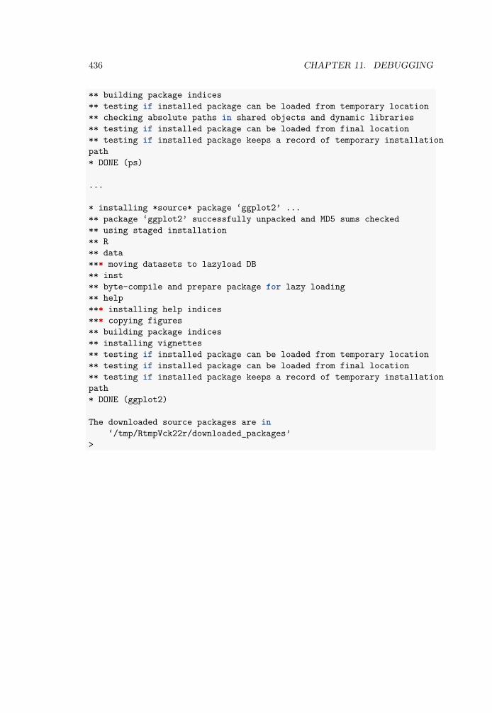
436 CHAPTER 11. DEBUGGING
** building package indices** testing if installed package can be loaded from temporary location** checking absolute paths in shared objects and dynamic libraries** testing if installed package can be loaded from final location** testing if installed package keeps a record of temporary installationpath* DONE (ps)
...
* installing *source* package ‘ggplot2’ ...** package ‘ggplot2’ successfully unpacked and MD5 sums checked** using staged installation** R** data*** moving datasets to lazyload DB** inst** byte-compile and prepare package for lazy loading** help*** installing help indices*** copying figures** building package indices** installing vignettes** testing if installed package can be loaded from temporary location** testing if installed package can be loaded from final location** testing if installed package keeps a record of temporary installationpath* DONE (ggplot2)
The downloaded source packages are in‘/tmp/RtmpVck22r/downloaded_packages’
>

Chapter 12
Mathematical appendix
This chapter contains remarks regarding the mathematical background of certainmethods and concepts encountered in Chapters 7-9. Sections 12.2 and 12.3 consistof reworked materials from Thulin (2014b). Most of this chapter assumes somefamiliarity with mathematical statistics, on the level of Casella & Berger (2002) orLiero & Zwanzig (2012).
12.1 Bootstrap confidence intervalsWe wish to construct a confidence interval for a parameter 𝜃 based on a statistic𝑡. Let 𝑡𝑜𝑏𝑠 be the value of the statistic in the original sample, 𝑡∗
𝑖 be a bootstrapreplicate of the statistic, for 𝑖 = 1, 2, … , 𝐵, and 𝑡∗ be the mean of the statistic amongthe bootstrap replicates. Let 𝑠𝑒∗ be the standard error of the bootstrap estimateand 𝑏∗ = 𝑡∗ − 𝑡𝑜𝑏𝑠 be the bias of the bootstrap estimate. For a confidence level 1 − 𝛼(𝛼 = 0.05 being a common choice), let 𝑧𝛼/2 be the 1 − 𝛼
2 quantile of the standardnormal distribution (with 𝑧0.025 = 1.9599 …). Moreover, let 𝜃𝛼/2 be the 1− 𝛼
2 -quantileof the bootstrap distribution of the 𝑡∗
𝑖 ’s.
The bootstrap normal confidence interval is
𝑡𝑜𝑏𝑠 − 𝑏∗ ± 𝑧𝛼/2 ⋅ 𝑠𝑒∗.
The bootstrap basic confidence interval is
(2𝑡𝑜𝑏𝑠 − 𝜃𝛼/2, 2𝑡𝑜𝑏𝑠 − 𝜃1−𝛼/2).
The bootstrap percentile confidence interval is
(𝜃1−𝛼/2, 𝜃𝛼/2).
437

438 CHAPTER 12. MATHEMATICAL APPENDIX
For the bootstrap BCa confidence interval, let
𝑧 = Θ−1(#{𝑡∗𝑖 < 𝑡𝑜𝑏𝑠}
𝐵 ),
where Θ is the cumulative distribution function for the normal distribution. Let 𝑡∗(−𝑖)
be the mean of the bootstrap replicates after deleting the 𝑖:th replicate, and definethe acceleration term
𝑎 =∑𝑛
𝑖=1(𝑡∗ − 𝑡∗(−𝑖))
6( ∑𝑛𝑖=1(𝑡∗ − 𝑡∗
(−𝑖))2)3/2 .
Finally, let
𝛼1 = Θ( 𝑧 +𝑧 + 𝑧1−𝛼/2
1 − 𝑎( 𝑧 + 𝑧1−𝛼/2))
and𝛼2 = Θ( 𝑧 +
𝑧 + 𝑧𝛼/21 − 𝑎( 𝑧 + 𝑧𝛼/2)).
Then the confidence interval is(𝜃𝛼1
, 𝜃𝛼2).
For the studentised bootstrap confidence interval, we additionally have an estimate𝑠𝑒∗
𝑡 for the standard error of the statistic. Moreover, we compute 𝑞𝑖 = 𝑡∗𝑖−𝑡𝑜𝑏𝑠
𝑠𝑒∗𝑡
for eachbootstrap replicate, and define 𝑞𝛼/2 as the 1− 𝛼
2 -quantile of the bootstrap distributionof 𝑞𝑖’s. The confidence interval is then
(𝑡𝑜𝑏𝑠 − 𝑠𝑒∗𝑡 ⋅ 𝑞𝛼/2, 𝑡𝑜𝑏𝑠 + 𝑠𝑒∗
𝑡 ⋅ 𝑞1−𝛼/2).
12.2 The equivalence between confidence intervalsand hypothesis tests
Let 𝜃 be an unknown parameter in the parameter space Θ ⊆ ℝ, and let the samplex = (𝑥1, … , 𝑥𝑛) ∈ 𝒳𝑛 ⊆ ℝ𝑛 be a realisation of the random variable X = (𝑋1, … , 𝑋𝑛).In frequentist statistics there is a fundamental connection between interval estimationand point-null hypothesis testing of 𝜃 , which we describe next. We define a confidenceinterval 𝐼𝛼(X) as a random interval such that its coverage probability
P𝜃(𝜃 ∈ 𝐼𝛼(X)) = 1 − 𝛼 for all 𝛼 ∈ (0, 1).
Consider a two-sided test of the point-null hypothesis 𝐻0(𝜃0) ∶ 𝜃 = 𝜃0 against thealternative 𝐻1(𝜃0) ∶ 𝜃 ≠ 𝜃0. Let 𝜆(𝜃0, x) denote the p-value of the test. For any𝛼 ∈ (0, 1), 𝐻0(𝜃0) is rejected at the level 𝛼 if 𝜆(𝜃0, 𝑥) ≤ 𝛼. The level 𝛼 rejectionregion is the set of x which lead to the rejection of 𝐻0(𝜃0):
𝑅𝛼(𝜃0) = {x ∈ ℝ𝑛 ∶ 𝜆(𝜃0, x) ≤ 𝛼}.

12.3. TWO TYPES OF P-VALUES 439
Now, consider a family of two-sided tests with p-values 𝜆(𝜃, x), for 𝜃 ∈ Θ. For sucha family we can define an inverted rejection region
𝑄𝛼(x) = {𝜃 ∈ Θ ∶ 𝜆(𝜃, x) ≤ 𝛼}.
For any fixed 𝜃0, 𝐻0(𝜃0) is rejected if x ∈ 𝑅𝛼(𝜃0), which happens if and only if𝜃0 ∈ 𝑄𝛼(x), that is,
x ∈ 𝑅𝛼(𝜃0) ⇔ 𝜃0 ∈ 𝑄𝛼(x).If the test is based on a test statistic with a completely specified absolutely continuousnull distribution, then 𝜆(𝜃0, X) ∼ U(0, 1) under 𝐻0(𝜃0) (Liero & Zwanzig, 2012).Then
P𝜃0(X ∈ 𝑅𝛼(𝜃0)) = P𝜃0
(𝜆(𝜃0, X) ≤ 𝛼) = 𝛼.Since this holds for any 𝜃0 ∈ Θ and since the equivalence relation x ∈ 𝑅𝛼(𝜃0) ⇔ 𝜃0 ∈𝑄𝛼(x) implies that
P𝜃0(X ∈ 𝑅𝛼(𝜃0)) = P𝜃0
(𝜃0 ∈ 𝑄𝛼(X)),
it follows that the random set 𝑄𝛼(x) always covers the true parameter 𝜃0 with prob-ability 𝛼. Consequently, letting 𝑄𝐶
𝛼 (x) denote the complement of 𝑄𝛼(x), for all𝜃0 ∈ Θ we have
P𝜃0(𝜃0 ∈ 𝑄𝐶
𝛼 (X)) = 1 − 𝛼,meaning that the complement of the inverted rejection region is a 1 − 𝛼 confidenceinterval for 𝜃. This equivalence between a family of tests and a confidence interval𝐼𝛼(x) = 𝑄𝐶
𝛼 (x), illustrated in the figure below, provides a simple way of constructingconfidence intervals through test inversion, and vice versa.
The figure shows the rejection regions and confidence intervals corresponding to thethe 𝑧-test for a normal mean, for different null means 𝜃 and different sample means
𝑥, with 𝜎 = 1. 𝐻0(𝜃) is rejected if ( 𝑥, 𝜃) is in the shaded light grey region. Shown indark grey is the rejection region 𝑅0.05(−0.9) = (−∞, −1.52) ∪ (−0.281, ∞) and theconfidence interval 𝐼0.05(1/2) = 𝑄𝐶
0.05(1/2) = (−0.120, 1.120).
12.3 Two types of p-valuesThe symmetric argument in perm.t.test and boot.t.test controls how the p-values of the test are computed. In most cases, the difference is not that large:library(MKinfer)library(ggplot2)boot.t.test(sleep_total ~ vore, data =
subset(msleep, vore == "carni" | vore == "herbi"),symmetric = FALSE)
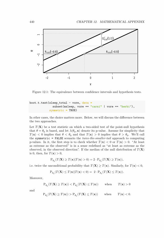
440 CHAPTER 12. MATHEMATICAL APPENDIX
Figure 12.1: The equivalence between confidence intervals and hypothesis tests.
boot.t.test(sleep_total ~ vore, data =subset(msleep, vore == "carni" | vore == "herbi"),
symmetric = TRUE)
In other cases, the choice matters more. Below, we will discuss the difference betweenthe two approaches.
Let 𝑇 (X) be a test statistic on which a two-sided test of the point-null hypothesisthat 𝜃 = 𝜃0 is based, and let 𝜆(𝜃0, x) denote its p-value. Assume for simplicity that𝑇 (x) < 0 implies that 𝜃 < 𝜃0 and that 𝑇 (x) > 0 implies that 𝜃 > 𝜃0. We’ll callthe symmetric = FALSE scenario the twice-the-smaller-tail approach to computingp-values. In it, the first step is to check whether 𝑇 (x) < 0 or 𝑇 (x) > 0. “At leastas extreme as the observed” is in a sense redefined as “at least as extreme as theobserved, in the observed direction”. If the median of the null distribution of 𝑇 (X)is 0, then, for 𝑇 (x) > 0,
P𝜃0(𝑇 (X) ≥ 𝑇 (x)|𝑇 (x) > 0) = 2 ⋅ P𝜃0
(𝑇 (X) ≥ 𝑇 (x)),i.e. twice the unconditional probability that 𝑇 (X) ≥ 𝑇 (x). Similarly, for 𝑇 (x) < 0,
P𝜃0(𝑇 (X) ≤ 𝑇 (x)|𝑇 (x) < 0) = 2 ⋅ P𝜃0
(𝑇 (X) ≤ 𝑇 (x)).Moreover,
P𝜃0(𝑇 (X) ≥ 𝑇 (x)) < P𝜃0
(𝑇 (X) ≤ 𝑇 (x)) when 𝑇 (x) > 0and
P𝜃0(𝑇 (X) ≥ 𝑇 (x)) > P𝜃0
(𝑇 (X) ≤ 𝑇 (x)) when 𝑇 (x) < 0.

12.3. TWO TYPES OF P-VALUES 441
Consequently, the p-value using this approach can in general be written as
𝜆𝑇 𝑆𝑇 (𝜃0, x) ∶= min(1, 2 ⋅ P𝜃0(𝑇 (X) ≥ 𝑇 (x)), 2 ⋅ P𝜃0
(𝑇 (X) ≤ 𝑇 (x))).
This definition of the p-value is frequently used also in situations where the medianof the null distribution of 𝑇 (X) is not 0, despite the fact that the interpretation ofthe p-value as being conditioned on whether 𝑇 (x) < 0 or 𝑇 (x) > 0 is lost.
At the level 𝛼, if 𝑇 (x) > 0 the test rejects the hypothesis 𝜃 = 𝜃0 if
𝜆𝑇 𝑆𝑇 (𝜃0, x) = min(1, 2 ⋅ P𝜃0(𝑇 (X) ≥ 𝑇 (x))) ≤ 𝛼.
This happens if and only if the one-sided test of 𝜃 ≤ 𝜃0, also based on 𝑇 (X), rejects itsnull hypothesis at the 𝛼/2 level. By the same reasoning, it is seen that the rejectionregion of a level 𝛼 twice-the-smaller-tail test always is the union of the rejectionregions of two level 𝛼/2 one-sided tests of 𝜃 ≤ 𝜃0 and 𝜃 ≥ 𝜃0, respectively. The testputs equal weight to the two types of type I errors: false rejection in the two differentdirections. The corresponding confidence interval is therefore also equal-tailed, inthe sense that the non-coverage probability is 𝛼/2 on both sides of the interval.
Twice-the-smaller-tail p-values are in a sense computed by looking only at one tailof the null distribution. In the alternative approach, symmetric = TRUE, we usestrictly two-sided p-values. Such a p-value is computed using both tails, as follows:𝜆𝑆𝑇 𝑇 (𝜃0, x) = P𝜃0
(|𝑇 (X)| ≥ |𝑇 (x)|) = P𝜃0({X ∶ 𝑇 (X) ≤ −|𝑇 (x)|} ∪ {X ∶ 𝑇 (X) ≥
|𝑇 (x)|}).
Under this approach, the directional type I error rates will in general not be equalto 𝛼/2, so that the test might be more prone to falsely reject 𝐻0(𝜃0) in one directionthan in another. On the other hand, the rejection region of a strictly-two sided testis typically smaller than its twice-the-smaller-tail counterpart. The coverage proba-bilities of the corresponding confidence interval 𝐼𝛼(X) = (𝐿𝛼(X), 𝑈𝛼(X)) thereforesatisfies the condition that
P𝜃(𝜃 ∈ 𝐼𝛼(X)) = 1 − 𝛼 for all 𝛼 ∈ (0, 1),
but not the stronger condition
P𝜃(𝜃 < 𝐿𝛼(X)) = P𝜃(𝜃 > 𝑈𝛼(X)) = 𝛼/2 for all 𝛼 ∈ (0, 1).
For parameters of discrete distributions, strictly two-sided hypothesis tests and con-fidence intervals can behave very erratically (Thulin & Zwanzig, 2017). Twice-the-smaller tail methods are therefore always preferable when working with count data.
It is also worth noting that if the null distribution of 𝑇 (X) is symmetric about 0,
P𝜃0(𝑇 (X) ≥ 𝑇 (x)) = P𝜃0
(𝑇 (X) ≤ −𝑇 (x)).

442 CHAPTER 12. MATHEMATICAL APPENDIX
For 𝑇 (x) > 0, unless 𝑇 (X) has a discrete distribution,
𝜆𝑇 𝑆𝑇 (𝜃0, x) = 2 ⋅ P𝜃0(𝑇 (X) ≥ 𝑇 (x))
= P𝜃0(𝑇 (X) ≥ 𝑇 (x)) + P𝜃0
(𝑇 (X) ≤ −𝑇 (x)) = 𝜆𝑆𝑇 𝑇 (𝜃0, x),
meaning that the twice-the-smaller-tail and strictly-two-sided approaches coincide inthis case. The ambiguity related to the definition of two-sided p-values therefore onlyarises under asymmetric null distributions.
12.4 Deviance testsConsider a model with 𝑝 = 𝑛, having a separate parameter for each observation.This model will have a perfect fit, and among all models, it attains the maximumachievable likelihood. It is known as the saturated model. Despite having a perfectfit, it is useless for prediction, interpretation and causality, as it is severely overfitted.It is however useful as a baseline for comparison with other models, i.e. for checkinggoodness-of-fit: our goal is to find a reasonable and useful model with almost as gooda fit.
Let 𝐿( 𝜇, 𝑦) denote the log-likelihood corresponding to the ML-estimate for a model,with estimates 𝜃𝑖. Let 𝐿(𝑦, 𝑦) denote the log-likelihood for the saturated model, withestimates 𝜃𝑖. For an exponential dispersion family, i.e. a distribution of the form
𝑓(𝑦𝑖; 𝜃𝑖, 𝜙) = exp([𝑦𝑖𝜃𝑖 − 𝑏(𝜃𝑖)]/𝑎(𝜙) + 𝑐(𝑦𝑖, 𝜙)),
(the binomial and Poisson distributions being examples of this), we have
𝐿(𝑦, 𝑦) − 𝐿( 𝜇, 𝑦) =𝑛
∑𝑖=1
(𝑦𝑖 𝜃𝑖 − 𝑏( 𝜃𝑖))/𝑎(𝜙) −𝑛
∑𝑖=1
(𝑦𝑖 𝜃𝑖 − 𝑏( 𝜃𝑖))/𝑎(𝜙).
Typically, 𝑎(𝜙) = 𝜙/𝜔𝑖, in which case this becomes
𝑛∑𝑖=1
𝜔𝑖(𝑦𝑖( 𝜃𝑖 − 𝜃𝑖) − 𝑏( 𝜃𝑖) + 𝑏( 𝜃𝑖))/𝜙 =∶ 𝐷(𝑦, 𝜇)2𝜙 ,
where the statistic 𝐷(𝑦, 𝜇) is called the deviance.
The deviance is essentially the difference between the log-likelihoods of a model andof the saturated model. The greater the deviance, the poorer the fit. It holds that𝐷(𝑦, 𝜇) ≥ 0, with 𝐷(𝑦, 𝜇) = 0 corresponding to a perfect fit.
Deviance is used to test whether two models are equal. Assume that we have twomodels:
• 𝑀0, which has 𝑝0 parameters, with fitted values 𝜇0,

12.5. REGULARISED REGRESSION 443
• 𝑀1, which has 𝑝1 > 𝑝0 parameters, with fitted values 𝜇1.
We say that the models are nested, because 𝑀0 is a special case of 𝑀1, correspondingto some of the 𝑝1 parameters of 𝑀1 being 0. If both models give a good fit, we prefer𝑀0 because of its (relative) simplicity. We have 𝐷(𝑦, 𝜇1) ≤ 𝐷(𝑦, 𝜇0), since simplermodels have larger deviances. Assuming that 𝑀1 holds, we can test whether 𝑀0holds by using the likelihood ratio-test statistic 𝐷(𝑦, 𝜇0) − 𝐷(𝑦, 𝜇1). If we reject thenull hypothesis, 𝑀0 fits the data poorly compared to 𝑀1. Otherwise, the fit of 𝑀1is not significantly better and we prefer 𝑀0 because of its simplicity.
12.5 Regularised regressionLinear regression is a special case of generalised linear regression. Under the assump-tion of normality, the least squares estimator is the maximum likelihood estimatorin this setting. In what follows, we will therefore discuss how the maximum likeli-hood estimator is modified when using regularisation, bearing in mind that this alsoincludes the ordinary least squares estimator for linear models.
In a regularised GLM, it is not the likelihood 𝐿(𝛽) that is maximised, but a regu-larised function 𝐿(𝛽) ⋅ 𝑝(𝜆, 𝛽), where 𝑝 is a penalty function that typically forces theresulting estimates to be closer to 0, which leads to a stable solution. The shrinkageparameter 𝜆 controls the size of the penalty, and therefore how much the estimatesare shrunk toward 0. When 𝜆 = 0, we are back at the standard maximum likelihoodestimate.
The most popular penalty terms correspond to common 𝐿𝑞-norms. On a log-scale,the function to be maximised is then
ℓ(𝛽) + 𝜆𝑝
∑𝑖=1
|𝛽𝑖|𝑞,
where ℓ(𝛽) is the loglikelihood of 𝛽 and ∑𝑝𝑖=1 |𝛽𝑖|𝑞 is the 𝐿𝑞-norm, with 𝑞 ≥ 0. This is
equivalent to maximising ℓ(𝛽) under the constraint that ∑𝑝𝑖=1 |𝛽𝑖|𝑞 ≤ 1
ℎ(𝜆) , for someincreasing positive function ℎ.In Bayesian estimation, a prior distribution 𝑝(𝛽) for the parameters 𝛽𝑖 is used Theestimates are then computed from the conditional distribution of the 𝛽𝑖 given thedata, called the posterior distribution. Using Bayes’ theorem, we find that
𝑃(𝛽|x) ∝ 𝐿(𝛽) ⋅ 𝑝(𝛽),
i.e. that the posterior distribution is proportional to the likelihood times the prior.The Bayesian maximum a posteriori estimator (MAP) is found by maximising theabove expression (i.e. finding the mode of the posterior). This is equivalent to theestimates from a regularised frequentist model with penalty function 𝑝(𝛽), meaning

444 CHAPTER 12. MATHEMATICAL APPENDIX
that regularised regression can be motivated both from a frequentist and a Bayesianperspective.
When the 𝐿2 penalty is used, the regularised model is called ridge regression, forwhich we maximise
ℓ(𝛽) + 𝜆𝑝
∑𝑖=1
𝛽2𝑖 .
In a Bayesian context, this corresponds to putting a standard normal prior on the 𝛽𝑖.This method has been invented and reinvented by several authors, from the 1940’sonwards, among them Hoerl & Kennard (1970). The 𝛽𝑖 can become very small, butare never pushed all the way down to 0. The name comes from the fact that in alinear model, the OLS estimate is 𝛽 = (X𝑇 X)−1X𝑇 y, whereas the ridge estimate is
𝛽 = (X𝑇 X + 𝜆I)−1X𝑇 y. The 𝜆I is the “ridge”.
When the 𝐿1 penalty is used, the regularised model is called the lasso (Least AbsoluteShrinkage and Selection Operator), for which we maximise
ℓ(𝛽) + 𝜆𝑝
∑𝑖=1
|𝛽𝑖|.
In a Bayesian context, this corresponds to putting a standard Laplace prior on the𝛽𝑖. For this penalty, as 𝜆 increases, more and more 𝛽𝑖 become 0, meaning that wecan simultaneously perform estimation and variable selection!

Chapter 13
Solutions to exercises
Chapter 2Exercise 2.1
Type the following code into the Console window:1 * 2 * 3 * 4 * 5 * 6 * 7 * 8 * 9 * 10
The answer is 3, 628, 800.
Exercise 2.2
1. To compute the sum and assign it to a, we use:a <- 924 + 124
2. To compute the square of a we can use:a*a
The answer is 1, 098, 304.As you’ll soon see in other examples, the square can also be computed using:a^2
Exercise 2.3
1. When an invalid character is used in a variable name, an error message isdisplayed in the Console window. Different characters will render differenterror messages. For instance, net-income <- income - taxes yields the er-ror message Error in net - income <- income - taxes : object 'net'
445

446 CHAPTER 13. SOLUTIONS TO EXERCISES
not found. This may seem a little cryptic (and it is!), but what it meansis that R is trying to compute the difference between the variables net andincome, because that is how R interprets net-income, and fails because thevariable net does not exist. As you become more experienced with R, the errormessages will start making more and more sense (at least in most cases).
2. If you put R code as a comment, it will be treated as a comment, meaning thatit won’t run. This is actually hugely useful, for instance when you’re lookingfor errors in your code - you can comment away lines of code and see if the restof the code runs without them.
3. Semicolons can be used to write multiple commands on a single line - both willrun as if they were on separate lines. If you like, you can add more semicolonsto run even more commands.
4. The value to the right is assigned to both variables. Note, however, that anyoperations you perform on one variable won’t affect the other. For instance, ifyou change the value of one of them, the other will remain unchanged:
income2 <- taxes2 <- 100income2; taxes2 # Check that both are 100taxes2 <- 30 # income2 doesn't changeincome2; taxes2 # Check values
Exercise 2.4
1. To create the vectors, use c:height <- c(158, 170, 172, 181, 196)weight <- c(45, 80, 62, 75, 115)
2. To combine the two vectors into a data frame, use data.framehw_data <- data.frame(height, weight)
Exercise 2.5
The vector created using:x <- 1:5
is (1, 2, 3, 4, 5). Similarly,x <- 5:1
gives us the same vector in reverse order: (5, 4, 3, 2, 1). To create the vector(1, 2, 3, 4, 5, 4, 3, 2, 1) we can therefore use:x <- c(1:5, 4:1)

447
Exercise 2.6
1. To compute the mean height, use the mean function:mean(height)
2. To compute the correlation between the two variables, use cor:cor(height, weight)
Exercise 2.7
1. length computes the length (i.e. the number of elements) of a vector.length(height) returns the value 5, because the vector is 5 elements long.
2. sort sorts a vector. The parameter decreasing can be used to decide whetherthe elements should be sorted in ascending (sort(weights, decreasing =FALSE)) or descending (sort(weights, decreasing = TRUE)) order. To sortthe weights in ascending order, we can use sort(weight). Note, however, thatthe resulting sorted vector won’t be stored in the variable weight unless wewrite weight <- sort(weight)!
Exercise 2.8
1.√𝜋 = 1.772454 …:
sqrt(pi)
2. 𝑒2 ⋅ 𝑙𝑜𝑔(4) = 10.24341 …:exp(2)*log(4)
Exercise 2.9
1. The expression 1/𝑥 tends to infinity as 𝑥 → 0, and so R returns ∞ as theanswer in this case:
1/0
2. The division 0/0 is undefined, and R returns NaN, which stands for Not aNumber:
0/0
3.√
−1 is undefined (as long as we stick to real numbers), and so R returns NaN.The sqrt function also provides an error message saying that NaN values wereproduced.
sqrt(-1)

448 CHAPTER 13. SOLUTIONS TO EXERCISES
If you want to use complex numbers for some reason, you can write the complexnumber 𝑎+𝑏𝑖 as complex(1, a, b). Using complex numbers, the square root of −1is 𝑖:sqrt(complex(1, -1, 0))
Exercise 2.10
1. View the documentation, where the data is described:?diamonds
2. Have a look at the structure of the data:str(diamonds)
This shows you the number of observations (53,940) and variables (10), and the vari-able types. There are three different data types here: num (numerical), Ord.factor(ordered factor, i.e. an ordered categorical variable) and int (integer, a numericalvariable that only takes integer values).
3. To compute the descriptive statistics, we can use:summary(diamonds)
In the summary, missing values show up as NA’s. There are no NA’s here, and henceno missing values.
Exercise 2.11
ggplot(msleep, aes(sleep_total, awake)) +geom_point()
The points follow a declining line. The reason for this is that at any given time,an animal is either awake or asleep, so the total sleep time plus the awake time isalways 24 hours for all animals. Consequently, the points lie on the line given byawake=24-sleep_total.
Exercise 2.12
1.ggplot(diamonds, aes(carat, price, colour = cut)) +
geom_point() +xlab("Weight of diamond (carat)") +ylab("Price (USD)")
2. We can change the opacity of the points by adding an alpha argument togeom_point. This is useful when the plot contains overlapping points:

449
ggplot(diamonds, aes(carat, price, colour = cut)) +geom_point(alpha = 0.25) +xlab("Weight of diamond (carat)") +ylab("Price (USD)")
Exercise 2.13
1. To set different shapes for different values of cut we use:ggplot(diamonds, aes(carat, price, colour = cut, shape = cut)) +
geom_point(alpha = 0.25) +xlab("Weight of diamond (carat)") +ylab("Price (USD)")
2. We can then change the size of the points as follows. The resulting figure isunfortunately not that informative in this case.
ggplot(diamonds, aes(carat, price, colour = cut,shape = cut, size = x)) +
geom_point(alpha = 0.25) +xlab("Weight of diamond (carat)") +ylab("Price (USD)")
Exercise 2.14
Using the scale_axis_log10 options:ggplot(msleep, aes(bodywt, brainwt, colour = sleep_total)) +
geom_point() +xlab("Body weight (logarithmic scale)") +ylab("Brain weight (logarithmic scale)") +scale_x_log10() +scale_y_log10()
Exercise 2.15
1. We use facet_wrap(~ cut) to create the facetting:ggplot(diamonds, aes(carat, price)) +
geom_point() +facet_wrap(~ cut)
2. To set the number of rows, we add an nrow argument to facet_wrap:ggplot(diamonds, aes(carat, price)) +
geom_point() +facet_wrap(~ cut, nrow = 5)

450 CHAPTER 13. SOLUTIONS TO EXERCISES
Exercise 2.16
1.ggplot(diamonds, aes(cut, price)) +
geom_boxplot()
2. To change the colours of the boxes, we add colour (outline colour) and fill(box colour) arguments to geom_boxplot:
ggplot(diamonds, aes(cut, price)) +geom_boxplot(colour = "magenta", fill = "turquoise")
(No, I don’t really recommend using this particular combination of colours.)
3. reorder(cut, price, median) changes the order of the cut categories basedon their median price values.
ggplot(diamonds, aes(reorder(cut, price, median), price)) +geom_boxplot(colour = "magenta", fill = "turquoise")
4. geom_jitter can be used to plot the individual observations on top of thehistogram. Because there are so many observations in this dataset, we mustset a small size and a low alpha in order not to cover the boxes completely.
ggplot(diamonds, aes(reorder(cut, price), price)) +geom_boxplot(colour = "magenta", fill = "turquoise") +geom_jitter(size = 0.1, alpha = 0.2)
Exercise 2.17
1.ggplot(diamonds, aes(price)) +
geom_histogram()
2. Next, we facet the histograms using cut:ggplot(diamonds, aes(price)) +
geom_histogram() +facet_wrap(~ cut)
3. Finally, by reading the documentation ?geom_histogram we find that we canadd outlines using the colour argument:
ggplot(diamonds, aes(price)) +geom_histogram(colour = "black") +

451
facet_wrap(~ cut)
Exercise 2.18
1.ggplot(diamonds, aes(cut)) +
geom_bar()
2. To set different colours for the bars, we can use fill, either to set the coloursmanually or using default colours (by adding a colour aesthetic):
# Set colours manually:ggplot(diamonds, aes(cut)) +
geom_bar(fill = c("red", "yellow", "blue", "green", "purple"))
# Use defaults:ggplot(diamonds, aes(cut, fill = cut)) +
geom_bar()
3. width lets us control the bar width:ggplot(diamonds, aes(cut, fill = cut)) +
geom_bar(width = 0.5)
4. By adding fill = clarity to aes we create stacked bar charts:ggplot(diamonds, aes(cut, fill = clarity)) +
geom_bar()
5. By adding position = "dodge" to geom_bar we obtain grouped bar charts:ggplot(diamonds, aes(cut, fill = clarity)) +
geom_bar(position = "dodge")
6. coord_flip flips the coordinate system, yielding a horizontal bar plot:ggplot(diamonds, aes(cut)) +
geom_bar() +coord_flip()
Exercise 2.19
To save the png file, usemyPlot <- ggplot(msleep, aes(sleep_total, sleep_rem)) +
geom_point()

452 CHAPTER 13. SOLUTIONS TO EXERCISES
ggsave("filename.png", myPlot, width = 4, height = 4)
To change the resolution, we use the dpi argument:ggsave("filename.png", myPlot, width = 4, height = 4, dpi=600)
Chapter 3Exercise 3.1
1. Both approaches render a character object with the text A rainy day inEdinburgh:
a <- "A rainy day in Edinburgh"aclass(a)
a <- 'A rainy day in Edinburgh'aclass(a)
That is, you are free to choose whether to use single or double quotation marks. Itend to use double quotation marks, because I was raised to believe that doublequotation marks are superior in every way (well, that, and the fact that I think thatthey make code easier to read simply because they are easier to notice).
2. The first two sums are numeric whereas the third is integerclass(1 + 2) # numericclass(1L + 2) # numericclass (1L + 2L) # integer
If we mix numeric and integer variables, the result is a numeric. But as long as westick to just integer variables, the result is usually an integer. There are exceptionsthough - computing 2L/3L won’t result in an integer because… well, because it’snot an integer.
3. When we run "Hello" + 1 we receive an error message:> "Hello" + 1Error in "Hello" + 1 : non-numeric argument to binary operator
In R, binary operators are mathematical operators like +, -, * and / that takes twonumbers and returns a number. Because "Hello" is a character and not a numeric,it fails in this case. So, in English the error message reads Error in "Hello" + 1 :trying to perform addition with something that is not a number. Maybeyou know a bit of algebra and want to say hey, we can add characters together, like

453
in 𝑎2 + 𝑏2 = 𝑐2!. Which I guess is correct. But R doesn’t do algebraic calculations,but numerical ones - that is, all letters involved in the computations must representactual numbers. a^2+b^2=c^2 will work only if a, b and c all have numbers assignedto them.
4. Combining numeric and a logical variables turns out to be very useful insome problems. The result is always numeric, with FALSE being treated as thenumber 0 and TRUE being treated as the number 1 in the computations:
class(FALSE * 2)class(TRUE + 1)
Exercise 3.2
The functions return information about the data frame:ncol(airquality) # Number of columns of the data framenrow(airquality) # Number of rows of the data framedim(airquality) # Number of rows, followed by number of columnsnames(airquality) # The name of the variables in the data framerow.names(airquality) # The name of the rows in the data frame
# (indices unless the rows have been named)
Exercise 3.3
To create the matrices, we need to set the number of rows nrow, the number ofcolumns ncol and whether to use the elements of the vector x to fill the matrix byrows or by columns (byrow). To create
(1 2 34 5 6)
we use:x <- 1:6
matrix(x, nrow = 2, ncol = 3, byrow = TRUE)
And to create
⎛⎜⎝
1 42 53 6
⎞⎟⎠
we use:

454 CHAPTER 13. SOLUTIONS TO EXERCISES
x <- 1:6
matrix(x, nrow = 3, ncol = 2, byrow = FALSE)
We’ll do a deep-dive on matrix objects in Section 10.3.
Exercise 3.4
1. In the [i, j] notation, i is the row number and j is the column number. Inthis case, airquality[, 3], we have j=3 and therefore asks for the 3rd column,not the 3rd row. To get the third row, we’d use airquality[3,] instead.
2. To extract the first five rows, we can use:airquality[1:5,]# orairquality[c(1, 2, 3, 4, 5),]
3. First, we use names(airquality) to check the column numbers of the twovariables. Wind is column 3 and Temp is column 4, so we can access them usingairquality[,3] and airquality[,4] respectively. Thus, we can compute thecorrelation using:
cor(airquality[,3], airquality[,4])
Alternatively, we could refer to the variables using the column names:cor(airquality[,"Wind"], airquality[,"Temp"])
4. To extract all columns except Temp and Wind, we use a minus sign - and avector containing their indices:
airquality[, -c(3, 4)]
Exercise 3.5
1. To add the new variable, we can use:bookstore$rev_per_minute <- bookstore$purchase / bookstore$visit_length
2. By using View(bookstore) or looking at the data in the Console window usingbookstore, we see that the customer in question is on row 6 of the data. Toreplace the value, we can use:
bookstore$purchase[6] <- 16
Note that the value of rev_per_minute hasn’t been changed by this operation. Wewill therefore need to compute it again, to update its value:

455
# We can either compute it again for all customers:bookstore$rev_per_minute <- bookstore$purchase / bookstore$visit_length# ...or just for customer number 6:bookstore$rev_per_minute[6] <- bookstore$purchase[6] / bookstore$visit_length[6]
Exercise 3.6
1. The coldest day was the day with the lowest temperature:airquality[which.min(airquality$Temp),]
We see that the 5th day in the period, May 5, was the coldest, with a temperatureof 56 degrees Fahrenheit.
2. To find out how many days the wind speed was greater than 17 mph, we usesum:
sum(airquality$Wind > 17)
Because there are so few days fulfilling this condition, we could also easily have solvedthis by just looking at the rows for those days and counting them:airquality[airquality$Wind > 17,]
3. Missing data are represented by NA values in R, and so we wish to check howmany NA elements there are in the Ozone vector. We do this by combiningis.na and sum and find that there are 37 missing values:
sum(is.na(airquality$Ozone))
4. In this case, we need to use an ampersand & sign to combine the two conditions:sum(airquality$Temp < 70 & airquality$Wind > 10)
We find that there are 22 such days in the data.
Exercise 3.7
We should use the breaks argument to set the interval bounds in cut:airquality$TempCat <- cut(airquality$Temp,
breaks = c(50, 70, 90, 110))
To see the number of days in each category, we can use summary:summary(airquality$TempCat)

456 CHAPTER 13. SOLUTIONS TO EXERCISES
Exercise 3.8
1. The variable X represents the empty column between Visit and VAS. In the X.1column the researchers have made comments on two rows (rows 692 and 1153),causing R to read this otherwise empty column. If we wish, we can removethese columns from the data using the syntax from Section 3.2.1:
vas <- vas[, -c(4, 6)]
2. We remove the sep = ";" argument:vas <- read.csv(file_path, dec = ",", skip = 4)
…and receive the following error message:Error in read.table(file = file, header = header, sep = sep,
quote = quote, :duplicate 'row.names' are not allowed
By default, read.csv uses commas, ,, as column delimiters. In this case it fails toread the file, because it uses semicolons instead.
3. Next, we remove the dec = "," argument:vas <- read.csv(file_path, sep = ";", skip = 4)str(vas)
read.csv reads the data without any error messages, but now VAS has become acharacter vector. By default, read.csv assumes that the file uses decimal pointsrather than decimals commas. When we don’t specify that the file has decimalcommas, read.csv interprets 0,4 as text rather than a number.
4. Next, we remove the skip = 4 argument:vas <- read.csv(file_path, sep = ";", dec = ",")str(vas)names(vas)
read.csv looks for column names on the first row that it reads. skip = 4 tells thefunction to skip the first 4 rows of the .csv file (which in this case were blank orcontain other information about the data). When it doesn’t skip those lines, the onlytext on the first row is Data updated 2020-04-25. This then becomes the name ofthe first column, and the remaining columns are named X, X.1, X.2, and so on.
5. Finally, we change skip = 4 to skip = 5:vas <- read.csv(file_path, sep = ";", dec = ",", skip = 5)str(vas)names(vas)
In this case, read.csv skips the first 5 rows, which includes row 5, on which the

457
variable names are given. It still looks for variable names on the first row that itreads though, meaning that the data values from the first observation become variablenames instead of data points. An X is added at the beginning of the variable names,because variable names in R cannot begin with a number.
Exercise 3.9
1. First, set file_path to the path to projects-email.xlsx. Then we can useread.xlsx from the openxlsx package. The argument sheet lets us selectwhich sheet to read:
library(openxlsx)emails <- read.xlsx(file_path, sheet = 2)
View(emails)str(emails)
2. To obtain a vector containing the email addresses without any duplicates, weapply unique to the vector containing the e-mail addresses. That vector iscalled E-mail with a hyphen -. We cannot access it using emails$E-mail, be-cause R will interpret that as email$E - mail, and neither the vector email$Enor the variable mail exist. Instead, we can do one of the following:
unique(emails[,3])unique(emails$"E-mail")
Exercise 3.10
1. We set file_path to the path to vas-transposed.csv and then read it:vast <- read.csv(file_path)dim(vast)View(vast)
It is a data frame with 4 rows and 2366 variables.
2. Adding row.names = 1 lets us read the row names:vast <- read.csv(file_path, row.names = 1)View(vast)
This data frame only contains 2365 variables, because the leftmost column is nowthe row names and not a variable.
3. t lets us rotate the data into the format that we are used to. If we only applyt though, the resulting object is a matrix and not a data.frame. If we wantit to be a data.frame, we must also make a call to as.data.frame:

458 CHAPTER 13. SOLUTIONS TO EXERCISES
vas <- t(vast)class(vas)
vas <- as.data.frame(t(vast))class(vas)
Exercise 3.11
We fit the model and use summary to print estimates and p-values:m <- lm(mpg ~ hp + wt + cyl + am, data = mtcars)summary(m)
hp and wt are significant at the 5 % level, but cyl and am are not.
Exercise 3.12
We set file_path to the path for vas.csv and read the data as in Exercise 3.8::vas <- read.csv(file_path, sep = ";", dec = ",", skip = 4)
1. First, we compute the mean VAS for each patient:aggregate(VAS ~ ID, data = vas, FUN = mean)
2. Next, we compute the lowest and highest VAS recorded for each patient:aggregate(VAS ~ ID, data = vas, FUN = min)aggregate(VAS ~ ID, data = vas, FUN = max)
3. Finally, we compute the number of high-VAS days for each patient. One wayto do this is to create a logical vector by VAS >= 7 and then compute itssum.
aggregate((VAS >= 7) ~ ID, data = vas, FUN = sum)
Exercise 3.13
First we load and inspect the data:library(datasauRus)View(datasaurus_dozen)
1. Next, we compute summary statistics grouped by dataset:aggregate(cbind(x, y) ~ dataset, data = datasaurus_dozen, FUN = mean)aggregate(cbind(x, y) ~ dataset, data = datasaurus_dozen, FUN = sd)
by(datasaurus_dozen[, 2:3], datasaurus_dozen$dataset, cor)

459
The summary statistics for all datasets are virtually identical.
2. Next, we make scatterplots. Here is a solution using ggplot2:library(ggplot2)ggplot(datasaurus_dozen, aes(x, y, colour = dataset)) +
geom_point() +facet_wrap(~ dataset, ncol = 3)
Clearly, the datasets are very different! This is a great example of how simplycomputing summary statistics is not enough. They tell a part of the story, yes,but only a part.
Exercise 3.14
First, we load the magrittr package and create x:library(magrittr)x <- 1:8
1. sqrt(mean(x)) can be rewritten as:x %>% mean %>% sqrt
2. mean(sqrt(x)) can be rewritten as:x %>% sqrt %>% mean
3. sort(x^2-5)[1:2] can be rewritten as:x %>% raise_to_power(2) %>% subtract(5) %>% extract(1:2,)
Exercise 3.15
We can use inset to add the new variable:age <- c(28, 48, 47, 71, 22, 80, 48, 30, 31)purchase <- c(20, 59, 2, 12, 22, 160, 34, 34, 29)visit_length <- c(5, 2, 20, 22, 12, 31, 9, 10, 11)bookstore <- data.frame(age, purchase, visit_length)
library(magrittr)bookstore %>% inset("rev_per_minute",
value = .$purchase / .$visit_length)

460 CHAPTER 13. SOLUTIONS TO EXERCISES
Chapter 4Exercise 4.1
1. We change the background colour of the entire plot to lightblue.p + theme(panel.background = element_rect(fill = "lightblue"),
plot.background = element_rect(fill = "lightblue"))
2. Next, we change the font of the legend to serif.p + theme(panel.background = element_rect(fill = "lightblue"),
plot.background = element_rect(fill = "lightblue"),legend.text = element_text(family = "serif"),legend.title = element_text(family = "serif"))
3. We remove the grid:p + theme(panel.background = element_rect(fill = "lightblue"),
plot.background = element_rect(fill = "lightblue"),legend.text = element_text(family = "serif"),legend.title = element_text(family = "serif"),panel.grid.major = element_blank(),panel.grid.minor = element_blank())
4. Finally, we change the colour of the axis ticks to orange and increase theirwidth:
p + theme(panel.background = element_rect(fill = "lightblue"),plot.background = element_rect(fill = "lightblue"),legend.text = element_text(family = "serif"),legend.title = element_text(family = "serif"),panel.grid.major = element_blank(),panel.grid.minor = element_blank(),axis.ticks = element_line(colour = "orange", size = 2))
It doesn’t look all that great, does it? Let’s just stick to the default theme in theremaining examples.
Exercise 4.2
1. We can use the bw argument to control the smoothness of the curves:ggplot(diamonds, aes(carat, colour = cut)) +
geom_density(bw = 0.2)
2. We can fill the areas under the density curves by adding fill to the aes:

461
ggplot(diamonds, aes(carat, colour = cut, fill = cut)) +geom_density(bw = 0.2)
3. Because the densities overlap, it’d be better to make the fill colours slightlytransparent. We add alpha to the geom:
ggplot(diamonds, aes(carat, colour = cut, fill = cut)) +geom_density(bw = 0.2, alpha = 0.2)
4. A similar plot can be created using geom_density_ridges from the ggridgespackage. Note that you must set y = cut in the aes, because the densitiesshould be separated by cut.
install.packages("ggridges")library(ggridges)
ggplot(diamonds, aes(carat, cut, fill = cut)) +geom_density_ridges()
Exercise 4.3
We use xlim to set the boundaries of the x-axis and bindwidth to decrease the binwidth:ggplot(diamonds, aes(carat)) +
geom_histogram(binwidth = 0.01) +xlim(0, 3)
It appears that carat values that are just above multiples of 0.25 are more commonthan other values. We’ll explore that next.
Exercise 4.4
1. We set the colours using the fill aesthetic:ggplot(diamonds, aes(cut, price, fill = cut)) +
geom_violin()
2. Next, we remove the legend:ggplot(diamonds, aes(cut, price, fill = cut)) +
geom_violin() +theme(legend.position = "none")
3. We add boxplots by adding an additional geom to the plot. Increasing thewidth of the violins and decreasing the width of the boxplots creates a betterfigure. We also move the fill = cut aesthetic from ggplot to geom_violin

462 CHAPTER 13. SOLUTIONS TO EXERCISES
so that the boxplots use the default colours instead of different colours for eachcategory.
ggplot(diamonds, aes(cut, price)) +geom_violin(aes(fill = cut), width = 1.25) +geom_boxplot(width = 0.1, alpha = 0.5) +theme(legend.position = "none")
4. Finally, we can create a horizontal version of the figure in the same way we didfor boxplots in Section 2.18: by adding coord_flip() to the plot:
ggplot(diamonds, aes(cut, price)) +geom_violin(aes(fill = cut), width = 1.25) +geom_boxplot(width = 0.1, alpha = 0.5) +theme(legend.position = "none") +coord_flip()
Exercise 4.5
We can create an interactive scatterplot using:myPlot <- ggplot(diamonds, aes(x, y,
text = paste("Row:", rownames(diamonds)))) +geom_point()
ggplotly(myPlot)
There are outliers along the y-axis on rows 24,068 and 49,190. There are also somepoints for which 𝑥 = 0. Examples include rows 11,183 and 49,558. It isn’t clearfrom the plot, but in total there are 8 such points, 7 of which have both 𝑥 = 0 and𝑦 = 0. To view all such diamonds, you can use filter(diamonds, x==0). Theseobservations must be due to data errors, since diamonds can’t have 0 width. The high𝑦-values also seem suspicious - carat is a measure of diamond weight, and if thesediamonds really were 10 times longer than others then we would probably expectthem to have unusually high carat values as well (which they don’t).
Exercise 4.6
The two outliers are the only observations for which 𝑦 > 20, so we use that as ourcondition:ggplot(diamonds, aes(x, y)) +
geom_point() +geom_text(aes(label = ifelse(y > 20, rownames(diamonds), "")),
hjust = 1.1)

463
Exercise 4.7
# Create a copy of diamonds, then replace x-values greater than 9# with NA:diamonds2 <- diamondsdiamonds2[diamonds2$x > 9] <- NA
## Create the scatterplotggplot(diamonds2, aes(carat, price, colour = is.na(x))) +
geom_point()
In this plot, we see that virtually all high carat diamonds have missing x values. Thisseems to indicate that there is a systematic pattern to the missing data (which ofcourse is correct in this case!), and we should proceed with any analyses of x withcaution.
Exercise 4.8
The code below is an example of what your analysis can look like, with some remarksas comments:# Investigate missing datacolSums(is.na(flights2))# Not too much missing data in this dataset!View(flights2[is.na(flights2$air_time),])# Flights with missing data tend to have several missing variables.
# Ridge plots to compare different carriers (boxplots, facetted# histograms and violin plots could also be used)library(ggridges)ggplot(flights2, aes(arr_delay, carrier, fill = carrier)) +
geom_density_ridges() +theme(legend.position = "none") +xlim(-50, 250)
# Some airlines (e.g. EV) appear to have a larger spread than others
ggplot(flights2, aes(dep_delay, carrier, fill = carrier)) +geom_density_ridges() +theme(legend.position = "none") +xlim(-15, 100)
# Some airlines (e.g. EV) appear to have a larger spread others
ggplot(flights2, aes(air_time, carrier, fill = carrier)) +geom_density_ridges() +theme(legend.position = "none")

464 CHAPTER 13. SOLUTIONS TO EXERCISES
# VX only do long-distance flights, whereas MQ, FL and 9E only do# shorter flights
# Make scatterplots and label outliers with flight numbersggplot(flights2, aes(dep_delay, arr_delay, colour = carrier)) +
geom_point() +geom_text(aes(label = ifelse(arr_delay > 300,
paste("Flight", flight), "")),vjust = 1.2, hjust = 1)
ggplot(flights2, aes(air_time, arr_delay, colour = carrier)) +geom_point() +geom_text(aes(label = ifelse(air_time > 400 | arr_delay > 300,
paste("Flight", flight), "")),vjust = 1.2, hjust = 1)
Exercise 4.9
1. To decrease the smoothness of the line, we use the span argument ingeom_smooth. The default is geom_smooth(span = 0.75). Decreasing thisvalues yields a very different fit:
ggplot(msleep, aes(brainwt, sleep_total)) +geom_point() +geom_smooth(span = 0.25) +xlab("Brain weight (logarithmic scale)") +ylab("Total sleep time") +scale_x_log10()
More smoothing is probably preferable in this case. The relationship appears to befairly weak, and appears to be roughly linear.
2. We can use the method argument in geom_smooth to fit a straight line usinglm instead of LOESS:
ggplot(msleep, aes(brainwt, sleep_total)) +geom_point() +geom_smooth(method = "lm") +xlab("Brain weight (logarithmic scale)") +ylab("Total sleep time") +scale_x_log10()
3. To remove the confidence interval from the plot, we set se = FALSE ingeom_smooth:

465
ggplot(msleep, aes(brainwt, sleep_total)) +geom_point() +geom_smooth(method = "lm", se = FALSE) +xlab("Brain weight (logarithmic scale)") +ylab("Total sleep time") +scale_x_log10()
4. Finally, we can change the colour of the smoothing line using the colour argu-ment:
ggplot(msleep, aes(brainwt, sleep_total)) +geom_point() +geom_smooth(method = "lm", se = FALSE, colour = "red") +xlab("Brain weight (logarithmic scale)") +ylab("Total sleep time") +scale_x_log10()
Exercise 4.10
1. Adding the geom_smooth geom with the default settings produces a trend linethat does not capture seasonality:
autoplot(a10) +geom_smooth()
2. We can change the axes labels using xlab and ylab:autoplot(a10) +
geom_smooth() +xlab("Year") +ylab("Sales ($ million)")
3. ggtitle adds a title to the figure:autoplot(a10) +
geom_smooth() +xlab("Year") +ylab("Sales ($ million)") +ggtitle("Anti-diabetic drug sales in Australia")
4. The colour argument can be passed to autoplot to change the colour of thetime series line:
autoplot(a10, colour = "red") +geom_smooth() +xlab("Year") +ylab("Sales ($ million)") +

466 CHAPTER 13. SOLUTIONS TO EXERCISES
ggtitle("Anti-diabetic drug sales in Australia")
Exercise 4.11
1. The text can be added by using annotate(geom = "text", ...). In ordernot to draw the text on top of the circle, you can shift the x-value of the text(the appropriate shift depends on the size of your plot window):
autoplot(gold) +annotate(geom = "point", x = spike_date, y = gold[spike_date],
size = 5, shape = 21, colour = "red",fill = "transparent") +
annotate(geom = "text", x = spike_date - 100,y = gold[spike_date],label = "Incorrect value!")
2. We can remove the erroneous value by replacing it with NA in the time series:gold[spike_date] <- NAautoplot(gold)
3. Finally, we can add a reference line using geom_hline:autoplot(gold) +
geom_hline(yintercept = 400, colour = "red")
Exercise 4.12
1. We can specify which variables to include in the plot as follows:autoplot(elecdaily[, c("Demand", "Temperature")], facets = TRUE)
This produces a terrible-looking label for the y-axis, which we can remove by settingthe y-label to NULL:autoplot(elecdaily[, c("Demand", "Temperature")], facets = TRUE) +
ylab(NULL)
2. As before, we can add smoothers using geom_smooth:autoplot(elecdaily[, c("Demand", "Temperature")], facets = TRUE) +
geom_smooth() +ylab(NULL)
Exercise 4.13
1. We set the size of the points using geom_point(size):

467
ggplot(elecdaily2, aes(Temperature, Demand, colour = day)) +geom_point(size = 0.5) +geom_path()
2. To add annotations, we use annotate and some code to find the days of thelowest and highest temperatures:
## Lowest temperaturelowest <- which.min(elecdaily2$Temperature)
## Highest temperaturehighest <- which.max(elecdaily2$Temperature)
## We shift the y-values of the text so that it appears above# the pointsggplot(elecdaily2, aes(Temperature, Demand, colour = day)) +
geom_point(size = 0.5) +geom_path() +annotate(geom = "text", x = elecdaily2$Temperature[lowest],
y = elecdaily2$Demand[lowest] + 4,label = elecdaily2$day[lowest]) +
annotate(geom = "text", x = elecdaily2$Temperature[highest],y = elecdaily2$Demand[highest] + 4,label = elecdaily2$day[highest])
Exercise 4.14
We can specify aes(group) for a particular geom only as follows:ggplot(Oxboys, aes(age, height, colour = Subject)) +
geom_point() +geom_line(aes(group = Subject)) +geom_smooth(method = "lm", colour = "red", se = FALSE)
Subject is now used for grouping the points used to draw the lines (i.e. forgeom_line), but not for geom_smooth, which now uses all the points to create atrend line showing the average height of the boys over time.
Exercise 4.15
Code for producing the three plots is given below:library(fma)
# Time series plotautoplot(writing) +

468 CHAPTER 13. SOLUTIONS TO EXERCISES
geom_smooth() +ylab("Sales (francs)") +ggtitle("Sales of printing and writing paper")
# Seasonal plotggseasonplot(writing, year.labels = TRUE, year.labels.left = TRUE) +
ylab("Sales (francs)") +ggtitle("Seasonal plot of sales of printing and writing paper")
# There is a huge dip in sales in August, when many French offices are# closed due to holidays.
# stl-decompositionautoplot(stl(writing, s.window = 365)) +
ggtitle("Seasonal decomposition of paper sales time series")
Exercise 4.16
We use the cpt.var functions with the default settings:library(forecast)library(fpp2)library(changepoint)library(ggfortify)
# Plot the time series:autoplot(elecdaily[,"Demand"])
# Plot points where there are changes in the variance:autoplot(cpt.var(elecdaily[,"Demand"]))
The variance is greater in the beginning of the year, and then appears to be more orless constant. Perhaps this can be explained by temperature?# Plot the time series:autoplot(elecdaily[,"Temperature"])
We see that the high-variance period coincides with peaks and large oscillations intemperature, which would cause the energy demand to increase and decrease morethan usual, making the variance greater.
Exercise 4.17
By adding a copy of the observation for month 12, with the Month value replaced by0, we can connect the endpoints to form a continuous curve:

469
Cape_Town_weather[13,] <- Cape_Town_weather[12,]Cape_Town_weather$Month[13] <- 0
ggplot(Cape_Town_weather, aes(Month, Temp_C)) +geom_line() +coord_polar() +xlim(0, 12)
Exercise 4.18
As for all ggplot2 plots, we can use ggtitle to add a title to the plot:ggpairs(diamonds[, which(sapply(diamonds, class) == "numeric")],
aes(colour = diamonds$cut, alpha = 0.5)) +ggtitle("Numeric variables in the diamonds dataset")
Exercise 4.19
1. We create the correlogram using ggcorr as follows:ggcorr(diamonds[, which(sapply(diamonds, class) == "numeric")])
2. method allows us to control which correlation coefficient to use:ggcorr(diamonds[, which(sapply(diamonds, class) == "numeric")],
method = c("pairwise", "spearman"))
3. nbreaks is used to create a categorical colour scale:ggcorr(diamonds[, which(sapply(diamonds, class) == "numeric")],
method = c("pairwise", "spearman"),nbreaks = 5)
4. low and high can be used to control the colours at the endpoints of the scale:ggcorr(diamonds[, which(sapply(diamonds, class) == "numeric")],
method = c("pairwise", "spearman"),nbreaks = 5,low = "yellow", high = "black")
(Yes, the default colours are a better choice!)
Exercise 4.20
1. We replace colour = vore in the aes by fill = vore and add colour ="black", shape = 21 to geom_point. The points now get black borders,which makes them a bit sharper:

470 CHAPTER 13. SOLUTIONS TO EXERCISES
ggplot(msleep, aes(brainwt, sleep_total, fill = vore, size = bodywt)) +geom_point(alpha = 0.5, colour = "black", shape = 21) +xlab("log(Brain weight)") +ylab("Sleep total (h)") +scale_x_log10() +scale_size(range = c(1, 20), trans = "sqrt",
name = "Square root of\nbody weight") +scale_color_discrete(name = "Feeding behaviour")
2. We can use ggplotly to create an interactive version of the plot. Adding textto the aes allows us to include more information when hovering points:
library(plotly)myPlot <- ggplot(msleep, aes(brainwt, sleep_total, fill = vore,
size = bodywt, text = name)) +geom_point(alpha = 0.5, colour = "black", shape = 21) +xlab("log(Brain weight)") +ylab("Sleep total (h)") +scale_x_log10() +scale_size(range = c(1, 20), trans = "sqrt",
name = "Square root of\nbody weight") +scale_color_discrete(name = "Feeding behaviour")
ggplotly(myPlot)
Exercise 4.21
1. We create the tile plot using geom_tile. By setting fun = max we obtain thehighest price in each bin:
ggplot(diamonds, aes(table, depth, z = price)) +geom_tile(binwidth = 1, stat = "summary_2d", fun = max) +ggtitle("Highest prices for diamonds with different depths
and tables")
2. We can create the bin plot using either geom_bin2d or geom_hex:ggplot(diamonds, aes(carat, price)) +
geom_bin2d(bins = 50)
Diamonds with carat around 0.3 and price around 1000 have the highest bin counts.
Exercise 4.22
1. VS2 and Ideal is the most common combination:

471
diamonds2 <- aggregate(carat ~ cut + clarity, data = diamonds,FUN = length)
names(diamonds2)[3] <- "Count"ggplot(diamonds2, aes(clarity, cut, fill = Count)) +
geom_tile()
2. As for continuous variables, we can use geom_tile with the arguments stat ="summary_2d", fun = mean to display the average prices for different combi-nations. SI2 and Premium is the combination with the highest average price:
ggplot(diamonds, aes(clarity, cut, z = price)) +geom_tile(binwidth = 1, stat = "summary_2d", fun = mean) +ggtitle("Mean prices for diamonds with different
clarities and cuts")
Exercise 4.23
1. We create the scatterplot using:library(gapminder)library(GGally)
gapminder2007 <- gapminder[gapminder$year == 2007,]
ggpairs(gapminder2007[, c("lifeExp", "pop", "gdpPercap")],aes(colour = gapminder2007$continent, alpha = 0.5),upper = list(continuous = "na"))
2. The interactive facetted bubble plot is created using:library(plotly)
gapminder2007 <- gapminder[gapminder$year == 2007,]
myPlot <- ggplot(gapminder2007, aes(gdpPercap, lifeExp, size = pop,colour = country)) +
geom_point(alpha = 0.5) +scale_x_log10() +scale_size(range = c(2, 15)) +scale_colour_manual(values = country_colors) +theme(legend.position = "none") +facet_wrap(~ continent)
ggplotly(myPlot)
Well done, you just visualised 5 variables in a facetted bubble plot!

472 CHAPTER 13. SOLUTIONS TO EXERCISES
Exercise 4.24
1. Fixed wing multi engine Boeings are the most common planes:library(nycflights13)library(ggplot2)
planes2 <- aggregate(tailnum ~ type + manufacturer, data = planes,FUN = length)
ggplot(planes2, aes(type, manufacturer, fill = tailnum)) +geom_tile()
2. The fixed wing multi engine Airbus has the highest average number of seats:ggplot(planes, aes(type, manufacturer, z = seats)) +
geom_tile(binwidth = 1, stat = "summary_2d", fun = mean) +ggtitle("Number of seats for different planes")
3. The number of seats seems to have increased in the 1980’s, and then reached aplateau:
ggplot(planes, aes(year, seats)) +geom_point(aes(colour = engine)) +geom_smooth()
The plane with the largest number of seats is not an Airbus, but a Boeing 747-451. Itcan be found using planes[which.max(planes$seats),] or visually using plotly:myPlot <- ggplot(planes, aes(year, seats,
text = paste("Tail number:", tailnum,"<br>Manufacturer:",manufacturer))) +
geom_point(aes(colour = engine)) +geom_smooth()
ggplotly(myPlot)
4. Finally, we can investigate what engines were used during different time periodsin several ways, for instance by differentiating engines by colour in our previousplot:
ggplot(planes, aes(year, seats)) +geom_point(aes(colour = engine)) +geom_smooth()

473
Exercise 4.25
First, we compute the principal components:library(ggplot2)
# Compute principal components:pca <- prcomp(diamonds[, which(sapply(diamonds, class) == "numeric")],
center = TRUE, scale. = TRUE)
1. To see the proportion of variance explained by each component, we usesummary:
summary(pca)
The first PC accounts for 65.5 % of the total variance. The first two account for86.9 % and the first three account for 98.3 % of the total variance, meaning that 3components are needed to account for at least 90 % of the total variance.
2. To see the loadings, we type:pca
The first PC appears to measure size: it is dominated by carat, x, y and z, which allare size measurements. The second PC appears is dominated by depth and tableand is therefore a summary of those measures.
3. To compute the correlation, we use cor:cor(pca$x[,1], diamonds$price)
The (Pearson) correlation is 0.89, which is fairly high. Size is clearly correlated toprice!
4. To see if the first two principal components be used to distinguish betweendiamonds with different cuts, we make a scatterplot:
autoplot(pca, data = diamonds, colour = "cut")
The points are mostly gathered in one large cloud. Apart from the fact that verylarge or very small values of the second PC indicates that a diamond has a Fair cut,the first two principal components seem to offer little information about a diamond’scut.
Exercise 4.26
We create the scatterplot with the added arguments:seeds <- read.table("https://tinyurl.com/seedsdata",
col.names = c("Area", "Perimeter", "Compactness","Kernel_length", "Kernel_width", "Asymmetry",

474 CHAPTER 13. SOLUTIONS TO EXERCISES
"Groove_length", "Variety"))seeds$Variety <- factor(seeds$Variety)
pca <- prcomp(seeds[,-8], center = TRUE, scale. = TRUE)
library(ggfortify)autoplot(pca, data = seeds, colour = "Variety",
loadings = TRUE, loadings.label = TRUE)
The arrows for Area, Perimeter, Kernel_length, Kernel_width and Groove_lengthare all about the same length and are close to parallel the x-axis, which showsthat these have similar impact on the first principal component but not the second,making the first component a measure of size. Asymmetry and Compactness bothaffect the second component, making it a measure of shape. Compactness alsoaffects the first component, but not as much as the size variables do.
Exercise 4.27
We change the hc_method and hc_metric arguments to use complete linkage andthe Manhattan distance:library(cluster)library(factoextra)votes.repub %>% scale() %>%
hcut(k = 5, hc_func = "agnes",hc_method = "complete",hc_metric = "manhattan") %>%
fviz_dend()
fviz_dend produces ggplot2 plots. We can save the plots from both approachesand then plot them side-by-side using patchwork as in Section 4.3.4:votes.repub %>% scale() %>%
hcut(k = 5, hc_func = "agnes",hc_method = "average",hc_metric = "euclidean") %>%
fviz_dend() -> dendro1votes.repub %>% scale() %>%
hcut(k = 5, hc_func = "agnes",hc_method = "complete",hc_metric = "manhattan") %>%
fviz_dend() -> dendro2
library(patchwork)dendro1 / dendro2

475
Alaska and Vermont are clustered together in both cases. The red leftmost clusteris similar but not identical, including Alabama, Georgia and Louisiana.
To compare the two dendrograms in a different way, we can use tanglegram. Settingk_labels = 5 and k_branches = 5 gives us 5 coloured clusters:votes.repub %>% scale() %>%
hcut(k = 5, hc_func = "agnes",hc_method = "average",hc_metric = "euclidean") -> clust1
votes.repub %>% scale() %>%hcut(k = 5, hc_func = "agnes",
hc_method = "complete",hc_metric = "manhattan") -> clust2
library(dendextend)tanglegram(as.dendrogram(clust1),
as.dendrogram(clust2),k_labels = 5,k_branches = 5)
Note that the colours of the lines connecting the two dendrograms are unrelated tothe colours of the clusters.
Exercise 4.28
Using the default settings in agnes, we can do the clustering using:library(cluster)library(magrittr)USArrests %>% scale() %>%
agnes() %>%plot(which = 2)
Maryland is clustered with New Mexico, Michigan and Arizona, in that order.
Exercise 4.29
We draw a heatmap, with the data standardised in the column direction because wewish to cluster the observations rather than the variables:library(cluster)library(magrittr)USArrests %>% as.matrix() %>% heatmap(scale = "col")
You may want to increase the height of your Plot window so that the names of allstates are displayed properly.

476 CHAPTER 13. SOLUTIONS TO EXERCISES
The heatmap shows that Maryland, and the states similar to it, has higher crimerates than most other states. There are a few other states with high crime rates inother clusters, but those tend to only have a high rate for one crime (e.g. Georgia,which has a very high murder rate), whereas states in the cluster that Maryland isin have high rates for all or almost all types of violent crime.
Exercise 4.30
First, we inspect the data:library(cluster)?chorSub
# Scatterplot matrix:library(GGally)ggpairs(chorSub)
There are a few outliers, so it may be a good idea to use pam as it is less affected byoutliers than kmeans. Next, we draw some plots to help use choose 𝑘:library(factoextra)library(magrittr)chorSub %>% scale() %>%
fviz_nbclust(pam, method = "wss")chorSub %>% scale() %>%
fviz_nbclust(pam, method = "silhouette")chorSub %>% scale() %>%
fviz_nbclust(pam, method = "gap")
There is no pronounced elbow in the WSS plot, although slight changes appear tooccur at 𝑘 = 3 and 𝑘 = 7. Judging by the silhouette plot, 𝑘 = 3 may be a goodchoice, while the gap statistic indicates that 𝑘 = 7 would be preferable. Let’s tryboth values:# k = 3:chorSub %>% scale() %>%
pam(k = 3) -> kola_clusterfviz_cluster(kola_cluster, geom = "point")
# k = 7:chorSub %>% scale() %>%
pam(k = 7) -> kola_clusterfviz_cluster(kola_cluster, geom = "point")
Neither choice is clearly superior. Remember that clustering is an exploratory pro-cedure, that we use to try to better understand our data.

477
The plot for 𝑘 = 7 may look a little strange, with two largely overlapping clusters.Bear in mind though, that the clustering algorithm uses all 10 variables and not justthe first two principal components, which are what is shown in the plot. The differ-ences between the two clusters isn’t captured by the first two principal components.
Exercise 4.31
First, we try to find a good number of clusters:library(factoextra)library(magrittr)USArrests %>% scale() %>%
fviz_nbclust(fanny, method = "wss")USArrests %>% scale() %>%
fviz_nbclust(fanny, method = "silhouette")
We’ll go with 𝑘 = 2 clusters:library(cluster)USArrests %>% scale() %>%
fanny(k = 2) -> USAclusters
# Show memberships:USAclusters$membership
Maryland is mostly associated with the first cluster. Its neighbouring state NewJersey is equally associated with both clusters.
Exercise 4.32
We do the clustering and plot the resulting clusters:library(cluster)library(mclust)kola_cluster <- Mclust(scale(chorSub))summary(kola_cluster)
# Plot results with ellipsoids:library(factoextra)fviz_cluster(kola_cluster, geom = "point", ellipse.type = "norm")
Three clusters, that overlap substantially when the first two principal componentsare plotted, are found.
Exercise 4.33
First, we have a look at the data:

478 CHAPTER 13. SOLUTIONS TO EXERCISES
?ability.covability.cov
We can imagine several different latent variables that could explain how well theparticipants performed in these tests: general ability, visual ability, verbal ability,and so on. Let’s use a scree plot to determine how many factors to use:library(psych)scree(ability.cov$cov, pc = FALSE)
2 or 3 factors seem like a good choice here. Let’s try both:# 2-factor model:ab_fa2 <- fa(ability.cov$cov, nfactors = 2,
rotate = "oblimin", fm = "ml")fa.diagram(ab_fa2, simple = FALSE)
# 3-factor model:ab_fa3 <- fa(ability.cov$cov, nfactors = 3,
rotate = "oblimin", fm = "ml")fa.diagram(ab_fa3, simple = FALSE)
In the 2-factor model, one factor is primarily associated with the visual variables(which we interpret as the factor describing visual ability), whereas the other primar-ily is associated with reading and vocabulary (verbal ability). Both are associatedwith the measure of general intelligence.
In the 3-factor model, there is still a factor associated with reading and vocabulary.There are two factors associated with the visual tests: one with block design andmazes and one with picture completion and general intelligence.
Exercise 4.34
First, we have a look at the data:library(poLCA)?cheatingView(cheating)
Next, we perform a latent class analysis with GPA as a covariate:m <- poLCA(cbind(LIEEXAM, LIEPAPER,
FRAUD, COPYEXAM) ~ GPA,data = cheating, nclass = 2)
The two classes roughly correspond to cheaters and non-cheaters. From the tableshowing the relationship with GPA, we see students with high GPA’s are less likely tobe cheaters.

479
Chapter 5Exercise 5.1
1. as.logical returns FALSE for 0 and TRUE for all other numbers:as.logical(0)as.logical(1)as.logical(14)as.logical(-8.889)as.logical(pi^2 + exp(18))
2. When the as. functions are applied to vectors, they convert all values in thevector:
as.character(c(1, 2, 3, pi, sqrt(2)))
3. The is. functions return a logical: TRUE if the variable is of the type andFALSE otherwise:
is.numeric(27)is.numeric("27")is.numeric(TRUE)
4. The is. functions show that NA in fact is a (special type of) logical. This isalso verified by the documentation for NA:
is.logical(NA)is.numeric(NA)is.character(NA)?NA
Exercise 5.2
We set file_path to the path for vas.csv and load the data as in Exercise 3.8:vas <- read.csv(file_path, sep = ";", dec = ",", skip = 4)
To split the VAS vector by patient ID, we use split:vas_split <- split(vas$VAS, vas$ID)
To access the values for patient 212, either of the following works:vas_split$`212`vas_split[[12]]

480 CHAPTER 13. SOLUTIONS TO EXERCISES
Exercise 5.3
1. To convert the proportions to percentages with one decimal place, we must firstmultiply them by 100 and then round them:
props <- c(0.1010, 0.2546, 0.6009, 0.0400, 0.0035)round(100 * props, 1)
2. The cumulative maxima and minima are computed using cummax and cummin:cummax(airquality$Temp)cummin(airquality$Temp)
The minimum during the period occurs on the 5th day, whereas the maximum occursduring day 120.
3. To find runs of days with temperatures above 80, we use rle:runs <- rle(airquality$Temp > 80)
To find runs with temperatures above 80, we extract the length of the runs for whichruns$values is TRUE:runs$lengths[runs$values == TRUE]
We see that the longest run was 23 days.
Exercise 5.4
1. On virtually all systems, the largest number that R can represent as a floatingpoint is 1.797693e+308. You can find this by gradually trying larger and largernumbers:
1e+100# ...1e+3081e+309 # The largest number must be between 1e+308 and 1e+309!# ...1.797693e+3081.797694e+308
2. If we place the ^2 inside sqrt the result becomes 0:sqrt(2)^2 - 2 # Not 0sqrt(2^2) - 2 # 0
Exercise 5.5
We re-use the solution from Exercise 3.7:

481
airquality$TempCat <- cut(airquality$Temp,breaks = c(50, 70, 90, 110))
1. Next, we change the levels’ names:levels(airquality$TempCat) <- c("Mild", "Moderate", "Hot")
2. Finally, we combine the last two levels:levels(airquality$TempCat)[2:3] <- "Hot"
Exercise 5.6
1 We start by converting the vore variable to a factor:library(ggplot2)str(msleep) # vore is a character vector!
msleep$vore <- factor(msleep$vore)levels(msleep$vore)
The levels are ordered alphabetically, which is the default in R.
2. To compute grouped means, we use aggregate:means <- aggregate(sleep_total ~ vore, data = msleep, FUN = mean)
3. Finally, we sort the factor levels according to their sleep_total means:# Check order:means# New order: herbi, carni, omni, insecti.
# We could set the new order manually:msleep$vore <- factor(msleep$vore,
levels = c("herbi", "carni", "omni", "insecti"))
# Alternatively, rank and match can be used to get the new order of# the levels:?rank?matchranks <- rank(means$sleep_total)new_order <- match(1:4, ranks)
msleep$vore <- factor(msleep$vore,levels = levels(msleep$vore)[new_order])

482 CHAPTER 13. SOLUTIONS TO EXERCISES
Exercise 5.7
First, we set file_path to the path to handkerchiefs.csv and import it to thedata frame pricelist:pricelist <- read.csv(file_path)
1. nchar counts the number of characters in strings:?ncharnchar(pricelist$Italian.handkerchiefs)
2. We can use grep and a regular expression to see that there are 2 rows of theItalian.handkerchief column that contain numbers:
grep("[[:digit:]]", pricelist$Italian.handkerchiefs)
3. To extract the prices in shillings (S) and pence (D) from the Price column andstore these in two new numeric variables in our data frame, we use strsplit,unlist and matrix as follows:
# Split strings at the space between the numbers and the letters:Price_split <- strsplit(pricelist$Price, " ")Price_split <- unlist(Price_split)Price_matrix <- matrix(Price_split, nrow = length(Price_split)/4,
ncol = 4, byrow = TRUE)
# Add to the data frame:pricelist$PriceS <- as.numeric(Price_matrix[,1])pricelist$PriceD <- as.numeric(Price_matrix[,3])
Exercise 5.8
We set file_path to the path to oslo-biomarkers.xlsx and load the data:library(openxlsx)
oslo <- as.data.table(read.xlsx(file_path))
To find out how many patients were included in the study, we use strsplit to splitthe ID-timepoint string, and then unique:oslo_id <- unlist(strsplit(oslo$"PatientID.timepoint", "-"))
oslo_id_matrix <- matrix(oslo_id, nrow = length(oslo_id)/2,ncol = 2, byrow = TRUE)
unique(oslo_id_matrix[,1])

483
length(unique(oslo_id_matrix[,1]))
We see that 118 patients were included in the study.
Exercise 5.9
1. "$g" matches strings ending with g:contacts$Address[grep("g$", contacts$Address)]
2. "^[^[[:digit:]]" matches strings beginning with anything but a digit:contacts$Address[grep("^[^[[:digit:]]", contacts$Address)]
3. "a(s|l)" matches strings containing either as or al:contacts$Address[grep("a(s|l)", contacts$Address)]
4. "[[:lower:]]+[.][[:lower:]]+" matches strings containing any number oflowercase letters, followed by a period ., followed by any number of lowercaseletters:
contacts$Address[grep("[[:lower:]]+[.][[:lower:]]+", contacts$Address)]
Exercise 5.10
We want to extract all words, i.e. segments of characters separated by white spaces.First, let’s create the string containing example sentences:x <- "This is an example of a sentence, with 10 words. Here are 4 more!"
Next, we split the string at the spaces:x_split <- strsplit(x, " ")
Note that x_split is a list. To turn this into a vector, we use unlistx_split <- unlist(x_split)
Finally, we can use gsub to remove the punctuation marks, so that only the wordsremain:gsub("[[:punct:]]", "", x_split)
If you like, you can put all steps on a single row:gsub("[[:punct:]]", "", unlist(strsplit(x, " ")))
…or reverse the order of the operations:

484 CHAPTER 13. SOLUTIONS TO EXERCISES
unlist(strsplit(gsub("[[:punct:]]", "", x), " "))
Exercise 5.11
1. The functions are used to extract the weekday, month and quarter for eachdate:
weekdays(dates)months(dates)quarters(dates)
2. julian can be used to compute the number of days from a specific date(e.g. 1970-01-01) to each date in the vector:
julian(dates, origin = as.Date("1970-01-01", format = "%Y-%m-%d"))
Exercise 5.12
1. On most systems, converting the three variables to Date objects using as.Dateyields correct dates without times:
as.Date(c(time1, time2, time3))
2. We convert time1 to a Date object and add 1 to it:as.Date(time1) + 1
The result is 2020-04-02, i.e. adding 1 to the Date object has added 1 day to it.
3. We convert time3 and time1 to Date objects and subtract them:as.Date(time3) - as.Date(time1)
The result is a difftime object, printed as Time difference of 2 days. Note thatthe times are ignored, just as before.
4. We convert time2 and time1 to Date objects and subtract them:as.Date(time2) - as.Date(time1)
The result is printed as Time difference of 0 days, because the difference in timeis ignored.
5. We convert the three variables to POSIXct date and time objects usingas.POSIXct without specifying the date format:
as.POSIXct(c(time1, time2, time3))
On most systems, this yields correctly displayed dates and times.
6. We convert time3 and time1 to POSIXct objects and subtract them:

485
as.POSIXct(time3) - as.POSIXct(time1)
This time out, time is included when the difference is computed, and the output isTime difference of 2.234722 days.
7. We convert time2 and time1 to POSIXct objects and subtract them:as.POSIXct(time2) - as.POSIXct(time1)
In this case, the difference is presented in hours: Time difference of 1.166667hours. In the next step, we take control over the units shown in the output.
8. difftime can be used to control what units are used for expressing differencesbetween two timepoints:
difftime(as.POSIXct(time3), as.POSIXct(time1), units = "hours")
The out is Time difference of 53.63333 hours.
Exercise 5.13
1. Using the first option, the Date becomes the first day of the quarter. Usingthe second option, it becomes the last day of the quarter instead. Both can beuseful for presentation purposes - which you prefer is a matter of taste.
2. To convert the quarter-observations to the first day of their respective quarters,we use as.yearqtr as follows:
library(zoo)as.Date(as.yearqtr(qvec2, format = "Q%q/%y"))as.Date(as.yearqtr(qvec3, format = "Q%q-%Y"))
%q, %y,and %Y are date tokens. The other letters and symbols in the format argumentsimply describe other characters included in the format.
Exercise 5.14
The x-axis of the data can be changed in multiple ways. A simple approach is thefollowing:## Create a new data frame with the correct dates and the demand data:dates <- seq.Date(as.Date("2014-01-01"), as.Date("2014-12-31"),
by = "day")elecdaily2 <- data.frame(dates = dates, demand = elecdaily[,1])
ggplot(elecdaily2, aes(dates, demand)) +geom_line()
A more elegant approach relies on the xts package for time series:

486 CHAPTER 13. SOLUTIONS TO EXERCISES
library(xts)## Convert time series to an xts object:dates <- seq.Date(as.Date("2014-01-01"), as.Date("2014-12-31"),
by = "day")elecdaily3 <- xts(elecdaily, order.by = dates)
autoplot(elecdaily3[,"Demand"])
Exercise 5.15
## First, create a data frame with better formatted datesa102 <- as.data.frame(a10)a102$Date <- seq.Date(as.Date("1991-07-01"), as.Date("2008-06-01"),
by = "month")
## Create the plot objectmyPlot <- ggplot(a102, aes(Date, x)) +
geom_line() +xlab("Sales")
## Create the interactive plotggplotly(myPlot)
Exercise 5.16
We set file_path to the path for vas.csv and read the data as in Exercise 3.8 andconvert it to a data.table (the last step being optional if we’re only using dplyrfor this exercise):vas <- read.csv(file_path, sep = ";", dec = ",", skip = 4)vas <- as.data.table(vas)
A better option is to achieve the same result in a single line by using the freadfunction from data.table:vas <- fread(file_path, sep = ";", dec = ",", skip = 4)
1. First, we remove the columns X and X.1:
With data.table:vas[, c("X", "X.1") := NULL]
With dplyr:vas %>% select(-X, -X.1) -> vas
2. Second, we add a dummy variable called highVAS that indicates whether apatient’s VAS is 7 or greater on any given day:

487
With data.table:vas[, highVAS := VAS >= 7]
With dplyr:vas %>% mutate(highVAS = VAS >= 7) -> vas
Exercise 5.17
We re-use the solution from Exercise 3.7:airquality$TempCat <- cut(airquality$Temp,
breaks = c(50, 70, 90, 110))
aq <- data.table(airquality)
1. Next, we change the levels’ names:
With data.table:new_names = c("Mild", "Moderate",
"Hot")aq[.(TempCat = levels(TempCat),
to = new_names),on = "TempCat",TempCat := i.to]
aq[,TempCat := droplevels(TempCat)]
With dplyr:aq %>% mutate(TempCat = recode(TempCat,
"(50,70]" = "Mild","(70,90]" = "Moderate","(90,110]" = "Hot")) -> aq
2. Finally, we combine the last two levels:
With data.table:aq[.(TempCat = c("Moderate", "Hot"),
to = "Hot"),on = "TempCat", TempCat := i.to]
aq[, TempCat := droplevels(TempCat)]
With dplyr:aq %>% mutate(TempCat = recode(TempCat,
"Moderate" = "Hot"))
Exercise 5.18
We set file_path to the path for vas.csv and read the data as in Exercise 3.8 usingfread to import it as a data.table:vas <- fread(file_path, sep = ";", dec = ",", skip = 4)
1. First, we compute the mean VAS for each patient:

488 CHAPTER 13. SOLUTIONS TO EXERCISES
With data.table:vas[, mean(VAS, na.rm = TRUE), ID]
With dplyr:vas %>% group_by(ID) %>%
summarise(meanVAS =mean(VAS, na.rm = TRUE))
2. Next, we compute the lowest and highest VAS recorded for each patient:
With data.table:vas[, .(min = min(VAS,
na.rm = TRUE),max = max(VAS,
na.rm = TRUE)),ID]
With dplyr:vas %>% group_by(ID) %>%
summarise(min = min(VAS,na.rm = TRUE),max = max(VAS,na.rm = TRUE))
3. Finally, we compute the number of high-VAS days for each patient. We cancompute the sum directly:
With data.table:vas[, sum(VAS >= 7, na.rm = TRUE),
ID]
With dplyr:vas %>% group_by(ID) %>%
summarise(highVASdays =sum(VAS >= 7, na.rm = TRUE))
Alternatively, we can do this by first creating a dummy variable for high-VAS days:
With data.table:vas[, highVAS := VAS >=7]vas[, sum(highVAS, na.rm = TRUE),
ID]
With dplyr:vas %>% mutate(highVAS = VAS >= 7) -> vasvas %>% group_by(ID) %>%
summarise(highVASdays = sum(highVAS,na.rm = TRUE))
Exercise 5.19
First we load the data and convert it to a data.table (the last step being optionalif we’re only using dplyr for this exercise):library(datasauRus)dd <- as.data.table(datasaurus_dozen)
1. Next, we compute summary statistics grouped by dataset:

489
With data.table:dd[, .(mean_x = mean(x),
mean_y = mean(y),sd_x = sd(x),sd_y = sd(y),cor = cor(x,y)),dataset]
With dplyr:dd %>% group_by(dataset) %>%
summarise(mean_x = mean(x),mean_y = mean(y),sd_x = sd(x),sd_y = sd(y),cor = cor(x,y))
The summary statistics for all datasets are virtually identical.
2. Next, we make scatterplots. Here is a solution using ggplot2:library(ggplot2)ggplot(datasaurus_dozen, aes(x, y, colour = dataset)) +
geom_point() +facet_wrap(~ dataset, ncol = 3)
Clearly, the datasets are very different! This is a great example of how simplycomputing summary statistics is not enough. They tell a part of the story, yes,but only a part.
Exercise 5.20
We set file_path to the path for vas.csv and read the data as in Exercise 3.8 usingfread to import it as a data.table:library(data.table)vas <- fread(file_path, sep = ";", dec = ",", skip = 4)
To fill in the missing values, we can now do as follows:
With data.table:vas[, Visit := nafill(
Visit, "locf")]
With tidyr:vas %>% fill(Visit)
Exercise 5.21
We set file_path to the path to ucdp-onesided-191.csv and load the data as adata.table using fread:library(dplyr)library(data.table)
ucdp <- fread(file_path)

490 CHAPTER 13. SOLUTIONS TO EXERCISES
1. First, we filter the rows so that only conflicts that took place in Colombia areretained.
With data.table:colombia <- ucdp[location ==
"Colombia",]
With dplyr:ucdp %>% filter(location ==
"Colombia") -> colombia
To list the number of different actors responsible for attacks, we can use unique:unique(colombia$actor_name)
We see that there were attacks by 7 different actors during the period.
2. To find the number of fatalities caused by government attacks on civilians, wefirst filter the data to only retain rows where the actor name contains the wordgovernment:
With data.table:gov <- ucdp[actor_name %like%
"[gG]overnment",]
With dplyr:ucdp %>% filter(grepl("[gG]overnment",
actor_name)) -> gov
It may be of interest to list the governments involved in attacks on civilians:unique(gov$actor_name)
To estimate the number of fatalities cause by these attacks, we sum the fatalitiesfrom each attack:sum(gov$best_fatality_estimate)
Exercise 5.22
We set file_path to the path to oslo-biomarkers.xlsx and load the data:library(dplyr)library(data.table)library(openxlsx)
oslo <- as.data.table(read.xlsx(file_path))
1. First, we select only the measurements from blood samples taken at 12 months.These are the only observations where the PatientID.timepoint column con-tains the word months:

491
With data.table:oslo[PatientID.timepoint %like%
"months",]
With dplyr:oslo %>% filter(grepl("months",
PatientID.timepoint))
2. Second, we select only the measurements from the patient with ID number6. Note that we cannot simply search for strings containing a 6, as we thenalso would find measurements from other patients taken at 6 weeks, as well aspatients with a 6 in their ID number, e.g. patient 126. Instead, we search forstrings beginning with 6-:
With data.table:oslo[PatientID.timepoint %like%
"^6[-]",]
With dplyr:oslo %>% filter(grepl("^6[-]",
PatientID.timepoint))
Exercise 5.23
We set file_path to the path to ucdp-onesided-191.csv and load the data as adata.table using fread:library(dplyr)library(data.table)
ucdp <- fread(file_path)
Next, we select the actor_name, year, best_fatality_estimate and locationcolumns:
With data.table:ucdp[, .(actor_name, year,
best_fatality_estimate,location)]
With dplyr:ucdp %>% select(actor_name, year,
best_fatality_estimate,location)
Exercise 5.24
We set file_path to the path to oslo-biomarkers.xlsx and load the data:library(dplyr)library(data.table)library(openxlsx)
oslo <- as.data.table(read.xlsx(file_path))
We then order the data by the PatientID.timepoint column:

492 CHAPTER 13. SOLUTIONS TO EXERCISES
With data.table:oslo[order(PatientID.timepoint),]
With dplyr:oslo %>% arrange(PatientID.timepoint)
Note that because PatientID.timepoint is a character column, the rows are nowordered in alphabetical order, meaning that patient 1 is followed by 100, 101, 102,and so on. To order the patients in numerical order, we must first split the ID andtimepoints into two different columns. We’ll see how to do that in the next section,and try it out on the oslo data in Exercise 5.25.
Exercise 5.25
We set file_path to the path to oslo-biomarkers.xlsx and load the data:library(dplyr)library(tidyr)library(data.table)library(openxlsx)
oslo <- as.data.table(read.xlsx(file_path))
1. First, we split the PatientID.timepoint column:
With data.table:oslo[, c("PatientID",
"timepoint") :=tstrsplit(PatientID.timepoint, "-",
fixed = TRUE)]
With tidyr:oslo %>% separate(PatientID.timepoint,
into = c("PatientID","timepoint"),
sep = "-") -> oslo
2. Next, we reformat the patient ID to a numeric and sort the table:
With data.table:oslo[, PatientID :=
as.numeric(PatientID)]oslo[order(PatientID),]
With dplyr:oslo %>% mutate(PatientID =
as.numeric(PatientID)) %>%arrange(PatientID)
3. Finally, we reformat the data from long to wide, keeping the IL-8 and VEGF-Ameasurements. We store it as oslo2, knowing that we’ll need it again in Exercise5.26.

493
With data.table:oslo2 <- dcast(oslo,
PatientID ~ timepoint,value.var = c("IL-8", "VEGF-A"))
With tidyr:oslo %>% pivot_wider(id_cols =
PatientID,names_from = timepoint,values_from =c("IL-8", "VEGF-A")
) -> oslo2
Exercise 5.26
We use the oslo2 data frame that we created in Exercise 5.26. In addition, we setfile_path to the path to oslo-covariates.xlsx and load the data:library(dplyr)library(data.table)library(openxlsx)
covar <- as.data.table(read.xlsx(file_path))
1. First, we merge the wide data frame from Exercise 5.25 with theoslo-covariates.xlsx data, using patient ID as key. A left join, where weonly keep data for patients with biomarker measurements, seems appropriatehere. We see that both datasets have a column named PatientID, which wecan use as our key.
With data.table:merge(oslo2, covar,
all.x = TRUE,by = "PatientID")
With dplyr:oslo2 %>% left_join(covar,
by = "PatientID")
2. Next, we use the oslo-covariates.xlsx data to select data for smokers fromthe wide data frame using a semijoin. The Smoker.(1=yes,.2=no) columncontains information about smoking habits. First we create a table for filtering:
With data.table:filter_data <-covar[`Smoker.(1=yes,.2=no)`
== 1,]
With dplyr:covar %>%filter(`Smoker.(1=yes,.2=no)`
== 1) -> filter_data
Next, we perform the semijoin:

494 CHAPTER 13. SOLUTIONS TO EXERCISES
With data.table:setkey(oslo2, PatientID)oslo2[oslo2[filter_data,
which = TRUE]]
With dplyr:oslo2 %>% semi_join(filter_data,
by = "PatientID")
Exercise 5.27
We read the HTML file and extract the table:library(rvest)
wiki <- read_html("https://en.wikipedia.org/wiki/List_of_keytars")keytars <- html_table(html_nodes(wiki, "table")[[1]], fill = TRUE)
We note that some non-numeric characters cause Dates to be a character vector:str(keytars)keytars$Dates
Noting that the first four characters in each element of the vector contain the year,we can use substr to only keep those characters. Finally, we use as.numeric toconvert the text to numbers:keytars$Dates <- substr(keytars$Dates, 1, 4)keytars$Dates <- as.numeric(keytars$Dates)keytars$Dates
Chapter 6Exercise 6.1
The formula for converting a temperature 𝐹 measured in Fahrenheit to a temperature𝐶 measured in Celsius is $C=(F-32)*5/9. Our function becomes:FtoC <- function(F){
C <- (F-32)*5/9return(C)
}
To apply it to the Temp column of airquality:FtoC(airquality$Temp)

495
Exercise 6.2
1. We want out function to take a vector as input and return a vector containingits minimum and the maximum, without using min and max:
minmax <- function(x){
# Sort x so that the minimum becomes the first element# and the maximum becomes the last element:sorted_x <- sort(x)min_x <- sorted_x[1]max_x <- sorted_x[length(sorted_x)]return(c(min_x, max_x))
}
# Check that it works:x <- c(3, 8, 1, 4, 5)minmax(x) # Should be 1 and 8
2. We want a function that computes the mean of the squared values of a vectorusing mean, and that takes additional arguments that it passes on to mean(e.g. na.rm):
mean2 <- function(x, ...){
return(mean(x^2, ...))}
# Check that it works:x <- c(3, 2, 1)mean2(x) # Should be 14/3=4.666...
# With NA:x <- c(3, 2, NA)mean2(x) # Should be NAmean2(x, na.rm = TRUE) # Should be 13/2=6.5
Exercise 6.3
We use cat to print a message about missing values, sum(is.na(.)) to computethe number of missing values, na.omit to remove rows with missing data and thensummary to print the summary:na_remove <- . %T>% {cat("Missing values:", sum(is.na(.)), "\n")} %>%
na.omit %>% summary

496 CHAPTER 13. SOLUTIONS TO EXERCISES
na_remove(airquality)
Exercise 6.4
The following operator allows us to plot y against x:`%against%` <- function(y, x) { plot(x, y) }
Let’s try it out:airquality$Wind %against% airquality$Temp
Or, if we want to use ggplot2 instead of base graphics:library(ggplot2)`%against%` <- function(y, x) {
df <- data.frame(x, y)ggplot(df, aes(x, y)) +
geom_point()}
airquality$Wind %against% airquality$Temp
Exercise 6.5
1. FALSE: x is not greater than 2.
2. TRUE: | means that at least one of the conditions need to be satisfied, and x isgreater than z.
3. FALSE: & means that both conditions must be satisfied, and x is not greaterthan y.
4. TRUE: the absolute value of x*z is 6, which is greater than y.
Exercise 6.6
There are two errors: the variable name in exists is not between quotes and x > 0evaluates to a vector an not a single value. The goal is to check that all values in xare positive, so all can be used to collapse the logical vector x > 0:x <- c(1, 2, pi, 8)
# Only compute square roots if x exists# and contains positive values:if(exists("x")) { if(all(x > 0)) { sqrt(x) } }
Alternatively, we can get a better looking solution by using &&:

497
if(exists("x") && all(x > 0)) { sqrt(x) }
Exercise 6.7
1. To compute the mean temperature for each month in the airquality datasetusing a loop, we loop over the 6 months:
months <- unique(airquality$Month)meanTemp <- vector("numeric", length(months))
for(i in seq_along(months)){
# Extract data for month[i]:aq <- airquality[airquality$Month == months[i],]# Compute mean temperature:meanTemp[i] <- mean(aq$Temp)
}
2. Next, we use a for loop to compute the maximum and minimum value of eachcolumn of the airquality data frame, storing the results in a data frame:
results <- data.frame(min = vector("numeric", ncol(airquality)),max = vector("numeric", ncol(airquality)))
for(i in seq_along(airquality)){
results$min[i] <- min(airquality[,i], na.rm = TRUE)results$max[i] <- max(airquality[,i], na.rm = TRUE)
}results
# For presentation purposes, we can add the variable names as# row names:row.names(results) <- names(airquality)
3. Finally, we write a function to solve task 2 for any data frame:minmax <- function(df, ...){
results <- data.frame(min = vector("numeric", ncol(df)),max = vector("numeric", ncol(df)))
for(i in seq_along(df)){
results$min[i] <- min(df[,i], ...)results$max[i] <- max(df[,i], ...)

498 CHAPTER 13. SOLUTIONS TO EXERCISES
}
# For presentation purposes, we add the variable names as# row names:row.names(results) <- names(airquality)
return(results)}
# Check that it works:minmax(airquality)minmax(airquality, na.rm = TRUE)
Exercise 6.8
1. We can create 0.25 0.5 0.75 1 in two different ways using seq:seq(0.25, 1, length.out = 4)seq(0.25, 1, by = 0.25)
2. We can create 1 1 1 2 2 5 using rep. 1 is repeated 3 times, 2 is repeated 2times and 5 is repeated a single time:
rep(c(1, 2, 5), c(3, 2, 1))
Exercise 6.9
We could create the same sequences using 1:ncol(airquality) and 1:length(airquality$Temp),but if we accidentally apply those solutions to objects with zero length, we wouldrun into trouble! Let’s see what happens:x <- c()length(x)
Even though there are no elements in the vector, two iterations are run when we use1:length(x) to set the values of the control variable:for(i in 1:length(x)) { cat("Element", i, "of the vector\n") }
The reason is that 1:length(x) yields the vector 0 1, providing two values for thecontrol variable.
If we use seq_along instead, no iterations will be run, because seq_along(x) returnszero values:for(i in seq_along(x)) { cat("Element", i, "of the vector\n") }

499
This is the desired behaviour - if there are no elements in the vector then the loopshouldn’t run! seq_along is the safer option, but 1:length(x) is arguably lessopaque and therefore easier for humans to read, which also has its benefits.
Exercise 6.10
To normalise the variable, we need to map the smallest value to 0 and the largest to1:normalise <- function(df, ...){
for(i in seq_along(df)){
df[,i] <- (df[,i] - min(df[,i], ...))/(max(df[,i], ...) -min(df[,i], ...))
}return(df)
}
aqn <- normalise(airquality, na.rm = TRUE)summary(aqn)
Exercise 6.11
We set folder_path to the path of the folder (making sure that the path ends with/ (or \\ on Windows)). We can then loop over the .csv files in the folder and printthe names of their variables as follows:files <- list.files(folder_path, pattern = "\\.csv$")
for(file in files){
csv_data <- read.csv(paste(folder_path, file, sep = ""))cat(file, "\n")cat(names(csv_data))cat("\n\n")
}
Exercise 6.12
1. The condition in the outer loop, i < length(x), is used to check that theelement x[i+1] used in the inner loop actually exists. If i is equal to thelength of the vector (i.e. is the last element of the vector) then there is noelement x[i+1] and consequently the run cannot go on. If this condition wasn’tincluded, we would end up with an infinite loop.

500 CHAPTER 13. SOLUTIONS TO EXERCISES
2. The condition in the inner loop, x[i+1] == x[i] & i < length(x), is used tocheck if the run continues. If [i+1] == x[i] is TRUE then the next element ofx is the same as the current, meaning that the run continues. As in the previouscondition, i < length(x) is included to make sure that we don’t start lookingfor elements outside of x, which could create an infinite loop.
3. The line run_values <- c(run_values, x[i-1]) creates a vector combiningthe existing elements of run_values with x[i-1]. This allows us to store theresults in a vector without specifying its size in advance. Not however thatthis approach is slower than specifying the vector size in advance, and that youtherefore should avoid it when using for loops.
Exercise 6.13
We modify the loop so that it skips to the next iteration if x[i] is 0, and breaks ifx[i] is NA:x <- c(1, 5, 8, 0, 20, 0, 3, NA, 18, 2)
for(i in seq_along(x)){
if(is.na(x[i])) { break }if(x[i] == 0) { next }cat("Step", i, "- reciprocal is", 1/x[i], "\n")
}
Exercise 6.13
We can put a conditional statement inside each of the loops, to check that bothvariables are numeric:cor_func <- function(df){
cor_mat <- matrix(NA, nrow = ncol(df), ncol = ncol(df))for(i in seq_along(df)){
if(!is.numeric(df[[i]])) { next }for(j in seq_along(df)){
if(!is.numeric(df[[j]])) { next }cor_mat[i, j] <- cor(df[[i]], df[[j]],
use = "pairwise.complete")}
}return(cor_mat)
}

501
# Check that it works:str(ggplot2::msleep)cor_func(ggplot2::msleep)
An (nicer?) alternative would be to check which columns are numeric and loop overthose:cor_func <- function(df){
cor_mat <- matrix(NA, nrow = ncol(df), ncol = ncol(df))indices <- which(sapply(df, class) == "numeric")for(i in indices){
for(j in indices){
cor_mat[i, j] <- cor(df[[i]], df[[j]],use = "pairwise.complete")
}}return(cor_mat)
}
# Check that it works:cor_func(ggplot2::msleep)
Exercise 6.15
To compute the minima, we can use:apply(airquality, 2, min, na.rm = TRUE)
To compute the maxima, we can use:apply(airquality, 2, max, na.rm = TRUE)
We could also write a function that computes both the minimum and the maximumand returns both, and use that with apply:minmax <- function(x, ...){
return(c(min = min(x, ...), max = max(x, ...)))}
apply(airquality, 2, minmax, na.rm = TRUE)

502 CHAPTER 13. SOLUTIONS TO EXERCISES
Exercise 6.16
We can for instance make use of the minmax function that we created in Exercise6.15:minmax <- function(x, ...){
return(c(min = min(x, ...), max = max(x, ...)))}
temps <- split(airquality$Temp, airquality$Month)
sapply(temps, minmax) # or lapply/vapply
# Or:tapply(airquality$Temp, airquality$Month, minmax)
Exercise 6.17
To compute minima and maxima, we can use:minmax <- function(x, ...){
return(c(min = min(x, ...), max = max(x, ...)))}
This time out, we want to apply this function to two variables: Temp and Wind. Wecan do this using apply:minmax2 <- function(x, ...){
return(apply(x, 2, minmax))}
tw <- split(airquality[,c("Temp", "Wind")], airquality$Month)
lapply(tw, minmax2)
If we use sapply instead, we lose information about which statistic correspond towhich variable, so lapply is a better choice here:sapply(tw, minmax2)
Exercise 6.18
We can for instance make use of the minmax function that we created in Exercise6.15:

503
minmax <- function(x, ...){
return(c(min = min(x, ...), max = max(x, ...)))}
library(purrr)
temps <- split(airquality$Temp, airquality$Month)temps %>% map(minmax)
We can also use a single pipe chain to split the data and apply the functional:airquality %>% split(.$Month) %>% map(~minmax(.$Temp))
Exercise 6.19
Because we want to use both the variable names and their values, an imap_* functionis appropriate here:data_summary <- function(df){
df %>% imap_dfr(~(data.frame(variable = .y,unique_values = length(unique(.x)),class = class(.x),missing_values = sum(is.na(.x)) )))
}
# Check that it works:library(ggplot2)data_summary(msleep)
Exercise 6.20
We combine map and imap to get the desired result. folder_path is the path to thefolder containing the .csv files. We must use set_names to set the file names aselement names, otherwise only the index of each file (in the file name vector) will beprinted:list.files(folder_path, pattern = "\\.csv$") %>%
paste(folder_path, ., sep = "") %>%set_names() %>%map(read.csv) %>%imap(~cat(.y, "\n", names(.x), "\n\n"))

504 CHAPTER 13. SOLUTIONS TO EXERCISES
Exercise 6.21
First, we load the data and create vectors containing all combinationslibrary(gapminder)combos <- gapminder %>% distinct(continent, year)continents <- combos$continentyears <- combos$year
Next, we create the scatterplots:# Create a plot for each pair:combos_plots <- map2(continents, years, ~{
gapminder %>% filter(continent == .x,year == .y) %>%
ggplot(aes(pop, lifeExp)) + geom_point() +ggtitle(paste(.x, .y, sep =" in "))})
If instead we just want to save each scatterplot in a separate file, we can do so byputting ggsave (or png + dev.off) inside a walk2 call:# Create a plot for each pair:combos_plots <- walk2(continents, years, ~{
gapminder %>% filter(continent == .x,year == .y) %>%
ggplot(aes(pop, lifeExp)) + geom_point() +ggtitle(paste(.x, .y, sep =" in "))
ggsave(paste(.x, .y, ".png", sep = ""),width = 3, height = 3)})
Exercise 6.22
First, we write a function for computing the mean of a vector with a loop:mean_loop <- function(x){
m <- 0n <- length(x)for(i in seq_along(x)){
m <- m + x[i]/n}return(m)
}
Next, we run the functions once, and then benchmark them:

505
x <- 1:10000mean_loop(x)mean(x)
library(bench)mark(mean(x), mean_loop(x))
mean_loop is several times slower than mean. The memory usage of both functionsis negligible.
Exercise 6.23
We can compare the three solutions as follows:library(data.table)library(dplyr)library(nycflights13)library(bench)
# Make a data.table copy of the data:flights.dt <- as.data.table(flights)
# Wrap the solutions in functions (using global assignment to better# monitor memory usage):base_filter <- function() { flights0101 <<- flights[flights$month ==
1 & flights$day == 1,] }dt_filter <- function() { flights0101 <<- flights.dt[month == 1 &
day == 1,] }dplyr_filter <- function() { flights0101 <<- flights %>% filter(
month ==1, day == 1) }
# Compile the functions:library(compiler)base_filter <- cmpfun(base_filter)dt_filter <- cmpfun(dt_filter)dplyr_filter <- cmpfun(dplyr_filter)
# benchmark the solutions:bm <- mark(base_filter(), dt_filter(), dplyr_filter())bmplot(bm)
We see that dplyr is substantially faster and more memory efficient than the base Rsolution, but that data.table beats them both by a margin.

506 CHAPTER 13. SOLUTIONS TO EXERCISES
Chapter 7Exercise 7.1
The parameter replace controls whether or not replacement is used. To draw 5random numbers with replacement, we use:sample(1:10, 5, replace = TRUE)
Exercise 7.2
As an alternative to sample(1:10, n, replace = TRUE) we could use runif togenerate random numbers from 1:10. This can be done in at least three differentways.
1. Generating (decimal) numbers between 0 and 10 and rounding up to the nearestinteger:
n <- 10 # Generate 10 numbersceiling(runif(n, 0, 10))
2. Generating (decimal) numbers between 1 and 11 and rounding down to thenearest integer:
floor(runif(n, 1, 11))
3. Generating (decimal) numbers between 0.5 and 10.5 and rounding to the nearestinteger:
round(runif(n, 0.5, 10.5))
Using sample(1:10, n, replace = TRUE) is more straightforward in this case, andis the recommended approach.
Exercise 7.3
First, we compare the histogram of the data to the normal density function:library(ggplot2)ggplot(msleep, aes(x = sleep_total)) +
geom_histogram(colour = "black", aes(y = ..density..)) +geom_density(colour = "blue", size = 2) +geom_function(fun = dnorm, colour = "red", size = 2,
args = list(mean = mean(msleep$sleep_total),sd = sd(msleep$sleep_total)))
The density estimate is fairly similar to the normal density, but there appear to betoo many low values in the data.
Then a normal Q-Q plot:

507
ggplot(msleep, aes(sample = sleep_total)) +geom_qq() + geom_qq_line()
There are some small deviations from the line, but no large deviations. To decidewhether these deviations are large enough to be a concern, it may be a good idea tocompare this Q-Q-plot to Q-Q-plots from simulated normal data:# Create a Q-Q-plot for the total sleep data, and store# it in a list:qqplots <- list(ggplot(msleep, aes(sample = sleep_total)) +geom_qq() + geom_qq_line() + ggtitle("Actual data"))
# Compute the sample size n:n <- sum(!is.na(msleep$sleep_total))
# Generate 8 new datasets of size n from a normal distribution.# Then draw Q-Q-plots for these and store them in the list:for(i in 2:9){
generated_data <- data.frame(normal_data = rnorm(n, 10, 1))qqplots[[i]] <- ggplot(generated_data, aes(sample = normal_data)) +geom_qq() + geom_qq_line() + ggtitle("Simulated data")
}
# Plot the resulting Q-Q-plots side-by-side:library(patchwork)(qqplots[[1]] + qqplots[[2]] + qqplots[[3]]) /(qqplots[[4]] + qqplots[[5]] + qqplots[[6]]) /(qqplots[[7]] + qqplots[[8]] + qqplots[[9]])
The Q-Q-plot for the real data is pretty similar to those from the simulated samples.We can’t rule out the normal distribution.
Nevertheless, perhaps the lognormal distribution would be a better fit? We cancompare its density to the histogram, and draw a Q-Q plot:# Histogram:ggplot(msleep, aes(x = sleep_total)) +
geom_histogram(colour = "black", aes(y = ..density..)) +geom_density(colour = "blue", size = 2) +geom_function(fun = dlnorm, colour = "red", size = 2,
args = list(meanlog = mean(log(msleep$sleep_total)),sdlog = sd(log(msleep$sleep_total))))
# Q-Q plot:

508 CHAPTER 13. SOLUTIONS TO EXERCISES
ggplot(msleep, aes(sample = sleep_total)) +geom_qq(distribution = qlnorm) +geom_qq_line(distribution = qlnorm)
The right tail of the distribution differs greatly from the data. If we have to choosebetween these two distributions, then the normal distribution seems to be the betterchoice.
Exercise 7.4
1. The documentation for shapiro.test shows that it takes a vector containingthe data as input. So to apply it to the sleeping times data, we use:
library(ggplot2)shapiro.test(msleep$sleep_total)
The p-value is 0.21, meaning that we can’t reject the null hypothesis of normality -the test does not indicate that the data is non-normal.
2. Next, we generate data from a 𝜒2(100) distribution, and compare its distribu-tion to a normal density function:
generated_data <- data.frame(x = rchisq(2000, 100))
ggplot(generated_data, aes(x)) +geom_histogram(colour = "black", aes(y = ..density..)) +geom_density(colour = "blue", size = 2) +geom_function(fun = dnorm, colour = "red", size = 2,
args = list(mean = mean(generated_data$x),sd = sd(generated_data$x)))
The fit is likely to be very good - the data is visually very close to the normaldistribution. Indeed, it is rare in practice to find real data that is closer to thenormal distribution than this.
However, the Shapiro-Wilk test probably tells a different story:shapiro.test(generated_data$x)
The lesson here is that if the sample size is large enough, the Shapiro-Wilk test (andany other test for normality, for that matter) is likely to reject normality even if thedeviation from normality is tiny. When the sample size is too large, the power of thetest is close to 1 even for very small deviations. On the other hand, if the sample sizeis small, the power of the Shapiro-Wilk test is low, meaning that it can’t be used todetect non-normality.
In summary, you probably shouldn’t use formal tests for normality at all. And I saythat as someone who has written two papers introducing new tests for normality!

509
Exercise 7.5
As in Section 3.3, we set file_path to the path to vas.csv and load the data usingthe code from Exercise 3.8:vas <- read.csv(file_path, sep = ";", dec = ",", skip = 4)
The null hypothesis is that the mean 𝜇 is less than or equal to 6, meaning that thealternative is that 𝜇 is greater than 6. To perform the test, we run:t.test(vas$VAS, mu = 6, alternative = "greater")
The average VAS isn’t much higher than 6 - it’s 6.4 - but because the sample size isfairly large (𝑛 = 2, 351) we are still able to detect that it indeed is greater.
Exercise 7.6
First, we assume that delta is 0.5 and that the standard deviation is 2, and want tofind the 𝑛 required to achieve 95 % power at a 5 % significance level:power.t.test(power = 0.95, delta = 0.5, sd = 2, sig.level = 0.05,
type = "one.sample", alternative = "one.sided")
We see than 𝑛 needs to be at least 175 to achieve the desired power.
The actual sample size for this dataset was 𝑛 = 2, 351. Let’s see what power thatgives us:power.t.test(n = 2351, delta = 0.5, sd = 2, sig.level = 0.05,
type = "one.sample", alternative = "one.sided")
The power is 1 (or rather, very close to 1). We’re more or less guaranteed to findstatistical evidence that the mean is greater than 6 if the true mean is 6.5!
Exercise 7.7
First, let’s compute the proportion of herbivores and carnivores that sleep for morethan 7 hours a day:library(ggplot2)herbivores <- msleep[msleep$vore == "herbi",]n1 <- sum(!is.na(herbivores$sleep_total))x1 <- sum(herbivores$sleep_total > 7, na.rm = TRUE)
carnivores <- msleep[msleep$vore == "carni",]n2 <- sum(!is.na(carnivores$sleep_total))x2 <- sum(carnivores$sleep_total > 7, na.rm = TRUE)

510 CHAPTER 13. SOLUTIONS TO EXERCISES
The proportions are 0.625 and 0.68, respectively. To obtain a confidence interval forthe difference of the two proportions, we use binomDiffCI as follows:library(MKinfer)binomDiffCI(x1, x2, n1, n2, method = "wilson")
Exercise 7.13
To run the same simulation for different 𝑛, we will write a function for the simulation,with the sample size n as an argument:# Function for our custom estimator:max_min_avg <- function(x){
return((max(x)+min(x))/2)}
# Function for simulation:simulate_estimators <- function(n, mu = 0, sigma = 1, B = 1e4){
cat(n, "\n")res <- data.frame(x_mean = vector("numeric", B),
x_median = vector("numeric", B),x_mma = vector("numeric", B))
# Start progress bar:pbar <- txtProgressBar(min = 0, max = B, style = 3)
for(i in seq_along(res$x_mean)){
x <- rnorm(n, mu, sigma)res$x_mean[i] <- mean(x)res$x_median[i] <- median(x)res$x_mma[i] <- max_min_avg(x)
# Update progress barsetTxtProgressBar(pbar, i)
}close(pbar)
# Return a list containing the sample size,# and the simulation results:return(list(n = n,
bias = colMeans(res-mu),vars = apply(res, 2, var)))

511
}
We could write a for loop to perform the simulation for different values of 𝑛. Alter-natively, we can use a function, as in Section 6.5. Here are two examples of how thiscan be done:# Create a vector of samples sizes:n_vector <- seq(10, 100, 10)
# Run a simulation for each value in n_vector:
# Using base R:res <- apply(data.frame(n = n_vector), 1, simulate_estimators)
# Using purrr:library(purrr)res <- map(n_vector, simulate_estimators)
Next, we want to plot the results. We need to extract the results from the list resand store them in a data frame, so that we can plot them using ggplot2.simres <- matrix(unlist(res), 10, 7, byrow = TRUE)simres <- data.frame(simres)names(simres) <- names(unlist(res))[1:7]simres
Transforming the data frame from wide to long format (Section 5.11) makes plottingeasier.
We can do this using data.table:library(data.table)simres2 <- data.table(melt(simres, id.vars = c("n"),
measure.vars = 2:7))simres2[, c("measure", "estimator") := tstrsplit(variable,
".", fixed = TRUE)]
…or with tidyr:library(tidyr)simres %>% pivot_longer(names(simres)[2:7],
names_to = "variable",values_to = "value") %>%
separate(variable,into = c("measure", "estimator"),sep = "[.]") -> simres2
We are now ready to plot the results:

512 CHAPTER 13. SOLUTIONS TO EXERCISES
library(ggplot2)# Plot the bias, with a reference line at 0:ggplot(subset(simres2, measure == "bias"), aes(n, value,
col = estimator)) +geom_line() +geom_hline(yintercept = 0, linetype = "dashed") +ggtitle("Bias")
# Plot the variance:ggplot(subset(simres2, measure == "vars"), aes(n, value,
col = estimator)) +geom_line() +ggtitle("Variance")
All three estimators have a bias close to 0 for all values of 𝑛 (indeed, we can verifyanalytically that they are unbiased). The mean has the lowest variance for all 𝑛, withthe median as a close competitor. Our custom estimator has a higher variance, thatalso has a slower decrease as 𝑛 increases. In summary, based on bias and variance,the mean is the best estimator for the mean of a normal distribution.
Exercise 7.14
To perform the same simulation with 𝑡(3)-distributed data, we can reuse the samecode as in Exercise 7.13, only replacing three lines:
• The arguments of simulate_estimators (mu and sigma are replaced by thedegrees of freedom df of the 𝑡-distribution,
• The line were the data is generated (rt replaces rnorm),• The line were the bias is computed (the mean of the 𝑡-distribution is always 0).
# Function for our custom estimator:max_min_avg <- function(x){
return((max(x)+min(x))/2)}
# Function for simulation:simulate_estimators <- function(n, df = 3, B = 1e4){
cat(n, "\n")res <- data.frame(x_mean = vector("double", B),
x_median = vector("double", B),x_mma = vector("double", B))
# Start progress bar:

513
pbar <- txtProgressBar(min = 0, max = B, style = 3)
for(i in seq_along(res$x_mean)){
x <- rt(n, df)res$x_mean[i] <- mean(x)res$x_median[i] <- median(x)res$x_mma[i] <- max_min_avg(x)
# Update progress barsetTxtProgressBar(pbar, i)
}close(pbar)
# Return a list containing the sample size,# and the simulation results:return(list(n = n,
bias = colMeans(res-0),vars = apply(res, 2, var)))
}
To perform the simulation, we can then e.g. run the following, which has been copiedfrom the solution to the previous exercise.# Create a vector of samples sizes:n_vector <- seq(10, 100, 10)
# Run a simulation for each value in n_vector:res <- apply(data.frame(n = n_vector), 1, simulate_estimators)
# Reformat the results:simres <- matrix(unlist(res), 10, 7, byrow = TRUE)simres <- data.frame(simres)names(simres) <- names(unlist(res))[1:7]library(data.table)simres2 <- data.table(melt(simres, id.vars = c("n"),
measure.vars = 2:7))simres2[, c("measure", "estimator") := tstrsplit(variable,
".", fixed = TRUE)]# Plot the resultlibrary(ggplot2)# Plot the bias, with a reference line at 0:ggplot(subset(simres2, measure == "bias"), aes(n, value,
col = estimator)) +

514 CHAPTER 13. SOLUTIONS TO EXERCISES
geom_line() +geom_hline(yintercept = 0, linetype = "dashed") +ggtitle("Bias, t(3)-distribution")
# Plot the variance:ggplot(subset(simres2, measure == "vars"), aes(n, value,
col = estimator)) +geom_line() +ggtitle("Variance, t(3)-distribution")
The results are qualitatively similar to those for normal data.
Exercise 7.15
We will use the functions that we created to simulate the type I error rates andpowers of the three tests in Sections @ref(simtypeI} and 7.5.3. Also, we must makesure to load the MKinfer package that contains perm.t.test.
To compare the type I error rates, we only need to supply the function rt for gen-erating data and the parameter df = 3 to clarify that a 𝑡(3)-distribution should beused:simulate_type_I(20, 20, rt, B = 9999, df = 3)simulate_type_I(20, 30, rt, B = 9999, df = 3)
Here are the results from my runs:# Balanced sample sizes:
p_t_test p_perm_t_test p_wilcoxon0.04340434 0.04810481 0.04860486
# Imbalanced sample sizes:p_t_test p_perm_t_test p_wilcoxon
0.04300430 0.04860486 0.04670467
The old-school t-test appears to be a little conservative, with an actual type I errorrate close to 0.043. We can use binomDiffCI from MKinfer to get a confidenceinterval for the difference in type I error rate between the old-school t-test and thepermutation t-test:B <- 9999binomDiffCI(B*0.04810481, B*0.04340434, B, B, method = "wilson")
The confidence interval is (−0.001, 0.010). Even though the old-school t-test appearedto have a lower type I error rate, we cannot say for sure, as a difference of 0 is includedin the confidence interval. Increasing the number of simulated samples to, say, 99, 999,might be required to detect any differences between the different tests.

515
Next, we compare the power of the tests. For the function used to simulate data forthe second sample, we add a + 1 to shift the distribution to the right (so that themean difference is 1):# Balanced sample sizes:simulate_power(20, 20, function(n) { rt(n, df = 3,) },
function(n) { rt(n, df = 3) + 1 },B = 9999)
# Imbalanced sample sizes:simulate_power(20, 30, function(n) { rt(n, df = 3,) },
function(n) { rt(n, df = 3) + 1 },B = 9999)
Here are the results from my runs:# Balanced sample sizes:
p_t_test p_perm_t_test p_wilcoxon0.5127513 0.5272527 0.6524652
# Imbalanced sample sizes:p_t_test p_perm_t_test p_wilcoxon
0.5898590 0.6010601 0.7423742
The Wilcoxon-Mann-Whitney test has the highest power in this example.
Exercise 7.16
Both the functions that we created in Section 7.6.1, simulate_power andpower.cor.test include ... in their list of arguments, which allows us to passadditional arguments to interior functions. In particular, the line in simulate_powerwhere the p-value for the correlation test is computed, contains this placeholder:p_values[i] <- cor.test(x[,1], x[,2], ...)$p.value
This means that we can pass the argument method = "spearman" to use the func-tions to compute the sample size for the Spearman correlation test. Let’s try it:power.cor.test(n_start = 10, rho = 0.5, power = 0.9,
method = "spearman")power.cor.test(n_start = 10, rho = 0.2, power = 0.8,
method = "spearman")
In my runs, the Pearson correlation test required the sample sizes 𝑛 = 45 and 𝑛 = 200,whereas the Spearman correlation test required larger sample sizes: 𝑛 = 50 and𝑛 = 215.

516 CHAPTER 13. SOLUTIONS TO EXERCISES
Exercise 7.17
First, we create a function that simulates the expected width of the Clopper-Pearsoninterval for a given 𝑛 and 𝑝:cp_width <- function(n, p, level = 0.05, B = 999){
widths <- rep(NA, B)
# Start progress bar:pbar <- txtProgressBar(min = 0, max = B, style = 3)
for(i in 1:B){
# Generate binomial data:x <- rbinom(1, n, p)
# Compute interval width:interval <- binomCI(x, n, conf.level = 0.95,
method = "clopper-pearson")$conf.intwidths[i] <- interval[2] - interval[1]
# Update progress bar:setTxtProgressBar(pbar, i)
}
close(pbar)
return(mean(widths))}
Next, we create a function with a while loop that finds the sample sizes required toachieve a desired expected width:cp_ssize <- function(n_start = 10, p, n_incr = 5, level = 0.05,
width = 0.1, B = 999){
# Set initial valuesn <- n_startwidth_now <- 1
# Check power for different sample sizes:while(width_now > width){
width_now <- cp_width(n, p, level, B)cat("n =", n, " - Width:", width_now, "\n")

517
n <- n + n_incr}
# Return the result:cat("\nWhen n =", n, "the expected with is", round(width, 3), "\n")return(n)
}
Finally, we run our simulation for 𝑝 = 0.1 (with expected width 0.01) and 𝑝 = 0.3(expected width 0.05) and compare the results to the asymptotic answer:# p = 0.1# Asymptotic answer:ssize.propCI(prop = 0.1, width = 0.01, method = "clopper-pearson")
# The asymptotic answer is 14,029 - so we need to set a fairly high# starting value for n in our simulation!cp_ssize(n_start = 14020, p = 0.1, n_incr = 1, level = 0.05,
width = 0.01, B = 9999)
#######
# p = 0.3, width = 0.05# Asymptotic answer:ssize.propCI(prop = 0.3, width = 0.1, method = "clopper-pearson")
# The asymptotic answer is 343.cp_ssize(n_start = 335, p = 0.3, n_incr = 1, level = 0.05,
width = 0.1, B = 9999)
As you can see, the asymptotic results are very close to those obtained from thesimulation, and so using ssize.propCI is preferable in this case, as it is much faster.
Exercise 7.18
If we want to assume that the two populations have equal variances, we first haveto create a centred dataset, where both groups have mean 0. We can then drawobservations from this sample, and shift them by the two group means:library(ggplot2)boot_data <- na.omit(subset(msleep,
vore == "carni" | vore == "herbi")[,c("sleep_total","vore")])
# Compute group means and sizes:group_means <- aggregate(sleep_total ~ vore,

518 CHAPTER 13. SOLUTIONS TO EXERCISES
data = boot_data, FUN = mean)group_sizes <- aggregate(sleep_total ~ vore,
data = boot_data, FUN = length)n1 <- group_sizes[1, 2]
# Create a centred dataset, where both groups have mean 0:boot_data$sleep_total[boot_data$vore == "carni"] <-
boot_data$sleep_total[boot_data$vore == "carni"] -group_means[1, 2]
boot_data$sleep_total[boot_data$vore == "herbi"] <-boot_data$sleep_total[boot_data$vore == "herbi"] -
group_means[2, 2]
# Verify that we've centred the two groups:aggregate(sleep_total ~ vore, data = boot_data, FUN = mean)
# First, we resample from the centred data sets. Then we label# some observations as carnivores, and add the group mean for# carnivores to them, and label some as herbivores and add# that group mean instead. That way both groups are used to# estimate the variability of the observations.mean_diff_msleep <- function(data, i){
# Create a sample with the same mean as the carnivore group:sample1 <- data[i[1:n1], 1] + group_means[1, 2]# Create a sample with the same mean as the herbivore group:sample2 <- data[i[(n1+1):length(i)], 1] + group_means[2, 2]# Compute the difference in means:return(mean(sample1$sleep_total) - mean(sample2$sleep_total))
}
library(boot)
# Do the resampling:boot_res <- boot(boot_data,
mean_diff_msleep,9999)
# Compute confidence intervals:boot.ci(boot_res, type = c("perc", "bca"))
The resulting percentile interval is close to that which we obtained without assumingequal variances. The BCa interval is however very different.

519
Exercise 7.19
We use the percentile confidence interval from the previous exercise to compute p-values as follows (the null hypothesis is that the parameter is 0):library(boot.pval)boot.pval(boot_res, type = "perc", theta_null = 0)
A more verbose solution would be to write a while loop:# The null hypothesis is there the difference is 0:diff_null <- 0
# Set initial conditions:in_interval <- TRUEalpha <- 0
# Find the lowest alpha for which diff_null is in the# interval:while(in_interval){
alpha <- alpha + 0.001interval <- boot.ci(boot_res,
conf = 1 - alpha,type = "perc")$percent[4:5]
in_interval <- diff_null > interval[1] & diff_null < interval[2]}
# Print the p-value:alpha
The p-value is approximately 0.52, and we can not reject the null hypothesis.
Chapter 8Exercise 8.1
We set file_path to the path of sales-weather.csv. To load the data, fit themodel and plot the results, we do the following:# Load the data:weather <- read.csv(file_path, sep =";")View(weather)
# Fit model:m <- lm(TEMPERATURE ~ SUN_HOURS, data = weather)

520 CHAPTER 13. SOLUTIONS TO EXERCISES
summary(m)
# Plot the result:library(ggplot2)ggplot(weather, aes(SUN_HOURS, TEMPERATURE)) +
geom_point() +geom_abline(aes(intercept = coef(m)[1], slope = coef(m)[2]),
colour = "red")
The coefficient for SUN_HOURS is not significantly non-zero at the 5 % level. The 𝑅2
value is 0.035, which is very low. There is little evidence of a connection between thenumber of sun hours and the temperature during this period.
Exercise 8.2
We fit a model using the formula:m <- lm(mpg ~ ., data = mtcars)summary(m)
What we’ve just done is to create a model where all variables from the data frame(except mpg) are used as explanatory variables. This is the same model as we’d haveobtained using the following (much longer) code:m <- lm(mpg ~ cyl + disp + hp + drat + wt +
qsec + vs + am + gear + carb, data = mtcars)
The ~ . shorthand is very useful when you want to fit a model with a lot of explana-tory variables.
Exercise 8.3
First, we create the dummy variable:weather$prec_dummy <- factor(weather$PRECIPITATION > 0)
Then, we fit the new model and have a look at the results. We won’t centre theSUN_HOURS variable, as the model is easy to interpret without centring. The inter-cept corresponds to the expected temperature on a day with 0 SUN_HOURS and noprecipitation.m <- lm(TEMPERATURE ~ SUN_HOURS*prec_dummy, data = weather)summary(m)
Both SUN_HOURS and the dummy variable are significantly non-zero. In the nextsection, we’ll have a look at how we can visualise the results of this model.

521
Exercise 8.4
We run the code to create the two data frames. We then fit a model to the firstdataset exdata1, and make some plots:m1 <- lm(y ~ x, data = exdata1)
# Show fitted values in scatterplot:library(ggplot2)m1_pred <- data.frame(x = exdata1$x, y_pred = predict(m1))ggplot(exdata1, aes(x, y)) +
geom_point() +geom_line(data = m1_pred, aes(x = x, y = y_pred),
colour = "red")
# Residual plots:library(ggfortify)autoplot(m1, which = 1:6, ncol = 2, label.size = 3)
There are clear signs of nonlinearity here, that can be seen both in the scatterplotand the residuals versus fitted plot.
Next, we do the same for the second dataset:m2 <- lm(y ~ x, data = exdata2)
# Show fitted values in scatterplot:m2_pred <- data.frame(x = exdata2$x, y_pred = predict(m2))ggplot(exdata2, aes(x, y)) +
geom_point() +geom_line(data = m2_pred, aes(x = x, y = y_pred),
colour = "red")
# Residual plots:library(ggfortify)autoplot(m2, which = 1:6, ncol = 2, label.size = 3)
There is a strong indication of heteroscedasticity. As is seen e.g. in the scatterplotand in the scale-location plot, the residuals appear to vary more the larger x becomes.
Exercise 8.5
1. First, we plot the observed values against the fitted values for the two models.# The two models:m1 <- lm(TEMPERATURE ~ SUN_HOURS, data = weather)m2 <- lm(TEMPERATURE ~ SUN_HOURS*prec_dummy, data = weather)

522 CHAPTER 13. SOLUTIONS TO EXERCISES
n <- nrow(weather)models <- data.frame(Observed = rep(weather$TEMPERATURE, 2),
Fitted = c(predict(m1), predict(m2)),Model = rep(c("Model 1", "Model 2"), c(n, n)))
ggplot(models, aes(Fitted, Observed)) +geom_point(colour = "blue") +facet_wrap(~ Model, nrow = 3) +geom_abline(intercept = 0, slope = 1) +xlab("Fitted values") + ylab("Observed values")
The first model only predicts values within a fairly narrow interval. The secondmodel does a somewhat better job of predicting high temperatures.
2. Next, we create residual plots for the second model.library(ggfortify)autoplot(m2, which = 1:6, ncol = 2, label.size = 3)
There are no clear trends or signs of heteroscedasticity. There are some deviationsfrom normality in the tail of the residual distribution. There are a few observations -57, 76 and 83, that have fairly high Cook’s distance. Observation 76 also has a veryhigh leverage. Let’s have a closer look at them:weather[c(57, 76, 83),]
As we can see using sort(weather$SUN_HOURS) and min(weather$TEMPERATURE),observation 57 corresponds to the coldest day during the period, and observations76 and 83 to the two days with the highest numbers of sun hours. Neither of themdeviate too much from other observations though, so it shouldn’t be a problem thattheir Cook’s distances are little high.
Exercise 8.6
We run boxcox to find a suitable Box-Cox transformation for our model:m <- lm(TEMPERATURE ~ SUN_HOURS*prec_dummy, data = weather)
library(MASS)boxcox(m)
You’ll notice an error message, saying:Error in boxcox.default(m) : response variable must be positive
The boxcox method can only be used for non-negative response variables. We cansolve this e.g. by transforming the temperature (which currently is in degrees Celsius)

523
to degrees Fahrenheit, or by adding a constant to the temperature (which only willaffect the intercept of the model, and not the slope coefficients). Let’s try the former:weather$TEMPERATUREplus10 <- weather$TEMPERATURE + 10m <- lm(TEMPERATUREplus10 ~ SUN_HOURS*prec_dummy, data = weather)
boxcox(m)
The value 𝜆 = 1 is inside the interval indicated by the dotted lines. This correspondsto no transformation at all, meaning that there is no indication that we shouldtransform our response variable.
Exercise 8.7
We refit the model using:library(lmPerm)m <- lmp(TEMPERATURE ~ SUN_HOURS*prec_dummy, data = weather)summary(m)
The main effects are still significant at the 5 % level.
Exercise 8.8
The easiest way to do this is to use boot_summary:library(MASS)m <- rlm(TEMPERATURE ~ SUN_HOURS*prec_dummy, data = weather)
library(boot.pval)boot_summary(m, type = "perc", method = "residual")
We can also use Boot:library(car)boot_res <- Boot(m, method = "residual")
# Compute 95 % confidence intervals using confintconfint(boot_res, type = "perc")
If instead we want to use boot, we begin by fitting the model:library(MASS)m <- rlm(TEMPERATURE ~ SUN_HOURS*prec_dummy, data = weather)
Next, we compute the confidence intervals using boot and boot.ci (note that weuse rlm inside the coefficients function!):

524 CHAPTER 13. SOLUTIONS TO EXERCISES
library(boot)
coefficients <- function(formula, data, i, predictions, residuals) {# Create the bootstrap value of response variable by# adding a randomly drawn residual to the value of the# fitted function for each observation:data[,all.vars(formula)[1]] <- predictions + residuals[i]
# Fit a new model with the bootstrap value of the response# variable and the original explanatory variables:m <- rlm(formula, data = data)return(coef(m))
}
# Fit the linear model:m <- rlm(TEMPERATURE ~ SUN_HOURS*prec_dummy, data = weather)
# Compute scaled and centred residuals:res <- residuals(m)/sqrt(1 - lm.influence(m)$hat)res <- res - mean(res)
# Run the bootstrap, extracting the model formula and the# fitted function from the model m:boot_res <- boot(data = mtcars, statistic = coefficients,
R = 999, formula = formula(m),predictions = predict(m),residuals = res)
# Compute confidence intervals:boot.ci(boot_res, type = "perc", index = 1) # Interceptboot.ci(boot_res, type = "perc", index = 2) # Sun hoursboot.ci(boot_res, type = "perc", index = 3) # Precipitation dummyboot.ci(boot_res, type = "perc", index = 4) # Interaction term
Using the connection between hypothesis tests and confidence intervals, to seewhether an effect is significant at the 5 % level, you can check whether 0 is containedin the confidence interval. If not, then the effect is significant.
Exercise 8.9
We fit the model and then use boot_summary with method = "case":m <- lm(mpg ~ hp + wt, data = mtcars)

525
library(boot.pval)boot_summary(m, type = "perc", method = "case", R = 9999)boot_summary(m, type = "perc", method = "residual", R = 9999)
In this case, the resulting confidence intervals are similar to what we obtained withresidual resampling.
Exercise 8.10
First, we prepare the model and the data:m <- lm(TEMPERATURE ~ SUN_HOURS*prec_dummy, data = weather)new_data <- data.frame(SUN_HOURS = 0, prec_dummy = "TRUE")
We can then compute the prediction interval using boot.ci:boot_pred <- function(data, new_data, model, i,
formula, predictions, residuals){data[,all.vars(formula)[1]] <- predictions + residuals[i]m_boot <- lm(formula, data = data)predict(m_boot, newdata = new_data) +
sample(residuals(m_boot), nrow(new_data))}
library(boot)
boot_res <- boot(data = m$model,statistic = boot_pred,R = 999,model = m,new_data = new_data,formula = formula(m),predictions = predict(m),residuals = residuals(m))
# 95 % bootstrap prediction interval:boot.ci(boot_res, type = "perc")
Exercise 8.11
autoplot uses standard ggplot2 syntax, so by adding colour = mtcars$cyl toautoplot, we can plot different groups in different colours:mtcars$cyl <- factor(mtcars$cyl)mtcars$am <- factor(mtcars$am)

526 CHAPTER 13. SOLUTIONS TO EXERCISES
# Fit model and print ANOVA table:m <- aov(mpg ~ cyl + am, data = mtcars)
library(ggfortify)autoplot(m, which = 1:6, ncol = 2, label.size = 3,
colour = mtcars$cyl)
Exercise 8.12
We rerun the analysis:# Convert variables to factors:mtcars$cyl <- factor(mtcars$cyl)mtcars$am <- factor(mtcars$am)
# Fit model and print ANOVA table:library(lmPerm)m <- aovp(mpg ~ cyl + am, data = mtcars)summary(m)
Unfortunately, if you run this multiple times, the p-values will vary a lot. To fixthat, you need to increase the maximum number of iterations allowed, by increasingmaxIter, and changing the condition for the accuracy of the p-value by lowering Ca:m <- aovp(mpg ~ cyl + am, data = mtcars,
perm = "Prob",Ca = 1e-3,maxIter = 1e6)
summary(m)
According to ?aovp, the seqs arguments controls which type of table is produced.It’s perhaps not perfectly clear from the documentation, but the default seqs =FALSE corresponds to a type III table, whereas seqs = TRUE corresponds to a typeI table:# Type I table:m <- aovp(mpg ~ cyl + am, data = mtcars,
seqs = TRUE,perm = "Prob",Ca = 1e-3,maxIter = 1e6)
summary(m)
Exercise 8.13
We can run the test using the usual formula notation:

527
kruskal.test(mpg ~ cyl, data = mtcars)
The p-value is very low, and we conclude that the fuel consumption differs betweenthe three groups.
Exercise 8.16
We set file_path to the path of shark.csv and then load and inspect the data:sharks <- read.csv(file_path, sep =";")View(sharks)
We need to convert the Age variable to a numeric, which will cause us to lose informa-tion (“NAs introduced by coercion”) about the age of the persons involved in someattacks, i.e. those with values like 20's and 25 or 28, which cannot be automaticallycoerced into numbers:sharks$Age <- as.numeric(sharks$Age)
Similarly, we’ll convert Sex. and Fatal..Y.N. to factor variables:sharks$Sex. <- factor(sharks$Sex, levels = c("F", "M"))sharks$Fatal..Y.N. <- factor(sharks$Fatal..Y.N., levels = c("N", "Y"))
We can now fit the model:m <- glm(Fatal..Y.N. ~ Age + Sex., data = sharks, family = binomial)summary(m)
Judging from the p-values, there is no evidence that sex and age affect the probabilityof an attack being fatal.
Exercise 8.17
We use the same logistic regression model for the wine data as before:m <- glm(type ~ pH + alcohol, data = wine, family = binomial)
The broom functions work also for generalised linear models. As for linear mod-els, tidy gives the table of coefficients and p-values, glance gives some summarystatistics, and augment adds fitted values and residuals to the original dataset:library(broom)tidy(m)glance(m)augment(m)

528 CHAPTER 13. SOLUTIONS TO EXERCISES
Exercise 8.18
Using the model m from the other exercise, we can now do the following.
1. Compute asymptotic confidence intervals:library(MASS)confint(m)
2. Next, we compute bootstrap confidence intervals and p-values. In this case,the response variable is missing for a lot of observations. In order to use thesame number of observations in our bootstrapping as when fitting the originalmodel, we need to add a line to remove those observation (as in Section 5.8.2).
library(boot.pval)# Try fitting the model without removing missing values:boot_summary(m, type = "perc", method = "case")
# Remove missing values, refit the model, and then run# boot_summary again:sharks2 <- na.omit(sharks, "Fatal..Y.N.")m <- glm(Fatal..Y.N. ~ Age + Sex., data = sharks2,
family = binomial)boot_summary(m, type = "perc", method = "case")
If you prefer writing your own bootstrap code, you could proceed as follows:library(boot)
coefficients <- function(formula, data, predictions, ...) {# Remove rows where the response variable is missing:data <- na.omit(data, all.vars(formula)[1])
# Check whether the response variable is a factor or# numeric, and then resample:if(is.factor(data[,all.vars(formula)[1]])) {
# If the response variable is a factor:data[,all.vars(formula)[1]] <-factor(levels(data[,all.vars(formula)[1]])[1 + rbinom(nrow(data),
1, predictions)]) } else {# If the response variable is numeric:data[,all.vars(formula)[1]] <-
unique(data[,all.vars(formula)[1]])[1 + rbinom(nrow(data),1, predictions)] }
m <- glm(formula, data = data, family = binomial)return(coef(m))

529
}
boot_res <- boot(data = sharks, statistic = coefficients,R=999, formula = formula(m),predictions = predict(m, type = "response"))
# Compute confidence intervals:boot.ci(boot_res, type = "perc", index = 1) # Interceptboot.ci(boot_res, type = "perc", index = 2) # Ageboot.ci(boot_res, type = "perc", index = 3) # Sex.M
# Compute p-values:
# The null hypothesis is that the effect (beta coefficient)# is 0:beta_null <- 0
# Set initial conditions:in_interval <- TRUEalpha <- 0
# Find the lowest alpha for which beta_null is in the# interval:while(in_interval){
# Based on the asymptotic test, we expect the p-value# to not be close to 0. We therefore increase alpha by# 0.01 instead of 0.001 in each iteration.alpha <- alpha + 0.01interval <- boot.ci(boot_res,
conf = 1 - alpha,type = "perc", index = 2)$perc[4:5]
in_interval <- beta_null > interval[1] & beta_null < interval[2]}
# Print the p-value:alpha
Exercise 8.19
We draw a binned residual plot for our model:m <- glm(Fatal..Y.N. ~ Age + Sex., data = sharks, family = binomial)

530 CHAPTER 13. SOLUTIONS TO EXERCISES
library(arm)binnedplot(predict(m, type = "response"),
residuals(m, type = "response"))
There are a few points outside the interval, but not too many. There is not trend,i.e. there is for instance no sign that the model has a worse performance when itpredicts a larger probability of a fatal attack.
Next, we plot the Cook’s distances of the observations:res <- data.frame(Index = 1:length(cooks.distance(m)),
CooksDistance = cooks.distance(m))
# Plot index against the Cook's distance to find# influential points:ggplot(res, aes(Index, CooksDistance)) +
geom_point() +geom_text(aes(label = ifelse(CooksDistance > 0.05,
rownames(res), "")),hjust = 1.1)
There are a few points with a high Cook’s distance. Let’s investigate point 116, whichhas the highest distance:sharks[116,]
This observation corresponds to the oldest person in the dataset, and a fatal attack.Being an extreme observation, we’d expect it to have a high Cook’s distance.
Exercise 8.20
First, we have a look at the quakes data:?quakesView(quakes)
We then fit a Poisson regression model with stations as response variable and magas explanatory variable:m <- glm(stations ~ mag, data = quakes, family = poisson)summary(m)
We plot the fitted values against the observed values, create a binned residual plot,and perform a test of overdispersion:# Plot observed against fitted:res <- data.frame(Observed = quakes$stations,
Fitted = predict(m, type = "response"))

531
ggplot(res, aes(Fitted, Observed)) +geom_point(colour = "blue") +geom_abline(intercept = 0, slope = 1) +xlab("Fitted values") + ylab("Observed values")
# Binned residual plot:library(arm)binnedplot(predict(m, type = "response"),
residuals(m, type = "response"))
# Test overdispersionlibrary(AER)dispersiontest(m, trafo = 1)
Visually, the fit is pretty good. As indicated by the test, there are however signs ofoverdispersion. Let’s try a negative binomial regression instead.# Fit NB regression:library(MASS)m2 <- glm.nb(stations ~ mag, data = quakes)summary(m2)
# Compare fit of observed against fitted:n <- nrow(quakes)models <- data.frame(Observed = rep(quakes$stations, 2),
Fitted = c(predict(m, type = "response"),predict(m2, type = "response")),
Model = rep(c("Poisson", "NegBin"),c(n, n)))
ggplot(models, aes(Fitted, Observed)) +geom_point(colour = "blue") +facet_wrap(~ Model, nrow = 3) +geom_abline(intercept = 0, slope = 1) +xlab("Fitted values") + ylab("Observed values")
The difference between the models is tiny. We’d probably need to include morevariables to get a real improvement of the model.
Exercise 8.21
We can get confidence intervals for the 𝛽𝑗 using boot_summary, as in previous sections.To get bootstrap confidence intervals for the rate ratios 𝑒𝛽𝑗 , we exponentiate theconfidence intervals for the 𝛽𝑗:

532 CHAPTER 13. SOLUTIONS TO EXERCISES
library(boot.pval)boot_table <- boot_summary(m, type = "perc", method = "case")boot_table
# Confidence intervals for rate ratios:exp(boot_table[, 2:3])
Exercise 8.22
First, we load the data and have a quick look at it:library(nlme)?OxboysView(Oxboys)
Next, we make a plot for each boy (each subject):ggplot(Oxboys, aes(age, height, colour = Subject)) +
geom_point() +theme(legend.position = "none") +facet_wrap(~ Subject, nrow = 3) +geom_smooth(method = "lm", colour = "black", se = FALSE)
Both intercepts and slopes seem to vary between individuals. Are they correlated?# Collect the coefficients from each linear model:library(purrr)Oxboys %>% split(.$Subject) %>%
map(~ lm(height ~ age, data = .)) %>%map(coef) -> coefficients
# Convert to a data frame:coefficients <- data.frame(matrix(unlist(coefficients),
nrow = length(coefficients),byrow = TRUE),row.names = names(coefficients))
names(coefficients) <- c("Intercept", "Age")
# Plot the coefficients:ggplot(coefficients, aes(Intercept, Age,
colour = row.names(coefficients))) +geom_point() +geom_smooth(method = "lm", colour = "black", se = FALSE) +labs(fill = "Subject")

533
# Test the correlation:cor.test(coefficients$Intercept, coefficients$Age)
There is a strong indication that the intercepts and slopes have a positive correlation.We’ll therefore fit a linear mixed model with correlated random intercepts and slopes:m <- lmer(height ~ age + (1 + age|Subject), data = Oxboys)summary(m, correlation = FALSE)
Exercise 8.22
We’ll use the model that we fitted to the Oxboys data in the previous exercise:library(lme4)library(nlme)m <- lmer(height ~ age + (1 + age|Subject), data = Oxboys)
First, we install broom.mixed:install.packages("broom.mixed")
Next, we obtain the summary table as a data frame using tidy:library(broom.mixed)tidy(m)
As you can see, fixed and random effects are shown in the same table. However,different information is displayed for the two types of variables (just as when we usesummary).
Note that if we fit the model after loading the lmerTest, the tidy table also includesp-values:library(lmerTest)m <- lmer(height ~ age + (1 + age|Subject), data = Oxboys)tidy(m)
Exercise 8.24
We use the same model as in the previous exercise:library(nlme)m <- lmer(height ~ age + (1 + age|Subject), data = Oxboys)
We make some diagnostic plots:library(ggplot2)fm <- fortify.merMod(m)

534 CHAPTER 13. SOLUTIONS TO EXERCISES
# Plot residuals:ggplot(fm, aes(.fitted, .resid)) +geom_point() +geom_hline(yintercept = 0) +xlab("Fitted values") + ylab("Residuals")
# Compare the residuals of different subjects:ggplot(fm, aes(Subject, .resid)) +geom_boxplot() +coord_flip() +ylab("Residuals")
# Observed values versus fitted values:ggplot(fm, aes(.fitted, height)) +geom_point(colour = "blue") +facet_wrap(~ Subject, nrow = 3) +geom_abline(intercept = 0, slope = 1) +xlab("Fitted values") + ylab("Observed values")
## Q-Q plot of residuals:ggplot(fm, aes(sample = .resid)) +geom_qq() + geom_qq_line()
## Q-Q plot of random effects:ggplot(ranef(m)$Subject, aes(sample = `(Intercept)`)) +geom_qq() + geom_qq_line()
ggplot(ranef(m)$Subject, aes(sample = `age`)) +geom_qq() + geom_qq_line()
Overall, the fit seems very good. There may be some heteroscedasticity, but nothingtoo bad. Some subjects have a larger spread in their residuals, which is to be expectedin this case - growth in children is non-constant, and a large negative residual istherefore likely to be followed by a large positive residual, and vice versa. Theregression errors and random effects all appear to be normally distributed.
Exercise 8.25
To look for an interaction between TVset and Assessor, we draw an interaction plot:library(lmerTest)interaction.plot(TVbo$Assessor, TVbo$TVset,
response = TVbo$Coloursaturation)
The lines overlap and follow different patterns, so there appears to be an interaction.There are two ways in which we could include this. Which we choose depends on

535
what we think our clusters of correlated measurements are. If only the assessors areclusters, we’d include this as a random slope:m <- lmer(Coloursaturation ~ TVset*Picture + (1 + TVset|Assessor),
data = TVbo)manova(m)
In this case, we think that there is a fixed interaction between each pair of assessorand TV set.
However, if we think that the interaction is random and varies between repetitions,the situation is different. In this case the combination of assessor and TV set areclusters of correlated measurements (which could make sense here, because we haverepeated measurements for each assessor-TV set pair). We can then include theinteraction as a nested random effect:m <- lmer(Coloursaturation ~ TVset*Picture + (1|Assessor/TVset),
data = TVbo)manova(m)
Neither of these approaches is inherently superior to the other. Which we choose isa matter of what we think best describes the correlation structure of the data.
In either case, the results are similar, and all fixed effects are significant at the 5 %level.
Exercise 8.26
BROOD, INDEX (subject ID number) and LOCATION all seem like they could causemeasurements to be correlated, and so are good choices for random effects. To keepthe model simple, we’ll only include random intercepts. We fit a mixed Poissonregression using glmer:library(lme4)m <- glmer(TICKS ~ YEAR + HEIGHT + (1|BROOD) + (1|INDEX) + (1|LOCATION),
data = grouseticks, family = poisson)summary(m, correlation = FALSE)
To compute the bootstrap confidence interval for the effect of HEIGHT, we useboot_summary:library(boot.pval)boot_summary(m, type = "perc", R = 100)
536 CHAPTER 13. SOLUTIONS TO EXERCISES
Exercise 8.27
The ovarian data comes from a randomised trial comparing two treatments forovarian cancer:library(survival)?ovarianstr(ovarian)
Let’s plot Kaplan-Meier curves to compare the two treatments:library(ggfortify)m <- survfit(Surv(futime, fustat) ~ rx, data = ovarian)autoplot(m)
The parametric confidence interval overlap a lot. Let’s compute a bootstrap confi-dence interval for the difference in the 75 % quantile of the survival times. We setthe quantile level using the q argument in bootkm:library(Hmisc)
# Create a survival object:survobj <- Surv(ovarian$futime, ovarian$fustat)
# Get bootstrap replicates of the 75 % quantile for the# survival time for the two groups:q75_surv_time_1 <- bootkm(survobj[ovarian$rx == 1],
q = 0.75, B = 999)q75_surv_time_2 <- bootkm(survobj[ovarian$rx == 2],
q = 0.75, B = 999)
# 95 % bootstrap confidence interval for the difference in# 75 % quantile of the survival time distribution:quantile(q75_surv_time_2 - q75_surv_time_1,
c(.025,.975), na.rm=TRUE)
The resulting confidence interval is very wide!
Exercise 8.28
1. First, we fit a Cox regression model. From ?ovarian we see that the sur-vival/censoring times are given by futime and the censoring status by fustat.
library(survival)m <- coxph(Surv(futime, fustat) ~ age + rx,
data = ovarian, model = TRUE)summary(m)

537
According to the p-value in the table, which is 0.2, there is no significant differencebetween the two treatment groups. Put differently, there is no evidence that thehazard ratio for treatment isn’t equal to 1.
To assess the assumption of proportional hazards, we plot the Schoenfeld residuals:library(survminer)ggcoxzph(cox.zph(m), var = 1)ggcoxzph(cox.zph(m), var = 2)
There is no clear trend over time, and the assumption appears to hold.
2. To compute a bootstrap confidence interval for the hazard ratio for age, wefollow the same steps as in the lung example, using censboot_summary:.
library(boot.pval)censboot_summary(m)
All values in the confidence interval are positive, meaning that we are fairly sure thatthe hazard increases with age.
Exercise 8.29
First, we fit the model:m <- coxph(Surv(futime, status) ~ age + type + trt,
cluster = id, data = retinopathy)summary(m)
To check the assumption of proportional hazards, we make a residual plot:library(survminer)ggcoxzph(cox.zph(m), var = 1)ggcoxzph(cox.zph(m), var = 2)ggcoxzph(cox.zph(m), var = 3)
As there are no trends over time, there is no evidence against the assumption ofproportional hazards.
Exercise 8.30
We fit the model using survreg:library(survival)m <- survreg(Surv(futime, fustat) ~ ., data = ovarian,
dist = "loglogistic")
To get the estimated effect on survival times, we exponentiate the coefficients:

538 CHAPTER 13. SOLUTIONS TO EXERCISES
exp(coef(m))
According to the model, the survival time increases 1.8 times for patients in treatmentgroup 2, compared to patients in treatment group 1. Running summary(m) shows thatthe p-value for rx is 0.05, meaning that the result isn’t significant at the 5 % level(albeit with the smallest possible margin!).
Exercise 8.31
We set file_path to the path to il2rb.csv and then load the data (note that ituses a decimal comma!):biomarkers <- read.csv(file_path, sep = ";", dec = ",")
Next, we check which measurements that are nondetects, and impute the detectionlimit 0.25:censored <- is.na(biomarkers$IL2RB)biomarkers$IL2RB[censored] <- 0.25
# Check the proportion of nondetects:mean(censored)
27.5 % of the observations are left-censored.
To compute bootstrap confidence intervals for the mean of the biomarker level distri-bution under the assumption of lognormality, we can now use elnormAltCensored:elnormAltCensored(biomarkers$IL2RB, censored, method = "mle",
ci = TRUE, ci.method = "bootstrap",n.bootstraps = 999)$interval$limits
Exercise 8.32
We set file_path to the path to il2rb.csv and then load and prepare the data:biomarkers <- read.csv(file_path, sep = ";", dec = ",")censored <- is.na(biomarkers$IL2RB)biomarkers$IL2RB[censored] <- 0.25
Based on the recommendations in Zhang et al. (2009), we can now run a Wilcoxon-Mann-Whitney test. Because we’ve imputed the LoD for the nondetects, all obser-vations are included in the test:wilcox.test(IL2RB ~ Group, data = biomarkers)
The p-value is 0.42, and we do not reject the null hypothesis that there is no differencein location.

539
Chapter 9Exercise 9.1
1. We load the data and compute the expected values using the formula 𝑦 =2𝑥1 − 𝑥2 + 𝑥3 ⋅ 𝑥2:
exdata <- data.frame(x1 = c(0.87, -1.03, 0.02, -0.25, -1.09, 0.74,0.09, -1.64, -0.32, -0.33, 1.40, 0.29, -0.71, 1.36, 0.64,-0.78, -0.58, 0.67, -0.90, -1.52, -0.11, -0.65, 0.04,-0.72, 1.71, -1.58, -1.76, 2.10, 0.81, -0.30),x2 = c(1.38, 0.14, 1.46, 0.27, -1.02, -1.94, 0.12, -0.64,0.64, -0.39, 0.28, 0.50, -1.29, 0.52, 0.28, 0.23, 0.05,3.10, 0.84, -0.66, -1.35, -0.06, -0.66, 0.40, -0.23,-0.97, -0.78, 0.38, 0.49, 0.21),x3 = c(1, 0, 0, 0, 0, 1, 0, 0, 0, 1, 0, 0, 0, 0, 1, 1, 0,1, 0, 0, 0, 0, 1, 0, 0, 0, 1, 1, 0, 1),y = c(3.47, -0.80, 4.57, 0.16, -1.77, -6.84, 1.28, -0.52,1.00, -2.50, -1.99, 1.13, -4.26, 1.16, -0.69, 0.89, -1.01,7.56, 2.33, 0.36, -1.11, -0.53, -1.44, -0.43, 0.69, -2.30,-3.55, 0.99, -0.50, -1.67))
exdata$Ey = 2*exdata$x2 - exdata$x3 + exdata$x3*exdata$x2
Next, we plot the expected values against the actual values:library(ggplot2)ggplot(exdata, aes(Ey, y)) + geom_point()
The points seem to follow a straight line, and a linear model seems appropriate.
2. Next, we fit a linear model to the first 20 observations:m <- lm(y ~ x1 + x2 + x3, data = exdata[1:20,])summary(m)
The 𝑅2-value is pretty high: 0.91. x1 and x2 both have low p-values, as does theF-test for the regression. We can check the model fit by comparing the fitted valuesto the actual values. We add a red line that the points should follow if we have agood fit:ggplot(exdata[1:20,], aes(y, predict(m))) +
geom_point() +geom_abline(intercept = 0, slope = 1, col = "red")
The model seems to be pretty good! Now let’s see how well it does when faced withnew data.

540 CHAPTER 13. SOLUTIONS TO EXERCISES
3. We make predictions for all 10 observations:exdata$predictions <- predict(m, exdata)
We can plot the results for the last 10 observations, which weren’t used when wefitted the model:ggplot(exdata[21:30,], aes(y, predictions)) +
geom_point() +geom_abline(intercept = 0, slope = 1, col = "red")
The results are much worse than before! The correlation between the predicted valuesand the actual values is very low:cor(exdata[21:30,]$y, exdata[21:30,]$predictions)
Despite the good in-sample performance (as indicated e.g. by the high 𝑅2), the modeldoesn’t seem to be very useful for prediction.
4. Perhaps you noted that the effect of x3 wasn’t significant in the model. Perhapsthe performance will improve if we remove it? Let’s try!
m <- lm(y ~ x1 + x2, data = exdata[1:20,])summary(m)
The p-values and 𝑅2 still look very promising. Let’s make predictions for the newobservations and check the results:exdata$predictions <- predict(m, exdata)
ggplot(exdata[21:30,], aes(y, predictions)) +geom_point() +geom_abline(intercept = 0, slope = 1, col = "red")
cor(exdata[21:30,]$y, exdata[21:30,]$predictions)
The predictions are no better than before - indeed, the correlation between the actualand predicted values is even lower this time out!
5. Finally, we fit a correctly specified model and evaluate the results:m <- lm(y ~ x1 + x2 + x3*x2, data = exdata[1:20,])summary(m)
exdata$predictions <- predict(m, exdata)
ggplot(exdata[21:30,], aes(y, predictions)) +geom_point() +geom_abline(intercept = 0, slope = 1, col = "red")

541
cor(exdata[21:30,]$y, exdata[21:30,]$predictions)
The predictive performance of the model remains low, which shows that model mis-specification wasn’t the (only) reason for the poor performance of the previous mod-els.
Exercise 9.2
We set file_path to the path to estates.xlsx and then load the data:library(openxlsx)estates <- read.xlsx(file_path)
View(estates)
There are a lot of missing values which can cause problems when fitting the model,so let’s remove those:estates <- na.omit(estates)
Next, we fit a linear model and evaluate it with LOOCV using caret and train:library(caret)tc <- trainControl(method = "LOOCV")m <- train(selling_price ~ .,
data = estates,method = "lm",trControl = tc)
The 𝑅𝑀𝑆𝐸 is 547 and the 𝑀𝐴𝐸 is 395 kSEK. The average selling price in thedata (mean(estates$selling_price)) is 2843 kSEK, meaning that the 𝑀𝐴𝐸 isapproximately 13 % of the mean selling price. This is not unreasonably high forthis application. Prediction errors are definitely expected here, given the fact thatwe have relatively few variables - the selling price can be expected to depend onseveral things not captured by the variables in our data (proximity to schools, accessto public transport, and so on). Moreover, houses in Sweden are not sold at fixedprices, but subject to bidding, which can cause prices to fluctuate a lot. All in all,and 𝑀𝐴𝐸 of 395 is pretty good, and, at the very least, the model seems useful forgetting a ballpark figure for the price of a house.
Exercise 9.3
We set file_path to the path to estates.xlsx and then load and clean the data:library(openxlsx)estates <- read.xlsx(file_path)estates <- na.omit(estates)
542 CHAPTER 13. SOLUTIONS TO EXERCISES
1. Next, we evaluate the model with 10-fold cross-validation a few times:library(caret)# Run this several times:tc <- trainControl(method = "cv" , number = 10)m <- train(selling_price ~ .,
data = estates,method = "lm",trControl = tc)
m$results
In my runs, the 𝑀𝐴𝐸 ranged from to 391 to 405. Not a massive difference on thescale of the data, but there is clearly some variability in the results.
2. Next, we run repeated 10-fold cross-validations a few times:# Run this several times:tc <- trainControl(method = "repeatedcv",
number = 10, repeats = 100)m <- train(selling_price ~ .,
data = estates,method = "lm",trControl = tc)
m$results
In my runs the 𝑀𝐴𝐸 varied between 396.0 and 397.4. There is still some variability,but it is much smaller than for a simple 10-fold cross-validation.
Exercise 9.4
We set file_path to the path to estates.xlsx and then load and clean the data:library(openxlsx)estates <- read.xlsx(file_path)estates <- na.omit(estates)
Next, we evaluate the model with the bootstrap a few times:library(caret)# Run this several times:tc <- trainControl(method = "boot",
number = 999)m <- train(selling_price ~ .,
data = estates,method = "lm",trControl = tc)
m$results

543
In my run, the 𝑀𝐴𝐸 varied between 410.0 and 411.8, meaning that the variability issimilar to the with repeated 10-fold cross-validation. When I increased the numberof bootstrap samples to 9,999, the 𝑀𝐴𝐸 stabilised around 411.7.
Exercise 9.5
We load and format the data as in the beginning of Section 9.1.7. We can then fitthe two models using train:library(caret)tc <- trainControl(method = "repeatedcv",
number = 10, repeats = 100,savePredictions = TRUE,classProbs = TRUE)
# Model 1 - two variables:m <- train(type ~ pH + alcohol,
data = wine,trControl = tc,method = "glm",family = "binomial")
# Model 2 - four variables:m2 <- train(type ~ pH + alcohol + fixed.acidity + residual.sugar,
data = wine,trControl = tc,method = "glm",family = "binomial")
To compare the models, we use evalm to plot ROC and calibration curves:library(MLeval)plots <- evalm(list(m, m2),
gnames = c("Model 1", "Model 2"))
# ROC:plots$roc
# Calibration curves:plots$cc
Model 2 performs much better, both in terms of 𝐴𝑈𝐶 and calibration. Adding twomore variables has both increased the predictive performance of the model (a muchhigher 𝐴𝑈𝐶) and lead to a better-calibrated model.

544 CHAPTER 13. SOLUTIONS TO EXERCISES
Exercise 9.9
First, we load and clean the data:library(openxlsx)estates <- read.xlsx(file_path)estates <- na.omit(estates)
Next, we fit a ridge regression model and evaluate it with LOOCV using caret andtrain:library(caret)tc <- trainControl(method = "LOOCV")m <- train(selling_price ~ .,
data = estates,method = "glmnet",tuneGrid = expand.grid(alpha = 0,
lambda = seq(0, 10, 0.1)),trControl = tc)
# Results for the best model:m$results[which(m$results$lambda == m$finalModel$lambdaOpt),]
Noticing that the 𝜆 that gave the best 𝑅𝑀𝑆𝐸 was 10, which was the maximal 𝜆that we investigated, we rerun the code, allowing for higher values of 𝜆:m <- train(selling_price ~ .,
data = estates,method = "glmnet",tuneGrid = expand.grid(alpha = 0,
lambda = seq(10, 120, 1)),trControl = tc)
# Results for the best model:m$results[which(m$results$lambda == m$finalModel$lambdaOpt),]
The 𝑅𝑀𝑆𝐸 is 549 and the 𝑀𝐴𝐸 is 399. In this case, ridge regression did not improvethe performance of the model compared to an ordinary linear regression.
Exercise 9.10
We load and format the data as in the beginning of Section 9.1.7.
1. We can now fit the models using train, making sure to add family ="binomial":
library(caret)tc <- trainControl(method = "cv",

545
number = 10,savePredictions = TRUE,classProbs = TRUE)
m1 <- train(type ~ pH + alcohol + fixed.acidity + residual.sugar,data = wine,method = "glmnet",family = "binomial",tuneGrid = expand.grid(alpha = 0,
lambda = seq(0, 10, 0.1)),trControl = tc)
m1
The best value for 𝜆 is 0, meaning that no regularisation is used.
2. Next, we add summaryFunction = twoClassSummary and metric = "ROC",which means that 𝐴𝑈𝐶 and not accuracy will be used to find the optimal𝜆:
tc <- trainControl(method = "cv",number = 10,summaryFunction = twoClassSummary,savePredictions = TRUE,classProbs = TRUE)
m2 <- train(type ~ pH + alcohol + fixed.acidity + residual.sugar,data = wine,method = "glmnet",family = "binomial",tuneGrid = expand.grid(alpha = 0,
lambda = seq(0, 10, 0.1)),metric = "ROC",trControl = tc)
m2
The best value for 𝜆 is still 0. For this dataset, both accuracy and 𝐴𝑈𝐶 happenedto give the same 𝜆, but that isn’t always the case.
Exercise 9.11
First, we load and clean the data:library(openxlsx)estates <- read.xlsx(file_path)estates <- na.omit(estates)
Next, we fit a lasso model and evaluate it with LOOCV using caret and train:

546 CHAPTER 13. SOLUTIONS TO EXERCISES
library(caret)tc <- trainControl(method = "LOOCV")m <- train(selling_price ~ .,
data = estates,method = "glmnet",tuneGrid = expand.grid(alpha = 1,
lambda = seq(0, 10, 0.1)),trControl = tc)
# Results for the best model:m$results[which(m$results$lambda == m$finalModel$lambdaOpt),]
The 𝑅𝑀𝑆𝐸 is 545 and the 𝑀𝐴𝐸 is 394. Both are a little lower than for the ordinarylinear regression, but the difference is small in this case. To see which variables havebeen removed, we can use:coef(m$finalModel, m$finalModel$lambdaOpt)
Note that this data isn’t perfectly suited to the lasso, because most variables areuseful in explaining the selling price. Where the lasso really shines in problems wherea lot of the variables, perhaps even most, aren’t useful in explaining the responsevariable. We’ll see an example of that in the next exercise.
Exercise 9.12
1. We try fitting a linear model to the data:m <- lm(y ~ ., data = simulated_data)summary(m)
There are no error messages, but summary reveals that there were problems:Coefficients: (101 not defined because of singularities) and for halfthe variables we don’t get estimates of the coefficients. It is not possible to fitordinary linear models when there are more variables than observations (there is nounique solution to the least squares equations from which we obtain the coefficientestimates), which leads to this strange-looking output.
2. Lasso models can be used even when the number of variables is greater thanthe number of observations - regularisation ensures that there will be a uniquesolution. We fit a lasso model using caret and train:
library(caret)tc <- trainControl(method = "LOOCV")m <- train(y ~ .,
data = simulated_data,method = "glmnet",

547
tuneGrid = expand.grid(alpha = 1,lambda = seq(0, 10, 0.1)),
trControl = tc)
Next, we have a look at what variables have non-zero coefficients:rownames(coef(m$finalModel, m$finalModel$lambdaOpt))[
coef(m$finalModel, m$finalModel$lambdaOpt)[,1]!= 0]
Your mileage may vary (try running the simulation more than once!), but it is likelythat the lasso will have picked at least the first four of the explanatory variables,probably along with some additional variables. Try changing the ratio between nand p in your experiment, or the size of the coefficients used when generating y, andsee what happens.
Exercise 9.13
First, we load and clean the data:library(openxlsx)estates <- read.xlsx(file_path)estates <- na.omit(estates)
Next, we fit an elastic net model and evaluate it with LOOCV using caret andtrain:library(caret)tc <- trainControl(method = "LOOCV")m <- train(selling_price ~ .,
data = estates,method = "glmnet",tuneGrid = expand.grid(alpha = seq(0, 1, 0.2),
lambda = seq(10, 20, 1)),trControl = tc)
# Print best choices of alpha and lambda:m$bestTune
# Print the RMSE and MAE for the best model:m$results[which(rownames(m$results) == rownames(m$bestTune)),]
We get a slight improvement over the lasso, with an 𝑅𝑀𝑆𝐸 of 543.5 and an 𝑀𝐴𝐸of 393.

548 CHAPTER 13. SOLUTIONS TO EXERCISES
Exercise 9.14
We load and format the data as in the beginning of Section 9.1.7. We can then fitthe model using train. We set summaryFunction = twoClassSummary and metric= "ROC" to use 𝐴𝑈𝐶 to find the optimal 𝑘.library(caret)tc <- trainControl(method = "repeatedcv",
number = 10, repeats = 100,summaryFunction = twoClassSummary,savePredictions = TRUE,classProbs = TRUE)
m <- train(type ~ pH + alcohol + fixed.acidity + residual.sugar,data = wine,trControl = tc,method = "rpart",metric = "ROC",tuneGrid = expand.grid(cp = 0))
m
1. Next, we plot the resulting decision tree:library(rpart.plot)prp(m$finalModel)
The tree is pretty large. The parameter cp, called a complexity parameter, can beused to prune the tree, i.e. to make it smaller. Let’s try setting a larger value for cp:m <- train(type ~ pH + alcohol + fixed.acidity + residual.sugar,
data = wine,trControl = tc,method = "rpart",metric = "ROC",tuneGrid = expand.grid(cp = 0.1))
prp(m$finalModel)
That was way too much pruning - now the tree is too small! Try a value somewherein-between:m <- train(type ~ pH + alcohol + fixed.acidity + residual.sugar,
data = wine,trControl = tc,method = "rpart",metric = "ROC",tuneGrid = expand.grid(cp = 0.01))

549
prp(m$finalModel)
That seems like a good compromise. The tree is small enough for us to understandand discuss, but hopefully large enough that it still has a high 𝐴𝑈𝐶.
2. For presentation and interpretability purposes we can experiment with man-ually setting different values of cp. We can also let train find an optimalvalue of cp for us, maximising for instance the 𝐴𝑈𝐶. We’ll use tuneGrid =expand.grid(cp = seq(0, 0.01, 0.001)) to find a good choice of cp some-where between 0 and 0.01:
m <- train(type ~ pH + alcohol + fixed.acidity + residual.sugar,data = wine,trControl = tc,method = "rpart",metric = "ROC",tuneGrid = expand.grid(cp = seq(0, 0.01, 0.001)))
mprp(m$finalModel)
In some cases, increasing cp can increase the 𝐴𝑈𝐶, but not here - a cp of 0 turnsout to be optimal in this instance.
Finally, to visually evaluate the model, we use evalm to plot ROC and calibrationcurves:library(MLeval)plots <- evalm(m, gnames = "Decision tree")
# ROC:plots$roc
# 95 % Confidence interval for AUC:plots$optres[[1]][13,]
# Calibration curves:plots$cc
Exercise 9.15
We set file_path to the path of bacteria.csv, then load and format the data asin Section 9.3.3:bacteria <- read.csv(file_path)bacteria$Time <- as.POSIXct(bacteria$Time, format = "%H:%M:%S")
Next, we fit a regression tree model using rows 45 to 90:

550 CHAPTER 13. SOLUTIONS TO EXERCISES
library(caret)tc <- trainControl(method = "LOOCV")
m <- train(OD ~ Time,data = bacteria[45:90,],trControl = tc,method = "rpart",tuneGrid = expand.grid(cp = 0))
Finally, we make predictions for the entire dataset and compare the results to theactual outcomes:bacteria$Predicted <- predict(m, bacteria)
library(ggplot2)ggplot(bacteria, aes(Time, OD)) +
geom_line() +geom_line(aes(Time, Predicted), colour = "red")
Regression trees are unable to extrapolate beyond the training data. By design, theywill make constant predictions whenever the values of the explanatory variables gobeyond those in the training data. Bear this in mind if you use tree-based modelsfor predictions!
Exercise 9.16
First, we load the data as in Section 4.9:# The data is downloaded from the UCI Machine Learning Repository:# http://archive.ics.uci.edu/ml/datasets/seedsseeds <- read.table("https://tinyurl.com/seedsdata",
col.names = c("Area", "Perimeter", "Compactness","Kernel_length", "Kernel_width", "Asymmetry","Groove_length", "Variety"))
seeds$Variety <- factor(seeds$Variety)
Next, we fit a classification tree model with Kernel_length and Compactness asexplanatory variables:library(caret)tc <- trainControl(method = "LOOCV")
m <- train(Variety ~ Kernel_length + Compactness,data = seeds,trControl = tc,method = "rpart",

551
tuneGrid = expand.grid(cp = 0))
Finally, we plot the decision boundaries:contour_data <- expand.grid(Kernel_length = seq(min(seeds$Kernel_length), max(seeds$Kernel_length), length = 500),Compactness = seq(min(seeds$Compactness), max(seeds$Compactness), length = 500))
predictions <- data.frame(contour_data,Variety = as.numeric(predict(m, contour_data)))
library(ggplot2)ggplot(seeds, aes(Kernel_length, Compactness, colour = Variety)) +
geom_point(size = 2) +stat_contour(aes(x = Kernel_length, y = Compactness, z = Variety),
data = predictions, colour = "black")
The decision boundaries seem pretty good - most points in the lower left part belongto variety 3, most in the middle to variety 1, and most to the right to variety 2.
Exercise 9.17
We load and format the data as in the beginning of Section 9.1.7. We can then fitthe models using train (fitting m2 takes a while):library(caret)tc <- trainControl(method = "cv",
number = 10,summaryFunction = twoClassSummary,savePredictions = TRUE,classProbs = TRUE)
m1 <- train(type ~ .,data = wine,trControl = tc,method = "rpart",metric = "ROC",tuneGrid = expand.grid(cp = c(0, 0.1, 0.01)))
m2 <- train(type ~ .,data = wine,trControl = tc,method = "rf",metric = "ROC",tuneGrid = expand.grid(mtry = 2:6))

552 CHAPTER 13. SOLUTIONS TO EXERCISES
Next, we compare the results of the best models:m1m2
And finally, a visual comparison:library(MLeval)plots <- evalm(list(m1, m2),
gnames = c("Decision tree", "Random forest"))
# ROC:plots$roc
# Calibration curves:plots$cc
The calibration curves may look worrisome, but the main reason that they deviatefrom the straight line is that almost all observations have predicted probabilitiesclose to either 0 or 1. To see this, we can have a quick look at the histogram of thepredicted probabilities that the wines are white:hist(predict(m2, type ="prob")[,2])
We used 10-fold cross-validation here, as using repeated cross-validation would taketoo long (at least in this case, where we only study this data as an example). Aswe’ve seen before, that means that the performance metrics can vary a lot betweenruns, so we shouldn’t read too much into the difference we found here.
Exercise 9.18
We set file_path to the path of bacteria.csv, then load and format the data asin Section 9.3.3:bacteria <- read.csv(file_path)bacteria$Time <- as.POSIXct(bacteria$Time, format = "%H:%M:%S")
Next, we fit a random forest using rows 45 to 90:library(caret)tc <- trainControl(method = "LOOCV")
m <- train(OD ~ Time,data = bacteria[45:90,],trControl = tc,method = "rf",tuneGrid = expand.grid(mtry = 1))

553
Finally, we make predictions for the entire dataset and compare the results to theactual outcomes:bacteria$Predicted <- predict(m, bacteria)
library(ggplot2)ggplot(bacteria, aes(Time, OD)) +
geom_line() +geom_line(aes(Time, Predicted), colour = "red")
The model does very well for the training data, but fails to extrapolate beyond it.Because random forests are based on decision trees, they give constant predictionswhenever the values of the explanatory variables go beyond those in the trainingdata.
Exercise 9.19
First, we load the data as in Section 4.9:# The data is downloaded from the UCI Machine Learning Repository:# http://archive.ics.uci.edu/ml/datasets/seedsseeds <- read.table("https://tinyurl.com/seedsdata",
col.names = c("Area", "Perimeter", "Compactness","Kernel_length", "Kernel_width", "Asymmetry","Groove_length", "Variety"))
seeds$Variety <- factor(seeds$Variety)
Next, we fit a random forest model with Kernel_length and Compactness as ex-planatory variables:library(caret)tc <- trainControl(method = "LOOCV")
m <- train(Variety ~ Kernel_length + Compactness,data = seeds,trControl = tc,method = "rf",tuneGrid = expand.grid(mtry = 1:2))
Finally, we plot the decision boundaries:contour_data <- expand.grid(Kernel_length = seq(min(seeds$Kernel_length), max(seeds$Kernel_length), length = 500),Compactness = seq(min(seeds$Compactness), max(seeds$Compactness), length = 500))
predictions <- data.frame(contour_data,Variety = as.numeric(predict(m, contour_data)))

554 CHAPTER 13. SOLUTIONS TO EXERCISES
library(ggplot2)ggplot(seeds, aes(Kernel_length, Compactness, colour = Variety)) +
geom_point(size = 2) +stat_contour(aes(x = Kernel_length, y = Compactness, z = Variety),
data = predictions, colour = "black")
The decision boundaries are much more complex and flexible than those for thedecision tree of Exercise 9.16. Perhaps they are too flexible, and the model hasoverfitted to the training data?
Exercise 9.20
We load and format the data as in the beginning of Section 9.1.7. We can then fitthe model using train. Try a large number of parameter values to see if you can geta high 𝐴𝑈𝐶. You can try using a simple 10-fold cross-validation to find reasonablecandidate values for the parameters, and then rerun the tuning with a replicated10-fold cross-validation with parameter values close to those that were optimal inyour first search.library(caret)tc <- trainControl(method = "cv",
number = 10,summaryFunction = twoClassSummary,savePredictions = TRUE,classProbs = TRUE)
m <- train(type ~ pH + alcohol + fixed.acidity + residual.sugar,data = wine,trControl = tc,method = "gbm",metric = "ROC",tuneGrid = expand.grid(
interaction.depth = 1:5,n.trees = seq(20, 200, 20),shrinkage = seq(0.01, 0.1, 0.01),n.minobsinnode = c(10, 20, 30)),
verbose = FALSE)
ggplot(m)
Exercise 9.21
We set file_path to the path of bacteria.csv, then load and format the data asin Section 9.3.3:

555
bacteria <- read.csv(file_path)bacteria$Time <- as.POSIXct(bacteria$Time, format = "%H:%M:%S")
Next, we fit a boosted trees model using rows 45 to 90:library(caret)tc <- trainControl(method = "LOOCV")
m <- train(OD ~ Time,data = bacteria[45:90,],trControl = tc,method = "gbm")
Finally, we make predictions for the entire dataset and compare the results to theactual outcomes:bacteria$Predicted <- predict(m, bacteria)
library(ggplot2)ggplot(bacteria, aes(Time, OD)) +
geom_line() +geom_line(aes(Time, Predicted), colour = "red")
The model does OK for the training data, but fails to extrapolate beyond it. Becauseboosted trees models are based on decision trees, they give constant predictionswhenever the values of the explanatory variables go beyond those in the trainingdata.
Exercise 9.22
First, we load the data as in Section 4.9:# The data is downloaded from the UCI Machine Learning Repository:# http://archive.ics.uci.edu/ml/datasets/seedsseeds <- read.table("https://tinyurl.com/seedsdata",
col.names = c("Area", "Perimeter", "Compactness","Kernel_length", "Kernel_width", "Asymmetry","Groove_length", "Variety"))
seeds$Variety <- factor(seeds$Variety)
Next, we fit a boosted trees model with Kernel_length and Compactness as ex-planatory variables:library(caret)tc <- trainControl(method = "LOOCV")
m <- train(Variety ~ Kernel_length + Compactness,

556 CHAPTER 13. SOLUTIONS TO EXERCISES
data = seeds,trControl = tc,method = "gbm",verbose = FALSE)
Finally, we plot the decision boundaries:contour_data <- expand.grid(Kernel_length = seq(min(seeds$Kernel_length), max(seeds$Kernel_length), length = 500),Compactness = seq(min(seeds$Compactness), max(seeds$Compactness), length = 500))
predictions <- data.frame(contour_data,Variety = as.numeric(predict(m, contour_data)))
library(ggplot2)ggplot(seeds, aes(Kernel_length, Compactness, colour = Variety)) +
geom_point(size = 2) +stat_contour(aes(x = Kernel_length, y = Compactness, z = Variety),
data = predictions, colour = "black")
The decision boundaries are much complex and flexible than those for the decisiontree of Exercise 9.16, but does not appear to have overfitted like the random forestin Exercise 9.19.
Exercise 9.23
1. We set file_path to the path of bacteria.csv, then load and format the dataas in Section 9.3.3:
bacteria <- read.csv(file_path)bacteria$Time <- as.numeric(as.POSIXct(bacteria$Time, format = "%H:%M:%S"))
First, we fit a decision tree using rows 45 to 90:library(caret)tc <- trainControl(method = "LOOCV")
m <- train(OD ~ Time,data = bacteria[45:90,],trControl = tc,method = "rpart",tuneGrid = expand.grid(cp = 0))
Next, we fit a model tree using rows 45 to 90. The only explanatory variable availableto us is Time, and we want to use that both for the models in the nodes and for thesplits:

557
library(partykit)m2 <- lmtree(OD ~ Time | Time, data = bacteria[45:90,])
library(ggparty)autoplot(m2)
Next, we make predictions for the entire dataset and compare the results to theactual outcomes. We plot the predictions from the decision tree in red and thosefrom the model tree in blue:bacteria$Predicted_dt <- predict(m, bacteria)bacteria$Predicted_mt <- predict(m2, bacteria)
library(ggplot2)ggplot(bacteria, aes(Time, OD)) +
geom_line() +geom_line(aes(Time, Predicted_dt), colour = "red") +
geom_line(aes(Time, Predicted_mt), colour = "blue")
Neither model does particularly well (but fail in different ways).
2. Next, we repeat the same steps, but use observations 20 to 120 for fitting themodels:
m <- train(OD ~ Time,data = bacteria[20:120,],trControl = tc,method = "rpart",tuneGrid = expand.grid(cp = 0))
m2 <- lmtree(OD ~ Time | Time, data = bacteria[20:120,])
autoplot(m2)
bacteria$Predicted_dt <- predict(m, bacteria)bacteria$Predicted_mt <- predict(m2, bacteria)
library(ggplot2)ggplot(bacteria, aes(Time, OD)) +
geom_line() +geom_line(aes(Time, Predicted_dt), colour = "red") +
geom_line(aes(Time, Predicted_mt), colour = "blue")
As we can see from the plot of the model tree, it (correctly!) identifies different timephases in which the bacteria grow at different speeds. It therefore also managed tomake better extrapolation than the decision tree, which predicts no growth as Time

558 CHAPTER 13. SOLUTIONS TO EXERCISES
is increased beyond what was seen in the training data.
Exercise 9.24
We load and format the data as in the beginning of Section 9.1.7. We can then fitthe model using train as follows:library(caret)tc <- trainControl(method = "repeatedcv",
number = 10, repeats = 100,summaryFunction = twoClassSummary,savePredictions = TRUE,classProbs = TRUE)
m <- train(type ~ .,data = wine,trControl = tc,method = "qda",metric = "ROC")
m
To round things off, we evaluate the model using evalm:library(MLeval)plots <- evalm(m, gnames = "QDA")
# ROC:plots$roc
# 95 % Confidence interval for AUC:plots$optres[[1]][13,]
# Calibration curves:plots$cc
Exercise 9.25
First, we load the data as in Section 4.9:# The data is downloaded from the UCI Machine Learning Repository:# http://archive.ics.uci.edu/ml/datasets/seedsseeds <- read.table("https://tinyurl.com/seedsdata",
col.names = c("Area", "Perimeter", "Compactness","Kernel_length", "Kernel_width", "Asymmetry","Groove_length", "Variety"))

559
seeds$Variety <- factor(seeds$Variety)
Next, we fit LDA and QDA models with Kernel_length and Compactness as ex-planatory variables:library(caret)tc <- trainControl(method = "LOOCV")
m1 <- train(Variety ~ Kernel_length + Compactness,data = seeds,trControl = tc,method = "lda")
m2 <- train(Variety ~ Kernel_length + Compactness,data = seeds,trControl = tc,method = "qda")
Next, we plot the decision boundaries in the same scatterplot (LDA is black andQDA is orange):contour_data <- expand.grid(Kernel_length = seq(min(seeds$Kernel_length), max(seeds$Kernel_length), length = 500),Compactness = seq(min(seeds$Compactness), max(seeds$Compactness), length = 500))
predictions1 <- data.frame(contour_data,Variety = as.numeric(predict(m1, contour_data)))
predictions2 <- data.frame(contour_data,Variety = as.numeric(predict(m2, contour_data)))
library(ggplot2)ggplot(seeds, aes(Kernel_length, Compactness, colour = Variety)) +
geom_point(size = 2) +stat_contour(aes(x = Kernel_length, y = Compactness, z = Variety),
data = predictions1, colour = "black") +stat_contour(aes(x = Kernel_length, y = Compactness, z = Variety),
data = predictions2, colour = "orange")
The decision boundaries are fairly similar and seem pretty reasonable. QDA offersmore flexible non-linear boundaries, but the difference isn’t huge.
Exercise 9.26
First, we load the data as in Section 4.9:

560 CHAPTER 13. SOLUTIONS TO EXERCISES
# The data is downloaded from the UCI Machine Learning Repository:# http://archive.ics.uci.edu/ml/datasets/seedsseeds <- read.table("https://tinyurl.com/seedsdata",
col.names = c("Area", "Perimeter", "Compactness","Kernel_length", "Kernel_width", "Asymmetry","Groove_length", "Variety"))
seeds$Variety <- factor(seeds$Variety)
Next, we fit the MDA model with Kernel_length and Compactness as explanatoryvariables:library(caret)tc <- trainControl(method = "LOOCV")
m <- train(Variety ~ Kernel_length + Compactness,data = seeds,trControl = tc,method = "mda")
Finally, we plot the decision boundaries:contour_data <- expand.grid(Kernel_length = seq(min(seeds$Kernel_length), max(seeds$Kernel_length), length = 500),Compactness = seq(min(seeds$Compactness), max(seeds$Compactness), length = 500))
predictions <- data.frame(contour_data,Variety = as.numeric(predict(m, contour_data)))
library(ggplot2)ggplot(seeds, aes(Kernel_length, Compactness, colour = Variety)) +
geom_point(size = 2) +stat_contour(aes(x = Kernel_length, y = Compactness, z = Variety),
data = predictions, colour = "black")
The decision boundaries are similar to those of QDA.
Exercise 9.27
We load and format the data as in the beginning of Section 9.1.7. We’ll go with apolynomial kernel and compare polynomials of degree 2 and 3. We can fit the modelusing train as follows:library(caret)tc <- trainControl(method = "cv",
number = 10,summaryFunction = twoClassSummary,

561
savePredictions = TRUE,classProbs = TRUE)
m <- train(type ~ .,data = wine,trControl = tc,method = "svmPoly",tuneGrid = expand.grid(C = 1,
degree = 2:3,scale = 1),
metric = "ROC")
And, as usual, we can then plot ROC and calibration curves:library(MLeval)plots <- evalm(m, gnames = "SVM poly")
# ROC:plots$roc
# 95 % Confidence interval for AUC:plots$optres[[1]][13,]
# Calibration curves:plots$cc
Exercise 9.28
1. We set file_path to the path of bacteria.csv, then load and format the dataas in Section 9.3.3:
bacteria <- read.csv(file_path)bacteria$Time <- as.POSIXct(bacteria$Time, format = "%H:%M:%S")
Next, we fit an SVM with a polynomial kernel using rows 45 to 90:library(caret)tc <- trainControl(method = "LOOCV")
m <- train(OD ~ Time,data = bacteria[45:90,],trControl = tc,method = "svmPoly")
Finally, we make predictions for the entire dataset and compare the results to theactual outcomes:

562 CHAPTER 13. SOLUTIONS TO EXERCISES
bacteria$Predicted <- predict(m, bacteria)
library(ggplot2)ggplot(bacteria, aes(Time, OD)) +
geom_line() +geom_line(aes(Time, Predicted), colour = "red")
Similar to the linear model in Section 9.3.3, the SVM model does not extrapolatetoo well outside the training data. Unlike tree-based models, however, it does notyield constant predictions for values of the explanatory variable that are outside therange in the training data. Instead, the fitted function is assumed to follow the sameshape as in the training data.
2. Next, we repeat the same steps using the data from rows 20 to 120:library(caret)tc <- trainControl(method = "LOOCV")
m <- train(OD ~ Time,data = bacteria[20:120,],trControl = tc,method = "svmPoly")
bacteria$Predicted <- predict(m, bacteria)
ggplot(bacteria, aes(Time, OD)) +geom_line() +geom_line(aes(Time, Predicted), colour = "red")
The results are disappointing. Using a different kernel could improve the resultsthough, so go ahead and give that a try!
Exercise 9.29
First, we load the data as in Section 4.9:# The data is downloaded from the UCI Machine Learning Repository:# http://archive.ics.uci.edu/ml/datasets/seedsseeds <- read.table("https://tinyurl.com/seedsdata",
col.names = c("Area", "Perimeter", "Compactness","Kernel_length", "Kernel_width", "Asymmetry","Groove_length", "Variety"))
seeds$Variety <- factor(seeds$Variety)
Next, we two different SVM models with Kernel_length and Compactness as ex-planatory variables:

563
library(caret)tc <- trainControl(method = "cv",
number = 10)
m1 <- train(Variety ~ Kernel_length + Compactness,data = seeds,trControl = tc,method = "svmPoly")
m2 <- train(Variety ~ Kernel_length + Compactness,data = seeds,trControl = tc,method = "svmRadialCost")
Next, we plot the decision boundaries in the same scatterplot (the polynomial kernelis black and the radial basis kernel is orange):contour_data <- expand.grid(Kernel_length = seq(min(seeds$Kernel_length), max(seeds$Kernel_length), length = 500),Compactness = seq(min(seeds$Compactness), max(seeds$Compactness), length = 500))
predictions1 <- data.frame(contour_data,Variety = as.numeric(predict(m1, contour_data)))
predictions2 <- data.frame(contour_data,Variety = as.numeric(predict(m2, contour_data)))
library(ggplot2)ggplot(seeds, aes(Kernel_length, Compactness, colour = Variety)) +
geom_point(size = 2) +stat_contour(aes(x = Kernel_length, y = Compactness, z = Variety),
data = predictions1, colour = "black") +stat_contour(aes(x = Kernel_length, y = Compactness, z = Variety),
data = predictions2, colour = "orange")
It is likely the case that the polynomial kernel gives a similar results to e.g. MDA,whereas the radial basis kernel gives more flexible decision boundaries.
Exercise 9.30
We load and format the data as in the beginning of Section 9.1.7. We can then fitthe model using train. We set summaryFunction = twoClassSummary and metric= "ROC" to use 𝐴𝑈𝐶 to find the optimal 𝑘. We make sure to add a preProcessargument to train, to standardise the data:

564 CHAPTER 13. SOLUTIONS TO EXERCISES
library(caret)tc <- trainControl(method = "cv",
number = 10,summaryFunction = twoClassSummary,savePredictions = TRUE,classProbs = TRUE)
m <- train(type ~ pH + alcohol + fixed.acidity + residual.sugar,data = wine,trControl = tc,method = "knn",metric = "ROC",tuneLength = 15,preProcess = c("center","scale"))
m
To visually evaluate the model, we use evalm to plot ROC and calibration curves:library(MLeval)plots <- evalm(m, gnames = "kNN")
# ROC:plots$roc
# 95 % Confidence interval for AUC:plots$optres[[1]][13,]
# Calibration curves:plots$cc
The performance is as good as, or a little better than, the best logistic regressionmodel from Exercise 9.5. We shouldn’t make too much of any differences though,as the models were evaluated in different ways - we used repeated 10-fold cross-validation for the logistics models and a simple 10-fold cross-validation here (becauserepeated cross-validation would be too slow in this case).
Exercise 9.31
First, we load the data as in Section 4.9:# The data is downloaded from the UCI Machine Learning Repository:# http://archive.ics.uci.edu/ml/datasets/seedsseeds <- read.table("https://tinyurl.com/seedsdata",
col.names = c("Area", "Perimeter", "Compactness",

565
"Kernel_length", "Kernel_width", "Asymmetry","Groove_length", "Variety"))
seeds$Variety <- factor(seeds$Variety)
Next, we two different kNN models with Kernel_length and Compactness as ex-planatory variables:library(caret)tc <- trainControl(method = "LOOCV")
m <- train(Variety ~ Kernel_length + Compactness,data = seeds,trControl = tc,method = "knn",tuneLength = 15,preProcess = c("center","scale"))
Next, we plot the decision boundaries:contour_data <- expand.grid(Kernel_length = seq(min(seeds$Kernel_length), max(seeds$Kernel_length), length = 500),Compactness = seq(min(seeds$Compactness), max(seeds$Compactness), length = 500))
predictions <- data.frame(contour_data,Variety = as.numeric(predict(m, contour_data)))
library(ggplot2)ggplot(seeds, aes(Kernel_length, Compactness, colour = Variety)) +
geom_point(size = 2) +stat_contour(aes(x = Kernel_length, y = Compactness, z = Variety),
data = predictions, colour = "black")
The decision boundaries are quite “wiggly”, which will always be the case when thereare enough points in the sample.
Exercise 9.32
We start by plotting the time series:library(forecast)library(fma)
autoplot(writing) +ylab("Sales (francs)") +ggtitle("Sales of printing and writing paper")

566 CHAPTER 13. SOLUTIONS TO EXERCISES
Next, we fit an ARIMA model after removing the seasonal component:tsmod <- stlm(writing, s.window = "periodic",
modelfunction = auto.arima)
The residuals look pretty good for this model:checkresiduals(tsmod)
Finally, we make a forecast for the next 36 months, adding the seasonal componentback and using bootstrap prediction intervals:autoplot(forecast(tsmod, h = 36, bootstrap = TRUE))

Bibliography
Further readingBelow is a list of some highly recommended books that either partially overlap withthe content in this book or serve as a natural next step after you finish reading thisbook. All of these are available for free online.
• The R Cookbook (https://rc2e.com/) by Long & Teetor (2019) contains tonsof examples of how to perform common tasks in R.
• R for Data Science (https://r4ds.had.co.nz/) by Wickham & Grolemund (2017)is similar in scope to Chapters 2-6 of this book, but with less focus on statisticsand greater focus on tidyverse functions.
• Advanced R (http://adv-r.had.co.nz/) by Wickham (2019) deals with ad-vanced R topics, delving further into object-oriented programming, functions,and increasing the performance of your code.
• R Packages (https://r-pkgs.org/) by Wickham and Bryan describes how tocreate your own R packages.
• ggplot2: Elegant Graphics for Data Analysis (https://ggplot2-book.org/) byWickham, Navarro & Lin Pedersen is an in-depth treatise of ggplot2.
• Fundamentals of Data Visualization (https://clauswilke.com/dataviz/) byWilke (2019) is a software-agnostic text on data visualisation, with tons ofuseful advice.
• R Markdown: the definitive guide (https://bookdown.org/yihui/rmarkdown/)by Xie et al. (2018) describes how to use R Markdown for reports, presentations,dashboards, and more.
• An Introduction to Statistical Learning with Applications in R (https://www.statlearning.com/) by James et al. (2013) provides an introduction to methodsfor regression and classification, with examples in R (but not using caret).
• Hands-On Machine Learning with R (https://bradleyboehmke.github.io/HOML/) by Boehmke & Greenwell (2019) covers a large number of machine learningmethods.
• Forecasting: principles and practice (https://otexts.com/fpp2/) by Hyndman& Athanasopoulos, G. (2018) deals with forecasting and time series models in
567

568 CHAPTER 13. SOLUTIONS TO EXERCISES
R.• Deep Learning with R (https://livebook.manning.com/book/deep-learning-
with-r/) by Chollet & Allaire (2018) delves into neural networks and deeplearning, including computer vision and generative models.
Online resources• A number of reference cards and cheat sheets can be found online. I like the
one at https://cran.r-project.org/doc/contrib/Short-refcard.pdf• R-bloggers (https://www.r-bloggers.com/) collects blog posts related to R. A
great place to discover new tricks and see how others are using R.• RSeek (http://rseek.org/) provides a custom Google search with the aim of
only returning pages related to R.• Stack Overflow (https://stackoverflow.com/questions/tagged/r) and its
sister-site Cross Validated (https://stats.stackexchange.com/) are questions-and-answers sites. They are great places for asking questions, and in addition,they already contain a ton of useful information about all things R-related.The RStudio Community (https://community.rstudio.com/) is another goodoption.
• The R Journal (https://journal.r-project.org/) is an open-access peer-reviewedjournal containing papers on R, mainly describing new add-on packages andtheir functionality.
ReferencesAgresti, A. (2013). Categorical Data Analysis. Wiley.
Bates, D., Mächler, M., Bolker, B., Walker, S. (2015). Fitting linear mixed-effectsmodels using lme4. Journal of Statistical Software, 67, 1.
Boehmke, B., Greenwell, B. (2019). Hands-On Machine Learning with R. CRC Press.
Box, G.E., Cox, D.R. (1964). An analysis of transformations. Journal of the RoyalStatistical Society: Series B (Methodological), 26(2), 211-243.
Breiman, L., Friedman, J., Stone, C.J., Olshen, R.A. (1984). Classification andRegression Trees. CRC press.
Breiman, L. (2001). Random forests. Machine Learning, 45(1), 5-32.
Brown, L.D., Cai, T.T., DasGupta, A. (2001). Interval estimation for a binomialproportion. Statistical Science, 16(2), 101-117.
Buolamwini, J., Gebru, T. (2018). Gender shades: Intersectional accuracy disparitiesin commercial gender classification. Proceedings of Machine Learning Research, 81,1-15.

569
Cameron, A.C., Trivedi, P.K. (1990). Regression-based tests for overdispersion inthe Poisson model. Journal of Econometrics, 46(3), 347-364.
Casella, G., Berger, R.L. (2002). Statistical Inference. Brooks/Cole.
Charytanowicz, M., Niewczas, J., Kulczycki, P., Kowalski, P.A., Lukasik, S. & Zak,S. (2010). A Complete Gradient Clustering Algorithm for Features Analysis of X-ray Images. In: Information Technologies in Biomedicine, Ewa Pietka, Jacek Kawa(eds.), Springer-Verlag, Berlin-Heidelberg, 15-24.
Chollet, F., Allaire, J.J. (2018). Deep Learning with R. Manning.
Committee on Professional Ethics of the American Statistical Association. (2018).Ethical Guidelines for Statistical Practice. https://www.amstat.org/ASA/Your-Career/Ethical-Guidelines-for-Statistical-Practice.aspx
Cook, R.D., & Weisberg, S. (1982). Residuals and Influence in Regression. Chapmanand Hall.
Cortez, P., Cerdeira, A., Almeida, F., Matos, T., Reis, J. (2009). Modeling wine pref-erences by data mining from physicochemical properties. Decision Support Systems,47(4), 547-553.
Costello, A.B., Osborne, J. (2005). Best practices in exploratory factor analysis:Four recommendations for getting the most from your analysis. Practical Assessment,Research, and Evaluation, 10(1), 7.
Cox, D. R. (1972). Regression models and life‐tables. Journal of the Royal StatisticalSociety: Series B (Methodological), 34(2), 187-202.
Dastin, J. (2018). Amazon scraps secret AI recruiting tool that showed bias againstwomen. Reuters.
Davison, A.C., Hinkley, D.V. (1997). Bootstrap Methods and their Application. Cam-bridge University Press.
Eck, K., Hultman, L. (2007). One-sided violence against civilians in war: Insightsfrom new fatality data. Journal of Peace Research, 44(2), 233-246.
Eddelbuettel, D., Balamuta, J.J. (2018). Extending R with C++: a brief introduc-tion to Rcpp. The American Statistician, 72(1), 28-36.
Efron, B. (1983). Estimating the error rate of a prediction rule: improvement oncross-validation. Journal of the American Statistical Association, 78(382), 316-331.
Elston, D.A., Moss, R., Boulinier, T., Arrowsmith, C., Lambin, X. (2001). Analysisof aggregation, a worked example: numbers of ticks on red grouse chicks. Parasitology,122(05), 563-569.
Fleming, G., Bruce, P.C. (2021). Responsible Data Science: Transparency and Fair-ness in Algorithms. Wiley.

570 CHAPTER 13. SOLUTIONS TO EXERCISES
Franks, B. (Ed.) (2020). 97 Things About Ethics Everyone in Data Science ShouldKnow. O’Reilly Media.
Friedman, J.H. (2002). Stochastic Gradient Boosting, Computational Statistics andData Analysis, 38(4), 367-378.
Gao, L.L, Bien, J., Witten, D. (2020). Selective inference for hierarchical clustering.Pre-print, arXiv:2012.02936.
Groll, A., Tutz, G. (2014). Variable selection for generalized linear mixed models byL1-penalized estimation. Statistics and Computing, 24(2), 137-154.
Hall, P. (1992). The Bootstrap and Edgeworth Expansion. Springer Science & Busi-ness Media.
Hartigan, J.A., Wong, M.A. (1979). Algorithm AS 136: A k-means clustering algo-rithm. Journal of the Royal Statistical Society: Series C (Applied Statistics), 28(1),100-108.
Henderson, H.V., Velleman, P.F. (1981). Building multiple regression models inter-actively. Biometrics, 37, 391–411.
Herr, D.G. (1986). On the history of ANOVA in unbalanced, factorial designs: thefirst 30 years. The American Statistician, 40(4), 265-270.
Hoerl, A.E., Kennard, R.W. (1970). Ridge regression: Biased estimation fornonorthogonal problems. Technometrics, 12(1), 55-67.
Hyndman, R. J., Athanasopoulos, G. (2018). Forecasting: Principles and Practice.OTexts.
James, G., Witten, D., Hastie, T., Tibshirani, R. (2013). An Introduction to Statis-tical Learning with Applications in R. Springer.
Kuznetsova, A., Brockhoff, P. B., Christensen, R. H. (2017). lmerTest package: testsin linear mixed effects models. Journal of Statistical Software, 82(13), 1-26.
Liero, H., Zwanzig, S. (2012). Introduction to the Theory of Statistical Inference.CRC Press.
Long, J.D., Teetor, P. (2019). The R Cookbook. O’Reilly Media.
Moen, A., Lind, A.L., Thulin, M., Kamali–Moghaddamd, M., Roe, C., Gjerstad, J.,Gordh, T. (2016). Inflammatory serum protein profiling of patients with lumbarradicular pain one year after disc herniation. International Journal of Inflammation,2016, Article ID 3874964.
Persson, I., Arnroth, L., Thulin, M. (2019). Multivariate two-sample permutationtests for trials with multiple time-to-event outcomes. Pharmaceutical Statistics, 18(4),476-485.

571
Petterson, T., Högbladh, S., Öberg, M. (2019). Organized violence, 1989-2018 andpeace agreements. Journal of Peace Research, 56(4), 589-603.
Picard, R.R., Cook, R.D. (1984). Cross-validation of regression models. Journal ofthe American Statistical Association, 79(387), 575–583.
Recht, B., Roelofs, R., Schmidt, L., Shankar, V. (2019). Do imagenet classifiersgeneralize to imagenet?. arXiv preprint arXiv:1902.10811.
Schoenfeld, D. (1982). Partial residuals for the proportional hazards regression model.Biometrika, 69(1), 239-241.
Scrucca, L., Fop, M., Murphy, T.B., Raftery, A.E. (2016). mclust 5: clustering,classification and density estimation using Gaussian finite mixture models. The RJournal, 8(1), 289.
Smith, G. (2018). Step away from stepwise. Journal of Big Data, 5(1), 32.
Tibshirani, R. (1996). Regression shrinkage and selection via the lasso. Journal ofthe Royal Statistical Society: Series B (Methodological), 58(1), 267-288.
Tibshirani, R., Walther, G., Hastie, T. (2001). Estimating the number of clusters ina data set via the gap statistic. Journal of the Royal Statistical Society: Series B(Statistical Methodology), 63(2), 411-423.
Thulin, M. (2014a). The cost of using exact confidence intervals for a binomialproportion. Electronic Journal of Statistics, 8, 817-840.
Thulin, M. (2014b). On Confidence Intervals and Two-Sided Hypothesis Testing.PhD thesis. Department of Mathematics, Uppsala University.
Thulin, M. (2014c). Decision-theoretic justifications for Bayesian hypothesis testingusing credible sets. Journal of Statistical Planning and Inference, 146, 133-138.
Thulin, M. (2016). Two‐sample tests and one‐way MANOVA for multivariatebiomarker data with nondetects. Statistics in Medicine, 35(20), 3623-3644.
Thulin, M., Zwanzig, S. (2017). Exact confidence intervals and hypothesis tests forparameters of discrete distributions. Bernoulli, 23(1), 479-502.
Tobin, J. (1958). Estimation of relationships for limited dependent variables. Econo-metrica, 26, 24-36.
Wasserstein, R.L., Lazar, N.A. (2016). The ASA statement on p-values: context,process, and purpose. The American Statistician, 70(2), 129-133.
Wei, L.J. (1992). The accelerated failure time model: a useful alternative to the Coxregression model in survival analysis. Statistics in Medicine, 11(14‐15), 1871-1879.
Wickham, H. (2019). Advanced R. CRC Press.
Wickham, H., Bryan, J. (forthcoming). R Packages.

572 CHAPTER 13. SOLUTIONS TO EXERCISES
Wickham, H., Grolemund, G. (2017). R for Data Science. O’Reilly Media.
Wickham, H., Navarro, D., Lin Pedersen, T. (forthcoming). ggplot2: Elegant Graph-ics for Data Analysis.
Wilke, C.O. (2019). Fundamentals of Data Visualization. O’Reilly Media.
Xie, Y., Allaire, J.J., Grolemund, G. (2018). R Markdown: the definitive guideChapman & Hall.
Zeileis, A., Hothorn, T., Hornik, K. (2008). Model-based recursive partitioning. Jour-nal of Computational and Graphical Statistics, 17(2), 492-514.
Zhang, D., Fan, C., Zhang, J., Zhang, C.-H. (2009). Nonparametric methods formeasurements below detection limit. Statistics in Medicine, 28, 700–715.
Zhang, Y., Yang, Y. (2015). Cross-validation for selecting a model selection proce-dure. Journal of Econometrics, 187(1), 95-112.
Zou, H., Hastie, T. (2005). Regularization and variable selection via the elastic net.Journal of the Royal Statistical Society: Series B (Methodological), 67(2), 301-320.

Index
𝑅2, 356∣>, 81∣, 65∣∣, 219+, 33, 425->, 27..., 213.N, 179::, 214;, 30<-, 26<<-, 210?, 34AIC, 356Anova, 312BIC, 356BiocManager, 409Boot, 306Date, 168EnvStats, 346GGally, 116GPArotation, 139Gompertz2, 344Hmisc, 338Hotelling, 263I, 298Lognorm2, 344MKinfer, 260MKpower, 264MLeval, 366MatchIt, 350
Matrix, 416Mclust, 137NA, 38
remove, 40POSIXct, 58, 168R.Version, 293Rcpp, 418Surv, 337Sys.getlocale, 169Sys.setlocale, 170Sys.sleep, 227Sys.time(), 35TRUE/FALSE, 58TukeyHSD, 312VIF, 301VarCorr, 330Weibull2, 344#*, 404#, 29$, 39%*%, 417%<>%, 215%>%, 78%T>%, 216%$%, 215%%, 35%between%, 183%in%, 64%like%, 184%o%, 417&&, 219
573

574 INDEX
&, 65~., 297~, 75, 234abline, 100abs, 35across, 179addNA, 157add, 80aes, 42
alpha, 46colour, 45fill, 54shape, 119size, 119text, 103x, 42y, 42
affyio, 409aggregate, 76agnes, 128all.equal, 155all, 65annotate, 109anova, 320anti_join, 200any, 65aovp, 313aov, 311apply, 232arrange, 189as.Date, 168as.character, 148as.data.frame, 60as.dendrogram, 130as.logical, 148as.matrix, 60as.numeric, 148augment, 308auto.arima, 401autoplot, 108barplot, 52base, 214beepr, 228beep, 228
bench, 241between, 183bind_cols, 196bind_rows, 196binomCI, 268binomDiffCI, 270biplot, 127bookstore, 31boot.ci, 286boot.pval, 290boot.t.test, 261bootMer, 332boot_summary, 306bootkm, 338boot, 285boxcox, 303boxplot, 48break, 231brewer.pal, 132broom.mixed, 331broom, 307by, 76caret, 360car, 301cat, 160cbind, 196ceiling, 151censboot_summary, 339censboot, 340changepoint, 113character, 58chisq.test, 268chol, 417choose, 35citation, 293cluster, 127coef, 75colMeans, 151colSums, 105, 151colorRampPalette, 132colors, 45compfun, 244compiler, 244complex, 58, 448

INDEX 575
confint, 304contains, 187cooks.distance, 320coord_flip, 54cor.test, 267cor, 34
by group, 77, 178cox.zph, 340coxph, 339cpt.meanvar, 113cpt.mean, 113cpt.var, 113cummax, 152cummin, 152cumprod, 152cumsum, 152cut, 66c, 30data.frame, 31, 59data.table, 59, 173data, 39dcast, 191debug, 423dendextend, 130desc, 189detectCores, 376, 410det, 418dev.off, 54devtools, 408diabetes, 343diag, 414diana, 129difftime, 171dim, 38, 61distinct, 239divide_by, 80doParallel, 376, 409dotPlot, 373double, 58dplyr, 173drop_na, 183droplevels, 158dtplyr, 173duplicated, 363
e+, 153eapply, 233egammaAltCensored, 346eigen, 417element_blank, 96element_line, 96element_rect, 96element_text, 96elnormAltCensored, 346else, 218ends_with, 187enormCensored, 346epoisCensored, 346evalm, 366exists, 220expand.grid, 369exp, 35extract, 80fa.diagram, 139fa.parallel, 141facet_wrap, 47factoextra, 134, 137factorial, 35factor, 58, 156
add ‘NA‘ level, 157change order of levels, 158combine levels, 158, 177drop levels, 158rename levels, 157, 176
fanny, 136fa, 139file.choose, 68fill, 180filter, 182fixef, 330floor, 151fma, 107foreach, 376, 409forecast, 107, 401, 402foreign, 204format, 153formula, 305fortify.merMod, 331for, 223

576 INDEX
parallel, 409fpp2, 107frankv, 183fread, 174fromJSON, 204full_join, 199function, 208furrr, 413future_imap, 413future_map, 413future, 413fviz_cluster, 135fviz_dend, 130fviz_nbclust, 134geom_abline, 75geom_area, 255geom_bar, 52geom_bind2d, 121geom_boxplot, 48geom_contour, 369geom_count, 122geom_density_ridges, 98geom_density, 98geom_freqpoly, 97geom_function, 251, 254geom_hex, 121geom_histogram, 50geom_hline, 109geom_jitter, 50geom_line, 108geom_path, 110geom_point, 42geom_qq_line, 252geom_qq, 252geom_smooth, 106geom_text, 104geom_tile, 121geom_violin, 101geom_vline, 100getwd, 67ggbeeswarm, 242ggcorr, 118ggcoxzph, 340ggfortify, 113
ggpairs, 116ggplot2, 42ggplotly, 103ggplot, 42ggridges, 98ggsave, 54ggseasonplot, 112ggtitle, 108ginv, 417glance, 308glm.nb, 323glmer, 335glmmLasso, 385glmnet, 379glmtree, 394glm, 265, 316grid, 44gsub, 166hcut, 130head, 38heatmap, 131hist, 50
extract breaks/midpoints, 99hotelling.test, 263html_nodes, 202html_table, 203html_text, 202ifelse, 104, 220if, 218image, 416imap, 237inner_join, 198inset, 79install.packages, 37install, 409integer, 58interaction.plot, 312is.character, 149is.logical, 149is.na, 64is.numeric, 149isTRUE, 155iwalk, 237jsonlite, 204

INDEX 577
julian, 171kendallSeasonalTrendTest, 349kendallTrendTest, 349keras, 419kmeans, 133knn, 399kruskal.test, 313lapply, 233lda, 396left_join, 199length, 35, 76levels, 156library, 37list.files, 226list, 149lmPerm, 304lme4, 327lmer, 328lmp, 304lmtree, 394lm, 75, 296load, 73logical, 58log, 35lower.tri, 415ls, 203magrittr, 78makeCluster, 413map2, 239map_chr, 236map_dbl, 235map_dfr, 236map_int, 235map_lgl, 236mapply, 233mark, 241matchit, 350match, 99, 159matlab, 418matrix, 59, 61, 166, 414
operations, 416sparse, 416
max, 40mclapply, 413
mclust, 137mean, 33, 40, 65
by group, 76, 178median, 40melt, 191merge, 198min, 40mob_control, 394mona, 128months, 170multiply_by, 80n_distinct, 179na.omit, 183na.rm, 40nafill, 180names, 38, 61, 167nchar, 167ncol, 61ncvTest, 301next, 231nlme, 107nrow, 61, 110numeric, 58nycflights13, 106n, 179offset, 325openxlsx, 70options
scipen, 153optmatch, 350order, 189p.adjust, 263packageVersion, 293pam, 134parApply, 413parLapply, 413parallel, 376, 409partykit, 393paste, 160patchwork, 101pch, 44pdf, 54perm.t.test, 260perm_mvlogrank, 344

578 INDEX
pipe, 215pivot_wider, 191pi, 35plan, 413plot_ly, 118plotly, 103plot, 42plumber, 403pmap, 240png, 54poLCA, 141possibly, 238posterior_interval, 266power.prop.test, 268power.t.test, 264power.welch.t.test, 264pr_run, 404prcomp, 125preProcess, 399predict, 299, 309print, 216prod, 35proportions, 41prp, 388pr, 404pscl, 323psych, 139pull, 186purrr, 234pwalk, 240qr, 417quantile, 40quarters, 170raise_to_power, 80randomForest, 390ranef, 330rank, 159rapply, 233raw, 58rbeta, 250rbind, 196rbinom, 251rchisq, 250read.csv, 67
read.dta, 204read.mtp, 204read.spss, 204read.table, 124read.xlsx, 70read.xport, 204read_html, 202recode, 176recover, 424registerDoParallel, 376, 410relaimpo, 374relocate, 189remove.packages, 409rename, 175reorder, 50rep, 224require, 407reticulate, 418return, 208rexp, 249rf, 250, 390rgamma, 250right_join, 199rle, 152rlm, 304rlnorm, 250rm, 203rnbinom, 251rnorm, 249round, 151row.names, 61rowMeans, 151rowSums, 151rpart.plot, 388rpart, 388rpois, 251rt, 250runif, 249rvest, 202safely, 238sample_n, 184sample, 184, 248sapply, 233save.image, 73

INDEX 579
save, 73scale_colour_brewer, 95scale_colour_discrete, 120scale_size, 120scale_x_log10, 47scale, 129, 297scree, 140sd, 40search, 214select_if, 187selectorgadget, 203semi_join, 200separate, 192seq.Date, 172seq_along, 224seq, 224set.seed, 248setTxtProgressBar, 227set_names, 237setcolorder, 189setkey, 198setnames, 175setwd, 67shapiro.test, 254signif, 151sim.power.t.test, 280sim.power.wilcox.test, 280sim.ssize.wilcox.test, 283sin, 35slice, 182solve, 417sort, 189source, 215sparklyr, 419split, 150spower, 344sprintf, 154, 161sqrt, 35ssize.propCI, 269stan_aov, 314stan_glm, 313stan_lmer, 336starts_with, 187stat_density_2d, 121
stlm, 401stl, 112, 401stopCluster, 413strftime, 170strsplit, 166str, 38subset, 79substr, 161subtract, 80sub, 166summary, 39, 75, 126sum, 35, 40, 65survfit, 337survival, 337survminer, 340survreg, 341svd, 417switch, 221system.time, 241t.test, 74, 256tail, 38tanglegram, 130tapply, 233tbl_df, 59theme_..., 94theme, 96tidyr, 173tidy, 307tolower, 161top_n, 183torch, 419toupper, 161traceback, 422trainControl, 360train, 360trunc, 151tstrsplit, 192txtProgressBar, 227t, 72, 415undebug, 424uniqueN, 179unique, 71unite, 193unlist, 150, 166

580 INDEX
upper.tri, 415use_series, 80vapply, 233varImp, 373var, 40vector, 224walk2, 239walk, 236weekdays, 170where, 179which.max, 64which.min, 64which, 65while, 229wilcox.test, 266write.csv, 72write.xlsx, 72xgboost, 393xlab, 45, 46xlim, 46xor, 65ylab, 45, 46ylim, 46[ 1], 31
accuracy, 366aesthetics, 42AIC, 356annotate plot, 109ANOVA, 311
Kruskal-Wallis test, 313mixed model, 333permutation test, 313post hoc test, 312
API, 403as.yearqtr, 171assignment, 26AUC, 367
confidence interval, 367
bagging, 389bar chart, 52bias-variance decomposition, 378BIC, 356
boosting, 391bootstrap, 284
evaluate predictive model, 364inference, 284mixed model, 332parametric, 290prediction interval, 309
boxplot, 48bubble plot, 119
calibration curve, 367categorical data, 52class, 58classification
class imbalance, 371clustering, 127
𝑘-means, 133centroid, 133dendrogram, 128distance measure, 128fuzzy, 136gap statistic, 135hierarchical, 128linkage, 128model-based, 137of variables, 131silhouette plot, 135WSS, 134
code, 24Cohen’s kappa, 366comments, 29condition, 64confidence interval
bootstrap, 284difference of proportions, 270proportion, 268simulate sample size, 283
correlation, 34Spearman, 119
correlogram, 118count occurences, 76, 122, 179cross-validation, 359
𝑘-fold, 362LOO, 359

INDEX 581
LOOCV, 360repeated 𝑘-fold, 362
cumulative functions, 152
dataestates.xlsx, 361handkerchiefs.csv, 167oslo-biomarkers.xlsx, 167sharks.csv, 317ucdp-onesided-191.csv, 185vas-transposed.csv, 71vas.csv, 71CAex, 416Cape_Town_weather, 115Oxboys, 111Pastes, 332TVbo, 333USArrests, 131VerbAgg, 334a10, 107airports, 197airquality, 61attitude, 139bacteria.csv, 374cheating, 146chorSub, 136, 137contacts, 162datasaurus_dozen, 77dogs, 184elecdaily, 109flights, 106gapminder, 123, 190gold, 108il2rb.csv, 348keytars, 203lalonde, 350lung, 337msleep, 38mtcars, 74, 295oslo-covariates.xlsx, 201ovarian, 339, 341philosophers.csv, 67planes, 123quakes, 324
retinopathy, 341sales-rev.csv, 194sales-weather.csv, 194seeds, 124ships, 325sleepstudy, 327smoke, 156soccer, 385stockholm, 204tb_data, 70upp_temp, 152votes.repub, 128weather, 197wine_imb, 371wine, 315writing, 113export, 72import from csv, 67import from database, 204import from Excel, 70import from JSON, 204import from URL, 70load from .RData, 73National Mental Health Services
Survey, 142save to .RData, 73standardise, 225
data frame, 59add variable, 63change variable names, 167extract vector from, 39from long to wide, 191from wide to long, 191number of rows, 110select ‘numeric‘ variables, 117transpose/rotate, 72
data type, 58coercion, 59, 147hierarchy, 148
date format, 168decision tree, 387
boosting, 391model-based, 393prune, 548

582 INDEX
pruning, 389density plot, 98
2-dimensional, 121descriptive statistics, 39, 40distribution, 248
𝜒2, 250beta, 250binomial, 251exponential, 249F, 250gamma, 250lognormal, 250negative binomial, 251normal, 249Poisson, 251t, 250uniform, 249
documentation, 34down-sampling, 371
elastic net, 382element, 30error message, 56
(list) object cannot becoerced to type‘double’, 429
.Call.graphics... : invalidgraphics state, 431
No such file or directory,426
Object of type ‘closure’ isnot subsettable, 429
$ operator is invalid foratomic vectors, 429
arguments imply differingnumber of rows, 430
attempt to applynon-function, 428
cannot allocate vector ofsize, 431
cannot open the connection,426
could not find function, 425
missing value whereTRUE/FALSE needed, 427
non-numeric argument to abinary operator, 430
non-numeric argument tomathematical function,430
object not found, 425plot.new() : figure margins
too large, 431replacement has ... rows
..., 431subscript out of bounds, 428undefined columns selected,
428unexpected '=' in ..., 427
escape character, 159ethics, 82, 369
ASA guidelines, 82
facetting, 47factor analysis, 139file
find path, 69import data from, 67
filterat random, 184using conditions, 182using regular expressions, 184using row numbers, 182
floating point numbers, 154frequency polygons, 97function, 33
... argument, 213arguments/parameters/input, 34benchmark, 241compile, 244default value of argument, 212define, 208function as argument, 212namespace, 214operator, 217vectorised, 232
functional, 232

INDEX 583
parallel, 413
generalised linear modelBayesian estimation, 326
geoms, 42graphics
save, 54grouped summaries, 177grouped summary, 76
heatmap, 131help file, 34histogram, 50hypothesis test
bootstrap, 284chi-squared, 268correlation, 267independence, 268multiple testing, 262permutation test, 258simulate power, 277simulate sample size, 282simulate type I error rate, 275t-test, 74, 256t-test, bootstrap, 261t-test, permutation, 260
if statements, 218import data, 67imputation, 375index, 32, 62infinite loop, see infinite loopinteractive plot, 103iteration, 223
join, 198anti, 200full, 199inner, 198left, 199right, 199semi, 200
Juliet, 28
key, 197
kNN, 399
lasso, 381latent class analysis, 141latent profile analysis, 141linear discriminant analysis, 395linear model
Bayesian estimation, 313mixed, 327
linear regressioncentre variables, 297confidence interval, 304dummy variable, 298elastic net, 382fit model, 296interaction, 297lasso, 381model diagnostics, 299multicollinearity, 301permutation test, 304plot, 299polynomial, 298prediction, 309prediction interval, 309residual, 300ridge, 379robust, 304Tobit, 349transformations, 303variable selection, 308
list, 149collapse to vector, 150
lm.influence, 305locale, 169log transform, 47logical operators, 64longitudinal data, 109loop, 223
for, 223while, 229nested, 226
MAE, 357manipulating data, 24

584 INDEX
matched samples, 350mathematical operators, 35mean, 33Minitab, 204missing data, 38mixed model, 327
ANOVA, 333Bayesian estimation, 336bootstrap, 332generalised, 334nested, 332p-value, 330
model tree, 393MSE, 378
namespace, 214naming conventions, 28nearest neighbours classifier, 399numerical data, 42
offset, 325oneSE, 383overplotting, 120
p-hacking, 270package, 36
Biconductor, 408Github, 408installing, 37load, 37use function from without
loading, 214panel data, 109path plot, 110pipe, 78
inside function, 217plot in chain, 216
plotchoose colour palette, 95multiple plots in one graphic, 101
principal component analysis, 124project, 73
quadratic discriminant analysis, 397
random forest, 389random variable, 248regular expression, 161relative path, 73reproducibility, 272ridge regression, 379RMSE, 356ROC curve, 366RStudio, 22run length, 152running code, 24
SAS, 204scatterplot matrix, 116scientific notation, 153scripts, 25
creating new, 25running, 25
seasonal plot, 112sensitivity, 366simulation, 248
bias and variance, 273power, 277sample size, 282type I error rate, 275
spaghetti plot, 111specificity, 366SPSS, 204Stata, 204support vector machines, 397survival analysis, 337
accelerated failure time model,341
Cox PH regression, 339logrank test, 338multivariate, 343Peto-Peto test, 338
test-training split, 358tibble, 59tile plot, 121time series
ARIMA, 401changepoint, 113

INDEX 585
decomposition, 112, 401plot, 108
tolerance, 384trend curve, 106tuning, 379
up-sampling, 371
variable, 26add to data frame, 63change type, 147compute new, 175global, 209local, 209modify, 63, 174name, 28, 167numeric → categorical, 66remove, 175remove variable, 203
vector, 30split, 150
violin plot, 101combine with boxplot, 101
warning messageNAs introduced by coercion,
433longer object length is not
a multiple of shorterobject length, 432
number of items toreplace..., 432
package is not available,433
the condition has length >1 and only the firstelement will be used, 432
working directory, 67