THE ROLES OF THE VISUAL IN PICTUREBOOKS - OhioLINK ...
567
THE ROLES OF THE VISUAL IN PICTUREBOOKS: BEYOND THE CONVENTIONS OF CURRENT DISCOURSE DISSERTATION Presented in Partial Fulfillment of the Requirements for the Degree of Doctor of Philosophy in the Graduate School of the Ohio State University By Dominic Catalano, BS, MA, MFA ****** The Ohio State University 2005 Dissertation Committee: Approved by Professor Sydney Walker, Advisor ___________________________________ Professor Ken Marantz Advisor Professor Janet Hickman Art Education Graduate Program
-
Upload
khangminh22 -
Category
Documents
-
view
3 -
download
0
Transcript of THE ROLES OF THE VISUAL IN PICTUREBOOKS - OhioLINK ...

THE ROLES OF THE VISUAL IN PICTUREBOOKS:BEYOND THE CONVENTIONS
OF CURRENT DISCOURSE
DISSERTATION
Presented in Partial Fulfillment of the Requirements for
the Degree of Doctor of Philosophy in the
Graduate School of the Ohio State University
By
Dominic Catalano, BS, MA, MFA
******
The Ohio State University
2005
Dissertation Committee: Approved by
Professor Sydney Walker, Advisor ___________________________________
Professor Ken Marantz Advisor
Professor Janet Hickman Art Education Graduate Program

Copyright by
Dominic Catalano
2005

ii
ABSTRACT
The purpose of this investigation is to examine the meaning making potential of
the visual properties of the literary and artistic genre known as the picturebook. In
addition, the means in which we come to understand the visual in picturebooks is
challenged, particularly in regards to written text and in context within the conventions of
the larger picturebook community. Through primarily a poststructural semiotic analysis
of three major post-1960s picturebook works (plus an addtional work produced by this
author), this study demonstrates the deeper potentials of meaning in the visual elements
of illustration and design qualties beyond current discourse. Lastly, this deeper potential
meaning is qualified as to its impact on the picturebook field itself, as to the making,
interpretation, and criticism of picturebooks, and to the utilization in education,
especially the practise of visual art education.

iii
Dedicated to my wife, Oksana,
my calm port in life’s stormy sea

iv
ACKNOWLEDGMENTS
I would like to thank Dr. Sydney Walker, for her encouragement and support
throughout the writing of this study, and Drs. Kenneth Marantz and Janet Hickman for
their expertise in the field.
A special thank you to the men and women who work as illustrators, designers
and authors in the field of picturebooks. Their work has been the inspiration for this
investigation.
v
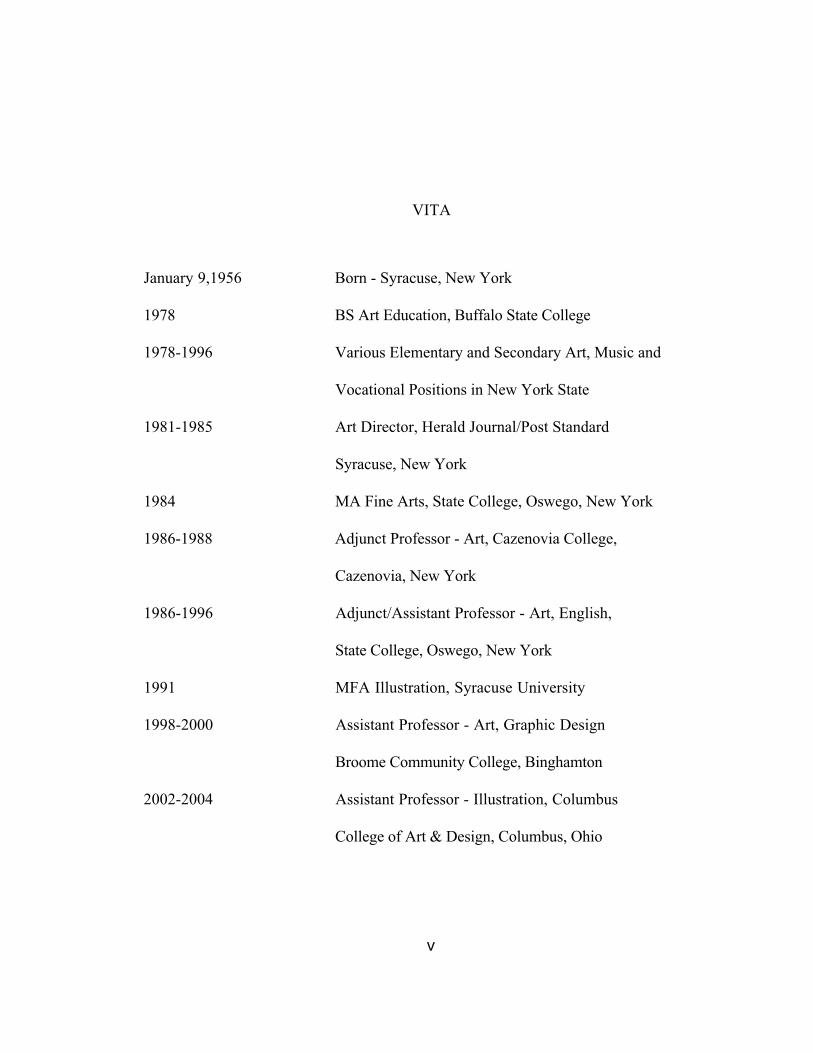
VITA
January 9,1956 Born - Syracuse, New York
1978 BS Art Education, Buffalo State College
1978-1996 Various Elementary and Secondary Art, Music and
Vocational Positions in New York State
1981-1985 Art Director, Herald Journal/Post Standard
Syracuse, New York
1984 MA Fine Arts, State College, Oswego, New York
1986-1988 Adjunct Professor - Art, Cazenovia College,
Cazenovia, New York
1986-1996 Adjunct/Assistant Professor - Art, English,
State College, Oswego, New York
1991 MFA Illustration, Syracuse University
1998-2000 Assistant Professor - Art, Graphic Design
Broome Community College, Binghamton
2002-2004 Assistant Professor - Illustration, Columbus
College of Art & Design, Columbus, Ohio

vi
2004-2005 Assistant Professor - Art Education, Ashland
University, Ashland, Ohio
2005 Assistant Professor- Bowling Green State
University, Bowling Green, Ohio
PUBLICATIONS
“Hush: A Fantasy in Verse,” Gingham Dog Press/McGraw Hill, 2003
“Mr. Basset Plays,” Boyds Mills Press, 2003
“Santa and the Three Bears,” Boyds Mills Press, 2001
"Frog Went A-Courting," Boyds Mills Press, 1998
"Wolf Plays Alone," Philomel Books, 1992
FIELDS OF STUDY
Major Field: Art Education
Minor Fields: Fine Arts/Printmaking & Drawing, Illustation,
Children’s Literature
vii
TABLE OF CONTENTS
Page
Abstract................................................................................................................... ii
Dedication ............................................................................................................... iii
Acknowledgments ................................................................................................... iv
Vita .......................................................................................................................... v
List of Tables............................................................................................................ vi
Chapters
1. Introduction ................................................................................................. 1
2. The Picturebook and the Picturebook Community ..................................... 9
3. An Historical and Ideological Overview....................................................... 45
4. Theoretical Frameworks of Analysis .......................................................... 77
5. Methodology: A Multiple Case Study ....................................................... 134
6. Case Study A: “Where the Wild Things Are”.............................................. 162
7. Case Study B: “The Polar Express” ............................................................ 237
8. Case Study C: “The Stinky Cheese Man” .................................................. 302
9. Case Study D: A Personal Journey,
“Hush: A Fantasy in Verse”…………………………………………......... 362

viii
10. A Comparison of Case Study Material ....................................................... 413
11. Implications and Directions for Further Study ........................................... 460
Appendix A Glossary of Terms .............................................................................. 491
Appendix B Awards and Lists Criteria ................................................................... 497
Appendix C Awards and Lists Matrix..................................................................... 507
Reference List .......................................................................................................... 512
Picturebook List ....................................................................................................... 551

ix
LIST OF TABLES
Table Page
1 “Where the Wild Things Are” ...................................................................... 236
2 “The Polar Express” .................................................................................... 301
3 “The Stinky Cheese Man and Other Fairly Stupid Tales” ......................... 361
4 “Hush: A Fantasy in Verse” ....................................................................... 412
5 “Comparison of Picturebook Community” ................................................ 416
6 “Camparison of Texts” ............................................................................... 425
7 “Comparison of Aesthetics” ...................................................................... 439
8 “Comparison of Social and Cultural” ......................................................... 447

x
“Whatever the pictorial turn is, then, it should be clear that it is not a
return to naive mimesis, copy or correspondence theories of representation, or
a renewed metaphysics of pictorial “presence”: it is rather a postlinguistic,
postsemiotic rediscovery of the picture as a complex interplay between visuality,
apparatus, institutions, discourse, bodies, and figurality. It is the realization
that spectatorship (the look, the gaze, the glance, the practices of observation,
surveillance, and visual pleasure) may be as deep a problem as various forms
of reading and that visual experience or “visual literacy” might not be fully
explicable on the model of textuality. Most important, it is the realization
that while the problem of pictorial representation has always been with us,
it presses inescapably now, and with unprecedented force, on every level of
culture, from the most refined philosophical speculations to the most vulgar
productions of the mass media. Traditional strategies of containment no longer
seem adequate, and the need for a global critique of visual culture seems
inescapable” (J. W. T. Mitchell, “Picture Theory,” 1994, pg. 16).

1
CHAPTER 1
INTRODUCTION
On many occasions, working as a picturebook visual artist, I’ve noticed a
difference in how I think about and perceive the visual qualities of picturebooks and how
others involved, in whatever way, think about those same qualities. Invariably, as I relish
the subtlety of an illustration, the delicacy of a particular font, or the bold design format
of a picturebook work, a review of the same piece will scarcely mention those qualities at
all, primarily focusing on the narrative structure or on the applicability to an educational
curriculum. This investigation has sought to examine how meaning is produced by these
visual qualities apart from and in relation to written representations as well as how the
visual has come to be perceived by the institution and its conventions that guide
picturebook production. Not only does this study hope to challenge these perceptions to
reveal deeper meaning within the visual but to demonstrate the potential such an
awarenesss would have on the utilization of picturebooks in the practice of visual art
education.
2
A Matter of Definitions. Because this investigation is about the visual as
separate from, and sometimes opposed to, the verbal, it is important to get the matter of
definitions out of the way from the beginning. Throughout this investigation the term
“visual text” has been used for the combined visual aspects of any work in question.
However, at times, the full visual text will be further broken down into “picture text,” the
visual material commonly referred to as illustration, those aspects of the visual that hold
concrete content, and “design text,” which includes abstract content such as page layout
and margins, type size and style, company logos and other design elements, trim size,
choice of paper, printing quality, and color and design of endpapers (for a full description
of these qualities see appendix 1: Glossary of Terms). The term “picture” has been used
for the most part instead of the term “illustration” primarily because illustration has the
connotation that it relies on written text as its primary source of meaning. Since this
investigation is concerned with how the visual qualities mean in relationship with and
beyond the written text it was felt that picture was more suitable. Illustration is used at
times when the picture text is directly being related to the written text, or in the quotes of
the various visual artists researched speaking about their work. It should also be noted
that the word “image” is, at times, used synonymously for picture or illustration. All of
3
these visual qualities mentioned above begin creatively in the minds of the artists,
illustrators, designers, art agents, and art directors who, together, tend to the more visual
aspects of the enterprise.
The term “written text” will refer to the semantic content of the words
themselves, differing from the the visual presentation of the printed material, which falls
under design text. The written text is that which is read aloud or read from the most
generic of visual presentations without the additional visual elements of a choice of
specific font, its size, the layout and how the type occupies its designated space, and
other design possibilities. The written text is the domain of authors and editors that tend
to the language aspects of the enterprise.
Lastly, all these various texts when brought together will constitute the “total
text.”
The Central Issues. Through my involvement as a picturebook visual artist, I’ve
begun to understand the complexity of the field of the picturebook as a whole. While my
primary concern as an illustrator is that of providing the picture on the page, I also attend
to the design of some of my books and also write the text of others as well. For that
reason I am aware of many of the creative aspects of the making of a picturebook. Still,
other individuals attend to an even more diverse range of qualities and activities that

4
together make up the totality of the picturebook industry. While all of these individuals
are concerned to some degree with the visual qualities of picturebooks there are
discernible differences as to the perception and understanding of these qualities. The
central issues of this study have grown out of my personal experiences relating to how
these differences directly or indirectly impact the visual qualities of picturebooks and
alter, both positively and negatively, the understanding and appreciation of those
qualities. In addition, these differences in perception and understanding impact on how
the meaning of a picturebook is understood overall. It is in regard to these issues that this
investigation will ask the following questions:
a) What are the different ways that meaning in picturebooks is
understood?
b) How have these different understandings evolved over time?
c) Why is it important to examine these different understandings?
d) What further understandings of the meaning of the visual in
picturebooks are possible?
While this study will recognize that a great many authors within the picturebook
community have attempted to discuss the role of the visual in picturebooks and that there
exists a true appreciation in the literature about the “art of the picturebook,” it
nonetheless asserts that, to date, no single theory captures the complex nature of the

5
visual qualities as found in these slim volumes to the extent seemed warranted. What then
are some of the other ways in which we could understand the visual in picturebooks?
The Theoretical Framework. Utilizing primarily a poststructural view and
relying on semiotic analysis and aesthetic analysis to discuss the meaning expressed in the
visual qualities of picturebooks, this investigation will explore three major picturebook
works created between 1960 and the present. Importantly, the theories and philosophies
that have emerged out of the ideas associated with postmodernity, such as the
poststructural frame of reference, plays a large part in this investigation’s view of the role
of the visual. Postmodernity, which questions the dominance of reason, logic, and the
existence of one essential universal meaning found in the ideals of modernism, concerns
itself more with the construction of multiple meanings based on cultural and societal
differences that manifest differently through each individual’s perceptions, experience,
and knowledge. Still, many of the conventions of the picturebook community continue to
be based on a modernist point of view. Picturebooks tend to be directed and limited by
many of the modernistic ideals that continue to play a major role in the field of education,
a discipline that leans toward the more verbal forms of representation.
Nietzsche (as found in Linn, 1996), a forerunner of postmodern ideology, stressed
that “language itself imposes a shape on the way human beings think about the world”

6
(pg. 19). Language, by its nature, brings order to the events of our lives, but, this order is
artificial, fabricated within the structure of language itself. The later linguistic theories of
Derrida, the philosophies of Wittgenstein and Gadamer along with the work of Barthes,
and Rorty provide a poststructural view of language challenging the modern notions of
truth and the supremacy of the author’s voice. Further, these writers replaced the
traditional view that the primary function of language was nomenclaturism, or the naming
of things, with the idea that language is more play or a game. In this game, meaning is not
isolated to each single word but to the play and interactions of the words that surround it.
Because the picturebook is positioned by the conventions of the picturebook community
as a book form, produced primarily for a child audience, the criteria used in its
development has been mainly concerned with the early acquisition of language of which
nomenclaturism is a large part. The understanding of the visual’s role in picturebooks has
been primarily viewed through the lens of many of these modernistic tendencies.
Most conventional theories of picturebooks stress that it is the interrelationship
or interdependence of text and image that produces meaning. Rather, I would challenge,
the text still maintains a dominant position in this relationship. In many ways, the
postmodern era turns this premise around. In the work of Mitchell we find a
poststructural view that grants the visual a predominance. Mitchell (1994) speaks of the
postmodern era as taking a “pictorial turn.”

7
“Whatever the pictorial turn is, then, it should be clear that it is
not a return to naive mimesis, copy or correspondence theories of
representation, or a renewed metaphysics of pictorial “presence”: it is
rather a postlinguistic, postsemiotic rediscovery of the picture as a
complex interplay between visuality, apparatus, institutions, discourse,
bodies, and figurality. It is the realization that spectatorship may be as deep
a problem as various forms of reading and that visual experience or “visual
literacy” might not be fully explicable on the model of textuality.” (pg. 16)
The role of the visual as to meaning in picturebooks then is not totally dependent
upon its associated text or embedded within the needs or confines of the picturebook
community. Rather, the imagery of picturebooks is part of a larger set of social, cultural,
economic, historical, and artistic practices. The account of these practices is now being
called “visual culture,” a model of investigation tracing back to the work of Panofsky and
Gombrich and made relevant to the field of art education most recently by the work of
Duncum and others. Visual culture is an inclusive model that attempts to critically look at
aspects of visual art not commonly considered for such analysis such as illustration and
design, two areas of applied art associated with the picturebook.
By recasting the picturebook as visual culture a more critical emphasis can be
placed on its visual qualities. This investigation will utilize a variety of conventions,
ideologies, theories, and philosophies, including those outlined above, to answer the four

8
basic questions first proposed in this section’s opening paragraph: 1) What are the
different ways that meaning in picturebooks is understood, 2) How have these
understandings evolved over time? 3) Why is it important to examine these different
understandings? and 4) What further understandings of the meaning of the visual in
picturebooks are possible? To further this end, Chapter Two will examine the prevailing
conventions of the picturebook and the configuration of the picturebook community,
Chapter Three will explore the history of the picturebook form, while Chapters Four and
Five will describe a variety of theoretical lens and research methodology that will aid in
the analysis of several selected case studies featured in Chapters Six through Eight. An
additional case study, Chapter Nine, will examine a picturebook of my own. A
comparison of these four case studies, Chapter Ten, and the implications such analysis
might have on the fields of Children’s Literature and Art Education, Chapter Eleven, will
complete this investigation.
It is my hope that this research might affect a transformation in the picturebook
community’s about the visual in picturebooks and impact the way picturebooks are
utilized educationally, especially by art educators. Asked more distinctly, could a deeper
analysis of these qualities change the perceptions of the picturebook community, and the
larger mass audience, as to how meaning in picturebooks is understood as well as increase
the awareness and appreciation of the roles the visual play in that meaning?

9
CHAPTER 2
THE PICTUREBOOK AND THE PICTUREBOOK COMMUNITY
To fully understand and appreciate the role of the visual in picturebooks a more
complete definition of the genre itself is needed. Two important questions impact on such
a definition: how does the publishing community and the scholarly community determine
the category of picturebook? and how does a picturebook work? Of primary concern to
this investigation and these questions is the role of the visual.
Text and Image. For the purposes of this dissertation the term “picturebook” is
inclusive of all the sub-categories found in the marketplace and in scholarly literature. The
children’s divisions of American publishing companies use the term “picturebook” to
describe a wide variety of book products that they produce, market, and distribute. As a
market category its definition is broad and includes all types of books that combine words
and pictures in a variety of ways. As a scholarly category in the fields of children’s
literature, library, and education, picturebooks are further divided into: baby books and

10
board books, which are produced for the very young; toy books, which are books with
toy parts, flaps, or tabs, among other special features; pop-up books; picture books (two
words); picture story books; and illustrated books. Baby books, board books, and toy
books are intended for an audience ranging from infancy to toddlers. The illustrations tend
to be heavily outlined, filled with flat color and are composed on the page or spread on a
white or minimally rendered ground. Text consists of one word or a simple phrase on one
page. Pop-up books feature very simple to very complex paper engineering and utilize a
wide range of text from simple words and phrases to full stories with complex characters
appealing to a wide age range. Illustrations for pop-ups can be simple, heavily outlined,
graphic representation to highly rendered and fully developed naturalistic images. Picture
books, picture story books, and illustrated books are distinguished partly by what
Nikolajeva and Scott (2000) refer to as the “quantitative ratio of text and pictures” (pg.
6). In other words, how many words are there per image. In addition, and perhaps more
importantly, these various alternative classifications of the picturebook form attempt to
identify the functions of the text and images and how they independently, or by working
congruently, create meaning. It is important to note that these definitions do vary
throughout the literature.
Most commonly in the scholarly literature, a picture book (two words) is one in
which the pictures are the dominant or sole element. Examples of picture books are
11
alphabet books, counting books and wordless books. Sutherland and Herne (as found in
Barron, 1984) makes use of the term picture story book, in which “the balance between
print and illustrations is maintained so that neither is as effective without the other” (pg.
13). Meaning is achieved by the reader continuously moving back and forth between the
text and image. Illustrated books are books that contain texts that are seemingly complete
in and of themselves. In other words the illustrations are not necessary to understand the
text in its basic form. However, the large number of distinctly illustrated versions of
familiar fairy tales attests to the fact that illustrations can and will change the meaning and
experience of even such a complete story. In addition, books designed for beginning
readers are many times also classified in the general picturebook category. Sutherland and
Herne questions such inclusion stating that in books of this sort “it seems clear that the
text is more important and can indeed stand alone, while the illustrations, engaging or
informative as they may be, function more as extensions or corroborating devices than as
entities” (Barron, pg. 13). Implied here is the notion that a picturebook is a book whose
visual qualities function in some alternative and meaningful way apart from its text while
the books they are calling beginning readers contain images that have no meaning by
themselves. I would argue that the notion that an illustration which would only function
as an extension or corroborating device denies the image its full potential to impart
meaning.

12
A more visually oriented distinction between a “story book” and a “picture book”
is utilized by author and illustrator Uri Shulevitz (1985) in “Writing with Pictures.”
Shulevitz writes:
“The difference between a story book and a picture book,
however, is far more then a matter of degree, of the amount of words
or pictures--it is a difference in concept... Picture books are “written”
with pictures as much as they are written with words. A picture book
is read to the very young child who doesn’t know how to read yet;
consequently, the child sees the pictures and hears the words directly,
without having to deal with the intermediate step of reading the
printed word. By telling a story visually, instead of through verbal
description, a picture book becomes a dramatic experience: immediate,
vivid, moving. a picture book is closer to theater and film, silent films
in particular, than to other types of books, It is a unique type of book.”
(pp. 15-16)
Regardless of this distinction presented by Shulevitz above, it is still this
investigation’s contention that all of the above categories tend to focus on the inter-
relationship between the text and image, with an emphasis on the text as the dominant
feature, rather than examining the role of the visual in any depth. In other words,
depending on the definition applied, the role of the visual is modified to fit that definition.
By combining all the categories into a more inclusive description this role becomes more
general and therefore more applicable to any application of text and image within the
broader category of picturebook.

13
As an example of this, Joanne Goodman (1990) defines five variations in this text-
image dynamic: a) Text and picture are symmetrical, b) Text depends on picture for
clarification, c) Illustration enhances, elaborates text, d) text carries primary narrative,
illustration is selective, e) Illustration carries primary narrative, text is selective. While
these distinctions suggest that there is on occasion a dominance of image in the dynamic
structure between image and text it is also understood that both text and image are
working together towards one particular meaning, that of the narrative. Goodman refers to
text and image as differing “agencies.” “Agency... refers to the means or instrument used
to accomplish the act--how the act was done” (pg. 93). She identifies narrative as the
“act” that occurs in a picturebook, the only act.
To reiterate, the questions that still remain are: how is the meaning of the visual in
picturebooks understood beyond this narrative function? and, is the meaning of the visual
in picturebooks confined only to its relationship to the text whether it be narrative or
non-narrative? Indeed supporting the narrative, if there is one, is a part of the role of the
visual, but, it should not be assumed that it is its only function. In non-narrative books
such as “mood” books or “concept” books the role of the visual is to establish the
emotional character of the work as well as provide a specific aesthetic experience
generated by the formalistic qualities of the image, the media used, or the particular
sensibilities of the artist's visual interpretation. These qualities are present in a more
14
narrative book as well but tend to be dominated by the sequential dimensions of the
story. These dimensions are associated with causal and chronological relationships
implied in the order of the images presented. In other words, as supportive of narrative,
visual story telling relies heavily on how the sequence of images is organized from the
beginning of the book to the end.
Goodman continues by quoting Mitchell as saying: “the dialectic of word and
image seems to be a constant in the fabric of signs that a culture weaves around itself
(Goodman, pg. 119).” She then goes on to say that Mitchell argues that “the history of a
culture reflects in part, a continuing struggle between pictorial and linguistic signs for
dominance,” but in conclusion she finds that “In a picturebook, however, this struggle
seems to be suspended as both word and image work together to convey meaning” (pg.
119). Implied here is the notion that in all the work that demonstrates the tension that
exists between word and image, we witness in the picturebook these divergent forms of
representation in complete harmony. Of course, the verbal and visual components of a
picturebook do work together to convey meaning. But they also manifest meaning
independently as well, readily stepping outside of any single interpretation. This
tendency relates to the deconstructive theories of Derrida (as found in Leitch, 1988, pg.
273) in which there exists the “free play” of signs and signifiers resulting in an opened
system of interpretation. The meanings of both text and image in such a poststructuralist
15
model is always deferred, unstable, and dependent on cultural systems. It would be fair to
say that the struggle between words and pictures that Mitchell describes does indeed exist
in the picturebook as it does in other forms of image/text communications and it is
perhaps the reluctance of the picturebook community, of which Goodman is a part, to
acknowledge such a struggle in favor of a more limited view of how meaning is created.
Such a reluctance oversimplifies the entire enterprise.
Trade Market and Mass Market. This investigation is primarily concerned with
commercially produced picturebooks. Although there may be some shared attributes with
those privately created, whether as a single book or as a limited edition, these occupy a
very small niche in the total production of picturebooks. Within this larger commercial
picturebook market there exists two major categories of trade and mass market. These
distinctions are based on how the books themselves are published, manufactured,
distributed and perceived by various consumers.
A trade picturebook is primarily manufactured in a hardback first edition, with
endpapers and dust jacket (for a full description of these qualities see appendix A:
Glossary of Terms). In general, trade picturebooks are printed in smaller editions, on
quality papers, and are usually of a higher manufactured quality to have a longer shelf life.
As a rule, they tend to be expensive for the consumer and sold in bookstores--the book
16
trade (Underdown, 2001, pg. 92). First edition trade picturebooks are reviewed in
professional and literary journals and are eligible for major awards in the field of children’s
literature. In the final analysis, they usually tend to be more unique and individualistic in
terms of literary and artistic style. This is to say that not only the quality of manufacture
is higher but the quality of the writing and art associated with these titles tends to be, at
least perceived as, more appealing to a better educated or wealthier consumer group.
Important to remember, however, is that as a trade publication grows in popularity and
achieves a certain longevity it will eventually be released in a mass market paperback
edition. The mass market is discussed in more detail below. It is safe to say that these
various market distinctions have more to do with the commodity structure of publishing
then with artistic intent.
Most important to this study, is the idea that these market distinctions rely
heavily on image to establish their individual identities. In other words, it is the overall
look of the product that creates its market position. The history of the distinction of
trade can be traced back to the first major American publishing houses, such as Harpers
and Scribners, that rejected what they felt were the lower qualities of writing associated
with pulp magazines in favor of work of both words and pictures they considered more
appealing to their own educated and cultured readership.

17
A mass market picturebook, as opposed to trade, is primarily produced in board
versions (pages made from rigid paper-board materials), versions printed on a lesser
quality paper with board covers and simple stitched bindings, in paperback editions, or in
similar inexpensive forms. Editions tend to be large in number, sometimes in the 100s of
thousands. In addition, there are vast numbers of mass market books produced each year.
Underdown (2001) writes “Whereas a mass market publisher of children’s books may
release more than 500 titles or more a year, trade publishers of quality children’s books
won’t even publish 50 titles in a year” (pg. 93). Mass Market picturebooks are produced
more as a dispensable commodity with each book costing less for the consumer.
Marketing of these books is through a wider range of general merchandise stores and is
aimed at the widest possible demographic of the buying public.
Mass market books many times make use of licensing structures to promote
higher sales. The 1990’s saw mass picturebook marketing moving towards a more “brand
name” association. Underdown (2001) writes that a brand name is “a name that is known
and respected and therefore likely to help sell a book and its associated merchandise as
well. He goes on to say, “Do not be quick to exclaim in horror at this phenomenon...
Lewis Carroll... licensed such products as ‘Through the Looking Glass’ biscuit tins” (pg.
49). Licensing tools include author names, character names, book titles or series, or
celebrity names. As a rule, however, mass market books are typically not reviewed in any

18
critical way, and are not normally eligible for the industry’s major awards. In addition,
they tend to be more anonymous or generic in style and individualistic artistic qualities.
Major market areas for picturebooks are schools and libraries. These markets are
primarily interested in trade titles but bound in specialized ways that provide for a longer
shelf life. It is important to note that due to the demand of their young patrons, school
and public libraries have been providing more mass market titles that have a wider appeal.
Many times these are paperback titles and are displayed in racks separate from the rest of
the collection. Along these lines, current trends in children’s book publishing are blurring
the boundaries of these markets. Underdown writes, “Lately, publishers are producing
‘high end’ mass market books which can as easily sit in a (bookstore) as in a (department
store)... At the same time, trade publishers are creating inexpensive versions of their
books, and reaching into the mass market” (pg. 94). Again, what is of interest to this
study is that the blurring of these markets occurs through a manipulation of the visual
qualities so inherent to image and the perceptions of the consuming public.
Primarily, the examination of trade picturebooks will be the focus of this study.
As discussed previously, trade titles have the distinction of being reviewed and criticized
in a formal manner through journals and related magazines and newspapers, the creators
of trade titles are the recipients of the industry’s awards and accolades, and, in general,
trade titles enjoy a more prestigious position in the picturebook community then do mass

19
market books. Because of these distinctions there is more information important to this
study written about them. Nonetheless, mass market picturebooks can provide additional
insights to a more thorough understanding of the ebb and flow of social, cultural,
economic, and historic indicators. For this reason, certain, mass market titles should and
will be discussed. Both trade picturebooks and mass market picturebooks can be seen as
both objects of commodity and of art. Trade picturebooks can be viewed more readily as
taking their place within the constructs of history and society while mass market
picturebooks tend to be more indicators of current economics and popular culture.
How Picturebooks are Perceived. For the purpose of this investigation I
identify the various individuals that concern themselves with the visual qualities of
images, pictures, designs, and illustrations as the “visual group” which includes
illustrators, designers, art agents, and art directors. Other individuals involved with
picturebooks, such as authors, editors, literary critics, educators, and librarians, taken
together in the same way, could be said to tend to the more verbal aspects of the
enterprise concerned with text and writing. These individuals will constitute a “verbal
group.” Yet another aspect, that of the picturebook’s potential as a commodity product,
is supervised by individuals tending to the areas of publishing, marketing, reviewing, and
bookselling. These individuals will constitute a “commodity group.”

20
A Culture of Reading as Opposed to a Culture of Spectatorship. Central to
this investigation of the dynamics associated with the understanding and appreciation of
picturebooks is the identification of the schism that exists between the perceptions of the
visual group and the verbal group. This schism is the result of the distinctions that have
been formed between two fundamentally different types of representation. Mitchell
(1994) refers to these distinctions as “word and image” and their distinctive perceptions
as the differences “between a culture of reading and a culture of spectatorship” (pg. 3).
This is to say that the ways in which an individual will perceive a picturebook are closely
tied to that individual’s predominant affiliation with either a culture that primarily
promotes and communicates through text or a culture that primarily promotes and
communicates through image.
Culture, in this sense, is defined in the Webster’s Ninth New Collegiate
Dictionary (1988) as: “the integrated pattern of human knowledge, belief and behavior
that depends upon (an individual’s) capacity for learning and transmitting knowledge to
succeeding generations” (pg. 314). The patterns associated with a given culture, and the
adherence of the participants engaged with it as to its conventions and practices, create
the boundaries that form distinctive groups or communities. This is not to say that these
boundaries have to be in any way fixed or rigid. Instead, as Herbert Blumer (1970)

21
observed, a (cultural) community exists by the general acknowledgement of a more general
sense of “sensitizing concepts,” as well as more specific “definitive concepts.” “A
definitive concept refers precisely to what is common to a class of objects, by the aid of a
clear definition in terms of attributes or fixed bench marks,” while “A sensitizing concept
lacks such specifications of attributes or bench marks... it gives the user a general sense of
reference and guidance in approaching empirical instances” (pg. 57-58). Thus, a culture of
either reading or spectatorship can be defined through sensitizing concepts that create a
general sense of knowledge, beliefs, and behaviors demonstrated by its participants.
The notion of a culture of spectatorship comes from the term “society of the
spectacle,” developed by Debord (1994) to describe how contemporary culture is
dominated by visual representations and how all social relations and the commodity
aspects of society are reflected by and through images. While Debord is concerned with
the “society of the spectacle” as an indication of the shift in capitalist culture from
“having to appearing,” where “Images... have become so common they not only fuse with
reality but have become reality” (Duncum, 2001, pg. 102), Mitchell, in turn, uses the term
to describe the shift away from text to images being the dominate form of communication
in contemporary postmodern societies.
For example, a picturebook illustrator, as a member of a culture of spectatorship,
may be more acutely aware of every visual aspect of the picture or illustration being

22
created and how those aspects can achieve meaning then someone more interested in the
market value of the book or in the writing of the book. These visual aspects include the
basic formalistic elements of art--color, shape, composition, line, texture, and so on, and
artistic styles, as well as the subject matter represented within the picture. In addition,
the illustration may also display the particular aesthetic sensibility of the illustrator as
well as the society, era, and economic strata the illustrator is a part of, their gender, their
race, and their educational and artistic training. An illustration, to an illustrator, is not
only about what the picture shows but how and why the picture is executed.
In contrast, a picturebook author is a member of a culture of reading. This
affiliation motivates in an author a primary interest with a picture’s content and it’s
relationship to the text they have written. What usually concerns the picturebook author
is that the illustration not distract or misdirect the reader from the author’s intended
meaning. What some authors, at times, may not realize is that the distinctive qualities of
the visual are fundamentally different from words. That rather then simply being
redundant of the verbal content or narrative structure of the text or even a visual narrative,
as is the case in a wordless book, pictures themselves, by their nature, have meaning that
go well beyond content and narrative simply because they can not be easily contained.
Mitchell (1994) quotes the philosopher Ludwig Wittgenstein in a now famous excerpt:
“A picture held us captive. And we could not get outside of it, for it lay in our language

23
and language seemed to repeat itself to us inexorably” (pg. 12). In other words, a picture
can not simply be explained by language alone. It is one of the reasons why we are
sometimes speechless in front of a work of art. It captures us and moves us in ways that
stir up words in us that we hope will express what we are experiencing but often
invariably fall short. While we can identify the subject matter of a picture we may be
unable to precisely interpret a picture. Nor, as is the case of the many pictures that
appear in sequence throughout a picturebook, we may be unable to precisely interpret a
visual narrative.
The argument that the visual images of picturebooks can not be examined
individually, each by itself, is based on this idea of sequence; that each image is part of a
series of events that are causally linked. Nodelman (1988) states that “the individual
pictures in picture books rarely possess the harmonious balance we believe ought to exist
and seek out in other forms of visual art... the pictures in picturebooks are literally
“illustrations”--images that explain or clarify words and each other” (pg. viii). But, even a
clear understanding of the function of a image within the narrative remains outside our
grasp. Acknowledging this, Nodelman (1988) quotes Roxburgh who, almost in
contradiction to Nodelman’s previous statement, writes “Narrative is the most vital
element in literature for children... Yet critical theory dealing with the narrative functions
of illustration, as distinct from narrative elements in the text, is sadly lacking” (pg. ix).

24
The most current research in the field of picturebooks has attempted to examine
how picturebooks work in terms of text and image. Nikolajeva and Scott (2001) refer to
“the complexity of the relationship between the verbal communication and the iconic
(visual) communication that picturebooks embody” (pg. 29). Referring to the process of
collaboration between an author and an illustrator (the author in the case of a picturebook
has first written a text which has been assigned by an editor or art director to an illustrator
and then, even further along in the process, to a designer), Nikolajeva and Scott state that
“the interpretation of the relationship between image and text also becomes increasingly
complex as the number of people involved in its creation increases and their collaboration
diminishes. Multiple ownership and multiple intentionality lead to ambiguity and
uncertainty in the validity of the interpretation” (pg. 29).
Indicated here is the possibility of misinterpretation in terms of the author’s
intended meaning during the creative process of visually developing a picturebook.
Keeping in mind that in the picturebook industry the text or a verbal conception of a
narrative is the first step in the process, it is implied in the Nikolajeva and Scott quote
above, that if there is ambiguity in the work as a whole, the image makers, the illustrator
and designer, have created it. This notion not only supports an assumed superior position
of the text, rendering illustration and design as simply an interpretation of something
already existing, but also supports the belief that text has a single intended meaning.
25
An Extended Culture of Reading. Not only are authors members of a culture of
reading but, logically, educators, editors, literary critics, and librarians are as well.
Interestingly however, while all of these more verbal individuals are primarily concerned
with what the words say, there are differences even within this cultural group as to the
premise of the picturebook as a whole. An author, for example, coming from a particular
cultural frame of reference, perceives a picturebook in a slightly different way than might
an educator who perceives a picturebook from a different cultural framework. Where the
author has written a good tale that she hopes will delight her readers and possibly provide
her with an income, the educator might look to the content of the story and attempt to
utilize the work in a particular aspect of his curriculum. This being said, there is however
a similarity in their perceptions of the picturebook that place the verbal, or the word, in a
more dominant position. Members of the verbal group look at the picturebook in terms of
those qualities that address the narrative aspects of the picturebook or their educational
potential in the way of subject content, reading comprehension, or literary appreciation.
For this group, the primary function of the visual is that it exists in relation to the all-
important text; that it clarifies, extends, or enhances that text.
The large schism in perception that exists between the verbal group and the visual
group effectively directs and controls the work of not only illustrators and designers but

26
art agents, and art directors as well. The visual group has been trained in the ability to
effectively discern the qualities of the visual, essentially to “read” an image through its
visual language, a skill that has been referred to by Mitchell (1980) and others as “visual
literacy,” or to what Panofsky has referred to “iconology,” the “historical study of the
logic, conventions, grammar, and poetics of imagery” (Mitchell, ed., pg. 2).
Text and Image. The fundamental difference between the verbal group and the
visual group is based on how we have historically separated the understanding and
utilization of text as different to that of image. Arnheim (as found in Mitchell 1980)
writes, “The habit of separating the intuitive from the abstractive functions, as they were
called in the Middle Ages, goes far back in our tradition” (pg. 171). The “abstractive
function” here refers to those qualities of thinking and reasoning demonstrated by
language, whereas the “intuitive function” refers to the perception of sensory experience.
Arnheim continues: “Reasoning was cognition of the higher degree: it was distinct, that is,
it could analyze things into their components. Sensory experience, on the other hand, was
cognition of the lower order: it also could be clear, but it was confused... all elements
fused and mingled together in an indivisible whole” (pg. 171). To refute this superior
position of language over sensory input, which includes the visual as perceived by the
sense of sight, Arnheim argues that while indeed one will at first “take in” visual

27
information, what he refers to as the “intuitive mode” of seeing,” that there immediately
takes place a structuring of that information through a more “intellectual mode” of seeing.
In other words, the understanding of an image, like text, requires a discernment and
ordering of the individual characteristics of that image. Because an image holds a
completely different set of characteristics than does text, it can be argued that to
completely understand an image you must go outside or beyond those characteristics
most associated with language text.
Rather than looking at an image for what it shows alone, an image demands to be
understood by how it reveals what can not be seen as well. Mitchell (1986) writes “the
pictorial artist... is as much concerned with the invisible as the visible world... One thing
that cannot be seen in an illusionistic picture, or which tends to conceal itself, is precisely
its own artificiality” (pg. 39). To clarify this statement, the author reminds us of the
painter’s claim to present the viewer with “more than meets the eye.” For the illustrator
or designer both functioning as visual artists, an image is only partly understood as part
of the narrative or as a literal depiction of content. There is what exists beyond the
content that is of importance as well. This, of course, can be equally said of text as well
and while this sentiment may not be a conscious concern of any artist or author it is
nonetheless an integral part of the very nature of art itself.

28
Miller (1992) writes of the philosopher Heidegger’s adoption of the Greek word
“aletheia,” or revelation: “Aletheia is... bringing the truth into the open.” Miller continues:
“Such illumination is, for Heidegger, the basic function of the work of art, whether the
work is graphic, architectural, verbal, or a product of craftsmanship...” (pg. 79). However,
visual art brings out such truth in a manner different from that of language. Miller (1992),
in relation to Heidegger’s analysis of Van Gogh’s painting “Old Shoes” (1886), writes
that painting “...is not something that depends on language or on speaking as such, though
it is a form of speaking. It is mute speech, not something that can be duplicated in words”
(pg.81). Is this “mute speech” Miller refers to essentially the internal dialogue that would
occur during Arnheim’s “intellectual mode of seeing?” Clearly, as visual images, the
illustrations and designs of picturebook, like Van Gogh’s shoes, require a far deeper
analysis than simply that of content and narrative.
Natural Signs and Conventional Signs. In relation to the differences between
verbal and visual forms of representation, Mitchell (1986) writes, “The most ancient and
influential figure of the difference between images and words is unquestionably the
distinction between “natural” and “conventional” signs (pg. 75). As a natural sign the
image is seen as “something biological, objective, and universal,” whereas a conventional
sign system renders words as “something social, cultural, and local or regional” (pg. 77).

29
While such distinctions have their roots in the writings of Plato, Mitchell argues they can
inadvertently create a “relative superiority of sign types” (pg. 78).
“Thus, when the conventionality of language is invoked to make
a case for its superiority to imagery, the arbitrary sign becomes a token of
our freedom from and superiority to nature; it signifies spiritual, mental things,
in contrast to images which can only represent visible, material objects; it is
capable of articulating complex ideas, stating propositions, telling lies, expressing
logical relations, whereas images can only show us something in a mute display...
the notion that images are “natural signs,” then, can be used to their disadvantage
by construing “nature” as a lower region of brute necessity, inarticulate instinct,
and irrationality.” (pp. 78-79)
Mitchell quickly demonstrates that the same reasoning can reveal the image as superior.
“The naturalness of the image makes it a universal means of communication that provides
a direct, unmediated, and accurate representation of things, rather than an indirect,
unreliable report about things” (pg. 79), such as the legal distinction between hearsay and
eyewitness accounts or between crime photos and verbal accounts.
In argument against the opposition of text and image as being simply the
differences between natural and conventional sign systems, Mitchell turns to the work of
Gombrich who wrestled repeatedly with the notion. Mitchell writes that in “Art and
Illusion” (1956), Gombrich “argued that pictorial representation is not simply a matter of
copying what we see, but is a complex process involving stylized “schemata,” a
vocabulary of conventional forms...” (Mitchell, 1986, pg. 80). This is the basis of

30
iconology, the study of images in reference to their metaphorical, symbolic, and allegorical
tendencies. While the notion of picturebook images being natural signs seems best suited
to the aspects of content and narrative associated with books for children, such an idea
limits the visual. As conventional signs, illustrations and design elements begin to imply a
far richer vocabulary thus raising the following questions important to this investigation:
1) what are the conventions of the visual qualities of the picturebook, and 2) how does
one “read” them. Treating the visual in picturebooks as a conventional sign system
changes its role dramatically. Primarily viewed now as handmaiden to the text in current
literature, the visual would then become an equal, divergent, and independent system of
meaning within the expressive form of the picturebook.
The Commodity Group. Once the book is created, a third group, the commodity
group, which consists of those concerned with the picturebook as a marketable product,
perceives the visual in yet other way. This group includes the larger institutions of
publishing itself, the marketing division of publishing, the reviewing process, and the
booksellers. A recent article by Daniel Hade (2002) points to the growing application of
“brand” name recognition and integrated marketing that is dramatically changing the
bottom-line of children’s publishing. Hade reports that eight corporate media giants now
dominate the field. These eight corporations produced 75% of the children’s books

31
(picturebooks being a large percentage) which received starred reviews in 2000. The
starred reviews indicated what the reviewing mechanism perceived as the best of the new
books. These books then tended to dominate both institutional and bookstore sales. The
new corporate structure has shifted the expected profit margins of children’s books from
four percent to an anticipated 15%. Coupled with the movement towards larger bookstore
super chains, these trends have resulted in a visual explosion of name brand characters
leaping off the pages of picturebooks and landing on a wide range of consumer products.
While this scenario is the most recent manifestation of the commodity structure of the
picturebook, the book as product has a lengthy history. For this group, the visual
becomes the main focus in advertising and marketing campaigns aimed at increased sales.
The Picturebook Community. All of the individuals in these three divergent
groups of either visual, verbal, or commodity, if taken together, would constitute what
could be called the picturebook community. This community becomes the center for the
development of the conventions and established set of rules and practices that define
what a picturebook is, should be, or could be. Of major issue in this dissertation is that
these conventions are dominated most frequently by either the verbal component of the
community or, and this is becoming more and more true in the last decade, by the
commodity aspects of the community.

32
There is a sense that the visual aspects of the picturebook remain under-
appreciated in their own right and understood, or misunderstood, only by and through
their relationship to the text or their potential as a market commodity. In other words,
images in picturebooks are not addressed in a manner that is significant to their nature,
due, in part, to the positions of power given to both language and capital over that of the
image. This study will need to determine the conventions and rules established and
maintained by the picturebook community that reinforce these subordinate roles of the
visual in picturebooks. To identify these conventions I reviewed writers whose works are
pertinent to the areas of: children’s literature and the writing and illustrating of children’s
books, educational practices involving literature and the picturebook, and American
publishing and the history of the book and the book market.
Conventions of the Picturebook Community. Writers such as Lane (1971) and
Hamilton (1973) provide an overview of the field of children’s literature prior to the
1970s. Important to this study are the attitudes and beliefs inherent to the field that have
historically shaped the role of the visual in picturebooks. The picturebook is included in
the area of children’s literature due to its conventional functions of providing educational
material or entertainment primarily to a younger audience. However, many contemporary
picturebooks dramatically push against this conventional boundary especially through

33
imagery demanding the attention of all ages. Hunt (1990) writes of the development of
criticism in children’s literature while in Hazard (1965) we find a strong case defending
the right of children to have their own literature. Both these volumes help to reveal the
conventions that surround children’s literature in general and the picturebook specifically
as they have gained the respect of critics and scholars as an important art form deserving
of a more thorough examination. In addition, Colby (1967), demonstrates clearly the
conventions that continue to still shape the creation of books for children throughout the
last 35 years.
A variety of authors have written about the picturebook and its workings. Among
them are Nodelman (1988), Stewig (1995), Mallan (1999), and most recently, Nikolajeva
and Scott (2001) who examine the dynamic structure of the picturebook as a blended
object of text and image. Of importance is to place the picturebook in an historic context.
Bader (1976) and Whalley and Chester (1988) provide an historical overview of
illustration for children’s books and picturebook in America since the 1800s while Bland
(1969) provides the larger history of book illustration in general. In addition, over the past
four decades interest in the picturebook as an art object has slowly developed. Writers as
early as Klemin (1966) began to write critically of the illustrations in picturebooks.
Schwarcz and Schwarcz (1991), and Marantz and Marantz (1992) are the most current
advocates for the appreciation of picturebooks as objects of artistic integrity. Other than

34
Marantz et. al., these authors primarily come from the field of children’s literature and
have a particular set of attitudes and beliefs that help to shape their writings. Pitz (1963)
and Shulevitz (1985) are two of the few illustrators who have written about the art of the
picturebook.
Much of the conventional ideology that surrounds the utilization of picturebooks
comes from the field of education. Benedict and Carlisle (1992) and Kiefer (1995) are
among the many writers who describe a variety of ways to introduce and make use of the
picturebook in the classroom. While most of the guides like these talk about a book’s
potential connection to reading readiness or curriculum content, Marantz (1992) is more
of an introduction for teachers, librarians, and parents to the sharing of the visual
experiences as found in picturebooks with young people. The author (1992) writes,
“Every school and public library... is a treasure house of small works of art--picture
books” (pg. v).
In addition to how the picturebook is utilized in the classroom, the theories of
education and childhood have underscored the development of children’s literature and
thus directed to a great degree the conventions of the picturebook community and the
picturebook. Writers such as Field (1892), Mayer (1973), Cleverley and Phillips (1986),
and Baker (2001) provide an overview of how our perceptions of childhood have changed
historically and how that perception has impacted the development of education in
35
general. As educational practices evolved so did the requirements for books. Because
picturebooks are, and have been, a part of the educational atmosphere it is important to
identify those conventions that come from those needs as distinct from other conventions
that direct their visual qualities.
Lastly, the conventions of the book itself and the commodity structure that
surrounds its production and distribution are of importance. Writers such as Febvre and
Martin (1976), and Graham and Abel (1996) provide the history of the book and its
influence on social and economic structures in western Europe and America since the mid
15th century to the present. Important to this study is how the conventions of the book
itself in turn shaped the conventions by which the visual in picturebooks is directed and
maintained.
All of these ideologies, the systematic body of concepts represented in the
literature reviewed above, contribute to the conventions that drive the picturebook
community. By identifying these conventions and examining the theories and
philosophies that give them substance and relevance one can better understand how the
role of the visual in picturebooks has been established and how it is maintained. My
hypothesis is that these conventions most often address the role of the visual as having to
do with: 1) the visual’s function as part of the picturebook’s narrative structure, or how
the story is being told, 2) the visual’s appropriateness for, or application to, a child

36
audience, and 3) the visual’s content in terms of its sociological, educational, or economic
value. The question then becomes: how can we further a discussion of the visual beyond
this particular discourse--the discourse that is most commonly understood by the
picturebook community.
The Awards. To appreciate how the picturebook community perpetuates their
ideals and standards of the picturebook form, a look at some of the major awards given by
the community is necessary. Since 1969 the Children’s Book Council (1996; 2003) has
compiled the winners of all of the awards and “best” lists associated with children’s
books of which picturebooks appear as a category. Awards and “best” lists are given by a
variety of organization each defining a successful picturebook according to its particular
understanding of the form. For example, if an organization is primarily associated with
school libraries and the needs of school librarians, their criteria for selecting successful
picturebooks, by necessity, would be different for organizations interested in
picturebooks as critical additions to culture either as literature or art. However, many of
the organizations giving awards have very few formal criteria that help to determine their
top choices.
It is important to note that all of the selected winners and “best” books are chosen
by small panels of individuals and, in theory, those individuals are representative of, and

37
endorsed by, the larger segments of the picturebook community involved. In other words,
such awards and lists would theoretically indicate a larger group’s understandings and
perceptions of what a picturebook is and what it should be. The particular exercise of
cross checking listings of this nature reveals qualities of recognition, social significance
(what are the prevailing social needs of the times), and perhaps an artist’s stature, but
does little in the long run to reveal the understandings of the visual qualities of the
picturebook as they exist throughout the picturebook community. Such contradictions as
they exist among the groups involved with picturebooks are similar to the contradictions
found in many branches of the social sciences and the arts where the variants are so wide
and the literature on a topic is so extensive that any trends are obscured with an
overwhelming collection of material. As noted before, all of these awards and lists are, in
the final analysis, very subjective and ebb and flow according to the tastes of the unique
individuals that make up each panel. Each of the panels making the choices of titles
changes each year so that even if criteria were to exists, there are still no hard and fast
rules that each panelist might be forced to adhere to, thus allowing for personal biases and
philosophical differences within the selection process. While the following awards and
“best” lists are flawed to a great degree, they are still the best indicators of what has been
considered the best picturebooks published, and for this reason were utilized to determine
which picturebooks would later serve as case studies for this investigation.

38
The Boston Globe/Horn Book Award. The Horn Book Award, while it
continues the traditions established in the beginning years of the publication, has no
written criteria. Marketing and circulation assistant for Horn Book, Marika Hoe, when
asked through personal communications about how the Horn Book goes about choosing
their top winners, wrote: “You ask a tricky question! The Boston Globe-Horn Book
judges don't have a specific list of criteria to use when examining a picture book (or any
book for that matter). Each book is judged by its own individual merit” (personal
communications, Tuesday, February 17, 2004). Established in 1924 by Bertha Mahoney
to “blow the horn for fine books for boys and girls” (as found in The Horn Book, Inc.,
2003”), The Horn Book Magazine continues to reflect the editorial direction first
established by Mahoney and some of its early contributors, such as Louise Seaman
Bechtel, May Massey, Alice Jordan, and Anne Carroll Moore. While the magazine is
dedicated “to remain sensitive to the fluctuations in the world of children’s books... (it) is
still blowing the horn for the finest books for boys and girls” (The Horn Book, Inc., 2003,
history, pg. 3). The award seems to have always reflected this dedication, choosing a
winner and several honor books for their overall excellence as children’s literature and not
solely for their artistic merit alone. However, with no formal criteria, the award remains

39
subjective and more a reflection of the editorial stance of the Horn Book itself. The Horn
Book Award for Picturebooks was first given in 1967. From 1960 (the start of this study)
to 1966 the Horn Book Fanfare honor list was cross referenced.
The American Library Association’s Caldecott Award. In contrast, the
Caldecott award has formal criteria that informs the committee’s decisions. Given
annually by the American Library Association (ALA), the award winners are chosen for
“Excellence of execution in the artistic technique employed (and) (e)xcellence of pictorial
interpretation of story, theme, or concept; of appropriateness of style of illustration to
the story, theme or concept; of delineation of plot, theme, characters, setting mood or
information through the pictures” (American Library Association, 2001, Caldecott award:
Terms and criteria). Established in 1938 to honor the visual artists involved in the making
of picturebooks, the Caldecott still considers the major criteria of a picturebook that of its
appropriateness to children. The Caldecott Medal is given to the most outstanding
example while the Honor awards are close runner-ups. There can be multiple Honor
award winners
The Society of Illustrators’ Original Art Show. “The Original Art” show, now
held annually at the Society of Illustrators in New York City since 1992, first featured

40
original work from picturebooks along side the book itself at the Eagle Gallery in 1980.
Again, while there exist no formal criteria, Dilys Evans, the founder of the show, writes in
the show catalog for the most recent exhibition:
“In 1980 ‘The Fine Art of Children’s Book Illustration’ was
not a familiar term in the world of children’s books publishing, but
happily today it seems almost commonplace. In picture books it all
begins with a story or an idea in search of the perfect visual
interpretation. At its highest level, this visual partnership becomes
a ‘Fine Art’ where words and pictures are one in complete harmony”
(Society of Illustrators, 2002, pg. 2).
What is clear is that “The Original Art” show is dedicated to promoting picturebooks as a
fine art form and is unique amongst the awards given.
“The Original Art” show begs the question however, is it the picturebook as a
whole or the visual qualities that take center stage? The single individual receiving both
the Caldecott and the Society awards is the illustrator, that artist who provides the
picture text of the book. But, what of the designer of the book, the author of the story “it
all begins with,” and the editor that brought the book all together? The official listing of
Gold and Silver Medal winners names the illustrator, publisher, art director and editor,
with no reference to an author. The winning work reflects more the cultural and aesthetic
trends of the world of illustration, as perceived by the Society, then other awards might
and, in addition, seems to pay less attention to the criteria of appropriateness to children.

41
Also, the Society of Illustrators announces it’s award winners for the year in
December, around the same time as the New York Times Best Illustrated list is published.
Interestingly, not a single title matched in these two categories since 1992. Indeed, only
four titles that won at the Society received any other accolades: “Alphabet City,” by
Stephen T. Johnson, was given a silver medal by the Society as well as receiving an
Caldecott Honor medal and a place on the New York Times list; “John Henry,” illustrated
by Jerry Pinkney, and written by Julius Lester, was a Horn Book Winner and Caldecott
Honor as well as receiving the gold from the Society; “Dance,” photo-illustrated by Susan
Kuklin and written by Kuklin and Bill T. Jones (who also was the subject of the photos,
received a silver from the Society and a Horn Book Honor; and “Komodo,” by Peter Sis,
was the recipient of a Horn Book Honor and a Gold Medal from the Society.
The New York Times Best Illustrated Children’s Book List. The New York
Times “Best Illustrated Children’s Books of the Year” list was first published in 1952.
The list is produced in the calendar year of the publications and therefore is one of the
first critical responses available preempting the other awards listed above except the
Society of Illustrators Original Art Show. The Times list does not differentiate between
picturebooks and other books that feature illustrations, such as what might be called
illustrated storybooks. While it is maintained in the literature that illustrated story books

42
can be understood through the text alone, and that the illustrations extend or enhance
meaning or act as visual decoration, I have observed illustration in books of this nature,
shape the understanding of the text and direct the respondent in ways more associated
with picturebooks. For this reason I feel the New York Times list is appropriate to this
study. Once again, however, when queried as to how the list is selected there was a
notable absence of objective criteria. Eden Ross Lipson, the editor in charge of the list,
wrote:
“The New York Times Best Illustrated Children's Book award is the
least defined of all the prizes I know about. We ask a panel of three judges:
always a librarian, a critic and an artist. The artist is usually a previous winner.
There are no rules about what kind of illustration, how much illustration, the
nationality of the artist, or even that the book be published by a specifically
children's trade house” (personal communication Thursday, Feb. 12, 2004).
Lipson qualifies the Times philosophy further in an article about the newspaper’s annual
listing:
“Over the years, the process has remained essentially the same, three
judges, a large number of books culled from an even larger number (we now
receive as many as 5,000 children's books a year), a day long deliberation. The list
has evolved to 10 books, and the notion of ranking them disappeared decades ago.
The modern jury always includes a librarian who works with books and children
and has a sense of what happens when stories are read aloud; a critic with broad
experience and a practiced eye; and an artist, usually a winner in a previous year.
The judges' task is very loosely defined. They are not limited to any
particular kinds of art, nor are they asked to evaluate the text, if there is one.
There's no requirement that the artist live in this country (as there is for the

43
Caldecott Medal, for example, which is given by the American Library
Association), or even that he or she be alive; a number of artists have been
honored posthumously” (November 17, section 7, pg. 36).
IBBY, an International Award. Lastly, The International Board of Books for
Young People (IBBY) was also crossed checked with the other awards and lists above.
The IBBY Honor List has been announced every two years since 1956 and represents a
world view in children’s literature.
“At the present time, each National Section of IBBY selects two
books (one for the text and on for the illustration), published in a given
period... Important considerations in selecting the Honor List titles are that
the books chosen be representative of the best in children’s literature from
each country, and that the books are recommended as suitable for publication
throughout the world, thus furthering the IBBY objective of encouraging world
understanding through children’s literature” (Children’s Books: Awards and
Prizes, Children’s Book Council, 1996, pg. 375).
The IBBY Honor List selection process makes use of “a reliable professional
cross-section of knowledge and experience with children's books published in this nation,”
and is dedicated to excellence in all three of the categories awarded. Ginny Moore Kruse
of the International Reading Association (IRA) writes:
“Please keep in mind that the Honour Illustrator must be selected
because of a work of artistic excellence. The skill of the artist in creating

44
an aesthetic, unified whole is what matters enormously in determining
this particular honor” (personal communications, Friday, March 5, 2004).
Such a statement as above begs the questions: what is excellence? and how does one judge
an “aesthetic unified whole.”
In Conclusion. The picturebook is defined and idealized within the context of the
picturebook community which is made up of verbal, visual, and commodity subgroups
that bring differing sensibilities to the processes of creation, evaluation, and distribution.
The picturebook is a manifestation of popular culture and as such has relevance
historically, socially, culturally, and economically. The picturebooks that achieve status
through awards and “best” lists can be considered those works that best define the genre
within the confines of the picturebook community. For this reason, the group of awards
and lists discribed above were utilized to choose the picturebooks that will serve as case
studies later in this investigation.

45
CHAPTER 3
AN HISTORICAL AND IDEOLOGICAL OVERVIEW
Most important to this investigation, and its primary source of examples, will be
the picturebooks of American publishers that were produced, marketed, and distributed
between 1960 and 2002. This era marks a shift in picturebooks towards a more visual
quality and is consistent with theoretical shifts towards postmodernity. However, to
fully understand the picturebook industry as a whole, and the entailing community that
informs it’s production, I will need to more thoroughly examine the field itself, and a
variety of related areas, both historically and theoretically. These related areas, that have
shaped, and continue to shape, the ideas and conventions of the visual, verbal, and
commodity groups of the picturebook community, include: 1) the form, utilization, and
aesthetics of the book, 2) the subsequent changes in the fields of the graphic arts (design,
typography, and illustration) associated with the development of the printing industry
and, 3) the resulting schism between the graphic arts and the fine arts, 4) the growing
commodification of books, 5) the historic development of public education, 6) the

46
changing idea of childhood brought about by new philosophical directives of the
Reformation and the industrial revolution, and 7) the development of children’s literature.
American Picturebooks and European Traditions. While a case could be made
that contemporary American picturebooks, especially in the trade market, demonstrate a
diverse and seemingly global perspective, the theories that impact most critically on their
nature, purpose, interpretation, and aesthetics, are deeply rooted in European intellectual,
artistic, and philosophical developments. To understand more fully how the current
ideologies of the picturebook community, the thinking that informs the notion of a
picturebook in general and the role of its visual qualities specifically, developed and are
maintained, this study will need to trace a variety of these developments in various
related fields.
For example, the invention of the printing press by Johannes Gutenberg in the
mid-15th century can be seen as a bench mark in a milieu of social change that ultimately
redefines the theoretical and philosophical fabric of Western thinking. What led up to the
invention of the printing press? How did the printing press alter the perception of the
book? How did the book, in turn, alter the ideologies of education? And finally, in what
ways do these ideas and perceptions inform the role of the visual in picturebooks. This
47
role, as addressed by the current picturebook community, conforms more or less to the
roles first assigned to the visual reaching back even before Gutenberg to the book’s first
Western European inception.
In the hand production of books prior to the printing press the roles of the visual
were primarily to decorate and illuminate the text. The codex, or paged, bound book most
resembling our present day book form, was invented some time during the second century
A.D. By the seventh century A.D. the Roman Catholic Church produced the vast
majority of books which were primarily written in religious houses (Blands, 1969, pg.
40). The purpose of these books was to regulate the teaching of Christian doctrine. The
hand painted illuminations provided a visual rendition of the text to aid in the teaching of
the illiterate masses. While each book was a distinctive expression of artistic achievement
its intrinsic function was clearly outside of aesthetic concerns.
With the development of the printing press in mid-15th century Europe, we see
the beginnings of mass produced books first made possible by the development of
movable type. The development of the Gutenberg press took place in an atmosphere of
huge social change. Trade routes reaching into the east were bringing new ideas to Europe.
Strong developing central monarchies encouraged new commerce and industry. Continued
exploration brought the arrival of Europeans to the Americas. In addition, the
Reformation of the 16th century challenged the domination of the Roman Catholic

48
Church, opening the possibility for new intellectual freedom and the growth of the
individual (Russell, 2001, pg. 5). These social changes during the 15th and 16th centuries
promoted the need for a more literate populace, hence the need for more mass produced
literary material. This new commodity of books rose amidst conflicts and power struggles
between the new landed nobility and the trade guilds, shaping the economic disposition of
an emerging publishing industry. The publishing, marketing, and sales of books remains
the major enterprise of the commodity group as defined by this study. (Meggs, 1998, pp.
61-64). It then follows that these factors, as outlined above, continue to inform and
impact our present view of what a book is, why it exists, what form it should take, and
how it functions. Because a picturebook is of like form, the conventions and assumptions
that shape the book also shape the picturebook.
Public Education and the Emergence of Childhood. In a similar fashion to the
development of printing as commerce and power, the development of the picturebook as
a definitive form runs parallel with the development of public education and the notions
of childhood. Most histories of the picturebook begin with the publication of “Orbis
sensualium pictus,” in 1658 by Bishop Comenius. Selma Lanes (1971), in “Down the
Rabbit Hole,” quotes Comenius: “Pictures are the most intelligible books children can
look upon,” (pg. 45). “Orbis sensualium pictus,” was basically a Latin textbook, teaching

49
vocabulary by accompanying the Latin text with visual depictions of the same material.
Lanes state, “publishers, authors and artists have adhered to his dictum both faithfully
and profitably,” (pg. 45). One can surmise from this that the profits in publishing for
children were to be found in their educational value. Thus, an early coalition was formed
between the educational community and the publishing community in regards to books
for children. Prior to “Orbis sensualium pictus,” printers such as William Caxton
produced many instructional books facilitating the learning of Greek and Latin. “Aesop’s
Fables” (1483) is just one example (Colon, 2001, pg. 287).
In addition, the Protestant Reformation placed more emphasis on the literacy of
the common man. Educational theorists such as Desiderius Erasmus placed great
importance on books to cultivate strong moral principles. As Europe moved into the Age
of Reason one can see the beginnings of the theoretical and philosophical roots of our
current educational system. The “emergence of the common man,” (Johnson, et. al., 1977,
pg. 287) is facilitated by the coalition between the publishing houses and new public
education ideologies. With growing literacy however, there was less and less of a need for
pictures to help communicate text to the general public. But, pictures, being a means of
communication with the preliterate child, then became the hallmark for publishing trends
directed to children as a ready market. In 1872, printer and publisher, Edmund Evans
developed new technology to reproduce color art economically and in quantity. Artists

50
destined to be the first artists of note in the picturebook field, Walter Crane, Randolph
Caldecott, and Kate Greenaway, provided Evans with ample materials which, as Lanes
(1971) states “was best suited to books for the nursery,” (pg. 45). The question remains,
what qualities made the work of these artists best suited to children? Or, is it simply the
attachment of their work to a commodity that was now not only educational but
profitable?
The English traditions of picturebooks as expressed in the works of Crane,
Caldecott and Greenaway form the aesthetic well from which contemporary American
picturebooks spring. Barbara Bader, in “American Picturebooks from Noah’s Ark to the
Beast Within” (1976), speaks of their work in this manner: “But a curious thing happened
to picturebooks towards the end of the nineteenth century: they became artistic. In
England (Evans) printed the books (of Crane, Caldecott, and Greenaway) in color from
woodblocks and printed them beautifully... creating a new market for picturebooks
altogether” (pg. 3). There are several implication in Bader's words. If picturebooks became
artistic in the late 1800s, what were they before that time? If picturebooks are for
children, is Bader then surprised that their visual qualities could be considered artistic?
Bader states “Though color was the key, under Evans' guidance the books were designed
as a unit from cover to cover and illustrated with an eye to the means of reproduction,
simply and direct, in pure, flat colors” (pg. 3).

51
For me, Bader’s observations are indicative of the conventional notion of
picturebooks; that their history, rooted in the history of books and printing technology
does not somehow have an artistic or aesthetic distinction, or, that the visual work in
books prior to Evans is somehow outside of the art world proper. While there is an
acknowledgement by Bader of artistic intent in the work being done after Crane,
Caldecott, and Greenaway, such a statement, small as it may seem, denies an artistic
heritage that not only can be witnessed in the history of graphic design and illustration,
but also in the art history of the western world as well.
Even with the appreciation of the English tradition, the early years of book
publishing for children in America was also shaped by the attitudes of prominent
librarians who were interested in creating children’s collections to invite a younger
audience to participate in the developing American library system. One such librarian
was Anne Carroll Moore who Bader (1976) determines as being critically influential in the
visual look of picturebooks in the early 1900s. As an example, Bader notes that Moore
rejected the work of W. W. Denslow, who drew with a thick graphic line and rendered in
flat color, favoring the more naturalistic approached as demonstrated by the work of L.
Leslie Brooks. “The sway of the naturalistic aesthetic is the only possible explanation,
the equation of artistic quality with the faithful representation of nature, and the
consequent dismissal of anything else as ‘primitive’ or ‘degenerate’” (pg. 7).

52
Both the institutions of public education and libraries are, and continue to be,
indicative of the larger prevailing ideals and attitudes of American society. The early years
of the American picturebook, as seen within the context of the social history of the early
20th century, reveals a conservative aesthetic sensibility that shaped that era’s popular
forms of art. The dynamic of society’s tastes and interests shaping the texts and images
of mass media, of which the picturebook is a part, still dominates our current picturebook
market.
Seeking a Benchmark for Success; the Caldecott Medal. It is in the early
20th century’s historic milieu of educational reform, industrial and technological growth,
and public library expansion, not to mention an inflated post WWI economy, that the
American picturebook came to be most realized. Most of the picturebook community’s
literature points to the 1928 publication of Wanda Gag’s “Millions of Cats,” as the
distinctive edition that marks the beginning of the modern American picturebook (Bader,
1976, pg. 33). Ten years later, the American Library Association (ALA), an organization
that, through its capital, exerted (and still exerts) a great amount of influence on book
publishing in America, created the Caldecott Medal and established their criteria for
excellence in the visual qualities (primarily those of illustration) of American
picturebooks. The Caldecott Medal was initiated to honor the visual artist similar to the

53
Newberry Medal, established in 1922, that honored the most distinguished authors of
young adult literature. The complete terms and conditions of the Caldecott Medal can be
found in Appendix B of this proposal. The most critical of the criteria for the award are:
1) the mastery in the execution of artistic technique, 2) pictorial execution of narrative,
and 3) the recognition of a child audience (defined as up to 14 years of age). These criteria
have remained virtually unchanged since the award was first given to “Animals of the
Bible,” illustrated by Dorothy P. Lathrop in 1938. These criteria raise certain questions
that are critically important to this investigation: How is the mastery of artistic
techniques determined and by whom? If the award is for visual art why is a major criteria
that of adherence to narrative structure? And, lastly, how is a picture judged as being in
recognition of a child audience? Inherent to the Caldecott Medal is the ambiguity that
surrounds giving an award of excellence only to the visual aspects of a picturebook. In
many ways, this award underscores the tensions that exist in the picturebook form.
Since the inception of the Caldecott Award, there has been tremendous growth in
the field of picturebooks. The tensions that I perceive existing in the picturebook
community stem from the limitations ascribed to their visual qualities that can be traced
back to: the development of the book, the commodification of knowledge and the
development of mass printing, the changes in educational philosophy brought about by

54
the evolving notions of childhood, as well as a myriad of other socioeconomic and cultural
factors occurring in Western Europe and, subsequently, in the United States.
Publishing the American Picturebook. In her book, “The Potential of
Picturebooks,” Barbara. Z. Keifer (1995) makes the argument that the picturebook, as it
has been understood throughout the 20th century and as it continues to be understood
now, has been the “province of young children” (pg. 70). The marketing of picturebooks
as a commodity has been aimed at teachers, librarians, and parents that are buying for
these children. However, Keifer is quick to point out that even though these adults tend
to shelves picturebooks in the “easy reading” section of the library, and older children
refer to them as “baby books,” “modern picturebooks are intellectually and visually
sophisticated and may demand a range of experience and developmental understandings
that are beyond many young children” (pg. 70). This statement reflects a disparity within
the picturebook community as to how a picturebook is understood. Are picturebooks
only for young children? If modern picturebooks demand an intelligence and visual
sophistication beyond the abilities of young children, then who are they for, and what is
their purpose? And, how has that purpose gradually developed historically?
Important to this investigation is the tracing of historical and cultural trends that
eventually led to the development of the picturebook in America. A variety of questions

55
will be addressed in this inquiry including: 1) what factors, socially and economically have
impacted along the way on the book itself, literature for children, and finally the
picturebook as we know it today, defining their content, form and audience? 2) how have
the attitudes and beliefs of the various diverse members of the picturebook community
today shaped the understanding of what a picturebook is? 3) are there identifiable trends
as to the creative sources of picturebooks; who has wanted to write and illustrate them
and why? 4) how has technology enhanced the development of picturebooks? 5) how has
the publishing industry, social institutions, and government initiatives impacted on
picturebooks? 6) has the market and audience for picturebooks changed in relation to the
socio-cultural dynamics that surround them? and 7) do picturebooks indeed reflect the
times in which they are created? A brief history prior to the 20th century will set the
stage for a more thorough examination of the development of the contemporary
picturebook starting with the creation of the first juvenile department of any American
publisher, indeed, the first in the world, that of Macmillian’s in 1919 (Bader, 1976).
An exploration of this sort is useful in determining how we have come to
understand picturebooks, as well as reveal the areas of future research necessary to
further that understanding. It is my opinion that any disparities that may exist in our
understanding are those between attempting to hold picturebooks to conventional
functions or allowing the form to be more responsive to socio-cultural change.

56
The Early Forms of Word/Picture Communications. To understand the
picturebook more fully it is necessary to trace its functionality back to its origins.
Picturebooks are a form of visual/verbal communications, the same sort of
communications that we find as far back in human experience as aboriginal rock paintings
and cave paintings (Kiefer, 1995; Meggs, 1998). Keifer (1995) suggests that even the
earliest forms of visual/verbal, or text/image, communications were the result of three
predominate factors: the technologies that were available, the need for the culture to be
passed down and survive, and the social structure prevalent at the time. Relating
picturebooks to these factors, Keifer writes “these technological, cultural, and social
underpinnings provide the basis throughout history for the individual’s response to image
and ideas now found in picturebooks” (pg.71). In other words, the way we understand
picturebooks today is directly related to their connections to cultural heritage,
technological advancement, and social trends.
Sumerian clay tablets and Egyptian hierogyphs, first carved in stone and later
written on papyrus, are other early examples of such visual/verbal communications. All of
these early forms were primarily concerned with the passing on of ritual and beliefs. The
first secular forms of communications were scroll books first developed by the Greeks

57
beginning around 500 B.C. These combined pictures with writing to share a wide range of
stories, such as animal fables, satire, and instruction on subjects ranging from magic to
astronomy.
The Romans are also responsible for the invention of the codex developed in the
fourth century A.D. The codex is the earliest form of the book as we know it today
consisting of cut pages of papyrus or parchment stitched together on one side and bound
between wooden tablets. According to Keifer (1995), the codex offered the opportunity
for a wider range of media and techniques then rolled scrolls, which, because of the
constant rolling and unrolling, had to be primarily illustrated with line drawings (pg. 73).
This technological change from roll to bound multiple pages allowed for more visual
development leading to the illuminations of the middle ages. During this period the
decorative and design elements of the page grew in complexity, and illustrations, which
first were primarily a means to clarify text, developed into a means to beautify the page
artistically.
Christian illuminated manuscripts were first a method to spread the Gospel to an
“illiterate and linguistically diverse audience” but gradually moved towards “art for art’s
sake.... (and) the expression of more individualistic painting styles” (Keifer, 1995, pg. 76).
In addition, illuminated books gradually began to feature more secular themes where text
and illustration began to reflect the real world physically, socially, and culturally. Olmerst

58
(as found in Keifer, 1995) argues that as the demand for books increased, due in part to a
growing literate populace, the status of the crafts persons who decorated and illustrated
the pages grew as well. Keifer states, “During this time books came to be valued, not for
their magical or religious qualities, but as objects of art in themselves” (pg. 80).
Because of increased demand for books by an expanding middle class, there was a
growing need for new methods of producing books other than by the labor intensive hand
methods used up to this point. Rag papers, first invented in China, the development of
better inks for woodblock printing, and modifications to wine presses resulted in the
printing presses of the 1400’s. At first these presses printed from single wood blocks cut
to contain both image and text. It was not until 1450 that Johann Gutenberg introduced
movable metal type characters that would revolutionize book printing completely
(Meggs, 1998).
The impact of the printing press equipped with movable type made the
production of books faster and less costly. It also was the beginning of a gradual change in
the use of illustration and visual elements. Not only was it costly to produce hand cut
woodblocks for insertion into the page designs, Bland (as found in Keifer, 1998) suggests
that the aesthetic sensibilities surrounding books during the Renaissance began to value
the form’s more literary qualities as opposed to the pictorial qualities that had been
valued earlier. A new, more literate, adult population could access the written text directly

59
without the aid of illustrations. This development, and another revolutionary
phenomenon, the early recognition of childhood as different from adulthood, was to place
books that continued to have pictures in the hands of a new and younger audience.
The Development of Children’s Literature. The 16th and 17th centuries
seemingly saw the birth of modern notions of childhood. Interestingly, the realization of
how and when this had happened was not formalized until 1960 with the publication of
Aries’ “Centuries of Childhood,” Cox (1996), argues that “the great discovery that Aries
appeared to have launched upon the world, was that in pre-modern times there was no
conception of childhood and that consequently childhood must be regarded as the product
of modern western societies” (pg. 1). The author then goes on to say, “Outside the field
of history, especially within the social sciences... and within the training of professionals
whose work related to childhood, the Aries ‘idea’ rapidly gained hold” (pg. 2). Just prior
to “Centuries of Childhood,” Paul Hazard (1944) made an impassioned plea for children.
In “ Books Children and Men” (6th ed. 1965), Hazard writes “Children and grownups
belong to different worlds... How far removed is the world of childhood! Its inhabitants
seem of another species” (pg. 1). Such are the champions of childhood that forced the
issue of separateness between the world of adults and the world of children, but at what
expense?

60
As stated earlier, scholars generally agree that the first volume produced for
children is “Orbis sensualium pictus,” published in 1658 by John Amos Comenius.
“Orbis Pictus” is an alphabet book designed to teach Latin to the children of a growing
bourgeois. It is, in a sense, a balance of image and text where both are needed for the
meaning of the work to be understood. This quality is the defining feature of picturebooks
that exist within a continuum of text/image forms of communication. With little exception,
books for children maintained an educational purpose throughout the rest of the 17th
century and into the first half of the 18th century. Books of morality, cautionary tales on
the consequence of bad manners, and other volumes whose contents were didactic in
nature were numerous. However, the growing popularity among children of collections of
fables and fairy tales and the continued success of chapbooks, small, crudely bound
condensed versions of old tales, inspired English publisher, John Newberry to publish “A
Pretty Little Pocket Book” in 1744 (Keifer, 1995). The commercial success of “A Pretty
Little Pocket Book” gave Newberry, who was influenced greatly by John Locke, the
incentive to publish many more books intended more for a child’s entertainment.
While Newberry was not the first to produce children’s books he is among the
first to understand their commodity value. Whalley and Chester (1988) writes of
Newberry, “...he was the first to appreciate the commercial importance of the children’s
book market... and by the end of the (18th) century books for children were firmly

61
established as a genre in their own right... attractive to the child who would demand them
as well as to the parents who would buy them” (pg. 23). In this way, Newberry can be
said to be instrumental in first putting the market forces that now drive current juvenile
publishing in the United States in motion. With an increasing number of circulating
libraries throughout Western Europe and Great Britain, the demand for books in general
greatly increased.
The beginning years of the 1800’s saw a dramatic amount of publishing activities
for both adults and children. Artists, specially trained in book illustration and engraving,
grew in number and further advances in printing technologies, such as the invention of
lithography, furthered this trend. At this point in publishing history the split between
what will later be called the trade market, the more costly, better produced books, and the
mass market, the cheaply produced throw away volumes, developed in earnest. The
majority of books for children, at this point, were produced as mass market publications
(Whalley and Chester, 1988). However, through the mid 19th century children’s literature
moves into its first golden age. Authors and illustrators too numerous to mention worked
almost exclusively in the children’s market in Europe, Great Britain, and America ( Meigs,
et. al., 1969). In the area of illustrated books, the next major technological breakthroughs
were the addition of color and the application of photographic processes that would more
faithfully render the artist’s vision. These processes were pioneered and refined by the
62
printer Edmund Evans, whose interest in printing quality books produced especially for
children, and featuring words and pictures throughout, set the stage for the picturebook
today. Evans color printing methods spotlighted some of the major artists whose work
has continued to influence picturebooks through out the 20th century: Kiefer (1995)
writes: “with (his) attention to detail, Evans convinced artists like Walter Crane, Kate
Greenaway, and Randolph Caldecott to create work especially for children” (pg. 86).
Kiefer (1995) reminds us that with Caldecott especially we see the beginning of the
modern picturebook. In addition, as Moebius (1986) suggests, it is Evans’ sense of page
design that moved the picturebook toward the unity of picture and text that is so central
to its present form. Important to note as well is the shift at this point back to an
emphasis on the visual. The image of the book as a whole, and the pictures within it, take
on great importance not only as a vehicle for meaning but as the marketable commodity,
the saleable feature now in full and glorious color.
Into the 20th Century; Publishing the American Picturebook. Up to the
beginning of the 20th century, throughout western Europe and the United States, a
variety of cultural, sociological, economic, and technological factors had converged to
shape what we now refer to as the picturebook. Books had developed into powerful
vehicles for the transmittal of information, ideas, and narratives. Cultural and social forces

63
demanded of technology to produce larger quantities of books that would educate and
entertain a new literate majority. The printing press and movable type facilitated this
need as well as set the stage for the distinction between the trade market, books as art
objects produced for the wealthy and well educated, and mass market, books produced
cheaply for a growing literate middle class. In addition, printed books, due to a variety of
economic and aesthetic factor become more text dominate as the power shifts from
pictures to words (Mitchell, 1994). Social acceptance of the nature of childhood and the
child’s unique educational needs, as well as their deep desires for stories, fostered a
separate genre of literature created solely for their consumption. Market trends
capitalizing on the realization that children, especially preliterate children, wanted and
needed pictures, inspired new technologies that could more faithfully reproduce the visual
artist’s work. All these factors resulted in a commercially successfully and highly visual
style of book. These books were readily accepted and purchased by not only parents but
educators and librarians eager to bring them into rapidly changing elementary curriculums,
and new children’s sections of public libraries.
1919 saw the first juvenile department established at any major publishing house
in America or elsewhere in the world. George Brett, the president of Macmillian,
promoted Louise Seaman to be in charge of the department based on her experience as a
teacher. Bader (1976) suggests that Brett shrewdly realized, due to the fast growth in the

64
area of children’s public library programming, that there was a ready, and governmentally
financed, market for children’s books larger then ever before. In 1922, Doubleday also
founded their own juvenile department and placed May Masse in charge. With strong ties
to the educational community and the American Library Association, both Seaman and
Masse directed their respective departments with the specific agenda to develop new
directions in children’s literature.
While neither Masse or Seaman started out commissioning picturebooks, due in
part to the continued success of the prominent British illustrators and the lack of quality
color print shops here in the United States, the 1923 publication of C. B. Falls’ ABC
book marks the beginning of a flurry of activity leading up to William Nicholson’s
“Clever Bill” (1926), and Wanda Gag’s “Millions of Cats (1928).” These two volumes are
regarded by most historians as the first picturebooks produced in America that feature an
equal marriage between text and image, a quality most indicative of the picturebook form
as we have come to define it. (Bader 1976).
The 20s was also an era of rapid social change which was dramatically and
artistically documented by the increasing numbers of artists working in other editorial,
advertising, and book illustration markets. These market primarily were for an adult
audience. Walter Reed (2001) writes:

65
“Illustrators of the ‘20’s faced a fast-changing society that wanted
no part of the past. The young doughboys returning after World War I were...
a restless vanguard of a population rapidly shifting from a rural and small town
America into an urban social structure... The market for illustration boomed along
with the rest of the post-war economy (pg. 163).
Interestingly, there were few cross over artists working both in the areas indicated above
and in children’s books, a phenomenon that is still with us today. Not only was the
illustrator’s income much greater for these markets but, because of the volume of sales
possible, more money could be spent on full color printing which was still somewhat cost
prohibitive for the children’s market. However, it is easy to understand the increased
efforts made by the publishing houses of that time. There was surely a huge increase in
the numbers of young couples, educated and financially secure, just starting their families.
The need for books for their very young children would have been a rich potential that the
publishers could not have passed up. This ready market, as Bader (1976), points out,
prompted editors to solicit an eclectic assortment of artists, many first generation
immigrants, to work in the children’s book field. Many of the picturebook projects that
resulted were initiated and guided by the editors themselves through the creative process
and on through production and marketing. Lois Lenski, the Haders, Kurt Weiss, William
Nicholson, and Wanda Gag were among the first professionals in the area of picturebooks
that emerged.

66
The Shift from Naturalism. Gag’s work not only marks a decisive moment for
picturebooks in terms of text/image relationships, it popularizes a shift from naturalism to
a reductive simplification of form reminiscent of the poster styles favored at the turn of
the century in Europe (Meggs, 1998). Since the turn of the century, naturalism, or the
representation of an object to resemble it’s physical state in nature, had been the
preferred style of the personalities guiding the early development of illustrated children’s
literature in America. As mentioned, Anne Carroll Moore, a librarian of substantial
influence, rejected the work of such artist’s as W. W. Denslow in favor of the more
naturalistic qualities of Leslie Brooke or Beatrix Potter. Bader quotes Moore as saying:
“Such books as Denslow’s Mother Goose... with a score of others of the comic poster
order, should be banished from the sight of impressionable small children” (pg. 7).
Artists like Gag, working at the beginning of the picturebook’s development,
harkened back to a graphic style more symbolic than literal. These artists, surely visually
aware of the artistic trends around them, created works that responded to much of the
sensibilities of the 30’s art deco movement popular in graphics, architecture and product
design (Meggs, 1998). While the various improvements made in printing technologies,
such as the development of offset lithography and photographic color separation, were
partially responsible for the look of picturebooks through out the 30s, the popular
aesthetic values of the era undoubtedly had a tremendous impact.

67
The history of the picturebook is most commonly related as a chronological list of
the artists whose work grace their pages. The 30s would bring us a feast of foreign born
artists. The Petershams, the D’aularies, and later, Bemelmans and Politi, brought a
sensitivity and a range of subject matter and styles to picturebooks that became the
hallmark of American publishing. Bader writes: “The world was making its way to
America and, through picturebooks, American children were to see and know the world”
(pg. 38). While the rest of the American economy remained sluggish, picturebooks
maintained a steady and viable market. The American artists of this time period, such as
Credle, Lawson and McClosky, favored more traditional approaches to both design and
drawing quality. Bader suggests, “The American artists who began doing distinctly
American picturebooks in the Thirties... follow from the ‘Ash Can School’ of John Sloan
and his circle” (pg. 140). Their work directly addressed the demand for books about life in
America. Historically, this is the period of regrowth from the economic devastation of the
depression. Books like Lawson’s “They Were Strong and Good” (1940) gave adults the
opportunity to pass down the American experience to the next generation. Throughout
the work of these artists, as well as Artzybasheff, Ardizzone, Shephard, and Leaf, was a
strong inclination for drawing, either in lithography or pen and ink, the later reflecting
early Victorian styles reminiscent of engraving. In this time of recovery, picturebooks
may have provided a sense of nostalgia, a way of healing a country’s broken spirit.

68
The 40s and 50s. The five years of America’s involvement in World War II saw
the publishing of children’s books restricted due to severe shortages of labor and supplies
(Whalley and Chester, 1988). Bader (1976) suggests that a decade earlier, most artists
would occasionally do a picturebook, but few could make a career of it. While the early
40s saw a decrease in the number of picturebooks published, major talents in the field
continued to emerge. Following the end of the war the country quickly recovered,
experiencing a boom in all sectors of the economy. The end of the decade “also saw the
revitalization of the children’s book genre as the baby boom burgeoned” (Reed, 257). This
era also brought major changes in the field of education (Johnson, et. al., 1999). The
progressive school championed by John Dewey yielded to a “less philosophically
oriented breed of researchers...” (Johnson, et. al., pg. 341), and concerns at the federal
level of government, prompted a series of initiatives to improve education for a swelling
number of school aged baby boomers. Viguers (Meigs, 1969) writes that the 50s saw a
“deluge” of books for children, many cheaply produced, catering to a growing number of
parents, educators, and school librarians with the desire to place books in the hands of
children.
The 40s saw the careers of Margaret Wise Brown and Leonard Weisgard, who
started in the late thirties creating books, flourish. With a seemingly endless market,

69
publishing houses such as Harper’s gave a tremendous amount of autonomy to the editors
in charge of children’s materials. Ursula Nordstrom would be a guiding influence for two
decades, reaching into the 60s. Nordstrom would continue to publish Brown (who gave us
“Good Night Moon” in 1947, illustrated by Clement Hurd), as well as Ernest Shepard,
and later would be instrumental in developing the talents of Maurice Sendak (Bader,
1974). In many ways, this era saw the coming of age of the picturebook. The Caldecott
Award, established in 1938, honored the top names of the field, many of which were now
household names, enjoying a new found status in a society fixated on celebrity. Artists
such as Marc Simont, Marie Hall Ets, Lynd Ward, Marcia Brown, Don Freeman, Roger
Duvoisin, and Peter Spier, provided a eclectic mix of picturebook titles to an eager buying
public.
With the movement away from progressive education, which advocated realistic
writing concerned with a child’s own experiences and everyday activities (Meigs, 1969),
the creators of picturebooks were encouraged to experiment and break new ground. Even
so, the emphasis was still placed on the child. Ruth Hill Viguers, writer, teacher, librarian
and long time editor of The Horn Book magazine writes of “the obsession with children’s
books as gainful product” (Meigs, 1969, pg. viii). In summing up the first thirty years of
the picturebook Viguers states:

70
“Throughout three decades of picture-book publishing in the United
States a strong philosophy has been growing: the child is entitled to the best
that writers and artists can give; the picture book is for the child and demands
more of the artist than a display of virtuosity” (Meigs, 1969, pg. 652).
Of course, the market success of the picturebook, the new found status for the
visual artist, the continued need of libraries and schools for new books, and the growing
atmosphere of change throughout the country sets the stage for a tumultuous period
throughout the 60s and 70s that fundamentally challenges the character of picturebooks
from that point on.
A Clash of Forces Defining a New Era. Children’s Book publishing in the 60s
became big business due in part to the financial boom experienced throughout the country.
Of equal importance, reflected in the huge increase of books produced, is the social and
cultural need to examine subjects long felt inappropriate for children’s book or simply
neglected. Jacobs and Tunnell write, “Along with an increase in sales, the 1960s brought a
revolution in writing and illustrating: the age of new realism. Long standing taboos
imposed on authors and illustrators (imposed by who?) began to break down as the social
revolution of the ‘60s began to boil” (pg. 50). Picturebooks such as Maurice Sendak’s
“Where the Wild Things Are”(1964), which used as its theme an angry conflict between a
child and parent, and Ezra Jack Keats’ “The Snowy Day” (1962), which featured an

71
African-American child as the protagonist were hugely successful. Interestingly, Sendak’s
“Wild Things,” was considered too controversial, and even frightening, for children by
many librarians and educators across the country.
It is in the combination of cultural, social, economic and technical forces that
result in the picturebooks of the 60s and 70s. But, it is primarily the visual qualities,
while heralded as ground-breaking, that are ushered in under cautious scrutiny. In 1973,
Virginia Haviland questions the role of the visual:
“Strong forces have come together to affect modern children’s
book illustration. Sophistication of technology, virtuosity of graphic art,
and experimentation for new effects by commercial and other artists have
paralleled an internationalism which has created a growing overseas exchange...
One wonders, however, whether these changes have been beneficial. Are adults
selecting for themselves and not for the child? Has a rich field become excessively
opulent? Have pictures--as art--pushed text into the background, beyond the
necessity for illustrations to play their role in illuminating or extending the texts
they accompany? Has the role of illustration thus changed, giving us a prodigality
of art...” (pg. 169).
The disparity here for Haviland is perhaps that technological advances have somehow
empowered images to reach somehow beyond the scope of text; that pictures have
somehow changed and are more demanding of attention. In the 60s we witness a “pictorial
turn” (Mitchell, 1994) in picturebooks. It is a phenomenon not isolated to picturebooks
but runs throughout all media and is indicative of a movement away from the modern to
the postmodern (Mitchell, 1994).
72
Throughout the 60s and into the 70s we see picturebooks embraced by a wider
variety of visual artist at play in the form. Designers such as Paul Rand and Antonio
Fransconi paved the way for graphic designers and advertising artists, visionaries at home
with the possibilities of offset printing techniques and the abstract qualities of visual
communication (Bader (1976). Cox (1996) argues that the picturebook of modernity saw
“the child as an ‘object of knowledge’ structured in time and space according to complex
rules governing social interactions with clearly specified norms relating to the process of
growing up” (pg. 201). However:
“The brilliance of many contemporary picture books may lie not
in anything so simple as the creator’s empathy with children... but in their
creators’ ability to capture the postmodern, to play games with reality, to
be metafictive... and in this sense, they do not celebrate childhood so much
as present a disturbing picture of it...” (Cox, 1996, pg. 167).
At the center of this shift lies the ability of the image to communicate meaning far
more complex than a picturebook’s primary audience, that of the preliterate child, could
understand from the written text. Meyrowitz, (as found in Cox, 1996) suggests that the
complex nature of codification found in reading and writing “serves to isolate children
from adult situations” (pg. 179). Cox (1996) argues that television fundamentally changed
the experience of childhood granting access to attitudes associated more with adult life to
children through images. Childhood changed in the 60s and with it the picturebook.

73
Further economic changes occurred in the late 70s as the amount of Federal monies
being poured into public libraries were cut, shifting the picturebook market from the
institutional and educational base to the consumer purchasing directly from bookstores
(Jacobs and Tunnell, 1996). Because of this there was an increased emphasis on books for
the very young, toy books, pop-ups, and “books more lavishly illustrated” (pg. 51), in an
effort to capture this new consumer market. The overall effect of all these changes
continued to be felt in the final decades of the century.
The Contemporary Picturebook. In the 80s and 90s, picturebook production
literally doubled. A rise in international purchases of books and increased demands for
multicultural materials brought to the enterprise a diverse group of talented author and
illustrators. Illustrators from all areas of the illustration field took an interest in
picturebooks, finding the work interesting and lucrative but perhaps motivated by the
possibilities of the art then by the passion to communicate with children that was the
hallmark of previous eras. Picturebook illustration began to reflect the commercial art field
as a whole, bringing a new generation of artists eager to leave their mark. Reed suggests,
“These ‘New Illustrators’ deliberately turned their backs on the accepted norms of
drawing and painting.... Alternatively rejecting old ideas yet borrowing heavily from a
cross cultural melange of imagery...” (pg. 405). Picturebooks such as “The Three Pigs”
74
(2001) by David Weisner and “Black and White” (1990) by David Macaulay are books
exemplifying these postmodern trends of experimentation and parody of the form. Other
examples include “The True Story of the Three Little Pigs, by A. Wolf” (1989) and “The
Stinky Cheese Man” (1992) by the author, illustrator, and designer team of John
Scieszka, Lane Smith, and Molly Leach. The titles above and other books similar to their
content have found a ready audience of adults buying picturebooks for other adults as
well as for children.
Additionally, Jacobs and Tunnell report that the 80s “saw the formation of
publishing conglomerates... businesses having no relation to books, began purchasing
publishing houses” (pg. 52). As a result, the expected profit margins for picturebooks
rose from 5% to 15%, or more, and publishers sought extensive licensing agreements,
wooed celebrity talent, and devised new marketing strategies designed not only to sell
books but to sell spin-off products based on the books as well (Hade, 2002; Jacobs and
Tunnell). Because of these trends, picturebooks, in the 90s especially, have blurred the
boundaries between trade and mass markets. Children’s books have always been subject
to the market and the whim of the consumer but the market of the 90s was completely
different then of any other era.
Hade (2002) writes that in the 60s and 70s public and school libraries were the
major markets with books being purchased by “trained professionals committed to

75
selecting high quality literature...” (pg. 511). As has been discussed, governmental funding
provided the purchasing power of these professionals. But, as the funding vanished,
library sales dwindled, and publishers concentrated on targeting a direct consumer
audience through bookstores. While the small independent bookstores gave consumers a
wide variety of books to choose from. The 90s saw the decline of such independents
which were replaced by the larger bookstore chains. The buyers for these chains based the
purchase of a new book title on the sales records of the author’s and illustrator’s previous
books and in this way began to limit the opportunities for new voices to enter the field
(Hade, 2002). While the 80s saw a rich diversity in talent, the last half of the 90s saw the
literal licensing of the best selling talent as brand names.
Hade summarizes all these factors in the picturebook market by stating: “The
corporate owners of children’s books really aren’t in the business of publishing children’s
books anymore... the business of corporate owners is developing brands” (pg. 512).
Certainly not all contemporary picturebooks are subject to brand recognition strategies.
There are hundreds of books published every year that transcend the forces at play and
exist solely as a significant, enjoyable, and artistic addition to a rich tradition. However,
the significance of these forces and how they have been shaping contemporary
picturebooks, especially during the last decade of the 20th century, can not be
overlooked.
76
Conclusions. To reiterate once again the questions initially posed in the beginning
of this investigation: 1)What are the different ways that meaning in picturebooks is
understood? 2) How have these different understandings evolved over time? 3) Why is it
important to examine these different understandings? and 4) What further understandings
of the meaning of the visual are possible? This section has examined how the
understanding of meaning in picturebooks has evolved through the myriad of related
historical, sociological, educational, economic, and even philosophical activities that
shaped the picturebook’s form and purpose as well as its interpretation and aesthetic
appreciation.
The American picturebook has emerged out of rich traditions that reach back
centuries. The form and content of the picturebook has been shaped by the social,
cultural, economic, and technological forces that surround it. Constant changes in these
forces, as well as disparities in the ideologies directing its function and purpose, continue
to impact on the picturebook’s gradual evolution. Certainly, this evolution will continue.
Through all these changes and the shifts of power even within the picturebook
community itself, the genre continues to attract an enthusiastic audience. More and more
adults are appreciating the picturebook as an art object that is culturally significant and
worthy of critical attention.

77
CHAPTER 4
THEORETICAL FRAMEWORKS OF ANALYSIS
The personal experience mentioned earlier, of experiencing and understanding the
visual text of picturebooks as a visual person somehow differently then other members of
the picturebook community, has often left me with the question, “how can I discuss and
write about the visual aspects of a picturebook in such a way that it would resonate and
potentially mean the same to others as it does to me.” To reiterate, “visual text,” in the
context of this investigation, includes all the visual qualities of picturebooks, the
illustrations, page layout, type and other design elements, trim size, choice of paper,
printing quality, even the color and design of endpapers. In addition, it also includes the
marketing, promotion, and point of purchase sales presence of a given picturebook as a
product of popular culture. These commodity assets rely heavily on the visual qualities
of the picturebook to produce sales and drive the publishers and other members of the
commodity group within the picturebook community to make visual choices based on
cultural trends. These various aspects of image, those of conception and perception,

78
intrigue me, and stir my imagination. For me they are transcendent and affective, deeply
resonate of the human spirit in all its compassion, tragedy, humor, and celebration, as well
as providing a road map to the deeper stirrings of our human culture in both a positive
and negative sense. In other words, the visual texts of picturebooks, as is true of all forms
of art, can reveal us to ourselves throughout the full range of our humanity. To experience
and understand visual texts as they occur in picturebooks is to conceive of them
artistically as well as perceive in them elements that render the picturebook as an art
object, an expression of human artistic and creative endeavor.
Ultimately this investigation becomes an exploration of how a picturebook
produces meaning, begging the questions asked previously:1) what are the different ways
that meaning in picturebooks is understood? 2) how have these different understandings
evolved over time? 3) why is it important to examine these different understandings? 4)
what further understandings of the meaning of the visual in picturebooks are possible?
While the first three questions have been addressed in previous chapters in varying
degree, the fourth question, that of furthering the understanding of meaning in
picturebooks, especially as expressed in its visual text, is the focus of this chapter. It is a
question that requires a brief survey of a number of select theoretical strategies that
attempt to render meaning as understandable beyond its elusive and ephemeral nature. As
an object expressed jointly by language and image, the picturebook demands a broad and

79
inclusive theoretical appraisal. Modern literary theory, beginning with the shift from
structuralism to the poststructural with the development of deconstruction and the
revisiting of hermeneutics, has become an inroad to a deeper understanding of events
beyond literature and language. Semiotics, as a tool of structuralism and
poststructuralism, provides a method of understanding images as a complex system of
signs that are informed by cultural, historical, and political dynamics that are important to
a picturebook’s meaning as a social commodity.
Presently, however, there is a movement away from the postmodern relativism of
such theory. Writers such as David Holt (2001) are concerned that such ideas as
expressed in “Post-Kantian, post-Wittgensteinian analytical philosophy, and European
symbol or language theory... are inadequate in expressing the concepts of (visual) art” (pg.
2). Holt favors a return to a traditional aesthetics that links art with emotion rather then it
being an experience that is completely logic based. While Holt finds postmodern art
theory, one that favors the subjectivity of experience, as oppositional to the concept of a
transcendent aesthetic, W. J. T. Mitchell (2002) blends the essence of cultural studies as
it pertains to the visual, with aesthetics and art history into “a complementary and
collaborative alliance. Aesthetics... raises fundamental questions about the nature of art,
artistic value, and artistic perception... Art History... (studies)... artists, artistic practices,
styles, movements, and institutions” (pg. 232). The resulting study of visual culture is an
80
emerging discourse that picturebooks are an integral part. Mitchell provides a current
discourse on picture theory and iconology that reflects theories of representation.
Aesthetics would also demand analyses based on formalist, contexturalist, and
expressionist theories.
As has been previously expressed, it is my observation that the visual, as bounded
by the premises of the picturebook community and the political dominance of written
language, is short changed. And, while authors such as David Lewis (2001) believe, “It is
no longer necessary to defend the rights of pictures... Non-specialists, as well as critics
and scholars, are now much more at ease with both the idea and the practice of ‘reading
pictures’” (pg. 103), that the picturebook community can still gain a degree of
understanding as to the role of the visual in meaning beyond what is apparent in
contemporary discourse. Roland Barthes (1977), in his work “Image--Music—Text,”
states that as we shift meaning away from the notion that the image clarifies the text to
the notion that “the text constitutes a parasitic message designed to connote the image, to
‘quicken’ it with one or more second-order signifieds... the image no longer illustrates the
words; it is now the words which, structurally, are parasitic on the image” (pg. 25), that
we have engaged in an “important historic reversal” (pg. 25), a reversal that is expressed
by Mitchell (1994) as a pictorial turn. The later writings of Barthes and the current trends
of the study of visual culture as expressed by Mitchell has provided a focus to this

81
investigation’s theoretical framework utilized for the analysis of the visual through a
multiple case study, the methodology of which will be outlined in the next chapter.
The Complexities of Picturebook Analysis. Looking at picturebooks in an
analytical way for the purposes of criticism, interpretation, or simply for a deeper and
more thoughtful awareness and understanding of them, poses the same questions and
problems of all such inquiry into the vastness of human expression. The picturebook
itself poses a unique set of questions and problems because it is a product of several
overlapping theoretical positions. In one sense it is an art object, a reflection of the human
experience; an artistic expression whose analysis is informed by the shifting tides of
aestheticism. In addition, however, the picturebook has utilitarian functions and is an item
of commodity. These qualities are informed by attitudes that predispose certain
limitations and continually shape and reshape the picturebook through a milieu of
historical, social, cultural and economic trends. Any analysis that attends to the
picturebook as a whole would need to address these qualities. The distinct aesthetic,
utilitarian, and commodity purposes of picturebooks are many. They serve as cultural
and social transmitters, they are foundational tools in education that are used to teach
language and reading, they are popular products sold to a wide range of consumers, they

82
entertain and enliven our lives through stories, they provide a source of wonder and
beauty, and they touch deep emotional wells of memory, history, and tradition.
Any analysis of the picturebook demands a combined application of theories due
to the range and diversity of its form. In addition, the picturebook has already gone
through many dramatic changes throughout its relatively short existence. In dealing with
the ever changing dynamics of artistic expression in the realm of art history for example,
Burnham (1971) writes, “As a rule (art) historians try to develop analytical tools covering
the broadest array of art styles, but as innovation further fragments the art impulse...
historians are forced to adopt a variety of approaches” (pg. 3). Picturebooks, as a
particular form of art impulse, reflect an array of dynamic aesthetic, cultural, social,
historical and economic indicators each of which add to the complexity of any attempted
inquiry.
Most important to this investigation are how the qualities of the picturebook that
are visual in nature have meaning. I will be referring to these qualities as the visual text of
the picturebook which includes pictorial and design subtexts. While the visual text is most
commonly integrated tightly with the written text, as a whole it stands apart from the
written text insomuch as it makes use of strategies specific to visual objects to impart
meaning. The pictorial subtext is expressed by the more narrative illustrations or
photographs present in the picturebook and their analysis would strive to understand

83
their intrinsic meaning as well as the meanings derived from the sequence of their
orientation, their placement on the page and their interrelationship with the written text.
The design subtext is expressed more abstractly by means of the visual qualities inherent
in type design (how the written text is visually represented), graphic or decorative
elements, the overall size and orientation of the picturebook, end paper design, paper
quality, and binding style and any analysis of these qualities would equally strive to
understand their meaning both intrinsically and as part of the whole picturebook. The
interrelationship between the written text and the whole of the visual text, including both
pictorial and design subtexts, reinforce each other as well as subvert, exceed, or dominate
one over the other to create desired effects.
The Dominance of Language over the Visual. While the picturebook, in its
final analysis, is best discussed as a complete object, it is this investigation’s premise that
a predominance of critical attention has been paid to the picturebook as a literary art work
rather than a visual art work. This dominance is expressed in a very recent work entitled
“Reading Contemporary Picturebooks: Picturing Text,” written by early-education
specialist David Lewis (2001). Lewis writes:
“Books and reading have always seemed to me to be inseparable
so I have taken an uncompromising view of the picturebook as first and foremost
a kind of text, a quasi-literary artefact more closely allied to other kinds of text
84
then to works of visual art. I shall not ignore the pictures but I think it is unwise
to make a beginning by disconnecting the several parts of something that is clearly
a complex whole so that they can be examined separately. Far better to keep the
complete object in view and see what kind of sense can be made of it in its
completeness, however difficult that may be” (pg. 1).
In addition, the functional qualities of the picturebook and its position as a
commodity object has largely superseded the visual in the areas of popular review and
utilization. This is not to say that the visual has been ignored. On the contrary, and as the
lengthy quote above demonstrates, many authors over the last thirty years have
acknowledged the critical importance of the visual and have attempted to shed light on the
complex ways a picturebook means. However, keeping the book whole has resulted in
analyses that are heavily one sided in favor of the qualities of the written text and its
narrative or didactic attributes and how the visual supports, enhances, or adds to it.
Marantz and Marantz (1995) sees the picturebook as primarily a visual art object in the
context of its composite structure and have done much to promote a more visual
understanding of the picturebook. In the introduction to the Marantzs’ second edition of
“The Art of Children’s Picture Books: A Selective reference Guide” (1995), Ken Marantz
writes:
“All picturebooks tell stories... the illustrator replaces the speaker and
the pictures become, symbolically, the voice (of the storyteller) that conveys
some of the special qualities of meaning that (written) language frequently

85
cannot... What I am referring here to is the expressive content of the book, the
stuff of effect that deals more with the”how” of communication than the “what”
(pp. xiv-xv).
The “stuff of effect” Marantz is referring are those elements, as per Webster’s New
Collegiate Dictionary, ”designed to produce a distinctive and/or desire impression.” Its
usage here suggests the additional quality of ‘affect’ which is, again according to
Webster’s, the “action of a stimulus that can produce a response or reaction.” We refer to
something as being affective when it brings about or influences feelings and emotions.
These expressive qualities Marantz refers to are, of course, not only present in the visual
of the picturebook but in the writing as well. Written language can convey such qualities
poetically or metaphorically in a simple turn of phrase or through culturally, historically,
and socially significant connotations of single words. It is simply a matter of what the
audience is more witness to in a picturebook that is in question. When one opens a novel
they are faced with page after page of encrypted messaging. The analysis of how that
message means is the subject of centuries of discourse that includes modern linguistic
theory and the field of semiotics. However, when one opens a picturebook they are
immediately taken into a visual world. It is the question of “how” does that visual world
means that is of concern here.
Recently there has been a growing interest in how visual text conveys meaning
differently than written text whether it is part of a complex blended structure or not. The

86
result of these investigations have generated a convergence of theoretical and
philosophical inquiry into the nature of what has come to be called visual culture. In their
collection of essays “Interpreting Visual Culture: Explorations in the Hermeneutics of the
Visual,” Heywood and Sandywell (1999) write:
The role of the ‘visual’ and of human perception is increasingly
being seen as central to an understanding of the contemporary human condition...
Many of the most creative debates and research programmes in contemporary
critical theory, postmodern philosophy, aesthetic theory, deconstruction and
cultural studies converge and intersect upon the field of visuality as one of the
central, if contested, terrains of modern critical thought. Over the past decade or
so we have witnessed a veritable explosion of interest in the phenomenological,
semiotic and hermeneutic investigation of the textures of visual experience, and
more broadly in a new appreciation of the historical, political, cultural, and
technological mediations of human visual perception in the context of a more
‘holistic’ and ‘reflexive’ theory of the human condition” (pp. i & ix).
Throughout the 20th century, picturebooks have generated their own “variety of
approaches” to better understand the intricacies of their form. As an expression of visual
culture similar to other blended forms of expression, such as advertising, graphic design,
film, or musical theater, they combine several distinct forms of communication. The
“iconotext” (Nikolajeva and Scott, 2001) of picturebooks, the blended quality of text and
image, thus becomes a major focus for much of the current picturebook analyses. But
even though efforts have been made to present a comprehensive analytical approach, a
bias as to the nature of the visual qualities in relation to the text still permeates the

87
literature. Scholars such as Nodelman (1988) and Nikolajeva and Scott (2001) have
maintained that the pictures in picturebooks are somehow different than other pictures
because “they exist primarily so that they can assist in the telling of stories” (Nodelman,
pg. vii). Granted, pictures, indeed all visual qualities including type, design, and the
book’s final physical appearance, do assist in communicating a picturebook’s story.
However questions still remain as to how a visual narrative works. Further, and more
importantly to this investigation, in what ways do these qualities function beyond the
story? Or, a better question, how do images relate narrative and other qualities differently
then written, or even oral, text?
The Picturebook and its Audience. Barbara Bader, in the oft quoted
frontispiece statement featured in her book “American Picturebooks: From Noah’s Ark to
the Beast Within” (1976), elegantly defines the picturebook in the following way:
“A picturebook is text, illustration, total design; an item of
manufacture and a commercial product; a social, cultural, historic document;
and foremost, an experience for a child.
As an art form it hinges on the interdependence of pictures and
words, on the simultaneous display of two facing pages, and on the drama
of the turning of the page.
On its own terms its possibilities are limitless” (pg.1).

88
Bader captures the essence of the picturebook and effectively identifies the larger
elements that influence its creation. Succinctly, a picturebook is a combination of written
text, visual pictures and design elements directed by its commodification. Its aesthetic
quality is impacted by a variety of dynamic aspects produced by social, cultural, and
historic factors. Most importantly however, in Bader’s definition is the assumed child
audience of the genre, a notion that is pervasive throughout the literature.
That a picturebook is intended for a child audience is an integral part of a series of
conventions that surround the picturebook and, as previously discussed, are disseminated
and perpetuated by the picturebook community. The picturebook community’s collective
understanding of the picturebook, formed historically and pedagogically over the span of
it’s existence, holds fast to these conventions. However, contemporary American
picturebooks, those produced over the last 40 years, have begun to reflect more the
“spectacle” (Duncum quoting Debord, 2001) of postmodern times, taking a more “visual
turn” (Jay, 1989, pg.49) or “pictorial turn” (Mitchell, 1994. pg. 13) as illustrations, and
illustrators have garnered more of the spotlight. It is this investigation’s premise that it is
primarily, though not exclusively, this visual turn that has moved the picturebook into a
larger arena, promoting the picturebook as an art form enjoyed and valued by young and
old alike furthering the notion that the picturebook enjoys a dual audience.

89
Writing about this notion of dual readership as it would pertain to the genre of
children’s fiction in the later half of the 20th century, Beckett (1995) writes:
Children’s literature, like other aspects of children’s culture and almost
every other field of human endeavour, has undergone striking changes... changes
that seem to be unfolding at an ever accelerating pace as we approach the end
of the millennium. The shifting and the redrawing of the boundaries between
children’s and adult fiction has led some critics to argue that the borders are not
just changing, but disappearing altogether, a sign, they believe, of the imminent
death of children’s literature. Other critics claim, on the contrary, that the
boundaries are becoming more pronounced and are being drawn with even
greater precision” (pg. xiii).
A quick survey of contemporary titles in a major bookstore reveal both the
disappearance of boundaries and the precision of form Beckett refers to within the genre
of picturebooks. In many trade titles topics and themes range throughout the whole of
human experience and not just the limited life experience of childhood. Contrary to that
however, mass market titles are more and more designed exclusively with the tastes of
young people in mind or with their educational needs firmly established as the impetus of
the work. Importantly, both these phenomena are witnessed not only in the written text
but, and in some ways, primarily, within a picturebook’s visual qualities.
Bringing it All Together. To best deal with the picturebook as a blending of
modes of communication, as a cultural, educational, and aesthetic object that touches an

90
expanding audience, and as a commodity, is a huge task. Of greatest importance to this
investigation however is, once again, to ask the question: “how does the visual mean in
picturebooks.” While the visual of picturebooks is continually impacted by historic,
social, economic, and cultural influences, what we see in their pages transcends much of
these various modifiers and exists as a momentary experience. With this in mind, the
remainder of this chapter will explore a variety of theoretical frameworks that can aid in
answering the question above. These will include theoretical frameworks from literary
analysis such as semiotic, structuralism and poststructuralism, and deconstruction as well
as aesthetic theories such as representational, expressivist, functional, and formalist.
Mimesis and Representation. Nodelman (1988) writes, “...it is inherent in the
nature and purpose of picturebooks that the pictures in them be specifically oriented
towards meaningful elements. Those picturebooks that have practical purposes, such as
alphabet books, and word books, require their viewers to focus on the names of objects
their pictures convey; picturebooks that tell stories force viewers to search the pictures
for information that might add to or change the meanings of the accompanying text” (pg.
18). Inferred here are two basic premises that permeate the literature concerned with the
visual qualities, primarily those embodied by the illustrations, of picturebooks: 1) that the
pictures must be recognizable as to what they represent so that those elements can be

91
named, and 2) the pictures found in picturebooks are part of a text/image relationship that
relates a story. In addition, this statement infers that the written text is the starting point
as to meaning and in our search we might discover the truth of that meaning. In other
words, pictures should lead us to the discovery of the true meaning of a written text.
For Nodelman pictures must move the respondent, the individual with the
picturebook in their hands, to a understanding of a single word or a single idea. The visual
text in these scenarios are bounded tightly with the written text. While mimetic notions
of art, especially visual art, go back to Plato, problematic here is the notion that words
and pictures can somehow mean the same thing. Recent investigation into word and image
relationships suggests differently. Mitchell (1994) writes the following, describing the
major focus in his volume, “Picture Theory:”
The book’s major aim, however, is not merely to describe these
interactions, but to trace their linkages to issues of power, value, and human
interest. Foucault’s claim that “the relation of language to painting is an infinite
relation” (from Michel Foucault (1973), “The Order of Things: An archaeology
of the Human Sciences,” pg. 9) seems to me true, not just because the “signs”
or “media” of visual and verbal expression are formally incommensurable, but
because this fault-line in representation is deeply linked with fundamental
ideological divisions” (pg. 5).
The question then becomes, if picturebooks exist as representative of the world
we come to understand through a blended form of communication, is there anything more
92
beyond these fundamental meanings? In addition, how are these meanings, and what might
lay beyond them, understood differently through words, images, or by the relationship of
words and images together?
Mimesis has its roots in the theoretical writing of Plato. Bredin and Santoro-
Brienza (2000) write:
“Plato’s entire metaphysical theory can be seen as a continuous
reformulation and modulation of one central theme: mimesis. Things
in the everyday world are copies of the eternal ideals. Works of art are
also copies. Indeed, they are said by Plato to be copies of copies,
imitations of imitations, twice removed from ideal prototypes and
hence twice removed from truth and intelligibility. Mimesis became
the central principle of all subsequent philosophical reflections on art
and beauty throughout the Middle Ages and up to the Renaissance”
(pg. 27).
Plato’s notion is ontological in nature being that he theorized that art copies the
ideal of that which is in existence. “There is a sense in which all arts are mimetic in form,
because they all produce copies, to a greater or lesser degree, of the ideas or forms”
(Bredin and Santoro-Brienza, 2000, pg. 29). In this way, all picturebooks are, to a greater
or lesser degree, mimetic. The book heralded as the first picturebook, “Orbis Sensualium
Pictus” (1685) by John Amos Comenius (first published in the original Latin in 1658),
can be said to be mimetic in structure where pictures copy the ideal definitions of words.
Not much more then a reading primer design to teach Latin and Greek vocabulary, the

93
book shares its structure with contemporary phonics readers, word books, picture
dictionaries, alphabet books, and counting books. But pictures have an odd way of
copying the existing natural world. Marantz (1994) quotes Comenius: “With such Book
(The Orbis Pictus), and in such dress may (I hope) serve to entice witty children to it...
For it is apparent that children... are delighted with Pictures and willingly please their
eyes with these lights...” (pg. 1). Beyond its mimetic function, “Orbis Sensualium Pictus”
visually delights the eye. As Marantz (1994) points out, if “we fail to exploit sufficiently
the visual qualities of books that Comenius astutely identified as those that cause us
delight” (pg. 1), then we have missed something of greater importance.
In a true Platonic sense, mimesis points to a naturalistic representation, either in
written text or visual text, of an object, event or emotional experience. However,
picturebooks that favor the imagined or perceived world of the artist represents a more
Aristotelian approach to mimesis. Bredin and Santoro-Brienza (2000) write:
“Aristotle, then, did not hold a representationally realistic conception
of art. He did not accept Plato’s conception of art as the production of simulacra.
Instead, he insisted that artist’s deal with probability, possibility and inner
necessity: in a word, with verisimilitude, that is with the imaginative, creative,
fictional constructions of symbolic and ideal worlds... For Aristotle... art does
not consist in the copying or reproducing of a pre-existing state of affairs, but
rather in forming and producing an ideal state of affairs... we encounter metaphors
and epiphanies of probable and possible worlds. This is what is meant by art’s
verisimilitude: that it follows the laws of ideal probability and necessity, and so
engenders in us a heightened experience of knowledge and delight” (pp. 40-41).

94
If we are to understand the meanings inherent in the representations present in
picturebooks as verisimilar or having the appearance of truth we would need to
understand how such a mimetic dynamic works. Bredin and Santoro-Brienza return once
again to Aristotle and find a possible answer in the philosopher’s analysis of diction.
Aristotle required of diction to be, on the one hand, clear and “readily decodable” (pg. 43)
and on the other hand, “rare, strange, and unpredictable” (pg. 43). If diction were too
predominately the former it would be “commonplace and prosaic” (pg. 43), or ordinary,
dull and unimaginative. However if diction waxes too heavily to the later it is in danger of
being, as Aristotle expressed it, barbaric jargon at best and meaningless noise at worst.
Bredin and Santoro-Brienza continue:
“The clarity of ordinary diction, sustained by familiarity of code or
convention, can avoid banality and the commonplace, and thus produce poetic
utterances and aesthetic effects, only when adequately combined with unfamiliar,
unexpected, metaphorical or other figurative elements.
Centuries before structuralism, linguistics and semiotics, Aristotle had
already seen that a work of art can produce the shock of epistemic discovery and
delight only if it employs a diction that is both surprising and familiar. Effective
poetic diction requires a symbiotic interaction of estrangement, violation, and
deviation, with the obvious and the conventional” (pg. 43)
Inferred here is the notion that for art to transcend mere imitation, or in the very
rigid sense, copy, it must organize the conventional in nonconventional ways. The shift
from a view of representation as mimetic, that the artist is attempting to copy the world
95
around them, to a view that the artist is relating a more personal view is a distinction that
promotes the modernist view of artist as creator. However, the sense that representation
is fundamentally different from reality is a reoccurring matter of philosophical
importance. Culler (1997) writes:
“Traditionally, Western philosophy has distinguished ‘reality’
from ‘appearance’, things themselves from representations of them, and
thought from signs that express it. Signs or representations, in this view, are
but a way to get at reality, truth, or ideas, and they should be as transparent
as possible; they should not get in the way, should not affect or infect the
thought or truth they represent” (pg. 9).
The challenge of this traditional view is provided by the French poststructuralist,
Jacques Derrida who argued that instead of seeing reality as being added to by the signs
and text that seek to represent it, “we should conceive of life itself as suffused with signs,
made what it is by processes of signification” (Culler, 1997, pg. 12). That our sense of
reality is contained within the system we have come to know. A visual artist who seeks
to capture a particular reality will choose those signs that lie within the sign system they
have come to understand culturally, socially, and historically.
The Semiotics of the Visual in Picturebooks. The idea of signs and how they
are understood through the process of signification is the basis of the theories of semiotics
which can aid in any analysis of the meaning of the visual in picturebooks. The Swiss
96
linguist Ferdinand de Saussure, developed one such systematic study of signs to
understand the process of how something can come to stand for something else (Berger
1989). While words are among the most widely used and understood signs, an
understanding that comes to us through our learned reliance on language and the
convenience of the dictionary to provide meaning, everything conceived and executed by
the minds and hands of human beings communicates through the use of signs. Umberto
Eco writes: “Semiotics is concerned with everything that can be taken as a sign. A sign is
everything which can be taken as significantly substituting for something else” (Eco,
1976, pg. 7).
Saussure theorized that signs are made up of two distinct elements; a sound-image,
which he referred to as the signifier, and a concept for which the sound-image refers to or
stands for, which he called the signified. Of the signifier and the signified Saussure writes:
“(these) two terms have the advantage of indicating the opposition that separates them
from each other and from the whole of which they are a part” (as found in Berger, 1989,
pg. 9). In other words, any sign is understood by that which is represented, the idea or
ideas it connects to, and how that particular representation is different from any other.
Important for Saussure is that the relationship between the signifier and the signified is
arbitrary, “a matter of choice and convention” (Berger, 1989, pg. 10) and having no
“natural” (Saussure) connection to each other. Visually if a viewer is provided a picture of

97
a tree for example, there is one level of natural understanding of the image as a woody
plant. But, if the tree is used as a sign, meaning becomes arbitrary and dependent on the
conventions and choices of the viewer.
For example, when looking at the cover of the popular picturebook “Where the
Wild Things Are” by Maurice Sendak (1963), a viewer can not help but wonder about the
strange little boat, left by an unknown sailor, not quite run aground but precariously
positioned at the edge of the far side of a river. If this little boat is the signifier then the
concepts of travel, journey, or exploration might be indicated as various signifieds. If the
respondent then extract meaning from this little boat and experiences “Where the Wild
Things Are” as a journey of sorts, signification, a term developed by Saussure, has
occurred (Kim, 1996). Of this process Kim (1996) writes:
“A determining factor here is the signified is already stored in
the internal world called the mind. In order for a given signifier to become
meaningful, there should be a signified that can be related to the given signifier.
Otherwise, signification cannot occur.
The internal world--that is, the mind--is the reservoir of cultural
experiences. There exist paradigms of various percepts like ideas, images,
and the like. Because all of them are signifieds, one may readily note that the
human being itself is a gigantic signified. In this vein, Barthes (1985) described
man as image repertoire, where chains of signifieds are evoked by incoming
signifiers” (pp. 10-11).

98
The boat as part of the cover image of “Where the Wild Things Are,” has meaning
due to the already present signified concepts stored in the mind of the respondent. A case
can be made that such signified concepts need be present in the mind of the creator of the
sign as well for signification to occur. In addition, such concepts are culturally, socially,
and historically informed. Sendak created an image for the cover of “Where the Wild
Things Are,” whether consciously or in a more intuitive fashion, that is deeply embedded
with significant signifieds. Throughout the image there is a sense of anticipation of what
will come that occurs primarily in the visual text as opposed to the written text. Any
nuance or subtlety of meaning occurs specifically in the pictorial subtext where the surreal
representation, the muted color, the shadowed forms, are all signifiers that help create
meaning. In addition, each signifier is filled with various connotations that add additional
meaning for each individual respondent “based on their idiosyncratic experiences and
feelings” (Kim, 1996, pg. 24). Importantly, “connotative meanings (are) contingent on
forms belonging to human unconsciousness... Connotative meanings of things are buried in
the collective unconsciousness of people. Although we see things, their connotations are
by and large beyond our comprehension” (Kim, 1996, pg. 25). In other words, much of
what we experience from a visual image is by and large outside of our cognitive reasoning
and more of an affective response.

99
Importantly, Saussure argued that even though a concept is communicated
(signification), meaning is not dependent “on reference to the world or even to ideas. On
the contrary...if the things or concepts language named already existed outside language,
words would have exact equivalents from one language to another...” (Belsey, 2002, pg.
8). In other words, meaning exists in language itself and as such resides in context of the
particulars of an individual’s culture, society and history. If we look at images in
picturebooks, as we have done above with the cover image of “Where the Wild Things
Are,” as complex iconic sign systems, meaning then can only resonate for the viewer in
their particular context. However, there is something about image meaning that is more
transcendent then simply a one to one correspondence of signifier and signified. While a
semiotic analysis can provide inroads to a fuller understanding of images as they exist in
picturebooks, there are perhaps other theoretical practices through which we might gain a
broader and more rich perspective.
Structuralism and Narratology. The language centered linguistic sign system of
Saussure demonstrates the shift from a more objective based reality to a subjective reality.
It is also indicative of the more scientific approach to analysis that lead directly to
structuralism. Structuralism “contains a distinctive doctrine...that the individual units of

100
any system have meaning only by virtue of their relations to one another” (Eagleton,
1983, pg. 94). In “Literary Theory” (1983), Terry Eagleton writes of poetic analysis:
“You can examine a poem as a structure while still treating each
of its items as more or less meaningful in itself. Perhaps the poem contains
one image about the sun and another about the moon, and you are interested
in how these two images fit together to form a structure. But you become a
card-carrying structuralist only when you claim that the meaning of each
image is wholly a matter of its relation to the other. The images do not have
a substantial meaning, only a ‘relational’ one. You do not need to go outside
the poem, to what you know of suns and moons, to explain them; they explain
and define each other” (pg. 94).
In a rigid structuralism, like formalism, the content of the work is bracketed off
and the analysis concentrates “entirely on the form” (Eagleton, 1983, pg. 95). Eagleton
(1983) suggests that Saussure and the science of semiotics as applied to linguistics was
less concerned with what was being said (parole) then with the system of signs that made
speech possible (langue). “Structuralism in general is an attempt to apply this linguistic
theory to objects and activities other than language itself. This pull away from content,
renders an image as a functional structure “in which signifiers and signifieds are governed
by a complex set of relations (Eagleton, 1983, pg. 99). Theorists such as Roman Jakobson
and Claude Levi-Strauss, applied this approach to the areas of poetics and anthropology
respectively. Applied to picturebooks, structuralist theory would view each element as
contributing to the meaning of the whole. In a structural analysis of a picturebook more

101
concern would be paid to how all the elements, the words, the pictures, the total design,
work towards a single meaning. It is this sort of structural analysis that is most apparent
in the work of Nikolajeva and Scott (2001) in their “How Picturebooks Work”:
“Pictures in picturebooks are complex iconic signs, and words
in picturebooks are complex conventional signs; however the basic
relationship between the two levels is the same. The function of pictures,
iconic signs, is to describe or represent. The function of words, conventional
signs, is primarily to narrate. Conventional signs are often linear, while iconic
signs are nonlinear and do not give us direct instruction about how to read
them. The tension between the two functions creates unlimited possibilities
for interaction between word and image in a picturebook” (pp. 1-2).
It is this investigation’s contention that rather then providing unlimited
possibilities for meaning, especially as it resides in the images of picturebooks, that such a
structuralist view, one that demands such interrelationships, limits a image and binds it to
the whole prematurely; that the visual text, pictures and design, of a picturebook
transcends the structure of the narrative or educational aspect of the picturebook.
Narratology, a structuralist system that seeks to analyze the narrative aspects of
literature, however, is useful in determine the sequence relationship of picture subtext not
only from one illustration to the next but in relationship to the written text. The work of
Gerard Genette (as found in Eagleton, 1983), in his work, “Narrative Discourse” (1972),
formulates a difference between plot, the sequence in which events occur in the text, and
story, the order the events actually occurred as inferred in the text. In the case of the
102
picturebook this information would be assembled from all of the various texts present.
Genette identifies five important aspects of narrative analysis presented here as described
by Eagleton (1983):
“’Order’ refers to the time-order of the narrative, how it may operate
by prolepsis (anticipation), analepsis (flashback) or anachrony, which refers
to discordances between ‘story’ and ‘plot’. ‘Duration’ signifies how the
narrative may elide episodes, expand them, summarize, pause a little and so on.
‘Frequency’ involves questions of whether an event happened once in the
‘story’ and is narrated once, happened once but is narrated several times,
happened several times and is narrated several times, or happened several
times and is narrated only once. The category of ‘mood’ can be subdivided into
‘distance’ and ‘perspective’. Distance concerns the relation of the narration to
its own materials: is it a matter of recounting the story (‘diagesis’) or representing
it (‘mimesis’), is the narrative told in direct, indirect or ‘free indirect’ speech?
‘Perspective’ is what might traditionally be called ‘point of view’, and can also
be variously subdivided: the narrator may know more than the characters, less
than them, or move on the same level; the narrator may be ‘non-focalized’,
delivered by an omniscient narrator outside the action, or ‘internally focalized’,
recounted by one character from a fixed position, from a variable position, or
from several character-viewpoints... Finally there is the category of ‘voice’,
which concerns the act of narrating itself, what kind of narrator and narratee are
implied. Various combinations are possible here between the ‘time of the
narrative’ and the ‘narrated time’, between the action of recounting the story
and the events which you recount: you may tell of the events before, after or
(as in the epistolary novel) while they happen. A narrator may be ‘heterodiegetic’
(i.e absent from his own narrative), ‘homodiegetic’ (inside his narrative as in first
person stories), or ‘autodiegetic’ (where he is not only inside the narrative but
figures as its principal character)” (pp. 105-106).

103
While narratology as Genette defines it may be of primary use with written
stories, each of the categories above help to clarify the meaning of the visual and the
sequence of their orientation in term of the purpose of story. Frequency, perspective
(point of view) and voice have direct correspondence with the visual elements of
picturebooks. The repetition of a character and the number of times we see similar actions
or elements help to create the visual pacing of a picturebook, that quality that pulls the
respondent in and hold their attention through each subsequent page turn. The different
perspectives we view characters and scenes creates interest and excitement whereas the
voice, or, in a visual sense, style of the work results in a more intimate conversation
between the picturebook and its audience. However, as has been suggested before, both
picture and design subtexts have qualities beyond the story that have important merit
worth exploring. While narratology gives us a more thorough understanding of the story it
does not address those mysterious marks on the page that many times have no one to one
correspondence to the actual object they represent.
Formalism. Formalistic analysis is another method of exploring the qualities of
the images of picturebooks. In an attempt to analyze, interpret, or criticize visual
elements in terms of their formal qualities it is important to recognize how such an

104
attempt overlaps with the dynamics of culture and history. John Dewey (as found in
Rothchild, 1960) writes “... a philosophy of art is sterilized unless it makes us aware of
the function of art in relation to other modes of experience” (pg. 2). In other words, any
attempt to qualify formal style apart from the social, cultural, historical, and economic
forces that shape it would only deny its origin and impetus to exist in the first place.
By their nature, picturebooks are shaped by the society in which they are present.
Artists working in the field of picturebooks, whether consciously or unconsciously, are
aware of the underlying criteria that govern their form. Rothchild (1960) writes “The task
of the (artist) is to create forms that will develop a given environment for a particular
purpose, in terms of the aims and beliefs of the society of which he is a part” (pg. 34).
However, the illustrator and designer providing the visual elements of a picturebook are
free to represent those forms in an infinite number of ways stylistically.
Style then become the operative aspect of formalism in visual art; it is a
description of how the visual qualities of an image represents the world and life’s
experiences which comes about intentional or unintentionally from the artist. As
Rothchild (1960) writes, “Style in art might be defined as those aspects of form that are
correlated to produce a socially desirable expression consciously or unconsciously
intended by the artist” (pg. 53). For purposes of this inquiry, two major areas of style
will be explored: 1) naturalistic aspects that refer to the formal ways in which a

105
picturebook image is conceived and produced, and 2) synthetic aspects that refer to the
connections or synthesis of stylistic tendencies in which a picturebook image is conceived
and produced.
Borrowing heavily from Lincoln Rothchild’s “Styles in Art” (1960), naturalistic
aspects of style as found in picturebooks can be seen to be indicative of two culturally
significant attitudes: analytical or sensational. An analytic attitude is otherwise referred to
as noumental, conceptual, or intellectual, and constitutes E. H. Gombrich’s notion of
making (“Art and Illusion,” 1968). A sensational attitude is otherwise referred to as
phenomenal, intuitive, or sensual, and constitutes Gombrich’s notion of matching.
Rothchild (1960) defines analytic and sensational in this way:
“An artist with an analytical attitude would not attempt a complete
visual counterfeit of the factors in his environment to which the particular work
of art had reference, but would recreate his subject out of component elements
to which its natural complexity had been reduced to human logic. The result
might not seem very close to the visual appearance of nature, but would embody
the essence of reality most significant for human understanding... The creative
person who follows a sensational procedure of cultural expression, with no
inclination to see or depend on a logical pattern in experience, would be forced
either (1) to attempt a counterfeit for full natural complexity; 2) to summarize
it intuitively; or (3) to turn his back on natural appearance entirely and indulge
his aesthetic or emotional fantasies” (pg. 30).

106
To further define these attitudes, Rothchild then looks at the following formalistic
attributes: 1) substantiation or description, 2) space, 3) composition, 4) articulation, 5)
structure and exposition, and 6) movement, and describes how each would appear in
either an analytic artist’s work or a sensational artist’s work. The results of these
descriptions can most easily be seen in the following chart (pg. 53):
In respect to: Analytical Form in Sensational Form in:
1) Substantiation Tactile (line) Optic (tone)
or description
2) Space Planimetric (1 point) Recessional (2 point)
3) Composition closed or enframed open or focused and
radiating
4) Articulation Mechanical, with Organic with fused or
separate or discrete interdependent parts
parts supporting inducing simultaneous
successive attention attention
5) Structure and Clarified Obscure
exposition
6) Movement Rhythmic and balanced Flowing and intensified
Further, synthetic aspects of style can be seen as those qualities that refer to,
reflect, or borrow from other visual objects. This aspect of style makes use of visual
107
motifs associated with: historic and global trends in fine arts, historic and global trends in
design, authentic art or folk art, and children’s art, among other examples. Here the artist
makes a conscious decision to connect to other visual styles by first making an analysis of
the formalistic aspects of a given style and then applying those qualities to their own
imagery. Needless to say that all visual art has some connection to existing work, and
whether it is by way of the artist’s training or by their artistic experiences, the recognition
of those connections results in a deeper understanding as to the work’s expression and
meaning.
Both structuralism and formalism “represents a remorseless demystification”
(Eagleton, 1983, pg. 106) of the arts and culture in which there is an emphasis on the
constructedness of meaning. Eagleton (1983) writes, “Meaning was not ‘natural’, a
question of just looking and seeing, or something eternally settled; the way you
interpreted your world was a function of the languages you had at you disposal” (pg.
107). But, can meaning be limited to a one to one correspondence between a particular
element and what concept it projects, between one signifier and one signified? “Meaning
is the spin-off of a potentially endless play of signifiers rather than a concept tied firmly
to the tail of a particular signifier” (Eagleton, 1983, pg. 127). This almost infinite circular
aspect of meaning is the main driving force of poststructuralism.

108
The Shift to Poststructuralism and the Postmodern. Picturebooks
purposefully transmit meaning through a variety of complex ways. Since the middle of
the 20th century the creators of picturebooks have lived and worked in an era whose
climate of culture and society has been greatly influenced by aspect of what has come to
be known as postmodernity. At approximately the same time that philosophers such as
Lyotard and Foucault began to identify trends of the postmodern (around 1960) and
perhaps in response to the dynamic aspect of this burgeoning era, the tenets of
structuralism, in the hands of many of its strongest advocates (such as Roland Barthes,
who we will turn to shortly) were beginning to be challenged. Butler (2002) writes:
“By the mid 1960s, critics like Susan Sontag and Ihab Hassan
had begun to point out some of the characteristics... of what we now
call postmodernism. They argued that the work of postmodernists was
deliberately less unified, less obviously ‘masterful’, more playful or anarchic,
more concerned with the processes of our understanding than with the pleasures
of artistic finish or unity, less inclined to hold a narrative together, and certainly
more resistant to a certain interpretation, than much of the art that had preceded
it... (in addition) a further postmodernist development took place: ‘the rise of
theory’ among intellectuals and academics. Workers in all sorts of fields
developed an excessively critical self-consciousness. Postmodernists reproached
modernists for their belief that a work of art could somehow appeal to all
humanity, and so be free of divisive political implications...”
This startlingly new framework of ideas was exported from the France
of the late 1960s and early 1970s into England, Germany, and the United
States...These new beliefs were expressed in what came to be known as
deconstructive and poststructuralist theory.” (pp. 5-7).

109
A resulting group of theorists that sought to describe culture, society, history, and their
relationship to self, included Barthes, Lacan, Derrida, Althusser, and Foucault and were
referred to as poststructuralists. Therefore to better understand the theoretical analytic
methods of poststructuralism it is important to outline some of the the major aspects of
the postmodern with regard to meaning as it occurs in the picturebook.
David Lewis (2001), a foremost children’s literature specialist in Great Britain,
writes: “postmodernity refers to the condition that western society finds itself in
subsequent to the undermining of many of the ideals of the Enlightenment” (pg. 88).
Lewis attempts to identify qualities of the picturebook that render the form a significant
artifact of both culture and society seeing the following as key features of the
postmodern: 1) indeterminacy, 2) fragmentation, 3) decanonization, 4) irony, 5) the
dynamic aspects of the relationship between artistic performance and respondent
participation, and finally, 6) hybridization. All of these features, examined more in depth
below, impact on how meaning is both conceived and perceived and thus greatly
influences meaning as it is expressed through the picturebook recast in the contemporary
western world. Lewis (2001) writes:
“Those who write, illustrate, design and publish picturebooks live and
have their being in the complex contemporary world that we all share; it has
been suggested that the makers of picturebooks (identified as postmodern) are
110
doing no more than responding to the tenor of the times and either consciously
or subconsciously importing the approaches, techniques and sensibilities of
postmodernism into their work” (pg. 87).
Within the cultural, social, and economic fabric of our contemporary world,
postmodern tendencies can be seen as oppositional or reactionary to the tenants of
modernity. Primarily visual in nature, the postmodern “denies the possibility as well as
adequacy of representing realities by language” (Kim, 1996, pg. 225) and in essence
rejects the logocentric worldview that is represented by language. This rejection of
“logos,” from which all truth is derived, demonstrates the division between the Saussarean
model of structuralism and the Derridean model of poststructuralism (Kim, 1996). The
tensions present in postmodern/poststructural analysis are demonstrated strongly in
visual indices and have resulted in what Debord (1994) has identified as the “society of
the spectacle.”
The spectacle, as Debord (1994) theorizes, “ is a social relationship between
people that is mediated by images... (and) is the very heart of society’s real unreality (pg.
13). As such, image become more real then reality. However, along with this visual turn
comes uncertainty and doubt. Indeterminacy is that feature of the postmodern that
addresses this sense of uncertainty. “The more we know about the world the less stable
and certain it seems... science and philosophy, along with many other disciplines, seem to
111
be telling us that we will never be able to be sure of anything, once and for all, ever again”
(Lewis, 2001, pg. 88). In this uncertainty, postmodern creators are “likely to let the ends
remain loose and visible” (Lewis, 2001, pg. 89) rather then come to a definitive finish or
conclusion. These loose ends result in a fragmentation of meaning and an openness of
purpose. Fragmentation creates a multiplicity of possible conclusions.
David Macaulay’s “Black and White” (1990) is a well know example that
demonstrates the postmodern features of indeterminacy and fragmentation. In “Black and
White” the respondent witnesses four separate stories, presented in four different visual
styles. These four stories slowly begin to connect and interrelate as the book progresses.
But, to what end? Dresang and McClelland (1995) write:
“Black and White... is a journey. Not a journey from one point to
another, but an ongoing, interactive, thought-provoking, multilayered, nonlinear
experience... a journey that changes the reader. It is a journey that changes the
very essence of literature itself” (pg. 704).
Each of the four stories in “Black and White” are in themselves fragments or bits and
pieces. It is in the totality of the work that signification occurs. Macaulay (1991) writes:
“ I use pictures and words to emphasize the common sense behind the
design of any object in an attempt to demystify an increasingly complex and
detached world... In Black and White my intentions are the same , but the subject
of this book is the book. It is designed to be viewed in its entirety, having its
surface “read all over.” It is a book of and about connections – between pictures
and between words and pictures” (pg. 410).

112
Macaulay’s concerns over demystifying an “increasingly complex and detached world”
reflect a conscious purpose on the artist’s part to make sense of the fragmentation and
indeterminacy that permeates the postmodern era. In the case of “Black and White,”
purpose is expressed through the visual form of the work. Meaning is achieved through
deconstructing each individual story and restructuring them to form the whole.
In reference to Lyotard’s 1984 publication “The Postmodern Condition: a report
on Knowledge,” Lewis (2001) continues, “Perhaps the most widely disseminated tenet of
postmodernism is that the governing narratives of our culture -- les grands recits -- have
broken down.” Lewis refers to this as decanonization. In the place of grand narratives
what is left are “les petits recits” (Lyotard, as found in Lewis, 2001, pg. 89), “stories that
do not aspire to global significance” (Lewis 2001, pg. 89). In many ways, decanonization
leads to a leveling of purpose and a blurring of boundaries between so called high art and
popular art and gives rise to the more inclusive study of visual culture. A case can be
made that the picturebook is understood more as a visual art object in the postmodern era.
Another prominent feature of the postmodern is irony. Lewis (2001) writes,
“Whether we like it or not, modern life and culture is massively double-coded’ images and
ideas coming to us ready equipped with an ironic spin that tells us not only what we are
looking at but also how to look at it” (pg. 90). In other words, picturebooks of the

113
postmodern era are likely to contain texts that deliberately express something else in
addition to the literal meaning. Picturebook creators that are consciously or unconsciously
responding to prevailing postmodern tendencies rely on a certain level of respondent
participation in order to ‘get the joke across.’ Irony inevitably is linked to the three
features previously mentioned. It is in the process of decanonization however that irony
finds its teeth.
“The True Story of the 3 Little Pigs by A. Wolf” (1991) is a picturebook that
dramatically demonstrates the postmodern tendencies of decanonization and irony.
Written by Jon Scieszka and illustrated by Lane Smith, this alternate telling of the classic
folktale “The Three Pigs” relies on the respondent’s knowledge and awareness of the
original telling for its humorous purposes. This reliance on the audience knowledge and
experiences for meaning to be understood is referred to by Lewis (2001) as the
relationship between performance and participation where “the role of the onlooker or
participant in the process (is) deemed as important...” as the role of the creator of the
work. In addition, it relies heavily on the audience’s recognition of self within the reality
of the story.
While the premise and humorous intent of “the True Story of the 3 Little Pigs is
strongly presented in the written text it is in the visual text that we find the subtle sense
of irreverence that renders the whole a pastiche, a hodgepodge of bits and pieces strung

114
together by a desperate character, the wolf, attempting to rewrite the story in his own
favor. The illustrator Lane Smith’s utilization of collage elements, surreal cartoon
depictions of characters, and heavily textured surfaces, projects a broken and violated
world. The whole idea of “blowing your house down,” and the consuming of the pigs one
by one as the spoils of war (or, in this case, just accidental circumstances according to the
wolf) is underscored by images that are, at times, dark and frightening. Of course, it is this
ambiguity between the written text and the visual text that resonates for the respondents
of the work.
There is a dissolving of boundaries witnessed in the written and visual texts of
“The True Story of the 3 Pigs,” which is an example of what Lewis (2001) refers to as
hybridization. This is a tabloid newspaper article, a bit of sensationalism, a parody, a
retelling of a traditional folktale, a post war cautionary tale, all wrapped up as one. It is
this ambiguity of meaning where the postmodern is most illustrated. And, further, this
ambiguity is most profound in the subverting relationship between image and written
texts. Druce (1990) writes:
“...whichever text is paramount (a drawing or painting requiring a title,
a text requiring an illustration) the traffic between word and image is a two
way one. It is rarely predictable. Illustrations are essentially translations, and
like all translations are condemned to betray; while “title” and “name” are
notoriously slippery concepts” (pg. 23).

115
Lewis (2001) concludes his section of postmodernity in picturebooks
unconvinced that the phenomenon is indeed even valid, preferring “to make a case for
metafiction” (pg. 100), stating that so called postmodern picturebooks merely “comment
upon, or direct attention to, the nature of fiction in the process of creating” (pg. 93).
“If we wish to say that... David Macaulay and John Scieszka are
making, or have made, postmodern picturebooks then we must be prepared
to consider whether their books reflect the instability, indeterminacy and
fragmentation evident within the wider culture, or whether they are explicit
and self-conscious rejections of the tenets and practices of modernism in the
arts. Neither argument, I believe, can be made in a wholly satisfying way. The
picturebooks in question rarely unhook themselves totally from mainstream
literary norms and none possesses the apocalyptic, endgame quality – that
feeling of pirouetting gaily on the edge of an abyss --that is found in much
postmodern art (Lewis, 2001, pg. 99).
I would argue that Lewis’ rejection of the plausibility of the postmodern in
picturebooks is, in part, linked to his premise of the picturebook as a “quasi-literary
object, more closely related to books than to paintings, prints and drawings” (Lewis,
2001, pg. 102). Indeed, he forgoes any discussion of pictures themselves until the next to
last chapter of his book not wanting to “(risk) making them seem too much like discrete
entities that have an existence apart from the overall text within which they are
embedded” (pg. 102). In many ways, the postmodern is most alive in the visual (Rifkin,
2000) and recognizes the incommensurability that exists between written and visual texts

116
as two separate modes of communication. Poststructuralists would argue that no matter
how “embedded” an image is in any blended form of expression that image remains open
and unbounded beyond the confines of the work as a whole or any other expressive
aspect of the work. Acceptance of the postmodern in picturebooks is an acceptance that a
picturebook’s meaning and purpose can not be completely understood only from the
structure of the words and images combined, a modern idealism, but that the pictures may
be wanting more (Mitchell, 1997). Rather, Lewis’s insistence is more indicative of the
place of the visual within the picturebook community and reflects more of how the
parameters of educational and commodity criteria continue to reign in the picturebook
from straying too far.
The theories of poststructuralism, those that attempt to analyze the cultural
postmodern era, “turn away from the project of working out what makes cultural
phenomena intelligible and emphasize instead a critique of knowledge, totality, and the
subject... the structures of the systems of signification do not exist independently of the
subject, as objects of knowledge, but are structures for subjects, who are entangled with
the forces that produce them” (Culler, 1997, pg. 125). In other words, while structuralism
sought to analyze work from the inside, in an almost nonhistorical manner,
poststructuralism see the work as suspended in a maelstrom of political, historical, social,
cultural, and technological forces. Importantly, poststructuralism can be seen not in

117
opposition to structuralism but as an outgrowth of it, a challenging of the tenets of
structuralism first witnessed in the theory of deconstruction and the writings of Derrida,
Foucault and Lacan. Deconstruction can be said to be a radical variant of structuralism and
while both share basic fundamental doctrines (authenticity is given to the system rather
than the individual, mental structures are attributed to language systems, and that ‘deep’
structures operate in the unconscious as well as the conscious realm) deconstruction
moves structuralism away from a conservative philosophical idealism in favor of a more
open and liberal interpretation, hence the term poststructuralism (Cantor, 1997).
Critical to a poststructural analysis of the visual qualities of picturebooks has to
do with the way picturebooks are created. As commercial commodities picturebooks are
“touched” by many hands in their journey from initial idea to finished product. Most
important to this investigation is the question of ownership between multiple and
independent creative individuals. The most common practice within the children’s
publishing industry places the emphasis on the text being established first and the other
elements being added to it. In this scenario: 1) an author writes the words, 2) the words
are screened by an editor and publicist, 3) the words are assigned to an illustrator to
interpret the words and provide appropriate pictures, and then 4) a designer is given the
words and pictures to bring the final work together. As interpreters of work initiated by
others, the illustrator and designer, the creative artists most involved with the

118
actualization of the visual elements of the picturebook, may primarily honor the author’s
voice or the editor’s direction. It is a different matter when one creative individual is
responsible for the entire picturebook package. Any analysis, interpretation. or criticism
of a picturebook should take into account this factor from the beginning.
Also, there is again the factor of multiple audiences. While picturebooks are
produced specifically for a young audience, their appeal and sophistication, as has been
discussed earlier, span the ages. The narratives of many picturebooks focus on themes
and content central to the issues of childhood but in many ways they touch the lives of
adults in search of nostalgia and a desire to rediscover their youth. In addition, a
picturebook, by design, is intended for pre-readers and is therefore a vehicle to be read
aloud by an adult to a child. It must therefore hold some interest for an adult either in its
text or imagery. This multiple set of criteria is most evident in picturebooks where visual
artists have enjoyed the widest possible outlet for their creative vision.
Both the factor of multiple creators and multiple audiences elude to Barthes’
contention of what he referred to as “The Death of the Author.” Barthes insists that the
text be read itself and that we should not try to get ‘behind’ the work by looking to the
life of the author or illustrator or the ‘period’ of their work. It is this stripping of the
origin of a work, the view that the creative individual is simply a transmitter of culturally
laden signs that is currently being seen by some art theorists as problematic.

119
The ideas of poststructuralism and postmodernity as applied to picturebooks
have produced a great many volumes that have struck a chord with contemporary
respondents. As satire, parody, and irony, a deliberate use of, or simply a response to,
the tenets associated with the postmodern age can create a work that is provocative and
timely, or, conversely, empty and dislocated. The recognition of these trends in
picturebooks, however, is acknowledgement of their cultural, historic, and social
significance.
Expressivist Theory. While the application of poststructural theory and
semiotics aids in the understanding of the represented content of the visual qualities of
picturebooks, lost to a degree are the more visceral and emotional aspects. Past
investigations of how art, in the broadest sense, creates emotional response, has been
suspect in the later half of the 20th century. However, a look at expressivist theory,
beyond its most commonplace of definitions, is warranted. Graham (2000) writes, “If
pleasure is the commonplace explanation of the value of art, expression of emotion is the
commonplace view of its nature” (pg. 24). Expressivism (not to be confused with
expressionism, a school of painting) is a theoretical position with application to all art in
general, and was of major importance as an ideal in the work of Leo Tolstoy, the great
Russian novelist. Tolstoy (as found in Graham, 2000), in his work “What is Art,” wrote:

120
“Art is a human activity consisting in this, that one man consciously
by means of certain external signs, hands on to others feelings he has lived
through, and that others are infected by these feelings and also experiences them”
(pg.24).
Graham (2000) argues that while Tolstoy “captures a picture of artistic activity
which is widely shared: artists are people inspired by an experience of deep emotion, and
they use their skills.... to embody that emotion in a work of art” (pg. 25), that such
sentiment is deeply flawed. To counter the difficulties Graham (2000) offers the
following:
“... the proponents of expressivism might draw a distinction between
‘being an expression of sadness’ and ‘being expressive of sadness’. Expressivism
then becomes the view that works of art are expressive of emotion rather actual
expressions of emotions. This is an important distinction” (pg. 27).
Graham (2000) suggests that by being expressive of emotion, a work of art does not have
to be directly a product of the artist’s own experience but their understanding of an
emotional experience as an observer. In addition, audience response to a work of art need
not be the generation of direct feelings but that the work “might alter our understanding
of” (pg. 28) the feelings and emotions present. For Graham (2000) such a sense of the
expressivist view can be found in the more “sophisticated argument” (pg. 30) of the 20th
century art theorist and philosopher, Benedetto Croce.

121
Croce makes the argument that “art is essentially intuition” and that the
manifestation of this intuition is the quality that makes a work “distinctively aesthetic”
(as found in Graham, 2000, pg. 31). Graham (2000) writes that “intuition refers... to the
lack of distinction between reality and unreality -- the image itself -- with its purely ideal
status as mere image” (pg. 32). What then is the function of pure image? Croce writes:
Art is symbol, all symbol, that is all significant. But symbol of what?
Signifying what? Intuition is truly artistic, is truly intuition and not a chaotic
accumulation of images, only when it has a vital principle which animates it
and makes for its complete unity” (as found in Graham, 2000, pg. 32).
Art, then, in Croce’s view, becomes the symbolic expression of deep feelings.
A further refinement of this sentiment is found in the work of R. G. Collingwood.
Collingwood defines intuition as a vague sense, or stirring of emotion that is transformed
by the artist’s imagination. Graham (2000) writes:
In Collingwood’s aesthetic... imagination plays an important role...
It is by imaginative construction that the artist transforms vague and uncertain
emotion into an articulate expression. The process of artistic creation is thus not
a matter of making external what already exist internally... but a process of
imaginative discovery... a process of self discovery” (pg. 34)
It is this artistic process then that an audience shares. It is an affective process,
urged by a stirring of emotions within an artistic spirit and driven by the desire to
communicate to others. Ultimately art is expressive of an individual artist’s emotions,

122
judged to be important to a larger audience, “a public labour on behalf of the community
to which he (the artist) belongs” (Collingwood as found in Graham, 2000, pg. 35).
Picturebooks then can be seen as significant in a broader social sense as a result of an
individual artist’s imaginative exploration of their emotions. The evaluation of
picturebooks and the further understanding of the meaning of their visual qualities in
terms of the emotions expressed becomes a discovery of an artist’s relationship to their
society, culture, and heritage. It is through these relationships that emotions flow. The
question then becomes: how can we effectively speak of these emotions as produced and
shared in picturebooks through an expressivist lens?
Evaluative aesthetic practices invariably utilize a wide variety of common words
to describe an art work’s properties. Goldman (1995) provides the following list of
categories of terms, each with examples of the type of descriptive words used, typical of
this process: 1) broadly evaluative terms such as beautiful, ugly, sublime, dreary; 2)
formal terms such as balanced, graceful, concise, loosely woven; 3) emotion terms such as
sad, angry, joyful, serene; 4) evocative terms such as powerful, stirring, amusing,
hilarious, boring; 5) behavioral terms such as bouncy, jaunty; 6) representational terms
such as realistic, distorted, true to life, erroneous, 7) second order perceptual, or
sensuous, terms such as vivid, dull, muted, steely, mellow; and 8) historical terms,

123
“evaluations of relations of works to their historical traditions” (pg. 46), such as
derivative, original, daring, bold, conservative (pg. 17). These categories overlap and build
on one another. Goldman (1995) writes:
“... the first type of property on the list, the broadly evaluative
properties such as beauty, may rest on different sorts of lower-level properties.
A work may be beautiful by virtue of its elegance or its stark power, for example.
Elegance in turn is an evaluative formal property, whereas powerful works are
typically highly expressive. In other similar cases too the narrower evaluative
properties on which the broader ones immediately depend in turn depend on
nonevaluative formal or expressive qualities. The next four categories on the
list--formal, emotion, evocative, and behavioral qualities--once again involve
reactions to nonevaluative formal properties or to those typically described
as expressive...” (pg. 45).
Goldman isolates expressive, representational (including symbolic), and formal qualities
as critical “base” qualities in art evaluation. As base properties, these three qualities can
stand apart from each other. In terms of meaning, an art work can be discussed equally as
to its expression, its content, or its form alone, or as overlapping qualities that modify
and alter each other. The ability to distill expressive affective meaning from the visual
aspects of picturebooks then becomes a matter of weighing content against form and
identifying those elements that project a sense of emotion beyond mere imitation or the
application of formal properties.
For Goldman (1995) as well, expressivist theory is flawed with “overwhelming
and obvious objections... in regard to both the nature and value of expression” (pg. 47).

124
Central to Goldman’s arguments is the contrast between communication or arousal
theories and cognitivist theories. Communication or arousal theories hold that emotions
are communicated by the artist who first must feel deeply the emotion themselves and
then arouse like emotions in their respondents while the cognitivists maintain that
respondents recognize analogies of emotions without actually feeling the emotion itself.
In Tolstoy’s favor as a communication or arousal theorist, Goldman (1995) writes:
“According to (Tolstoy), art, as opposed to ordinary language,
is peculiarly apt for communicating feeling (as opposed to thought),
and this communication creates bonds among people that are clearly
of human value, especially when the feelings transmitted are of an
ennobling kind” (pg. 47).
Applied to picturebooks, it remains to be asked whether the various texts of a
picturebook, both written and visual, arousing an emotion in its audience is part of the
concept of transmitting expression or the way a picturebook has “to affect its audience
affectively” (Goldman, 1995, pp. 49-50). In addition, it can be argued that it is not
necessary for a picturebook to arouse emotions in a respondent by having those emotions
present but that we recognize expressive qualities in a picturebook as elements with
affective potential, more of a cognitivist point of view. This argument emphasizes the
ability to recognize human emotions in art due to “our innate tendency to animate
perceived phenomena (and) to view them in human terms” (Goldman, 1995, pg. 54). In

125
other words, human beings have a “tendency towards anthropomorphic categorization”
(Goldman, 1995, pg.54); we view all manner of phenomena through our own biological
and psychological states. Present in picturebooks are ample visual clues to their
expressive understanding.
Additionally, there are the expressive theories of Kendall Walton, Walton argues
that respondents of art do not experience real emotions but a fictionalize or “make-
believe” version of emotions. Goldman (1995) counters Walton’s claim, writing:
“In my view it is generally less perspicuous (discerning) to say that
we have imaginary emotions in reacting to art than to say that we react
emotionally to the imaginary worlds of artworks. We do not imagine that we
are sad, but we have feelings of sadness in the contexts of the work’s world.
Since when attending to a work we remain aware of the artistic medium even
while reacting affectively” (pg. 59).
Expressivist theories, then, hope to reveal the emotional meaning of art as art.
Applied to the visual of picturebooks, the question becomes: how do pictures and design
in picturebooks affect respondents deeply while still maintaining their station as
something outside of the respondent’s own world. Returning to Collingwood (1938) this
notion is central to the differentiation between art proper and craft. Where craft is
designed to arouse emotion, artistic expression can be seen as more of a dialogue that
results in a shared exploration and ultimately an understanding of a unique and highly
differentiated emotional experience.
126
Looking again at Maurice Sendak’s picturebook classic “Where the Wild Things
Are,” we witness an exploration by the artist of the emotions surrounding the ambiguity
inherent in the relationship between parent and child; the need for belonging and for being
cared for as opposed to the need for autonomy and the desire for omnipotence. This is a
relationship that all humans share and as such is fertile ground for Sendak’s creative
imagination. Collingwood (1938) writes: “When we asked what expression was... it was
pointed out that the (artist) was not trying to construct an argument intended to convince
the (respondent), nor to offer him information, but to remind him of what he knows
already” (pg. 125). “Where the Wild Things Are,” the physical book, then becomes the
vehicle, the artifact, of the vague feelings of one individual, Sendak, and those of another,
that individual engaged in the work. Collingwood (1938) continues:
“When speaking about a work of art, we mean by art a specific craft,
intended as a stimulus for producing specific emotional effects in an audience,
we certainly mean to designate by the term ‘work of art’ something that we
should call real. The artist as magician or purveyor of amusement is necessarily
a craftsman making real things, and making them out of some material according
to some plan...But it does not at all follow that the same is true of an artist
proper. His business is not to produce an emotional effect in an audience, but,
for example, to make a tune. This tune is already complete and perfect when it
exists merely as a tune in his head, that is, an imaginary tune. Next, he may
arrange for the tune to be played before an audience. Now there comes into
existence a real tune, a collection of noises... The noises made by the performers,
and heard by the audience, are not the music at all; they are only the means by
which the audience, if they listen intelligently (not otherwise), can construct for
themselves the imaginary tune that existed in the composer’s head” (pg. 139)
127
It follows then that “Where the Wild Things Are” becomes a collection of marks
on the page, marks that, if looked at intelligently, can construct in the respondent’s head
the picturebook that once only existed in Maurice Sendak’s head. And there lies the
difficulty of such aesthetic theories, of which expressivism is amongst, as noted by the
poststructuralists. Can we truly construct the one singular meaning of a work of art or is
there a multiplicity of meaning that leaves each of us isolated in our own interpretation.
Yet somehow, aesthetic meaning, not simply contextual meaning, is transcendent of all
outside factors, including our own individualism.
Towards a Aesthetic Meaning of the Visual in Picturebooks. Davis Holt
(2001), in “The Search for Aesthetic Meaning in the Visual Arts,” believes that
postmodern art theory “is an anomaly in the history of art theory” (pg. 3). Holt writes:
“It (postmodern art theory) is... the by-product of a Kantian
Zeitgeist whose ultimate legacy has been one of placing dogmatic emphasis
on the subjectivity of experience, and away from the concept of a transcendent
aesthetic... Under the influence of Post-structuralism, there is only an interest
in interpreting works of art as symbols akin to language, that carry meaning or
reference. One does not judge a work as an individual entity or artifact but
interprets its meaning through the relation of existent symbols. An arbitrary
separation has been made between content and form. The artist is no longer a
creator of original work, the prime mover of the artistic process, but rather an
arranger of pre-existing images or signs” (pg. 3).

128
Holt goes on to suggest that there exists a history of belief in the idea that aesthetic
experience is different from a rational and cognitive understanding of meaning and that the
function of visual artwork is “to touch our sentiments and not our reason” (pp. 4-5).
The affective and transcendent possibilities of the visual in picturebooks, and its
role in delighting the eye and subsequently the spirit, does not have to be viewed as
oppositional to a more rational view of meaning. It is yet another level of a logocentric
view that places language in a superior position to image. But, why can’t both theoretical
frameworks be utilized side by side in a deeper analysis that determines meaning
throughout the spectrum of human understanding? The response to the images of
picturebooks is both an attempt to understand their meaning and experience their artistry.
To follow the story and to experience its emotion. Holt (2001) argues that “An art theory
overly influenced by the subjectivity of analytical philosophy and linguistic symbolism is
unsuitable for understanding the revelatory, mysterious, and spiritual nature of art and the
creative experience” (pg. 9). But, surely the inroads to deeply understand the meaning of
the visual in picturebooks on its own and in relation to the written text, cross and bridge
each other on both (to borrow from Arnheim) reflective (mediated) and intuitive
(nonmediated) paths.
While current postmodern theory alone “is too involved with issues arising from
subjective interpretation and not at all concerned with a traditional understanding of art

129
and aesthetic experience” (Holt, 2001, pg. 15), the current area of study referred to as
visual culture and the work of W.J.T. Mitchell in the areas of iconography and iconology,
which is deeply indebted to the writings of Panofsky, are readdressing the visual as it
exists apart from and different to language. Erwin Panofsky (1982) defines iconography
as that analysis that identifies intrinsic meaning or content. Panofsky writes:
“The meaning thus discovered may be called the intrinsic meaning
or content; it is essential where the two other kinds of meaning, the primary or
natural and the secondary or conventional, are phenomenal. It may be defined as
a unifying principle which underlies and explains both the visual event and its
intelligible significance” (pg. 29).
Panofsky thus divides meaning into three strata; 1) Primary or natural, which is divided
into factual and expressional and is ‘apprehended’ by identifying pure forms as artistic
motifs, 2) Secondary or conventional, where artistic motifs connect to themes and
concepts, stories and allegories, referred to as images; “The identification of such
images...is the domain of what is normally referred to as iconography” (Panofsky, 1982,
pg. 29), leading up to, 3) Intrinsic meaning, which:
“...is apprehended by ascertaining those underlying principles which
reveal the basic attitude of a nation, a period, a class, a religious or philosophical
persuasion--qualified by one personality and condensed into one work. Needless
to say, these principles are manifested by, and therefore throw light on, both
“compositional methods” and “iconographical significance”... In thus conceiving
of pure forms, motifs, images, stories and allegories as manifestations of
underlying principles, we interpret all these elements as what Ernst Cassirer

130
has called “symbolical” values. As long as we limit ourselves (primary and
secondary features)... we deal with the work of art as such, and we interpret its
compositional and iconographical features as its own properties or qualifications”
(Panofsky, 1982, pp. 31-32).
Importantly however, as Panofsky (1983) goes on to explain, if we try to understand the
image as a document that reveals the artist, a particular civilization or historic time, or a
particular system of belief, “we deal with the work of art as a symptom of something else
which expresses itself in a countless variety of other symptoms, and we interpret its...
features as more particularized evidence of this “something else”. The discovery of these
“symbolical” values... is the object of what we may call iconography” (pg. 31).
The “something else” referred to here is not only deep cultural indicators but may
well be manifestations of the deeper emotional resonance of a visual work, the affective
and transcendental qualities of meaning that have, as Holt (2001) would argue, been
stripped away by a limiting postmodern subjective interpretation. The question of ‘what
is an image’ is of importance here. Images in picturebooks exist within a contextual
framework and as such contribute to the meaning of the whole work. If the structure of
the whole work is all that is discussed, however, the potential of the image, the
‘something else’ of the visual elements of picture and design, might simply be neglected.
W.J.T. Mitchell (1986) asks two major questions in his “Iconology:” “What is an
image? What is the difference between images and words” (pg. 1). Iconology:..

131
“...attempts to understand the traditional answers to these questions
in relation to the human interests that give them urgency in particular situations.
Why does it matter what an image is? What is at stake in marking off or erasing
the differences between images and words? What are the systems of power
and canons of value--that is the ideologies--that inform the answers to these
questions and make them matters of polemical (hostile) dispute rather than
purely theoretical interest?.. It is thus a “rhetoric of images”... and is centrally
concerned with the description and interpretation of visual art; and second, as
a study of “what images say”--that is, the ways in which they seem to speak for
themselves by persuading, telling stories, or describing” (pp. 1-2).
For the images of picturebooks to speak for themselves there is a certain necessity to free
them from the attitudes that bind them, at the same time recognizing their reluctance to be
freed. In other words, the images of picturebooks do have function, they are part of an
integrated structure, they are produced as a commodity within the parameters of what
this investigation has been calling the ‘picturebook community,’ but they are so much
more, perhaps even in spite of themselves. Perhaps it is what happens in us as we view
images that is of bigger concern.
Nicholas Davey (1999), in his essay, “The Hermeneutics of Seeing” found in a
collection of essays edited by Heywood and Sandywell entitled, “Interpreting Visual
Culture, ” sees hermeneutical aesthetics as “a philosophical meditation upon what
happens to us in our experience of art” (pg. 3). Davey (1999) writes:
“...rather than dwelling on the ‘subjectivity’ of our experience of art,
hermeneutical aesthetics seeks to illuminate what philosophical and existential
determinants shape our perceptions of art. That what we come to see in art

132
cannot be reduced to mere subjectivity depends on historical and cultural ideas
which transcend the subjective and yet achieve personal perceptual instanciations
(insistent urgencies) within aesthetic experience... Hermeneutic aesthetics
emphasizes that art works do not merely re-interpret and re-present subject
matter but extend and alter their being” (pg. 3).
Hermeneutic aesthetics return us to the existential work of Martin Heidegger and
the philosophical writings of Hans-George Gadamer who both theorized that
understanding of self, similar to the notions of expressivism as set forth in the last
section, was the precondition of interpretation rather than the reverse. The interpretation
of the meaning of pictures and design in picturebooks, the question of how those images
mean, is than a matter of self reflection and discovery. The visual of picturebooks
presents us to ourselves, not so much as a mirror, but as a kaleidoscope of ever changing
fragments of self and our place culturally, socially, and historically. A deeper and more
thorough examination of their potential is surely warranted.
Conclusion. It is this investigation’s premise to allow for the overlap of
theoretical positions that historically have stood in opposition to better explore meaning
as it is manifested in the visual elements of picturebooks. The return to Heidegger and
existential hermeneutics marks an opposition to post-Wittgensteinian analytic
philosophy and structuralism. Current trends in the area of visual culture bring aesthetic
theories, such as formalism and expressivism, and the traditional methods of art historical

133
analysis back to the table modified by the theories of language structure, sign systems,
and the pluralism of a culturally and politically charged poststructuralism. While elements
of the pictures found in picturebooks can be said to be complex sign relationships there is
also a space to know the artist and the expression of what their vague feelings and
emotions might manifest and the historical and social times in which those signs were
formed. It is hoped that a deeper understanding through analysis of how the pictures and
designs that make up the visual text of a picturebook manifests meaning will promote the
place of the visual and enliven the discourse that surrounds it. In the following chapter the
methodology of the use of these theoretical frameworks will be outlined as will how the
case studies of this investigation have been chosen.

134
CHAPTER 5
METHODOLOGY: A MULTIPLE CASE STUDY
The primary research questions of this investigation are: 1) How does the visual in
picturebooks produce meaning? and 2) How is that meaning discernible beyond the
conventions of established understanding? Additional sub-questions posed by this
investigation up to this point have been; 1) What are the different ways that meaning in
picturebooks is understood? 2) How have these different understandings evolved over
time? 3) Why is it important to examine these different understandings? 4) What further
understandings of the meaning of the visual in picturebooks are possible? All of these
questions have provided the basic structure for conducting a multiple case study
investigation. Each of three individual cases will be picturebooks, and their creators, that
span the years from 1960 to 2003. The cases, chosen for their place on multiple award
lists, and for their exemplary and unique visual nature, will be examined through the
various theoretical frameworks explored in the last chapter with emphasis placed on
poststructural semiotic analysis.

135
Choosing the Case Studies. The three case studies were selected based on the
criteria that follows below. The criteria were drawn from those characteristics which were
essential to the nature of picturebooks and those characteristics relevant to the goals of
this study investigating the role of the visual. A variety was hoped to be demonstrated
among the selected works. The criteria were:
1) implied overall purpose, both of the creator(s) of the work and of the
publisher involved, ie.: entertainment, literary, aesthetic, educational, etc.
2) relationship between written and visual texts, ie.: symmetrical,
complementary, expanding, counterpoint, or sylleptic (Nikolajeva and Scott,
2001, pg. 12).
3) stylistic representation in regards to the image including both design
and illustration, ie.: formal, informal, naturalistic, expressionistic, illustrative,
cartoon, etc.
4) genre, ie.: folk tale, fantasy, humor, etc.
5) implied age of the target audience for the work.
6) date of publication as indicative of the social and cultural period.
7) acknowledgment by the picturebook community as to work’s
significance indicated by multiple awards, multiple listings, and substantial
reviews and scholarly works in a variety of publications.
8) representative work in a body of work by a well established artist.

136
Most important to this investigation are the first three of these criteria: purpose,
word/image relationship, and stylistic qualities. These qualities are most indicative of how
meaning is achieved through the visual aspects of the works. In accordance with the
criteria as stated above the following three picturebooks where chosen: 1) “Where the
Wild Things Are” (1963), written and illustrated by Maurice Sendak, 2) “The Polar
Express” (1985), written and illustrated by Chris Van Allsburg, and 3) “The Stinky
Cheese Man and Other Fairly Stupid Tales” (1992), written by John Scieszka, illustrated
by Lane Smith, and designed by Molly Leach.
Importantly, only trade picturebooks published between 1960 to the present were
considered for this investigation. Trade tiles are critically reviewed and are more
documented as to quality and nature. However, a more thorough examination of the
popularity of mass market titles is warranted for future studies. For the purposes of this
study, popularity is demonstrated through the Publishers Weekly all-time best sellers list
in children’s literature which list picturebooks that have sold more than 750,000 copies,
indicating a measure of public acceptance and success as a commodity.
As explored earlier in Chapter 2, this investigation utilized the following awards
and lists: The Boston Globe--Horn Book Award, first awarded in 1967, The Caldecott
Medal and Honor Books given by The American Library Association, first awarded in

137
1938, The Original Art Show judged presently by the Society of Illustrators and given
since 1992, The New York Times Best Illustrated Children’s Books of the Year list, first
published in 1952, and The International Board on Books for Young People (IBBY)
Honor list, given every two years since 1956.
The criteria that each of these organizations use to determine the best in
picturebooks should, in theory, reflect their philosophical stance as to the nature of
picturebooks as a form of communication and an art form (for a full description of formal
or informal criteria where available see Appendix B). Even though there was a surprising
lack of objective criteria in the five awards and lists detailed above, they, along with the
Publishers Weekly 2001 list of all-time best selling children’s books, still provided the
basis from which a list of possible picturebooks was generated. While subjective at best,
the awards and lists actively create the system in which picturebooks are created, defining
the criteria of excellence as a byproduct of their enterprise.
The resulting list of picturebooks that received multiple awards or listings (two or
more) then provided a short list of works that achieved the level of notoriety that seems
essential to this study (all works that received two or more awards or listings are
identified in Appendix 3). Of these titles only three stood out as truly multiple winners:
1) “Where the Wild Things Are” (1963), by Sendak, won the Caldecott Medal, received
the Horn Book Fanfare award, received the IBBY award in 1966, was listed as a New

138
York Times best illustrated book, and is listed in the Publisher’s Weekly all-time best
selling children’s book list. 2) “The Garden of Abdul Gasazi” (1979) written and
illustrated by Chris Van Allsburg, won a Caldecott Honor, was the Horn Book winning
title, received the IBBY award in 1982, and was listed as a New York Times best
illustrated book, and, 3) “The Polar Express” (1985), also by Van Allsburg, won the
Caldecott Medal, was a Horn Book Honor, was listed as a New York Times best
illustrated book, and is listed in the Publisher’s Weekly all-time best selling children’s
book list. Because “The Polar Express” was also a best seller, indicating a degree of
societal approval, this investigation chose it for its second case study with the idea that
all of Van Allsburg’s work, including “The Garden of Abdul Gasazi,” would be a part of
the study.
The choice of a third case study was between the titles that appeared in three
awards or listings. This occurred only nineteen times since 1960 (see Appendix C). In
choosing the third work for this investigation, several factors were weighed. Because of
the diversity of picturebooks and the sheer numbers of publication involved, the final
selection reflects some level of personal preference and a “best guess” as to which would
reveal the most material applicable to this investigation. It was reasoned that since
“Where the Wild Things Are” and “The Polar Express” were both listed on the best
selling children's book list by Publishers Weekly that the only other best seller, “The

139
Stinky Cheese Man,” would be a reasonable choice. In addition, “The Stinky Cheese
Man,” by Scieszka, Smith, and Leach, has been recognized by many sources as
postmodern in nature thus providing a basis for the further exploration of the postmodern
as it manifests in the picturebook genre. Importantly, all of the other picturebooks with
three awards or lists to their credit, as well as those with two awards or lists, will provide
additional examples for comparison and to establish general trends and directions as to the
aesthetic and contextual meaning of the visual in picturebooks published from the 1960s
on.
To reiterate, the chosen works of this study hope to demonstrate a significantly
diverse range in the visual qualities of picturebooks within the limits of three cases. The
criteria for selecting the final three cases, as listed earlier, was used to validate the three
picturebook choices.
Selection Criteria #1. The first criteria sought to demonstrate a variety in the:
implied overall purpose, both of the creator(s) of the work and of the publisher involved,
ie.: entertainment, literary, aesthetic, educational, etc. The implied purpose of the three
picturebooks chosen represents a variety especially in the creators’ intent, as documented
in various speeches and interviews given by the artists themselves. Sendak’s purpose in
“Where the Wild Things Are,” was to validate the dark feelings of childhood and to

140
present a realistic portrayal of a child seeking a balance between autonomy and belonging.
In his Caldecott acceptance speech, Sendak (1964) refers to what he believes is “an awful
fact of childhood... their vulnerability to fear, anger, hate, frustration... perceive(d) only as
ungovernable and dangerous forces. Through fantasy, Max... discharges his anger against
his mother, and returns to the real world sleepy, hungry, and at peace with himself” (pg.
348). “The Polar Express,” on the other hand, explores Van Allsburg’s sense of mystery
and the virtue of faith. Van Allsburg (2004), in his own 1986 Caldecott acceptance
speech, spoke about the process of identifying the premise of “The Polar Express”
through story telling. He writes, “When I started (the work), I thought I was writing
about a train trip, but the story was actually about faith and the desire to believe in
something” (as found online, pg. 2). Lastly, “The Stinky Cheese Man,” by Scieszka,
Smith, and Leach, attempts to deconstruct the well know tales from folk tradition and the
very form of the picturebook itself, exploiting every element for its humorous results. In
an interview conducted by Zvirin (1992) for Booklist Magazine, Scieszka reflects on the
way the fairy tales that form the contents of the “Sticky Cheese Man are written, “I
think that turning something upside down or doing something wrong is the peak of what’s
is funny for second graders” (pg. 57). This sentiment is shared by Smith, who stated,
“There are so many serious books out there and lots of people who do them really well.
But there aren’t many people who do really goofy work. It’s so refreshing to see kids

141
who respond to funny stuff” (Zvirin, 1992, pg. 57). While the implied intention for all
three works is to entertain and provide an aesthetic experience, each explores a very
different aspect of the human condition and the picturebook itself as an expressive form.
Selection Criteria #2. The second criteria sought to demonstrate a variety in the:
relationship between written and visual texts, ie.: symmetrical, complementary, expanding,
counterpoint, or sylleptic (Nikolajeva and Scott, 2001, pg. 12). The three works
demonstrate such a variety. “Where the Wild Things Are” utilizes a brief written text that
is wedded tightly with the visual text to present what one might call a classic or ‘pure’
picturebook. In this work the relationship between written and visual texts can be said to
be complementary in nature, mutually interdependent in the telling of the story. In the
“Polar Express” we find a longer written text that is much less dependent on the images to
tell the narrative. In this case the visual serves a much different function, providing the
drama of the moment in an aesthetic way through composition and light. Quite different
in scope, “The Stinky Cheese Man” is a collection of tales that are held together through
various visual motifs. The various elements of irreverent humor are jointly within the
written and visual text or as separate ‘jokes,’ sometimes even spilling over into the design
of the layout and the type. In addition, “The Stinky Cheese Man” is the only one of the
cases that is written and illustrated by two separate creative individuals. While it is
142
common in the picturebook field for there to be two individuals involved, in most cases
there is no dialogue between them. In contrast, all three of the creative team involved with
“The Stinky Cheese Man,” author Scieszka, illustrator Smith, and even designer Leach,
were in constant communications as the work evolved. One area that this investigation
lacks is an example of the process of an author’s manuscript being first mediated through
an editor, then illustrated by an independent illustrator, and finally being designed by a
corporate designer. This process, though not adequately explored in this study, certainly
warrants further investigation.
Selection Criteria #3. The third criteria sought to demonstrate a variety of:
stylistic representation in regards to the image including both design and illustration, ie.:
formal, informal, naturalistic, expressionistic, illustrative, cartoon, etc. Equally, the
stylistic differences between the three works represent the desired variety. “Where the
Wild Things Are” is presented theatrically in a shallow space reminiscent of the stage.
Sendak works in a pre-separated technique where the artist painted the background and
then provided pen and ink drawings, rendered in tight crosshatch for the structure of the
characters. There is an illustrative sensibility to the imagery that is closely aligned with
cartooning but still with attention to form. Van Allsburg paints in pastels in a very
formal technique that is primarily about form and lighting. “The Polar Express” attempts

143
a naturalistic look focusing in on arrested moments in time. Lastly, Smith’s oil paintings
are filled with random textures achieved through a sense of experimentation and attention
to the surface of paint. The imagery has a surreal sense to it, dark, and at times,
purposely grotesque. In addition, the design elements, such as layout and type, change
radically across the three cases as well. “Where the Wild Things Are” utilizes page layout
in a narrative way, changing the amount of white space surrounding the illustrations as the
narrative moves from the main character's real world to the fantasy place of the wild
things. “The Polar Express” stays true to a simple design format throughout varying only
the placement of the type from one side to the other. It is in “The Stinky Cheese Man,
however, that design and typography become major components in the complete work.
Leach adds relevant meaning through the manipulation of type size, emphasis, and special
type effects made possible because of new technology.
Selection Criteria #4. The fourth criteria sought to demonstrate a variety of:
genre, ie.: folk tale, fantasy, humor, etc. While both Sendak’s and Van Allsburg’s work
contain fantasy elements, “Where the Wild Things Are” gives us a sense that we are privy
to more of a dream or a drama being played out in the main character’s own mind, a
psychological vehicle contrary to “The Polar Express” which presents fantasy and
mystery as things that could really happen if we believe hard enough. While there is a

144
strong sense of myth and legend in both of these works it is manifested differently
primarily through the visual qualities. “The Stinky Cheese Man” also utilizes traditional
folk motifs but in a more direct way, taking recognizable stories and presenting them as
parody, humor being the main intent. While all the cases here utilize premises beyond a
realistic rendition of the world, there is enough variation in the handling of these alternate
views to provide the diverse range of genre sought. However, it will be important to
discuss other works throughout the case studies that are more realistic in nature to
provide contrasting roles in terms of the visual in the representation of reality.
Selection Criteria #5. The fifth criteria sought to demonstrate a variety in the:
implied age of the target audience for the work. While all three cases were originally
marketed as picturebooks which suggests a market target audience of 3 to 7 year olds,
each case handles the notion of audience, and the sense of a dual audience of child and
adult, differently. Sendak is communicating directly through his sense of the child, an
often beleaguered character filled with conflict and a wide range of emotional responses to
the world. “Where the Wild Things Are” presents the inner child that resonates for its
younger audience but also for all readers that acknowledge childhood as a complex
experience. Van Allsburg’s, “The Polar Express,” plays to the sentiments of a wide
audience of children and adults in much the same way as “Peter Pan” or “Robinson

145
Crusoe” does, providing a tale for young and old alike and providing imagery that is rich
in dramatic effects. As parody that is even bitingly sarcastic at times, “The Stinky Cheese
Man” provides a duel audience with differing experiences. While children laugh at the off
based retellings of familiar tales, Adults respond to the sophistication of the premise and
the metafictive intent that deconstructs the very form of the picturebook itself.
Selection Criteria #6. The sixth criteria sought to demonstrate a variety in the:
date of publication as indicative of the social and cultural climate of the period.
Chronologically the three cases chosen provide examples that are defining for the years
after their publication dates. “Where the Wild Things Are” was ground breaking in 1963,
opening up the possibilities of the picturebook as an expressive art form. “The Polar
Express,” published in 1985, can be said to be a pinnacle of achievement in an era of
conservatism as the picturebook became more of a commodity. This very sentiment may
have set the stage for the more irreverent postmodern “The Stinky Cheese Man,” first
published in 1992. There is a concern on the part of this investigation that the era of the
seventies is not well represented. It was an era of experimentation due in part to generous
federal funding and a new generation of editors and art directors beginning to work in the
field as the old vanguard retired. As such, the era represents a time of little agreement as

146
to the nature of the picturebook and consequently works did not surface as multiple
winners in the matrix of awards and lists identified. It is, however, an era that has rich
potential for further investigation.
Selection Criteria #7. The seventh criteria was the: acknowledgment by the
picturebook community as to work’s significance indicated by multiple awards, multiple
listings, and substantial reviews and scholarly works in a variety of publications. As
discussed previously, all three cases have an extensive trail of reviews and discourse
describing their unique contributions to the field.
Selection Criteria #8. And lastly, the eighth criteria sought: a defining work as
one in a body of work by a well established artist. Each of the works have been
documented as a defining moment of their creator’s careers. As artists, Sendak, Van
Allsburg, Smith, and Leach are all recognized as the best the field has to offer.
This investigation feels strongly that the cases represented offer the significant
variety necessary to form reasonable conclusions as to how the visual means in
picturebooks. Importantly, throughout all three case studies, comparison with other
picturebooks and other visual artists will be made. In this way, this study hopes to

147
identify aspects of visual meaning that are fundamental to the expressive and artistic
nature of the picturebook as an art object deeply grounded in culture, history, and
society. In this way the picturebook is a complex object of both utilitarian and aesthetic
intent.
The Methodology of Investigation. To reiterate, this investigation is interested
in furthering the understanding of the visual elements of picturebooks. To accomplish this
I have needed to: 1) examine how the overall meaning of a picturebook is understood, 2)
establish how that understanding has been shaped by the variety of forces associated with
the various groups involved with picturebooks (who together form the picturebook
community), 3) identify what viewpoints concerning the picturebook’s visual qualities
that may or may not be marginal or outside of this sphere of understanding, but would
add to the existing discourse regarding the visual qualities of picturebooks.
The first step of this investigation, as examined in chapters two through four,
addressed the questions above by laying the groundwork of historic background that has
shaped the understanding of how meaning in picturebooks has come to be understood not
only within the picturebook community today but also by the public at large. Up to this
point, this study has attempted to briefly examine the causal links among the book
industry, education, society and the economy, art and design history, and a variety of

148
factors that have combined to form this conventional view. With this in mind, this
investigation has attempted to point out the various social, cultural, and historic dynamics
that first created, and has continued to shape, the picturebook community’s attitudes,
conventions, and beliefs about the purpose, form, interpretation, and aesthetics of the
picturebook.
Step two of this investigation, then, is to engage the multiple case study for which
the three picturebook have been chosen for examination. Each of the case studies will first
examine the prevailing understanding of the title chosen provided by reviews, critical
writings, and other sources written by members of the picturebook community. Secondly,
each title will be considered through the theoretical frameworks which were explored in
the last chapter. This analysis will be followed in the last two chapters of this
investigation by an interpretation of the implications for the role of the visual in
picturebooks and art education instruction.
The Multiple Case Study as a Research Methodology. By definition, a case
study is an inductive research strategy that strives to collect and present detailed
information about a particular phenomena, in this case, the visual qualities of
picturebooks. Case studies are a form of qualitative descriptive research that looks
intensely at individual events with an emphasis on the exploration and description of that

149
event. While the focus of case study research is not the discovery of universal and
generalizable truths it is felt that through the process of “thick description” a more
complete understanding of the phenomenon under study can be obtained. In this
investigation, such description will involve an in-depth analysis of the chosen
picturebooks, the characteristics of the people involved with their creation, distribution,
acceptance, and use, and the position they hold within the picturebook community as
reflected in the awards or listings they have been a part of. Such awards and listings as
utilized in this investigation provide insights as to the “cultural norms and mores,
community values, ingrained attitudes and motives” (Colorado State University, 1997)
that direct the picturebook enterprise.
This multiple case study, as outlined by Yin (1994), is primarily an explanatory
one which can rely heavily on historic research methodologies. Yin (1994) writes:
“... the distinctive contribution of the historical method is in dealing
with the “dead” past... when an investigator must rely on primary documents,
secondary documents, and cultural and physical artifacts as the main source of
evidence. Histories can, of course, be done about contemporary events; in this
situation, the strategy begins to overlap with that of the case study (pg. 8).
For Yin (1994), the case study is preferred when “a ‘how’ or ‘why’ question is being
asked about a contemporary set of events over which the investigator has little or no
control” (pg. 9). Further, any case study investigation...

150
1) “copes with the technically distinctive situation in which
there will be many more variables of interest than data points, and as
one result...
2) “relies on the multiple source of evidence, with data needing
to converge in a triangulating fashion, and as a another result...
3) “benefits from the prior development of theoretical
propositions to guide data collection and analysis” (Yin, 1994, pg. 13).
In other words, each of the cases investigated in this study will be regarded as a complex
entry point of many overlapping variables of which a finite amount of data will come
from at least three different sources and will be pertinent to the theoretical framework
established within the study (see chapter four).
The Use of Content Analysis. Within the context of an historic explanatory case
study strategy the visual attributes themselves of each picturebook will be investigated
using a modified content analysis. While content analysis is traditionally regarded as a
quantitative research strategy first developed in communication science, it is now being
applied by many researchers in more qualitative ways. Content analysis can not only be
used to analyze the manifest content, that content that is readily displayed and
discernible, of a given text, but also primary content, which includes themes and main
ideas, and latent content, which is the more contextual aspects of the same text. Mayring
(2000, June) writes, “content analysis embeds the text into a model of communication

151
within which it defines the aims of analysis... Qualitative content analysis defines itself
within this framework as an approach of empirical, methodological controlled analysis of
texts within their context of communication, following content analytical rules and step
by step models...” The development of a step by step model can then assist in the
determination of a variety of inferences that lay within the various texts, such as aspects
of the creative person or persons involved, the period in which the text was produced,
social and cultural aspects, or the effect of the message contained (which is the affective
sense of meaning this investigation is most interested in) and aid in identifying critical
commonalities. In content analysis it is important to develop a unique set of rules that
will then govern the analysis. These rules are manifested in the basic categories that are
developed and revised within the entire process. Describing a more qualitative content
analysis one researcher writes:
“Content analysis is about essence, capturing the essence...what is
the perfume, the flavor, the nature of the phenomenon... the researcher tends
to immerse him/her self experientially in the holistic nature of the phenomenon...
there is immersion in text, and one can use a variety of approaches to analysis. It
may be that via deep, personal reading and thinking about textual data that a
researcher can develop authentic and well-polished conceptualizations and
understanding. But it may also be that using more structured, analytical
techniques, involving: sorting; categorizing; naming themes, counting, etc. a more
rigorous and valid content analysis can be achieved” (Neill, 2003).

152
The methodology of content analysis is more commonly associated with the
analysis of written or recorded versions of oral text where actual words or phrases are
identified and tallied to determine the main ideas of that text. To achieve this end, content
analysis utilizes two distinct strategies, the conceptual and the relational. Conceptual
analysis seeks the presence of selected words or phrases that directly relate to the
primary research question. Relational analysis begins in the same manner but then “seeks
to go beyond presence by exploring the relationships between the concepts identified”
(Colorado State University, 1997). This same online source writes:
“Relational analysis has also been termed semantic analysis. In other
words, the focus of relational analysis is to look for semantic, or meaningful,
relationships. Individual concepts, in and of themselves, are viewed as having
no inherent meaning. Rather, meaning is a product of the relationships among
concepts in a text.”
It is felt by this investigation that a more relational analysis is needed when
dealing with the highly subjective visual texts of picturebooks as well as the relationship
between the visual texts and the written text. The utilization of this type of analysis can
then provide a step by step process in which is applied a more extensive semiotic
interpretation within a poststructural frame of reference that allows for a multiplicity of
interpretations.
153
Conceptual Framework. Given that the primary research questions of this study
concerns the identification and interpretation of the meaning of the visual components of
picturebooks. The following contexts will be used to develop a multi-dimensional
understanding of how meaning functions in each of the picturebook case studies.
a) meaning as found in the combined visual qualities of illustration
and design alone.
b) meaning as found in the written text alone.
c) meaning as found in the relationship between written and visual text.
d) meaning as found in the intent of the creator(s) of these texts (illustrator,
designer, author, editor, art director, publishers) both implied and apparent.
e) meaning as it occurs for recipients of these texts (child, parent, teacher,
librarian, critic) both independently and combined as per reviews, testimonials,
and educational research.
In all of these contexts, meaning is defined as that which is conveyed through
denotation and connotation and can include all forms of meaning from mimetic
representation to complex narrative structures. This analysis will rely primarily on a
semiotic approach investigating the symbolic visual language that prompts a dynamic
sense of understanding between a respondent and the work. As stated earlier, this
analysis will favor a poststructural frame of reference that allows for a multiplicity of

154
possible meaning. Keeping this in mind, any interpretations represented here are only
intended as a possibility as to meanings associated with the works studied.
Research Design Plan. The three case studies of this investigation will follow
the research design plan as outlined below:
a) description of the work.
b) position of the work within the picturebook community including
reviews, critical writings, etc..
c) information about the creator(s) of the work.
d) interpretation of the visual qualities.
Section D: Interpretation. The following list of questions will be applied to
each case study as a basis for interpretation. They are arranged under the following areas,
all of which represent ways in which we can interpret the meaning of the various
characteristics of the picturebook. These areas are: a) the picturebook community, b) the
total text (the combined various written, picture, and design texts), c) aesthetic, emotional,
and affective content, d) social/cultural context, followed by e) a summary. Many of these
questions can be seen as overlapping and tangential to each other.
155
QUESTIONS FOR ANALYSIS
A) The Picturebook Community
What meaning is found in the subject matter and formal elements of this
picturebook through the picturebook community as defined by those members of:
a) the verbal group, ie. writers, editors, critics, librarians, educators, b) the visual
group, ie. illustrators, designers, art directors, and c) the commodity group, ie.
publishers, publicists, book sellers?
1) What is the explanation of the picturebook community regarding how
meaning is produced in this picturebook through: a) written text alone, b) visual
text alone, c) written and visual texts combined?
2 How does the visual relate to the commodity structure of this
picturebook?
B) Total Text: Written, Picture, and Design Texts
What meaning is found in the subject matter and formal elements of this
picturebook through its total text as defined by the combined and separate
understanding of the written text and the visual text which is produced by the
picture and design texts combined?
156
1) How does the written text produce meaning for this picturebook?
2) How do the picture and design texts produce meaning for this
picturebook?
3) In terms of the total text, how does a semiotic analysis of the visual
reinforce or deviate from the meanings, as understood and articulated by the
picturebook community, of this picturebook?
C) The Aesthetic, Emotional, and Affective Content
What meaning is found in the subject matter and formal elements of this
picturebook through its aesthetic qualities which, in turn, produce emotional and
affective content that push beyond a simple mimetic representation to produce a
unique artistic interpretation and experience?
1) What are the aesthetic qualities of the written and visual components in
this picturebook?
2) How do the aesthetic qualities of the written and visual components
produce the emotional and affective content that complement the primary
meanings, as understood and articulated by the picturebook community, of this
picturebook?

157
3) How does a semiotic analysis of the aesthetic qualities and the
subsequent emotional and affective content of the visual contribute to the meanings
of this picturebook?
D) The Social/Cultural Context
What meaning is found in the subject matter and formal elements of this
picturebook through its social/cultural context as defined by those aspects that are
associated with the historical features and the social and cultural proclivities
during the period of initial publication?
1) How do the written and visual components relate to the social and
cultural context at the time of the publication of this picturebook?
2) How does a semiotic analysis of the social and cultural context of the
visual contribute to the meaning of this picturebook?
3) How do the written and visual components relate to the past in terms of
genre and style of representation?

158
E) The Summary
What do the findings from the preceding questions suggest about the
relationship of the written and visual components of this picturebook in regard to
the production of meaning both as understood and articulated by the picturebook
community, as indicated by the creator’s intent, and through a deeper semiotic
analysis?
This final summary directly relates to the main research questions: how does the
visual in picturebooks mean and how is that meaning discernible beyond the conventions
of established understanding?
A Fourth Case Study. Following the case studies of the three chosen
picturebooks a more personal case study of my own work will complete the multiple case
study. This additional case study will be a exploration of a title of my own as an
illustrator and author working in the picturebook field. This unique case will lend a sense
of process and first-hand experience garnered from a work that was developed during the
period of this investigation. Much of the material for this particular case study was first

159
documented during my general exams in May of 2003. This documentation was in answer
to a question asked by a member of my committee, Dr. Kenneth Marantz. The question
posed the follow:
“Premise:
You are an established picturebook artist/author and a publisher has given
you a contract for a new book.
Task:
I want you to show/tell us the process of creation. What considerations
from that “picturebook community” you refer occupy your thoughts? How do
more theoretical questions such as “How do pictures mean?” gum up the process?
And what about the constraints of space (e.g. the number of pages: to design
endpages or not? Where does the visual narrative begin?) And how do you
perceive the text/image togetherness? What other members of that community
become involved in the process and at what point? What are your feelings about
this “collaboration”? What changes in the process must be considered if the text is
by someone other than yourself?
In other words, your creative exploration should be in the form of a case
study which helps reveal the structure and methodology of your study, I
encourage you to produce whatever visuals you feel help strengthen your
argument [show us rather than try to tell us when it makes the most sense]. Line
drawings are easy to reproduce and, if necessary, color can be included” (personal
communication, 2003).
This fourth case study will be of a more personal reflection and will constitute a
slightly different design plan as outlined in the next section.

160
A Personal Reflection. “Hush: A Fantasy in Verse,” published by Gingham Dog
Press in 2003, is a trade title of my own as illustrator, author and designer. As such the
design plan directing its investigation will follow the general plan with the addition of an
analysis of how meaning occurs in the visual within the creative process. The narrative
description of “Hush: A Fantasy in Verse,” will also include the process of how the initial
idea first came about through to the final work as was documented in the answer to the
general exam question given by Marantz and as indicated by sketches, notes, and various
other pieces of process work left behind. In addition, my background and training as an
illustrator, designer, and author as well as information concerning the placement of the
work within the picturebook community as indicated by publisher’s statements, early
reviews and audience response will address the key areas of the conceptual framework
established earlier in this chapter with the additional focus of the process involved as well
as that of the product, the book itself. As such the key areas of investigation become:
a) meaning as found in the process of creating the combined visual qualities of
illustration and design alone.
b) meaning as found in the process of creating the written text alone.
c) meaning as found in the process of relating written text and visual text.
d) meaning as found in the intent of the creator of these texts.
e) meaning as found in the recipients of these texts both independently and
combined.
161
This information will then, in turn, be compared to the three previous case
studies. It is hoped that this type of reflection, dealing with my own personal work, will
shed a more intense light on the epistemology of the practice of picturebook. Donald A.
Schon (1983), in his book, “The Reflective Practitioner,” writes:
“We are in need of inquiry into the epistemology of practice. What is the
kind of knowing in which competent practitioners engage? How is professional
knowing like and unlike the kinds of knowing presented in academic textbooks,
scientific papers, and learned journals? In what sense, if any, is there intellectual
rigor in professional practice” (pg. viii).
In other words, for this investigation to make any claim on how meaning is created
and engaged in the visual of a picturebook, the correspondence must be made between the
philosophical and the practical, the world of theory and the world of actual doing.
Comparison and Implications. The final chapters of this investigation will be
devoted to a comparison of all of the case study material and a report as to the findings of
this investigation as to how the visual qualities of picturebooks mean (chapter 10).
Finally, the implications of this study and directions for further study in regards to the
fields of children’s literature and art education will be explored (chapter 11).

162
CHAPTER 6
CASE STUDY A: “WHERE THE WILD THINGS ARE”
Leonard Marcus (2003), in a recent issue of Horn Book Magazine honoring the
75th birthday of Maurice Sendak, the creator of “Where the Wild Things Are” (1963),
writes:
A second look at Where the Wild things Are? Forty years after
Maurice Sendak’s early mid-career masterpiece first appeared... the
suggestion still feels premature. Turning to the book now, the most striking
thing about it remains its undated, fresh-as-paint immediacy. However familiar
the Sendak images have long since become, however far afield of their original
purpose those images have occasionally migrated, Wild Things has yet to shed
its initial fascination as an epic staring match in which the reader gets caught in
the crossfire.... As has so often been pointed out by now, even the illustrations
as they ratchet up and then back down in trim size seem first to devour and then
disgorge the available white space of successive pages. Form becomes content,
and matter matters. Everything works” (pg. 703).
Indeed, upon starting this case study, it seemed that everything about “Where the
Wild Things Are. “ from the growth, and subsequent reduction, in composition space of

163
the illustrations, to the psychological symbolism of its narrative, has been so often
written about that any further analysis ran the risk of redundancy. That being said, the
primary issue for this investigation is to not only look once again at how the visual
functions to produce meaning in “Where the Wild Things Are,” but to look beyond, if
possible, the established understanding of the work.
Following the format outlined in the last chapter, this case study analysis will
consist of two parts. Section One, the work in context, will include three parts: a) a
description of “Where the Wild Things Are,” b) the position of the work within the
picturebook community, and c) information about, and comments from, the work’s
creator, Maurice Sendak. Section Two will consist of an analysis addressing questions A
through F that focus on how meaning is produced as indicated in the methodology.
ANALYSIS: SECTION ONE
Part A: Description of “Where The Wild Things Are.” I first held in my
hands “Where the Wild Things Are” the Christmas before my 9th birthday. The work had
just been published in November of 1963. That first copy has long disappeared, the one I
hold now was reprinted in 1974 from new engravings made from the original art. On it’s
cover is the gold embossed Caldecott Medal which the work received in 1964.

164
The Story. “Where the Wild Things Are” is about a child named Max who is
angry at being disciplined by his mother for his “wild” behavior. Being sent to his room
without his supper, it is there that he embarks on an imaginary journey to the land of
where the wild things are, first allowing his room itself to become a forest and then
traveling the rest of the way in a little boat. Once there, he tames the monsters that
inhabit this relm by staring into their eyes and becomes the king of all wild things. Not
long after, however, he tires of being king and travels back to his room to find his supper,
still hot, waiting for him.
Beyond the Narrative. As has been pointed out by countless others, the images
of the work are filled with tracery information, symbolic connections that take the work
into deep psychological and aesthetic territory. While these meanings have been
somewhat guided by the creator of the work, Maurice Sendak, himself; Perrot (1991-92)
reminds us that “since the interview given to Rolling Stone in 1976... (Sendak) has
presented himself as the amiable and sometimes teasing guide of his own critics” (pg.
259); the words, pictures, and design of Wild Things continues to intrigue each new
generation of respondents. For me to present my own interpretation such a work, one

165
with an extensive history of interpretation and criticism, I have attempted here to first
describe “Where the Wild Things Are” with ‘fresh eyes’, providing a description of
simply what is here in my hands.
The Jacket and Case. The physical presence of the work, as is the case for all
picturebooks, is decidedly thin (as opposed to a novel being thick), and of a moderate
horizontal trim size that fits comfortably in my hands when opened to a full spread. The
copy I have is hard bound with a dust jacket printed in a matte finish. When removed, the
image of the dust jacket is repeated on the case inside with the addition of a gray strip of
binding tape showing on the spine. The complete image of the dust jacket and case
contains an illustration, arranged as a long frieze bordered by two strips of white top and
bottom. The illustration and white strips completely wrap the work from front to back.
The white strips comfortably hold a bold san-serif display font. Marcus (2003) writes,
“...as Claire Counihan has noted, the display type used on the cover for the title and
author’s name was selected for its ‘hot, very sixties’ quality, as a signal for the world that
here was ‘something new’” (pg. 706).The display type is all uppercase and printed in
gray.
The illustration of the jacket and case depicts a shallow space of grassy land split
vertically by the lines of a variety of trees and bisected horizontally by a river that runs

166
the length of the image. Riding the waves of the river is a small boat whose sails and flag
blow in contrary directions. At the far right of the illustration sits a creature that
combines the head of a bull, the claws of a lion, and the feet of a human being. He seems
to be in thoughtful repose, eyes closed and head braced on the claw of his right arm which
is supported on a raised right knee. His right foot is turned upward. The illustration is
subdued in its use of pale watercolors; dots of white ‘stars’ barely noticeable in the dusky
blue sky. Both the creature, whom we assume is a wild thing from the title, “Where The
Wild Things Are,” presented with it, and the boat, have been emphasized by a textural
cross hatch of short black ink lines. this technique is used throughout the work. A full
moon, round and white is a pertinent detail in the illustration as it wraps around to the
back of the work.
The Jacket Flap, Endpapers, and Title Pages. As I open the case cover I first
encounter the jacket flap describing the narrative of a “small boy who has been sent to
bed for misbehaving” and who imagines that he sails to where the wild things are,
creatures “huge and bizarre.” In this particular reprinting the jacket flap copy is a quote
from the Bulletin of the Center for Children’s Books. The quote ends with the sentiment
that “The text has a lovely lyric quality, and the psychological implications are sound.”
Beneath the flap and filling the open spread is the endpaper printed to the trim edge with

167
a multi-colored leaf motif, heavily laced with a black line cross hatch. The next spread is a
field of paper-white with the title printed in the lower right hand corner; a clean slate on
which the story can begin. Following this is the full title spread that shows two more wild
things on the left side of the spread, arms raised and claws extended. They look back at a
smaller figure appearing on the far right hand side of the spread. The figure, a little boy, is
dressed in a white suit (buttons with no seam showing) complete with claws, pointed
ears, and a long tail. He wears a crown. These pictures appear on a paper-white
background, taken out of context and environment they seem to present a foreshadowing
of events to come. There is a playful, animated quality to the wild things and the little
boy projected by their expressions and the style in which they are represented.
The Written Text. Upon turning the page the written text of the narrative begins.
The words seem chosen not for their descriptive quality but to impart a sense of what
might happen; eluding to something larger and more substantial. “The night Max wore his
wolf suit and made mischief of one kind... and another...” gives me the sense that this
night in particular, when Max is feeling his most wild, something important is about to
happen. Yet, there exist a contrast even here in this first line. Mischief is not easily
associated with the wolf. There is a sense to mischief that suggests more of a purposeful
intent to cause harm or irritation. This sense seems to clarify why Max is wearing a wolf

168
‘suit’, donning a guise of wildness to accomplish what he may not be able to as just
himself. This larger than life quality permeates the written text of Wild Things. A forest
grows in Max’s room, expanding his existing world into the boundless space of the
“world all around”. He sails off “through night and day... and in and out of weeks, and
almost over a year...” Whatever is to happen seems monumental, universal in some way.
Through the written text a reader can trace the plot of Wild Things, the thread of
the story that moves from beginning to end. After sailing away from his room and his
mother who has punished him by sending him to bed without his supper, Max lands on
the shore of “where the wild things are. He tames them by a “magic trick” and becomes
“king of all wild things.” After a lengthy “wild rumpus” Max is lonely and longs “to be
where someone loves him best of all” so he gives up being king and leaves the wild things
behind to return to “the night of his very own room where he found his supper waiting
for him... and it was still hot.”
Beyond the plot, however, it is important to note that the words move in a
rhythmic, often poetic fashion. They set an audible pace, slowing or pushing the page
turn. Sendak has broken sentence structures, purposely utilizing what would be
considered grammatical errors such as run on sentences, to create a rush of words: “the
wild things roared their terrible roars and gnashed their terrible teeth and rolled their
terrible eyes and showed their terrible claws...” In addition, the words themselves, the

169
ocean that “tumbled by,” the “wild rumpus,” are musical, adding to the cadence of the
written text which functions here as almost a libretto to an opera of Wagnerian stature.
The Picture Text. There is a graphic, animated cartoon quality to the illustrations
of Wild Things. The forms are kept simple, the perspective subtly untrue. However, they
are rendered in a soft watercolor technique, the colors muted, more naturalistic then are
commonly associated with cartoons. Over the majority of the surface of each illustration
is a controlled lace of ink cross hatch resulting in textures and values that counter the
flatness of much of the color application. There is a sense here that the illustrations bring
the words into clearer focus. They are much more specific in terms of emotional content
and the unfolding drama. Subtle nuances of gesture, expression, lighting, and color shifts,
express the more affective aspects of the work. In many ways the illustrations bring the
work to life.
This quality of animation inherent in the illustrations is something that Sendak
(1988) himself writes about:
“Vivify, quicken, and vitalize--of these three synonyms, quicken,
I think best suggests the genuine spirit of animation, the breathing to life, the
swing into action, that I consider an essential quality in pictures for children’s
books.” To quicken means for the illustrator, the task first of comprehending
the nature of his text and then of giving life to that comprehension in his own
medium, the pictures” (pg. 3).

170
To be sure, examples of this quickening abound throughout the work. As the forest grows
in Max’s room, his demeanor is visualized through his body language, contrite and almost
nonchalant when it first begins, his gesture gives way to barely controlled giddiness with a
sly and devilish smile on his face, all accomplished with a brevity of line and graphic
symbology. And, of course there's the ‘wild rumpus.’
I remember when I first turned to the first spread of the ‘wild rumpus’ on that
Christmas morning long ago. The illustration filled the space. The picture was all there
was. It was an awesome experience for me as a youngster excited about looking at art and
making my own. The illustration was unbounded and untempered by any words but
captivating on its own and completely arresting. And, it was only the beginning, two
more were to follow. As I look at the first spread of the ‘wild rumpus’ even now I’m
filled with that same awe. I can’t help wondering how it does what it does, what is there
about it and the next two images that are among the most widely recognized picturebook
spreads in children’s literature. In this brief description, prior to a deeper, more
penetrating, analysis, I’m struck by the sense that music drives these three spreads.
Sendak (1988) qualifies this sense in his continued definition, now a more personal
connotation, of the word ‘quicken:’
“The word quicken has other more subjective association for me.
It suggests something musical, something rhythmic and impulsive. It
171
suggests a best--a heart best, a musical beat, the beginning of a dance.
this association proclaims music as one source from which my own
pictures take life. For me, “to conceive musically” means to quicken
the life of the illustrated book” (pp. 3-4).
This quickened animation began several spreads before the ‘wild rumpus’, as Max
first encounters the wild things. Now, as this primal dance begins, it seems as if a music
has intensified and strengthened in a great crescendo to a more prominent presence. This
musical analogy makes sense to me as a musician myself. As I page through the three
wordless spreads, the first, it seems to me, echoes jungle drums; the baying at the full
moon, the howling, the forms in deep shadow, a primitive ritual of four of the more
brutish wild things and Max. In contrast, the second illustration is more playful, a
pastoral scene filled with a lyric flute and high, long-bowed violin strains; four wild
things, three of which are different from the previous spread, along with Max, swing from
the trees in the daylight. Lastly, a triumphant march, Max as king and drum major, riding
the bull-headed beast from the jacket/case image, taming the minotaur of the labyrinth that
has directed his fantasy and psyche. Four other wild things parade before me, all eyes on
Max.
The Design Text. Tieing the words and the pictures together is the design of the
work, the compositions of the spreads, the spaces given to written text and picture text as

172
the play of the narrative unfolds between them. In Wild Things one is struck immediately
that there is purpose to the layouts, to the type placement, to the white spaces that, as
has been noted on numerous occasions, is first engulfed by the pictures and then released
again as the pages turn and the drama comes to a climax and dissipates.
Lastly, is the type itself, the visual treatment of the written text. The font,
previously introduced on the full title spread and used for the publisher and copyright
information, is Cheltenham Bold. Marcus (2003) reports:
“As Claire Counihan (art director at Holiday House) has pointed out,
Cheltenham Bold, the turn-of-the-century typeface chosen for Wild Things,
serves as a ‘counterpoint of calm’ to the illustrations ‘rampant exuberance’...
From the reader’s point of view, it quietly underscores the impression of the
book as a perennial” (pg. 705).
This same font is still a favorite of designers today, it’s quiet elegance and easy
readability is applicable to not only picturebooks but book design in general and even
advertising.
The Total Text. Importantly, and more to the point, is how all of these various
text work together as the total text of the work. An interpretation of this interplay
between words, the pictures, and design elements will constitute a major portion of
Section Two of this analysis.

173
Part B: “Where the Wild Things Are:” Its Place in the Picturebook
Community. Present throughout the literature pertaining to “Where the Wild Things
Are” is the assertion that the work virtually changed the course of the picturebook in the
later half of the 20th century. This change was not characterized as a gradual
development, even if one were to review Sendak’s earlier works out of context with the
rest of the industry up to the creation of Wild Things, the work seemed to revolutionize
the field over night. Of the work, Rees (1988) writes, “there is little (in Sendak’s work
prior to Wild Things) to prepare the reader for the immense leap forward it shows in
imaginative skill and execution... (Sendak) is now generally considered the most
important illustrator of children’s book of his generation and the inventor of a new genre--
the picture book that stands in its own right as a work of art” (pg. 96).
In some ways it is hard to believe such a claim, that Wild Things was so entirely
new and different that we might place its creator in the position of ‘inventor’ of the first
picturebook that could qualify as ‘a work of art.’ However, while the sentiment strike me
as something that would be hard to justify, it is a sentiment shared by many critics and
scholars. Cech (1995) writes:
“Only a few months before Where the Wild Things Are appeared,
one commentator complained that American children’s books seemed
unable to revise their well-worn formulas that churned out ‘uniform’

174
books that ‘strike an average quality which precludes their ever being
excellent, eccentric, or bold’... It is perhaps difficult for us to imagine
today the full significance that Where the Wild Thing Are must have
had on this world and these assumptions, but an analogy from another
art form offers this perspective: the arrival of Where the Wild Things
Are was the aesthetic equivalent for the picture book that the famous
1913 premier of Igor Stravinsky’s The Rite of Spring was for modern
music--electrifying, controversial, precedent setting--a point of departure
from which there could really be no easy return to the same old forms and
subjects” (pg. 110).
Yet, the review found in the October, 1963 issue, the publication month of Wild
Things, of School Library Journal doesn’t seem to project this incredulous surprise and
shock over the work’s arrival: “A little boy dressed in a wolf suit is sent to his room for
being too ferocious. Suddenly he finds himself in a magic forest inhabited by wild things”
(pg. 153). This matter-a-fact portrayal does give way however to more praise worthy
descriptions by December. A reviewer at Booklist (Dec. 15, 1963) stated “original and
superbly imaginative paintings and accompanying text tell the story of Max’s satisfying
adventures... the whole mood of this picture-book fantasy is one of playfulness and the
ending is perfect” (pg. 386). While another reviewer, once again writing for School Library
Journal (Dec., 1963) seemed to see the work from a fresh point of view upon a second
reading:
“The few moments’ reverie of a small unruly boy who has been
sent supperless to his room seem slight company, at first, for the imaginative
and beautifully executed illustrations with their subtle child-like humor that
175
make up the major portion of this book. A second reading shows, however,
that each word has been carefully chosen to express Max’s mood precisely
and that the simplicity of the language is quite descriptive. Max experiences
the universal dream of glory when he sails to where the wild things live. The
wild things who acclaim him their king, are at once both ugly and humorous,
never fearsome” (pg. 43).
Inferred here is that what was new and different about “Where the Wild Things
Are” was not so much the written narrative structure, the words themselves did not seem
to garner critical acclaim for their imagination or ingenuity, but it was the visual qualities
of the work, the form of the work itself, and the dynamic interaction between a sparse
written text, each word chosen with care, and the design elements and pictures laden with
symbolic, even Freudian, meaning. Kloss (1989), borrowing from Bruno Bettelheim,
portrays the body of Sendak’s picturebook works as a whole as “contemporary
fairytales” (pg. 567). While newly created, the artist’s works “are timeless as well, for
(they) deal, on deeper levels, with the universal fears and fantasies of children which
remain, everywhere and always, approximately the same” (Kloss, 1989, pg. 567). These
‘universal’ themes resinate primarily in the illustrations of Sendak’s work. “Where the
Wild Things Are” challenged the attitudes of what was possible visually in a picturebook,
attitudes set forth by a conservative picturebook community. Certainly it was because of
its striking visual quality that the work received the coveted Caldecott Medal from the
American Library Association in 1964, the year following its publication.

176
On the outset, however, it was the strong psychoanalytic thread present in the
work that garnered the majority of the scholarly attention, not the work’s artistic
significance. It is the contrast between a psychological interpretation and an aesthetic
interpretation that has in many ways kept the discourse concerning Wild Things alive. In
her comprehensive biography, “The Art of Maurice Sendak,” Selma Lanes (1980)
discusses the matter only briefly. Hilton Kramer (as found in Kloss, 1989), one of the
few art critics that sought a more indepth psychological interpretation of Sendak’s works,
and, in a sense, brought the two views into unison, writes of Lanes’ research:
“The professional role played by psychoanalysis in both the life and
the work, for example, is mentioned but not really explored. This is important,
for the vision of childhood experience that is conjured up in Mr. Sendak’s stories
and drawings is deeply indebted to the psychoanalytic mode” (pg. 566).
What is maintained by the psychological camp is that the depth of the
psychological resonance of “Where the Wild Things Are” is deeply connected to Sendak’s
own psyche. Such depth, connections to archetypal symbolism and mythic motifs, is
what may very well separate Sendak’s work from much of the field. In this way, his work
has a quality that is elusive in its final analysis, in some ways even to the artist himself.
Cech (1995) writes:
“Though one can often unravel the threads of cultural associations and
personal references that Sendak weaves through a given book... what remains to
be unknotted is the line that will lead one to the generative force that animates the

177
creation, the ‘it’ that Sendak refers to as the unifying principle of his work...
Sendak told (Lanes)... ‘Whenever I get really close to it, I think, ‘no, it’s from
some deeper part of myself than my head.’ The facet of the psyche that is
‘deeper’ than the rational, analytical ‘head’ is, of course, the unconscious, where
words can only represent experiences, where verbal language yields to the language
of the emotions... and they connect Sendak’s experience with its most ancient
roots in myth and the archetypal vocabulary of the unconscious...” (pg. 22).
Undoubtedly such connections are very present in “Where the Wild Things Are,”
now viewed as almost obvious in its representation of Max, filled with anger, retreating
into his own unconscious to battle his inner demons; struggling for autonomy yet
realizing that belonging and shelter are all too precious to give up. What is important to
remember, however, is that a work that potentially reaches a deeper level of meaning as
“Where the Wild things Are” is simply not preferred within the field of literature for the
very young. In many way Sendak remains one of the major critical voices against a
complacency, a lack of vision, that continues to flourish within the picturebook industry
itself. In an interview with Walter Lorraine, Sendak (1988) refers to this complacent lack
of vision as ‘kiddiebooklanditis:’
“Kiddiebookland is where we live... It’s next to Neverneverville
and Peterpanburg. It’s that awful place that we’ve been squeezed into
because we’re children’s book illustrators or children’s book writer. Yes, we
are! But isn’t our work meant fro everybody? How infuriating and insulting
when serious work is considered only a trifle for the nursery. When you’ve
worked a year on a book, when you’ve put your life into it, you expect the
point of view of the professionals--editors, teachers, librarians--to be somewhat
larger, more expansive... I think they should try to learn what picture books are

178
all about. There is some fine mystery in this difficult form, a mystery that is
the artist’s business. What I’m objecting to is that picture books are judged from
a particular pedantic point of view vis-a-vis their relation to children--and I insist
that a picturebook is much more” (pg. 191).
As was suggested earlier in this investigation, the picturebook community,
especially the verbal group represented by editors, educators, and librarians, creates
boundaries, confining the visual nature of the picturebook and restricting its possibilities.
In many ways, the relationship of the picturebook community with the picturebook work
of Sendak, especially ”Where the Wild Things Are,” can be seen as a polite standoff.
Critically acclaimed and purchased by millions, Wild Things is undeniable the wellspring
for a more visually acute picturebook. However, while “Where the Wild Things Are” has
enjoyed a collective deeper interpretation for its own merits, its presence does not seem
to have significantly changed the overall way the picturebook community views the visual
qualities of picturebooks. The visual art of the majority of picturebooks are not analyzed
to the degree of Wild Things, nor do most picturebook creators enjoy Sendak’s notoriety.
This is to say that “Where the Wild Things Are” and the rest of Sendak’s body of work,
are not the only picturebooks that hold cultural connections, social significance, and
mythic complexities. Picturebook, viewed as objects of art, deserve a deeper
interpretation, a more vocal appreciation as to the mysterious ways of their vision.

179
Part C: The Creator of Wild Things. In his Caldecott acceptance speech,
Sendak (1964) refers almost immediately to Randolph Caldecott. This reference is made
in answer to a question frequently asked him at the time, “where did you ever get such a
crazy, scary idea for a book” (pg. 345), asked, of course, about “Where the Wild Things
Are.” For Sendak, the work of Caldecott, of whom the award is obviously named after,
embodies those qualities essential to art made for picturebooks. “I can’t think of
Caldecott without thinking of music and dance” (pg. 345), Sendak remarks, describing the
Caldecott classic, “The Three Jovial Huntsmen” (1880). “I am infatuated with the musical
accompaniment Caldecott provides in his books” (pg. 345), Sendak continues, suggesting
that he reaches for those same qualities in his own work. However, there is no musical
accompaniment in “The three Jovial Huntsmen,” or in “Where the Wild Things Are” for
that matter, per say, it is the rhythm of the visual, the lyric poetry of the words, that
Sendak refers.
Found as well in Caldecott’s work is a spirit of animation; “the liveliness and
physical ease,” and a skillful interplay between words and images; “his ingenious and
playful elaborations on a given text” (pg. 346). But, most importantly for Sendak is
Caldecott’s “personal vision of life” (pg. 346). Sendak (1964) states:
“Caldecott never tells half-truths about life, and his honest vision,
expressed with such conviction, is one that children recognize as true to their
own lives. Truthfulness to life--both fantasy life and factual life is the basis of

180
all great art. This is the beginning of my answer to the question, Where did
you get such a crazy, scary idea for a book? I believe I can try to answer it
now if it is rephrased as follows: What is your vision of the truth, and what
has it to do with children?” (pg. 347).
In this statement we find the core to Sendak’s work. It is the theme that permeates his
creative life. And, it is a theme that has its beginning in the artist’s early childhood.
Born, in Brooklyn, in 1928, Sendak was the youngest of three children. As a
youngster, often ill and confined to his bed, he would watch as the neighborhood children
would play in the streets below his family’s brownstone apartment. As a teen, he drew
these games in sketchbooks. As an adult, he realized what he believed were their purpose:
“They are the necessary games children must conjure up to combat an
awful fact of childhood: the fact of their vulnerability to fear, anger, hate,
frustration--all the emotions that are an ordinary part of their lives and that they
can perceive only as ungovernable and dangerous forces. To master these forces,
children turn to fantasy: that imagined world where disturbing emotional
situations are solved to their satisfaction. through fantasy, Max, the hero of my
book, discharges his anger against his mother, and returns to the real world sleepy,
hungry, and at peace with himself.” ...it is through fantasy that children achieve
catharsis. It is the best means they have for taming Wild Things. (Sendak, 1964,
pg. 348).
Exactly 30 years after “Where the Wild Things Are,” Sendak would create “We
Are All In The Dumps With Jack and Guy.” Of the picturebook, Devereaux (1993)
writes: “Children’s books or simply picture books, there’s no mistaking the seriousness
of Sendak’s most recent title... Images of homelessness, abandoned children, AIDS and

181
the severest expressions of urban decay coexist in its pages with two nursery rhymes
from Mother Goose” (pg. 28). However, Sendak himself puts the work in it proper place
within his body of work. “People say I’m doing a book about the homeless children...
Well yes, it is about that, but primarily it’s about the same old theme my books are
always about, which is how do children manage? How do we stay alive until adulthood,
considering how difficult circumstances usually are” (Devereaux, 1993, pg. 28).
To present such emotional truth, Sendak feels that fantasy becomes the ideal
vehicle. In an 1971 interview with with Virginia Haviland, Sendak states, “Fantasy is so
all-pervasive in a child’s life... Children do live in fantasy and reality, they move back and
forth very easily...” (pg. 264). Because of this ability, Sendak feels that in writing, and
presumably in creating images, for children that “you just must assume they have this
incredible flexibility, this cool sense of the logic of illogic, and that they can move with
you very easily from one sphere to another without any problems” (Haviland, 1971, pg.
264). In other words, Sendak does not worry about making every part of his work fit
logically, his process is more of a free flow of ideas and feelings that show up
symbolically, drawn from both the real world and the fantasy world. In the end, he
believes, the child will understand his work, not so much intellectually, but at a deeper
level of understanding. That they will go with the flow, so to speak.

182
Interestingly, even though Sendak speaks so forcefully about the inner lives of
children he has maintained that he does not specifically create his books for them. “I
certainly am not conscious of sitting down and writing a book for children. I think it
would be fatal if one did” (Haviland, 1971, pg. 266). In this way, the artist seems driven
not by the commodity structure of the industry but by an true desire to simply create for
himself, a trait shared by many artists.
But, what then is being communicated by “Where the Wild Things Are?” What is
the experience, the essence of truth that Sendak must hope will flow from his work to the
hearts of his respondents, be they children or what is left of the child within adults? In
almost a reversal of the psychological thesis set down by the critics, the educators, and
the child psychologists, Sendak continued his Caldecott acceptance speech with the
following:
“Someone once criticized me for representing children as little old
people worrying away their childhood, but I reject the implication that this is
not a true vision. It seems a distortion, rather, to pretend to a child that his life
is a never ending ring-around-the-rosie. Childhood is a difficult time. We know
it is a marvelous time as well--perhaps even the best time of all. Certainly all
children’s games are not therapeutic attempts to exorcise fear; often they are just
for fun. Max too is having fun, and not by playing hide-and-seek with Sigmund
Freud. He is delighted at having conjured up his horrific beasts, and their
willingness to be ordered about by an aggressive miniature king is for Max his
wildest dream come true. My experience suggests that the adults who are troubled
by the scariness of his fantasy forget that my hero is having the time of his life
and that he controls the situation with breezy aplomb. Children do watch Max.

183
They pick up his confidence and sail through the adventure deriving, I sincerely
hope, as much fun as he does... A letter from a seven-year-old boy encourages
me to think that I have reached children as I had hoped. He wrote: “How much
does it cost to get to where the wild things are? If it is not expensive my sister
and I want to spend the summer there. Please answer soon.” I did not answer
the question, for I have no doubt that sooner or later they will find their way,
free of charge” (Sendak, 1964, pg. 351).
Doubtless, as well, is the notion that there is much going on in “Where the Wild
Things Are.” As it captured the attention and imagination of the seven year old boy who
wrote to Sendak above, it has continued to capture the attention of now several
generations of enthusiastic respondents. In the following analysis, this perpetual classic
will be examined through the series of questions first presented in the last chapter. The
goal of this analysis is to determine if there are specific ways in which the work produces
meaning; within the context of the picturebook form, through its social, cultural, historic,
and economic context, and, most importantly, as an art object.
ANALYSIS: SECTION TWO
An Analysis of Meaning in “Where the Wild Things Are.” The following
analysis is the result of my own personal biases, experiences, and research done for this
investigation. Importantly, as a working illustrator, designer, and author for picturebooks

184
I am part of the picturebook community and, as such, have first hand knowledge that I
hope will enrich this study. As has been noted, this analysis is primarily a semiotic
poststructural one used to suggest possible meaning. Each section below will investigate
various sections and passages of the total text of “Where the Wild Things Are” within the
contextual questions addressed.
A) The Picturebook Community
What meaning is found in the subject matter and formal elements of
this picturebook through the picturebook community as defined by
those members of: a) the verbal group, ie. writers, editors, critics,
librarians, educators, b) the visual group, ie. illustrators, designers, art
directors, and c) the commodity group, ie. publishers, publicists, book
sellers?
Question 1: What is the explanation of the picturebook community
regarding how meaning is produced in this picturebook through: a)
written text alone, b) visual text alone, c) written and visual texts
combined?
185
Psychology and the New Realism. As has been indicated in the first part of this
case study, the manifest analysis of “Where the Wild Things Are” has been exceedingly
psychological in nature. Members of the verbal group favor the interpretation of an
enraged Max traveling to the inner reaches of his own psyche to tame and calm the
wildness within himself.
Many researchers, also primarily of the verbal group, have also indicated that the
work helped to usher in an age of new realism that prompted controversial subject matter
in children’s literatures. Jacobs and Tunnell (1996) write:
“...the 1960s brought a revolution in writing and illustrating: the age of
new realism. Long standing taboos imposed on authors and illustrators began
to break down as the social revolution of the ‘60s began to boil... A picture
book, Where the Wild Things Are (1963) by Maurice Sendak (is) often credited
with ushering in this age of new realism.... Max’s mother in Wild Things loses
her temper at his unruly behavior and sends him “to bed without eating
anything.”... Max’s psychological fantasy, a vent for his frustration and for the
anger he feels toward his mother... were unsettling story elements for some
adults” (pg. 51).
Attesting to the sense that the 1960s witnessed a new realism in children’s
literature are other picturebooks that supposedly pushed the genre in new directions.
Drawing from this investigation’s matrix of multiple award winners, (see appendix 3) we
can cite works such as “The Snowy Day,” by Ezra Jack Keats, that features a minority

186
child (an African American little boy named Peter) as protagonist, a rare occurrence up to
that point, and “Sam, Bangs & Moonshine,” by Evaline Ness, which turns on the
traumatic and very real consequences of telling lies. To the picturebook community, it
seemed that these picturebooks, along with Wild Things, were revolutionary. However,
such a notion is difficult to understand given that all through the 1950’s children’s
publishing was attempting to stay astride with “modern” educational thinking. As early
as 1953, Bess Porter Adams, in her book “About Books and Children,” wrote: “the
general interest in current psychological theories and educational experiments has
naturally been reflected in the literature for children” (pg. 106). Further, Adams goes on to
say that through books, picturebooks among them, a child...
“...quite unconsciously absorbs valuable and ensuring lessons and
attitudes. He learns that honestly and justice are more than abstract words; he
learns to appreciate and care for animals; he learns the dignity of labor, the love
of home and country, the challenge of discovery and invention. He learns to value
the beauties of past ages, and to anticipate those to come in the future. His
understanding of the complex problems of human relationships is heightened. He
grows in perception and sensitivity” (pg. 106).
In a very real sense, “Where the Wild Things Are” can be seen as a shining
example of the new direction children’s publishing pursued to stay current with the
educational market; the deep psychological journey; the transformation of the wild child
into an enlightened, sensitive, and loved citizen of the state, qualities especially important

187
for the white male child Max personifies. However, it is this investigation’s conjecture
that Sendak, whether consciously or subconsciously, visually stepped beyond this
manifest meaning, a notion that will be explored more in depth later in this interpretation.
A Structural View. In this way, the picturebook community has come to
understand “Where the Wild Things Are” by creating a structuralist’s view of its inner
workings akin to Freudian psychoanalysis. Sendak (1988) himself makes reference to
these underpinnings in an article written about Jean de Brunhoff, the creator of “Babar.”
As a young illustrator working in the early 1950, Sendak was indifferent to de Brunhoff’s
work primarily because he felt there were unresolved emotions present concerning the
death of Babar’s mother. Sendak writes”
“My early indifference to de Brunhoff’s writing was, in retrospect,
a curious and significant blind spot. I was busy then, furiously learning what
a picture book was and, more to the point, what it could be... This was the
1950s. I was then a green recruit fresh from the analyst’s couch and woe betide
any work that failed to loudly signal its Freudian allegiance” (pg. 97).
While Sendak later reversed his decision on “Babar” and his creator, recognizing it
at last as a work of art; the images “tightly linked to the ‘loose’ prose-poetry, remarkable
for its ease of expression” (Sendak, 1988, pg. 97-98), he nonetheless signals his own
deeply ingrained agenda. The artist has been remarkably verbal about this aspect of his

188
work and in many way has guided the critics and the public alike as to their deeper
meanings, many of which revolve around the same issues, those centered around the
struggles inherent to childhood. Jean Perrot (1991-92) deems this thread of thematic
material Sendak’s “postmodern palimpsest” (pg. 259), a rich tableau, draw and written
on, erased, and drawn and written on again and again. Perrot, writing about Sendak’s
illustrations for “Dear Mili” (1989), a then newly “discovered” manuscript written by
Wilhelm Grimm, comments of Sendak’s own peremptory statements concerning the
work:
“...is there not the desire to control the gaze of the exegete, who is
invited to take part in the cult of an aesthetic family which is part of the
extension and complement to the psychoanalytical reconstruction of the
“child bound” artist? For what Sendak suggests to us here directly is that the
child weighs heavy on the consciousness and unconsciousness of the territories
defined by his work... to return to the child of a more facetious lineage: to the
hero of Where the Wild Things Are, for example,which like Dear Mili also has
a system: is not the story of the little girl who escapes from the horrors of war
(the nightmare)... an artistic transposition of the adventure of Max who, in his
frightening and delectable dream, manages to get his dinner by dominating the
monsters?” (pg. 259).
Perrot (1991-92) points out that it is important to look beyond Sendak’s imposed
personal mythology “which paralyzes the critical consciousness of the reader and freezes
him under the gaze of the Medusa” (pg. 259). This is not to say that Sendak’s works are
not the rich depository of deep connections that he and the critics say they are. What is

189
important, however, is to look beyond established interpretations and search the work
itself for alternative possibilities. It is this investigation’s opinion that the picturebook
community too quickly resolved the meaning behind “Where the Wild Things Are,” and
that this quick resolution has forever daunted a more thorough examination of the work’s
visual qualities. The picturebook community has come to understand Wild Things
primarily through its written text and the relationship of that text with the visual text. But
what of the visual text alone, especially the illustrations set off by themselves?
Interestingly, Claudia Lewis, in an article entitled “Maurice Sendak: How Readers
Interpret the Trilogy” (1994) recounts some statements made by a group of children just
two years after Wild Things was published. Many of these comments are directly related
to the pictures, specifically about the discrepancies found between the written and
picture texts and the affective qualities the pictures impart.
“...here are some comments of a group of six-year-olds in a private
experimental school in New York City.... Their student teacher, whom I was
visiting as a supervisor, read aloud, and I took a few notes, always interested
to learn more about how children interpret what we read to them and particularly
how they react to this book...
It wasn’t a dream. Max is standing up in his room, so he couldn’t
be asleep.
He might be asleep standing up -- sleepwalking.
He might have been leaning against the wall dreaming!
(Scoffing) Its imagining, pretending.
190
Maybe he went out in the woods and had never seen trees like that and
thought they looked like monsters.
Maybe he had seen the Macy parade.
Maybe he had a lot of giant animal toys with motors in them that could
wind them up.
Max dreamed about monsters because it helped him to sleep. He could
stare at their yellow eyes.
There couldn’t be real monsters like these or they would break up the
whole world” (pp. 127-128).
Another respondent recorded by Lewis saw the wild things as “a nice family” (pg.
129) of monsters that made the protagonist, Max, happy. There is little indication in any
of these comments that the children consciously realize that Max is dealing with an inner
turmoil and that the wild things are a manifestation of this turmoil. Rather, there is a sense
of playful monsters on parade in a place where Max is accepted for who he is.
Question 2: How does the visual relate to the commodity structure of
this picturebook?
The Wild Things as Commodity. Remarkably, Sendak himself has taken the
wild things into all manner of related and unrelated print material, television commercials,
and theatrical inventions. The expanding presence into other venues of Wild Things is
directly related to its visual qualities that lean more to the sense of characters enacting a
stage play. For example, the very last page of the work is a paper-white field with the

191
words “and it was still hot.” There is a sense, for me, that visually Sendak has plunged his
metaphorical theater, here in the guise of a picturebook, into darkness for this last
narrative line. It’s silence is terminated by the closing of a curtain, the same endpapers as
in the beginning. The dramatic presence of “Where the Wild Things Are” as theater was
fully realized when in 1980 an opera based on the work made it’s debut. Cech (1986), in a
Horn Book article entitled “Maurice Sendak: Off the Page,” writes about the artist’s
propensity towards expressive genres beyond the picturebook, primarily the theatric:
“... there is a kind of ubiquitousness to Sendak’s work and to his
creative interest, a restless drive that has led him off the page and across
those artificial boundary lines of genre and medium for well over a decade. In
a very real sense Sendak has been writing and drawing with the stage, music,
or film in mind from his earliest days as a professional artist... Take, for instance,
A Hole is to Dig, with its ensembles of children dancing across the minimalist
openness of its pages. The four little books of the Nutshell Library were also
created with a sense of motion and animation... Where the Wild Things Are
consciously uses the margins and page size of the book as a kind of a
proscenium stage for the fully developed production number of Max and the
Wild Things” (pg. 305).
The opera of Sendak’s “Where the Wild Things Are” expands on the major themes of the
artist’s work, distilling the “joyous sense of movement... (taking) this kinetic aesthetic to
its logical and fitting end by literally moving his imagination onto the stage” (Cech, 1986,
pg. 306). In addition, Sendak is developing live action and animated feature films, the first
of which is “Where the Wild Things Are” (See, Lisa, 1992).

192
In many ways the wild things, especially the minotaur, have become character
commodities with promoters relying on their visual presence as a marketing tool.
However, each time they appear out of context from the picturebook, their meaning is
further obfuscated and diluted. In some respects, the wild things have taken center stage
as ubiquitous symbols of the untamed, the wild and spontaneous, the free spirited and
creative; developments of their characters that seem far afield from the first manifestation
of Max’s id as he wrestled with his unabated rage. In essence, the visual of Wild Things
has developed a life of its own. If unbounded by the written text will the true nature of
the visual emerge? Question B below examines this particular dynamic more indepth.
Summary: The Picturebook Community
• Much of how we have come to understand “Where the Wild Things Are” has
been handed down by its creator himself, Maurice Sendak, who sees the work in a
specific psychoanalytic way, primarily about Max’s inner journey dealing with
the rage he feels towards his mother.
• The decidedly dominant view of the work within the picturebook community is
also through this psychoanalytical lens though many researchers have examined
the more minute details of the work to discuss its use of myth, space and time,
and a variety of other dynamic qualities the work exhibits.
193
• There is a discrepancy, however, in how children view the work and how the
picturebook community has come to understand the work.
B) Total Text: Written, Picture, and Design Texts
What meaning is found in the subject matter and formal elements of
this picturebook through its total text as defined by the combined and
separate understanding of the written text and the visual text which is
produced by the picture and design texts combined?
Question 1: How does the written text produce meaning for this
picturebook?
Dichotomy of Structure. Throughout “Where the Wild Things Are” Sendak
employs a variety of dichotomies in the structure of his written text. In some passages
there is a literal sense of meaning, a straightforward telling, such as “That very night in
Max’s room a forest grew,” while in other there is more of a metaphorical feeling in the
writing, such as “the walls became the world all around.” As metaphor, the written text

194
has the potential to connect to deeper meaning, poetically symbolic of larger ideas. As
well, there is a dichotomy between language that seems more mature and that which
seems more child-like in nature. “And when he came to place where the wild things are
they roared their terrible roars and gnashed their terrible teeth and rolled their terrible eyes
and showed their terrible claws,” resonates on an adult level, a description reminiscent of
Poe or Stephen King. Such language is countered by statements such as “I’ll eat you up!”
or “Be Still!” and passages that speak more from a child’s point of view, “and tamed
them with the magic trick of staring into all their yellow eyes without blinking once...”
Overall, the written text adds structure to the work, framing, as it were, each
segment or scene. In addition, as part of the intertexuality of the work as a whole, the
written text’s oppositional structures play off the design and pictures to create a balance
of emotional resonance on each spread. This quality is further enhanced by the placement
and amount of written text, and the space it is allotted, on each spread. As the forest
grows, a full page is given over to a slight bit of text that is set oppositionally to ever
increasingly larger pictures, while later in the narrative there are pages that contain almost
a flood of words compressed into smaller and smaller areas of design space as the pictures
bleed off the edges of the spread and become more and more of the dominate feature. This
visual relationship, between written and picture text, reaches it final resolution as the
pictures overtake the spread entirely during the “wild rumpus.”
195
Seemingly, all of these devices contribute to the overall pacing of the work,
controlled, to a degree, by the amount of written text contained in each successive turn of
the page. By allowing a small passage of written text to occupy a large part of the design
space, Sendak slows the reading down. Such is the case in the sequence of the forest
growing in Max’s room. There is a tendency to linger on the single word or phrase
presented. Equally, there is a rush to read the tumble of words that are compressed into
ever tighter spaces. By controlling the pacing of the oral reading, Sendak controls the
dramatic quality of the work, heightening the emotional impact as the pace set by the
words becomes more and more urgent.
The Connotation of Words. As well as the various dichotomy of structures
utilized in the written text, it is equally obvious that Sendak has chosen his words
carefully and deliberately through out Wild Things, relying on certain words to create
wellsprings of meaning that in turn can be enlarged upon by the pictures. Words such as
‘wolf’, ‘forest, ‘magic trick’, ‘king’, and ‘wild thing’ conjure up a wide variety of
connotations. As has been suggested earlier, the idea of a ‘wolf suit’ allows Max to step
outside himself, to literally transform to a different persona. However, this
transformation obfuscates our hero’s ultimate triumph over the wild things he is soon to
confront, for he too is a wild thing at the moment himself. Hourihan (1997), in her work

196
“Deconstructing the Hero: Literary Theory and Children’s Literature, writes here about
monsters and wild things in general, but the resonance of this statement as applied to
“Where the Wild Things Are” is enlightening:
“The wild things symbolize both the external ‘other’ and the hero’s
inner fears and passions... We must all make the journey from childhood to
adulthood and overcome the disabling doubt and terrors that beset us on the way
and so the struggle against the monster resonates with personal meaning” (pp.
107-108).
Perhaps it not rage against his mother all all, as has been repeatedly suggested in
the literature, but Max’s own inner fears, his own sense of needed self discovery, that
drives him to such maliciousness. This proposition is supported more in depth below as
the picture text is examined more closely.
Question 2: How do the picture and design texts produce meaning for
this picturebook?
One Picture is Worth... Pictures, such as those of Max’s mischief, are a more
economical representation of the world then language can offer. Miller (1992) writes:

197
“Is a picture worth a thousand words? If so, why? Perhaps because
the picture presents something, makes it more present, than any words can... A
picture leaves language following lamely behind with its fatal necessity of
enumerating things one by one” (pg. 61).
Let’s begin first by examining once again the dust jacket/case image of Wild
Things. As we perceive the work, we witness a complex scene, a frozen moment of a
continuous temporal event. It is represented here as a composition of objects, each
carrying its own complex code of meaning, arranged in a aesthetically pleasing and
balanced way, and rendered in a specific style by a unique artist. Each of these qualities
add additional layers meaning to the picture. As I scan the picture my eyes rests first on
the anthropomorphic character on the right hand side of the front of the cover. I assume
the creature depicted is a wild thing primarily because it is labeled as such by the language
of the title, which serves, in a very distinct way, as a caption to the picture. This
‘caption’ also serves as the narrative spring board that launches the story in light of this
picture and caption relationship, though no sense of the narrative yet exists. Within the
precision of the image, however, there is more to this creature then we may be initially
aware of, for he too closely resembles a recognizable mythological character, a Minotaur,
with its bull’s head and human feet.
The tracery information that accompanies such a revelation adds to the
significance of this creature, who is featured deliberately on the cover. The Minotaur,

198
derived from ancient symbolism, was the guardian of the labyrinth of ancient Greek myth,
a symbol to the Greeks of the forces of the natural world and, because of its parentage
(Pasiphae, the queen of Crete and a magnificent white bull) “the danger of passion
uncontrolled by reason” (Hourihan, 1997, pg. 108). Further, “Hidden in the darkness at
the heart of the labyrinth it also functions, at least for modern readers, as an image of the
terrors that dwell in the depths of the unconscious.” (Hourihan, 1997, pg. 109). The
Minotaur, coupled with the idea of him resting by a river where a little boat awaits a
passenger, all could be said to symbolize a journey into the maze of the unconscious
mind, a notion very much in agreement with established interpretations of the work. This
notion is brought about by a deeper understanding of the props and characters present in
the picture alone. As we open the work and begin to look at the interior pictures this
same depth of picture is witnessed again and again.
Pictures Rich in Semiotic Meaning. As we open the book and turn to the page
where Max’s story “begins” (though the whole narrative really has started when we first
encountered the cover), we have been thrust into the midst of another reality very
different from the calm, almost pastoral cover where the wild thing awaits in repose. As
has been described earlier, Max is hammering a long spike into the wall that holds a line of
tied together pieces of cloth. This line is the support for a make shift tent fashioned from

199
a floral comforter. A round stool is tucked inside. Max stands upon two thick books, an
expression of angry determination fills his face. A stuffed toy hangs from a wire clothes
hanger which is also suspended from the tied together line.
As signs, each of these details point to an earlier reality, towards events that have
led up to Max’s current actions. The signifier:a line of tied together pieces of cloth, one
possible signified: a makeshift escape rope made by prisoners. The signifier: the hammer
and spike, one possible signified: to break through the walls. The signifier: the suspended
teddy bear, one possible signified: the silencing of an insider. The signifier: the tent, one
possible signified: a source of shelter and survival. Given the signified listed, there is a
sense here that Max is in the process of escaping from a prison. Max is not just simply
enraged at his mother for no reason, he may not be angry at her at all, but there is a
previous story indicated here by the picture alone, one the respondent is not privy to but
one that we sense has caused a tremendous conflict for Max internally. Making mischief,
as has been suggested in the previous section, is Max’s way of alienating himself, of
removing himself, from his family. Significant as well are the books Max stands on,
signaling, if you will, the depth of stories, the history of such conflict that has come
before; signally as well that there is more here then meets the eye and to understand
completely one must delve deeply into legend and lore.
200
Of course, in keeping with the tenets of poststructural thinking, such an
interpretation as above is but one possibility. Each of the signifiers listed could be equally
suggestive of a wide variety of symbolic ideas. The suspended teddy bear, for instance
might suggest Max’s annoyance with the trappings of childhood, or it might be a symbol
for his coming of age. The idea that it is ‘suspended’ could mean that Max is suspending
his know reality for a indeterminate amount of time. The tent that Max creates is equally
rich in symbolic meaning. Most commonly a tent would be a shelter from the elements
but perhaps it represents the passage, since it is opened on both ends, from reality to
fantasy, or perhaps it might represent a place of solace, that ‘hideaway’ we all seek in our
most stressful moments. In any event, in it in each of these artifact and in the ultimate
combination of all of them, that meaning is derived. In addition to the meaning produced
by the picture, there is the connection between the written text and the picture text to
consider. As has been suggested, the literalness of “The night Max wore his wolf suit and
made mischief,” is oppositionally balance with a picture text rich in metaphor.
And what of this picture of Max gamboling after the dog with a fork? On a
personal level, it is a picture that has haunted me since I first saw it as a child. Why
would Max take a fork to his, one can assume, beloved pet dog? to understand such an
image we might return to the notion that Max is attempting to alienating himself from all
the significant others of his life. It suggests the scenes of the boy throwing rocks at the

201
wild animal he has brought home and tamed only to realize the animal would be better off
in the wild. Max is freeing his mother, his pet, from himself, so that he may be free to
travel his own inner journey. Equally, such an image might be symbolic for a myriad of
other ’readings.’ What is important to realize is that each picture, if viewed through a
semiotic lens, reveals a wealth of meaning beyond its simple content.
As has been stated earlier, throughout Wild Things there is this sense that the
pictures are move the story to deeper levels. After his mischief is done, the result is just
as could be anticipated, our hero is sent to bed without his supper. Max is now in his
bedroom standing in the foreground. He has turned away from the closed door looking
back over his shoulder. Anger plays across his face achieved with an almost cartoon
simplicity of line. There is a visual feeling of the close of a chapter grammatically
reinforced by the first use of a period in the written text. This picture signals the
beginning of Max’s inner journey. In a surrealistic caprice, bedposts and door frame turn
into rooted and full grown trees while Max, eyes closed, seems nonchalant about the
transformation. We move from reality to fantasy, brought to life in the visual text.
The Transition from Reality to Fantasy. Yet another aspect of Wild Things
widely written about, the passage from reality to fantasy, from Max’s bedroom to the
land of the wild things, has garnered some weighty discourse. Moseley (1988) writes:

202
“Traditionally, the plot of Where the Wild Things Are would have been
seen as time-oriented and the illustrations as space oriented but the theories of
Joseph Frank, Rudolf Arnheim, and E. H. Gombrich about the integral and
complex relationship between space and time, and the application of these
theories by literary critics such as Sharon Spencer, Eric S. Rabkin, W, J. T.
Mitchell, and others now allow us to view both text and illustration more fluidly
for the interdependence of word and picture is paralleled by the interdependence
of time and space” (pg. 86).
Moseley (1988) goes on to suggest that taken together, aspects of the written text,
illustrations and design elements of this sequence results in a spatial and temporal “sign
that (Max) has shifted into a fantasy world, into the space and time of psyche and myth”
(pg. 88). This shift is drawn out, taking five spreads in all for Max to reach his final
destination. In the second spread of the transition, Max, still in the same foreground
position but shown with a bemused expression, delighted in his own handiwork as the
room itself is defused into the background of the emerging forest.
Continuing the transition the text states: “and grew until his ceiling hung with
vines and the walls became the world all around,” as Max turns away from the respondent
to confront the forest now before him. A bright crescent moon back-lights his form and
casts deep shadows on the forest floor. It is here that the illustration has at last bled off
the edges of the page and flowed into the gutter of the spread. Turning the page we read:”
and an ocean tumbled by with a private boat for Max and he sailed off through night and
203
day.” The illustration depicts a smiling Max sailing towards the right; sailing toward the
rest of the book. He is in the same little boat first shown on the dust jacket/case.
Semiotically there is truly a sense of theater in this picture, complete with a
heavily cast shadow from Max on the sail of his boat, and a sea that resembles the stage
set waves, painted on multiple panels and moving in contrary directions to depict
movement, of the burlesque houses of the 19th century. Symbolically, this sense of
theater, is further enhanced by the signifier of the moon that appears in the spread
depicting Max’s return for ‘where the wild things are’ at the end of the work. In many
ways this picture is a mirror image of the scene now in question. The full moon
represented, illuminates the backdrop of the star-filled sky like a spotlight. It is in this
context that the shadows finally make sense, for they are cast from a light source that lies
directly in front of the forms. One additional element in these two scenes that has
significance are the trees. As Max sails away to the right of the spread, towards the
fantasy of the wild things, the tree he is moving away from is depicted in a literal, more
naturalistic way, keeping, of course, within the parameters of Sendak’s style. Opposing
this are the trees that Max approaches, and will soon pass, on his way back from where
the wild things are. These are depicted in a fanciful way with large, different colored
leaves, indicating symbolically his passage from his psyche back to his own reality, “into
the night of his very own room where he found his supper waiting for him...”

204
Returning to the initial transition from reality to fantasy found in the beginning of
the narrative; in the final spread that completes this transition and brings Max to his final
destination, the text reads: “and in and out of weeks and almost over a year to where the
wild things are.” In the strip of illustration that exists left of the gutter is a horned shaggy-
haired and goateed sea dragon, a puff of steam expelled from his nostrils, blocking any
retreat Max might entertain. The little boat crashes into an island as Max cringes in
apprehension of this sea bound wild thing, the only moment that there seems to be any
doubt or fear portrayed in his expression. At last Max has reached his destination through
the forest, over the sea, in a quest unbounded by time and space, purposely blocked from
any return by a wild thing that conjures up impressions of dragons. The dragon, as a
semiotic sign, is a creature well documented in lore and mythology, most always serves as
a complex signifier, a symbol of qualities such as the powers of nature or the dark
shadowy side of the personality, an interpretation found in Jungian theory. Hourihan
(1997) writes, “For (Joseph) Campbell the dragon is both ‘the tenacious aspect of the
father’ which must be overcome in order to release ‘the vital energies that will free the
‘universe’ and repressed id’ (pg. 115). The dragon that blocks Max from his return seems
to serve here as representative of Max’s own fears and internal struggle that moved him to
journey forth in search of himself in the first place. In essence it is a visual reminder of
why he is making this very journey.
205
Through out this transition, the picture text has been minimalized as to content.
Each picture holds just the information that creates the literal depiction of the change
from Max’s room to “the world around..” In this way, the pictures are devoid of the
clutter of a typical child’s room. There are no toys, or games, or other trappings of play.
Overall, this enhances the ‘set’ quality of the scene and presents Max’s room as a
monastic sort of cell. More importantly, this representation reverses the relationship
between the written text and the picture text creating an opening for the written text to
resonate in a more open metaphorical way. This relationship between the picture text and
the written text is explored more in depth in the next section.
Question 3: In terms of the total text, how does a semiotic analysis of
the visual reinforce or deviate from the meanings, as understood and
articulated by the picturebook community, of this picturebook?
Texts at Play. There is a sense throughout “Where the Wild Things Are” that the
written text and the picture text correspond to each other in a contrary or opposing
manner. When the picture text is literal the written text tends to be more metaphorical,
such as when Max turns to confront the forest that grows in his room but the text states
his room turns into “the world all around.” Or, while circumstances seem much too grave,

206
almost frightening, in the words, the picture is almost playful, such as when the wild
things “roared their terrible roars and gnashed their terrible teeth and rolled their terrible
eyes,” yet visually seem more curious and excited then so terrible. In most cases, the
picture text and the underlying design text forces the written text away from a simple
narrative plot, pushing the meaning to a deeper level. Equally, the written text contains
the visual, keeping the focus on the events that are swirling around the protagonist, Max.
This disparity and interplay between the written text and the picture text is one of the
driving forces of the work, keeping the respondent in a continual state of searching for
meaning.
As has been noted before, at the opening of the written text, Sendak writes “The
night Max wore his wolf suit and made mischief of one kind,” which is accompanied by a
small, intimate picture showing Max pounding a huge spike into the wall with a very large
hammer, cracking the plaster, to hang a makeshift tent line. His expression is angry. At
the turn of the page, the written text reads simply “and another,” accompanied here by a
slightly larger illustration showing Max chasing a white dog with a fork. His expression
here, as he bounds after the dog in wild flight, is gleeful yet treacherous. Neither of the
pictures represents a simple picture of mischief, defined in Webster’s Ninth New
Collegiate Dictionary (1988) as “action that annoys or irritates.” Instead, the pictures
convey more powerful emotions that reveal purpose of intent on Max’s part, a quality

207
already examined more in depth previously. Needless to say there is not a simple one-to-
one correspondence between words and pictures exhibited. Each interchange between
written and pictorial texts are far from redundant. Mischief, as denoted in the dictionary,
seems more prankish, lighter, while the pictures here add a depth to the actions that are
darker and more filled with malice. This contrary relationship between words and pictures
repeats itself over and over again throughout the work.
The ambiguity that such a intertextual relationship causes is a manifestation of
postmodern tendencies, creating a certain indeterminacy, and fragmentation. The tensions
that such qualities support hold the audience in a suggestive wonderment, referring back
and forth from one text to the other to discern meaning. As well, this quality is quite
likely the feature that prolongs the success of Wild Things across generations, and across
age differentials, offering, as it does, multiple levels of symbolism.
A Look at the Wild Things. No analysis of “Where the Wild Things Are would
be complete without an examination of the beasts themselves, as has been already suggest,
the wild things are the personification of Max’s unconscious levels of awareness,
psychoanalytically, his id, unbounded by the concerns for others or any other social
responsibilities. More then that, however, they visually are a playful combination of
powerful mythical motifs and 1930’s animation, a quality that will be more fully explored

208
in a later section of this analysis. Combining elements form all manner of wild beasts the
wild things produce a primal presence akin to creatures such as the Greek Chimaera,
which has the fore part a lion, the hind part a serpent, and in the middle a goat, the
Northern Slavic Griffin, featuring the face, beak, talons and wings of an eagle and the body
of a lion, and the Scottish Cockatrice, a beast with the wings of a fowl, tail of a dragon and
the head of a cockerel.
By introducing the wild things in such guise, Sendak is tapping into the grand
stories of humanity’s ancient spiritual roots, the mythology from where all of our stories
spring from. In this way “Where the Wild Things Are” reacquaints us, forces us, really, to
turn inward and to confront the demons, the same demons that have inhabited the
blackest center of our psyche from the dawn of our collective consciousness. But, it is in
this confrontation that rests our ultimate triumph. As Joseph Campbell (1988) states in
“The Power of Myth,” a series of transcripts of televised interviews with Bill Moyers:
“One thing that comes out in myths is that at the bottom of the abyss
comes the voice of salvation. The black moment is the moment when the real
message of transformation is going to come. At the darkest moment comes the
light” (pg. 39).
When asked where these beasts came from, Sendak has quipped that they are
caricatures of his Jewish relative, but, far from that, they are the presence of ancient lore,

209
and, as such, and spin the tale in a very different direction. Certainly, if they had remained
as wild horses, as they were in the original manuscript (Lanes, 1980) the work would not
have it poignant overtones. Nor would it have been the same if the wild things were just
an assortment of wild animals living in the jungle. The wild things, cast as they are,
transports the work to a much deeper level, and one that is entirely visual in its
manifestation.
A Poststructural Semiotic Interpretation. These multiple symbol systems that
have been demonstrated above, reveal how a deeper analysis of the various texts, in terms
of what each word and image can be seen to symbolize, can produce different
interpretations of “Where the Wild Things Are” then is presently manifested within the
picturebook community. Sendak, whether consciously or subconsciously (it really
doesn’t matter, for his presence in this discussion, is moot, it is the work that we
ultimately witness) has layered rich metaphorical content both in the written text and in
the picture text to produce meaning that is connected to deep universal narrative
structures. In many cases these metaphors are compromised or mixed in such a way as to
obfuscate the more traditional meanings, allowing for unusual connections. Importantly, it
seems to be primarily the pictures that add the richer textures of meaning. And it is not
just from myth, legend, and lore that Sendak gains these meanings. Researchers such as

210
Lanes and Cech have identified much of the source material for Sendak’s imagery by way
of the artists that seem to inspire him. Names such as: Thomas Rowlandson, an 18th
century caricaturist, Albrecht Durer, Andrea Mantegna, William Blake, Randolph
Caldecott, William Nicholson, an early 20th century picturebook author and illustrator,
Winslow Homer, and Vincent Van Gogh, to name a few that Sendak visually quotes.
Gregory Maguire (2003), in “A Sendak Appreciation” featured in the recent Horn Book
Magazine issue celebrating the artist’s 75th birthday, writes:
“The artist as scavenger is an ancient notion. No other children’s book
artist has had the nerve to borrow with abandon and playfulness as Sendak.
One might be dubious about the need, when Sendak has such a font of his own
native imagery on which to draw, but his use of borrowed imagery is vigorous,
transforming, never slavish” (pp. 667-668).
This aspect of borrowed style will be more thoroughly examined in the next section.
Summary: The Total Text
• The written text, picture text, and design text, ‘play’ off of each other
and combine to produce manifest meaning as well as drama, and emotional depth.
• The artist has used specific visual content that symbolizes meaning through
tracery connections to a wide variety of source material, such as myth, legend,
psychoanalysis, and a number of historical and cultural visual styles.

211
• There is a multiplicity of different meanings that correspond to and differ from
those meanings most established within the picturebook community.
• The relationships of the various texts are oppositional and ambiguous, resulting
in fresh discovery upon each generation’s new reading, as well as deeper levels of
understanding throughout a respondent’s life time experience of the work.
C) The Aesthetic, Emotional, and Affective Content
What meaning is found in the subject matter and formal elements of this
picturebook through its aesthetic qualities which, in turn, produce emotional and
affective content that push beyond a simple mimetic representation to produce a
unique artistic interpretation and experience?
Question 1: What are the aesthetic qualities of the written and visual
components in this picturebook?
Beyond the Real. Returning to Aristotle’s notion that mimesis is not just the
copying of reality but, to bring a sense of aesthetic vitality, an image, in the hands of an
artist, must bring forth the expected and familiar in unexpected and the unfamiliar ways.

212
In “Where the Wild Things Are,” Sendak brings forth the everyday events of childhood in
a deeply penetrating way. By moving those events into the realm of fantasy, as all
fantasy does, he engages the respondent on a level of sheer aesthetic delight and
wonderment. As has been noted, Sendak utilizes the same basic theme over and over
again. He is concerned and fascinated by how a young child navigates through the murky
and sometimes treacherous waters of childhood. To bring a fresh vibrancy to this theme
however is part of an aesthetic process, a searching investigation. Lanes (1980) quotes
Sendak as saying:
“None of my books come about through ‘ideas’ of by thinking of
a particular subject and exclaiming, ‘Gee, that’s terrific; I’ll just put it down!’
they never happen quite that way. They well up. Just as dreams come to us at
night, feelings come to me and I rush to put them down!” But these fantasies have
to be given a physical form, so I build a house around them--the story--and the
painting of the house is the picturemaking. Essentially, however, it’s a dream or
fantasy.... (but) rooted in living fact” (pg. 85).
A query into the aesthetic of “Where the Wild Things Are” requires an examination of the
formalistic qualities that have been used to construct and paint Sendak’s aforementioned
‘house.’
The Total Text. There is a brevity and exactness of purpose in “Where the Wild
Things Are.” Each element has been honed down to it’s barest form to produce specific
213
emotional and intellectual effect. There is an ebb and flow to how the various text work
together. Each are utilized in the manner they are best suited for. While the written text
provides the rhythmic beat, a audio pulse, to the work, driving the pacing as the pages
turn forward, the picture text provides the animation, the physical movement and energy.
We find a leisurely storyteller’s meter when we read “That very night in Max’s room a
forest grew...” This meter quickens to a tongue-tying pace as we read “And when he
came to the place where the wild things are they roared their terrible roars and gnashed
their terrible teeth and rolled their terrible eyes and showed their terrible claws...” which is
further heightened by the absence of punctuation and the repetition of words and sounds.
Fueled by the raise level of energy the writing supplies, the three spreads of the wild
rumpus visually jump from the page. Tying these two many times oppositional texts
together is the design text, creating the unfolding drama as the illustrations grow and fill
the page. Taken together, there is no apparent redundancy here, each element offers
something else, something that contributes independently to the overall meaning.
Stylistically, the pictures, to borrow from Rothchild (1960), are analytical in
nature, recreating the natural world in a way that embodies the essence of reality that is
most significant to Sendak’s assumed audience of this work in particular. Looking to other
examples of the artist’s work we find many times a much more sensual attitude in how
the world is represented. In “Outside Over There,” for example, the artist has taken care

214
to develop the intricate network of folds that would exist in the over-sized raincoat that
Ida, the work’s protagonist, wears as she tumbles out the window into ‘outside over
there.’ The work also exhibits the artist’s ability to produce naturalistic landscape,
seascapes, and dramatic lighting and weather effects that are evidenced in the sky and
cloud treatments. None of the intuitive stylistic detail that “Outside Over There” exhibits
is present in Wild Things. There is more a sense that these characters, Max and the wild
things, are frozen animations, akin more to the cartoonist’s creations the to the naturalist
painter’s. The spaces these characters exist in are shallow and theatrical. The forced
perspective of the illustrations gives me a sense that I’m looking at a three dimensional
construction, optically made to appear as deep space but is really only several inch deep.
Stylistically, this use of space connotes a theater set that is built within the confines of a
stage. In addition, by constructing his space in such a way, Sendak places the respondent
in the role of an audience member. Further, the style of the work softens the over all
effect, As has been discussed previously, there is a depth in the connections made to
myth and lore, By drawing Max, the wild things, and their environments in the manner he
does, the artist lightens the overall effect and makes the work more approachable for its
assumed audience of young people.
Complementary to this style of visual treatment is the free form verse structure of
the written text. Here, there are no long descriptive passages, no indepth insights into the

215
psyche of our hero. Of course, the brevity of the text is due in part to the form of the
picturebook, as is the minimum number of pictures possible. This form tends to be be the
tightest of intertextual genre, graphic novels and even comic books have greater length.
And, compared to film there is a tremendous amount of content expected of each turn of
phrase and picture, But, more then simple working the form, there is a sense that Sendak
crafted the writing and pictures to present the most significant aspects of the narrative to
his audience, as evidenced in the editing and sketching processes described in Lanes
(1980). However, while there is sparse description in the written text for these reasons,
there is a decidedly poetic feel to the writing in Wild Things. Choice turns of phrase:
“...his ceiling hung with vines and the walls of his room became the world all around”
punctuate the pages and once again bring a sense of music to the work, melodious rifts of
a musical score.
The design text of Wild Things offers a sense of aesthetic exactness as well. The
large white borders that surrounds the first interior illustration is the beginning of a much
written about transition in which the size of the next successive illustrations grows,
gradually lessening the border, to eventually overtake and bleed off the page itself. Selma
Lanes, in her 1980 work, “The Art of Maurice Sendak,” writes:
“...critics have commented on the way in which the Wild Things
illustrations grow in size as the drama unfolds. This was an intentional device
to hold the readers attention. ‘A picture book can be very boring,’ Sendak points

216
out. ‘You turn one page after another, and that’s it.... One of the reasons why
the picture book is so fascinating is that there are lots of devices to make the
form itself more interesting. In Where the Wild Things Are, the device is a
matching of sizes and shapes. I used it to describe Max’s moods pictorially: his
anger, more or less normal in the beginning, expands into rage; then the explosion
of fantasy serve as a release from that particular anger...” (pg. 96).
The total text of Wild Things achieves the level of interest that continues to capture the
attention of recipients young and old, casual and scholarly, alike. It has endured for more
than forty years, never out of print,.and selling in the millions around the world. It has
brought its creator fame and fortune, giving him the ability to branch out in the artistic
directions of his choice. Yet what seems to drive the work’s success, at least as the
literature would indicate, is more of an interest in its content then in how it is executed.
Question 2: How do the aesthetic qualities of the written and visual components
produce the emotional and affective content that complement the primary
meanings, as understood and articulated by the picturebook community, of this
picturebook?
Beyond Content. To perceive “Where the Wild Things Are” by it’s content alone
is to deny its aesthetic, the qualities of the work that raise it to the level of a work of art.
Yet, the picturebook community has paid little attention to these latent qualities,
217
concentrating more on the manifest content. If we look back at works by Sendak leading
up to Wild Things we find many of the same stylistic tendencies and visual motifs at
play. “Open House For Butterflies” (1960) exhibits the same lexicon of expressions and
gestures that the artist used to represent the feelings and attitudes of Max. In “Little
Bear’s Visit” (1961) is the same economy of form, enlivened by a dense cross hatch of
pen and ink used to represent value and texture simultaneously. However, in the work
just prior to Wild Things, “Mr. Rabbit and the Lovely Present” (1962), there is a
decidedly different quality. Here we see a more painterly watercolor technique used to
depict scenes that are more grounded in natural light, reminiscent of 19th century English
landscape paintings; formally sensational in attitude.
The story of Mr. Rabbit, written by Charlotte Zolotow, follows a little girl who
requests the aid of a rabbit to help her with a present for her mother. For this work,
Sendak created a human sized rabbit, tall and stately, who moves in a relaxed and ‘easy
going’ manner, rendered with a soft, diffused edge. Space as well is handled much
differently. In Mr. Rabbit, there exists a sense of real space, far away mountains and fog
laden deep forests. The open compositional movement flows and intensifies. Almost
completely the opposite in nature, Wild Things is articulated in much more of a
mechanical way with closed composition that are tightly framed and balanced.
Importantly as well is the sense of fantasy that exists in each work. While Mr. Rabbit is

218
in the little girl’s own reality, Max must travel to where the wild things are. Where Mr.
Rabbit is primarily an affective work, Wild Things is primarily intellectual. There is a
sense for me that Sendak’s purpose in the choice he made as to how to create the final
vision of Wild Things was how best to get to the point, leave no doubts as to the manifest
meaning, and in some ways, looking to Mr. Rabbit, the work loses something in its bold
directness as well as gains. What is gained, however, is a quality supporting the primary
meaning as established by the picturebook community: here is a work that is an icon, a
symbolic work of universal proportion. Where Mr. Rabbit is a unique story of a singular
little girl, Wild Things is a iconographical narrative where Max is representative of the
emotional make-up of the 'everychild.'
Through Expression and Gesture. Throughout Wild Things we are privy to the
main character, Max’s, emotional make up through expression and gesture. Even though
these qualities are represented stylistically in the cartoon manner discussed earlier there
exists a subtle and diverse range to their emotional content. Rather than broad, sweeping
emotions such as anger, happiness, or sadness, we witness Max bemused, wistful,
mischievous, gleeful, and a host of other specific feelings that, at times, shape the visual in
surprising and ambiguous ways. Sendak’s ability to delve deeply into the inner life of his
characters in the face of the brevity of the picturebook form is formidable. The great care

219
taken by the artist to represent just the perfect expression and gesture provides an inroad
for the work’s respondents. As they experience the range of his emotions their own are
revealed. It is a quality that is not as well documented as other aspects of the artist’s
work. Tony Kushner (2003), in the recent “The Art of Maurice Sendak: 1980 to the
Present,” writes:
“What is often overlooked by the critics of this particular agent
of revolution and liberation is the great scrupulousness and care with
which Sendak has always addressed his audience. One of the liberatory powers
of art is its capacity to mirror, to help the self name itself, to recognize itself
and see itself among others. This naming of the self is a critical moment in the
act of liberation. For any revolution to succeed, it must have a nameable cause.
Art, by mirroring, can contribute to that. But children both need and suffer
revolution. Art for children must not merely mirror, must not be satisfied simply
to foment the growth that comes from freedom; art for children must organize as
well. Sendak’s comprehension of this dialectic, and his masterful expression of it,
account for part of his appeal to children and scholars alike” (pg. 11).
The liberation spoken of here, as applied to “Where the Wild Things Are,” is that
of the respondent’s own psyche, the freeing of the bonds self imposed and the ultimate
creation of self. As we trace Max's emotions through the specific representation of
expression and gesture we mirror the respondent’s own response to the work. They are,
in essence, incited to self discovery. However, as Kushner eludes to above, since the work
is intended for a younger audience there is a need to lessen the directness of the emotion

220
and channel it through a more subconscious level of experience. This quality is what
Croce refers to as intuition. Not a chaotic intuition but one that is carefully orchestrated
by the artist to stir the imagination towards self discovery.
Emotional Play. Examples of how Wild Things functions on an emotional level
permeate the work. Represented on the title spread are two of the primary wild things
and Max. They are pictured on a paper-white background that emphasizes their
expression and gestures. Max, in his wolf suit and already crowned as king, threatens the
wild things with outstretched claws, arms raised, one foot high in the air. His expression
gives us a sense that he is gleefully at play, a tight grin extends across his face in impish
merriment while his furrowed eyebrows reveal a hit of malice. Max is a wild boy here, a
boy who might intentionally hurt someone and then laugh about it in the end; larger then
life if only in his own imagination. Diffusing this malice however are the wild things,
pictured running away from Max but in a manner that stirs up a sense of pretending, of
imaginative play, they look back at Max as playmates who has been given the part of
victim to Max’s monster. Sendak (1964) reveals this very scenario in his Caldecott speech
when he speaks of “Arnold the Monster.”
Arnold was a tubby, pleasant-faced little boy who could instantly
turn himself into a howling, groaning, hunched horror -- a composite of
Frankenstein’s monster, the Werewolf, and Godzilla. His willing victims were

221
four giggling little girls whom he chased frantically around parked automobiles
and up and down front steps. The girls would flee, hiccupping and shrieking,
“Oh, help! Save me! The monster will eat me!” And Arnold would lumber
after them, rolling his eyes and bellowing. The noise was ear splitting, the
proceedings were fascinating.
At one point Arnold, carried away by his frenzy, broke an unwritten
rule of such games. He actually caught one of his victims. She was furious.
“You’re not suppose to catch me, dope,” she said, and smacked Arnold. He
meekly apologized, and a moment later this same little girl dashed away
screaming the game song: “Oh, help! Save me! etc. The children became hot
and mussed looking. They had the glittery look of primitive creatures going
through a ritual dance” (pg. 347).
This sense of emotional play flows through Wild Things primarily within the
visual context. We witness Max at play throughout the work. However, the premise that
Max is engaged in a deep psychological journey or even the tone of the written text seem
counter to the idea of play. As defined by Rubin, Fein, and Vandenberg (as found in
Hughes, 1991) play is determined by five characteristics: it is intrinsically motivated,
freely chosen, pleasurable, nonliteral, and actively engaged in by the player. By creating
an atmosphere of play, Sendak reinforces his overall theme reaching back to Rousseau and
naturalism as it applies to child development. As Rousseau wrote in “Emile” (as found in
Hughes, 1991), “Childhood has its own way of seeing, thinking, and feeling, and nothing
is more foolish than to try to substitute ours for their” (pg. 6).
Wild Things visually rests in the child’s emotional domain. Emotionally it is calm
and centered, never taking Max to any extreme emotion but instead offering him the

222
ability to play through the deeper and more serious psychological edifice he is facing.
This sense of play with deeper resonance is present in much of Sendak’s work. Mickey
of “In the Night Kitchen” (1970) works his way through story elements that touch on
sexual awakening, night time fears, and even aspects of the Holocaust, in a pleasurable and
actively engaged manner. Max is simply a little boy at play.
Ambiguity of Meaning. While, “Where the Wild Things Are” can be said to
explore the darker emotions of childhood, the lightness of the presentation and the playful
attitude created in the visual, counters this. What is understood by the picturebook
community relates more to an adult frame of reference, one that is not completely shared
by the work’s intended audience. For children there exists multiple ambiguities in Wild
Things, not only in the interconnectedness of fantasy and reality but in the emotional
content. Lewis (1994), reporting on children’s reactions to the work, writes:
It is no wonder that our six year olds were puzzled by these monsters.
Sendak was creating a new format for picture books: a real life story in which
symbolic fantasy became pictorially interwoven with reality... Children identified
with Max who achieved mastery in a frightening situation... nothing about
identifying with the angry Max Sendak thought he was creating. There was
never any evidence that they found the story so scary that they wanted to put
the book down” (pg. 128).

223
Question 3: How does a semiotic analysis of the aesthetic qualities and the
subsequent emotional and affective content of the visual contribute to the meanings
of this picturebook?
Are the Wild Things Frightening? When the creatures who are the wild things
were first witnessed they brought a flurry of criticism from many educators and child
psychologists concerned that not only the theme of the work was too frightening but the
manifestation of Max’s psyche as wild beasts with their claws and fangs would
traumatize the very young. John Cech (1995), in his volume entitled “Angel and Wild
Things: The Archetypal Poetics of Maurice Sendak,” writes:
“Among the many comments about the book, one critic... warned that
‘it is not a book to be left where a sensitive child may come upon it at twilight.’
Alice Dalgiesh argued that the book has disturbing possibilities for the child
who does not need this catharsis’ and asked about Max’s fantasy, ‘Is anyone
ever really in charge of a nightmare?’ The question about the capacity of the book
to frighten children, in fact, has followed it since its appearance” (pg. 111)
As I look at the spreads that feature the wild things, I am struck by the sense that,
while horned and clawed in all their beastly finery they seem tame compared to the
characters populating much of the media consumed by today’s children. They have an
almost muppet-like quality to them, those famed Jim Henson creatures that populate

224
Sesame Street. As has been pointed out before, while the tracery connections back to
myth can provide a deeper analysis as to the power of the imagery, Sendak has diffused
much of it by stylistically rendering the wild things in the manner of a animated cartoon
with round heads and soft bodies. As a signifier, this style functions as a agent fashioning
potentially dark material into lighter fare. In some ways this works against the overall
effect of the piece, the connections to myth and psyche are dampened, diffused. But, in
other ways it has the effect of leveling the playing field, making somewhat heavy
concepts again more universal. Max is Little Nemo, Charlie Brown, and a host of other
cartoon characters that have waxed deeply. As has been discussed earlier, this borrowing
stylistic appearances for the sake of meaning is a hallmark of Sendak’s work. It some
ways it can be seen as a mask, a fictional filter through which content meaning flows,
sifted, and ultimately altered.
The Pictorial as Theater. A deeper probe of the visual through a semiotic
analysis of those qualities that dispatch emotional content most readily, those of
expression and gesture, reveal a slightly different connotation of the work. If we look to
the characters as members of a theatre group where body language and the slight changes
of expression speak volumes then a different interpretation is available to us.
225
As a final example of this I have turned to the spread in which Max first
approaches what we assume is the island where the wild things exist. While the written
text reads: “And when he came to the place where the wild things are they roared their
terrible roars and gnashed their terrible teeth and rolled their terrible eyes and showed
their terrible claws,” the wild things, contrary to the dangers evoked by the word, are
almost joyous at Max’s arrival. They are smiling and seem genuinely happy that he is
finally there. While some malice exists in the eyes of the quasi-lion it is countered almost
immediately by the playful expression of the quasi-goat that rides on his back, arms
waving in a baby-like fashion, excited to see our hero approach. Max. however, shows in
his gesture and expression a certain annoyance to this joyful greeting, an attitude of
contempt and impatience.
As is the case throughout this work, the picture text and the written text seem to
move in different directions. While the written text suggests that this is Max’s first
journey to where the wild things are, the picture text seems to indicate that Max has been
here many times before. That this is a journey that Max must take gain and again. As
Sendak layers meaning by juxtaposing the written and the pictorial in this way he reveals
a depth in emotional content that satisfies a tremendously diverse range of respondents.

226
Summary: The Aesthetic Qualities
• The stylistic qualities of “Where the Wild Things Are” aide in creating significant
meaning complimentary to its other features.
• Aesthetically the work functions analytically, achieving a unique “world” view
that the artist has contructed himself rather than reproducing the natural world. It
is in this analytical way that a more intellectual overall effect is maintained.
• Much of the aesthetic attributes of the work are supplanted by its more well
documented psychological meaning.
• The artist takes great care in the precise visual rendering of expression and
gesture to create specific emotional content.
• The ambiguities between the written and picture text help to create a broader
range of emotional response to the work.
• Exploring expression and gesture in the context of a semiotic analysis allows for
varying interpretations that run contrary to established discourse.
• There is a playful emotional quality to the work that is present primarily in its
visual aspects.
227
D) The Social/Cultural Context
What meaning is found in the subject matter and formal elements of this
picturebook through its social/cultural context as defined by those aspects that are
associated with the historical features and the social and cultural proclivities
during the period of initial publication?
Question 1: How do the written and visual components relate to the social and
cultural context at the time of the publication of this picturebook?
Controversial for the Times. As has been already established, “Where the Wild
things Are” is a very personal product created out of the unique experiences of a
particularly gifted artist. However, it is, as well, a product of its time and as such
resonates with the cultural proclivities of the early 1960s. The controversy generated by
Wild Things is an example of how general sensibilities of a given time can shape the
destiny of a work, especially a work of popular culture. In every respect, Sendak (1964)
himself raised the first battle cry in his Caldecott acceptance speech:
“The realities of childhood put to shame the half-true notions in some
children’s books. these offer a gilded world unshadowed by the least suggestion
of conflict or pain, a world manufactured by those who cannot—or don’t care

228
to—remember the truth of their own childhood. their expurgated vision has no
relation to the way real children live. I suppose these books have some
purpose—they don’t frighten adults, those adults who cling to the great
nineteenth-century fantasy that paints childhood as an eternally innocent
paradise. These so-called children’s books… could be loved only by adults who
have a false and sentimental recollection of childhood. My own guess is that they
bore the eyeteeth out of children” (pg. 350).
This aspect of Wild Things, a war raged on the overly sentimental in favor of in-
your-face-reality is indicative of the decade in which it was produced. The 1960’s was an
era of radical change, a rejection of the tenets of modernist institutions, and mostly, an era
of social unrest and revolution. The decade proved to be the staging ground for civil rights
and African-American liberation, the birthplace of a new popular culture -- the rock
culture, and a time when a powerful new mass media would come into its own -- the
television.
Max represented the classic 1960s “bad boy.” Segel (1987) writes:
Sendak’s portrait of a bad boy, a positively fiendish boy, in Where
the Wild Things Are draws upon the dense theological and literary tradition
of “the beast within.” ... Through Max’s story, Sendak suggests that identification
of the wild animal with destructive, ungoverned impulse and rage is more than a
remnant of obscure theology. It is the reality of the young psyche... Max subdues
his wild things, but, significantly he does not destroy them or the part of himself
they represent... it is a compelling demonstration that the beast within is an
integral part of our being--dangerous, but when acknowledged and controlled,
a source of strength and energy” (pg. 10).

229
This aspect of Max, as ‘rebel without a cause,’ as ‘the easy rider’, holds a great
deal of validity yet it is surprisingly absent from most of the discourse or even in the
writings of Sendak himself. Sendak, is, of course, an artist of his times, and especially a
purveyor of popular culture. But, most importantly, a revolutionary who pushes the
status quo. Max most certainly is a reflection of those qualities. Sendak (1964) writes:
“Max is my truest and therefore my dearest creation.... (A) quality
that makes him especially lovable to me is the directness of his approach. Max
doesn’t shilly-shally about. He gets to the heart of the matter with the seed of
a superjet...” (pg. 348).
A Product of its Own Social History. Placing Max in the midst of the prevailing
social and cultural maelstrom is an aspect of the work seldom discussed but nonetheless
worth exploring. As has been stated, Max is a classic “bad boy,” reminiscent of a whole
generation, unprecedented in size, that would would come of age during the 1960s feeling
disenfranchised and alienated. Norman Cantor (1997), in his work “The American
Century,” writes of this group:
“The institutions of society, particularly the educational institutions,
could not absorb in the sixties this vast generation... regardless of how quickly
faculties were expanded, educational institutions could not effectively absorb
the tide of incoming students. Between 1960 and 1072 the number of college
students increased from 3 to 7.5 million. But they were poorly socialized and

230
deeply discontented... The members of this vast generation taught one another,
rather than being taught by adults. Youth culture became a thing unto itself”
(pg. 312).
In so many ways, Max becomes the poster boy of a new revolution in which very
young children are empowered to take control of their lives and find some level of
contentment. A case then can be made that “Where the Wild Things Are” stands as a
symbol of these social issues in picturebooks. As Barthes (1977) writes:
“... every well-structured signification, is an institutional activity;
in relation to society overall, its function is to integrate man, to reassure him.
Every code is at once arbitrary and rational... In this sense, the analysis of codes
perhaps allows an easier and surer historical definition of a society than the
analysis of its signifieds...” (pg. 31).
In other words, if we allow Wild Things to stand freely on its own it is far more
indicative of its time and far more representational of the artist that is living within that
time; ultimately transforming the work into a social and cultural transmitter.
Question 2: How does a semiotic analysis of the social and cultural context of the
visual contribute to the meaning of this picturebook?

231
History Shapes Meaning. A semiotic, poststructural, view of “Where the Wild
Things Are” that frames the work within the confines of its history can render its meaning
in a significantly different direction. This interpretation, however, relies more on a
knowledge of the historic moment and of the artist’s personal intent then on signifiers
within the written or picture texts. Of those text, it is the picture text that supports such
an interpretation to a larger degree. Max is a wolf, a free spirit, the “lone wolf” of the
pack. His swagger and demeanor as reveal by the nuance of expression and gesture give
him the devil make care attitude of the archetypal rebel. Most importantly, it is the
manner in which the work is visualized that promotes this sense of rebellion. A matter
discussed more in depth in the last question of this section.
Question 3: How do the written and visual components relate to the
past in terms of genre and style of representation?
Wild Things as Animation. In his Caldecott acceptance speech, Sendak gives a
generous nod to Randolph Caldecott for the animated and quicken quality of his
illustrations. But more than Caldecott, another of Sendak’s influences, that of the graphic
quality of the early Mickey Mouse created by Walt Disney, permeates the visual aspects
of how Max and the wild things are conceptualized. Of this quality Sendak (1964) writes:

232
“Though I wasn’t aware of it at the time, I know a good deal of my
pleasure in Mickey had to do with his bizarre proportions: the great rounded
head extending still further by those black saucer ears, the black trunk fitting
snuggly into ballooning red shorts, the tiny legs stuffed into delicious doughy
yellow shoes, The giant white gloves, yellow buttons, pie-cut eyes, and
bewitching grin were the delectable finishing touches. I am describing, of course,
the Mickey of early color cartoons... The black and white Mickey of the late
twenties and early thirties had a wilder, rattier look. The golden age of Mickey
for me is that of the middle thirties. A gratifying shape, fashioned primarily to
facilitate the needs of the animator, he exuded a sense of physical satisfaction
and pleasure--a piece of art that powerfully affected and stimulated the
imagination” (pg. 108).
While Sendak (1964) openly states that “In the Night Kitchen” (1970) is “a kind
of homage to old times and places,” where he “broke cover and fused a very particular
character with the famous Mouse” (pg. 109) (which is Mickey of course, the hero of “In
the Night Kitchen”), the visual qualities of how Mickey Mouse is penned is line for line
Max and the wild things. That such a connection rings true is not an interpretation
difficult to validate. The large graphic heads, though softened with a thick cross hatch, the
tubular arms and legs attached as if coils of clay to the stout trunks of bodies. But, most
of all, it is the movement that is reminiscent of not only the animation of Disney, but to
the artists of Merry Melodies and Felix the Cat, Popeye and Betty Boop. The wild
things move in that bent knee rhythmic dance and, as has been previously discussed, the
work flows as if accompanied by music. This is especially true of the “wild rumpus” that
functions as a three part ballet, a suite of images that move from a primitive tribal dance

233
to a pastoral folk dance to a military march, all reminiscent of Disney’s “Fantasia.” “In
the Night Kitchen” plays more homage to the print comics of Windsor McKay while
Wild Things is an animated cartoon. Additional, by connecting to the animated culture of
the mid-thirties we find a source of lighthearted humor being used to diffuse a traumatic
period of global unrest and war, a quality very reminiscent of that utilized in Wild Things
to diffuse the trauma indicted by Max’s journey of self discovery.
Summary: The Social/Cultural Context
• The work of “Where the Wild things Are” is significantly connected to the
culture of the times in which it was produced.
• This quality is played out primarily through the discourse that surrounds the
work and positions it as revolutionary in nature both by the picturebook
community and by the artist.
• The picture text develops and represents Max as the archetypal “bad boy” that
was featured in most of the mass media and popular culture of the era in which it
was created, the 1960s
• The work is reminiscent of the animation styles of the mid-thirties in both the
form and applied movement. This quality is a signification of earlier times where
media brought a lighthearted humor and entertainment to a world bracing for war.

234
E) The Summary
What do the findings from the preceding questions suggest about the relationship
of the written and visual components of this picturebook in regard to the
production of meaning both as understood and articulated by the picturebook
community, as indicated by the creator’s intent, and through a deeper semiotic
analysis?
In “Where the Wild Things Are,” we find a work layered with multiple meanings.
Sendak has taken a variety of personal, cultural, and mythological symbols and interlaced
them to produce a rich open tapestry that warrants close inspection. In many ways the
mixed metaphors produced by the various sign systems counter each other in ambiguous
and contrary ways. While this aids in creating dramatic interest, arresting the
respondent’s attention, it many times diffuses meaning and simply renders the total text
confusing. This dynamic is especially true between the written text and the picture text
where there exists a large differential in mood and content. Viewed as a positive quality,
however, it reveals the depth possible in the picturebook form, where a play between
texts, rather then simple redundancy, is desirable.

235
Historically, the work has been interpreted by critics and by the artist himself as a
journey into the inner psyche of a child attempting to deal with his inner rage. A closer
semiotic analysis, primarily of the visual qualities of the work, helps to understand its
meaning beyond this established discourse. Rather then a closed text, the pictures
function to open up the possibilities of the narrative making Wild Things ultimately more
emblematic. This, the artist says “is not to say I’ve made the words less important; I
simply opened up the lines in ways that at first may not have seemed possible” (as found
in Lane, 1980, pg. 87). These multiple possibilities lean towards a more postmodern
frame of reference where the work could be said to be fragmented, which in turn leaves its
thematic conclusions indeterminate
However “Where the Wild Things Are” may be analyzed, it is safe to say that
every facet of its total text adds to the work’s overall meaning. Viewing it as more open in
its narrative, allows the book to be experienced by each new respondent uniquely, a
quality that has surely contributed to its long standing popularity and appeal with each
successive generation.
Note: A summary chart of the four major categories of analysis follows on the next page.
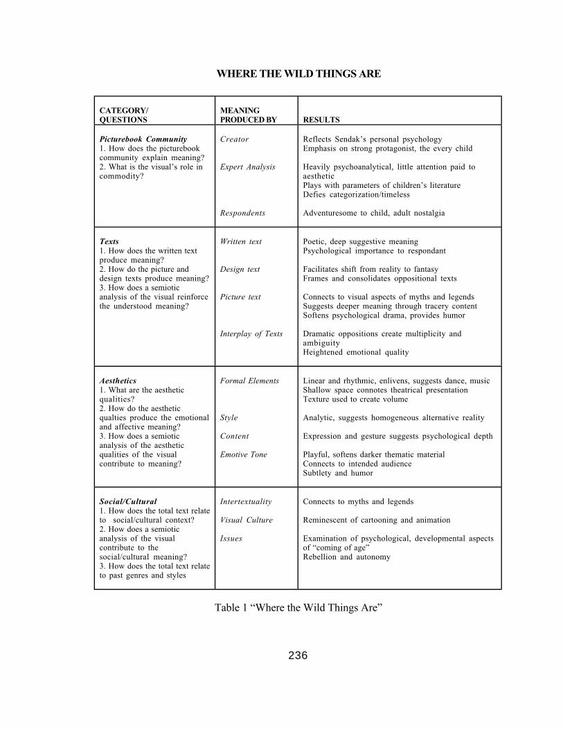
236
WHERE THE WILD THINGS ARE
CATEGORY/QUESTIONS
MEANINGPRODUCED BY RESULTS
Picturebook Community1. How does the picturebookcommunity explain meaning?2. What is the visual’s role incommodity?
Creator
Expert Analysis
Respondents
Reflects Sendak’s personal psychologyEmphasis on strong protagonist, the every child
Heavily psychoanalytical, little attention paid toaestheticPlays with parameters of children’s literatureDefies categorization/timeless
Adventuresome to child, adult nostalgia
Texts1. How does the written textproduce meaning?2. How do the picture anddesign texts produce meaning?3. How does a semioticanalysis of the visual reinforcethe understood meaning?
Written text
Design text
Picture text
Interplay of Texts
Poetic, deep suggestive meaningPsychological importance to respondant
Facilitates shift from reality to fantasyFrames and consolidates oppositional texts
Connects to visual aspects of myths and legendsSuggests deeper meaning through tracery contentSoftens psychological drama, provides humor
Dramatic oppositions create multiplicity andambiguityHeightened emotional quality
Aesthetics1. What are the aestheticqualities?2. How do the aestheticqualties produce the emotionaland affective meaning?3. How does a semioticanalysis of the aestheticqualities of the visualcontribute to meaning?
Formal Elements
Style
Content
Emotive Tone
Linear and rhythmic, enlivens, suggests dance, musicShallow space connotes theatrical presentationTexture used to create volume
Analytic, suggests homogeneous alternative reality
Expression and gesture suggests psychological depth
Playful, softens darker thematic materialConnects to intended audienceSubtlety and humor
Social/Cultural1. How does the total text relateto social/cultural context?2. How does a semioticanalysis of the visualcontribute to thesocial/cultural meaning?3. How does the total text relateto past genres and styles
Intertextuality
Visual Culture
Issues
Connects to myths and legends
Reminescent of cartooning and animation
Examination of psychological, developmental aspectsof “coming of age”Rebellion and autonomy
Table 1 “Where the Wild Things Are”

237
CHAPTER 7
CASE STUDY B: “THE POLAR EXPRESS”
“The Polar Express,” created by Chris Van Allsburg, has sold millions of copies
since its publication in 1985. In addition, the work received the 1986 Caldecott Medal
from the American Library Association for its illustrative excellence which further
enhanced its sales and notability.
Oddly enough, even though it has been a perennial Christmas favorite, now
considered a contemporary classic, the work did not start out as a Christmas book at all.
In his Caldecott acceptance speech Van Allsburg (The Horn Book Magazine, 1986)
writes:
“When I began thinking about what became The Polar Express, I had
a single image in mind: a young boy sees a train standing still in front of his
house one night, The boy and I took a few different trips on that train, but we
did not, in a figurative sense, go anywhere. Then I headed north, and I got the
feeling that this time I picked the right direction, because the train kept rolling
all the way to the North Pole. At that point the story seemed literally to present
itself. Who lives at the North Pole? Santa. When would the perfect time for a
visit be? Christmas Eve. What happens Christmas Eve at the North Pole?

238
Undoubtedly a ceremony of some kind, a ceremony requiring a child, delivered
by a train that would have to named the Polar Express” (pg. 422).
This process of starting out with a “vague idea” and allowing it to evolve as if
were “a discovery, as if the story was always there” (Van Allsberg, 1986, page 422), is a
significant part of Van Allsburg’s vision and artistic process. As a virtual outsider of the
picturebook community (beginning as a sculptor and entering the field almost as a fluke),
Van Allsburg has not been contained or directed in any significant way by the editorial
process or by the larger concerns of the picturebook community. Even consciously
blocking any concern for a predisposed audience, he allows for his ideas to flow from
only his own muse. In an online interview Van Allsburg comments:
“... I think that the actually thinking about your audience is poisonous
to the art process -- it truly contaminates it. If you think, “Oh, they’re really
going to like this...” if you ever hear a voice like that in your ear while your
drawing, it’s time to put down the pencil, because there should be no “they” at
the art table. there should be only one person at the drawing table, and that’s
you” (Reading Rockets, 2004, pg. 4).
The independence that Van Allsburg enjoys sets his work apart from much of the
rest of the industry. It was this individual vision that personally I first found exciting.
While I don’t know the precise moment I first witnessed any of Van Allsburg’s titles, I
do recall being aware of something unique about them. I recall as well, envying the artist (I
was still a struggling hopeful in those days) after he received a Caldecott Honor award for
239
his very first book, “The Garden of Abdul Gasazi” (1979) and the Caldecott Medal for
his second book “Jumanji” (1981) and then, only to strike gold again with “The Polar
Express.”
This analysis will examine “The Polar Express” and other works by Chris Van
Allsburg in regards to how their visual qualities create the enigmatic and surreal worlds of
this creative and imaginative practitioner of the picturebook art form.
ANALYSIS: SECTION ONE
Part A: Description of “The Polar Express.” Of “The Polar Express,” Marantz
(1985), in a starred review for School Library Journal writes:
Given a talented and aggressive imagination, even the challenge of as
cliche-worn a subject as Santa Claus can be met effectively. Van Allsburg’s
Polar Express is an old fashioned steam train that takes children to the north
pole on Christmas Eve to meet the red-suited gentleman and to see him off on
his annual sleight ride. This is a personal retelling of the adult storyteller’s
adventures as a youngster on that train. The telling is straight, thoughtfully
clean-cut and all the more mysterious for its naive directness: the message is
only a bit less direct: belief keeps us young at heart. The full page images are
theatrically lit. Colors are muted, edges of forms are fuzzy, scenes are set
sparely, leaving the details to the imagination. the light comes only from
windows of buildings and the train or from a moon that is never depicted.
Shadows create darkling spaces and model the naturalistic forms of children
wolves, trees, old-fashioned furniture and buildings. Santa Claus and his reindeer
seem like so many of the icons bought by parents to decorate yards and

240
rooftops: static, posed with stereotypic gestures. These are scenes from a
memory of long ago, a dreamy reconstruction of a symbolic experience, a
pleasant remembrance rebuilt to fulfill a current wish: if only you believe, you
too will hear the ringing of the silver bell that Santa gave him and taste rich hot
chocolate in your rise through the wolf-infested forests of reality. Van Allsburg’s
express train is one in which many of us wish to believe” (pp. 165-166).
As I hold the book now in my hands I can only commend the above reviewer on
his gallant attempt to note some of the many high points of the visuals of this work in
such a limited space.
The Story. “The Polar Express,” is the story of a nameless boy who, troubled by
the ambiguities of Christmas, is swept away on Christmas Eve in the Polar Express, a
train bound for the North Pole. Told in first person, the written text reads as if written
from vivid memories by the narrator who recalls the train rumbling down his own street
and stopping at his house in the middle of the night, a conductor beckoning him to board.
The train takes him on a journey through the wilderness to an industrial complex filled
with hundreds of workers all gathered to witness the departure of Santa Claus on his
flight to bring toys to all the boys and girls of the world. The narrator himself is chosen to
receive the first gift of this particular Christmas. He asks for a bell off the harness of the
reindeer but accidentally loses it through a hole in his robe. Saddened by the lose of the
bell the boy nonetheless enjoys Christmas day with a renewed commitment to Santa and

241
his mission. Finally, he opens a present from the bearded gentleman himself. It is the bell
from the harness lost just the night before. The bell, while silent to his parents, rings
clearly for him even as he grows into manhood because of his belief in the magic of the
holiday.
Beyond the Narrative. There is a rich tapestry of symbolic and formalistic
material in “The Polar Express” that weaves a lucid description of the reality of our
everyday life giving way to an equally lucid, and utterly believable, description of the
alternate reality of our fantasies and dreams. Cloaked in a gauzy veil of soft falling snow,
many of the images imbue the very atmosphere of my own memories of a snow flecked
Christmas Eve. Such is the case with the picture that dominants the work’s jacket cover.
The Jacket and Case. The jacket picture is a segment of a larger picture that will
later appear in the interior of the work. Dark and mysterious, yet strangely compelling,
the picture shows the steam engine of what we understand, by way of the title, to be the
Polar Express. The engine moves forcefully into the foreground, from the left to the right,
emerging out of a deep naturalistic space and literally compelling us to turn to the interior
of the book. While such an engine and its trail of train cars would bring with it a
cacophony of sound, there is a strange other-wordly silence to the scene, as if I’m looking

242
at this picture through a window, a quality that is enhanced by the bright white border
and black line that encases it within the cover design.
This design is formally balanced, placing the type elements top and bottom of the
picture. The serif font used for the title and Van Allsburg’s name are all in capital letters,
suggesting a bold, headline quality. This overall image is further expressed by the
increased letter spacing of the title that stretches it to the width of the picture. The type
is printed in a deep rust-brown that echoes the color tones of the picture. Emblazoned on
the cover of my edition is the Caldecott Medal, symbolic of the work’s significance
within the picturebook community.
Most important however, is the location of the engine. It appears to be rolling
down a typical residential street of middle-America. Ghostly clapboard houses,
illuminated by a single street lamp are tucked into the middle ground on the far right of the
composition. The white trim of their windows and the green shutters echo the
architecture of most small towns. Manicured and snow covered bushes are additional
elements in the foreground adding to this surreal juxtaposition and enhancing the
suggested perspective that connotes a believable reality. By Van Allsburg’s admission,
this is the first image that he imagined, the spring board for the rest of the work that
would gradually evolve into a northbound magical adventure on Christmas Eve.
Turning the book over, the rest of the picture is continued on the back, the two

243
halves divided by the white border that wraps around the spine of the case. Interestingly,
because the full image is only three-quarters of the width of the interior spread, this
picture includes a portion of the picture that is also on the front of the jacket. As the train
continues into the background, the passenger cars, ablaze with bright interior lights, are
depicted. The glowing windows of the cars lead my eyes right to the tiny figure of a small
boy, clad in a bright blue garment that is most probably a robe due to its length. The boy
looks up at a man’s head leaning out of the open door of the car. The man wears a cap,
and, by association, I assume he is the train’s conductor. Most intriguing for me about
this portion of the picture is the sense I have of my position as the viewer and
subsequently every other viewer as well. Together, we, the audience, seem positioned
clearly behind a large, snow covered, evergreen tree and a brick house that terminate the
composition at the far left side. This part of the picture is cast in deep, flat, shadow,
serving as a curtain that we, as anonymous observers, can peek around to watch the
ensuing action unfold.
Significantly, when the jacket is removed, a traditional cloth covered case with a
embossed silver foil design await us. The cloth itself is a deep maroon color that connotes
a richness and tradition. The silver foil design depicts a sleigh bell and length of thin strap
on a field of flecks of snow. This case treatment, like most of Van Allsburg’s work,
echoes classic book design. In his collaboration with author Mark Helprin for “Swan
244
Lake” (1989) the artist intended a feeling of “a book done in a different time... (of)
collectible quality” ( as found in Hurwitz, 1990, pg. 66). “Swan Lake” is also designed
with a cloth case and foil embossing. Certainly, in the case of “The Polar Express, “ such
design treatment serves as tracery information subtly transforming it into a work of the
past, an instant classic so to speak.
The Jacket Flap, Endpapers, and Title Pages. The jacket flap copy contains a
brief synopsis of the narrative. As I read it now, I can’t help but wonder why it gives
away the ending of the story: “The mother of the boy admires the bell, but laments that it
is broken -- for you see, only believers can hear the sound of the bell.” The bell is a sleigh
bell off the harness of Santa’s reindeer given to the protagonist of the story. It serves as
the visual and symbolic motif throughout the work and is the featured silver embossed
design image that appears on the case. The flap copy goes on to say, “In strange and
moving shades of full color art, Chris Van Allsburg creates an otherworldly classic of the
Christmas season.” The emphasis on color here may have to do with the fact that Polar
Express is only Van Allsburg’s second work in full color, the first being “The Wreck of
the Zephyr” (1983).
In the particular edition I have of “The Polar Express” a deep tan endpaper of
textured and heavy stock provides a soft transition into the interior pages of the work. As

245
with the type treatment on the jacket, and even the case design, it is unknown if Van
Allsburg himself chose this particular endpaper. While there is every indication that the
artist certainly had some input into the decision, in most cases such matters are decided
by the designer working behind the scenes or by the editor in charge of the project. Van
Allsburg’s editor for “The Polar Express” was the legendary Walter Lorraine. As a master
of design and typography, Lorraine has left his visual, as well as editorial, imprint on
many works by some of the most noteworthy picturebook practitioners of our times,
including David Macaulay, Bill Peet, and Allen Say, as well as Van Allsburg (Marcus,
1998). Whether Van Allsburg’s or Lorraine’s, the aesthetic sensibility of the whole
package of the Polar Express is that of vintage book making.
The very first page of the interior signatures of the book holds the full title
information. It is an elegant expression of typography, echoing the extended letter spacing
and color of the cover design. A portion of an illustration that will appear later in the
work appears as a boxed spot. This picture shows a wolf moving towards the left of the
space seemingly unaware of the train passing far in the background. Trees fill the space
between the wolf and the the train. This picture segment is an intriguing choice for the
title page serving as it does as an introduction of what is to come. A more through
examination of its significance will be made later in this analysis.

246
The Written Text. Throughout the literature there is a sense that Van Allsburg’s
writing has a tendency towards the minimal. Stanton (1996) speaks of the written text of
Van Allsburg’s “The Garden of Abdul Gasazi as “dull, though carefully crafted” (pg.
170), and as already reported, Marantz (1985) states that the written text of Polar
Express “is straight, thoughtfully clean-cut and all the more mysterious for its naive
directness” (School Library Journal, pg. 165). As I read the text now, I am struck by the
economy of its form. While literal in its imagery: “On Christmas eve, many years ago, I
lay quietly in my bed. I did not rustle the sheets, I breathed slowly and silently,” it
nonetheless paints a naturalistic and believable story in keeping with the picture text it
accompanies. In terms of how it establishes verbal associations it can be said to be
metonymic in nature, stringing syntactic content together through associations
(Gandelman, 1991) rather then making metaphorical jumps in meaning.
The Picture Text. In a similar fashion, Van Allsburg’s picture text can be said to
be pictorial or haptic in nature relying on the tactile representation of surface and form
that, in a sense, can be touched by the eye, a synesthetic operation. Haptic vision is the
other side of a duality shared by optical vision. Gandelman (1991) writes:
“The purely optical (without synesthesia) is only capable of
apprehending points on a plane surface... It is only through a transference of
247
the sense of touch to the eye that one is able to locate and identify things and
evaluate one’s position in relation to them” (pg. 6).
As I page through Polar Express, I am struck by the surfaces and the deep spaces I am
able to enter into. Not only do I experience an immediate and visceral sense of surface, I
feel the cold of the winter atmosphere, I smell the hot chocolate steaming, and I hear the
far off factory sounds as the train approaches the industrialized North Pole. Van Allsburg
creates these sensations by a precise use of space and composition, alternately placing the
viewer close to the ongoing action, as in the train car filled with children excited about
their journey, or outside of the scene, a distant observer watching the Polar Express wind
its way through the mountain peaks.
Throughout the work there is also a sense that each picture has been carefully
chosen out of the myriad of possibilities that each scene might suggest; in the manner of
the multiple pictures contained in a length of film. In his Caldecott acceptance speech for
“Jumanji” Van Allsburg writes of the picturebook: “It is a unique medium that allows an
author-artist to deal with the passage of time, the unfolding of events, in the same way
film does” (as found online at Houghton Mifflin, 2004, pg. 2). It is my sense that this film
tendency is what allows this particular artist’s work to translate to the big screen, such as
the movie version of “Jumanji” and the more recent film of “The Polar Express,” featuring
a digitally captured version of Tom Hanks as the conductor, the boy, and Santa himself.
248
For all of the picture’s atmosphere and light however, there is an uncomfortable
awkwardness in the drawing, especially in the human figures which many times appear
flat and stiff. The figure of Santa, holding up a bell he’s about to give to the boy, is
anatomically incorrect, one arm, draped over the boy’s shoulder is too long while the
other holding up the bell seems stunted and without an elbow. Barbara McKee (1986), in
an article in Horn Book Magazine published just a few months after Van Allsburg’s
Caldecott acceptance writes:
“Yet recurring incongruities appear in his early work, which on first
viewing we are inclined to overlook or interpret as deliberate but which remain
disturbing to the internal balance of the illustration. When compared to the
harmony and accuracy of the other elements of his drawings, many of Van
Allsburg’s human figures display distortions -- exceeding those used to create
the surreal effects of the whole -- that do not always seem attributable to artistic
intention. The viewer is, in fact, sometimes left with a sense of confusion in
attempting to reconcile the beauty of the rest of the drawing with the
awkwardness of the human figures” (pg. 566).
By his own admission, drawing was never Van Allsburg’s strong suit -- he
majored in art school in three dimensional design and sculpture, receiving an MFA in
sculpture from Rhode Island School of Design. However, aside from any lack of ability,
the figures in his pictures are perceived as they are presented, creating meaning beyond
Van Allsburg’s personal story. This quality will also be explored in greater depth in later
in this analysis.

249
The Design Text. In “The Polar Express” there is a formal balance between
picture and design. On each spread a column of white space, that alternates from the left
to right hand sides of the spread and is boxed with the same black line that hold the
picture text, holds the written text. These two texts, the written and the pictorial, stand
apart within their own compartments, seemingly not integrated in any significant way
beyond the design motif. Such a design is reminiscent once again of book design from past
eras and as such forces the respondent to experience each element separately first before
combining them as they attempt to understand the story.
The Total Text. As each separate text element unfolds the total text of the work
appears. Importantly, it is the relationship between the written text and the picture text
that most impacts meaning, In the case of Polar Express each section of written text
describes a myriad of small details, such as the pocket watch pulled from the conductor’s
vest pocket, or the Christmas carols the children sang on the train and the cocoa “as thick
and rich as as melted chocolate bars,” they drank. Snippets of dialogue are also utilized to
add an element of personality. The picture text, in contrast to this however, rarely depicts
the precise moment of the written text, rather it is chronologically just before or just after
that moment, and many times even viewed from a great distance. Also, the picture text
250
never reveals (accept in the case of Santa) the speaker of the dialogue contained in the
written text, thus enhancing the overall enigmatic and mysterious quality of the work.
Part B: “The Polar Express:” Its Place in the Picturebook Community. In an
article appearing in American Artist, Hurwitz reports:
“From the beginning, Van Allsburg’s efforts as an illustrator have met
with both critical and commercial success. As John Russell wrote of Van
Allsburg in the New York Times in 1983, “Ever since he made his debut in 1979...
he has had a position all his own as a poet of displacement or, in other words, �of
the world turned upside down” (pg. 64).
To be sure, the sense of “the world turned upside down” that permeates most of
the artist’s book work has been the quality of primary interest to the picturebook
community at large and, while Van Allsburg’s signature enigmatic plot structure is toned
down to a degree in “The Polar Express,” there is still the sense of mystery that flavors
the work as a whole. Stanton, (1996) believes that Van Allsburg is continuing traditions
that have been commercially successful and artistically intriguing for generations.
Concerning the artist’s work overall, Stanton writes:
“I shall... propose a theory concerning the traditions that lie behind his
remarkable originality. Van Allsburg’s work involves, it seems to me, the yoking
together of two kinds of traditions that are almost never discussed together--a
popular-culture tradition and an avant garde, high-modernist tradition. the popular
culture tradition I have in mind will be referred to as the strangely-enough tale.
251
The high-art, experimental tradition is, of course, surrealism. It too often
happens that the popular arts are completely boxed off from the high arts--
more often as a result of academic specialization than of overt snobbery--but
some of the greatest innovations in the arts come from the surprising mixing of the
contents of various boxes” (pg. 162).
Certainly, as well, such a mixture is not new with Van Allsburg. It is one that links him to
other venues of popular culture such as early television shows like “The Twilight Zone,”
and “The Outer Limits,” as well as much of the work of contemporary film makers such
as George Lucas, Steven Spielberg, and M. Night Shyamalon. The fact that such
narratives and scenarios have the power to capture a large mass audience is reflected in the
following communique received from a marketing specialist at Houghton Mifflin,
concerning the sales figures for “The Polar Express” for just this year alone, almost 20
years since the “The Polar Express” was first published:
“I can tell you that year to date, “The Polar Express has sold about
124,00 copies. For tie in with the film, a $500,000 marketing campaign and
author tour are planned and sure to bolster sales even beyond our numbers
from last year. Last year, the book had steady sales at about 172,000 copies.
The book appeared on 9 separate bestseller lists last holiday season. I was
unable to determine how many books are in print at this moment. If I find
anymore information (the sales team is very secretive with the numbers) I'll
pass that along. Please note these numbers are estimates and all information
is extremely sensitive” (July, 2004).
Stanton (1996) sees Polar Express as a type of seasonal legend, akin to other
classic pieces of popular culture such as the movie “Miracle on 34th Street.” This is not
252
to say that the work is somehow lessened in its attempted emotional impact by these
popular cultural connections. In the work’s defense, Stanton continues:
“The popular-culture nature of this tale makes it no less important than
it would be if it were tricked out in the trappings of classical myth. The truth-
pretense of the reality of Santa is perhaps the most widely distributed of all
American strangely-enough motifs. Santa is the “flying saucer” that parents
profess to believe in as an important game of ritual affection, gift giving, and
seasonal celebration” (pg. 174).
This sentiment is shared by the artist himself, who wrote in his Caldecott acceptance
speech, “Santa is our culture’s only mythic figure truly believed in by a large percentage
of the population. It’s a fact that most of the true believers are under eight years old, and
that’s a pity. The rationality we all embrace as adults makes believing in the fantastic
difficult, if not impossible” (1986, pg. 422). While one could question Van Allsberg on the
basis of religious faith alone, his sense that children are “true believers” seems
appropriate.
In essence “The Polar Express,” and, by virtue of his creative status in the work,
Van Allsburg himself, captures the sense of longing, we, as a culture, have, to believe in
aspects of our collective childhood we feel are lost to us. In other words, we all secretly
want to believe that we can still hear the sleigh bell. The very fact that the work has
become a major motion picture reveals it as, at least in Hollywood terms, culturally
significant. A press release of the movie states:

253
“The academy Award-winning team of Tom Hanks and director Robert
Zemeckis reunite for the Polar Express, an inspiring adventure based on the
beloved children’s book by Chris Van Allsburg. When a doubting young boy
takes an extraordinary train ride to the north pole, he embarks on a journey of
self discovery that shows him that the wonder of life never fades for those who
believe” (as found online at Houghton Mifflin, 2003, pg. 1).
The fact that Polar Express has garnered so much popular attention places it in a
commanding position in children’s literature. As has been discussed earlier, Van
Allsburg’s prose style is consider by some critics as flat and naive, but it is in the
narrative motifs and structure that educators will turn to his work as example. And, of
course, there are the pictures. What makes the pictures of Van Allsburg so arresting, so
different from the rest of the visual fare of the picturebook genre? As has been suggested
earlier, the answer lies partly in the fact that the artist does not cater to the boundaries set
by the picturebook community, a notion that is further explored in the next section.
Part C: The Creator of Polar Express. Van Allsburg is, in most respects, a self-
styled creator of picturebooks. Entering the field in a very indirect way--his sculptural
works, and a few drawings done as a lark primarily because his sculpture studio was too
cold in the winter, were thought highly narrative by family and friends--the idea of
picturebooks seemed all too remote to the artist himself. Van Allsburg even entered

254
college as an art major at the University of Michigan (he created a story that he study art
on the weekends to be accepted) with little commitment to the field, finding difficulty in
drawing there but gaining a firm foothold in three-dimensional design and sculpture, an
outgrowth of his childhood fascination with building models. In an online interview Van
Allsburg states:
“So I got into art school, not because I had formed in my mind a desire
to be an artist, not that I even had any information about what that might mean
to be an artist. I just said, “Well, how about this?”... But then to actually be in
the company of kids who really did study art on the weekends... And when I
saw how well they could draw, I was greatly intimidated by it. I thought, “Well, I
don’t belong here, I’m not really an artist, I just got in here by mistake... But then
I had a 3-D class... that drew on skills that I had in abundance, from being a model
maker... And when I started building things, making things with my hands, I
realized, “Well, maybe this is the place for me, I can’t draw, but I can really make
stuff, I can really build things.... But I never actually drew pictures in the sense
that we use the word to describe illustration. I never made a picture of figures
doing something together, I mean I just made drawings of things that I would
make” (Reading Rockets, 2004, pg. 2).
As the very public records show, the friend that felt Van Allsburg’s work to be
strongly narrative was another of Walter Lorraine prodigies, David Macaulay, creator of
“Cathedral” (1973), his first book with Lorraine at Houghton, and “Black and White”
(1990), the 1991 Caldecott Medal winner. Oddly, however, it was not Macaulay that
introduced Van Allsburg to Lorraine. In an interview with Leonard Marcus (1998), when
asked if this were the case, Lorraine replied: “That’s the conventional story--but no, he
255
didn’t. I had seen some reproductions of artwork that Chris has shown, probably at the
Allan Stone Gallery” (pg. 178). Such discrepancies are common in the popular literature
concerning Van Allsburg. In some interviews it is reported that he loved to draw as a
child, while in others, that he “didn’t draw all that much” (Reading Rockets, 2004, pg. 1).
There is a sense that the artist, an obvious story teller, is having fun, creating, if
you will, his own enigmatic presence. While it is indeed an innocent gesture, perhaps to
protect his privacy more that anything else, it shapes a public persona that intrigues his
audience, and in many ways, offers reasons, by way of his personal experiences, for any
failed artistic ability. Hurwitz (1990) writes: “Not unlike his mysterious stories, Van
Allsburg himself clearly intrigues the American public. Pursued with zeal by his fans, he
receives a constant flow of fan mail (nearly fifty letters a week)...” (pg. 60). While fifty
letters may not be very many for film stars or rock musician, in the children’s
picturebook industry it reflects Van Allsburg’s superstar status.
This playfulness of story is evidenced as well in one of Van Allsburg’s most
critically acclaimed works, “The Mysteries of Harris Burdick” (1984), where the artist
removes himself by creating another artist responsible for the artwork left behind at a
publishing house. Even Polar Express was recast as a story the artist “stole” from “a
little beggar child” (School Library Journal, 1996, pg. 18), a tongue-in-cheek story created
for a marketing campaign to celebrate the work’s 10th anniversary.

256
This tendency towards play and the blending of fiction and reality are markedly
postmodern in nature. Historically it has been shown that the story created by celebrity
can serve to promote and qualify an artist’s work, as witnessed in the lives of such fine
artists as Dali and Warhol. As well, this quality is one that permeates all of Van
Allsburg’s artwork to a greater or lesser degree. There is a sense of indeterminacy at the
end of his narratives that leaves us, the respondents, feeling as if there is more that goes
unstated, or forces the question, “what really happened?” In “Jumanji” it is the idea that
the board game that has caused so much chaos is now in the hands of two other children
that are unaware of its special powers (what does happen is answered in “Zathura”
(2002), the most recent picturebook by Van Allsburg). In “The Garden of Abdul Gasazi”
it is the question of whether or not the magician used real magic at all or if it was all slight
of hand. The artist is very aware of this potential in his work, purposely creating
ambiguities and uncertainties to keep his audience engaged. This involvement manifests
itself in letters that ask if there will be a sequel to a book, a strong indicator that the ends
are not tied together, that there are unresolved elements that remain a puzzle. Van
Allsburg states:
“Actually it all started with Gasazi, because I got letters from kids.
Gasazi has an ambiguous ending... They’d want to know what happened. Did
he really turn the dog into a duck? I’d write them letters, and say. “Well, thanks
for writing, but I can’t tell you. What do you think?” I didn’t expect them to
write me another letter and tell me, but I didn’t want to give them the impression

257
that I knew something and I was withholding it. I wanted them to think that
what existed on the page was a living thing, and that it just was: it is. And if it
had a solution, its for them to provide (Reading Rockets, 2004, pg. 4).
Further, these ambiguities and loose ends result in fragmentation, another quality
of the postmodern, where meaning remains open. the most apparent postmodern
tendency in Polar Express is the sense of decanonization. As has been pointed out by
Stanton (1996), there is a blurring of the boundaries between so called high art and
popular art, between surrealism and the ‘strangely-enough’ tale. Lastly,“The Polar
Express” presents a reality filled with irony. While, in Van Allsburg’s words, “it was
logic that insisted (the North Pole) be a vast collection of factories” (1986, pg. 423), such
an image is hugely double-coded. It reveals a vast industrialized complex spewing out
billows of smoke to produce children’s toys--commercialism at its worst, yet a prominent
feature in the Santa mythology.
Importantly, it seems to be Van Allsburg himself that is very aware of the
potential of pictures and images to create wonder and puzzlement. In his surreal world
there always exists some quality that evokes a searching question. It is a quality in the
artist’s work that will be examined more in depth later in this analysis.

258
ANALYSIS: SECTION TWO
An Analysis of Meaning in “The Polar Express.” Continuing the methodology
established in Chapter 6, the following will investigate elements of the various texts of
“The Polar Express” and how they produce meaning.
A) The Picturebook Community
What meaning is found in the subject matter and formal elements of this
picturebook through the picturebook community as defined by those members of:
a) the verbal group, ie. writers, editors, critics, librarians, educators, b) the visual
group, ie. illustrators, designers, art directors, and c) the commodity group, ie.
publishers, publicists, book sellers?
Question 1: What is the explanation of the picturebook community regarding how
meaning is produced in this picturebook through: a) written text alone, b) visual
text alone, c) written and visual texts combined?

259
A Beloved Expansion of Time-tested Motifs. Polar Express is but one of a long
list of books and other popular media that expands on the various motifs of the Santa
Claus legend. By building on this well known narrative framework, Van Allsberg can rely
on a certain body of knowledge to anchor his own flight of fancy, leaving much unsaid and
undepicted in favor of filling in an aspect of the story prehaps never revealed in quite the
same way before. Here, it is the mysterious place of the tale, the North Pole, and the
equally mysterious inhabitants. A reviewer, writing just before the book’s release in
December, 1985, states:
“It’s a retrospective story of a child’s fantasy experience, a trip by train
to a bustling city (a new concept of the North Pole) where hundreds of elves
labor in toy factories” (Bulletin of the Center for Children’s Books, pg. 39).
This same reviewer, however, finds the message of the work prehaps a bit adult and
wonders if the “read aloud audience” will even “get” it at all but even so “will probably
enjoy the several appeals of the story that has Santa Claus and a journey in it.” However,
this ambivalence over the message is superceded by the reviewer’s enthusiatic description
of the work’s illustrations and their appeal to older readers:
“…they will surely appreciate the stunning paintings in which Van
Allsberg uses dark rich colors and misty shapes in contrast with touches of
bright white-gold light to create scenes, interior and exterior, that have a quality

260
of mystery that imbues the strong compositions to achieve a soft evocative mood”
(Bulletin of the Center for Children’s Books, pg. 39).
Throughout the reviews of Van Allsberg’s work we find similar accolades. The
above reviewer’s use of terms like “stunning,” “imbues,’” and “soft evocative mood,” are
attempts to describe pictures that are highly complex in their use of formal elements to
move the viewer in particular ways and drive the story dramatically and symbolically
forward. Yet, such terminology provides little insight as to the workings of the pictures
themselves or the devices used by the artist to produce subtle meaning. Like Van
Allsberg’s work itself, much of what is written about it is, in essence, smoke and mirrors,
illusions to far more complex phenomena but lacking in critical understanding.
The general understanding throughout the picturebook community of Polar
Express is one of heart warming nostaglia over the magic of the season. Yet on the rare
occasion, a writer digs more deeply into the strange imagery presented. Stanton (1996),
writes:
“We might expect to lose the dangerous edge of surrealism in Van
Allsburg’s embrace of Jolly Old Saint Nick, but when we consider the intrusion
of a massive train into a quiet suburban street, the restrainedly demonic nature
of Van Allsberg’s North Pole with its bizarrely vast snow-covered urban
appearance, and the quietly nightmarish hugeness of the crowd of identically
dressed elves turned out to hear Santa’s speech—when we consider all of the
elements of this late-night sojourn—we find the surrealist edge of danger subtly

261
implicit. It might even be said that there is something about the visualization
of Santa’s speech to his army of elves that is reminiscent of the famous filmed
sequences of Hitler addressing his storm troopers. Although Santa is treated as
an unambiguously benign being in the context of the book, there is an unsettling
quality to the North Pole scene that adds an aesthetically interesting element of
disorientation to the miraculous presence of the godlike Santa figure” (pp. 174-
175).
Such observations as indicated above do not hold with the more popular view of the
work, that of the magical story of Christmas. However, as Stanton (1996), and Van
Allsberg himself, are quick to point out, the qualities as decribed above are the natural
outcomes if one were to pursue the story of Santa Claus to its logical and inevitable ends.
Polar Express achieves an interesting balance between the sentimental and the
surreal. It’s mass appeal indicates a tremendous following and yet the fact that more
reviewers and critics have not written about the darker possibilites of its visual
sensibilities demonstrates a lack of exploration as to its underlying iconography, a matter
more fully discussed later in this chapter.
Question 2: How does the visual relate to the commodity structure of this
picturebook?

262
Marketing and Image. As was discussed earlier, Van Allsberg’s works tend to
lend themselves well to film adaptations. Both “Jumanji” and “The Polar Express” have
provided the bare bones for feature length (and big budget) movies. However, when asked
by online interviewer, Stephanie Loer (1999), if he liked the movie adaption of Jumanji,
Van Allsberg stated:
“It’s probably not the movie I would have made from the same source
material. My own imagination leads me towards things that are more mysterious
or peculiar and less kinetic and action packed.The movie wraps another story
around my original tale and adds more characters. This had to be done to make
the story longer and complex enough to hold the audience’s attention. But
although there are changes, the movie stays true to my original ideas” (pp. 2-3).
What makes Van Allsberg’s work interesting to film producers? As with the
recent surge of movies based on comic book heros and graphic novels, picturebooks
provide film makers with strong visual ideas including ready made storyboards and
characters. As Van Allsberg states above, while the plot is expanded and new characters
are created, the artist’s original themes and ideas are still in place. Yet, it is far more the
visual qualities that remain during this transference from page to frame. If one looks
closely at the movie version of “Jumanji” and especially at the movie version of “The
Polar Express,” what is quickly apparent is the presence of Van Allsberg in terms of his

263
drawing style, the way he renders form, and the compositional strategies he utilizes.
Image itself becomes the marketing tool, begging the question: if the movie “The Polar
Express,” doesn’t look like the book will the audience be disappointed? I dare say that
yes they will be. Such is the reason why elaborate care is taken with comic book movies
such as “Blade”, “The Crow,” and “The Incredible Hulk” to maintain their visual
qualities.
Further evidence of the power of the visual is in the fact that, while the plot line
of the movie version of “The Polar Express” greatly expands on the brief written text of
the picturebook, rather than recreating the work in live action, as “Jumanji” was done, it
was decided to do the film in animation instead. This was accomplished by employing the
talents of Sony Pictures Imageworks visual effects wizard Ken Ralston. Utilizing the
most advanced motion capture processes available, along with the acting talents of Tom
Hanks, direction by Robert Zemeckis, and the vision of Chris Van Allsberg, this time
acting as one of the executive producers, the film hoped to bring “this enchanting holiday
story vividly to life…” (Houghton Mifflin, Press Release, 2003).
Summary: The Picturebook Community
• The prevailing understanding of “The Polar Express” depends on the
awareness of the traditional Christmas story.

264
• The visual elements put a much different and darker “spin” on the tale.
• The limited understanding of the work is due in part to a visual illiteracy or a
reluctance to look deeply at pictures.
• The strength of the visual qualities of the picturebook “The Polar Express” is a
compelling attribute of the reconceptualization and subsequent marketing of a
feature film based on the original work.
B) Total Text: Written, Picture, and Design Texts
What meaning is found in the subject matter and formal elements of this
picturebook through its total text as defined by the combined and separate
understanding of the written text and the visual text produced by the picture text
and the design text?
Question 1: How does the written text produce meaning for this picturebook?
A Straight Forward Telling. To tell his particular version of the night before
Christmas, Van Allsberg utilizes, to borrow from narratology, a first person narrator that
is autodiegetic in nature. For example, here the narrator is recounting an incident from his

265
youth: “On Christmas eve, many years ago, I lay quietly in my bed. I breathed slowly
and silently. I was listening for a sound—a sound my friend had told me I’d never
hear—the ringing bells of Santa’s sleigh.” This example serves to demonstrate a device
Van Allsberg utilizes often in his writing, an analeptic flashback which signals a memory,
one that those who have grown up with the story of Santa Claus as told in Western
European traditions can share.
The style of writing is understated and straight forward, relying on sensual
decriptions to heighten the visual experience of the ongoing action. Sounds of “hissing
steam, “squeaking metal,” tastes of “candies with nougat centers as white as snow,” and
“hot cocoa as thick as melted chocolate bars,” enliving the text that moves the narrative
along ever forward.
While on the surface there seems little here that is metaphorical, the story is told
as a series of matter-of-fact events unfolding in real time, but the inclusion of wolves and
the general fantasy journey through the mountains to the North Pole suggests deeper
connections to myth and lore.
It is the understated quality of the writing that is the hallmark of Van Allsberg as a
author. However, it is fairly obvious that he is most interested in the story itself, and how
that story is expressed through the relationship between written text and visual text, and
not as much in what language can do aesthetically. There is a sense of pulp fiction to Van

266
Allsberg’s writing rather then literature, a quality that Joseph Stanton (1996) recognizes
in his article “The Dreaming Picture Books of Chris Van Allsberg.” Stanton refers to what
he calls “strangely enough” tales, a term derived from the title of a collection of stories by
C. B. Colby written in 1959. Stanton writes:
“What made Colby’s collection of strange stories exciting for twelve-
years-olds of all ages was the attitude he adopted toward the material and
expressed in his title Colby managed to present his brief retellings of startling
tales in a manner that suggested they might be true, despite their strangeness.
Colby’s journalistic plain style of writing was one of the elements that seemed
to attest to the truth of the tales. Paradoxically, if Colby had been a better writer,
his tales would have seemed more literary and thereby less real” (pp. 168-169).
It is this same quality that permeates Van Allsberg’s prose, a plain style that presents the
story as reality and thus enhances the inevitable juxtaposition of words and images.
Van Allsberg’s writing then, while controled and seemingly over simplistic, creates
a sense of journalistic reality. As a story teller her relies heavily on plot structure and
narrative devices that move the action forward, a feature of his writing that blends well
with the pictorial elements he creates.
Question 2: How do the picture and design texts produce meaning for this
picturebook?

267
A Gentle Surrealistic Vision. Where Van Allsberg’s written text for Polar
Express is straight forward his visual text presents a surreal rendering of the world
presented in a surprisingly naturalistic manner, an approach that demands critical
attention. Van Allsberg’s vision of the world is many times compared to both Edward
Hopper and Rene Magritte, artists he himself admits to admire and emulate. This is to
say that, perhaps like these two very different artists, Van Allsberg constructs meaning in
his visual work not only by the juxtapositon of subject matter, such as found in Magritte,
but in the subtle manipulation of composition, form, and surface, evident in work by
Hopper. Each element in Van allsbergs illustrations is placed and rendered with
specificity. However, while Van Allsberg may render form in a similar manner to Hopper
and Magritte, it should be noted that he takes from them as well different sensibilites,
gaining from Magritte a conceptual surrealism while blending such qualities with the more
naturalistic content of Hopper.
While drawing may not be his strong suit, a fact that Van Allsberg himself admits
too, like Hopper and Magritte, it is all too evident that he is well versed in the
manipulation of space, a skill perhaps learned in his three demensional design work and
sculpture. Each image in Polar Express leads us deeper and deeper into a faraway space.
As the train moves from the comforts of home, through a transitional wilderness

268
populated by wolves, we are then taken to the tops of the world and over the water to
our ultimate destination. We, as the viewer, now separated from the story’s protagonist,
are racing to keep up as the train plunges into the psychological realm that spirits all such
legends. The strategies Van Allsberg uses to make this journey are very much akin to film,
where each spread is but one of a endless number of frames making up the complete
movie, the very quality that makes Van Allsberg’s work so applicable to film adaptation.
This quality again attests to the manner in which both Hopper and Magritte arrest time,
freezing moments of experience at a critical point where the story can be fully
understood.
In addition, Van Allsberg’s work in general has as Stanton (1996) suggests, further
surrealistic tendencies. In comparing Van Allsberg to other surrealists such as DeChirico,
Tanguy, Dali, and Ernst, Stanton (1996) writes:
“What the works of these artists, as well as the works of Van Allsberg,
have in common is that they contain ‘highly detailed likenesses of objects,
straight or distorted, or three dimensional abstractions, in fantastic and unexpected
juxtaposition, or in a setting of a hallucinatory kind’ (as quoted from Murray,
Peter and Murray, Linda, 1959, A dictionary of art and artists). This kind of
surrealism constructs its dream images with a highly self-conscious sense of
form and style. The content of the images may arise from the tapping of the
subconscious, but the rendering of the work of art is realized with conscious
finesse. Van Allsberg’s surrealism is quite deliberate, as he himself has

269
acknowledged: ‘If all artists were forced to wear a badge, I’d probably wear the
badge of surrealism. I don’t mean something as extreme as Salvador Dali’s melting
clocks, but a gentle surrealism with certain unsettling provocative elements’ (as
quoted from Ruello, Catherine, 1989, Something about the author, vol. 53)” (pg.
163).
Finally, Ellen Spitz (1994), in “Museums of the Mind” writes:
“Surrealism erupts into our space, even today, so many years after its
birth between the world wars. It floods our ark of security. It retains its capacity
to jar and unsettle us like an unexpected downpour, to thwart our plans and make
us successively—or simultaneously—angry, irritable, bemused, tolerant, even
merry.
The world we had always recognized shifts, so that what we think ought
to come next never does. We are discomforted and discomfited. The art, poetry,
music of surrealism all strive not to lull but to intercept, not to entertain but to
infuriate, not to soothe but to baffle, and to goad” (pg. 128).
While Van Allsberg attests to a gentler surrealism it nontheless has the potential to
wake us up. To goad us into seeing something we take for granted in a new way. If the
artist is true to the badge he wears then “The Polar Express” expects more from us then
tradition dictates. Van Allsberg constructs a surreal vision of Christmas to uncover its
most eloquent meanings of joy and charity.

270
Question 3: In terms of the total text, how does a semiotic analysis of the visual
reinforce or deviate from the meanings, as understood and articulated by the
picturebook community, of this picturebook?
Leading to a Deeper Analysis. At first glance, Polar Express seems light enough
fare. Van Allsberg has rendered each form in an overly simplistic manner, reducing each
image to stark compositions of contrasting values and suggested textures. The details
included in each picture are carefully and deliberately chosen, moving the respondant in
specific and dramatic directions. Just how do we ascertain the deeper meanings suggest in
the last section?
Semiotically the details of the work suggest a variety of symbolic meanings that
render “The Polar Express” as something more than a simple excursion into a creative
variation on legendary themes. Interestingly the symbols most commonly associated with
Christmas are surprisingly understated, a Christmas tree tucked to the edge of the
composition, unopened presents in anonymous boxes, there only for their immediate
association with the season.
Van Allsberg, however, introduces other symbolic imagery in subtle yet
substantial ways, blending several symbol systems to reveal a possibily darker intent.
Whether the effect of these multiple layers of meaning is calculated by the artist or are a

271
result of subconscious intiatives is unimportant. Though, I dare say that, looking at
themes of Van Allsberg’s other works, that the associations that follow are a conscious
attempt by the artist to spin the story in a socially significant direction.
Demonstrating this is the first illustrated spread, where the boy looks out his
bedroom window, his yellow pajamas brightly illuminated from below by what we
assume are the lights of the train that is indicated in the written text. This example is very
indicative of Van Allsberg’s approach, setting the stage for future imagery laced with
subtle implications. The bright planes of the boy’s pajamas and the direction of the boy’s
gaze out the window compells us to quickly turn the page. Tucked into the shadows
however is the red, white, and blue of what suggests an American flag. Seemingly a detail
overlooked by the majority of reviewers, this almost obvious allusion to a patriotic
emblem suggests that this telling is an American version, alerting the critical observer to
watch for other symbolic evidence. A further reference to American traditions is the
picture of a baseball player hanging on the wall above the back of the boy. Baseball, as
does Christmas, functions in the American psyche in legendary domains, almost mythical
in its place in the American identity. Following these symbols further into the work, one
might ask just what the artist might be saying about Christmas in America.
Reminiscent of stories such as Pinnochio and the Pied Piper, the Polar Express
takes children far away from their homes to a place where all their egotistic dreams come

272
true. But, to what end? Pinnochio and the other boys that are taken to an amusement park
where they can eat as much candy and ice cream they want, and even smoke cigars, all
turn into donkeys that are in turn used as beasts of burden. In Polar Express, chefs in the
dining car serve up candy and rich hot chocolate, placating the children as they gaze out
into a darkness populated by wolves. Further as the illustrations cross over an
indescriminate body of water, traditionally symbolic of transition and coming of age, the
factories of the North Pole come into view. As Stanton (1996) observed, there is an
ominous aura to this scene. Factories with tall smoke stacks belching out dark smoke
commonly suggest aspects of industrialization and commercialism out of control.
Certainly, Christmas itself in America has fallen from grace, now considered by many to
be merely an excuse for rampant consumerism. Interestingly Van Allsberg allows the
motifs of Christmas such as Santa, his sliegh, the Christmas tree, the elves, and presents
to maintain the sentimental allure of the holiday while inserting powerful signifiers that
create a plausable ambiguity as to the meaning of the entire work.
While such signifiers as the factories and smoke stacks of the North Pole could
also be associated with signifieds such as industriousness and enterprise, Van Allsberg’s
interests in a variety of social concerns brings a distinct credibility to such an
interpretation. In “Just a Dream,” Van Allsberg confronts the delicate nature between man
and his environment more directly. Of the work a review from Publisher’s Weekly reads;
273
“Here Van Allsberg introduces Walter, a boy who imagines the future
as a marvelous time, with tiny airplanes that can be parked on the roof of your
house and robots that take care of all your work for you. In the present, however,
Walter is a litterbug who can’t be bothered to sort the trash for recycling and
laughs at Rose, the girl next door, because she receives a sapling for her birthday.
One night, when Walter goes to sleep, his bed travels to the future. But he finds
neither tiny airplanes or robots, only piles of trash covering the street where he
used to live, acres and acres of stumps where forests used to stand, rows and
rows of great smokestacks belching out acrid smoke and many other
environmental nightmares” (Reed Business Information, 1990).
Certainly it makes sense that an artist that has something as passionate to say about
ecology and the misuse of our natural resources as evident in “Just a Dream” wouldn’t
pass up the opportunity to take a critical look at a holiday like Christmas. Yet, even to
see this particular message, the work has to be deconstructed, in a sense, to reveal any
possible interpretation beyond that of the dominant aspects of the well-loved Christmas
story.
These two conflicting code structures, the holiday legend as opposed to a strong
social message, creates, in essence, the tension and drama of “The Polar Express.” As
such, however, this conflict breaks down the sense of the work as a whole. A well defined
system of codes, referred to as structural codes, all lead to a relatively closed
interpretation of a work, On the other hand when conflicting or ambiguous codes are
274
introduced into a system, referred to as processional codes, a more opened interpretation
is possible. Johansen and Larson (2002) argue:
“…semiotics operates with codes on two different levels, which are
simultaneously active. On the first level, we have codes connecting a set of
elements into a well-defined but not necessarily closed system… On the next
level there is a code connecting at least two such systems. The first are called
structural codes; the second processional codes. Semiotics is only marginally
interested in the build-up of systems according to structural codes, but semiotics
commonly takes for granted the existence of collections of elements that have a
more or less clear sturcture, and are capable of creating meaning – possibly new
meaning – through the use of processional codes” (pg. 11).
As was indicated earlier, the picturebook community tends to view Polar Express as a
heart warming extension of the traditional tale and nothing more. And yet the distinction
of elements that point to alternative interpretations is readily available upon a closer
inspection of the visual as it stands alone.
While the written text of Polar Express remains almost awe struck, seemingly
innocent, unreproachful, the illustrations (a healthy part of the visual text), move the
meaning in a more ominous, forboding, and sinister direction. As the steam engine makes
its final approach to the North Pole, the illustration shows it high on a massive and
eternally lengthy stretch of curving bridge of concrete and masonry. Far in the distance are

275
the factories, each smoke stack billowing smoke, the windows aglow in the dark haze of
deep night. The written text, positioned on the far left of the spread to be read first,
reads: “The mountains turned into hills, the hills, to snow-covered plains. We crossed a
barren desert of ice – the Great Polar Ice Cap. Lights appeared in the distance. They
looked like the lights of a strange ocean liner sailing on a frozen sea. “There,” said the
conductor, “is the North Pole.” Masterfully, Van Allsberg builds to a final spectacle,
utilizing both language and image to heighten anticipation and build wonder and an overall
sense of otherworldliness.
Yet, as we turn the page, the written text, now on the opposite side of the spread,
designed to be read last, simply reads: “The North Pole. It was a huge city standing alone
at the top of the world, filled with factories where every Christmas toy was made.” A
rather matter-of-fact description considering the shadow filled image that shares the
spread. In this image we see the steam engine enter into the inner walls of the complex
through a tunnel opening in one of the main structures. Above the opening is an
emblematic image of the head of Santa Claus, reminescent of the busts of various world
leaders that adorn so many public buildings here and abroad. The steam engine,
tranversing the middle of the composition is dwarfed by the surrounding architecture.
While some of the buildings’ window are aglow with interior lights, others stand
ominously dark, shrouded in deep shadow. Here the clash of code systems is extremely

276
evident, Where the written text grounds us in our beloved legend, “…where every
Christmas toy was made,” there is an undeniable apprehension that accompanies the
image presented. I am reminded of dark dock scenes from “On the Waterfront,” or
factory and mining towns, cloaked in bitter cold, of the American northeast. So dark is
this image that even the rows of what we understand as Christmas lights that decorate the
roof lines are swallowed up by a gray bleakness.
In all, a semiotic analysis of “The Polar Express,” leaves one with many more
questions than answers, so strong is the juxtapostion of code systems. As such it renders
the work ultimately enigmatic and intriguing, qualities Van Allsberg is known for
throughout his body of work. Granted, this interpretation of the visual text is ultimately
my own, supported by only a few reviewers, and outside of the prevailing understanding
of the picturebook community. It is only possible because there is such a richness
afforded us in Van Allsberg’s work.
Summary: The Total Text
• Van Allsberg writes in an understated way that presents the basic structure and
plot of the narrative.
• The design and overall presentation of the Van Allsberg’s body of work heralds
back to traditional book making practices

277
• The total text of Polar Express is doublely coded, creating distinct ambiguities
between he written text and the illustrations.
• The richness of possible interpretations of Polar Express as expressed in
symbolic visual language can best be illuminated within the context of the artist’s
complete body of work.
C) The Aesthetic, Emotional, and Affective Content
What meaning is found in the subject matter and formal elements of this
picturebook through its aesthetic qualities which, in turn, produce emotional and
affective content that push beyond a simple mimetic representation to produce a
unique artistic interpretation and experience?
Question 1: What are the aesthetic qualities of the written and visual components
in this picturebook?
The Suggestion of Technique. Throughout his picturebook career, Van Allsberg
has set about to master a variety of self imposed artistic problems with each new work.
McKee (1986) writes:

278
“Van Allsberg states that for him the joy of being an artist lies in the
challenge of solving particular technical problems and in creating impossible
worlds” (pg. 566).
With the first five books that lead up to Polar Express, “The Garden of Abdul Gasazi”
(1979), “Jumanji” (1981), “Ben’s Dream” (1982), “The Wreck of the Zephyr” (1983),
and “The Mysteries of Harris Burdick” (1984), we see a gradual refinement of media
techniques and a continuous exploration of the illusion of three dimensional space, visual
point of view and light. In each of these works, Van Allsberg renders its set of final
images in a completely new medium or a variation in the techniques of a medium used
before. The most startling departure is with “Ben’s Dream” which approximates the look
of a woodcut in scratch board, a black and white graphic medium of inscribed white lines
on a black ground. Out of these first five titles only one is in color, “The Wreck of the
Zephyr,” completed in a vibrant palette of pastels.
Also evident in these intial works is the equally gradual refinement of the artist’s
representation of the human form, the primary subject of Barbara McKee’s 1986 article,
“Van Allsberg: From a Different Perspective.” McKee, who finds the intial awkardness of
Van Allsberg’s figures disquieting, writes:
“Yet recurring incongruities appear in his early work, which on first
viewing we are inclined to overlook or interpret as deliberate but which remain

279
disturbing to the internal balance of the illustration. When compared to the
harmony and accuracy of the other elements of his drawing, many of Van
Allsberg’s human figures display distortions – exceeding those used to create
the surreal effect of the whole – that do not always seem attributable to artistic
intention. The viewer is, in fact, sometimes left with a sense of confusion in
attempting to reconcile the beauty of the rest of the drawings with the
awkwardness of the human figures” (pp. 566-567).
While this awkwardness gradually gives way to more convincing representations
of the human form, even in his most recent work, the long awaited sequel to “Jumanji,”
entitled “Zathura” (2002), the figure remains problematic, appearing motionless, frozen in
time, at times anatomically inaccurate, and, not necessarily devoid of, but lacking in an
internal depth of emotion. And, while these qualities are especially noticable in the
figures, there is a sense throughout the artist body of work, of a bluntness, a paring down
of details to the most essential forms. These forms, simplifications of natural and man-
made forms that exist in the real world, are then turned, lighted, and composed, with the
intent to create atmosphere, drama, and mood, qualities that are the true hallmark of Van
Allsberg’s work.
More to the point, however, when observing the aesthetic qualities of a work like
“The Polar Express,” is not how well the artist has rendered the image, but how the image
transcends meaning through the subtle manipulation of the formal elements. It is in the

280
darkly mysterious diffused light of Polar Express that the incongruity of the tale is
realized. Many have imagined the North Pole of Santa to be a complex of workshops and
factory-like buildings filled with busy elves. Picturebooks such as William Joyce’s “Santa
Calls” (2001), and movies like “The Santa Clause,” starring Tim Allen, create such a
setting, but are lighter and feel and happier in mood. “The Polar Express” projects quite a
different vision.
Pulling at Our Heart String. Most often, however, “The Polar Express is
unjustly described as overly sentimental. Unjust, for it assuredly presents a starkness and
surreality not often associated with Christmas. It nevertheless plays on the deeper
personal connections a European and American audience would have with the holiday.
Written in first person, a reader would readily project themselves into the narrative
finding connections with the protagonist, the author as a little boy, and themselves, and
their own memories and longings that surround the commercial celebration. This
connection is one immediately takes place due to the overly contrite and emotion laden
first opening paragraphs of the written text and the illustration that shares the spread.
The written text reads:
“On Christmas eve, many years ago. I lay quietly in my bed. I did
not rustle the sheets. I breathed slowly and silently. I was listening for a sound –

281
a sound a friend had told me I’d never hear – the ringing bells of Santa’s sleigh.
“There is no Santa,” my friend had insisted, but I knew he was wrong”.
Within the picture, situated to the right of the type column, we gaze across the boy’s bed,
our eyes low, almost at the level of the bed, and we see the boy, kneeling, arms
outstretched, hands at the edge of the bed. The weight of his body leans out and further to
the right as he cranes to see from his bedroom window which is open to the cold wintery
night sky. These narrative devices, in both the written and visual texts, are referred to as
‘the hook.’ Lacey, (2000) writes:
“Openings are important because they are usually intended to grab and
hold the attention of the receiver of the text. People may walk out of a movie or
play that begins badly or boringly; many of us wouldn’t bother finishing a novel
that does not interest us from the start. So the effectiveness of the opening may
well have an effect on the text’s financial success: the opening must act as a
narrative hook” (pg. 8).
That the opening of Polar Express has helped to achieved its financial success is
self evident, more importantly is how it acts as the narrative hook? By allowing the reader
to relate so strongly with the narrative through the first person, the written text compells
us to feel the very anticipation experienced by the boy. As the boy breaths slowly and
silently, so do we. As the boy listens for the ringing of Santa’s sleigh bells, the existence

282
of which is powerfully denied by one of the boy’s anonymous friends, so we listen with
as much intensity. However, it is in the visual text that we find the stronger hook.
As the boy leans out over his bed a bright light illuminates the underside of his
pajama top and casts a deep shadow upwards across the fold of his curtain from his
window sill. This light, as we understand from the written text, is from a train that is
“standing perfectly still” in front of the boy’s house. The window, obviously open since
no vertical wooden divisions appear in the lower half, stands as a portal to something far
away and tantalizingly exciting. Obviously the boy has left this window open in
deference to the chilly cold and falling snow. There is something in the air, the same
something that is the change of wind direction that anticipates the coming of Peter Pan,
and while in the next spread we read that the boy puts on his slippers and robe and
tipstoes downstairs, we can imagine the boy jumping directly out this opened window
and flying off to a Christmas never-land. We are hooked and even more powerfully so
because it has hooked us emotionally.
In addition, this open window and otherworldly bright light casts the opening
scene engimatically. No longer are we certain that this is all happening in real time and
space for there is no sense of when the boy’s window was open , how long its been open,
and who opened it. And, without question, this enigma, this uncertainly, even though we
may not be fully aware of its presence, draws us further into the narrative. This example

283
demonstrates once again the purposefulness of Van Allsberg. He dramatizes the very
moment that will tantalize and give breath to the exact emotional connection he wants
with his audience.
.
Question 2: How do the aesthetic qualities of the written and visual components
produce the emotional and affective content that complement the primary
meanings, as understood and articulated by the picturebook community, of this
picturebook?
Contrary to Popular View. A brief search of reviews written since Polar Express
first appeared indicates very little attention paid to the darker qualities of the pictures.
Throughout the unsolicited public reviews published on the Amazon.com site there is an
overwhelming sense that while the pictures are “amazing,” “wonderful,” and reminds one
enthusiastic reviewer of Caravaggio, not one of these anonymous reviewers makes
mention of any specific visual details or aspects of the illustrations, referring primarily to
the narrative. This narrative is decribed by these reviewers in a passionate way making
reference to when they first “discovered” the book or how they return to the book again
and again to recapture the essence of Christmas as a holiday of innocence and imagination.

284
The story of “The Polar Express” ends in this way:
“At one time most of my friends could hear the bell, but as years passed,
it fell silent for all of them. Even Sarah (the boy’s little sister) found one
Christmas that she could no longer hear its sweet sound. Though I’ve grown
old, the bell still rings for me as it does for all that truly believe.”
This written text is accompanied by a delicately rendered sleigh bell that gleams in a soft
light and casts a reflection on a polished wooden surface. It is offered here as an icon,
emblematic of innocence lost and wonder retained. Such themes as these are common in
literature for children. A sense that childhood is a magical time. A notion that as we
become adults that some aspects of our precious selfs are forever lost. Peter Pan, for
example, is a boy that flew to Neverland to never grow up.
Yet it seems that for all its ability to stir deep emotions in its readers, the pictures
of “The Polar Express” are forever bound by the singular sense we have of Christmas.
The images of Polar Express and Audience Response? While Polar Express
continues to be a beloved classic of literally millions, any analysis that looks at the
multiplicity of its meaning apart from a traditional view which reveals the work to have a
potential for a deeper understanding beyond the intentions of the artist or the established
view of the institution, in this case the picturebook community.

285
As has been suggested in a previous section, while Van Allsberg writes a straight
forward text, symbolic elements of the visual text remain open to a diverse interpretation.
Looking at his body of work, it is highly likely that Van Allsberg is relying on the
emotional context of the traditional Christmas story to establish a powerful audience
response while subliminally suggesting alternative responses to the industrial and
commercial aspects of the holiday creating such a tone by color and compostional
elements.
In a refinement of expressivist theory, Croce suggested that art, by its nature, was
a truly intuitive act where all aspects of a work are not simply an accumulation of
unrelating symbols but a unity that is animated towards a “vital principle” (as found in
Graham, 2000, pg. 32). While the overwhelmingly understood theme of Polar Express is
seen by the picturebook community, and even as stated by the artist himself, is one of
faith and belief, there is every indication that the work itself projects something far
different, a deeper and more vital principle that may be best realized through a semiotic
interpretation.
Question 3: How does a semiotic analysis of the aesthetic qualities and the
subsequent emotional and affective content of the visual contribute to the meanings
of this picturebook?

286
The Symbolism of Abstract Elements. What can a deeper analysis of the
symbolic nature of the pictures reveal about this highly enigmatic work? Why has Van
Allsberg created the pictures in the way he has? Through the manipulation of basic formal
elements the artist creates images that at once seem to deftly echo the written text but
present an alternate sensibility as well. As has been discussed before, the diffused and
dramatic lighting, the muted colors and especially the extreme points of view and
perspectives utilized offer meaning that seems to go strangely unnoticed. Such a reading
requires a haptic vision rather then a tracery optic viewing. Gandelman (1991) writes “
The optic eye merely brushes the surfaces of things. The haptic, or tactile, eye penetrates
in depth, finding its pleasure in texture and grain” (pg. 5). To deeply penetrate the images
of Polar Express a respondent must move aside the veil of the narrative and find pleasure
in the abstract qualities of the pictures themselves.
For example, the first time that Santa appears in Polar Express, he stands with his
arms outstretched and his back to us as respondents. The bright lights that illuminate his
figure (a figure that, if closely inspected, is flawed with a variety of drawing problems)
resemble the flood lamps of a ball field at night, or the lights of a runway awaiting a plane
in a severe storm. Santa stands motionless, silencing the throngs of shoulder to shoulder
elves, all nearly identical in posture and height. Yet the real mood of this image is not in

287
its content alone but in the way it is aesthetically conceived. Cast in the deepest
foreground shadows of the image are four elves who strain against the weight of a hugh
bag. A fifth elf motions them towards the dark shape of what we assume is a sleigh (once
again Van Allsberg relies on our knowledge of the traditional tale for there is only a
portion of the sleigh visible). The elves straining in the forground are shrouded in shadow,
secondary to the omnipresent Santa who is seemingly addressing his legion, his army of
elves, rendered as a unit, a horizontal band across the spread.
For these effects, Van Allsberg has applied a thick pastel on a deep ground. Many
of the muted greys and neutral tones of the background have been mixed using a
combination of greens and reds, a playful connection to the traditional colors of
Christmas. The media leaves a rich texture that gives a viseral and tactile appearance even
as it is reproduced on the printed page. This resulting soft, diffused surface enhances the
dream-like quality of the work and casts it as something beyond the real world, the
neverland of legend.
As we leave the North Pole, we are again in the interior of the train. A warm
glowing light permeates the scene that tightly focuses in on a group of children sitting near
the protagonist of the story. He had been given the sleigh bell by Santa previously, now,
head down in deep despair, he realizes he has lost the bell through a hole in his robe’s
pocket. This picture holds me transfixed as I gaze at each child’s reaction to the boy. Two

288
of the children stare off to the left, apprehensive of some unseen vestage, the same
pinpoint of light in their eyse. An older girl reaches in to comfort the boy while the girl
next to him, a slight smile playing across her face, sits next to him with her hands in her
lap. Deep shadows render the image solidly realistic as does the attention paid to the
details of garment folds and hair textures. But what has griped the two children who stare
off to the left? The question seems to have never been asked.
Finally, the boy is returned home. He stands in the open doorway of his living
room quietly waving to the train that seems to glow with an inner light. A door such as
this has elaborate semiotic potential used as a passageway within a composition.
Gandelman (1991) reasons that doors are explicit signs of passage. Utilizing a system of
semiotic analysis elaborated by Greimas, the French semiotician, he describes four
passagways suggested by doors: freedom, independence, obediance, powerlessness. There
is a strong sense as the boy stands at the open door that he will never ride the Polar
Express again. The commonality of his living room engulfs him, a smallish figure dwarfed
even by the doorway itself, a portal to a world now just beyond the boy’s reach. He is
powerless within that framework of sill and door and the sense of sadness this image
evokes is almost overpowering. Yet the words do not mention the finality of this
moment. In the matter-of-fact style of the rest of the written text it describes the hurried
goodbyes and the shouted “Merry Christmas” from the conductor. And then “The Polar

289
Express let out a loud blast from its whistle and sped away.” Emotionally then, this
particular scene relies on a deeper semiotic “reading” to be fully understood.
Hope and Hopelessness. Robert Druce (1990), in an article included in a
collection entitled “Verbal/Visual Crossings,” writes:
“…the traffic between word and image is a two-way one. It is rarely
perdictable. Illustrations are essentially translations, and like all translations,
condemned to betray… visual text is alive with distractions. At worst they offer
false interpretations. At best their inevitably irrelevant detail seduces the
viewer’s attention from the central linguistic concerns of the text” (pp. 23-29).
While such a sentiment may be true for a chart that graphically presents quantitative
findings it is far from the dynamic relationships between words and image found in the
picturebook. Such is the case as demonstrated by “The Polar Express.” By allowing the
emotional enigma created by the surreal juxtaposition of the visual elements of the work
to rise to the surface the traditional tale, and the deep emotions that accompany it, is
challenged. These are not pictures that simply translate the ‘linguistic concerns of the
text’, they are alive but not as distractions or false interpretations filled with irrelevant
details, but rather as a unity of thought, an exercise in how not only belief and hope but
how we are ultimately duped by those hopes and wishes even in the face of troubling

290
outcomes. If allowed to, the symbolism in the images of “The Polar Express” can offer a
deeper emotional understanding of the duelity of the human condition.
Summary: The Aesthetic, Emotional, and Affective content
• Subtle meaning and a depth of understanding are triggered by symbolic clues
identified in the formal elements of the pictures.
• These formal elements (color, texture, composition, and value) act as a
oppositional devices to a strong traditional narrative.
• Through a semiotic lens, the aesthetic potential of the pictures can be more fully
realized.
• Van Allsberg has relied on the emotional response to the traditional Christmas
story to provide a thesis to the work
• Visually, the images carry highly emotionally charged symbolic imagery that
provide an antithesis. In so doing the artist has added another level of emotional
meaning to the work through the illustrations which function here both
independently and in association with the written text.
• By its omission of alternate possibilities of meaning in Polar Express, the
picturebook community denies the complexities of the work and subsequently of
the artist.

291
D) The Social/Cultural Context
What meaning is found in the subject matter and formal elements of this
picturebook through its social/cultural context as defined by those aspects that are
associated with the historical features and the social and cultural proclivities
during the period of initial publication?
Question 1: How do the written and visual components relate to the social and
cultural context at the time of the publication of this picturebook?
A Picturebook in Social Context. In “In the Picture,” author Kerry Mallan
(1999) quotes Paley, from a 1992 article entitled “Postmodernist Impulses and the
Contemporary Picture Book: Are There Any Stories to These Meanings?” as saying that
“books are not neutral aesthetic/literary objects, but sites of ideological production where
forms of knowledge reflecting certain cultural assumptions are presented to the reader”
(pg. 21). Mallan (1999), again referencing Paley, goes on to say:

292
“…picture books’ very existence depends on a range of contextual issues
that are related to ‘economic priviledge, political power and cultural advantage’.
Whilst these contexts or discourses have always shaped the picture book and
other cultural artifacts, they are never constant, always unpredictable.
Furthermore, these contexts will also determine the fate of the picture book.
The picture book, like the arts in general, cannot be understood apart from the
cultural contexts in which it is produced. To assume that picture books reflect one
common or universal culture denies the multiplicity of cultures which operate in
western societies… It also denies the ways social and political issues impact on
differences which exist in any given cultural context” (pg. 21).
“The Polar Express” then, as with all picturebooks, reflects the social, political,
and, by association, the economic fabric of the our present United States. Viewed through
that contextual lens it is not hard to understand why the prevailing understanding of the
work supports the mainstream attitudes surrounding Christmas. It is, however, important
to note that present day traditions are quite different from the social fabric that gave rise
to Christmas originally. Christmas, Werbner (1996) argues, “is a giant sacrificial act of
destruction. In alienating wealth objects to dependents, givers are essentially distroying
them in a magnanamous gesture of annual revitlalization” (pg. 139). Christmas, then, was
initially a means for those with power and wealth to maintain and demonstrate those
attributes. Werbner, utilizing Veblen’s theory of consumption, continues with this
explanation of ‘hierarchal gift economies’:

293
“… in order to display waste conspicuously an individual requires a
circle of others around him to consume this excess. A man’s wife, his children,
his servants, his slaves and even his competitors are all… mere vehicles through
whom he displays his prodigious wastefulness… Studies of Christmas…
repeatedly show that gifting at Christmas flows hierarchically downwards from
rich to poor, from male to female and from old to young” (pg.139).
It is essential as well in such economies that this form of gift giving be anonymous and
should not be reciprocated. Father Christmas, or Santa Claus, is necessary “to carry out
gifts for us, to disguise their source. (He) acts as the sacrilizer of gifts, the mediator who
transforms gifts into sacrifices” (Werbner, 1996, pg. 142). In addition, Werbner (1996)
suggests the following about this enigmatic figure:
“His mythical figure generates a series of symbolic oppositions:
between hot and cold, light and dark, laughter and sadness, inside and outside,
consumption and fasting, fertility and barrenness. The colour of his robe and
cheeks, red, contrasts with the cold white of snow which touches his beard
and the trims of his red gown and shawl” (pg. 143).
In other words, Santa Claus is the symbolic mainifestation of those oppostional forces
that drive sacrificial gift giving to maintain a power hierarchy. He is a way for the
powerful to give to those lesser than so they may be purged of negative feelings and guilt.

294
I point this out not to cast a cynical eye on a treasured holiday but simply to
suggest that present day feelings surrounding Christmas have greatly changed due in part
to an overly sentimental vision that has been perpetuated throughout the 20th century.
Classic films such as “Miracle on 34th Street” (1947), and countless books and popular
media have reinforced this view. Such was the editorial by Francis Church written to
Virgina O’Hanlon and appearing in the New York Sun on September 21, 1897. Virginia
wrote to ask Church if there really was a Santa Claus because her friends denied his
existence. In response, Church replies:
“Yes, Virginia there is a Santa Claus. He exists as certainly as love and
generosity and devotion exist, and you now that they abound and give to your
life its highest beauty and joy. Alas! how dreary would be the world if there
were no Santa Claus! It would be as deary if there were no Virginias. There
would be no child-like faith then, no poetry, no romance to make tolerable this
existence. We should have no enjoyment except in sense and sight. The eternal
light with which childhood fills the world would be distinguished” (as found
online at Stormfax, 2004).
Considering the opposing historical and present day mythology that surrounds
Christmas the next section deals with the question of how does “The Polar Express” add
uniquely to its meaning?

295
Question 2: How does a semiotic analysis of the social and cultural context of the
visual contribute to the meaning of this picturebook?
Reflecting a Mythical Depth to the Narrative. By being more alert to the
possible semiotic interpretations of the visual indicators of Polar Express a case can be
built that decribes the work as inclusive of the more traditional meanings of Christmas as
well as capturing the contemporary view. While the written text develops a narrative
suggestive of faith and belief, the visual text presents a far more ominous point of view
through its use of lighting, point of view, and tracery visual content that is laden with
meaning.
As has been suggested in previous sections of this analysis, when Santa finally
appears we view him from behind, his form rimmed with a flood of light. He stands
before masses of identical elves, the “little” people of his domain. As his face is revealed
to us, the light that illuminates his face is from below so massive in stature is this larger-
than-life figure.
Because of a certain stiffness of form the figure of Santa takes on the appearance
of an effigy, a mannequin that is representational of something else. It is important to
note that what makes Santa appear so stiff does not seem as evident in the images of

296
children, especially in the spread that shows the boy downcast after having lost the bell.
Van Allsberg creates an almost photographic image that is emotive and naturalistic.
Of course the factories themselves indicate an industrial society, a hierarchal gift
economy, where those that have give to those that don’t in a gesture of retribution. As
Santa holds up the bell as “the first gift of Christmas” there is the sense of ritual, a call on
the part of Santa for all eyes to see that the gift has been given.
Finally, there is the symbolic nature of the wolves. As trickster, heretic, and the
originator of ceremony, the wolf is one of the most complex animals in terms of
symbology. Here we see a small pack of three, ears up and alert as the train passes
through the deep evergreen forest. Are these wolves on guard? Are they a foreshadowing
of the pagan ceremony that is to come, symbolic of Christmas as that which stands in
oppostion to the Christian doctrine of the birth of the baby Jesus? The written text that
shares this spread reads: “Soon there were no more lights to be seen. We traveled through
cold dark forests, where lean wolves roamed and white tailed rabbits hid from our train as
it thundered through the quiet wilderness.” While Van Allsberg may have depicted the
wolves as indicators of the wilderness as opposed to the cultured trappings of society,
the complexity of the wolf as a symbol offers deeper connections to mythological
narrative structures, suggestive again of the boundless nature of the visual if allowed to
resonate beyond any written text it may share space with.

297
The work “The Polar Express” then relates these cultural and social indicators
through symbolic language that has somehow, whether intentionally or not, made their
way into Van Allsberg’s images and writing. From the rendering of Santa to the forests
filled with wolves, symbolism that attaches this work to our shared deeper culture is a
distinct possibility that should not be ignored.
Question 3: How do the written and visual components relate to the past in terms
of genre and style of representation?
Reminiscent of Film. That “The Polar Express” has been recast as a film is by
no means surprising. As Van Allsberg moves from scene to scene, utilizing long shots and
closer interiors to move the narrative forward, we can almost fill in the action and cuts
that might exist inbetween. Like “Lawrence of Arabia” (1962), the motion of the train
moves the action always from left to right. The various points of view appear more like
camera angles panning across expanses of mountains and cityscapes. The unfolding visual
drama as determined by the careful choice of scenes is suggestive of a film storyboard.
Most intriguing, however, is where Van Allsberg places the viewer.
While the written text is written in first person, the visual text is omniscient,
meaning that we are able to see beyond the limitations of our narrator, resulting in a

298
greater psychic distance. As the action becomes more intense and a lesser psychic
distance is needed for a greater intimacy with the central character, Van Allsberg
masterfully pulls us in closer yet still allows us to remain anonymous. All of these
devices are very suggestive of film and indicate how film and television, moving images,
have impacted on how we visually tell stories.
Summary: The Social/Cultural Context
• Van Allsberg uses indexical signs to connect to cultural and social signifieds.
• The work blends historic and contemporary traditions of the Christmas
experience in an oppositional manner even though the favored interpretation is
more contemporary and sentimental.
• As a part of culture and society “The Polar Express” is reflective of attitudes
and belief concurrent with its publication date.
• Also indicative of the time in which it was created is the sense of film the work
evokes, suggestive of a storyboard that distills a moving image down to essential
frames or scenes.

299
E) The Summary
What do the findings from the preceding questions suggest about the relationship
of the written and visual components of this picturebook in regard to the
production of meaning both as understood and articulated by the picturebook
community, as indicated by the creator’s intent, and through a deeper semiotic
analysis?
While “The Polar Express” is regarded as a contemporary Christmas classic and
the prevailing understanding of the picturbook community and the general public is in
keeping with the more sentimental views of the holiday, a deeper analysis of the pictures
suggests other possible meanings that stand in opposition to this view.
In addition, if one looks at the body of work produced by Van Allsberg a variety
of themes emerge that point to a more enigmatic understanding of Polar Express. The
influences of Magritte and others suggests the style of surrealism that presents the world
in juxtaposition to make a strong statement, while the connections to “strangely enough”
tales is reminiscent of pulp fiction and other popular narrative forms. By using this blend
of a fine art style and popular genres of storytelling, Van Allsberg relates his own
personal feeling about industrialization, the environment, and other difficult issues.

300
However, Van Allsberg does not openly suggest that his work is in any way
controversial, preferring to remain, like his picturebooks, mysterious. For this reason it is
not known if the artist intended “The Polar Express” to present the duality of Christmas
that this analysis has suggested. But, even if the artist hadn’t purposely created evocative
images but instead attempted only a certain level of narrative drama, the pictures
nonetheless make use of a variety of symbolic aspects that render their meaning beyond
that of the words and of the traditional story overall.
A semiotic analysis then is especially useful when analyzing “The Polar
Express” to relate the play of formal elements, such as lighting and composition, and
tracery content, such as factories and the presence of wolves, to their symbolic possible
meanings. Importantly, such symbolic connections give the work a deeper resonance, a
quality lacking if it is viewed through a simple sentimental lens.
Whether or not “The Polar Express” is ever fully realized as to its potential depth,
it remains to be said that the work will most probably remain as the definitive late 20th
century Christmas variation. Until it is usurped by the next Christmas classic, of course.
For it is truly a work of its time and is deeply embedded in the cultural fabric of an overly
sentimental and melancholy era in search of hope.
Note: A summary chart of the four major categories of analysis follows on the next page.

301
THE POLAR EXPRESS
Table 2 “The Polar Express”
CATEGORY/QUESTIONS
MEANINGPRODUCED BY RESULTS
Picturebook Community1. How does the picturebookcommunity explain meaning?2. What is the visual’s role incommodity?
Creator
Expert Analysis
Respondents
Creates theme of belief through popular reviewLittle said of themes consistent with body of work
Seen as contemporary Christmas “classic”Little attention to alternative meanings or ambiguitiescreated by opposition between written and picturetexts
Relies on traditional Christmas story motifs,popularity results in feature film
Texts1. How does the written textproduce meaning?2. How do the picture anddesign texts produce meaning?3. How does a semioticanalysis of the visual reinforcethe understood meaning?
Written text
Design text
Picture text
Interplay of Texts
Understated yet emotive, first person accountRelies on traditional and historical motifs
Formal design promotes sense of being a classic
Indexical material creates ambiguity in meaningSuggests deeper meaning with use of formal elements
Double coded, subtly continues themes present in VanAllsberg’s extended body of work
Aesthetics1. What are the aestheticqualities?2. How do the aestheticqualties produce the emotionaland affective meaning?3. How does a semioticanalysis of the aestheticqualities of the visualcontribute to meaning?
Formal Elements
Style
Content
Emotive Tone
Color, light, and composition create ambiguousmeaning in opposition to traditional written textComposition and deep perspective enhances narrative,heightens emotional response
Synthetic, naturalistic reality enhances believabilityof first person account
Traditional visual motifs facilitate nostalgia andlonging
Mysterious and unsettling, heightened sense of drama
Social/Cultural1. How does the total text relateto social/cultural context?2. How does a semioticanalysis of the visualcontribute to thesocial/cultural meaning?3. How does the total text relateto past genres and styles
Intertextuality
Visual Culture
Issues
Ties to traditional Christmas stories and motifspromote emotional response
Suggestive of film, enhances narrative, builds dramaticeffect
Forces deeper evaluation of the commercialism andindustrialization of Christmas

302
CHAPTER 8
CASE STUDY C: “THE STINKY CHESS MAN
AND OTHER FAIRLY STUPID TALES”
The work to be examined in this third case study is unlike the other two
picturebook examples in a very significant way. It is the product of not one creator
(Sendak, in the case of Wild Things, and Van Allsberg, in the case of Polar Express), but
three. “The Stinky Cheese Man and Other Fairly Stupid Tales” ( 1992) is the
collaboration, one that traces the work’s genesis to its completion throughout the creative
process, of Jon Scieszka, Lane Smith, and Molly Leach. Scieszka (1998), the author of
the work, writes:
“With the three of us working in close collaboration, Molly, Lane, and I
take advantage of the opportunity to play off one another’s ideas throughout the
process. Words can be changed to accommodate design. Design can be juggled to
allow a new illustration. Illustration can be altered to fit a new story twist” (pg.
206).

303
Such a process, as the one describe by Scieszka above, runs counter to the
standard structure utilized by most publishing houses producing picturebooks. Within the
confines of this structure an author’s words are first chosen by an editor and then, after
marketing gives their nod, the manuscript is assigned to an illustrator. The illustrator then
supplies, usually without communication with the author, the pictures. The pictures,
along with the words, are then assigned to an in-house designer who, also working in
isolation from the author and the illustrator, ‘packages’ the entire work. By opening up
the permeability of the separate components of their work, the words, pictures, and
design elements become less precious and sacrosanct. In an interesting way, such a
partnership blends these three creative individuals into one focused team akin more then
not to Sendak and Van Allsburg in the way a idea becomes an actual picturebook.
From the beginning, Stinky Cheese Man created a sensation within the picturebook
community, and the public at large (well over a million hardcover copies have been sold).
Most commonly described as postmodern in its sensibilities, a designation Lane Smith,
the work’s illustrator is distressed by; “he can barely bring himself to say the word and
when compelled to, his voice is sodden with irony” (Lasky, 1995, pg. 56), the work
challenged fairy tales and the picturebook form itself. Stevenson (1994) writes:
“Jon Scieszka and Lane Smith’s “The Stinky Cheese Man and Other
Fairly Stupid Tales,” is the classic postmodern picture book. Its self-referential
irony, in both text and illustration, descends from visual as well as written
304
traditions; the multivariance of its meanings is enhanced by the multiplicity of
levels required of children's literature. It exemplifies the picture book as genuine
literary innovator while remaining attuned to its child audience” (pg. 32).
In addition, the work’s design and typography, created by Molly Leach, has been
credited with changing the very look of contemporary picturebooks. Britton (2002),
quotes Isabel Warren-Lynch, executive art director at Knopf & Crown as saying, “Molly
Leach opened the door in a lot of ways. When we saw The Stinky Cheese Man, designers
said, ‘This is what we want to do too!’--and that it worked and sold made that possible”
(pg. 28). Britton (2002) continues, “The Stinky Cheese Man is widely recognized as the
book that moved children’s design into a new era” (pg. 28).
Accolades as those above lead to questions such as; what were picturebooks like
before Stinky Cheese Man?, why was the work seen as being so completely different at
the time of its publication? and, is it only possible to make changes when a product
proves its market value? These, and other questions will be examined more carefully later
in this analysis.
ANALYSIS: SECTION ONE
Part A: Description of “The Stinky Cheese Man and Other Fairly Stupid
Tales.” I remember the first time I held a copy of The Stinky Cheese Man in my hands. It

305
was given to me by one of my college art students who said it was one of the best ‘kids’
books he had ever seen. I was struck even then, by how different the work looked. I
remember that at first I didn’t quite understand what it was. I turned the book over and
opened up its cover, looking to my student for some help as to what they were showing
me. After a while I realized it was a picturebook, but I still didn’t equate it with other
picturebooks whose format I knew so well. For one thing, it didn’t seem to be for
children. It looked like something for adults. It had a nonfiction look to it as well; a book
on home improvement or a cookbook. It surprised me when I realized, upon closer
inspection, that it was a collection of revisionist fairy tales. Even now, as I look at the
work to describe it for this analysis I am once again struck by it uniqueness. It seems to
stand alone (as the cheese often does) in the entire socio-historic framework of the genre.
The Story. While the underlying design of The Stinky Cheese Man consists of
seemingly unrelated retellings of classic fairy tales, there is a narrative thread that holds
the work together and, in the end, is responsible for the work’s climactic ending. The main
story is Jack’s (of Jack and the Beanstalk fame), who also serves as the narrator for the
rest of the stories. Jack’s challenge is to direct a huge cast of characters in their outlandish
retellings but inadvertently he winds up central to their ultimate failings. The one
character that gives him the most grief is the Little Red Hen, who just wants her time in

306
the spotlight but who’s so obnoxious that Jack keeps her waiting until the very end.
Eventually we come to Jack’s story but the Giant has another agenda, demanding to tell
his side of the whole sordid affair. The result is a postmodern smorgasbord of fairy tale
verbal motifs and imagery in deference to which Jack spins his tale again and again in
hopes of not being squashed by the Giant. In the end it’s the Little Red Hen who meets
her demise, but that’s another story….
Beyond the Narrative. In addition to all this nonsense, it is, of course, its unique
visual quality that was perhaps most responsible for The Stinky Cheese Man’s immediate
success, receiving a Caldecott Honor medal, a second place for best illustration from the
American Library Association, in 1993. That, along with it’s irreverent parody of classic
tales and its playfulness with the established rules that have dominated the form of, not
only the picturebook, but of book design since there have been books, gives the work its
ample cache.
The Jacket and Case. The edition I have is a Scholastic edition produced in
1993, almost immediately after the initial 1992 Viking publication and, in all certainty,
printed as a response to the work’s Caldecott Honor status. The Honor medal is
prominently featured as a printed element on the case cover. There is no jacket on my
307
copy but it can probably be assumed that there was one and that it was the same as what
I’m looking at now printed directly on the case cover. To facilitate this analysis I made
copies of the inside flaps of the jacket from my local library’s 1992 Viking edition.
The dominant feature of the case is the large, headline style, typeforms of the title.
The font used is a radically condensed bold version of Bodoni, a ‘modern’ typeface that
was designed by Giambattista Bodoni in the late 1700s, giving the work a strong ‘classic’
quality and undoubtedly used to tie into the era that most of the fairy tale motifs
parodied in the interior had their beginnings. The font has a strong contrast between the
thick and thin elements of the letter forms which is especially pronounced in the capitals
(Craig, 1971). This contrast, accentuated by the condensed version of the letters and the
fact that the title almost fills the entire design space, creates a feeling of the words being
squeezed onto the page; a sense that the book is filled beyond its capacity. This sense is
in keeping with the initial design ideas Leach had for the work. All through Stinky Cheese
Man, the designer expanded whatever words were on the page to fill the space creating
not only visual dominance but allowing the visual aspects of the type to become affective
in themselves and impacting on the pacing, drama, and even the comedic timing of the
‘jokes’ the author and illustrator were attempting to convey. Scieszka (1998) comments
on how the type contributes to the story of “The Really Ugly Duckling,” a short retelling
that occupies two interior spreads:
308
“... it was Molly who came up with the idea to have whatever words
were on the text page expand to fill the space. the final punchline sentence of
the story, the transformation of the illustration, the turn of the page, and the
blown-up type--text, illustration, and design--all combine to create one hilarious
ending.” (pg. 199).
Returning to the cover, in many ways, the design elements have taken center stage.
The large type forms leave only a slim column of space for pictorial elements, in this case,
cropped sections of full page illustrations that will later appear in the interior pages. One
additional picture segment, a silhouetted vestige of a larger illustration--the stinky cheese
man himself--runs through (the form is layered both behind and in front of the letter
forms) the title. The cropped segments of pictures have a dark presence on the cover.
They are primarily the faces of the main characters of several of the interior stories and
reveal a quirky vision that gives a nod to particular American illustrative styles of mid-
century. In an article for School Library Journal, Lane Smith (2002) writes:
“The 1940s, ‘50s, and ‘60s were an interesting time. There was a lot
of experimentation going on in animated cartoons, kids’ books, advertising,
and album-cover design. Images became angular, stylized, and graphic... The
most influential for me was UPA (United Productions of America)... (the artists)
were influenced more by modern art and design than by naturalism and
the Disney tradition” (pg. 54).
A recognition of source material for an artist’s stylistic tendencies is invaluable.
However, intent and what the visual conveys can be very different. While Smith’s

309
illustrations share many of the qualities of the influences he mentions above, the work is
also visually distressed and while styled after cartoon imagery, have an aged or antique
quality to them, as if from another time. As well as being slap-stick funny, they are, as
well, dark and brooding flights of the fantastic; as if Hieronymous Bosch, the late Gothic
Flemish painter noted for his visions of fantastic demon-filled worlds, had painted Daffy
Duck.
Taking all of these various elements of the case cover into account; the title and
additional written text (the credits and a list of some of the stories included inside), the
typography, the layout or composition, and the picture elements, we have a rich mixture
of disparate aesthetic sensibilities that are merged into one through the context alone.
Strangely, at first glance the cover conveys a serious tone, the type treatment especially is
more in keeping with a newspaper or magazine. But it yields quickly to humor as one
reads the words carefully (“Stinky Cheese” and “Fairly Stupid” are the sure give aways)
and looks at the pictures that show exaggerated characters complete with bulging eyes,
lolling tongues, and sly, toothy grins. The cover, in essence, promises that the book will,
indeed, favor the humorous, but still there is a sense here that the whole enterprise has
been meticulously calculated, a quality that is substantiated by Scieszka himself:
“People would call our book ‘wacky,’ ‘zany,’ ‘anything goes,’ kind of
fun. When I look back though, I think, ‘Not Really.” It was actually very carefully

310
planned. Doing humor is like ditch digging! You do it over and over again until
you get to the bottom of the thing” (Marcus, 2001, pg. 86).
Turning the book over to the back cover I find another silhouetted image of a hen
with a bonnet and a watering can. Her beak is opened wide as she considers the ISBN
number, screaming: “What is this doing here? This is ugly! Who is this ISBN guy? Who
will buy this book anyway?” etc. the text has been sized to once again fill the
composition space. A series of “Blah, blah, blahs,” give us the sense that the character is,
well, frankly annoying, and, indeed, inside we find that she is the little red hen whose
insistence of asking for help drives Jack, of ‘Jack and the Beanstalk’ fame, and the
narrator of this particular work, crazy.
The Jacket Flap, Endpapers, and Title Pages. The jacket flaps of the original
edition is also pushed to its comedic potential. The flap copy reads: “Only $16.00, USA,
56 action packed pages, 75% more than those old 32-page ‘Brand-X’ books. 10
COMPLETE STORIES! 25 LAVISH PAINTINGS! A small figure, whom we later meet
as Jack, the narrator of the work, holds a sunburst medallion, as if it were receiving a gold
medal award, with the words: NEW! IMPROVED! FUNNY! GOOD! BUY! NOW! I
remember when I first saw the work I thought along the same lines as Lane Smith: “We
were just happy they let us get away with it” (Marcus, 2001, pg. 86). There is a
complete sense of the irreverent here and every aspect of the book speeds it along in that

311
direction. The back flap features a picture of George Washington above a short paragraph
about Jon Scieszka and a picture of Abraham Lincoln above a paragraph about Lane
Smith.
The work continues to challenge the picturebook form in other ways as well. The
endpapers, for example, are either overprinted on top of a traditional pattern with aspects
of the narrative structure or used in an usual way. The front endpaper has the beginning
of the Little Red Hen’s story which is abruptly interrupted by Jack who says, “You
can’t tell your story right here. This is the endpaper.” The back endpaper appears before
the actual end of the book to divert the Giant’s attention and make him believe that the
book is over. In addition to the endpapers, the title page holds some of the largest text in
the book, shouting “Title Page.” Parenthetically, and in smaller type, the copy continues:
“for The Stinky Chess Man & Other Fairly Stupid Tales.”
As has been stated previously, these metafictive devices of Stinky Cheese Man
place the work within the postmodern. Such tendencies “comment upon, or direct
attention to, the nature of fiction in the process of creating it” (Lewis, 2001, pg. 93).
Bette Goldstone (2001-02), in an article for Reading Teacher entitled: “Whaz Up With
Our Books? Changing Picturebook Codes and Teaching Implications,” calls for teachers to
be cognizant of these tendencies to help children make sense of what is going on in books
like Stinky Cheese Man. Goldstone writes:

312
“Postmodern characteristics found in picture books are the same as
those found in postmodern adult literature, fine arts, cinema, and popular culture--
a cynicism and mocking of traditional art forms; a reference back to the creative
process of making the book, movie, or image; a greater power given to the
reader/viewer encouraging cocreation with the author or artist; and a juxtaposition
of unrelated images creating nonlinear formats. These postmodern elements...
need to be clearly described to children, as they reflect a changing story structure,
a new linguistic code and a different way of understanding” (pg. 363).
Yet being purposely postmodern does not seem to be at the heart of what the
work’s creators had in mind. Rather, it is a sense of what would appeal to their intended
audience. In the 1992 Booklist interview, Scieszka is quoted as saying: “I think that
turning something upside down or doing something wrong is the peak of what’s funny to
second graders,” while Smith states: “Well there are so many serious books out there...
But there aren’t many people who do really goofy work. It’s so refreshing to see kids
who really respond to funny stuff” (Zvirin, pg. 57). And, the kids do get it without the
training described above by Goldstone.
Perhaps what has occurred then is a work that has grown out of a team of creative
people who are themselves part of the postmodern culture. Their work is a extension not
of their understanding of the philosophical maelstrom swirling around them but rather an
expression of the aesthetic fabric they are a part of. It is the same fabric that the children
who are their audience are a part of as well. This aspect of the work will be discussed
more in depth later in this analysis.

313
The Written Text. The written text of Stinky Cheese Man is in a narrative first
person. The voice is that of Jack, the main character of Jack and the Beanstalk. The
demeanor of the prose style is conversational which immediately pulls the reader in as an
almost co-conspirator. “The stories in this book are Fairly Stupid Tales. I mean, what
else would you call a story like ‘Goldilocks and the Three Elephants’?” From the
beginning it is suggested that the reader knows exactly what is going on, that what they
are reading is a parody of something else. Of course, the something else in this case are
classic fairy tales.
The deconstruction of existing styles of literature is a thematic thread that runs
throughout the writings of Jon Scieszka. “The True Story of the Three Little Pigs by A.
Wolf” (1989) gives the classic antagonist a chance to tell his own side of the story. In
“Math Curse” (1995), the author blends the form of a picturebook with that of a math
textbook, while in “Squids Will Be Squids” (1998), Aesop’s Fables are the source for
satire.
Each of the eleven stories of Stinky Cheese Man start with “Once upon a time”
and end, of course, with “The end.” There is a brisk, edgy quality to the writing that leans
towards a more mocking, sarcastic, or ironic tone. These are longer stories, in terms of
word count, compared to Wild Things and Polar Express. Presented with almost a
314
childlike sensibility, “The seventh was a really ugly duckling. Everyone use to say,
“What a nice looking bunch of ducklings--all except that one. Boy, he’s really ugly,” The
writing seems blunt by itself but lends itself well to an oral interpretation. Indeed, it was
Scieszka’s intent for it to be a good read aloud (Scieszka, 1998), an aspect of the
picturebook that he feels is fundamental to its success.
The Picture Text. Coupled with the stories are Lane Smith’s illustrations.
Rendered in oil and acrylic glazes, the textures are a serendipitous result of the chemical
reaction that takes place when the two mediums are combined. The characters are
presented in an exaggerated, cartoon manner but because they are painted in the rich earth
tones of oil paints they achieve a sophistication beyond that of their content. Collage
elements, some seemingly first photocopied onto tissue and then attached with polymer
to the surface, add archaic styled visual references and type segments to the pictures.
Smith’s use of collage causes a fragmentation of the surface, bits and pieces of related and
unrelated ephemera coming together to form the whole. Stevenson (1994) writes:
“’The Giant’s Story’ presents as illustration a Rauschenbergian
collage laden with fairy-tale references and pointfully pointless things, an
explosion of chosisme. One has a sense of a human figure created in this
convergence, but it is a figure borrowing from already borrowed components...
If you do not see the figure, it does not matter, if you read the newspaper
clippings, they do not tell you anything. You should still try to read them,
because their irrelevance makes them firmly a part of the book” (pg. 33).
315
The irrelevance of these bits and pieces however render much of Smith’s visuals as
hollow or empty. A pastiche rather then a parody. One wonders what the point is.
Jameson (1984) states that “Pastiche is, like parody, the imitation of a particular mask...
but it is a neutral practice of such mimicry, without any of parody’s ulterior motives”
(pg. 202). While all of Smith’s picture are visually arresting and extremely tactile some
remain more on the surface then conveying any depth of meaning.
The Design Text. Layered upon the writing and the pictures is the organizational
strategy of the page design. As has been stated earlier, Molly Leach, the designer of Stinky
Cheese Man wanted to bring elements of more sophisticated design notions to the project.
The result is a slick, Madison Avenue style, package, held together by various design
motifs that are repeated throughout. Graphic elements such as the rectangles of color that
hold reversed titles of the retellings and the concept of type that is enlarged or reduced to
fill the page are design motifs that tie the work together. Counter to these elements, each
of the tales offers a different graphic ‘joke.’ The type is flattened as the Giant’s foot
comes down the beanstalk, Jack buys some time by repeating his story over and over and
over again as the type dwindles in size with each retelling and eventually runs right off the
page, and the type seems to wither in the fumes of the Stinky Cheese Man’s pungent
odor.
316
The Total Text. Together, all of the elements of written text, design text, and
picture text in Stinky Cheese Man create a work that resonates on several levels. In one
way it functions as a satire, a parody of traditional stories that have already lost much of
their meaning as they have been filtered through the ages, here rendered almost
meaningless. In another way it is a grand gesture of postmodernity, applied to a genre
heaped in tradition and resolute expectations. Finally, it is a collection of dynamic models
demonstrating the potential of written and visual pairings. It is this last quality that will
be of most importance to the second section of this analysis.
Part B: “The Stinky Cheese Man and Other Fairly Stupid Tales:” Its Place
in the Picturebook Community. As witnessed by the number of reviews and writings,
Stinky Cheese Man has become the most prominent example for the picturebook
community of postmodern tendencies as they appear in the genre. In addition, Halls
(2003), in a very recent Booklinks article entitled “When Picture Books Grow Up,” cites
Stinky Cheese Man to make the point that, “...in recent years some picturebooks have
reached far beyond preschool and early-elementary audiences... Clearly they’re not just
for ‘babies’ anymore” (pg. 51). For me, it is startling that Halls has reached this
conclusion at such a late date, given even the applicability of just the other case studies of

317
this investigation to audiences well beyond preschool and early elementary. The question
must be asked, what is it about this particular work that makes the notion of multiple
audiences much more acceptable? Halls (2003) quotes Scieszka, in reference to the first
work by this creative team, “The True Story of the three Little Pigs by A. Wolf (1989),
as saying, “I think it’s something about the humor of the book... A really good joke can be
appreciated by all different ages and types of people. (pg. 51).
While I don’t really agree with Scieszka’s claim, humor is afterall dependent on
cultural contexts, the attention paid to the assumed universal and ageless humor of Stinky
Cheese Man has driven the picturebook community’s interest from the beginning. An
early 1993 Instructor Magazine review gives the work an “all ages” designation. The
reviewer states:
If you’re still chortling over The True Story of the Three Little Pigs,
then by all means go out and buy your own classroom copy of Scieszka and
Smith’s brilliant new work, which garnered a 1993 Caldecott Honor. By far
my favorite book of the year, this frantic, insanely comic send-up of fairy tale
includes... (and here the review lists some of the story titles). All of this madness
is held together by narrator Jack (of beanstalk fame) and spectacular collage
paintings of Lane Smith (pg. 24).
While such generous (brilliant, spectacular) and enthusiastic (frantic, insanely comic)
accolades are the life’s blood of creative people, and the work might well be all the above
review says it is, what really seems more evident is that Stinky Cheese Man provided a

318
formulaic and acceptable approach for bringing an awareness of current popular culture
into the classroom. After all, popular forms of entertainment like animated cartoons and
comic books have utilized folk literature motifs for years. And, by his own admission,
Smith’s illustration style borrows heavily from 1930s, 40s, 50s, and 60s animation and
cartooning. As a picturebook, Stinky Cheese Man repackages these elements into a
respectable literary form that can be utilized by teachers without questions of
appropriateness.
A 1994 Instructor Magazine article by Cefali featured both the Three Little Pigs
and Stinky Cheese Man in an article entitled “What’s so Funny About Parody?’ Cefali
opens her article with:
“Jon Scieszka and Lane Smith have collaborated on several hysterically
funny books. You’ll immediately recognize in their work an assortment of
literary characters from traditional tales, legends, and myths. Use these books
as a way to reintroduce fairy tales and traditional stories in a humorous new
light and to share such elements of literary humor as satire and parody” (pg. 82).
Key to Cefali’s notion is the immediate recognition served up in Stinky Cheese Man.
Where parody of folk motifs occurs subtly in movies, television programs, and other
popular genres, as well as works of fine arts, Stinky Cheese Man provides direct and
obvious parody of readily available and universal tales from western European heritage.

319
In addition, books like Stinky Cheese Man and others that have been determined
by scholars in the fields of education and reading as having “new linguistic codes”
(Goldstone, 2001-02, pg. 363), are seen as examples that can lead to the study of the
postmodern by even the youngest of respondents, or in the sense of the postmodern,
consumers. Citing various examples of picturebooks that have postmodern tendencies,
Goldstone writes:
“The books just mentioned are renegades from traditional picturebook
structure. It is important to recognize that these books, despite their innovative
features remain true to the classic definition of picture books. Picture books are
categorized not by content but by format, which is an interdependence of the
illustration and the text... What has changed is the underlying organization...
Traditional picture books are certainly not losing their appeal, and no one
illustrative or writing style is better than another. Rather, the boundaries of
what is understood as a successful picturebook are broadening. The new breed of
picture book has its own commonly held set of structuralcharacteristics. These
texts do not follow a linear pattern, are self-referential (the characters of a story
may refer to the physical presence of the book or the process of making a book),
are cynical or sarcastic in tone, and actively invite the reader to coauthor the text”
(pg. 363).
Central to the acceptance and understanding by the picturebook community of
Stinky Cheese Man then, is the sense that, while different from “traditional” picturebooks,
the work retains enough of the form to not be suspect, as comic books or graphic novels
tend to be. The picturebook community’s embrace of Stinky Cheese Man, as is indicated

320
in the above quote, has broadened the boundaries of the form, a dynamic that we have
already seen the two other case studies featured in this investigation, Wild Things and
Polar Express, do as well.
Part C: The Creators of Stinky Cheese Man. A question that, to some degree, is
of importance to this study is: was Stinky Cheese Man a calculated foray into the
postmodern? Were Scieszka, Smith, and Leach aware of the boundaries they were
broadening? As has been suggested, there is more of a playful atmosphere to their
collaboration then a serious attempt to deliberately create a ‘classic’ postmodern
picturebook.
In a recent book entitled “Side by Side: Five Favorite Picture-Book Teams Go To
Work” (2001), Leonard Marcus reports the development of the Scieszka, Smith, Leach
collaboration. Jon Scieszka had moved to New York City in 1978 with the hopes of
becoming an adult fiction writer and an English professor. For income Scieszka took a job
as a second grade teacher. While teaching he continued to try and sell his short stories but
to no avail. After three years, and inspired undoubtedly by his second graders, he took a
leave of absence to write, this time concentrating on stories for children.
Meanwhile Scieszka’s wife, who was an art director at Sport magazine became
aware of a young illustrator’s work through a fellow art director and designer, Molly

321
Leach. The illustrator, of course, was Lane Smith. Smith had been hired by Sport to do an
illustration of two name brand sneakers, one of which was taking a bite out of the other.
Upon meeting and viewing his work, Scieszka immediately responded to Smith’s
illustrative style, which was a far cry from what he referred to as the overly sweet
imagery of many of the picturebooks he was seeing on the market. A romance blossomed
between Smith and Leach as did a friendship between the two couples, who would
socialize together often.
With the bonds of friendship and a commonality of vision, the creative team that
would soon collaborate on their first book, was born. The last hurdle, of course, was
finding a publisher. In actuality, it was Smith that had the most connections in the field
having already illustrated three picturebooks, two of which were already published. Smith
created illustrative samples based on several of Scieszka’s new children’s stories and
presented them to a variety of editors. Still, many editors rejected the stories and pictures
not quite seeing their market potential. It was Regina Hayes at Viking Penguin who would
finally accept The True Story of the Three Little Pigs for publication.
The book was a huge success and because of it, Scieszka and Smith were asked to
school after school as speakers. Attempting to expand their presentations, Scieszka began
to read a collection of offbeat retellings of fairy tales he had written (and subsequently
put in a folder marked “unpublishable”) to the children while Smith drew sketches at an

322
easel. These stories were the early versions of the revisionist fairy tales that would later
appear in Stinky Cheese Man, and were being test marketed as they toured from school to
school (Marcus, 2001). Marcus (2001) writes:
“As they tried to imagine their new book, Scieszka and Smith became
intrigued with the idea of poking fun not only at fairy tales but also at books in
general. “I knew that second-graders would get a kick out of a book that broke
lots of rules,” Scieszka says,” because they’re a group that has just found out
that there are rules--such as where the title page belongs.” Scieszka made lists
of all the book-related pranks he could think of. He and Smith traded ideas, often
over a game of ping-pong at the artist’s Manhattan studio” (pg. 32).
All of this is reported here because it is a model of an artistic process that is more
in keeping with film making, or the development of a Broadway musical rather then a
picturebook. Certainly it is not the typical version of dedicated authors, alone at their
word processor, their goal to deliver a spark of wisdom to their readers; the illustrators,
choosing the passages that they feel are the most significant and painting, alone at their
drawing boards, their goal to depict the visual beauty or drama of the author’s world; the
designers, putting all the pieces together at the very end, alone at their digital work
stations, their goal to present a unified whole that is keeping with the standards of the
industry. There’s a certain type of creative exploration demonstrated in the process that
resulted in Stinky Cheese Man, a joint venture where ideas are thrown into the mix,
critiqued and synthesized into the whole. It is the development of a product.The

323
commodification of an aesthetic parley that reflects not one artistic vision but a group.
Even in this collaboration, Scieszka, Smith, and Leach reflect the very essence of the
postmodern. In “Postmodernism, or the Cultural Logic of Late Capitalism,” Jameson
(1984) writes:
“What has happened is that aesthetic production today has become
integrated into commodity production generally: The frantic economic urgency
of producing fresh waves of ever more novel-seeming goods, at ever greater rates
of turnover, now assigns an increasingly essential structural function and position
to aesthetic innovation and experimentation” (pg. 192).
As a commodity product, Stinky Cheese Man changed the course of picturebooks
for a time; its creative team innocently producing a product of entertainment? an object of
art? And what role does the visual play in the context of that commodity? Questions that
only a deeper analysis can answer in any meaningful way.
ANALYSIS: SECTION TWO
An Analysis of Meaning in “The Stinky Cheese Man and Other Fairly
Stupid Tales.” Continuing the methodology of the analysis of “Where the Wild Things
Are” and “The Polar Express,” the following investigates elements of the written, picture,
and design texts of “The Stinky Cheese Man and Other Fairly Stupid Tales”.

324
A) The Picturebook Community
What meaning is found in the subject matter and formal elements of this
picturebook through the picturebook community as defined by those members of:
a) the verbal group, ie. writers, editors, critics, librarians, educators, b) the visual
group, ie. illustrators, designers, art directors, and c) the commodity group, ie.
publishers, publicists, book sellers?
Question 1: What is the explanation of the picturebook community regarding how
meaning is produced in this picturebook through: a) written text alone, b) visual
text alone, c) written and visual texts combined?
An Audience Caught Up in the Humor. As has been indicated previously in
this chapter, Stinky Cheese Man was an immediate success. Its irreverant approach tickled
not only its younger intended audience but young adults and adult audiences enjoyed it as
well. Marcus (2001) writes:
“The book proved to be extraordinarily popular, even more so than the
True Story of the 3 Little Pigs! Second-graders, the readers Scieszka originally

325
had in mind, reveled in it, in part because it made them feel a bit grown up.
Eight-graders also liked it, and so did many readers of the grades in between.
Adults bought copies of the book for their own amusement, too. Reviewers
praised The Stinky Cheese Man as not only an entertaining book but also an
original one in spirit and design. Teachers and librarians agreed” (pg. 36).
Overwhelmingly, reviews and other material concerning the work are caught up in
its parody and satire. While many have written about its words and its overall design,
very little is mentioned about the nature of its pictures; how absurd and tremendously
distorted, to the point of being ugly, the characters are, and how darkly negative and
ominous the settings seem to be. The pictures of Stinky Cheese Man, painted by Lane
Smith, seem to go relatively unnoticed, glossed over as only a small part of the humor,
looked at in passing as part of the joke on traditional folk motifs.
Yet it is in these dark images, seen as text, that, in many respects, the true nature
of the postmodern can be found. Inherent in postmodern texts, afterall, is the sense of
multiple meanings, here being expressed one way in the written text and in another way in
the visual text framed within the superimposed confines of folktales, yet revealing nothing
new. Flieger (as found in Stevenson, 1994) suggests that “the postmodern comic text
often adopts the task of exposing all the possible versions of meanings underlying a single
narrative, all the while demonstrating the failure of such an exhaustive project” (pg. 32).

326
Stevenson (1994), in her article entitled “If You Read This Last Sentence, It Won’t Tell
You Anything”: Postmoderism, Self-Referentiality, and The Stinky Cheese Man,”
continues:
“…then folktales, with their versions upon versions, are the perfect
source material. The title of this article… comes from the last sentence of the
The Stinky Cheese Man’s introduction. None of the book “tells you anything”;
at least this sentence in the introduction is candid enough to say so. The nothing-
telling comes not from meaninglessness but from a multiplicity of meaning
gathered over the years to the point of excess” (pg. 32).
There is a sense in postmodernity of a response to this excess of meaning, to the
heavy weight of the metanarratives that once formed the bedrock of our collective cultures
but now seem empty or simply irrelevant. This response is, in many ways, a violent one,
filled with reflexive irony and one that is especially apparent in our visual popular art. It
is no surprise that the postmodern finds a ready perch in the genre of the picturebook.
The visual images and design of Stinky Cheese Man echo the violent proclivities of an era
that chooses to rip away an excess of meaning but may have little to fill the void with
once its gone. Stevenson (1994) suggests that:
“The real antecedents of The Stinky Cheese Man are extra-literary.
Postmodernism is steeped in popular art, the visual most strongly of all. The

327
TV generation is creating picture books now; we learned our fairy tales not
from vellum-bound collections of Grimm but from The Bullwinkle Show’s
“Fractured Fairy Tales” and Bugs Bunny’s high speed performances. For us
Fairy Tales are narrative clay, made to be played with and reshaped…” (pg. 32).
How then do the visual qualities of Stinky Cheese Man create meaning within this
context? The picturebook community maintains the work offers a diversion, but
recognizes at least that it also represents a shift in “linguistic codes” (Goldstone, 2002,
pg. 363). Can a deeper analysis of its pictures and design offer more, even when the work
itself seems to scoff at the very idea?
Question 2: How does the visual relate to the commodity structure of this
picturebook?
Flouting the Tenents of Postmodernity. As has been mentioned before, the flap
copy of the jacket of the original edition of Stinky Cheese Man provides a parody of
advertising utilizing several of the worn cliches still being seen in print ads and television
commercials. On the flap a potential buyer is lured in with the promise that the book
contains 75% more pages (56 in all) then the “those old 32-page ‘Brand-X’ books. A gold
medallion is accompanied by the words: ‘new! improved! funny! good! buy! and now!’
While disguised as humor, these aspects add an additional layer of socially significant

328
commentary to a work already rich in metanarrative. As well, such devices serve to define
the work as a commodity product designed to perpetuate our capitalistic ideals. This last
is something “literature” has always tried to minimize accept for the area of children’s
literature which has actively acknowledged the role of the book, as well as the role of folk
literature, as cultural disseminators. Stephens and McCallum (1998) write:
“When compared with general literature, the literature produced for
children contains a much larger proportion of retold stories. In part this is
because some domains of retellings, especially folk and fairy tale, have long
been considered more appropriate to child culture than to adult culture, but this
relegation is not entirely because such materials might seem ingenuous and
accessible to children. Rather, retold stories have important cultural functions.
Under the guise of offering children access to strange and exciting worlds removed
from everyday experiences, they serve to initiate children into aspects of a social
heritiage, transmitting many of a culture’s central values and assumptions and a
body of shared allusions and experiences” (pg. 3).
“The Stinky Cheese Man” makes no pretense that it is anything more then a
commodity product though at the same time satirizing those aspects of our culture and
social heritage that values blatant capitalism and empty consumerism. With its layers of
readily distilled and recycled meaning it stands as a testament to what Jameson (1984) has
refered to as the…

329
“One fundamental feature of all (postmodern forms)… namely, the
effacement in them of the older (essentially high-modernist) frontier between high
culture and so-called mass or commercial culture, and the emergence of new kinds
of texts infused with the forms, categories, and contents of the very Culture
Industry so passionately denouced by all the ideologues of the modern… The
postmodernisms have in fact been fascinated precisely by the whole ‘degraded’
landscape of schlock and kitsch, of TV series and Readers Digest culture, of
advertising and motels, of the late show and the grade-B Hollywood film…
materials they no longer simply ‘quote’… but incorporate into their very
substance” (pp. 189-190).
Yet, in many ways, Stinky Cheese Man becomes what it seeks to satirize. It is and
is not, a new and improved version of tried and true forms. It is and is not a revisionist
collection of fairy tales, now “fairly stupid tales.” And finally, it is and is not a
picturebook but has, nonetheless, “become institutionalized and (is) at one with the
official culture” (Jameson, 1984, pg. 191) of the picturebook community.
Accordingly, the visual quality of Stinky Cheese Man plays a major role in
achieving this balance between parody and the acceptable. So outlandish are the visual
elements of design and illustration that the work becomes a parody itself of the
picturebook as a postmodern form. The illustrations are rarely seen out of context.
There’s been no marketing of the characters as stuffed toys, or, as what happened with
William Steig’s “Shrek,” movie property. The visual and written texts are so intertwined

330
that it is impossible to remove a single picture to serve as a marketing tool. The book,
then, remains complete and emblematic of a society and culture that wraps its aesthetic
around the mass market economy yet is diabolically cynical of the whole process in
general. In these ways the work identifies itself as postmodern in its tendencies/
Summary: The Picturebook Community
• While the picturebook community accepts the work as humor, it achieves greater
depth through its dark images and design qualities indicative of a critique of
postmodern society and culture.
• The work is primarily viewed as ground breaking in its written and design texts
while little is discussed about the illustrations. Yet, it is within the illustrations
that the mood of a more militant postmodern critique of society can be witnessed.
B) Total Text: Written, Picture, and Design Text
What meaning is found in the subject matter and formal elements of this
picturebook through its total text as defined by the combined and separate
understanding of the written text and the visual text which is produced by the
picture and design texts combined?

331
Question 1: How does the written text produce meaning for this picturebook?
A Variety of Stylistic Features. In Stinky Cheese Man we seem to once again
encounter an autodiegetic narrative voice. Jack, of “Jack and the Beanstalk” fame,
introduces the work by explaining that these are “almost Fairy Tales. But not quite. The
stories in this book are Fairly Stupid Tales.” Jack continues as narrator eventually relating
his own tale only to be interrupted by the giant who wants to tell his own story as well.
However, at times, Jack appears as one of the characters in a tale that is being related by
an anonymous narrator rather then being the narrator himself.
For example, writing in a manner that seems to emulate the writing style of young
children, Scieszka begins the story of “Chicken Licken,” a parody of “Chicken Little,”
with: “Chicken Licken was standing around when a piece of something fell on her head.
She wasn’t the brightest thing on two legs, so she started running around in circles
clucking, ‘The sky is falling! The sky is falling! We must tell the president!’” Soon,
however, Jack interupts “’Wait a minute! Wait a minute!’ cried Jack the Narrator. ‘I
forgot the Table of Contents!’” After which the table of contents crashes down on the
scene crushing all the characters of “Chicken Licken.” This metafictive self-referential
play on writing and the process of book making, as well as the child-like voice, are several

332
of the more prominent stylistic features of the written text of the work.
Of equal importance, however, are the visual aspects of the written text. The font,
size, spacing, and even the letter forms themselves are manipulated to aid in creating
meaning. As was pointed out earlier, the size of the type increases to visually fill the page
and help deliver the punch line in “The Really Ugly Duckling.” The Little Red Hen’s
dialogue is always in red to emphasize the irritation in her voice. The Giant, coming out of
the sky to interupt Jack’s story, speaks all in uppercase letters which Jack responds to
by saying “Could you please stop talking in uppercase letters? It really messes up the
page.”
With all these examples in mind it can be said that each aspect of the written text
of Stinky Cheese Man relys on other texts to further its meaning. These intertextual
references include other stories, the conventions of storytelling or book production, the
allusion to the writing style of a young author, and the visualizing properties of type
styling and design.
In “Ages: All; Readers, Texts, and Intertexts in The Stinky Cheese Man and Other
Fairly Stupid Tales,” Roderick McGillis (1999) creates a hypothetical conversation
involving Harriet Childe-Pemberton, Evelyn Sharp, George Cruikshank, and Maurice
Maeterlinck. During the conversation, the questions of intertextuality and its relationship
to parody and the differences between parody and pastiche arise. Parody is understood

333
by the group as “supreme intertextuality… a great weave of interconnected stories…”
(pg. 115) that has an ulterior motive, a desire to change or undo, say, an ill of society.
Parody as well “displaces the voice of the original author” (pg. 116), so is primarily
referential in nature containing oblique reference to, or is, perhaps, an homage to other
works. Pastiche, as opposed to parody, has no ulterior motive but simply borrows from a
variety of texts creating a parody of parody. In this way, Stinky Cheese Man, especially
within the written text, could be seen as a parody of parody, an intertextual confluence of
conscious and unconscious connections. Further, the written text of Stinky Cheese Man
acts as the thread that weaves in and out of these intertextual connections, blending them
together in dynamic ways to create meaning.
Question 2: How do the picture and design texts produce meaning for this
picturebook?
How is “The Stinky Cheese Man” Positioned as Visual Culture? Barnard
(2001), in “Approaches to Understanding Visual Culture,” writes:
“There seems to be a case for distinguishing a strong sense and a weak
sense of visual culture. Used in its strong sense it stresses the cultural side of the
phrase. It refers to the values and identities that are constructed in a way
communicated by visual culture. Some books on visual culture, then, will be

334
interested in studying and understanding it as one of the ways in which a
cultural group produces and reproduces its particular character and individuality.
Such books are concerned with the objects, institutions and practices of visual
cultural in so far as they are used to assemble and communicate cultural identity…
The weak sense of ‘visual culture’ stresses the visual side of the phrase. It
refers partly to the enormous variety of visible two- and three-dimensional things
that human beings produce and consume as part of their cultural and social lives”
(pp. 1-2).
Barnard (2001) goes on to suggest that within this ‘weak sense’, which is “more
interested in how different approaches… use the notion of understanding” (pg. 2), to
analyze a visual object, lies the key in understanding then how a visual object commits to
“performing a set of cultural and social functions” (pg. 2), which is the ‘stronger sense’ of
the study of visual culture as a whole. The visual elements of Stinky Cheese Man, those
design elements of typography and layout and especially the pictorial illustrations, can be
seen, then, as ‘performing’ within particular social and cultural parameters utilizing
indicators from a variety of art making institutions such as advertising, graphic design,
fine arts, and popular art. While the discussions of “Where the Wild Things Are” and
“The Polar Express” made mention of tracery information and semiotic systems of
symbolism, the extent that Stinky Cheese Man intertextualizes and blends indiscriminate
elements demands an even more inclusive approach.

335
Building a case for how we come to understand the visual qualities of Stinky
Cheese Man and, more to the point of this study, how those qualities create meaning, we
have to acknowledge, as philosophers such as Heidegger and Gadamer have suggested,
that “we are our understanding of the world in which we find ourselves” ( Barnard, 2001,
pg. 32). Barnard goes on to say that Gadamer refers to the the limits of our understanding
as ‘prejudices’, used here not as unjustified opinions but as benchmarks of self
‘horizons’. A hermeneutic version of the play of meaning that occurs in the visual of
Stinky Cheese Man, then, would place the horizons of Lane Smith, the illustrator, and
Molly Leach, the designer, and the multiple horizons of the respondent audience, into a
kind of a dance, resulting, if allowed to, in what Gadamer refers to as a wider ‘superior
vision’ (from Barnard, 2001, pg. 33). All this being said, what are some examples of how
this dance takes place within the aspects of the visual in Stinky Cheese Man? Since the
design elements of typography and layout have been discussed to some length in the
previous section as aspects of the visual qualities of the written text, the bulk of this
section will cite examples primarily from Lane Smith’s pictures.
As a visual artist Smith readily acknowledges his own eclectic approach to image
making. As was indicated earlier, he appropriates freely from any number of visual
sources, primarily retro popular forms in advertizing, illustration and animation. This
propensity is further demonstrated in the artist’s individual body of work that followed

336
Stinky Cheese Man. Turning to the computer, a significant media change that allowed the
artist a flawless interface to create the intertextual collage images he intended, Smith most
recently has created “Pinocchio, the Boy: In Cognito in Collodi” (2002), the reference of
Collodi being that of Carlos Collodi, the author of the original Pinocchio story. In an
article entitled “How I learned to love the Computer” (2002), Smith refers to “retro
elements,” “1950’s ephemera,” the illustrative work of Art Seiden, J.P. Miller, Mary
Blair, Alice and Martin Provenson, and Mel Crawford, all Golden Book illustrators, and
the experimental animated cartoons and other popular art forms of the 1940s, ‘50s and
‘60s. “Pinocchio, the Boy, I hope, is a tip of the cap to that era” (Smith, 2002, pg. 53).
While Smith is never as decided in his homage to specific artists or eras in Stinky
Cheese Man, there is nevertheless an overwhelming sense that there are similar
connections. The manner in which the characters are drawn, the rounded forms, the
bugged out eyes, the flat forms, all seem to me, as a respondant, definitely reminiscent of
something else, though the visual parody is more vague. However, while Pinnochio, the
Boy, and much of Smith’s later work is light in mood, almost playful, Stinky Cheese Man
has a darker sense to it, an angry, psychotic quality. Take for instance the evil brow of
Foxy Loxy, the blank dot eyes of both the Princess in “The Princess and the Bowling
Ball” and Cinderumpelstiltskin, the frenetic Ugly Duck, complete with spastic motion
lines, dripping beak and a spray of saliva, the jaw dropping reaction of the cow to the

337
smell of the Stinky Cheese Man, and finally the evil pleasure of the Giant as he eats the
Little Red Hen, picking his teeth with one of her own feathers. This dark undercurrent
makes reference to those fine artists of the past who explored the images of maddness and
human failings, Hieronymus Bosch, Edvard Munch, or Salvadore Dali, as well as the
animation and illustration styles referenced earlier.
Question 3: In terms of the total text, how does a semiotic analysis of the visual
reinforce or deviate from the meanings, as understood and articulated by the
picturebook community, of this picturebook?
Layer upon Layer of Meaning. Taken together, the written text, the design text
and the picture text, present the “fairly stupid tales” of Stinky Cheese Man in a truly
poststructural, postmodern fashion. Blending seemingly unrelated symbol systems, the
work builds to a cacophonous pastishe, yet still seems to hang together within the bound
pages of its picturebook form. It is a work that allows for the hermeneutic play of three
individual artists, layering meaning upon meaning all within the known structures of
folklore and the picturebook as it is understood by the picturebook community. While a
semiotic analysis of the work is helpful it is a poststructural ulilization of the method, as
examplfied in the later works of Roland Barthes, that allows for the multiplicity of
338
humor, anger, and terror that exists in the work. In many ways, the picturebook
community denies the more connotative aspects of the images. This denial of oppressive
or negative qualities renders the visual work of Stinky Cheese Man as simple parody.
Summary: The Total Text
• Each separate text relies on different source material to connote meaning. While
the written text parodies literary folk motifs, the design is influenced by a variety
of contemporary visual trends in advertising and graphics.
• As visual culture, this work is indicative of the cultural, social, and historic
frameworks that have shaped it.
• While the work is considered humor, the pictures produce meaning that stands in
opposition to the written text’s humorous intent.
C) The Aesthetic, Emotional, and Affective Content
What meaning is found in the subject matter and formal elements of this
picturebook through its aesthetic qualities which, in turn, produce emotional and
affective content that push beyond a simple mimetic representation to produce a
unique artistic interpretation and experience?

339
1) What are the aesthetic qualities of the written and visual components in this
picturebook?
Texts Aesthetically at Odds. While Scieszka’s written text relies heavily on the
stylistic tendencies towards written work by children themselves, both Leach’s design
and Smith’s pictures are more personal and seem to reflect more of their own adult sense
of aesthetic. This aesthetic fracture, however, is a continuance of the same postmodern
tendencies eluded to previously. Writing about the phenomenon of what she refers to as
“post-literate” media such as television and movies, Stevenson (1994) states:
“These “post-literate” media have in common with postmodern fictions
and children’s literature in general a multi-pronged, multilayered attack on the
audience’s consciousness. While all books have facets and all literature has levels,
children’s literature requires them as it constructs itself in the continuing dialectic
between adult and child audiences. The genre must address the adult creator and
buyer, the adult’s idea of childhood, the child audience, and the adult that the child
will be—to name only a few” (pg. 33).
This understanding of the genre, as suggested in the paragraph above, addresses
the picturebook’s appreciation by an audience that consist of members from all age
groups. This has been especially true for Stinky Cheese Man as indicated by the reviews

340
and articles mentioned earlier in this chapter. It can be argued then, that the various
aesthetic sensibilities at play throughout the written and visual texts contribute to this
wider appeal. Scieszka’a written text, playfully rendered in a childlike mocking tone,
appeals strongly to young and middle grade children’s sense of humor, while Leach’s
strong graphic treatment of the design and typography lends an air of sophisticated
humor and visual nuance that appeals more to adult tastes.
Since the written and design texts of Stinky Cheese Man have been examined more
thoroughly previously in this chapter, this section will take a more indepth look at the
aesthetics of Smith’s illustrations, images that blend a comedic sense of the absurd with
the unique aesthetic category of the grotesque. I introduce the idea of the grotesque here
to facilitate a more comprehensive examination of Smith’s work. The tenets of the
grotesque can be seen to manifest themselves in varying degrees in a variety of historic
movements and applications but primarily they involve the disruption and distortion of
reality through the blending of the bizarre with the ridiculous rendering of the world
through an almost ornate ugliness (Cornell, 2005). As has been suggested before, these
ideas are demonstrated in fine art through the work of the late gothic painter,
Hieronymous Bosch, the surrealist, Salvador Dali, and the abstract expressionist, Willem
DeKooning, and in popular art through the work of filmmaker Tim Burton, cartoonist
Charles Addams, and fellow illustrator Ralph Steadman. Within the realm of these

341
associations, Smith’s dark images created for Stinky Cheese Man can be seen to appeal to
the same aesthetic needs that fuel the appreciation of the genres of fantasy, horror, and
the supernatural.
Elements of the Grotesque. An online source writes of the grotesque in art in
the following way:
“With its insistence on ironic reversals, on fluent and fertile opposites,
the grotesque also resembles the topos of The World Upside-Down, that topsy-
turvy universe where things are no longer in their place, where order is disrupted,
where hierarchies tumble, and the Fool is king. Both the Grotesque and The World
Upside-Down possess a darkly comic portent, that the fantastic uncovers and
explores; both serve the key function of revealing the constructed nature of
rationality, of the mandate that everything be in its place. The surface
relationships by which daily life is governed are anything but ordained and
stable; indeed, they can be understood as absolute only by dint of a sustained
illusion” (Cornell, 2005, pg. 1).
Applying the above ideas to a formalistic analysis of the picture text of Stinky
Cheese Man, one can readily see how precisely this particular aesthetic resonates within
the postmodern. There is an element of chaos and a sense of extreme ambiguity.
DeKooning once remarked that “Ambiguity prevails in an art and in an age where nothing

342
is certain but self-consciouness” (found in Tansey, R. G., Art through the ages, 1980).
For example, the distortion of form we see in the image of “Chicken Licken” presents a
grotesque vision rich with an ominous foreshadowing (that dark portent referred to in the
paragraph above) of events to come. A collaged “12”, part of the table of contents that
crashes down on all the characters on the next spread of the story, bounces off Chicken
Licken’s head. This bounce is indicated by the motion lines of the cartoonist, as Chicken
Licken’s beak stretches wide in an unheard scream of terror; thick lensed glasses
seemingly knocked askew yet still encasing her wide yellow eyes reveal her character as
not “the brightest thing on two legs.” Smith renders all these elements in a rich oil and
acrylic resist, billowing clouds fill the background, yet there is a sense of the bizarre, an
ugliness, that pervades the image.
In the image for the “Princess and the Bowling Ball,” this bizarre reality is even
more pronounced. Smith renders the scene as a drama unfolding on stage, curtains part to
reveal a pile of mattresses made from collaged textures stacked high on top of a precisely
rendered bowling ball. A glow surrounds the ball as if backlit. On top of this pile of
mattresses is the grotesque form of the Princess. She is rendered as a rag doll, distorted
and ugly, the very antithesis to the beautiful Princess we have become accustomed to in
traditional tellings. However, the deep values and painterly textures render this image not
as a cartoon, rather it reads like a Bosch or DeKooning, a reflection of an inner view.

343
These two illustrations, “Chicken Licken” and “The Princess and the Bowling
Ball,” serve well as exemplars of the illustrative work found in Stinky Cheese Man overall.
Smith’s illustrations for the work are darker and more forboding then much of the rest of
his body of work. What emotional responses do such images induce? How do these
images add to the overall meaning of the work as a whole? And, how does a deeper
reading of these qualities support or conflict with how the work is understood in general?
These matters are addressed more indepth in the next section.
Question 2: How do the aesthetic qualities of the written and visual components
produce the emotional and affective content that complement the primary
meanings, as understood and articulated by the picturebook community, of this
picturebook?
The Depth of Intertextuality. While many reviews from popular sources praise
Stinky Cheese Man as a clever piece of satire, in the chapter entitled “Ages: All,” from
“Transcending Boundaries” (1999), Roderick McGillis confronts the work’s aesthetic
complexity emphasizing its extreme intertextual nature:
“In terms of its Formal qualities—and that’s all that matters anyway—
this book is a Parody, or a Baroque Parody, what Lecerle calls Pastiche. And from

344
the point of view of Intertextuality, we can see that the book sets out to make
direct connections to other books and stories… Entering into the conversation…
of The Stinky Cheese Man are fables, folktales, fairy tales, didatic works,
fantasies, and so on. As Bakhtin and later Kristeva show, intertextuality means
more than simply direct allusion or quotation. The point is clearly and accurately
stated in a recent book by a critic of children’s book. Maria Nikolajeva rightly
points out that the “meaning of the text is revealed for the reader or researcher
only against the background of previous texts, in a clash between them and the
present text. Texts cannot avoid looking back at previous texts and also looking
“forward towards new, yet unwritten texts.” She sensibly notes that it is possible
“to distinguish between dialogics where the relation to a previous text is
conscious, and intertextuality where it can be both conscious and unconscious.”
Whether conscious or unconscious, a writer or artist who enters a discourse, must
perforce engage in conversation with everyone who has come before” (pp. 118-
119).
The topic of intertextuality here primarily refers to the connection to the various
fairy tale motifs utilized in the work as a whole. But what of stylistic tendencies? Can we
not look to the appropriation of the grotesque, or any other aesthetic categories for that
matter, as intertextual? This investigation could not locate a single reference to the
aesthetic category of the grotesque, or any allusion to previous artists, fine or popular, in
connection with Smith’s illustrations for Stinky Cheese Man. To allow these connections
to go unnoticed is to deny the depth of the images in terms of meaning. However, it

345
should be stated that such connections are the least obvious to the general respondant.
Quoting directly from Nikolajeva and Scott (2001):
Intertextuality presupposes the reader’s active participation in the
decoding process; in other words, it is the reader who makes the intertextual
connection. It means that the allusion only makes sense if the reader is familiar
with the hypotext (the text alluded to)” (pg. 228).
Making the visual intertextual connections expressed in the previous section even
more difficult is the sense that Smith’s conscious or unconscious allusions to Bosh and
the like, is through the stylistic and formal aspects of a particular aesthetic, not to a
particular work or works. Whereas Scieczka’s direct use of existing fairy tales allows for
his written parody, a respondant can easily decode the various parts of the various mixed
up tales and understand their humorous intent. However, the intended picturebook
audience may not be fully aware of the particular aesthetic that informs Smith’s
illustrations in a way that would allow for those connections to be consciously made and
then acted upon in search of meaning. Nikolajeva and Scott (2001) refer to this quality as
“intervisuality.” Such intervisuality can be difficult to percieve. Rather then a direct one
to one correspondance, as found in the written text of Stinky Cheese Man, facilitating
meaning, a more symbolic approach is necessary to understand such aesthetic

346
connections, as found in Smith’s illustrations, and the emotional and affective responses
that they might generate. Such an approach is, of course, semiotic in structure.
Question 3: How does a semiotic analysis of the aesthetic qualities and the
subsequent emotional and affective content of the visual contribute to the meanings
of this picturebook?
Signifying Practices. In examining the work “The Stinky Cheese Man,” a series
of oppositional qualities within the realm of the aesthetic have emerged: the playful
parody of the written text as opposed to the grotesque pastiche of the illustrations, the
adult, graphic sophistication of the layout and typography compared to the more child-
like voice of the written text, and finally the dark, gothic quality of the illustrations that
exist within a work of, what most reviews seem to agree, purely humorous intentions.
While the postmodern allows for, even seeks out, such disparity, it is a jarring mix of, of
want Jonathan Culler (1981) refers to as, “signifying practices.” In his discussion of such
practices, and using literature as his primary model of a signifying practice, Culler (1981)
writes:
“Semiotic investigation is possible only when one is dealing with a
mode of signification or communication. One must be able to identify effects
347
of signification, the meaning objects and events have for participants and
observers. Then one can attempt to construct models of signifying processes
to account for these effects. A semiotics of literature is thus based on two
assumptions, both of which can be questioned: first, that literature should be
treated as a mode of signification and communication, in that a proper
description of a literary work must refer to the meanings it has for readers;
second, that one can identify the effects of signification one wants to account
for” (pp. 48-49).
In terms of a semiotic analysis of the aesthetic characteristics of Stinky Cheese Man, it
must be first recognized that the illustrations represent a definitive mode of signification,
both separately and in concert with the written and design texts, and that the effects they
generate can be identified readily. Coupling this criteria for semiotic study with formal
and aesthetic elements that point towards identifiable styles in art such as the groteque
(as it became manifest in the late gothic and, subsequently, in aspects of surrealism and
abstract expressionism), produces a compelling profile of Lane Smith’s contributions to
Stinky Cheese Man. This is not to say that there exists some manner of hidden symbolic
meaning that corresponds directly to particular identifiable objects; rather, that Smith’s
illustrations represent a signifying system that corresponds to other art styles and
movements, and, that we can apply how we come to understand meaning in those styles
and movements to better understand the images of Stinky Cheese Man.

348
Keith Moxey (1994) pursues Bosch in just this manner. In “Hieronymus Bosch
and the ‘World Upside Down,’ Moxey challenges the notion of attempting to decipher
Boch’s work, a common methodology in art history, replacing it with a semiotic based
interpretation. Moxey (1994) writes:
“In place of the pictorial symbol, I would substitute the pictorial sign.
Rather than attempt to ascribe to Bosch’s pictorial motifs symbolic or allegorical
status… I will think of them as signs… to draw attention not to the depth of
meaning that are said to lie behind Bosch’s forms but to the surfaces they
aninate… the way in which his paintings insist that the interpreter create
meaning before them” (pg, 106).
Moxey goes on to discuss how Bosch’s work was leading to the emergence of the visual
representation of the fantastic, that which comes from the inner reaches of the artist’s
mind. Even though a contemporary of the other Renaissance masters, the fantasy quality
found in Bosch’s work stands in opposition to the naturalism of most. In naturlism, the
artist is attempting to represent a reality that others can experience directly. With fantasy
however a hermeneutic dialogue between the artist and the respondant takes place.
Bearing in mind that we are primarily interested in a semiotic interpretation, in terms of
signification, a fantastic image can be seen to function in a slightly different manner then a
more memetic representation. In fantasy, the signified becomes the more dominant aspect

349
to an indescriminate or even non-existent signifier. In other words we may only have the
slightest recognition of the object before us but we nontheless can come to understand the
general meanings associated with it.
For example, in looking at the scene from Stinky Cheese Man where the giant has
Jack in a tight grasp, the giant’s face, or, I should say, what we understand as a face, is
distorted into a menacing grimace. This grimace is created by a row of tiny white dots
representing the giant’s bared teeth while the corner of his mouth is drawn back and down
as if a huge finger had pulled back on a slice made in a lump of clay. A red triangle with
two dots is understood as the giant’s nose, while the eyeball, a perfect sphere, hangs in
the space just in front of the giant’s cheek and directly above the squirming Jack. A tiny
hat floats above the giant’s huge forehead. Looking at this Giant, and allowing
associations to play freely in my mind, I’m at first startled by the recognition of a
scarecrow, brought to mind by the painted triangle of a nose on a stuffed cloth face. In
gigantic form, this figure then, almost instantly, becomes an effigy, such as those used in
various archaic rituals, As an effigy, the giant becomes the representation of something
else. A dictionary definition states that an effigy is “a dummy, often roughly made and
intentionally amusing or insulting, representing somebody or something disliked or
despised” (as found in the Encarta World English Dictionary, Word 11.0). The tiny hat

350
floating above the giant’s head further reinforces this sense that the Giant has grown to
farcical proportions, a bloated scarecrow, mindless—if it only had a brain. This image
then becomes more of a symbolic enigma, ambiguous in meaning, far more then how we
might have originally percieved it. Through connections, the same type of connections
one must make to understand a Bosch, Dali or DeKooning, connections associated more
with the disruption and distortion of reality, a deep understanding can be gained. But, too
make sense of this image, I had to turn one spread back to find “The Giant’s Story” and a
collage, held by, what we assume are, the giant’s fingers. The clarity of this image and
what the giant might represent then became, for me, the central theme of the work as a
whole. This theme will be discussed more fully in the next section of this investigation
that deals with the social and cultural relevance of this engimatic work.
Summary: The Aesthetic, Emotional, and Affective Content
• The various texts of the work are aesthetically at odds producing a fracture in
meaning.
• The picture text is especially personal and is informed by the aesthetic category
of the grotesque.
• The grotesque is suggested by the use of distortion, reliance on the sublime, and
depiction of fantasy.

351
• Dark and viseral images are in opposition to the playful written text.
• The various texts rely on intertextual connections to produce new
meaning, however, the picture text is less evident in these terms.
D) The Social/Cultural Context
What meaning is found in the subject matter and formal elements of this
picturebook through its social/cultural context as defined by those aspects that are
associated with the historical features and the social and cultural proclivities
during the period of initial publication?
Question 1: How do the written and visual components relate to the social and
cultural context at the time of the publication of this picturebook?
Existing in Response to the Institutions of Modernity. If we go beyond the
boundaries of the picture into the culture that surrounds it, Stinky Cheese Man can be
seen as a reflection, and subsequently, a commentary, on the very society that produced
it, the contemporary American society of the latter half of the 20th century. As has been
previously determined, most agree that Stinky Cheese Man is an expression of the

352
postmodern. In addition, this investigation has linked the work through an aesthetic
conduit with other artists that seek a form for their inner vision through the tenets of the
grotesque. Examining Lane Smith’s illustrative work for Stinky Cheese Man there is
ample evidence of these connections, aesthetically filtered through the more popular
media of the late 20th century; illustration, animated cartoons and film, even advertising,
all influences that Smith acknowledges in his work. Similarly, the written texts of John
Scieszka and the design sensibilities of Molly Leach have been viewed as composites of
styles that have come before. The reclaiming of previous ideas, motifs, styles, etc. creates
some of the more visible feature of postmodern forms: fragmentation (the breaking up of a
synthesized and unified whole), hybridizaton (the dissolution of boundaries), and
decanonization (the rejection of our governing narratives), all leading to a sense of
indeterminacy (the uncertainty of ourselves and our institutions) (Lewis, 2001).
Importantly, and by definition, as a postmodern work, Stinky Cheese Man exists
in response to something else, usually something from the halls of modernity.
Postmodernity locates its aesthetic as a critique on the status quo, and the institutions
that govern it. Is then Lane Smith, through the quilted fabric of his artistic heritage,
making a statement of social and cultural conditions? How does this statement then
reinforce the work overall, complimenting the ideas that are presented in the other texts?
Let’s return to the example introduced in the last section and examine the giant’s role.

353
First, the giant’s story:
The End
of the evil stepmother
said “I’ll HUFF and SNUFF and
give you three wishes.”
The beast changed into
SEVEN DWARVES
HAPPILY EVER AFTER
for a spell had been cast by a Wicked Witch
Once upon a time
This story is presented as a collage of phrases where each line is a different type face that
has been torn from a larger piece of paper. There is the quality of a ransom note to the
presentation, indicating that someone is being held hostage. Accompanying the story, a
story by the way, that Jack (who is pulling away the edge of the paper the collage is
created on) finds not only “fairly stupid,” but “incredibly stupid,” is an image made from
illustrated and collaged, real and fabricated, bits and pieces of visual material. Since it’s the
giant’s story the assumption can be made that this is an image made by the giant as well; a
portrait, prehaps even a self portrait, of what he is cast to represent. Examining this
image, at first it seems to be a bricolage, empty, made up of whatever material happened
to be available. But, upon closer inspection, the relevance of each separate piece becomes
apparent. Each segment either makes direct or indirect reference to some motif found in a

354
fable or something from children’s literature in general: Madeline’s hat; the policeman’s
arm and hand near a quacking duck reminiscent of “Ping;” a wood engraved image of
Aesop (labeled for our convenience); a blackbird baked in a pie and held up on the
fingertip of an idol’s carved stone hand; the tin woodsman; a bear; a witch; a rose; the
magic harp; Heinrich Hoffman’s Struwwelpeter with his long fingernails; and much more.
What might this figure and story represent?
Question 2: How does a semiotic analysis of the social and cultural context of the
visual contribute to the meaning of this picturebook?
Bringing Down the Giant. Given the basic tenet of semiotic analysis, that each
signifier represents something else (the signified) and if we identify this collaged figure as
a self portrait of the giant, just who, or what, could the giant symbolize? A compelling
case can be made that the giant represents the very institution that allowed Stinky Cheese
Man to come into existence, children’s literature itself. As a giant, children’s literature has
grown out of proportion and may be taking itself much too seriously. Critics have
suggested that children’s literature is recycling tried and true material in deference to new
approaches. As the collage indicates, the giant favorably sees this attempt as a justified,
even praise worthy, nod to artistic heritage, hence the upturned finger of carved stone.
355
Interestingly, the Giant’s torso emerges from a genie’s bottle, a swatch of
wallpaper, deliberately torn to reveal an angry set of eyes and furrowed brow within its
pattern, is his suit. We have let the genie, the spirit, the muse of children’s literature, out
of the bottle and there is some price to pay. A puffer fish, another allusion to being
bloated or “puffed up” serves as his tie. Finally there is the face, made from more bits
and pieces, each vaguely recognizable. But, most interesting to me, one side of the face is
an image of a scarecrow, an angry crow perched on his stick nose. My initial association
has been validated.
Certainly, it is a collage of symbolic images rendered in true postmodern fashion.
Through its fragmentation and hybridization, there is a message revealed here of social
significance, a message to the institution of children’s literature itself that you can not rely
on the piecing together of all your old successes, on simply regurgitating the same old
formulas over and over again. However, if the institution tries to do just that, it might
suffer the very fate of Jack’s own Giant in the original tale of “Jack the Giant Killer,” it
will plummet from its lofty castle in the clouds and die. This self-referential quality is
particularly pronounced in the postmodern.
While the giant’s story and collage are particularly rich examples, all of the images
in “The Stinky Cheese Man” can be shown to hold a depth of meaning beyond the simple
parody the work has been associated with since its publication. The work is, in essence, a

356
cautionary tale directed to the very institution it belongs. Taken together, the written,
design, and picture texts can be seen to present a significant moral and ethical lesson in
true postmodern fashion.
Question 3: How do the written and visual components relate to the past in terms
of genre and style of representation?
There’s Nothing New Under the Sun. As has been demonstrated above, the
major aspects of Stinky Cheese Man are its appropriations of past and existing forms of
representation. From Scieszka’s bow to pre-teen writers, to Lane Smith’s favoring of
animated cartoons, the work stands as a textbook example of the tenets of postmodernity
applied to the picturebook.
These connections, however, suggest tracery meaning that can be easily
overlooked in favor of the outragious retellings of favorite fairy tales. Especially difficult
are Lane Smith’s illustrations, dark, forboding, bordering on the grotesque. Yet, it is that
very tradition that much of the early animated cartoons had their impetus. The strange
creatures that inhabited the cartoon shorts from the genre’s “Golden Age,” seem to have
taken shape directly from an appreciation of Hieronymus Bosch. Friz Freleng, Bob
Clampett, and Tex Avery, emerged as the most notable directors of surreal cartoons with

357
Clampett’s “Porky in Wackyland” at the top of the list. I can not help but recognize the
grotesque in the Fleisher’s “Popeye”, or the fantasy of Chuck Jone’s “Gerald McBong
Bong.”
In his allegorical article “Ages All,’” Roderick McGillis (1999) has Tex Avery join
an eclectic group of writers and artists that include: feminist author Harriet Childe-
Pemberton, journalist and novelist Evelyn Sharp, illustrator George Cruikshank, and
playwright and poet Maurice Maeterlinck, all chosen, I’m sure, because of their own
appropriations and intertexual allusions to fairy tales. In response to the group’s
discussion of “The Stinky Cheese Man,” and in particular, Cruikshank’s remarks that
“we can only enter a conversation, not initiate one,” Avery admonishes them:
“…I just happen to hear what this fellow was saying about being original.
I also see this book on the table here, The Stinky Cheese Man and other Fairly
Stupid Tales. I’ve looked at this book; it’s a rip-off man, this book is cocky in
its irreverence, but this kind of thing has been done before. It ain’t new. In fact
evidence of my own work is clear in there. And you don’t have to sit there with
your jaws dropping to the floor. If you want proof take a look at the picture of
the cow in the story of “Stinky Cheese Man.” The drawing is distinctly Merry
Melodies stuff. Only we did it better…” (pg. 119).
Whether or not Avery did it better, at least for this investigation, is not the point.
Rather, it is to see the visual work of Stinky Cheese as part of a continuum of sensibilities

358
which, understood more fully, can bring deeper meaning to the various texts of the work,
and in their interplay, as social and cultural commentary.
Summary: The Social/Cultural Context
• The work exists as a commentary on aspects of modernity as well as the
postmodern tendencies that counter it.
• While grounded in the aesthetic category of the grotesque the images of the work
seem filtered through a variety of popular visual culture such as animated
cartoons.
• A deeper analysis of the work reveals its potential as a critique on the very
industry it is, itself, a part of.
E) The Summary
What do the findings from the preceding questions suggest about the relationship
of the written and visual components of this picturebook in regard to the
production of meaning both as understood and articulated by the picturebook
community, as indicated by the creator’s intent, and through a deeper semiotic
analysis?

359
In McGillis (1999), it is Evelyn Sharp who hypothetically utters the following:
“Intertextuality is a reflection of the human condition. We are, all of
us, creatures of intertextuality; child and adult inhabit intertextuality. We are
simultaneously master of and slaves to language. In our desire to take control
of our lives, we speak and in speaking hope to clarify what it means to be a
subject by taking up a position in language. But every position is occupied and
we can only sit in someone else’s lap. The palimpsest is the only true order
of textuality. But understanding this, choosing a lap, entering into the conversation
(if I might alter the metaphor), is the only way we have of gaining a perspective
on what we read or see that allows us to understand the forces—both literary
and nonliterary—at work vying for our subjectivity” (pg. 124).
As a work becomes more and more complex, interlacing, and weaving together a
larger number of textual connections, meaning can become diluted rather then enhanced.
Especially if the allusions are not somehow obviously connected. In the case of “The
Stinky Cheese Man and Other Fairly Stupid Tales,” there exists almost a hyper-
intertextuality, the blending together of an enormous array of text and text fragments.
How really precise is the notion indicated in the back matter that the illustrations are
rendered in oil and vinegar, that the work has the qualities of a tossed salad, mixed greens.
Sadly, however, the work does seems diluted and understood only partially, at least as
360
indicated by its reviews. Its true creative nature is blocked, in a way, by its own
cleverness. Like Polar Express, the work is hard pressed to raise above the common
denominator of its well known stories. And yet, it is these stories that are the palimpsest
spoken of in the quote above. So, the question becomes, as demonstrated by Scieszka,
Smith, and Leach, just how differently can you recreate them.
Note: A summary chart of the four major categories of analysis follows on the next page.

361
THE STINKY CHEESE MAN AND OTHER FAIRLY STUPID TALES
Table 3 “The Stinky Cheese Man and Other Fairly Stupid Tales”
CATEGORY/QUESTIONS
MEANINGPRODUCED BY RESULTS
Picturebook Community1. How does the picturebookcommunity explain meaning?2. What is the visual’s role incommodity?
Creators
Expert Analysis
Respondents
Defines work as humor, distrustful of postmoderndescription
Ground breaking, especially in designSeen as example of postmodern indeterminacy
Understood as parody/satire primarily through writtenand design texts, little written about picture textWide and eclectic audience appeal
Texts1. How does the written textproduce meaning?2. How do the picture anddesign texts produce meaning?3. How does a semioticanalysis of the visual reinforcethe understood meaning?
Written text
Design text
Picture text
Interplay of Texts
Relies heavily on folk motifsConnects to writing of young children
Suggests contemporary design/advertising. Parodieswork as commodity
Opposition with other texts creates ambiguity and“fractured” meaning, fragmentation
Multiplicity and hybridizationDeep satire, decanonization
Aesthetics1. What are the aestheticqualities?2. How do the aestheticqualties produce the emotionaland affective meaning?3. How does a semioticanalysis of the aestheticqualities of the visualcontribute to meaning?
Formal Elements
Style
Content
Emotive tone
Color and textures suggestive of art history
Analytic, suggests homogeneous alternative realityConnections to fantasy, the surreal, and horror throughthe aesthetic of the grotesque
Distortion of story motifs and visual elementsmanifest in a world “turned upside down”
Ambiguous and chaotic, strong emotional responsesof fear, apprehension and foreboding
Social/Cultural1. How does the total text relateto social/cultural context?2. How does a semioticanalysis of the visualcontribute to thesocial/cultural meaning?3. How does the total text relateto past genres and styles
Intertextuality
Visual Culture
Issues
Pastiche of folk literature and motifs
Suggestion of animated cartoons quickens imageryand heightens humor, relevant to contemporary times
Examines the validity of the metanarratives ofchildren’s literature

362
CHAPTER 9
CASE STUDY D: A PERSONAL JOURNEY:
HUSH: A FANTASY IN VERSE
Over the past two decades I’ve been very fortunate to work in the picturebook
field. Being educated and trained in the areas of fine art, art education, and commercial art
(illustration and design), I entered the field as an illustrator, but soon, as often happens
with illustrators, was encouraged to write more. My first endeavor as an
illustrator/author, “Wolf Plays Alone” (1991), met with a modicum of success, enough to
allow me further opportunities. This chapter examines one of my latest works, “Hush: A
Fantasy in Verse” (2004). It is the fifth picturebook I have illustrated, authored and
designed, and the 19th trade book I’ve been a part of so far in my picturebook career.
The examination of Hush that follows includes, as its core text, a response written
for my General exam. Additional text has been added in an editorial process to further
clarify the sentiments expressed and enhance its narrative flow. The question this

363
response addressed was given to me by Dr. Ken Marantz, a member of my committee.
Dr. Marantz has served as a tremendous resource and mentor due to his long standing
involvement with the visual nature of picturebooks. His question, that was reproduced in
chapter five of this investigation, prompted me to document my thinking and procedures
that traced the initiation and completion of Hush. As has been stated in the methodology
section, the key areas of this investigation have been modified for this particular case
study to reflect more of the processes involved. Being the creator of this work I, of
course, have insight to at least what I was attempting to accomplish. It is hoped that, in
comparison to the other case studies included in this investigation, information such as
this might add to the analysis of the how the visual in picturebooks creates meaning
overall in some significant way.
The key areas for this case study read as follows:
a) meaning as found in the process of creating the combined visual qualities
of illustration and design alone.
b) meaning as found in the process of creating the written text alone.
c) meaning as found in the process of relating written text and visual text.
d) meaning as found in the intent of the creator of these texts.
e) meaning as found in the recipients of these texts both independently and
combined.
364
ANALYSIS: SECTION ONE
The Response. On one level, picturebooks are magical to me. When I visit
schools and share my work with students and their teachers, their eyes widen; fingers
pointing out details. Each turn of the page is greeted in anticipation, and not just by the
children but by the adults as well. Picturebooks capture their audiences in the same ways
all the great arts do: by the engagement of our humanity, the recognition of ourselves in
their form, and by the sheer wonder of it all, the latter being the most magical of all.
Picturebooks are but one type of the many vessels that hold and preserve frozen
moments of our ever changing culture. In some ways the understanding of how they are
made, how they work, and how they mean, might best remain simply magic, something
we take in as an experience to savor but not analyze, a mystery. But, like all art forms,
there is a need to strike a balance between the intuitive response associated with the
mythic muse and the deliberate application of cognitive knowledge. This need is
especially true for the creative person wishing to work the magic themselves. For me,
even at a very early age, it was the desire to make picturebooks.
As a youngster I always wanted to know how things worked. As a creative
person I was intrigued from an early age by how art worked; how it did its job. It wasn’t
until high school that the understanding of these aspects were featured in an actual class; a

365
class, curiously enough, about picturebooks, given by an enlightened English teacher
named Mr. Graham. Mr. Graham was the first teacher I had that spoke of the inner
workings of an art object. He chose as his exemplar Maurice Sendak’s “Where the Wild
Things Are.” We discussed the growing intensity of the story in the early pages of the
work, instilled by the gradually increasing size of the pictures and their placement on the
page, the way the words gave us a general sense of action while the pictures created vivid
and specific details, and the almost pagan frenzy created by the three wordless double
spreads of the “wild rumpus.” The experience was the beginning of this very inquiry and
set the stage for my own understanding of the making of a picturebook. Remarkable to me
now is the realization that Mr. Graham was not just teaching about picturebooks as
literary objects, being an English teacher he might have very well had a bias in that
direction, but instead he was looking at the whole of the thing, the complexity of the
form.
It is this complexity that still intrigues me to this day and when I am engaged in
any of my picturebook projects I delight in working out the puzzle and discovering each
book’s secrets. My most recent project as author and illustrator, still fresh in my mind as
to its creative journey, is “Hush: a Fantasy in Verse.” Throughout this chapter, “Hush”
will serve as a case study as I explore my personal views on the creation of a picturebook.
Aspects of the making of “Hush” to be examined include: 1) What were my ideas,

366
concerns, and beliefs that initiated the project? 2) How did the form of a picturebook
direct my creative decisions, 3) What was my thinking concerning the dynamics of the
relationship between the text portions of the project and the pictures as a means to tell
the story, 4) How do stylistic qualities, composition, formalistic qualities, and other
aspects of the final visual art add to how a picturebook means even beyond the narrative,
5) How has this project differed from others in which I served as illustrator for someone
else’s text, and 6) How did other individuals: friends and colleagues, my agent, my editor,
the designer, the marketing staff of the publishing house among others, impact on the
project through its various stages.
Initiating the project. It should be noted from the beginning that the type of
picturebook I was hoping to produce was a trade volume as opposed to a mass market
product or one of specific educational usage, such as a reader. Needless to say, I was very
happy when a new trade imprint, Gingham Dog Press of McGraw Hill Publishing,
offered me a contract. Trade allows for more, one might say, artistic and literary ventures,
offers the creator or creators of the piece the opportunity for critical review and
appraisal, and is most commonly royalty based providing a more attractive financial
incentive.
Hush is based on the folk song “Hush Little Baby.” I have always found folks

367
songs to be a rich potential source for trade picturebook concepts. Like other forms from
folk traditions, the original text of folk songs vary from region to region and are open to a
creative interpretation and rewrite. The most memorable aspect of any folk song, for me,
is the tune. When I was just a small boy my mother would sing “Hush Little Baby” to me
as a lullaby and I, in turn, sang it to my daughter, humming the melody when the words
escaped me. The melody provides a syntax and rhythm for me to work; a poetic structure
that I can play in and still have a recognizable result. I believe that this recognizability is
key to the market success of a picturebook of this sort, one based on a folk motif. It
seems important to note at this point that this potential market success, resulting in
financial rewards and perhaps a smattering of notoriety, is one of several reason why I
work in picturebooks as a creative artist. Other reasons include the desire to reach out and
speak to the picturebook audience, and a passionate interest in the form as an expressive
vehicle.
A complete folk song, such as “Hush Little Baby,” provides a story arc, or plot,
that can be shaped in different ways. Reading several versions of the song, one of which
is provided below, it occurred to me that the song was about a parent’s attempts to
soothe a baby or young child from crying or being frightened by trying to divert their
attention to the pretty objects around them. This version is sung by many folksingers:
Hush, little baby, don't say a word

368
Mama's gonna buy you a mockin' bird
If that mockin' bird don't sing
Mama's gonna buy you a diamond ring
If that diamond ring turns brass,
Mama's gonna buy you a looking glass
If that looking glass gets broke
Mama's gonna buy you a billy goat
If that billy goat don't pull,
Mama's gonna buy you a cart and mule
If that cart and mule turn over
Mama's gonna buy you a dog named Rover
If that dog named Rover won't bark
Mama's gonna buy you a horse and cart
If that Horse and Cart fall down,
Then you'll be the sweetest little baby in town
At this point I was excited because I felt that this text had all the elements needed
for a successful project: the tune was well known, it was from folk tradition and therefore
in the public domain (not an owned intellectual property) and open to both verbal and
visual interpretation. In addition, thematically it concerned itself with a reasonably
universal facet of parent and child relationships. It occurs to me that this last quality is
fundamental to the making of picturebooks. Are picturebooks, most commonly discussed

369
in the framework of children’s literature, exclusively for children?
Haviland (1973) states “Social forces have, of course, affected the content and
style of books. But neither commercial nor social pressures are responsible for most of
our enduring books” (pg. 89). The author goes on to refer to C.S. Lewis, who stated in his
essay “On Three Ways of Writing for Children,” “that he wrote for children because he
found this the best art form for saying what he wanted to say” (pg. 89). All of this is to
say that while there are underlying assumptions and conventions, such as the commercial
and social pressures indicated above, shaping the style and content of picturebooks, that
the work that will most endure is that which results from a picturebook being the best
form to express an individual artist’s ideas and views. In addition, Haviland states that
“Another creative force which produces convincing and honest children’s books is found
in an identification with childhood, or, at least, in an instinctive understanding of children”
(pg. 89). For me, “Hush Little Baby” presented an honest and genuine experience that
was recognizable to people of all ages. It was, in all honestly, a mirror to my own
relationship with my daughter Sara, whom I, on many nights, tried to soothe from bad
dreams with futile distractions.
Once I identified the theme of Hush I thought that I could push this premise of a
parent trying to distract their child through a series of fantasy scenarios. Just how far
would the father (it seemed far more natural for the parent to be a father) go to appease

370
his beloved daughter? I began to build the idea that the father would use the objects in his
daughter’s room as the basis for his distractive play. This idea, of course, came directly
from the original folk song where if the mockingbird doesn’t sing a diamond ring is tried
and so on. At this point what existed of the project was a vague notion of the direction of
the work and several visual impressions of possible scenes.
Working the form. My understanding is that a contemporary picturebook, one
produced by a trade publisher for issue in primarily trade and institutional markets, is:
1) Hard covered, which is, in turn, protected by a laminated paper or acetate dust
jacket.
2) Most commonly 32 pages long, which can include, depending on the binding
used, printed endpapers, or can have additional endpapers, either printed or of
colored stock. These 32 pages, again, most commonly, are made up of the binding
together of two 16 page signatures. A signature is the folded and trimmed results
of a single double-sided press sheet.
3) Produced in a variety of sizes and shapes dependent on press restrictions,
point of purchase requirements, consumer expectations, and cost limitations.

371
I understand these aspects of the form through years of observational experience:
looking at picturebooks, handling them, and noting how variations within the form
affected my experience of each uniquely. The size and shape, as listed above, are critical
qualities that are often taken for granted or assumed to be most determined by the
publishing process. These qualities, however, set the stage for the work and should be
given ample consideration as to how they will affect meaning. Shulevitz (1985) states
“When you pick up a children’s book, the first thing you see is its size and shape. Before
you even look at the pictures or read the text, the size and shape of a book have an impact
on you” (pg. 89). In addition, the actual physical size of the book is only one aspect of
the quality of scale which can be further visually manipulated by composition,
perspective, and point of view.
Hush, it seemed to me, demanded a more horizontal orientation allowing for long
landscapes to explore the fantasy journey that was emerging in my mind’s eye. I also
wanted a larger format that would not only be an opportunity to produce an exciting and
detailed folio of pictures but would also be a good read-aloud for group audiences.
Because much of my understanding of picturebooks is informed in many ways by
teachers and librarians, two influential groups within the picturebook community, I think
in terms of how the book will be read in its final form. I use “reading” here to describe not

372
only the acquisition of the written text, as it is most commonly understood, but of the
reading of the image as well, both in conjunction with the other. Nikolajeva and Scott’s
(2001) reference to Hallberg’s “notion of the iconotext, an inseparable entity of word and
image, that cooperate to convey a message” (pg. 6), seems to best describe this
phenomenon. Reading of this sort can be silent by an individual, aloud between the
members of an intimate small group, such as a parent and child, or aloud to a larger group,
such as a teacher to a class. As a creative artist, I am most intrigued by the later scenario
because it most resembles theater, a side of picturebooks that appeals to my dramatic
inclinations. Interested in creating such a theatrical piece I knew I wanted a fairly large
format that could be “read” at a distance. After measuring and comparing several books
that felt “right” in my hands, I decided on a final single page trim size of 11” wide by 9.5”
high. This resulted in a dramatic 22” double-page-spread.
With the size and shape determined, my blank canvas if you will, I could then turn
to planning the narrative structure and determining the visual flow and pacing of the work.
Both these qualities were developed through the processes of storyboarding and the book
dummy. Shulevitz writes, “An outstanding picture book is a result of both spontaneity
and careful planning” (pg. 67). While I do develop both a storyboard and book dummy for
my picturebook projects I have modified the standard methodologies that are most
prevalent in the literature. For me, the storyboard provides an opportunity to develop the

373
design system that will hold the work together as a whole. I know, because of the
essential structure of contemporary picturebooks, that the number of pages is 32. I also
know that within the first few pages, in keeping with conventions of not only
picturebooks but of books in general dating back centuries, I need to include the title, the
author and publisher, the dedication (if there is one), and the cataloging and rights
information that has become know as the “front matter.” Further, the first printed page of
the book, even though the text may not start until later, can carry narrative elements that
can begin the story content and mood of the piece visually.
Hush began to take on its first visual shape within the structure of the storyboard.
My initial story boards have no content indicated, only the abstract shapes of the design
elements of image, graphics, and type. The aspects of Hush I worked out at that point
included how the images would start as boxed compositions surrounded by the white of
the page and then enlarge to fully bled (running off the edges of the spread) scenes, and
that the transition between the two compositional formats would indicate the transition
from the characters’ reality to the fantasy the father crafts as a diversion for his daughter
and her stuffed monkey (the monkey was another connection for me being similar to my
daughter’s constant bedtime companion during her childhood; he was added as a visual
motif to help tie the piece together but soon came to life as part of the fantasy). The
structure of 32 pages and the additional conventions of title pages, front

374
matter, and other traditional book design axioms, such as starting the text on the right
hand side of a spread, helped me to conceive the work in these beginning stages.
The storyboard further revealed to me the number of visual scenes that the
narrative could occupy. However, rather than changing scenes every spread, it occurred to
me that if I elaborated on a given scenario into a next spread on occasion I could change
the pacing, break up the pattern (though not destroy it) for interest, and develop more or
the visual qualities of the book. I decided on developing eight different scenes in all,
leaving three spreads, more or less equally spaced through out the book, for further
development. At this point the basic flow and structure of the work was clear.
Text and image. In their book “How Picturebooks Work,” Nikolajeva and Scott
(2001) explore a variety of ways that text and image can interact, complement, or work
together to produce meaning within the pages of a picturebook. It is important to note
that the authors never question the placement of the object of their study within the
category of children’s literature (an assumption which in many ways limits the
understanding of the form as being a book for young people) and base their analysis of
text and image relationships on the conventions that exist within that particular branch of
study. Nevertheless, I have found their descriptions useful in helping to at least identify

375
the dynamic ways in which words and pictures can interface. The authors present a
continuum that has, at one end, books that are completely text, and at the other end,
books that are completely images. In this continuum, the following types of icontexts are
listed: 1) symmetrical or redundant, 2) complementary or “filling each others gaps,” 3)
expanding or enhancing, 4) as counterpoint or “two mutually dependent narratives,” and
5) sylleptic or independent (pg. 12). The question then becomes, does any given
picturebook really operate in only one of these categories? While certain books do utilize
one dominant text/image relationship as almost a thematic logic that holds the book
together, I have found that most books are a blend of all of these qualities and
demonstrate a variety of text/image dynamics on any one given spread. Hush is an
example of such a picturebook. But, before I can demonstrate text/image relationships as
they appear in the work I first want to describe my visualization and writing process.
As a folk song, “Hush Little Baby,” provided me with a premise, or theme, and a
structure, or syntax, that I could utilized in my retelling. Being visually inclined as well as
formally trained as a visual artist, I start my book projects by making a list of the types
of pictures I think would be interesting and exciting to make. Would the daughter’s
bedroom be the location for the entire book? I felt this would soon become repetitive no
matter how many times I might change the point of view. Again, the song itself provided
the answer. Where would the father get a mocking bird? What if it was on the daughter’s
376
bed spread? If it came to life it might provide the transitional motif into a fantasy.
After I made the transition to fantasy I was no longer limited by a single place but
could go anywhere, provided I could make a link to an object that would appear in the
daughter’s room. I listed where I thought would be interesting places to go: the park, the
movies, the theater. I also made a list of how they might get to these places: by walking,
by car, boat, plane, or rocketship. Various images were clear in my mind from the start. I
saw the characters riding in a subway to the Broadway station for a show. I saw them in
an antique car driving in the country. I saw them out in space, tethered to the space
shuttle, the earth beneath them. These were images that were in my mind’s eye even
before I began writing. I was excited about the idea that a simple folk song could be
extended into a rollicking fantasy. Below is the final version of the text. It is the result of
this visualization process and many rewrites and revisions based on feedback from
colleagues and friends.
Hush little darling don’t say a word,
Daddy’s gonna give you a mocking bird
If that mocking bird flies away,
Daddy’s gonna take you to the park to play.
If at the park the rainy winds blow,
Daddy’s gonna take you to the picture show.
If the movie makes you frown,

377
Daddy gonna take you a play downtown.
If the lead should loss her voice,
Daddy’s gonna let you drive his best Rolls Royce.
If the car should sputter and die,
Daddy’s gonna take you up high in the sky.
If up that high your poor head whirls,
Daddy’s gonna take you on a trip around the world.
If the cruise is too slow paced,
Daddy’s gonna take you into outer space.
If your Daddy plays a clown,
You’ll still be the sweetest little darling in town.
You will notice that I have completely changed the sequence of the original song
and created an entirely new set of scenarios. There is a danger here that the audience will
reject such a complete change preferring the recognizability of the original song. What will
hold their attention are the pictures, that will, in essence, release the words from their
origins and provide a new reality for them to exist in. That reality is the daughter’s
bedroom that will provide various toys, collectables, videos, mobiles, and posters that the
fantasy can spring from.
I want now to return to aspects of text/image that occur in Hush. Upon closer
examination of the spread that features the transitions from reality to fantasy, many of

378
the dynamic qualities indicated by Nikolajeva and Scott become apparent. The text reads:
“Daddy’s gonna give you a... mocking bird.”
(left side of spread) (right side of spread)
The image on the right, bordered by a black line and the white of the page, shows the
father picking up the daughter’s bedspread and gesturing to a mocking bird that is part of
the spread pattern. The father has a look of devil-may-care in his eyes and the daughter
looks slightly concerned but bemused at the same time, as much as to say “what’s going
to happen next?” The image on the right is the transition into fantasy. The picture plane
has increased and is bleeding off the page. This one aspect alone indicates a
boundlessness; in other words, the action can not be contained and has no limits. The
father wears a safari costume while the daughter is still in her nightgown. She’s a reluctant
traveler in this fantasy, still holding on to part of her reality. Several other characters are
present in the scene. Her dog and cat have come along, added to increase interest and
activity, and as foils for various visual asides and sight gags. Also seen is the daughter’s
monkey, now fully animated and enjoying the fantasy completely.
Certainly, the text and image of this spread complement each other. The text
provides the relationship and the premise; why is the father doing this? for what purpose
has the mocking bird come to life? The image expands the text, providing a larger story,

379
more characters, and even a subplot featuring the daughter’s monkey. The counterpoint
between the two elements shapes the final meaning that the reader understands. What’s
enjoyable for me is the play words and images can have between them. The words may
say something in a very subtle manner while the picture that appears with them is full
blown slapstick.
I found as I worked out the entire book that there were times I needed to introduce
elements of dialogue for clarification. Because the text was a set structure it was difficult
to add anything to it without breaking its rhythm. The choice of a word balloon struck me
as an exciting possibility. Words, pieces of dialogue, in balloons over the characters heads
would be reminiscent of cartoons and comic books, moving the work into a slightly
different visual style. Several spread feature these additional bit of dialogue. By picturing
the words larger or smaller and overlapping the shapes I can indicate volume and the
sequence of the conversation. The daughter’s scream grows in size (and volume) even
though her father tries to hide it with a soft “hush.”
Once the text was complete and the overall premise of the book firmly
established, the initial sketches fell quickly into place. While many of my colleagues do
many thumbnails and quick compositional sketches I go right to the final sketches. The
basic design of each composition was indicated with a few quick gestural lines after which
I began to block in my characters in large, bold shapes. Molly Bang’s (2000) book

380
“Picture This,” effectively shows how a picture is built with large shapes whose
arrangement and relationships energizes the picture plane and provides the mood and
drama to the final picture. Working on tracing paper, I can use its transparent quality to
my advantage to move elements around the space by tracing on another sheet, erasing the
element from the first sketch and tracing again until I achieve the energy I was looking for.
My sketches were tight and complete and provided my editor with all the details. Once
the sketches were finished they were sent, along with the text manuscript, to my editor.
More about editors and the other individuals that support a picturebook project later in
this chapter. But, first I would like to look briefly at aspects of the final art and comment
as well on the experience of illustrating someone else’s text.
Making the final art. Mitchell (1997) asks the question, “what do pictures
want.” The author suggests that a picture is a “three way intersection” between image,
object, and discourse. In other words, a picture is an image, which the author refers to as a
“mobile gestalt,” that has been captured on a material support, such as a canvas or a page
in a picturebook, that then addresses a viewer. But, more than that, a picture, according
to Mitchell, desires more than a scant glance, it wants to hold us, spellbound. Fried (as
found in Mitchell, 1997) writes “a painting... had first to attract the beholder, then to
arrest and finally to enthrall the beholder, that is, a painting had to call to someone, bring
him to halt in front of itself, and hold him there as if spellbound and unable to move” (pg.

381
220).
As any of my sketches are developed into final art I am always amazed at how I
know when one is finished. For me there is a dialogue going on between myself and the art
before me. Each book has given me an opportunity to grow as an artist and each book has
become harder to execute for that reason. As I was working on the picture that would be
featured on the cover of Hush I was struck by the subtlety it demanded of me, the
changes I was literally forced to make as the picture slowly revealed itself to me. I was
painfully aware that once this picture was out of my hands it would take on a life of its
own; that I could only direct the viewer so far as to their understanding of it. As the
picture on the cover of the book, it would serve as the entry to the rest of the body of art
inside. It would be the “point of purchase” that must attract and hold on to a potential
reader (and buyer).
Much of the narrative qualities of my pictures are in place in the pencil sketches. I
believe that narrative is far more a matter of content (the subject matter of a picture) and
sequence (the order in which the pictures appear). By the time I finish the sketches for a
picturebook project I have effectively told the story. The questions then that arise for me
about the final art of a book are: what is the function of the finished art? what is style?
do I have a style? how has that style developed? and what do the formal elements of art
contribute to how a picturebook means?
382
For Hush, I worked hard to do the best work of my career. My editor was very
excited about the project and so were the publicists in the marketing division of Gingham
Dog Press, the publishing house. Gingham Dog is the new trade imprint of McGraw Hill,
a company that is well establish, but primarily in educational materials. A new trade
imprint is subjected to a great deal of scrutiny during its first few seasons, so the pressure
was very real. I felt I had a opportunity to receive some real attention for the work. As
an established illustrator, my work has fostered a certain level of recognizability. People
identify my work by its unique style. As an artist I’m not at all sure where this style has
come from. The way I draw has to do with my own personal tastes, my early experiences
and training, the artists I look at and have looked at and emulated, and the media I’ve
chosen to work with. For a project like Hush, my style is a ready fit because I have
created the whole work, everything has been filtered through my own aesthetic
sensibilities so the book hangs together as one unique expression.
The compositions have initially been worked out in the preliminary sketches. For
me composition is one of the strongest aspects of any picture. It helps to tell the
narrative by creating focus and visual direction, moving the viewer in and through the
picture plane. But, more than that, it provides the structure that builds a cohesive whole
of the many separate pieces of the picture. In the final art of the cover there exists an

383
equilateral triangle that has as its base the bottom of the picture plane. Each of the larger
elements of the composition, the father’s and daughter’s heads and the hot air balloon in
the background are balanced on the sides of this triangle. Another, smaller triangle, also
centered along the base of the picture plane but half the size, runs trough the father’s
finger that is at his lips on one side and down the side of the daughter’s stuffed monkey
on the other. These balance points happen naturally. In other words, I didn’t consciously
devise a set of two triangles to base my composition on but the balance they inscribe,
came about through my drawing process.
Color for me has been a struggle throughout my career as a picturebook artist.
Primarily a draftsman, I have always drawn and not painted. Hush represents some real
breakthroughs for me in this area. Color is the strongest element in art for creating mood
and emotional content. It can be soft or harsh, bright or subdued but most important is
that the work hang together in a harmonious family of values and intensities. Color is
dependent on light and shadow which modulates each form through a value structure. I
wanted the final art for Hush to be bright in terms of intensity but soft and approachable.
While the sun is present, there is an assumed light source more frontal and to the right of
the figures creating shadow on the left sides of the forms. An additional soft fill of
reflected light on the left side pulls the forms out of the picture plane moving them closer
to the viewer.

384
Unlike color, which is more dramatic, the elements of line and texture tend to be
much more subtle but effectively add a finished vitality and energy to the work. Finished
strokes that move with the direction of the forms help to establish more of a sense of
roundness and complete the illusion of space. I wanted the cover illustration to be a
window into the rest of the book. The viewer is right in front of the main characters
looking pass them into the deep landscape beyond. Line quality is weightier in the
foreground, as is texture, creating a energized surface that keeps the focus on the main
characters.
In the final analysis however, it was the combined nuance of expression and gaze
that kept me at the drawing board the longest. Stylistically I am neither naturalistic nor
cartoony. I fall somewhere in between. However, it is human expression for me that is
still the most powerful way of connecting with the viewer in what ever way I choose to
render it. A subtle rise in the eyebrows and the upper lids, a faint curve in the upper lip,
the eyes glancing over but not focused, all these qualities transmit exact messages to the
viewer. These qualities, together with color, light, the drama of shadow, and the
expressive quality of line, create an experience that addresses the viewer and brings them
in as a sort of conspirator as to what might transpire within the reality of this single
space.

385
Mitchell (1997) suggests that pictures want simply to be on equal footing with
language, not interpreted and reduced to mere explanations as to their wiles. He states that
“Vision is as important as language in mediating social relations, and it is not reducible to
language, the ‘sign,’ or to discourse” (pg. 230). It is my hope that the final art for Hush is
lingered over not only as pieces of the narrative or as devices to fill the “gaps” left open in
the language, but for those magical qualities that have held us transfixed before art since
the dawn of our humanity.
Illustrating an existing text. What are the differences in the experience of
writing and illustrating a picturebook as a single expressive form and illustrating an
existing text written by someone else? Can this process be called a collaboration between
two equal artists? I have completed many picturebook projects as the illustrator only.
From the beginning of my career I marketed my illustrative style to the editors and art
directors of trade publishing houses that produced picturebooks. Samples of my work
have been kept on file at most major houses with the promise of projects to come that my
work was “best suited for.” In this scenario, where the picturebook text and author has
already been chosen, a search is initiated for the “right” illustrator. I believe the function
of the visual artist in this case becomes more of an interpreter, carefully developing

386
pictures that first respond to the given text and then spin off on their own.
It is the editor involved with the project, along with the art director in some cases,
who has the responsibility to choose the illustrator whose visual style they think will
best blend with, and complement, the author’s words. The author is rarely involved with
this choice unless they are an established and a successful commodity. Underdown (2001)
instructs authors that “this can be hard to take. You see the story as yours, and you want
the books to follow your vision. Keep in mind the story started out as yours, but turning
it into a book has become a true team effort” (pg. 215-6). Already the editor has exercised
their own aesthetic sensibilities in the process. I think of casting the role of illustrator into
the creative mix as similar to casting the right actor to play a part in a film. Many choices
could work but the final choice directs the outcome of the work shading it in both obvious
and subtle ways.
Once the choice of illustrator is made, the text is sent to the artist as a whole idea,
one, at first, outside of their own thinking. Repeated reading of the text to grasp its
intended meaning is required at this point which also establishes a sense of ownership
critical to the book’s outcome. In my illustrative work for Joan Elizabeth Goodman’s
picturebook series featuring a preschool elephant named Bernard, I read each manuscript
over many times over before I ever put pencil to paper to draw. How will the pictures
complement the text? What will the pictures offer that the text only hints at or does not
387
speak to at all? In the case of the Bernard books, the most obvious visual element is the
choice of setting and location. Rather than placing the elephant family in suburban
America, I chose India as their home. This choice offered a unique architecture, range of
costume, and color palette distinctive to itself. In addition, I rendered each elephant a
particular color I thought would help to establish their own personalities: little Bernard is
purple, mother is pink, father is green, and grandmother is yellow.
One other obvious aspect that I have brought to the Bernard books is that of the
page turn. It has been my experience to always have the opportunity to determine how
the text will be broken up throughout the book. At times, it can be quite obvious and I’ve
followed the author’s lead, though I’ve never worked on a text that was paginated by the
author, it’s more of a sense of where each scene ends and a new idea begins. At other
times, and the critical aspect here is the superimposed picturebook format of 32 pages,
scenes have to be combined or extended to flow dramatically through the whole book and
to achieve a balance where the book doesn’t rush in some parts and drag in others.
For the most part, I have been left alone to bring to the book my own “voice.”
While the experience is a different one than creating the complete work from start to
finish, I find there are ample opportunities that I can add to, extend, and, at times, even
alter, the meaning of the existing narrative. In the end my goal is to present a seamless
marriage of words and pictures balanced as to their contribution to how the book means

388
and where whichever element came first is not at all noticeable. Once I’ve worked that
balance out, the rest of the process is the same as if I wrote the words myself.
My place in the process. Throughout my career I have had the guidance and
encouragement of talented editors and art directors. While I might command the attention
of the audience and be noted in the reviews as the creative talent responsible, I know in
my heart that without these individuals the book would never see the light of day.
A great editor knows how to bring out the best in their authors and illustrators.
They keep the project moving in a forward direction, check the project at every stage. and
identify those weak areas that need to be rethought to work successfully. They work
closely with copy editors that rigorously check the text for the most minute of errors in
grammar, spelling, or syntax.
The art director guides the visual aspects of the project, many times working
closely with in-house designers to pull together the complete image of the book in terms
of page layout and typography. As a designer as well as an illustrator, I prefer to design
these elements myself because I feel strongly that they add to the meaning of the book,
but always there is a need for fine tuning. In addition, the art director follows the book
through the mechanical processes of preproduction, printing, and binding, making sure

389
that every detail is covered.
In addition to the editor, copy editors, art director, and designers there is one more
department that is critical in this development stage. The marketing department has
become more and more active in the preproduction phase of picturebook projects. A
publicist is now present when manuscripts or book proposals are first considered for
publication because they bring to the table a sense of current market trends and an eye for
what will sell. I was happy to hear from my editor that”Hush” made the publicist “laugh
out loud” during its initial reading.
As of this writing, Hush has been out in the market almost two years. It often
feels like being a parent, sending my offspring out into the world. The book has been
reviewed and appraised to some extent but with the hopes that more reviews will follow.
It has been bought by librarians, teachers, and parents, consumed by children and adults
young at heart. I will go out and promote it but for the most part it will have a life beyond
me that I can only hope will be a long one for my family’s prosperity depends on it.
While I may have been the starting point for “Hush,” its presence in the world is brought
about and nurtured by the entire picturebook community and for that I can only be
grateful to be a part of it all.

390
Conclusion of the Initial Response. Kiefer (1995) writes:
“Through the centuries, the artist’s role has been to understand the
needs of society and, using the technology at hand, to convey some meaning
through the pages of a picturebook. Although culture, society, and the character
of the book may have changed, I’d like to think that these artists have remained
remarkably alike... they have been people who had some inner need to tell about
their world through pictures” (pg. 88).
I believe it is a mystery to most artists why they have the desire, the need, as Kiefer
expresses in the passage above, to share their thoughts and impressions of their life
experiences. I’m not sure if I see this as the role I’m playing but more as something I
naturally do, almost like breathing. Creating picturebooks has become an ongoing activity
for me. As soon as I finish one book project I already have two or three other ideas
poised to begin the whole process over again. I like to think that I am a part of the
picturebook community and a part of the rich history of not only picturebooks but the
making of visual art that dates back to prehistory. Evidence of Australian aboriginal
artifacts dating back 30,000 years, or the cave paintings of Lascaux in France and Altamira
in Spain some 15,000 years ago, speaks to this desire as fundamental to the human
experience, a driving force that connects us through time, place, and cultural differences.
I make picturebooks because I enjoy the process of multiple layers of meaning
emerging from the various types of texts; and for me the form of the picturebook is best

391
suited for what I want to say. The expectations of the picturebook community have
mostly to do with the story; “is it a good story?” But story is an ephemeral thing. The
postmodern theories that have, at least, brought the storytelling process into question,
permeate our contemporary culture and whether consciously or without being at all
aware, artists, like myself, respond in some way through their work. I have found that I
enjoy the playfulness that seems to abound these days, the ambiguities, the mysteries,
the juxtapositions of ideas that can result in a myriad of experiences. I can only hope that
my work finds a responsive audience that will enjoy these things as I do. For the most
part, I believe that audience exists and I’ve thoroughly enjoyed sharing my work with
them.
ANALYSIS: SECTION TWO
An Analysis of Meaning in “Hush: A Fantasy in Verse.” To facilitate
comparisons, this analysis will follow the context questions designed to examine the three
previous case studies. However, since I, myself, am the creator of the work, the answers
will reflect more of the thinking and processes involved in its making. Because the work is
new and very little has been ‘discovered’ in its pages by the picturebook community, the
analysis that follows is relatively shorter in length then in the previous studies.

392
A) The Picturebook Community
What meaning is found in the subject matter and formal elements of this
picturebook through the picturebook community as defined by those members of:
a) the verbal group, ie. writers, editors, critics, librarians, educators, b) the visual
group, ie. illustrators, designers, art directors, and c) the commodity group, ie.
publishers, publicists, book sellers?
Question 1: What is the explanation of the picturebook community regarding how
meaning is produced in this picturebook through: a) written text alone, b) visual
text alone, c) written and visual texts combined?
It’s a Beginning. As of this writing I have only seen one review of the work so
far. I have a sense that since the publisher is primarily a textbook company and that Hush
is a work published under their new trade imprint, that it may have been passed up by
many of the major reviewing publications. The review that is available is from School
Library Journal and reads as follows:
“Prior to the title page, a picture shows a child waking up from a bad

393
dream. She calls for her father, who then begins a series of verses that are a
takeoff on the traditional nursery rhyme “Hush Little Baby.” Dad’s versions
are full of action and drama, as is the art that depicts them. About midway
through, his daughter tries to interrupt him but he is on a roll and just doesn't
stop. In fact, he breaks his flow to say, "Hush." Finally, she is able to tell him
that all she really wants is a hug. He sings one more verse, they hug, and now it
is her turn to say, "Hush." Illustrations are done in muted tones depicting the
nighttime scenario. The artwork begins with thinly framed paintings. Once Dad
gets going, the pictures open out and fill the entire spread. As the story winds
down, the pictures are once again framed. Observant children will note that many
of dad's ideas come from his daughter's toys. This is an interesting and fun take on
the rhyme that will pair well with Allan Ahlberg's Mockingbird (Candlewick,
1998)” (Simonetta, 2004).
Question 2: How does the visual relate to the commodity structure of this
picturebook?
Relying on the Old Song. The marketing campaign for the work has relied
primarily on the work being a variation of the old song “Hush Little Baby.” In addition,
the premise of the father not keying in to his daughter’s wishes, became the focal point of
the catalog copy, “...Dad has so much fun that he does not listen to the one thing his
daughter does need--a simple hug” (McGraw Hill, Spring 2004, pg. 40). Any aspects of
the visual quality of the work has not seemed to be of importance in any of the market

394
descriptions or publicity copy. There is no mention, for example, of the discernable shift
in color intensity compared to my other works. Primarily being marketed as a retelling of
folk material in some ways limits the audience. As potential consumers scan the new lists,
retellings are many times passed by because a collection already has several others of the
same origin. This is indicative, once again, of the importance, or lack of, given to the
interpretation as newly presented in the visual qualities of the source material. In other
words, buyers who already have the story in one form, even though the illustrator is
different, are less interested in another version. This phenomenon has plagued illustrators
for years. Folktales and other folk literature sources are ready vehicles for new visual
treatments but the willingness to add one to a collection may not exist since the narrative
is present in other volumes and library budgets are now at a bare minimum.
Summary: The Picturebook Community
• Marketing for this work has been primarily narrative driven paying little
attention to the unique visual qualities offered by a new work.
• The one review made mention of subtle elements in the narrative but did not
compare it to the rest of the artist’s work still in print.
• New versions of folk motifs, especially ones that differ primarily in the visual
qualities of the work, run the risk of not being noticed since so many other

395
versions already exist in library collections.
B) Total Text: Written, Picture, and Design Texts
What meaning is found in the subject matter and formal elements of this
picturebook through its total text as defined by the combined and separate
understanding of the written text and the visual text which is produced by the
picture and design texts combined?
Question 1: How does the written text produce meaning for this picturebook?
Written Text and Syntax, Following the Form. As has been indicated earlier,
by following the rhythm and syntax of the original folk song there is an instant
recognition of the narrative being interpreted. Hush, however, attempts to rewrite the
original narrative to elaborate on and intensify the song’s thematic intent, at least the
intent I interpreted it as having. Also still in place is the rhyming pattern of the original.
The result is a poetic reinterpretation of source material to suggest a more personal
narrative.
396
Question 2: How do the picture and design texts produce meaning for this
picturebook?
Creating a Deeper but Parallel Narrative. Since the original source material
suggests primary theme and motive I felt I could allow the illustrations to be less direct
and develop several parallel ideas that support the main theme but remain independent of
it as well. For example, through gesture and expression each character; the father, the
daughter, the monkey, and the dog and cat, have varying reactions to the ongoing plot.
Through the visual text, the story deepens, suggesting that the various actions initiated by
the father may not be at all what the other characters hope for, thus creating a level of
conflict not at all present in the original song.
Importantly, through the visual text, the song becomes a fantasy, again, a quality
not present in the original. The fantasy is primarily of the father’s creation and who is
pulling his daughter and her menagerie into his own fantastic world. The daughter
participates in this fantasy somewhat reluctantly, indicated by her remaining in her
nightgown, but still allows her stuffed monkey, an extension of her self, to become
animated and have the fun she might have if she were fully engaged. Enhancing this is the
idea that all of the elements use by the father are there in her room from the beginning, a

397
part of the visual narrative confirmed by the School Library Journal reviewer.
Question 3: In terms of the total text, how does a semiotic analysis of the visual
reinforce or deviate from the meanings, as understood and articulated by the
picturebook community, of this picturebook?
How does signification occur in process? As with the other case studies of this
investigation, the visual creates meaning by the use of signifiers that produce a variety of
signifieds that are dependent on the respondent’s culture and experiences for meaning. It
occurs to me that Hush is primarily urban and suburban in its settings. This being the
case, the associations made by the respondent with the little girl as she rides the subway
will be different for a child respondant who has lived in a city and ridden on a subway
than for one who has always lived in the country and has never set foot on a subway at
all. By being more aware of the ways in which an image conjures up meaning in a semiotic
manner, I can, as an author and illustrator, reinforce the meanings I hope to produce by
the relationship between the various texts. The subway scene follows a spread that
depicts the little girl responding to a monster movie. Her shriek of apprehension goes
clear across the spread enclosed in a word balloon. As we turn to the scene where the
father has taken the little girl on the subway, the text states: “If the movie makes you

398
frown, Daddy gonna take you to a play downtown.” The oppositional meanings between
the connotations of the word “frown” and the extended word balloon of her screams,
depicted on the spread before, orient the respondant to look for further apprehensions
she might encounter on the subway. Not only can the subway itself connote a level of
apprehension, but there is also another person on the subway who we are lead to believe
is the actor who played the part of the monster in the movie the little girl just saw. We
understand this because of the structure of the man’s face and the newspaper he is reading
which features a review of the movie. If the respondent has followed all of these visual
clues then the fearful expression on the little girl’s face will not be confusing, nor will the
expression of the father’s face which reveals an amused concern.
While constructing the scene in my mind’s eye, I can’t honestly say that I was
aware of the process of signification that I have outlined above. I was attempting to tell a
visual story and through a thoughtful combination of objects, expressions, and gestures,
the sequence took shape. Whether or not the story I attempted was indeed understood by
the audience can only be conjecture at this point. I can state however that I believe a
semiotic approach to understand the work, as well as multiple readings would result in a
deeper appreciation of its content.

399
Summary: The Total Text
• The syntax and rhyme scheme of the original folk song provided not only a
template for a variation of the written text, but a context in which a system of
signification already existed.
• The picture text extends the narrative of the written text and modifies its original
form.
• The picture text relies on visual signifiers to produce meaning. The system of
signification is specific to my experiences as a creator.
C) The Aesthetic, Emotional, and Affective Content
What meaning is found in the subject matter and formal elements of this
picturebook through its aesthetic qualities which, in turn, produce emotional and
affective content that push beyond a simple mimetic representation to produce a
unique artistic interpretation and experience?
Question 1: What are the aesthetic qualities of the written and visual components
in this picturebook?

400
Still a Lullaby. As indicated earlier, the written text of Hush is based on the
syntax and structure of the well known folk song, “Hush Little Baby.” Through this
association, the written text, outstanding of the variations I’ve imposed on it, took on a
variety of qualities shared with folk singing, folk literature, nursery rhymes, and lullabies.
For example, once I identified the song as having the potential for a picturebook, it
seemed natural to continue its basic themes, which seemed to be either about soothing a
young child who has had a bad dream while asleep, or getting them ready to intially go to
bed in the first place. While the work could have moved in several other directions;
manners, proper behavior, or simply the appeasement of a crying child, the more natural
inclinations of the story is associated with bedtime or quiet time.
These associations seem to me more strongly indicated in the rhythm and melody
of the song then in the original written text. Even taking the song to the levels of
adventure and fantasy that my version attempts, it still resonates as a lullaby musically, a
quality I also reinforced by several of the visual motifs found in Hush as well, such as the
girl remaining in her nightgown and the inclusion of her stuffed monky, the special
bedtime “security” toy she is shown with from the beginning. In addition, by basing my
version on the original song, the written text took on a lyrical and rhythmic feel as well as
being inclined towards a particular rhyme scheme, two qualities that provide a rich fabric
401
of associations in mood and tone, establishing the emotional foundations to the work.
Picture Text Reinforces Emotional Tone. In opposition to the nature of the
song itself, the picture text visualizes the fantasy created by the father in his attempts to
quiet his daughter. However, even though the content is fantastic, the tone of the
illustrations remain soft and comforting. These qualities are consistent with much of the
rest of my work and are primarily dependent on the use of large simplified shapes that are
rendered in soft diffused light and a mid-range of color values and intensities. Rarely do I
use dark colors or veiling shadows which could introduce a sinister or ominous element.
Another element worth mentioning concerns the design text of the work. By
enclosing the written text in a box, it remains separate from the picture text and allows
each to have equal weight. If I had integrated the written text within the picture text it
would have seemed diminished and lost. In addition, this design feature suggests a
particular formality associated with classic picturebooks. This same graphic treatment can
be seen in Sendak’s “Outside Over There” (1981).
Question 2: How do the aesthetic qualities of the written and visual components
produce the emotional and affective content that complement the primary
meanings, as understood and articulated by the picturebook community, of this

402
picturebook?
Emotions Expressed Through Gesture and Expression. While little discourse
exists pertaining to Hush, it is at least gratifying that both in the School Library Journal
review and in the Gingham Dog catalog copy, the intended theme of the work seems
clearly understood. As the story emerged in the planning stages, I became more and more
interested in how to represent the delicate relationship between a daughter and her father.
Throughout the work there is a sense that, while the little girl is not very happy with the
ensuing fantasy that her father becomes increasingly engaged with, that she nonetheless
doesn’t want to upset him by showing her disinterest. In essence, she “plays along” until
the fantasy becomes just too “out of this world” and she finds herself in outer space with
her father joyously clad in a space suit and tethered to the space shuttle. Through
expression and body language, the little girl’s increasing uneasiness with her father’s
fantasy play become obvious. The suble aspects of expression, the slight changes in
eyebrows, the delicate wrinkles around the corners of the mouth, can indicate volumes of
emotion.
For me, all these factors, the formal aspects of the pictures such as shape, color,
and the essence of light, and the nuance of expression and gesture, tend to reinforce and
support each other in, what could be called, a system of signification, an aspect of the

403
work dealt with in the next section.
Question 3: How does a semiotic analysis of the aesthetic qualities and the
subsequent emotional and affective content of the visual contribute to the meanings
of this picturebook?
A Signifying System of Affective Meaning. Aspects of the emotive
signification connoted through expression especially is first explored in the discussion of
the cover of Hush found in the initial response to the research question that provided the
basis of this chapter. There, I elaborated on the subtlely demanded in capturing just the
right mix of expressions to convey the mood and affective qualities desired in the work.
Following this line of reasoning, the emotional fabric of Hush can be traced through the
various expressions represented in the girl’s face. As her father imagines the mocking bird
on his daughter’s comforter coming to life and the story transitions from reality to
fantasy (a similar device seen in Where the Wild Things Are) the daughter’s expression is
one of dubious interest. As the work progresses from spread to spread, the girl’s
expression and body language changes gradually, emoting an increasing distress and
annoyance. As I rendered these images, I had recalled having similar expressions on my
own face, prehaps a subconscious attempt to “feel” the physical quality of the expression

404
to better visualize it. As a semiotic analysis indicates, a respondant of the work would
understand these expressions as signs or signifiers for the associated feelings.
In addition, a semiotic analysis helps to clarify the affective aspects of the formal
elements of the picture text. As was suggested in a previous section, full, simplified
shapes and soft colors reinforce the quiet and calming sense of the lullaby that serves as
the basis of the written text. In some ways, Hush represents a signifying system in the
true sense of Saussure’s more structural form of semiotics, where all the elements exist in
concert directing the respondent towards a singular interpretation. However, the disparity
between the original content of the song and my variation, supported by the visual
narrative, creates an ambiguity that is more in keeping with the multiplicity of meaning
associated with more of a poststructural analysis. As an artist, I prefer the playfulness of
the poststructural/postmodern ideology and hope Hush resonates more along those lines.
Summary: The Aesthetic, Emotional, and Affective Content
• The signifying aspects of folk songs and lullabies contribute greatly to the visual
presence of the work.
• The new written variation maintains the context of the original through syntax
and rhythmic structure.

405
• The picture text extends the original written text into a dream-like fantasy further
reinforced by the newly written variation.
• The tone of the work is established by a gentle and humorous style featuring
large forms, diffused light, and soft textures.
• The affective qualities of the work are enhance by the expressions and gestures
that demonstrate the emotions and realtionships of the characters.
D) The Social/Cultural Context
What meaning is found in the subject matter and formal elements of this
picturebook through its social/cultural context as defined by those aspects that are
associated with the historical features and the social and cultural proclivities
during the period of initial publication?
Question 1: How do the written and visual components relate to the social and
cultural context at the time of the publication of this picturebook?
An Emerging Climate of Profit and Use. As a picturebook artist working at the
406
beginning of the new millenium I have become increasingly aware of a variety of issues at
play within the picturebook community that have, once again (for these changes are
ongoing, afterall), reshaped the industry. For example, the bottom line, the amount of
expected profit, has increased. Picturebooks have become a product of commodity and
when a new book proposal is being considered, a whole team of marketing and
distribution specialists discuss the demographic expectations of potential sales. Hush was
enthusiastically received by the marketing department at McGraw Hill Publishing, the
parent company to Gingham Dog Press, because they felt it addressed a market need for
books that featured a father and daughter.
Another factor that seems to be shaping a publisher’s view of the potential of a
picturebook is its applicability to the educational community. Through personal
experiences and various conversations at conferences and workshops, I have sense that
the educational community has become increasingly vocal as to what it wants from books.
Because of increases in the testing of basic skills, reduction in staffing for specialty areas,
such as art, music and library, and the general sense that our classrooms are being
inspected for the efficent distribution of knowledge, many teachers are hardpressed to
find the time for the inclusion of books for literary enjoyment. Rather, a book needs to
serve a function within the curriculum. Publishers are responding with picturebooks that
are “educational,” featuring both fiction and non-fiction that can serve such purposes.

407
Once again, Hush fared well under these circumstances. The marketing and public
relations departments felt that since it was based on a well known song it could be
utilized for a language arts lesson as an example, and, in addition, it “taught” a lesson
about relationships.
I have to question the validity of such criteria. As I was creating Hush it never
occurred to me how large of an audience base it might have or how it might be utilized in
the classroom. I hoped it would strike a note of recognition for all those parents who
easily forget that sometimes we can simply love our children without having to bribe
them with food or trinkets to appease them. However, if authors and illustrators must
start out with the notion that their work must teach something, I believe that ultimately
that work suffers. Rather, I desire my work to emerge from the common experiences of
our society and culture. As an artist, I sense my role is somewhat that of a conduit for the
ebb and flow of these larger institutions. Granted, the educational community could be
seen as a microcosm of society, but there is more of the politics and economics of that
society that seem to be driving such ideas then anything that can be considered cultural.
For me, Hush was a personal affirmation of the love between a father and his daughter
and, on a purely artistic plane, it hoped to touch its potential audience in those terms
alone.
408
Question 2: How does a semiotic analysis of the social and cultural context of the
visual contribute to the meaning of this picturebook?
Appealing to Human Experience. Hush presents a basic human experience in a
very personal way. It was, however, important to me, as its creator, that the work would
be accessable, humorous, genuine, and complex enough to be regarded as credible as an art
and literary object. Filling the little girl’s room with particular toys and other signifiers
such as videos and posters for musicals, places the work into a specific social/cultural
category. It is, afterall, a white, primarily urban, setting, throughout and reflective of my
own experiences. Even the song itself is understood within a certain social/cultural
context. However, because the work is presented in a humorous and exaggerated
illustrative style, the rigidity of signification is softened, becoming more permeable and
endlessly deferred, a concept described by Derrida and deconstruction. It has always been
my experience that humor can do this. Here, accessabilty seems more associated with the
style of representation then with the specific objects represented. But, because I wanted
the work to have more of an artistic presence I tried to modify a typical “cartoon” look
by adding volume to the forms, creating a deeper space, and adding textural touches that
were suggestive of a more painterly approach.

409
Question 3: How do the written and visual components relate to the
past in terms of genre and style of representation?
Balancing the Commercial and the Artistic. These qualties that I feel make the
pictures of Hush accessable to a more “universal” respondant and yet maintain an artistic
credibility are concerns that are shared widely within the illustration community, both
historically and by contemporary illustrators. N. C. Wyeth fought throughout his career
for recognition from the fine art establishment in hopes to be “taken seriously”. Norman
Rockwell, while adored by the masses as a purveyor of the American condition, was only
just “discovered” by the fine art world a decade ago. I see my work connected to the
traditions of illustration, the creation of images that clarify, illuminate, dramatize, and
quicken our spoken and written language. Language has to create analogs of the world
where illustrative images simply are.
Summary: The Social/Cultural Context
• The work successfully fits a newer model of marketing and educational use
emerging in the picturebook community.
• The work was intended by its creator to touch its respondant audience on a

410
personal, humanistic, level
• To these ends, the work visually attempts to follow in the traditions of
illustration.
F) The Summary
What do the findings from the preceding questions suggest about the relationship
of the written and visual components of this picturebook in regard to the
production of meaning both as understood and articulated by the picturebook
community, as indicated by the creator’s intent, and through a deeper semiotic
analysis?
Due, in part, to its brief existence within the picturebook community, it remains a
question whether or not “Hush: A Fantasy in Verse,” will be in print long enough to
reveal its true nature. While I feel confident that the work manifest the meanings I first
intended, there exists no demonstration of the validity of these intentions. As I make
visits to schools and talk to teachers and young people about the work I can report that
there is the immediate association with the original song and that this association creates a
certain level of interest and familiarity. However, this association also create some

411
confusion when various respondents have realized that its not the original but a variation.
All in all, the work has been a learning experience for me as a picturebook artist.
Just how far can I take traditional material? How much can I rely on the visual to carry
alternative meanings that appear in opposition to the original written text, even if the
newly written text reinforces the visual? In this conservative market that places
marketability and educational applicability above artistic integrity I even question the role
the work has as a part of this system.
However, the work succeeds for me in that it is, at least at this moment, an end
result of a process that I have come to know intimately. It is the result of my desire to
grow and diversify as a picturebook artist, to try new ideas, to push the level of my
understanding. As I have stated throughout this investigation, the picturebook, the whole
enterprise is far more complex then most would believe. If anything, looking in detail as to
the processes involved in my own work compared to Wild Things, Polar Express, and
Stinky Cheese Man, has been eye-opening to say the least.
Note: A summary chart of the four major categories of analysis follows on the next page.

412
HUSH : A FANTASY IN VERSE
CATEGORY/QUESTIONS
MEANINGPRODUCED BY
RESULTS
Picturebook Community1. How does the picturebookcommunity explain meaning?2. What is the visual’s role incommodity?
Creator
Expert Analysis
Respondents
Intentions of author/illustrator seem apparent incatalog and review copy
Marketing primarily narrative driven, little attentionpaid to visualNo comparisons to artist’s body of work
New versions of folk tales run the risk of not beingrecognized in tight economy
Texts1. How does the written textproduce meaning?2. How do the picture anddesign texts produce meaning?3. How does a semioticanalysis of the visual reinforcethe understood meaning?
Written text
Design text
Picture text
Interplay of Texts
Relies on traditional folk song for structure andcontent
Organizes but maintains separate text integrity
Visualizes fantasy, creates emotional tone and humor
Visual and written texts are organized in acounterpoint manner
Aesthetics1. What are the aestheticqualities?2. How do the aestheticqualties produce the emotionaland affective meaning?3. How does a semioticanalysis of the aestheticqualities of the visualcontribute to meaning?
Formal Elements
Style
Content
Emotive tone
Large, soft shapes and diffused light enhance meaningand create atmosphere
Written text echoes original in syntax and rhythmVisually suggestive of folk literature and lullaby
Gesture and expression suggest depth of relationshipsbetween charactersVariation on written text creates extended narrative
Formal elements and style produce a quiet “bedtime”atmosphere, humorous but innocent
Social/Cultural1. How does the total text relateto social/cultural context?2. How does a semioticanalysis of the visualcontribute to thesocial/cultural meaning?3. How does the total text relateto past genres and styles
Intertextuality
Visual Culture
Issues
Use of folk song produces possible marketability,audience recognition and educational potential
Corresponds to traditional notions of illustration asan art form
Concerned with parent/child relationship, ability toreally listen to childrenSense that we too quickly give our children materialgoods rather then the love they need

413
Table 4 “Hush: A Fantasy in Verse”
CHAPTER 10
A COMPARISON OF CASE STUDY MATERIAL
In a critical chapter of “The Responsibility of Forms,” Roland Barthes (1985)
relates that, since he first expressed an interest in semiology, he is often asked the
question “is painting a language?” His reply being:
“Yet, til now, no answer: we have not been able to establish either
painting’s lexicon or it’s general grammar—to put the picture’s signifiers on
one side and its signifieds on the other, and to sytematize their rules of
substitution and combination. Semiology, as a science of signs, has not
managed to make inroads into art…” (pg. 149).
Yet Barthes finds vindication for semiotic analysis in the writings of contemporary french
Philosopher Jean-Louis Schefer, who, while junior to Barthes, reframes the question,
paraphrased here by Barthes, as “What is the connection between the picture and the
language inevetably used in order to read it—i.e. in order (implicitly) to write it?”

414
(Barthes, 1985, pg. 150). With this in mind, Barthes (1985) continues:
“The picture, whoever writes it, exists only in the account given it;
or again: in the total and the organization of the various readings that can be
made of it: a picture is never anything but its own plural description… as
Jean-Louis Schefer says: ‘The image has no a priori structure, it has textural
structures… of which it is the system,’ so it is no longer possible (and this
is where Schefer gets pictural semiology out of its rut) to concieve the description
by which the picture is constituted as a neutral, literal, denoted state of language…
the identity of what is ‘represented’ is ceaselessly deferred, the signified always
displaced, the analysis is endless; but this leakage, this infinity of lanquage is
precisely the picture’s system: the image is not the expression of a code, it is
the variation of the work of codification: it is not the repository of a system but
the generation of systems” (pg. 150).
This is to say that meaning found in the image can not be assumed, is not self
evident nor denoted in any literal sense. Rather, an image generates an endless stream of
connections, creating with each new viewing, each new viewer, intertextural systems of
connotations. To this end, Barthes (1985) reinforces his notion that the image
communicates in three distinct, yet interelated ways: the linguistic message that supports
the language that surrounds it, the denoted image that is obvious and literal, and the
connoted image which is the site of symbolic and cultural signifieds resulting in richer and
deeper meaning.

415
It is this connoted message that has primarily been the subject of this
investigation. As such, connotation allows for the images found in the picturebooks that
have served as case studies; “Where the Wild Things Are,” “The Polar Express,” “The
Stinky Cheese Man,” and my own “Hush: A Fantasy in Verse,” to break from the
confines of any written text, narrative structure, audience relevance or the consensus of
meaning established by the picturebook community through reviews and critical writings.
It is the measure of this chapter to bring together the variety of ways that the various
qualities of the four case studies investigated create this connotative meaning. As stated
throughout this investigation, of primary inportance is how the visual qualties achieve
that end.
To reiterate, it was the purpose of this investigation to ask the following
questions: a) What are the different ways that meaning in picturebooks is understood? b)
How have these different understandings evolved over time? c) Why is it important to
examine these different meanings? and d) What further understandings of the meaning of
the visual in picturebooks are possible? These questions will be explored through the
following sections: a) the picturebook community, b) the texts, c) the aesthetics, and d)
the social and cultural.

416
A) The Picturebook Community
The following chart compares the findings of all four case studies in this catagory.
COMPARISON OF PICTUREBOOK COMMUNITY
Table 5 “Comparison of Picturebook Community”
MEANING PRODUCED BY
CASES CREATOR EXPERT ANALYSIS RESPONDANTS
WILD THINGS Reflects personalpsychology, emphasison child
PsychoanalyticalLittle about aestheticChallenges parameters ofgenreDefies categorization,timeless
Adventuresome to child,adult nostalgia
POLAR EXPRESS Creates theme throughpopular reviewLittle about consistencywith themes in body ofwork
Contemporary “classic”Little about alternatemeaning or ambiguity
Relies on traditional storymotifsMass popularity. featurefilm
STINKY CHEESE MAN Defines work as humor,distrustful ofpostmodern description
Ground breaking,especially in designSeen as example ofpostmodernindeterminacy
Understood asparody/satire primarilythrough written anddesign texts, little writtenabout picture textWide and eclecticaudience appeal
HUSH Intentions ofauthor/illustrator seemapparent in catalog andreview copy
Marketing primarilynarrative driven, littleattention paid to visualNo comparisons toartist’s body of work
New versions of folk talesrun the risk of not beingrecognized in tighteconomy

417
The Creators. As the chart above shows, in all the cases the creators of each of
the works have played an important role in directing the perceptions of reviewers and a
general respondent audience. In the case of Wild Things, it is Sendak’s already well
established position on what children’s literature should be in general that adds
substantially to the understanding of the work. In addition, Sendak continued to define
the work through his Caldecott acceptance speech and series of interviews that promoted
a child centered justification of its content, a theme that is consistent with the artist’s
body of work. Contrary to this, Van Allsberg played down the surreal aspects of of Polar
Express, a quality celebrated in the rest of his work, in favor of a more sentimental
perception of the work. There exists a general sense in interviews and his Caldecott
acceptance speech that the work is primarily about the power of belief while there is no
indication of the possible alternative meanings so pervasive in the pictures.
The Critics. In both of these cases, expert analysis has reinforced the creator’s
directing influences. The exception to this being the analysis of Polar Express by Stanton
(1996) who suggested the alternative themes of industrialization and questionable societal
practices. In the case of Stinky Cheese Man, however, the creators’ intentions, at least as

418
indicated by their statements, were to produce a humorous work that would find a ready
audience of young people. Yet, expert analysis favored a more substantial view,
classifying the work as the definitive postmodern picturebook, a label that Lane Smith
dismisses, and finding it suitable for a general audience. Differences between the creator’s
intentions and critical analysis demonstrates the poststructural/postmodern propensity
for multiple meanings that may, or may not, be in conjuction with the intended meaning
first imagined by the work’s originator.
The Audience. In terms of audience response, meaning is derived primarily
through the perception of story, whether it’s by the recognition of a particular archetypal
plot sequence, as is the case for Wild Things, the recognition of traditional story motifs,
as is the case for Polar Express, or the recognition of a specific story or stories, as is the
case for Stinky Cheese Man and Hush. In general, respondent understanding is consistent
with expert analysis and creator commentary. The examination of scholarly writings and
reviews, artist’s statements, as well as respondent writings, indicates a strong inclination
towards a structural view of the works. In general, this view favors a single narrative as it
is percieved primarily through language and only secondarily as it is percieved through
pictures or design. Little understanding of the visual, especially the potential of the
pictures beyond the collusionary structure of the overall narrative, is indicated. This is to
say that while the works are understood primarily through the storyline, they are not as

419
readily understood in any alternative way.
Conventions and Meaning. These alternatives may include different or even
oppositional meanings, different affective results (what emotional responses are
produced), or the possibility of strong social or cultural commentary. Obviously, the
strength of the narrative structure of a picturebook should not be underestimated.
However, narrative as found in picturebooks is far more complex than simply an analysis
of plot would indicate. The “what happens then, and to whom,” sense of the story is
only a small part of the picturebook experience. For the most part, the picturebook,
especially through its visual text, remains enigmatic as to its facility to connote narrative
meaning. Golden (1990), writing about the picturebook as a visual-verbal agency, states:
“The previous discussion illustrates how the picture book functions as
a special agency of the narrative. The text is an unfolding continuum of
sequentially presented information which guides the reader in constructing the
textual patterns. The pictures on the page present information spatially yet
each picture representation is sequentially related to the picture which procedes or
follows it. On each page, the picture anchors the meaning in the text and the text
anchors the meaning in the picture, each serving to reduce the signifieds that can be
generated through the interdependent relationship between word and picture.
While the semantic possibilities are influenced by this interdependence, this does
not suggest that the picturebook is not polysemous. The picture book like other
narrative agencies, has the potential of generating multiple meanings”
(pg. 118).
With that being said, however, Golden (1990) goes on to quote Mitchell, yet, in

420
conclusion, finally denies the complexity due the genre:
“Mitchell observed that the “dialectic of word and image seems to be
a constant in the fabric of signs that a culture weaves around itself... what varied
is the precise nature of the weave...” Moreover, he argued, the history of a culture
reflects, in part, a continuing struggle between pictorial and linguistic signs for
dominance. In a picture book, this struggle seems to be suspended as both word
and image work together to convey the narrative” (pg. 119).
In other words, it is the prevailing culture, here it can be presumed to be the picturebook
community, that promotes a particular style of understanding applied to any narrative
agency. As has been demonstrated, this culture is dominated by the word and, as the
reviews of all the case studies indicate, by the story the words primarily impart.
Further, all of these reviews, and the additional materials examined for each case,
exist within the confines of the picturebook community where certain conventions
constrain the perception of the works within the limits of the genre. These constraints
become highly visable when they are challenged, demonstrating the “struggle between
pictorial and linguistic signs” as stated in the quote above. Such is the case with both Wild
Things and Stinky Cheese Man. With Wild Things, Sendak pushed at the psychological
limits arbitrarily assigned to children’s literature. Stinky Cheese Man broke the
conventions of design and folk literature, again, against the parameters of established
protocols in the industry. These breaks from convention indicate the potential for the

421
possible signifieds of picturebooks, especially the visual texts of picturebooks, to remain
constantly deferred. And, it certainly indicated that any differences between the various
texts as to meaning is not simply suspended, as Golden indicated in the quote above, but
can ultimately be viewed as the source for a richer, and deeper understanding of meaning.
Conventions, of course, exist in all areas of human endeavor and in many ways
enable the flow of communication within each discourse. However, such conventions, as
has been examined previously in chapter three, are permeable and change often in
response to societal, cultural, economic, and historical shifts. The understanding of how
picturebooks mean demonstrates just such a open and dynamic set of conventions. But,
consistent with the premise of this investigation, the various material generated by the
conventions of the picturebook community (scholarly writings, reviews, teaching
materials, and respondent writings) substantially neglect the visual elements of the cases
examined. In essence, such neglect suggests that the picturebook community, as a whole
and while willing to do so, is not able, due primarily to a lack of critical knowledge or
understanding, to process the visual in meaningful ways, a common problem that has been
readily identified throughout a wide range of scholarship. Charles Kostelnick and Michael
Hassett (2003), in “Shaping Information: The Rhetoric of Visual Conventions,” write:
“We inhabit a world that relies increasingly on visual language to function,
422
yet the structure of that language remains surprisingly opaque. Visual language
speaks to us everywhere we encounter information—text, tables, illustrations,
graphs, icons, screens, Web sites, public signs. Unbounded, various, and complex,
visual language seems to range freely across a vast informational landscape, its
disparate elements lacking any discernable structure. However, to function as a
language that users can reliably make meaning with, visual language must embody
codes that normalize its practices among both the designers who deploy it and the
readers who interpret it.
Externalizing the structure of visual language has long eluded scholars and
teachers, partly because they have failed to recognize visual language on its own
terms, either discounting it as subservient to verbal language (and therefore
unworthy of study) or examining it through the lens of verbal language... However,
analogies between the visual and the verbal are necessarily limited because the two
differ in their form, syntax, and origin as well as the ways in which readers
perceive and interpret them” (pg. 1).
While the full development of a visual “language” as applicable to the picturebook
is far beyond the scope of this investigation it is indeed within its parameters to identify
ways in which the visual can create meaning beyond the historic and cultural conventions
of the picturebook community. To this end the next section will attempt to distill some of
the variables that occur in an between the various texts of the picturebook cases examined.

423
Summary of the Picturebook Community. If we identify three major roles,
those of creator, critic, and audience, what has this study indicated as to how each of
these roles determine a work’s meaning? In all cases the creators’ role has been a vitally
important aspect of how the works have come to be understood initially. The critic’s role
has furthered as well as expanded that understanding to deeper levels of symbolic meaning
in three of the cases. However, in Stinky Cheese Man, the critcs attached far more
significance to the postmodern aspect of the work than did the creators. The primary
audience understanding, however, has been, in all cases, that of the narrative structure of
the works. In turn, it has been the mass audience’s role to then perpetuate this
understanding of these works and further neglect, if you will, artistic merit, alternative
meanings, and especially the potential of the visual to extend, modifiy or even challenge
the narrative structure.
Implications. As demonstrated, the various relationships between these three
factors, the creator, the critc, and the audience, determine how a work is understood.
Breaking down these roles into particular postions within the community, ie: authors,
illustrators or editors as types of creators, scholars and reviewers as types of critics, and
teachers, librarians, or parents as types of audience members, we begin to see the
complexity of the community in general. Adding to this complexity is the system of
424
conventions and the power structures that drive it. For the visual to gain a more critical
appraisal as to its meaning making potential, those in the community that understand its
nature need to provide the rest of the community the means for a more critical analysis.
This aspect of re-education is more carefully examined in the final chapter. Even with the
substantial evidence of neglect paid to the visual however, it should be stated that the
picturebook community is not entirely devoid of visual understanding. Many voices have
been raised throughout the last half of the 20th century that have called for a more
complete analysis of the visual. Presently, publishers are adding a new catalog catagory
called “picturebooks for olders readers” where typically the more visually sophisticated
works are listed, a move that further acknowledges the visual potential that exists within
these works beyond the established conventions.
Needless to say however, information such as this is not a topic sought out by
most. I recently had the opportunity to teach a class in “Art and Ideas” to college
students. These students were non-art majors, so their interests were varied but for the
most part not about visual matters. Putting forth some alternative interpretations of Polar
Express based on the observable visual material, I was immediately challenged by the
majority of the students who told me that such implications would destroy their favorite
children’s book. As well as increasing awareness, proponents of the visual will need to
demonstrate how a more complete understand of how the visual produces meaning can
425
provide a richer and far more deeper aesthetic and enjoyable experience
B) The Texts
The following chart compares the findings of all four case studies in this category.

426
COMPARISON OF TEXTS
Table 6 “Comparison of Texts”
Differences in Texts. Key to the discussion of the how the various texts
produce meaning in picturebooks is the notion that within each of these text there exists
particular strategies and structures that inform their construction. Most importantly these
MEANING PRODUCED BY
CASES WRITTEN TEXT DESIGN TEXT PICTURE TEXT TEXTS INTERPLAY
WILD THINGS Poetic, deepsuggestive meaningPsychologicalimportance torespondant
Facilitates shiftfrom reality tofantasyFrames andconsolidatesoppositional texts
Connects to myth andlegendSuggests deepermeaning throughtracery contentSoftens psychologicaldrama, provides humor
Dramaticoppositionsbetween verbal andvisual texts createmultiplicity andambiguityHeightenedemotional qualitydue to textinterplay
POLAR EXPRESS Understated yetemotive, first personaccountRelies on traditionaland historical motifs
Formal designpromotes sense ofclassic
Indexical materialcreates ambiguity inmeaningSuggests deepermeaning with use offormal elements
Texts are doublecoded providingricher signifiedsSubtly continuesthemes present inartist’s body ofwork
STINKY CHEESEMAN
Relies on therecognition of folkmotifs for meaningVoice and child-likestyle make possibleoutrageousretellings in aconservative market
Suggestscontemporarydesign/advertising.Parodies work ascommodity
Opposition with othertexts createsambiguity and“fractured” meaning,fragmentation
Multiplicity intexts andhybridizationcreate deep satireDecanonization offolk motifs alteredfurther by use ofthe grotesque
HUSH Relies on traditionalfolk song forstructure andcontent
Organizes butmaintains separatetext integrity
Visualizes fantasy,creates emotional toneand humor
Visual and writtentexts are organizedin counterpoint

427
strategies and structures are different in the way they operate. In comparing what they
refer to as “design” languages, used to describe all forms of visual communication, and
verbal language, Kostelnick and Hassett (2003) write: “Unlike verbal languages, whose
abstract codes provide a gatekeeping function for those who wish to enter their domains,
design languages are far more perceptually and hermeneutically accessible” (pg. 10). In
other words, the very feature of a verbal language, the fact that its code system must be
first learned to understand it, makes it different from design languages. These design
languages are what this investigation has been referring to as visual texts.
This difference is especially problematic in the genre of picturebooks where a
market audience of young children, whether they are being read to or learning how to read
themselves, adds issues pertaining to the limits of vocabulary, literary allusion, and other
similar qualities that have to do with the acquisition of reading. These issues have more to
do with perceptions generated by the educational arm of the picturebook community and
are still open for further investigation. In addition, there are further limitations, further
gatekeeping directives, within the larger children’s literature and educational communities
that have to do with the conventions that establish appropriate or responsible content for
young people. However, and herein lies the problem: visual texts are far more
perceptually open to interpretation and are more inclined to manifest a larger, and far
more difficult to control, hermeneutic circle of meaning. Far more than adults, children
attend to images, discerning the most minute of details and readily identifying visual clues
that lead to understanding. What a child may lack in ability to deeply ‘read’ an image as to

428
it’s cultural, social, or historic connections they more than make for with an acute
perceptive ability.
The Written Texts
Childhood Issues. Returning to the case studies, we find three of the four written
texts directly involving a child protagonist addressing appropriate, and conventional,
issues of childhood. Max, from Wild Things, travels deep within his imagination to
wrestle with issues of autonomy and belonging, while the little boy from Polar Express is
taken on a journey by outside forces that, in the end, help him continue to believe in the
magic of a commercial holiday. In a similar fashion, the little girl in my own Hush is
swept into fantasy by a well-meaning father only for both to realize a basic conventional
tenet of the parent and child relationship: that love is the most important gift in the end.
Style. While Sendak uses a more poetic written style as opposed to Van
Allsberg’s more direct, almost understated approach, both written texts primarily address
the issue at hand, issues easily sanctioned, justified, and understood within the
conventions of the picturebook community. Van Allsberg’s text also demonstrates the
more concrete system that organizes written and verbal language as opposed to the less
systematic way images are organized. Uniquely, the written text for Stinky Cheese Man
parodies not only well known fairy tales but also the stylistic tendencies of youngsters
when attempting to write humor. The utilization of child-like styles both in the written
texts and the visual texts of picturebooks is a common practice. Finally, in Hush I simply
429
made use of an existing syntax and rhythm to guide my own version of a well known folk
song allowing a plot to emerge as the work evolved.
Literary Expectations. Another important aspect concerning the appropriation
of folk literary motifs is that they readily meet the expectations of the picturebook
community and audience. This is to say that established fairy tales, folk songs, nursery
rhymes, and the like, are “safe” material for picturebooks that already have a history
within the field of children’s literature. In both cases that utilize such motifs, Stinky
Cheese Man, and Hush, the recognition of the historical form is so entrenched that
variations and parodies of their content serve to produce humor, in the case of Stinky
Cheese Man, and extended plot opportunities, in the case of Hush.
Point of View. Importantly, the literary point of view chosen for each work
establishes specific qualities that address expected audience perception, affective
presence, and emotional tone. By writing in third person limited omniscient, Sendak,
makes Wild Things a more universal experience. We, as respondents, recognize Max as the
everychild, an expression of each of our own psychological profiles. In this way, the
deeper suggestive meanings of the work ring more true. Writing in first person, Van
Allsberg, gains the audience’s attention in an almost conspiratorial way. We are privy to a
diary-like entry of an intensely personal experience, hence the straightforward telling. The
applied first person in Hush is, of course, that of the father’s, and the structure of the
written text, has more to do with the original song then any other conscious reason on my
part. It occurs to me now, however, that the work is more about the father, and that the

430
little girl, for the most part, plays a very passive role, a negative aspect of the work
especially in the current market where the emphasis is on a more child centered solution
to problems.
The main character of Jack, and the structure of the written text of Stinky Cheese
Man are unique among the four cases. Jack falls in and out of his role as narrator and
becomes the main character in several of the stories adding to the fractured sense of
narrative exhibited in the work. In this way he becomes a trickster character and difficult
to identify with. Scieszka capitalizes on this feature, writing in a style reminiscent of
children’s own attempts at humor, making Jack, in the end, the “little devil” who laughs
about the obnoxious Little Red Hen being eaten by the giant. A case can be made that the
voice and style of writing made it possible for the otherwise outrageous retellings of
classic fairy tales to find purchase in a traditionally conservative industry. However
conservative this industry might be however, the playfulness and humor of the
postmodern has found a ready playground in picturebooks.
However, it is in the first person narrative, exhibited here in Polar Express and
Hush, that is found to be most problematic for a more rigorous structural analysis.
Nikolajeva and Scott (2001), referring to an essay by Nodelman, write:
“In his essay “The Eye and the I: Identification and First-Person
Narratives in Picture Books,” Perry Nodelman points out some problems
arising from the double narrative in the picturebook medium. The verbal
431
narrative in a picturebook may use the first-person, or autodiegetic, perspective.
Pictures, on the other hand, as Nodelman remarks, “rarely convey the effect
of an autodiegetic first-person narrative,” which he finds odd, and we cannot
but agree. Picturebooks are suppose to be addressed to a young, inexperienced
audience, yet they use within the same story two different forms of focalization,
which puts very high demands on the reader. While identification with the “I”
of the verbal text in itself presents a problem for young children, the contradictory
perspective of the visual text is rather confusing” (pp. 124-125).
The authors go on to suggest, however, that to literally share the first-person narrator’s
point of view would mean that the narrators themselves would never be seen in the
picture text, a solution that, as well as being confusing, goes against the conventions of
most visual communication which “create in us the expectation of seeing the protagonist
in the picture” (pg. 125). Once again, central to this perceived confusion is the insistence
that somehow all the texts of a picturebook line up in single-minded fashion, yet here is
one aspect of the overall system of picturebooks that recognizes that a visual text
functions under quite different conventions to achieve meaning. The complexity of a first
person written narrative which is seamlessly joined to a third person visual representation
is evident in cartoons and advertising that are also directed to children. These blended

432
styles of perceptional experiences reveal a sophisticated ability on the part of children to
readily understand visual material without confusion, a particular area of additional study
worth investigating.
The Visual Texts
Alternative Meanings. It is within the visual texts, especially the picture texts,
that deeper or alternative meanings were most identified in this investigation. Looking
beyond the dominance of language over the visual, and allowing for the visual text to
create meaning independently, deeper or alternative meanings are possible, however, these
meanings may tend to be subverted due to the power of the conventions (and our
expectations as story respondents) that drive narrative structure itself. The following
examines ways in which additional meaning was achieved in the visual texts throughout
the four case studies.
Tracery Information. In Wild Things, the minotaur and dragon-like creatures can
be seen as tracery visual information that suggest deeper mythical meaning. For this
investigation I have utilized the term ‘tracery’ to capture this sense of connection.
Tracery information, or what some might call residual information, activates meaning by
the suggestion of connections to other related or obscure ideas. In the same way, the
smokestacks and further industrialization of the Northpole cast a sinister light on the idea
of Santa’s workshop in Polar Express. These perceptual features are kept in check by
conventions that primarily look to the written text to provide defining captions. Their

433
meanings are broadened the more obscure or less specific the written text tends to be.
Referring to these visual signifiers as tracery information further suggests that their
presence creates a more intricate, and interlaced web of meaning, similar to tracery
patterns in intricate lace designs or stained glass church windows. It also connotes the
idea of a ‘trace’ of something, literally a sign of something that is no longer there, and,
equally, the idea of a path or line leading back to something, such as ‘tracing your family
heritage.’ In psychology, such tracery images are referred to as engrams, memory pictures
that lay latent in the subconscious until activated or recalled. In brain research, engrams
are hypothetical changes in neural tissue that may account for the persistence of memory.
Bringing the tracery information visually available in works such as Wild Things and
PolarExpress to the conscious level allows for the building of deeper meaning.
Rather than functioning solely as an engram, tracery visual information can also
be, semiotically speaking, an index or indicator of something else. While the smokestacks
of the industrial Northpole in Polar Express conjure up images of factories they also
serve as indicators of a variety of positive social attributes such as commerce, free trade,
and wealth as well as a host of negative associations such as pollution, waste, capitalism,
toil and hardship, and mass production. It is not surprising that very little was ever
written in regard to these negative connotations by the picturebook community for they
simply do not fit within the conventions established and maintained concerning stories
about Christmas or Santa Claus. Such tracery information can be seen in the other cases as
well. While the minotaur was already mentioned within the context of Wild Things, there

434
is also the little boat, the trip over the water, and a host of other connections to mythic
tales that activates deeper meaning in the work. Certainly it is in the grotesque stylistic
tendencies of Lane Smith’s illustrations that the surreal is obtained in Stinky Cheese Man.
Hush as well is altered by visual content that pushes the original folk song in a
completely different direction. In Hush we see a variety of visual clues that activate
memories of various types of outings and events that are shared by parents and children,
thus giving the work its appeal.
Mood and Tone. Additionally, we see demonstrated in all four of the cases the
visual texts providing meaning more associated with qualities that exist beyond the
works’ basic narrative structures such as presence, mood, and tone. While such features
will be covered more in depth in the two comparison sections that follow, there are
certain aspects of these qualities that are more contextually oriented and function as part
of the textual fabric, such as the visual indicators that produce presence, mood, and tone
and serve to direct the overall perceptions of a work. For example, how the design text of
Wild Things helps to facilitate the shift from reality to fantasy, or how the more formal
design text of Polar Express presents the work as a modern day classic. Equally, both
design text and picture text of Stinky Cheese Man contribute to the fractured quality of
the work; the design text adding a sense of advertising and commodity, while the picture
text tracing back to historical art movements and an aesthetic that can only be described as
‘grotesque.’ Each are used in opposition, add a certain darker presence to the lighthearted
fare of children’s fairy tales. In all cases, the picture text contributes to the tone and mood

435
of the work; the psychological drama of Wild Things is softened by the stuffed-animal
like presentation of its creatures, while the pictures in Hush evoke a fun and playful
mood keeping its ‘reading’ light and cheerful.
The Interplay of Texts.
More Than Description. As the last paragraph suggested, at all times the various
texts of a picturebook can be seen as flowing through and around each other, creating a
fabric of potential meaning rather then a single strand. Indeed, as Nikolajeva and Scott
(2001) point out, it is in this interplay of texts where much of the meaning in
picturebooks can be found. In describing how texts cooperate to create meanings, they
utilize the following list of terms which were first suggested by Schwarcz (pg. 6): a)
congruency, b) elaboration, c) specification, d) amplification, e) extension, f)
complementation, g) alternation, h) deviation, and i) counterpoint. Each of these terms is
descriptive of a particular type of dynamic relationship (most being self evident) between
the written text and the picture text. Further these terms help to define the whole
synergistic blended form of communication, referred to as “polysystemy,” a “duet,” or an
“imagetext” (Nikolajeva and Scott, 2001, pg. 6), that a picturebook consists of.
Using the terms above we could easily identify the types of relationships that
exist between the written text and the picture text of each of the four case studies, but to
what end?. One might say, for example, that Wild Things exhibits degrees of amplification
where each separate text amplifies, or strengthens, the meaning of the other. A case can be
436
made, however, that almost all of the descriptors Schwarcz suggests can be identified at
certain points in the work. In their essence, these terms serve simply as ways to describe
how all types of texts, words, pictures, music, etc., interplay with any other text or texts.
The way in which music is used in film for example, or how lighting is used in theater.
However, while these terms serve the purpose of identifying the relationships texts may
have, they do little to establish the complexity of signification that occurs beyond these
structural forms. In other words, while such terms help to label the relationship, they do
little to provide deeper access to the diversity of meaning made possible by those
relationships. In addition, such terms hardly address the tracery or symbolic material
especially present in the picture text, as they primarily focusing on the basic content that
the words and the pictures have in comparison to each other.
For example, examining the opening scene of Wild Things we read: “The night
Max wore his wolf suit and made mischief of one kind…,” while in the illustration we see
him pounding a spike into the wall to hang a make shift line holding up a tent. The
illustration obviously ‘specifies,’ ‘elaborates,’ and ‘amplifies’ the meaning of the written
text, but to what end do such labels help us to more deeply understand the experience put
before us? Contrary to Nikolajeva and Scott’s (2001) insistence on a structural analysis of
the multiple texts of picturebook, an analysis that would typically utilize the terms
mentioned above, a more inclusive, poststructural sense of multiple yet distinct texts that
operate both independently and in congruence with each other, seems more satisfactory.
Text relationships such as these form hermeneutic webs of possible meanings that are
437
highly contingent on the experience of the respondent and on the cultural and social fabric
of the times. While the terms above help to label the dynamic aspects of the text
interplay, a final analysis would need to go to a much deeper level, allowing for
oppositional forms of relationships or even material that is seemingly unrelated in any
way. For example, such an analysis would allow for the very different sense of Christmas
found between the written and picture texts of Polar Express. An analysis that examined
deeply the interplay between words, pictures, and design would plumb the depth of
metaphorical meaning found in Wild Things, and entertain the discrepancies that exist
between the highly humorous and child-like written text of Stinky Cheese Man and its
surreal illustrations and sophisticated design sensibilities. Finally, a deeper analysis of
textual interplay allows for alternative meanings to emerge and have the credibility
beyond the established interpretations dictated by conventional views.
Summary of the Texts. In terms of the written text, we find three cases that
directly concern themselves with childhood issues while one case, Stinky Cheese Man, is a
parody of childhood folk stories. Two cases, Hush and Stinky Cheese Man, utilize
historic sources of literature, while the other two are original stories with ties to myth and
legend. Two cases utilize a first person point of view while one, Polar Express, utilizes
the third person. Stinky Cheese Man changes the point of view from first to third person
periodically throughout the work. In terms of the visual text, all four cases exhibit the
utilization of tracery information to provide deeper or alternative meanings, establish the

438
dominant mood and tone by visual means, and are codependent with the written text to
produce meaning. This codependency of text is a critical aspect of the interplay of text.
However, in all four cases we see not only the written, design, and picture texts operating
congruently but independently as well, providing a plurality of meaning.
Implications. The relevance of both congruent and independent multiple texts
within a single work is a significant aspect of how picturebooks produce meaning. If
meaning is predominantly produced in the written text, whether the text pertains to
childhood issues, is a form of parody, or comes from historic or original sources, each of
these factors produce significant consequences that shape the work’s meaning overall. In
the cases concerned with childhood issues there is an immediacy in which a child can
relate to the work as well as providing an adult with nostalgic connections and memories.
The use of parody and humor creates a sense that the work is not to be taken as seriously
as it might be even though comedy is many times the most dramatic way we have for
examining our darker human experiences. By utilizing an historic source, parodies of those
sources, or straight retellings, the meaning produce becomes a vital connection to literary
history and provide relevance and significance to the work. Voice, added to these dynamic
factors, again provides the reader with an inroad for understanding. A third person
account has a universal sense to it while a first person narrative provides a more
immediate intimacy.

439
However, as this investigation had attempted to demonstrate, it is meaning
produced by the visual text that moves each of the cases examined to deeper levels of
understanding. Any meaning produced by the written text, whether it is through style,
content, or voice, is dramatically altered by the visual text, which establishes the affective
perception of the work. In essence, in all four cases we witness visual texts, by means of
style, formal elements, or trace connections to historic, social, or aesthetic material,
providing the drama and emotional impact to the works examined. Importantly, while
there exists a congruency between texts in all four cases in terms of subject content, a
quality that ultimately holds the work together as a single object, all texts still remain
independent in the manner in which they produce meaning. Complete congruency of texts
would render a work not only redundant, but lifeless as well. If texts are allowed to play
independently as well as contribute to the overall meaning of the work, the work itself
becomes more robust and significant. This independency of text may well be the very
reason why the three main works chosen for this study are multiple award winners and
have stood the text of time. More than most picturebooks, these titles make use of the
full potential of the visual. This is not to say, however, that a more thorough and
knowledgeable analysis of any picturebook wouldn’t result in a deeper understanding of
its potential meaning, or even meanings, overall.

440
C) The Aesthetics
The following chart compares the findings of all four case studies.
COMPARISON OF AESTHETICS
Table 7 “Comparison of Aesthetics”
MEANING PRODUCED BY
CASESELEMENTS STYLE CONTENT EMOTIVE TONE
WILD THINGS Linear and rhythmic,enlivens,theatrical spaceTexture densitysuggests volume
Analytic, suggestshomogeneousalternative reality
Expression andgesture suggestspsychological depth
Playful, softensdarker themeConnects toaudienceSubtlety, humor
POLAR EXPRESS Color, light, andcomposition createopposition towritten textUse of space andperspective adds tonarrative, emotion
Synthetic,naturalistic realityenhancesbelievability of firstperson account
Traditional visualmotifs facilitatenostalgia and longing
Mysterious andunsettling,heightened senseof drama
STINKY CHEESEMAN
Color and texturessuggestive of arthistory
Analytic, suggestshomogeneousalternative realityConnections tofantasy, the surreal,and horror throughthe grotesque
Distortion of storymotifs and visualelements manifest in aworld “turned upsidedown”
Ambiguous andchaotic, strongemotionalresponses of fear,apprehension andforeboding
HUSH Large, soft shapesand diffused lightenhance meaningand createatmosphere
Written text echoessyntax, rhythm oforiginalVisually suggestsfolk literature,lullaby
Gesture andexpression suggestsdepth in charactersWritten variationextends narrative
Quiet “bedtime”atmosphere,humorous butinnocent

441
Formal Elements. In each case, the basic formal elements inherent to all forms of
visual communication, such as line, color, shape, texture, and implied aspects of space,
can be seen to render the works in dramatic and affective ways. For example, the rhymic
linear quality found in Wild Things evokes a sense of animation that quickens the images
and enlivens the visual presentation. In addition, the way in which Sendak creates a more
stage-like space enhances the theatrical presence of the unfolding drama. In Polar Express,
Van Allsberg utilizes color, light, and dramatic points of view rendered in deep
perspective to establish a mysterious and evocative mood. These same formal elements
can be used to evoke a particular aesthetic framework. Shape, color, and texture suggest a
sense of the grotesque in Smith’s illustrative work for Stinky Cheese Man, further
suggesting connections to a variety of artists and historic artistic movements. While in my
own Hush, I’ve recognised the large, soft shapes, and diffused light as being reminescent
of past picturebooks and serving as an indicator of style, a quality dealt with more
indepth below.
Design Qualities. Equally, the basic compositional building blocks of design as
well as the precision of unique letter forms serve as tools for expression. In Stinky Cheese
Man, Leach, the work’s designer, uses the size and spacing of the visual aspects of the
written text to heighten its meaning and provide comedic energy to its presentation. In
Polar Express we observe a formal design motif creating a sense that the work is an
442
‘instant’ contemporary classic. Page layout itself, with its intricate blend of illustrated
elements, lines or columns of visual text, and other graphic elements becomes a powerful
means for the creation or drama, pacing, and narrative flow. This is demonstrated in all
four cases, but especially so in Wild Things and Stinky Cheese Man. In Wild Things,
Sendak moves us from the intimate space of Max’s room to the wider, open space of his
metaphysical journey into the world of the wild things by gradually enlarging the
illustrative “window” and changing the illustation/text design relationship. In Stinky
Cheese Man, each spread is uniquely laid out, adding to the eclectic and frenetic sense of
the work overall. As the visual text melts, is crushed, cut-up, falls off or runs of the page,
illustrative elements further these effects by their increased dominance or encrouching
silhouetted elements. In addition to the formal ‘classic” quality exhibited in Polar
Express, the page layout evokes a quiet, understated quality that is congruent with the
style of the written text. The divsion that the layout creates between written text and
picture text, allows the picture to function independently. Finally, in Hush there is a
sense that the written text, designed as it is within a series of graphic ‘boxes,’ is literally
laid on top of a visual story that is only marginally connected to the original folk song the
work is based on.
A Visual Language. Basic formal elements and design methodologies serve the
visual artist as grammar and vocabulary serve the writer. As such, they are tools for

443
expression, aesthetics, and affective communication. However, these basic tools are
rendered moot if they do not convey a larger sense of the abstract ideas that are persistent
in the dynamic aspects of style and aesthetics. It is to this end that I quote a passage
written by S. I. Hayakawa as a preface to “Language of Vision,” by Gyorgy Kepes
(1964):
“Whatever may be the language one happens to inherit, it is at once a
tool and a trap. It is a tool because with it we order our experience, matching
the data abstracted from the flux about us with linguistic units: words, phrases,
sentences. What is true of verbal languages is also true of visual “languages”:
we match the data from the flux of visual experience with image-cliches, with
stereotypes of one kind or another, according to the way we have been taught
to see. And having matched the data of experience with our abstractions, visual
or verbal, we manipulate those abstractions, with or without further reference
to the data, and make systems with them... With these little systems in our
heads we look upon the dynamism of the events around us, and we find, or
persuade ourselves that we find, correspondences between the pictures inside
our heads and the world without… In saying why our abstractions, verbal or
visual, are a tool, I have intimated why they are also a trap. If the abstractions…
that we have inherited from our cultural environment are adequate to their task,
no problem is presented. But like other instruments, languages select, and in
selecting what they select, they leave out what they do not select…. (pg. 8).
These basic visual tools, as the author above suggests, if to be used to successfully
communicate meaning, must connect to larger ‘organizations of meaning’ that stand apart
from other forms of communication or even that which constitutes a representation of the
444
perceived world. For example, there are certain qualities in the pictures of Stinky Cheese
Man that connect to the abstract ideas of a diverse range of visual iconography, such as
the style of the grotesque or the movement of surrealism, yet little is mentioned of these
qualities within the common interpretation of how the pictures are understood or how
they help to shape the meaning of the work both by themselves and in conjuction with
the verbal and design elements. These omissions, made primarily by the picturebook
community, have to do with the conventions of the picturebook enterprise, what is
allowed, or even what is perceived. As the reviews and additional writings reported earlier
indicate, there is a well defined selection process engaged by the members of the
pictuebook community that in many ways filters out those aspects of possible meaning
that may be outside the range of what is believed to be a picturebook. These organized
beliefs can be seen to generate prevailing attitudes and parameters that guide the making of
picturebooks and, most importantly, the aesthetics that inform their visual artistry.
Style and Content and Tone. This artistry mentioned above is focused on the
use of the formal elements that combine to produce a sense of style. Combined with
evocative content, such as gaze and gesture, style can be utilized to produce the emotional
or affective tone that holds the work and serves as a conduit through which a respondant
perceives its meaning. One additional aspect of style is that not only is it an indication of
an artist’s individual voice, but it is also highly reminicent of the previous styles that

445
inform it. In this way, style becomes a tracery phenomena generating a lineage back
through artistic ideas and ideals. In Wild Things, the depth of psychological content is
softened by the visual suggestion of cartoon and animation, while the more abstract
qualties of light and perspective found in Polar Express suggest connections to artists
that exemplify a particular aesthetic approach in depicting the world around us, such as
Edward Hopper, an artist that Van Allsberg himself lists as influential to his style.
Importantly, style, as it is seen in picturebooks, becomes a selection process in and of
itself, responding to the conventions of the picturebook community.
However, in all cases, the result of a more astute, and deeper, study of dynamic
aesthetic qualties results in a more profound realization of the work. The contrast of a
playful aesthetic style with the darker themes of Wild Things produces a tension that
energizes the whole production, enlivens its presentation, and adds a quality of
psychological importance and depth. The mystery evoked by the lighting and extreme
atmospheric perspective of Polar Express suggests that there is more of an unsettling
quality to the drama unfolding than just the Christmas story would suggest. And, while
Stinky Cheese Man is primarily percieved as a humorous parody, there is a frightening
aspect to the work, associated with its connection to the grotesque, that spins it as more
then even biting satire; it becomes a scathing critique of our contemporary culture based
on empty and irrelevant expressions of truths long lost in translation.
446
Summary of the Aesthetics. In all four cases we see the formal elements of
visual art working to produce drama. Color and the expression of light and form is used
consistently throughout all four cases to heighten the affective experience while texture,
shape, and line express more tangible sensory qualities. Equally, we see the design texts in
all four cases being utilized to further the expressive qualities of the overall visual text and
not just as formal enhancement or as having a decorative function. Further, in all four
cases studied, the formal elements of both the picture and design texts work both
congruently with the written text and independently, forming unique and strong visual
meaning.
In terms of style, all four of the cases represent visually unique styles that express
the individual aesthetic tastes of the artists. Three cases are more overtly reminescent of
style that can be traced to previous visual examples. We see this primarily in the
‘grotesque’ imagery of Stinky Cheese Man, and in the surreal qualities of Polar Express,
but also in the animated ‘cartoon’ style of Wild Things. The final case, my own Hush,
expresses more of a traditional illustrative or commercial style.
Implications. For me it is the aesthetic visual aspects of these works that set
them apart from the mass market or commercially oriented works that function in more

447
rudimentary visual ways. When the formal elements of visual art are used in decisive and
deliberate ways to produce poignant and emotional meaning, the work itself transcends
the ordinary and becomes art. In three of the cases, my own Hush excluded because it is
(not yet) a multiple winner of numerous accolades, the consequence of this transcendence
is a level of importance and substance that reaches beyond the narrative alone. In other
words, the strength, say of Polar Express, comes not from its story, in many ways it’s
typical of the season’s fare, but in the aesthetic depth and uniqueness of its visual
presentation. There is substance to the illustrations of all three of these cases, the designs
are well crafted and ‘just right,’ the overall effects are arresting and moving. There is an
independence of vision exhibited in which the picture and design texts do more than they
need to, go beyond what is necessary for simple understanding and force the respondent
to experience the work fully, be engaged by the work affectively. In this way then, the
artistry of the visual can bring a narrative to life. The visual text then is for the
picturebook what ‘colorful’ description and provocative metaphor is for the novel.

448
C) The Social and Cultural
The following chart compares the findings of all four case studies in this category.
COMPARISON OF SOCIAL AND CULTURAL
Table 8 “Comparison of Social and Cultural”
MEANING PRODUCED BY
CASES INTERTEXTUALITY VISUAL CULTURE ISSUES
WILD THINGS Connects to myths andlegends
Reminescent ofcartooning andanimation
Examination ofpsychological,developmental aspects of“coming of age”Rebellion and autonomy
POLAR EXPRESS Ties to traditionalChristmas stories andmotifs promoteemotional response
Suggestive of film,enhances narrative,builds dramatic effect
Forces deeper evaluationof the commercialism andindustrialization ofChristmas
STINKY CHEESE MAN Pastiche of folk literatureand motifs
Suggestion of animatedcartoons quickensimagery and heightenshumor, relevant tocontemporary times
Examines the validity ofthe metanarratives ofchildren’s literatureCriticism of industry
HUSH Use of folk songproduces possiblemarketability, audiencerecognition andeducational potential
Corresponds totraditional notions ofillustration as an art form
Concerned withparent/child relationshipMaterial goods given overlove

449
Intertextuality and Suggestions of Visual Culture.
Reference to Outside Texts. Intertextuality can be seen as those relationships
that exist between different texts or the reference in one text to another outside text. The
tracery information discussed in the earlier section concerning texts creates strong
intertextual meaning. In all cases we see the creators consciously and subconsciously
relying on intertexual connections to provide both subject and narrative meaning and
deeper psychological, symbolic, or allegorical meaning. These connections have a decidely
cultural and social distinctions providing inroads to a deeper understanding of ourselves
and our heritage and history. Subliminal visual texts that suggest connections to artifacts
of popular visual culture such as cartoons, animation, film, advertising, and various
aesthetic catagories are less obvious but nontheless direct the meanings of the works in
forceful and significant ways.
Connections to Myth. In Wild Things, Sendak connects his character Max’s
journey to universal truths suggested in western myths and legends about the inevitability
of coming of age. These larger concepts are suggested through intertextual connections via
the visual representations of mythical beasts and visual symbols such as the water Max
travels over to get to the land of the wild things. Orignially the wild things were horses, an
early version Sendak abandoned for the more ubiquitous beasts of the present volume. In
doing so he made Wild Things more universal and larger in scope. These elements can be
450
seen to represent specific outside text that adds depth and cultural relevance to the work.
Reminiscent of Animation and the Stage. In addition, ‘quickening’ his imagery
through the qualities of cartooning and animation provides for the acceptance of Wild
Things by the author’s intended audience and softens the dark quality of the experience.
Equally, the ‘staged’ quality of space connotes a theatrical presence to the work wherein
Max is simply a character playing a role, role being used here as the part played within a
social context. These devices from animation and stage further aid in the visual narrative
sequence, an aspect of the picturebook that has had little attention in this investigation.
Sendak’s traditional use of sequence, where one image is followed by the next
chronologically, is tempered with his use of fantasy. As Max travels to ‘where the wild
things are’ vast amounts of time are reported passing. Yet, upon his return to his bedroom
his supper is still hot, connoting that very little time has past. Interestingly, this aspect of
Wild Things, as revealed in the reviews and scholarly writings concerning the work, has
been a subject of controversy. Max’s bending of time and space plays with and alters a
basic convention of story telling. In a conventional story there is a beginning, a middle,
and an ending. With the realization that very little time has past, the entire middle section
of the story, where Max become king of the wild things, exists outside of the conventional
narrative structure. More to the point of this section, these conventions, intertexually the

451
metanarrative structure of European modernity, are based on social, cultural, and historic
tendencies and have fallen prey to experimentation in the postmodern arena.
Connections to Traditional Folk Motifs. A more specific cultural connection to
a metanarrative is seen in Polar Express. Van Allsberg relies on the respondent’s
knowledge of the traditional western European, and now American, Christmas story as a
foundation to his own variation. However, the visual signifiers of our secular Christmas,
such as the Christmas tree, Santa and his sliegh, and Santa’s workforce of elves, are
reinvented and staged in dramatically oppositional ways to traditional settings thus
suggesting the ambiguity discussed in previous sections. In this case, intertextual
references to previous Christmas motifs may provide a foil for the author’s comments on
social ills. In addition, Polar Express utilizes the cuts, pan shots, and closesups
reminiescent of film. Such strategies that inform the camera work inherent to film, ie:
dramatic points of view, odd juxtapositions of perspective, diffused atmospheric effects,
and strong chiaroscurro lighting suggestive of film noir, all aid in the building of drama.
Additions of Diverse Intertextual Material. While both Stinky Cheese Man and
Hush utilize the concept of intertextuallity by revisiting traditional folk texts, it is in the
Scieszka/Smith/Leach work that we witness the true pastiche and self-parody of
postmoderism. Most obvious in the work are those connections to past folk motifs.
While much of the work’s humor relies on a knowledge of these existing stories, the

452
additional subtexts of advertising and commercialization provided in the design text, as
well as the connections to cartooning, animation, and the grotesque (as a strong
connection to the surreal) witnessed in the picture text, combine to create a strong biting
satire. Further enhancing this satire are the picture’s undeniable connection to the imagery
of the grotesque, casting the work into the darker waters of surrealism and fantasy.
A Forum for Social Issues.
Intertextuality as Social Commentary. In all cases, the intertextual and visual
cultural connections yield deeper issues than may be apparent in the reviews and analyses
of the picturebook community. Little mention is made, for example, of the possibility
that Van Allsberg is being critical of the commercialization of Christmas or that Stinky
Cheese Man may be a critique on the state of affairs that exist in contemporary children’s
publishing. In deference to the picturebook community, however, Sendak’s Wild Things
has been examined repeatedly as to it psychological complexity. Yet, the deeper
connections to myth and universal truths is strangely lacking to the degree it seems
warranted.
Connections as Metaphor. In some ways it is in the revelation of the socially or
culturally significant issues suggested in any art form that a work derives its strength. In
my own Hush, it is the relationship between parent and child that provides the relevance
453
of the work. The question remains, however, how does the visual inform these issues? In
Polar Express, the alternative meanings suggested exclusively in the picture text indicate a
critical concern with industrialization and rampant commercialism surrounding a religious
holiday. These issues are suggested through the lighting and dramatic compositions of the
illustrations as well as how the content is both chosen and presented. In this way,
expressive qualities of the work can serve as metaphors to symbolically suggest relevant
issues. The factories of the Northpole, for example, are represented with billowing dark
smoke and further shrouded in shadows connoting a sinister enterprise. Both Polar
Express and Wild Things develop multiple critcal issues through individual or congruent
texts. While the developmental issues of coming of age, and the dichotomy of autonomy
versus belonging are intricate to the written text of Wild Things, it is in the picture text
that the psychological depth and archetypal relevance resonate.
Style as Metaphor. By the same token, Stinky Cheese Man is at once a playful
parody of fairy tales yet quite possibly a forceful commentary on the children’s literary
industry as well. The latter is indicated by a variety of signifiers that include Smith’s dark
and foreboding illustrative style and his use of collage imagery suggestive of the history of
children’s literature that accompanies the Giant’s story. Style also plays a role in my own
Hush. While the theme of parent and child relationships is evident within the written
variation of the original folk song, this theme is more fully realized in a illustrative style

454
reminiscent of historic children’s books. This connection provides a framework within
which Hush can be seen as a continuation of traditional motifs that historically first
shaped the children’s publishing industry. In both of these cases, the use of well known
folk motifs bring with them not only a sense of recognition, but also a set of expectation
as to how these stories should go. However, the parody of the fairy tales found in Stinky
Cheese Man is activated by the bizarre and surreal pictures that serve to present them,
thus creating alternative connotations, metaphorical symbolism, and depth of meaning. It
is the visual framework of pictures and design makes these metaphorical alternatives
possible by providing an alternate visual reality. This use visual alternative is true for
Hush as well. While the expectations may be for the original song lyrics, the alternative is
made possible by the visual world depicted. The little girl’s daddy gives in to his own
fantasies and, set within the fabric of the emerging picture story, little question of the fact
that the verses in the work are not the original verses, arises.
Summary. In all four cases there exists powerful demonstrations as to the nature
of the visual to readily produce complex meanings through intertextual and cultural
connections that may move the written text down deeper, more original, and more
profound paths. These connections yield significant commentary on relevant issue that
deal with the human experience or have social and historical ramifications. Intertextual

455
material included myth, present in Wild Things and folk motifs, present in the other three
case. Also present were connections to various genres of expression such as animation,
cartooning, stage production, surrealist painting, and advertising. These connections were
witness in all four cases. As tracery and metaphorical aspects of the visual texts, these
connections are, at times, obvious to those aware of the possibility of their presence, and
at time less so. Needless to say, the recognition of any symbolic metaphor lies in the
knowledge of the respondent. For those aware, or taught to be aware, all four cases yield
strong specific social issues that vary from parent and child relationships (Hush) to the
consequences of idustrialization and commercialism (Polar Express), and from alienation
and coming of age (Wild Things) to the degradation of modern culture (Stinky Cheese
Man).
Implications. All four of the cases investigated utilized intertextuality to various
degrees. The consequences for meaning when such references are obvious is that the
narrative structure immediately takes on some aspect of the issues these intertexual
outside texts bring up beyond its narrative story. However, as also demonstrated by the
works studied, those references that have the potential for metaphorical, symbolic, or
connotative meanings, lie buried within the context of the work and are freed only by a
shift in understanding that allows for those meanings to emerge. In this way intertextual

456
material can become a powerful bridge toward social and cultural relevance without having
to be so obvious as to turn the respondent audience away. What is the story behind the
story? Such a search produces deeper and more insightful understanding of any work.
Additionally, one might ask if it is at all possible for a text, any text, whether
written, visual, musical, etc. not to be, to some degree, intertextual? All texts can be
shown to connect back to something. Demonstrated so well in our four case studies,
however, is the sense that the more ambiguous those intertextual connections are,
especially when they finally connect in some way to relevant social issues or matters of
the human condition, the stronger they seem to be. In the Polar Express, for example, the
sudden realization of a darker possible interpretation spins the story irreversibly in an
alternative direction. The fact that this alternative meaning is achieved through the picture
text alone is extremely important for it justifies this investigation’s emphasis on the
deeper meaning making potential of the visual.
A FINAL REFLECTION
As is indicated in the sections above, the picturebook, through the hands of its
creators, and as witnessed by its various respondents, achieves meaning in a diverse and
complex manner. In terms of the visual texts of picturebooks (the picture texts and the

457
design text), independent from, and in conjuction with, written language, this complexity
is especially pronounced. Each turn in any aspect of the various texts yield multiple
consequences for meaning as produce congruently by all the texts acting together or each
acting independently. However, these turns, choices of methodology, of technique, of
style, are unique and function differently from sign system to sign system. In this way,
these various systems independently produce a multi-dimensional web of meaning that
then overlap and co-mingle to produce an even more complex web when brought together.
In addition, the visual artist (the focus of this investigation), by their spontaneous
and imaginative assembly of cultural, social, historical, conventional, and formal material,
all of which resides in existing sign systems, and again in conjuction with or in opposition
to the written text, can pull together a variety of tracery, metaphorical, and connotative
material to construct relevant and significance meaning. This activity occurs both
consciously and from deep within their own aesthetic and psychological subconscious
psyche, a place, regardless of what ever metaphysical realm it may have first formed, is
fundamentally dependent on the artist’s position socially, economically, politically,
historically, and culturally.
Artist as Bricoleur. But prehaps the manner in which the visual produces
meaning can be best understood through a metaphorical comparison to the process of
bricolage. Bricolage is the coming together of whatever materials are available to transmit

458
meaningful ideas that, in turn, resonate on many levels of understanding; all of which
depends upon the depth of each individual’s ‘reading.’ Referring to the work of the famed
structural anthropologist, Claude Levi-Strauss, Jack Burnham (1971), in “The Structure
of Art,” writes:
“In regard to (visual) art, a most important distinction is made between
the bricoleur and the engineer…. the bricoleur is a kind of a handyman who uses
whatever means are available. His significance lies in the fact that his forms or
materials have no preordained function; they find their place according to spur
of the moment notions and activities… Bricolage has its counterpart in mythic
thought. Unlike the engineer, the mythmaker need not subordinate elements to a
strict procedure… the products of the bricoleur all develop from the things at
hand which can be imaginatively recombined.
Here Levi-Strauss introduces the fundamental concept of signs. Signs…
possess the flexibility of being both neutral images and active concepts: the
bricoleur, or mythmaker, uses signs either way. His use is limited to the fact
that most signs already possess certain implications within a mythic structure…
The artist or mythmaker manipulates signs into various new permutations;
the fact that they are subjected to novel arrangements alters their power and
potential for future signification” (pg.10).
Importantly, this assembly of diverse visual parts can only give rise to meaning
within a given system of conventional understanding. Burnham (1971) writes:

459
“Intrinsically, works of art are devoid of meaning: as signs their meaning
lies in becoming a segment of a larger context.... Art’s unifying order exists in
how the artist reassembles signs within a structure which produces the sense
of mediation… art’s effectiveness depends upon its surface “vagueness,” which
is not meant in the sense of a lack of focus, but rather in the artist’s success in
shifting our minds from an empirical level of comprehension to the mythic”
(pg. 13).
By first understanding the visual components of the picturebook as texts which
are both independent and dependent on the context of the work, combined with the
location of the work within the larger social structures that define it (such as literature,
children’s literature, the history of art, publishing, educational theory, etc.), we can
readily allow for this ‘vagueness’ Burnham refers to. The connotations that occur within
the visual texts of the case studies of this investigation can not be calculated by empirical
means alone; they are not observable simply in the surface content of the image but
instead, lie deeply within the image as tracery information, as the affective qualities of
formal elements, and as cultural or social indicators. As such, these images are activated
by the conscious recognition of a unique respondent of the larger systems of signification
they suggest. It should be noted as well that in all cases the interpretation of the
connections I have written about have been dictated by my own unique station formed
according to my education, and life experiences.

460
As has been noted repeatedly in this investigation, in all of the works studied,
these ‘vague’ connections, connections that reveal a decidedly deeper sense of meaning,
were either neglected or hardly perceived within the conventional interpretations of the
picturebook community. Obviously, it is in the recognition of the visual as a unique form
of communication that is significantly different in structure and signification from written
language that these deeper meanings are accessable. As an artifact of visual culture, the
picturebook, as demonstrated by the four case studies of this investigations, gains its
strength from a more thorough understanding of its visual meaning beyond that of the
conventions that attempt to bind it.
To this end, Malcolm Barnard (2001), referring Gadamer, writes:
“Understanding… then, is not reconstructing or duplicating the world
of the past or the intentions of the other in the head of the interpreter… it is
a mediation, or a fusing of the horizons of the interpreter and of the past. So,
understanding is not the move from a single, closed horizon of the present into
the single, closed horizon of the past, it is the fusion of horizons into a wider
superior vision” (pg. 33).
It has long been my hope that such a superior vision may reveal the true depths and vast
horizons of the picturebook as a complex and dynamic art form. Having established this
complexity, what then are the implications of this heightened awareness?

461
CHAPTER 11
IMPLICATIONS AND DIRECTIONS FOR FURTHER STUDY
I will never forget the first time I experienced Sendak’s “Where the Wild Things
Are”, the intial case study of this investigation. It was the Christmas of my third grade
year, I was almost 9 years old, and while I had already started reading longer works of
fiction, my picturebooks were still very important to me. It was my great fortune that my
mother understood this and encouraged me to continuing looking at and enjoying
picturebooks rather than to put them away as “baby” books of no particular importance.
Christmas always provided the opportunity to build our home library and the acquisition
of picturebooks continued throughout my entire childhood, through adolescence, and into
my adult life. To this day, I’m not sure who was more excited about picturebooks, my
mother or myself, for I remember both of us sharing a sense of sheer delight when I would
open the “book” packages and she would rush to my side to enjoy the very first time the
covers were opened and the riches of their content enjoyed. This excitement was
especially profound with “Where the Wild Things Are.” We poured over the pages again

462
and again, dramatically readng the words aloud and each time seeing something new in the
enigmatic pictures, images which literally took our breaths away.
I owe a great deal of debt to my mother for modeling such an acute attention to
pictures. It could be said that this very study has simply been an extension of just that,
an attempt to look deeply at things visual, to understand how they produce meaning and
to understand, as well, why most people seem to look at visual things, at times with a
great deal of admiration, but only in very superficial ways.
The Potential of the Picturebook. Of course, this investigation has been
specifically about the picturebook, a multitextual experience that produces meaning by
both the congruency and independence of two of the great sign systems, words and
images. This in and of itself is highly complicated, yet adding to this is the picturebook’s
multiple position as a visual and literary art form as well as a commodity of entertainment
and an educational tool, all of which is governed by the conventions of the picturebook
community within historic, social, economic, and cultural parameters. As the four case
studies have demonstrated, the ways in which a picturebook can potentially create deep
and divergent meaning is vastly more complex, almost inextricably so, than is revealed by
the majority of the discourse that investigates the genre. Given this complexity, especially
in the often neglected areas of the visual text itself or the relationships between the visual

463
and written texts, what are the implications that this study has to offer, both to the
picturebook community and, in a broader sense, to our deeper understanding and
appreciation of all things visual? Further, what questions have been raised by this study
that may not have been apparent before?
Towards Deeper Visual Understanding. As an art educator at the elementary,
secondary, and college levels, as well as working as an illustrator and designer in the
picturebook field, my interests, of course, are to increase awareness of both the art
making process and the appreciation of art. As I first embarked on this investigation, my
hopes were to demonstrate that there is more to the pictures and designs of picturebooks
then most people seem to notice, to investigate why most people seem to just glance over
visual things in general, and to suggest alternative ways of looking at picturebooks that
might prove transformative in regards to these issues. Acknowleging my position in many
ways vindicates my motives. I believe in, and am committed to, the idea that learning
about art is a positive and highly desirable thing to do not only for each individual but for
our society as a whole. Importantly, the implications of this study are primarily about
increasing the knowledge of the picturebook community about how visual things work.
This need is indicated throughout all the cases by the reviews and comments written
about each work. This is not to say that there presently exists a total lack of visual

464
understanding (reading the reams of material written about the deeper meanings of Wild
Things demonstrates a great deal of perceptive visual awareness), simply that this
understanding can increase throughout the picturebook community and with that increase
may come a deeper appreciation of picturebooks as well as open the possibilities for
creative expression that the picturebook form offers visual artists.
The Commodity Group. Throughout this investigation, I’ve witnessed efforts to
increased visual awareness and the visual potential of picturebooks in many aspects of
the commodity group of the picturebook community. Publishing has embraced new
technologies that facilitate a broader and more divergent visual expression. Many editiors
and art directors, in their roles within the industry, are visually acute and attempt to bring
sophisticated visual materials to the market. A great many books are published each year
that attempt to push the boundaries of established conventions. While I might suggest
that publishing in general could benefit from a deeper understanding of the visual, I
recognize that such a suggestion is not truly indicated in this investigation. This study
was not a survey of publishing trends. In truth, publishers produce a broad spectrum of
new materials each year that run the gamut between art and literature to entertianment
fluff and purely didactic educational materials, all the while being mindful of prevailing
market tastes amd trends. Afterall, publishing is big business and as the larger

465
communications companies redirect the publishing industry, profit margins become more
important and the making of art less so. This is true as well for the book selling industry.
As the small independent book sellers have been usurped by the huge national chains,
changes have occured in the types of work available to the consumer. However, both of
these issues are topics for further investigation.
Mindful of the complexity of the commodity structure of picturebook production,
it is my conviction that the implications of this study can best inform the various
members of the verbal and visual groups of the picturebook community as well as the
reviewing and criticism aspect of the commodity group.
The Verbal Group. As chapter two indicated, authors and editors attend to the
written aspects of the enterprise, while educators, librarians and parents are both the
market audience and conduits to the younger audience members, the children. As was
discussed in chapter two, the verbal group tends to perceive meaning primarily through
words and the process of reading.
An important aside concerning children is needed here, however. While very
young children who are non-readers tend to understand picturebooks far more through
their visual elements, further study is in order to determine just what the acqusition of
language and reading skills does to visual perception. Other issues that relate to this

466
question deal with the noticeable sophistication in a child’s visual perception as well as
their ability to both discern complex visual information and understand a wide range of
sylistic differences in visual material. In addition, the duel audience of adult reader and
child respondent of picturebooks makes these issues that much more problematic.
Further, as all four case studies indicated, another highly verbal process, that of
review and criticism, is a powerful agent in not only generating a responsive audience but
facilitating understanding within the context of the picturebook community which deals
primarily with the narrative structure of any given work. This was demonstrated through
the various written materials generated by librarians, educators and the general public.
While the picture and design texts are recognized, they are mostly understood through
their role as congruent elements with the written text to impart the story.
The Visual Group. Because of the dominance of verbal and written languages
throughout our society and culture, individuals trained in art and design may not
themselves realize the potential of visual material. As an art professor in the applied arts
of graphic design and illustration I have witnessed first hand that both graphic design and
illustration are primarily taught as subordinate elements used to organize, enhance, clarify
and specify the written text. Contrary to this the, visual text has proved to be
independent of these functions and capable of producing meaning on its own. Illustrations

467
especially, like other pictures, are, in a sense, constantly deferred and are only ‘pinned
down’ by written text. Even the most commercial and seemingly straight forward use of
imagery can give rise to deeper and deeper levels of meaning. This aspect of the visual
was amply demonstrated by Barthes in his work with the semiotics of advertising.
Trade Versus the Mass and Educational Markets. When the visual is limited
to a particular function, such as a mimetic device to help children learn new words, is the
aesthetic potential as well as the meaning making potential of the visual lessened? This
aspect of the visual, that of functionality as opposed to aesthetic expression, is part of
the distinctions between trade works and mass market works and educational works. This
is another area deservant of further inquiry. This investigation purposely examined trade
titles exclusively due to the review process and awards offered to works in that category.
However, the question is, are the findings arrived at in relation to the case studies of this
investigation applicable only to other trade picturebooks or also to other picturebook-
styled works across a broader spectrum of children’s literature? In other words do all
multitextural works have similar attributes and render similar plurality in meaning due to
issues pertaining to the congruency or independence of written/visual text distinctions? I
believe the answer is yes, to a degree. Visual sign systems, by their nature are problematic
and divergent in the way they produce meaning, the very reasons why they remain

468
enigmatic, mysterious, and evocative. Even in works were there has been an attempt to
strip the visual of details and specificity, style and elemental features move the visual in
powerful ways.
“The Collector of Moments.” As an art educator, these matters of visual
complexity and pluralism are vitally important to me. The question is, how can these
issues become important to a larger constituency of the picturebook community?
Strangely enough a suitable answer to that question came in the form of a picturebook.
Recently, I came across a unique work that was originally published in Germany
in 1997 by Carl Hanser Verlag and brought to America in 1999 by Farrar, Straus and
Giroux. The work, entitled “The Collector of Moments,” was created by Quint Buchholz
and was translated from the German by Peter F. Neumeyer. A biography of Buchholz
printed on the last page of the book relates that “he turned to illustrating at the age of
sixteen, ‘because in pictures I could express things I couldn’t talk about...’” The jacket
copy describes the work in this way:
“A solitary boy is drawn to his mysterious new neighbor, an artist
named Max. He spends hours in Max’s studio, but Max is secretive and does
not show the boy his pictures—until he departs on a journey and leaves behind
a surprise exhibition for his young friend. Max’s pictures are strange and beautiful.
They depict a realm where things, familiar at first glance, nevertheless behave in

469
the most surprising and unpredictable ways. In this spellbinding book created by
German illustrator Quint Buchholz, the reader joins the boy in contemplating
these challenging images, in a celebration of the power of art to transform the
everyday into something magical.”
The work is indeed spellbindng, but more importantly, it breaks all the
conventions of the picturebook. The illustrations are not a depiction of what the words
describe, they are the works supposedly created by the artist, Max, and presented after
the main body of written text, alone on each spread with only engimatic captions that do
little to clarify the images but add to their mystery. The written text is allowed to also
exist on its own, elegantly written and relating journal-like prose penned in first person
by a music professor who is reminiscing of his time as a boy when Max had lived on the
top floor of his parent’s home. In the middle of the work, the written and picture texts are
co-mingled on two spreads. On both occasions the words refer to the image on the
adjoining page but only to indicate a caption the artist left behind. The professor writes:
“Max always captured a precise moment. But I understood that there
was always a story attached to this moment which had begun long before and
would continue long afterward.
In one picture I saw a giant package standing next to a house. But I
could not tell how it got there, what was packed inside, or whom the cows were
looking at. Max had not captured those things.

470
Once, he said something which, at the time, I had not understood:
“Every picture has a secret to keep. Even from me. Others might actually
discover much more in my pictures than I do.” And then he added, “I’m merely
the collector. I collect moments.”
Now I began to see what he had meant by that.
In a mirror next to a doorway that led to the beach, Max had depicted
himself. His brown suitcase with the brass clasps sat by the door. Next to it lay
his sketchbook. On the scrap of paper in front of the picture I read: “The
Collector of Moments” (pg. 28).
(There is a break here that is filled with five of the art works and their enigmatic captions)
“In the following weeks, whenever I’d visit the studio, I would set up a
different picture for myself on the easel, which I had carried over to my red chair
by the window.
Then I’d undertake ever new travels to all those places which Max had
created for me. I would go through mysterious doors and would wander through
nighttime streets. Alongside the chickens, I’d stomp through snowy landscapes
and listen to the big fellow and the little one there by the ocean. With the clown
and the goose I’d run across meadows, and with the penguins I’d run through the
city. Sometimes I’d be the king, or at other times I’d be the little girl, as I
navigated across the waters with the lion
On every one of these trips, I’d have different experiences, and setting
forth from any one ofthe pictures, I could go to different places. And when I had
come back from the pictures, there would be the soft pillow of the chair, the
soothing ticks of the clock on the wall, and the security of the room itself.

471
Slowly it began to dawn on me why I was to look at the pictures while
Max was away. He had not wanted to be present to have to give me explanations.
The answers to all my questions were revealed in the long spells which I spent in
front of the pictures” (pg. 40).
The pictures in this work are not typical of picturebooks. They are not
interdependent with the written text to communicate a story chronologically. Yet they do
create a coherent experience of a time and of a place, a collection of loose and open
moments that tie together through symbolic connections that can only be understood, as
the boy begins to understand, through long and studious viewing. Each image as well
captures an aesthetic momemt, the glimmer of dawn, the cool of twilight, precise in their
craftsmenship and attention to detail. Buchholz gives his audience a work to linger over
and puzzle over and enjoy time and again.
A work like “The Collector of Moments,” demands a deeper awareness. As
demonstrated in the above quote, the clues to this awareness lie in the written text. It is
created, afterall, by an illustrator, a visual story teller, and in its way the written text may
be intended as a primer for how to go about understanding the pictures to the depth of
their potential meaning. And, as the quote reveals, this meaning is dependent on each
individual respondent and what they uniquely bring to the work. To appreciate such a
work, as is true to varying degrees of the four cases studies of this investigation, requires
a deeper awareness and knowledge of how visual materials create meaning.

472
Some of the reviews of “The Collector of Moments” questioned the “lengthy
text” and lack of plot (true there is no problem to be solved here), but for the most part,
critics found the work “extraordinary.” Publshers Weekly (Oct. 1999) stated: “Whether
young or old, readers will never view a work of art the same way again.” Respondent
comments as found on the internet (Amazon.com, “The Collector of Moments”) praised
the work as “magical,” “compelling,” and “not merely a children’s book.” This last
comment especially reveals that the work was perceived as beyond the conventions of
what constitutes a picturebook.
While it is true that most picturebooks don’t challenge the conventions of the
genre as obviously as “The Collector of Moments,” all visual materials deserves the most
studious of observation. This observation is only possible with an increased awareness
and knowledge of how the visual produces meaning, products of a more astute visual
education. Obviously, such awareness and knowledge falls within the realm of art
education, the topic of the next section of this chapter. But a stronger understanding of
visual communication is also warranted in the general elementary classroom, across the
secondary curriculum and throughout a liberal arts college education. Recently, this issue
has been taken up by two current trends in visual education, visual literacy and visual
culture. The implications of this study are congruent with both these areas of study.
473
IMPLICATIONS FOR ART EDUCATION
A Search For Meaning. As art education has begun to address issues of meaning
in interpretation and art making, new directions that challenge older paradigms have
gradually developed. Despite these developments and the theoretical controversies they
have inspired, the field has maintained a sense of purpose to continue to bring the benefits
of art appreciation, understanding, interpretation and production to each successive
generation. Directions such as multicultural art education, and issue-based art education
have demanded a more thorough look at art as part of the social and cultural milieu. Most
importantly, the emerging area of visual literacy, and the call for a complete paradigm
shift to the study of visual culture (Duncum, 2001), have sought to equip students with
the abilities to better discern, understand and produce an ever widening and more inclusive
definition of visual art as well as be witness to its potential depth and power.
In many ways, picturebooks share a similar history. As a field populated with a
diverse group of creative practitioners, loyal audiences, and captains of industry and
commerce, the picturebook represents a cultural, social, economic, and aesthetic
patchwork of trends and objective that are seemingly in a constant state of flux. Through
it all, picturebooks have remained a vital space for the making of art that touches and
transforms the lives of young and old alike.

474
Important to this investigation has been the recognition that throughout its
history, the picturebook has been perceived and understood in particular ways that have
shaped its content and artistic identity. To reiterate, there is, in general, a deficiency in
critical understanding as to the role of the visual in this perception and understanding. As
the case studies indicated, if the picturebook is understood and perceived more fully as a
visual artifact, that is to say, if the visual elements of a picturebook themselves are more
fully understood, the picturebook has the potential to serve more fully as a decisive
indicator of aesthetic, emotional, historical, cultural, and social constructs. Such potential
can lead to the picturebook becoming an integral component in contemporary art
educational practices.
Visual Literacy. Noted art educator Elliot Eisner (as found in Considine and
Haley, 1999) stated: “We think about literacy in the tightest most constipated terms”
(pg. xvii). Eisner was calling for a broader definition of literacy, one that takes into
account the “expanding and diverse communication forms of our culture, forms that are
increasingly visual in nature” (Considine and Haley, 1999, xvii). In response to this
phenomenon the field of visual literacy emerged. Visual literacy has its beginnings in the
language arts and social studies curriculums that sought to include analysis and production
of mass communications media, such as television , film, and the internet (Hobbs, 1997).
475
However, visual literacy has not been taken up as readily by art educators who often hold
on to more modernistic paradigms defining art in a very narrow and somewhat elitist
manner and focusing on the more traditional notions of so called fine or high art. However,
the ground breaking 1988 National Endowment of the Arts report, “Toward Civilization,”
includes in visual arts: “painting, sculpture, photography, video, crafts, architecture,
landscape and interior design, product and graphic design.” The reports goes on to name
four purposes key to arts education: “to give our young people a sense of civilization...
to foster creativity... to teach effective communication... (and) to provide tools for critical
assessment of what one reads, sees, and hears” (pp. 14-18). These last points parallel a
broader definition of literacy that the field of visual literacy encompasses.
The study of picturebooks as commercial products, as blended text/image
communications, as art objects, and as cultural, historical, and social indicators can
provide a means to the fulfillment of all of the purposes listed above as well as aid in
fostering the ability to deeply understand what we witness in the visual world around us,
promoting a higher level of visual awareness, understanding, and appreciation.
The implications of this study directly relate to some of the key questions of
visual literacy, such as: what is the relationship between written and verbal languages and
visual texts? how does a visual text assert itself beyond its related written text? and, what
are the similarities and differences beteen the various types of texts? However, the depth

476
of meaning associated with visual material, and as demonstrated in this investigation’s
four case studies, is perhaps even more in keeping with the current studies in visual
culture, an area of investigation currently impacting heavily on the field of art education.
Visual Culture. In his article entitled “Visual Culture: Developments,
Definitions, and Directions for Art Education,” Duncum (2001), describes what he see as
a shift within art education “from studying the art of the institutional artworld to
studying the more inclusive category of visual culture” (pg. 101). Visual culture can be
seen as a much awaited idea that is still in the making. It broadly encompasses “anything
visually produced, interpreted or created by humans which has, or is given, functional,
communicative, and/or aesthetic intent” (Barnard, as found in Duncum, 2001, pg. 105).
Most elegantly it has been described as a “hermeneutics of visual experience” by
Heywood and Sandywell (as found in Duncum 2001, pg. 105). Picturebooks, as a
signifying system of society, are primary examples of our visual culture and as such
should be recognized as important in how they visually produce, reproduce and contest
our social, cultural, and historic institutions, practices, values, and beliefs (based on
Williams, as found in Duncum, 2001, pg. 105). However, the mere recognition of
picturebooks as a viable form of visual culture, to be critically studied in a new and more
inclusive art education curriculum, is only the beginning.

477
What the emerging field of visual culture offers is a more rigorous exploration of
the visual qualities of the things that surround us and permeate our postmodern existence.
Mirzoeff states that:
“Human experience is now more visual and visualized than ever before...
visual culture is concerned with visual events in which information, meaning or
pleasure is sought by the consumer in an interface with visual technology.
Visual culture is a tactic with which to study the genealogy, definition and
functions of postmodern everyday life from the point of view of the consumer,
rather than the producer ” (pg. 3).
As has been pointed out repeatedly in this investigation, awareness of the picturebook as
a aspect of visual culture opens up the possibilities for a more critical investigation as to
their impact and plurality of meaning beyond current literary or educational discourse.
Presently, the picturebook is primarily informed by a community of educators, librarians,
publishers, literary specialists, but least of all by those who represent their visual
qualities. However, it is clear that picturebooks, in step with other forms of media, have
taken what Mitchell (1994) has called a “pictorial turn,” becoming more and more visual
in nature. If we do not attend more to the visual shift in picturebooks their potential
contribution to society may be lost in a maelstrom of images. To reiterate the quote used
at the very beginning of this investigation, Mitchell (1994) writes:

478
“Whatever the pictorial turn is, then, it should be clear that it is not a
return to naive mimesis, copy or correspondence theories of representation, or
a renewed metaphysics of pictorial “presence”: it is rather a postlinguistic,
postsemiotic rediscovery of the picture as a complex interplay between visuality,
apparatus, institutions, discourse, bodies, and figurality. It is the realization
that spectatorship (the look, the gaze, the glance, the practices of observation,
surveillance, and visual pleasure) may be as deep a problem as various forms
of reading and that visual experience or “visual literacy” might not be fully
explicable on the model of textuality. Most important, it is the realization
that while the problem of pictorial representation has always been with us,
it presses inescapably now, and with unprecedented force, on every level of
culture, from the most refined philosophical speculations to the most vulgar
productions of the mass media. Traditional strategies of containment no longer
seem adequate, and the need for a global critique of visual culture seems
inescapable” (pg. 16).
Relating these ideas back to the initial case study of this investigation, how then
can the perceptions of a work like “Where the Wild Things Are” change when recognized
as an element of visual culture? How can we “read” the “wild rumpus” differently? As I
look once again at those three spreads, even after the exhaustive study represented in
chapter six, I am still filled with the same awe as when I was a child, and I am still unable
to completely verbalize what I experience. They seem to represent the human experience,
indebted to the vast storehouses of culture and myth. I am again carried me away and, as
always, I am taken back by their complexity as well as their simplicity. Most
importantly I understand them in a way that no words can transend. As Mitchell states in
the passage above, there is a need for a new way to perceive, interpret, and understand

479
pictures. A new way to access their depth and power. This is true even in terms of the
simple picturebook, a sentiment that lies at the core of this investigation.
DIRECTIONS FOR FURTHER STUDY
What Now? Essentially, this study has concerned itself with the realization that
visual art is a highly complex system of communication and that this system is not, at the
present time, completely understood. Within the system itself there exists variables of
culture, society, economics, politics, history, traditions, conventions, and other dynamic
forces that not only shape the production of visual art itself, but also shape our
understanding, interpretation, appreciation, and evaluation of it as well. In addition, there
exists a hierarchy of power amongst the various forms of communication and expression
that yields schisms in how we critically access information and ideas. The schism that
most impacts the picturebook form has to do primarily with its multiple texts and the
resulting dominance of language over all things visuals. Reclaiming the visual is a matter of
going beyond a simple iconographical analysis of its content to a more iconological
synthesis of interpretation and resulting in a deeper understanding of its symbology
(Panofsky, 1982, pp. 26-39). It is through such an interpretation that crucial matters
informing contemporary art educational practices are illuminated. At the core of these

480
practices is the desire to enable students to critically access the visual world around them.
But, what does such a desire demand in terms of further study? How can an extended
investigation of the critical aspects of this intial investigation further the understanding of
the visual in general and the picturebook specifically? In what other areas can such an
extended investigation be advantageous?
Looking to a variety of diverse topics of investigation the areas that suggest
further study might include: 1) educational theory and practice as to how the visual is
perceived and dealt with, 2) literacy acquisition compared to visual comprehension and
the further development of visual perception not only in children but adults as well, 3)
the dynamics of how children understand contemporary media, 4) the possible
development of a cohesive visual language, 5) the further appreciation and understanding
of the picturebook, and all other artifacts of contemporary visual culture, as art forms that
warrant increased study as to their intrinsic manner of meaning making, 6) the teaching of
art and design, not only at the elementary and secondary levels but at the college and
professional levels as well, as to the increased understanding of the visual and its
complexities in relation to culture, society, history, politics, power, gender, and
economics, 7) the further understanding of unique forms of representation and
communication as to how they differ, how they are the same, and how they relate
intertextually, 8) the comprehensive analysis of the conventions that guide contemporary

481
media as to how it is produced and consumed, and finally, 9) the structure of visual
narrative. These suggested areas of further study can be broadly grouped in the following
general catagories: a) education, childhood and children’s literature, b) art instruction and
visual culture, and c) textuality, communication, and narrative.
A) Education, Childhood, and Children’s Literature
As was suggested in the previous section, questions remain as to how the
educational community, informed by educational theory, perceives and deals with visual
material. While the acquisition of literacy, the ability to read and comprehend written text,
has been extensively studied, there is very little in educational discourse that indicates an
indepth investigation of the acquisition of a visual “literacy.” Goodman (1990) reports
that literacy development is associated with the natural developmental stages of
childhood as described by the Swiss theorist, Piaget. Goodman’s (1990) study, “How
Children Construct Literacy,” describes the development of literacy as psychogenetic, a
psychological “evolution of the systems of ideas children build up about the nature of the
social object that is the writing system” (pg. 13). While this researcher is not convinced
that it is possible to perceive visual art as a language system, the question arises: just how
do children develop a system of ideas to understand visual materials, especially
acknowledging the plurality of the visual imbedded in social and cultural conventions?

482
Equally, how are children able to recognize visual objects in all their stylistic,
expressive, and aesthetic variations? As was suggested earlier, in picturebooks we see a
variety of representations as diverse as the artists who produce them, and yet very little
is written about how young children can, without, hesitation, understand the same object
through a variety of different styles that run the gamut between photographic realism
through expressionism to the most humorous of cartoons. These issues have primarily to
do with perception and as such are thoroughly descibed by researchers such as Rudolph
Arnhiem (1969), in his work “Art and Visual Perception: A Psychology of the Creative
Eye,” and E. H. Gombrich (1968), in his work “Art and Illusion: A Study in the
Psychology of Pictorial Representation.” Both of these works discuss visual perception
as a psychological process, yet little of the various theoretical frameworks presented
seem to inform educational practice. Much of what is a part of current practice when it
pertains to visual literacy is based on observations of children’s art work as indicative of
visual competencies in the very young (Vernon, as found in Brothwell, 1976, pp 64-70).
Yet children reveal a far greater sophistication in the interpretation and understanding of
diverse visual materials then in their own art making.
Further study is also warranted in the relationship of children with the media that
shape their world and perpetuate their cultural heritage. As a dynamic artifact and sub-
genre of the larger category of communications media, the picturebook can be seen as
483
especially influential to children. In Bazelgette and Buckingham (1995) the nature of
childhood and how ‘adult’ media impacts that nature, comes into question. In their
gatekeeping role, publishers who produce picturebooks and the educators and librarians
that introduce young children to their pages exert a huge amount of power over the
picturebook’s possible visual lexicon. Questions such as what those limitations do to the
visual development in children or how such limitations impact individual aesthetic
judgement in children deserve critical attention. Bazelgette and Buckingham (1995) write,
“The idea that children, like other subordinate social groups, are somehow all alike in their
tastes, interests and aspirations is powerful and widespread” (pg. 6). It is important that
picturebooks are allowed the widest possible aesthetic variety and that children are
instructed to garner their deepest meanings. In addition, these issues suggest further study
as to how artists consciously or unconsciously deal with a child audience and the duel
audience of the genre.
All of these questions, of course, lead back to defining the role of visual art in
education and media as a cultural and social conduit, and realizing that role’s vast
importance. Remarkably, philosopher John Dewey spoke of these very matters in his
1934 manifesto, “Art as Experience:”
“Art is a quality that permeates an experience; it is not, save by a figure
of speech, the experience itself. Esthetic experience is always more than esthetic.

484
In it a body of matters and meanings, not in themselves esthetic, become esthetic
as they enter into an ordered rhythmic movement toward consummation. The
material itself is widely human… The material of esthetic experience in being
human—human in connection with the nature of which it is a part—is social.
Esthetic experience is a manifestation, a record and celebration of the life of a
civilization, a means of promoting its development, and is also the ultimate
judgement upon the quality of a civilization. For while it is produced and is
enjoyed by individuals, those individuals are what they are in the content of
their experience because of the culture in which they participate” (pg. 326).
As attention is turned to a deeper understanding of the visual material of picturebooks a
deeper appreciation of our own human experience, and how those experiences are turned
into the contents of our civilization becomes hugely apparent.
B) Art Instruction and Visual Culture
As a result of the Enlightment and the supplication of the arts to a more scientific
inquiry, a redefining of the individual areas of artistic expression became inevitable.
Modernistic tendencies sought purity in these forms but as the postmodern continues to
unfold, the boundaries that were created are continually blurred. As a result, the qualties
of visual art become part of larger forms of blended expression.
As a further consequence, the teaching of professional artists then becomes a
critical issue that demands examination. Beyond the realm of public education, colleges

485
and art institutions that foster the creative and innovative minds and abilities of the next
generation of artists need to rexamine curriculums that still emphasize the formal elements
and principles of design while paying little attention to how meaning is created or how
that meaning will be understood through the lenses of culture, history, society, politics,
and economics. Questions arise as to how to best train the next wave of art student; how
will they impact out future society? what will they have to offer the mass audience? what
messages will they attempt to communicate? how will their work mean?
As this investigation has offered, a more thorough understanding of the
picturebook can serve as a substantial indicator of a larger and more inclusive range of
communication forms, bringing together as it does multiple texts whose conception and
understanding hinge on the dynamics of a myriad of factors. As a college instructor in a
variety of art programs it has been my experience that while my students exhibit technical
ability and can produce competent, even well drawn, rendered, or executed work, that few
know what they are trying to say or what meaning they are attempting to convey. In her
“Teaching Meaning in Art Making,” Sydney Walker (2001) utilizes the term ‘big idea’ to
conceptualize the process of engaging broad human experiences and issues as potential
artistic expression. Walker writes:
Big ideas—broad, important human issues—are characterized by
complexity, ambiguity, contradiction, and multiplicity… Because they provide

486
artmaking with significance, big ideas are important to the work of professional
artists—and of students if student art making is to be a meaning making endeavor
rather than simply the crafting of a product. Big ideas are what can expand student
artmaking concerns beyond technical skills, formal choices, and media
manipulation to human issues and conceptual concerns. Big ideas can engage
students in deeper levels of thinking” (pg. 1).
As our culture is more and more visually disseminated, one of the obvious reasons
for the increased interest in visual culture, the ability to look deeply at visual material and
distill the ‘big ideas’ of meaning become more and more important. The picturebook as
exemplar demonstrates the complexity of other genres of visual culure including film,
advertising, and comic books for example. While film and advertising have been
legitimized by the aesthetic considerations of critical institutions, comic books, like
picturebooks, have only sporadically been analysed as to their visual nature.
Interestingly, the study of comics has recently increased in the last two decades with the
publishing of Will Eisner’s “Sequential Art” (1986), and Scott McCloud’s
“Understanding Comics, the Invisible Art” (1993). However, Magnussen and
Christiansen (2000), quote Thierry Groensteen’s article “Why are Comics still in Search
of Cultural Legitmization?” to demonstrate why there has been so little theoretical inquiry
into comics and how they work. Not surprisingly these reasons ring true for the
picturebook as well:

487
“…Thierry Groensteen answers the question of his title by suggesting
that the academic prejudices against comics is based on four ‘original sins’.
These are; the fact that comics are ‘hybrids’ consisting of images as well as
text; the grouping of comics as para-or sub-literature; the historical relationship
between comics and caricature; and the consideration of comics as ‘children’s
literature’ (Magnussen and Christiansen, 2000, pp. 7-8).
Similar in content to this investigation, “Comics and Cuture: Analytical and
Theoretical Approaches to Comics” (2000), edited by Anne Magnussen and Hans-
Christian Christiansen, examines comics through a variety of theoretical frameworks
including structural narratology, semiology, psychoanalysis and cultural studies primarily
through a postmodern, poststructural perspective. More indepth inquiry into the nature
of picturebooks, comics, and other marginalized forms of visual culture, such as video
games and even television to some degree, has the potential to reveal the larger themes of
our contemporary world, the ‘big ideas’ that can serve as artistic fodder to the generation
who has most embraced them.
C) Textuality, Communication and Narrative
As has been indicated in the section above, forms of communication that develop
meaning through the interelationships of different types of text are considered ‘hybrids’
488
and many times are maginalized as to academic inquiry. While Nikolajeva and Scott have
written extensively on the multitextuality of picturebooks in their “How Picturebooks
Work” (2001), there still exists a large body of material that is only superfically
understood in the context of the picturebook. To reiterate, because picturebooks are
primarily viewed in a structuralist manner where each text is moving the participant to a
predetermined conclusion, little research exists that examines oppositional relationships,
cultural contexts, and, most importantly, the position of the participant as it impacts on
the work. Murray (found in Magnussen and Christiansen, 2000), referring to the writings
of Bennett and Barthes, writes:
“One of Bennett’s main points is that texts exist in what he calls a
“reading formation”. For Bennett reading is not simply an act of interpretation.
In place of “reading” Bennett proposes another term, “productive activation”.
By this he means the act known as reading results in the activation of certain
meanings suggested by the text. These meanings, far from being set and
unchanging, are as much produced by the reader as they are received or
interpreted…
The acts that are often inadequately referred to as “reading” and
“writing” are not two separate acts. In fact they are one and the same act. When
a subject reads they productively activate meanings… drawing on that “tissue
of quotations” that Barthes talks about. We all create reading formations, and in
the act of reading we productively activate texts, creating new meanings,
re-writing the text in line with our own experiences and interests” (pg. 150).

489
The question then becomes just how do multiple texts, each of which are
activating the production of meaning within the particpant, interact, modify, extend, or
alter each other? While much is written about such qualities in relation to single text
sources, very little is understood about the multiplicity of texts that generate (or activate)
individual responses in participants and then dramatically fuse into a single phenomenon.
As an extension of the qualties of the intertextuality found in picturebooks, film
and animation further this dynamic with the inclusion of sound and music. As a creative
director, Bruce Bird introduced a variety of tracery information into the recent feature
animated film, “The Incredibles.” Now privy to the thinking that goes into such projects
with “the making of….” segments included on DVDs, Bird suggests that the costumes,
architecture, fashions and furnishings depicted in the film reflect the notion of the future
through the lens of the 1960s. Even the music has the brassy quality of the spy movies of
the same era. What is not mentioned is why the director pursued these particular cultural
signifiers. Perhaps it is a reflection of the time when Bird himself grew up, a product of
the aesthetic of his childhood.
Communication forms such as the picturebook, comics, animated movies, film,
and television can be seen as being far more complex as instruments of meaning and as
such warrant continued examination. All of these forms create an increasingly visual sense
of narratve. How do pictures tell stories? As a sequence of pictures, picturebooks relate

490
to conventions found in all manner of storytelling. Because stories have a beginning,
middle, and end, it is assumed, by convention, that there is a “global coherence”
(Magnussen found in Magnussen and Christiansen, 2000) in its interpretation. In other
words all the various parts of a picturebook moves us, as participants, primarily through
its narrative structure. However, this narrative structure can also be seen as a foil to a
deeper analysis made possible by the examination of each text separately. How does the
setting, for instance, communicate cultural context in a television sitcom? How does the
style of illustration create associations to other aesthetic catagories? How does font
choice alter the sense we have about the story? These questions, it seems, while a part of
narrative, go beyond the story to activate other affective or cognitive associations that
“color” the story but do little to alter the plot, the basis of narrative. In addition, the
matter of sequence, or in what order we witness the visual, becomes a critical aspect in
narrative analysis. Picturebooks like Macaulay’s “Black and White” (1990), that plays
with the interweaving of story threads that ultimately come together in the end, or many
contemporary films, especially those of director Quentin Tarantino, that break the
traditional narrative flow and presents the story ‘out of order,’ challege the notion of plot
structure and hinge on the abiltiy of the visual to build narrative differently than written
text. Obviously, further research is needed to understand the visual’s complex role in
narrative communication.

491
A FINAL REFLECTION
As we observe and examine the picturebook more closely, its complexity as an
artistic form of communication and expression becomes increasingly apparent. To
understand the qualities of the picturebook in a profound way gives rise to a more genuine
utilization of the genre in the teaching of art, communication, and visual story telling, as
well as the inclusion of picturebooks in educational venues. Further, strengthening our
understanding of the workings of picturebooks facilitates a deeper appreciation of them as
art and allows for a greater and more exhaustive interpretation of their meanings.
However, there is much to learn to reveal the picturebook’s full potential. As with all
manner of visual material there still exists a certain unfathomable quality to the visual’s
workings, and perhaps it is this mysterious nature that continues to make visual art so
compelling, affective and enigmatic.

491
APPENDIX A
GLOSSARY OF TERMS
Following are the definitions of the key terms I will be utilizing for the purposes
of this dissertation. These terms are organized in related categories.
VISUAL QUALITIES
Art object: An object of various function made by human hands that is interpretive
of culture or society.
Art world proper: The community of critics, historians, and scholars that study
the fine arts.
Commercial art: Those areas of visual art making that serve the function of
communicating information through a variety of media.
Fine art: Those areas of visual art making that serve primarily the art itself.
Graphic design: An area of commercial art dealing with print layout, typography,
and visual communications.

492
Illustration: An area of commercial art dealing with the making of pictures most
commonly responsive to some form of text.
Image: Any visual quality that is part of a work of commercial or fine art.
Picture: An image that is content specific as to subject matter.
TYPES OF PICTUREBOOKS
The exhibit book: A picture dictionary that contains no narrative structure (story).
The wordless book or a picture narrative: A book whose narrative is told
completely with pictures.
The picturebook: A book whose narrative is told equally by text and image, each
relying on the other for clarification.
The picture storybook: A book whose narrative is told primarily through the text
and the images are selective in that they clarify or restate particular text passages. Images
could be said to enhance or elaborate the text.
The illustrated book: A book whose narrative can be understood through its text
alone. The images could be said to decorate or provide a visual “break.” Illustrated fairy
tales are many times placed in this category.
THEORETICAL TERMS
Aesthetic: The nature of art.
Community: A group of people held together by common beliefs and interests.
Conventions: A general agreement about basic principles or procedures.

493
Culture: The integrated pattern of human knowledge, beliefs and behaviors that is
passed on to succeeding generations.
Design Text: The combined visual elements that are not content, ie: typography
(how the written text appears visually), graphic elements, layout, paper, jacket and
binding.
Didactic: Intended to teach.
Discourse: The connected formal speech and writing on a subject.
Ideology: A body of systematic concepts about life or culture.
visual text: The combined text that includes all the visual elements, ie: picture text
and design text.
Multiculturalism: The study and awareness of the diversity of world cultures.
Picture Text: What is commonly referred to as the illustration. The visual text that
is content oriented.
Total text: The combined texts of a picturebook, ie: written, picture (illustration),
and design.
Naturalism: The visual presentation of objects as they appear in nature.
Society: A community, nation or large group of people that have common
traditions, institutions, activities and interests.
Written Text: The written words only. Not their visual aspects, however which is
part of the design text.

494
TECHNICAL TERMS
Binding: The physical assembly of the cover and individual pages of a book.
Book dummy: A facsimile or model of the final book.
Double page spread: The arrangement or layout of left and right facing pages as
they appear when a book is open.
Dust jacket: The protective cover that wraps around the hard covers of a book.
The dust jacket is both functional and an integral part of the book’s design.
Endpapers: The decorative papers just inside the covers of a book that help to
hold the body of the book in the book’s binding.
Gutter: The central fold in a double page spread.
Page layout: The arrangement of the various parts of visual images on a page.
Storyboard: A page by page series of images that serve to plan a book or other
sequential art form.
Trim size: The final size of the inside pages of a book after stitching and trimming.
Typography: The visual qualities and spacing of letter forms and how they appear
as display text and as body copy.
THE PICTUREBOOK COMMUNITY
VISUAL GROUP
The art director: Aids the illustrator and designer from the initial concept to the
final artwork of a book project. Works in conjunction with the editor and coordinates the
printing, and binding of the book.
495
The art agent: Works to place an illustrator or designer in appropriate markets.
The designer: Develops the layout, overall design concept, and typography of the
book.
The illustrator: Develops the pictorial aspects of the book
VERBAL GROUP
The author: Develops the text aspects of the book.
The editor: Aids the author and illustrator from the initial concept to the final text
and art of a book project. Decides on viable texts and works to match authors and
illustrators.
The educator: Utilizes books in a variety of ways in the classroom.
The librarian: Buys books based on reviews and personal criteria for public,
school, and private libraries. As a group, librarians set the standards of success in the
book market.
The literary critic: Reviews and critiques books for newspapers, magazines and
journals as to the works merit as a work of literary/pictorial art.
COMMODITY GROUP
The bookseller: Places books in the hands of consumers in a variety of book
selling venues.
The marketing agent: Develops campaigns to sell books to institutions and
bookstores.
496
The publisher: Watches trends and directs the overall production of a publishing
house.
The reviewer: Provides additional written information on a book as to content,
possible usage and other qualities primarily of an educational nature.

497
APPENDIX B
AWARD AND LIST CRITERIA
The Caldecott Award
TERMS
1. The Medal shall be awarded annually to the artist of the most distinguished
American picture book for children published in the United States during the
preceding year. There are no limitations as to the character of the picture book
except that the illustrations be original work. Honor Books may be named. These
shall be books that are also truly distinguished.
2. The Award is restricted to artists who are citizens or residents of the United
States.
3. The committee in its deliberations is to consider only the books eligible for the
award, as specified in the terms.
DEFINITIONS
1. A "picture book for children" as distinguished from other books with
illustrations, is one that essentially provides the child with a visual experience.
A picture book has a collective unity of story-line, theme, or concept, developed
through the series of pictures of which the book is comprised.
2. A "picture book for children" is one for which children are a potential audience.

498
The book displays respect for children's understandings, abilities, and
appreciations. Children are defined as persons of ages up to and including fourteen
and picture books for this entire age range are to be considered.
3. "Distinguished" is defined as
• marked by eminence and distinction: noted for significant achievement
• marked by excellence in quality
• marked by conspicuous excellence or eminence
• individually distinct
4. The artist is the illustrator or co-illustrators. The artist may be awarded the
medal posthumously.
5. "Original Work" means that illustrations reprinted or compiled from other
sources are not eligible.
6. "American picture book in the United States" specifies that books originally
published in other countries are not eligible.
7. "Published . . . in the preceding year" means that the book has a publication
date in that year, was available for purchase in that year, and has a copyright date
no later than that year. A book might have a copyright date prior to the year
under consideration but, for various reasons, was not published until the year
under consideration. If a book is published prior to its year of copyright as stated
in the book, it shall be considered in its year of copyright as stated in the book.
The intent of the definition is that every book be eligible for consideration, but
that no book be considered in more than one year.
8. "Resident" specifies that author has established and maintained residence in the
United States as distinct from being a casual or occasional visitor.
9. The term, "only the books eligible for the Award," specifies that the committee
is not to consider the entire body of the work by an artist or whether the artist has
previously won the award. The committee's decision is to be made following
deliberation about books of the specified calendar year.

499
CRITERIA
1. In identifying a distinguished picture in a book for children,
a. Committee members need to consider:
• Excellence of execution in the artistic technique employed;
• Excellence of pictorial interpretation of story, theme, or concept;
of appropriateness of style of illustration to the story, theme or
concept; of delineation of plot, theme, characters, setting mood or
information through the pictures.
b. Committee members must consider excellence of presentation in
recognition of a child audience.
2. The only limitation to graphic form is that the form must be one which may be
used in a picture book. The book must be a self-contained entity, not dependent
on other media (i.e., sound or film equipment) for its enjoyment.
3. Each book is to be considered as a picture book. The committee is to make its
decision primarily on the illustration, but other components of a book are to be
considered especially when they make a book less effective as a children's picture
book. Such other components might include the written text, the overall design of
the book, etc. Note: The committee should keep in mind that the award is for
distinguished illustrations in a picture book and for excellence of pictorial
presentation for children. The award is not for didactic intent or for popularity
(American Library Association, 2001, Caldecott Award).

500
The New York Times Best
Illustrated Children’s Book List
DESCRIPTION
The Following description of the process involved with the choice of the Best
Illustrated Children’s Book List, published annually by the New York Times, was provided
as an email transmission by Eden Ross Lipton (personal communication, Thursday, Feb.
12, 2004), the editor in charge.
Dear Mr. Catalano,
The New York Times Best Illustrated Children's Book award is the least defined
of all the prizes I know about. We ask a panel of three judges: always a librarian, a
critic and an artist. The artist is usually a previous winner. There are no rules
about what kind of illustration, how much illustration, the nationality of the artist,
or even that the book be published by a specifically children's trade house. I cull
the thousands of books that come into the Book Review down to 4-500 and they
include every kind of art and illustration ranging from spot decorations to entirely
wordless books. The judges are welcome to send in lists of books they know they
want to see. The actual process is up to the judges. I've been watching for all these
years and it seems to me they take it seriously. By mid afternoon we start looking
at books they like, and usually confirming with a paper ballot, rather than voting
negatively on books they don't like, until there are 10. The judges are asked not to
say they have participated until after the advertising for the issue closes, at which
point I encourage them to tell everyone about their day at The New York Times.
As we list them in the issue every year, you might want to contact a few to find
out how they felt about the experience.
Best wishes, Eden Ross Lipson
501
The Boston Globe--Horn Book
Award for Best Picturebook
DESCRIPTION
First presented in 1967, the Boston Globe–Horn Book Awards for excellence in
for children and young adults are among the most prestigious honors in the field.
Each year a committee of three children’s literature professionals evaluates
thousands of submissions from United States publishers and selects winners in
three categories: Picture Book; Fiction and Poetry; and Nonfiction. The judges
may also name two honor books in each category. On occasion, a book will receive
a special citation for its high quality and overall creative excellence. Eligible books
must be published in the United States, though they may be written or illustrated
by citizens of any country.
SUBMISSION GUIDELINES
1. Books must be published in the United States between June 1, 2003, and May
31, 2004. New editions of previously issued books are eligible but reissued
editions are not. Textbooks, e-books, and audiobooks will not be considered, nor
will manuscripts.
2. Judges will select one winner and may designate up to two honor books in each
of the following categories:
• Fiction and Poetry
•Nonfiction
• Picture Book
3. Books should be submitted by publishers, although the judges reserve the right
to honor any eligible book. Publishers with one juvenile imprint may submit up to
502
twenty-four books, with a maximum of eight books submitted for each of the
three categories. Publishers with multiple juvenile imprints may submit up to
twenty-four titles per imprint, with a maximum of eight books per imprint
submitted for each category.
4. A copy of each book submitted should be mailed directly to each of the three
judges (The Horn Book, Inc., 2003).
CRITERIA
The Following inquiry and response concerning the process involved with the
choice of the Boston Globe--Horn Book Awards in all categories was provided as
an email transmission by Marika Hoe, Marketing and Circulation Assistant for
Horn Book (personal communications, Tuesday, February 17, 2004).
Inquiry...
Dear Marika,
I'm currently involved with writing a dissertation about the visual aspects of the
picturebook and I hoped I might be able to obtain the list of criteria you use to
help guide the judges in their selection of the annual Horn Book-Boston Globe
award for Picturebook, winner and honor books. I've been active as an illustrator
and author myself for the last 12 years--little by little learning the craft. My
dissertation is for my PhD in Art Education and I hope to publish materials that
will facilitate the more thorough utilization of picturebooks in art education.
Looking forward to your reply,
Dominic Catalano

503
Response...
Dear Dominic,
You ask a tricky question! The Boston Globe-Horn Book judges don't have a
specific list of criteria to use when examining a picture book (or any book for that
matter). Each book is judged by its own individual merit. I'm sorry to be so vague-
-in some ways, it would be nice to have a specific checklist and create a certain
standard (i.e. what makes a good book a good book?), and yet we worry about
supporting and perpetuating a standard. Each and every book is different, and we
have never presumed to define a standard for excellence. Although I have no
checklist to offer, please visit the web site to read our award submission
guidelines. I hope this helps. Good luck with your dissertation.
Regards,
Marika
The IBBY Honor List
DESCRIPTION
The following description of the International Board on Books for Young People
(IBBY) Honor List was found online, Tuesday, February 24, 2004:
The IBBY Honour List is a biennial selection of outstanding, recently published
books, honoring writers, illustrators and translators from IBBY member countries.
The titles are selected by the National Sections which can nominate one book for
each of the three categories. For a country with a substantial and continuing

504
production of children's books in more than one language, up to three books may
be submitted for writing and translation in different languages.Important
considerations in selecting the Honour List titles are that the books chosen be
representative of the best in children's literature from each country and that the
books are recommended as suitable for publication throughout the world. The
IBBY Honour List is one of the most widespread and effective ways of
furthering IBBY's objective of encouraging international understanding through
children's literature. The Honour List diplomas are presented to the recipients at
the IBBY Congresses where the catalogue is introduced and the books are shown
for the first time. Thereafter seven parallel sets of the books circulate around the
world at exhibitions during conferences and book fairs. The catalogue is sent to all
National Sections and IBBY correspondents and is available free of charge.
Permanent collections of the IBBY Honour List books are kept at the
International Youth Library in Munich, the Swiss Institute for Child and Youth
Media in Zurich and Bibiana Research Collection in Bratislava (IBBY, 2004).
CRITERIA
Further information about the Honor List was provided in an email transmission
by Ginny Moore Kruse of the International Reading Association (IRA) (personal
communications, Friday, March 5, 2004):
Greetings Dominic Catalano,
You've inquired about the criteria for the selection of the U.S. Honour Books for
the 2004 IBBY Exhibit. The committee making these selections represents a
reliable professional cross-section of knowledge and experience with children's
books published in this nation. In the instance of the most recent selections, the
committee chose three books in three distinct categories from all books published

505
for children in the U.S.A. in 2001 and 2002. Please keep in mind that the Honour
Illustrator must be selected because of a work of artistic excellence. The skill of
the artist in creating an aesthetic, unified whole is what matters enormously in
determining this particular honor. The Honour Author's work, likewise, must be
selected for literary excellence. The third Honour Book category is that of
Translation. Here the translator and the translation are honored. A book already
eligible for IBBY Honour Book status in ANOTHER nation is NOT eligible for
U.S. Honour Book status. In other words, a book first translated into English for
publication in a nation other than the U.S. is rightfully eligible for IBBY Honour
Book status that nation, but not in the U.S. Therefore, such a book is not eligible
to be considered in the U.S. Honour Book Translation Category. What we look for
the IBBY Honor List is an English translation specific to the U.S. and an edition
that no other country would be able to put on their honor list. Books first
translated into English for the precise purpose of being published in English first
by a U.S. publisher are in extremely short supply. Committees must not must not
make the mistake of naming a translation of a text originally authorized by another
nation. Below I've pasted the text of the press release announcing the U.S. Honour
Books for the 2004 Exhibit.
Best, Ginny Moore Kruse
Chair, 2003 U.S.B.B.Y. Hans Christian Andersen Awards Committee
Press Release
Three books published in the United States have been selected for
international recognition within a biennial program of the International Board on
Books for Young People (IBBY) during 2004. These three books will be featured
in IBBY's overview of the best in publishing for children and young adults

506
worldwide. IBBY will publish the complete Honour Book List in 2004, and an
international exhibit of the books selected by each national section will be hosted
by IBBY during the coming year, as well.
"The Three Pigs" by David Wiesner (Clarion Books) will represent the
U.S. in the Illustrator Category. Dinah Stevenson edited "The Three Pigs.
Everything changes immediately after the wolf completes his first huffing and
puffing in this bold and brilliantly conceived, humorous expansion of the
traditional tale. He really does blow the pigs right out of the story and into a
visual escapade in which each child who sees this book is invited to complete the
pigs' adventures. Experienced readers will observe that the handsome, multi-
layered, visual treat offers a commentary on children's book illustration and on
bookmaking in general.
Virginia Euwer Wolff's "True Believer" (Simon and Schuster) is the IBBY
Honour Book in the Author Category. Brenda Bowen is the editor of the novel
"True Believer." Fifteen-year-old LaVaughn has grown apart from girlfriends who
have become actively evangelical. She develops a passionate crush on a boy who
lives in the same housing project, but girls aren't for him. Her mother struggles to
support the two of them, but now she's seeing a man LaVaughn views with
suspicion. After moving into an after-school enrichment class where students from
lower income homes are exhorted to "Rise to the occasion, which is life,"
LaVaughn finds her way. The central and secondary characters are expertly
crafted, as are references with intriguing layers of meaning. With stunning
economy of language, Wolff shaped an emotionally stirring free verse narrative
sequel to "Make Lemonade."
The third category honors the translator of a book first published in a
language other than English. The book to be honored in 2004 is Gillian Rosner's
translation from the French of "A Book of Coupons" (Viking / Penguin Putnam)
written by Susie Morgenstern, illustrated by Serge Bloch, and edited in the U.S.

507
APPENDIX C
AWARDS AND LISTS MATRIX
Below are the titles that appear in two or more categories of awards and/or
listings. The 100 titles are published between 1960 and 2003.
1. Horn Book (Winner* and Fanfare) 2. Caldecott (Medal* and Honor) 3. New York Times BestIllustrated 4. Original Art/Society of Illustrators from 1992 only (Gold* and Silver)5. IBBY Award 6. Publisher’s Weekly (as of 2001).
Title Illustrator/Author Publisher 1 2 3 4 5 6___________________________________________________________________________________________________________All in the Morning Early (1963) Evaline Ness/Sorche Nic Leodhas Holt x x___________________________________________________________________________________________________________Alphabet City (1995) Stephen T. Johnson Viking x x x___________________________________________________________________________________________________________Always Room For One More (1965) Nonny Hogrogian/Sorche Leodhas Holt x x*___________________________________________________________________________________________________________The Amazing Bone (1976) William Steig Farrar x x___________________________________________________________________________________________________________Anno’s Alphabet (1975) Mitsumasa Anno Crowell x* x___________________________________________________________________________________________________________Ashanti to Zulu: Leo & Diane Dillon/ Dial x x* xAfrican Traditions (1976) Margaret Musgorove___________________________________________________________________________________________________________Baboushka & the Three Kings (1960) Nicholas Sidjakov/Ruth Robbins Parnassus x x* x___________________________________________________________________________________________________________Ben’s Trumpet (1979) Rachel Isadora Greenwillow x x___________________________________________________________________________________________________________The Boy of the Three Year Nap (1988) Stephen Gammell/Karen Ackerman Houghton x x___________________________________________________________________________________________________________Buttone (2000) Brock Cole Farrar Straus x x___________________________________________________________________________________________________________Cathedral (1973) David Macaulay Houghton x x___________________________________________________________________________________________________________A Chair for Mother (1982) Vera B. Williams Greenwillow x* x

508
1. Horn Book (Winner* and Fanfare) 2. Caldecott (Medal* and Honor) 3. New York Times BestIllustrated 4. Original Art/Society of Illustrators from 1992 only (Gold* and Silver)5. IBBY Award 6. Publisher’s Weekly (as of 2001).
Title Illustrator/Author Publisher 1 2 3 4 5 6___________________________________________________________________________________________________________Cherries and Cherry Pits (1986) Vera B. Williams Greenwillow x x___________________________________________________________________________________________________________Click Clack Moo (2000) Betsy Lewin/Doreen Crown Simon & Schuster x x___________________________________________________________________________________________________________Dance (1998) Susan Kuklin/Bill T. Jones Hyperion x x
and Susan Kuklin___________________________________________________________________________________________________________a day, a dog (2000) Gabrielle Vincent Front Street x x___________________________________________________________________________________________________________The Day We Saw the Sun Adrienne Adams/Alice E. Goudey Scribner x xCome Up (1961)___________________________________________________________________________________________________________The Desert is Theirs (1975) Peter Parnall/Byrd Baylor Scribner x x___________________________________________________________________________________________________________Frederick (1967) Leo Lionni Pantheon x x___________________________________________________________________________________________________________The Fortune Tellers (1992) Trina Schart Hyman/Lloyd Alexander Dutton x* x___________________________________________________________________________________________________________The Fox Went Out On a Peter Spier Doubleday x xChilly Night (1961)___________________________________________________________________________________________________________The Funny Little Woman (1972) Blair Lent/Arlene Mosel Dutton x* x___________________________________________________________________________________________________________Golem (1996) David Wisniewski Clarion x x*___________________________________________________________________________________________________________Gorilla (1985) Anthony Browne Knopf x x
___________________________________________________________________________________________________________The Garden of Abdul Gasazi (1979) Chris Van Allsburg Houghton x * x x x___________________________________________________________________________________________________________The Graphic Alphabet (1996) David Pelletier/Neal Porter Orchard x x___________________________________________________________________________________________________________Grandfather’s Journey (1993) Allen Say Houghton Mifflin x* x* x___________________________________________________________________________________________________________The Gray Lady and Molly Bang Four Winds x xthe Strawberry Snatcher (1981)___________________________________________________________________________________________________________The Happy Owls (1964) Celestino Patti Atheneum x x___________________________________________________________________________________________________________Harlem (1997) Christopher Myers/Walter Myers Scholastic x x___________________________________________________________________________________________________________Henry Hikes to Fitchburg (2000) D. B. Johnson Houghton x* x x___________________________________________________________________________________________________________Hide and Seek Fog (1965) Roger Duvoisin/Alvin Tresselt Lothrop x x x___________________________________________________________________________________________________________Hondo and Fabian (2003) Peter McCarty Henry Holt x x x*___________________________________________________________________________________________________________Hosie’s Alphabet (1972) Leonard Baskin/ Viking x x
Hosea, Tobias and Lisa Baskin

509
1. Horn Book (Winner* and Fanfare) 2. Caldecott (Medal* and Honor) 3. New York Times BestIllustrated 4. Original Art/Society of Illustrators from 1992 only (Gold* and Silver)5. IBBY Award 6. Publisher’s Weekly (as of 2001).
Title Illustrator/Author Publisher 1 2 3 4 5 6___________________________________________________________________________________________________________I Stink (2002) James McMullen/Kate McMullen Cotler/Harper x x___________________________________________________________________________________________________________If All the Seas Were One Sea (1971) Janina Domanska Macmillan x x___________________________________________________________________________________________________________In Coal Country (1987) Thomas B. Allen/Judith Hendershot Knopf x x___________________________________________________________________________________________________________In the Night Kitchen(1970) Maurice Sendak Harper x x___________________________________________________________________________________________________________Inch By Inch (1960) Leo Lionni Astor-Honor x x x___________________________________________________________________________________________________________It Could Always Be Worse: Margot Zemach Farrar x xA Yiddish Folktale (1977)___________________________________________________________________________________________________________Jambo Means Hello (1974) Tom Feelings/Muriel Feelings Dial x * x___________________________________________________________________________________________________________John Henry (1994) Jerry Pinkney/Julius Lester Dial x * x x*___________________________________________________________________________________________________________Jumanji (1981) Chris Van Allsburg Houghton x x * x___________________________________________________________________________________________________________Jonah and the Great Fish (1984) Warrick Hutton McElderry x* x___________________________________________________________________________________________________________Just Me (1965) Marie Hall Ets Viking x x___________________________________________________________________________________________________________Komodo! (1992) Peter Sis Greenwillow x x*___________________________________________________________________________________________________________Little Bear’s Visit (1961) Maurice Sendak/Else Minarik Harper x x___________________________________________________________________________________________________________The Man Who Walked Mordicai Gernstein Roaring Brook x * xBetween the Towers (2003)___________________________________________________________________________________________________________Martin’s Big Words (2001) Bryon Collier/Doreen Rappaport Hyperion x x___________________________________________________________________________________________________________May I Bring A Friend (1964) Beni Montresor/Beatrice de Regniers Atheneum x x*___________________________________________________________________________________________________________Mirette on the High Wire (1992) Emily McCully Putnam x* x___________________________________________________________________________________________________________Mother Goose and Philip Reed Atheneum x xNursery Rhymes (1963)___________________________________________________________________________________________________________Mr. Grumpy’s Outing (1971) John Burmingham Holt x x___________________________________________________________________________________________________________Mufaro’s Beautiful Daughters: John Steptoe Lothrop x * xAn African Tale (1987)___________________________________________________________________________________________________________The Mysteries of Chris Van Allsburg Houghton x xHarris Burdick (1984)___________________________________________________________________________________________________________Noah’s Ark (1977) Peter Spier Doubleday x* x x
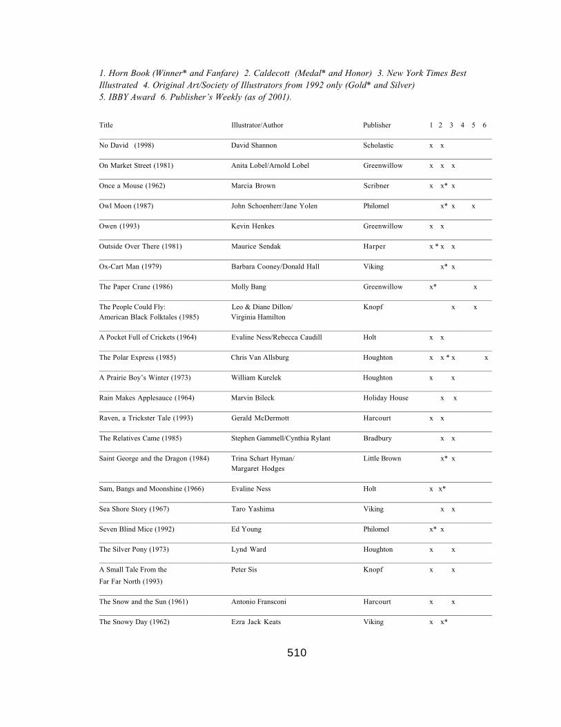
510
1. Horn Book (Winner* and Fanfare) 2. Caldecott (Medal* and Honor) 3. New York Times BestIllustrated 4. Original Art/Society of Illustrators from 1992 only (Gold* and Silver)5. IBBY Award 6. Publisher’s Weekly (as of 2001).
Title Illustrator/Author Publisher 1 2 3 4 5 6___________________________________________________________________________________________________________No David (1998) David Shannon Scholastic x x___________________________________________________________________________________________________________On Market Street (1981) Anita Lobel/Arnold Lobel Greenwillow x x x___________________________________________________________________________________________________________Once a Mouse (1962) Marcia Brown Scribner x x* x___________________________________________________________________________________________________________Owl Moon (1987) John Schoenherr/Jane Yolen Philomel x* x x___________________________________________________________________________________________________________Owen (1993) Kevin Henkes Greenwillow x x___________________________________________________________________________________________________________Outside Over There (1981) Maurice Sendak Harper x * x x___________________________________________________________________________________________________________Ox-Cart Man (1979) Barbara Cooney/Donald Hall Viking x* x___________________________________________________________________________________________________________The Paper Crane (1986) Molly Bang Greenwillow x* x___________________________________________________________________________________________________________The People Could Fly: Leo & Diane Dillon/ Knopf x xAmerican Black Folktales (1985) Virginia Hamilton___________________________________________________________________________________________________________A Pocket Full of Crickets (1964) Evaline Ness/Rebecca Caudill Holt x x___________________________________________________________________________________________________________The Polar Express (1985) Chris Van Allsburg Houghton x x * x x___________________________________________________________________________________________________________A Prairie Boy’s Winter (1973) William Kurelek Houghton x x___________________________________________________________________________________________________________Rain Makes Applesauce (1964) Marvin Bileck Holiday House x x___________________________________________________________________________________________________________Raven, a Trickster Tale (1993) Gerald McDermott Harcourt x x___________________________________________________________________________________________________________The Relatives Came (1985) Stephen Gammell/Cynthia Rylant Bradbury x x___________________________________________________________________________________________________________Saint George and the Dragon (1984) Trina Schart Hyman/ Little Brown x* x
Margaret Hodges___________________________________________________________________________________________________________Sam, Bangs and Moonshine (1966) Evaline Ness Holt x x*___________________________________________________________________________________________________________Sea Shore Story (1967) Taro Yashima Viking x x___________________________________________________________________________________________________________Seven Blind Mice (1992) Ed Young Philomel x* x___________________________________________________________________________________________________________The Silver Pony (1973) Lynd Ward Houghton x x___________________________________________________________________________________________________________A Small Tale From the Peter Sis Knopf x x
Far Far North (1993)___________________________________________________________________________________________________________The Snow and the Sun (1961) Antonio Fransconi Harcourt x x___________________________________________________________________________________________________________The Snowy Day (1962) Ezra Jack Keats Viking x x*

511
1. Horn Book (Winner* and Fanfare) 2. Caldecott (Medal* and Honor) 3. New York Times BestIllustrated 4. Original Art/Society of Illustrators from 1992 only (Gold* and Silver)5. IBBY Award 6. Publisher’s Weekly (as of 2001).
Title Illustrator/Author Publisher 1 2 3 4 5 6___________________________________________________________________________________________________________The Stinky Cheese Man (1992) Lane Smith/Jon Scieszka Viking x x x___________________________________________________________________________________________________________A Story a Story (1970) Gail Haley Atheneum x x*___________________________________________________________________________________________________________The Stray Dog (2001) Marc Simont Harper x x___________________________________________________________________________________________________________Stringbean’s Trip to the Vera B. Williams Greenwillow x xShining Sea (1988) & Jennifer Williams___________________________________________________________________________________________________________The Sun is a Golden Earing (1962) Bernarda Bryson/Natalia Belting Holt x x___________________________________________________________________________________________________________Swamp Angel (1994) Paul O. Zelinsky/Anne Isaacs Dutton x x x___________________________________________________________________________________________________________Swimmy (1963) Leo Lionni Pantheon x x___________________________________________________________________________________________________________The Tale of the Mandarin Leo and Diane Dillon/ Lodestar x* xDucks (1990) Katherine Paterson___________________________________________________________________________________________________________Tar Beach (1991) Faith Ringgold Crown x x___________________________________________________________________________________________________________There Was an Old Lady Simms Taback Viking x xWho Swallowed a Fly (1997)___________________________________________________________________________________________________________Thirteen (1975) Remy Charlip & Jerry Joyner Four Winds x* x___________________________________________________________________________________________________________The Three Robbers (1962) Tomi Ungerer Atheneum x x___________________________________________________________________________________________________________Thy Friend, Obadiah (1969) Brinton Turkle Viking x x___________________________________________________________________________________________________________Tibet:: Through the Red Box (1998) Peter Sis Frances Foster x x___________________________________________________________________________________________________________The Treasure (1979) Uri Shulevitz Farrar x x___________________________________________________________________________________________________________The Tree of Life (2003) Peter Sis Farrar Straus x x*___________________________________________________________________________________________________________The Ugly Duckling (1999) Jerry Pinkney/Adapted from Morrow x x
Hans Christian Anderson___________________________________________________________________________________________________________A Visit to William Blake’s Inn: Alice and Martin Provensen/ Harcourt x xPoems for Innocent and Nancy WillardExperienced Travelers (1981)___________________________________________________________________________________________________________The Wave (1964) Blair Lent/Margaret Hodges Houghton x x___________________________________________________________________________________________________________
Where the Wild Things Are (1963) Maurice Sendak Harper x x* x x x___________________________________________________________________________________________________________Where the Buffalo Begin (1981) Stephen Gammell/Olaf Baker Warne x x x___________________________________________________________________________________________________________Zin! Zin! Zin! A Violin (1995) Majorie Priceman/Lloyd Moss Simon & Schuster x x

512
REFERENCE LIST
Adams, Bess P. (1953). About books and children: Historical survey of children’s
literature. New York: Henry Holt and Co.
Adams, L. S. (1996). The methodologies of art: An introduction. New York: Icon
Editions.
American Library Association. (2001). Caldecott award: Terms and criteria.
Retrieved March 6, 2002, from http://www.ala.org/alsc/caldecott
_terms.html.
American Library Association. (2001) The Randolph Caldecott medal. Retrieved
March 6, 2002, from http://www.ala.org/alsc.caldecott.html.
Arbuthnot, M. H. and Sutherland, Zena. (1972). Children and books, fourth
edition. Glenview, IL: Scott, Foresman and Co.
Armstrong, P. B. (1990). Conflicting readings: Variety and validity in
interpretation. Chapel Hill, NC: The University of North Carolina Press.

513
Armstrong, P. B. (1994). Phenomenology. In M. Groden and M. Kreiswirth,
(Eds.), The John Hopkins guide to literary theory and criticism (pp.562-566). Baltimore:
Johns Hopkins University Press.
Arnheim, Rudolf. (1969). Art and visual perception: A psychology of the creative
eye, sixth printing. Berkley and Los Angles: University of California Press.
Art Education Department of the Ohio State University and the Ohio Arts
Council. (1984). Picture book design conference: From conception to consumption.
Transcription of program, May 18-19.
Bader, Barbara. (1998). American picture books: From Max’s metaphorical
monsters to Lilly’s purple plastic purse. The Horn Book Magazine, 74(2), 141-156.
Bader, Barbara. (1976). American picturebooks from Naoh’s ark to the beast
within. New York: MacMillan.
Baker, Bernadette M. (2001). In perpetual motion: Theories of power, educational
history, and the child. New York: Peter Lang.
Bang, Molly. (2000). Picture this: How pictures work. New York: Seastar Books.
Barnard, Malcolm. (2001). Approaches to understanding visual culture. New
York: Palgrave.

514
Barrett, Terry. (2000). Criticizing art: Understanding the contemporary.
Mountain View, CA: Mayfield Pub. Co.
Barrett, Terry . (2001). Interpreting art: Responding to visual culture. New York:
McGraw Hill.
Barrett, T. and Marantz, K. (1989). Photographs as illustrations. The New
Advocate, 2(4), 227-238.
Barr, John. (1986). Illustrated children’s books. London: The British Library.
Barron, P. P. and Burley, J. Q. (1984). Jump over the moon: Selected professional
readings. New York: Holt, Rinehart and Winston.
Barthes, R. (1977). Image, music, text. New York: Hill and Wang Pub.
Bazalgette, Cary and Buckingham, David. (1995). In front of children: Screen
entertainment and young audiences. London: British Film Institute.
Beckett, S. L. (Ed.). (1990). Transcending boundaries: Writing for a dual
audience for children and adults. New York: Garland Publishing.
Bender, J. W. and Blocker, H. G. (Eds.). (1993). Contemporary philosophy of art:
Reading in analytic aesthetics. Englewood Cliffs, NJ: Prentice Hall.
515
Benedict, S. and Carlisle, L. (Eds.). (1992). Beyond words: Picture books for older
readers and writers. Portsmouth, NH: Heinemann.
Berger, Arthur A. (1989). Signs in contemporary culture: An introduction to
semiotics. Salem, WI: Sheffield Pub. Co.
Bierut, M., Drenttel, W., Heller, St., Holland, D. K. (1994). Looking closer:
Critical writings on graphic design. New York: Allsworth Press.
Belsey, Catherine. (2002). Poststructuralism: A very short introduction. Oxford
and New York: Oxford University Press.
Bettelheim, Bruno. (1976). The uses of enchantment: The meaning and importance
of fairy tales. New York: Vintage Books.
Bland, David. (1969). A history of book illustration. Berkeley, MA: University of
California Press.
Blumer, Herbert. (1970). What is wrong with social theory? In W. Filstead (Ed.),
Qualitative methods (pp. 52-61). Chicago: Rand McNally.
Bodmer, G. R. (1989). The post-modern alphabet: Extending the limits of the
contemporary alphabet book, from Suess to Gorey. Children’s Literature Association
Quarterly, 14(3). 115-117.

516
Bogdan, R. C. and Biklen, S. K. (1992). Qualitative research for education: An
introduction to theory and methods, second edition. Boston: Allyn & Bacon.
Bodger, Joan. (1969, December). Mother Goose: Is the old girl relevant? Wilson
Library Bulletin, 44, 402-407.
Boureau, Alain, (Ed.). (1987). The culture of print. Princeton, New Jersey:
Princeton University Press.
Bowen, James. (1981). A history of western education, volume three: The modern
west, Europe and the new world. New York: St. Martin’s Press.
Brettell, Richard R. (1999). Modern art, 1851-1929: Capitalism and
representation. Oxford and New York: Oxford University Press.
Bredin, Hugh and Santoro-Brienza, Liberato. (2000). Philosophies of art and
beauty: Introducing aesthetics. Edinburgh: University Press.
Britton, Jason. (2002, Oct. 28). A new day for design. Publisher’s Weekly,
249(43), 28-32.
Brothwell, Don, (Ed.). (1976). Beyond aesthetics: Investigations into the nature of
visual art. London: Thames and Hudson.
Brown, R. McAffee. (1992). Persuade us to rejoice: The liberating power of
fiction. Louisville. KT: Westminster John Knox Press.

517
Browning, Oscar. (1892). Aspects of education. New York and Chicago: E. L.
Kellogg and Co.
Butler, Christopher. (2002). Postmodernism: A very short introduction. Oxford
and New York: Oxford University Press.
Burnham, Jack. (1971). The structure of art. New York: George Braziler.
Cameron, Eleanor. (1969). The green and burning tree. Boston: Little Brown and
Company.
Campbell, Joseph with Moyers, Bill. (1988). The power of myth. New York:
Doubleday.
Cantor, Norman. (1997). The American century. New York: Harper Collins
Publishers.
Carrier, David. (2000). The image sequence: Or, moving modernist pictures. In
The aesthetics of comics (pp. 47-59). University Park, PA: The Pennsylvania State
University Press.
Carrier, David. (2000). Words and pictures bound together: Or, experiencing the
unity of comics. In The aesthetics of comics (pp. 60-74). University Park,
Pennsylvania: the Pennsylvania State University Press.

518
Cech, John. (1995). Angels and wild things: The archetypal poetics of Maurice
Sendak. University Park, PA: Pennsylvania State University Press.
Cech, John. (1986, May/June). Maurice Sendak: Off the page. The Horn Book
Magazine, 62, 305-313.
Cefali, Leslie. (1994, Jan.). What’s so funny about parody? Instructor, 103(5), 82.
Chapman, L.H. (1982). Instant art instant culture: The unspoken policy for
American schools. New York: Teachers College Press.
Children’s Book Council. (1996). Children’s books: Awards and prizes. New
York: The Children’s Book Council.
Children’s Book Council. (2004). Children’s Books: Awards and Prizes. Retrieved
Feb. 12, 2004, from http://awardsandprizes.cbcbooks.org.
Cianciola, Patricia. (1970). Illustrations in children’s books. Dubuque, Iowa: Wm.
C. Brown Co. Pub.
Clark, Margaret. (1998, Jan.). Not the whole story. Signal, Approaches to
Children’s Books, 85, 36-43.
Cleverley, John and Phillips, D. C. (1986). Visions of childhood: Influential
models from Locke to Spock. New York: Teachers College Press, Columbia University.

519
Colby, J. P. (1967). Writing, illustrating and editing children’s books. New York:
Hastings House.
Collingwood, R. G. (1938). The principles of art. Oxford: The University of
Oxford Press.
Colon, A. R. (2001). A history of children: A socio-cultural survey across
millennia. Westport, CN: Greenwood Press.
Colorado State University (1997). Case study. Writing at Colorado State
University. Retrieved February 28, 2004, from http://writing.colostate.
edu/references/research/casestudy/.
Colorado State University (1997). Content analysis. Writing at Colorado State
University. Retrieved February 28, 2004, from http://writing.
colostate.edu/references/research/content/.
Cooney, Barbara. (1998). Making picture books: The pictures. The Horn Book
Magazine,74(2), 190-193.
Cooren, F. (2000). The organizing property of communication. Amsterdam and
Philadelphia, PA: John Benjamin Publishing.
Consortium of National Arts Education Associations. (1994). National standards
for arts education: Dance, music, theatre, visual arts: What every young American should
know and be able to do in the arts. Reston, VA: Music Educators National Conference.
520
Cornell University Library. (2005). The fantastic in art and fiction: The grotesque.
Retreived February 12, 2005 from http://fantastic.library.cornell.
edu/grotesque.php.
Cox, Roger. (1996). Shaping childhood: Themes of uncertainty in the history of
adult-child relationships. London and New York: Routledge
Craig, James. (1971). Designing with type: A basic course in typography. New
York: Watson-Guptill.
Crawford, T. (Ed.). (1998). American institute of graphic design: Professional
practices in graphic design. New York: Allsworth Press.
Culler, Jonathan. (1983). Barthes: A very short introduction. Oxford and New
York: Oxford University Press.
Culler, Jonathan (1997). Literary theory: A very short introduction. Oxford,
England: Oxford University Press.
Culler, Jonathan. (1981). The pursuit of signs: Semiotics, literature,
deconstruction. Ithaca, NY: Cornell University Press.
Cummings, J. and Kiefer, B. (Eds.). (1999). Wings of an artist: Children’s book
illustrators talk about their art. New York: Harry N Abrams.

521
Davey, Nicholas. (1999), The hermeneutics of seeing. In Heywood, Ian and
Sandywell, Barry (eds.) Interpreting visual culture. London and New York: Routledge.
Davies, Stephen. (Summer, 1990). Functional and percedural definitions of art.
The Journal of Aesthetic Education, 24(2), 99-105.
Davis, M. G. (1946). Randolph Caldecott, 1846-1886: An appreciation.
Philadelphia: J. B. Lippincott.
Debord, Guy. (1994). The society of the spectacle. New York: Zone Books.
Deutsher, Irwin. (1970). Words and deeds: Social science and social policy. In W.
Filstead (Ed.), Qualitative methods (pp. 52-61). Chicago: Rand McNally.
Dewey, John. (1934). Art as experience. New York: Minton, Balch and Company.
D’haen, Theo. (1990). Verbal/visual crossings 1880-1980. Amsterdam: Rodopi.
Dresang, E. T. and McClelland, K. (1995). Black and white: A journey. The Horn
Book Magazine, 71(6), 704-710.
Druce, Robert. (1990). Colorless green signifieds sleep furiously: Reconciling the
image and the word. In D’haen, Theo. (Ed.) Verbal/visual crossings 1880-1980 (pp. 15-
44). Amsterdam: Rodopi.

522
Duncum, Paul. (2001, Winter). Visual culture: Developments, definitions, and
directions for art education. Studies in Art Education, 42(2), 101-112.
Duncum, Paul and Bracey, Ted. (2001). On knowing: Art and visual culture. New
Zealand: Canterbury University Press.
Eagleton, Terry. (1983). Literary theory: An introduction. Oxford: Basil Blackwell.
Eco, Umberto. (1976). A theory of semiotics. Bloomington: Indiana University
Press.
Efland, A. D. (1990). A history of art education: Intellectual and social currents in
teaching the visual arts. New York: Teachers College Press, Columbia University.
Egoff, Sheila. (1975). The republic of childhood: A critical guide to Canadian
children’s literature in English, second edition. Toronto: Oxford University Press.
Egoff, Sheila, Stubbs, G. T., and Ashley, L. F. (Eds). (1980). Only connect:
readings on children’s literature. Toronto and New York: Oxford University Press.
Eisner, Elliot W. (1988, June/July). The primacy of experience and the politics of
method. Educational Researcher 17, 15-20.
Eisner, Elliot W. (Ed.). (1978). Reading, the arts, and the creation of meaning .
Reston, Virginia: National Art Education Association.

523
Ellis, Alec. (1963). A history of children’s reading and literature. Oxford:
Pergamon Press.
Emerson, Robert, Fretz, Rachel, and Shaw, Linda. (1995). Pursuing members’
meanings. In Writing ethnographic fieldnotes (pp. 108-141). Chicago: University of
Chicago Press.
Evans, Dilys. (2002). Founder’s statement. In Celebrating the fine art of
children’s book illustration (pg. 2). New York: The Society of Illustrators.
Feaver, William. (1977). When we were young: Two centuries of children’s book
illustration. New York: Holt Rinehart and Winston.
Febvre, L. and Martin, H. (1976). The coming of the book: The impact of printing
1450-1800. London: NLB.
Feldman, E. B. (1978). Art, criticism, reading. In Elliot W. Eisner (Ed.) Reading,
the arts, and the creation of meaning (pp. 141-157). Reston, Virginia: National Art
Education Association.
Feldman, E. B. (1996). Philosophy of art education. Upper Saddle River, NJ:
Prentice Hall
Field, E. M. (1892). The child and his book: The history and progress of
children’s literature in England, second edition. London: Wells Gardner, Darton and Co.

524
Flood, J. Heath, S. B., Lapp, D. (1997). Handbook of research on teaching
literacy through the communicative and visual arts. New York: Macmillan Library
Reference USA..
Fox, Geoff, et al. (1976). Writers, critics, and children. New York: Agathon Press.
Gandelman, C. (1991). Reading pictures, viewing texts. Bloomington and
Indianapolis: Indiana University Press.
Gane, Mike (Ed.). (1993). Baudrillard live: selected interviews. New York:
Routledge.
Geertz, C. (1973). The interpretation of culture. New York: Basic Books.
Gibson, A. (1996). Towards a postmodern theory of narrative. Edinburgh,
England: Edinburgh University Press.
Gilson, Nancy. (2002, Feb 10). Words on pictures. The Columbus Dispatch, pp.
F1-F2.
Ginsburg, Nancy and Ginsburg, Roy, (Eds.). Psychoanalysis and culture at the
millennium. New Haven, CT: Yale University Press.
Goldblatt, David and Brown, L. B. (1997). Aesthetics: A reader in the philosophy
of the arts. Upper Saddle River, NJ: Prentice Hall.

525
Golden, J. M. (1990). The narrative symbol in childhood literature: Explorations
in the construction of text. Berlin and New York: Mouton de Gruyter.
Goldman. A. H. (1995). Aesthetic value. Boulder, CO: Westview Press.
Goldstone, B. P. (2001-2002, Dec./Jan.). Whaz up with our books? Changing
picture book codes and teaching implications. Reading Teacher, 55(4), 362-370.
Gombrich, E. H. (1968) Art and illusion: A study in the psychology of pictorial
representation. London: Phaidon Press.
Gombrich, E. H. (1995). The story of art, fifteenth edition reprinted. London:
Phaidon Press Limited.
Goodall, H. L. Jr. (2000). Writing the new ethnography. New York: Alta Mira.
Goodman, Ken. (1996). On reading. Portsmouth, NH: Heinemann.
Goodman, Y. M. (1990). How children construct literacy. Newark, DE:
International Reading Association.
Graham, Gordon. (2000). Philosophy of the arts: An introduction to aesthetics,
second edition. London and New York: Routledge.
Graham, G. and Richard, A.. (Eds.). (1996). The book in the United States today.
New Brunswick, NJ: Transaction Publishers.

526
Gross, Gerald, (Ed.). (1993). Editors on editing: What writers need to know about
what editors do, third edition. New York: Grove Press.
Hade, Daniel. (2002, Sept./Oct.). Storyselling: Are publishers changing the way
children read? The Horn Book Magazine 78, 509-517.
Halls, K. M. (2003, April/May). When Picturebooks grow up. Books Links,
12(5), 51-54.
Hauser, Arnold. (1999). The social history of art, volume 1: From prehistoric
times to the middle ages, third edition. London and New York: Routledge.
Hauser, Arnold. (1999). The social history of art, volume 2: Renaissance,
Mannerism and Baroque, third edition. London and New York: Routledge.
Hauser, Arnold. (1999). The social history of art, volume 3: Rococo, Classicism
and Romanticism, third edition. London and New York: Routledge.
Hauser, Arnold. (1999). The social history of art, volume 4: Naturalism,
impressionism, the film age, third edition. London and New York: Routledge.
Haviland, Virginia. (1973) Children and literature: Views and reviews. New York:
Lothrop, Lee and Shepard.
Hazard, Paul. (1965). Books children & men, sixth printing. Boston: The Horn
Book, Inc.

527
Heller, Steven. (1998). The education of a graphic designer. New York: Allsworth
Press.
Heller, S. and Arisman, M. (2000). The education of an illustrator. New York:
Allsworth Press.
Heywood, Ian and Sandywell, Barry (Eds.). (1999). Interpreting visual
culture:Exploration in the hermeneutics of the visual. London and New York: Routledge.
Hickman, J., Helper, S., Cullinan, B. E. (Eds.). Children’s literature in the
classroom: Extending Charlotte’s Web. Norwood, MA: Christopher-Gordan Publishers.
Higgins, J. E. (1970). Beyond words: Mystical fancy in children’s literature. New
York: Teacher’s College Press.
Hillman, Judith. (1999). Discovering children’s literature, second edition. Upper
Saddle River, NJ: Merrill.
Hoare, Geoffrey. (1977, Spring). The work of David Macaulay. Children's
Literature in Education , 8, 12-20.
Hobbs, A. S. (1989). Beatrix Potter’s art. London and New York: Frederick
Warne.
Hodnett, Edward. (1982). Image and text. London: Scolar Press.

528
Holmes, J. O. (1988, Oct. 28). The way David Macaulay works. Publisher's
Weekly, 235, 30-31.
Holt, David K. (2001). The search for aesthetic meaning in the visual arts: The
need for the aesthetic tradition in contemporary art theory and education. Westport CT:
Greenwood Publishing.
Holub, R. C. (1994). Habermas, Jurgen. In M. Groden and M. Kreiswirth, (Eds.),
The John Hopkins guide to literary theory and criticism (pp.364-365). Baltimore: Johns
Hopkins University Press.
The Horn Book, Inc. (2003). A little history of the Horn Book magazine.
Retrieved November 22, 2003, from http://www.hbook.com/history1.shtml.
The Horn Book, Inc. (2003). The Boston Globe-Horn Book awards. Retrieved
November 22, 2003, from http://www.hbook.com/bghb2000s.shtml.
Horning, K. T. (1997). From cover to cover: Evaluating and reviewing children’s
books. New York: Harper Collins.
Horovitz, Carolyn. (1969, December). Fiction and the paradox of play. Wilson
Library Bulletin, 44, 397-401.
Houghton Mifflin. (2004). Jumanji, 1982 Caldecott medal acceptance. Retrieved
March 27, 2004, from http://www.houghtonmifflinbooks.com.
authors.vanallsburg/caljumanji.shtml.

529
Houghton Mifflin. (2003). Movie Press Release: The Polar Express by Chris Van
Allsburg. Retrieved March 27, 2004, from http://www.
houghtonmifflinbooks.com/booksellers/press_release/polar/index.shtml.
Hourihan, Margery. (1997). Deconstructing the hero: Literary theory and
children’s literature. London and New York: Routledge.
Hughes, F. P. (1991). Children, Play, and Development. Boston: Allyn and Bacon.
Hunt, Peter. (1990). Children’s literature: The development of criticism. London:
Routledge.
International Board on Book For Young People. (2004). The IBBY honour list.
Retrieved February 24, 2004, from http://www.ibby.org/Seiten/
04_honour.htm.
Jacobs, J. S. and Tunnell, M. O. (1996). Children’s literature briefly. Englewood
Cliffs, NJ: Merrill.
Jameson, F. (2000). Postmodernism, or the cultural logic of late capitalism. In
Michael Hardt and Kathi Weeks (Eds.) The Jameson reader (pp. 188-232). Oxford, UK:
Blackwell Press.
Jan, Isabelle. (1969). On children’s literature. New York: Schocken Books.

530
Jay, M. (1993). Downcast eyes: The denigration of vision in twentieth century
French thought. Berkley: University of California Press.
Jay, M. (1989). In the empire of the gaze: Foucault and the denigration of vision
in the 20th century French thought. In L. Appignanesi (Ed.), Postmodern ICA Documents
(pp. 49-74). London: Free Association Books.
Johansen, J. D., and Larsen, S. E. (2002). Signs in use: an introduction to
semiotics. New York: Routledge.
Johnson, J. A., Dupuis, V. L., Musial, D., Hall, G. E., Gollnick, D.M., (1999).
Introduction to the foundations of American education, eleventh edition. Boston: Allyn and
Bacon.
Johnson, E., Sickels, E. R., Sayers, F. C., and Horovitz, C. (Eds.). (1977).
Anthology of children’s literature. Boston: Houghton Mifflin, Co.
Jones, H. L. (1972). Robert Lawson, illustrator: A selection of his characteristic
illustrations. Boston: Little, Brown and Co.
Kepes, Gyorgy. (1964). Language of vision, eleventh printing. Chicago: Paul
Theobald and Company.
Kepes, Gyorgy, (Ed.). (1966). Sign image symbol. New York: George Braziller.

531
Kiefer, B. Z. (1995). The potential of picturebooks: From visual literacy to
aesthetic understanding. Englewood NJ: Merrill
Kim, Kyong L. (1996). Caged in our own signs: A book about semiotics.
Norwood, NJ: Ablex Pub. Corp.
Kingman, Lee. (1978). The illustrator’s notebook. Boston: The Horn Book
Incorporated.
Klemin, Diane. (1966). The art of art for children’s books: A contemporary
survey. New York: Clarkson N. Potter, Inc. Pub.
Kloss, Robert J. (1989, Winter). Fantasy and fear in the work of Maurice Sendak.
Psychoanalytic Review, 76(4), 567-579.
Korsmeyer, Carolyn, (Ed.). (1998). Aesthetics: The big questions. Malden, MA:
Blackwell Publishers.
Kostelnick, Charles and Hassett, Michael. (2003). Shaping information: The
rhetoric of visual conventions. Carbondale: Southern Illinois University Press.
Kushner, Tony. (2003). The art of Maurice Sendak: 1980 to the present. New
York: Harry N. Abrams, Inc., Publishers.
Kuskin, Karla. (1998). To get a little more of the picture: Reviewing picture
books. The Horn Book Magazine,74(2), 159-165.

532
Lacy, L. E. (1986). Art and design in children's picture books: An analysis of
Caldecott-winning illustrations. Chicago: American Library Association.
Lacey, N. (2000). Narrative and genre: Key concepts in media studies. New York:
St. Martin’s Press.
LaFountain, M. J. (1997). Dali and postmodernism: this is not an essence.
Albany, NY: State University of New York Press.
Lamb, Wendy. (1998, Sept.). Strange business: The publishing point of view.
Signal, Approaches to Children’s Books, 87, 167-73.
Langer, J. A. (1995). Envisioning literature: Literary understanding and literature
instruction. New York: Teachers College Press, Columbia University.
Lanes, Selma. (1980). The art of Maurice Sendak. New York: Harry M. Abrahms,
Inc.
Lanes, Selma. (1971). Down the rabbit hole: Adventures and misadventures in the
realm of children’s literature. New York: Atheneum.
Leitch, V. B. (1988). American literary criticism: From the 30s to the 80s. New
York: Columbia University Press.
Lewis, Claudia. (1994). Maurice Sendak: How readers interpret the trilogy. The
New Advocate, 7(2), 127-135.

533
Lewis, David. (2001). Reading contemporary picturebooks: Picturing text. London
and New York: Routledge/Falmer.
Linn, R. (1996). Richard Rorty's postmodern synthesis. In A teacher's
introduction to postmodernism (pp. 28-48). Urbana, Illinois: National Council of
Teacher's of English.
Lipson, E. R. (2002, November 17). From 'Two Little Trains' to 'I Stink!' New
York Times, Section 7, pg.36.
Litowinsky, Olga. (2001). It’s a bunny-eat-bunny world: A writer’s guide to
surviving and thriving in today’s competitive children’s book market. New York: Walker.
Loer, Stephanie. (1999). Author spotlight: Chris Van Allsberg. Houghton Mifflin
Company. Retreived March 27, 2004 from http//www.
eduplace.com/author/vanallsberg/interview.html.
Lowenfeld, Viktor and Brittain, W. L. (1975). Creative and mental growth, sixth
edition. New York: Macmillan.
Lukens, Rebecca J. (1990). A critical handbook of children's’ literature, fourth
edition. New York: Harper Collins.
MacCann, Donnarae. (1969, December). A valid criticism for children’s books.
Wilson Library Bulletin, 44, 394-396.
534
McCarthy, Tara. (1997). Teaching literary elements. New York: Scholastic.
Macaulay, David. (1991). Caldecott medal acceptance. The Horn Book Magazine,
67, 410-421.
Magnussen, A. and Christiansen, H. (Eds.). (2000). Comics and culture:
Analytical and theoretical approaches to comics. Copenhagen, Denmark: Museum
Tusculanum Press, University of Copenhagen.
Mahoney, B. E. and Whitney, E. (1930). Contemporary illustrators of children’s
books. Boston: The Bookshop for Boys and Girls.
Mallan, Kerry. (1999). In the picture: Perspectives on picture book art and artists.
New South Wales, Australia: Centre for Information Studies.
Marantz, Kenneth. (Ed.) (1994). The picturebook: Source and resource for art
education. Reston Virginia: National Art Education Association.
Marantz, Kenneth. (1978). On the mysteries of reading and art: The picturebook
as art object. In Elliot W. Eisner (Ed.) Reading, the arts, and the creation of meaning (pp.
71-87). Reston, Virginia: National Art Education Association.
Marantz, Kenneth. (1985, Oct.). Review of Chris Van Allsburg,: The polar
express. School Library Journal, 31, 164-165.

535
Marantz, Sylvia. (1992). Picture books for looking and learning: Awakening
visual perceptions through the art of children’s books. Phoenix, AZ: Oryx Press.
Marantz, K. and Marantz, S. (1992). Artists of the page: Interviews with
children’s book illustrators. Jefferson, North Carolina: McFarland & Co.
Marantz, K. and Marantz, S. (1988). The art of children’s picture books: A
selective reference guide. New York: Garland Pub.
Marantz, K. and Marantz, S. (1995). The art of children’s picture books: A
selective reference guide, second edition. New York: Garland Pub.
Marantz, K. and Marantz, S. (1997). Creating picturebooks: Interviews with
editors, art directors, reviewers, booksellers, professors, librarians, and showcasers.
Jefferson, North Carolina: McFarland & Co.
Marantz, K. and Marantz, S. (1994). Multicultural picture books: Art for
understanding others, Vol. 1. Worthington, Ohio: Linworth Pub. Co.
Marantz, K. and Marantz, S. (1997). Multicultural picture books: Art for
understanding others, Vol. 2. Worthington, Ohio: Linworth Pub. Co.
Marcus, L. S. (1983-84). The artist’s other eye: the picture books of
Mitsumasa Anno. Lion and the Unicorn, 7/8, 34-46.

536
Marcus, L. S. (2001, July 16). A collaborative effort. Publisher’s Weekly, 248(29),
84-87.
Marcus, L. S. (1998). An interview with Walter Lorraine. The Horn Book
Magazine,74(2), 168-182.
Marcus, L. S. (2003, Nov./Dec.). A second look: Where the wild things are. The
Horn Book Magazine, 79, 703-706.
Marcus, L. S. (2001). Side by side: Five favorite picture-book teams go to work.
New York: Walker & Company.
Matthews, G. B. (1994). The philosophy of childhood. Cambridge, MA and
London: Harvard University Press.
Mayer, Frederick. (1973). A history of educational thought, third edition.
Columbus, Ohio: Charles E. Merrill Publishing Co.
Mayring, Philipp (2000, June). Qualitative Content Analysis. Forum Qualitative
Sozialforschung / Forum: Qualitative Social Research (On-line Journal), 1(2). Retrieved
February 28, 2004, from http://www.qualitative-research.net/fqs-texte/2-00/2-00mayring-
e.htm.
McKee, Barbara. (1986, Sept./Oct.). Van Allsburg: From a different perspective.
The Horn Book Magazine. 62(5), 566-571.

537
Meggs, P.B. (1998). A history of graphic design, third edition. New York: John
Wiley and Sons.
Meigs, Cornelia, (Ed.). (1969). A critical history of children’s literature, revised
edition. Toronto: MacMillan.
Merrell, Floyd. (1997). Peirce, signs, and meaning. Toronto: University of
Toronto Press.
Miller, J. H. (1992). Illustration. Cambridge, MA: Harvard University Press.
Mirzoeff, Nicholas. (1999). An introduction to visual culture. London and New
York: Routledge.
Mishler, E. G. (1979). Meaning in context: Is there any other kind? Harvard
Educational Review, 49(1).
Mitchell, W. J. T. (1986). Iconology: Image, text, ideology. Chicago: The
University of Chicago Press.
Mitchell, W. J. T. (Ed.). (1980). The language of images. Chicago: The University
of Chicago Press.
Mitchell, W. J. T. (Ed.). (1981). On narrative. Chicago: The University of
Chicago Press.

538
Mitchell, W. J. T. (1994). Picture theory. Chicago: The University of Chicago
Press.
Mitchell, W. J. T. (1997) What do pictures want? An idea of visual culture. In
Terry Smith, (Ed.) In visible touch: modernism and masculinity (215-232). Chicago: The
University of Chicago Press.
Mitchell, W. J. T. (2002) Showing seeing: A critique of visual culture. In Michael
Ann Holly and Keith Moxey (Eds.) Art history, aesthetics, visual studies (231-249).
Williamstown, MA: Sterling and Francine Clark Art Institute
Moran, M. G. and Ballif, M. (2000). Twentieth-century rhetorics and
rhetoricians: Critical studies and sources. Westport, CT: Greenwood Press.
Moseley, Ann. (1988). The journey through the “space in the text” to where the
wild things are. Children’s Literature in Education, 19(2), 86-93.
Moxey, Keith. (1994). Hieronymus Bosch and the “world upside down”: The
case of The Garden of Earthly Delights. In Norman Bryson, Michael Ann Holly and
Keith Moxey (Eds.) Visual culture: Images and interpretations (104-140). Hanover, MA:
University Press of New England and Wesleyan University Press.
National Endowment for the Arts. (1988). Toward civilization: A report on arts
education. Washington, D. C.: NAEA.
539
Neill, James. (2003). Content analysis. Analysis of professional literature.
Retrieved February 28, 2004, from http://www.wilderdom.com/oecourses/PROFLIT/
Class8Qualitative3.htm.
News. (1996). Van Allsburg “confesses” on Polar Express anniversary. School
Library Journal, 42(1), 18.
Nikola-Lisa, W. (1994). Play, panache, pastiche: Postmodern impulses in
contemporary picture books. Children’s Literature Association Quarterly ,19(1), 35-40.
Nikolajeva, Maria and Scott, Carole. (2001). How picturebooks work. New York:
Garland Pub.
Nikolajeva, Maria and Scott, Carole. (2000) The dynamics of picturebook
communication. Children’s Literature in Education, 34(4), 225-239.
Nodelman, Perry. (1988). Words about pictures: The narrative art of children’s
picture books. Athens: the University of Georgia Press.
Panofsky, E. (1982). Meaning in the visual arts. Chicago: The University of
Chicago Press.
Parsons, M. J. (1987). How we understand art: A cognitive developmental account
of aesthetic experience. Cambridge and New York: Cambridge University Press.

540
Pellowski, Anne. (1980). Made to measure: Children’s books in developing
countries. France: UNESCO.
Pennell, Joseph. (1971). The illustration of books (a facsimile reprint of the 1896
edition published in London by T. Fisher Unwin). AnnArbor, Michigan: Gryphon
Books.
Perkins, D. N. (1978). Metaphorical perception. In Elliot W. Eisner (Ed.)
Reading, the arts, and the creation of meaning (pp. 111-139). Reston, Virginia: National
Art Education Association.
Perrot, J. (1991-92, Winter). Deconstructing Maurice Sendak's Postmodern
Palimpsest. Children's Literature Association Quarterly, 16(4), 259-263.
Pitz, H. C. (1963). Illustrating Children’s Book: History, technique, production.
New York: Watson Guptill Pub.
Pope, A. (2001). 2002 Children’s writers and illustrator’s market. Cincinnati,
OH: Writer’s Digest Books.
Quimby, Harriet. (1963, December). Review of Sendak, Maurice: Where the wild
things are. School Library Journal, 10, 43.
Rabinow, Paul, (Ed.). (1984). The Foucault reader. New York: Pantheon Books.

541
Rahn, Suzanne. (1983-84). Beneath the surface with “Fungus the Bogeyman.”
Lion and the Unicorn, 7/8, 5-19.
Rajan, Tilottama. (1994). Hermeneutics. In M. Groden and M. Kreiswirth, (Eds.),
The John Hopkins guide to literary theory and criticism (pp.375-378). Baltimore: Johns
Hopkins University Press.
Reading Rocket. (2004). Reading rocket’s interview with Chris Van Allsburg.
Retrieved March 27, 2004, from http://www.readingrockets.org.transcript.php?ID=69.
Read, Herbert. (1956) Art and society, third edition. London: Faber and Faber.
Reed Business Information. (1990). Editorial review: Just a dream by Chris Van
Allsberg. Publisher’s Weekly. Retreived October 5, 2004 from http://www.amazon.com/
exec/obidos/tg/detail/-/o395533082/ref=pd_sim_books_ 1/103-51491895103047?v=glance
&s=books
Rees, David. (1988, Fall). King of the wild things. San Jose Studies, 14(3), 96-107.
Review. (1993, May/June). Scieszka, John and Smith, Lane: The stinky cheese
man and other fairly stupid tales. Instructor, 102(9), 24.
Review. (1963, October). Sendak, Maurice: Where the wild things are. School
Library Journal, 10, 153.

542
Review. (1963, December 15). Sendak, Maurice: Where the wild things are.
Booklist, 59, 386.
Review. (1985, Oct.). Van Allsberg, Chris: The polar express. Bulletin for the
Center for Children’s Books, 39(2), 39.
Richard, Olga. (1969, December). The visual language of the picture book. Wilson
Library Bulletin, 44, 435-447.
Rico, G. L. (1978). Reading for non-literal meaning. In Elliot W. Eisner (Ed.)
Reading, the arts, and the creation of meaning (pp. 33-53). Reston, Virginia: National Art
Education Association.
Rifkin, J. (2000). A postmodern stage. In The age of access (pp. 186-220). New
York: Putnam.
Rivkin, Julie and Ryan, Michael, (Eds.). (1998). Literary theory: an anthology.
Oxford: Blackwell.
Robinson, Muriel. (1997). Children reading print and television. London and
Washington D. C.: The Falmer Press
Rota, Anthony. (1998). Apart from the text. Middlesex, England: Oak Knoll Press.
Rothchild, Lincoln. (1960). Styles in art. New York, Thomas Yoseloff, Inc.

543
Roxburgh, S. (1983-84). A picture equals how many words?: Narrative theory and
picture books for children. Lion and the Unicorn, 7/8, 20-33.
Rudnytsky, P. L. (1993). Transitional objects and potential spaces: Literary uses
of D. W. Winnicott. New York: Columbia University Press.
Russell, D. L. (2001). Literature for children: A short introduction, fourth edition.
New York: Longman.
Sales, Roger. (1978). Fairy tales and after: From Snow White to E. B. White.
Cambridge MA: Harvard University Press.
Schapiro, Meyer. (1973). Words and pictures: On the literal and symbolic in the
illustration of a text. Paris: Mouton.
Scholes, R. (1989). Reading: An intertextual activity. In Protocols of reading (pp.
1-49). New Haven: Yale University Press.
Schwarcz, Joseph H. and Schwarcz, Chava. (1991) The picture book comes of
age: Looking at childhood through the art of illustration. Chicago: American Library
Association.
Scieszka, Jon. (1998 March/April). Design matters. The Horn Book Magazine, 74,
196-208.

544
Sebesta, Sam. (1991). Children’s books: The state of the art. Publishing Research
Quarterly, 7(3), 3-102.
Segel, Elizabeth. (1987). Beastly boys: A century of mischief. Children’s
Literature in Education, 18(1), 3-12.
See, Lisa. (1992, June 8). Where the big deals are: Caldecott medalist Maurice
Sendak inks a film deal with TriStar. Publishers Weekly, 239, 26.
Sendak, Maurice. (1964). Caldecott acceptance speech. The Horn Book Magazine,
40, 345-351.
Sendak, Maurice. (1988). Caldecott & co. New York: Michael di Capua Books.
Shapiro, E. R. (2001). 2002-2003 Writer’s and illustrators guide to children’s
book publishers and agents: Who they are, what they want, and how to win them over.
Roseville, CA: Prima Publishing.
Sheriff, J. K. (1994). Charles Peirce’s guess at the riddle: Grounds for human
significance. Bloomington: Indiana University Press.
Shipps, S. W. (1996). About thinking, about “art.” Journal of Aesthetic Education,
30(1), 73-83.
Shulevitz, Uri. (1985). Writing with pictures. New York: Watson Guptill.

545
Shumay, D. R. (1989). Michel Foucault. Boston: Twayne Publishers.
Shusterman, Richard. (1994). Rorty, Richard. In M. Groden and M. Kreiswirth,
(Eds.), The John Hopkins guide to literary theory and criticism (pp.626-628). Baltimore:
Johns Hopkins University Press.
Sloan, G. D. (1991). The child as critic: Teaching literature in elementary school
and middle school, third edition. New York: Teachers College Press, Columbia
University.
Slythe, R. M. (1970). The art of illustration: 1750-1900. London: The Library
Association.
Smethurst, Wood. (1998). Teaching a young child to read. Cambridge, MA:
Brookline Books.
Smith, Lane. (2002, Nov.). How I learned to love the computer. School Library
Journal, 48(11), 52-55.
Smith, Ralph A. (Ed.). (1966). Aesthetic and criticism in art education: Problems
in defining, explaining, and evaluating art. Chicago: Rand McNally
Sokolowski, R. (2000). Introduction to Phenomenology. Cambridge, England:
Cambridge University Press.

546
Somers, A. B. and Worthington, J. E. (1979). Response guides for teaching
children’s books. Urbana, IL: National Council of Teachers of English.
Sonheim, Amy. (1991). Maurice Sendak. New York: Twayne Publishers.
Soto, L. D. (2000). The politics of early childhood education. New York: Peter
Lang.
Spitz, E. H. (1985). Art and psyche. New Haven: Yale University Press.
Spitz, E. H. (1991). Image and insight: Essays in psychoanalysis and the arts.
New York: Columbia University Press.
Spitz, E. H. (1999). Inside picture books. New Haven: Yale University Press.
Spitz, E. H. (1994). Museums of the mind: Magritte’s labyrinth and other essays
in the arts. New Haven: Yale University Press.
Stanton, Joseph. (1996). The dreaming picture books of Chris Van Allsburg.
Annual of the Modern Language Association Division on Children’s Literature and the
Children’s Literature Association, 24, 161-179.
Steiner, Wendy (Ed.). (1981). Image and code. Michigan: University of Michigan
Press.

547
Stephens, John. (1992). Language and ideology in children’s fiction. London:
Longman Press.
Stephens, John and McCallum, Robyn. (1998). Retelling stories, framing culture:
Traditional story and metanarratives in children’s literature. New York: Garland
Publishing.
Stern, Dan. (1995). The family guide to collecting children’s books: Investing in
the future while enjoying books of today. Santa Monica, CA.: DMS Publishers.
Stevenson, D. (1994, Spring). “If you read this last sentence, I won’t tell you
anything”: Postmodernism, self-referentiality, and The Stinky Cheese Man. Children’s
Literature Association Quarterly, 19, 32-34.
Stewig, J. W. (1995). Looking at picture books. Fort Atkinson, WI: Highsmith
Press.
Stoodt-Hill, B. D. and Amspaugh-Corson, L. B. (2001). Children’s Literature:
Discovery for a lifetime. Upper Saddle River, NJ: Merrill Prentice Hall.
Stormfax. (2004). Is there a Santa Claus? Retrieved October 19, 2004 from
http://www.stormfax.com/virginia.htm.
Tatar, Maria. (1992). Off with their heads: Fairytales and the culture of childhood.
Princeton, NJ: Princeton University Press.

548
Tierney, S. M. (Ed. ). (2002). Children’s writers guide to 2002. West Redding,
CT: Institute of Children’s Literature.
Tinkelman, Murray. (Spring/Summer 2003). Artist or illustrator. Chimes: The
Magazine of the College of Visual and Performing Arts, 1(2), 13-14.
Tolstoy, Leo. (1995). What is art? London and New York: Penguin Books.
Treib, Marc. (1982, Jan./Feb.). Drawing a narrative: Fact and fancy. Print, 36, 46-
55.
Trelease, Jim. (1992). Hey, listen to this: Stories to read aloud. New York: Penguin
Books.
Trelease, Jim. (1985). The read-aloud handbook. New York: Penguin Books.
Turow, Joseph. (1982). The role of “the audience” in publishing children’s books.
Journal of Popular Culture, 16(2), 90-99.
Underdown, H. D. and Rominger, L. (2001). The complete idiot’s guide to
publishing children’s books. Indianapolis, IN: Alpha Books.
Van Allsburg, Chris. (1991). David Macaulay: The early years. The Horn Book
Magazine, 67(4), 422-425.

549
Van Allsburg, Chris (1986, July/Aug.). Caldecott medal acceptance. The Horn
Book Magazine, 62(4), 420-424.
Vandergrift, K. (1980). Child and story: The literary connection. New York:Neal-
Schuman Publishers.
Vidich, A. J. (1960). Participant observation and the collection and interpretation
of data. The American Journal of Sociology, 66, 354-360.
Walker, Sydney R. (2001). Teaching meaning in art making. Worchester, MA:
Davis Publications.
Werbner, Pnina. (1996). The enigma of Christmas: Symbolic violence, compliant
subjects and the flow of English kinship. In Stephen Edgell, Kevin Hetherington, and Alan
Warde, (Eds), Consumption matters (pp. 135-162). Cambridge, MA: Blackwell
Publishers
Whalley, J. I., Chester, T. R. (1988). A history of children’s book illustration.
London: John Murray with the Victoria and Albert Museum.
White, D. A. and Robinson, Robin. (2001). Critical thinking and artistic creation.
Journal of Aesthetic Education, 35(2), 77-85.
Wildberger, M. E. (1993). The Caldecott Club. In Approaches to literature
through authors (pp. 10-54). Phoenix, AR: Oryx Press.

550
Woolley, Catherine. (1991). Writing for children. New York: The Penguin Group.
Yin, R. K. (1994). Case study research: Design and methods, sixth edition.
Thousand Oaks, CA: Sage Publications.
Yolen, Jane. (1981). Touch magic: Fantasy, faerie and folklore in the literature of
childhood. New York: Philomel Books.
Zimmer, Anne and Zimmer, Fred. (1978). Visual literacy in communication:
Designing for development. Tehran, Iran: Hulton Educational Pub. Ltd.
Zolotow, Charlotte. (1998). Making picture books: The words. The Horn Book
Magazine, 74(2), 185-189.
Zvirin, Stephanie. (1989, July). The Booklist interview: David Macaulay.
Booklist, 86, 1892-93.
Zvirin, Stephanie. (1992, September). The Booklist interview: John Scieszka and
Lane Smith. Booklist, 89(1), 57.
551
PICTUREBOOK LIST
Baker, Olaf and Gammell, Stephen (Ill.). (1981). Where the buffalo begin. New
York: Warne.
Brown, Margaret Wise, and Hurd Clement. (1947). Good night moon. New York:
Harper & Row.
Brown, Marcia. (1961). Once a mouse. New York: Scribner.
Buchholz, Quint. (1999). The collector of moments. New York: Farrar, Straus and Giroux
Caldecott, Randolph. (1880). The three jovial huntsmen. London: George
Routledge & Sons.
Comenius, Johann Amos. (1685). Orbis sensualium pictus: A work newly written
by the author in Latin, translated into English by Charles Hoole. London: C. Mearne.
Falls, C. B. (1923). ABC book. New York: Doubleday.
Gag, Wanda. (1926). Millions of cats. New York: Coward McCann.
552
Grimm, Wilhelm and Sendak, Maurice (Ill.). Dear Mili. New York: Harper &
Row.
Helprin, Mark and Van Allsburg, Chris (Ill.) (1989). Swan Lake. Boston:
Houghton Mifflin.
Isaacs, Anne and Zelinsky, Paul O. (Ill.). (1994). Swamp angel. New York: EP
Dutton.
Johnson, D. B. (2000). Henry hikes to Fitchburg. New York: Simon & Schuster
Johnson, Stephen T. (1995). Alphabet city. New York: Viking Press.
Keats, Ezra Jack. (1962). The snowy day. New York: Viking Press.
Krauss, Ruth and Sendak, Maurice (Ill.) (1960). Open house for butterflies. New
York, Harper & Row.
Kuklin, Susan and Jones, Bill T. Dance. New York: Hyperion.
Lawson, Robert. (1940). They were strong and good. New York: Viking.
Lester, Julius and Pinkney, Jerry (Ill.). (1994). John Henry. New York: Dial
Books.
Lionni, Leo. (1960). Inch by inch. New York: Astor-Honor.

553
Lobel, Arnold and Lobel, Anita (Ill.). (1981). On market street. New York:
Greenwillow.
McCarty, Peter. (2003). Hondo and Fabian. New York: Henry Holt.
Macaulay, David. (1990). Black and white. Boston: Houghton Mifflin.
Macaulay, David. (1973). Cathedral. Boston: Houghton Mifflin.
Minarik, Else H. and Sendak, Maurice (Ill.). (1961). Little Bear’s visit. New York:
Harper & Row.
Musgrove, Margaret and Dillon, Leo & Diane (Ills.). (1976). Ashanti to Zulu. New
York: Dial Books
Ness, Evaline. (1966). Sam, Bangs & Moonshine. New York: Henry Holt and Co.
Newbery, John. (1744). A pretty little pocket book. London: Newbery
Nicholson, William. (1927). Clever Bill. New York: Doubleday.
Robbins, Ruth and Sidjakov, Nicolas (Ill.). (1960). Baboushka and the three kings.
Berkeley: Parnassus
Say, Allen. (1993). Grandfather’s journey. Boston: Houghton Mifflin

554
Scieszka, Jon and Smith, Lane (Ill.). (1992). The stinky cheese man and other fairly
stupid tales. New York: Viking.
Scieszka, Jon and Smith, Lane (Ill.). (1989). The true story of the three little pigs.
New York: Viking Kestrel
Sendak, Maurice. (1970). In the night kitchen. New York: Harper & Row.
Sendak, Maurice. (1981). Outside over there. New York: Harper & Row.
Sendak, Maurice. (1963). Where the wild things are. New York: Harper & Row.
Simont, Marc. (2001). The stray dog. New York: Harper Collins.
Sis, Peter. (1992). Komodo. New York: Greenwillow.
Spier, Peter. (1977). Noah’s ark. New York: Doubleday.
Tresselt, Alvin and Duvoisin, Roger (Ill.). (1965). Hide and seek fog. New York:
Lothrop
Van Allsburg, Chris. (1979). The Garden of Abdul Gasazi. Boston: Houghton
Mifflin.
Van Allsburg, Chris. (1981). Jumanji. Boston: Houghton Mifflin.

555
Van Allsburg, Chris. (1985). The polar express. Boston: Houghton Mifflin.
Van Allsburg, Chris. (1983). The wreck of the Zephyr. Boston: Houghton Mifflin.
Wiesner, David. (2001). The three pigs. New York: Clarion.
Yolen, Jane and Schoenherr, John (Ill.). (1987). Owl moon. New York: Philomel.
Zolotow, Charlotte and Sendak, Maurice (Ill.). (1962). Mr. Rabbit and the lovely
present. New York: Harper & Row.