THE 12TH WORKSHOP ON VISUAL ANALYTICS IN ...
62
THE 12TH WORKSHOP ON VISUAL ANALYTICS IN HEALTHCARE VAHC 2021
-
Upload
khangminh22 -
Category
Documents
-
view
3 -
download
0
Transcript of THE 12TH WORKSHOP ON VISUAL ANALYTICS IN ...

THE 12TH WORKSHOP ONVISUAL ANALYTICS IN
HEALTHCAREVAHC 2021

VAHC 2021 (11th workshop on Visual Analytics in Healthcare)
Session 1 – Best Paper
Best Paper: A Multi-scale Visual Analytics Approach for Exploring Biomedical KnowledgeFahd Husain1, Rosa Romero-Gómez1, Emily Kuang1, Dario Segura1, Adamo Carolli Carolli1, Lai Chung Liu1, ManfredCheung1, Yohann Paris1
1Uncharted Software, Toronto, Ontario, Canada
Abstract: This paper describes an ongoing multi-scale visual analytics approach for exploring and analyzingbiomedical knowledge at scale. We utilize global and local views, hierarchical and flow-based graph layouts,multi-faceted search, neighborhood recommendations, and document visualizations to help researchers interactivelyexplore, query, and analyze biological graphs against the backdrop of biomedical knowledge. The generality of ourapproach - insofar as it re-quires only knowledge graphs linked to documents - means it can support a range oftherapeutic use cases across different domains, from disease propagation to drug discovery. Early interactions withdomain experts support our approach for use cases with graphs with over 40,000 nodes and 350,000 edges.Keywords: Human-centered computing—Visualization—Visualization techniques—Treemaps; Human-centeredcomputing—Visualization—Visualization design and evaluation methods
Session 2 – Clinical and Medical Decision Making
Paper 1: Towards a Comprehensive Cohort Visualization of Patients with Inflammatory Bowel DiseaseSalmah Ahmad1, David Sessler1, Jörn Kohlhammer2
1Fraunhofer IGD, Darmstadt, Hessen, Germany; 2Fraunhofer IGD, Darmstadt, Germany GRIS, TU Darmstadt,Darmstadt, Germany
Abstract: This paper reports on a joint project with medical experts on inflammatory bowel disease (IBD). Patientssuffering from IBD, e.g. Crohn’s disease or ulcerative colitis, do not have a reduced life expectancy and diseaseprogressions easily span several decades. We designed a visualization to highlight information that is vital forcomparing patients and progressions, especially with respect to the treatments administered over the years. Medicalexperts can interactively determine the amount of information displayed and can synchronize the progressions to thebeginning of certain treatments and medications. While the visualization was designed in close collaboration with IBDexperts, we additionally evaluated our approach with 35 participants to ensure good usability and accessibility. Thepaper also highlights the future work on similarity definition and additional visual features in this on-going project.Keywords: Cohort Visualization; Visual Cohort Analysis; Inflammatory Bowel Disease
Paper 2: Phoenix Virtual Heart: A Hybrid VR-Desktop Visualization System for Cardiac Surgery Planning andEducation
Jinbin Huang1, Jonathan Douglas Plasencia2, Dianna M.E. Bardo3, Nicholas C. Rubert3, Erik G. Ellsworth4, Steven D.Zangwill4, Chris Bryan1
1CIDSE, Arizona State University, Tempe, Arizona, United States; 2Cardiology, Phoenix Children's Hospital, Phoenix,Arizona, United States 4D CAVA Lab, Phoenix Children's Hospital, Phoenix, Arizona, United States; 3Radiology,Phoenix Children's Hospital, Phoenix, Arizona, United States; 4Cardiology, Phoenix Children's Hospital, Phoenix,Arizona, United States
Abstract: Physicians diagnosing and treating complex, structural congenital heart disease (CHD), i.e., heart defectspresent at birth, often rely on visualization software that scrolls through a volume stack of two-dimensional (2D)medical images. Due to limited display dimensions, conventional desktop-based applications have difficultiesfacilitating physicians converting 2D images to 3D intelligence. Recently, 3D printing of anatomical models has

VAHC 2021 (11th workshop on Visual Analytics in Healthcare)
emerged as a technique to analyze CHD, but current workflows are tedious. To this end, we introduce and describe ourongoing work developing the Phoenix Virtual Heart (PVH), a hybrid VR-desktop software to aid in CHD surgicalplanning and family consultation. PVH is currently being integrated into a 3D printing workflow at a children's hospitalas a way to increase physician efficiency and confidence, allowing physicians to analyze virtual anatomical models forsurgical planning and family consultation.We describe the iterative design process that led to PVH, discuss how it fits into a 3D printing workflow, and presentformative feedback from clinicians that are beginning to use the application.Keywords: Human-computer Interaction, Immersive Visualization, Virtual Reality, Interactive Data Analytics;Radiology, Surgical Planning, Medical Education, Medical Imaging
Paper 3: Communicating Performance of Regression Models Using Visualization in PharmacovigilanceAshley Suh1, Gabriel Appleby1, Erik W Anderson 2, Luca Finelli3, Dylan Cashman4
1Tufts University, Medford, Massachusetts, United States; 2Novartis, Inc., Medford, Massachusetts, United States;3Novartis, Inc., Basel, Switzerland; 4Novartis, Inc., Cambridge, Massachusetts, United States
Abstract: Statistical regression methods can help pharmaceutical organizations improve the quality of theirpharmacovigilance by predicting the expected quantity of adverse events during a trial. However, the use of statisticaltechniques also changes the risk profile of any downstream tasks, due to bias and noise in the model's predictions. Thatrisk profile must be clearly understood, documented, and communicated across many different stakeholders in a highlyregulated environment. Aggregated performance metrics such as explained variance or mean average error fail to tellthe whole story, making it difficult for subject matter experts to feel confident in deciding to use a model. In this work,we describe guidelines for communicating regression model performance for models deployed in predicting adverseevents. First, we describe an interview study in which both data scientists and subject matter experts within apharmaceutical organization describe their challenges in communicating and understanding regression performance.Based on the responses in this study, we develop guidelines for which visualizations to use to communicateperformance, and use a publicly available trial safety database to demonstrate their use.Keywords: Visual Communication, Regression Models, Pharmacovigilance
Paper 4: Interactive Cohort Analysis and Hypothesis Discovery by Exploring Temporal Patterns in Population-LevelHealth Records
Tianyi Zhang1, Thomas H. McCoy2, Roy H. Perlis2, Finale Doshi-Velez3, Prof. Elena L. Glassman3
1Computer Science, Purdue University, West Lafayette, Indiana, United States; 2Center for Quantitative Health,Massachusetts General Hospital, Boston, Massachusetts, United States Harvard Medical School, Boston,Massachusetts, United States; 3SEAS, Harvard University, Cambridge, Massachusetts, United States
Abstract: It is challenging to visualize temporal patterns in electronic health records (EHRs) due to the high volumeand high dimensionality of EHRs. In this paper, we conduct a formative study with three clinical researchers tounderstand their needs of exploring temporal patterns in EHRs. Based on those insights, we develop a new visualizationinterface that renders medical event trajectories in a holistic timeline view and guides users towards interestingpatterns using an information scent based method. We demonstrate how a clinical researcher can use our tool todiscover interesting sub-cohorts with unique disease progression and treatment trajectories in a case study.
Keywords: Human-centered computing—Visualization—Visualization techniques; Human-centeredcomputing—Visualization—Visualization design and evaluation methods

VAHC 2021 (11th workshop on Visual Analytics in Healthcare)
Session 3 – COVID-19 and Public Health
Paper 5: Enabling Longitudinal Exploratory Analysis of Clinical COVID DataDavid Borland1,2, Irena Brain1, Karamarie Fecho3,2, Emily Pfaff1, Hao Xu2, James Champion1, Chris Bizon2, DavidGotz1
1University of North Carolina at Chapel Hill, Chapel Hill, North Carolina, United States; 2RENCI, Chapel Hill, NorthCarolina, United States; 3Copperline Professional Solutions, Pittsboro, North Carolina, United States
Abstract: As the COVID-19 pandemic continues to impact the world, data is being gathered and analyzed to betterunderstand the disease. Recognizing the potential for visual analytics technologies to support exploratory analysis andhypothesis generation from longitudinal clinical data, a team of collaborators worked to apply existing event sequencevisual analytics technologies to a longitudinal clinical data from a cohort of 998 patients with high rates of COVID-19infection. This paper describes the initial steps toward this goal, including: (1) the data transformation and processingwork required to prepare the data for visual analysis, (2) initial findings and observations, and (3) qualitative feedbackand lessons learned which highlight key features as well as limitations to address in future work.Keywords: Visual analytics, temporal event sequence visualization, human-computer interaction, medical informatics, COVID-19
Paper 6: COVID-19 EnsembleVis: Visual Analysis of County-level Ensemble Forecast ModelsSanjana Srabanti1, G. Elisabeta Marai2, Fabio Miranda1
1University of Illinois at Chicago, Chicago, Illinois, United States; 2Electronic Visualization Laboratory, University ofIllinois at Chicago, Chicago, Illinois, United States
Abstract: The spread of the SARS-CoV-2 virus and its contagious disease COVID-19 has impacted countries to anextent not seen since the 1918 flu pandemic. In the absence of an effective vaccine and as cases surge worldwide,governments were forced to adopt measures to inhibit the spread of the disease. To reduce its impact and to guidepolicy planning and resource allocation, researchers have been developing models to forecast the infectious disease.Ensemble models, by aggregating forecasts from multiple individual models, have been shown to be a usefulforecasting method. However, these models can still provide less-than-adequate forecasts at higher spatial resolutions.In this paper, we built COVID-19 EnsembleVis, a web-based interactive visual interface that allows the assessment ofthe errors of ensembles and individual models by enabling users to effortlessly navigate through and compare theoutputs of models considering their space and time dimensions. COVID-19 EnsembleVis enables a more detailedunderstanding of uncertainty and the range of forecasts generated by individual models.Keywords: Human-centered computing—Visualization—Visualization application domains—Visual analytics
Paper 7: Visual Analytics for Decision-Makers and Public Audiences within the United States National COVID-19Response
Elisha Peterson1, Philip B Graff1, Peter Gu1, Max Robinson1
1Applied Physics Laboratory, Johns Hopkins University, Laurel, Maryland, United States
Abstract: The COVID-19 pandemic launched a worldwide effort to collect, process, and communicate public healthdata at unprecedented scales, and a host of visualization capabilities have been launched and maintained to meet theneed for presenting data in ways that the general public can understand. This paper presents a selection ofvisualizations developed in support of the United States National COVID-19 Response, describes the unique set ofconstraints and challenges of operational visualization in this context, and reflects on ways the visualizationcommunity might be able to support public health operations moving forward.Keywords: Human-centered computing—Visualization—Empirical studies in visualization; Applied computing—Life and medicalsciences—Health informatics

VAHC 2021 (11th workshop on Visual Analytics in Healthcare)
Paper 8: Communicating Area-level Social Determinants of Health Information: The Ohio Children’s OpportunityIndex Dashboards
Pallavi Jonnalagadda1, Christine M Swoboda1, Priti Singh1, Harish Gureddygari1, Seth Scarborough1, Ian Dunn2, NathanDoogan2, Naleef Fareed3
1Center for the Advancement of Team Science, Analytics, and Systems Thinking in Health Services andImplementation Science Research, The Ohio State University, Columbus, Ohio, United States; 2The Ohio Colleges ofMedicine Government Resource Center, The Ohio State University, Columbus, Ohio, United States; 3BiomedicalInformatics, Ohio State University, Columbus, Ohio, United States
Abstract: Social determinants of health (SDoH) can be measured at the geographic level to convey information aboutneighborhood deprivation. The Ohio Children’s Opportunity Index (OCOI) is a multi-dimensional area-levelopportunity index comprised of eight health dimensions. Our research team has documented the design, development,and use cases of dashboard solutions to visualize OCOI. The OCOI is a multi-dimensional index spanning the followingeight domains or dimensions: family stability, infant health, children’s health, access, education, housing, environment,and criminal justice. Information on these eight domains is derived from the American Community Survey and otheradministrative datasets maintained by the state of Ohio. Our team used the Tableau Desktop visualization software andapplied a user-centered design approach to developing the two OCOI dashboards— main OCOI dashboard andOCOI-race dashboard. We also performed convergence analysis to visualize the census tracts, where different healthindicators simultaneously exist at their worst levels. The OCOI dashboards have multiple, interactive components: achoropleth map of Ohio displaying OCOI scores for a specific census tract, graphs presenting OCOI or domain scoresto compare relative positions for tracts, and a sortable table to visualize scores for specific county and census tracts.Stakeholders provided iterative feedback on dashboard design in regard to functionality, content, and aesthetics. A casestudy using the two dashboards for convergence analysis revealed census tracts in neighborhoods with low infant healthscores and a high proportion of minority population. The OCOI dashboards could assist end-users in making decisionsthat tailor health care delivery and policy decision-making regarding children’s health particularly in areas wheremultiple health indicators exist at their worst levels.Keywords: Data visualization, social determinants of health, geographical information system, area level deprivation, opportunityindex

A Multi-scale Visual Analytics Approach for Exploring BiomedicalKnowledge
Fahd Husain* Rosa Romero-Gomez Emily Kuang Dario Segura Adamo CarolliLai Chung Liu Manfred Cheung Yohann Paris
Uncharted Software Inc.
Figure 1: A biomedical researcher uses our system prototype to investigate potential drug treatments for SARS-CoV-2 using theCOVID-19 biological graph that was automatically derived from literature. A. The Global View provides an overview of thebiological graph with bundled edges and nodes organized hierarchically in a biomedical ontology. The results of searching forlinks from several articles using DOIs are highlighted. B. The Local View shows the highlighted results extracted as a node-linkflow graph for further analysis. C. The Drill-down Panel displays the underlying evidence extracted from scientific articles forthe inhibition relationship between tocilizumab and IL6.
ABSTRACT
This paper describes an ongoing multi-scale visual analytics ap-proach for exploring and analyzing biomedical knowledge at scale.We utilize global and local views, hierarchical and flow-based graphlayouts, multi-faceted search, neighborhood recommendations, anddocument visualizations to help researchers interactively explore,query, and analyze biological graphs against the backdrop of biomed-ical knowledge. The generality of our approach - insofar as it re-quires only knowledge graphs linked to documents - means it cansupport a range of therapeutic use cases across different domains,from disease propagation to drug discovery. Early interactions withdomain experts support our approach for use cases with graphs withover 40,000 nodes and 350,000 edges.
Index Terms: Human-centered computing—Visualization—Visu-alization techniques—Treemaps; Human-centered computing—
*e-mail: [fhusain, rgomez, ekuang, dsegura, acarolli, nliu, mcheung,yparis]@uncharted.software
Visualization—Visualization design and evaluation methods
1 INTRODUCTION
With over 1.5 million publications a year and more than 50 millionpeer-reviewed articles in existence, the rate and volume of novelscientific research remains overwhelming, having long surpassed ourability to fully understand and utilize what is known [19]. Crises likethe COVID-19 pandemic only exacerbate this situation, with criticalinformation dispersed across the papers published each day [15].To stay up-to-date, scientists must manually review publications tointernalize new knowledge. Therefore, their coverage of the fieldremains small, and at this scale and pace, contextualization of newknowledge and synthesis with prior knowledge is often impractical,biased, and error-prone. While all disciplines are subject to theeffects of rapidly-changing knowledge, the cost in medical researchcan be measured in human lives.
In the field of biomedicine, it is already difficult and time-consuming to develop and validate hypotheses. Against the back-drop of all scientific knowledge, biomedical researchers start witha certain question, and turn to their prior domain knowledge andthe mental models from their specific experiences [17]. As manybiological processes are inherently network phenomena, they arewell suited for graph analysis [37]. For example, when analyzing the

effects of a drug on a disease, biomedical researchers must assemble(or update) biological graphs from literature, analyze their causalstructure, extract relevant subgraphs, highlight novel or alternativepathways that could aid in drug discovery, flag potential viral muta-tions should new pathways appear, and distill all this analysis into alist of drug candidates for downstream trials. Similar graph analyticworkflows are required across a range of biomedical use cases. How-ever, the sheer size and dense connectivity of such graphs makesthem hard to visualize and analyze in real-time.
The primary research contribution of this paper is a multi-scalevisual analytics approach that enables the investigation of biologicalgraphs to facilitate a variety of use cases such as drug discovery,disease analysis, and identification of side-effects. This researchis part of our ongoing effort for DARPA’s Automating ScientificKnowledge (ASKE) program [7]. Utilizing data from our ASKEcollaborators [14, 29], we developed a web-based prototype that vi-sualizes 16 biological graphs against a corpus of 176,000 documents.We then conducted an expert evaluation in order to better under-stand how the system helps biomedical researchers in identifyingdrug-target interactions. Domain experts believe our approach tohave unique value for knowledge exploration, and our initial itera-tion with users underscored that the prototype was easy to interactwith and useful for navigating and analyzing large graphs againstthe backdrop of scientific knowledge. More generally, we believeour design approach is flexible enough to be used for knowledgediscovery in other graph-based domains.
2 RELATED WORK
2.1 Biological Graph VisualizationGraph-based visualizations remain key to understanding biologicalgraphs across a range of use cases [10, 30]. Most existing visualiza-tion approaches support static overviews of the entire graph [18, 20]and interactive views of focused subgraphs [1, 11, 40]. However,research has shown that the inherent multi-scale nature of biologicalgraphs can only be fully appreciated when the entire range fromlocal to global graph structures can be inspected continuously andinteractively [32]. Some tools such as Reactome [35] strike a bal-ance by displaying overviews of biological graphs as well as detailedviews of selected subgraphs or pathways. Yet, in the workflow, theoverviews are replaced by selected pathways and thus global insightis decreased. By contrast, we propose a novel approach for scal-able and performant graph analysis with coordinated and adjustableglobal and local views so the multi-scale character of biologicalgraphs can be preserved and interrogated with multi-faceted search,interactive navigation, and progressive drill-down on demand.
2.2 Large-Scale Scientific Knowledge ExplorationVisualizations of large-scale scientific corpora can be broadly catego-rized into citation-linked graphs [5,9] and similarity clusters [23,38].Citation-linked graphs represent articles as nodes and edges as cita-tions. Cluster visualizations typically apply dimensionality reductionto produce text embeddings that can be visualized as interactive 2-Dscatterplots. For example, Open Knowledge Maps [24] displaysclusters of PubMed [8] articles based on textual similarity. Morerecent approaches visualize biomedical data repositories and sci-entific articles, using metadata for overview, organization, customuser-feeds and semantic querying [22, 24, 25].
Taking inspiration from the above work, we are building the capa-bility for interactive exploration of hierarchical clusters of scientificknowledge, where nested sub-clusters organize related knowledgeat finer resolution. To our knowledge, this visual and interactiveapproach is not yet present in the field at large.
3 DESIGN PROCESS AND GOALS
Our user-centered design process was based on periodic meetingsover eight months with domain experts and stakeholders in systems
biology, bioinformatics, and causal reasoning applied to the study ofinfectious diseases. Based on these interactions, we identified thefollowing high-level design goals (DG):
• DG1. Provide scalable, interactive, and performant visual-izations of biological graphs. Such graphs range from smallones visualized in standard ways to those with over tens ofthousands of nodes and hundreds of thousands of edges. Thevisualization approach should therefore be scalable with real-time interactivity, and should organize knowledge to be as vi-sually digestible as possible. Leveraging the data and ontologyprovided by our knowledge assembly collaborators [12, 14],our approach should enable biomedical researchers to queryand analyze the high-level structures of biological graphs de-rived from domain literature, thereby gaining insight on theontological structure of the extracted causal knowledge.
• DG2. Provide iterative local analysis coordinated withglobal context. While interactive graph overviews are use-ful to identify high-level structural and ontological patterns,biomedical researchers need to isolate and extract relevant sub-graphs for more focused analysis. They also need to iterateon these subgraphs as needed while keeping global context inmind. For example, to judge drug side effects, our approachmust enable researchers to identify incoming and outgoingpathways from particular agents, and iteratively expand ortruncate the subgraph under analysis in light of all pathwaysavailable in the global graph.
• DG3. Promote scientific knowledge synthesis and discov-ery. Researchers should be able to access backing scientificcorpora to further contextualize their analysis and explorerelated knowledge spaces. Using data provided by our collabo-rators [12,14,29], our visualization approach allow researchersto seamlessly navigate back and forth from biological graphsto the scientific corpus at large. In this manner, researchers cantrace pathways expressed in graph form to source documentsand explore related knowledge to broaden their analysis.
4 DATA PROCESSING
Our approach leverages graph and knowledge data from collabo-rating systems in INDRA and COSMOS. INDRA (the IntegratedNetwork and Dynamical Reasoning Assembler) assembles a networkof biological processes from statements extracted from source docu-ments using natural language processing techniques [14]. Extractedmechanistic and causal assertions are standardized and mapped to abiological ontology [13], generating an assembled set of causal state-ments that constitute a biological graph . We further normalize thisstatement data into a multidigraph optimized for real-time browserrendering. Here, biological agents are mapped to nodes clustered asper their ontological category and causal statements are mapped todirected edges between agents, with edges bundled into hyper-edgesto enable layout generation at each level of the ontology.
COSMOS is a knowledge discovery platform that automates theprocess of extracting and assimilating heterogeneous artifacts fromdiverse scientific publications [29]. In addition to enabling searchover a large corpus of publications, COSMOS extracts tables, text,images and source code. The corpus provided by COSMOS consistsof 176,000 documents, complete with metadata and document arti-fact extraction. Knowledge search over this corpus is made availablein our prototype via API. The corpus is also available as an embed-ding dataset, with each document cast as a vector embedding [33].To these embeddings, we apply dimensional reduction via UMAPand hierarchical clustering via HDBSCAN to first project the em-beddings into a 2D space and then group semantically proximatedocuments as nested clusters [27,28]. Moreover, for each cluster, wecompute the alpha shape of its point subspace to establish a polygoncluster boundary [4].

5 VISUALIZATION DESIGN
The following two subsections describe the two main spaces ofour approach - the Graphs space and the Knowledge space - thatwere developed in light of the above design goals (DG). While theskeleton and core components of our approach are in place, wecontinue to refine the visualization, interaction, and analytic designfor both spaces with domain experts.
5.1 Graphs SpaceThe Graphs space is composed of two coordinated views (Fig. 1)that seek to simultaneously provide the global and local perspectivesneeded for multi-scale graph sense-making [31]. As the defaultview, the Global View (Fig. 1. A) provides a visual overview of abiological graph, and has multi-faceted search, real-time navigation,and semantic zoom. The Local View (Fig. 1. B) is a sandbox towhich search results can be iteratively added as a flow graph forfurther inspection. Our coordinated approach uses linked filteringand highlighting so changes in one view are reflected in the other.In this way, we look to enable biomedical researchers to engage inlocal subgraph analysis while contextualizing this analysis withinthe global context of the large-scale graph.
5.1.1 Global ViewThe Global View shows an overview of a selected biological graph[DG1] assembled from large sets of biological causal statements.Each causal statement represents regulations between biologicalagents such as proteins or viruses (e.g. CDC12 phosporylates MID1).The overview global graph displays nested clusters of biologicalagents organized in the background biomedical ontology. We usea hierarchical circle-packing graph layout [3] to show high-levelrelationship structure and the nested concepts of the ontology [DG1].Each ontological group is rendered as rings (in blue) around theirchildren (in orange). To avoid displaying hundreds of thousands ofedges, we also apply edge bundling techniques [16], where edgeswith multiple nodes grounded to the same ontological category arebundled into hyper-edges. Hyper-edges are also wrapped aroundontological rings to avoid edge clutter between groups, and hyper-edge brightness corresponds to the number of bundled statements.Semantic zooming progressively discloses the nested categoriesof the ontology as the researcher dives deeper into an ontologicalbranch.
This view also allows researchers to interrogate biological graphsby using multi-faceted queries [DG2]. Researchers can chain mul-tiple queries related to node attributes (e.g. node degree), edgeattributes (e.g. edge type), and path queries via a search box atthe top of the Graphs space (Fig. 1). Query results are displayedon the Global View using contrast-based highlighting, with resultsforegrounded and the rest of the graph faded out.
5.1.2 Local ViewWhile such global views provide high-level structural information,they face sense-making challenges for multi-scale graphs [16,21,31].To this end, we coordinate the Global View with the Local View(Fig. 1.B), where the latter displays a subgraph containing the subsetof causal statements resulting from preceding search queries [DG2].
Edges are visually encoded based on the implied polarity of theregulation type (e.g. activation, inhibition), curation state (human-verified or unexamined), and directionality (directed or not). We usethe following scale to encode edge polarity: blue for “positive”, redfor “negative”, and gray for “unknown.” We use a filled arrow fordirected edges and a filled box arrow for undirected edges. Human-verified statements are shown with a filled circle, and unexaminedstatements have empty circles (incorrect statements are removedduring data pre-processing) (Fig. 1. B). As directionality is criticalfor understanding causality [41], we use a traditional left-to-rightflow layout algorithm [39] with recent extensions [6].
Selecting a node in the Local View opens a Drill-down Panel forthe Graphs Space to show node metadata (e.g. agent description)and link suggestions for incoming and outgoing relationships rankedby supporting evidence [DG2]. Neighborhood suggestions are alsohighlighted in the Global View so researchers can visualize theglobal connectivity of a given node. Selecting one or more of theserelationship suggestions adds them to the subgraph, which helpswith neighborhood expansion.
5.1.3 Graphs to KnowledgeTo aid trust-building, researchers need to link their graph explorationback to scientific knowledge [DG3]. We build on the links presentin the provided data. For example, selecting an edge reveals theunderlying evidence extracted by INDRA, where this evidence issurfaced as a short-text fragment (Fig. 1. C). Clicking the text opensa modal dialog displaying associated metadata on both source andneighborhood documents provided by COSMOS. The neighborhoodof a given document is taken as the set of semantically similardocuments within the corpus [33]. In this manner, researchers canseamlessly trace a graph edge to its underlying textual evidence andthen to the backing scientific paper.
5.2 Knowledge SpaceThe Knowledge space displays an interactive overview of the scien-tific corpus. The corpus data contains all source material from whichall biological graphs have been assembled, thus encouraging movingback and forth between graph-centric analysis and the literature atlarge [DG3]. Two perspectives on the knowledge corpus [DG3] areavailable via: a Card-based View and a Clusters View.
5.2.1 Card-based ViewThe Card-based View has a tabular layout with each documentas a card, including a preview image of a document artifact andtitle. Cards organize information in chunks, which aids in userscannability. As in the Graphs space, the Knowledge space alsohas rich search capabilities where researchers can perform multiplecompound queries on document attributes, including free text, author,publisher, and the presence of artifacts such as tables or figures.
5.2.2 Clusters ViewWhile the Card-based View supports visual scannability, it suffersfrom visual scalability for large numbers of documents. The Clus-ters View (Fig. ??) thus provides a more scalable perspective onthe scientific corpus using document embeddings. Organized in a2D topology, a point in this visual space is a document, and spatialdistance between points measures semantic similarity. Cluster mem-bers have the same color and are enclosed within a bounding alphashape. Documents designated as “noise” by the clustering algorithm(not in any cluster) are coloured grey with no boundary. To visuallyencode cluster hierarchy, color hue is preserved across levels withlower opacity being applied to coarsest clustering levels.
5.2.3 Metadata and Knowledge to GraphsSelecting a document from either a card in the Card-based Viewor a point in the Clusters View opens a Drill-down Panel in theKnowledge Space with three tabs for deeper interrogation of the doc-ument content. The Preview tab shows document metadata includingtitle, DOI, authors and publisher-related information, with furtherdrill-down available via a dialog with more detailed informationincluding figures and text excerpts as well as the link back to thesource document. This allows the researcher to discover relateddocuments in addition to using spatially proximate documents in theCluster view. The Graphs tab contains links to existing biologicalgraphs in the Graphs space, and fortifies the connection between useranalysis and background scientific literature. The Entities tab showsrelated keywords that helps researchers guide subsequent search.

6 USAGE SCENARIO
While our approach remains general across various biomedicalgraph-based use cases, we focus here on a usage scenario relevantto our current era around the exploration of biological mechanismsof COVID-19. A biomedical researcher is investigating potentialdrug treatments for SARS-CoV-2. Due to prior knowledge, theyknow that SARS-CoV-2 leads to the release of cytokines like IL6,which is associated with more severe symptoms and higher mortalityin COVID-19 patients [2]. They hypothesize that identifying in-hibitors of IL6 may provide potential therapeutics for the treatmentof SARS-CoV-2.
They start their investigation by selecting the COVID-19 graphfrom the available list in the Graphs space. Using their prior knowl-edge of articles related to cytokine release syndrome in severeCOVID-19 cases [42] and recommended medications for COVID-19 [26, 34], they do a search query using the DOIs of these papers.Highlighted results in the Global View show the causal relationshipsextracted from these papers (Fig. 1. A). To further examine theseresults, they click on the “Open Local View” button, which displaysthe corresponding subgraph in the Local View (Fig. 1. B). Theythen select the IL6 node to open the Drill-down Panel with nodemetadata and neighboring relationships. They explore the incomingrelationships for IL6 and identifies a relationship with SARS-CoV-2,and adds this relationship to the subgraph. They then click on thenew relationship to read the underlying evidence, which confirmstheir prior knowledge i.e. that SARS-CoV-2 increases the amount ofIL6.
They continue exploring the subgraph in the Local View andnotices that the relationship from tocilizumab to IL6 is encoded inred, which indicates that tocilizumab is an inhibitor of IL-6. Theystart to wonder if treating a COVID-19 patient with tocilizumabalter their chances of survival. To better understand the involvedbiological mechanisms, they click on the edge to read the pieces ofevidence underlying this relationship in the Drill-down Panel (Fig.1. C). In this panel, they see a check-mark beside the relationshipheading, indicating that this relationship has been vetted by domainexperts and is also supported by 39 pieces of evidence. In this light,they execute a path query that is chained with their prior queries.The results show a pathway from tocilizumab to IL6 to COVID-19,suggesting that tocilizumab (insofar as it acts upon IL6 and thereforecould inhibit the cytokine storm) might be a drug candidate for severeCOVID-19. Having formulated a hypothesis around tocilizumab andCOVID-19 survival rates, they now want to identify if tocilizumabcould have any side effects. To explore this, they inspect the 121outgoing nodes from tocilizumab and see a relationship to immuneresponses. After adding this relationship to the subgraph, theyfind that it is of the inhibition type. By inspecting the underlyingevidence, they also learn that tocilizumab may lower the ability of theimmune system, increasing the risk of superinfections [36]. Throughthis quick exploration using our approach, the researcher has beenable to quickly identify a potential drug to treat COVID-19 as wellas potential side effects. They can continue to expand this line ofinquiry to the backing scientific corpus available in the Knowledgespace, and look to discover publications and research artifacts relatedto this drug. They can also choose to explore other biomedicalhypotheses across the COVID19 graph, and quickly isolate relevantgraph structures and textual support to further analysis.
7 EXPERT EVALUATION
For an initial assessment on our approach to inform future itera-tion, we conducted a two-part evaluation: (i) a focus group withfive external researchers for high-level feedback; and (ii) an onlinequestionnaire focused on usability and utility with one biomedicalresearcher with over ten years of experience. All experts conductresearch on systems biology, bioinformatics, and causal reasoningusing biological models in their daily work. For the focus group,
we presented a demo of the tool before the experts were asked togive general feedback about system function in a group discussionthat lasted around two hours. For the questionnaire, the expert wasfirst asked to complete a task scenario, which was the same as theusage scenario described in Section 6 for investigating potentialdrug treatments for SARS-CoV-2. After completing the scenario,the expert was encouraged to keep using the tool, then respond tothe questionnaire.
The overall opinion of the domain experts was quite positiveregarding the ease of interaction, the scale covered and the over-all usefulness of the prototype. Specifically, the experts found thecoordination between the Global and Local Views very useful fornavigating the contained knowledge. The experts felt that this pro-totype achieves the goal of supporting query formulation whilerepresenting biological relationships in a visually organized way.Some critical feedback received regarded a slight delay when con-ducting large-scale path queries (due to the query’s time-complexitynot currently optimized over large graphs), inconsistencies in somepath query results (because of path alternatives), and the generalneed for better notifications. We plan to address all these concernsin the near future. Overall, domain experts agreed that they wouldlike to use the tool frequently as new features, optimizations andimprovements continue to be developed.
8 CONCLUSION AND FUTURE WORK
In this paper, we introduced a visual analytics approach for scalableexploration of biomedical knowledge that can aid across a range ofbiomedical use cases, from disease propagation to drug discovery.To demonstrate the feasibility of our approach, we implementeda web-based prototype that displays 16 biological models againsta corpus of 176,000 documents. Positive feedback from domainexperts underscores the usefulness and usability of our prototype inhelping them to explore, formulate and validate hypotheses.
Several promising directions exist in terms of future research.While the Global View is visually scalable for graphs of thousandsof nodes and edges, better overviews can be provided to the user viahigh-level summaries and aggregate graph statistics that surface inter-actively during graph exploration. Search remains a critical researchthread, given the scale and complexity of biological graphs. High-lighting and navigation of search results could be further improved.Search functionality can also better incorporate user context, somore relevant results are returned. Similarly, refinements in the Lo-cal View can improve neighborhood suggestions for user-extractedsubgraphs. For example, there are almost 2,000 incoming nodesand 1,000 outgoing ones for IL-6 alone in the COVID-19 graph:path ranking based on user context could help prioritize the edge listfor the problem at hand. For such global and local improvements,we look to explore graph embedding techniques that convert graphstructures into vector representations. Such representations enablevarious downstream analytic tasks, including similarity search forpathways and subgraphs, path ranking, link prediction and so on. Inthe Knowledge space, we plan to refine our hierarchical clusteringfor better visual separation, as well as enrich the view with searchcapability. We also plan to incorporate citation graphs and add se-mantic layers such as topics and extracted artifacts to better facilitateexploration across the available corpus.
On the whole, the generality of our approach means it can extendto other workflows that utilize hierarchically organized knowledgegraphs that are linked to backing documents. In this way, we believeour approach can be applied to a range of biomedical use-cases andultimately support knowledge discovery across different scientificdomains.
ACKNOWLEDGMENTS
This work was supported by the Defense Advanced ResearchProjects Agency (DARPA) under Contract (HR00111990005).

REFERENCES
[1] G. Cesareni. SIGNOR 2.0: The signaling network open resource, 2021.[2] V. J. Costela-Ruiz, R. Illescas-Montes, J. M. Puerta-Puerta, C. Ruiz,
and L. Melguizo-Rodrıguez. SARS-CoV-2 infection: The role ofcytokines in COVID-19 disease. Cytokine & Growth Factor Reviews,54:62–75, Aug. 2020. doi: 10.1016/j.cytogfr.2020.06.001
[3] d3. d3-hierarchy, July 2021.[4] H. Edelsbrunner, D. Kirkpatrick, and R. Seidel. On the shape of a
set of points in the plane. IEEE Transactions on Information Theory,29(4):551–559, July 1983. doi: 10.1109/TIT.1983.1056714
[5] A. T. Eitan, E. Smolyansky, I. K. Harpaz, and S. Perets. ConnectedPapers | Find and explore academic papers, 2021.
[6] elk.js. elk.js, 2020.[7] J. Elliot. Automating scientific knowledge extraction (aske), 2020.[8] N. C. for Biotechnology Information. PubMed, 2021.[9] A. J. Gates, Q. Ke, O. Varol, and A.-L. Barabasi. Nature ’s reach:
narrow work has broad impact. Nature, 575(7781):32–34, Nov. 2019.doi: 10.1038/d41586-019-03308-7
[10] N. Gehlenborg, S. I. O’Donoghue, N. S. Baliga, A. Goesmann, M. A.Hibbs, H. Kitano, O. Kohlbacher, H. Neuweger, R. Schneider, D. Tenen-baum, and A.-C. Gavin. Visualization of omics data for systems biology.Nature Methods, 7(3):S56–68, Mar. 2010. doi: 10.1038/nmeth.1436
[11] B. M. Gyori. Bob with bioagents dialogue system, 2020.[12] B. M. Gyori and J. A. Bachman. EMMAA: Ecosystem of Machine-
maintained models with Automated Analysis, 2020.[13] B. M. Gyori and J. A. Bachman. INDRA BioOntology — INDRA
1.20.0 documentation, 2020.[14] B. M. Gyori, J. A. Bachman, K. Subramanian, J. L. Muhlich,
L. Galescu, and P. K. Sorger. From word models to executable modelsof signaling networks using automated assembly. Molecular SystemsBiology, 13:953, July 2017. doi: 10.15252/msb.20177651
[15] E. M. Hechenbleikner, D. V. Samarov, and E. Lin. Data explosionduring COVID-19: A call for collaboration with the tech industry &data scrutiny. EClinicalMedicine, 23, June 2020. doi: 10.1016/j.eclinm.2020.100377
[16] D. Holten. Hierarchical Edge Bundles: Visualization of AdjacencyRelations in Hierarchical Data. IEEE Transactions on Visualization andComputer Graphics, 12(5):741–748, Sept. 2006. doi: 10.1109/TVCG.2006.147
[17] K. A. Janes, P. L. Chandran, R. M. Ford, M. J. Lazzara, J. A. Papin,S. M. Peirce, J. J. Saucerman, and D. A. Lauffenburger. An engineeringdesign approach to systems biology. Integrative biology : quantitativebiosciences from nano to macro, 9(7):574–583, July 2017. doi: 10.1039/c7ib00014f
[18] L. Jeske, S. Placzek, I. Schomburg, A. Chang, and D. Schomburg.BRENDA in 2019: a European ELIXIR core data resource. NucleicAcids Research, 47(D1):D542–D549, Jan. 2019. doi: 10.1093/nar/gky1048
[19] A. E. Jinha. Article 50 million: an estimate of the number of scholarlyarticles in existence. Learned Publishing, 23(3):258–263, 2010.
[20] M. Kanehisa and S. Goto. KEGG: Kyoto Encyclopedia of Genes andGenomes. Nucleic Acids Research, 28(1):27–30, Jan. 2000.
[21] D. A. Keim. Visual exploration of large data sets. Communications ofthe ACM, 44(8):38–44, Aug. 2001. doi: 10.1145/381641.381656
[22] A. Kerren, K. Kucher, Y.-F. Li, and F. Schreiber. BioVis Explorer: Avisual guide for biological data visualization techniques. PLoS ONE,12(11):e0187341, Nov. 2017. doi: 10.1371/journal.pone.0187341
[23] E. Kibardin. Using topological text analysis for COVID-19 OpenResearch Challenge, Apr. 2020.
[24] P. Kraker, C. Kittel, and A. Enkhbayar. Open Knowledge Maps: Creat-ing a Visual Interface to the World’s Scientific Knowledge Based onNatural Language Processing. 027.7 Zeitschrift fur Bibliothekskultur,4(2):98–103, Nov. 2016. doi: 10.12685/027.7-4-2-157
[25] F. Lekschas and N. Gehlenborg. SATORI: a system for ontology-guidedvisual exploration of biomedical data repositories. Bioinformatics,34(7):1200–1207, Apr. 2018. doi: 10.1093/bioinformatics/btx739
[26] Q. Ma, M. Qiu, H. Zhou, J. Chen, X. Yang, Z. Deng, L. Chen, J. Zhou,Y. Liao, Q. Chen, Q. Zheng, L. Cai, L. Shen, and Z. Yang. The studyon the treatment of Xuebijing injection (XBJ) in adults with severe or
critical Corona Virus Disease 2019 and the inhibitory effect of XBJagainst SARS-CoV-2. Pharmacological Research, 160:105073, Oct.2020. doi: 10.1016/j.phrs.2020.105073
[27] L. McInnes, J. Healy, and S. Astels. Hdbscan: Hierarchical densitybased clustering. The Journal of Open Source Software, 2(11), mar2017. doi: 10.21105/joss.00205
[28] L. McInnes, J. Healy, and J. Melville. UMAP: Uniform Man-ifold Approximation and Projection for Dimension Reduction.arXiv:1802.03426 [cs, stat], Sept. 2020.
[29] U. of Wisconsin Madison. Cosmos: An ai platform for knowledgediscovery and scientific model curation, 2021.
[30] G. A. Pavlopoulos, A.-L. Wegener, and R. Schneider. A survey ofvisualization tools for biological network analysis. BioData Mining,1(1):12, Dec. 2008. doi: 10.1186/1756-0381-1-12
[31] R. Pienta, J. Abello, M. Kahng, and D. H. Chau. Scalable graph explo-ration and visualization: Sensemaking challenges and opportunities.In 2015 International Conference on Big Data and Smart Computing(BIGCOMP), pp. 271–278, Feb. 2015. doi: 10.1109/35021BIGCOMP.2015.7072812
[32] S. Pirch, F. Muller, E. Iofinova, J. Pazmandi, C. V. R. Hutter, M. Chi-ettini, C. Sin, K. Boztug, I. Podkosova, H. Kaufmann, and J. Menche.The VRNetzer platform enables interactive network analysis in Vir-tual Reality. Nature Communications, 12(1):2432, Apr. 2021. doi: 10.1038/s41467-021-22570-w
[33] R. Rehurek and P. Sojka. Software Framework for Topic Modellingwith Large Corpora. In Proceedings of the LREC 2010 Workshop onNew Challenges for NLP Frameworks, pp. 45–50. ELRA, Valletta,Malta, May 2010.
[34] H. Samaee, M. Mohsenzadegan, S. Ala, S. S. Maroufi, and P. Moradi-majd. Tocilizumab for treatment patients with COVID-19: Recom-mended medication for novel disease. International Immunophar-macology, 89(Pt A):107018, Dec. 2020. doi: 10.1016/j.intimp.2020.107018
[35] K. Sidiropoulos, G. Viteri, C. Sevilla, S. Jupe, M. Webber, M. Orlic-Milacic, B. Jassal, B. May, V. Shamovsky, C. Duenas, K. Rothfels,L. Matthews, H. Song, L. Stein, R. Haw, P. D’Eustachio, P. Ping,H. Hermjakob, and A. Fabregat. Reactome enhanced pathway visual-ization. Bioinformatics (Oxford, England), 33(21):3461–3467, Nov.2017. doi: 10.1093/bioinformatics/btx441
[36] E. C. Somers, G. A. Eschenauer, J. P. Troost, J. L. Golob, T. N. Gandhi,L. Wang, N. Zhou, L. A. Petty, J. H. Baang, N. O. Dillman, D. Frame,K. S. Gregg, D. R. Kaul, J. Nagel, T. S. Patel, S. Zhou, A. S. Lauring,D. A. Hanauer, E. Martin, P. Sharma, C. M. Fung, and J. M. Pogue.Tocilizumab for Treatment of Mechanically Ventilated Patients WithCOVID-19. Clinical Infectious Diseases, (ciaa954), July 2020. doi: 10.1093/cid/ciaa954
[37] D. N. Sosa, A. Derry, M. Guo, E. Wei, C. Brinton, and R. B. Altman. ALiterature-Based Knowledge Graph Embedding Method for IdentifyingDrug Repurposing Opportunities in Rare Diseases. In Biocomputing2020, pp. 463–474. WORLD SCIENTIFIC, Kohala Coast, Hawaii,USA, Dec. 2019. doi: 10.1142/9789811215636 0041
[38] J. Stasko. Jigsaw: Visual Analytics for Exploring and UnderstandingDocument Collections, 2013.
[39] K. Sugiyama, S. Tagawa, and M. Toda. Methods for visual understand-ing of hierarchical systems structure. Systems, Man and Cybernetics,IEEE Transactions on, 11:109 – 125, 03 1981.
[40] P. V. Todorov, B. M. Gyori, J. A. Bachman, and P. K. Sorger. INDRA-IPM: interactive pathway modeling using natural language with auto-mated assembly, Nov. 2019. doi: 10.1093/bioinformatics/btz289
[41] W. T. Wright and T. Kapler. Challenges in visualizing complex causal-ity characteristics. In IEEE Pacific Visualization Symposium (PacificVis2018), 2018.
[42] C. Zhang, Z. Wu, J.-W. Li, H. Zhao, and G.-Q. Wang. Cytokine re-lease syndrome in severe COVID-19: interleukin-6 receptor antagonisttocilizumab may be the key to reduce mortality. International Jour-nal of Antimicrobial Agents, 55(5):105954, May 2020. doi: 10.1016/j.ijantimicag.2020.105954

A APPENDIX
Figure 2: The Clusters View represents the document corpus as an interactive 2D topology, where cluster members (documents) have the samecolor and are enclosed in a bounding polygon.

Towards a Comprehensive Cohort Visualization of Patients withInflammatory Bowel Disease
Salmah Ahmad*
Fraunhofer IGDDavid Sessler†
Fraunhofer IGDJorn Kohlhammer‡
Fraunhofer IGDTU Darmstadt
Figure 1: Visualization of a cohort of patients with inflammatory bowel disease with implemented feedback from the evaluations.Users can select data through the menu on the left. On the right side, this data is visualized for each patient in the cohort, with thefocal patient at the top. Time series of blood or stool values, important events and prescribed medications are displayed in eachpatient’s row. A tooltip shows additional information while hovering over an element. A timeline displays disease progression inyears and can be synchronised to a specific element, in this case Mesalazin.
ABSTRACT
This paper reports on a joint project with medical experts on in-flammatory bowel disease (IBD). Patients suffering from IBD, e.g.Crohn’s disease or ulcerative colitis, do not have a reduced lifeexpectancy and disease progressions easily span several decades.We designed a visualization to highlight information that is vitalfor comparing patients and progressions, especially with respect tothe treatments administered over the years. Medical experts caninteractively determine the amount of information displayed and cansynchronize the progressions to the beginning of certain treatmentsand medications. While the visualization was designed in close col-laboration with IBD experts, we additionally evaluated our approachwith 35 participants to ensure good usability and accessibility. Thepaper also highlights the future work on similarity definition andadditional visual features in this on-going project.
1 INTRODUCTION
Inflammatory bowel disease (IBD) is a chronic, costly disease char-acterised by relapsing-remitting symptoms, causing inflammation of
*e-mail: [email protected]†e-mail: [email protected]‡e-mail: [email protected]
the gastro-intestinal tract [2, 14]. Well-known varieties of IBD areCrohn’s disease or ulcerative colitis with clinical features includingdiarrhea, abdominal pain, and, in the case of ulcerative colitis, per-anal bleeding. The disease progression of IBD often spans severaldecades and its prevalence is increasing globally [6]. Managing thisdisease can be complex, since physicians usually only have accessto written patient records of individual patients, which leads to agreat amount of manual work if the complete medical history is tobe considered. Collecting and visualizing this patient data can helpphysicians gain a quick overview of the patient and other similarpatients. The IBD specialists in our collaboration explained to usthat understanding the effects of biologic (protein-based) drugs thatstimulate the body’s response as part of an immunotherapy againstIBD are of particular interest. The first biologic drug that is given toa patient seems to have a larger than expected impact on the diseaseprogression, which makes the decision for a certain compound oneof the most vital steps in the treatment of an IBD patient. Compar-ing patients and their disease progressions in relation to the chosentreatments is therefore an important IBD-specific analysis that ourexperts requested to help raise the standard of care and quality oflife for their IBD patients.
Based on collaboration with IBD specialists we designed a visu-alization to clearly display multimodal information of patients of acohort regarding disease progression and prior treatments. Duringdevelopment, we periodically carried out expert interviews to ensurethat the visualization is moving in the appropriate direction. Thisincluded evaluation sessions with IBD specialists, an external evalu-

ation, and a usability study with university students. Fig. 1 showsthe state of the application after implementing feedback gathered inall these evaluations.
2 RELATED WORK
In recent years, visualization in healthcare has become more widelyused and prevalent. While analyses of IBD treatments and cohortsare a ubiquitous topic of research [16, 19], medical data pertainingthis disease is rarely summarized in a comprehensive visualization.Instead, data tables and independent visualizations are still predomi-nately used [17]. The workshop on visual analytics in healthcare hasestablished itself as an important event showcasing new approachesin the visualization and analysis of medical data. Patient cohorts arean important mechanism for analyzing similar disease trajectoriesand drawing new conclusions about treatments.
Maftools by Mayaconda et al. [13] is a tool that focuses on vi-sualizing a large cohort of the Mutation Annotation Format (MAF)data. Zhang et al. [20] developed a platform for Cohort Analysis viaVisual Analytics (CAVA). This tool is designed to accelerate domainexperts’ cohort studies. Their visualization approach includes aninteractive Sankey diagram to easily display complex analysis path-ways that were chained together. Bernard et al. [3] have developeda visual-interactive system that enables physicians to define andanalyze cohorts of prostate cancer patients. This system focuses ondefining and visualizing patient cohorts and helping physicians andresearchers increasing their analytical workflow. A visualization byAntweiler et al. [1] focuses on identifying, assessing and visualizingclusters in COVID-19 contact tracing networks. Their visualizationdisplays multimodal data of events (contact, first symptoms, testresults) and time periods (infectious periods, quarantine) in a singlerow per person. Events are displayed as colored circles and timespans as colored bars. Their approach is used in our visualization ina modified form. However, none of the previous work targeted IBDor the visualization of similarly long disease progressions.
3 VISUAL COHORT ANALYSIS
The goal of our visualization is to provide a quick overview of adisease progression over a long period of time. Fig. 1 shows ourvisualization filled with example data. The user can select relevantinformation through a menu on the left side. The selected informa-tion is displayed in multiple rows in the resulting visualization onthe right side. A selected focal patient is always displayed at the topof the page and will stay there while the user may scroll throughother patients of the cohort to ensure a good comparability to thisfocal patient. On the bottom of the page, a timeline shows the therelative duration of the treatment history for all patients within thecohort. Aditionally, a tooltip is shown on mouseover with furtherinformation on the corresponding event, e.g. the start and end dateof a prescribed medication. Time series of blood or stool samplesare displayed as a line chart at the top of each row. Below this,different events, e.g. consultations or surgeries can be displayedas icons on the timeline. Prescribed medications are shown in thebottom part of each patient row. Each medication is represented bya colored bar, corresponding to the color chosen in the menu on theleft. Collecting ideas on how to visualize overlapping prescriptionsand events was one part of the usability evaluation. In the currentstate of the visualization, overlapping prescriptions are stacked verti-cally and overlapping events are transparent. Different design ideaswere collected and evaluated and will be implemented in subsequentiterations of the tool. These ideas are further elaborated in Sect. 4.3.
Furthermore, users are able so set the focus of the timeline at thebottom of the page to the peak in a time series of a measurement,a specific event or the start of a medication by pressing a buttonin the menu. In this case, the visualization will shift the timelineto the selected element. In Fig. 1 this alignment is shown for themedication Mesalazin. The user can now compare for example how
Figure 2: Our visualization in a previous iteration, which was usedin the evaluations.
a specific blood level changed after prescribing a specific mediation.Another example is examining disease progression after a surgery.By selecting and deselecting elements in the visualization, physi-cians can easily individualize patient care, after examining howtreatments worked for other patients.
3.1 Technical ImplementationThe basis for our visual-interactive system is data from the Univer-sity Hospital Frankfurt [11]. A complete real-world data set wasnot yet available at the time of the evaluations. For this reason, wetook the data of approx. 500 patients provided by our partners inFrankfurt and constructed a realistic, but simulated data set contain-ing all relevant attributes for the evaluations. The department thatspecializes in treatment of IBD provided the data from their hospitalinformation system (ORBIS) after technical, ethical, and GDPR ap-proval. Our tool was developed as part of a larger project to advancecost-intelligence, data-driven medicine. Our cohort visualization isone module within a software framework that uses the data fromFrankfurt to support decision making by IBD experts. Togetherwith other modules our cohort analysis tool will be integrated intoa dashboard providing the physicians with a powerful analysis toolset. To ensure the accessibility for all modules of the dashboardand to make the database easily extensible with data from additionalsources, the ORBIS data was mapped into a knowledge graph by thedata experts from our consortium. Our tool accesses this data viaa secure connection to the database using SPARQL [18] as querylanguage. The processing of the data to match the requirements ofour visualization is performed on a Java backend. Here, we selecta group of appropriate patients based on their similarity to the fo-cal patient, thus creating a cohort that can be explored using ourvisualization. The visual-interactive tool is implemented as a webapplication. Notable frameworks we use are React.js [15] for thebasis of the application, d3.js [4] for the event-based patient cohortvisualization, and Material-UI [12] for the GUI components.
4 EVALUATION
During development expert interviews were held periodically.Since physicians usually have a very busy schedule, we scheduledfeedback sessions as rare as possible and as often as needed. Wewere able to schedule five sessions with a senior expert at ourpartner clinic in Frankfurt and two meetings with the externaladvisory board to gather this expert advice. The functionality anduser-friendliness of our tool was evaluated by an external companyspecialized in evaluating software solutions in the health sector.We also conducted a quantitative user evaluation with universitystudents to collect feedback on the usability where domain expertisewas not required. All evaluations were conducted with the state ofthe application as shown in Fig. 2.
Data The data set used in all evaluations contained a virtual

patient cohort with simulated multimodal data. It includes bloodsamples of Calprotectin, medical consultations as events and themedications MTX, Cyclosporin, Mesalazin and Adalimumab. Thisdata was chosen in accordance to feedback from IBD specialists, inorder to not distract from the visualization during the interviews. Itwas also constructed to be able to show all relevant features of thevisualization.
4.1 Expert FeedbackFeedback sessions with domain experts were conducted as an onlinevideo meeting, where IBD specialists were shown a live demon-stration of the tool via screensharing. While it would have beenpreferable to have in-person meetings, we had to schedule onlinemeetings due to the pandemic, which caused a more complex tech-nical infrastructure in letting the experts use our application directly.The experts were able to ask questions about the tool at any time.After a demonstration of the features of the tool, we asked the do-main experts about further features they may want to see in the tool(implemented as mock-ups). This approach allowed us to collectfeedback on several design ideas before implementing them into thetool. In general, the feedback was positive. Physicians appreciatedthe clear and easy-to-read layout and the ability to quickly compareseveral patients. It was also noted that our tool could be used inteaching in order to explore long disease progressions and the impactof different treatments on the patient’s wellbeing.
4.2 Functional EvaluationAs part of an evaluation of all modules of the complete dashboard,our module was functionally evaluated by an external company spe-cialized on evaluation in the health sector. First, we presented allcurrent features of our tool with an outlook into future work. Af-terwards, the evaluator asked specific questions about the futureintegration of the tool into the dashboard and assessed functional-ity and usability of the current state of the application. After thelive interview, the application was made available to the evaluatorfor further testing. In general, the assessment of our tool was pos-itive. There were no technical problems in using the applicationand especially the clear overview over a large patient cohort wascommended.
4.3 Usability EvaluationWe conducted a usability evaluation with 35 students on our tool.The students who participated in this evaluation were all taking thecourse on ”user-centered design” at the time and they all study sub-jects related to computer science. Since the goal of the evaluationwas to collect feedback and determine usability flaws in addition tothe domain expert feedbacks, a medical background of the participat-ing students was not required. Students were instructed to interactwith the visualization with no prior knowledge about its featuresand only a short introduction to IBD and patient cohorts. Whileexploring the visualization we asked them to comment on perceivedappealing and disruptive design elements and assess this using theAttrakDiff [10] and System Usability Scale [5] questionnaires. Us-ing this evaluation approach helped us to understand which designelements worked well in guiding users without domain expertise.Further, participants were instructed to examine the visualizationwith respect to consistency, Gestalt laws [8] and reduction of mem-ory load. Complementary to the AttrakDiff questionnaire and inpreparation for creating new design ideas, participants also wereasked to find specific pragmatic and hedonic qualities of the visu-alization. Almost all participants were in the age range of 20-30years old with only one participant in the range of 30-40 years old.Of the 35 participants, 25 were male and 10 female. 62.9% of theparticipants have stated to have prior knowledge in infomation vi-sualization. Feedback in general included improvements on visualaspects of the tool to create an intuitive workflow, impressions of
Type Feedback Impl.
E Highlight important events like infections in adistinctive way.
G#
E Visualize when blood or stool values cross athreshold value.
#
E Sort medications into a hierarchy to identifyproblematic administrations.
G#
E Visualize co-existing diseases and concomitantmedications to ensure no harmful interactionsduring treatments.
G#
E, F Visualize concurrent prescriptions and events. E, F Save the current view as a screenshot. #F The overall design should match the dasboard
for future integration.
F Manually arrange patients to provide a betteroverview.
#
F, U Provide panning and zooming functionality. G#F, U Selected elements do not disappear from the
drop-down menu.
F, U A more prominent highlighting to further distin-guish the focal patient from the other patients.
U Add a higher contrast between the backgroundcolor and the patient’s color.
U Indicate the mouse position to help reading thechart.
G#
U Add icons to the buttons. U Add an additional button to select custom colors
for each element.G#
U Permanently display all patients’ IDs to be ableto quickly locate patients again.
#
U The menu bar should be expandable and col-lapsible.
#
Table 1: Most common feedback from the domain experts (E), thefunctional evaluation (F) and the usability evaluation (U). The circlesindicate whether the feedback is implemented in the current iteration( ), being currently worked on (G#) or not yet implemented (#).
the usability while working with the tool and new design ideas toimprove on perceived flaws.
4.4 Results
The most common feedbacks and feature suggestions from all evalu-ations are collected in Table 1. Table 1 also shows which feedbackis already implemented and being worked on in the current iterationas seen in Fig. 1.
The results of the AttrakDiff evaluation can be seen in Fig. 3.This scale is used to measure pragmatic and hedonic qualities [7]of a product. Pragmatic qualities describe how comprehensible, er-gonomic and task-oriented a product is perceived. Hedonic qualitiesdescribe the innovativeness, enjoyment and general ”appealingness”of a product [9]. On average, participants rated the pragmatic andhedonic quality as well as the attractiveness of the tool as neutral(PQ=3.96, HQI=4.25, HQS=4.1, ATT=3.8, on a lickert scale from1 (disagree) to 7 (agree)). As the participants of the usability eval-uation had no expertise in the domain, these results were to beexpected. Still, neutral values provide insight as this means that theapplication is not badly designed, but at the same time has roomfor improvement, which the students described in the feedback theyprovided. Participants commented positively on the clean inter-face of the visualization with no superfluous components. At thesame time, some participants noted that the empty interface withno selected data felt ”challenging” since they thought it would bedemanding to find the data to display, but were pleasantly surprised

Figure 3: Results of the AttrakDiff evaluation with medium value ofthe dimension with prototype P [10].
Figure 4: System Usability Scale scores. The average score (orangeline) is 66.2 [5].
at the ease of displaying relevant data. The System Usability Scoreaveraged at 66.2, with the lowest score of 22.5 and the highest of97.5 (cf. Fig. 4). The large variance of SUS scores could be a resultof the foreign domain of IBD for computer science students. Whilemost participants placed importance on considering the tool from aphysician’s point of view, some did not see value in using the toolthemselves and scored accordingly.
Fig. 5 shows different design ideas by participants for overlap-ping medications, concurrent events and improvements on the menu.Participants were directed to pay special attention to the limitationimposed by the limited screen space. For medications, a popularapproach was to have the bars interlock. This way, two medica-tions are easily distinguishable while keeping required space to aminimum. For more than two medications, many participants pro-posed decreasing the bar height or using texture to indicate furtherinformation to be accessed via tooltip. Icons were the most popularvisualization technique proposed for events. Combined with colorand transparency, two to three simultanous events can comfortablybe distinguished. For more than three events, displaying them ver-tically with smaller icons was often proposed. Since one frequentfeedback was the inadequate depiction of the buttons, many designideas featured improved menu elements. The button to remove an el-ement from the visualization was often suggested as a bucket or ”X”.Another frequent suggestion included permanently displaying theicon for setting the focus of the timeline on all relevant buttons and
Figure 5: Different design ideas for overlapping medications (a),overlapping events (b) and menu improvements (c).
highlighting the element that is currently selected. Displaying iconson the buttons was commonly referenced in the task of reducingmemory load for the user.
5 CONCLUSION AND FUTURE WORK
We presented a comprehensive visualization for cohorts of patientswith IBD with the ability to display multimodal data. Domainexperts gave quite positive feedback on the visualization and ap-preciated the ability to quickly gain an overview of the diseaseprogression over a long period of time. Our visualization can helpincrease the standard of care by presenting complex information in aconcise and easy to understand manner, allowing specialists to focustheir expertise on patient care instead of manually browsing throughpatient records. We conducted a usability evaluation with universitystudents to gain insight on aspects, where domain expertise was not arequirement. The usability evaluation showed that our visualizationcan be used without the need for an in-depth introduction.
Feedback from both domain experts and university students willbe implemented in subsequent iterations of our tool. The collecteddesign ideas for improvements and new features gave importantimpulses for future developments and will be evaluated again by ourcollaborating domain experts. Furthermore, in our future work wewill work on the similarity definition for long disease progressioncoupled with an interactive filtering approach to allow our experts toquickly define a specific cohort of interest.
ACKNOWLEDGMENTS
This work was funded by the Fraunhofer Lighthouse projecton Medical Data for Individual Treatment and Cost Intelligence(MED2ICIN).

REFERENCES
[1] D. Antweiler, D. Sessler, S. Ginzel, and J. Kohlhammer. Towards thedetection and visual analysis of covid-19 infection clusters. In EuroVisWorkshop on Visual Analytics (EuroVA). Submitted to the EurographicsAssociation, 2021.
[2] D. C. Baumgart and S. R. Carding. Inflammatory bowel disease: causeand immunobiology. The Lancet, 369(9573):1627–1640, 2007.
[3] J. Bernard, D. Sessler, T. May, T. Schlomm, D. Pehrke, and J. Kohlham-mer. A visual-interactive system for prostate cancer cohort analysis.IEEE Computer Graphics and Applications, 35(3):44–55, 2015. doi:10.1109/MCG.2015.49
[4] M. Bostock, V. Ogievetsky, and J. Heer. D3 data-driven docu-ments. IEEE transactions on visualization and computer graphics,17(12):2301–2309, 2011.
[5] J. Brooke et al. Sus-a quick and dirty usability scale. Usability evalua-tion in industry, 189(194):4–7, 1996.
[6] G. Collaborators et al. Global, regional, and national incidence, preva-lence, and years lived with disability for 354 diseases and injuries for195 countries and territories, 1990-2017: a systematic analysis for theglobal burden of disease study 2017. 2018.
[7] S. Diefenbach, N. Kolb, and M. Hassenzahl. The’hedonic’in human-computer interaction: history, contributions, and future research direc-tions. In Proceedings of the 2014 conference on Designing interactivesystems, pp. 305–314, 2014.
[8] L. Graham. Gestalt theory in interactive media design. Journal ofHumanities & Social Sciences, 2(1), 2008.
[9] M. Hassenzahl. The effect of perceived hedonic quality on productappealingness. International Journal of Human-Computer Interaction,13(4):481–499, 2001.
[10] M. Hassenzahl, M. Burmester, and F. Koller. Attrakdiff: Ein Frage-bogen zur Messung wahrgenommener hedonischer und pragmatischerQualitat. In Mensch & computer 2003, pp. 187–196. Springer, 2003.
[11] KGU. University Hospital Frankfurt. https://www.kgu.de/, 2021.Accessed: July 2021.
[12] Material-UI. React components that implement google’s materialdesign. https://material-ui.com/, 2021. Accessed: July 2021.
[13] A. Mayakonda and H. P. Koeffler. Maftools: Efficient analysis, visual-ization and summarization of maf files from large-scale cohort basedcancer studies. BioRxiv, p. 052662, 2016.
[14] D. Piovani, S. Danese, L. Peyrin-Biroulet, and S. Bonovas. Inflamma-tory bowel disease: estimates from the global burden of disease 2017study. Alimentary pharmacology & therapeutics, 51(2):261–270, 2020.
[15] React.js. Facebook inc. https://reactjs.org/, 2021. Accessed:July 2021.
[16] D. Sahoo, L. Swanson, I. M. Sayed, G. D. Katkar, S.-R. Ibeawuchi,Y. Mittal, R. F. Pranadinata, C. Tindle, M. Fuller, D. L. Stec, et al.Artificial intelligence guided discovery of a barrier-protective therapyin inflammatory bowel disease. Nature Communications, 12(1):1–14,2021.
[17] L. A. Sceats, M. S. Dehghan, K. K. Rumer, A. Trickey, A. M. Morris,and C. Kin. Surgery, stomas, and anxiety and depression in inflamma-tory bowel disease: a retrospective cohort analysis of privately insuredpatients. Colorectal Disease, 22(5):544–553, 2020.
[18] SPARQL. Sparql query language for rdf. https://www.w3.org/TR/sparql11-query/, 2013. Accessed: July 2021.
[19] S. R. Vavricka, L. Brun, P. Ballabeni, V. Pittet, B. M. P. Vavricka,J. Zeitz, G. Rogler, A. M. Schoepfer, S. I. C. S. Group, et al. Frequencyand risk factors for extraintestinal manifestations in the swiss inflam-matory bowel disease cohort. Official journal of the American Collegeof Gastroenterology— ACG, 106(1):110–119, 2011.
[20] Z. Zhang, D. Gotz, and A. Perer. Iterative cohort analysis and explo-ration. Information Visualization, 14(4):289–307, 2015.

Phoenix Virtual Heart: A Hybrid VR-Desktop Visualization System forCardiac Surgery Planning and Education
Jinbin Huang*
Arizona State UniversityJonathan D. Plasencia†
Phoenix Children’s HospitalDianna M.E. Bardo‡
Phoenix Children’s HospitalNicholas C. Rubert§
Phoenix Children’s Hospital
Erik G. Ellsworth¶
Phoenix Children’s HospitalSteven D. Zangwill||
Phoenix Children’s HospitalChris Bryan, Member, IEEE**
Arizona State University
ABSTRACT
Physicians diagnosing and treating complex, structural congenitalheart disease (CHD), i.e., heart defects present at birth, often relyon visualization software that scrolls through a volume stack oftwo-dimensional (2D) medical images. Due to limited display di-mensions, conventional desktop-based applications have difficultiesfacilitating physicians converting 2D images to 3D intelligence. Re-cently, 3D printing of anatomical models has emerged as a techniqueto analyze CHD, but current workflows are tedious. To this end, weintroduce and describe our ongoing work developing the PhoenixVirtual Heart (PVH), a hybrid VR-desktop software to aid in CHDsurgical planning and family consultation. PVH is currently beingintegrated into a 3D printing workflow at a children’s hospital as away to increase physician efficiency and confidence, allowing physi-cians to analyze virtual anatomical models for surgical planning andfamily consultation. We describe the iterative design process thatled to PVH, discuss how it fits into a 3D printing workflow, andpresent formative feedback from clinicians that are beginning to usethe application.
Index Terms: Human-computer Interaction—Immersive Visual-ization—Virtual Reality—Interactive Data Analytics; Radiology—Surgical Planning—Medical Education—Medical Imaging
1 INTRODUCTION
Congenital heart disease (CHD) refers to a pathology of the heartwhich is present at birth. The most difficult cases are complex,structural defects, in general. Catheter, a mechanism that can be usedto dilate / occlude anatomical structures or deliver other device types,and / or surgical interventions are often required during infancy forthese complex cases [16]. For both catheter and surgical planning,physicians employ visualization tools for understanding of the spatialrelationships of lesions and anatomy.
To reveal anatomical insights and plan clinical interventions, clini-cians have traditionally employed desktop-based applications whichshow medical images as a volume stack of either 2D computedtomography (CT) or magnetic residence (MR) slices [3]. Theseapplications generally limit the viewing to the in-plane image stackand its two corresponding planes that are orthogonal to each other. Adrawback to this method is that it can take physicians years to trainthemselves to “mentally construct” these three orthogonal imageplanes (called the axial, coronal and sagittal planes) into a 3D-space
*e-mail: [email protected]†e-mail: [email protected]‡e-mail: [email protected]§e-mail: [email protected]¶e-mail: [email protected]||e-mail: [email protected]
**e-mail: [email protected]
of spatial knowledge [9]. Alternatively, while image stacks canalso be visualized using volume rendering [14] or as 3D models,visualizing 3D anatomy on 2D displays has well-known drawbacks,including lack of depth perception and potential for misinterpreta-tion [3].
Recently, the 3D printing of anatomical models based on CT/MRdata has emerged as a strategy for CHD study. Allowing clini-cians to hold a physical representation of a patient’s anatomy hasdemonstrated trends for reduced operating room and case length oftime [25] and promoting a high degree of engagement and thereforeincreased memorability [12, 30]. As an example, our collaboratorhospital (Phoenix Children’s Hospital, or PCH) was one of the firsthospitals in the United States to develop a Cardiac 3D Print Lab tocreate life-size models of hearts from infants with complex forms ofcongenital heart disease to aid surgeons and physicians in surgicalplanning and family consultation. While this hospital is one of thefirst in the United States to support 3D anatomy printing in practice,the current workflow can become tedious (see Figure 1). First, aphysician must dictate printing needs (including the identificationof the anatomical features to reproduce, where cuts should be made,etc.) to an engineer who uses 3D printer software to produce theanatomical model. If changes are needed, the physician must specifyadditional print requests which are interpreted by the engineer andprinted as additional models. The result is, for the physician, largergulfs of execution and evaluation [21], as printing can take severalhours for complex anatomies, as well as increased cost for using3D printing material. Further, while the tactile nature of 3D printedmodels provides certain advantages compared to display on 2Dmonitors, such as improved conceptual understanding of complexanatomy [19] and informing the appropriate catheter course and de-vice [22], these models also have drawbacks, such as low annotationcapacity where only a surface area of interest can be highlightedwith a marker pen. We have been interviewing physicians at PCH tolearn how issues like these are considered bottlenecks in their 3Dprinting workflow. For example, instead of relying on engineers toupdate print requests and having to wait one or more hours everytime a change is needed, physicians would prefer to plan first usingsoftware and make a print after being able to review the anatomy.
VR provides an attractive modality for this scenario, as it providesstereoscopic perspective of 3D anatomies with the benefit that virtualmodels can be explored or altered immediately (thus improvingphysician efficiency) [26]. VR is already being used for CHD tasks,including for treatment planning, training and practice simulation,and educational applications, and rehabilitation [27, 28].
Unfortunately, despite the emerging popularity of VR for cardiacuse, there are questions as to the efficiency of such a technology.For example, VR software tend to employ hand-held controllersfor interaction, which performs poorly in tasks such as text inputand precise selection of small objects, where keyboard-and-mouseinterfaces are much more effective [29]. As these are commonactions in the 3D printing workflow (loading model and image stackfiles, manipulating item color and opacity, etc.), relying on VRas the only means of interaction is likely suboptimal compared to

Figure 1: The 3D printing pipeline at PCH includes medical imageacquisition (A), desktop data analysis (B) and potentially multipleiterations of 3D printing (D) to obtain a desired 3D anatomical model(E). The PVH software employs both desktop (B) and VR (C) tomitigate the need for multiple 3D prints, by allowing physicians to firstvirtually assess and modify anotomical models until satisfied. At thatpoint, a print request can be made (D) to generate a 3D print of themodel (E).
leveraging both VR and desktop modalities.In this paper, we report on our ongoing work developing such
a cross-device system that combines the strength of both VR anddesktop tools to facilitate CHD surgical planning and educationwithin a 3D printing workflow. Our software, called Phoenix Vir-tual Heart (PVH), is being built in an iterative manner with closecollaboration with clinicians at PCH. It consists of two interfaces, aVR interface and the desktop interface, and has been integrated intothe hospital’s existing 3D printing workflow. Each interface in PVHsupports different tasks: spatial manipulations of medical modelsis done in VR to leverage its stereoscopic perspective and intuitivespatial interactions, while common operational tasks are done on adesktop computer with keyboard and mouse, taking advantage offamiliarity of usage for these types of operations. Here, we reporton the specific design goals of this system, and how it is being in-tegrated into hospital use. We also report formative feedback fromphysicians who are beginning to use the tool as a supplement to thehospital’s existing 3D printing capabilities.
2 RELATED WORK
2.1 Immersive Analytics in Medical FieldImmersive analytics (IA) is “the use of engaging, embodied analy-sis tools to support data understanding and decision making” [4].Though the idea behind IA goes back decades [6], it has recentlygained attention due to advances in technology platforms [7]. IAapplications in medical fields are also emerging. Javaid et al. [13]surveyed applications of VR in the medical fields and identified fourmajor application areas: virtual surgery, operation planning, diagno-sis, and physical therapy. He et al. [10] developed a VR techniquethat creates an exploded view to enable interactive exploration ofmedical image “atlas’; (expert labeled tissues or structures) so asto enhance understanding of atlas. Pfeiffer et al. [24] proposed aframework that accommodates data of multiple modalities to aid inpreoperative planning for liver surgery and enhances spatial under-standing. Adams et al. [1] developed an commodity-level simulationwhere users can simultaneously interact with high resolution andtemporal resolution CT and their corresponding 3D structures aswell.
2.2 Visualization Technologies for CHDTraditionally, CHD visualization has been done on the desktop usingmedical images (such as image stacks from CT or MR data) and/oranatomical reconstruction models to assist CHD procedures [3]. Theuse of 3D printing, which provides benefits such as tactile feedbackand life-size reconstruction of anatomical models, is increasinglybeing used as a way to provide morphological information duringsurgical planning and medical education [17]. For example, Mooreet al. [20] have demonstrated a clinical outcome benefiting from
digital reconstructions and 3D printed model and a discussion onhow the advancement of virtual surgery and 3D printing will enhancedecision making in CHD treatment.
Likewise, VR is a well-known technique in medicine, due to thefact that VR offers high embodiment, immersion, and realistic depthperception of the 3D-space occupied by human anatomy. Salav-itabar et al. [26] recently surveyed existing VR applications in CHDand summarized them into four categories: teaching, predicting,planning, and guiding. Our work lies in the line of using VR as ameans of planning, with intended future usage in educational scenar-ios (such as family consulation and student education). Regardingthe latter, VR is heavily used in medical education. For exam-ple, Maresky et al. [18] explored the usability of teaching cardiacanatomy to undergraduate students using VR, and Erolin et al. [5]ran a pilot study to test the usefulness of VR in various anatomiessuch as cranial structures. Silva et al. [27] provide an overviewof most recent commercialized VR technologies in cardiovascularmedicine such as the Stanford Virtual Heart that provides intuitiveinteractions for users to gain straightforward understanding of heartanatomy and Echopixel that employs stereoscopic techniques tosimulate 3D volumes realistically to enhance surgical planning. Onget al. explore the role of VR in CHD in [23] where they design inter-actions such as magnification and see-thru to facilitate explorationof 3D heart models in immersion. While we employ some of thesame techniques as in these papers, our work differs in that we focuson a hybrid ecology specifically situated for integration into a 3Dprinting workflow.
2.3 Cross-device interactionCross-device interactions aim to facilitate users by combining thestrength of different devices. In our case, this is motivated by theease of some tasks when using traditional desktop peripherals suchas mouse and keyboard, compared to VR where both the peripher-als and the user’s hands are not visible [15]. Despite the overheadrequired in physically switching between devices, the idea of com-bining VR and desktop to take advantage of both interfaces is notnew [2, 11]. To the best of our knowledge however, it has not yetbeen employed in CHD usage scenarios. In Section 3, we notehow the hybrid desktop+VR system supports our design goals byproviding different affordances to support different tasks. In otherwords, we take advantage of VR’s immersion, depth perception, andspatial interactions when visualizing and directly interacting withanatomical models, but utilize the familiarity and efficiency of thedesktop for operational tasks.
3 DESIGN GOALS
To our knowledge, a systematic analysis of the design goals forincorporating VR into CHD usage scenarios has not yet been con-ducted. To understand how VR could help our collaborators, weconducted interviews with clinicians at PCH to understand how a VRsoftware could be implemented to augment their existing 3D print-ing workflow. In particular, we honed in on the fact that engineerswere required to “drive” the 2D desktop displays to analyze andposition the anatomical models prior to 3D printing. A customizedVR software application could have two advantages at this pointin the workflow: (1) It could be tailored specifically to clinicianexpertise and requirements, allowing physicians to directly analyzeand manipulate anatomies instead of relying on engineers. (2) Byutilizing VR as a visual and interaction modality, clinicians will haverealistic depth perception of the 3D anatomy, resulting in increasedconfidence when physicians analyzing the spatial relationships be-tween lesions. Our discussions with our collaborators therefore ledus to focus on supporting four design goals.
(G1) Separate controls for desktop and VR for differenttasks. During our initial development, we quickly realized that a VR-only solution would be insufficient, and that a hybrid VR+desktop

application would better serve our collaborators. For example, anearly prototype of PVH offloaded all functionality into the VR plat-form’s paddles. While physicians like the immersive viewpointsand intuitive manipulations afforded by VR, they had trouble withoperations that were traditionally “desktop-based tasks,” such asprecisely manipulating the intensity of medical images or navigatingthrough the computer’s file system to load additional objects into thesoftware. As a solution, PVH separates operations based on whetherthey are considered better suited for the VR or desktop modality.
(G2) Spatial manipulation of computer generated models.CHD diagnosis and treatment relies heavily on understanding the3D spatial relationships of heart lesions. Physicians often rotateand translate computer generated models to gain different views ofthe heart so as to synthesize a holistic view of the heart structure.Additionally, some surgeries rely on implanting artificial devicesto replace malfunctioning heart tissues; planning for these opera-tions require spatial knowledge which can be gained through spatialmanipulation of different cardiac structures. The takeaways is thatthe heart’s anatomy is not considered a single object, but is insteadcomposed of multiple subcomponents, which should be individuallyselectable and manipulatable within the VR space.
(G3) Alignment of models with medical images. When plan-ning for an operation (e.g., a surgery or a catheter procedure), physi-cians need to know what the inside of the heart looks like. CT andMR image slices are common techniques for obtaining structuralinformation of a target organ and the surrounding anatomy (tradition-ally viewed as three orthogonal image planes). Surgeons planningfor an operation and physicians planning for catheter interventionssometimes combine 3D computer generated models with imagesof three imaging planes to get situated knowledge of the patient’sheart [3]. It was therefore important to our collaborators that PVH in-cludes functionality to superimpose CT and MR image slices withinthe VR space on top of the anatomical model.
(G4) Integrating devices into heart models. Implantation is acommon CHD-related procedure where physicians need to implant amedical device in the patient’s heart. The ability to study the heart’sstructure first and preview a post-implantation heart is essential tothe surgeons because it offers an immediate realistic feedback ofhow the heart structure will look after an operation; physicians canuse this knowledge to evaluate and adjust implantation strategies.A major drawback of 3D printed anatomical models can be thatit is difficult to simulate implantation, due to model rigidity andocclusion. The virtual, stereoscopic anatomy afforded by a VRspace better supports this.
4 THE PHOENIX VIRTUAL HEART
PVH is developed using the Unity platform for HTC Vive Pro VRheadsets via an iterative prototyping methodology [8] in close col-laboration with several physicians at PCH. The system is beingfrequently tested by physicians and radiologists, who are providingimmediate feedback for quick refinement, which allows us to adaptand change designs as difficulties are identified and new require-ments emerge. We briefly describe the design of PVH as it reflectsthe four design goals listed in Section 3.
4.1 Separate Controls for Desktop and VR
A well-known drawback for extended reality devices, both VR andAR, is their inability to provide fast text entry and precise selection,which results in inefficiency of conducting 2D UI-based tasks [29].In our initial development of PVH, the system was designed solelyas a VR platform, however feedback from an early prototype quicklyled us to realize that, in the context of the 3D printing workflow,a hybrid modality made the most sense. For example, physiciansregularly must make precise adjustments to the intensity of CT andMR image slices when performing analysis, which was difficult to
Figure 2: PVH’s desktop interface supports operations that are effi-cient in traditional desktop UIs and inefficient in VR. The user cantoggle between (A) the heart model (B) and any loaded devices (B).For the selected item, available interactions include (E-F) resizing themodels, (G) toggling medical image planes, (H) toggling the visibil-ity of model subcomponents, (I) changing color intensities, and (J)deleting model subcomponents. (K) The VR scene is also mirroredfor coherence.
do in VR using paddles and much easier to do with numbers on akeyboard.
As a result, we decided to offloaded operations that were morenatural with mouse-and-keyboard operations to a desktop modality(shown in Figure 2), such as file selections and slider bar inter-actions, as opposed to requiring these interactions via the use ofpaddles within the VR space. The desktop interface is used by physi-cians to load and delete models (or model subscomponents), andcan be used to efficiently change image intensity, model color, andmodel size, and model opacity via the use of traditional UI affor-dances (checkboxes, sliders, input boxes, etc.) and windows, icons,mouses and pointers (WIMP) interactions. The physicians switchbetween desktop and VR control by mounting / unmounting the VRheadset. Though such a setup – switching between modalities whilstusing the application – temporarily breaks the user’s 3D immersion,the ultimate objective of PVH is not total or increased immersionand presence, but rather enhanced 3D intelligence and work effi-ciency. While we plan to conduct extensive empirical evaluationsof this setup to understand the advantages and drawbacks of thisapproach in terms of task efficiency, insight, and cognitive load, theinitial feedback from PCH personnel regarding this hybrid design ispromising.
Figure 3: (A) Within the VR space, a user can select a heart model ordevice and then translate, rotate, or resize it. (B) Selecting a modelallows the user to subsequently select its individual subcomponents,which can be further be moved around the space.
4.2 Spatially Manipulating Computer-Generated ModelsCompared to using a mouse and keyboard on a desktop, VR supportsmore intuitive spatial manipulations of objects [3], such as allowinga user to virtually “grab” an object and translate it around by movingthe user’s hand, or slice a model to simulate a cut plane. In PVH,

the user can raycast to select a model with a paddle. Once selected,a model can be manipulated with six degrees of freedom (DOF)by moving, rotating, or twisting the paddle to translate and rotatethe model (see Figure 3(A); rotation and toggling a slice plane areadditionally supported by scrubbing a control on the paddle.
Manipulation of individual parts that make up an anatomy isenabled by switching to a subcomponent manipulation mode. Indi-vidual features that make up the heart can be freely moved withinthe virtual space (see Figure 3(B)), allowing the user to examinethem in detail. Subcomponents can be moved back to their originalposition i.e., inside the heart model via a trigger on the VR paddle.
Figure 4: CT and MR image data can be overlaid onto the heart’s3D anatomy, shown as three orthogonal image planes. The user canselect and scroll individual planes along their axes.
4.3 Aligning Heart Models and Image SlicesIn addition to 3D models, CT and MR-based medical images actas a major source of spatial insight into the heart’s anatomy. PVHsupports overlaying this data onto the 3D heart model inside theVR space. The medical image stack is shown as three orthogonalplanes (axial, coronal, and sagittal) that intersect the heart model’sgeometry. Each plane can be selected via paddle raycasting andmoved along its axis.
PVH supports overlaying image slice data onto anatomy modelsin VR space — the user load an image stack CT or MR slicesusing the desktop interface, which are then spatially aligned withthe 3D models as shown in Figure 4. Individual image planes canbe selected and manipulated via the VR paddle to adjust the depthof each of the three orthogonal planes (up and down, left and right,back and forth).
Figure 5: In these images, (A) the user is inserting a 3D model of adevice into the VR space, and (B) moving it inside the heart’s geometryto assess if a device fits the heart anatomy. The user has also toggledoff several subcomponents of the heart model for better visibility.
4.4 Integrating Devices into Heart ModelsFinally, PVH supports adding additional medical devices into theVR space to simulate implantation scenarios. Devices can be loaded
from the desktop interface and manipulated within the VR space.Figure 5 shows an example of inserting an Amplatzer ventricularseptal occluder device into the interventricular septum of the heart.To provide additional visibility, the user has toggled off severalsubcomponents of the heart, so they can better see how the devicefits into the anatomy.
5 DISCUSSION AND CONCLUSION
PVH is an ongoing project, and this paper primarily focuses onhighlighting a set of four primary design goals that were consideredwhile implementing this tool. While we plan to conduct extensiveevaluations with PCH physicians to learn in detail about how the sys-tem supports surgical planning, family consultation, and educationaltraining, a formative survey with three clinicians (one intervention-alist and two pediatric radiologists, all with working experience inCHD of more than 24 years) has provided positive feedback aboutPVH’s tailored user experience.
For example, the hybrid VR+desktop interface was well-regarded,and the physicians are planning to expand their use of PVH in theirown clinical work. General system usability was rated as high, andall participants felt confident using the system, though as expected,there was a higher learning curve for the users who lacked priorexperience in VR. Despite this, during demonstrations all were ableto use the software to find pathologies in patient anatomies. Wealso plan to investigate the design and use of novel affordances andinteractions to support physicians using the tool.
In terms of integrating PVH into the 3D printing workflow atPCH, the potential to mitigate scenarios where multiple prints aredone, thus requiring multiple consultations between physician andengineer, as well as several hours of wait time, is significant. AsPVH is designed specifically to sit inside the 3D printing workflow,we see it as an example of how interactive visualization tools pro-vide exploratory and sensemaking insights without having to createexpensive and time-consuming 3D prints. However, if desired, userscan export analyzed and manipulated models (both anatomies anddevices) to 3D prints and receive additional benefits not offered inVR such as tactile response. We expect our future empirical studieswill also shed light into how PVH can act both as an alternative and aprecursor to 3D printing of models, and better characterize the typesof situations that are best served in the VR space as compared to the3D printed space or by using a combination of both modalities.
ACKNOWLEDGMENTS
This work is supported in part by a Phoenix Children’s HospitalFoundation’s Leadership Circle grant.
REFERENCES
[1] H. Adams, J. Shinn, W. G. Morrel, J. Noble, and B. Bodenheimer.Development and evaluation of an immersive virtual reality systemfor medical imaging of the ear. In Medical Imaging 2019: Image-Guided Procedures, Robotic Interventions, and Modeling, vol. 10951,p. 1095111. International Society for Optics and Photonics, 2019.
[2] B. Brown, I. MacColl, M. Chalmers, A. Galani, C. Randell, andA. Steed. Lessons from the lighthouse: collaboration in a sharedmixed reality system. In Proceedings of the SIGCHI conference onHuman factors in computing systems, pp. 577–584, 2003.
[3] J. L. Byl, R. Sholler, J. M. Gosnell, B. P. Samuel, and J. J. Vet-tukattil. Moving beyond two-dimensional screens to interactive three-dimensional visualization in congenital heart disease. The internationaljournal of cardiovascular imaging, pp. 1–7, 2020.
[4] T. Dwyer, K. Marriott, T. Isenberg, K. Klein, N. Riche, F. Schreiber,W. Stuerzlinger, and B. H. Thomas. Immersive analytics: An introduc-tion. In Immersive analytics, pp. 1–23. Springer, 2018.
[5] C. Erolin, L. Reid, and S. McDougall. Using virtual reality to comple-ment and enhance anatomy education. Journal of visual communicationin medicine, 42(3):93–101, 2019.

[6] M. A. Fisherkeller, J. H. Friedman, and J. W. Tukey. An interactivemultidimensional data display and analysis system. Technical report,SLAC National Accelerator Lab., Menlo Park, CA (United States),1974.
[7] A. Fonnet and Y. Prie. Survey of immersive analytics. IEEE transac-tions on visualization and computer graphics, 2019.
[8] N. Goldman and K. Narayanaswamy. Software evolution through itera-tive prototyping. In Proceedings of the 14th international conferenceon Software engineering, pp. 158–172, 1992.
[9] A. Guillot, S. Champely, C. Batier, P. Thiriet, and C. Collet. Relation-ship between spatial abilities, mental rotation and functional anatomylearning. Advances in Health Sciences Education, 12(4):491–507,2007.
[10] L. He, A. Guayaquil-Sosa, and T. McGraw. Medical image atlasinteraction in virtual reality. In Immersive analytics workshop. IEEEVis. http://immersiveanalytics. net, 2017.
[11] R. Holm, E. Stauder, R. Wagner, M. Priglinger, and J. Volkert. A com-bined immersive and desktop authoring tool for virtual environments.In Proceedings IEEE Virtual Reality 2002, pp. 93–100. IEEE, 2002.
[12] Y. Jansen, P. Dragicevic, and J.-D. Fekete. Evaluating the efficiency ofphysical visualizations. In Proceedings of the SIGCHI Conference onHuman Factors in Computing Systems, pp. 2593–2602, 2013.
[13] M. Javaid and A. Haleem. Virtual reality applications toward medicalfield. Clinical Epidemiology and Global Health, 8(2):600–605, 2020.
[14] A. E. Kaufman and K. Mueller. Overview of volume rendering. Thevisualization handbook, 7:127–174, 2005.
[15] P. Knierim, V. Schwind, A. M. Feit, F. Nieuwenhuizen, and N. Henze.Physical keyboards in virtual reality: Analysis of typing performanceand effects of avatar hands. In Proceedings of the 2018 CHI Conferenceon Human Factors in Computing Systems, pp. 1–9, 2018.
[16] J. E. Lock, J. F. Keane, and S. B. Perry. Diagnostic and interventionalcatheterization in congenital heart disease, vol. 221. Springer Science& Business Media, 2000.
[17] S. Marconi, L. Pugliese, M. Botti, A. Peri, E. Cavazzi, S. Latteri, F. Au-ricchio, and A. Pietrabissa. Value of 3d printing for the comprehensionof surgical anatomy. Surgical endoscopy, 31(10):4102–4110, 2017.
[18] H. Maresky, A. Oikonomou, I. Ali, N. Ditkofsky, M. Pakkal, andB. Ballyk. Virtual reality and cardiac anatomy: Exploring immersivethree-dimensional cardiac imaging, a pilot study in undergraduatemedical anatomy education. Clinical Anatomy, 32(2):238–243, 2019.
[19] J. S. Matsumoto, J. M. Morris, T. A. Foley, E. E. Williamson, S. Leng,K. P. McGee, J. L. Kuhlmann, L. E. Nesberg, and T. J. Vrtiska. Three-dimensional physical modeling: applications and experience at mayoclinic. Radiographics, 35(7):1989–2006, 2015.
[20] R. A. Moore, K. W. Riggs, S. Kourtidou, K. Schneider, N. Szugye,W. Troja, G. D’Souza, M. Rattan, R. Bryant III, M. D. Taylor, et al.Three-dimensional printing and virtual surgery for congenital heartprocedural planning. Birth defects research, 110(13):1082–1090, 2018.
[21] D. A. Norman and S. W. Draper. User centered system design: Newperspectives on human-computer interaction. 1986.
[22] L. Olivieri, A. Krieger, M. Y. Chen, P. Kim, and J. P. Kanter. 3dheart model guides complex stent angioplasty of pulmonary venousbaffle obstruction in a mustard repair of d-tga. International journal ofcardiology, 172(2):e297–e298, 2014.
[23] C. S. Ong, A. Krishnan, C. Y. Huang, P. Spevak, L. Vricella, N. Hibino,J. R. Garcia, and L. Gaur. Role of virtual reality in congenital heartdisease. Congenital heart disease, 13(3):357–361, 2018.
[24] M. Pfeiffer, H. Kenngott, A. Preukschas, M. Huber, L. Bettscheider,B. Muller-Stich, and S. Speidel. Imhotep: virtual reality frameworkfor surgical applications. International journal of computer assistedradiology and surgery, 13(5):741–748, 2018.
[25] J. Ryan, J. Plasencia, R. Richardson, D. Velez, J. J. Nigro, S. Pophal,and D. Frakes. 3d printing for congenital heart disease: a single site’sinitial three-yearexperience. 3D printing in medicine, 4(1):1–9, 2018.
[26] A. Salavitabar, C. A. Figueroa, J. C. Lu, S. T. Owens, D. M. Axel-rod, and J. D. Zampi. Emerging 3d technologies and applicationswithin congenital heart disease: teach, predict, plan and guide. FutureCardiology, 16(6):695–709, 2020.
[27] J. N. Silva, M. Southworth, C. Raptis, and J. Silva. Emerging appli-cations of virtual reality in cardiovascular medicine. JACC: Basic to
Translational Science, 3(3):420–430, 2018.[28] M. K. Southworth, J. R. Silva, and J. N. A. Silva. Use of extended
realities in cardiology. Trends in cardiovascular medicine, 30(3):143–148, 2020.
[29] M. Speicher, A. M. Feit, P. Ziegler, and A. Kruger. Selection-basedtext entry in virtual reality. In Proceedings of the 2018 CHI Conferenceon Human Factors in Computing Systems, pp. 1–13, 2018.
[30] S. Stusak, J. Schwarz, and A. Butz. Evaluating the memorabilityof physical visualizations. In Proceedings of the 33rd Annual ACMConference on Human Factors in Computing Systems, pp. 3247–3250,2015.

Communicating Performance of Regression ModelsUsing Visualization in Pharmacovigilance
Ashley Suh*
Tufts UniversityGabriel Appleby†
Tufts UniversityErik W. Anderson‡
Data Science and AINovartis Pharmaceuticals
Luca Finelli§Data Science and AI
Novartis Pharmaceuticals
Dylan Cashman¶
Data Science and AINovartis Pharmaceuticals
ABSTRACT
Statistical regression methods can help pharmaceutical organiza-tions improve the quality of their pharmacovigilance by predictingthe expected quantity of adverse events during a trial. However,the use of statistical techniques also changes the risk profile of anydownstream tasks, due to bias and noise in the model’s predictions.That risk profile must be clearly understood, documented, and com-municated across many different stakeholders in a highly regulatedenvironment. Aggregated performance metrics such as explainedvariance or mean average error fail to tell the whole story, making itdifficult for subject matter experts to feel confident in deciding to usea model. In this work, we describe guidelines for communicatingregression model performance for models deployed in predictingadverse events. First, we describe an interview study in which bothdata scientists and subject matter experts within a pharmaceuticalorganization describe their challenges in communicating and un-derstanding regression performance. Based on the responses inthis study, we develop guidelines for which visualizations to use tocommunicate performance, and use a publicly available trial safetydatabase to demonstrate their use.
Keywords: Visual Communication, Regression Models, Pharma-covigilance
1 INTRODUCTION
Advanced analytics and statistical methods have seen increasinguse by pharmaceutical organizations to improve the quality of theirpharmacovigilance [1, 11]. Notably, regression models have beenshown to accurately predict and detect the under-reporting of adverseevents (AEs) in clinical trials [16,20,21] – a persistent and recurrentissue raised by the FDA and GCP [33]. By identifying outliers inAE reporting through advanced regression methods, pharmaceuticalcompanies can improve the early-detection of data collection orprocessing issues at trial sites, prevent delays in the required approvalprocess, and ultimately improve patient safety [15].
Although regression methods can augment traditional pharma-covigilance approaches, a new challenge emerges: how can a di-verse set of stakeholders and subject matter experts (SMEs) assessa model’s risk profile in a highly regulated space, such as clinicalsafety? Stakeholders and SMEs often rely on model builders them-selves to translate the reliability and limitations of predictive models,under the assumption that these translations will be accessible bythe audience [14]. However, empirical studies suggest that evenSMEs can be overwhelmed and disappointed during presentationsby data scientists, particularly when metrics alone are presented asan assessment of the model’s performance [14, 23, 31]. Without a
*e-mail: [email protected]†e-mail: [email protected]‡e-mail: [email protected]§e-mail: [email protected]¶e-mail: [email protected]
more careful consideration for the communication of model perfor-mance between data scientists and SMEs, pharmacovigilance groupscan fail to capitalize on the predictive power of modern machinelearning and artificial intelligence techniques. It has been suggestedthat similar conditions limited the use of machine learning in otherapplications and domains, such as cybersecurity [30].
In this workshop paper, we present a design study on effectivecommunication of regression models deployed for pharmacovigi-lance. First, we describe a preliminary interview study within apharmaceutical corporation conducted with two participant groups:data scientists who build regression models, and SMEs who makedecisions based on a regression model’s performance and outputs.From our interviews, we outline common challenges that occur whencommunicating and assessing regression models, and offer guide-lines for visual communication methods for a regression model’sperformance. Lastly, we demonstrate the use of our guidelines witha pharmacovigilance use case, illustrating the performance of threedifferent regression models trained on a publicly available trial safetydatabase for predicting AEs in clinical trials.
2 RELATED WORK
The interpretability and transparency of machine learning models isan active field being tackled at every level of industry and academia.We take a more targeted approach, focusing on the specific needsof users within a pharmaceutical corporation. However, we stillreview related works to identify previous examples of the use ofstatistical methods in pharmacovigilance. We then offer a high-levelsummary of relevant work in model communication to understand ifany current solutions address our use case.
2.1 Predictive Models in Pharmacovigilance
Advanced analytics have been in use in pharmacovigilance fordecades to investigate both the risks and benefits of medicines[1, 8, 11]. For example, Menard et al. developed a predictive modelthat enables the oversight of AE reporting in clinical trials at theprogram, study, site, and patient levels [20, 21]. The authors de-scribe that the deployment of these predictive models can lessenthe labor-intensive load of manual investigations by pharmaceuticalsponsors [33], however, the authors do not detail whether challengesoccurred in the model’s actual adoption by end-users. Previousstudies suggest that these techniques are rarely deployed in practiceat healthcare and pharmaceutical organizations, regardless of theirability to improve pharmacovigilance and QA practices [4, 7, 29].
Seneviratne et al. call to bridge the implementation gap of ma-chine learning in healthcare by merging ML algorithms into the‘socio-technical’ milieu of the organization [27]. Shah et al. suggeststhat the utility of ML algorithms could be better demonstrated inpractice if stakeholders and healthcare patients could better assessthe performance of a predictive model without relying on standardperformance metrics [28]. In this work, we intentionally study howthe performance of a regression model can be effectively communi-cated to SMEs and decision-makers, with the goal of improving theaccessibility and use of predictive models in pharmacovigilance.

2.2 Model CommunicationEffective presentation of a predictive model’s performance to do-main scientists, SMEs, and other stakeholders is of ongoing study inliterature. Researchers in explainable AI seek to help users interpretand explain the inferences of AI models by visualizing the internalworkings of those models [6, 19, 22, 34]. Metrics and principlesare posed for explainable AI [12, 25], guidelines for defining inter-pretability are suggested [5, 36], and visual analytic tools enhancemachine learning and AI transparency [2, 13, 17, 26]. While muchof this research is relevant to the use case in this paper, they targetexplainability at too low of a level – the proposed solutions aretypically complex and often require training. From our interviewstudy, we found that there was a need for better solutions at a higherlevel to facilitate communication between data scientists and SMEs.
Our work is closer to the user-centered approaches that interviewand observe builders and consumers of AI models for improved MLworkflows. For example, previous work has examined the workflowfor machine learning practitioners to characterize common chal-lenges faced by those in industry settings [14, 23]. Similarly, Sureshet al. suggest improving ML workflows by characterizing stakehold-ers by their personal knowledge and expertise outside of ML [31].Our work attempts to consider both ‘expert’ and ‘non-expert’ roles,and examine the bridge of communication between them within asmall scope of regression models for pharmacovigilance.
While most related work at least touches on how visualizationcan be used as a communication method for the interpretability ofML models, to our knowledge, no previous work aims to under-stand the communication gap between data scientists and SMEs whomust make decisions based on a regression model’s performance.To address this, we identify what data scientists who build modelsand SMEs that use their predictions find most valuable in the in-terpretation of a regression model’s outcome. Our interviews withmembers of both groups, described in Section 3, lead us to createguidelines (Section 3.3) that can be used broadly by the communityfor communicating regression model performance to SMEs.
3 INTERVIEW STUDY
To identify visualization techniques that are most effective in com-municating a regression model’s performance, we conducted aninterview study within a pharmaceutical company with two partici-pant groups: data scientists who regularly build regression models,and SMEs who make decisions with regression models in their dailywork. In this section, we describe our study design, interview proto-col, and identify our participants’ priorities when communicatingand interpreting the capabilities of a regression model.
3.1 Study DesignParticipants: In total, 6 data scientists and 6 subject matter ex-perts were recruited via email. During our email exchange, potentialparticipants were informed that the purpose of the interview was todiscuss their experiences interpreting and communicating a regres-sion model’s performance. When recruiting SMEs, we specificallytargeted those without direct expertise in statistics, but who haveworked with or seen a regression model in the past. For data scien-tists, we targeted those who have developed or assessed regressionmodels at some point in their daily work. Demographics for ourparticipants, including their area of expertise and level of familiaritywith regression models, can be seen in Table 2.Procedure: All of our interviews were semi-structured and took45-60 minutes to complete. Each interview was conducted virtuallyon Microsoft Teams with audio only. Shortly before each inter-view, participants were given a copy of the consent form whichcontained information about the study, its design, and their rights asparticipants. Each participant verbally consented to the study overa recording and was given an anonymous demographics survey tocomplete. At the start of each interview, participants were given a
Figure 1: Visual representation provided to participants for theregression model they are tasked with assessing in the first part ofour interview study (Section 3). Participants were shown 10 rows ofthe input data, with labeled attributes for each predictor variable.
refresher on regression models which included: (1) a definition, (2)an example of a regression model being used at a weather stationto predict daily temperature, (3) the semantic difference betweenregression and classification models.
Participants were shown the same set of prepared slides to walkthrough three different scenarios of assessing and communicatingthe performance of a regression model, one question at a time. Re-gardless of the participant’s organizational role (data scientist orSME), the same questions were given during the interview. For timesensitivity, we did not ask all data scientists and SMEs every ques-tion that was included in our slide deck. Our slides and interviewquestions are included as supplementary material.Interviews: While previous work has investigated common ma-chine learning interpretability challenges faced by data scientists[23], machine learning practitioners [14] and stakeholders [31], ourwork focuses directly on how communication can be improved be-tween data scientists and subject matter experts when the end-goal isto use a regression model in their workflow. Our interviews considerthree major topics, presented as individual scenarios we steppedthrough with participants during the interview:
1. What would you need to know about a regression model torecommend its use? Participants were described a theoreticalscenario in which a new regression model was being presentedat their workplace. In our slides, we illustrated the regressionmodel as one that predicts a water potability score based on aset of input predictor values (e.g., pH, sulfate). A subset of theinput data was shown to participants, and the output of the modeldisplayed a predicted water potability score as a numerical value.The visual representation of the scenario shown to participantsis available in Figure 1. Participants described what they wouldneed to know about the model to recommend and trust its use.
2. How have you assessed and communicated a regressionmodel at work previously? We asked participants to think of atime when a regression model was introduced to their daily work.In our slides, we presented examples of regression models com-monly deployed for pharmacovigilance. Once the participant hada particular model in mind, they described how its performancewas assessed, communicated, and scrutinized.
3. How could communicating a regression model’s perfor-mance with data scientists and subject matter experts be im-proved? We asked participants to describe what they wouldlike the opposite role to better communicate or give feedback onwhen assessing the performance of a regression model together.In other words, SMEs were asked what they would like data sci-entists to communicate to them regarding a model’s performance,and data scientists were asked what they would like SMEs tocommunicate to them regarding a model’s performance.
For the first scenario of our interview study, we asked participantshow they would assess a regression model that they had never seenbefore. Our goal was to engage participants in a broad discussionon factors that influence their trust and interpretation of a regressionmodel when being presented on its performance. In the second sce-

nario, a number of data scientists and SMEs elaborated on projectsrelated to modeling adverse events in clinical trials, which we con-sider for our use case in Section 4. For the remainder of the section,we summarize results for all three interview scenarios.
3.2 Study Results
A preliminary analysis of our interviews revealed several high-leveldifferences and similarities between the experiences and concernsof data scientists and SMEs. In this workshop paper, we highlightthe findings that were most relevant to our use case, and presentguidelines based on these findings. We hope to provide furtheranalysis of our interview results in future work.
To recommend a model’s use, we found data scientists stronglyvalued performance metrics, the distribution and correlation of fea-tures, and overall data quality when assessing regression models. Onthe other hand, SMEs were primarily concerned with the limitationsof the regression model, particularly where the model might fail.One SME detailed the risks that he must consider when using aregression model to predict under-reporting of AEs in clinical trials:“Under-reporting is very critical for clinical trials because it’s safetyinformation. . . which needs to be notified from the scientists, to theteams, to the company. . . There can be a risk to the patient’s safety,[if] we have not addressed a safety issue which has come up on time,that may have an impact on changing the safety profile of the drug.So, it [the model’s performance] has quite an impact.”
Another SME working in pharmacovigilance was strongly con-cerned about the reliability of the model’s outputs, particularly whenit affects patient safety. She was the only interviewee of ours toadamantly question how the predicted water potability score, de-scribed in the first scenario of our interview, would be used in the realworld. In particular, she noted that she would need to exhaustivelyknow the limitations and risks of the model before recommending itsuse: “If we’re telling people that water is potable, that means they’regoing to use it for washing, cooking, cleaning, drinking. . . there areconsequences to that decision. You know, there is a human being atthe end of it. That’s the reason why I’d want as much informationabout the model as possible. So if I’m going to make a decisionabout applying this in the real world, then at least I know exactlywhat its limitations are before making a decision on something.”
During the second scenario of our interview, all participants men-tioned charts, graphs, or interfaces that would be or have been usefulto them in assessing a model’s performance. Overwhelmingly, SMEsrequested the ability to see how certain inputs (or features) affectedthe output of a model to test out its performance. This offers evi-dence that there is an appetite for the interactive explainable systemsthat are seen in literature, e.g., the What-if tool [35] for black boxmodels, and similar tools for classification models [24, 37].
When discussing how communication could be improved, datascientists told us they expected to spend time explaining the tech-nical details of their models’ performance to SMEs. They did notexpect SMEs to already know regression metrics by name, notingthat slides are prepared in advance to cover questions about quanti-fying performance. However, SMEs stated they did not always feelcomfortable asking questions during presentations, often due to thepacing of the explanation: “Data scientists show a regression curveand it’s so normal for them. . . they don’t always realize that peopledon’t understand some of the visuals for the models and what theyreally mean. Sometimes it just goes over your head, and I think theend-user a good chunk of the time would be too embarrassed to say- I don’t get what you’re talking about” (SME).
Similar feedback from interview participants suggests that therecan be a mismatch in the interpretation of the conversation betweendata scientists and SMEs, where visualization could more effectivelyact as an explanatory bridge. Further, it suggests that commonly usedcharts for visualizing regression performance may not be as easilyinterpretable or recognizable to SMEs as data scientists perceive.
3.3 Guidelines
From the analysis of our interviews, we derive a set of guidelinesfor communicating the performance of a regression model to SMEs.
The first two guidelines address a lack of context and comfortidentified by SMEs: “You have to make the end-user feel comfortableboth in the data scientist’s language, and also that if they don’tunderstand something they can easily ask, what is this?” (SME).
G1: When articulating results, start slow and offer to speedup. All SMEs we interviewed suggested that data scientists couldspend more time highlighting aspects of their presentation thatcould be considered “obvious”, in order to establish a commonbaseline for the language spoken and understood. For example,data scientists could define common performance metrics or po-tentially nuanced visual encodings before detailing their results.
G2: Tie in use cases for the model by illustrating real-life,objective-driven examples. Across all of our interviews, whenasked what they would want to know about a model’s performanceto recommend its use, a common request made by SMEs was tounderstand how a regression model’s performance relates to theirend-goals for the model. This request is especially critical whenusing regression models that affect patient and/or public safety.
The next three guidelines relate to the choice of visualization stylewhen communicating and presenting regression model performanceto SMEs: “Some people don’t have experience with visualizationoutside of BBC infographics. I do realize it can be hard for me toremove my data scientist hat and put myself into the role of somebodywho’s not looking at a log plot every day” (data scientist).
G3: Provide context for performance by annotating plotswith stories. Each annotated story serves to decode the intendedmessage of the visualization, beyond the visualized data and pro-vided legend. By guiding the audience through sensible conclu-sions on a provided visualization, an SME could more quicklyarrive at new conclusions with the same visualization
G4: For any chart that communicates a model’s performance,provide a range of comparisons. SMEs found that assessingthe results of a regression model’s performance is easier if it iscompared against their current practices, an interpretable naivebaseline model, and if possible, an oracle or perfect model.
G5: Visually explain significance of global metrics. Globalmetrics such as explained variance or mean absolute error canseem abstract and removed from the use case. Showing metrics invisual context can help ground them; for example, visualizing theenveloping ellipse in a correlation scatterplot can give a proxy forthe correlation between predicted and actual values.
The final three guidelines address concerns by both data scientistsand SMEs in understanding the caveats, edge cases, outliers, andlimitations of the model: “If data scientists said, ‘when you runthese models, here is the area where we think you’re going to havethe most problems, or the most risk. And here’s the explanation forwhy we think that’s happening.’. . . I think upfront and transparentcommunication about why we should expect those issues is a verybig way for us to build trust and confidence in the model” (SME).
G6: Point to outliers in the model’s performance with knownor plausible explanations. The source of outliers and anomaliesis often dependent on the scenario, therefore, data scientists shouldpoint SMEs to known or potential outliers, and include at leastreasonable speculations behind their anomalous behavior.
G7: Be descriptive about the data used for training and test-ing a model, and provide examples. The distribution, weighting,correlation, and availability of the data used in the modeling pro-cess were notable concerns from both SMEs and data scientists.Many data scientists agreed that SMEs provide essential context

(a) XGB model (b) KNN model
Figure 2: Absolute error plots for two models predicting adverseevent rate. To explain the mean absolute error global metric, theaverage error is shown as a green rectangle compared with the sortederrors of individual sites, showing that approximately 80% of siteshave better than average error with the XGB model. Residual plotsfor the remaining models can be seen in Figure 5 of the appendix.
for the data domain, ultimately leading to improvements in modelperformance and transparent communication.
G8: Explicitly demonstrate the error, limitations, and weak-nesses of the model, not just the strengths. From our interviews,SMEs want transparent information regarding the limitations of amodel with both qualitative and quantitative assessments of thoseerrors or weaknesses. Both SMEs and data scientists noted thatthey were able to help each other improve a model’s performanceonce the limitation of the model was fully understood.
4 USE CASE: MODELING ADVERSE EVENTS
To demonstrate how our guidelines for communicating regressionmodel performance can be used, we present a use case on modelingAEs in clinical trials. We train three different models and twobaselines, then provide example visualizations that could be usedin explaining the performance of these models. A write-up of ourmodeling process is included in our appendix, and error metricsfor the regressors trained are available in Table 1. A subset ofvisualizations for our models are provided in the main text, however,examples for each can be found in the appendix (Figures 4, 5, 6).
4.1 Communicating Model PerformanceFor the remainder of this section, we provide examples of visual-izations and explanations that follow the proposed guidelines inSection 3.3 for the five models described above.
Adding context and comfort: To address G1 and G2, we suggeststarting with an explanation of the model’s basic functions. Forexample, if a KNN model was used, it could be explained thatthe model looks at the rates of similar historical trials based onmultiple aspects: the program, patient, site, and study phases.Walking through a single example of inference, or a simplifiedillustration, can establish a level of comfort with SMEs and bettertie the model to the use case at hand. For context on the data usedin the modeling process (G7), a description of the data can beprovided, as in Table 3.
Provide annotated visualizations explaining global metrics:For the use case of predicting the rate of AEs, we propose us-ing a bar chart showing the residuals between predicted and actual,sorted by size of the residual. The shape of this plot shows howerror is apportioned globally (G5). Explanatory annotations (G3)can show the mean absolute error and a comparison against abaseline (G4) can show the different shapes of error, as seen in
KNN Mean
Figure 3: Heat map showing the apportionment of error of a KNNmodel vs. a baseline (mean), split by treatment in each row. Thisvisualization explains whether the model is biased towards certainsubgroups in the data. An annotation could be added to point outthat the KNN model has a better r2 for Influenza trials than the mean,but a worse mean absolute error for Lymphoma trials. Heat mapsfor remaining models can be seen in Figure 4 of the appendix.
Figure 2. A containing ellipse can also be shown to provide avisual of the r2 of the regression model (e.g., Figure 6) [10].
Caveats, edge cases, outliers, and limitations:. Examples ofthe input data should be provided, with special focus given totrials where the model has greatest error (G6). SMEs also wantto know if there are segments of the data that the model has higherror on; we recommend looking at the most important featuresof the model and using a heat map to show which categories havehigh error (G7), as seen in Figure 3. This heat map can showmultiple error metrics across all categories. However, differenterror metrics have different scales, so some normalization mustbe applied to make outliers visually salient. The most importantlimitations of a model can be communicated textually or visually(G8). For example, if a KNN model is used, it should be explainedthat they are highly sensitive to noisy or junk data, while it can becommunicated that an XGB model might be slower to train.
5 CONCLUSION AND FUTURE WORK
In this work, we present guidelines for communicating regressionmodel performance within a pharmaceutical organization. Basedon interviews with both data scientists and subject matter experts,we identify common gaps in communication and suggest broadlyapplicable solutions for data scientists to use in communicating theirresults to SMEs. Lastly, we demonstrate how our guidelines couldbe used in practice by illustrating a pharmacovigilance use case.
We hope to have future work in several directions. First, wewould like to quantitatively analyze our interview data to better un-derstand mismatches in language between data scientists and SMEs.Characterizing these gaps could lead to more pointed recommen-dations about common language to use, or a visual language tofacilitate translation. We would also like to evaluate commonlyused regression visualizations, including those suggested in thisworkshop paper, to evaluate if SMEs indeed find them helpful wheninterpreting a model’s performance. Finally, empirical studies cancomparatively analyze the efficacy of our suggested guidelines.
ACKNOWLEDGMENTS
We thank our collaborators at Novartis for their time and participa-tion in our study, as well as the reviewers for their helpful feedback.
REFERENCES
[1] J. S. Almenoff. Innovations for the future of pharmacovigilance. Drugsafety, 30(7):631–633, 2007.

[2] A. Chatzimparmpas, R. M. Martins, I. Jusufi, K. Kucher, F. Rossi, andA. Kerren. The state of the art in enhancing trust in machine learningmodels with the use of visualizations. In Computer Graphics Forum,vol. 39, pp. 713–756. Wiley Online Library, 2020.
[3] T. Chen and C. Guestrin. XGBoost: A scalable tree boosting system.In Proceedings of the 22nd ACM SIGKDD International Conferenceon Knowledge Discovery and Data Mining, KDD ’16, pp. 785–794.ACM, New York, NY, USA, 2016. doi: 10.1145/2939672.2939785
[4] K. Cresswell and A. Sheikh. Organizational issues in the implemen-tation and adoption of health information technology innovations: aninterpretative review. International journal of medical informatics,82(5):e73–e86, 2013.
[5] B. Davis, M. Glenski, W. Sealy, and D. Arendt. Measure utility, gaintrust: Practical advice for xai researchers. In 2020 IEEE Workshop onTRust and EXpertise in Visual Analytics (TREX), pp. 1–8. IEEE, 2020.
[6] F. Doshi-Velez and B. Kim. Towards a rigorous science of interpretablemachine learning. arXiv preprint arXiv:1702.08608, 2017.
[7] E. J. Emanuel and R. M. Wachter. Artificial intelligence in health care:will the value match the hype? Jama, 321(23):2281–2282, 2019.
[8] S. J. Evans. Pharmacovigilance: a science or fielding emergencies?Statistics in medicine, 19(23):3199–3209, 2000.
[9] E. Fix and J. L. Hodges. Discriminatory analysis. nonparametric dis-crimination: Consistency properties. International Statistical Review /Revue Internationale de Statistique, 57(3):238–247, 2021/07/09/ 1989.Full publication date: Dec., 1989. doi: 10.2307/1403797
[10] M. Friendly, G. Monette, and J. Fox. Elliptical insights: understandingstatistical methods through elliptical geometry. Statistical Science,28(1):1–39, 2013.
[11] M. Hauben and X. Zhou. Quantitative methods in pharmacovigilance.Drug safety, 26(3):159–186, 2003.
[12] R. R. Hoffman, S. T. Mueller, G. Klein, and J. Litman. Met-rics for explainable ai: Challenges and prospects. arXiv preprintarXiv:1812.04608, 2018.
[13] F. Hohman, A. Srinivasan, and S. M. Drucker. Telegam: Combiningvisualization and verbalization for interpretable machine learning. In2019 IEEE Visualization Conference (VIS), pp. 151–155. IEEE, 2019.
[14] S. R. Hong, J. Hullman, and E. Bertini. Human factors in modelinterpretability: Industry practices, challenges, and needs. Proceedingsof the ACM on Human-Computer Interaction, 4(CSCW1):1–26, 2020.
[15] ICH. E26(r2) guideline for good clinical practices. International Con-ference on Harmonisation of Technical Requirements for Registrationof Pharmaceuticals for Human Use., 2:1–60, 2016.
[16] B. Koneswarakantha, T. Menard, D. Rolo, Y. Barmaz, and R. Bowling.Harnessing the power of quality assurance data: can we use statisticalmodeling for quality risk assessment of clinical trials? Therapeuticinnovation & regulatory science, 54(5):1227–1235, 2020.
[17] J. Krause, A. Dasgupta, J. Swartz, Y. Aphinyanaphongs, and E. Bertini.A workflow for visual diagnostics of binary classifiers using instance-level explanations. In 2017 IEEE Conference on Visual AnalyticsScience and Technology (VAST), pp. 162–172. IEEE, 2017.
[18] A. Legendre. Nouvelles methodes pour la determination des orbitesdes cometes. Nineteenth Century Collections Online (NCCO): Science,Technology, and Medicine: 1780-1925. F. Didot, 1805.
[19] Z. C. Lipton. The mythos of model interpretability: In machine learn-ing, the concept of interpretability is both important and slippery.Queue, 16(3):31–57, 2018.
[20] T. Menard, Y. Barmaz, B. Koneswarakantha, R. Bowling, and L. Popko.Enabling data-driven clinical quality assurance: predicting adverseevent reporting in clinical trials using machine learning. Drug safety,42(9):1045–1053, 2019.
[21] T. Menard, B. Koneswarakantha, D. Rolo, Y. Barmaz, L. Popko, andR. Bowling. Follow-up on the use of machine learning in clinicalquality assurance: can we detect adverse event under-reporting inoncology trials? Drug safety, 43(3):295–296, 2020.
[22] S. Mohseni, N. Zarei, and E. D. Ragan. A survey of evaluation meth-ods and measures for interpretable machine learning. arXiv preprintarXiv:1811.11839, 1, 2018.
[23] S. Passi and S. J. Jackson. Trust in data science: Collaboration, transla-tion, and accountability in corporate data science projects. Proceedingsof the ACM on Human-Computer Interaction, 2(CSCW):1–28, 2018.
[24] D. Ren, S. Amershi, B. Lee, J. Suh, and J. D. Williams. Squares:Supporting interactive performance analysis for multiclass classifiers.IEEE transactions on visualization and computer graphics, 23(1):61–70, 2016.
[25] C. Rudin, C. Chen, Z. Chen, H. Huang, L. Semenova, and C. Zhong.Interpretable machine learning: Fundamental principles and 10 grandchallenges. arXiv preprint arXiv:2103.11251, 2021.
[26] D. Sacha, M. Kraus, D. A. Keim, and M. Chen. Vis4ml: An ontologyfor visual analytics assisted machine learning. IEEE transactions onvisualization and computer graphics, 25(1):385–395, 2018.
[27] M. G. Seneviratne, N. H. Shah, and L. Chu. Bridging the implemen-tation gap of machine learning in healthcare. BMJ Innovations, 6(2),2020.
[28] N. H. Shah, A. Milstein, and S. C. Bagley. Making machine learningmodels clinically useful. Jama, 322(14):1351–1352, 2019.
[29] S. Shilo, H. Rossman, and E. Segal. Axes of a revolution: challengesand promises of big data in healthcare. Nature medicine, 26(1):29–38,2020.
[30] R. Sommer and V. Paxson. Outside the closed world: On using machinelearning for network intrusion detection. In 2010 IEEE symposium onsecurity and privacy, pp. 305–316. IEEE, 2010.
[31] H. Suresh, S. R. Gomez, K. K. Nam, and A. Satyanarayan. Beyondexpertise and roles: A framework to characterize the stakeholders ofinterpretable machine learning and their needs. Proceedings of the2021 CHI Conference on Human Factors in Computing Systems, May2021. doi: 10.1145/3411764.3445088
[32] A. Tasneem, L. Aberle, H. Ananth, S. Chakraborty, K. Chiswell, B. J.McCourt, and R. Pietrobon. The database for aggregate analysis ofclinicaltrials.gov (aact) and subsequent regrouping by clinical specialty.PloS one, 7(3):e33677–e33677, 2012. 22438982[pmid]. doi: 10.1371/journal.pone.0033677
[33] F. R. Varallo, S. d. O. P. Guimaraes, S. A. R. Abjaude, and P. d. C.Mastroianni. Causes for the underreporting of adverse drug eventsby health professionals: a systematic review. Revista da Escola deEnfermagem da USP, 48(4):739–747, 2014.
[34] H. J. Weerts, W. van Ipenburg, and M. Pechenizkiy. A human-grounded evaluation of shap for alert processing. arXiv preprintarXiv:1907.03324, 2019.
[35] J. Wexler, M. Pushkarna, T. Bolukbasi, M. Wattenberg, F. Viegas, andJ. Wilson. The what-if tool: Interactive probing of machine learningmodels. IEEE transactions on visualization and computer graphics,26(1):56–65, 2019.
[36] F. Yang, Z. Huang, J. Scholtz, and D. L. Arendt. How do visualexplanations foster end users’ appropriate trust in machine learning? InProceedings of the 25th International Conference on Intelligent UserInterfaces, pp. 189–201, 2020.
[37] J. Zhang, Y. Wang, P. Molino, L. Li, and D. S. Ebert. Manifold: Amodel-agnostic framework for interpretation and diagnosis of machinelearning models. IEEE transactions on visualization and computergraphics, 25(1):364–373, 2018.

A APPENDIX
A.1 Modeling ProcessThe data used is a small subset of the ClinicalTrials.gov data ac-cessed through the AACT database [32], which contains a largequantity of basic trial summary and results information. We use thisinformation to predict the number of AEs per enrolled person.
The dataset was filtered by requiring all values to be filled, inaddition to the study being a completed interventional study thatlasted one or more years. We also filtered the dataset by removingany studies that did not have a MeSH1 term for the condition, or anintervention in the 40 most popular within the current subset. Finally,all categorical features were transformed into a one-hot encoding.The resulting dataset totals 2572 instances with 96 derived features,88 of which are one-hot encodings of categorical features.
Three basic regression models were chosen: Linear Regres-sion [18] (OLS), K-Nearest Neighbors Regression [9] (KNN), andGradient Boosting Tree Regression [3] (XGB). Two ‘dummy’ re-gression models were included as interpretable baselines: one thatalways predicts the mean, and one that always predicts the median.
Some hyperparameter tuning was done for two of the regressionmodels, KNN and XGB. We split the dataset into a train and test setof 75% and 25%. The training set was then used to perform threefold cross validation grid search to find the best hyperparametersbased on mean squared error. For the KNN we looked for thenumber of nearest neighbors, and for XGB we examined differentmax depths. We found the best value for the nearest neighbors to be25, and the best value for max depth to be 3.
Each of the regression models were then trained on the full train-ing set, using the best hyperparameter values found with the gridsearch where appropriate. Finally, the mean squared error (MSE),mean absolute error (MAE), and coefficient of determination (Rˆ2)on the test set was recorded. Error metrics for all regressors trainedare available in Table 1.
A.2 Additional Tables and Figures
Regressor MAE MSE Rˆ2
OLS 0.564 1.064 0.283XGB 0.579 1.090 0.266KNN 0.703 1.364 0.082Mean 0.788 1.486 -0.001Median 0.736 1.621 -0.091
Table 1: Error metrics across the three regressors, and two heuristicmethods used as baselines. In order of lowest mean squared error,regressors were Linear Regression (OLS), Gradient Boosting Trees(XGB), and K-Nearest Neighbors Regression (KNN). The two base-line methods were Mean and Median, which predicted the Mean andMedian of the training set respectively.
1https://www.ncbi.nlm.nih.gov/mesh/
(a) XGB model
(b) OLS model
(c) Median (baseline)
Figure 4: Heat maps for the remaining three models described inSection 4.

Measure Count
N 12Age 18-29: 1, 30-39: 5, 40-49: 5, 50-59: 1, 60-69: 0Gender Female: 5, Male: 7, Non-binary: 0Education Associates: 0, Bachelors: 1, Masters: 7, Doctorate: 4Role Data scientist: 6, Subject matter expert: 6Data science experience No experience: 0, Somewhat familiar: 1, Familiar: 5, Very familiar: 3, Expert: 5Frequency using data tools Never: 0, 1-3x/month: 0, 1-3x/week: 4, 1-3x/day: 2, All day: 6Frequency using regression Never: 1, 1-3x/month: 4, 1-3x/week: 1, 1-3x/day: 5, All day: 1Expertise (SMEs only): Finance 1, Commercial: 1, Pharmacovigilance: 2, Quality Assurance: 2
Table 2: Demographics table for the interview study described in Section 3.
Feature Description
Phase For a clinical trial of a drug product (including a biological product), the numerical phase ofsuch clinical trial, consistent with terminology in 21 CFR 312.21 and in 21 CFR 312.85 forphase 4 studies.
Enrollment The estimated total number of participants to be enrolled (target number) or the actual totalnumber of participants that are enrolled.
Number of Arms The number of arms in the clinical trial. For a trial with multiple periods or phases that havedifferent numbers of arms, the maximum number of arms during all periods or phases.
Has Expanded Access Whether there is expanded access to the investigational product for patients who do notqualify for enrollment in a clinical trial. Expanded Access for investigational drug products(including biological products) includes all expanded access types under section 561 of theFederal Food, Drug, and Cosmetic Act: (1) for individual participants, including emergencyuse; (2) for intermediate-size participant populations; and (3) under a treatment IND ortreatment protocol.
Number of Facilities The number of participating facility in a clinical study.Actual Duration Number of months between the start date and primary completion date. Start date: the
estimated date on which the clinical study will be open for recruitment of participants, or theactual date on which the first participant was enrolled. Primary completion date: the datethat the final participant was examined or received an intervention for the purposes of finalcollection of data for the primary outcome, whether the clinical study concluded according tothe pre-specified protocol or was terminated. In the case of clinical studies with more thanone primary outcome measure with different completion dates, this term refers to the date onwhich data collection is completed for all of the primary outcomes.
Months to Report Results Number of months between primary completion date and first received results date.Minimum Age The numerical value, if any, for the min. age a potential participant must meet to be eligible
for the clinical study. (Years only for us)Number of Primary Outcomes “Primary outcome measure” means the outcome measure(s) of greatest importance specified
in the protocol, usually the one(s) used in the power calculation. Most clinical studies haveone primary outcome measure, but a clinical study may have more than one.
Number of Secondary Outcomes “Secondary outcome measure” means an outcome measure that is of lesser importance thana primary outcome measure, but is part of a pre-specified analysis plan for evaluating theeffects of the intervention(s) under investigation in a clinical study, and is not specified as anexploratory or other measure. A clinical study may have more than one secondary outcomemeasure.
Condition Mesh Term Condition MeSH terms generated by NLM algorithmIntervention Mesh Term Intervention MeSH terms generated by NLM algorithm
Table 3: Descriptions of the data used for training in Section 4.

(a) OLS model
(b) Median (baseline)
(c) Mean (baseline)
Figure 5: Absolute error plots for the three remaining models de-scribed in Section 4.
(a) KNN model
(b) XGB model
(c) OLS model
Figure 6: Correlation scatter plots for three of the models describedin Section 4.

Interactive Cohort Analysis and Hypothesis Discovery by ExploringTemporal Patterns in Population-Level Health Records
Tianyi Zhang*
Purdue UniversityThomas H. McCoy Jr.† Roy H. Perlis‡
Massachusetts General HospitalHarvard Medical School
Finale Doshi-Velez§ Elena Glassman¶
Harvard University
Figure 1: A holistic view of medical events with information scents (green) in different time windows
ABSTRACT
It is challenging to visualize temporal patterns in electronic healthrecords (EHRs) due to the high volume and high dimensionality ofEHRs. In this paper, we conduct a formative study with three clinicalresearchers to understand their needs of exploring temporal patternsin EHRs. Based on those insights, we develop a new visualizationinterface that renders medical event trajectories in a holistic timelineview and guides users towards interesting patterns using an informa-tion scent based method. We demonstrate how a clinical researchercan use our tool to discover interesting sub-cohorts with uniquedisease progression and treatment trajectories in a case study.
Index Terms: Human-centered computing—Visualization—Visu-alization techniques; Human-centered computing—Visualization—Visualization design and evaluation methods
1 INTRODUCTION
The availability of electronic health records (EHRs) enables clinicalresearchers to discover data-driven insights about diseases and treat-ments. However, EHRs often include data spanning several yearsfrom hundreds of thousands of patients (i.e., large volume), whichare encoded using hundreds of thousands of unique medical eventtypes (i.e., high dimensionality). As a result, clinical researchers can-not easily gain insights from EHRs with bare eyes or primitive dataanalysis tools [10]. For example, it is hard to answer questions like“What are the patients with similar disease progression patterns?”,
*e-mail: [email protected]†e-mail: [email protected]‡e-mail: [email protected]§e-mail: [email protected]¶e-mail: [email protected]
“What are the commonality among them and how are they differentfrom other patients?”, “What comorbidities have they developed?”,“Does the ordering of drugs tried matter?”, etc.
Over the years, the information visualization community hasmade great efforts to visualize EHRs. Of particular interest to us arethe visualization techniques that identify and render temporal pat-terns in EHRs [4, 6, 7, 9, 13, 14, 17, 18, 20, 25, 29–32]. To understandhow clinical researchers use such visualization tools in exploratorycohort analysis, we conducted a formative study with three clinicalresearchers at Massachusetts General Hospital and asked them to tryout a state-of-the-art visualization tool called Cadence [13]. Partic-ipants gave three major pieces of feedback. First, they wished thevisualization could make interesting patterns more recognizable orat least provide some hints about which medical events to considerinvestigating first, instead of users composing their own hypothesesor queries with little assistance or information scent from the system.Second, instead of only showing relative temporal ordering, theysuggested time be better represented in the visualization, as an eventoccurring a week vs. a month after another event has significantlydifferent clinical implications. Third, they found it difficult to trans-late their clinical questions into queries supported by Cadence. Forexample, they found it hard to define a meta-event like “seizure”using several diagnosis codes, and they were also not able to definea query to answer an exploratory question such as “What symptomsdid patients develop while taking a drug over a time period?”
Based on the formative study, we designed an interactive visual-ization interface for exploring temporal patterns in electronic healthrecords. Figure 1 shows an overview of our tool. Our tool providesa holistic view of disease and treatment trajectories in a timelineview, where users are given the flexibility to bin medical events intodifferent time windows. Frequent medical events are rendered ineach time window. The flow between two events in adjacent timewindows indicates the conditional probability of having one eventgiven another event, which is computed based on the frequency ofeach event in the cohort. We also developed a novel algorithm to

identify medical events that may lead to a sub-cohort with uniquetemporal patterns. These medical events are highlighted to guidethe data exploration process, inspired by the idea of informationscents in the information foraging theory [8]. Furthermore, our toolsupports a rich set of user interactions to allow clinical researchersto create a query that answers their clinical questions. For example,users can group multiple events to form a meta-event. Users canalso define the inclusion or exclusion of an event to filter the cohortof patients. Clinical researchers can further run statistical tests toassess the correlation between two medical events.
This paper is organized as follows. Section 2 discusses relatedwork and elaborates on how our tool is different from existing visual-ization, clustering, and data mining techniques for EHRs. Section 3describes the formative study and our findings. Section 4 describesthe tool design. Section 5 demonstrates how a clinical researchercan use our tool to arrive at a sub-cohort of patients with interestingand unique temporal patterns. Section 6 concludes this work anddiscusses future work.
2 RELATED WORK
2.1 Visualization for temporal patterns in EHRsMany visualization techniques have been proposed to discover tem-poral patterns in EHRs [1, 4, 6, 7, 9, 13, 17, 18, 20, 25, 29–32]. Toreduce the volume and dimensionality of medical records, many ofthese techniques require a priori event selection, e.g., only includinga small set of events for analysis and ignoring the rest. While severaltools such as EventFlow [20] provide a faithful overview of eventsequences in medical records, the resulting sequence view can bequite complex and cluttered given the high dimensional structure ofmedical events and the rich variations in individual patients’ medicalhistories. Therefore, users have to manually filter and aggregatemedical events before they can arrive at a simple and clean sequenceview with recognizable patterns. This manual process is tediousand time-consuming. OutFlow [30] and Cadence [13] use auto-mated hierarchical event aggregation algorithms to simplify eventsequences, where users can control the aggregation level through aslider. However, clinical researchers in our formative study foundsuch automated aggregation obscure. They wished to have moretransparency and control over the automated aggregation process.
Query-based visualization tools [11, 13, 16, 17, 21] allow users todefine a query to filter a dataset and then visualize the query resultfor further investigation. However, our formative study shows that,for exploratory analysis, clinical researchers found it difficult todecide where to start and which event to further investigate on. Theywished the tool could provide some hints to guide them towardsinteresting patterns, rather than coming up with their own hypothesisor queries. To support this need, we propose a novel algorithm tocompute the information scent of a medical event based on howlikely patients having this event have unique patterns compared withpatients without this event. By following the information scent ofmedical events, users can interactively filter the dataset and identifya sub-cohort of patients with unique temporal patterns.
2.2 Clustering and sequence mining approachesClustering-based approaches have been proposed to identify pa-tients that follow the same or similar patterns [2, 3, 5, 12, 14, 19, 22].These approaches rely on feature selection and predefined metrics tomeasure the similarity between patients. This may hinder opportuni-ties of identifying latent patterns that are not captured by selectedfeatures or similarity metrics. Furthermore, it may not be readilydeterminable by the user why some patients are grouped togetherwhile others are not. As a result, clinical researchers still need to diginto each cluster of patients’ records to make sense of these clusters.In fact, given the complexity and temporal nature of medical records,they are often distributed in a high-dimensional space without clearboundaries as the basis for clustering.
Frequent sequence mining techniques have also been applied toidentify temporal patterns from EHRs [15, 23–26]. However, thesetechniques often require careful data preprocessing, aggregation,or filtering to simplify the raw EHRs, e.g., removing disease andprocedure events that are not related to a specific disease under inves-tigation. Otherwise, these mining techniques often identify too manypatterns. For example, we identified over 321K sequence patternssupported by at least 100 patients by running a frequent sequencemining algorithm [28] on a fully dimensional, non-filtered EHRdataset of 7K patients. A key challenge is to distill useful insightsfrom the over-abundance of patterns. Instead of directly visualiz-ing the large number of sequence patterns identified from an EHRdataset, we choose to use these patterns to compute the informationscents of medical events and guide users to interactively narrowdown to a sub-cohort of patients with unique sequence patterns.
3 FORMATIVE STUDY
To understand how well existing visualization techniques supporttemporal pattern discovery in exploratory cohort analysis, we con-ducted a formative study with three psychiatrists at MassachusettsGeneral Hospital. During the study, participants did an exploratoryanalysis of a large EHR dataset that they were familiar with, usinga state-of-the-art visualization tool called Cadence [13]. The EHRdataset contains medical records of 7393 patients diagnosed withmajor depressive disorders. In this dataset, diagnosis events are en-coded with ICD-9 codes, procedures are encoded with CPT-4 codes,and drug prescriptions are encoded with RxNorm codes.
While the participants felt excited about the visualization supportprovided by Cadence, they gave three major pieces of feedbackbased on their experience of using Cadence.
The tool should provide more hints to guide users towards inter-esting patterns. Given a temporal query, Cadence visualizes thetrajectories of events specified in the query. Users can interactivelyadd more events to the timeline view and refine the query by explor-ing co-occurring events in a list view or a scatter plot. Due to thehigh dimensionality of EHRs, there are often many events in the listview and the scatter plot. As a result, participants found it difficultto navigate through these many events and figure out which eventto investigate for the next step. Even though the list view shows thefrequency of co-occurring events and the scatter plot also rendersthe statistical signifance value of correlated events, such informationscents are not sufficient for users to decide whether further investi-gation on an event would lead them to a sub-cohort of patients withinteresting patterns. P1 said, “The distribution bars of co-occurringevents do not really tell me how many patients get it one time, twotimes, or many times. We really care about the time density of theseevents, not just their frequency.”
Time should be better represented. Though the visualization inCadence shows the relative ordering between different events, it ishard to tell how long an event occurred before another. In clinicalsettings, an event occurring one week before another is quite differ-ent from the event occurring one year before another. In addition,the timeline view in Cadence does not show co-occurring eventsother than those specified in the query. When investigating whathappened to patients who got seizure after taking bupropion, P3wished to see co-occurring events in the timeline view so she couldeasily recognize other possible reasons for seizure such as a recentdiagnosis of alcoholic disorder. While the scatter plot shows thecorrelation between events, it is hard to tell when a correlated eventoccurs. Participants commented that what they really cared aboutwas the chronicity of events. They wished to see trajectories ofco-occurring events in the timeline view.
The tool should provide more support to express exploratoryqueries and sophisticated temporal patterns. The query interfacein Cadence can be used to specify temporal patterns such as “dis-

Figure 2: Hovering over an event shows the flow of patients condi-tioned on this event.
charged from a hospital ten days after transferred into the ICU.”However, participants found it hard to define a query to answer moreopen-ended questions such as “are there groups of patients that aredifferent from other groups of patients in the way that we are notaware of?” Furthermore, since medical events in the EHR datasetwere encoded with low-level codes in CPT, ICD, and RxNorm, par-ticipants often had to manually bundle multiple low-level codesbased on their clinical questions. It is cumbersome since there aremany codes. While Cadence allows users to aggregate events usinga slider, participants found it hard to interpret which events wereaggregated together when moving the slider. Furthermore, wheninformed that this dynamic event aggregation feature was basedon ICD and CPT hierarchies, P2 said, “ICD and CPT hierarchiesshould not be used to infer event aggregation strategies, since thesehierarchies are primarily designed for billing. They do not reflectthe appropriate bundling clinicians need to answer their questions.”Participants wished to have better tool support for medical eventbundling.
4 TOOL DESIGN
Based on the feedback from the formative study, we designed aninteractive visualization interface for exploring temporal patterns inEHRs, as shown in Figure 1.
4.1 A Holistic View of Temporal PatternsTo help users recognize temporal patterns in a large EHR dataset,our interface provides a holistic view of medical events in differenttimeline windows. Users need to first define an anchoring pointto initiate the visualization, such as the first prescription of anyantidepressants. We choose to ask users to provide an anchoringpoint since patients’ health record often span across many years andthe resulting timeline view can be extremely lengthy and complexwithout a focus. By default, our interface shows frequent medicalevents in multiple time windows up to a year before and after theanchoring point. Users are allowed to add or delete a time windowto adjust the timeline view. The width of the flow between twoevents indicates how likely patients having one event would thenhave another event, which is a kind of conditional probability.
Flow(xt1→ yt2) =|Patient(xt1) ∩ Patient(yt2)|
|Patient(xt1)|
In the formula above, the function Patient(xt) returns the set ofpatients who have medical event x in the time window t. An alterna-tive way to compute the flow width is to use the relative frequencyof having xt1 and yt2, i.e., |Patient(xt1) ∩ Patient(yt2)|
|Cohort Size| . After consultingour clinician collaborators, we decided to use conditional probabilitysince it was more preferred to interpret the time dependency betweenevents in a temporal pattern. In addition, when a user hovers over an
Figure 3: A user pinned an event and viewed positively or negativelycorrelated events in the timeline view.
event in the timeline view, the flows in a sub-cohort with that eventare highlighted and overlaid on the current timeline view, as shownin Figure 2.
If a user is interested in one particular event, she can pin the eventin the timeline view. Our interface will then test the correlationbetween the pinned event and every other events in the timeline view.Currently, we use chi-squared test of independence to calculatethe coefficients and p-values. For example, if a user pins the firstprescription of citalopram, other correlated events with statisticalsignificance, such as admitted to an emergency room a week beforethe citalopram prescription, are highlighted in the timeline view, asshown in Figure 3. Yellow color indicates a positive correlation,while blue indicates a negative correlation. The color hue is adjustedbased on the correlation coefficient value. The default p-value andcoefficient thresholds are 0.05 and 0.01 respectively. A user canadjust these thresholds along with other thresholds, such as thenumber of events rendered in each time window, using the controlknobs on top of the interface.
4.2 Information ScentsDue to the high dimensionality of EHRs, the timeline view oftenrenders many medical events in different time windows. Based onour formative study, users may find it hard to navigate through thesemany events and decide which one to investigate for the next step.To address this challenge, we have developed a novel algorithm thatidentifies medical events that will lead to a sub-cohort with uniquetemporal sequence patterns compared to other sub-cohorts withoutthese events.
Scent(xt) = |PSet(xt)−PSet(¬xt)|× |PSet(¬xt)−PSet(xt)|
The formula above shows the method to calculate the informationscent of an event x in a time window t. The function PSet(xt)returns the set of temporal patterns in a sub-cohort of patients withxt , while PSet(¬xt) returns the set of temporal patterns in a sub-cohort without xt . We choose to multiply the number of uniquetemporal patterns in the sub-cohort with xt and the number of uniquepatterns in the sub-cohort without xt , since during the experiment,we observed that selecting an event sometimes split the cohort to twosub-cohorts, one of which contains a super set of temporal patternsof another. Currently, we use a frequent closed sequence miningalgorithm called BIDE [28] to identify temporal sequence patternsin a cohort. Since it is computationally expensive to run frequentsequence mining on the fly, we precompute all frequent sequencepatterns in the entire cohort using a minimum support threshold of100. In other word, each identified pattern is followed by at least100 patients. For each sequence pattern, we also cache the IDs of

Figure 4: An example inclusion criterion that bundles multiple events
those patients who follow the pattern. In this way, we can efficientlycompute PSet(xt) by checking whether there are at least 100 patientsin the intersection of the patients with xt and the patients that supporta pattern p in the pre-computed pattern set.
As shown in Figure 1, the events with information scent scoresabove a threshold are highlighted in green. The green color hue isadjusted based on the information scent score. For example, thesurgery events in multiple time windows are highlighted in Figure 1.This indicates that further investigation of these surgery events willlead to a sub-cohort of patients with unique temporal sequencepatterns. A user can filter the dataset by selecting one or more ofthese events and make further investigation.
4.3 Event bundlingWhile navigating through medical events in the timeline view, userscan bundle multiple events using conjunction and disjunction opera-tors to filter events and create a sub-cohort. Users can either add anevent via drag and drop or through a look up table. Our interface alsosupports specifying exclusion criteria such as not including an eventxt . Figure 4 shows an example inclusion criterion that bundles threeevents. Filtering the dataset with this criterion creates a sub-cohortof 320 patients who were given either citalopram or sertraline intheir first antidepressant prescription and were then diagnosed withdepressive disorder again a month after the first prescription. Everytime the dataset is filtered, the set of pre-computed sequence patternsand their supporting patients are also filtered accordingly.
5 DEMONSTRATION
This section describes a usage scenario to demonstrate how clinicalresearchers can use our tool to discover interesting temporal patternsin a cohort. We use the same psychiatry dataset as in Section 3 in thisusage scenario. Suppose Alex is a psychiatry researcher who is con-ducting an exploratory analysis on the psychiatry dataset. He wantsto find some interesting patterns that he is not aware of before anduse them to form new hypotheses in his research. Alex defines thefirst prescription of any antidepressants as an anchoring point. Thena timeline view is rendered in the interface. While it is interesting tosee the trajectories of patients in such a timeline view, Alex finds ittedious to look into so many events one by one. Alex clicks on the“Suggest Events to Investigate” button to solicit some recommenda-tions from the tool. Several medical events are highlighted in greento indicate what to investigate next (Figure 1). Alex notices that pa-tients whose first antidepressant prescription is citalopram are likelyto have unique temporal patterns. He decides to make some furtherinvestigation and pins this event in the timeline view. Then, severalevents that are correlated with the first prescription of citalopram arehighlighted in the timeline view (Figure 3). Alex finds that there isa strong positive correlation between the first prescription of citalo-pram and the subsequent prescriptions of citalopram, which is notsurprising. On the other hand, Alex is surprised to see a positive cor-relation between the prescription of citalopram and being admittedto an emergency. This makes Alex wonder whether this is becausecitalopram is a common antidepressant choice for those ER doctors.Alex also wonders whether other kinds of antidepressants also havesuch a positive correlation with ER. He pins the first prescription ofanother antidepressant, sertraline, in the timeline view. This time,the timeline view highlights a different set of correlated events forsertraline, as shown in Figure 5. Alex notices the first prescriptionof sertraline has a positive correlation with radiology procedures
Figure 5: Medical events correlated with the first sertraline prescription
a week and a month before the first sertraline prescription. Thisimplies a contrastingly different trajectory compared with patientswho were given citalopram as the first antidepressant. Alex finds thisobservation quite interesting. He decides to conduct more rigorousexperiments to validate this hypothesis and check if any scientificconclusions can be reached.
6 CONCLUSION
This paper presents an interactive visualization interface for explor-ing temporal sequence patterns in population-level electronic healthrecords (EHRs). The design of this interface is informed by a forma-tive study with clinical researchers on their needs and experiencesof using a state-of-the-art visualization tool for EHRs. Three keyfeatures in this tool include: (1) a holistic view of medical eventsin different time windows, (2) information scents that guide userstowards sub-cohorts of patients with unique sequence patterns, (3)a rich set of interactions that allow users to identify statisticallycorrelated events, bundle multiple events, and define sophisticatedinclusion and exclusion criteria to filter the dataset. Using this tool,we identified several interesting temporal patterns that were notknown before in a psychiatry dataset.
In future work, we will continue to implement several tool fea-tures suggested by our clinician collaborators to further supportexploratory cohort analysis. For example, our clinician collaboratorsfound it hard to compare patterns in two sub-cohorts, e.g., a sub-cohort of patients who prescribed citalopram and another sub-cohortwho prescribed sertraline. They wished they could compare thetimeline views of multiple sub-cohorts side by side. Some existingwork such as LifeLines2 [29] allows users to compare temporal sum-maries of two cohorts. It is worth investigating how well such cohortcomparison design can support clinicians’ need. Another promisingtool feature is to recommend what events to bundle together usingconcept learning or ontology learning. In addition, we will conductcase studies with clinical researchers to comprehensively evaluatethe usability and effectiveness of our tool, following the evaluationguidelines from prior work [27].
ACKNOWLEDGMENTS
We would like to thank anonymous participants for the formativestudy and anonymous reviewers for their valuable feedback. Thiswork was supported in part by NIH R01 MH123804-01A1.

REFERENCES
[1] R. Bade, S. Schlechtweg, and S. Miksch. Connecting time-oriented dataand information to a coherent interactive visualization. In Proceedingsof the SIGCHI conference on Human factors in computing systems, pp.105–112, 2004.
[2] I. Batal, G. F. Cooper, D. Fradkin, J. Harrison, F. Moerchen, andM. Hauskrecht. An efficient pattern mining approach for event detec-tion in multivariate temporal data. Knowledge and information systems,46(1):115–150, 2016.
[3] G. Bruno, T. Cerquitelli, S. Chiusano, and X. Xiao. A clustering-basedapproach to analyse examinations for diabetic patients. In 2014 IEEEInternational Conference on Healthcare Informatics, pp. 45–50. IEEE,2014.
[4] H. S. G. Caballero, A. Corvo, P. M. Dixit, and M. A. Westenberg. Visualanalytics for evaluating clinical pathways. In 2017 IEEE Workshop onVisual Analytics in Healthcare (VAHC), pp. 39–46. IEEE, 2017.
[5] N. Cao, D. Gotz, J. Sun, and H. Qu. Dicon: Interactive visual analysisof multidimensional clusters. IEEE transactions on visualization andcomputer graphics, 17(12):2581–2590, 2011.
[6] A. T. Chen, J. H. Chang, S. Hallinan, and D. C. Mohr. Mappinguser trajectories to examine behavior and outcomes in digital healthintervention data. In 2019 IEEE Workshop on Visual Analytics inHealthcare (VAHC), pp. 1–8. IEEE, 2019.
[7] R. Chen, P. Ryan, K. Natarajan, T. Falconer, K. D. Crew, C. G. Reich,R. Vashisht, G. Randhawa, N. H. Shah, and G. Hripcsak. Treatmentpatterns for chronic comorbid conditions in patients with cancer us-ing a large-scale observational data network. JCO clinical cancerinformatics, 4:171–183, 2020.
[8] E. H. Chi, P. Pirolli, K. Chen, and J. Pitkow. Using information scent tomodel user information needs and actions and the web. In Proceedingsof the SIGCHI conference on Human factors in computing systems, pp.490–497, 2001.
[9] F. Dabek, E. Jimenez, and J. J. Caban. A timeline-based framework foraggregating and summarizing electronic health records. In 2017 IEEEWorkshop on Visual Analytics in Healthcare (VAHC), pp. 55–61. IEEE,2017.
[10] F. Du, B. Shneiderman, C. Plaisant, S. Malik, and A. Perer. Copingwith volume and variety in temporal event sequences: Strategies forsharpening analytic focus. IEEE transactions on visualization andcomputer graphics, 23(6):1636–1649, 2016.
[11] D. Gotz and H. Stavropoulos. Decisionflow: Visual analytics forhigh-dimensional temporal event sequence data. IEEE transactions onvisualization and computer graphics, 20(12):1783–1792, 2014.
[12] D. Gotz, J. Sun, N. Cao, and S. Ebadollahi. Visual cluster analysisin support of clinical decision intelligence. In AMIA Annual Sympo-sium Proceedings, vol. 2011, p. 481. American Medical InformaticsAssociation, 2011.
[13] D. Gotz, J. Zhang, W. Wang, J. Shrestha, and D. Borland. Visualanalysis of high-dimensional event sequence data via dynamic hierar-chical aggregation. IEEE transactions on visualization and computergraphics, 26(1):440–450, 2019.
[14] M. Grace Shin, M. Samuel McLean, and M. June Hu. Visualizingtemporal patterns by clustering patients. pp. 41–46, 2014.
[15] Z. Huang, X. Lu, and H. Duan. On mining clinical pathway patternsfrom medical behaviors. Artificial intelligence in medicine, 56(1):35–50, 2012.
[16] J. Jin and P. Szekely. Interactive querying of temporal data using acomic strip metaphor. In 2010 IEEE Symposium on Visual AnalyticsScience and Technology, pp. 163–170. IEEE, 2010.
[17] J. Krause, A. Perer, and H. Stavropoulos. Supporting iterative co-hort construction with visual temporal queries. IEEE transactions onvisualization and computer graphics, 22(1):91–100, 2015.
[18] S. Malik, F. Du, M. Monroe, E. Onukwugha, C. Plaisant, and B. Shnei-derman. Cohort comparison of event sequences with balanced inte-gration of visual analytics and statistics. In Proceedings of the 20thInternational Conference on Intelligent User Interfaces, pp. 38–49,2015.
[19] B. M. Marlin, D. C. Kale, R. G. Khemani, and R. C. Wetzel. Unsuper-vised pattern discovery in electronic health care data using probabilistic
clustering models. In Proceedings of the 2nd ACM SIGHIT interna-tional health informatics symposium, pp. 389–398, 2012.
[20] M. Monroe, R. Lan, H. Lee, C. Plaisant, and B. Shneiderman. Temporalevent sequence simplification. IEEE transactions on visualization andcomputer graphics, 19(12):2227–2236, 2013.
[21] M. Monroe, R. Lan, J. Morales del Olmo, B. Shneiderman, C. Plaisant,and J. Millstein. The challenges of specifying intervals and absencesin temporal queries: A graphical language approach. In Proceedingsof the SIGCHI Conference on Human Factors in Computing Systems,pp. 2349–2358, 2013.
[22] A. Mustaqeem, S. M. Anwar, and M. Majid. A modular cluster basedcollaborative recommender system for cardiac patients. Artificial intel-ligence in medicine, 102:101761, 2020.
[23] G. N. Noren, J. Hopstadius, A. Bate, K. Star, and I. R. Edwards.Temporal pattern discovery in longitudinal electronic patient records.Data Mining and Knowledge Discovery, 20(3):361–387, 2010.
[24] A. Perer and F. Wang. Frequence: Interactive mining and visualizationof temporal frequent event sequences. In Proceedings of the 19thinternational conference on Intelligent User Interfaces, pp. 153–162,2014.
[25] A. Perer, F. Wang, and J. Hu. Mining and exploring care pathways fromelectronic medical records with visual analytics. Journal of biomedicalinformatics, 56:369–378, 2015.
[26] H. Scheuerlein, F. Rauchfuss, Y. Dittmar, R. Molle, T. Lehmann,N. Pienkos, and U. Settmacher. New methods for clinical path-ways—business process modeling notation (bpmn) and tangible busi-ness process modeling (t. bpm). Langenbeck’s archives of surgery,397(5):755–761, 2012.
[27] B. Shneiderman and C. Plaisant. Strategies for evaluating informationvisualization tools: multi-dimensional in-depth long-term case studies.In Proceedings of the 2006 AVI workshop on BEyond time and errors:novel evaluation methods for information visualization, pp. 1–7, 2006.
[28] J. Wang, J. Han, and C. Li. Frequent closed sequence mining withoutcandidate maintenance. IEEE Transactions on Knowledge and DataEngineering, 19(8):1042–1056, 2007.
[29] T. D. Wang, C. Plaisant, B. Shneiderman, N. Spring, D. Roseman,G. Marchand, V. Mukherjee, and M. Smith. Temporal summaries: Sup-porting temporal categorical searching, aggregation and comparison.IEEE transactions on visualization and computer graphics, 15(6):1049–1056, 2009.
[30] K. Wongsuphasawat and D. Gotz. Exploring flow, factors, andoutcomes of temporal event sequences with the outflow visualiza-tion. IEEE Transactions on Visualization and Computer Graphics,18(12):2659–2668, 2012.
[31] K. Wongsuphasawat, J. A. Guerra Gomez, C. Plaisant, T. D. Wang,M. Taieb-Maimon, and B. Shneiderman. Lifeflow: visualizing anoverview of event sequences. In Proceedings of the SIGCHI conferenceon human factors in computing systems, pp. 1747–1756, 2011.
[32] Y. Zhang, K. Chanana, and C. Dunne. Idmvis: Temporal event se-quence visualization for type 1 diabetes treatment decision support.IEEE transactions on visualization and computer graphics, 25(1):512–522, 2018.

Enabling Longitudinal Exploratory Analysis of Clinical COVID DataDavid Borland*
RENCI, UNC-Chapel HillIrena Brain †
UNC-Chapel HillKaramarie Fecho ‡
RENCI, UNC-Chapel HillEmily Pfaff §
UNC-Chapel HillHao Xu ¶
RENCI, UNC-Chapel Hill
James Champion ||
UNC-Chapel HillChris Bizon**
RENCI, UNC-Chapel HillDavid Gotz††
UNC-Chapel Hill
Figure 1: The Cadence visual analytics system in use to examine data from a cohort of 998 patients from early in the COVID-19pandemic. Because no official COVID diagnosis was available in the standard coding systems at that point in the pandemic, atemporal query of “First ICD-10 Diagnosis” followed by a one year time window was issued to select all patients and all events in theavailable data. As the visualization shows, the patients were 79% COVID-positive (based on a standardized COVID phenotype),60% female, and represented a wide variety of ages, from infants to elderly adults. An exploration of potential risk factors based onthis cohort is presented within this paper.
ABSTRACT
As the COVID-19 pandemic continues to impact the world, datais being gathered and analyzed to better understand the disease.Recognizing the potential for visual analytics technologies to supportexploratory analysis and hypothesis generation from longitudinalclinical data, a team of collaborators worked to apply existing eventsequence visual analytics technologies to a longitudinal clinical datafrom a cohort of 998 patients with high rates of COVID-19 infection.This paper describes the initial steps toward this goal, including: (1)the data transformation and processing work required to prepare the
*email: [email protected]†e-mail: [email protected]‡e-mail: [email protected]§e-mail: [email protected]¶e-mail: [email protected]||e-mail: [email protected]
**e-mail: [email protected]††e-mail: [email protected]
data for visual analysis, (2) initial findings and observations, and(3) qualitative feedback and lessons learned which highlight keyfeatures as well as limitations to address in future work.
Keywords: Visual analytics, temporal event sequence visualization,human-computer interaction, medical informatics, COVID-19
Index Terms: Human-centered computing [Visualization]: Visual-ization systems and tools—; Human-centered computing [Visualiza-tion]: Visualization application domains—Visual analytics
1 INTRODUCTION
Beginning in late 2019, the emergence of the SARS-CoV-2 virus andits corresponding disease COVID-19 triggered a quickly spreadingglobal pandemic. The crisis has caused health and economic harmsto billions of people around the world, and resulted in millionsof deaths in less than two years of existence. As of this writing,novel variants are emerging and continue to ravage unvaccinatedpopulations [6]. As a result, and despite the development of effectivevaccines, it appears that the virus is becoming endemic [25].
This ongoing health crisis has led to significant investments inresearch to better understand the nature of the SARS-CoV-2 virus,the novel disease it causes, risk factors that relate to severe outcomes,and the efficacy of potential treatments. One major initiative spon-

sored by the National Institutes of Health in the United States isthe National COVID Cohort Collaborative (N3C) [2, 18]. N3C isa multi-institutional effort to collect and share longitudinal clinicaldata in support of urgent research related to the pandemic.
Given the novelty of the COVID-19 disease–including many un-knowns surrounding long and short-term symptoms, risk factors,and response to treatments–there is great interest among researchersin finding effective tools that can facilitate exploratory analysis andhypothesis generation based on complex longitudinal clinical data.These requirements align well with the general goals of visual an-alytics technologies [12, 24], and fit particularly closely with thecapabilities of certain visual analytics tools developed for under-standing event sequence data [15].
Motivated by this alignment in analytic requirements and sys-tem capabilities, a collaborative project was initiated to apply Ca-dence [14], an existing prototype visual analytics tool for eventsequence analysis, to COVID-centric clinical data gathered at UNCHealth using the N3C phenotype definition. This paper describeskey aspects of this project, including: (1) the data transformation andpreparation work required to ready the COVID cohort data for visualanalysis, (2) initial findings and observations from a visual analysisof the data, and (3) qualitative feedback and lessons learned whichinclude observations that motivate future research opportunities.
2 RELATED WORK
This section provides an overview of two key areas of research thatprovide a context for the work presented in this paper: applicationsof visualization to support the response to the COVID-19 pandemic,and visual analytics techniques for event sequence analysis.
2.1 Visualization and COVID-19The value of visualization for health-focused applications has beenwell-studied [12], including both clinical use cases [27] and publichealth applications [22]. Accordingly, visualization has played a keyrole in the ongoing response to the COVID-19 pandemic. Examplesinclude visualizations for managing the rise in telehealth activity [8],surveillance tools for tracking infection prevalence geographicallyand over time [9], and fatality management tools for managingthe worst of the pandemic’s impacts [17]. One common themein these efforts is the need for rapid development and innovationto meet the needs of a quickly changing environment. Our workfollows a similar rapid development process. However, in contrastto the COVID-related articles cited above, which primarily focuson situational awareness and crisis management for on-the-groundresponse, the work presented in this paper aims to support COVIDresearch activities for analysts working to better understand thenature of the disease.
2.2 Event Sequence AnalysisEvent sequence data has been the focus of a large number of visualanalytics research efforts [15]. From techniques for individual eventsequences (e.g., [21]) to those for large collections of sequences(e.g., [28,29]), many of these technologies have been developed withmedical data analysis as a primary application. More recent workhas focused on solving scalability challenges for these types of visualanalytics tools [10]. Such challenges are especially pronounced inmedical data, such as the extensive number of event types that arisefrom large medical coding systems [13, 14].
Reflecting the need for rapid progress, the work reported in thispaper leverages Cadence [30], an existing visual analytics platform.Cadence employs a scalable visual design similar to the earlierDecisionFlow design [13], but adds selection bias quantificationtools [3, 4] and data aggregation and navigation features for hierar-chical event types such as those found in coded medical data [14].This hierarchical aggregation and navigation feature proved espe-cially useful for the work reported in this paper because, beyond the
Custom hierarchiesfor new or manually
de�ned COVID-relatedmedical event types.
Standard medical codes.
Imputation methodsincluded as sub-types
to give users the optionof comparing performance
between approaches.
Figure 2: The type hierarchy for this project includes a combination ofstandard coding systems, custom hierarchies for new COVID-specificconcepts, and representations of different imputation methods.
normal benefits for high-dimensional health data, it provided a wayto allow users to optionally distinguish between different imputationmethods during as part of their analysis.
3 METHODS AND FINDINGS
To support exploratory analysis and hypothesis generation by re-searchers investigating the clinical nature of COVID-19, we appliedthe Cadence visual analytics system to longitudinal medical datafrom UNC Health that was collected using the N3C phenotype defini-tion in collaboration with the Integrated Clinical and EnvironmentalExposures Services (ICEES) [1, 11] team at UNC-Chapel Hill.
ICEES is an open regulatory-compliant service that exposes sen-sitive clinical data (e.g., EHR data, survey data, research data) thathave been integrated at the patient level with a variety of publicenvironmental exposures data (e.g., airborne pollutants, major road-ways/highways, socio-economic factors, landfills, CAFOs). ICEESprovides disease-agnostic capabilities for data access and analysis,and was recently adapted to support research activities surroundingcoronavirus infections.
This section details the key steps required to apply the Cadencevisual analytics system in this context, and describes an initial setof interesting findings. This work represents the first steps towardsthe ultimate aim of fully integrating Cadence capabilities withinthe larger ICEES platform for longitudinal analysis of large scaleclinical data.
3.1 Data Preparation
Data for an initial set of 999 patients were obtained from the N3Cteam at UNC-Chapel Hill. The data included patient demographicattributes (including ethnicity, gender, race, and age), diagnoses,procedures, and laboratory tests. One patient was excluded becausethere were zero diagnoses present in that patient’s data, resulting inan overall cohort of 998 patients. The cohort was 60% female andincluded patients of all ages from infants to elderly adults. Thesefigures are visible in the Attributes sidebar on the left side of Figure 1.The data were represented using standard medical coding systems(e.g., ICD-10, CPT4, and LOINC), and included several newly addedcodes created specifically for COVID-related concepts.

The data also contained labels for each patient identifying theirCOVID-19 status (COVID positive or COVID negative). Becausethe data for this cohort was captured early in the pandemic, fewpatients had actual COVID tests. Instead, labels were assigned toeach patient based on a specific set of criteria regarding combinationsof diagnoses and lab test results. In all, 79% of the cohort was labeledas COVID positive.
Data was provided in a set of JSON-encoded FHIR format files[16] and transformed into the Cadence data model. This model repre-sents time-specific events as < ID,Date,EventType > triples wherethe EventType has both a class and a code component (e.g., <ICD-10,B34.2> to represent a coronavirus infection using the ICD-10coding system). As part of this process, all diagnosis and proceduredata was included. However, only LOINC data specifically related toCOVID was included in the transformation from FHIR to Cadenceformats. This includes LOINC-coded data about COVID tests (forthose that had access, which was limited at the time) and other labtests thought to be associated with COVID-related outcomes basedon published literature [2]. Other LOINC lab tests were excludedfrom the analysis due to the manual work required to include thesevalues (see the next section for more details).
3.2 Data Imputation and CategorizationUnlike diagnoses or procedures, which are represented as categoricalevents (e.g., a pneumonia diagnosis made on a specific date), labtests are typically associated with attributes. For example, a whiteblood cell count test would include not only the fact that the testoccurred, but also the value of the result. To fit this type of datainto the triplet format used by Cadence, the lab results needed tobe converted into categorical values. To achieve this goal, we usedreference ranges for the test results to map observed numerical valuesto either High, Normal, or Low categories. Then, within the data, wecreated three types for each lab test (e.g., White-Blood-Cell-HIGH,White-Blood-Cell-NORMAL, White-Blood-Cell-LOW).
This process worked predictably and reliably when referencerange data was available in the original FHIR data. However, wefound information about High or Low ranges were often missing.Moreover, the specific ranges used to determine High or Low valuescan vary from patient to patient in complex ways based on theirmedical condition.
We therefore applied a two-phase imputation algorithm to fill inmissing high or low reference range information. First, in a localimputation phase, if a given occurrence of a lab test was missing areference range, we looked at the same patient’s data to see if therewere any records of the same test being performed on different datesthat included a reference range. If so, we applied the reference rangemost frequently used for that patient on other dates to the lab test thatwas missing a reference range. Second, in a global imputation phase,if a given occurrence of a lab test was missing a reference range andall occurrences of that lab test for the same patient were also missingreference ranges, we applied the most frequent reference range fromthe overall population to that lab test.
3.3 Event Type MetadataCadence leverages event type hierarchies to manage complexity byperforming aggregation of similar event types. The system recom-mends informative levels of aggregation while enabling users tomanually move up or down the hierarchy of event types as desiredduring analysis. Standard medical codes are used as much as pos-sible by leveraging the open-source Athena vocabulary databasemaintained by OHDSI [20]. However, the advent of COVID hasled to the introduction of a number of extremely new codes. Onekey feature of Cadence is that it allows manually defined type hi-erarchies to supplement those in Athena, and this feature was usedto add support for any new codes found in the data that were notpresent in Athena. These event types are shown in Figure 2.
The manually defined type hierarchy feature of Cadence was alsocritical for maintaining transparency for imputed event types. Theimputation process described in Section 3.2 produces a High, Nor-mal, or Low label for all lab tests. It was important to ensure thatanalysts could both: (1) treat all High (or Normal, or Low) values thesame regardless of imputation method to maximize statistical power,and (2) distinguish between imputation methods to identify batcheffects for validation of the various approaches. This was accom-plished by inserting multiple event types into the hierarchy for eachcategorized lab test result, one for each imputation method. This canbe seen in the user interface snapshot shown in Figure 2 for the ASTlab test. The expanded hierarchy shows three subtypes of AST tests:High, Low, and Normal. The expanded High value section showssubtypes which can be used to represent High values obtained viathe two types of imputation. This approach enables comparisons ofdifferent imputation methods as shown in Figure 4(b).
3.4 Findings
Once the data processing stage was complete, the data were loadedinto the Cadence event sequence visual analysis platform for analy-sis. The data were initially explored by developers of the Cadencesystem. Then two interactive meetings were held with membersof the collaborating ICEES team at UNC-Chapel Hill. The firstmeeting included two developers and five other full-time researchstaff collaborators, including three PhD-level researchers involvedin medical data analysis. The second meeting included two develop-ers and one PhD-level researcher in medical data analysis. Duringthese meetings, the visualization was displayed to all attendees us-ing Zoom screen sharing and jointly analyzed as we discussed thefindings.
The first step in using Cadence was to issue a query. Eventsequence visualization tools, including Cadence, generally aim totemporally align event sequences by a sentinel event (e.g., firstdiagnosis of COVID-19) to see patterns in how patients evolvebefore or after the alignment point. However, in the early daysof the pandemic, patients were not often formally diagnosed withCOVID-19. The disease was novel and not yet represented as acoded diagnosis within the EHR systems. Therefore, data wereretrieved by issuing a temporal query that asked for one year ofmedical data following the first occurrence of any ICD-10 code. Thegeneric nature of this query ensured that all 998 patients in the cohortmatched the query, and the one year duration of the time windowwas sufficiently long to ensure that all available data was includedin the analysis. The COVID-19 label value for these patients wasused as the outcome with a positive COVID-19 value representing anegative outcome for the purposes of analysis.
The result from this initial query is shown in Figure 1. The At-tributes column provides a summary of key non-temporal patientdata including gender, ethnicity, race, and age distributions. In addi-tion, the summary view showed that 79% of patients were labeledas COVID-positive.
Analysts were next drawn to the event scatterplot on the right sideof the Cadence interface. Each circle in this plot represents a specificevent type or higher-level event type group (e.g., a range of closelyrelated ICD-10 codes) as determined by a dynamic hierarchicalaggregation algorithm that aims to maximize informativeness of thevisualized representation with respect to the outcome (in this case,a patient’s COVID-19 label) [14]. The x-axis represents the eventtype’s correlation with the outcome, and the y-axis represents theproportion of the population that exhibits the corresponding eventtype. Given this encoding, the most “interesting” events tend to bethose on the left/right extremes (higher correlation) and toward thetop of the scatterplot (high frequency).
Via interactive probing of this plot, the team was able to quicklyconfirm that well-publicised COVID-19 symptoms were indeedamong the most strongly associated factors with a positive COVID-

19 label. Factors standing out at the periphery of the scatterplotincluded cough, fever, pneumonia, and a range of respiratory issuesincluding general difficulty in breathing. The very quick identifi-cation and confirmation of these well-known symptoms raised theteam’s confidence in the system’s analysis capabilities.
Similarly, a strong negative indicator for COVID-19 was a nega-tive COVID test. These tests were rare early in the pandemic, andsome patients who tested negative later tested positive. However, anegative test was by far the strongest negatively associated factor.
Not all findings were confirmatory, however, with the visualiza-tion highlighting some surprising discoveries. For example, therewas a strong negative association between an “exposure to commu-nicable disease” ICD-10 diagnosis and a positive COVID-19 status.Given the focus on contact tracing and our understanding of how dis-ease spreads, this is opposite from what might be initially expected.However, surprisingly, the statistics for this diagnosis placed it quiteclose to a negative COVID-19 test in the scatterplot. A discussionwithin the team ensued to interpret this finding, and the leadinghypothesis was that early in the pandemic, fearful patients with nosymptoms were arriving for medical care because of potential expo-sure as their only risk factor. Without observable symptoms or theavailability of confirmatory tests, these patients were not consideredCOVID-positive.
Similarly, the team was somewhat surprised to see a lack of strongsupport for some lab tests that had been expected to be predictiveindicators for positive COVID cases: AST, Albumin, C-ReactiveProtein, Ferritin, Lactate, and White Blood Cell Count [2]. Abnor-mal tests did show some correlation with positive COVID cases, butthe strength of the effect was very small. For example, Figure 4(a)shows the data for AST tests in our cohort. This screenshot fromCadence shows that the High AST test results did have a strongercorrelation than Normal or Low tests, but all were close to zero.
This could be caused in part by the imbalance in our cohort(70% COVID-positive) as well as the fact that these patients werefrom early in the pandemic before standards of care were developed.However, we can also see another potential problem from the visu-alization. The gray triangle beneath the High circle in Figure 4(a)is wide. This is a scenting clue provided by Cadence that variationexists within children event types.
Clicking on the High circle brought us to the view in Figure 4(b).Here we can see that not all High lab tests are the same. Locallyimputed high AST test results were statistically similar to thosefound in the raw data. Globally imputed values, however, werequite different. This suggests a potential problem with the globalimputation algorithm which may be obscuring more meaningfulrelationships between labs and a patient’s COVID status. This showsthe critical value in ensuring that analysts can distinguish betweenobserved data, imputed values, and the different methods used forimputation.
Other interesting findings included a surprising-to-the-team linkbetween sleep apnea and COVID-19 status. As shown in Figure 3,the general class of diseases of the nervous system (ICD codes inrange G00-G99) had a positive correlation with COVID-19. Drillingdown via the visualization, we found sleep apnea to be the predom-inant diagnoses within this category. This was a new discoveryfor those of us in the meeting, but a subsequent literature searchdemonstrated that this finding is in fact in line with recently pub-lished research [23]. In a similar way, we found relatively stronglinks between various hyperlipidemia diagnoses and COVID-19 sta-tus. This too was confirmed by a subsequent literature search as anexacerbating factor [5, 26].
4 DISCUSSION
Beyond the specific findings about the data, our analyses and thetwo interactive team meetings described in Section 3 yielded severalinsights about both the utility of various event sequence analysis
features and open challenges that would be valuable to address infuture work.
For example, the collaborators found the attribute summariesuseful to ground the work. “That’s handy, the demographics.” Com-menting on the gender breakdown, “that’s about the hospital break-down.” This along with confirmation of known symptoms increaseduser confidence in the system.
The ability to browse visually up and down the event type hierar-chy as part of the visualization was seen to be especially valuable.A collaborator commented “that’s a nice feature I think, often youcare about the higher level” aggregation. In addition, it enabledusers to search for generic terms (e.g., ‘vent’ for ‘ventilator’) andthen browse from that point to find a specific code or code group.Relatedly, the ability to leverage the type hierarchy to distinguish be-tween observed values and different types of imputed values provedextremely valuable. As described in Section 3 with the AST labtest example, this approach provided essential transparency as to thebatch effects between different methods of imputation.
Beyond these useful capabilities, the surprise findings were oftenmost exciting for users. Remarking on the previously described sleepapnea observation, one user exclaimed “Oh, OK. That’s interesting!”Users would then immediately begin thinking about the potentialvalidity of the discovery. Showing her internal thought process,a user commented about the sleep apnea discovery by stating “itmakes sense. It’s a big risk factor for anesthesiology too.”
In terms of limitations, there were several that would benefit fromadditional research. One key constraint was the requirement thatevents with attribute values (e.g. lab tests) be mapped to categor-ical values (e.g., High, Normal, Low). This forces an analyst toimpose arbitrary thresholds. This can obscure potentially valuableinformation such as trending in labs performed multiple times, ordifferences in thresholds for different patients. There has been somepast research exploring events with attributes [7] but continued re-search is needed. Similarly, the pre-defined type hierarchy imposesconstraints on the units of analysis. Support for more dynamic andflexible grouping would bring these tools closer to allowing arbitraryvalue sets [19] during analysis.
Finally, one of our collaborators mentioned that we could “docool stuff with other outcomes and a better dataset.” For future work,we aim to apply Cadence to a larger 100,000 patient cohort fromfrom UNC Health that has a more balanced case/control populationand which includes samples from later in the pandemic. This willenable us, as requested by our collaborators, to look more closely atdifferent outcomes, such as mortality, ventilation, or other indicatorsof severe disease.
5 CONCLUSION
A collaborative effort was undertaken to adapt and apply existingvisual analytics technologies to support exploratory analysis andhypothesis generation from from UNC Health data gathered usingthe COVID phenotype definition developed by the National COVIDCohort Collaborative (N3C). This paper describes the initial stepstoward this goal, including: (1) the data transformation and prepara-tion work required to prepare the data for visual analysis, (2) initialfindings and observations, and (3) qualitative feedback and lessonslearned about the visual analytics system which highlight both usefulfeatures and limitations to address in future work.
ACKNOWLEDGMENTS
The research reported in this article was supported in part by a grantfrom the United States National Science Foundation (#1704018).Partial support was also provided by the United States National In-stitutes of Health (NCATS OT2TR003430, NCATS UL1TR002489,NCATS UL1TR002489-03S4, and NCATS OT3TR002020).

REFERENCES
[1] S. C. Ahalt, C. G. Chute, K. Fecho, G. Glusman, J. Hadlock, C. O.Taylor, E. R. Pfaff, P. N. Robinson, H. Solbrig, C. Ta, N. Tatonetti, andC. Weng. Clinical Data: Sources and Types, Regulatory Constraints,Applications. Clinical and Translational Science, 12(4):329–333, 2019.doi: 10.1111/cts.12638
[2] T. D. Bennett, R. A. Moffitt, J. G. Hajagos, B. Amor, A. Anand, M. M.Bissell, K. R. Bradwell, C. Bremer, J. B. Byrd, A. Denham, P. E.DeWitt, D. Gabriel, B. T. Garibaldi, A. T. Girvin, J. Guinney, E. L.Hill, S. S. Hong, H. Jimenez, R. Kavuluru, K. Kostka, H. P. Lehmann,E. Levitt, S. K. Mallipattu, A. Manna, J. A. McMurry, M. Morris,J. Muschelli, A. J. Neumann, M. B. Palchuk, E. R. Pfaff, Z. Qian,N. Qureshi, S. Russell, H. Spratt, A. Walden, A. E. Williams, J. T.Wooldridge, Y. J. Yoo, X. T. Zhang, R. L. Zhu, C. P. Austin, J. H. Saltz,K. R. Gersing, M. A. Haendel, and C. G. Chute. The National COVIDCohort Collaborative: Clinical Characterization and Early SeverityPrediction. medRxiv, p. 2021.01.12.21249511, Jan. 2021. doi: 10.1101/2021.01.12.21249511
[3] D. Borland, W. Wang, J. Zhang, J. Shrestha, and D. Gotz. SelectionBias Tracking and Detailed Subset Comparison for High-DimensionalData. IEEE Transactions on Visualization and Computer Graphics,26(1), 2020.
[4] D. Borland, J. Zhang, S. Kaul, and D. Gotz. Selection-Bias-CorrectedVisualization via Dynamic Reweighting. IEEE Transactions on Visu-alization and Computer Graphics, 27(2):1481–1491, 2021. doi: 10.1109/TVCG.2020.3030455
[5] J. H. Butt, T. A. Gerds, M. Schou, K. Kragholm, M. Phelps, E. Havers-Borgersen, A. Yafasova, G. H. Gislason, C. Torp-Pedersen, L. Køber,and E. L. Fosbøl. Association between statin use and outcomes inpatients with coronavirus disease 2019 (COVID-19): a nationwidecohort study. BMJ Open, 10(12):e044421, Dec. 2020. doi: 10.1136/bmjopen-2020-044421
[6] E. Callaway. Could new covid variants undermine vaccines? labsscramble to find out. Nature, 589(7841):177–178, 2021.
[7] B. C. Cappers and J. J. van Wijk. Exploring multivariate event se-quences using rules, aggregations, and selections. IEEE transactionson visualization and computer graphics, 24(1):532–541, 2017.
[8] R. A. Dixit, S. Hurst, K. T. Adams, C. Boxley, K. Lysen-Hendershot,S. S. Bennett, E. Booker, and R. M. Ratwani. Rapid development ofvisualization dashboards to enhance situation awareness of COVID-19telehealth initiatives at a multihospital healthcare system. Journal ofthe American Medical Informatics Association, 27(9):1456–1461, Sept.2020. doi: 10.1093/jamia/ocaa161
[9] B. E. Dixon, S. J. Grannis, C. McAndrews, A. A. Broyles, W. Mikels-Carrasco, A. Wiensch, J. L. Williams, U. Tachinardi, and P. J. Embi.Leveraging data visualization and a statewide health information ex-change to support COVID-19 surveillance and response: Application ofpublic health informatics. Journal of the American Medical InformaticsAssociation, 28(7):1363–1373, July 2021. doi: 10.1093/jamia/ocab004
[10] F. Du, B. Shneiderman, C. Plaisant, S. Malik, and A. Perer. Copingwith Volume and Variety in Temporal Event Sequences: Strategies forSharpening Analytic Focus. IEEE Transactions on Visualization andComputer Graphics, 23(6):1636–1649, June 2017. doi: 10.1109/TVCG.2016.2539960
[11] K. Fecho, E. Pfaff, H. Xu, J. Champion, S. Cox, L. Stillwell, D. B.Peden, C. Bizon, A. Krishnamurthy, A. Tropsha, and S. C. Ahalt. Anovel approach for exposing and sharing clinical data: the TranslatorIntegrated Clinical and Environmental Exposures Service. Journalof the American Medical Informatics Association, 26(10):1064–1073,Oct. 2019. doi: 10.1093/jamia/ocz042
[12] D. Gotz and D. Borland. Data-Driven Healthcare: Challenges andOpportunities for Interactive Visualization. IEEE Computer Graphicsand Applications, 36(3):90–96, May 2016. doi: 10.1109/MCG.2016.59
[13] D. Gotz and H. Stavropoulos. DecisionFlow: Visual Analytics forHigh-Dimensional Temporal Event Sequence Data. IEEE Transactionson Visualization and Computer Graphics, 20(12):1783–1792, 2014.doi: 10.1109/TVCG.2014.2346682
[14] D. Gotz, J. Zhang, W. Wang, J. Shrestha, and D. Borland. Visual
Analysis of High-Dimensional Event Sequence Data via DynamicHierarchical Aggregation. IEEE Transactions on Visualization andComputer Graphics, 26(1), 2020.
[15] Y. Guo, S. Guo, Z. Jin, S. Kaul, D. Gotz, and N. Cao. A survey on visualanalysis of event sequence data. IEEE Transactions on Visualizationand Computer Graphics, Early Access, 2021. doi: 10.1109/TVCG.2021.3100413
[16] HL7 FHIR Community. JSON - FHIR v4.0.1.https://www.hl7.org/fhir/json.html, Jul 2021.
[17] S. Kaul, C. Coleman, and D. Gotz. A rapidly deployed, interactive,online visualization system to support fatality management duringthe coronavirus disease 2019 (COVID-19) pandemic. Journal of theAmerican Medical Informatics Association, 27(12):1943–1948, Dec.2020. doi: 10.1093/jamia/ocaa146
[18] NIH National Center for Advancing Translational Sciences. NationalCOVID Cohort Collaborative (N3C). https://ncats.nih.gov/n3c, Jun2021.
[19] NIH National Library of Medicine. Value Set Authority Center.https://vsac.nlm.nih.gov/, Jul 2021.
[20] OHDSI. ATHENA Standardized Vocabularies.https://www.ohdsi.org/analytic-tools/athena-standardized-vocabularies/, Jul 2021.
[21] C. Plaisant, R. Mushlin, A. Snyder, J. Li, D. Heller, and B. Shneiderman.LifeLines: using visualization to enhance navigation and analysis ofpatient records. Proceedings of the AMIA Symposium, pp. 76–80, 1998.
[22] B. Preim and K. Lawonn. A Survey of Visual Analytics for PublicHealth. Computer Graphics Forum, 39(1):543–580, 2020. doi: 10.1111/cgf.13891
[23] S. Strausz, T. Kiiskinen, M. Broberg, S. Ruotsalainen, J. Koskela,A. Bachour, FinnGen, A. Palotie, T. Palotie, S. Ripatti, and H. M.Ollila. Sleep apnoea is a risk factor for severe COVID-19. BMJ OpenRespiratory Research, 8(1):e000845, Jan. 2021. doi: 10.1136/bmjresp-2020-000845
[24] J. Thomas and K. Cook. Illuminating the Path: The Research andDevelopment Agenda for Visual Analytics. National Visualization andAnalytics Ctr, 2005.
[25] I. Torjesen. Covid-19 will become endemic but with decreased potencyover time, scientists believe. BMJ: British Medical Journal (Online),372, 2021.
[26] H. Wang, Z. Yuan, M. A. Pavel, S. M. Jablonski, J. Jablonski, R. Hob-son, S. Valente, C. B. Reddy, and S. B. Hansen. The role of high choles-terol in age-related COVID19 lethality. bioRxiv, p. 2020.05.09.086249,June 2021. doi: 10.1101/2020.05.09.086249
[27] V. L. West, D. Borland, and W. E. Hammond. Innovative informationvisualization of electronic health record data: a systematic review.Journal of the American Medical Informatics Association, 22(2):330–339, Mar. 2015. doi: 10.1136/amiajnl-2014-002955
[28] K. Wongsuphasawat and D. Gotz. Outflow: Visualizing Patient Flowby Symptoms and Outcome. In IEEE VisWeek Workshop on VisualAnalytics in Healthcare. Providence, Rhode Island, USA, 2011.
[29] K. Wongsuphasawat, J. A. Guerra Gomez, C. Plaisant, T. D. Wang,M. Taieb-Maimon, and B. Shneiderman. LifeFlow: visualizing anoverview of event sequences. In Proceedings of the 2011 annualconference on Human factors in computing systems, CHI ’11, pp.1747–1756. ACM, New York, NY, USA, 2011. doi: 10.1145/1978942.1979196
[30] J. Zhang, D. Borland, W. Wang, J. Shrestha, and D. Gotz. DynamicHierarchical Aggregation, Selection Bias Tracking, and Detailed SubsetComparison for High-Dimensional Event Sequence Data. In 2019 IEEEWorkshop on Visual Analytics in Healthcare (VAHC), pp. 56–57, Oct.2019. doi: 10.1109/VAHC47919.2019.8945029

A ADDITIONAL FIGURES
G47.3 Sleep Apnea
Figure 3: Diagnoses for diseases of the nervous system showed positive correlation with COVID-19-positive status. Drilling down via the interactivescatterplot, it was found that Sleep Apnea was the most common diagnosis code within that category and exhibited a positive correlation.
Normal
Low
High
High
“Local”imputation
“Global”imputation
(a) (b)
Figure 4: Several lab tests that were thought to be associated with COVID-19 infection proved to have weaker association than expected in thestudy cohort. (a) This example screenshot shows that high AST tests had a stronger positive correlation with COVID than normal or low tests, butthe effect was very weak. Meanwhile, the scenting feature of Cadence (the gray triangular glyph underneath the High dot in the plot) suggeststhat variation exists between subtypes of High AST. Clicking on the High dot brings up (b) a visualization of the High result’s subtypes whichcorrespond to different methods of imputation. The plot shows that local imputation methods perform well in that the locally imputed High labvalues have similar correlation statistics to the High test results found in the raw data. However, global imputation appears to have performedpoorly as indicated by the large difference in correlation to COVID-positive patients. In fact, the sign of the correlation is reversed. This suggests apotential flaw in the global imputation approach, a key insight for analysts.

Visual Analytics for Decision-Makers and Public Audiences within theUnited States National COVID-19 Response
Elisha Peterson, Philip Graff, Peter Gu, Max Robinson *
Johns Hopkins UniversityApplied Physics Laboratory
Figure 1: Selected elements of the publicly available Community Profile Report (left) and State Profile Report (right), highlightingCOVID-19 indicators of interest at the national, regional, state, metropolitan, and county levels.
ABSTRACT
The COVID-19 pandemic launched a worldwide effort to collect,process, and communicate public health data at unprecedented scales,and a host of visualization capabilities have been launched andmaintained to meet the need for presenting data in ways that thegeneral public can understand. This paper presents a selection ofvisualizations developed in support of the United States NationalCOVID-19 Response, describes the unique set of constraints andchallenges of operational visualization in this context, and reflectson ways the visualization community might be able to support publichealth operations moving forward.
Index Terms: Human-centered computing—Visualization—Empirical studies in visualization; Applied computing—Life andmedical sciences—Health informatics
1 INTRODUCTION
The COVID-19 pandemic launched a worldwide effort to collect,process, and communicate public health data at unprecedented scales,and a host of visualization capabilities have been launched and main-tained to meet the need for presenting data in ways that the generalpublic can understand [3,5,7,9,12–14]. While there was a substantialbody of work on epidemic visualizations prior to 2020 [6, 8, 11], thecurrent pandemic lead to the near-simultaneous creation of nationaland sub-national dashboards and visuals targeted at a variety of audi-ences. Information visualization has been critical at every level and afundamental tool to convey data to decision-makers in a way that letsthem understand data, limitations, and take appropriate action. It hasalso been vital for communicating data and public health messagingto the general public in a way that is understandable and trusted [14].It has also been an opportunity for visualization methods to evolve inresponse to a dynamic environment, with operational needs drivingimprovements.
*e-mail: [email protected], [email protected], [email protected], [email protected]
Within the United States National COVID-19 Response, the DataStrategy and Execution Workgroup (DSEW) was launched to pro-vide a cross-agency focal point for data integration, analytics, andcommunication. Inside DSEW, the Integrated Surveillance Analysis(ISA) team was created to design, maintain, and deliver a commonset of analytical products across government audiences and the pub-lic. In support of this response effort, a JHU/APL team designed,implemented, and maintained numerous visualizations targeted ata variety of audiences, evolving them as needed to keep up withthe changing demands of the pandemic, and delivering them withindaily and weekly reports. Two of the reports, the Community ProfileReport (CPR) and the State Profile Report (SPR) were made publicin December 2020 and January 2021, respectively, and are currentlyavailable on COVID Data Tracker [2]1, hosted by the US Centersfor Disease Control (CDC).
This paper describes unique constraints and challenges associatedwith developing visualizations within an operational emergency re-sponse effort. We begin by discussing some of these challenges andhow the unique needs of visualization consumers or “users” of ourproducts informed our design choices. We then survey four specificvisualizations created over the course of the pandemic, discussingthe key information elements and questions addressed in each case.We close with some lessons learned as practitioners within this op-erational setting, and reflect on how the visualization communityinformed the effort.
2 METHODOLOGY
2.1 Constraints
The COVID-19 pandemic brought a unique set of constraints andchallenges for visual analytics, for both data and process. Whendesigning visualizations for products, it was important to be as fo-cused as possible on the specific questions being asked and answeredby a visualization, minimize distractions, and ensure the result metneeds of the intended user, all while operating within the contextof a constantly evolving environment, rapid response requests, andconstant product deliveries.
1https://covid.cdc.gov/covid-data-tracker

Data challenges related to the variety, rapid evolution, and qual-ity of sources. Dozens of data sources have been available throughthe pandemic, most of them updated daily and frequently addingor changing reporting fields. Reporting criteria for specific fieldsshifted throughout the pandemic, and localities followed these in-consistently. There were often multiple reporting sources providingdifferent values, sometimes varying substantially.
Operational/process challenges related primarily to speed, scale,and consistency. Visualizations needed to be designed and deliveredon a quick-turn basis (hours to days). Within a national response,consistency is key to building trust and to keeping users focused onthe question being answered rather than “why do these two numbersdisagree?” To that end, it was important to consider whether existingmethods were already in use for certain questions, to select commondatasets where there were multiple options, and to align data cleaningmethods with other products or pipelines.
Over the course of the pandemic, the “library” of visualizationsgrew to over 100 unique daily visualizations; these needed to be fullyautomated, regenerated each time a dataset was updated, and alwayskept production-ready. The data pipeline needed to be similarlyautomated and reliable. Beyond that, products and visualizationsneeded to be archivable, stored to serve as a historical document ofwhat was known at certain points in time.
2.2 Visualization Design
Visualization design and evolution within the response was almostalways driven by decision-maker needs. Where was the diseaseburden the highest? Where are hospitals running out of supplies?Where could interventions be most effective? What communitiesneed to be targeted for vaccine outreach? Do we expect to see casesincreasing or decreasing? A secondary goal in creating visualizationswas to provide a set of common methods that would be applicableacross all states and geographic levels.
During the response, we designed and refined numerous visu-alizations to address some of these questions. We routinely fol-lowed four design phases: (i) understand the precise question beingasked/answered, (ii) survey existing tools and literature for best visu-alization methods, while keeping the approach simple, (iii) developa quick mockup with sample data for review, and (iv) automate. Asmentioned above, this process would need to be completed withina few days, or sometimes a few hours, to keep up with the rapidlychanging needs within the response.
In addition to the initial design process, we solicited and receivedfrequent feedback from stakeholders through email and remote col-laboration. Feedback often included alignment issues such as word-ing and color choice or methodological improvements such as theaddition of trajectory arrows in Figure 6 and explicit numbers inFigure 8. Frequently, feedback also involved removal of visual-izations that were no longer necessary, or the creation of entirelynew visualizations, as the analytic needs of the response evolvedsignificantly over time.
3 IMPLEMENTATION
Two of the key products within the national response are the Commu-nity Profile Report (CPR) and the State Profile Report (SPR), bothproduced and made available each week for the general public [2].
The CPR, originally a daily spreadsheet and Portable DocumentFormat (PDF) report and now generated twice-weekly, was designedto provide key indicators of interest across all geographic levels(national, regional, state, metropolitan, and county), with accom-panying visuals to answer questions of interest related to trends,current disease burden, historical values, and more. It includes botha spreadsheet component, with color coding to help users under-stand variations in reporting across hundreds of indicators, and aPDF component with visualizations.
The SPR is a weekly PDF report designed to be used by stateleaders and health officials, with a separate report prepared for eachstate, plus the District of Columbia and Puerto Rico, and currentlycontains 426 pages and hundreds of visualizations each week.
This section presents four of the visualizations within the CPR, asa representative sample of the kinds of questions that visual analyticshave been best able to answer within the context of public healthresponse efforts as well as some of the decision-making that goesinto them. These four are taken from the CPR, but there are similarvisuals and methods within the SPR.
3.1 Choropleth Geospatial VisualizationsGeospatial visualizatons provide quick insight into the variationof indicators at different local levels, and were a staple of everyresponse product. There are currently 19 national geospatial choro-pleth visualizations in the CPR, and several hundred within the SPR,showing incidence rates, utilization, change, and more (Figures 4and 5).
These visualizations were primarily oriented at the US countylevel, as the finest unit of geography with good reporting, but some-times would use states, zip codes, or other area types such as HospitalService Areas (HSAs) [4]. Where variations in reporting might causeconfusion, data notes were added to ensure context was provided.In addition to the primary metric, these visualizations would oftenbe accompanied by stacked area charts (Figure 5) to provide userscontext regarding how the distribution of counties (or other area) bycategory changed over time.
3.1.1 Color SelectionWhen selecting categories for Figure 4, we originally selectedpalettes with no more than six colors, and made it clear whereareas were either missing data, or contained so little data that theresulting color could not be reliably interpreted. However, sincethe initial selection of categories in August 2020, the winter surgemade it necessary to introduce two additional levels of “red” whileretaining existing color mappings. Ideally, color palettes wouldbe selected with color blindness in mind; however, given the op-erational context, decision-makers felt it more important to adoptthe red-yellow-green color scale because it better resonated withexpectations of the original audience.
The numeric thresholds in color palettes used here were chosenbased on two criteria: (i) they needed to provide a simply-computedanswer to the question about which areas are experiencing “high” or“low” disease spread, with color boundaries informed by epidemio-logical observations of past data, and (ii) they needed to agree withall other products used in the response that associated colors with thesame metric. This latter point often required aligning methods, downto rounding methods and specific red-green-blue color definitions,with partner organizations.
3.2 Geofacet VisualizationsGiven the visualizations were static, we often designed facetedvisualizations to enable explicit comparisons between metrics, ge-ographies, or demographics. This faceting enables users to makecomparative visual queries much like they would with interactivedashboards, but also sometimes has the advantage of enabling gestaltperception of the whole.
Geofacet visualizations are a useful tool for showing trends acrossa variety of geographic areas [10]. Within the response, these wereused to illustrate differences between US states and regions andto draw attention to those areas with the most concerning indica-tors. The CPR contains versions of these for eight key metrics ofinterest: case incidence, mortality rate/forecast, test positivity, emer-gency department visits, hospital admission rate, hospital inpatientCOVID utilization, hospital ICU COVID utilization, and vaccinedose administration (Figures 6, 7).
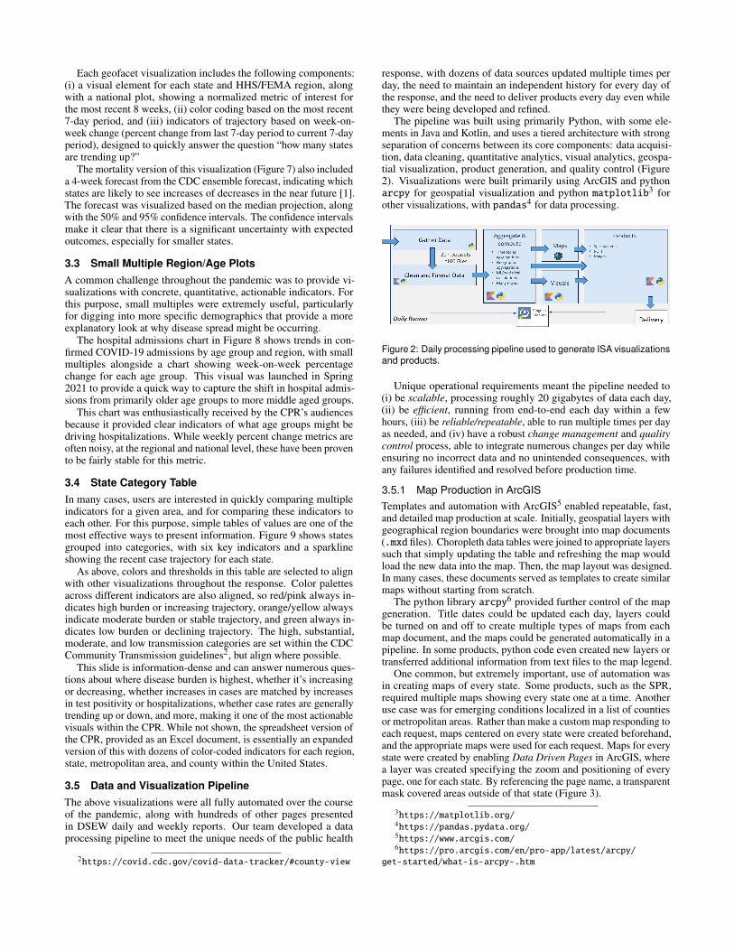
Each geofacet visualization includes the following components:(i) a visual element for each state and HHS/FEMA region, alongwith a national plot, showing a normalized metric of interest forthe most recent 8 weeks, (ii) color coding based on the most recent7-day period, and (iii) indicators of trajectory based on week-on-week change (percent change from last 7-day period to current 7-dayperiod), designed to quickly answer the question “how many statesare trending up?”
The mortality version of this visualization (Figure 7) also includeda 4-week forecast from the CDC ensemble forecast, indicating whichstates are likely to see increases of decreases in the near future [1].The forecast was visualized based on the median projection, alongwith the 50% and 95% confidence intervals. The confidence intervalsmake it clear that there is a significant uncertainty with expectedoutcomes, especially for smaller states.
3.3 Small Multiple Region/Age PlotsA common challenge throughout the pandemic was to provide vi-sualizations with concrete, quantitative, actionable indicators. Forthis purpose, small multiples were extremely useful, particularlyfor digging into more specific demographics that provide a moreexplanatory look at why disease spread might be occurring.
The hospital admissions chart in Figure 8 shows trends in con-firmed COVID-19 admissions by age group and region, with smallmultiples alongside a chart showing week-on-week percentagechange for each age group. This visual was launched in Spring2021 to provide a quick way to capture the shift in hospital admis-sions from primarily older age groups to more middle aged groups.
This chart was enthusiastically received by the CPR’s audiencesbecause it provided clear indicators of what age groups might bedriving hospitalizations. While weekly percent change metrics areoften noisy, at the regional and national level, these have been provento be fairly stable for this metric.
3.4 State Category TableIn many cases, users are interested in quickly comparing multipleindicators for a given area, and for comparing these indicators toeach other. For this purpose, simple tables of values are one of themost effective ways to present information. Figure 9 shows statesgrouped into categories, with six key indicators and a sparklineshowing the recent case trajectory for each state.
As above, colors and thresholds in this table are selected to alignwith other visualizations throughout the response. Color palettesacross different indicators are also aligned, so red/pink always in-dicates high burden or increasing trajectory, orange/yellow alwaysindicate moderate burden or stable trajectory, and green always in-dicates low burden or declining trajectory. The high, substantial,moderate, and low transmission categories are set within the CDCCommunity Transmission guidelines2, but align where possible.
This slide is information-dense and can answer numerous ques-tions about where disease burden is highest, whether it’s increasingor decreasing, whether increases in cases are matched by increasesin test positivity or hospitalizations, whether case rates are generallytrending up or down, and more, making it one of the most actionablevisuals within the CPR. While not shown, the spreadsheet version ofthe CPR, provided as an Excel document, is essentially an expandedversion of this with dozens of color-coded indicators for each region,state, metropolitan area, and county within the United States.
3.5 Data and Visualization PipelineThe above visualizations were all fully automated over the courseof the pandemic, along with hundreds of other pages presentedin DSEW daily and weekly reports. Our team developed a dataprocessing pipeline to meet the unique needs of the public health
2https://covid.cdc.gov/covid-data-tracker/#county-view
response, with dozens of data sources updated multiple times perday, the need to maintain an independent history for every day ofthe response, and the need to deliver products every day even whilethey were being developed and refined.
The pipeline was built using primarily Python, with some ele-ments in Java and Kotlin, and uses a tiered architecture with strongseparation of concerns between its core components: data acquisi-tion, data cleaning, quantitative analytics, visual analytics, geospa-tial visualization, product generation, and quality control (Figure2). Visualizations were built primarily using ArcGIS and pythonarcpy for geospatial visualization and python matplotlib3 forother visualizations, with pandas4 for data processing.
Figure 2: Daily processing pipeline used to generate ISA visualizationsand products.
Unique operational requirements meant the pipeline needed to(i) be scalable, processing roughly 20 gigabytes of data each day,(ii) be efficient, running from end-to-end each day within a fewhours, (iii) be reliable/repeatable, able to run multiple times per dayas needed, and (iv) have a robust change management and qualitycontrol process, able to integrate numerous changes per day whileensuring no incorrect data and no unintended consequences, withany failures identified and resolved before production time.
3.5.1 Map Production in ArcGISTemplates and automation with ArcGIS5 enabled repeatable, fast,and detailed map production at scale. Initially, geospatial layers withgeographical region boundaries were brought into map documents(.mxd files). Choropleth data tables were joined to appropriate layerssuch that simply updating the table and refreshing the map wouldload the new data into the map. Then, the map layout was designed.In many cases, these documents served as templates to create similarmaps without starting from scratch.
The python library arcpy6 provided further control of the mapgeneration. Title dates could be updated each day, layers couldbe turned on and off to create multiple types of maps from eachmap document, and the maps could be generated automatically in apipeline. In some products, python code even created new layers ortransferred additional information from text files to the map legend.
One common, but extremely important, use of automation wasin creating maps of every state. Some products, such as the SPR,required multiple maps showing every state one at a time. Anotheruse case was for emerging conditions localized in a list of countiesor metropolitan areas. Rather than make a custom map responding toeach request, maps centered on every state were created beforehand,and the appropriate maps were used for each request. Maps for everystate were created by enabling Data Driven Pages in ArcGIS, wherea layer was created specifying the zoom and positioning of everypage, one for each state. By referencing the page name, a transparentmask covered areas outside of that state (Figure 3).
3https://matplotlib.org/4https://pandas.pydata.org/5https://www.arcgis.com/6https://pro.arcgis.com/en/pro-app/latest/arcpy/
get-started/what-is-arcpy-.htm

Figure 3: Single state vaccination map used within the State ProfileReport. Each map highlights the state of interest by covering otherareas with a transparent mask.
4 DISCUSSION
The visualizations here all evolved over the course of the pandemic,based on near continuous user feedback and changing priorities, andcould likely be improved further. Based on this experience, fivekey attributes were needed for successful public health visualization:simplicity, explanatory power, consistency, deliverability, and time-liness. These observations mirror some of the findings in [14], inparticular the need to maintain trust and ensure visualizations areclear and not misleading.
Simplicity. When communicating with decision-makers and thegeneral public, visuals should be easily interpreted and consistentwith past experience or general knowledge wherever possible. Meth-ods should be clear and easily replicated wherever possible. Thisexcludes several visualization types from consideration, for instancescatterplots that are designed to convey correlations.
Explanatory Power. Metrics/indicators should be communi-cated along with an “explanation.” If there are 100 cases, is thatgood or bad? In practice, the most critical element providing thisexplanation is the choice of a metric that allows for comparisonacross geographic areas (like normalizing COVID-19 case countsby population), along with a color palette that is shared across allvisualizations using that metric. For displaying trajectory, simplevisual indicators can explain whether a given percentage change in ametric indicates an increase, decrease, or stability.
Consistency. Reports provide a historical record and anchordiscussion around a common set of values along with methods forinterpreting those values. For decision-makers that base discussionson a set of “daily numbers,” visualizations need to agree on thosenumbers. Any discrepancies, whether due to reporting or data ac-cess time or cleaning methods, serve as a distraction (unless theconversation is about data reporting!). Visualizations should alsomaintain a consistent layout and look-and-feel so that they can beeasily compared or viewed together.
Deliverability. As in many operational settings, visual analyticswere best received and used when delivered to the email inboxes ofusers. Many decision-makers have limited time to access dashboards,but can quickly review a key set of visual analytics that arrive intheir inbox.
Timeliness. Throughout the pandemic, conditions rapidlychanged across the country, and due to the novel nature of COVID-19, having up to date information was of utmost importance. Thismeant that most products needed to be regenerated each day, quicklybecoming too much to create manually. To this end, we heavilyautomated as much of the process as possible. The daily pipelineruns automatically every day, generating most of the recurring visu-alizations and freeing up the team for handling new requests.
In addition to these, visualizations need to be maintained overtime in response to changing needs, data sources, or data quality.As one example, over the course of 2021, states continually shifted
reporting frequencies and policies. Because of this, reporting meth-ods also needed to change to ensure displayed weekly averagesand weekly changes were not misleading. Where methods couldn’tchange due to the need for consistency, we added high visibility datanotes as in Figures 4 and 6.
4.1 NeedsWe also found there are two areas where current methods do notadequately address needs:
Uncertainty. Communicating uncertainty and risk in operationalsettings remains a challenge. Some of our visualizations depicteduncertainty, such as the confidence intervals for model projectionsshown alongside recent data in Figure 7 to illustrate the range oflikely outcomes. However, most of the time either appropriatemodels/methods were not available to communicate uncertainty,or the inclusion of uncertainty added too much complexity to avisualization.
As an example, we primarily relied on week-over-week percentchange to highlight changes in metrics. While simple, this metriccan often provide misleading values, particularly when reportingdumps occur and in smaller states or counties, leading some usersto the wrong conclusions. This could be resolved in part by bettermethods for estimating trajectory, better methods for filtering datato remove reporting dumps, or methods that indicate confidenceintervals rather than a single number.
Shared Methods. Given the need to align data processing andreporting methods with partner organizations, many of whom useddifferent platforms, we often faced significant challenges aligningmethods. This is particularly true for more complex datasets, suchas hospital data, where state data is “rolled up” from daily reportsby individual hospitals with frequent missing or inaccurate data,changes in bed counts, and even changes in which hospitals shouldbe included. A grammar for time series data methods, similar towhat vega-lite7 does for visualization, might help bridge this gap.
5 CONCLUSION AND FUTURE WORK
This paper described some of the unique challenges associated withdeveloping operational visualizations in support of a pandemic pub-lic health response, with selected visualizations reviewed as exem-plars of the questions and methods used.
In an operational public health setting, there is constant changeand visualizations must often be designed and deployed on quicktimelines. For decision-makers, the best visualizations answer ques-tions clearly and directly, with minimal distractions. Often, thismeans visualizations that help them understand, diagnose, or pin-point a problem, whether by geography or demographic, and of-ten this means providing multiple indicators together as a bulwarkagainst problematic data reporting.
In future pandemic response efforts, visualization could be im-proved by providing clearer, more accessible explanations of meth-ods and do a better job of conveying uncertainty and risk. In addi-tion, the practitioner community would benefit greatly from bettertools for sharing methods, ensuring that common data cleaning, pro-cessing, and presentation methods are available to a wide range ofpartners and platforms.
ACKNOWLEDGMENTS
This work was supported by the U.S. Department of Health andHuman Services, Office of the Assistant Secretary for Preparednessand Response. The authors wish to thank the Integrated Surveil-lance Analysis team as well as the JHU/APL COVID-19 Responseteam, many of whom played major roles in the development andautomation of these visualizations.
7https://vega.github.io/vega-lite/

REFERENCES
[1] CDC COVID-19 Forecasts: Deaths. https://www.cdc.
gov/coronavirus/2019-ncov/science/forecasting/
forecasting-us.html. Accessed: 2021-07-19.[2] CDC COVID Data Tracker. https://covid.cdc.gov/
covid-data-tracker. Accessed: 2021-07-19.[3] CovidActNow U.S. COVID Risk & Vaccine Tracker. https://covidactnow.org. Accessed: 2021-07-19.
[4] Dartmouth Atlas of Health Care. https://www.dartmouthatlas.org/faq/. Accessed: 2021-07-19.
[5] JHU CSSE COVID Dashboard. https://
www.arcgis.com/apps/dashboards/index.html#
/bda7594740fd40299423467b48e9ecf6. Accessed: 2021-07-19.
[6] L. Carroll, A. P. Au, L. Detwiler, T.-c. Fu, I. Painter, and N. Abernethy.Visualization and analytics tools for infectious disease epidemiology:A systematic review. J. Biomed. Informatics, 2014. doi: 10.1016/j.jbi.2014.04.006
[7] D. Cay, T. Nagel, and A. E. Yantac. Understanding User Experience ofCOVID-19 Maps through Remote Elicitation Interviews. In 2020 IEEEWorkshop on Evaluation and Beyond - Methodological Approaches toVisualization (BELIV), pp. 65–73. IEEE Computer Society, 2020. doi:10.1109/BELIV51497.2020.00015
[8] H. Chen, D. Zeng, and P. Yan. Data Visualization, Information Dis-semination, and Alerting. Infectious Disease Informatics, 2009. doi:10.1007/978-1-4419-1278-7 5
[9] J. Comba. Data Visualization for the Understanding of COVID-19.Computing in Science & Engineering, 2020. doi: 10.1109/MCSE.2020.3019834
[10] R. Hafen. Introducing geofacet and a discussion of other geo-graphic visualization techniques. https://ryanhafen.com/blog/geofacet/. Accessed: 2021-07-19.
[11] R. D. Howe. Understanding Pandemic Outbreaks through DataVisualisation-An Assessment of Current Tools and Techniques. 2014.
[12] Y. Lan, M. Desjardins, A. Hohl, and E. Delmelle. Geovisualization ofCOVID-19: State of the Art and Opportunities. Cartogr. Int. J. Geogr.Inf. Geovisualization, 2021. doi: 10.3138/cart-2020-0027
[13] B. Preim and K. Lawonn. A Survey of Visual Analytics for PublicHealth. Comput. Graph. Forum, 2020. doi: 10.1111/cgf.13891
[14] Y. Zhang, Y. Sun, L. Padilla, S. Barua, E. Bertini, and A. G. Parker.Mapping the Landscape of COVID-19 Crisis Visualizations. In Pro-ceedings of the 2021 CHI Conference on Human Factors in ComputingSystems, number 608, pp. 1–23. Association for Computing Machinery,New York, NY, USA, May 2021.

A VISUALIZATIONS
Figure 4: Dual geospatial visualizations showing test positivity bycounty along with the change since last week. The banner at the topshows the national average for each metric.
Figure 5: Choropleth geospatial visualization and accompanying sandchart showing changes in “Area of Concern” category by county andover time.
Figure 6: Geofacet visualization showing differences in case incidencefor varying states and regions, with accompanying indicators to helpusers quickly identify disease trajectory and burden.
Figure 7: Geofacet visualization showing differences in mortality ratefor varying states and regions, with additional visualization of confi-dence intervals for mortality forecasts.
Figure 8: Small multiples visualization of COVID hospital admissionsby age and HHS/FEMA Region. Colored indicators of percentagechange for each age/region were a critical tool to monitor shiftingdemographics of hospital admissions in Spring 2021.
Figure 9: Table visualization of states, grouped by CDC’s CommunityTransmission Level categories, along with six key indicators. In thereport containing these, a second page shows the remaining ModerateTransmission states and the Low Transmission states.

COVID-19 EnsembleVis: Visual Analysis ofCounty-level Ensemble Forecast Models
Sanjana Srabanti*University of Illinois at Chicago
G.Elisabeta Marai†
University of Illinois at ChicagoFabio Miranda‡
University of Illinois at Chicago
a
b
c
Figure 1: Enabling the visual analysis of COVID-19 ensemble forecast models with COVID-19 EnsembleVis. (a) We visualize theaverage error of the ensemble model at the county level. (b) Temporal distribution of the error of individual models, aggregated overall counties. (c) Distribution of errors over county population. Using the interface, we can notice that, in Week 42, the majority of theoutlier counties are located in Texas (highlighted points in (c) and highlighted counties in (a)).
ABSTRACT
The spread of the SARS-CoV-2 virus and its contagious diseaseCOVID-19 has impacted countries to an extent not seen since the1918 flu pandemic. In the absence of an effective vaccine and ascases surge worldwide, governments were forced to adopt measuresto inhibit the spread of the disease. To reduce its impact and toguide policy planning and resource allocation, researchers have beendeveloping models to forecast the infectious disease. Ensemblemodels, by aggregating forecasts from multiple individual models,have been shown to be a useful forecasting method. However, thesemodels can still provide less-than-adequate forecasts at higher spa-tial resolutions. In this paper, we built COVID-19 EnsembleVis, aweb-based interactive visual interface that allows the assessment ofthe errors of ensembles and individual models by enabling usersto effortlessly navigate through and compare the outputs of modelsconsidering their space and time dimensions. COVID-19 Ensem-bleVis enables a more detailed understanding of uncertainty and therange of forecasts generated by individual models.
Index Terms: Human-centered computing—Visualization—Visualization application domains—Visual analytics;
*e-mail: [email protected]†e-mail: [email protected]‡e-mail: [email protected]
1 INTRODUCTION
The COVID-19 pandemic has upended the world over the past year,in a health crisis not seen since the 1918 flu pandemic. As of July2021, the disease has caused the death of more than 4 million peo-ple worldwide, 600,000 in the US alone. While waiting for aneffective vaccine amidst the surging cases worldwide, governmentsadopted measures to inhibit the spread of the disease. Despite theseefforts, waves of COVID-19 infection with varying characteristics,continued to ravage communities [24], highlighting the necessityto understand the spatio-temporal complexity of the problem [25].Forecast models are among the tools available to public health ex-perts and policymakers to predict likely pandemic outcomes (i.e.,number of cases, deaths) and prepare for different scenarios. Inthe past year, several models have been proposed by a myriad ofexperts, and using vastly different assumptions, methodologies, pa-rameters and data sources. As a result, models produce a range ofsometimes radically different forecasts, especially at higher spatialresolutions, limiting their use by decision makers and the public ingeneral. In order to address this problem, more recently, ensemblemodels have been proposed for COVID-19 forecasts, with promisingresults [35, 44].
Ensemble models are usually created by combining differentindividual models (i.e., members), either through simple weightedaverages or more sophisticated approaches, such as multiple linearregression and principal component regression [27]. Rather thanrelying on individual models, a set of forecasts in an ensembleindicates a larger range of possible future scenarios. Because of theirhigh prediction accuracy, ensemble approaches are widely used in

Table 1: Overview of the individual models considered by our tool.
Model name Team Data sources
CEID-Walk [11] U. of Georgia JHU case and death countsCMU-TimeSeries [10] CMU JHU case and death counts
CU-Select [20] Columbia U. JHU case and death counts, hospitalizations and ICU admissions, mobilityFAIR-NRAR [8] Facebook NY Times case counts, weather, mobility
IEM MED-CovidProject [9] IEM MED JHU case countsIowaStateLW-STEM [3] Iowa State NY Times, Health department, county-level infected and death cases
JHUAPL-Bucky [14] JHU JHU, hospitalizations, mobilityJHU IDD-CovidSP [19] JHU JHU, US Census (population, mobility)
JHU UNC GAS-StatMechPool [13] JHU Demographic parameters, weather, mobilityLANL-GrowthRate [16] Los Alamos HHU, population
LNQ-ens1 [17] SAS JHUOneQuietNight-ML [4] - JHU, mobility
PandemicCentral-USCounty [18] Pandemic Central JHU case and death cases, US Census, CCVI, mobilityUCLA-SuEIR [21] UCLA JHU case and death cases, hospitalizations
UMass-MechBayes [1] UMass-Amherst JHUUpstateSU-GRU [6] SUNY JHU, US Census, health surveys, behavioral risk factorsUVA-Ensemble [2] U. of Virginia Mobility
different domains, such as weather and climate [36], economy [47],and more recently in forecasting infectious diseases [35, 38]. Giventhe increasing importance of ensembles for COVID-19 forecasting,it is important to evaluate and compare ensemble members throughspace and time, as well as identifying potential limitations andguiding the improvement of both ensemble and individual models.
In this paper, we propose COVID-19 EnsembleVis, an open-source1 web-based interface to enable the visual analysis of thecounty-level differences between forecast and ground truth data ofensemble models and their members. We focus on fine geographiclevel data since it can reveal staggering disparities among differentlocations that were missed at coarser aggregation levels [22, 33],which signifies the need for even more precise predictions. By en-abling effortless navigation through ensemble members and allowingthe evaluation and comparison of multiple models, our proposedapproach can be used to obtain a more detailed understanding ofuncertainty and the range of forecasts generated by individual mod-els, and highlight limitations of the models at the county level. Thislast point is a particularly important one, given the impact of thepandemic on different communities at different levels throughoutthe past year. Since COVID-19 ensemble models have only recentlybeen shown to be effective [44], our work offers the first steps ineliciting some of the particular challenges related to the visualiza-tion and analysis of ensemble models of COVID-19 forecasts. Wefocus our efforts on the visualization of the outputs of ensemblesand individual models. While our approach addresses some of thesechallenges, we believe that our work goes toward creating the neces-sary connections between ensemble visualization (a popular topic,especially in the weather domain) and pandemic ensemble models.
2 RELATED WORK
In this section, we briefly survey existing literature related to COVID-19 forecasting, a topic that has received significant attention recentlydue to the different ways the pandemic has impacted the world.Given how widely used ensemble models are in other domains, wealso survey ensemble visualization techniques and systems.
COVID-19 forecasting. Over the past year, different researchgroups from academia and industry have been developing modelsto forecast COVID-19 cases and deaths. In the US alone, over 50teams have made their forecasts publicly available, according to theCOVID-19 Forecast Hub [5]. The majority of these models forecastboth cases and deaths at a state level, while a smaller number fore-casts cases at the county level, (and one recent model also providingcounty-level fatalities [39]).
1https://github.com/uic-evl/covid-19-ensemblevis
The vast majority of the models rely on the Johns Hopkins Coron-avirus Resource Center confirmed case and death data [15], while asubset uses mobility [2, 4, 8, 13, 14, 18–20], weather [8, 13], US cen-sus [6,18,19], or hospitalization data [16,20,21]. Table 1 presents anoverview of individual models. In April 2020, an initiative led by theReich Lab at the University of Massachusetts started to collect andcombine forecasts for US spatial units (states and counties), mak-ing the resulting ensemble data publicly available each week. Thisinitiative was in close collaboration with the US Center for DiseaseControl and Prevention (CDC), who also release weekly ensembleforecasts as a real-time tool to help guide policy and planning [7].
Several interfaces and dashboards have also been made availablewith the goal of visualizing ensemble members [3, 9, 16, 18, 21], butthey are restricted to individual members or lower spatial resolutions.COVID-19 EnsembleVis is the first visual interface that allows usersto compare and analyze ensembles and individual members at thecounty level.
Ensemble visualization. Ensemble data is common in severaldomains, such as biomedical images [34], network security [32],climate simulations [40], machine learning [46], and due to thecomplexity of the data, ensemble visualization faces a variety ofresearch challenges, such as scalability, extraction of trends, dif-ferences and commonalities [42]. Previous work has focused onproposing frameworks to support visual analysis of ensemble datathrough a combination of statistical visualization techniques anduser interaction [43], visual glyphs, such as radar plots [37], ribbonsand spaghetti plots [45], clustering [30,31] and probabilistic [28,29]and trend analysis [41]. A complete survey of visualization andvisual analysis of ensemble data can be found at Wang et al. [48];the survey focuses on more common ensemble data, such as weatherand climate simulations, and lists a series of six common ensemblevisualization tasks: overview, comparison, clustering, temporal trendanalysis, feature extraction, and parameter analysis. In our work, weuse a subset of these tasks to visualize COVID-19 forecast ensemblemodels, with the goal of indicating and starting to lay down bridgesbetween ensemble visualization research and pandemic predictions.
3 COVID-19 FORECASTS AND ENSEMBLES
An initiative led by the University of Massachusetts has createda central repository, called COVID-19 Forecast Hub, that collectsand organizes submissions with COVID-19 forecasts in the US,both at the state level and at the county level. These submissionsare developed independently and shared publicly. Submissions caninclude week-ahead forecasts of COVID-19 deaths and/or casesfollowing the CDC’s epidemiological weeks. For example, duringepidemiological week 1 (EW1), a team can submit a forecast for the

Figure 2: Spatial view: visualizing the spatial distribution of the en-semble model’s error (aggregated by counties).
subsequent weeks (≥EW2). At the beginning of each week, an en-semble forecast will be created using the most recent valid forecastsfrom each team; the ensemble is composed of the median predictionacross all eligible models at each quantile level. Both individualforecasts, as well as ensemble forecasts, are made available as CSVfiles with a weekly temporal resolution and state and county spatialresolutions. Ground truth data is also collected by the Forecast Hub,allowing the straightforward computation of error metrics. To bemore precise, the error of a model can be calculated as the differenceec,t = y′c,t −yc,t , where y′c,t is the model’s predicted value for countyc at week t, and yc,t is the ground truth for county c at week t. In thispaper, positive differences (i.e., predicted value greater than groundtruth) are represented by shades of blue, and negative differences byshades of red.
On top of the individual forecast CSV files, the central repositoryalso hosts a weight CSV file and an eligibility CSV file. For eachweek and geographical unit, the first file lists the models’ weightsused in the computation of the ensemble forecast, and the secondfile informs whether or not a given model is eligible for inclusion inthe ensemble forecast. Both files are updated weekly.
It is important to note that UMass’ center interprets forecastsas unconditional predictions about the future. In other words, pre-dictions should consider uncertainty across a wide range of futurescenarios (e.g., new social distancing mandates), and it is up to theteam to select and submit one or a combination of predictions acrossthe most likely scenarios. In this work, we make use of UMass’COVID-19 Forecast Hub ensemble model, which combines the indi-vidual models highlighted in Table 1. We focus our attention on thevisualization of 2-week-ahead predictions.
4 REQUIREMENTS
The CDC recently highlighted how important it is to bring forecaststogether to help understand how they compare with each otherand how much uncertainty there is about what may happen in thefuture [7]. Considering that, we identified three main tasks thatcan be facilitated by a visual interface: 1) provide an overviewsummary of the errors of the models to assess uncertainty; 2) identifyspatiotemporal trends, i.e., how a group of members changes overspace and time; and 3) visually identify differences between two ormore ensemble members. In order to accomplish these tasks, weidentified the following requirements for our visual interface:
[R1] Support the identification of spatiotemporal patterns.Explore the spatial and temporal patterns of one or more ensemblemembers to identify regions or periods with above average forecasterror and uncertainty.
[R2] Support the comparison of ensemble members. Com-pare predictions of different ensemble members to evaluate thespatiotemporal performance of different models.
Figure 3: Temporal view: visualizing the temporal distribution of in-dividual ensemble models (aggregated by weeks). Cells show posi-tive (shades of blue) and negative (shades of red) prediction errorsfor each model (row). Cells without prediction information are shownin grey.
[R3] Support the analysis of the relationship between modelperformance and sociodemographic features. Explore therelationship between sociodemographic variables and model perfor-mance to identify regions not adequately represented in the model.
5 COVID-19 ENSEMBLEVIS
In order to satisfy the previously detailed requirements, we builtCOVID-19 EnsembleVis, a web-based interface to facilitate the vi-sual exploration of COVID-19 forecast ensembles. The interface iscomposed of three main views: spatial view, temporal view, and dis-tribution view. These three views are all linked, such that a selectionin one view will highlight the appropriate data in other views. Inthis work, we consider weekly predictions between April 6, 2020and July 5, 2021.
Spatial view. This component is composed of a map with UScounties (Figure 2) and enables the identification of spatial pat-terns (R1). Each county is painted according to the average ensem-ble’s forecast error over all weeks (i.e., ∑t∈weeks
ec,t|weeks| , for each
county c). A divergent color scale is used to indicate negative andpositive forecast errors. In order to enable detailed analysis, the usercan select an individual county, and the temporal view will updateaccordingly.
Temporal view. This view uses a matrix heatmap to display theweekly average error for each ensemble member (Figure 3). Eachcell is painted according to the average ensemble member’s forecasterror over all counties (i.e., ∑c∈counties
ec,t|counties| , for each week t).
The temporal view allows the visualization of forecast errors overtime (R1) and the comparison of individual ensemble members (R2)that can help in the identification of weeks with bad predictions (e.g.,predictions with high errors) from ensemble members. The temporalview is linked with the spatial view. If a single county is selected,the weekly average error for each model of that particular countywill be shown (Figure 6). Furthermore, the temporal view enablesthe user to add temporal constraints by selecting specific weeks ofinterest, which will update the other views. The same divergentcolor scale from the previous component is also used in the temporalview. Missing predictions are displayed in light gray.
Distribution view. This view incorporates a 2D scatterplot thatshows, for each week, the distribution of per-county ensemble pre-diction errors (normalized by population) by the log of the totalcounty population. Each data point then represents the ensembleprediction error for a given county at a given week. Users can usethe scroll wheel to view different weeks or select specific weeksfrom the temporal view. In this version of the interface, we onlyconsider the population information, partially meeting R3. The main

Figure 4: Distribution view: visualizing the distribution of ensembleprediction errors. Each data point represents the ensemble predictionerror for a given county at a given week.
Figure 5: Spatial distribution of predictions with large error values.By selecting outlier points in Week 47 (left), we notice that they aremostly located in the state of Missouri.
purpose of the scatterplot is to assess any possible relationship be-tween prediction error and demographic variables. The distributionview also allows the user to brush the scatterplot and select datapoints of interest; this will then update the other views, enabling theassessment of the spatiotemporal distribution of the errors.
Implementation. The COVID-19 EnsembleVis interface wasimplemented using Angular, D3 and TopoJSON so that it could beeasily accessed through a web browser. We collected the predictionsfrom UMass’ COVID-19 Forecast Hub and pre-processed them us-ing Python and Jupyter Notebook. The EpiWeeks Python librarywas used to compute epidemiological weeks (following CDC’s stan-dard). The pre-processing step is responsible for aggregating thedata over counties and epidemiological weeks. The pre-processeddata is then stored as a single JSON file and accessed by the frontend. The source code and data pre-processing stages are available athttps://github.com/uic-evl/covid-19-ensemblevis.
6 EXPLORING ENSEMBLE PREDICTIONS
In this section, we illustrate an initial case on how our tool canbe used in the visual analysis of ensemble models, with a focuson understanding how prediction errors are spatially distributedover different counties. We begin the exploration by visualizingthe distribution of ensemble prediction errors by county populationusing the distribution view (Figure 1(right)). We notice a particularweek (Week 42) where certain counties present a larger predictionerror. We select these data points in the scatterplot and notice thatmost of them are counties in Texas. While it is not possible toprecisely say why this happened, such visualization can fomentdiscussions on the shortcomings of current modeling practices, suchas data availability, parametrization for those counties, etc.
We also used COVID-19 EnsembleVis to explore the spatial dis-tribution of errors in Week 47, which showed another unusual pat-tern (Figure 5). After selecting a set of points in the scatterplot (leftside of the figure), we noticed that these points are from countiesin Missouri (right side). Unlike the previous example, however, wewere able to pinpoint the source of such an unusual pattern: onMarch 8, 2021, the Missouri Department of Health and Senior Ser-vices updated the number of daily cases to show 81,206 previouslyunreported infections.
Figure 6: Temporal distribution of average error of an individual county.After selecting Cook County (left), we observe that there are largedifferences in average error over the weeks (right).
Our ongoing collaboration with public health experts interestedin the impact of COVID-19 on underrepresented communities inChicago enabled us to use COVID-19 EnsembleVis to better un-derstand the prediction errors in Cook County. The data revealedsignificant differences in the average error over the weeks (Figure 6).In the initial weeks, the average error for each ensemble memberwas mostly negative, and with time the error increased to positivevalues. One possible hypothesis is that models were not able tocapture the significant loss of life in Long-term Care Facilities, anongoing problem due to inaccurate public health indicators [26]. Un-derstanding the poor local accuracy of prediction models can createopportunities to investigate new sources of data or parametrizationsfor specific counties and communities.
7 CONCLUSION AND FUTURE WORK
COVID-19 EnsembleVis is a visual interface built specifically for theanalysis of COVID-19 forecast ensemble models. By using three dif-ferent visualization components, we enable the investigation of boththe ensemble and individual models, from both spatial and temporalperspectives. COVID-19 EnsembleVis takes the first steps towardthe visualization of county-level forecast ensemble models. Al-though only presenting a collage of known visualization metaphors,this work creates a foundation that will enable researchers to applyensemble visualization techniques to efforts related to the recentpandemic. We hope this can help foment a discussion that buildsbridges between ensemble visualization researchers (mostly focusedon weather and climate data) and modeling and public health experts.Additionally, we believe there are several interesting challenges thatcould certainly benefit from collaboration between these fields. Forinstance, while we focus our efforts on the visualization of theoutput of the models, certain research teams do make their codepublicly available, opening doors to have a more vivid picture oftheir computational mechanisms. Therefore, understanding the im-pact of different parametrizations through visual analytics tools is apath that can not only increase performance and accuracy but alsoincrease public trust in these models.
We also believe that there is an opportunity to use metaphors thatwere previously introduced by visual analytics tools to visualizeweather and climate ensemble data. Given the potential impact ofCOVID-19 predictions, in future work we will also investigate howpredictions can better inform policymakers and their decisions froma visual analytics perspective [23]. Furthermore, we will explorethe relationship between models and data sources. As shown in Ta-ble 1, models use different data sets, and this can heavily impact thepredictive power of both individual members and ensembles. Giventhat, we believe it would be interesting to understand the relation-ship between data sets, model performance, and social demographicvariables. Moreover, given the number of possible data slices, itwould be important to guide the user in the exploratory process andhighlight potentially interesting data features. We will also extendCOVID-19 EnsembleVis to enable the visualization and explorationof COVID-19 forecasts from other regions of the world, includingEurope [12].

REFERENCES
[1] Bayesian modeling of COVID-19. Available: https://github.com/dsheldon/covid. Accessed on: July 18, 2021.
[2] Biocmplexity Institute. Available: https://biocomplexity.
virginia.edu/. Accessed on: July 18, 2021.[3] COVID-19 Dashboard. Available: https://covid19.stat.
iastate.edu. Accessed on: July 18, 2021.[4] COVID-19-forecast. Available: https://github.com/
One-Quiet-Night/. Accessed on: July 18, 2021.[5] COVID-19 Forecast. Available: https://covid19forecasthub.org/. Accessed on: July 18, 2021.
[6] COVID-19 Forecast from SUNY and Syracuse University Team. Avail-able: https://github.com/ylzhang29/UpstateSU-GRU-Covid.Accessed on: July 18, 2021.
[7] COVID-19 Forecasting. Available: https://www.cdc.
gov/coronavirus/2019-ncov/science/forecasting/
forecasting.html. Accessed on: July 18, 2021.[8] COVID-19 Forecasts - Facebook Data for Good. Available: https://dataforgood.fb.com/tools/covid-19-forecasts/. Accessedon: July 18, 2021.
[9] COVID-19 Projection Dashboard. Available: https:
//iem-modeling.com/. Accessed on: July 18, 2021.[10] DELPHI. Available: https://delphi.cmu.edu. Accessed on: July
18, 2021.[11] e3bo/random-walks. Available: https://github.com/e3bo/
random-walks. Accessed on: July 18, 2021.[12] European Covid-19 Forecast Hub. Available: https://
covid19forecasthub.eu/. Accessed on: July 18, 2021.[13] Exploring methods for merging mechanistic and models to fore-
cast epidemics. Available: https://github.com/HopkinsIDD/EpiForecastStatMech. Accessed on: July 18, 2021.
[14] JHUAPL-Bucky COVID-19 model. Available: https://github.com/mattkinsey/bucky. Accessed on: July 18, 2021.
[15] John Hopkins Coronavirus Resource Center. Available: https://coronavirus.jhu.edu. Accessed on: July 18, 2021.
[16] LANL COVID-19 Cases and Deaths Forecasts. Available: https://covid-19.bsvgateway.org/. Accessed on: July 18, 2021.
[17] locknquay — Kaggle. Available: https://www.kaggle.com/sasrdw/locknquay. Accessed on: July 18, 2021.
[18] Pandemic Central. Available: https://itsonit.com. Accessed on:July 18, 2021.
[19] Public shared code for doing scenario forecasting and creat-ing reports. Available: https://github.com/HopkinsIDD/
COVIDScenarioPipeline. Accessed on: July 18, 2021.[20] Shaman Group. Available: https://blogs.cuit.columbia.edu/
jls106/. Accessed on: July 18, 2021.[21] UCLAML Combating COVID-19. Available: https://covid19.
uclaml.org/. Accessed on: July 18, 2021.[22] Historical insights on coronavirus disease 2019 (covid-19), the 1918
influenza pandemic, and racial disparities: Illuminating a path forward.Annals of Internal Medicine, 173(6):474–481, 2020.
[23] S. Afzal, S. Ghani, H. C. Jenkins-Smith, D. S. Ebert, M. Hadwiger,and I. Hoteit. A visual analytics based decision making environmentfor covid-19 modeling and visualization. In 2020 IEEE VisualizationConference (VIS), pp. 86–90, 2020.
[24] G. Arling, M. Blaser, M. Cailas, J. R. Canar, B. Cooper, P. Geraci,K. M. Osiecki, and A. Sambanis. A second wave of covid-19 in cookcounty: What lessons can be applied? Online journal of public healthinformatics, 12 2:e15, 2020.
[25] M. Blaser, M. Cailas, J. Canar, B. Cooper, P. Geraci, K. M. Osiecki,and A. Sambanis. Analyzing covid-19 mortality within the chicagolandarea, Dec 2020.
[26] M. Blaser, M. D. Cailas, J. Canar, B. Cooper, P. Geraci, K. OSIECKI,and A. SAMBANIS. Analyzing covid-19 mortality within thechicagoland area: Data limitations and solutions. Research Brief,(117), 2020.
[27] L. Breuer, J. Huisman, P. Willems, H. Bormann, A. Bronstert, B. Croke,H.-G. Frede, T. Graff, L. Hubrechts, A. Jakeman, G. Kite, J. Lanini,G. Leavesley, D. Lettenmaier, G. Lindstrom, J. Seibert, M. Sivapalan,
and N. Viney. Assessing the impact of land use change on hydrology byensemble modeling (luchem). i: Model intercomparison with currentland use. Advances in Water Resources, 32(2):129–146, 2009.
[28] A. Diehl, L. Pelorosso, C. Delrieux, K. Matkovic, J. Ruiz, M. E. Groller,and S. Bruckner. Albero: A visual analytics approach for probabilisticweather forecasting. Comput. Graph. Forum, 36(7):135–144, 2017.
[29] A. Diehl, L. Pelorosso, C. Delrieux, C. Saulo, J. Ruiz, M. E. Groller,and S. Bruckner. Visual analysis of spatio-temporal data: Applicationsin weather forecasting. Comput. Graph. Forum, 34(3):381–390, 2015.
[30] F. Ferstl, K. Burger, and R. Westermann. Streamline variability plotsfor characterizing the uncertainty in vector field ensembles. IEEETrans. Vis. & Comp. Graph., 22(1):767–776, 2016.
[31] F. Ferstl, M. Kanzler, M. Rautenhaus, and R. Westermann. Time-hierarchical clustering and visualization of weather forecast ensembles.IEEE Trans. Vis. & Comp. Graph., 23(1):831–840, January 2017.
[32] L. Hao, C. G. Healey, and S. E. Hutchinson. Ensemble visualizationfor cyber situation awareness of network security data. In 2015 IEEESymposium on Visualization for Cyber Security (VizSec), pp. 1–8, 2015.
[33] E. Hatef, H.-Y. Chang, C. Kitchen, J. Weiner, and H. Kharrazi. As-sessing the impact of neighborhood socioeconomic characteristics oncovid-19 prevalence across seven states in the united states. Frontiersin Public Health, 8:554, 2020.
[34] M. Hermann, A. C. Schunke, T. Schultz, and R. Klein. Accurate inter-active visualization of large deformations and variability in biomedicalimage ensembles. IEEE Trans. Vis. & Comp. Graph., 22(1):708–717,2016.
[35] J.-S. Kim, H. Kavak, A. Zufle, and T. Anderson. Covid-19 ensemblemodels using representative clustering. SIGSPATIAL Special, 12(2):33–41, 2020.
[36] T. N. Krishnamurti, V. Kumar, A. Simon, A. Bhardwaj, T. Ghosh,and R. Ross. A review of multimodel superensemble forecasting forweather, seasonal climate, and hurricanes. Reviews of Geophysics,54(2):336–377, 2016.
[37] T. Luciani, A. Burks, C. Sugiyama, J. Komperda, and G. E. Marai.Details-first, show context, overview last: supporting exploration ofviscous fingers in large-scale ensemble simulations. IEEE Trans. Vis.& Comp. Graph., 25(1):1225–1235, 2018.
[38] P. Melin, J. C. Monica, D. Sanchez, and O. Castillo. Multiple ensembleneural network models with fuzzy response aggregation for predictingcovid-19 time series: The case of mexico. Healthcare, 8(2), 2020.
[39] K. Mueller and E. Papenhausen. Using demographic pattern analysisto predict covid-19 fatalities on the us county level. Digit. Gov.: Res.Pract., 2(1), Dec. 2020.
[40] T. Nocke, M. Flechsig, and U. Bohm. Visual exploration and evalu-ation of climate-related simulation data. In 2007 Winter SimulationConference, pp. 703–711, 2007.
[41] H. Obermaier, K. Bensema, and K. I. Joy. Visual trends analysis in time-varying ensembles. IEEE Trans. Vis. & Comp. Graph., 22(10):2331–2342, 2016.
[42] H. Obermaier and K. I. Joy. Future challenges for ensemble visualiza-tion. IEEE Comp. Graph. & Applications, 34(3):8–11, 2014.
[43] K. Potter, A. Wilson, P.-T. Bremer, D. Williams, C. Doutriaux, V. Pas-cucci, and C. R. Johnson. Ensemble-vis: A framework for the statisticalvisualization of ensemble data. In 2009 IEEE International Conferenceon Data Mining Workshops, pp. 233–240. IEEE, 2009.
[44] E. Ray, N. Wattanachit, J. Niemi, others, and on behalf of the COVID-19 Forecast Hub Consortium. Ensemble forecasts of coronavirus dis-ease 2019 (covid-19) in the u.s. medRxiv, 2020.
[45] J. Sanyal, S. Zhang, J. Dyer, A. Mercer, P. Amburn, and R. Moorhead.Noodles: A tool for visualization of numerical weather model ensembleuncertainty. IEEE Trans. Vis. & Comp. Graph., 16(6):1421–1430, 2010.
[46] B. Schneider, D. Jackle, F. Stoffel, A. Diehl, J. Fuchs, and D. Keim. In-tegrating data and model space in ensemble learning by visual analytics.IEEE Trans. on Big Data, 7(3):483–496, 2021.
[47] B. Soybilgen and E. Yazgan. Nowcasting us gdp using tree-basedensemble models and dynamic factors. Computational Economics,57(1):387–417, 2021.
[48] J. Wang, S. Hazarika, C. Li, and H.-W. Shen. Visualization and visualanalysis of ensemble data: A survey. IEEE Trans. Vis. & Comp. Graph.,25(9):2853–2872, 2019.

Communicating Area-level Social Determinants of Health Information: The Ohio Children’s Opportunity Index Dashboards
Pallavi Jonnalagadda,1 Christine Swoboda, 1 Priti Singh, 1 Harish Gureddygari, 1 Seth Scarborough, 1 Ian Dunn, 2Nathan J. Doogan, 2 Naleef Fareed* 1,3
1CATALYST, Center for the Advancement of Team Science, Analytics, and Systems Thinking in Health Services and Implementation Science Research, College of Medicine, The Ohio State University, Columbus, Ohio, USA
2The Ohio Colleges of Medicine Government Resource Center, Columbus, OH 3Biomedical Informatics, The Ohio State University, Columbus, Ohio, USA
ABSTRACT Social determinants of health (SDoH) can be measured at the geographic level to convey information about neighborhood deprivation. The Ohio Children’s Opportunity Index (OCOI) is a multi-dimensional area-level opportunity index comprised of eight health dimensions. Our research team has documented the design, development, and use cases of dashboard solutions to visualize OCOI. The OCOI is a multi-dimensional index spanning the following eight domains or dimensions: family stability, infant health, children’s health, access, education, housing, environment, and criminal justice. Information on these eight domains is derived from the American Community Survey and other administrative datasets maintained by the state of Ohio. Our team used the Tableau Desktop visualization software and applied a user-centered design approach to developing the two OCOI dashboards— main OCOI dashboard and OCOI-race dashboard. We also performed convergence analysis to visualize the census tracts, where different health indicators simultaneously exist at their worst levels. The OCOI dashboards have multiple, interactive components: a choropleth map of Ohio displaying OCOI scores for a specific census tract, graphs presenting OCOI or domain scores to compare relative positions for tracts, and a sortable table to visualize scores for specific county and census tracts. Stakeholders provided iterative feedback on dashboard design in regard to functionality, content, and aesthetics. A case study using the two dashboards for convergence analysis revealed census tracts in neighborhoods with low infant health scores and a high proportion of minority population. The OCOI dashboards could assist end-users in making decisions that tailor health care delivery and policy decision-making regarding children’s health particularly in areas where multiple health indicators exist at their worst levels.
Keywords: Data visualization, social determinants of health, geographical information system, area level deprivation, opportunity index
Index Terms: Visualization techniques; Visualization systems and tools; Public Health Informatics; Health Equity
1 INTRODUCTION An abundance of research acknowledges the relationship between social determinants of health (SDoH) and health outcomes.[1] Individual-level factors alone have been deemed insufficient for explaining population disease patterns, thereby raising the importance of the spatial context.[2, 3] Neighborhoods have emerged as relevant contexts as they possess physical and social attributes that could affect health.[4] The impact of neighborhood deprivation has been well established by the Whitehall-II study that showed effects of neighborhood factors on health varied by socioeconomic position.[5] Neighborhood deprivation can be communicated using area-level measures of SDoH, which are composite, and often weighted, scores of measures representing different dimensions of deprivation. Across the world, multidimensional measures of deprivation have been computed at the level of census-based geographic units,[6-10] to be used as guides for resource allocation, community advocacy, and research.[11]
The impact of neighborhood is especially pertinent for children growing up in deprived neighborhoods.[12-14] Evidence links neighborhood deprivation with health outcomes such as behavioral problems and verbal ability.[15, 16] The Moving to Opportunity Experiment underscored the role of neighborhood in children’s lives by showing that moving to more affluent neighborhoods in childhood had positive impacts on college attendance and earnings.[17] Other research indicates that risk factors tend to cluster within individuals, families and communities exacerbating the inverse relationship[18] that already exists between those who need healthcare and those who have access to it.[19]
1.1 Significance Ohio ranks 31st in children’s health nationally. Nearly 2.6 million of the 11.5 million population in Ohio are children aged zero to 17. Of these, about 20% live in poverty, 16% are chronically absent from school, over 0.7% are homeless, and 14 – 15% have disabilities. Thirty-one percent of children and teens have been classified as overweight or obese, and nearly half (46%) the teens and children report not exercising regularly. Further, a considerable health disparity exists in self-reported health between White and Black or African American children,[20] as well as in infant mortality rates between infants born to White and Black mothers.[21] Together, these statistics indicate room for improvement in children’s health across Ohio.
With the objective of improving birth outcomes in Ohio, the project sponsor collaborated with researchers at a mid-Western academic medical center (AMC) to develop area-level measures of deprivation. The high rate of and wide race disparities in infant mortality in Ohio, [21, 22] prompted the creation of the Ohio Opportunity Index (OOI) and the Ohio Children’s Opportunity

Index (OCOI). Researchers at the AMC have already successfully visualized the OOI using a dashboard solution.[23] Dashboards are powerful tools supporting public health and clinical efforts.[24, 25] They offer several advantages over traditional methods of disseminating data, such as the ability to customize data presentations per the user’s interest, to more effectively convey information on trends, to facilitate evaluation of the impact of interventions on communities and subpopulations, and to provide easy access to data with an internet connection.[26] Visualizing the OCOI using dashboards can assist policymakers, public health officials, and health care leaders in making decisions for better health care delivery to improve children’s health. To this end, we developed two functional and interactive dashboards with training material in the form of instructional videos and user guides to analyze the distribution of the OCOI.
1.2 Objective First, we describe the creation of the main OCOI dashboard bearing in mind two use cases: the project sponsor and community-based organizations using the dashboard to plan or deliver interventions and health care programs. Second, we describe the creation of another OCOI dashboard, that displays the race/ethnic distribution in census tracts across Ohio. Lastly, we provide a case study of how the two OCOI dashboards can be used to perform convergence analysis to visualize factors associated with children’s health outcomes in combination with data on infant mortality rates in Ohio from the Ohio Department of Health.
2 METHODS Our approach to developing and deploying the OCOI dashboard followed the principles of user-centered design, which involved constant engagement with subject matter experts and stakeholders represented by end-users from the project sponsors. This project is an extension of the Infant Mortality Research Project that was set up to improve birth outcomes in Ohio. Researchers at the AMC compiled the pertinent data and constructed the OCOI first by standardizing the measures, calculating domain scores, and finally calculating an index score. [27]The OCOI is constructed at the census tract level. Higher opportunity scores indicate relatively higher opportunity or lower deprivation. Similarly, lower opportunity scores indicate relatively lower opportunity or higher deprivation. The OCOI dashboards in their current form are intended for project-affiliated researchers and sponsors, and are therefore password protected on an online server. The stakeholders intend to release public versions in the future.
2.1 Data Sources Census tracts were chosen as the geographical unit for data collection because they are uniform in terms of geography and socioeconomic characteristics, thus serving as proxies for neighborhood and individual-level SDoH measures. Of the 2952 census tracts in Ohio, 12 had zero population. Therefore, study data pertaining to the 2940 census tracts were collected from various sources including, but not limited to, the U.S. census based-American Community Survey (ACS) data set, which is a freely available resource, and other state level agency administrative data sets (e.g., Medicaid claims and Department of Education school report card data). Information was compiled from these sources based on census tracts for the creation of the OCOI. Finally, datasets corresponding to two different time periods, Period I (2010 – 2014) and Period II (2013 – 2017), were collated for developing OCOIs for each time period. [27] We used ACS data aggregated over two five-year periods 2010 – 2014 and 2013 – 2017 to obtain the race/ethnic distribution across census tracts in the state of Ohio. Our study visualized the percentage of White individuals, the
percentage of Black or African American individuals, the percentage of Hispanic individuals, and the percentage of minority individuals in the state of Ohio.
2.2 Domains and Measures Outcomes related to the well-being of children depend on the economic, material, and psychosocial conditions in which they grow. These socioeconomic conditions relate to their parents or caregivers, housing units and the neighborhood in which they live.[28] Guided by these findings, the study team, with the help of subject matter experts outlined domains to develop the OCOI. Several iterations later, a set of eight domains were finalized for use: family stability, infant health, children’s health, access (to health care and food), education, housing, environment, and criminal justice. [27] These domains are consistent with the SDoH attributes the Centers for Disease Control and Prevention has identified, such as food supply, housing, transportation, education, and health care, thus substantiating their use in our study.[29, 30] The OCOI is composed of eight equally-weighted domains. Each of the eight domains was measured by multiple variables also referred to as constituent measures. A total of 53 variables were proposed for use, however information on only 37 variables was available for Period I. As a result, for the purpose of comparison, the Period II dataset was treated in two ways; Period II (Reduced) comprising the same 37 variables as in Period I (Reduced) and Period II (Complete) with all 53 variables. Consequently, three datasets: Period I (Reduced), Period II (Reduced), and Period II (Complete) were used for study analyses. Additionally, a fourth dataset captured the differences between Period I (Reduced) and Period II (Reduced) measures, referred to as the “Change” dataset to illustrate shifts in area-level SDoH over time. Appendix table 1 presents a summary of the domains, associated variables, description of variables, data sources, and availability by time period. Of the 53 variables, the family stability domain comprised five, infant health comprised seven, children’s health comprised eight, access domain seven, education comprised eight, housing comprised seven, environment comprised six, and the criminal justice domain comprised five. Some responses were reverse coded to maintain a consistent direction with respect to what higher (deprivation) versus lower (opportunity) values meant. [27] Seminal studies [31, 32] informed the stepwise, co-creation approach used to construct the OCOI. The details of constructing the OCOI are available elsewhere. [27] We tested the OCOI for association with health-related outcomes including death rate and life expectancy, which have been linked to area-level deprivation. [30] Results indicated that tracts with high OCOI have significantly lower (p<0.001) death rates and significantly higher (p<0.001) life expectancy compared to tracts with low OCOI, suggesting that the OCOI is a valid measure of area-level SDoH. [27]
2.3 Dashboard Structure Our team previously developed a dashboard solution that visualized OOI information and its domains across all census tracts in the state of Ohio, displayed score plots allowing for comparison of constituent measure scores across tracts, included a sortable table to display OOI scores, and had interactive features so they would be updated whenever a user selected certain parameters.23 The project sponsors requisitioned a similar dashboard for the OCOI with three additional requirements: first, visualization of change in OCOI based on data aggregated between 2010 – 2014 and 2013 – 2017; second, grouping of census tracts into ZIP codes, neighborhoods, and cities as end users tend to be more familiar with places in these terms rather than census tract numbers; and third, the creation of an additional dashboard to visualize OCOI and the race/ethnic distribution of the Ohio population.

Leveraging prior end user feedback for the OOI dashboard, the five components of the OCOI dashboard were: 1. Choropleth map of Ohio with OCOI scores for specific census tracts; 2. Plots of OCOI and/or individual domain scores to compare relative positions for census tracts; 3. A sortable table to view OCOI or individual domain scores for specific census tracts; 4. Information available from four data sources for users to select: the reduced data compiled over two different time periods 2010 – 2014 and 2013 – 2017, complete data compiled from 2013 – 2017, change in OCOI and the individual domain scores between 2010 – 2014 and 2013 – 2017 based on the reduced dataset; 5. A neighborhood filter so end users can filter census tracts corresponding to familiar geographies like cities, neighborhoods or ZIP codes. To permit visualization of the OCOI and area-level race/ethnic distribution in Ohio, we created the OCOI-Race dashboard retaining the choropleth map of Ohio, choice of data sources, and the neighborhood filter from the main OCOI dashboard. New additions included a menu with options to visualize the race /ethnic distribution; a scatter plot with OCOI and domain scores on the X-axis and the frequency of the race/ethnic distribution factor on the Y-axis; as well as the categorization of the OCOI score and the race/ethnic distribution into four discrete categories. This OCOI-race dashboard can be adapted in the future to display information about other area-level indicators. Project sponsors required the use of Tableau for constructing the dashboard. The dashboard was subsequently deployed to a secure Tableau Server environment. Tableau offers notable strengths over commonly used statistical software packages such as SAS and STATA. Tableau uses VizQL, a visual query language that converts drag-and-drop actions into queries. The visualization team used Tableau Desktop to first connect to a data set (stored in files, warehouses, and the cloud), and then used a front-end interface to query the data and view it in different graphical forms (charts, graphs, maps). Independent worksheets containing specific visuals were compiled to create dashboards to communicate key insights. The visuals were further linked together by the creation of filters, parameters, and actions so the dashboard displayed information as directed by user actions. Another advantage of Tableau is its ability to automatically recognize various geographical fields, like state, county, and ZIP code, to generate the corresponding latitude and longitude coordinates. We imported shapefiles of Ohio that had vector data for the latitude and longitude for each census tract, county, and neighborhood in Ohio. The data file with information on the measures to construct the OCOI and the shapefiles were linked using the Federal Information Processing Standard code as the primary key.
3 RESULTS Our team applied project sponsor feedback on the OOI dashboard pertaining to content, aesthetics, and function to the OCOI dashboard (Figure 1).[23] Briefly, in terms of content, the OCOI like the OOI is a score of opportunity and not deprivation for easier interpretation and a positive connotation. Second, the scores are visualized as septile groups on a choropleth map of Ohio to provide adequate contrast between OCOI scores. Third, we displayed the actual OCOI values on the Y-axis of the distribution plot to facilitate easier interpretation of the distribution of OCOI scores across census tracts. Further, we included a breakdown of the domain scores in the score plot as standard deviations from the mean for every census tract, which facilitates comparison between selected tracts. In regard to aesthetics, we retained the divergent color scheme for the heat map approved for the OOI dashboard. Similarly, the score plot is presented as a bar graph rather than a line plot to effectively communicate scores across domains or domain variables.
In terms of dashboard function, we displayed street and highway patterns to better orient the end users to the communities within a census tract. Further, users could select a county from a drop-down list to assess census tracts within a specific county. We also incorporated information icons by each component to aid the end user. To address one of the sponsor requirements, we visualized change in OCOI score based on aggregate data between 2010 – 2014 and 2013 – 2017. When users visualize change in OCOI, the distribution plot shows a distribution of income adjusted differences in OCOI and absolute differences for the domains. The score plot displays absolute changes for OCOI domains and Z-scores for constituent measures (Figure 2). In terms of aesthetics, we ensured that the size of the map was sufficiently large to facilitate zooming in on a specific county.
The project sponsor additionally requested for the visualization of OCOI and the area -level race/ethnic distribution of the Ohio population to examine disparities in health outcomes at the intersection of race and SDoH. To fulfill this second requirement, we again engaged in iterative feedback from the sponsors. Appendix table 2 summarizes the modifications we made in response to feedback on the initial prototype. Continuous improvements were made to the dashboard throughout this project, but there is still a learning curve for those unfamiliar with data visualization tools. Therefore, we created training videos and user guides to help users understand the basic functions of Tableau along with the displayed features of the OCOI.
3.1 Case Study We present a case study where a health program manager in Columbus, Ohio seeks to gain a better understanding of children’s opportunity in the counties across Ohio that have high infant mortality and high disparity in infant mortality between infants born to White and Black mothers. The health program manager has to strategically allocate resources to the Columbus area and wants to optimize them by identifying areas that have the lowest infant health scores and highest infant mortality rates.
Using the main OCOI dashboard, the program manager selects Franklin County in Ohio and examines the Columbus area. They first examine the OCOI and its domains and note the 10 tracts with the lowest scores for all the domains (Figure 1a). Because this program is targeting infant health disparities, they then examine the infant health domain. After looking at the 10 worst tracts for infant health, it is noted that many census tracts scoring low for infant health do not have significantly lower infant mortality, but their scores are low because of neonatal abstinence syndrome, maternal morbidity, Neonatal Intensive Care Unit (NICU) stays, or other factors (Figure 1b). Finally, in the score plot, the official clicks to keep only infant mortality to find the worst scoring tracts for infant mortality (Figure 3a). They highlight the 25 worst ranked infant health scores in the table, and look at the score plot (Figure 3b). They find that the two worst tracts for infant mortality, 049001400, and 049007511, are both in the South Linden area (Figure 4a).
The program manager decides to further examine the two lowest-scoring tracts (049001400, and 049007511), which also score poorly for preterm birth, but not on the other sub-domains of infant health. Both tracts are in the lowest quantile of overall OCOI score, criminal justice, and education, and score poorly in regard to the sub-domains like food access, asthma, free lunch access, high school graduation rates, reading ability, amount of green area, air quality, tobacco exposure, paternal involvement, poverty, crowding, evictions, and percentage renting. The health program manager examines the race/ethnic makeup of the census tracts using the OCOI-Race dashboard. Both the census tracts have low opportunity scores and over 75% minority population (Figure 4b). The health program manager decides to direct infant mortality prevention resources towards community-based organizations and

public health programs in the South Linden area. Programs should be prepared to provide referrals for help in access to food, educational resources, social services, drug and tobacco cessation, and housing.
4 DISCUSSION The OCOI dashboard visually summarizes and communicates quantitative information about SDoH through 53 measures organized into eight domains, showing opportunity for infants and children in the state of Ohio. This representation of SDoH can help characterize individual census tracts throughout the state and help policy makers, practitioners, and researchers assess their level of need. Other national geographic indices displaying child health or economic opportunity are available. The Opportunity Atlas shows the average outcomes in adulthood for people based on where they grew up with a greater focus on economic opportunity than health.[33] Another index, the Child Opportunity Index 2.0, comprises 29 indicators grouped into three domains (education, health and environment, social and economic), available for all US neighborhoods at the census tract level for the years 2010 and 2015.[34] Unlike the OCOI, the COI 2.0 has a national focus, the indicators used to construct the COI have varying weights, the environment domain includes toxic exposures like proximity to hazardous waste dump sites, and there is no separate criminal justice domain. Potential limitations exist to using and sharing area-level SDoH measures like the OCOI. This dashboard reflects average neighborhood measures, but does not describe individuals within neighborhoods; researchers and policymakers should remain sensitive to people within these communities and avoid negative characterizations. In addition, because these are neighborhood averages, there are still individuals in high opportunity areas who may need assistance in certain domains. The intention of tools like the OCOI is to help communities in need, but there is risk of decisions being made that negatively affect communities, such as companies choosing to purposely relocate from low opportunity areas to serve high opportunity areas. Finally, indices like the OCOI may impact rural and urban areas in different ways, [35] and policymakers should take the individual variables into account when developing interventions instead of attempting a one-size-fits-all approach for low domain scores. Future use of the OCOI include monitoring change in neighborhood opportunity over time. Positive changes in opportunity in specific census tracts may point to improvements due to public health support, the actions of community programs, and movement of people and businesses to an area. Alternatively, decreases in opportunity due to crime, loss in property value, movement of residents, and closing of businesses, schools, and public buildings will also be reflected. Changes in SDoH may predict changes in health outcomes in an area. Researchers will be able to use the OCOI to study potential relationships between specific SDoH and infant and child health outcomes, further adding to public health knowledge about area-level predictors of health. Renewed focus on the “place” effect on health has shifted the conversation to innovation in health care delivery and collaboration between healthcare organizations, public health, and social services.
5 CONCLUSION The communication of OCOI through dashboard tools presents an opportunity to help increase awareness about pressing SDoH-related challenges faced by infants and children, with potential immediate and long-term implications for their development and health. The dashboards facilitate analysis of information from multiple perspectives. Users of the dashboards can make informed
decisions about allocating resources to individuals and their communities in order to ameliorate disparities in health care, with the goal of increasing health equity. The OCOI may have applications in clinical practice by serving as a proxy for individual-level SDoH as is being increasingly advocated.[36, 37] Even though universal and comprehensive screening for SDoH during the clinical encounter is still debated [38], area-level measures of SDoH, like the OCOI, represent a rich resource of readily-available data that may be incorporated into electronic health records (EHR) and may be used to improve health care delivery. Compiling a more complete picture of patients’ neighborhood risk can help healthcare providers assist patients in a more tailored manner.
REFERENCES [1] P. Braveman, S. Egerter, and D. R. Williams, "The social
determinants of health: coming of age," Annu Rev Public Health, vol. 32, pp. 381-398, 2011 2011, doi: 10.1146/annurev-publhealth-031210-101218.
[2] A. V. Diez-Roux, "Bringing context back into epidemiology: variables and fallacies in multilevel analysis," Am J Public Health, vol. 88, no. 2, pp. 216-222, 1998/02/01 1998, doi: 10.2105/AJPH.88.2.216.
[3] T. A. Blakely and A. J. Woodward, "Ecological effects in multi-level studies," (in eng), Journal of epidemiology and community health, vol. 54, no. 5, pp. 367-374, 2000, doi: 10.1136/jech.54.5.367.
[4] A. V. Diez Roux, "Neighborhoods and health: where are we and were do we go from here?," Rev Epidemiol Sante Publique, vol. 55, no. 1, pp. 13-21, 2007/02// 2007, doi: 10.1016/j.respe.2006.12.003.
[5] M. Stafford and M. Marmot, "Neighbourhood deprivation and health: does it affect us all equally?," Int J Epidemiol, vol. 32, no. 3, pp. 357-366, 2003/06// 2003, doi: 10.1093/ije/dyg084.
[6] J. Atkinson, C. Salmond, and P. Crampton, "NZDep2013 index of deprivation," Wellington: Department of Public Health, University of Otago, 2014.
[7] D. McLennan, S. Noble, M. Noble, E. Plunkett, G. Wright, and N. Gutacker, "The English Indices of Deprivation 2019: technical report," 2019.
[8] G. K. Singh, "Area deprivation and widening inequalities in US mortality, 1969-1998," Am J Public Health, vol. 93, no. 7, pp. 1137-1143, 2003/07// 2003, doi: 10.2105/ajph.93.7.1137.
[9] A. J. H. Kind and W. R. Buckingham, "Making Neighborhood-Disadvantage Metrics Accessible - The Neighborhood Atlas," N Engl J Med, vol. 378, no. 26, pp. 2456-2458, 2018/06/28/ 2018, doi: 10.1056/NEJMp1802313.
[10] "Social Vulnerability Index." Centers for Disease Control and Prevention. https://svi.cdc.gov/ (accessed.
[11] R. L. Phillips et al., "How Other Countries Use Deprivation Indices—And Why The United States Desperately Needs One," Health Affairs, vol. 35, no. 11, pp. 1991-1998, 2016, doi: 10.1377/hlthaff.2016.0709.
[12] J. L. A. and, N. G. Bennett, D. C. Conley, and J. Li, "The Effects of Poverty on Child Health and Development," Annual Review of Public Health, vol. 18, no. 1, pp. 463-483, 1997, doi: 10.1146/annurev.publhealth.18.1.463.
[13] J. Brooks-Gunn and G. J. Duncan, "The Effects of Poverty on Children," The Future of Children, vol. 7, no. 2, pp. 55-71, 1997, doi: 10.2307/1602387.
[14] K. Larson and N. Halfon, "Family Income Gradients in the Health and Health Care Access of US Children," Maternal and Child Health Journal, vol. 14, no. 3, pp. 332-342, 2010/05/01 2010, doi: 10.1007/s10995-009-0477-y.
[15] M. O. Caughy, S. M. Nettles, and P. J. O'Campo, "The effect of residential neighborhood on child behavior problems in first grade," (in eng), Am J Community Psychol, vol. 42, no. 1-2, pp. 39-50, Sep 2008, doi: 10.1007/s10464-008-9185-9.

[16] R. J. Sampson, P. Sharkey, and S. W. Raudenbush, "Durable effects of concentrated disadvantage on verbal ability among African-American children," Proceedings of the National Academy of Sciences, vol. 105, no. 3, p. 845, 2008, doi: 10.1073/pnas.0710189104.
[17] R. Chetty, N. Hendren, and L. F. Katz, "The Effects of Exposure to Better Neighborhoods on Children: New Evidence from the Moving to Opportunity Experiment," American Economic Review, vol. 106, no. 4, pp. 855-902, 2016, doi: 10.1257/aer.20150572.
[18] J. Tudor Hart, "THE INVERSE CARE LAW," The Lancet, vol. 297, no. 7696, pp. 405-412, 1971/02/27/ 1971, doi: https://doi.org/10.1016/S0140-6736(71)92410-X.
[19] K. Fiscella and P. Shin, "The Inverse Care Law: Implications for Healthcare of Vulnerable Populations," The Journal of Ambulatory Care Management, vol. 28, no. 4, pp. 304-312, 2005. [Online]. Available: https://journals.lww.com/ambulatorycaremanagement/Fulltext/2005/10000/The_Inverse_Care_Law__Implications_for_Healthcare.5.aspx.
[20] D. C. KIDS COUNT. Selected Indicators for Ohio [Online] Available: https://datacenter.kidscount.org/data/customreports/37/any
[21] Ohio Department of Health. "2017 Infant Mortality Report." https://odh.ohio.gov/wps/wcm/connect/gov/5b43b42b-0733-42cd-8a01-063f831ec53f/2017+Ohio+Infant+Mortality+Report.pdf (accessed.
[22] Centers for Disease Control and Prevention. "Infant Mortality Rates by States." https://www.cdc.gov/nchs/pressroom/sosmap/infant_mortality_rates/infant_mortality.htm (accessed.
[23] N. Fareed, C. M. Swoboda, P. Jonnalagadda, T. Griesenbrock, H. R. Gureddygari, and A. Aldrich, "Visualizing Opportunity Index Data Using a Dashboard Application: A Tool to Communicate Infant Mortality based Area Deprivation Index Information.," Applied Clinical Informatics, 2020, doi: https://doi.org/10.1055/s-0040-1714249.
[24] A. Joshi, C. Amadi, B. Katz, S. Kulkarni, and D. Nash, "A Human-Centered Platform for HIV Infection Reduction in New York: Development and Usage Analysis of the Ending the Epidemic (ETE) Dashboard," JMIR Public Health Surveill, vol. 3, no. 4, p. e95, 2017/12/11 2017, doi: 10.2196/publichealth.8312.
[25] D. Dowding et al., "Dashboards for improving patient care: Review of the literature," International Journal of Medical Informatics, vol. 84, no. 2, pp. 87-100, 2015/02/01/ 2015, doi: https://doi.org/10.1016/j.ijmedinf.2014.10.001.
[26] D. Nash, "Designing and Disseminating Metrics to Support Jurisdictional Efforts to End the Public Health Threat Posed by HIV Epidemics," Am J Public Health, vol. 110, no. 1, pp. 53-57, 2020/01/01 2019, doi: 10.2105/AJPH.2019.305398.
[27] N. Fareed, P. Singh, P. Jonnalagadda, C. M. Swoboda, C. Odden, and N. Doogan, "Construction and Validation of the Ohio Children’s Opportunity Index," medRxiv, p. 2021.05.12.21257062, 2021, doi: 10.1101/2021.05.12.21257062.
[28] A. Pearce, R. Dundas, M. Whitehead, and D. Taylor-Robinson, "Pathways to inequalities in child health," Archives of Disease in Childhood, vol. 104, no. 10, p. 998, 2019, doi: 10.1136/archdischild-2018-314808.
[29] V. H. National Center for HIV/AIDS, STD, and TB Prevention. "Social Determinants of Health." CDC. https://www.cdc.gov/nchhstp/socialdeterminants/faq.html (accessed.
[30] R. Seaman, T. Riffe, A. H. Leyland, F. Popham, and A. van Raalte, "The increasing lifespan variation gradient by area-level deprivation: A decomposition analysis of Scotland 1981–2011," Social Science & Medicine, vol. 230, pp. 147-157, 2019/06/01/ 2019, doi: https://doi.org/10.1016/j.socscimed.2019.04.008.
[31] M. Noble, G. Wright, G. Smith, and C. Dibben, "Measuring multiple deprivation at the small-area level," Environ. Plann. A, vol. 38, no. 1, pp. 169-185, 2006 2006, doi: 10.1068/a37168.
[32] D. J. Exeter, J. Zhao, S. Crengle, A. Lee, and M. Browne, "The New Zealand Indices of Multiple Deprivation (IMD): A new suite of indicators for social and health research in Aotearoa, New Zealand," PLOS ONE, vol. 12, no. 8, p. e0181260, 2017, doi: 10.1371/journal.pone.0181260.
[33] R. Chetty, J. Friedman, N. Hendren, M. R. Jones, and S. Porter, "The Opportunity Atlas: Mapping the Childhood Roots of Social Mobility," ed, 2018
. [34] C. Noelke et al., "The Child Opportunity Index 2.0," 2019. [35] D. Fecht et al., "Inequalities in rural communities: adapting
national deprivation indices for rural settings," Journal of Public Health, vol. 40, no. 2, pp. 419-425, 2018, doi: 10.1093/pubmed/fdx048.
[36] P. Jonnalagadda, C. M. Swoboda, and N. Fareed, "Using area-level measures of social determinants of health to deliver improved and effective health care," Journal of Hospital Management and Health Policy, vol. 4, 2020. [Online]. Available: https://jhmhp.amegroups.com/article/view/6527.
[37] A. W. Bazemore et al., "“Community vital signs” : incorporating geocoded social determinants into electronic records to promote patient and population health," Journal of the American Medical Informatics Association, vol. 23, no. 2, pp. 407-412, 2015, doi: 10.1093/jamia/ocv088.
[38] A. Garg, R. Boynton-Jarrett, and P. H. Dworkin, "Avoiding the Unintended Consequences of Screening for Social Determinants of Health," JAMA, vol. 316, no. 8, pp. 813-814, 2016, doi: 10.1001/jama.2016.9282.
[39] N. J. Doogan, M. E. Roberts, M. E. Wewers, E. R. Tanenbaum, E. A. Mumford, and F. A. Stillman, "Validation of a new continuous geographic isolation scale: A tool for rural health disparities research," Social Science & Medicine, vol. 215, pp. 123-132, 2018/10/01/ 2018, doi: https://doi.org/10.1016/j.socscimed.2018.09.005.
[40] M. L. Burgoon et al., "Exposures to the tobacco retail environment among adolescent boys in urban and rural environments," (in eng), Am J Drug Alcohol Abuse, vol. 45, no. 2, pp. 217-226, 2019, doi: 10.1080/00952990.2018.1549562.

APPENDIX Table 1 Description of domain and variables used in OCOI construction
Domain Measure Descriptions Data Source
Time Periods(s)
Family Stability 1) Proportion of parents enrolled in Medicaid with a primary SMI diagnosis
Medicaid Admin Both
2) Proportion of children living in a household with below-poverty income
ACS Both
3) Proportion of births that include no father’s first/middle/last name VS births Both 4) Proportion of families with a parent served by Medicaid who has an SUD diagnosis
Medicaid Admin Both
5) Labor Market Engagement Index (HUD)(reversed) HUD 2013 – 2017
Infant Health 1) Proportion of births that resulted in an infant mortality VS Births, Deaths Both 2) Proportion of Medicaid infants who had an injury or poisoning in the first year of life
Medicaid Admin Both
3) Medicaid-enrolled infants with neonatal abstinence syndrome Medicaid Admin Both 4) Medicaid-enrolled infants with NICU stay Medicaid Admin Both 5) Proportion of infants born preterm VS Births Both 6) Medicaid children with six or more well-child visits in first 15 months of life (reversed)
Medicaid Admin Both
7) Proportion of infants born to Medicaid-enrolled women with severe maternal morbidity
Medicaid Admin Both
Children’s Health (non-infant)
1) Proportion of Medicaid-enrolled children ages 1-5 with a diagnosis of developmental delay including sight and hearing impairment
Medicaid Admin Both
2) Proportion of Medicaid children age 3-6 meeting continuous enrollment criteria with one or more well-child visits with a PCP (reversed)
Medicaid Admin Both
3) Proportion of Medicaid-enrolled children ages 6-17 with a diagnosis of asthma
Medicaid Admin Both
4) Proportion of Medicaid-enrolled children ages 6-17 with a diagnosis of mental illness
Medicaid Admin Both
5) Proportion of Medicaid enrolled children ages 6-17 with a diagnosis of a developmental disability
Medicaid Admin Both
6) Proportion of Medicaid enrolled children ages 6-17 with a diagnosis of diabetes
Medicaid Admin Both
7) Proportion of Medicaid enrolled children ages 6-17 who received psychotropic BH medication
Medicaid Admin Both
8) Proportion of Medicaid-enrolled children ages 6-17 with a diagnosis of obesity
Medicaid Admin 2013 – 2017
Access 1) Proportion of Medicaid behavioral health visits for children that meet the access standards of CMS (reversed)
Medicaid Admin Both
2) Proportion of primary care visits for children that meet the access standards (driving time, driving distance) of CMS (reversed)
Medicaid Admin Both
3) Geographic isolation (rurality) of the Census tract Doogan et al.,2018 [39]
Both
4) Low Transportation Cost Index HUD 2013 – 2017
5) Percent occupied housing units in tract without a vehicle ACS 2013 – 2017
6) Percent tract population within a distance from the supermarket USDA-ERS 2013 - 2017 7) Distance to nearest elementary school CURA 2013 –
2017 Education 1) Percent youth who have dropped out ACS Both
2) Percent of adults in the tract with more than high school education ACS Both 3) Percent of youth (age 5-17) not enrolled in school ACS Both 4) Proportion of children not meeting third grade reading standards ACS 2013 –
2017 5) Free lunch distribution (reversed) ACS 2013 –
2017 6) Graduation rate (reversed) ACS 2013 –
2017

7) School performance index (reversed) ODE 2013 – 2017
8) School’s value-added score (reversed) ODE 2013 – 2017
Housing 1) Percentage putting 50 percent of income towards mortgage ACS Both 2) Percentage of households with less than one person per room ACS Both 3) Percentage putting 50 percent of income towards rent ACS Both 4) Percent housing identified as vacant ACS Both 5) Percent renting ACS 2013 –
2017 6) Percentage living in same housing unit for less than one year ACS 2013 –
2017 7) Rate of evictions among renters Eviction lab Both
Environment
1) Tract land area not covered by vegetation NHGIS Both 2) Tract land area covered by open development (e.g., pavement, parking)
NHGIS Both
3) Percent of housing units constructed prior to 1980 ACS 2013 – 2017
4) Annual average of daily pm25 measurements EPA Both 5) Count of tobacco retail outlets within a 3/4th mile buffered tract boundary
Burgoon et al., 2019 [40]
2013 – 2017
6) Environmental Health Hazard Index (air quality) HUD 2013 – 2017
Criminal Justice 1) Average number of homicide, assault, and sexual assault incidents per person reported to police each year during the period 2017-2018
OIBRS Both
2) The average number of robbery incidents per person reported to police each year during the period 2017-2018
OIBRS Both
3) The average number of burglary, larceny-theft, and motor-vehicle theft incidents per person reported to police each year during the period 2017-2018
OIBRS Both
4) The average number of drunkenness and driving under the influence incidents per person reported to police each year during the period 2017-2018
OIBRS Both
5) The average number of drug crime incidents per person reported to police each year during the period 2017-2018
OIBRS Both
Note: SMI=Severe Mental Illness; ACS=American Community Survey; VS= Vital statistics; SUD= Substance use disorder; HUD= Housing and Urban Development; NICU=Neonatal intensive care unit; PCP=Primary care physician; BH=Behavioral Health; USDA_ERS= U.S Department of Agriculture-Economic Research Service; CMS=Center for Medicare and Medicaid services; CURA=Center for Urban and Regional Analysis; ODE=Ohio Department of Education; EPA= Environmental Protection Agency; NHIGS= National Historical Geographic Information System; OIBRS= Ohio Incident Based Reporting System. Table 2 Modifications to OCOI dashboard based on sponsor feedback
Modification Rationale Content Creation of four categories for each race/ethnic group. These were 0% to 25%, 25 – 50%, 50 – 75%, and > 75%.
Using quantiles to create categories for race/ethnic group gave rise to very skewed categories. Therefore, the categories requested by the sponsor were created.
Switch from septile to quartile groups of the OOI score to use in the state-level heat map.
Using septile groups gave rise to too many categories and was visually busy. It was therefore decided that the quartile distribution was easier for interpretation.
Scatterplot of OCOI and its domain scores with the X-axis showing the OCOI scores and the Y-axis showing the frequency of the SDoH factor
The scatterplot allows the end users to see the scores for all census tracts at a glance. Each census tract is represented as a circle, which when selected highlights the census tract on the map
Discrete categories represented as tiles showing 16 combinations of the four COI categories and the four SDoH factors and the number of census tracts with each combination
End users can at a glance see how many tracts have low opportunity and how many have high opportunity based on the race/ethnic distribution of the census tract.
Function

Selection of county results by filtering dashboard content to only the census tracts within that county.
This helped the end users specifically assess the census tracts within a county of interest.
Selection of neighborhood results by filtering dashboard content to census tracts within a city, neighborhood, or township
This helped end users find census tracts by specifying geographies that were more familiar to them such as the neighborhood, city, township, or zip codes
Provide an information icon by each component to help the end user understand it.
Provide end users with a conveniently located icon to quickly understand what the information a specific component can provide them, such as the source of the data.
Display street and highway patterns. Allow end users to get a better sense of the communities present within a census tract by locating them using streets and highways.
Aesthetics Use a divergent color scheme for the heat map. Attempts to preserve the color scheme used on the main
dashboard proved inefficient because the original dashboard used three colors and the need was for four colors in the OCOI dashboard with other area-level indicators. We used shades of blue, orange, purple, and green. We avoided using certain shades of red and green to minimize the probability that end users would have trouble perceiving the colors.
Linking the color-coded tiles and the circles on the scatter plot
End users can select any combination of OCOI and area-level indicator of interest. This selection unselects all other census tracts from the scatter plot and at the same time highlights the census tracts in that particular category on the map. Alternatively, users can select any circle on the scatterplot and the selected tract is highlighted on the map and the color-coded tile that it corresponds to is highlighted as well.
Figure 1 Ten lowest ranked census tracts in terms of OCOI and Infant Health in Columbus, Ohio. Panel A shows the ten lowest ranked census tracts in terms of OCOI in Columbus, Ohio. Panel B shows the ten census tracts with lowest OCOI in Columbus, Ohio in terms of the Infant Health domain and subdomains of Infant Health

Figure 2 Ten census tracts in Columbus, OH with the most negative change in OCOI

Figure 3 25 tracts with the lowest scores for Infant Health in Columbus, OH. Panel A shows 25 of the lowest-scoring census tracts in terms of Infant Health in Columbus, OH. Panel B shows 25 census tracts with the lowest scores for the Infant Mortality subdomain of the Infant Health domain of the OCOI.

Figure 4 Two lowest-ranked census tracts in terms of Infant Mortality in Columbus, OH. Panel A shows the two census tracts ranked the lowest in terms of Infant Mortality in Columbus, OH. Panel B shows the race distribution for the two lowest-scoring census tracts in terms of Infant Mortality in Columbus, OH in the South Linden neighborhood.