Master's Thesis - Eindhoven University of Technology ...
76
Eindhoven University of Technology MASTER A goal-driven dashboard design method Smeets, N.G.W. Award date: 2020 Link to publication Disclaimer This document contains a student thesis (bachelor's or master's), as authored by a student at Eindhoven University of Technology. Student theses are made available in the TU/e repository upon obtaining the required degree. The grade received is not published on the document as presented in the repository. The required complexity or quality of research of student theses may vary by program, and the required minimum study period may vary in duration. General rights Copyright and moral rights for the publications made accessible in the public portal are retained by the authors and/or other copyright owners and it is a condition of accessing publications that users recognise and abide by the legal requirements associated with these rights. • Users may download and print one copy of any publication from the public portal for the purpose of private study or research. • You may not further distribute the material or use it for any profit-making activity or commercial gain
-
Upload
khangminh22 -
Category
Documents
-
view
1 -
download
0
Transcript of Master's Thesis - Eindhoven University of Technology ...

Eindhoven University of Technology
MASTER
A goal-driven dashboard design method
Smeets, N.G.W.
Award date:2020
Link to publication
DisclaimerThis document contains a student thesis (bachelor's or master's), as authored by a student at Eindhoven University of Technology. Studenttheses are made available in the TU/e repository upon obtaining the required degree. The grade received is not published on the documentas presented in the repository. The required complexity or quality of research of student theses may vary by program, and the requiredminimum study period may vary in duration.
General rightsCopyright and moral rights for the publications made accessible in the public portal are retained by the authors and/or other copyright ownersand it is a condition of accessing publications that users recognise and abide by the legal requirements associated with these rights.
• Users may download and print one copy of any publication from the public portal for the purpose of private study or research. • You may not further distribute the material or use it for any profit-making activity or commercial gain

Department of Industrial Engineering and Innovation SciencesInformation Systems Group
A Goal-Driven Dashboard DesignMethod
Master Thesis
N.G.W. Smeets - 1216134
Supervisors:
dr. B. Ozkan, TU/e, ISdr. L. Genga, TU/e, IS
K. van ’t Sant MSc, ASML
Eindhoven, June 2020

Series Master Thesis Operations Management and Logistics
Keywords: Dashboard design method, GQIM, Goal-driven performance measurement, Visualcommunication, Data visualization, Information presentation.
ii A Goal-Driven Dashboard Design Method

Abstract
Context. Key performance indicators have been used to measure performance in organizationsfor a long time. Due to the opportunities modern tools of information technology provide in datagathering in today’s businesses, performance evaluation of business processes by the use of KPIshas gained increased attention from both academic and industrial environments. However, despitethe development of several performance measurement processes and frameworks, the challengeof identifying, developing and presenting the right set of performance indicators that match theinformation needs of the organization still exist due to the lack of practical guidance in this process.
Objective. The aim of this research is to develop a method that provides practical guidance inthe dashboard design process for the performance evaluation of business processes. The methodaims to enhance the how-to knowledge of designing a dashboard and contribute to an improvedability of practitioners to develop and present an appropriate set of performance indicators fortheir application to support the achievement of their business objectives.
Method. This research applies the Design Science Research Methodology (DSRM) in orderto develop a goal-driven dashboard design method. Based on a literature review, an existingmeasurement methodology is selected, refined and extended for the dashboard design application.The measurement methodology focuses on deriving information needs from a business objectiveand answers these information needs by developing indicators. The dashboard design activitiesand constraints focus on presenting the indicators by the use of a dashboard. The method isapplied in a business context to evaluate its use. Evaluation is based on the experiences andopinions of participants in the case study and is guided by formulating five evaluation criteria:efficacy, utility, understandability, ease of use and generality. The evaluation is operationalizedby formulating questions for each evaluation criterion that are scored and answered during semi-structured interviews with participants in the case study.
Results. The resulting dashboard design method is an 8-step approach which is closely relatedto the GQIM method. It extends the GQIM structure by adding a step after the indicator stepin which the dashboard is conceptualized by aggregating and structuring the identified indicators.Furthermore, the dashboard design method adapts and refines the GQIM process for the dashboarddesign application and merges some of the GQIM process steps to keep the process compact andmanageable. By applying the method, a set of meaningful performance indicators is obtained thatmeets the information need of the business users. The dashboard design method is validated asan effective and useful method that provides practical guidance in the complete dashboard designprocess.
Conclusions. Based on the output of the case study and the positive evaluation results, it isconcluded that the dashboard design method meets the purpose it was designed for: providingpractical guidance in the complete dashboard design process for the performance evaluation ofbusiness processes. Furthermore, the results indicate that the method is useful in practice todesign a dashboard that meets the information need of its audience. To support this first positivevalidation of the method, it is recommended that future research focus on applying the methodin more studies and in different business domains.
A Goal-Driven Dashboard Design Method iii


Executive summary
This research contains the development of a dashboard design method that guides companies inthe process of identifying, developing and presenting a set of key performance measures that meetstheir information needs and support the achievement of their business objectives.
Context
Key performance indicators (KPIs) and performance metrics have been used to measure perform-ance in businesses for a long time. Today, performance measurement and performance managementpractices are prevalent in all sectors of industry (Bititci, Garengo, Dorfler & Nudurupati, 2012).KPIs can have a wide range of practical applications. Their use range from high-level enterpriseperformance analysis focused on long term organizational objectives to low-level operational per-formance analysis focused on supporting day to day decision making. Technologies for monitoringKPIs have evolved drastically over the years, from pen and paper, to spreadsheeds, to businessintelligence tools and advanced analytics (Brooks, 2005). Today’s tools of information techno-logy, create the possibility for businesses to collect a large amount of essential data to obtainand calculate KPIs (Zhu, Johnsson, Mejvik, Varisco & Schiraldi, 2017). Furthermore, due to theadvancements in data science, big data and analytics, a large amount of techniques, technologiesand tools for data analysis are available and are still being developed (Henke et al., 2016).
Despite the development and availability of a large amount of technologies, techniques and toolsto track and analyze KPIs, the following challenges can be identified:
– Companies and executives struggle in finding the right KPIs that match their business needs(Zhu et al., 2017; Chae, 2009).
– Presenting KPIs in an effective way is a challenge (Yigitbasioglu & Velcu, 2012).
– Leveraging the available techniques in a systematic way to reap the benefits and the prom-ising opportunities they have to offer is a challenge (e.g. Liu, Han & DeBello, 2018)
This research provides a solution that focuses on addressing all these three challenges.
Research objective
Since the process of identifying, developing and presenting KPIs can be referred to as dashboarddesign, the objective of this research is formulated as follows:
Design of a method that guides companies in the dashboard design process for theperformance evaluation of their business processes.
The method aims to enhance the how-to knowledge of designing a dashboard and contribute toan improved ability of decision makers to develop and present an appropriate set of performance
A Goal-Driven Dashboard Design Method v

measures for their application to support the achievement of their business objectives. The scopeof this research is on evaluating business process performance, i.e. evaluating how well a completeprocess or part of a process is executed to indicate areas of improvement.
This research applies the Design Science Research Methodology (DSRM) in order to develop anew artifact: a goal-driven dashboard design method. The DSRM process has six steps: problemidentification and motivation, definition of the objectives for a solution, design and development,demonstration, evaluation, and communication.
Design and development
First, a literature review is performed to create a thorough understanding of the dashboard conceptand identify important dashboard characteristics. Furthermore, existing performance measure-ment processes are identified and key design activities that can be useful for the dashboard designprocess are derived. The development of the method is done by selecting a suitable existing meas-urement methodology and extend it with dashboard design activities and principles. The GQIMmethod is selected as basis for the dashboard design method, because it has a clear structure toderive performance measures from business goals and includes all the important design activitiesidentified from the different performance measurement processes. Furthermore, it includes an in-dicator step (i.e. the definition of charts and visualizations) which matches the dashboard designapplication. Since the GQIM method is not a complete solution for dashboard design it is extendedwith one step after the identification of indicators in which the dashboard is conceptualized. Thisstep enables to form a concept of the dashboard based on the identified indicators of the previousstep in the process. Conceptualizing the dashboard is useful to select the most important indicat-ors that need to be presented to the audience, to validate whether indicators are suitable for theirpurpose, to structure indicators into groups, to check for ambiguous or superfluous indicators andif the set of indicators fits on a single screen size. Because this step is included after the indicatorstep, the dashboard design method developed in this study is called the GQI(D)M method whichis an acronym for goal-question-indicator-(dashboard)-measure and is depicted in Figure 1.
Business Objective
ProcessInput Output
Entity Entity Entity EntityEntity Entity
Goal Goal Goal
Question Question Question Question Question
Measure Measure Measure Measure Measure
Definition
Inte
rpre
tatio
n
Process steps:
1. Characterize the environment2. Map object of study3. Select process entities of interest and formalize
measurement goals4. Formulate quantifiable questions that address the
measurement goals5. Identify indicators that answer the quantifiable questions6. Conceptualize the dashboard7. Identify data elements to be collected8. Collect data, implement and refine dashboard
Figure 1: GQI(D)M method
vi A Goal-Driven Dashboard Design Method

Demonstration
The method is demonstrated in a case study at the EUV Factory of ASML. By applying themethod, ASML was able to develop and present a set of meaningful performance indicators aboutits scheduling performance and adherence at final assembly that meets the information need ofthe business users. The resulting (anonymized) dashboard design as output of the case study isdepicted in Figure 2.
FASY PWO 123456789-AB12
Total scheduled idle time W% (X hours)
Average scheduled idle time per shift Y% (Z hours)
Scheduling performance & adherence at System Integration (Final Assembly)
Scheduling performance Schedule adherence (activities) Schedule adherence (time)
Max difference in utilization T%
Average difference in utilization M%
Average production progress (downtime included) X%
Average production progress (downtime excluded) Z%
Average deviation of actual activity times from planned activity times R%
Portion of completed activities <1 min (start/stop behavior) S%
Figure 2: Dashboard design (anonymized due to confidentiality restrictions)
Evaluation
After applying the the method in a case study, its use is evaluated. Evaluation is based on theexperiences and opinions of participants in the case study and is guided by defining five evaluationcriteria: efficacy, utility, understandability, ease of use and generality. The evaluation criteria areoperationalized by formulating questions for each evaluation criterion that are scored and answeredduring semi-structured interviews with participants in the case study. Based on the evaluation ofthe method it can be concluded that the participants are overall positive about the method and itsuse. They indicated that the method provides practical steps to design a dashboard and providesa clear and helpful structure to derive the information need from business objectives. The averagescores of the evaluation criteria are depicted in Figure 3.
Tabel 1
X Y Z
Efficacy 1 5 5 5 5
2 5 5 5 5
3 5 5 5 5
Efficacy 5
Utility 4 4 4 5 4,33333333333333
5 2 5 4 3,66666666666667
6 4 5 4 4,33333333333333
7 4 4 4 4
Utility 4,08333333333333
Understandability
8 5 5 5 5
9 3 3 4 3,33333333333333
10 5 5 5 5
Understandability
4,44444444444444
Ease of use 11 3 4 4 3,66666666666667
12 2 4 4 3,33333333333333
13 5 5 5 5
14 2 3 4 3
Ease of use 3,75
Generality 15 5 5 5 5
16 4 5 5 4,66666666666667
Generality 4,83333333333334
1
2
3
4
5
6
7
8
9
10
11
12
13
14
15
16
0 1
Tabel 1-1
Efficacy 5
Utility 4,08333333333333
Understandability
4,44444444444444
Ease of use 3,75
Generality 4,83333333333334
4,42222222222222
Efficacy
Utility
Understandability
Ease of use
Generality0 1 2 3 4 5
4,8
3,8
4,4
4,1
5,0
Average score
1
Figure 3: Scores on each evaluation criterion
A Goal-Driven Dashboard Design Method vii

Conclusion and discussion
In general, the research objective is achieved by the design of the GQI(D)M method. The outputof the case study shows that the method is useful in practice to design a dashboard that meetsthe information need of its audience. Furthermore, the first promising evaluation results indicatea positive attitude towards the method. Suggestions for future research are:
– To support the first positive validation, more applications of the method are required andin different business domains.
– To obtain a more complete evaluation, a different or more comprehensive set of evaluationcriteria could be used.
– Validate the method with dashboard design experts.
viii A Goal-Driven Dashboard Design Method

Preface
This master thesis report is the final result of my graduation project and marks the end of myMaster program Operations Management and Logistics at Eindhoven University of Technology(TU/e). I would like to use this page of the report to thank everyone who has supported meduring this project and the rest of my Master program.
Niels Smeets
A Goal-Driven Dashboard Design Method ix


Contents
Contents xi
List of Figures xv
List of Tables xvii
1 Introduction 1
1.1 Problem definition . . . . . . . . . . . . . . . . . . . . . . . . . . . . . . . . . . . . 2
1.2 Research objective . . . . . . . . . . . . . . . . . . . . . . . . . . . . . . . . . . . . 2
1.2.1 Research questions . . . . . . . . . . . . . . . . . . . . . . . . . . . . . . . . 3
1.3 Research design . . . . . . . . . . . . . . . . . . . . . . . . . . . . . . . . . . . . . . 3
1.4 Thesis outline . . . . . . . . . . . . . . . . . . . . . . . . . . . . . . . . . . . . . . . 4
2 Literature review and background 5
2.1 Dashboards . . . . . . . . . . . . . . . . . . . . . . . . . . . . . . . . . . . . . . . . 5
2.1.1 Definition of dashboards . . . . . . . . . . . . . . . . . . . . . . . . . . . . . 5
2.1.2 Purpose of dashboards . . . . . . . . . . . . . . . . . . . . . . . . . . . . . . 6
2.1.3 Key dashboard characteristics . . . . . . . . . . . . . . . . . . . . . . . . . . 6
2.1.4 Dashboard types . . . . . . . . . . . . . . . . . . . . . . . . . . . . . . . . . 7
2.1.5 What is a dashboard? . . . . . . . . . . . . . . . . . . . . . . . . . . . . . . 8
2.2 Performance measurement methodologies . . . . . . . . . . . . . . . . . . . . . . . 8
2.2.1 The Performance Metrics Architecture Approach (PMA) . . . . . . . . . . 8
2.2.2 The Goal Question Metric Approach (GQM) . . . . . . . . . . . . . . . . . 9
2.2.3 The goal-driven measurement process (GQIM) . . . . . . . . . . . . . . . . 10
2.2.4 Management Information Engineering methodology . . . . . . . . . . . . . 11
2.2.5 Company-specific process performance measurement system developmentmethodology . . . . . . . . . . . . . . . . . . . . . . . . . . . . . . . . . . . 12
2.2.6 Analysis of described performance measurement processes . . . . . . . . . . 13
A Goal-Driven Dashboard Design Method xi

CONTENTS
2.3 Conclusion . . . . . . . . . . . . . . . . . . . . . . . . . . . . . . . . . . . . . . . . 15
3 Research design 17
3.1 Problem identification and motivation . . . . . . . . . . . . . . . . . . . . . . . . . 17
3.2 Definition of the objectives for a solution . . . . . . . . . . . . . . . . . . . . . . . . 18
3.3 Design and development . . . . . . . . . . . . . . . . . . . . . . . . . . . . . . . . . 18
3.4 Demonstration . . . . . . . . . . . . . . . . . . . . . . . . . . . . . . . . . . . . . . 19
3.5 Evaluation . . . . . . . . . . . . . . . . . . . . . . . . . . . . . . . . . . . . . . . . . 19
3.6 Communication . . . . . . . . . . . . . . . . . . . . . . . . . . . . . . . . . . . . . . 20
3.7 Research roadmap . . . . . . . . . . . . . . . . . . . . . . . . . . . . . . . . . . . . 20
4 Information presentation 21
4.1 Visualizations and dashboards . . . . . . . . . . . . . . . . . . . . . . . . . . . . . . 21
4.2 Creating visualizations . . . . . . . . . . . . . . . . . . . . . . . . . . . . . . . . . . 22
4.3 Dashboard layout . . . . . . . . . . . . . . . . . . . . . . . . . . . . . . . . . . . . . 23
4.4 Design process activities . . . . . . . . . . . . . . . . . . . . . . . . . . . . . . . . . 24
4.5 How to present the information? . . . . . . . . . . . . . . . . . . . . . . . . . . . . 25
5 Artifact development 27
5.1 Design choices for the method . . . . . . . . . . . . . . . . . . . . . . . . . . . . . . 27
5.2 Description of the method . . . . . . . . . . . . . . . . . . . . . . . . . . . . . . . . 28
5.2.1 Step 1: Characterize the environment . . . . . . . . . . . . . . . . . . . . . 29
5.2.2 Step 2: Map object of study . . . . . . . . . . . . . . . . . . . . . . . . . . . 30
5.2.3 Step 3: Select process entities of interest and formalize measurement goals . 31
5.2.4 Step 4: Formulate quantifiable questions that address the measurement goals 31
5.2.5 Step 5: Identify indicators that answer the quantifiable questions . . . . . . 31
5.2.6 Step 6: Conceptualize the dashboard . . . . . . . . . . . . . . . . . . . . . . 32
5.2.7 Step 7: Identify data elements to be collected . . . . . . . . . . . . . . . . . 32
5.2.8 Step 8: Collect data, implement and refine dashboard . . . . . . . . . . . . 33
6 Demonstration 35
6.1 Case study environment . . . . . . . . . . . . . . . . . . . . . . . . . . . . . . . . . 35
6.1.1 The company . . . . . . . . . . . . . . . . . . . . . . . . . . . . . . . . . . . 35
6.1.2 Main process of interest . . . . . . . . . . . . . . . . . . . . . . . . . . . . . 36
6.2 Case study protocol . . . . . . . . . . . . . . . . . . . . . . . . . . . . . . . . . . . 36
xii A Goal-Driven Dashboard Design Method

CONTENTS
6.3 Demonstration of the dashboard design method . . . . . . . . . . . . . . . . . . . . 36
6.3.1 Step 1: Characterize the environment . . . . . . . . . . . . . . . . . . . . . 36
6.3.2 Step 2: Map object of study . . . . . . . . . . . . . . . . . . . . . . . . . . . 38
6.3.3 Step 3: Select process entities of interest and formalize measurement goals . 38
6.3.4 Step 4: Formulate quantifiable questions that address measurement goals . 38
6.3.5 Step 5: Identify indicators that answer the quantifiable questions . . . . . . 39
6.3.6 Step 6: Conceptualize the dashboard . . . . . . . . . . . . . . . . . . . . . . 40
6.3.7 Step 7: Define data elements to be collected . . . . . . . . . . . . . . . . . . 42
6.3.8 Step 8: Collect data, implement and refine dashboard . . . . . . . . . . . . 43
7 Evaluation 45
7.1 Evaluation approach . . . . . . . . . . . . . . . . . . . . . . . . . . . . . . . . . . . 45
7.2 Evaluation results . . . . . . . . . . . . . . . . . . . . . . . . . . . . . . . . . . . . 46
7.3 Discussion of results . . . . . . . . . . . . . . . . . . . . . . . . . . . . . . . . . . . 48
7.3.1 Efficacy . . . . . . . . . . . . . . . . . . . . . . . . . . . . . . . . . . . . . . 48
7.3.2 Utility . . . . . . . . . . . . . . . . . . . . . . . . . . . . . . . . . . . . . . . 48
7.3.3 Understandability . . . . . . . . . . . . . . . . . . . . . . . . . . . . . . . . 48
7.3.4 Ease of use . . . . . . . . . . . . . . . . . . . . . . . . . . . . . . . . . . . . 49
7.3.5 Generality . . . . . . . . . . . . . . . . . . . . . . . . . . . . . . . . . . . . . 49
7.4 Summary of findings and artifact improvement points . . . . . . . . . . . . . . . . 49
8 Conclusions 51
8.1 Research conclusion . . . . . . . . . . . . . . . . . . . . . . . . . . . . . . . . . . . 51
8.2 Contributions to research . . . . . . . . . . . . . . . . . . . . . . . . . . . . . . . . 52
8.3 Contributions to practice . . . . . . . . . . . . . . . . . . . . . . . . . . . . . . . . 52
8.4 Limitations and recommendations for future work . . . . . . . . . . . . . . . . . . 53
References 54
Appendix 57
A Profiles of case study participants 57
A Goal-Driven Dashboard Design Method xiii


List of Figures
1 GQI(D)M method . . . . . . . . . . . . . . . . . . . . . . . . . . . . . . . . . . . . vi
2 Dashboard design (anonymized due to confidentiality restrictions) . . . . . vii
3 Scores on each evaluation criterion . . . . . . . . . . . . . . . . . . . . . . . . . . . vii
1.1 Design Science Research Methodology process model (Peffers, Tuunanen, Rothen-berger & Chatterjee, 2007) . . . . . . . . . . . . . . . . . . . . . . . . . . . . . . . 4
2.1 The Performance Architecture Approach . . . . . . . . . . . . . . . . . . . . . . . . 9
2.2 Hierarchical structure GQM model . . . . . . . . . . . . . . . . . . . . . . . . . . . 9
2.3 A GQIM model . . . . . . . . . . . . . . . . . . . . . . . . . . . . . . . . . . . . . . 11
2.4 Approach for definition of performance indicators . . . . . . . . . . . . . . . . . . . 12
2.5 Approach for developing a company-specific process performance management system 12
3.1 Research roadmap . . . . . . . . . . . . . . . . . . . . . . . . . . . . . . . . . . . . 20
5.1 GQI(D)M structure . . . . . . . . . . . . . . . . . . . . . . . . . . . . . . . . . . . 29
5.2 Example of process model . . . . . . . . . . . . . . . . . . . . . . . . . . . . . . . . 30
5.3 Measurement goal template . . . . . . . . . . . . . . . . . . . . . . . . . . . . . . . 31
5.4 Template to map required data elements, availability degree and source . . . . . . 33
6.1 Dashboard objective in relation to higher-level goals . . . . . . . . . . . . . . . . . 37
6.2 Relevant attributes and entities of object of study . . . . . . . . . . . . . . . . . . 38
6.3 Structural design of dashboard . . . . . . . . . . . . . . . . . . . . . . . . . . . . . 42
6.4 Identified data elements including degree of availability and source . . . . . . . . . 43
6.5 Final dashboard design . . . . . . . . . . . . . . . . . . . . . . . . . . . . . . . . . . 44
7.1 Scores on each evaluation criterion . . . . . . . . . . . . . . . . . . . . . . . . . . . 48
A Goal-Driven Dashboard Design Method xv


List of Tables
2.1 Starting points of described design processes . . . . . . . . . . . . . . . . . . . . . . 13
2.2 Design activities included in the described design processes . . . . . . . . . . . . . 13
2.3 Output of described measurement methodologies . . . . . . . . . . . . . . . . . . . 14
3.1 Solution Objectives . . . . . . . . . . . . . . . . . . . . . . . . . . . . . . . . . . . . 18
5.1 Relation to GQIM . . . . . . . . . . . . . . . . . . . . . . . . . . . . . . . . . . . . 28
5.2 Step 1 . . . . . . . . . . . . . . . . . . . . . . . . . . . . . . . . . . . . . . . . . . . 30
5.3 Step 2 . . . . . . . . . . . . . . . . . . . . . . . . . . . . . . . . . . . . . . . . . . . 30
5.4 Step 3 . . . . . . . . . . . . . . . . . . . . . . . . . . . . . . . . . . . . . . . . . . . 31
5.5 Step 4 . . . . . . . . . . . . . . . . . . . . . . . . . . . . . . . . . . . . . . . . . . . 31
5.6 Step 5 . . . . . . . . . . . . . . . . . . . . . . . . . . . . . . . . . . . . . . . . . . . 32
5.7 Step 6 . . . . . . . . . . . . . . . . . . . . . . . . . . . . . . . . . . . . . . . . . . . 32
5.8 Step 7 . . . . . . . . . . . . . . . . . . . . . . . . . . . . . . . . . . . . . . . . . . . 33
5.9 Step 8 . . . . . . . . . . . . . . . . . . . . . . . . . . . . . . . . . . . . . . . . . . . 33
6.1 Output of design step 1 . . . . . . . . . . . . . . . . . . . . . . . . . . . . . . . . . 37
6.2 Output of design step 3 . . . . . . . . . . . . . . . . . . . . . . . . . . . . . . . . . 38
6.3 Output of design step 4 . . . . . . . . . . . . . . . . . . . . . . . . . . . . . . . . . 39
6.4 Output of design step 5 . . . . . . . . . . . . . . . . . . . . . . . . . . . . . . . . . 39
6.5 Initial groups of indicators . . . . . . . . . . . . . . . . . . . . . . . . . . . . . . . . 40
6.6 Output of content and structure validation . . . . . . . . . . . . . . . . . . . . . . 41
6.7 Resulting set of indicators . . . . . . . . . . . . . . . . . . . . . . . . . . . . . . . . 42
7.1 Evaluation criteria and interview questions . . . . . . . . . . . . . . . . . . . . . . 45
7.2 Evaluation criteria and interview questions . . . . . . . . . . . . . . . . . . . . . . 46
7.3 Interview results . . . . . . . . . . . . . . . . . . . . . . . . . . . . . . . . . . . . . 47
A Goal-Driven Dashboard Design Method xvii

LIST OF TABLES
A.1 Profiles of case study participants . . . . . . . . . . . . . . . . . . . . . . . . . . . . 57
xviii A Goal-Driven Dashboard Design Method

Chapter 1
Introduction
Key performance indicators (KPIs) and performance metrics have been used to measure perform-ance in businesses for a long time. Today, performance measurement and performance managementpractices are prevalent in all sectors of industry (Bititci et al., 2012). Technologies for monitoringKPIs have evolved drastically over the years, from pen and paper, to spreadsheeds, to businessintelligence tools and advanced analytics (Brooks, 2005). Despite the development of sophistic-ated tools to track KPIs, still many companies and executives struggle in finding the right KPIsthat match their business needs (Zhu et al., 2017; Chae, 2009). This often results in a wrongset of KPIs which leads to a waste of resources by pursuing advances in the wrong measures andimportant information stays neglected or undiscovered (Schmenner & Vollmann, 1994).
KPIs are defined as measurable values that show how effectively a company is achieving keybusiness objectives. They enable knowledge gathering about the business performance and ex-ploring how to achieve organizational goals in the best possible way (Badawy, El-Aziz, Idress,Hefny & Hossam, 2016). KPIs can have a wide range of practical applications. Their use rangefrom high-level enterprise performance analysis focused on long term organizational objectivesto low-level operational performance analysis focused on supporting day to day decision making.Today’s tools of information technology, create the possibility for businesses to collect a largeamount of essential data to obtain and calculate these KPIs (Zhu et al., 2017). However, due tothe large amount of data that is being collected by these tools and the challenge of identifyingand selecting what should be measured and how, many companies and managers suffer from dataoverload (Nudurupati, Bititci, Kumar & Chan, 2011). Furthermore, due to the advancements indata science, big data and analytics, a large amount of techniques, technologies and tools for dataanalysis are available and are still being developed (Henke et al., 2016). However, the challengecompanies are facing is leveraging these techniques in a systematic way to reap the benefits andthe promising opportunities they have to offer to support the achievement of business objectives(Liu et al., 2018; McGuire, Ariker & Roggendorf, 2013; Gopalkrishnan, Steier, Lewis & Guszcza,2012).
Also in the manufacturing domain, KPIs have proved to be useful for performance evaluation ofthe operational processes and identifying areas of improvements (Arinez et al., 2010; Zhu, Su, Lu,Wang & Zhang, 2014; May, Barletta, Stahl & Taisch, 2015; Bauer, Lucke, Johnsson, Harjunkoski& Schlake, 2016). In today’s manufacturing facilities, the production plan is translated to produc-tion execution by the use of a manufacturing execution system (MES). These MES informationsystems are able to record data about the manufacturing planning and execution process and cre-ate the opportunity to understand, evaluate and provide decision support for complex productionprocesses through a data-driven approach. However, according to Zhu et al. (2017), also in themanufacturing domain the problem in evaluating the operational performance is the identifica-tion and selection of a appropriate set of KPIs that matches the information requirements of the
A Goal-Driven Dashboard Design Method 1

CHAPTER 1. INTRODUCTION
business situation and not defining the KPIs itself. The selection of an appropriate set of KPIscan support continuous improvement of the manufacturing processes and help manufacturers inachieving their organizational goals (Kang, Zhao, Li & Horst, 2016).
KPIs have proved to be useful in the performance evaluation of manufacturing processes andother domains. However, managers and other practitioners struggle in the process of identifyingand selecting an appropriate set of KPIs that provide the right information to discover areas ofperformance improvement and support them in reaching their business objectives. This results in apoor set of KPIs that stimulates improvements that have few positive or even harmful consequencesfor the company and important and useful information is kept neglected or undiscovered.
1.1 Problem definition
Due to the opportunities modern tools of information technologies provide in data gatheringin the manufacturing domain, performance evaluation of manufacturing production systems bythe use of KPIs has gained increased attention from both academic and industrial environmentsin recent years (Zhu et al., 2017). They mainly focus on providing a list of useful KPIs in aspecific application (e.g., Amrina & Yusof, 2011; Zhu et al., 2017), provide generic guidelines fordevelopment and design (e.g., Taticchi, Balachandran & Tonelli, 2012; Chae, 2009) or structuringKPIs (e.g., Zhu et al., 2014; Kang et al., 2016; Zhu et al., 2017), and focus on problems, gapsand challenges in performance measurement (e.g., Wazed & Ahmed, 2008; Bititci et al., 2012;Zhu, Johnsson, Varisco & Schiraldi, 2018). However, less research attention has been given to theprocess of identifying, selecting and developing KPIs to guide decision makers in the challengingtask of choosing what to measure and how to develop a set of meaningful performance measures.The selection of an appropriate set of KPIs to measure process performance remains a difficultand highly debated topic in theory and practice (Heckl & Moormann, 2010).
Another challenge is the presentation of performance measures. The already mentioned problemof data overload due to the fast development of information technology tools is exacerbated wheninformation is poorly presented. This often distracts managers instead of guiding them in theirdecision making process (Yigitbasioglu & Velcu, 2012). Performance dashboards might offer asolution to this problem by combining different concepts of performance management into onepackage. According to Yigitbasioglu and Velcu (2012) a dashboard is a data driven decisionsupport system that collects, summarizes and presents information from multiple data sources tothe decision maker. However, designing a dashboard seems to be a complex task. Only littleguidance has been provided in the complete dashboard design process (Pauwels et al., 2009;Jaaskelainen & Roitto, 2016) and literature disagrees on what information presenting techniquesshould be utilized to achieve better decision making (O’Donnell & David, 2000).
1.2 Research objective
The research objective can be derived from the problem definition as described in previous sec-tion. The challenge of identifying and deriving useful performance measures and the subsequentchallenge of presenting the information to its audience in an effective way indicates a need for thedevelopment of practical guidance for this process. This process can be referred to as a dashboarddesign process and leads to the following main research objective:
Design of a method that guides companies in the dashboard design process for theperformance evaluation of their business processes.
In other words, the objective is to enhance the how-to knowledge of designing a dashboard andcontribute to an improved ability of decision makers to develop and present an appropriate set ofperformance measures for their application to support the achievement of their business objectives.In this research, the dashboard design process is defined as the process starting at identifying and
2 A Goal-Driven Dashboard Design Method

CHAPTER 1. INTRODUCTION
deriving performance measures until developing, implementing, visualizing and aggregating thisinformation to form a dashboard. The scope of the research will be on evaluating business processperformance, i.e. evaluating how well a complete process or part of a process is executed to indicateareas of improvement.
1.2.1 Research questions
To address the research objective, the following main research question is formulated:
How can the complete dashboard design process be guided for the performance eval-uation of business processes?
To guide the research, three sub-research questions are formulated. First, to be able to develop adashboard design method, a thorough understanding of the dashboard concept needs to be created(e.g. purpose, main characteristics, types). Therefore, the first sub-research question is formulatedas follows:
1. What is a dashboard?
Then, after it is clear what dashboards are and what they can be used for, existing measurementmethodologies and dashboard design approaches are studied to find out what is already knownabout the dashboard design process and what can be used for the development of the method.Therefore, the second sub-research is formulated as follows:
2. What current methodologies, approaches and processes exist for performance measurement anddashboards?
Lastly, to find out what practical guidance is missing in the current methodologies, key designactivities need to be derived from existing methodologies to identify a set of common measurementactivities which can be used to indicate missing elements. Furthermore, it needs to be investigatedhow these activities can be used in the dashboard design process. Therefore, the third researchquestion is formulated as follows:
3. What can be the key design activities in a dashboard design process and how can they be used?
1.3 Research design
The objective of this research is to develop a new artifact, a dashboard design method for theperformance evaluation of business processes that guides decision makers in the complete processof identifying, developing and presenting useful KPIs for their application. In order to achieve thisobjective, the design science research methodology (DSRM) as provided by Peffers et al. (2007) isused. The methodology is developed for conducting design science (DS) research in informationsystems (IS).
DSRM is a research process that includes six steps and will serve as a basis for the research methodof this study (Figure 1.1). The process starts by identifying the problem. Then, it continues bydefining objectives of the solution. The next step in the process is the design of the artifact, whichin this case is a dashboard design method. In order to develop this artifact a literature reviewis conducted to create a knowledge base on this topic. Current methodologies and approachesand critical activities in the dashboard design process are identified. This knowledge base thenprovides input for the actual dashboard design method. The method is applied in practice to solvea business problem and to demonstrate its application. After applying the method in a businesscontext, its quality is evaluated based on the earlier defined solution objectives. Lastly, the resultsare communicated with the main audience of the research. The activities performed in each stepof the DSRM process are described in detail in Chapter 3. The DSRM can be entered at differentpoints in the process. In this research a specific problem is used as a research entry point (problem
A Goal-Driven Dashboard Design Method 3

CHAPTER 1. INTRODUCTION
centered initiation), therefore it starts with the problem identification step.
������0%&&%
23�4
55
.!
.%
.�2
/4
(%
."
%2
'%
2�!
.$
#(
!4
4%
2*%
%
&IGURE����$32-�0ROCESS�-ODELFigure 1.1: Design Science Research Methodology process model (Peffers et al., 2007)
1.4 Thesis outline
In this chapter, the basis of the the research is described. The remainder of this documentis structured as follows. In Chapter 2 the theoretical background of the research is given byelaborating on the dashboard concept and describing relevant performance measurement designprocesses. In Chapter 3 the research design is described which guides the execution of the research.In Chapter 4 the required knowledge base for the artifact development is expanded by elaboratingon information presentation design activities and constraints. In Chapter 5 the dashboard designmethod is developed and presented. In Chapter 6 the demonstration of the developed method in abusiness context is described. In Chapter 7 the method is evaluated based on the experiences andopinions of participants during the demonstration by the use of semi-structured interviews. Finally,in Chapter 8, conclusions, limitations are described and recommendations for future research aremade.
4 A Goal-Driven Dashboard Design Method

Chapter 2
Literature review and background
In the previous chapter the problem context is described, the research objective is stated andresearch questions are formulated. This chapter provides an overview of relevant literature on thetopic of this research. First, the purpose, characteristics and types of dashboards are describedto provide an answer to the sub-research question: ”What is a dashboard?”. Then, existingmeasurement methodologies are described and compared to derive a set of key design activitiesthat can be used for the dashboard design method. This provides an answer to part of the secondand third sub-research question. Finally, missing elements in this set of activities are identifiedfor the dashboard design application.
2.1 Dashboards
Before diving into the design and development processes of dashboards, it is important to createa clear and thorough understanding of the dashboard concept and its characteristics. The goal ofthe remainder of this section is to define the dashboard concept used in organizations and describeits main characteristics to answer the first research question ”What is a dashboard?”.
A well-known and often reported example of a dashboard in literature is the one in a car. Itconsists of a variety of visual indicators that provides information about the car’s various systemsto the driver. It enables the driver to monitor the status of the car and supports decision makingwhen something is wrong. If a driver needs to drive to a specific destination, the car’s dashboardis designed to ensure the well functioning of the vehicle during operation by providing a set ofrelevant information a driver needs to know during the trip. When something is wrong the driveris notified about what is wrong so he can take action. If the example of a car’s dashboard istranslated into a business setting, it can be said that a dashboard is designed to help achievingbusiness objectives (e.g. driving to a specific destination) by providing relevant information (e.g.status of the car’s various systems) to the decision maker (e.g. the driver) to support decisionmaking.
2.1.1 Definition of dashboards
Many different definitions of a dashboard can be found (Wexler, Shaffer & Cotgreave, 2017).According to Few (2006) software vendors use the specific features of their products as the basisof the definition, which results in lists of technologies and features as a definition. Researchersdefine dashboards based on types of applications of the dashboard concept and stages in theirdevelopment (Pauwels et al., 2009). Therefore, some examples of definitions are provided to getan idea of the dashboard concept. Wexler et al. (2017) define dashboards in their book TheBig Book of Dashboards as ”a visual display of data used to monitor conditions and/or facilitate
A Goal-Driven Dashboard Design Method 5

CHAPTER 2. LITERATURE REVIEW AND BACKGROUND
understanding”. Pauwels et al. (2009) defines a dashboard as ”a relatively small collection ofinterconnected key performance metrics and underlying performance drivers that reflects bothshort- and long-term interests to be viewed in common throughout the organization”. Accordingto Yigitbasioglu and Velcu (2012) a dashboard is ”a graphical user interface that contains measuresof business performance to enable managerial decision making”. Few (2004) based the definition onthe common characteristics of every dashboard he could find and defines a dashboard as ”a visualdisplay of the most important information needed to achieve one or more objectives; consolidatedand arranged on a single screen so the information can be monitored at a glance”. Although thedefinitions that can be found vary, commonalities can be identified and it can be said that thedashboard concept is about presenting important information in a compact visual format.
2.1.2 Purpose of dashboards
Dashboards are used to monitor organizational performance (Yigitbasioglu & Velcu, 2012). Theypresent data gathered from multiple sources to provide a complete overview of the organizationalperformance. This ensures that managers do not have to search through multiple reports to findpieces of information and compile it themselves (Dover, 2004). It provides relevant, timely insightsof how the business is doing to support fast and adequate responses to problems (Dover, 2004). Asdashboards provide a consistent view of performance to the whole organization, it enables usersand employees to understand the common goal and to focus on the same objectives (Dover, 2004).
Dashboards can also be used to support the decision making process (Eckerson, 2010). To someextent, they can be used to perform data analyses (Lawson, Stratton & Hatch, 2007) by quicklyobtaining valuable information without asking support from the IT department to retrieve therequired information from the database (Dover, 2004).
2.1.3 Key dashboard characteristics
As described in section 2.1.1, no commonly accepted definition of a dashboard can be found inliterature. However, common characteristics of dashboards can be identified. Few (2006) identifiedthe most notable dashboard characteristics in his book Information Dashboard Design which willbe discussed in the remainder of this section.
– Visual presentation of information: the most important common characteristic of dash-boards is that they present information visually. When looking at a number of dashboards, acombination of graphics, tables and text can be identified, but the vast majority of the con-tent is presented by the use of graphics. The emphasis on visual presentation of informationin dashboards is because graphical information can often communicate with greater efficiencyand richer meaning than text and numbers (Few, 2006). The advantages of visual presenta-tion of information are well acknowledged in literature and research have been conducted inmany disciplines (Bititci, Cocco & Ates, 2016).
– High-level summaries or exceptions: dashboards are designed to communicate inform-ation at a glance. Although the information that is presented by dashboards vary widely, theinformation that is provided is reduced to high-level summaries or exceptions. They tell whatis happening and points out where attention is needed and actions might be required (Few,2006). In a performance management context, a dashboard presents information in a waythat a user can see at once how well the performance indicators are performing (Yigitbasioglu& Velcu, 2012). It represents only a small part of the available data and a user needs toanalyze further to identify causes of poor performance if required.
– Single screen size: the information presented by a dashboard fits on a single screen, suchthat a user can see all the required information at once. Navigating through multiple displaysis not required. A user should be able to directly see the required information when accessingthe dashboard.
6 A Goal-Driven Dashboard Design Method

CHAPTER 2. LITERATURE REVIEW AND BACKGROUND
2.1.4 Dashboard types
Dashboards can support multiple business activities and can have multiple purposes. Therefore,Few (2006) categorized dashboards by their purpose as he states that this is the only classificationin which significant design differences can be identified. He breaks down dashboards into thefollowing categories: strategic, analytical and operational. These three categories will be discussedbelow.
– Strategic: dashboards for strategic purposes provide an concise overview of the performanceof an organization required by decision makers to monitor the health and opportunitiesof their business. This type of dashboards focus on high-level performance measures andcontains simple display mechanisms. They provide only little contextual information such ascomparison to targets, brief histories and simple performance evaluators. These dashboardsfocus on long-term information provisioning, aligned with the goals of the strategic manager,and therefore benefit from static snapshots taken monthly, weekly or daily. They do notrequire real-time data, as they not need to provide information regarding fast-paced changes.Lastly, dashboards for strategic purposes focus on just providing information about thecurrent state of the business. The design does not require functionalities for further analyses,since this, as Few (2006) states, is rarely the responsibility for the strategic manager.
– Analytical: dashboards for analytical purposes are designed to support data analysis andare therefore designed differently than dashboards for strategic purposes. They need tosupport data understanding and therefore demand comprehensive contextual information,like detailed comparisons, extensive histories and refined performance evaluators. Analyticaldashboards benefit, just like strategic dashboards, from static snapshots of data which are notconstantly changing. However, in contrast to strategic dashboards, more advanced displaymedia are required to facilitate the examination process of complex data and relationshipsfor the analyst. The purpose of analytical dashboards is not only to present what is goingon but also make it possible to discover causes. Therefore, an analytical dashboard supportsinteraction with the data by navigational methods (e.g. drilling down) to uncover usefuldetails. However, the analytical dashboard itself still meets the dashboard characteristicsas described earlier. This means that also an analytical dashboard should communicateimportant information in a way the analyst can see at a glance what should be analyzed.
– Operational: dashboards for operational purposes are designed for monitoring operations.This is also the biggest difference between operational dashboards and strategic and analyt-ical dashboards. They are designed to monitor ongoing activities and might require imme-diate attention and actions. For example, if a work center in a factory runs out of materialsa manager needs to be notified immediately to initiate a corrective action to keep the workcenter running. Therefore, dashboards for operational purposes use real-time data and notonly static snapshots. Operational dashboards require, just like strategic dashboards, simpledisplay media. They should support fast and appropriate decision making in stressful situ-ations like an emergency situation. Therefore, more detailed information is presented on anoperational dashboard than on a strategic dashboard. A user should be aware at a glancewhat is happening, where and what action is required to resolve the issue, for example thematerial part number, the work center, the storage location in the warehouse. This level ofdetail is not provided by high-level measures.
These three types of dashboards are also mentioned by Eckerson (2010) in his book PerformanceDashboards: Measuring, Monitoring, and Managing Your Business, but he names them differently.However, the described characteristics are the same. He distinguishes strategic, tactical andoperational dashboards which are briefly described below.
– Strategic: strategic dashboards are used to monitor the execution of strategic objectivesand focus more on management than on monitoring or analysis.
A Goal-Driven Dashboard Design Method 7

CHAPTER 2. LITERATURE REVIEW AND BACKGROUND
– Tactical: tactical dashboards are used to track departmental processes and projects and,therefore, need more detailed information. They focus more on analysis than on managementor monitoring.
– Operational: operational dashboards are used to monitor core operational processes andfocus therefore mainly on monitoring.
2.1.5 What is a dashboard?
The goal of this chapter was to provide an answer to the research question: ”What is a dash-board?”. As no commonly accepted definition of a dashboard could be found, this question isanswered as follows. A dashboard is a means of providing important information (i.e. summariesand exceptions) to its users (e.g. executives, analysts, workers) by the use of mainly visual commu-nication. It fits on a single screen to make it possible for its users to absorb relevant information ata glance. The purpose of a dashboard (i.e. strategic, analytical/tactical, operational) determinesthe level of detail of the information, type and detail of display media, type of data (static orreal-time) and to what extent additional relevant information is made readily accessible.
2.2 Performance measurement methodologies
Now it is described what dashboards are and what they can be used for, this section will focus onthe development and design process. To obtain a useful dashboard, two main activities need tobe performed. First, meaningful performance measures need to be developed that are useful forthe particular application. Second, these measures need to be visualized in an appropriate wayand aggregated and arranged to form the dashboard.
A wide range of performance measurement frameworks can be found in literature. Two frameworkcategories can be identified: structural frameworks and procedural frameworks. The structuralframeworks are models or frameworks for structuring and categorizing measures and KPIs, such asthe Balanced Scorecard (Kaplan & Norton, 1992), the Performance Prism (Neely, Adams & Crowe,2001), the Performance measurement matrix (Keegan, Eiler & Jones, 1989) and the Performancepyramid (Lynch & Cross, 1991). These frameworks are developed to support organizations inidentifying areas where measurement is required and to develop performance metrics and indic-ators for those areas. Although these frameworks are valuable for organizations, they are nota complete solution on their own (Bourne, Neely, Mills & Platts, 2003). They suggest areas inwhich measurements can be potentially useful, but provide only little guidance in the processof identifying, developing and using appropriate measures to be meaningful for the organization(Neely et al., 2000). Furthermore, they do not include a mechanism for setting goals that shouldbe achieved (Ghalayini & Noble, 1996). As the objective of this research is to develop a methodthat guide companies in the complete dashboard design process, the structural frameworks arenot included in this section.
The other category of frameworks that can be found in literature are procedural frameworks. Pro-cedural frameworks are step-by-step processes to develop performance measures and performancemeasurement systems. Several of these frameworks will be described in this section as they provideguidance in the design process which is aligned to the research objective of this study.
2.2.1 The Performance Metrics Architecture Approach (PMA)
The PMA approach as described by (Brooks, 2005) is a sequential development process that startswith identifying key business objectives. It continues by deriving performance measures fromthese goals and identifying reliable data sources that represent those metrics. Then, it focuses onidentifying stakeholders and ends with defining how the metrics will be presented to be useful forthe organization (Brooks, 2005).
8 A Goal-Driven Dashboard Design Method

CHAPTER 2. LITERATURE REVIEW AND BACKGROUND
DesignContext
Figure 2.1: The Performance Architecture Approach
The PMA approach, as presented in Figure 2.1 has 5 steps which are described as follows:
1. Identify business objectives
2. Develop performance measures
3. Identify reliable data to gather the required data from
4. Identify stakeholders
5. Identify how to create business value by presenting the information
2.2.2 The Goal Question Metric Approach (GQM)
The Goal Question Metric (GQM) approach (Basili, Caldiera & Rombach, 1994) is developedbased on the assumption that for an organization to measure in a purposeful way, it first needsto specify its goals to meet a specific purpose. Secondly, formulate a set of questions intendedto define those goals operationally and lastly, create a set of metrics in order to answer thesequestions in a measurable way (Basili et al., 1994). This approach was developed originally forsoftware engineering, but has been applied in other disciplines as well (e.g. Basili et al., 2014).
Goal 1
Question Question
Goal 2
QuestionQuestion Question
Metric Metric Metric Metric Metric MetricQuantitative level
Operational level
Conceptual level
Figure 2.2: Hierarchical structure GQM model
A GQM model (Figure 2.2) is defined on the following three levels (Basili et al., 1994):
1. Conceptual level (Goal) defines what is studied and why. The goal specifies the purposeof measurement, object to be measured, issue to be measured, viewpoint from which themeasure is taken and the context.
2. Operational level (Question) breaks down the object of study into its relevant componentsby formulating several questions, and defines what properties of these components are usedfor assessing the achievement of a related goal.
A Goal-Driven Dashboard Design Method 9

CHAPTER 2. LITERATURE REVIEW AND BACKGROUND
3. Quantitative level (Metric) refines each question into a metric. So, it defines for eachquestion which data has to be gathered to answer it in an quantitative way.
The Goal Question Metric process consists of six steps which are based on the Quality ImprovementParadigm (Basili, 1993):
1. Characterize project and environment
2. Set quantifiable measurement goals for the project
3. Choose appropriate process model and supporting methods and tools for the project
4. Execute the process, construct the products, collect prescribed measurement data, validatedata and prepare for analysis
5. Analyze data and interpret results
6. Package experiences and results to be useful for future projects and other people in theorganisation
2.2.3 The goal-driven measurement process (GQIM)
The goal-driven measurement process (Park, Goethert & Florac, 1996), also known as the GoalQuestion Indicator Metric (GQIM) process, emphasises on collecting information that helps toachieve business goals. It starts with identifying business goals and breaking them down intomanageable subgoals (Park et al., 1996). It continues by identifying measures and indicators thatsupport those goals and ends with an implementation plan.
The goal-driven measurement process is closely related to the GQM approach as described byBasili et al. (1994). The ”indicator” step is what mainly distinguishes GQIM process for GQMapproach. According to Park et al. (1996), supplementing the GQM approach by adding the”indicator” step can help significantly in identifying and defining appropriate measures. In the”indicator” step, indicators (e.g. charts, graphs and tables) are developed to help answering thequestions as formulated at the operational level of the GQM approach. A GQIM model is presentedin Figure 2.3.
The goal-driven measurement process has ten steps which are defined as follows (Park et al., 1996):
1. Identify business goals
2. Identify knowledge or learning need
3. Identify sub-goals
4. Identify entities and attributes related to the sub-goals
5. Formalize measurement goals
6. Identify quantifiable questions and the related indicators that will be used to help achievethe measurement goals
7. Identify data elements that have to be collected to construct indicators
8. Define the measures to be used, and make these definitions operational
9. Identify which actions are needed to implement the measures
10. Prepare a plan for implementing the measures
10 A Goal-Driven Dashboard Design Method

CHAPTER 2. LITERATURE REVIEW AND BACKGROUND
BusinessObjective
G2G1 G3
SG2SG1 SG3 SG4 SG5 SG6
Q3Q2 Q4Q1
I1 I2 I3
M1 M2 M3 M4
DE2 DE3DE1
Questions that address business goals
Indicators (e.g. charts, graphs, tables) that answer
questions
Measures used to construct indicators
Data elements from which measures are derived
Goals and sub-goals that trace back to high-level
business objectives
Figure 2.3: A GQIM model
2.2.4 Management Information Engineering methodology
The Management Information Engineering methodology as described by Mertins and Krause(1999) is designed to support the development of a balanced performance management system. Itstarts by creating process maps to reduce the complexity and generate a common understandingof the business processes. Based on these process maps, critical success factors can be identifiedwhich are used to define performance indicators.
The Management Information Engineering methodology has the following six steps:
1. Develop a value chain process model
2. Identify the critical success factors
3. Define the performance indicators
4. Gather and verify the data
5. Evaluate the performance indicators
6. Implement continuous process
Furthermore, as part of this methodology, Mertins and Krause (1999) have developed a detailedapproach for the definition of performance indicators. This approach is presented in Figure 2.4.
A Goal-Driven Dashboard Design Method 11

CHAPTER 2. LITERATURE REVIEW AND BACKGROUND
1 2 3 4 5
Which processes
are critical?
Which processes are
structurally different?
Which basic data can be obtained?
Which performance indicators are
suitable to control the processes?
Search for alternatives
Complexity reduction Performance indicator definition
Figure 2.4: Approach for definition of performance indicators
2.2.5 Company-specific process performance measurement system de-velopment methodology
Based on the methodology of Neely et al. (2000) to design a performance measurement system oncorporate level, Heckl and Moormann (2010) developed a methodology to design a performancemeasurement system on business process level. In the first step of this methodology processesare clustered based on their structure and objectives. Then for each process cluster two activitiesneed to be performed: set process objectives and identify critical process success factors. Afterthese two activities have been completed, for both the process objectives and the critical successfactors performance indicators, performance measures and performance figures are derived.
The process has four main steps which are described as follows:
1. Cluster processes based on structure and objectives
2. Set business process objectives
3. Identify critical process success factors
4. Derive performance indicators, measures and figures
The structure of the approach is presented in Figure 2.5.
implementation steps have to be taken. These can be based on the recommendationsby Brignall and Ballantine (1996), Fitzgerald et al. (1991), and/or Kaplan andNorton (1993). Subsequently, the external environment, the strategy, and the pro-cess model of the company have to be taken into consideration. An example of sucha dynamic methodology is the framework delivered by Neely et al. (2000).
3 Development of a Company-Specific Process PerformanceMeasurement System
Academic research distinguishes between two approaches to define and develop aprocess performance measurement system (Neely et al. 1995, 2000, 2005). The firstapproach utilizes existing generic performance indicators or performance measure-ment systems. This enables companies to build upon existing concepts and experi-ences rather than starting from scratch. The challenge, however, consists in selectingthe appropriate indicators from an extensive list of potential indicators. Moreover,research indicates that there is not such a thing as “the one and only” acceptedindicator list. The second approach entails selecting the performance indicators for acompany on the basis of its business objectives and its success factors, resulting inperformance indicators that are specific to the company. This procedure appears tobe more closely aligned with the needs of the respective company.
The development of a process performance measurement system following thesecond approach can be accomplished according to the methodology depicted inFig. 4. Initially, this methodology was designed for the definition of a performance
Step 1Cluster processes
Step 2Set process objectives
Step 3aDetermine performanceindicators for processobjectives
Step 3bDetermine detailedmeasurement system
Step 3cImplement performancemeasurement system
Step 4aIdentify critical processsuccess factors
Step 4b Assess critical processsuccess factors
Step 4cDetermine performanceindicators for successfactors
Step 4dDetermine detailedmeasurement system
Step 4eImplement performancemeasurement system
Objective:Performance
Measurement System
Fig. 4 Steps for developing a company-specific process performance measurement system (basedon Neely et al. 2000, p. 1139)
126 D. Heckl and J. Moormann
Figure 2.5: Approach for developing a company-specific process performance management system
12 A Goal-Driven Dashboard Design Method

CHAPTER 2. LITERATURE REVIEW AND BACKGROUND
2.2.6 Analysis of described performance measurement processes
Although the measurement processes described in the previous sections are quite different, com-monalities can be identified. In this section the measurement processes are compared and keydesign activities are derived. The key design activities that result from this synthesis will be usedas input for the dashboard design method that will be developed in this study.
Before deriving the key design activities from the described design processes an important aspectneeds to be discussed, namely the different starting points of the described processes. The designprocesses including their starting point are presented in Table 2.1.
Table 2.1: Starting points of described design processes
Performance measurement design process Starting pointPerformance Metric Architecture Business ObjectiveGoal Question Metric Approach Business ObjectiveGoal-driven measurement process (GQIM) Business ObjectiveManagement Information Engineering methodology Business ProcessesCompany-specific PPMS development methodology Business Processes/Business Objective
As presented in Table 2.1, two different starting points are used in the described design processes:setting business objectives or identifying business processes. The choice of the starting point canbe linked to the purpose of the design process.
In case the starting point of the design process is a business objective, the design process is ofteninitiated by a (specific) goal the company wants to achieve or an information need the companyhas. If a question in the direction of ”What do I want to learn?” or ”What do I want to achieve?”suits the initial situation, setting the business objective(s) may be a good starting point. In suchsituation, a company has a goal that needs to be clarified to start the design process.
In case the starting point of the design process is a business process, the purpose of the designprocess is initiated by the need for process control or monitoring. It derives objectives and suc-cess factors from the increased understanding of the business processes and identifies and derivesmeasures from there. Questions that suit this initial situation are often in the direction of ”Howcan we control the process?” or ”Which processes or process elements are critical”.
To derive the key design activities from the described design processes, the main design activitiesof each design process are listed and for each activity it is indicated in which design process it isincluded. The result is presented in Table 2.2.
Table 2.2: Design activities included in the described design processes
Design process PMA GQM GQIM MIE CS-PPMSDesign activitySet business objective(s) Yes Yes Yes Yes YesMap business process(es) Yes Yes YesDefine measurement goals Yes YesIdentify critical success factors Yes YesDevelop performance measures Yes Yes Yes Yes YesIdentify data sources Yes Yes Yes Yes YesIdentify stakeholders Yes Yes Yes YesDefine indicators (visually) Yes YesDefine how to present information Yes YesDefine implementation plan/activities Yes YesEvaluate performance measures Yes
A Goal-Driven Dashboard Design Method 13

CHAPTER 2. LITERATURE REVIEW AND BACKGROUND
From Table 2.2 it can be derived that three design activities are included in all the describeddesign processes, namely setting business objective(s), develop performance measures and identifydata sources. Therefore, these three activities can be indicated as key design activities in theperformance measurement process.
The identification of stakeholders is included in 4 out of 5 design processes and can therefore beindicated as an important design activity. The importance and value of identifying stakeholders isclear, although their involvement varies in the design processes. In the PMA and GQIM approachstakeholders are identified after developing performance measures. They are identified beforeimplementing the performance measures and indicators to determine who the users are and howthe information can be presented effectively. Questions that can be asked are ”Who will use theinformation?”, ”To whom is the information valuable?” and ”What presentation format suits thembest?”. In the MIE and CS-PPMS processes stakeholders are more actively and earlier involvedin the design process. In the MIE process stakeholders, in the appearance of process owners, areinvolved in the definition of relevant performance indicators, the identification of data sources andin the data acquisition activities. The active stakeholder involvement in the MIE process ensuresthat the results are trusted and the performance indicators can be utilized as a management toolrather than only in a specific project (Mertins & Krause, 1999). In the CS-PPMS developmentprocess, stakeholders are used as basis for the development of performance measures and areinvolved in the process of identifying and defining business objectives and critical success factors,and all subsequent steps.
The design activity of mapping business process(es) is included in 3 out of 5 design processes.Mapping business process(es), as already mentioned, can be a critical step in the design processdependent on the purpose of the design project. When the design process is initiated by theneed of process control or monitoring, mapping business process(es) can be indicated as a keydesign activity, as an increased understanding of the business process(es) supports identifyingcritical processes from which critical success factors can be derived (Mertins & Krause, 1999).In design projects that start with a clear target or business objective, mapping the process(es)can also be helpful to break down the high-level objectives into manageable sub-goals, as in theGQIM approach. They provide guidance to useful measures and actions by generating insightsand summarize relationships that exist among the elements associated with the processes (Park etal., 1996). Therefore, mapping business process(es) is worth considering as a design activity butis less critical in comparison to the design activities already discussed.
As the objective of this research is to develop a dashboard design method, also activities relatedto visualizations and dashboards are relevant. However, only two of the described measurementprocesses include an activity in the area of defining figures and visualizations to present theinformation to the audience. Furthermore, only one design process (PMA) has a dashboard asoutput (Table 2.3) and moreover, only little guidance for actual designing a dashboard has beenprovided in this design process.
Table 2.3: Output of described measurement methodologies
Performance measurement design process OutputPerformance Metric Architecture DashboardGoal Question Metric Approach MetricsGoal-driven measurement process (GQIM) Measures and IndicatorsManagement Information Engineering methodology Performance IndicatorsCompany-specific PPMS development methodology Measures, Indicators, Figures
Overall, the described measurement processes are not a complete solution for designing a dash-board. However, they consist of steps that are useful in the dashboard design process. Theobjective of this research is to develop a method that provides practical guidance in the dash-board design process. Therefore, the method should have a clear structure to derive performance
14 A Goal-Driven Dashboard Design Method

CHAPTER 2. LITERATURE REVIEW AND BACKGROUND
measures. Comparing the different measurement processes, two methods have a clear structureto derive measures from business goals: GQM and GQIM. These methods start with a businessgoal and focus the measurement efforts by formulating quantifiable questions and measurementgoals on providing information that supports reaching this business goal. The GQIM method isan extension to the GQM method and includes an indicator step (i.e. the definition of chartsand visualizations) which matches the dashboard design application. Furthermore, the GQIMmethod contains all the design activities that are identified in this section as most important inthe performance measurement process. Therefore, the GQIM method is the most suitable methodto use as a basis for the development of the dashboard design method in this research.
2.3 Conclusion
In this chapter the dashboard concept has been introduced and the question of What is a dash-board? has been answered in section 2.1.5. Furthermore, several performance measurement designprocesses have been described and compared. Based on the analysis of the performance measure-ment design processes, the following most important design activities are identified:
1. Identify business objective(s)
2. Identify data sources
3. Develop performance measures
4. Identify stakeholders
5. Map business process(es)
From a dashboard design perspective the identified key design activities are of great importancefor dashboard design. They contribute to the definition of the dashboard by setting the businessobjectives, identifying and developing useful performance measures (including the identificationof data sources) and identifying stakeholders. However, they do not provide provide guidance inactual designing a dashboard. Therefore, it can be concluded that existing performance meas-urement processes are not a complete solution for dashboard design. They are mainly missingdesign steps that provide guidance in the actual design of a dashboard (e.g. selecting visualizationtechniques and arranging information) to be able to form a dashboard. Based on the analysisof the different measurement processes in Chapter 2.2.6, the GQIM method provides the mostsuitable basis for the development of the dashboard design method, because it provides a clearstructure to derive performance measures and indicators from business goals and contains all themost important design activities as identified in this chapter.
A Goal-Driven Dashboard Design Method 15


Chapter 3
Research design
The previous chapters described (1) what is studied: how can the dashboard design process beguided for the performance evaluation of business processes and (2) why it is studied: missing pro-cess steps in existing performance measurement design processes that provide practical guidancein designing an actual dashboard. In this chapter the research design is described which defineshow this research will be carried out. As the objective of this research is the development of adashboard design method, the design science research methodology (DSRM) is followed (Pefferset al., 2007).
As already introduced in Chapter 1, the DSRM process has six steps: problem identificationand motivation, definition of the objectives for a solution, design and development, demonstra-tion, evaluation, and communication. Next to that, Peffers et al. (2007) defines four researchentry points: problem-centered initiation, objective-centered initiation, design and development-centered initiation, and client/context initiated. This research is inspired by a business problemof the supporting company ASML and is used as the research entry point of this study. Therefore,the research enters the described DSRM process with a problem-centered initiation. The six stepsare described in the remainder of this chapter.
3.1 Problem identification and motivation
Modern tools of information technology offer a wide range of opportunities for performance man-agement in all sectors of industry. They enable organizations to collect a large amount of dataabout the performance of almost all business processes. However, this large volume of data canonly be valuable if it can be used effectively. To utilize this data, performance measures and keyperformance indicators have been used in businesses for a long time. However, due to the lack ofpractical guidance in the process of identifying and developing performance measures, executivesand other practitioners struggle in finding an appropriate set of performance measures that matchtheir information need. As a result a poor set of performance measures is used to evaluate thebusiness performance which might be harmful for the business.
The same problem exists for the presentation of performance information. Modern tools of inform-ation technologies offer a wide range of possibilities to present information. However, informationthat is poorly presented distracts managers instead of providing support in the decision makingprocess. Furthermore, organizations generate a lot of reports about the business performance.Therefore, a manager needs to search through multiple reports to find the required informa-tion which slows down the decision making process. Moreover, various parts of the organisationmight have different data sources. Viewed independently this data may tell a story from a spe-cific perspective. Viewed together they may provide valuable insights about the organization’s
A Goal-Driven Dashboard Design Method 17

CHAPTER 3. RESEARCH DESIGN
performance (Brooks, 2005). Performance dashboards might offer a solution to this problem bycombining different concepts of performance management into one package. However, designing adashboard seems to be a complex task and only little practical guidance has been provided.
As part of the problem identification and motivation step of the DSRM process, in Chapter 2existing measurement processes have been compared to derive a set of key design activities whichcan be used for the dashboard design application. Based on this set of key design activities, aspresented in Chapter 2, it could be found that existing measurement processes are mainly missingdesign activities that support organizations in the actual design of the dashboard (i.e. how tovisualize, structure and present the developed set of performance measures to its audience). Thedevelopment of a complete dashboard design method that provides practical guidance in eachdesign activity in the process can contribute to an increased how-to knowledge for organizationsand practitioners to design a dashboard. Furthermore, it can contribute to an improved abilityof decision makers to develop and present an appropriate set of performance measures for theirapplication to support the achievement of their business objectives.
3.2 Definition of the objectives for a solution
The objective of this research is to develop a dashboard design method for the performanceevaluation of business processes. The method should provide decision makers and practitionerswith how-to knowledge that guide them towards their goal: develop a useful dashboard thatwill support them in evaluating their business performance and identifying areas of improvement.The method should not focus on prescribing what to choose but facilitating the design process,such that decision makers can decide themselves what to measure by applying the method. Toachieve this, the method should provide a step-by-step process in which key design activities aredistinguished and practical descriptions about what to do in each design activity are provided.The method should support decision makers in completing the activities by providing practicalguidelines, tools and techniques in each step. The solution objectives are presented in Table 3.1.
Table 3.1: Solution Objectives
Objective Reasoning Relation to research problemPractical utility The design activities included in the
method should be highly practical, anyvagueness about what to do in each ofthe activities needs to be eliminated
Existing design processes oftenlack practical guidance oncertain aspects
Procedural The method should be a step-by-stepapproach and it should be clear foreach step what the start and endproduct is to keep the design activitiesmanageable
Existing design processes oftenprovide large design activitiesin which it is not completelyclear what needs to becompleted before moving tothe next step in the process
Completeness The method should provide guidance inthe complete dashboard design processand the result should be a dashboarddesign
Existing design processes dooften not include all the designactivities to design an actualdashboard
3.3 Design and development
After defining the problem and its objectives, the next step described by the DSRM approach isdeveloping the artifact itself. In this study this comprises the development of the dashboard designmethod. According to Peffers et al. (2007) to move from objectives to design and development,
18 A Goal-Driven Dashboard Design Method

CHAPTER 3. RESEARCH DESIGN
knowledge of theory is required that forms the knowledge base for the solution.
To establish the knowledge base required for developing the dashboard design method, in Chapter2 key design activities of a performance measurement design process are identified. However, con-sidering the solution objectives of Chapter 3.2, to be able to design a complete design process moreknowledge is required about how to visualize data and how to aggregate information. Therefore,the literature review is expanded and is presented in Chapter 4.
After expanding the knowledge base, the actual dashboard design process can be developed. Thisincludes determining the desired functionality and its structure and then designing the methoditself. In this development process, key design activities identified during the literature reviewwill be considered as well as the knowledge about information presentation acquired in Chapter4. Furthermore, during this development process, the defined solution objectives of Chapter 3.2are taken into account.
3.4 Demonstration
After designing the artifact, its use needs to be demonstrated. To do this, the developed methodo-logy will be demonstrated in a case study at the supporting company ASML to solve (one or moreinstances of) their business problem. The case study will be performed at the production logisticsdepartment of ASML. It will focus on the final assembly phase of the manufacturing process ofEUV machines, because it is on the critical path of the order fulfillment process and therefore hasdirect impact on the cycle time of the EUV machines. The data used for the demonstration willbe gathered from the MES information system. Participants are mainly working in the masterplanning team and production planning team of the production logistics department.
3.5 Evaluation
After applying the developed method in a business context, it needs to be determined how wellthe methodology supports in solving the problem. To do this, evaluation criteria are formulatedbased on the earlier defined solution objectives. The used evaluation criteria are derived fromthe hierarchy of criteria for IS artifact evaluation (Prat, Comyn-Wattiau & Akoka, 2014). Thefollowing criteria are used to evaluate the method including a justification for inclusion:
– The efficacy is evaluated to determine whether the method achieves the purpose it is de-signed for.
– The utility of the method is evaluated to determine the quality of the method in practicaluse. As practical guidance is missing for dashboard design based on the literature review,evaluating the utility is an important criteria in determining how well the method supportsin solving this problem.
– The understandability of the method is evaluated to determine if the method is presentedin a way the users can easily comprehend it.
– The ease of use of the method is evaluated to determine whether the steps in the methodare easy to perform and if they are manageable. This criterion is also mentioned by Marchand Smith (1995) for the evaluation of methods.
– The generality is evaluated to determine whether the method can also be used to solveproblems in other contexts. This criterion is also mentioned by March and Smith (1995) forthe evaluation of methods.
As the evaluation criteria are mainly qualitative, a qualitative evaluation method will be used.Therefore, evaluation of the method will be based on opinions and experiences of participants of
A Goal-Driven Dashboard Design Method 19

CHAPTER 3. RESEARCH DESIGN
the case study by the use of semi-structured interviews. Semi-structured interviews are selectedas evaluation tool since they provide a flexible and powerful way to capture the experiences andthe reasoning behind the opinions of the participants.
3.6 Communication
The last step, as described by Peffers et al. (2007) is communicating the problem and its import-ance, the designed artifact with its novelty and its effectiveness to the relevant audiences. Theresults of this will be of value to organizations and practitioners that are struggling with the devel-opment and design of a dashboard that match their information needs. Furthermore, the resultsof this study might be of interest for researchers in the area of dashboard design and performancemeasurement design processes. The main means of communication will be this report that willbe made available for the public by including it in the repository of the Eindhoven University ofTechnology.
3.7 Research roadmap
The research roadmap of this study is based on the Design Science Research Methodology ofPeffers et al. (2007) and is shown in Figure 3.1.
Problem Identification
Lack of practical guidance in the
dashboard design process
Define Objectives of a Solution
Development of a dashboard design
method
Design & Development
Extension of an existing
performance measurement method with
dashboard design activities
Demonstration
Application of the method in a
business context
Evaluation
Analysis of experiences and
opinions of participants about
the use of the method during demonstration
Communication
Master Thesis Report
Problem-Centered Initiation
Figure 3.1: Research roadmap
20 A Goal-Driven Dashboard Design Method

Chapter 4
Information presentation
As described in Chapter 3, before the artifact can be designed more knowledge is required. Accord-ing to Malik (2005) three questions are central to the dashboard design process: What informa-tion?, Who is the audience? and How to present the information? Furthermore, Lempinen (2012)formulates the following questions to indicate the challenges in the dashboard design process:What to measure?, Where and how to capture data? and How to deliver performance informationto the users? These six questions can be combined into the following three questions:
1. What to measure and for whom?
2. Where and how to capture data?
3. How to present the information to the audience?
The first and second question can be answered by the already identified key design activities inthe performance measurement design processes as described in Chapter 2. Set business objectives,identify stakeholders and develop performance measures are related to the first question and theidentification of data sources is related to the second question. Therefore, this chapter provides anoverview of relevant information reported in literature on topics relevant to information present-ation to be able to answer the third question: How to present the information to the audience?
4.1 Visualizations and dashboards
Considering the definitions of dashboards in Chapter 2, the relationship between visualizationsand dashboards can easily be derived. Dashboards make extensive use of visualizations. Theymainly consist of display media which are tailored to the requirements of its users to communicateinformation. According to Lengler and Eppler (2007) visualizations are concerned with the rep-resentation of data, information and knowledge in a graphic format to acquire insights, developand elaborate understanding or communicate experience. Visualizations use the human visualsystem’s ability to see patterns, spot trends, and identify outliers (Heer, Bostock & Ogievetsky,2010). They enable the integration of the flexibility, creativity, and general knowledge of hu-mans in the data exploration process (Keim, 2002). According to Heer et al. (2010) well-designedvisualizations can replace cognitive calculations with simple perceptual inferences and improvecomprehension, memory, and decision making. Furthermore, as visualizations make data moreaccessible and appealing, a broader audience may be involved in the data exploration and analysis(Heer et al., 2010) which can be valuable for organizations. The challenge, however, is to developeffective visualizations which are suitable to the data, in order to take advantage of the benefits
A Goal-Driven Dashboard Design Method 21

CHAPTER 4. INFORMATION PRESENTATION
mentioned in this section. Since dashboards mainly consist of visualizations, the effectiveness ofthe visualizations determines to a large extent the effectiveness of the dashboard itself. Therefore,the ability to create effective visualizations is of high importance in the dashboard design process.
4.2 Creating visualizations
In order to create a visualization a number of thoughtful decisions need to be made. It needs to bedetermined what to visualize, appropriate data needs to be identified and effective visual encodingsneed to be selected to map data values to graphical features such as position, size, shape, and color(Heer et al., 2010). The challenge is that for any given data set the number of visual encodingsis extremely large, which results in a large amount of possible visualization designs (Heer et al.,2010). Since a large amount of different visual data representations exists, this review will notaim at providing a complete list of visualizations including an explanation why it works well ina specific situation. Furthermore, extensive lists of visual display media can already be foundin literature (e.g. Few, 2006; Knaflic, 2015). In many cases, there is not a single correct visualdisplay and often different types of visuals can be used to meet a specific need (Knaflic, 2015).The best visualization technique is based on the type of information, nature of the message, andthe requirements and preferences of the audience (Few, 2006).
However, some things that should be avoided when creating a visualization can be found inliterature. Knaflic (2015) described in her book Storytelling with data a number of graph types andelements to be avoided when creating a visualization. Also Few (2006) describes several displaymedia to be avoided in his book Information Dashboard Design. Three main elements can beidentified:
– Avoid pie charts, donut charts and radar graphs. This type of visualizations rely onthe viewer’s ability to compare two-dimensional areas and to ascribe a quantitative value toa two-dimensional space, which is hard for people to do (Knaflic, 2015; Few, 2006). With piecharts the viewers need to compare angles and areas, donut charts expect readers to comparearc length and with radar graphs the audience need to compare the distance between thecenter and the perimeter of the graph on every axis. Both Few (2006) and Knaflic (2015)state that bar charts are in most situations the better alternative to pie charts, donut chartsand radar graphs.
– Avoid data visualization in 3D. 3D distracts the audience as it adds extra elements tograph (e.g. side panels and floor panels) that do not add value (Knaflic, 2015; Few, 2006).Furthermore, it makes graphs harder to interpret (Few, 2006) and causes interpretationerrors (Knaflic, 2015).
– Avoid using a secondary y-axis. When a secondary y-axis is added more time andreading is needed to understand which axes belongs to which data points. As a result, itslows down the audience in absorbing information. Especially with dashboards this is anissue as its purpose is to communicate information at a glance. Knaflic (2015) provides twopotential alternatives which can be used to avoid this problem:
1. Label the data-points directly and do not show any vertical axis at all. This will putmore attention on the specific values of the data points.
2. Separate the graphs vertically and show two different y-axes on the left side on top ofeach other, but retain the same horizontal axis for both. This will put more attentionon the overarching trends.
22 A Goal-Driven Dashboard Design Method

CHAPTER 4. INFORMATION PRESENTATION
4.3 Dashboard layout
Apart from selecting and creating effective visualizations itself, the visualizations need to be ar-ranged in an appropriate way to ensure the dashboard meets the information need of its audience.Therefore, a few important aspects about the layout need to be considered when designing a dash-board. Malik (2005), Few (2006) and Knaflic (2015) have described some important aspects aboutthe structural layout of visual communication.
– Keep the information within the dimensions of a single screen. A single screen sizeenables the user to see everything required at once. This enables comparisons that lead tovaluable insights, which might be lost when a user needs to navigate through several (partsof) screens (Few, 2006).
– Keep the presented information manageable. Each piece of information places ademand on the human’s finite cognitive load (i.e. mental effort required to learn new in-formation) (Knaflic, 2015). When excessive cognitive load is experienced, the audience willnot be able to process the information and will lose the interest to spend more time figuringout what is in it for them (Knaflic, 2015). Therefore, it is a good practice to present only theessential information on the dashboard screen that is required to meet the information needof the audience. Furthermore, the level of detail of the information and the presentationprecision also needs to be reduced as much as possible. Excessive detail or precision slowsdown the audience in their information processing without adding value (Few, 2006).
– Present the information in an organised way. According to Malik (2005) it is a goodpractice to reduce the number of windows or frames to a minimum since each window orframe asks for attention of the user. The use of a large amount of separate windows or framescan create a sense of information overload (Malik, 2005). Few (2006) describes that groupingthe information according to business functions, entities, and use can support building thedesired overview, which can also help to reduce the required number of separate windows andframes on the dashboard screen to present the information. Furthermore, it could also behelpful to make the visual elements used to delineate groups of information (e.g. borders, gridlines and background fill colors) as visible as necessary to do their job (Few, 2006). Especiallywhite space between different groups of information works well. It does not add extra visualcontent to the dashboard (Few, 2006), makes the dashboard appear as a single page view(Malik, 2005) and draws attention to the content of the dashboard (Knaflic, 2015). Lastly,the symmetry and proportions of information groups, windows or frames is also importantto create an effective visual display (Malik, 2005). Irregularly sized windows may result inunintended highlighting or decreasing importance of presented information (Malik, 2005).Therefore, a good practice according to Malik (2005) is to use uniformly sized informationgroups, windows or frames. Furthermore, this also supports a proper arrangement of theinformation. Visual order can have a positive impact on visual communication (Knaflic,2015).
– Select appropriate context for the information. Context selection refers to the place-ment of information in relation to other data on the dashboard (Malik, 2005). Measures ofbusiness performance do often not provide sufficient information in isolation (Few, 2006).Context provides meaning to key measures and supports the initiation of actions (Few, 2006).For example, knowing that the current cycle time of a specific module is 1.3 weeks meanslittle in isolation, context related questions that arise are: Is this good or bad? How good orhow bad? What is the cycle time target? Is this better or worse than cycle time performancein the past? Furthermore, in relation to other possible relevant information: What was theoccupation rate? Was the occupation rate higher or lower than expected? Were there ma-jor issues? Therefore, the selection of context is really important in designing an effectivedashboard. As dashboards need to provide information about business performance, business
A Goal-Driven Dashboard Design Method 23

CHAPTER 4. INFORMATION PRESENTATION
users are often the best source for the selection of context. They know best how they consultand link the several graphs, charts and reports to extract the critical business information(Malik, 2005). Therefore, to design an effective dashboard and ensure a positive receptionby its end users, it is very important to involve business users early in the dashboard designprocess to gather input and feedback to select appropriate context for the information.
4.4 Design process activities
So far the topics of creating a visualization and aggregating visualizations onto a dashboard havebeen discussed. Based on this information, the question as formulated in the introduction of thischapter ”How to present the information?” could be answered. However, this does not providepractical guidance in the design process. As the objective of this research is to design a dashboarddesign process, design activities need to be identified which can be used in the design of the artifact.Therefore, this section aims at identifying activities which complete the required knowledge baseto develop the dashboard design process.
Knaflic (2015) developed a process to tell a story with data. Although this process does not aimat designing a dashboard in particular, some steps could be useful in the dashboard design processas well as the described tools. The storytelling with data process (Knaflic, 2015) consists of thefollowing 6 design principles:
1. Understand the context
2. Choose an appropriate display
3. Eliminate clutter
4. Draw attention where you want it
5. Think like a designer
6. Tell a story
The process of Knaflic (2015) is initiated by a faced visualization challenge and starts with creatinga thorough understanding of the context. The step of context understanding includes identifyingthe audience, their information need and determine which data will be used. Identifying theaudience, has already been identified as a key design activity in Chapter 2 as well as determiningthe data that will be used. Identifying the information need of the audience can be covered by thedesign step of mapping the business process as described in Chapter 2. However, understandingthe context is not only related to the business objectives but it is also very important to obtainuseful visualizations and a meaningful dashboard. Therefore, selecting appropriate context for theinformation is an important activity in the dashboard design process. Questions that could beasked are: What context is required for each measure or visualization to be meaningful? Target?Trend? and What measures or visualizations are required to provide support or additional insightto other measures or visualizations?
The next step in the process is choosing an appropriate display. As already mentioned in section 4.2the amount and diversity of possible visualizations is extremely large and multiple visualizationscan be used to meet a specific information need. However, it is important to validate whether thechoice of visualization meets the requirements of the audience. According to Knaflic (2015) thiscould easily be done by asking a random person to give feedback on the visualization. However,as business users know best what they require (Malik, 2005) it might be better to gather inputand feedback from them. Apart from the selection of appropriate visualizations to present specificdata, in order to form a dashboard these visualizations also need to be arranged and placed withinspecific dimensions to fit a single screen size. Therefore, it is also important to incorporate the
24 A Goal-Driven Dashboard Design Method

CHAPTER 4. INFORMATION PRESENTATION
conceptualization of the actual dashboard in the design process. Conceptualizing accelerates thedesign process and reduces the risk to deliver a dashboard that does not meet the requirementsof the audience (Brath & Peters, 2004). Creating sketches of a dashboard is a possible way toconceptualize the dashboard solution. Getting the right design for the visual interface is critical tosuccess (Brath & Peters, 2004; Knaflic, 2015). Group sessions (e.g. brainstorming, storyboardingand whiteboard sessions) are really helpful in conceptualizing a dashboard and gather the designrequirements (Malik, 2005; Brath & Peters, 2004). In such sessions participants are able toarticulate their information need and indicate how they would like to have it displayed (Brath &Peters, 2004). Such sessions establish a visual structure and a visual outline of the content thatwill be created (Knaflic, 2015). The sketches might change during the process as more detailsbecome available. However, if sketches are revisited along with its users, it helps to ensure thedesign efforts remain aligned with the requirements of its users.
The remaining process steps are mainly related to refining the design. Decluttering refers to theprocess of eliminating all elements in the design that increase the perceived cognitive load but donot lead to an increased understanding of the information (Knaflic, 2015). Some examples havealready been described in Chapter 4.3 and 4.2, for example using white space instead of borders orframes to delineate groups of information. Focusing the users’ attention to specific data elements isrelated to highlighting several data. This may be less important if the business users are involvedin the design process. They already articulated what they need and how they would like to haveit presented, so they know where to look for on the dashboard. However, highlighting specificelements might still be useful to communicate information more effectively or faster. Preattentiveattributes such as colors, borders and position are a powerful tool to do this (Knaflic, 2015). Theother steps described in the process of Knaflic (2015) are not relevant to the dashboard designprocess and are therefore not discussed.
4.5 How to present the information?
The goal of this chapter was to answer the question How to present the information?. Answeringthis question is not straightforward as information presentation has an extremely large amount ofdifferent aspects and options that can be considered. Next to that, according to Knaflic (2015)different types of information presentation can be used to meet a specific need. Literature mainlyfocuses on best practices which can be helpful in acquiring an understanding of the concept andsolving specific design challenges that might possibly arise during the dashboard design process.However, only little information can be found on the actual design activities. As the aim ofthis research is to develop a dashboard design method, design activities need to be derived fromthe information that could be found. Based on the information provided in this chapter, threeimportant design activities can be derived that provide support in the process towards presentinginformation in a meaningful way:
1. Select appropriate context for the information
2. Select appropriate visualizations and dashboard layout
3. Refine visualizations and dashboard layout
A Goal-Driven Dashboard Design Method 25


Chapter 5
Artifact development
After the knowledge base has been expanded in Chapter 4, the dashboard design method can bedesigned. In this chapter the design choices made in the development process of the dashboarddesign method are described and the method itself is presented. This answers the main researchquestion: How can the complete dashboard design process be guided for the performance evaluationof business processes?
5.1 Design choices for the method
In this section the design choices for the dashboard design method are explained. The choicesmade in the development process of the dashboard design method are based on a synthesis ofthe information about dashboards and existing performance measurement design processes ofChapter 2 and the identified information presentation related activities and constraints of Chapter4. Furthermore, the solution objectives as formulated in Chapter 3.2 are taken into account duringthe development process.
The dashboard design method is developed by extending an existing performance measurementmethod. An existing method has already proved to be useful in practice and provides therefore agood basis to develop the artifact. It is important that a dashboard is aligned with the informationneeds of its audience to support the achievement of their business objectives. Therefore, a goal-based method is chosen as basis for the development of the method. In Chapter 2.2.6 it is motivatedwhy the GQIM method is suitable to use as basis for the development of the method. Therefore,the GQIM method is used as basis for the development of the dashboard design method. TheGQIM method allows for mapping business objectives to the information needs of the organisationand develop (visual) indicators to analyze or monitor the achievement of these goals. Furthermore,as an effective dashboard can only be obtained when it is closely tailored to the specific applicationand the information needs of its users, it should not prescribe design elements to choose from (e.g.lists of indicators, dashboard templates). Therefore, the method is developed to facilitate thedecision making in the design process such that companies can make the design decisions forthemselves to ensure the design is completely aligned to the business needs.
The dashboard design method extends the GQIM process with one step after the identification ofindicators. Based on the literature review of Chapter 4, the selection of appropriate context of theinformation on the dashboard and the structural design of the dashboard lay-out is important toobtain a useful dashboard design. Therefore, for the dashboard design method a step is included inwhich the dashboard is conceptualized. This step enables to form a concept of the dashboard basedon the identified indicators of the previous step in the process. Conceptualizing the dashboardis useful to select the most important indicators that need to be presented to the audience, to
A Goal-Driven Dashboard Design Method 27
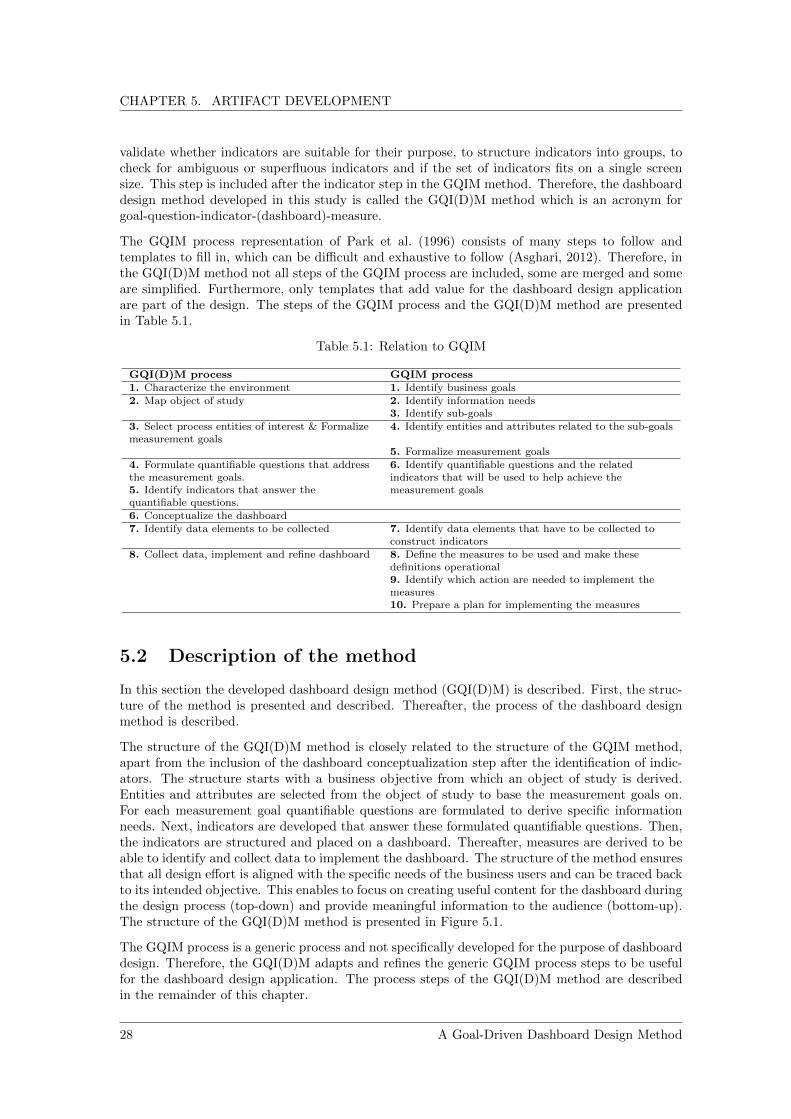
CHAPTER 5. ARTIFACT DEVELOPMENT
validate whether indicators are suitable for their purpose, to structure indicators into groups, tocheck for ambiguous or superfluous indicators and if the set of indicators fits on a single screensize. This step is included after the indicator step in the GQIM method. Therefore, the dashboarddesign method developed in this study is called the GQI(D)M method which is an acronym forgoal-question-indicator-(dashboard)-measure.
The GQIM process representation of Park et al. (1996) consists of many steps to follow andtemplates to fill in, which can be difficult and exhaustive to follow (Asghari, 2012). Therefore, inthe GQI(D)M method not all steps of the GQIM process are included, some are merged and someare simplified. Furthermore, only templates that add value for the dashboard design applicationare part of the design. The steps of the GQIM process and the GQI(D)M method are presentedin Table 5.1.
Table 5.1: Relation to GQIM
GQI(D)M process GQIM process1. Characterize the environment 1. Identify business goals2. Map object of study 2. Identify information needs
3. Identify sub-goals3. Select process entities of interest & Formalizemeasurement goals
4. Identify entities and attributes related to the sub-goals
5. Formalize measurement goals4. Formulate quantifiable questions that addressthe measurement goals.5. Identify indicators that answer thequantifiable questions.
6. Identify quantifiable questions and the relatedindicators that will be used to help achieve themeasurement goals
6. Conceptualize the dashboard7. Identify data elements to be collected 7. Identify data elements that have to be collected to
construct indicators8. Collect data, implement and refine dashboard 8. Define the measures to be used and make these
definitions operational9. Identify which action are needed to implement themeasures10. Prepare a plan for implementing the measures
5.2 Description of the method
In this section the developed dashboard design method (GQI(D)M) is described. First, the struc-ture of the method is presented and described. Thereafter, the process of the dashboard designmethod is described.
The structure of the GQI(D)M method is closely related to the structure of the GQIM method,apart from the inclusion of the dashboard conceptualization step after the identification of indic-ators. The structure starts with a business objective from which an object of study is derived.Entities and attributes are selected from the object of study to base the measurement goals on.For each measurement goal quantifiable questions are formulated to derive specific informationneeds. Next, indicators are developed that answer these formulated quantifiable questions. Then,the indicators are structured and placed on a dashboard. Thereafter, measures are derived to beable to identify and collect data to implement the dashboard. The structure of the method ensuresthat all design effort is aligned with the specific needs of the business users and can be traced backto its intended objective. This enables to focus on creating useful content for the dashboard duringthe design process (top-down) and provide meaningful information to the audience (bottom-up).The structure of the GQI(D)M method is presented in Figure 5.1.
The GQIM process is a generic process and not specifically developed for the purpose of dashboarddesign. Therefore, the GQI(D)M adapts and refines the generic GQIM process steps to be usefulfor the dashboard design application. The process steps of the GQI(D)M method are describedin the remainder of this chapter.
28 A Goal-Driven Dashboard Design Method

CHAPTER 5. ARTIFACT DEVELOPMENT
Business Objective
ProcessInput Output
Entity Entity Entity EntityEntity Entity
Goal Goal Goal
Question Question Question Question Question
Measure Measure Measure Measure Measure
DefinitionIn
terp
reta
tion
Figure 5.1: GQI(D)M structure
5.2.1 Step 1: Characterize the environment
As already mentioned, one of the most important goals when designing a dashboard is to presentinformation that is relevant to its audience. Therefore, a dashboard needs to provide informationthat meets a knowledge need of its audience. A knowledge need originates from an objective,as the acquired knowledge by using the dashboard will be used to achieve a specific objective.Therefore, the first step in the dashboard design process is to identify the business objectives.This includes identifying the objective of the dashboard, identifying what the object of study(i.e. the process or product that will be analyzed), why this object is studied and identifying thebusiness users (i.e. the audience). This first step can best be done in a group setting to ensure tostart with the right business objectives and identifying the context. Questions that can be askedin this step are: What needs to be achieved?, What is being studied?, Why is this being studied?and For whom is this being studied? By answering these questions the context of the dashboardproject can be obtained. This first step of the method is mainly qualitative. However, results ofprior quantitative analyses may be used to substantiate the problem or objective that drives theproject.
A Goal-Driven Dashboard Design Method 29

CHAPTER 5. ARTIFACT DEVELOPMENT
Table 5.2: Step 1
Input Sub-steps Output PurposeObjective,problem,need or ideaPreliminaryanalyses (ifavailable)
a. Define objective, problem,need or idea that initialized theprojectb. Identify dashboard purposec. Identify object of studyincluding underlying motivationd. Identify business users
High-level dashboardobjectiveSpecified object of studySpecified audience ofdashboard
Characterizedashboardproject bydefiningcontext
5.2.2 Step 2: Map object of study
After the business objectives have been identified, the next step is to identify the required inform-ation (i.e. the information need) that helps in achieving these business objectives. In order toidentify the required information, a thorough and common understanding of the object of studyis required. Therefore, the second step in the dashboard design process is to map the businessprocesses related to the object of study. Mapping the business processes forces design participantsto think about which processes, process elements and resources are involved in the achievementof the identified business objectives. The goal of this step is to create a process model in whicheach process element (i.e. entity) and its corresponding parts (i.e. attributes) are identified. Anexample of a process model is given in Figure 5.2.
Table 5.3: Step 2
Input Sub-steps Output PurposeSpecifiedobject ofstudy
a. Identify (sub-)processesrelated to the object of studyb. Identify for each(sub-)process its relevantentities and correspondingattributesc. Create a process map of theobject of study
Process map Createthoroughand commonunderstand-ing of objectof study
ProcessInput Output
Entity Entity Entity EntityEntity Entity
ProcessInput Output
ProcessInput Output
Entity Entity
Attribute Attribute
Entity EntityEntity Entity
Attribute
Attribute
Process flow
Consists of …
Process
Figure 5.2: Example of process model
30 A Goal-Driven Dashboard Design Method

CHAPTER 5. ARTIFACT DEVELOPMENT
5.2.3 Step 3: Select process entities of interest and formalize measure-ment goals
After the processes have been mapped, it needs to be identified what parts of the object of studyare relevant to the dashboard. Based on the process map of step 2, process entities of interest haveto be selected. By considering the identified process entities and attributes the following questionneeds to be answered: Which parts of the process can be used to characterize the assessment orachievement of the business objective of step 1? By answering this question, concrete measurementgoals can be defined that create focus for the dashboard design project. The measurement goalsshould contain the object of interest, the purpose and the perspective. The measurement goalscan be defined according to the template adapted from Basili et al. (1994) depicted in Figure 5.3.
Table 5.4: Step 3
Input Sub-steps Output PurposeProcess mapof object ofstudy
a. Select process entities andattributes of interestb. Define for each entity orattribute of interest concretemeasurement goals
Concrete measurementgoals
Create focusfor thedashboarddesignproject
Measurement Goal
Analyze the <object of interest> with the aim to <purpose> it with respect to its <focus> from the <perspective> point of view.
Measurement Goal
Analyze the production schedulewith the aim to evaluate it with respect to its efficiency from the manager point of view.
Figure 5.3: Measurement goal template
5.2.4 Step 4: Formulate quantifiable questions that address the meas-urement goals
Based on the defined measurement goals of step 3, quantifiable questions need to be formulatedthat help to achieve the measurement goal(s). These quantifiable questions specify which aspectsof the process entities and attributes of interest are observed. Therefore, the next step in thedashboard design process is to formulate quantifiable questions that represent for each processentity and attribute the specific information need of the business users.
Table 5.5: Step 4
Input Sub-steps Output PurposeMeasurementgoals
Derive the important attributes fromthe measurement goals by formulatingquantifiable questions
Quantifiablequestions
Specify aspects ofinterest ofmeasurement goals
5.2.5 Step 5: Identify indicators that answer the quantifiable questions
After the quantifiable questions have been formulated, they need to be answered. The first step inorder to answer these questions is to identify visual indicators (e.g. charts, graphs and tables) thataddress these questions. By preparing sketches of the indicators it can be identified how businessusers want to consult the required information by using the dashboard. Identifying indicators
A Goal-Driven Dashboard Design Method 31

CHAPTER 5. ARTIFACT DEVELOPMENT
before looking for the actual data ensures that the data that is being collected has a clearlydefined purpose which can be traced back to the measurement goal(s) of step 3 and limits thedata collection effort.
Table 5.6: Step 5
Input Sub-steps Output PurposeSpecificquantitativeinformationrequirements
a. Identify how business userswant to consult the informationthey needb. Sketch indicators andvalidate with business users
Set of indicators Translateinformation needsto indicators
5.2.6 Step 6: Conceptualize the dashboard
After identifying the indicators that address the quantifiable questions, the indicators need tothe aggregated. Therefore, the next step in the dashboard design process is to conceptualize thedashboard by preparing a sketch containing all the identified indicators of step 5. Aggregating theindicators enables to visualize the dashboard structure and outline its content. The sketch needsto be validated with business users to ensure it meets their information need. As step 5 and step 6are highly creative activities in the dashboard design process, validating the visual structure andits content can best be done in group sessions with the business users. Multiple iterations of step5 and step 6 might be required to come up with meaningful indicators, dashboard structure andcontext for the presented information. For example, it may occur that more detailed informationis required in order to create a meaningful indicator. In such a situation, it can be decided toadd an additional level to the dashboard which can be consulted by the inclusion of navigationalfunctionalities (e.g. drilling down). However, in order to include these functionalities it should bedefined what information they should display, how they should display it and how this additionalinformation could be consulted.
Table 5.7: Step 6
Input Sub-steps Output PurposeSet ofindicators
a. Structure indicators into groupsb. Create a sketch of the dashboardby aggregating the groups ofindicatorsc. Validate dashboard design andcontent with business users
Dashboard designSet of indicatorsthat need to becreatedStructural lay-outof dashboard
Create thedesign of thedashboardand defineits content
5.2.7 Step 7: Identify data elements to be collected
After conceptualizing and validating the dashboard design and its content, it needs to be created.Therefore, the next step in the dashboard design method is to identify the data elements requiredto create the indicators. This can be done by going through the indicators and list for eachindicator which data elements are needed to create it. Some data elements might be required formultiple indicators. After identifying the data elements required to construct the dashboard, thedata elements need to be collected. Some of them may be available, some may be derived fromother data, some may be obtained by minor effort and some might be not available, not suitablefor the application or extremely difficult to obtain. Therefore, the degree of availability needs tobe identified for each data element including its source and needs to be communicated with thebusiness users. In case a data element is not available or it takes major effort to obtain it, thedecision can be made to exclude a piece of information or to include it later. In such a situationthe conceptual sketches of step 5 and 6 may need to be revised. The data elements required for
32 A Goal-Driven Dashboard Design Method

CHAPTER 5. ARTIFACT DEVELOPMENT
each indicator including its availability degree and source can be mapped using the template ofFigure 5.4 which is adapted from Park et al. (1996).
Table 5.8: Step 7
Input Sub-steps Output PurposeDashboardcontent
a. Identify data elements requiredto construct the dashboard contentb. Determine for each data elementits availability degree and its sourcec. Document data elementsrequired to each indicator includingits availability degree and sourced. Discuss documented dataelements and decide on actual datacollection with business userse. Optional: revise conceptualsketches of step 5 and 6
Defined data elementsto be collected
Define datacollectionplan
Data element Required for visualization
1
X X
X
X X X
X X
X X
A
B
C
D
E
2 3 4
0 V
0 0 W
- X
+ Y
- - - Z
Availability SourceCode Meaning
+ Available
0 Can be derived from other data
0 0 Can be obtained by minor effort
- Not available now
- - Not suitable
- - - Impossible or extremely difficult to obtain
Figure 5.4: Template to map required data elements, availability degree and source
5.2.8 Step 8: Collect data, implement and refine dashboard
Based on the defined data collection plan of step 7, in this step the data is collected directly orindirectly (i.e. derived from other data). After the data has been collected the visualisation canbe created and aggregated to form the actual dashboard. Lastly, if required, the indicators anddashboard lay-out need to be refined by eliminating all elements that do not contribute to anincreased or faster understanding of the presented information.
Table 5.9: Step 8
Input Sub-steps Output PurposeData collection planDefined dashboardcontent outline step 6
a. Collect datab. Create visualisationsc. Aggregate indicators to formdashboardd. Refine indicators and dashboardlay-out
Dashboard Form theactualdashboard
A Goal-Driven Dashboard Design Method 33


Chapter 6
Demonstration
Now the dashboard design method has been developed in Chapter 5, its use needs to be demon-strated and evaluated. In order to do this, a case study is conducted in a business context whichis described in this chapter.
6.1 Case study environment
The environment in which the case study is conducted is introduced in this section.
6.1.1 The company
ASML is the world’s largest supplier of photolithography systems for the semiconductor industry.The company designs, develops, integrates, markets and services advanced systems used in themanufacturing process of complex integrated circuits (ICs or chips). The customers of ASMLinclude the largest chip manufacturers in the world such as Intel, Samsung and TSMC. The com-pany’s headquarters are located in Veldhoven, The Netherlands, where also research, development,manufacturing and assembly takes place.
ASML’s lithography systems perform a critical step in the production process of chips. Theirsystems optically image patterns onto a photosensitive silicon wafer. After the pattern is printed,the wafer is moved slightly to image the pattern at another location on the wafer. This processis repeated until the wafer is covered in patterns. After printing, the photosensitive material onthe wafer is further processed to form the first layer of the wafer’s chips. To create a completemicrochip, this process is repeated 100 times or more to form layers on top of layers. In theproduction process of microchips different types of lithography systems are used for differentlayers (depending on the size of the features to be printed for a specific layer). ASML’s latestEUV (extreme ultraviolet) systems are used for the smallest features and ASML’s older DUV(deep ultraviolet) systems for larger features.
Within ASML, three main operational processes can be distinguished to serve the market needs.The Demand Identification and Order Capturing process, the Product Generation Process andthe Order Fulfillment Process. The Demand Identification and Order Capturing process translatesthe mid to short-term customers’ business requirements into ASML’s mid to short-term businesstargets to build a long-term partnership with its customers. The Product Generation Processdefines and drives the development of new products, techniques and related services in orderto answer the requirements of the semiconductor industry and specific customer needs. TheOrder Fulfillment Process deals with the execution of orders and services and includes planning,procurement, production, logistics and customer support.
A Goal-Driven Dashboard Design Method 35

CHAPTER 6. DEMONSTRATION
6.1.2 Main process of interest
The case study will focus on (a part of) the Order Fulfillment Process. Therefore, this process isintroduced on high-level.
The Order Fulfillment Process starts with the procurement of materials, tools and other hardwareat ASML’s suppliers. When the parts have been delivered, the parts are assembled into modules.This first assembly step is called ASSY (assembly) and the assembly of the different modules isexecuted in parallel. After completing the ASSY assembly step, modules are combined into anactual system during the final assembly step (FASY).
After the assembly phase is completed, the system is tested and calibrated during a test periodwhich is called TEST. When testing and calibration is completed successfully, the factory accept-ance test (FAT) determines whether the system’s performance meets the customer’s requirements.After the system’s performance is accepted, the system is prepared for transportation. It is partlydisassembled, packed and shipped to the customer’s manufacturing location. The system is thenassembled, calibrated and tested in the clean room of the customer, which is called INSTALL.After testing is completed successfully, the site acceptance test (SAT) determines whether the sys-tem’s performance meets the requirements of the customer. When the performance of the systemis accepted by the customer, the order fulfillment process is completed and the system is ready tobe used (or to be further implemented) in the manufacturing process of the customer.
6.2 Case study protocol
The dashboard design method developed in Chapter 5 is applied in the business context of ASMLto develop and implement a set of indicators. Two participants are selected for the case studybecause they are closely involved in a larger process improvement project and know what theinformation need is.
– Explanation of the method: First the method is explained in a meeting to the participantsincluding its structure and process steps. The participants were able to ask questions toclarify aspects to create a thorough understanding of the method.
– Execution of the method: During two weeks of daily sessions of one hour (one in the morn-ing and one in the afternoon) each step of the method is executed. During these sessionsother participants have been invited to the daily sessions to provide input. However, theseadditional participants are not involved in the complete execution of the method. Betweenthe morning and afternoon sessions, the researcher elaborated and documented the outputof each step which was evaluated at the end of the day.
– Validation of the method: After the method is executed, individual evaluation sessionsare planned with participants to validate the method based on the evaluation criteria asformulated in Chapter 3.5. The evaluation of the method is described in Chapter 7.
6.3 Demonstration of the dashboard design method
In this section the dashboard design method as developed in Chapter 5 is applied in the businesscontext of ASML. In this section each design step and its result is documented to demonstratethe use of the method.
6.3.1 Step 1: Characterize the environment
ASML has the objective to increase the output of the EUV Factory in the upcoming years. Oneof the defined key success factors for this is reducing the cycle time in the factory. Cycle time
36 A Goal-Driven Dashboard Design Method

CHAPTER 6. DEMONSTRATION
reduction is a comprehensive goal and many projects have already started to address this high-level business objective. One of them is the reduction of waiting time for materials (i.e. materialdelays) at the shop floor. Material delays (internally known as B1s) are defined as materials thatare in stock but not in time available at the shop floor due to internal issues at the EUV factory.This results, among other things, in an increased cycle time. To address these internal issuesrelated to material delays, they have been grouped into several work streams. One of them isthe optimization of the operator utilization to improve the material availability. Although a largeamount of data is available, this topic has been analyzed mainly qualitative until now. Therefore,in this dashboard design project the planning and execution process will be analyzed with thepurpose of quantitative evaluation with respect to operator utilization in the context of a processimprovement project. Business users are part of the production logistics department of the EUVFactory. The output of step 1 of the dashboard design method is depicted in Table 6.1. Toillustrate the context of the project in relation to higher-level goals, the goal-hierarchy is depictedin Figure 6.1. The project focuses on the final assembly phase (FASY) of the order fulfillmentprocess as a lot of materials are involved and it is on the critical path of the manufacturing processof the EUV product.
Table 6.1: Output of design step 1
Output DescriptionHigh-level dashboard objective Reduce material delaysSpecified object of study Manufacturing planning and execution
process of EUV FactorySpecified audience of dashboard Production Logistics department of ASML’s
EUV Factory
Increase output EUV
Factory
Increase efficiency
Reduce cycle time in factory
…
……
… …
…Reduce material delays
…
Increase sales EUV product
Increase revenue
…
Figure 6.1: Dashboard objective in relation to higher-level goals
A Goal-Driven Dashboard Design Method 37

CHAPTER 6. DEMONSTRATION
6.3.2 Step 2: Map object of study
In this step the object of study as defined in step 1 (the scheduling and execution process) includingits relevant process entities and attributes is mapped with the identified business users. Theresulting process map is depicted in Figure 6.2.
Production scheduling and execution process
Design of EUV Product
EUV Product
System blueprint(GRE Routing)
Executable plan(MES Routing)Scheduling
Manufacturing Execution
Constraints Objective function
Materials
Operator allocation
Routing steps
Activity times
Routing steps
Routing step dependencies
Time schedule
Progress loggings
EUV Product
Start routing
step
Finish routing
step
Pause routing
step
Equipment Operators
Planning Material planning
Process flow
Consists of …
Process
Figure 6.2: Relevant attributes and entities of object of study
6.3.3 Step 3: Select process entities of interest and formalize measure-ment goals
Based on the process map of step 2, the process elements of interest are identified and defined asa concrete measurement goal. Two main process elements of interest are identified. The processelements of interest including their measurement goals are depicted in Table 6.2.
Table 6.2: Output of design step 3
Process element of interest Measurement GoalExecutable plan (MES routing) 1. Analyze the MES Routing with the aim to
evaluate it with respect to its efficiency froma process improvement point of view.
Progress loggings 2. Analyze the progress loggings with theaim to evaluate it with respect to productionprogress from a process improvement point ofview.
6.3.4 Step 4: Formulate quantifiable questions that address measure-ment goals
After the measurement goals have been defined, quantifiable questions are formulated to derivethe specific information need from these goals. The quantifiable questions for each measurementgoal are depicted in Table 6.3.
38 A Goal-Driven Dashboard Design Method

CHAPTER 6. DEMONSTRATION
Table 6.3: Output of design step 4
Measurement goal Quantifiable questionMeasurement goal 1 1a. What is the average operator utilization?
1b. What is the average scheduled operatorutilization on shift level?1c. What is the average amount of idle timescheduled?1d. What is the total amount of idle timescheduled?1e. What is the amount of idle timescheduled per shift?1f. What is the total amount of activity timescheduled?1g. How is the total amount of activity timedivided over the total number of shifts?1h. How is the scheduled workloaddistributed over the amount of operators in ashift?
Measurement goal 2 2a. What is the amount of activitiescompleted per shift?2b. What is the total amount of activitytime logged per shift?2c. What is the total amount of idle timelogged per shift?2d. How much does the manufacturingexecution deviate from the scheduledplanning?2e. How representative are the plannedactivities times in relation to the actuallogged activity times?
6.3.5 Step 5: Identify indicators that answer the quantifiable questions
Based on the specific knowledge need defined in step 4, indicators that can answer these specificknowledge question are identified. These indicators are identified by sketching different charts,visualizations and tables and validating them with business users. In Table 6.4 the quantifiablequestions and the corresponding identified indicators are described.
Table 6.4: Output of design step 5
Indicator description Answers quantifiable questionIndicator A:Bar chart, x-axis: shift numbers of onecomplete FASY milestone, y-axis: utilization rate onshift-level expressed in a percentage. Add overallaverage operator utilization.
1a, 1b.
Indicator B: Bar chart, x-axis: shift numbers of onecomplete FASY milestone, y-axis: scheduled idle timeper shift expressed in hours. Add average idle time pershift and total idle time of complete standardscheduled FASY milestone.
1c, 1d, 1e.
A Goal-Driven Dashboard Design Method 39

CHAPTER 6. DEMONSTRATION
Indicator description Answers quantifiable questionIndicator C: Bar chart, x-axis: shift numbers of onecomplete FASY milestone, y-axis: amount of scheduledactivity time expressed in hours. Add total amount ofactivity time scheduled for one complete FASYmilestone.
1f, 1g.
Indicator D: Bar chart, x-axis: shift numbers of onecomplete FASY milestone, y-axis: utilization rate peroperator on shift level expressed in hours.
1h.
Indicator E: Bar chart, x-axis: shift numbers of onecomplete FASY milestone, y-axis: completed amount ofactivities expressed in planned activity time in hours.
2a.
Indicator F: Bar chart, x-axis: shift numbers of onecomplete FASY milestone, y-axis: logged activity timeexpressed in hours.
2b.
Indicator G: Bar chart, x-axis: shift numbers of onecomplete FASY milestone, y-axis: logged idle timeexpressed in hours.
2c.
Indicator H: Line graph, x-axis: shift numbers of onecomplete FASY milestone, y-axis: amount ofcompleted activities relative to amount of plannedactivities expressed in a percentage (calculated basedon planned activity times to take into account the sizeof activities).
2d.
Indicator I: Line graph, x-axis: shift numbers of onecomplete FASY milestone, y-axis: logged activity timeof completed activities per shift relative to the plannedactivity time of these completed activities expressed ina percentage.
2e.
6.3.6 Step 6: Conceptualize the dashboard
After the indicators are identified in step 5, they arranged to conceptualize the dashboard. Firstthe indicators are structured into groups. The grouped indicators including reasoning are depictedin Table 6.5.
Table 6.5: Initial groups of indicators
Indicator category Indicators ReasoningScheduling performance A, B, C, D All indicators are related to scheduling
performance and calculated based on planneddata. They indicate the efficiency of the schedule.
Execution performance E, F, G All indicators are related to production executionand are calculated based on execution data. Theyindicate the efficiency of the execution process.
Schedule adherence H, I Both indicators compare planning and executionand indicate if manufacturing under or overperforms against plan.
After sketching the dashboard, its content and structure have been validated with business users.Several changes have been made to the set of indicators identified in step 5. The changes aredepicted in Table 6.6.
40 A Goal-Driven Dashboard Design Method

CHAPTER 6. DEMONSTRATION
Table 6.6: Output of content and structure validation
Indicator description Changes based on validationIndicator A:Bar chart, x-axis: shift numbers ofone complete FASY milestone, y-axis: utilizationrate on shift-level expressed in a percentage. Addoverall average operator utilization.
Do not include.
Indicator B: Bar chart, x-axis: shift numbers ofone complete FASY milestone, y-axis: scheduledidle time per shift expressed in hours. Add averageidle time per shift and total idle time of completescheduled FASY milestone.
Express idle time in a percentage oftotal available time instead of in hours.
Indicator C: Bar chart, x-axis: shift numbers ofone complete FASY milestone, y-axis: amount ofscheduled activity time expressed in hours. Addtotal amount of activity time scheduled for onecomplete FASY milestone.
Do not include.
Indicator D: Bar chart, x-axis: shift numbers ofone complete FASY milestone, y-axis: utilizationrate per operator on shift level expressed in hours.
Express utilization in a percentageinstead of hours.
Indicator E: Bar chart, x-axis: shift numbers ofone complete FASY milestone, y-axis: completedamount of activities expressed in planned activitytime in hours.
Do not include.
Indicator F: Bar chart, x-axis: shift numbers ofone complete FASY milestone, y-axis: loggedactivity time expressed in hours.
Do not include.
Indicator G: Bar chart, x-axis: shift numbers ofone complete FASY milestone, y-axis: logged idletime expressed in hours.
Do not include.
Indicator H: Line graph, x-axis: shift numbers ofone complete FASY milestone, y-axis: amount ofcompleted activities relative to amount of plannedactivities expressed in a percentage (calculatedbased on planned activity times).
Add horizontal red line tovisualization that represents situationwhen completed activities are equal toplanned activities (100% adherence).Make it possible to select differentFASY orders.
Indicator I: Line graph, x-axis: shift numbers ofone complete FASY milestone, y-axis: loggedactivity time of completed activities per shiftrelative to the planned activity time of thesecompleted activities expressed in a percentage.
Do not include.
Indicator J: Boxplot of distribution of overallproduction progress including downtime
Added indicator.
Indicator K: Boxplot of distribution of overallproduction progress downtime excluded.
Added indicator.
Indicator L: Boxplot of distribution of overalldeviation of logged activity time from plannedactivity time
Added indicator.
Indicator M: Bar chart, x-asis: shift hours, y-axis:number of cases in which activities are completedwithin 1 minute to illustrate start/stop behaviourof operators during their shift.
Added indicator.
A Goal-Driven Dashboard Design Method 41

CHAPTER 6. DEMONSTRATION
Based on the changed set of indicators, also the groups of indicators have been changed to structurethe content of the dashboard. The new groups of indicators are depicted in Table 6.7. This tableis used as input for step 7.
Table 6.7: Resulting set of indicators
Indicator category Indicators ReasoningScheduling performance B, D. Both indicators are related to scheduling
performance and calculated based on theoreticaldata. They indicate the efficiency of the schedulein terms of idle time and workload balance.
Schedule adherence(activities)
H, J, K. All indicators compare planning and executionand indicate if manufacturing under or overperforms against plan in terms of planned versusactual completed activities.
Schedule adherence(time)
I, M. Both indicators compare planning and executionand indicate if manufacturing under or overperforms against plan in terms of planned timeversus actual logged time.
Furthermore, the conceptual design of the dashboard structure has been defined and is depictedin Figure 6.3.
Indicator H
Indicator J
Indicator D
Indicator B Indicator I
Summary Table Summary Table Summary Table
Indicator M
Scheduling performance & adherence at System Integration (Final Assembly)
Indicator K
Summary Table
Dropdown menu
Figure 6.3: Structural design of dashboard
6.3.7 Step 7: Define data elements to be collected
After the set of indicators has been defined in step 6, data elements are identified that are requiredto implement the indicators. The template as presented in Chapter 5 is used to do this. Thecompleted template is presented in Figure 6.4.
Based on the availability degree of the data elements, it is decided to implement all indicators.For indicator M the logged start time stamp per activity and the logged time per activity is used
42 A Goal-Driven Dashboard Design Method

CHAPTER 6. DEMONSTRATION
instead of the logged finished time stamp per activity. This makes it still possible to identifystart/stop behaviour of operators during their shift.
Data element Required for indicator
B
X
X X
X
X X X X X
X
X
X X X X
X X
X X X X
X X X X
X X
X X
X
X
Planned activity time per shift
Number of operators planned per shift
Total available time per shift
Shift identification
Planned activity time per operator per shift
Total available time per operator per shift
Completed activities per shift
Planned and re-planned activities per shift
Activity identification
Planned time per activity
Final assembly order identification
Logged time per activity
Logged start date time stamp per activity
Logged finish date time stamp per activity
D H I
0 0 SAP BO
0 0 SAP BO
0 SAP BO
+ SAP BO
0 0 SAP BO
0 SAP BO
0 SAP BO
0 SAP BO
+ SAP BO
+ SAP BO
+ SAP BO
+ SAP BO
+ SAP BO
- - SAP ME
Availability Source
Code Meaning
+ Available
0 Can be derived from other data
0 0 Can be obtained by minor effort
- Not available now
- - Not suitable
- - - Impossible or extremely difficult to obtain
J K M
Figure 6.4: Identified data elements including degree of availability and source
6.3.8 Step 8: Collect data, implement and refine dashboard
After the indicators are identified, the structural design of the dashboard defined and the dataelements to be collected are identified. The data can be collected and the indicators can beimplemented and aggregated onto the dashboard. The final dashboard design is depicted in Figure6.5.
Important note: due to confidentiality restrictions of the case study company, the indicatorsas presented in Figure 6.5 are anonymized. The actual values in the summary tables have beenreplaced by letters as well as the values along the axes. Furthermore, some of the graphs are scaledto hide their actual behaviour. To ensure the visual indicators are still readable, the title of thegraphs as well as the axes labels are retained. This still gives an idea about what the indicatorsrepresent. Next to that, the structure of the dashboard is presented in the same way as it isdesigned during the case study.
A Goal-Driven Dashboard Design Method 43

CHAPTER 6. DEMONSTRATION
FASY PWO
123456789-AB12
Total scheduled idle time
W%
(X hours)
Average scheduled idle time per
shiftY%
(Z hours)
Scheduling performance & adherence at System
Integration (Final Assembly)
Scheduling performance
Schedule adherence (activities)Schedule adherence (tim
e)
Max difference in utilization
T%
Average difference in utilizationM
%
Average production progress (dow
ntime included)
X%
Average production progress (dow
ntime excluded)
Z%
Average deviation of actual activity times
from planned activity tim
esR
%
Portion of completed activities <1 m
in (start/stop behavior)
S%
Fig
ure
6.5
:F
inal
dash
board
desig
n
44 A Goal-Driven Dashboard Design Method

Chapter 7
Evaluation
Now the designed artifact has been demonstrated in a business context, the next step in the designscience research methodology is to evaluate its use. In this chapter the evaluation of the methodis described.
7.1 Evaluation approach
During the application of the method as described in Chapter 6, participants were able to experi-ence the use of the method. Based on these experiences, semi-structured interviews are performedwith each participant individually to evaluate the method based on the evaluation criteria thatare selected in Chapter 3.5. The evaluation criteria are operationalized by formulating multiplequestions for each criterion. In addition, the participants were asked to score each question on afive-point Likert scale, which ranges from 1 (strongly disagree) to 5 (strongly agree). The basicquestions of the semi-structured interviews are presented in Table 7.1, more detailed questionswere asked during the interviews to obtain a clear understanding of the experiences and opinionsof the participants. The interviews are held with three closely involved participants during thedemonstration of the method. Two participants were involved in the complete execution of themethod and one has been invited multiple times for input during the case study. The parti-cipants are from different departments of the organization and have experience in multiple processimprovement projects. More information about the participants is presented in Appendix A.
Table 7.1: Evaluation criteria and interview questions
Criterion # QuestionEfficacy 1 Do you think the method provides practical guidance in the process of designing
a dashboard?2 Do you think the method can be used for deriving specific information needs?3 Do you think the method can be used for designing a dashboard?
Utility 4 Do you think the dashboard design method is practical?5 Do you think practical guidance is missing in some of the steps?6 Do you think the method includes all steps to obtain a dashboard design?7 Do you think important design (sub-)steps are missing in the method?
Understandability 8 Do you think the method is clearly depicted?9 Do you think the method is easy to understand?10 Have you encountered any vagueness in the descriptions of the design activities?
Ease of use 11 Do you think the design steps are easy to perform?12 Do you think the method can easily be mastered?13 Do you think the design activities are manageable?14 Do you think you will use the method for future projects?
Generality 15 Do you think the method can be applied in another context?16 Do you think the design activities are defined independent of the context?
A Goal-Driven Dashboard Design Method 45

CHAPTER 7. EVALUATION
7.2 Evaluation results
In this section the results of the semi-structured interviews are presented. In Table 7.2 the indi-vidual scores of the participants for each question are presented which illustrates their experiencesand opinions about the method. Furthermore, the average score for each question is presented.
Table 7.2: Evaluation criteria and interview questions
Criterion # Question SD D N A SA Avg.Efficacy 1 Do you think the method
provides practical guidance inthe process of designing adashboard?
X,Y,Z 5
2 Do you think the method canbe used for deriving specificinformation needs?
X,Y,Z 5
3 Do you think the method canbe used for designing adashboard?
X,Y,Z 5
Utility 4 Do you think the dashboarddesign method is practical?
X,Y Z 4.3
5∗ Do you think practicalguidance is missing in some ofthe steps?
Y Z X 3.6
6 Do you think the methodincludes all steps to obtain adashboard design?
X,Z Y 4.3
7∗ Do you think importantdesign (sub-)steps are missingin the method?
X,Y,Z 4
Understandability 8 Do you think the method isclearly depicted?
X,Y,Z 5
9 Do you think the method iseasy to understand?
X,Y Z 3.3
10∗ Have you encountered anyvagueness in the descriptionsof the design activities?
X,Y,Z 5
Ease of use 11 Do you think the design stepsare easy to perform?
X Y,Z 3.7
12 Do you think the method caneasily be mastered?
X Y,Z 3.3
13 Do you think the designactivities are manageable?
X,Y,Z 5
14 Do you think you will use themethod for future projects?
X Y Z 3
Generality 15 Do you think the method canbe applied in another context?
X,Y,Z 5
16 Do you think the designactivities are definedindependent of the context?
X Y,Z 4.3
∗Questions marked with a ∗ have a negative form and therefore the results are reversed. SD = Strongly Disagree,D = Disagree, N = Neutral, A = Agree, SA = Strongly Agree. Participants Y and Z have been involved in thecomplete execution of the method and participant X has been closely involved during the execution.
In Table 7.3 the essence of the answers to the questions provided by each participant per evaluationcriterion is presented. The reasoning behind their scores, the strong and weak elements of themethod, the faced difficulties and the possible improvements are obtained from this. The resultswill be discussed in the next section.
46 A Goal-Driven Dashboard Design Method

CHAPTER 7. EVALUATION
Table 7.3: Interview results
Participant X Participant Y Participant ZEfficacy - Consists of practical
description of steps to beable to design a dashboard.- Provides a good structureto derive specificinformation needs byidentifying parts of theobject of study to create aclear focus on what a userneeds to know.
- Method has practical,theoretical substantiatedsteps that can be used for thedesign of a dashboard.- Provides a helpful structureto derive information needsfrom business objectives.
- Method consists of clearpractical steps to design adashboard.- Method provides a goodway to identify specificinformation needs frombusiness goals and makesit possible to link those tocreate content for thedashboard in a structuredway.
Utility - Method provides thepractical support needed inthe dashboard designprocess.- Mapping the object ofstudy requires someadditional guidance, butthe step itself really addsvalue (especially in acomplex environment). Itforces users to discuss,think and find out how thebusiness process reallyworks and makes it easierto identify the trueinformation need.- Simple examples of theoutput of the design stepswould help to executethem.
- Method provided practicalguidance during thedashboard design process.- Step 2 is really helpful as itresults in an increasedunderstanding of the businessprocess and informationneeds can be derived fromthere.- The step of conceptualizingthe dashboard force users toselect only the mostimportant indicators ormerge them, which results ina useful set of indicators.- Knowledge of underlyingtheoretical model could behelpful to execute the stepsfrom measurement goals untilindicators.
- Method provides apractical step-by-stepapproach to be able todesign a dashboard.- A simple exampleelaboration of the designstep results would help toexecute the method.- Step 6 is really helpful toselect only the mostimportant indicators andleave out the rest.Furthermore, whenaggregating the indicatorsit is more easy to indicaterequired changes in thestructure of the dashboardor the indicatorsthemselves.
Understandability - Method is clearlydescribed and depicted.- Tables with input,sub-steps, output andpurpose are really helpfulto understand the method.- Knowledge about orexperience with theunderlying GQIM processwill help to understand thestructure of the method.
- Method steps are clearlydescribed and presented.- Knowledge aboutunderlying theoretical modelis required to understand themethod structure for newusers.- In some descriptions theused language could bedifficult to understand.
- Method has a clearstructure and design stepsare described explicitly.- Method structure isrecognizable and thereforeeasy to understand.- The use of simplelanguage can improve theunderstandability in someparts of the method.
Ease of use - Method steps are easy toperform but explanation isrequired before execution.- Method is divided intoclear logical steps.- Method is not easy tomaster without backgroundinformation about theunderlying theoreticalmodel.- For a future project Iwould prefer anothermethod as I don’t haveexperience with theunderlying measurementapproach.
- Method steps are easy toperform after explanation.Without explanationproblems may arise.- Steps are divided in alogical way and the amountof effort needed to performeach step is balanced.- If a user is willing to spendsome time to getting to knowthe method, the method canbe mastered.- I will use another methodfor future projects as theorganization prescribes a setof methods to use forprojects.
- Method steps are easy toperform in general butthis also depends on theavailability of informationand complexity of thesituation.- Steps are logical dividedand balanced in terms ofeffort.- The method can easilybe mastered, but theeducational backgroundmay play a role.- I would probably use themethod in future projects
Generality - Method is designedindependent of context.- Steps are generic butmainly focused on businessprocesses.
- Method is generic, nocontext specific aspects canbe found.
- Method can be usedindependent of context.
A Goal-Driven Dashboard Design Method 47

CHAPTER 7. EVALUATION
7.3 Discussion of results
In this section the results of the evaluation of the method are discussed. This is done by combiningthe scores and the answers provided by each participant to the different questions. The averagescore for each evaluation criterion is presented in Figure 7.1. In general, the scores indicate apositive view on each of the evaluation criteria.
Tabel 1
X Y Z
Efficacy 1 5 5 5 5
2 5 5 5 5
3 5 5 5 5
Efficacy 5
Utility 4 4 4 5 4,33333333333333
5 2 5 4 3,66666666666667
6 4 5 4 4,33333333333333
7 4 4 4 4
Utility 4,08333333333333
Understandability
8 5 5 5 5
9 3 3 4 3,33333333333333
10 5 5 5 5
Understandability
4,44444444444444
Ease of use 11 3 4 4 3,66666666666667
12 2 4 4 3,33333333333333
13 5 5 5 5
14 2 3 4 3
Ease of use 3,75
Generality 15 5 5 5 5
16 4 5 5 4,66666666666667
Generality 4,83333333333334
1
2
3
4
5
6
7
8
9
10
11
12
13
14
15
16
0 1
Tabel 1-1
Efficacy 5
Utility 4,08333333333333
Understandability
4,44444444444444
Ease of use 3,75
Generality 4,83333333333334
4,42222222222222
Efficacy
Utility
Understandability
Ease of use
Generality0 1 2 3 4 5
4,8
3,8
4,4
4,1
5,0
Average score
1
Figure 7.1: Scores on each evaluation criterion
To understand the reasoning behind the scores, the remainder of this section discusses the resultsfor each evaluation criterion.
7.3.1 Efficacy
The participants are positive about the efficacy of the method. All participants have given eachquestion for this evaluation criterion a maximum score of 5. Which implies that the methodmeets the purpose it was designed for: providing practical guidance in the process of designinga dashboard that meet the information need of its audience. All participants indicate that themethod provides practical steps in order to design a dashboard (Q1 & Q3). Furthermore, theystate that the method provides a good structure to derive and define the information needs of theaudience (Q2).
7.3.2 Utility
In general, participants are positive about the utility of the method. They all indicate thatthe method provides the practical guidance needed in the design process of a dashboard (Q4).Furthermore, they state that they did not miss any step in the method to come up with a dashboarddesign (Q6) and also no missing design sub-steps are mentioned (Q7) which suggests that themethod is complete. Next to that, it is pointed out by two participants that step 2 in themethod is helpful to focus the design efforts on the real information need of the users. Alsostep 6 is indicated as helpful by two of the participants as it forces users to reduce the numberof indicators to only the most important ones. One participant indicated that in step 2 of themethod some additional guidance or explanation is needed to map the process (Q5). Furthermore,one participant indicated that knowledge of the underlying theoretical model would be helpful toexecute the steps (Q5). Lastly, two participants mentioned that simple examples of the output ofeach design step would help to execute the steps correctly (Q5).
7.3.3 Understandability
In general, the participants find the method understandable. They are positive about the waythe method is presented. They indicate that the method is clearly depicted (Q8) and the designsteps are described explicitly (Q10). The tables at the end of each design step are perceived ashelpful to have a clear overview of the activities in each step. However, two participants statethat knowledge about the underlying measurement approach or experience with this measurementapproach is required to understand the structure of the method (Q9). This was also found bySarcia (2010) about the application of the GQM method to other domains apart from software
48 A Goal-Driven Dashboard Design Method

CHAPTER 7. EVALUATION
engineering. In contrast, one participant says that the method structure is recognizable andtherefore easy to understand (Q9). Lastly, two participants mentioned that the use of simplelanguage in some descriptions of the design steps can improve the understandability.
7.3.4 Ease of use
The participants are positive about the method’s ease of use. They indicate that the steps are easyto perform (Q11), although one participant says that this also depends on the complexity of thecontext and the availability of information. Furthermore, they all state that the method is dividedinto logical steps and the amount of effort required to complete each step is balanced (Q13). Allparticipants indicate that explanation is required prior to the execution of the method to be ableto perform the design steps correctly. Furthermore, one participant states that the method isnot easy to master for users without knowledge or experience with the underlying measurementapproach (Q12). However, the two other participants indicate that this depends on how muchtime the user is willing to invest in getting to know the method and the educational backgroundof the user (Q12). Finally, the users were asked if they would use the method in future projects(Q14). One participant states that he would use the method in a future project or at least thestructure. Two participants state that they would not use the method for different reasons. Oneof the participants would not use the method because he is not familiar with the structure and theother one would not use the method due to a organizational constraint (i.e. prescribed standardset of methods to use for projects).
7.3.5 Generality
Lastly, the participants agree on the generality of the methodology. All participants state thatthe method is designed independent of the context and can therefore be applied in many differentsituations (Q15). This also holds for the described design steps, although one participant men-tioned that they mainly focus on designing a dashboard for business processes and some changesmight be needed to be applicable for a product (Q16).
7.4 Summary of findings and artifact improvement points
Based on the evaluation of the method it can be concluded that the participants are overall positiveabout the method and its use. To summarize the evaluation, the main positive and negative pointsare presented in this section. Lastly, some improvement directions for the method are given.
The participants mentioned the following main positive points about the method:
– Method provides practical steps needed to design a dashboard and provides a clear andhelpful structure to derive information need from business objectives.
– The design step of mapping the object of study is experienced as helpful to breakdown theobject of study into manageable elements and subsequently focus the measurement effortson the most important elements of this object.
– The design step of conceptualizing the dashboard is experienced as helpful to reduce thenumber of indicators by selecting only the most important performance indicators to includein the dashboard design and easily identify required changes to the structure of the dashboardand the indicators.
– Method structure and steps are clearly described and presented.
– The design steps are divided logically and the effort required to complete each design stepis experienced as balanced.
– The method and the design steps are indicated as generic.
A Goal-Driven Dashboard Design Method 49

CHAPTER 7. EVALUATION
The participants mentioned also the following negative points about the method:
– Participants mentioned that they missed some simple examples of the output of each designstep which support the execution of the steps.
– Structure of the method may be difficult to understand without knowledge or experiencewith the underlying measurement approach.
– Participants mentioned that the method may not be easy to master for all users, eachparticipants mentioned a different reason: (1) knowledge about the underlying measurementmodel, (2) the time a user is willing to spend on getting to know the method and (3) theeducational background of the user.
Lastly, possible directions for future improvements and extensions are identified during the casestudy as well as by analysing the experiences and opinions of the participants. These possiblefuture improvements are:
– During the interviews the participants frequently mentioned that examples of the output ofthe design steps would have been helpful to execute the design steps and make them easier tounderstand. Therefore, including simple examples of the output for each of the design stepscould be a future improvement of the methodology. It is important that these examples arerepresentative in different applications to be useful for the users.
– Another frequently mentioned point during the interviews is that knowledge about the un-derlying measurement approach (GQM) would be helpful to execute and understand some ofthe design steps. Adding an additional basic explanation of how the Goal-Question-Metricstructure works could be a future improvement of the method.
– One of the participants stated that practical guidance is required for mapping the object ofstudy. A future improvement of the method might be to use a widely used process mappingtechnique like flowcharts or BPMN to show the sequence and the relationships among them.However, to use flowcharts or BPMN the user needs to be familiar with these process mappingtechniques.
– The method mainly focuses on obtaining a dashboard design and the implementation ofthe identified indicators. However, it does not provide practical steps for implementing thedashboard by utilizing the existing information systems or reporting tools of the company.Further improvement of the method could focus on extending the method with implementa-tion related activities to implement the dashboard by using the existing systems or tools ofthe company.
50 A Goal-Driven Dashboard Design Method

Chapter 8
Conclusions
After evaluation of the method in the previous chapter, a conclusion can be drawn based on theobtained results. In the final chapter of this report conclusions of the research are describedand scientific and practical contributions are presented. Finally, the research limitations andrecommendations for future work are discussed.
8.1 Research conclusion
This research aimed to develop a dashboard design method that provides companies and prac-titioners with practical guidance in the process of identifying, developing and presenting keyperformance indicators that support the achievement of their business objectives. Existing per-formance measurement methodologies mainly focus on what to measure and how to gather databut lack practical guidance in how to present information. Therefore, the objective of this researchis formulated as follows:
Design of a method that guides companies in the dashboard design process for theperformance evaluation of their business processes.
To achieve this objective, the research is guided by answering the following three research questions:
1. What is a dashboard?
2. What current measurement methodologies, approaches and processes exist for performancemeasurement and dashboards?
3. What can be the key design activities in a dashboard design process and how can they beused?
As the objective of this research is to design a new artifact the design science research methodologyis followed. The development of the method is based on a synthesis of an existing measurementmethodology and information presentation related design activities. Critical design activities areidentified by comparing several procedural performance measurement methodologies and inform-ation presentation approaches reported in literature. Based on the identified critical design activ-ities, a measurement methodology is selected and further extended and refined for the dashboarddesign application. One of the most important requirements of a dashboard is that its contentis aligned with the information needs of its audience. Therefore, the GQIM method is selectedas basis because it enables deriving indicators and measures from business goals and remainingtractability during the application of the approach to these business goals. This enables to de-
A Goal-Driven Dashboard Design Method 51

CHAPTER 8. CONCLUSIONS
velop indicators and measures that are aligned with the information need of the business usersand ensures that all design efforts contribute to reaching these business goals.
In order to validate the method, it has been demonstrated in a case study at ASML in order todesign a dashboard for the performance evaluation of some aspects of their scheduling, planningand execution process. By applying the method, a set of meaningful performance indicatorscould be obtained that meets the information need of the business users. After demonstration,the method has been evaluated with participants in the case study. Overall the method hasbeen positively evaluated on its efficacy, utility, understandability, ease of use and generality.Furthermore, some future improvements for the method have been derived from the evaluationwith participants and the output of the case study, including the addition of simple examples ofthe output of each of the design steps that support the execution and the extension of the methodwith steps to implement the designed dashboard by utilizing the information systems or reportingtools of the company.
Based on the output of the case study and the positive evaluation results, it can be concluded thatthe research achieves its objective. Furthermore, the results indicate that the method is useful inpractice to design a dashboard that meets the information need of its audience.
8.2 Contributions to research
This research contributes to the knowledge in academic literature in the following ways:
– First of all, this research contributes to knowledge about how to develop and design ameaningful dashboard by the development of a goal-driven dashboard design method whichprovides guidance in the complete process of identifying, developing and presenting per-formance indicators aligned with business objectives and the information needs of businessusers.
– Secondly, the developed method is an extension to the GQIM method of Park et al. (1996)and is applied to a new problem domain, namely dashboard design. The promising resultsshowed that the GQIM method can be effectively applied to the dashboard design domain.
– Lastly, critical design activities are derived from performance measurement methodologiesand information presentation approaches. By synthesizing these design activities, this re-search contributes to the literature by providing a common set of design activities to beconsidered when designing a dashboard which can be used in dashboard design research.
8.3 Contributions to practice
In addition to the scientific contributions, this study has the following practical implications:
– First of all, the dashboard design method enhances the how-to knowledge of practitionersto design a dashboard by providing them with practical step-by-step guidance.
– Secondly, the dashboard design method provides a structure that ensures the dashboardcontent is aligned with specific business objectives. This will likely increase in how well theperformance indicators support in achieving of business objectives.
– Lastly, the dashboard design method is developed in such way that business users determinethemselves what and how they want the information to be presented. This ensures thatthe dashboard content meets the information need of the business users. By applying themethod for designing a dashboard, information about business performance can be presentedmore effectively which can contribute to the improvement of the decision making process.
52 A Goal-Driven Dashboard Design Method

CHAPTER 8. CONCLUSIONS
8.4 Limitations and recommendations for future work
As in every research, limitations and suggestions for future work can be identified. The mostimportant limitations and recommendations for future research are:
– The method has been applied in only one case study in a specific business context and theevaluation of the method is based on the experiences and opinions of a limited number ofparticipants in this case study. The results of this first validation showed a positive attitudetowards the use of the method. However, to support this first validation future researchshould focus on applying the method in multiple case studies. Based on these applications,a more complete evaluation can be obtained and a more supported conclusion about themethod can be drawn. An example is the evaluation of generality of the method. It is difficultfor participants to indicate whether the method is applicable independent of context. Themethod may be applicable for other projects in the same business domain. However, thisdoes not immediately imply that the method will be useful in a different business domain.Therefore, future research should not only focus on more applications of the method butalso on applications in different business domains to obtain a more complete evaluation.
– Evaluation of the method is performed based on a set of evaluation criteria selected by theresearcher, partly substantiated by literature, partly selected based on the solution objectivesand partly based on what the researcher finds important. However, for the evaluation ofIT artifacts a wide range of evaluation criteria can be found in literature (e.g. Prat et al.,2014). Therefore, there are possibly other important criteria to evaluate the method. Amore comprehensive set of evaluation criteria might result in a more complete evaluation,which in turn might lead to more possible improvement directions for the method.
– The method has only been evaluated with business users which have limited experience withdashboard design. Therefore, evaluation of the method with dashboard design experts canlead to a more complete evaluation. To obtain a more complete evaluation, future researchshould focus on validating the method with dashboard design experts.
– The development of the method is done by selecting an existing measurement method andextend and refine it with specific dashboard design activities. The selection of the existingmethod is based on the identification of critical design activities and aspects of informationpresentation which are obtained by conducting a literature review. This means that theselection of the existing measurement methodology depends on the papers that were used toderive this information from and the interpretation of the information in these papers by theresearcher. Furthermore, only procedural performance measurement design frameworks areconsidered during the identification of critical design activities. Therefore, future researchshould focus on extending the synthesis by for example including also structural perform-ance measurement design frameworks to validate whether all important design activities areincluded in the developed method.
A Goal-Driven Dashboard Design Method 53

References
Amrina, E. & Yusof, S. M. (2011). Key performance indicators for sustainable manufacturingevaluation in automotive companies. In 2011 ieee international conference on industrialengineering and engineering management (pp. 1093–1097). 2
Arinez, J., Biller, S., Lyons, K., Leong, S., Shao, G., Lee, B. E. & Michaloski, J. (2010). Bench-marking production system, process energy, and facility energy performance using a systemsapproach. In Proceedings of the 10th performance metrics for intelligent systems workshop(pp. 88–96). 1
Asghari, N. (2012). Evaluating gqm+ strategies framework for planning measurement system. 28
Badawy, M., El-Aziz, A. A., Idress, A. M., Hefny, H. & Hossam, S. (2016). A survey on exploringkey performance indicators. Future Computing and Informatics Journal , 1 (1-2), 47–52. 1
Basili, V. R. (1993). The experience factory and its relationship to other improvement paradigms.In European software engineering conference (pp. 68–83). 10
Basili, V. R., Caldiera, G. & Rombach, H. D. (1994). The goal question metric approach.Encyclopedia of software engineering , 528–532. 9, 10, 31
Basili, V. R., Trendowicz, A., Kowalczyk, M., Heidrich, J., Seaman, C., Munch, J. & Rombach,D. (2014). Aligning organizations through measurement: The gqm+ strategies approach.Springer. 9
Bauer, M., Lucke, M., Johnsson, C., Harjunkoski, I. & Schlake, J. C. (2016). Kpis as the interfacebetween scheduling and control. IFAC-PapersOnLine, 49 (7), 687–692. 1
Bititci, U., Cocco, P. & Ates, A. (2016). Impact of visual performance management systems onthe performance management practices of organisations. International Journal of ProductionResearch, 54 (6), 1571–1593. 6
Bititci, U., Garengo, P., Dorfler, V. & Nudurupati, S. (2012). Performance measurement: chal-lenges for tomorrow. International journal of management reviews, 14 (3), 305–327. v, v, v,1, 2
Bourne, M., Neely, A., Mills, J. & Platts, K. (2003). Implementing performance measurementsystems: a literature review. International Journal of Business Performance Management ,5 (1), 1–24. 8
Brath, R. & Peters, M. (2004). Dashboard design: Why design is important. DM Direct , 85 ,1011285–1. 25
Brooks, M. (2005, Summer). Defining and measuring kpis and metrics. Business Intelli-gence Journal , 10 (3), 44-50. Retrieved from https://search.proquest.com/docview/
222637920?accountid=27128 v, v, v, 1, 8, 18
Chae, B. K. (2009). Developing key performance indicators for supply chain: an industry per-spective. Supply Chain Management: An International Journal . v, v, v, 1, 2
Dover, C. (2004). How dashboards can change your culture. Strategic Finance, 86 (4), 42. 6
Eckerson, W. W. (2010). Performance dashboards: measuring, monitoring, and managing yourbusiness. John Wiley & Sons. 6, 7
Few, S. (2004). Dashboard confusion. Perceptual Edge. 6
Few, S. (2006). Information dashboard design: The effective visual communication of data. O’ReillyMedia, Inc. 5, 6, 7, 22, 23
54 A Goal-Driven Dashboard Design Method

References
Ghalayini, A. M. & Noble, J. S. (1996). The changing basis of performance measurement. Inter-national journal of operations & production management . 8
Gopalkrishnan, V., Steier, D., Lewis, H. & Guszcza, J. (2012). Big data, big business: bridging thegap. In Proceedings of the 1st international workshop on big data, streams and heterogeneoussource mining: Algorithms, systems, programming models and applications (pp. 7–11). 1
Heckl, D. & Moormann, J. (2010). Process performance management. In J. vom Brocke &M. Rosemann (Eds.), Handbook on business process management 2 (pp. 115–135). Berlin:Springer. 2, 12
Heer, J., Bostock, M. & Ogievetsky, V. (2010). A tour through the visualization zoo. Communic-ations of the ACM , 53 (6), 59–67. 21, 22
Henke, N., Bughin, J., Chui, M., Manyika, J., Saleh, T., Wiseman, B. & Sethupathy, G. (2016).The age of analytics: Competing in a data-driven world. McKinsey Global Institute, 4 . v,v, v, 1
Jaaskelainen, A. & Roitto, J.-M. (2016). Visualization techniques supporting performance meas-urement system development. Measuring Business Excellence. 2
Kang, N., Zhao, C., Li, J. & Horst, J. A. (2016). A hierarchical structure of key performanceindicators for operation management and continuous improvement in production systems.International Journal of Production Research, 54 (21), 6333–6350. 2
Kaplan, R. S. & Norton, D. P. (1992). The balanced scorecard - measures that drive performance.Harvard business review , 70 (1), 71-79. 8
Keegan, D. P., Eiler, R. G. & Jones, C. R. (1989). Are your performance measures obsolete?Strategic Finance, 70 (12), 45. 8
Keim, D. A. (2002). Information visualization and visual data mining. IEEE transactions onVisualization and Computer Graphics, 8 (1), 1–8. 21
Knaflic, C. N. (2015). Storytelling with data: A data visualization guide for business professionals.John Wiley & Sons. 22, 23, 24, 25
Lawson, R., Stratton, W. & Hatch, T. (2007, Dec). Scorecards and dashboards - partners inperformance: The management accounting magazine. CMA Management , 80 (8), 33-37. 6
Lempinen, H. (2012). Constructing a design framework for performance dashboards. In Scand-inavian conference on information systems (pp. 109–130). 21
Lengler, R. & Eppler, M. J. (2007). Towards a periodic table of visualization methods for man-agement. In Iasted proceedings of the conference on graphics and visualization in engineering(gve 2007), clearwater, florida, usa. 21
Liu, Y., Han, H. & DeBello, J. (2018). The challenges of business analytics: Successes and failures.In Proceedings of the 51st hawaii international conference on system sciences. v, v, v, 1
Lynch, R. L. & Cross, K. F. (1991). Measure up!: The essential guide to measuring businessperformance. Mandarin. 8
Malik, S. (2005). Enterprise dashboards: design and best practices for it. John Wiley & Sons. 21,23, 24, 25
March, S. T. & Smith, G. F. (1995). Design and natural science research on information technology.Decision support systems, 15 (4), 251–266. 19
May, G., Barletta, I., Stahl, B. & Taisch, M. (2015). Energy management in production: Anovel method to develop key performance indicators for improving energy efficiency. AppliedEnergy , 149 , 46–61. 1
McGuire, T., Ariker, M. & Roggendorf, M. (2013). Making data analytics work: Three keychallenges. mckinsey & company. 1
Mertins, K. & Krause, O. (1999). Performance management (Vol. 24; K. Mertins & O. Krause,Eds.). Springer Science & Business Media. 11, 14
Neely, A., Adams, C. & Crowe, P. (2001). The performance prism in practice. Measuring businessexcellence. 8
Neely, A., Mills, J., Platts, K., Richards, H., Gregory, M., Bourne, M. & Kennerley, M. (2000).Performance measurement system design: developing and testing a process-based approach.International journal of operations & production management . 8, 12
A Goal-Driven Dashboard Design Method 55

References
Nudurupati, S. S., Bititci, U. S., Kumar, V. & Chan, F. T. (2011). State of the art literaturereview on performance measurement. Computers & Industrial Engineering , 60 (2), 279–290.1
O’Donnell, E. & David, J. S. (2000). How information systems influence user decisions: a researchframework and literature review. International Journal of Accounting Information Systems,1 (3), 178–203. 2
Park, R. E., Goethert, W. B. & Florac, W. A. (1996). Goal-driven software measurement. aguidebook. (Tech. Rep.). Pittsburgh: Software Engineering Institute. 10, 14, 28, 33, 52
Pauwels, K., Ambler, T., Clark, B. H., LaPointe, P., Reibstein, D., Skiera, B., . . . Wiesel, T.(2009). Dashboards as a service: why, what, how, and what research is needed? Journal ofservice research, 12 (2), 175–189. 2, 5, 6
Peffers, K., Tuunanen, T., Rothenberger, M. A. & Chatterjee, S. (2007). A design science researchmethodology for information systems research. Journal of management information systems,24 (3), 45–77. xv, xv, xv, 3, 4, 17, 18, 20
Prat, N., Comyn-Wattiau, I. & Akoka, J. (2014). Artifact evaluation in information systemsdesign-science research-a holistic view. In Pacis (p. 23). 19, 53
Sarcia, S. A. (2010). Is gqm+ strategies really applicable as is to non-software developmentdomains? In Proceedings of the 2010 acm-ieee international symposium on empirical softwareengineering and measurement (pp. 1–4). 48
Schmenner, R. W. & Vollmann, T. E. (1994). Performance measures: gaps, false alarms, and the“usual suspects”. International Journal of Operations & Production Management . 1
Taticchi, P., Balachandran, K. & Tonelli, F. (2012). Performance measurement and manage-ment systems: state of the art, guidelines for design and challenges. Measuring BusinessExcellence. 2
Wazed, M. & Ahmed, S. (2008). Multifactor productivity measurements model (mfpmm) aseffectual performance measures in manufacturing. Australian journal of basic and appliedsciences, 2 (4), 987–996. 2
Wexler, S., Shaffer, J. & Cotgreave, A. (2017). The big book of dashboards: visualizing your datausing real-world business scenarios. John Wiley & Sons. 5
Yigitbasioglu, O. M. & Velcu, O. (2012). A review of dashboards in performance management: Im-plications for design and research. International Journal of Accounting Information Systems,13 (1), 41–59. v, v, v, 2, 6
Zhu, L., Johnsson, C., Mejvik, J., Varisco, M. & Schiraldi, M. (2017). Key performance indicatorsfor manufacturing operations management in the process industry. In 2017 ieee internationalconference on industrial engineering and engineering management (ieem) (pp. 969–973). v,v, v, v, v, v, 1, 2
Zhu, L., Johnsson, C., Varisco, M. & Schiraldi, M. M. (2018). Key performance indicators formanufacturing operations management–gap analysis between process industrial needs andiso 22400 standard. Procedia Manufacturing , 25 , 82–88. 2
Zhu, L., Su, H., Lu, S., Wang, Y. & Zhang, Q. (2014). Coordinating and evaluating of multiplekey performance indicators for manufacturing equipment: Case study of distillation column.Chinese Journal of Chemical Engineering , 22 (7), 805–811. 1, 2
56 A Goal-Driven Dashboard Design Method

Appendix A
Profiles of case study participants
More detailed information about the participants in the case study are presented in Table A.1below.
Table A.1: Profiles of case study participants
Participant Role Experience Background Educationaldegree
X Project leader 5+ years Logistics and supply chain Master
Y Engineer 15+ years Logistics and supply chain Bachelor
Z Manager 10+ years Logistics and supply chain Master
A Goal-Driven Dashboard Design Method 57