
essays on empirical industrial organization
169
ESSAYS ON EMPIRICAL INDUSTRIAL ORGANIZATION By XINLONG TAN A dissertation submitted in partial fulfillment of the requirements for the degree of DOCTOR OF PHILOSOPHY WASHINGTON STATE UNIVERSITY School of Economic Sciences MAY 2018 © Copyright by XINLONG TAN, 2018 All Rights Reserved
-
Upload
khangminh22 -
Category
Documents
-
view
2 -
download
0
Transcript of essays on empirical industrial organization

ESSAYS ON EMPIRICAL INDUSTRIAL ORGANIZATION
By
XINLONG TAN
A dissertation submitted in partial fulfillment of
the requirements for the degree of
DOCTOR OF PHILOSOPHY
WASHINGTON STATE UNIVERSITY
School of Economic Sciences
MAY 2018
© Copyright by XINLONG TAN, 2018
All Rights Reserved

© Copyright by XINLONG TAN, 2018
All Rights Reserved

ii
To the Faculty of Washington State University:
The members of the Committee appointed to examine the dissertation of
XINLONG TAN find it satisfactory and recommend that it be accepted.
Jia Yan, Ph.D., Chair
Jill J. McCluskey, Ph.D.
Felix Munoz-Garcia, Ph.D.

iii
ACKNOWLEDGMENT
I would first like to express my sincere and profound gratitude to my advisor Jia Yan for his
guidance through the process of writing my dissertation, as well as for his invaluable help and
advice planning my career. I would also like to thank my other committee members, Jill J.
McCluskey and Felix Munoz-Garcia, for their support and comments that helped me keep
moving forward and added depth to my dissertation. I also extend my deep appreciation to our
coauthor Clifford Winston, not only for his constructive contributions and insights, but also for
our collaboration in making my second chapter possible.
Special thanks to my peer classmates and friends at Washington State University for the
hours spent studying and enjoying our lives together. Thank you especially to Dila Ikiz for her
best friendship and unforgettable memories we had together. Without her, I would not have had
such a wonderful and joyful life here in the pursuit of my Ph.D. My deepest appreciation goes to
my parents for their love, patience, and unconditional support.
iv
ESSAYS ON EMPIRICAL INDUSTRIAL ORGANIZATION
Abstract
by Xinlong Tan, Ph.D.
Washington State University
May 2018
Chair: Jia Yan
In the first chapter, I quantify two mega airline mergers’ effects on travelers’ welfare using the
most popular identification technique, the difference-in-differences (DID) approach, in
retrospective analysis of mergers. I find that the DID method does not generally provide an
accurate measurement when follow-up mergers are close to the merger of interest in calendar
time. I then develop and estimate a two-level model of consumer demand. The result shows that
fare and frequency have opposite effects on consumer welfare for both mergers in which the
positive frequency effect dominates. In the short run, both mergers have little impact on
consumer welfare. In the long run, however, travelers gain from both mergers.
In chapter two, we design a novel quasi-experiment approach, DID-Matching with regression
adjustment approach, to estimate the effects of Low-Cost Carriers’ (LCCs) expansions on fares.
We decompose the overall effect of LCC entry into three effects: actual entry, potential entry and
adjacent entry. For each type of entry, we select treated routes to exclude the contamination of
other types of entry. The controlled routes are matched from routes that were entered by the
same LCC in later years. We find that LCC entry caused at most a 20% and 30% price drop in

v
EU and U.S. markets, respectively. In EU markets, fare reductions are mainly caused by LCCs’
actual entries. Potential entries can cause big price drop in U.S. markets. Our results also imply
that concerns about market consolidation can be reduced if cabotage rights were granted.
Chapter three investigates the performance of consumer reviews in addressing endogeneity in
discrete choice models with an application to individuals’ choices among smartphone options.
Instead of identifying unobserved product quality as a scalar, I explicitly express the control
variable as a function of feature sentiments, which are extracted from reviews using a machine
learning technique. I find that the estimated price coefficient is biased in the positive direction
without endogeneity correction while it is adjusted in the expected way after including review
variables. The findings indicate that consumer reviews provide alternative sources of information
in dealing with endogeneity.

vi
TABLE OF CONTENTS
Page
ACKNOWLEDGMENT................................................................................................................ iii
ABSTRACT ................................................................................................................................... iv
LIST OF TABLES .......................................................................................................................... x
LIST OF FIGURES ..................................................................................................................... xiii
DEDICATION .............................................................................................................................. xv
CHAPTER 1: THE EFFECTS OF MEGA AIRLINE MERGERS ON CONSUMER WELFARE
THROUGH PRICE AND FLIGHT FREQUENCY ....................................................................... 1
1. Introduction ............................................................................................................................. 1
2. Related Literature .................................................................................................................... 4
3. Recent Airline Mergers ........................................................................................................... 9
3.1. DL/NW Merger ............................................................................................................... 10
3.2. UA/CO Merger ............................................................................................................... 11
3.3. WN/FL Merger ............................................................................................................... 12
3.4. AA/US Merger ................................................................................................................ 13
4. Data ....................................................................................................................................... 14
5. The Empirical Strategy.......................................................................................................... 17
5.1. Event Window ................................................................................................................. 18
5.2. Market Selection ............................................................................................................. 19
5.3. Frequency Effects ........................................................................................................... 21
5.4. Price Effects .................................................................................................................... 22
vii
5.5. Identification ................................................................................................................... 23
5.6. Estimation Results for the DL/NW Merger Effects ......................................................... 23
5.7. Estimation Results for the UA/CO Merger Effects ......................................................... 25
6. Demand ................................................................................................................................. 29
6.1. Two-Level Approach....................................................................................................... 29
6.2. Instrumental Variables ................................................................................................... 31
6.3. Results of Demand Estimation ........................................................................................ 32
7. Travelers’ Welfare Changes .................................................................................................. 35
8. Conclusions ........................................................................................................................... 40
9. References ............................................................................................................................. 42
CHAPTER 2: LCC COMPETITION IN U.S. AND EUROPE: IMPLICATIONS FOR
FOREIGN CARRIERS’ EFFECT ON FARES IN THE U.S. DOMESTIC MARKETS ............ 46
1. Introduction ........................................................................................................................... 46
2. LCCs’ Expansions in U.S. and EU ....................................................................................... 53
2.1. Expansion of Southwest in U.S. ...................................................................................... 53
2.2. Ryanair and EasyJet in Europe ...................................................................................... 55
3. Set up and Patterns of Route Entry of LCCs ......................................................................... 57
3.1. Data and Entry Decomposition ...................................................................................... 57
3.2. Patterns of Route Entry of LCCs .................................................................................... 60
4. Regression Implementation of DID Identification ............................................................... 62
5. A DID Matching with Regression Adjustment Approach ................................................... 65
6. Sample Matching Criteria ..................................................................................................... 69
6.1. Time Window .................................................................................................................. 69

viii
6.2. Sample Selection ............................................................................................................. 70
6.3. Balancing Test ................................................................................................................ 75
7. Estimation Results ................................................................................................................ 77
7.1. Baseline Results .............................................................................................................. 77
7.2. Additional Tests in the U.S. Markets .............................................................................. 81
7.3. Robustness Checks .......................................................................................................... 83
8. Conclusions ........................................................................................................................... 86
9. References ............................................................................................................................. 89
CHAPTER 3: ADDRESSING ENDOGENEITY BASED ON A PRODUCT ATTRIBUTE
SPACE AUGMENTED FROM CUSTOMERS' REVIEWS ....................................................... 92
1. Introduction ........................................................................................................................... 92
2. Smartphone Industry ............................................................................................................. 96
3. Data ....................................................................................................................................... 98
4. Feature Sentiment Classification ......................................................................................... 104
4.1. Similar Features Clustering ......................................................................................... 105
4.2. Sentiment Classification ............................................................................................... 105
5. A Hedonic Pricing Model ................................................................................................... 109
6. A Static Discrete Choice Model .......................................................................................... 110
7. Estimation Results ............................................................................................................... 111
8. Conclusions and Future Research ....................................................................................... 119
9. References ........................................................................................................................... 121
APPENDIX ................................................................................................................................. 124
Appendix A: Supplement Tables for Chapter 1 ...................................................................... 125

ix
Appendix B: Summary Statistics for Chapter 2 ...................................................................... 129
Appendix C: Time of Entries Made by Selected Low-Cost Carriers ...................................... 132
Appendix D: Visualization of Expansion of Low-Cost Carriers ............................................ 137
Appendix E: The Evolvement of Route Fare before and after Entry of a Low-Cost Carrier . 140
Appendix F: An Example of a Low-Cost Carrier (LCC)’s Entry Patterns ............................. 146
Appendix G: Supplement Martials for Chapter 3 ................................................................... 147

x
LIST OF TABLES
Table 1.1: The Sample of Recent Airline Mergers ....................................................................... 10
Table 1.2: Cities, Airports, and Population................................................................................... 15
Table 1.3: List of Airlines in the Sample ...................................................................................... 16
Table 1.4: Airline City Pair Market Overlap in 2008: Q2 ............................................................ 20
Table 1.5: 2SLS Estimates of the Flight Frequency Effects of the DL/NW Merger .................... 24
Table 1.6: 2SLS Estimates of the Price Effects of the DL/NW Merger ....................................... 25
Table 1.7: 2SLS Estimates of the Flight Frequency Effects of the UA/CO Merger .................... 27
Table 1.8: 2SLS Estimates of the Price Effects of the UA/CO Merger ........................................ 28
Table 1.9: Long-Run Effects of the UA/CO Merger Including the Markets Affected by the
WN/FL Merger ............................................................................................................................. 29
Table 1.10: 2SLS Estimates of the Top-Level Demand ............................................................... 33
Table 1.11: GMM Estimates of the Bottom-Level Demand (SE) ................................................ 34
Table 1.12: Estimated Demand and Flight Elasticities [5th-percentile, 95th-percentile] ............. 34
Table 1.13: Welfare Gains from Blocking the DL/NW Merger [5th-percentile, 95th-percentile] 36
Table 1.14: Short-Run Welfare Gains from Blocking the UA/CO Merger [5th-percentile, 95th-
percentile] ..................................................................................................................................... 38
Table 1.15: Long-Run Welfare Gains from Blocking the UA/CO Merger [5th-percentile, 95th-
percentile] ..................................................................................................................................... 39
Table 2.1: Spatial Entry Patterns of LCCs from Probit Regressions (Dependent variable: the
dummy of the first-time route entry) ............................................................................................ 61
Table 2.2: DID Regression Results of LCCs’ Entry Effects on Average Route Fare .................. 64
Table 2.3: Test for Standardized Differences in the U.S. Sample ................................................ 76

xi
Table 2.4: Standardized Differences of Route Average Fare in the U.S. Sample ........................ 77
Table 2.5: DID Matching Results on the Effect of Southwest’s Actual Entry without Prior
Potential Entry on Route Average Fare ........................................................................................ 78
Table 2.6: DID Matching Results on the Effect of a LCC’s Actual Entry with Potential Entry on
Route Average Fare ...................................................................................................................... 78
Table 2.7: DID Matching Results on the Effect of a LCC’s Potential Entry on Route Average
Fare ............................................................................................................................................... 79
Table 2.8: DID Matching Results on the Effect of a LCC’s Adjacent Entry on Route Average
Fare ............................................................................................................................................... 79
Table 2.9: DID Matching Results on the Effect of Southwest’s Type 1 Potential Entry on Route
Average Fare Categorized by Route Distance .............................................................................. 81
Table 2.10: DID Matching Results on the Route Average Fare Effect of Southwest’s Entry
before 2001 ................................................................................................................................... 82
Table 2.11: DID Matching Results on the Route Average Fare Effect of Southwest’s Entry on
High Concentrated Routes (HHI>4000) ....................................................................................... 82
Table 2.12: DID Matching Results on the Route Average Fare Effect of Southwest’s Entry on
Hub Routes.................................................................................................................................... 83
Table 2.13: Robustness Checks of DID Matching Results on the Effect of a LCC’s Actual Entry
on Route Average Fare (Column (1) in Table 2.6 is the benchmark)1 ....................................... 84
Table 2.14: DID Matching Results on the Route Average Fare Effect of Southwest’s Actual
Entry on Routes without other LCCs’ Entry................................................................................. 85
Table 2.15: Matching OLS Results on the Effect of Southwest’s Potential Entry on Route
Average Fare (Module 3) .............................................................................................................. 86

xii
Table 3.1: Correlation Test among Smartphone Brands ............................................................. 103
Table 3.2: Correlation Test among Observed Attributes and Feature Review Variables ........... 108
Table 3.3: Estimated Results for Hedonic Pricing Model .......................................................... 113
Table 3.4: Estimated Results for Conditional Logit Model ........................................................ 115
Table 3.5: Estimated Results for Conditional Logit Model (Continued) .................................... 118
Table A1: Summary Statistics 2006: Q1-2014: Q4 .................................................................... 125
Table A2: Validity Tests of the Instruments in the Flight Frequency and Fare Equations ........ 126
Table A3: Validity Tests of the Instruments in the Bottom-Level Demand Equations .............. 126
Table A4: Validity Tests of the Instruments in the Top-Level Demand Equation ..................... 127
Table A5: Robustness Check--2SLS Estimates of Frequency Effects of the DL/NW Merger .. 127
Table A6: Robustness Check --2SLS Estimates of Price Effects of the DL/NW Merger .......... 128
Table B1: Summary Statistics of EU Data ................................................................................. 129
Table B2: Summary Statistics of U.S. Data ................................................................................ 130
Table B3: Descriptive Statistics by Southwest’s Entry Patterns ................................................ 131
Table C2: Some Summary Statistics of Routes Entered and Served by Southwest: 1994-2011 132
Table C2: Time of Actual Entries Made by Ryanair on the Treated Routes between 2005m1 and
2013m12 ..................................................................................................................................... 133
Table C3: Time of Actual Entries Made by Easyjet on the Treated Routes between 2005m1 and
2013m12 ..................................................................................................................................... 134
Table C4: Time of Potential Entries Made by Ryanair between 2005m1 and 2013m12 ........... 135
Table C5: Time of Potential Entries Made by Easyjet between 2005m1 and 2013m12 ............ 136
Table G1: Summary Statistics .................................................................................................... 147

xiii
LIST OF FIGURES
Figure 1.1: The Timeline of an Airline Merger ............................................................................ 19
Figure 2.1: Expansion of Southwest in the U.S. Domestic Markets............................................. 53
Figure 2.2: Operating Costs of Selected U.S. Airlines ................................................................. 54
Figure 2.3: Expansion of Ryanair and Easyjet from January 2005 (2005m1) to December 2013
(2013m12) ..................................................................................................................................... 56
Figure 2.4: Airport Presence of LCCs after Rapid Expansion...................................................... 57
Figure 2.5: Entries and Exits Made by Ryanair and Easyjet in a Month over Time .................... 59
Demonstration 2.1: Timeline (in month) of Defining a Treated Route of a LCC’s Actual Entry 69
Demonstration 2.2: Timeline (in month) of Defining a Controlled Route to a Treated one from
the Routes Entered by the Same LCC........................................................................................... 70
Figure 3.1: Resale Values of Smartphone Brands ........................................................................ 97
Figure 3.2: Average Usage Time of Old Smartphones at the Time of Replacement ................... 99
Figure 3.3: Switching Behavior across Operating Systems Over Time ..................................... 100
Figure 3.4: Percentage of Switching Users across Operating Systems Over Time .................... 100
Figure 3.5: Brand Share of Monthly Active Smartphones ......................................................... 101
Figure 3.6: Brand Share of Monthly Sold Smartphones ............................................................. 102
Figure 3.7: Average Selling Price across Price Segments .......................................................... 104
Figure 3.8: The Framework of Smartphones’ Feature Sentiment Classification ........................ 104
Figure 3.9: Selected Samples for Smartphone Feature Reviews ................................................ 107
Figure D1: Expansion of Southwest from 1994 to 2011 ............................................................ 137
Figure D2: Entries and Exits Made by Southwest in a Quarter over the Years.......................... 138
Figure D3: Expansions of Ryanair and EasyJet in EU ............................................................... 139

xiv
Figure E1: The Evolvement of Market Fare within the Time Framework of the DID Analysis on
Markets of Some Chosen Treated Routes ................................................................................... 140
Figure E2: The Evolvement of Market Fare within One Year of First-time LCC Potential Entry
(presence at both end-point airports) .......................................................................................... 141
Figure E3: The Evolvement of Route Fare on Some Chosen Treated Routes of Southwest Over
Time. (Actual entry without potential entry) .............................................................................. 142
Figure E4: The Evolvement of Route Fare on Some Chosen Treated Routes of Southwest Over
Time. (Actual entry conditional on potential entry) ................................................................... 143
Figure E5: The Evolvement of Route Fare on Some Chosen Treated Routes of First-time
Potential Entry of Southwest Over Time (presence at both end-point airports) ......................... 144
Figure E6: The Evolvement of Route Fare on Some Chosen Treated Routes of Adjacent Entry of
Southwest Over Time ................................................................................................................. 145
Figure F1: An example of a LCC’s entry pattern. ...................................................................... 146
Figure G1: Average Time Gap between Purchase and Launch .................................................. 148
Figure G2: Average Time Gap between Birthdays of New Purchase and Last Purchase .......... 149
Figure G3: Dynamics of Smartphone Attributes ........................................................................ 150
Figure G4: Dynamics of Low-end Smartphone Attributes ......................................................... 151
Figure G5: Dynamics of Mid-range Smartphone Attributes ...................................................... 152
Figure G6: Dynamics of High-end Smartphone Attributes ........................................................ 153

xv
DEDICATION
I dedicate this dissertation to my beloved parents,
Yunsheng Tan and Meizhang Zhou.

1
CHAPTER 1
THE EFFECTS OF MEGA AIRLINE MERGERS ON CONSUMER
WELFARE THROUGH PRICE AND FLIGHT FREQUENCY
1. Introduction
Since the global financial crisis, the U.S. Department of Justice (DOJ) has approved four large
airline mergers 1 and concluded that they would benefit passengers by optimizing aircraft
utilization and the network system, providing a wider variety of services, and being a strong
competitor for the existing mega carriers. However, these mergers account for about 70 percent
of the US domestic market,2 which leads to concerns about the high market concentration. On
the one hand, higher market power could induce an increase in fares. On the other hand,
efficiency gains could lead to a decrease in fares and an increase in service quality, as the DOJ
concluded. A natural question is whether travelers could benefit from the mergers when
considering both the price and the service quality effects. The answer is critical to antitrust,
because it will provide guidance for future decision making.
One of the most popular reduced-form identification methods that have been used in
retrospective analysis of mergers is the difference-in-differences (DID) technique. This approach
identifies a control group of products that face similar demand and cost conditions to those
potentially affected by a merger and then determines how those products’ indexes (such as price,
quality, and variety) change relative to the products sold in markets affected by a merger
1 The most recent wave of consolidation in the US airline industry includes the Delta/Northwest, United/Continental,
Southwest/AirTran, and American/US Airways mergers. 2 “Airline domestic market share March 2014–February 2015,” Bureau of Transportation Statistics,
http://www.transtats.bts.gov.

2
(Ashenfelter et al., 2009). One advantage of this method is that the estimation is straightforward
and transparent. However, it requires exogenous events that are hardly satisfied in reality.
Another challenge is that it is usually difficult to find proper control groups. As pointed out by
Weinberg (2011), anything that affects the merging firms’ products differently from control
groups over time will lead to bias. Moreover, Weinberg argued that there might be response
behavior to the merger in the control group. If this is the case, the DID estimate will not reflect
the true competitive effects of mergers.
The objective of this paper is twofold. First, I evaluate the performance of the DID approach
in estimating the effects of recent mega airline mergers. Unlike previous airline mergers, each
recent airline merger formed the world’s largest airline at the time in terms of different measures,
which affected most markets in the US domestic market and made it more difficult to find
unaffected control groups. Therefore, I doubt that DID is still an appropriate approach to
evaluating the largest airline mergers.
I then propose a relatively clean design. Firstly, I focus on the mergers of Delta/Northwest
(DL/NW) and United/Continental (UA/CO), which experienced financial distress in the
recession, so it is reasonable to treat them as exogenous events. Secondly, I exclude small
markets to deal with the drastic difference between large and small markets. I also drop data
from the announcement period to obtain uncontaminated measures. Furthermore, I exclude data
affected by follow-up mergers for both the treatment and the control group. I assume that
antitrust is not forward looking when making decisions. That is, it does not expect the occurrence
of a follow-up merger in the future, so the merger approval is made taking the market structure at
the time of the announcement as given. Finally, to check the robustness of my findings, I add a

3
random market trend to capture the heterogeneous factors that affect the merging firms’ products
differently from the control groups over time.
Secondly, I evaluate the price and frequency effects of both the DL/NW and the UA/CO
merger and, given these effects, calculate travelers’ welfare gains. Obviously, when reviewing a
merger proposal, antitrust considers not only the potential anti-competition effect on price but
also the potential change in service quality produced by the merger. In this paper I use the flight
frequency to measure the service quality. Travelers value the convenience of a flight schedule
with multiple departure times, because they are then more able to find a flight that minimizes the
schedule delay.3 Since the schedule delay falls on average as the flight frequency increases,
passengers’ willingness to pay for air travel rises with frequency. As shown by Baily and Liu
(1995), reversed conclusions would be reached if the service quality were included in the welfare
assessment. Therefore, it is necessary for researchers and public policy makers to consider both
quality effects and price effects when analyzing merger effects.
The empirical results reveal that the DID method does not provide an accurate measurement
when a large proportion of markets are affected by follow-up mergers. For instance, the long-run
effects of the UA/CO merger are more likely to be biased, largely because the size of both the
treatment and the control group is much smaller after the merger than before the merger. Indeed,
the long-run frequency effect of the UA/CO merger shifts upward when I include the markets
affected by the Southwest/AirTran (WN/FL) merger, which took place immediately after the
approval of the UA/CO merger.
3 A schedule delay is the difference between a traveler’s desired departure time and the actual departure time
(Douglas & Miller, 1974).

4
Although I understate the merger effects, the results indicate that price and frequency have
opposite effects on travelers’ welfare for both mergers and that the frequency effect dominates.
In the short run, both mergers have little impact on consumer welfare. However, in the long run,
the DL/NW merger generates $1.5 billion in annual gains for travelers in selected markets,
associated with a lower price and a higher frequency. In terms of per passenger results, each
traveler gains on average 16 dollars every time he or she flies in affected markets. Travelers in
selected markets gain $0.5 billion annually from the UA/CO merger and an additional $0.8
billion from markets that overlap with the DL/NW merger in the long run. In other words, each
passenger on average gains 5 dollars per itinerary in markets affected by the UA/CO merger
alone and 14 dollars per itinerary in markets overlapped by both mergers.
The remainder of the paper is structured as follows. Section 2 reviews the related literature.
Section 3 provides the background of recent airline mergers. Subsequently, in section 4 I discuss
the data and the construction of the main variables. Section 5 presents the details of the choices
of event window and treatment and control groups, proposes my empirical models to estimate
the price and frequency effects, respectively, and discusses the estimation results. Section 6
describes the estimation method for the demand model and provides a brief discussion of the
estimation results. A calculation of travelers’ welfare gains from both mergers follows in section
7. Finally, section 8 presents the conclusions.
2. Related Literature
This section proceeds in two parts. I first review the typical literature on the analysis of mergers.
In the field of empirical industrial organization, most of the models fall into one of two
categories: reduced-form models and structural models. Which one is more pertinent when it
comes to antitrust is currently the subject of hot debate (see Angrist & Pischke, 2010; Nevo &

5
Whinston, 2010). In the first part, I discuss the advantages and disadvantages of each method.
Then, I provide a brief review of the literature on airline mergers. Specifically, I highlight papers
that have evaluated the quality effects of a merger in the US airline industry and recent studies
that have focused on the same mergers as this paper.
The first empirical approach is interview based and asks industry participants whether the
merger affected prices or other services.4 Due to its simplicity and sometimes low cost, this
approach has become common and often works as a supplement in retrospective assessment.
However, as Farrell et al. (2009) noted, these interview-based studies are unconvincing because
of two intrinsic weaknesses: (1) the inherently subjective nature of the evidence and assessment
concerning what happened post-merger and (2) the non-rigorous method for predicting what
would have happened in the absence of the merger.
Another line of research focuses instead on using the first-order approach (price pressure
approach) to predict the directional price impacts of mergers.5 This approach was first taken by
Werden (1996) by arguing that the marginal cost reductions necessary to restore the pre-merger
prices can be calculated without making any assumptions about a particular functional form for
the industry demand. The simpler “upward pricing pressure” index (UPP) proposed by Farrell
and Shapiro (2010a) has been used by antitrust agencies for the evaluation of mergers. Farrell
and Shapiro (2010a, b) and Froeb et al. (2005) argued that the sign of UPP minus efficiency
gains would indicate the direction of merger effects. However, in most cases researchers want to
evaluate the merger effects as precisely as possible; therefore, providing only a directional
indication of price effects is insufficient. As Werden and Froeb (2011) emphasized, the first-
4 Farrell et al. (2009) reviewed this literature in great detail. 5 This approach adopts both the simplicity and the transparency of approaches based on the market definition and
the firm grounding in formal economics of the market simulation approach (Jaffe & Weyl, 2013, provided a detailed
review of this literature).

6
order approach is usually appropriate for an initial screening, with some value during an
investigation, but inadequate for a thorough investigation or in-court proceedings, in which a
detailed merger simulation will typically be more compelling.
The most popular reduced-form model that has been used in estimating merger effects is the
DID approach. It identifies a control group of products that face similar demand and cost
conditions to those potentially affected by a merger and then determines how those product
indexes change relative to the products sold in markets affected by a merger (Ashenfelter et al.,
2009). The difficulty of this approach lies in identifying a proper control group: a major
challenge in some merger analyses. Besides, there are two other potential weaknesses to the DID
approach, as presented by Weinberg (2011). First, anything that affects the merging firms’
products differently from the control groups over time will lead to bias. The second potential
pitfall is response behavior to the merger in the control group. If this is the case, the DID
estimate will not reflect the true competitive effects of mergers.
Based on the DID strategy, many retrospective studies have examined mergers of airlines
(e.g., Huschelrath and Muller, 2013; Kim and Singal, 1993), banking (e.g., Allen et al., 2013;
Prager and Hannan, 1998), hospitals (e.g., Farrell et al., 2009; Vita and Saches, 2001), and
petroleum (e.g., Hosken et al., 2011; Taylor and Hosken, 2007). One common advantage of
using DID in these industries is the availability of geographically isolated markets that are not
affected by the merging firms. 6 For example, Kim and Singal (1993) examined 14 airline
mergers in the late 1980s and estimated the effect of a merger on fares using the DID approach.
6 Some literature has focused on the consumer goods industry (see, for example, Ashenfelter & Hosken, 2010, 2013;
Weinberg, 2011), in which control products are more difficult to find. For instance, Ashenfelter and Hosken (2010)
estimated the price effects of five mergers producing various consumer products. Because each of these products is
sold nationally, they could not use the prices of the same products sold in different regions as a control. Instead,
unlike Kim and Singal, they used private-label products as a control group based on the assumption that the merging
brands’ prices would have changed in the same way as those of private-label products in the absence of the merger.

7
This paper compared the change in fares on routes serviced by merging firms with the change in
fares on routes of a similar distance on which none of the merging parties operated.
More sophisticated structural models have been developed in merger simulations, especially
for evaluating the price effects of mergers in differentiated product markets. 7 These studies
evaluated mergers by comparing predicted price effects with retrospective estimates of the price
effects of a merger (e.g., Dube, 2005; Nevo, 2000; Peters, 2006; Town, 2001; Weinberg and
Hosken, 2008). The basic idea is to estimate the structural parameters of demand functions and
of possible supply relations and to use them to simulate the post-merger equilibrium. However,
this requires strong assumptions on the nature of competition both before and after the merger
occurs, the shape of the demand and marginal cost functions, as well as the statistical
assumptions necessary to estimate the demand consistently (Weinberg, 2011). For example, in
standard unilateral effect models, it is assumed that price is the only competition factor and that
pricing decisions are static. As in Ashenfelter et al. (2009), if any of these assumptions are
invalid, the merger simulation may predict inaccurate price effects of the merger.
Turning to the airline industry, several papers in the literature have studied the service quality
effect of a merger in the US domestic market.8 On the one hand, the price and service quality
could move in the same direction. That is, a merger would lead to a higher (lower) price
associated with a lower (higher) quality, which undoubtedly harms (benefits) consumers. For
example, Werden et al. (1991) separately investigated the price and service quality effects
7 Besides the price effects of a merger, some literature has developed dynamic structural models for analyzing other
effects of a merger. For example, Jeziorski (2010, 2013) used a structural model with endogenous radio mergers and
product repositioning decisions to estimate cost synergies from mergers without using actual data on costs. Benkard
et al. (2010) simulated the medium- and long-run dynamic effects of proposed mergers in the airline industry. Gayle
and Le (2013) evaluated the cost effects of two airline mergers. Collard-Wexler (2014) evaluated the duration of the
effects of a merger in the ready-mix concrete industry. 8 A number of studies have investigated the price effects of airline mergers. See, for example, Bamberger et al.
(2004), Borenstein (1990), Huschelrath and Muller (2013), Kim and Singal (1993), Kwoka and Shumilkina (2010),
and Peters (2006).
8
(measured in number of departures) of two airline mergers ‒ TWA/Ozark and
Northwest/Republic ‒ at their respective hub airports and found that both mergers caused an
increase in fares and a reduction in services on city pairs.
On the other hand, a series of papers has shown that reversed conclusions would be reached
if the service quality were included in the welfare assessment.9 For example, Bailey and Liu
(1995) also studied the effects of airline consolidation on the price and services (measured by the
scope of operations or network density). In a two-stage model with free entry, they showed that
the service-enhancing effects of further consolidation might indeed outweigh the price-increasing
effects of a reduction in the number of effective competitors. Based on a model of airlines’
decisions on quantity and flight frequency, Richard (2003) showed that, although a merger
typically causes decreases in the passenger volume and consumer surplus, some markets show
net welfare gains as soon as merger-induced changes in flight frequency are included in the
welfare assessment. Consistently, several papers (see, e.g., Clark, 2015; Israel et al., 2013) have
studied the airline network effects on consumer welfare. In general, they have concluded that
analyses that ignore the quality effects associated with expanded airline networks would
understate consumer welfare.
It is useful to discuss briefly the recent papers that have also investigated the DL/NW and/or
UA/CO mergers using the DID technique.10 Roberts and Sweeting (2012) demonstrated that
DL/NW raised non-stop prices by 8% and UA/CO by 16% in hub-to-hub markets relative to
9 See also Mazzeo et al. (2014), who reviewed the literature on the relationship between market concentration and
product offerings after a merger. They found that allowing for changes in product offering can have effects on
profitability and consumer welfare above and beyond those generated by traditional price responses alone. 10 Some papers have analyzed the potential effects of recent mergers using structural modeling. See, for example,
Benkard et al. (2010), Brown and Gayle (2009), and Israel et al. (2013). Related to this paper, Brown and Gayle
(2009) estimated the potential market effects of the DL/NW merger in markets in which their services overlapped
prior to the merger. Using pre-merger data and a structural econometric model, they found that code-sharing
products between Delta and Northwest had larger predicted price increases in terms of percentages relative to their
pure online products.

9
unaffected routes. In contrast, Gayle and Le (2014) showed that DL/NW reduced prices by 7%
and UA/CO by 14% in all the affected markets.11 Finally, Luo (2014) found that the DL/NW
merger only generated a small fare increase, because competition among legacy carriers
generally has a weak effect on fares compared with low-cost carrier competition.
Chen and Gayle (2013) investigated the product quality effect of the DL/NW and UA/CO
mergers. Product quality is measured by the percentage ratio of non-stop flight distance to the
product’s itinerary flight distance used to transport passengers from the origin to the destination.
They found that each merger is associated with a quality decrease in markets in which the
merging firms had pre-merger competition with each other and that the quality change can have
a U-shaped relationship with the pre-merger competition intensity.
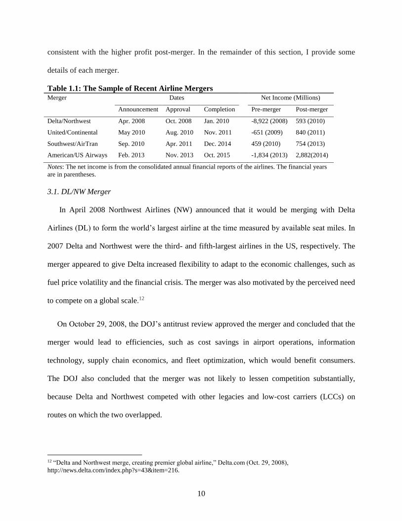
3. Recent Airline Mergers
Table 1.1 represents the timings of recent airline mergers and their pre- and post-merger
financial reports. Notice that the UA/CO merger was followed immediately by the
Southwest/AirTran (WN/FL) merger, which makes it difficult for researchers to separate the
effect of the UA/CO merger from that of the WN/FL merger. From the perspective of financial
status, all three legacy mergers experienced financial stress pre-merger, which was the main
incentive for merging. Interestingly, they all made enormous and positive profits just after each
merger. The turnover of profitability might come from less competition and/or cost savings.
Finally, the WN/FL transaction was the first significant merger involving low-cost carriers
(LCCs) in the US domestic market. Growth was the main reason for the transaction, which is
11 The main purpose of their paper was to evaluate the cost effects of these two airline mergers using a dynamic
structural model. They found that both mergers are associated with marginal and fixed-cost savings but higher
market entry costs.
10
consistent with the higher profit post-merger. In the remainder of this section, I provide some
details of each merger.
Table 1.1: The Sample of Recent Airline Mergers
Merger Dates Net Income (Millions)
Announcement Approval Completion Pre-merger Post-merger
Delta/Northwest Apr. 2008 Oct. 2008 Jan. 2010 -8,922 (2008) 593 (2010)
United/Continental May 2010 Aug. 2010 Nov. 2011 -651 (2009) 840 (2011)
Southwest/AirTran Sep. 2010 Apr. 2011 Dec. 2014 459 (2010) 754 (2013)
American/US Airways Feb. 2013 Nov. 2013 Oct. 2015 -1,834 (2013) 2,882(2014)
Notes: The net income is from the consolidated annual financial reports of the airlines. The financial years
are in parentheses.
3.1. DL/NW Merger
In April 2008 Northwest Airlines (NW) announced that it would be merging with Delta
Airlines (DL) to form the world’s largest airline at the time measured by available seat miles. In
2007 Delta and Northwest were the third- and fifth-largest airlines in the US, respectively. The
merger appeared to give Delta increased flexibility to adapt to the economic challenges, such as
fuel price volatility and the financial crisis. The merger was also motivated by the perceived need
to compete on a global scale.12
On October 29, 2008, the DOJ’s antitrust review approved the merger and concluded that the
merger would lead to efficiencies, such as cost savings in airport operations, information
technology, supply chain economics, and fleet optimization, which would benefit consumers.
The DOJ also concluded that the merger was not likely to lessen competition substantially,
because Delta and Northwest competed with other legacies and low-cost carriers (LCCs) on
routes on which the two overlapped.
12 “Delta and Northwest merge, creating premier global airline,” Delta.com (Oct. 29, 2008),
http://news.delta.com/index.php?s=43&item=216.

11
The combined airline uses Delta’s name and branding. On January 31, 2010, Delta completed
the merging of the reservation systems and discontinued the use of the Northwest name for
flights. The new Delta committed to maintaining all the hubs, including Atlanta, Cincinnati,
Detroit, Minneapolis, New York JFK, and Salt Lake City. The two airlines asserted that the
consolidation would help to create a more resilient airline for long-term success and financial
stability. The transaction also created a premier global airline with services to nearly all of the
world’s major travel markets.13 The transaction was expected to generate $2 billion or more in
annual revenue and cost synergies from more effective aircraft utilization, a more comprehensive
and diversified route system, and cost synergies from reduced overheads and improved
operational efficiency.
3.2. UA/CO Merger
On May 2, 2010, Continental (CO) and United Airlines (UA) approved a stock swap deal
that would create the world’s largest airline in revenue passenger miles. Both airlines had
reported losses in the recession and expected the merger to generate savings of more than $1
billion a year. The other reason for the merger was domestic and international network
complementarities with a special focus on access to international markets from the combined
airline’s network of gateway hubs.
The parties have similar fleets and operate in different geographic markets that complement
each other. Flying mainly Boeing aircraft helped to reduce the costs associated with multiple
orders. Operating in distinct geographical markets enabled them to link and expand their
networks. At the time United’s strength was mainly in the western part of the United States,
while Continental had a larger presence on the east coast.
13 See note 2.

12
In July 2010, the European Union approved the merger. On August 27, 2010, the DOJ
approved the merger, partially because United and Continental agreed to lease 18 take-offs and
18 landing slots at Newark Liberty International Airport to Southwest Airlines. 14 The DOJ
concluded that the airlines’ networks would create overlaps on only a limited number of routes
on which the merging parties both offered a non-stop service. The new airline took on United
Airlines’ name and Continental’s logo. The operation integration was finalized by November
2011, which officially completed the merger.
3.3. WN/FL Merger
In September 2010 Southwest Airlines (WN) announced a plan to acquire its rival AirTran
Airways (FL). The transaction was the first significant merger involving LCCs in the US
domestic market. Growth was the main reason for the Southwest acquisition of AirTran.
Nationally, Southwest is ranked second overall and first for LCCs, while AirTran is ranked
eighth overall and third for LCCs. The AirTran merger would give Southwest a new presence in
37 cities, including Atlanta, the world’s busiest airport and the only major US market not served
by Southwest at the time. The acquisition made Southwest the largest domestic carrier in terms
of originating domestic passengers boarded in 2014.
On April 26, 2011, the DOJ approved the acquisition by concluding that the merger was not
likely to lessen competition substantially and would offer new services on routes that neither
served currently. The concerns about eliminating competition on overlapping routes could be
eliminated by the consumer benefits from the new service. The DOJ also said that the presence
of Southwest/AirTran would lower fares on routes previously served only by legacies.
14 U.S. Department of Justice, “United Airlines and Continental Airlines transfer assets to Southwest Airlines in
response to Department of Justice’s antitrust concerns” (Aug. 27, 2010),
http://www.justice.gov/atr/public/press_releases/2010/262002.htm.

13
3.4. AA/US Merger
As expected, in February 2013 American Airlines and US Airways announced plans to
merge, forming the world’s largest airline in terms of passenger traffic. At the time American
was bankrupt and the proposed merger was part of its reorganization plan. US Airways reported
that the merger would yield more than $1.5 billion a year in added revenue and cost savings. The
airlines also reported that the merger would benefit consumers by offering more choices, a wider
variety of services, and more competition on more routes.
In August 2013, however, the DOJ, along with attorneys from the six main affected states,15
filed a lawsuit seeking to block the merger, arguing that it would lead to less competition, higher
fares, and reduced services. For instance, the transaction would make the merged airline control
69 percent of the take-off and landing slots at Reagan National. In November 2013 the DOJ
reached a settlement that required the merged airline to give LCCs more landing slots or gates in
7 major airports16 to enhance the system-wide competition. The company gave up 52 pairs of
take-off and landing slots at Reagan National and still controlled about 57 percent. The approval
marked the last combination of legacy US carriers and created a stronger competitor for United
and Delta. The combined airline carried the American Airlines name and branding. The
integration of American Airlines and US Airways under a single operating certificate was
completed in October 2015.
Below I investigate the potential price and flight frequency effects of the DL/NW and
UA/CO mergers. One reason for choosing them is that it is reasonable to treat each merger as
exogenous relative to the WN/FL merger, because both mergers experienced financial distress in
15 Including Arizona, Florida, Pennsylvania, Tennessee, Virginia, and the District of Columbia. 16 The seven key airports are Boston Logan International, Chicago O’Hare International, Dallas Love Field, Los
Angeles International, Miami International, New York LaGuardia International, and Ronald Reagon Washington
National.
14
the recession. 17 The WN/FL transaction, however, was an active aggressive strategy for
Southwest, since growth was the main reason for the Southwest acquisition of AirTran.
Therefore, I exclude this merger due to the endogeneity concern. In addition, I do not analyze the
AA/US merger, because it was still in the process of completion during my sample period.
4. Data
I use data from T-100 Domestic Segment Data and the Origin and Destination Survey (DB1B)18
from the first quarter of 2005 to the fourth quarter of 2014. The T-100 Domestic Segment Data
contain monthly domestic non-stop segment information on the carrier, origin and destination,
available capacity, departures performed, and aircraft type. The DB1B survey is a 10% quarterly
random sample of airline tickets reported by certified US carriers. Each ticket records
information on the carrier, origin and destination airports, itinerary fare, round-trip indicator,
miles flown, number of passengers who share the same itinerary, and flight segments.
A market is defined as a directional city pair.19 Following Aguirregabiria and Ho (2012),
among others, I select cities among the 80 largest US cities based on the 2010 population census
from the Bureau of Statistics.20 I group cities that belong to the same metropolitan areas or share
the same city market IDs in the DB1B survey.21 Cities without airports are excluded from the
sample. Finally, I have 56 cities and 68 airports. Table 1.2 provides a list of the cities with their
airports and populations.
17 Morrison and Winston (2000) found that a number of mergers are proposed because carriers in financial distress
seek a merger partner. 18 They are collected by the Bureau of Transportation Statistics (BTS). 19 For example, Seattle‒Denver is a different market from Denver‒Seattle. 20 I use data from the category “Cities and Towns.” 21 The City Market ID is an identification number assigned by the US DOT to identify a city market. I use this field
to consolidate airports serving the same city market.
15
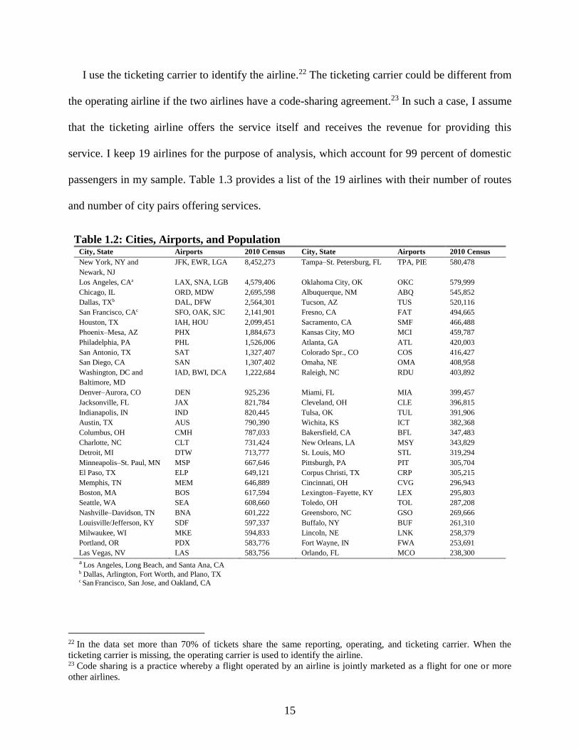
I use the ticketing carrier to identify the airline.22 The ticketing carrier could be different from
the operating airline if the two airlines have a code-sharing agreement.23 In such a case, I assume
that the ticketing airline offers the service itself and receives the revenue for providing this
service. I keep 19 airlines for the purpose of analysis, which account for 99 percent of domestic
passengers in my sample. Table 1.3 provides a list of the 19 airlines with their number of routes
and number of city pairs offering services.
Table 1.2: Cities, Airports, and Population
City, State Airports 2010 Census City, State Airports 2010 Census
New York, NY and
Newark, NJ
JFK, EWR, LGA 8,452,273 Tampa‒St. Petersburg, FL TPA, PIE 580,478
Los Angeles, CAa LAX, SNA, LGB 4,579,406 Oklahoma City, OK OKC 579,999
Chicago, IL ORD, MDW 2,695,598 Albuquerque, NM ABQ 545,852
Dallas, TXb DAL, DFW 2,564,301 Tucson, AZ TUS 520,116
San Francisco, CAc SFO, OAK, SJC 2,141,901 Fresno, CA FAT 494,665
Houston, TX IAH, HOU 2,099,451 Sacramento, CA SMF 466,488
Phoenix‒Mesa, AZ PHX 1,884,673 Kansas City, MO MCI 459,787
Philadelphia, PA PHL 1,526,006 Atlanta, GA ATL 420,003
San Antonio, TX SAT 1,327,407 Colorado Spr., CO COS 416,427
San Diego, CA SAN 1,307,402 Omaha, NE OMA 408,958
Washington, DC and
Baltimore, MD
IAD, BWI, DCA 1,222,684 Raleigh, NC RDU 403,892
Denver‒Aurora, CO DEN 925,236 Miami, FL MIA 399,457
Jacksonville, FL JAX 821,784 Cleveland, OH CLE 396,815
Indianapolis, IN IND 820,445 Tulsa, OK TUL 391,906
Austin, TX AUS 790,390 Wichita, KS ICT 382,368
Columbus, OH CMH 787,033 Bakersfield, CA BFL 347,483
Charlotte, NC CLT 731,424 New Orleans, LA MSY 343,829
Detroit, MI DTW 713,777 St. Louis, MO STL 319,294
Minneapolis‒St. Paul, MN MSP 667,646 Pittsburgh, PA PIT 305,704
El Paso, TX ELP 649,121 Corpus Christi, TX CRP 305,215
Memphis, TN MEM 646,889 Cincinnati, OH CVG 296,943
Boston, MA BOS 617,594 Lexington‒Fayette, KY LEX 295,803
Seattle, WA SEA 608,660 Toledo, OH TOL 287,208
Nashville‒Davidson, TN BNA 601,222 Greensboro, NC GSO 269,666
Louisville/Jefferson, KY SDF 597,337 Buffalo, NY BUF 261,310
Milwaukee, WI MKE 594,833 Lincoln, NE LNK 258,379
Portland, OR PDX 583,776 Fort Wayne, IN FWA 253,691
Las Vegas, NV LAS 583,756 Orlando, FL MCO 238,300
a Los Angeles, Long Beach, and Santa Ana, CA b Dallas, Arlington, Fort Worth, and Plano, TX c San Francisco, San Jose, and Oakland, CA
22 In the data set more than 70% of tickets share the same reporting, operating, and ticketing carrier. When the
ticketing carrier is missing, the operating carrier is used to identify the airline. 23 Code sharing is a practice whereby a flight operated by an airline is jointly marketed as a flight for one or more
other airlines.

16
Following the literature, I apply several selection criteria to the tickets. I keep tickets with
nominal itinerary fares between $50 and $2000. I also exclude all the tickets with the following
characteristics: foreign carriers and non-continental US travel; one-way tickets; itineraries with
multiple ticketing carriers; more than one stop each way; more than six coupons; and tickets with
missing flight frequency information for any flight segment.
Table 1.3: List of Airlines in the Sample
Airline (Code) # Routes # Directional City Pairs
Southwest (WN)a 16,540 1,862
Delta (DL)b 16,481 2,348
United (UA)c 14,466 2,337
American (AA)d 9,807 2,200
US Airways (US)e 9,557 1,819
Northwest (NW) 6,132 1,586
Continental (CO) 5,031 1,622
AirTran (FL) 2,217 835
America West (HP) 1,754 612
Frontier (F9) 1,662 910
Alaska (AS) 1,055 252
JetBlue (B6) 861 250
Spirit (NK) 606 241
Midwest (YX) 443 237
Virgin America (VX) 252 103
ATA (TZ) 109 73
Sun Country (SY) 74 64
Allegiant Air (G4) 37 34
USA 3000 (U5) 25 20 a In 2011 Southwest (WN) acquired AirTran (FL). b Delta (DL)+Comair (OH)+Atlantic Southwest (EV) acquired Northwest (NW)+Mesaba (XJ) in 2008. c United (UA)+Air Wisconsin (ZW) acquired Continental (CO)+Expressjet (RU) in 2010. d American (AA)+American Eagle (MQ)+Executive (OW). e US Airways (US) acquired America West (HP) in 2005 and merged with American (AA) in 2013.
I define a product at the market level as the combination of the origin city‒destination city
fare class. The fare classification is not based on the fare class code in the DB1B data set,
because it is defined by carriers and might not follow the same standard. Alternatively, to capture
the distribution of fares, I use percentiles to divide the tickets in each market into three segments:
segment 1 50
, p
, segment 2 50 75
,p p
, and segment 3 75
,p , where 50p and 75
p

17
are, respectively, the fiftieth (median) and seventy-fifth percentiles of fares. The price is
calculated as the average itinerary fares that belong to the same product, weighted by the number
of segment passengers.
The flight frequency is measured as the total number of quarterly market flights. I first count
each carrier’s non-stop and connecting flights in a market. The number of departures in each
non-stop segment is aggregated by aircraft type. Connecting flights are determined by the
minimum number of departures between the two segments.24 To avoid double counting, for each
merger pair, I only calculate the operating carrier’s flights in a market if they are code-sharing
partners before the merger.25
5. The Empirical Strategy
I assume that airlines engage in a two-stage game of their supply decisions. Airlines first choose
their flight frequency in each market, which reflects the extent of entry, and then, given the
frequency, set fares for each fare class. I then measure the price and frequency effects of the
mergers of interest at the market level.
I identify the price and frequency effects of a merger by applying the difference-in-
differences (DID) approach. It has been common when using this approach for researchers to pay
great attention to selecting proper control groups. However, less attention has been paid to the
selection of the treatment group. As I note later, identifying good treatment groups is also an
important part of the merger retrospectives, especially when a wave of mergers occurred in
24 Berry and Jia (2010) noted that this using measure does not make much difference from using other departure
measures. For example, they counted all the feasible connections with the connecting time between 45 minutes and
4 hours using Back Aviation Solutions’ schedule data. 25 For instance, if the ticketing carrier is Northwest but the frequency is derived from Delta, which is the operating
carrier on the route, it is reasonable to assume that Northwest does not enter this route. In this case I only count the
number of flights offered by Delta.

18
succession. Therefore, it is helpful to clarify my sample structure, including the choices of event
window, treatment group, and control group, before specifying my empirical model.
5.1. Event Window
Following Ashenfelter and Hosken (2010), I select an event window of data surrounding the
merger to deal with transitory time-varying factors. Kim and Singal (1993) found that, during the
announcement period, merging firms increase their prices significantly. This implies that, if
merging airlines expect their merger proposal to be approved by antitrust, 26 they have an
incentive to change their pricing behavior following the announcement of their merger proposal.
To avoid this issue and obtain uncontaminated measures of mergers’ pre- and post-merger
pricing and departures, I exclude the data from the announcement period.27
To distinguish the market power effect and the effect of efficiency gains, I consider two
different event windows, a short-run window and a long-run window. As noted by Kim and
Singal (1993), the exercise of market power can take place once the merger has been approved.
In contrast, efficiency gains, such as cost savings in airport operations, information technology,
supply chain economics, and fleet optimization, cannot be realized until the merging airlines
have finished consolidation completely. Therefore, I expect that the effect of efficiency gains
will not prevail until merger completion. Coincidently, it took both the DL/NW and the UA/CO
merger six quarters to finish the consummation completely. Accordingly, as shown in Figure 1.1,
the short-run window is composed of the first six quarters following the approval and before
completion. I define seven to twelve quarters after the approval as the long-run window. Finally,
I choose six quarters before the announcement as the pre-merger period.
26 For example, during the period 1985‒1988, the Department of Transportation did not deny any of the airline
mergers proposed for approval. 27 That is, data on 2008-Q2-Q3 and 2010-Q2 are excluded for Delta/Northwest and United/Continental, respectively.

19
Announced
6 0 12 -Ti -(6+Ti)
Figure 1.1: The Timeline of an Airline Merger
Note: TDL/NW = 2 and TUA/CO = 1, respectively.
5.2. Market Selection
I distinguish two main categories of markets involving mergers based on their relationship on
the market at the time of the merger. One refers to a non-overlapping market in which only one
merging carrier was present before the merger, and Two denotes an overlapping market in which
both parties offered a service at the time of the announcement and did not exit the market
immediately following the approval.
Note that, during the network optimization process, mergers may also choose to exit some
markets during the post-merger period. I am unable to investigate the market power and
efficiency effects of a merger in these markets. The potential merger effect will be captured by
the decrease in the number of carriers, for which I think the effect would be negligible because of
the new entrance of competitors. I therefore exclude observations corresponding to each category
once the merger exits the market.
Table 1.4 lists the overlapping markets among the four mega-mergers in the second quarter of
2008. It shows that these airlines served a great portion of the same markets prior to the DL/NW
merger. For instance, Delta entered 2312 city pairs at the time, including 1987 (86%) markets
that overlapped with United. Note also that my sample markets include cases in which another
Approved
Post-merger
long-run effect
Completed
Pre-merger
period
Contamination
period
Post-merger
short-run effect

20
merger occurred in the sample period.28 Therefore, one big concern is that, for a given merger,
many routes may suffer from contamination by other mergers. I deal with this issue by selecting
an appropriate treatment group and control group as follows.
Table 1.4: Airline City Pair Market Overlap in 2008: Q2 Carrier AA CO DL FL NW UA US WN
AA 2359(475) 71 93 34 46 185 96 183
CO 1698 1829(261) 76 10 21 41 40 67
DL 1981 1593 2312(336) 80 27 71 72 26
FL 689 588 730 737(161) 34 44 36 32
NW 1800 1462 1827 688 2064(323) 42 39 41
UA 1947 1519 1987 671 1785 2365(473) 236 214
US 1447 1236 1622 647 1305 1638 1788(416) 173
WN 1153 1016 1065 337 947 1099 895 1289(618)
Notes: The upper triangle lists the number of non-stop markets overlapped by the row and column carriers. The number of
overlapping markets, including connecting markets, is listed in the lower triangle. The diagonal is the total number of markets
(non-stop markets in parentheses) served by the row carrier.
In the DL/NW merger case, the initial treatment markets consist of all the markets served by
at least one of the merger parties. To avoid the contamination issue caused by other mergers, I
further exclude markets that were affected by other mergers in the sample period. For example,
both Delta and United offer flights from Chicago, IL to Atlanta, GA. For the DL/NW merger, the
observations in this market from the third quarter of 2010 are dropped. Following this rule, I
exclude observations of markets affected by the United/America West (US/HP) merger before
the third quarter of 2007. I also exclude observations of markets affected by the UA/CO merger
from the third quarter of 2010 to the third quarter of 2011. Finally, I drop data affected by the
WN/FL merger in the second and third quarters of 2011.
As a control group of the DL/NW merger, I identify a set of unaffected directional city pairs,
defined as markets served by neither of the merging carriers during the period of analysis. First, I
drop all the routes associated with merger exits during the post-merger period. Again, to avoid
28 For example, following the United/Continental merger’s approval in August 2010, Southwest/AirTran was
approved in April 2011. It is very likely that the follow-up merger would affect the current merger’s behavior
regarding the airfares and flight frequencies in question.

21
the issue of potential effects of other mergers on controlled markets, among these markets I
subsequently exclude observations of markets affected by the US/HP, UA/CO, and WN/FL
mergers in the corresponding time periods, respectively.
For the UA/CO merger, given the occurrence of the DL/NW merger, airlines changed their
pricing and frequency strategies in response to the UA/CO merger. That is, the treated markets
include markets that have been affected by the DL/NW merger. Similarly, I drop observations of
markets affected by the WN/FL merger since the second quarter of 2011. The initial control
group in this case includes all the markets served by neither UA nor CO. To capture the
overlapping effect of the UA/CO and DL/NW mergers, I further drop the control markets
affected by the DL/NW merger during the whole sample period.
5.3. Frequency Effects
I use the DID methodology to investigate each merger’s frequency effect given the following
specification:
0 1
2 3 4
5 6 7
ln 1
log
log log
mt t mt t mt mt
t mt t mt mt
mt mt mt
F F F
mt y q m mt
F Post M M UC Post M DN
Post One Post Two Q
N C NLCC
X
(1.1)
where mtF is the number of flights in market m at time t ; tPost is an indicator equal to one
following the merger approval; and mtM ( / /M DN DL NW UC UA CO , ) is an indicator equal to
one if the merger of interest was active in market m at time t . For the UA/CO merger, I add the
term t mt mtPost M DN to capture the interaction effects in markets overlapped by the DL/NW and
UC/CO mergers; mtQ is the number of passengers in market m at time t ;
mtN is the geometric

22
mean of the populations of the end-point cities; mtC and
mtNLCC are the number of carriers and
number of low-cost carriers in market m at time t , respectively; and F
mtX is a vector of market-
level attributes that affect carriers’ flight frequency decisions, including the trip distance, the
maximal temperature difference between January and July in the origin and destination cities,
and the number of cities connected to the end-point cities. y and
q are year and quarter fixed
effects, and m denotes random market effects, which are allowed to be correlated with the
regressors. Finally, F
mt is an error term.
5.4. Price Effects
Airlines set fares for each fare class given the frequency conditional on the market passengers.
The market structure, number of carriers, and number of low-cost carriers affect the markups,
while airlines’ operating costs and thus fares are affected by market-level characteristics, p
mtX ,
including the market distance interacted with the price of crude oil and the maximal temperature
difference between January and July in the end-point cities. The segment price equations are
therefore specified as:
0 1
2 3 4
5 6 7
log 1
log
log log
+ 1,2,3.
gmt g g t mt g t mt mt
g t mt g t mt g mt
g mt g mt g mt
p p p
mt g y q m gmt
p Post M M UC Post M DN
Post One Post Two F
Q C NLCC
X g
,
(1.2)
in which I also include year and quarter fixed effects ( y and q ) and random market effects
( m ), which are allowed to be correlated with the regressors. p
gmt is an error term.

23
5.5. Identification
In my model I allow the random market effects to be correlated with the regressors. The
market demand (mtQ ) is endogenous in both equations. When a regressor mtx is only correlated
with the random market effects, I use the demeaned mtx , which is defined as 1
1
mN
mt m mttx N x
as
its instrument. The process of demeaning removes its correlation with the random market effects.
Therefore, I use the demeaned log population, demeaned log number of flights, demeaned log
number of carriers, and demeaned number of low-cost carriers as instruments. Besides the
demeaned log per capita income, I use two exogenous variables, the temperature difference
between the origin and the destination and a tourist city dummy as the market demand’s
instruments. To test the validity of the instruments, I regress the endogenous variables on the
instruments in the first-stage regression. The results show that all the coefficients are statistically
significant, indicating that the instruments are correlated with the endogenous variables. I present
the main results of those regressions in detail in Appendix Table A2.
5.6. Estimation Results for the DL/NW Merger Effects
I report the parameter estimates of the frequency and fare equations in separate tables for each
merger. Table 1.5 presents the short-run and long-run effects of the DL/NW merger on the flight
frequency. The estimated signs of the regressors are plausible, as the number of passengers,
population, number of carriers, and number of cities connected to the end-point cities have a
positive impact on the flight frequency while long distances and the temperature differences in
the end-point cities have a negative effect. The result shows that, on average, the DL/NW merger
caused a reduction in frequency by 3.75 percent in the short run. When including the additional
effects on non-overlapping and overlapping markets, the merger only reduced the frequency by

24
1.8 percent in non-overlapping markets. On the contrary, the frequency rose by 4 percent in non-
overlapping markets and by about 12 percent in overlapping markets in the long run.
Turning to the price effects, as shown in Table 1.6, the DL/NW merger reduced the fares of
segment 1 by about 3 percent in the short run. However, the fares in the other two segments
hardly changed. Similarly, I find small price changes in non-overlapping markets in the long run.
In the long run, the prices in all the segments rose by less than 2 percent in overlapping markets,
which is close to the findings of Luo (2014).
Table 1.5: 2SLS Estimates of the Flight Frequency Effects of the DL/NW Merger
Variables Short-run effect
(1)
Long-run effect
(2)
Post DN -0.0375 (0.0093) 0.0205 (0.0179)
Post One 0.0196 (0.0097) 0.0213 (0.0163)
Post Two 0.0309 (0.0092) 0.0960 (0.0161)
Log number of passengers 0.1756 (0.0154) 0.1526 (0.0189)
Log geometric mean population of the end-point cities 0.2750 (0.0752) 0.2973 (0.0809)
Log number of carriers 0.5354 (0.0079) 0.5807 (0.0102)
Number of LCCs 0.0052 (0.0013) -0.0035 (0.0024)
Log number of cities connected to the end-point cities 1.6342 (0.2422) 2.4481 (0.3881)
Log distance 0.0981 (0.0154) 0.0974 (0.0175)
Log distance squared -0.0706 (0.0137) -0.0699 (0.0152)
Log maximal temperature difference between January
and July in the end-point cities
-0.0451 (0.0140) -0.0779 (0.0267)
Year dummies included Yes Yes
Quarter dummies included Yes Yes
Random market effects taken into account Yes Yes
Number of controlled markets 546 522
Number of markets 2,911 2,890
Observations 24,874 12,941
Note: Standard errors are in parentheses.

25
Table 1.6: 2SLS Estimates of the Price Effects of the DL/NW Merger
Variables Log price of segment 1
(1)
Log price of segment 2
(2)
Log price of segment 3
(3)
Panel A. Short-run effect
Post DN -0.0104 (0.0054) -0.0078 (0.0021) -0.0235 (0.0067)
Post One -0.0210 (0.0056) 0.0097 (0.0022) 0.0169 (0.0069)
Post Two -0.0174 (0.0056) 0.0156 (0.0028) 0.0252 (0.0071)
Log number of passengers -0.0276 (0.0050) -0.0063 (0.0010) -0.0404 (0.0051)
Log number of flights 0.0259 (0.0045) -0.0044 (0.0020) 0.0223 (0.0055)
Log number of carriers -0.0210 (0.0044) -0.0045 (0.0017) 0.0099 (0.0054)
Number of LCCs -0.0046 (0.0008) 0.0005 (0.0006) -0.0068 (0.0011)
Log distance 0.1140 (0.0056) -0.0235 (0.0021) 0.0083 (0.0067)
Log distance × crude oil price -0.0063 (0.0047) 0.0321 (0.0025) 0.0046 (0.0060)
Log maximal temperature difference
between January and July in the end-
point cities
0.0069 (0.0063) -0.0098 (0.0030) -0.0498 (0.0077)
Number of controlled markets 546 546 546
Number of markets 2,911 2,911 2,911
Observations 24,874 24,874 24,874
Panel B. Long-run effect
Post DN -0.0177 (0.0102) -0.0014 (0.0036) -0.0115 (0.0111)
Post One 0.0075 (0.0095) 0.0043 (0.0034) 0.0184 (0.0104)
Post Two 0.0263 (0.0097) 0.0103 (0.0040) 0.0309 (0.0108)
Log number of passengers -0.0368 (0.0062) -0.0020 (0.0012) -0.0315 (0.0060)
Log number of flights 0.0311 (0.0065) -0.0056 (0.0026) 0.0114 (0.0072)
Log number of carriers -0.0270 (0.0065) -0.0020 (0.0024) 0.0221 (0.0071)
Number of LCCs -0.0065 (0.0016) -0.0006 (0.0010) -0.0077 (0.0019)
Log distance -0.0848 (0.0270) -0.0789 (0.0108) 0.0180 (0.0298)
Log distance × crude oil price 0.1960 (0.0272) 0.0867 (0.0115) -0.0022 (0.0303)
Log maximal temperature difference
between January and July in the end-
point cities
-0.0078 (0.0107) -0.0079 (0.0043) -0.0524 (0.0116)
Number of controlled markets 522 522 522
Number of markets 2,890 2,890 2,890
Observations 12,941 12,941 12,941
Notes: Standard errors are in parentheses. Year and quarter fixed effects and random market effects are included
in all the regressions.
5.7. Estimation Results for the UA/CO Merger Effects
As shown in Table 1.7, the initial frequency effect of the UA/CO merger reduced the
frequency, on average, by 2.6 percent. In addition, the merger caused a 2 percent frequency
decrease in non-overlapping markets but a 2.7 percent increase in overlapping markets. In
markets served by both the DL/NW and the UA/CO merger, however, there was an additional
5.8 percent increase in frequency. In the long run, it is surprising that the UA/CO merger reduced
the frequency by 8.1 percent. Moreover, I find that the frequency was reduced by 4 percent in

26
non-overlapping markets and increased by 5 percent in overlapping markets. Again, the merger
raised the frequency by 3.3 percent additionally in markets overlapped by both the DL/NW and
the UA/CO merger.
Finally, the segment price results (Table 1.8) indicate that the UA/CO merger raised prices by
2–3 percent in all the segments in the short run. In the long run, the results show that the price in
segment 1 fell by 3.7 percent in non-overlapping markets and 5 percent in overlapping markets.
However, the merger caused an additional 4 percent increase in markets served by both mergers.
Further, the price in segment 3 increased by 5 percent in both non-overlapping and overlapping
markets, and an additional 2 percent increase was caused by the DL/NW merger. Finally, the
price in segment 2 did not change much.
The long-run effects of the UA/CO merger are more likely to be biased, largely because both
the number of treated markets and the number of controlled markets after the merger are much
lower than those before the merger. In the post-merger period, I only have 929 treated markets
and 57 controlled markets compared with 2,657 treated markets and 145 controlled markets
before the merger. Amongst the markets dropped post-merger, most were affected by the WN/FL
merger and are associated with greater frequency and lower prices generally. Therefore, to some
extent both the frequency effect and the price effect are downward biased.
To test this possibility, I re-estimate the long-run effects of the UA/CO merger by including
the markets affected by the WN/FL merger. Table 1.9 reports the main estimated results. Column
(1) of Table 1.9 shows that the long-run frequency effect shifts upward when I include the
markets affected by the WN/FL merger. Compared with the price reduction in segment 1, as
presented in Table 8, the UA/CO merger leads to an approximate 2 percent price increase in
segment 1. Finally, I obtain similar price effects in the other two segments. Note that many

27
markets in this case are characterized as having fewer carriers and hence higher market
concentration. It is likely that the true long-run effects of the UA/CO merger would lie between
them.
In sum, I have analyzed the price and frequency effects of the DL/NW merger and the
UA/CO merger. As reported in Appendix Tables A5–A6, I also provide robustness checks by
including random market trends in the estimation and using the demeaned first difference of one-
year lag endogenous variables as instruments. These estimates do not show deviations from my
main findings. Generally, I have found that the two mergers induced the price and frequency to
move in the same direction. That is, for example, a greater (smaller) number of flights is
associated with higher (lower) fares. This is largely because frequency is costly and airlines tend
to raise their average itinerary fares when expanding their frequency in a market. This also
implies that price and frequency show opposite effects on travelers’ welfare for both mergers.
The net gains will depend on which effect dominates. To quantify the magnitude of those effects,
I now turn to estimating the demand-side parameters.
Table 1.7: 2SLS Estimates of the Flight Frequency Effects of the UA/CO Merger
Variables Short-run effect
(1)
Long-run effect
(2)
Post UC -0.0263 (0.0115) -0.0808 (0.0356)
Post UC DN 0.0578 (0.0065) 0.0333 (0.0104)
Post One 0.0064 (0.0100) 0.0421 (0.0149)
Post Two 0.0528 (0.0103) 0.1373 (0.0175)
Log number of passengers 0.1531 (0.0181) 0.1422 (0.0246)
Log geometric mean population of the end-point cities 0.0824 (0.1026) -0.2218 (0.1368)
Log number of carriers 0.4908 (0.0083) 0.5117 (0.0114)
Number of LCCs 0.0103 (0.0010) 0.0043 (0.0019)
Log number of cities connected to the end-point cities 2.1208 (0.2900) 2.9461 (0.4805)
Log distance 0.1163 (0.0170) 0.1513 (0.0202)
Log distance squared -0.0408 (0.0184) 0.0051 (0.0224)
Log maximal temperature difference between January
and July in the end-point cities
-0.0454 (0.0163) -0.1169 (0.0237)
Number of controlled markets 164 145
Number of markets 2,804 2,802
Observations 24,442 19,052
Notes: Standard errors are in parentheses. Year and quarter fixed effects and random market effects are included in all the
regressions.

28
Table 1.8: 2SLS Estimates of the Price Effects of the UA/CO Merger Variables Log price of segment 1
(1)
Log price of segment 2
(2)
Log price of segment 3
(3)
Panel A. Short-run effect
Post UC -0.0080 (0.0065) 0.0233 (0.0025) 0.0037 (0.0073)
Post UC DN 0.0162 (0.0038) 0.0001 (0.0015) 0.0029 (0.0042)
Post One 0.0085 (0.0056) -0.0003 (0.0021) 0.0245 (0.0063)
Post Two 0.0257 (0.0058) -0.0005 (0.0023) 0.0293 (0.0064)
Log number of passengers -0.0258 (0.0047) -0.0067 (0.0011) -0.0336 (0.0065)
Log number of flights 0.0277 (0.0047) -0.0032 (0.0018) 0.0153 (0.0054)
Log number of carriers -0.0219 (0.0045) 0.0036 (0.0017) 0.0120 (0.0050)
Number of LCCs -0.0037 (0.0006) 2.02e-05 (0.0002) -0.0029 (0.0006)
Log distance 0.0770 (0.0078) 0.0005 (0.0031) 0.0078 (0.0088)
Log distance × crude oil price 0.0266 (0.0073) 0.0067 (0.0031) 0.0028 (0.0079)
Log maximal temperature difference
between January and July in the end-
point cities
-0.0033 (0.0058) -0.0050 (0.0018) -0.0292 (0.0071)
Number of controlled markets 164 164 164
Number of markets 2,804 2,804 2,804
Observations 24,442 24,442 24,442
Panel B. Long-run effect
Post UC -0.0259 (0.0142) -0.0001 (0.0047) 0.0322 (0.0161)
Post UC DN 0.0403 (0.0051) 0.0002 (0.0019) 0.0209 (0.0056)
Post One -0.0112 (0.0068) 0.0011 (0.0024) 0.0204 (0.0075)
Post Two -0.0250 (0.0076) 0.0011 (0.0028) 0.0173 (0.0083)
Log number of passengers -0.0157 (0.0047) -0.0071 (0.0012) -0.0318 (0.0059)
Log number of flights 0.0265 (0.0051) 0.0028 (0.0019) 0.0214 (0.0056)
Log number of carriers -0.0440 (0.0052) 0.0009 (0.0020) 0.0057 (0.0057)
Number of LCCs -0.0047 (0.0011) 0.0005 (0.0006) -0.0065 (0.0012)
Log distance 0.0388 (0.0079) -0.0181 (0.0030) 0.0243 (0.0088)
Log distance × crude oil price 0.0687 (0.0073) 0.0233 (0.0029) -0.0041 (0.0079)
Log maximal temperature difference
between January and July in the end-
point cities
0.0020 (0.0068) -0.0026 (0.0024) -0.0384 (0.0077)
Number of controlled markets 145 145 145
Number of markets 2,802 2,802 2,802
Observations 19,052 19,052 19,052
Notes: Standard errors are in parentheses. Year and quarter fixed effects and random market effects are included
in all the regressions.

29
Table 1.9: Long-Run Effects of the UA/CO Merger Including the Markets Affected by the
WN/FL Merger
Variables Log number of
flights
(1)
Log price of
segment 1
(2)
Log price of
segment 2
(3)
Log price of
segment 3
(4)
Post UC -0.0012
(0.0226)
0.0155
(0.0107)
0.0144
(0.0035)
0.0210
(0.0109)
Post UC DN 0.0718
(0.0072)
0.0295
(0.0036)
0.0039
(0.0014)
0.0131
(0.0036)
Post One 0.0161
(0.0106)
-0.0015
(0.0054)
0.0005
(0.0019)
0.0297
(0.0055)
Post Two 0.0912
(0.0111)
0.0062
(0.0057)
0.0005
(0.0020)
0.0306
(0.0057)
Number of controlled markets 151 151 151 151
Number of controlled markets
post-merger
77 77 77 77
Number of treated markets post-
merger
2,655 2,655 2,655 2,655
Notes: Standard errors are in parentheses. Year and quarter fixed effects and random market effects are included in
all the regressions. The overlapping effect between UA/CO and WN/FL is included but not reported. Control
variables are included in all the regressions but not reported.
6. Demand
6.1. Two-Level Approach
I follow Winston and Yan (2015) and use Hausman’s (1996) two-level approach, in which the
top level corresponds to the overall demand for air travel in the market and the bottom level
corresponds to the allocation of the total demand among the three fare classifications, conditional
on the total expenditures. I model the bottom-level demand using Deaton and Muellbauer’s
(1980) linear approximate version of the almost ideal demand system (LA/AIDS). The demand
for a market segment is given by
' '
'
3
1
1
2
2
log log log
log
mtgmt g g g mgg g mt
gmt
s
g m gy gq gm gmt
Es p L
P
L
(1.3)
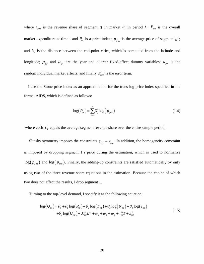
30
where gmts is the revenue share of segment g in market m in period t ; mtE is the overall
market expenditure at time t and mtP is a price index; 'g mtp is the average price of segment
'g ;
and mL is the distance between the end-point cities, which is computed from the latitude and
longitude; gy and gq are the year and quarter fixed-effect dummy variables; gm is the
random individual market effects; and finally s
gmt is the error term.
I use the Stone price index as an approximation for the trans-log price index specified in the
formal AIDS, which is defined as follows:
3
1
log logmt g gmt
g
P s p
(1.4)
where each gs equals the average segment revenue share over the entire sample period.
Slutsky symmetry imposes the constraints ' 'gg g g . In addition, the homogeneity constraint
is imposed by dropping segment 1’s price during the estimation, which is used to normalize
2log mtp and 3log mtp . Finally, the adding-up constraints are satisfied automatically by only
using two of the three revenue share equations in the estimation. Because the choice of which
two does not affect the results, I drop segment 1.
Turning to the top-level demand, I specify it as the following equation:
0 1 2 3 4
5
log log log log log
log
mt mt mt mt mt
Q Q Q Q
mt mt y q m m mt
Q P F N I
U X B T
(1.5)

31
where mtQ is the number of passengers in market m at time t ; mtF is the number of non-stop
and connecting flights; mtN is the geometric mean of the populations of the end-point cities; mtI
is the geometric mean of the per capita incomes of the end-point cities; mtU is the arithmetic
mean of the unemployment rates of the end-points weighted by the city populations; and Q
mtX is a
vector of the market attributes that affect the consumer demand, including the indicator of
whether the destination is a tourist city and the temperature difference between the origin city
and the destination city. y and q are fixed year and quarter effects, and m is the random
market effects, which are allowed to be correlated with the regressors. I also specify the random
market trend, Q
mT , where Q
m is a random component with zero mean and T denotes the time
trend.
6.2. Instrumental Variables
In the demand estimation, I use the same identification strategy as the supply equations. In the
bottom-level demand equation, the segment prices ( gmtp ), price index (mtP ), and market
expenditure (mtE ) are correlated with the random market effects and simultaneity bias. As is
common in the literature, I use the average segment prices in markets other than the market
under consideration as an instrument for the segment prices. Specifically, I choose markets with
a similar market distance to the market of interest but not sharing end points with the market of
interest. I then use the combination of these average segment prices weighted by the segment
shares as the instrument for the price index. As noted by Winston and Yan (2015), the demeaned
market population and per capita income are valid instruments for the market expenditure,
because the relative segment prices and expenditures are held constant.

32
In the top-level demand equation, I use the demeaned variables as instruments for the market
population, per capita income, and unemployment rate, respectively. Finally, the flight frequency
is also likely to be correlated with the random market trend. Therefore, I use the demeaned first-
order difference of the last year’s log number of flights as its instrument. This is a valid
instrument because the process of demeaning and first-order differencing removes its correlation
with the random market effects and the random market trend. The results of the first-stage
regression show that all the coefficients are statistically significant, indicating that the
instruments are correlated with the endogenous variables. I present the main results of those
regressions in detail in Appendix Tables A3 and A4.
6.3. Results of Demand Estimation
Tables 1.10 and 1.11 present the results of the top- and bottom-level demand equations.
Generally, all the parameter estimates in the top-level demand equation have the expected sign: a
higher fare decreases the demand with an elasticity of -0.35 conditional on a fixed number of
flights; a greater number of flights increases the demand with an elasticity of 0.29; distance has a
negative effect on demand, reflecting the intuition that travelers prefer to travel over shorter
distances; the demand is increasing in markets with a larger population, higher income per capita,
at least one tourist city, and a larger temperature difference between end-point cities; and a
higher unemployment rate reduces the demand. Most of the parameters in the bottom-level
equations shown in Table 1.11 are estimated precisely. I then use them to calculate the own and
cross-price elasticities of the segment demand, as shown in Table 1.12.
The results show that the own-price elasticities have the expected negative sign. Their
magnitudes imply that travelers in segment 2 have the greatest responsiveness to fare changes in
their segment. According to the fare classifications in the data set, over 80 percent of travelers fly
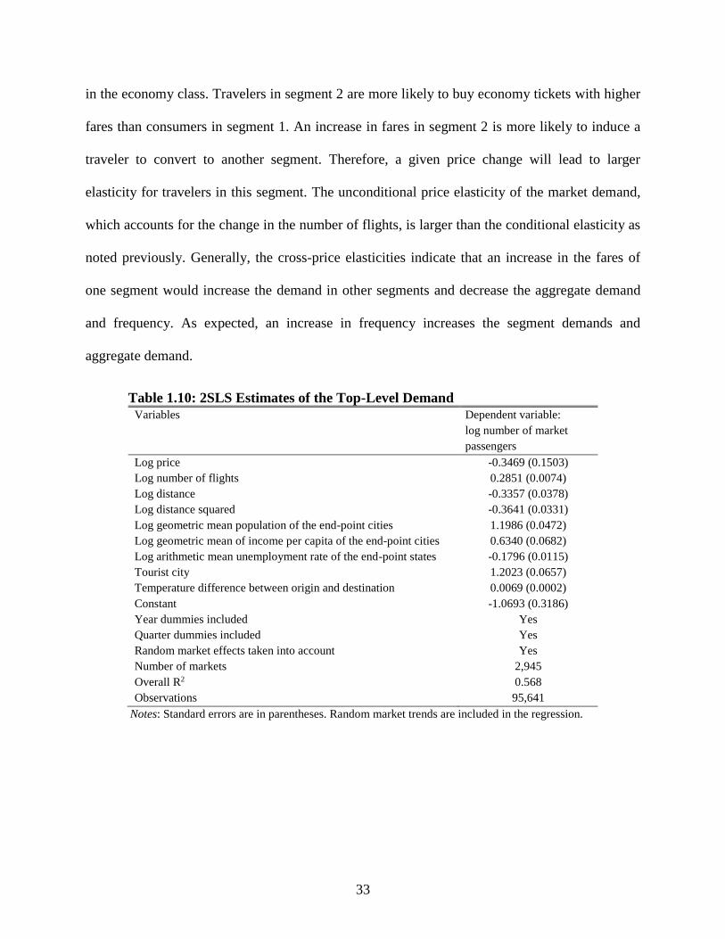
33
in the economy class. Travelers in segment 2 are more likely to buy economy tickets with higher
fares than consumers in segment 1. An increase in fares in segment 2 is more likely to induce a
traveler to convert to another segment. Therefore, a given price change will lead to larger
elasticity for travelers in this segment. The unconditional price elasticity of the market demand,
which accounts for the change in the number of flights, is larger than the conditional elasticity as
noted previously. Generally, the cross-price elasticities indicate that an increase in the fares of
one segment would increase the demand in other segments and decrease the aggregate demand
and frequency. As expected, an increase in frequency increases the segment demands and
aggregate demand.
Table 1.10: 2SLS Estimates of the Top-Level Demand
Variables Dependent variable:
log number of market
passengers
Log price -0.3469 (0.1503)
Log number of flights 0.2851 (0.0074)
Log distance -0.3357 (0.0378)
Log distance squared -0.3641 (0.0331)
Log geometric mean population of the end-point cities 1.1986 (0.0472)
Log geometric mean of income per capita of the end-point cities 0.6340 (0.0682)
Log arithmetic mean unemployment rate of the end-point states -0.1796 (0.0115)
Tourist city 1.2023 (0.0657)
Temperature difference between origin and destination 0.0069 (0.0002)
Constant -1.0693 (0.3186)
Year dummies included Yes
Quarter dummies included Yes
Random market effects taken into account Yes
Number of markets 2,945
Overall R2 0.568
Observations 95,641
Notes: Standard errors are in parentheses. Random market trends are included in the regression.

34
Table 1.11: GMM Estimates of the Bottom-Level Demand (SE)
Revenue share of
segment 1 (g = 1)
(1)a
Revenue share of
segment 2 (g = 2)
(2)
Revenue share of
segment 3 (g = 3)
(3)
Constant 0.3804 (0.0066) 0.2703 (0.0053) 0.3493 (0.0076)
Log real expenditure -0.0770 (0.0223) 0.0505 (0.0152) 0.0265 (0.0147)
Log distance -0.1320 (0.0123) 0.0149 (0.0097) 0.1171 (0.0054)
Log distance squared -0.0625 (0.0052) -0.0116 (0.0041) 0.0741 (0.0041)
Interaction of log segment prices
Segment g and segment 1: -0.1305 (0.1392) 0.2647 (0.0856) -0.1342 (0.1317)
Segment g and segment 2: 0.2647 (0.0856) -0.4025 (0.1506) 0.1378 (0.1250)
Segment g and segment 3: -0.1342 (0.1317) 0.1378 (0.1250) -0.0036 (0.0968)
Year dummies included Yes Yes Yes
Quarter dummies included Yes Yes Yes
Random market effects taken into
account
Yes Yes Yes
Number of markets 2,945 2,945 2,945
Observations 95,641 95,641 95,641 a The parameter estimates of this equation are derived from the parametric restrictions noted in the text. The
standard errors are calculated using the bootstrap technique.
Table 1.12: Estimated Demand and Flight Elasticities [5th-percentile, 95th-percentile]
Percentage
change in the
demand of
segment 1
Percentage
change in the
demand of
segment 2
Percentage
change in the
demand of
segment 3
Percentage
change in the
total market
demand
Percentage change in
the number of flights
1 percent increase in the price of
segment 1
-0.97
[-1.62, -0.31]
1.41
[0.69, 2.13]
0.05
[-0.95, 1.06]
-0.14
[-0.25, -0.02]
-0.02
[-0.05, 0]
1 percent increase in the price of
segment 2
0.83
[0.45, 1.22]
-2.41
[-3.40, -1.41]
0.42
[-0.25, 1.08]
-0.09
[-0.17, -0.01]
-0.02
[-0.03, 0]
1 percent increase in the price of
segment 3
-0.23
[-0.91, 0.45]
0.64
[-0.47, 1.74]
-0.81
[-1.58, -0.05]
-0.13
[-0.24, -0.02]
-0.02
[-0.04, 0]
Overall price (1 percent increase in
the prices of all the segments)
-0.32
[-0.84, -0.11]
-0.48
[-0.84, -0.11]
-0.43
[-0.58, -0.07]
-0.39
[-0.68, -0.09]
-0.07
[-0.12, -0.01]
1 percent increase in the number of
flights
0.24
[0.21, 0.27]
0.35
[0.32, 0.38]
0.32
[0.28, 0.35]
0.29
[0.27, 0.30]
--
The elasticities are calculated at the sample mean of the explanatory variables. I use Delta/Northwest’s short-run effect parameter estimates of the
flight frequency equation to calculate the elasticities. I calibrate the intercepts of the demand of equations and the flight frequency equation so
that, when those equations are evaluated at the sample means of the explanatory variables, my model replicates the sample means of the market
outcomes, which I use as the benchmark for the elasticity calculations. I use bootstrap techniques to construct the 95 percent confidence interval.

35
7. Travelers’ Welfare Changes
To be more intuitive, I use the parameter estimates obtained from both the supply and the
demand equations to calculate travelers’ welfare changes from each merger. Specifically, I
calculate both the short-run and the long-run changes in travelers’ welfare on routes on which the
merger of interest has been operating post-merger, assuming that the merger was blocked. I
determine the equilibrium number of flights, segment prices, and passengers for each
counterfactual scenario by iterating the frequency, fare, and demand equations after assuming a
change in merger status.
I account for changes in both fares and frequencies attributable to mergers by specifying a
representative consumer’s expenditure function corresponding to the AIDS as
3
0 0
1
log , log g
g
g
E u P P u p
(1.6)
where log P is defined in equation (1.4) and 0u is the traveler’s initial indirect utility. Let
NMp denote the segment prices if the merger was blocked, obtained for a simulated equilibrium,
NM (not merged), then I can measure the compensating variation for the price effects alone by
0 0 0, ,NM
PCV E u p E u p (1.7)
I can then measure the compensating variation for the change in the number of flights by
simulating the virtual segment prices, VNMp , which yield the same equilibrium quantity of
passengers as in the counterfactual scenario, assuming that I hold the number of flights at the
pre-merger level. Hence, the additional change in welfare caused by the change in the number of
flights F is given by

36
0 0, ,VNM NM
FCV E u p E u p (1.8)
I then compute the annual changes in travelers’ gains by aggregating the compensating
variations, PCV and FCV , per market and per quarter for post-merger time windows and
averaging the values over the six quarters. In sum, by comparing the market outcomes in the
counterfactual scenarios with the observed outcomes during the sample period, I can quantify the
short-run and long-run effects of both mergers in the selected markets.
Table 1.13: Welfare Gains from Blocking the DL/NW Merger [5th-percentile, 95th-percentile] Observed short-
run outcomes
(08:q4–10:q1)
Simulated short-run change from
blocking the
DL/NW merger (%)
Observed long-run outcomes
(10:q2-11:q3)
Simulated long-run change from
blocking the
DL/NW merger (%)
Average segment price in dollars
Segment 1 216
[167, 258]
+2.82
[+2.81, +3.19]
239
[184, 282]
-0.40
[-1.13, +1.02]
Segment 2 328 [301, 359]
-0.58 [-0.78, -0.19]
356 [337, 377]
-0.69 [-0.88, -0.26]
Segment 3 553
[449, 702]
+0.14
[-0.16, +0.70]
584
[483, 718]
-1.51
[-1.96, -0.68] Average segment demand (number of passengers
per quarter)
Segment 1 518
[3, 2,349]
-4.07
[-10.24, -0.87]
569
[4, 2,469]
-2.35
[-3.13, -0.79]
Segment 2 175
[4, 760]
+7.42
[+2.70, +14.03]
184
[5, 786]
-2.91
[-6.24, +1.88]
Segment 3 141 [3, 587]
-1.14 [-3.67, +0.63]
150 [3, 612]
-2.47 [-2.85, -0.77]
Average market demand (number of passengers
per quarter)
834
[18, 3,740]
-0.03
[-0.09, +0.04]
903
[21, 3,920]
-2.49
[-2.97, -1.25] Average number of quarterly flights 1,563
[267, 4,302]
+1.05
[+0.64, +1.81]
1,651
[287, 4,547]
-9.40
[-11.41, -4.28]
Annual change in travelers’ aggregate welfare (millions of dollars)
Pure price effects -- -160 -- +952
Additional flight frequency effects -- +216 -- -2,418 Total -- +54 -- -1,466
Per passenger gains ($) +0.6 -16
Number of markets 2,539 2,539 2,518 2,518
Observations 13,895 13,895 13,973 13,973
Notes: I calibrate the constants of the equations for each market and each quarter so that the simulation model replicates the observed outcomes
under the current market structure. The annual change in travelers’ aggregate welfare is calculated by multiplying the estimated average quarterly
welfare gain in a market by the number of quarters in a year, the number of markets, and the true demand size, since my data represent only 10%
of the aggregate demand.
As shown in Table 1.13, blocking the DL/NW merger would in the short run raise fares
slightly in segment 1 and segment 3, with the greatest effect, 2.82 percent, only in segment 1;
hardly reduce fares in segment 2; reduce the passenger demand in segment 1 and segment 3;
37
increase the passenger demand by 7.4 percent in segment 2 because of its larger price elasticity;
have little effect on the market demand; and increase the number of flights by 1 percent.
Travelers would lose $160 million annually from higher fares and gain $216 million from more
flights, indicating that they have lost $54 million annually since the approval of the DL/NW
merger in the short run.
The last column of Table 1.13 shows that blocking the DL/NW merger would in the long run
reduce the fares in all the segments, with the greatest effect, 1.5 percent, in segment 3; reduce the
passenger demand by less than 3 percent in all the segments and the market demand; and reduce
the number of flights by 9.4 percent. Travelers would gain $952 million annually from lower
fares and lose $2.4 billion from fewer flights, indicating that they have gained $1.5 billion since
the approval of the DL/NW merger in the long run.
I report the short-run welfare gains from blocking the UA/CO merger in Table 1.14. When
excluding the additional effects from the DL/NW merger, blocking the UA/CO merger would
reduce fares by less than 3 percent in all the segments; increase the passenger demand in segment
2 slightly; and reduce the number of flights by 0.9 percent only. As a result, travelers would gain
$530 million and lose $233 million from blocking the merger, indicating that they have lost $297
million. When I include the overlapping effects in markets served by both the UA/CO merger
and the DL/NW merger, blocking the UA/CO merger would cause a larger decrease in fares in
all the segments; reduce the passenger demand in all the segments and the market demand; and
lead to a 6 percent decrease in the number of flights. As a result of the larger frequency effect,
travelers gained $551 million from the UA/CO merger following the DL/NW merger in the short
run.

38
Finally, I show the long-run welfare effects of the UA/CO merger in Table 1.15. When
excluding the additional effects from the DL/NW merger, fares would rise by 4.6 percent in
segment 1 but fall by 4.9 percent in segment 3; accordingly decrease the passenger demand in
segment 1 and increase the passenger demand in the other two segments; and reduce the number
of flights if the merger was blocked. This implies that travelers have gained $519 million mainly
from more flights in the long run.
Table 1.14: Short-Run Welfare Gains from Blocking the UA/CO Merger [5th-percentile, 95th-
percentile] Observed short-run
outcomes
(10:q3–11:q4)
Simulated pure change from blocking the UA/CO merger (%)
(1)
Simulated composite change from blocking the UA/CO merger (%)
(2)
Average segment price in dollars
Segment 1 240
[185, 285]
-1.13
[-1.75, -0.05]
-2.58
[-3.53, -0.05]
Segment 2 359 [337, 381]
-2.26 [-2.29, -2.25]
-2.26 [-2.28, -2.22]
Segment 3 586
[482, 722]
-2.98
[-3.24, -2.78]
-3.24
[-3.60, -2.78] Average segment demand
(number of passengers per quarter)
Segment 1 570
[3, 2,517]
-0.59
[-2.97, +0.58]
-0.11
[-1.53, +2.60] Segment 2 181
[5, 774]
+2.22
[-0.42, +7.83]
-2.13
[-6.66, +4.49]
Segment 3 149 [3, 595]
+0.01 [-0.93, +2.06]
-0.68 [-1.32, +1.26]
Average market demand
(number of passengers per quarter)
896
[18, 3,934]
+0.48
[+0.10, +1.20]
-0.83
[-1.36, +1.20] Average number of quarterly flights 1,613
[279, 4,491]
-0.90
[-2.60, +2.20]
-6.06
[-8.27, +2.20]
Annual change in travelers’ aggregate welfare (millions of
dollars)
Pure price effects -- +530 +1,051 Additional flight frequency effects -- -233 -1,602
Total -- +297 -551
Per passenger gains ($) -- +3 -6
Number of markets 2,654 2,654 2,654
Observations 14,414 14,414 14,414
Notes: I calibrate the constants of the equations for each market and each quarter so that the simulation model replicates the observed outcomes
under the current market structure. The annual change in travelers’ aggregate welfare is calculated by multiplying the estimated average quarterly
welfare gain in a market by the number of quarters in a year, the number of markets, and the true demand size, since my data represent only 10%
of the aggregate demand. In column (1) I exclude the overlapping effects in markets overlapped by Delta and the United/Continental merger.
That is, I keep 1Post UC DN . In column (2) the overlapping effect is incorporated into the counterfactual simulation.
Taking the overlapping effect with the DL/NW merger into account, the UA/CO merger would
reduce fares in segment 3 by 6.6 percent; decrease the passenger demand in segment 2 by 5
percent; and reduce the number of flights by around 5 percent. The results show that travelers

39
have lost only $109 million from higher fares but gained $1.4 billion from more flights. This
implies that the larger frequency effect outweighed the small price effect, which would make
travelers gain $1.3 billion annually from the UA/CO merger in the long run. As noted, I
understate the long-run gains from this merger, because its positive frequency effect is
downward biased.
Table 1.15: Long-Run Welfare Gains from Blocking the UA/CO Merger [5th-percentile, 95th-
percentile] Observed long-run outcomes
(12:q1–13:q2) Simulated pure change from
blocking the UA/CO merger (%)
(1)
Simulated composite change from blocking the UA/CO merger (%)
(2)
Average segment price in dollars
Segment 1 250 [189, 300]
+4.62 [+3.78, +5.22]
+0.90 [-0.32, +3.78]
Segment 2 377 [356, 400]
-0.09 [-0.10, -0.09]
-0.11 [-0.13, -0.10]
Segment 3 602
[507, 722]
-4.86
[-5.13, -4.83]
-6.64
[-7.11, -5.13] Average segment demand
(number of passengers per quarter)
Segment 1 571
[2, 2,575]
-3.08
[-6.71, +1.60]
+2.60
[-2.42, +16.72] Segment 2 186
[5, 788]
+2.56
[-2.06, +8.14]
-5.19
[-10.06, +2.77]
Segment 3 147 [3, 599]
+1.43 [-1.37, +6.24]
+4.27 [+0.62, +8.90]
Average market demand
(number of passengers per quarter)
904
[17, 4,023]
-0.55
[-1.69, +1.36]
-0.70
[-1.86, +1.36] Average number of quarterly flights 1,636
[274, 4,553]
-2.03
[-5.72, +4.15]
-4.91
[-8.83, +4.15]
Annual change in travelers’ aggregate welfare (millions of
dollars)
Pure price effects -- +110 +109 Additional flight frequency effects -- -629 -1,447
Total -- -519 -1,338
Per passenger gains ($) -- -5 -14
Number of markets 2,655 2,655 2,655
Observations 14,326 14,326 14,326
Notes: I calibrate the constants of the equations for each market and each quarter so that the simulation model replicates the observed outcomes
under the current market structure. The annual change in travelers’ aggregate welfare is calculated by multiplying the estimated average quarterly
welfare gain in a market by the number of quarters in a year, the number of markets, and the true demand size, since my data represent only 10%
of the aggregate demand. In column (1) I exclude the overlapping effects in markets overlapped by Delta and the United/Continental merger.
That is, I keep 1Post UC DN . In column (2) the overlapping effect is incorporated into the counterfactual simulation.

40
8. Conclusions
Since the global financial crisis, the U.S. Department of Justice has approved four large airline
mergers, which have led to a highly concentrated market. Unlike previous airline mergers, each
recent airline merger formed the world’s largest airline at the time of merging in terms of
different measures, which affected most markets in the US domestic market and made it more
difficult to find unaffected control groups when the DID technique is used to evaluate the merger
effects.
In this paper I try to answer the following questions. First, is the DID approach appropriate
for estimating the effects of a mega airline merger? Second, did travelers gain from each merger
as antitrust expected when both price and frequency are included in the analysis?
I evaluate the performance of the DID approach based on a careful and clean design. The
empirical results reveal that the DID method does not generally provide an accurate
measurement when follow-up mergers are close to the merger of interest in calendar time. A
structural model may be useful to judge the accuracy of those estimates. I will leave this for
future research. My findings imply that this approach is likely to work better for the
American/US Air merger, since it was not followed by another merger and the time horizon is
long enough for researchers to estimate the merger’s effects. Moreover, the reduced-form
approach would be convincing in investigating airline entry. Because entry occurs time by time,
it is always possible to find good control routes through a rolling match method for an entered
route.
I estimate the price and frequency effects of both the DL/NW and the UA/CO merger using
the DID technique and calculate travelers’ welfare gains considering both effects. Even
underestimated, the results show that price and frequency have opposite effects on travelers’

41
welfare for both mergers and that the positive frequency effect dominates. In the short run, both
mergers have little impact on consumer welfare. However, in the long run, the DL/NW merger
generates $1.5 billion in annual gains for travelers in selected markets associated with the lower
price and higher frequency. In terms of per passenger, each traveler gains on average 16 dollars
every time he or she flies in affected markets. Travelers in selected markets gain $0.5 billion
annually from the UA/CO merger and an additional $0.8 billion from the overlapping effect with
the DL/NW merger in the long run. In other words, each passenger on average gains 5 dollars
per itinerary in markets affected by the UA/CO merger only and 14 dollars per itinerary in
markets overlapped by both mergers.
My findings are consistent with the DOJ’s conclusion that the mergers would benefit
passengers by optimizing aircraft utilization, providing a wider variety of services, and being a
strong competitor for the existing mega carriers. This implies that these mergers would have
been blocked if only price was included in the welfare assessment. Therefore, it is necessary for
policy makers to consider quality effects and price effects when analyzing merger effects.
42
9. References
Aguirregabiria, V., and C.-Y. Ho. 2012. "A dynamic oligopoly game of the US airline industry:
Estimation and policy experiments." Journal of Econometrics 168:156-173.
Allen, J., R. Clark, and J.-F. Houde. 2014. "The Effect of Mergers in Search Markets: Evidence
from the Canadian Mortgage Industry." American Economic Review 104:3365-3396.
Angrist, J.D., and J.-S. Pischke. 2010. "The credibility revolution in empirical economics: How
better research design is taking the con out of econometrics." The Journal of Economic
Perspectives 24:3-30.
Ashenfelter, O., and D. Hosken. 2010. "The effect of mergers on consumer prices: Evidence
from five mergers on the enforcement margin." Journal of Law and Economics 53:417-
466.
Ashenfelter, O.C., D. Hosken, and M. Weinberg. 2009. "Generating evidence to guide merger
enforcement." National Bureau of Economic Research.
Ashenfelter, O.C., D.S. Hosken, and M.C. Weinberg. 2013. "The Price Effects of a Large Merger
of Manufacturers: A Case Study of Maytag-Whirlpool." American Economic Journal:
Economic Policy 5:239-261.
Bailey, E.E., and D. Liu. 1995. "Airline consolidation and consumer welfare." Eastern Economic
Journal 21:463-476.
Bamberger, G.E., D.W. Carlton, and L.R. Neumann. 2004. "An Empirical Investigation Of The
Competitive Effects Of Domestic Airline Alliances." Journal of Law & Economics 47.
Benkard, C.L., A. Bodoh-Creed, and J. Lazarev. 2010. "Simulating the dynamic effects of
horizontal mergers: Us airlines." Manuscript, Yale University.
Berry, S., and P. Jia. 2010. "Tracing the Woes: An Empirical Analysis of the Airline Industry."
American economic journal. Microeconomics 2:1-43.
Borenstein, S. 1990. "Airline mergers, airport dominance, and market power." The American
Economic Review:400-404.

43
Brown, D., and P.G. Gayle. 2009. "Analyzing the effects of a merger between airline codeshare
partners." Unpublished Manuscript, Kansas State University.
Chen, Y., and P. Gayle. 2013. "Mergers and Product Quality: Evidence from the Airline
Industry." Working paper.
Clark, M.T. 2016. "Merger-Induced Effects of Airline Route Changes."
Collard-Wexler, A. 2014. "Mergers and Sunk Costs: An application to the ready-mix concrete
industry." American Economic Journal: Microeconomics 6:407-447.
Deaton, A., and J. Muellbauer. 1980. "An almost ideal demand system." The American
Economic Review 70:312-326.
Dubé, J.-P. 2005. "Product Differentiation and Mergers in the Carbonated Soft Drink Industry."
Journal of Economics & Management Strategy 14:879-904.
Farrell, J., P.A. Pautler, and M.G. Vita. 2009. "Economics at the FTC: retrospective merger
analysis with a focus on hospitals." Review of Industrial Organization 35:369-385.
Farrell, J., and C. Shapiro. 2010a. "Antitrust evaluation of horizontal mergers: An economic
alternative to market definition." The BE Journal of Theoretical Economics 10.
Farrell, J., and C. Shapiro. 2010b. "Recapture, pass-through, and market definition." Antitrust
Law Journal 76:585-604.
Froeb, L., S. Tschantz, and G.J. Werden. 2005. "Pass-through rates and the price effects of
mergers." International Journal of Industrial Organization 23:703-715.
Gayle, P.G., and H.B. Le. 2013. "Measuring merger cost effects: evidence from a dynamic
structural econometric model." working paper, Kansas State University, Department of
Economics.
Hausman, J.A. 1996. "Valuation of new goods under perfect and imperfect competition." In The
economics of new goods. University of Chicago Press, pp. 207-248.
Hosken, D., L. Silvia, and C. Taylor. 2011. "Does concentration matter? Measurement of
petroleum merger price effects." The American Economic Review:45-50.

44
Hüschelrath, K., Müller, K. 2013. "The Price Effects of Mergers in Airline Networks." Working
paper.
Jaffe, S., and E.G. Weyl. 2013. "The first-order approach to merger analysis." American
Economic Journal: Microeconomics 5:188-218.
Jeziorski, P. 2010. "Estimation of cost synergies from mergers without cost data: Application to
US radio." Working papers//the Johns Hopkins University, Department of Economics.
Jeziorski, P. 2013. "Empirical Model of Dynamic Merger Enforcement–Choosing Ownership
Caps in US Radio."
Kim, E.H., and V. Singal. 1993. "Mergers and market power: Evidence from the airline
industry." The American Economic Review:549-569.
Kwoka, J., Shumilkina, E. 2010. "The Price Effect of Eliminating Potential Competition:
Evidence From an Airline Merger." The Journal of Industrial Economics LVIII.
Luo, D. 2014. "The Price Effects of the Delta/Northwest Airline Merger." Review of Industrial
Organization 44:27-48.
Mark, I., K. Bryan, and W. Bobby. 2013. "Airline Network Effects and Consumer Welfare."
Review of Network Economics 12:287-322.
Morrison, S.A., and C. Winston. 2000. "The remaining role for government policy in the
deregulated airline industry." In Deregulation of network industries: What’s next:1-40.
Washington, DC: Brookings Institution Press.
Nevo, A. 2000. "Mergers with differentiated products: The case of the ready-to-eat cereal
industry." The RAND Journal of Economics:395-421.
Nevo, A., and M.D. Whinston. 2010. "Taking the dogma out of econometrics: Structural
modeling and credible inference." The Journal of Economic Perspectives 24:69-81.
Peters, C. 2006. "Evaluating the performance of merger simulation: Evidence from the U.S.
airline industry." Journal of Law and Economics 44:22.

45
Prager, R.A., and T.H. Hannan. 1998. "Do substantial horizontal mergers generate significant
price effects? Evidence from the banking industry." The Journal of Industrial Economics
46:433-452.
Richard, O. 2003. "Flight frequency and mergers in airline markets." International Journal of
Industrial Organization 21:907-922.
Roberts, J., and Sweeting, A. 2012. "Airline mergers and the potential entry defense." Working
paper.
Taylor, C.T., and D.S. Hosken. 2007. "The economic effects of the marathon-ashland joint
venture: the importance of industry supply shocks and vertical market structure." The
Journal of Industrial Economics 55:419-451.
Town, R. 2001. "The welfare impact of HMO mergers." Journal of health economics 20:967-990.
Vita, M.G., and S. Sacher. 2001. "The competitive effects of not‐ for‐ profit hospital mergers:
a case study." The Journal of Industrial Economics 49:63-84.
Weinberg, M.C. 2011. "More evidence on the performance of merger simulations." The
American Economic Review:51-55.
Weinberg, M.C., and D. Hosken. 2008. "Using mergers to test a model of oligopoly." In.,
Citeseer.
Werden, G.J. 1996. "A robust test for consumer welfare enhancing mergers among sellers of
differentiated products." The Journal of Industrial Economics:409-413.
Werden, G.J., and L.M. Froeb. 2011. "Choosing Among Tools for Assessing Unilateral Merger
Effects." European Competition Journal 7:155-178.
Werden, G.J., A.S. Joskow, and R.L. Johnson. 1991. "The effects of mergers on price and output:
Two case studies from the airline industry." Managerial and Decision Economics
12:341-352.
Winston, C., and J. Yan. 2015. "Open Skies: Estimating Travelers' Benefits from Free Trade in
Airline Services." American Economic Journal: Economic Policy 7:370-414.
46
CHAPTER 2
LCC COMPETITION IN U.S. AND EUROPE: IMPLICATIONS
FOR FOREIGN CARRIERS’ EFFECT ON FARES
IN THE U.S. DOMESTIC MARKETS
1. Introduction
The U.S. airline industry has been highly concentrated with a number of mergers of the
industry’s top airlines since 2005.29 The wave of consolidation has led to big concerns that
competition is being reduced, which could lead to higher fares and service cuts to low density
areas. Indeed, most studies focusing on the potential effects of recent airline mergers have found
that a merger would lead to a higher price (e.g., Brown and Gayle, 2009; Kwoka and Shumilkina,
2010; Huschelrath and Muller, 2014; Luo, 2014). As a regular policy, it is necessary for antitrust
to strengthen market supervision in limiting carriers’ ability to gain market power and/or form
cartel. In our opinion, we suggest antitrust make policies which would increase market
competition, including more deregulation and open-skies, such as cabotage rights30.
Deregulation and open skies31 are considered as effective policies because they have allowed
entry that reduced fares and increased service. Open-skies agreement has induced 20%-30%
price drop and 5%-10% increase in passenger volume (e.g., Micco and Serebrisky, 2006;
Piermartini and Rousova, 2013; Winston and Yan, 2015). The expansion of LCC competition is
considered to be a key ingredient of deregulation’s success in the United States and Europe. For
29 The following mergers occurred following each other: US Airways-America West (2005), Delta-Northwest
(2008), United-Continental (2010), Southwest-AirTran (2011), American-US Airways (2014), and Alaska-Virgin
America (2016). 30 In aviation industry, cabotage right is the right to operate within the domestic borders of another country. 31 Open skies is an international policy concept that calls for the liberalization of the rules and regulations of the
international aviation industry in order to create a free-market environment for the airline industry.

47
instance, Morrison and Winston (2000) estimate that competition from Southwest Airlines
accounted for more than 40% of the fare savings from US deregulation. We would expect that
LCCs could provide significant benefits to travelers if governments allow LCC expansions in
markets where: airport access has been constrained by slots and the lack of available gates;
mergers have reduced the number of competitors; and foreign carriers have been prohibited from
providing service—that is, cabotage rights have not granted.
In this paper, we address the following question: What are the welfare effects of LCC
expansions abroad? Answer to the question is important to get a preliminary understanding of
allowing cabotage to further deregulate aviation markets. In doing so, we first review the patterns
of LCC’s expansions after deregulations in EU and US. According to their patterns, we
decompose the overall effect of LCC entry into three effects: actual entry, potential entry and
adjacent entry. We then estimate the effect of LCC entry on the average fare of a route by
developing a novel empirical model. Finally, we compare our results with ones from traditional
identification approach and draw policy implications.
It is challenging to identify the effects of LCCs’ expansions. First, usual approaches of
implementing difference-in-differences (DID), which typically assume homogeneity over time
holding other observables constant, are inappropriate here because LCC entries spanned over 10
years. Entries occurred at different time points are associated with different market environments.
Unobserved factors affecting market outcomes are unlikely to be constant over the long time
period. Second, LCC entries are not exogenous since the timing of a LCC’s entries on different
routes is mainly affected by its initial network structure. We cannot simply compare markets
entered with ones not entered by a LCC. We cannot also compare pre- and post-entry periods on
the markets entered by a LCC because many other factors also affect market outcomes. Finally,
48
for our specific purpose here, the DID regression approach cannot separate the effects of actual
entry, potential entry and adjacent presence on fares because these events may occur sequentially
in a route.
In order to address the above potential concerns, we design a novel quasi-experiment
approach, DID-Matching with regression adjustment approach, to estimate the effects of LCCs’
expansions on fares. It compares the difference in market fare on routes entered by a LCC with
the difference in market fare on matched routes without a LCC entry before and after the entry
on treated routes. The DID comparison between the treated and controlled routes is therefore on
the same time window. For each type of entry, we select treated routes to exclude the
contamination of other types of entry. The controlled routes are selected from routes that were
entered by the same LCC in later years -- at least two years later in our baseline estimation. A
treated route can be matched to multiple controlled routes satisfying the matching criteria we
defined. We call this approach the DID matching within the treatment group. The underlying
assumption of this identification strategy is that the timing of a LCC’s entries on different routes
is not driven by route characteristics but is mainly affected by its initial network structure. The
initial network structure is largely determined by the geographic location of headquarter of the
LCC. One concern for our identification strategy is that a treated route and a matched controlled-
route may still have different characteristics which are correlated with route fare. In such a case,
we remove further the possible impacts of other time-varying factors on the DID matching
outcome via a regression adjustment.
We begin our exercise by estimating a Probit model to investigate the patterns of route entry
of LCCs. The results imply that a LCC enters a route only when it already operated in at least
one of the end-point airports; That is, actual entry is positively affected by the LCC’s airport
49
presence. In EU markets, given that a LCC already operated in an end-point airport of a route,
the probability of the LCC entering the route in a period increases if the number of served routes
connecting the airport by the LCC increases. We also find that actual entry is negatively affected
by the LCC’s adjacent route presence in EU markets. In U.S. markets, the actual entry is,
however, positively affected by adjacent own route presence.
Motivated by the patterns of LCCs’ expansions, we decompose the overall effect of LCC
entry into three effects: actual entry, potential entry and adjacent entry. In our quasi-experiment
design, we first quantify the price effect of actual entry without prior potential entry, which is
specific for the Southwest due to the availability of data, excluding the impacts of its adjacent
entry. We then estimate the fare effect of actual entry conditional on potential entry, excluding
the impacts of the LCC’s adjacent entry. We separate potential entry into two types where type 1
is defined as the event when the LCC started to operate at only one of the end-point airports of a
route but not the route itself in a quarter and type 2 is defined as the event when the LCC started
to present at both the end-point airports of a route but not the route itself in a quarter. We further
estimate the price effect of each type of potential entry, excluding the impact of LCCs’ adjacent
entry. We finally use the DID matching approach to quantify the price effect of adjacent entry
excluding the impacts of LCCs’ actual and potential entry.
We estimate the model using the data from the International Air Transportation Association
(IATA) from 2005-2013 for the EU markets; and from the Origin and Destination Survey (DB1B)
and T-100 Domestic Segment Data (T100) spanning from 1993 to 2011 for the U.S. markets.
Routes in our analysis are non-directional airport pairs. We restrict the analysis to the routes
within the EU for Ryanair and Easyjet, and all available routes in the U.S. for Southwest. There
are 3588 such routes in EU and 13,590 routes in U.S. in our sample.

50
Our estimates imply that LCC entry would cause at most a 20% price drop in the EU markets
and a 30% price drop in the U.S. markets. In the EU markets, fare reductions are mainly caused
by LCCs’ actual entries. In the U.S. markets, besides actual entry, potential entries can cause big
price drop. The different findings in the EU and the U.S. markets imply that EU markets are less
competitive than US markets because of more slot and gate constraints and subsidized national
carriers, which are weak competitors in EU markets.
Comparing our findings from DID matching to the traditional DID regression approach, the
latter underestimates the effects of potential and adjacent LCC entries on fare, especially in the
US markets. At the same time, it overestimates the effect of actual LCC entry and the overall
effect of LCC entry on route fare. Our model is more reliable and accurate because we have
several advantages relative to the traditional DID regression approach. First of all, the DID
comparison in our model is between routes entered by LCC earlier and routes entered by the
same LCC later. Compared with the regression approach, homogeneity between treated and
controlled routes is higher. Moreover, our model enables us to get a cleaner DID comparison via
a regression adjustment after the DID matching results. Finally, we are allowed to separate
different entry effects from the sample selection process by excluding routes contaminated by
other types of entry.
Our model also allows us to estimate the potential benefits of LCCs’ entry in markets facing
different competition conditions in the U.S. markets. We find that Southwest’s potential entry
caused a much larger price drop in short haul markets, which indicates that competitors on short
routes have a larger response when the LCC presents at one airport than those on long routes
sharing the same end-point airport. Our results also imply that Southwest has a larger reduction

51
effect on fares in less competitive markets, such as in highly concentrated markets, in markets
where mergers reduced the number of competitors, and on hub routes.
Given the current concentrated market structure in the U.S. aviation industry, our findings
give us some intuitive support on allowing cabotage to further deregulate aviation markets. EU
LCCs are expected to reduce fares even further in the U.S. markets, especially on short haul and
less competition routes.
Our paper contributes to the relevant literature on three strands. First, the main contribution
to the literature is to provide a novel identification strategy for empirical models of studying
market entry effects. Our approach, to the largest extent, addresses the endogeneity of entry and
the heterogeneity between treatment group and control group at the same time. It is also suitable
for investigating firms’ entry effects in industries where markets are geographically isolated and
firms’ expansion is driven by their initial network, such as banking, hospital, petroleum and
chain store.
Second, our paper is related to a series of studies on the effects of Southwest’s entry on fares
in the U.S. markets (Windle and Dresner, 1995; Dresner, Lin and Windle, 1996; Morrison, 2001;
Daraban and Fournier, 2008; Goolsbee and Syverson, 2008; Brueckner, Lee, and Singer, 2013;
Gedge, Roberts and Sweeting, 2014).32 As we noted, the quantitative effect of LCC competition
in previous studies is not well established because the endogeneity of LCC entry has not been
adequately addressed. For instance, Morrison (2001) is the first paper to systematically measure
the fare effects of actual, potential and adjacent entries of Southwest in a reduced-form
32 A line of literature also studied other LCCs entry effects in the U.S. domestic markets (e.g. Whinston and Collins,
1992; Morrison and Winston;1995). They also found large reduction effect on fares by other LCCs. For example,
Whinston and Collins(1992) found that the entry of People Express, resulted in a drop of 34 per cent in the mean
prices on 15 routes during the period 1984-85.

52
framework treating entries as exogenous. Gedge, Roberts and Sweeting (2014) develop a model
of dynamic limit pricing to provide some evidence against alternative explanations for why
incumbent carriers cut prices substantially when Southwest becomes a potential entrant on a
route. They also treat airport entry as exogenous though. Compared to ours, most previous
studies find a much larger fare reduction effects of Southwest’s actual entry, potential entry and
adjacent entry.
Finally, to the best of our knowledge, we are the first to provide a systematic empirical
evidence of the fare effects of LCC entry for the EU markets. Our results provide evidence that
EU aviation market is less competitive than the one in U.S.. We also find that fare reductions are
mainly caused by LCCs’ actual entries. Incumbents in a market may not cut prices as a response
to the potential entry threat from LCCs until they have entered.
The rest of the paper proceeds as follows. Section 2 introduces representative LCCs’
expansions in both EU and US markets. Section 3 describes the data construction and
analyzes the patterns of route entry of LCCs using a Probit regression. In section 4, we develop
and implement the DID identification based on a regression approach and then discuss the
concerns of the approach. We present the novel DID matching with regression adjustment
approach in detail in section 5. We define the time window and sample selection criteria for each
type of entry in section 6, while section 7 discusses the baseline results and additional tests in the
U.S. markets. Finally, we provide concluding remarks, outline future work and draw policy
implications.

53
2. LCCs’ Expansions in U.S. and EU
This section introduces some stylized facts of LCCs’ expansions in both U.S. and EU markets.
We also provide visualized evidence to review the patterns of LCC’s expansions after
deregulations in both markets.
2.1. Expansion of Southwest in U.S.
The low-cost business model was introduced by Southwest in the US at the beginning of the
1970s. It is now the world’s largest low-cost carrier. Southwest never stops the expansion
process as shown in Figure 2.1, serving from 148 non-stop markets in 1994 to 490 non-stop
markets in 2011. When connecting markets included, Southwest has expanded from 501 routes
in 1994 to 2228 city-pairs in 2011. Moreover, Southwest mainly entered short and medium haul
markets. Finally, Figure 2.1 also shows that Southwest started to expand from its initial network,
from airports close to its headquarter to remote cities across time.
Figure 2.1: Expansion of Southwest in the U.S. Domestic Markets
Note: Blue dots and red lines denote airports and non-stop routes, respectively.
54
From Southwest’s history of openings-closings we find that its entry behavior mainly follows
two patterns. The first entry pattern is entering a new destination and offering service from it to
other existing destinations. For example, on February 17, 1997, Southwest announced that the
company would inaugurate service from 51st destination-JAN-in August 1997 with nonstop
service to BWI, MDW, HOU, and MCO. The other pattern is offering new service between two
destinations where Southwest is present at the time of entry. For instance, Southwest initiated
nonstop service between LIT and PHX with one roundtrip each day on March 02, 1994. The
carrier entered the airports in 1984 and in 1982, respectively.
Figure 2.2: Operating Costs of Selected U.S. Airlines
Notes: CASM=cents per available seat miles, adjusted by CPI in 2000 dollars. DL= Delta,
WN = Southwest, UA= United, AS = Alaska, and B6 = JetBlue.
Sources: U.S. SEC Filings: airlines’ 10-K annual reports.
Southwest’s aggressive entry strategy has not harmed its operating efficiency. Indeed, as
shown in Figure 2.2, like other low-cost carriers, Southwest is able to keep its operating costs at
levels far below those of major hub-and-spoke carriers over the entire sampling period. For
510
15
CA
SM
(ce
nts
)
1995 2000 2005 2010Year
DL WN
UA AS
B6

55
decades, a key element of Southwest’s service model was keeping operations simple and costs
down by flying only one type of aircraft, the B737. The low-cost advantage is achieved through
lower aircraft maintenance costs and pilots’ training costs. Moreover, Southwest strategically
avoid congested airports, or those with high facilities charges in favor of secondary, less crowded
airports. As mentioned in the literature, this strategy lowers costs in two main ways. First,
smaller and secondary airports tend to have lower passenger facility charges. Secondly, less
congested airports allow Southwest to minimize congestion related delay cost and exploit their
comparative advantage in providing quick-turn service (Boguslaski, Ito and Lee, 2004).
2.2. Ryanair and EasyJet in Europe
Europe’s Ryanair and EasyJet are two of the best-known airlines to follow Southwest’s
business strategy. Ryanair was one of the first airlines in Europe to adopt the low-cost model in
1992. In 2016, Ryanair was the largest European airline by scheduled passengers flown. The
airline has been characterized by its rapid expansion, a result of the deregulation of the aviation
industry in Europe in 1997 and the success of its low-cost business model. EasyJet has seen
expansion since its establishment in 1995 and was the second-largest European airline by
number of passengers carried in 2014. Similarly, the two LCCs’ expansion also show a strong
endogenous network effect as shown in Appendix Figure D3.
Bringing Europe’s underused secondary airports into greater use has been a vital part of the
success of low-cost airlines, in particular, Ryanair (Barrett, 2004). The grandfather rights of
incumbent airlines at hub airports would have restricted the supply of slots available to new
entrant airlines seeking slots at hubs. Secondary airports became part of the low-cost airline
product. Because the two LCCs operate from lesser-used non-hub airports, they encounter less

56
airport congestion than airlines serving major hubs. As a result, LCCs brought pressure on
incumbent airlines for price reductions.
Within the EU, airlines can now operate between any two other member countries via their
home country and even operate domestic flights within other European member countries
(cabotage right). Figure 2.3 shows the number of served routes by the two LCCs within the EU
from January 2005 to December 2013. Apparently, the two LCCs still expanded rapidly in the
sampling period; and they entered different markets so their networks do not overlap much. On
the one hand, they increased competition on served routes. On the other hand, they tried to avoid
over competition with each other.
Figure 2.3: Expansion of Ryanair and Easyjet from January 2005 (2005m1) to December
2013 (2013m12)

57
We also review airport presence of major LCCs after rapid expansion as shown in Figure 2.4.
The left figure shows the served airports by the first three largest LCCs in the U.S. markets. It
indicates that Southwest presents at more airports where a large proportion of them are not
entered by the others. Second, on overlapped airports, Southwest has a larger market share in
terms of number of quarterly flights. The right panel presents the airport presence of Ryanair and
EasyJet in 2010. The two LCCs served 126 and 88 airports in our sample respectively. Even
though they present at 38 airports at the same time, their networks do not overlap much as we
mentioned above. Given all these facts, we choose Southwest for the U.S. and Ryanair and
Easyjet for the EU as case studies. As noted later in detail, as a robustness check, we further
remove other LCCs impact for the selected airlines.
Figure 2.4: Airport Presence of LCCs after Rapid Expansion
Note: Each legend is scaled by the number of quarterly (monthly in the EU case) flights out of the airport.
3. Set up and Patterns of Route Entry of LCCs
3.1. Data and Entry Decomposition
EU33 data we use comes from the International Air Transportation Association (IATA), monthly
data on airline operations and fares from 2005-2013. We use U.S. data from the Origin and
33 EU includes UK.

58
Destination Survey (DB1B) and T-100 Domestic Segment Data (T100) spanning from 1993 to
2011.34 The DB1B survey is a 10% quarterly random sample of airline tickets reported by
certified US carriers. The T-100 Domestic Segment Data contain monthly domestic non-stop
segment information on the carrier, origin and destination, available capacity, departures
performed, and aircraft type.
Routes in our analysis are non-directional airport pairs.35 We restrict the analysis to the
routes within the EU for Ryanair and Easyjet, and all available routes in the U.S. for Southwest.
There are 3588 such routes in EU and 13,590 routes in U.S. in our sample. The expansions of
these LCCs to different routes over the years create many observations of entries. We take this
opportunity as a quasi-experiment to investigate the effect of LCCs’ entries on the fare of an
airline market.
Actual route entry (exit) made by a LCC is defined as the case when the LCC served (did not
serve) a route in a month (quarter) but did not serve (served) the route in the previous period.36
Under this definition, we observe 500 entries on 377 routes and 211 exits on 150 routes for
Ryanair Airlines; 438 entries on 323 routes and 231 exits on 134 routes for Easyjet. Figure 2.3
summarizes the number of entries and exits made by the two LCCs over the sampling period.
There are strong time patterns of the LCCs’ entry and exit; both the two LCCs’ tend to adjust
their networks via entry and exit in April and November of a year; about 60% of Ryanair’s
entries and exits and about 50% of Easyjet’s entries and exits are made in April and November.
34 In April 2011, Southwest merged with another LCC AirTran Airways (FL). At the time, AirTran is ranked eighth
overall and third for LCCs in U.S. domestic markets. To exclude the potential effect of structural change, we only
use data until 2011. 35 The results of Morrison (2001) and Goolsbee and Syverson (2008) show that the airport-pair approach should be
used when competition from adjacent airports is taken into account. 36 Particularly, we consider the airline entered a route if it served the route through non-stop or one-stop connecting
flights at least for 6 quarters and offered at least one flight every two days, i.e. 45 flights a quarter.
59
Figure 2.5: Entries and Exits Made by Ryanair and Easyjet in a Month over Time
Southwest seldom exits an airport or a city-pair market. The carrier only ceased operations in
three airports, DET (1993), SFO (2001) and IAH (2005), over the sampling period. Note that the
exit from an airport does not imply exiting from the city since a city may include multiple
airports. For example, after exit from SFO, Southwest keeps offering service from OAK which
belongs to the same metropolitan area as SFO. Given this, we only observe 8 non-stop market
exits made by Southwest and all happened after financial crisis.
Potential entry is defined as the case when a LCC was present in at least one of the end-point
airports but not the airport-pair market itself in the period. We use 100-kilometer (62.5-mile)37
radius to define adjacent competitive routes. That is, two airports are considered as adjacent
airports if the distance between them is less than 100 kilometers. A route’s adjacent routes
consist of routes that at least one endpoint is an adjacent airport, with the alternative endpoint
being the same. Particularly, we evaluate the fare effect of a LCC’s adjacent entry where both
end-point airports of parallel route are adjacent airports of the entered route by the LCC. To
avoid double counting, if the airline entered the route in question followed by its entry on
adjacent routes, we only calculate the actual entry effect on fares.
37 Morrison (2001) used 75-mile radius to define adjacent competitive routes. He finds that it provided the best fit
compared with zones of 25, 50, 100, and 125 miles. Dresner et al. (1996) used 50-mile radius.
m11 m11 m11m4 m4 m11 m4 m11 m4 m11 m3
01
02
03
04
05
0
2005m1 2006m1 2007m1 2008m1 2009m1 2010m1 2011m1 2012m1 2013m1date
Number of entries made by Ryanair in a month
Number of exits made by Ryanair in a month
m4 m11 m4 m11 m11 m4 m11 m4 m7 m4 m11 m4
02
04
06
08
0
2005m1 2006m1 2007m1 2008m1 2009m1 2010m1 2011m1 2012m1 2013m1date
Number of entries made by Easyjet in a month
Number of exits made by Easyjet in a month

60
3.2. Patterns of Route Entry of LCCs
We run a Probit regression to estimate the conditional probability Pr 1 , ,ijt jt it i td X Z Z ,
where ijtd is a binary indicator which takes 1 if LCC entered route j the first-time in time t 38;
jtX is a vector of market characteristics such as distance and market size; itZ is the vector of
variables measuring the LCC’s network and i tZ is a vector of variables measuring the competitors’
networks at the time of entry.
Table 2.1 summarizes the estimation results. On the one hand, common in both markets, a
LCC enters a route only when it already operated in at least one of the end-point airports; That is,
actual entry is positively affected by the LCC’s airport presence. On the other hand, the two
markets also show different entry patterns. In the EU markets, given that a LCC already operated
in an end-point airport of a route, the probability of the LCC entering the route in a period
increases if the number of served routes connecting the airport by the LCC increases. We also
find that actual entry is negatively affected by the LCC’s adjacent route presence in the EU
markets. In the U.S. markets, the actual entry is, however, positively affected by adjacent own
route presence. If competitors in a market know these patterns of LCC entry, they would respond
to the potential entry of a LCC even before the LCC actually enters the route.
38 We exclude re-entries of a LCC on a route because the re-entry decisions can be affected by previous entries and
exits of the LCC.

61
Table 2.1: Spatial Entry Patterns of LCCs from Probit Regressions (Dependent variable: the dummy of the
first-time route entry)
Variables Note Ryanair
(1) Easyjet
(2) Southwest
(3)
Constant -3.2791
(0.2175)
-3.9192
(0.2147)
-4.8442
(0.1435)
Geometric mean of population of end-point catchment areas
The value of current period -0.0228 (0.0150)
0.0129 (0.0132)
-0.0067 (0.0088)
Geometric mean of income-per-capita of end-
point catchment areas
The value of current period -0.0817
(0.0245)
0.0481
(0.0248)
0.0095
(0.0030) Route distance 0.0910
(0.2886)
0.0337
(0.0346)
-0.0115
(0.0163)
Percentage of first and business passengers in the regional market
The average value in previous year 0.0117 (0.0928)
-0.0599 (0.0187)
--
Dummy of airport presence at one of the end-
point airports
The status of previous period 0.6136
(0.1801)
0.1450
(0.1625)
1.1388
(0.1027) Dummy of airport presence at one of the end-
point airports × Number of served routes
connecting the airport
The value of previous period 0.0198
(0.0015)
0.0259
(0.0023)
-0.0015
(0.0009)
Dummy of airport presence at both end-point
airports
The status of previous period 1.6303
(0.1760)
0.7785
(0.1558)
2.1022
(0.1078)
Dummy of airport presence at both end-point airports × Number of served routes connecting
the two airports
The value of previous period 0.0032 (0.0013)
0.0149 (0.0019)
-0.0136 (0.0009)
Dummy of adjacent route presence The status of previous period. -0.7568 (0.0596)
-0.8550 (0.0879)
0.3298 (0.0238)
Dummy of route presence of the other LCC The status of previous period -0.1129 (0.1035)
-0.3585 (0.1738)
--
Dummy of adjacent route presence of the other
LCC
The status of previous period -0.0113
(0.0804)
-0.2159
(0.0848)
--
Dummy of airport presence of the other LCC at
one of the end-point airports
The status of previous period 0.2355
(0.0747)
0.1774
(0.0631)
--
Dummy of airport presence of the other LCC at one of the end-point airports × Number of served
routes connecting the airport by the other LCC
The value of previous period -0.0061 (0.0041)
-0.0141 (0.0038)
--
Dummy of airport presence of the other LCC at both end-point airports
The status of previous period 0.2619 (0.0873)
0.1973 (0.1034)
--
Dummy of airport presence of the other LCC at
both end-point airports × Number of served routes connecting the two airports by the other
LCC
The value of previous period -0.0029
(0.0030)
-0.0073
(0.0038)
--
Average flights-to-runway ratio at end-point airports
The average value in previous year -0.2421 (0.2543)
0.0512 (0.2444)
--
Maximal flights-to-runway ratio at end-point
airports
The average value in previous year -0.1233
(0.1656)
-0.0680
(0.1682)
--
Number of seats in regional market The average value in previous year 0.0265
(0.0045)
0.0112
(0.0042)
--
Number of flights in the regional market The average value in previous year -0.0043 (0.0007)
-0.0012 (0.0005)
-0.0034 (0.0022)
Number of carriers in the regional market The average value in previous year -0.0053
(0.0062)
0.0054
(0.0060)
0.0106
(0.0078) HHI of the regional market The average value in previous year. -0.5900
(0.0967)
-0.2046
(0.1047)
0.0332
(0.0649)
Number of legacy carriers in the regional market The average value in previous year -- -- 0.1246 (0.0108)
Vacation dummy 1 if at least one of the two airports
is located in Florida or Nevada
-- -- 0.0585
(0.0238) Hub route dummy 1 if only one airport is the hub of
some major full service airlines
-- -- -0.0300
(0.0208)
Double hub route dummy 1 if both the two airports are hubs of some major full service airlines
-- -- -0.0431 (0.0386)
Pseudo R2 0.18 0.16 0.14
Number of routes 3,573 3,573 13,569 Number of Observations 258,322 258,322 666,371
Notes: period = month for Ryanair and Easyjet, and = quarter for Southwest respectively; Adjacent routes are the nearby parallel routes to the one
under consideration. The end-point airports of an adjacent route are located within 100km of the end-point airports of the route under consideration; The HHI is calculated based on the seats (passengers in Southwest case) of carriers in a market.
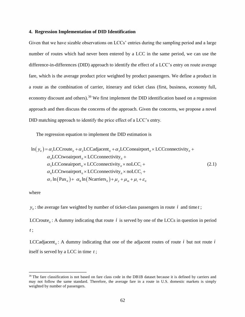
62
4. Regression Implementation of DID Identification
Given that we have sizable observations on LCCs’ entries during the sampling period and a large
number of routes which had never been entered by a LCC in the same period, we can use the
difference-in-differences (DID) approach to identify the effect of a LCC’s entry on route average
fare, which is the average product price weighted by product passengers. We define a product in
a route as the combination of carrier, itinerary and ticket class (first, business, economy full,
economy discount and others).39 We first implement the DID identification based on a regression
approach and then discuss the concerns of the approach. Given the concerns, we propose a novel
DID matching approach to identify the price effect of a LCC’s entry.
The regression equation to implement the DID estimation is
1 2 3
4
5
6
ln LCCroute LCCadjacent LCConeairport LCCconnectivity
LCCtwoairport LCCconnectivity
LCConeairport LCCconnectivity noLCC
LCCtwoair
it it it it it
it it
it it i
y
7 8
port LCCconnectivity noLCC
ln Pax ln Ncarriers
it it i
it it y m i it
(2.1)
where
ity : the average fare weighted by number of ticket-class passengers in route i and time t ;
itLCCroute : A dummy indicating that route i is served by one of the LCCs in question in period
t ;
LCCadjacentit : A dummy indicating that one of the adjacent routes of route i but not route i
itself is served by a LCC in time t ;
39 The fare classification is not based on fare class code in the DB1B dataset because it is defined by carriers and
may not follow the same standard. Therefore, the average fare in a route in U.S. domestic markets is simply
weighted by number of passengers.

63
LCConeairportit : A dummy indicating that one of the end-point airports of route i but not route
i itself is served by a LCC in time t ;
LCCtwoairportit: A dummy indicating that both the end-point airports of route i but not route i
itself is served by a LCC in time t ;
LCCconnectivityit : Number of a LCC’s served routes connecting to the end-point airports of
route i in period t . In the EU case, if both the two LCCs operate at the end-point airports, we
take the one with the larger number of served routes;
inoLCC : A dummy indicating that a LCC had never entered route i during the sampling period;
itPax : Number of route passengers;
itNcarriers : Number of carriers serving the route in time t ;
imy and , : year, month/quarter and route fixed effects;
Table 2.2 shows the DID regression results of LCCs’ entry effects on route fares. We use the
geometric mean of population of end-point cities as the IV of the endogenous number of
passengers. The IV regressions imply that on average, LCCs’ actual entry reduced fares by 39%
in the EU markets and by 26% in the U.S. markets, respectively. LCCs’ potential entries have
little effect on fares in the EU markets when they only presented at one airport. However, LCC
potential competition caused a 5% price drop in the EU markets when presenting at both airports
and Southwest’s potential entry caused a larger fare drop in the U.S. markets. Finally, the
adjacent entry of an LCC has different effects on fares in EU and US markets. Route average
fares tend to slightly rise in US markets but tend to drop in EU markets after an LCC makes an
adjacent entry.
64
Table 2.2: DID Regression Results of LCCs’ Entry Effects on Average Route Fare
Variables Ryanair and Easyjet Southwest
OLS
(1)
IV
(2)
OLS
(3)
IV
(4)
LCC route presence -0.2976
(0.0035)
-0.3895
(0.0066)
-0.2080
(0.0028)
-0.2607
(0.0033)
LCC adjacent presence -0.0308
(0.0030)
-0.0330
(0.0032)
0.0183
(0.0035)
0.0199
(0.0038)
LCC one-airport presence × LCC
connectivity
0.0052
(0.0126)
0.0089
(0.0134)
0.0500
(0.0081)
-0.0605
(0.0093)
LCC two-airport presence × LCC
connectivity
-0.0435
(0.0109)
-0.0491
(0.0116)
0.0242
(0.0047)
-0.0672
(0.0056)
LCC one-airport presence × LCC
connectivity × dummy of no LCC entry in
the sample period
0.0011
(0.0004)
-0.0018
(0.0004)
-0.2159
(0.0083)
-0.1549
(0.0092)
LCC two-airport presence × LCC
connectivity × dummy of no LCC entry in
the sample period
-0.0001
(0.0003)
-0.0062
(0.0005)
-0.1344
(0.0101)
-0.0520
(0.0111)
Log of number of passengers -0.0539
(0.0009)
0.1165
(0.0101)
-0.0807
(0.0004)
0.0641
(0.0041)
Log of number of carriers 0.0078
(0.0016)
-0.0445
(0.0035)
0.00004
(0.0008)
-0.0999
(0.0029)
Year dummies included? YES YES YES YES
Month (Quarter) dummies included? YES YES YES YES
Route dummies included? YES YES YES YES
Number of routes 3,573 3,573 13,590 13,590
Number of observations 289,546 289,546 762,534 762,534
R2
within
between
overall
0.15
0.47
0.35
0.03
0.17
0.13
0.20
0.16
0.19
0.07
0.02
0.01
Note: In the IV estimations, we use geometric mean of population of end-point cities as the instrument for log
passengers.
Basically, we use a fixed-effects panel-data model to implement the DID estimation and the
identification relies on the assumption that the route and time dummies capture the unobserved
route-specific factors and time effects which are correlated with the regressors. Such an
identification assumption may be strong given that we have a large panel of more than 3500
routes from January 2005 to December 2013 in the EU sample and 13,590 routes from the first
quarter of 1993 to the fourth quarter of 2011 in the U.S. sample. The difference across routes is
expected to vary over the years such that the fixed route-effects cannot capture the time-varying
heterogeneity. The regression implementation of DID compares treatment and control group

65
across years because the entries of the LCCs on the treated routes spread over the years. The
time-varying route heterogeneity causes such a comparison to be problematic.
Another problem of the regression approach is that we cannot separate the effects of actual
entry, potential entry and adjacent presence on fares because these events may occur sequentially
in a route. For example, the actual entry of a LCC in a route may be only several months after its
potential entry. If we have many such routes in estimation, the identification to the coefficients
of the actual and potential entry dummy is contaminated.
5. A DID Matching with Regression Adjustment Approach
The large sample size of our data in both cross-section and time-series allows us to incorporate
more designs which address the above identification issues in the regression approach. In
particular, we use a DID matching approach, which compares the difference in market fare on
routes entered by a LCC with the difference in market fare on matched routes without a LCC
entry before and after the entry on treated routes, to identify the effect of LCC entry on market
fare. The DID comparison between the treated and controlled routes is therefore on the same
time window. Moreover, we separate the effects of adjacent, potential and actual entry of LCCs
on route fare in the DID matching approach by first quantifying the price effect of actual entry
conditional on potential entry and then quantifying the price effect of potential entry, excluding
the impact of LCCs’ adjacent entry. We finally use the DID matching approach to quantify the
price effect of adjacent entry excluding the impacts of LCCs’ actual and potential entry.
A treated route can be matched to multiple controlled routes satisfying the matching criteria
as denoted later for each case. For a treated route denoted by i , we use pre
iy and post
iy to denote
the outcomes of interest – route average fare weighted by number of passengers, on the treated

66
route before and after the LCC’s entry respectively40. For a matched route 'i , '
pre
iy and '
post
iy are
the outcomes of interest on the matched route before and after the LCC’s entry on the treated
route respectively. The non-parametric DID comparison on a matched pair is given by
change rate of average fare change rate of average farein a treated route in a matched route, capturing
the time trend of fare change inthe c
post pre post pre
i i i iii pre pre
i i
y y y y
y y
net change rate of route average fare caused by a LCC entry
ounterfactual scenario withouta LCC entry
(2.2)
ii measures the net change rate of route average fare caused by a LCC’s entry. The first term on
the right-hand side is the change rate of average fare in a treated route. And the second term is
the change rate of average fare in a matched route, capturing the time trend of fare change in the
counterfactual scenario without a LCC entry.
One concern for the DID matching identification strategy is that a treated route and a
matched controlled-route may have different characteristics which are correlated with route fare.
In such a case, the time-trends of route fare on the treated and the matched route are different.
Although the DID calculation removes the fixed route effects, ii in equation (2.2) can be
affected by many route characteristics which vary over time. In order to address this
identification concern, we construct variables such as number of carriers, number of passengers
and the Herfindahl-Hirschman Index (HHI) for each non-directional city-pair market. We
compile also data on population and per capita income for each city in our sample and from the
data we construct the geometric mean of population and per capita income for each city-pair
40 The route average fare is averaged over the quarters in pre and post entry period respectively.

67
market. We use these variables as control variables to control for the difference between treated
and controlled routes.
One possible way to use these control variables is to follow the traditional matching approach
to match the treated route with only controlled routes with similar characteristics. However, such
an approach is hard to be applied to our problem because we have panel data with multiple
periods; The DID identification is affected by the change of these control variables on controlled
routes relative to the one on the treated route. Matching controlled routes to a treated one based
on the similarity in the control variables cannot account for the dynamic nature in the data.
We therefore propose a way first to compute the DID as in equation (2.2) and then remove
the effects of these control variables on the computed outcome. Formally, we compute the DID
for each of the control variables as the way of computing the DID for the route average fare. We
use ' ' '
post pre post pre
ii i i i iX X X X X to denote the vector of the DID of the control variables
between a treated route i and a controlled route 'i and run the following regression without a
constant term:
' ' 'ii ii iiX B (2.3)
If the DID of route average fare is completely determined by the DID of control variables,
' ' 'ˆ ˆii ii ii , where 'ii is the predicted value from regression equation (2.3), is expected to be
close to zero. A non-zero 'ii can be interpreted as the net effect of the LCC’s entry on route
average fare. We can therefore use
1 1 ˆ
i
i ii
i i
N M e
(2.4)

68
to estimate the average treatment effect of a LCC’s entry on route average fare excluding the
effects of observed market characteristics. The set of matched routes to the treated one is denoted
by i and iM denotes the number of routes in the set. The set of treated routes is denoted by
and N is the total number of matched pairs.
We use the bootstrap technique to construct the confidence interval of the estimator defined
in equation (2.4). We randomly sample the matched pairs , 'i i with replacement to obtain a
bootstrapped sample with the same size as the original sample of matched pairs. The is
computed on the bootstrapped sample. Repeating this process for 100 times, we use the empirical
distribution of the over the bootstrapped samples to construct the confidence interval of the
estimator.
Another concern for the DID matching identification strategy is that the LCCs may
strategically entered routes based on unobserved market characteristics which are correlated with
route fares. Our empirical strategy to address this identification concern is that, for a treated
route, we can restrict the set of controlled routes of matching it to the ones where the LCC
entered in later years – at least two years later in our baseline estimation.41 We call this approach
the DID matching within the treatment group. The underlying assumption of this identification
strategy is that the timing of a LCC’s entries on different routes is not driven by route
characteristics but is mainly affected by its initial network structure. This assumption seems
plausible because as shown in Table 2.1, a LCC enters a route only when the LCC already
presented at one of end-point airports and the likelihood of entry increases when the LCC
41 We conduct sensitivity analysis on the threshold.
69
presented at both the end-point airports. The initial network structure is largely determined by
the geographic location of home country (or headquarter) of the LCC.
6. Sample Matching Criteria
6.1. Time Window
The DID calculation is on the following time window: 12-4 months before the actual route entry
as the pre-entry period and the 18 months after the entry as the post-entry period. Within the
post-entry period, we define 0-6 months after the entry as the short-run, 7-12 months after the
entry as the medium-run and 13-18 months after the entry as the long-run. Demonstration 2.1
describes the timeline of defining a treated route. Because the potential entry was made at least
18 months before the actual entry, it is unlikely to affect the market fare in the pre-period. We do
not include the 3 months42 right before the entry in the pre-entry period because there may be a
time lag from announcing the entry to serving the route. Restricting the DID calculation on the
time window avoids comparing treated and controlled routes over a long period over which route
fares may be affected by unobserved time-varying route heterogeneity.
Demonstration 2.1: Timeline (in month) of Defining a Treated Route of a LCC’s Actual
Entry
42 We notice that the time gap between the time of entry announcement and actual entry time is, on average, slightly
more than one quarter. Therefore, in the U.S. case, we exclude 2 quarters before the actual entry of Southwest in a
market.
-18 0 -12 -3 6 12
Post entry
medium-run
effect
Post entry short-run
effect
Pre-entry
period
The LCC started to present at
least one of the end-point
airports at least 18 months
before actual entry and the
status of airport presence
remained unchanged before
entry.
Post entry long-
run effect
18

70
Accordingly, Demonstration 2.2 shows the timeline of determining the set of controlled
routes to match a treated one. The LCC started to present at least one of the end-point airports on
the controlled route at least 18 months before the actual entry on the treated route. To avoid the
potential effect of the actual entry on the controlled route on the estimation of post entry long-run
effect, the LCC’s actual entry on the controlled route must at least 24 months after the actual
entry on the treated route.
Demonstration 2.2: Timeline (in month) of Defining a Controlled Route to a Treated one
from the Routes Entered by the Same LCC.
6.2. Sample Selection
In this section, we provide details in choosing treated routes and controlled routes for actual,
potential and adjacent entry of LCCs, respectively. We separate the effects of actual, potential
and adjacent entry of LCCs on route fare into four modules. We first choose matched pairs to
quantify the price effect of actual entry without prior potential entry and then define the sample
for quantifying the fare effect of actual entry conditional on potential entry. We separate
potential entry into two types where type 1 is defined as the event when the LCC started to
operate at only one of the end-point airports of a route but not the route itself in a quarter and
type 2 is defined as the event when the LCC started to present at both the end-point airports of a
route but not the route itself in a quarter. We then estimate the price effect of each type of
potential entry, excluding the impact of LCCs’ adjacent entry. We finally use the DID matching
0 6 12 24 -3 -12 -18
Actual entry
on the treated
route
Actual entry on the
matched route at
least 24 months after
the actual entry on
the treated route
Potential entries of the
LCCs on the controlled
route at least 18 months
before the actual entry on
the treated route
Pre-entry
period in
DID
Short-run
post-entry
period in
DID
Medium-run
post-entry
period in DID
18
Long-run
post-entry
period in DID

71
approach to quantify the price effect of adjacent entry excluding the impacts of LCCs’ actual and
potential entry.
Module 1: The fare effect of Southwest’s actual entry without prior potential entry before its
actual entry and excluding the impacts of its adjacent entry.
This module is specific for Southwest because of the availability of sample from the larger
size of routes in U.S. markets. We use the following criteria to select treatment group of actual
entries in this case: i) Southwest entered this route after 1993 and stayed in this route at least for
8 quarters; ii) Southwest did not potentially enter the route before its actual entry; or iii)
Southwest did indeed potentially enter the route but the potential entry was made at most 2
quarters before the actual entry; and iv) Southwest did not serve an adjacent route before the
actual entry.
A controlled route matched to a treated one satisfies the following conditions: i) it is not
adjacent to the treated route; ii) Southwest did not serve the route and the route’s adjacent routes
up to 8 quarters after the actual entry on the treated route; iii) Southwest did not potentially enter
the route between 6 quarters before and 8 quarters after the actual entry on the treated route; and
iv) Southwest had the same status of airport presence on the controlled route which it entered in
later years as on the treated route within 6 quarters before its actual entry on the treated route.
Module 2: The effect of LCCs’ actual entry on route fare conditional on the LCCs’ potential
entry and excluding the impacts of the LCCs’ adjacent entry.
We consider two types of a LCC’s actual entry based on the types of its potential entry and
analyze their effects on route fare separately. A route is included in the treatment group of actual
entries for the two LCCs in EU if the following conditions are satisfied: i) one of the two LCCs

72
initiated its service on this route in a month after July 2006 and stayed in this route after the entry;
ii) the LCC potentially entered the route before its actual entry and the potential entry was made
at least 18 months before the actual entry; iii) the LCC which made the actual entry did not serve
an adjacent route before the actual entry; iv) the other LCC did not serve both the route and an
adjacent route up to 24 months after the actual entry; and v) the other LCC did not potentially
enter the route within 18 months before the actual entry.
A controlled route matched to a treated one satisfies the following conditions: i) it is not
adjacent to the treated route; ii) a LCC did not serve the route and the route’s adjacent routes up
to 24 months after the actual entry on the treated route; iii) a LCC did not potentially enter the
route between 18 months before and 24 months after the actual entry on the treated route; and iv)
the LCC which actually entered the treated route has the same status of airport presence on the
controlled route as on the treated route within 18 months before its actual entry on the treated
route.
A treated route in both types for Southwest satisfies the following conditions: i) Southwest
entered this route after the second quarter of 1994 and stayed in this route at least for 8 quarters;
ii) Southwest potentially entered the route at least 6 quarters before the actual entry; and iii)
Southwest did not serve an adjacent route before the actual entry.
A controlled route matched to a treated one of Southwest satisfies the following conditions: i)
it is not adjacent to the treated route; ii) Southwest did not serve the route and the route’s
adjacent routes up to 8 quarters after the actual entry on the treated route; and iii) Southwest did
not potentially enter the route between 6 quarters before and 8 quarters after the actual entry on
the treated route; and iv) Southwest had the same status of airport presence on the controlled

73
route which it entered in later years as on the treated route within 6 quarters before its actual
entry on the treated route.
Module 3: The effect of LCCs’ potential entry on route fare excluding the impacts of the LCCs’
actual and adjacent entry.
As defined earlier, we consider two types of LCCs’ potential entry and analyze their effects
on route fare separately. A treated route in EU satisfies the following conditions: i) one of the
two LCCs started to operate at only one of (both for type 2) the end-point airports of a route but
not the route itself in a month after July 2006 and stayed in the airports afterward; ii) if the LCC
started its service at the two airports sequentially, the time interval between entering the two
airports is not less than 24 months (18 months for type 2); iii) the LCC did not actually enter the
route within 24 months after its potential entry; iv) the LCC did not serve both the end-point
airports of an adjacent route before the potential entry; v) if the LCC operated at airports of
adjacent routes before the potential entry, the most recent time that the LCC started its service at
one of these airports must be at least 18 months before the potential entry; and vi) the other LCC
did not serve the route interval between which made the actual entry did not serve an adjacent
route and the other LCC did not serve both the route and an adjacent route before the actual entry.
A controlled route matched to a treated one defined in Demonstration 2.1 satisfies the
following conditions: i) it is not adjacent to the treated route; ii) a LCC did not serve the route
and the route’s adjacent routes up to 24 months after the actual entry on the treated route; and iii)
at least one LCC potentially entered the route and the potential entries were made at least 18
months before the actual entry on the treated route.

74
Similarly, a treated route in U.S. satisfies the following conditions: i) Southwest started to
serve one of (both for type 2) the end-point airports of a route but not the route itself after the
second quarter of 1994 and stayed in the airport afterward; ii) if Southwest started its service at
the two airports sequentially, the time interval between entering the two airports is not less than 8
quarters (6 quarters for type 2); iii) the carrier did not actually enter the route within 8 quarters
after its potential entry; iv) the carrier did not potentially entered an adjacent route before the
potential entry on the treated route; and v) Southwest did not serve an adjacent route on the same
time window.
A controlled route matched to a treated one satisfies the following conditions: i) it is not
adjacent to the treated route; ii) Southwest did not serve the route and the route’s adjacent routes
up to 8 quarters after the potential entry on the treated route; iii) Southwest did not potentially
enter the route up to 8 quarters after the potential entry on the treated route; and iv) the controlled
route has similar distance to the treated one.
Module 4: The effect of LCCs’ adjacent entry on route fare excluding the impacts of the LCCs’
actual and potential entry.
A treated route in EU satisfies the following conditions: i) one of the two LCCs started to
operate at least one of the route’s adjacent routes but not the route itself in a month after July
2006 and stayed the status at least for 24 months; ii) the LCC did not potentially enter the route
up to 24 months after the adjacent entry on the treated route; and iii) the other LCC did not serve
the route interval between which made the actual entry did not serve an adjacent route and the
other LCC did not serve both the route and an adjacent route before the actual entry.

75
A controlled route matched to a treated one defined in Demonstration 1 satisfies the
following conditions: i) it is not adjacent to the treated route; ii) a LCC did not serve the route
and the route’s adjacent routes up to 24 months after the actual entry on the treated route; and iii)
at least one LCC potentially entered the route and the potential entries were made at least 18
months before the actual entry on the treated route.
A treated route in U.S. satisfies the following conditions: i) Southwest started to serve at least
one of the route’s adjacent routes but not the route itself after the second quarter of 1994 and
stayed the status at least for 8 quarters; and ii) Southwest did not potentially enter the route up to
8 quarters after the adjacent entry on the treated route.
A controlled route matched to a treated one satisfies the following conditions: i) it is not
adjacent to the treated route; ii) Southwest did not serve the route and the route’s adjacent routes
up to 8 quarters after the adjacent entry on the treated route; iii) Southwest did not potentially
enter the route up to 8 quarters after the adjacent entry on the treated route; and iv) the controlled
route has similar distance to the treated one.
6.3. Balancing Test
One concern for our sample selection procedure is that the matched treated routes may not
represent the whole entered routes by a LCC. Therefore, the test of standardized differences is
used here to illustrate the similarity between all routes affected by a LCC and matched treated
routes for each case. We take Southwest case as an example. The test was first described in
Rosenbaum and Rubin (1985) to check the balance between the treatment and comparison group.
The standardized difference is defined as:

76
2 2
100.
2
F M
F M
X XB X
S X S X
(2.5)
where for each covariate, FX and MX are the sample means for the full affected routes and
matched treated routes, and 2
FS X and 2
MS X are the corresponding sample variances.
Intuitively, the standardized difference considers the size of the difference in means of a
conditioning variable, scaled by the square root of the variances in the samples. Rosenbaum and
Rubin (1985) suggest that for each covariate, imbalance is defined as the absolute value greater
than 20. Since the matched treated routes are not selected using market attributes, we use a more
lenient rule that considers a standardized difference greater than 40 as large.
Table 2.3 reports the standardized differences for chosen variates in the U.S. sample. It
shows that the most important variable route average fare is balanced in any case, with all
standardized differences smaller than 20. Most of the standardized differences have absolute
values smaller than 40, which indicates that they pass the balancing test. However, the variables
number of carriers and HHI of the city market for type 2 in module 3 as defined above have
standardized differences larger than 40, which is an indication that there are some differences in
these covariates between the two groups.
Table 2.3: Test for Standardized Differences in the U.S. Sample
Variable Module 1 Module 2 Module 3 Module 4
Type 1 Type 2 Type 1 Type 2
Fare 6.7 19.0 1.7 7.2 -19.4 -5.3
Distance -1.5 7.7 -31.1 0 -5.9 -4.4
No. of carriers -19.2 4.2 -17.5 -19.2 40.0 11.6
HHI 0 6.1 10.8 15.4 -41.8 -20.4
Population -19.5 18.7 -21.7 -11.4 12.2 7.4
PCI -4.7 16.5 4.4 0 2.2 6.9
Note: Fare = average route fare; Distance = route distance; No. of carriers = number of carriers in the city-
pair market; HHI = market concentration index of the city-pair market; Population = geometric mean of
population of end-point cities; and PCI = geometric mean of per capita income of end-point cities.

77
Even though the route average fare is balanced in each case, a big concern is whether it
follows similar patterns before and after (actual/potential/adjacent) entry between the two groups.
To test this, we also calculate its standardized differences before and after entry in each case as
shown in Table 2.4. It shows that except the one in type 2 of module 3, all standardized
differences are smaller than 20. The standardized difference after entry in type 2 of module 3 is
(-44.4), which implies that the fare effect in this category might be underestimated. The bias is
not serious because the higher fare in the matched treatment group is associated with less number
of carriers and higher competition concentration as shown in Table 2.3. As we noted earlier, we
remove the effects of these control variables on the computed outcome. Generally, in our model
the matched treated routes are able to represent the full samples for each case, which implies that
the potential sample selection issue is negligible.
Table 2.4: Standardized Differences of Route Average Fare in the U.S. Sample
Entry pattern Standardized difference
before entry
Standardized difference after entry
Module 1 -7.7 6.5
Module 2: Type 1 -5.2 15.0
Module 2: Type 2 0 -5.7
Module 3: Type 1 0 15.0
Module 3: Type 2 1.2 -44.4
Module 4 -7.9 -12.0
7. Estimation Results
7.1. Baseline Results
We report the estimated fare effects of actual, potential and adjacent entry of LCCs in separate
tables corresponding to four modules. Table 2.5 presents the fare effect of Southwest’s actual
entry without relying on potential entry. The LCC enters a route in less than two quarter after its
potential entry. It caused 10-14% price drop on average in the U.S. markets as shown in column
(1) in Table 2.5. We also report Southwest’s actual entry effect on connecting route fares only in

78
column (3), which shows a very similar effect to the overall effect. Note that we would have
overestimated the fare effects as shown in column (2) and (4) if we did not exclude the effects of
observed market characteristics. Hereafter, we only report results with regression adjustment.
Table 2.5: DID Matching Results on the Effect of Southwest’s Actual Entry without Prior Potential Entry on
Route Average Fare
All routes entered Connecting routes entered only
Excluding the effects
of observed market
characteristics (1)
Without excluding the
effects of observed
market characteristics (2)
Excluding the effects
of observed market
characteristics (3)
Without excluding the
effects of observed
market characteristics (4)
Short-run effect (1-2 quarters
after entry)
-10.2%
[-10.5%, -9.8%]
-23.8%
[-24.2%, -23.4%]
-11.3%
[-11.6%, -10.9%]
-20.4%
[-20.8%, -20.0%]
Medium-run effect (3-4
quarters after entry)
-13.2%
[-13.6%, -12.7%]
-24.3%
[-24.8%, -23.8%]
-13.1%
[-13.5%, -12.5%]
-21.0%
[-21.6%, -20.5%]
Long-run effect (5-6 quarters after entry)
-13.7% [-14.1%, -13.2%]
-24.6% [-25.1%, -24.2%]
-13.4% [-14.0%, -13.0%]
-20.8% [-21.4%, -20.4%]
Number of treated routes 227 227 161 161
Number of observations 9,093 9,093 5,204 5,204
Note: we report median along with [5%-ile, 95%-ile] for each of the effects. The confidence interval is calculated using the bootstrap technique.
Table 2.6: DID Matching Results on the Effect of a LCC’s Actual Entry with Potential Entry on Route
Average Fare
EU Conditional on both types
of potential entry
(1)
US conditional on Type 1
potential entrya
(2)
US conditional on Type 2
potential entrya
(3)
Short-run effect (0-6 months after entry) -14% [-16%, -12%]
-17.7% [-18.7%, -16.9%]
-4.0% [-4.6%, -3.4%]
Medium-run effect (6-12 months after entry) -15%
[-17%, -12%]
-17.5%
[-18.2%, -16.8%]
-5.0%
[-5.7%, -4.4%] Long-run effect (12-18 months after entry) -10%
[-13%, -8%]
-18.8%
[-19.9%, -17.8%]
-3.8%
[-4.5%, -3.0%]
Number of treated routes 120 159 136 Number of observations 477 2,925 1,800
a Southwest did not potentially enter the controlled route up to 8 quarters after the actual entry on the treated route.
Note: Type 1 potential entry = present at only one end-point airport; Type 2 potential entry = present at both end-point airports. The effects of observed market characteristics are excluded in all results. We report median along with [5%-ile, 95%-ile] for each of the effects. The confidence
interval is calculated using the bootstrap technique.
Table 2.6 reports LCCs actual entry effects conditional on potential entry. Conditional on
presenting at one or both end-point airports, a LCC reduced fares about 14-15% in the short and
medium run in the EU markets as reported in column (1). However, the effect dropped to 10% in
the long run. In the U.S. markets, as reported in the last two columns, Southwest entry
conditional on presenting at only one end-point airport led price to decrease about 18% over time
and entry conditional on operating at both end-point airports reduced price by 4-5%. These imply

79
that competitors in a market take different pricing strategies to respond to different patterns of
actual entries of a LCC.
As expected, competitors have a larger response to type 2 potential entry than to type 1
potential entry of a LCC. Both types of LCC potential entry had little effect on fares in the EU
markets as shown in the first two columns of Table 2.7. Southwest, however, caused 3% and 7-
10% price drop for type 1 and type 2 potential entry in the U.S. markets, respectively. Finally,
Table 8 shows that LCC adjacent entry caused about a 1-3% price drop in the EU markets and a
3-5% price drop in the U.S. markets.
Table 2.7: DID Matching Results on the Effect of a LCC’s Potential Entry on Route Average Fare
EU US
Type 1
(1)
Type 2
(2)
Type 1
(3)
Type 2a
(4)
Short-run effect (0-6 months after entry) -0.1%
[-0.02%, -0.016%]
-1.3%
[-2.8%, -0.1%]
-2.3%
[-2.9%, -1.9%]
-8.3%
[-8.7%, -7.9%]
Medium-run effect (6-12 months after entry)
-0.3% [-0.08, -0.44%]
-2.2% [-3.6%, -0.6%]
-3.3% [-3.9%, -2.9%]
-9.7% [-10.0%, -9.1%]
Long-run effect (12-18 months after entry) 0.6%
[-0.1%, 1.1%]
-0.3%
[-1.3%, 0.8%]
-3.2%
[-3.8%, -2.7%]
-7.2%
[-7.7%, -6.8%] Number of treated routes 180 82 2,287 224
Number of observations 4025 1198 73,889 7,944 a The time interval between entering the two airports is not less than 6 quarters.
Note: Type 1 potential entry = present at only one end-point airport; Type 2 potential entry = present at both end-point airports. The effects of observed market characteristics are excluded in all results. We report median along with [5%-ile, 95%-ile] for each of the effects. The confidence
interval is calculated using the bootstrap technique.
Table 2.8: DID Matching Results on the Effect of a LCC’s Adjacent Entry on Route Average Fare
EU
(1)
US
(2)
Short-run effect (0-6 months after entry) -2.8%
[-4.4%, -1.2%]
-3.0%
[-3.4%, -2.6%]
Medium-run effect (6-12 months after entry) -3.5%
[-5.2%, -1.9%]
-3.9%
[-4.3%, -3.5%]
Long-run effect (12-18 months after entry) -1.3%
[-2.7%, 0.01%]
-5.1%
[-5.5%, -4.6%]
Number of treated routes 77 441
Number of observations 823 7,348
Note: The effects of observed market characteristics are excluded in all results. We report median along with
[5%-ile, 95%-ile] for each of the effects. The confidence interval is calculated using the bootstrap technique.
In sum, LCC entry would cause at most a 20% price drop in the EU markets and a 30% price
drop in the U.S. markets. In the EU markets, fare reductions are mainly caused by LCCs’ actual
entries. In the U.S. markets, both actual entry and potential entries can cause big price drop. The

80
different findings in EU and U.S. markets imply that EU markets are less competitive than US
markets. Compared to the U.S. markets, the aviation industry in the EU is characterized as more
slot and gate constraints and subsidized national carriers, which are weak competitors.43
Comparing our findings from DID matching to the traditional DID regression approach, the
regression approach underestimates the effects of potential and adjacent LCC entries on fare,
especially in the US markets. At the same time, it overestimates the effect of actual LCC entry
and the overall effect of LCC entry on route fare. Compared to ours, most previous studies find a
much larger fare reduction effects of Southwest’s actual entry, potential entry and adjacent entry.
For instance, Morrison (2001) finds that fares are 46% lower when Southwest serves a route. If it
serves an adjacent route, fares fall by 15-26%. The potential competition from Southwest lowers
fares by 6% when it only serves one airport and by 33% when it serves both endpoints of a route
but not the route itself.
Our novel identification strategy has several advantages relative to the traditional DID
regression approach. First of all, the DID comparison in our model is between routes entered by
LCC earlier and routes entered by the same LCC later. Compared with the regression approach,
homogeneity between treated and controlled routes is higher. Moreover, our model enables us to
get a cleaner DID comparison via a regression adjustment after the DID matching results. Finally,
we are allowed to separate different entry effects from the sample selection process by excluding
routes contaminated by other types of entry.
43 For example, in 2016, there are 180 slot-controlled airports in the world, 93 of which are in the EU and 2 in the
U.S. (European Parliament, 2016). In slot-controlled airports, airlines need to obtain slots for landings and take-offs
in advance. In the EU, airlines are allocated slots on the basis of their previous use, according to a system based on
what is known as the “grandfather rights” rule. The grandfather rights of incumbent airlines (mainly national airlines)
at hub airports would have restricted the supply of slots available to new entrant airlines seeking slots at hubs
(Barrett, 2004).

81
7.2. Additional Tests in the U.S. Markets
As we mentioned earlier, Southwest mainly entered short and medium haul markets. We
would expect that competitors on short routes would have a larger response when Southwest
presents at one airport than those on long routes sharing the same end-point airport. In other
words, type 1 potential entry is distance sensitive. To test this hypothesis, we re-estimate
Southwest’s type 1 potential entry effect by categorize markets into four groups according to
route distance. As shown in Table 2.9, Southwest’ potential entry has the largest price reduction
effect (7.8%) on routes less than 500 miles. Its effect is decreasing along route distance. The
results also imply that Southwest would cause a much larger price drop (>5.3%) than its average
type 1 potential effect (3.2%) if we only consider markets below 1000 miles.
Table 2.9: DID Matching Results on the Effect of Southwest’s Type 1 Potential Entry on Route Average Fare
Categorized by Route Distance
Distance less than
500 miles
(1)
Distance between 500
and 1,000 miles
(2)
Distance between
1,000 and 1,500 miles
(3)
Distance greater than
1,500 miles
(4)
Short-run effect (1-2 quarters after
entry)
-5.0%
[-5.6%, -4.5%]
-3.1%
[-3.7%, -2.8%]
-1.6%
[-2.0%, -1.2%]
-0.8%
[-1.2%, -0.6%]
Medium-run effect (3-4 quarters after entry)
-4.8% [-5.6%, -4.1%]
-5.3% [-5.7%, -4.8%]
-2.9% [-3.3%, -2.5%]
0.7% [0.4%, 1.2%]
Long-run effect (5-6 quarters after
entry)
-7.8%
[-8.4%, -6.9%]
-5.3%
[-5.8%, -4.7%]
-2.1%
[-2.4%, -1.6%]
-0.5%
[-0.9%, -0.2%] Number of treated routes 384 843 555 505
Number of observations 5,400 32,787 22,586 9,908
Note: The effects of observed market characteristics are excluded in all results. We report median along with [5%-ile, 95%-ile] for each of the effects. The confidence interval is calculated using the bootstrap technique.
We further estimate the potential benefits of additional LCC expansion in various markets
where it has been constrained. We first estimate Southwest’s entry effects on route fares before
2001. The motivation to do this is that the U.S. domestic markets were more competitive during
this period.44 As expected, the effects, as shown in Table 2.10, are 2% in total less than the
44 Over the last decade, the U.S. airline industry has been restructured with a number of mergers of the industry’s top
airlines. In 2005, the top 11 airlines comprised 96% of domestic market share by available seat miles. This number
has reduced to six airlines with 94% of U.S. market share by available seat miles.
82
baseline effects. This implies that the cabotage rights would benefit travelers further given the
current less competitive U.S. markets.
Table 2.10: DID Matching Results on the Route Average Fare Effect of Southwest’s Entry before 2001
Actual entry Potential entry Adjacent entry
Module 1
(1)
Module 2:
Type 1
(2)
Module 2:
Type 2
(3)
Module 3:
Type 1
(4)
Module 3:
Type 2
(5)
Module 4
(6)
Short-run effect (1-2 quarters after entry)
-10.2% [-10.5%, -9.7%]
-15.0% [-16.1%, -13.9%]
-4.1% [-4.8%, -3.4%]
-2.5% [-3.1%, -2.1%]
-9.3% [-9.7%, -8.7%]
-3.0% [-3.5%, -2.4%]
Medium-run effect (3-
4 quarters after entry)
-12.8%
[-13.4%, -12.3%]
-14.6%
[-15.7%, -13.3%]
-5.5%
[-6.3%, -4.9%]
-3.7%
[-4.2%, -3.2%]
-11.8%
[-12.6%, -11.3%]
-3.9%
[-4.5%, -3.5%] Long-run effect (5-6
quarters after entry)
-12.5%
[-12.9%, -12.0%]
-15.4%
[-16.6%, -14.5%]
-4.9%
[-5.6%, -4.1%]
-3.4%
[-3.9%, -2.9%]
-9.5%
[-10.1%, -9.0%]
-5.4%
[-6.1%, -4.9%]
Number of treated
routes
104 140 90 1,226 85 272
Number of
observations
6,524 2,271 1,495 6,628 6,483 6,448
Note: The effects of observed market characteristics are excluded in all results. We report median along with [5%-ile, 95%-ile] for each of the effects. The confidence interval is calculated using the bootstrap technique.
Table 2.11: DID Matching Results on the Route Average Fare Effect of Southwest’s Entry on High
Concentrated Routes (HHI>4000)
Actual entry Potential entry Adjacent entry
Module 1
(1)
Module 2:
Type 1
(2)
Module 2:
Type 2
(3)
Module 3:
Type 1
(4)
Module 3:
Type 2
(5)
Module 4
(6)
Short-run effect (1-2 quarters after entry)
-10.0% [-10.7%, -9.3%]
-16.2% [-17.6%, -14.7%]
-5.6% [-6.9%, -4.2%]
-2.6% [-3.2%, -2.1%]
-8.9% [-9.5%, -8.3%]
-3.6% [-4.1%, -3.1%]
Medium-run effect (3-
4 quarters after entry)
-13.0%
[-13.7%, -12.1%]
-15.1%
[-17.1%, -13.9%]
-7.0%
[-8.3%, -5.5%]
-3.7%
[-4.4%, -3.1%]
-8.6%
[-9.2%, -7.8%]
-4.1%
[-4.8%, -3.4%] Long-run effect (5-6
quarters after entry)
-12.4%
[-13.2%, -11.7%]
-17.9%
[-19.3%, -16.3%]
-5.1%
[-6.2%, -3.6%]
-3.8%
[-4.5%, -3.3%]
-5.0%
[-5.7%, -4.1%]
-6.0%
[-6.7%, -5.3%]
Number of treated routes
142 101 59 1,787 169 327
Number of
observations
3,187 991 484 42,232 3,886 3,767
Note: The effects of observed market characteristics are excluded in all results. We report median along with [5%-ile, 95%-ile] for each of the effects. The confidence interval is calculated using the bootstrap technique.
We also estimate Southwest’s entry effects on routes where HHI is greater than 4000.45 We
find very similar effects as the baseline effects (reported in Table 2.11). Since legacy carriers
mainly operate using a hub-and-spoke networks, we finally evaluate Southwest’s entry effects on
route fares on hub routes. The results in Table 2.12 show that Southwest’s type 1 actual entry
would at most reduce fares about 24.1% on hub routes, which is larger than the baseline effect
45 The U.S. Department of Justice considers a market with an HHI of 2,500 or greater to be a highly concentrated
marketplace. In the airline industry, it is very common for a market with a much higher HHI than this level. So we
chose a market with an HHI of 4,000 or greater as a highly concentrated marketplace. This accounts for around 50%
of our total U.S. sample markets.

83
(22.2%). However, its type 2 actual entry has a smaller impact on fares compared to our baseline
result in the long run.
Table 2.12: DID Matching Results on the Route Average Fare Effect of Southwest’s Entry on Hub Routes
Actual entry Potential entry Adjacent entry
Module 1
(1)
Module 2:
Type 1
(2)
Module 2:
Type 2
(3)
Module 3:
Type 1
(4)
Module 3:
Type 2
(5)
Module 4
(6)
Short-run effect (1-2 quarters after entry)
-9.6% [-10.3%, -8.9%]
-18.3% [-19.9%, -16.9%]
-2.1% [-3.2%, -1.2%]
-1.5% [-2.1%, -0.9%]
-5.2% [-6.5%, -8.3%]
-2.0% [-2.7%, -1.5%]
Medium-run effect (3-
4 quarters after entry)
-12.2%
[-13.0%, -11.5%]
-17.5%
[-18.4%, -15.9%]
-4.3%
[-5.5%, -3.3%]
-2.3%
[-3.1%, -1.7%]
-10.0%
[-11.6%, -8.6%]
-3.0%
[-3.8%, -2.4%] Long-run effect (5-6
quarters after entry)
-13.4%
[-14.1%, -12.7%]
-19.6%
[-21.3%, -18.3%]
-1.9%
[-2.8%, -0.9%]
-4.5%
[-5.3%, -4.0%]
-4.5%
[-6.3%, -3.3%]
-4.0%
[-4.8%, -3.4%]
Number of treated
routes
141 83 81 593 42 252
Number of
observations
2,600 1,160 459 13,139 884 3,117
Note: The effects of observed market characteristics are excluded in all results. We report median along with [5%-ile, 95%-ile] for each of the effects. The confidence interval is calculated using the bootstrap technique.
7.3. Robustness Checks
7.3.1. Alternative Timelines
We conduct the following robustness checks on the baseline results with respect to the
timeline of defining treated and controlled routes. In the first check, we modify that the potential
entry of LCCs on a treated or a controlled route must be at least 24 months (changed from 18
months) before a LCC’s actual entry on the treated route. The rationale of this robustness check
is that the threshold of 18 months could be too short to separate the effect of potential entry from
the effect of actual entry on route average fare. In the following checks, we change the time gap
between a LCC’s actual entry on a treated route and its actual entry on a controlled route. We
first increase the time interval from 24 months to 36 months to account for the possibility that
competitors may be able to predict a LCC’s entries given the LCC’s current strategies in the
short run. We then restrict the set of controlled routes of a treated one to the routes where the
same LCC entered between 24 months and 36 months after the LCC entered the treated route.
The motivation of conducting this robustness check is that a treated route could be different to a
84
controlled route if the time gap of a LCC’s entry on them is too large. Results from these
robustness checks are shown in Table 2.13. All these results imply that our baseline results are
robust.
Table 2.13: Robustness Checks of DID Matching Results on the Effect of a LCC’s Actual Entry on Route
Average Fare (Column (1) in Table 2.6 is the benchmark)1
(1)
The LCC which
actually entered the treated route
potentially entered
both the treated and controlled route at
least 24 months before
the actual entry
(2)
The LCC which
actually entered the treated route actually
entered a controlled
route at least 36 months after its actual
entry on the treated
route
(3)
The LCC which
actually entered the treated route actually
entered a controlled
route between 24 and 36 months after its
actual entry on the
treated route
(4)
The average total
monthly number of routes served by the
entering LCC at end-
point airports of the treated route between
12 and 4 months
before the actual entry is similar to the one on
the controlled route in
the same time period 2
Short-run effect (0-6 months after entry)
-10% [-12%, -7%]
-13% [-15%, -10%]
-13% [-17%, -10%]
-13% [-17%, -9%]
Medium-run effect (6-12 months after entry)
-10% [-13%, -8%]
-14% [-17%, -11%]
-14% [-19%, -10%]
-15% [-20%, -11%]
Long-run effect (12-18 months after
entry)
-5%
[-6%, -3%]
-10%
[-13%, -10%]
-7%
[-11%, -4%]
-10%
[-16%, -4%] Number of treated routes 103 120 120 120
Number of observations 262 256 205 129
Note: 1 We report median along with [5%-ile, 95%-ile] for each of the effects. The confidence interval is calculated using the bootstrap technique.
2 We discretize the number of served routes by the entering LCC into categories by 10, and match a treated route with only controlled
routes where the entering LCC served the same category of number of routes connecting end-point airports during the time period under
consideration.
7.3.2. Excluding Other LCCs’ Entry
Note that we did not consider other LCCs’ entry effects on fares when estimating
Southwest’s effects in the U.S. markets. One potential problem is that we would have
underestimated Southwest’s entry effects when taking routes served by other LCCs as controlled
routes. Therefore, we conduct the following robustness check by only considering routes where
other LCCs46 served neither the treated nor the controlled routes up to 8 quarters after the actual
entry of Southwest on the treated routes.47 Results as shown in Table 2.14 imply that Southwest
46 We exclude the first six largest LCCs except Southwest in terms of transported passengers in our sample,
including Allegiant Air (G4), Frontier Airlines (F9), JetBlue (B6), Spirit Airlines (NK), Sun Country Airlines (SY)
and Virgin America (VX). 47 It is hard to exclude all routes where other LCCs show potential competition. As a result, we only took
Southwest’s actual entry effects as an example.
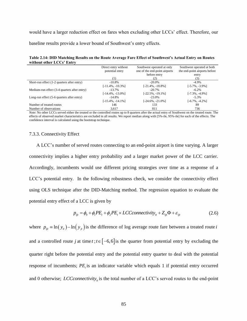
85
would have a larger reduction effect on fares when excluding other LCCs’ effect. Therefore, our
baseline results provide a lower bound of Southwest’s entry effects.
Table 2.14: DID Matching Results on the Route Average Fare Effect of Southwest’s Actual Entry on Routes
without other LCCs’ Entry
Direct entry without
potential entry
(1)
Southwest operated at only
one of the end-point airports
before entry (2)
Southwest operated at both
the end-point airports before
entry (3)
Short-run effect (1-2 quarters after entry) -10.8%
[-11.4%, -10.3%]
-20.0%
[-21.4%, -18.8%]
-4.9%
[-5.7%, -3.9%]
Medium-run effect (3-4 quarters after entry) -13.7% [-14.4%, -13.0%]
-20.7% [-22.5%, -19.1%]
-6.2% [-7.3%, -4.9%]
Long-run effect (5-6 quarters after entry) -14.8%
[-15.4%, -14.1%]
-23.0%
[-24.6%, -21.0%]
-5.3%
[-6.7%, -4.2%] Number of treated routes 146 133 89
Number of observations 3,617 811 736
Note: No other LCCs served either the treated or the controlled routes up to 8 quarters after the actual entry of Southwest on the treated route. The
effects of observed market characteristics are excluded in all results. We report median along with [5%-ile, 95%-ile] for each of the effects. The
confidence interval is calculated using the bootstrap technique.
7.3.3. Connectivity Effect
A LCC’s number of served routes connecting to an end-point airport is time varying. A larger
connectivity implies a higher entry probability and a larger market power of the LCC carrier.
Accordingly, incumbents would use different pricing strategies over time as a response of a
LCC’s potential entry. In the following robustness check, we consider the connectivity effect
using OLS technique after the DID-Matching method. The regression equation to evaluate the
potential entry effect of a LCC is given by
0 1 2ijt t t it ijt ijtp PE PE LCCconnectivity Z (2.6)
where ln lnijt it jtp y y is the difference of log average route fare between a treated route i
and a controlled route j at time t ; 6,6t is the quarter from potential entry by excluding the
quarter right before the potential entry and the potential entry quarter to deal with the potential
response of incumbents; tPE is an indicator variable which equals 1 if potential entry occurred
and 0 otherwise; itLCCconnectivity is the total number of a LCC’s served routes to the end-point

86
airports of route i at time t ; and ijtZ is a vector of the difference of the control variables between
a treated route i and a controlled route j at time t . The regression results for Southwest are shown
in Table 2.15. All results imply that Southwest’s potential entry reduced price more when
connectivity effect is taken into account.
Table 2.15: Matching OLS Results on the Effect of Southwest’s Potential Entry on Route Average Fare
(Module 3)
Type 1 Type 2
(1)
Overall
(2)
Distance
less than 500 miles
(3)
Distance
between 500 and 1,000 miles
(4)
Distance
between 1,000 and 1,500 miles
(5)
Distance
greater than 1,500 miles
(6)
Potential entry dummy -0.0808 (0.0072)
-0.0904 (0.0207)
-0.1153 (0.0118)
-0.0977 (0.0090)
-0.0086 (0.0086)
-0.2864 (0.0102)
Potential entry dummy ×
WNconnectivity
0.0021
(0.0004)
0.0006
(0.0009)
0.0029
(0.0006)
0.0039
(0.0005)
-0.0003
(0.0006)
0.0045
(0.0003) Fare effect -4.5%
(0.25%)
-7.7%
(0.66%)
-6.4%
(0.42%)
-3.0%
(0.30%)
-1.3%
(0.35%)
-11.4%
(0.29%)
Number of treated routes 2,287 384 843 555 505 224 Number of observations 798,554 118,160 357,075 244,665 103,018 83,168
Note: Control variables are included in all regressions but not reported. We report the mean along with the standard error for each variable. The
standard errors are calculated using the bootstrap technique.
8. Conclusions
This paper designs a novel quasi-experiment approach, DID-Matching with regression
adjustment approach, to estimate the effects of LCCs’ expansions on fares in both the EU and the
US markets. The results enable us to get a preliminary understanding of allowing cabotage to
further deregulate aviation markets. In doing so, we first review the patterns of LCC’s
expansions after deregulations in EU and US. According to their patterns, we decompose the
overall effect of LCC entry into three effects: actual entry, potential entry and adjacent entry. For
each type of entry, we select treated routes to exclude the contamination of other types of entry.
The controlled routes are selected from routes that were entered by the same LCC in later years.
We also remove further the possible impacts of other time-varying factors on the DID matching
outcome via a regression adjustment.

87
Our novel identification strategy has several advantages relative to the traditional DID
regression approach. First of all, the DID comparison in our model is between routes entered by
LCC earlier and routes entered by the same LCC later. Compared with the regression approach,
homogeneity between treated and controlled routes is higher. Moreover, our model enables us to
get a cleaner DID comparison via a regression adjustment after the DID matching results. Finally,
we are allowed to separate different entry effects from the sample selection process by excluding
routes contaminated by other types of entry.
Common in both aviation markets, a LCC enters a route only when it already operated in at
least one of the end-point airports; That is, actual entry is positively affected by the LCC’s
airport presence. On the other hand, they also show different entry patterns. In the EU markets,
given that a LCC already operated in an end-point airport of a route, the probability of the LCC
entering the route in a period increases if the number of served routes connecting the airport by
the LCC increases. We also find that actual entry is negatively affected by the LCC’s adjacent
route presence in the EU markets. In the U.S. markets, the actual entry is, however, positively
affected by adjacent own route presence.
Simply speaking, our estimates imply that LCC entry has a less competitive effects in the EU
markets than the one in the U.S. markets. In the EU markets, fare reductions are mainly caused
by LCCs’ actual entries. In the U.S. markets, potential entries can also cause big price drop. We
also find that competitors on short routes have a larger response when the LCC presents at one
airport than those on long routes sharing the same end-point airport. Finally, our results imply
that Southwest has a larger reduction effect on fares in less competitive markets, such as in
highly concentrated markets, in markets where mergers reduced the number of competitors, and
on hub routes.

88
Our findings may have some important policy implications for deregulation policy. Given the
current concentrated market structure in the U.S. aviation industry, our findings give us some
intuitive support on allowing cabotage to further deregulate aviation markets. LCCs are likely to
expand if international aviation markets are fully deregulated and if cabotage is allowed.
Travelers would benefit from LCCs expansions, especially on short haul and less competition
routes. In a word, concerns about market consolidation might be addressed by allowing foreign
competition in domestic markets.
To get a more direct evidence, we need to answer the question: Could EU LCCs reduce fares
even further in the U.S. markets? As a future work, we still need to develop a dynamic structural
model of LCC entries to address this question explicitly.

89
9. References
Alderighi, M., et al. (2012). "Competition in the European aviation market: the entry of low-
cost airlines." Journal of Transport Geography 24: 223-233.
Barrett, S. D. (2000). "Airport competition in the deregulated European aviation market."
Journal of Air Transport Management 6(1): 13-27.
Barrett, S. D. (2004). "The sustainability of the Ryanair model." International Journal of
Transport Management 2(2): 89-98.
Bliss, F. A. (1994). "Rethinking Restrictions on Cabotage: Moving to Free Trade in Passenger
Aviation." Suffolk Transnat'l L. Rev. 17: 382.
Boguslaski, C., et al. (2004). "Entry Patterns in the Southwest Airlines Route System." Review of
Industrial Organization 25(3): 317-350.
Brown, D. and P. G. Gayle (2009). "Analyzing the effects of a merger between airline codeshare
partners." Unpublished Manuscript, Kansas State University.
Button, K. (2009). "The impact of US–EU “Open Skies” agreement on airline market structures
and airline networks." Journal of Air Transport Management 15(2): 59-71.
Chen, R. (2017). "Competitive responses of an established airline to the entry of a low-cost
carrier into its hub airports." Journal of Air Transport Management 64(Part B): 113-120.
Ciliberto, F., et al. (2016). "Market structure and competition in airline markets."
Cristea, A., et al. (2017). "Estimating the gains from liberalizing services trade: The case of
passenger aviation."
Dresner, M., et al. (1996). "The impact of low-cost carriers on airport and route competition."
Journal of Transport Economics and Policy: 309-328.
Fu, X., et al. (2010). "Air transport liberalization and its impacts on airline competition and air
passenger traffic." Transportation Journal: 24-41.
Gerardi, K., et al. (2009). "Does Competition Reduce Price Dispersion? New Evidence from the
Airline Industry." Journal of Political Economy 117(1): 1-37.
90
Gillen, D. (2006). "Airline Business Models and Networks: Regulation, Competition and
Evolution in Aviation Markets." Review of Network Economics 5(4).
Goetz, A. R. and T. M. Vowles (2009). "The good, the bad, and the ugly: 30 years of US airline
deregulation." Journal of Transport Geography 17(4): 251-263.
Hüschelrath, K. and K. Müller (2014). The Price Effects of Mergers in Airline Networks. The
Analysis of Competition Policy and Sectoral Regulation: 31-57.
Kappes, J. W. and R. Merkert (2013). "Barriers to entry into European aviation markets revisited:
A review and analysis of managerial perceptions." Transportation Research Part E:
Logistics and Transportation Review 57: 58-69.
Kwoka, J. and E. Shumilkina (2010). "The price effect of eliminating potential competition:
Evidence from an airline merger." The Journal of Industrial Economics 58(4): 767-793.
Luo, D. (2014). "The price effects of the Delta/Northwest airline merger." Review of Industrial
Organization 44(1): 27-48.
Malighetti, P., et al. (2009). "Pricing strategies of low-cost airlines: The Ryanair case study."
Journal of Air Transport Management 15(4): 195-203.
Micco, A. and T. Serebrisky (2006). "Competition regimes and air transport costs: The effects of
open skies agreements." Journal of International Economics 70(1): 25-51.
Morrison, S. A. (2001). "Actual, Adjacent, and Potential Competition: Estimating the Full Effect
of Southwest Airlines." Journal of Transport Economics and Policy 35(2): 239-256.
Morrison, S. A. and C. Winston (2000). "The remaining role for government policy in the
deregulated airline industry." Deregulation of network industries: What’s next: 1-40.
Oum, T. H. (1998). "Overview of regulatory changes in international air transport and Asian
strategies towards the US open skies initiatives." Journal of Air Transport Management
4(3): 127-134.
Piermartini, R. and L. Rousová (2013). "The Sky Is Not Flat: How Discriminatory Is the Access
to International Air Services?" American Economic Journal: Economic Policy 5(3): 287-
319.

91
Rosenbaum, P. R. and D. B. Rubin (1985). "Constructing a control group using multivariate
matched sampling methods that incorporate the propensity score." The American
Statistician 39(1): 33-38.
Stasinopoulos, D. (1993). "The third phase of liberalisation in Community Aviation and the need
for supplementary measures." Journal of Transport Economics and Policy 27(3): 323-
328.
Whalen, W. T. (2007). "A panel data analysis of code-sharing, antitrust immunity, and open
skies treaties in international aviation markets." Review of Industrial Organization 30(1):
39-61.
Whinston, M. D. and S. C. Collins (1992). "Entry and competitive structure in deregulated
airline markets: an event study analysis of People Express." The RAND Journal of
Economics: 445-462.
Windle, R. J. and M. E. Dresner (1995). "The short and long run effects of entry on US domestic
air routes." Transportation Journal: 14-25.
Winston, C. (2013). "On the Performance of the U.S. Transportation System: Caution Ahead."
Journal of Economic Literature 51(3): 773-824.
Winston, C. and J. Yan (2015). "Open Skies: Estimating Travelers' Benefits from Free Trade in
Airline Services." American Economic Journal: Economic Policy 7(2): 370-414.
92
CHAPTER 3
ADDRESSING ENDOGENEITY BASED ON A PRODUCT ATTRIBUTE
SPACE AUGMENTED FROM CUSTOMERS' REVIEWS
1. Introduction
In the typical discrete choice models, endogeneity occurs when omitted variables are correlated
with the included attributes, especially price, thus leading to inconsistency under the standard
independence assumption (Berry, 1994). Although researchers try to include as many as
important product characteristics that proxy for sources of differentiation, we could not capture
all aspects of product differentiation either due to data availability or unquantifiable features.
Researchers have begun to pay more attention to extract valuable information from
consumers’ comments which are readily available online nowadays. These reviews provide
information on pros and cons of products, which affect consumers’ purchase decisions. User
reviews also include desirable attributes that are observed by consumers but not measured by
econometricians, such as battery performance of a smartphone. Usually, such information can’t
be obtained from a product’s physical attributes. If all the attributes that are unobserved
previously could be measured from reviews information, then the model estimators will be
consistent.
Consider, for example, the case of stylishness of design for a smartphone. Design styles
affect consumer choices, but they cannot be measured directly. Now, consumer reviews provide
sources of information that can work as a proxy for stylishness of design. We can construct
several indicators that show the degree of consumers’ sentiment with each design. In this paper,

93
we extract two measures, appearance and hand feel from review data as proxies for the level of
design.48 They are measured as the percentage of positive ratings, which reflect the degree of
satisfaction with the overall design at the first impression and how much they like the material
and weight of each model. Take battery as another example. Although battery is measurable, it is
omitted due to the data availability in my data set. In this case, I collect consumers’ opinions on
battery for each product as a proxy. Therefore, online comments enable us to extract important
product features beyond observable or measurable attributes.
There are several methods that have been used in addressing the endogeneity problem in
econometric models. First, the most popular endogeneity correction method in discrete choice
models is the quality control approach49 developed by Berry (1994), and Berry et al. (1995, 2004,
hereafter BLP) for both market-level and consumer-level data.50 In BLP-like models, a scalar
variable plays a role in capturing all unobserved product attributes and hence stands for the
overall unmeasured quality. The aggregate demand equations provide a source of information for
its identification.
Petrin and Train (2010) describe a control-function method for handling endogeneity in
discrete choice models.51 The basic idea underlying control-function approach is to construct a
variable or control function that accounts for the non-zero expected value of the error-term,
conditional on the observed attributes. The endogeneity problem is then solved by adding this
control function as an explanatory variable in the choice utility. The core of this approach is
48 I collected more feature reviews that can be used as proxies for design style, such as overall design, locations of
cameras, color, and border design. For simplicity, I did not include all of them into the model. 49 It is also called product-market control approach. See Petrin and Train (2010). 50 See also Goolsbee and Petrin (2004) who applied the BLP model to consumers’ choice among television options
using consumer-level data. 51 Guevara and Ben-Akiva (2006) use the control-function approach in addressing endogeneity in residential
location choice models.

94
located in finding proper instrumental variables. Compared to BLP, Petrin and Train (2010)
demonstrate that both methods produce similar downward-sloping demand estimates.
The latent-variable method is another technique used to account for unobserved or latent
variables in econometric models.52 The basic idea in this case is to explicitly include the latent
variables in the model specification, and then to integrate them out in the calculation of the
likelihood of each observation (Guevara and Ben-Akiva, 2010). Specifically, this is achieved by
including explicitly the omitted quality attribute as a latent variable in the utility function. Then
the distribution of the latent variable is depicted using either structural or measurement
equations.53 Guevara and Ben-Akiva (2010) analyze the similarities and differences between
control-function and latent-variable methods. One disadvantage of the latent-variable technique
is the computational burden due to the calculation of the multifold integral. In the Monte Carlo
experiment, Guevara and Ben-Akiva (2010) find that the two stages control-function approach
outperforms the latent-variable method.
In this paper, I investigate how rich sources of information on consumer reviews can help to
address the endogeneity problem in discrete choice models. Instead of identifying unobserved
product quality in terms of a scalar variable as seen in previous methods, I explicitly express the
control variable as a function of feature review variables. A hedonic pricing model is first used to
test the relative importance and prediction power of feature reviews. This paper then discusses
the performance of feature reviews in addressing endogeneity in a conditional logit discrete
choice model with an application to individuals’ choices among smartphone models.
52 A complete review of the latent variable method can be found in Walker and Ben-Akiva (2002). 53 Structural equations are used when we assume the latent variable is a function of observed variables. In
measurement equations, some observable quantity or indicators are assumed to be a function of the latent variables.
See Guevara and Ben-Akiva (2010) for detailed examples.

95
In doing so, I first extract 189 feature ratings on smartphones using a supervised machine
learning technique -- Support Vector Machine (SVM). Then I choose 17 level-one most
frequently commented features as the input of control variables. The feature review variables are
highly correlated with corresponding product attributes, which implies that they are suitable to
approximate unobserved attributes. I then estimate the models using both the individual level
consumers’ data and smartphone attributes data from China Telecom over the period March
2015 to March 2017.
The results show that when the review variables are included into the hedonic pricing
regression, both the magnitude and the sign of product attributes change dramatically. The
pricing prediction accuracy increases 4% with review variables, which is considered as a
significant improvement from the industrial practice point of view. In the discrete choice model,
the estimated price coefficient is biased in the positive direction without endogeneity correction.
It is adjusted in the expected way after including review variables. The coefficients on screen
size are also adjusted from positive to negative by applying controls. The findings indicate that
consumer reviews provide alternative sources of information in dealing with endogeneity in
discrete choice models. Finally, I find that individuals show significant heterogeneous preference
on product attributes. The finding can help smartphone vendors locate target group through
advertising when new products are introduced into the market.
The rest of the paper proceeds as follows. The next section introduces the background of
smartphone market in China, and then describe the data and the industry in more detail. Section 4
introduces the process of creating feature opinions and proposes a SVM approach to proceed
sentiment classification. The hedonic pricing model and conditional logit model are presented in

96
the following two sections while estimation results are reported in section 7. The final section
concludes the paper.
2. Smartphone Industry
The smartphone industry is an important sector, with about 467 million units sold in China in
2016.54 In 2016, there were 626.1 million smartphone users in China. In the same year, the
revenue from smartphone sales in China amounted to 133.6 billion U.S. dollars, which accounts
for 31% of the global revenue.55 According to Statista’s prediction, about a quarter of all
smartphone users in the world will be located in China by 2018, with more than 45 percent of the
population in China projected to use a smartphone by then.56
The iPhone led the industry’s revolution by offering customer friendly features such as a touch
screen interface and a virtual keyboard in 2007. The first smartphone running on Android was
introduced to the consumer market in late 2008. In terms of operating systems, in 2016, Android
holds more than 83 percent of the market share, whereas Apple’s iOS accounts for about 17
percent of the smartphone operating system market in China. In terms of brands, three China
brands -- Oppo, Huawei, and VIVO, followed by Apple, made the most smartphone shipments in
the Chinese market in 2016.57
In addition, brand value differentiates from one another in the aspect of depreciation. The
monthly depreciation rate is calculated using resale prices, listed prices and ages of smartphones.
I collect recycling prices for 280 smartphones from a second-hand smartphone recycling
54 Source: IDC Quarterly Mobile Phone Tracker, Feb 6, 2017. 55 Source: Statista. https://www.statista.com/statistics/. 56 Source: Statista. https://www.statista.com/topics/840/smartphones/ 57 The shipments of the top three brands were 78.4, 76.6 and 69.2 million units, respectively.
Source: Statista. https://www.statista.com/statistics/220988/global-smartphone-market-share-by-country/

97
platform, Huishoubao58, in April 2017. I report the results in Figure 3.1. As expected, Apple
products depreciate much less in comparison to Android smartphones. An iPhone continues to
retail 66% of its value after one year since its launch. A Huawei product can only retain 44% of
its value after a year from its release. A ZTE smartphone loses its value the fastest, losing 89% of
its initial value within a year of being launched in the market.
Figure 3.1: Resale Values of Smartphone Brands
Smartphone producers introduce new products for the same product series (such as iPhone
series) almost every year owing to the rapid technology progress. Prices for older generation
products often decline rapidly after launching new products. Individuals will delay purchase
strategically if they were aware of the launch time of new products and price reductions for older
products (Fevrier and Wilner, 2016). Features such as pixel and camera, also improve
58 www.huishoubao.com.
0
10
20
30
40
50
60
70
80
90
100
0 1 2 3 4 5 6 7 8 9 1 0 1 1 1 2
%
Month after launch
Apple Huawei Meizu OPPO Samsung
VIVO Xiaomi Coolpad ZTE

98
dramatically. Producers compete in prices and features by providing consumer diversified
models.59 Improved features and falling prices are key reasons consumers desire to buy new
smartphones. As a result, the perception of demand for last generation smartphone products
tends to decline as soon as newer and faster technology is available for consumer purchase.
3. Data
I have 30 thousand individual users’ monthly unbalanced panel data from China Telecom over
the period March 2015 – March 2017. This sample is randomly chosen from all China Telecom
users in city Xi’an, Shanxi province. Consumer characteristics include age, gender, brand loyalty,
data flow and fee. We know the phone model which the consumer is using every month. Cell
phone attributes include price, cell phone age, number of net types, screen size, OS, CPU
manufactory dummies, brand dummies, RAM, ROM, pixel and so on.
I keep individuals between 15 and 80 years old, which account for 99.8% in our sample. I
then only keep individuals with full information on cell phone usage and demographic variables
over the entire sample period. Finally, we drop 990 (7.6%) individuals who reused older phones
over time. That is, I only keep consumers who always use the latest purchase. Accordingly, I
have a balanced panel data including 13,036 individuals during the sample period. Amongst
them, 73% and 41% of people have purchased new cell phones at least once and twice
respectively during the sample period.
Figure 3.2 shows the average usage time of older phones over time. The average usage time
is 1-2 years and is increasing over time during the sample period. The phones they are holding on
59 Cecere et al. (2015) study the evolution in hardware components in the smartphone industry and find that despite
some convergence in the introduction of vertical innovations, product differentiation still characterizes the
competition among manufacturers.

99
are so good that they don’t need to upgrade as often as before. Generally, the usage time for loyal
Apple iPhone consumers is shorter than that for the loyal Android smartphone users.60 Android
users purchase lower cost devices compared to Apple. Apple users who have higher disposable
income are willing to upgrade newest products often. I also report the average usage time for
consumers who switch to an alternative brand product. They tend to hold current phones longer
before a new purchase.
Figure 3.2: Average Usage Time of Old Smartphones at the Time of Replacement
I report consumers’ switching behavior across operating systems over time in our sample in
Figure 3.3. It shows that Android users are less likely to purchase Apple iPhones over time.
Apple users, however, are switching to Android smartphones, especially in 2016. Amongst all
new purchase consumers, the fraction of new Apple users is also decreasing dramatically during
60 Android and Apple products account for 73% and 26% respectively in our sample.
12
14
16
18
20
22
24
Mo
nth
s
Andriod Apple Switch to an alternative brand Overall

100
the sample period as shown in Figure 3.4. This is largely because Chinese smartphone
manufactures introduced cheaper and more competitive high-end products.
Figure 3.3: Switching Behavior across Operating Systems Over Time
Note: The percentage is measured as the ratio of the number of switching purchasers over the number of total
consumers who purchase the same operating system smartphones.
Figure 3.4: Percentage of Switching Users across Operating Systems Over Time
Note: The percentage is measured as the ratio of the number of new Apple/Android users over the number of total
consumers who purchase new smartphones in each month.
0
10
20
30
40
50
60
%
Switch from Andriod to Apple Switch from Apple to Andriod
0
5
10
15
20
25
%
Percent of New Apple Users Percent of New Andriod Users

101
I have information on the number of users for each smartphone model over time and the total
number of smartphone users in Xi’an. I use this to calculate each brand’s share as shown in
Figure 3.5. Huawei leads the market with a stable market share around 25% in our sample period.
Apple’s market share has risen from 10.5% in January 2015 to 16.5% in June 2016 and kept
relatively stable thereafter. increases mainly in 2015 and becomes relatively stable in 2016.
Samsung and Coolpad, however, have experienced stunning market share loss during the whole
sample period. Samsung’s market share has fallen from 24% in January 2015 to 11% in March
2017. Similarly, Coolpad’s market share has fallen from 14% in Januray 2015 to 5.5% in March
2017. At the same time, OPPO and VIVO capitalized on their setbacks and gained considerable
market share. Their cheaper smartphones have become increasingly more popular over the years.
As a result, their market shares have risen from almost nothing to 13% and 12% respectively in
March 2017. Another Chinese manufacture, Xiaomi, could not gain share in this market over
time.
Figure 3.5: Brand Share of Monthly Active Smartphones
0
5
10
15
20
25
30
%
Apple Huawei OPPO Samsung VIVO Xiaomi Coolpad
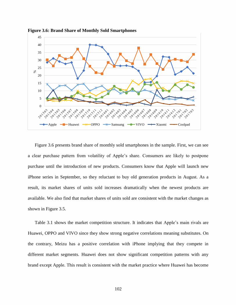
102
Figure 3.6: Brand Share of Monthly Sold Smartphones
Figure 3.6 presents brand share of monthly sold smartphones in the sample. First, we can see
a clear purchase pattern from volatility of Apple’s share. Consumers are likely to postpone
purchase until the introduction of new products. Consumers know that Apple will launch new
iPhone series in September, so they reluctant to buy old generation products in August. As a
result, its market shares of units sold increases dramatically when the newest products are
available. We also find that market shares of units sold are consistent with the market changes as
shown in Figure 3.5.
Table 3.1 shows the market competition structure. It indicates that Apple’s main rivals are
Huawei, OPPO and VIVO since they show strong negative correlations meaning substitutes. On
the contrary, Meizu has a positive correlation with iPhone implying that they compete in
different market segments. Huawei does not show significant competition patterns with any
brand except Apple. This result is consistent with the market practice where Huawei has become
0
5
10
15
20
25
30
35
40
45%
Apple Huawei OPPO Samsung VIVO Xiaomi Coolpad

103
Apple’s main challenger. In addition, OPPO and VIVO represent a strong supplementary relation
because they belong to the same manufactory BBG, and attract different target group—OPPO
being good at camera, while VIVO having an advantage in high-qualified hi-fi music system.
Table 3.1: Correlation Test among Smartphone Brands Apple Huawei Meizu OPPO Samsung VIVO Xiaomi Coolpad ZTE
Apple 1
Huawei -0.63*** 1
Meizu 0.57*** -0.27 1
OPPO -0.54*** 0.11 -0.73*** 1
Samsung 0.17 -0.01 0.67*** -0.58*** 1
VIVO -0.66*** 0.12 -0.71*** 0.84*** -0.64*** 1
Xiaomi -0.04 -0.06 -0.08 -0.34* -0.25 -0.02 1
Coolpad 0.01 0.05 0.38* -0.66*** 0.65*** -0.50** 0.24 1
ZTE 0.23 -0.25 0.34* -0.44** 0.38* -0.41** -0.03 0.31 1
Note: ***, **, and * denote significant at 1%, 5% and 10% respectively.
In China domestic smartphone market, products are usually divided into three segments
based on listed prices. The low-end products correspond to smartphones sold at a price of less
than RMB ¥1,200.61 The high-end products are those with listed prices higher than RMB ¥3,000.
The middle range products are all smartphones with prices in between. Accordingly, 37% of
smartphones fall into the low-end segments; 45% belong to the middle-range segments; and
high-end segment is composed of 18% smartphones. Figure 3.7 reports the average selling price
by price segments. In 2015, prices for all segments seldom changed. However, the smartphone
industry experienced a sharp price drop in May and June 2016. The average price of high-end
products dropped 30% at that time. This is probably due to the fierce competition in China
market.
61 1 US dollar (USD) ≈ 6.4 Chinese Yuan (CNY).

104
Figure 3.7: Average Selling Price across Price Segments
4. Feature Sentiment Classification
In this section, I briefly introduce the process of creating feature opinions. I first work on the
tasks of similar feature clustering and extraction of polarity words. Then I use the machine
learning method—Support Vector Machine (SVM) for sentiment classification. Figure 3.8
illustrates the basic framework of the process.
Figure 3.8: The Framework of Smartphones’ Feature Sentiment Classification
0
1000
2000
3000
4000
5000
6000A
ver
age
Pri
ce (
¥)
Low-end:<¥1200 Mid-range:¥1200<¥3000 High-end:¥3000+
Negative
Positive
Words Vectors Similar
Features
Comment
Data
Sentences
Words Vectors Feature
Vectors
word2vec
SVM Lexicon-based
Clustering
Segmenting

105
4.1. Similar Features Clustering
In Chinese comments, many different words can be used to express the same product feature.
Therefore, we need to group these domain synonyms under the same feature group. To do this, I
first adopt Jieba, a Chinese text segmentation package, to segment texts into different words.
Jieba also tag each word with a pre-defined part-of-speech (POS) tag, which can be used to
deleting meaningless or stop words. After dropping these words and punctuation characters, I get
a training file where words are separated by spaces. In the second step, I use word2vec to learn
the vector representations of words. Word2vec takes as its input a large corpus of text and
produces a vector space, typically of several hundred dimensions, with each unique word in the
corpus being assigned a corresponding vector in the space.62 Finally, word2vec enable me to
calculate the cosine distances between words to achieve the target of synonyms clustering.63
4.2. Sentiment Classification
In the sentiment classification, I segment each comment text into sentences using punctuation
characters. I find that one sentence mainly expresses one feature at a time. After segmenting
sentences, I segment them into words and obtain vectors using word2vec. Before classification, I
use a lexicon-based method to select features. We need to construct a dictionary of sentiment
words and phrases associated with features. To do so, I first extract some positive and negative
words for each feature through manual annotation. Then I take them as input words and run the
distance command in word2vec to obtain more sentiment words. As a result, I expand the
original dictionaries. And then, I keep both the feature words and the sentiment words as the
final training features.
62 https://en.wikipedia.org/wiki/Word2vec 63 Word2vec reads every words and their corresponding vectors in the vector matrix and calculates the semantical
distances between input word and other words using cosine similarity. the higher the cosine value, the closer the two
words semantically. The calculation is done by the commend called distance in word2vec.

106
In machine learning, SVM is among the best supervised learning algorithms.64 Indeed, a lot
of previous researches have proven that SVM is highly effective and more robust in the work of
text classification (see e.g., Pang et al., 2002; Go et al., 2009; Tang et al.,2014; Zhang et
al.,2015). Due to this, I adopt SVM for sentiment classification in this paper.
I consider a linear classifier for a binary classification problem here with labels y and
features x . The basic idea behind the training procedure is to find a hyperplane (denoted by a
vector w ) such that the text vectors in one class are separated from those in the other and the
margin is as large as possible. Let 1,1y (corresponding to negative and positive) denote the
class labels and ,w b be the parameters. The classifier can be written as the following
optimization problem:
2
1
1min max 0,1
N
i i
i
y wx b wN
(3.1)
where the parameter determines the tradeoff between increasing the margin-size and ensuring
that the ix lie on the correct side of the margin. By solving for the Lagrangian dual of the above
problem, we obtain the following constrained optimization problem:
1
1 1 1
1max , , ,
2
N N N
N i i i i j j j
i i j
f c c c y c x x y c
(3.2)
1
. . 0,N
i i
i
s t c y
and 1
02
icN
for all i .
64 Some deep learning approaches, such as CNN, RNN, also have been used in sentiment classification. See e.g.
Glorot et al. (2011), Tang et al., (2015), and Lee et al. (2017), to only name a few.
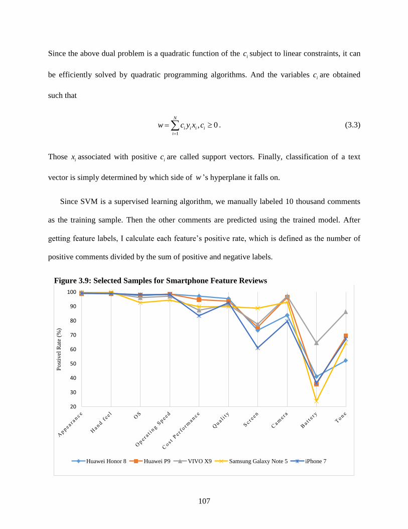
107
Since the above dual problem is a quadratic function of the ic subject to linear constraints, it can
be efficiently solved by quadratic programming algorithms. And the variables ic are obtained
such that
1
, 0N
i i i i
i
w c y x c
. (3.3)
Those ix associated with positive ic are called support vectors. Finally, classification of a text
vector is simply determined by which side of w ’s hyperplane it falls on.
Since SVM is a supervised learning algorithm, we manually labeled 10 thousand comments
as the training sample. Then the other comments are predicted using the trained model. After
getting feature labels, I calculate each feature’s positive rate, which is defined as the number of
positive comments divided by the sum of positive and negative labels.
Figure 3.9: Selected Samples for Smartphone Feature Reviews
20
30
40
50
60
70
80
90
100
Po
stiv
el R
ate
(%)
Huawei Honor 8 Huawei P9 VIVO X9 Samsung Galaxy Note 5 iPhone 7

108
I scraped 1.9 million user reviews data on JD.com, a Chinese electronic commerce company.
I only keep products with at least 400 reviews since the measure of feature reviews would have
large noises if the sample size is too small. I first extract 189 feature ratings on smartphones and
then keep 17 level-one most frequently commented features as the input of control variables.
After matching the smartphone models in the user data, I have 117 models for further analysis.
Figure 3.9 provides a features’ sentiment sample for five selected models. It shows that
appearance, hand feel, operating system, and quality tend to homogenize from one another. On
the other hand, smartphones are highly heterogeneous in terms of screen, camera, battery, and
tone. Samsung Galaxy Note 5 has the best screen but the worst battery ratings. And VIVO X9
leads in camera, battery and tone, which supports its fast growth in demand. The results indicate
that feature reviews indeed could capture the sources of product differentiation.
Table 3.2: Correlation Test among Observed Attributes and Feature Review Variables Attributes
Reviews
Screen
size
RAM ROM Two
sim
cards
CPU
GHz
Eight
core
CPU
Pixel Resolu-
tion
No. of
net types
Star Ratings 0.301* 0.394* 0.255* -0.050* 0.063* 0.092* -0.030* 0.115* 0.322*
Camera -0.080* 0.252* 0.095* -0.028* 0.101* -0.139* 0.016* 0.234* -0.035*
Memory 0.257* 0.335* 0.489* 0.135* 0.330* 0.291* 0.059* -0.059* 0.075*
Quality -0.013* -0.063* -0.108* -0.034* -0.157* 0.061* -0.120* -0.185* -0.031*
Battery 0.382* 0.073* 0.018* 0.142* -0.032* 0.001 0.123* -0.140* 0.186*
Signal 0.216* 0.041* 0.084* 0.157* 0.083* 0.228* -0.013* -0.064* -0.090*
Screen quality 0.490* 0.272* 0.180* 0.137* 0.069* 0.077* 0.164* 0.419* -0.041*
Cost performance -0.161* -0.468* -0.371* -0.104* -0.109* 0.047* 0.040* -0.258* -0.196*
Tone 0.236* 0.285* 0.260* 0.139* 0.250* 0.108* 0.096* 0.130* 0.003*
Operating system 0.275* 0.353* 0.244* -0.041* 0.288* -0.070* 0.183* 0.253* 0.272*
Operating speed 0.418* 0.465* 0.286* 0.074* 0.290* -0.068* 0.237* 0.375* 0.355*
Hand feel 0.135* 0.212* 0.206* -0.003* 0.312* -0.015* 0.043* 0.031* 0.007*
Heated-up -0.006* -0.097* -0.262* 0.183* -0.121* -0.095* 0.121* 0.062* -0.013*
Appearance 0.214* 0.168* 0.058* 0.016* -0.195* 0.106* 0.070* 0.131* 0.026*
Resolution 0.146* 0.148* 0.134* -0.116* 0.099* -0.147* 0.152* 0.458* 0.026*
Backup -0.458* -0.392* -0.310* -0.161* -0.312* -0.199* -0.264* -0.186* -0.066*
Screen size 0.472* 0.037* 0.029* 0.192* -0.019* 0.093* 0.075* 0.036* -0.182*
Note: * denotes significant at 1%.
Table 3.2 reports the pairwise correlations between observed attributes and review variables.
It shows that review variables have significant correlation with attribute variables at the 1%
significance level. The positive ratings on memory has a highly positive correlation with RAM

109
and ROM. Also screen quality shows a strong positive relationship with screen size and
resolution. Similarly, the positive correlation is also found in the following pairs: the positive
ratings on screen size with attribute screen size, reviews on resolution with attribute resolution,
and the positive ratings on operating speed with RAM and GPU GHz. The findings indicate that
reviews provide a source of information to reflect the quality level of observed attributes. As a
corollary, I expect that review variables can also work as proxies for unmeasured and omitted
variables.
5. A Hedonic Pricing Model
In this section, I use the hedonic price method to investigate the relative importance of feature
reviews. Hedonic pricing theory states that the price of a product is determined both by its own
characteristics and external factors such as competition environment and the characteristics of
substitutes or complements (Rosen, 1974). Usually, the price of a smartphone is affected by the
attributes of the product itself (e.g. screen size, RAM, ROM, and its camera), the attributes of its
competitors, and the market environment (e.g. the number of brands, and the number of
competitive products in the same price segment). In addition, bad consumer reviews would give
producer a downward pricing pressure. Therefore, I also include information from reviews into
the hedonic pricing model. The model is written as follows:
0 1 2 3 1 2 3
, , , ; , , ;s s s
jt jt jt jt t j j j jt
s s
jt jt jt j j j t jt
p W z z z T C
z z z T
(3.4)
where s
jtp is the price of product j in segment s at time t . W is a function of observed
variables and C is a control function of unobserved review variables. jtz is a vector of cell
phone attributes including model age, number of net types, screen size, CPU manufactory

110
dummies, brand dummies, RAM, ROM, and pixel and so on. Number of substitutes is also
included in jtz . jtz and s
jtz stand for the average product attributes of all substitutes and those
belonging to the same segment s . j is a vector of feature review variables, such as battery,
appearance, and screen. Similarly, j and s
j are the average feature ratings for product j ’s
substitutes. tT captures the time trend of pricing. , are parameters of interest, especially,
1 1, . Finally, jt is the error term.
6. A Static Discrete Choice Model
I then develop a conditional logit discrete choice model to test the estimation sensitivity to
review variables. There are 117 available cell phone models in estimating the static model. The
utility of consumer i using a cell phone tj J , where tJ is the choice set, at time t is given by
0ijt ijt ijt jt jt ijt ijtu U z p x (3.5)
=ijt j ijt (3.6)
where ijtx is a vector of interaction terms between attribute dummies and consumer specific
characteristics.65 Consumer characteristics include gender, age, one period lagged data flow, one
period lagged payment, and brand loyalty dummy. jtz , jtp and j have been defined in equation
(3.4). The error term ijt includes the unobserved review variables and a random shock ijt which
follows an i.i.d. Gumbel distribution. Since we posit that price is correlated with unobserved
attributes, the dependence of jtp on ijt will induce an inconsistent estimated coefficient on price
65 This is also called a mixed logit model when interaction terms are included in the model. See Hoffman and
Duncan (1988) for detail.

111
using model (3.5). We expect that the bias will be reduced after introducing review variables into
the model. Combining equation (3.5) and (3.6), the utility function becomes
0ijt ijt ijt jt jt ijt j ijtu V z p x (3.7)
The conditional logit model specifies the probability of product choice for consumer i at
time t as
exp| , ,
expt
ijt
it it jt j
iktk J
VP y j x z
V
(3.8)
The model can be estimated by ML estimation. The likelihood function is given by
| , ,ijtd
it it jt j
i t j
L P y j x z (3.9)
where 0 , , , is the vector of parameters to be estimated and 1ijtd if j is selected, 0
otherwise. Accordingly, the log-likelihood function is
ln | , ,
ln expt
ijt it it jt j
i t j
ijt ijt iktk Ji t j
LL d P y j x z
d V V
. (3.10)
7. Estimation Results
The estimated results of the hedonic price regression are reported in Table 3.3. Column (1) ((2))
shows the results by excluding (including) the control function of unobserved feature review
variables in the regression. The adjusted R2 values indicate that the models can explain 90% and
94% of the variance in smartphone prices. In the industrial practice, 4% is considered as a big
improvement in the prediction accuracy. Since product attributes are correlated with associated

112
reviews, the coefficients are biased when we drop the control function to the error term. When
we include feature variables into the model, as shown in column (2) of Table 3.3, both the
magnitude and the sign of some variables change a lot. For example, the time trend in column (1)
is positive which is contrast to our intuition as we have obtained from Figure 3.7. We get the
correct time trend after introducing feature reviews. As a result, we only focus on the analysis of
the importance of feature attributes and reviews in column (2).
As expected, the number of rivals increase the competition and induce to a downward pricing
pressure. Also, holding other variables constant, the phone using eight core CPU is on average
¥128 cheaper than those with less cores. Consistent to industry practice, the coefficients on
model age and its squared term indicate that price begins to drop after 11.8 months. This is the
usual time interval that suppliers introduce new models into the market. On the other hand,
screen size, RAM, ROM, double sim cards, high speed CPU, and pixel, and resolution all play
important positive role in determining the listing price. This is mainly due to the high costs in
improving these attributes. Unsurprisingly, Apple products lead the high-end market and prices
are ¥2,114 higher than other products. As a comparison, Android products, on average, are much
cheaper than Apple products. In addition, Qualcomm, Mediatek and Hisilicon’s CPUs lower
prices around ¥500 compared to Samsung CPU.
My primary interest is the relationship between price and review variables. Overall, price is
positively correlated with star ratings, which reflect the popularity and the satisfactory of a
product. The attributes consumers are mostly interested in are camera, operating speed,
appearance and screen. These attributes show positive effect on price since they are associated
with materials in high quality, and hence high production cost. Other feature reviews, however,
are negatively correlated with price. One possible reason is that feature ratings are commented
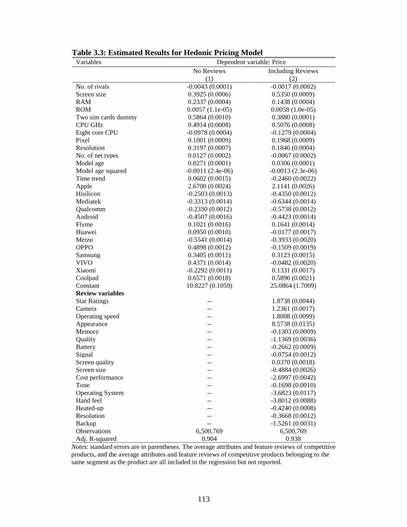
113
Table 3.3: Estimated Results for Hedonic Pricing Model
Variables Dependent variable: Price
No Reviews
(1)
Including Reviews
(2)
No. of rivals -0.0043 (0.0001) -0.0017 (0.0002)
Screen size 0.3925 (0.0006) 0.5350 (0.0009)
RAM 0.2337 (0.0004) 0.1438 (0.0004)
ROM 0.0057 (1.1e-05) 0.0058 (1.0e-05)
Two sim cards dummy 0.5864 (0.0010) 0.3880 (0.0001)
CPU GHz 0.4914 (0.0008) 0.5076 (0.0008)
Eight core CPU -0.0978 (0.0004) -0.1279 (0.0004)
Pixel 0.1001 (0.0009) 0.1968 (0.0009)
Resolution 0.3197 (0.0007) 0.1846 (0.0004)
No. of net types 0.0127 (0.0002) -0.0067 (0.0002)
Model age 0.0271 (0.0001) 0.0306 (0.0001)
Model age squared -0.0011 (2.4e-06) -0.0013 (2.3e-06)
Time trend 0.0602 (0.0015) -0.2460 (0.0022)
Apple 2.6700 (0.0024) 2.1141 (0.0026)
Hisilicon -0.2503 (0.0013) -0.4350 (0.0012)
Mediatek -0.3313 (0.0014) -0.6344 (0.0014)
Qualcomm -0.2330 (0.0012) -0.5738 (0.0012)
Android -0.4507 (0.0016) -0.4423 (0.0014)
Flyme 0.1021 (0.0016) 0.1641 (0.0014)
Huawei 0.0950 (0.0010) -0.0177 (0.0017)
Meizu -0.5541 (0.0014) -0.3933 (0.0020)
OPPO 0.4898 (0.0012) -0.1509 (0.0019)
Samsung 0.3405 (0.0011) 0.3123 (0.0015)
VIVO 0.4371 (0.0014) -0.0482 (0.0020)
Xiaomi -0.2292 (0.0011) 0.1331 (0.0017)
Coolpad 0.6571 (0.0018) 0.5896 (0.0021)
Constant 10.8227 (0.1059) 25.0864 (1.7009)
Review variables
Star Ratings -- 1.8738 (0.0044)
Camera -- 1.2361 (0.0017)
Operating speed -- 1.8008 (0.0099)
Appearance -- 8.5738 (0.0135)
Memory -- -0.1303 (0.0009)
Quality -- -1.1369 (0.0036)
Battery -- -0.2662 (0.0009)
Signal -- -0.0754 (0.0012)
Screen quality -- 0.0370 (0.0018)
Screen size -- -0.4884 (0.0026)
Cost performance -- -2.6997 (0.0042)
Tone -- -0.1698 (0.0010)
Operating System -- -3.6823 (0.0117)
Hand feel -- -3.8012 (0.0088)
Heated-up -- -0.4240 (0.0008)
Resolution -- -0.3668 (0.0012)
Backup -- -1.5261 (0.0031)
Observations 6,500,769 6,500,769
Adj. R-squared 0.904 0.938
Notes: standard errors are in parentheses. The average attributes and feature reviews of competitive
products, and the average attributes and feature reviews of competitive products belonging to the
same segment as the product are all included in the regression but not reported.

114
given the price of the product. For instance, although a product’s quality is low compared to
others, consumer may still give a positive review on it when the low price is taken into
consideration. Finally, the negative coefficient on backup implies that a phone model labeled as a
backup, that is, as a second phone for emergency, is associated with a much lower price.
Turning to the discrete choice model, Table 3.4 and 3.5 give the estimated results. Table 3.4
includes the estimates for product attributes and feature reviews. And Table 3.5 shows the results
for mixed terms between product attributes and consumer characteristics. The first column gives
the model without any control for the correlation between product attributes and unobserved
feature reviews. The second column reports the adjusted results by applying review variables as
controls.
The statistically significant correlation between price and review variables indicates that the
coefficients in column (1) are implausible. Without reviews, the price coefficient is estimated to
be insignificant at a positive level 0.007. This contradicts our expectation of downward sloping
demand. As a result, this model is implausible for prediction and welfare analysis. As shown in
column (2), however, we obtain a significant negative price coefficient, -0.07. The estimated
price coefficient is adjusted in the expected way after including review variables. Screen size is
the most import attribute in determining a product’s price. As expected, the coefficients on it also
adjust from positive to negative by applying controls.
Some attributes enter with same signs in both models. Consumers prefer models with bigger
RAM, higher CPU GHz and eight core CPU. This might imply that consumers prefer products
work well in the aspect of fast operation. In addition, pixel makes a positive contribution to
consumer demand. The coefficient of resolution, however, is significant and negative, an
implausible sign. This result, to some extent, is resulted from the high multi-collinearity between

115
Table 3.4: Estimated Results for Conditional Logit Model
Variables Excluding Reviews
(1)
Including Reviews
(2)
Price 0.0074 (0.0135) -0.0727 (0.0195)
Screen size 1.1667 (0.0197) -0.7085 (0.0509)
RAM 0.1218 (0.0160) 0.1507 (0.0194)
ROM -0.0164 (0.0008) -0.0035 (0.0009)
Two sim cards dummy -0.5115 (0.0539) -0.9785 (0.0671)
CPU GHz 0.9743 (0.0298) 0.4316 (0.0394)
Eight core CPU 0.1293 (0.0145) 0.0619 (0.0232)
Pixel 0.0901 (0.0376) 0.4158 (0.0543)
Resolution -0.1815 (0.0128) -0.3382 (0.0195)
No. of net types 0.1922 (0.0057) 0.0779 (0.0074)
Model age 0.2431 (0.0024) 0.2588 (0.0031)
Model age squared -0.0033 (5.1e-05) -0.0031 (0.0001)
Apple 6.2409 (0.1350) 2.7428 (0.2012)
Hisilicon -0.6793 (0.0369) 0.2005 (0.0658)
Mediatek -0.0554 (0.0436) 1.8984 (0.0741)
Qualcomm 0.0500 (0.0370) 1.0818 (0.0629)
Android 1.4565 (0.0852) 0.0328 (0.1025)
Flyme -1.3533 (0.2233) -0.1948 (0.2264)
Huawei 3.4979 (0.0915) 0.8668 (0.1550)
Meizu 3.3770 (0.0974) -0.0297 (0.1911)
OPPO 4.0432 (0.0959) 0.4030 (0.1502)
Samsung 2.7336 (0.0915) 0.9375 (0.1408)
VIVO 3.3956 (0.1019) -0.0828 (0.1662)
Xiaomi 1.4761 (0.0960) 0.5648 (0.1584)
Coolpad 2.1332 (0.1132) -1.2670 (0.1658)
Review Variables
Star ratings -- 4.4472 (0.2543)
Camera -- 2.7820 (0.0857)
Memory -- 0.1481 (0.0494)
Quality -- -2.2960 (0.2270)
Battery -- 0.1722 (0.0454)
Signal -- 0.1580 (0.0635)
Screen quality -- 3.3287 (0.1030)
Screen size -- -0.5469 (0.1295)
Cost performance -- -4.0461 (0.2247)
Tone -- 0.5761 (0.0529)
Operating System -- 5.8224 (0.8209)
Operating speed -- 2.2125 (0.6269)
Hand feel -- 1.2807 (0.4394)
Heated-up -- 0.8817 (0.0409)
Appearance -- 3.4083 (0.6849)
Resolution -- -1.0933 (0.0577)
Backup -- -6.3480 (0.1941)
Observations 6,499,342 6,499,342
Pseudo R2 0.249 0.259
Notes: standard errors are reported in parentheses.

116
pixel and resolution. The negative sign on ROM implies that not bigger is better. There is a
tradeoff between bigger ROM and higher price when a consumer makes purchase decisions.
The last attribute deserves to be mentioned is the two sim cards dummy. Due to the special
communication market structure in China, it is common for people to choosing two sim cards
from competitive communication operators for different purposes. Therefore, mobile phone
manufacturers make two sim cards design to compete in this market segment. As a result, we
expect the negative coefficient on it because products tend to convergence in terms of this
attribute, where 90% of products have this feature in the data sample, and the left are high-end
products, like iPhone.
When it comes to feature review variables, most of them show that the higher positive rating is,
the higher demand for it. For example, higher star rating, better camera, larger memory, and
better battery will increase the probability of purchase. The heat-up variable measures the
proportion of consumers describing if the phone has a heat-up problem. Although a higher
heated-up rate is a bad signal, it increases the probability of consumers’ choices. I expected this
result because heated-up problem is highly correlated with preferred fast operation. On the other
hand, some features show the opposite effect. Both quality and cost performance measure the
relative product quality level given price. The estimated negative coefficients of them might
imply that it is not always a wise competition strategy by lowering prices. Similarly, the negative
sign on backup indicates that a backup label lowers consumers’ purchase expectation when the
purpose of purchase is for daily use.
I also have interested in the heterogeneous preference on product attributes among consumer
groups. Table 3.5 shows the estimated coefficients for mixed terms between product attributes
and consumer characteristics. Their estimated coefficients are fairly similar in both models. The

117
results imply that keeping everything equal, elder consumers tend to purchase phones with larger
size, higher pixel, bigger RAM and ROM, age under one year, and two sim card allowed.
Consumers showing brand loyalty prefer the opposite compared to elder group. Young people
with brand loyalty are more likely to obtain high-end products. In terms of product attributes, the
results show that female and older consumers tend to purchase large size phones. Consumers
with brand loyalty, heavy data usage, and more payment have less incentive to purchase large
size models. For pixel, those who are elder male, using a lot of data every month, are more likely
to purchase a product with higher pixel. Male consumers with heavy data usage also prefer big
RAM phones. These results might imply that suppliers can provide high pixel and big RAM
phones for game lovers who care about fast operation and high pixel when playing games. On
the contrary, females who spend less but use more data like big ROM phones. Big ROM enables
them to save more photos and videos. In addition, rich males with heavy data usage are the
potential buyers of new launched models. Males with less data usage are more likely to purchase
phones with two sim card slots. Finally, in the high-end segment, consumers show the following
characteristics, younger, male, high brand loyalty, heavy data usage and high-income. This
implies that individuals in this group should be the ads target when new models are introduced to
the market.
To summarize, feature reviews are significantly correlated with price. They also provide
additional prediction power on pricing. The pricing prediction accuracy increases 4% with
review variables, which is considered as a significant improvement from the industrial practice
point of view. In the discrete choice model, the estimated price coefficient is biased in the
positive direction without endogeneity correction. It is adjusted in the expected way after
including review variables. The coefficients on screen size are also adjusted from positive to

118
Table 3.5: Estimated Results for Conditional Logit Model (Continued)
Variables No Reviews
(1)
Including Reviews
(2)
Large size = 1 if screen size > 5
Large size × age 0.0014 (0.0009) 0.0048 (0.0009)
Large size × male -0.2740 (0.0206) -0.2759 (0.0212)
Large size × loyalty -0.4915 (0.0364) -0.1486 (0.0395)
Large size × data flow -0.0485 (0.0086) -0.0161 (0.0082)
Large size × payment -0.1917 (0.0197) -0.1383 (0.0195)
High pixel = 1 if pixel > 1,300
High pixel × age 0.0080 (0.0009) 0.0097 (0.0010)
High pixel × male 0.0598 (0.0281) 0.0685 (0.0279)
High pixel × loyalty -0.2550 (0.0412) -0.2521 (0.0418)
High pixel × data flow 0.0941 (0.0121) 0.1060 (0.0120)
High pixel × payment -0.0716 (0.0251) -0.0475 (0.0245)
Big RAM = 1 if RAM > 2 GB
Big RAM × age 0.0067 (0.0010) 0.0052 (0.0011)
Big RAM × male 0.3065 (0.0276) 0.3006 (0.0285)
Big RAM × loyalty -0.1402 (0.0440) -0.1708 (0.0470)
Big RAM × data flow 0.1077 (0.0121) 0.1105 (0.0123)
Big RAM × payment 0.0382 (0.0284) 0.0278 (0.0289)
Big ROM = 1 if ROM > 32 GB
Big ROM × age 0.0103 (0.0011) 0.0020 (0.0011)
Big ROM × male -0.1216 (0.0319) -0.1697 (0.0318)
Big ROM × loyalty -0.2943 (0.0467) -0.5115 (0.0466)
Big ROM × data flow 0.1102 (0.0129) 0.0915 (0.0130)
Big ROM × payment -0.0595 (0.0279) -0.0333 (0.0278)
New = 1 if model age <=12 months
New × age 0.0176 (0.0007) 0.0182 (0.0007)
New × male 0.0466 (0.0162) 0.0389 (0.0164)
New × loyalty -0.7668 (0.0276) -0.7940 (0.0280)
New × data flow 0.1426 (0.0066) 0.1479 (0.0067)
New × payment 0.0595 (0.0127) 0.0301 (0.0129)
Sksd = 1 if two sim cards allowed
Sksd × age 0.0073 (0.0011) 0.0069 (0.0012)
Sksd × male 0.3003 (0.0280) 0.3223 (0.0289)
Sksd × loyalty -0.0866 (0.0533) -0.1907 (0.0553)
Sksd × data flow -0.2597 (0.0128) -0.2878 (0.0131)
Sksd × payment 0.2192 (0.0281) 0.1783 (0.0286)
Seg3 = 1 if birth price > ¥3,000
Seg3 × age -0.0148 (0.0008) -0.0137 (0.0008)
Seg3 × male 0.0368 (0.0224) 0.0420 (0.0222)
Seg3 × loyalty 0.3289 (0.0365) 0.3145 (0.0366)
Seg3 × data flow 0.1328 (0.0104) 0.1186 (0.0102)
Seg3 × payment 0.6093 (0.0235) 0.6024 (0.0230)
Observations 6,499,342 6,499,342
Pseudo R2 0.249 0.259
Notes: standard errors are reported in parentheses.
negative by applying controls. The findings indicate that consumer reviews provide alternative
sources of information in dealing with endogeneity in discrete choice models. Finally, the

119
analysis on consumer preferences shows that individuals show significant heterogeneous
preference on product attributes. The finding can help smartphone vendors locate target group
through advertising.
8. Conclusions and Future Research
This paper investigates how rich sources of information on consumer reviews can help to address
the endogeneity problem in discrete choice models. Instead of identifying unobserved product
quality in terms of a scalar variable as seen in previous methods, I explicitly express the control
variable as a function of feature review variables. A hedonic pricing model is first used to test the
relative importance and prediction power of feature reviews. This paper then discusses the
performance of feature reviews in addressing endogeneity in a conditional logit discrete choice
model with an application to individuals’ choices among smartphone options.
I find that when the review variables are included into the hedonic pricing regression, both
the magnitude and the sign of product attributes change dramatically. The pricing prediction
accuracy increases 4% with review variables, which is considered as a significant improvement
from the industrial practice point of view. In the discrete choice model, the estimated price
coefficient is biased in the positive direction without endogeneity correction. It is adjusted in the
expected way after including review variables. The coefficients on screen size are also adjusted
from positive to negative by applying controls. The findings indicate that consumer reviews
provide alternative sources of information in dealing with endogeneity in discrete choice models.
Notice that the analysis only compares the performance between models with and without
review information. In the future work, I will provide more comparison with other approaches.
The residual from the hedonic pricing regression can be used as the control function as seen in
the control-function method. In the latent-variable approach, a latent variable can be written as a

120
function of both observed attributes and review variables. In this way, I can analyze the
similarities and differences between the review-variable method and the alternative approaches.
Like other high-tech markets, such as digital cameras and laptops, a consumer’s replacement
decision is dynamic because of the rapid improvements in quality and falling prices. Therefore, a
dynamic model is needed to capture consumers’ smartphone replacement and switching
behavior.66 As a future work, I will develop and estimate the dynamic model using the individual
level data and product reviews data. The model enables us to analyze the improvement of
identification when unobserved product attributes are available. It can also help understand the
pattern of dynamics in consumer preferences.
66 A line of research has studied durable goods using dynamic modellings. See, e.g. Gordon (2009), Lou et al. (2012),
Yang (2010), Gowrisankaran and Rysman (2012), and Shcherbakov (2016).

121
9. References
Amil Petrin, and Train, K. (2010). A Control Function Approach to Endogeneity in Consumer
Choice Models. Journal of Marketing Research, 47(1), 3-13.
Berry, S., Levinsohn, J., and Pakes, A. (1995). Automobile prices in market equilibrium.
Econometrica: Journal of the Econometric Society, 841-890.
Berry, S., Levinsohn, J., and Pakes, A. (2004). Differentiated products demand systems from a
combination of micro and macro data: The new car market. Journal of Political Economy,
112(1), 68-105.
Berry, S. T. (1994). Estimating discrete-choice models of product differentiation. The RAND
Journal of Economics, 242-262.
Carranza, J. E. (2010). Product innovation and adoption in market equilibrium: The case of
digital cameras. International Journal of Industrial Organization, 28(6), 604-618.
Cecere, G., Corrocher, N., and Battaglia, R. D. (2015). Innovation and competition in the
smartphone industry: Is there a dominant design? Telecommunications Policy, 39(3-4),
162-175.
Chevalier, J., and Goolsbee, A. (2009). Are Durable Goods Consumers Forward-Looking?
Evidence from College Textbooks*. The Quarterly journal of economics, 124(4), 1853-
1884.
Février, P., and Wilner, L. (2016). Do consumers correctly expect price reductions? Testing
dynamic behavior. International Journal of Industrial Organization, 44, 25-40.
Glorot, X., Bordes, A., and Bengio, Y. (2011). Domain adaptation for large-scale sentiment
classification: A deep learning approach. Paper presented at the Proceedings of the 28th
international conference on machine learning (ICML-11).
Go, A., Bhayani, R., and Huang, L. (2009). Twitter sentiment classification using distant
supervision. CS224N Project Report, Stanford, 1(12).
Gordon, B. R. (2009). A dynamic model of consumer replacement cycles in the PC processor
industry. Marketing Science, 28(5), 846-867.
122
Gowrisankaran, G., and Rysman, M. (2012). Dynamics of consumer demand for new durable
goods. Journal of Political Economy, 120(6), 1173-1219.
Guevara, C., and Ben-Akiva, M. (2006). Endogeneity in residential location choice models.
Transportation Research Record: Journal of the Transportation Research Board (1977),
60-66.
Guevara, C. A., and Ben-Akiva, M. (2010). Addressing endogeneity in discrete choice models:
Assessing control-function and latent-variable methods. Paper presented at the Choice
Modelling: The State-of-the-Art and the State-of-Practice: Proceedings from the
Inaugural International Choice Modelling Conference.
Hoffman, S. D., and Duncan, G. J. (1988). Multinomial and conditional logit discrete-choice
models in demography. Demography, 25(3), 415-427.
Lee, G., Jeong, J., Seo, S., Kim, C., and Kang, P. (2017). Sentiment Classification with Word
Attention based on Weakly Supervised Leaning. arXiv preprint arXiv:1709.09885.
Li, S., Lee, S. Y. M., Chen, Y., Huang, C.-R., and Zhou, G. (2010). Sentiment classification and
polarity shifting. Paper presented at the Proceedings of the 23rd International Conference
on Computational Linguistics.
Lou, W., Prentice, D., and Yin, X. (2012). What difference does dynamics make? The case of
digital cameras. International Journal of Industrial Organization, 30(1), 30-40.
Melnikov, O. (2013). Demand for differentiated durable products: The case of the US computer
printer market. Economic Inquiry, 51(2), 1277-1298.
Pang, B., Lee, L., and Vaithyanathan, S. (2002). Thumbs up?: sentiment classification using
machine learning techniques. Paper presented at the Proceedings of the ACL-02
conference on Empirical methods in natural language processing-Volume 10.
Prince, J. T. (2008). Repeat purchase amid rapid quality improvement: Structural estimation of
demand for personal computers. Journal of Economics & Management Strategy, 17(1), 1-
33.

123
Rosen, S. (1974). Hedonic prices and implicit markets: product differentiation in pure
competition. Journal of Political Economy, 82(1), 34-55.
Schiraldi, P. (2011). Automobile replacement: a dynamic structural approach. The RAND
Journal of Economics, 42(2), 266-291.
Shcherbakov, O. (2016). Measuring consumer switching costs in the television industry. The
RAND Journal of Economics, 47(2), 366-393.
Tang, D., Qin, B., and Liu, T. (2015). Learning semantic representations of users and products
for document level sentiment classification. Paper presented at the Proceedings of the
53rd Annual Meeting of the Association for Computational Linguistics and the 7th
International Joint Conference on Natural Language Processing (Volume 1: Long Papers).
Tang, D., Wei, F., Yang, N., Zhou, M., Liu, T., and Qin, B. (2014). Learning sentiment-specific
word embedding for twitter sentiment classification. Paper presented at the Proceedings
of the 52nd Annual Meeting of the Association for Computational Linguistics (Volume 1:
Long Papers).
Walker, J., and Ben-Akiva, M. (2002). Generalized random utility model. Mathematical social
sciences, 43(3), 303-343.
Xianghua, F., Guo, L., Yanyan, G., and Zhiqiang, W. (2013). Multi-aspect sentiment analysis for
Chinese online social reviews based on topic modeling and HowNet lexicon. Knowledge-
Based Systems, 37, 186-195.
Yang, Y. H. (2010). Identification of consumer switching behavior with market level data.
Unpublished manuscript, University of California at Los Angeles.
Zhang, D., Xu, H., Su, Z., and Xu, Y. (2015). Chinese comments sentiment classification based
on word2vec and SVMperf. Expert Systems with Applications, 42(4), 1857-1863.

APPENDIX

125
Appendix A: Supplement Tables for Chapter 1
Table A1: Summary Statistics 2006: Q1-2014: Q4
Variable Definition Mean Std. Dev.
Price of segment 1a ($100) Average fare paid by passengers for segment 1. 2.39 0.36
Price of segment 2a Average fare paid by passengers for segment 2. 3.63 0.26
Price of segment 3a Average fare paid by passengers for segment 3. 5.95 0.83
Share of segment 1 Share of revenues of segment 1. 0.37 0.22
Share of segment 2 Share of revenues of segment 2. 0.27 0.12
Share of segment 3 Share of revenues of segment 3. 0.36 0.20
Number of market passengers
(1000)
Total passengers for a specific ticket class on a route. 8.54 17.95
Number of flights (100) Total market departures on a directional city pair. 15.30 15.96
City distance (1000 miles) Distance flown between the origin and destination
cities.
1.08 0.60
Number of carriers Number of carriers offering service in a market. 5.37 2.21
Number of LCCs Number of destinations served by the carrier from the
destination city.
3.40 4.48
Tourist city 1 if the destination city is located in Florida or
Nevada; 0 otherwise.
0.10 0.30
Slot control 1 if either the origin, the connecting airport, or the
destination is under slot control;0 otherwise.
0.17 0.37
Oil pricea Quarterly average price of crude oil 70.23 13.65
Population (millions) Geometric mean of the population of the end cities. 0.80 0.56
Unemployment rate (%) Arithmetic mean of unemployment rates at endpoints
weighted by city populations.
7.14 2.16
Mean income ($1000) Geometric mean of income per capita of the
endpoints.
33.68 2.64
Observations 95,641 Source: DB1B, T-100 Domestic Segment Data, Population census from the Bureau of Statistics, and Bureau of Labor Statistics. a inflation-adjusted.

126
Table A2: Validity Tests of the Instruments in the Flight Frequency and Fare Equations Instrumental variables Depend variable:
log number of
flights
(1)
Dependent variable:
log number of
carriers
(2)
Dependent variable:
number of LCCs
(3)
Dependent variable:
Log number of
market passengers
(4)
Demeaned log number of flights 0.7790
(0.0111)
Demeaned log number of carriers 0.8271
(0.0057)
Demeaned number of LCCs 1.1032
(0.0076)
Tourist city 1.0479
(0.0743)
Temperature difference between
origin and destination
0.0070
(0.0002)
Demeaned log geometric mean
income per capita of the end-
point states
0.5353
(0.0722)
Instruments for other endogenous
variables and exogenous
regressors included?
Yes Yes Yes Yes
Observations 95,641 95,641 95,641 95,641
Note: Standard errors are in parentheses.
Table A3: Validity Tests of the Instruments in the Bottom-Level Demand Equations Instrumental variables Dependent variable: log
price of segment 1
(1)
Dependent variable: log
price of segment 2
(2)
Dependent variable: log
real expenditure
(3)
Log price of segment 1 of similar markets 0.0699 (0.0055) Log price of segment 2 of similar markets 0.4404 (0.0045)
Demeaned log geometric mean population of the end-
point cities
1.2670 (0.0457)
Demeaned log geometric mean income per capita of
the end-point states
1.2872 (0.0649)
Instruments for other endogenous variables and exogenous regressors included?
Yes Yes Yes
Observations 95,641 95,641 95,641
Note: Standard errors are in parentheses.

127
Table A4: Validity Tests of the Instruments in the Top-Level Demand Equation Instrumental variables Dependent
variable: market price index
(1)
Dependent
variable: log flight frequency
(2)
Dependent
variable: log geometric
mean
population of the end-point
cities
(3)
Dependent
variable: log geometric
mean income
per capita of the end-point
states
(4)
Dependent
variable: log arithmetic
mean
unemployment rate of the
end-point
states (5)
Log price of similar markets 0.1831
(0.0051)
Demeaned first-difference of one-year lag log flight frequency
0.4994 (0.0023)
Demeaned log geometric mean population of
the end-point cities
0.7641
(0.0781)
Demeaned log geometric mean income per
capita of the end-point states
0.9782
(0.0164)
Demeaned log arithmetic mean unemployment rate of end-point states
0.9203 (0.0041)
Instruments for other endogenous variables and
exogenous regressors included?
Yes Yes Yes Yes Yes
Observations 95,641 95,641 95,641 95,641 95,641
Note: Standard errors are in parentheses.
Table A5: Robustness Check--2SLS Estimates of Frequency Effects of the DL/NW Merger
Variables Short-run effect
(1)
Long-run effect
(2)
Post DN -0.0407 (0.0091) 0.0168 (0.0186)
Post One 0.0239 (0.0095) 0.0222 (0.0170)
Post Two 0.0314 (0.0089) 0.1054 (0.0163)
Log number of passengers 0.1109 (0.0062) 0.0939 (0.0107)
Log geometric mean population of the end-point cities 0.2712 (0.1239) -0.0628 (0.1610)
Log number of carriers 0.5693 (0.0095) 0.6044 (0.0149)
Number of LCCs 0.0062 (0.0016) -0.0085 (0.0034)
Log number of cities connected to the end-point cities 1.8499 (0.2090) 3.3598 (0.3706)
Log distance 0.0851 (0.0229) 0.1467 (0.0294)
Log distance squared -0.0786 (0.0207) -0.0276 (0.0256)
Log maximal temperature difference between January
and July at the end-point cities
-0.0418 (0.0145) -0.1229 (0.0329)
Number of controlled markets 546 522
Number of markets 2,911 2,890
Observations 24,874 12,941
Notes: Year and quarter fixed effects and random market effects are included in all the regressions. Random market
trend is considered in this model. We use demeaned first-difference of one-year lag endogenous variables as
instruments. Standard errors are in parentheses.

128
Table A6: Robustness Check --2SLS Estimates of Price Effects of the DL/NW Merger Variables Log price of segment 1
(1)
Log price of segment 2
(2)
Log price of segment 3
(3)
Panel A. Short-run effect
Post DN -0.0129 (0.0055) -0.0095 (0.0022) -0.0308 (0.0065)
Post One -0.0160 (0.0055) 0.0079 (0.0022) 0.0032 (0.0065)
Post Two -0.0097 (0.0055) 0.0118 (0.0024) -0.0015 (0.0062)
Log number of passengers -0.0341 (0.0031) -0.0060 (0.0011) -0.0182 (0.0037)
Log number of flights 0.0079 (0.0061) -0.0024 (0.0025) 0.0179 (0.0070)
Log number of carriers -0.0072 (0.0065) -0.0048 (0.0027) 0.0295 (0.0075)
Number of LCCs -0.0042 (0.0010) 0.0009 (0.0004) -0.0001 (0.0011)
Log distance 0.1110 (0.0054) -0.0207 (0.0021) 0.0236 (0.0069)
Log distance × crude oil price -0.0027 (0.0046) 0.0270 (0.0021) -0.0252 (0.0052)
Log maximal temperature difference
between January and July at the end-
point cities
-0.0012 (0.0061) -0.0041 (0.0023) -0.0285 (0.0076)
Number of controlled markets 546 546 546
Number of markets 2,911 2,911 2,911
Observations 24,874 24,874 24,874
Panel B. Long-run effect
Post DN -0.0185 (0.0101) -0.0041 (0.0036) -0.0198 (0.0108)
Post One 0.0059 (0.0093) 0.0053 (0.0033) 0.0150 (0.0099)
Post Two 0.0244 (0.0091) 0.0123 (0.0036) 0.0233 (0.0099)
Log number of passengers -0.0307 (0.0049) -0.0037 (0.0014) -0.0196 (0.0051)
Log number of flights 0.0184 (0.0089) -0.0041 (0.0031) -0.0216 (0.0096)
Log number of carriers -0.0186 (0.0095) -0.0030 (0.0035) 0.0427 (0.0102)
Number of LCCs -0.0056 (0.0017) -0.0011 (0.0007) -0.0034 (0.0018)
Log distance 0.0783 (0.0262) -0.0812 (0.0099) 0.0413 (0.0282)
Log distance × crude oil price 0.1900 (0.0263) 0.0901 (0.0102) -0.0259 (0.0285)
Log maximal temperature difference
between January and July at the end-
point cities
0.0009 (0.0110) -0.0088 (0.0036) -0.0427 (0.0115)
Number of controlled markets 522 522 522
Number of markets 2,890 2,890 2,890
Observations 12,941 12,941 12,941
Notes: Year and quarter fixed effects and random market effects are included in all the regressions. Random
market trend is considered in this model. We use demeaned first-difference of one-year lag endogenous variables
as instruments. Standard errors are in parentheses.

129
Appendix B: Summary Statistics for Chapter 2
Table B1: Summary Statistics of EU Data
Variable Mean Std.Dev. Min Max
Route average fare (Euros) 141.8 70.28 26 4,430
Route distance (1,000 km) 1.141 0.796 0.1 4.996
Number of carriers in the regional market 7.002 5.862 1 48
Dummy of the route presence of Ryanair 0.167 0.373 0 1
Dummy of the route presence of EasyJet 0.088 0.283 0 1
Number of passengers in the regional
market (1,000)
11.48 20.45 1 227.9
Percentage of first class passengers in the
regional market
0.016 0.051 0 1
Percentage of business class passengers
in the regional market
0.037 0.074 0 1
Number of served routes by Ryanair
connecting the origin airport
7.026 13.790 0 99
Dummy of presence at the origin airport
of Ryanair
0.406 0.491 0 1
Number of served routes by Ryanair
connecting the destination airport
7.132 16.29 0 99
Dummy of presence at the destination
airport of Ryanair
0.431 0.495 0 1
Number of served routes by EasyJet
connecting the origin airport
5.084 8.574 0 69
Dummy of presence at the origin airport
of EasyJet
0.563 0.496 0 1
Number of served routes by EasyJet
connecting the destination airport
4.687 8.750 0 69
Dummy of presence at the destination
airport of EasyJet
0.506 0.500 0 1
Number of flights in the regional market 146.9 236.4 1 2,832
Number of seats in the regional market
(1,000)
19.28 33.33 19 388.3
HHI of the regional market 0.639 0.308 0.070 1
Geometric mean of population of end-
point catchment areas (Millions)
2.581 1.926 0 13.95
Geometric mean of income-per-capita of
end-point catchment areas (1,000 Euros)
35.26 11.39 3.79 97.04
Number of observations 289,546
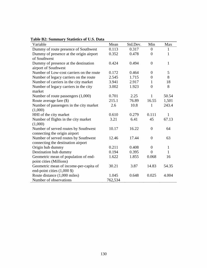
130
Table B2: Summary Statistics of U.S. Data
Variable Mean Std.Dev. Min Max
Dummy of route presence of Southwest 0.113 0.317 0 1
Dummy of presence at the origin airport
of Southwest
0.352 0.478 0 1
Dummy of presence at the destination
airport of Southwest
0.424 0.494 0 1
Number of Low-cost carriers on the route 0.172 0.464 0 5
Number of legacy carriers on the route 2.545 1.715 0 8
Number of carriers in the city market 3.941 2.917 1 18
Number of legacy carriers in the city
market
3.002 1.923 0 8
Number of route passengers (1,000) 0.701 2.25 1 50.54
Route average fare ($) 215.1 76.89 16.55 1,501
Number of passengers in the city market
(1,000)
2.6 10.8 1 243.4
HHI of the city market 0.610 0.279 0.111 1
Number of flights in the city market
(1,000)
3.21 6.41 45 67.13
Number of served routes by Southwest
connecting the origin airport
10.17 16.22 0 64
Number of served routes by Southwest
connecting the destination airport
12.46 17.44 0 63
Origin hub dummy 0.211 0.408 0 1
Destination hub dummy 0.194 0.395 0 1
Geometric mean of population of end-
point cities (Millions)
1.622 1.855 0.068 16
Geometric mean of income-per-capita of
end-point cities (1,000 $)
30.21 3.87 14.83 54.35
Route distance (1,000 miles) 1.045 0.648 0.025 4.004
Number of observations 762,534

131
Table B3: Descriptive Statistics by Southwest’s Entry Patterns Fare Distance
(1000 miles)
No. of
carriers
HHI Population
(million)
PCI
($ 1000)
No. of
routes
Obs.
Module 1: Southwest’s actual entry without potential entry before entry
All treated routes 192
(75)
1.20
(0.66)
7.1
(2.7)
0.40
(0.19)
3.0
(2.1)
32.8
(4.3)
386 33,333
Matched treated
routes
187
(74)
1.21
(0.65)
7.6
(2.5)
0.40
(0.19)
3.4
(2.0)
33.0
(4.2)
227 19,834
Module 2: Southwest’s actual entry conditional on potential entry before entry
Type 1: Southwest operated at only one of the end-point airports before entry
All treated routes 192
(70)
1.23
(0.67)
7.6
(2.6)
0.38
(0.17)
3.3
(2.5)
32.8
(4.3)
508 44,280
Matched treated
routes
179
(67)
1.18
(0.63)
7.5
(2.2)
0.37
(0.16)
2.9
(1.7)
32.1
(4.2)
210 18,370
Type 2: Southwest operated at both the end-point airports before entry
All treated routes 207
(63)
1.57
(0.63)
6.6
(2.9)
0.37
(0.19)
2.8
(2.3)
32.1
(4.6)
500 43,343
Matched treated
routes
206
(57)
1.76
(0.59)
7.1
(2.8)
0.35
(0.18)
3.3
(2.3)
32.3
(4.5)
144 12,410
Module 3: Routes potentially entered by Southwest
Type 1: Southwest operated at only one of the end-point airports
All treated routes 219
(71)
1.07
(0.65)
3.7
(2.5)
0.61
(0.26)
1.6
(1.7)
31.0
(3.8)
2,939 228,310
Matched treated
routes
214
(67)
1.07
(0.61)
4.2
(2.7)
0.57
(0.26)
1.8
(1.8)
31.0
(3.7)
2,287 192,751
Type 2: Southwest operated at both the end-point airports
All treated routes 199
(72)
1.26
(0.69)
6.9
(2.9)
0.41
(0.20)
3.2
(2.5)
32.7
(4.4)
1,560 132,719
Matched treated
routes
213
(72)
1.30
(0.66)
5.7
(3.1)
0.50
(0.23)
2.9
(2.4)
32.6
(4.8)
224 19,171
Module 4: Parallel routes affected by Southwest’s entry
All treated routes 205
(76)
1.34
(0.69)
6.7
(3.3)
0.43
(0.23)
3.6
(2.8)
33.4
(4.5)
1,024 77,398
Matched treated
routes
209
(74)
1.37
(0.68)
6.3
(3.6)
0.48
(0.26)
3.4
(2.6)
33.1
(4.2)
441 37,053
Note: The variables in the first six columns are route average fare, route distance, number of carriers in the city market, HHI of the city market,
geometric mean of population of end-point cities, and geometric mean of income-per-capita of end-point cities (PCI) respectively following each
other. The entry of each cell is the sample mean. Standard deviations are reported in parentheses.

132
Appendix C: Time of Entries Made by Selected Low-Cost Carriers
Table C2: Some Summary Statistics of Routes Entered and Served by Southwest: 1994-2011
Year Airports
entered
Non-stop
routes
entered
Distance
entered
(miles)
All routes
entered
Non-stop
routes
served
All routes served
1994 7 36 476 129 148 501
1995 1 26 442 109 176 611
1996 4 31 554 126 206 725
1997 1 23 442 104 229 823
1998 1 13 421 67 242 897
1999 3 46 436 200 285 1091
2000 2 33 920 144 307 1196
2001 3 29 724 128 336 1323
2002 0 7 442 15 340 1307
2003 0 5 876 26 342 1318
2004 1 24 1009 94 361 1416
2005 3 29 733 275 387 1690
2006 2 20 447 138 397 1743
2007 1 21 542 43 419 1806
2008 0 30 1232 25 442 1752
2009 4 14 538 119 453 1957
2010 1 27 593 87 471 2049
2011 3 25 882 167 490 2228 Sources: U.S. DOT T100 non-stop segment dataset and Southwest’s fact sheets of city start-up dates at
www.swamedia.com/channels/city-start-up-dates/pages/when-did-we-arrive.

133
Table C2: Time of Actual Entries Made by Ryanair on the Treated Routes between 2005m1 and
2013m12
Time of actual entries made by Ryanair Number of actual entries
2006m12 1
2007m2 1
2007m10 1
2007m11 1
2007m12 1
2008m7 1
2008m11 3
2009m7 1
2009m11 9
2010m1 1
2010m4 1
2010m7 2
2010m9 5
2010m11 4
2011m1 1
2011m3 5
2012m3 2
2012m4 4
2012m11 2
2013m4 1
2013m11 1
Total 48

134
Table C3: Time of Actual Entries Made by Easyjet on the Treated Routes between 2005m1 and
2013m12
Timing of actual entries made by Easyjet Number of actual entries
2006m7 1
2006m8 1
2006m11 1
2007m3 2
2007m4 1
2007m7 1
2007m10 3
2007m11 6
2008m2 2
2008m3 1
2008m4 5
2008m5 1
2008m10 1
2008m11 1
2009m4 1
2009m5 1
2009m6 1
2009m10 1
2009m11 3
2009m12 1
2010m4 1
2010m5 1
2010m6 1
2010m9 2
2010m11 1
2010m12 2
2011m7 1
2011m10 1
2011m11 1
2012m4 13
2012m10 1
2012m12 2
2013m3 1
2013m4 8
2013m10 1
2013m11 1
Total 72
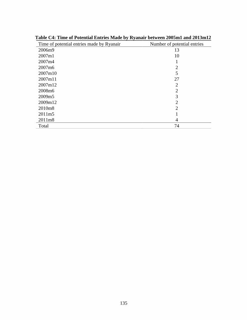
135
Table C4: Time of Potential Entries Made by Ryanair between 2005m1 and 2013m12
Time of potential entries made by Ryanair Number of potential entries
2006m9 13
2007m1 10
2007m4 1
2007m6 2
2007m10 5
2007m11 27
2007m12 2
2008m6 2
2009m5 3
2009m12 2
2010m8 2
2011m5 1
2011m8 4
Total 74

136
Table C5: Time of Potential Entries Made by Easyjet between 2005m1 and 2013m12
Time of potential entries made by Easyjet Number of potential entries
2006m8 1
2006m9 26
2006m10 12
2006m12 3
2007m2 3
2007m4 4
2007m5 19
2007m6 2
2007m7 15
2007m9 1
2007m11 13
2007m12 57
2008m1 11
2008m2 1
2008m5 3
2008m6 1
2008m12 3
2009m1 1
2009m3 1
2009m6 3
2009m7 2
2009m11 2
2010m8 7
2011m6 3
2011m7 1
Total 195

137
Appendix D: Visualization of Expansion of Low-Cost Carriers
Figure D1: Expansion of Southwest from 1994 to 2011
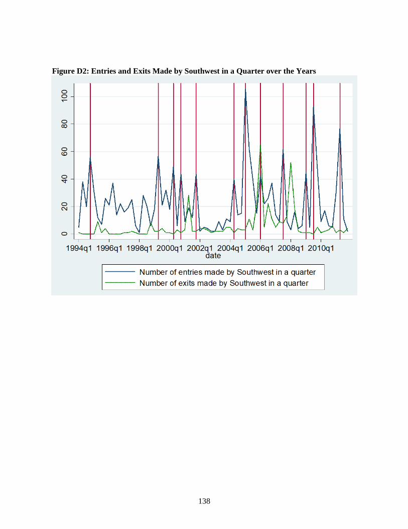
138
Figure D2: Entries and Exits Made by Southwest in a Quarter over the Years
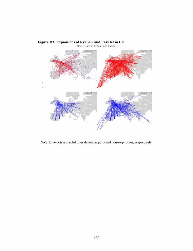
139
Figure D3: Expansions of Ryanair and EasyJet in EU
Note: Blue dots and solid lines denote airports and non-stop routes, respectively.

140
Appendix E: The Evolvement of Route Fare before and after Entry of a Low-Cost Carrier
Figure E1: The Evolvement of Market Fare within the Time Framework of the DID
Analysis on Markets of Some Chosen Treated Routes

141
Figure E2: The Evolvement of Market Fare within One Year of First-time LCC Potential
Entry (presence at both end-point airports)

142
Figure E3: The Evolvement of Route Fare on Some Chosen Treated Routes of Southwest
Over Time. (Actual entry without potential entry)
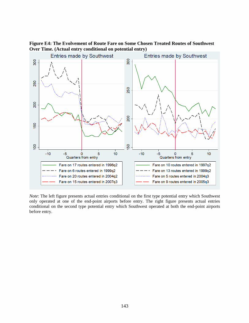
143
Figure E4: The Evolvement of Route Fare on Some Chosen Treated Routes of Southwest
Over Time. (Actual entry conditional on potential entry)
Note: The left figure presents actual entries conditional on the first type potential entry which Southwest
only operated at one of the end-point airports before entry. The right figure presents actual entries
conditional on the second type potential entry which Southwest operated at both the end-point airports
before entry.

144
Figure E5: The Evolvement of Route Fare on Some Chosen Treated Routes of First-time
Potential Entry of Southwest Over Time (presence at both end-point airports)

145
Figure E6: The Evolvement of Route Fare on Some Chosen Treated Routes of Adjacent
Entry of Southwest Over Time

146
A
C
B
D
F
E
G
Appendix F: An Example of a Low-Cost Carrier (LCC)’s Entry Patterns
Figure F1 shows an example of a LCC’s network connecting four cities. In city 1, instead of
entering the most congested airport or a hub airport of a major carrier A, it chose to enter two
secondary airports B and C, which are adjacent to airport A. In city 2, the carrier entered both
airport D and airport E, but only offered service from airport D to city 1 and city 3, and served
route E-G. Finally, the carrier only entered one airport F in city 3 and airport G in city 4.
Figure F1: An example of a LCC’s entry pattern. A solid line means the carrier serves both
airports and the route. A dash dot line means the carrier serves both airports but not the route.
And a dash line means the carrier serves neither airport A nor the route.
In this network, the carrier serves five non-stop airport-pairs: B-D, B-F, C-F, D-F, and E-G,
which are denoted as actual entries. Instead of entering routes A-E and A-F, it offers a parallel
adjacent route B-D to compete with A-E, and serves two adjacent competitive routes for A-F: B-
F and C-F. Finally, even though the airline may not enter a route, such as A-G, it may still affect
fares on the route if airlines change fares in response to the potential entries of the LCC on this
route, or adjacent routes like B-G and C-G.
City 4
City 3
City 2
City 1

147
Appendix G: Supplement Martials for Chapter 3
Table G1: Summary Statistics Variables Mean Std. Dev. Min Max
Product attributes
Price (1,000¥) 2.148 1.319 0.588 6.388
Screen size 5.314 0.412 4 6.6
RAM (GB) 2.768 0.923 1 6
ROM (GB) 30.49 21.82 8 128
CPU GHz 1.684 0.383 1.2 2.5
Eight core CPU 0.486 0.500 0 1
Pixel (1,000) 1.320 0.236 0.800 2
Resolution (10^6) 1.845 0.814 0.518 3.686
No. of net types 6.569 1.110 4 9
Model age (month) 10.12 6.957 1 43
Two sim cards 0.888 0.316 0 1
CPU-Hisilicon 0.181 0.385 0 1
CPU-Mediatek 0.187 0.390 0 1
CPU-Qualcomm 0.501 0.500 0 1
CPU-Samsung 0.054 0.226 0 1
OS-Android 0.880 0.325 0 1
OS-Flyme 0.021 0.144 0 1
OS-Yun 0.022 0.147 0 1
Brand-Apple 0.077 0.266 0 1
Brand-Huawei 0.385 0.487 0 1
Brand-Meizu 0.069 0.254 0 1
Brand-OPPO 0.051 0.219 0 1
Brand-Samsung 0.198 0.399 0 1
Brand-VIVO 0.032 0.176 0 1
Brand-Xiaomi 0.143 0.350 0 1
Brand-Coolpad 0.012 0.108 0 1
Brand-ZTE 0.034 0.181 0 1
Consumer characteristics
Age 36.78 10.04 15 80
Male 0.649 0.477 0 1
Loyalty 0.962 0.191 0 1
Data flow (GB) 1.218 1.451 0 50.97
Payment (100¥) 0.645 0.658 -0.392 18.94
Features’ positive rates ([0,1])
Star ratings ([0,5]) 4.810 0.072 4.597 4.997
Camera 0.721 0.178 0.220 1
Memory 0.571 0.265 0 1
Quality 0.913 0.064 0.455 1
Battery 0.497 0.281 0 1
Signal 0.511 0.224 0 1
Screen quality 0.753 0.146 0.243 1
Cost performance 0.967 0.050 0.667 1
Tone 0.600 0.217 0.071 1
Operating System 0.919 0.053 0.733 1
Operating speed 0.929 0.057 0.667 1
Hand feel 0.979 0.024 0.857 1
Heated-up 0.767 0.259 0 1
Appearance 0.991 0.014 0.933 1
Resolution 0.782 0.228 0 1
Backup 0.046 0.064 0 0.316
Screen size 0.896 0.102 0.338 1
Observations 6,500,769
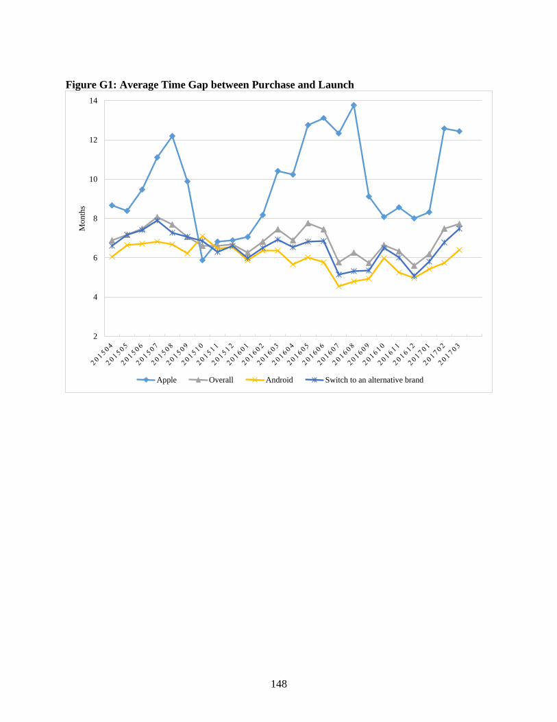
148
Figure G1: Average Time Gap between Purchase and Launch
2
4
6
8
10
12
14
Mo
nth
s
Apple Overall Android Switch to an alternative brand
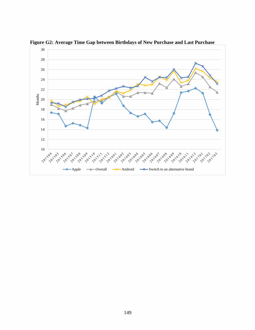
149
Figure G2: Average Time Gap between Birthdays of New Purchase and Last Purchase
10
12
14
16
18
20
22
24
26
28
30
Mo
nth
s
Apple Overall Android Switch to an alternative brand

150
Figure G3: Dynamics of Smartphone Attributes
0
1
2
3
4
5
6
20
14
Q1
20
14
Q2
20
14
Q3
20
14
Q4
20
15
Q1
20
15
Q2
20
15
Q3
20
15
Q4
20
16
Q1
20
16
Q2
20
16
Q3
20
16
Q4
20
17
Q1
RAM Resolution CPU_hz Screen size Front camera Behind camera ROM

151
Figure G4: Dynamics of Low-end Smartphone Attributes
0
1
2
3
4
5
6
20
14
Q1
20
14
Q2
20
14
Q3
20
14
Q4
20
15
Q1
20
15
Q2
20
15
Q3
20
15
Q4
20
16
Q1
20
16
Q2
20
16
Q3
20
16
Q4
20
17
Q1
RAM Resolution CPU_hz Screen size Front camera Behind camera ROM
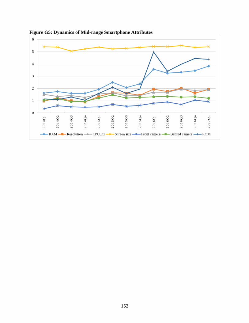
152
Figure G5: Dynamics of Mid-range Smartphone Attributes
0
1
2
3
4
5
6
20
14
Q1
20
14
Q2
20
14
Q3
20
14
Q4
20
15
Q1
20
15
Q2
20
15
Q3
20
15
Q4
20
16
Q1
20
16
Q2
20
16
Q3
20
16
Q4
20
17
Q1
RAM Resolution CPU_hz Screen size Front camera Behind camera ROM

153
Figure G6: Dynamics of High-end Smartphone Attributes
0
1
2
3
4
5
6
7
8
20
14
Q2
20
14
Q3
20
14
Q4
20
15
Q1
20
15
Q2
20
15
Q3
20
15
Q4
20
16
Q1
20
16
Q2
20
16
Q3
20
16
Q4
20
17
Q1
RAM Resolution CPU_hz Screen size Front camera Behind camera ROM