DO ILI - Defense Technical Information Center
449
UNITED STATES DEPARTMENT OF COMMERCE * John T. Connor, Stcrttary NATIONAL BUREAU OF STA.\NDARDS * A. V. Astin, Dirtet• Legibility of Alphanumeric Characters and Other Symbols II. A Referern e- dok ): .. D. Y. Cornog and F. C. Rose Institute of Applied Technology National Bureau of Standards 'a Washington, D.C. BEST AVAILABLE COPY National Bureau of Standards Miscellaneous 262-2 Issued February 10, 1%7 For sale by the Superintendent of Docamenta. U.S. Government Ptintiang Office, Wlhinston, D.C. 20402 Price 54.25 DO ILI
-
Upload
khangminh22 -
Category
Documents
-
view
0 -
download
0
Transcript of DO ILI - Defense Technical Information Center

UNITED STATES DEPARTMENT OF COMMERCE * John T. Connor, StcrttaryNATIONAL BUREAU OF STA.\NDARDS * A. V. Astin, Dirtet•
Legibility of Alphanumeric Characters
and Other Symbols
II. A Referern e- dok ): ..
D. Y. Cornog and F. C. Rose
Institute of Applied Technology
National Bureau of Standards 'aWashington, D.C.
BEST AVAILABLE COPY
National Bureau of Standards Miscellaneous 262-2
Issued February 10, 1%7
For sale by the Superintendent of Docamenta. U.S. Government Ptintiang Office, Wlhinston, D.C. 20402
Price 54.25
DO ILI

Contents
Pagea
INTRODUCTION .... .. ......... . . . . 1
REFERENCE INFORMATION EXTRACTS . . . . . 5
APPENDIX A: AUTHOR INDEXES (alphabetical and chronological). 389
APPENDIX B: CHARACTER FACE NAME INDEX ... . . . . 405
APPENDIX C: CHARACTER FACE SAMPLES . . ... . .. 437
APPENDIX D: GLOSSARY OF MATRIX INDEX TERMS .. . 453
APPENDIX E: MATRIX SUBJECT INDEX . . . . . . . . . . InsideBackC )ver
Library of Congress Catalog Card Number: 64-60082
H,

LEGIBILITY OF ALPHANUMERIC CHARACTERS AND OTHER SYMBOLS:
I. A REFERENCE HANDBOOK
D. Y. Cornog and F. C. Rose
The major psychological findings and data in the field of the
legibility of alphanumeric characters and other symbol# are
provided in this detailed Referenct Handbook. Summaries and
extracts of information for 203 experimental, developmental,
review, and other legibility reports are presented and are
multiply indexed in depth by (1) a matrix, cross-reference index
(article versus functional variables - environmental typographical),
(2) author indexes (alphabetical and chronological), and (3) a
character-face-name index. These Handbook entries are further
indexed by the permuted title index in NBS Miscellaneous Publica-
tion No. 262-I, "Legibility of Alphanumeric Characters and Other
Symbols: I. A Permuted Title Index and Bibliography. " Selected
samples of several important experimental and other faces are
presented.in an appendix. Key words: Alphanumeric C]aracters.
Displays, Handbook, Human Factors, Legibility, Psychology,
Readability, Standards, Symbols, Type Faces, Typography,
Visibility.
INTRODUCTION
This Reference Handbook is the second of several related reports on the subject of
L* legibility of alphanumeric characters and other meaningful symbols. It is designed as
reference source to the information contained in the primary human factors and
3ychological technical and scientific le3ibility literature. A preceding report, Legibilit,
"Alphanumeric Characters and Other Symbols: I. A Permuted Title Index and Biblio-
:!p.h, NBS Miscellaneous Publication No. 262-1, serves as an index-key and biblio-
:aphy to the human factors legibility literature. A selection of materials from the
bliography of Part I serves as the basis tor the information presented in this Handbook
3art I1). It is intended that these first two reports should be used in conjunction with one
tother, but each is complete in itself.
The Legibility Project of the Research Information Center and Advisory Service on
"-1-

Information Processing (RICASIP) is producing the series of legibility reports, including
the Reference Handbook. RICASIP is part of the Information Technology Division, Institute
for Applied Technology, National Bureau of Standards (NBS), and has been jointly
sponsored by NBS and the National Science Foundation. The legibility research of
RICASIP is especially directed toward those people interested in information processing
problems and those areas of information selection and retrieval in which tLh human
acceptability of machine printouts and various displays of document identification,
abstracts, and text is clearly related to questions of legibility. Closely related are the
problems involved in the design of characters and symbols developed for automatic
character recognition, and also the development of standards and specifications for
printing, including automatic photocomvosition techniques.
In the legibility literature, there is much confusion and overlap in the usage of the
terms legibility, readability, perceptibility, and visibility. For the purposes of this
Handbook, the term legibility is considered to include these and any closely related
concepts. In general, legibility refers to the characteristics of printed, written, or other
displayed meaningful symbolic material which determine the speed and accuracy with which
the material may be read or identified. In using the Handbook information, note should be
made of the "legibility" usage of each experimenter. The psychological literature on
perception has been included only when it was closely involved with the specific problems
of alphanumeric characters and other meaningful symbols. "Other symbols" include such
items as the arrows and other coded symbols used to present information on radar
displays. Studies concerned only with environmental variables, i. e. illumination and
symbol-background contrast, and the legibility of dials and scales have received little
attention.
Other criteria for inclusion or relection of material for the Handbook include (1)
emphasis on post-1940 information, and (2) emphasis on psychological, quantitative
experimentation, as contrasted with artist-designer information based primarily on
opinion of atud experience with aesthetic considerations and acceptability. The literature
coverage is primarily from the United States, but a few foreign entries are included.
Access to the foreign literature was chiefly through 'econdary reference sources.
The entries contained in this Reference Handbook represent only a fraction of the
material covered in studying the problems of legibility. For a particular article to have
been included, it was judged to have a substantial degree of pertinency for legibility in
terms of the various criteria discussed in this introduction. Thus, the Handbook contains
-2-

selective, rather than an exhaustive, coverage. The degree of individual article
overage varies from article to article, depending mostly upon the length of the original
*curnert and, to a lesser extent, upon the abstractor's subjective evaluation of the
rticle's relative importance in meeting the selection criteria for the Handbook.
It is intended that the person using the Handbook will be able to ascertain from it
hether or not it would be of value to him to go to the original source of information in
rder to determine more complete details of experimental procedures, results, and
mnclusions.
Accession numbers at the beginning of each citation (upper-left corner) and the
ocument Extract "author-date" method of identification (e.g. Craik-1943, Paterson-1947a,
c.) have been carried forth from the Permuted Title Index and Bibliography (NBS-MP-
4Z-1). Since the inclusion of literature in this Fandbook. represents only a selection from
iZ-I, an author's second article for a particular year may be included (e. g.
;rger-1944b), while the first (Berger-1944a) has been omitted. Also, the citations
elude several abbreviations and numbers that need further explanation. Contract
jtbers, for U.S. material, refer to U.S. Gcvernment military and other agency
ntracts. Numbers prefixed by AD-, ATI-, and TIP-, are accession numbers assigned
- the Defense Documentation Center, Cameron Station, Alexandria, Virginia 22314, and
e available from them at no cost to those who are affil~a..d with the Department of
;fense. For others, the same reports are available from the Clearinghous. !or Federal
ientific and Technical Information, Sills Building, 5Z85 Port Royal Ra,ý Sr',ingfield,
rginia 22171. AMEL (AerL.-Medical Equipment Laboratory) is part of the U.S. Navy.
kDC (Wright Air Development Center---later WADD, . . . Division), ESD (Electronic
stems Division), RADC (Rome Air Development Center), and AFCCDD (Air Force
-nmand and Control Development Division) are all part of the U.S. Air Yorr%.
Access to the abstracts may be made through (1) the Permuted Title Index and
bliography (NBS-MP-262-I), (2) the Author Indexes (alphabetical and chronological) in
pendix A, (3) the Character Face Name Index (Appendix B), and (4) the Matrix Subject
lex (rear fold-out). Appendix D, a Glossary and explanation of the subject terms u.ed
the Matrix Index. will be found of use in conjunction with tl~e Matrix.
The contribution of Mrs. Betty Anderson in the editing and typing of the mr,:.-c"irA
s been invaluable. The staff of the Information Processing Reference Service, a part c,:t
Information Technology Division, NBS, provided bibliographic support.
-3-
- _ _ _ _

REFERENCE INFORMATION EXTRACTS
S~-5-

Aldrich-1937
3423 Aldrich- 1937Aldrich, Milton H.Vermont U., BurlingtonPERCEPTION AND VISIBILITY OF AUTOMOBILE LICENSE PLATESIn PROCEEDINGS OF THE SEVENTEENTH ANNUAL MEETING,1937, Washington, D. C., Highway Research Board,Vol. 17. p. 393-412
Problem: Determine the effect of number, grouping, style, and stroke-width of digits, onthe legibility of numeric characters to be used on automobile license plates. Also considerthe effect of introducing one or more alphabetic characters into the legend. The authornotes that "(t)he intrinsic legibility of a license plate will depend upon the combined effectof the following items:
1. "Size and shape of plate.2. "Height and width of characters.3. "Style and width of stroke of characters.4. "Spacing and grouping of characters.5. "Color combination.6. "Amount of gloss on the figures and background.7. "Area ratio of legend to background.8. "Content and arrangement of the items on the plate.9. "Number of characters in the legend.10. "The letters selected for use in combinations.11. "The number of letters used in the legend.
"External conditions which will also affect the legibility are:I. "Distance of the observer from the plate.2. "Angle at which observer views plate.3. "Intensity and color of plate illumination.4. "Angle at which most of the light strikes the plate.5. "Conditions of vehicle movement (i. e. , stationary, slow or high speed, receding or
approaching, smooth or rough road, etc.)6. "Amount of dirt or moisture on the plate.7. "Atmospheric conditions.8. "Position of the plate on the vehicle.9. "Amount of dust which is thrown up by the car, or by passing traffic.
'Many of these later items are beyond the control of the plate designer." (p. 393-394)
Procedure: "Perception" and "visibility" tests were performed. The "perception" tests'compare(d) the merits of the plain numeral and the various letter-numeral systems
trouped in different ways. The effect of using letters the same size, or either larger orimaller than the numerals in the group, was experimented with. " (p. 394) Thus, 50subjects (mostly students) individually viewed 50, black-on-white, 2-inch high,tipha-numeric character groups at an "easily visible" distance. Each group was exposedor 0. 67 seconds. Groups presented are as follows (not in the type face used bynvestigators):
16. z8- P. Z84. J 683 b-L-'4 Z84. p--J i4p48392 T 385 869 60J8 16. 52937 076P93. 652 D 5 J608 468. 053 329E LZP. 047)Q.953 514. 076 1306 193. JQC 683. 869 59.36.52.652.937 3E29 536 1686 68.723 TD385
398
-7-
_ _ _ - -

Aldrich-1937
68..e4 59PV6 9E. 27. 04 D. 953. 0 I 426 1306. 5363C6. 829 1686. 398 19. 36573 698.968 B 4F. 83. 92LZP 9ZT63 lB. 426 HQF 1936. 573 306829047 HOF. 493 698968 493 9zr63 59PV646.80.53 JQC. 193 E92704(above from p. 398)
Accuracy was the test crite•rion. In the "visibility" tests, 14 subjects viewed 10,black-on-white, numeric character groups. Groups consisted of five to six, 3-inch high,1-1/4- to l-1/2-inch wide, 1/4- to 3/8-inch stroke-width, 1/2-inch spaced digits in theROUND, BLOCK, OPEN, and VERMONT 1937 styles. Stimuli were viewed outdoors,under varying weather conditions, and at a distance of 200 feet or less (in 10 footincrements) until the legibility threshold was reached for individual digits. In the order
displayed, digit groups were in the following layout (style/width (inches)/stroke-width(inches)):
ROUND 1-1/2 3/8 OPEN 1-1/2 3/8OPEN 1-1/2 1/4 OPEN 1-1/2 1/4OPEN 1-1/2 3/8 VERMONT 1937 1-1/4 3/8BLOCK 1-1/2 3/8 ROUND 1-1/2 3/8ROUND 1-1/2 1/4 BLOCK 1-1/2 1/4(above from p. 405)
Some variants of individual digits were introduced.
Result: From the "perception" tests, the following results and conclusions were derived:1. One disadvantage in the use of alphabetic characters (when mixed with numerics) on
auto license plates is that, if one character is missed in an attempt to read thenumber of a retreating car, the car may be traced as one of ten if it is known thatni ",erics only are on the plate, but as one of 34 if alpha-numerics are present.
2. Conbinations of 5 characters were better than 6, which in turn were better than 7.The itriking difference was between 6 and 7.
3. "The presence of letters in the group increases the difficulty of perception, thisdifference increasing with the number of letters appearing." (p. 404)
4. There was a slight preference for grouping characters by three's rather than two's,but both were superior to the equal spacing of all characters.
5. In 6-character groups cnntaining I letter, the preference was for grouping by two'srather than separating the letter only from the numerics.
6. In 5-.haracter groups containing 2 letters, there seemed to be a very slightpreference for the groups in which the letters and numerals were placed inseparate groups.
7. Contrasting letters from numerals by making the former smaller "did not aid in theperception of the number. " Therefore, "the letters should be . . . at least aslarge as the numerals. " (p. 404)
8. "Some advantage in perception seems to be gained with 6 and 7 character" (p. 404)groups when a "Devine" system (over and under) of grouping was employed. Therewas no advantage for groups totaling less than 6 characters.
9. "No extensive investigation on letter confusion seems to have been made, but Dr.Lauer says the letters A, F, H, K, M, R, S U, W, X, Y, and Z appar to bebest." (p. 405)
Fror• the "visibility" tests, the following results and conclusions were derived.I. "No appreciable difference . . . (was) found between the ROUND and BLOCK
styles. " (p. 406) However, "the OPEN type numerals (were) more visible thaneither" (p. 409) of the above.
2. The digit "I" was legible at a farther distance with a base than without. However,"the top should be small lest this digit be confused with '7'. " (p. 410)

Aldrich-19''
3. The rounded "3" also was legible at a farther distance than the flat top "3",although this may have been because the latter was frequently confused with thelist5.
4. There was a very small superiority (in all cases) of the 3/8- over the 1/4-inchstroke-width. "The optimum stroke doubtless would vary -with the style, height,and width of the numerals, the ratio of height to width, and possibly other factors.It is a question which could well be investigated further. " (p. 408)
5. ".. 3- by 1-1/2 (-inch) numerals (were) quite superior to 3- by 1-1/4 (-inch)numerals. " 'sic) (p. 409)
6. Little confusion. resulted from the digits 1, 4, 5, 6, 7, and 0. Except for theBLOCK "2" (which was not confused at all), the d, .t "2" was sometimes confusedwith 1, 3, 5, 7, and 8. The rounded "3" was infrequently confused, except in theVERMONT 1937 numerals, wherein it was given frequently as I or 7. The digit"8" was frequently confused with 9, although use of "the OPEN stylh. '9' shouldtend to reduce this confusion. " (p. 409) Use of the OPEN type 5 and 6 should helpin othe- confusion areas. The digit "9" was most frequently confused, being givenas 5 or 8, and, with "the narrow VERMONT numerals, . . . also . . . as 1, 7,and 0. " (p. 409) The fact that "9" was most frequently confused and "6" was one ofthe least frequently confused may possibly be attributed to "the fact that most cuesin reading are secured from the upper half of the . . . characters. " (p. 409)Thus, "since it is hardly feasible to omit any digit even though it may be confusedfrequently, numerals should be designed to emphasize their distinguishingcharacteristics. " (p. 410)
7. While "no comparisons of legibility due to spacing can be made" (p. 409) from thisexperiment, the author again refers to Dr. Lauer as saying that " 'greaterspacing between the numbers would greatly increase their legibility. . . (andthat) letters should not center closer than 2 (inches). ' "(p. 409)
8. "(D)igits in the end positions . . . were more legible than . . . elsewhere.(p. 409)
The author closes with general comments on plate borders and state/year designationlocations. Comments on this work, by Dr. A. R. Lauer (in an appended discussion)concern the following:
I. "(I)f the stroke gets much larger than 3/8-(inch), there is a tendency for thenumber or letter to blur. " (p. 412)
2. "We found (state identifications at the bottom) a decided advantage over verticalstate identifications. . . (because in the latter) . . . the small letters tended torun together and resemble a letter I or number 1. " (p. 412)
3. "(A)nything at the top of the . . . plate is likely to reduce . . . perception of thenumber . . . . " (p. 412) (See item 6 of "visibility test" results above.)
4. "(C)olor combinations of the plates are of even more importance than the shape ofletters or numbers, and slight differences in illumination which it is possible tothrow upon them. " (p. 412)
3424 Allen- 1955Allen, Terrence M. and Straub, Arthur L.Virginia Council of Highway Investigation andResearch, CharlottesvilleSIGN BRIGHTNESS AND LEGIBILITYIn NIGHT VISIBILITY 1955, Highway Research BoardBulletin 127, (Washington, D. C. , National Academyof Sciences- National Research Council Publication41'., 1956), p. 1-14, 23 refs.
Problem: "Four factors of primary importance to the night legibility of signs are sign"-9-

Allen-1955
brightness, the level of illumination to which the eye is adapted, characteristics ofletters, and contrast direction (black letters on white or vice versa)... These factorswere investigated in a field . . . and a laboratory experiment to gather information on
the(ir) effects . . . and . . . interrelationships . . . " (p. 1)
Procedure: The authors first present a review of the literature on the legibility ofreflectorized signs. Then, in the first experiment (field study), eight subjects (25-30years old and with 20/25 to 20/15 visual acuity) were used in investigating (I) four levelsof sign reflectance (white paint, beads on paint, moderately reflective sheeting, and highly
reflective sheeting), (2) two conditions of background illumination (incident night lightingfrom street lamps, buildings, and other cars versus only the headlamps of the test car),and (3) high and low headlamp beams. "(S)ubject(s) rode beside the driver as the test carapproached the sign (which contained two 7-inch high, BPR (Bureau of Public Roads)SERIES C digits) at a constant speed of 10 (miles per hour). " (p. 4) In the second
experiment (laboratory investigation), "(f)our factors were selected as the most fruitfulfor investigation: sign brightness (0. 1, 1. 0, 10, and 100 foot-lamberts), surroundingillumination (0. 001 and 0. 1 foot-candles at the subject's eyes), letter series (BPR SERIESA, B, C, D, E, and F capitals) and contrast direction (white-on-black versus black-on-white). "(p. 6) In this experiment, 19 subjects (20-35 years old and with 20/25 to 20/17visual acuity) viewed slides of sample messages projected onto a screen.
Result: In the field experiment, all factors (except surrounding illumination) and "(a)llinteractions of the factors tested were significant. " (p. 4) And, of all these, onlyreflectances by surrounding illumination by headlight beams, and surrounding illuminationby headlight beams (both of which were at the 5 percent level) were not significant at the Ipercent level of confidence. "For high beams, however, increases in reflectance beyond'beads on paint' yielded no increase in legibility listance. In fact, results showed a slight
decrease and the high-reflectance sign was read at a greater distance with low beams thanwith high beams. " (p. 4) In the laboratory experiment, "(s)tatistical analysis of theresults . . . show((d) . . . (s)ignificant factor interactions . . . as follows: (1)
Brightness x Illumination, (2) Brightness x Contrast Direction, and (3) Brightness x
Letter Series. . . This means that results for illumination, contrast direction, or letterseries were different depending upon the level of brightness. . . The following subjectinteractions were significant: (1) Brightness . . . , (2) Illumination . . .. (3) Brightness
x Illumination . . . , and (4) Contrast Direction . . . (p. 10) The results of this
(laboratory) study have not yet been validated in the field or related to reflectivematerials. However, from .he relationships observed . .. , the following . . .
conclusions are made . . . :1. "Surrounding illumination is . . . important . . . in relation to reflective
materials. In a brightly-lit area, higher sign brightness is needed for legibility,and . . . is permissible without excessive irradiation. High-refl 3ctance signs ona dark open road may have poor legibility because of irradiation.
2. "Letter size is a very important factor, since it determines effective signbrightness. Large letters can be read at distances where illumination fromheadlights is low, if sign reflectance is high. Small letters, however, must beread at distances where illumination from headlights is high. In thib caso;, highsign reflectance may produce excessive irradiation...
3. "(T)he wider letters with their wider stroke width are less severely affected byirradiation. However, these differences . . . are small compared to the
differences in legibility distance. SERIES A letters must have about twice theletter height as SERIES F to have the same legibility distance and the sameillumination from headlights...
4. "(W)hite letters on black gave superior legibility in the middle range of brightness,but results indicate that irradiation is more serious for white letters of thestandard series. White-on-black signs may be very effective, but care should beused to achieve a well-designed sign. " (p. 12)
-10-

Alluisi-1957
2129 Alluisi-1957Alluisi, Earl A. and Martin, Hugh B.Laboratory of Aviation Psychology, Ohio State U.,ColumbusCOMPARATIVE INFORMATION- HANDLING PERFORMANCE WITHSYMBOLIC AND CONVENTIONAL ARABIC NUMERALS: VERBALAND MOTOR RESPONSESApr 57, 12p.Contract AF 33(616)-3612; Project 7192WADC Technical rept. 57-196; AD-118 160
Problem: "(C)ompare the information-handling performance of subjects in making verbal(number-naming) and motor (key-pressing) responses to . . . (a) set of symbolicnumerals . . . (generated from an EIGHT-ELEMENT STRAIGHT-LINE MATRIX)
along with a set of conventional numerals (AND 10400). " (p. iii)
Procedure: In a two part experiment, 48 male student subjects were randomly dividedinto two groups of 24 for each part. In the motor response part, subjects responded, bymeans of finger-keys, to 1/4-inch high numerals (as defined above) back-projected onto a10-inch diameter opal glass screen in the display of a Serial Discrimeter (sic) (designedand constructed by the Laboratory of Aviation Psychology, The Ohio State University).Numerals were presented in random sequence (but not inter-mixed) within sessions tosubjects, who were seated 28 inches from the display screen. Broad-band noise, atapproximately 70 decibels, was presented to subjects through earphones in order to maskextraneous sounds. Conditions for the second (verbal response) part of the experimentwere the same as for the first part, except that subjects responded by speaking into aboom microphone. Speed and accuracy were the test criteria in both parts of theexperiment.
Result: "On an a priori basis, it seemed reasonable to suppose that information-handlingperformance with the symbolic numerals might have at least equaled that with theconventional numerals. . . The data of the present experiment did not corroborate thissupposition. . . (A)n interaction between the two types of numerals and the two modes ofresponse . . was . . . evidenced . . .. In terms of information handling (bits/second),time, and errors, performance with the conventional numerals was consistently superiorto performance with the symbolic numerals when verbal responses were made. No suchclear superiority for either set of numerals was evidenced in the motor-responseperformances." (p. 8) The former might be "(b)ecause number-naming responses toconventional Arabic numerals are greatly overlearned in our culture . . . A second lineof argument would suggest that performance with straight-line and angular figures issuperior to performance with conventional numerals only under difficult or threshold-likeviewing situations in which probability of correct identification, and nut response time, ismeasured. . . Both hypotheses . . . are consistent with the data. " (p. 8-9)
Furthermore, "if the increase in information-handling performance . . . represent(s)learning, then it was of a special type that result(s) in faster speed performance, butlower accuracy. " (p. 9) And yet, "if learning was involved, it was probably not a form oflearning related to the perception of the numerals . . . With regard to practicalapplications, the numerals formed by the use of an EIGHT-ELEMENT 'printing' MATRIXdo not appear to be quite as satisfactory as standard AND 1C40C numerals. They shouldnot be used if other considerations are equal, but should their use be dictated byexpediency the result should be only a small drop in information-handling performance.(p. 9-10)
Note: For the commercially published version of this work, see Alluisi-1958, following.
-1*1-

I.Alluisi-1958
2130 Alluisi- 1958Alluisi, Earl A. and Martin, Hugh B.Laboratory of Aviation Psychology, Ohio State U.,ColumburAN INFORMATION ANALYSIS OF VERBAL AND MOTORRESPONSES TO SYMBOLIC AND CONVENTIONAL ARABICNUMERALSJournal of Applied Psychology, 42:2 (April 1958) 79-84
Problem: "(C)ompare the information-handling performance of (subjects) in makingverbal and motor responses to two sets of Arabic numerals--- one . . . conventional .
the other . . . symbolic figures drawn from an EIGHT-ELEMENT, STRAIGHT-LINEMATRIX." (p. 83)
Procedure: Key-pressing, motor responses and number-naming, verbal responses weremade by two groups of 24 subjects each. The apparatus utilized was a SerialDiscriminator, which for this study contained a 10-inch diameter, opal glass, displayscreen. "The various symbols were projected onto the screen from the back by means ofa ten-unit optical projector, each unit of which contained a different photographictransparency . . . The scoring unit consist(ed) of . . . a timing . . . and an automaticrecording element. . . The conventional numerals were the AND 10400 . . . Thesymbolic numerals were straight-line figures generated from an EIGHT-ELEMENTMATRIX... (as) illustrated . . . The symbols from each of the two sets appeared . . .as l/4-(iach) high light patterns at the center of the display, approximately 28 (inches) infront of the seated (subject). " (p. 80)
Result: "When verbal responses were made, the conventional numerals were consistentlysuperior in perform.-nce to the symbolic numerals. This was true whether performancewas measured in terms of information handling (bits/second), time, or errors. No suchclear superiority was evidenced for either set of numerals when motor responses were
made. . . (The former) interaction . . . might be a stimulus-response compatibilityeffect resulting from use of the much-practiced ensemble of number-naming responses toconventional Arabic numerals. . . (A)lso . .. , performance with straight-line andangular figures should be superior to per'ormance with conventional numerals underdifficult or threshold-like viewing situations as, for example, in visibility studies, but notnecessarily . . . under speeded-response conditions with stimuli above threshold...With regard to . . . applications, the . . . EIGHT-ELEMENT 'printing' MATRIX do(es)not appear to be quite as satisfactory as AND 10400 . . . (B)ut should their use bedictated by expediency the result should be only a small drop in information-handlingperformance. " (p. 84)
Note: For the contract-report version of this work, see Alluisi-1957, preceding.
3323 AmASHO- 1961
American Association of State Highway Officials, Washington, D.C.
MANUAL FOR SIGNING AND PAVEMENT MARKING OF THE
NATIONAL SYSTEM OF INTERSTATE AND DEFENSE HIGHWAYS
1961, 75 p.
Problem: "The National System of Interstate and Defense Highways, referred to as the
Interstate System and now under construction along the Nation's principal travel desire
-1 2-

AmASHO-1961
lines, was conceived and is being built primarily to provide rapid, convenient and safe
travel between and through major traffic generating centers. Essential to the realization of
these valuable benefits is a uniform system of highway signing and marking that will be
fully adequate in an environment of high volume, high speed motor vehicle traffic on modern
controlled access highways. " (p. 7)
Procedure: "For (the above) reason, a new concept has been developed for signing the
Interstate System. " (p. 7)
Result: The Manual's Table of Contents, which is indicative of its mission, follows (ii
brief):
I. Introduction, including signing, uniformity, and standards.
U. General characteristics of signing, including messages and displays; overhead
installations; lettering, spacing, and borders; color, reflectorization, and
illumination; destitation messages; arrows; and clearances.
III. Interchange signing, including layout; and advance guide, exit direction, gore,
and other guide signs.
IV. Route markers, including application, design provisions, trail blazer
instaltations, intersecting routes, cardinal direction and off-route markers,
overlapping routes, and signing for memorial highways.
V-IX. Rest areas, signing for services, mileposts, regulatory and warning signs,
and sign structures.
X. Miscellaneous considerations, including adjacent signing, placement for
effective viewing, and sign materials.
XI. Other details of design and location, including letter height and arrow
specifications, and individual sign designs.
XII. Pavement; including edge, and exit and entrance ramp; marking.
XIII. Delineators---location, application, design, performance, and median
crossovers.
Typically, the figures shown are examples of signing, while the two tables concce1r (1)
letter style and height for principal guide signs, and (2) delineator spacing on horizontal
curves.
2132 Anderson- 1960
Anderson, Nancy S., Braunstein, Myron and
Novick, Lee
IBM Rusearch Center, Yorktown Heights, N.Y.
AN EVALUATION OF HUMAN READABILITY AND RECOGNITION
OF A SPECILIZED FONT
Rept. no. RC-219, 11 Feb 60, 20p.
-13-

Anderson-1960
Problem: Evaluate the readability and recognition of E13B compared to BANKERS
GOTHIC and each of these to a mixture of the two numeric fonts.
Procedure: Using the E13B and BANKERS GOTHIC fonts, New York college students
participated in "transcription" and "recognition" experiments. The "transcription"
experiment involved six subjects who were given a training period designed to have themdevelop a touch system on a ten-kuy adding machine. They were then each to read a ten-
digit number (in one font) on a card and transcribe that same number to the machine, for
a number of trials, until a speed/error plateau was reached. Each subject then repeated
the experiment for the other font. Scoring was based on both speed and error rate of the
first and last six trials. The "recognition" experiment involved 38 subjects who were each
given a booklet of test pages containing ten-digit numbers in one font. The first occurrence
of a specific single digit on a page was crossed out. The subject was to cross out all other
occurrences of the same digit and count the total croasouts. The experiment was then
repeated for the other font. Scoring was again based on speed and error rate. A similar
l;Irecognition" experiment involving six subjects added a booklet that had numbers in the two
fonts mixed together on the same page.
Result: A difference of means was statistically significant in favor of BANKERS GOTHIC.
However, the differences were very small and decreased with training. In the
"transcription" experiment, which extended over the longest testing period, the differences
were reduced to practically zero toward the end of the experiment.
3458 ArmyWES- 1953
Army Engineer Waterways Experiment Station,
Vicksburg, Miss.
NOTES ON THE REPRODUCTION OF DRAWINGS IN WATERWAYSEXPERIMENT STATION TECHNICAL REPORTS
Misc. paper no. 5-49, Nov 53, (r. Sep 55), Iv.
AD- 106 366
Extract: "(T)he Waterways Euperiment Station continually strives to improve the
appearance and usefulness of its reports, and at the same time to hold their costs to the
minimum commensurate with the quality desired. . . The basic principle developed is that
practically every drawing can be prepared in such a way as to enable it to be reduced to
8 . . . by 10-1/2 (inches) in size .... The border dimensions . . . are 6 . . . by
9 (inches). . . (D)rawings should be prepared with this reduction in mind in order to
achieve uniform lettering on all drawings in any one report, and to ensure legibility...
To illustrate .... several groups of sample sheets have been prepared. Group I is a
folio of sheets illustrating WRICO (similar to LEROY) lettering. The first six sheets
contain examples of various styles and sizes of WRICO lettering, including STANDARD
-14-

ArryWES-1953
VERTICAL GOTHIC, STANDARD SLANT GOTHIC, EXTENDED lettering, CONDENSEDlettering, etc. ; each size lettering guide is illustrated with several sizes of lettering pens
The remaining sheets in this group illustrate the reduction . . . (p. 1) to 75 . ..
50 . ., 33-1/3 . ... and 25 per cent of the original dimensions. . Sheets . . . A are
prints of tracings that were prepared . . . for eventual reduction to 6 by 9 (inches); . . .included here . . . to illustrate the form and size of the original tracings. Sheets . . . B
are 6- by 9-(inch) reductions of the comparably numbered originals. The reductions rangefrom 33-1/3 . . . to 78 per cent . . . (E)ach of the . . . reductions is clearly legible,
even in the case of . . . complicated drawing . . .. This is true because every feature of
the original drawings was drawn with the final reduction in mind, and every size of lettering
. . . was selected so as to produce the desired size on the . . . final copy. . . For
convenient reference, the size of WRICO lettering used has been indicated on all the
originals . . .. The process illustrated . . . not only has resulted in drawings of
convenient size rather than the bulky, unmanageable plates often found in engineering
reports, but also has saved many thousands of dollars . . .. This saving results largely
from . . . utilization of the lithographic-offset . . . reproduction . . . in contrast to
contact methods (ozalid, black-and-white prints, etc. ) required in the reproduction of
large-size illustrations. The contact methods are inherently more expensive and alsoafford no reduction in unit cost as the number of prints increases. Moreover, the pagesize illustrations eliminate the necessity for costly and time-consuming folding of plates,
which often must be done by hand. " (p. 2)
!138 Atkinson- 1952ktkinson, William H., Crumley, Lloyd M., and Willis, Marion P.keronautical Medical Equipment Lab., Naval Air Material Center,
.hiladelphia, Pa.
t STUDY OF THE REQUIREMENTS FOR LETTERS, NUMBERS, AND
AARKINGS TO BE USED ON TRANS-ILLUMINATED AIRCRAFT
;ONTROL PANELS. Part 5 - THE COMPARATIVE LEGIBILITY
)F THREE FONTS FOR NUMERALStept. no. TED NAM EL-609, 13 Jun 52, 27 p., 8 refs.
,TI- 157 808
problem_. "(E)valuate the legibility of the forms for numerals developed in this
3boratory. . . compared to the forms embodied in Air Force-Nrvy Drawing 10400 and the
ont developed by BERGER. " (p. 2)
'rocedure: "The tests were conducted under conditions of red transillumination ranging
Som . 10 to 3. 30 footlamberts and under conditions of daylight illumination with intensities11, 24 and 34 footcandles. For the transillumination tests the duration of the exposures
-15-

Atkinson-1952
was approximately 200 milliseconds, while in the daylight tests the duration of exposures
was 5 milliseconds. The transilluminatlon tests employed 30 su~bjects while the daylight
tests required 48 subjects. " (p. 2) Digits were light on dark.
Result: "Where total errors (were) employed as the criterion, it (was) found that under the
conditions of the experiment the AMEL proposed form (was) superior to the other two forms
with red transillumination or daylight illumination. In the analyses of the error scores for
individual digits, the digits of the AMEL proposed series (were) not always significantly
more legible than their counterparts in the (BERGER and AND 10400). However, it was
found that where significant differences in error scores (were) obtained, it (was) always
the AMEL proposed digit which produce(d) the fewer errors when compared with a digit of
one of the other two forms. . . The (specific) results of these comparisons (were) as* follows:
1. "With transilluumination,
a. "the AMEL proposed 1, 3, 4, and 5 (were) significantly more legible than
their counterparts in the AND 10400 series. .. (,)
b. "the AMEL proposed 2, 5, and 9 (were) significantly more legible than the
corresponding digits in the BERGER font. . . (. and)
c. "the BERGER 'I' and '3' (were) significantly more legible than the samedigits in the AND 10400 series while the greater legibility of the BERGER
'4' approache(d) statistical significance.
2. "With daylight illumination,
a. "the AMEL proposed '4' and '5' (were) significantly more legible than their
counterparts in the AND 10400 font, while the AMEL proposed '3' and '6'
approach(ed) statistically significant better legibility. .. (,)b. "the AMEL proposed '2' and '5' (were) significantly more legible than the
corresponding digits in the BERGER font. . . (, and)
C. "the AND 10400 'Z' (was) significantly more legible than the BERGER '2'
while the BERGER font ha(d) the more legible digit when the '4' (was)
considered. " (p. 25)
The authors recommend "the digits of the AMEL . . . form . . . for use in aircraft oa
plastic console panels." (p. 2)
-16-

Baker-19542608 Baker- 1954Baker. Charles A. and Grether, Walter A.
Aero Medical Lab., Wright-Patterson Air Force Base, Ohio
VISUAL PRESENTATION OF INFORMATIONWADC Technical rept. 54-160, Aug 54, 111 p., refs.
Project 7180
AD-43 064
Abstract: "An important factor in the design of equipment for maximum efficiency ofhuman operation is the design, illumination, and arrangement of visual displays which
provide information to the human operator. This report provides a compilation of general
human engineering recommentations and presents some of the supporting presentations of
information. . . Liberal use is made of pictorial, graphic, and tabular presentations to
illustrate the data and design recommendations... " (p. iii)
Contents (with underline emphasi- on those parts pertinent to this handbook):
I. Mechanical indicators.
A. General considerations include methods of use (i. e. quantitative, qualitative,
and check reading; setting; and tracking), conditions of use (i. e. reading
distance, angle of view, illumination, presence of other instruments, andlocation and method of actuation of related controls), and check list for a good
indicator.
B. Selection of mechanical symbolic indicators includes distinction between
symbolic and pictorial indicators in displays, basic symbolic indicator types
(i.e. counters, scales, pointers, and their selection), table of recommendedindicators according to use, variations in basic indicator types (i.e. circular
and curved scales, and horizontal and vertical straight scales), and long scale
indicators (i.e. counters, subdials, multiple pointers, and various pointer-
scale combinations).
C. Selection of mechanical pictorial indicators includes pictorial representation of
aircraft attitude, direction, and position in space; and distinction between flight
(tracking) and navigation (orientation) displays.
D. General design recommendations include those for moving pointer/fixed scale,
moving scale/fixed pointer, and counter type indicators.
E. Scale design includes definition of terms (for scale range, and numbered andgraduation interval values), scale numbering and graduation interval, table of
recommended scale designs, exceptions, transformed scale values, scaledimensions - low brightness requirements (i.e. graduation mark dimensions
and spacing), graduation mark dimensions when low brightness not required,
scale interpolation, and additional recommendations.
F. Instrument zone markings include color and shape coding methods.
G. Pointer design.H. Instrument identification includes labeling; color, shape, and position coding;
-17-

Baker-1954and instrument configuration.
1. Numeral and letter styles.
11. Warning devices include warning light location, brightness, identification, and
intermittency characteristics; and caution and on-off indicators.
IM. Cathode-ray tubes and signal coding.
A. Introduction includes definitions of terms (for target, signal, trace, noise,
clutter, background, surround, brightness contrast, and scan line), common
types of radar presentation (i.e. A-, B-, C-, F-, PPI-, and Sector-scan), and
a check list for good design practices in cathode-ray tubes.
B. Cathode-ray tube resolution, including eye versus radar resolution.
C. Cathode-ray tube visibility, including visual factors, signal size and brightness
relationships, design factors that affect visibility (i. e. signal size, scope
brightness and its adjustment, contrast direction, and scope brightness
distribution), adaptation level, general recommendations, signal strength,
duration of pre-exposure brightness, signal duration, viewing angle, v
distance, and screen size (for both visibility and resolution considerations).
D. Workplace lighting and cathode-ray tube displays include general
recommendations, selective spectrum and polaroid lighting, and summary table
of lighting systems.
E. Methods for indicating range on radar displays include range markers and
mark interval, range ring separation distance, electronic range cursors,
pantographic methods, evaluation of range aid methods for both speed and
accuracy, and general conclusions.
F. Methods of indicating bearing on radar displays include dial, cursor, counter,
pantograph, and overlay methods; evaluation of bearing aids for accuracy and
speed; time delay in data transmission; and system consideration in radar
design.
G. Three-coordinate information displays, including general discussion and the
coding of the third coordinate.
H. Visual coding - the display of additional target data includes what may be coded,
various coding methods, subjective scaling, code compatibility, and the
following coding methods: color, shape, area, visual number, line length,
:angular orientation, brightness, stereo-depth, and compound coding, followed
by recommendations for compound coding and a summary and table of coding
methods.
IV. Printed materials.
A. Legibility of printed matter includes books, pamphlets, and detailed instruction
cards (for their style of type, type form and size, line length, leading, paper,
contrast, space between columns, margins, and illumination); and decals, check
lists, and labels (for their style and size of print, contrast, word selection, and
brevity).
B. Design of graphs, tables, and scales for numerical data.
V. Instrument panel layout, including check list for good layout, representation of
-18-

Baker-1954
planes in space, locational parameters (viz. optimum position, viewing angle and
distance, horizontal and vertical separation, position of adjusting knobs and
switches, and right-/left-handed operation), instrument arrangement and pointer
alignment, and combinations of instruments.
Vt. Lighting.
A. Definition of terms, including photometry, illuminationfilluminance (candle,
footcandle, and lumen), brightness/luminance (candles per unit, footlambert,
and lambert), luminous reflectance (diffuse, specular, compound.
reflectance and transmittance factors, and selective reflectance and
transmittance), brightness contrast, visual angle and acuity, conversion factors
for brightness units, and a table of approximate brightnesses.
B. General workplace lighting, including illumination levels, general methods of
light distribution (direct, indirect, and diffuse luminaires), glare (direct and
specular) and its reduction, surround brightnesses, types of illuminants,
surface reflectance and color, specific color coding recommendations (by
function of display), and color selection.
C. Instrument and control console lighting, including dark adaptation, reflections,
brightness requirements, uniformity of distribution, special conditions
(lightning flashes, searchlights, rocket and gun flashes, daytime flight, high
altitude daytime flight, and chart reading), selection among instrument and
console lighting systems (advantages and disadvantages of flood, indirect, edge,
and rear lighting), and general recommendations.
VII. Visual detection and identification, including visual acuity (resolution, detection,
stereoscopics, glare; perceptibility, visibility, retinal location, and as a function.
of illuminant colcr), detection and recognition of colored targets (surface color,
l ghts, and recognition thresholds, target detection against non-uniform backgrounds,
pattern recognition and identification, magnification aids, and visual estimations of
target parameters (size, range, velocity, acceleration, etc.).
3369 Bauch- 1954
Bauch, William F., Jr. and Nagel, John T.
Illinois Division of Highways
EXPRESSWAY SIGNS IN THE CHICAGO METROPOLITAN AREA
Highway Research Abstracts, 24:5 (May 1954) 33-39, 4 refs.Paper presented at the Thirty-Third Annual Meeting of the
Highway Research Board, January 12-15, 1954
Abstract: Methods and activities used to establish standards and policies, and to
coordinate and unify design details, for signs on the expressway system in the Chicago
Metropolitan Area, have been discussed. Observation tests were conducted from movingvehicles using variable numbers of observers (who were men from various highway
-19-

Bauch-1954agencies). Conc1hisions were drawn on the basis of questionnaires completed by the
observers. The final sign choices included: (1) dark background with white letters, (2)
moulded plastic button reflectors, and (3) 6-, 8-, and 12-inch letters on various signs.
Also, "the message on the sign determined its overall dimensions." (p. 36)
2613 Bauer-1962Bauer, Herbert J.
General Motors Research Labs., Warren, Mich.
SOME SOLUTIONS OF VISIBILITY AND LEGIBILITY PROBLEMS
IN CHANGEABLE SPEED COMMAND SIGNSIn DRIVER CHARACTERISTICS, Highway Research Board
Bulletin 330, (Washington, D. C., National Academy
of Sciences-National Research Council Publicati'n
1010, 1962), p. 60-68.
Problem: "This report details the . . . design criteria specified for (and experimental
development of) a discrete-bulb, matrix, speed command sign. " (p. 60)
Procedure: Criteria established for the sign were as follows:
I. psychophysical - instantly changeable numerals, minimum of reading errors,
legible from 500 feet, exposure time approximately I second (for test purposes),
useful for day and night viewing without electrica] or mechanical changes, tolerance
of 1/16-inch of solid frost or ice on the sign face, some bulb failure permissible,
chromatic qualit , of numerals somewhere between yellow and amber, numeral
strokes to be linear rather •han discrete points of light in appearance, and sign to
be capable of being blanked without the appearance of spurious nurnerals.
2. mechanical - two by four feet in overall size, thickness to about 12 inches, weight
less than 100 pounds, minimum dirt collection permissible, adequate ventilation,
ease of maintenance even under adverse conditions, and no day-night mechanical
changes.
3. cost - minimum, using standard available parts wherever possible.
"Before experimentation a number of commercially available (highway and sports arena
type) signs were tested. . . Those tested failed on two primary grounds: legibility at the
specified distance and lighting condition, and/or too many reading errors when viewed at
the criterion distance and exposure time." (p. 62) A new numeral set was developed for
and tested in the 5 by 7 macrix. "The prototype configurations were tested under three
different conditions:
1. "Bright sunlight, clear sky, with sun incident on the sign face with minimum shadow
in the bulb cells.
2. "Bright sunlight, clear sky, with sun behind the sign (the sign oriented for maximum
brightness behind it).
-20-

Bauer-1962
3. "On a dark, moonlesrs night.
"One digit was presented at a time to each of (twenty) experimental subjects. . . Exposure
time was I (second). . . at a distance of 500 (feet) . . . (R)andom bulb failures were
introduced .... " (p. 62-63) Stroke linearity was achieved by locating the colored frosted
bulbs in a honeycomb-like structure of rectangular cells. "The linearity can be further
enhanced by the use of lightly frosted glass or plexiglass in front of the cells. However,
such an addition is in conflict with some of the other requirements (especially daylight
usage) of the sign." (p. 63)
Result: After many trials and errors delineated in the article, the following sign
specifications were developed:
1. "The sign consists of a 5 by 7 bulb matrix composed of rectangular cells 2-3/8 by
2-3/8 (inches) square inside dimensions by 4-5/8 'inches) in depth. The cell matrix
interiors are painted reflective white with the exception of those cells which do not
have bulb sockets, these have a yellow background (sides and edges white) of the
same shade of yellow as the bulbs in unillum nated mode. The bulb sockets
(ceramic) are on 2-l/2-(inch) centers.
2. "The numeral configurations shown . • . have been found most suitable.
3. "The recommended bulb is GE 25AY, the yellow enameled 25-watt bulb rated at
130 volts.
4. "Bulb-operating voltage is 110 volts . . . The rated life . . . is 1,000 (hours). At
. . . operating voltage the life is increased to 9, 340 (hours which is) well within the
3, 000-(hour) repiacement schedule .
5. "The face of the Aign is equipped with KoolShade screen, type RB. . . mounted so
that it is immediately adjacent to the front edge of the matrix cell.. (T)he angle
of the louvers (must be) slanted downward. The screen as well as the rest of the
sign is painted flat black. " (p. 67)
The specifications listed met the following requirements:
1. "Legible at 500 (feet) with l-(second) exposure time when viewed under the following
conditions: i
(a) Bright sunlight, clear sky with sun incident on sign face with minimum of
shadow on the bulb cells.
(b) Bright sunlight, clear sky with sun behind the sign. The sign-oriented
maximum brightness behind it.
(c) Dark rainy, moonless night.
(d) When sign face is covered with 1/17 (inch) of ice.
(e) When as many as f..ve bulbs have failed.
2. "Numerals have definite chromatic (yellow) hue in both daylight and night conditions.
3. "Nighttime l'egibility is as adequate as daytime legibility without the necessity of
components designed to reduce bulb voltages with lower ambient lighting.
4. "Blanking of sign face when power is removed . . . so that . . . no spurious
numeral is visible under either day or night viewing." (p. 68)
-21-

Bendix-1959
Z141 Bendix- 1959
Bendix Radio Div., Bendix Aviation Corp., Baltimore, Md.
DESIGN FOR LEGIBILITY OF VISUAL DISPLAYS
Preliminary study rept.
Rept. no. 481-1016-97A, 15 Feb 59, 5Z p.
* AD-230 962
Purpose: "The main purpose of this report is to call attention to the need for more
legibility in the various characters used for visual displays of information. All too often,
displays best signal a need for their own improvement. A little new information, plus a
careful examination of present data, could readily effect this change: an improvement which
would reduce error and aid reading. Not only is the need for greater legibility already
serious, but the need is bound to grow as systems become more complex and time allowances
shorter. " (p. 1) Studies to date "center around three main topics:
1. "Visibility - Studies made to determine those characteristics which providevisibility at greatest distance or visibility of smallest size of characters. In addition,
studies were made to determine optimal size of characters for various viewing
distances.
2. "Legibility - Studies concerned with those characteristics of type which assurepositive identification of individual letters and numerals. Absolute legibility is
essential in today's application of displays.
3. "Readability - Studies directed toward ease and rapidity of reading and concerned
with rapid recognition of words, word groups, abbreviations, and whole numbers."
(p. 7)
Procedure: In studying previous work, and in the "design and test(ing) for optimized
legibility. . (t)his report is directed toward -
1. "Arranging the presently available data in a form directly usable by specificationwriters, design engineers, and others for maximum utilization in assuring optimized
display design.2. "Clarifying the language of communication of visual display requirements between
specification writers, design engineers, and suppliers.
3. "Analyzing the existing, extensive study data and, on the basis of such analysis,recommending the alphabetic and numeric designs best suited to the provision of
higher error-free legibility.4. "Determining what further experimentation is most likely to result in further
improvement in character design. " (p. 5)
Result: The following outline of contents, including excerpts from the information contained
therein, shows the results of this very comprehensive study of the literature and the state-
of-the-art conclusions derived by the authors from the literature studied:
-22-

Bendix-1959
1. Purpose of this report.
A. The need for higher legibility of visual displays. "All too often, displays best
signal a need for their own improvement. . Not only is the need - )r greater
legibility already serious, but . . . is bound to grow as systems becom, more
complex and time aUowances shorter. " (p. 1)B. Bendix's interest in the problem. "(I)n the design and manufacture of .
equipment requiring alphabetic-numeric displays and clear identification andmarking of controls, . . . (determine) those styles . . . which can be expected
to produce optimum eaie and ra.pidity of reading and maximum error-free
legibility. " (p. 1)
C. Bendix's experience and understanding of the problem. "(W)hich combination is
the best for each of. . . various display requirements encountered(?).
(A)pplicable data are . . . scattered . . . (I)ndividual excellence of .
disolays and markings does not automatically insure an optimized total system.
* . To date, it has been almost impossible to design completely optimized and
* . . compatible alphabetical and numerical displays within a complex system.
This is primarily because the necessary design data are so scattered,
ambiguous, and confusing. .. " (p. 2-3) The Bendix approach is as follows:
"(f)irst, the . . . use(r) task is analyzed; second, the environment is examined;
third, . . . the lettering style, size, proportion, and contrast are specified...
(p. 3) (T)he importance of good legibility is obvious beyond any need for
elaboration. " (p. 2)D. Indicated course of action. (See items 1. -4., in the above Procedure.)
II. Statement of the problem.
A. Availability of data. "In dealing with (the three items stated in Purpose, above),
the studies deal with the many factors which influence (them). Size, stroke
width, and width-to-height ratios are important. So is the spacing between
characters, words, and lines. But in addition, the effects of lettering style,
geometrical form, the use of capitals versus lower case, color, viewing
distance, vibration, human stress, and the user's visual acuity must be taken
into account. Also critical is the whole complex related to contrast: contrast
with background, black-on-white versus white-on-black, illumination, and
intervening mist or smoke. " (p. 7)
B. Value of data. "The factors investigated by experimental psychologists arethose which are encountered in the equipment design field, and the resultsobtained sum up to valid findings applicable to real display problems. Athorough organization of the valid data is very much needed and would be
immediately useful. " (p. 9)C. Limitations. Included here is "a family tree of typical (Government)
specifications and the exact words governing lettering. . . (I)nsofar as they go,. . . specifications are so worded as to keep the door wide open to excellence
of design. At the same time, . . . writers of specifications do not have enoughprecise data to close the door on poor design . . . (M)any specifications go no
-23-

Bendix-1959further than to require GOTHIC type or 'similar simple style.'. (T)he first
limit on the improvement of legibility is . . . the scattering and the ambiguity
of the information about existing, available type faces... Second, there is an
acute scarcity of good type styles to meet the requirements of unusual
applications. . . The reason . . . is that for centuries type designers have
paid prime attention to beauty of the printed page... (,) achiev(ing) great
heights in beauty of type design, aftan at the direct expense of the quality of
legibility desired for expressilg vital quantities or .ornmands . . . (p. 9) In
spite of the fact that in the history of printing over ten thousand type styles have
been desigred, and hundreds of GOTHIC styles have been designed just since
19Z0, completely satisfactory displays are not yet achievable for some
applications. . . The FUTURA family . . . is the most useful, but is not
completely optimal for many applications. " (p. 13)
D. Positive steps already taken. "An excellent example . . . is to be found in the
preparation of . . . AND 10400, superseded by MIL Standard MS33558 (ASG)
. . . (T)he NAMEL style . . . also presents a design for l~igher legibility...
Quite important among the positive steps . . . is the restraint which has been
exercised by not calling out in specifications specific styles . . .. " (p. 13)
E. Definitions. "The following terms are the worst offenders (p. 13) . . .
Visibility - the quality of an item which makes it separately visible from its
surroundings. . . If . . . three width . . . and five height elements can be
distinguished, we may say that the elements of the letter are visible. . . (T)he
popular nominal width-to-height ratio of type is given as 3 (to) 5. Normal
human vision under average lighting can see an object subtending a visual angle
of one minute. It follows then that a letter to be visible . . . must be five
minutes of visual angle in height. . . about one sixty-fourth of an inch at
normal reading distance . . . This is a threshold value, not a recommendation.
Legibility - the quality of a letter or numeral which enables the observer
to positively and quickly identify it to the exclusion of all other(s) . . .
(D)ifferent type styles possess different degrees of absolute legibility. Every
factor mentioned in (II. A., above) is involved in the problem of absolute
legibility. . . (p. 15) (T)he quality of legibility is mainly determined by the
dimensions and style of the character . . . (p. 22) Readability - the quality of
a group of letters or numerals of being recognizable as words or whole numbers.
Although similar in many respects, it is quite a different thing from legibility.
. . Involved . . . are . . . spacing of the individual characters, . . . words,
(p. 15) . . . (and) lines, and the ratio of character area to background area...
(T)he quality of readability is mainly determined by the dimensions of
surroundings of the individual characters in relation to other characters . . .
GOTHIC Type - . . . 'any character which is of uniform stroke width and whose
strokes terminate without decorations or embellishments called "serifs". ' In
printer's parlance, it also includes styles which have very minor serifs
designed to provide very sharp terminations. . . a reference to-24-

Bendix-1959
COPPERPLATE GOTHIC . . (H)owever, ... (i)n the traditional definition,
* * . GOTHIC means Just about everything that the . . . definition (above) does
not. . . (p. 22) Printer's Terms of Meaiurement - . . . The printer's 'point'
is one seventy-second of an inch. . . (w)hen used as a unit of measure . .
but . . . as a measure of type size, it means the size of the slug upon which thecharacter is cast. . . A close approximation of character height expressed inpoints can be made by considering the point as being one one-hundredth. . .of
an inch." (p. 23)F. Preferred GOTHIC styles. The following list was a tentative selection by
Bendix: Very Light Styles - FUTURA LIGHT, FUTURIA LIGHT, HEADLINERNO. 48, LINING METROTHIN, METROLITE, SANS SERIF LIGHT, TEMPO
LIGHT, and VOGUE LIGHT. Light Styles - FUTURA BOOK, SPARTAN BOOK,SANS SERIF M. DTUM, SANS SERIF MEDIUM CONDENSED, and TEMPO
MEDIUM. Medium Styles - FUTURA MEDIUM, AIRPORT GOTHIC,
HEADLINER NO. 50, SPARTAN MEDIUM, FUTURA MEDIUM CONDENSED,AIRPORT MEDIUM CONDENSED, SPARTAN MEDIUM CONDENSED, SANS
SERIF BOLD, TEMPO BOLD, VARITYPE NO. 660, TEMPO BOLD
CONDENSED, and VOGUE BOLD. Medium Bold Styles - ARTYPE S-274(NAMEL), FUTURA DEMIBOLD, AIRPORT SEMI BOLD, ARTYPE NO. 1200,
FUTURIA DEMIBOLD, HEADLINER NO. 52, PHOTOTYPE 1900 SERIES,SPARTAN BOLD, VOGUE MEDIUM, 20th CENTURY BOLD, and MIL Standard
MS-33558. Bold Styles - FUTURA BOLD, AIRPORT BOLD, HEADLINER NO.
54, FUTURA BOLD CONDENSED, AIRPORT BOLD CONDENSED, HEADLINERNO. 60, METROBLACK, VARITYPE NO. 670, SANS SERIF EXTRA BOLD,TEMPO HEAVY, FUTURIA BOLD, and VOGUE EXTRA BOLD. Engraving
Styles - GORTON EXTENDED, GORTON MODERNE, GORTON NORMAL, and
GORTON CONDENSED.G. Inadequacy of existing styles. "Some of the styles shown (above) qualify as
'preferred' only because they are the best available. " (p. 27) In a simulated
comparison, it was "clearly seen that FUTURA is more legible than
COPPERPLATE of an equal area. . . Fxperimental . . . studies have indicated
that legibility can be increased by using wide characters. Optimum for absolutelegibility (not . . . readability) appears to occur at a width of 1. 3 times the
height. . . It is clear (however) that design, not width, is the more important
determiner . . . (T)here are occasions when wide characters should be used.
. . (for) example . . . a digital indicator using a wheel or tape to carry the
characters to a position in a window. . . Specification MIL-P-7788 suggestsextended styles for letters, but wisely suggests nonextended . . . for numerals,
even though extended (wide) numerals could be superior. " (p. 27)IMl. Experimental psychology findings.
A. Common sense. "(W)hen experimental data . . . have accumulated, the
primitive use of common sense should be shelved . . .. The accumulated data
upon the subjects of visibility, legibility, and readability have reached the point
-25-

Bendix-1959
which indicates that common sense on the subject is no longer valuable in design."
(p. 29)B. Stroke width. "Berger found . . . a I (to) 8 ratio of stroke-to-height . . . best
for black letters on a white background... Further, (he) found that when the
characters were white on . . . black .. , the greatest distance for reading was
achieved with a stroke width of . . . appro:dmately 1 (to) 13... Berger's
experiments dealt with optimal conditions of lighting. . . (p. 29) Berger . . .
(also) explor(ed) night reading . . . () us(ing) white letters on black. . . (with)
floodlighting. The optimum stroke turned out to be . . . the same as for daylight.
(Using) luminous characters . . . the results (gave an) amazing. . . ratio of I
(to) 40. . . (I)n the early uses of neon tubing to form sign displays, ... a ratio
of I (to) 100 and better. . . was customary... Modern neon sign us(ing)
multiple rows of tubing . . . are more attractive . . . but far less legible . . .
This phenomenon of white letters on black requiring a narrower stroke widththan black. . . on white is a familiar one . . . (F)actor(s) . . . such as bad
eyesight; air, dust, smoke, or mist intervening between the display and the
observer; vibration; nervous stress; etc., cause the light areas to appear larger
than they are. . . Darkness cannot spread into light areas but light can be
dispersed into dark areas... This effect is more pronounced as the intensity of
the light is increased. . . Just as it can be shown that very thin strokes are
required for very highly luminous characters, it qan also be demonstrated that
very thick strokes are required for black letters on a very highly luminous
background... (p. 31) A typical case . . . is a warning light having its label
engraved directly on the lens. Here, thick strokes are desirable, but there is
a practical limit. " (p. 33)
C. Low levels of illumination and contrast. "(A). . . . illumination (or contrast) is
reduced, the thick letters become relatively more readable than the thin ones.
This is true for both black-on-white or white-on-black. . . (A)s . . .illumination . . . and the consequent contrast is reduced, a new rule comes into
effect. There seems to be a common meeting point at very low levels of
illumination and contrast of an optimum stroke width for both white-on-black and
black-on-white . . .. The complete answer has not yet been found . . .. There
are good reasons to expect that . . . the most important factor controlling
legibility is area . . . (---)a simple question of visibility . . . ?" (p. 33)
D. Legibility at great distance or with small size characters. "There are good
reasons to expect . . . that . . . the most important factor governing legibility
of distarnt or very small type is geometric form. . . If the individual characters
can be made sufficiently distinctive in geometric form, the downward range of
legible size can be extended. " (p. 35)
E. Width-to-height ratio. "The experimentally derived optimum . . . for certain
characters appears to be of the order of 1. 3 (width to) 1. 0 (height) . . . partly
because many displays must be viewed from an unfavorable angle, which
-26-
S• r., i-- .r ,[. . . - -

Bendix-1959
artificially reduces the apparent width, and is also partly due to the fact that
there is opportunity to emphasize the distinctive features of some characters by
extension of the geometric patterns in width. . . In matters of proportion, the
modern designer bows in admiration . . . (to t)he classic ROMAN alphabet ....
In general, the vertical strokes were made thick in order that they would remain
visible at wide viewing angles. . . (p. 35) (W)hen successive vertical strokes
occur, the most significant were selected for thickening. . . (W)ithout exception,
the most poorly legible styles are all the result of an attempt to 'horse' the design
into a standard (or fixed) ratio and that all the most legible type styles are the
result of pursuing good geometric expression .... " (p. 37)
F. Comments on some proposed styles. "The NAMEL . . . was based partly upon
S. . EMACKWORTH . -. . Another experiment us(ing) numerals of very radical
design. . . reduced (errors) to near zero. . . (p. 37) Perhaps such unmistakable
characters represent a step in the right direction. " (p. 39)
0. Experimental methods. "(M)any different criteria and methods (have been) used.
Careful study is needed . . . (I)t is difficult to test legibility. . . (W)e . . .
want to know . . . how good is the design for optimal or near optimal operating
conditions? However, we cannot get valid test results by testing under optimal
conditions. . . (L)egibility cannot be maximized using only one style of lettering,
however good, for all applications. " (p. 39)
H. Accountant's numerals. "Absolute legibility . . . has always been of prime
importance . . . With the adverai of typewriters and business machines, this
science of handwriting has largely been abandoned, but the records (should) be
studied." (p. 41)
1. Legibility and beauty are not synonomous. "However, let us not jump to the
conclusion that legibility and beauty are irreconcilable. They are . . . in fact,
not separable. " (p. 41)
IV. Summary.
A. Specifications could be more informative. "This is not because of errors to be
found in the specifications, but rather that some erroneous inferences could
easily be made from what is said. . . (T)he fault lies not with the writers but
with the confusing data with which they have had to work. This report makes an
effort to clarify that situation. . . (p. 43) In spite of the work that has been done,
there is still room for improvement in type design. The word GOTHIC should
never be used in specifications . . .. (p. 44) Use of the term point should be
avoided . . .. There is nothing to be gained by specifying width-to-height ratios
. . . (M)ost important of all, stroke width should be determined on the basis of
contrast or of one of the factors interrelated to it: illumination, size, or time of
exposure, in this manner:" (p. 45)
-27-

condition95 variety of style strokce width;
ilmnto:BOLD 1:5S
of 1: 12 and up-black on white: MED. BOLD - MED. 1:6 to 1:8white on black: MEDIUM - LIGHT 1:8 to 1: 10
dark letters onilluminated
bcgon:BOLD 1:5S
lettersounda: MEDIUM -LIGHT 1: 8 to 1: 10highy luinous
letters: VERY LIGHT 1:12 to 1:20
distances or ofIbelow optimumsize: BOLD - MED. BOLD 1:5 to 1:6-
(above from p. 45)
B. A job needs doing. "We hesitate . . . to estimate what the'lack of precise
information has cost our country in dollars, delays, and in human life."1 (p. 45)
V. Program for continued study.
A. Approach. "1(M)any details of useful information could be added."11(p. 47)
B. Objectives. "Suggested preliminary objectives are: a. . .(S)earch...
Government specifications, and abstract all (pertinent) data . .b. Refine
and expand . . . material . . . in (II. E., above; definitions) . .c. Prepare
a complete exposition of available, legitimate alphabets . . . d. Prepare clear
explanations of why certain .. styles should not be aised, on the basis of valid
experimental data. e. Expand the list of available styles . . . (and d)efine,
among these, (those) which meet each particular class of operating requirements
6 (p. 47) The list of equivalents should be .. expanded and . . . checked
for accuracy. . . f. Prepare (an) . .explanation~of the various processes by
which lettering for displays is produced and used....(p. 49)
VI. Communication between psychology and design. "One of the shortcomings of many
design programs is a lack of real understanding between psychologists and design
engineers. . . The psychologist sometimes overestimates the value of his work in
human factor studies, and the design engineer often underestimates it. Often the
psychologist is content to dig out useful facts without taking on the task of
transforming them into tools useful in solving engineering problems, or if he does try
to dc this, he may not be properly understood. . . On the one hand, we have capable
experimenters in human factors discovering facts of extreme usefulness to equipment
design, and on the other . . . , we have busy design engineers who, with considerable
justification, say, 'Put your facts in usable form, or go away." (p.51
-28-
Berger-1944b
3330 Berger- 1944b
Berger, Curt
STROKE WIDTH, FORM AND HORIZONTAL SPACING OF
NUMERALS AS DETERMINANTS OF THE THRESHOLD OF
RECOGNITION (PART II)
Journal of Applied Psychology, 28:4 (August 1944)
336-346
Also in READINGS IN EXPERIMENTAL INDUSTRIAL
PSYCHOLOGY, Milton L. Blum, Editor. (New York,
Prentice-Hall, 1952), p. 295-303, 7 refs.
Problem: "(I)nvestigate (using white and luminous numerals on black backgrounds, and
black numerals on a white background, under conditions of night-vision, and with medium
dark-adaptation) the influence of stroke-width . .., specific form-factors, distances
between the strokes of numerals, distances between two nurnerals(, ) and surroundings(,)
upon the threshold of recognition, with a view toward improvement of the recognizability of
. . . (p. 303) luminous numerals during night-conditions. " (p. 295)
Procedure: As a preliminary procedure, "the optimal light-intensities for white numbers
of optimal day vision under night-conditions were determined, using 5, 10 and 15 watt
lamps "ks light-sources for reflecting light. . . , (p. 295) in the center, some inches below
and before the . . . license-plate. Ten to 15 Watt-lamps were found practically equal and
better than 5 Watt. A further increase . . . (p. 298) did not seem to improve
recognizability . . .. Similar experiments were made with luminous numbers of equal
appearance, cut out of card-board and illuminatee. from behind, the light-source being in a
light-tight box. Ten Watt lamps were found most satisfactory. " (p. 298) The author
acknowledges that the major "experiments . . . should have been made in combination with
(the) preliminary . . . " (p. 298) procedures. "Such a thorough investigation would . . .have been carried out but for two reasons. . . First, if reflected light is used under
night-conditions, the numerals were bound to have . . . the optimal daylight structure
(6-millimeter width), since it is . . . practically impossible to use on the same plate twodifferently constructed numbers for day- . . . and night-vision, both with reflected light.
. . Second, the intensities . . . should be kept low because . . . the lamps are run from
motorcar batteries. Furthermore, . . . (t)he lower the intensities, the less aberration
and the fewer glaring effects at night. . . Subsequently, experiments were made with the
number(s) 8 and . . . 2, using widths of ,trokes between 2 and 10 (millimeters) for
numerals with reflected light, and . . . I (to) 5 (millimeters) for luminous numerals. "
(p. 298) Also "compared . . . (were) luminous five-number groups with only 2
(millimeter) stroke-width, the old DANISH numerals with reflected light(,) and optimally
legible white numerals of 6 (millimeter) stroke-width and with reflected light. "(p. 298)
Five subjects were used in the first experiment and four in the second.
-29-

SBerger-1944b
Result: The following results were obtained from the experimentation:
I. Optimal average recognizability, for numerals in an area 42 by 80 millimeters
each, showed stroke-widths of 6 and 10 millimeters and stroke-width to inner
horizontal distance ratios of about 1:5 and 1:2. 2, for white-on-black and black-on-
white (figure-to-ground) numerals, respectively. "The white numerals are (,)under these conditions, singly, about 8. 2 per cent more recognizable than the
optimally constructed black numerals for the same area.
2. "Investigating many detailed characteristics of form, it was found that the angle
under which two horizontal (or two vertical) lines are connected has a particular
importance for the re--ognition of a numeral. The recognizability is best with
angles which cut the adjacent parts of the area into two equal halves. A vertical orhorizontal connection is least recognizable...
3. "A 5-number group requires about 10 per cent more space between the numerals
than 2 numbers alone, even though the space between the 2 numerals already has
been adjusted to standard...
4. "A white frame around white numerals improves their legibility only if at a certaindistance from the top and base of the numerals, and only if its width is equal to the
stroke-width of the numerals. Then the improvement is about 9 per cent...
5. "Under ordinary night-conditions (medium dark adaptation) very slender, luminous
numerals at threshold brightness are about 17. 8 per cent more recognizable than
optimally constructed white numerals with reflected light. " (p. 303)
As a result, "(a) construction is found for 9 numerals, white on black background,
luminous during night-conditions, which are optimally recognizable [standard area -42
(millimeters) X 80 (millimeters)] and which at the same time are adjusted to standard in
such a way, that each single numeral as well as 2- and 5-number constellations appear or
disappear at the same distance from the eye, a distance which is the greatest possible
distance for the particular area chosen. " (p. 303) Finally, "(t)he relations of these results
to previous theoretical work are discussed .... " (p. 303)
3361 Berger- 1948
Berger, Curt
Copenhagen U. (Denmark)
SOME EXPERIMENTS ON THE WIDTH OF SYMBOLS AS
DETERMINANT OF LEGIBILITY
Acta Ophthaimologica, 26:4 (1948) 517-550, 25 refs.
Problem: "This paper describes and analyzes some experiments about the influence of
width of area upon the legibility of some numerals. . . In this paper we will try to
consider legibility as a purely physiological function of the human retina . . . (p. 518)
Considering the complexity of legibility . . ., no one single method can possibly claim to
-30-

Berger-1948
be 'the one' method of measuring legibility. . . Speed of reading .... eye-movements,
blinking rate, muscular tension, heart-rate, etc. are all interesting details .... but
there is no doubt that the structure and the function of the retina and the total visual
reception organ is the physiological basis of reading as of all other visual functions.
The functions of the human eye can be divided into: (a) Light sense, (b) Color sense, (and)
(c)the physiological resolving power. . . (I)t. must be assumed, that both, light sense and
physiological resolving power are always involved in experiments of legibility of printed
letters or words, black on a white background. " (p. 522-523)
Procedure: "In physiological optics we can . . . aetermine the importance of a factor for
the function of the human eye by threshold determinations. . . The following thresholds
can be used: (la) The 'minimum legible' . . . is found by decreasinj the size of letter.
* .... (lb) The 'minimum legible' can also be achieved by changing the distance between
observer and test-object. . . (2a) (T)he differential threshold. . . could be achieved by
gradually changing the reflection coefficient of the letters from the one possessed by the
. . . background . . . (2b) (T)he intensity threshold . . . is really the basis of Luckiesh's
visibility meter: . (3) (D)etermine the time-limit at which a letter is legible. . . The
experiments were carried out monocularly with (2)-5 subjects. . . (p. 523-524) An
apparatus is described with which visual distance thresholds (moving away to, and toward
---- the subject --- from 50 centimeters with the screen at 22 foot-candles) and intensity
thresholds (light variations between 2 and 20 foot-candles) with 10 symbols of different
width (1. 5, 2. 0, 2. 75, 3. 3, and 4. 15 millimeters), five 0('s) and five 5('s) but equal
height: 6 (millimeters), have been determined. " (p. 548) A third experimental methodinvolved use of the Luckiesh-Moss Visibility Meter. "Experiments were performed withphotographic reproductions on one hand and printed reproductions on the other .
(p. 548)
Result: "The experiments . . . show(ed) a general increase of legibility with increased
width of numeral. . . In two (light intensity variation and Luckiesh visibility apparatus) of
the three methods, the increase of legibility with width is more pronounced in the case of. . . (the 0) than in the case of the . . . (5). " (p. 548) No significant differences were
found between the use of photographic vs. printed reproductions. The difficulties andproblems associated with use of the Luckiesh-Moss Visibility Meter are discussed. The
results of all experimentation here "are explained on the basis of pure physiological
factors of the human retina . . . and the relatio(n) . . . to other theories (Spencer and
Moon, Kreiker, Luckiesh-Moss, etc... ).... (p. 548) The larger increase of legibilityw;th number 0 can be explained on the ground that increasing the width of the 0 . . .
corresponds to the increase of distance between two parallel vertical bars. . . The
increase of the total length of the line of which the 0 is composed seem(ed) to have no
influence upon (the) dependency . . .. The minor increase of legibility . . . in the case of
number 5 can . . . be explained with a similar reason . . . (by t)he fact that the center of
the 5 . . . is filled with the line representing this typical form, (thus) bring(ing) .
-31-

Berger-1948
about an increase of width . . . (but) not increas(ing) the white space considerably.. .
(and rather increases) the length of the horizontal borders between the black . . . lining
(thus) increas(ing) the resolution threshold but much less . . . than in the case of the
distance between two parallel lines. "(p. 545-546)
3367 Berger- 1950
Berger, Curt
Copenhagen U. (Der:nark)
EXPERIMENTS ON THE LEGIBILITY OF SYMBOLS OF
DIFFERENT WIDTH AND HEIGHT
Acta Ophthalmologica, 28:4 (1950) 423-434, 5 refs.
Problem: Investigate "the influence upon the threshold of ],gibility of the height of three
black symbols (5, 0, and E, each in three different widths) on a white background ..
(p. 433)
Procedure: The following five different heights were used for each of the symbols 5, 0,
and E: 2. 5, 4. 0, 5. 5, 7. 0, and 8. 5 millimeters. For each height, each symbol had a
width of 1. 0, 2. 5, or 4. 0 millimeters. Stroke-width was held constant at 0. 4 millimeters
for all 15 variants of each symbol. "The method used (three subjects, monocularly, and)
was described in detail in . . . (Berger-1948)" (p. 423)
Result: "(T)he effect of increasing the hEight only (was) very similar for all symbols
The threshold of their legibility, defined by the distance of the test-object from the subject,
increase(d) slightly less than proportionally as (a) function of height. . . The legibility of
the number 0 increase(d) more with increasing width than the . . . 5. This applie(d) to all
heights investigated. For heights above (about) 3. 0 (millimeters), the 5, when verynarrow,
(was more) legible tha(n) the 0, a relationship . . . which reverse(d) gradually with
increasing width. (When) the height (was) decreased below (about) 3. 0 (millimeters), the
legibility of the 5, when very narrow, gradually approache(d) . . . the 0 and eventually
equal(led) it. .. (R)esults with the letter E resemble(d) those with the . . . 5, except
when very narrow. . . The results (as a whole, were) explained as . . . function(s)
primarily of spatial relations between activated units of the fovea, and second(arily) of the
'aligning power'. " (p. 433-434)
-32-
,_ . . .II IlllI ll • . .. w -.-.tm•il -- I I I [ [ I[ -. ... .

Berger-1952
3363 Berger-1952
Berger, Curt
Copenhagen U. (Denmark)
THE INFLUENCE OF STROKE WIDTH UPON THE
LEGIBILITY (THRESHOLD O± RECOGNITION) OF SOME
NARROW NUMERALS OF VARYING HEIGHT
Acta Ophthalmologica, 30:4 (1952) 409-420, Z1 refs.
Problem: "(S)tudy the influence of stroke-width upon the legibility of narrow numerals '0'
and '5', . . . while changing their height .... "(p. 409)
Procedure: The following two different stroke-widths were used for each of the digits 0
and 5: 0. 1 and 0. 25 millimeters. For each stroke-width, each symbol had a height of
2. 5, 4. 0, 5. 5, 7. 0, or 8. 5 millimeters. Width was held constant at 1. 0 millimeters for
all 10 variants of each symbol. "The method used (seven subjects, monocularly, and) was
described in detail in . . . (Berger-1948). . . (p. 409) The distance between the eye of the
observer and the test-objects was used as the measure of 'legibility', or 'threshold of
recognition' . . .. These two terms (were) used synonymously. . . The intensity of light
on the fixed adaptation-screen and the movable screen, carrying the test-objects was 58
foot-candles during the first part of the experiments. Then all the experiments were
repeated at about . . . 28 foot-candles .... "(p. 411)
Result: "Increasing the retinal height (equivalent to visual angle?) from about 300 . . . to1300 (seconds of arc) had no significant influence upon the recognition of any of the 0's
used. Contrary to this, an increase of retinal height of the numerals '5' from 300 . . . to600 (seconds of arc) increased the threshold of recognition significantly, namnely between
17 . . . and 30 (percent). Further increase of height had no influence upon their legibility
* . Decrease of stroke-wi(d)th . . . increased the legibility of the 0's around 14
(percent), while a similar change . . . did not affect the . . . 5's. . . It is suggested, that
the limiting factors in the case of the 0's (were) mainly the spatial distribution of active
units in the cross-section of their foveal image, double-line and single-line resolution,while in the case of the 5's mainly the displacement threshold decide(d) recognition...
(T)he results (were) correlated to . . . effects reported by other(s) .... "(p. 419)
-33-

"Berger- 1956
3270 Berger-1956
Berger, Curt
Copenhagen U. (Denmark)
GROUPING, NUMBER, AND SPACING OF LETTERS AS
DETERMINANTS OF WORD RECOGNITION
Journal of General Psychology, 55:2 (October 1956)
215-228, 12 refs.
Problem: Determine "the effect (of) number (and) spacing of differently grouped
constituent letters upon (the distance threshold of recognition) of words and nonsensical
letter-groups." (p. 215)
Procedure: "The test objects consist of (capital or lower-case) letters of two type-faces
REGAL and WEISS, 10 points, printed isolate(d)ly or in groups black on white (reflection
coefficient 2. 5 percent for black and 78 percent for white). The following words were used:
Group 1: net nest ernst arrest
Group 2: sad sand stand strand
Group 3: AT SAD SAND STAND STRAND
STRANDRET STRANDTEATER" (p. 215)
The following letter spacings were used for "word" groups: 0. 5, 1. 0, 1. 5, 2. 0, 2.5, 4.0,
5. 0, 7. 0, 8. 0, 12. 0, and 20. 0 millimeters. When single letters (A, D, E, N, S, or T)
were presented, they were in groups of 1 to 7 of the same letter and spaced at 4. 0 milli-
meters. "The apparatus (used) has been described in . . . (Berger-1948). . . The distance
threshold of recognition . . . (was) defined as that distance from the eye which is the mean
of the distance between eye and test object, at which the test object can just be recognized
(Threshold I) and the distance, at which the test object can no longer be recognized
(Threshold II). . . All experiments (were) performed monocularly with three or four
normal subjects . . . (T)he test object (was) observed . . . while moving. " (p. 217)
Illumination was 2. 0 Lux (retinal).
Result: The following differences had an influence on the "distance threshold of
recognition:"
I. Groups of isolated letters were arranged as follows: best - D, N, and d, n;
average - T and t; least - A, S, E, and a, s, e.
2. Isolated capitals were appro'imately 13 to Z4 percent better than isolated lower
case letters.
3. The REGAL type-face was 9 to 21 percent better than the WEISS.
4. The threshold* "of words of eq.,al number and spacing of letters (were) proportional
to the average (threshold) of their constituent letters. . . (, ) of closely spaced
words down to 20 per cent less, . . . (and) of optimally spaced words up to 60 per
cent higher than the average (threshold) of all single letters, tested isolate(d)ly.
(p. 227)
-34-

Berger- 1956
5. The threshold "of words increase(d) with increasing space between single letters up
to a maximum (of about 3. 25 millimeters), which (was) above average letter-width
(letter-width ranged from T z 2. 35 to D = 2. 70 millimeters). " (p. 227)
6. The threshold "of words increase(d) with the number of constituent letters, apart
from the effect of spacing. The limit of this effect (was) not reached by use of up to
11 (or) 12 letters in a word. " (p. 227)
7. The threshold "of nonsensical letter combinations (decreased) significantly from
(the threshold) of words . .." (p. 227)
The following had no significant influence on the "distance threshold of recognition:"
I. The "(f)orm of words due to differences of grouping of constituent letters (Gestalt
sic) ha(d) no specific influence . . .. " (p. 227)
2. The determination of "optimal spacing (of 3 to 4 millimeters was) independent of the
(word) length .... "(p. 227)
3. In ascertaining the lesser threshold for nonsensical letter combinations vs. words,
the nonsense "words" showed basically the opposite or no effect of number of
constituent letters upon (the threshold). "
"The (following) practical and theoretical significance of the results (were) discussed.".. (:)(p. 227)
1. "Determinations of distance thresholds of recognition deal with one aspect of the
complex problem of 'legibility, ' especially important for signs on highways and
streets, for advertising displays as well as traffic regulations. " (p. 224)
2. Determinations of distance thresholds of recognition should also be "useful ior
differentiating different type-faces and3. "for determination of specific characteristics of structure, spacing, and number of
letters in a word, decisive for their recognition at the longest possible distance
from the human eye. " (p. 224)
4. "Studies of the dependence of (the distance threshold of recognition) on structural
details (such) as stroke-width, width and height of single letters, are a prerequisite
for developing lettering to be read at optimal distances from the eye. " (p. 224 and
226)
The following conclusions were drawn from the results:
1. "Perhaps the most important theoretical conclusion . . . is the fact that 'grouping'
of letters as such has no effect on (the threshold) of words. This is not only
contrary to Gestalt-concepts, but seems also to contrast with everyday experience.
(p. 226)
2. "Spacing between single letters (up to an optimum) and number of letters in a Vord
evolve as new and important determinants of (the threshold). The basic
physiological function involved is the resolution threshold of the retina... The
.. effect on (threshold) of number of letters in a word appears to be central in
nature. . . (and) is limited to se-.sible words. " (p. 226)
Thus, in general, the distance threshold of recognition "of words (is) affected by a parjty
unconscious process, improved b the number of letters in a word, but decreased by
-35-

Berger- 1956
consciously focussing attention upon the single constituent letters of words." (p. 227)
"* . "Threshold, " or "the threshold, " unless otherwise qualified, as by an adjective, istaken to mean "the distance threshold of recognition." It is referred to by the author asDtr throughout the paper.
3447 Berger- 1960
Berger, Curt
VISUMETER (A DEVICE FOR EXPERIMENTAL RESEARCH ON THE
LIVING HUMAN EYE AND FOR A MORE ACCURATE
DETERMINATION OF RESOLUTION)
Die Farbe, 9:1/3 (1960) 63-72, 23 refs.
Abstract: "The Visumeter is a device designed for experimental work on the eye's
sensibility (sic) to differences in luminance, color, form, and time, (and) further to
investigate the retinal resolving power, legibility and irradiation. " (p. 63) A well-labeled
drawing of the apparatus is provided. This in a descriptive paper with no experimental or
detailed construction data.
3445 Berger- 1961
Berger, Curt
DIE LESBARKEIT FARBIGER KENNUMMERN (THE LEGIBILITY
OF COLORED SIGNAL NUMERALS)
Die Farbe, 10:5/6 (1961) 3-19, 32 refs.
In German, with English summary
Abstract: Numerals were redesigned, as shown in the article's illustrations, with a
resulting legibility improvement of approximately 18 percent. A standard curve was
developed to provide the optimal character height for any legibility distance, for both black
characters on a white background and white characters on a black background. "The
influence of 22 colour combinations on the legibility (was) studied, with special allowance
made for the variation of hue. " (p. 3) The best color combination for distant legibility was
black on yellow; the poorest combination was yellow on white.
-36-

Betts - 1942
3353 Betts- 1942
Betts, Emmett A.
Pennsylvania State U., University Park
A STUDY OF PAPER AS A FACTOR IN TYPE VISIBILITY
The Optometric Weekly, 33:9 (April 9, 1942)
229-232, 45 refs.
Problem: ". • . (S)tudy the effect of paper color, or tint, upon visibility in a controlled
light situation. " (p. 2)
Procedure: "A new type of paper, with the trade name Facilex, has been developed by the
Fitchburg Paper Company for prirting school textbooks. This paper was developed to
increase 'ease of reading' under varying lighting conditions. The cream tint, special
(calendering), and revised manufacturing process were believed to contribute to 'ease of
reading'. " (p. 2) In testing it, a factorial experiment involved 26, randomly selected,
sixth-grade, public-school students, who viewed four targets each of 16 different types of
paper, * including the Facilex. "Typographical specifications for the total (of text type)
follow: type page---Z3 x 36 picas, type face---MONOTYPE NO. 157-CENTURY OLD
STYLE with long ascenders and descenders, text---in 12 point leaded 4 points, head note
on page 61 in II point leaded 2 points, story head 12 point NO. 157 caps, section head IIpoint NO. 157 caps, and running head 11 point NO. 157 italic caps and lower case." (p. 3)
In this threshold experiment, 1664 readings were taken using the Luckiesh-Moss Visibility
Meter (laboratory model). Two sittings were used for each subject. Those subjects with
reading handicaps were permitted to spell rather than read the words. Reading distance
was 14 inches. Illumination was twenty foot-candles of diffused artificial light on the target.
Result: "Within the limits of . . . data, the following conclusions appear to be valid:
I. "For practical purposes, the experimental paper, Facilex, appears to produce as
much type visibility as the 'white' paper now used in basal readers.
2. "The tinted experimental paper, Facilex, appears to produce substantially better
results than the other 'white' experimental paper . . . used in this study. " (p. 4)
Preliminary remarks in this study suggest that the following are additional important
considerations:
1. "One of the classic studies on the readability of books was reported by Gray and
Leary. " (p. 1) They compiled the following factors as influencing readability:
Format or mechanical features, size of book, number of pages, quality of paper,
kind of type and printing, length of line, margins, general appearance of page,
binding, and illustrations. General features of organization; title of book, chapter
divisions, paragraph divisions, and reference guides. Style of expression and
presentation; vocabulary, sentences, paragraphs, chapters, attitude of author,
method of presentation, style of presentation, and stylistic devices. Content;
theme, nature of subject matter, and unity of content. Subjectively, the two major
factors that seem to have the greatest influence were found to be "content" and
-37-

Betts 1942"style of expression and presentation", each accounting for approximately one-third
of the solution to the problem of readability.
2. "Visibility" is distinguished from "readability" by Luckiesh and Moss in the
following manner: "Visibility is a term used . . . 'to denote the intensity of a
psychophysical stimulus which evokes visual perception and discrimination.
Readability is used 'to express the integral effect of physical factors which
influence ease of reading'. " (p. 1)
3. The following experimental test criteria are Aiscussed by the authors: rate ofreading, rate of involuntary blinking, ductions, heart rate, nervous muscular
tension, pupil size, and visibility as measured by the Luckish-Moss Visibility
Meter. "In general, certain conclusions have been reached regarding the use of theabove criteria: 1. The criterion should reveal small increments or decrements of
change. For example, Luckiesh and Moss found that rate of blinking was a more
sensitive 'indicator of readability' than normal rate of reading. 2. The criterionshould be one that can be evaluated in terms of the individual's compensatory
abilities. " (p. 2)
"* - "Nine publishers (Bobbs-Merrill Company, Houghton Mifflin Company, JohnsonPublishing Company, Lyons and Carnahan, Row, Peterson and Company, ScottForesman and Company, Silver Burdett and Company, Webster Publishing Company,and the John C. Winston Company) of elementary school basal readers . . . suppl(ied)fresh stock for printing the targets. With the exception of two samples submitted by theFitchburg Paper Company, the paper was the same as that used in the basal readerspublished by the co-operating companies. . . The printing . . . was done on one pressof the American Book Company. Plates for pages 61, 62, 63, and 65 of Friendly HourReaders, Grade 5, were used." (p. 3)
3364 Birren- 1957
Birren, Faber
SAFETY ON THE HIGHWAY: A PROBLEM OF VISION,
VISIBILITY, AND COLOR
American Journal of Ophthalmology, 43:2
(February 1957) 265-270, 2 refs.
Problem: Study the interrelation between color/shape and message legibility on highway
warning, regulatory, guide qigns.
Procedure (study I): "(A) conveotional stop sign in red (background) and white (letters and
border) was placed in a prominent location with the letters rearranged to read TOPS...
After passing the sign, 100 drivers were questioned.". . (p. 267) as to whether theynoticed anything unusual in passing the sign.
Result (study I): "Under the assumption that a stop sign registers primarily for its color
and shape, it could be expected that few persons would note anything unusual... Of (the
-38-

Birren- 1957
drivers questioned), 86 percent (overall---.87 percent habitual drivers along the road and
79 percent strangers) admitted that the word TOPS had been overlooked. . The reason is
simple enough, for visual reaction to color is involuntary, while words require
deliberation. " (p. 267)
Procedure (study 11): "(T)he general subject of legibility was reviewed... (F)our
reflectorized signs (white on red-- -word WON, black on yellow-- -letters 0, W, and
backwards N, black on white---word NOW, and white on green---word OWN) were
prepared, using eight inch letters on an octagonal panel. The test was designed to check
relative legibility, and to interpret the data in terms of realistic driving speeds. " (p. 267)
"Several" observers were utilized.
Result (study II): "(A)ctual legibility (averaged among the observers) was as follows . . .
(p. 268)
sign day-rank and distance (feet) night-rank and distance (feet)
black on white I---404 3---316
white on red 2---361 4---312
black on yellow 3---358 1---341
white on green 4---358 2Z---337
"On an average the signs were legible on night driving at 88 percent of the day viewing
distance. . . In the . . . test described . . . a few significant figures . . . would apply if
a driver were proceeding at . . . 50 (miles per hour).
1. "During the day, the threshold points of the black on white . . and the white on
green . . . (were) 0. 627 seconds apart---a mere heart beat!
2. "At night, the threshold points of the black on yellow . . . and the white on red . . .
(were) only (. 395 seconds apart!
"In both instances the time element . . . (was) less than the . 75 second 'reaction time' so
often mentioned . . . From the above facts it is perhaps fair to state that slight differences
in the legibility of traffic signs are of no great consequence. If black on white has minor
advantage, it would be impractical to keep adding more and more combinations of it ....
because clear identity and differentiation through color would be lost and a meaningful code
sacrificed. " (p. 268-269)
Result (general): The following general observations were made (not necessarily supported
by the above):
1. "(C)olor in vision . . . commands attention, arouses interest and pleasure, and
seems to work its way deep into consciousness. . . In the supermarket, for
example, it is conceivable that all packages in black and white would be quitevisible. Yet color is introduced for purposes of outright attraction. " (p. 265 & 266)
In "studies of black and whit( . . . versus color advertisements, fully 50 percent
greater readership and me% .ory retention have been demonstrated. " (p. 266)
-39-

Birren- 19572. "(G)ood legibility is a . . . function of size and contrast. In . . conditions of
extreme brightness .... white on black holds certain advantages because it tends
to control glare. . In darkness or dim light, black on white is desirable because
it sets up a bigger target and is easier to seize upon visually. "1 (p. 266)3. "(T)ests of visibility and legibility . . . conducted under controlled conditions in
which (a) the observer's attention is fixed, and (b) he approaches the sign slowly.
(are) not very typical of average driving in which there are countless distractions,
high speed, and a wandering eye and mind. . . Therefore, before the sign serves
a practical purpose at all, it must itself be found and located! . . Having this need
in mind, the value of color begins to loom large. " (p. 266)
4. "(R)esearch (by the railroads) led to the accepted fact, that in recognition red was
the color of first importance, then green, then yellow, with white fourth.. .
(W)hile white might be . . . of high visibility, it tended to lack impulsive attraction
and psychologic interest. . . (T)he standards . . . adopted later in the red, yellow,
and green traffic signal . . (were) the same as those of the Association of
American Railroads. " (p. 267)
"The four color schemes used in (study II) are those . . . commonly found on traffic signs.
All have good visibility... (a)nd . . . should be reflectorized or illuminated . . . to
assure general high brightness at night and a uniform day-night appearance. " (p. 269)
Comments concerning individual combinations were as follows:1. (white on red warning signs) "The use of red solely for (STOP sign) identification
is . . . sound, for red is a color of high recognition and impulse attraction (although
it may lack distinction to a low percentage of color-blind men). " (p. 269)
2. (black on yellow warning signs) "(T)he choice could hardly be improved.
(Y)elow has more impulse attraction than achromatic white. . . (,) is less likely to
show glare. . . (, and) reflects in the high visibility region where areas, forms, and
images are sharply focused. " (p. 269)
3. (black on white regulatory signs) The "combination, though commonplace, is
probably satisfactory. . . (H)owever, too much use . . . may offer certain
drawbacks of repetition and monotony. " (p. 269)4. (black background for highway signs) "A thorough investigation . . . would seriously
question black as a suitable color for . . . backgrounds---despite the high legibility
it gives to white legends or characters. . . It affords . . . no stimulation of the
. . . retina . . ., it is emotionally negative, ... (and) it is most difficult to
focus." (p. 269)
5. (white on green guide signs) "This would apply to directional signs, destination
signs, distance signs, and route markers .... If red is for stop, yellow for
caution, white for regulation or information, green would be a likely symbol to
keep . . . moving . . .. Obviously the green should be reflectorized so that its
night symbol would be identical with its day likeness (sic). . . Green as a color is
second in recognition only to red... (a)nd . . . it is emotionally tranquil rather
than impulsive . . . . " (p. 270)
Relative to color in general, the following overall observations were made:
-40-

Birren- 1957
1. "Maria Rickers-Ovoiankina writes, 'Color experience . . . is . . . a much more
immediate and direct sense datum than the experience of form. . . '" (p. 270)
2. "(T)he useful 'spectrum' for traffic purposes is extremely limited. The number of
clearly distinguishable and different colors is few---red, green, yellow, white.
Added to theme might be orange, pink, blue, purple . . ., and the list is practically
exhausted. . . (O)range and pink might be introduced where high impulses are
desired for some new and vital purpose. The blue and purple, however . . . are
difficult to focus and tend to form a blurred image .... "(p. 270)
2142 Bitte rman- 1945
Bitterman, M. E.
Cornell U., Ithaca, N. Y.
HEART RATE AND FREQUENCY OF BLINKING AS
INDICES OF VISUAL EFFICIENCY
Journal of Experimental Psychology, 35:4
(August 1945) 279-292, 41 refs.
Problem: Determine the effect of type size and illumination level on heart rate, frequency
of blinking, and level of performance, with a view to using these as indices of visual
efficiency. Compare the results with those of p-evious investigators.
Procedure: "Continuous electromyographic recordings of cardiac and eyelid activity were
made as (subjects) performed visual tasks under" (p. 291) varied conditions in two
experiments. The first experiment, using 14 subjects, "was designed to provide data on
the variation in heart rate, frequency of blinking and level of performance with size of
type. " (p. 283) Subjects, who were undergraduate psychology students, naive to the
experiment, and had normal vision, sat in comfortable chairs (with writing boards), in a
temperature- and humidity-controlled room, where their task was to compare (in pre-
determined time periods) paired nar.es and number-groups in the Minnesota Vocational
Test for Clerical Workers. The Test was reproduced in two type sizes (approximately 6-
and 10-point height) onto high-quality, non-glossy, white paper, and received a constant
illumination level of 3 foot-candles. Experimenters tested for both accuracy and speed.
The second experiment, which made illumination level (rather than type size) the variable,
utilized 10 subjects (similar to those in the first experiment) under nearly identical
conditions to the above, except for the following: stimulus material was The Battle is the
Payoff, which the subjects "were given to 'settle down and enjoy . . . '; (t)he book was
printed in 10-point type on non-glossy paper. .. ; (h)alf of the subjects read under
illumination of three foot-candles on the first day and 91 foot-candles on the second..
(t)he others read first under the higher level. .. ; and (t)he illumination was diffuse and
produced no appreciable glare." (p. 287) Performance level was not measured in the
-41-
Bitterman- 1945
second experiment.
Result: "Although level of performance differed significantly for the two sizes of type
employed in the first experiment, patterns of blinking were very similar under the two
conditions. . . In the second experiment, blink rate was . . . higher during work under
the more intense illumination, but was unrelated to (subjects') preferences in the matter.
(p. 289) Even if average trends had been significant, the individual variation would
would indicate that many factors play a part in determining the pattern... (p. 290) It is
clear that rate of blinking can have little value as an index of visual fatigue or effort...
(p. 289) With reference to heart rate, ... (d)uring relaxed reading the heart rate shows
a greater tendency to decrease with the passage of time under low as compared with high
illumination. It is not justified, however, to assume that cardiac deceleration is a function
of increased expenditure of effort. . . (p. 290) (T)he results of the first experiment make
untenable the position that visual effort produces cardiac deceleration." (p. 291) Hence,
"(t)he results do not support the conclusions of Luckiesh and Moss with respect to the value
of heart rate and frequency of blinking as indices of the ease of visual work. " (p. 291) In
addition, "(t)he findings of the first experiment support the position of Paterson and Tinker
that under suitably controlled conditions performance tests afford a reliable approach to
problems of visual efficiency. . . It is recognized . . . that studies of visual efficiency
must, by definition, involve some measure of the cost of work. The results of other(previous) investigations indicate that further experiments with muscular tension might
profitably be undertaken." (p. 29 1)
3344 Bitterman- 1946a
Bitterman, M. E. and Soloway, Esta
Cornell U., Ithaca, N. Y.
THE RELATION BETWEEN FREQUENCY OF BLINKING
AND EFFORT EXPENDED IN MENTAL WORK
Journal of Experimental Psychology, 36:Z
(April 1946) 134-136, 13 refs.
Problem: Determine the possibility "that there is a tendency for blinking to increase with
effort in so-called mental work. " (p. 134)
Procedure: "The plan of experiment was similar to that outlined in a pre, ious
communication (see Bitterman-1945) . . . (p. 134) dealing with the effect of type size on
frequency of blinking. In the present experiment the variable was distraction produced by
the continuous playing of a record of a man's voice reciting groups of numbers from one to
ten digits in length. . . (at an) intensity level (of) approximately 60 (decibels). Each of
10 (subjects) worked (during periods of distraction and of complete silence) . . . on
-42-

Bitterman- 1946areproductions of the Minnesota . . . Test . . under illumination measured as 10 foot-
candles at the working surface. . . The method controlled practice, fatigue, adaptation to
the level of illumination, temperature, and humidity. The procedure of obtaining
performance scores and continuous electromyographic tracings of cardiac and eyelid
activity was the same as in the previous experiment. " (p. 135) Performance was measured
by both speed and accuracy.
Result: "Although there was no significant difference in performance under the two
conditions of work, the results for heart rate justify the assumption that the distraction
employed was sufficient to necessitate increased effort on the part of the (subjects). The
negative results for blink rate indicate, therefore, that this index bears no relation to the
difficulty of the task. Since it has generally been found in experiments of this kind that
distraction is accompanied by increases in muscular tension, it must be concluded that
there is no tendency for these tensions to influence frequency of blinking. " (p. 136) In
comparing the present results to those of (Bitterman-1945), "(i)t might be argued that such
(previous) results cannot lead to any conclusion with respect to the validity of blink rate as
a measure of effort because it may be that the lower performance scores achieved with
smaller type indicated that effort did not increase. The present results remove the basis
for this argument. " (p. 136)
2145 Bitterman- 1946c
Bitterman, M. E. and Soloway, Esta
FREQUENCY OF BLINKING AS A MEASURE OF VISUAL
EFFICIENCY: SOME METHODOLOGICAL CONSIDERATIONS
American Journal of Psychology, 59:4 (October 1946) 676-681
Minor Studies from the Psychological Lab. of Cornell U., 93.
Problem: "(D)uplicate the essential conditions of . . . (a)n experiment by Luckiesh and
Moss on the relation of glare to frequency of blinking . . . and . . . introduce variations
relating to the influence of (a) method of recording, (b) kind of work performed, and (c) S's
(subjects') knowledge of what was being measured. " (p. 677)
Procedure: Four groups of ten subjects each participated in a reading experiment having
the following group variables:
g precording work erformed knowledgeelectromyographic normal reading without
U direct observation normal reading withoutm- ct romyographic normal reading withIV electromyographic speed test ---tout
In all cases, the material read was printed in 10-point black type on non-glossy white
paper. Subjects sat in a comfortable chair equipped with an adjustable writing board.
Overhead illumination provided 10 foot-candles on the working surface and a brightness-
-43-

Bitterman- 1946c
ratio (ratio of the brightness of the reading material to that of the surround) within the
range of 1:1 to 5:1. Glare, when introduced, was provided by a separate single lamp "at an
angle of 200 with the line of regard. " (p. 678) Blink rate was recorded by the techniques
indicated above. Normal reading work utilized H. G. Wells' Outline of History, while the
speed test used an adaptation of the Minnesota Vocational Test for Clerical Workers. All
subjects had knowledge that "'verious physiological processes" were being measured, but
the subjects in group In were specifically told that blink rate was being measured, but
were not told that glare was involved.
Result: "None of the differences . . . (in the rn)ean frequencies of blinking for the
various groups . . under conditions of glare and no glare . . . proved to be significant.
(p. 679) Questioned . .. , 19 of the 40 (subjects) reported they considered the glare a
source of distraction or annoyance. . . The results of the experiment by Luckiesh and
Moss . . . are not confirmed by those here presented. . . (p. 680) (T)he value of
frequency of blinking as an index of visual efficiency (sic) must at the prese1.t time be
denied." (p. 68 1)
2146 Bjelland-(1963)
Bjelland, H. L.
National Cash Register Co., Hawthorne, Calif.
DATA DISPLAY STUDY
First Quarterly Rept., 1 Dec 62-Mar 63
Rept. no. 1, 56 p.
Contract DA-36-039 SC-90855
Problem: Determine the prospective utility of Photochromic techniques in data display
systems, including the parameters necessary for character generation and display.
Procedure: The following author abstract shows the tone of the report: "State-of-the-art
in Photochromic Displays is discussed. Comparisons are made of Army Artillery and
Army Intelligence display parameters. Two possible techniques of advancing the state-of-
the-art of the photochromic display technology are described: one electromechanical; and
one electronic, employing a CRT (cathode-ray tube) for writing on photochromi's. " (p. 1)
Result: "The parameters for a large-screen Intelligence display (formulated in discussions
with Army Intelligence representatives)" (p. 4) are (selectively) as follows:
1. "The number of basic alphanumeric and graphic symbols that would satisfy present
and future requirements is 100 to 125.
2. "Basic unit symbol size would be 1-1/4 inch wide by 3/4 inch high.
3. "Symbol line width would be 1/32 inch.
-44-

BJelland-( 1963)4. "Letter and number sizes would be approximately 7/32 inch.
5. "A typical symbol group consists of an average of 15 symbols, including
alphanumeric s.
6. "Screen size would be 5 ft. by 7 ft. (p. 4)
7. "Viewing angle would be 45 degrees, with respect to perpendicular to the screen
center.
8. "Anticipated group viewing distance is 10 ft. to 12 ft.
9. "Screen surface should permit grease pencil notations.
10. "Data would be projected on the screen from the rear.
11. "Ambient light level would range from moderate to that cf a well-lighted room.
12. "Resolution should be greater than 1000 by 1000 lines. (p. 5)
13. "Colors might be used to distinguish categories. Red, yeUow, green, blue, black
and white are used.
14. "A cursor and a method of highlighting new data for approximately 30 seconds is
desirable. (p. 6)
"Specifics of the Artillery Display (derived from meetings with Army Artillery personnel)
are listed in the following paragraphs:
1. "Color is desired for background map projection.
2. "Colored symbols are not necessary; symbology (listed in Field Manual FM2 1-30)
is acceptable.3. "The ability to change the orientation of symbols is desirable (and possibly
necessary).
4. "Typically, a 40 by 40-inch screen is desired. Screen sizes might be as large as
5 or 6 feet square.
5. "Display should operate in ambient light ranging from moderate to that of a well-
lighted room. . . (p. 7)
6. "Means should be provided to easily generate and produce a transparent overlay
.... Overlay should contain only dynamic data. . . (T)he overlay should
measure 40 Ly 40 inches . . .
7. "It is desirable to highlight new data until operator takes action." (p. 9)
In a comparison of both needs, the following data are pertinent:
characteristic intelligence artillerysymbols per group 15 typical 8 to 10 typicalunit symbol size 1-1/4 by 3/4 in. 3/8 inchline width 1/32 inch 1/32 inchalphanumeric sym-
bol size 7/32 inch 3/16 inchscreen projection rear rear or frontresolution 1000 by 1000 1000 by 1000
lines linescolor data plot red, yellow, not required
green, blue,black, white
highlight new data desirable desirable(above from p. 10)
-45-

Bjelland-(1963)
Two suggestions made by the author are as follows:
1. 'It is suggested that symbol sizes be expressed as a percentage of screen size.
The symbol sizes listed in (the above table) range from I to 1. 5 percent of screen
size. . . (p. 11)
2. "(B)ased on increased cost, decreased reliability, and increased complexity, it is
preferable not to provide a dynamic color plotting capability. Instead . . . the
suggestion is made that consideration be given to special symbology to differentiate
the desired categories, e.g., double lines, dotted lines, or simply a meaningful
symbol such as F or U superimposed on the target to distinguish between friendly
or unfriendly. " (p. 13)
In a preliminary system design, the dimensional specifications for a typical characterwere as follows:
1. 'height = 1. 5 (percent) of display size
2. "line width = 0. 15 (percent) of display size
3. "repeatability width = 1/4 of line width" (p. 42)
"Three character generation techniques have been considered: shaped beam, line trace,and dot matrix. . . Because all of the three . . . would probably be satisfactory, no
further investigations were conducted (in this area)." (p. 46)
2148 Blackhurst- 1927
Blackhurst, James H.
INVESTIGATIONS IN THE HYGIENE OF READING
Baltimore, Warwick and York, 1927, 61 p.
Problem: (1) Give an historical review of legibility and readability experimentation. (2)
Determine, for the readability of textual material, the effect of margin on the first grade,
and size of type, length of line, and leading on the first four grades of school children.
Procedure: The results of previous experimentation is reported on below. The
experimentation here involved four tasks. Constants were as follows:
1. Subjects - of normal age for the first through the fourth grades, except in the task
concerning rmargins, .n which only first grade students were used.
2. Environment - ?leasant surroundings, quiet and well lighted room, no disturbancer.,
natural lighting from behind subject, and experimenter out of visual range of
(behind) subject.
3. Task - textual reading assignments were made in a random faahion, and were read
out-loud with stibject standing.4 • Test criteria - speed and accuracy.
-46-

Blackhurst- 1927
Experimental variables were. as follows:
1. Task one (size of type) - The following point sizes were used: 8-, 10-, 12-, 14-,
18-, 24-, and 30-point. A total of 190 subjects participated in a total of 910
readings.
2. Task two (length of line) - The following approximate line lengths were used: 55,
80, 90, 100, 120, and 140 millimeters. 210 subjects participated in 1296 readings.
3. Task three (leading) - The following leading was used: set solid, 1-, 2-, 3-, 4-,
and 10-point. 156 subjects participated in 588 readings.
4. Task four (regularity of margins) - The following margin formats were used: both
regular, left regular and right irregular, and both irregular. 36 subjects
participated in 108 readings.
Result: A summary of the conclusions made from the author's experiments is as follows:
"Size of Type: Eighteen-point type (height of small letters 2. 75 mm.) is more readable
in all the first four grades than type which is smaller. Twenty-four-point
type offers about the same reading difficulty in the second grade as does
eighteen-point type. In the first grade twenty-four-point type is more
readable than that which is smaller or larger. The question of its use in
this grade should be one of expense rather than desirability.
"Length of line: The most desirable length of line for the first four grades lies around 100
millimeters.
"Leading: There is no justification for more than 1. 33 millimeters of leading in the
third and fourth grades. The studies in the first and second grades are
inconclusive.
"Margin: There is no advantage to be gained in the first grade in making the right
margin (margin on reader's right) irregular. There is an advantage to be
gained in making the left margin irregular. " (p. 61)
Pertinent statements derived from the historical summary are as follows:
1. "Plateau . . . in . . . 1835 said that it took a certain length of time for an
impression to be produced by light. Flic:k . . . confirmed the opinion ....
Bruecke found this time to be . 119s decreasing in arithmetical progression as the
intensity of light increased in geometrical progression. " (p. 11)
2. "The first to write and experiment with the problems of the hygiene of reading
definitely in mind was Doctor Emele Javal whose work was reported in "Essaies
sur la physiologie de la lecture" 1878-9, Javal attempted to work out the order of
legibility in the letters, which he tested by the distance at which they could be
read." (p. 12)
3. "Weber . . . found that . . . letters greater in size than 2 mm. retarded the
-47-

Blackhurst-1927
speed of reading. He met 1. 5 as the minimum. He, also, advanced the theory . . .
that lines 14 to 15 cm. in length could be read more readily than those shorter or
T: longer." (p. 12)
4. "Cohn believed that 100 mm. (4 inches) was the maximum length of line advisable
and 90 mm. (3. 6 inches) the best length of line where the small letters were 1. 5
mm. in height. If larger letters were used Cohn believed a line of 110 mm.
possible. " (p. 13)
S. Cattell "found that the time a . . . light must work upon the retina was different for
the several colors, the retina being most sensitive to orange and least sensitive to
violet... (I)n the case of one color following another the time necessary for the
recognition of the second was increased from about two and one-half to fifteen times
its usual length. " (p. 14)
6. "With respect to the effect of the intensity of light upon the time of recognition
Cattell makes the following statement: 'The portion of the curve I have investigated
follows the formula,
t = c log i(+ cI)
in which t is the necessary time and i the intensity of the light; that is, the time
colored light must work on the retina in order that it may be seen, increases in
arithmetical progression, as the intensity of the light decreases in geometrical
progression. '"(p. 14)
7. "1(I)n determining the time the light reflected from a letter or a word must work
upon the retina in order that it may be distinguished... (Cattell) concludes as
follows: I. . . not only are some types harder to see than others but different
letters in the same alphabet are not equally legible . . . The order of distinctness
forthe smallletters . . . follows: dkm qhbpwuljtv z rof naxye igc s
. . . As in the case of capital letters, some letters are hard to see (especially a,
g, c, and x) owing to their form; others are misread, because there are certain
pairs and groups in which the letters are similar. A group of this sort is made up
of the slim letters i j I f t, which are constantly mistaken the one for the other. '"
(p. 14- IS)
8. "Cattell would u3e a different character for I (one) and do away with the dot over
the i (eye). " (p. 18)
9. "Sanford tested legibility of letters using as . . . criteri(a) . . . the distance
• . . and . . . time test(s)." (p. 15) The following results were obtained (in
descending order of legibility):
distance - first method:
mwfpqr jv kbyhdgxa ilus tne c o z
-48-

Blackhurst- 1927
distance - second method - subject H:
wmjfvyqpdhbrxlguknzoatc sei
distance - second method - subject M:
mwyqphdkbv xjun r 1f g t c o s a zie
distance - second method - subject J:
ymfj wv g q pb x r dhn tk iuo z las ce
time:
mwdqvyjpkfbligh rxtouane sc z
"... by a strange bit of perversity several of the worst letters are those most
frequently used. This is most strikingly true of the letter e. The group most
prone to confusion was . . . f j i I t. Small a is more likely to be confused with
these letters than with a or z. (sic) . . (I)n the words of Sanford: 'With most of
the letters breadth is rather of more advantage, other things being equal, than
length for it gives some visibility to their internal spaces; . . . Javal is
undoubtedly right in preferring short broad letters to long narrow ones. ' The
rounded effects of letters like s proves confusing; while the angular effects of
letters like z ma(k)e them more easily distinguishable. " (p. !7-18)
10. Dearborn concluded the following: " 'The rate of reading depends upon the ease
with which a regular rythmical (sic) movement is established. Uniformity of linelength aids . . . in establishing rhythmical eye-movements. Lines should be from
75 to 85 mm. in length. ' " (p. 19)
11. "Dockeray . . . studied the relative legibility of letters . . . The findings
. . . did not well agree with those of Sanford. For example, . . . n, which appears
near the first in Sanford's results, is found to be nearly the poorest . . .. There
is agreement in that both found broad letters to be the most easily r. ad; while the
tall thin letters were the least satisfactory. " (p. 19-20)
12. "Roethlein studied the relative legibility of some fifty faces of type, comprimising
some thirty ordinary faces together with such variants as italics, bold, condensed,
expanded and various combinations . . . The capital letters which proved to be the
most distinguishable were the JENSEN OLD STYLE (a broad letter with thin lines).
the AMERICAN TYPEWRITER letters were the most difficult to distinguish...
The optimal heaviness of face seems . . . to lie in a mean between the bold faces
and such light faces as SCOTCH ROMAN and CUSHING MONOTYPE. " (p. 20-21)
13. Gilliland, using short reading specimens in 3-, 4-, 6-, 9-, 12-, 24-, 36-, 54-,
and 90-point type, concluded ' that size of type is not an important factor in the
reading process so long as the size of type is not extreme either in the direction of
small or large type. " (p. 22)
-49-

Blackhur st- 1927
14. "'rhe Committee on the Standardization of School text books . . . set up the following
norms (in 1911) as regards text books:
"a. "The paper should be unglazed, free from shine, and opaque.
b. "... The maximum of safety (for line length) is 90 nmn. and 60 mm. to 80
mm. is better.
c. "The margin should be sufficient so that the eye, in the backward movement
does not swing off the paper; and the inner margin should be wide enough so
that the inner end of the line is not obscured by the curvature of the paper.
d. "The sizes of type should be as follows:---I. Adult standard---(i) The height
of the small letters should be 1. 5 mm. (ii) The width of the vertical stroke
should be . 25 nmn. (iii) The space within the letters should be . 5 mm. (iv)
The space between the letters should be . 50 to . 75 mm. (v) The space
between the words should be 2 mm. (vi) The leading should be 2. 5 mm.
2. Standards for children are as follows:
A. First grade---(i) The height of the small letters should be at least
2. 6 mm. with the other dimensions in proportion. (ii) The width of
the vertical stroke should be from . 4 mm. to . 5 mm. (iii) The space
within the letters should be from . 8 mm. to . 9 mm. (iv) The space
between the letters should be about I mm. (v) The space between thewords should be about 3 mm. (vi) The leading should be 4 mm. to
4. 5 mm.
B. For the second and third year the standard may be reduced slightly,
but the letters should not be less than 2 mm. in height, and the
leading should be 4 mm.
C. For the fourth year height and leading should not be less than 1. 6 mm.
and 3 mm.r , respectively. It would be better to retain the standard of
the fourth year through the sixth year. " (p. 22-23)
15. "(A) committee of the British Association for the Advancement of Science"
recommended the following standards for school books:
age height * length * space * lines * measure *
7 3.5 umm. 96 mm. 6. 5 mm. 10
7 to 8 2.5 mm. 72 mm. 6.4 mm. 15 100 mm.
8 to 9 2.0 mnm. 55 mm. 2. 9 mm. 20 93 mm.
9 to 12 1. 8 mm. 50 mm. 2.4 mm. 22 93 mm.
over 12 1. 58 mm. 47 mm. 2. 2 mm. 24 93 mm.
* - height = minimum height of faces of short letters
length = minimum length of alphabet of small letters
-50-

Blackhur st- 1927
space a minimum interlinear space
lines a maximum number of lines per vertical 100 mm. (approx. 4 inches)
measure a maximum length of measure of line
16. "Shaw made an analysis of type found in four primers with the following
results:" (p. 24) size of type - 2. 5 to 3. 5 millimeters; leading - S. 0 to 7. 5
millimeters.
"The writer made a study of three hundred and twelve elementary school readers published
from 1860 to (1921) for the purpose of determining . . . the trend of their typography."
(p. Z5-30) Results are as follows:
before 1890- 1900- 1910-
height of small letters 1890 1900 1910 1921
first grade median (mm.) 2.53 2. 54 2.46 2. 50
second " " " 2.09 2. 19 2. 18 2.32
third " " " 1.63 2.00 2.00 2.00
fourth " " " 1. 63 1. 75 1. 75 1. 75
fifth " 1 t 1. 50 1. 7! 1. 75 1. 75
sixth " " , 1.50 1.50 1.75 1.75
length of line 1890 -1900 -1910 -1921
first grade median (mm.) 89. 00 98. 00 101.41 101. 00
second " " " 89. 00 106. 00 102. 00 102. 00
third " " " 84. 00 94. 00 97. 00 102. 00
fourth " " " 89. 00 93. 00 103. 00 101. 00
fifth " " " 89. 00 96. 00 102. 00 97.50
sixth " " " 88. 00 94. 00 97. 00 101. 00
leading 1890 -1899 -1910 -1921
first grade median (mm.) 1.90 2.41 2.78 3. 12
second " " " 1. 13 2. 19 2.25 2.63
third " " " 1.25 1. 75 2. 00 2. 10
fourth " " " I (sic) 1. 63 I. 75 1. 75
fifth " " " .87 1.25 .56 1. 25
sixth " " " 1.00 1.50 1.25 1.50
regularity of margins 1890 -1899 -1910 -1921
(first grade)
both margins regular 2970 27%0 13% 13%
both margins irregular 54% 46% 43.5% 56%
left margin regular only 17% 27% 43.5% 31%
-51-
Blackhurst- 1927
"In general there was an increase in the size of type" with the passage of time. "The first
grade however, (was) an exception... (T)ype becomes smaller as we go up the grades
from the first to the fourth but at this grade a minimum has been established which remains
constant . . . (I)n the case of the length of line . . . there is no exception to the increase
(with the passage of time)... In the books published since 1910 the . . . median length
(has been) 101 millimeters. . . Considering the question of leading . .. , there has been
a steady decrease in the amount . . . used as we go up the grades from the first to the
fifth. . . There was a tendency from 1890 to 1910 to make the left margin regular leaving
the right irregular. From 1910 to (1921), however, the tendency has been to make both
margins irregular. " (p. 25-30)
* 3331 Botha- 1963a
Botha, B. and Shurtleff, D.
Mitre Corp., Bedford, Mass.
STUDIES OF DISPLAY SYMBOL LEGIBILITY: THE
EFFECTS OF LINE CONSTRUCTION, EXPOSURE TIME
AND STROKE WIDTH
Rept. no. TM-3515, Jul 63, Iv., 11 refs.
Contract AF33(600)-3958
ESD-TDR-63-249; AD-414 323
Problem: "(D)etermine the effects on the legibility of capital alphabetic letters of: (a) two
simulated TV rasters with horizontal, linear scan constructions of 11 and 5 lines per letter
height and a solid (continuous) construction of infinite lines per letter height, (b) two visual
exposure times of 0. 03 and 0. 003 second, and (c) two letter stroke-widths of 16 (percent)
and 28 (percent) of letter height. " (p. iii)
Procedure: "Four subjects identified the letters (in alphabets A and B) presented singly
(white on black) in a tachistoscope under all combinations of (the above) conditions.
Legibility was measured three wp. s: by information transmitted (in bits), by errors in
identification, and by verbal reaction time. " (p. iii)
Result: "The results showed that for the 0. 03-second exposure time, the letters
constructed with 11 lines were as legible as solid (continuous stroke) letters, but the line
construction was less legible at 0. 003-second exposure. At both exposure times, the
5-line construction was less legible than the solid construction. With 5-line construction
and 0 003-second exposure, the wide stroke-width gave better legibility than the narrow
width Confusion between specific letters varied for both line constructions and stroke-
widths. The possible effects on legibility of changes in brightness, contrast and letter
geometry introduced by the experimental conditions are discussed. It was concluded that
the legibility of letters generated by a horizontal linear scan construction is highly
dependent upon appF.rently minor differences in letter geometry." (p. iii)
*• -52-

Botha-1963b
Z610 Botha- 1963b
Botha, B. and Shurtleff, D.
Mitre Corp., Bedford, Mass.
STUDIES OF DISPLAY SYMBOL LEGIBILITY. PART U.
THE EFFECTS OF THE RATIO OF WIDTHS OF INACTIVE
TO ACTIVE ELEMENTS WITHIN A TV SCAN LINE AND
THE SCAN PATTERN USED IN SYMBOL CONSTRUCTION
Rept. no. TM-3692, Sep 63, 25 p., 6 refs.
Technical Documentary rept. ESD-TDR-63-440
Contract AF 91(628)-2390
Problem: "(I)nvestigate the effects on legibility of several factors characteristic of linear
scan methods (TV raster) of symbol construction and display. These factors were: (1)
The ratio of the widths of inactive to active elements within a TV scan line (active elements
are those parts of a character that appear on a raster scan line, while inactive elements
are those parts of a character that are missing because they are located between scan
lines), (2) the scan pattern (the path of the scan element over the symbol) used in symbol
construction. . . A second purpose of the present study was to determine whether the
method of symbol illumination (reflected light vs. transilluminated light) had an effect on
legibility. " (p. iii)
Procedure: "Two groups of subjects viewed tachistoscopically transillurninated capital
letters at a . 03 (second) exposure for each of three different ratios of the widths of inactive
to active elements within a TV scan line. Each group viewed letters constructed by a
different scan pattern. " (p. iii)
Result: "The results showed that both accuracy and speed of response in letter
identifications decreased as the ratio of the widths of inactive to active elements increar
The scan pattern used in the construction of letters had a progressively greater effect on
response accuracy as the ratio of the widths of inactive to active elements within a TV Ecan
line was increased. The method of symbol illumination had no effect on either response
accuracy or speed. " (p. iii)
2149 Bowen- 1959
Bowen, H-ugh M., Andreassi, John, Truax, Shaffer, and
Orlansky, Jesse
Dunlap and Associates, Inc., Stamford, Conn.
OPTIMUM SYM3OLS FOR RADAR DISPLAYS
I Sep 59, 33 p. , 47 refs.
Contrnct Nonr 2682(00)
A , 7 014
-53-

Bowen- 1959
Problem: "(D)etermine: (1) sets of geometric symbols which can be discriminated from
each other and recognized with high accuracy under a variety of display conditions,
especially those involving degradation of the image; and (2) the size and strokewidth to
height ratio desirable for symbols to be used on complex displays. " (p. 1)
Procedure: "In deciding which shapes to include in the study, first the geometric properties
of shapes were considered, second the requirements for writing shapes on radar tubes, and
third the requirements for using shapes as symbols to form a symbolic code... (p. 2)
The primary purpose of (the first) study was to determine the rank discriminability of 20
geometric symbols under various conditions of degradation of noise (none, moderate, and
severe), blur (blur and no blur), and distortion (distortion and no distortion). A secondary
purpose was to select sets of symbols which, used as a group, would yield minimum
confusion between symbols. . . (p. 6) The display conditions produced a light symbol on a
dark ground. . . back projected onto the center of a five by five inch square opal glass
screen. The size of each symbol when displayed w s such that it would just fit in a circlewith a 5/8 inch diameter. This gave a symbol heig t of approximately 0. 5 inch for all
symbols, and a stroke-width to height ratio of I (to 10. Viewing distance was 50 inches;
the brightness of the display was from 4 to 5 foot lamberts, dependent on the noise
conditions of the picture. Each slide was projected for 0. 5 second . . . (to e)ight subjects
(18 to 20 year old male students) . . . (p. 8) The set of ten symbols (derived) was examined
further to see whether any of them had any particular weaknesses. . . (p. 16) The second
experiment was designed to provide information concerning the optimum size and
strokewidth of symbols. . . Four symbols were selected . . .: a circle, a variation of a
cross, a square, and a triangle. Three sizes (0. 25, 0. 375, and 0. 50 inches) and three
strokewidth to height ratios (1 to 6, i to 8, and I to 10) were utilized . . . (p. 17) For
each condition of symbol construction two displays were made. Each display consisted of
40 symbols placed on a 12 (inch) diameter display, and distributed evenly over the display.
Each of the four symbols was shown . . . up to thirteen times . . . There were 8 male
observers of 17 or 18 years of age whose vision was tested as normal. " (p. 18)1
Result: "Various combinations of symbols that will not be confused with each other are(p. 1) as follows: (symbol numbers refer to the 20-figure matrix shown in appendix)
number of recommended symbols (for additional symbols use:symbols 11. but not with 3; 12, but not with 5 or 7; andin set 13, but not with 8)
I and 2; or I and 3; or 2 and 3; or 7 and 14; or5 and 7; or 5 and 14
3 1, 2, and 3; or 5, 7, and )44 1, 2, 3, and 4; or 5, 6, 7, and 145 1, 2, 3, 4, and 5; or 4, 5, 6, 7, and 146 1, 2, 3, 4, 5, and 67 1, 2, 3, 4, 5, 6, and 78 1, 2, 3, 4, 5, 6, 7, and 89 1, 2, 3, 4, 5, 6, 7, 8, and 9
10 1, 2. 3. 4, 5, 6, 7, 8, 9, and 10(above from p. 15)
-54-

Bowen- 19 59
"Symbols should be about 1/2 inch high and have a strokewidth 1/8 to 1/10 of their height.
If small symbols must be used, the strokewidth to height ratio must be 1 (to) 10 or less, but
not smaller than 0. 02 inch. Where display conditions are poor, symbols should be increased
in size. . . Selection and number of symbols should conform to the following rules:
1. "The choice of symbols should permit the observer to identify the class to which a
symbol belongs without necessarily identifying its group or subgroups;
2. "Care should be taken to select distinctive shapes for infrequently occurring symbols
since infrequent symbols are likely to be recognized slowly and with greater error.
Symbols representing very important items r•..:z.t be chosen from the set of 'best'
symbols, particularly when they occur infrequently;
3. "Primary symbols should be large and enclose a space;
4. "No auxiliary symbol should cross, distort, interfere with or in any way obscure
the primary symbol(s);
5. "Symbol complexes should not normally exceed two geometric symbols, a location
dot, and a speed and direction vector line; and
6. "A symbol code should comply with the conventional and stereotyped meanings
normally associated with such symbols." (p. 1)
3268 Brainard- 1961
Brainard, Robert W., Campbell, Richard J. and
Elkin, Edwin H.
Laboratory of Aviation Psychology, Ohio State U., Columbus
DESIGN AND INTERPRETABILITY OF ROAD SIGNS
Journal of Applied Psychology, 45:2 (April 1961) 130-136
Problem: "(I)nvestigate the interpretability of selected European road signs, to determine
if stereotypes exis(t) for signs, to compare the general characteristics of the European
signs with the characteristics embodied in the stereotypes, and to determine if stereotype-
based signs enhanc(e) interpretability. " (p. 135)
Procedure: In phase I, 29 Ohio State University subjects viewed 30, 12- by 12-inch signs
mounted on display cards for 30 seconds each. Their task was to write "the meaning
which they thought a sign conveyed . . ." (p. 135) In phase II, 33 different subjects
viewed the same signs under the same conditions in choosing from a list of possible
meanings the one mearng which bex't matched the particular sign being shown. . . (p. 135)
The score used was the percentage of corrcct matchings. . . In (p)hase III, the same
(subjects) . . . (as) in (p)hase II were told the meanings of the signs. The:i the signs were
presented again and (the subjects) wrote the meaning which they thought the sign conveyed."
(p. 130) In phase IV, sixteen "sign meanings were read to (31 new subjects), and they
designed (with a 2-minute time limit each) signs which would convey these meanings. "
(p. 135) In phase V, "10 sign drawings were constructed from the drawings of (p)hase IV.
-55-

Brainard- 1961
Twenty-nine new (subjects) ."• . (p. 131) viewed and responded to these under the same
conditions as in phase I.
Result: "The results of the study can be summarized as follows:
1. "Interpretability of the European siqns was partly a function of the method by which
interpretability was examined. The mean interpretability score from (p)hase I was
considerably lower than for (p)hase II. although the correlation between the two
methods was significant.
2. "The European signs were moderately well interpreted on first presentation; afterone e-pc~ure to the correct meaning, intcrpretability approached 100 (percent).
3. "The easily interpreted European signs were generally pictorial representations of
the sign meanings or were counterparts of American road signs. The signs whichwere difficult to interpret generally used abstract, unfamiliar symbols or included
ambiguous cues.
4. "Stereotypes for some road signs exist. The general characteristics found in the
stereotypes were the same as those in the easily interpreted European signs.
5. "Interpretability is enhanced if signs are stereotype-based. However, signs based
on stereotypes of only moderate strength (30-40 percent) will not always be highly
interpretable.
6. "A small number of the European road signs (not specifically delineated) could be
. . . used in the United States, without necessitating prior instruction as to their
meaning. The majority . . . however, could not be used without a minimal degree
of familiarization. " (p. 136)
3356 Breland- 1944
Breland, Keller and Breland, Marian K.
Minnesota U., Minneapolis
LEGIBILITY OF NEWSPAPER HEADLINES ?RINTED
IN CAPITALS AND IN LOWER CASE
Journal of Applied Psychology, 28:2
(April 1944) 117-120, 3 refs.
Problem: "(C)ompare the legibility of newspaper headlines printed completely in capitals
with the legibility of those printed in capitals and in lower case where the initial letters of
the important words only are capitalized. . . For purposes of the present study, legibilityis defined in terms of the number of words read during a brief exposure time and correctly
reported by the subject immediately after the exposure. " (p. 117)
Procedure: "The material used . . . consisted of 120 (single-column,) five-word newspaper
headlines. . . taken from . . . the New York Times...(,) printed in 24-(point)
-56-

Breland- 1944CHELTENHAM bold-face, extra-condensed type in two lines on newsprint... (and) pasted
on 5-1/2(-inch by) 3-3/4(-inch) tachistoscope cards which had first been covered with
newsprint paper stock. . . Each of the . . . headlines was printed . . . once in capitals
and once in lower case. . . Twenty-two senior and graduate (university) students . . .
(viewed the stimuli in) the Dodge Mirror Tachistoscope. . . for 50 milliseconds . . . (each),
and the subject then wrote on (the) blank (provided) as many words as he could... (p. 118)
The responses were scored by recording the number o! words correctly reported for each
headline, regardless of the order in which they were reported... (M)isspelled words
were counted as wrong. " (p. 119)
Result: "Th(e) results indicate that for the length and type face here considered, headlines
printed in lower case are considerably more legible (statistically highly significant) than
thotse printed entirely in capitals, when legibility is defined as the number of words which
can be correctly reported after a 'glance' at the headline. . .. (p. 119) (Specifically), there
(was) 18. 9 per cent loss in reading headlines set in all capitals in comparison with lower
case. . . Furthermore, the percentage difference is larger than that previously obtained
in the reading test comparison by Tinker and Paterson. . . In view of these results, it
seernmi incontrovertible that a real difference exists in favor of single-column headlines
printed in lower case versus all capitals. Moreover, it does not seem nttcessary to
compare 24 (point) capitals with 36 or 48 (point) lower case, since Z4 (point) lower case
headlines are obviously markedly superior in legibility to headlines in the same size
capitals. " (p. 120)
3296 Bridgman - 1956
Bridgman, C. S.. and Wade, E. A.
Wisconsin U.. Madison
OPTIMUM LETTER SIZE FOR A GIVEN DISPLAY AREA
Journal of Applied Psychology, 40:6 (December 1956) 378-380, 5 refs.
Problem: "Given a certain display space, limited by a high-contrast border, what is the
maximally visible size. of (an) inscribed . . single line of BLOCK capital letters, (using) a
visual acuity criterion of visibility?" (p. 378)
Procedure: Forly male and female subjects (psychology students each having at least
20/20 birocular visual acuity) viewed five, five-letter lines of BLOCK, upper case,
alphabetic characters prcjec.ed onto (1) "an aluminized projection screen. " (p. 378)and (2) "a
flat black mat surface. " (p. 378) The experiment was of a minimum recognition s'.ze
"threshold" design. The two background surfaces provided luminance levels of 8. 45 and
0.084 millilamberts, respectively. Ratios of letter size to vertical dimension of the
background utilized were I to 1, 1 to 1.4, and I to 5.5. Using a variable magnification
projector, "the relations stated above were m'aintained as letter size was varied to
-57-

Bridgeman- 1956
determine thresholds. . . Projection and observation distance were both 20 feet. "(p. 378)
Result: "Providing a field equal to the strue width of the letters gave improvement in
mean acuity thresholds of nearly 11 (percent) over those obtained with no field, and the
wider field (2. 25 times the letter size) gave improvements of 18 to 20 (percent). These
proportional increases were approximately equal at both luminance levels. . . When the
data are examined in terms of the over-all size of field required to provide threshold
letters, however, it is found that the decrease in letter size is not enough to compensate
for the additional space taken up by the field. It is concluded that, when space limitations
are a consideration, letters should be made as large as possible up to the point of very
nearly filling the available space (margin less than the stroke width of the letters), in
order to permit discrimination at a maximum distance. " (p. 380)
3332 Brown- 1949a
Brown, Fred R., and Lowery, Edward A.
Aeronautical Medical Equipment Lab.,
Naval Air Material Center, Philadelphia, Pa.
A STUDY OF THE REQUIREMENTS FOR LETTERS, NUMBERS
AND MARKINGS TO BE USED ON TRANSILLUMINATED AIRCRAFT
CONTROL PANELS. PART I. THE EFFECTS OF STROKE WIDTH
UPON THE LEGIBILITY OF CAPITAL LETTERS
Rept. TED no. NAM EL-609, Part I, 26 Sep 49, 19 p., 10 refs.
ATI-205 706
Problem: Determine the effect of varying stroke-width, brightness of red trans-illumination,
level of floodlighting simulating daylight, and time of exposure upon the legibility of capital
letters of fixed height and width "to be used on trans-illuminated control panels in the
cockpits of military aircraft. " (p. 2)
Procedure: A total of 89 subjects, in three test series, viewed (at 28 inches) NavyGROW
CHART capital letters, light-on-dark, in three-letter groups in a tachistoscope. Letter
heights were all 0. 156 (5/32) inches (and width equals height in these lbtters). Stroke-
width was varied as follows:
stroke-width (inches) stroke-width to height ratio
0.0312 I to 50.0260 1 to 60.0206 1 to 7.50.0156 1 to 100.0104 1 to 15
rhe level of floodlighting was varied between none, 40, and 80 foot-candles. The
brightnesses of trans-illumination were 0. 35, 0. 85, 1. 75, 2. 80, and 3. 60 millilamberts.
Exposure times were 1/5th and 1/25th of a second.
-58-

Brown- 1949a
it: The following results were obtained for the conditions indicated:
trans -'llumination Sackgroundexposure time brightnesses lighting
1/25 sec. below 3. 60 darkmillilambe rts
(legibility improved non-linearly with increase in stroke-width)
1/25 sec. 3. 60 millilamberts dark
(legibility improved to a maximum at a stroke-width of 0. 0260 inchesand then decreased for the larger width)
1/5 sec. low and middle dark
(legibility improved over 1/25 second, but only at the lowest brightnessdid legibility improve with increasing stroke up to the highest width---in the middle range of brightnesses, no great improvement in legibilityis noted when stroke is increased up to the largest width, at which pointlegibility appears to drop)
1/5 sec. 3. 60 millilamberts dark
(a definite indication was obtained of optimal legibility with the smalleststroke-width---at the same time, the largest stroke-width yieldeddefinitely decreased legibility over the narrower stroke-widths)
unspecified unspecified 40 and 80foot-candles
(legibility improved markedly when the stroke-width was increasedfrom 1/15 to 1/10 of letter height---however, there was only a smallincrease for widths greater than 1/10, and improvement was verysmall for widths greater than 2/15 the letter height)
"(f)or use on the trans-illuminated plastic plates fo, the control consoles of aircraft
s, where brightness levels will usually be low to preserve dark adaptation, but when
.onally higher brightnesses might be used, a ratio of stroke width to letter height of
appears optimal. This same ratio shows a high legibility for daylight reading as
AIRPORT SEMI-BOLD, FUTURA DEMI-BOLD, and VOGUE MEDIUM appear to
. optimal stroke width/letter height for this use. . . It is also recommended that,
trve dark adaptation, trans-illumination brightnesses on these panels be kept as low
permit adequate legibility of the markings. " (p. 18)
Brown- 1949b
Fred R.
tical Medical Equipment Lab.,
r Material Center, Philadelphia, Pa.
Y OF THE LEGIBILITY OF TRANS-ILLUMINATED
"GS IN AIRCRAFT COCKPITS
-59-

Brown- 1949b
Rept. TED no. NAM EL 600, Part 2, 25 Feb 49, 3 3p., 11 refs.
ATI-93 994
Problem: "(D)etermine the principles governing the legibility of red trans -illuminated
GROW CHART letters under conditions simulating those encountered in reading markings
on new type aircraft cockpit console panels. " (p. 2)
Procedure: "Seventy-five subjects read the (all capital, light on dark) letters from a
distance of 28 (inches) in the dark .... The variables in the tests were letter size (0. 04,
0. 06, 0. 08, and 0. 12 inches high), brightness of trans-illumination (24, 40, 62, and 80
microlamberts) and level of background floodlighting (11, 33, and 110 x 10-3 foot-candles
of red illumination on the cards).. (p. 2) Among the possible problems with this type of
illumination are .".. (p. 5) the following:
1. "Do trans-illuminated markings offer a different legibility problem than do ordinary
low-reflectance markings on a high-reflectance background or the reverse
combination using reflected light?
2. "In what way does the color of the illumination affect legibility of trans-illuminated
markings?
3. "In what way does the brightness of . . . trans-illuminated markings affect (their)
legibility . . ?
4. "What effect have size and combinations of sizes of trans-illuminated markings on
legibility?
5. "What effect does the amount of background lighting have on the legibility of trans-
illuminated markings?
6. "Is additional floodlighting needed for orientation with trans-illuminated consoles?
7. "Do any illusory effects result from reading trans-illuminated markings? Are these
effects changed with addition of background lighting?
8. "What forms of letters and markings are most legible when trans-illuminated?
9. "Are there any other subjective effective from combinations of background
floodlighting and trans-illumination such as reduction in haze or after-image
occurrence?" (p. 5)
Result: The following conclusions and recommendations were given:
1. "The legibility of red trans-illuminated letters increase(d) with the increasing
brightnesses of trans-illumination . . . and with the increasing letter sizes used.
However, there (were) certain critical size and brightness combinations for which
small changes in brightness or size produce(d) large changes in legibility. ..With
uneven light distribution and with variabie size of letters on individual console
panels, these critical size-brightness combinations . . . occur(red). Thus with
brightness adjusted for one of the larger or better illuminated markings, a smaller
or more poorly illuminated marking might be at a critically low level of legibility. "
-60-

Brown- 1949b
(p. 32) Therefore, it was recommended that "(l)ettering on trans-illuminated
consoles should be of uniform size and brightness. If size differences are needed
for emphasis of some few elements, the number of different sizes should be kept to
a minimum...
"When a low level of red background floodlighting (up to about 50 x 10.3 foot candles,
was) added to a trans-illuminated panel %with background reflectancz of about 5
(percent), no marked change in legibility occur(red). if the legibility lever (were)
already very low or very high. But for those markings which (were) in the
neighborhood of 50 (percent) legibility, a low level of floodlighting tend(ed) to
decrease legibility significantly. A higher level of floodlighting (above 50 x 10"3
foot candles) increase(d) legibility in all cases." (p. 32) These result. !ended
support to a recommendation that there is a "need for uniform console floodlighting
so that the effects on legibility will be the same on all the console panels in a
cockpit. " (p. 32)
.eral, it is concluded "that uniformity in size and brightness of markings 0.1 console
i would insure that the legibility of all markings (would) vary uniformly as the
ness (was) changed. . . (and) that uniformity of floodlighting on . . . panels would
in equal changes in legibility for all . . . trans-illuminated markings as the
ighting level (was) changed. " (p. 2)
Brown- 1951
i. Fred R., Lowery, Edward A. and
, Marion P.
autical Medical Equipment Lab.,
Air Material Center, Philadelphia, Pa.
JLY OF THE REQUIREMENTS FOR LETTERS, NUMBERS,
vIARKINGS TO BE USED ON TRANS-ILLUMINATED
1AFT CONTROL PANELS. PART 3. THE EFFECT OF
KE WIDTH AND FORM UPON THE LEGIBILITY OF NUMERALS
TED no. NAM EL-609, Part 3, 24 May 51, 32p., 19 refs.
07 638
ern- Detrnr-.- th, eff.•t of varying numeral form, stroke-width, and general
nation on the legibility of numerals. From the results, design a set of "optimal"
"als.
dure: BERGER and AND 10400 numerals, in stroke-width to height (. 156 inches)
of I Lo 15, 1 to 8. 6, 1 to 8, 1 to 7, and I to 6, were viewed (in light on dark), under
-61-

Brown-1951
both "floodlighting simulating daylight (both 40 and 80 foot-candles) and the red trans-
illumination used in night operation.". . (p. 4) by a total of 60 subjects at tachistoscopic
exposures of 0. 007, 0. 040, and 0. z00 seconds. As a point of interest, there are "inherent
factors which influence the selection of the markings to be used on . . . aircraft trans-
illuminated cockpit console . . . panels. These factors may be . . . as follows:
1. "The markings have a contrast relationship the reverse of that normally
encountered; that is, the markings are brighter than their surroundings. By day
they are white against a black background; by night they are self-luminous red with
the background either fully blacked out or with a variably low level of red
floodlighting.
2. "The console panels are arranged in the cockpit at varying distances from the pilot's
eyes. There may be a range of from 15 . . . to 35 (inches) in the reading distances
which will be employed. Frequently, the pilot's head position cannot be altered
enough to change significantly the eye to panel distances
3. "For reasons of design economy and simplification of the visual task, it is desirable
that the markings have the same configuration for day and night viewing.
4. "In designing markings, consideration should be given to the range of brightnesses
which actually will be employed in night operations and the range of illumination
levels which will be found during day use. Where optimal design characteristics
may vary with the changing illumination situation, the recommended design should
be based on a consideration of the relative importance and critical nature of each of
the reading situations.
5. "The size of markings is somewhat limited by the overall requirement that the
luminous flux be reduced to a minimum in the cockpit. In addition, the size of
markings is limited hy dfe aeed for Aee ping nearby markings sufficiently spaced for
clarity.
6. "The size of letters, numerals and other markings should be comparable.
Otherwise, as in a panel employing a variety of sizes for markings, the larger
markings will appear *ubjectively brighter and will localize attention. In addition,
at the low brightness levels which may be employed, the smaller markings might be
at a critical level of legibility. " (p. 5)
Result: "The results (of the experiment) indicate(d) a general preference for the BERGER
form. Especially noteworthy (we-) the much higher legibility of the BERGER '4'. The
remainder . . . (had) only slight differences in legibility .... except the '9' which under
daylight (was) distinctly better in the AN form... Of the individual numerals, the '7', '1'
and BERGER '4' (were) the most recognizable. The least recognizable (were) the '8', '0'
and '31. The stroke-width data indicate(d) that a stroke-width to height ratio of 1 (to) 8
is optimal when all the conditions of use (were) considered, especially the low trans-
illumination levels recommended for use in aircraft cockpits to facilitate dark adaptation.
Under trans-illumination, numerals with stroke-width to height ratios of I (to) 7 and I (to)
8. 6 (were) nearly as legible as those with a ratio of I (to) 8. " (p. 4) From these results,
-62-

Brown- 1951
ýries of digits has been designed incorporating the characteristic% ,( the
ais tested which appear(ed) to irnprov.- digit legihility." (p. 4)
Brown- 1953
Fred R.
.utical Medical Equipment Lab.,
%ir Material Center, Philadelphia, Pa.
)Y OF THE REQUIREMENTS FOR LETTERS,
.RS, AND MARKINGS TO BE USED ON
-ILLUMINATED AIRCRAFT CONTROL PANELS.
6. LEGIBILITY OF UNIFORM STROKE CAPITAL
:RS AS DETERMINED BY SIZE AND HEIGHT TO
RATIO AND AS COMPARED TO GARAMOND BOLD
"ED no. NAM EL-609, Part 4, 10 Mar 53, 20p., 5 refs.
Z11
n: "(D)etermine the effect of variations in size and in height-to-width ratio upon the
:y of capital BLOCK letters as they would be used in aircraft cockpit plastic
plates." (p. 2)
ire: A total of 120 male subjects viewed sans-serif, uniform stroke-width, BLOCK
Letters and also viewed GARAMOND BOLD capital letters, both in light on dark and
)s of three letters, at tachistoscopic exposures of 1/5 and 1/25 second. Other
*s were as follows: letter height = 0. 12, 0. 13, 0. 14, 0. 156, 0. 17, and 0. 18 inches;
:-width ratio = 1.00, 1. 17, 1.43, and 1.81 to I (ffr GARAMOND BOLD, the height-
ratio was standard, and the letters varied individually from I to 0. 67 to I to 1. 33);
s-illumination = 0. 30, 0. 80, 1. 60, 2. 60, and 3. 30 foot-lamberts; and background
tion-- dark, and 40 and 80 foot-candles.
"The experimental studies . . . (led) to the following conclusions:
Letter legibility improve(d) as letter width (was) increased to a width equal to the
eight. Marked loss in legibility (was) found when letter width (was) narrower than
/3 the height. (p. 18)
GARAMOND BOLD, a commercial type characterized by variable strokes, serifs,
nd variable widths, was not shown to have legibility advantages over uniform stroke
-tters in this application, especialli in daylight.
While there (was) legibility improvement with every size increment tested, the data
idicate(d) especially marked legibility improvements up to the, size of 0. 140
nches). This size, especially in daylight and with low transillumination luminance
wvels, (was) selected for the general run of lettering on plastic plates. " (p. 19)
-63-

Brown-1953
Final "recommendations for the form and size for letters to be used on plastic lightingplates . . . derived from (this) and previous studies . . . and from recognized good
practice. are as follows:
1. "Uniform stroke-width letters should be used in which the stroke-width is one sixththe height. The stroke-ends should be squared with no serifs. The width of the
letters shall be equal to the height, where space allows. If necessary, narrower
letters may be used, but not narrower than 2/3 the height. Exceptions where I (to)
I letters are used are: the 'I', one stroke wide; the '3' and 'LI, 3/4 the height in
width; the 'W' one stroke-width wider than the height.
2. "Two sizes of letters appear to satisfy the concurrent desirability of uniform siza
but with occasional larger letters for special emphasis. These sizes are: 9/64
(inches) for the bulk of the letters and 11/64 (inchesy for the emphasized letters.
3. "The BLOCK forms for the recommended letters are shown .... This form is
generally called GOTHIC. Since typographic catalogues are variable as to the
names given to type forms which approach the design (shown) .... no fixed
commercial designation can be referenced. However, these are suggested as
con.rcrcial dcs~gns to be cc..s..d.rc.. ARPORT SEM!-BOLD, FUTURA DEMI-
BOLD, VOGUE MEDIUM and LINING GOTHIC NO. 66. For engraving processes
GORTON EXTENDED is a similar form. However, in an engraving techniquestroke widti is dependent upon engraving tool size and stroke ends are necessarily
rounded. " (p. 19)
2619 BurPR-nd(a)
Bureau of Public Roads, Washington, D. C.
SPACING, IN INCHES, FOR 10-, 12-, and18-INCH (LOOP HEIGHT) LOWER CASE LETTERS WITH
INITIAL CAPITALS OF A HEIGHT 1. 33 TIMES THE
LOWER CASE LOOP HEIGHT
Table, undated
Abstract: This is a chart, showing the spacing, in inches, for 10-, 12-, 15-, and 18-inch
(loop height) lower case letters with initial capitals of a height 1. 33 times the lower case
loop height. The initial or preceding letters are grouped as follows: A W X, B. C E G,
DOOR, F, HIMN, JU, KL, P, S, T, V; Y, Z, adghijlmnqu, bfkops, ce,
r, t z, v y, w, and x. Following letters are grouped as follows: a c d e g o q, b h i k I
m n p r u, f w, J, s t, v y, x, and z.
-64-

BurPR- 1958
BurPR-1958
of Public Roads, Washington, D. C.
kRD LOWER-CASE ALPHABETS FOR HIGHWAY SIGNS
1958 (Reprint 196Z), Iv.
Approved standards for directional signs on the National System of Interstate and
Highways prescribe that destination names shall be in lower-case letters, with
apitals. This lower-case alphabet has accordingly been prepared by the U.S.
of Public Roads for the American Association of State Highway Officials.
thabet is basically that developed by the California Division of Highways after
e research. It has been tested in service in that State and, with some
.tions, on a few expressways elsewhere.
ndards for signs on the interstate highway system presc ibe that initial capital
hall be one-third higher than the 'loops' of the lower-cpse letters used with them.
illy and practically this sets a limit to the height ol the 'ascer.ders' in the lower-
erq. The present alphabet accordingly has been designed so that all projections
ý nominal or loop height uf tht lower-case letters are just one-third that loop
The same limitation does not apply to extensions below" t"- 'base' line, hence the
ie ,j' are made to drop downward one-half the loop height, and the 'p,' 'q,' a-,d 'y'
.hts the loop height.
-nded, straight vertical strokes are cut off at an angle of 20 degrees from the
portional enlargement to any desired size the letters have been laid out on a grid
If-inch squares, so that they can easily be transferred, square by square, to a
ty other size. They may also, of courbe, be enlarged photographically.
dance with usual practice, all curves or projecting angles have been extended
bove or below the nominal vertical limits of the loop or the over-all letter height.
be noted that the heavy black outlines of the letters lie wholly outside the actual
e letters.
Smmended that the initial capitals and the numerals used with these lower-case
Series L of the Standard Alphabets for Highway Signs, approved 1945, but with
-width widened to approximately one-fifth of the letter or numeral height.
ion of these letters is permissible within reasonable limits, particularly where
-y manufacturing processes or by the type of reflectorization that will be used.
-65-

BurPR-1961
2618 BurPR-1961
Bureau of Public Roads, Washington, D. C.
STANDARD ALPHABETS FOR HIGHWAY SIGNS1961 (Reprint), Iv.
Text: "These Standard Alphabets for Highway Signs were designed by the U.S. Bureau of
Public Roads at the re-quest of the Joint Committee on Uniform Traffic Control Devices,
approved by that committee, and first published in 1945. The 'rounded' style was created
to replace an earlier more angular design, for better legibility and a more pleasing
appearance.
"Most highway departments and sign manufacturers will find it desirable to make up a set
of templates of light material to simplify the laying out of signs. The letters and numerals
may be reproduced in any required size by following the table of dimensions carried on each
sheet of the drawings (or by adjusting dimensions proportionally for sizes not shown), or by
a photographic enlargement or reduction of drawings of any size. It is not reco:"n,-lended,
however, that photographic enlargements be made from the small printed drawings, which
will be found to vary slightly in dimensional accuracy.
"To facilitate the laying out of different sizes of letters and numerals, the detailed
dimensions are shown only in a letter code referring to the tabulation at the bottom of each
sheet. Tangents, major arcs, and certain indicated control points are laid down first,
followed by the connecting arcs of shorter radius. Two circumstances must be notedi:
1. "Under certain conditions the radii of connecting arcs cannot be given precisely. In
these cases there is only one possible arc that can fit accurately to all controlling
points. The dimension given on the drawing is a close approximation, but the
draftsman may have to make a slight adjustment to achieve a perfect fit. rhis
applies especially to the large letters, since the dimensions on the tables were
generally derived from measurements on smaller drawings.
2. "For similar reasons, it is not practical to show the exact centers of all arcs.
Centers are invariably indicated for the controlling arcs. For others the draftsman
must set his compasses and find the center by experiment.
"The stroke-width of the letters and numerals is uniform throughout any size and series of
alphabet, except where otherwise definitely indicated.
"All characters having an arc at top or bottom are extended slightly above or below the line
of the other letters. This is in accord with accepted practice for rounded letters.
"If the design of any particular letter or numeral in a given size is incompatible with any
manufacturing process, necessary modifications may be made within reasonable limits.
For example, the height or length of a horizontal menrrber may have to be adjusted slightly
to permit a satisfactory arrangement of reflector buttons, or to prwvi,lc necessary
-66-

BurPR - 1961
e for embossing dies."
Burt-1959
ril L.
(Gt. Brit.
(OLOGICAL STUDY OF TYPOGRAPHY
ge. University Press, 1959, 68 p.
Determine the effect of style, boldness, size, leading, line width, margin width
ictions between these on the readability and esthetic quality of type faces currently
aildren's books and scientific journals, with a particular view toward improving the
:y of the British Journal of Statistical Psychology.
e: The following outline of contents, including the experimental material, is
of the book's scope and wealth of information on the aspects of typography
to readability:
Ze.
uction by Stanley Morison.
ie investigation of typographical problems; printing as a medium n( communication.
ogibility (readability); (including) the legibility (readabil\0 t ,•il -'s reading
oks.
Methods.
Influence of various factors.
1. Type faces (stiles).
2. Boldne s s.
3. Size (in points).
4. Leading (between lines).
5. Measure (line width).
6. Margins.
7. T ̀ - interaction of these factors.
PuT cal corollaries.
Introspecti.on4.
thetic preferences and the c.assification of type faces; the study of preferences.
Methods.
1. Correlations between persons; introspectiors.
a. Subjective.
i. Associative.
ii. Emotional.
iii. Anthropomorphic.
-67-

Burt-1959
b. Objective.
i. Intuitive.
ii. Rationalizations.
2. Correlations between type faces.
B. The preferences and their causes; general order; orders for main group and
subgroups; the bipolar factor; legibility and preferences; and supplementary
factors.
C. Implications for psychology and education.
IV. Summary and conclusions.
Appendix - The characteristics of the commoner type faces: readers' comments and
historical notes; (including) modern developments in printing, origins.
A. Old faces.
1. Continental.
a. Italian.
i. BEMBO.
ii. VERONESE.
iii. CENrAUR.
b. French.
i. GARAMOND.
ii. GRANJON.
iii. FCURNIER.
iv. PLANTIN.
v. EHRHARDT.
2. British.
a. CASLON.
b. BASKERVILLE.
c. OLD STYLE.
d. IMPRINT.
e. TIMES NEW ROMAN.
f. PERPETUA.
B. Modern faces.
1. Continental.
a. BODONI.
b. DIDOT.
c. WALBAUM.
2. British.
a. BELL.
b. SCOTCH ROMAN.
c. MODERN SERIES 7.
C. Italic.
D. Mathematical publications.
-68-

Burt- 1959
;pecimens of type faces (of those referred to in the appendix, sections A. and B., above).
.lossary (including a pictorial description of the parts of a type slug).
References.
ndexes.
A. Subjects and persons.
B. Letters of the alphabet.
C. Type faces.
vestigating "(a) the legibility and (b) the aesthetic merits of (type faces) in more
ient use, " (p. 1) the following was done. . . "Using tests of speed and comprehension
.lemented by observations of eye movements, blinking, and other symptoms of eye-
In), we have studied the influence of (the parameters noted above in II. B.) on legibility,
with children and adults. . . Factorial methods, supplemented by an analysis of
,spections, appear to yield a classification of both readers and type faces based on
ietic preference; and the data incidentally obtained throw considerable light on the
ons for such preferences. " (p. 1)
It: "It should again be emphasized that our conclusions are themselves merely
tive . . .. ": (p. 17)
* A 5-inch line width (adopted for the British Journal of Statistical Psychology)"seems satisfactory for academic readers." (p. 17)
• A line width of 4-5/8 inches (adopted for the British Journal of Educational
Psychology) "is well suited for a journal of a slightly more popular kind. " (p. 17)
"(S)hort lines (2-2/3 inches) recently introduced by the British Journal of
Medical Psycholog . . .. two columns to a page, are more likely to diminish speed
of reading . ... " (p. 17) This line width could be particularly bad in a book or
periodical dealing with advanced mathematics.
"For mathematical work the comrrittee of the Royal Society selected . . . IMPRINT,
TIMES NEW ROMAN, and MODERN 7. " (p. 17)
"For books . . . 11-point IMPRINT (large face) on a 12-point body set in . . . 23
ems (3. 83 inches)" (p. 17) line width, "or 25-28 ems if there are numerous
equations. " (p. 17)
"For ordinary periodicals .... provided no formulae in italic are required, the
best type . . . appears to be 10-point TIMES ROMAN with long descenders and with
1-print leading (2-point if the . . . version, with short descenders, is used)."
(p. 17)
"For subsidiary matter (in periodicals), 9-point with -Ipoint leading, ... might be
(used). " (p. 17) However, "no serious difficulty seemed to be experienced with
short footnotes of 8-point, even when set solid . . .. " (p. 17) It has been suggested
that "8-point footnotes . . . might be divided into two columns. " (p. 18)
"For books . . .. a slightly larger size will often be preferable (for subsidiary
matter), e.g. 11-point TIMES ROMAN or 12-point BASKERVILLE or BEMBO."
(p. 18)
-69-

Burt- 1959
"Mrs Beatrice Wards has rightly observed, 'What the book critic calls readability is
not a synonym for what the optician calls legibility. '" (p. 18) It was also observed, on the
basis of comments elicited from the subjects, "that almost everyone reads most easil
matter set upin the style and size to which he has become habituated." (p. 18) In esthetic
preference, the following table shows the results of subjective inquiry:
Roman faces Italic facesLiterary Scientific Literary Scientific Combined
Tp face name group Total Total totalIMPRINT " 1- 6- 1 3• 1
TIMES NEW ROMAN 7 2 2 8 7 6 2BEMBO 3 9 3 2 10 4 4PLANTIN 2 13 4 7 6 5 5BASKERVILLE 11 5 5 11 4 9 7MODERN 15 1 6 4 1 1 3CASLON 6 12 7 6 8 8 8B LL 13 4 8 10 3 7 9SC TCH ROMAN 16 3 9 5 2 2 6G NJON 8 14 10 13 16 14 11CENTAUR 4 18 11 1 13 10 10VERONESE 5 19 12 12 12 13 13GARAMOND 9 17 13 9 11 11 12FOURNIER 10 16 14 15 15 15 15OLD STYLE 14 11 15 16 9 12 14EHRHARDT 12 15 16 14 19 16 16DIDOT 17 8 17 17 18 19 17WALBAUM 18 7 18 18 17 18 18BODONI 19 10 19 19 14 17 19(above from p. Z7)
The following general conclusions were drawn:
"1. "(T)he different characteristics . . . necessarily condition and interact with
" each other.
2. "On the whole, OLD STYLE ANTIQUE appeared most appr .i-_iate for children
under 12, and IMPRINT, PLANTIN, or TIMES NEW ROMAN for those over 12.
3. "With adult readers enjoying normal vision wide variations in Uesign, size, or
measure seemed permissible without greatly affecting efficiency of reading.
4. "Type having an x-height (the relative height of a lower-case letter, measured from
the base line to the top of the lower-case x) of about 0. 060 (inches) (e. g. 10-point
TIMES NEW ROMAN or 11-point IMPRINT or MODERN 7), with 2-point leading (or
1-point with type small (n its body) and a measure of 20-23 ems, appeared to be
most satisfactory for general purposes.
5. "Slightly wider measures and somewhat narrower margins seemed preferable for
technical publications; slightly narrower measures and larger sizes of type for
literary works." (p. 30)
-70-

Carmichael- 1947
Carmichael- 1947
Lichael, L. and Dearborn, W. F.
)ING AND VISUAL FATIGUE
n, Houghton Mifflin Co. , 1947
em: Study visual fatigue "as a description of what the organism does" (p. 3) and to
acteriz(e) certain changes in organisms or parts of organisms following activity. In
.he descriptive) sense, the word fatigue may be applied to . . . patterns of
ological, physiological, biochemical, or . . . physical alteratione . . .. " (p. 3) It
Iso "apply to . . . the following phonemena: subjective feeling-tone; alteration of
Lor, motivation, or physiological activity; biochemical change in active tissues; . .
-nolecular or . . . physical changes in a living tissue .... " (p. 3) However, it is
!ant here to include emotional disorder or "personality alteration."
dure: The book's table of contents shows the following primary chapter headings:
What Is Visual Fatigue?
The Visual Task of Reading.
Reading and Fatigue.
Reading the Printed Page.
The Problem of Illumination.
The Recording of Eye Movements.
The Methodology of the Present Experiments.
The Electro-Oculogram.
Books and Reading Groups.
Changes in Comprehension and Related Processes.
Discussion and Interpretation of the Results of These Experiments.
Summary and Conclusions.
experiments (optimal type of format, lighting, and other conditions) were
6ken in order to study the effects of prolonged reading of books or microfilm in
; what is popularly termed 'visual fatigue. ' Stated in other words, the problem to be
gated is the determination of how long a normal human subject can continue to read
otivation) before there are significant changes in his reading behavior. " (p. 206)
The following conclusions were drawn:
"(A) book can 1.e read by a normal subject continuously for six hours without undue
signs of fatigue . . .. " (p. 358)
"(M)icrofilm reading can be carried on for six hours without unduly fatiguing the
normal subject . . .. " (p. 358) However, one group of subjects (who exhibited the
lowest general academic aptitude as measured by "intelligence tests") "read the
microfilm reproduction . . . less well than . . . the regularly printed. " (p. 359)
rhere seemed to be no distinction between fatiguing of the two educational ages of
3ubjects (high school and college).
-71-

Carmichael- 1947
4. "No single factor that we have isolated as delimiting the experimental situation in
the present investigations produced special differences in ability to read for six
hours. " (p. 359) Nor were there any consistent "significant differences in total
performance . . . when any single factor . . . was varied . . . in relation to other
factors. " (p. 360)
5. "The so-called intrinsic interest of the material . . . was not found to be associated
with significant differences in fatigue or in the capacity to read with understanding
for six hours." (p. 360)
6. "(R)eading for six hours in a relatively fixed posture does in some way (undesirably)
affect the total organism. " (p. 360)
7. "(O)ne seems forced to assume that the total visual mechanism . . . is able to
function approximately as effectively at the end of a long period of continuous
activity as at the onset . . .. " However, "eventually a combination of 'local' and'general' fatigue would . . . produce a change .... Yet, "sleep deprivation . .
might first show .... "(p. 361)
8. "There is no evidence known to the authors which indicates that it is not at least
possible that exercise of eye muscles such as that given in prolonged reading may
not strengthen rather than harm the total visual mechanism. " (sic) (p. 362)
9. "There is little evidence . . . which would make us believe that . . . older subjects
or . . . subjects selected in some other way . . . would alter the present results
(p. 362-363)
10. "(I)n the case of subjects . . . whose eyes required refractive correction .. , no
special disadvantageous effects . . . were discovered. " (p. 363)
11. "(T)here seems to be no basis for the belief that . . . long periods of reading (under
optimal conditions?) . . . may be injurious to the visual mechanisms . . .. " (p. 363)
12. While "the present experiments do not allow the plotting of a 'feeling of fatigue'
curve, " subjective responses indicated that "satisfyingness decreased (while)
accomplishment remained constant. " Also, some subjects seemed "to like the long
continued work of reading. " (p. 366)13. "(T)here is a specificity of fatigue of . . . systems which has . . . very little
transfer to other comparable mechanisms." (p. 368)
14. "(C)hanges in the visual system following prolonged work may include an alteration
on the part of the subject in his attitudes to:.,ard further work and in his description
of his own feeling state. " (p. 369)
15. Preliminary experiments, in which the subjects were given the simple task (no *
response motivation) of reading for four hours and until they were told to stop,
resulted in a decrement "especially noticeable . . . in the tendency of subjects to
stop reading for a few seconds or to allow the eyes to roam over the pages without
reading. " (p. 369)
"A conclusion which can be drawn from . . . these . . . experiments . . . and which also
finds support in the literature . . . is summed up in the following . . .: In the use of a
mechanism as well protected against the deleterious effects of the prolonged work of
-72-
w .- - - o •..

Carmichael- 1947
real reading as is the visual mechanism, the first index of fatigue seems to come in the
rations of the general attitudes and general feelings of the subject, not in a breakdown
he sensory-neuromuscular mechanism which actually performs the task. . . At the
te time, it . . . also demonstrated a . . . more objective characteristic of the oncoming
itigue, namely, the so-described starting and stopping phenomenon of temporary
:kings, fluctuations, or the on and off effects in the performance of reading ....
Llly, the most constructive aspect . . . may well be the demonstration of the ease with
:h well-considered alterations of the motivational pattern --- in this instance through
introduction of regularly interspersed tests of comprehension --- may forestall these
phases of fatigue and enable the individual to maintain for hours a high level of
iency in reading." (p. 370-371)
Case-1952
Harry W., Michael, J. L., Mount, George E.
•-•,irer, Robert
ornia U., Berkeley
LYSIS OF CERTAIN VARIABLES RELATED TO SIGN LEGIBILITY
)AD USER CHARACTERISTICS, Highway Research Board
tin 60, (Washington, D. C. , National Academy of Sciences-
nal Research Council Publication 244, 1952), p. 44-58, refs.
.em: "The recent development of high-speed urban freeways has increased the need
•stination signs of maximum legibility. " (p. 44) With this problem in mind, "determine
field situation) whether or not outdoor, daylight letter legibility varies with letter-
round arrangement, and in turn how this letter-background legibility is influenced by
ig between letters and rows. " (p. 44)
dure: Three-inch high, BPR SERIES E, rounded capital letters, with a stroke-width
ximately one-sixth of letter height, were used, but only the letters B, C, D, E, F, 0,
I R. Altogether, there were twenty matched pairs of letter groups, half being spaced
inches between the letters and 2 inches between rows, the other half being spaced 4
between both letters and rows. Stimuli were shown in both black-on-white and white-
.ck to four groups of college, summer-student subjects in a shutter-type tachistoscope,
ances ranging from 220 to 355 feet. Prior to the experimentation, the authors made
ey of the literature, which "revealed nine published studies in which the legibilities
) combinations (discussed above) were systematically compared. " (p. 44) (see
h-1937 and Forbes-1951, elsewhere in this handbook, and also see T. W. Forbes,
iod for analysis of the effectiveness of highway signs, Journal of Applied Psychology,
1939) 669-684; T. W. Forbes and R. S. Holmes, Legibility distances of highway
ttion signs in relation to letter height, letter width, and reflectorization, HRB
-73-

Case- 1952
Proceedings, v. 19 (1939) 321-335; H. F. Janda and W. N. Volk, Effectiveness of various
highway signs, HRB Proceedings, v. 14 (1934) 442-447; A. R. Lauer, Improvement in
highway safety, HRB Proceedings, v. 12, part I (1932) 389-399; A. R. Lauer, The effect of
increased illumination on acuity readings of singly exposed letters at different distances,
Year Book of Optometzr, 1942, 225-232; J. Otuka and T. HondR, Relationship between
visual ac.ity and contrt-t ,i•er sf-veral li•ght intensities, Acta Societatis Ophthalmologicae
Japonicae, v. 44 (1940) 2253-2259; and W. W. Wilcox, The basis of the dependency of
visual acuity on iilumination, Proceedings of the National Academy of Sciences, v. 18
(1932) 47-56)
Result: "The results indicated that the widely spaced letters were more legible than those
closely spaced, and that the legibility of the black-white arrangement as compared with the
white-black arrangement was dependent on the lett-r spacing . . . (p. 53) Black letters on
white background (was) the most legible arrangemý-nt when the letters (were) closely spaced,
but this (was) not true when the letters (were) widt ly spaced. It may even be that white
letters (would be) superior when wide spacing is involved. . . (p. 49) (These) interaction(s
were) discussed in terms of irradiation and fixation fluctuations, and these concepts were
then used to infer the effects of decreasing stroke width. "(p. 53)
2622 Casperson- 1950
Casperson, Roland C.
Johns Hopkins U., Baltimore, Md.
THE VISUAL DISCRIMINATION OF GEOMETRIC FORMS
Journal of Experimental Psychology,
40:5 (October 1950) 668-681, 16 refs.
Rept. no. 166-1-108, Special Devices Center
Contract N5-ori-166
Problem: "(D)eterrnine the discrimination thresholds of six different geometric forms
(ELLIPSE, RECTANGLE, TRIANGLE, DIAMOND, CROSS, and STAR) and... relate
their relative discriminability to three quantifiable aspects (area. dimension, and
perimeter) of their construction." (p. 669)
Procedure: "(F)ive different figures for each form were constructed. . . (that) differed in
maximum dimension and perimeter... (E)ach set of figures was reproduced at seven
different areas . . ." (p. 669) thus providing a total of 210 different figures. "The seven
areas used were . 032, .072, . 128, .200, .288, . 512, and .800 (square centimeters)."
(p. 670) For the smallest area, the following maximum diameters (MD) and perimeters
(P) were used (in centimeters for the . 032 square centimeter area---other areas are
enlargements of the basic figure set---multiply MD and P by 1. 5, 2, 2. 5, 3, 4, and 5):
-74-

Cauperson- 1950
ELLIPSE RECTANGLE TRIANGLE DIAMOND CROSS STAR(6)
.202 .254 .272 .254 .240 .235
.662 .716 .817 .716 .882 .720
.269 .287 .311 .311 .258 .27266Z3 .745 .985 .Q44
..310 .327 .373 .358 .318 .304
.748 .828 .890 .803 1.242 1.112
.414 .373 .411 .414 .411 .334
.949 .897 .995 1.035 1.635 1.391
.518 .421 .455 .518 .534 .4331. 157 .983 .992 1.064 2. 132 2.099
e from p. 670)
experiment, 20 male student subjects (normal acuity by AO test chart---no
inatics) viewed stimuli (sets of cards, each conristing of nine, solid black, geometric
!s randomly arrayed on a semi-gloss, white card at 2-inch centers in columns and
of three each) from a comfortable chair having arm and chin rests, at 20 feet from
3en end of a five-sided, three-foot-cube box (stimulus card at far end). "Each time a
i was repeated it appeared in a different relation to the surrounding figures and in i
ent orientation. " (p. 671) Illuminance on each card Aas 11. 2 foot-candles. A total
),800 individual responses were made by all subjects for all stimuli. Accuracy was
st criterion, although "(t)he (subjects) were advised not to spend too mu-h time on any
gure and the method of forced guesses was used." (p. 671)
t: The "frequency and percent of reports for each form regardless of accuracy
etical chance percent based on the number of forms = 16. 7)" (p. 672) was as follows:
ELLIPSE RECTANGLE TRIANGLE DIAMOND CROSS STAR total
21,607 17, 258 19,619 14,591 14,919 12,806 100,80021.4 17. 1 19.5 14.5 14.8 12.7 100
frequency; *'•' - %=percent
ic results of the experiment are as follows:
"Area was found to be the best measure of discriminability for ELLIPSES and
TRIANGLES.
"Maximum dimension best predicted liscriminability for RECTANGLES and DIAMO7,4DS.
"Perimeter was the best predictor zor STARS and CROSSES.
"As a group the six basic forms can be evaluated best for discriminabilit.! whI'-,
their maximum dimensions are known.
"Prediction of discriminability for the total of 30 forms and figures was best
accomplished on the basis of their perimeters.
"Comparison of the relative discriminability of the six forms used in this
-75-
n ------------------

Casperson- 1950
experiment in terms of thresholds and total percent of correct reports confirms
earlier findings that the CIRCLE and elliptical shapes in general are not very easy
to identify.
7. "These results indicate that the Gestalt principle of 'simplicity' is inadequate as a
predictor of the relative discrirninability of ELLIPSES, RECTANGLES, TRIANGLES,
DIAMONDS, CROSSES, and STARS such as those used in this experiment.
8. "A comparison of the variance contributed by the 20 (subjects) with the variance due
to form differo,-'•s substantiates the hypothesis that forms do differ in their
discriminability and that differences among individuais making the discrimination
are small compared to these form differences. " (p. 680)
3308 Chapanis - 1949
Chapanis, Alphonse, Garner, Wendell R. and Morgan, Clifford T.
Johns Hopkins U., Baltimore, Md.
APPLIED EXPERIMENTAL PSYCHOLOGY: HUMAN FACTORS
IN ENGINEERING DESIGN
New York, John Wiley & Sons, Inc., 1949, 4 34 p.
("Legibility of Numbers, Letters, and Symbols, " p. 170-180)
Extract: "A very important factor in most visual displays is the legibility of the numbers,
letters, and symbols used. . . (T)here are some important perceptual problems involved
in legibility too. " (p. 170)
Confusion - "Capital O's and Q's . . . are very frequently confused when they are seen at a
distance. A's and V's . . . are practically never confused. " (p. 170)
Legibility Studies - "Most of the work on legibility has been done with different kinds of
printer's type... Our summary of . . . recommendations . . . is taken from the books
by Paterson and Tinker and Luckiesh and Moss. " (p. 170-171)
Styles of Type Face - "GARAMOND, ANTIQUE, SCOTCH ROMAN, BODONI, OLD STYLE,
MODERN, CASLON, CHELTENHAM, and KABEL LIGHT all (are read) about equally well.
AMERICAN TYPEWRITER . . . definitely slows us down. . . OLD ENGLISH. . . has
so many angles and curlycues that it slows readers down by about 14 percent. " (p. 171)
Type Form - "(M)aterial in capital letters (is read) much more slowly than . . . in lower-
case . . . (O)bjective tests . . . agree with how readers feel about it. . . The reason is
probably that we destroy word form when we use capitals. . . Bold-face type is read about
as well as ordinary type. Most people, however, do not like . . . it . . . (R)estrict the
use of italics and bold-face printing to short sections which require emphasis." (p. 171)
-76-_______________________________________________________ ________________________

Chapanis -1949
ize, Line Width, and Leading - "(T)hese factors are interrelated... When the best
idths and leading are used . ., it appears that 9-, 10-, 11-, and 12-point type sizes
Pout equally legible. Speed of reading is slowed down with 8-point type and markedly
I with 6-point type. " (p. 171)
of Print and Background - "(B)lack print on white is more legible than white on black.
')hite on black (is) so illegible . . . that (it) should never be used where readability
oortant. . . (In) colored inks on different colored papers. . . the colors by
elves are not very important. The really important thing is the amount of brightnp*s
at between the letters and their backgrounds. " (p. 172)
lity of Isolated Symbols - "(T)he total context of all the letters and words helps us to
apidly. But many visual displays do not have whole words on them. . Whenever
letters or numbers are used .... the legibility problem becomes more difficult. "
1-)73)
of Seeing Conditions - "Instruments and dials sometimes have to be read when the
s very poor. Aircraft status boards, plotting boards, and highway signs have to be
tom great distances. For many types of visual display, . . . we want . . . maximum
ity of single letters or symbols under unfavorable conditions. " (p. 173)
of Performance Measured - "(T)he experiments to date did not measure as many
as we should like to have measured. " (p. 173) Speed of reading and blink rate are
tmary ones used until now. "(I)t is difficult to see what the blink rate has to do with
ity . . .. " (p. 173)
Studies Versus Comparative Tests - "(C)omparative tests. . . do not get at the real
3 that make symbols legible. . . All we can tell from the (readability) studies . . .
certain kinds of type are more readable than others. We still do not know whether
re the best possible kind of type." (p. 173)
'a Affecting Symbol Legibillity - "(T)he simplicity of a number or letter markedly
Sits legibility. Different amounts of shading, and different numbers of hair lines in
rs also make them harder or easier to read. So does the amount of white space
!d within the outline of . . . symbols. And finally, emphasizing certain parts . . .
ake them much more readable. The B, for example, is a lot more legible if we put
Soverhang on the top and bottom. The same is true of . . . D..... (I)t (is) easier to
uish C and G if we have well-marked gaps . . and put a well-marked cross-piece
. G. The Q needs a definite strong oblique stroke so we will nct confuse it with . . .
, and the W needs a high center prong so it will not look like an M. S is a difficult
no matter what we do. " (p. 174)
parison of Letter Designs - "Mackworth . . . improv(ed) the legibility of letters and
-77-

Chapanis - 1949
numbers on sector maps used fur air raids. . . (V)iewed . . . at 25, 30, 35, and 40 feet(,
t)he average misreading errors at every distance (were) much lower for the new
(MACKWORTH) design. .. (I)t is . . . easier . . . to tell the difference between the '0'
and 'Q, ' the 'C' and 'G' and '6'. " (p. 174)
The Best Stroke Width - "(T)hicker (U.S. Bureau oi Public Roads) series D letters can
always be seen farther away than the thinner (Series B) letters and . . . day vision is
always better than n'.ght vision, as we might expect. . . In (an experimental) study, . . .
the best stroke width was 18 percent of the height of the letter, which corresponds very
closely to the one-sixth height of the series D letters . . .. " (p. 176)
Tha Most Legible Numbers - In a series of experiments "on automobile li'cense plates...
(numbo.rs had outside dimensions of 42 by 80 millimeters, using the numbers 8, 5, and 2,
because they are the hardest to identify correctly) the data show that 6 millimeters (was)
the best stroke width for white numbers on . . . black . . ., but that 10 millimeters (was)
the best width for (the opposite) . . .. (It is n)oted especially that the white numbers on the
black background (were) recognized farther away than the black . . . on . . . white
even when both (had) the best stroke width. " (p. 177)
Numbers at Night - "In a(n) . . . experiment, ... (it was ascertained that) luminous
numbers can be seen better than those illuminated from the front (in white on black), but
they also need a much smaller (1/80 as opposed to 1/10 the height) stroke width. . . The
daylight . . . and the luminous (optimal) numbers . . . are shown .... " (p. 177-178)
Angle of Viewing - "(D)isplays should be placed perpendicular to the line of sight ..
(p. 178) The reasons for doirg it are the avoidance of (1) distortion, (2) parallax errors,
and (3) ease of reading (accommodation?). For the latter, "reading errors increase(d) for
(MACKWORTH) . . . as the viewing angle change(d) from 90 to 35 d'egrees. " (p. 178)
Further Research Needed - "The results of . . . studies . . . have not varied enough of
the critical factors . . . to emerge with some . . . basic generalizations. We need . . .
more basic studies, for example, in which the height . . . is kept constant while the width
and stroke width are varied .... It is possible that there are some important
interactions . . . We need . . . more basic studies on the ef.-fcts of things like emphasizing
certain parts of letters or numbers. . . Maybe the vertical lines need to be heavier ..
Or vice versa. We need . . . research on the influence of 'overhangs' on certain letters,
and on the width of the white space in . . . letters .... And, finally, we need . . .
basic research on symbols other than letters and numbers, like ARROWS, DASHES, PLUS
MARKS, and so on... (U)ntil we have this . we will not be able to tell you how to
design the best possible symbols for visual displays. "(p. 179)
-78-

Chaundy- 1954
.3 Chaundy- 1954lundy, Theodore W., Barrett, P. R. and Batey, CharlesE PRINTING OF MATHEMATICSidon, Oxford University Press, 1954, 105 p.
)blem: Prepare a reference manual, i. e. a handbook of practice, for use by the authors,tors, and compositors of mathematical publications (specifically for use at theversity Press, Oxiord), including (1) information concerning confusable alpha-numericracters and (2) a set of HANDPRINTED, "LATIN and GREEK alphabets, capital and
er-case, and also the ARABIC NUMERALS, . . . which . . . will minimize the danger
ýonfusion . .. " (p. 90)
)cedure: The following outline of contents indicates that the printing of mathematical'ks is necessarily of such an exactitude that there is little, if any, room forgibility or confusion:
I. The mechanics of mathematical printing ("a simple explanation oi thetechnique of printing !. . addressed to those . . . curious to know how
writings are transformed to . . . the printed page"). (p. v)
A. The hand compositor (letterpress method of printing, nature of type, andcomposing type by hand).
B. The machine compositor ('Monotype' keyboard and casting machine).C. Composing mathematics on the 'Monotype' machine.D. Making-up.E. Making new matricts.F. Imposition.G. A note on offprints.
II. Recommendations to matl..ematical authors (to the mathematical author,editor, and reader).A. Introduction (constraints cf type, text and formulae, embellished
characters, and consideration for the reader).B. Fractions (the solidus, bracketing with the solidus, numerical fractions,
and products of fractions).C. Surds.D. Superiors and inferiors (including commas, use of solidus, and
correction signs).E. Brackets (including symbolic and special uses).F. Embellished characters.G. ")isplayed formulae (including broken formulae and 'assertions',
simultaneous equations, 'broken definition', 'broken inequalities', andeconomy).
H. Miscellaneous notý-tion (abbreviations, binomial coefficients, definit.ons,limits, metrices and determinants, maxima and minima, products,unfinished series, vectors, and sign of substitution).
I. Headings and numbering (including sections, paragraphs, enunciations,numbering, equation numbers, and subsidiary results).
J. Footnotes and references.K. Varieties of type (bold-face, italics, capitals, and special founts).L. Punctuation (including the comma, full point, semicolon, colon, dashes,
quotation marks, apostrophe, and hyphen. ).M. Wording (including assertions, proofs, definitions, 'assume',
'arbitrary', 'or', 'as', 'only', 'I', 'we', ' omay', 'will', 'shall',subjunctives, split infinitives, unattached participles, and 'combinedoperations').
N. Preparing copy (confusable characters, mathematical notation,typescript, special symbols, text-figures, tables, and final precautions).
-79-
Chaundy- 1954
0. Correction of proofs (including errata and corrigenda).P. Final queries and offprints.
21. Rules for the composition of mathematics at the University Press, Oxford(intended for compositors, readers, authors, and editors).A. General.B. Formulae.C. Spacing.D. Marks used in correction of proofs.
Appendix A. Legible HANDWRITING.Appendix B. Type specimens and list of special sorts.
L. Founts and accents used in mathematical composition.a. MODERN SERIES 7: ll-, 9-, and 8-point.b. MODERN SERIES 7: 11-, 9-, and 8-point italic
kerned caps.k. MODERN SERIES 18: 6-point.
d. MODERN SERIES 16: 5- 1/2-point.
e. MODERN SERIES 16: 5--point.f. BOLD FACE SERIES 532: l-, 9-, and 6-point.g. BOLD SCRIPT: SE -point.h. GILL SANS SERIES P62: 10-point caps.i. GILL SANS BOLD SERIES 275: 10-point caps.J. GREEK SERIES 106: SR-, I0-, 8-, and 5-1/c-point.
k. GREEK SERIES 90: I1-, 9-, and 6-point.1. GREEK SERIES 91: 11-point.
M. GREEK UPRIGHT DISPLAY SERIES 9: 11-andn9-point.
n. KERNED CAPS: DI-point.n. FRAKTUR SERIES 28: 10-, 9-, and 6-point.
p. FRAKTUR SERIES 28: 10-, 9-, and 6-point.
q. SCRIPT (including superiors and inferiors): 6 1-point.r. SCRIPT CAPITALS 8/9.
s. SUPERIORS ard INFERIORS: T /- and 9-point.
Z. SYMBOLS used in mathematical composition (117 symbols in
2. -, S 0-, 9u, 8-, and 6-point).3. DISPLAY SYMBOLS (12 symbols in 48-, 42-, 36-, 30-, 24-,
20-, 18-, and 14-point).
Appendix C. Abbreviations.1. Names of units.2. Names of periodicals.
Confusion data and an optimal han.printed character set are reported in section IN. N.(preparing copy), and appendix A., respectively.
Result: Confusion and ambiguity may arise in the following cases:I. "Greek and italic: cc, a, d; ;o, y, Y; 4, e; Y), Y; K, k, K; A,, u; V, v, r, 1r; , o;
X. X; WJ, w, W."
2. "Numeral and italic: 0. o, 0; 1, i, I, typed 1; 2, 3, z.3. "CaVitand lower-case: C, c; 0, o; S, s; U, u; V, v; W, w; X, x; Z, z; a e;
4. "In some binds the pairs h, n; e, 1; n, x; n, r; r, s; m, n may be confused."5. A "... new (i.e. novel) symbol should be 'seeable' . ." in order to be legible
and might possibly better come from existing fonts of type (even in foreignalphabets "such as HEBREW or GAELIC").
6. "(I)nversion of symbols to form new symbols is not recommended .... "(p. 66-68)
-80-

Chaundy- 1954
"legible" HANDPRINTED character set (shown in appendix A) is as follows:LATIN CAPITALS:
ABCDEFGHIJKLMNOPQRST UVWXYZLATIN LOWER-CASE:
GREEK CAPITALS:
ABrAEZH@I KAMNEOTIPT TYfXT "GREEK LOWER-CASE:
otose 4n eL.Kowp,-rcrS-rvj+X1 w wARABIC NUMERALS:
1234567890
5 Coffey- 1961
fey, John L.
telle Memorial Inst., Columbus, Ohio
OMPARISON OF VERTICAL AND HORIZONTAL ARRANGEMENTS
ALPHA-NUMERIC MATERIAL--EXPERIMENT I
ian Factors, 3:2 (July 1961) 93-98
ý available as RADC-TR-60-201,
tract AF 30(602)-2078
blem: "(D)eterrnine the relative effectiveness of visual displays containing alpha-
.eric material displayed in vertical and horizontal arrangements. Variables included in
experimental design were: types of arrangement of display material, composition of
erial, and operator tasks. " (p. 93)
cedure: "The experimental design . . . was a . . . complete factorial with 12 (male,
22-33, and with a minimum education of high school) subjects . . . The variables in
design were: (1) two types of arrangement---horizontal and vertical; (2) two density
Is---one column or row and three columns or rows; (3) four compositions of alpha-
eric material---le'ters, numbers, letters and numbers combined, and two-letter
is; and (4) four subject tasks---counting, locating, identifying, and comparing.
Sen original formats were prepared. Four of these formats contained onlyletters . . .
. . . only numbers . . .; four . . . only letters and numbers . . .; and four
. contained only two-letter words(, each of the above being) in different arrangements
density. . . (p. 93) The subject's desk chair was placed 5 (feet) in front of (a) screen.
?rojected alpha-numeric characters were approximately 1/2 (inch) in height. The
er of the projected display was 47 (inches) from the floor. " (p. 95)
At: "It was found that subjects performed better with words than with other types of
-81-

Coffey- 1961
alpha-numeric materials. This probably can be attributed to the greater meaningfulness of
words. As would be expected, the higher density condition degraded subject performance.
With regard to subject tasks, locating and comparing resulted in significantly better
performance scores than did counting and identifying. . The major finding in the study
was the non-significance of the arrangement variable. According to the results of the
present study, the design engineer can assume that, for all practical purposes, the
differential effects of horizontal and vertical arrangement of alpha-numeric material on
operator performance are negligible. " (p. 98)
2626 Cohen- 1953
Cohen, Jerome and Webb, Wilse B.
Antioch Coll., Yellow Springs, Ohio
AN EXPERIMENT ON THE CODING OF NUMERALS FOR
TAPE PRESENTATION
WADC Technical rept. 5486, Dec 53, 14p., 3 refs.
Contract AF 18(600)-50
AD-43 529
Problem: "One way of transmitting information to aircraft crews would be to automatically
punch or print numerical (and/or digital?) information on tape in the airplane in response to
radio or radar signals. . . A compromise system of marking the tape . . . (would have to
be) efficient for both mechanical . . . scanning.". . (p. iii) and weight requirements as well
as for human reading. With these criteria in mind, determine the difference between
"ARABIC numerals and five systems of coded numerals.". . (p. iii) in speed and
accuracy of reading.
Procedure (primary experiment): Twenty-four college students---age 16 to 24---in 6
groups of 4 each; were tested on the following codes (simulated here):
ARABIC (A) 1 2 3 4 5 8 7 8 9 0
SYMBOLIC ARABIC (B) I Z 3 4 ' E 7 X 3 0DOT, NUMBER (C) V• :.o .. *** *** **"
DOT. NUMBER (D) .. ....
LINE, NUMBER (E) / I II 1il A /## ///# ///M/9 I//l/I ////W//////##/#
DOT, POSITION (F) ' n• , , . . t f ::
(above from p. 3)
"(S)ubjects were tested "divdually while sitting at a table with the experimenter." (p. 2)
The task was to read the number on a card, and then turn to the next card in the deck of
100 cards for each code. Subject had reference to the instruction sheet during the course
-82-

Cohen- 1953
Sbeing tested. Codes wera not mixed within ^ deck. However, the order of presentation
codes to subjects was random. "All subjects were tested on all codes." (p. 2) Accuracy
id speed were recorded.
esult (primary experiment): The following were read significantly faster (at the 0. 1
ircent level of confidence) than others as shown by asterisks (*).
code read faster than: B C D E F
B
C *D *E *
f engineering considerations make it unfeasible to build a lightweight scanner to interpret
9 conventional ARABIC numerals, then a (six line element) numeral system analogous to
r code B should be considered. . . (p. 8) Another possibility would be to have a dual
stem, so that a simple dot (or binary?) code could be useJ by the mechanical scanner,
tile the Arabic code could be superimposed on the tape for human scanning. . . It seems
make little difference whether the elements are dots or lines but presumably the elements
auld be patterned to aid in the identification of visual number. " (p. 9) For accuracy of
iding, the following rank was found: A, B, E, F, C, and D. However, "(o)nly 1. 88
:rcent) of the 12, 000 numerals were read incorrectly, so an extensive analysis of the
rticular error producing features of the codes is not possible. However, two outstanding
irces of error (were) apparent . . .. Half of the errors in code B involved the numeral
• . . confused with 151. Confusion between the '0' and the '9' account(ed) for one third
the errors in code D. . . (C)ode D would be considerably more accurate without a zero,
.the . . . zero did not materially affect the accuracy of the other codes. However,
les like C, D and E would all be improved if in actual use a blank sp.ace in the proper
umn would designate zero rather than a symbolic presentation." (sic) (p. 9)
>cedure (corollary experiment): "Since the accuracy of code D was materially affected
the omission of zero numbers, . . . (e)ight additional subjects were run on 10, cards of
es B and D from which zero numbers were omitted." (p. 9)
sult (corollary experiment): "(M)ean reading time(s) . . . were similar to the means of
previous experimental groups and in favor of code B." (p. 9) Significance was "at the
ercent) point . . . Further experimentation should be done with actual tapes . . ..n a
nulated) real(ity) situation in order to test the merits of a code like D or E in presenting
raphical picture. " (p. 9)
ult (developmental): The following is a suggt..ted symbolic alphabet, requiring an eight
nent printer, for use in "the tape presentation of verbal information.". . (p. 14)
iulated here):
-83-

Cohen- 1953
elements A BC DE GH I J KL MN* 'R~L~. n[lJKLM
O P Q R S T U V W X Y Z
o3 F 9 S1IU V W X( X270 1 2 3 4 5 6 7 8 9
0 IZ 3'VE7X
2170 Colgate-(1955)
Colgate U., Hamilton, N. Y.
LEGIBILITY OF SYMBOLS OF THE AND10400, MACKWORTH,
AND BERGER TYPE-FACES AT VERTICAL AND HORIZONTAL
ANGLES OF PRESENTATION AND THE CONSTRUCTION AND
TEST OF LEGIBILITY OF A REVISED TYPE-FACE
Final rept., undated, 37 p., 10 refs.
Contract AF 30(602)-212
RADC TR 55-78; AD-75 629
Problem: "Because of spatial restrictions, individuals employing visual displays as
sources of information often must be displaced from the axis normal to the plane of the
display-panel. Understanding the effects of such angular displacement upon legibility was
the general aim of this investigation. More specifically the research was directed toward:
I. Measurement of variation in legibility of symbols at several horizontal and vertical
angles of presentation, U. Comparison of the legibility of three representative systems of
type-face at the several angles of presentation, III. Comparitive legibility of each of the
homologous symbols of the three type-faces, IV. Analysis of the frequency and nature of
error-responses given to each symbol (confusion), V. From III and IVr, determining the
characteristics of symbol construction which contribute to legibility and reduce confusions,
VI. From the results of (V), construction of an improved type-face, and VII. Measurement
of legibility of the REVISED type-face at several horizontal and vertical angles of
presentation. " (p. i)
Procedure (AND1O400, MACKWORTH, and BERGER faces): "All letters and numerals of
the AND10400 and MACKWORTH ".ype-faces, and numerals of the BERGER constituted the
test-material. The symrbuIr were re.produced individually, 3/16 (inches) high, white on
black, on dull finish photograpl"_c u.a-,er Obtaining constant brightness and brightness
contrast for all angles of presentatiorn was . . . solved . . . by proper selection of
reproduction paper and place-nent %f illuminating sources. . . the light rays (being) so
directed that varying ang.' - :f ret-.ectance to 0 produced little variation in brightness...
The method of limits was employed to obtain from 10 . . . (subjects) individually, distance-
limits (in feet) for each symbol pr!sented at (0, 15, 30, 45, 60, and 75 degrees),
-84-

Colgate -(1955)
zontally and vertically. Error responses elicited to each stimulus-symbol %cfore the
t of correct identification was reached, were recorded to be used in an analysis of
.tive confusion. Statistical and mathematical treatment: Mean distance-limits were
puted for several combinations of data, converted into conventional visual acuity units
risual angle, and plotted graphically. The error-responses to each symbol were
lated both as to total frequency and the frequency of each specific error-symbol to each
talus-symbol. " (p. i)
alt (AND10400, MACKWORTH, and BERGER faces): The "(g)eneral findings were as
Iws:
t. "Legibility of symbols on planes displaced from the normal varied according to an
exponential cosine function of the angle of displacement. In terms of mean distance-
limits, for horizontal and vertical angles the exponents were 2/3 and 1/2
respectively, increasing vertical angles producing a smaller decrement in legibility
than equivalent horizontal angles; in terms of visual angle, the reciprocal of the
cosine of the angle described the data.
I.. "(a) There was no significant difference between the all-symbol, all-angle mean
distance-limits of the AND and MACKWORTH type-faces; (however, ) the numerals
of both . . . yielded higher mean distance-limits than the BERGER numerals. (b)
Comparison of the type-faces(, ) based on the number of symbols whose all-angle
mean distance-limits reached or exceeded one standard deviation above or below the
average(, ) . . . favored slightly the AND . . . over the MACKWORTH, and both
over the BERGER numerals.
1. "Comparison of mean distance-limits for homologous symbols at all angles and at
each angle of presentation, revealed more instances of higher mean limits for the
AND homologous than for the MACKWORTH. By a similar comparison, the
BERGER numerals were inferior to both ....
L. "(a) The average number of confusions per symbol were quite equal for the three
type-faces studied. (b) There were, however, widespread differences in the
frequencies and nature of confusions to each of the symbols within each type-face
and between homologues of the type-faces. (c) Comparisons of frequencies of error-
response to each symbol using both standard deviation and homologue criteria
indicated a slight superiority (in terms of number of superior symbols) of the AND
over the MACKWORTH type-face, and the numerals of both . . . over the BERGER
numerals.
5. "On the basis of higher mean distance-limits (greater legibility) and fewer el ror-
responses (less confus(a)bility), the superior homologues of the type-faces were
isolated. Examination of the stroke-composition of these as compared to their
inferior hornologues revealed characteristics of design, both individually and
generally, which contribute to legibility.
". "A system of type-faces was constructed in which the strokes, characterizing and
distinguishing each symbol, were emphasized or accented in one or more ways:
-85-

Colgate-(1955)
width, length, intersection, relative position, curvature." (p. i-ii)
Procedure (REVISED experimental face): An experimental REVISED type-face (referred to
in 6. above) was "reproduced in the same manner as the symbols in the (above) study and
subjected to tests of legibility at five angles of presentation---(0, 30, and 60 degrees),
horizontally and vertically. The symbols of the AND10400 system, as a standard of
comparison, were retested with the revised. The method, procedure, and treatment of
data closely followed the pattern of the (above) study. " (p. ii)
Result (REVISED experimental face): "High correlation coefficients (approximately C. 80)
between mean limit-distances . . ., and between frequencies of error-response for AND
symbols of the (above) and (of this) stud(y), demonstrated a high reliability of method."
(p. ii) Specific findings were as follows:
1. "The mean limit-distance data of the REVISED type-face and retest data of the AND
type-face were described by the same mathematical function (exponential cosine
formula) relating legibility to increasing angle of presentation, that held for the
(above) study.
2. "(a) The REVISED system yielded higher all-angle, all-symbol mean distance-
limits than did the AND system. Also the REVISED all-symbol mean limits were
higher at each of the five (sic) angles of presentation. (b) Comparison of the type-
faces based on the number of symbols whose all-angle mean limits reached or
exceeded one standard deviation above or below the average . . . definitely favored
the REVISED system.
3. "Comparison of mean distance-limits for homologous symbols at all angles and at
each angle of presentation, revealed many more instances of higher mean limits for
the REVISED than for the AND homologues.
4. "(a) The symbols of the REVISED type-face in toto, elicited about 10 (percent)
fewer error-responses than did the symbols of the AND. (b) Correlation coefficients
of over -. 80 (for both systems) between error-responses and all-angle mean
distance-limits indicated that the two indices were inversely correlative measures
of symbol legibility. (c) Comparisons of frequencies of error-response to each
symbol using both standard deviation and homologue criteria favored the REVISED
system---less confus(a)bility.
5. "The data reveal(ed) that the all-angle mean distance-limit of a symbol is a
reflection of its each-angle data accumulatively; symbols which are significantly
superior in all-angle legibility tend to have good legibility at each angle.
Intercorrelations between qymbol-data for each of the angles of preentation yield
high coefficients and tend to confirm the internal consistency. It can be generalized
that characteristics of nymbols which contribute to legibility at any one angle of view
contribute to legibility at all other angles. " (p. ii-iii)
Result (overall): "It can be concluded that: 1) Legibility of symbols decreases according
-86-

Colgate -(1955)
n exponential cosine function of the angle of displacement; and, employing this as a
iciple of application, observers angularly displaced from a visual display panel can be
ated appropriately, providing them with conditions for legibility equal to the centrally
tied observer. 2) It is possible to improve legibility of type-faces by determining and
enting those characteristics of symbol construction which contribute to correct
ttification and low confus(a)bility. A step in this direction (has been) demonstrated by
improved legibility of the REVISED system of type-face. "(p. iii)
Craik- 1943
ik, K. J. W.
ng Personnel Research Committee (Gt. Brit.)
rIBILITY OF DIFFERENT COLOURED INSTRUMENT
tKINGS AND ILLUMINATED SIGNS AT LOW ILLUMINATIONS
;. no. F.P.R.C. 415, Jan 43, 3p.
102 931
)lem: Discuss the effect of various colors of fluorescent paint on the legibility of
-ument markings and illuminated signs at low levels of illumination. "L,.ickiesh and
s have pointed out that blue or green fluorescent figures may be blurred for distant
)n . . . though the effect is not very serious . . . (H)owever. . . . the effect can
me serious with some of the blue-filtered tungsten lamps used for illuminated signs
rendcrting) them far less legible than red ones of comparable brightness . . . (T)his
omenon may possibly account for the superiority of a -1 (dioptre) focus for night
3es . .
edure: A number of experiments were conducted at brightnesses low enough to be
narable to instrument-panel night-lighting. These included (1) a photometric match
a 1 (degree) field, (2) the Bishop Harman test, (3) experiments with colored stencils
"luorescent paints, (4) tilting parallel lines of paint, under ultra-violet illumination,
they fuse together, and (5) time required (by three subjects) tc pick up aircraft
uettes projected on a screen in a comparison of mock-up blind flying panels for their
zle" effect. The last two techniques specifically were utilized because it was
-mined that the "(p)hotometric corrmparison of different colours at low brightnesses with
I fields . . . is unsatisfactory, . . . (t)he final criterion of the permissible brightness
itrument markings (being) not their brightness but their dazzling effect."
It: In these experiments, an inferiority, similar to that found by Luckiesh and Moss,
lue and green fluorescent paints in legibility been found even at distances of 18
a, where the accommodative power of the r t eye can compensate for the maximum
natic aberration of 2 dioptres. Figures in radio-active luminous paint or green
-87-

Craik- 1943
fluorescent paint (Type F) required to be approximately 50 (percent) larger for equal
legibility at equal brightness . . . or alternatively required to be about 70 (percent) brighter
to give equal legibility. The green figures had a very blurred appearance and a tendency to
fuse together or diverge in the Bishop Harman test much more readily than orange or red
figures. This blurred appearance was . . . found . . to be due to the colour (rather than
to a lack of background to enable the eyes to accommodate) .... " In the mock-up panel
experiment, "the green one was found to produce significant delay . . . while the orange did
not. For orange paint, brightnesses up to . 005 (effective foot-candles) appear safe from
dazzle. The upper brightness limit of the present fluorescent system is probablynecessary
under exceptional conditionz (c. g. with moonlight outside the aircraft and the panel in
shadow), but the brightness should always be set to the least necessary. " The "results
have confirmed the good visual qualities of the orange fluorescent paint used in the system
of lighting evolved by the . . . R.A. E. " However, "while orange is markedly superior
(to green) . . ., it is probable that a bright red fluorescent paint would be better still, and
would have the added advantage of . . . avoiding all chance of impaired dark adaptation."
The current drawback to red is that "(t)he G. E. C. red powders available in this country
(Great Britain) are insufficiently bright."
2627 Crannell- 1958
Crannell, Clarke W. and Debons, Anthony
Miami U., Oxford, Ohio and Aero Medical Lab.,
WADC, Wright-Patterson Air Force Base, Ohio
ILLUMINATION AND TILT AS FACTORS IN THE
LEGIBILITY OF REFLEX-REFLECTIVE NUMERALS
WADC Technical rept. 58-47, Sep 58, 2lp., 2 refs.
Contract AF 33(616)-2844
AD- 142 327
Problem: Determine the effect of variations in distance, orientation, and illumination on
the "legibility of AND 10400 digits under nighttime conditions . . . using four different sets
of all ten digits .... "(p. 14)
Procedure: A total of 27 male subjects viewed, by groups and at night, 'black digits on
aluminum background, black digits on white painted background, black digits on reflex-
reflective background, and reflex-reflective digits on black background. . . Three
experiments were conducted: (1) with digits at four different distances (256, 320, 400, and
500 feet) from the observers and at 90 (degrees) to the line of sight, and also tilted at
angles of 60 (degrees), 40 (degrees) and 27 (degrees) to the line of sight; (2) at three
different distances (256, 320, and 500 feet) and with digits simultaneously turned and tilted
from the line of sight . . . (p. 14) For (this) study . . . (. t)he number of degrees of turn,
-88-

Crannell- 1958
(degrees), 40 (degrees) or 27 (degrees), was always equal to the number of degrees of
.; (p. 4) and (3) at a distance of 500 (feet) when the level of illumination wasreased by moving the spotter lamp closer to the display (and thus varying brightness
m 0. 07 to 0. 52 foot-lamberts, depending on the distance and viewing angle). " (p. 14)
,its were all IZ inches tall, 8 inches broad (except for "I"), and 1. 5 inches in stroke-
Ith. The experiments were performed (statically) to simulate the (dynamic) condition in
.ch an interceptor aircraft overtakes an unidentified aircraft and wishes to identify it by
numerals normaily found on aircraft vertical stabilizers.
wt'It: "Under nighttime conditions reflex-reflective digits (were) more legible than the
ir display conditions at the greater distances, and at the closer distances when the
.t1 (were) tilted or turned from the perpendicular to the line of sight. . . Comparison
S. . . previou(s) . . . experiments . . . indicate(d) that tilting the digits to the line of
it yield(ed) about the same reduction in visibility as turning them from the line of sight.
lever, when the plane of the digits was displaced both vertically and horizontally from
line of sight, legibility was seriously impaired for all types of materials. An increase
ntensity of illumination was found to have little or no effect upon legibility when the
)lay was vlowed from 500 (feet). With the size and strokewidth used, digit 8 (was) least
ble." (p. 14)
Crook- 1947a
ok, Mason N., Hoffman Arthur C., Wessell, Nils Y.,
feck, Joseph W. and Kennedy, John L.
:s Coll., Medford, Mass.
CLIMINARY STUDIES OF THE EFFECT OF VIBRATION,
UMINATION AND TYPE SIZE ON LEGIBILITY OF NUMERALS:'ECT OF VIBRATION ON LEGIBILITY OF TABULAR
AERICAL MATERIAL, EXPERIMENTS I TO 4
ort on Aviation Psychology Project Rept. no. 1, May 47, 20 p.tract W33-038 ac-14559
o Medical Lab. Memorandum rept. no. TSEAA-694-IF; ATI-64 451
blem: Determine the effect of (1) amiplitude of linear surface vibration, (2) brightness1, (3) type size, (4) orientation of the characters, and (5) interactions between some of
e on the legibility of numeric characters that simulate those normally found on charts,
ruments, manuals, tables, and other visujl aids.
cedure: Six to twelve male subjects between the ages of 20 and 25 (and having binocular
al acuity of 20/25 or better) participated in four experiments. The task was to read aes of black-on-white, paired digits and determine whether they were the saine or
-89-

Crook- 1947a
different, with response being the actuation (by the subject) of one of two finger keys.
Horizontal linear vibration (induced by means of Risley prisms which rotated in the 14-inch
space between the eyes and the stimulus) was varied from 0. 0079 to 0. 079 inches of double
amplitude (distance between extremes of the excursion). Brightness of the reading material
ranged approximately from I to 13 foot-lamberts. Type size varied from 6 to 11 points.
Orientation of the characters was upright or upside down. Interactions between variables
were as follows: experiment one - amplitude of vibration and brightness, experiment two -
amplitude of vibration and type size, experiment three - same as experiment two but with
the reading material inverted, and experiment four (performance under extreme conditions) -
a favorable combination compared with an unfavorable combination of vibration, brightness,
and type size. Accuracy and speed were the test criteria in all experiments.
Result: Major research findings were as follows:
1. Vibration amplitude of 0. 08 inch resulted in significantly slower reading than 0. 02
and 0. 008 inch. However, there was no significant difference in accuracy.
2. Brightness variations between 12. 4 and 0. 96 foot-lamberts gave no significant
difference in either accuracy or speed.
3. Inverted 6-point type was read with less accuracy and speed than other sizes inverted.
For upright reading, there was no significant difference between sizes.
4. The unfavorable combination, when compared with the favorable combination of
vibration, brightness, and size, increased error rate by approximately 150 percent
and speed by approximately 40 percent.
Thus, it may be concluded (from the above and other experimental results shown) that (1)
the effect of vibration amplitude was roughly comparable to the effects of brightness and
type size, and (2) a combination of unfavorable values of the variables used may go beyond
a subject's capacity to adjust to the impairment.
2120 Crook- 1947b
Crook, Mason N., Hoffman, Arthur C., Wessell, Nils Y.,
Wulfeck, Joseph W., and Kennedy, John L.
Tufts Coll., Medford, Mass.
FURTHER STUDIES OF THE EFFECT OF VIBRATION AND
OTHER FACTORS ON LEGIBILITY OF NUMERALS;
EFFECT OF VIBRATION ON LEGIBILITY OF TABULAR
NUMERICAL MATERIAL, EXPERIMENTS 5 TO 7
Report on Aviation Psychology Project
Rept. no. 4, Aug 47, 17 p.
Contract W33-038 ac-14559
Aero Medical Lab. Memorandum rept. no.
TSEAA-694-IK; ATI-14 243
-90-

Crook- 1947b
'roblem: Determine the following:1. "Effect of vibration frequency on legibility under favorable conditions of amplitude,
brightness, and numeral size, and under unfavorable conditions of these same
secondary variables.
2. "Effect of different vibration patterns (i. e., linear, rotary, and elliptical) on
legibility under two conditions of amplitude and with brightness, numeral size and
vibration frequency held constant.
3. "Relative legibility of white numerals on a black background (versus) blacknumerals
on a white background. " (p. 1)
rocedure: "All studies were made under simulated daylight conditions... (p. 1) The
tading material consisted of a s'-ies of pairs of digits. The subject's task was to judge
hether the two mcmbers of a pair were the same or different, indicating his judgment by
nger keys. . . Subjects were male college students with visual acuities 20/25 or better
the experimental reading distance, 14 inches " (p. 6-7) In Experiment 5, "(t)hree
equencies were used, 480, 930, and 1830 per minute... (T)he 930 and 1830 were within
the range of frequencies most commonly encountered (in aircraft). With respect to
e other stimulus variables, two conditions were established. The favorable condition
. . included the following values: amplitude, 0. 0079 inch (double amplitude of linear
'rizontal vibration); brightness, 14. 7 foot-lamberts; type, 11 point. Values for the
favorable condition . . . were: amplitude, 0. 079 inch; brightness, 1. 12 foot-lamberts;
pe, II point. . . Six subjects . . . served . . .. " (p. 9) In Experiment 6, "(t)wo sets
form patterns were used, alike except for amplitude level. Each set included one linear
*ttern, two ellipses, and one circle. In set no. I, the linear amplitude was 0. 032 inch.
ie two ellipses had major axes equal to the linear amplitude and minor axes of 0. 010 and
021 inch. Diameter of the circle was the same as the linear amplitude. . . in set no. 2,
mensions were one half of ý.et no. I . . .. Each of the other stimulus variables was held
natant at an intermediate value: vibration frequency, 1380 per minute; brightness, 5. 69
)t-lamberts; type, 8 point. " (p. 12) Four of the previous six subjects participated. In
:periment 7, "(r)eading material was prepared in white on black, otherwise identical with
black on white regularly used. Type size was 11 point. " (p. 14) Also, because of
perimental limitations, "the subject . . . (was) presented with an areal contrast
ndition in addition to the demands of the reading task. . . The linear vibration pattern
ly was used. With respect to other variables, two conditions were set up: the
ift.vorable) condition was analagous to the (same) condition of Experinment 5; the
vorable?) condition was mixed, being favorable in brightness and frequency but
favorable in amplitude. Values were as follows: (unfavorable) condition--amplitude,
074 inch; frequency, 1380 per minute; brightness, 1. 12 foot-lamberts; (favorable?)
ndition--amplitude, 0. 11 inch; frequency, 480 per minute; brightness, 14.7 foot-
nberts. . . Four new subjects were trained for this exlx-riment . . .. " (p. 15)
sult: The three :..xperiments here reported show: (1) clear evidence of the effect of
-91-

Crook- 1947b
vibration frequency on legibility and of interaction between frequency and other stimulus
variables(, i. e. ,) . . . (p. 17) (n)umerals (were) significantly less legible under high
vibration frequencies than under low frequencies. . (and t)he detrimental effect of high
frequency vibration (became) more marked under unfavorable conditions of brightnes ,
numeral size and amplitude . . .; (p. 1) (2) some indication, not statistically established,
of an effect of circular versus linear vibration and corresponding interaction with other
variables(, however the) . . . (p. 17) (p)attern of vibration was not significantly related to
legibility(;) . . . (3) . . . (1)egibility was poorer for high amplitude vibration than for low.
* . (this finding was consistent with previous results; and) . . . (p. 2) (4) no indication of a
differential effect of black on white versus white on black under the conditions studied...
(p. 17) (which) finding is contrary to earlier reports in the literature that black-on-white
is superior. " (p. 2)
3301 Crook-1950aCrook, Mason N., Harker, George S.,Hoffman, Arthur C., and Kennedy, John L.Tufts Coll. , Medford, Mass.EFFECT OF AMPLITUDE OF APPARENT VIBRATION,BRIGHTNESS, AND TYPE SIZE ON NUMERAL READINGAF Technical rept. no. 6246, Sep 50, 54p., 14 refs.Contract W33-038 ac-14559ATI-92 222
Problem: Determine the effect of brightness, type size, apparent vibration, andinteractions between them on the legibility of black on white, "dial type, " numerals in a
MODERN type face.
Procedure: Nine exploratory, three main, and two supplementary experiments were run.The exploratory experiments showed a quite conclusive difference between the legibilityresults of single and multiple decrements. For example, "any one of the three factors(brightness, type size, and vibration amplitude could) be varied over a considerablerange, when all other conditions (were) favorable, with no substantial impairment ofperformance . . .. But the value of such conclusions about the effect of variables inisolation is limited by the fact that secondary conditions are frequently not optimal. It istherefore important to consider interactions. " (p. 20) The main experiments (numbers 10,12, and 14) utilized 12 subjects each in a task that involved reading a three digit group,mentally adding the numerals, and comparing the result with a two digit group next to it.Response was by pushing one of two (correct or incorrect) response keys. All subjectshad 20/25 or better visual binocular acuity. Reading distance was 14 inches. Auditorynoise (from a motor driving prisms located between the eye and the stimulus) was present.Brightness of the reading material was controlled by metal film and cross-polarizedfilters. Vibration (in an elliptic pattern having a 3/2 major/minor axis ratio) wasi-ontrolled by two counter-rotating pairs of disc prisms located two and four inches beforethe eye, and being driven at a constant 1050 cycles/second. The following variables (andtheir interactions) were utilized:
-92-
Crook- 1950a
vperiment number 10 12 14,pe size (points) 6, 7, 8, & i0 6, 8, & 10 6, 8, & 10Lbration (major 0.006, 0.012, 0.' 0, 0.01, 0.0014, 0. 008-7,axis displacement) 0. 018, and v. 02, and 0. 0187, and(inches) 0.030 0.03 0.0291rightness (reading 1.00, 5,40, 0.010, 0.046,material) 15.2 10. 10, and 0.21 and(foot-lamberts) 15.10 0.94lumination level(subject field) 7 10 = 1. 00 none(foot-lamberts)st criteria accuracy accuracy accuracy
or speed and speed and/or speed
esult: The following conclusions were drawn from the main experiments:1. Performance was not significantly impaired by (a) decreasing brightness to 0. 05
foot-lamberts, (b) decreasing type size to 6-point, or (c) increasing amplitude of
vibration to 0. 02 inches, if only one factor was varied at a time. In combination,the impairment in time and error scores was from 0 to 1100 percent.
2. For brightness, and possibly for type size, the range in which performance is notaffected is broader for numerals than for "verbal material. 11
3. As a function of one variable (with other conditions favorable), performance "tends
to improve rapidly to a critical value and then levels off sharply. " (p. 26)
4. Impairment caused by the vibration induced here seems to be considerably less("to judge from previous work"---p. 26) than would be caused by vibration of the
head at the same amplitudes. However, "in some operational situations the visual
vibration might be the more troublesome" (p. 27) because of "excessive amplitudes
of relative movement." (p. 27) Some specific inferences are made about the
tolerences to be found in "relative vibratory movement. " (p. 27)
5. Experimental results here "should be considered as indicating the minimum
impairments. " (p. 26)
06 Crook- 1951
"-ook, Mason N. and Baxter, Frances Schulze
ifts Coll. , Medford, Mass.
--COGNITION TIME FOR DIAL-TYPE NUMERALS AS A
JNCTION OF SIZE AND BRIGHTNESS
' Technical rept. no. 6465, Mar 51, 26p. , 7 refs.
rntract W33-038 ac-14559
'1-119 387
oblem: Determine the effect of low to very low brightness and variations in size on the
cognition time of a set of "white dial type digits on a dark ground," (p. iii) when
esented singly and in groups.
-93-

C rook- 1951
Procedure: Four experiments, using 4-16 male subjects (visual acuity equal to or better
than 20/25), tachistoscopically read dial-type, light-on-dark, numeric, AND characters.
The characters were back-projected onto a ground glass screen and read from a distanceof 28 inches. \utoklnetic effects were compensated for in the high-contrast experiments(1-3) by "floodlighting" (at 5 X 10⁻⁶ foot-lamberts) selective portions of the background.
Digit brightness was varied between 0. 003 and 0. 1 foot-lamberts. Digit height was variedbetween 0. 12 and 0. 90 inches. In the first (main) experiment, "digits were presented
singly at maximum brightness contrast" (p. 1) (for each level of illumination). Thefollowing combinations of conditions were used:
brightness character height(foot-lamberts) (inche s)
0.003 0.36, 0.63, and 0.900.01 0.26, 0.36, and 0.460.03 0. 14, 0.22, and 0.360.1 0.12, 0. 18, and 0.24.
In the second experiment, digits were presented both singly and flanked by 0 and 5. Thefollowing brightness and size conditions were used:
charac:ter height brightness(inches) (foot-lamberts)
0.18 0. 1 and 0.030.36 0.01 and 0. 003.
Subjects responded to all digits when grouped. In the third experiment, digits were groupedODS and 5D0 as before; brightness was held constant at 0. 03 foot-lamberts; and digit
heights were 0. 14, 0. 18, 0. 30, and 0. 36 inches. Subjects were instructed to respond tothe middle digit only. In the fourth experiment, with contrast reduced by "floodlighting"at0.003 foot-lamberts, digits were presented singly and in groups at a constant brightnesslevel of 0.03 foot-lamberts, thus providing an effective brightness of 0.033 foot-lamberts
and a contrast ratio of 0.91. Digit heights used were 0.22, 0. 29, and 0. 36 inches. In thegrouped presentation, subjects responded to the middle digit. Recognition time was
measured in all experiments.
Result: The following conclusions were drawn:
I. Average recognition time for 0. 48-inch-high digits, presented singly, at maximum
contrast, and at a brightness level of 0. 1 foot-lamberts, was C. 6 seconds.
"Decreases in size or brightness from this level produce at first a gradual and then
a more rapid increase in recognition tirre. " (p. 25)
2. Where the effects of size and brightness were small, the effects of subject
differences, digit grouping, and moderate brightness contrast reduction were also
relatively small. When size and brightness produced large variables, the
secondary effects were also significant, e. g. "unfavorable conditions impair(ed) the
performance of the poorer . . relatively more than . . . the better subjects."
(p. 2 5)
3. The reported data suggested 0. 7 seconds as a median recognition time cutoff point.
-94-

Crook- 1951
To permit recognition within this, a digit would have the following characteristics:
0. 23-inch height at 0. 1 foot-lamberts, 0.30 at 0.03, 0.44 at 0.01, and 0.64 at
0. 003. Recognition by three-fourths of the group, using these same size/brightness
parameters, would require a recognition time of 0.85 seconds. Thus, "size-
brightness combinations below the cut-off point involve . . . digits that are too
large . .. , or brightnesses too high .... Compromises are tnerefore necessary
(in operational situations). " (p. 25)
Crook-1952
k, Mason N., Hanson, John A. and Wulfeck, Joseph W.
,Coll., Medford, Mass.
LEGIBILITY OF TYPE AS A FUNCTION OF REFLECTANCE
iACKGROUND UNDER LOW ILLUMINATION
C Technical rept. 52-85, Jun 52, 16p., 2 refs.
ract W33-038 ac-14559
165 547
lem: Determine the effect of illumination level, type size, background reflectance,
heir interactions on the legibility of type, such as is normally used on aeronautical
ation charts, to be read under conditions of low, red, cockpit illumination.
adure: Twelve male students (19-30 years old, and having normal color vision and
ular acuity) performed a cross-out comparison reading task on a dark-on-light,
betic, medium width, upper- and lower-ca3e, MONOTYPE GOTHIC type face at a
auum reading distance of 14 inches. Adaptation problems were provided for.
tcteristics of the type were as follows: 6-point - letter height = 1. 65 millimeters,
ieight (height of lower-case letters lacking ascending or descending stems) = 1. 2
neters, mean lower-case letter width = 0. 89 loop height, stroke-width - 0.27 loop
., and mean letter spacing = 0. 48 mean lower-case letter width; 8-point - all
isions increased by a factor of 1. 3. Experimental variables were as follows:
illumination levels (foot-candles of red light)
reflectance 6 8-point
0.26 0.043, 0. 057, 0. 075, 0. 129 0.021, 0. 037, 0. 057, 0. 1020.49 0.021, 0. 037, 0. 057, 0. 102 0. 014, 0. 028, 0. 043, 0. 0700.87 0.014, 0.028, 0.043, 0.070 0.014, 0.021, 0.028, 0.051
subject was givn each of the 24 combinations of variables once. Speed and accuracy
measured.
t: "The legibility of 6- and 8-point GOTHIC lower case black print falls off at an
-rated rate as, (1) the level of red illumination is reduced from 0. 129 to 0. 014 FT-L
and (2) reflectance of background is reduced from 0. 87 to 0. 26. The legibility is
i all cases for 6-point than for 8-point type. " (p. 15)
-95-
* .. A,__-

Crook- 1954a
3306 Crook- 1954aCrook, Mason N., Hanson, John A., and Weisz, AlexanderTufts U., Medford, Mass.LEGIBILITY OF TYPE AS DETERMINED BY THE COMBINEDEFFECT OF TYPOGRAPHICAL VARIABLES AND REFLECTANCEOF BACKGROUNDWADC Technical rept. 53-441, Mar 54, 2 4p.Contracts W33-038 ac-14559 and AF33(616)-2018AD-43 309
Problem: Determine the effect of letter height, stroke-width, letter spacing, backgroundreflectance, and their interactions on a "regular" width, upper case, EXPERIMENTAL typeface under conditions simulating low level, red, cockpit illumination.
Procedure: After three preliminary experiments that were performed "to give someevidence on interactions involving background reflectance and (type) size .". . (p. 3), themain experiment was an oral reading task using 12 male subjects that had normal colorvision and binocular acuity. Stimuli were black, experimental (simulated GOTHIC, based onVARIGRAPH template VB-UN, with mean letter height equal to 0. 064 inches), alphabeticcharacters under the following conditions (combined factorially to provide 54 interactions):
I. Mean letter width was set at 86. 3 percent of letter height, which is in the range of"regular" letter widths.
2. Illumination level was set at 0. 082 foot-candles (red).3. Letter height was varied by changing viewing distance and hence visual angle. This
created equivalent letter heights of 0. 045, 0. 064, and 0. 090, which approximated4, 6, and 8-1/2 points respectively.
4. Stroke-width averaged 9. 8 percent (light), 21. 1 percent (intermediate), and 30. 0percent (bold) of letter height.
5. Letter spacing averaged 35. 6 percent (medium) and 63. 2 percent (wide) of letterheight.
6. Copy was printed on papers (quality, finish, and color differences notdistinguishable under illumination conditions used) with r d light reflectances(contrast?) of 87, 49, and 26 percent.
Speed and accuracy were measured.
Result: For the conditions stated, i. e. upper case, "regular" width, GOTHIC alphabeticcharacters under low level red illumination, the following generalizations were derivedfrom the statistical evaluation:
1. "No advantage . . . (was) gained by increasing letter spacing beyond 50 (percent) ofmean letter width (sic). " (p. 16)
2. Optimum stroke width was approximately "22 (percent) of mean letter width" (sic!)(p. 16) with large type and high contrast, but was not critical for these conditions.As contrast decreased, the optimum stroke-width shifted to 25 percent and becamemore critical. Also, as other variables deteriorated, increasing stroke-widthover optimum had less degrading effect on legibility than decreasing thestroke-width under optimum with the same deterioration in other variables.
3. For letters of at least 0. 064 inches height, with op'imum stroke-width and spacing,a reduction in background reflectance to 50 percen' had little effect on legibility.For less favorable conditions, reducing reflectance impaired legibility at any level.
4. As letter size was increased, legibility increased at a decelerating rate,particularly as other conditions became more favorable.
5. Limited data from the three preliminary experiments indicated that the effects ofvariables used on lower case were consistent with the effects on capitals whenallowances were made for differences in basic letter size.
A rather detailed discussion of the -esults is given. This includes specific interpretations
-96-

Crook- 1954a
he data on spacing, stroke-width, reflectance, type size, lower case measurement
iants, and other miscellaneous information.
4 Crook- 1954b
ok, Mason N., Hanson, John A. and Weisz, Alexander
:s Coll., Medford, Mass.
;IBILITY OF TYPE AS A FUNCTION OF STROKE WIDTH,
-TER WIDTH, AND LETTER SPACING UNDER LOW ILLUMINATION
DC Technical rept. 53-440, Mar 54, 34p., 5 refs.
tracts W33-038 ac-14559 and AF 33(616)-2018
56 537
bler: Determine the effect of letter width, stroke-width, letter spacing, and their
ractions on the legibility of small. upper- and lower-case, EXPERIMENTAL type faces
,r conditions of high and low illumination, with a view to improving type design and
-r spacing on aeronautical charts that are to be read under conditions of red cockpit
nination.
:edure: Two major and several mrna11 supplemental experiments were run. In each of
:wo major experiments, 18 male subjects having normal color vision and binocular
ty read six-point (approximately), black-on-white, experimental (simulated GOTHIC),
abetic characters under the following conditions: experiment one (comparison test) -
r case [based on VARIGRAPH template EV-ULN, and with mean loop height (height of
r-case letters lacking ascending or descending stems) = 0. 046 inches] in three stroke
is, two letter widths, and three letter spacings; experiment two (oral reading) - upper
(based on VARIGRAPH template VB-UN, and with mean letter height = 0. 064 inches)
e same number and type of variables as for experiment one.
stroke -widths
letter widths (light) (intermediate) (bold)
(regular) 90.3/86.3 22.0/11.4 29.6/24.6 34.4/34.7(condensed) 71. 3/59. 8 18.9,114.6 26.3/25.9 28.6/34.4
letter spacing
(close) (medium) (wide)
(regular) 90.3/86.3 14. 3/8. 1 54. 7/35.6 95.4/63. 2(condensed) 71. 3/59.8 9. 1/4.8 35.7/25.4 62.3/46. 1
figures to left of virgule (/) are mean percentages of lower-case loop height forexperiment one
figures to right of virgule are mean percentages of upper-case letter height forexperiment two
orially combining the variables with two conditions of illumination (0. 08-0. 09 foot-
les red and 13. 6 foot-candles white light) provided 36 combinations of variables and
-97-

Crook- 1954b
interactions in each experiment. Visual adaptation problems were minimized. Speed and
accuracy were measured.
Result: While the report details a large number of typographical design suggestions, the
following generalizations (derived from the experiments) seem pertinent to low illumination
effects:
1. Type characteristics affected legibility more markedly under low illumination.
2. Capitals were read more easily than lower case.
3. Both upper and lower case were read more easily in "regular" vs. "condensed"
widths. Under high illumination, "regular" letters held only a slight advantage.
4. With the exception of material set in close spacing, a stroke-width approximately
equal to "25 (percent) of mean letter width" (sic) (p. 26) is optimum for both upper
and lower case in both "regular" and "condensed" widths. Under high illumination,
stroke-width effect is small, but similar in pattern to the effect under low
illumination.
5. Mean letter spacing approximately equal to "50 (percent) of mean letter width" (sic!)
was optimal under low and high illumination.
6. Interactions occurred among the two design and one spacing fartors, with the single
most unfavorable combination being narrow stroked, closely spaced, condensed
letters.
2607 Crook- 1954c
Crook, Mason N. and Baxter, Frances Schulze
Tufts Coll., Medford, Mass.
THE DESIGN OF DIGITS
WADC Technical rept. 54-262, Jun 54, 6 5 p., 47 refs.
Contract W33-038 ac-14559
AD-50 080
Problem: Determine the effect of the following variables on the legibility of luminous digits
of very low brightness: width to height ratio (with area both constant and variable), stroke-
width to height ratio, spacing, configuration, defective strokes, inter-digit confusion,
experimental method, and some interactions between these. Compare the results with the
results of previous experiments with a view to improving the design of low level,
transilluminated, dial type numerals.
Procedure: In an extensive series of recognition (with verbal response) tasks, 4-16 male
subjects (having 20/25 or better visual acuity) tachistoscopically read back-projected,
light on dark, AND numeric characters singly and in groups, under low illumination,
and at a viewing distance of 28 inches. Illumination of the digits was 0. 0 11-0. 017 foot-
lamberts. Subject adaptation was accounted for. Illumination of the field was 5 X 10⁻⁶
-98-

Crook- 1954c
oot-lamberts floodlighting (sic). Using a standard of 0. 19 inches, character height was
,aried between 0. 095 and 0. 38 inches. Different numbers were used for different tasks.
igit widths used were standard, 10 percent wider, and 10 percent narrower. Height to
vidth ratios (in a constant area task) and their corresponding height to stroke-width ratios
vere as follows (widths and stroke-widths expressed as a percentage of height):
width 2 50 57 67 80 100
stroke-width = 10.8 11.5 12.5 13.7 15.3.
M'hen width to height ratio was held constant, the following stroke-width values were used
percentage of height for both):
width stroke -width
67 11.2, 12.5, 13.7, and 16. 1
50 8.3, 10.6, and 12.7.
,igit spacing used was 5. 4 and 16. 2 percent of height. Configurational changes were
xperimented with, as for example, changing the flat upper horizontal stroke of the "3" to
rounded curve. Defective strokes were tested by removing, one at a time, each of eight
dic) strokes in each digit. Inter-digit confusion was tested by placing numbers in groups
id testing for selected members. Rank order of recognizibility was discussed in light of
previous experiment. Test criteria were varied in several experiments between "size
treshold, " "recognition time, " and "error score. " An extensive review of and comparison
ith the work of other investigators was made.
esult: The following general conclusions were drawn from the experiments:
1. Overall digit size (area) is important and must be considered in comparing different
designs. Within a constant area, height-to-width ratio changes have effects that vary
from digit to digit.
2. "It is easier . . . to measure the effect of dimensional . . . than configurational
changes." (p. 52)
3. "Very narrow stroke-widths and . . . -digit spacing are disadvantageous. " (p. 52)
4. A round top was more legible than a flat top "3".
S. Inter-digit confusions were most troublesome in the combinations 3-5, 4-6, 0-6,
5-6, and 0-9. With the defective stroke presentation, the result showed
consistencies that may be of value in design.
6. Rank order of "recognizability" for the AND digits (from previous experiments)
was (best to worst)7, 9, 2, 5, 3, 1, 6, 4, 8, and 0.
7. Perceptual phenomena, individual subject performance, and experimental procedure
all influenced digit recognition.
a rather extensive literature review correlations were made with previous work in which
periments utilized the following digit sets (identified as): AMEL, AND, BERGER
ack on white), CRAIK, EXPERIMENTAL, LEROY, MACKWORTH, OPEN,
DNANCE, and ROUND. Conclusions made in this context were as follows:
1. Many variables of digit design, experimental procedure, and interactions involving
both of these may affect digit legibility.
2. Stroke-width data from different investigators show superficial contradictions, but
-99-

Crook- 1954c
"a general trend in the direction of an increase in optimum strokes as brightness
decreases. " (p. 52) Considering the effects of contrast amount and direction, and
exposure time, "most of the contradictions can be resolved and . . . fitted into a
coherent pattern. " (p. 52)
3. Comparative tests have usually involved digit style or experimental procedure
modifications. It is necessary to take these into account.
4. In dial-type numerals, AMEL has been best validated, but specifically for use on
aircraft control panels.
The paper also defineq four levels of design modification. These are as follows:
I. "Changes of detail resulting in only minor departures from some current design."
(p. 1)
2. "Substantial innovations, which might or might not show a regard for aesthetic
considerations and printing conventions, but which retain the essential features of
traditional patterns. " (p. 1)
3. "Radical innovations which constitute departures from existing patterns, but which
have enough familiar elements to be correctly recognized at first glance or wiLh a
minimum of learning. " (p. 1)
4. "Entirely new patterns, which could probably be made more discriminable than those
now in use, but which would create a problem of relearning and habituation. " (p. 2)
3295 Crook-1959Crook, Mason N.Tufts U., Medford, Mass.THE EFFECT OF NOISE ON THE PERCEPTION OF FORMSIN ELECTROVISUAL DISPLAY SYSTEMSFinal rept., 31 Jan 59, 15p. , 15 refs.Contract DA-49-007-MD-536AD-218 902
Problem: Determine "the effect of visual noise on the perception of familiar andunfamiliar forms against plain and complex backgrounds in a prototype electro-visualsystem. " (p. i)
Procedure: In several experiments, 6-18 subjects viewed, and were re'1uired to recognizeand/or compare, dark on light (primarily), experimental, silhouette iorms in a 52 line per(vertical) inch, experimental, electro-visual, facsimile system. The forms were bothfamiliar and irregular and were presented on both simple and complex backgrounds.Illumination was at 0. 28, 2. 56, and 30. 60 foot-candles. Varying types and amounts ofVisual noise degradition were present. "Landolt rings . . . provided a convenient scale by.which two types of degradation (size of detail and what detail) could be compared. " (p. 9)Area, perimeter, geometric construction, and familiarity of objects were the primarycriteria for form construction. Test criteria were accuracy, or accuracy and speed.
Result: Experimental results included the following specific findings:I. Display system characteristics - "Recognition increased with increasing
signal/noise ratio for all the materials tested . . . (H)igher definition (moreprinting elements in a form of standard size) produced substantially better
-100-

Crook- 1959
recognition under nois. .. (There was) a much more rapid change in recognitionscores when both contrast and contour impairment were operating than whencontrast alone was varied. It is clear that different types of degradation do notnecessarily produce equivalent results. . . For the simpler and more recognizablepatterns, scores improved with increasing illumination from 0. 28 to 2. 56foot-candles, but not beyond . . .. " (p. 5-6)
2. Form characteristics - "Perimeter, area, and the ratio of perimeter to squareroot of area were determined . . . (but c)orrelatious were not computed becauseinspection . . . indicated that all coefficients wouldkb either approximately zero orvery low . . . Results . . . indicate(d) that the response tendencies for thefour-sided forms . . . were different (not necessarily better or easier) from thosefor the more complex categories. . . (I)t appeared that the specific requirementsof the task determined whether scores would differ as a function of formcomplexity. . . The recognition-noise functions for the irregular (and 'difficult')forms . . . indicat(ed) less precision in the judgments. . . Whether the formswere shown in their natural contrast relation or the reverse was found to have noeffect on recognizability. The data provided some indication, however, that copyprinted dark on light was more recognizable than the reverse, regardless of thetype of object represented." (p. 6-8)
3. Complex backgrounds - "The main effect of complex backgrounds was to disruptform contours with resulting impairment of recognition scores. " (p. 9)
4. Interactions - "Various interactions were manifest among form characteristics,definition, noise level, and background condition... They cannot readily beitemized. " (p. 9)
5. A scaling device - "(O)nce the recognition threshold for a particular form (was)established in terms of noise level, Landolt rings provide(d) a means fordetermining the size of detail which (was) just discriminable at that level, . . .inferring what detail of the form (was) most critical. " (p. 9)
6. Subjects' response patterns - "(A)ttitudes and assumptions, often unconscious,inevitably come into play in operational situations, and eventually undergo whateveradjustment processes the practical requirements make necessary. For moreprecise control and prediction, . . . an understanding of the psychologicalprocesses as well as the average performance levels is much to be desired.(p. 10)
7. Familiarity - "(I)ncreaced familiarity did not improve the same-different judgmentson noisy copy. (It should not be inferred that the same result would hold for anabsolute identification task. ) The several different familiarization procedures usedwere found to differ, not primarily in overall effectiveness, but in effectiveness forparticular types of discrirmination, . . . the implication (being) . . . that
generalizations are hazardous unless based on an understanding of the psychologicalprocesses involved." (p. 11-12)
following broad conclusions were drawn:1. Recognition loss resulting from visual noise degradation in the system used
presented "difficult, but not prohibitive, technical problems. " (p. 13)2. Recognition in the system was limited by resolution, amount of noise, indefineable
form characteristics, background detail, interactions among these, and thesubject's interpretation of the experimental situation. Tentative interpretationswere presented for interactions among these limitations.
3. "Analysis of the objective variables needs to be supplemented . . . for a fullunderstanding of form discrimination in zomplex displays. " (p. 13)
-101-

Crumley- 1961
2575 Crumley- 1961
Crumley, Lloyd, Divany, Richard, Gates, Stephen,
Hostetter, Robert and Hurst, Paul
HRB-Singer, Inc., State College, Pa.
DISPLAY PROBLEMS IN AEROSPACE SURVEILLANCE SYSTEMS.
PART I. A SURVEY OF DISPLAY HARDWARE AND ANALYSIS
OF RELEVANT PSYCHOLOGICAL VARIABLES
Rept. no. Z56-R-2, pt. 1, 30 Jun 61, 257 p., 348 refs.
Contract AF 19(604)7368
ESD TR-61-33; AD-263 543
Extract: "This report describes . . . work . . . which has as its over-all objective the
determination of the information presentation requirements of human data processing roles
in future air and aerospace surveillance systems . . Display parameters and operator
characteristics . . . relevant to display selection . . . (,) reviews of some of the pertinent
literature . . . (, and t)he description and specification of operator roles (are) . . .
included . . . (p. vii) This report is (intended as) a working vehicle with information and
reference data intended to support the conclusions and recommendations . . . in the final
(classified) report. "* (p. ix) Thus, "specific implications of the factors studied are not
delineated . . . (p. 2)
"Chapter I begins with a general discussion of surv ilance systems and proceeds to a
general discussion of displays, pointing up the information transfer interface problem in
the design of displays for a given system. Finally, the approach used is described and
discussed relative to the problems involved.
"Chapter II defines and discusses thc display parameters which are important in the
evaluation and selection of displays. In addition to important physical display factors
(resolution, scale factor, transformation and accuracy, size, brightness, color, and shape),
information factors (capacity load and speed, deliberate and incidental redundancy,
reliability-- -signal/noise and isomorphism, replacement, and selectivity), and the temporal
factors (currentness in parallel and serial presentation and interaction effects, initiation
and termination factors of duration, and access time), a discussion of some of the pertinent
display environment considerations is presented (temperature and humidity, light, and
noise and vibration).
"Chapter III discusses operator characteristics, some of which will operationally dictate
the inclusions or exclusions of certain display characteristics. Some of these will also
define the limits within which certain display parameters can vary and still continue to
produce efficient information flow through the operator. , IV
"Chapter IV presents a functional analysis of the operator roles in the conceptual model
This analysis is on a 'block by block' basis in relation to the conceptual model. It
is from these functions that the operator roles will be developed and related to display
selection in the final report . . ..
"Chapter V presents a digest of the state of the art in displays (see outline shown below).
-102-

Crumley- 1961
cluded are cathode ray tubes, character generating displays, projection techniques,
end recording techniques, photographic techniques, and three-dimensional displays.
,splay recommendatiors to be made in the final report will be drawn primarily from this
scussion...
:hapters VI, VII, and VIII are in essence parallel and supporting chapters to Chapter II.
. (They) point out in greater detail the influences of display parameters (see excerpts
own below), information processing factors, and ambient conditions upon operator
rformance.. (M)any of the same factors are considered in . . . Chapter III . . .
ppendix A is a functional description of what seems to occur when people 'process'
ormation. If focuses upon the identif'cation and ordering o' the information processing
.ges. "(p. 1-2)
outline of the contents of Chapter V, the state-of-the-art in displays, is as follows:
A. Introduction.
B. Information requirements.
1. Surveillance systems.
2. Real-time displays.
3. Semi-static, second order information.
4. Predictive type information.
5. Historical information.
C. Cathode-ray tubes.
1. Advantages and disadvantages.
a. Pnosphor screens.
b. Flicker.
c. Frequency response problem.
d. Auxiliary storage.
e. Storage tube auxiliary system.
f. Information quantity.
g. Use of color.
h. Auxiliary methods.
2. New developments in cathode-ray tubes.
a. Storage tubes.
(1). General discussion.
(2). Illustrative examples.
(a). TONOTRON (Hughes Aircraft Company).
(b). MEMOTRON (Hughes Aircraft Company).
(c). Westinghouse.
b. Thin cathode-ray tibes.
(1). AIKEN tube (W. R. Aiken).
(2). Image-intensifier tube.
c. Fiber-optic cathode-ray tube.
Character generation.
1. General discussion.
-103-
., I I I I I I I I I I I I I-I I I i-

Crumley- 1961
2. Cathode-ray tube character display schemes.
a. Beam-shaping.
(1). CHARACTRON (Strombe rg-Carlson).
(2). INDICODER (Stromberg-Carlson).
(3). COMPOSITRON (Radio Corporation of America).
b. Handwritten or stroke method.
(1). ALPHADYNE character generator (Skiatron Electronics and
Television Corp.).
(2). Harmonic character generator.
c. Scanning or raster method.
(1). VIDEOGRAPH character generator (A. B. Dick Co.).
(2). VIDIAC (CBS Laboratories).
d. Dot pattern system.
(1). DOTITRON (Link Division, General Precision, Inc.).
3. Individual alphanumeric units (electromechanical, electromagnetic, electro-
optical, and electronic).
a. Industrial Electronic Engineer indicator (Industrial Electronic Engineers).
b. UNION indicator (Union Switch and Signal Division, Westinghouse Air
Brake Company).
C. Teleregister digital indicator.
d. NIXIE tube (Burroughs Corp.).
4. Field emission displays.
a. Electroluminescent digplays.
(1). Theory of electroluminescence.
(a). Input requirements.
(b). Cell life and humidity.
(c). Colors.
(d). Color versus frequency.
(e). Advantages as display devices.
(2). Electroluminescent alphanumeric displays.
(3). Electroluminescent plotter-type displays.
(4). Electroluminescent translator-display devices.
(5). Electroluminescence and photography.
(6). Electroluminescent-fe rroelectric display.
(7). Electroluminescent-pie zoelectric display.
b. Liquid matrix-cell displays.
c. Gaseous matrix-cell displays.
5. Hard-copy printers.
a. XEROGRAPHY printer (Stromberg-Carlson).
b. VIDEOGRAPH printing (A. B. Dick Co.).
E. Projection techniques.
1. EIDOPHOR.
-104-

C rumley- 1961
2. Thermoplastic recording (General Electric Company).
3. Light Valve Projector (General Electric Company).
F. Trend recorders.
I. Electro-Plotter (Benson-Lehner).
2. Light Beam Plotter (Sanborn Company).
3. Optical Plotter (Fenske, Fedrick, and Miller, Inc.).
G. Photographic techniques.
1. Conventional projection techniques.
2. KALFAX photography.
3. Rapid-development techniques.
4. Kelvin-Hughes projection system.
5. Ramo-Wooldridge Color Display System.
H. Third-dimension display.
1. Methods for presenting the third dimension (three-dimensional models; two-
dimensional representation of a three-dimensional occurrence such as
isometric or perspective drawings, or stereoscopic devices; coding techniques
such as representing the third dimension by color coding, alphanumeric
character, or separate digital indicator; etc.).
cific excerpts from Chapter VI which seem to be of interest here are as follows:
1. Resolution - "Under good viewing conditions, the eye is capable of resolving detail
which subtends a visual angle of less than one minute of arc. . . (p. 140) (T)here
are . . two kinds of resolution: 'real' . . . and 'apparent' . . . (R)esolution from
the standpoint of the operator . . . is 'apparent' or visual resolution... The
human visual apparatus tends to reshape gradients of light to produce apparent sharp
contours. . . (V)isual resolution . . . cannot be predicted, in a simple way, from
facts known about the .". . (p. 141) "real" resolution. Thus, "resolution must be
judged relative to the %.se to which the display is going to be put. Cost factors and
information overloading factors are important considerations here. " (p. 142) For
this, "(i)t would be extremely helpful to develop operational ranges of required
resolution for a number of generalizable operator tasks." (p. 142) In addition, it is
noted that "(m)any other factors such as ambient illumination, scale factor,
brightness contrast, etc. , interact with resolution in evaluating this factor from an
operator standpoint." (p. 140)
Scale factor and display size - "It is generally agreed that an object of complex form
must subtend a visual angle considerably greater than one minute of arc in order to
be identified by its form. . . It hab been estimated that a complex form must subtend
at least 12 minutes of visual angle .n order "o be identified under favorable condition3,
and that under operating conditions a figure of 20 minutes is not unreasonable.
(p. 143)
1. Transformation and accuracy - "(T)here are essentially two kinds of distortion which
can affect the transformation and accuracy of displayed information; these are
purposeful and non-purposeful distortion. . . (P)urposeful distortion generally leads
-105-

Crumley- 1961
to improvement of performance. Some examples (from a radar PPI display) . . .
are time distortion, logarithmic or nonlinear range representation, scope sector
'blowups, I etc. . . Non-purposeful distortion can either be that which is inherent in
the display equipment itself, or that which is caused by auxiliary equipment such as
operator or display aids. in either case, the distortions are relatively minor . . . .
(p. 145) Various types of non-purposeful distortion are parallax from an overlay;
flat-face, pincushion, rhombic, noise, and bandwidth distortion in cathode-ray
tubes; and various other image distortions.
4. Brightness - "At high brightness levels, the eye is sensitive to brightness change of
as little as I (percent), while at low . . . levels changes of 100 (percent) or more
may not be discriminated. This immediately suggests . . . that visual
discriminatio(n) of . . . display(s) . . . could . . . be optimized in terms of
brightness. . . (D)etectability is impaired at low intensities by the characteristics
of the eye, and at high intensities by the c..aracteristics of the (display). . . (p. 146)
Other important problems . . . are the retinal adaptation of the operator's eye, and
the . . . ambient illumination . . . Brightness and illumination considerations for
. . . wall maps, charts, printed materials, etc. , are rather well known and (are)
not . . . contidered in any great detail . . . (T)he desirability of good diffusion and
the elimination of glare spots and areas of high brightness contrast . . . are
generally accepted and (are) not . . . elaborated (upon) . . . Luckiesh and Moss
recommend increasing amounts of light for progressively finer or more difficult
work up to a minimum of 100 foot-candles for very exacting work. Tinker . . .
considers a maximum of 50 foot-candles to be adequate for the most exacting tasks.
. . Illuminating engineers have tended to follow Luckiesh and Moss. . . Scale and
dial reading speed both increase with increasing brightness. . . (F)or most
types of visual displays (possibly excepting radar) . . . increased precision
requirement demands an increase in brightness." (p. 147-148)
5. Color - "1(C)olor is a desirable coding feature . . . (T)he number of absolutely
identifiable hues may range from 5 or 6 up to 16, depending upon the individual
Under idealized viewing cor.ditions, half of the observers . . . (should) discriminate
without appreciable error nine maximally saturated colors. . . (U)nder . . .
limited . . . viewing conditions . . .. eight surface colors appear to be the maximum
• . . (F)ive, six, or seven, will probably be necessary for most practical purposes.
• . (C)olor provides an odditional dimension for the presentation . . . (S)elf-
luminous colors, i.e., lighi.;, excited phosphors, etc., can be utilized over a wid(e)
range of ambient lighting conditions. . . (C)olor recognition requires little additional
training . . . (T)he attention-getting value of color as a coding symbol is widely
recognized. . . (S)ome people are color defective, in which case they cannot utilize
the codes. . . Color discrimination is seriously degraded when surface colors . . .
are viewed unde, highly chromatic light source(s) . . . The character and stability
of . . . (the cathode-ray tube color) display is difficult to create and control. Color
judgments are influenced by many aspects of the surrounding conditions. ..
-106-

Crumley- 1961
(S)urface colors have a tendency to fade with age... (and) must be kept clean ....
Electronically generated color symbols are subject to distortion and (colored) noise
limits. . . (S)ignals or color patches of small dimensions, 20 (minutes) or less in
visual angle, cause normal subjects to show certain characteristics of anomalous
color vision. . . Devoe and Duva have described a method of display sharing through
the projection of several different displays onto the same screen, and selecting the
desired display by viewing it through an appropriately colored filter. " (p. 148-150)
6. Shape - "The coding possibilities offered by Arabic letters (sic) and numerals are
well known, and the legibility standards for these are well established. (sic)
Therefore, we . . . deal mainly with . . . more unconventional coding...
(S)pecial applications include . . . : (a) writing the symbol on a CRT by means of an
electron beam, (b) maximum information per unit of display area, and (c) minimum
interference with the readout of target position and the use of trail on a pictorial
display. . . The basic unconventional code symbols are inclination, ellipse ratio,
blip diameter, and color . . . (Twelve,) and if necessary as many as 16, categories
of inclination can be employed even when a small amount of noise is expected on the
display. . . By employing a complex symbol(, an) . . . alphabet (could) provid(e)upto
12 bits of information per symbol. All of these codes, except, perhaps, color are
presently feasible for use with some CRT's or with an optical projection system...
Another coding dimension which should be considered is one employing . . .
arbitrary shapes . . . Simple symbols often have great mnemonic or associative
value. . . In a situation such as air traffic control, the use of symbolically coded
targets should give the controller a better picture of the total situation . . . (I)f
the information requirements of a given task do, in fact, merit the use of
complicated symbology, the general consensus of opinion seems te be that it will be
worth the extra cost of the equipment in terms of the advantages gained. "(p. 151-152)
-107-
Dearborn- 1906
)7 Dearborn- 1906arborn, Walter F..E PSYCHOLOGY OF READING, AN EXPERIMENTAL STUDYSTHE READING PAUSES AND MOVEMENTS OF THE EYE
chives of Philosophy, Psychology and Scientific Methods,
McKeen Cattell and Frederick J. E. Woodbridge, Editors,. 4, March 1906lumbia U. Contributions to Philosophy and Psychology,
1. 14, No. 1w York, The Scierce Press, 134 p.
oblemr: "(D)-terrnine . . . the form and character of the movement of the eye in reading,
I . . . define or plot the positions on the page which correspond to the so-called fixationreading pauses of the eye. " (p. 8)
ocedure: "(Q)uestiens . . . concerning the perc..ption and recognition of words anditences, the typographical and more purely physiological factors which impede or aid iniding, the basis of the individual differences in the rapidity of reading and other related)blems (are) discussed in reference to the data . . . obtained." (p. 8) The followingline of contents indicates the scope and coverage of this monograph:
I. Introduction.
II. Historical summary.
III. Methods and records (including (a) methods and apparatus, (b)explanation of records and the method of measurement, and (c)description of accompanying photographs).
IV. The fixation pauses (including (a) the number of fixation pauses and theextent of page read per fixation, (b) motor habits, and (c) refixations).
V. Is there perception during eye movement?
VI. The distribution of attention in perception.
VII. Visual processes involved in recollecting.
VIII. The duration of the fixation pauses (including (a) relation to the number
of pauses, and (b) the length of fixation and the reaction time of the eye).
IX. The span of attention and the duration of pauses (including experimentalisolation of the reading pauses).
X. The number span of attention.
XI. The location of the fixation pauses (including (a) the location of pausesin ordinary reading; (b) proof reading, effect of articulation, etc. ; (c)children's reading; and (d) the effect of long and short words).
XII. The length of text lines and motor habits.
XIII. Rapidity of reading.
XIV. The fatigue of the eyes in reading.
XV. Summary and conclusions.
Appendix. Passages used for experimentation (excerpts only, but excluding thetypewritten nonsense word and number groups).
garding "INI", above, the apparatus used was a modification of the Dodge falling platernera, which photographs movements of the corneal reflection. The apparatus and.thod described were thought to be especially useful in prospective work with children.
-109-

Dearborn- 1906
Result: The following selected excerpts are applicable to problems of readability: Theauthor's "relation of fixation and attention is at variance with the Wundtian theory,developed by Zeitler. . ." (p. 49) who would have the subject fixate on "the so-calleddomineering letters. . . (as) the principal basis for perception. (Domineering letters are(1) capitals, (2) letters that stand above the line as I, t, d, h, k, and especially si'-hcombinations as scht, and (3) in some instances m, w; i.e.. the broader letters . . .Messm,-r's . . . statement" (p. 41-50) compared this theory with the concept that "themora the letters of slight individual form (with straight lines) predominate, so much thegreater is the impulse to a unitary (perception). " (p. 50) In addition, "(t)here is . . •evidence to support the observation that the threshold of perception of the domineeringletters . . . is lower "han that of the other(s) . . . (The following letters were . . .perceived apart . . . (as) found in Messmer's tables: i, k, h, w, g, . . . b, gew, sch,her, ge ...... d .... ch, . . . S, nnen). " (p. 52) Messmer contends that "every otherpartial perception of a word is by syllables" (p. 52) and that h, t, fl, etc., are notdominant letters. In considering dominant letters, Erdmann and Dodge stated that " 'wordsof characteristic optical "Gesammtform" are more easily recognized than those ofundifferentiated (gleichfbrmiger) configuration. ' " (p. 53) Cattell found the dominant letters,i. e., "the letters most easily perceived, mainly 'those letters which project above thebody of the word and the additional middle sized letters x and z. '" (p. 90) The authorhypothesizes that the dominant letters "furnish . . . a bette r form of peripheral stimulation
.. i.e. they 'catch the eye' more readily. " (p. 90)
3346 Dearborn- 1951
Dearborn, Walter F., Johnston, Philip W.
and Carmichael, Leonard
Tufts U., Medford, Mass.
IMPROVING THE READABILITY OF TYPEWRITTEN
MANUSCRIPTS
Proceedings of the National Academy of Sciences,
37:10 (October 1951) 670-672, 2 refs.
Problem: Determine a manner in which "a typewritten page may be prepared which is not
displeasing in appearance to most readers and which significantly increases the
comprehension of the material presented. " (p. 672)
Procedure: After preliminary selection (based on "good experimental (and/)or theoretical
justification"), (p. 670) a "peak stress" typewritten format was adopted for major
experimentation. The article describes only this final format and experiments performed
with it. In this "peak stress" format, "explicit indication of the author's meaning is given
by capitalizing (. . . italics . . . might be preferable) in each sentence that word to which
the author would give maximum oral stress. . . Other changes . . . worthy of mention
are (1) a two-column arrangement . . . ; (2) single-spaced lines . . .; (3) other 'spatial'
arrangements which break up the article for the reader into more comprehensible units of
thought and; (sic) (4) the blackening of certain sections (effected by retyping over the
original) deemed by the author to be of particular importance. " (p. 671) The first
experiment involved 70 college students, who "were requircd to read (individually) a long
-110-
Dearborn- 1906
krticle of moderate to severe difficulty in conventional format and in peak stress format.
rhe design of the experiment was . . . altered for group experimentation. . . This basic
!xperiment was subsequently repeated four times. In these . . . , new sets of college
.ubjects were first given two standardized tests of reading (the Nelson Denny and the
;alifornia Advanced Reading Test) and were then 'paired' on the basis of the averages of
heir scores in these two tests. One of each pair read the materials in the peak stress
orm and the other in the conventional format. Four groups of approximately twenty
tudents each were thus examined. " (p. 671) Subsequent to these tests, a "demonstration
f ýhe -efficiency of (the) new format was . . . made in a class of 38 graduate students at
[arvard. In this case 85 words were deleted from both the new and the standard formats
-he same words from each)... (S)tudents . . . were . . . asked to read the article and
fill in the missing words." (p. 671)
esult: The results of the basic experiment showed "an increase in comprehension of 16
er cent over material presented in conventional typed format. The improvement . . .
vas) significant at the five per cent . . . level. " (p. 671) Also, "(t)he (new) format was
tfinitely preferred---subjectively---by 95 per cent of these subjects." (p. 671) In the
,ur subsequent experiments, "(t)he percentage gains of the subjects who read the improved
,rmat were for Experiment I, 22 per cent; for Experiment I1, 30 per cent; for Experiment
1, 10 per cent; and for Experiment IV, 18 per cent. The average gain for the half of the
tal population which (sic) read the new format was 19. 5 per cent." (p. 671) In the
3rvard demonstration, "(t)he readers of the new format succeeded in filling in 21 per cent
ore of deleted words . . . than did the readers of the conventional format. " (p. 672)
irther experimentation on the new format will utilize the electrical recording of eye
ovements.
77 Decker-1961
!cker, James D.
rginia Council of Highway Investigation and
search, Charlottesville
GHWAY SIGN STUDIES -- VIRGINIA 1960
PROCEEDINGS OF THE FORTIETH ANNUAL MEETING, 1961,
rbert P. Orland, Editor (Washington, D. C.,
tional Academy of Sciences-National Research
uncil Publication 863, 1961), Vol. 40, p. 593-609, 5 refs.
oblem: "(C)ompare the (day and night, dynamic) legibility of two signs (placed to
nulate a rural situation on the Interstate System of highways) having different color
nbinations but the same letter size and series." (p. 593) In another, unrelated, study,
vestigat(e) the (day and night) visibility of various designs (stripe width, over-all size,
-III-

* Decker-1961
and color combination variables) for diagonally striped signs which are used as (bridge end)
hazard warning markers on . . . highways. " (p. 593)
Procedure: (Phase I---Legibility Study of Roadside Signs) "Twenty-four subjects
(fourteen male and ten female, ranging in age from 18 to 38 years, and with visual far
acuities ranging from 20/14 to 20/50, with a mean acuity of 20/20. 3, and having normal
color vision, each) read (12 pairs of signs) . . . (from) a moving vehicle (20 miles per
hour) under three levels of illumination (daylight, and high-beam---four lamps, 150 watts
--- and low-beam---two lamps, 100 watts---at night). . . in a simulated rural Interstate
situation." (p. 594) On each sign were two-word messages, "The test words . . . all
were four-letter(s) . . . so that they could not be identified by length alone. . . (p. 596)
The twelve words chosen (familiar, but not necessarily those encountered on a highway)
were: DOFF, DUDE, ELMS, FELT, FOOT, FUSE, LOOM, MODE, MULE, SELF, SIDE,
(and) TOLL. . . The letters were all standard (U.S. Bureau of Public Roads) 'D' series
upper-case, 10-(inch) high with a stroke width of 1-9/16 (inches). The words had a length
expansion of approximately 10 to 15 percent over standard 'D' series spacing. The spacing
used was that . . . designed for 10-(inch) upper case letters of a 'modified E' series.
(p. 597) Color combinations used were (I) green non-reflectorized letters on a white
(specified as silver) reflectorized field (this combination is effectively black on white at
night), and (2) white reflectorized letters on a blue reflectorized field. "The (reflective
field) sheeting was . . . made with a flat surface and a non-exposed lens system.
(p. 595) (I)dentical words and spacings were used for both color combinations. . . The
message panels (words) were (randomly) presented . . . two at a time, one above the other
S.".. t (p. 597) The signs were posted with the "bottom edge 7 (feet) above the edge of the
pavement , nd (the) roadside edge 17 (feet) from the edge of the pavement... (p. 595)
(T)he sign faces formed an angle i somewhat more than 90 (degrees) with the edge of the
pavement to prevent specular glare... (p. 596) (and were) placed . . . facing westbound
traffic. . . (T)he daylight tests were conducted in the morning hours when the weather was
clear. . . (p. 597) Traffic was kept out of the (test) section during night test observations
to prevent opposing headlight glare and headlamp illumination from other cars on the sign
face. . . (p. 598) The (legibility) distance was marked down . . . when (the subject) called
aloud the second word. . . The data were initially subjected to an analysis of variance."
(p. 600) Since "(t)he experimental design was a 3 (by) 2 factorial with two replications...
(,) (p. 600) (t)he three sources of variation analyzed were the color combination, the level
of illumination, and the interaction of these two factors." (p. 601)
Result: (Phase I---Legibility Study of Roadside Signs) Mean legibility distances were as
follows:
-112-

Decker- 1961
white-green signs blue-white signs
day ......... 657feet ...... ............ 662 feetnight-high . . 466 feet ................. .533 feetnight-low . . 404 feet ................. .488 feet
(above from p. bOO)
n analysis of variance performed on the interaction between color and illumination
show(ed) that the interaction (was) not significant in this test. That is, the effect of color
Smean legibility distances (did) not depend on the effect of illumination level and vice
.rsa. " (p. 601) However, a second analysis, measured by standard deviation, showed a
.gnificant difference (at the 5 percent level) for the following (better vs. worse):
1. daylight vs. night high-beam for both white-green and blue-white signs,
2. night high- vs. night low-beam for both white-green and blue-white signs, and
3. blue-white vs. white-green signs for both night high- and low-beam.
here was no significant difference (at the indicated level) between white-green and blue-
hite signs under daylight conditions.
rocedure: (Phase I- --- Visibility Study of Striped Signs) "The visibility tests were
inducted (on 12 full-scale, diagonally---upper-right to lower-left---striped signs---one
andard and eleven that included variations in stripe width, stripe color, and over-all
gn size) from a vehicle parked 1000 (feet) from the test signs.". . (p. 602) using ten
tbjects who each were seated in the right front of the car, and who had far acuities
6nging from 20/18 to 20/22 with normal color vision. Daylight conditions were as for
.lase I. "At night only high beams (rated at 150 watts) were used .... " (p. 602) No
affic was permitted on the road during the observations. The sign "structure was
rectly in line with the vehicle and because of a horizontal curve the signs could be placed
x the shoulder of the highway. . . (S)ign centers were located 4. 2 (feet) above the ground.
(T)he sign faces were at an angle somewhat more than 90 (degrees) with the tangent of
e roadway to eliminate . . . specular glare .... " (p. 602) Test sign configurations
ere as follows:
1. 24 inches 4. 30 inches 7. 36 inches 10. 36 inchessquare square square square
5-inch 5-inch 6-inch 3-inchstripes stripes stripes stripes
red transparent color on white reflectorized sheeting
2. 24 inches 5. 30 inches 8. 36 inches 11. 36 inchessquare square square square
5-inch 5-inch 6-inch 3-inchstripes stripes stripes stripes
black opaque paint on yellow reflectorized sheeting
3. 24 inches 6. 30 inches 9. 36 inches 12. 36 inchessquare square square square
5-inch 5-inch 6-inch 3-inchstripes stripes stripes stripes
black opaque paint on white reflectorized sheeting(above from p. 604)
-113-

Decker- 1961
"The sheeting used was of the flat-top design, consisting of glass spheres embedded
beneath a flat outer surface. . . (p. 603) The signs (in pairs) . . . were rotated into view
of the subject for a 3-(second) interval (during which time the subject told his preference to
a recorder). " (p. 602) Thus, "(t)he experiment consisted of a preference test that used the
technique of paired comparisons. Each observer saw all 66 possible (combinations, not
permutations of) pairs . . . both at day and at night. " (p. 603)
Result: (Phase II---Visibility Study of Striped Signs) The author states that "(t)here are
two primary aspects of the perception of a sign that require the designer's attention.
Detection is the aspect of a sign that permits it to be visually separated from the
background against which it is seen. This characteristic is aided by the size, color,
brightness, and location . . .. Discrimination is the aspect of a sign that permits it to be
differentiated from other objects in the field of view. Symbols, messages, color, and
shape control this quality . . .. (P)oor detection can result from: (a) a relatively small
area of high brightness material . . . splashed with road dirt, (b) a lack of color contrast
with the surroundings, (and) (c) obscured placement . . . Poor discrimination is
primarily due to . . . symbol design; (e. g. ) at normal viewing distances the 3-(inch) black-
white stripes (sign 12. ) often appear to merge into a uniform gray color. (Thus, t)his study
was to test design changes that might improve (the) discrimination quality. " (p. 605)
Besides, the standard black-white, yellow-black and red-white combinations were selected
fnr study because "(i)t was thought that (they) . . . would help identify the sign as a
warning . . . It was also thought that an increased stripe width might improve the
discrimination value of the symbol and simultaneously improve its detection value. If
sufficient improvement . . . could be attained . . ., it . . . might be possible to reduce
the . . . over-all sign size, and thereby get a sufficiently effective sign at a lower cost.
(p. 605) The results of this study showed the following:
I. "The markers bec(a)me more visible as the stripe width increase(d). This was
true even (when) the over-all size of the sign (was) somewhat reduced. In these
tests, the 6-(inch) stripes (nos. 7, 8, and 9) were most easily differentiated, but
the 5-(inch) stripes on the 24-(inch square) panel (nos. 1, 2, and 3) were more
visible than the 3-(inch) stripes on the 36-(inch square) panel (nos. 10, 11, and 12)."
(p. 607)
2. "Among signs of the same color combination, the sign with the widest stripe (nos.
7, 8, and 9; for the groups 1, 4, 7, and 10; 2, 5, 8, and 11; and 3, 6, 9, and 12;
respectively) was the most effective . . . . " (p. 608) Also, "a reduction of
approximately 30 percent in over-all area produces some degree of effectiveness."
(sic) (p. 608)
3. "For signs of the same over-all size and stripe width (groups 1-3, 4-6, 7-9, and
10-12) the black-white combination (nos. 3, 6, 9, and 12) is the most visible,
follovwed closely by the black-yellow (nos. 2, 5, 8, and 11) signs. The use of red-
white stripes is to be discouraged because this color combination is difficult to
discriminate. " (p. 608)
-114-
- .- ,-- ~ - .

Decker- 1961
follnwing over-all ranking was seen for the twelve signs:
test-sign numbers configurationsrank d• d+ncolor s size
/W 6-inc 36-in. sq.2 8 8-9 8 ............... B/Y 6-inch 36-in. sq.3 6 6 6 ..... ............. ... B/W 5-inch 30-in. sq.4 5 5 5 ..................... B/Y 5-inch 30-in. sq.5 7 7 7 ................ ...... R/W 6-inch 36-in. sq.6 3 3 3 ...... ............. B/W 5-inch 24-in. sq.7 2 2 2 ......... ............. B/Y 5-inch 24-in. sq.8 4 4 4 ...... ............. R/W 5-inch 30-in. sq.9 1 1 1 ............. ......... R/W 5-inch 24-in. sq.
10 12 12 12 ......... ............. B/W 3-inch 36-in. sq.11 11 11 11 ................ B/Y 3-inch 36-in. sq.12 10 10 10 ..... . . . . . . . . R/W 3-inch 36-in. sq.
Deuth- 1953
h, A. F.
Ln Labs., Inc., New York
tL ENGINEERING REPORT ON INFOMAX
!ring period 14 Dec 50-31 Aug 53
. no. 1176-FR-10, 30 Nov 53, 75p.
ract AF 33(038)-17923
33 597
lem: "(S)tudy the relations and effects of (the following) parameters on legibility when
ommunication system (a system in which the units of information---26 alpha and 10
:ric characters---are composed of a number of elements which are transmitted as
rate signals and recorded on paper for visual presentation) is perturbed by Gaussian
:, and in so far as possible to determine an optimum set of parameters:
"Communication parameters--such as signal-to-noise ratio, bandwidth, rate of
transmission, dynamic range, detector circuits, etc.
"Typographical parameters--such as character shape, size, spacirg, etc. " (p. 3)
edure (general): "A facsimile transmitter and printer were adapted for the production
FOMAX test copy by the addition of a noise generator. Subsequently a circuit was
I to permit the use of srnchronous detection. . . Equipment was constructed in which
!gibility of INFOMAX copy could be tested under controlled conditions of illumination
eading distance." (p. 1) In addition to a detailed summary oa the engineering
-imental program, the following material was extracted from the summary of the
iological experimental program.
edure (feasibility experiments---matrix size, gray scale, and noise): "These
•injents required subjects to read single letters, scrambled groups of letters, and
-115-

Deuth- 19 53
words. In all cases, letters were synthesized from square elements and were shown under
various degrees of simulated noise degradation. . . introduced by elimination of letter
elements, by addition of elements in the surrounding area, and by elimination and addition
combined. Material was presented both in black and white and in a 'gray scale' consisting
of four steps of brightness. Two matrix sizes were used, one being seven spaces
vertically by five horizontally per letter block and the other 14 by 10. " (p. 7)
Result (feasibility experiments): "(U)nder the conditions of the experiments, legibility was
better in the 14 by 10 matrix size . .. , and . . . in the gray scale .... "(p. 7)
Procedure (preliminary experiment l---letter case---the first of "(a) series of
preliminary experiments . . . undertaken in order to answer a number of questions of
experimental technique and to provide a framework for the planning of more formal
experiments") (p. 7): "A small scale comparison was made between noise-degraded
capital - lower case letters in the same type style and point size. " (p. 8)
Result (preliminary experiment 1): "The capitals proved to be more legible under noise."
(p. 8)
Procedure (preliminary experiment 2---stroke width): "Measurements were made of per
cent of area in a 'letter block' covered by the letter strokes, for several stroke widths, for
the purpose of providing a preliminary check on the information theory prediction that the
optimum would be 50 per cent. " (p. 8)
Result (preliminary experiment 2): "Examination of noisy copy prepared from printed
originals . . . indicated that under noise degradation, the most legible stroke width is that
in which the strokes cover, on the average, approximately half the area of the rectangle
circumscribing the widest letter. " (p. 8)
Procedure (preliminary experiment 3---boundaries around letters): "It had been suggested
that presenting letters in uniform rectangular areas defined by boundary lines might help
to indicate the position of the letter in badly degraded copy. Therefore, two experiments
were done comparing bounded and unbounded letters. In the boundary arrangement used,
the cells were spaced by uniform white background, noise appearing within the cells only."
(p. 8)
Result 'preliminary experiment 3): "Legibility was found to be no better for the bounded
than the unbounded arrangement and was found to be worse if the boundary lines coincided
with the outer limits of the letters at top and bottom, leaving no noisy margin on those
edges. In a second experiment, similar results were obtained employing black borders
instead of white." (p. 8)
-116-

Deuth- 1953
ýrocedure (preliminary experiment 4---columnar arrangement of letters): "The effect of
)resenting the letters in uniform columns was tested by comparing this arrangement with
,ne in which the letters were not aligned in columns." (p. 8)
tesult (preliminary experiment 4): "No difference was found. " (p. 8)
ýrocedure (preliminary experiment 5---letter spacing): "It had been assumed that
.11 letters would be assigned the same amount of space in the line, as in typing, rather than
,ariable spaces as in printing. . . With this arrangement, the closest spacing possible
)etween letters for a given type face is that in which the uniform letter areas are the width
if the widest letter. In the . . . test, letter areas of this size were compared with
iomewhat wider letter areas (i. e. with copy so printed that the average space between
etters was somewhat greater)." (It. 8-9)
tesult (preliminary .. oeriment 5):, "The wider spacing was found to be of no advantage for
egibility. " (p. 9)
ýrocedure (preliminary experiment 6---letter spacing): "A second spacing experiment
ncluded a narrower spacirg arrangement in which the basic letter area was reduced by
'edesigning the widest letters (W, M and A)." (p. 9)
tesult (preliminary experiment 6): "The data was inconclusive, but there was some
ndication that reducing the spacing below the narrowest spacing possible with the type face
is originally designed impaired legibility. " (p. 9)
Procedure (preliminary experiment 7---noise): "(D)ata were gathered on the relative
egibility under noise of a number of equivalent type sizes at 14 inches, (4-, 8-, 10-. 12-,
4-, 24-, and 36-point sizes)." (p.1 9)
result (preliminary experiment 7): "The 8 to 12 point range of sizes appeared to be
,ptimum. There appeared to be little or no difference in legibility within this range, while
here was impairment of legibility for the larger and smaller equivalent type sizes. " (p. 9)
Drocedure (preliminary experiment 8---gray scale): "Optical density measurements of
)lack and white noise-degraded copy were made over the available range of S/N (signal-to-
ioise) values. " (p. 9)
tesult (preliminary experiment 8): "Results indicated a discrepancy, probably of minor
mportance, from an optimum centering of the density range about a middle gray value."
p. 9)
Procedure (preliminary experiment 9---.learning): "A further experiment (was) designed
-117-
-- .. . - . - - i -i -i i C

1
Deuth- 1953
to provide information on the amount of improvement produced by learning in the reading of
noisy copy .... "(p. 9)
Result (preliminary experiment 9): This "indicated relatively small improvement. Data
derived from later experiments showed that at the low error levels of practical iriterest
virtually all improvements occur within eight experimental trials. " (p. 9)
Procedure (preliminary experiment 10---experimental arrangements): Studied were "(a)
the possible effect of mirrors used to increase the viewing distance, and (b) the effect of
instructing the subject to work for speed." (p. 9)
Result (preliminary experiment 10): "Some indication was found that the mirrors might
have a small effect on performance which could easily be allowed for. Instructing the
subject to work for speed had the effect of reducing time scores, and for inexperienced
subjects, it tended to increase error scores." (p. 9-10)
Procedure (preliminary experiment l --- experimenter error): "To validate (the)
procedure the experimenter practiced recording responses . . . . " (p. 10)
Result (preliminary experiment 11): "Analysis of results indicated that . . . errors
introduced by the experimenter . . . would be negligible." (p. 10)
Procedure (preliminary experiment 12---printing density): "Data were derived from
several experiments testing the effect on legibility of differences in printing density
ohqerved between different rolls oi recording paper and on the same rolls after varying
lengths of time of exposure to the air. " (p. 10)
Result (preliminary experiment 12): "These results showed no systematic differences
between performance scores on stimulus materials differing in density, demonstrating that,
within the range tested, printing density was not a substantial factor influencing legibility.
(p. 10)
P-rocedure (preliminary experiment 13---visual noise variability): "(T)he effect of the
visual noise pattern in degrading legibility varied considerably . . . A minor experiment
was performed to get a rough measure of the variability in legibility between stimulus
cards printed at the same S/N value. " (p. 10)
Result (preliminary experiment 13): "Resul's showed a ratio of nearly six to one in
estimated error level between the best and worst card. These results pointed out the
necessity of employing a fairly large sample of printings in order to obtain precise and
reliable estimates of the average legibility of noise-degraded copy." (p. 10)
Procedure (experiments on the noise variables): "Copy was prepared in the form of
-118-

Deuth- 1953
:rambles of 26 (capital) letters; the letters being arranged in five lines of 5 letters each
ith a sixth line containing a single letter. The type face employed was (10-point) GOTHIC
EMPO in a heavy stroke width. In the test situation, stimulus cards were presented 8. 5
iches behind an 11 inch square aperture in a vertical screen. Illumination at the reading
irface was 72. 9 foot candles. . . The subject was seated in a chair equipped with a
-adrest. In an experimental trial, the subject began reading aloud after a shutter dropped
reveal the stimulus card. Experimental instructions emphasized accuracy rather than
)eed. Both time and error scores were recorded. . . (p. 11) The twenty-four subjects,
ale students and laboratory personnel, were selected for 20/20 visual acuity on the
rtho-Rater at near and far distances. . . (p. 13) During the experimental periods,
!sponses were recorded by individual letters so as to provide additional data on letter
)nfusions to be used in later work on type design. . . (A)dditional controls employed in
is experiment(al series) served to provide a definitive set of data on the effect of the
oise' variables on legibility of unrelated letters. " (p. 14)
!sult (experiments on the noise variables): Curves derived from the data yielded the
IUowing conclusions:
1. "The legibility of noisy copy at a given definition decrease(d) at an accelerating
rate with decreasing ratio of signal to noise.
2. "The legibility of noisy copy increase(d) systematically with increasing definition
(printing elements per letter).
3. "At a given legibility level, the normalized energy per symbol (E = N2 S/N) varies
only slightly over a wide range of definitions.
4. "The optimum definition, in terms of such small energy differences as occur(red),
problems of equipment design, and various secondary considerations, appear(ed) to
be in the "eighborhood of 20 to 25 elements per letter height (400-625 elements per
letter square). " (p. 42)ocedure (experiments on typographical and related variables---capitals versus lower
se for scrambled letters): "Experimental copy . . . was . . . printed in 30- and 36-
.nt TWENTIETH CENTURY MONOTYPE. The capital letters . . . have definitions of 15
1 20 elements respectively in the vertical dimension. In lower case, because stemq of
-ne letters project above and some below the line, the overall vertical definitions . . .
: 19. 3 and 24. 3 elements respectively. The lower case letters are, of course, narrower
the average. . . Overall printing area for capitals and lower case was identical, the
taller letter-width of lower case being compensated for by larger inter-letter spaces,
i the greater vertical extension . . . by less space between the lines. '! (p. 16)
sult (capitals versus lower case for scrambled letters): "The test data were converted
o normalized energy per symbol values for upper and lower case letters at a number of
"or levels. It was found that, for this particular printing arrangement, lower case
luire(d) more than twice as much energy per symbol as capitals under noise conditions
)ducing 4 to 10 (percent) errors. These findings indicate that capitals are to be preferred
the immediate objective of the Infomax project." (p. 16-17)
-119-

Deuth- 1953
Procedure (experiments on typographical and related variables---letter spacing): This
experiment "tested the legibility of upper case, unrelated letters in two spacing
arrangements. The . . . even spacing arrangement . . . was compared with proportional
spacing, . . . in which the width of the letter cell varies with the width of the letter . . .
giv(ing) a 27 (percent) saving in printing area. The test was made employing a single
definition of 20 elements in the vertical dimension of the letter. " (p. 17)
Result (letter spacing): "Although legibility was found to be poorer with proportional
spacing, this was compensated for by the reduction of printing area. Consequently,
proportional spacing turns out to be slightly more efficient in terms of energy per symbol
requirements at two error levels. It can be inferred from these results that the optimal
spacing for this type face would be found with proportional spacing, the average space
between letters lying somewhere between the standard and proportional values tested ..
(p. 17)
Procedure (experiments on typographical and related variables---capitals versus lower
case for meaningful material): "Ninety five-letter words were chosen from among the 500
most frequently used words in the language. . . printed five to a card, capitals and lower
case on separate cards, in proportional spacing. Thirty-six point type was used. The
vertical definition of words printed in capitals was 20 elements, that for lower case, 24. 3
elements, but the mean letter cell for lower case was narrower. The definitions expressed
in mean number of elements per cell were 355 for capitals and 367 for lower case. Total
printing space requirements were therefore almost identical for the two cases. " (p. 17) In
the experiment, "(a) word was scored as either correct or incorrect . . .. " (p. 17)
Result (capitals versus lower case for meaningful material): "(A)t two relatively high
error levels, capitals (were) more efficient than lower case ... , the energy cost for
lower case being about 50 (percent) greater than for capitals. This difference (was) not as
great at that found between upper and lower case unrelated letters." (p. 18)
Procedure (experiments on typographical and related variables---unrelated letters and
words): A comparison was made "between energy estimates for unrelated letters and for
words, using data from .". . (p. 18) the previous two experiments. "It should be noted
that, in computation of error percentages, the word (was) the unit of scoring in the word
copy and the letter in the letter copy. The estimate of relative energy-per symbol might
(have been) somewhat different if the word copy had been scored by individual letters."
(p. 18)
Result (unrelated letters and words): "(W)hen printed in capitals with all typographical
variables equated, five-letter words are considerably more economical than sets of five
unrelated letters, the energy cost for unrelated letters being about 50 (percent) greater
than for words." (p. 18)
-120-
--.- ~- - -- - .. - ___

Deuth- 1953
cedure (experiments on typographical and related variables---letter size): "Six sizes
e selected in the 5 to 24 point range. Capital letter scrambles printed at three
nitions (15, 20, and 32 elements) were employed . . . at each of the type-size values.
h definition was printed at two S/N values. . . Twelve subjects were employed. "(p. 19)
ult (letter size): "The results in general agreed with those of the exploratory
eriments. An optimum was found in the neighborhood of the 10 point size. At the level
wo errors in 26 tries the effect of type size was quite small with very little difference
,een 8 and 12 point. At the level of five to seven errors in 26 tries the loss of legibility
increasing size was more marked, the optimum region being 8 to 10 point." (p. 19)
cedure (experiments on typographical and related variables---letter design):
gibility test data generally show confusions among letters to be unevenly distributed
r the alphabet, and the confusions can to some extent be related to obvious
racteristics of the letter designs. . . There are a number of problems involved in
designs . . .. A change of one letter sets up new relations within the set . . . and
oduces the possibility of new confusions . .. Information theory suggests that the more
letters have in common, in terms of . . . their strokes, the greater the probability of
r being confused. This suggests . . . a physical measure of overlapping stroke areas
. substituted for confusion scores . . . This was done . . .. The correlation . . . of
5 (was) not high enough . . . (p. 20) (and t)he idea . . . was therefore dropped. . . A
hod was . . . devised for producing simulated noisy copy by superimposing over the
ers (1) one or more layers of a Zip-a-tone screen bearing an irregular white dot
ern and (2) a photographic film positive of noise as produced in the facsimile printer.
(T)he noise pattern can be changed quickly by slight shifts of the superimposed
eens . . . The process of developing new designs involved . . . (f)irst, ... division
ie alphabet into the following four (confusion) groups:
1. "0, 0, D, G, C, U
2. "E, F, B, P. R, S
3. "Y, I, V, T, J, L, Z
4. "N, H, K, X, M, W, A
ough there were some marginal cases, confusions within the groups were considerably
'e frequent than between groups. This grouping suggests that similarity in such
racteristics of design as roundness, overall width, width greater at the top than at the
om, etc. contributes to confusion. It can be further observed that there is considerable
i in the distribution of elements among the letters; (p. 21) for example, more letters
e a vertical stroke on the left than on the right, more letters are relatively wide at the
than at the bottom. The detailed examination disclosed a tendency for a letter to be
taken for one with a simpler outline more often than the reverse, and for a letter to be
taken for one which occurs more frequently in the language more often than the reverse.
As a second step, a large number of new designs was worked out, not with reference to
ticular letters which they might replace, but with a view to getting some idea of the
-12 1-

Deuth- 1953
variety and type of patterns that might survive noise degradation. These designs were
presented under simulated noise and rated for recognizability by a sampling of subjects.
Results . . . justif(ied) discarding some items and retaining others. . . The next (third)
step was to modify letters . . ., concentrating on the letters most often confused, and
making as much use as seemed advisable of the designs which had survived the preliminary
test. . The revised alphabet . . . included about 15 characters modified in some degree
S.... The original and revised alphabets were then compared .... using simulated
noise." (p. 22)
Result (letter design): "It was found that 50 . . . to 70 (percent) fewer errors were made
on the revised . . . letters . . .. Learning on the new designs by the subjects was not a
major problem. . . (p. ZZ) Results up to this time do not justify recommending a
particular set of new designs. Such a recommendation should be based on more extensive
testing with regular facsimile copy. " (p. 23)
3322 Dixon- 1948
Dixon, J. C.
North Carolina U., Chapel Hill
EFFECT OF EXPOSURE-TIME ON PERCEPTION OF GROUPED DIGITS
American Journal of Psychology, 61:3 (July 1948) 396-3 , 4 refs.
Problem: Determine "the effect of variation in exposure time and fixation-point on
immediate recall of digits grouped in 2s and 3s, as measured by immediate reproduction
from tachistoscopic exposure. " (p. 396)
Procedure: "The (subjects) were 108 college students (most of them Naval cadets), 18 for
each exposure-time used. In Experiment I (no fixation-point designated) exposure-times of
100, 300, 450, and 700 (milliseconds) were used. In Experiment 2 (central fixation-point
designated) exposure-time was at 100 and 450 (milliseconds). . . (p. 397) The Dodge
tachistoscope was used with a 100-(watt) lamp at pre-stimulus and stimulus windows to
insure good photopic vision. Exposure-time was measured and controlled . . . and light
intensity was varied with exposure-time . . . to keep brightness photometrically constant
(p. 396) White stimulus-card was 5 X 9 (centimeters) on which were mounted six
black digits, each 13 (millimeters) high, 8 to 9 (millimeters) wide, with stroke-width
between 1-2 (millimeters). Each digit was alloted I (centimeter) space with I (centimeter)
between each grouping. With identical allotm nt of space for digits and space between
groups, the 000 000 grouping with 2-(centimeter) between the two ,roups was devised to be
equivalent to the 00 00 00 grouping in total length. The digits were arranged in such an
order as to give no advantage to position, serial location, etc. Eighteen series of six
digits each were used, grouped in 7-(centimeter) 39, 8-(centimeter' 39, and 8-(centimeter)
2s, making a total of 54 cards. . . Written reproduction was required .... Correctness
-122-

Dixon- 1948
of reproduction was measured by Weinland's weighted penalty method. " (p. 397)
Result: In Experiment I (no fixation point), "the 7-(centimeter) 3s enjoyed a consistent
advantage. The 8-(centimeter) 2s were equal . . . at the shorter exposure-times (100 and
300 milliseconds) . . . ". (p. 397) and the 8-centimeter 3s were equal at the longer
exposure-times (450 and 700 milliseconds). Thus, "(a)t the longer exposure-times the
grouping in 2s was definitely less well apprehended than the grouping in 3s. " (p. 398) In
Experiment 2 (central fixation-point), "the grouping in 2s is unquestionably superior at
short exposure-time (100 milliseconds), with the 3s improving somewhat (particularly for
the 8-centimeter) at 450 (milliseconds). " (p. 398) Thus, "it was found that, at exposure-
imes precluding effective eye-movements, apprehension of grouped digits varied with
-iumber of digits encompassed within a more effective visual area. Where eye-movements
,yere effective, digits grouped in 3s were apprehended better than digits grouped in 2s.
Effective visual area and number of fixations required, as controlled by exposure-time,
:ixation-point and grouping-artifact, are offered as an economical, but not exclusive or
:omplete, explanation. " (p. 399) However, "the question as to whether digits are
Lpprehended better when grouped in 2s or 3s has no absolute answer. " (p. 398)
196 Dodge-1907)odge, Raymond
tesleyan U)., Middletown, Conn.,N EXPERIMENTAL STUDY OF VISUAL FIXATION'he Psychological Review Monograph Supplements, 8:4•4ovember 1907) 95 p., whole no. 35
problem: Review the problems concerned with the previous work reporting on, and somexperimental studies concerned with visual fixation.
'rocedure and Result: The following outline of contents and interspersed summary
tatements show the scope of this rather extensive monograph:
I. The fixation field.
A. Visual fixation and its anomalies, as shown by recent photographicregistration of the eye movements.
B. The physical origin of fixation movements; pu!se, respiration, andthe general oscillations in muscular tension.
C. Visual motives for fixation movements; retinal fatigue, and
binocular ccordination.
D. The inhibition of fixation movements.
E. The reaction time of the eye; apparatus and results.
F. The fixation object; normal variations in the point of regard andthe importance of extra-foveal vision.
II. Adequate fixation.
-123-

Dodge- 1907
A. The clearing-up process; its differentiation from after-image,and its demonstration.
B. Minimum duration of the clearing-up process; inadequacy offamiliar tests. "(T)he tachistoscope offers the best conditions forthe solution of our problem, provided we realize its limitations."(p. 32)
C. Tachistoscopic exposure; motives for minimal exposures, theirfallacies and practical consequences. "(T)he only exposure,whose results will apply directly to normal processes, is thatwhich, under the given experimental conditions of illumination,will permit a full and uniformly cleared-up visual impression. "
(p. 37)
D. Influence of the pre- and post-exposure fields; six experimentsgiving the minimal clearing-up time under variarion of the pre-and post-exposure fields. Experiment l---given the followingconditions:
pre -exposure exposure post-exposure
white/black white white/black"a maximum clearing up is only accomplished by an exposure of
from (. 5) to several seconds, according to the duration of thepre-exposure fixation. " (p. 37) Experiment 2---given thefollowing conditions:
pre-exposure exposure post-exposure
black gray white"Ian exposure of 50 a (milliseconds) may utterly fail to reveal any
trace of the gray. " (p. 38) Above 20 0, words printed in the styleof type used in the Psychological Bulletin "became legible if theywere increased in size, though . . . differential emphasis on. . . larger letters . . . remained. Words of the same sized
letters were legible if the exposure was increased to 30 a; or
again, without changing the exposure time, if the relativeillumination of the exposure field was slightly increased. " (p. 40)Experiment 3---given the following conditions:
pre-expoexposure post-exposurewhite/black gray white/black
"at 20 a only that part of the phrase that fell on the black pre-exposure field was sufficiently cleared to be legible. . . Notuntil the exposure time reached 120 a was it possible to speak ofa full clearing up of the word on the white field. . . (D)ifferences(in contrast amount) persisted to 500 a, beyond which theexperiment was not carried. " (p. 40-41) Experiment 4---give-nthe following conditions (top = every other exposure, bottomin between):
pre-exposure exposure post-exposureblack word whitewhite word black
"(e)ach swing of the pendulu n in the direction black, ex., white
gave a legible exposure. E,.ch swing in the opposite directiongave an illegible exposure. This was directly contrary to
expectation .... " (p. 42) In general. "(e)xperiment discloses
an irregular variation of the clearing-up process consequent to aregular increase in the complication of the pre- and post-exposurefields." (p. 43) Experiment 5---given the following conditions:
-124-____ ___ ___ ____ ___ ___ ____ ___ ___ ____ ___ ___ _ -

Dodge- 1907
pre-exposure exposure post-exposure1. horizontal word horizontal
line where line whereword will be word was
2. several hori- word several hori-z%,ntal lines zontal lines
covering area covering area3. five horizontal word five horizontal
lines covering lines coveringword area word area
4. vertical lines word vertical linesat letter at letterspacing spacing
condition (1) rendered "uncertain and indistinct the otherwiseadequate exposure of 30 a." (p. 43) Condition (2) "failed toincrease the disturbance." (p. 43) Condition (3) "appeared notonly plainer than with [condition (1)], but . . . was clearer than
without any complication at all. "(p. 43) Condition (4) "almost
completely obliterated the word. . . The most pronouncedinterference with the clearing-up process . . ., without decreasing
the illumination . . ., was by a . . . complication of exaci'ly the
same general character as the exposure, i. e., by a word." (p. 44)Experiment 6-- -given the following conditions:
pre-exposure exposure post-exposuremirror image word mirror image
of word of word"(a)s the time was reduced below 70 0 the inadequacy of the
exposure became more and more obvious. But even 70 a wasobviously too short for an adequate clearing up. " (p. 45) 125 aseemed about right, while 170 a seemed "unnecessarily long . . .With the same complication that made a 12(-point) word illegiblewhen T = 70 0, a 24(-point) word was entirely legible and fairlycleared up, and even a 16(-point) word was legible." (p. 45)
E. Normal interference of successive fixations; apparatus forapproximating normal exposure, and the consequent variationfrom simple tachistoscopic, uncleared fixation pauses, and the
approximate duration of adequate fixation. "Both experimentallyand practically the operation of the visual clearing-up processprecludes a succession of adequate visual fixations under . I
(seconds) each. " (p. 50)
III. The complication of the visual process during fixation.
A. Eccentric vision in reading; the relative position of direct fixationin the complex reading process, and an experimental determinationof the value of peripheral vision in shortening the period of directfixation.
B. Successive elements of the process of perception; the perceptualunit in reading, the perceptual process subserved by peripheralvision, and the temporal differentiation of general and specific
stimulation.
C. The determination of a new point of regard; the irrelevance of theprecise fixation point, and its testimony concerning the object ofregard.
-125-

Dodge- 1907
IV. The or anization of retinal elements.
A. The function of extra-foveal vision in space perception. "(T)hequestion forces itself . . . whether the more general traditionzlview of the spatial organization of the retina does not needthoroughgoing revision. " (p. 65)
B. Retinal local signs; the functions of a local sign, motor local signsof the retina, experimental evidence for and against theirexistence.
C. A genetic organization of the retinal elements; differentialintegration of the retinal elements consequent to normalstimulation, the standardizing effect of eye movement, thedevelopment of foveal prerogatives, and a connecting bondbetween visual and tactual organization.
Appendix. The technique of recording the eye movements.
A. Introduction. Reviews the apparati and techniques of Delabarre,Huey, Cline, Judd, and the author.
B. The theory of the movements of the corneal reflection; limitationsand precautions of registration by the corneal reflection.
C. The reliability of the corneal reflection records; difficulties of anexperimental test, after-image control, artificial object,differential illumination, comparison of the movements of thecorneal reflection and a fixed point of the eye. "(E)ven under themost accurate control it is doubtful if we can expect to eliminate
errors under 10 (minutes of arc). " (p. 91)
D. The technique of the Wesleyan apparatus. "(T)he probability oferror will be below the error of measurement. In a succession offixations the error ought not to be more than I (degree). Ingeneral the maximum errors will be in the form of the slow drifts,which we observed in considering the relation of the head and eyemovements. The smaller errors may be sharp and rapidcorresponding to the pulse and respiration curves. Undoubtedlysubjects vary in their control of the head movements and thevariation in any given case should be tested out with the aid of thenormal head lines. " (p. 95)
-126-

English- 1944
657 English-1744
nglish, E.
)wa State U., Iowa City
STUDY OF THE READABILITY OF FOUR NEWSPAPER
EADLINE TYPES
')urnalism Quarterly, 21:3 (September 1944) 217-229
roblem: "(D)etermine if printing types commonly used in setting newvspaper headlines
fier in the ease with which they are read." (p. 217)
rocedure: The following prefacatory remarks are pertinent to the background of this
cperiment:
1. "Frederick W. Goudy, the greatest of American type designers, recently wrote (in
t letter to English): 'I feel that too few (designers) realize that a type amply legible
for one purpose may not prove so for another---there is no universal type---there
is no universal quality of legibility for types for all purposes. ' " (p. 2 17)
2. "(V)isibility (is) a term referring to the intensity of the psychophysical stimulus
which evokes perception and discrimination. . . For the measurement of the
visual threshold, . . . Luckiesh and Moss have developed a visibility meter.
(which) reduc(es) or increas(es) the factor of brightness contrast. " (p. 218) (see
Luckiesh-1942, elsewhere in this volume)
3. "Sanford measured the 'legibility' of letters by noting the distance from the observer
that individual letters could be read (distance threshold)." (p. 218) (see E. C.
Sanford, The relative legibility of small letters, American Journal of Psychology,
v. 1 (1888) 402-435)
4. "Burtt and Basch measured the degree that out-of-focus letters could be identified
when projected on a screen." (p. 218) (see H. E. Burtt and C. Basch, The legibility
of BODONI, BA'iKERVILLE ROMAN, and CHELTENHAM type faces, Journal of
Applied Psychology, v. 7 (1923) 237-245)
5. "Criteria of reading fatigue include me*abolism and pulse rate, variations in visual
near point, eye movements, speed of accommodation, and rate of blinking. . The
blink rate method has not been found . . . acceptable by (some) experimenters ....
McNally . . . concluded that 'there is need for further evaluation of the validity and
reliability of eye-blink frequency as a criterion of readability. '" (p. 219) (see H. J.
Mc'Nally: The readability of certain type sizes and forms in sight saving classes,
Teachers College Contributions to Educdtion, No. 883, New York: Columbia
University, 0943)
6. "(R)eat'ability (including all the factors that affect ease of reading, i.e. , visibility,
visual effort, fatigue, etc. ' . . has been investigated by measuring work output,
or speed of reading, of a group of readers. . . Tinker and Paterson. . . (use a)
total time of 1-3/4 minutea . . . as a criterion of readability. . . (see Paterson-
1940a, elsewhere in this volume) Luc:kiesh and Moss . . employ speed of reading
-127-
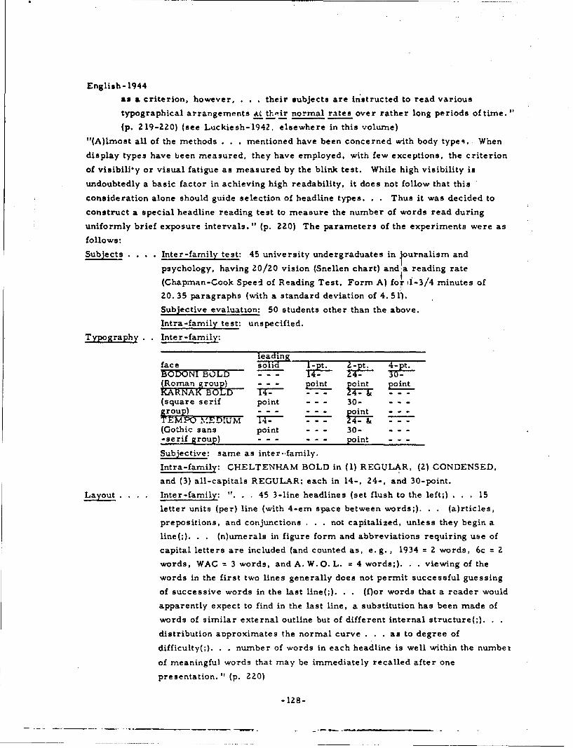
English- 1944
as a criterion, however, . . . their subjects are instructed to read various
typographical arrangements at thoeir normal rates over rather long periods of time.
(p, 219-220) (see Luckiesh-1942. elsewhere in this volume)
"(A)Imost all of the methods . . . mentioned have been concerned with body types.. When
display types have been measured, they have employed, with few exceptions, the criterion
of visibiliy or visual fatigue as measured by the blink test. While high visibility is
undoubtedly a basic factor in achieving high readability, it does not follow that this
consideration alone should guide selection of headline types. . . Thus it was decided to
construct a special headline reading test to measure the number of words read during
uniformly brief exposure intervals. " (p. 220) The parameters of the experiments were as
follows:
Subjects . . . Inter-family test: 45 university undergraduates in •ournalism and
psychology, having 20/20 vision (Snellen chart) and a reading rate
(Chapman-Cook Speed of Reading Test, Form A) fo 1i-3/4 minutes of
20. 35 paragraphs (with a standard deviation of 4. 51J.
Subjective evaluation: 50 students other than the above.
Intra-family test: unspecified.
Typography.. Inter-family:
leadingface soidBODONI BtL - -- +?--2A -1O;F(Roman group) point _
KARNAK BOLD p - - -. oint..(square serif point - - - 30- - - -group)--- pon ---
TIMQMDIM T- - - - 24- & ---(Gothic sans point - - - 30- - - -
-serif group) - - - - - - point - - -
Subjective: same as inter-.family.
Intra-family: CHELTENHAM BOLD in (1) REGULAR, (2) CONDENSED,
and (3) all-capitals REGULAR, each in 14-, 24-, and 30-point.
Layout . . . . Inter-family: ". . . 45 3-line headlines (set flush to the left;) . . . 15
letter units (per) line (with 4-erm space between words;). . . (a)rticles,
prepositions, and conjunctions . . . not capitalized, unless they begin a
line(;). . . (n)umnerals in figure form and abbreviations requiring use of
capital letters are included (and counted as, e.g. , 1934 = 2 words, 6c = 2
words, WAC = 3 words, and A. W. 0. L. - 4 words;). . . viewing of the
words in the first two lines generally does not permit successful guessing
of successive words in the last line(;). . . (f)or words that a reader would
apparently expect to find in the last line, a substitution has been made of
words of similar external outline but of different internal structure(;). ..
distribution aDproximates the normal curve . . . as to degree of
difficulty(;). . . number of words in each headline is well within the number
of meaningful words that may be immediately recalled after one
presentation." (p. 220)
-128-

English- 1944
Subjective: same as inter-family.
Intra-family: "experimental design . . . identical with the treatment
employed in the earlier (inter-family) study. " (p. 227)
Presentation . .Inter-family: '-andom (Graeco-Latin square for each group of three
readers) in a modified Seashore spark gap chronoscope with a three-inch-
square opening---450 millisecond exposure with field of stimulus 14 inches
from subject's eyes.
Subjective: "method of paired comparisons . . . " (p. 226)
Intra-family: same as inter-family.
Environment . Inter-family: paper = newsprint, illumination = 50 foot-candles constant,
area around stimulus opening in newspaper pages.
Subjective: unspecified.
Intra-family: same as inter-family.
Task ......... Inter-family: recognition.
Subjective: appreciation.
Intra-family: recognition.
Response . . . Inter-family: written.
Subjective: judgment.
Intra-family: written.
Test ......... Inter-family: accuracy (with analysis of variance).
Subjective: preference.
Intra-famnily: same as inter-family.
R ----"": Tha fol'ow-..- conciuh1u..ý ia.w,,n as a L suit oi the experinr....•.
I. "Printing types under consideration in this study have been shown experimentally to
differ in readability as herein defined. " (p. 229) This is somewhat contrary to the
following statement by Tinker and Patersca: " 'In spite of the opin'cin of publishers
and. printers as well as of readers to the effect that marked differences in legibility
will characterize different type faces, our tests show that type faces in common use
are equally legible.' Only AMERICAN TYPEWRITER and CLOISTER BLACK ('OLD
ENGLISH') compared unfavorably with several commonly used OLD-STYLE and
MODERN faces, their te-ts revealed." (p. 222)
2. "The CHELTENHAM BOLD. BODONI BOLD, and TEMPO BOLD families were
found superior to KARNAK MEDIUM in the qualities measured in this test (sic).
3. "CHELTENHAM BOLD all-capitals retard the speed with which ht adlines are read
approximately 18 per cent as compared with the lower case of this design.
4. "There is no reason to believe that the readability of headlines is fairly constant ini
the size range betAeen 14 point and 30 point, inclusive.
5. "Reader judgment was found to be an unreliable index of the readability of type in
headline form as measured by objective methods.
6. "To increase the assurance that news presentation to readers occurs under optimum
reading conditions further investigations of other headline type families seem
justified. (p. 229) * *
-129-

Erdmann- 1898
3457 Erdmann- 1898
Erdrnann, Benno and Dodge, Raymond
PSYCHOLOGISCHE UNTERSUCHUNGEN UBER DAS LESEN AUF
EXPERIMENTELLER GRUNDLAGZ (ZXPERIMENTAL PSYCHOLOGICAL
RESEARCH ON READING)
Niemeyer, 1898, 360 p.
Note: As is indicated above, this work is one of the earliest authoritative studies in the
field of readability of text. However, it is not only an historical document, but includes
also rather complete descriptions of Raymond Dodge's early tachistoscopic and
chronographic apparati. In this light, its contents would be of interest to those
experimenters interested irn aspects of the legibility problem other than the readability
of text exclusively. The difficulty encountered in using this document is not only that it
is in German, but also that its German is of an idiom now almost 70 years old. As being
indicative of its contents, the following paragraph is extracted from the Foreword:III
"Die nachstehende Untersuchung ist aus psychologischen Ubungen uber das Lesen
hervorgegangen, die im Wintersemester 1894/95 an der Universitat Halle von dem
Unterzeichneten geleitet wurden. Ich hatte in diesen Ubungen die Anforderungen an
einen Expositions -Apparat darzulegen, der binokulare Beobachtungen, sichere
Akkommodation der Augen sowie simultanes Auftauchen der Schriftzeichen, und zwar
auch von Wortreihen in Zeilenform gestattete. Auf diese Anregungen hin entwarf einer
der Teilnehmer an jenen Ubungen, Herr Raymond Dodge, selbstandig die Skizze eines'I
solchen Apparats, sowie uberdies den Plc.n zu einem neuen, ebenso einfachen wie sicher
funktionirenden Chronographen. . . Prof. D:. Benno Erdmann. "(p. iii-iv)
-130-

Flores- 1960
3345 Flores-1960
Flores, IvanDunlap and Associates, Inc. , Stamford, Conn.METHODS FOR COMPARING THE LEGIBILITY OFPRINTED NUMERAL3Journal of Psychology, 50:1 (J!ily 1960) 3-14, 6 refs.
Problem: Compare the legibility of five, stylized, prospectively machine-readable,numeric type fonts.
Procedure: In the first experiment, twenty-seven literate rubjes-s tachistosco,•.callyviewed random, individua, digits in -_. .. tie "ype fonts identified as GOTHIC, AIR
FORCE, STANFORD RESEARCH, EXPERIMENTAL (examples not provided), and PARKAVENUE. Each digit was illuminated for approximately ten milliseconds, viewed througha light-tight port in the tachistoscope at approximately normal reading distance, andverbally identified to the experimcater in the interval between presentations. Errors wererecorded. In a second experiment, the !ame subjects read a several-digit number to theexperimenter from five (one for each font) series of check-simulating documents. Timeand uncorrected errors were recorded.
Result: For the first experiment, the results of an "F" test were highly significant. A"t" test showed a statistically significant difference between all but the STANFORDRESEARCH and EXPERIMENTAL fonts. The author indicates a superiority for the AIRFORCE fon,. For the second experiment, an 'F ' test showed that differences amongtimes were highly significant. A "t" test showed a significant difference between the AIRFORCE and the other four fonts. This experiment indicated that the identification mayhave depended upon a similarity in the type to that normally encountered.
2659 Foley- 195b
Defence Research Medical Labs. (Canada)EVALUATION OF ANGULAR DIGITS AND COMPARISONSWITH A CONVENTIONAL SETJournal of Applied Psychology, 40:3(June 1956) 178-180, 7 refs.
Problem: "This is a report upon four experiments carried out with the revised set (ofLANSDELL digits) to answer the following questions:
1. "What are the confusion errors?2. "Is the legibility of these digits independent of whether they are presented as
black . . on . . . white . . . , (or vice versa?)
3. "Is the set more legible than a typical conventional set under varied conditions ofexposure and illumination?
4. "Is this set more legible than a typical conventional set when the digits are viewedobliquely?" (p. 178)
Procedure (general): "The conventional set chosen for comparison was that ofMACKWORTH. . . because it shows consistently high performance in comparisons madeby other investigators. . . (In) all experiments . . . (t)he digits were presented singly to
the (subjects, who ranged in age from 18 to 37, and all of whom had 20/20 or betterbinocular acuity, ) who viewcd them (on a 3- by 3-inch white Bristol board screen, from) adistance of 20 feet. . The room . . . was dark. . . (E)xposure time, rate ofpresentatio.., and illumination level (on the screen) were controlled . . . (W)henprc,,;.cted on the screen (all digits) were 3/8 (inch) high. " (p. 178)
-131-

Foley- 1956
Prctedure (experiment 1): "Digits were exposed singly for .6 second . . . (at) one . .every three seconds. . (1)llurr'ination . . . on t)'e screen was ten foot-candles. There
were 15 (naive subjects).". . (p. 179) who each viewed 30 presentations of everyLANSDELL digit.
Result (experiment I): "The specific confusions which contributed more than 5 per cent tothe total error were the 3 with 5 (6. 12%), the 3 with 7 (6. 0%), the 5 with the 3 (6. 6%), the9 with the 5 (5. 2%), and the 0 with the 8 (8. 9%)." (p. 1791
Procedure (experiment 2): "Revised LANSDELL digits, black on white, vwere comparedwith . . . white on black, at . . . 10, 30, and 50 foot-candles. . . exposed singly for . 5
second . . . every three seccods. . . There were j0 (subjects) drawn fror, the 15 ua"d in
Experiment 1. " (p. 179)
Result (experiment 2): "(D)ifferences between (subjects were) significant .... None ofthe subject interactions (were) significant, however . . .. The interaction between digittype and illumination level (was) significant . . . (, i.e. when) the illumination level was
of the order of 10 foot-candles, then white digits on a black ground (were) more legible;(while) . . . from 30 to 50 foot-candles, th(e) black . . . on . . . white . . . (were) more
legible. " (p. 179)
Proacd,-re (experim-nmnt 3): "Revised LANSDELL . . . were compared with MACKWORTHdigits, (all) black on white at . . . 10, 30, and 50 foot-candles, and . . . (0. 3, 0. 8, or)
1. 3 seconds. every three seconds... Six (subjects) from Experiment 2 were used."
(p. 179)
Result (experiment 3): "(T)he difference between the legibility of the revisedLANSDELL . . . and the MACKWORTH digits (was) highly significant . . . (I)nteraction
between exposure and digit type wab nut significant. There (was) a highly significantincrease in percentage correct from (. 3 to 1. 3 seconds exposure time) . . . Similarly for
illumination levels---as illumination increase(d) . . . --- there (was) a highly significantincrease in percentage correct . . .. " (p. 179-180)
Procedure (experiment 4): "Revised LANSDELL . . . were compared with MACKWORTHdigits, (all) black on white, at three angles of view, 45 (degrees) left, normal, and 45,degrees) right. . . exposed singly for . 8 second . . . every three seconds. The (screen)
illumination . . . was 30 foot-candles. There were five (subjects) .".. (p. 180) from
Experiment 3.
Result (experiment 4): "The Revised LANSDELL . . . (were) significantly more legiblethan the MACKWORTH digits under tl-ese conditions . . . . There (was) no interaction
between digit type and viewing angle. (For t)he degrees of freedom . . . the followingcomparisons (were) made: (a) 45 (degrees right) - 45 (degrees left); the difference (was)not significant . . . ; (b) 45 (degrees right) + 45 (degrees left) - 2 (normal); the difference
(was) significant, and show(ed) a decrease in legibility between the normal and the obliqueangle of view. None of the interactions approach(ed) significance. " (p. 180)
Result (general): "The legibility of the new (LANSDELL) digits is not independent of .
(contrast direction). At low illumination levels white on black is more legible, thereverse being true at high . . . levels. Comparisons with a conventional set, theMACKWORTH . . , at different illumination levels, exposure times, and angles of view,
show the new set to be significantly more legible under all of these conditions, (p. 180)
-132-
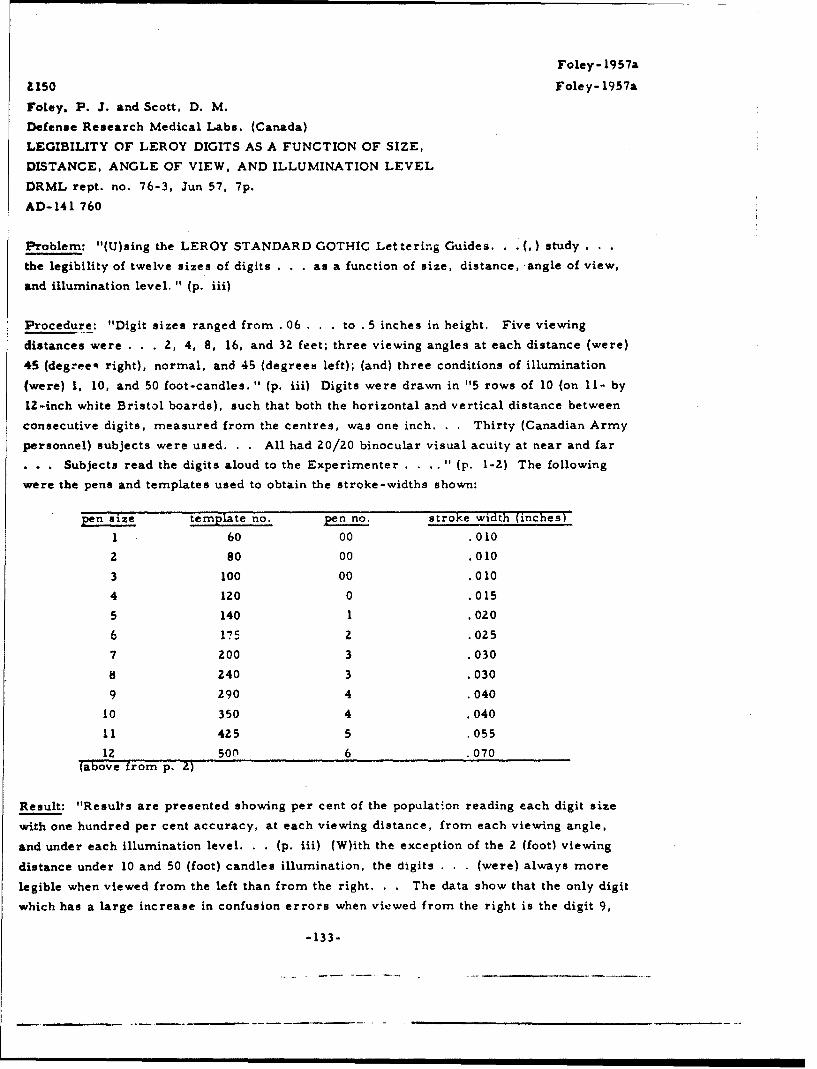
Foley- 1957a
al150 Foley- 1957a
Foley, P. 3. and Scott, D. M.
Defense Research Medical Labs. (Canada)
LEGIBILITY OF LEROY DIGITS AS A FUNCTION OF SIZE,
DISTANCE, ANGLE OF VIEW, AND ILLUMINATION LEVEL
DRML rept. no. 76-3, Jun 57, 7p.
AD- 141 760
Problem: "(U)sing the LEROY STANDARD GOTHIC Lettering Guides. . . (,) study . . .
the legibility of twelve sizes of digits . . . as a function of size, distance, angle of view,
and illumination level. " (p. iii)
Procedure: "Digit sizes ranged from . 06 . . to . 5 inches in height. Five viewing
distances were . . . 2, 4, 8, 16, and 32 feet; three viewing angles at each distance (were)
45 (degree- right), normal, and 45 (degrees left); (and) three conditions of illumination
(were) 1, 10, and 50 foot-candles. " (p. iii) Digits were drawn in "5 rows of 10 (on 11- by
12-inch white Bristol boards), such that both the horizontal and vertical distance between
consecutive digits, measured from the centres, was one inch. . . Thirty (Canadian Army
personnel) subjects were used. . . All had 20/20 binocular visual acuity at near and far
. . . Subjects read the digits aloud to the Experimenter . . . . " (p. 1-2) The following
were the pens and templates used to obtain the stroke-widths shown:
pen size, template no,. pen no stroke width (inches)
1 60 00 .010
2 80 00 .010
3 100 00 .010
4 120 0 .015
5 140 1 .020
6 175 2 .025
7 200 3 .030
8 240 3 .030
9 290 4 .040
10 350 4 .040
11 425 5 .055
12 son 6 .070(above from p. 2)
Result: "Results are presented showing per cent of the population reading each digit size
with one hundred per cent accuracy, at each viewing distance, from each viewing angle,
and under each illumination level. . . (p. iii) (W)ith the exception of the 2 (foot) viewing
distance under 10 and 50 (foot) candles illumination, the digits . . . (were) always more
legible when viewed from the left than from the right. . . The data show that the only digit
which has a large increase in confusion errors when viewed from the right is the digit 9,
-133-

Foley- 1957a
although the digit 6 has almost as large a decrease." (p. 3) The data are presented
graphically.
2151 Foley- 1957b
Foley, P. J.
Defence Research Medical Labs. (Canada)
LEGIBILITY OF MOVING DIGITS AS A FUNCTION OF THEIR
SEPARATION AND DIRECTION OF MOVEMENT
DRML rept. no. 76-4, Aug 57, 5p.
AD- 145 7Z5
Problem: Investigate "(t)he maximum speed of moving digits (on a screen) at which correct
identification is possible .... " (p. iii) Use "the separation between digits . . . and the
direction of movement. ". (p. iii) as variables.
Procedure: "Digits were inscribed, using UNO PEN Stencils, on transparent tapes...
Three separation distances were used, . 75 inch, 1. 5 inches, and 2. 0 inches, subtending
visual angles (at 8.8 feet from the subject) of 6.40, 12. 80, and 25. 6 respectively. . . A
Keystone projector was modified so that tapes could be moved . . . in any direction (right-
left, left-right, up-down, and down-up). . . (It) projected (the digits) onto a screen
(at) speed(s) . . . increased in discrete steps of 20 per second, until the subject (of which
there --'crc fivc males %.ho -,.ch nmd In / 0 vision or better) no longei gave 100 (percent)
correct responses. . . The . . . actual legibility (visibility of the digits) was not a
factor." (p. 1)
Result: The following table "shows the average maximum speed, in degrees per second, at
which (the) subjects could correctly identify a series of Z5 digits(:)
seprationdirection 6.4 12.8 Z5.6right-left = 1 Uleft-right 30.4 46.8 59.6down-up 28.2 37.4 54.4up-down 25.6 32.6 49.8"(above from p. 2)
The results of an analysis of variance show "that all main effects are significant. There
is, however, a significant interaction between the separation of digits and the direction ofmovement. . . The differences in the maximum speeds that can be tolerated for each
direction appear to become accentuated as the. separation increases. Further, increases
in separation up to 120 result in proportionately greater in-ximurn speeds when the
direction of movement is in the horizontal dimension. . . The superiority of movement
from right to left . . . probably reflects the normal . . . reading habits . . . The
superiority of movement upwards can be similarly explained." (p. 3) In conclusion, it is
-134-

Foley- 1957b
seen that "more digits can be presented and correctly identified . .. , if the speed is sl8%
and the separation small, than if the speed is fast and the separation large." (p. 3)
I578 Forbes- 1951
Forbes, T. W., Moskowitz, Karl and Morgan, Glenn
Cnstitute of Transportation and Traffic Engineering,
U. of Calif. , Berkeley, and California Div. of Highways
. COMPARISON OF LOWER CASE AND CAPITAL LETTERS
FOR HIGHWAY SIGNS
:n PROCEEDINGS OF THE THIRTIETH ANNUAL MEETING, 1951,
Ioy W. Crum, Fred Burggraf, and W. N. Carey, Jr., Editors,
Washington, D. C., Highway Research Board, National Research
;ouncil, 1951), Vol. 30, p. 355-373
Problem: Compare the legibility (for scrambled le ters) and recognition distances (for
amiliar names "with" and "without" previous know edge by the subject as to the names to
)e presented) of lower case versus all capital letters (each in three different sizes) for
Lighway signs under both daylight and night conditions. Ascertain whether the results
ýompare favorably with the results of previous experimentation that "have shown that
ower case printing gives more rapid reading than solid black printing with capital letters."
p. 356)
2rocedure: All letters were semi-matte white on a black background. "The capital
etters were rounded standard (U.S. Bureau of Public Roads)SERIES E (average letter
ridth of (1) neat letters = 0.81, and (2) letter plus spacing t 1. 13, both in inches per inch
f letter height) but with a slightly widened stroke (0.20 inches per inch of letter height).
'he lower case alphabet was one based on practical trial and development (average letter
didth of (1) neat letters = 0. 77, and (2) letter plus spacing = 1. 15, both in inches per inch
f 'loop' height---vertical strokes 0. 22-0. 25, horizontal strokes 0. 20-0. 22 inches per
ich of 'loop' height, depending on letter---stem height of 'b', 'd', and 'k' = 1. 415 inches
er inch of 'loop' height). . . (p. 358 & 370) (L)ower case letters were chosen whose
verage width including spacing would be very close to that of the capital letters including
pacing. . . (p. 361) (The) three types of test signs. . . were: (1) scrambled letters in a
ix letter combination (24 of the 26 possible letters were used) for determination of true
-gibility (involved letter discrimination); (2) familiar (geographic---local) names 'without
nowledge' (by the subject) as to the names which would be used (involved letter
iscrimination and word pattern recognition); and (3) familiar names 'with knowledge'
nvolved word and over-all pattern recognition). Both lower case and capital letters were
Ped in all three types of observations and in different sizes of letter (height = 6. 0, 8. 5,
id 13. 0 inches for capitals, and 'loop' height = 5. 3, 8. 0, and 12. 0 inches for lower case).
(T)he . . . determinations with the scrambled material were used as a base and the
-135-

Forbes- 1951
observations of familiar signs were related to them." (p. 370) Observations were made by
an average of 55 subjects (age 18-70 years) for each condition. Observations were made at
night (12 to 18 foot lamberts . . . obtained from fluorescent tubes above and below the
sign---30 to 40 foot lamberts gave blurring at longer distances) and during the daytime
with the sun on the face of the signboard. The signboard carried six words (each 6-9
letters in length) at a time (the same word---of four for day and four for night---was used
for each condition, case, and size). The signboard was 24 feet long by 6 feet high, with
the bottom edge 17 feet above the ground. Thus, "measurements were carried out La funl
scale. . . against an outdoor background . . . 'Distance seen' was analyzed on the basis
of known psychological factors into (1) recognition by overall word pattern and (2) actual
discrimination of letters, as the two extremes. . . (p. 356) Where large numbers of
porcelain enamel signs are involved, the amount of sign area required per letter is of
importance in determining cost. An analysis was therefore desired of median 'dibtance
seen' in (these) terms . . . In order to make such a determination, assumptions as to
minimum vertical spacing between words and vertical spacing for margins were necessary.
In the case of capital letters, . . . experience . . . indicate(d) that a border width equal to
the letter height above and below each word is satisfactory to eliminate blur from the
brightness of the sky or fusion between two words when arranged one above the other. For
a two line sign, this gives a vertical spacing of 2. 5 letter heights per line . . . For the
lower case letters, however, the vertical spacing required to obtain an equivalent isolation
of wozds was not clear. If the same factor were used on the basis of stem height . . ., it
would result in a greater effective area of vertical spacing . . . (A)lternative assumptions
were therefore made for exploratory purposes. The first . . . was . . . 2. 5 'loop' heights
. . . The second . . . was . . . 2.25 'stem' heights per line .... " (p. 366)
Result: Concerning the foregoing, "a considerable advantage resulted for the place names
'with knowledge' when (assumption one) was made. However, on this basis there was very
little difference between lower case and capital letters for the scrambled letter legibilitydistances. On the other hand, (the second assumption) made the lower case and capital
letters about equally effective in the case of the most familiar test material and showed the
lower case at some disadvantage in the names 'without knowledge' and the scrambled letter
determinations. The effects of the two assumptions were similar for day and night
conditions except that differences obtained were smaller for the latter. . . (p. 366) ýA)
series of observations should be carried out to determine the minimum vertical spacing
necessary for the two forms of letter. " (p. 371) Returning to the primary variables (letter
case, letter size, illu .Jnation level, and word composition), the following approximate 85
percentile (representing 20/20 vision) distance values (in feet) were derived from the
observation data (equivalent letter and 'loop' heights interpolated from chart plot):
-136-
- .* . - -- -

Forbes-1951
S.. .. .. . ........ .. .daylight ni~ght
letter or capital lower- capital lower-,loop, ht. letters case leLters casescrambled 6 inches 32 370 -'= "*25
letters 8 inches 450 500 350 355- -.-- 12 inches 700 755 530 345
without 6 inches 45 3know- 8 inches 605 640 510 560ledge - - 12 inches 950 960 800 855
with 6 inches 63 40 48
know- 8 inches 720 850 560 640ledge - - 12 inches 1150 1255 900 960
(above from p. 364)
"For both lower case and capital letter signs, the median and 85 percentile distance
increased as the degree of familiarity increased. The longest recognition distances
however, were reduced more nearly to those of the second type under night conditions.. .
The legibility distances from 'scrambled' letters were in line with (previous results) . . .,
and decreased at night for the capital letters . . . Median l-.gibility distances from the
scrambled material proved to be roughly thr._z -fourths as great as the recognition distances
determined with familiar names . . . 'without knowledge' .... This relationship was
also approximately the same for night observations. . Letter height has been used
rather generally as a basic index of capital letter size since it is constant for all letters
For the lower case letters, however, . . . 'loop' height was the onl' constant
dimension. When distance 'seen' was plotted against loop height, comparison oi median
distances showed an increasing advantage for lower case . . . over capital letters as
familiarity of test signs increased. However, when stem height was used the advantage
was reversed. . . Approximate eighty-five percentile distances for scram, led capitals
and place names 'without knowledge' were 55 and 75 (feet) per inch of letter h,.ight. For
lower case letters of equal 'loop' height, these distances were about 10 per cent greater.
. . (p. 371) (P)revious studies . . . show(ed) that observations of legibility distances of
highway signs resiulted in a rather symmetrical frequency distribution of distance values,
and here again similar distributions were obtained. " (p. 361) In conclusion, "(o)n the
basis of width, the lower case words could be seen farther than the cap'tal words,
presumably because they were higher. Thus where length of sign is the controlling factor,
.. these . . . would have the advantage. . . On the basis of sign Lrea, the advantage
S. . depends upon the vertical spacing or m argins." (p. 355) Discussion following
presentation of the paper brought out the following: (1) "the difference in distance seen
. . . of only 10 percent does not seerm significant enough to warrant immediate widespread
use of the lower case letters", (p. 371-372) (2) "(d)irect comparison of capital letter height
to the loop height of the lower case letters is not strictly correct", (p. 372) and (3) "(i)n
usual use, the lower case letters for names involve a higher or capital initial letter, which
requires more board space." (p. 372) In reply, the author states that "the question of how
to compare the two forms of letter is much more compiex than iL may appear at first
glance." (p. 372)
-137-

Gleason- 1947
2153 Gleason- 1947
Gieason, 3. G.
Purdue U., Lafayette, Ind.
THE DESIGN OF NUMERALS FOR USE IN COUNTER-TYPE
INSTRUMENTS: A REVIEW OF THE LITERATURE
Rept. no. 166-1-39, 20 Dec 47, 24 p.
ATI-31 814
Extract: "The works reviewed (of which Berger-1944b and Luckiesh-1937a may be found
elsewhere in this volume) appear to provide adequate information (except for styles and
stroke-width) concerning the characteristics of the variables studied (size of the critical
detail to Le perceived, contrast between object and background, brightness level to which
object is illuminated, time the image is allowed to rest on the retina, color of the image/
background, height of numeral, stroke-width of numeral, and interactions among these
variables). . . These may be summarized as follows:
1. "The size of the critical detail in the numerals should be as large as is possible
within the necessary practical limitations of overall size. Within these limitations,
it may be said that the larger the numeral of any given type, the greater will be its
visibility . . . , the more rapidly it can be identified, . . . the smaller the contrast
ratio required . . . , the lower the brightness level required ....
2. "The contrast between the numeral and its immediate background should be as great
as it is possible to provide. By increasing this contrast ratio for any given numeral
type, equal visibility may be maintained when the size is reduced, or the brightness
level is reduced, or the time for apprehension is reduced.
3. "The brightness contrast between the dial area and the surround should preferably
yield a ratio of one. If this is not possible, a reduction of surround brightness
below the level of the dial area reduces legibility only slightly. A situation which
yields surround brightness greater than dial areas is to be strenuously avoided as
this condition greatly reduces acuity.
4. "The brightness level of the numeral and its background should be as high as
possible in the situation obtaining. Increasing the brightness level increases the
speed and accuracy of apprehension and with the same type numeral a given visibility
level may be maintained by increasing the brightness level while decreases in
contrast . . . or . . . size are made, or while time for apprehension is decreased.
5. "For greatest visibility, other factors held equal, numerals should be either black
or white on opposite b-v.kground. In ordi-r of decreasing visibility, . . . inferior to
black on white or (vice versa), are black on yellow, yellow-green, orange, green,
red, blue-green, and blue. The question of the relative merits of black on white
and (vice versa) has not been conclusively answered . . .
"(E)ach of the above factors should be applied to the greatest extent compatible with other
requirements . . . (S)tyle of numeral and width of stroke used . . . have not been
-139-

Gleason- 1947
adequately investigated. . . Therefore, ... study of the design of numerals for use in
counter-type instruments is conceived to be the study of these two factors while holding
the (other) variables constant. " (p. 18-19)
Note: Of the author's 67 references, which formed the basis for his literature review, the
majority are concerned with such problems of perception as visual acuity, object-field
contrast, size of critical detail, and the time an image is allowed to rest on the retina, and
for these areas extensively covers material that is nft included in this hanuoook.
3317 Green- 1953
Green, B. F., McGill, W. J. and Jenkins, H. M.
Lincoln Lab., Mass. Inst. of Tech. , Lexington
THE TIME REQUIRED TO SEARCH FOR NUMBERS ON
LARGE VISUAL DISPLAYS
Technical rept. no. 36, 18 Aug 53, 15p.
Contract AF 19(122)-458
AD-Z1 109
Problem: "(D)etermine the amount of time that is lost in searching for numbers on typical
visual displays. " (p. ii)
Procedure: Seven experiments were conducted "in order to determine . . . time . . . lost
in searching . . . (and) some of the variables that influence search times. .. The displays
used . . . were circular areas in which three-digit numbers were distributed at random.
In some experiments, the displays were projected on a vertical beaded screen; in the
others, numbered plastic tokens were arranged on a horizontal circular table top. In some
cases, the background was uniform, or uncluttered; in other cases, a cluttered background
was used. The properties of the numbers on the display were varied during the
exper, nents, and the effects of these variations were noted in terms of their influence on
search time. " (p. 1) In Experiment 1 (numbers projected onto a 42-inch diameter screen
10 feet from each of 20 subjects), "the variables controlled were: (1) Number density: -
. . . 25, 50, 75, or 100 three-digit numbers .... (2) Number size: - . . . 1/2 . . . or
3/4 inch high. . (3) Number orientation: -... upright . . . (and) jumbled in eight
different orientations 45 degrees apart. " (p. 1) In Experiment 2, 17 new subjects read
numbers under "r.ine experimental conditions: eight single orientations and one random
orientation. " (p. 6) Other conditions were fixed at 50, 3/4-inch numbers. "Experiment 3
was performed in order to determine whether . . . some numbers were easier to find than
others. In (it), each of 12 subjects searched for the same 24 numbers. . . (in) the
condition of 50 . . . 3/4-inch numbers upright on the screen. " (p. 7) Order of presentation
was also a variable. "In (Experiment 4) . . ., the projected displays included a polar
-140-

Green-1953
coordinate grid . . ., and eaca. number on the display had a marker arrow near it. . . The
numbers were 3/4 (inches) in height, and were all upright . . . . Five number densities were
used: 20, 30, 40, 54, and 60 numbers, respectively. . . Each of 11 subjects we.s given
four trials at each density. . . In Experiments 5 and 6, a horizontal (60-inch diameter)circular table top was used for the display. . . (which) was confined to an area 42 inches in
diameter. The numbers were cut into small plastic tokens and the cuts were filled with
fluorescent wax. . . On (a) small token the numbers were 1/8 inch high and were colored
yellow. The larg(e) tokens had blue numbers 1/2 inch high. The background . . . was a
polar coordinate grid . . . painted (green fluorescent) on vellum . . . The display was
liý d with ultraviolet . . . in (a) . . . dark room. . . (T)okens (were placed) in a
haphazard arrangement . . . (T)hc experimenter announced the target number ....
(Subject's) eyes were 3 to 4tfeet from the display . . . (at an) angle of regard (of) about 45degrees. In Experiment 5, (25, 50, 75, and 100) number densities were used with each
token type separately . . . . " (p. 8-9) The eleven subjects used "had normal color vision.
. . In Experiment 6, . . . 25 large blue . . . and 25 small yellow tokens (were placed) on
the table and (the subject was) instructed to find a particular number of a specified color. "
(p. 10) T1-,e experiment was also conducted for 50 of each size token. Experiment 7 was
an extension of Experiment 6. In it were added "some large yellow tokens of the same sizeand shape as the large blue (ones). For each token, separately, two density conditions
were used: 25 . . . and 50 numbers. In addition, . . . 25 blue . . . (were combined) with
25 large yellow . . and . , . with 25 small yellow tokens. . . For these . . . (there
were) three conditions of search: search for a blue target number, search for a yellow
target number, and search for a target number with color not specified." (p. 13) There
were 12 subjects in this experiment.
Result: The following results and conclusions were drawn from the data:
1. "For legible numbers on a large visual display, the most important variable is the
number of alternative numbers that must be scanned. For a moderate number of
alternatives, the average search time in seconds is approximately one-fifth the
number of alternatives.
2. "The search time is shorter for large numbers than for small numbers, unless
there are so many numbers that the display becomes crowded. Smaller numbers
are preferable on crowded displays.
3. "If the numbers on the display are all in an upright orientation, the search time is
shorter than if the number! are oriented at random . . .. However, if the numbers
are all oriented in the same way and this orientation is not upright with respect tothe observer, the search time depends on the . . . orientation. The average search
time for all single orientations is equivalent to the search time for a display inwhich the various numbers are randomly oriented. Consequently, if operators
must be located around a horizontal display where the numbers cannot be oriented
properly for everyone, there is no advantage in arranging the numbers in a single
orientation.
-141-

Green- 1953
4. "Numbers at some positions in the patterns of numbers are harder to find thanothers, but the effect of location is very small.
5. "If the numbers are clearly legible, typical background clutter has no effect on
search time.
6. "When the color of the number to be searched for is specified in advance, the
presence of numbers of a clearly different color does effect the search time.
7. "Some individuals are faster searchers than others, but the differences are
relativ,1y small... (p. ii)
"In general, (the) data show that number-searching is a time-consuming process. It is not
likely that search times can be reduced materially unless tl ; number of alternatives to he
scanned is reduced. When decisions must be made in a few minutes, delays up to an
average of 30 seconds can be very costly. When speed is important, procedures involving
number searches should be avoided. " (p. 15)
3273 Gustason- 1960
Gustafson, Charles E.
Behavioral Sciences Lab. , Aerospace Medical Div.
Wright-Patterson Air Force Base, Ohio
A METHOD OF ESTIMATING SURFACE COLOR
DISCRIMINABILITY FOR CODING TRAINING EQUIPMENT
AND PREDICTING LABEL LEGIBILITY
WADD Technical Note 60-83, May 6U, 8p. , 4 refs.
Project 1710, Task 71607
AD-243 721
Problem: "(E)stimate the relati,. e discriminability of colors solely on the basis of their
relative brightness as obtained from spectrophotometric data or code approximations...
Ignor(e) the effect of color contrast (contrast in hue) . . . . " (p. 7)
Procedure: "Using luminous reflectance values for Federal Standard colors, the classic
formula for contrast is suggested as a convenient method of estimating surface color
discrininability for purposes of coding training equipment and predicting the legibility of
panel labels. " (p. iiil A table is shown of "contrast and discrimination error percentages
for selected Federa' .ndard color combinations. . . (p. 3) Specific applications of the
method are discussecý . . .. " (p. iii)
Result: "The following conclusions appear justified ..
1. "Brightness contrast between Federal Standard colors can be estimated by
substituting available luminous apparent reflectance values (or code approximations)
in the classic formula:
-142-

Gustafson- 1960
contrast (M,) - , x 100
(in which Y = measured luminous apparent reflectance)
2. "As the brightness contrast between colors increases, the probability of committing
errors in discrimination decreases and, conversely, as the contrast decreases,
discrimination errors increase.
3. "In order to keep discrimination errors below 1 percent, contrast should be at least
75 percent or greater.
4. "As '-rightness contrast is reduced below 50 percent, the probability of committing
errors in discrimination increases rapidly.
5. "Because brightness contrast is a prime factor in visual acuity, the legibility of
printed labels involving combinations of Federal Standard colors (including
achromatic) can be comparatively determined by means of the contrast formula
... ,, (p. 7 )
-143-

Halsey- 1960a
3297 Halsey- 1960a
Halsey, Rita M.IBM Command Control Center, Federal Systems Div.,Kingston, N. Y.CHARACTER DESIGNS IN A 5x7 MATRIX OF SOUARESResearch rept. on ECPX-0027, Nov 60, 6 p., 17 refs.Contract AF30(635)-1404AFCCDD-TN-61-3; AD-252 030
Problem: Determine the effect of brightness (of the characters) and size of individualelements (with center-to-center spacing held constant) on the legibility of numericcharacters made up of a 5 X 7 MATRIX of squares. Also "generate a confusion matrixfor the characters used, as an initial step toward designing a legible set of characters."(p. 133)
Procedure: The parameters expected to affect the legibility of alpha-numeric charactersdesigned within a 5 X 7 MATRIX of squares are as follows:
1. "The form of the elements (circles, squares, blobs, etc.).2. "The patterns, or designs, of the various characters.3. "The size of the characters, relative to the viewing distance.4. "The size of the elements, relative to the separation between the elements.5. "The vocabulary to be used: whether alphabetic, numeric, or symbolically-coded
characters will be included.6. "The brightness of the on elements, and the brightness of the background
(off-elements).7. "Temporal factors.8. "Interference among messages.9. "Other factors specific to particular displays. " (p. 133)
In the experiment, all factors but 4. and 6. were either arbitrarily fixed or held constant"at values expected by design engineers. " (p. 133) Also, only 0. 10-inch high (distancefrom center-to-center, top-to-bottom squares) numeric characters were used. Fivcstyles (distinguished by the size of individual elements as defined below) were presented.
measure style of numerals
A B C D Eratio of side of element
to distance betweencenters of elements 0. 1 0.3 0.5 0.7 1.0
ratio of actual width toactual height ofnumeral 0.67 0.68 0.69 0.70 0.71
visual angle of oneelement at 36 inchesviewing distance (inminutes (') and (sic)seconds (") ) 0'9. 5" 002. 9" 0'48" 1'7" 1'36"
(above from p. 134)
Thus, five subjects tachistoscopically viewed (at 0. 10-second flash duration) back-projected, luminous on opaque, 5 X 7 ELEMENT, randomly arranged, numeric
characters at a distance of 36 inches, giving a visual angle of about °'9. 5 minutes" e tzh.The illumination intensity of the character elements was varied (by means of neutralfilters) between "a level yielding 100 percent correct identifications (and) a levelyielding 0 percent correct identifications . . . (with) the intervening intensities in stepsof 0. 2 density. " (p. 134) Room illumination provided a brightness on the b.:koroune.
-145-

Halsey- 1960a
panel of approximately 0. 7 foot-lamberts. Accuracy was the test criterion.
Result: For the numeral sets used, the following results were obtained:1. For a given style, accuracy increased as element illumination intensity increased.2. To achieve equal performance, a higher intensity was required for style "A" than
for "E" numerals.3. Generally, the "results suggest that a simple relationship exists between element
size and numeral intensity. 1 (p. 135) Further, "it is reasonable to assume that aselement size and/or brightness is further increased, legibility will reach aplateau and will finally decline as the character begins to resemble a blob.(p. 136)
Thus, "(i)t can be concluded that, for practical situations involving the ranges of sizesand intensities tested, area and intensity are roughly reciprocally related in determininglegibility. " (p. 135) Finally, the following conclusions were drawn from a confusionmatrix generated by the results:
1. 7, 1, and 4 were correctly identified most frequently---5 and 8 least frequently.In general, accuracy decreased as the number of elements comprising thenumeral increased. Also, the number of elements predicted inaccuracy betterthan it did accuracy.
2. "The numeral I w s frequently reported as not being seen. " (p. 137)3. The numerals most frequently confused were as follows: 7 for 1; 4 for 2; 2, 4,
and 7 for 3; 6 for 4; 3, 6, and 9 for 5; 4 for 6; 6, 9, and 0 for 8; and 6 and 8 for 0.However, a subjective numeral preference seemed to appear in that "moreresponses of 4 .and 6 occurred than can be accounted for by confusion patterns."(p. 137)
There were no consistent differences between the confusion matrices for the differentstyles, although there was an indication that "larger or smaller elements seem toproduce different sorts of confusions. " (p. 137-138) A revised set of numeral designs(some old and some new) that should reduce some of the major confusions was shown.These designs have not been evaluated experimentally. When designs are limited to the5 X 7 MATRIX shown, the above numerals "are appropriate only when no alphabeticmaterial is used on the same display. " (p. 138)
2662 Halsey- 1960bHalsey, Rita M.IBM Command Control Center, Federal Systems Div., Kingston, N. Y.FACTORS INFLUENCING THE LEGIBILITY OF SAGE DISPLAYSResearch rept. on ECPX-0027, Nov 60, Iv. , 42 refs.Contract AF 30(635)-1404AFCCDD TN 61-7; AD-252 034L
Problem: Determine the effect of type, color, and amount of room illumination; tubebrightness intensity; intensification time (a function of the time, in microseconds, allotedto the sweep in order to bring a symbol up to a viewable intensity of brightness); displayrate; character size; and some interactions between these on the legibility ofalpha-numeric characters and special symbols on a SAGE-type, shaped-beam,cathode-ray tube display. Present "infrequent repainting of information (every 2. 5seconds) requires that the system operate under a low level of blue light. The majorcomplaints that have been made about the existing system were based on these conditions;namely, that there is too much Licker, too low an ambient light level, and too muchinformation displayed on every con3ole. " (from the author's foreword) However, "(t)heprimary requirement for alpha-numeric information on a SAGE display is legibility. Thisseries of experiments u3es a method which combines the tasks of detection andidentification for information which does not move nor change with time. " (p. 87)
-146-

Halsey- 1960b
Procedure: Fifteen experiments, designated (within the total experiment 4) A through 0,involved a total of 46 subjects (IBM employees), ranging in age from 21 to 49, with amedian age of 31. Most subjects had good vision. The following cor,'•tions were standard,and thereby fixed unless otherwise stated for a specific experiment:
1. Three SAGE consoles were set in a lusterless, neutral gray, painted room; withgray cloth screens as light baffles behind observers to eliminate ceiling reflections.
2. Tubes were 19-inch, shaped-beam, cathode-ray tubes, each using a P-14phosphor,and having a 60 percent reflectance, a standard SAGE matrix painted in the centerof the tube face, and a yellow implosion shield in place over the tube face.
3. Electrical conditions w-re those standard for XD-2 operation.4. On the standard tubes used, the character height was 0. 11 inches and the height to'
stroke-width ratio was 6 to 1. On the bright tubes, the following were seen: brightnumbers I and 2 - height to stroke-width ratio of 5 to 1; bright number 3 - height tostroke-width ratio of 9 to 1; character heights on all bright tubes was 0. 10 inchesexcept when intentionally reduced to approximately 0. 07 inches; bright number 3also had SYMBOLS X, /, and \ without standard center dot X, 0, and k.
5. Sixty-four alpha-numeric characters could be placed in the matrix, with P having aprobability of 5/39 and all others a probability of 1/39. Ten numerics and 25 alphaswere available.
6. All observations were foveal, with the observer's eyes 17 inches (and held by abrow-rest) from the center of the implosion shield. Dark adaptation was accountedfor where necessary.
7. The observers' task was a recognition ont (e. g. count the P's), with the responsebeing by pushbutton, switches, or light gun.
8. Measurement criteria included reading time for static alpha-numeric characters,reading accuracy for changing SYMBOLS, and tracking performance.
The following variables were seen in the total experimentation:1. Room illumination - type: normal ceiling, fixture, and bare ceiling.2. Room illumination - color: SAGE blue, commercial blue, and white light.3. Room illumination - amount: 0. 004 to 1. 0 foot-candles for SAGE blue, 0. 6 to 15
foot-candles for commercial blue, and 0. 017 to 13 foot-candles for white light,with 0. 001 foot-candles (mostly white) in "lights off" condition. Amount of roomillumination was varied by adjusting the input voltage between 0 and 120 volts, andin addition by the number of bulbs placed in the fixture mode.
4. Tube intensity: Brightness increased as the display rate increased. Two tubetypes, standard and bright, were used, with the bright having approximately 10times the brightness of the standard. Relative brightness only was measured andvaried between approximately 0. 007 and 18. 0. The following nomenclature wasutilized to indicate the intensity of the two tube types: standard - minimum, low,medium-low, medium, high, and maximum; bright - minimum, low, medium, high,and maximum.
5. Intensification time was varied between 7 and 25 (standard) microseconds.6. Character size was 0. 10 (bright tubes) to 0. 11 (standard tubes) inches height,
except for two experiments in which it was (an average of) 0. 07 inches.7. Display rates (ti-ne between successive intensifications) were as follows: For
alpha-numerics - 2. 6 seconds (0. 38 cycles per second), the SAGE standard; and0. 31 seconds (3. 2 cps). For radar - 3. 2 seconds (0. 31 cps); and 2. 3 seconds(0.43 cps).
For each of the individual fifteen experiments, the following title, purpose, conditions, andresults, were seen (by experiment):
1. A - Effects of room illumination and tube intensity at the present SAGE displayrate. Purpose: "(D)etermine the settings which would yield optimal performanceon a legibility task. " (p. 90) Conditions: Nine observers. Room illumination =0. 001, 0. 004, 0. 09, 0. 26, and 1. 0 foot-candles of SAGE blue light. Tubeintensities = minimum, low, medium, and high on standard tubes. Display rate2. 6 seconds. Seventeen of 20 possible interactions were tested. Results: "(T)ube
-147-

Halsey- 1960b
intensity is the most important determinant of legibility .... " (p. 91)
2. B - Effect of stray light. Purpose: Determine if "stray light from switches andpushbuttcns interfered with visibility when the room lights were low. " (p. 92)
Conditions: Nine observers. "Selected conditions of Experiment A were run withand without the masking of stray light. The 'mask' condition was accomplished bydraping opaque black cloth over all lighted units on the console and by taking extraprecautions against stray light in the room. No other changes were made inprogramming, procedure, or conditions." (p. 93) Results: "The presence of straylight does not degrade performance . . . (p. 93)
3. C - Interaction between room illumination and display rate. Purpose: Determinewhether a faster than standard display rate will permit higher and possibly whiteroom illumination. Conditions: Six observers. Display rates = 2. 6 and 0. 31seconds. Room illumination = 0. 09 and 1. 0 foot-candles of SAGE blue, and 0. 017and 1.0 foot-candles of white light. "At the fast :ate, an illumination of 13foot-candles of white light vas also used. Standard tubes at high tube intensitywere used. " (p. 93) Nine interactions of these conditions were tested. Results:"At the standard . . . rate . . . , performance is much poorer under wh;ite
light .... and . . . under higher levels of both kinds . . . . At the faster
rate . .. , neither the color nor the amount of room illumination affects
performance, except under 13 foot-candles of white light, where a decrement isnoticed. " (p. 94)
4. D - Interaction between tube intensity and room illumination at a fast display rate.Purpose: "(D)eterminf: if, for fast rates, lower tube intensities (than in C) alsoproduced legible displays under high rcom illumination. " (p. 94) Conditions: Sixobservers. Tube intensities = minimum and high on standard tubes. Roomillumination = 0.09 and 1.0 foot-candles of SAGE blue; and 0.017, 1.0, and 13foot-candles of white light. Display rate = 0. 31 seconds. All conditions weretested. Results: "Under SAGE blue light, the two tube intensities produce equallegibility. Under %%hite light, performance is poorer with the lower tube intensity.A high level (13 foot-candles) of white light produces a large decrement inperformance. " (p. 95)
5. E - Comparison of bright tube and standard tube. Purpose: Compare a bright witha standard tube "for legibility at both the center and the edge of the tube .... "
(p. 96) Conditions: Six observers. Tubes = standard and bright number 1. Roomillumination and display rate = 1 foot-candle .ach of SAGE blue and white light at2.6 seconds, and 13 foot-candles of white light at 0. 31 seconds. Matrix positions
center of tube and edge of tube. All combinations of variables were tested.Results: "(I) performance is better at the fast rate (even with high roomillumination) than at the slow rate; (2) at the slow rate, legibility is better withSAGE blue room illumination than with white; (3) the matrix is easier to read at thecenter of the tube than at the edge; (4) the Bright tube is superior to the standardtube. . . Under the best observing conditions (0. 31-second rate, center oftube), however, there is no difference . . .. " (p. 98)
6. F - Effect of intensification time at a fast display rate. Purpose: "(D)etermine thelegibility of . . . information as a function of intensification time and roomillumination. " (p. 99) Conditions: Four observers. Tube intensity = maximum onstandard and bright number 1. Intensification times = 7, 14, and 25 microseconds.Room illumination = 1, 6, and 13 foot-candles of white; and I foot-candle of SAGEblue lipnt. Display rate = 0. 31 seconds. All combinatiois of variables weretested. Results: "On the standard tube, legibility decreases as intensification time
decree ses and as room illumination increases. Excellent legibility was obtainedwith I e Bright tube at all intensification times. The only objectionable dec ementin pt .formance was found when the 7-(microsecond) intensification time and 13foot-candles of white room illumination occurred together. " (p. 99)
7. G - Effect of character size. Purpose: "(D)eterrnine if 0. 07-inch characters canbe used under the proposed conditions (for SAGE-U) without degrading
-148-

legibility." (p. 101) Conditions: Eight observers. Display rate = 0. 31 seconds.Intensification time = 14 microseconds. Roorm illumination = I foot-candle of SAGEblue, and 6 foot-candles of white light. Tube intensities = minimum, low, high,and maximum for the bright numbers 1, 2, and 3; and low, medium, high, andmaximum for the standard tubes. Character heights = 0. 10 (normal), and 0. 065 to0. 075 (0. 07 proposed) inches for the bright; and 0. 11 inches for the standard tubes.Forty conditions were run in this two part (bright an'd standard tubes) experiment.Results: "0. 07-inch characters are less legible . . . under conditionsconsidered . . .. The decrement averages about 25 percent in scanning speed butvaries with observing conditions. . . (A)ny decrease below maximum tubeintensity will cause a further decrement in performance. Likewise, an increase inthe amount of room illumination, or a substitution of whiter lights for the presentSAGE blue, or an increase in the transmittance of the room illumination by theimplosion shield, or a decrease in display rate, will probably degrade legibility toan unacceptable level. " (p. 104)
8. H - Comparison of three sources for room illumination. Purpose: "(E)valuate the
light source proposed by the MITRE Corporation for the SAGE-II Display Systemusing Bright tubes. " (p. 105) Conditions: Four observers. Roc.m illumination =commercial blue fixtures at 0. 6, 1. 0, 3, 6, and 15 foot-candles of light. "SAGEblue, commercial blue, and white lamps were placed in the fixture to providethe . . . qualit(y) of illumination. " (p. 105) Tube intensities = low and maximumfor bright, and medium and high for standard tubes. Characier sizes = 0. 10inches height on bright number 2, 0. 065 inches height on bright number 3, and0. 11 inches height on standard tubes. Display rate = 0. 31 seconds. Intensificationtime = 14 microseconds. Seven conditions of this experiment were tested.Results: "Illumination with SAGE blue results in better legibility than doesillumination with commercial blue or white. The superiority of SAGE blue is moreevident at higher illuminations. Commercial blue and white produce essentiallyequal legibility scores. Performance declines as illumination increases, butslowly at the lower levels. Decrearing tube intensity or decreasing character sizealso degrades legibility. " (p. 106)
9. 1 - Legibility with changing symbology at a slow display rate. Purpose:"(D)etermine if conditions improving the legibilit-y of static material improve ordegrade the legibility of changing material. " (p. 110) Conditions: Six observers.Display rate = 2. 6 seconds. Tube intensities = minimum, medium-low, and highon standard tubes. Room illumination = 0. 004, 0. 09, and 1. 0 foot-candles ofSAGE blue; and 0. 017 and 1.0 foot-candles of white light. All 15 conditions weretested. Results: "(A)t the standard SAGE rate, the conditions necessary formaximum legibility of static materia) also produce maximum legibility of changingmaterial: high tube intensity, SAGE blue light, and low levels of ambientillumination. " (p. 112)
10. J - Legibility with changing symbology at a fast display rate. Purpose: Determine"the legibility of overpainted material at a fast display rate. " (p. 112) Conditions:Eight observers. Display rate = 0. 31 seconds. Tube intensities = minimum,medium-low, and high on standard tubes. Room illumination = 0. 017, 1. 0, and 13foot-candles of white. "The number of times the test numerals were painted was1, 2, 3, or 4." (p. 112) All 36 conditions were tested. Results: "There is acomplex interaction among the three principal variables: room illumination, tubeintensity, and number of paints. . . (L)egibility increases as the number ofpaints . . . increases. . . (T)he higher the tube intensity the higher the percentageof correct identifications. The improvement is greatest for the highest roomillumination . . .. " (T). 113) However, "(i)n general, performance deteriorates asroom illumination is increased." (p. 114) Yet, "for N=l and N=2, 13 foot-candlesof room light actually produces better legibility scores than does one foot-candle,provided the tube intensity is high. . . (H)igh room illumination degrades thelegibility of static material, but at the fast rate it may permit better legibility than
-149-

Halsey- 1960b
lower room illuminations under certain conditions. . includ(ing) the requirementthat the message be read on the first or second intensification .... " (p. 114)
11. K - Effect of room illumination on the discrimination of radar data symbols.Purpose: "(E)xperiment . . . with operator performance in handling Radar Data cBright and standard tubes under various levels of SAGE blue and white roomillumination." (p. 116) Conditions: Eight observers. Head rest removed.Display rate = 2. 3 seconds. Tube intensity = maximum on two standard and onebright number I tube. Room illumination z 0. 09 and 1. 0 foot-candles of SAGEblue, and 0. 017 and 1. 0 foot-candles of white light. "(I)n the course of 16 runs,each (observer) was tested on each console under each room illumination. " (p. I YResults: "(O)perator performance is unaffected by the amount of SAGE blue roomilluminati-n; performance deteriorates as the amount of white room illuminationincreases; performance is better under SAGE blue light than under an equalamount of white light; performance is better with the Bright tube than with thestandard tube." (p. 118)
12. L - Effect of increased SAGE blue room illumination on the discrimination ofradar data symbols. Purpose: "(D)etermine if ai even higher level of roomillumination (than in the previous experiment) can be used. " (p. 118) Conditions:Four observers. "Only two levels of SAGE blue room illumination were used: 1. 1foot-candle (normal ceiling) and 2. 4 foot-candles (bare ceiling). All otherconditions were as described for Experiment K." (p. 118) Results: There is "onla small decrease in performance (increase in time) as the amount of SAGE blueroom illumination is increased from 0. 09 to 2. 4 foot-candles. Performance on thBright tube is much better and less affected by room illumination than performancon standard tubes." (p. 118)
13. M - Effect of intensification time on the discrimination of radar data symbols.Purpose: "(D)etermine if intensifications qhorter than the standard 25(microseconds) degrade performance requiring the discrimination of radarSYMBOLS, which are repainted at relatively slow rates." (p. 119) Conditions:Four observers. Head rest removed. Tube intensity = maximum on one standardand two bright tubes. Intensification times = 7, 14, and 25 microseconds. Displarates = 2. 3 and 3. 2 seconds. Room illumination = I foot-candle each of SAGE bluEand white light. Eleven of the twelve combinations of variables were tested.Results: "An intensification time of 14 (microseconds) is acceptable for (radardata) at both display rates .... Performance is about equal with 14 and 25
(microseconds) of intensification .... A 7-(microsecond) intensification bringsabout a decline in performance. . . The Bright tubes allow the operator toperform better than does the star.dard tube. In general, SAGE blue . . . permitsbetter performance than does white room illumination . . . Comparison betweenthe data for the two rates is not justified because of peculiarities of the program.(p. 120)
14. N - Comparison of three sources for room illumination, using normal consoles folthe discrimination of radar data. Purpose: "(D)etermine whether commercialblue room illumination, as proposed by the MITRE Corporation, permits anoperator satisfactorily to discriminate and deal with radar data symbols on hisdisplay." (p. 120) Conditions: Four observers. Head rest removed. Displayrate = 3. 2 seconds. Intensification time = 14 microseconds. Tube intensities -low and maximum on bright numbers 2 and 3, and medium and maximum on astandard tube. Room illumination (utilizing fixtures) = 0. 6 and 1. 0 foot-candles ofSAGE blue; and 0. 6, 1. 0, 6, and 15 foot-candles of both commercial blue and whit,light. Of all combinations of variables, "certain . . . conditions were omittedbecause of time limitations. " (p. 122) Results: "As usual, more time is requiredto perform the task ander high levels of room illumination. At the lowest levelthere are no differences among the illuminants. At 1 foot-candle, SAGE blue hassmall advantage. At higher levels the differences between commercial blue andwhite are not consistent .... " (p. 123)
-150-

Halsey- 1960b
15. 0 - Comparison of three sources for room illumination, using tipped consoles forthe discrimination of radar data. Purpose: "(C)ompare the three qualities ofillumination, remedying certain defects in the previous (N) study. " (p. 123)Conditions: Nine observers. "The . . . consoles were tipped up so that theirfaces were five degrees from vertical, and hoods were placed above the displayareas. This arrangement . . . approximated the conditions recommended for . . .SAGE-il . . .. The light fixturss were directly over the console shelves, and nolight baffles were used between consoles. " (p. 123) Room illumination a 0. 1. 0. 6,3, and 15 foot-candles of commercial blue and white; and 0. 1, 0. 6, and 3foot-candles of SAGE blue light from fixtures; sometimes supplemented by the bareceiling mode of lighting. Display rate = 3. 2 seconds. Intensification time = 14microseconds. Tube intensities = maximum on the standard, medium on the brightnumber 2, and maximum on the bright number 3 tube. "The program andprocedure were as . . . for the previous experiment. " (p. 123) However, allcombinations of variables were tested. Results: "The new angle of the tube face,permitting little light to stiike (it), permits good performance under allilluminations. The data show that SAGE bL e light produces the best operatorperformance, and that commercial blue and white are about equal . . . Differencesamong the sources . . . increase as illumination increases. . . (p. 125) Theeffects of the other variables are the expected ones . . . (p. 127) '(R)oomillumination', in the experiment with normal consoles, may be considered to beequivalent to 'light incident on the implosion shield', and the data may be combinedwith those obtained with tipped consoles. " (p. 128)
Results: "While the experimental data (seem to) show that SAGE blue is superior to whitelight (understandable, since the blue and yellow filters, on the lights and implosion shield,respectively, are designe< to exclude light from the tube face), the differences are notvery great when only small amounts of light are allowed to strike the tube face. " (p. 130)Further, "it is necessary to consider all possible ways in which room light may degradelegibility. It is assumed that legibility decreases with background luminance. . . (which),in turn, is a function of three factors: reflections from the implosion shield, reflection.zfrom the tube face, and excitation of the phosphor. . . (R)elationships imply a ratherdelicate balance of the constants: relative to white light, commercial blue apparentlyexcites the phosphor sufficiently to cancel the advantage of less reflected light, but withSAGE blue the increased phosphor excitation is less than the reflected light. " (p. 129-130)Concerning the test criteria, "(p)ositive correlations were found between speed scores andaccuracy scores. Since the speed (time to scan the matrix) measure is more sensitivethan the accuracy measures, it is used as the principal datum in reporting the results . . .No statistical tests of significance (with one exception---H) were performed on thesedata . . . on the grounds that, in 'applied' experiments such as these, statisticalsignificance is not sufficient to establish the importance, to actual system performance, ofsmall differences. " (p. 88) In general, the following conclusions were drawn:
I. "The data . . . should be useful to persons designing new display systems orpreparing specifications for improving existing (including both SACE-I andSAGE-Il) displays. " (p. 130,
2. "Legibility was found to be best for: the Bright tube, high tube intensities, SAGEblue room illumination, fast display rates, long intensification times, and largecharacters. However, almost all of these . . . were expected; it is theinteractions ameng them (as seen by individual experiment in the previous section)that must be considered. " (p. 130)
3. "(R)esults reported here are valid only for the conditions and ranges tested. Forexample, if the power supply or implosion shield were changed, the legibilityfunctions might be quite different. " (p. 130)
4. "While SAGE blue has consistently produced the best legibility scores, white lightmay be considered (because of economic reasons) for rooms containing SAGE-typedisplays, provided that other display conditions are optimized." (p. 130)
-151-
-- AI

Halsey- 1960b
5. "Ability to read printed material and perform other non-CRT-oriented task. is notnecessarily constant for equal levels of room illumination of different qualities.Blue light probably does not permit as good visual acuity as does white light, butthe published data are contradictory on this point. A study of the legibility oftypical printed material under the alternative illuminants wouid be valuable."(p. 130)
6. "(D)ifferences in legibility scores . . . (could not) be related to differences invisual acuity .... " (p. 131) The experimenters hypothesized that "level ofaspiration" may have been more responsible for the individual differences found.
7. "(S)ome observers expressed a preference for low levels of illumination, but othersfavored high levels. The data show that low levels produce better legibility for allobservers regardless of their subjective opinions. The same is true fordifferences among colors of room illumination. "1 (p. 131)
8. "(N)o observer . . . ever reported any degree of sickness or discomfort due to theSAGE arrangements, even after prolonged observation. " (p. 131)
"Several problems (including that noted in 5. above) . . . point to the need for furtherresearch or special technical information. These areas include: details of therelationship between intensification time and display rate, characteristics of phosphors,design of symbols for the tube matrix (especially with respect to stroke width), andmethods for measuring tube intensity. " (p. 131)
Z 156 Harris- 1956
Harris, W.P., Green, B.F., Wilson, E.A., and
Liaudansky, L.H.
Lincoln Lab., Mass. Inst. of Tech., Lexington
THE DESIGN OF CHARACTERS FOR THE CHARACTRON
Technical rept. no. 117, 8 May 56, 25p.
AD-101 142
Problem: On the basis of experimentation, design a set of numerals, alphabetic (upper
case) characters, and special symbols "that would have maximum legibility on the
Charactron display. . . (Also,) interpret confusions among characters to provide tentative
hypotheses for a theory of legibility. " (appendix)
Procedure: "Special cathode-ray tubes called Charactrons are used in the SAGE System to
display information to the operators. This report describes several studies concerned
with the design of characters for use on these displays. . . Legibility was evaluated .
by noting how easily a character could be identified and how seldom it was confused with
other characters in the set. . . The studies reported . . . (were) concerned only with the
shapes of the characters. The parameters of size, stroke width and height-wieth ratiowere held constant. The characters, as they appeared on the display, were about 0. 120
(inches) high ..... .They had a nominal stroke width of 0. 010 (inches), but the apparent
stroke width was more nearly 0. 020 (inches) because of light-scattering in the phosphor.
The height-width ratio was 4 (to) 3 for letters and numbers, and 1 (to) I for symbols. The
literature indicates that . . stroke widths for bright numerals on a dark ground should be
slightly thinner ... " (p. 1) The author notes that "(s)everal designs for numerals (were)- 152-
-- .-o-~-

Harris- 1956
available, including BERGER's, MACKWORTH's, the . . . AND-10400, the LEROY
lettering set and the . . . AMEL. . . MACKWORTH's design was chosen as a starting
point . .. " (p. 3) Thus, in Experiment 1, five subjects viewed the ten MACKWORTH
numerals, one at a time, in a Chot actron-type display. Exposurc time was 0.25 seconds
per character, but at various (five different) delay (after the character was written on the
screen) times. Characters were 0. 25 inches high and viewed from 60 inches. This
simulatet4 the Charactron display wherein characters are 0. 120 inches high and viewed from
approximately 29 inches. "The fixed conditions of the experiment were chosen to represent
the poorest expected in practice. The purpose (being) . . . to raise the subject's error
rate to a level that would give clearcut effects in a short experiment. The level of ambient
illumination was high: 0. 5 (foot-candlest) rather than the optimum level of about 0. 1 (foot-
candles). The ambient light was white (incandescent) . . . (rather than blue fluorescent)
* .... " (p. 4) In Experiment Z, 21 symbols were viewed by 10 subjects. "Some of (the
symbols were) line figures, like letters and numbers, while others (had) solid areas.
Some (were) pictorial; others (were) abstract designs. " (p. 8) Experimental conditions
were as in Experiment I. After a complete set of characters for the Charactron was
designed (on the basis of the above experiments, and presumably others for the alphabetic
set), the set was evaluated in experimentation not detailed in this report, and changes were
made.
Result: Confusion data between numerals was shown in the results of Experiment 1. The
following were predominant confusions (stimulus-response): 2-7, 3-5, 5-3, 6-4. 7-2, and
9-7. In Experiment 2, "(t)he over-all error rate (was) 30. 0 per cent, which (was) much
higher than the 13. 2 per cent error rate in Experiment I . . .. The difference may (have
been) due in part to the increased number of alternative responses. . . (p. 9) Variations
of a single geometric form were often confused, while pictorial symbols were more legible
than geometric symbols. . . (p. 21) (The) confusion matrix for special symbols in
Experiment 2 .". . (p. 10) showed the following predominant confusions (stimulus-
response): open square-ring, diamond-ring, diamond-O bar, 0 bar-diamond, bull's eye-
O bar, bull's eye-checker, bull's eye-large dot, large dot-bull's eye, double cross-bull's
eye, double cross-large dot, double cross-star, star-double cross, plus-star, solid up-
star, open down-bull's eye, solid down-propeller, and propeller-open down. From the
evaluation of the complete set of 63 characters designed for the Charactron, "very few
important confusions were noted. " (p. 2 1) However, from the confusion matrix chart,
these were (stimulus-response) as follows: H-N, I-1, 0-0, Z-2, 1-I, 2-Z, 5-S. 6-rocket,
8-B, block-square, cl.ip-3, cross-plus, key-flkg, plus-cross, plus-dot, dot-star, dot-
ring, star-dot, ring-dot, 0 bar-ball, plane-K, radar-rocket, and rocket-A. The total set
of Charactron Characters (M. I. T. Mod X) developed was as follows: A, B, C, D, E, F,
G, H, I, J, K, L, M, N, 0, P, 0, R, S, T, U, V, W, X, Y, Z, 1, 2, 3, 4, 5, 6, 7, 8, 9,
arch, wedge, table, block, clip, square, triple, double, cross, key, plus, dash, dot, star,
ring, up, down, ball, flag, gun, O-bar, plane, post, radar, rocket, and blank. In
reference to the "tentative hypotheses for a theory of legibility, " the following is the only
-153-
_3L. - - -

Harris- 1956
reference in the text alluding to them/it: "From a theoretical standpoint, it is clear that
any kind of difference between members of a confused pair can be accounted for by invoking
an imprecise theory of features in conjunction with an arbitrary assignment of response
probability. However, experiments can be designed which will permit a distinction between
these variables. From the standpoint of the 'art of high-legibility design, ' the analysis is
a matter of practical judgment, and the usual remedy of using features that are more
distinctive is likely to help in any event. " (p. 8)
3272 Hastings-1956
Hastings, Clinton B.
Texas Highway Department
AN INVESTIGATION OF AVAILABLE MATERIALS AID METHODS
FOR PRODUCTION OF BEADED RED STOP SIGNS
Undated, 33p.
Abstract in Highway Researo-h Abstracts, 26:1
(January 1956) .5-26
Abstract: "The adoption of the red stop sign by AASHO prompted the Paint Section of the
Materials and Tests Laboratory to inveihUg.te the various types of red pigments and
varnishes that were available and the methods that could be followed in the production of
such signs. Sample quantities of all proposed materials were obtained and two general
types of signs were made. Several different procedures were followed employing vprious
pigments and formulations of bead binder. The resulting signs were examined and
evaluated. Test results show that:
1. "Care must be exercised in the choice of red pigments, because most of the
common red pigments are not satisfactory for exterior exposure. The addition of
glass beads often accelerates failure of red pigments on exterior exposvire.
2. "When either red or yellow beaded signs are made with a single layer of colored,
opaque oead binder, in the manner that the yellow stop signs have been made in the
past, then the yellow signs appear several times as brilliant as the red ones.
Reflected light from this type of red signs usually is a dull, orange-red color.
This single-layer type is relatively less expensive and is easier to make than the
second type of sign described later.
3. "A brighter red sign may be made by starting with a white or metallic reflecting
layer on which is placed a layer of transparent red, topped off with a layer of clear
bead binder and beads. Due to the optical characteristics of the glass beads,
improper thickness of the transparent layer will cause dispersion of the reflected
light and a reduction in brilliance of the sign; lack of uniform thickness will produce
light or dark blotches. Therefore, some accurate means of determining and
controlling the thickness of the transparent layer is required. Many of the possible
-154-
Hastings- 1956
designs are covered by patents.
"The report discusses the light reflectance of pigments, the effect of light
source on color reflectance, relative sensitivity of the human eye to all wave lengths,
optics of glass beads, and selection of transparent pigment and binder having satisfactory
characteristics. " (p. 25-26)
3372 Herrington- 1960
Herrington, C. Gordon
Illinois U., Urbana
DESIGN OF REFLECTORIZED MOTOR VEHICLE LICENSE PLATES
In HIGHWAY RESEARCH BOARD, PROCEEDINGS OF THE
THIRTY-NINTH ANNUAL MEETING, 1960, Herbert P. Orland,
Editor, (Washington, D.C., National Academy of Sciences-National
Research Council Publication 773, 1960), Vol 39, p. 441-466, 17 refs.
Problem: Investigate "the basic factors concerning the legibility of reflectorized license
plates and evaluate each of these components for an optimum plate design. " (p. 441) The
experiment is designed to provide for optimum legibility in daytime and at night under
actual traffic conditions. "The factors given extensive analysis . . . were (a) . . . types
of reflective materials; (b) the effects of reflectorizing the legend, the background, or both
portions of the plate; (c) contrast direction; (d) thickness of stroke; (e) character spacing;
(f) use of . . . borders; and (g) various color combinations. " (p. 441)
Procedure: "Ninety-seven specimen license plates of various designs were viewed by 30
observers with a specially designed apparatus which simulated actual nighttime driving
conditions. The data were analyzed . . . (for) reliability of the results and significance of
interactions between variables. . . AUl of the experiments . . . deal(t) with a relative . . .
and not . . . a specific legibility distance. There is no inference that identical distances
would be found under actual conditions. " (p. 441) The following parameters were varied
a.s shown:
1. Types of reflective materials: flat sheeting, exposed lens sheeting, beads on paint,
semi-gloss paint, and aluminum paint.
2. Systems of reflectorization: background only reflectorization, legend only
reflectorization, and both background and legend reflectorization.
3. Contrast direction: dark legend on light background, and light legend on dark
background.
4. Stroke-width of characters: 8/32-, 10/32-, 12/32-, and 14/32-inch strokes,
corresponding to height/stroke-width ratios of 12. 0 to 1, 9. 6 to 1, 8. 0 to 1, and
6. 8 to 1, respectively.
5. Spacing of characters: 1-1/2 and 2-1/2 inches, center-to-center.
-155-

He rrington- 1960
6. Use of borders: with and without borders.
7. Color combinations: "The colors used were the flat sheeting colors." (p. 458) 7I
color combinations tested were as follows: light legends on dark bakcgrounds;
white on orange, yellow on red, yellow on green, white on red, white on green,
* orange on green, orange on blue, yellow on blue, white on blue, orange on black,
* and white on black; dark legends on light backgrounds; orange on white, red on
yellow, red on white, green on yellow, green on orange, green on white, blue on
yellow, blue on orange, black on yellow, black on white, and blue on white."tEach plate had 4 n-umbers as the copy or legend. .. The number I was omitted . . .(p. 444) For uniformity, all numbers were 3 (inches) high and were . . . Bureau of Pub
Roads Standard Number SERIES B (modified) . . All plates were the standard 6- by 12
(inch) size with rounded corners. . . (p. 445) This study . . . was performed in two
phases . . The first group . . . was designed to study . . . the following . . .: 1.
Stroke width of characters. 2. Various types of reflecting materials. 3. Systems of
reflectorization. 4. Contrast direction. The second group . . . was concerned with thi
following . . . : 1. Interaction between stroke width and spacing of digits. 2. Characte
spacing. 3. Use of borders on plates. 4. Color combinations."1 (p. 446)
Result: Analysis of variance of phase I reflectorized plates yielded the following
statistically significant variations: stroke-width (5 percent level of confidence), contras
direction (1 percent), type of material (5 percent), system of reflectorization (I percent'
system of reflectorization and contrast direction interaction (I percent), and contrast
direction and stroke-width interaction (I percent). For the phase I nonreflectorized
plates, the following variations were noted: type of material (5 percent), and contrast
direction (1 percent). The phase 2 tests yielded the following results, in terms of the
variables studied: interaction between stroke-width and spacing of digits---"(t)he use of
an inappropriate stroke width at a narrow spacing ha(d) a greater effect on legibility tharit (did) at a larger spacing.".. ; (p. 456) character spacing---"(f)or plates with an opaqu
legend on a white reflectorized background, the relationship between spacing and legibili
distance (was) linear . . ., however, . . . in the smaller spacing range. . . (i)ncrease
in spacing . . . cause disproportionate increases in legibility distance. '".. ; (p. 456) use
of borders on plates---"(a) 3/16-(inch) opaque border on a plate with a white reflectorizi
background had no significant effect on legibility distance. . . (, also t)he legibility
distance of an opaque plate with a white reflectorized legend and I/8-(inch) border was n
significantly different frcm a similar plate with no border . . . "; (p. 457) and color
combinations---the following table of color identification shows the legend and backgrour
colors, the percentage of time identified cmrrectly and the percentage confusion with oth.
colors:
-156-

Herrington- 1960
percentageof timeidentified confused
color correctly with (percent)legends: ba4.0 - - -
blue 16.4 black (54. 5)red 63.0 black (13). blue (6. 5)green 27.0 black (32), blue (18)orange 31.8 white (40), red (17)yellow 24.7 white (65)white 54.0 yellow 132)
back- S = 87.0 red (I1Z)grounds: blue 78.5 green (20)
red 93.0 orange (7)green 98.8 - - -
orange 88.0 red (10)yellow 66.0 orange (24), white (10)white 94.0 yellow (4)(above from p. 460)
"Some elements of reflectorized license plate design which are not directly concerned with
legibility must be considered in the design of a license plate . . .. " (p. 461) These include
(1) visibility, (2) durability, (3) cost, %4) method of plate distribution, (5) expected service
life of the plate, (6) availability of the materials, (7) manufacturing restrictions, (8) ease
of cleaning, and (9) all-weather performance.
2157 Hitt- 1960
Hitt, W.D., Schutz, H.G., Christner, C.A. and Coffey, J.L.
Battelle Memorial Inst., Columbus, Ohio
DEVELOPMENT OF DESIGN CRITERIA FOR INTELLIGENCE
DISPLAY FORMATS
Final rept., 21 Sep 60, 12Op. . 18 refs.
Contract AF 30(602)-2078RADC-TR-60-201; AD-245 138
Problem (general): "(D)evelop design criteria for intelligence display formats to be used
in the Samos data-processing sub-system. " (p. 1)
Problem (Experiment I. A Comparison of Vertical and Horizontal Arrangements of Alpha-
Numeric Material): "(D)etermine the relative effectiveness of visual displays containing
alpha-numeric material displayed in vertical and horizontal arrangements. " (p. 1)
Procedure (Experiment I): "Variables included in the experimental design (see also
Coffey-1961) were: typ~es of arrangement of display material, density of material,
composition of material, and operator tasks." (p. 1)
Result (Experiment I): "The major finding . . . was the nonsignificance of the arrangement
variable. It was found that, for all practical purposes, the differential tffects of vertical
-157-
-J

Hitt- 1960
and horizontal arrangement of alpha-numeric materials on operator performance (were)
negligible." (p. 1)
Problem (Experiment II. An Evaluation of Formats for Graphic Trend Displays):
"(D)etermine which of three types of trend formats results in superior performance for a
task requiring the subject to make complex decisions. " (p. 1)
Procedure (Experiment I1): "Three commonly used formats were included in the study:
line type, vertical-bar type, and horizontal-bar type. Two secondary independent variablet
were: number of time points and amount of missing data. " (p. 1)
Result (Experiment II): "Results . . . indicate that preference should be given to line-type
graphs, followed closely by the vertical-bar type. A secondary finding was that irrelevant
points and missing data on graphic trend displays represent important factors in the
degradation of operator performance. " (p. 1)
Problem (Experiment III. An Evaluation of Methods for Presentation of Graphic Multiple
Trends): "(D)etermine the effect of multiple-line versus multiple-graph presentation of
trend-type displays on operator performance. " (p. 2)
Procedure (Experiment III): "Four types of lines having low confusability were determined
experimentally from a sample of 25 lines. The primary variable was single-graph,
multiple-line presentation versus multiple-graph, single-line presentation. Other variablet
included in this study were: number of lines, degree of confusion among lines, coding of
lines, and two operator tasks: point-reading and comparing. " (p. 2)
Result (Experiment III): "(F)or the point-reading task, either type of display is acceptable,
but for the comparing task, the multiple-line display (was) much superior to the multiple-
graph display. Moreover, the uLe of color coding for the graph lines tended to improve
performance slightly. " (p. 2)
Problem (Experiment IV. An Evaluation of Five Different Visual Coding Methods):
"(A)scertain the relative effectiveness of selected abstract coding methods, based upon
their effects on various operator tasks. " (p. 2)
Procedure (Experiment IV): "Five different coding methods were selected: numeral,
letter, geometric shape, color, and configuration. Secondary variables included in the
study were target density, number of coding levels, and operator tasks." (p. 2)
Result (Exp.riment IV): "(N)umeral coding and color coding (were) the two superior coding
methods. If greater emphasis is to be placed on identifying symbols, numeral coding is
superior to color coding. No significant differences were found, however, betweennumera]
coding and color coding for the remaining operator tasks: locating, counting, comparing,
- 158-

Hitt- 1960
and verifying. " (p. 2)
Problem (Experiment V. An Evaluation of the Effect of Selected Combinations of Target
and Background Coding on Map-Reading Performance): "(D)etermine the relative
effectiveness of selected target/background coding combinations. " (p. 2)
Procedure (Experiment v): "Three target codes were: color, number, and enclosed shape.
Five types of background were: all white, solid gray, five shades of gray, five pastel hues,
and five different patterns. These target/background coding combinations were evaluated
under eight different complexity conditions and for five different operator tasks. ' (p. Z-3)
Result (Experiment V): "The major findings . . . were: (1) no significant differences . . .
in background coding, (2) numeral coding (was) superior for the 'identifying' task, and (3)
color coding (was) superior for the 'locating' and 'counting' tasks. " (p. 3)
Result (general): The following problem areas, delineated prior to experimentation, are of
interest to those concerned with a break-down of the problem areas in the legibility of alpha-
numeric characters and similar special symbols:
display parameters variables to consider
format ........ ... arrangement of categories (alpha-numeric and trend displays)
format ........ ... use of color (alpha-numeric and cartographic displays)
format ........ ... black on white versus white on black (all displays)
format ........ .. size of display (all displays)
format ........ ambient/display lighting ratio (all displays)
format ........ ... line graph versus bar graph (trend displays)
format ........ ... number of trends (trend displays)
format ........ ... degree of pictorial reality (cartographic displays)
format ........ ... area covered (cartographic displays)
format ........... ..... use of texture (cartographic displays)
format ........ ... use of elevation (cartographic displays)
format ........ ... mosaic or single map (cartographic displays)
format ........ scale (cartographic displays)
density ........ ... number of categories (alpha-numeric displays)
density ........ ... total number of letters and numbers (alpha-numeric displays)
density ......... amount of data per unit area (alpha-numeric displays)
density ...... ........ "word" size (alpha-numeric displays)
-159-
-... . - w - - --.- I--•- -

Hitt- 1960
display parameters variables to consider (continued)
density .............. number of trend figures (trend displays)
density .............. amount on each figure (trend displays)
density .............. amount of detail of geographic nature (cartographic displays)
density .............. number of names of cities, etc. (cartographic displays)
density ......... number of symbols (cartographic displays)
number of categories . . data are given for how many categories (alpha-numeric
displays)
number of categories . . number of graphs (trend displays)
number of categories . . number of differ'ent lines on graph (trend displays)
number of categories . . types of information (cartographic displays)
number of categories . . how many types of symbols (cartographic displays)
coding dir..r,-naons . . . . descriptive phrases versus symbols for cotegories (alpha-
numeric displays)
coding dimensions .... what coding systems for symbols (alpha-numeric displays)
coding dimensions . . . . families of symbols (alpha-numeric and cartographic
displays)
coding dimensions .... multidimensional coding (alpha-numeric and trend displays)
coding dimensions . . .. use of colored symbols (alpha-numeric and cartographic
displays)
coding dimensions . . . . association characteristics (alpha-numeric and trend display,
coding dimensions . . . . what symbols are used (trend displays)
coding dimensions . . . . how are symbols organized (trend displays)
coding dimensions .... use of color coding (trend displays)
coding dimensions .... how are categories coded (cartographic displays)
coding dimensions .... what dimensions (e. g size, shape) for each information
category (cartographic displays)
coding dimensions . . . degree of reality in code-association characteristics
(cartographic displays)
rate of change .......... change of categories (alpha-numeric displays)
rate of change .......... change of all data for categories (alpha-numeric displays)
rate of change .......... change of particular data for categories (alpha-numeric
displays)
rate of change .......... number of time intervals (trend displays)
rate of change .......... change of present time condition (trend displays)
rate of change .......... rate of change of new parameter (trend displays)
rate of change .......... number of different maps per unit time (cartographic display
-160-
- -- -W. . - -

- ~~Hitt- 1b
display parameters variablec to consider (continued)
rate of change rate of updating symbols on map (cartographic displays)
(above from p. 10-11)
In addition, the following general discussion and conclusions were pertinent:
1. "(D)esign recommendations based on only main effects can be misleading. In most
of the . . . described experiments, the results were qualified by the various
interactions. Naturally, if such interactions are so small that they have little
practical significance - even though they are statistically significant - then the
designer need not be burdened with such findings. (sic) When such interactions are
important in a practical sense, however, it is essential that recommendations be
qualified in accordance with these findings. " (p. 116)
2. "(S)ignificant interactions were found between display conditions and operator
tasks... Furthermore, . . . it is important to determine . . . whether or not
these task factors are representative of the real-world data-processing operations
under study. It would then be possible to make recommendations concerning display
parameters according to th•! relative importance of the various tasks. " (p. 116)
3. "A review of the literature ,ermphasize(d) the need for more standardized
conditions for the study of visual displays. It is a relatively easy task to find
studies . . . that report contradictory results. By reviewing these . . . in detail,
howeveA', it might.c be found that they differed in: subject tasks, specification of...
environment, experimental procedures, and environmental conditions, as well as
characteristics of subjects." (p. 116)
4. "To assist the individuals responsible for the design of visual displays, an extremely
worthwhile goal would be to develop a detailed, up-to-date handbook on 'Design
Criteria for Visual Displays". . .. Much information is already available ....
If . . . collected and integrated, . . . it would serve as an excellent foundation for
a visual-display handbook, as well as give direction to future work on visual
displays. "(p. 117)
Recommendations for further research, as "logical extensions of the experiments" (p. 117)
here, could be in the following areas: (1) Methods of Grouping Alpha-Numeric Data. (2)
Coding Single Categories of Information. (3) Two-Dimensional Abstract Coding. (4)
Realism in Target Coding.
-161-
e i I l--•

Hodge- 1962
2161 Hodge-19
Hodge, David C.
Rochester U., N.Y.
LEGIBILITY OF A UNIFORM-STROKEWIDTH ALPHABET: I.
RELATIVE LEGIBILITY OF UPPER AND LOWER CASE LETTERS
Journal of Engineering Psychology, 1: (January 1962) 34-46, refs.
Problem: Compare the legibility of black upper- and lower-case letters read individuall'
against a white background under a high level of illumination.
Procedure: Fifteen college students, ranging in age from 16 to 44 and demonstrating 20/
binocular acuity, each viewed, in a highly illuminated enclosure, at distances ranging do
from 300 centimeters (250 centimeters for lower case), seven LEROY (number 3240-35C
CL) upper- and lower-case alphabets. Height to stroke-width ratios varied between 3. 7:
and 14. 6: 1. A modified method of limits was used in determining legibility threshold
distance.
Result: Capital letters were recognized at a significantly greater distance than lower-ca
Optimrum height to stroke-width ratio was 5. 6:1 for capitals and 4. 6:1 for lower case.
Lower-case letters appear to be appropriate for use in some visual displays since
recognition distance for the optimum lower case, height to stroke-width ratio was more
than twice the standard instrument panel viewing distance of 28 inches, but further resea
is indicated. Examination of letter identification confusion errors suggests that there is
little capitals/lower-case overlap. Practical applications of confusion error data were
suggested, and a legibility frequency table for capital and lower-case letters was present
as shown below (most legible to the left):
LAJ ZTUEPSMVNFWRDC XIKY BOGHQ
mpdbc uyvwhn zqkg r xjo s fe ital
(Font shown here was not that used in experiment.) Pairs of letters underlined were
equally legible.
3373 Hodge-I1
Hodge, David C.
Rochester U., N. Y.
LEGIBILITY OF A UNIFORM-S-1 ROKEWIDTH ALPHABET
II. SOME FACTORS AFFECTING THE LEGIBILITY OF WORDS
Journal of Engineering Psychology, 2:2 (April 1963) 55-67, 15 refs.
-162-

Hodge- 1963
Based on Ph. D. Dissertation
Problem: Determine, under varying exposure lengths, letter spacings, and height/stroke-
width ratios, "the relative legibility of words made up of black upper, lower, and mixed
upper and lower case letters of a uniform-strokewidth alphabet, as might be used on awhite background under a hi'h luminance condition on instrument panels (e.g. a bank of
annunciators). . . In addition, the effect on . . . legibility of . . . (the interaction between)
the amount of spacing . . . and the (height/strokewidth) ratio . . . were investigated."
(p. 56) From previous investigation, the possibility in suggested that "words in other than
all upper case letters might be more appropriate for use in visual displays .... "(p. 56)
Procedure: "Sixty (subjects--- 18 female and 42 male university students and staff, age 17
to 41 years, with a mean age of 20.3, having normal, or corrected to normal, vision, and
with English ac their native language---assigned at random to the six treatment groups, 10
subjects per group) read (at 28 inches) groups of (eight) unrelated five-letter words (a total
of eighty were selected from the 1000 most common as listed by Thorndike and Lorge)
during exposures of varying duration (0. 30, 0. 55, 0. 80, 1. 05, and 1. 30 seconds in a box
apparatus illuminated with 13 foot-lamberts on the test card), and after each exposure
reported (verbally) what they had been able to read. The measure of legibility was the
mean number of correct responses per (subject) per condition. " (p. 66) Conditions were
as follows: (1) upper (10 cards), lower (10 cards), and mixed (first letter capitalized)
upper and lower case (10 cards), (2) spacing between letters = 25, 50, and 75 percent of
mea i letter width, and (3) height/strokewidth ratio = 5. 6: 1 and 10. 2:1. "(S)ubjects . . .
(p. 56) (were) tested under all three levels of the cases variable, a;nd under one of the sixpossible combinations of the spacing and ratios variables. . . (p. 57) The words were
drawn (in India ink on tracing papo r mounted on white Bristol board cards 4.0 inches wide
by 3. 25 inches high) with the Keuffel and Esser LEROY lettering . . . (p. 57) template
number 3240-140CL (upper case letters similar to the standard MS-33558---formerly AND-
10400); upper and tall lower case letters were thus about 0. 14 (inches) in height. The two
(height/strokewidth) ratios were drawn by . . . pen number 2 giving . . . 5. 6/1, and pen
number 00 giving . . . 10. 2/1. " (p. 58) The arrangement of words on the cards was in two
columns of four each with the left-hand margins of words in the first and second columns
0. 75 and 2. 5 inches, respectively, from the left side of the board. Each of the words had
its base 0. 7 inches from the top of the card or the base of the word -.bove.
Result: The following results were seen:
I. "The finding . . . that words printed in all upper case letters were significantly
superior to those in mixed, or lower, cases was somewhat unexpected, .... "
(p. 64) However, by contrast to the situation reported herein, in 1-hich "the task
was des'Yned to incorporate the visual skills used in an actual instrument panelviewing situation, . . . (p. 65) (an) important aspect of (reading) the extended
passage is the context . . . and the meaning of the material may be understood
Ab3-

Hodge- 1963
without the necessity for reading every single word. " (p. 64)
2. "(T)he 75 percent spacing condition was the most legible one, and . . . the functionsfor spacing at the three levels of cases have about equivalent slopes. No explanatior
can be found for this discrepancy in results, either .... " (p. 65-66)
3. "(T)he 5. 6/1 ratio was more legible .... This result was predicted
somewhat paradoxical(ly) . . . since the task used . . . earlier . . . wasn
considerably different .... " (p. 66)
4. "The 1finding of no interaction between the (height/strokewidth) r~zo variable and
the two other independent variables (not including the different exposure times)suggests that in future . . . research . . . (this) variable need not be manipulated.'
(p. 66)Thus, "(t)he data were interpreted . . . that, for optimal performance, single-word (sic)
instrument panel labels should be printed in all upper case letters with spacing betweenletters of at least 75 percent of mean letter width; and that a (height/strokewidth) ratio of
5. 6/1 is better than 10. 2/'." (p. 66)
2162 Hogg- 1957
Hogg, Doreen
McGill U. (Canada)
EFFECTS OF LETTER POSITION ON RECOGNITION
M.A. Thesis, Aug 57, 26 p., 11 refs.
Problem: This study is designed to answer scme of the following questions:
I. "Does the (neuro--muscular, ocular coordination) mechanism operate in the sameway when stimuli are displayed on both sides of the fixation point simultaneously?
2. "What would be the effect of the introduction of gaps in the letter formation, or the
effect of the introduction of forms?3. "Do changes in spacing affect the operation of the mechanism?4. "What, if any, is the effect of educational level?" (p. 4)
Procedure: "The stimulus material for all experiments consisted of 13 upper case letters
and eight geometric forms. . . arranged in a square in the centre of 3 (inch) by 5 (inch)white cards so that the midpoinE of the l.etters and forms was equidistant from the fixationpoint. The letters were TYPEWRITTEN with an electric typewriter. The recognition threshoic
of each letter had been previously determined, and the letters were rotated so that letters
of equal difficulty appeared an equal number of times in each position. The geometric
forms, which were slightly larger than the letters, were stencilled on the cards. Each
form appeared in each position an equal number of times. " (p. 5) A toll of 104 Armypersonnel and college student subjects participated in three experiments, in which theyviewed and reported on stimuli in a Gerbrands Harvard tachistoscope at 20 and 30
-164-

Hogg- 1957
milliseconds. "The object of the first experiment was to see whether the order of report
was affected (1) by the introduction of geometric forms and blank spaces in the letter series
(2) by using geom,,tric forms alone as stimulus material. (3) by increasing the horizontal
distir.ce between the letters. . . (p. 6) In the second experiment, . . . the same stimulus
materials were presented in the same sequence as . . . in the first experiment, but the
subjects were . . . college students (vs. Army personnel)." (p. 10) Since the first two
experiments contained a preponderance of letters, this "may have induced a 'net' to
respond to forms in the same way as letters. " (p. 12) The third experiment "was an
attempt to isolate any such effect. " (p. 12)
Result: "(T)he accuracy with which stimuli in different positions (were) recognized (was)
affected by the stimulus arrangement, the context in which they (were) presented, and the
educational level (sic) of the subjects. . . (T)hese findings are, for the most part,
inconsistent with earlier, relatively specific, interpretations . . .. An explanation is
proposed which attributes the phenomenon to complex interactiona among the individual
stimuli. It is suggested that these interactions are the result of a process of selective
attention through many years of reading experience. " (p. 21) Specifically, "the results are
not entirely compatible with Heron's interpretation. In the first place, the phenomenon
which he describes (the fact that letters exposed in a square are reported from upper left
to lower right) is only obtained when the letter groups subtend the same visual angle as the
groups he used. . . In addition. . .. (the) results . . . (were not) specific to alphabetical
material. . . It seems that when the order of report is disrupted (as by blank spaces or
geometric forms), letters to the right of fixation are more cftcn reported than those to the
left. " (p. 16-17) Otherwise, it follows "the order in which it would normally be read, that
is, from upper left to lower right. . . (p. 18) When the period of time for which the stimuli
were presented was shortened (from 30 to 20 milliseconds), the effect of letter position on
recognition disappeared. Letters in all four positions were recognized with equal ease.
That is, this might be a case in which the stimulus was strong enough to excite the cell
assemblies corresponding to the individual letters, but not strong enough to excite the
pathways responsible for the ordering process. " (p. 20)
Note: Upon review, the above work appears to be reported on later by Doreen Kimura
(Kimura-1959, following). It is possible that the same experimenter is involved, with
the above having been done prior to Mrs. Kimura's marriage.
-165-

Hollingworth- 1913
2164 Hollingworth- 191
Hcllingworth, Harry
ADVERTISING AND SELLING, PRINCIPLES OF APPEAL AND
R".SPONSE
New York, D. Appleton and Co., 1913, 314 p.
Problem: "(F)ormulate and systematize those facts and laws which relate to the processel
* of appeal and response in the selling and advertising of goods, and . . . undertake
investigations which might result in the discovery of new facts and principles of both
practical and scientific interest. " (p. v)
Procedure: "(F)our distinct aims . . ." (p. v) have been utilized:
I. "To sort out, from the general body of psychological doctrine, such principles as
underlie the mental processes involved in creating, presenting and reacting to
appeals which are presented in the form of advertisements, arguments, selling
talks, etc; to state these in systematic form for convenient acquisition and referent
by the active and prosperous business man.
2. "To examine such various methods, media and devices as have proven clearly
successful or unsuccessful in known circumstances, places, and with differentcommodities, and to deduce and formulate any principles revealed by such
comparative study.
3. "To carry on, in a cooperative way, new experiments and investigations, by exact
scientific methods, and with the definite intention of helping to render the technique
of the laboratory more and more serviceable in handling the practical problems of
daily business life.
4. "To devise accurate and reliable methods of testing beforehand the probable value
of appeals which are intended for actual use in advertising and selling, (a) by more
exact study of the known principles of appeal and response and their applications in
business transactions, and (b) by a comparison of laboratory tests with keyed resu]
produced by the appeals in business campaigns. " (p. v-vi)
The following table of contents shows the scope of the book:
I. Measuring the strength of an appeal.
II. The nervous basis of mental processes.
IMI. The analysis of task and media.
IV. The first task: catching the attention.
V. Mechanical incentives.
VI. Interest incent-tes.
VII. An experimental test of the relative attention and memory value of the
mechanical and interest devices.
VIII. The second task: holding the attention.
IX. Feeling tone of form.
X. Feeling tone of content.XI. The third task: fixing the impression.
-166-

Hollingworth- 1913XII. The fourth task: provoking the response.
XIII. Instincts, their nature and strength.
XIV. The relative strength of the chief instincts and interests.
XV. Sex and class differences of interest to business men.
Result: The following statements concern typography, environment, and the legibility of
characters:
1. (analysis of advertising types) - The psychology of the classified advertisement
involves ". . . typography---the laws of reading, spacing, position, cataloging,
color, legibility of type, etc. " (p. 33) The psychology of the publicity advertisement"1.. is usually mechanical---utilizing the principles of size and contrast. " (p. 35)
Both of the above types of factors are involved in the display adverthiement.2. (media) - The eight classes of advertising media, "... according to psychological
character and situation" (p. 38) are as follows:
a. Newspapers, magazines, periodicals, and trade journals.
b. Circulars, hand bills, posters, bulletin boards, electric signs, and
placards and signs in street cars.
c. Size, form, decoration, color, and illumination of store, comfortable
service, waiting chairs, courteous attendance, etc.
d. Printed and stamped novelties, as lead pencils, paper weights, note books,
calendars, knives, rulers, tapes, toys, puzzles, etc.
e. Registers, directories, theater pngrams, etc. (resembles b. above).
f. Delivery wagons, street banners, floats, etc. (resembles c. above).g. Samples, catalogues, agents, and traveling men.
h. The personal communication, form letter, and "follow-up" literature of
booklet and pamphlet.
3. (the first task: catching the attention) - "(T)he range of attention is limited.
(to) five units that can be encompassed in a single act of attention. " (p. 57-58) This
may include five (or six) dots, letters, words, or phrases, providing the latter "are
familiar enough to be perceived as units. . . Nine to sbiteen words make a clear
and easily read sertence. . . (G)ood headlines will seldom be found with more thannine and usually not more than five words. " (p. 58-59)
4. (intensity of the stimulus) - "The intense lights of an electric sign, the brilliant
colors of a billboard placard may force us to look in their direction. But they may
force us just as quickly to look away again. " (p. 62)5. (magnitude of the stimulus) - "Scott's general conclusion (from an experiment on the
size, as measured by fraction of a page, of an advertisement) is: 'The attention andmemory value of an advertisement increases as the size of the advertisement
increases, and the increase of value is greater than the increase in the amount ofspace used. '" (p. 65) However, the response does not necessarily match that.
Figures derived by the author "suggest a more or less definite law of increase
under such circumstances, namely: the number of inquiries tends to increase asthe square root of the amount of space used. " (p. 67)
-167-

Hollingworth- 1913
6. (magnitude of the stimulus - typography) - "Gale found progressive increase in
attention value with increase in size of type from two to six millimeters. "1 (p. 72)
Scott, in a speed of reading test, found that a "HEAVY face" was read faster and
with fewer errors than a "LIGHT face" type. "The writer would . . o be inclined
stress the futility of mere size as an effective advertising device." (p. 73-74)
7. (contrast) - "(A) striking difference between foreground and background has
strong attention value, and black on white, blue on yellow, red on green are the
most striking combinations .... "(p. 76) As to black-on-white vs. white-on-bla
"the principle of irradiation would lead us to expect just the opposite result. " (p.
However, "we habitually associate dark spaces with objects and light spaces with
background .... " (p. 78) Thus, "when black letters are seen on white the letter
attract attention. But when white letters appear on black, they seem to be merely
hole.s in ýhe object . . . So far as acuity and legibility go there is no difference
between the two arrangements. " (p. 78)
8. (position) - Gale's experiments indicated that the left-hand side of the page hadgreater attention value, while Starch's experiments indicated quite the reverse.
However, the author indicatea that, "in flat surfaces the left side will be found the
most favorable, in newspaper pages the outside spaces . . ., while on magazine
pages there will be little difference found. . . A second question relating to positiconcerns the relative value of the top and bottom of the page. . . We tend to find
meaning in the top of things . . . We begin to read at the top of the page. Furthe
in reading, experiments show that the . . . eye does not run along the middle of a
printed or written line but rather along a line between the middle of the smalllette
and the tops of the high ones . . . In fixating a general object . . . there is a
constant tendency to fixate the center. . . (p. 82) (I)n Starch's tests, the value of
the upper half of pages was (greater) . . . as against . . . the lower half . . . Ga
. . . found that the quarter just above the middle was strongest, and the bottom
weakest." (p. 83) In preference of pages, Starch found "the outer cover to be twit
as effective, and the inside cover to be half again as effective as the ordinaryinsit
pages. " (p. 84) In an experiment performed by one of the author's students, the
following results were obtained: "I. The value of the front section is almost 50
(percent) better than that of the back section. 2. The best page . . . is . . . nex
to the reading matter in front. The next best . . . next to the reading matter beh4
3. The front cover and the back cover turn(ed) out to be the poorest . . . of . . .
twenty. " (p. 86-87) 4. and 5. The front and back pages were of equal value with
their respective sections. Strong's results were similar, however (and a much
larger publication was used) they showed a definitely higher preference for the
covers
9. (color) - Rice showed the isual acuity of colored lights to be in the following orde
To 3/4 meter-candles; white, red, blue, green. 3/4 to 1-1/4 meter-candles; whi
red, green, blue; Above 1-1/4 (at least to 8-1/2) meter-candles; red, white, gree
blue. Allen, in studying the color preferences of savages, gives the following ordred, yellow, orange, blue, green. Baldwin, with babies, shows the following: re
-166-

Hollingworth- 1913
blue, white, green, brown. Winch, with English school children, shows: blue, red,
yellow (falling lower with increasing age and intelligence), green (rising higher with
increasing age and intelligence), white, black. Gordon, on a few subjects using
background, shows: on black; red, yellow, green, blue; on white; blue, red, green,
yellow. Vassar students showed: blue, red, green, yellow and orange. Wissler's
studies on Columbia students showed the following results: male preference; blue,
red, violet, green, orange, white, yellow; male dislike; yellow, orange, green, blue,
violet, red, white; female preference; red, violet, green and blue, Q-'ange and white,
yellow; female dislike; orange, blue, green, violet, red and yellow (none disliked
white). Other results of Wissler's studies indicated the following: "yellow was
preferred more by the younger students than by the older (with age, he concludes,
the preferred color passes on down toward the violet end of the spectrum); . . .
(p. 100) children and women . . . prefer reds, while men and older women . . .
show greater fondness for blues. . . Taking these studies as a group, the following
points are to be noted. . . (R)eds and blues stand high for educated people, . . .
orange and yellow . . . low. For children and savages just the reverse is the case.
Yellow falls in the development of the race and . . . the individual. No very
striking sex differences for order are shown, but . . . considerable differences for
amount. . . (p. 101) (T)he most saturated colors are preferred." (p. 102)
10. (color and third dimension) - "Brightness is easily taken to mean nearness, while
relative dullness suggests distance. . . (T)he spectral series shows an increasing
suggestion of distance as we go from red . . . to . . . violet." (p. 103) The latter
is caused by chromatic aberration in the human eye.
11. (the second task: holding the attention - complexity) - "Perhaps three elements or
units . . . represent the ideal; three arguments or propositions of interest, three
figures if (it) takes the form of a picture, three styles or sizes of type, three color
masses, etc. . . (O)ne . . . for the focus, one for the field, and one for the
margin . . .. " (p. 136)
12. (the use of pointers, curves, arrows, borders and similar lines) - "The border . . .
tends to keep the eye within the given area . . .. " (p. 137) All turn the eye "back
toward the center of the composition. . . (T)he eye tends to move along lines
instead of across them . . .. " (p. 138)
13. (lines - quality) - "(F)actoru constituting the quality of a line are: (1) breadth;
(2) intensity; (3) texture; (4) color. . . Speaking generally, the following principles
hold: The fine gray line suggests delicacy of texture. The fine black line suggests
precision and hardness. The broad rough line suggests homeliness and solidity."
(p. 142-143)
14. (lines - direction) - "The moderate use of vertical lines conveys a suggestion of
sLnplicity, firmness and dignity, with a certain severe grace. Excess of verticals,
however, iD likely to give stiffness and rigid formality." (p. 144) Because I'(s)ide
to side movements are frequent, as in . . . reading, . . . the horizontal is the line
of ease, quiescence and repose, almost of languor . . . (p. 146) The diagonal line
seems to the observer to be full of action and movement... (C)urves are more
-169-

Hollingworth- 1913
pleasing than straight lines, whether the curve be arc, serpentine, loop, spiral oi
what not... (p. 147) giving an atmosphere of grace, pliability, richness, and
voluptuousness (sic). " (p. 149)
15. (closed forms) - "The triangle . . is lively, incisive and delicately balanced.
Especially if . . . not resting on its base, it io . . . (p. 149) suggestive of spirit,
life and constant motion. . . The square . . . suggests solidity and strength,
sturdiness. . . so long as (it) remains on one of its sides. . . (O)n one corner it
resolves itself into triangles and conveys . . . delicate balance and liveliness. T]
oblong . . . (whether an ellipse or rectangle, is) most beautiful . . . (in) the
'golden section' . . . (p. 150) such a relation that the size of the whole is to the si.
of the larger part as that part is to the smaller (a + b : a :: a : b) .... "(p. 151)
16. (principles of design) - Quoting Gordon: " '(T)o gain stability, large masses
must be below the center, and this is appropriate when the masses are supposed ti
be heavy; to gain freedom and buoyancy, masses may lie above the center, and thi
is appropriate when the masses represent something light. '" (p. 157)
17. (character of colors) - Quoting Gordon: "'Red has been compared to the blare of
trumpet, loud and ringing; it is also known as one of the "warm" colors. . . (p. 1!
(Y)ellow . . . is the brightest . . . is joyous and uplifting . . . (p. 159) Green is
less exciting than the reds and yellows. . . Blue is . . . suggestive of stillness a
depth. . (p. 160) White stimulates a joyful but serene mood. . . Gray is . . .
most sober, quiet and subtle. .. ' (p. 161) Black by itself is melancholy and
depressing . . .. It stands also for quiet. In combination with other colos . . .
makes the impression of great concentration and strength. No other color has mo'character' than black. " (p. 162) Color combinations and color balance are also
discussed in some detail.
18. (feeling tone of content) - "(I)n selecting type faces, bulk, weight, mass or
strength demands heavy, strong, bold faced type, while an appeal to feeling or
emotion should be conveyed by means of artistically formed letters, shaded type,
with free, flowing or graceful lines. " (p. 166-167)
19. (feeling tone and imagination) - "An interesting phenomenon which may . . . beco:
of • . use to the . . . writer is . . . (synaesthesia). (E.g.) One man on recort
sees consonants as purplish black, while the vowels viry in color. 'U' is a light
dove color, 'e' is pale emerald, 'a' is yellow, etc." (p. 176-177)
20. (legibility - favorable length of printed lines) - "The most comfortable . .. , for
ordinary printing, is . . . about three and one-half inches. " (p. 18 1)
21. (legibility - appropriate spacing of letters, words, and lines) - "(T)he space
between letters making up a word should be less than the width of the letters
themselves, while the space between adjacent words should be greater than either
of these two distances. The space bet,'een sentences should be somewhat greater
still. . . (S)pacing between . . . lines should be somewha* less than the width
(height of the letters) of the lines themselves . . . (p. 181) Indentation of
paragraphs and even of every other line in the printed matter is found to facilitate
the process of reading. " (p. 182)
-170-

Hollingworth - 19 13
22. (legibility - capitals vs. lower-case) - "(T)he 'lower-case' letters are more
easily perceived and read than are capital letters. " (p. 184)
23. (legibility - ease of reading) - "(T)oo great a variety of type faces. cause(s)
lack of unity and organization . . . (Many) different kinds of letters and type fares
occurring on a single page call for excessive and uncomfortable changes in . . .
rhythmical habits of eye movement . . .. " (p. 185)
24. (legibility - type style) - In testing nine different, 10-point Roman, lower-case
styles in a threshold experiment, the following order of legibility was found: NEWS
GOTHIC, CUSHING OLD STYLE, CENTURY OLD STYLE, CHELTENHAM WIDE,
CENTURY EXPANDED, SCOTCH ROMAN, BULLFINCH, CASLON, and CUSHING
MONOTYPE.
25. (legibility - style vs. grouping) - Roethlein, in testing 16 different faces, found
legibility "to vary little with the form of the type, but to depend chiefly on the size,
width of line, and amount of white space . . . between the letters. The faces
differed less when the letters are grouped than they do . . . in isolation. " (p. 186)
This may be because "much of our reading is done, not by perceiving the separate
letters . . . ; but . . . recognizing the words as whole . . . 'word forms. (p. 187)
26. (legibility - background) - "A maximum brightness difference between background
and type makes for easy perception. When colored background or type is used, the
same r,.le holds, for it is not the difference in color as such, but the difference in
the brightness values of the colors used .... "(p. 187)
27. (principle of connection) - In attempting to impart an idea, "(p)lace first the genera
class, the purpose or use" (p. 195) that the word should impart "in the moment of
need. . . Place next the name . . . which you desire to connect with the need
. . .. " (p. 196) A number of further comments are made concerning the "Laws of
Original Connection, Principles of Revival, " and miscellaneous memory devices.
28. (memorability of different kinds of facts) - "(T)he relative accuracy with which
different sorts of facts are reported when direct questions are asked concerning
them, runs as follows:" (p. 210)
accuracy (percent)
a. mere presence of things 97
b. number of people 65
c. space relations, form, etc. 58
d. condition of objects 48
e. order of events 35
f. color 26g. size and quantity Z2
h. sounds 10
i. time (duration) 8
j. actions (strong attention value
but not accurately reported)(above from p. 210)
-171-

Hollingworth- 1913
29. (trade marks - geometric forms) - "(T)he relative attention and memory value of
different geometric forms . . . " (p. 2 12) is as follows (left to right and top to
bottom):
(above from p. 213)
"The general principle suggested . . . is that those forms are best remembered to
which specific names can be given .. " (p. 212)
30. (suggestion) - In an experiment with an optical illusion, even though the lines
producing the ilistsion were so faint as not to be perceptible consciously, the
illusion was reported on by 17 out of 20 subjects.
The following general statements concern experimentation:
1. "(T)he first requirtment of a scientific experiment (curiously neglected in
reported tests . . . is) that the only variable factor be that which is being
specifically investigated, or that, if other factors vary, this variation be also
measured and reckoned with . ... " (p. 85)
2. "(T)he image power of words depends largely on their feeling tone. An
appreciation of this feeling tone must come from literary training rather than from
scientifir experiment." (p. 173)
-172-

-- n~rorion pQI
Horton, David L. and Mecherikoff, Michael
Minnesota U., Minneapolis and Westmont Coll.,
Santa Barbara, Calif.
LETTER PREFERENCES: RANKING THE ALPHABET
Journal of Applied Psychology, 44:4
(August 1960) 252-253
Problem: "(R)ank order the alphabet . . . according to the appearance of the capital
letter." (p. 252)
Procedure: One hundred subjects (all college students--19 males 25 or older, 41 males
younger than 25, 5 females 25 or older, and 35 females younger than 25) were asked to
list, on a sheet of paper containing a full alphabet in sequence to be used as a check-off
list to prevent duplication, the alphabet in the order in which they preferred the appearance
of the capital letter.
Result: The following table presents the rankings of the total group, the sub-groups by age
and sex, and a previous sample (22 college males):
total males females < 25 . 25 previousrank 1* r I rank I rank I ra rank n
'A -" X _FT 'A '9 X sTT2 S 8.7 B 8.8 S 6.6 S 8.7 M 8.8 A 7.73 A 8.9 M 10.0 M 9.2 A 9.4 S 8.9 S 9.64 M 9.7 S 10.2 R 9.6 M 9.9 B 9.8 M 10.65 R 10.6 R 11.4 A 10.3 R 10.2 H 11.3 D 11.06 N 11.9 0 11.6 D 10.9 D 11.8 T 11.6 W 11.37 D 12.2 H 12.2 N 11.2 N 11.9 P 11.8 0 11.78 C 12.3 N 12.4 3 11. 5 0 12. 1 N 11.9 G 12.29 0 12.4 C 12.5 C 12.0 C 12.2 R 12.0 C 12.2
10 H 12.7 T 12.5 P 12.6 L 12.9 E 12.2 R 12.311 E 12.8 E 12.8 E 12.8 E 13.0 C 12.7 P 12.412 L 12.9 L 12.9 L 13.0 H 13.2 L 13.0 H 12.913 T 13. 1 D 13. 1 H 13.5 J 13.3 0 13.3 E 13. 114 P 13.4 P 13.9 0 13.6 T 13.6 D 13.4 N 13.315 K 14.0 K 14. 1 K 13.8 K 13.7 V 13.7 3 13.616 J 14.0 W 14.2 T 14.0 P 13.9 W 13.8 T 14.017 W 14.6 G 14.7 W 15. 1 W 14.8 K 15. 1 K 14.218 G 14.9 V 15.4 G 15.3 G 14.8 F 15.2 Q 14.719 V 15.8 U 15.5 F 16.3 U 15.8 G 15.3 F 14.820 U 15.9 I 15.7 V 16.3 I 16. 1 X 16.0 L 15.321 I 16.2 X 15.7 U 16' 6 V 16.4 U 16.2 U 15.922 F 16.2 J 15.7 I 17.0 F 16.6 J 17.4 X 16.723 X 17. 1 F 16.2 Q 17.2 0 17.0 I 17.5 I 17.624 Z 17.3 Z 17.0 Z 17.6 Z 17. 1 Z 18.0 V 18.325 0 17.3 Y 17.3 X 19. 1 X 17.4 Q 18.4 Z 19.226 Y 18.3 0 17.4 Y 19.7 Y 18.2 Y 18.5 Y 19.8
N* 00 0 40 76 24 22Rr** .94 .88 .91 .91 .78 .78i•"=ietter** =reliability coefficient
number of subjects
-173-

Horton- 1960
"Coefficients of concordance among judges (not shown above) are low, but rankings for
total sample and the age and sex subsamples appear to be quite reliable. 11 (p. 253) In ti
light, it seemed "justified . . . to pool all the subgroups for an overall ranking, since
differences between groups can be attributed to chance differences between different gr(
of judges." (p. 253)
3377 Howell- I
Howell, William C. and Kraft, Conrad L.
Aviation Psychology Lab. , Ohio State U. Research
Foundation, Columbus i
SIZE, BLUR, AND CONTRAST AS VARIABLES AFFECTING
THE LEGIBILITY OF ALPHANUMERIC SYMBOLS ONRADAR-TYPE DISPLAYS
Sep 59, 38 p. , 17 refs.
Contract AF 33(616)3612
WADC TR 59-536; AD-232 889
Problem: Determine the effect of size, blur, and contrast, and their interactions on thlegibility of alpha-numeric characters presented on a radar-type display (light characti
on a dark field).
Procedure: Twelve male university students each tachistoscopically viewed individual
characters of a randomly arranged, 36-character, alphanumeric, MACKWORTH
(modified) set that was back-projected onto a ground glass screen. There were four
conditions each of size, blur, and contrast, for a total of 64 conditions. Performance
indices were speed and accuracy.
Result: Optimum legibility was obtained at a 26. 80-minute visual angle, low blur, and
high contrast. Each of the variables and two of the interactions (size vs. blur vs. cont
and size vs. contrast) between them significantly influenced legibility. Implications of
data, and how the procedure and result of this experiment are related to the work of ot]
were discussed. Specifically, "(t)he major implications of these findings for opiration
use are these: (a) in a situation employing white-on-black alpha-numeric symbols,maximum legibility may be attained when no blur exists, whcn contrast is at or above 3
(percent), and when size is approximately 27 (minutes) of visual angle of letter height,(b) when restrictions prohibit the attainment of this optimum for specific dimensions,iegibility can be maintained by suitable adjustment of the other dimensions. These
restrictions can also be compensated for in another manner, that of choosing from the
confusion data alphabets that minimize the effect of the restriction. "(p. 19) An appenereports on confusion data derived from specific conditions.
-174-
Howell- 1961
2160 HoweU1-1961
Howell, William C. and Kraft, Conrad L.
Ohio State U., Columbus
THE JUDGMENT OF SIZE, CONTRAST, AND SHARPNESS OF
LETTER FORMS
Journal of Experimental Psychology, 61:1 (January 1961) 30-L•9
Problem: Psychophysically quantify the "three variables involved in figure recognition:
image size, blur, and contrast. " (p. 30) In addition, "examine the efficiency of . . .
techniques for scaling directly perceived magnitudes . . . More specifically..... : (a)
Is (a subject) able to judge and assign numerals to magnitude in a consistent fashion for
relatively complex dimensions such as size and blur? (b) Is (a subject) able to abstract
these dimensions from complex, meaningful stimuli such as letters of the alphabet? (c)
Do the functions obtained for these dimensions correspond to the functions obtained by
others for basic dimensions involving less compiex stimuli?" (p. 30-31)
Procedure: "Three experimental investigations were undertaken .... In each, the . . .
magnitude estimation described by Stevens was used . . .. The first study .vas concerned
with the scaling of apparent size, sharpness, and contrast individually under optimal
conditions of the other two dimensions. The second and third studies were aimed atdetermining the exteat to which judgments along the individual continua are independent of
the level of the •ther two stimulus dimensiors." (p. 3i) The apparatus used was desigited
by Fry and Enoch of the Mapping and Charting Research Laboratory of the Ohio State
University. Stimuli were projected from the rear of the apparatus onto a ground glass
screen. Variables were manipulated within the apparatus. "The (subject) viewed the
stimulus through a 2-(rrnillimeter) artificial pupil, the image appearing in the center of a
limitless, uniformly illuminated (3. 5 foot-candles) field. . . The size, blur, and contrast
levels of the stimuli . . . were specified as follows: (a) size, in minutes of visual angle ofl
letter height . . . ; (b) blur, in units based on the ratio of light-dark transition width to
stroke width; and (c) contrast, in the ratio of figure-minus-background to background
illuminance. " (p. 32) For scaling procedures, the standard was designated by the number
10, and differences from this were to be judged by the subject in a linear fashion. In
Experiment 1, 16 college student subjects viewed the alphabetic letters I, 0, H, and F,
under the conditions previously stated. The "physical specification(s) of the stimulus levels
used for, each dimension in .".. (p. 33) this and the following experiment were asfollows:
-175-

Howell- 1961
size (min. blur contrastof visual distribution B1 - B2angle) stroke width 72Z.7"3 "0=701473
8.20 0.55 4.1411.25 1.04 8.1415.00 1. 54 12. 1418.25 2.09 16.1421.6C 2.58 20.7124.60 3. 13 25.2927.00 3.63 29.3931.00 4.18 33.2936.79 4.67 37.57
(above from p. 33)
In the second experiment, 5 student subjects viewed stimuli at "one level of standard-
variable figure heterogeneity (. 50) .-. . " (p. 35) In order to determine whether
"judgments along one dimension (are) independent of the values of the other two. . . each
dimension . . . was scaled with the other two at 75 (percent) recognition threshold valuel
. . (p. 35) of 4. 73 minutes for size, 1.43 percent for contrast, and 4. 67 blur units for
sharpness. In Experiment 3, 4 of the 5 subjects from Experiment 2 viewed "(a) rectangu
figure resembling the letter 'I' . . .. Its width was varied systematically . . . between
.25 . . . and 16.00 (minutes) visual angle, and its height remained constant at 36 (minute
(This) study was designed to determine the influence of varying two dimensions
(sharpness and contrast) individually on judgment of a third (size). . . (Ten) size steps
were judged under . . .: (a) . . . high sharpness, high contrast, (b) . . . ob" sharpness
high contrast, and (c) . . . high sharpness, low contrast." (p. 36)
Result: "In all three experiments . . . the method of magnitude estimation yielded
systematic and reliable scales for each of the variables investigated. Only the judgmentl
of sharpness under minimal size and contrast . . . appear to include serious amounts of
variability . . . (p. 37) The results indicated that size and sharpness judgments are
linearly related to their physical counterparts (letter height and blurredness), whereas tl
function for contrast is most adequately described by a hyperbolic equation. Reducing tA
of the three dimensions to legibility threshold does not appear to exert a serious influenc
upon judgments of size and contrast, although it d._es effectively disrupt sharpness
judgments. Whether a change in the sharpness function also results from the reduction i
size and contrast is difficult to ascertain . . .. Reduction to recognition threshold of
contrast and sharpness taken individually has a small, but statistically reliable, effect ot
size judgments, such that reduced sharpness increases the apparent size of the stimulus
figure and reduced contrast decreases it. " (p. 39)
-176-

Huey- 1916
2198 Huey- 1916
Huey, Edmund Burke
THE PSYCHOLOGY AND PEDAGOGY OF READING
New York, Macmillan Co., 1916, 469 p.
Problem: With a view to the history of writing, reading, and reading methods, discuss the
application of empirical investigations performed by the author and others to the problems
of the psychology, pedagogy, and hygiene of reading.
Procedure: The following outline of contents dives clues to the scope and coverage of the
book:
INTRODUCTORYI. The mysteries and problems of reading.
THE PSYCHOLOGY OF READINGUI. The work of the eye in reading.
III. The extent of reading matter perceived during a reading pause.IV. The experimental studies upon visual perception in reading.V. The nature of the perceptual process in reading.
VI. The inner speech of reading and the mental and physical characteristics ofspeech.
VII. The functioning of inner speech in the perception of what is read.VIII. The interpretation of what is read, and the nature of meaning.
IX. The rate of reading.
THE HISTORY OF READING AND OF READING METHODSX. The beginnings of reading, in the interpretation of gestures and pictures.
XI. The evolution of an alphabet and of reading by alphabetic symbols.XII. The evolution of the printed page.
XIII. The history of reading methods and texts.
THE PEDAGOGY OF READINGXIV. Present-day methods and texts in elementary reading.XV. The views of representative educators concerning early reading.
XVI. Learning to read at home.XVII. Learning to read at school---the early period.
XVIII. Reading as a discipline, and as training in the effective use of books.XIX. What to read; the reading of adolescents.
THE HYGIENE OF READINGXX. Reading fatigue.
XXI. Hygiene requirements in the printing of books and papers.
CONCLUSIONXXII. The future of reading and printing---the elimination of waste.
Result: The following excerpts concern the legibility and readability of alphabetic ind
syllabic characters and symbols (excluding pictographs) and are especially appropriate to
the subject matter of this Reference Handbook. Also, these excerpts are representative of
the types of material found elsewhere in the text. This book, however, does not attempt to
-177-

Huey- 1916
analyze "what we do when we read . . . (for that) would be to describe very many of th
most intricate workings of the human mind (an-, the processes of perception), as well a
unravel the tangled story of the most remarka ie specific performance that civilizatioi
learned in all its history. " (p. 6)
1. In reading, the eyes move "by a succession of quick, short movements to the e
(of the line), then return in one quick, usually unbroken movement to the (begin
of the next line at the) left. .. (T)here are at least two pauses for every line,
almost always more than that for lines of this (3-1/2 inches) length, --- from th
to five . . . usually, and even more when the reading proceeds very slowly.
(S)ome of the pauses are very much longer than others. . . Javal . . . concluw
that there was a pause about every ten letters, and . . . that this was about the
amount that could be seen clearly at one fixation. " (p. 16-18)
2. "Javal . . . found that after reading he had after-images of straight gray lines
corresponding to the parallel lines of print . . .. " (p. 18)
3. "Javal . . . concluded that the fixation point moves along between the middle al
top of the small letters... (T)he conclusion was shown to he unfounded."
(p. 18 & 31)
4. "Javal . . . stated that the movement was such as to prevent the seeing of what
read except during the reading pauses. " (p. 18)
5. "Landolt . . . concluded that on an average 1. 55 words were read per reading
pause, at the ordinary reading distance. Reading of a foreign language require
more pauses, as d!d also the reading of detached words, numbers, and lists of
proper names. He found that the small movements were very fatiguing, and th
since the angular excursion increases as the reading matter is brought nearer
the eye, this may account for the tendency of children . . to myopia. Doublil
the distance of the page from the eye increased the number of movements in th,
ratio of nine to seven, the number of eye-movements seeming to depend upon t]
visual angle subtended." (p. 19)
6. "(M)ore movements are made by . . . slow readers." (p. 20)
7. "Erdxnann and Dodge . . found that the number of pauses did not vary greatly
from line to line, for the saine reader and with easy familiar reading matter.
There were fewer pauses with familiar matter. " (p. O)
8. "In reading from a . . . treatise, printed in English, with lines 83 millirretere
length, Dodge . . . averaged from three to five pauses per line, according to t
familiarity . . .. Erdmann . . . averaged from five to seven pauses . . . in
reading a familiar German scientific work, with lines 122 millimeters in lengt'
(p. ZO)
-178-

Huey- 1916
9. "Proof reading required about three tnimes as many pauses . . . in the case of
Erdmann." (p. 21)
10. "In writing there seemed to be a pause for about every two letters .. " (p. 21)
11. In reading, "the first pause was almost always within the line, and . . . the last
was still farther from the end of the line. The more familiar the text, the greater
was the indentation at the left, and more especially still at the'right. " (p. 21)
12. "(F)ixations . . . in reading were almost exclusively upon words, upon the middle
of the word usually. " (p. 2 1)
13. "Dodge . . Lhowed that the forward movements varied from two to seven
degrees . . .. " (p. 22)
14. "It seems to me (Huey) probable that the fixation point varies more widely than
(between the middle and top of the small letters), but there is nothing to indicate
that it wanders perceptibly above or below the line. " (p. 27)
15. "The return sweep when a line was finished was usually without interruption,
although about once in six lines a halt would be made near the end of the movement
S.... These halts . . . are more numerous in reading long lines. " (p. 27)
16. "In reading lines of the length (3-3/4 inches) . . . movements . . . (u)sually . . .
were from four to six. . . Doubling the distance did not appreciably lessen the
number of pauses per line. " (p. 29)
17. "(L)ines of the length (2-3/8 inches) and type (about 8-point) shown . . . gave an
average of 3. 6 pauses . . . (L)ines (2 inches) and type (about 6-point) . . . gave
3.8 pauses . . . for one reader and 3. 4 for another. " (p. 30)
18. "From 78 per cent to 82 per cent of the line, on an average, was actually traversed
by the eye. . .. " (p. 30)
19. Tests in which the subjects "were asked to read as fast as possible", as opposed to
reading at their own rate, there was a decrease in both the number and duration of
fixations. There was also an increase in the extent, but not the speed of the eye-
movement. The results of the author's experiments "are fairly congruent with
those of Erdmann and Dodge . . ., except as to the rate of movement. . . The
essential problem as to the movements in reading is to know whether they are of
such a speed as to prevent our perceiving letters or words during the movement."
(p. 33 & 35)20. "Cattell advanced the hypothesis that the visual organs respond to retinal changes
more rapidly when the eye moves than when the objects are in motion . . . " (p. 36)
21. When fixating on a central point, "Erdmann and Dodge, . . . on a page of German
printed in good type, found that neither of them could see letters or words clearly
beyond the ends of ri e lines represented in the diagram below .... Not all of
-179-

S•+Huey -19 16Huy-eve9n this amount could be seen clearly.
I I "I"52)
22. "It was found by . . . various . . . experimenters, that when orinted matter wat
exposed . . . for . . about one one-hundredth of a second, more could be read
or the same amount could be read more easily, than when the exposure was
longer." (p. 54)
23. "Erdmann and Dodge found that a German reader, in a single exposure lasting oi
tenth of a second, read correctly sentences consisting of from four to six words
two to ten letters each, and occasionally recognized a simple word even at the ei
of a sentence of seven words, containing twenty-six letters. The middle of the
sentence was fixated in all cas s." (p. 61) Messmer found similar results, "(b)
like the writer, he found certain readers with a curiously limited reading range.
CattelI('s) . . . readers . . . ver e usually limited to four words. " (p. 61-62)
24. "Erdmann and Dodge found that words could be read at a distance from the read(
which made the constituent letters unrecognizable when presented singly. . . (at
that even very familiar short sentences were sometimes recognized as wholes u
conditions which prevented recognition of their constituent words. " (p. 62-63)
25. "Erdmann and Dodge found that while but four or five nonsense letters could
regularly be read at a single (short) exposure, words consisting in the aggregatf
four or five times as many letters were read under similar conditions. . . The'
believe, however, that for the words, as for the nonsense letters, only an exten
six to seven letters is clearly perceived . . . It was found, too, that . . . nons
words gave readings that were three or four times as large as readings from
nonsense letters . . .. " (p. 64 )
26. Zeitler found the following order of difficulty in reading (hard to easy):
"consonants in nonsense arrangement, such as v c Pn l_.w. .,. four t(
seven at an exposure"
"consonants in nonsense arrangement, . . with vowels interspersed fr(
five to eight could be read"
"(a) series of familiar syllables joined continuously, as lencurbilber,
losverkungwei . . . six to ten letters being read"
"series of unfamiliar words"
" series of . . . familiar words"
"sentences"
-180-

Huey- 1916
"familiar expressions or proverbs"
"sentences of four or five short words, with a total of twenty to thirty
letters"
"(s)ingle words having as many as nineteen to twenty-five letters each, as
Bewusstseinszustand and Aufmerksamkeitsschwankung" (p. 64-65)
27. There is a suggestion that as one receeds farther from the fixation point, the items
to disappear are first "the small marks" (p. 67) (serifs?), then the dots, then the
small letters, then the large letters, and finally the word outlines.
28. "Two facts . . . are evident . . .: First, reading . . . go(es) on by other means
than the recognition of letters; second, the amount . . . read . . . will vary with
the nature of the matter read, with the associative connections existing between the
letters, words, etc., and with the reader's familiarity . . ., the latter enabling
. . . clear(ing) (of) . . . parts that are indistinct. . . (W)e are limited, in the
amount that can be read during a reading pause, by the inadequacy of the retinal
structure, by our inability to attend to more than a few parts of the total picture
presented, and by the necessity of our attention's concerning itself with
interpretations. " (p. 68 & 70)
29. "Cattell . . . concluded . . . that we read in word-wholes and even, sometimes, in
phrase or sentence wholes, and not by letters. . . that the shortest exposure which
would permit the recognition of single small letters and capitals sufficed also for
the recognition of short words, and that long words needed but one one-thousandth
of a second more." (p. 72-73)
30. Erdmann and Dodge found: "First, words are recognized when lying too far from
the fixation point to permit recognition of their component letters. Second, words
are recognized when formed of letters so small that the letters could not be singly
identified. Third, . . . words were recognized at distances at which the letters
when exposed singly, could not be recognized. Fourth, . . . words were more
readily recognized when they were long, or of optically characteristic form. Fifth,
when twenty-six selected words were learned thoroughly in a fixed order, as the
alphabet is known, and then exposed beyond the distance at which the letters could
be recognized, the words could be distinguished and recognized in almost every
instance. Sixth, words of four letters are named somewhat more quickly than
single letters, and words of eight, twelve, and sixteen letters need comparatively
little more time, the longest needin , only about one-fifth more time than the
shortest. " Thus, "it is not the constituent parts of any Siven form that make it
recognizable, but it is the familiar total arrangement... - 0 is not
-181-

Huey- 1916
recognized as 5 nor I as K . . . The arrangement g has all the elements of a
n
i
d
a
e
r
familiar word and, indeed, in their usual order. But it is by no means the visu
form recognized . . . in the word reading. " (p. 73-74)
31. "Goldscheider and Mtiller . ., working earlier than Erdmann and Dodge, foun
similar results with the grouping of strokes, squares, semicircles, ellipses,
.mixed symbols, parts of numbers, and nonsense letters, syllables, words, phr
etc. " (p. 75)
32. Mtlnsterberg concluded "that 'reproduced sensations under favorable conditions
cannot be distinguished from sense impressions. '" Goldschieder and Mieller L
the following German examples to substantiate his thesis:
"C ntr m . . . sufficed for recognition of . . . Centrum, but ent urn dii
"Klangbild . . . from K1 ngb ld, but not from Ian bild"
"M k do gave Mikado, but Mik o . . . gave only Mikosch"
"Ch t6 gave CharitA at once" (p. 79-80)
33. "To the determining letter class belongs the first letter of a word, almost alwa
For example:
"Autor was never recognized from utor"
" eweis did not give Beweis . .. , but edelweiss"
"weifel did not give Zweifel, but Weibel"
"ia n se was completed to Wannsee, and . . . Diagnose could not be n
out" (p. 80)
34. "Goldscheider and Mtller do not find that the consonants are the determining le
as against the vowels as indifferent letters . . .. For instance, Diagnose was
recognized with greater difficulty when D gn se was presented than from D a
The . . . importance of the vowels . . . may be . . . the clew to the number o:
syllables, . . . the rhythm and the accent. Or . . . the vowel sound is of
'determining significance' . . . (C)onsonants, however, from their frequent
projecting above or below the line, are apt to contribute more than the vowels t
characteristic form of the word. " (p. 80-81)
35. "In general, (Goldscheider and Mtiller) conclude that . . . (w)ith increase in
familiarity, . . . reading is now by letters, now by groups of letters or by
-182-

Huey- 1916
syllables, now by word-wholes, all in the same sentence soinetimos, or even in the
same word, as the reader may most quickly attain his purpose. H (p. 81)
36. Zeitler, in studying determining or "dominating" parts, found that "lettersprojecting above or below the line were recognized preferably. The vowels and
small consonants were misread most often, the long consonants least often.
(E)xamples of the dominating letters may be . . . the following:
Gold G Id
Haut H t
Fliege F Ig (sic)
Woche W ch (ck) (sic)
Streit St t
Minute M t " ( p. 82-84)
37. "The dominating parts may be silent letters, or letters having a sound that is very
different when heard singly than when combincd in the given word. " (p. 85)
38. "The reading stim.iulus . . . is ordinarily not the . . . sentence or the . . . words
. (b)ut . . . is the series of dominating letters or complexes. " (p. 85)
39. "In Zeitler's opinion, ... word-length and total form are not very important
factors in the recognition. " This result came from the following words being read
for the exposures given:
exposure reading
Phalanstkre Phantasie
Polarstern
Skioplikon Skorpion
Skioptikon
Pygmalion Pygmae
Lepidodendron Leoparden
Ritardando Retoranda
Epaminondas Epimenides
Agoraphobie Agraphie
Farbe Fabrik
Meludie (exposed for
Melodie) Medulla
GeffIdl (Geftlhl) Gefilde
Ktlge (KUlpe) Klage
Fniede (Friede) Feinde
Analomre (Anatomie) Anomalie
Thus also, "in the first perception . . . the dominant parts . . . are not seen in
-183-

Huey-1916
any very fixed spatial arrangement, but are later put in place . . . when the fu
recognition completes itself with . . the associative elemencs. " (p. 85-87)
40. "Messmer finds that !he long letters which project above the line are usually th
dominating ones. . . Letters projecting below the line would be mistaken for
vowels, as I for a, £ for o, etc. 'They possess optically the value of small
letters. '" (p. 91)
41. "The dominating letters play the main role in recognition, but the others . . .
an important part as well." (p. 91)
42. "Readers of (one) type apperceive . . . from the total character of the word-for
rather than from the dominating parts . . ." (p. 92) and, at a glance, read a
larger amount, less accurately, than do the ones who utilize the dominant letter
43. "Small letters adjoining the dominant letter may, by their proximity, help in
forming a total configuration and . . . thus . . . a dominant complex. " (p. 92)
44. Messmer "finds that word-length plays little part in characterizing words for
children, and that it is usually less important for children than are the dominant
complexes." (p. 93)
45. "Messmer's analysis of the 'total character of words' has . . . three main facto
first, breadth of the letters horizontally; second, height of the letters
vertically; third, geometrical form of the letters. As to breadth, the letters art
composed of one, two, or three vertical strokes, as i, h, m, or of forms
occupying one or another of these three horizontal spaces. . . Differentiatic(n in
letter-width (73. 0 percent of German text letters are small) . . . seems to be of
comparatively little value. . . Viewing the total word-form as to height, (the) Ic
letters vary it and give a characteristic outline." (p. 93-94) Compare
Zu-ammenreisen with Verschiedenheiten. "(L)etters may be grouped, first, int(
those composed essentially of vertical strokes, as i, n, m, t, 1, f, h, r, j; seco
those composed essentially of curved lines, as o, e, c, s, a, g; third, those
composed essentially of both perpendicular strokes and curved lines, as b, d, q,
fourth, those composed essentially of oblique strokes, as, w, v, y, x, z, k, the
last letter having also a perpendicular stroke. " In frequency (German text), the
following breakdown is seen:
group one (i n m t 1 f h r j) = 46.99%
group two (o e c s a g) = 37. 1%
group three (b d q p) = 6. 10%
group four (wv y x z k) = 4.6%
(capitals---more frequent than in English) = 6. 3%
total = 101.0% (sic)
-184-

"The predominance of one or another of these classes of letters, in any given word,
gives it a characteristic total appearance . . . Messmer calls . . . the total
impression . . . in ... words . . containing about equal numbers of... the
first two groups . . 'the most favorable total form' . . .. " (p. 94-95)
46. "Messmer . . . thinks that for (child readers) , . . word-length is but a minor
factor in word-perception. " (p. 96)
47. "In experiments made some years ago I found that the first half of a word is of
considerably greater importance for perception than is the latter half. . . (T)he
beginning of a word was regularly found to be a tctermining or dominating part
Indeed, the terminal letters are considerably more legible than the others,
perhaps from being partially isolated. . . (R)eaders tested averaged . 49 words per
second when reading from the first halves, as against .33 words per second when
reading from the last halves. . . (F)actors which cogperate to produce this result
(are) . . . the tendency of English to place the accent upon the first part of the
word, . . . the preponderance of . . . suffixes over prefixes, . . . (and) the time-
order (from the first part toward the latter) in ordinary inter-association of
syllables .... "(p. 96-98)
48. "The upper half of a word or letter is . . , more important for perception than is
the lower half. . . Javal . . . concluded . . . that the .ve's fixation point moved
along between the middle and top of the small letters, thus giving an advantage in
perception to the upper half of the line. . . (I)t seems to me that the greater
importance of the upper part is due rather to the words being better differentiated
there than below, as . . . shown by Messme(r) . . . . " (p. 98-991,
49. "In my own experiments . . . it seems certain that the recognition of familiar and
comparatively short words is little affected by doabling the number of letters .
ip. 101)
50. "(O)ne is inclined to accept what the experiments of Zeitler, Messmer, and others
seem to show, that the first factors of perception in reading are not usually the
total form, word-length, etc., but certain striking 'dominant' parts, . . , word-
form and word-length coming a little later as the recognition is completed at the
suggestion of these dominant cues." (p. 109)
51. "There is no question but that . . . recognition could well be set off by a skeleton
drawing of the word showing no particular letter forms, and might well occur at
distances at which particular letters were no longer recognizable as such...
But Erdmann and Dodge have . . . apparently mistaken what is possible and many
times actual for a usual and almost universal metho I of recognition. Here the
testimony of the majority of . . . experimenters is against them... As a matter
-185-

Huey- 1916
of fact, the outline form of a word is a rather inconstant quantity. " (p. 110)
524 "When a single letter is exposed and recognized . . ., the simultaneously giv,
stimulations from its various parts mutually re~nforce each other, having bee
associatively knitted together in past experience. . . Doubtless we have doam
parts of letters as of words." (p. 112)
2667 Hughes
Hughes, C. L.
International Business Machines, Corp., New York
VARIABILITY OF STROKE WIDTH WITHIN DIGITS
J-urnal of Applied Psychology, 45:6
(December 1961) 364-368, refs.
Problem: After a review of the literature and conclusions drawn from it concerning 1
design. "(t)he present study was an attempt to study systematically the effect of varia
in within-variable stroke width, CONVENTIONAL versus SYMBOLIC digits, emphasi'
the unique aspects of digits through stroke boldness, angularity versus curvature, an
interaction of these variables. " (p. 365)
Procedure: Subjects viewed stimuli (illuminated at 100 foot-candles) from 21 feet.
was decreased by on•e-foot intervals until (the subject) could read the digit correctly.
(p. 366) The stimuli were a set of cards on which the digits were drawn, one digit pc
card, each digit 9/64 (inches) high . . . . The stroke width to height ratios . . . wer
either 1 (to) 6 (emphasized) or I (to) 8 (unemphasized). . . Eight 'types' of digits, (I
through 0) of each . . . were used . . .. Some . . . were duplicate(d) . . . to preve
i(m)balance in . . . presentation . . . and as an offset for guessing habits .... Thl
types were:
"Type A---conventional ARABIC, even-overall stroke width, (stroke width to he
ratio) I (to) 8
"Type B---conventional ARABIC, even-overall stroke width, (stroke width to he
ratio) 1 (to) 6
"Type C---SYMBOLIC. even-overall stroke width, (stroke width to height ratio).
"Type D---SYMIBOLIC, even-overall stroke width, (stroke width to height ratio)
"Type E--- SYMBOLIC. emphasized horizontal components, (stroke width to heii
ratios) I (to) 6 and I (to) 8
"Type F --- SYMBOLIC, emphasized vertical components, (stroke width to height
ratios) I (to) 6 and i (to) 8
"Type G --- SYMBOLIC, emphasized unique components, (stroke width to height
I (to) 6 and I (to) 8
"Type H--- SYMBOLIC, special design with only unique components, the commnof
elements absent, (stroke width to height ratio) I (to) 6
- 186-

Hughes-1961
"(T)he following terms *". were defined in the report:
"Form--- the shape or contour of the digit irrespective of the stroke variations .
"Stroke Width---the ratios of (stroke width) or line emphasis . .
"Configuration---the total or whole digit including form Atnd (stroke width) variations
"Component- -- any part or stroke or contour of a digit
"Uniqueness---the condition of having comrnonents or element combinations that are
not present in other configurations, either through changes in (stroke
width) or form . ." (p. 365-366)
Result: "The primr ry conclusions which may be drawn from the previous research
would appear to be as follows:
1. "The degr es of boldness of stroke lie within the range (stroke width to height
ratios) I ( 9) 6 to 1 (to) 8 for best visibility.
2. "Overall kAidth to height ratios my range from I (to) 1 to 7 (to) 10.
3. "Angularity increases visibility.
4. "Increased enclosed white space aids visibility.
5. "No adequate theory or hypothesis has yet been formulated to account for the
differences in v1sinility demonstrated in research studies... (p. 365)
"The results (of this study) indicated that the symbolic num. rals were significantly more
visible than the conventional digits, contrary to prior reports. Form And stroke width
showed a significant interaction, supporting the conclusion that stroke width could vary
within a set of digits or even within a single digit so as to increase the discriminability...
We can generalize to say that each digit must be designed on an individual configuration
basis taking form, stroke widths, and their combinations into account. Two factors must
be considered: (a) absolute recognition of the digit as such, (b) differentiation (by relative
emphasis) of features that suggest similarity (hence ambiguity) of one digit (to) each of the
others. . . Questions still unanswered are: what are the effects of decreasing illumination
to near thresholds, tachistoscopic presentaticn, and the relative perceptability (sic) of
groups of the symbolic digits?" (p. 368)
2580 Hulbert- 1957
Halbert, S. F. and Burg, A.
Institute of Transportation and Traffic Engineering,
U. of Calif., Los Angeles
THE EFFECTS OF UNDERLINING ON THE READABILITY OF
HIGHWAY DESTINATION SIGNS
In F!IGHWAY RESEARCH BOARD, PROCEEDINGS OF THE
THIRTY-SIXTH ANNUAL M.E'rING, 1957, Herbert P. Orland,
Editor, (Washington, D. C., National Academy of
-187-

:T
Hulbert- 1957
Sciences-National Research Council Publication 542, 1957),
Vol. 36, p. 561-574, 6 refs.
Problem: Considering the readability of the sign as a whole, determine the effect of sh
and long, thick and thin, and no horizontal dividing lines (separating the different direc
only, not necessarily all the place names) on the legibility of geographic names and
directionalARROWS on highway destination signs. Ascertain also the interaction among
above and the following: (1) the number of names on the sign, (2) the relative and absol
"length of these names, (3) the number of arrows on the sign, (4) the arrow configuratio
and (5) the position on the sign of the stimulus name.
Procedure: The possible sign configurations used were as follows:
stimulus [ ---- 1 4----- t ----or.-- stimulus stimulus --)0- stimulus - - ------- (4)
-Try--"(2) (3) stimulus -- p-
(5) ,r •; ) (7)
-------- ------ stilmulus t stimulus* __ 4 or '
stimlus stimulus (8)or 4- 4'
- stimulus stimulus - -------- --------
4. t-----------stImulus stimulus - 4 1- (12)
--- --------P----------------------------------------- *- -------- (2
(9) (10) stimulus . stimulus(11)
Sst-I irulus A4stimulusor I or
- stimulus + stinttlu s stimulusor (16)
stimulus stimulus44-- or
-- stimulus
(17) (18) ((19) 20)
stimulus ----- stimulus sti+ulus
stimulus - 8. --
-188-

Hulbert- 1957
(21) .(22)
- stimulus
stimulus -. 1 -
"Four conditions were investigated:1. 26-1/2 (by) 1-1/4 (inch) line, centered on the sign (short thick);2. 42 (full sign width, by) 1-1/4 (inch) line (long thick);3. 42 (by) 3/4 (inch) line (long thin); and" (p. 561)4. a "no-line" condition.
"A number of other characteristics . . . " (p. 561) investigated included the following: (1)the number of destinations per sign was 2, 3, or 4, (2) arrow/name configurations as shownabove, (3) absolute length of place names was short (5 or fewer letters), medium (6 to 9letters), and long (10 or more letters), (4) relative length of place names per sign eitherequivalent or different, and (5) stimulus name at *arious locations (among the possiblefour). All the above gave an experimental matrix design of 176 different signs. Eachsubject saw only 22 of these (with which were mixed 3 "placebo" signs) in the rearprojection, motion picture display (photographed from an automobile moving at 33 milesper hour). "The subject was seated (in a light-tight projection room) approximately 2-1/2(feet) behind a curved (2- by 3-foot) translucent screen." Ip. 564) The 140 subjects involvedwere licensed drivers, ranging in age from 17 to 50 years, 60 percent male, had drivingexperience of from a few weeks to over 25 years, and visual acuity ranging from 20/40 tobetter than 20/20. The subject's task was to mark, by drawing an arrow up, right, orleft, the direction in which lay the locality that had been verbally called out and visuallyshown to him as the sign approached. Arbitrary test criteria dictated that there must beno fewer than 4, nor more than 18 errors out of the 22 responses, and that response to thethree placebos indicate a guess only rather than a positive answer. Constant in theexperimentation were the following: (1) all signs were on posts at the roadside, and (2) thesize, style (GOTHIC capitals), and spacing of the letters were "from the manufacturer'sstencils, " (p. 564) and hence "identical with actual highway signs. " (p. 564)
Result: Analysis was by (1) subjects, i.e. who met what criteria, and (2) errors. Fromthe results the following conclusions were drawn:
1. "Underlining (i.e. separating words on the basis of destination direction) reduce(d)the probability of a destination being associated with the wrong arrow in the unequal-word-length signs.
2. "The pro'.-bility of a sign being misread (was) greater when the place names (were)of equal length than when . . . unequal.
3. "Proportionally more errors were made on the 4- . . . than on the 2- and 3-destination signs.
4. "Proportionally more c.rrors were made on 3- . . than on 2-arr.,w signs.5. "No significant difference among the three styles of underlining wi.s apparent.6. 'No correLtion was found between visual acuity and number of misread signs."
(p. 570-571)
-189-

InsTUFTS- 1952
3375 InsTUFTS- 1952Institute for Applied Experimental Psychology,Tufts Coll., Medford, Mass.LEGIBILITY OF PRINTED MATERIALSection II, Chapter IV, Part III of HANDBOOK OFHUMAN ENGINEERING DATASpecial Devices Center, Human Engineering Technical rept.SDC 199-1-2a, I Nov 52, (9p. , 57 refs. of 6 10p.Contract N6-ori-199-T. 0. 1NavExos P-643; AD-43 650
Definition of legibility - "(W)e refer to the fact that printed material varies in the easewith which it can be read. " (p. 1)
Measures of legibility - "Some studies evaluate . . . material by the speed with which it
can be read. . . Another measure . . . is the maximum distance . . . . This measure is
sometimes called . . . perceptibility, and . . . is ordinarily used for small units of
material . . . . A third technique is to present the material . . . in a tachistoscope and
determine the mimimum time . . . for correct recognition. Visibility is the rating interms of the units on the Luckiesh-Moss Visibility Meter . . .. A somewhat similar
method . . . is the focus method. . . (, a)n image . . . being . . . projected through
reciprocal lenses in such a way that it can be varied in clearness . . . without changingthe size. Relative legibility can be determined (from this) .... "(p. 1)
Physiological and psychological response - "(T)he two most common are the blink rate andthe number and kind of eye movements made during the reading process. . . (B)link ratehas been (used) in studies concerned with . . . illumination . . . Smooth eye movementswith relatively few fixations and regressions . . . have been used as criteria indetermining differences in legibility. One other technique is occasionally used. Thesubject is asked to rate samples of different types of patterns of printing as to . . .pleasingness .... " (p. 1)
Factors influencing legibility - "Two . . . groups of characteristics . . . have beenconsidered of importance . . . : a. factors dealing with the characteristics of the printed
material itself - the face and size of type, the leading, the length of line, and, b. factorsdealing with the characteristics of the background - its color, intensity, brightnessrelations, and spatial relations. . . Combinations of several conditions, each one ofwhich has only a slight tendency to reduce reading efficiency, will produce significantlyslower reading and more eye movements. " (p. 1)
Vibration - "Tables, charts, . . . graphs . . .(, and) dials are . . . affected. One set
of experiments . . . rotat(ed) prisms between the reading material and the eyes of thereader .... (from Crook-1947a and Crook-1947b, both of which appear elsewhere in this
volume; and also from Crook et al, STUDIES OF THE EFFECT OF TYPOGRAPHICALSPACING ON THE LEGIBILITY OF NUMERALS UNDER VIBRATION, U. S. A. F., AirMateriel Command, Wright-Patterson Air Force Base, Aero Medical Laboratory,Engineering Division, MCREXD-694-IQ, 29 November 1949, 18 pp. ) In another study thewhole book was vibrated in order to achieve the same effect. . . (from Tinker-1948b)(V)ibrtion, if sufficiently large, reduces efficiency of performance. . . (T)he human 7.odyhas a considerable tolerance for adverse conditions such as vibration, if the . . .conditions occur singly. When several . . . act together, performance is significantlyimpaired .... "(p. 1-2)
Comparison of type faces - The following rank order was seen in the visibility,perceptibility at a distance, speed of reading and reader opinions of legibility for ten typefaces.
-191-

InsTUFTS- 1952
SCOTCH ROMAN speed of r-taderversus visibility perceptibility reading opinion
ANTIQUE 1 3 3 2CHELTENHAM 2 2 8 1AMERICAN TYPEWRITER 3 1 9 6CLOISTER BLACK 4 10 10 10BODONI 5 7 4.5 3GARAMONT 6 6 1 5OLDSTYLE 7 4 4.5 4CASLON OLD STYLE 8 5 6 8KABEL LIGHT 9 9 7 9SCOTCH ROMAN 10 8 2 7(p. 3) (above table is from Paterson-1940a, which appears elsewhere in this volume;and also from Paterson and Tinker, STYLE OF TYPE FACE, Journal of AppliedPsychology, v. 16 (1932) 605-613; and Tinker and Paterson, THE INFLUENCE OF T'FACE ON THE LEGIBILITY OF PRINT, Journal of Applied Psychology, v. 19 (1935)43-52)
Effect of type characteristics on various criteria of legibility - as follows (quoted mais from p. 4):
1. Upper vs. lower case, distance - "Both words and nonsense syllables read at(significantly) greater distance when written in capitals. " (from Tinker, THEINFLUENCE OF FORM OF TYPE ON THE PERCEPTION OF WORDS, JournaApplied Psychology, v. 16 (1932) 167-174)
2. Upper vs. lower case, reading speed - "Lower case reads 13.4 (percent) fastthan capitals, and 2. 8 (percent) faster than italics. " (from Tinker and Paters,INFLUENCE OF TYPE FORM ON SPEED OF READING, Journal of AppliedPsychology, v. 12 (1928) 359-368)
3. Upper vs. lower case and type face, reading speed judgment - "Lower casestandard is judged more pleasing and . . . legible than lower case boldface, treading rates are the same. . . (, and) preferable on both counts to capitals,(but) read 11. 8 (percent) more rapidly. " (from TinkPat-1942)
4. Type size, eye movement - "Ten-point type induces fewer eye movements thaeither very large or . . . small type." (from Paterson-1942a)
5. Type size, reading speed - "Ten-point type is read significantly faster than elarger or smaller type. " (from Pate -son and Tinker, SIZE OF TYPE, JournaApplied Psychology, v. 13 (1929) 12C-129)
6. Width and leading, reading speed - "Extremes . . . lead to slower reading.Optimal reading occurs with 9-point type with I to 4 points of leading and withwidths of 14 to 30 picas. " (from TirkPat-1949)
7. Line width, reading speed - "Line width of 80 (millimeters) is read significarfaster than either longer or shorter lincs; effect is most pronounced for goodreaders." (from Tinker and Paterson, LENGTH OF LINE, Journal of AppliecPsychology, v. 13 (1929) 205-219)
8. Line width, eye movement - "Standard line produces more efficient eye movethan short (or long) line(s), with exception that there were more regressionsstandard line . . .. " (from Paterson-1942b)
9. Medley, reading speed - "Speed of reading is significantly reduced . . . andincrease in variation in medley slows reading further. Slight amount ofmedley . . . , however, is judged more pleasing. " (from TinkPat-1946b)
10. Grouping of digits, speed of perception - "When no fixation point was used, 6were more accurately reported when presented by means of tachisto(s)cope irgroups of 3 extending 7 (centimeters), rather than in 3 groups of 2, especiallshort exposure timee. . . (M)ore widely-spaced groups of 2 equalled morecompact groups of 3 in legibility and were superior to widely-spaced groups c
-192-

InsTUFTS- 1952
exposure was short. At long exposure, 3's were better .... When fixation pointwas used, grouping in V's was . . . superior." (from Dixon- 1948)
11. Letters and digits, speed of perception - from most to least legible: Lower case -k, d, q, a b/p, 7/mr, w, f, A, 9/13, =, 6, h, J/?, y, o, 0, r/t, x, V, v/3/8, +,2, 5, z, 4/c. o, a/u, g, +, %, 1/+, e, i, n, I (one), s, I (ell). Upper case- W,Z, X, 0, D, M/P, =//Y-/U, A. 9, N, J, 0, ?, 7, Q/rX, H, C/S/3, 4/0/L, 2, T,1, 8, 6, F, B, +. 5, 11%/RIG, E, A, 0, +./I, 41. (from Tinker, THE RELATIVELEGIBILITY OF THE LETTERS, THE DIGITS AND OF CERTAIN MATHEMATICALSIGNS, Journal of General Psychology, v. 1, (1928) 472-495)
Characteristics of background that affect legibility - as follows (quoted material is fromp. 5):
I. Black vs. white, reading speed - "Black on (w)hite read . . . (significantly) moreefficiently than (w)hite on (b)lack. " (from Paterson and Tinker, BLACK TYPEVERSUS WHITE TYPE, Journal of Applied Psychology, v. 15 (1931) 241-247)
2. Black vs. white, distance - "Black on (w)hite . . . (significantly) more legible than(w)hite on (b)lack. " (from Holmes, THE RELATIVE LEGIBILITY OF BLACKPRINT AND WHITE PRINT, Journal of Applied Psychology, v. 15 (1931) 248-251)
3. Black vs. white, comparison of apprehension, per.phe-al legibility, eyemovements, and distance - "Regardless of . . . measurement used, (b)lack print
on (w)hite background is superior to (w)hite on (b)lack. . . (, and) is more markedfor those situations in which there are no pattern or meaning cues to aid inperception, i. e. , for isolated letters, nonsense words, etc. " (from Taylor, THERELATIVE LEGIBILITY OF BLACK AND WHITE PRINT, Journal of EducationalPsychology, v. 25 (1934) 561-578)
4. Black vs. white, distance - "When digits 80 (millimeters) in height are used, a.Optimal stroke width for (w)hite on (b)lack (equals) 6 (millimeters), for (b)lack on(w)hite (equals) 10 (millimeters), b. When of optimal proportions, single digits of(w)hite on (b)lack can be recognized 8. 8 (percent) better than (b)lack on (w)hite. c.Figure 8 is most legible when lines cross in middle at about 90 (degree) angle.Optimum form recognition was found in each case to depend on sharp angle incrossing lines and equality of parts. d. When 5 digits come together, outerdistance between numbers must be increased 10 (percent) to be equally as legibleas standard. e. Frame of (w)hite lines same width as those forming digitsincreases legibility though one either narrow#-- .r wider decreases legibility.(sic) (from Berger-1944b. which appears elsewhere in this volume; and alsofrom PART I of the same study, which appeared in Journal of Applied Psychology,v. 28 (1944) 208-231)
5. Achromatic vs. chromatic, eye movements - "42. 6 (percent) retardation(over black on white) in (r)ed on (g)reen situation. " (from TinkPat-1944a)
6. Achromatic vs. chromatic, reading speed - "Green on (w)hite, (b)lue on(w)hite, (b)lack on (y)ellow . . . are almost as quickly read as (b)lack on (w)hite;• • . (o)range on (b)lack, (o)range on (w)hite, (r)ed on (g)reen, (b)lack on (p)urple. . . produce very slow reading." (from Tinker and Paterson, VARIATIONS INCOLOR OF PRINT AND BACKGROUND, Journal of Applied Psychology, v. 15(1931) 471-479)
7. Achromatic vs. chromatic, distance - "Blue on (w)hite is most legible,(g)reen on (w)hite, (b)lack on (w)hite, and (g)reen on (r)ed are approximately equal• . . (, and r)cd on (g)reen (is) least. Very legible combinations . . . (have)marked brightness differences. Close correlation indicated between this . . . andreading speed . . . (from Preston et al, THE EFFECTS OF VARIATIONS INCOLOR CF PRINT AND BACKGROUND ON LEGIBILITY, Journal of GeneralPsychology, v. 6 (1932) 459-461) Hue relatively unimportant. (Brightnessc)ontrast . . . is significant variable: (b)lue on (g)ray, (b)lack on (g)ray, (b)lackon (y)ellow, (r)ed on (g)ray most legible, (b)lue on (b)lack, (y)ellow on (w)hite,(b)lack on (b)lue, (r)ed on (b)lack, and (r)ed on (g)reen least legible. " (from
-193-

InsTUFTS- 1952
Sumner, INFLUENCE OF COLOR ON LEGIBILITY OF COPY, Journal of AppliePsychology, v. 16 (1932) 201-204)
8. Type of surface, reading speed - "Finish and color (sic) of paper have no(statistically significant) effect on speed of reading. " (from Stanton and Burtt, IINFLUENCE OF SURFACE AND TINT OF PAPER ON THE SPEED OF READINIJournal of Applied Psychology, v. 19 (1935) 683-693; with similar results fromPaterson and Tinker, PRINTING SURFACE, Journal of Applied Psychology, v.(1936) 128-131)
9. Type of surface, distance - "Paper surface has no effect on distance at whichwords can be read." (from Webster and Tinker, THE INFLUENCE Of PAPERSURFACE ON THE PERCEPTIBILITY OF PRINT, Journal of Applied Psychologv. 19 (1935) 145-147)
10. Letter brightness, distance - "When all letters on (a single stimulus object) aresame brightness, . . . no differences are completely reliable. When black, daand light gray letters are mixed . . . black and dark gray letters are recalledsignificantly better . ... " (from Taylor and Tinker, THE EFFECT OF
LUMINOSITY ON THE APPREHENSION OF ACHROMATIC STIMULI, Journal olGeneral Psychology, v. 6 (1932) 456-458)
Effects of illumination on legibility - "(It) depends on three factors: brightness oflight to which subject is adapted; sort of light being used; and criterion used. Subjectprefers light . . . to which he is adapted, when . . . indirect, but . . . considerably
brighter . . . if direct illumination is being used. Only low illumination (below 7foot-candles) has detrimental influence on rate of reading, and if subject is allowedto adapt, less than 3 (foot-candles) has no effect. (sic) . . (Use of) blinking or heart ras indicators of efficiency .. is . . . open to question . . . . " (p. 6) (the above effec
illumination are from Rose-1946, which appears elsewhere in this volume; and alsofrom Tinker, THE EFFECT OF ILLUMINATION INTENSITIES UPON SPEED OFPERCEPTION AND UPON FATIGUE IN READING, Journai of Educational Psychology,30 (1939) 561-571; Tinker, EFFECT OF VISUAL ADAPTATION UPON INTENSITY OFILLUMINATION PREFERRED FOR READING WITH DIRECT LIGHTING, Journal ofApplied Psychology, v. Z9 (1945) 471-476; Tinker, EFFECT OF VISUAL ADAPTATIOrUPON INTENSITY OF LIGHT PREFERRED FOR READING, American Journal ofPsychology, v. 54 (1941) 559-563; and Tinker, ILLUMINATION INTENSITIES FORREADING NEWSPAPER TYPE, Journal of Educational Psychology, v. 34 (1943) 247-2!Proper illumination levels are cited as follows:
Critical levels:10-point type - 3 to 4 foot-candlesnewspaper - 7 foot-candles
With allowance for margin of safety, following are recommended:good print - 10 to 15 foot-candlesnewsprint - 15 to 20 foot-candleshandwriting - 20 to 30 foot-candles6-point type - 30 to 40 foot-candlesmost severe - 40 to 50 foot-candles
(p. 6) (above table is from Tinker, ILLUMINATION STANDARDS FOR EFFECTIVE AD•EASY SEEING, Psychological Bulletin, v. 44, (1947) 435-450)
Effect of vibration on visual tasks - as follows:1. Ability to discriminate digits - "High frequency of vibration is one of factors
producing m-st impairment of performance. Increased amplitude of vibrationmore important than particular lattern in reducing efficiency. Reading time aierrors both reflect greater difficulty of task when combination of unfavorablefactors is compared to favorable combination (e. g. , low illumination, highamplitude, small type vs. high illumination, low amplitude, large type)." (p. I
-194-

(from Crook et al, referred to in paragraph 5 above)2. Reading speed - In one experiment, there was a "5 (percent) reduction in speed"(p. 7) of reading text material. (from Tinker-1948b)
-195-

Karmeier, Delbert F., Herrington, C. Gordon and Baerwald, John E.
Illinois U., Urbana
A COMPREHENSIVE ANALYSIS OF MOTOR VEHICLE PLATES
In HIGHWAY RESEARCH BOARD, PROCEEDINGS OF THE
THIRTY-NINTH ANNUAL MEETING, 1960, Herbert P. Orland,
Editor, (Washington, D. C., National Academy of Sciences-
National Research Council Publication 773, 1960), Vol. 39,
p. 416-440, 17 refs.
Problem: "This . . . analysis of motor vehicle license plates was conducted with the
following objectives .". . (p. 416) in mind:
1. "(D)etermine the functions (and their relative importance) of license plates . . .
2. "(D)etermine what information (and the relative importance of each item) should be
displayed . . .
3. "(D)esign the most (economical, ) effective(, ) and efficient license plate. " (p. 416)
Procedure (general): "To determine the functions of a license plate and their relative
importance (I., above), 475 questionnaires were distributed to (American and Canadian)
persons concerned with vehicle licensing. Analysis of the questionnaire returns provided
information whereby the other two objectives of the study (2. and 3., above) could be
analyzed. This, to7,ether with an extensive literature search, was supplemented by
additional field and laboratory tests." (p. 416) More specifically, the study was directed
toward the following functional, information, and design considerations: (1) legibility
distances for registration and year numbers, and state name, (2) important characteristics
of the registration number, (3) importance of color in year identification, (4) value of
county or area identification, (5) the value of slogans in state identification, (6) importance
of two (front ani rear) license plates, (7) plate size and shape, (8) number and letter-
number combinations, (9) relative legibility of letters and numbers, (10) size of state name
and year numbers, (11) effect of slogans on legibility, (1I) color combinations, 113)
miscellaneous factors such as registration procedures, area identification, and motor
vehicle laws, and (14) reflectorization of license plates. "(D)esign items . . . studied
(were) (a) composition and size of the . . . registration number, (b) size of state narre
and year number, (c) the effect of slogans and emblems, and (d) color cormbiuations. The
size and shape (of the plate), which would logically be determined on the basis of . . .
design items, have instead been (previously) standardized (at 6 by 12 inches) . . .
Miscellaneous factors that affect design are materials and paints, distribution method3,
registration procedures, and various motor vehicle laws. " (p. 419) Thus, the material
;.erein covers first, the results ot the questionnaires, second, the findings of the literature
search, and third, the procedures and results of the field and laboratory experiments
performed---all, for the most part, in terms of the fourteen items 3hown above.
-197-
Karmeier- 1960
Result (questionnaires): "(L)icense pI.A; * •b •eing used to carry many different items c
information... (r)egistration numbers *d letters, county names, county or area code
numbers or letters, congressional district numbers, state names, year numbers, state
slogans, emblems, and weight indications . . . Sixty-two percent of the questionnaires
were completed and returned. . . On the basis of the replies .... the following
conclusions concerning the functions of license plates were evident:
1. "The primary function . . . is to display the information necessary for fast and
accurate identification of a motor vehicle under actual traffic conditions. This
is accomplished by . . . the . . registration number and the state name
2. "The second function . . . is to display . . . compliance with the . . . registratic
laws .... This . . . is accomplishe I by. . . year number ... by changing C,
color .... and by. . . special designa ions for differing types and weights of
vehicles.
3. "The designation of. . county or area f residence is not a true function.
(and) usually require(s) more complex and costly administrative procedures . . .
(However, in some) cases . . . (it) may facilitate the accomplishment of the
(primary) function . . . (and also) may help in the enforcement of registration
laws. . .
4. "The advertising and publicizing of the state is not a function . . . (and) tends to
reduce the effective accomplishment of the important functions .... "(p. 417-418
Design considerations drawn from the above functions were as follows:
1. "(E)ach vehicle should be issued two plates
2. "The . . . registration number . . . should have the greatest legibility distance
possible in consideration of plate size and design.
3. "(P)late(s) . . . (should) posses(s) maximum legibility under actual traffic
conditions. . . (and be) easy to remember
4. "The year number should be legible at a Iistance approximately one-half that of th
registration number.
5. "The state name should be legible at a distance slightly greater than that required
for reading the year number.
6. "The yer r number is more important than the color combination .... Cooperatic
.. among the states is necessary for color . . . to be of great help
7. "(A)rea designations . . . aid in . . . identification
8. "(A)rea designations . . . require more complex and costly administrative
procedures
9. "The (area) name is the least popular method of effecting (an area) designation.
10. "The effect of address changes on the value of . . . area designations is slight
(when) plates are issued annually.
11. "(A)rea designations are of little value . . . outside the state .
12. "(S)logans and enblems may have some value in (state) identification .
13. "(However, ) . . . removal of . • . slogans . . . and the use of the increased spaco
for a larger state name would make state identification easier.
-198-
Karmeier- 1960
14. -The removal of . . . slogans . . . and the use of larger . . . registration numbers
could be a significant improvement .... " (p. 418-419)
"The items of information . . . on the plate . . . are the primary design considerations...
and . . . consis(t) of (a) the vehicle registration number, (b) the name of the state or
province, and (c) the year of issuance." (p. 419)
Result (literature search):
1. (plate size and shape) - "(T)he American Association of Motor Vehicle
Administrators adopted a standard 6- by 12-(inch) plate size in 1953 . . . (This)
has given auto manufacturers an opportunity to provide better mounting . . . to
protect (plates) from damage.. (H)owever . . . the front plate . . . often
becomes badly damaged and illegible. " (p. 419)
2. (legibility distances) - "The desired legibility distance of the registration number
generally ranges from 100 to 150 (feet). Previous . . . studies (see Aldrich-1937,
Berger-1944b, and Kuntz-1950, all elsewhere in this volume; as well as the
following: License plate visibility tests, Michigan Department of State, mimeo.,
1940; T. M. Matson, W. S. SmiLh, and F. W. Hurd, Traffic engineering, McGraw-
Hill, 1955; and C. C. Wiley, Automobile license plates for Illinois, University of
Illinois, 1937) have shown that this requires a 2-1/2- to 3-(inch) high character.
The state name (and year number) ha(ve) . . . desirable legibility distance(s) of 60
to 75 (feet) which can be achieved with l-(inch) high (characters). . . Allowing
3/4-(inch) margins above and below the characters, and l/2-(inch) spacing between
the state and identification number, gives a total vertical dimension of 6 (inches).
The factors determining length are number of characters, width of characters,
spacing between characters, and edg, spacing." (p. 420)
3. (number of characters) - "(I)t is never desirable to have more than six total
characters in an identification number. " (p. 420)
4. (standard characters) - "(T)he Bureau of Public Roads SERIES C Alphabet has a
daylight legibility distance of approximately 42 (feet) per (inch) of letter height.
(p. 420) (see Matson, ibid.)
5. (plate size) - "Although a 14-(inch) plate is desirable, it does not appear likely that
any changes will be made soon in the standard . . . Future changes . . . should be
based on . . . legibility distances . . . . " (p. 420-421)
6. (Aldrich on perception of license plate legends) - "For a short observation period
(0. 67 seconds), 5-digit numbers are iecidedly superior to those with 6, and 6-.
(to) those with 7. Little would be gained by reducing the ,iumber . . . to 4...
(Six)-character plates with I letter are more easily perceived than 7-digit plates,
and 5- . . . with 2 . . . are better than 6- . . with 1 .... "(p. 421) (see
Aldrich- 1937)
7. (legibility distance of letters and numbers) - "The desired daytime legibility
distance of the registration number . . . is generally in the range of 100 to 150
(feet)... (see Matson, ibid.) There is a definite correlation between the height
-199-

Karmeier- 1960
of characters and their legibility. . . that . is not linear . . . (see T. W
Forbes and R.S. Holmes, Legibility distances of highway destination signs in
relation to letter height, letter width, and reflectorization, HRB Proceedings, v.
(1939) 321-335) Regardless of the relationship, an increase in character height
results in an increased legibility distance, provided that the width of the charactel
increases proportionately. . . (see Matson, ibid. ) The daytime legibility per inc
of letter height of the U. S. Bureau of Public Roads alphabets has been reported as
follows:
"SERIES B, 33 (feet) per (inch);"SERIES C. 42 (feet) per (inch); and"SERIES D, 50 (feet) per (inch). (see Matson, ibid.)
"Soar . . . prescribes 1. 33:1 as an optimum height-to-width ratio. (see Soar-
1955a) Lauer (in an unpublished memorandum) . . . indicates that the legibility
distance increases as the height-width ratio approaches unity. (Thus t)he
references . . . suggest the following . . . : (a) the height-to-width ratio . . . is
an important determinant in its legibility distance; (b) there is a correlation betwe
the height of a character and its legibility... (N)umbers and letter- currently
used on license plates sho(w) . . . (too large) height-to-width ratio(s) .... As a
general guide, ... (it) should be reduced to 2:1 or less . . . It would appear, th,
that as long as the standard plate remains 6 by 12 (inches), the letters and number
. . . should have approximately the following dimensions: height, 2-1/2 to 3
(inches) and width, 1-1/4 to 1-3/4 (inches). . . The optimum stroke width . . .i:
doperndent on . . . height and width, and on the colors of . . . character and . . .
background. . . The height (of a character) is measured from the centers of the
top and bottom horizontal strokes. . . Kuntz spy- the optirr-urr (height/strnke
width) ratio is 5. 0:1. but . . . the difference between 5. 0:1 and 6. 0:1 or 4. 0:1 is
not significant. " (p. 427) (see Kuntz-1950)
8. (character styling) - "(T)he most important . . . factors involved in the
determination of an optimum character styling . . . are
"(a) simplicity or complexity of the character outline,
"(b) amount of open space within the outline of the character, and
"(c) emphasis on one component of the character which differentiates it
from another.
"Character styles can be grouped into four general categories;
"BLOCK,
"ROUNDED BLOCK,
"ROUNDED, and
"OPEN.
"Neal says that ROUNDED letters are more visible than BLOCK, and do not tend to rui.
together as much when closely spaced. (see H. E. Neal, The legibility of highway
signs, Traffic Engineering, 17:12 (1947) 525-5Z9) Aldrich states that the OPEN
style . . . is more visible than either the ROUND or BLOCK. (see Aldrich-1937)
According to Matson . . . the ROUNDED BLOCK style letters yield about 5 percent
-200-

Karmeier- 1960
greater legibility distance than pure BLOCK capital letters... (see Matson, ibid.)
(T)hose states which use BLOCK . . . or. . . unusual style (characters)shouldadopt
some version of the OPEN or ROUND style. . . (to) elimin- e similarity between
characters (BLOCK) . . . and the confusion . . . (in)unusualstyle(s). . . (S)tyles
should be similar to the . . . SERIES B or C .... or the AmericanAssociation of
Motor Vehicle Administrators standard alphabet for license plates." (p. 428)
9. (character spacing) - "(S)pacing . . . is an important consideration . ., and . . .
generous spacing is advantageous. . . (License) plate , . . characters (must be)
designed so that they all have the same width (except I and I) and the same . . .
space between the extremities of adjacent characters (again, except I and I?)...
The Bureau of Public R-,ads recommends . . 1. 2 times the stroke width for
parallel strokes, to almost zero for strokes of opposing slope. Neu . . . presented
a formula for determining the minimum spacing between parallel lines. This
formula is
S (required spacing in inches) = 0. 0035D (required legibility distance in
feet) . . . (see R. J. Neu, Incernally-illurninated traffic signs, Traffic
Quarterly. v. 10 (1956) 247-259)
When reflective (rather than painted) surfaces are used, spacing req.lirements
vary. . . (see Herrington-1960 and Karmeier-1960) (S)pacing . . . on current
plates is too small . . . (S)pacing requirements vary with the size and shape of
character . . . (F)or a legibility distance of 150 (feet), spacing between characters
on painted plates should be approximately 1/2 (inches) . . . (S)pacing of characters
on reflectorized plates must be considered separately. " (p. 428-429)
10. (relative legibility) - "Kuntz stated that those numerals having the most curvedlines
are least legible . ... The order of legibility according to his data was 1, 7, 0,
4, 3, 2, 9, 6, 5, and 8. . . (see Kuntz-1950) Aldrich noted that (1, 2, 4, 5, 6, 7,
ai.d 0) . . . were confused least . . . (and) 3, 8, and 9 were confused most...
(H)e also noted that a 3 with a flat top was found to bc . . . easily confused with a
5. . . (see Aldrich-1937) Neu's table of the relative legibility of . . . letters . . .
show A, I, L and T to be the most legible, and B, H, and G to be the least. All
othe(r letters) are in the group of fair legibility. . . (see Neu, ibid. ) The legibility
of letters will vary with the letter style, size, and shape . . . (T)here is no
conclusive evidence that either letters or numbers are . . . more legible. " (p. 429)
11. (special registration systems) - "The use of a classification letter, or letters, for
trucks appears to be a satisfactory procedure. As with passenger plates, the
letters should be larger than . . . and separated from the number..... (I)t would
appear desirable to place the (truck) classification letter(s) . . . at the end of the
combination, especially where truck plates are of the same color combination as
passenger car plates. . . Special plates should be limited to those types which are
absolutely necessary, because they are non-uniform, more costly to manufacture,
and cause complex recording systems." (p. 43 1-432)
12. (color combinations) - Preston reported the following: "'Blue on white, black on
-201-

Karmeier-1960
yellow, green on white, and black on white provide good legibility; green on red,
red on yellow, and red on white provide fair legibility; and :range on white, and
red on green provide poor legibility. " (p. 436) (see K Preston, H. P. Schwankl,
and M.A. Tinker, The effect of variations in color of print and background on
legibility, Journal of General Psychology, v. 6 (1932) 459-461; and reviewed in
this volume by Paterson-1940a) The Michigan Department of State reported the
following (see Michigan Department of State, ibid.):
legibil. di.t .. eet,color combinations Tuwhite on maroonmaroon on white 145.4 102.7brown on cream 152.5 89.2cream on brown 147.8 101.4white on dark green 152. 7 102.8black on white 146.9 107. 1dark blue on maize 153.7 12. 8maize on dark blue 142.3 1iO. 5dark green on light green 139..2 88.6(above from p. 436)
Wiley reported the following:
1. 1'For dark colors, use black and the darker shades of red, blue and green
Avoid the more brilliant shades.
2. "1'For light colors use white, the more brilliant shades of yellow and light
chrome orange, and perhaps the light tints of green and blue.
3. " 'Avoid grays, browns, and other neutral shades. Do not put colors of
similar reflecting power or wave length in combination. Thus, red on blac
is decidedly bad, Yellow on green is not very good ,anless the green is ver.
dark, etc.
4. " 'Dark symbols on light backgrounds appear preferable to the reverse, but,
with well chosen colors, the difference is not so marked as to be
ob'.-ctionable. " (p. 436) (see Wiley, ibid.)
Outdoor Advertising, Inc. reported the following ranking of color combinations (se
Lettering color schemes, Art Departm,-nt, Outdoor Advertising Inc., Chicago):
"1. Black on yellow 10. White on green2. Black on white 11. Brown on white3. Yellow on black 12. White on brown4. White on black 13. Brown on yellow5. Blue on white 14. Yellow on brown6. White on blue 15. Red on white7. Blue on yellow 16. White on red8. Yellow on blue 17. Red on yellow9. Green on white 18. Yellow on red" (p. 436)
-202-

Ka rieier- 1960
General Electric Co. reported the following reflectance values for paints:
color reflectance colo0r0 reflectanceb=ac k 0 7 '•,, light green 417,4 f', ~8 % tan 41%
8.% light orange 53%l-Xk brown 15 % light pink 62 %red 22 % yellow 66 %orange 36 To ivory 79 %light blue 40 % white 82 %(above from p. 436) .
"Lauer has suggested that the differences between the reflectance values of colors
used for legend and background should be no less than 45 percent. Following tOis
* .. , the following color combinations are suitable for use on license plates (see
A. R. Lauer, Certain structural components of letters for improving the efficiency
of the stop sign, HRB Proceedings, v. 27 (1947) 360-371):
color combination diff. bet. reflect. values (%)black and white 82black and ivory 79dark blue and white 74dark green and white 74dark blue dnd ivory 71dark green arnd ivory 71dark brown and white 67black and yellow 66dark brown and ivory 64black and light pink 62red and white 60dark blue and yellow 58dark green and yellow 58red and ivory 57dark blue and light pink 54dark green and light pink 54black and light orange 53dark brown and yellow 51dark brown and light pink 47orange and white 46dark blue ard light orange 45dark green and light orange 45(above from p. 436-437)
13. (area designations) - "The designation of the vehicle owner's . . . area of
residence is not a true function of license plates. . . (however) area designations
may facilitate the accomplishment of the function of identifying the vehicle quickly
and accurately. " (p. 436) (see D. Karmeier, An evaluation of the purposes of
motor vehicle license plates, Engineering Experiment Station, University of
Illinois, 1958)
14. (reflectorized plates) - "Investigations (not delineated here) were conducted to
reveal the basic factors concerning the legibility of reflectorized plates . . . The
variables studied were as follows:
a. "Types of reflectorized and nonr,•flectorized materials:
(1) Flat sheeting . . ..
(2) Exposed lens sheeting .
(3) Beads on paint . ...
-203-

Karmeler- 1960
(4) Semi-gloss paint
(5) Aluminum paint.
b. "Systems of reflectorization:
(1) Background only reflectorized.
(2) Legend only reflectorized.
(3) Both background and legend reflectorized.
c. "Stroke width of characters.
d. "Spacing of characters.
e. "Reflectorized borders.
f. "Color combinations." (p. 438-439)
Procedure - Experiment I (grouping of letters and numbers): 1/2-second exposure
followed by immediate recording---indoor---128 slides, illustrating 16 combinations---
plates were white, 6 inches high and from 10-3/8 to 13-7/8 inches long--numerals and
letters were black, 2-3/8 inches high, 1-3/8 inches wide (except "I" and "I"), with 5/16-
inch stroke width---spacing between adjacent characters was 3/8 inches; between groups,
I inch; and at the edges, 1/2 inch---letters and numbers were centered vertically---no
year numner, state name, slogan, or insignia-- -darkened room--- 500-watt slide projectc
--- flex tachistoscope---70- by 70-inch screen---3, 4, or 5 subjects seated 20 feet from
screen, at a table, and with data sheet and pencil--- 1/2-second exposure---50 male,
college-student subjects---general form of the combinations tested was as follows:
12 345 A 1234 123 AB 1234 AS123 456 IA 234 Al 2345 AB 12341234 567 123 A4 IA 2345 1234 AB1234567 AB 123 1234 5A ABC 123
Result - Experiment I (grouping of letters and numbers): The following ,'isults were showr
rorm rank rcent correct12 345 -" 1?Z 9•0
A 1234 2 90.8AB 123 3 89.8123 AB 4 86.8123 A4 5 83.0IA 234 6 80.4123 456 7 75.0AB 1234 8 70.01234 AB 9 58.8IA 2345 10 58.61234 A5 11 55.6
ABC 123 12 53.4Al 2345 13 51.01234 5A 14 32.81234 567 15 28.91234567 16 26.0
In comparing combinations which differed only in the number of numerals and the total
number of characters, the means differed significantly at the one percent level in favor of
the combinations having fewer total characters. In comparing combinations which differed
only in the number of letters and the total number of characters, the means differed
-204-

Karmeier- 1960
significantly at the one percent level in favor of the combinations having fewer total
characters. In comparing other combinations. the following s;.Wnificant differences were
found (at the indicated level of confidence):
12 345 and AB 123 both significantly better than IA 234 at the one percent level of
confidence.
12 345 not significantly better than AB 123.
AB 1234 significantly better than both Al 2345 and IA 2345 at the one and five
percent levels of confidence respectively.
123 AB not significantly better than 123 A4.
1234 AB significantly better than 1234 5A at the one percent level of confidence but
not significantly better than 1234 A5.
(1) 12 345 at 1% over LA 234123 456 at 1% over 1A 2345lA 2343 t 1% over 1234 567
(2) 12 345 n t o0ver AB 123123 456 not over AB 1234AB I-34 at 1% over 1234 567
(3) 12 345 at 1% over ABC 123123 456 at 1% over ABC 123ABC 123 at l1,, over 1234 567
(4) AB 123 at 1% over IA 234AB 1-34 at 5% over IA 2345
(5) AB 123 at 176 over ABC 123AB 1234 at 1% over ABC 1-3
(6) AB 123 not over 123 ABAB 1234 at 3% over 123.4 AB
(7) 12 345 not over A 123412 345 at 5% over 123 A4
(8) LA 234 not over 123 456123 A4 not over 123 456
(9) 1234 567 not over 1234567IA 23.45 not over Al 23.45123.4 AS at 1% over 1234 5A
Procedure - Experiment IA (supplemental): "(A) limited numrner of police observers . . .
were also tested. " (p. 426) The following results were shown:
-205-

Karmeier- 1960
form rank percent correctS1 3 5_-'-T 98.7
AB 123 2 92.7A 1234 3 99.41A 234 4 82.7123 AB 4 82.7123 456 4 82.7AB 1234 7 82.0123 A4 8 79.4IA 2345 9 58.0A 12345 10 47.31234 567 11 42.2ABC 123 12 40.71234 AB 13 38.71234 A5 14 36.01234567 15 30.71234 5A 16 21.3(above from p. 426)
Result - Experiment IA (supplemental): "The (above) results . suggest the need
for . . . uniformity in the identification systems .... All combinations should be
properly grouped and spaced, letters should always appear at the begining or end and be
separated from the numbers ... " (p. 426)
Procedure - Experiment UI (stroke-width): "As a portion of the study of reflectorized
plates, the effect of stroke width on legibility was studied for 3-(inch) white (and blue)
painted numerals on blue (and white, respectively) painted backgrounds . . . in a darkened
indoor area with . . . illuminat(ion from) low beams of a standard headlight system."
(p. 427) Stroke-widths used were 7/16, 3/8, 5/16, and 1/4 inches.
Result - Experiment II (stroke-width): The following results were shown:
stroke legibility distanceswidth (feet)(inches) white on blue blue on white
3/8 109.8 103. 15/16 110.2 100. I1/4 109. 5 98. 4
(above fromn p. 428)
"However . . . (c)loser spacing would (probably have) tend(ed) to cause white numbers to
merge . . . when their stroke width was large. .. (C)haracters used on painted plates
should have a (height/stroke-width) ratio similar ta . . . SERIES C .... Assuming a
height-to-width ratio of . . . 2:1, . . ."(p. 428) the following recommendations are made:•
height (inches) stroke-width (inchres
2 1/42-1/2 5/163 • •3/8
Tabove from p. 428)
-206-

Karmeier- 196r
Procedure - Experiment III (pure legibility): "A pure legibility test, using 20 (6- by 12-
inch) test plates bearing either (2, 3, or 4) ... numbers or . . • letters (in blue on a
white ground). was conducted (in a dark indoor area under controlled 'rtificial lighting) to
determine the relative legibility of groups of letters and numbers. Numbers used were
SERIES B. 3(inches)high, 1-17/64 (inches) wide, and with a 3/8 (inch) stroke. The
letters used were modified SERIES B, 3 (inchcs)high, witha 3/8 (inch) stroke. The width
. . . varied from 1-1/4 . . . to 1-1/2 (inches). All characters were centered on the test
plate with l/2-(inch) spacing between adjacent characters. . For purposes of comparison,three actual plates were added to the test. . . 3 letters and 3 numbers, black . . . on . .yellow . . . 2 letters and 4 numbers, black . . . on . . . yellow . . . 2 letters and 4
numbers, blue . . . on . . . gold . . . Test plates were . . . advanced toward the
observer at a constant rate of approximately 1 (foot) per (second). The observer . . .read aloud the characters . . . (and) the legibility distance was recorded . . . Twodistances (one for numbers and the other for letters) were recorded for the 3 actual plates
. ... Twelve observers (9 male and 3 female) . , . made a total of 312 observations.(p. 429-430)
Result - Experiment III (pure legibility): "The results . . . indicate(d) that numbers ingroups of 3 or 4 are legible at a greater distance than letters in groups of 2 or 3. The
legibility distances of . . . the actual . . . plates substantiate(d) the results . . . Lettersused in letter-number combinations must be designed so that they will have legibility
distances equal to those of numbers. Wiley has stated: 'For balanced legibility, the
letters should be somewhat larger than the numbers.'. Assuming a linear relationship
between legibility distance and letter height, . . . letters in groups of 3 should be 22. 5percent larger than numbers in groups of 3. Similarly, letters in groups of 2 should be4. 0 percent larger than numbers in groups of 4 and 9. 7 percent In rger than numbers in
groups of 3." (p. 431)
Procedure - Experiment IV (state name, •iv ,\i , and slogz .. 'Studies of thelegibility distance of state names and oýi; , , 't of various 7 , vetre c onducted
(t)o determine ,1) the effect of character s, e on the legibility J, . (, ) (2) the
correct range of characte: sizes . . .f. atd) (3) the effrit of atv, ,.- 0 ris Wn thelegibility distance . . . Pure leglbi lht• i'.,, , . ,I 1 .dip 1 -o.~d) 1 12-(inch)test
plates with white characters on a dark blue ba( Ogrwoil Alt,' st,,' -n .. umeral
registration number, grouped three and three . . . (Nt,- I ' I Lu of Public
Roads SERIES B .... 3 (inches) high and 1-1/4 (inc!O• %i i•t I, -(,:c h) stroke. ...
(and) were spaced 1-3/4 (inches) center-to-cent., %, , I,t the third and fourth numberswhich were spaced 2-3/4 (inches') . . . . One-h,_ii -,I the plates had full state names and
half had abbreviations. One-half of the plates . also had abbreviated year numbers.
I . Ten observers read 30 plates . . . (in) a total of 300 observations. " (p. 433)
Appa ,' ,s used in previous pure legibility tests was used here.
Result - Fperiment IV A (state name and )mear number): The following legibility distanceswere found:
plate legibility distance (feet)group reg. no. state year slogan
A (0.6 inches) 115 36 35 39B (1. 0 inches) 119 73 66 --
C (1.5 inches) i18 88 81 --
(above from p. 433)
-207-
i ! I I I I I IN

Karmeier- 1960
And, in that part of the experiment that investigated state name abbreviations, the followin
legibility distances were given:
plate legibility dstance (feet)
group full name abbreviation
A 36 36
B 77 69
C 86 89
(above from p. 434)
From "t" tests run on the r Its, the following conclusions were drawn:
1. "The height of characters in the state name and year number should be
approximately 1. 0 (inches) if . . . (they) are to be legible at . . . one-half theegibility distance of the dentification legend. . . State names and year numbers
on most current designs are too small." (p. 434)
2. "The effect of abbreviations on the legibility of the state name varies with different
states.3. "Omitting the century prefix before the year does not affect the . . . legib(ility
distance), but will relieve the crowded appearance of many plates. " (p. 435)
Result - Experiment IV B (slogans and emblems): The primary conclusion drawn from th,
tests was that "(t)he removal of slogans and emblems will permit the use of state names
and year numbers large enough to be legible at the distance required for fast and accurate
identification. " (p. 435) In addition, of motor vehicle administrators and law enforcemen,
officers queried, "(s)eventv-two percent of the law enforccment men and 83 percent of the
motor vehicle adrn-nistrators felt that it would be easier to identify the state if the
slogan was removed and the size of the state name increased. " (p. 435) Also, "(e)ighty-
five percent of the law enforcement officers and 89 percent of the motor vehicle
administrators thought that removing slogans to make room for larger . . . registration
numbers would be advantageous. " (p. 435)
Procedure - Experiment V (contrast): "Legibility studies were conducted to compare the
legibility of dark legends on light backgrounds and . . . " (p. 437) vice versa. "The test
was conducted in a large indoor area. Plates were illuminated with low beams of a
standard 12-volt headlamp system and were drawn toward the observer at a constant spee
of about I (foot) per (second). All plates carried four numbers, spaced Z-1/2 (inches)
center-to-center, 3 (inches) high, 1-1/4 (inches) wide, with v. - ring stroke width." (p. 43
Result - Experiment V (contrast): The following legibility distances were found:
stroke legibility distance
width (feet)(inches,) white on blue blue on white
14/32 112.4 107.312/32 109.8 103. 1
10/32 110.2 100.18/32 109.5 98.4
(above from p. 437)
From these results, the following conclusions were drawn:1. "States which adopt permanent color combinations must cooperate with nearby-
states to eliminate confusion . . .
2. "Color combinations . . . must have a high . . . contrast .... This m.1st be
maintained under both natural and artificial lighting.
3. "The relative effectiveness of dark . . . as compared to light backgrounds is
-208-

Karmeier- 1960
dependent on conditions such as illumination, spacing, stroke width, and color. Itis not possible to conclude that either light or dark backgrounds are preferableunder all conditions.
4. "Dark colors used . . . should consist of black and the darker shades of blue,green, brown, and red.
5. "Light colors used should be white, ivory, yellow or light orange.6. "Grey, pink, light blue or green, and other neutral shades, should not be used7. "It would appear advantageous . . . to adopt permanent color combinations,
reversing the color . . . with each issue of plates. " (p. 437)
Result (general): "The results of the perception and legibility studies, together with theresults of previous studies, form the basis for the following conclusions regardingidentification numbering systems:
I. "A . . . system must be composed of combinations of characters which(a) can be perceived quickly and accurately,(b) are legible at a (daylight) distance of approximately 125 (feet) .... and(c) are readily adapted to filing and administrative procedures. . .
2. "(T)he total number of characters should not exceed six.3. "Combinations of letters and numbers should
(a) have the letters grouped and separated from the numbers by a space and(b) have . . . the letters . . . always appear at the beginning (preferably) or
end ....4. "The total number of letters, in a system using . . . letters and numbers, should
not exceed 2 unless the . . . registration exceeds the capacity of a 2-letter 4-digitsystem.
5. "Assuming . . • a registration system using uniform positioning of letters andnumbers, and that all digits and letters are used (except 0), the results . . .sugges(t) the following rankings of . . . systems for states of indicated . . .registrations:
Less than 250, 000a. straight numerical (1 to 250, 000)b. 1 letter, I to 4 digits (A I to Z 9999)c. 2 letters, I to 3 digits (AA I to ZZ 999)d. 1 to 3 digits, 2 letters (I AA to 999 ZZ)
250, 000 to 500, 000a. straight numerical (1 to 500, 000)b. 2 letters, I to 3 digits (AA 1 to ZZ 999)c. I to 3 digits, 2 letters (1 AA to 999 ZZ)
500, 000 to 1, 000, 00Oa. straight numerical (I to 9M9, 999)b. 2 letters, I to 4 digits (AA I to ZZ 9999)
1, 000, 000 to 6, 000, 0002 letters, 1 to 4 digits (AA 1 to ZZ 9999)
Above 6, 000, 0003 letters, 1 to 3 digits (AAA 1 to ZZZ 999)
6. "The numbers should be ROUND or OPEN in style, 2-1/2 to 3 (inches) high, 1-1/1 to1-3/4 (inches) wide, and have a stroke width of 5/16 to3/8 (inches). The minumumvalues are for a (standard) 12-(inch) plate; the maximum . . . for a 14-(inch) plate.
7. "The letters should be ROUNDor OPEN in style, 2-3/4to 3-1/2 (Inches) high, 1-3/8. . . to 2 (inches) wide, and should have a stroke width of 5/16 to 7/16 (inches)(for 12- . . . and 14-inch plates, respectively).
8. "For balanced legibility, the letters in a letter-number combination should be 5 to10 percent larger than the numbers when 1 or 2 letters are used. When 3 lettersmust be used, the(y) . . . should be 20 to 25 percent larger than the numbers.
9. "Registration systems for . . . special vehicle classes should be chosen from one
-209-

Karmeier- 1960
of the systems listed in . . . 5 (above), or from one of the following . . .(a) I to 4 digits, I letter (I A to 9999 Z) and(b) I digit, I letter, I to 3 digits (1A I to 9Z 999)." (p. 432)
2167 Kelly-lI
Kelly, Robert B.
Dunlap and Associates, Inc., Stanford, Conn.
THE EFFECT OF DIRECTION OF CONTRAST OF rv
LEGIBiLITY UNDER VARYING AMBIENT ILLUMINATION
Jun 60, 12 p., 17 refs.
Contract Nonr 1076(00)
Problem: Determine the effect on the television legibility of black-on-white versus whitt
on-black characters under three levels of ambient illumination.
Procedure: Twelve subjects (six male and six female, age 22 to 38, each having normal
visual acuity and color discrimination) viewed, for 15 seconds each, white-on-black and
black-on-white, 20 (14 alpha and 6 numeric) FUTURA DEMIBOLD characters stimuli on
closed-circuit, 675-line television. The 1/8th-inch high characters each covered 5
horizontal scan lines. Ambient illuminations used were 0. 026 foot-candles (simulating
night-flying conditions), 186. 37 foot-candles, and 638. 44 foot-candles (approaching
simulation of high-altitude daytime ambient lighting). These three levels of ambient
illumination gave the following brightness values measured at the -creen (in foot-lamber
characters low medium ... hiwhite 31.8black 5.68 16. 10 31.97
Result: "From examining the simple effects of contrast :L7d ambient illumination
(was) seen that performance decrease(d) as ambient illumination increase(d) and that wh
characters (would be) suitable for low (0. 026 foot-candles) ambient illumination while bl
characters (would be) most suitable under high (186. 37 and 638.44 foot-candles) ambient
conditions. . . The direct application of these results . . . call for:
1. "White characters to be used under such conditions as: night flights, lowillumini
'blind' cockpits of high performance aircraft, and space capsules.
2. "Black characters to be used under such conditions as: daylight flights in the
conventional cockpit, high ambient illuminated capsules, and simulator 'mock-u;
in which no canopy masks prevailing ambient illumination.
3. "Inclusion of a mode whi:h provides for changing direction of contrast for use un
wide ranges of ambient illumination produced either mechanically (two sets of
charts) or electronically (polarity switching technique). . . (p. 11)
"In addition, it is proposed that further investigation be undertaken to study the possibili
of negating the differences in performance as a function of direction of contrast by
manipulation of the screen brightness and contrast prior to developing a polarity switchi
device. .... "(p. i) • *
-210-

Kimura- 1959
2205 Kimura- 1959
Kimura, Doreen
McGill U. (Canada)
THE EFFECT OF LETTER POSITION ON RECOGNITION
Canadian Journal of Psychology, 31:1
(March 1959) 1-10 --- (also see Hogg-1957, preceding)
Problem: For the recognition of letters in different parts of the visual field, there are"several questions which may be answered empirically. (a) Is the response sequence the
same over a wide range of stimuli, for example, when the letter square is presented with
the fixation point at its centre, when gaps and non-alphabetical material are introduced,
and when the space between the letters is changed? (b) What is the effect of reading
experience? (c) Do changes in the duration of the stimulus affect the way in which letters
are reported?" (p. 1)
Procedure: "Mishkin and Forgays . , . found that if English words were tachistoscopically
exposed . .. more words were recognized in the right field than in the left. . . (L)ater
. . . Heron . . . demonstrated that . . . (i)f letters are exposed in both fields
simultaneously, more letters are recognized to the left of fixation. Heron also found . . .
the accuracy with which the letters are recognized . . .: upper left . . ., upper right,
lower left, and lower right, in Lhat order. " (p. 1) In the three experiments here, the
following were found: For the first two experiments, eight samples each of "(t)wenty-four
different arrangements of (13 upper case) letters and (8, slightly larger) geometric forms
(arranged in squares or rectangles or four in the centers of 3" X 5" white cards so that the
mid-point of each letter or form was equidistant from a fixation point) were presented
tachistoscopically (30 milliseconds each) to two groups of subjects (40 Army personnel
averaging 8 years of schooling, and 20 college students) .... "(p. 9) Stimulus groups
varied as follows:
1. Group 1 (standard) - letters; visual angles subtended by horizontal distance between
letters = 10563, and by vertica! distance between letters =20221.
2. Group 2 - horizontal angle =4"26'.
3. Group 3 - horizontal angle = 60391.
4. Groups 4-7 - one letter omitted.
5. Groups 8-13 - two letters omitted.
6. Group 14 - geometric forms only.
7. Groups 15-18 - one geometric form introduced.
8. Groups 19-24 - two geometric forms introduced.
Thus, the specific object of the first two experiments was to determine, for two groups of
subjects differing in reading experience (as judged by educational level), "whether the
accuracy of recognition was affected by (a) using geometric forms and blank spaces in the
letter series; (b) usine geometric forms alone as stimuli; (c) increasing the horizontal
distance between letters." (p. 2) In the third experiment (designed :o determine the
-211-

Kimura-1959
"relation between duration of stimulus and the effect of letter position on recognition
(p. 5) 56 stimuli (alpha material, similar to groups 2 and 3 above) were presented to eac
of two groups (N =II and N z12) of college students at 20 and 40 milliseconds, respectivel
For all three experiments, the task was to recognize the letter or symbol and report it o
paper, and the test criterion was accuracy.
Result: Experiment I seemed to conform somewhat to Heron's results, except that "(t)he
difference between the two upper positions is not significant, but letters in the top positic
are recognized significantly more often than letters in the bottom positions, and those in
the lower left better than those in the lower right. . . (S)cores for . . . geometric form
and for letters with . . . forms added are in the same order. " (p. 3) However, for
stimulus groups 2 to 13, "significantly more letters are recognized to the right . . .: th.
is, the order of recognition is now upper right, upper left, lower right, lower left. " (p. !
Still, it is noticed that "in all these examples more letters are recognized above the fixat
point than below it. " (p. 5) Experiment II provided a contrast in that for groups 4 to 13,
"letters in the upper left are recognized as well as those in the upper right . . . ", (p. 5)
and for groups 15-24, "the upper left is significantly better .... "(p. 5) Thus, in genel
"the introduction of gaps or forms is not as disruptive of the order of recognition for the
students as it is for the soldiers. " (p. 5) Experiment MI indicated that exposure time
changes the effect of letter position on recognition. However, the "data . . . suggest
(differences between positions were not significant for either group of subjects) that, witl
very short exposure times, the effect may disappear altogether. " (p. 7) Probably the
clearest conclusions that may be drawn are as follows:
1. "There is a strong tendency to recognize letters in the upper positions more
frequently than those in the lower .... a difference which is apparent under
almost all conditions. " (p. 8)
2. "(T)he introduction of gaps and geometric forms seems to have a more disruptive
effect with subjects who have had relatively little reading experience than with
subjects who have had a great deal. " (p. 8)
3. "These results indicate that perception . . . is not a sole function of either retina
locus (to the right?) or eye movement (from the left?) tendencies. It is suggested,
instead, that explanation must be some combination of habits acnuired during
reading." (p. 9)
3274 Kiare- 19.
Klare, George R., Nichols, William H., and Shuford, Emir H.
Illinois U., Urbana
THE RELATIONSHIP OF TYPOGRAPHIC ARRANGEMENT TO THE
LEARNING OF TECHNICAL TRAINING MATERIAL
Journal of Applied Psychology, 41:1 (February 1957) 41-45, 8 refs.Contract AF33(038)-25726
-212-

Kiare- 1957
Problem: Determine whether "two newly developed methods of typographic arrangement,
square span and spaced unit, . . . possess . . . advantages over the usual arrangement...
(p. 45) One of the chief problems . . . (is that) (n)o rules exist for . . . grouping (by so-called 'thought units') . . . The present study . . . us(es) 'longer' and 'shorter' sizes of
units. In addition, it assesses the effects of the experimental arrangements upon reading
efficiency, immediate retention, and acceptability of technical material when presented to
subjects of a wide range of ability. " (p. 41)
Procedure: "Below are sample sentences in (the several) . . . arrangements:
I. Standard:
The remaining 30 (percent) to 40 (percent) must be dissipated through the cooling
system.
2. Square span:
The remaining must be through the
30 (percent) to 40 (percent) dissipated cooling system.
3. Spaced unit:
The remaining 30 (percent) to 40 (percent) must be dissipated
through the cooling system.
"A 1, 206-word printed lesson . . . was used in this . . . stud(y). . . (p. 41) (It) was . . .divided (by five people) into thought units . . . The common rules generated by both longer
and shorter units were: (a) technical terms consisting of more than one word were not
broken into two units; (b) thought units were never arbitrarily broken because of lack of
space at the right margin of the paper; and (c) existing punctuation was used and therefore
determined units to some extent (i. e., no mark of punctuation was ever used inside a
thought unit). . . For the shorter units, the chief rules were: (a) subject and predicate of
simple sentences were separated, and object was also separated from predicate; (b)
phrases (chiefly prepositional) were set off; (c) noun modifiers, if short, were linked with
the noun, and verb modifiers with the verb, but single subjects or objects stood alone; and
(d) clauses were set and, if long, broken into appropriate thought units. . . For the longer
units, the chief differences were: (a) subject and predicate of short simple sentences were
not separated, but object was separated from predicate; (b) phrases were set off, except in
short sentences (when they were linked chiefly with the verb); (c) single words at beginning
or end of sentences (i. e., used chiefly as subject or object) were joined with adjacent
thought units; and (d) short clauses were not broken. . . The subjects used were 533 male
airmen in indoctrination training . . . Every fifth line of each version was numbered as an
aid in obtaining total number of words read . . . A 50-item multiple-choice test was used
to measure immediate retention . . . (p. 42) (Individual) aptitude indices . . . were
accounted for in . . . analyses. . . (p. 43) (Q)uestions printed on the back of the answer
sheet . . . asked subjects to indicate which was more pleasant to read . . . and four
possible reasons: (a) 'is more familiar, ' (b) 'is more interesting,' (c) 'is easier to read,
and (d) 'permits faster reading. '"(p. 42)
-213-

Klare-1957
Result: "The results of this study indicated that . . . square span and spaced unit . . .
may possess certain advantages .... While square span slowed the reader on first
encounter, this effect tended to diminish with practice; spaced unit had little effect upon
reading speed. The reader found the newer arrangements less acceptable than the more
traditional, but this feeling was less marked when the 'thought units' in the arrangement
were small rather than large. The chief effect upon immediate retention produced by the
newer arrangements . . . was to provide an increase in test scores for the more able
readers. . . (T)he advantages of the newer arrangement(s) are best described as
5 potential, since they interfere with strongly developed reading habits.. (H)owever,
the(y) . . . may be of value for subjects who have had some practice in reading them and/
or high ability. Further work in the setting up of thought units wad also indicated. " (p. 45
3334 Klare-196
Klare, George R.Ohio U., AthensTHE MEASUREMENT OF READABILITYAmes, Iowa State U. Press, 1963, 328 p., 48 refs.
Introduction: "This book is primarily a review of research literature (482 annotated itemsin the field of readability, together with an analysis of trends and conclusions that can bedrawn from the existing data. The term 'readability' has come to be used in three ways:
1. "To indicate legibility of either handwriting or typography.2. "To indicate ease of reading due to either the interest-value or the pleasantness of
writing.3. "To indicate ease of understanding or comprehension due to the style of writing.
"(R)esearch in each of these areas is legitimately referred to as readability research.. . This book is restricted to the analysis of research stemming from the third meaning.* . Studies of the legibility and interest-value of writing have been excluded, except foroccasional studies that also have some relevance to understandability. " (p. 1)
Table of Contents:IntroductionPart I --- Practical Applications
1. Useful Information for Communicators: Readability for the ReaderThe Writer's Purpose; Principles of Writing Readably; How to Usea Readability Formula; Which Formula to Use; Limitations of
FormulasPart II --- Measures of Readability
2. Historical Precedents of Formulas3. Methodology of Formula Development4. Developmental History of Formulas: Early Formulas - 1921-1934;
Detailect Formulas - 1934-1938; Efficient Formulas - 1938-1953;Specialized Formulas - 1951-1959
5. Other Methods of Measuring Readability6. Applications of Readability Measures: Education; Business and
Industry; Journalism and Mass Communications; Legal andGovernmental Writing; Psychological Tests and Questionnaires;Writing; Speech; Foreign Languages; Summary
7. Sampling Adequacy and Analyst Reliability: Sampling; AnalystReliability
-214-

IKlare- 1963
8. Validity: Original Criterion Prediction; Comparative Validity Data;Validation Aganist Outside Criteria; Summary Statement
Part III --- Basic Considerations in Readability9. Basic ConsidMerations in Written Material: Units of Analysis; Factor
Analyses in Readability Elements; The Word Factor; The SentenceFactor; Other Factors in Written Material
10. Basic Considerations in the Reader: Reading Level; Reader
11. Future Research in Readability: Basic Research; New ReadabilityFactors; Refinement of Existing Factors and Methods; Summary
Part IV --- Annotated and Classified BibliographyA. Introductory ReferencesB. Readability FormulasC. Other Measures of ReadabilityD. Applications of Readability Measures: Education; Business and
Industry; Journalism and Mass Communications; Legal andGovernmental Writing; Psychological Tests and Questionnaires;Writing; Speech; Foreign Languages
E. Sampling and Analyst ReliabilityF. Validity: Comparative Data; Outside CriteriaG. Basic Considerations in Readability MeasurementH. Review and Bibliographic References
Index
3319 * * * Klernmer-1958
Klemmer, E. T. and Loftus, J. P.
Operational Applications Lab., Air Force Cambridge
Research Center, Washington, D. C.
NUMERALS, NONSENSE FORMS, AND INFORMATION
AFCRC-TR-57-2, Feb 58, 22 p., 10 refs.
Project 7682
AD-l10 063
Problem: "How much better are arabic numerals seen and reported than random pattern(s)
of lines of about the same complexity? How do numerals and the related class of forms
compare with other classes of stimuli when performance is measured in terms of the
amount of information transmitted by (a subject)? And, how much more information can
(a subject) perceive than he can transmit with the stimuli used in this study?" (p. 1)
Procedure: "A matrix was constructed of individually lighted line segments such that if
all lines were illuminated, a block figure 8 would be produced. By selectively Ughting
only some of the lines, an additional 127 light patterns were generated. . . (A.) subclass
of ten patterns formed a reasonably good set of the arabic numeral forms. . . (p. 14)
Each figure was 4 (inches) high and 2-1/2 (inches) wide. . . (p. 2) Four of the matrices
were placed in a row and programmed to produce a random order of the entire class of
patterns or, in a separate test, a set of random four-digit numbers. Each pattern was
flashed tachistoscofically for 0. 02 (seconds).". . (p. 14) from a distance of 30 to 36 feet
from the subject. "Ten (subjects) took tests in which they attempted to reproduce the
-215-

Ke rnme r- 1958
stimulus patterns on specially prepared answer sheets. In some tests they were asked tc
reproduce the entire pattern; in other tests a poststimulus cue indicated . . . only that on
(of the four matrices) to be recorded. The time between stimulus and cue was varied
systematically, and visual and auditory cues were compared. . Performance was
measured in terms of the percentage of line segments correctly reported and . . . of the
amount of information transmitted or perceived by (the subject). " (p. 15)
Result. "in the -o1 .":.; .-- sults, all percentage figures refer to the percentage of line
segments reported correctly.
1. "A delay of 0. 2 (seconds) between stimulus and pobtstimulus visual cue gave best
performance. The average score was down 7 (percent) with a delay of 3. Z
(seconds). A check of two delay times using an auditory cue showed no large
difference between visual and auditory cuing.
2. "Performance when a complete report of the four matrices was required was 14
(percent) below performance with the partial response and a 0. Z-(second) cue dela
3. "The arabic numerals were reported only slightly better than nonsense figures
when all patterns were mixed.
4. "Several general pattern classifications that emerged correlated with performance
Continuous patterns were seen better than broken patterns. Patterns containing a
closed loop of line segments were seen better than patterns without such a loop.
Symmetrical patterns were seen better than unsymmetrical patterns. The blank
pattern was seen best of all, and patterns of only one line segment were seer bette
than patterns with more line segments.
5. "An informational analysis of performance showed that the average (subject)
transmitted 9. 6 bits when the complete response was required, but perceived 17. 0
bits as estimated from the best partial response test.
6. "In tests requiring a complete response, the average (subject) transmitted
approximately the same amount cf information from the arabic numerals as from
the complete set of 128 patterns. Practice effects made exact comparisons
impossible.
7. "There were large individual differences in relative performance e-A each of the
four positions.
8. "In a controlled association test, the total nurmber of associations given to each
pattern by all (subjects) correlated 0. 446 with a performance measure.
9. "An average rating score of pattern difficulty by all (subjects) correlated 0. 569
with a performance measure.
10. "A large and continuing improvement with practice wa* observed throughout the 24
days of testing.
11. "Support was found for the hypothesis that information transmission by the human
operator varies as the logarithm of display 'coordinality' (defined as 'the number a
independent dimensions along which each element of the display~varies summed
over all independently varying elementsI (p. 13))." (p. 15-16)
-Z16-

Krulee- 1954
2572 Krulee- 1954
Krulee, Gilbert K., Podell, Jerome E and Ro" co, Paul G.Tufts U., Medford, Mass.
EFFECT OF NUMBER OF ALTERNATIVES AND SET ON THE
VISUAL DISCRIMINATION OF NUMERALS
Journal of Experimental Psychology, 48:1 (July 1954) 75-80
Problem: "(I)nvestigate (in two experiments) the effect of the number of alternatives and
tho pereeptlial s,,t of (a subject) cor.cernini these alternatives on the vis-... discrimnination
of numerals. The visual task confronting (subjects is) to discriminate accurately the
particular number displayed. The threshold was defined as the maximum distance at
which this discrimination was possible. . . (p. 80) Two hypotheses were advanced: (a)
that the magnitude of the threshold for discrimination of numerals would increase as the
number of alternative possibilities (amount of uncertainty) was increased, and (b) that in a
situation in which expected uncertainty exceeded actual uncertainty, the visual threshold
would be a function of the number of alternatives expected by (the subject) and not of the
number actually used by (the experimenter). " (p. 75)
Procedure: A total of 76, male, naval, enlisted-personnel subjects participated in two
experiments; (32 in each of two parts of experiment one and 12 in experiment two) in which
they each viewed (through a single eyepiece) I-inch-high, white-on-black, BERGER
numerals in 1-, 2-, and 3-digit numbers, projected in random order onto a frosted gla3s
screen in the rear of a specially designed, 35-1/2-inch long (and 6- by 7-inch square) box.
Numerals were behind the screen on a movable carriage controlled by the subject and were
illuminated by "light from two shielded 25-(watt) lamps fastened to the box. " (p. 75)
Subject's task was to permit the carriage to move, from a predetermined zero position,
toward the box until "he could recognize the number displayed . . .. The threshold value
was defined as the amount of travel required from the initial starting point before
recognition was possible. " (p. 75) Accuracy was also judged. "The first experiment
(specifically) involved the determination of (the) distance threshold under variations in the
number of alternatives from which a random selection of presentations was made. " (p. 76)
While, "(t)he design of the second experiment was chosen so as to investigate the
consequences of perceived uncertainty being greater than objective uncertainty. " (p. 77)
Result: In the first experiment, "(t)he results for the variable of amount of information
corroborate the findings reached by the use of the "t" test. The variation due to information
is significant at the I (percent) level of confidence for the first half of the experiment
(conditions of information used were 2, 4, 8, and 16 alternative categories), but is not
significant even at the 5 (percent) level . . . for the second half (16, 32, 100, and 1000
categories). " (p. 77) In the second experiment, "(f)or all variations, there are sharp
drops in thresholds, all significant at the I (percent) level. . . In contrast . . . the
differences in threshold obtained for comparison of the average of the first set of four
-2 17-

Krulee - 1954
presentations as compared to the second set . . . (gave no) differences . . . significant
the I (percent) level, and only one at the 5 (percent) level... (C)ornparisons between t
three variations. . . discloses no significant differences . . . (T)hese . . . results are
consistent with the . . . finding of no increase in threshold for amounts of information i)
excess of eight categories. " (p. 79) Thus, in general, "(t)he results indicated that the
difficulty of (the) perceptual decision varied directly with the number of possible
alternatives within the limited range of not more than ten categori-s... In addition,
(M)t was shown that thresholds obtained under . . . conditions (of expected uncertainty
&reater than actual uncertainty) exceeded those obtained when full knowledge was availab
to (a subject) as to the actual set of alternatiyes. "(p. 80)
2306 Krulee- 1-
Krulee, Gilbert K. and Weisz, Alexander
Tufts Coll., Medford, Mass.
STUDIES IN THE VISUAL DISCRIMINATION OF
MULTIPLE-UNIT DISPLAYS
Journal of Experimental Psychology,
50:5 (November 1955) 316-324
Problem: Experimentally examine the following two general hypotheses:
1. "(I)n single-unit displays, the magnitude of a distance threshold for the recognitit
of elemental symbols is directly related to the amount of information involved in
the recognition of that particular symbol.
2. "(T)he recognition of multiple-unit displays involves independent and concurrent
processes such that the distance threshold is primarily a function of that position
in the display containing the most difficult discrimination. " (p. 323)
Specifically, determine the "distance thresholds for 1-, 2-, and 3-digit displays as a
function of the number of alternative possibilities in each position of the display. " (p. 32
Procedure: "In (the) first experiment, the amount of information displayed was helA
constant, but the coding of the categories was manipulated so as to vary the distribution
information amongst the three possible positions in the display. The (specific) hypothesi
advanced was that the distance threshold would vary directly with the number of categorif
possible in the most complex position of the display " (p. 317) For this experiment, nin'
sets of "eight categories (or groups of numbers) wcre defined in terms of 1-, 2-, and 3-
digit codes using different choices of elkmental symbols to define three such sets of code
(p. 324) There were eight presentations of each condition to each of nine subjects.
Numerals used for this and the following experiment were those designed by Berger and
were one inch high. In the second experiment, an "inference that can be drawn from the
initially stated hypothesis is that the threshold for 2- or 3-digit numbers should be the
-218-

Krulee- 1955
same as that obtained for 1-digit numbers, provided that the discrimination required in the
10's or 100's position does not exceed in complexity the discrimination required in the
digits position. . . Similarly, if the discrimination required at each position in a multiple-
unit display is limited to a binary choice, then the threshold obtained for a 3-digit binary
number should not exceed that obtained for the same binary choice when confined to a
single position display. " (p. 319) For this experiment, "thresholds for several binary
choices (defined by the pairs of numbers: I & 8, 1 & 2, 0 & 3, 5 & 9, 4 & 6, and 2 & 7)
used both as 1-digit and as 3-digit displays were obtained. " (p. 324) There were eight
presentations of each of twelve conditions to each of twelve subjects. The third experiment
was conducted to ascertain the truth of the following: "With a set oi symbols containing a
number of elements in excess of 10, it could be predicted that the threshold would increase
as long as increases in number of possible ca.egories were accomplished by use of a
single unit display. " (p. 320) However, since "(i)t is conceivable that (variations due to
the perceptual difficulties of symbol discriminations present in experiment three) tend to
obscure the effect of amount of information and thus . . . intrrfere with the main purpose
of the experiment", (p. 321) experiment four was carried owit to determine if "it should be
possible to obtain increases in threshold with each increase in the size of the set of
elemental symbols to be discriminated. " (p. 322) Thus, for these last two experiments,"an alphabet of 32 symbols (26 letters in a sanserif GOTHIC one inch high and having a
height to stroke-width ratio of 5 to 1, with matching numerals 2 through 7) was used in
order to investigate the relationship of threshold magnitude to amount of information,
provided that only single-position displays were used. " (p. 324) Ex:eriments three and
four each utilized sixteen subjects; experiment three in one group to determine distance
thresholds for conditions of 4, 8, 16, and 32 categories; and experiment four in two groups
of eight each to determine distance thresholds for conditions of 8 and 16, and 16 and 32
categories. Visibility threshold was the test criterion for a;l four experiments.
Result: Experiment one - "With two of the three (major) sets, results . . . indicat(ed)
that (the) threshold is directly related to the amounc of information contained in the most
complex of the three positions. For the third set, the apparent difficulty of the specific
binary choice (2 & 7) chosen for the 3-di-git code made this the most difficult of the three
codes in the set. " (p. 324) Experiment two - "With five out of six . . . comparisons no
significant differences could be detected for the 3- vs. the 1-digit binAry choice." (p. 324)
Experiments three and four - "Increases in threshold were obtained in 8 vs. 16 and 16 vs.
32 categories when the comparison was based upon the discrimination of a iet of
alt,.-rnatives first in isolation and finally as part of a larger set of alternatives. (However)
(t)he data indicate that such threshold increases are not necessarily obtained when the
larger set does not contain as members the specific symbols included in the smaller.
(p. 324) Experiment four specifically confirmed "the hypothesis relating the magnitude of
the distance threshold to the number of possible alternatives . . . for a display limited to
the presentation of single-unit symbols. " (p. 323) The following general conclusions were
drawn:
-219-
S,, i i - II I I - I I I

Krulee- 1955
1. "One clear-cut implication of all these findings is that hypotheses concerning
distance thresholds must involve not only the number of alternative possibilities
but also the specific difficulty of discriminating among the elements chosen to
define a set of possible alternatives. " (p. 323)
2. "It would appear to be desirable if a broader theory of the visual discrimination of
symbols could be developed which would include both types of variables and which
would increase the predictive value of the existing theories of visual displays.'
(p. 324)
3340 Krzhivoglavy- 1962
Krzhivoglavy, Yaro
Scientific Research Inst. of Work Safety,
Prague (Czechoslovakia)
ENGINEERING PSYCHOLOGY AND WORK SAFETY
Voprosy Psikhologii (Problems of Psychology),
No. 4 (July-August 1962) 89-98, 12 refs.
Translation in JPRS-17, 219, "Soviet P3ychological
Reports-USSR, " 21 January 1963, p. 19-30.
Washington, D. C., Joint Pu:blications Research Service.
AD-407 228
Problem: "(I)nvestigat(e) the problem of interpolating readings within the limits of a
scale's aivision (5), and . . . of legibility of differunt types of figures (10)." (p. 20) Also,"stud(y) the effect of the space surrounding (a control panel) indicator on the accuracy and
speed of information reception. " (p. 22) Fourth, study the man-machine, visual-
communication channel. Fifth, design and propose "a unified three-stage (industrial safety)
warning system . . .. " (p. 25) And finally, study "the legibility of road signs. " (p. 28)
Procedure (scale divisions): "It was established that the accuracy of interpolation depends
on the number :f the scales intradivision (division range). " (p. 20)
Result (scale divisions): "(Ninety-six percent) of the accurate readings were dbserved
when the division range of the scale did not exceed 5 interdiviqions (the size of one
interdivision was 6 rniv..tes). This fact (made) it possible to determine the magnitude of
scale divisions and the magnitude of the scale or dial, considering the maximum accuracy
and speed of reading indicators. " (p. 20)
Procedure (legibility of numerals): Figures used in the experiment were (1) the
MACKWORTH, (2) the GILL, and (3) the CHSN 902341, TYPE I (Czechoslovakian standard),
Of these, "(t)hree significant numbers of (the above) types were displayed . . . (in) a
-220-

Krzhivoglavy- 1962
modified Neylor tach(i)stoscope (at 1/125 second each) to a group of twenty men. " (p. 21)
R-sult (legibility of numerals): "(A)n important difference was observed ., which was
not of a random nature. Oi the basis of a T-test it was found that the GILL number type
''as the most legible . . . The differences . . . are conclusive." (p. 21)
Procedure (control panel design): "(S)ubjects were shown a 'panel' with a complex of
conventional symbols (3X3)... (and) had to find pairs of symbols . . . occupying an
idetitical position. The space surrounding the 'panel' was purposefully changed in different
series. . . (p. 22) In the first series the space was homogeneous and unbroken. In the
second series, the symbols were moved in the surrounding space in a pattern similar to the
symbols of the 'panel. I Also, the 'neutral' external symbols were separated from the basic
(meaningful) ones by a special line. In the third series, as in the second, the space
surrounding the panel was filled with 'neutral' symbols with the difference that the line
separating the basic and 'neutral' symbols was absent." (p. 24)
Result (control panel design): "(T)he presence of symbols in the surrounding space which
were similar in form to the meaningful ones significantly lowered the speed and accuracy
of fulfilling the task." (p. 24)
Procedure (visual communication channel): "(Alt the place of work in the control room, we
determined the amount of information transmitted from the boiler screen and control panel.
(T)he variety of situations arising in the condition of the apparent indicator organs was
an impressive figure -- 10436. The amount of information transmitted by a determined
position of indicator organs was 1460. 3 beats. " (p. 24)
Result (visual communication channel): "(M)easurements . . . conducted before and after
(work) shifts . . . resulted in established significant individual differences, and the total
average capacity of transmission (channei of communication) was 8. 79 beats (per second).
* . A comparison of the capacity of the visual channel of communication and the information
load of the indicator organs showed that . . . in transmitting emergency information, at
least 164 seconds are required. If one considers that random non-signal charges of
indicator organ position is 31. 72 beats (per second), it becomes clear that a reduction in
the amount of transmitted information is essential to creating optimal working conditions
* . .(A) redaction to some degree can be accomplished . . . at the sources of information.
for example, (by) designating the inclination tolerance of . . . pointers. Secondly, of
no less importance is the study of psychological forms of reducing information. " (p. 24-25)
Procedure (warning system): Color, shape and symbolic devices were desired for the
folloving three stages of warning systems:
"Stage I - Sources with a small amount of information. The degree of danger is not
a constant magnitude and therefore may be divided into categories. In
-221-
.'- I-

4
Krzhivoglavy- 1962
practice, a dich(o)tomous division is used most frequently." (p. 25)
"Stage II - Sources with an average amuunt of information. It is essential to
emphasize that the dichotomous designation of dangerous and non-
dangerous locations by (e. g. ) various colorations cannot completely st
us." (p. 26)
"Stage II - Sources with a heavy information load. . . (w)hen it is necessary to
transmit safety information in as much detail as possible .... " (p. 2
Result (warning system): The following were devised for each stage:
Stage I - From psychological research, "we devised a system for color designa
of places which may involve danger or risk... In the most generaliz
terms, our system . . . takes the following form. Danger is designat
by 'warm' colors: red -- stop, orange -- serious danger, yellow --
caution. For designating non-dangerous situations we use 'cold' colorgreen -- safe condition, azure -- organizational messages. .. We
developed this general system into a complete series of general
governme.nt standards. Sample standards: 'Colors for transportationlight signals' (CHSN 012728), standard of 'shades and paints for textile
machines' (CHSN 268810), etc. " (p. 25)
Stage II - "(C)onsidering the . . . capability of the human eye to differentiate col
it would be permissible to select . . . shades of colors .... Howeve
there are familiar difficulties here .... We therefore chose another
way -- combining the danger colors, with a (s)imple geometric form
and graphic symbol into one expressive complex. . . We also studied
role of framing warning signs and the size of the background surface..
(E)xperimental results showed that even the smaller frame improves a
sign's legibility. If the frame's surface is increased, the 'reading'
accuracy of the sign is increased. A sufficiently large background surl
behind the symbol also improves the legibility of warning signs...Considerable attention . . . was devoted to the sign legibility in relatio
the color and background of the symbol. In this connection we compilec
pairs of contrasting colors where combinations of chromatic and
achromatic colors were used. .. We tested to see . . . whether sign
legibility depends on the background color of the selected pair of colors
or the degree of brightness, determ'ned by the reflectability of a colort
surface. The results showed that . . . a brightness :ontrast plays a
dominating role in the legibility of various combinations of chromatic a)
achromatic colors. . . All . . . warning signs .. devised. . . have
been standardized in Czechoslovakia. " (p. 26-27)
Stage MII - "(T)he best form for this is a warning sign (stage I1) with an adjoining
text (warning board).. (I)n designing the indicated source of informa
we utilized data established in (a previous) investigation of the legibility
-222-

Krzhivoglavy- 1962
various types of letters and numbers. " (p. 28)
Procedure (highway signs): In "determining the legibility of existing road signs. . . we
conducted experiments with twenty subjects to whom various road signs were shown at
distances from 350 meters (maximum) to 20 meters (minimum). The 'reading' accuracy
was recorded. . . (N)ew road signs. . . were subsequently tested . . . on the highways
S.... The type of materials ,ased for painting . . . signs were also experimentally
tested. " (p. 28-29)
Result (highway signs): "This work resulted in the introduction of paraflex road signs on
Czechoslovakian highways. " (p. 29)
Result (general): "(I)n attempting to utilize psychology for solving . . . problem(s), we
often are at a loss because of not knowing the appropriate psychological features which
ought to be taken advantage of in a given case. In relation to work safety, this concerns
such problems, for example, as the accuracy of visual interpolation within the range of
two hard points, the effect of non-signal stimuli, the effect of surface background size on
symbol legibility, psychological means of reducing information, etc. . . The solution of
this problem lies in the . . . inclusion of psychology into the complex of other sciences."
(p. 29)
2168 Kuntz- 1950Kuntz, James E., and Sleight, Robert B.LEGIBILITY OF NUMERALS: THE OPTIMAL RATIO OFHEIGHT TO WIDTH OF STROKEAmerican Journal of Psychology, 63:4(October 050) 567-575, 12 refs.Rept. no. 166-1-106, Special Devices CenterContract N5-ori- 166Also in READINGS IN EXPERIMENTAL INDUSTRIAL PSYCHOLOGY,Milton L. Blum, Editor, (New York, Prentice-Hall, 1952) p. 239-295, 12 refs.
Problem: Determine the mos* legible numeral height to stroke-width ratio under conditionsof varying distance, brightness, and background.
Procedure: Fourteen university student subjecto, 20-35 years of age, uf ncrmal visualacuity, binocularly viewed LEROY test numerals through a tunnel eight feet long by two feetsquare. Brightnf ss was varied between 3 and 31 foot-larnberts. Distance fro-n subject'scornea (with heae- at rest) was ranged inward from two meters, until all numerals wereidentified. Background was both black on white and vice-versa. Height to stroke-widthratio was varied between 3. 5 and 6. 5 to one.
Result: The following statements are pertinent:I. In legibility distance, there seemed to be a consistent, not satistically significant,
superiority for black numerals on a white field.2. Optimal height to stroke-width rati., for legible distance seems to be between four
and six to one with a peak (more pronounced for black on white) at about 5: 1.
-223-
Kuntz- 1950
3. There is a consistent trend for legible distance to increase with increasingillumination, with optimal height to stroke-width ratio remaining approximately thesame.
4. Legibility of the numerals seemed to be as follows (in descending rank): 1, 7, 0, 43, 2, 9, 6, 5, and 8. This may possibly indicate the need for redesign of low-ranking numerals to improve their legibility.
-224-

Lanadell- 1954
2670 Lansdell- 1954Lansdell, H.Defence Research Medical Labs. (Canada)EFFECT OF FORM ON THE LEGIBILITY OF NUMBERSCanadian Journal of Psychology, 8:2 (June 1954) 77-79. 7 refs.Superseded by P. J. Foley (Defence Research Medical Labs. , Canada),EVALUATION OF ANGULAR DIGITS AND COMPARISONS WITH A CONVENTIONAL SET,Journal of Applied Psychology, 40:3 (June 1956) 178-180
Problem: Test the legibility of a newly designed, blocked NEW ANGULAR FORM,numeric character set by experimentally comparing it with two, more conventional sets.
Procedure: Six subjects individually viewed black-on-white, 1/4-inch-high digits in threenumeric character sets at a distance of 14 feet. Each digit was illuminated at about 10foot-lamberts for 0. 6 seconds by a shaded photoflood bulb in a dark box, 2-x 2 x 3 feetlong. The subject controlled the beginning of each exposure by push-button activation of anelectronic timer. Room illumination was by overhead, indirect fluorescent tubes.Subjects wrote down the digits, as they were shown, on a record sheet. Each subject wastested on 600 individual digits, with 200 each from the MACKWORTH, MOUND, and NEWANGULAR FORMS sets, randomly arranged in groups of 100. Accuracy was the testcriterion.
Result: "No difference in legibility was found between the MACKWORTH numbers and theMOUND revision of them. All . . . (subjects) did better on the NEW ANGULAR FORMS,which (gave) a (0). 03 significance level with the Friedman chi-square test of rank. " (p. 78)This better legibility "may be related to the fact that they were presented singly . .. Thedifficult viewing conditions (imposed in order to reduce the number of observationsnecessary to obtain confusion data for further work on the design) may also have beenpartly responsible for better legibility . . .. " (p. 79) Thus, the NEW ANGULAR FORMSnumeral designs, which broke away from the uniform stroke-width tradition by makinguse of "more easily discriminated form (squares and triangles) components . . . provedto be better than an accepted standard set, when presented singly under difficult viewingconditions. " (p. 79)
2669 Lauer- 1948Lauer, A. R.Iowa State Coll. , Iowa CityCERTAIN STRUCTURAL COMPONENTS OF LETTERS FORIMPROVING THE EFFICIENCY OF THE STOP SIGNIn PROCEEDINGS OF THE TWENTY-SEVENTH ANNUAL MEETING,1947, Roy W. Crum, Fred Burggraf, and W. N. Carey, Jr., Editors,(Washington, D. C. , Highway Research Board, National Research Council,1948), p. 360-371, 10 refs.
Problem (general): Based upctn previous work done by the author and others, as reviewedin the early part of the paper, study the most effic'ent form of STOP sign.
Problem (experiment I---Differential Perceptibility of Certain Letters): "(D)etermine thedifferential perceptibility of the standard SNELLEN letters S, T, 0, and P used for visualtests under controlled conditions. " (p. 365)
Procedure (experiment I): "Th(e) letters (were) square with a stroke of 20 percent thewidth of the letters. The criterion used for vision charts is that each member of theletter subtend an angle of I minute and the characters as a whole subtend an angle of 5
-_Z5-

Lauer- 1948
minutes. . . The Clason Acuity Meter was used for testing . . . (f)ifty-fiveobservers .... " (p. 365)
Result (experiment 1): "The differences were all significant except in the case of 0 anwhich was borderline. " (p. 365)
Problem (experiment 2--- .The Optimal Spacing of BLOCK Letters): Determine therelation of stroke-width to spacing and legibility.
Procedure (experiment 2): In "(a) preliminary check . (i)t was found that strokesabove 25 percent . . . or less than 18. 75 percent of the width were inferior. " (p. 365)Then, in the experiment, "(f)ive plates with the word STOP in one-inch letters wereconstructed using spacings 1/4, 1/2, 3/4, 1 and 1-1/4 (inches) respectively and twowidths of stroke, 0. 187 and 0. 250 percent of the width. BLOCK letters were carefullydrawn and inked with India ink. They were mounted on white cardboard . . . for use isStoelting Flash Card Tachistoscope . . . for slow-timed exposures. Twenty-threesubjects were used . . . The projected light was gradually increased on each test carcuntil the test object was just legible to the observer. " (p. 365)
Result (experiment 2): "No very significant difference in spacings were noted formaximum legibility unless it be a slight advantage at about 3/4 (inches), for letters on#inch high. No other reason than scotopic vision can be given . . . for the results obtaifrom 1/4-(inch) stroke which has usually been inferior. . . It may be tentativelyconcluded that a stroke of 0. 25 percent of the width of SQUARE letters is most desirab!for very low levels of illumination. . . (T)his result may possibly be explained by ahalation effect on the retina, giving in reality a wider effective stroke, while thereverse would hold for black letters on a light reflectorized background. " (p. 366)
Problem (experiment 3- -- Optimal Background- Letter Combinations): "(C)hec(k) theeffects of black letters on white background against white letters on dark background wiother conditions being held constant. " (p. 366)
Procedure (experiment 3): "Identical sets of one-inch BLOCK letters were constructedwith backgrounds reversed (black-on-white and white-on-black) using spacings varyingfrom 1/2 to 1-1/4 (inches) and with strokes 3/8 and 1/4 (inches). Two different groupsobservers (91 in one and 56 in the other) were used . . . The same apparatus asdescriLd in (experiment) 2 was used. " (p. 366)
Result (experiment 3): "The results in general lead to the general conclusion that for Itlevels of illumination, or sc,)topic vision, wider strokes are necessary than for photopivision. . . (T)he results . . . of a stroke of about 0. 183 of the width for BLOCK letterhold only at the higher levels of lighting. The superior results obtained by Neal (1944)from white reflectorized letters on black background probably are due to retinalirradiation of the luminous letters giving the effect of a broader stroke which offsets thqdisadvantage of white on black found in this study. . . Black letters on white weresuperior in practically all combinations used, the average . . . being about 20 to 25percent. Spacing between letters is a function of several variables but can probably ranbetween 50 to 100 percent of letter width without doing violence to most lettercombinations. " (p. 367)
Problem (experiment 4 --- Optimal Letter Shapes): "(T)est . . . the various styles andsizes of letters to be used as a basis for the final selection of letters to be made for theword STOP in further studies." (p. 367-368)Procedure (experiment 4): "The same general methods were used to separate letters of
the various combinations of styles and characteristics as were made in the previous
-226-

Lauer- 1948
(experiments) described. Some modifications of letters were made to test their legibilityvalue. " (p. 368) Apparatus was the "(s)ame as that (used) in (experiments) 2 and 3."(p. 368)
Result (experiment 4): "The results were synthesized into a generalized STOP . . (as)shown . ... Further modifications will need to be made for reflectorization and fitting onto the background . . . selected. The height may be increased but with diminishingreturns in . . . legibility. . . ROUNDED letters with height and width equal, having a
stroke of 25 percent of the letter width, and spaced 50 percent of the width . . .s, eem(ed)to give the best legibility under conditions of low illumination. " (p. 368)
Problem (experiment 5-- -Relative Perceptibility of Sign Shap, and Ca!or): "(D)et~rminepossible modifications, shapes, and colors, which will give maximum attention value andprovide for maximum legibility of the legend on a STOP sign. " (p. 368)
Procedure (experiment 5): "The first step was to study the octagonal sign and consider itspossibilities. Since only 40 percent of the height of the revised sign is utilized, fivepossibilities for modifying the shape were considered. Two of these were modifications toform a CROSS, by notching the diagonal corners. One was an OCTAGON having a height of80 percent of the width while two were modified forms of a sign 60 percent as high asbroad. Thirty-six miniature blan'- signs embracing nine patterns one inch across wereconstructed from white cardboard and three colors of Scotchlite; white, yellow, and red.These were presented individually to six trained subjects to ascertain at what point theshape and color could be perceived accurately. . . The apparatus (was) the same as thatdescribed in . . . experiments . . . 2, 3, and 4. " (p. 368)
Result (experiment. 5): "In very low levels of illumination (below 0. 01 to 0. 40foot-candles) the yellow reflecting surfaces were difficult to discriminate from white.This . . . resulted in higher light re;.dings for both white and yellow, than would normallyresult if discrimination of only white and red were made. . . In general, . . . the
DIAMOND and SQUARE are easiest to discriminate while the most difficult are theCIRCLE and OCTAGON. As the OCTAGONAL shape is decreased in height it becomeseasier to distinguish from the CIRCLE and to be identified as a characteristic shape.Red (was) easiest to distinguish as a color but this experiment did not indicate clearlywhether it showed up equally well at very low levels of illumination. " (p. 368-369)
Experiment 6 (based on the question "When reflectorizations are used, how will this modifythe results obtained on painted signs") (p. 364): This experiment was not included in thepaper.
Problem (experiment 7---Comparison of Thresholds for Visibility, Color, and Shape):"(D)etermine which of four types of rnflecting and plain surfaces were easiest to perceive;(a) as an object, (b) as a shape, and (c) as a color when relatively large areas were
exposed, well above the angle of normal visual discrimination." (p. 369)
Procedure (experiment 7): "The same laboratory apparatus and technique were used as in(experiment) 6 with shapes 5 (inches) ?.cross being exposed at 20 (feet) and four trainedsubjects making a total of 78 observations. " (p. 369)
Result (experiment 7): "The results . . . suggest strongly that STOP signs should carrysome combinations of white and red reflectorized materials since yellow does not have alow color visibility threshold. No valid conclusions can be drawn on shapes . . .. Colorvision may in some degree affect the ultimate choice of colors. . . (and) seems muchmore critical at low levels of illumination . . . . " (p. 360)
Problem (experiment 8-- -Comparison of Laboratory and Outdoor Results on Typical
-227-

Lauer- 1948
Signs Used): Make a preliminary evaluation of a series of model signs constructed ofexperimental forms.
Procedure (experiment 8): "To make preliminary evaluations of the experimental forms4, of STOP signs shown, tests were made with . . . laboratory apparatus at ZO (feet) and
with the signs outdoors in 300 to 400 (foot) candles of light on a hazy afternoon. Theywere set in mild shade with the burface facing the west for the outdoor runs. . . Twotrained subjects were used .... " (p. 370)
Result (experiment 8): The following rank was obtained for the signs shown(best to worst):
20 feet 2 6 4 1 5 7 3distance 4 7 6 1 2 3 5combined 2 7 5-1/2 1 3 5-1/2 4(above from p. 370)
"Some of the designs shown would be more effective if the letters wele taller but theyrepresent specimens of types to be reflectorized for further study. " (p. 371)
Result (general): "It was found the ROUNDED letters are superior and that the letter Tneeds to be strengthened to make it equal to other letters as a part of the STOP Gestalt.Strokes of about 25 percent of the letter width were found best. Ovalizing the 0 seems toimprove it as an individual letter as well as improving the Gestalt of the STOP signgenerally. . . Preliminary studies of background colors and shapes show(ed) asuperiority of horizontally elongated OCTAGONAL signs for discrimination of form. Asa distinctive target the reflectorized red seems to have an advantage over yellow. Earlieýexperiments would indicate the reverse to be true for non-reflectorized signs although thiresult might have been suspected on theoretical grounds. . . The results show that theefficiency of standard signs now in use can be improved from 20 to 50 percent by redesigrof the letters. Target value of the OCTAGONAL form, as a precautionary sign, could bemuch improved by a change in shape. . . Probably the most effective as well asdistinctive STOP sign from all points of view (would) be a combination of red and whiterellectorized materials with a third color or materiai used for letterings. " (p. 371)
2171 Legros-191Legrus, Lucien A. and Grant, John C.TYPOGRAPHICAL PRINTING-SURFACESLondon, Longmans, Green & Co., 1916, 732 p.
Extract: "(T)he aim having been not only to produce an interesting volume, but to make i.A*so a standard text-book (manual of technology) on . . . the art of producing a(typographical) printing-surface . . . . " (p. xi & v) The following outline of contents, witJeniphasis on chapters that are outlined in detail, shows the scope of this ratherextensive typographic design manual:
Introduction (including notes on historical origin), and Preface (including raisondetre). Glossary of common technical terms (referenced to the .ext).
I. Printing- surfaces (intaglio, lithographic, and relievo).z. Typography (th- art of writing by means of movable types).3. Description of type.
4. Typefounding (history and currcrt practice).'. Type design.
Principles (including optical illusion, of which figures 25 through 40 areexamples).
-228-

Legros-1916
b. The influence of illusion on the form of characters (including figure 41---
alinement and peculiarities of type).
c. The influence of the serif (including samples of the following type faces:
canon CONDENSED SANS, 30-point CONDENSED SANS SERIF, d-line great
primer GROTESQUE NO. 4, 30-point ANTIQUE NO. 3, 2-line english 27-point
FRENCH ANTIQUE. 36-point IONIC, 36-point VENETIAN OLD-STYLE, 2-line
great primer ANTIQUE NO. 8, 36-point OLD-STYLE. 36-point HADDONIAN,
2-line english 27-point OLD-STYLE ANTIQUE NO. 7, 2-line great primer OLD-
FACE, 3-line pica DE VINNE, Z-line GREAT PRIMER NO. 4, and 24-point
ATLAS).
6. Founts of type.
a. Conventional founts (including table 1 which shows the 275 characters in the
ordinary fount of type, a listing of 76 additional characters used in languages
based on the LATIN character, and figure 42 �-INTERNATIONAL PHONETIC
ASSOCIATION type).
b. Conventional and ideographic signs (including samples of the following:
ASTRONOMICAL SIGNS; PSEUDO -SCIENTIFIC SIGNS; MATHEMATICAL
SIGNS and the interrelationship between typesetting and mathematical
composition showing also figure 43---example of mathematical composition and
cross-section through the component type, ECCLESIASTICAL SIGNS,
MEDICAL SIGNS, ARCHEOLOGICAL SIGNS; SCRIBAL ABBREVIATIONS,
CARTOGRAPHICAL SIGNS; NATURAL HISTORY SIGNS, BOTANICAL SIGNS,MONEY SIGNS; COMMERCIAL SIGNS, METEOROLOGICAL SIGNS, WEIGHTS
and MEASURES SIGNS; ENGINEERING SIGNS, PEDIGREE SIONS, CROWNS,
CORONETS, WREATHS, HELMETS. and HERALDIC SIGNS, ORDERS, MEDALS,
MASONIC, and other SECRET and PHILANTHROPIC ASSOCIATION SIGNS,
POLITICAL SIGNS, METAL SIGNS; TRAVEL SIGNS, DIRECTION SIGNS,
CAUTION SIGNS, SPORT SIGNS, MISCELLANEOUS SIGNS;and SYMBOLIC
SIGNS with an example of use of symbolic signs in contemporar, work).
7. Units and dimensions.
a. Spaces and quads.
b. Height-to-paper.
c. Units (including table 2---pica sizes, a chart of sizes above double pica,
table 3---body-sizes of type, table 4---faces and body-sizes, typographic
points including figures 44 through 49---facsimile reproduction of Fournier's
table of proportions of body-sizes, the Didot point system, and other systems
including Fergusson's Rules and table 5---Shanks's point system).
d. Accuracy of body and set (including limits of accuracy, figure 50---single-
ended body-gauge for type, table 6---comparative table giving names of
English and foreign type and their dimensional relationships in Fournier-
Didot- and standard-points in inches and in millimeters, tables 7 and 8---,(,t
widths of modern and old-style pica founts without spaces and quads, aid
figures 51 through 55---various gauges).
-229-

Legros -1916
e. Self-spacing type (including table 9 which shows the set widths of 281
characters and spaces).
f. Kerning and bearding (including figures 56 and 57---kerned type as cast and
after dressing).
8. Type faces.
a. Variety of faces (classified as old-style, e.g. PICA OLD-STYLE; modern,
e.g. PICA MODERN; and fancy, e.g. BLACKFRIARS, faces). The chief
varieties are as follows: BLACK, BLACK ECCLESIASTICAL (both of which
were formerly referred to as GOTHIC), SANSERIF (sometimes called SANS,
SANS SERIF, GROTESQUE, or GOTHIC, and in its italic form is prefaced by
the adjective INCLINED), OLD-FACE, OLD-STYLE ANTIQUE, DE VINNE,
BLACKFRIARS, CHELTENHAM, LATIN (sometimes called ANTIQUE),
MODERNIZED OLD-STYLE, MODERN, and ANTIQUE (son-etimes called
CLARENDON or EGYPTIAN, and has the derivatives IONIC and FRENCH
ANTIQUE). Figures 58 through 60 show "the sorts . . . arranged in tabular
form for capitals, lower-case, figures and points, and for italics where such
are used .... " (p. 88) Specific faces shown in these figurea are as follows:
BLACK, TUDOR BLACK (ECCLESIASTICAL), SANSERIF, OLD-FACE,
ANTIQUE OLD-STYLE, DE VINNE, BLACKFRIARS, CHELTENHAM OLD-
STYLE, BOLD LATIN, MODERNIZED OLD-STYLE, MODERN, EGYPTIAN,
INCLINED SANSERIF, OLD-FACE ITALIC, DE VINNE ITALIC,
BLACKFRIARS ITALIC, CHELTENHAM OLD-STYLE ITALIC, MODERNIZEr
OLD-STYLE ITALIC, and MODERN ITALIC.
b. Width of face (including figure 61, which shows the folloiding faces and their
a-z em-lengths: EXTRA CONDENSED, CONDENSED, LEAN, STANDARD,
FAT, BROAD-FACED, and EXPANDED; and figure 6Z---comparison of a-z
lengths of the following 60 type founts: nonpareil BLACK NO. 3 and TUDOR
BLACK; long primer BLACK NO. 1, AUGUSTAN BLACK, and OLD-STYL:
ANTIQUE NO. 3; brevier OLD-STYLE ANTIQUE NO. 7; minion onbrevier ANTIQUE; brevier ITALIAN; pica and bourgeois OLD-STYLE
brevier OLD-STYLE ANTIQUE NO. 8; pica and brevier MODERN; 22
long primer ITALIC MODERN; 17 auid 23 BOURGEOIS; long primer
ITALIAN, SKELETON ANTIQUE, and CONDENSED SANS NO. 5; brevier
CONDENSED SANS ITALIC; long primer CONDENSED SANS and GOTHIC;
10-point HAWARDEN and WINCHELL; 8-point CONDENSED WINDSOR;
long primer RONALDSON; PICA TYPEWRITER; 12- and 8-point
BLACKFRIARS ROMAN; 10-poin' BLACKFR.ARS ITALIC; 12-point
COLUMBUS; 8-point MORLAND; 12-, 10-, and 8-point CHELTENHAM
OLD-STYLE; 12-, 10-, and 8-point CHELTENHAM BOLD CONDENSED; 12-,
10-, 8-, and 6-point CHELTENHAM BOLD; 12-, 10-, and 8-point
CHELTENHAM BOLD EXPANDED; 12-, 10-, and 8-point CHELTENHAMWIDE; 12-, 10-, 8-, and 6-point DE VINNE CONDENSED; 12-, 10-, 8-, an(
6-point DE VINNE; and 12-, 10-, and 8-point DE VINNE ITALIC).
-Z30-

Legros-1916
c. Type of materials other than type-metal (including steel, brass, and wooden
letters).
d. INITIALS.
e. Type for illustrating games (including the following figures: 63--- CHESS,
64---DRAUGHTS, 65---PLAYING-CARDS, 66---DICE, 67---DOMINOES, and
68---BACKGAMMON or trick-track showing small dice and counters).
f. ITALIC and SCRIPT (including figures 69 through 73---script type sectione and
body diagrams).
g. TYPEWRITER, DUPLICATING-MACHINE, and ADDRESSOGRAPH type
(including figure 74---CHEQUERED FACE TYPEWRITER type, and figures 75
through 81 which now various type-bodies for machines).
h. Type for miscellaneous purposes, leads, and furniture (including the following
figures: 82 and 83---SEMAPHORE; 84 and 85---MORSE; 86--- WHEATSTONE
perfortet•-i ribbon and MORSE tape; 87 and 88---embossing machine and
GRAPHOTYPE; no figures for PRINTING-TELEGRAPH type and NUMBERING-
MACHIN•E type; 89---MUSIC; 90---SHORTHAND; 91 and 92---BRAILLE; 93---
REVERSED; 94---LOGOTYPE matrix-box; 95 through 109---BORDERS,
CORNERS, COMBINATION BORDERS, ORNAMENTS, COMBINATION
ORNAMENTS, GROUNDWORK, NATURAL OBJECTS, RULES and CHEQUE-
RULES, SCROLLS, BRACES, ARROWS, ORNAMENTAL DASHES, PEN or
LINE DASHES, FLOURISHES, COMBINATION FLOURISHES, COLOPHONS,
and ILLUSIONAL FORMS; l10---lead-cutting machine; and Ill through 117---
various types of furniture).
i. Accuracy of type faces (including figures 118---lock-up test for accuracy of
type, and 119---exactitude of face reproductions).
9. Series, proportions, and weight.
a. Series (including series of type faces, family, line, figure 120---type series,
table 10---amount of beard expressed in points, table 1l---position of the
standard line in GERMAN type in Didot points, and figure 121---point title line
of letters).
b. Proportions (including tables 12 through 24, which show the bills of type for
ENGLISH, WELSH, FRENCH, GERMAN, ITALIAN, SPANISH, BOHEMIAN,
GREEK, RUSSIAN, and HEBREW).
c Weight of type (including tables 25 and 26, which show weights, by sizes, of
English and French types in quantities of 1, 000, 000).
10. Logotypes (sometimes called polygraphs or polygra.-ns, and includes ligatures).
a. History and frequency (including figure 122---ligatures, and the followinAg
tables: 27---number of logotypes in 100, 0"0 characters; 28---logotypes per
100, 000 characters, roman lower-case, capitals, and points, a comparison;
29---logotypes per 100, 000 characters, roman lower-case, capitals, and
points, variation in frequency of occurrence; and 30---comparison of observed
and calculated frequency of occurrence of individual characters per 100, 000).
b. Possible reforms in or moi;'fication of the alphabet (including table 31---
-231-
-.A-6 • -

Legros- 1916
sounds represented by two-letter combinations per 100, 000 characters; and
figure 123---a sample proposal, illustrated textually, wherein "th" and "ng"
are combined into one symbol each).
11. Legibility.
a. Factors affecting legibility (including s e of the characters; amount of space
between succeeding lines or the amount c leading; amount of white between th
main strokes or in the counters; length of the printed line; resemblance of
some characters to others; presence of unnecessary lines or marks,
ornamental or otherwise; frequency of kerns in certain characters; quality of
the paper and its colour; colour of the ink; capacity of the paper for reflecting
light; illumination; and irradiation).
b. Type, leadihig, and length of line for school-books (including size of type and
leading; length of the printed line; recommendations of Dr. Cohn for type for
school-books showing four samples; recommendations of the British
Association Committee showing five samples; the influence upon the style of
charact,-r arising from the manner in which payment is made to the composito
and amount of white between the main-strokes and in the counters).
c. Resemblances of some characters to others (including the following overlay
figures and related tables, respectively: l?4/32---illegibility of ROMAN
MODERN (lower-case), 12-point letters c vs. e vs. o, f vs. f (long s), b vs.
a vs. i, i vs. 1, and n vs. u; 125/33---illegibility of ROMAN OLD-STYLE
(lower-case), 12-point letters c vs. e vs. o, b vs. h, a vs. s, i vs. 1, and n
vs. u; 126/34---illegibility of ROMAN BLACKFRIARS (lower-case), 12-point
letters c vs. e vs. o, b vs. h, a vs. s, i vs. 1, and n vs. u; 127/35---
illegibility of ROMAN SANS SERIF (lower-case), 12-point letters c vs. e vs. ,
b vs. h, a vs. s, i vs. 1, and n vs. u; 128/36---illegibility of German
FRAKTUR (lower-case), 12-point letters c vs. e vs. o, b vs. h, f vs. f
(long s), i vs. 1, n vs. u, a vs. v, and mr vs. w; 129/37---illegibility of
MODERN, OLD-STYLE, BLACKFRIARS, and SANS SERIF 12-point figures 3
vs. 5 and 6 vs. 8; 130-133/38---illegibility of MODERN, OLD-STYLE,
BLACKFRIAR.S, and SANS SERIF (capital) letters C vs. G, 0 vs. Q, B vs. R,X vs. Z, and (for SANS SERIF) F vs. P; 134/38---illegibility of FRAKTUR
(capital) letters C vs. E, 0 vs. 0. B vs V, and F vs. I; 135/38---illegibility
of GREEK (capital) letters A vs. A, H vs. I[. 0 vs. 0, and 1 vs. A (i. e. alpha
vs. lambda, eta vs. pi, omicron vs. theta, and delta vs. lambda); 135/39---
illegibility of GREEK (lower-case) letters v vs. u and C vs. ' (i.e. nu vs.
upsilon and zeta vs. xi); 136/39---illegibility of RUSSIAN (lower-case) letters
1`1 vs. H. rn vs. U4, -I vs. 1., 14 vs. 14, and L.I vs. L". (i.e.pe' v. en, pe' vs
ee, pe vs. tse, en vs. tse, and sha vs. shtcha): 137/39---illegibility of
HEBREW letters A vs. ý and 1vs. 0 (i.c. gimel vs. nun and mem-final vs
samnech); 138/40---illegibility of DEVANAGARI characters SX vs. :;, rTvs.
T1, vs. T, L vs. Ef, Tvs. •, and "i[ vs. 3vs. ' (i.e. a vs. ch,' bh:
-232-

Legros- 1916
vs. m, m vs. n, dh vs. gh, t vs. J, and v vs. b vs. br); 139/40- -- illegibility
of ARABIC characters . vs..; , +Va vs.,,. VS.) vs.)9 , t. vs. I , and J vs.
W) (i.e. initial b vs. n, medial b vs. y, normal z vs. r vs. w, initial a vs. 1,
and detached I vs. n); and figure 140---illegibility of FRENCH (lower-case)I A
accents e vs. e vs. e and c vs. s, and points ". "vs. ", ).
d. Influence of parts of the character on legibility (including a chart of the number
of lower-case and capital letters still legible after removal of one-half of the
letter, and figure 141---comparison of legibility of upper and lower halves of
type).
e. The line followed b., the eye (including figure 142---mean resultant character
obtained by combining in their proper proportions the whole of the lower-case
characters and f-ligatures of an OLD-STYLE 12-point face, with the centre of
gravity of the character marked by a white cross).
f. Operations involved in the process of reading (Cattell's experiments).
g. Illumination and reflection (including the quality of the paper, its colour, and
the colour of the ink; reflection of light, and illumination; and irradiation as
shown in figures 143 and 144, which produce illusions of size and tint,
respectively).
12. Punch-cutting (history and techniques).
13. Matrices (history, types, and techniques).
14. Moulds (description, types, and techniques).
15. Pumps (history, and description of types).
16. The classification of typecasting machinery, composing machinery, justifying
appliances and distributing appliances, and of machines which embody two or more
of the operations or processes described.
17. Keyboards (including arrangement of cases, and descriptions of composing
machines and distributing keyboards).
18-30. Casting; composing; line -justifying; distributing; casting/composing; casting/line-
justifying; casting/distributing; composing/line -justifying; composing/distributing;
casting/composing/line -justifying; composing/line -justifying/distributing; matrix-
composing/line-justifying/type (or slug) casting; and impression, transfer, type-
bar, photographic, and unclassified machines.
31. Stereotyping (processes and techniques).
32. Typog-aphical etching, relirf process blocks, and electrotyping.
a. History and processes (including a description of colour-printing, terms
associated with colour, the aesthetic effects of colour, and plate CIV---
continuous spectrum reproduced by the three-colour process).
b. Electrotyping.
33. The language of China and its typographical expression (history and description).
34. Hieroglyphic, cognate, syllabic, and other scripts.
35. Ancient and modern scripts and their uses.
a. Alphabets and syllabaries (including the following samples: 10-point
-233-

Legros-1916
MILISEET, 11-point NAMA or KHOI-KHOI, 11-point ANGLO-SAXON, 8-point
INSCRIPTION ROMAN Numbers 3 and 4, 10-point MANUSCRIPT GREEK
(Codex Vaticanus), 18-point MANUSCRIPT GREEK (Codex Alexandrinus), 10-
point INSCRIPTION GREEK NO. 2, 12-point GERMAN FRAKTUR NO. 3, 8-
point ANCIENT SLAVONIC (Bulgarian Glagolitic), 12-point BULGARIAN, 10-
point ABKHAZIAN, 11-point RUNIC (Old Norse), 10-point GOTHIC, 11-point
IRISH (Erse) or GAELIC, 14-point ECCLESIASTICAL GEORGIAN, 18-point
CIVIL GEORGIAN, single and double alinement ARABIC, 24-point NESTORIAD
(Syro-Chaldaic), 18-point ESTRANGELO (Syriac), 18-point PESHITO (Syriac),
12-point MODERN SYRIAC, 18-point CUFIC (Arabic), 24-point CARSHUNI, II
point ARMENIAN NO. 1, 11-point ARMENIAN NO. 1 (Kurdish), 12-point
RABBINICAL (Hebrew), 18-point ACCADIAN CUNEIFORM, 14-point ASSYRIA)
CUNEIFORM, 12-point BABYLONIAN CUNEIFORM, 14-point PHOENICIAN,
12-point SAMARITAN, 12-point PALMYRENE, 18-point OUTLINE
HIEROGLYPHIC (Egyptian), 18-point HIERATIC (Egyptian), 12-point DEMOTI(
(Egyptian), 12-point COPTIC NO. 2 (Bohairic or Northern), 12-point COPTIC
NO. 3 (Sa'idi.z or Southern), 14-point ZEND, 11-point AMHARIC NO. 2, 12-
point ETHIOPIC NO. 1, 16-point HINDI NO. 3 (Devanagari), 12-point BENGAL
NO. 2, 12-point PANJABI (or Sikh) NO. 8 (Gurumukhi), 18-point THAKURI
(Chamba), 14-point GUJARATI (Guzerati), 14-point KANARESE NO. 1, 14-
point TELUGU NO. 1, 12-point TAMIL NO. 2, 14-point MALAYALIM, 14-
point ORIYA (Uriya), 11-point SINHALESE (Cingalese), 22-point LEPCHA, 18-
point TIBETAN, 18-point BURMESE, 18-point SIAMESE, 24-point LAO-TIAN
(Lao-shan), 14-point KANA-MAJIRI (Japanese), 14-point KATA-KANA
(Japanese), 14-point HIRA-GANA (Japanese). 14-point KOREAN, 18-point
KALMUK, 18-point MANCHU, 18-point MONGOLIAN, 22-point JAVANESE
(Sundanese), 10-point BATTA, 14-point BUGI, 18-point BISAYA (Visaya), 10-
point CHEROKEE, 14-point CHIPPEWYAN, and 14-point ESKIMO (Innuit)).
b. Specially devised alphabets and syllabaries (including samples of the following:
11-point COMPASS (or CV), showing also the relationship of characters in its
alphabet; and 18-point UNIVERSAL SYLLABICS).
c. Music composition (including samples of diamond MUSIC, bourgeois PLAIN-
SONG, and brevier (or tonic) SOL-FA).
36. Conclusion.
Appendix I: Bibliography.
Appendix II: British and American patents relating to the preparation of the
typographical printing--surface, together with a brief note on each
patent (British---2923, American---3873, total---6796).
Appendix III: Technical vocabulary; tri-lingual in English, French, and German
(including 709 nomenclature, 55 character-type, and 82 language-
name terms).
Appendix IV: Note on standardization of nomenclature.
Appendix V: List of (609) illustrations.
-234-
• - o.-,ql. ---
Legros-1916
Index.
It is especially noted that the illustrations in this encyclopedic work are almost
encyclopedic themselves. Of particular interest are the illustrations of (1) illegibility
(chapter 11), which are shown superimposed one on another, and (2) Chinese,
Hieroglyphic, cognate, syllabic, and other ancient and modern, general- and special-
purpose scripts (chapters 33-35).
2553 Lippert- 1962Lippert, S.Douglas Aircraft Co., Inc., El Segundo, Calif.DYNAMIC VISION--THE LEGIBILATY OF EQUALLYSPACED ALPHA-NUMERIC SYMBOLSRept. no. LB 30961, 12 Jul 62, 35 p., 5 refs.Contract Nonr 1076(00)AD-285 817Also in Human Factors, 5:2 (April 1963) 129-138
Problem: Determine the effect of stimulus motion on the legibility of black on white, alpha-numeric characters, such characters being a simulation of the motion of "targets" when
being viewed from a moving vehicle, such as an airplane or an automobile.
Procedure: Six male/female subjects* (having monocular visual acuity of 18/20 orbetter) viewed 42-point type (TYPE MASTER VC-V4271, printed on a Coxhead-Liner
Composing Machine using the ALTERNATE GOTHIC, STYLE 71 template) black on white (in apurple-gray cast caused by a two-way mirror), alpha-numeric characters, verticallyarrayed on a moving (top to bottom) endless-belt display at a distance of 38-±2 inches.The character height of 7/16 inches provided a visual angle of 39 minutes. Stroke-widthof the characters was 1/16 inches. The vertical space between characters subtended 51minutes. Average contrast of the stimulus surface, as viewed by the subject, was 93percent at approximately 3 foot-lamberts. An auditory background masking noise(simulating the cockpit noise iii an airplane) was provided. Speed of the moving belt wasvaried between threshold (the point at which a subject could recognize one character) and100 percent. At various belt speeds, masks were placed over the stimuli that providedreading areas 2 inches wide and 2, 8, or 20 inches high. Performance criteria was thenumber of correct identifications per angular velocity of the stimuli. It was noted thatsome of the subjects utilized saccadic eye movements to "stop" the display. These
included judiciously timed blinking and self-induced nystagmus. Head movements werealso noted.
Result: Experimental results were as follows:I. Mean angular velocity for zero legibility varied from 30 degrees per second for the
2-inch aperture to 56 degrees per second for the 20-inch aperture. For 100 percentlegibility, the mean angular velocity varied from 10 degrees pet second for the 2-inch aperture to 16 degrees per second for the 20-inch (zero : 100% Z 3 : I angularvelocity).
2. Since the letter "M" seemed to enjoy the highest legibility, it was used in thethreshold trials. Other characters that appeared to have high legibility were 8, E,A, S, 3, and X.
3. It is difficult to judge the effect of the eye and head movements on the experimentalresults (except that some movements could raise the angular velocity at thresholdby essentially simulating a tachistoscopic display) since eye and head movements
-235-
, , , , , , , I I I MI I I

•,. Lippe rt - 19 62
are both permitted in the real-life situation.
* While five of the subjects were "naive, "one was not only a former pilot, but also amember of the human factors group.
3304 Long- I
Long, E. R., Reid, L. S. and Oueal, R. W.
Virginia U., Charlottesville
, FACTORS DETERMINING THE LEGIBILITY OF LETTERS
AND WORDS DERIVED FROM ELEMENTAL PRINTERS
Third report on the "Infomax" principle (for I and 2, see Long-1952a and b, following)
AF Technical rept. no. 5924, Aug 51, 33p. , 3 refs.
Contract W-33-038 ac-21269
ATI- 184 797
Problem: In determining the legibility of letter and word patterns formed by elements o)".dots," as output from a pulse-activated elemental printer, consider the effect of numbe
size, and gray scale of elements vs. each other and vs. the type and degree of degradati
on letters, words, and letter-group "jumbles.
Procedure: This was the last of a series of three experiments and differed from the two
previous investigations by the following factors:
1. Letters were presented not only singly, but in groups of four letter actual and
jumbled words.
2. Many more subjects were utilized, each of whom viewed only a specific group of
rather than all of the 1584 stimuli.
3. Only 11 of the possible 26 alphabetic characters 7•ere utilized for recognition
purposes.
Thus, "144 subjects were randomly distributed among the 48 different combinations of
matrix size, degradation type, degree of degradation, and printed brightness. Further,
the three subjects assigned to a given combination were to view only the 33 slides (II
single letters, 11 meaningful words, and 11 random four-letter groups) of that particular
combination and no others. " (p. 2) Subjects viewed pre.entations of dark on white,
experimental, upper case, alphabetic patterns (approximating the Control Instrument
Company's alphabetic element set) for 4 seconds each (with 6 seconds between exposures)
at a constant viewing brightness of 87. 5 millilamberts, and a viewing distance of 14 inche
Letters were 3/8 inch high, 1/4 inch wide, and had a stroke-width of 1/16 inch, providinf
.'isual angles of I degree and 30 seconds, I degree, and 20 minutes, respectively. The
experimental design was a factorial of the following variables:
1. 35 and 140 matrix elements, with the latter elements each covering 1/4 the area o
one of the "35 matrix" elements,
Za. addition of supurious (randomly inserted) active elements (falling in the non-figure
areas), omission (again random) of signal elements (in figure areas), and a
-236-

Long- 1951
combination of both,
2b. addition of spurious (randomly inserted) active elements (itlling in the non-figure
areas and randomly "printed in either black, dark gray, (or) light gray but never
white") (p. 4), omission (again random) of signal elements (in figure areas and
randomly "printed in either white, light gray, or dark gray but never black")
(p. 4), and a combination of both,
3. 0, 10, 30, and 60 percent (of active figure elements, to the nearest round number)
degrees of the six above types of figure degradation, and
4. letters presented singly (A, B, E, K, 0, P, R, S, W, X, and Z were randomly
selected from the total 26), in arbitrarily selected words (YARD, BEAN, MOVE,
JOKE, HOCK, SLIP, TURF, STAG, WISH, EXAM, and QUIZ), and in random,
four letter anagrams of the above words (RYDA, NBEA, MEOV, JKEO, OCHK,
LPSI, UFTR, GSAT, HWSI, MEXA, and IUQZ). The shape of letter elements
(unlike the CIC set, these elements were square and abutted each other), letter
stroke-width, and letter styles were held constant. Identification accuracy was the
test criterion.
Result: "The same factors as in the previous studies were found to decrease legibility.
Again legibility loss was minimized, by the use of a larger matrix and by printing in the
gray scale. Four-letter words and single letters were equally legible (or illegible); four-
letter jumblcs were less legible under all experimental conditions. The less highly trained
observers in this study demonstrated consistently lower and more variable performance
than those of th, earlier studies, using the same stimulus patterns. " (p. iii) The results
(with possibly some implications for the engineering design of element printers)
specifically indicated the following:
1. "(I)f coded text is to be used, it should involve the presentation of individual
letters or sequences of letters which have 'meaning' for the operator. " (p. 29) In
connection with this there is discussion on the possible role of "learning" in the
recognition situation with the conclusion that ". . . efficiercy of a presentation
device is a function of . . . (operator) training . . . " (p. 32)
2. Loss of recognition decreased maximally when the number of elements was
increased, if omission or addition only were present, and less than maximally when
there was a combination of both. "(P)erhaps for some letters the use of gray
scale produces better recognition, while for others increasing number of matrix
elements is superior. This line of reasoning is based on . . . letters depend(ing)
for their correct recognition upon certain 'critical portions'. " (p. 29-30) Gray
scale plus increased matrix size gave greatest recognition improvement, especially
when omission and addition were both present.
3. The disproportionality of omission plus addition vs. either omission or addition
alone, as seen in previous experimentation, is discussed further, particularly for
the cases in which the disproportionality disappears. Despite these reversals, it
is still suggested that the system be either highly sensitive or highly insensitive.
-237-
S... . ... .IIII III I T V

Long- 19 51
Further the system should be designed to provide minimal degradation of the
stimulus pattern, and in this, to print signal and noise in differential brightness
according to their intensities.
Further research should center around (1) factors determining legibility of numbers, (2)
"the variable of type of print" (p. 32) (i.e. design, case, etc.), (3) signal to background
contrast and color, (4) verification of results in these experiments "in light of equipment
specifications, " (p. 32) and (5) the dependence of "pattern intelligibility (on) operator
familiarity with the stimulus vocabulary and practice level of viewing." (p. 32)
2173 Long-195;
Long, E. R. and Reid, L. S.
Virginia U., Charlottesville
FACTORS DETERMINING THE LEGIBILITY OF LETTERS AND
WORDS, PRINTED IN "DOT" PATTERNS WITH PURE BLACK AND
WHITE WHEN THE PATTERNS ARE DEGRADED IN VARYING AMOUNTS
First report on the "Infomax" principle
AF technical rept. no. 5922, Apr 52, 23 p. , 1 ref.
Contract W33(038) a,:-2 1269, Proj. 7192
AD-I 144
Problem: In determining the legibility of letter patterns formed by elements or "dots," a
output from a pulse-activated elemental printer, consider the effect of number and size of
elements, type and degree of degradation, and viewing brightness.
Procedure: Four subjects (who were informed as to the nature of the experiment) each
viewed 1040 stimulus presentations of single, black-on-white, experimental, upper case,
alphabetic patterns (approximating the CONTROL INSTRUMENT COMPANY's alphabetic
element set) projected on a milk-glass screen, for 4 seconds each (with 6 seconds betweer
exposures), at a viewing distance of 14 inches. Letters were 3/8-inch high, 1/I-inch wide
and had a stroke-width of 1/16 inch, providing visual angles of I degree and 30 seconds, I
degree, and 20 minutes, respectively. The experimental design was a factorial of the
following variables:
1. 35 and 140 MATRIX elements, with the latter elements each covering 1/4 the area
of one of the 35 MATRIX elements,
2. addition of spurious (randomly inserted) active elements (falling in the non-figure
areas), (random) omission of signal elements (in figure areas), and a combination
of both,
3. 0, 10, 30, and 60 percent (of active figure elements, to the nearest round number)
degrees of the three above types of figure degradation, and
4. 6. 5 and 87. 5 millilambert viewing brightnesses (with a constant 87. 5 millilamberts
between exposures).
-238-
- - -s. -. • ,- .m.,•, - - ....

Long- 1952a
All 26 alphabetic characters were used. The size (sic) and shape (unlike the CIC set, these
were square and abutted each other) of elements, the stroke-width, and the letter styles
were held constant. Identification accuracy was the test criterion.
Result: Generally, "legibility was found to depend upon all of the variables except viewing
brightness. Statistically significant differences were also found among the subjects."
(p. iii) Specifically, the following results were shown:
1. "Numbers of correct recognition of elemental formed letters are reduced by all
types of degradation--omission of figure (signal) elements, addition of spuriously
active non-figure (non-signal) elements, and equal amounts of simultaneously
combined omission and addition, these reductions being dependent upon the degree
of degradation.
2. "The reduction in correct recognitions is dependent upon the degree of degradation,
greatest reductions being produced by greatest degrees of degradation.
3. "Reductions in recognition produced by the various types and degrees of degradation
may themselves be lessened by increasing the number of elements of equal area
matrices. Th--se increases in numbers of correct recognitions produced by
increases in number of matrix elements appear to be most pronounced at the
greater degrees of degradation (30 and 60 percent).
4. "There are statistically sigrificant differences among subjects which appear to be
independent from any of the manipulated variables.
5. "Increasing viewing brightness from 6. 5 to 87. 5 millilamberts does not
significantly alter numbers of correct recognitions. " (p. 22)
2172 Long- 1952b
Long, E. R. and Reid, L. S.
Virginia U. , Charlottesville
FACTORS DETERMINING THE LEGIBILITY OF LETTERS AND
WORDS PRINTED IN "DOT" PATTERNS WITH DIFFERENTIAL
BRIGHTNESSES OF THE PATTERNS PROPORTIONAL TO THE
AMOUNT OF DEGRADATION
Second report on the "Infomax" principle
AF technical rept. no. 5923, Apr 52, 25 p. , 2 refs.
Contract W33(038) ac-21269, Proj. 7192
AD- 1 145
Problem: In determining the legibility of letter patterns formed by elements or "dots," as
output from a pulse-activated elemental printer, consider the effect of number, size, and
gray scale of elements vs. each other and vs. the type and degree of degradation.
Procedre- This experiment differed from the previous inve.1tigation (Long-1952a) by the
following two factors:
-239-

Long- 1952b
I. Brightness of viewing, which had two values (6. 5 and 87. 5 millilamberts) in thefirst experiment, was held constant at 87. 5 millilamberts.
2. A gray scale was introduced to produce (in addition to white and black) a light ardark gray. This was done on the basis of work at the Hogan Laboratories "whic
allows signal and noise to be printed in brightnesses proportional to their respe(
strengths. " (p. 1)
Four subjects each viewed 2080 pres..ntatins (2 each of 1040 stimuli) of single, dark otwhite, experimental, upper case, alphabetic patterns (approximating the CONTROL
INSTRUMENT COMPANY's alphabetic element set) for 4 seconds each (with 6 secondsbetween exposures), at a constant brightness of 87. 5 millilamberts and a viewing distan
of 14 inches. Letters were 3/8-.inch high, l/4"inch wide, and had a stroke-width of 1/1inch, providing visual angles of I degree and 30 seconds, I degroe, and 20 minutes,
respectively. The experimental design was a factorial of the following variables:
1. 35 and 140 MATRIX elements, with the latter elements each covering 1/4 the ar
of one of the 35 MATRIX elements,
2. addition of spurious (randomly inserted) active elements (falling in the non-figurareas and randomly "printed in either black, dark gray, (or) light gray but nevewhite") (p. 4), omission (again random) of signal elements (in figure areas and
randomly "printed in either white, light gray, or dark gray but never black")
(p. 4), and a combination of both, and
3. 0, 10, 30, and 60 percent (of active figure elements, to the nearest round numbcdegrees of the three above types of figure degradation.
All 26 alphabetic characters were used. The size (sic) and shape (unlike the CIC set,these were square and abutted each other) of elements, the stroke-width, and the letterstyles were held constant. Identification accuracy was the test criterion.
Result: "The following are tentative findings: (1) Stimulus legibility was again found toreduced by all types of degradation (element omission, addition, and simultaneous additplus omission). (2) Loss of intelligibility may be reduced either by increasing the numb
of matrix elements (from 35 to 140), or by changing from letters printed in pure black awhite to those utilizing the gray scale. (3) Statistical analysis of the data indicates that
simultaneously combined addition of spurious elements and omission of signal elementsreduces stimulus legibility disproportionately more than does either addition or omissio
alone." (p. iii) A comparison of the results here with those of the first experimentindicated that "unless the communication system is designed to employ both the 140-
ELEMENT MATR TX and the gray scale, it might be well to design the system so that it will beeither highly se isitive or highly insensitive (giving) . . . either much addition but with 1omission or much omission with no addition." (p. 22-23) This is based on "the assumpt. . . that either of these will reduce recognitions less than will a simultaneous combinat
of equal amounts of each . . ." (p. 23)
-240-

Long- 1954
3305 Long-1954
Long, E. R., Reid, L. S. and Garvey, W. D.
Virginia U., Charlottesville
THE ROLE OF ST'MULUS AMBIGUITY AND DEGREE OF
RESPONSE RESTRICTION IN THE RECOGNITION OF
DISTORTED LETTER PATTERNS
Fourth report on "Set" as a determiner of perceptual
responses
WADC Technical rept. 54147, May 54, 18p., 4 r fs.
Contract W33-038 ac-21269
AD-48 906
Problem: "(E)xplore the basic operation of perceptual 'set' as response restriction
(through the) identif(ication of) single distorted letters." (p. iii) Results should "furnish
answers to the following questions:
1. "Can identification response uncertainty be reduced by figural cuing alone, i. e.,
when independent from areal cuing?
2. "Are the identification-response restriction effects of figural cuing operations
dependent upon the level of figural contour distortion and thus level of identification
response uncertainty?
3. "Do the setting effects of figural cuing influence the stimulus-identifying response
class directly or by limiting some other earlier response class in the chain, e. g.
detection or location, which in turn sets the occasion for a correct identifying
response?" (p. 3)
Procedure: Thus, "three variables---level of uncertainty, degree of response
limi*:ation, and temporal position of cuing were organized into a . . . factorial design" (p.4)
experiment. In it, 108 male subjects (college students) viewed degraded, single-letter
(11 of Z6 from the "infomax" studies), ELEMENT MATRIX style, black-on-white, upper case,
alphabetic characters projected on a screen and "subtending visual angles ranging from 3. 50
to 60. " (p. 4) Level of uncertainty was varied by providing letters for which varying
degrees of recognition difficulty had been previously ascertained without cuing. Percentages
of correct recognition for the three difficulty levels had been 55 percent, 22 percent, and
4 percent. Degree of response limitation was varied by providing the subject with "small
sheets of paper on which were printed either 4, 6, 8, or 11 letters, one of which
corresponded to the stimulus letter . . . " (p. 6) Temporal position of cuing was varied by
providing the subject with one of the above "cuing sheets" either before and after, only
before, or only after, the stimulus presentation. The cuing sheet also served as an answer
sheet. Accuracy was the test criterion.
Result: "(R)esults showed that cuing or response-restricting information greatly
increased the number of correct identifications for the various conditions of the experiment,
thus confirming the hypothesis as to the beneficial effects of response restriction for the
-241-
"Long-1954
identification of ambiguous letter stimuli. Both level of response uncertainty and degre,
response restriction significantly influenced the number of correct letter identifications.
The effects of the setting operations employed in this exptriment were, however,
independent from the degree of response uncertainty or stimulus distortion. Pre-stimu,
cuing was significantly poorer than either post-stimulus or pre- plus post-stimulus cuir
This finding . . . indicat(es) that identification responses are best restricted by post-
stimulus cuing. " (p. 17)
2176 Long-I'Long, E.R. and Garvey, W.D.Virginia U., CharlottesvilleTHE ROLE OF SETTING CUES IN REDUCING THE SIMULTANEOUSLOCATION AND IDENTIFICATION AMBIGUITY OF LETTER PATTERNSFifth report on "Set" as a determiner of perceptual responsesWADC technical rept. 54-289, Apr 55, 19 p., 6 refs.Contract W33(038) ac-21269, Proj. 7192AD-85 564
Problem: "Practical situations involving data presentation frequently require the operatto search for and select a critical stimulus before attempting to identify it. It wastherefore sought to learn how setting cues might be utilized to facilitate identification whboth location and identification uncertainty existed simultaneously in the ambiguousstimulus situation. " (p. iii) Specifically, the study sought "answers to the followingquestions: (1) When location or search response uncertainty is simultaneously presentwith identification response uncertainty, will locational cuing, added to identification cuiincrease correct identifications of distorted figures? (2) Is the obtained setting effectrelated to the degree of figural contour distortion? (3) Will pre-stimulus figural(identific-'tion) cuing combine with locational cuing to produce more correct identificatiorthan will post-stimulus figural cuing? (4) 1" such evidence is found, will this facilitationidentification be a function of the degref of locational cuing and the level of figural contovdistortion?" (p. 17)
Procedure: "Multiple distorted letters of the alphabet were employed to provide (the abocondition, (72 male, student) subjects being required to select and identify a single criticletter (from slides containing four distorted letters previously developed for the INFOMAstudies). Principal experimental variables were degree of location restriction and levelfigural contour distortion. Degree of identification restriction was held constant...(p. iii) The final stimuli were presented by projecting . . . transparencies on a screen.. . The projected . . . letter patterns subtend(ed) visual angles ranging from 3. 5 . . . t
6. 0 (degrees). . . (p. 6) Temporal position of figural cuing was manipulated by having oihail of the subjects view four undistorted letter alternatives both before and after stimulupresentation, while the other half . . . viewed these cuing letters only after stimuluspresentation. " (p. 17)
Result (fifth of the series): 'Locational setting cies were found to aid identification, butonly when so specific as to reduce location uncertainty to zero. This setting effect wasindependent from the level of figural distortion, although the latter variable itselfsignificantly influenced identification. . . (p. iii) Temporal position of figural cuing didnot significantly influence identification, pre- plus post-stimulus cuing being no betterthan post-stimulus cuing alone. In addition this variable did not interact significantly wit]either level of stimulus difficulty or degree of location restriction. " (p. 18)
-242-

Long- 1955
Result (entire series): "This program of experiments has yielded a number ofgeneralizations which presumably have application to several practical aspects of thepresentation and reception of information. The more definite of the generalizations arethe following:
1. "Cuing information given to the subject relative to ambiguous stimuli can materiallyreduce perceptual errors. This finding holds for both the location of criticalstimuli made difficult by the presence of irrelevant clutter, and the correctidentification of stimuli with distorted contours.
2. "The facilitating effect of the setting cues is dependent upon the degree of responserestriction achieved by the setting information.
3. "The helpful effect of setting the observer depends upon the degree of stimulusambiguity, setting being more beneficial as response uncertainty increaqes. T'•sinteraction is inore significant at the extremes o! stimulus ambiguity than in themiddle range.
4. "In order to facilitate the location or selection of critical stimuli, presented withbackground 'clutter', the setting cues must be given to the observer prior topresentation of the stimulus field.
5. "Where setting cues are utilized to aid the identification of ambiguous stimuli, thecuing may be done either before or after stimulus presenttion. Post-stimulussetting appears to be as effective, or more so, than pre-stimulus cueing for thispurpose." (p. 15)
"This last finding, which had noc been entirely anticipated, probably warrants somediscussion . . . . Fundamentally, the facilitating effect of post-stimulus setting cuesindicates that if the number of final instrumental responses to be made by the operator isdecreased, the informational carrying capacity of the same degraded message signal willbe increased. . . Whereas it may be operationally impractical to red' ce the number ofresponses under most conditions, it should be quite feasible for special situations (such asunusual flight missions) to cut down stringently the num')er of response alternatives inorder to save communication or to indure a maximum probability of correct operatorresponse. The evidence afforded by the post-message cuing in the present experimentswith regard to the value of such a response-limiting procedure is of considerable relevancehere. " (p. 16)
-243-

Longyear- 1936
2181 Longyt-sr-
Longyear, William
A DICTIONARY OF MODERN TYPE FACES AND LETTERING
Pelham, N. Y., Bridgman Publishers, Inc., 1936,
Third edition, 122 p.
Problem: Prepare a manual of printing and lettering typefaces, showing each face in
several sizes and both cases together with numerals. Utility of the manual should be to
both advertising layout and new-book typography.
Procedure: "Type history is divided into five periods as follows---
/enetian, 16th century, typified by CLOISTER (embellished)
Old Style, 17th century, typified by CASLON (serif)
Transitional, 18th century, typified by BULMER (serif)
Modern, typified by bLOLiXNI (serif)
Contemporary, present day, typified by FUTURA. " (sans serif)
The following ".zacts concerning printing" are shown:
I. "Type is generally classed as follows:"
a. roman and italics
b. upper- and lower-caise
c. light, medium, ant bold
2. "The printing surface of type is called the face."
3. "The design of the face gives the type its name
4. "The size of type relates to the body. "
5. "The following point system of measuring type is in general us
a. 6 points = 1 nonpareil
b. 12 points = 2 nonpareil or 1 pica
c. 6 picas = I inch
d. 72 points = 1 inch.
Proofreader's marks and Monotype Rules are also shown.
Result: The following type- and lettering-faces are shown:
ASTREE (roman and italic) - OPEN
BARNUM BODONI (light, medium, and bold)
BERNHARD (roman and italic) - (italic: medium and bold)
- CURSIVE (medium and bold) - BOOK (roman and italic)
- FASHION - SHADED
- FINE - ULTRA (roman and italic)
BETON (medium, bold, and extra bold) - ULTRA (condensed and extra condensed'
-244-

Longyear- 1936
61 BOOKMAN - HEAVY
BRUCE EXTRA BOLD (roman and italic) FUTURA (light, medium: roman and
BRUSH SCRIPT oblique, demibold, and bold: roman and
BULMER (roman and italic) italic)
CASLON - BLACK
- 540 (roman and italic) - DISPLAY
- AMERICAN (roman and italic) GALLEA
- BOLD (roman and italic) GARAMOND (medium: roman and italic,
- BOLD CONDENSED and bold: roman and italic)
- HEAVY GIRDER HEAVY
- MODERN GLORIA
- NEW GOTHIC
- OPEN FACE - ALTERNATE
- RECUT ITALIC - CLEARFACE
CAXTON - COPPERPLATE 1, 2, 3, and 4
CENTURY EXPANDED - COPPERPLATE CONDENSED
- FIGURES - COPPERPLATE LIGHT
CHARTER OAK - FRANKLIN (roman and italic)
CHELTENHAM (roman and italic) - FRANKLIN (extra and condensed)
- BOLD (roman and italic) - GILLES BOLD
- CONDENSED (bold and extra bold) - LIGHTLINE CAPS
- OLDSTYLE - NEWS (condensed and extra condensed)
CLOISTER (roman and italic) - PUBLICITY
- BLACK GOUDY (light, medium italic, bold:
- BOLD roman and italic, and extra bold)
COCHIN-NICHOLAS ITALIC - CATALOGUE
COLWELL ITALIC - HAND TOOLED
COOPER (roman and italic) GRECO ADORNADO
- BLACK (regular and condensed) - BOLD
CORVINUS (light: roman and italic, medium: HANCOCK
roman and italic, and bold) HOBO
DELL k ROBBIA HOMEWOOD
DELPHIN Initials
ENGRAVERS ROMAN - CALIGRAPH
ERBAR (light and bold) - CINCINNATTI
EVE (roman and italic) - CLEARCUT
- BOLD ITALIC - CLOISTER
-245-

Longyear- 1936
- DUTCH ROYCROFT
- MISSALL SCOTCH (roman and italic)
- VANITY - MONO
- VERSATILE SHAKESPEARE
- VOGUE SIGNAL (light and medium)
- WEISS SPHINX
JENSEN (roman and italic) STYMIE (light, medium, and bold italic
KABEL (light: roman and italic, medium, SWASHES
and bold: roman and italic) TOWER
KARNAK (light and bold) TRAFTON SCRIPT
LIBERTY TYPE UPRIGHT BOLD
LUCIAN OPEN FACE TYPEWRITER
MANDATE - REMINGTON
MAYFAIR TYPO ROMAN SHADED
METROPOLIS (light and bold) UMBA
Miscellaneous WEBB INLINE
- BINNEY WEISS ITALIC
-BOLDFACE NO. I ZEPPELIN
- BRUCE O.S.
- MODERN EXTENDED
MODERN (roman: regular and condensed,
and italic no. 8)
MODERNIQUE
Monotype faces included throughout list
NEULAND
- INLINE
NUBIAN
OLD STYLE (roman and italic)
ORPLID
PABST (roman and italic)
PARISIAN
PARSONS (light and bold)
POST
PRISMA
RALEIGH CURSIVE
ROMANY
ROUND HAND * *
-246-

Loucks- 1944a
Z179 Loucks- 1944aLoucks, Roger B.AAF School of Aviation Medicine, Randolph Field, Tex.LEGIBILITY OF AIRCRAFT INSTRUMENr DIALS: THERELATIVE LEGIBILITY OF TACHOMETER DIALSRept. no. 1, Proj. 265, 30 May 44, 12 p.AD-38 561
Problem: "(O)btain objective data that will provide specifications for optimum legibility ofaircraft tachometer dials. " (p. i)
Procedure: "Various modifications of the Type E-10 tachometer dial (were experimentally)compared as to the accuracy with which they can be read during brief (1. 5 and . 75 second)exposures." (p. i)
Result: "The data are consistent in demonstrating that the dial without subdivisions givesrise to fewer errors than dials with one or four subdivision lines. The data also indicatethat the small numbers of the . . . E-10 . . . do not improve the accuracy with which thisdial can be read. Where differences do arise, the dial with the small numbers tends to bein(f)erior to the more simple dials. . . (p. i) It is recognized that the dial which gives thefewest errors for brief exposure readings is not necessarily the one which will makepossible the most precise readings were the subject to have unlimited time. There arevery few aircraft instruments, however, which must be read with great precision. " (p. 1)
2177 Loucks- 1944bLoucks, Roger B.AAF School of Aviation Medicine, Randolph Field, Tex.LEGIBILITY OF AIRCRAFT INSTRUMENT DIALS: A FURTHERINVESTIGATTON OF THE RELATIVE LEGIBILITY OF TACHOMErER DIALSRept. no. 2, Proj. 265, 27 Oct 44, 6 p.AD- 132 973
Problem: "(O)btain objective data that will provide specifications for optimum legibility ofaircraft tachometer dials. " (p. i)
Procedure: "In the present study, tachometer dials have been constructed . . . whichmake it possible to investigate the influence on relative legibility of certain variations inthe size (1/8-, 3/16-, and 9/32-inch height) and thickness (1/64-, 1/32-, and 3/64-inchstroke width) of division numerals. . . (Twenty s)ubjects were required to read thetachometer settings to the nearest 10 .". . (p. 2) revolutions per minute on the basis of a.75- or 1. 5-second exposure under either incandescent or ultraviolet light. Numerals,marks and pointers were painted with fluorescent paint.
Result: "A tachometer dial which has division figures 3/16the of an inch by 1/32nd of aninch proves, in general, to be as legible as dials with much thicker and larger numbers.This finding requires some qualification in that the large figures apparently caused somedifficulty because their overall width made it difficult to select the particular divisionmark with which each number was aasociated. Had it been possible to construct dials withi different style of number in which the ratio of the height to the overall width was greater,the larger figures might conceivably have been superior. It should also be noted that suchlifferences in legibility as were foind to exist with ultraviolet light cannot be assumed toipply to a situation where the level of illumination permits an optimal degree of darkidaptation. " (p. i) Finally, it is noted that orange fluorescent paint, which was not
-247-

Loucks - 1944b
available at the time of the experiments, may be superior to the yellow-green type used
2180 Loucks- 194Loucks, Roger B.AAF School of Aviation Medicine, Randolph Field, Tex.LEGIBILITY OF AIRCRAFT INSTRUMENT DIALS: THE RELATIVELEGIBILITY OF VARIOUS CLIMB INDICATOR DIALS AND POINTERSRept. no. 1, Proj. 286, 25 Nov 44, 10 p.AD- 132 977
Problem: "(O)tain objective data that will provide specifications for optimum legibilityclimb indicator assemblies. " (p. i)
Procedure: "Various modifications of the AC Type C-2 climb indicator have beencompaas to the accuracy with which they can be read during brief exposures. " (p. i)
Result: "Removal of all mid-division lines beyond the 500 (foot) point as well as the wor'up' and 'down' results in a dial which is more legible than the standard indicator...(Also, ) mid-division lines which change in value from one part of a scale to another . .give rise to errors. Although a majority of subjects being tested p-efer(red) the dial wi,numbers at each of the scale d:.visions, the numerals at the 3, 000 (foot) and 5, 000 (foot)points of the simplified dial . . . can be omitted without decreasing its legibility...Under the specific conditions of this experiment, numbers and division lines 1/32 inch it,thickness are as legible as heavier lines and numbers, and are superior to lines andnumbers 1/64 inch in thickness. . . A pointer which has only a luminous tip is inferiorin legibility to the standard dial hand, but a pointer with a strip of luminous paint only I/inch in width, throughout its length, is as satisfactory as the standard hand. " (p. i)
2178 Loucks-194,Loucks, Roger B.AAF School of Aviation Medicine, Randolph Field, Tex.LEGIBILITY OF AIRCRAFT INSTRUMENT DIALS: THE RELATIVELEGIBILITY OF MANIFOLD PRESSURE INDICATOR DIALSRept. no. 1, Proj. 3Z5, 7 Dec 44, 8 p.AD-38 562
Problem: "(O)btain objective data that will provide specifications for optimum legibilityaircraft manifold pressure dials. " (p. i)
Procedure: The experimental procedure was the same used previously (Loucks-1944a,Loucks-1944b, and Loucks-1944c).
Result: "With ultraviolet light the standard manifold pressure indicator dial (AC TypeD- 10) exhibits an improved legibility when the small nun bers at the mid-division marksare obscured. . . A manifold pressure dial with 1/4 inch numbers is superiir to a dialwith 3/16 inch figures. It appears desirable to compress the width of the numerals inrelation to their height in order that the association between a particular num'er and itsappropriate division mark is of optimal clarity. . . It has been demonstrated that thestarting point of a scale can be shifted considerably without affecting the dial's legibility.
Within certain limits, the legibility of a dial appears to be closely associated with theangular spacing of the division marks. Two scales which have a difference in the angular
-248-

Loucks - 1944d
spacing of the division marks that is only about one and a half degrees exhibit astatistically significant difference. . . (p. i) (In general, ) once the dial scale has reacheda certain degree of expansion, further simplification does not appear to affect itslegibility. " (p. 4)
2183 Luckiesh- 1923
Luckiesh, Matthew
LIGHT AND COLOR IN ADVERTISING AND MERCHANDISING
New York, D. Van Nostrand, 1923, 268 p.
Problem: Show the utility of light and color as advertising and sales media, including
their effects on the legibility of printed and electrical display materials.
Procedure: This book, whose outline of contents follows, is almost purely textual in
content, without benefit of many objective experimental results or much reference to other
authorities. Included, however, are 37 plates, mostly in color, to illustrate various points.
I. Introduction (including terminology).
II. Characteristics of color (including color appeal).
III. Color preference (subjective, absolute, and relative).
IV. Emotional value.
V Symbolism.
VI. Attention -value.
VII. Effectiveness of color.
VIII. Selecting colors.
IX. Lighting versus pigments.
X. The show-window.
Xl. Displays (lighting and other effects).
XII. Stores (illumination and lighting systems).
XIII. Distinctive interiors (various places of business).
XIV. Electrical advertising (poster boa -ds, painted signs, electric signs).
XV. The esthetic sense.
Subject index.
Chapter XIV (electrical advertising) is more concerned with the topic of legibility than the
others, with the single reservation that "the use of color (and illumination) is based upon
the same general principles; therefore, the material of the early chapters is directly
applicable . . . . " (p. 246)
Result: The following points are made concerning the legibility of poster boards and
painted signs:
-249-

Luckie sh-1923
1. "The printed message on the sign-board must be reduced to a minimum of word
. . . (with) (h)igh concentration on a single idea .... "(p. 246)
2. "(I)n mag;Lzine advertisements . . . it is easy to achieve legibility . . by .
(h)olding . . . copy or the printer's proof at arm's length (to) r -veal its degree
legibility. " (p. 247)
3. "The white spaces between black letters should be at least as wide as the black
letters and preferably larger. " (p. 247)
4. "Many sign-boards fail to deliver their message effectively because the letterinj
too decorative, the contrast is too small, or the letters are not large enough."
(p. 247-248)
5. "A large factor of safety should be allowed in order to insure legibility on dark
days, in bad weather, and to allow for the speed of traffic. " (p. 248)
6. "Color contrasts on sign-boards should be striking. Vivid colors are quite
justifiable outdoors. However, in obtaining color-contrast it is a safety measur
achieve also a bri htness-contrast." (p. 248) Dangers in brightness-contrast oc
when color-vision fails (e. g. at twilight) and is found particularly with the color
combinations red/green,. orange/light-green, green/purple, yellow/gray, and ai
color with gray of the same brightness.
7. "Owing to certain complexities of vision, letters of certain colors are seen mort
clearly than others, assuming brightness-contrast to be the same in all cases.
is easier to focus red, orange, yellow at a distance than green, blue, or violet.
Furthermore . . . the phenomenon termed irradiation (which makes an entity
appear larger when bright than when dark) . . . complicates the legibility of brig
painted letters and is a very important factor in electric signs where the letters
other portions of the sign are very bright." (p. 249)
8. Previous experimentation has shown the rank of "legibility of various combinatiol
of colors in advertisements fo:" reading at a considerable distance" (p. 250) to be
the following order: black, green, red, and blue on white; white on blue; black oi
white; yellow on black; white on red, green, and black; red on yellow; green on ri
and red on green.The following statements were made concerning primarily the legibility of electrically
lighted signs:
1. The development of illuminated sign-boards (static and dynamic, continuous and
flashing) has made progress primarily because the use of light commands attentic
particularly at night. In this way, they are used for the purposes of designating a
location and broadcasting a message. Legibility is concerned with both but
particularly with the latter. In their development, the first signs (flat, painted
and studded with lamps) suffered from a low illumination contrast. Animprovemf
raised the letters from the background. Further improvements sunk the letters
into the background, and then had the letters illuminated by concealed lamps.
Further developments utilized transparent glass or perforated metal letters. A
variant had opaque letters raised from the background with lamps installed behind
-250-

Luckiesh- 1923
the letters to illuminate the background and silhouette the letters. A danger of
illuminated signs is that they may not be legible in the daylight if messages overlap
or contrast is poor
2. "(R)ange or visibility of an uncolored light-source increases with its candle-
power. " (p. 252)
3. "(L)egibility also depends upon the size of the letters and to the relation of the
width of the lines comprising the letter to the size of the letter. " (p. 252)
4. "The atmosphere containing dust and smoke absorbs blue and blue-green light
For this reason the rank of colored lights of equal candlepower according to range
of visibility is as follows: red, orange, yellow, green, blue. Of course, if
colorless lamps of equal candlepower are covered with colored glass caps, the
range of each will not only be determined by the colot -but also by the brightness.
The rank as to range of visibility will (then) be approximately as follows: yellow,
orange, red, green, blue. . . based upon the assumption that these colors are of
equal purity or saturation. " (p. 252)
5. Reporting on the work done by C.A. Atherton, the relative legibility of GOTHIC
(sanserif) letters is shown as being in the following order: A, I, J, L, T, M/W,
V/X, C/U, K/O/Q, F/P/Y, D, Z, E/N, R, S, G/H, and B.
6. "The attention-value (which is not the same as but holds an intimate relation to
legibility) of an electric sign increases with its brightness . . . . However, in
signs with small (not necessarily lower-case) letters there is a point at which
another increase in the size of lamps produces so much halation or irradiation
that the letters 'melt' or run together. . . (producing) low legibility. "(p. 253-254)
7. "Lettering and pictorial .epresentation must be simple in the bright . . . sign or
there is great risk of illegibility. This is a limitation that the designer may
counterbalance with the effectiveness of color and motion . . . . There is no
question as to the attention-value of motion but it seems unnecessary to resort to
it excepting in the case of powerful competition of neighboring signs. " (p. 254)
8. "Colored lights of moderate tints carry further than the pure colors and have the
advantage of not being too harsh in brightness-contrast as well as in color-contrast.
(However) (i)f pure colors are to be used the bright color should . . . carry the
. . . message." (p. 255)
2185 Luckiesh- 1937aLuckiesh, Matthew and Moss, Frank K.THE SCIENCE OF SEEINGNew York, D. Van Nostrand, 1937, 548 p.
Problem: Study and report on the "science" of vision as a human function, including thevisual task of reading.
Procedure: The following outline of contents gives an indication of the book's breadth:
-251-
S , , , , , , , , , , , , ,., -

Luckie .h- 1937a
I. Seeing, including evolution of vision, learning to see, light andbrightness outdoors, seeing in modern civilization, and seeing is rnor4than vision.
U. The human seeing-machine, including visibility and human beings,various thresholds of seeing, optimum conditions for seeing,correlations, and controllable factors in seeing.
U!. Visual sensory processes, including retinal functions, neural pathwaysand activities, pupillary phonomena, the eyelids, orientation andconvergence, binocular vision, accommodation, sensation, perceptionand color vision.
IV. Visual thresholds, including significance of threshold functions inseeing, characteristics of visual thresholds, parameters of the visualthreshold, interrelationships between fundamental variables,interpretation of threshold data, energy thresholds, various perceptualthresholds, and the effects of attention and distraction upon visualthresholds.
V. Visibility of objects, including the measure of visibility, the Luckiesh.Moss Visibility Meter, the variability of threshold measurements,precision of visibility measurements, human characteristics anddeficiencies, visual factors of safety, and visibility and ease of seeing.
VI. Physiological effects of seeing, including nervous muscular tension,visual effort and the heart-rate, the eyelid reflex in critical seeing,fatigue of the extrinsic muscles, pupil size and ocular fatigue, andvisual functions and rate of working.
VII. Conservation and achievement, including conservation of vision,education and seeing, work-world efficiency, safety and seeing, anddemonstrations of .jeeing.
VUI. Ligh' and lighting, including light versus lighting, level of illuminationillumination and brightness, backgrounds for seeing, specularreflection, shadows, reflection of light, definitions and units,measurement of footcandles, and measurement of brightness andreflection-factor.
IX. Prescribing light, including effectiveness of footcandles, a standard ofvisibility, footcandle-levels, footcandle prescriptions, footcandles forreading, individual selection of footcandle-levels, prescribing fordefective vision, and high levels of illumination.
X. Quality of lighting, including basic considerations, adaptation andbrightness, pupillary criteria, influence of surroundings, psychologicaeffects, glare, and appraising lighting conditions.
XI. Spectral gqality of light, including chromatic aberration and visualacuity, common illuminants, seeing in mercury and in sodium light,color-discrimination -matching and -contrast, selectivity of theatmosphere, colored eyeglasses and printing papers, glare and coloreclights, and ultraviolet and infrared energy.
XII. Reading as a task, including typography, illumination, reading distanceposture, eye-movements, perceptual factors, and ocular deficiencies.
XIII. Eyesight and seeing, including sensitometric measurements, the contr,of dynamic accommodation, visual efficiency and ocular comfort,sensitometric criteria in refraction, orthoptic training, and visualefficiency.
Chapter XII (reading as a task) is more concerned with the problems of typographicvisibility, legibility, and readability than the other parts of the book. However, the entirework bears on the basic problems of seeing; all of which have some bearing on the above
-252-

Luckiesh- 1937a
problems. Reading, then, is detailed in the sense that "it constitutes a critical, uniformand highly controllable visual task. " (p. 454) About the task, some general observationsare made:
1. "(T)he characteristics of printed or written material are not completelydescribable in terms of the visibility of single letters or characters. Inopthalmology, for example, it has long been known that identical visual acuityratings are not necessarily obtained when single letters and a line of letters of the
same size, respectively, are viewed by the patient.2. "The influence of intellect, experience and education is generally more prominent
in readability than in visibility. As this difference decreases readability andvisibility tend to become equivalent. " (p. 455)
3. Comparisons are made concerning the differences in validity between objectiveexperimentation and subjective "esthetic comfort" reactions.
From these and several other general observations, a review of others' and the authors'own previous experimental findings are shown.
Result: Specific observations pertinent to visibility, legibility, and (primarily) readability,then, are as follows:
1. "OLD ENGLISH and MODERN GOTHIC letters are not equally readable to onewho is not familiar with the former.
2. "(I)t would seem obvious that a monograrn is not as readable as one of theletters even though the two are of identical visibility as appraised by thresholdmeasurements . ..
3. "(T)he average visibility of the lower case letters of seven modern typefaceswas about 40 per cent higher for isolated than for grouped letters. This valuevaried from 30 to 56 per cent for the individual type-faces ...
4. "(I)f two types were equally visible, it seems reasonable . . . that the onewhich yielded the highest integrated reflectance (type and background) would bepreferred. However, actual measurement . . . indicated that the differencesare not large.
5. Measurement of "psychophysical effects of seeing . . . are too unwieldy to be usedin practice . . .. " However, "measurements of visual function (viz. speed ofreading accuracy in reading and eye-movements) . . . as criteria of readability...are rather insensitive to the differences in readability produced by moderatechanges in type-face.
6. "(T)he relationship between type-size and visibility as determined by adultsubjects possessing normal or near-normal vision. . . is a linear one . . .probably . . . due to empirical factors involved in the design if this particularseries (BODONI) of types ....
7. "3-point type is about the smallest which unaided eyes may (normally)resolve ....
8. "12-point type (illuminated by 10 footcandles) represents a practical optimurr
. . . (T)ype of this size has a relative visibility of about 5. 7 or . . . thresholdvisibility to a person with a visual efficiency rating of about 44 per cent,....This is less than 20/100 ....
9. "(A)n ideal standard of visihility is far above the average type in newspapers.10. "24-point type is the largest size practicable" for reading.11. "The degree of visib-lity, for a given type-size, is also a function of the pattern or
configuration of the type-face. . . (R)elative visibilities of a series of 20different 8-point type-faces" (p. 456-462) is as follows (determi.ed with theLuckiesh-Moss Visibility Meter):
-253-
, iJ J i i i | J J J • i i . •

"Luckie sh- 1937a
type-face per cent visibilityBODONI BOOK 100.0BODONI BOOK ITALIC 96.0BODONI BOLD 108.3CASLON LIGHT 96.2CASLON LTGHT ITALIC 81. 1CASLON BOLD 106.5SANS SERIF LIG14T 97. 1SANS SERIF MEDIUM 105.7SANS SERIF BOLD 104.3CHELTENHAM WIDE 100.5CHELTENHAM BOLD 108.5CHELTENHAM BOLD CONDENSED 93.2LIGHT COPPERPLATE GOTHIC 98. 1HEAVY COPPERPLATE GOTHIC 102.5COUDY LIGHT 94.0GOUDY ANTIQUE 106.2GOUDY BOLD 104.8COCHIN LIGHT 102.3COCHIN BOLD 11Z. 6GARAMOND BOLD 118.7
12. "Novelty (e. g. boldness and italics) . . , in large portions of text . . . is (not)obtained without significant sacrifices in ease of seeing and reading." (p. 46Z)
13. "(C)oncerning the optimum length of line, . . . consensus indicates . . . (no)longer than ten centimeters. . . Upon the basis of speed of reading. ... 7. 5 to 9centimeters.
14. "(U)sing speed of reading as a criterion, . o . optimum interlinage (leading)was: approximately 1/10 inch for 12-point type, 1/14 inch for 9-point type, and1/17 inch for 6-point type.
15. "Footcandles necessary for various sizes of type to equal a given standard ofvisibility" (p. 466-467) are as follows:
standard (BODONI BOOK) 12-pt. -P. 6-pt5 ft. -cdls. on 12-pt. 5 7 10 17
10 " " " " 10 15 21 3620 "f it " " 20 28 42 6850 " " " " 50 71 93 167,
16. "(R)eaders with normal eyesight and normal eye-movements showed littlevariation (in fixational-pauses) between 6-point and 36-point type, " (p. 470) but agreat deal of difference between various types of reading content, familiarity andlanguage, and age.
17. "(R)ather small differences in the (time-dependent) frequencies of . . . eye-movements were obtained under . . . lighting conditions" (p. 475) of 0. 25 and 5footcandle s.
18. "(S)peed of reading decreased about ten per cent during (a 2-hour) period."(p. 476)
19. "(O)cular muscle activity . . . increased from 9 to 13 from the beginning to t'.eend of the (2-hour) period of reading. " (p. 477)
20. In perceptual span, "the average reader, for a tachistoscopic exposure of0. 01 (seconds?), could perceive three of four single letters, two disconnectedwords containing as many as twelve letters, or a sentence of four words.
21. "(I)t requires several times as much light on numerals such as stock-marketquotations to make their visibility the same as that of words printed in the same
-254-
Luckiesh- 1937a
size of type and upon the same sheet of paper. " (p. 479)22. "Approximate number of letters in a single horizontal which may be seen byfoveal
(acute vision afforded by the small rodlesa area of the retina) and macular(perceived by the yellow spot on the retina) vision at a reading distance of 14inches" (p. 480) is as follows:
.625.? 8-pt. 10-pt 12-nt.foveal 6 5 4 3.5macular 66 51 45 38
23. "(S)peed of perception in reading is independent of retinal sensory functions
and must depend upon central nervous processes." However, "the possible
advantages of enlarging the perceptual span . . . may be discounted by thepossibility of accompanying ocular anomalies.
24. "In general, it would seem better to obtain the desired degree of visibility bymeans of higher levels of illumination rather than by unusually large type . .. ,particularly to compensate for visual defects (nystagmus may be an exception).
25. "A survey of 10, 000 school-children . . . established definite correlation between
rate of reading and visual efficiency. "(p. 480-482)
2184 Luckiesh- 1937cLuckiesh, MatthewGeneral Electric Co., Cleveland, OhioTHE PERFECT READING PAGEElectrical Engineering, 56:7 (July 1937) 779-781
Problem: Discuss "the factors that would influence the production of a perfect readingpage, and an opinion, founded upon scientific research, concerning this 'easy reading'page as an approximation of the t:heoretical ideal. " (p. 779)
Procedure. "The visibility of objects depends primarily upon1. Size of the critical details.2. Contra. between the object and background.3. Brightness of the object and background, which depends upon the reflection factor
and intensity of illumination.4. Time available for recognizing the object.
"In general, tLh theoretically ideal printing page results from1. Large type of the most legible style.2. Paper of hig'i reflection factor and dull surface. If it is tinted, it should be
optically and aesthetically satisfactory.3. High level of illumination comparable to that in the shade of a tree or porch.4. Time usually is not of great importance, if other factors are satisfactory. " (p. 779)
Result: The following specific observations concern various aspects of the "components ofthe perfect reading page. " (p. 779)
1. Fixation pauses - "(D)uration of the fixational pause . . . has been found to varychiefly between 0. 07 and 0. 30 second. . . Words, or even groups of them, areseen at each pause. The number of stops made in reading a line depends unor.visibility, familiarity, practice, and intelligence ....
2. Type size - "12-point type may be concluded to be quite satisfactory forcontinued reading. Newspapers commonly are set in 8-point type, with parts ofthenr in 6-point type.
-255-

Luckiesh- 1937c
3. Type style - "The effect . . . on legibility is a complex matter, but longexperience has evolved satisfactory styles devoid of needless details and withopenness necessary for good legibility.
4. Contrast - The formula for computing percentage contrast ratio is as follows:
100 X (background - object) brightnessbackground brightness
"Usually the nearest approach is a contrast of about 97 per cent. For a teleph,directory the contrast . . . is about 80 per cent, and for the better examples onewsprint about 85 per cent. . . Any color, even a light tint, added to white pdecreases the contrast slightly; however, the extent to which this decrease caua decrease in visibility should be considered in weighing this against otherconsiderations. . . Although contrast is very important in the visibility of objtit is of only slight importance in the range of high contrasts . . . The loss incontrast is very slight in a white paper tinted yellow, and is less in ordinaryartificial light than in daylight.
-5. Color - "There can be no justification for the use of highly colored paper for p.that must be read for extended periods; furthermore, from purely the optics ofeye, blue, violet, purple, and pink papers are inadvisable. Normal eyes canntfocus blue light at the usual reading distance. . . (E)limination of the blue andviolet components of light does not decrease visibility appreciably . . . (A)yellowish tint is better than any other. " There are "other reasons for using aslightly yellowish paper . . .. It does not decrease visibility appreciably becaof its slightly lower reflection factor and the consequent slightly lower contrastmoreover, its color is in the right direction from the viewpoint of chromaticaberration of the eye. " Also, there seems to be some basis for estheticallypreferring "a slightly yellowish tint.
6. Reflection - "Glossy paper may reflect bright, imperfect images into the eye;paper is ideal . . . MF-ny white papers have reflection factors of from 80 to 85cent . . .. " A difference in reflection factors of 76 (percent) and 73 (percent)(ordinary tungsten-filament-- -slightly greater difference for daylight) for sepiatinted paper gave no significant difference in the visibility -f print thereon (usiithe Luckiesh-Moss Visibility Meter).
7. Contrast vs. reflection - "The reflection factor of a paper having a slight . . .is a few per cent less than it would be if the tint were eliminated, thus reducingbrightness (and hence contrast) of the paper under a given intensity of illuminatby an amount exactly proportional to the reduction in reflection factor.
8. Illumination - "One foot-candle . . . is a common illumination indoors. Thegeneral average in the indoor world is less than 5 foot-candles where reading itdone. Near a window in the daytime there is commonly an illumination of seveýhundred foot-candles. . . Experiments have indicated that while the subjects ra book printed in 12-point type on excellent dull, white paper, the ease of readicontinues to increase up to at least 1, 000 foot-candles.
9. Illumination vs. type size - "12-point type could be read at one foot-candle.10. Psycho-physical response - Nervous muscular tension resulting from visual wo
can be measured at the finger tips.The following general observations also were made:
I. "(E)ase of reading cannot be judged by visibility, and the mere possibility ofseeing provides no reason for believing that further improvement in seeing is ov alue.
2. "Feelings are just as real as any reality .
3. "(K)nowledge (in the legibility of printed materials) springs both fromcontrolled researches anti mass experience." (p. 779-781)
-2*5-

Luckiesh- 1940a
2566 Luckie sh- 1940&Luckiesh, Matthew and Mo39, Frank K.General Electric Cc., Cleveland, OhioBOLDNESS AS A FACTOR IN TYPE-DESIGN AND TYPOGRAPHYJournal of Applied Psychology, 24:2(April 1940) 170-183
Problem: Determine "the optimum degree of boldness for (the MEMPHIS) family of 10-point types as indicated by the criteria of visibility (measured by the Luckiesh-Mossvisibility meter) and readability (rate of involuntary blinking). " (p. 170) A secondary"objective . . . (was) the determination of the extent to which visibility measurementsindicate the attribute of readability as the latter is influenced by boldness. " (sic) (p. 171)
Procedure: First, "a precise photometric method for appraising the relative boldness oftypes of the same size and amount of leading.". . (p. 171) was derived. Data extractedfrom tests of the MEMPHIS family indicated that the boldness of the menmbers, as indicatedby the designations LIGHT, MEDIUM, BOLD, and EXTRA BOLD, "does not increaseexactlty in either an arithmetic or a geometric progression(, w)hile . . . it is a wefl-knownfact that visual sensation (visibility) increases arithmetically with geometric increases inthe •ntensity of the stimulus (boldness of type in this case). " (p. 173) Then, "(t)he relativevisibilities of the four weights of 10-point MEMPHIS type . . . (were) determined with the
Luckiesh-Moss visibility meter .". , (p. 174) by five observers under a diffuse illuminationof 10 footcandles. After that, a speed-of-reading test was utilized on 40 subjects todetermine "readability" of the faces. "Since the rate of involuntary blinking has beenshown to increase when conditions for critical seeing are made for more unfavorable, * it isreasonable to assume that this criterion is a reliable one for appraising the influence ofboldness upon readability in any family of types for body-text. . . In obtaining (the) data(from this test), each subject read each of the four types (printed on dull white paper) for5-minute periods on two different occasions . . . under a diffuse illumination of 10 foot-candles. " (p. 176) Finally, as a result of the experiments delineated by this paper, "theinvestigation was repeated by a different experimenter under the following conditions:I. In a different laboratory and under . . . 5 footcandles . . .. 2. The order ofpresenting the several weights of MEMPHIS types was altered. . . 3. The measurementswere made with 18 instead of 40 subjects .... "(p. 180)
Result: In the visibility test, "the relative visibilities of MEMPHIS LIGHT, MEMPHISMEDIUM, and MEMPH.IS BOLD (were) 100, 114, and 116, respectively. " (p. 175) On acomparative basis, "the (MEMPHIS) EXTRA BOLD . . . (gave) a relative visibility of115.5. . . The outstandingly important fact revealed by the visibility-boldnessrelationship is the definite indication of an optimum boldness. . . (I)t appears that . . .(this) is obtained with MEMPHIS MEDIUM . . . (S)uch an increment . . . (however) is notsignificant from statistical or practical viewpoints. . . (I)t is probable that othercommonly used type-faces . . . would vary similarly in visibility. . . In any event, thepotential enhancement in visibility appears to be an important one.". . (p. 176) from atype design viewpoint. In the readability test, the following relative rates of blinking weredetermined (low numbers best):
MEMPHIS MEMPHIS MFMPHIS MEMPHISLIGHT MEDIUM BOLD EXTRA BOLD
arithmetic mean 100.0 90.4 96. C' 101. 5geometric mear, 100.0 88. 1 94.3 99. 1(above from p. 177)
"It will be noted . . . that about the same relative rates of blinking were obtained by bothmethods of averaging . . . It will also be noted that the differences . . . are quitesignificant .... " (p. 177) From a comparison of the visibility versus readability tests,
-257-

Luckiesh- 1940a
the following conclusions were drawn:1. "The optimum degree of boldness, as indicated by the criterion of readability,
obtained with MEMPHIS MEDIUM;2. "The optimum degree of boldness is much more sharply defined by the criterior
readability than by that of visibility;3. "A somewhat bolder type is indicated by the criterion of visibility than by...
readability. . ." (p. 178)"In view of. . . complex relationships, it seems obvious that introspective methods foappraising the influence of boldness can possess little intrinsic significance and reliabiIt should also be obvious that utilitarian aspects of type and typography are not appraissby the esthetic sense. " (sic) (p. 179) "(F)rom the practical viewpoint of type-design, aimportant contribution of readability criteria lies in the confirmation of the appropriateof visibility measurements under certain definite conditions and limitations. In the absof additional data, these conclusions are at present restricted to 10-point types set wit)points of leading . . .. " (p. 179) In the test by the independent investigator, the resultshowed no statistically significant variation from the blink-rate test conducted here. Afinally, the following general conclusions were drawn "pertaining to the utilitarian mervarious type-faces . . . :
1. "A marked enhancement in the readability of the printed page can be obtained byaugmenting the boldness of many types which are now being recommended or wi,used for body text.
2. "An enhancement in readability is decisively less promising by means of alteratin the configuration of many commonly used type-faces than by utilizing theoptimum degree of boldness.
3. "The design of a type of optimum readability may now be guided with reliabilityexactness by measurements of visibility within a range which is now fairlydefinitely known.
4. "The rate of involuntary blinking while reading under controlled conditions appeito be well established as a criterion of readability...
"(T)hese conclusions are based upon the intrinsic visibility of the types studied and upolfacility with which they are actuall, read and not upon introspective appraisals of theappearance of the printed page. " (p. 182)
* By: (1) decreasing the illumination, (2) increasing the duration of the task, (3) thepresence of glare, (4) increasing the contrast between task and surroundings, (5)flickering illumination, (6) erroneous eyeglasses, (7) increasing extrinsic muscleeffort, (8) decreasing size of type, (9) decreasing the leading, (10) use of coloredbackgrounds, (11) inferior printing, (12) altering type-face, etc. (p. 176)
3348 Luckiesh-19Luckiesh, Matthew and Moss, Frank K.General Electric Co., Cleveland, OhioCRITERIA OF READABILITYJournal of Experimental Psychology, 27:3(September 1940) 256-270, 11 refs.
Surnmrar : "Readability has been defined as an attribute of the physical characteristicsthe materials read and has been appraised, on this basis, by the criteria of rate of readand rate of involuntary blinking while reading. The results of a series of carefullycontrolled investigations, involving diverse visual variables, reveal that the normal rat,of reading is an insensitive indicator of readability as compared with rate of blinking.Furthermore, the appraisals of readability by the two criteria are frequently indisagreement. Whether or not the criterion of involuntary blinking adequately appraisesall factors involved in readability, it appears to be far more significant, from both
-258-

Luckiesh- 1940b
theoretical and experimental viewpoints, than the criterion of rate of reading. " (p. 269)
Review: The results of previous investigations that used relative rates of blinking as theexperimental criteria are shown as follows:
variable relative rate of blinkingillumination on bock (one hour of reading) 100 118 154
(100 fc) (10 fc) (I fc)
duration of reading (first and last 5-min. 100/108 100/131 100/171of 1 hour) (100 fc) (10 fc) (1 fc)
glare while reading (25 L. at 20 degrees) 100 156without with
eyeglasses worn while reading 152 100 145+0. 5 D. correct - 0. 5 D.
type-size of ter:t matter 100 14812-point 6-point
type-face of text matter 100 110 118
bold medium light
color of paper of printed text matter 100 99 ill 118white cream yellow red
leading of type read 100 104 111 1236-point 3-point 2-point solid-set
task requiring rapid shifts in fixation 100 146 171(periods of 5-minutes of task) first second third
illumination of surroundings 111 100 108 116(10 FL. on book) 0.2 1 5 25
brightness ratio, central : surroundings(above from p. 258)
In addition, the following tables show relative rates of reading and blinking for theexperi.ments and variables indicated:
Material: "Outlinn of History"---Wells. Book form. Non-glossy black ink on non-glossywhite paper.
Type: 10-point DE VINNE; 1-point leading; 24 pica linesTests: Two 5-minute periods by each of 10 subjects.Relative rate of reading: 100 102. 7 107.9
at I f-c at 10 f-c at 100 f-c
Material: "Why We Behave Like Human Beings"---Dorsey. Book form. Non-glossy blackink on non-glossy white paper.
Type: 12-point BODONI BOOK; 1-point leading, 22 pica lines.Tests: Eight 30-minute periods by each of 14 subjects.Relative rate of reading: 100 102.9 104.7
at I f-c at 10 f-c at 100 f-c
-259-

Luckiesh-1940b
Material: "Outline of History"--.Wells. Book form. Non glossy black ink on Non-giwhite paper.
Type: 10-point DE VINNE; 1-point leading; 24 pica lines.Tests: Five 60-minute periods by each of 7 subjects.Relative rate of reading: 100 107. 0
at 1 f-c at 100 f-c
Experiment: The values involve the arithmetic mean of four tests for each individualthe geometric mean of the data from 25 subjects obtained under each cotof lighting during 5-minute reading periods.
* Relative rate of reading: 101.6 100.0 101.2 99.6 102.7Relative rate of blinking: 111.4 100.0 108.4 116.4 125. 1each at brightness-ratios
(book/surrounds) of: 0.2 1 5 25 125
Experiment: The data were obtained from 30 subjects each of whom read 10-pointTEXTYPE composed in 2 1 pica lines under a constant diffuse illuminatio10 footcandles in 5-minute reading periods.
Relative rate of reading: 100.0 98.8 99.6 100.8 101. 1Relative rate of blinking: 100.0 99.6 90.3 84. 1 81.2each at the following
points of leading: 0 1 2 3 6
Experiment: Average maximal rates of reading 10-point type as obtained with 10 subj%each of whom read each material on 5 different occasions.
Relative rate of reading: 100.0 97.2 98.8 97.6 99.3at the following points
of leading: 0 1 2 3 6
Experiment: The averages were obtained from 40 subjects each of whom read each ofmaterials on two different occasions under a constant level of diffuse ligkof 10 footcandles. All reading periods were 5 minutes in duration.
Relative rate of reading: 100.0 103.2 103.5 101.8Relative rate of blinking: 100. 0 88. 1 94.3 99. 1each at the following
weights of type-face: light medium bold extra-bold
Experiment: The following data were derived from experiments in a different laboratol(than for the experiment immediately above) using 18 subjects under 5 foccandles of illumination. The same materials were read.
Relative rate of blinking:arithmetic means
first test: 100.0 90.4 96.0second test: 100.0 88.9 94.5
geometric meansfirst test: 100. 0 88. 1 94. 3second test: 100.0 88.8 95.0
at the following weightsof type-face: light medium bold
-260-

Luckiesh- 1940b
Experiment: The data represent the average results obtained in two separate investigationsinvolving 12 subjects each reading materials printed in 10-point TEXTYPEwith 2 points of leading and in black ink on non-glossy white paper under10 footcandles.
Relative rate of reading: 100.0 97.2 96.7 98.0 99.6Relative rate of blinking: 100.0 110.4 122.0 118.2 119.5each in the following line-
lengths (picas): 13 17 21 25 29(above experiments from p. 259-268)
2122 Luckiesh- 194 lbLuckiesh, Matthew and Moss, Frank K.General Electric Co.THE EXTENT OF THE PERCEPTUAL SPAN IN READINGJournal of General Psychology, 25:2(October 1941) 267-273
Problem: Determine whether "the extent of the average perceptual span is . . . constant"(p. 267) or variable, with respect to type size and line length, for the normal readingsituation.
Procedure: "(D)ata pertaining to the average number of characters read during a fixationalpause were determined from numerous records of the eye-movements obtained while thesubjects (selected at random from technical and clerical groups. . . possess(ing) normalvision and . . . better than average ability in reading) read under normal conditions(simulated in the laboratory) of posture, fixational distance, illumination (10 foot-candlesdiffuse), etc." (p. 267-268) Data were recorded by measuring electrical potential betweenthe temple and forehead. "(R)eading matter may be described as informative and not of anemotional character." (p. 267-268) In the type size experiment, the CENTURY EXPANDEDface was used. Its characteristics and layout were as follows:
size (in points) 4 6 8 10characters (including
spaces) per line 57 48 39 34lower case alphabet
length (in points) 78 95 119 142
line length (in picas) 14 14 14 14leading (in points) I I 1 1
"(Twenty) lines of print (were scored) for each eight subjects. " (p. 269) In the line-lengthexperiment, subjects read from Well's Outline of History in 10-point TEXTYPE with linelengths of 13, 21, and 29 picas (2-point leading between lines).
Result: "It is the consensus of several investigators that the number of charactersperceived or 'read' during a single fixational pause . . . is not appreciably influenced byfactors such as size of type, level of illumination, etc. . . In general, (our) data confirmthe conclusion that the . . . span is quite constant . . . insofar as it depends upon strictlyperceptual factors. However, . . . the number of characters read during a single averagefixation depends to some (small) extent upon the physical characteristics of the text...(p. 267) (E)rratic eye-movements and a more oblique line of vision in the case of thelonger lines, might increase the number of characters included in (a) fixation. On theother hand, (an) increase in the numbL of hyphenated words might produce a decrease inthe number of characters per span in t . .. shorter lines. " (p. 271) The following
-261-
AL .s

Luckiesh- 194 lb
specific results were shown:1. "(T)he number of characters per fixation decreases (but not monotonically) froi
8. 50 to 7. 84 as the type-size is increased from 4 to 10 points .... " (p. 272)2. "(T)he span increases from 8. 14 to 9. 31 characters as the line-length of 10-po
matter is increased from 13 to 29 picas. " (p. 272) Thus, "the average numbe:fixations increases as the line-length increases, but not in direct proportion. "(p. 270) In addition, it was ascertained that "13-pica lines are easier to read I29-pica lines under otherwise identical conditions. " (p. 272)
3. "The average of all . . . data indicates a span of about 8. 5 characters during a'average' fixation. . .. The maximum variation from this . . . is 0. 8 of onecharacter per fixation or about 10 per cent of the average value. " (p. 272)
"(I)t seems reasonable to conclude that the number of characters recognized in a 'typi(fixation is substantially independent of type-size and of line-length in the case of readeof the type involved in this research. " (p. 272)
2182 Luckiesh-Luckiesh, Matthew and Moss, Frank K.READING AS A VISUAL TASKNew York, D. Van Nostrand Co., Inc., 1942, 428 p.
Extract: "(T)he authors have dealt primarily with reading as a visual task and with thevarious controllable factors which influence ease of seeing. The results presented . .are confined chiefly to the authors' work and entirely to reading as a visual task. Otheaspects, such as retention and reading disabilities, are beyond the boundaries of theirwork." (p. v) Following is an outline of contents of this quite comprehensive work:
I. The task of reading.A. General (reading may be defined as the visual reception and understat
of words or other symbols).B. An unnatural task.C. Visibility and readability.D. Reading efficiency (including figure l---a diagrammatic view of the
relation of any aid to seeing to the expenditure of human resources inthe performance of any task of seeing).
E. Need for measurements.F. Reading a line of print (including figure 2---an electromyogram made
while a typical educated adult subject read two consecutive lines of prý
G. Fixations and regressions (including figure 3---a summary of data frtmany electromyograms made while adult subjects read for one hour).
H. Reading and other muscular tasks.I. The brain as a taskmaster (including figure 4---comparing the demant
of the brain upon the functioning of the heart and eyes).
I1. Aids to seeing.A. General.B. The visual sense.C. Young eyes (including figure 5---the development of binocular vision i
early childhood; and figure 6-- -the influence of age and training upon Icharacter of the eye-movements in reading).
D. Controllable aids to reading (including figure 7---a diagrammatic vievof the controllable factors in seeing balanced against a given visual taiconsidered in its extended sense which includes the vagaries, limitaticand abilities of the human being, the characteristics and requirementsperformance and the environment as it affects visibility and the human
-262-
--- w .-

Luckie sh- 1942
seeing machine).E. Four fundamental factors (including figure 8 --- illustrating the relations
among the fundamental visual factors of size, contrast, brightness, andtime; and figure 9---the threshold relationship between contrast and sizefor three levels of brightness).
F. Physical and visual size.G. Brightness-contrast (including the formula---
percent = 100 X object brightness - background brightness;contrast object brightnessand figure 10---the relation between measurements of visual functiondetermined from contrast-thresholds and visual acuity thresholds).
H. Brightness.I. Duration of retinal impression.J. Light, lighting, and brightness (the level of illumination or brightness of
the printed page, the brightness of the area immediately surrounding theprinted page, and the brightnesses in the remainder of the peripheralvisual field).
K. Illumination and brightness.L. Brightness and surroundings (including figure 1 I---a diagrammatic
presentation of the rivalry between peripheral and central stimuli forvisual fixation and mental attention).
M. Papers and inks.N. Quality of printing.0. Eyeglasses.P. Any aid to seeing (including figure 12---the degree of utilization of any
aid to seeing is represented).M. Visibility.
A. General.B. Visibility measurements.C. The visibility meter (including figure 13---the portable Luckiesh-Moss
Visibility Meter; and figure 14-- -the two identical gradient filters of theL-M Visibility Meter, calibrated in relative footcandles and relativevisibility).
D. Scale of relative visibility (including figure 15-- -reproductions of theparallel-bar test-objects used in calibrating the L-M Visibility Meter;figure 16- -- illustrating the visibility of various sizes of type in terms ofthe standard parallel-bar test-object; and table l---the order of magnitudeof the probable error of typical measurements of visibility with the L-MVisibility Meter made under well-controlled laboratory conditions).
E. Primary scale of supra-threshold visibility (including figure 17---thethreshold relationship between size and contrast plotted on logarithmiccoordinates).
F. Modified scale of supra-threshold visibility (including figure 18---thresho:d relationship between size and contrast plotted on arithmeticcoordinates; figure 19---the modified scale of supra-threshold visibility,showing a translation from threshold to supra-threshold visibility byarithmetic rather than by geometric means; and table 2---the relationshipsbetween the scales oi relative visibility and percent maximal visibility).
G. A comparison of the primary and modified scales (inc'uding table 3---visibility values obtained with the L-M Visibility Meter under a diffuseillumination of 10 footcandles).
H. Empirical scales of visibility.1. Equivalent type size (including figure Z0---the relative visibility of
BODONI BOOK type face in points and under various levels ofillumination, and the relationship between relative visibility andpercent maximal visibility).
-263-

Luckiesh- 1942
2. Illumination factor (including figure Zl---the relative visibility,obtained with the L-M Visibility Meter, of 8-point BODONI BOOKtype under various levels of illumination).
IV. Criteria of readability.A. General.B. Criteria of readability.C. Involuntary blinking (including figure ZZ---the relative rates of blinking
while reading as various factors which influence visibility and ease ofseeing are varied individually).
D. Technique of the blink-rate criterion.E. The significance of the criterion.
1. Duration of task.2. Type-size.
3. Refractive errors.4. Glare.5. Illumination (including table 4---the rates of involuntary blinking
during periods of reading under various illumination levels).F. Reliability of blink-rate criterion.
I. Experimental results (including table 5---the relative rates ofblinking determined in repeated investigations involving type-face,line-length, and brightness of surroundings as variables).
2. Individual variations in rate of involuntary blinking.G. Speed of reading as a criterion of readability.
I. Discussion.
2. Level of illumination (including table 6---the normal rate of readiniunder various levels of diffuse lighting and for varying length readirperiods).
3. Lighting env'ronment (including table 7---relative rates of readingand blinking for brightness-ratios (book/surrounds) of 0. 2, 1, 5, 2!and 125).
4. Leading of type (including table 8---relative rates of reading andblinking for 0, 1, 2, 3, and 6 points of leading; and table 9---
average maximal relative rates of reading for 0, 1, 2, 3, and 6points of leading).
5. Boldness of type-face (including table 10---relative rates of readingand blinking for light, medium, bold, and extra-bold type).
6. Line-length (including table ll---geometric average relative rates creading and blinking for line-lengths of 13, 17, 21, 25, and 29 picas
H. Speed of reading and compensation phenomena (including figure 23---illustrating an experiment which showed the ability of the human seeing-machine to compensate for poor, i. e. vibratory, visual conditions; andfigure 24---indicating the relationship between level of illumination andspeed of reading OLD ENGLISH type printed with black ink on white and
gray paper).I. Summary.
V. Size of type.A. Gezieral.B. Type-size and visibility (including table 12---the visibilities of various
sizes of BODONI BOOK type expressed on the RV (type-size versusr-lative visibility) and PMV (type-size versus visibility) scales).
C. Type-size versus relative visibility (including figure 25---the relativevisibility of various sizes of BODONI BOOK type; and table 13-- -a
correlation between the Scale of Relative Visibility (RV) of the L-MVisibility Meter and the Scale of Visual Efficiency of the A. M. A.).
-264-

Luckiesh- 1942
D. Type-size versus visibility (including figure 26---percent maximalvisibility of various sizes of BODONI BOOK type; figure 27---thevisibility of various sizes of BODONI BOOK type expressed upon thescales of Relative Visibility and Supra-threshold Visibility; and table14---the percentages of various assumed standards of visibility obtainedwith given sizes of type).
E. Type-size and illumination (including figure 28---the percent maximalvisibilities of various sizes of BODONI BOOK types under various levelsof illumination).
F. Illumination, type-size, and standards of visibility (including table 15---footcandles necessary for various sizes of type to equal a given standardof visibility).
G. Type-size and perceptual span (including table 16---the average numberof characters per fixation in reading types varying from 4 to 10 pointsinclusively).
H. Type-size and reading habits (including figure 29 --- showing the decreasein the visibility of 10-point type as the plane of the reading material isvaried with respect to the so-called normal line of vision).
I. Type-size and readability (including table 17-- -the visibility andreadability of various sizes of TEXTYPE involving line-lengths andleading in accord with modern typographical practice; and figure 30---the relationship between level of illumination and the increase in the rateof involuntary blinking as the result of reading for an hour).
VI. Type-face.A. General.B. Visibility of type-faces (including table 18---the relative visibilities of
8-point types expressed on several appropriate scales; table 19---thevisibilities of seven common type-faces well printed with black ink onexcellent non-glossy white paper; and table 20-- -the experimentalvisibility rank of five common type-faces).
C. The readability of various type-faces (including table 21l---the relativevisibility, rate of blinking, and speed of reading for three, 10-point type-faces; table 22---the geometric mean for the relative visibility, frequencyof blinking, and speed of reading for the same faces; and table 23---therate of blinking and speed of reading for the same faces, obtained in twoseries of measurements made a monith apart).
D. Boldness as a factor in type-design.E. A measure of boldness (including figure 31---four weights of 10-point
MEMPHIS type with two points of leading; table 24-- -the re. ,ctionfactor and relative boldness for four weights of MEMPHIS type, L.able25---the relative and percent visibility, and the alphabet length/relativecharacter count for the same four weights of MEMIPHIS type; and figure32---the influence of boldness of type as appraised by the criteria ofinvoluntary blinling, visibility, and speed of reading, respectively).
F. The readability of MEMPHIS types (including table 26---arithmetic andgeometric means of the relative rates of reading and blinking for thefour weights of MEMPHIS type).
G. Speed of reading MEMPHIS type (including table 27---nurnber of lnesread and relative rate of reading the four weights of MEMPHIS type in10-point, by 40 subjects, for 5-minute periods each).
H. Summary pertaining to boldness.I. Visibility and readability of various type-faces (including table 28---data
pertaining to the readability of various type-faces, expressed as apercentage of those obtained with TEXTYPE; and table 29---showing thesuperiority of 10-point TExrYPE and MEMPHIS MEDrUM cver some
-265-

Luckie sh- 1942
other 10-point types as determined by visibility, blink-rate and acombination of the two).
VII. Leading and line-length.A. General.B. Leading and readability.
1. Discussion (including flgure 33---ten-point TExrYPE set with fiv;different degrees of leaditig and composed in 2 1-pica lines).
2. Influence of leading on blink-rate (including figure 34-- -the relativrate of blinking while reading with various degrees of leading).
3. Influence of lead:ng on speed of reading (including table 30--.averimaximum speeds of reading 0-, 1-, 2-, 3-, and 6-point leaded te)by 10 adult subjects possessing reasonably normal vision; figure35-- -the individual relationships between leading and speed of reawas determined with 10 subjects; figure 36---the average speed ofreading as determined by five subjects for two levels of illuminati(and various points of leading; and table 31---average normal speeiof reading 0-, 1-, 2-, 3-, and 6-point leaded text by 23 subjectsunder 5 footcandles).
C. Conclusions pertaining to leading.D. Line-length and readability.
I. Discussion.2. Rate of blinking (including figure 37---the effect of line-length on
the rate of blinking while reading 10-point TEXTYPE set with 2points of leading aud composed in various line-lengths; table 32--.the geometric average rates of blinking during 5-minute periods olreading 10-point type, with 2 points of leading, and in 13-, 17-, 225-, and 29-pica line-lengths; and table 33---showing the numbersubjects of a total of 24 who blinked faster, the same, or slowerwhile reading 29-pica lines than in reading 13-, 17-, 21-, and 29-lines, respectively).
3. Eye-movements (including table 34---the number of fixations,fixations-span in picas, and relative length of span for 12 subjectsreading 15 or more lines of 10-point, 2-point leaded, type in line-lengths of 13, 21, and 29 picas).
4. Speed of reading (including table 35-- -geometric averages of ratesreading 10-point, 2-point leaded, type, in line-lengths of 13, 17,25, and 29 picas by 24 subjects).
E. Conclusions pertaining to line-length.F. Typographical practice.
VIII. Papers and inks.A. General.B. Diffuse reflection-factor (including figure 38---common reflection
characteristics of surfaces).C. Diffuse reflection and visibility (including table 36---the rank in visibil
of printed matter on nine different specimens of paper; and table 37---'visibility of printed matter on ten different specimens of paper, eachdiffusely illuminated by 10 footcandles).
D. Specular reflection-factor (includiing table 38---specular and diffusereflection-factors of some common papers and inks; and figure 39---determination of the specular reflection-factor of a glossy paper).
E. Specular reflection and visibility.F. Tinted and colored papers (including figure 40---the diffuse reflection-
factors of four different papers for light of various waveleng.ths througlthe visible spectrum; and table 39-- -visibility, speed of reading, andreadability of 10-point LINOTYPE TEXTYPE printed with non-glossy iion four specimens of tinted or colored papers).
-266-

Luc kie zh- 1942
G. A practical exampple (including table 40---percent visibilities of the samteprinted matter with various papers and inks; and table 41---the vis•.bilities,in percent of 10-point EXCELSIOR, -3f four 10-point and one 1I-point type).
H. Letterheads (including table 42---a comparison of the same typewrittenmaterial on white and on blue letterheads).
I. Advertising material (including table 43-- -a comparison of results ofprinting the same material on red and on white papers).
J. Level of illumination.K. Quality of lighting (including figure 41---illustrating the effect of
specular reflection-factors of paper and ink upon the brightness-contrastbetween paper and ink for light-sources of three different brightnesses atvarious levels of diffuse illumination).
IX. Various duplicated materials.A. General.B. Glimpses of processes.C. Stencil-duplicated materials (including figure 42---specimens of average
and superior duplicated reading material; table 44---the rate ofinvoluntary blinking for 12 subjects who read average and superiorstencil-duplicated materials for 30-minute periods; table 45---the rate ofreading for 12 subjects for two qualities of stencil-duplicated materials
compared with visibility and rate of blinking; figure 43-- -typicalelectromyograms for an educated adult reader whose eye-movements inreading are characteristically somewhat erratic; and figure 44---typicalelectromyograms for an educated adult reader whosc eye-movements arecharacteristically fairly rhythmic with well-defined fixations).
D. Typewritten material (including table 46---a comparison of twotypewriter types, scaled down to ]0-point in size, with 10-point metaltypes commonly used in printing, all leaded 2 points; and table 47---comparative visibility data pertaining to typewritten originals and carboncopies of very good quality, specimens of which were backed with bothwhite and black cardboard).
E. Hectograph duplication (including table 48---illustrating the variation inhectograph reproductions with ELITE TYPEWRITER type).
F. Offset printing.G. Other materials.H. Hand-lettering (including table 49-- -relative visibility data obti.ined for
24 samples frrrn run-of-the-mill comic books compared with a standardconsisting of 12-point BODONI BOOK type well printed with black ink onexcellent white paper, all samples being under an illumination of 20footcandles; table 50---relative visibility data obtained for 24 samplesfrom three of the relatively fe .v comic books in which obvious effort hasbeen made to improve visibility and readability, again under anillumination of 20 footcandles for all samples; figure 45---scaleindications of the visibility of various size3 of BODONI BOOK type,printed in black ink on a good grade of white paper and illuminated to 20footcandles; figure 46---footcandle s.:ale indicating the levels of
illumination required upon various comic books in order that the letteringbe as visible as 12-point BODONI BOOK type, well-printed with blackink on white paper, under an illumination of 20 footcandles; and table51---averages of .,alues of samples in tables 49 and 50 compared witheach other and with the standard 12-point BODONI BOOK type wellprinted withi black on thick white paper).
X. Visual efficieacies and deficiencies.A. General (including figure 47---approximate percentages of persons having
def'ective vision in various age-groups in the work-world and also inschools and colleges; and figure 48---the impairment in visual functions
-267-

Luckie sh- 1942
and visual abilities as the eyes grow older).B. Visual deficiencies and refractive errors (including figure 49---the
percentage loss !n visibility resulting from uncorrected refractive errorsof various magnitudes as determined with the L-M ophthalmicsensitometer; figure 50---the percentage loss in visibility resulting fromvarious uncorrected refractive errors, also expressed in terms ofdecreasing type-size; figure 51---the relative visibilities of a given test-object with myopic and hyperopic errors of various magnitudes, asdetermined under various brightness-levels, also indicating thevariability of unit size in visual effectiveness; and figure 52---electromyograms obtained during reading by an emmetropic subject andby the same subject while wearing -0.75 diopter cylindrical lenses, axisvertical, before both eyes).
C. Appraisals of visual efficiency (including figure 53---the relationshipbetween the size of the thresholc4 timulus and visual efficiency expressedin percent; and figure 54 --- the inluence of level of illumination uponvisual acuity as illustrated by SN4LLEN characters, expressed in termsof the Snellen fraction, or in terms of the A. M.A. scale of visualefficiency).
D. Visual deficiencies and the visibility of type (including table 52---visibility measurements of various diagnosed visual deficiencies anddisorders, and the levels of illumination which are required in order toincrease the visibility of 18-point type to equal that of 24-point type under10 footcandles; table 53---visibilities obtained, with 18- and 24-point typeilluminated to 10 footcandles, by subjects having visual deficiencies; andfigure 55---juxtaposed scales indicating the visibility of various sizes ofBODONI BOOK type under 10 footcandles, as determined for normalvision and by subjects possessing various ocular defects).
E. Education and vision (including figure 56---the age-grade characteristicsof a group of school-children possessing visual deficiencies).
F. Basic eye-movements in reading (including figure 57---electromyogramsshowing the movements of the eyes as the fixation is rapidly shifted fromleft to right and vice versa, and up and down and vice versa; and figure58---an electromyogram of basic eye-movements of an educated adultreader whose eye-movements in reading are characteristically erratic).
G. Actual eye-movements in reading.H. Functional adaptation to near-vision (including figure 59---(a) relative
visibility versus additional power in diopters, and (b) lead and lag indiopters versus fixational distance in diopters).
I. L-M sensitometric method of refraction.XI. Reading performance.
A. General.B. Speed and accuracy of visual performance.C. Illumination and reading performance (including figure 60---relaLive
measures of efficiency in reading).D. Footc-andle scale of effectiveness (including figure 61---illustrating the
relationship between illumination and its influence upon visibility andease of seeing).
E. Work-world tasks involving reading (including figure 62---the increase inproduction and the decrease in errors, respectively, which followed theinstallation of supplementary lighting units upon business machine..).
F. Illumination and educational progress (including figure 63---the influenceof improved lighting on educational age as determined with four well-balanced test-groups).
G. Visibility and ocular functions (including figure 64-- -the relative numberof cases in the experimental and control rooms in which the refractive
-268-

Lucklesh- 1942
changes from the beginning of the fifth to the close of the sixth gradewere in the direction oi less plus power).
H. Recommended levels of illumination (including table 54---conservativefootcandle recommendations on a rational basis of the characteristics ofthe visual task and requirements of performance).
I. Visual relaxation and visual distractions (including figure 65---therelationship between rate of blinking while reading and the ratio of thebrightness of the central to the surrounding field).
J. Ocular comfort and glare (including figure 66---some relationshipsbetween size and brightness of light-sources in the visual field as theyaffect the rate of involuntary blinking).
K. Auditory distractions.L. Distractions within the central field (including table 55---number of
blinks during 5-minute periods of reading under three lighting conditions,as determined by 5 observers).
M. Reading distance and its stability (including table 56---reading-distancein inches as observed on four occasions for 13 adult readers under 5,10, and 20 footcandles, respectively).
XII. Psychophysiological effects associated with reading.A. General.B. Nervous muscular tension (including figure 67---showing the method of
obtaining indications of nervous muscular tension while reading, andaverage pressures exerted upon the key while reading under 1, 10, and100 footcandles, respectively; and figure 68---the relationships betweenindicated nervous muscular tension and level of illumination for each of14 adult readers).
C. The heart-rate (including figure 69---the relationship between heart-rateand duration of reading for successive intervals of a test-period).
D. Rate of involuntary blinking (including figure 70-- -pe-cent increase inrate of blinking after one hour of reading under levels of illumination of1, 10, and 100 foote ndles, respectively, P -.. :'-rrmnpd wa, '1 adult
E. Fatigue of the extrinsic eye-muscles 'including figure 71---illustratingthe extrinsic ocular muscles and presenting the decrease in tonicity ofthe lateral muscies after an hour of reading under 1 and 100 footcandles).
F. Pupillary ;hanges (including figure 72---the relative area of the pupil atdifferent periods of the 5-day work-week).
G. Various illuminants (including figure 73-- -the influence of illumination onimportant aspects of visual function and seeing).
H. An extension of Fechner's Law (sensation varies arithmetically as thestimulus is varied geometrically).
MI. Specifications for optimum readability.A. General (including figure 74---reading recommendations presented by the
National Committee for the Prevention of Blindness).B. Optimum size of type.C. Optimum brightness.D. Maximal brightness-contrast between ink and paper.E. Non-glossy paper and ink.F. Optimum type-face.G. Clear-cut delineation of characters.H. Brightnt - of si ro-- !ings.I. Preventable glare.J. Other distractions.K. Correct eyeglasses.L. Optimum leading.M. Optimum line-length.
-269-

Luckiesh- 1942
N. Margins.0. Rest-periods.
XIV. Glossary of technical terms (inrluding accommodation, alphabet length,arithmetic mean, behavioristic criteria, blinking, boldness of type, brightness,candle per square inch. candle-power, character count, contrast (brightness),convergence, diffuse reflection-factor, diopter, distant-vision, educational age,electromyogramn, emmetropia, equivalent type-size, er'ograph, extrinsicmuscles, eye-movements, fixation, fixation-pause, footcandle, footcandle scaleof effectiveness, footlambert (including figure 75---the relationships of threecommon units of brightness), fovea, geometric mean, glare, hyperopia,illumination, leading, legibility, millilambert, mimeograph, minu't.- ,isu~langle, myopia, near-vision, normal line of vision, normal vision, perceptualspan, periphery of retina, photopic vision, pica, percent maximal visibility,point, presbyopia, probable error, pupillometer, readability, reading,reflection-factor, refractive error, regression, relative accommodation,relative footcandles, retinal sensitometer, relative visibility, snellen fraction,specular reflection-factor, speed of reading, systematic differences, threshold(visual), type-face, t.,pe-size, visibility, visibility meter, visual acuity, visualefficiency, and figure 76-- -a reduction of the 1932 American MedicalAssociation Test-Chart).
XV. Specimens of type and typography.A. BODONI BOOK; in 3-, 4-, 6-, 8-, 10-, I2-, 14-, 18-, and 24-point;
leaded 1, 2, and 4 points.B. BOOKMAN TYPE; in 10-point; leaded 3 points.C. CASLON OLD FACE; in 11-point; leaded 3 points.D. CENTURY EXPANDED; in 4-, 6-, 8-, and 10-point; leaded 1 point.E. EXCELSIOR; in 10-point; leaded 3 points.F. MEMPHIS LIGHT; in 10-point; leaded 2 points.G. MEMPHIS MEDIUM; in 10-point; leaded 2 and 3 points.H. MEMPHIS BOLD; in 10-point; leaded 2 points.I. MEMPHIS EXTRA BOLD; in 10-point; leaded 2 points.3. METROLITE; in 10-point; leaded 3 points.K. SCOTCH; in 10-point; leaded 3 points.L. TEXTYPE; in 6-, R-, 10-, II-, and 12-point; leaded 0, 1, 2, 3, and 6
points.M. Figure 77 --- a reproduction uf ELITE and PICA typewriter faces scaled
down to be equivalent in size to 10-point m.etal types, and leaded 2 points.XVI. References (67).
-270-

Mackworth- 1944
672 Mackworth- 1944tackworth, N. H.lying Personnel Research Committee (Gt. Brit.EGIBILITY OF RAID BLOCK LETTERS AND NUMBERS
P, R. C. rept. no. 423(s), Apr 44. 18p.
roblem: "The aims of this invesigation have been:- (a) to measure the legibility of thecasting Sector Operations Room display nurrbers and letters when seen at differentstances and viewing angles; ana (b) to find whether there is any way of making thesermbols more legible - first, without increasing the size, and secondly, with a slightcrease in size. " (p. 1)
rocedure: "The following types of display letters and numbers were compared;- (a)IRESENT SECTOR' RAID BLOCK equipment - black characters on an orange - yellow_ckground, the colour code for hostile aircraft. (b) 'NEW SECTOR' equipment - modifiedack characters on a light lemon - yellow background, the suggested new display. (c)'RESENT GCI' equipment - black characters somewhat elongated on an orange - yellowckground. (d) 'NEW SECTOR (GCI SIZE)' equipment - modified black characterslarged to the present size on a light lemon - yellow background. . . (e) Red numbers onwhite background - the existing sector display for friendly aircraft. The numbers and:ters were automatically exposed (for 1. 62 seconds each every 1-3/4 seconds) one at ane and each (of 212 W. A. A. F.) subjects read a complete set from . . . 25 ....
. .. 35 . . . and 40 feet . . .. Each set consisted of a jumbled series of the numbers- 9 and the letters A - Z with the exception of I, L, 0 and T. . . shown at right ang!es
. and also at oblique presentations. . . The fluorescent . . . illumination on the
;play was 10 foot candles. " (p. 2)
suit: "RESULTS have been considered under five main headings:- . (p. 2)I. "Reduced Incidence of errors when only contrast and design were improved.
(W)hen the display (was) set square to the line of sight the viewing distancc (was of)greet importance. Neither the PRESEN, .S7ZTO: r.- r t,. NEW SECTOR -be read accurately from distances greater than 25 feet by people with goodeyesight; increasing the . . . distance to 30 feet more than double(d) the incidenceof errors. . . (The) advantage in favour of the NEW SECTOR display was alsofound at oblique viewing angles. . . (I)n the case of the NEW SECTOR, alterationin the viewing angle without any other change can lead to as much as a sixteen foldincrease in errors at this particular distance. . . (p. 3-4)
2. "The Effects of a Slight Increase in the Size of the Characters plus IrnprovedContrast and Design. . . (A)t the 25 feet - 30 feet distances it is not real solution(sic) of the problem simply to increase the size of the display and replace thePRESENT SECTOR by the PRESENT GCI letters and numbers . . ., provided thedisplay is set squarely to the line of sight. . . At these two distances and with the90 (degree) viewing angle the NEW SECTOR display with improved contrast anddesign seems to give a better result ti an the larger PRESENT GCI display ....This difference is not so definite as it looks because . . . the NEW SECTORsubjects had rather better vision. One can however safely say that there is nosignificant difference in visibility between NEW SECTOR and PRESENT GCIdisplays under these conditions even though the latter takes up more space... Atall four distances the effect of improved contrast and design is quite clearlyconfirmed (with all differences btatistically significant in favor of the GCI SIZE) bycomparing the PRESENT GCI with that of the NEW SECTOR (GCI SIZE).Statistical tests show no real difference between the results given by the NEWSECTOR (SAME SIZE) and those of NEW SECTOR (GCI SIZE) provided the viewing.,,gle is 90 (degrees) and the viewving distance (is) 25 . . . or 30 feet. . . This
last finding has been checked with another set of results obtained from test seriescomposed entirely of numbers. . . compari(ng) . . . PRESENT SECTOR . . . and
-271-

Mac kworth- 1944
PRESENT GCI numbers fir.- set squarely to the line of sight and then .
"where the viewing angle was 45 (degrees). . Once again the slightly larger size(was) of real value when the viewing conditions (were) difficult on account of . . .distance - or when the display (was) set obliquely . . . The PRESENT SFCTORdisplay (gave) 13. 5 (percent) errors with numbers alone and 19. 2 (percent) errorswhen both letters and numbers (were) shown in the tame test series - on averagingall four distances and taking only the 90 (percent) viewing angle. . . (U)ndersimilar viewing conditions the PRESENT GCI shows a much larger difference: 3. 2(percent) for numbers alon3 and 12. 6 ipercent) for letters and numberstogether. . . (p. 4-5)
3. "Black on Yellow Display compared with Red on White Display. . . PRESENTSECTOR numbers printed in read . . . on a white background. averaged 18. 2(percent) errors when set squarely to the line of sight. This -'"s significartlyworse than the 13. 5 (percent) errors made by the same . subjects withidentical numbers printed in black on an orange yellow background." (p. 5) Thefollowing shows a "(t)able of the reflection factors of the materials used in theseexperiments. The lower contrast index explains the higher error incidence withthe red on white display. ".. (p. 5)
Reflection Percentage Average (percent)Material Factor (percent) Contrast Error IncidencePRESENT SECTOR:Red Lettering 19White Background 73 74 18.2PRESENT SECTOR:Black Lettering 4Orange Yellow
Background 48 91 13. 5NEW SECTOR:Black Lettering 4 not comparableLemon Yellow as design changes
Background 60 93 were also made(above from p. 5)
Note: Percentage contrast or contrast index
reflection factor of background - reflection factor of lettering X 100reflection factor of background
4. Nature of the errors. 'rhere (was) a wide range i the visibiiity of the differentcharacters. . . The improved contrast and design of the NEW SECTOR (SAMESIZE) display reduce(d) the incidence of errors in 26 out of the 32 characters inspite of the fact that the subjects were all very practised at reading the PRESENTSECTOR display. . . The factor of contrast (%%as) probably more important thanthe design changes. . . There was a tendency . . . to read numbers as letters,
possibly because letters were in the majority and the subjects would therefore bemore likely to expect a letter . . . But the PRESENT SECTOR (numbers only)analysis shows that this is not the only cause .... Other possible reasons arethat the numbers have been allotted less space than the letters - and perhaps alsothat the letters tend to make more use of straight lines which are relatively easierto see than curved lines. " (p. BI)
5. Relation of the results Lo the vision gradings of the subjects. "By consideringpeople with normal vision instead of those with exceptional eyesight and by addingonly 15 feet to the viewing distance . . . turn(ed) absolute success with thePRESENT SECTOR display into complete failure - an increase from 1. 4 (percent). . . to 100 (percent) errors . . . (T)his is not an argument for a more rigorous
-272-

Mackworth- 1944
selection of plotters. On the contrary, small improvements . . . (should) bring thework within the capabilities of the ordinary person. .. (F)or example, . . . the
NEW SECTOR (SAME SIZE) display with its improved contrast and design is ofgreater value to people with normal eyesight than to those with exceptionalvision. . An attempt was made to see whether tle . . . results . . . were
related . . . to the length of . . experience in Operations rooms. At first a
slight . . . relationship was found . . . It seemed likely however that some at
least (of) this . . . might be due to the factor of age. . . A partialcorrelation . . . with the influence of age removed. . . reversed the previous
finding and there was now no relation . . . between vision test errors and lengthof . . . experience. . . In other words . .. , there (was) no connection . . . that
(could) not be accounted for by . . . age... Another analysis . . . showed . . . no
difference . . . between . . . more than one year . . . and . . . one year or less
- nor was there any difference between two years or longer and . . . less than two
years . . .. "(p. C2-C3) From this, "(t)wo conclusions are possible, either (a)
Personnel are quick at noticing any deterioration in . . . acuity and report it . . .so that . . . eyesight is maintained with . . . spectacles; or (b) Work in Ops.
rooms has no permanent effect on eyesight as measured by the standard visualacuity test. " (p. C3)
om all these re.iflts, the following conclusions were dr--:I. "The NEW SECTOR (SAME SIZE.) display letters and numbers . . should be
used . . . instead of the PRESENT SECTOR display when the viewing distance isnot more than 25 feet. No alteration in the size of the display is needed but slightchanges in the design of the type and a small improvement in the contrast betweendisplay and background will cut the error incidence to half its present value .
(p. 6)2, "(I)n . . . circumstances . . . (where) moving the table closer to the dias is not
going to reduce the viewing distance to 25 feet. . . there is a very definiteadvantage in using the NEW SECTOR (GCI SIZE) display. This slight increase insize plus the improved contrast and design cuts down the errors at . . . 35feet . . . to less than one-third of its existing value. (p. 7)
3. "When tellers are having some difficulty in seeing the display they are more likelyto guess than admit that they are unable to see properly. (p. 7)
4. "(I)f one takes the factor of age into account a standard eye test fails to show anydifference between the working eyesight of people who have been in Ops. rooms forone year and those who have been there for several .... " (p. 7)
8 Mackworth- 1952ckworth, N. H.ing Personnel Research Committee (Gt. Brit.viE NUMBER-LEGIBILITY TESTS IN A MOCK-UPNTROL ROOM)t. no. F. P.R. C. 785, Mar 52, 2: , I ref.
'-71 616
)blem: "Tests were made of the legibility of raid block displays . . . of a proposed newyal Air Force) Control Room. The purpose . . . was to test the suggested
angements for this Control Room while it was still in the early mock-up stages ofvas and scaffolding. " (p. 1)
,cedure: Six WRAF tellers, 17-18 years of age, and with normal vision, viewed "(t)en
D BLOCKS . . . each with a three-figure index number followed by an identificationer, the strength and also the height designation. These plaques were fastened to at) display table . . . Five different telling positions were tried .... " (p. 1) The
-273-

Mackworth- 1952
following table gives the viewing distance and angle for each position:
2nd floor 1st floor lst floor teller dias teller diasviewing distance 35 feet 30 feet 24 feet 19 feet 27 feetviewing angle 70 degrees 50 degrees_ 35 degrees 25 degrees 20 degrees(above from p. I)
Result: The following error scores and percentages were derived for the above fivepositions:
2nd floor 1st floor 1st floor teller dias teller diaserror score 37/60 41/60 1/60 18/60 59/60error percent 63% 68%7 2% 13% 93%(above from p. 1)
"The . . . results showed that the placing of. .. tellers in the room would make all thedifference between perfect (sic) visibility and a situation in which very nearly all theidentification readings would be quite wrong. " (p. 1) Specifically, "(i)f tellers have towork from some . . . central dias, there is a real need to try to avoid the slight loss ofaccuracy due to the resulting slant view by adopting the suggested shape changes toidentification numbers mentioned in 'Planned Seeing'. ". . (F. C. Bartlett -nd N. H.Mackworth. Planned Seeing: Psychological Experiments. Air Publication 3139B, 76.HMSO, 1950). (p. 2) Also, "(s)ize limitations to the display make it inevitable that tellerswill work under borderline seeing conditions. Reduction of visual acuity by even one lineon the eye chart is known to give a very considerable increase in errors with this display(Fig. 18 op. cit.) It therefore seems reasonable to suggest that tellers should have
normal binocular vision .... " (p. 2)
3374 Mead-1954Mea,, -- CTufts Coll. , Medford, Mass.THE TYPOGRAPHY OF TOMORROWBookbinding and Book Production, 59:3(March 1954) 72-74
Problem: "Is it possible in some way to 'flag the eyes' of a skilled reader so that they maymore quickly and more accurately catch the significant parts of a Tianuscript and thusimprove even a skilled reader's comprehension per unit time? Historically thedevelopment of print has been in the direction of sharper type, reduction of letter size,and . . . simplicity of styling. " (p. 72) Since this seems to have reached a plateau,further development would seem to be in the directions of either format changes (possibly
meaning less complex programs for such developments as the Photon) and/or basicchanges in the number and direction of strokes in characters.
Procedure- This paper is based upon the work of Mead, Dearborn, and Johnston, inwhich college students were given (1) a conventional reading test scored on the basis ofquestions on passages read, (2) other reading passages in which they were required to
indicate those words which they would stress in reading aloud, and (3) reading tests inwhich typographical emphasis had been placed on words and/or clauses and sentences.The following methods were used for giving typographical emphasis: color, varying letterheights, contrasting boldnesses, putting key words in upper case, single line clauses (withline justification on the center), separation of sentences within a paragraph, two-columnformatting, and accent marks over key words. Similar methods have been used by stripcartoonists for many years, as for example in "Dick Tracy" (Chicago Tribune), "Orphan
-274-

Mead- 1954
runie" (News Syndicate Co. , Inc. ), and "Li'l Abner" (United Feature Syndicate Inc. ).lowever, radical changes, such as simplified spelling also found in cartoons, were notttempted here.
;esult: Reader resistance to innovation and habit change indicated that acceptanceppeared to be more related to the character, rather than the amount, of mrndification, and-at modifications must be immediately acceptable to a majority of competent readers.[owever, the following results seem to be pertinent:
1. Placing "alternate clauses on slightly different levels provoked . . .uncomplimentary comments. " (p. 73) Yet, "surprisingly, ... 40 (percent) . . .preferred this . . . . " (p. 73)
2. 50 percent preferred light and dark clause alternation and the two-column format.3. Word stressing, when done extensively, resulted in such clumsiness that the
reader finally tended to overlook all stresses. However, suitable word stressimproved comprehension p r unit time.
4. Better comprehension resulted from coincidence of author and subject str .sses.5. Irregularities in eye movem ent were the result, rather than the cause, of poor
comprehension.6. Reasonable modifications in typography were accepted, and some were preferred,
"particularly (by) those . . . with estimated high I. Q. 's." (p. 74)enerally, to he of benefit, changes in conventional formats should improve the reader'siderstanding rather than be merely an arrangement to move his eyes in a particularshion.
07 Mecherikoff- 1959!ýcherikoff, M. and Horton, D. L.astmont Coll., Santa Barbara, Calif. and.nnesota U., MinneapolistEFEPENCES I OR LEfFTERS OF ItHE ALPHABETurnal of Applied Psychology, 43:2pril 1959) 114-116
oblem: "(D)etermine whether . i consistent preferences for letters of the alphabetist . . ., and . . . identify pairs of letters which have equal preference value
116)
ocedure: "(S)even (capital) letters (G, K, N, P, S, T, and V---chosen on the basis of3 preliminary studies as having the least likelihood of being different---in sound and inpearance of the capital---from each other ir. appeal) were presented pairwise in all (21)3sible combinations (mimeographed onto sheets of 8-1/2 by 5-1/2 inch paper) to 182lege students (of mixed sexes) . . . " (p. 116) The subjects' "task was to . . . circle. letter (in each pair) he preferred. " (p. 114) Preferencfes for (a) the beginning vs. endthe list, (b) the middle vs. extremes of the list, or (c) tLi right or left member of a.r, were accounted for by the prep :ation of eiý.ht forms of the basic list.
sult: The following three major conclusions were drawn:1. "The following pairs showed a preference for the letter listed first at significance
level indicated:1% level: SK, SO, SP, ST, GK5% level: PG, NK, NG, SN, SV, TK
2. "The following pairs show no preference for either letter, with . 50 + . 05 as thetolerated limits (described by Walker and Lev, 1953):
Power 85%: GT and VPPower 75%: TV and VK
-275-

Me rche rikoff- 1959
3. "There do not appear to be any consistent position preferences or sex differences,except that the letter K is significantly preferred by more women than men. "(p. 116)
The authors state that those studies "(c)losest to the present problem are studies of numberpreferences, e.g., Yule (see Chapanis-1949, elsewhere in this volume; and G. V. Yule,On reading a scale, Journal of the Royal Statistical Society, v. 90 (1927) 570-587) and astudy by Forer (B. R. Forer, A study of consonant preferences, Psychological Bulletin,v. 37 (1940) 589---an abstract) which deals with preferences for sounds of consonants."(p. 114) j3275 Melville- 1957Melville, Joseph R.Floeida U., GainesvilleWORD-LENGTH AS A FACTOR IN DIFFERENTIAL RECOGNITIONAmerican Journal of Psychology, 70:2 (June 1957)316-318, 6 refs.
Problem: Based on the work of Forgays, Mishkin and Forgays, Orbach, and Huey, *"(t)he purpose . . . is to . . . tes(t) . . . the relative importance of the firs: letters ofwords (in word recognition). . (and determine whether) seven-letter words would . . .show significantly greater differential recognition than three-letter words. " (p. 317)
Procedure: Eighty-one subjects (60 men and 21 women) viewed 10 three-letter and 10seven-letter words. "A Keystone Overhead Tachistoscope war so placed that the projectedimage of tall letters in PICA type averaged 2 (centimeters) in height. . . A fixed head-restplaced (the subjects') eves 2 (meters) from a white screen. . Words projected on thescreen were centered either 10. 6 (centimeters) to the right or . . . to the left of thefixation-point... Exposure-times ranged from 10 to 100 (milliseconds), and monocularand binocular vision were counterbalanced. " (p. 317)
Result: "Analysis of variance indicated a significant (1/10 percent level of confidence)interaction between word-length . . . and word-position .... " (p. 318) Seven-letterwords to the right were better thar three-letter words to the left or right, which were alsobetter than seven-letter words to the left. There was no "significant differential recognition. . . for three-letter words. (However, t)he null hypothesis %'whether seven-letter wordswould show significantly greater differential recognition than three-letter words) wasrejected at the 1/10 (percent) level . . . (Thus,) Huey's argument (concerning thedifferential recognition of words as a function of retinal focus--..the doctrine ofequipotentiality) was supported. . . (and) the doctrine need not be rejected on the basis ofprevious studies "(p. 318)
*D.G. Forgays, The development of differential word-recognition, Journal of ExperimentalPsychology, v. 45 (1953) 165-168; Mortimer Mishkin and D.G. Forgays, Word-"recognition as a function of retinal locus, Journal of Experimental Psychology, v. 43(1952) 43-48; Jacob Orbach, Retinal locus as a factor in the recognition of visuallyperceived words, American Journal of Psychology, v. 65 (1952) 555-562; and E. B. Huey,The Psychology and Pedagogy of Reading, 1903, 96-99, of which a subsequent edition hasbeen abstracted herein as Huey-1916.
-276-

Moore- 1958
2189 M-oo e- 1958Moore. Leonard C. and Nida, Paul M.Technical Development Center, Federal AviationAqency, Indianapolis, Ind.AN ANALYSIS OF LETTERING STYLES FOR AN IMPROVEDRASTER-TYPE DATA DISPLAYTechnical development rept. no. 378, Dec 58, 10 p.
Problem: Analyze a study that developed a set of minimum-size, alpha-nuineric charactersthat would be legible regardless of orientation when presentcd on a raster-type, pictorial,air-traffic control display (Spanrad).
Procedure: In analyzing and continuing ,he work done by Rowland and Cornog (Courtney andCompany, DDC document number AD-203 ;8), the evaluating group viewed variouscommercially available type faces and the specially designed COURTNEY face on a 27-inch,625-line, cathode ray tube (CRT) screen. The characteristics of the television equipmentconsidered were (1) number of raster lines, (2) camera resolution, (3) lighting, and someothers not specified. Assuming omni-directionality of character and/or observer position,the characteristics of the faces considered were (1) minimum size, (2) acceptable style,(3) form and direction of contrast, (4) illumination, and (5) vertical and horizontal spacing.
Result: After elimination of the commercial faces "since they obviously wereunacceptable, " (p. 3) the COURTNEY face was accepted as a basis for CRT and "markerdata" character display design criteria. From its design, the following recommendationswere derived (assuming numerals and upper case lett#-rs of equivalent height):
1. use an 875 vs. 625 raster line system to reduce character height by 1/3 and stillretain legibility at the viewing distance of four feet,
2. use "bold" (stroke-width equal to 20-25 percent of height), "expanded" (width equalto approximately 75 percent of height) characters,
3. use maximum intense white on dead black contrast, except for the use of black onlight red on the marker board when it is not desired to display the characters on theCRT screen,
4. even though a 5-line character height is considered the theoretical minimum, a 9-to 10-line height seems a more practicable standard,
5. use horizontal spacing eq-al to 10-20 percent of character height and verticalspacing minimum of three raster lines, and
6. within limits, use brighter illumination for greater legibility.Also, further study was indicated as desirable for (1) the reproduction and arranging ofthe selected character set, (2) illumination levels, and (3) color combinations.
3321 Moore- 1962Moore, R. L.TRAFFIC SIGN DESIGNrraffic Engineering and Control, 3:11 (March 1962)685-688, 1 ref.
Problem: Discuss some of the factors involved in meeting the following principles ofhighway sign design:
1. "The driver's act of reading the sign should not require him to slow down ordistract his attention unduly from the task of driving safely in the prevailing trafficconditions.
2. "A traffic sign should be perceived and understood by a driver travelling at theaverage speed of traffic on the road sufficiently early for him to take any necessaryaction with safety.
-277-
Moore-1962
3. "The sign should fulfill the above conditions by night and day." (p. 685)
Procedure: Theoretical assumptions lead to the conclusion "that letter height h shouldbe ...
V -S(N- 6) 10-0" inches . . .
"where N is the number of names on the sign.V is the velocity of the vehicle in mile(s per hour),S is the distance of the sign from the vehicle's path in (feet); and drivers are
assumed to have the . . . ability to read signs at 50 (feet per inch) of letterheight...
"To test this, the following signs (were) compared in terms of reading distance:(a) "The conventional panel layout.(b) "The 'Continental' type with a map of the junction with place names opposite
arrowheads.(c) "Signs made with a stack of names one above the other with arrows indicating the
direction..."(O)bservers seated in a vehicle driven at 50 (.niles per hour) were asked to reportthe instant at which they had identified a given (sign) and knew which direction (and/oraction) to take. " (p. 685-686)
Result: "The following represents the score sheet . . . ; the 'best' sign is that which isinterpreted at the greatest range.
"(a) Recognition of sign type (warning, mandatory or informatory):British Continental American
mean feet feet feetvalues 570 640 700
"(b) Identification of the particular sign:British Continental American
mean feet feet feetvalues 210 240 200
"Notable exceptions to this general pattern were:1. "Halt signs, where the American sign was best with an identification distance of
405 (feet).2. "Yield/Slow signs where again the American sign is best with a distance R'f615
(feet).3. "No Waiting and Roundabout signs which came out best on the British system with
distances of 270 and 230 (feet) respectively. " (p. 687)
The following general conclusions concerning sign types were given:1. "(A)cceptable sizes of lettering . . . may be derived from the formula shown above.
2. "At simple cross-roads at right angles a stack type of sign with arrows is
satisfactory.3. "At junctions with more unusual layout or more than two roads a map type of layout
without panels is advisable.4. "Large direction signs should have dark backgrounds and light letters; small signs
should have light-coloured backgrounds (and dark letters)...5. "Signs in roads where there is street lighting require illumination with lamps of
better design than those in use . . .. On all other roads the use of reflectivesheeting or other means of reflectorization if equal efficiency is required. " (p. 687)
Concerning sign lettering, "it was found that there was practically no difference betweengood lower-case sans-serif lettering, unserifed upper-case and upper-case with serifs.If anything, the upper-case with serifs had a small (3 percent) advantage on legibilitydistance. .. One advantage of lower-case may . . . be . . . (that) a sign with lower-caseletters is narrower but taller than an equal area upper-case sign. Where there is
-278-

Moore- 1962
•estriction on the width of a sign, . . . Lhere a-e clear a!var.tages hi using lower-caseetters. . . (Further, it is) suggented that th.ere are probably advantages in using both&pper- and lower-case letters for different purposes .".. (p. 686) such as the use oftpper-case for all mandatory and warning signs. A more complete discussion of color Inigns than is indicated here. Also discussed in some depth are the economics of sign
esign and placement.
UT Murrell- 19524urrell, K. F. H."HE DESIGN OF INSTRUMENT SCALESastruniert Practice, 6:4 (February 1952) 225-232, 22 refs.
lrp : "It is not perhaps generally realized that bad scale numbering is a factor whichontributes much to the inaccuracy of scale reading . . . It is the purpose of this paper toummarize that part of the research which deals with the design of the dial face and itsffect on reading accuracy. " (p. 225)
:xtract: "(F)or black on white the ratio of the height/stroke width should be 6 (to) I. and for'kite on black 10 (to) 1. Thick and thin strnkes should never be used. . . (The) height/idth (ratio) . . . shows a difference of opinion. The U. S. Army/Navy standard is 3 (to), while Kaintz and Sleight propose a proportion in which the letters are wider than theyre tall, 0. 77 (to) 1. The general conclusion would seem to be that ao advantage is to beiined in legibility in making figures tall and thin and that the space between digits shoulde approximately half the with of the digit. . . The shape of the digits has a very markedlect on their legibility and the order of legibility appears to be 1, 7, 0, 4, 3, 2, 9, 6, 5,%d 8. . . Berger arrived at the following results:
1. "The angle at the base of 2 and 7 and the tails on the 9 and 6 should be 45(degrees).
2. "The top of the 4 should be closed.3. "The bar on 5 should go half-way across the full width.
3ased on these rules he designed a series of square figures. Bartlett and Mackworthtve also studied the legibility of figures and numerals and their design is shown)n general it may be said that 3/8-(inch) figures should be used on a scale 5 (inches) in&meter and other sizes pro rata. Sewig re.rommends that parallel figures shouldirmally be used but when the dial is very crowded radial figures should be used. . . The.st results are obtained when there is a maximum contrast between the numerals and theal face. In general the use of black figures on white is to be recommended except when.rk adaptation is required. " (p. 230)
88 M srre11- 1958arrell, K. F. H., Laurie, W. D. and McCarthy, C.!istol U. (G,:. Brit. )
iE RELATIONSHIP BE'rwEFN DIAL SIZE. READINGSTANCE AND READING ACCURACY•gonomics, 1:2 (February 1958) 182-190
'oblem: Determine the effect of variations in dial size and reading distance and:eractions between them o.n the accuracy of reading circular dials. "(T)he majorLding(s) (of previous work indicate that) . . . errors decrease with increasing spacetween scale marks, very rapidly until an interval of 0. 25 (inches) is reached, thenadually to a minimum at 0. 50 (inches). From this it is concluded that for maximumading accuracy (at a 30-inch reading distance) the width of the space between marks on
-279-

Murrell- 1958
any scale should fall between these values." (p. 182) Since actual practice does not bearout a direct proportionality between dIal size and reading distance, "(t)he presentexperiment was undertaken in order to obtain further information on the optimum size ofdial to be used at different reading distances. " (p. 183) Determine also if there is acorrelation between dial reading and the legibility of numerals used thereon.
Procedure: "The method used was that developed by Kappauf, Smith and Bray (1947) whichconsisted in mounting 12 dials on a board and exposing them to the subject who was requiredto read indicated valies at his own pace, timing being mad., from the end of the fir-treading to the end of the eleventh reading. "1 (p. 183) The dials were of ?-, 3-, 4-, 6-, and8-inch nominal diameter. Scale diameters were 5/6 of these. Dial figures were of theMACKWORTH design in black on a white dial face. Each dial contained 200 units on a270-degree scale with 0 at 3 o'clock. Graduations were numbered in twenties and sub-divided into tens (a preliminary experiment showed that the 20 by 10 was read faster andwith at least as high accuracy as a 20 by 5, and was read both faster and more accuratelythan a 50 by 10). Brightness at the dial face was 30 foot-lamberts. A buff-colored, hand-drawn blind was used in front of t&-e dial board when it was not being viewed. Dials weremounted on a gray board that had a reflection factor of 60 (percent). Pointer settings onthe dials were random. Subjects' eyes were situated at approximately 2-1/2, 6, 9, 12, 18,and 24 feet from the dials. The order of dial readings was randomized. Each subjectparticipated in 14 of a possible total of 30 viewing interactions (dial size by distance).Subjects were six Naval Chief Petty Officers (four had 6/6 and the two others had 6/12vision) who had not had dial-reading experience in the -ourse of their naval duties.Accuracy and speed were the test criteria. In order to test a possible correlation betweenthe accuracy of dial reading and the legibility of numerals on the dials, the experimenters"prepared a series of six cards each with five rows of 10 numerals, each row correspondingto the size of the numerals in each of the five dial sizes. Each subject read one of thecards at each of the six distances and the whole sequence was repeated once. " (p. 189)
Result: The scores utilized were those taken after a learning effect had levelled off. Fromthese, the following results were seen:
1. accuracy v. dial size - "(I)t is the 'apparent size' . . . which determines theaccuracy . . . (for instance a 3 inch dial at 6 feet and a 6 inch at 12 feet are . . .the same 'apparent size') . . . (E)xpressing this . . . was obtained by using theangle (in minutes) subtended at the eye . . .. " (p. 187)
2. accuracy and s v. dial size - "(T)here (was) an increase in the percentage ofcorrect readings and a decrease in reading time with increase of apparent sizeuntil a critical point (was) reached, after which there (was) little or no improvement.
For all ('called intervals') this critical point was reached at about 98 per centaccuracy except for the . . . interval of 1 unit when it was reached at 80 per cent.
With the called interval of 1 unit the points representing the viewing distance of2-1/2 (feet) did not fall in line with those representing the seats further away. Thissuggests that when very great accuracy of judgment is required the proportionalrelationship between size and distance does not hold good for short distances ofabout 30 (inches) . . . Kappauf and Smith's results (when plotted on the same basis)behave in much the same way as do ours although their curves reach the criticalpoints at higher values of apparent size. This may be due to the greater amount ofpractice put in by our subjects. " (p. 187-189)
3. .rformance v. dial size - The critical point for accuracy was reached at an
"apparent size of called space (p. 186) (the physical size of the interval into whichthe scale space, i. e., the physical size of the interval between two scale marks,has to be sub-divided 'by eye'-- -interpolation)" (p. 184) of about 21 minutes of arc
(visual angle). The critical point for speed was reached at about 23 minutes of arc.4. performance v. visual acuity - "(S)ubjects with 6/12 eyesight gave . . . (e)quivalent
performance . . . at a lar,er apparent size, representing a decrease of readingdistance of about one-fifth. "(p. 188)
-280-

Murrell- 19585. pe!!rformance v. nueral size- "It Is evident that when an oboe
rh oneed to be able to read the numerals in order to find his wayabout. it (p. 189) Specificaly, the following chart shows the "(rjelationship ofnumerical height and reading distance": (p. 189)
24 imt.possible* to. diacrim-
.• 18 inate
UV
12 ~ 1000%.[ correct
• 6
•, 00.0 0. 1 0.2 0.3 0.4 0.5figure height in inches (above chart from p. 189)
-281-

Nahinsky- 1956
3 Nahinsky- 1936Ainsky. Irwin D.inesota U. , MinneapolisE INFLUENCE OF rERTAIN TYPOGRAPHICAL ARRANGEMENTSON SPAN OF VISUAL COMPREHENSIONrnal of Applied Psychology, 40:1 (February 1956) 37-39
oblern: "(C)ompare the span of visual comprehension for the square span, the spaced:, and the conventional typographical arrangement by presenting tachistoscopicallytences printed in all three styles. " (p. 37)
,cedure: The following three sentences illustrate the conventional, spaced-unit, andare-span typographies, respectively:
The street was not well paved
Do not leave his glove here
The two boys sawthe car pass
rty college student subjects (age 18 to 39) viewed these arrangements in the Dodgeror tachistoscope for an exposure period of 100 milliseconds each. "Each (subject)gien a point for each word correctly reported irrespective of whether the order was
-ect. " (p. 38)
alt: "The square-span style yielded comprehension spans significantly superior toof the other two styles investigated. . . The other two styles yielded comprehension
is not significantly different irom each other. . . All the styles showed a high degreekterrelationship for all the subjects. . . The data indicate that the greater utilizationLe vertical visual span was the factor that yielded superior comprehension scorer foriquare-span style. . . The square span style used in books and advertising mightto increased reading and comprehension speed. This warrants further
_i-,gation.". . , (p. 39) especially since the author indicates that, because of theence shown (20 subjects better under square-span, I equally well under square-spanconventional, and 9 better under conventional layout), "great caution should becised in accepting the square-span style as being unequivocally superior ..
;8)
Neisser- 1960ier, Ulric and Weene, Paulleis U., Waltham, Mass.TE ON HUMAN RECOGNITION OF HAND-PRINtED CHARACTERS.nation and Control, 3:2 (June 1960) 191-196'act AF 19(604)-5200
.en: With a view toward "the development of machines that can read . . . HAND-TED material .... (p. 191) determine the relative and total legibility of a set of)-PRINTED alpha-numeric characters.
:dure: Nine subjects (college students or graduates that were aware of the purpose ofperiment, i.e. the development of an accuracy criterion for HAND-PRINTED characternition machines) each viewed 18 individual photographs cf HAND- PRINTED, upper-case,
-283-

Neisser- 1960
alpha-numeric character samples, A-Z and 0-9 (selected from a pool obtained at theLincoln Laboratory). Each photograph showed a blow-up of a black-on-white character,inscribed within a 2-3/4 X 2-3/4 inch square. The stimuli were viewed in random order at2-3 yards distance with the subject performing a cross-out task, on a record sheet, of hisbest guess for each character. Accuracy was the test criterion, since this human accuracywould seem to "serve as (a) standar(d) for the accuracy of mechanical devices ..
(p. 191) 4
Result: Results were presented in a confusion table. From this, the following conclusionswere drawn:
1. 0 (oh) was not distinguished from 0 (zero) at all.2. I (eye) was distinguished from I (one) only poorly.3. A, H, K, M, R, Z, 3, and 8 were recognized without error.4. T, U, V, Y, and 2 presented the most difficulty. However, even for these, currect
recognitions predominated.5. Overall mean error for the nine subjects was 4. 1 percent.6. "A particularly meaningful minimum rate (was) the proportion of modal errors,
3. 2 (percent). In a sense, this represent(ed) the degree of sheer illegibility in
these exemplars of HANDPRINTED characters. " (p. 196)Overall, "individual accuracies ranged from 94. 9 . . . to 96. 5 (percent), and even (the)pooled best guess was right only 96.8 (percent) of the time .".., (p. 191) as shown bymodal errors, above.
3276 North- 1951
North, Alvin J., and Jenkins, L. B.
Southern Methodist U., Dallas, Tex.
READING SPEED AND COMPREHENSION AS A FUNCTION
OF TYPOGRAPHY
Journal of Applied Psychology, 35:4 (August
1951) 225-228, 6 refs.
Problem: Compare square span, spaced unit, and standard typographic arrangements by
means of reading speed, comprehension, and accuracy.
Procedure: One hundred and eighty university social science freshmen read three articles
from a popular magazine, each of which was printed in standard, square span, and spaced
unit typography. Each typographic arrangement was presented to one group of 60 subjects.
The fcllowing are examples of the two new arrangements:
This is of the style of
an example square span presentation
This is an example of the spaced unit style
of presentation
-284-

North- 1951
m breaking the material into units . ., an attempt was made to group words into thought
its." (p. 225) The first two articles were for practice and the third was tested for
mprehension and accuracy (using an objective test), and reading speed. The test article
d, according to the revised Flesch formula, a "reading ease" score of 36. 9 and a
uman interest" score of II. 6, indicating a moderately difficult style. The experimental
sign was factorial. A secondary consideration in the experiment was to determine the
ferential effects of practice.
sult: "In terms of reading speed and comprehension .... spaced unit was superior
atistical significa, ce at the five percent level of confidence) to square span or standard
'ography. This advantage . . . was not accompanied by a loss in accuracy of retention.
differences attributable to the two limited degrees of practice (tested) were found.
9 hypothesis is offered that spaced unit . . . provid(es) auxiliary cues for the
:anization of thought. .. (T)he spaced unit style . . . may have immediate practical
blication, perhaps in academic and military instructional materials. . . Further
earch . . . is recommended." (p. 228)
-28 5-

OptRead- 1961
190 OptRead-1961iPTICAL READING (MACHINES THAT READ PRINT ANDUTOMATICALLY CONVERT THE INFORMATION OBTAINED4TO A FORM SUITABLE FOR DIRECT INPUT INTO DATAIROCESSING SYSTEMS)ata Processing. 3:2 (April-June 1961) 68-77
betract: The author discusses the optical print-reading machines and associatedjuipment produced by the Farrington Manufacturing Company (formerly Intelligentachines Research Corporation). Reference to this article (and als; Utman-1963) is madeicause many optical reading machines are currently in service in this and other countries. applications such as "keeping the records of a book club . . . (,) preparing technical)stracts. . . (and) credit sale accounting . . .. " (p. 68) The application of theseachines to commerce presents the unique problem of requiring a type font that is-signed for recognition not only by the reading machines (whethar they be optical oragnetic), but also by human beings for the purposes of verification, emergency manualwerations, etc. Following a general introduction de.cribing Farrington's majorluipment (transaction recorders and optical readers) and its current applications, the.title describes the SELFCHEK type font, the operation of transaction recorders, theanning and decoding operation, equipment that will read type fonts other than"LFCHEK, and future applications and research. Delineation o( the transactions andeerations involved in a typical credit sale and its accounting, is interspersed throughout& discussion. It is pointed out that "(t)he major differences that exist between therious machines are confined to the type of document from which information can be readd the manner in which it is subsequently handled. . . In conformity with . . . otherdes designed for machine reading, the figures (numerals) . . . are of a specialsign(, a) fount known as SELFCHEK . . . developed for (the) purpose (of opticaltchine-reading) by Farrington. . . Each SELFCHEK figure is formed by utilizing thepropriate strokes of a seven-line basic pattern. Three of the lines are horizontal andir vertical (a). Each long vertical may be treated as two separate lines. This basicttern is modified slightly where necessary so that the resulting outline conforms more)sely with the accepted appearance of a figure. For instance, indentations are made inSbasic pattern in the region of the central horizontal stroke so that the resulting figureaore nearly resembles its conventional ARABIC counterpart. This particular modificationio serves to increase the contrast between the figures 8 and 0. " (p. 69-70) In a plasticedit card embossing application "the SELFCHEK figures are approximately 0. 17 inch;h and are spaced horizontally at seven to the inch. The figures are printed (on.nsaction cards) in an area approximately 2. 5 inches long by 0. 4 inch deep. Margins16 and 3/8 of an inch wide are maintained between the printed line and the top andt-hand edges of the documents respectively. . . (p. 70) (T)he reversed carbonpression (on the back of an imprinted card) i, chosen (for reading by the optical scanner)preference to the ink impression (because) the density of the inked image tends to varythe ink dries out on the roller (of the transaction recorder). In contrast, the density ofcarbor impression (from a two sided carbon behind the card) remains consistent."72) Potential applications for the alpha-numeric reading equipment could be in (1)
tparation of computer input, (2) data transmission, (3) language translation, (4) catalogexing, and (5) automatic typesetting. However, for optical reading in general, "(o)ne ofmajor difficulties . . . is to obtain clearly printed characters on the transactionurnents. If optical reading is (to be) adopted by commerce, . . . business equipmentnufacturers will not only have to provide machines to which the special typefaces can bed, .... but in addition they will have to improve the general quality of print
duced .... " (p. 77)
-487-

2191 Ovink- 1938Ovink, G. W.LEGIBILITY, ATMOSPHERE-VALUE AND FORMS OF PRINTING TYPESLeyden, A. W. Sijthoff's Uitgeersmaacschappij, 1938, 2 5 3p.
Problem: Determine the state-of-the-art of the legibility/readability, esthetic quality,and styles of printing-type faces.
Procedure: The below outline of contents indicates the book's scope and richness:1. The legibility of printing types.
A. The problem.B. Theoretical foundations of the legibility of isolated letters.C. Variations of the shape in proper sense.D. Variations of the thickness of the constituent parts.E. Theorelical foundations of reading of letters in context; the difference between
the reading of isolated characters, of single lines and of several lines.1. The problem.2. Recognition of single characters.3. Recognition of single words.
a. Gestaltf~ctors.b. Space and outline.c. Boldness.d. Experience.e. Importance of upper half.f. Serifs.g. Horizontal extension.h. Vertical extension.
4. Recognition of lines of words (reading in a proper sense).F. The measurement of reading-speed of a line of words.G. The judgment of the subjects on legibility.H. Summary and application of the results.
1. The studies on typographical factors influencing speed of reading by Tinkerand Paterson.
2. Style of type face, e. g. FRAKTUR vs. ANTIQUA.3. Size of type and length of line.4. Space between lines.5. Legibility of small print.
a. Newspapers.b. Time-tables, dictionaries, etc.c. Continuous texts.
6. Colour and surface of paper.U. The atmosphere-value (esthetic quality in relation to content) of type faces.
A. (chapter 9. )1. Description and method of investigation.2. Former studies.3. (Experimental) series VIla.4. (Experimental) series VIib.
a. The types.b. The questionnaire.c. The instruction.d. Conditions.e. Results.
B. The influence of margin, interlineage, colour and quality of paper.I. Questionnaire.2. Material.
-288-

Ovink- 1938
3. Interlineage.4. Margin.5. Colour.6. Paper.7. Proceeding.8. Results.
LU. Short historical review of the modern printing type.A. Introduction.B. United States.C. England.D. France.E. Germany.F. Other countries.
1. Spa.n.2. Holland.3. Italy.4. Czechoslovakia.
V. Appendices (interspersed at various points in the text).A. Technical Introduction.B. Description of the qualities.C. Description of the type faces.D. List of the most important modern printing types.E. Selected references.
i experimental results (too numerous to mention specifically) have been included alongi the discursive review. For this new experimentation, the author discusses theblems, apparatus, subjects, and experimental procedures involved. The resultsude subjective responses ("feeling tone" and legibility) to the type faces individuallywhen in context. Responses to individual letters are in terms of what the subjecttght he saw, i. e. a description of the letter. E. g., the subject saw "a flattened circle,
a distinctive vertical bar.". . (p. 27), identifying it as an "a". In defining legibility,author follows Pyke, with the reservation that he gives an illustration rather than anition. Comments are albo made on the "subjective facility (feeling of ease)" and theective facility (consumption of energy). " (p. 9) Atmosphere-value is defined asfisting of "those properties by which it (the type face) exccites feelings within the
ler. " (p. 127) A technical introduction, which is unusually comprehensive for its"ity, discusses type-founding and -setting by describing technique, spacing and fitting,types and kerns, lining systems, typesetting and composing machines, andtypographical lettering.
ut: From the point of view of legibility; the results of previous investigations, somections and deductions from them, and suggestions for further research along the samei, are given. The new experimental results concern primarily the esthetic qualities of2us type faces, and in the context of combination with the type of information they areined to convey.
-289-

Paterson-1940a
119 Paterson- 1940aaterson, Donald 0. and Tinker, Miles A.OW TO MAKE TYPE READABLE--A MANUAL FORYPOGRAPHERS, PRINTERS AND ADVERTISERSaw York, Harper. 1940, 209 p.
roblem: On the basis of surveys of current practice, experiments, and subject opinions,ttermine the effect of type style, type form, type size, line width, line spacing (leading),ýge layout, contrast direction, use of color In pr'int and background, printing surface,ktimal vs. non-optimal printing arrangements, and some interactions between these one legibility/readability ("In general, we have used the words legibility and readabilityterchangeably to mean 'ease and speed of reading printed material at a natural readingstance'. ") of printed reading material.
-¢cedure: Using the Chapman-Cook Speed of Reading Test, a total of 66, 062 tests wasyen to 33, 031 subjects in a total of 45 experiments. Two hundred to 10, 000 subjectsrticipated In each experiment. Forms A and B (for experimental purposes) of the Test.re used in the "ordinary reading situation. " Reading times were 1-3/4 minutes for both
i standard and the changed typographical arrangements. While a review of previousrk (as such) was excluded, a criticism of the Luckiesh and Moss book, a comment onle's report, and a "complete" bibliography were included in this study. For most:tions of the book, the remarks concerning experiments followed the results of a survey,t determined current practices for the particular variable involved. In turn, the2erimental comments were followed by the subjects' personal "reactions" to the stimuliisented. E~xperimental variables were as follows:
1. Type styles wereSCOTCH ROMAN BODONI CHELTENHAMGRANJON OLD STYLE AMERICAN TYPEWRITERGARAMOND CASLON CLOISTER BLACK.ANTIQUE KABEL LIGHT
2. Type forms were bold vs. ordinary, italic vs. upright, and upper- and lower-casevs. all capitals.
3. Type sizes were 6-, 8-, 9-, 10-, 11-, 12-, and 14-point.4. Line width was varied between 5 and 45 picas.5. Line spacing was varied between 0- (solid) and 8-point leading.6. Page layout was considered for
a. dimensions of the full page (4 x 6 to 11 x 14 inches),b. relative size of the printed portion,C. margins (presence or absence, how much, and what for),d. single vs. double column (and others),e. spacing and lines between columns (rule and no space to no rule and 2-pica
space), andf. paragraphing arrangements.
7. Contrast directions were black-on-white and white-on-black.8. Colors utilized numbered eight for the print and six for the background.9. Printing surfaces considered were Eggshell, White Enamel, Artisan Enamel, and
Flint Enamel.0. Optimal (vs. non-optimal) printing arrangements discussed concerned the results
of interactions between various typographical va-riL.blcs.Idition te an introductory chapter, the main body of the study, and a summary of,mmendations, the book contains several appendices, including ones coveringrimental methodology and a conversion table for printing measurements. Tables ofiled experimental results (not included in the book) also are listed by title with thethat they may be procured from the American Documentation Institute.
"-291-

Paterson- 1940a
Result: In addition to detailed textual summaries at the end of each chapter and in the lastchapter. the authors present (1) printing specifications for ideal printed pages using (a)single-column composition and (b) double-column composition, and (2) a tabular summaryof typographical recommendations. The latter is paraphrased below.
factor satisfactory undesirabletype style any commonly used modern AMERICAN TYPEWRITER
or ultra modern OLD ENGLISHtype form upper- and lower-case, all capitals
bold for emphasis anddistance reading, anditalics for emphasis only
type size 9-, 10-, 11-, or I2-potnt 6- a~nd 7-point and larger'
leaded and in optimal line than 12-point_ __widthsline width about 19 picas less than 14- or greater___than 28-pica
line spacing6-point type Z-point leading at 14- to set solid at less than 14-
28-pica line width or greater than 28-picaI ine widths
8-point type same same10-point type same solid and I-point leading
for all line widths11-point type Z-point leading at 16- to 28- set solid at 16- or less,
pica line width or greater than 28-picaline widths
12-point type set solid or leaded I- or 2-point set solid or leaded in 9-in line width of about 25 picas or less or more than 33-
pica line widthspage layout ..... ......
margins 1/4-inch at top, outer and bottom; wide margins unnecessary3/4-inch at inner for legibility
columns single or double readers disliked singlecolumn spacing 1/2-pica space with no rule inter-columnar rule or
greater than 1/2-picaspace unnecessary forlegibility
contrast direction black-on-white or dark-on-Light white-on-black, dark-on-and colors dark, or light-on-lightprinting surface dull-finish opaque stock glazed in artificial light;
and thin, semi-trans-parent stock j
3351 Paterson- 1940b
Paterson, Donald G. and Tinker, Miles A.
Minnesota U. , Minneapolis
INFLUENCE OF LINE WIDTH ON EYE MOVEMENTS
Journal of Experimental Psychology, Z7:5
(November 1940) 572-577, 1 ref.
Problem: Determine, through the use of eye-movement studies, the validity of optimal
-292-
Paterson- 1940b
,-widths, as previously ascertained in eleven reading-performance studies using 10-
it, lower-case, SCOTCH ROMAN type, set solid on egg-shell paper stock.
cedure: "In the first study (here), each of 20 collge students read 10 paragraphs from
Chapman-Cook Speed of Reading Test, Form A, set in an optimal line width (19 picas)
10 different paragraphs from Form B of the same test set in an excessively short line
:h (9 picas). In the second study, each of 20 additional college students read (10)
&graphs from Form A in the 19 pica width and 10 paragraphs from Form B in the
issively long line width of 43 picas. . . (E)ach study (yielded) the following five
.ytical measures: number of fixations, number of words per fixation, duration of pauses,
:eption time, and number of regressions. , . (E)ye movements were photographed by
Minnesota eye-movement camera. " (p. 572)
.ilt: In the first study, there was "a marked increase (15.7 percent) in the average
ber of fixations in reading the 9 pica line width in comparison with the 19 pica optimum.
Curiously enough, more time in reading the short line was spent on each fixation (pause
.tion percentage difference equals 8. 1). Also for the short line there is a striking
ease (24. 7 percent) in the total perception time. The only apparent advantageous
acteristic of the short line width is found in the fact that it was read with fewer
essions (14.2 percent decrease). . . The . . . factor that could account for the
eased efficiency in reading the short line would appear to be the difficulty in making
imum use of peripheral vision in the horizontal direction... The results for the
nd study . . . sho(w) that fixation frequency in reading the long line is definitely
!ased, whereas the average number of words per fixation is decreased. Furthermore,
.verage time devoted to fixations (pause duration) is slightly increased and, of course,
perception time as well. A most striking difference occurs with respect to the number
gressions. This amounts to 56. 7 percent increase (for the long line). . . (and) come
ly at the beginning of each line. . . We interpret the results to mean that an
ssively long line width gives rise to a major difficulty in swinging back to the beginning
ccessive lines. " (p. 574-576)
Paterson- 1942arson, Donald G. and Tinker, Miles A.esota U., MinneapolisUENCE OF SIZE OF TYPE ON EYE MOVEMENTS%al of Applied Psychology, 26:21 1942) 227-230
Lem: "(D)etermine the specific patterns of eye movements involved in reading antally large . . . and a very small size of type (each) in comparison with a mediumS... " (p. 227) This is in comparison with previous findings that showed "decreaseqeading efficiency (as determined by speed of reading) if unusually large or small sizesompared with 10 point as a standard. " (p. 227)
-293-

Pate rton- 1942.
Procedure: AUl type was lower-case SCOTCH ROMAN, set solid, in 19-pica line-widths,on egg-sheU paper-stock. The first part compared 10- and 6-point, while the secondcompared 10- and 14-point type slzes. In etch part, 20 college students read the standard(10-point) on Form A of the Chapman-Cook Speed of Reading Test, and then compared onForm B of the same test. Each reading consisted of 10 paragraphs. "(E)ye movementswere photographed by the Minnesota eye-movement camera. " (p. 227) In each case, theitems measured were the following: fixation frequency, words per fixation, pause duration,perception time, and regression frequency.
Result. In the first part, "eye-movement measures show that 10 point type is read moreefficiently. (It) requires fewer fixations . . .. Pause duration is . . . shorter and totalperception time is appreciably less." Statistically, "(a)ll differences (were) . . .signifIcart (beyond the 1 percent level) except for regression frequency. " From theseresults and also from the "(u)se of the Luckiesh-Moss Visibility Meter . . . (i)t appearsthat the decreased efficiency with which 6 point type is read is due to reduced visibility...The results for the second (part) . . . again show . . ." an efficiency differential in favorI of 10-point type. "The details ... , hov~ever, are not the same ... Here & striking'
diference exists in frequency of fiviont(21. I percent increase for the 14-point). " Also,1"(i)t Is interesting to note that the direct, n of the difference in pause duration is reversed.
The net result in terms of total perception time again favors 10 point type. " Finally,"(t)here is a slight . . . favor(ing) of 10 point so far as number of regressions isconcerned. " In this second part, "(a)ll differences (were) statistically significant (beyondthe 1 percent level) except for regression frequency . . . The factor responsible forreducing the efficiency with which 14 point type is read, seems to be due primarily to theincreased amount of printing area that must be covered In reading a given amount of text."(p. 228-230)
3355 Paterson- 1942b
Paterson, Donald G. and Tinker, Miles A.
Minnesota U., Minneapolis
INFLUENCE OF LINE WIDTH ON EYE MOVEMENTS FOR
SIX-POINT TYPE
Journal of Educational Psychology, 33:7
(October 1942) 552-555.
Problem: "(D)etermine the specific patterns of eye movements involved in reading optimalversua non-optimal line widths for six-point (lower-case, SCOTCH ROMAN) type set solid
. . . on egg-shell paper stock. " (p. 552) This is by comparison with the results of readingperformance tests (in which it was) found that a very short line width (seven picas) and an
excessively long line width (thirty-six picas) produced . . . an importa-it retardation inspeed of reading in comparison with an optimum line width of about fourteen picas. " (p. 552)
Procedure: In the first part, twenty college students read "(t)en paragraphs from the
Chapman-Cook Speed of Reading Test, Form A, . . . set in a thirteen-pica line width and
ten paragraphs from Form B . . . set in a five-pica line width. " (p. 552) In the secondpart, twenty college students read "(t)en paragraphs from . . . Form A, . . . set in a
thirteen-pica line width and ten . . . from Form B . . . set in a thirty-six-pica line width."
-294-

Paterson- 1942b
552) Photographic records of eye movements were obtained, for both parts, with the
Innesota eye-movement camera. Measurements in these experiments were for the
Ilowing: fixation frequency, words per fixation, pause duration, perception time, and
gression frequency.
sult: "In only one respect (regression frequency) does the excessively short line have an
vantage. " (p. 554) In this respect and others, the "results parallel . . . findings for the
iding often-point type (Paterson- 1940b). . .. " (p. 554) Again, the general "interpretation
*essed the reader's inability to make maximum use of horizontal peripheral cues in
Wding an unusually short line of print. " (p. 554) Statistical differences for this first part
)wed all differences "significant beyond the one per cent level. " (p. 552) Results of the
:ond part show "the biggest difference in reading the excessively long line . . . is the
nber of regressions (67. 7 percent more). Pause duration is also lengthened as is
Iception time... The direction of all of the differences again parallels the results . . .
ten point type." (p. 554) Thus, "the eyes, in reading an excessively long line, are
ccurate in locating . . . the beginning of each new line. " (p. 555) Statistical differences
this second part were "significant beyond the one per cent level . . . for regression
juency and pause duration . . . (; and) at the 2 per cent level , . in perception time
. (D)ifferences in fixation frequency and words per fixation (were) not significant."
554)
Paterson- 1943
irson, Donald G., and Tinker, Miles A.
iesota U., Minneapolis
'MOVEMENTS IN READING TYPE SIZES IN OPTIMAL
EE WIDTHS
,nal of Educational Psychology, 34:9
ember 1943) 547-551.
lem: "(T)he present investigation was undertaken... (i)n order to provide an
ftical picture of the oculomotor patterns accompanying the retardation in reading each
e smaller type sizes (6- and 8-point) in comparison with one of the larger ones (ele'.en
) . . . A (previous) comparison of . . . optimal (line width and leading) arrangement
&led that both (the smaller size) type(s) were read significantly slo-;,er tVan the larger
1 (9-, 10-, 11-, and 12-point) which were read with equal speed." (p. 547)
edure: Using the Minnesota eye-movement camera, "'(e)ye-movement photographs of
. . groups of twenty subjects each indicate(d) the precise changes in oculomotor
rns involved . . . (p. 551) In the first comparison, (subjects) . . . read ten
grapLs from the Chapman-Cook Speed of Reading Test, Form A, set in eleven-point
-295-

Paterson- 1943
GRANJON type with optimum line width (twenty-two picas) and leading (two points), and ten
different paragraphs from Form B of the same test in eight-point GRANJON type with
optimum line width (sixteen picas) and leading (two points). In the second comparison,
(subjects) . . . read. . . from Form A (as before) . . . and . . . from Form B in six-
point GRANJON with optimum line width (fourteen picas) and leading (two points). " (p. 547)
Parameters measured were fixation frequency, words per fixation, pause duration,
perception time, and regression frequency.
Result: "In reading eight-point type there was a significant increase in fixation frequency,
pause duration and perception time and a significant decrease in words read per fixation.
Regressions were also slightly increased... For six-point type there was a significant
increase in pause duration and perception time. The other measures, although not
significantly different, were in line with the findings for eight-point type. . . (T)he main
factor producing the changes in oculomotor behavior. . . appears to be . . . (r)educed
visibility of the smaller type sizes .... "(p. 551)
3347 Paterson- 1944Paterson, Donald G. and Tinker, Miles A.Minnesota U., MinneapolisEYE MOVEMENTS IN READING OPTIMAL, ANDNON-OPTIMAL TYPOGRAPHYJournal of Experimental Psychology, 34:1(February 1944) 80-83, 6 refs.
Problem: Compare "eye-movement patterns employed in reading text in optimal and innon-optimal typography. " (p. 80) The non-optimal typography was obtained by introducing,simultaneously, undesirable variations of the following factors that in a previous speed ofreading test (with the exception of the last item) retarded performance 22. 2 percent: "typesize, line width, leading(, ) color of print and background. . . (and) paper surface .
(p. 8o0)
Procedure: "The optimal arrangement consisted of type set in ten-point with two-pointleading, 19 pica line width, black print on white eggshell paper stock; the non-optimal, oftext set in six-point set solid, 34 pica line width, white print (with black background) onwhite enamel paper stock (sic). All material was printed in SCOTCH ROMAN, lower case.
Each of 20 coflege students read 10 paragraphs from the Chapman-Cook Speed ofReading Test, Form A set in the optimal arrangement and 10 different paragraphs fromForm B of the same test set in the non-optimal arrangement. . . (E)ye-movements "werephotographed with the Minnesota eye-movement camera. . . The photographic recordsyielded the following analytical measures: number of fixations, number of words perfixation, duration of pauses, perception time and number of regressions. " (p. 80)
Result: All differences were positive (except, of course, words per fixation) and werestatistically significant "beyond the one percent level" (p. 8 1) except for pause duration,which was "at the five percent level. " (p. SI) All differences were "larger than foundwhen any single undesirable variable is concerned. This suggests that, when severalundesirable typographical factors (sic) are combined, they operate together to produceinefficient oculomotor patterns although the effects are not additive. " (p. 82)
-296-
-- -f

Paterson- 1946a
"75 Paterson- 1946a
.terson, Donald 0. and Tinker, Miles A.
nnesota U., Minneapolis
:ADABILITY OF NEWSPAPER HEADLINES PRINTED IN
,,PITALS AND IN LOWER CASE
irnal of Applied Psychology, 30:1
ibruary 1946) 161-168
*blem: Determine the diffcrence in readability of all-capital vs. capital and lower-case
vepaper headlines at normal, table-length, ahd far reading distances, using variations
:ype-size, line-width (single vs. multiple-column coverage), and exposure method.
;vious experimentation showed "that continuous text set in all capitals was read about 12
cent more slowly than text set in lower case. (Few typographical factors exert such a
irding effect on reading speed.) (p. 161) Generalizing from these results . . ., the
ters recommended the abandonment of all capitals printing (in spite of Tinker's previous
Ling that all-capitals, in isolated letters and words, had greater perceptibility, because
latter was a function of perceptibility without reference to speed of perception). This
ommendation was sharply challenged . . ." (p. 167)---hence, the present
istigations.
cedure: Three studies (not factorial) were undertaken to investigate the above. They
.zed the following parameters:
experiment I i LUinvestigators Breland and Warren Warren
Brelandprimary vari- capitals and lower-case versus all-capitals
ablesstimuli single-column, five-word headlines 100, multiple-
column, five-word headlinesselected fromMinneapolispapers 1934-1940
type face CHELTEN'.HAM BOLD MEMPHIS BOL'Dtype size 24-point 0 intsubjects (N) ------ 40 46testing number •igesingle group
viewing distince 15 inches 5-1/2 feet approximately6 - 17 feet
viewing angle normal normal variousapparatus Dodge Tach- Whipple Dis screen shutter
istoscope Tachistos.exposure time 50 miiiisec- 180 miUi- approximately
onds seconds I secondadditional ------. subjective
parameters judgment _
Lt! "The results (of the first study) disclosed an 18. 9 per cent difference in favor of
,wer case headlines. " (p. 167) In the "second study . . . both kinds of headlines were
1 to be equally legible.". . (p. 167) by the conditions of the experiment and by
-297-

Pate ron- 1946a
subjective judgments elicited afterward. In the third study, "(&)t a distance of six feet the
legibility of the lower came banner headline was 5. 3 per cent greater than the legibility of
those met in upper case. At distances from ten feet to fourteen feet, both kinds of headlines
were equally legible. At a distance of seventeen feet, however, the upper case headlines
proved to be more legible. . . The writers conclude that . . . (c)aps and lower case
printing provides characteristic word forms which serve as cues to the rapid and accurate
reading of meaningful material. This advantage has been shown. . . for . . . headlines
when exposed at the distances at which they are ordinarily supposed to be read. For
reading at unusually great distances such as in billboard display advertising, the writers
would insist that lower case is also to be preferred. In this special situation, a larger
point size of lower case than of upper case would have to be specified... In conclusion,
* . . (w~hen (the) rule (of the abandonment of all-capitals) is generally adopted, an
occasional use of all capitals might be justified as a device for attracting attention."
(p. 168)
3360 Paterson- 1947aPaterson, Donald G. and Tinker, Miles A.Minnesota U., MinneapolisINFLUENCE OF LEADING UPON READABILITY OFNEWSPAPER TYPEJournal of Applied Psychology, 31:2(April 1947) 160-163, 4 refs.
Problem: A survey of newspaper practice revealed that amount of leading used rangedfrom solid set to 2-1/2-point, with 1/2-, 1-, and 2-point the most popular. "The purpose(of this) present study is to determine the influence of leading on the readability ofnewsprint and to secure reader opinions of legibility for the material used. " (p. 160)
Procedure: "(R)eading material (consisting of Forms A and B of the Chapman-Cook Speedof Reading Test) was set in 7 point NO. 5 IONIC NEWSPAPER type in a 12-1/2 pica linewidth on newspaper printing stock. " (p. 161) In each case, Form A, the standard, was setsolid and was compared with the following amounts of leading in Form B: solid (control),1-, 2-, 3-, 4-, 5-, 7-, and 9-point. In the reading test, 680 university students weredivided into eight groups of 85 subjects each to be tested for each leading amount. In thesubjective judgment experiment, "(a)n additional 22 1 college students ranked samples ofthe print according to apparent . . . (readability). " (p. 162)
Result: The following conclusions were derived from the results:I. "All material with leading was read faster than text set solid. " (p. 163)2. "In comparison with set solid material, the 4 and 5 point leading produced
differences with the highest significance (beyond the 1 percent level). . . One pointleading is as effective in improving readability as larger amounts of leading exceptfor 4 and 5 points. Nine point leading is less effective than most of the lesseramounts of leading. " (p. 163) Specifically, the following rank was found (p. 161)(from the percent difference between means): 4-, 5-, 1-, 7-, 3-, 9-, and 2-point.
3. "Text with 4 and 5 point leading (also was judged) to be moat legible. . . Materialset colid (was) judged to be least legible. " (p. 163) Specifically, the following rankorder of leading was derived from the reader judgments: (p. 162) 4- and 5-point,3-, 7-, 2-, 9-, and I-point, and set solid.
-298-

Paterson- 1947*
"In view of practical considerations, readability and readers' Judgments, I point leading isindicated for 7 point newspaper type in a 12-1/2 pica line width. This would also hold fora 12 pica line width since unpublished data of the writers show that variations in line widthfrom 12 to 12-1/2 to 13 picas do not significantly affect readability of newspaper type."[p. 163)
! 195 Paterson- 194T7Paterson, Donald G. and Tinker, Miles A.Winnesota U.. MinneapolisCHE EFF'ECT OF TYPOGRAPHY UPON THE PERCEPTUAL SPANN READINGkmerican Journal of Psychology, 60:3 (July 1947) 388-397Uso in READINGS IN EXPERIMENTAL INDUSTRIAL PSYCHOLOGY,dilton L. Blum, Editor, (New York, Prentice-Hall, 1952) p. 275-282
Problem: Study the effect of various typographical factors upon the perceptual span in'eading.
3rocedure: Reading from two Forms of the Chapman-Cook Speed of Reading Test,ight groups of twenty college students each participated in oculomotor behaviorxperiments, in which there was a typographical variant (such as size of type) for eachxperiment. Measures compared were pause duration, fixation-frequency, and words,icas, and characters per fixation. The number of units (e. g. words) read per fixationlelded the perceptual span. Variations in pause durations were also noted.
•esult Typographical changes found to affect significantly the perceptual span in readingtere as follows:
1. upper vs. lower case,2. OLD ENGLISH vs. SCOTCH ROMAN3. 6- and 14- vs. 10-point height (with 19-pica line width),4. 9- and 43- vs. 19-pica line widths (for la-point height),5. 5- vs. 13-pica line width (for 6-point height),6. non-optimal typographical factors combination vs. optimal typography, and7. red print on green field vs. black print on white field.
hose that did not produce significant changes in perceptual span were as follows:1. 11- vs. 6-point height (in optimal line widths), and2. 13- vs. 36-pica line width (for 6-point height). Also, certain typographical
variations produced significant changes in pause duration, with or withoutsignificant changes in perceptual span.
i general, typographical variation seems to be an important determinant of perceptualpan in reading, with optimal typography favoring a large perceptual span and non-optimalLgnificantly reducing it. It is noted that other factors, such as comprehension, may"lect perceptual span more than typographical changes.
.04 Perry- 1952erry, Dallis K..innesota U., MinneapolisPEED AND ACCURACY OF READING ARABIC AND ROMAN NUMERALSHurnal of Applied Psychology, 36:5 (October 1952, 346-347
ioblem: Determine "how much speed and accuracy of reading are lost by the use of
:)MAN numerals. " (p. 346)
-299-

• I
Perry- 1952
Procedn-*G: "Thirty college students were asked to read (aload) as fast and as accurately
as possible sets of numbers (allowing one minute per set) from one to nine, 10 to 49, and50 to 99 (arranged in random order) in both ARABIC and ROMAN numerals (typed on bondpaper in FICA type, with an inter-numeral space of two typewriter spaces) .... (p. 347)Speed and accuracy were the test criteria.
Result: Percentage differences for the increase in speed of reading of ARABIC over ROMANnumerals represented 50. 1 percent, 137. 5 percent, and 349. 4 percent more speed for the1-9, 10-49, and 50-99 sets respectively. "All differences were significant at the one percent level. " (p. 347) Percentage differences for the decrease in errors of ARABIC overROMAN numerals represented 75 percent, 96.4 percent, and 97. 1 percent more accuracyfor the 1-9, 10-49, and 50-99 sets respectively. "The first difference was significant atthe five per cent . . . and the last two at the one per cent level." (p. 347)
2202 Poulton- 1959Poulton, E. C.Applied Psychology Research Unit,Cambridge (Gt. Brit.)EFFECTS OF PRINTING TYPES AND FORMATS ONTHE COMPREHENSION OF SCIENTIFIC JOURNALSRept. no. APU 346, 1959, 22 p., 8 refs.Condensed version (utilized here) of this report appeared inNature, 184:4701 (December 5, 1959) 1824-1825, 3 refs.
Problem: "(D)etermine the relative comprehensibility in scientific papers of four differentstyles of printing. " (p. 1824)
Procedure: "Two passages of 1, 150 words were written on unfamiliar topics. The layoutwas that of a scientific paper, but without title, subheadings, summary or tables, etc.Both passages were printed in all four styles... Comprehension was . . . tested . . .by 17 questions, each of which could be answered in a few words... Altogether 275scientists from the University of Cambridge acted as experimental subjects ..
(p. 1824) Typography was as shown in the following table:
condition I II II IVmonotype series 7-MODERN 101- 7-MODERN 327-TIMES
number and name EXTENDED IMPRINT EXTENDED NEW ROMANNO. I NO. I
point size 11 11 9 9letter height (inches)
total 0. 15 0. 15 0. 13 0. 13x-height (height of the
lower-case letter x) 0. 07 0. 07 0. 05 0. 06leading between lines
(inches) 0.03 0.02 0.01 0.01line length (inches) 5.2 5.0 2.8 2.8columns per page 1 1 2 2
Result: The following were the mean comprehension scores for each condition:
condition I 1I III IVpercentage score 63 58 56 58
-300-
--- • .. -- smv -•.,--- ---- - .

Poulton- 19159
C)ondition I was considerably easier to comprehend than any of the other styles . . .'his) is in line with the findings of Burt et al ..... .. The advantage . . . over conditionmust be due very largely to the style of type . . . The average scores for comprehensionire 61 per cent for the under 301s, 58 per cent for those between 30 and 39, and only 53r cent for the over 40's... The single-column passages . . . were read more quicklyan the double-column . . (Twenty-six) per cent . . . (had an) average rate of reading
. less than 300 words per (minute). . . (and) failed to finish reading both (conditionsand IV) passages in the alloted time . . .. The faster readers tended to score more
ghly on the tests of comprehension. . . Rate of reading was not related to agetere were no significant differences between scientific departments on anay measure.*1324)
01 Poulton- 1960ulton, E. C.plied Psychology Rese rch Unit,mbridge (Ct. Brit.)
NOTE ON PRINTING 0 MAKE COMPREHENSION EASIERgonomics, 3:3 (July 1960) 245-248
oblem: "Until more experiments have been carried out it is clear that printers,)ecially in (Great Britain), cannot be sure that they are printing in the style which isat helpful tc their readers. What appears to be needed now is fairly specific researchnparing styles of print . . .. " (p. 247)
,cedure: The following table "summarizes the recommendations on printing made by. Luckiesh and Moss (in) 1942; Burt, Cooper and Martin (in) 1955, also Burt (in) 1959;Tinker and Paterson (in) 1940, also Tinker (in) 1960 . . . :*
recommended optimal printingBurt Tinker & Paterson Luckiesh & Moss
s style OLD STYLE best, only AMERICAN MODERN better thanexcept possibly TYPEWRITER and OLD STYLEfor scientists CLOISTER BLACK
not recommendedi form - - - roman better than italics insufficiently
all capitals or bolditalics
iness only if eye defects unnece3sary medium boldrecommended
; 10 point 10 point at least 12 pointLing between I or 2 point 2 point 3 point or morete_
:th of line 3-1/2 to 5-1/2 3 inches 2 inches or lessinches
,ur of print - - - dark letters on dit'o; non-glossy paperd paper light paper best. and ink recommended
contrast alonematters
ve from p. 245)
remainder of the paper discusses the experimental evidence and difficulties in itsrpretation.
ilt: In conclusion, the author states that "(w)hen more researco. for special purposes
-301-

Poulton- 1960
has been carried out, it may be possible to decide whether additional basic work isrequired. If so it will probably be of a rather different kind from most previous researchin this field, in that it will be concerned with the interactions of specific variables,including as one the type of reader. . What cannot be predicted for certain is the effectsof a number of simultaneous changes.". in the parameters of typography andenvironment. " (p. 247)
*See Burt-1959, Luckiesh-1942, Paterson-1940a, and Tinker-1960, all abstracted
elsewhere in this volume; and also see C. Burt, W. F. Cooper, and J. L. Martin, Apsychological study of typography, British Journal of Statistical Psycholog, v. 8 (1955)29-58.
2193 Pyke- 1926Pyke, Richard L.Medical Research Council (Gt. Brit.)REPORT ON THE LEGIBILITY OF PRINTSpecial rept. series, No. 110London, H. M. Stationery Office, 1926, 118 p.
Problem: Study the legibility of printing type faces in the light of past theories andresearch. The author states that "(l)egibility must be distinguished from terms likerecognizability, perceptibility, etc. With these we are not concerned. Legibility has to do
with reading. " (p. 25)
Procedure: This is probably the first comprehensive state-of-the-art report in the fieldof the legibility (readability) of printing types. Because of its indicative nature, the book'stable of contents is reproduced below to indicate the author's scope of coverage:
I. Introduction
A. Neglect of the problem.B. Significance of the present work.
II. Previous work.A. Its relation to physiology and psychology.B. Analysis of its results.
III. The Problem.A. Theoretical.
1. Definition.2. Material.3. Criterion.4. Procedure.
a. Loud or silent reading?
b. Maximum or normal speed?c. Length of exposure.
5. Classification of data.6. Subjects.
B. Practical.1. Typographical.2. Experimental.
a. Apparatus.b. Illumination.c. Subjects.
-302-

Pyke - 1926
d. Procedure (general).
IV. The experiments.A. Series A, B, C, and D.B. Series 1-8.C. Series 9.D. Series 10.E. Questionnaires.
V. Conclusions.
VI. Acknowledgements.
Appendices.1. a. Explanatory note to 'Historical Subject-Resumes'.
b. 'Historical Subject-Resumes'. (these include the author, year,experimental problem or basis, experimental criteria, andresults or judgments for an extremely extensive literaturereview-- -this section of 50 pages, from the perspective ofhistory, probably the most significant portion of Pyke's work).(1) Contrast in thickness and thinness.(2) Criterion of legibility.(3) Definition of legibility.(4) Faces of types.(5) Illumination.(6) Indentation.(7) Leading.(8) 'Legibility' of letters.(9) Length of line.
(10) Margin.(11) Paper and ink.(12) 'Projectors', or long sorts.(13) Punctuation.(14) Serifs.(15) Size of type.(16) Spacing.(17) 'The Ideal Type'.(18) Thickness of limbs.
c. Index to names of authors appearing in 'HistoricalSubject-Resumes'.
2. Specimens.a. Type-faces.b. Nonsense-material.
3. List of books and articles used for reading by subjects in thepresent experiments.
4. a. Glossary to typographical and other terms used irt this Report.b. List of Abbreviations.
5. a. Explanatory note to Table of r~eferences.b. Selected References.
new experimental work (IV. and V. above) involved the use of the following faces:
Type no. I - OLD STYLE (Lanston Monotype Series No. 2)Type no. 2 - MODERN EXTENDED (Lanston Monotype Series No. 7)Type no. 3 - IMPRINT OLD FACE (Lanston Monotype Series No. 101)Type no. 4 - MODERN CONDENSED (Lanston Monotype Series No. 39)
-303-

Pyke-1926
Type no. 5 - MODERN (Caslon Series No. 23)Type no. 6 - OLD STYLE ANTIQUE (Lanston Monotype Series No. 161)Type no. 7 - CUSHING (Lanston Monotype Series No. 17)Type no. 8 - LINING GROTESQUE (Stephenson & Blake Series No. 10)
Experimental series A-D "were intended to compare (1) the effect of a normal with a lowillumination on the reading performance, and (2) the difference in the legibility of the threestandard styles: OLD STYLE, OLD FACE, and MODERN FACE. " (p. 46) Paper used wasknows as "Double Crown Basingwork Parchment Quad Foolscap 80-5i6", and was a mattewhite. The ink was a dead black. Type •.zy size was "Lnng Primer" with 48 lines perpage. In series A and B, the face was no. I; in C, no. 3; and in D, nu. 7. Subjects, who"varied considerably" in astigmatism and visual acuity, "read several tens of thousands ofletters in every series. " (p. 47) The main purpose of experimental series 1-8 was "(I) tore-test in better controlled conditions the three standard styles used in Series A, C, andD, and (2) to test in conjunction with (I) the comparative legibility of five sorts of face,each embodying a distinct and an important quality, viz:
1. Lateral extension of face (type no. 5).2. Lateral compression of face (type no. 4).3. Uniform thickness of limb (type no. 6).4. Uniform thinness of limb (type no. 7).5. Absence of serifs (type no. 8). " (p. 47)
Thus, this series involved the use of all eight faces listed above. Experimental testseries 9 was carried out to determine "if tests of a totally different and less elaboratesort would confirm the results of Series 1-8. " (p. 54) Experimental series 10 was "arough attempt to corroborate in a different way Series 1-8, to discover a more realistictest than by using nonsense (as utilized in all previous series), and to utilize sensematerial by testing every type at every session. " (p. 56) Finall%, "sixty individuals were(subjectively) canvassed for their opinions as to the relative merits of the eight types.They were expressly asked to ignore the aesthetic aspect. "(p. 58)
Result: "The experimenter believes that in the laboratory, Type 1 (OLD STYLE) wasprobably the most legible and Type 4 (MODERN CONDENSED) the least. He is far moredoubtful (a) of the sizes of the differences and (b) whether the relative legibility of the typesin the experiments holds in the ordinary world. " (p. 60) Also, "the most legible type, in(a) subjective sense, is unlikely to be the same for all readers. " (p. 60) Very interestingly,"the results indicate that to some extent it was its ordinariness which helped to make TypeI the best .... If it is correct, to isolate and test a type's objective legibility must bealmost impossible. " (p. 60) In closing the author gives 'he following: "For the practical,
typographical problems of legibility are still far---further than many have believed---from scientific solution. Such solution is not possible until the manifold problems ofprinciple, method, and technique have been acknowledged to exist and themselves solved.
For this purpose are needed fewer opinions and more facts. " (p. 61)
-304-
- . -r-

Rabinow- 1954
S1 Rabinow- 1954
binow, J.
bmond Ordnance Fuze Labs., Washington, D. C.
'NDARDIZATION OF TME 5 X 7 FONT
FL rept. no. TR-39, 15 Jan 54, Sp.
-221 312
)blem: Develop and propose a standard type font which is legible for human readers, but
or use as input to and output from automatic data processing equipment.
cedure: Determine the desirable characteristics of the font, including its ready
roducibility, utility as machine-readable input, and adaptability to high-speed element
:onventional printing output. If possible, select a font already used in some of the tasks
.sioned for the standard. The face should not be esthetically undesirable.
alt: The following reasons are set forth for the proposed use of a 5 X 7 element grid:
:s based on this grid already have widespread use in industry (e. g. high-speed
ters). While a 5 X 7 matrix produces 35 elements (many more than necessary for
hine recognition), a smaller number would result in a far less legible face and a
er error rate in machine recognition (since the failure of the machine to read or print
ver number of elements would give a higher probability of error). A larger grid,
ough it would give a font designer much more freedom, would contain a far greater and
e less manageable number of elements, and would also decrease the strokI-width to
it ratio (using the rules by which this font is constructed). Further, it would be
-able to standardize not only the "shape" (sic) but also the size. Two sizes (not
ified) could possibly answer a majority of present needs. For reproduction by
late milling, photocopying, or microfilming, some advantages over present typefaces
. as constant stroke-width to height ratio) are discussed. For printing by elements,
spects of present compatability and prospects for future development are also
ssed. For machine reading of the characters (the primary purpose of the report), the
'sed font would, possibly, theoretically permit reading speeds that would now be
dered phenomenal. Finally, the pro's and con's of the font's suitability in the
ntional reading situation ae discussed. Specifically, it is pointed out that a simple
cal Braille" for machine reading would have the advantages of compactness and
icity. The basic objections to it are (1) that for many years thk re will be a need for
that is readable by both machines and humans, and (2) as mentioned above, the
rantage of a lack of redundancy more than outweighs the advantage Uf simplicity by
ling for a higher probability of error. For example, "the failure of the machine to
ar read any one dot (of six employed to define up to 64 (sic) characters as is done in
e) would result in a certain error." (p. 5) A double, parallel font (conventional
I plus special machine-readable marks) is dismissed for the same reasons plus the
,at it would seem reasonable that a machine capable of reading separate special
-305-
I I I I I I I I I I i i

Rabinow- 1954
marks could also be dexigned to read the humanly legible characters, such as English type(especially since the double font would require a separate printing in any event).
3303 Rabinow- 196Z
Rabinow, J.
Rabinow Engineering Co., Rockville, Md.
5x9 FONTS
15 Jan 62, lv.
Problem: Develop and test a machine-readable, alpha-numeric, type font based on a
5 X 9 matrix.
Procedure: General considerations of the proposed font(s) are discussed. The desirable
characteristics of a business machine font are as follows:
I. It should be based on a regular geometric pattern for easy reproducibility by
conventional equipment, i. e. by typing, conventional printing, high-speed computer
output printing, and microreproduction.
2. It should be adaptable to reading by most character recognition machines now being
developed.3. It should be humanly legible and "aesthetically not too objectionable. " (p. 2)
While a 5 X 7 matrix of elements could easily lead to characters that (for machine-readable
purposes) are quite unambiguous, the 5 X 9 grid "gives the designer much more freedom
and produces a character somewhat taller in relation to its width and, therefore, .
more suitable for denser packing of characters per line .... " (p. 2-3) Characters for the
primary set were made up of horizontal, vertical, and 45 degree angle lines. "We have
made photoelectric tests (of these) characters (in large scale) in our laboratory
equipment. " (p. 5)
Result: Figures show the following fonts:
1. The ASA OCR font is a 5 X 9 compromise meeting the requirements of various
machines and also providing sufficient redundancy to eliminate ambiguities and toprovide a good "starting signal" when the characters are read right-to-left.
However, "it doesn't lend itself particularly well to an alpha-numeric system .
(p. 3)
2. The Rabinow 59NI numeric font (also based on a 5 X 9 grid) is designed to "givereasonably good starting signals when read from left or right and . . . be
compatible with the (Rabinow 59AI) alphabetic font .... shown . . . and (theRabinow 59SI) several symbols . . . (also) shown." (p. 3) Area analyses showed
that the numeric "characters can be distinguished from each other when the linethickness is . . . one-half . . . two times . . . and three times normal. (They)
-306-

Rabinow- 1962
can also be distinguished . . . if the top or . . . bottom line is missing, as may
occur in high-speed drum printers. " (p. 4)
3. The Rabinow 59A2, 5 X 9, alphabetic font is a modification of style 59AI. In itsome of the rules for forming characters were violated to "increase the reliability
of reading (sic) and to improve the appearance. " (p. 4)
4. The Rabinow 59SAI, 5 X 9, expanded, alphabetic font widens the characters
somewhat (by the insertion between each vertical row of an additional space equal to
27 percent of the normal line thickness) for easier machine reading of some
characters (e. g. M and W) and to cause less smudging in typewriting. The
corresponding Rabinow 59SNI and 59SSI fonts are also shown. The resulting sets
are "considerably more pleasant to the eye and can be read by the same logic as theregular 5 X 9 . " (p. 4)
ti conclusion, "the fonts proposed . . . have not yet been tested in actual practice. " (p. 5)"*et, "it is hoped that in the very near future typewriters (specification shown) and other
ffice machinery will be available, equipped with these characters. We shall then be able
Stell, under . . . operating conditions, how well this font can be read (by machines)."
,. 5)
350 Rose- 1946
ose, Florence C. and Rostas, Steven M.mith Coll., Northampton, Mass. and Amherst
oi1., Mass.
HE EFFECT OF ILLUMINATION ON READING RATE
ND COMPREHENSION OF COLLEGE STUDENTS
)urnal of Educational Psychology, 37:5
Aay 1946) 279-292, 17 refs.
roblem: "(D)etermine the effect of changes in illumination intensities from 2 to 55 foot-
6ndles* upon the reading rate and comprehension scores of college students. " (p. 290)
rocedure: The following experiments were conducted:
I - part 1: 42 student subjects were divided into two equal groups, each reading a
selection from the Equated Transfer Selections for use with the Harvard
Reading films, under 10 and 2-3 foot-candles, respectively. The groups
were then reversed to read two different selections under the opposite
conditions of illumination.
part 2: The same conditions held for this part except that a total of 30 subjectsparticipated and illumination levels were 10 and 28 foot-candles.
1I - 32 subjects read four selections (from the above noted material) under the following
conditions:
-307-

p
Rose- 1946
reading order selections illumination time
group A (16 one 28 ft-cd. 10 min.subjects) two 3-5 ft-cd. 20 min.
one 28-30 ft-cd. 10 min.group B (16 one 3-5 ft-cd. 10 min.
subjects) two 28-30 ft-cd. 20 min.
one 3-5 ft-cd. 10 min.
U! - part 1: "Of an original group of twenty ... it was possible to obtain complete
data from only eight pairs of students. In this experiment the students
were allowed to complete one selection from an unpublished (reading?)
test used at Smith College . . . The ontire group of twenty was tested
together under 7 foot-candles . o" (p. 283)
part 2: The following materials were read: two more selections from the Smith
test plus a second form of the Michigan Speed of Reading Test (whichutilizes green print). Group A read the materials under 50 foot-candles,
while group B read under 3 foot-candles. Illumination level was varied
with a rheostat. It was noted that there was a color change toward yellow
as illumination was decreased.
IV - Twenty-seven subjects were "divided into two nearly matched groups. " (p. 286)
One group read two samples from the freshman Hygiene text, one each under first
50 and then 3 foot-candles, while the other group read the same materials under
first 3 and then 50 foot-candles.
Reading rate and comprehension were the test criteria in all the above experiments. In
addition to these, "(a) second part of the experiment(s) included a survey of the illumination
preferred by students when they could control the light from an indirect lamp, with
possibilities of variation from 0 to 250 foot-candles. " (p. 288) The task involved reading
(1) 5-1/2-point AGATE type in the large Webster Merriam Dictionary, and (2) 14-point
ENGLISH type in Equated Selections for use with Harvard Reading Films.
Result: The following results were delineated:
1. "(R)ate of reading and comprehension . . . did not increase by a measurable
amount with increased intensity of illumination. " (p. 290) However, "(t)here was a
slight indication of incr.ease in comprehension with increases of illumination from
2 to 10 and from 3 to 30 foot-candles. " (p. 290)
2. "There were wide individual variations in reading efficiency (rate of reading and
comprehension) under different conditions of illumination. " (p. 290)
"3. "Students do not necessarily read most efficiently under the illumination intensity
which they prefer. " (p. 290)
The following observations were also advanced:
1. "Given sufficient light to distinguish print (2-3 foot-candles), and freedom to read
the material at the preferred distance from the eyes, almost any factor other than
-308-

Rose- 1946
illumination seems to play a more important role in reading efficiency than
illumination. " (p. 290)
2. "'The very low illumination intensities, 2-3 foot-candles, are not to be recommended
for reading because of their effect upon posture, rather than because of their effect
upon reading efficiency." (p. 290)
Turthe" studies need to be made . . . upon reading under normal free conditions in order
balance the widely publicized . . . recommendations for greatly increased intensities oftluminatiolL. " (p. Z90)
- This "includes the extremes found in any classroom at Smith College." (p. 280)
574 Rowland- 1958owland, George E. and Cornog, Douglas Y.ourtney and Co., Philadelphia, Pa.ELECTED ALPHA-NUMERIC CHARACTERS FORLOSED-CIRCUIT TELEVISION DISPLAYSechnical rept. no. 21, 1 Jul 58, 21 p.ontract Cl3ca-646D-203 318
roblem: Design and test a set of minimum-size, upper-case, alpha-numeric charactersat will be legible and appear to be normal on a Spanrad air-traffic control, televisionisplay screen.
rocedure: In describing the requirement for new characters, the report first discusses.ewing circumstances in terms of character identity and individuality when viewed fromty direction and mentions the following typographic characteristics pertinent to legibility:roke-width, contrast and its direction, size, horizontal and vertical spacing, height-Idth ratio, and illumination level. Secondly, it describes the mechanical aspects of thetvironment by considering the effect on characters of (1) the number of scan lines, (2)tipped scan lines, (3) horizontal scan response, and (4) contrast setting. Recognizingat time for developing the character set was too short for complete statistical evaluation,e experimenters selected a team of three subjects to view approximately 3/8-inch high, white-t-black characters on a Spanrad screen in order to subjectively evaluate their comparativegibility and eliminate undesirable sets. From 67 commercial type faces, five remained.iese were: MEMPHIS BOLD, MEMPHIS EXTRA BOLD, SPARTAN BOLD, SPARTAN2LD ITALIC (numerals only), and SQUARE GOTHIC. More exhaustive variations inewing circumstances then left MEMPHIS BOLD for letters and SPARTAN BOLD ITALICr numbers. Representative reasons for eliminating some of the sets are given.corporating the reasons for previous selection and elimination, an entirely new charactert was designed with several variants for each character. A similar elimination pr 3cedurevolved a single character for each letter and. numeral in this set. Inverse and other typesorientation were considered for character differer~ces; e.g. as between C and U, M andE and 3, Y and V, etc. Finally, MEMPHIS BOLD/SPARTAN BOLD ITALIC, a celluloid
!nu style not previously co.,sidered, and the newly devised set were compared. Theiteria used in the design of the new character set included specification that thearacters should be (1) small enough to allow a maximum number of alphanumeric tags oni screen, (2) large enough to minimize recognition error (i. e., maintain legibility),
so designed that loss of a raster (scan) line would not cause such errors as mistaking"E" for an "F", and (4) designed for projection onto a horizontal plotting table with
-309-

Rowland- 1958
optimum legibility when viewed from any orientation (I. e. location around the table orposition of character on the table).
Result: Recognizing the caution of needed empirical evaluation, the newly devised set wasascertained to be superior to the others on the Spanrad display. General rules used inbuilding the set are represented by the following excerpts:
1. all characters have same vertical height,2. maximum width to height ratio of 3:4, with noted exceptions,3. vertical and diagonal stroke width to height ratio of 1:5-1/3, with noted exceptions,4. horizontal stroke width to height ratio of 1:4, with noted exceptions,5. stroke Junctions generally squared, and6. serifs, nulls, offset, and cutoff, as appropriate, used to eliminate orientation
confusion.
-310-

Schapiro-1952
2720 Schapiro- 1952
Schapiro, Harold B.
Rochester U., N. Y.
FACTORS AFFECTING LEGIBILITY OF DIGITS
WADC technical rept. no. 52-127,
Jun 52, 17p., 28 refs.
Contract AF 33(038)18317
kD-l 117
:ondensation of doctoral thesis
Problem : Determine how the legibility of single digits is affected by the interactions of
style, illumination, and stroke-width to height ratio.
3rocedure: The author first gives a review of previous work. Then, as a speed-of-reading
est, twelve subjects, ages 19-33, with "normal" vision, each tachistoscopically read 32W0
,lack-on-white digits in all possible combinations of the following parameters, with each
igit being read five times for every given combination. Styles utilized were AND 10400,
XERGER, CRAIK, and MACKWORTH. Illumination levels were 0. 011. 0. 044, 0. 145, and
. 975 foot-lamberts. Stroke-width to height ratios were 1:5, 1:6.25, 1:8, and 1:10.
esult: Variance analysis (including the "t" test for significantly high variances) of the
nsults indicated (1) illumination level was the most important parameter and there was marked
nprovement in performance up to 0. 044 foot-lamberts but relatively little more for higher
rightness levels, (2) the MACKWORTH digits were most legible with AND 10400 a very
.ose second, (3) stroke-width to height ratios of 1:5 and 1:6.25 were superior to the others
sted, and (4) except for illumination, the differences between subjects were more
aportant than the other two variables. Correlation with the results of other investigators
is shown for all parameters of the investigation. Also, informal interviews indicated
at the 1: 10 stroke-width to height ratio and the angularity of the BERGER digits were both
sliked.
39 Scott- 1903ott, Walter D.irthwestern U., Evanston, Ill.LE THEORY OF ADVERTISINGston, Mass., Small, Maynard and Co., 1903, 240 p.
oblem: Study the effect of grouping, motion, color, type size, angle of viewing, contrast,rnprehension, relevance, repetition, shape, complexity/simplicity, esthetic quality,.venience, significance, apparent size, and illusion of characters, words, and)ographic environment in advertising media. Also, specifically determine (1) the;ibility of type in railroad time-tables, and (2) the effect of contrast direction on theibility of printed material.
-311-

Scott- 1903
Procedure: The following table of contents delineates the scope of the book:
I. The theory of advertising.I. Attention.
M. Association of ideas.MV. Suggestion.V. The direct command.
VI. The psychological value of the return coupon.VII. Fusion.
VIII. Psychological experiment.IX. Perception.X. Apperception.
XI. Illusions of perception.XII. Illusions of apperception.
XIII. Personal differences in mental imagery.XIV. Practical application of mental imagery.XV. Conclusion.
In the experiments concerning the legibility of type in railroad time-tables, 4 to 12 subjects
participated in accuracy/speed reading tests involving a SMALL-FACE and a LARGE-FACE
type, each of which was presented in both medium and bold stroke-widths. The contrast
experiments were not delineated for procedure.
Result: The following observations resulted from the "time-table" experiments:
1. "(T)he LARGE-FACE type is easier to read and is not so subject to error as the
SMALL-FACE type. " (p. 125)
2. "(T)he lighter face type increase(d) the chance of errors . . . and increase(d)
the time necessary to read .... " (p. 128)
In a "series of laboratory experiments . . . black letters on a white background were seen
oftener than the white type on a black background. " (p. 139) Finally, general observations
concerning the parameters mentioned above are as follows:
1. "The easier and more pleasant the type is to read, the greater are the chances that
it will be read and have the desired effect. " (p. 129) Also, since they are only
symbols, "(t)ype forms must not be regarded as a production of artistic demands,
but as a product of the demands of convenience... Those forms of type . . . best
perform their functions which are so easy of interpretation that they are not
noticed at all. " (p. 138)
2. "About four letters, four simple pictures, four geometrical figures or easy words
are as much as we can see or attnd to at once. " (p. 7) And also, "the power of
any object to force itself into our attention depends on the absence of counter
attractions. " (p. 9)
3. A corollary to the above rule of four states that ". . . the width of perception for
printed words is about four. " (p. 140)
4. "(T)he power of any object to attractour attention depends on the intensity of the
-31U-

Scott- 1903
sensation aroused... (M)oving objects produce a stronger sensation than
objects at rest. . . (R)ed is the color having the greatest attention value, green
is the second and black the third. Black on a white background is more effective
than white on . . . black . . .. " (p. 12-14) Corollary to this is the concept that
". .. white objects appear larger than black ones. . . Red, orange, and yellow
objects look larger than objects of the same size which are green and blue. " (p. 171)
Also, ". . . red objects look closer than green ones. " (p. 172)
5. "(T)he attention value of display (large and heavy) type increases in almost exact
proportion to the increase of its size. " (p. 14)
6. "Objects that fall under the direct gaze of the eyes make stronger visual impressions
than those which fall out of the focus. " (p. 14-15)
7. "(T)he attention value of an object depends upon the contrast it forms to the object
presented with it, preceding or following it. " (p. 15) Thus, ". . . when red and
green are placed in juxtaposition. . . red looks redder and • . , green looks
greener." (p. 17)
8. "(T)he power which any object has to attract our attention, or its attention value,
depends on the ease with which we are able to comprehend it. "(p. 18) Thus,
"(s)tyles of lettering that are not easily read . . . are not so attractive (sic) as
lettering . . . that (is) more simple and transparent in . . . meaning. " (p. 19)
9. "(L)ettering that is distinct may be so united and so dimmed by the background that
the whole is an indistinct blur. " (p. 19)
10. " I(I)rrelevant words' . . . do not attract the attention . . . as often as relevant
(ones) . . .. " (p. 19-20)
11. "(T)he attention value of an object depends on the number of times it comes before
us, or on repetition. " (p. 24)
12. "(T)he attention value of an object depends on the intensity of the feeling aroused."
(p. 29) Thus, "(a) command in good display type at the beginning of an advertisement
may express in a few wnrds the intent of the entire advertisement. " (p. 75)
13. "(T)he TRIANGLE is more attractive than a SQUARE, an OBLONG, or PARALLEL
LINES . . .. " (p. 82)
14. "(A)l1 things tend to fuse and only those things are analyzed that must be analyzed
• . . and only after the process of analysis . . . do we perceive the parts."
(p. 98-99)
.5. "(W)e judge everything in the light of its environment---it fuses with its
environment and the environment becomes a part of it. " (p. 101)
6. "(W)e observe only those things which have significance for us ... . (p. 153)
as for example the tail of the 0 in distinguishing the 0 from the 0.
-313-

Se ibe rt- 1959
3298 Seibert- 1959
Seibert, Warren F., Kasten, Duane F., and
Potter, James R.
Pordue U., Lafayette, Ind.
A STUDY OF FACTORS INFLUENCING THE LEGIBILITY
OF TELEVISED CHARACTERS
Journal of the SMPTE, 68:7 (July 1959) 467-472, 6 refs.
Problem: Determine the effect of viewing distance, viewing angle, image size, figure-
background contrast, and elapsed viewing time on the legibility of upper-case, alpha-
numeric characters when displayed on a television screen.
Procedure: Thirty-six subjects (college students, ages 17-35, and having normal near and
far visual binocular acuity) were randomly seated at specific viewing stations in order to
observe 252, randomly ordered, four character groups presented on a 24-inch television
screen, whose picture-tube center was 6 feet above floor level. Viewing time was 10
seconds per group. Stimuli were FUTURA MEDIUM, upper-case, alpha-numeric characters
displayed on the screen at 85 percent of their normal height. Characters eliminated from
the set for the purpose of this experiment were I, 0, R, Z, 1, 2, 7, and 0. The
experimental design was a factorial of the following variables: Viewing distances were 6,9.8, 13.6, 17.4, 21.2, and Z5 feet. Viewing angles were 0, 19, and 38 degrees. Stimuli
sizes were 60-point (ARTYPE catalog numbers 1158 and 1159), 48-point (number 1108), 36-point (number 1004), and 24-point (number 1209). Contrast directions (stimulus/field) were
black/white, white/black, and white/medium-gray. The elapsed time variable was
accomplished by showing the stimuli in three periods of approximately 15 minutes each,with 5 minute "filler" periods in between. Distance between characters in each stimulus
group was three ;imes the stroke-width between the two nearest parts of adjacent
characters. Room illumination was measured at between 6. 5 and 38. 0 foot-candles in
various parts of the room. Accuracy, the test criterion, was based on each subject making
a "best estimate" of the content of each group.
Result: Generally, the "results indicate that no visual fatigue occurred, that black-on-
white and white-on-black contrasts produced about equal visibility, and that characte's
subtending 10 min (or more) of vertical visual angle could be perceived with almost
complete accuracy. " (p. 467) Further, "information gathered during the course of thestudy . . . lends support to the following conclusions:
1. "Persons with average (or somewhat better . . .) visual acuity can engage in
moderate. to heavy TV viewing for . . . one hour without . . . loss in.
ability to perceive and record . . . information presented.
2. "(L)egibility (loss) . . . becomes pronounced at an angle (of viewing) between19 and 380.
3. "(U)nder most conditions, black-on-white characters are . . . more legiblethan white-on-black" (p. 471) with white on medium gray less legible than either of
-314-

Siebert- 1959
the others. However, "when character size was reduced appreciably, the white-on-
black characters become much less legible than the black-on-white . . . (p. 470)
"(V)iewing distance and character size influence(d) legibility . . ." (p. 471) In
this, with screen centers "5-1/2 to 6 feet" above the floor, "the minimum distance
recommendation should take account of the posture assumed and . . . a minimum
(viewing) distance of five to six screen widths (maintained as) . . . acceptable . . .
(p. 471)
king use of the study results, the following operational vs. experimental differences
be considered:
Subjects used in the experiment demonstrated "a relatively high level of visual
acuity." (p. 471)
The experimental " 'nonsense' visuals should . . . underestimate legibility of
meaningful materials . . . " (p. 471)
"(I)t can only be assumed . , . that the characteristics of the TV system used
* . . were 'typical' ... "(p. 471)
Silver- 1940EdwAin H.
:,E LICENSE PLATES AS A SAFETY AIDA Bulletin, 5:1 (January 1940) 20-22
:t: The following material is excerpted from this review article:tors (that) influence the accuracy of perception of the license plate of a moving car.'e t)he vision and mental attitude of the person observing . . . (,) the conditions whichaid the license plate itself: the amount of haze . . . ; dust or moisture on the plate;ighness of the highway; the size and stability of the vehicle; the amount of illuminationplate, as well as the color of the vehicle against which the tag is exhibited...irs which are found in the plate itself. . . are: the color and gloss of the legend andound; the height, width, spacing and shape of the numerals and letters; the thicknessike of numerals; the ratio of height to width of numerals, and finally the reflectionients of the legend and background. (It is noted also) that a complementary colorbeside another tends to make it appear more deeply saturated. " (p. 2 1)
ility of a moving plate decreases if the letter or digit is too broad because of thee after-image left on the retina by a series of lateral displacements caused byon. Broad letters likewise tend to run together, as will groups of letters when too, spaced. The accommodation of the eye when fixing on a moving object also enterse subject. . . Because of the . . . complication of (the above) . . . factors, Dr.conducted . . . research with the license plate as a fixed object, under the premise.ngs read at the greatest distance and under different conditions of illumination whileless would be read best when moving. " (p. 21)
esults showed: (I) Dark legends on a light background offer the highest legibility ingh and low illumination. (2) Orange and red license plates are not efficient belowfive lumens or foot candles. (3) Bright yellow of about 575 mnm (sic) makes a veryLckground. (4) Greens and blacks are best for numerals in various degrees ofation. (5) Colors with long wave lengths are better for legend than background. (6)50 percent difference in reflection factors of legend and background offers the best
-315-

Silver- 1940
results. (7) The ratio between number and background should not exceed one to four. (8)Letters and numbers, if not black, should have a width-height ratio of I to 3 for bestlegibility. (9) The optimal stroke-width ratio of numberals (sic) is about I to 5. (10)Spacings 50 percent of the width of the numerals give the greatest legibility. (11) Numbersof four digits or less are preferable for legibility. (12) Groupings of two digits are mostlegible when exposed for sufficient time. (13) Metallic colors are best in low illumination,especially when exposed to a direct beam of light. They act as semi-reflectors." (p. 21-22)
3264 Slei;,ht-1952
Sleight, Robert B.
Johns Hopkins U., Baltimore, Md.
THE RELATIVE DISCRIMINABILITY OF SEVERAL
GEOMETRIC FORMS
Journal of Experimental Psychology, 43:4
(April 1952) 324-328, 11 refs.
Rept. no. 166-1-55, Special Devices Center,
Contract N5-ori-166
Problem: Concerning the relative discriminability of geometric forms, in sorting previous
"literature into disagreements among comparable data and agreements among unrelated
data, ... one reaches the . . . conclusion that there can be no efficient ranking of
geometric forms as an unequivocal abstract in itself. . . It seems appropriate, therefore,
to investigate forms as they are 'good' in particular classes of situations and for particular
purposes rather than to search abstractly for 'good' designs per se . . . Two aspects of
discriminability were considered in this study: (a) the efficiency of the various forms in
terms of 'sorting time' required, and (b) the 'attention-getting' value of the forms as
measured by the priority of (subjects') selections. " (p. 324)
Procedure: "The stimuli were six each of 21 different geometric figures . . .. constructed
of black paper and mounted on l-l/4-(inch) clear lucite squares. Each figure was the
maximum size which could be inscribed within a l-(inch) diameter circle. " (p. 324) Namesof the figures were as follows: AIRPLANE, CIRCLE, CRESCENT, CROSS, DIAMOND,
DOUBLE-CONCAVE, ELLIPSE, HEART, HEPTAGON, HEXAGON, OCTAGON,
PENTAGON, RECTANGLE, SEMI-CIRCLE, SHIELD, SHIP, SQUARE, STAR, SWASTIKA,
TRAPEZOID, and TRIANGLE. "A ciecular board, 25 (inches) in diameter and painted flat
white, was used as a display background... The board was set on a table 30 (inches)
from the floor. The 126 figures were spread out in random order and in variousorientations . . .. Overhead room lighting was used. . . (p. 325) Sixteen male and fivefemale (subjects, who were told to emphasize accuracy rather than speed) participated"
(p. 326) in two tasks. In the first, "each (subject) was instructed to sort first the kind of
figure which, at a glance, seemed to 'stand out' or seemed to be 'easiest to sort quickly.
All six of these were . . . completed before another kind was sorted." (p. 325) The other
-316-4

Sleight- 1952
*types followed the first in the same manner, with "the last group . . . that considered
a most difficult. " (p. 326) The second task "involved two variations on the above,
ocedure: (a) The sorting order was predetermined and was different for each
ibject) . . . (b) When six of any given . . . figure were sorted, they were replaced by
,s experimenter) in approximately their original positions . . . so that (the subject) ilways
gan to sort from among all 126 items. " (p. 326)
sult: The "relative disc riminability of geometric forms as determined by (a) mean
ection order, and (b) mean sorting time" (p. 327) was as follows:
groupings by
rank by rank by significant differencesms selection order sorting time in mean sorting time
ASTIKA 1 I* A**
0SS 2 5 A**
kR 3 6 A**
.PLANE 4 4 A**
ESCENT 5 3 A** - simple***
MOND 6 9 B
CLE 7 2 A** - simple***
kRT 8 12 C
ANGLE 9 10 B
JBLE-CONCAVE 10 19 D
HI-CIRCLE 11 14 C
-LD 12 17 C
:TANGLE 13 8 B
JPSE 14 7 B
:I 15 13 C
ARE 16 11 B
PEZOID 17 16 C
TAGON 18 15 C
AGON 19 21* D
AGON 20 18 D
TAGON 21 20 D
ie from p. 326 & 327)
'Discriminability as measured by sorting time was approximately ten times faster for
he first ranking than for the last ranking figure." (p. 328)
This was "(t)he most discriminable group . . .. "(p. 328)
"* "Of the six best figures in terms of speed of sorting time, ... two (as noted) might
be considered 'simple' in the sense that this term is used by Gestalt psychologists."
(p. 328)
dicated above, "(a) high positive correlation was found between the ranking of figures
-317-

Sleight- 1952
according to sorting time and ranking based on (subjects') order of selection of items
according to their 'attention-getting' value. . . It would seem that the present study as
well as the earlier researches supports the thesis that neither 'good' nor 'bad' are qualities
intrinsic to form per se but an extrinsic evaluation that may be applied to any given form
depending upon the total situation being considered and the purpose to be served. " (p. 328)
3277 Slivinake -1957
Slivinske, Alec J.., and Crumley, Lloyd M.
Pennsylvania State U., University Park
HUMAN ENGINEERING INVESTIGATION OF AIRCRAFT
COCKPIT VISUAL DISPLAYS: THE EFFECTS OF CONTRAS7,
COLOR, AND VIEWING ILLUMINATION ON THE LEGIBILITY
OF LETTERS AND NUMERALSRept. no. NAMC-ACEL-39Z (TED NAM AE-7047, Part 16a),
27 Feb 57, 13p., 3 refs.
AD- 129 107
Problem: "(I)nvestigate the effects of contrast, color, and viewing illumination (and their
interactions) on the legibility of printed letters and numerals. " (p. 1)
Procedure: "The letters used were E, L, N, T, Y, and the numerals were 2, 4, 5, 7, and
9 (all from the AND 10400 set). . . (p. 2) They were presented (singly) under threedegrees of contrast (46. 45, 15. 30, 5. 16), two values of color (white on black vs. red on
black), and under conditions of day viewing (30 foot-candles) as opposed to night viewing(.09 foot-candles). A total of 50 (student) subjects were run under 10 combinations of
these conditions since the stimuli were not legible under the lowest contrast value (5. 16) atthe night illumination. . . (p. 11) The letters or numbers were flashed (3/16 inches high)
onto a . . . ground glass viewing plate . . . 2-1/4 (by) 3-1/4 (inches) . . . at 28 (inches
from the subject). " (p. 2)
Result: "Contingent upon the conditions of the study, the following conclusions were
warranted by the findings:1. "When the effects of contrast and color were analyzed independently under day and
night viewing conditions, they failed to produce reliable effects on . . . legibility
2. "When . . . combined in a single analysis, viewing illumination was found to be
reliably related to legibility. Specifically, day viewing produced significantly
shorter read-out times than the simulated night viewing .... Neit.lu: vi the other
variables nor any of the interactions . . . yielded reliable effects...
3. "It was (shown) that the stability of legibility measures which (were) obtained
after a relatively small number (20 here) of practice trials . . . provide(d) a useful
-318-

Slivinske- 1957
methodological finding.
4. "Slight differences between the rank orders of the letters and numerals . . . were
noted under day and night viewing conditions. The correlation between ranks,
however, was . . . statistically reliable." (p. 12) The rank order was as follows:
day - N, E, L, Y, 5, 2, 9, T, 4, and 7; night - E, N, L, 9, 5, T, 2, Y, 7, and 4.
general, except for day being significantly better than night viewing, the apparent
)eriority of (1) the high contrast ratio, (2) red on black in night viewing, and (3) white on
ck in day viewing, did not hold. * * *
4 Smith- 1958
ith, G. W. and Israel, R. J.
SRHEAD SIGNS
ifornia Highways and Public Works, 37: 11 - 12
vember-December 1958' 25-30
ract: "The use of upper and lower case letters for guide signs . . . (is) of proven
Lntage in recognition and legibility . . .. The CALIFORNIA style of lower case lettering
subsequently utilized for directional signing by the major eastern toll roads. . . (and)
been adopted . . . for destinations on the interstate system. . . (W)hite letters on a
-background . . . (give) more effective nighttime legibility . . . One of the most
)rtant developments in the signing field has been the overhead illuminated signing
!5) lighted . . . (by a) fluorescent . . . fixture . . . mounted below the sign in order to
inate the objectionable daytime shadow of the lighting fixture on the sign face...
.6) (T)he largest . . . type frame covered by the standard plans is 10 (feet by) 60
). ,.(p. 28) (I)nterstate guide signs will have a green background and wid(e) borders,
rounded corners. The interstate manual reserves upper and lower case lettering for
nations only, so that (exit) d&.stance, lane assignment, etc. will appear as all
al letters. This will involve the mixing of upper and lower case letters on
ame sign. Perhaps the major difference in interstate (over California) signing will be
iagonal up arrow at the exit ramp .... "(p. 29)
Soar-1955a
Robert S.-rbilt U. , Nashville, Tenn.
HT-WIDTH PROPORTION AND STROKE WIDTH
rMERAL VISIBILITY
al of Applied Psychology, 39:1 (Feb lary 1955)
, 16 refs.
eam: Study the effect of the interaction between height/width ratio (holding area
-319-
Soar- 1955a
constant) and stroke-width on the legibility of numerals.
Procedure: "A total of 72 (subjects, having 95 percent or better visual acuity, and being
from the university elementary psychology laboratory) provided six replications for all
combinations of height-width proportion at four levels (10:3, 10:4. 5, 10:6, and 10:7. 5) and
stroke width at three levels (. 0167, . 0125, and . 0083 inches)... The heights and widths
of the finished (HAND-DRAWN) numbers were, ininches, respectively: (p. 43) .1313 X .0396,
* 1067 X . 0483, . 0934 X . 0558, and . 0834 X . 0625.. The stroke width to height ratios
(thus) ranged from 1:8 to 1:5 for the widest . . . and 1:16 to 1:10 for the narrowest stroke
width(s) .... " (p. 45) A pilot study indicated that 40 milliseconds at 1 foot-candle
illumination in a tachistoscopic exposure would yield about half the responses correct.
"The score for each (subject, therefore, ) was the number of digits correctly identified.
(p. 43) The data were treated •y analysis of variance and covariance. " (p. 45)
Result: "Height-width proportilrn and stroke width show(ed) no (significant) interaction.
Height-width proportion was a source of variation in (legibility) significant beyond the I(percent) level for . . . numerals (0, 3, 4, 7, and 9), and beyord the 5 (percent) level for
(the numeral 6) . . Stroke width was a significant (I percent) source of variation for
only (the) numeral (8). The most (legible) combination of height, width, and stroke width
for all numbers (was) a height-width ratio of 10:7. 5 and a stroke width to height ratio of
1:10. . . (p. 45) The only numbers for which one of the two widest combinations (of height-
width) was not the most (legible were) the 5 and 9. (p. 44)
3267 Soar-1955b
Soar, Robert S.
Vanderbilt U. , Nashville, Tenn.!
STROKE WIDTH, ILLUMINATION LEVEL, ANDFIGURE-GROUND CONTRAST IN NUMERAL VISIBILITY
Journal of Applied Psychology, 39:6 (December 1955)
429-432, 15 refs.
Problem: In determining numeral visibility, ascertain the effect of the following
interactions: stroke-width vs. illumination level, stroke-width vs. contrast direction,
illumination level vs. contrast direction, and stroke-width vs. illumination level vs.
contrast direction.
Procedure: Forty college students (all having 100 percent normal visual acuity) viewed
stimulus numerals (HAND-DRAWN and photographically reduced to about the size of 10-point
type) in black-on-white and the reverse, in stroke-width to height ratios of I to 4 and I to
16, and under illumination levels of 0. 5 and 500 foot-candles. "The forms of the numbers
-320-

Soar- 1955b
lowed those found to be optimal by Brown et a.l." (p. 430) In all, "five replications of
ght combinations of experimental conditions" (p. 432) were studied. The task involved "a
riant of the method of constant stimuli, in which each subject observed the . . . numbers
three different distances under one of the combinations of experimental conditions. The
Dre for each subject was an estimated threshold distance at which he would have been
oected to read half of the numbers correctly. " (p. 430)
sult: Neither stroke-width nor contrast direction "showed a significant influence on
ibility, but illumination level was highly significant. Stroke width interacted
nificantly with illumination level" (p. 432) and with contrast direction. "The interaction
ween illumination level and (contrast direction) . . . was not significant; further, there
; no suggestion in the data that such an interaction exists. The interaction of all three
iables was significant. " (p. 432) In addition, the following general statements were
de:
I. The problem of contrast direction (at least for B/W vs. W/B) "can be settled only
if the optimal stroke width is determined separately for each, and for the
illumination under which the comparison is to be made. " (p. 431) In converse,
"(b)oth illumination level and (contrast direction) must be known to specify the
optimal stroke width. " (p. 431)
2. "If the application is subject to a wide range of illumination levels, it seems likely
that the best choice of stroke width would be that which would be optimal at the
lowest illumination level, since visibility would be expected to increase more
rapidly with rising illumination than it would decrease as a function of nonoptimal
stroke width. " (p. 431)
Soar- 1958
•, Robert S.
Jerbilt U., Nashville, Tenn.
fERAL FORM AS A VARIABLE IN NUMERAL VISIBILITY
nal of Applied Psychology, 42:3 (June 1958) 158-162, 9 refs.
,len.: Compare the legibility of individual numerals from five experimentally developed
that differ from each other in numeral form.
edure: Previous work concerning legibility comparisons between experimental
-ral sets ,hows contradictions in the results. Even for "errors in reading maximally
le numeral forms", (p. 159) previous work of the author shows the following
isions: 0 with 6and 9; 1 with 4;2 with 8; 5 with 6 and 8; 6 with 4; 8 with 6 and 9; and
7, and 9 with other numerals in random fashion. "These . .. patterns of confunion
ded the basis for designing experimental numera(l sets). An attempt was made to
-32 1-

Soar-1958
minimize the . . . common ... and to emphasize the unique elements. . . Three . . .
numera(l sets) were prepared . . .: one by altering stroke vidth, a second by altering
form, and a third in which both alterations were made simultaneously. A fourth set . . .
(was) prepared which duplicated . . . those designed by Mc LAUGHLIN. The control (a
fifth set of) numerals were those whose form had been found to be maximally visible by
Brown . . ., and whose optimal height-width combination and stroke width had been
determined by (the author). . . The stimulus numerals (three sets) were hand-drawn, 2
inches high and 1. 5 inches wide, and with stroke widths of . 2-. 4 of an inch. .
Mc LAUGHLIN's numerals were . . . the same external dimensions, but with a maximum
stroke width of . 37 (inches). . . These were then reduced to one-twentieth .... resulting
in . . . figures approximately the size of 10-point type. . . One hundred college student
(subjects, having normal visual acuity for the distance required) . . . provid(ed) 20
replications of the five experimental conditions . . . (in the) Harvard Tachistoscope . . .
The exposures were 40 milliseconds . . . under approximately one foot candle of
illumination... (A)nalysis of variance and covariance... " (p. 159) were mide on the
data.
Result: "(S)ix of the experimentally developed numerals (0, 1, 2, 5, 6, and 8) were shown
to be significantly more visible than the current standard. " (p. 162) However, "(t)he data
suggest that boldness, rather than form, is the important factor . ... " (p. 160) Also,
"there are suggestions (from this) and in (a previous) study . . . that . . . visibility may
be increased by allowing stroke width to vary from numeral to numeral . . . " (p. 160)
and/or within one numeral, particularly for their unique elements. Numeral sets were
identified as follows: A = the standard (BROWN?), B = changes in stroke width
(McLAUGHLIN?), C = changes in form (EXPERIMENTAL), D = changes in stroke width
(EXPERIMENTAL?), and E = changes in form and stroke width (EXPERIMENTAL). The
following significant differences were found (with indications as to important variables):
0 - AC < D < BE (beyond 1/10 percent) differences not clear, i.e. D vs. B vs. E
1 - AC < BDE (beyond 1/10 percent) differeC only in boldness, except rounded ends inB
2 - C < A < DE < B (beyond 1/10 percent) form important, as well as boldness
3 - no significant differences, however A, C, D, and E were identical in form
4 - same as 3
5 - A < C < BD < E (beyond 5 percent) form and stroke width both important
6 - ACDE < B (beyond 5 percent) form and stroke width both important
7 - same as 3
8 - AC < BDE (beyond 1 percent) boldness important
9 - no significant differences
Stroke width for the whole number improved 0, 1, and maybe 2; stroke width for a part of
the number (and to a certain extent form of the number) improved 5, 6, and 8; and form
improved 2, 5, and 6. Openness of the internal white space in the numbers was also seen
as a factor.
-322-
- ~ - - - - -~ - ' V . - - --

Solomon- 1956
2579 Solomon- 1956
Solomon, David
Bureau of Public Roads, Washington, D. C.
rHE EFFECT OF LETTER WIDTH AND SPACING ON
NIGHT LEGIBILITY OF HIGHWAY SIGNS
En HIGHWAY RESEARCH BOARD, PROCEEDINGS OF
rHE THIRTY-FIFTH ANNUAL MEETING, i956, Fred
3urgrraf and Elmer M. Ward, Editors, (Washington, D.C.,
4ational Academy of Sciences-National Research Council
.Publication 426, 1956), Vol 35, 600-617, 3 refs.
Problem: "(D)eterruine the effect that (letter width, i. e., height-width ratio, and) spacing
ietween letters (i. e., horizontal character spacing) of words, used in highway signs, had
fn their nighttime legibility. " (p. 600)
2rocedure (primary): "More than 2, 500 observations were made by 36 observers while
riving an automobile at 30-(miles per hour at night). White reflectorized (all capital)
-tters, 10 (inches) high, were displayed on a black nonreflectorized background. Three
ifferent alphabets were used. Two of these, the Standard (U. S. Bureau of Public Roads)
ERIES C with narrow letters and the wider SERIES E, were cut from reflective sheeting
he third alphabet, identified as SERIES ED and similar in width to the SERIES E, was
esigned . . . using l-l/4-(inch) diameter plastic reflectors to form the letters. The
pacings between letters were increased as the lengths of the six test words (BALK, DUCK,
ARM, NAVY, STOP, and ZONE) were extended from normal to 20, 40, and 60 percent
0ove normal. " (p. 600)
esult (primary): "As interletter spacing was increased, the legibility distances also
ýcreased for all three alphabets until word lengths were 40 percent above normal. The
!sulting gain i(n) legibility at this point was 15 percent for SERIES C, 16 percent for . . .
, and 7 percent for . . . ED. . . When word lengths were normal or no more than 10
-rcent above . . ., test signs with the . . . ED alphabet (had) greater legibility...
,)t corresponding letter spacings the SERIES E alphabet was legible at a greater
stance . . . than the narrower . . . SERIES C . •, the differences . , . rang(ing) from
. . . to 27 percent. (However, a) word with letters of the . . . C . . . is shorter
an one with l1tters of the . . . E for a given spacing, and a comparison of legibility
stance per inch of word length showed that the . . . C • . • was . . . superior to the . . .
" (p. 600)
•ocedure (height variant): "Also studied was the probable effect of increasing the letter
ight of the narrower alphabet until the legend area equaled that of the wider alphabet."
600)
-323-

Solomon- 1956
Result (height variant): "At the poiat of equivalent legend area and spacing, the two
alphabets proved to be equally legible. " (p. 600)
Result (general): "The study findings point to the importance of sign proportions and
provide an improved means for efficient determination of legend design. Where vertical
dimensions restrict sign letter heights to something less than desirable, increased spacing
between letters can help to compensate for the loss of legibility distance that would
otherwise occur. " (p. 600)
3354 Spragg- 1952
Spragg, S. D. S. and Rock, M. L.
Rochester U. , N. Y.
DIAL READING PERFORMANCE AS A FUNCTION
OF BRIGHTNESS
Journal of Applied Psychology, 36:2 (April 1952)
128-137, 15 refs.
Problem: Determine the speed and accuracy of reading "photographic reproductions of
instrument dials as a function of the brightness of the dial markings. " (p. 136)
Procedure: Twenty (experiment I) and ten (experiment II) young adult males, all vigorously
screened for excellent visual abilities, participated in two speed and accuracy scored
experiments in which the task was to read photo-reproductions of circular dials, through
an 11-inch by 14-inch aperture at a distance of 28 inches. The stimuli each contained
three rows of four dials each, white-on-black, and in high contrast (greater than 10 to I).In Experiment I, the dials were each 2.8 inches in diameter and contained 100 units,
divided (by sLale mark3 and numbers) every ") units. A sweep pointer indicated the
reading. In Experiment II, the dials were of the same configuration except that they were
1. 4 inches in diameter and there were scale marks for every unit. Illumination (from
behind subject) had a color temperature in the neighborhood of 24000 K. Illumination levels
for Experiment I were 0. 005 (just above cone threshold), 0. 018 and 0. 022 (straddling a
pre -determined difficulty transition area), 0. 296 (intermediate), and 6.0 (relatively high)
foot-lamberts. Similar adjudications for Experiment II provided illumination levels of
0. 005, 0.01, 0.05, 0. 1, and 1. 0 foot-lamberts. Dark adaptation was accountel for.
Result: "Both for time and for error frequency scores a critical brightness level was
found at approximately 0. 02 foot-lamberts. At brightnesses below this level performance
was increasingly impaired; above this level increases in brightness produced little or no
improvement in visual performance. . . These findings suggest that for the night-time
operation of equipment where dial-reading and comparable visual tasks are involved
-324-
V.---- - -------

Spragg- 1952
ightness values should be kept safely above the critical . . . level. . . (A)t higher (than
05 foot-lamberts) levels . . . brightness ceases to be a significant variable. " (p. 136)
xrther, the authors compare their results with those of previous investigators, and in one
stance make the very interesting statement that "contrast, defined physically, is
lependent of illumination. " (p. 135) The following limitations are applied to the results:
rallax error due to angle of viewing was not possible, contrast on photo-reproductions
6y be lower than on actual dials, reflections from a g!ass face are lacking, and data
re taken under non-fatiguing conditions.
!3 Squires- 1957
tires, Paul C.
.al Medical Research Lab., New London, Conn.
W DIGIT DESIGNS FOR USE UNDER REFLECTED RED
;HT OF LOW BRIGHTNESS
3t. no. 284, 20 May 57, 1 lp., 11 refs.
-159 357
iblem: "(D)esign a set of digits uniquely appropriate for use under reflected red light of
brightness, especially for use on rotating dials." (p. ii)
,cedure: "Every effort was made to design the digits as nearly as possible in harmony
, our number perception habits. That is to say, radical novelties (were) incorporated
NEW design only where deemed absolutely essential for speedy and accurate reading
er low red light. . . In (this) NEW set of digits, uniform stroke-width (was) sacrificed
rever necessary in the interest of optimum recognizability. . . (p. iii) The digits were
out of white Strathmore Bond paper having a reflectance of 80 per cent, under the
lition of a (matte) black background; these were attached . . . to a clear Plexigla.ts
I (foot) in diameter. . . (,) vertically mounted in such manner that it could be rotated.
dial was mounted immediately behind a matte black disc of I (foot) diameter . . . with
pen sector large enough to permit one digit to be shown at a time . . . at any desired
tion on the arc. . . Two sets of digits were tested: (1) The NAMEL (and) . . (2) The
f designs. Each digit in both sets was 42 (millimeters) high, subtending a visual angle
3. 6 minutes at a viewing eistance of 16. 5 (feet). . . (I)lluminating the digits . . . was
an overhead . . . egg-crate . . . fluorescert, equipped with two 8-watt tubes
:losed in red acrylic cylinders. . . accepted as standard in submarine lighting. The
htness of the digits . . . was 0. 165 (foot-lamberts) . . Each observer . . . was
m one digit at a time in the upside down position. . . (,) whereupon (he) began to
ease the brightness of the visual field (in the Luckiesh-Moss Visibility Meter) until he
could 'just barely but with certainty' identify the digit. . . Seven . . . Navy personnel
served . . . (as observers). . . (p. 3) Analysis was by variance technique." (p. 8)
-325-
- -~-•

Squires- 1957
Result: "A set of digits was designed, which was uniquely appropriate for use under
reflected red light of low brightness levels, especially in connection with rotating dials...
Findings . . . (were) with regard to the comparativi absolute thresholds of the NEW digits
and the NAMEL . . . set . . . used as criterion. . . (p. iii) (O)nly two variances differ(ed)
significantly from chance: between types and between observers. Both . . . (were) beyond
the 1 (percent) level . . . (T)here (was) a significant perceptual difference between the
NEW and NAMEL types of (and individual) digits. Since the interaction between types and
observers (was) not significant, the observers presumably behaved similarly with respectto the types of digits. . . (p. 4) (However, t)hese NEW digit designs should under no
circumstances be used fur general purposes. (p. iii) Some typical comments by the(observers) follow:
'A perfect "8" '(this was a NAMEL '3').' "8", "2", and "4" are good' (said of NEW).
' "3" and "8" not confused' (NEW)."4" is good because of longer extension of horizontal line segment' (NEW).
'This "8" (NEW) is better than the other "8"; I don't confuse this "8" with "3". 1
'I don't mix up this "I" (NEW) with any other number. ''The "4", "8", "12", "0" look really good under this low light' (NEW).
'This "8" I don't confuse with "2" ' (NEW).
'This "3"1 is like an "8"' (NAMEL).
""2" (NAMEL) looks like a "5" or "7". 1
'I confuse "2" with "8" at lower light levels' (NAMEL).
'The "1" like "0" when very dim' (NAMEL).
""3" a hard number to read' (NAMEL).
'1 confuse "2"' and "5", "3" and "8", "5" and "3" ' (NAMEL).
'I confuse "3" with "8" a lot' (NAMEL). "(p. 5)
-326-
Starch- 1914
,337 Starch- 1914tarch, DanielVisconsin U., Madison,DVERTISING: ITS PRINCIPLES, PRACTICE, AND TECHNIQUEfew York, Scott, Foresman and Co., 1914, 281 p.
Iroblem: "(A)nalyze and . . . put together in systematic form the available facts andlementary principles of advertising. " (p. 3)
'rocedure: The following table of contents shows the scope of the book:
I. The place of advertising in the business world.II. Problems of advertising: definitions.
III. Attracting attention: reaching the people.IV. Display type: its attention value and use.", The size of advertisements.
VI. Emphasis and unity in advertisements: avoidance of counter-attractions.Il. Contrast: the use of colors and novel features.I. Borders: eye-movement and attention.
IX. Mediums---general considerations.X. Mediums --- magazines.
XI. Mediums --- newspapers.XII. Mediums---street railway cards.
XIII. Trade names and trade-marks.XIV. Headlines.XV. Illustrations.
XVI. Repetition and cumulative effect.XVII. Type and legibility.
XVIII. Artistic elements in advertisements.XIX. Arrangement, balance, and harmony.XX. Argumentative advertisements.
XXI. Suggestive advertisements: methods of keying.XXII. Testing the strength of advertisements.
XXIII. The ethics of advertising.
suit: The ifollowing statements are made concerning typography aiid layout:
I. "(T)he size of the display type for a given advertisement. . . depends onwhether the headline is to be the chief means of attracting attention . . .. If onlyan insignificant illustration is inserted, the heading should . . . be larger than ifa prominent one is used. . . (H)eadings in common use are between one-tenth andone-twentieth of the height of the advertisement. " (p. 42)
2. In an experimental test of contrast, "words printed in red had approximately eighttimes as great a chance of being noticed as . . . words printed in black. " (p. 72)
3. "(A)ny background other than white makes the advertisement, as a rule, moredifficult to read. The same ir, true of bizarre type, or unusual arrangements ofwords. A dead-black background often is repulsiv, . ... "(p. 75)
4. "A dark shade and a light shade close together tend to make each other appeardarker and lighter, respectively . . .. " (p. 76)
5. In a test of a-rtistic-value of colors, the following preferences were seen (indescending order): men - blue, red, purple, violet, green, orange, greenish blue,bluish green, yellowish green, and yellow; women - red, blue, greenish blie,violet, green, yellow, bluish green, purple, orange, and yellowish green.
6. In a test of attention-value of colors, the following preferences were seen (indescending order): men - black, red, orange, green, blue, purple, and yellow;women - red, green, black, orange, blue, purple, and yellow; average - red,
-327-

Starch-1914
black, greet, orange, blue, purple, and yellow.7. The illustrative-value of colors is seen in producing perspective. "Red seems
nearer than blue at the same distance, and a bright object seems nearer than adark one. " (p. 79)
S. "Borders . . . increase the attention-value by their tendency to arrest eye-movement. " (p. 84) However, they should "not be employed unnecessarily or actas counter-attractions. " (p. 85)
9. "The pages usually designated as preferred (for attention value in magazineadvertising) are:
1. "The last outside cover page.2. "The first inside cover page.3. "The last inside cover page...4. "The page facing the first page of reading matter.5. "The page facing the last page of reading matter.6. "The page facing the first inside cover.7. "The page facing the last inside cover.8. "The page facing the table of contents. " (p. 107)
10. Also concerning attention value, "the upper quarters, and particularly the rightquarter on the right page, appear to have appreciably greater values than the lowerquarters, particularly the lower left quarter. " (p. 115)
11. In newspaper advertising, the following positions seem to have preference:1. "Top of column surrounded by reading.2. "Top of column next t3 reading. . .3. "Bottom of column surrounded by reading...4. "Following and alongside of reading...5. "Next to reading.6. "Women's pages...7. "2nd, 3rd, or last page...8. "Opposite editorial page...9. "First and last page of sections. "(p. 126)
12. In street railway advertising, "(a)ll (cards) have an equally advantageous location.excep(t) . . where cards are placed over the doors." (p. 128)
13. "(T)he number of words (in a heading) should not . . . exceed five . . . Shortwords are preferable to long words. A one-line . . . heading is ordinarilybetter . . .. " (p. 150)
14# "(F)actors which affect the legibility of print (are): (a) the type; (b) the lengthof the lines in print; (c) the distribution of the lines, words, and letters; (d) thebackground upon which the text is printed. " (p. 181)
15. In several tests of legibility, the following results were obtained:
"(I)talic text was not read as rapidly as . . . roman .... " (p. 182)
"Capitals are more difficult to read than lower case (because) they are stiff,have more angles and fewer curves(, and) . . . are also less common,
so that the eye is not so fully accustomed to them." (p. 1,82)
In a threshold test, the following order of legibility was Seen for nine faces:NEWS GOTHIC, CUSHING 0. S., CENTURY 0. S., CENTURY EXPANDED,CHELTENHAM WIDE, SCOTCH ROMAN, BULFINCH, CASLON, andCUSHING MONOTONE.
"Condensed and expanded faces are harder to read . ,., especially . . . inlarge quantities with little space between the words and lines. Expanded faces,however, are good fo: street car cards because of the . . . angle from which. . . seen." (p. 182-183)
"A type face . . . with . . . few angles and corners is read most easily. Theold ROMAN . . . face . . . comes nearest .... GERMAN print is . .
-328-

Starch- 1914
responsible for . . . visual defects among the school children of Germany."tp. 183)
"Type smaller than ten point becomes increasingly difficult (to read) as itdecreases in size." (p. 185)
"A line five or six inches in length does not look . . . inviting .... "(p. 186)A 2-3/4 inch long line was read at a higher rate of speed than either a 1-1/2or 5-inch line. "In . . . long lines it is . . difficult for the eyes, whenshifting .... to find the beginning of the next line. " (p. 187)
"The advertisement which won the prize as . . . the poorest . . . out of (a)large number . . . had . . , words of . . . text . . . arranged in step-ladderfashion from the bottom up . . . . " (p. 189)
"A white background with black type is, as a rule, the most legiblecombination. " (p. 189) An experiment showed "a difference of 42 percent infavor of . . . black . . . on white . . .. " (p. 190)
16. The most esthetically pleasing shapes are as follows (not necessarily in order).Ratios show first the vertical and then the horizontal axes:
OPTICAL SQUARE: 1. 00 to 1. 03.CIRCLE: 1. 00 to 1. 00.DOUBLE SQUARE: 1. 00 to 2.00.GOLDEN RECTANGLE: 1. 00 to 1. 62 (approx. 5 to 8).OVAL: 1. 00 to 1. 62.
17. "The optical center (of a rectangle) . . . is located above the actual center byapproximately one-tenth of the distance from the lower border to the mathematicalcenter. . . For example, the lower half of the letter S is slightly larger than theupper half. the middle bar in the letter E is slightly above the center."(p. 207-208)
n appendix depicts the following type faces:
type face: point size:CHELTENHAM 6- 8- 10- 12- 14- 18- 24- 30- 36- 48- 60- 72-CHELTENHAM BOLD 6- 8- 10- 12- 14- 18- 24- 30- 36- 42- 48- 60- 72-CHELTENHAM BOLD
CONDENSED 6- 8- 10- 12- 14- 18- 24- 30- 36- 42- 48-CHELTENHAM BOLD
ITALIC 6- 8- 10- 12- 14- 18- 24- 30- 36- 48-(above from p. 277-281)
-329-

Starch- 1923
3338 Starch- 1923Starch, DanielHarvard U., Cambridge, Mass.PRINCIPLES OF ADVERTISINGChicago, Ill.. A. W. Shaw Co., 1923, 998 p.
Problem: "This treatise has been prepared with three aims in mind. (1) to make a broadand comprehensive analysis of the fundamental problems of advertising . . . ; (2) to develop. . . scientific methods in dealing with these problems; (3) to bring together . . . allavailable material--- . . . experience . . . and . . . data---which bear upon theproblems .... "(p. iii)
Procedure: The following outline of contents shows the scope of the book (special emphasisis placed on those areas relating to legibility):
1. The first four, introductory, chapters concern the problems, scope, history, anddevelopment of advertising; as well as the place of advertising in business.
2. Chapters five through ten concern the human aspects of the market---specificallyan analysis of the problem, methods of investigation, and sample investigations.
3. Chapters eleven through sixteen cover the analysis And selection of appeals,determination of the value of appeals, the validity of laboratory-field experiments,sample results of tests, and sex and class differences.
4. Section four, the presentation of the appeals, is covered by chapters seventeenthrough twenty-seven. Of these, the first four concern the analysis of problems,suggestive and argumentative aCvertising, and truth in advertising. Chaptertwenty-one concerns headlines, "the guide-posts of advertisements, " and includes(1) the mechanical and meaning aspects of criteria for judging headlines, (2)size of type for headlines, (3) length of headline, (4) experimental demonstrationof the law, (5) increase in use of short headlines, (6) the magazine test, (7)location of headline, (8) form of heading, (9) stating the vital point of theadvertisement, (10) blind headings, (11) objections to blind headings, (12)stimulating reading of the text, (13) using the news factor, (14) appealing tohuman instincts, (15) classes of display headings, (16) relative merits ofdifferent classes of headings, (17) a selling point as heading, (18) the questionand the command, (19) relative frequency of use of different kinds of headings,(20) catch phrases and slogans, and (21) how to test headlines. Chapters twenty-two and -three concern iWustrations and the size of advertisements. Chaptertwenty-four, color, includes (1) extent of the use of color pages in magazines,newspapers, and catalogs, (2) evidence regarding effectiveness of color inadvertising, (3) "pulling power" of color, (4) opinions of advertisers, (5) use ofcolor, (6) artistic value of different colors, (7) attention value of colors, (8)illustrative value of colors, (9) test to determine the relative values of colors andthe colors to be used for a specific purpose, (10) color theory, (11) the Munsellsystem of color notation, (12) tests to determine the validity of this theory, and(13) methods of the investigation. Chapter twenty-five, layout and typography,includes the following:Importance of layout. I. Attention elements. Importance of attention factors.Laws of attracting attention: (a) The law of magnitude or intensity. Applicationof law of magnitude. Increase in size of display type used. The point system ofmeasuring type. Testing the attention value of display type. How large shoulddisplay lines be? (b) Law of isolation or counter-attraction. Application of thelaw. (c) Movement---its application to layout. Borders, eye-movement andattention. Increase in use of borders. Rules for the use of borders. Directingthe movement of the eyes. (d) The principle of contrast. An experimental testof contrast. Contrast devices. Black and white contrast. Comparative valuesof mechanical and intereq, factors in securing attention. 2. Artistic elements.
-330-

Starch- 1923
Art for business' sake. Psychological effects. Artistic forms. Classes offorms and outlines. Applications in advertisements. Meaning of balance. Theoptical center. Location of the main features. The principle of support orstability. Representation of action. Meaning of harmony. Harmony in formsand shapes. Styles of type. 3. Comprehension factors: Type and legibility.Four main factors. The type. Type faces commonly used at the present time.Individuality in type. The distribution of letters and words. The effect ofbackground... The last two chapters in this section concern trade-marks; andpackages, cartons, and labels.
5. Section five, concerning advertising mediums, is covered by chapters twenty-eight through thirty-three, and includes discussions of magazines, newspapers,direct mail material, street-car cards, and posters and other miscellaneousmediums, as well as an introductory discussion of general considerations.
6. The special fields of advertising, covered by chapters thirty-four through -seven,are concerned with national, retail, foreign, and financial advertising.
7. An appendix shows samples of type faces in 6-, 8-, 10-, 12-, 14-, 18-, 24-, 30-,36-, 42-, and 48-point sizes. Of the ones shown, CHELTENHAM BOLD,REGULAR, EXTENDED, CONDENSED, and CONDENSED ITALIC are in all theabove sizes; while CHELTENHAM BOLD ITALIC is in all except the 48-pointsizes; CHELTENHAM OLD STYLE in all less than 42-point sizes; CHELTENHAMOLD STYLE ITALIC in all less than 30-point sizes; and BODONI BOLD,CLOISTER BOLD, SCOTCH ROMAN, and CASLON BOLD in 24-point caps andlower case.
ult: Chapters XXI, XXIV, and XXV in part 4 (the presentation of the appeals), and theýerial in the appendix are of special interest to this study. The following statements.acted from these chapters (and some others as indicated) are of interest to the designharacters and their typographic environment:
1. Chapter XVIII (principles underlying suggestive advertising) -The HANDWRITINGof adults shows the following characteristics: "Average inclination (from thehorizontal) of I (el) . . . 65. 1 degrees... Average width of letters . . . 4. 33
mm. " (p. 394)2. Chapter XXI (criteria for judging headlines) - "I. The type should be large
enough to set it off and secure the attention of the reader. 2. The headlineshould have as few (and short) words as possible (five or less) so that it may beread as quickly as possible. 3. The type and the arrangement of the wordsshould make the reading as easy (preferably instantaneously) as possible. 4.The headline should be located where it will be seen to the best advantage (withoutcounter-attractions and in an optically good location). " (p. 491)
3. Chapter XXI (increase in use of short headlines) - "A one-line or 'single-deck'heading is ordinarily better . . .. " (p. 497)
4. Chapter XXIV (evidence regarding effectiveness of color in advertising) - In aseries of letter inquiries sent to dealers by a manufacturer of house dresses,more replies came back from the letters printed on pink paper. Next in orderwere those printed on gold, green, corn, and white papers.
5. Chapter XXIV (evidence regarding effectiveness of color in advertising) - "Apublication can probably not carry over 15 to 20 (percent) of its space irn colorwithout reducing considerably the (overall) effect of contrast. " (p. 587)
6. Chapter XXIV ("pulling power" of color) - "Although . . . a booklet illustrated
by the three-color process costs four times as much as . . . in black, , . . the
extra cost is clearly justified. . . (since) 'a cut in color will sometimes sell ashigh as 15 times as many goods . . .. ' 'It has been found, for instance, that asingle word in red ink increased the pulling power . . . exactly one-third. Thiswas plainly due to the contrast . . . and would not be the case if other colorprinting had been in competition . . .. ' " (p. 587-588)
-331-

Starch- 1923
7. Chapter XXIV (artistic value of different colors) - Several tests of colorpreferences showed the following (in decreasing order of agreeability): Men -
blue, red, purple, violet, green, orange, greenish blue, bluish green, yellowishgreen, and yellow. Women - red, blue, greenish blue, violet, green, yellow,bluish green, purple, orange, yellowish green. "(T)he color preference ofprimitive people (is) in the following order: red, blue, green. . . (W)ith . . .children . . . the following order of preference: blue, red, yellow, and green.Yellow decreased (and green increased) . . . with the increase in age andintelligence of the child." (p. 591) Another worker "found the following order ofpreference (in children): Blue, red, green, yellow. " (p. 591)
8. Chapter XXIV (attention value of colors) - In a rapid exposure test, the followingorder of colors was found for their attention value: Men - black, red, orange,green, blue, purple, and yellow. Women - red, green, black, orange, blue,purple, and yellow. Average - red, black, green, orange, blue, purple, andyellow.
9. Chapter XXIV (illustrative value of colore) - "Colors . . . aid in producingperspective. Red seems nearer than blue . . . and a bright object seems nearerthan a dark one. " (p. 593)
10. Chapter XXIV (tests to determine (a) the relative values of colors and (b) thecolors to be used for a specific purpose) - In a test of consumer preference forsingle color advertisements, the following results were obtained (order ofpreference, 1-10):
color men women total artistspurple -blue 1 1 1 2blue 2 3 2 7yellowish-red 3 2 3 1blue-green 5 4 4 5red 6 6A 5 6violet 7 5 6 8yellow 4 8 7 3green 8 9 8 9orange 9 6B 9 4greenish-yellow 10 10 10 10
In a test of preference for color patches taken from the above notedadverti.sements, the following results were obtained:
color men women totalpurple-blue 7 6 7blue 2 2A 2Ayellowish-red 9 9 9blue-green 4 5 4red I 1 1violet 5A 4 5yellow 8 7A 8green 5B 7B 6orange 3 ZB 2Bgreenish-yellow 10 10 10
In a test of preference for two-color advertisements, the following results wereobtained (again, consumers vs. artists):
i____________________

Starch- 1923
color men women total artistsblue and yellow 1 1 1 1blue and red 2 ZA 2 2purple and yellow 3 5A 3 7violet and green 5A 4 4A 3red and green (#4) 4 2B 4B 4red and green (#9) 5B 5B 6 10blue and orange 7 7 7 8red and orange 9 9 8 6purple and orange 8 10 9A 5green and yellow 10 8 9B 9
Patches taken from the two-color advertisements showed the following colorpreferences:
color men women totalblue and yellow 2 2 2blue and red I 5A 3purple and yellow 8 3 5violet and green 9 1 1red and green (#8) 4 7 6red and green (#10) 7 4 8purple and yellow (sic) 5 9A 7red and yellow (sic) 6 9B 9purple and orange 3 5B 4green and yellow 10 8 10
"The third series . . . consisted of 10 multi-colored advertisements(P)reference tests for the colors off the advertisements . . . showed the resultsgiven . . . :
color men women total artistsgreen, blue, red 1 2 1 4blue, purple, red 3 1 2 6orange, blue, green 2 4 3 1red, green, yellow 4 3 4 8red, yellow, green 5 5 5 3purple, yellow, red 6 6 6 5violet, yellow, green 7 7 7 2green, blue, brown 8 8 a 7red, blue, yellow 9 9 9 10yellow, red, green 10 10 10 9
"The results showed a fairly decided preference (in the consumers) forcomplementary. . . colors . . .. The preferences of the artists differ(ed) . . .materially . . .. The . . . inference is that the consumer . . . is a morereliable index of color preferences .... " (quoted material and tables in thepreceding from p. 599-605)Chapter XXV (the importance of layout) - "'In . . . power to attract the reader'seye as the line of vision enters a page there are various methods . . .. It canbe done with extraordinarily large black bars at the top and bottom; with a heavyblack border; with a circle; a curve; anything that will intercept the left-to-rightpath of vision and carry it to the desired point . ... White space to the left ofthe type matter has the same effect. . . Setting the headline in "reverse"---white letters on a black background---has 50 (percent) greater power to attractthe eye than plain black type. . . To be optically correct (the center display)
-333-

Starch- 1923
. . . should be two-thirds to three-fourths the length of the advertisement aboveits base. . . It is due to the way the average reader holds a magazine ornewspaper. . . When the type gets down to 6-point it becomes hard to read if thelines are 5 or 6 inches in length. . . If the headline is set in plain type, then itshould be surrounded with 1-1/2 to 2 inches of white space . . . to allow it tostick out irom the surrounding type matter. '*" (p. 609-610) Diagonal lines,panels, arrows, and check marks are other ways of attracting attention tospecific parts of a layout.
12. Chapter XXV (laws of attracting attention) - "To demonstrate the . . . law (ofmagnitude or intensity), an experiment was performed . . . (which showed that)words printed in large type had about five times as much attention value as thewords printed in small type .... " (p. 615-616)
13. Chapter XXV (the point system of measuring type) - "About 1886 the AmericanType Founders Union established what became known as the Point System...The sizes of various kinds of type formerly used are designated according to thepoint system:
4-point equals Diamond5-point equals Agate or Pearl5-1/2-point equals Ruby6-point equals Nonpareil7-point equals Minion8-point equals Brevier9-point equals Bourgeois
10-point equals Long Primer11-point equals Small Pica12-point equals Pica14-point equals English18-point equals Great Primer. "(p. 618)
Other typographic conventions are also given. The more important of these arethe following:
"Seventy-two points equal one inch..."(A)gate . , . is the standard
of advertising space. . ."(U)sually 2-point leads are placed
between the lines. " (p. 618)
Twelve points equal one pica, hence sixpicas equal one inch.
14. Chapter XXV (testing the attention value of display type) - Experiments showedthat "in general the attention value . . . is closely proportional to the size ofthe letters." (p. 621)
15. Chapter XXV (how large should display lines be?) - "(T)h-e headings in commonuse are between one-tenth and one-twentieth of the height of the advertisement."(p. 622)
16. Chapter XXV (application of the principle of isolation or counter-attraction) -
"As a general rule, subheadings should not exceed one-third the size of the maindisplay iine." (p. 625)
17. Chapter XXV (movement---its application to layout) - "(L)ines which are atright angles to the movement of the eyes tend to arrest the movement and causethe eyes either to stop or to follow in the direction of the lines." (p. 627)
18. Chapter XXV (borders, eye-movement and attention) - "Borders have four . . .distinct uses: (1) . . . increase the attention value . . . ; (2) . . . lend unity,compactness, and individuality; (3) . . . serve to separate . . .; (4) . . . add a.decorative and illustrative value .... " (p. 627)
* - Printers' Ink, January 25, 1912, p. 10.
-334-

Starch- 1923
19. Chapter XXV (rules for the use of borders) - "(A) plain, simple border ispreferable to a fancy, elaborate border. unless there are special reasons for(the ornamental one) ... " (p. 63 1)
20. Chapter XXV (the principle of contrast) - In an experimental test of contrast,"words printed in red had approximately eight times as great a chance of beingnoticed as . . . words printed in black. " (p. 635)
21. Chapter XXV (contrast devices) - "Some of the devices . . . in common use arethe following: Black, gray, or colored backgrounds; large amounts of vacantwhite space; odd shapes, circles, ovals, curves, diagonal lines; bizarre type;. . . odd borders; unusual arrangements of type and words. " (p. 636) However,the use of any of these may have other detrimental effects that outbalance theirbenefit as a contrast device.
22. Chapter XXV (classes of forms and outlines) - "The chief. . . forms and outline(are) . . . as follows:" (p. 645)
a. The OPTICAL SQUARE - sides in a ratio of 1. 00 to 1. 03, verticalto horizontal.
b. The CIRCLE - diameters in a ratio of 1. 00 to 1. 00, vertical to horizontal.c. The DOUBLE SQUARE - sides in a ratio of 1. 00 to 2. 00.d. The GOLDEN SECTION RECTANGLE - sides in a ratio of 1.00 to
1. 62, or approximately 5 to 8.e. The OVAL - axes in a ratio of 1. 00 to 1. 62.
23. Chapter XXV (the optical center) - ". . . is located above the actual center byapproximately one-tenth of the distance from the lower border to themathematical center. . . For example, the lower half of the letter S is slightlylarger than the upper half. . . (A)lso the middle bar in the letter E is slightlyabove center." (p. 649-650)
24. Chapter XXV (location of the main feature) - "(T)he best positions are asfollows, in the order of preference:
a. "At the optical center.b. "At the upper division point of the 'golden proportion. ' That is, at the
point so located that the upper area and the lower area maintain theratio of 1 to 1. 62...
C. "At the lower division point of the 'golden proportion.d. "Near the extreme top.e. "Near extreme bottom." (p. 651)
25. Chapter XXV (the principle of support or stability) - "If we have a weight, saya block of heavy type, in one position, it must be placed above the center of
support. If it is placed at one side . . . it must be counter-balanced by a weighton the opposite side. " (p. 651)
26. Chapter XXV (harmony in forms and shapes) - "(C)urves and curvilinearforms . . . ; straight lines and rectangular forms go well together. " (p. 656)
27. Chapter XXV (tone) - "(T)oo much dead black . . . give(s) a depressingeffect. " (p. 656)
28. Chapter XXV (styles of type) - '"Fancy or special type should be used only whenit adds to . . . effectiveness . . in giving . . . distinctiveness or greateraesthetic effect. . . As a rule not more than two different (ty; e) faces should beallowed (in the same text); unless they are closely related . . .." (p. 656)
29. Chapter XXV (comprehension factors: type and legibility) - "There are fourmain factors which affect the legibility of print: (a) The type; (b) the length ofthe lines in print; (c) the distribution of the lines, words, and letters; (d) thebackground upon which the text is printed. " (p. 657)
30. Chapter XXV (the style or face of the type) - In an experimental test, it wasshown that "italic text (is) not read as rapidly as . . . roman text. " (p. 658)Another experiment showed "a difference of 10 (percent) in favor of . . . lower-case type" (p. 658) when compared with the reading speed of all capitals. In a
-335-

Starch- 1923
threshold experiment, the following rank was seen for the "legibility" of ninetype faces: NEWS GOTHIC, CUSHING OLD STYLE, CENTURY OLD STYLE,CENTURY EXPANDED, CHELTENHAM WIDE, SCOTCH ROMAN, BULFINCH,CASLON, and CUSHING MONOTONE. "Condensed and expanded faces are harderto read than the ordinary widths . . . Expanded faces . . . are good for street-car cards because of the oblique angle from which they are generally seen. . .(T)ype . . . constructed on plain, iimple lines with relatively few angles andcorners is readmost easily. The old ROMAN.. . face . . . comes nearest. .and is generally conceded to be the most legible . . . (T)he angular and difficult
character of the GERMAN print is . . . responsible for the prevalence of visualdefects among the school children of Germany. . . Fancy and unusual types . . .contain too many nooks and corners, too many angles and curly-cues... (and)should be avoided unless there are guod reasons for using it. "(p. 660)
31. Chapter XXV (type faces commonly used at the present time) - "BODONI,CASLON, and CHELTENHAM . . . are used most commonly because experienceand. psychological experiment have shown that the small, plain, graceful type faceis, on the whole, the most legible as well as the most pleasing. " (p. 662)
32. Chapter XXV (the size of the type) - "Type smaller than 10 point becomesincreasingly difficult (to read) as it decreases in size. " (p. 663)
33. Chapter XXV (length of the line of print) - "A line five or six inches in lengthdoes not look . . . inviting . . . A long line printed in large type is easier toread than the same line in smaller type. " (p. 663) An experiment involving thereading of lines 1-1/2, 2-3/4, and 5 inches long resulted in the ascertaining that"a certain optimum length of line (is) somewhere in the neighborhood of 3 inches.• . The average newspaper line is about 2-1/4 inches and the average magazineline is about 2-1/2 inches long. . . The eyes, in reading, . . . take . . .glimpses at intervals of three to five words. . . In lines of moderate length thesubject-matter in adjoining lines is more closely related than in long lines.. .(p. 666) In very long lines it is . . . difficult . . . when shifting (the eyes)to find the beginning of the next line. " (p. 668)
34. Chapter XXV (the distribution of letters and words) - "(U)nusual arrangementsand distributions of letters and words" (p. 668) should be avoided since they tendto "make an advertisement nothing short of an optical puzzle. " (p. 668)
35. Chapter XXV (the effect of background) - In an experiment, black type on a whitebackground was found to read 42 percent faster than white type on a dark graybackground. . 1
A rather lengthy dissertation concerning preferred space in different types of magazines(Chapter XXIX) may have some application to the layout of printed material.
3299 Swartz- 1961S artz, W. F.Martin Co., Baltimore, Md.REVIEW OF THE LITERATURE CONCERNING DESIGN OF DIGITSMemorandum rept. 61-1, 8 Feb 61, 20 p.Irn AIR FORCE FLIGHT CON7ROL AND FLIGHT DISPLAYI:ITEGRATION PROGRAM: '.•ARTIN HUMAN ENGINEERINGMEMORANDUM REPORTS, 1961, Engineering rept. no. 12, 191, Dec 61, Iv.AD-273 321
Problem: Review the "literature concerning the design and construction of digits . . . (in)an effort to optimize digit design for moving tape instrum,-nts. " (p. 1)
Procedure: Twelve critical typographical and environmental parameters have 'een seen
-336-

Swartz- 1961
the experimental literature) to affect significantly subjects' performance (criteria usedP been speed, accuracy, maximum reading distance, "or some other score" (p. 2))Ler directly or by complex interactions. These parameters are digit (which one of thenumeric characters), stroke-width, digit-width, style, illumination (of the viewingface), brightness (reflected from the surfac-e), viewing angle, response mode (of theJect), subject, contrast relation (direction), arrangement-of-numerals (grouping), and3sure time. The style. investigated are Arabic and those that are nove4 by "grade3ol" (p. 3) standards. The Arabic included AND 10400 (characterized by open 4,igerated 6 and 9 loops, and flat stubby 3), MS 33558 (similar), BERGER (for autonse plates and characterized by horizontal, vertical, and 450 angle lines),LCKWORTH (for distant recognition and similar to AND 10400 ), AMEL ( AND)0 plus BERGER ), CRAIK (marked differences in size between upper and lowerions oi 3, 6, 8, and 9), MODERN (uniform in height and line position), OLD STYLE1, and 2. are small in relation to others), LEROY (hand lettering having closed loopscurved stems), and ORDNANCE (some digits extend above or below the line). TheVEL included straight line matrices, dot codes, counting lines, dot positions, line:ations, ellipse-axis ratios, color coding, LANSDELL , and ROMAN NUMERALS.ussed next are the results of sixteen experiments* that ascertained the effects ofous critical parameters and their interactions on the legibility of both Arabic and novels.
tit: Three factors prohibiting extrapolation of the results of previous work to the designgits for moving tape instruments "are (1) the interaction of critical parameters (andnability to generalize therefrom), (2) inter-subject differences (particularly withect to subject/critical parameter interaction), and (3) the methodological problem (inProstitution of results because of poor methodology and the almost non-existent relationperiment to the actual use of the digits). " (p. 14) Hence, while "the literature hased out the parameter , . . of interest . .. , it seems . . . naive to base the designigit.. for moving tape) upon past . . . results." (p. 18)
iperiments were performed by various investigators, whose work may be fnundsewhere in this volume as Alluisi-1957, Alluisi-1958, Atkinson-1952, Brown-1951,)hen-1953. Colgate-(1955) (which includes Reinwald's 1953 work), Foley-1956, Kuntz-50, Lansdell-1954, Loucks-1944c, Perry-1952, Schapiro-1952, and Soar-1955ahich is a later publication of Soar's 1952 thesis). Work not shown herein was done byC. McLaughlin, Jr., Configuration and stroke-width in numeral legibility,ipublished thesis, Tufts College, Medford, Mass., 1948; and also by M.A. Tinker,ie relative legibility of modern and old style numerals, Journal of Experimentalycholog , v. 13 (1930) 453-461.
-337-

Tinker- 1944
2125 Tinker- 1944
Tinker, Miles A.Minnesota U. , MinneapolisCRITERIA FOR DETERMINING THE READABILITY OF TYPE FACESJournal of Educational Psychology, 35:7(October 1944) 385-396
Problem: Measure the "visibility of text" for ten type faces, and compare the results with"the perceptibility at a distance, and the speed of reading of materials printed in (the
same) ten type faces. . . " (p. 386) as measured in previous experimentation.
Procedure: The ten book type faces utilized were: SCOTCH ROMAN, GARAMONT,ANTIOUE, BODONI, OLD STYLE, CASLON OLD STYILE, CHELTENHAM, KABEL LIGHT,
AMERICAN TYPEWRITER, and CLOISTER BLACK (OLD ENGLISH). "In the . . . study,thirty five-letter words were cut from the text for each type face and each word mounted at
the center of a four-by-six white index card. .. (M)easurements were made with theLuckiesh-Moss Vi'sibility Meter. . . in a light laboratory with ten-foot-candles of general
illumination. . . The . . . meter was mounted at a constant distance c~f fiftcn, inches
from the test card which was held on a slanting reading stand. " (p. 386) Each of thirty-sixuniversity student subjects (having normal vision) "slowly rotated . . . filters in the
apparatus until the word could be apprehended. " (p. 386) Subjects were divided, four each,into nine groups (the tenth face, SCOTCH ROMAN, was the control for each group). All
faces "were printed in ten-point type . . . on enamel paper stock. Illustrations of the typefaces are shown in Paterson and Tinker (J. AppI. Psychol. , 1932, 16, 605-613). "(p. 386)
Result: The following table shows a "(c)omparison of (v)isibility, (p)erceptibility at(d)istance, (s)peed of (r)eading, and (r)eader (o)pinions of legibility for (t)en (t)ype faces":(p. 391)
Speed of Reader
Type Face Comparison: Visibility Perceptibility Reading Opinionspercent percent percent 'mean
SCOTCH ROMAN Versus difference rank difference rank difference rank rank ranki
ANTIQUE +56.3 1 -14.8 3 -0.2 3 2.4 2
CHELTENHAM +38.6 2 -22.2 2 -2. 5 8 2. 3 1AMERICAN TYPEWRITER +36. 5 3 -37 7 1 -5. 1 9 5. 5 6
CLOISTER BLACK +25.0 4 +2. 3 10 -16. 5 10 9.8 10BODONI +19.5 5 -4.6 7 -1. 1 4.5 4.2 3
GARAMONT +16.9 6 -6.8 6 +0. 5 1 5.4 5
OLDSTYLE +15.8 7 -11.4 4 -1. 1 4.5 4.6 4
CASLON OLD STYLE +11. 1 8 -7.9 5 -1.3 6 6.4 8
KABEL LIGHT +8.2 9 +0. 1 9 -2.3 7 8.2 9
SCOTCH ROMAN 0.0 10 0.0 8 0.0 2 6. Z 7(above from p. 391)
"All differences for the visibility data are statistically significant; for perceptibility data,
differences of six per cent and greater are significant; and for speed of reading data,
differences of five per cent and greater are significant. For perceptibility, minus
differences mean better perceptibility. . . The ranks for judged legibility correspond
more closely to visibility and perceptibility ranks than to speed of reading ranks. Thecorrelations follow:
Visibility vs. judged legibility ... ............................... +. 58Perceptibility vs. judged legibility ............................... +. 67Spee-d of reading vs. judq -l legibility ... ............................... +. 33
-339-

Tinker- 1944
"Of the techniques employed in this (and previous) stud(ies), speed of reading appears toprovide the best possibilities as a measure of readability. . There are, however,certain situations where visibility and perceptibility are obviously factors in readability:(1) For relatively small type sizes, as six and seven point, visibility and perceptibilityreduces readability. (2) Variation in brightness coitrast between print and backgroundaffects readability and this is due to variations in perceptibility." (p. 391-393) Finally,the following conclusions were summarized:
1. "Although there were marked individual differences present, the trends fromsubject to subject were consistent.
2. "Differences between the type faces are more striking in terms of visibility,perceptibility and reader preferences than for speed of reading.
3. "Measures of visibility and perceptibility corresponded moderately well except forCLOISTER BLACK type face. Neither of these measures agrees with speed ofreading. Readers preferences agree best with perceptibility at d distance.
"Analysis of the results, taking account of the normal reading situation, perceptual habitsin reading and practicality, indicate that speed of reading when adequately 4-ontrolled is themost valid of (those discussed) as a measure of readability." (p. 395)
3352 Tinker- 1945
Tinker, Miles A.
Minnesota U.. Minneapolis
RELIABILITY OF BLINKING FREQUENCY EMPLOYED
AS A MEASURE OF READABILITY
Journal of Experimental Pqychology, 35:5
(October 1945) 418-424, 5 refs.
Problem: "(D)etermine under controlled experimental conditions the . . . reliability or
consistency of response for blink-rates . . . from one reading period to another. . . as a
measure of readability." (p. 418 & 423)
Procedure: "The experiment was carried out in a light laboratory with 10 foot-candles of
well diffused illumination. Two studies were completed. In Study I, 74 university
students . . . read in Dibble's Strenuous Americans. . . printed in 11 point type with 2
point leading in a 22 pica line width on rough surfaced paper. In Study 11 (64 students read)
. . . material consist(ing) of Winkler's Morgan the Magnificcnt. . . printed in 12 point
type with 2 point leading in a 23 pica line width on rough surfaced paper. . . The textual
material was placed on an inclined stand at the normal reading distance from the (subject)
--- about 14 (inches). . . Direct observation was employed. . . in counting eye blinks . . .
Each (subject) . . . was told to read with comprehension and at his normal rate . .
(p. 418) for 30 minutes. "The number of pages read was recorded." (p. 419)
Result: "Trends in the two sets of data were approximately the same. The mean blink-
rate tended to increase on successive periods of reading and the coefficients of variation
were high. . . The blink-rate consistency was fairly high from one five-(minute) reading
period to the next . . . (median reliability coefficient = about .88). The trend was about
-340-

Tinker- 1945
he same for adjacent 10-(minute) periods . . When an interval of 20.(rninutes) of
'eading intervene(d). . . . the reliability drop(ped) to about .50 for blink-rates during five
minutes) of reading. For 10-(minute) periods . . . , the coefficient drop(ped) to about . 65.
When individual data (were) considered it (was) found that, as reading (went) on, the
-link-rates of some readers increase(d), of others decrease(d), and of still others
how(ed) no chinge. During successive . . . periods . . ., individual blink-rates . . .
scillate(d) markedly. . . Th(e) data reveal(ed) highly satisfactory reliability where group
omparisons of means are involved for blink-rates recorded during successive adjacent
eriods of reading. . . Since the reliability of the ý'-ink-rates . . . increase(d) somewhat
3r 10-(minute) periods, it seems best to record blinks for 10 rather than for five
.ninutes) when a period of reading intervenes between the periods compared. . . The
ext step is to determine the validity of blink-rates as a measure of readability."
•. 423..424)
343 rinker- 1946
inker, Miles A.
Hinnesota U., Minneapolis
ALIDITY OF FREQUENCY OF BLINKING AS A
RITERION OF READABILITY
,urnal of Experimental P3ychology, 36:5
)ctober 1946) 453-460, 24 refs.
roblem: Compare blink frequency in "(t)he reading of text in roman lower case . . . with
Le reading of text in all-capitals . . . t (p. 453) in order to ascertain "the validity of blink
'equency as a criterion of readability. " (p. 453)
rocedure: "Sixty university students . . . rea(d) for two experimental sessions. . . in a
ght laboratory (under) 10 foot-candles of well diffused illumination. . . The textual
aterial (placed on an inclined stand at about 14 inches from the subject) consisted of
orms I and II (equivalent) of Tinker's Speed of Reading Test. . . Form I was printed in
)-point lower case EXCELSIOR type with 2-point leading in a 20-pica line width on
rgshell paper stock. " (p. 453-454) Form II dirrered only by being in all-capitals.
Lbjects' task was to cross-out (orally) the one word of 30, in each of 450 items, that
)oiled the meaning of the item. This was done in ordcr "to show that the material ha(d)
,en read and comprehended. , . The direct method of observing and counting eye blinks
. . was employed. Speed of reading in terms of number of items read c'rrectly, as
all as number of blinks, was recorded. " (p. 454)
asult: "There was no significant difference in rate of blinking while reading text in all-
.pitals in comparison with lower case. .. In every comparison made, text in all-
-341-

Tinker- 1946
capitals was read significantly slower than text in lower case. The percent retardation in
speed of reading ranged from 9. 53 to 19. 01. . . Analysis of the data in this experiment
plus consideration of evidence from other studies indicate(d) that the frequency of blinking
is an unsatisfactory criterion of readability of print. . . The data (also) furnish(ed)
additional evidence that rate of reading is a fairly adequate index of readability. " (sic)
(p. 459)
3325 Tinker- 1948a
Tinker, M. A.
Minnesota U., Minneapolis
READABILITY OF BOOK PRINT AND NEWSPRINT IN TERMS
OF BLINK-RATE
Journal of Educational Psychology, 39:1
(January 1948) 35-39, 9 refs.
Problem: "The purpose of this study is to check the rate of blinking as a criterion of
readability by comparing blink rate while reading book print and newsprint. . . (p. 39)
The . . . experiment aims to duplicate the experimental conditions specified by Luckiesh
in his work. " (p. 35)
Procedure: "The experiment was carried out in a light laboratory with 10 foot-candles of
well diffused illumination. Sixty university students served as readers for two
experimental sessions each. The reading material was placed on an inclined stand at the
normal reading distance . . . , about fourteen inches. . . The book print was . . .
(Winkler's Morgan the Magnificent) set in twelve-point type with two point leading in a
twenty-three pica lint width on a good quality of Matt-white paper. This . . . arrangement
. . . is optimal . . . For the newsprint material, stories of general interest but
unemotional in character were cut from . . . the Mankato (Minnesota) Free Press, and
mounted on cardboards. The text was set in seven-point type with one-point leading in at.
eleven and one-half pica line width on regular newsprint paper stock. . . (T)his
approximates the gneral trend in newspaper typography. . . (and) is optimal for seven-
point newsprint. . . The direct method of observing and counting eye blinks by a skilled
experimenter was employed. . . The subjects read for five minutes on each kind of
material .... "(p. 36-37)
Result: "All requirements specified by Luckiesh for satisfactory use of the blink technique
were fulfilled. . . Significantly fewer blinks were employed for reading the newsprint.
Since other . . . evidence indicates that newsprint is less readable, the blink technique
appears not to be valid as a measure of ease of seeing. Further checking of the validity of
the blink technique is needed." (p. 39)
-342-

Tinker- 1948b
Tinker-1948b
.er, Miles A.
ýesota U., Minnezx,1)is
, , '• "• y" hology, 61:3 (July 1948)
Alem: "(S)tudy the effect of vibration of textual material on speed of perception in
ing. " (p. 390)
:edure: "The experiment was carried out in a light laboratory with 16 foot-candles of
diffused illumination. Two groups (control and test), each consisting of 69 students,
ed as readers. . The textual material consisted of Forms I and II (equivalent) of
er's Speed of Reading Test. . . Both forms were printed in 10-point EXCELSIOR type
two-point leading in a 20 pica line-width on eggshell paper stock." (p. 387) Vibration
introduced by means of an apparatus attached to an inclined reading table. "The extent
eitn was 1/16 (inch) and there were 5 cycles of movement per (second). This
oximates the vibration of one's book while riding an a fast train. . . (Subjects) in the
ý-ol group re.ad Form I and . . . II of the test with the copy stationary but with the noise
e apparatus persent (sic). In the experimental group, the (subjects) read Form I with
onary copy and noise; Form II with vibrating copy (and, of course, noise)." (p. 387)
!cts respý;.-ded orally throughout the experiment (giving the word that spoiled the
iing of the item). "Every (subject) read for 10 (minutes) on each form of the test, but
umber of items completed at the end of every 5-(minute) period of reading were
rded. . . (p. 388) Score was in terms of the number of items, each consisting of 30
s, read by (a subject). "(p. 387)
It: The "differences indicate, therefore, that vib-ation of text reduces speed of
eption in reading by a significant amount (about five percent). Here is further
:nce that rate of reading, when measured in a valid manner, is a fairly satisfactory
rion of readability of print.*. . It is well known that people ordinarily read much
ar than they can read... (especially) when there is no check on comprehension. In
. . . situation(s), non-optimal factors such as print of (sic) poor readability are apt
3 iniluence the rate of reading. . . Except with extremes, it is not a question of not
able to discriminate accurately, but of how promptly the discrimination can be made
the lighting .,r the print is other than optimal. . . (T)here is also the question of
iditure of energy but as yet we have no satisfactory measure of this. " (p. 389-390) In
.usion, "(w)hen a variable reduces significantly rate of perception in reading, it would
. justifiable to conclude that there is a real difference in readability manifested.
90)
The situation is about as follows: (1) speed of reading as used by Tinker and"*son is a fairly sensitive criterion of the readability of print. (2) Speed of reading asby Luckiesh and by Luckiesh and Moss is not an adequate criterion of the readability
-343-

Tinker- 1948b
of print. Tinker and Paterson employ standardized reading tests and maintainexperimental controls. Luckiesh and Moss use no standardized test-material and make nocheck on the comprehension of what is supposedly read. The reader must decide which ofthe two kinds of experimentation is more adequate for measuring the effect of illuminationvariation, typographical changes, vibration of text, etc., upon speed of perception inreading, or readability (sic) of print. (p. 389)
3358 Tinker-1948c
Tinker, Miles A.
Minnesota U., Minneapolis
CUMULATIVE EFFECT OF MARGINAL CONDITIONS
UPON RATE OF PERCEPTION IN READING
Journal of Applied Psychology, 32:5
(October 1948) 537-540, 2 refs.
Problem: "(I)nvestigate the effect upon speed of percepton in reading oi combining three
rarglnal conditions: illumination intensity, type form and type size. " (p. 540)
Procedure: Two groups (control and experiment) of 83 subjects each were tested
(2 subjects at a time) on Forms I and II of the Tinker Speed of Reading Test* under the
following typographical and environmental conditions (for the control group, both Forms I
and II were under "standard" conditions, while, for the experimental group, Form U was
under "marginal" conditions):
conditions standard marginal
illumination intensity (well-diffused) 25 foot-candles 3 foot-candles
type form roman italic
type size 10- point 8- ointtype face EXCELSIOR EXCELSIOR
leading 2-point 1-point
line -width 20-pica 12-pica
paper eggshell e gshell
Result: "When employed as a single variable (in previous experimentation), neither 8
point type, italic type form, nor reading under 3 foot-candles retard(ed) speed of reading
significantly." (p. 540) However, a combination of the three together "retarded speed of
perception in reading by 10. 4 per cent in comparison with reading j0 point Roman type
under 25 foot-candles. . . To maintain a hygienic visual environment, therefore, it is
important not to employ marginal (critical) levels of ilurnination. . . where the details to
be discriminated are also marginal. " (p. 540)
"* - "In each form there are 450 paragraphs (items) of 30 words each. As a check oncomprehension, the reader crosses out the one word that spoils the meaning in each item.The two forms are approximately equival(e)nt. " (p. 537-538)
-344-

Tinker-!952
366 Tinker- 1952
inker, Miles A.
linnesota U. , Minneapolis
HE EFFECT OF INTENSITY OF ILLUMINATION
PON SPEED OF READING SIX-POINT ITALIC PRINT
merican Journal of Psychology, 65:4
)ctober 1952) 600-602, 5 refs.
roblem: "(I)nvestigate the relation between level of illumination and speed of reading
-(point) italic print. " (p. 600)
rocedure: "The experiment was conducted in a laboratory which provided indirect, well-
ffused incandescent illumination. The (subjects) . . . were 285 sophomores at the
)niversity. . . divided into five groups, one control a.id four experimental . . . (p. 601)
.)eading material consisted of Forms I and II of Tinker's Speed of Reading Te-t...
. 600) Form I, the standard, was printed in 10-(point) EXCELSIOR type face, Roman,
.(point) leading, 20 pica line-width on eggshell paper stock. Form I1, for Group I
ontrol), was typographically the same . . .. For all other groups, Form II was printed
6-(point) EXCELSIOR type face, italic, l-(point) leading, 12 pica line-width on eggshell
Form I was always read under 25 (foot-candles). (p. /'2) Form II was read under
10, 25, and 50 foot-candles by Groups II through V, respectively.
!sult: "As illurnination intensity . . . increased from 1 to 25 (foot-candles), speed of
ading 6-(point) italic print increase(d) significantly. Then there (was) a further slight
t non-significant gain as the intensity (was) raised from 25 to 50 (foot-candles). It would
pear that the critical level . . . is somewhere between 10 and 25 (foot-candles). . . (and)
ýser to 25 than 10. If 10 to 15 (foot-candles) are added . . . to provide a margin of
fety, the intensity desirable . . . becomes 30 to 40 (foot-candles). There is nothing in
te) data which suggests that higher intensities are needed for the optimal perc.eption of
.s type." (p. 602) Also, interestingly enough. "(t)he difference . . . in Group IV
presents an 8 (percent) loss in speed of reading as a function of type-size alone . . . . "
601) In connection with this, the results of previous work indicate that "the deleterious
"ects upon speed of perception from reducing size of type and from employing italic
ther than Roman type are cumulative. This trend is similar to the cumulative effect of
rt.in marginal conditions (variations in illumination and typography) upon rate of
rception in reading discovered in (another) previous study." (p. 601-602)
-345-

Tinker- 1953
2729 Tinker-1953
Tinker, Miles A.
Minnesota U., Minneapo'is
EFFECT OF VIBRATION UPON SPEED OF PERCEPTION WHILE
READING SIX POINT PRINT
Journal of Educational Research, 46:6
(February 1953) 459-464, 5 refs.
Problem: "(I)nvestigate the effect of vibration upon speed of perception while reading
material printed in six point Roman and six point italic type." (p. 459)
Procedure: "The experiment was carried out in a light laboratory with 25 foot-candles of
well-diffused illumination. (p. 459) A control (69 university students) and three
experimental (60 students each) groups (of subjects) were employed. . . (p. 463) The
textual material consisted of Forms I and II of Tinker's Speed of Reading Test. . Form
I, the standard, was printed in 10 point Roman, EXCELSIOR type face with two point
leading in a 20 pica line width on eggshell paper stock. . . (,) an optimal : .p.-)graphical
arrangement . . . . In Group I, the control group, Form II was typographically identical
with Form I. In Groups II and III, Form II was printed in six point Roman, EXCELSIOR
type face with one point leading In a 12 pica line width on eggshell paper stock. And in
Group IV, Form II was printed in six point italic, " (p. 459-460) with other parameters the
same as with Form II for Groups II and III. Vibration, at a movement of 1/16-inch and 5
cycles per second (approximate, that ir i fast tih,), was introduced by means of a motor
attached to an inclined reading table. The noise of the motor was "eard by the subject
whether reading was done with or without vibration. Subjects in Groups I and I read both
forms with the copy stationary. Subjects in Groups III and IV read Form I with the copy
stationary and Form II with vibration.
Result: "In comparison with 10 point type, six point type was read 8. 49 percent slower;
six point with vibraticn, 10.99 percent slower; and six point italic with vibration, 14.21
percent slower. Vibration (alone) reduced speed of reading six point type by 2. 5 percent,
and six point italics by 5. 72 percent." (p. 463) These differences are all significant. In
addition, the results of previous work comoared with this experiment show that "(v)ibration
has less effect upon speed of reading six . . . than upon 10 point type (2. 5 vs. 5. 19 percent)
except when the six point type is printed in italics." (p. 463) In conclusion, it is stated that
"(t)he effects of non-optimal conditions are cumulative in reducing speed of perception in
reading. The influence of small type, vibration and use of italics combine to produce a
relatively large drop in speed of perception." Cr. 463)
-346-

Tinker- 1954
,26 Tinker 1954
.nker, Miles A.
innesota U., Minneapolis
"FECT OF SLANTED TEXT UPON THE READABILITY OF PRINT
urnal of Educational Psychology, 45:5
lay 1954) 287-291, 2 refs.
-oblem: "In . . . books (where) the printed material does not lie flat . . . (t)o what
gree does 'his condition interfere with easy and rapid perception in reading? . The
ecific problem . . is to investigate changes that occur in speed of reading and in
3ihbility of words when the reading copy is slanted away from the eyes at different
gles." (p. 287)
ocedure: "(O)ne hundred and eighty (university student) subjects. . . (read m)aterial
,n.ed at forty-five and at sixty degrees (in) comnpar(ison) with flat copy. . (p. 291)
e reading material consisted of Forms I and II of Tinker's Speed of Reading Test. In
ch form there (were) four hundred and fifty items of thirty words each... The two
-ms . . were printed in ten-point EXCELSIOR type in a twenty pica line width with two-
int le2.ding on eggshell paper stock. .. For the visibility measurements, thirty five-
ter words were cut from the test and pasted on white cards, one word per card. All
rds used (were) within the five hundred most familiar . . . The experiment was
-iducted in . . . twenty-five foot-candles of indi ect, well-diffu-e,1 ticandescent
imination. . Visibility measurements were made wit$, 0iI *-• •, ,-Moss Visibility
ter." (p. 288-289)
sult: "Speed of reading was retarded 5. 7 p,, cent by the forty-fEý., -*,ree slant, and
4 per cent by the siAty-degree slant. (. "( I'I) lh Hic.-ei ,I re ,-ek were ,
nificant. '"Visibility of word forms was reducred 11. 1 pq*,r %. %- t- 1- -
1 48.4 per cent by the sixty-degree slant. . . (p. 291) ( , , ' t . (ý%ere also)
hly significant . . . The role of accommodation c-. • ,iitot be determined from
se results. . . It is suggested that a major por',ý. ,t the retardation in reading speed
iue to the reduced visibility of the words. . . e~e results have a bearing upon
ntir.... binding of large books and bound journals where there tends to be considerable
"• t.r .f he lines of prin, near the inner margin. To avoid the deleterious effects of
i.... it .,ý ;iggeste. ý at large books and journals should be printed with a much
Ler inner rnargin." (p. 2 -291)
-347-

Tinker-1955
"2731 Tinker-1955
Tinker, Miles A.
Minnesota U., Minneapolis
PROLONGED READING TASKS IN VISUAL RESEARCH
Journal of Applied Psychology, 39:6
(December 1955) 444-446, 5 refs.
Problem: "(D)emonstrate the us.fulness of prolonged periods of reading in studying the
effects on speed of perception in reading varying typographical arrangements. " (p. 445)
Procedure: "In th, first experiment Form I (of the speed of reading test) was set inregular
(roman) 10-point EXCELSIOR type face with 2-point leading in a 20-pica line width on
eggshell paper stock. Form II was the same typographically except that italic rather than
roman type was used. Another copy of Form II was also printed exactly the same as Form
I. The 192 university sophomore subjects were tested in . . . groups of about 32 each . . .
In the second experiment . . . (,) Forms I and II were identical and printed in roman
(upper- and) lower-case type for the control group . . .. In (another group), . . . Form
II was typographically the same as Form I except that it was printed in all-capitals. There
were 127 subjects . . . (university sophomores) in each test group, 254 in all. They were
tested . . . in small classroom groups of about 32." (p. 444)
Result: "Reading periods of 10 minutes or more produced a significant retardation in
reading italic in comparison with roman print. With a reading period of 1-3/4 minutes in
an earlier experiment the retardation was not significant. . . Retardation in speed of
reading all-capital material in comparison with (upper- and lower-case) roman print was
large and approxirrately the same irrespective of the length of th. reading period within the
limits of 4 to 16 minu*es. Approximately the same retardation was found with a time limit
of 1-3/4 minutes in an earlier experiment." (p. 445) Thus, in general, it was ascertained
that "(m)easuring speed of perception in reading is a relatively sensitive technique for use
in typographical studies when prolonged periods of reading are employed." (p. 445)
2732 Tinker- 1957
Tinker, Miles A.
Minnesota U. , Minneapolis
EFFECT OF CURVED TEXT UPON READABILITY OF PRINT
Journal of Applied Psychology, 41:4
(August 1957) 218-221
Problem: "(I)nvestigate changes that occur in speed of reading and in visibility of words
when the reading copy is curved. . (as, for example,) near the inner or gutter margin
-348-

Tinker- 1957
where the pages are bound." (p. 218)
Procedure: "Traditional practice is to have (the) inner margin narrowest .... In . . . a
typical journal page the widths of margin are: inner, 12/16 inch; top, 12/16 inch; outside,
1-2/16 inches; and bottom, 1-4/16 inches. In a large book on typographical practice the
margins run: inner, 11/16 inch; top, 11/16 inch; outside, 1 inch; and bottrm, 1-1/2 inches.
Use of such narrow inner margins results in appreciable curvature of about one-third of the
line of print in single column printing and up to four-fifths of the line in multiple column
printing for the column ne..t to the bound edge." (p. 2 18) In the material tested, "(t)he
effect from distortions of letter and word forms on ease of perceiving (was) measured in
terms of visibility of selected words. . . The reading material consisted of Forms A and
B of the Chapman-Cook Speed of Reading Test. . . (printed in) 10-point SCOTCH ROMAN
• . . with 2-point leading in a 19-pica line %%idth on eggshell paper stock... (from which)
20 five-letter words (were) cut . . . (and) mounted on . . . index card(s). . . (p. 218) (I)na
light laboratory with 25 footcandles of well diffused indirect illumination... 104 college
students.". . (p. 219) viewed the materials for speed of reading and visibility (using the
Luckiesh-Mcss Visibility Meter) at 15 inches from a special reading stand which "consisted
of a cylinder 8 (inches) in diameter which could be set in any position from the horizontalto
the vertical. . . (and a) flat surface . . . set at 45 (degrees) to the table top .". ., (p. 218)
the former approximating "the curvature of a page in a large book lying open on a table.".
(p. 2 18) (and the latter) "to provide optimal conditions for reading flat copy. " (p. 2 19)
Result: The data provided the following results:
1. "The rate of reading curved print was significantly slower than for flat copy.
(This) seem(ed) to be due largely to reduced visibility of word forms.". . (p. 221)
(which also, i.e. visibility or ease of perceiving words, was retarded significantly
for the curved print).
2. "The need for constant changes in accommodation in reading the curved text may
also be involved in reducing speed of reading the curved text.
'It is suggested that wider inner margins be employed in large books and magazines to
,void the marked curvature of the printed page now present .... " (p. 221)
1349 Tinker- I•60
rinker, Miles A.
vAinnesota U., Minneapolis
.EGIBILITY OF MATHEMATICAL TABLES
rournal of Applied Psychology, 44:2
April 1960) 83-87. 1 ref.
Droblem: "(S)tudy the effect of type size, arrangement of numerals in columns, and space
-349-

Tinker- 1960
vs. space plus rules between columns on the speed with which the correct numbers can be
located." (p. 83)
Procedure: "Four simulated pages of powers and roots were printed all on one sheet of 70-
(pound) sulphide paper with a non-shiny surface. The four simulated pages extended in
four blocks from left to right with 1-1/4 (inches) of space between pages. The headings of
columns on each page were .".. (p. 83) number, square, cube, square root, and cube root.
"There were 50 numerals in each column so that the four pages listed . . . powers and
roots for the numbers 300 to 499. Numerals in the (number) column were in bold face and
the (others) in ordinary printing. (All) numerals were . . . EXCELSIOR . . . (and) were
the same height. . (p. 83) All testing was done individually under 25 (foot-candles) of
well diffused illumination. In the nine studies completed there were 24 to 30 (subjects) in
each, a total of 246. . . (p. 87) The particular typographical arrangement employed in
each substudy .". . (p. 83) was as follows:
1. Six and eight point type were compared. "Numerals in columns were grouped by
fives and there was one pica (1/6 inch) of space between columns. " (p. 83)
2. F or "grouping of numerals in columns for 6-point type(, s)et solid (no grouping),
grouping by tens, and groui.: ', by fives were compared. " (p. 84)
3. This substudy was the same as "2" above, except that numerals were in 8-point
type.
4. "Space vs. space plus rules between columns was compared for 6-point type set
solid. " (p. 85)
5. This substudy was the same as "4" above, except that numbers were grouped by
tens.
6. This substudy was also the same as "4" above, excE <--, ;hat numbers were grouped
by fives.
7. "Space vs. space plus rules between columns for 8-point type set solid was
compared. " (p. 85)
8. This substudy was the same as "7" above, except that numbers were grouped by
tens.
9. This substudy was also the same as "7" above, except that numbers were grouped
by fives.
Result: The studies yielded the following results (which correspond numerically to the
individual procedures shown above):
1. "(T)hr differences in time were always in favor of the 8-point type, but . . . were
not statistically significant . . . . " (p. 83)
2. "Both grouping by tens and by fives were more effective than set solid, and grouping
by fives tended to be better than by tens. " (p. 84)
3. "In the . . . (cubes and square roots) only the five grouping was significantly better
than set solid for square roots. The rest of th(e) differences were not significant.
(p. 84)
4. "No significant differences were found. " (p. 85)
-350-

Tinker- 1960
5. "The results (were) somewhat in conflict in that space appear(ed) best for cubes and
rules (one pica plus a rule) best for square roots. The other differences were not
significant. " (p. 85)
6. "The space alone was significartly better for finding square roots and cube roots.
It made no difference with squares. " (p. 85)
7. "No significant differences appear(ed). " (p. 85)
8. "Rules between columns were significantly better for squares and square roots.
The other differences were not significant. " (p. 86)
9. "Rules between columns led to significantly faster responses in finding square roots
and cube roots. The other differences were not significant. " (p. 86)
n general, these results indicated the following:
1. "When numerals are grouped by fives in columns, 6- and 8-point type were equally
effective in promoting location of powers and roots. " (p. 87)
2. "Grouping numerals in columns by fives or tens tends to promote quick finding of
powers and roots. In general, the grouping by fives tends to be more effective . . .
for both 6- and 8-point type. " (p. 87)
3. "Apparently it makes little difference whether one pica space or (this) plus a rule
between columns is used in tables of powers and roots. In this . . . the results
were not entirely unequivocal. " (p. 87)
320 Tinker- 1963
'inker, Miles A.
,EGIBILITY OF PRINT
Lmes, Iowa, Iowa State University Press, 1963,
29p., 238 refs.
,bstract: This comprehensive (too long to delineate here) book is one of a series dealing
rith research in human communication, it is based primarily on previous experimentation
y Tinker and Paterson that is reported on elsewhere. Hence, what follows Lere is only
n outline of its contents.
,utline: I. Introduction.
A. General.
B. Print for adults and children.
C. Legibility versus readability.
D. Nature of legibility.
E. Legibility: methods of investigation.
1. Speed of perception.
2. Perceptibility at a distance.
3. Perceptibility in peripheral vision.
4. Visibility.
-351-
Tinker- 1963
5. The reflex blink technique.
6. Rate of work.
7. Eye movements.
8. Fatigue in reading.
F. Definition of legibility.
H. Methodology and definitions.
A. General.
B. Visibility measurement.
C. Distance method.
D. The short-exposure method.
E. The focal variator method.
F. Rate of involuntary blinking method.
G. Reliabilitr and validity of measurement.
H. Speed-of reading method.
I. Measure rent of eye movements.
J. Length of work period.
K. Measurement cautions.
L. Summary.
III. Legibility of letters and digits.
A. General.B. Upper-case letters.
C. Lower-case letters.
D. Legibility of digits.
E. Summary.
IV. Kinds of type.
A. General.{
B. Printing practice.
C. Styles of type face.
D. Italic print versus roman lower case.
E. Capitals versus lower case.
F. Mixed type forms.
G. Summary.
V. Size of type.
A. General.
B. Printing practice.
C. Subsidiary research on type size.
D. Speed-of-reading studies.
-352-

Tinker- 1963
VI. Width of line.
A. General.
B. Printing practice.
C. Experimental results.
D. Line widths for 10-point type.
E. Line widths for 12-point type.
F. Line widths for 8-point type.
G. Line widths for 6-point type.
H. Simultaneous variation of type size and line width.
I. Summary.
VII. Leading and relationship of leading, type size, and line width.
A. General.
B. Printing practice.
C. Experimental study of leading.
D. Leading with 10-point type.
E. Leading with 8-point type.
F. Type size versus leading.
G. Leading and line width in relation to type size.
H. Relative legibility of six sizes of type.
I. Summary.
VIII. Spatial arrangements of the printed page.
A. General.
B. Size of full page.
C. Margins.
D. Single versus multiple -column printing.
E. Inter-columnar space and rules.
F. Paragraphing arrangements.
G. Vertical versus horizontal printing.
H. Summary.
IX. Color of print and background.
A. General.
B. Black print versus white print.
C. Legibility in the ordinary reading situation.
D. Perceptibility of black and white print.
E. Perceptibility at a distance.
F. Black print on tinted paper.
G. Colored print on colored paper.
H. Speed of reading.
I. Trends in use of colored print on tinted papers.
J. Summary.
-353-

Tinker- 1963
X. Printing surfaces.
A. General.
B. Experimental studies.
C. Thickness of paper.
D. Summary.
XI. Cumulative effect of combining nonoptimal typographic arrangements.
A. General.
B. Experimental results.
C. Summary.
XII. Newspaper typography.
A. General.
B. Printing practice.
C. Legibility of newspapt r type faces.
D. Leading.
E. Line width and leading.
F. Size of type.
G. Newspaper headlines.
H. Reductions in size of newspaper print.
I. Summary.
XIMI. Formulas and mathematical tables.
A. General.
B. Reading numerals in problems.
C. Legibility of mathematical signs.
D. Reading formulas.
E. Legibility of mathematical tables.
F. Summary.
XIV. Special printing situations.
A. General.B. Typewritten material.
C. Linotyped versus typewritten material.
D. Typewriting, manuscript, and cursive script.
E. Handwriting.
F. Stencil ditplicated materials.
G. Print in comic books.
H. Projected materials.
I. Dictionary printing.
J. Items in bibliographies.
K. Telephone directories.
L. Library of Congress cards.
-354-

Tinker-1963
M. Timetable typography.
N. Printing of backbone titles.
0. Summary.
XV. Illumination for reading.
A. General.
B. Spectral quality of color of light.
C. Intensity of illumination.
D. Recommended practice in lighting.
E. Light intensities adequate for reading.
F. Distribution of illumination.
G. Summary.
XVI. The hygenic reading situation.
A. General.
B. Light source and the reader.
C. Proper slope for the readirng page.
D. Angular alignment and reading ease.
E. Flat versus curved print.
F. Effect of vibration on reading.
G. Length of the reading period.
H. Summary.
Bibliography: 238 annotated citations.
Index.
3265 TinkPit- 1941Tinker, Miles A. and Paterson, Donald G.Minnesota U.. MinneapolisEYE MOVEMENTS IN READING A MODERN TYPE FACE AND OLD ENGLISHAmerican Journal of Psychology, 54:1 (January 1941) 113-114.
Problem: "(D)etermin(e) . . . the difference in speed of reading . . . (CLOISTER BLACK)
Ln comparison with . . . (SCOTCH ROMAN) . . .. " (p. 113)
Procedure: "The eye movements of each of 20 college students were photographed whileeading 10 paragraphs from the Chapman-Cook Speed of Reading Test, Form A, set in.LOISTER BLACK (Old English) and 10 different paragraphs from Form B of tae same testset in SCOTCH ROMAN. Practice effects were equated by systematic variation of test-orms and subjects). . . All paragraphs were printed as follows: Lower crtse, 10 point,L9 pica line-width, set solid, on egg-shell paper stock. " (p. 113) Eye movementsneasured were fixation frequency, words per fixation, pause duration, perception time,.nd regression frequency.
tesult: "The results . . . show(ed) that the eye-movement patterns are more efficient in
-3 55-

TinkPat- 1941
reading SCOTCH ROMALN than in reading CLOISTER BLACK. The detailed findings showthat the reading of CLOISTER BLACK resulted in a 5. 0 (percent) increase in the number offixations (significant beyond the 5 percent level of confidence) and a 5. 3 (percent) decreasein the number of words per fixation (beyond 5 percent). The average duration of thefixational pauses, however, was only slightly increased (1. 3 percent---beyond the 30percent level). Perception-time was lengthened by 6. 4 (percent) (beyond 5 percent) andthere was a 10.7 (percent) increase in the number of regressions (between 5 percent and10 percent). . . It is somewhat surprising to discover that the reading of CLOISTERBLACK, which is read at a strikingly slower rate than SCOTCH ROM.,N (about 12 percentin previo'.!s po- -•"nce tests), should not produce an eq'ially striking difference in theanalytical eye-movement records. . . It is suggested Lhst the difficulty encounLercd in
reading OLD ENGLISH type is due to the necessity for discriminating details in theperception of word and phrase units. " (p. 113-114)
2726 TinkPat- 1942Tinker, Miles A. and Paterson, Donald G.Minnesota U., MinneapolisREADER PREFERENCES AND TYPOGRAPHYJournal of Applied Psychology, 2-6:1(February 1942) 38-40
Problem: "(D)etermine the extent to which judged legibility and judged 'pleasingness'agree or disagree with each other." (p. 38)
Procedure: "(P)rinted samples were presented to college students who were instructed'to arrange them in order from most . . . to least legible. I Legibility was defined as'ease and speed of reading. ' In a similar manier, pleasingness judgments were obtainedfrom a different group of . . . students who were instructed to rank the same samples inorder from most . . . to least pleasing. No attempt was made to define 'pleasingness.'.Each printing sample consisted of five paragraphs from the Chapman-Cook Speed ofReading Test printed in 10 point SCOTCH ROMAN, 19 pica line width, set solid oil eggshellpaper stock and in the typographical arrangements . . ' " of lower case vs. bold face (using100 subjects), and lower case vs. all capitals (using 320 subjects). "(O)ther typographicalarrangements studied were: styles of type face, combinations of colored print and coloredpaper stock, leading, size of type, line width, paper surface, lower case versus italics,simultaneous variation of line width and type size, space dnd lines between columns,regularity of alignment versus indentatior. of alternate lines at left and right ends andsimultaneous variation of type size and leading. " (p. 38-40)
Result: "(R)eaders believe that lower case is far more legible and . . . pleasing than boldface, although both kinds . . . are actually read at the same rate. . . (L)ower case isread much more rapidly than all capitals and readers rank lower case ahead of all capitalsboth with respect to legibility and pleasingness. " Thus, there is a "striking agreementbetween judged legibility and pleasingness. " The same was true of the other typographicalvariations, with "only a slight disagreement . . . (h)ere and there . . . In general, theagreement is so close that we are warranted in concluding that judged legibility may beaccepted as equivalent to pleasingness. " However, "(o)ur data fail to disclose the causalrelationship involved. " Thus, "(t)he prirn.er should be guided by the facts regarding thespeed with which particular typographical arrangements can be read, and also by readerjudgments of legibility. (sic) When a printing arrangement is shown to promote rapidreading and readers judge this arrangement to be legible, the printer, presumably wouldemploy it. When two or more printing arrangements are equally legible, the printerpresumably would employ the one judged to be most legible. However, when the most
-356-

TinkPat- 1942
efficient printing arrangement is judged to be less legible than another, then the printerwill be forced to decide whether or not he will cater to the opinions of the readers. " (p. 38-40)
3329 TinkPat-1943Tinker, M. A. and Paterson, D. 0.DIFFERENCES AMONG NEWSPAPER BODY TYPES IN READABILITYJournalism Quarterly, 20:2 (June 1943) 152-155Also in READINGS IN EXPERIMENTAL INDUSTRIAL PSYCHOLOGY,Milton L. Blum, Editor, (New York, Prentice-Hall, 1952), p. 282-284
Problem: Establish the relative readability of newspaper type faces.
Procedure: R.eading from two Forms of the "Chapman-Cook Speed of Reading Test", ninegroups of 100 high school seniors each participated in an experiment that compared ninedifferent newsprint fonts with a standard that was one of the nine.
Result: The three most readable fonts were: OPTICON , REGAL NO. 1 , and"CENTURY EXPANDED". PARAGON , EXCELSIOR , and IDEAL read significantlyfaster than the standard. IONIC NO. 2 and TEXTYPE , while slightly faster than thestandard, IONIC NO. 5 , showed no statistically significant differences. It was onlycoincidental that the standard was apparently read more slowly than any of the other faces.
3359 TinkPat- 1944arinker, Miles A. and Paterson, Donald G..Ainnesota U., MinneapolisEYE-MOVEMENTS IN READING BLACK PRINT ON WHITE BACKGROUND%ND RED PRINT ON DARK GREEN BACKGROUNDkmerican Journal of Psychology, 57:1 (January 1944) 93-94.
Problem: Determine the effect on eye-movements in the reading of black print on a whiteground and red print on a dark green ground.
Procedure: "The eye-movements (fixation frequency, words per fixation, pause duration,
)erception time, and regression frequency) of each of 20 university students wereihotographed while reading . . (t)en paragraphs from the Chapman-Cook Speed ofreading Test, Form A, . . printed witi' Ruxton's black ink on white rainbow cover-stock.nd 10 paragraphs from Form B of the same test . . . printed with Ruxton's Tulip red inkin green rainbow cover-stock. All paragraphs were set SCOTCH-ROMAN lower case, 10-ooint type, 19-pica line width, set solid. " (p. 93)
tesult: From the results, "(i)t (was) apparent that the red-on-dark-green text (was) readAth only the greatest difficulty. . . They reveal(ed) . . . marked difference(s significant
*eyond the 1 percent level of confidence) in all eye-movement measures (black/whiteuperior to red/green in the following: fixation frequency = 24. 8 percent, word3 perixation = 20. 2 percent, pause duration = 14. 5 percent, perception time = 42. 6 percent,nd regression frequency = 35. 2 percent). . . The retardation (total perception-time of)2. 6 per cent . . . closely approximate(d) the (previously assembled) performance reading-sat results (39. 5 percent retardation with red/green). . . The difficulty encountered . ,ppear(ed) to be due primarily to poor visibility of the printed characters. In other words,ie rapid perception of word form and phrase units which occurs in reading ordinary copyi no longer possible under conditions of minirmal brightness-contrast .... " (p. 94)
-357-

TinkPat-1944b
3328 TinkPat- 1944bTinker, Miles and Paterson, D.).iald 0.Minnesota U., MinneapolisWARTIME CHANGES IN NEWSPAPER BODY TYPEJournalism Quarterly, 21:1 (March 1944) 7-11, 2 refs.
Problem: "What modifications can be made in typography to save paper and at the sametime maintain readability .... " (p. 7)
Procedure: Several unprinted investigations were carried out using Forms A and B of theChapman-Cook Speed of Reading Test. "In each comparison of two typographicalarrangements, 85 to 100 subjects read Form A as a standard and then Form B in a changedtypography. . . In each test form there were thirty sections of thirty words each. A wordmust be crossed out in each section ro show that it has been read with understanding...All sections were in IONIC type face on newspaper stock. " (p. 8)
Result: "(N)o significant change in readability of newsprint was found for certaincomparisons. Thus:
1. "7 point on 8 point slug, 11-I/2 pica line = 8-1/2 point on 9-1/2 point slug, 12 picaline.
2. "7 point on 9 point slug, 12-1/2 pica line = 8 point on 9-1/2 point slug, 12-1/2 picaline.
3. "7 point on 9 point slug, 12 pica line = 8 point on 10 point slug, 12 pica line.4. "7 point on 8 point slug, 12 pica line = 8 point on 10 point slug, 12 vica line.5. "8 point on 10 point slug, 12 pica line = 9 point on 11 point slug, 12 pica line.
"The(s)e comparisons indicate that text in 7 . . . on 8 point slug, printed in 11-1/2 to 12-1/2 pica line widths, is read as rapidly as text in a slightly largcr type size. . . (H)owever,. . . it would not be safe to reduce . . . below 7 point . . .. A consistent advantage wasfound when one point leading was employed . . .. But two pint leading was no better thanone. However, readers . . . prefer(red) two . . . over one point and . . . one . . . over
solid. . . One-haif to one pica change in line width in the region of 12 picas was found toproduce no aignificant changes in readability. . . It would seem therefore, that 7 point on8 point slug . . . in a 11-1/2 to 12-1/2 pica line width . . . may be (safely) employed . . .(and) may save considerable paper. . . (A)lso . . . paper may be saved by reducingmargins . . . (which) do not (themselves) promote greater readability. . . It was alsofound that text was read juat as fast when a rule without space was employed as whengreater intercolumnar space was present. " (p. 7-8)
Problem (collateral): Conduct a survey of newspaper printing pr'ctice.
Procedure (collateral): The first survey was conducted in 1935 and had a response of 89replies to questionnaires. The follow-up survey in 1942 received 87 replies. In each case,the "information requested . . . was: 'The front page news columns of your paper areprinted usual1y as follows: A. Style of type face and name of type founder or manufacturer.B. Size of type in points. C. Width of line of print in picas. D. bpace between lines(leading). ' The same information was requested for the editorial page." (p. 8)
Result (collateral): "The data were assembled in (the following) tables . . . (:)
-358-

TinkPat- 1944b
designa of type times used on front page times used on editorial page1935 1942 1935 1942
IONIC 30 22 20 16IDEAL 28 21 22 17EXCELSIOR 14 17 13 12REGAL 5 13 4 10CENTURY 2 1 7 10OLD STYLE 2 0 3 1TEXTYPE 2 0 1 0NO. 2 2 0 0 0ROMAN 1 0 4 1CLASSIC 1 0 2 1MODERN 1 0 1 0CHELTENHAM 1 0 2 0ANTIQUE 0 0 5 3DE VINNE 0 0 4 2BODONI 0 0 1 0
OPTICON 0 5 0 6PARAGON 0 2 0 1
CORONA 0 2 0 2LINOTYPE 2 0 1 0 1MERGANTHAILER 2 0 2 0 1INTERTYPE 655 0 1 0 1BODONI (sic) 0 0 0 1SPARTAN 0 0 0 1size of type front page editorial page
1935 1942 1935 194212 0 0 4 210 0 0 23 299-1/2 0 0 0 19 0 0 10 128-1/2 1 2 0 38 17 30 32 287-3/4 0 1 0 07-1/2 16 20 3 37 45 31 16 96-3/4 6 3 1 a6-1/2 4 3 0 0
width of lirt front page editorial page1935 1q42 1435 1942
? 0 0 1 U25-1/2 0 0 2 124-1/2 0 0 9 524 1 0 3 523-1/2 0 0 1 023 0 3 0 121 0 0 1 019 0 0 1 018-1/2 0 0 1 018 0 0 17 1617-1/2 0 0 2 417 0 0 2 016-1/2 1 1 2 316 0 0 20 1415-1/2 0 0 2 8
-359-

TinkPat-1944b
width of line front page editorial page1935 1942 1935 1942
150 0 5114-1/2 0 0 1 114 0 0 1 213-1/2 1 0 4 512-1/2 9 6 1 112 77 80 12 7
leading front page editorial page1935 1942 1935 1942
4 0 0 2 23 0 0 7 6
2-1/2 2 1 2 42-1/4 1 0 0 12 11 9 44 431-3/4 0 1 0 01-1/2 3 2 1 11-1/4 4 2 1 01 33 36 23 18
3/4 1 2 0 01/2 19 18 0 01/4 1 2 0 0
0 14 14 9 12(above from p. 8 & 9)
2570 TinkPat- 1946aTinker, Miles A. and Paterson, Donald G.Minnesota U., MinneapolisEFFECT OF LINE WIDTH AND LEADING ON READABILITYOF NEWSPAPER TYPEJournalism Quarterly, 23:3 (September 1946) 307-309
Problem: "(D)etermine the effect of varying line width and leading upon the readability ofnewspaper body type. " (p. 309)
Procedure: For 8-point EXCELSIOR type on newsprint, compare the readability of astandard (12-pica line width with 2-point leading) with variations set 6-, 12-, 18-, 24-,30-, and 36-pica line widths, each line width being set solid and with 1/2-, 1-, and 2-point
leading. A total of 2016 high school senior subjects read the materials in Forms A and Bof the Chapman-Cook Speed of Reading Test.
Result: "In general, the data indicate . . . (the following):
I. "An 18-pica line width with I or 2 point leading produces most readable text.2. "Textual materials with a rather wide range of linc widths and leading are equally
legible.3. "Very bhort and relatively long line widths produce poor readability except when the
long lines are generously leaded..."In general, judgments of pleasingness tended to agree with judgments of relative legibility. . . For 6 and 24 pica line widths, however, I-point leading was considered morepleasing than 2 points ... "(p. 309)
-360-

TinkPat- 1946b
2728 TinkPat- 1946bTinker, Miles A. and Paterson, Donald G.Minnesota U., MinneapolisREADABILITY OF MTXED TYPE FORMSJournal of Applied Psychology, 30:6(December 1946) 631-637
Problem: "(M)easure the readabiiity of and reader preferences for two medley (or mixed,and sometimes called 'change of pace') typographical arrangements in comparison withstraight-forward lower case Roman type. "(p. 631)
Procedure: "Three groups of 94 college students each served as subjects. . in theclassroom situation . . . Reading material consisted of Forms A and B of the Chapman-Cook Speed of Reading Test. . . There were 30 paragraphs of 30 words each in each testform. Reading time allowed was 1-3/4 minutes on each form. . In each group (ofsubjects), Form A was the standard. Each subject read the standard . . . first, followedby Form B . . .. The order of presenting the test forms was systematically varied...(T)est forms were printed (on newsprint paper atock) in the following typographicalarrangements:" (p. 631 & 633)
line -stroke- size width leading
type face style width case (points) (picas) (points) other
(control - Form A)
EXCELSIOR Roman regular lower 7 12
(uniform - Form B)
EXCELSIOR Roman regular lower 7 12
(medley no. I - Form B)
EXCELSIOR Roman regular lower 10 12 2 - - -EXCELSIOR italic regular lower 10 12 2 - - -
EXCELSIOR Roman regular lower 7 12 1 - - -
MEMPHIS Roman bold lower 7 1Z 1 - - -MEMPHIS Roman bold lower 7 10-1/2 1 - - -EXCELSIOR Roman regular capital 7 12 1 - - -EXCELSIOR Roman regular capital 7 10-1/2 1 - - -MEMPHIS Roman bold capital 7 12 1 - - -EXCELSIOR Roman regular lower 7 11 1 boxed
(medley no. 2 - Form B)
EXCELSIOR Roman regular lower 10 12 2 - - -EXCELSIOR Roman regular lower 7 12 1 - - -
MEMPHIS Roman bold lower 7 12 1 - - -
EXCELSIOR Roman regular capital 7 12 1 - - -
MEMPHIS Roman bold capital 7 12 1 - - -MEMPHIS Roman bold lower 10 9 2 - - -MEMPHIS Roman bold lower 10 10-1/2 2 - - -
MEMPHIS italic bold lower 10 9 2 - - -
EXCELSIOR italic regular capital 10 9 2 - - -
MEMPHIS Roman bold lower 10 10 2 boxedEXCELSIOR italic regular lower 10 10 2 boxed(above from p. 631-633)
-361-

TinkPat- 1946b
"Each variation (in medley No. 1) involved a phrase, a sentence, or one or two paragraphswith repetitions. In medley arrangement No. 2 there was greater variation in line widthsand more frequent changes from one arrangement to another within a paragraph, and boxedin paragraphs were used... Readability was measured in terms of speed of reading andpreferences were determined in terms of judged legibility and judged pleasingness...Analysis of the data will reveal the influence upon readability of the medley arrangementsin comparison with the standard arrangement. " (p. 631 & 633)
Result: "Medley arrangement No. I was read 8. 35 and medley arrangement No. 2 wasread 11. 39 per cent more slowly than the 7 point EXCELSIOR in uniform arrangement.This amount of retardation is serious and is seldom shown in non-optimal typography...The slower rate of reading the medley arrangements is apparently due to several factors:(a) the slower rate for reading text in all-capitals, in italics and in non-optimal line widths,and (b) the possible distraction produced by frequently shifting from one typographicalarrangement to another. . . Judged legibility was in line with readability measurements.The 7 point newsprint in uniform arrangement was judged most legible, medleyarrangement No. 1 was next, and medley arrangement No. Z was rated least legible...Medley arrangement No. I was rated most pleasing, the uniform 7 point text was next andmedley arrangement No. 2 was a poor third. The difference in average rank between thefirst two, however, was not large. Apparently these readers tended to consider somevariation in typography as more pleasing even though they judged such variation to be lesslegible than uniform typography. . In deciding to .:mploy a medley arrangement innewspaper printing, the editor should consider whether certain alleged advantages morethan compensate for the severe loss in readability and the adverse opinions of readers."(p. 637)
3362 TinkPat- 1949Tinker, Miles A. and Paterson, Donald G.Minnesota U., MinneapolisSPEED OF READING NINE POINT TYPE IN RELATION TO LINE WIDTH AND LEADINGJournal of Applied Psychology, 33:1 (February 1949) 81-82, 1 ref.
Problem: "(D)etermine the influence of line width and leading on the speed of reading 9point type." (p. 82)
Procedure: "Reading speeds for 8. 14, 18, 30, and 40 pica line widths each set solid andleaded I . ., 2 . . . and 4 points are compared . . . with reading speed for SCOTCHROMAN printed in 18 pica line width leaded 2 points as a standard. . . (R)eaders (were)2000 university sophomores. " (p. 82)
Result: "The results indicate that optimal rate of reading occurs with line widths of 14 to30 picas and with I to 4 points leading. This may be considered the zone of saety. .. Aconservative range would be 16 to 24 pica line width with I or 2 points leading when 9 point(SCOTCH ROMAN?) type is used. . . (R)eader preferences show(ed) that readers dislike(d)long . . . and very short lines." (p. 82)
-362-

TinkPat- 1950
3262 TinkPat- 1950Tinker, Miles A. and Paterson, Donald G.Minnesota U., MinneapolisTYPOGRAPHY AND LEGIBILITY IN READINGSection 9, Chapter U1 in HANDBOOK OF APPLIEDPSYCHOLOGY. Vol. 1, Douglas H. Fryer and EdwinR. Henry, Editors, (New York, Rinehart & Co.,1950), p. 55-60, 7 refs.
Problem: Discuss the process of reading in terms of the problems generated bytypography
and the reading environment.
Procedure: This review paper discusses reading in the following sections:
I. Introduction.I. Analysis of the reading act.
UI. Typography and legibility.IV. Legibility.V. Visibility.
VI. A typical problem.VII. Recommended typography (including style of type face; type form
(italics, bold face, aU-capitals, etc. ); size of type; width of line;
interlinear spacing; type size, line width, and leading; margins;columnar arrangement; space between columns; color of print andbackground; and paper surface).
VIII. General conclusion.
Result: The following definitions and situations, stated in the first six sections, are given:1. (introduction) "(O)ptimal typographical conditions promot(e) ease and comfort in
reading .... "2. (analysis of the reading act) "(A)pproaches are two: perception and eye-movement
studies, and measurements of intelligence and reading achievement. " Factorsinvolved, experimental methodology, and difficulties with them are discussed. As,
for example, "(t)he importance of intelligence as a determinant of readingproficiency is revealed by the . . . correlation. co-efficien(t) range between0. 50 and 0. 70. "
3. (typography and legibility) "Here one is concerned with suitable illumination and
optimal typographical arrangements. . . In what follows the terms legibility andreadability are synonymous. Likewise, the terms perceptibility and visibility are
synonyms (underlining not by Tinker and Paterson). . . (R)eading printed matter atthe ordinary or usual distance of approximately 14 inches. . . deal(s) with thelegibility . . . in newspapers, magazines, books, pamphlets, circul.. J, etT.(R)eading printed matter at a distance. . . one is concerned with . . newspaperheadlines, billboards, car cards, window display signs, road signs, 'ibe:' onpackaged goods, etc. . . The distinction is more than verbal .... .
4. (legibility) "Complications arise because one printing arrangement may be readmore rapidl/ than another and yet involve eyestrain and visual fatigue to such anextent as to make its use inadvisable. Su.table speed of reading tests are availablebut suitable fatigue tests are not. " Compromise arrangements are discuised.
5. (visibility) "Visibility, or perceptibility of print, refers to the reading of print atthe threshold for visual discrimination of words. . . (T)here is evidence thatalthough arrangement A may be better than B in terms of visibility or perceptibility,
yet B mw.y actually be read more ra..dly than A under ordinary conditions. . . Theproblem of typography is complicated both by the fact that legibility and visibility
are somewhat independent, and by the large number of typographical factors
involved in printing. " The authors discuss the Luckiesh-Moss Visibility Meter, the
-363-
TinkPat- 1950
distance and illumination threshold methods, and the tachistoscopic exposure interms of their experimentl utility in varying situations.
6. (a typical problem) "(T)he relative legibility and perceptibility of printing in all-capitals and in lower case (with proper capitalization) . . . is . . of direct interestto those who write printing specifications for headlines . . . (,) posters, billboard(s).. .. , circulars, ... names and titles on books, packages, and calling cards.. .In . . . a reliable speed of reading test. . . all-capitals retarded speed of readingby about 12 per cent. . . (M)ovements of the eye . . . show . . . a marked increasein the number of fixations . . . required .... This . . . (is) due in part to the factthat the all-capital text requires a 35 per cent increase in . . • printing surface.In addition, 'word form' cues are lacking. " Also, subjective judgments of legibilityshowed 90 per cent of subjects in favor of lower case. In another group of subjects,94 per cent "voted in favor of lower-case printing. " However, "(i)f one wereconcerned with sheer perceptibility then he would advocate the use of all-capitals
(since they) can be recognized at a (39 per cent) greater distance than the samewords printed in lower case. . . Unfortunately, such situations are (usually) thevery ones which require emphasis on speed as weli as on perceptibility. . . (f)orexample, billboard advertising and newspaper headlines . . . The visibility oflower case type can . . . be increased by specifying . . . bold face type. . . (A)use for all-capital printing. . . can be justified as a mechanical device forattracting attention. . . (f)or example, . . . want-ads . . . This increasedattention value, of course, arises from novelty and contrast. "
Typographic recommendations given in section seven are as follows:1. (type face) "(C)ommonly used . . . or ultramodern type face(s) . , . are equally
legible. Readers . . . prefer a . . . face which borders on the bold ....TYPEWRITER type (except for novelty) and OLD ENGLISH (except for brief formalmessages) should be avoided . . . because of poor legibility."
2a. (type form - italics) "Italics are read more slowly . . . (and r)eaders over-whelmingly choose Roman as being more legible as well as more pleasing. . .(I)talics should be employed sparingly and then only when added emphasis isdesired. "
2b. (type form - bold face) "Bold face . . . is read just as rapidly .... Readersbelieve, however, that (it) is less legible and less pleasing. . . (N) ghould be Usedonly when emphasis Is desired or when pemeptjbfluly at a distanoe is Involved."
Zc. (type form - capitals) "All-capital printing is read much more slowly ....READERS JUDGE ALL-CAPITALS TO BE QUITE ILLEGIBLE AND TO BE FARLESS PLEASING THAN LOWER CASE. . . (I)t may be used as a device to attractattention. "
3. (type size) "Small sizes (6 and 7 point) and unusually large . . . sizes (14 point orlarger) are less legible . . . . The intermediate . . . sizes (9, 10, 11 and 1/ point),when appropriate space between lines and suitable line widths are used, are allequally legible . . . Of these . . ., 11 point is liked slightly more . . .. Larger• . . sizes should be used . . . where emphasis is desired or where perceptibility
is involved. "4. (line width) "(S)hort . . . (less than 2-1/3 inches) and . . long . . . widths (more
than 4-2/3 inches) are difficult to read . . . Readers . . . believe (moderatewidths) to be more legible and more pleasing. In general, ... 3 inches (is)recommended. "
5. (line spac ng) "Leading (2 points) improves the legibility of all type sizes except 12point and larger. Re3,l-s . . . prefer 2-point . . . (for) legibility as well as . . .aesthetics. In general leading is . . . more important than line width. "
6. (type size vs. lirn.= %irlth ' s. line spacing) These "factors . . . are intimatelyinterrelatcd . . . ?,A) series of tables showing safety zones is present n thePaterson-- •- -cr buok (194G,. "
7. (margins) "Most . . . printing devotes far more space . . . than is tie, try...
-364-

TinkPat- 1950
(Miargins do not promote fast reading. "8. (columnar arrangement) "Double-column printing is preferred by readers . . .(,
would introduce . . . economies . . . (, and) would promote legible printing bypreventing the frequent use of cxcessively long lines of print... (H)owever,(it) should (not) lead to the use of excessively short lines. "
9. (columnar spacing) "(A)n intercolumnar rule or line does not promote legibility incomparison with the use of a one-half pica space (about 3/32 inch). "
10a. (contrast) "(B)lack print on a white background is much more legible than white onblack. . . The occasional use of white on black . . . can be justified . . . an anattention-getting device. "
10b. (color) "Colored print on colored backgrounds is less legible than black on white.If used, . . . a dark-colored print should be used on a light-colored background. "
11. (paper surface) "Printing on highly glazed . . . stock is . . . as legible as . . . ondull . . . stock. Nevertheless, because of . .. unsatisfactory . . . illumination,one should employ . . . dull finish, opaque paper stock. "
"Studies concerned with the legibility of type point to an amazing adaptability of the humaneye in adjusting to . . . typographical arrangements. . . This does not mean . . . that
one . . . arrangement is read just as easily and as rapidly as any other. . . (I)mprovementin legibility can be made by seeking optimal printing arrangements. " (quoted material inthe preceding was taken from p. 55-59)
-365-

Uhlaner-1941
335? Uhlaner- 1941
Uhlaner, Julius E.
Iowa State Coll., Ames
THE EFFECT OF THICKNESS OF STROKE ON THE
LEGIBILITY OF LETTERS
Proceedings Iowa Academy of Science, Vol. 48,
1941, p. 319-324, 4 refs.
Problem: As "part of a study dealing with the optimal characteristics . . . of highway
signs. . . deal with the isolation of the stroke (thickness) as a factor in legibility. " (p. 319)
Procedure: Experiment I - Sixteen subjects, in a total of 1344 observations, viewed four,
dull black on mat white, 3-inch block (height = width) letters (E, N, C, and P--- corrected
to 100 percent Clason and Snellen visual acuity) outdoors (in shade) under a daylight
illumination level of 250 to 550 foot-candles. Stroke-width of the letters was varied
between 8 percent and 32 percent of the height at 4 percent intervals. Each subject made
three observations for each letter/stroke-width combination. Two observations were made
with the subject approaching the stimulus from 350 feet, and the third with the subject
withdrawing from the stimulus, in each case until the legibility distance was reached. "A
block letter using an eight per cent stroke is equal to a . 4 minute angle of the separate
members of the letter and a 20 per cent stroke to a one minute angle. . . The Snellen
criterion of 20/20 vision is a five minute angle for the . . . letter and a one minute angle
for its individual members as seen from the standard distance. " (p. 319) Experiment II -
This experiment was identical to Experiment I with the following exceptions: Four
additional letters (F, Z, B, and 0) were used. Stroke-widths used were 16, 18, and 20percent of the height. Fifteen subjects participated in a total of 1080 observations.
Result: The following conclusions were stated:
I.. "(O)ptimal stroke . . . is . . . closest to 18 per cent of the . . . height . . .
2. "The general acceptance of constancy of angle should make this applicable to any
size block letter..
3. "The legibility distances obtained for letters having a stroke of 16 and 20 per cent
are fairly close . . .
4. "A 16 per cent stroke, on the average, gives a higher legibility distance than a 24
per cent stroke." (p. 323)
"(D)ata are presented with a full knowledge of the limits of application to letters of other
characteristics. . . (S)uggest the need for reduction in the width of stroke with the
reduction of the height-width ratio t; assure maximum legibility. " (p. 324)
-367-

"Ullman- 1958
3280 Ullman- 19 58
Ullman, William
TEST-TUBE HIGHWAY AIDS SIGN RESEARCH
Automotive News, 32:3268 (November 11, 1957) 16
Abstract in Highway Research Abstracts, 28:4
(April 1958) 17-18
Abstract: "Two of the most important cities in the Washington area during the past month
have been Metropolis and Utopia, each with a population of zero in the last census. They
htve no existence e'cept on some of the biggest highway signs you ever saw, but the abilityrof motorists to read and understand them will determine the types of sign to be used
throughout the new 41, 000-mile Interstate System.
"The test area for the Bureau of Public Roads is a winding, three-mile loop of
unopened highway in nearby Maryland. Spotted along the sides of the road---and over it---
are several dozen signs of varying color and design. They are alternately covered or
uncovered, according to the test plan.
"All day and through half the night for the past 30 days, volunteer motorists of
all ages have been spinning through a 48-mile run through the test course, reporting what
they see to highway engineers seated beside them. Small roadside markers bearing Greek
letters tell engineers precisely at what distance drivers can read each portion of the signs.
"But the best background color for both day and night driving hasn't been
selected yet, though the 15, 000 separate pieces of information collected in the Maryland
test should provide the right answers. Test colors are black, blue, red and green, some
of them luminous.
"The information obtained will be of use to states, counties and foreign
couintries as well as to Federal road planners." (p. 17-18)
1798 Utman- 1963Utrnan. R. E.Business Equipment Manufacturers Assn., New YorkSTANDARDS FOR INFORMATION PROCESSING: A PROGRESS REPORTComputers and Automation, 12:7 (July 1963) 9-12
Problem: Report on current activity in the development of standards for informationprocessing, including character and symbol sets used in mechanized information processingequipment.
Procedure: The following are some of the organizations that have been formally interestedin standardization in information processing since 1960:
American Standards Association (ASA); X3, X4, and X6International Organization for Standardization (ISO); TC 95 and TC 97Business Equipment Manufacturers Association (BEMA); sponsor of X3, X4, and
TC 97International Electro-Technical Commission (IEC); TC 53Electronic Industries Association (EIA); spons.or of X6
-368-

Utman- 1963
Committees X3 and TC 97 are particularly concerned with the standardization of characterand symbol sets and codes. Of seven working subcommittees in X3, the first, X3. 1, isconcerned with optical character recognition and includes task-groups on font development,printing, and applications. A closely related subcommittee, X3.7, which is concerned withmagnetic ink character recognition, has "assumed the work of the Office EquipmentManufacturers Committee in conjunction with the American Bankers Association .... 1(p. 9) A manufacturer's patent application is presently holding this work in abeyance.Further, "the French proposal CMC-7, based on BULL equipment, has recently beenadopted by the EBA (European Bankers Association) as a European Common Marketstandard . . .. " (p. 10) In general, "the European Computer Manufacturers Association(ECMA) TC-4 and the European Bankers Association (EBA) are carrying out similar workin parallel to X3. 1 and X3. 7. It is hoped that ISO/TC 97/SC 3---Character Recognition---will compare the X3. 1 work with the ECMk TC-4 work on a numeric and subsequentalphanumeric font . . .. " (p. 9) Subcommittee X3. 2, on character sets and data formats,has investigated the following: "Set Size: Need for letters; digits; programming languagecharacters of COBOL and ALGOL; data processing characters like 6, $, %; transmissioncharacters like null/idle, delete/idle, 'Who are you', start of message; carriage controlcharacters like bell, carriage return, horizontal tab .... Collation Sequence:where possible the upper case---lower case arrangement of characters on a typewritershould correspond to a single bit difference between characters of such a pair ....li,ternational Considerations: Provision was made for expansion of the alphabet." (p. 10)Subcon,,-iittee "X3. 6 on Problem Description and Analysis has devoted the last two and ahlilf years . . . to the development of a proposed American stand-ird flow chart symbolismfor information processing . . .. Internationally, ... a counterpart ISO/TC 97/WG C . . .group was approved (to) . . . consider . . . Flow Chart Symbol draft proposals from the
Netherlands, IFIP (International Federation of Information Processing Societies), ECMAand the USA. " (p. 12)
Result: Proposed American Standards and International Draft Recommendations are shownin the paper in a report of progress. It was deemed pertinent to this volume to includeinformation concerning work in this area in order to show the directions that are beingtaken in the development of character faces for machine reading that are also humanlyrecognizable.
-369-

Vernon- 1931
2249 Vernon- 1931Vernon, Magdalen D.THE EXPERIMENTAL STUDY OF READINGLondon, Cambridge University Press, 1931, 190 p.
Problem: "The purpose of this book is to give a concise account of . . . experimentalwork . . . which throws . . . light upon the psychology of reading. "(p. xiii)
Procedure: The work is a review of ocular physiology, psycho-ocular reaction,experimental method (for reading tests and eye movement), and the result of previousexperimental work in readability and legibility (the author's and others'). Hence, thepoints pertinen* here are found below (*) interspersed in an outline of contents.
Result: I. Methods of observing and recording eye movements.A. Direct observation.B. Devices attached to the eye.C. Pbot ,raphic recording.D. Miscellaneous methods.
I. Types of eye movement.A. Simple reactive and sweeping eye movements.B. Convergent and divergent movements.C. Torsional movements.D. Pursuit movements, co-ordinate compensatory movements and
reactive compensatory movements.
E. Fixation pauses.
III. Sensations of eye movement.A. Kinaesthetic sensations of reflex eye movement.B. Spatial perception.C. Perception of depth and distance.D. Perception of the rate of movement.
IV. Eye movements in reading.A. General description.
"*. "The location and relative duration of the fixation pauses inthe printed line are in part functions af fixed habits ofmovement, and tend to remain the same whatever the wordsin the line; but they are also affected by the nature of thereading material. " (p. 45)
"•. "Dearborn found that the exact points fixated might bein any part of the words, or even in the spaces between
-them." (p. 46)"*. "(W)ith readers . . . whose maturity in reading varied
greatly, there is no correlation between length and duration(of fixations) . . . . " (p. 48)
B. Variation of eye movements with objective factors in reading.S. "(T)here is an increase in the number of fination pauses in
• . . longer printed lines, but this . . . is not appreciable
unless the difference . . . ir about 4 cm. . . In any case, itdoes not appear that there iV any increase in the number offixations relative to the number of words in the line. "
(p. 49-50)C. Variation of eye movements with age and maturity of reader.D. Differences of eye movements in silent and oral reading.
-371-

Vernon-1931
E. Variation of eye movements with the purpose of the reading.*. "(R)apid reading is different from scanning (and skimming).
careful reading and detailed studying, summarizing,paraphrasing, analysing for style, etc., ana proof-reading.(p. 58)
F. Variation of eye movements with the nature of the readingmaterial.1. The native language.2. Disconnected words.3. Foreign languages.4. Spelling.5. Mathematics.
G. Variation of eye movements with motor habits.
V. Visual perception in reading.A. Visual perceptual processes.B. The nature of the perceptua.l processes in reading.
"* "It seems improbable that we perceive individually everyletter of every word. . . Cattell found that . . . the average
reader could perceive three to four single letters or digits,two disconnected words containing up to twelve letters, or asentence of four words. . . Indeed, Cattell found that it tooklonger to name single letters than single words ..
(p. 111-112)"*. "Erdmann and Dodge . . . found that a whole word could be
read even when its individual letters were too far away or toosmall to be perceived separately and individually. . . (L)ongwords, particularly of . . . characteristic form, were morereadily recognized than shorter ones." ip. 112) However,
"Kutzner . . . found that . . . short words could berecognized at a greater distance . . .. Korte has shown thatshort words can be more readily recognized in peripheralvision. " (p. 112)
" . "Goldscheidcr and Mtller concluded . . . that words arerecognized principally by means of certain 'determiningletters', of which the initial letter, letters projecting aboveor below the line, and vowels, were the most important.(p. 112)
"*. "Messmer considered that the total word form is determined.. by its length . . . vertical profile . . . relative number
of vertical letters (e. g. i, n, m, t, 1, etc. ) and curved letter:(e.g. o, e, c, s, etc.)." (p. 114) However, "(i)f the word iscomposed principally of one of these types of letters, it willbe less readily perceived than if it contains a mixture . . . ozseveral vertical-curved letters (b, d, p, q). " (p. 114)
"*. "Kutzner considered that the important factor in perception(is) the 'form quality' (Gestalt-qualitlt) . . . determined bylength (of word), (and) more particularly by the number ofascending and descending letters . . . their position relativeto one another and to the rest of the word." (p. 115) By
contrast, "Korte . . . concluded that the 'total optical form'(is) not very important in ordinary reading. "(p. 115) Yet,"(h)e agreed with Messmer that words were more easilyrecognized if they contained . . . long and short letters (with)ascending letters yield(ing) better cues than descending ones.(p. 116)
-372-

Vernon- 1931
*. There is "a tendency (in reading) to preserve the uppercontour line of the word, but not the lower. This agreesq with. . . Huey, who found that a passage in which the lower halvesof the words had been deleted was read much more easily than(one) in which the upper halves . . . had been deleted."(p. 116-117)
C. The perceptual span.'. At the "normal reading distance . . . about four letter spaces
of normal sized print can be seen foveally, although nearlyforty can be seen in macular vision. " (p. 122)
D. Variations in the nature of the perceptual processes in reading.
VI. The visual perception and reading of children.A. The visual perception of children.B. Children's reading.
*. "N. B. Smith found that . . . there was much lia ility toconfusion between letters of similar form, such s 'b' and'd', 'p' and 'q,. '(p. 145)
"P. "Wiley stated that a large proportion of errors irn children'sreading was due to similarity of configuration . . . of lettersrather than . . . of the total word form." (p. 147)
"P. "Meek fond . . . confusion . . . caused by words withthe two final letters the same and less confusion by those withthe first two letters the same." (p. 147-148) Also, sheconcluded that "i", "g", "11l% "o", and "k" seemed to befavorite "'cues' for word recognition. . . The only generalconclusion was that the initial and final letters wererecognized and remembered better than the middle letters ofthe words." (p. 148-150)
C. Reading disabilities."P. "Orton has attributed reading disability to a purely functional
defect of the brain. . . based .upon the following (commonlyobserved) features . . .: (1) confusion of . . . 'p' and 'q,'b' and 'd', . . . 'was' and 'saw', 'not' and 'ton'; also atendency to reversal of pairs of letter.s or of syllables inwords; (2) capacity to read and write mirror writing. . . Onthe other hand, Smith found that (these confusions) (were)frequent with normal readers when letters were presentedsingly, but was much less marked when . . . combined . . .(in) nonsense syllables." (p. 157-159)
VII. Typographical factors.A. Investigation of the influence of typographical factors upon reading.
"•. "Pyke found . . . no correlation between the relativelegibility of . . . type faces as determined by thetachistoscopic reading of nonsense v ords, and of prose."(p. 162)
",. "Hovde has shown that . . . reading rate and legibility . . .is far more affected by differences in the context than bydifferences in the sensory content; for instance, in the sizeof type and leading. " (sic) (p. 162)
*. Pyke suggests that "the best ultimate measure (of legibility)would be the degree of fatigue produced by prolongedreading. " (p. 162) But he further states that "we have nodefinite accurate and extrinsic measure of fatigue ... .
(p. 163)
-373-
, .n _I _ _I_ _I_ _I

Vernon- 1931
"I. "It is quite possible that the power of accommodation would bemore liable to fatigue than any other part of the visualapparatus . . . Unfortunately no satisfactory method ofmeasuring the power of accommodation has been devised."(p. 163)
. "(F)requently employed criteria of legibility are speed ofreading, accuracy of reading, and eye movements. " (p. 163)
*. "(O)nly very extreme typographical changes, such as theuse of type more than 36 point or less than 6 point . . . or
a GOTHIC type face (or HANDWRITING), affected the eyemovements appreciably. " (p. 164)
B. General typographical standards."C. "Huey has summarized the findings of the earlier writers with
regard to the size of type..."Height of short letters: 1. 5 to 2. 0 mm. (about 10point)."Width of letters: 6 or 7 per cm."Thickness of vertical strokes: 0. 25 to 0. 30 mm."Spaces within letters (between vertical strokes):0. 3 to 0. 5 mm."Spaces between letters: 0. 50 to 0. 75 mm."Spaces between words: 2. 0 mm." (p. 165)
"H. "I-Iovde found that a narrow variation of type size, from 6-3/4to 8 point, had no significant effect upon the rate of reading."(p. 166)
"C. "Paterson and Tinker . . . found that 10 point type was readfaster than 6, 8, 12, or 14 point type . . . . " (p. 166)
"C. "Blackhurst found that the optimum sizes for children in thefirst, second, and third and fourth grades . . . were 24 point,18 to 24 point, and 18 point respectively. " (p. 166)
"C. "It is possible that a rather small type, even if it producesrapid reading initially, may be nwore fatiguing eventually."(p. 166)
"C. "With regard to the length of line, there seems to be aconsensus of opinion that it should not exceed 10 cm. . . (and)should be not less than 7.5 cm. . .. " (p. 166-167)
"C. "Javal and Huey state that interlineage should not be used atthe expense of body size . . . But (others) seem to show thatleading is an advantage with small type. . . Opinion on thewhole is favorable to the use of leading with larger sizes oftype. . . Bentley . . . found that speed seemed to depend uponthe ratio--- letter height/interlinear space; thus the optimuminterlineage was:
"Approximately 1-1/10 in. for 12 point type,Approximately 1-1/14 in. for 9 point type,Approximately 1-1/17 in. for 6 point type."
(p. 167-168)In general, "(a) printed page always appears clearer and morelegible with a moderate amount of interlineage. For normalreading, however, it is orobable that an adequate size of typeis more important.
"C. "(I)t has been suggested that a slight irdentation at theleft-hand end of alternate lines would not interfere withregular habits, and would help to prevent a return to the lineabove or the line below the correct one. " (p. 168)
-374-

Vernon- 1931
*. "(I)t should be a rule that every book should be printed andbound in such a way that all the printed part of the page liesflat . ... . (p. 170)
"*. "A compromise (between white and yellow) of cream colour(paper) has been suggested, but the general consensus . . . isin favour of white. The surface should, however, be matt,not glossy, to give diffuse and avoid specu!.r reflection. Thepaper should . . . be thick enough to prevent the ink fromshowing through . . . Griffing and Frani found that white,greyish, yellow and red paper were best in order of legibility.
Hall and Ames . . . found that matt white, medium glossypink and blue, and glossy white, in order, gave the bestlegibility. Black ink is . . . considered . . . best. " (p. 170)
C. Forms of letters.*. In light of suggestions "to alter the form of some of the
individual letters . . . one can see that 'o' and 'e', 'a' and's', 'r', 'n' and 'u', 'f' and 't', 'i' and 111. 'b', 'h' and 'd' areonly slightly differentiated from each other. . . In thewriter's work .'. . the most common form of definite letter-for-letter substitution which caused a mis-reading was aconfusion of the ascending letters, particularly of If' and 't',
and '1' and 't'. Confusion of vowels was also frequent, notonly of 'o' and 'e', but also of 'a' and 'e'. . . (R)esults seemto indicate that . . . letter confusion . . . is likely to lead tothe substitution of words differentiated from the correct onesonly by the common vowels or the common ascenders. " (p. 173)
SD. Type faces.*. Some "writers recommend a simple, fairly broad type face,
without great contrast between the thick and thin strokes."(p. 174) OLD FACE (e. g. CASLON) types "are to bepreferred to MODERN FACE . . .. (A)esthetic opinionnowadays is in favour of OLD STYLE or OLD FACE ....This may . . . be merely a matter of fashion, similar to thefashion for BASKERVILLE and BODONI MODERN faces in thelast century. It has (the) practical justification . . . that thevery fine serifs and hair lines of a MODERN FACE type areliable to get broken, or to print off so badly as to be almostinvisible; hence in part the illegibility oi linotype newspaperprint." (p. 174)
"*. "Javal recommended that OLD STYLE type should be used forchildren . . .. For adults, however, MODERN styles arepreferable, since the total word form is more differentiated,by the alternation of main strokes and hair lines. But the longnarrow serifs of MODERN faces tend to run into one another,and the OLD STYLE triangular serifs are more legible anddurable. " (p. 174-175)
"*. "Pyke . . . found that, on the whole, an OLD STYLE type facewas the most legible. He concluded . . . that the ideal type'should be simple, fairly broad, with fairly thick limbs, butnot too much contrast in thickness and thinness, and withfairly wide spacing. ' " (p. 175)
"*. "(N)ot much is known definitely as to the influence oftypographical factors upon the ease and efficiency of reading.As long as the existent methods of experimentation areemployed, it seems unlikely that conclusions of importance
-375-

Vernon- 1931
will be reached." (p. 175)Two general conclusions seem to predominate as a result of the author's review:
1. "In adult reading, in general only a small part of the visual field (is) actuallyperceived, probably only the contours of the words together with a few prominentdetails; these (are) sufficient to suggest the corresponding language and thoughtunits, and hence to convey the rneaning of the content. " (p. 177)
2. "(T)he criterion of legibility should be based upon the reading of children. Typewhich in suitable for them will hold no difficulties for the adult, though certainmodifications, such as reduction in size, may be found desirable." (p. 165)
2210 Vernon- 1948Vernon, Magdalen D.THE PROBLEM OF THE OPTIMUM FORMAT FOR SCIENTIFIC JOURNALS.SUGGESTIONS AND POINTS FOR FURTHER INVESTIGATIONPaper No. 11 in THE ROYAL SOCIETY SCIENTIFIC INFORMATIONCONFERENCE, 21 Jun-2 Jul 48, Report and Papers Submitted,(London, The Royal Society, 1948), p. 349-351
Problem: Report on optimum typographic considerations for characters and symbols to beused in scientific journais.
Procedure: Although no citations are appended to or referenced in the paper, it is apparentthat the author's dissertation is based, at least in part, on previous experimental studies.However, since "there are large gaps in our knowledge as to the most legible formats . . .(statements concerning) (t)hese . . . have been selected mainly on the basis of . . .individual . . . opinion, rather than from the results of scientific experiments. " (p. 35 1)
Result: The following points were made concerning the influence of typography, layout, andformat on legibility and readability:
1. Type face - "In general, the most legible . . . are those to which the reader ismost accustomed. "
2. Character design - "(L)etters should be broad, medium bold, and not too muchcontrast between thick and thin strokes, and with short fairly thick serifs.TIMES ROMAN is a good example .... "
3. Face style - "Italics are less legible than roman letters, although they aresometimes useful" for contrast.
4. Letter height - "(O)ptimurn type size is 10 to 12 point."5. Interlineage - "(A) 2 or 3 point leading (is) the optimum."6. Line length - It "should not exceed 10 cms."7. Columns - "With double(s) . ., there should be adequate white space or a
vertical line between ... .8. Margins - "Adequate (ones) are . . . desirable, particularly on the inside of the
pages .. It9. Contrast direction - "Black . . . on white . . . gives greater legibility than any
other combination of colours."10. Layout - Because of eye movement habits, "the layout . . . should attract the eye
and distract the attention as little as possible. "11. Formulae - "(M)ake numbers, formulae, etc., stand out to some extenrt from tht-
text . . .. On the other hand, they should not be made so arresting (for instance. . . in CLARENDON type) that they attract . . . from some quite different partof the text. "
12. Character design for formulae - "(Tihe most legible letters and digits, ... innumbers and formul;:e, are . . fairly broad, with bold black outlines, no
-376-

Vernon- 1948
narrow hair lines, broad white inner spaces, clearly printed serifs, and (e. g.with c, e, E, F, 6, and 9) with wide 'gaps' between the ends of the outlines. "
13. Illegible characters and symbols in formulae - The following letters, digits, andsigns "are relatively illegible, and should when possible be thickened": i, J, 1(el), t, I (one), +, -, and =.
14. Simplicity of symbols - "(S)implicity of outline, as in the 0 and A signs, makesfor good legibility. "
15. Character styles in formulae - "GREEK letters and italic letters and digits---and particularly exponents and subscripts---tend to be very illegible; . . . seethat they are as black and as clear as possible. Particularly the parts whichdifferentiate them from one another must be clearly shown; for instance thetail of 'a' should be lengthened. "
16. Formul.,e character grouping outline - "Formulae containing ascending letters('b', 'd', Wh', etc. ) and descending letters ('g', 'p', 'q'), fractions, capital lettersand math.,matical signs are more legible than those made up entirely of shortletters, since the shape and outline of the former is more diversified and lesshomogeneous. "
17. Numeral faces - "It seems possible that OLD FACE digits, which project aboveand below the line, are more legible than modern face digits which do not...(M)odernized OLD FACE digits should be used for mathematical tables, and . . .white space should be used to separate columns
18. Numeral size - "(S)maller numbers with enough white space round them aresuperior to larger sized numbers. "
19. Interpolated information - "(T)abular material and diagrams should be placed asclose as possible to that part of the text to which they refer. " Also, "adequatewhite spaces should be left between interpolated material and the body of thetext, and also between columns of figures .... "
ZO. Footnotes - They "are tiresome . . . and should be avoided as far as nossible."The author, in addition, suggests the following concerning future experimental investigation:
1. "Probably the conclusions as to relative legibility should be based, not uponrelative speed of reading, but upon relative accuracy of retention of theinformation given. "
Z. Subjects "should be of the type for whom the material is ultimately intended . . .(A) format which is most legible for one class of reader is not necessarily mostlegible for another." (quoted material in the preceding was taken from p. 349-351)
-377-

Warren- 1942
3370 Warren- 1942Warren, Alice L.Minnesota U. , MinneapolisTHE PERCEPTIBILITY OF LOWER CASE AND ALLCAPITALS NEWSPAPER HEADLINESMaster's Thesis, Nov 42, 71p., 28 refs.
Problem: In a "comprehensive study of typography.". . (p. 3), Paterson and Tinker"recommended that all capitals printing be eliminated from all text material, and alsofrom newspaper headlines and other situations where 'speed of perception is especially
important'." (p. 3) Whether Paterson and Tinker, who had used the normal readingsituation in arriving at the above conclusions, were correct in these conclusions waschallenged by Theodore M. Bernstein of the New York Times. Bernstein pointed out that"the readability of headlines is typically a matter, not of 'legibility' .... but of . . .
'perceptibility"' (p. 3) at more than the normal reading distance of 10 to 16 inches, "andthat there are no grounds for assuming lower case to be superior to upper case under suchconditions. " (p. 3) Thus, this study was un~dertaken to determine "(t)he relativeperceptibility of lower case and all capitals type . . . in single-column (and banner)headlines. " (p. 40)
Procedure: "Fifty(, five-word) headlines of each type form . . . were presented .".
(p. 40) for the single-column-head test in 24-point size at 5-1/2 feet by means of theWhipple Disc Tachistoscope, and for the banner-head test in 60-point size at approximately
6 to 17 feet by the short-exposure (1 second) method. Stimuli for the single-column-headtest "were printed on newsprint in . . . CHELTENHAM BOLD FACE EXTRA CONDENSEDtype in two-line single-column form .". . (p. 17) and for the banner-head test "in one-line
multi-column . . . in MEMPHIS BOLD FACE . . .. " (p. 25) Forty (male and female)
university student subjects participated in the single-column-head test, and 46 of the samein the banner-head test.
Result: In the single-column-head test, "the headlines proved equally perceptible whenseen in lower case and in all capitals. " (p. 40) In the banner-head test, the following
results were seen: "At a distance of approximately six to eight feet, upper case wasinferior . . . by 5. 3 per cent. At nine and ten feet, upper case was superior by Z. 6 percent, and at thirteen to fourteen feet by 4. 8 per cent. (p. 40) At sixteen to seventeen feet,upper case was 19. 8 per cent more perceptible . . . The conclusion drawn . . . is that
the relative perceptibility . . . , for any given type size, depends upon the distance . ...
Lower case is more perceptible at shorter distances, due to its more marked work form;upper case . . . at greater distances due to the larger size and heaviness of its letters.
At some point . . . , the two type forms are equally perceptible. . . In view of the short
distances at which single-column headlines usually are read, it is recommended that they
be set in lower case. . . Banner headlines, however, are glimpsed under a wide varietyof circumstances. " (p. 41) Because of this, "it is concluded that as far as perceptibilityis concerned(, ) one type form is as satisfactory for this use as the other. " (p. 41)
3316 Whiteside- 1951Whiteside, T. C. C., and Roden, T. G. V.RAF Inst. of Aviation Medicine (Gt. Brit. )VISIBILITY OF AERODROME SYMBOLS OF ICAO - NEWISSUE RAF AND MODIFIED NEW RAF MAPSRept. no. FRRC 760, May 51, 5p.ATI- 116 385
Problem: Test "(t)he comparative visibility of ICAO, NEW ISSUE RAF and MODIFIEDRAF aerodrome symbols on maps . . . by 'normal reading intensity' electric lights. "(p. 1)
-379-

Whiteside-1951
Procedure: "Three types of aerodrome symbols were examined: ICAO in red, RAF in
black, and MODIFIED RAF (center filled in and symbol in black) .. Map sheets of
three areas were usei, all the symbols on or.e map being of one type." (p. 1) Underillumination "provided by a 100 watt daylight (blue) bulb, 26 inches above the near edge of
the sheet so as to give no specular reflections . . (,) (p. 2) subject(s were) shown map"A" under a perspex (clear plastic) sheet and told to tick off in 15 seconds as manyaerodromes as possible. (They) then repeated the performance with map(s) 'B' . . . and
. . . 'C'." (p. 1)
Result: "The hypothesis . . . that there was no significant difference betwec.i reading RAF
* NEW ISSUE and ICAO map (symbols)... was disproved. . . (p. 2) The MODIFIED NEWRAF symbols were easiest of all to see; the ICAO red symbols were easier to see than theNEW ISSUE RAF black symbols. The difference in score was largely due to the loss of
colour contrast in the NEW RAF map. To increase visibility it was recommended: -
1. "That aerodrome symbols . . . should be modified as suggestcd.
2. "That if this could not be done, printing the symbols in electric blue would ensure
good visibility by red light, although the degree of visibility attained might still notbe up to the level of that of ICAO symbols, as in the NEW RAF series the level of
colour contrast produced by electric blue against a purple background wouldprobably be less than that obtained by printing electric blue against the brown
background of ICAO hypsometric tints.3. "That where electric blue is used for aerodrome symbols on RAF maps it should be
richly printed in a hue quite distinct from sea blue or the purple of the hypsometrictints.
"In view of th(e) findings . . . (, i)t has been possible . . . to reduce slightly the diameter
of the (MODIFIED RAF) symbols to save map space." (p. 1)
2250 Wright- 1958a
Wright, Natalie L., and Seminara, J. L.Picatinny Arsenal, Dover, N. J.READABILITY THRESHOLDS OF LETTERS AND NUMBERSBACKLIGHTED BY RADIOACTIVE ILLUMINANTSTechnical rept. 2471, Mar 58, 36 p., 7 refs.
Problem: "(D)etermine optimum colors, brightness levels, and letter sizes in connectionwith the use of radioactive self-luminous compounds to backlight panel markings. " (p. 1)
Procedure: "Radioactive (Strontium-90*) illuminants of 3 colors and 5 brightness levels
(10. 8 effective microlambert green, 13. 2 . . . yellow, 17. 6 . . . blue, 26. 6 . . . green,
and 28. 8 . . . yellow) were used to backlight 4 sizes (0. 116-, 0. 170-, 0. 184-, and 0. 235-
inch high LEROY characters)** of words (FUZE, FIRE, HIGH, STOP, and DOWN), numbers
(13, 237, 15, 18, and 689), and nonsense syllables (YAD, VOB, SEG, PAM, KIJ, LUS,
RON, WOF, ZUT, and BIP). . . Readability thresholds were established by moving a
board bearing the back-lighted . . . (stimuli) toward and away from a subject (of five) who
was instructed to declare when he could just accurately read and . . . not read the(m)S.. '. " (p. 1)
Result: "The 28. 8 effective microlaz.ibert yellow was found to be most readily readable.
The blue illuminant was definitely inferior . . . Dark lettering against an illuminated
background (was found to be) undesirable for night time panel markers since too much
light is given off. However, since black on white has been shown to provide the best
contrast for legibility when outside light sources are used, a part of this study . . . was
-380-

Wright- 1958a
devoted to a comparison . . . (p. 1 & 8) No significant difference was foundbetween the thresholds for dark- . , . and . . . light-adapted subjects. . . Of the colorsused . . ., yellow on a black background yield(ed) the best readability thresholds. . .
(T)he particular half life of the . . . isotope . . . (was) taken into consideration .... "(p. 1) Source to eye transmission loss was also computed. It was noted that "(w)henev'erradioactive self luminous sources are considered for use in equipment which will besubjected to a great deal of vibration, suitable tests should be performed to ensure that theprotective shielding remains adequate despite the loosening effects of the vibration." (p. 2)This safety consideration is in Lddition to considerations of legibility loss caused by thevibration. And finally, there was an "indicat(ion) that color is a more important variablethan intensity within the (same) range of brightnesses .... " (p. 17) There weresignificant second order interactions between a-4aptation and subjects, types of stimuli andsubjects, and letter size and brightness. The only significant third order interactioninvolved adaptation, type of stimuli, and subjects. In conclusion, the following "tentative"brightness values for panel markings of various sizes and colors were recommended:
character height yellow green0. 116 inch 33 effective microlamberts 55 eff. PL0. 170 inch 20 eff. PL 35 eff. ýkL0. 184 inch 18 eff. PL 31 eff. PL0.235 inch 9 eff. siL 16 eff. PL
(above from p. 23)
* The authors note that "(t)he use of strontium-90 compounds is . . . limited to situations
which permit the extra space and weight of shield(ing). . . Sources which are excitedby . . . newly developed radioisotopes (e. g. tritium and kryston) . . . offer a grea(t)range of colors . . ., are eas(y) to apply . . . (, and) require little shielding to preventexternal radiation. " (p. 3 & 4)
** Additional dimensions of characters were as follows (stroke width being the leastconsistent dimension because of variance in the amount of ink on the pen):
dimension sizes (in inches) and ratiosheight 0. 116 0. 170 0. 184 0.235width 0. 089 0. 124 0. 136 0. 176stroke width 0.016 0.019 0.021 0.034stroke width/height 1/7 1/9 1/9 1/7width/height 3/4 3/4 3/4 3/4
3342 Wright- 1958bWright, Natalie L.Picatinny Arsenal, Dover, N. J.A STUDY OF LEGIBILITY CONCERNING THE INTERACTION OF LETTERDESIGN WITH THE COLOR AND BRIGHTNESS OF TRANSILLUMINATIONTechnical Memorandum 132, Oct 58, 31 p., 13 refs.
Problem: "(D)etermine the best practical combination of letter design and transilluminationfor optimum legibility at a distance of 28 inches. " (p. iv)
Procedure: "Red and yellow self-luminous (radioactive---Strontium 90) sources in lowlevel brightnesses backlighted AND 10400 (height to width ratio equals 3:2, except A, I, N,and W) and AMEL (height to width ratio equals 1:1, except I, J, and L) style capital letters,
-381-

Wright-1958b
3/16 inch high.". . (p. iv) and having stroke-widths 1/6 and 1/8 the height, "were presentedindividually, in a dark room, with time and number of errors as the criteria. . . (p. iv)One male and one female subject . . . were used." (p. 9)
Result: The following results were seen:1. "Red self-luminous letters provide(d) better visual acuity than (did) yellow (with)
the background . . black, the viewing distance . . . 28 inches, and the twocolors . . . of equal brightness. This pertains . . . to brightnesses calibrated byphotometric, subjective methods. . . (p. 19) (I)t appears that a more rigid standard(of calibration) is necessary.". ., (p. iv) however. Also, "(w)hen a self-luminousradioactive source is used, the half life of the phosphor . . . must be considered.
* (, usually) requir(ini) a 55 (microlambert) . . . source at the time ofmanufacture.".. (p. iv) in order to give an approximately 14 microlambertbrightness at the- normal expiration of equipment shelf-life.
2. "That letter style, AMEL design with a (height of 3/16 inch and a) stroke width 1/6the height, which . . (p. 19) supplie(d) excellent transillumination. . . (p. iv)(and) was best at 14 (microlamberts), was also best when the brightness wasincreased by a factor of four." (p. i9)
3. "The AMEL letters were definitely easier to read than the AND (10400). Bothstyle and equal height to width ratio appear to be important in providing betteracuity." (p. 19)
4. "At lower levels of brightness, acuity was definitely better with a 6:1 stroke width.It was not a disadvantage when the brightness was increased. Therefore, a 6:1ratio should be used. " (p. 19)
5. "Four letters were errorless--the 'A, I, R, and Z. ' The 'G', the only letter whichwas worse in the AMEL style, should have a larger opening and an extended bar.The '0' was very poor in the AND (10400) style, probably because of a poorlydefined bar. . . (p. 19) (A)n order of preference has been worked out for letters tobeusedincoding: A ZLNEVRWMXPTJYUHKSBFIDCQO (and)G(.)
This order is based on time-to-read and errors and has not been tested forefficiency when combined with numbers. " (p. 18)
6. "Color, brightness, and style were the important interactions, both two-way andthree-way. Brightness significantly (sic) interacted with stroke width, meaningthat a wider stroke was preferable at lower brightnesses. There was asignificant difference between subjects and color, too, due to the fact that onesubjecL responded better to yellow than did the other . ... (p. 19)
In addition, the following recommendations for the design engineer were specificallydelineated (somewhat repetitious of the results shown above):
"A. Lettering for Transilluminated Panels1. Lettering should be all capitals, 3/16 inch high. (Capital, rather than lower
case, lettering is generally recommended in the literature. ) (sic)2. The style should be the AMEL block design or one similar to it which has a
height to width ratio of 1: 1. (In the AMEL style, the '3' and 'L' are in a12:9 ratio. )
3. If possible, two letters in the AMEL sty!e should be changed slightly toimprove acuity. The 'G' should have a larger opening in the circle, and thebar should be extended to the left to the center of the circle. The barthrough the bottom of the 'Q' should be extended upward...
4. The stroke width should be 1/6 the height.5. When letters a-.e used for coding purposes, i. e., not combined in words,
avoid using th.- 'G, 0, 0, and C' whenever possible.6. The space between the letters probably should be about one-half the letter
width. If space is limited, the distance could be less between those letterswhose outside strokes are not parallel, e.g. 'A' and 'T' and 'B', but not 'U'and 'D' and 'E'. Since this study tested one letter at a time, no empirical
-382-

Wright- 1958b
evidence is available."B. Transillurnination
1. When self-luminous sources are to be used, they will probably be calibratedby the manufacturer by some subjective photometric method. Where thesemethods are employed to measure the level of brightness, red illuminationis recommended for backlighting the above letter design. The surroundingarea should be black.
2. The illuminants should have a brightness of no less than 10 and no morethan 55 microlamberts. At the end of the 20-year shelf life, the brightnessshould be no less than 10 (microlamberts) so, depending upon the half life ofthe phosphor used, the installed source must be between 40 and 55(mic rolambe rts).
3. Any material which is placed between the light source and the observer mustbe taken into consideration. The film on which the. letters were printed forthis experirm~ent cut out 15 per cent of the light. This should be known sothat the correct brightness can be chosen." (p. 20-21)
-383-

Young- 1946
2251 Young-1946Young, Katherine D.Engineering Div. , Air Materiel Command,Wright-Patterson Air Force Base, OhioLEGIBILITY OF PRINTED MATERIALSMemorandum rept. no. TSEAA-8-694-IA,10 Jun 46, 27 p., 24 refs.ATI-l0 570
Problem: "(S)ummarize experimental studies on legibility of printed materials. " (p. 1)
Procedure: "Studies . . . concerned with discovering the conditions under which printedmaterial is best suited to the, capacities and habit patterns of the average person. . . (,)published in the psychological literature . . . on legibility . . . , have been reviewed. The
most important of these studies (which are orimarily the work of Paterson and Tinker) aresummarized in the Appendix to this report. " (p. 1)
Result: The following conclusions and recommendations were shown:I. "Under ordinary reading conditions, type faces in common use are equally legible,
as measured by speed of reading. However, material printed in AMERICAN* TYPEWRITER, ANTIOUE, CHELTENHAM, and OLD STYLE type can be readaccutately at a greater distance than can . . . CLOISTER BLACK, KABEL LIGHT,SCOTCH ROMAN, or BODONI." (p. 1) Thus, it is recommended "(t)hat anycommonly used type face be used for printed material, which is to be read underordinary conditions, but that if the material must be read at considerabledistance," (p. 2) the above first mentioned faces should be used.
2. "When size of type is studied as an isolated factor, 10 point type, measured byvisibility and speed of reading, seems to be the most legible under ordinaryreading conditions. This can be varied from 8 to 12 point without seriouslyretarding speed of reading. " (p. 1)
3. "When type size is kept constant at 10 point, and line length is studied as anisolated factor, 80 (millimeters) (19 picas) is found to be the optimum line lengthfor greatest speed of reading. . . The factors of line length and size of type mustbe properly balanced, as neither one alone can be relied upon in determiningoptimum typographical arrangements. " (p. 2) It is recommended "(t)hat 8, 9, or10 point type be used with 17, 18, or 19 pica line width respectively for ordinaryreading situations. " (p. 3)
4. "Material printed in lower case is much more legible, as measured by speed ofreading than material printed in capitals. Single words printed in capitals areperceived at a greater distance than words in lower case. " (p. 2) From this, it isrecommended "(t)hat the use of all cali'tals be eliminated from headlines as well asfrom text, and from signs and markers except where perceptibility at the greatestpossible distanre is essential. " (p. 3)
5. "Material printed in lower case (roman) is read, under normal reading conditions,somewhat faster than that printed in italics. " (p. 2) Thus, it is recommended"(tWhat the use of italics be restricted to short passages when needed for contrast
or emphasis. " (p. 3)6. "The legibility of words and letters printed in black type on white background is
greater than that of white on black. " (p. 2) It is recommended "(t)hat white printon black background be used only for a small amount of text when contrast isdesired as an attention-getting device. . . (, but is to) be avoided for distancereading and where possible for instrument panels, labels, and signs. " (p. 3)
7. "When colored print on colored background is used, brightness contrast betweenprint and background is necessary for good legibility. " (p. 2) Thus, "..
combinations of colors used for print and background (should) be chosen formaximum brightness contrast. " (p. 3)
-385-

Young- 1946
8. "Variations In paper surface have little effect on the legibility of printed material.If glossy surface tends to retard reading, the retardation is offset by the clearerwhite of the paper and the sharper printing impressions on the glossy surface. Th4amount of glaze permissible depends upon the type of illumination used. " (p. 2)
9. "Leading is a factor in good legibility, but its influence varies with the size of typeused. " (p. 2)
10. "Measured by speed of reading, legibility of material is not affected by width ofmargin. " (p. 2)
11. "Speed of reading and clearness of seeing (fatigue) measures indicate that theminimum level of illumination for 10 point type is between 3 and 10 foot-candles.Measured by speed of reading, the minimum . . . for . . . 7 point type is between15 and 20 foot-candles. " (p. 2)
12. "In isolation, OLD STYLE num'nerals are somewhat easier than MODERN toperceive at a distance, and in groups they are much easier to perceive. When byspeed of reading, MODERN numbers are read as fast as OLD STYLE." (p. 2) Yetit is recommended "(t)hat OLD STYLE numerals be used rather than MODERN. "(p. 3)
-386-

APPENDIX A: AUTHOR INDEXES
(alphabetical and chronological)
i i i. i * *-i

AUTHOR INDEX (alphabetical)
author reference page
Aldrich, Milton H. Aldrich- 1937 7
Allen, Terrence M. Allen- 1955 9
Alluisi, Earl A. Alluisi-1957 11
Alluisi-1958 12American Association of State Highway
Officials ArnASHO- 1961 12Anderson, Nancy S. Anderson-1960 13
Andreassi, John Bowen-1959 53
Army Engineer Waterways Experiment
Station ArmyWES-1953 14
Atkinson, William H. Atkinson-1952 15
Baerwald, John E. Karmeier-1960 197
Baker, Charles A. Baker-1954 17
Barrett, P.R. Chaundy- 1954 79
Batey, Charles Chaundy- 1954 79
Bauch, William F. Bauch-1954 19Bauer, Herbert J. Bauer-1962 20
Baxter, Frances Schulze Crook-1951 93
Crook-1954c 98Bendix Aviation Corporation Bendix-1959 22
Berger, Curt Berger-1944b 29Berger-1948 30Berger-1950 32Berger-1952 33Berger-1956 34Berger-1960 36Berger-1961 36
Betts, Emmett A. Betts -1942 37
Birren, Faber Birren-1957 38
Bitterman, M. E. Bitterman- 1945 41Bitterman- 1946a 42Bitterman- 1946c 43
Bjelland, H.L. Bjelland-(1963) 44
Blackhurst, James Herbert Blackhurst- 1927 46
Botha, B. Botha-1963a 52Botha- 1963b 53
Bowen, Hugh M. Bowven- 1959 53
Brainard, Robert W. Brainard-1961 55
-389-

author reference
Braunstein, Myron Anderson- 1960 13
Breland, Keller Breland- 1944 56
Breland, Marian K. Breland-1944 56
Brenner, Robert Case-1952 73
Bridgman, C.S. Bridgman- 1956 57
Brcwn, Fred R. Brown-1949a 58
Brown- 1949b 59Brown-1951 61Brown- 1953 63
Bureau of Public Roads BurPR-nd(a) 64BurPR- 1958 65BurPR-1961 66
Burg. A. Hulbert-1957 187
Burt, Cyril L. Burt- 1959 67
Campbell, Richard J. Brainard- 1961 55
Carmichael, Leonard Carmichael- 1947 71Dearborn-1951 110
Case, Marry W. Case-1952 73
Casperson, Roland C. Casperson-1950 74
Chapanis, Alphonse Chapanis- 1.949 76
Chaundy, Theodore W. Chaundy- 1954 79
Christner, C.A. Hitt-1960 157
Coffey, John L. Coffey-1961 81
Hitt- 1960 157
Cohen, Jerome Cohen- 1953 82
Colgate University Colgate-(1955) 84
Cornog, Douglas Y. Rowland-1958 309
Craik, K. J. W. Craik- 1943 87
Crannell, Clarke W. Crannell- 1958 88
Crook, Mason N. Crook-1947a 89Crook- 1947b 90
Crook- 1950a 92Crook-1951 93Crook-1952 95Crook- 1954a 96Crook- 1954b 97Crook- 1954c 98Crook- 1959 100
Crumley, Lloyd M. Atkinson-1952 15Crumley-1961 102Slivinske- 1957 318
-390-

author reference
"Data Processing" OptRead- 1961 287Dearborn, Walter F. Carmichael- 1947 71
Dearborn-1906 109Dearborn-1951 110
Debons, Anthony Crannell- 1958 88Decker, James D. Decker-1961 111Deuth, A.F. Deuth-1953 115Divz.ny, Richard Crumley- 1961 102Dixon, J.C. Dixon-1948 122Dodge, Raymond Dodge-1907 123
Erdrnann- 1898 130
Elkin, Edwin H. Brainard- 1961 55English, E. English- 1944 127Erdmnann, Benno Erdmann- 1898 130
Flores, Ivan Flores-1960 131Foley, P.J. Foley-1956 131
Foley- 1957a 133Foley- 1957b 134
Forbes, T.W. Forbes-1951 135
Garner, Wendell R. Chapanis- 1949 76Garvey, W.D. Long-1954 241
Long- 1955 242Gates, Stephen Crumley- 1961 102Gleason, J.G. Gleason-1947 139
Grant, John C. Legros-1916 228Green, B.F. Green-1953 140
Harris- 1956 152Grether, Walter A. Baker-1954 17Gustafson, Charles E. Gustafson- 1960 142
Halsey, Rita. M. Halsey-1960a 145Halsey- 1960b 146
Hanson, John A. Crook-1952 95Crook- 1954a 96Crook- 1954b 97
Harker, George S. Crook-1950a 92Harris, W. P. Harris-1956 152Hastings, Clinton B. Hastings- 1956 154
-391-

author reference page
Herrington, C. Gordon Herrington- 1960 155Karmeier-1960 197
Hitt, W. D. Hitt-1960 157
Hodge, David C. Hodge-1962 162Hodge-1963 162
Hoffman, Arthur C. Crook-1947a 89Crook- 1947b 90Crook- 1950a 92
Hogg, Doreen * Hogg-1957 164
Hollingworth, Harry Hollingworth-1913 166
Horton, David L. Horton-1960 173Mecherikoff- 1959 275
Hostetter, Robert Crumley-1961 102
Howell, William C. Howell-1959 174Howell-1961 1175
Huey, Edmund Burke Huey-1916 I177
Hughes, C.L. Hughes-1961 ý186
Hulbert, S.F. Hulbert-1957 187
Hurst, Paul Crumley- 1961 102
Institute for Applied Experimental
Psychology InsTUFTS-1952 191
Israel, R. J. Smith-1958 319
Jenkins, H.M. Green-1953 140
Jenkins, L.B. North-1951 284
Johnston, Philip W. Dearborn-1951 110
Karmeier, Delbert F. Karmeier-1960 197
Kasten, Duane F. Seibert-1959 314
Kelly, Robert B. Kelly-1960 210
Kennedy, John L. Crook- 1947a 89Crook- 1947b 90Crook-1950a 92
Kimura, Doreen * Kimura-!959 211
Klare, George R. Klare-1957 212Klare-1963 214
Klemmer, E.T. Klernmer-1958 215
Kraft, Conrad L. Howell-1959 174Howell- 1961 175
Krulee, Gilbert K. Krulee- 1954 217Krulee- 1955 218
-392-

author reference
Krzhivoglavy, Yaro Krzhivoglavy-1962 220Kuntz, James E. Kuntz-1950 223
Lansdell, H. Lansdell- 1954 223Lauer, A.R. Lauer-1948 225Laurie, W.D. Murrell- 1958 279Legros, Lucien A. Legros-1916 228Liaudansky, L.H. Harris- 1956 152Lippert, S. Lippert-1962 235Loftus, J. P. Klernmer-1958 215Long, E.R. Long-1951 236
Long- 1952a 238Long-1952b 239Long-1954 241Long-1955 242
Longyear, William Longyear-1936 244Loucks, Roger B. Loucks-1944a 247
Loucks-1944b 247Loucks-1944c 248Loucks-1944d 248
Lowery, Edward A. Brown- 1949a 58Brown-1951 61
Luckiesh, Matthew Luckiesh-1923 249Luckiesh-1937a 251Luckiesh-1937c 255Luckiesh-1940a 257Luckiesh-1940b 258Luckie sh- 194 lb 261Luckiesh- 1942 262
Mackworth, N.H. Mackworth- 1944 271Mackworth- 1952 273
Martin, Hugh B. Alluisi-1957 11Alluisi- 1958 12
McCarthy, C. Murrell-1958 279McGiel, W. J. Green-1953 140Mead, Leonard C. Mead- 1954 274Mecherikoff, Michael Horton-1960 173
Mecherikoff-1959 275Melville, Joseph R. Melville- 1957 276Michael, J. L. Case- 1952 73Moore, Leonard C. Moore-1958 277Moore, R.L. Moore-1962 277
-393-

author references pae
Morgan, CGiffort T. Chapanis-1949 76
Morgan, Glenn Forbes-1951 135
Moskowitz, Karl Forbes-1951 135
Moss, Frank K. Luckiesh-1937a 251Luckiesh-1940a 257Luckiesh-1940b 258Luckiesh-1941b 261Luckie sh- 1942 262
Mount, George E. Case- 1952 73
Murrell, K. F.H. Murrell- 1952 279Murrell- 1958 279
Nagel, John T. Bauch- 1954 19
Nahinsky, Irwin D. Nahinsky-1956 283
Neisser, Ulric Neisser-1960 283
Nichols, William H. Klare-1957 21Z
Nida, Paul M. Moore-1958 277
North, Alvin J. North- 1951 284
Novick, Lee Anderson-1960 13
Orlansky, Jesse Bowen- 1959 53
Ovink, G.W. Ovink- 1938 288
Paterson, Donald G. Paterson- 1940a 291Paterson- 1940b 292Paterson- 1942a 293Paterson- 1942b 294Paterson-1943 295Paterson- 1944 296Paterson- 1946a 297Paterson-1947a 298Paterson- 1947b 299TinkPat- 1941 355T inkPat- 1942 356TinkPat- 1943 357TinkPat- 1944a 357TinkPat- 1944b 358TinkPat- 1946a 360TinkPat- 1946b 361TinkPat- 1949 362TinkPat-1950 363
Perry, Dallis K. Perry- 1952 299
Podell, Jerom-! E. Krulee- 1954 217
Potter, James R. Seibert-1959 314
Poulton, E.C. Poulton- 1959 300Poulton- 1960 301
-394-

author reference page
Pyke, Richard -. Pyke- 1926 302
Queal, R.W. Long-1951 236
Rabinow, J. Rabinow- 1954 305Rabinow- 1962 306
Reid, L.S. Long- 1951 236Long-1952a 238Long-1952b 239Long-1954 241
Rock, M. L. Spragg-1952 324Roden, T.G.V. Whiteside-1951 379Ronco, Paul G. Krulee- 1954 217Rose, Florence C. Rose- 1946 307Rostas, Steven M. Rose-1946 307Rowland, George E. Rowland- 1958 309
Schapiro, Harold B. Schapiro-]952 311Schutz, H.G. Hitt-1960 157Scott, D.M. Foley- 1957a 133Scott, Walter D. Scott-1903 311Seibert, Warren F. Seibert-1959 314Seminara, J. L. Wright-1958a 380Shuford, Emir H. Klare-1957 212Shurtleff, D. Botha-1963a 52
Botha-1963b 53Silver, Edwin H. Silver- 1940 315Sleight, Robert B. Kuntz-1950 223
Sleight-1952 316Slivinske, Alec J. Slivinske-1957 318Smith, G. W. Smith-1958 319Soar, Robert S. Soar-1955a 319
Soar- 1955b 320Soar-1958 321
Solomon, David Solomon- 1956 323Soloway, Esta Bitterman- 1946a 42
Bitterman- lq46c 43Spragg, S.D.S. Spragg-1952 324Squires, Paul C. Squire -1957 325Starch, Daniel Starch-1914 327
Starch-1923 330
-395-

author reference
Straub, Arthur L. Allen- 1955
Swartz, W.F. Swartz-1961 33
Tinker, Miles A. Paterson-1940a 29
Paterson-1940b 29Paterson- 1942a 29Paterson- 1942b 29Paterson-1943 29"Paterson- 1944 29Paterson-1946a 29Paterson- 1947a 29Paterson- 1947b 29Tinker-1944 33Tinker-1945 34Tinker-1946 34Tinker-1948a 34Tinker-1948b 34Tinker-1948c 34Tinker-1952 34Tinker-1953 34Tinker-1954 34Tinker-1955 34Tinker-1957 34Tinker-1960 34Tinker-1963 35TinkPat- 1941 35TinkPat-1942 35TinkPat- 1943 35TinkPat- 1944a 35TinkPat- 1944b 35;TinkPat- 1946a 36TinkPat- 1946b 36TinkPat- 1949 36;TinkPat- 1950 36
rruax, Shaffer Bowen- 1959 5,
Tufts College InsTUFTS- 1952 19
Uhlaner, Julius E. Uhlaner-1941 36'
Ullman, William Ullman- 1958 36f
Utman, R.E. Utman-1963 36ý
Verncn, Magdalen D. Vernon-1931 3.Vernon-1948 374
Wad--, E.A. Bridgman- 1956 5"
Warren, Alice L. Warren-1942 37(
Webb, Wilse B. Cohen-1953 82Weene, Paul Neisser-1960 28.
-396-

author reference
Weisz, Alexander Crook-1954a 96Crook- 1954b 97Krulee- 1955 218
Wessell, Nils Y. Crook-1947a 89Crook-1947b 90
Whiteside, T.C.C. Whiteside-1951 379
Willis, Marion P. Atkinson- 1952 15Brown-1951 61
Wilson, E.A. Harris- 1956 152
Wright, Natalie L. Wright-1958a 380Wright- 1958b 381
Wulfeck, Joseph W. Crook-1947a 89Crook- 1947b 90Crook- 1952 95
Young, Katherine D. Young-1946 385
*note: upon review, the works reported upon by Hogg-1957 and Kimura-1959 appear to
be similar and by the same experimenter-- -the former name is possibly nhe.
-397-

AUTHOR INDEX (chronological)
year author page year author
1963 Bjelland, H. L. 44 1960 Anderson, Nancy S. I:
Botha, B. 52 Baerwald, John E. 19'53
Berger, Curt 31Hodge, David C. 162 Braunstein, Myron
Klare, George R. 214 Chriatner, C.A. 15'
Shurtleff, D. 5253 Coffey, John L. 15"
Tinker, Miles A. 351 Flores, Ivan 13:
Utman, R. E. 368 Gustafson, Charles E. 14;
Halsey, Rita M. 14!
1962 Bauer, Herbert J. 20
Hodge, David C. 162 Herrington, C. Gordon 15!
Krzhivoglavy, Yaro 220 Hitt, W. D.HittW.D.15;Lippert, S. 235 Horton, David L. 172Moore, R.L. 277 Karmeier, Delbert F. 19'Rabinow, J. 306 Kelly, Robert B. 21C
1961 American Association of Mecherikoff, Michael 173State Highway Officials 12 Neisser, Ulric 283
Berger, Curt 36 Novick, Lee 13
Brainard, Robert W. 55 Poulton, E. C. 301
Bureau of Public Roads 66 Schutz, H. G. 157
Campbell, Richard J. 55 Tinker, Miles A. 349
Coffey, John L. 81 Weene, Paul 283
Crumley, Lloyd M. 102
"Data Processing" 287 1959 Andreassi, John 53
Decker, James D. 1Bendix AviationCorporation 22
Divany, Richard 102 Bowen, Hugh M. 53
Elkin, Edwin H. 55 Burt, Cyril L. 67Gates, Stephen 102 Crook, Mason N. 100
Hostetter, Robert 102 Horton, David L. 275Howell, William C. 175 Howell, William C. 174
Hughes, C.L. 186 Kasten, Duane F. 314
Hurst, Paul 102 Kimura, Doreen 211
Kraft, Conrad L. 175 Kraft, Conrad L. 174
Swartz, W. F. 336 Mecherikoff, Michael 275
-398-
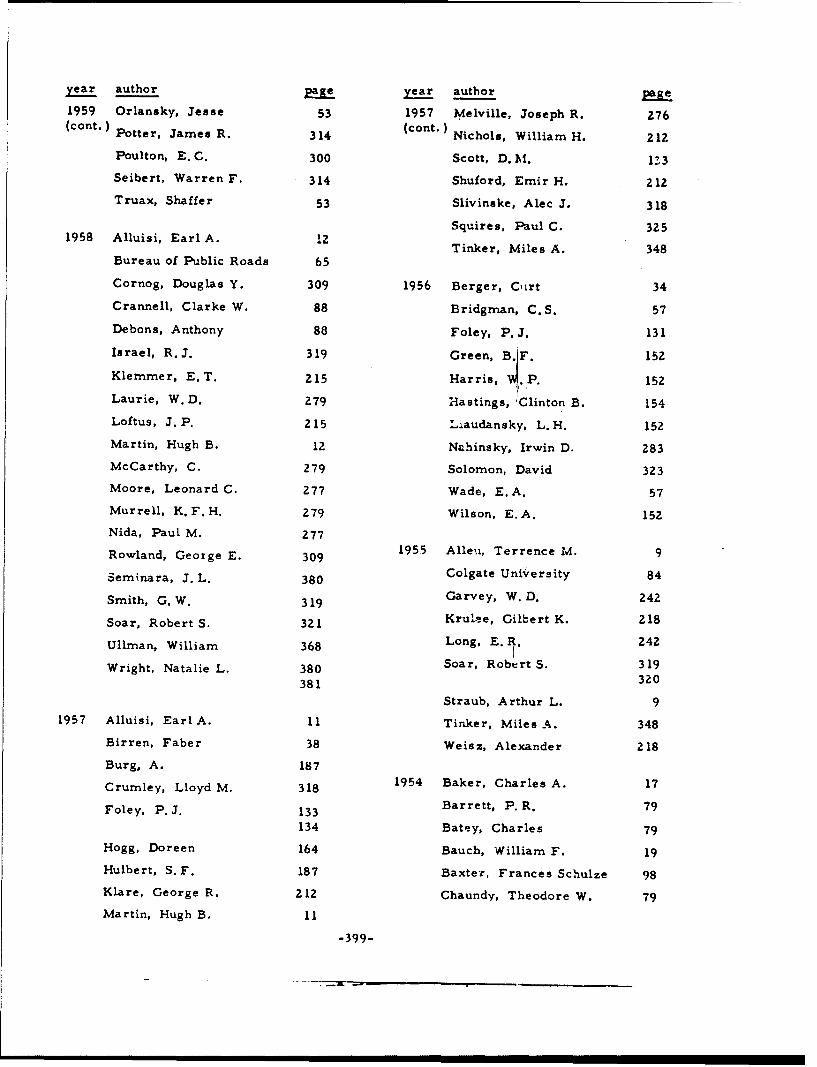
year author Me year author MAI
1959 Orlansky, Jesse 53 1957 Melville, Joseph R. 276(cont.) Potter, James R. 314 (cant. Nichols, William H. 212
Poulton, E. C. 300 Scott, D. M. 113
Seibert, Warren F. 314 Shuford, Emir H. 212
Truax, Shaffer 53 Slivinske, Alec J. 318
Squires, Paul C. 3251958 Alluisi, Earl A. 12
Tinker, Miles A%. 348Bureau of Public Roads 65
Cornog, Douglas Y. 309 1956 Berger, COrt 34
Crannell, Clarke W. 88 Bridgman, C.S. 57
Debons, Anthony 88 Foley, P.J. 131
Israel, R.J. 319 Green, B'1F. 152
Klernrner, E. T. 215 Harris, 'P. 152
Laurie, W.D. 279 Hastings, 'Clinton B. 154
Loftus, J. P. 215 Liaudansky, L.H. 152
Martin, Hugh B. 12 Nahinsky, Irwin D. 283
McCarthy, C. 279 Solomon, David 323
Moore, Leonard C. 277 Wade, E.,A. 57
Murrell, K. F. H. Z79 Wilson, E. A. 152
Nida, Paul M. 277
Rowland, George E. 309 1955 Alleu, Terrence M. 9
Seminara, J. L. 380 Colgate University 84
Smith, G. W. 319 Garvey, W. D. 242
Soar, Robert S. 321 Krulae, Gilbert K. 218
Ullrman, William 368 Long, E. 1. 242
Wright, Natalie L. 380 Soar, Robert S. 319
381 320
Straub, Arthur L. 9
1957 Alluisi, Earl A. 11 Tinker, Miles A. 348
Birren, Faber 38 Weisz, Alexander 218
Burg, A. 187
Crumley, Lloyd M. 318 1954 Baker, Charles A. 17
Foley, P. J. 133 Barrett, P. R. 79
134 Batey, Charles 79Hogg, Doreen 164 Bauch, William F. 19
Hulbert, S.F. 187 Baxter, Frances Schulze 98
Klare, George R. 212 Chaundy, Theodore W. 79
Martin, Hugh B. 11
-399-

year author Pytear author a
1954 Crook, Mason N. 96 1952 Institute for Applied(cont.) 97 (cont.) Experimental Psychology 19
98 Long, E.R. 231
Garvey, W.D. 241 23'
Grether, Walter A. 17 Mackworth, N. H. 27:
Hanson, John A. 96 Michael, J. L. 7:' 97
Mount, George E. 7:Krulee, Gilbert K. 217!Murrell, K. F. H. 271
SLansdell, H. 225LPerry, Dallis K. 29'
Long, E.R. 241 Reid, L. S. 231Mead, Leonard C. 274 23'
Nagel, John T. 19 Rock, M. L. 32.
Podell, Jerome E. 217 Shapiro, Harold B. 31
Rabinow, J. 305 Sleight, Robert B. 311
Reid, L.S. 241 Spragg, S. D.S. 32.
Ronco, Paul G. 217 Tinker, Miles A. 34-
Tinker, Miles A. 347 Tufts College 19
Weisz, Alexander 96 Willis, Marion P. 1:Wulfeck, Joseph W. 9
1953 Army Engineer Waterways 1951 Baxter, Frances Schulze 9Experiment Station 14
Brown, Fred R. 63 Brown, Fred R. 6
Cohen, Jerome 82 Carmichael, Leonard 11,
Deuth, A.F. 115 Crook, Mason N. 9
Green, B.F. 140 Dearborn, Walter F. 1I'Forbes, B.W F.13
Jenkins, H. M. 140 Forbes, T. W. 13
McGill, W. J. 140 Jenkins, L. B. 28
Tinker, Miles A. 346 Johnston, Philip W. il1
Webb, Wilse B. 82 Long, E. R. 23
Lowery, Edward A. 6
1952 Atkinson, William H. 15 Morgan, Glenn 13
Berger, Curt 33 Moskowjtz, Kari 13
Brenner, Robert 73 North, Alvir J. 28.
Case, Harry W. 73 Queal, R. W. 23
Crook, Mason N. 95 Reid, L.S. 23
Crumley, Lloyd M. 15 Roden, T.G.V. 37
Hanson, John A. 95 Whiteside, T.C.C. 37
Willis, Marion P. 6
-400-

year author y year author
1950 Berger, Curt 3Z 1947 Tinker, Miles A. 298
Casperson, Roland C. 74 (cont.) 299
Crook, Mason N. 92 Wessell, Nile Y. 8990Harker, George S. 92 Wulfeck, Joseph W. 89Hoffman, Arthur C. 92 90
Kennedy, John L. 92
Kuntz, James E. 223 1946 Bitterman, M. E. 4243
Paterson, Donald G. 363Paterson, Donald G. 360
Sleight, Robert B. 123 361Tinker, Miles A. 363 297
Rose, Florence C. 3071949 Brown Fred R. 58 Rostas, Steven M. 307
Soloway, Esta 42Chapanis, Alphonse 76 43
Garner, Wendell R. 76 Tinker, Miles A. 297
Lowery, Edward A. 58 360361Morgan, Clifford T. 76
Paterson, Donald G. 362 Young, Katherine D. 385
Tinker, Miles A. 3621945 Bitterman, M. E. 41
1948 Berger, Curt 30 Tinker, Miles A. 340
Dixon, J.C. 122
Lauer, A.R. 225 1944 Berger, Curt 29
Tinker, Miles A. 342 Breland, Keller 56343 Breland, Marian K. 56344 English, E. 127
Vernon, Magdalen D. 376 Loucks. Roger B. 247
2481947 Carmichael, Leonard 71
Crook, Mason N. 8990 Markworth, N.H. 271
Dearborn, Walter F. 71 Paterson. Donald G. 296
Gleason, J. G. 139 357358Hoffman, Arthu: C. Tinker, Miles A. 296339
Kennedy, John L. 89 35790 358
Paterson, Donald G. 298299 1943 Craik, K.J.W. 8"?
-401-
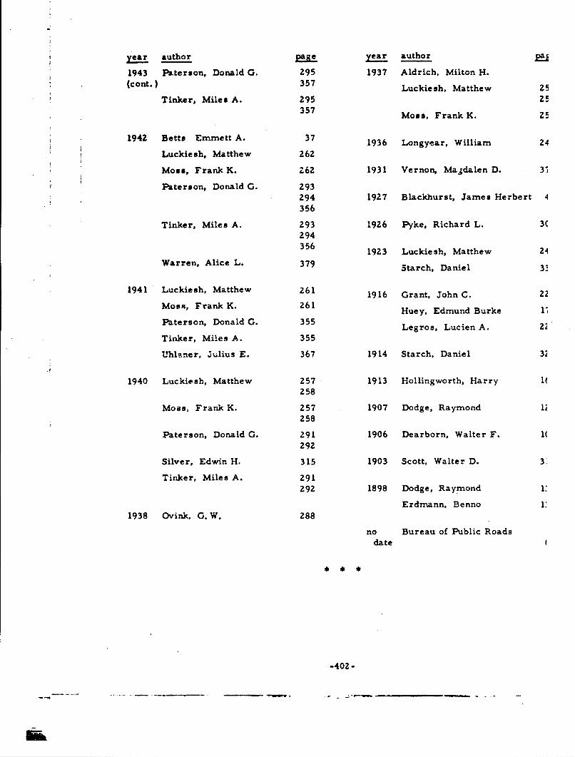
year author year author RU
1943 Paterson, Donald G. 295 1937 Aldrich, Milton H.(cont.)} 357
Luckiesh, Matthew 25
Tinker, Miles A. 295357
Moss, Frank K. 2!
1942 Betts Emmett A. 37 1936 Longyear, William 24
Luckiesh, Matthew 262
Moss, Frank K. Z62 1931 Vernon, Magdalen D. 31
Paterson, Donald G. 293294 1927 Blackhurst, James Herbert 4356
Tinker, Miles A. 293 1926 Pyke, Richard L. U294356 1923 Luckiesh, Matthew 24
Warren, Alice L. 379 Starch, Daniel
1941 Luckiesh, Matthew 261 1916 Grant, John C. 22
MosR, Frank K. 261 Huey, Edmund Burke
Paterson, Donald G. 355Legro, Lucien A. 22
Tinker, Miles A. 355
Uhlaner, Julius E. 367 1914 Starch, Daniel 32
1940 Luckiesh, Matthew 257 1913 Hollingworth, Harry P258
Moss, Frank K. 257 1907 Dodge, Raymond I;258
Paterson, Donald G. 291 1906 Dearborn, Walter F. 1(292
Silver, Edwin H. 315 1903 Scott, Walter D. 3
Tinker, Miles A. 291292 1898 Dodge, Raymond 11
Erdmann, Benno 1:
1938 Ovink, G. W. 288
no Bureau of Public Roads
date
-402-

APPENDIX B: CHARACTER FACE NAME INDEX

CHARACTER FACE NAME INDEX
There are three types of entries in the following Character Face Nan. Index. These
are as follows: (1) CHARACTER FACE narre to Document Extrart identification (e.g.,
VOGUE: Bendix-1959, Brown- 1953, and Longyear-1936); (2) Document Extract
identification to CHARACTER FACE name (e.g., Paterson-1946a: See BOLD faces,
CHELTENHAM, and MEMPHIS); and (3) cross-references of various kinds. All of the
above are intermingled together in letter-13y-letter alphabetical sequence. Following the
alphabetic sequence are the names, in number-by-number order, of eiglt character
faces whose names b-gin with a number.
In addition, several peculiarities should be explained in that they might otherwise
cause difficulty in the use of this Index. (1) The spelling of foreign face names does not
necessarily coincide with the spelling of the language for which it is used (e.g.,
MALAYALIM versus Malayalam). (2) In the case (f face names whose acronym is more
commonly known than the spelled-out version, the acronym is underlined and cross-
referenced to the full spelling (e. g., AMEL: See Aero-Medical Equipment Laboratory).
However, when the face name has been superseded by another, the older version is not
underlined, and cross-reference is made to the new name (e.g. AND 10400 versus
MS 33558). Nonetheless, appropriate citations are listed for both. (3) Several face
names are followed by a parenthetical comment. This was done to identify, when it was
not entirely clear from the face name, the medium in which the face is used (e.g.
COMPOSITRON (display), in this case connoting use in a display medium other than that
commonly encountered in printed text (e.g., cathode-ray tube displays). (4) Some
underlined names are followed by such names as for example "symbols, " "faces, "
"forms, " etc. (e.g., MACHINE RECOGNITION faces). These entries cover classes of,
rather than individual, character faces. In some few cases, "class" names are made to
stand alone since they are attributed sometimes to a face name but usually are descriptive
of some special condition, as configuration, of the face (e.g. , ITALICS). (5) As noted
below in a fuller listing, there also exist special entries, such as UNSPECIFIED
COMMERCIAL and UNSPECIFIED EXPERIMENTAL faces.
These entries are as follows: BLOCK style (otherwise unspecified), BOLD faces,
BOLD FACE SERIES (listed here as an example of the fact that type face seri.s numbers
are not usually listed in this Index, unless the number is the only identification, in which
case it is listed under NO. ... ), CALIGRAPH/CUNEIFORM/HIEROGLYPHIC faces
(listed here to indicate those classes of faces in which symbols are used in pictorial
-405-

language form), CONDENSED faces, DIACRITICAL MARKS (PUNCTUATION),
EMBOSSED faces, EXPANDED/EXTENDED/WIDE faces, GOTHIC (GROTESQUE, SANS,
SANSERIF, SANS SERIF, SANS SERIFFED, etc.) faces, GROUNDWORK, HANDWRITIN(
(hand-written/-printed---see also SCRIPT), HATCHED (CHECKED) faces, INITIALS
(various), IRREGULAR symbols (including FAMILIAR and GEOMETRIC forms,
ARBITRARY shapes, PICTORIAL, ABSTRACT, and DISTORTED figures, etc. --- either
LINE or SOLID), ITALICS (including OBLIQUE faces and INCLINED/SLANT GOTHIC),
KERNED characters, LIGATURES, LIGHT faces, LINING faces (see LINING, INLJINE.
OUTLINE, and SKELETON faces, individually), MACHINE RECOGNITION faces (machin
recognition, magnetic and optical characters), MATRIX/ELEMENT faces, MODIFIED
faces, NEWSPAPER faces (otherwise unspecified), NOVELTY faces (otherwise
unspecified), OLD ENGLISH (includes, e. g., BLACK-FACE, TRADITIONAL GOTHIC,
and several others), OPEN style (otherwise unspecified), OPTICAL ILLUSIONS,
ORNAMENTAL faces, OVAL style (otherwise unspecified), PECULIARS, RECTANGULA
faces, REVERSED faces, ROUND style (otherwise unspecified), SCRIPT (handwriting an
printing), SEMICIRCULAR faces, SHORTHAND, SUB- and SUPER-SCRIPTS, SWASHES,
SYMBOLS (various---composite listing at this entry and individual listings throughout
Index, e.g. BOTANICAL symbols), TRIANGULAR faces, TYPEWRITER (otherwise
unspecified), UNSPECIFIED COMMERCIAL faces (various), and UNSPECIFIED
EXPERIMENTAL faces (various).
-406-

A (experimental): Botha-1963a and also see BOTHA.
ABBEY TEXT: Legros-1916.
ABKHAZIAN: Legros-1916.
ABSTRACT figures: See IRREGULAR symbols.
ACCADIAN CUNEIFCRM: Legros-1916.
ADDRESSOGRAPH: Legros- 1916.
(Aero-Medical Equipment Laboratory) AMEL: Atkinson-1952, Crook-1954c, Harris-1956,Swartz-1961, Wright-1958b, and also see NAMEL.
AGATE: Rose-1946.
AIR FORCE (machine recognition): Floi'es-1960.
AIRPORT: Bendix-1959 and Brown- 1953.
ALBANIAN: Legros-1916.
Aldrich-1937: See BLOCK style, EMBOSSED faces, OPEN and ROUND styles, and
VERMONT 1937.
Allen-1955: See BPR SERIES.
Alluisi-1957: See AND 10400; MATRIX/ELEMENT faces; and 8-ELEMENT,STRAIGHT-LINE MATRIX.
Alluisi-1958: See AND 10400; MATRIX/ELEMENT faces; and 6-ELEMENT,STRAIGHT-LINE MATRIX.
ALPHADYNE (display): Crurmley-1961.
ALTERNATE GOTHIC: See TYPEMASTER.
AmASHO-1961: See UNSPECIFIED EXPERIMENTAL faces.
AMEL: See Aero-Medical Equipment Laboratory.
AMERICAN CASLON: Lcngyear-1936.
AMERICAN GOTHIC: Bendix-1959.
AMERICAN NUMBERING-MACHINE: -egros-1916.
/.American Standards Association) ASA (Optical Character Recognition) OCR (machinerecognition): Rabinow-1962.
AMERICAN TYPEWRITER: Blackhurst-1927, Chapanis-1949, InsTUFTS-1952,Paterson-1940a, Poulton-1960, Tinke:--1944, Tinker-1963, and Young-1946.
AM.HARIC: Legros-1916.
AMOY: Legros-1916.
ANCIENT: Legros-1916.
ANCIENT SLAVONIC: Legros-1916.
Anderson-1960: See BANKERS GOTHIC, EI3B, and MACHINE RECOGNIT ION faces.
-407-

AND 10400: See Army-Navy Drawing.
ANGLO-SAXON: Legros-1916.
ANNAMITE ': Legros-1916.
ANTIQUE: Chapanis- 1949. InsTUFTS- 1952, Legros -1916, Paterson- 1940a,Tinker- 1944, Tinker- 1963, TinkPat- 1944b, and Young- 1946.
ANTIQUE OLD STYLE: Legros-1916.
ARABIC: Legros-1916.
ARBITRARY shapes: See IRREGULAR symbols.
ARCHEOLOGICAL symbols: Legros -1916.
ARMENIAN: Legros-1916.
(Army-Navy Drawing) AND 10400- Alluisi- 1957, Alluisi- 1958, Atkinson- 1952,Baker- 1954, Bendix- 1959, Brown- 1951, Colgate-( 1955), Crannell- 1958, Crook- 1951,Crook- 1954c, Harris -1956, Schapiro- 1952, Slivinske- 1957, Swartz- 1961,Wright-1958b, and also see MS 33558.
ArrnyWES- 1953: See BOLD, CONDENSED, and EXPANDED/EXTENDED/WIDE faces;ITALICS; LIGHT faces; and WRICO.
ARPKE: Ovink-1938.
ARROW symbols: Bauch-1954, Legros-1916, and Smith-1958.
ARTYPE: Bendix-1959.
ARTYPE 5-274: See NAMEL.
ASA OCR: See American Standards Association.
ASHANTI: Legros-1916.
ASSYRIAN: Legros-1916.
ASSYRIAN CUNEIFORM: Legros-19 16.
ASTREE: Longyear-1936.
ASTRONOMICAL symbols: Legros-19 16.
Atkinson-1952: See AMEL, AND 10400, and BERGER.
ATLAS: Legros-1916.
AUGUSTAN BLACK: Legros-19 16.
AUTOMATIC CHARACTER RECOGNITION: See MACHINE RECOGNITION faces.
B(experimental): Botha-1963a and also see BOTHA.
BABYLONIAN: Legros-1916.
BABYLONIAN CUNEIFORM: Legros -1916.
Baker'-1954: See AND 10400 and NAMEL.
BANKERS GOTHIC: Anderson-1960 and Bendix- 1959.
BANK GOTHI-.: Bendix-1959.
BARNUM: Lorigyear-1936.
-408-
BARTLETT: Murrell-1952.
BASKERVILLE: Burt-1959 and Vernon- 193 1.
BATTA: Legros-1916.
Bauch-1954: See ARROW symbols, GOTHIC faces, and SYMBOLS.
Bauer-1962: See MATRIX/ELEMENT faces and 5 X 7 MATRIX.
BELL: Burt-1959.
BEMBO: Burr-1959 and Ovink-1938.
Bendix-1959: See AIRPORT, ALTERNATE GOTHIC, AMERICAN GOTHIC, AND 10400,ARTYPE, ARTYPE S-274, BANKERS GOTHIC, BANK GOTHIC, BERGER, BLOCKstyle, BOLD faces, CLASSIC ROMAN, COMMERCE GOTHIC, CONDENSED faces,COPPERPLATE GOTHIC, EXPANDED/EXTENDED/WIDE faces, FRANKLIN GOTHIC,FUTURA, FUTURA BOOK, FUTURA DISPLAY, GORTON, GORTON MODERNE,GOTHIC faces, HEADLINER, LABEL GOTHIC, LEROY, LIGHT faces, LININGGOTHIC, LINING METROTHIN, LINING PLATE GOTHIC, MACKWORTH, MARANGOTHIC, METROBLACK, METROLITE, METROTHIN, MIL-C-18012, MODERNE,MS 33558, NAMEL, NEWS GOTHIC, OLD ENGLISH, OPEN style, ORNAMENTALfaces, PHILADELPHIA LINING, PHOTOTYPE, PLATE GOTHIC, RECTANGULARfaces, ROMAN, SANS SERIF, SEMICIRCULAR faces, SPARTAN, SPARTAN BLACK,SPARTAN BOOK, SQUARE GOTHIC, TEMPO, TOURIST, TRADITIONAL GOTHIC,TRIANGULAR faces, TWENTIETH CENTURY, TYPEMASTER, UNSPECIFIEDCOMMERCIAL and EXPERIMENTAL faces, VARITYPE, VERNEN, and VOGUE.
BENGALI: Legros-1916.
BERGER: Atkinson-1952, Bendix-1959, Berger-1944b, Berger-1948, Berger-1950,Berger-1952, Berger-1960, Brown-1951, Chapanis-1949, Colgate-(1955),Crook-1954c, Harris-1956, Krulee-1954, Krulee-1955, Murrell-1952,S~hapir"o- V, •. an.. • :'t- V;
Berger-1944b: See BERGER; BOLD, EMBOSSED, and LIGHT faces; OLD DANISH; andZ and 6 MILLIMETER STROKE-WIDTH.
Berger-1948: See BERGER, and GOTHIC faces.
Berger-1950: See BERGER, and GOTHIC faces.
Berger-1952: See BERGER, and GOTHIC faces.
Berger-1956: See REGAL and WEISS.
Berger-1960: See BERGER; DOT, IRREGULAR, and PARALLEL BAR symbols; andSYMBOLS.
Berger-1961: See MOSAIC-STRUCTURE and UNSPECIFIED EXPERIMENTAL faces.
BERNHARD CURSIVE: Longyear-1936 and Ovink-1938.
BERNHARD FASHION: Longyear-1936.
BERNHARD ROMAN: Longyear-1936 and Ovink-1938.
BETON: Longyear-1936 and Ovink-1938.
Betts-1942: See CENTURY OLD STYLE.
BINNEY: Longyear-1936,
Birren-1957: See BPR SERIES.
-409-
BISAYA: Legroa-1916.
Bltterman- 1945: See UNSPECIFIED COMMERCIAL faces.
Bitterman-1946a: See UNSPECIFIED COMMERCIAL faces.
Bitterman- 1946c: See UNSPECIFIED COMMERCIAL faces.
Bjelland-(1963): See DOT MATRIX, LINE TRACE, MATRIX/ELEMENT faces, andSHAPED BEAM.
BLACK: Legros-1916.
BLACK-FACE: See OLD ENS:LISH.
BLACKFRIARS: Legros-1916.
Blackhurst-1927: See AMERICAN TYPEWRITER, CUSHING MONOTYPE, JENSEN OLDSTYLE, and SCOTCH ROMAN.
BLACK-LETTER: See OLD ENGLISH.
BLIP symbols: Crumley-1961.
BLOCK style (otherwise unspecified): Aldrich- 1937, Bendix- 1959, Bridgrnan- 1956,Legros-1916, and Uhlaner-1941.
BODONI: Burt-1959, Chapanis-1949, English-1944, InsTUFTS-1952, Longyear-1936,Luckie sh- 1942, Ovink- 1938, Paterson- 1940a, Starch-.1923, Tinker- 1944,Tinker- 1963, TinkPat- 1944b, and Young -1946.
BODONI BOOK: Longyear-1936 and Luckiesh-1940b.
BODONI MODERN: Vernon-1931.
BODONI SHADED: Longyear-1936.
BOHEMIAN: Legros-1916.
BOLflfaces: Arm;.-WES-1953, Bendix-1959, Berger-1944b, Bro-land-1944, Brown-1953,Burt-1959, Chapania-1949, Chaundy-1954, English-1944, Foley-1957a, Foley-1957b,Kelly- 1960, Legros -1916, Longyear- 1936, Luckiesh- 1940a, Luckiesh- 1940b,Luckiesh- 1942, Ovink- 1938, Paterson- 1940a, Paterson- 1946a, Poulton- 1960,Rowland- 1958, Starch- 1914, Starch- 1923, Tinker- 1963, TinkPat- 1946b, andWarren- 1942.
BOLD FACE SERIES: Chaundy-1954 and Longyear-1936.
BOOKLET: Legros-1916.
BOOKMAN: Longyear- 1936 and Luckiesh- 1942.
BORDER symbols: Legros-1916.
BOTANICAL symbols: Legros-1916.
BOTHA: Botha-1963a and Botha-1963b.
Botha-1963a: See A, B, and BOTHA.
Botha-1963b: See BOTHA, and UNSPECIFIED EXPERIMENTAL faces.
Bowen-1959: See CIRCULAR, CROSS, IRREGULAR, and SQUARE symbols; SYMBOLS;and TRIANGULAR symbols.
BPR SERIES: See Bureau of Public Roads.
BRAILLE: Legros-1916.
-410-

Brainard-1961: See ROAD SIGN symbols, and SYMBOLS.
Breland-1944: See BOLD faces and CHELTENHAM.
Bridgman-1956: Soe BLOCK style.
BROWN: Brown-1951, Browri-1953, Soar-1955b, and Soar-1958.
Brown-1949a: See GROW CHART
Brown- 1949b: See GROW CHART.
Brown-1951: See AND 10400, BERGER, and BROWN.
Brown- 1953: See AIRPORT, DOLT' PROWNT, FUTURA, GARAMOND, GOTHICSANS-SERIF, LINING GOTHIC, UNSPFCIFIED EXPERIMIENTAL faces, andVOGUE MEDIUM.
BRUCE: Longyear-1936.
BRUCE OLD STYLE: Longyear-1936.
BRUSH SCRIPT: Longyear-1936.
BUGI: Legros-1916.
BULGARIAN: Legros-1916.
BULLFINC1H: Hollingworth- 1913, Starch- 1914, and Starch- 1923.
(Bureau of Public Roads) BPR SERIES A-F (display): Allen-1955, Birren-1957,BurPR-nd(a). BurPR- 1958, BurPR- 1961, Chapanis -1949, Decker- 1961, Forbes -1951,Herrington- 1960, Karmejer- 1960, Solomon- 1956, and Ullman- 1958.
BURMESE: Legros-1916.
Bur"OR-nd(a): See BPR SERIES.
BurrI'.- 1^'8: See BPR SERTFS.
BurPR-1961: See BPR SERIES.
Burt-1959: See BASKERVILLE, BELL, BEMBO, BODONI, BOLD faces, CASLON,CENTAUR, DIDOT, EHRHARDT, FOURNIER, GARAMOND, GRANJON, IMPRINT,MODERN, OLD ENGLISH, OLD STYLE, PERPETUA, PLANTIN, SCOTCH ROMAN,TIMES NEW ROMAN, VERONESE, and WALBAUM.
CALIFORNIA (display): Smith-1958.
CALIGRA PH: Longyear- 1936.
Carmichael- 1947: See UNSPECIFIED COMMERCIAL faces.
CARSHUNI: Legros-1916.
CARTOGRAPHIC symbols: Legros-1916.
Case-1952: See UNSPECIFIED EXPERIMENTAL faces.
CASLON: Burt- 1959, Chapanis -1949, Hollingworth- 1913, Longyear- 1936,Paterson- 1940a, Starch- 1914, Starch- 1923, Tinker- 1963, and Vernon- 1931.
CASLON MODERN: Longyear-1936.
CASLON OLD FAr-F.: Luckiesh-1942.
CAS-LJN OLD STYLE: InsTUFTS- 1952 and Tinker- 1944.
-411-

CASLON 540: Longyear-1936.
Casperson-1950: See CROSS, DIAMOND, ELLIPTICAL, RECTANGULAR, and STARsymbols; SYMBOLS; and TRIANGULAR symbols.
CAXTON: Longyear-1936.
CENTAUR: Burt-1959.
CENTUPY: Ho11ingwurth- 1913, Longyear- 1936, L'ickiesh- 194 ib, Luckiesh- 1942,Soar-1955a, Starch-1914, Starch-1923, Tinicer-1963, TinkPat-1943, andTinkPat-1944b.
CENTURY OLD STYLE: Betts-1942, Hollingworth-1913, Starch-1914. and Starch-1923.
CHANGING symbols: Halsey-1960b.
Chapanis-1949: Sec AMERICAN TYPEWRITER, ANTIQUE, BERGER, BODONI, BOLDfaces, BPR SERIES, CASLON, CHELTENHAM, GARAMOND, ITALICS, KABEL,LIGH'Tfaces, MACKWORTH, MODERN, OLD ENGLISH, OLD STYLE, and SCOTCHROMAN.
CHARACTER RECOGNITION: See MACHINE RECOGNITION faces.
CHARACTRON (display): Crumley-1961 and Harris-1956.
CHARTER OAK: Longyear-1936.
Chaundy-1954: See BOLD faces, BOLD FACE SERIES, DISPLAY symbols,FRAKTUR, GILL, GRE~EK, HANDWRITING, ITALICS, KERNED characters,MATHEMATICAL symbols, MODERN, SCRIPT, SUB- and SUPER-SCRIPTS, andSYMBOLS.
CHECKED symbols: Legros-1916.
CHECKERED TYPEWRITER: Legros -1916.
CHELTENHAM: Breland- 1944, Chapanis- 1949, English- 1944, Hollingworth- 1913,InsTUFTS- 1952, Legros -1916, Longyear- 1936, Paterson- 1940a, Paterson- 1946a,Starch- i914, Starch-1923, Tinker- 1944, Tinker- 1963, TinkPat- 1944b, Warren- 1942,and Y oung- 1946.
CHELTENHAM OLD STYLE: Leg ros-19 16, Longyear-1936, and Starch- 1923.
CHEROKEE: Legros-19 16.
CHINESE: Legros-1916.
CHINESE BRAILLE: Legros-19 16.
CHIPPEWYAN: Legros-1916.
CINCINNATI: Longyear- 1936.
CIRCULAR symbols: Bowen-1959, Gleason-1947, Lauer-1948, Legros-1916, and
Sleight - 1952.CIVIL GEORGIAN: Legros-19 16.
CLARENDON: Legros -1916 and Vernon- 1948.
CLASSIC: Ti.iker-1963 and TinkPat-1944b.
CLASSIC ROMAN: See ROMAN.
CLEARCUT: Longyear-1936.
CLEARFACE GOTHIC: Longyear-1936.

ý0 •; •,\ h. See OLD ENGLISH.
'.,'. ("'A-hine recognition, magnetic characters): Utman-1963.
COCHIN-NICHOLAS: Longyear-1936.
CODING symbols: Cohen-1953 and HitL-1960.
Coffey-1961: See GOTHIC faces.
Cohen-1953: See CODING, DOT, ELEMENT, and LINE symbols; MACHINE
RECOGNITION and MATRIX/ELEMENT faces; and SYMBOLS.
Colgate-(1955): See AND 10400, BERGER, MACKWORTH, and REVISED.
COLOR symbols: Gustafson-1960, Hastings-1956, Swartz-1961, and Ullman-1958.
COLUMBIA: Ovink-1938.
COLUMBUS: Legros-1916.
COLWELL: Longyear-1936.
CO..MERCE GOTHIC: Bendix-1959.
COMMERCIAL symbols: Legros-1916.
COMPASS: Legros-1916.
COMPOSITRON (display): Crumley-1961.
CONDENSED faces: ArmyWES-1953, Bendix- 1959, English- 1944, Foley-1957a,
Foley-1957b, Legros-1916, Longyear-1936, Ovink-1938, Pyke-1926, Starch-1914,
Starch-1923, Tinker-1963, and Warren-1942.
CONTROL INSTRUMENT COMPANY ELEMENT M.ATRIX (display): Long-1951,
Long-1952a, Long-1952b, and also see INFOM.AX.
COOPER: Longyear-1936.
COOPER BLACK: Longyear-1936.
COPPERPLATE GOTHIC: Bendix- 1959 and Longyear- 1936.
COPTIC: Legros-1916.
CORNER symbols: Legros-1916.
CORONA: Tinker-1963 and TinkPat-1944b.
COURTNEY-FAA (display): Moore-1958 and Rowland-1958.
CRAIK (display): Crook-1954c, Schapiro-1952, and Swartz-1961.
Craik-1943: See UNSPECIFIED EXPERIMENTAL faces.
Crannell-1958: See AND 10400.
CREE: Legros-1916.
Crook-1947a: See UNSPECIFIED COMMERCIAL faces.
Crook-1947b: See UNSPECIFIED COMMERCIAL faces.
-rook-1950a: See UNSPECIFIED COMMERCIAL faces.
Zrook-1951: See AND 10400.
Z:rook-1952: See GOTHIC and MONOTYPE GOTHIC.
-413-

Crook-1954a: See VARIGRAPH.
Crook-1954b: See VARIGRA PH.
Craok-1954c: See AMEL, AND 10400, BERGER, CRAIK, GOTHIC faces, LEROY,MACKWORTH, ORDNANCE, OVAL and ROUND styles, and UNSPECIFIEDEXPERIMENTAL faces.
Crook-1959; See IRREGULAR symbols, and SYMBOLS,
CROSS symbols: Bowen-1959, Casperson-1950, Legros-1916, and Sleight-1952..
Cruniley-1961: See ALPHADYNE, BLIP symbols, CHARACTRON, COMPOSITRON,DOTITRON, ELECTROLUMINESCENT ALPHANUMERIC DISPLAY, ELLIPTICALsymbols, GASEOUS MATRIX-CELL DISPLAY, HARMONIC, IEE, INCLINATIONsymbols, INDICODER, IRREGULAR symbols, LIQUID MATRIX-CELL DISPLAY,MATRIX/ELEMENT fac~es, NIXIE, SYMBOLS, TELEREGISTER, UNION,VIDEOGRAPH, VIDIAC, and XEROGRAPHIC PRINTER.
CUFIC: Legros-1916.
CUNEIFORM: Legros-1916.
CURSIVE SCRIPT: See HANDWRITING and SCRIPT.
CUSHING: Pyke-1926 and Tinker- 1963.
CUSHING MONOTONE: Starch-1914 and Starch-19Z3.
CUSHING MONOTYPE: Blackhurst- 1927 and Hollingworth- 1913.
CUSHING OLD STYLE.: Hollingworth- 1913, Starch- 1914, and Starch- 1923.
C ZECHOSLOVAKIAN STANDARD (display): Krzhivoglavy- 1962.
Dearborn- I90: ')t- TY7r-rWRITER.
Dearborn-1951: See TYPEWRITER.
Decker-1961: See BPR SERIES, STRIPE symbols, and SYMBOLS.
DELLA ROBBIA: Longyear-1936.
DELPHIN: Longyear- 1936.
DEMOTIC: Legros-1916.
Deuth-1953: See GOTHIC TEMPO, INFOMAX, MATRIX/ELEMENT faces, at-idTWENTIETH CENTURY.
DEVANAGARI: Legros-1916.
DE VINNE: Legros-1916, Luckiesh-1940b, Ovink-1938, Tinker-1963, andTinkPat- 1944b.
DIACRITICAL MARKS: Legros-19 16, OptRead-1961 and Pyke-1926.
DIAMOND symbols: Casperson-1950. Lauer-1948, and Sleight- 195Z.
DIDOT: Burt-1959.
DISPLAY symbols: Chaundy-1954.
DISTORTED figures: See IRREGULAR symbols.
DIVISION MARK symbols: Loucks -1944a. Loucks -1944b, Loucks -1944c, andLoucks- l944d.
-4 14-

Dixon-1948: See UNSPECIFIED EXPERIMENTAL faces.
Dodge-1907: See TYPEWRITER.
DOTITRON (display): Crumley-1961.
DOT MATRIX (display): Bjelland-(1963).
DOT symbols: Berger-1960, Cohen-1953, and Swartz-1961.
DUPLICATING MACHINE: Legros-1916.
DUTCH: Longyear-1936.
ECCLESIASTICAL: See OLD ENGLISH.
ECCLESIASTICAL GEORGIAN: Legros-1916.
ECCLESIASTICAL symbols: Legros-1916.
ECKMANN: Ovink-1938.
EGYPTIAN: Legros-1916.
EHRHARDT: Burt-1959.
ELBAR: Longyear-1936.
ELECTROLUMINESCENT ALPHANUMERIC DISPLAY (display): Crumley-1961.
ELEMENT fonts: See MATRIX/ELEMENT faces.
ELEMENT symbols: Cohen-1953 and Legros-1916.
ELITE GOTHIC (experimental): OptRead-1961.
ELITE TYPEWRITER: Luckiesh-1942.
" .L .-TICAL symbols: Casperson-1950, Crumley-1961, Sleight-1952, and Swartz-1961.
ELZFVT.: !,-egros-191 6 .
EMBOSSED faces: Aldrich- 1937, Berger- 1944b, Gleason- 1947, Herrington- 1960,Karmeier-1960, Legros-1916, Silver- 1940, and Soar-1955b.
ENGINEERING symbols: Legros-1916.
ENGLISH: Rose-1946.
English-1944: See BODONI, BOLD faces, CHELTENHAM, CONDENSED faces, KARNAK,OLD ENGLISH, and TEMPO.
ENGRAVERS ROMAN: Longyea-r-1936.
Erdnann-1898: See UNSPECIFIED COMMERCIAL faces.
ESKIMO: Legros-1916.
ESPERANTO: Legros-1916.
ESTIENNE MORSE: Legros-1916.
ESTRANGELO: Legros-1916.
ETHIOPIC: Legros-1916.
EVE: Longyear-1936.
EXCELSIOR: Luckiesh-1942, Ovink-1938, Tinker- 1946, Tinker-1948b, Tinker-1948c,
-415-

f ~Tinker-1952, Tinker-1953, Tirnker-1954, Tinker-1955, Tinker-1960. Tinker-1963,TinkPat-1943, TinkPat-1944b, TinkPat-1946a, and TinkPat-1946b.
EXPANDED/EXTENDED/WIDE faces: ArmyWES- 1953, Bendix- 1959, Foley- 1957a,Foley- 1957b, Hollingworth- 1913, Legros- 1916, Longyear-1936, Luckiesh- 194 lb,Ovirnk-1938, Poulton-1959, Pyke-1926, Starch-1914, Starch-1923, Tinker-1963, andTinkPat- 1943.
E13B (machine recognition, magnetic characters): Anderson-1960 and Utman- 1963.
FAMILIAR forms: See IRREGULAR symbols.
(Federal Aviation Agency) FAA: See COURTNEY -FAA.
Flores-1960: See AIR FORCE, GOTHIC and MACHINE RECOGNITION faces, PARKAVENUE, STANFORD RESEARCH, and UNSPECIFIED EXPERIMENTAL Laces.
Foley- 1956: See LANSDELL and MACKWORTH.
Foley- 1957a: See BOLD, CONDENSED, and EXPANDED/EXTENWD/DWIDE faces;LEROY; and LIGHT faces.
Foley-1957b: See BOLD, CONDENSED, EXPANDED/EXTENDED/WIDE, and LIGHTfaces; and UNO PEN STENCIL.
Forbes-1951: See BPR SERIES, and UNSPECIFIED EXPERIMENTAL faces.
FOURNIER: Burt-1959 and Leg ros-1916.
FRAKTUR: Chaundy-1954, Huey-1916, Legros-1916, and Starch-1914.
FRANKLIN GOTHIC: Bendix-1959 and Longyear-1936.
FRENCH: Legros-1916.
FRENCH ANTIQUE: Legros-19 16.
FRENCH CLARENDON: Legros-19 16.
FUTURA: Bendix-19519, Brown-1953, Kelly-1960, Longyear-1936, and Seibert- 1959.
FUTURA BOOK. Bendix-1959.
FUTURA DISPLAY: Bendix- 1959 and Longyear- 1936.
GAELIC: See IRISH.
GALLEA: Longyear-1936.
GALLIA: Ovink-1938.
GAME-COUNTER symbols: Legros-1916.
GAMMETER MULTIGRAPH: Legros-1916.
GARAMOND: Brown- 1953, Burt- 1959, Chapanis- 1949, InsTUFTS- 195Z, Longyear- 1936,Paterson-1940a, Tinker-1944, and Tinker-1963.
GASEOUS MATRIX-CELL DISPLAY (display): Crumley- 1961.
GENEALOGICAL symbols: Legros- 1916.
GEOMETRIC forms: See IRREGULAR s-.:mbols.
GERMAN: See FRAKTUR.
-416-

GILL: Chaundy-1954 and Krzhivoglavy-1962.
GIRDER: Longyear-1936.
Gleaq'on-1947: See CIRCULAR symbols, EMBOSSED and LIGHT faces, PARALLEL BARand POINTER symbols, SYMBOLS, and UNSPECIFIED COMMERCIAL andEXPERIMENTAL faces.
CORIA: Longyear-1936.
GORTON: Bendix-1959.
GORTON MODERNE: Bendix-1959.
GOTHIG: See OLD ENGLISH.
GOTHIC faces: Bauch- 1954, Bendix- 1959, Berger- 1948, Berger- 1950, Berger- 1952,Coffey- 1961, Crook- 1952, Crook- 1954c, Flores- 1960, Green- 1953, Hulbert- 1957,Krulee- 1955, Lauer- 1948, Legros- 1916, Longyear- 1936, Luckiesh- 1923,Ovinkc-1938, and Vernon-1931.
GOTHIC SANS-SERIF: Brown-1953.
GOTHIC TEMPO: Deuth-1953.
GOUDY: Longyear-1936.
GOUDY CATALOGUE: Longyear- 1936.
GOUDY HAND TOOLED: Longyear-1936.
GRANJON: Burt-1959, Paterson- 1940a. Paterson-1I91 ', wOd tthne -r-o
SRASSET: Ovink-1938.
0RECO: Longyear-1936.
7#RECO ADORNADO: Longyear-1936.
:;REEK: Chaundy-1954, Legros-1916. and Verr~on-lt)4H.
7ireen-1953: See GOTHIC faces.
!ROTESQUE: See GOTHIC faces.
3ROUNDWORK: Legrus-1916.
;ROW CUART: Brown-1949a and Brown- 1949b.
WJA P 4 Legros-1916.
#UJARArL. Lgros-016l.
;ustafson- 1960: See COLOR symbols, and SYMBOLS.
:Alsey- 1960a: See MATRIX/ELEMENT face s and 5 X 7 MATRIX.
alsey-1960b: See CHANGING symbols, SAGE~, and SYMBOLS.
ANDWRITING (hand -written/-printed): Chaundy- 1954, InsTUFTS -1952, Luckiesh -1942,
Neisser-1960, Soar-1955a, Starch-1923, Tinker-1963, and Vernon-1931.
ARMONIC (display): Crurnley-1961.
arris-1956: See AMEL, AND 10400, BERGER, CHARACTrPON, LEROY, LINCOLNLABORATORY, MACKWORTH, and MATRIX/ELEMENT facps.
astings-1956: See COLOR symbols.
ATCHED faces: Legros-19 16.
-4 17-
* *1
HAWARDEN: Legros-1916.
HEADLINER: Bendix- 1959.
HEBREW: Legros-1916.
HERALDIC symbols: Legros-1916.
Herrington-1960: See BPR SERIES, and EMBOSSED faces.
HIERATIC: Legros-1916.
HIEROGLYPHIC: Legros-1916.
HINDI: Legros-1916.
HIRA-GANA: Legros-1916
Hitt-1960: See CODING symbols, and SYMBOLS.
HITTITE: Legros-1916.
Hodge-1962: See LEROY.
Hodge-1963: See LEROY.
Hogg-1957: See IRREGULAR s•,mbols, SYMBOLS, and TYPEWRITER.
Hollingworth-l113: See BULLFINCH, CASLON, CENTURY, CENTURY OLD STYLE,CHELTENHAM. CUSHING MONOTYPE, CUSHING OLD STYLE, EXPANDED/EXTENDED/WIDE faces, IRREGULAR symbols, NEWS GOTHIC, SCOTCH ROMAN,and SYMBOLS.
HOMEWOOD: Longyear- 1936.
Hortor.-1960: See TYPEWRITER.
Howell-1959: See MACKWORTH.
Howell-1961: See UNSPECIFIED EXPERIMENTAL faces.
Huey-1916: See FRAKTUR, SYMBOLS, and UNSPECIFIED COMMERCIAL faces.
Hughes-1961: See IRREGULAR symbols, SYMBOLS, and U.Y•-PECIFIED COMMERCIALand EXPERIMENTAL faces.
Hulbert-1957: See GOTHIC faces, IRREGULAR symbols, and SYMBOLS.
IBO: Legros-1916.
ICAO symbols: Whiteside-1951.
ICELANDIC: Legros-1916.
IDEAL: Tinker- 1963, TinkPat-1943, and TinkPat-1944b.
IDEOGRAPH symbols: Legros-1916.
IEZ: See Industrial Electronic Engineers.
ILLUSIONAL faces and forms: See OPTICAL ILLUSIONS.
IMPERIAL SCRIPT: Legros-1916.
IMPRINT: Burt-1959 and Poulton-1959.
IMPRINT OLD FACE: Pyke-1926 and Tinker-1963.
INCLINATION symbols: Crumley-1961, Legros-1916, and Swartz-1961.
-418-

INCLINED faces: See ITALICS.
INDICODER (display): Crumley-1961.
(Industrial Electronic Engineers) IEE (display): Crurnley-1961.
INFOMAX (display): Deuth- 1953, Long -1951, Long- 1952a, Long- 1952b, Long- 1954, andLong- 1955.
INITIALS (various): Legros-1916 and Longyear-1936.
INSCRIPTION GREEK: Legros-19 16.
INSCRIPTION ROMAN: Leg ros-19 16.
InsTUFTS-1952: See AMERICAN TYPEWRITER, ANTIQUE, BODONI, CASLON OLDSTYLE, CHELTENH-AM, GARAMOND, HANDWRITING, IRREGULAR symbols,ITALICS, KABEL, LIGHT faces, OLD ENGLISH, OLD STYLE, SCOTCH ROMAN,SCRIPT, and SY BOLS.
(International Phonet 21 'Association) IPA (printing): Legros -1916.
INTERSTATE (display): Smith- 1958.
INTERTYPE 655: Tinker- 1963 and TinkPat- 1944b.
IONIC: Legros- 1916, Paterson- 1947a, Tinker- 1963, TinkPat- 1943, and TinkPat- 1944b.
IOWA STATE (experimental): Lauer-1948.
IPA: See International Phonetic Association.
IRISH: Legros-1916.
IRREGULAR symbols (including FAMILIAR and GEOMETRIC forms, ARBITRARY shapes,PICTORIAL, ABSTRACT, and DISTORTED figures, etc. --- either LINE or SOLID):Berger- 1960, Bowen- 1959, Crook- 1959. Crumley- 1961, Hogg- 1957,Hollingworth- 1913, Hughes- 1961, Hulbert- 1957, InsTUFTS- 1952, Kimura- 1959,Kiemnmer- 1958, Krzhivoglavy- 1962, Lauer- 1948, Legros- 1916, Luckiesh- 1923,Moore- 1962, Rahinow- 1962, Scott- 1903, Sleight- 1952, Starch- 1914, Starch- 1923,Tijiker-1963, Ulman-1958, Utman-1963, Vernon-1948, and Webster-1963.
ITALIAN: Legros-191E§.
ITALICS (including OBLIQUE faces and INCLINED/SLANT GOTHIC): ArmyWES-1953,Chapanis -1949, Chaundy- 1954, InsTUFTS- 1952, Legros -1916, Longyear- 1936,Ovink- 1938, Paterson- 1940a, Poulton- 1960, Starch- 1914, Starch- 1923,Tinker-1948c, Tinker-1952, Tinker-1953, Tinker-1955, Tinker-1963, TinkPat-1946b,TinkPat- 1950, Vernon- 1948, and Youiig- 1946.
JAUNSARI: Legros-1916.
JAVANESE: Legros. 1916.
JENSEN: Longyear-1936.
JENSEN OLD STYLE: Blackhurst- 1927.
JENSON: Legros-1916.
KABEL: Chapanis -1949, InsTUFTS- 1952, Langyear- 1936, Paterson- 1940a.Tinker-1944, Tinker-1963, and Young-1946.
-4 19-
KALMUK: Legros-1916.
KANA-MAJIRI: Legros-1916.
KANARESE: Legros-1916.
Karmeier-1960: See BPR SERIES, and EMBOSSED and UNSPECIFIED EXPERIMENTALfaces.
KARNAK: English- 1944 and Longyear- 1936.
Kelly-1960: See BOLD faces and FUTURA.
KERNED characters: Chaundy-1954, Legros-1916, and Ovink-1938.
KHOI-KHOI: See NAMA.
KIENNING: Legros-1916.
Kimura-1959: See IRREGULAR symbols, SYMBOLS, and UNSPECIFIED COMMERCIALfaces.
Klare-1957: See UNSPECIFIED COMMERCIAL faces.
Kiare-1963: See UNSPECIFIED COMMERCIAL faces.
Klernmer-1958: See IRREGULAR symbols, MATRIX/ELEMENT faces, SYMBOLS, and7-SEGMENT.
KONTRAST: Ovink-1938.
KOREAN: Legros-1916.
Krulee-1954: See BERGER.
Krulee-1955: See BERGER, and GOTHIC faces.
Krzhivoglavy- 1962: See CZECHOSLOVAKIAN STANDARD, GILL, IRREGULAR symbols,MACKWORTH, and SYMBOLS.
Kuntz-1950: See LEROY.
LABEL GOTHIC: Bendix-1959.
LANSDELL: Foley-1956, Lansdell-1954, and Swartz-1961.
Lansdell-1954: See LANSDELL, MACKWORTH, MOUND, and NEW ANGULAR FORMS.
LAO-TIAN: Legros-1916.
LARGE-FACE: Scott-1903.
LATIN: Legros-1916.
LAUER: See IOWA STATE.
Lauer-1948: See CIRCULAR and DIAMOND symbols, GOTHIC faces, IOWA STATE,IRREGULAR symbols, SNELLEN, SQUARE symbols, SYMBOLS, andUNSPECIFIED COMMERCIAL and EXPER'MENTAL faces.
Legros-1916: See ABBEY TEXT, ABKHAZIAN, ACCADIAN CUNEIFORM,ADDRESSOGRAPH, ALBANIAN, AMERICAN NUMBERING-MACHINE, AMHARIC,AMOY, ANCIENT, ANCIENT SLAVONIC, ANGLO-SAXON, ANNAMITE, ANTIQUE,ANTIQUE OLD STYLE, ARABIC, ARCHEOLOGICAL symbols, ARMENIAN, ARROWsymbols, ASHANTI, ASSYRIAN, ASSYRIAN CUNEIFORM, ASTRONOMICAL symbols,ATLAS, AUGUSTAN BLACK, BABYLONIAN, BABYLONIAN CUNEIFORM, BATTA,
-420-

BENGALI, BISAYA, BLACK, BLACKFRIARS, BLOCK style, BOHEMIAN, BOLDfaces, BOOKLET, BORDER and BOTANICAL symbols, BRAILLE, BUGI,BULGARIAN, BURMESE, CARSHUNI, CARTOGRAPHIC and CHECKED symbols,CHECKERED TYPEWRITER, CHELTENHAM, CHELTENHAM OLD STYLE,CHEROKEE, CHINESE, CHINESE BRAILLE, CHIPPEWYAN, CIRCULAR symbols,CIVIL GEORGIAN, CLARENDON, COLUMBUS, COMMERCIAL symbols, COMPASS,CONDENSED faces, COPTIC, CORNER symbols, CREE, CROSS symbols, CUFIC,CUNEIFORM, DEMOTIC, DEVANAGARI, DE VINNE, DIACRITICAL MARKS,DUPLICATING MACHINE, ECCLESIASTICAL GEORGIAN, ECCLESIASTICALsymbols, EGYPTIAN, ELEMENT symbols, ELZEVIR, EMBOSSED faces,ENGINEERING symbols, ESKIMO, ESPERANTO, ESTIENNE MORSE, ESTRANGELO,ETHIOPIC, EXPANDED/EXTENDED/WIDE faces, FOURNIER, FRAKTUR, FRENCH,FRENCH ANTIQUE, FRENCH CLARENDON, GAELIC, GAME-COUNTER symbols,GAMMETER MULTIGRAPH, GENEALOGICAL symbols, GOTHIC, GOTHIC faces,GREEK, GROTESQUE, GROUNDWORK, GUARANI, GUJARATI, HADDON,HADDONIAN, HATCHED faces, HAWARDEN, HEBREW, HERALDIC symbols,HIERATIC, HIEROGLYPHIC, HINDI, HIRA-GANA, HITTITE, IBO, ICELANDIC,IDEOGRAPH symbols, ILLUSIONAL faces and forms, IMPERIAL SCRIPT,INCLINATION symbols, INITIALS, INSCRIPTION GREEK, INSCRIPTION ROMAN,IONIC, IPA, IRISH, IRREGULAR symbols, ITALIAN, JAUNSARI, JAVANESE,JENSON, KALMUK, KANA-MAJIRI, KANARESE, KERNED characters, KHOI-KHOI,KIENNING, KOREAN, LAO-TIAN, LATIN, LEPCHA, LIGATURES, LINE BRAILLE,LITHO-BLOCK, MAGYAR, MALAYALIM, MILISEET, MALTESE, MANCHU,MANUSCRIPT GREEK, MATHEMATICAL symbols, MATRIX/ELEMENT faces,MAYAN, MEDICAL and METEOROLOGICAL symbols, MIMAC, MODERN,MODERNIZED OLD STYLE, MODERN SYRIAC, MODIFIED faces, MONARCH,MONEY symbols, MONGOLIAN, MONOTYPE, MORLAND, MORSE TAPE, MUSICsymbols, NAMA, NEOSTYLE, NESTORIAN, NKONDI, NORWEGIAN, NSIBIDI, NO.FOUR, NO. SEVENTEEN, NO. TWENTY-THREE, NUPE, OLD ENGLISH, OLDFACE, OLD STYLE, OLD STYLE ANTIQUE, OLD TUDOR BLACK, OPTICALILLUSIONS, ORGANIZATIONAL symbols, ORIYA, ORNAMENTAL symbols,OUTLINE HIEROGLYPHIC, PALMYRENE, PARALLEL BAR symbols, PECULIARS,PESHITO, PHOENICIAN, PICA TYPEWRITER, PLAIN-SONG, POLISH, PUNJABI,RABBINICAL, REVERSED faces, ROAD SIGN symbols, RONALDSON, RONDE,RONEO, ROUMANIAN, RULE symbols, RUNIC, RUSSIAN, RUSSIAN CORPS 12,SAMARITAN, SANS, SANSERIF, SANS SERIF, SBIDIDI SCRIPT, SCHEUTZ,SCRIBAL abbreviations, SCRIPT, SCROLL symbols, SEMAPHORE, SEX symbols,SHORTHAND, SIAMESE, SINHALESE, SKELETON ANTIQUE, SLAVONIC,SLOVENIAN, SOL-FA, SPANISH, SWEDISH, SYMBOLS, SYRIAC, TA~iIL, TELUGU,THAKURI, TIBETAN, TUDOR, TUDOR BLACK, TYPEWRITER, UNIVERSALSYLLABICS, URDU, VENETIAN, VENETIAN OLD STYLE, WEIGHTS andMEASURES symbols, WELSH, WHEATSTONE PERFORATED RIBBON, WINCHELL,WINDSOR, XYLOGRAPHIC printing, YAHGAN, ZEND, and ZIG-ZAG symbols.
LEPCHA: Legros-1916.
LEROY (display): Bendix-1959, Crook-1954c, Foley-1957%, Harris-1956, Hodge-1962,Hodge-1963, Kuntz-1950, Swartz-1961, and Wright- 1958a.
LIBERTY: Longyear-1936.
LIGATURES: Legros-1916.
LIGHT faces: ArmyWES-1953, Bendix-1959, Berger-1944b, Chapanis-1949,Foley-1957a, Foley-1957b, Gleason-1947, InsTUFTS-1952, Longyear-1936,Luckiesh- 1940a, Luckiesh- 1940b, Ovink- 1938, Paterson- 1940a, Tinker- 1944,Tinker-1963, and Young-1946.
-421-

LINCOLN LABORATORY (display): Harris-1956 and Neisser-1960.
LINE BRAILLE: Legros-1916.
LINE symbols: Cohen-1953, Legros-1916, Swartz-1961, and also see IRREGULARsymbols, and SYMBOLS for other LINE figures.
LINE TRACE (display): Bjelland-(1963).
LINING GOTHIC: Bendix-1959 and Brown-1953.
LINING GROTESQUE: Pyke-1926 and Tinker-1963.
LINING METROTHIN: Bendix-1959.
LINING PLATE GOTHIC: Bendix-1959.
LINOTYPE TEXTYPE: Luckiesh-194Z.
LINOTYPE NO. 2: Tinker-1963 and TinkPat-1944b.
Lippert-1962: See ALTERNATE GOTHIC and TYPEMASTER.
LIQUID MATRIX-CELL DISPLAY (display): Crumley- 1961.
LITHO-BLOCK: Legros-1916.
LOCARNO: Ovink- 1938.
Long-1951: See CONTROL INSTRUMENT COMPANY ELEMENT MATRIX, INFOMAX,MATRIX/ELEMENT faces, and 140- and 35-ELEMENT MATRIX.
Long-1952a: See CONTROL INSTRUMENT COMPANY ELEMENT MATRIX, INFOMAX,MATRIX/ELEMENT faces, and 140- and 35-ELEMENT MATRIX.
Long-1952b: See CONTROL INSTRUMENT COMPANY ELEMENT MATRIX, INFOMAX,
MATRIX/ELEMENT faces, and 140- and 35-ELEMENT MATRIX.
Long-'954: See INFOMAX, and MATRIX/ELEMENT faces.
Long-1955: See INFOMAX, and MATRIX/ELEMENT faces.
Longyear-1936: See AMERICAN CASLON; ASTREE; BARNUM; BERNHARD CURSIVE,FASHION, and ROMAN; BETON: BINNEY; BODONI; BODONI BOOK and SHADED;BOLD faces; BOLD face SERIES; BOOKMAN; BRUCE; BRUCE OLD STYLE; BRUSHSCRIPT; CALIGRAPH; CASLON; CASLON MODERN and 540; CAXTON; CENTURY;CHARTER OAK; CHELTENHAM; CHELTENHAM OLD STYLE; CINCINNATI;CLEARCUT; CLEARFACE GOTHIC; CLOISTER; COCHIN-NICHOLAS; COLWELL;CONDENSED faces; COOPER; COOPER BLACK; COPPERPLATE GOTHIC; DELLAROBBIA; DELPHIN; DUTCH; ELBAR; ENGRAVERS ROMAN; EVE; EXPANDED/EXTENDED/WIDE faces; FRANKLIN GOTHIC; FUTURA; FUTURA DISPLAY;GALLEA; GARAMOND; GIRDER; GLORIA; GOTHIC faces; GOUDY; GOUDYCATALOGUE and HAND TOOLED; GRECO; GRECO ADORNADO; HOMEWOOD;INITIALS; ITALICS; JENSEN; KABEL; KARNAK; LIBERTY; LIGHT faces; LUCIAN;MANDATE; MAYFAIR; METROPOLIS; MISSALL; MODERN; MODERNIQUE;NEULAND; NEULAND INLINE; NEW CASLON; NOVELTY faces; NUBIAN; OLDSTYLE; OPEN faces; ORPLID; PABST; PARISIAN; PARSONS; POST; PRISMA;PUBLICITY GOTHIC; RALEIGH CURSIVE; RECUT CASLON; REMINGTONTYPEWRITER; ROUND HAND; ROYCROFT; SCOTCH; SCOTCH ROMAN; SCRIPT;SHAKESPEARE; SIGNAL; SIGNAL BLACK; SPHINX; STYMIE; SWASHES; TOWER;TRAFTON SCRIPT; TYPO UPRIGHT; ULTRA BODONI; UMBA; VANITY;VERSATILE; VOGUE; WEBB INLINE; and ZEPPELIN.
Loucks-1944a: See DIVISION MARK symbols, SYMBOLS, and UNSPECIFIED
" ~-422-

COMMERCIAL faces.
Loucks-1944b: See DIVISION MARK symbols, SYMBOLS, and UNSPECIFIEDCOMMERCIAL faces.
Loucks-1944c: See DIVISION MARK and POINTER Pymbols, SYMBOLS, andUNSPECIFIED COMMERCIAL faces.
Loucks-1944d: See DIVISION MARK symbols, SYMBOLS, and UNSPECIFIEDCOMMERCIAL faces.
LUCIAN: Longyear-1936.
Luckiesh- 1923: See GOTHIC faces, IRREGULAR symbols, SCRIPT, and SYMBOLS.
Luckiesh-1937a: See MODERN GOTHIC, NEWSPAPER and NOVELTY faces, and OLDENGLISH.
Luckiesh-1937c: See UNSPECIFIED COMMERCIAL faces.
Luckiesh-1940a: See BOLD and LIGHT faces, and MEMPHIS.
Luckiesh-1940b: See BODONI BOOK, BOLD faces, DE VINNE, LIGHT faces, andTEXTYPE.
Luckiesh- 194 ib: See CENTURY, EXPANDED/EXTENDED/WIDE faces, and TEXTYPE.
Luckiesh-1942: See BODONI, BOLD faces, BOOKMAN, CASLON OLD FACE, CENTURY,ELITE TYPEWRITER, EXCELSIOR, HANDWRITING, LINOTYPE TEXTYPE,MEMPHIS, METROLITE, OLD ENGLISH, PICA TYPEWRITER, SCOTCH ROMAN,SNELLEN, and TEXTYPE.
LUTETIA: Ovink-1938.
MACHINE RECOGNITION faces (machine recognition, magnetic and optical characters):Anderson- 1960, Cohen-1953, Flores-1960, OptRead-1961, Rabinow-1954,Rabinow-1962, and Utman- 1963.
MACKWORTH: Bendix-1959, Chapanis-1949, Colgate-(1955), Crook-1954c, Foley-1956,H-rris-1956, Howell- 1951, Krzhivoglavy-1962, Lansdell-1954, Mackworth-1944,Mackworth-1952, Murrell-1952, Murrell-1958, Schapiro-1952, and Swartz-1961.
Mackworth-1944: See MACKWORTH and RAID BLOCK.
Mackworth-1952: See MACKWORTH and RAID BLOCK.
MAGNETIC CHARACTER RECOGNITION: See MACHINE RECOGNITION faces.
MAGYAR: Legros-1916.
MALAYALIM: Legros-1916.
MALISEET: Legros-1916.
MALTESE: Legros-1916.
MANCHU: Legros-1916.
MANDATE: Longyear-1936.
MANUSCRIPT GREEK: Legros-1916.
MARAN GOTHIC: Bendix-1959.
MATHEMATICAL symbolE: Chaundy-1954, Legros-1916, and Tinker-1963.
-423-

MATRIX/ELEMENT faces (various): Alluisi- 1957, Alluisi- 1958, Bauer- 1962,Bjelland-( 1963), Cohen- 1953, Crumley- 1961, Deuth- 1953, Halsey- 1960a,Harris- 1956, Klemnier- 1958, Legros- 1916, Long- 1951, Long- 1952a, Long-1952b,Long- 1954, Long- 1955, Rabinow- 1954, Swartz- 1961, and Webster- 1963.
MAYAN: Legros-1916.
MAYFAIR: Longyear-1936.
McLAUGHLIN: Soar-1958.
Mead-1954: See UNSPECIFIED COMMERCIAL faces.
Mecherikoff-1959: See TYPEWRITER.
MEDIAEVAL: Ovink-1938.
MEDICAL symbols: Legros-19 16.
MelviUe-1957: See PICA.
MEMPHIS: Luckiesh- 1940a, Luckiesh- 1942, Paterson- 1946a, Rowland- 1958,TinkPat-1946b, and Warren- 1942.
MENU (display): Rowland-1958.
MERGENTI4ALER NO. Z: Tinker-1963 and TinkPat-1944b.
METEOROLOGICAL symbols: Legros-19 16.
METROBLACK: Bendix- 1959.
METROLITE: Bendix-1959 and Luckiesh-194Z.
METROPOLIS: Longyear-1936 and Cymnk- 1938.
METROTHIN: Bendix- 1959.
MIL-C-180 12: See NAMEL.
MIMAC: Legros-1916.
MISSAL: Longyear-1936.
MODERN: Burt- 1959, Chapanis -1949, Chaundy- 1954, Legros -1916, Longyear -1936,Poulton-1959, Poulton- 1960, Pyke- 1926, Swartz- 1961, Tinker- 1963, TinkPat- 1944b,and Young-1946.
MODERNE: Bendix-1959.
MODERN FACE: Vernon-1931.
MODERN GOTHIC: Luckiesh-1937a.
MODERNIQUE: Longyear- 1936.
MODERNIZED OLD STYLE: Legros-19 16.
MODERN STYLE: Vernon-1931.
MODERN SYRIAC: Legros-19 16.
MODIFIED Laces: Legros-1916 and also see UNSPECIFIED EXPERIMENTAL Laces.
MONARCH: Legros-1916.
MONEY symbols: Legros-1916.
MONGOLIAN: Legros-1916.
-424-

MONOTYPE: Legros-1916.
MONOTYPE GOTHIC: Crook-195Z.
Moore-1958: See COURTNEY-FAA.
Moore- 1962: See IRREGULAR symbols, SYMBOLS, and UNSPECIFIED COMMERCIALfacesa.
MORLAND: Legros-1916.
MORSE TAPE: Legros-19 16.
MOSAIC -STRUCTURE (display): Berger- 1961.
MOUND: Lansdell- 1954.
MS 33558: Bendix-1959, Swartz-1961, and also see AND 10400.
Murrell- 1952: See BARTLETT, BERGER, MACKWORTH, and UNSPECIFIEDCOMMERCIAL faces.
Murrell-1958: See SCALE MARK symbols, and SYMBOLS.
MUSIC symbols: Legros-1916.
Nahinaky- 1956: See UNSPECIFIED COMMERCIAL faces.
NAMA: Lt~gros-1916.
NAMEL: Baker-1954, Bendix-1959, Squires-1957, and also see AMEL.
NARCISS: Ovink-1938.
NAVY GROW CHART: See GROW CHART.
Neisser-1960: See HANDWRITING and LINCOLN LABORATORY.
NEOSTYLE: Legros-1916.
NESTORIAN: Legros-1916.
NEULAND: Longyear-1936.
NEULAND INLINE: Longyear-1936.
NEW (experimental): Squires -1957.
NEW ANGULAR FORMS (experimental): Lansdell-1954 and also see LANSDELL.
NEW CASLON: Longyear-1936.
NEWS GOTHIC: Bendix-1959, Hollingworth-1913, Starch-1914, and Starch-1923.
NEWSPAPER faces (otherwise unspecified): Luckiesh-1937a.
NIXIE (display): Crurnley-1961.
NKONDI: Legros-1916.
North-1951: See UNSPECIFIED COMMERCIAL faces.
NORWEGIAN: Legros-1916.
NOVELTY faces (otherwise unspecified): Bendix-1959, Legros-19 16, Longyear-1936,
TLuckiesh...937a, Ovi' .- 1938, and Swartz- 1961.
NSIBIDI: See SBIDIDI SCRIPT.
-425-

NUBIAN: Longyear-1936.
NO. TWO: Tinker- 1963 and TinkPat-1944b.
NO. FOUR: Legros-1916.
NO. SEVENTEEN: Legros-1916.
NO. TWENTY-THREE: Leg ros-1916.
* ~NUVE: Legros-1916.
OBLIQUE faces: See ITALICS.
* OLD DANISH: Berger-1944b.
OLD ENGLISH: Bendix- 1959, Burt- 1959, Chapanis -1949, English- 1944, InsTUFTS- 1952,Legros -1916, Luckiesh- 1937a, Luckiesh- 1942, Paterson- 1940a. Paterson- 1947b,Poulton- 1960, Starch- 1923, Tinker- 1944, Tinker- 1963, TinkPat- 1941, TinkPat- 1950,and Young -194 6 .
OLD FACE: Legros-1916, Vernon-1931, and Vernon-1948.
OLD GERMAN: See FRAKTUR.
OLD ROMAN: See ROMAN.
OLD STYLE: Burt- 1959, Chapanis -1949, InsTUFTS- 1952, Legros -1916, Longyear- 193b,Paterson-1940a, Poulton-1960, Pyke-1926, Swartz-1961, Tinker-1944, Tinker-1963,TinkPat-1944b, Vernon-1931, and Young-1946.
OLD STYLE ANTIQUE: Legros-1916, Pyke-19Z6, and Tinker-1963.
OLD TUDOR BLACK: See OLD ENGLISH.
OMEGA: Ovink-1938.
OPEN style (otherwise unspecified): Aldrich- 1937, Bendix- 1959, and Longyear- 1936.
OPTICAL CHARACTER RECOGNITION (otherwise unidentified): Utman-1963, and alsosee MACHINE RECOGNITION faces.
OPTICAL ILLUSIONS: Leg ros-19 16.
OPTICON: Tinker-1963, TinkPat-1943, and TinkPat-1944b.
OptRead- 1961: See DIACRITICAL MARKS, ELITE GOTHIC, MACHINE RECOGNITIONfaces, SELFCHEK, SYMBOLS, and TYPEWRITER.
ORDNANCE: Crook- 1954c and Swartz- 1961.
ORGANIZATIONAL symbols: Legros -1916.
ORIYA: Legros-1916.
ORNAMENTAL facet: Bendix-1959.
ORNAMENTAL symbols: Legros- 1916.
ORPHEUS: Ovink-1938.
ORPLID: Longyear-1936.
OUTLINE HIEROGLYPHIC: Legros-19 16.
OVAL style (otherwise unspecified ): Crook-1954c.
Ovink-1938: See ARPKE, BEMBO, BERNHARD CURSIVE and ROMAN, BETON, BODONI,
-426-

BOLD faces, COLUMBIA, CONDENSED faces, DE VINNE, ECKMANN, EXCELSIOR,EXPANDED/EXTENDED/WIDE faces, GALLIA, GOTHIC faces, GRASSET, ITALICS,KERNED characters, KONTRAST, LIGHT faces, LOCARNO, LUTETIA,MEDIAEVAL, METROPOLIS, MODERN, NARCISS, NOVELTY faces, OMEGA,ORPHEUS, ROMAANSCH, SAECULUM, SCRIPT, SHADOW NOBEL, THANNHAUSER,TRAFTON SCRIPT, and UNSPECIFIED COMMERCIAL and EXPERIMENTAL faces.
PABST: Longyear-1936.
PALMYRENE: Legros-1916.
PARAGON: Tinker-1963, TinkPat-1943, and TinkPat-1944b.
PARALLEL BAR symbols: Berger-1960, Gleason-1947, and Legros-1916.
PARISIAN: Longyear- 1936.
PARK AVENUE: Flores-1960.
PARSONS: Longyear-1936.
Paterson-1940a: See AMERICAN TYPEWRITER, ANTIQUE, BODONI, BOLD faces,
CASLON, CHELTENHAM, GARAMOND, GRANJON, ITALICS, KABEL, LIGHT faces,OLD ENGLISH, OLD STYLE, and SCOTCH ROMAN.
Paterson-1940b: See SCOTCH ROMAN.
Paterson-1942a: See SCOTCH ROMAN.
Paterson-1942b: See SCOTCH ROMAN.
Paterson-1943: See GRANJON.
Paterson-1944: See SCOTCH ROMAN.
Paterson-1946a: See BOLD faces, CHELTENHAM, and MEMPHIS,
Paterson-1947a: See IONIC.
Paterson-1947b: See OLD ENGLISH and SCOTCH ROMAN.
PECULIARS: Legros-1916.
PERPETUA: Burt-1959.
Perry-196Z: See PICA TYPEWRITER.
PESHITO: Legros-1916.
PHILADELPHIA LINING: Bendix- 1959.
PHOENICIAN: Legros-1916.
P-OTOTYPE: Bendix-1959.
PICA: Melville-1957.
PICA TYPEWRITER (printing): Legros-1916, Luckiesh-1942, and Perry-1962.
PICTORIAL figures: See IRREGULAR symbols.
PLAIN-SONG: See MUSIC symbols.
PLANTIN: Burt-1959.
PLATE GOTHIC: Bendix-1959.
POINTER symbols: Gleason-1947, Loucks-1944c, and Spragg-1952.
-427-

POLISH: Legros-1916;
POLYGON symbols: See IRREGULAR symbols.
POST: Longyear-1936.
Poulton-1959: See EXPANDED/EXTENDED/WIDE faces, IMPRINT, MODERN, andTIMES NEW ROMAN.
Pr,,fon-1960: See AMt""??AN TYPEWRITER, BCL= L..', ITALICS, MOIODJN, UJ.LiENGLISH, and OLD STYLE.
PRISMA: Longyear-1936.
PUBLICITY GOTHIC: Longyear-1936.
PUNCTUATION: See DIACRITICAL MARKS.
PUNJABI: Legros-1916.
Pyke-1926: See CONDENSED faces, CUSHING, DIACRITICAL MARKS, EXPANDED/EXTENDED/WIDE faces, IMPRINT OLD FACE, LINING GROTESQUE, MODERN,OLD STYLE, OLD STYLE ANTTQUE, and SYMBOLS.
RABBINICAL: Legros-1916.
RABINOW ENGINEERING (machine recognition): Rabinow-1962.
Rabinow-1954: See MACHINE RECOGNITION ;nd MATRIX/ELEMENT faces, and5 X 7 MATRIX.
Rabinow-1962: See ASA OCR, IRREGULAR symbols, MACHINE RECOGNITION faces,RABINOW ENGINEERING, SYMBOLS, and TYPEWRITER.
RAF: See Royal Air Force.
RAID BLOCK: Mackworth-1944, Mackworth-1952, and also see MACKWORTH.
RALEIGH CURSIVE: Longyear-1936.
RECTANGULAR faces: Bendix-1959.
RECTANGULAR symbols: Casperson- 1950 and Sleight- 1952.
RECUT CASLON: Longyear-1936.
REGAL: Berger-1956, Tinker-1963, TinkPat-1943, and TinkPat-1944b.
REMINGTON TYPEWRITER (printing): Longyear- 1936.
REVERSED faces: Legros-1916.
REVISED (experimental): Colgate-(1955).
ROAD SIGN symbols: Brainard-1961 and Legros-1916.
ROMAANSCH: Ovink- 1938.
ROMAN: Bendix-1959, Starch-1914, Swartz-1961, Tinker-1963, and TinkPat-1944b.
RONAI DSON: Legros-1916.
RONDL: Legros-1916.
RONFO: Legros-1916.
Rost -1946: See AGATE and ENGLISH.
-428-

ROUMANIAN: Legroa-1916.
ROUND HAND: Longyear-1936.
ROUND style (otherwide unspecified): Aldrich-1937 and Crook- 1954c.
Rowland- 1958: See BOLD faces, COURTNEY -FAA, MEMPHIS, MENU, SPARTAN, andSQUARE GOTHIC.
(Royal Air Force) RAF symbols: Whiteside-1951.
ROYCROFT: Longyear-1936.
RULE symbols: Legros-19 16.
RUNIC: Legros-1916.
RUSSIAN: Legros-1916.
RUSSIAN CORPS 12: Legros-1916.
SAECULUM: Ovink-1938.
SAGE (display): Halsey-1960b.
SAMARITAN: Legros-1916.
SANS (SANSERIF, SANS SERIF, SANS SERIFFED, etc.) faces: See various GOTHICfaces.
SBIDIDI SCRIPIT: Legros-.1916.
SCALE MARK symbols: Murrell- 1958 and Spragg- 1952.
Schapiro- 1952: See AND 10400, BERGER, CRAIK, and MACKWORTH.
SCH4EUTZ: Legros-1916.
SCOTCH: Lonigyear-1936.
SCOTCH ROMAN- Blackhurst- 1927, Burt- 1959, Chapanis -1949, Hollingworth- 1913,InsTUFTS- 1952, Longyear- 1936, Luckiesh- 1942, Paterson- 1940a, Paterson- 1940b,Paterbon- 1942a, Paterson- 1942b, Paterson- 1944, Paterson- 1947b, Starch- 1914,Starch-1923, Tinker-1944, Tinker-1957, Tinker-1963, TinkPat-1941, TinkPat-1942,TinkPat- 1944a, TinkPat- 1 49, and Young- 1946.
Scott-1903: See IRREGULAR symbols, LARGE-FACE, SMALL-FACE, and SYMBOLS.
SCRIBAL abbreviations: Legros-1916 and also 8ce DIACRITICAL MARKS.
SCRIP (handwriting and printing): Chaundy-1954, InsTUFTS-1952, Legros-1916,Longyear-1936, Luckiesh-19a3, Ovink-1938, Tinker-1963, and Vernon-1931.
SCROLL symbols: Legroo-1916.
Seibert-1959: See FUTURA.
SELFCHEK (machine recognition): OptRead-1961.
SEMAPHORE: Legros-1916.
SEMICIRCULAR faces: Bendix-1959.
SEX symbols: Legros-1916.
SHAKESPEARE: Longyear-1936.
SHADOW NOBEL: Ovink-1938.
-429-

SHAPED BEAM (display): Bjelland-(1963).
SHORTHAND: Legros-1916.
SIAMESE: Legros-1916.
SIGNAL: Longyear-1936.
SIGNAL BLACK: Longyear-1936.Silver-1940: See EMBOSSED and UNSPECIFIED COMMERCIAL faces.
SINHALESE: Legros-1916.
SKELETON ANTIQUE: Legros-19i6.* SLANT faces: See ITALICS.
SLAVONIC: See ANCIENT SLAVONIC.Sleight-1952: See CIRCULAR, CROSS, DIAMOND, ELLIPTICAL, IRREGULAR,RECTANGULAR, SQUARE, and STAR symbols; SYMBOLS; and TRIANGULAR
symbols.
Slivinske- 1957: See AND 10400.
SLOVENIAN: Legros-1916.
SMALL-FACE: Scott-1903.Smith-1958: See ARROW symbols, CALIFORNIA, INTERSTATE, and SYMBOLS.SNELLEN: Lauer-1948 and Luckiesh-1942.Soar- 1955a: See CENTURY, HANDWRITING, and UNSPECIFIED EXPERIMENTAL faces.Soar-1955b: See BROWN, and EMBOSSED faces.Soar-1958: See BROWN, McLAUGHLIN, and UNSPECIFIED EXPERIMENTAL faces.SOL-FA: See MUSIC symbols.
SOLID figures: See IRREGULAR symbols, and SYMBOLS.
Solornon-1956: See BPR SERIES.
SPANISH: Legros-1916.SPARTAN: Bendix-1959, Rowland-1958, Tinker-1963, and TinkPat-1944b.SPARTAN BLACK: Bendix-1959.
SPARTAN BOOK: Bendix-1959.
SPHINX: Longyear- 1936.Spragg-1952: See POINTER and SCALE MARK symbols, SYMBOLS, and
UNSPECIFIED COMMIERCIAL faces.SQUARE GOTHIC: Bendix-1959 and Rowland-1958.
SQUARE symbols: Bowen-1959, Lauer-1948, and Sleight-1952.
Squires-1957: See NAMEL and NEW.STANFORD RESEARCH (machine recognition): Flores-1960.Starch-1914: See BOLD faces, BULLFINCH, CASLON, CENTURY, CENTURY OLDSTYLE, CHELTENHAM, CONDENSED faces, CUSHING MONOTONE and OLDSTYLE, EXPANDED/EXTENDED/WIDE face FRAKTUR, IRREGULAR symbols,
-430-

IT,, S, NEWS GOTHIC, OLD ROMAN, SCOTCH ROMAN, and SYMBOLS.
Starch- '3: See BODONI, BOLD faces, BULLFINCH, CASLON, CENTURY, CENTURYOL: oTYLE, CHELTENHAM, CHELTENHAM OLD STYLE, CONDENSED faces,CU .ING MONOTONE and OLD STYLE, EXPANDED/EXTENDED/WIDE faces,HA~ 'WRITING, IRREGULAR iiymbols, ITALICS, NEWS GOTHIC, OLD ENGLISH,SC )7ICH ROMAN, and SYMBOLS.
STAR symbols: Casperson- 1950 and Sleight- 1952.
STRIPA:. symbols: Decker-1961.
STYMIE: Longyear-1936.
SUB- and SUPER-SCRIPTS: Chaundy-1954.
Swartz-196l: See AMEL; AND 10400; BERGER; COLOR symbols; CP.AIK; DOT,ELLIPTICAL, and INCLINATION symbols; LANSDELL; LEROY; LINE symbols;MACKWORTH; MATRIX/ELEMENT faces; MODERN; MS 33558; NOVELTY faces;OLD STYLE; ORDNANCE; ROMAN; SYMBOLS; and 6- and 8-ELEMENT, STRAIGHT-LINE MATRIX.
SWASHES: Longyear-1936.
SWEDISH: Legros-19 16.
SYMBOLS (various): Bauch-1954, Berger-l960, Bowen-1959, Brairzard-1961,Casperson- 1950, Chaundy- 1954, Cohen- 1953, Crook- 1959, Cruniley- 1961,Decker-1961, Gleason-1947, Gustafson-1960, Halsey-1960b, Hitt-1960, Hogg-1957,Hollingworth- 1913, Huey- 1916, Hughes- 1961, Hulbert- 1957, InsTUFTS- 1952,Kimura- 1959, Klemrner- 1958, Krzhivoglavy- 1962, Lauer- 1948, Legros -1916,Loucks-1944a, Loucks-1944b, Loucks-1944c, Loucks-1944d, Luckiesh-19Z3,Moore -1962, Murrell- 1958, OptRead- 1961, Pyke- 1926, Rabinow- 1962, Scott-1903,Sleight- 1952, Smith- 1958, Spragg- 1952, Starch-19 14, Starch- 1923, Swartz- 1961,Tinker -1963, Ullinan- 1958, Utman- 1963, Vernon- 1948, Webster- 1963,Whiteside-1951, and also see specific symbol types.
SYRIAC: See MODERN SYRIAC.
'kMIL: Leg ros -1916.
'ELEREGISTER (display): Crumley- 1961.
TELUGU: Legros-1916.
rEMPO: Bendix-1959 and English-1944.
TEXTY PE: Luckiesh'-1940b, Luckiesh- 1941b, Luckiesh- 1942, Tinker- 1963,TinkPat-1943, and TinkPat-1944b.
THAKURI: Legros-1916.
THANNHAUSER: Ovink-1938.
TIBETAN: Legros-1916.
TIMES NEW ROMAN: Burt- 1959 and Poulton- 1959.
TIMES ROMAN: Vernon-1948.
Tinker-1944: See AMERICAN TYPEWRITER, ANTIQUE, BODONI, CASLON OLD STYLE,CHELTENHAM, GARAMOND, KABEL, LIGHT faces, OLD ENGLISH, OLD STYLE,and SCOTCH ROMAN.
-43 1-
Tinker-1945: See UNSPECIFIED COMMERCIAL faces.
Tinker-1946: See EXCELSIOR.
Tinker-1948a: See UNSPECIFIED COMMERCIAL faces.
Tinker-1948b: See EXCELSIOR.
Tinker-1948c: See EXCELSIOR and ITALICS.
Tinker-1952: See EXCELSIOR and ITALICS.
Tinker-1953: See EXCELSIOR and ITALICS.
Tinker-1954: See EXCELSIOR.
Tinker-1955: See EXCELSIOR and ITALICS.
Tinker-1957: See SCOTCH ROMAN.
Tinker-1960: See EXCELSIOR.
Tinker-1963: See AMERICAN TYPEWRITER, ANTIQUE, BODONI, BOLD faces,CASLON, CENTURY, CHELTENHAM, CLASSIC, CONDENSED faces, CORONA,CUSHING, DE VINNE, EXCELSIOR, EXPANDED/EXTENDED/WIDE faces,GARAMOND, GRANJON, HANDWRITING, IDEAL, IMPRINT OLD FACE,INTERTYPE 655, IONIC, IRREGULAR symbols, ITALICS, KABEL, LIGHT faces,LINING GROTESQUE, LINOTYPE NO. 2, MATHEMATICAL synmbols,MERGENTHALER NO. 2, MODERN, NO. 2, OLD ENGLISH, OLD STYLE,OLD STYLE ANTIQUE, OPTICON, PARAGON, REGAL, ROMAN, SCOTCH ROMAN,SCRIPT, SPARTAN, SYMBOLS, TEXTYPE, and TYPEWRITER.
TinkPat-1941: See OLD ENGLISH and SCOTCH ROMAN.
TinkPat-1942: See SCOTCH ROMAN.
TinkPat-1943: See CENTURY, EXCELSIOR, EXPANDED/EXTENDED/WIDE faces,IDEAL, IONIC, OPTICON, PARAGON, REGAL, and TEXTYPE.
Tini.Pat-1944a: See SCOTCH ROMAN.
TinkPat-1944b: See ANTIQUE, BODONI, CENTURY, CHELTENIHAM, CLASSIC,CORONA, DE VINNE, EXCELSIOR, IDEAL, INTERTYPE 655, IONIC, LINOTYPENO. 2, MERGENTHALER NO. 2, MODERN, NO. 2, OLD STYLE, OPTICON,PARAGON, REGAL, ROMAN, SPARTAN, and TEXTYPE.
TinkPat-1946a: See EXCELSIOR.
TinkPat-1946b: See BOLD faces, EXCELSIOR, ITALICS, and MEMPHIS.
TinkPat-1949: See SCOTCH ROMAN.
TinkPat-1950: See ITALICS, OLD ENGLISH, TYPEWRITER, and UNSPECIFIEDCOMMERCIAL faces.
TOURIST: Bendix-1959.
TOWER: Longyear- 1936.
TRADITIONAL GOTHIC: See OLD ENGLISH.
TRAFTON SCRIPT: Longyear-1936 and Ovink-1938.
TRIANGULAR faces: Bendix-1959.
TRIANGULAR symbols: Bowen-1959, Casperson-1950, and Sleight-1952.
TUDOR: See OLD ENGLISH.
-432-
-

TUDOR BLACK: See OLD ENGLISH.
TWENTIETH CENTURY: Bendix-1959 and Deuth- 1953.
TYPEMASTER (various): Bendix- 1959 and Lippert- 1962.
TYPEWRITER (otherwise unspecified): Dearborn- 1906, Dearborn- 1951, Dodge- 1907,Hogg -1957, Horton- 1960, Legros -1916, Mecherikoff- 1959, OptRead- 1961,Rabinow-1962, Tinker-1963, TinkPat-1950, and Webster-1963, and Young-1946.
TYPO UPRIGHT: Longyear-1936.
Uhlaner-1941: See BLOCK style.
Ullnian-1958: See BPR SERIES, COLOR and IRREGULAR symbols, and SYMBOLS.
ULTRA BODONI: Longyear-1936.
UMBA: Longyear-1936.
UNION (display): Crurnley-1961.
UNIVERSAL SYLLABICS: Legros-19 16.
UNO PEN STENCIL (display): Foley-1957b.
UNSPECIFIED COMMERCIAL faces (various): Bendix- 1959, Bitterman- 1945,Bitterman- 1946a, Bitterman- 1946c, Carmichael- 1947, Crook- 1947a, Crook- 1947b,Crook-1950a, Erdrnann-1898, Gleauon-1947, Huey-1916, Hughes-1961, Kirnura-1959%Kiare -1957, Kiare -1963, Lauer- 1948, Loucks -1944a, Loucks -1944b, Loucks -1944c,
Loucks -1944d, Luckiesh- 1937c, Mead- 1954, Moore- 1962, Murrell- 1952,Nahlnsky- 1956, North- 1951, Ovink- 1938, Silver- 1940, Spragg- 1952, Tinker- 1945.Tinker-1948a, TinkPat-1950, and Vernon-1931.
UNSPECIFIED EXPERIMENTAL faces (various): ArnASHO-1961, Bendix.-1959,Berger-1961, Botha- 163b, Brown- 1953, Case- 1952, Craik- 1943, Crook- 1954c,Dixon-1948, Flores-1960, Forbes-1951, 'r2leason-1947, Howell-1961, Hughes-1961.
Karnieier-1960, Lauer-1948, Ovink-1938, Soar-1955a, Soar-195%13 andWebster- 1963.
URDU: Legros-1916.
Utman-1963: See CMC7. E13B, IRREGULAR symbols, MACHINE RECOGNITION faces,
OPTICAL CHARACTER RECOGNITION, and SYMBOLS.
VANITY: Longyear-193 6 .
VARIGRAPH: Crook- 1954a and Crook- 1954b.
VARITYPE: Bendix-1959.
VENETIAN: Legros-1916.
VENETIAN OLD STYLE: Legros-1916.
VERMONT 1937 (display): Aldrich-1937.
VERNEN: Bendix-1959.
Vernon-1931: See BASKFRVILLE, BODONL MODERN, CASLON, GOTHIC faces,HANDWRITING, MODERN FACE, MODERN STYLE, OLD FACE, OLD STYLE,SCRIPT, and UNSPECIFIED COMMERCIAL faces.
-433-

Vernon- 1948: See CLARENDON, GREEK, IRREGULAR symbols, ITALICS, OLD FACE,SYMBOLS, and TIMES ROMAN.
VERONESE: Burt- 1959.
VERSATILE: Longyear -1936.
VIDEOGRAPH (display): Crumley-1961.
VIDIAC (display): Crumley-1961.
VOGUE: Bendix-1959, Brown-1953, and Longyear-1936.
WALBAUM: Burt-1959.
Warren-194Z: See BOLD faces, CHELTENHAM, CONDENSED faces, and MEMPHIS.
WEBB INLINE: Longyear-1936.
WEIGHTS and MEASURES symbols: Legros-1916.
WEISS: Berger-1956.
WELSH: Legros-1916.
WHEATSTONE PERFORATED RIBBON: Legros-1916.
Whiteside-1951: See ICAO and RAF symbols, and SYMBOLS.
WIDE faces: See EXPANDED/EXTENDED/WIDE faces.
WINCHELL: Legros-1916.
WINDSOR: Legros-1916.
WRICO (display): ArrnyWES-1953.
Wright-1958a: See LEROY.
Wright- 1958b: See AMEL and AND 10400.
XEROGRAPHIC PRINTER: Crumley-1961.
XYLOGRA PHIC printing: Legros -1916.
YAHGAN: Legros-1916.
Young-1946: See AMERICAN TYPEWRITER, ANTIQUE, BODONI, CHELTENHAM,ITALICS, KABEL, LIGHT faces, MODERN, OLD ENGLISH, OLD STYLE, andSCOTCH ROMAN.
ZEND: Legros-1916.
ZEPPELIN: Long-;ear-1936.
ZIG-ZAG symbols: .,eg~ro9-!.'96.
140-ELEMENT )VA".!X, l'!xperinvntal): Long-1951, Long-1952a, Long-195Zb, and alsosee INFOMAX.
2 MILLIMETER STRI'X!i'-V)IDTH (experimental): Berger-1944b and also see BEPGER.
-434-

35-ELEMENT MATRIX (experim.tntal): Long-1951, Lorig-19S2a, Long-1952b, and alsosee INFOMAkX-.5 X 7 MATRIX (various): Bauer-1962, Halsey-1960a, and Rabinow- 1954.6-ELEMENT, STRAIGHT-LINE MATRIX (display): Allufai-1958 and Swartz.1961.6 MILLIMETER STROKE -WIDTH (experimlental): Berger- 1944b and also see BERGER.7-SEGýMENT (display): IKlernmer-1958.8-ELEMENT STRA1GHTr.LINE MARX(display): Alluisi-1957 and Swartz-1961.
-435-

APPENDIX C: CHARACTER FACE SAMPLES
,,,,m m illll-l IIIII IIIII IIII IIIIII iii iiIIIII

CHARACTER FACE SAMPLES
The Character Face Samples are intended to illustrate some of the varieties of
alphanumeric characters and other symbols which have been used in the legibility
experimentation. The applications for these characters range from book text and
automobile license plates to automatic character recognition for back checks and cathode
ray tube (CRT) displays for air traffic control. Standards and specifications have been
developed for labeling, dial faces and other applications in military systems and
equipment.
Anyone desiring an introduction to the many type faces used for foreign languages
should refer to: von Ostermann, George F., "Manual of Foreign Languages. " New York:
Central Book Company, Inc., 1952, 414 p., Fourth Edition, Revised and enlarged.
Most printers keep a library of type face sample books. These books show the wide
variety of type faces which are commercially available,
-438-

[|-31"31201
01123456789
0123456789'NE'0123456789
NO. AID-10400
O1 23456789LERIOY
0123456789""AC10 .8Th
01 23L456789LINCOLN LAIOIATOIY
Plate 1. Numeral designs studied for cathode ray
tube presentation (from Harris-1956).
-439-

iars 1956).
-440-=
-~9 - 31--

1,~~ II' I 'I
TII
PKlate3 einfrCaato eh a ue
.44-4

Harris 195)
-442-

AB CD EF G11H I JKLMN0 ,,PQRSTU
0d 0125451116789
8 TO 1 UC6V KMLPALS AND LTMS1/8 INCH RION AN UIM SAU UWI MI L~THAN To1.
j a PrI cz ow~nT a IMlUNINTWI? MCATION." PROVmISIOS OF T111 STANUM A LIn SEE E 1CT OF INTURTaIOAL STAMMUTIOZ A0! 131T1.-
f WUN AROhMPT, REVISIO ICA AMM~ATTOu OF THIS STMSLIO 13 FMPOO, InM MIIV
LPMPIOPATZ ACTION KAY rx TAIDx orUPiv ThE Irr3alflOIML ASAINCIN CMEU.
lit IS 13 A 109 STLOIDA, NOT TO U1 USI AS A PAWS WOO.
I'"~~"'' MILITARY STANDARD U c A 2rfAir fta$ IMSKA.3AMLS__M, A IXU T 11111310 34 "a 8
Plate 5. Example of a U. S. Military Standard
for numerals and letters.
-443-

MEJL-M-18012B
Speifiatin N. ML-M18iZB, datedFF
20~~~~~~~~ Jul 194 DsganCoiuratono
Makig fo Aice SttF Diplyr
-444-
-WY. I H

MnL-M-18012B
Plae .. The .. nu ea otrqie yU ...Military .
Speifcaio No.L EI--102 ae
]MJlEN= ,Dsinad ofgrainoMaORkig= o ice~tt ipas
]445-
300-=

Plate 8. Final best choice selection of commercially available
type styles (Letters -Memphis Bold; Numbers-Spartan
Bold Italic), used in a closed circuit television experi-
ment (from Rowland-1958).
-446-

Plate 9. Examples of commercial type styles which were tested
and considered unsatisfactory for television-type display
(from Rowland-1958).
-447-

%I
Plate 10. Restaurant menu characters used for closed circuit
television display experimentation (from Rowland-1958).
-448-

Plate Ila. Experimental alphan-imeric characters tested for
closed circuit television display purposes (A-L),
(from Rowland- 1958).
-449-

Plate Ilib. Experimental alphanumeric characters tested for
closed circuit television display purposes (M-X).(from Rowland- 1958).
-450.

Plate 1lIc. Experimental alphanumeric characters tested for
closed circuit television display purposes {-)
(from Rowland- 1958).
-451-

* MIN
Plate 1Z. Complete set of alphanumeric characters finally selected
as a result of closed circuit television display experimnen-
tation. (Caution -evaluate only on an actual TV, raster-
type, dis play), (from Rowland -1958).
-4 52-

APPENDIX D: GLOSSARY OF MATRIX INDEX TERMS

GLOSSARY OF MATRIX INDEX TERMS
The Matrix Index Terms and their descriptions in this Glossary indicate the criteri;
used for selection and entry into the Matrix, Subject Index. It must be noted that these
descriptions were determined on a subjective basis, that is to say, they were determined
on the basis of representing commonality of the various aspects of the legibility problem,
as it was seen in the documents extracted for this Handbook. Therefore, the Glossary
ti,ýscriptions are neither exhaustive in describing the aspect involved, nor do they
reprtsent general, dictionary-type definitions of the Terms.
-454-

ENVIRONMENT - Presentation
text: the main body of matter on a printed or written page, including short notes and othercontinuous material usually viewed at the normal reading distance of approximately 14inches (e.g. reference books).
opaque display. any display of characters and symbols, other than text, that are designedfor viewing in an ambient light environment and in which neither print nor background aretransparent, translucent, or "reflective" (e.g. non-reflective highway signs).
luminous display: any display of characters and symbols, other than text, in which eitherprint or background or both are translucent, transparent, self-illuminated, or opticallyreflective (e. g. cathode-ray tube displays).
graphic display: text or display of any kind that includes or is in the form of charts, maps,geometric forms, or other non-character content (e.g. aircraft navigation charts).
consoles & panels: character, symbol, color, or geometric form displays designed forviewing in ; control or indicator situation, especially one in which the display is input to,output from, or an indicatur of the status of an operational situation (e.g. computerconsoles).
signs & labels: primarily character or symbol displays of an identification or staticnature (e.g. name-plates identifying various dials and controls in an aircraft cockpit).
other: any type of display or character/symbol presentation other than those delineatedabove te.g. newspaper headlines).
ENVIRONMENT - Illumination
variable: a situation in which illumination is varied in intensity, direction, source,and/or color while all other parameters are held constant.
unusual: for the viewing situation considered, any type of illumination used that is notnormally encountered in a comparable real viewing situation.
colored: illumination, external to the stimulus, that is other than the color usuallyattributed to a source (i.e. blue-white or white for fluorescent, or yellow-white forincandescent lamps).
trns/,u•,,1nUU.: ,pplie.i ýo situations in which the light source is either trans-illuminated
through or generated by the stimulus or its immediate background.
ENVIRONMENT - Background
contrast amount: the difference in brightness, reflectance, or hue between the character/symbol and its immediate background.
colors: the use or presence of chromatics on the stimulus background.
-455-

surface features: situations in which the characteristics of the stimulus background are
either unusual or variable (e.g. glossy vs. matte paper).
contrast direction: the condition of either reversing the contrast direction between thestimulus and its immediate background (e.g. black on white vs. white on black), or theuse of an abnormal direction for a normal situation (e. g. white print on black backgroundfor text reading).
ENVIRONMENT - Viewing Conditions
reading distance: a distance normaliy used for the reading or viewing of continuous text orother types of documents viewed within a person's arm reach (i.e. 14 to 27 inches forcontinuous text).
console distance: any distance that is either at or somewhat beyond arm's reachandthatisnormally encountered in the "control display" rather than the static or distant display situation.
distance > c. 25': ascribed to those viewing situations in which the display, for the purposeof this Handbook, is located al: a distance greater than about 25 feet (e. g. highwaysigns).
variable distances: experimental or real sittations in which all other conditions are heldconstant while the distance at which a stimulus is viewed is varied either dynamically orin steps.
variable angles: describes situations in which a stimulus is viewed from some angle otherthan normal (i.e. 90 degrees) from the orientation plane of the stimulus.
ENVIRONMENT - Noise
environmental: any condition in the viewing environment that does or could degrade thesubject's viewing performance (e. g. mechanical vibration, ambient light flicker,acoustic noise, parallax error, etc.).
stimulus/dubject: any condition in the stimulus or subject that tends to degrade viewingperformance (e. g. blur, glare, stimulus errors, halo effects, fatigue, ocular defects,perceptual span limitations, optical illusions, etc.).
TYPOGRAPHY - Characters
alphabetic: characters tha. are or could be used to form continuous text (e. g. A to Z inEnglish), but including also the special case of Roman Numerals.
numeric: non-alphabetic characters used to represent quantitative values, specifically0 through 9 in Arabic Notation.
symbolic: characters or geometric representations other than alphabetic or numericnotations, but intended for use in the same context (e.g. $, *, , diacritical marks, etc.).
-456-

capitals: those alphabetic characters of the upper case, especially with reference to theirexclusive use in continuous text (e.g. a computer print-out), or as single stimuli.
combined cases: the use of both upper and lower cases in the same context(e. g. continuous text).
lower case: the use of lower case alphabetic characters either singly or in context.
TYPOGRAPHY - Faces
commercial: alphabetic and numeric faces that are commercially available in some typeof printing medium (e. g. lead type, photo-composing templates, acetate overlays, etc.).
experimental/symbolic: non-standard, not commercially available, and usually speciallydevised alphabetic, numeric, or symbolic faces developed for experimental purposes.
government: those faces developed for, and specified for use in governmental or publicsituations (e. g. MS 33558, BPR Series, etc.).
foreign: any printing or display faces that utilize characters, numerals, symbols, ordiacritical marks not found in English usage.
machine generated: those characters and symbols generated by or in some type ofmechanical and/or electronic device (e.g. typewriters, character generating cathode-raytubes, etc.).
drafting: characters and symbols generated by the use of pen and template (e. g. Leroy,Wrico, etc.).
hand-written/-printed: characters and symbols printed or written by a person without theuse of mechanical aids.
machine recognition: those characters and symbols, generated by any means, for thedistinct purpose of being optically or magnetically read by some type of automaticrecognition device.
TYPOGRAPHY - Face Designs
visual angle: the angle, at the eye, subtended by the stimulus being viewed --- specifiedwhen this angle is variable, unusual, or used in such a way as to simulate one viewingdistance by the use of another.
height: ascribed to variations in or significance of the height of a flaracter or symbol.
width: ascribed to variations in or significance of the width of a character or symbol.
stroke-width: ascribed to variations in or significance of the actual or mean width ofstroke of a character or symbol.
height : width: significance of or variations in the ratio of character/symbol height towidth (e.g. condensed vs. expanded faces).
-457-

height stroke-width: significance of or variations in the ratio of character/symbolheight to its actual or mean width of stroke (e. g. thin vs. bold faces).
configuration: significance of or variations in the design of a character (e.g. seriffed vs.sanuserif characters, in-line vs. filled characters, etc.).
colors: the use of chromatics in the printing or display of character/symbol faces.
luminosity: the quality of the character/symbol face generating or amplifying illumination(e. g. Nixie tube numerals, electroluminescent characters, trans-illuminated characters,beaded or reflectorized characters, etc.).
TYPOGRAPHY - Layout
character orientation: as a significant factor or as a variable, the orientation of acharacter or symbol relative to its normally viewed upright position (e. g. upside-down).
character spacing: as a significant factor or as a variable, the distance betweencharacters or symbols in text or other type of display in either an absolute or relativesense.
gas a significant factor or as a variable, the association of alphabetic, numeric,and/or symbolic characters by position, number, or type of mixture, as in studies oflicense plate character combinations.
word/line length: as an absolute or relative variable, consideration of the horizontal widthof a word or group of words (e.g. as measured in picas or inches for a printed line of text).
vertical line spacing: the vertical distance (leading or interlineage) between characters,words, or lines of print (e.g. as measured in points for letterpress text), when thisdistance was considered to be either significant or variable.
margins/borders: where significant, unusual, or variable, the presence, absence, andsize of "white space" around a character grouping to set it off from its background ---includ-Ing any type of ornamental or symbolic device, such as a black line, designed toenclose the text or character grouping.
emphasis (various): any device utilized to regroup characters or text into separateunits (e.g. double-column printing on a page), draw attention to a display (as with arrowsand pointers), make the content easier to read (e.g. by paragraphing), or draw attention tospecific characters, words, or groups of words (as by underlining, italicizing, coloning,etc. ).
other considerations: any other layout c.r formatting considerations, when significant,variable, or unusual, that bear on the 1: gibility of the display (e. g. the position of anadvertisement on a page).
STUDY CONTENT - Basic Functions
readabilit ,: considerations involving recognition of the information content of meaningful
material, when this material is represented by groups of alphabetic characters in word,sentence, or continuous text form.
-458-
recognizability: considerations involving the recognition of individual' characters, eithersingly or as part of a set, with some statistical significance of certainty that the characterin specifically identified.
perceptibility: considerations involving the recognition of text or display as consisting ofcharacter(s), with some basic recognition as to whether they may be alphabetic, numeric,or symbolic; and possibly that they might be read without explicit recognition ofindividual characters.
visibility: considerations involving interference (between stimulus and observer) inrecognizing tba. presence or absence of a character or character set.
STUDY CONTENT - Type of Article
experiment: those studies in which the content represents the design and/or re ult of anempirical investigation into the human legibility of characters and/or symbols.
development/design: those itudies in which the content represents the attempt oraccomplishment of the development/design of character(s) for use in either improvingtheir legibility or adapting them to an unusual viewing situation --- includes also the designof humanly legible characters for automatic character recognition.
standard: the promulgation of a specific character/symbol set when its use is mandatoryor voluntarily agreed upon in specific situations (e. g. the MS 33558 alphabet for militarydisplays).
review: those studies which contain reference to, information about, and/orrecommendations about past, present, and future research and development in somespecific area of the legibility of characters and symbols.
;TUDY CONTENT - Results
statistical: studies in which, usually out of empirical research, the results arestatistically evaluated.
;ubjective: studies in which the discussions and results are other than those designed fortatistical evaluation (e.g. a compilation of type-face designs).
:XPERIMENTAL FUNCTIONS - Presentation
eading/viewing: all types of experimental presentations other than tachistosccpic.
&chistoscopic: any type of experimental presentation involving a relatively short exposureisually less than 0. 1 second) of the stimulus to the subject.
-459-

EXPERIMENTAL FUNCTIONS - Subjects
large N (; 30 : experimental situations in which the number of subjects uti.zed is 30 ormore.
small N (< 30): experimental situations in which the number of subjects utilized is lessthan 30.
EXPERIMENTAL FUNCTIONS - Response Types
comprehension: an experimental basis for response by a subject in which it is his task tocomprehend the meaningful content of material in which thc stimulus characters appear.
comparison: an experimental basis for response by a subject in which it is his task tocompare the stimulus with i. control (e. g. to determine whether it is the same or different).
recognition: an experimental basis for response by a subject in which it is his task toidentify a character or symbol to the exclusion of all others.
EXPERIMENTAL FUNCTIONS - Respornse Functions
verbal: an experimental situation involving an oral response by a subject to stimuli.
motor: an experimental situation in which the subject responds to stimuli by performanceof some bodily motor function (e. g. pushing a button, pulling a lever, etc.).
clerical: an experimental situation in which the subject responds to stimuli by mentallytranslating it into another function (e. g. crossing out letters, adding numbers mentallyand registering them into an adding machine, etc.).
eye movements: an experimental situation in which subject response is recorded by theexperimenter through his measurement of such things as blink-rate, pupil size, fixationfrequency, etc.
EXPERIMENTAL FUNCTIONS - Test Criteria
accuracy: statistical evaluation of subject responses usually stated in terms of error rate.
speed: statistical evaluation of subject responses as to either the number of responses per
unit time or the total number of responses for a pre-set time.
threshold: statistical evaluation of subject responses as measured b; the quantity of unitsrequired to give a 50-50 probability of recognition (or some other measure) of the stimulus(e.g. nearness of stimulus to the subject, amount of light required to recognize thestimulus, number of words read on either side of a fixation point, etc. ).
other: statistical evaluation of any other type of physical (e. g. symbol trackingperformance) or psycho-physical (e. g. heart rate or nervous muscular tension) responseby a subject.
-460-

THE NATIONAL BUREAU OF STANDARDS
The National Bureau of Standards' provides measurement and technical information servicesessential to the efficiency and effectiveness of the work of the Nation's scientists and engineers. TheBureau serves also as a focal point in the Federal Government for ass;.ring maximum application ofthe physical and engineering sciences to the advancement of technology in industry and commerce. Toaccomplish this mission, the Bureau is organized into three institutes covering broad program areas ofresearch and services:
THE INSTITUTE FOR BASIC STANDARDS ... provides the central basis within the UnitedStates for a complete and consistent system of physical measurements, coordinates that system with themeasurement systems of other nations, and furnishes essential services leading to accurate and uniformphysical measurements throughout the Nation's scientific community, industry, and commerce. This
stitute comprises a series of divisions, each serving a classical subject matter area:-Applied Mathematics--Electricity-Metrology-Mechanics-Heat-Atomic Physics-PhysicalChemistry-Radiation Physics--La boratory Astrophysics 2-Radio Standards Laboratory,' whichincludes Radio Standards Physics and Radio Standards Engineering-Office of Standard Refer.ence Data.
THE INSTITUTE FOR MATERIALS RESEARCH ... conducts materials research and providesassociated materials services including mainly reference materials and data on the properties of ma-terials. Beyond its direct interest to the Nation's scientists and engineers, this Institute yields serviceswhich are essential to the advancement of technology in industry and commerce. This Institute is or-ganized primarily by technical fields:
-Analytical Chemistry-Metallurgy-Reactor Radiations--Polymers-Inorganic Materials--Cry-ogenics 2-Materials Evaluation Laboratory-Office of Standard Reference Materials.
THE INSTITUTE FOR APPLIED TECHNOLOGY ... provides technical services to promote theuse of available technology and to facilitate technological innovation in industry and government. Theprincipal elements of this Institute are:
-Building Research-Electronic Instrumentation-Textile and Apparel Technology Center-Technical Analysis-Center for Computer Sciences and Technology-Office of Weights and Mess.ures-Office of Engineering Standards Services-Office of Invention and Innovation-Clearing-house for Federal Scientific and Technical Information.'
I Headquarters and Laboratories at Gaithersburg. Maryland, unless otherwise noted; mailing address Washington, D. C.,20234.
s Located at Boulder, Colorado, 80302.s Located at 5285 Port Royal Road, Springfield, Virginia, 22151.
U IS GOVERNMENT PPINTING OFPIrCZ IN?70 - 241-3$3
• _ _,_l- j

LEGIBILITY OF ALPHANUMERIC CHARACTERS I OTHER SSYMBOLSA MATRIX ISUBJECT INDEX TO SELECTED, ANNOTATED LITERATURE
DOUGLAS Y. CORNOG AND F. CLAYTON ROSENATIONAL BUREAU OF STANDARDS 777
Mue isplayell 0 0 0 0 0 0 4 00
Presentation Ir I displaya
illumination unsa
ENVIRONMENT con vast amount0 aBackground aclrs- u, @00S 00 0 000
CV ie fin 0ar d 1c10 0 06 9 0
Faceam 3Designs
Fuctimons tblqdistne
Presentatio tOO flfV
F u n rcti en s m v , -al
Faest= awaoCriteria t~!ina 0

11ý9- see so 0: 0 000: 'o 00440 goo 4 a 0,4009 0 0 0 00 001
0000 000 0 0000 0 0 0! so00 0: 000 0 0so 00 400
0 emit
0*0 0 0
1*o 0 Ig Sri, 20 go o 0
:0 0 0 Y10001 1 1 101 1 0 11 00 0 0 01010
000 000 0 o is, 0*000 0 0 00 0 04440000 0 0 so 000,016
01 00 Oslo 0 10 0:1a a dw 1926
*AV IS ..... ... ... 7 -ed"ON 1*0*0141 1 1 1 101 U 00 1 1 z IS 0% S' IS! 10 v,0 or *00 01010i0 0000 0 0 400440 010OW 9 F
0 0 0 o goo04 o o 10 0 * 40
0 o: 0 000 0 Sýge 0 0 010 0 0 S Oýg 00 ! ,00 !1 1 04
f; .0 0 0 0 a00 [ý.i 0 000: *0 0 00 oloý of *so 0 so 0
0 0 0 0 0 0410 4 0 a
0 0 es 0
0 10000 10-ý4 000000 0 0 9 SLm
0 0 000 0 000 000 0 0 0 0
00 0 0000 000 0 o 0 10 L we
0 000 0 Op a a0000 0 0 00000 0 le
0 40 00 60 0400941
0 9 0
0 0 so 0
I * I a I I
oo* .0 ooooo*oo 000 0 00111 Goo 0 pt0 OW!WOOS esew 7to-i-770000000*ýee 1*771ý17*467ýýoioi 0 1 00 WII le I1111*00000001 ISVISISM7961S 6 10 "1 !7:40 :,":Lo -710, 1 10 fee 0 so& (a 0 0 :qTLj* 000000000 0 0 a vIS 1 0' 110, ýý eý 11 so 0 0; -IS 00-00 0 0 0 0 10 00 IS 00 0 00 000 0000 SOO 0000 owl lee o *L101.70:0100"0go ** I I00 to 1010 00 040 0 aw 6- 1 1-6 0 1 1:I go 00 bea 0000000 0 0 a0 00 00 0

ZY 0
eso *4 1 a 01111111111100 00 00 000 00 0 *0'0 0 00 0 *
@00wS*O@@*S00 0, so 0 000 :1 0
0 00a
0'D s:e;;:::;1i 0 0 a~ 0
:I.0 0 oso !D 1f Is @ fo
001 04 0 0 0000- 000 00 - ____
C 00 00: 0000000

*',* X0
0 00
0 0 0'.1 . 00
1 0g1 0 0 1
0
0
S e 00 0 04 010wwo 00 1 1 1 * 000000@ of.oo *0 00
* 0 000 0O~aSS. **~ 0 _00 ** *..g*** 00**0009: ! 0 *, !_ __ 00_
5*095000 0j 0 05 0@0 0000.
* ~0 *@@@@ S *@4:1S 0
0ý0
0 S
0 0*
0- 0-0 - -0 0 0 o