1980 census - Repositorio CEPAL
64
GENERAL CEPAL/CARIB 81/13 7 October 1981 ORIGINAL: ENGLISH ECONOMIC COMMISSION FOR LATIN AMERICA Sub-regional Headquarters for the Caribbean 1980 CENSUS - ANALYTICAL COMMENTARY
-
Upload
khangminh22 -
Category
Documents
-
view
1 -
download
0
Transcript of 1980 census - Repositorio CEPAL

GENERAL CEPAL/CARIB 81/13 7 October 1981 ORIGINAL: ENGLISH
ECONOMIC COMMISSION FOR LATIN AMERICA Sub-regional Headquarters for the Caribbean
1980 CENSUS - ANALYTICAL COMMENTARY

*
*
fr

1980 CENSUS - ANALYTICAL COMMENTARY
C O N T E N T S
P age
Plans for consideration by the Regional Census Co-ordinating Committee (RCCC)
Section A
Demographic Characteristics 1
Section B
Economic Activity 9
Section C
Other Socio-Economic Characteristics 23
Section D V •
Fertility and Marriage 36
Section E Housing and Household 50

A1
t¡

1980 CENSUS - ANALYTICAL COMMENTARY
Plans for consideration by the Regional Census Co-ordinating Committee (RCCC)
The following text is a suggestion for the type of commentary which could accompany the 1980 census table publications. It is based on the results of the Barbados 1970 Census, though occasionally the I960 Census results, and statistics from the '60 - '70 intercensal period are referred to„ In the case of the 1980 analysis, reference would be made to '70 Census results, and statistics from the '70 to '80 period.
The 1980 Census tables will differ somewhat in content and style from those published in 1970, so the analysis would not follow strictly along these lines. In particular, where reference is made in this text to the . absence of a table from the 1970 set which, it is thought, would have been useful for this kind of overview, this implies that it is planned to include that table in the 1980 publications, and to perform the kind of analysis suggested«
In general, this text should be treated as a guide to the "spirit" rather than the "letter" of the proposed analytical commentary. Comments on such matters as the emphasis given to the different subject areas; the presentation of the derived tables; the clarity/obscurity of information given regarding analytical techniques; and the amount of commentary on the derived statistics would be very welcome.
To give some idea of the amount of work involved in producing such a commentary: the above text is approximately the equivalent of 5 weeks full-time work by one professional« However much of the time was spent in:
a„ locating data sources; b, planning table contents and layouts| and c, routine calculations such as percentage
distributions„
Much of this work would be eliminated in the case of the 1980 Census, because most of the material would be available from a central source; once a plan for the derived tables had been accepted and tables constructed

for one country the production of the tables for other countries would follow a fixed pattern; and the more straightforward, routine calculations such as percentage distributions, could be produced by the computer, at the same time as the ordinary tables. It is estimated that the amount of time involved in producing analytical commentaries for the "second" and subsequent countries, would be about 2-3 weeks of one professional's full-time work for each country.
Basia Zaba Regional Adviser in Demographic Analysis
Section A
Demographic Characteristics
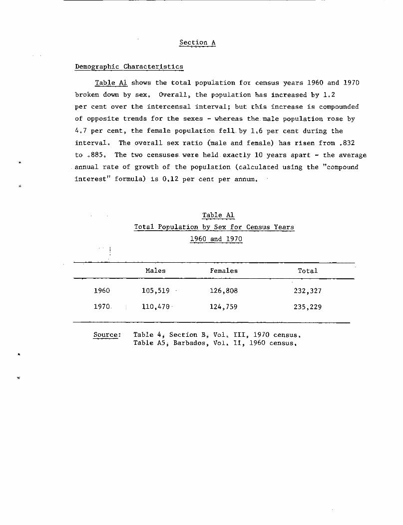
Table A1 shows the total population for census years 1960 and 1970 broken down by sex, Overall, the population has increased by 1.2 per cent over the intercensal interval; but this increase is compounded of opposite trends for the sexes - whereas the male population rose by 4.7 per cent, the female population fell by 1,6 per cent during the interval. The overall sex ratio (male and female) has risen from ,832 to .885, The two censuses were held.exactly 10 years apart - the average annual rate of growth of the population (calculated using the "compound interest" formula) is 0,12 per cent per annum,
Table Ai Total Population by Sex for Census Years
1960 and 1970
Males Females Total
1960 105,519 126,808 232,327
1970. 110,470 124,759 235,229
Source: Table 4, Section B, Vol, III, 1970 census. Table A5j Barbados, Vol. II, 1960 census.
-2-
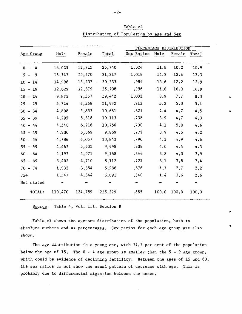
Table A2 Distribution of Population by Age and Sex
PERCENTAGE DISTRIBUTION cu Group Male Female Total Sex Ratios Male Female Total
0 - 4 13,025 12,715 25,740 1.024 11.8 10.2 10.9 5 - 9 15,747 15,470 31,217 1.018 14.3 12.4 13.3 10 - 14 14,996 15,237 30,233 .984 13.6 12.2 12.9 15 - 19 12,829 12,879 25,708 .996 11.6 10.3 10.9 20 - 24 9,875 9,567 19,442 1.032 8.9 7.7 8,3 25 - 29 5,724 6,268 11,992 .913 5.2 5.0 5.1 30 - 34 4,808 5,853 10,661 .821 4.4 4.7 4.5 35 - 39 4,295 5,818 10,113 ,738 3.9 4.7 4.3 40 - 44 4,540 6,216 10,756 .730 4.1 5.0 4.6 45 - 49 4,300 5,569 9,869 .772 3.9 4.5 4.2 50 - 54 4,786 6,057 10,843 .790 4.3 4.9 4.6 55 - 59 4,467 5,531 9,998 ,808 4.0 4.4 4,3 60 - 64 4,197 4,971 9,168 .844 3.8 4.0 3.9 65 - 69 3,402 4,710 8,112 .722 3.1 3.8 3.4 70 - 74 1,932 3,354 5,286 .576 1.7 2,7 2,2 75+ 1,547 4,544 6,091 .340 1.4 3.6 2.6 Not stated - - - - - - -
TOTAL: 110,470 124,759 235,229 .885 100,0 100.0 100,0
Source: Table 4, Vol. Ill, Section B
Table A2 shows the age-sex distribution of the population, both in absolute numbers and as percentages. Sex ratios for each age group are also shown.
The age distribution is a young one, with 37,1 per cent of the population below the age of 15. The 0 - 4 age group is smaller than the 5 - 9 age group, which could be evidence of declining fertility, Between the ages of 15 and 60, the sex ratios do not show the usual pattern o£ decrease with age. This is probably due to differential migration between the sexes.

-3-
Table B5 Percentage Age Distribution of the Population
i960 and 1970
Age Group 0 - 1 4 1 5 - 6 4 65+
1960 38,3 55.3 6,4
1970 37.1 54.7 8.2
Source: Table 4, Section B, Vol, III, 1970 census. Table A5, Barbados, Vol, II, 1960 census.
Table A3 compares the age distribution of the population in broad age groups for 1960 and 1970» There has been a small decrease in the percentage under 15, and a small increase in the percentage over 65, The dependency ratio (population aged under 15 or over 65 divided by those aged between 15 and 65) has increased slightly from .808 to ,828,
Table A4 • • <, i » » • • Intercensal Population Change
Males Females Total
Births 32,376 31,156 63,532 Deaths 9,284 11,582 20,866 Natural increase 23,092 19,574 42,666 Intercensal increase 4,951 - 2,049 2,902 Net intercensal migration -18,141 -21,623 -39,764
Source: Table A4 and Abstract of Statistics 1969,
Table A4 shows the registered births and deaths for the intercensal interval, broken down by sex. From these, we can calculate the natural increase in the intercensal interval. By subtracting this from the actual intercensal population change, we can estimate net intercensal migration. Assuming complete coverage in both censuses and for vital

-4-
registration, gives us an estimated net: migration-outwards of 39,764 persons, comprised of.18,141 males and 21,623 females; (By comparison, net migration calculated from arrival and departure statistics amounted to 20,600 outwards, comprising 10,582 males and.10,058 females. If census and registration data are assumed correct, this implies that net migration is under-recorded by around 50 per cent).
AGE PYRAMID FOR BARBADOS 1970
Figure (a)
I I I 1,000 2,000 3,000
FEMALES
Source; Vol. Ill, Section C, Table 4.

-5-
Figure (a) illustrates the age-sex distribution in Barbados. There is some evidence of a slight digit preference for ages ending in zero and two, with a corresponding dearth of ones; for ages over 30. The most notable feature is a steep undercut at ages below 10, This is due to the steady decline in live births which has been evident for the last 10 years. The relatively small, numbers between the ages of 30 and 50 could be due in part to a history of heavy out-migration. The bulge at ages 10 to 20 is due to the high and rising birth rates of the 1950's.
The published data do not show, any age breakdowns of the population by birth place, and there are no. published.tables showing year of immigration or country of birth for the foreign born, so very little information on in-migration can be extracted. Volume V, Table 1 in the Barbados section shows that a total of 104,452 males and 117,461 females were "locally born" which means that there were 6,018 males and 7,298 females whose place of birth was outside of Barbados, The foreign born totals in 1960 were 3,890 males and 5,798 females (1960 Vol, II, Table 7), The foreign.born population has thus increased by 2,128 males and 2,103 females«- To-estimate the level.of intercensal in-migration, allowance has to be made for.deaths occurring in the. foreign born population in the.intercensal interval. Assuming that the foreign born .were subject to the same average crude death rate in the intercensal period as prevailed for the total population, gives us an estimated 426 deaths of foreign born males.and 603.-deaths of foreign born females. Thus .the total.in-migration: for. the intercensal interval, was approximately 2,554. males ..and .2,103 -females* . (Note that this estimate does not take account of Barbados born emigrants who have returned to their country).
• Combining.these.estimates of in-migration with the estimates of net migration previously computed, gives us estimated out-migration in the intercensal interval of 20,695 males and 23,726 females,
. Table A5 shows the spatial.distribution of the population in 1960 and 1970, The size ranking of the parishes has changed very little. The two largest parishes, St, Michael and Christ Church have grown by 4 per cent and 5 per cent; St, Thomas has also grown by 5 per cent. The population of the other parishes has declined, most notably that of
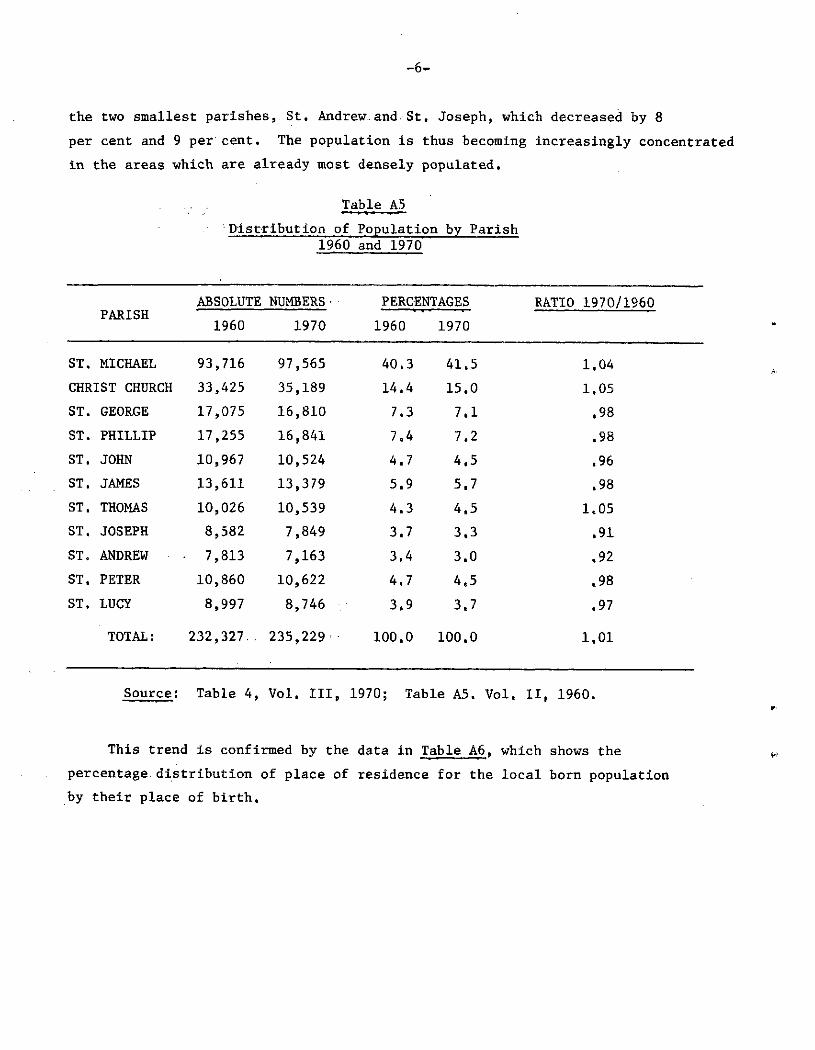
- 6 -
the two smallest parishes, St. Andrew-and. St, Joseph, which decreased by 8 per cent and 9 per cent. The population is thus becoming increasingly concentrated in the areas which are already most densely populated,
Table A5 Distribution of Population by Parish
1960 and 1970
ABSOLUTE NUMBERS• PERCENTAGES RATIO 1970/1960 PARISH 1960 1970 1960 1970
ST. MICHAEL 93,716 97,565 40.3 41.5 1,04 CHRIST CHURCH 33,425 35,189 14,4 15.0 1.05 ST. GEORGE 17,075 16,810 7.3 7.1 .98 ST. PHILLIP 17,255 16,841 7.4 7.2 .98 ST. JOHN 10,967 10,524 4.7 4.5 .96 ST. JAMES 13,611 13,379 5.9 5.7 ,98 ST. THOMAS 10,026 10,539 4.3 4.5 1.05 ST. JOSEPH 8,582 7,849 3.7 3.3 ,91 ST. ANDREW - 7,813 7,163 3.4 3.0 .92 ST. PETER 10,860 10,622 4.7 4.5 .98 ST. LUCY 8,997 8,746 3.9 3.7 ,97
TOTAL: 232,327.. 235,229 100,0 100,0 1.01
Source; Table 4, Vol. Ill, 1970; Table A5. Vol. II, 1960.
This trend is confirmed by the data in Table A6, which shows the percentage distribution of place of residence for the local born population by their place of birth.

Table A6 Percentage Distribution of Place of Residence by Place of Birth for Locally Born Population
P L A C E O F B I R T H
PLACE OF RESIDENCE
<si O
< PQ
O 1 - 1 S H co
« u PS S o H cn M Pi M u
w ai O w O H co
hJ >J H ili PM H CO
¡5 M O
H co
co
H co
C3
g H co
sa PM w en o
H co
i s S P
H CO
Pà W H M CU H W
G 3 H co
ST. MICHAEL 4Q,& 91 s 2 2,8- 16\2 12,6 16 4 Q 14,4- 16,9 17,5 17,6 14.4 14.3 CHRIST CHURCH 14,2 5.2 86,7 4.2 5.9 3.8 1.6 2,2 3.4 1.8 2.0 1.5 ST. GEORGE 7.5 J 1.1 75,6 1.3 3.4 .2 1,3 2,0 .6 .3 .2 ST. PHILLIP 7,4 ,4 1.3 1.1 77.5 3.2 ,3 .2 .7 .3 ,3 .2 ST. JOHN 4,6 ,2 .1 .9 1.3 71,2 »1 ,2 2,7 .4 .2 ,2 ST. JAMES 5,7 1.1 .3 .5 .3 .4 79,4 3 J) »6 1.9 5,1 3,3 ST. THOMAS 4,6 ,5 .3 .7 ,4 »4 1.7 73,9 2.5 6.0 .8 1.0 ST. JOSEPH 3,5 ,2 .2 .4 ,2 1.1 .1 ,8 68,7 2.2 .3 .2 ST, ANDREW 3,2 .2 .1 .1 .1 .1 .2 .9 1.3 66.7 1.1 .3 ST. PETER 4.6 .2 .1 .1 .2 .2 1.6 .3 .4 2.2 73.6 4.5 ST. LUCY 3.8 .1 .0 .0 .1 .1 .4 .1 .1 .2 1.8 74.3
TOTAL: 100.0 100,0 100,0 100,0 100,0 100,0 100,0 100,0 100,0 100.0 100.0 100.0 (Numbers) (221,913) (76,553) (27,299) (19,331) (19,322) (12,999) (12,495) (11,198) (9,990) (9,723) (12,122)(10,846:
I I
Source: Volume V, Table 1, Barbados,

- 8 -
Whereas the percentages of persons born in the two most populous parishes who still reside there are very high (91,2 per cent for St. Michael, 86.7 per cent for Christ Church), the percentages who are resident in their birth place for the two smallest parishes are much lower (66.7 per cent for St. Andrew, 68.7 per cent for St. Joseph), Between 12 per cent and 18 per cent of those born outside of the two largest- parishes migrate to St, Michael, and between 1.5 per cent and 6 per cent move to Christ Church. Large numbers of persons also move between St. Michael and Christ Church, The only other significant movement is from St, Andrew to St. Thomas, 6,0 per cent of those born in St. Andrew are now resident in St, Thomas.

- 9 -
Section B
Economic Activity
Table B1 Distribution of Adult Population by
Week's Economic Activity
NUMBERS PERCENTAGES WEEKS ACTIVITY Males Females Males Females
Worked 49,245 30,958 78.7 40.4 With job not working 1,255 948 2.0 1.2 Looked for work 3,679 4,134 5.9 5.4 Home duties 359 29,416 .6 38,4 Student 427 546 .7 .7 Retired 4,308 5,241 6.9 6.8 Disabled 1,521 2,762 2,4 3.6 Other and not stated 1,761 2,640 2.8 3.4
TOTAL: 62,555 76,645 100,0 100.0
Source: Table 1, Vol. IV. Pt. 4,
Table B1 shows the distribution of weeks activity for adults — of each sex. The main significant difference between the sexes is in the relative size of the "worked" and "home duties" categories. If the labour force is defined as the total number of persons who worked in the last week, or had a job but did not work, or who looked for work, then the total labour force consisted of 90,219 persons (54,179 males, 36,040 females) of whom 7,813 (8,7 per cent) were unemployed (looking for work). The percentages of unemployed males and females were 6.8 per cent and 11.5 per cent respectively,. The labour force comprised 64,8 per cent of the adult population; 86,6 per cent of adult men belong to the labour force, and so do 47,0 per cent of adult women.
1/ Strictly speaking, "Adult" population throughout this section, means persons 14 and over not attending primary or secondary school on a full-time basis.
-10-
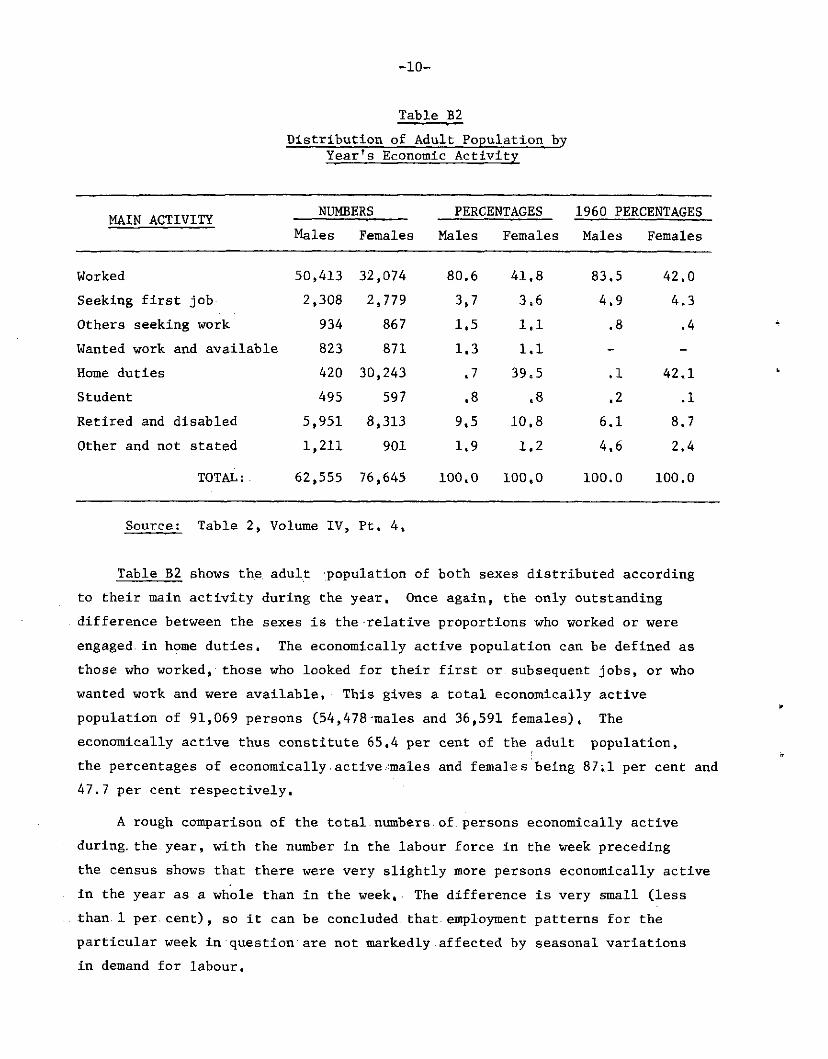
Table B5 Distribution of Adult Population by
Year's Economic Activity
MAIN ACTIVITY NUMBERS PERCENTAGES 1960 PERCENTAGES MAIN ACTIVITY Males Females Males Females Males Females
Worked 50. ,413 32, ,074 80. 6 41, 8 83.5 42, , 0
Seeking first job 2, ,308 2, ,779 3, 7 3. 6 4.9 4, .3 Others seeking work 934 867 1, 5 1, 1 .8 ,4 Wanted work and available 823 871 1, 3 1 . 1 -
Home duties 420 30. ,243 « 7 39. 5 .1 42, .1 Student 495 597 • 8 a 8 .2 .1 Retired and disabled 5, ,951 8, ,313 9. 5 10. 8 6.1 8. ,7 Other and not stated 1, ,211 901 1 , 9 1 . 2 4.6 2, ,4
TOTAL:. 62, ,555 761 ,645 100, 0 100, 0 100.0 100. .0
Source: Table 2, Volume IV, Pt, 4,
Table B2 shows the adult population of both sexes distributed according to their main activity during the year. Once again, the only outstanding difference between the sexes is the relative proportions who worked or were engaged in home duties. The economically active population can be defined as those who worked, those who looked for their first or subsequent jobs, or who wanted work and were available. This gives a total economically active population of 91,069 persons (54,478-males and 36,591 females), The economically active thus constitute 65,4 per cent of the adult population, the percentages of economically active-males and females being 87;1 per cent and 47.7 per cent respectively,
A rough comparison of the total.numbers of,persons economically active during, the.year, with the number in the labour force in the week preceding the census shows that there were very slightly more persons economically active in the year as a whole than in the week, The difference is very small (less than. 1 per.cent), so it can be concluded that employment patterns for the particular week in question are not markedly affected by seasonal variations in demand for labour,

-11-
Of the economically active, 8,582 (9,4 per cent) were unemployed for most of the year. These consisted of 4,065 males and 4,517 females, giving percentages unemployed amongst males and females of 7,5 per cent and 12,3 per cent respectively.
2/ In 1960, the total — economically active population consisted of
91,198 persons (53,403 males and 37,795 females), constituting 64.8 per cent of the adult population (the corresponding percentages for males and females being 89,2 per cent and 46,7 per cent). The total economically active population has thus declined slightly, in absolute terms, but increased as a percentage of the adult population - this 3/ might be due to the difference.in age structure of the base populations — . The trends for the two sexes are in opposite directions; the male economically active population has fallen both absolutely and as a percentage of the adult male population, whereas economic activity for females has increased, both absolutely and proportionally.
The number of economically active people unemployed in 1960 was 7,242 (3,386 males and 3,856.females) - constituting 7.9 per cent of the economically active population (6,3 per cent for males, 10,2 per cent for females). This would seem to indicate a rise in unemployment between the two censuses,.but may in fact be due to the more restrictive way in which "main activity" was classified in 1960: there was no category "wanted wo rk and available", so persons in this category may
2/ The figures for I960-are not tabulated in such a way as to allow direct comparisons to be drawn between 1960 and 1970. There are two sets of tables covering economic activity for the 1960: Vol, II, tables 11-19 and Vol, III, part G, Unfortunately, there are numerous discrepancies between the two sets of figures, which are unexplained by the notes accompanying the tables. The results quoted above, and used to calculate the percentages in the last two columns of Table B2, are derived by combining the information in table 19, Vol, II and table 1 part G. Vol, III, to obtain categories similar to those used in 1970.
3/ It should be noted that in the 1960's, the questions pertaining to economic activity were asked of the population aged 10 and over not attending school, unlike 1970, when it was restricted to those aged 14 and over. The number of children not attending school full-time, aged 10-13 in 1960, was 891 (446 males and 445 females).

-12-
have been classified as "other" in 1960. This is borne out, to some extent, by the percentage distributions shown in table B2: there is a drop in the proportions "other and not stated" from I960 to 1970 for both sexes, but there is little change in the overall proportions actually looking for work. The proportion whose main activity is working has fallen for both sexes, but again, this might be due not so much, to an increase in unemployment, but rather to a change in the age structure-of the.adult population between the two censuses: the number of people aged 65 and., over has. increased markedly, . and indeed this is reflected in the intercensal increases in the proportions retired and disabled.
Table B3 shows the percentage distribution of.main activity in each age group for both sexes,- Between the ages of. 30. and.55, males enjoy relatively high.employment.rates,. with.over 93 per cent-whose main activity is working. High levels.of unemployment are seen in both men and women under 20, particularly amongst those who. have just left school and are.seeking their first job. Above age 30, the unemployed comprise around.2.per cent of each age group for both sexes- At. ages-under 30,. females-tend to. show higher proportions at each age in the. categories, "seeking, first job" and "wanted.'work, and available". Employment for. women, peaks, in. the. 20^24 age.groupj.at.57,5.per cent,and then, declines steadily with, age , . Home, duties .absorb .an.increasing.number of women with age. There is.a suggestion that older women: who leave, employment tend to take up home, duties.rather, than: categorise themselves as "retired"; because although the proportion, "worked" declines faster with age than for men, the proportion "retired" rises more slowly.
Table. B3 also shows, the participation, rates i,es- the economically active expressed.as a-percentage of the total-population.in each sex and age group. (The rates can be found simply by adding the entries in the first four cells for each row).
The participation.rates for women-are.lower at.all ages than for men, and peak much earlier r-: the highest rates (around 68¿5-per. cent) occur in the age groups. 15̂ 24,-. and. decline, steadily thereafter, The highest rates for men are in the age groups 30-44 (around-96.5 per cent),
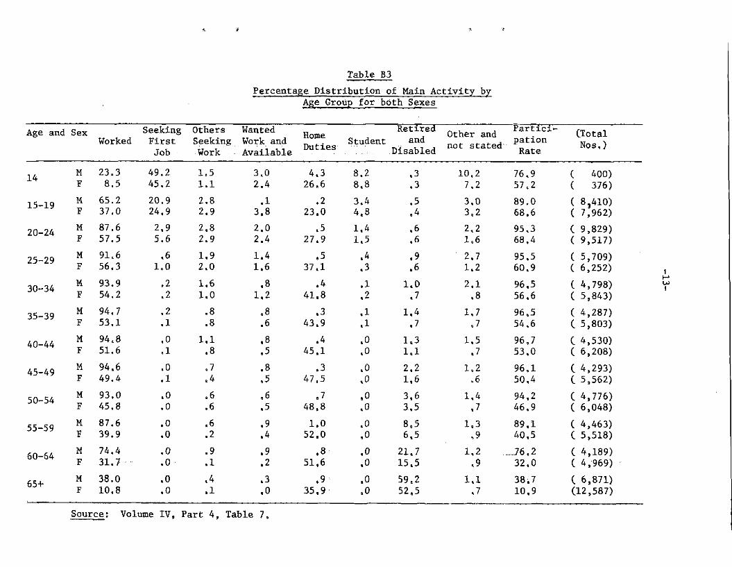
Table B3 Percentage Distribution of Main Activity by
Age Group for both Sexes
Age and Sex Seeking Others Wanted ~ Retired other and ? a r t l c l~ CTotal Worked First Seeking Work and _ _ Student and pation „ v
Job Work ^ Available D u t l e s Disabled « > t s t a t e d R a t e Nos,)
14
15-19
20-24
25-29
30-34
35-39
40-44
45-49
50-54
55-59
60-64
65+
M 23.3 49.2 1,5 3.0 4.3 8.2 .3 10,2 76.9 F 8.5 45.2 1.1 2.4 26.6 8.8 .3 7.2 57,2 M 65.2 20.9 2.8 .1 .2 3.4 ,5 3.0 89.0 F 37.0 24,9 2.9 3,8 23,0 4.8 .4 3,2 68,6 M 87.6 2.9 2.8 2.0 .5 1.4 .6 2.2 95,3 F 57.5 5.6 2.9 2.4 27.9 1.5 ,6 1.6 68,4 M 91.6 .6 1.9 1.4 .5 .4 .9 2,7 95,5 F 56.3 1.0 2.0 1.6 37,1 .3 .6 1.2 60,9 M 93.9 .2 1.6 .8 .4 .1 1.0 2,1 96.5 F 54.2 .2 1.0 1.2 41.8 .2 .7 .8 56,6 M 94.7 .2 .8 .8 .3 .1 1.4 1.7 96,5 F 53,1 .1 .8 .6 43,9 .1 .7 ,7 54,6 M 94.8 .0 1.1 .8 .4 .0 1.3 1.5 96,7 F 51.6 .1 .8 .5 45.1 .0 1.1 .7 53.0 M 94.6 .0 .7 .8 .3 .0 2,2 1.2 96,1 F 49.4 .1 .4 .5 47.5 .0 1.6 ,6 50,4 M 93.0 .0 .6 .6 .7 .0 3.6 1,4 94,2 F 45.8 .0 .6 .5 48,8 .0 3.5 ,7 46,9 M 87.6 .0 »6 .9 1.0 ,0 8,5 1.3 89,1 F 39.9 .0 .2 .4 52,0 .0 6.5 ,9 40,5 M 74.4 .0 .9 .9 .8 .0 21.7 1.2 76,2 F 31.7 .0 .1 .2 51,6 .0 15.5 .9 32,0 M 38.0 .0 .4 .3 .9 .0 59,2 1.1 38,7 F 10.8 .0 .1 .0 35,9 .0 52,5 J 10,9
400) 376)
8,410) 7,962) 9,829) 9.517) 5,709) 6,252) 4,798) 5,843) 4,287) 5,803) 4,530) 6,208) 4,293) 5,562) 4,776) 6,048) 4,463) 5.518) 4,189) 4,969) -6,871)
12,587)
Source; Volume IV, Part 4, Table 7-,
-14-
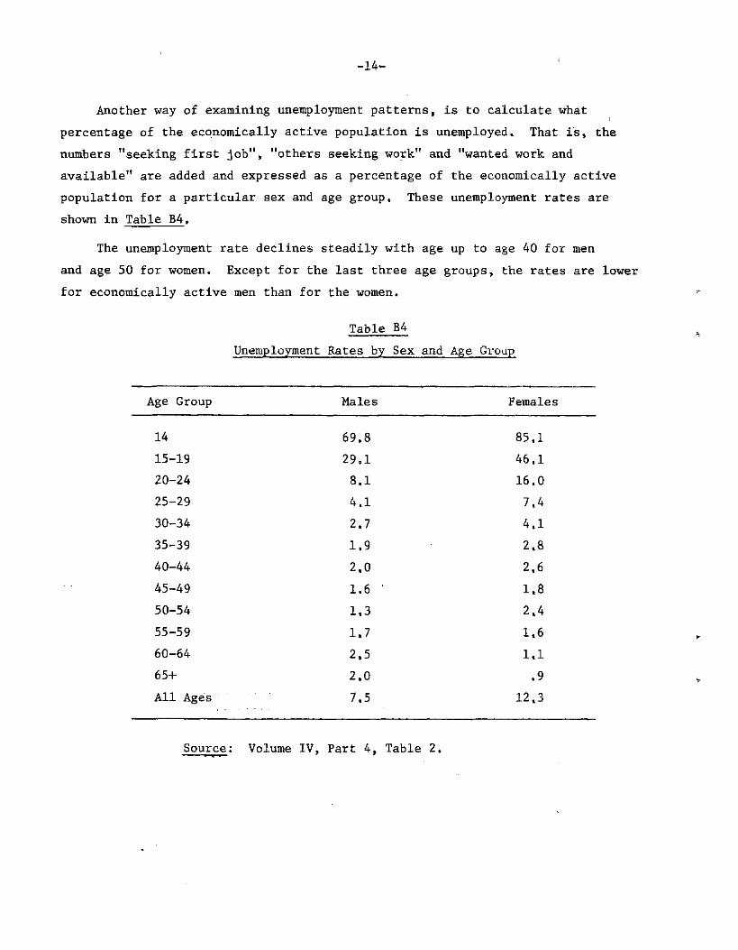
Another way of examining unemployment patterns, is to calculate what percentage of the economically active population is unemployed. That is, the numbers "seeking first job", "others seeking work" and "wanted work and available" are added and expressed as a percentage of the economically active population for a particular sex and age group. These unemployment rates are shown in Table B4.
The unemployment rate declines steadily with age up to age 40 for men and age 50 for women. Except for the last three age groups, the rates are lower for economically active men than for the women.
Table B4 Unemployment Rates by Sex and Age Group
Age Group Males Females
14 69.8 85.1 15-19 29.1 46.1 20-24 8.1 16.0 25-29 4.1 7.4 30-34 2.7 4.1 35-39 1.9 2.8 40-44 2.0 2.6 45-49 1.6 ' 1.8 50-54 1.3 2.4 55-59 1.7 1.6 60-64 2.5 1.1 65+ 2.0 .9 All Ages 7.5 12.3
Source: Volume IV, Part 4, Table 2,

-15-
Table B5 Percentage Distribution of Number of Months worked in Different Main Activity Categories for each Sex
No, of Months Worked
M ECONOMICALLY ACTIVE
A L E S ECONOMICALLY INACTIVE Total No, of Months
Worked Employed Unemployed Home Duties Other Total
< 2 .6 6,7 3,8 4,2 1.5 2- 3 1.6 6.5 1.7 2.9 1.7 4- 5 1.7 4.7 5.0 1.8 2,0 6- 7 6.8 - - - 5.5 8- 9 9.6 - - - 7,7
10-11 6.6 - - - 5.3 12 71.0 - - - 57,2 Not Stated 2.6 82.0 89,5 91,1 19.2
TOTAL: 100% 100% 100% 100% 100% (Numbers) (50,412) (4,065) ( 420) (7,656) (62,533)
F" E M A L E S < 2 1.0 5.8 3.8 3,9 2,7 2- 3 1.7 3.2 .9 ,8 1.4 4- 5 2.5 2.6 .9 .7 1.6 6- 7 9.4 - - - 3,9 8- 9 10.6 - - - 4,4
10-11 6.7 - - - 2.8 12 65.6 - - - 27,5 Not Stated 2.6 88,4 94,4 94,6 55.6
TOTAL: 100% 100% 100% 100% 100% (Numbers) (32,074) (4,517) (30,243) (9,811) (76,645)
Source : Volume IV, Part 4, Table 7,

-16-
Table B5 shows the population in various categories of main activity distributed according to the number of months actually worked, (The groupings used are as follows: "employed" are those whose main activity was worked; "unemployed" those who sought their first or subsequent job, or who wanted work and were available; the category "other" includes students, the retired and disabled, other economically inactive individuals and those who did not state what their main activity was), The main feature of this table are the differences between the sexes: of the employed persons higher proportions of women than men worked less than a full year; of the unemployed, higher proportions of males than females did just a few months of work. There are few men whose main activity is ' "home duties" - but of those, a higher proportion did a few months work than did females, in the same category, and the same holds true for the residual * category. Amongst the unemployed and the economically inactive, very high proportions are not stated.as to number of months worked - it is very likely that these consist for the large part of those who did not work at all.
Table B6 Unemployment rates for Educational
Attainment Categories by Sex
No Exam School Passed Leaving
Certifi-cate
G, C, E, '0' or 'A'
Diploma Or
Degree
Other or not Stated
All Categories
Males
Females
8.0
13,4
8 . 8
15,7
2.7
10,8
.9
3.3
7.2
7,4
7.5
12.3
Source : Volume IV, Part 4, Table 7,
Main activity has been cross-tabulated by educational attainment (highest exam passed), so we can find the proportions of economically active population unemployed for each educational attainment category, These are shown in Table B6. Once again, females show higher proportions unemployed than males, for all education categories. For both sexes, the proportions
-17-
unemployed are highest for those with the school leaving certificate, followed by those who have no formal educational qualification. Unemployment is lowest for graduates.
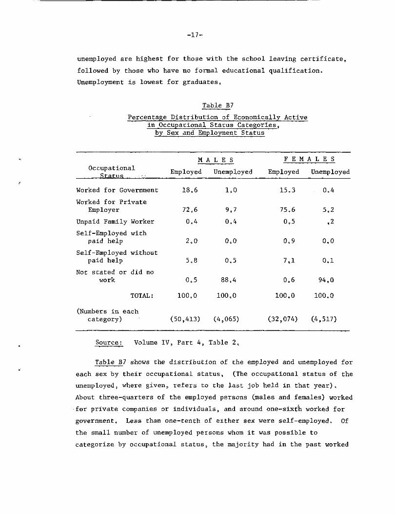
Table B7 Percentage Distribution of Economically Active
in Occupational Status Categories, by Sex and Employment Status
M A L E S F E M A L E S Occupational Employed Unemployed Employed Unemployed
Worked for Government 18,6 1,0 15.3 0.4 Worked for Private
Employer 72,6 9,7 75,6 5,2 Unpaid Family Worker 0,4 0,4 0,5 • 2 Self-Employed with
paid help 2,0 0,0 0,9 0,0 Self-Employed without
paid help 5,8 0.5 7,1 0,1 Not stated or did no
work 0,5 88,4 0.6 94,0
TOTAL: 100,0 100,0 100,0 100.0
(Numbers in each category) (50,413) (4,065) (32,074) (4,517)
Source: Volume IV, Part 4, Table 2,
Table B7 shows the distribution of the employed and unemployed for each sex by their occupational status, (The occupational status of the unemployed, where given, refers to the last job held in that year). About three-quarters of the employed persons (males and females) worked for private companies or individuals, and around one-sixth worked for government. Less than one-tenth of either sex were self-employed. Of the small number of unemployed persons whom it was possible to categorize by occupational status, the majority had in the past worked
-18-
for private employers, The main differences in employment patterns between the sexes are that slightly higher proportions of men than women work for government, with the reverse being true of private employment. Proportionally more men are employers in their own-right,. and proportionally, more women than men are own account workers (without paid help). Amongst the unemployed, higher proportions of men than'women had some form of employment in the last year which allowed them to be classified by occupational status.
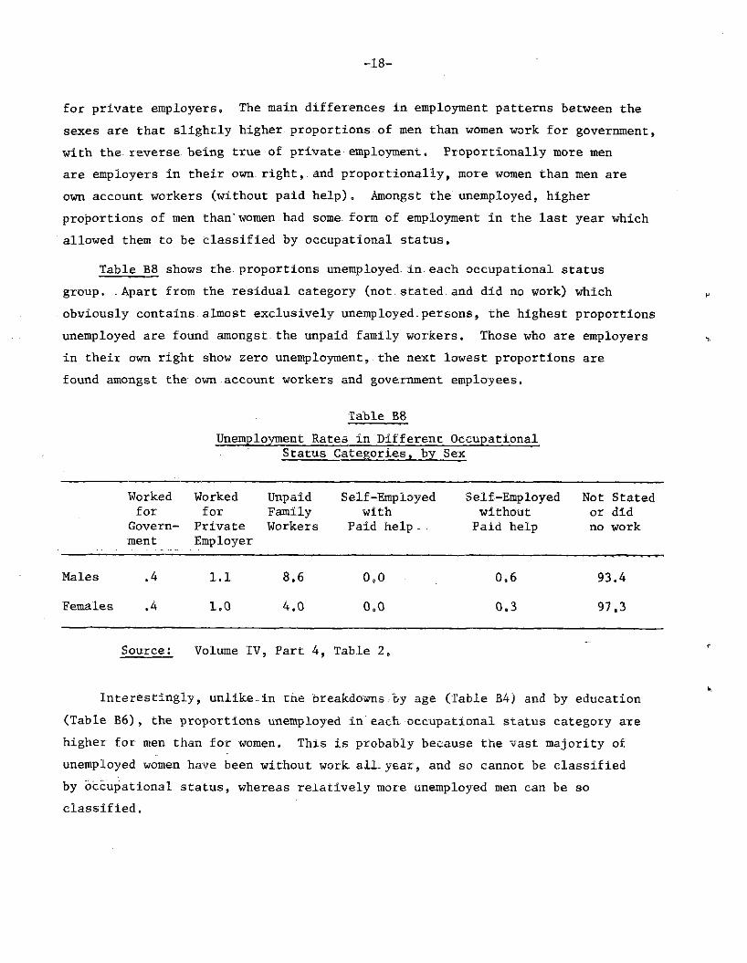
Table B8- shows the. proportions unemployed- in each occupational status group. . Apart from the residual category (not stated and did no work) which obviously contains almost exclusively unemployed, persons, the. highest proportions unemployed are found amongst.the unpaid family workers. Those who are employers in their own right show zero unemployment, the next lowest proportions are found amongst the own account workers and government employees,
Table B8 Unemployment Rates in Different Occupational
Status Categories, by Sex
Worked Worked Unpaid Self-Employed Self-Employed Not Stated for for Family with without or did
Govern- Private Workers Paid help . . Paid help no work ment Employer
Males .4 1.1 8.6 0,0 0,6 93.4
Females .4 1.0 4.0 0,0 0.3 97,3
Source: Volume IV, Part 4, Table 2,
Interestingly, unlike-in the breakdowns,by age (Table B4) and by education (Table B6), the proportions unemployed in'each occupational status category are higher for men than for women. This is probably because the vast majority of unemployed women have been without work, aLL year, and so cannot be classified by occupational status, whereas relatively more unemployed men can be so classified.

-Table B9 Percentage Distribution of Economically Active
Population over Occupational Groups for Employed and "Unemployedjby Sex
K A I, E s . . F E M A L E S Employed Unemployed Employed Unemployed
Professional and Technical 9.3 .8 9.4 .3 Administrative and Managerial 2,1 0.0 .4 0.0 Clerical and Related Workers 6,1 0,5 13.7 .8 Transport and Communications 2,2 -.2 ,3 ,0 Sales Workers 6,2 «3 13,4 .7 Service Workers 11.1 1.1 31,9 2.4 Farmers etc, 1.3 .0 .2 0,0 Agricultural Labourers 14,6 3.5 14,2 .5 Production 38,1 4.7 12,4 1,4 Other Labourers 6.4 1.4 2,0 .1 Others and not Stated 2.7 87,2 2.1 93,6
TOTAL: 100,0 100.0 100.0 100.0 (Numbers) (50,412) (4,065) (32,074) (4,517)
Source: Volume IV, Part 16, Table 1, Barbados,
Table B9 shows the percentage breakdown of the economically active population into occupational groups, The two sexes show quite distinct patterns, The largest occupational group for men is "productive workers", which encompasses. 38,1 per cent of the employed, followed by "agricultural labourers" and "service workers". For women, the largest group is "service workers" with 31,9 per cent, followed by "agricultural labourers", "clerical workers", "sales workers" and "production workers" -the latter four categories employing nearly equal numbers of women. Almost the same proportion: of employed men and women belong to the professional and technical group, but relatively fewer women than men are employed in
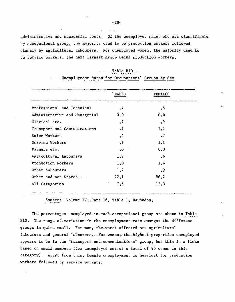
administrative and managerial posts, Of the unemployed males who are classifiable by occupational group, the majority used to be production workers followed closely by agricultural labourers.- For unemployed women, the majority used to be service workers, the next largest.group being production workers.
Table BIO Unemployment Rates for Occupational Groups by Sex
MALES FEMALES
Professional and Technical, ,7 .5 Administrative and Managerial 0.0 0,0 Clerical etc. .7 .9 Transport and Communications .7 2.1 Sales Workers .4 .7 Service Workers .9 1.1 Farmers etc. .0 0.0 Agricultural Labourers 1.9 .6 Production Workers 1.0 1,6 Other Labourers 1.7 .9 Other and not-Stated 72.1 86.2 All Categories 7.5 12,3
Source: Volume IV, Part 16, Table 1, Barbados,
The percentages unemployed in.each, occupational group are shown in Table BIO. The .range of.variation, in the unemployment, rate amongst the different groups is quite small. For men, the: worst affected.are agricultural labourers and general labourers, .For. womea, the. highest proportion unemployed appears to be in the "transport:and communications" group, but this is a fluke based on small numbers (two unemployed: out of a total of 95 women in this category). Apart from this, female unemployment is heaviest for production workers followed by service workers,

= 2 1 -
Tabla Bll Percentage Distribution of Economically Active
Population over Industrial Groups, for Employed and Unemployed, by Sex
A L E S F E M A L E S Employed Unemployed Employed Unemployed
Agriculture, Forestry and Hunting 16,5 3,6 15,3 .7 Mining, Refining and Quarrying „6 0,0 ,1 0,0 Manufacturing 15,3 2 04 13,4 1,3 Construction; and Installation 20,4 2,7 ,9 .0 Electricity, Gas, Water and Sanitation 2,0 ,3 ,3 0,0 Cbmmerce 11,9 06 18,5 1,1 Transportation, Storage and i Communication 8,0 „5 1,8 ,1 Services 20„8 2,4 46,0 3,0 Other and not Stated 4,5 87,6 3,8 93,8
TOTAL; 100o0 100,0 100,0 100.0 (Numbers) (50*412) (4,065) (32,074) (4,517)
Source; - Volume IV, Part 16, Table 2, Barbados,,
The distribution of the economically active population amongst different industries is shown in Table Bll, Once again, large differences in the employment patterns of the sexes are apparent, Almost half (46 per cent) of economically active women, are employed in "service" industries, the corresponding figure for men being only 20.8 per cent which is almost.the same as the percentage of men employed in the next largest sector, "construction and installation" (20,4 per cent), which provides employment for.very few women. The second largest industrial group for women's employment is commerce, followed by agriculture and manufacturing, For men, agriculture and manufacturing employ higher numbers than commerce.

-22-
,Table,B12.. Unemployment.Rates by Industrial Group for Each Sex
Males Females
Agriculture, Forestry and Hunting 1.7 .6 Mining, Refining and Quarrying 0.0 0.0 Manufacturing 1.2 1.3 Construction and Installation 1.1 .3 Electricity, Gas, Water and Sanitation 1.2 0.0 Commerce .4 .9 Transportation, Storage and Communication .5 .7 Services .9 .9 Other and not Stated 61,0 77.8 All Categories 7.5 12.3
Source: Volume IV, Part 16, Table 2, Barbados,
The last table in the section, Table B12 shows the unemployment rates for the different industrial groups: for males these are highest in the agricultural sector followed by manufacturing and the public utilities (electricity, water, etc.). For women, they are highest in manufacturing, followed by commerce and the service industries.

-23-
Section C
Other Socio-Economic Characteristics
Table CI Percentage of Population Currently attending School, by Sex and Age
Age Males Females
0- 4 4.2 4.6
5 95.2 95,9 6 98.8 99.0 7 99.4 99,3 8 99.2 99,1 9 99,1 99.4
5- 9 98.4 98,6
10 99,6 99,5 11 99,2 99,6 12 99.1 99,3 13 97,4 97,9 14 86,5 88,0
10-14 96,5 97,0
15 64,6 70,3 16 46,4 54,1 17 33,3 39,6 18 20,5 22,6
15-18 42,3 47,8
19-24 5,4 5,5
Source: Volume VI, Part 2, Table 1, Barbados and Volume III, Section C„ Table 4,
-24-
Table CI shows the proportions of children currently attending school, by single years of age. From age 5 to 13 school attendance is virtually universal for both sexes, and continues at a high level after the minimum school leaving age (14) with approximately 50 per cent attending up to age 16 and just over 20 per cent attending to age 18» From age 14 to 18, the percentage of girls attending school is significantly higher (by about 5 per cent) than the percentage of boys still at school. However, this levels out at ages 19 and over, with approximately 5 per cent of both sexes in the 19-24 age group receiving some sort of higher education.
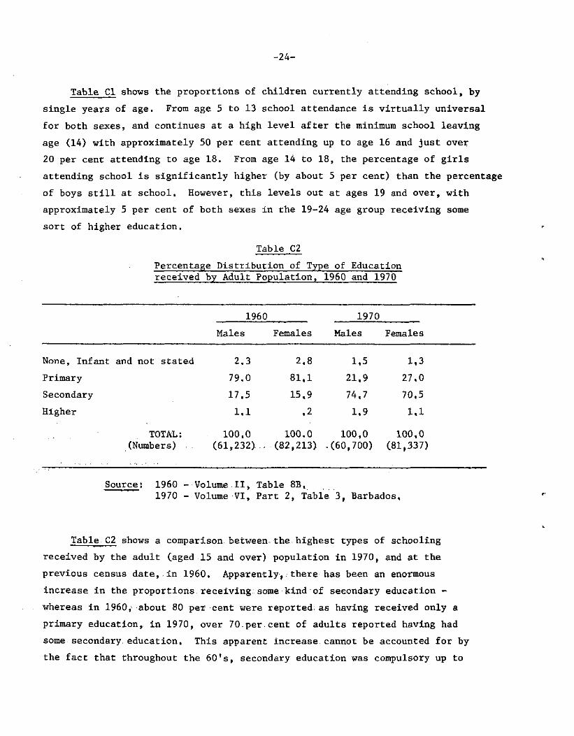
Table C2 Percentage Distribution of Type of Education received by Adult Population, 1960 and 1970
1960 1970 Males Females Males Females
None, Infant and not stated 2.3 2,8 1.5 1.3 Primary 79.0 81,1 21,9 27,0 Secondary 17.5 15,9 74.7 70,5 Higher 1.1 .2 1.9 1.1
TOTAL: 100,0 100.0 100,0 100,0 (Numbers) (61,232)... (82,213) .(60,700) (81,337)
Source: 1960 - Volume.II, Table 8B. 1970 - Volume VI, Part 2, Table 3, Barbados,
Table C2 shows a comparison between-the highest types of schooling received by the adult (aged 15 and over) population in 1970, and at the previous census date,.in 1960, Apparently, there has been an enormous increase in the proportions receiving some kind of secondary education -whereas in I960; about 80 per cent were reported: as having received only a primary education, in 1970, over 70.per.cent of adults reported having had some secondary, education. This apparent increase, cannot be accounted for by the fact that throughout the 60's, secondary education was compulsory up to
-25-
age 15, as those.adults who passed through secondary schools only after 1960,(i.e. those aged 15-24 in 1970) amount to only 30 per cent of the total adult population in 1970, whereas the increase in secondary school education is of the order of 50 per cent, and it is extremely unlikely that differential mortality or migration could account for the rest of the increase.
The distribution of educational attainment by age group and sex is shown in Table C3. As might be expected, the proportions with no schooling,.and the proportions with only primary schooling increase with age, whereas the proportions with.secondary schooling decrease with age, due to the ever increasing, availability of secondary education over time, However, this secular increase is much more gradual than that implicit in Table C2. The 1960 tabulations (Vol, III, Part F. table 14) also give a breakdown of educational attainment by age, though the age groups used are different from those used in 1970, It is enough to quote a few selected percentages.derived from this table, to show once again, that.the 1960 results, do not square with those obtained in 1970. For instance, in.I960, only.4^062 persons in the 20-24 age group, were reported as having had any kind, of secondary education, whereas the number of people with secondary.education in the same cohort in 1970, i.e., those in the age group 30-34 was 8,700 -more than double. Similarly, 4,505 persons aged 55+. in 1960 had some kind of secondary education; these people would be aged 65+ in 1970, when it was reported that 8,190 persons in this age group had a secondary education.
The most likely explanation for the discrepancy is either a change in the definition of what constituted secondary-education between the two censuses, or a change.in-the way-the question was.phrased, which elicited a biased response in one of the two censuses.
Table C3 gives.some indication as to how recent is the predominance of girls amongst teenagers receiving secondary education (noted previously in Table-CI),. The percentages of women with secondary education, are higher than the corresponding percentages for men, for the age groups 15-29; equal for the age group 30-34, and lower

- 2 6 -
for all age groups thereafter. This is probably due to a steady increase in the education of girls relative to boys, but may well be exaggerated by a higher propensity to emigration amongst educated men, in their 20's, relative to women of the same age.
As regards higher education, Table C3 shows that this is proportionally largest for men in the age group 30-34, and for women aged 25-29, Opportunities for higher education for school-leavers have increased steadily throughout the 60's, so the relatively lower proportions at ages 20-29 are unlikely to be the result of smaller proportions of school-leavers gaining entrance to colleges and universities; more likely it is because higher education is not concentrated in the traditional 18-22 age group, but spreads right through to involve persons in their late 20's. Another contributory factor may be that large numbers.of people in.their-early 20's leave Barbados in order to study abroad, and do not return until they are in their late 20's,

Table C3 Percentage Distribution of Type of School attended for
Adult Population by Sex and Age Group
M A L Ë S ~ ~ ~ ~ : F E M A L E S Age None,
N.S. , Infant
Primary Secondary Higher Total (Nos,) = 100%
None, N.S,, Infant
Primary Secondary Higher Total (Nos,) = 100%
15-19 .4 4.3 94,4 .9 (12,829) ,2 3,1 95,9 ,7 (12,879) .20-24 1.2 6.8 90.1 1,8 ( 9,875) ,5 6,6 91,3 1,6 ( 9,567) 25-29 1.7 10.9 84,5 2.9 ( 5,724) ,6 10,6 86,9 1,9 ( 6,268) 30-34 1.2 13.5 81,6 3.7 ( 4,808) ,5 16,2 81,6 1,6 ( 5,853) 35-39 1.0 17,9 78,0 3,1 C 4,295> .6 21,0 77,2 1.3 ( 5,818) 40-44 1,2 25,8 70,3 2,7 ( 4,540) ,6 30,6 67,9 .9 ( 6,216) 45-49 1.0 29.9 66,9 2,2 ( 4,299> 1.1 33,5 64,6 .8 ( 5,509) 50-54 1.5 37,0 59.9 1,6 ( 4,786} 1,3 41,9 56,0 .7 ( 6,057) 55-59 2.1 39,2 57,2 1.5 C 4,467) 2,5 44,2 52,6 .7 ( 5,531) 60-64 3,0 46.5 49,3 1.2 ( 4,197) 2,3 48,8 48,0 .9 C 4,971) 65+ 3,2 49.8 45,4 1.6 C 6,880) 3.4 55,1 40,2 1,0 (12,608) All Ages 1.5 21,9 74,7 1.9 (66,700) 1,3 27,0 70,6 1.1 (81,337)
Source: Volume VI, Part.2,.Table 3, Barbados,

-28-
• -Table C4 . Percentage Distribution of Adult Population
according to Highest Examination passed
None and School- G.C.E. Degree Not Leaving '0' or Diploma,"
Stated Ceirtifi- 'A' Level etc. cate
( N u m b e r s ) = 100%
Males 85.2 4.8 7.0 3.0 (66,700)
Females 86.9 4.7 6.3 2.1 (81,337)
Spurce; Volume VI, Part 2, Table 4, Barbados
Table C4 shows the percentage distribution of the adult population by educational qualifications, The most striking feature is the very high proportion of people with no.formal qualifications (over 85 per cent) which indicates that the large numbers of people reporting themselves as having had a secondary school education either did not finish it, or did not pass their final examinations. The table indicates very little difference between the sexes in examination achievements,
The 1970 census,also collected information on. completed years of schooling. Unfortunately this was. tabulated by single years only up to 6 completed years, and then there is an open ended category "7 +", into which about three-quarters of the population fall, so that the most interesting differentials cannot be observed, nor can this information be used to shed light on the discrepancy between '60' and '70' mentioned earlier. Table C4 which shows the percentages of men and women in each age group, who received 7 or more years of schooling could be compatible with either.data set, as exactly 7 years of schooling would correspond to a completed primary education, and 8 or more years would imply some secondary education. The data in Table C5 show the same general pattern as that in Table C3, namely: steadily decreasing educational attainment with age, the 'rate' of this decrease being faster for women than

- 2 9 -
for men; so that whereas at older ages lower proportions of men than women have had over 7 years of schooling, for the youngest age groups the reverse is true.
Table C5 Percentage of Population with 7+ years of Primary Schooling, by Sex and Age Group
Age Group Males Females
15-19 94,6 95,8 20-24 91,6 92.6 25-29 88,2 89,2 30-34 86,2 84,4 35-39 82,6 79.8 40-44 75,2 70,7 45-49 71,4 67.3 50-54 63,9 59.4 55-59 61,6 56,0 60-64 52,6 51,5 65 + 48,9 42,8 All Ages 77,6 72,7
Source; Volume VI, Table 5, Barbados,
Information was collected- on vocational training as well as academic education, A total of 8,526 males and 6,199 females reported themselves as having had some form of vocational training. This represents 12,8 per cent and 7,6 per cent respectively of the adult male and female-populations; or 15,7 per cent and 17,2 per cent respectively of the male and female labour force. In other words, although a lower proportion of adult women than men are trained for a special job, of those adults who actually work, a higher proportion of women than men have some special skill.

-30-
Table E8 Percentage Distribution of Persons with Vocational Training in Occupational Groups
Occupation Males Females
Physical Scientists.and Technicians 1.3 .0 Architects.» Engineers etc. 27,8 .6 Aircraft,and Ships. Officers .8 .0 Life Scientists and Technicians. .2 .1 Medical, Dental and Veterinary Workers 6.2 23.7 Statisticians, Mathematicians and Systems Analysts .1 .1
Economists.and Accountants 4.1 1.6 Judges, Lawyers etc. 1.7 .1 Teachers 10,0 23.2 Religious Workers, 1.9 ,6 Authors, Journalists and Writers .7 .1 Sculptors, Painters, Photographers 1.0 .3 Composers and Performing Artists .6 .2 Athletes etc. .0 .0 Other Professional and Technical .6 .5 Stenographers,,Punch and Computer Operators b 1 35.2 Others not Elsewhere Classified. 41,9 13.6
TOTAL: (Numbers)
100,0 (8,526),
100.0 (6,199)
-Source: Volume VI, Table 6, Barbados,

-31-
The breakdown of the persons with vocational training by occupation is shown in Table C6. There is a marked difference in the distribution of skills amongst the sexes, with men generally distributed much more widely over the occupations, whilst over 80 per cent of women are concentrated in just three of the professions, The largest number of skilled female workers have been trained in the clerical and secretarial skills (35.2 per cent), followed by medical workers (23.7 per cent) -probably largely comprised of nurses and ancillary workers - and teachers (23.2 per cent). By far, the largest group of men are in the residual category "Others not elsewhere classified". This is likely to consist largely of skilled manual workers - "blue-collar" workers like welders, plumberselectricians and.specialist craftsmen - e.g. carpenters etc. The next largest group for men is engineers and architects (27.8 per cent) followed by teachers (10.0 per cent).
Table C7 Percentage of the Adult Population with Vocational Training, by sex and age group
Age Group Males Females
15-19 8.5 18.5 17.4 16.7 15.9 13.7 13.5 11.5 10.2 9.0 7.9
12.8
7.1 15,5 13,8 11.0 9.0 6 . 8 6.5 4.6 4.3 3.5 2.4
20-24 25-29 30-34 35-39 40-44 45-49 50-54 55-59 60-64 65 + All Ages 7.6
Source; Volume VI, Table 6, Barbados.
-32-
Table C7 shows the percentages of persons with special training in each age group. The percentages are higher throughout for males than for females, and for both sexes,.they peak at age 20-24, and then decline steadily, This probably indicates that (unlike higher academic education), vocational training is acquired mainly in the late teens and early twenties, rather than later in a person's working, life;.and that the opportunities for acquiring special working skills have been increasing steadily for the last 50 years or so.
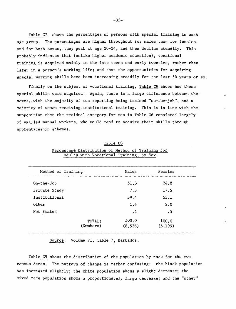
Finally on the subject of vocational training, Table C8 shows how these special skills were acquired, Again, there is a large difference between the sexes, with the majority of men reporting-being trained "on-the-job", and a majority of women receiving.institutional training. This is in line with the supposition, that the residual.category, for men.in Table C6 consisted largely of skilled manual workers, who would tend to acquire their skills through apprenticeship schemes.
Table C8 Percentage Distribution of Method of Training for
Adults with Vocational Training, by Sex
Method of Training Males Females
On-the-Job 51.3 24,8 Private Study 7,3 17,5 Institutional 39,4 55,1 Other 1.6 2,0 Not Stated .4 ,5
TOTAL: 100,0 100,0 (Numbers) (8,526) (6,199)
Source : Volume VI, Table 7, Barbados.
Table C9 shows the distribution of.the.population, by race for the two census dates. The pattern of change-is rather confusing: the black population has increased, slightly; the.white-population.shows a.slight decrease; the mixed-race population - shows a proportionately large decrease; and the "other"

-33-
races a proportionately large increase. Fertility, mortality and migration statistics are not published by race, so it is difficult to say whether the various changes are attributable to differential i migration or differential rates of natural increase. The one case in which we can be fairly certain as to the cause of the change is in the "other races" category, where a more detailed examination of the data shows that the increase is largely attributable to a 50 per cent increase in the size of the East Indian component (from 464 in 1960 to 675 in 1970). An increase of this magnitude in such a short time is almost certainly due largely to in-migration.
Table G9 Distribution of the Population by Race, 1960 and 1970
Absolute Numbers 1960 1970
Ratio 1970 : 1960 1960 1970
Black White Mixed Other and Not Stated
207,156 215,203 10,083 9,354 13,993 9,305
1,095 1,365 All Races 232,327 235,227
1.04 ,93 , 6 6
1,24 1,01
89,2 91,5 4,3 4,0 6,0 3.9
0,5 0.6 100,0 100,0
It has been suggested.that the decline in size of the-mixed race group and the accompanying .rise of- the black group could be an artifact caused by a change-in racial consciousness being of mixed origin is no longer deemed more prestigious than being black. There is probably some truth in this, as the decline in size of the mixed race group is too large to be accounted for solely by differences in vital rates and emigration. It would be difficult to think of reasons why the mixed race group should find more opportunities for emigration,.or why emigration, should appear more attractive to them than for either the black or white groups.
-34-
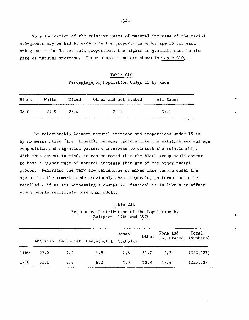
Some indication of the relative rates of natural increase of the racial sub-groups may be had by examining the proportions under age 15 for each sub-group - the larger this proportion, the higher in general, must be the rate of, natural increase. These proportions are shown in -Table CIO.
Table CIO Percentage of Population Under 15 by Race
Black White Mixed Other and not stated All Races
38.0 27.9 23.4 29.1 37.1
The relationship between natural increase and. proportions under 15 is by no means fixed (i.e. linear),.because factors like the existing sex and age composition and migration patterns intervene to disturb the relationship. With this caveat in mind, it can be noted that the black group would appear to have a higher rate of natural increase than any of the other racial groups. Regarding the very low percentage of.mixed race people under the age of 15, the remarks made previously about reporting patterns should be recalled - if we are witnessing a change in "fashion" it is likely to affect young people relatively more than adults.
Table Cll Percentage Distribution of the Population by
-Religion, 1960 and 1970
Roman None and Total 0tl:ier not Stated (Numbers) Anglican Methodist Pentecostal Catholic
1960 57.6 7.9 4.8 2.8 21.7 5.2 (232,327)
1970 53.1 8.6 6.2 3.9 10.8 17.4 (235,227)

-35-
The final table in the section, Table Cll, shows the distribution of persons by religion in 1960 and 1970, The relative ranking of the major religions has remained unchanged, but they experienced very different growth patterns. The category "none and not stated" grew more than three-fold, whereas the "other" category (consisting in the main of Christian sects such as Baptists, Bretheren, Church of God, Moravian, Seventh DayAdventists, Jehovah's Witnesses etc,), has almost halved in the same interval. The percentage of anglicans decreased slightly, whilst the other major religions (Methodist, Pentecostal and Catholic) all increased slightly.

-36-
Section D
Fertility and Marriage
Table D1 shows the percentage distribution of the population aged 15-64 by marital status, for the two census years 1960 and 1970. Proportions single have increased for men, and decreased for women, the reverse being true for the proportions married - this is slightly puzzling in so far as one would normally expect changes in proportions married to be in the same direction for both sexes. If one looks at the absolute numbers of married persons.for the.two censuses (23,284 males and 26,289 females for 1960; 20,973 males and 24,530 females in 1970) a further discrepancy comes to light — there is an excess of married females over married males - 13 per cent in 1960 and 17 per cent in 1970.
Table D1 Percentage distribution of Population aged 15-64
by marital status, 1960 and 1970
Year Sex Single (= never married)
Married Widowed Div. or Sep.
Not Stated
(Total number = 100%)
1960 M 56.5 40.7 1.7 .8 .3 (57,134) 1960 F 57.3 36,8 4.7 1.0 .2 (71,444)
1970 M 59.6 37.9 1.2 .8 .5 (55,283) F 56.5 38.5 3.8 1,1 .1 (63,682)
Source : 1960: Vol. Ill, Part B, Table 1 1970:- Vol. VIII, Part 1, Table 1 (Barbados).
Two factors could account for part of this discrepancy - the truncation of the tabulated information at age 64 (i.e. a large number of the "missing" husbands.might-be aged 65+) and differential migration amongst married.men and women (i.e. a greater number of married men than married women may.be currently abroad), The 1960 data is available

-37-
for ages 65+ (it was excluded from Table D1 for comparability) and shows that truncation only accounts for 3 per cent of the excess, It is unlikely that differential migration could account for all the rest, especially since the analysis in Part A indicated that for the intercensal interval more females emigrated than males. We are left with the conclusion that there is a bias in the reporting of marital status: either too many women are reported as married , or too few men.
It is thus difficult to draw conclusions from.the changes in proportions married and never married between the two censuses T they may even be an artifact due to this bias.
There has been a slight fall in proportions.widowed in.between the two censuses. Since the "aging" of the age.structure.of. the.population would have favoured an increase in widowhood,.we can conclude that there has either been a fall in mortality or an increase in the incidence of remarriage, or both
Table D2 shows the percentage, distribution by marital status in each age group for males and females. Up to the age.group 35-39,.the percentage of men remaining single is.higher.than that of women^ after.this age group the reverse is true. Percentages married.are higher for.women than men up to the age group. 30-34, and lower for older.ages,- This.is probably caused by the fact that, women tend.to marry younger.than, men;. but the higher proportions unmarried, at. older-ages. may. be partly due., to unfavourable, sex ratios. Proportions widowed, are higher throughout for women, than for men - this is a common observation as mortality rates are higher, for. men.-then, for women, but it may well be exaggerated-by a stronger.propensity of men to.remarry - another by-product of unfavourable sex ratios.
Two useful summary measures for the.marriage.experience of a population 4/ are "singulate" mean age at marriage — of those who marry, and the
kj The singulate mean age at-marriage is .a synthetic cohort measure, of the same type as the total fertility rate.. It is an estimate of the mean number of years spent in the single state by those who eventually marry, assuming that they experience throughout their lives marriage rates which yield the proportions never married by.age-group pertaining to the reference date. This measure is independent of the age structure of the population.
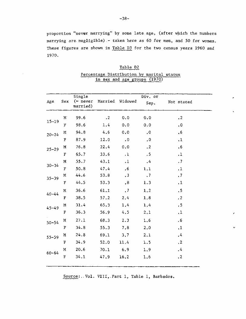
-38-
proportion "never marrying" by some late.age, (after which the numbers marrying.are negligible) - taken here as 60 for men, and 50 for women. These figures are shown in Table D3 for the two census years 1960 and 1970.
Table D2 Percentage,Distribution.by marital status
in sex and age groups (1970)
Age Sex Single (= never married)
Married Widowed Div, or
Sep. Not sti
M 99.6 .2 0.0 0.0 .2 15-19 F 98.6 1.4 0.0 0 o 0 »0
20-24 M 94.8 4.6 0.0 .0 .6 F 87.9 12.0 .0 .0 .1
25-29 M 76.8 22.4 0.0 .2 ,6 25-29 F 65.7 33.6 .1 .5 .1 M 55.7 43.1 .1 .4 .7
30-34 F 50.8 47.4 .6 1.1 .1
35-39 M 44.6 53.8 .3 .7 ,7 35-39 F 44.5 53.3 .8 1.3 .1 M 36.6 61.1 .7 1,2 .5
40-44 F 38.5 57.2 2.4 108 .2
45-49 M 31.4 65.3 1.4 1,4 ,5 45-49 F 36.3 56.9 4.5 2,1 .1
50-54 M 27.1 68.3 2.3 1,6 .6 F 34.8 55.3 7.8 2.0 .1
55-59 M 24.8 69.1 3.7 2,1 .4 F 34.9 52.0 11 „4 1.5 »2 M 20.6 70.1 6,9 1.9 .4 60-64 F 34.1 47.9 16.2 1.6 .2
Source:,. Vol. VIII,.Part. 1, Table 1. Barbados.
-39-
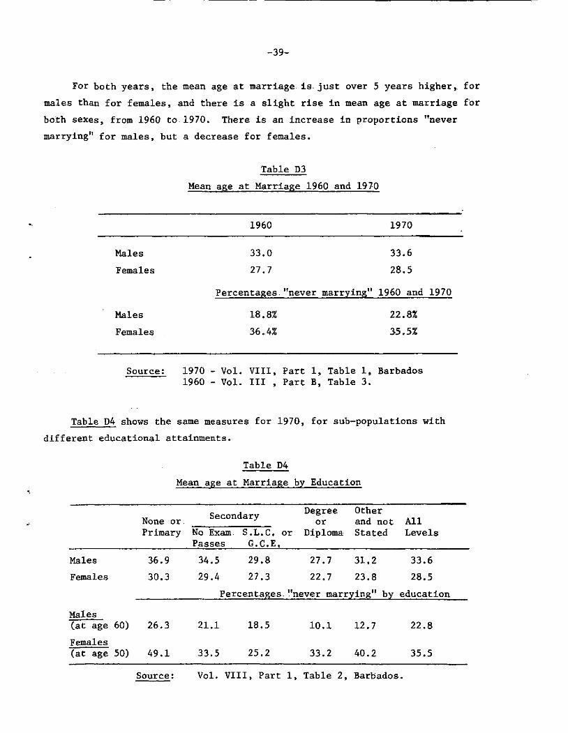
For both years, the mean age at marriage is. just over 5 years higher, for males than for females, and there is a slight rise in mean age at marriage for both sexes, from 1960 to 1970. There is an increase in proportions "never marrying" for males, but a decrease for females.
Table D3 Mean age at Marriage 1960 and 1970
1960 1970
Males 33.0 33.6 Females 27.7 28.5
Percentages "never marrying" 1960 and 1970
Males 18.8% 22.8% Females 36.4% 35.51
Source: 1970 - Vol. VIII, Part 1, Table 1, Barbados 1960 - Vol. Ill , Part B, Table 3.
Table D4 shows the same measures for 1970, for sub-populations with different educational attainments.
Table D4 Mean age at Marriage by Education
None or. Secondary Degree Other or and not All
Males Females
Males (at age 60) Females (at age 50)
Primary No Exam S.L.C. or Diploma Stated Levels Passes G.C.E.
36.9 34.5 29.8 27.7 31.2 33.6 30.3 29.4 27.3 22.7 23.8 28.5
Percentages "never marrying" by education
26.3
49.1
21.1 18.5
33.5 25.2
10.1 12.7
33.2 40.2
2 2 . 8
35.5
Source: Vol. VIII, Part 1, Table 2, Barbados.

-40-
Some unexpected trends are revealed by this table: mean age at marriage decreases with educational attainment for both sexes - which is the exact opposite of what is generally found in both developing and developed societies. The spread of. percentages "never marrying" for the different education categories is very wide, and, except for women with higher education, the percentage "never marrying" decreases with education attainment.
Although marital status information, was collected for all the population over age 14, it was only tabulated for those not attending school full-time - thus the measures derived above are not truly population measures, though, this should not have much effect except possibly in the 15-19 age group, where about 35 per cent of.the males and 40 per cent of the females (presumably nearly all.single) would, have been omitted. The effect on the mean age.at marriage, would be marginal - the ages quoted could be biased downwards by about .05 of a year.
Marriage-statistics-alone can be-rather misleading, in societies where.there are large numbers; of. persons, living in stable, consensual unions. Unfortunately,- data on.union.status, as opposed to marital status, is collected.only.for .females, - and once again, it is restricted to those not attending.school. -If union type (consensual or married) is related to educational attainment-and/or other socio-economic variables, the above analysis does not - give.a.true.picture.of union formation. For example,.the surprising^patterns, in Table D4 might well be reversed if persons, with lower standards;of-education.enter consensual unions in large numbers at young.ages,.especially if.there is a tendency for consensual unions to be.legalized by marriage.at a later age.
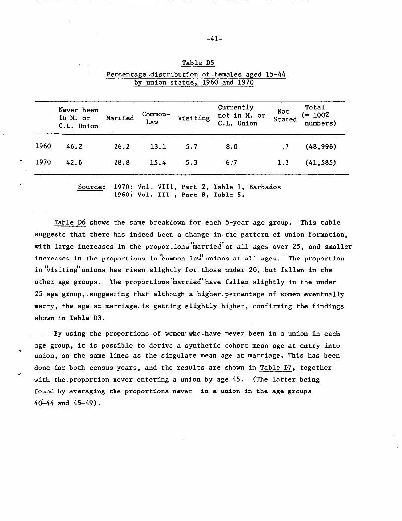
Table D5.shows the percentage.distribution of females aged 15-44, by union status, for 1960 and 1970,
There are increases.of just.over.2.per cent,- in the proportion of women, currently .married_or. in. consensual .unions,... with corresponding decreases-in the proportions.who-have never.been, or currently are not in a union. The proportion in the "visiting" union category has also dropped very slightly.
-41-
Table E8 Percentage^distribution of-females aged 15-44
by union status, 1960 and 1970
Never been in M. or C.L. Union
Married Common-Law Visiting
Currently not in M. or. C.L. Union
Not Stated
Total (= 100% numbers)
1960 46.2 26.2 13.1 5.7 8.0 .7 (48,996)
1970 42.6 28.8 15.4 5.3 6.7 1.3 (41,585)
Source; 1970: Vol. VIII, Part 2, Table 1, Barbados 1960: Vol. Ill , Part B, Table 5.
Table D6 shows the same breakdown for.each.5-year age group. This table suggests that there has indeed been a change, in the pattern of union formation, with large increases. in the proportions marriecf. at all ages over 25, and smaller increases in the proportions in "common law'unions at all ages. The proportion in'visiting" unions has risen slightly for those under 20, but fallen in the other age groups. The proportions'marriecf1have fallen slightly in the under 25 age group, suggesting.that.although .a higher, percentage-of women eventually marry, the age at marriage.is getting slightly higher, confirming the findings shown in Table D3.
By using the proportions of women; who.have never been in a union in each age group;, it is possible to derive a synthetic cohort mean age at entry into union, on the same lines as the singulate mean age at marriage. This has been done for both census years, and the results are shown in Table D7y together with the-proportion never entering a union by age 45. (The latter being found by averaging the proportions never in a union in the age groups 40-44 and 45-49).
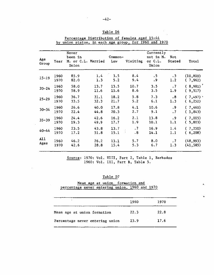
Table D6 Percentage Distribution of females aged 15-44
by union status, in each age group, for 1960 and 1970
Age Group Year
Never been in M. or C.L. Union
Married Common-Law Visiting
Currently not in M. or C.L. Union
Not Stated Total
15-19 1960 1970
85.9 82.0
1.4 1.3
3.5 5.2
8.4 9.4
.5
.9 .3
1.2 (10,800) ( 7,962)
20-24 1960 1970
58.0 58.9
13.7 11.6
13.5 15.6
10.7 8.6
3.5 3.5
.7 1.9
( 8,981) ' ( 9,517)
25-29 1960 1970
36.7 33.5
31.1 32.3
18.2 21.7
5.8 5.2
7.3 6.1
.8 1.3
( 7,497) 1 ( 6,252)
30-34 1960 1970
26.6 22.4
40.0 44.8
17.8 20.3
4.1 2.7
10.6 9.1
.9
.7 ( 7,460) ( 5,843)
35-39 1960 1970
24.4 19.3
42.6 49.9
16.2 17.7
2.1 1.9
13.8 10.1
.9 1.1
( 7,005) ( 5,803)
40-44 1960 1970
23.5 17.2
43.8 51.8
13.7 15.1
.7
.8 16.9 14.1
1.4 1.1
( 7,250) ( 6,208)
All Ages 1960
1970 46.2 42.6
26.2 28.8
13.1 15.4
5.7 5.3
8.0 6.7
.7 1.3
(48,993) (41,585)
Source: 1970: Vol. VIII, Part 2, Table 1, Barbados 1960: Vol. Ill, Part B, Table 5.
Table D7 Mean age at -union . formation..and. .
percentage never entering union, 1960 and 1970
1960 1970
Mean age at union formation
Percentage never entering union
22.3
23.9
2 2 . 8
17.6

-43-
i Comparing-these results with the.data.on marriage_for. females in Table D3, we see that for both.census years the mean age at union formation is about 5.5 years lower than the mean age. at marriage, and that the trend between censuses in mean age at marriage and union formation is in the same direction and roughly the same magnitude - i.e. an increase of about half a year.
The proportions never entering-a union are much, lower than proportions never marrying in both years, but the intercensal fall in proportions not entering a union is far greater than the fall in proportions not marrying.
Union status is tabulated by educational attainment, but unfortunately, these figures are not broken down by age group, so it is impossible to derive mean ages, at union formation by educational attainment. Table D8 shows the percentage distribution of women by union status in each educational attainment category.
Table D8 Percentage distribution of women aged 15-44
by union status for educational attainment categories
Secondary _ ! Degree Other All
Levels None or Primary
No Exam Passes
S • L • C • or G.C.E.
or Diploma
and not Stated
All Levels
Never been in M. or C.L. Union 28.2 42.0 56.7 38.9 52.8 42.6 Married 33.3 26.7 30.2 55.1 33.2 28.8 Common Law 22.5 16.7 6.4 1.3 6.2 15.4 Visiting 4.2 6.4 2.3 .5 2.0 5.3 Currently not in M. or C.L. Union 10.8 6.7 3.4 3.9 4.3 6.7 Not : Stated 1.1 1.3 1.1 .3 1.6 1.3
TOTAL NUMBERS (= 100%) (5,683) (27,822) (6,439) (633) (1,008) (41,585)
Source: Vol. VIII, Part 2, Table 3, Barbados.

-44-
The age distributions of women in each educational attainment category are very different - e.g. about 70 per cent of women in the "none or primary" category are over 30 years old, whilst around 70 per cent of those with secondary school.exam passes are.under 30 years old. One must bear in mind, therefore, that many of the apparent differences, in distribution of union status might.be explained by differences in age. distributions. Bearing .this in mind, it is probably of little interest to compare the proportions never.in a union in each category, as this is heavily dependent on age. It is interesting, however, to compare the relative distributions of women amongst the different union types. Of the women who arejactually, in unions, for the "none or primary" and "secondary - no exams" categories, approximately 55 per cent are married,. 35 per. cent are in common law unions and 10 per cent in visiting unions; in the "secondary with exams" group, about 80 per cent are married, 15 per. cent in common law unions and 5 per cent visiting; whereas, for those with degrees or diplomas, the respective percentages ,are 97 per cent, 2 per cent and 1 per cent. These differences amongst the education categories, could go a long way to explaining the mean age at marriage patterns, shown in Table D4.
Extensive fertility information was collected in the 1970 census, but relatively few useful tabulations were produced - the most surprising omission being..that of tables relating-to births in the past year. Thus it is not possible to calculate birth rates, or age.- specific fertility rates from the census data, or to obtain differential-fertility rates by education, economic, activity, union status etc. - the latter would have been particularly useful as it.is not.possible to use birth registration data . to, obtain.these rates. All the data.refer to women not currently attending ..school, therefore estimates derived from.it, such as mean children ever borne and not strictly speaking population measures, though this is probably unimportant except for the 15-19 and 20-24 age groups.
-45-
Table D9 shows the mean number of children ever borne by women in different age groups. If it were assumed that all women currently attending school had not had any children, the population values for the 15-19 and 20-24 age.groups would be .19 and 1.10 children respectively, the other values remaining unchanged. The data for 1960 are not available broken down by age, but the all age value of mean number of children borne, by. women is 2.61. This might mean that fertility rose in the intercensal decade, but the difference could also be caused by a change in the age distribution, which as noted in Section A, has become older.
The steady decline in numbers of children ever borne after age. 45, could be interpreted as meaning that fertility was lower in the past, when these older women were passing through their most fertile years. However, wide experience with the question on number of children ever borne, leads one to believe that the apparent decline after age 45 is a reporting error, due to a propensity to omit children of older women. This bias can be particularly strong .if the information is given on.the woman's behalf by.a younger member of the household, who may not know about children who have died, or who no longer live with their mother, though evidence from special surveys suggests that older women themselves may forget to include all their children.
i This is borne out by the data in Table DIP which shows the percentage
distribution of women in each age group by the number of children they have borne. The percentage of childless women rises after age. 40,.whereas one would normally expect it to level out after this age. The high proportions childless at older ages are probably due to omissions in the reports of older women.
As the 1960 data on number of children ever borne is not tabulated by age of mother, it is not possible to use intercensal vital registration data to prove conclusively that the reports of numbers of children born to older women are subject to errors of omission.
Data on children ever borne is presented by union.status and.age.of mother. Table Dll shows the mean number of children ever borne by age and union status, but limited to women under 45, as above this age, "union status" does not refer to current union status.

-46-
Table E8 Mean number of children ever borne
by age group of women
Age 15-19 20-24 25-29 30-34 35-39 40-44 45-49 50-54 55-59 60-64 All Group Ages Children ever borne .27 1.15 2.47 3.37 4.07 4.35 4.13 3.82 3.45 3.42 2.80
Table DIP Percentage distribution of women in each age group
by number of children ever borne
Age Group of Women
Number of
Children
All 15-19 20-24 25-29 30-34 35-39 40-44 45-49 50-54 55-59 60-64 Ages
0 77.7 48.5 23.0 14.4 12.5 14.3 17.7 20.1 22.7 24.1 30.8 1 16.0 20.3 16.8 11.6 9.6 9.0 11.3 12.2 14.2 15.4 14.0 2 4.5 15.5 17.7 15.8 12.4 11.6 11.8 11.9 12.5 12.1 12.4 3 I .7 8.7 14.5 13.4 12.6 10.8 10.4 10.3 10.0 9.2 9.6 4 • .1 4.0 12.1 12.6 11.3 10.2 8.9 9.2 8.5 7.4 7.9 5 0.0 1.5 8.1 10.4 10.7 9.4 7.9 7.2 6.4 5.9 6.2 6 0.0 .4 4.3 8.9 9.2 7.9 7.4 6.3 5.5 5.8 5.0 7 0.0 .1 1.7 5.4 6.7 7.3 5.9 5.2 5.0 4.5 3.8 8 0.0 .0 .8 3.1 5.4 6.1 4.9 4.3 3.8 3.5 2.9 9+ 0.0 .0 .5 3.6 8.9 12.8 13.3 12.3 10.3 10.9 6.5
Not Stated 1.0 .8 .6 .7 .6 .6 .6 1.1 1.2 1.3 .9
TOTAL 100.0 100.0 100.0 100.0 100.0 100.0 100.0 100.0 100.0 100.0 100.0
dumber of
Women) 7962 9517 6252 5843 5803 6208 5562 6048 5518 4969 64058

Table Dil Mean Children ever borne by age
and union status
All Ages Union Status 15-19 20-24 25-29 ,30-34 35-39 40-44 (15-44)
Never been in M. or C.L. Union .09 .46 1.20 1.79 2.15 2.17 .72 Married .87 1.58 2.58 3.69 4.55 4.88 3.81 Common Law 1.08 2.17 3.35 4.15 4.74 4.98 3.54 Visiting 1.29 2.28 3:67 5.34 6.15 6.13 2.64 Currently not in M. or C.L. Union 1.12 1.58 2.64 3.43 3.89 4.38 3.44 Not Stated .19 .73 1.37 2.83 3.02 2.73 1.42
TOTAL: .27 1.15 2.47 3.37 4.07 4.35 2.38
Source: Vol. VIII, Part 3, Table 3, Barbados.
Data on children ever borne is presented by union status and age of mother. Table Dll shows the mean number of children ever borne by age and union status, but limited to women under 45, as above this age, "union status" does not refer to current union status.
Table Dll shows that in feach age group, women in the "visiting" union category have borne the highest numher of children, followed.in each case by women in common law unions, with married women having ..the. least number of children. The reverse is true for the summary group, (women aged.15-44) -this is due to the fact that married women have an older age.distribution than those in the other two union types. So women of higher parity contribute more weight to the "all age" mean value of children ever borne.
It might seem surprising, at first sight, that the women in the "visiting" category, which one might think is an unstable type of union, and therefore likely to be conducive to lower overall fertility, should have a higher lifetime fertility than women in the other two kinds of union. This could partly be accounted for by the somewhat arbitrary definition of "visiting"

-48-
union - a woman is placed in this category if she has had a live birth in the past year, but was not living with, her husband or common-law partner at the time ..of that, birth.. This means that women in this category are selected for high current fertility. It also means that women, who are in a "visiting union" in the commonly used sense of the term, (i.e. they have a steady sexual partner who does not live with them) but happen not to have had a child in the last year are excluded from this category - even those who are pregnant at the time of the census, or have a child from.this relationship which is more than 1 year old. In fact, the question on union status does not identify women who have a steady sexual partner who does not live with them - they could correctly be classified as "never had husband or common-law partner" or "not currently living with husband" or."not currently living with common-law partner" or "in visiting union". Some of these categories will include women who are not now having, and who have never had, a "visiting" relationship |- e.g. spinsters, widows, divorces and women parted by death or separation from their common-law partners. But the "true" lifetime fertility of women who are currently engaged in a visiting relationship would be somewhere between that of the census defined "visiting" categoryand.that of.the composite category "never been in union" and "not currently in union" and "visiting". The mean children ever borne for each age group in this composite category is shown below for comparison with Table Dll.
15-19 20-24 25-29 30-34 35-39 40-44 All Ages Group °
Mean , .22 .73 1.68 2.50 2.96 3.24 1.24 c.e.b.
Lifetime fertility is also available broken down by education, but the education categories used are years of primary schooling 0 to 7+. As the overwhelming majority of women (80 per cent) fall into the final, open-ended category, and the rest of the groups consist of

small members, and are relatively undifferentiated as far as fertility patterns go, this table does not allow one to draw meaningful conclusions.
Tables are also presented on age at first and last birth, broken down by current age and by union category. These present several difficulties in interpretation. First, "union status" refers to the woman's current union status, (or status at age 45 for women 45+ years old), not to her union status at the time of the birth. Second, there are truncation effects: the "total" column does not really give a true picture of the distribution of age at first/ last birth in the population - the distribution is of necessity biased towards younger ages, as women who have not yet experienced their first/last birth cannot report the age they will be when (if) they experience this event. For ease of interpretation, therefore, only data pertaining co older women (aged 50-64) who have completed their child-bearing, is presented in Table D12j, and
Table D12 Percentage distribution at age at first
and last birth for women currently aged 50 to 64
< 1 5 15-19 20-24 25-29 30-34 35-39 40-44 < 4 5 Not 5/ Stated
First Birth Last Birth
1.06 .2
33.8 6.0
35.9 12.4
12.8 6„9 12.6 17.0
3.1 22 » 3
.8 20.3
.1 3.4
5.6 5.9
5/ The percentage distribution was computed using the total number of women aged 50-64 who had at least one child: 12,866 women, as given in fable 1 of the fertility section - i.e. only the 3,699 childless women in those age groups were excluded. These women should have appeared as "not applicable" in. Tables 6 and 7 - instead the numbers "not applicable" given in those tables were: 4,343 and 4,400 respectively» The excess numbers in the "not applicable" categories were added to the "not stated" column when the percentage distribution was calculated.
Source: Vol. VIII, Part 3, Tables 6 and 7, Barbados»
these are not broken down by union status» Of necessity, this means that the data do not refer to 1970, but to a period 0 to 50 years earlier, when these women were having their children. It is not even a complete record of the experience of this cohort of women, as the cohort will have been diminished by deaths and emigration - however, as long as these events are not related to ages at first or last birth, no bias would be introduced.
From Table D12, we can see that the mod^l age group for first births is 20-24, and for last -Jbi-ffchs it is 35-39.

-50-
Seetion E
Housing and Household
Table El shows the distribution of private households by parish. The pattern is very similar to that of the population distribution shown in Table A5 - in fact the rankings of parishes by population and by numbers of households are identical. The mean size of households for each parish is also shown, and it is apparent that in general, the smallest parishes have the largest mean household size. The mean household size for Barbados is just over 4 individuals per household, on the assumption that all the "non-institutional" population identified in Section A„.live in private households,
Table El Distribution of households by parish
and mean household size
Number of Households
Percentage Distribution
Mean Size of Household
St. Michael 25,498 43 » 5 3.83 Christ Church 9,186 15.7 3.83 St. George 3,833 6o5 4.39 St. Phillip 3,930 6„ 7 4.29 St. John 2,282 3 o 9 4.61 St. James 3,305 5.6 4.05 St. Thomas 2,429 4.1 4o34 Sto Joseph 1,724 2 » 9 4o55 St. Andrew 1,547 2o6 4.63 St. Peter 2,529 4.3 4.20 St. Lucy 2,133 3.6 4ol0
TOTAL: 58,596 100 o0 4.01
Source: Vol. IX, Part 2, Table 1, Barbados.
-51-
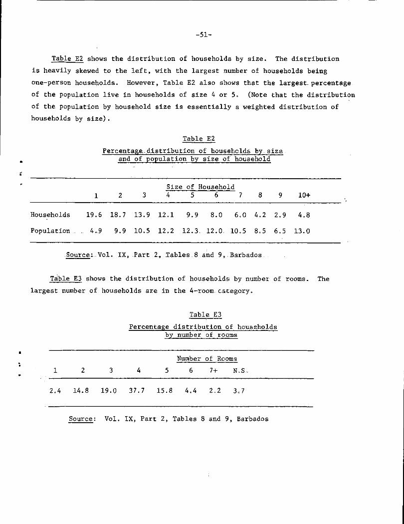
Table E2 shows the distribution of households by size. The distribution is heavily skewed to the left, with the largest number of households being one-person households. However, Table E2 also shows that the largest, percentage of the population live in households of size 4 or 5. (Note that the distribution of the population by household size is essentially a weighted distribution of households by size).
Table E2 Percentage.distribution of households by.size.
and of population by size of household
Size of Household 1 2 3 4 5 6 7 8 9 10+
Households 19.6 18.7 13.9 12.1 9.9 8.0 6.0 4,2 2.9 4.8
Population . . 4.9 9.9 10.5 12.2 12.3. 12.0. 10.5 8.5 6.5 13.0
Source:. Vol. IX, Part .2, Tables.8 and 9,.Barbados..
Table E3 shows the distribution of households by number of rooms. The largest number of households are in the 4-room category.
Table E3 Percentage distribution of households
by number of rooms
1 2 3 4 Number of Rooms
5 6 7+ No S„
2.4 14.8 19.0 37.7 15.8 4.4 2o2 3o 7
Source: Vol. IX, Part 2, Tables 8 and 9, Barbados

-52-
The mean number of persons per room.for. the country as a whole (for private households) is 1..07. In 1960, it was 1.15 persons.per room, so if this ratio is used.as a measure.of. overcrowdings .the.housing., situation has improved . since 1960. . The mean does, not always give. a., true picture, of . the situation.̂ ...especiaily when. the.distributions, are very skewed, so it is interesting to.compute the.actual.distribution of households, and the non-institutional population, by the number of persons per room. The results are shown in Table E4.
Table E4 Proportions of households and of-the population,. .
by ratio of persons to rooms
2 or more persons
Less than 2 but more than
1 person 1 Person per room
Less than 1 person per room per room per room
Less than 1 person per room
i 7o Households 10.6 27.4 14.9 47.1 Population 22.1 39.5 13.0 25.3
Source: Vol. IX, Part 2, Tables 8 and 9, Barbados
This shows that more than 10 per cent of.dwellings (which house over 20 per cent of the population), are occupied at a density of more than 2 persons per room - twice the national mean.
The distribution of households by number.of persons and number of rooms is not published by area,.so.it is impossible to see how overcrowding.varies across the country, However, it is possible to examine overcrowding in relation .to various socio-economic indicators, such as sex and age, marital status, education, economic.activity and income of the head of household. The calculations involved are somewhat lengthy, so this has been omitted from the present analysis.

- 5 3 -
Table E5 shows a simple breakdown of the heads of households, separately for the two sexes, by their main economic activity. A comparison with Table B2, which shows the distribution by main activity of the population as a whole, shows remarkably few differences. The proportion of household heads, whose main activity is work, is marginally higher than for the general .population, and there are proportionally fewer persons seeking .employment - especially first jobs, and fewer students. The proportions whose main activity is home duties is about 6 per cent lower for females and about the same for males, and there are 4 per cent more males and 8 per cent more females in the retired/disabled category for household heads than for the general population.
Table E5 Percentage.distribution of household heads
by sex and main activity
Main Activity Males Females
Worked 83.2 45.4 Seeking first job .1 .1 Others seeking work .6 .5 Wanted work and available .5 .6 Home duties .5 33.6 Student .1 .1 Retired and disabled 13.7 19.0 Other and not stated 1.3 .8
TOTAL NUMBERS: . (33,442). (25,154)
Source: Vol. IX, Part 2, Tables 8 and 9, Barbados
Table E6 shows the distribution of households by the type of dwelling. Well over 90 per cent of dwellings are separate houses, around 5 per cent are flats, and there are very few households in the other categories.

-54-
Table E8 Percentage distribution of households
by type of dwelling
Separate Flat/ „ _ Part of Group No ir * Barr- Out „ , Other _ , Not «wp-at House Apart- , Communal . Dwell- Fixed _ , TOTAL r acks room „ ... ,. private . , Stated ment Building r ing Abode
93.3 4.9 .0 .1 .4 .0 .1 .0 1.1 100.0
Source: Vol. IX, Part 2, Table 2, Barbados
Table E7 shows the distribution by tenure. Nearly three-quarters of dwellings are owned by the families that live in them, about one-fifth are rented and one-twentieth are "free" - presumably dwellings tied to a job e.g. caretaker's flats. The actual number of squatted buildings (a total of 14 for the whole island) appears very low - it is probably an undercount, because of reluctance to report the occupation of premises without the owner's permission.
Table E7 Percentage distribution of.households .
by type of tenure
Owned Leased Rented Free Squat Other Non stated Total
73.0 .5 19.6 5.3 .0 .2 1.3 100.0
Source: . Vol. IX, Part 2, Table 1, Barbados
Table E8 shows the percentage distribution of buildings by material of construction. Wood is by far the most common material used for private housing, but1 concrete and stone are. also widely used.

-55-
Table E8 Percentage distribution of dwellings by
material of construction
Wattle/ Wood and Wood Concrete Stone Brick Nog . Adobe Concrete Other
75.3 9.6 8.5 1.1 .1 .1 4.4 .8
Source: Vol. IX, Part 2, Table 2, Barbados
Table E9 shows the distribution of dwellings by year of construction. An annual construction rate has also been computed, although this cannot take account of buildings which were subsequently demolished or destroyed - or are currently unoccupied, however, information is only categorised fully for the.last 20 years, so this is probably not important. The construction rate for 1970 appears ,to be lower than for the preceding two years, but this may be due to seasonal factors.
Table E9 Distribution of dwellings by year of construction
and annual rate of construction
1970 1969 1968 1960-1967
1951-1959 1950
Not Stated TOTAL
Percentage Distribut-
ion .5 2.5 2.5 15.3 20.7 48.8 9.6 100.0 Numbers of Dwellings 319 1,451 1,463 8,989 12,109 28,611 5,654 58,596 Annual Construc-tion Rate 1,276 1,451 1,463 1,124 1,345 - - -
Source: Vol. IX, Part 2, Table 1, Barbados

- 5 6 -
Table ElO shows the distribution of water supply to private households. Over 90 per cent of households use the public water supply, though the majority do not have a tap in the home.
Table ElO Percentage distribution of dwellings by
method of water supply
Public Public Private Private Public Other Pipe to Pipe to Pipe to Not Stand Tànk and not TOTAL Dwelling Yard Dwelling Piped Pipe Stated
35.0 20.6 4.8 .4 36.6 .1 2.4 100.0
. Source: Vol. IX, Part 2, Table 3, Barbados
Table Ell gives information about toilet.facilities: over 90 per cent of households have their own toilet, but in the majority of homes this is only a pit latrine - which is not surprising as the previous table showed.that only 40 per cent of dwellings had water piped into the home. The great majority of flush toilets drain into septic tanks or directly into the sub-soil.
Table Ell Percentage distribution of dwellings by
type and availability of toilet facilities
Availability Own Shared None Not Stated Total
92.0 6.0 1.4 .7 100.0
Type Pit W.C. Link to Sewer l C ' N
t°. . Other Sewer Link Not Stated Total
70.5 1.5 25.0 1.7 1.2 100.0
Source: Vol. IX, Part 2, Tables 4a and 4b, Barbados.
There are no comparable data on housing characteristics for 1960, so it is not possible to measure how the situation has changed in the intercensal interval.


ß £