Wayfinding Design Guidance design manual NR/GN/CIV/300/01
132
Design Manual NR/GN/CIV/300/01 Wayfinding Design Guidance
-
Upload
khangminh22 -
Category
Documents
-
view
8 -
download
0
Transcript of Wayfinding Design Guidance design manual NR/GN/CIV/300/01
Design Manual NR/GN/CIV/300/01
WayfindingDesign Guidance

Wayfinding Design Guidance Compliance
NR/GN/CIV/300/01 December 2020
OFFICIAL1/128
DirectorSpaceagency
Sarah ManningName Department or Role
Anthony Dewar Professional HeadBuildings & Architecture,Technical Authority
Frank Anatole Principal ArchitectBuildings & Architecture,Technical Authority
Name Department or Role
Disclaimer
In issuing this standard/control document for its stated purpose, Network Rail Infrastructure Limited makes no warranties, expressed or implied, that compliance with all or any standards/control documents it issues is sufficient on its own to provide safety or compliance with legislation. Users are reminded of their own duties under legislation.
Compliance with a Network Rail standard/control document does not, of itself, confer immunity from legal obligations.
Where Network Rail Infrastructure Limited has granted permission to copy extracts from Network Rail standards or control documents, Network Rail Infrastructure Limited accepts no responsibility for, nor any liability in connection with, the use of such extracts, or any claims arising there from.
This disclaimer applies to all forms of media in which extracts from Network Rail standards and control documents might be reproduced.
Revision Information
Version: Date issued:
1.0 5th December 2020
Description of changes:First Issue
Developed by
Document Verification
Wayfinding Design Guidance Compliance
NR/GN/CIV/300/01 December 2020
3/128
This Wayfinding Design Guidance presents Network Rail’s requirements for the specification of new and updating of existing directional signs within Network Rail managed stations.
The intended audience for the Design Guidelines is Managed Station Managers, sign manufacturers and others involved in the planning, design and implementation of wayfinding signage for Network Rail.
This Wayfinding Design Guidance supports the statutory requirement to achieve consistency between installations undertaken in different locations. It illustrates the requirements for the provision of Wayfinding in a consistent manner that enables designs and compliance to be measured as described in the Network Rail standard NR/L2/CIV/150.
Station Wayfinding Design and Assurance ProcedureNR/L2/CIV/150
Standards Reference
Foreward
Wayfinding Design Guidance Compliance
NR/GN/CIV/300/01 December 2020
4/128
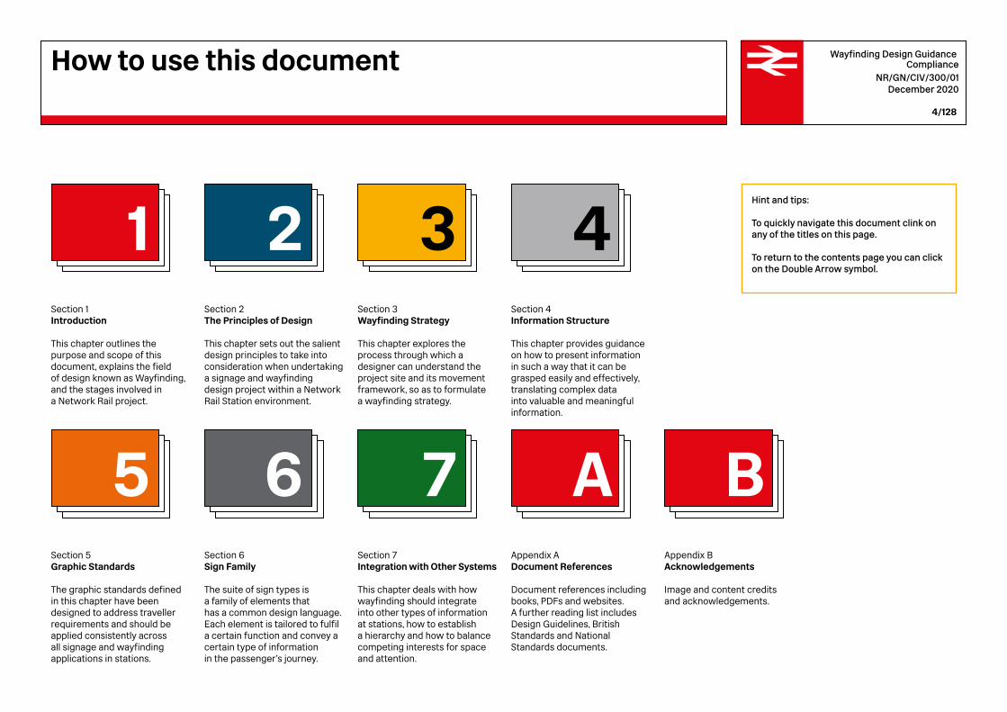
Section 1Introduction
This chapter outlines the purpose and scope of this document, explains the field of design known as Wayfinding, and the stages involved in a Network Rail project.
Section 5Graphic Standards
The graphic standards defined in this chapter have been designed to address traveller requirements and should be applied consistently across all signage and wayfinding applications in stations.
1
5
Section 2The Principles of Design
This chapter sets out the salient design principles to take into consideration when undertaking a signage and wayfinding design project within a Network Rail Station environment.
2
Section 6Sign Family
The suite of sign types is a family of elements that has a common design language. Each element is tailored to fulfil a certain function and convey a certain type of information in the passenger’s journey.
6
Section 3Wayfinding Strategy
This chapter explores the process through which a designer can understand the project site and its movement framework, so as to formulate a wayfinding strategy.
3
Section 7Integration with Other Systems
This chapter deals with how wayfinding should integrate into other types of information at stations, how to establish a hierarchy and how to balance competing interests for space and attention.
7
Section 4Information Structure
This chapter provides guidance on how to present information in such a way that it can be grasped easily and effectively, translating complex data into valuable and meaningful information.
4
Appendix ADocument References
Document references including books, PDFs and websites. A further reading list includes Design Guidelines, British Standards and National Standards documents.
Appendix BAcknowledgements
Image and content credits and acknowledgements.
A B
Hint and tips:
To quickly navigate this document clink on any of the titles on this page.
To return to the contents page you can click on the Double Arrow symbol.
How to use this document
Wayfinding Design Guidance Compliance
NR/GN/CIV/300/01 December 2020
5/128
Design GuidelinesNR/GN/CIV/300/01
WayfindingDesign Guidance
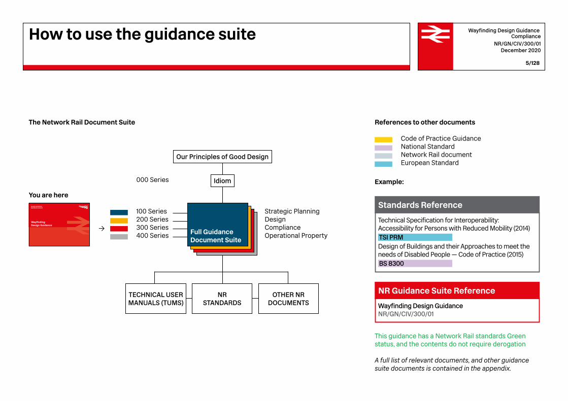
A full list of relevant documents, and other guidance suite documents is contained in the appendix.
This guidance has a Network Rail standards Green status, and the contents do not require derogation
Example:
Code of Practice Guidance National Standard Network Rail document European Standard
You are here
000 Series
Our Principles of Good Design
Idiom
Full GuidanceDocument Suite
TECHNICAL USER MANUALS (TUMS)
NR STANDARDS
OTHER NRDOCUMENTS
Strategic Planning Design Compliance Operational Property
→
100 Series 200 Series300 Series 400 Series
The Network Rail Document Suite References to other documents
Technical Specification for Interoperability: Accessibility for Persons with Reduced Mobility (2014)TSI PRM Design of Buildings and their Approaches to meet the needs of Disabled People — Code of Practice (2015)BS 8300
Standards Reference
Wayfinding Design Guidance NR/GN/CIV/300/01
NR Guidance Suite Reference
How to use the guidance suite
Wayfinding Design Guidance Compliance
NR/GN/CIV/300/01 December 2020
6/128
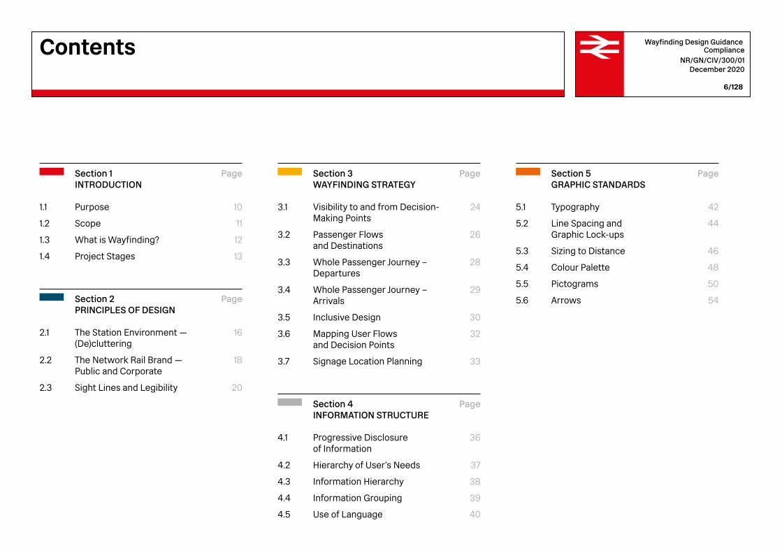
Section 3WAYFINDING STRATEGY
Visibility to and from Decision- Making Points
Passenger Flows and Destinations
Whole Passenger Journey – Departures
Whole Passenger Journey –Arrivals
Inclusive Design
Mapping User Flows and Decision Points
Signage Location Planning
3.1
3.2
3.3
3.4
3.5
3.6
3.7
2.1
2.2
2.3
1.1
1.2
1.3
1.4
Section 2PRINCIPLES OF DESIGN
The Station Environment — (De)cluttering
The Network Rail Brand — Public and Corporate
Sight Lines and Legibility
Page
16
18
20
Page
24
26
28
29
30
32
33
4.1
4.2
4.3
4.4
4.5
Section 4INFORMATION STRUCTURE
Progressive Disclosure of Information
Hierarchy of User’s Needs
Information Hierarchy
Information Grouping
Use of Language
Page
36
37
38
39
40
5.1
5.2
5.3
5.4
5.5
5.6
Section 5GRAPHIC STANDARDS
Typography
Line Spacing and Graphic Lock-ups
Sizing to Distance
Colour Palette
Pictograms
Arrows
Page
42
44
46
48
50
54
Section 1INTRODUCTION
Purpose
Scope
What is Wayfinding?
Project Stages
Page
10
11
12
13
Contents
Wayfinding Design Guidance Compliance
NR/GN/CIV/300/01 December 2020
7/128
A
B
7.1
7.2
7.3
7.4
7.5
7.6
7.7
6.1
6.2
6.3
6.4
6.5
6.6
6.7
6.8
6.9
6.10
6.11
6.12
6.13
6.14
6.15
6.16
6.17
Section 7INTEGRATION WITH OTHER SYSTEMS
Advertising, Retail, and Customer Information
Onward Transportation Information
Urban Wayfinding Systems
Station Security and Operations
Digital Signage
Future Technology
Illumination
Page
58
60
63
66
69
74
80
82
86
88
92
95
98
102
104
106
108
Section 6SIGN FAMILY
Recommended Sizing
Sign Family Sizing
Exterior Station Name
Freestanding Directional Signs — Totems
Perimeter Ribbon
Suspended Directional Signs
Projected Signs
Wall Mounted Directional Signs
Identification Signs
Vertical Circulation Signs
Platform Number Signs
Platform Supergraphics
Platform Totem Signs
Station Identifier on Platform
Regulatory and Prohibition Signs
Fire and Life Safety Signs
Local Area Signs
Page
112
114
116
118
119
120
122
APPENDICES
References Documentation
Acknowledgements
Page
126
128
Contents


Wayfinding Design GuidanceIntroduction 1
2015Design Standards for Accessible Railway Stations
Design Guidelines & Specifications Draft date 17:03:11
Managed Stations Wayfinding
Wayfinding
Design Standards for Accessible Railway Stations
Version 04 – Valid from 20 March 2015
A joint Code of Practice by the Department for Transport and Transport Scotland
March 2015
2011Managed Stations Wayfinding Guidelines
Wayfinding Design Guidance Compliance
NR/GN/CIV/300/01 December 2020
10/128
Introduction1.1 Purpose
At railway stations the design and positioning of rules for directional, orientation and identification information and signage is commonly known as wayfinding. Wayfinding encompasses all the ways in which people orient themselves in physical space and navigate from place to place.
The provision of effective wayfinding system is recognised as a means of assisting passengers in undertaking their journey efficiently, comfortably, accessibly, conveniently and safely.
This Guidance supports statutory requirements and achieves consistency between wayfinding signage installations undertaken in different stations across the Network. It sets out the requirements for the provision of wayfinding in a coherent and consistent manner that enables designs and compliance to be measured.
This Guidance supports compliance with primary legislation and regulations made under it. In particular, the Equality Act, Department for Transport / Transport Scotland Code of Practice Design Standards for Accessible Railway Station, and the European PRM Mobility TSI which prescribes consistency in visual information on signage. It is advisable to align with this standard in order to comply with European and National requirements of achieving a comprehensive, coherent and consistent system across the railway network.
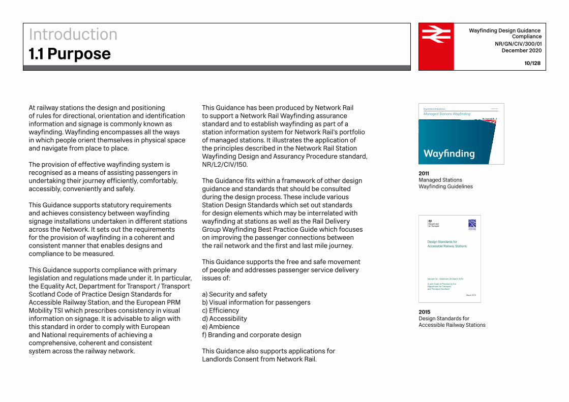
This Guidance has been produced by Network Rail to support a Network Rail Wayfinding assurance standard and to establish wayfinding as part of a station information system for Network Rail’s portfolio of managed stations. It illustrates the application of the principles described in the Network Rail Station Wayfinding Design and Assurancy Procedure standard, NR/L2/CIV/150.
The Guidance fits within a framework of other design guidance and standards that should be consulted during the design process. These include various Station Design Standards which set out standards for design elements which may be interrelated with wayfinding at stations as well as the Rail Delivery Group Wayfinding Best Practice Guide which focuses on improving the passenger connections between the rail network and the first and last mile journey.
This Guidance supports the free and safe movement of people and addresses passenger service delivery issues of:
a) Security and safetyb) Visual information for passengersc) Efficiencyd) Accessibilitye) Ambiencef) Branding and corporate design
This Guidance also supports applications for Landlords Consent from Network Rail.

Design GuidelinesNR/GN/CIV/100/XX
Station Design Guidance
2020Station Design Guidance
Rail Delivery Group 400549
Improving the First and Last Mile ConnectionsSeptember 2018 – Confidential
Rail Delivery Group Wayfinding Best Practice Guide
2018Rail Delivery Group Wayfinding Best Practice Guide
Wayfinding Design Guidance Compliance
NR/GN/CIV/300/01 December 2020
11/128
This Guidance applies to fixed directional wayfinding signage intended for use by passengers at Network Rail Managed Stations. This includes wayfinding signage in all passenger-facing areas including those which may be used infrequently by passengers.
This Guidance applies to the following types of proposed or actual Works when undertaken on buildings and civil infrastructure that is owned, or is to be owned, by Network Rail:
1. Enhancements:Wayfinding signage that is delivered througha project that changes operational capabilityor function of the building or infrastructure.
2. Replacements:Signage replacement where there is no changeto the functionality of the building or infrastructure.
3. Renewals:Signage that is replaced at the end of its design life.
4. Temporary works: Signage supplied on a temporary basis for no longerthan six months.
5. Permanent works or staged construction:Signage supplied on permanent works, or as a stagein construction where temporary works may havethe same impact on the infrastructure aspermanent Works
Works which are not covered by this Guidance:
1. Non-public or operational lineside signage;2. Heritage and listed building requirements.3. Emergency Do Not Enter (EDNE) signage4. Electronic Visual Passenger Information Systemsinstalled on stations.
This Guidance is intended for Network Rail and non-Network Rail parties involved in the design, remitting, design approval, installation and bringing into use of signage and wayfinding for station premises.
Station Wayfinding Design and Assurance ProcedureNR/L2/CIV/150
Standards Reference
Introduction1.2 Scope

Wayfinding Design Guidance Compliance
NR/GN/CIV/300/01 December 2020
12/128
Introduction1.3 What is Wayfinding?
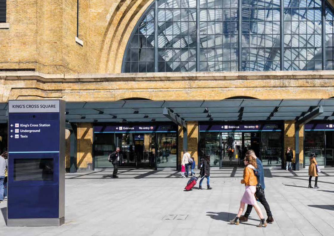
Wayfinding is a little known field of design that crosses a number of disciplines, including urban design and planning, product design, graphic design, information design and behavioural psychology. At its most essential, wayfinding is directly concerned with fundamental human needs, such as being able to travel effectively, to find one’s destination in time, to let others know where one can be found. To assist people in finding their way, signage is often added as an afterthought to the design of environments. However, the best design outcome would be to consider wayfinding at the start of any space planning exercise.
‘Wayfinding’ refers to the design field devoted to planning and designing coherent systems which incorporate maps, signs, directional markers and the insertion of small clues throughout the built environment that enable orientation. The wayfinding system codes the environment – through naming systems which identify, colour which differentiates, numbering systems that perceptually order the space, and the imposition of hierarchies which cast greater importance on some places rather than others. Good wayfinding systems employ explicit signs and information as well as implicit cues and symbols.
Fig.1 London Kings Cross
GRIP 3: Option selection
RIBA 2:Concept design
Solutions are developed to the flagged constraints in GRIP 2 and an economical business strategy is formed.
GRIP 4: Single option development
RIBA 3:Spatial Coordination
PREPARATION
The resolved strategy (in GRIP 3) begins and outlined designs developed.
GRIP 1:Output definition
RIBA 0:Strategic definition
The first stage is defined by the requirements of the project.
GRIP 2: Feasibility
RIBA 1: Preparation and brief
The scope and constraints of the project are highlighted and a business proposal is developed, alongside initial design proposals.
DESIGN
GRIP 5:Detailed design
RIBA 4:Technical design
Detailed design drawings, costs and timings are produced.
CONSTRUCTION IN USE
RIBA 6:Handover and
close out
GRIP 6/7:Commission, test,
hand back
RIBA 5:Construction
GRIP 8:Construction and
commission
RIBA 7:In use
The project is constructed, tested and commissioned.
The contracts are settled and the project comes to a close.
Wayfinding Design Guidance Compliance
NR/GN/CIV/300/01 December 2020
13/128
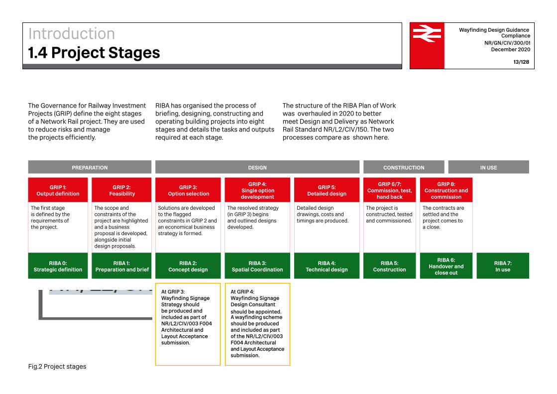
At GRIP 3: Wayfinding Signage Strategy should be produced and included as part of NR/L2/CIV/003 F004 Architectural and Layout Acceptance submission.
At GRIP 4: Wayfinding Signage Design Consultant should be appointed. A wayfinding scheme should be produced and included as part of the NR/L2/CIV/003 F004 Architectural and Layout Acceptance submission.
The Governance for Railway Investment Projects (GRIP) define the eight stages of a Network Rail project. They are used to reduce risks and manage the projects efficiently.
RIBA has organised the process of briefing, designing, constructing and operating building projects into eight stages and details the tasks and outputs required at each stage.
The structure of the RIBA Plan of Work was overhauled in 2020 to better meet Design and Delivery as Network Rail Standard NR/L2/CIV/150. The two processes compare as shown here.
Introduction1.4 Project Stages
Fig.2 Project stages
user
Stamp

2Wayfinding Design GuidanceThe Principles of Design
Wayfinding Design Guidance Compliance
NR/GN/CIV/300/01 December 2020
16/128
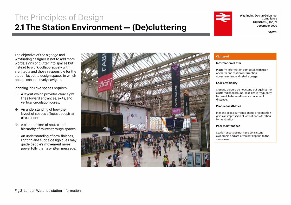
The objective of the signage and wayfinding designer is not to add more words, signs or clutter into spaces but instead to work collaboratively with architects and those responsible for the station layout to design spaces in which people can intuitively navigate.
Planning intuitive spaces requires:
→ A layout which provides clear sight lines toward entrances, exits, and vertical circulation cores;
→ An understanding of how the layout of spaces affects pedestrian circulation;
→ A clear pattern of routes and hierarchy of routes through spaces;
→ An understanding of how finishes, lighting and subtle design cues may guide people’s movement more powerfully than a written message.
Cluttered
Information clutter
Platform information competes with train operator and station information, advertisement and retail signage.
Lack of visibility
Signage colours do not stand out against the cluttered background. Text size is frequently too small to be read from a convenient distance.
Product aesthetics
In many cases current signage presentation gives an impression of lack of consideration for aesthetics.
Poor maintenance
Station assets do not have consistent ownership and are often not kept up to the same level.
The Principles of Design2.1 The Station Environment — (De)cluttering
Fig. 1 London Kings Cross Fig 1 London Kings Cross
Fig.3 London Waterloo station information.
Wayfinding Design Guidance Compliance
NR/GN/CIV/300/01 December 2020
17/128
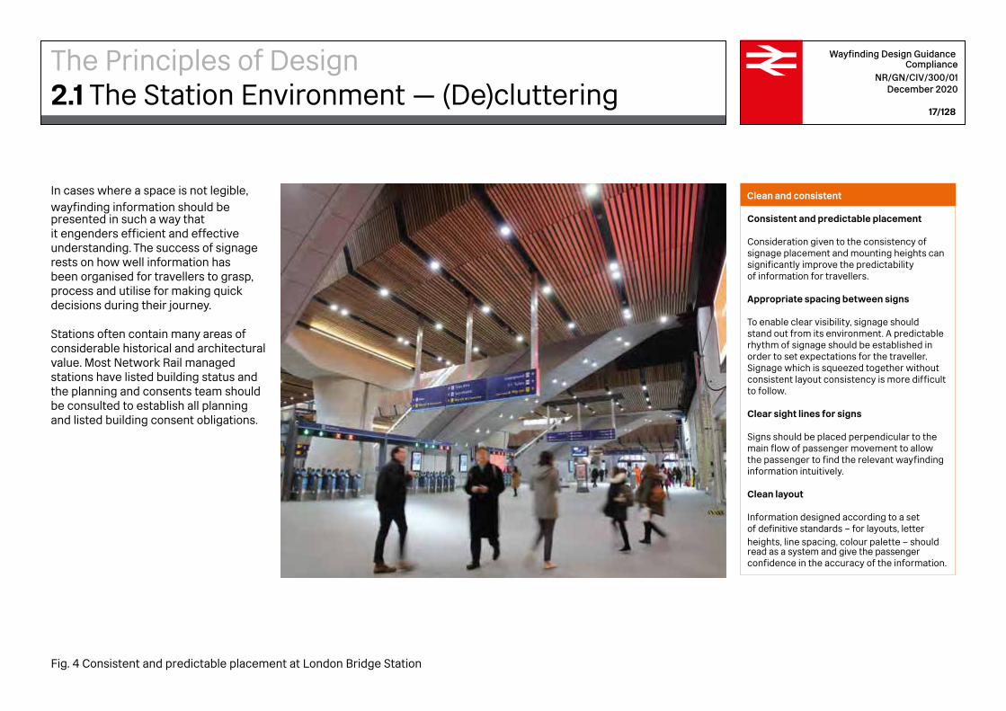
Clean and consistent
Consistent and predictable placement
Consideration given to the consistency of signage placement and mounting heights can significantly improve the predictability of information for travellers.
Appropriate spacing between signs
To enable clear visibility, signage should stand out from its environment. A predictable rhythm of signage should be established in order to set expectations for the traveller. Signage which is squeezed together without consistent layout consistency is more difficult to follow.
Clear sight lines for signs
Signs should be placed perpendicular to the main flow of passenger movement to allow the passenger to find the relevant wayfinding information intuitively.
Clean layout
Information designed according to a set of definitive standards – for layouts, letter heights, line spacing, colour palette – should read as a system and give the passenger confidence in the accuracy of the information.
In cases where a space is not legible, wayfinding information should be presented in such a way that it engenders efficient and effective understanding. The success of signage rests on how well information has been organised for travellers to grasp, process and utilise for making quick decisions during their journey.
Stations often contain many areas of considerable historical and architectural value. Most Network Rail managed stations have listed building status and the planning and consents team should be consulted to establish all planning and listed building consent obligations.
The Principles of Design2.1 The Station Environment — (De)cluttering
Fig. 4 Consistent and predictable placement at London Bridge Station
Wayfinding Design Guidance Compliance
NR/GN/CIV/300/01 December 2020
18/128
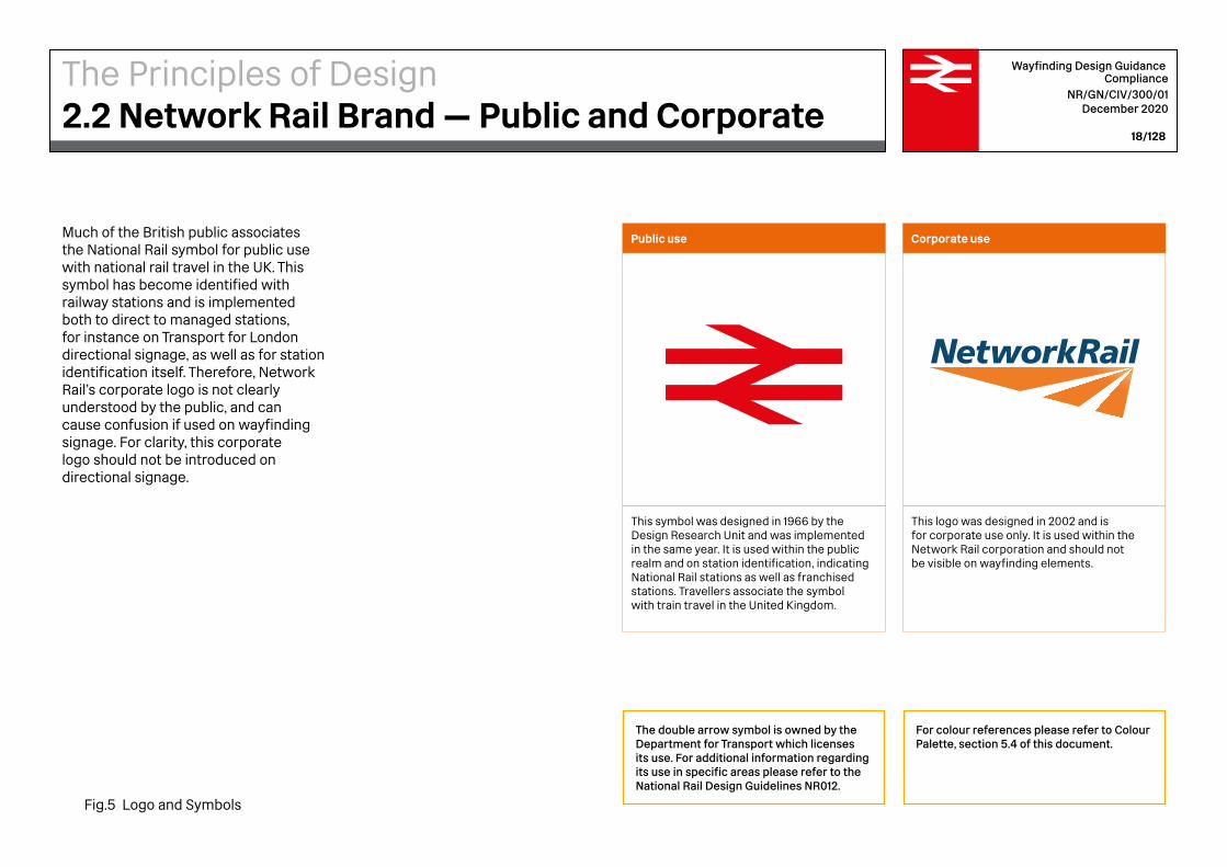
This symbol was designed in 1966 by the Design Research Unit and was implemented in the same year. It is used within the public realm and on station identification, indicating National Rail stations as well as franchised stations. Travellers associate the symbol with train travel in the United Kingdom.
This logo was designed in 2002 and is for corporate use only. It is used within the Network Rail corporation and should not be visible on wayfinding elements.
Public use Corporate useMuch of the British public associates the National Rail symbol for public use with national rail travel in the UK. This symbol has become identified with railway stations and is implemented both to direct to managed stations, for instance on Transport for London directional signage, as well as for station identification itself. Therefore, Network Rail’s corporate logo is not clearly understood by the public, and can cause confusion if used on wayfinding signage. For clarity, this corporate logo should not be introduced on directional signage.
The double arrow symbol is owned by the Department for Transport which licenses its use. For additional information regarding its use in specific areas please refer to the National Rail Design Guidelines NR012.
For colour references please refer to Colour Palette, section 5.4 of this document.
The Principles of Design2.2 Network Rail Brand — Public and Corporate
Fig.5 Logo and Symbols
4000mm
3000mm
2000mm
100
0m
m
200
0m
m
300
0m
m
400
0m
m
500
0m
m
60
00
mm
700
0m
m
80
00
mm
90
00
mm
100
00
mm
Wayfinding Design Guidance Compliance
NR/GN/CIV/300/01 December 2020
20/128
Typical Viewing Angles
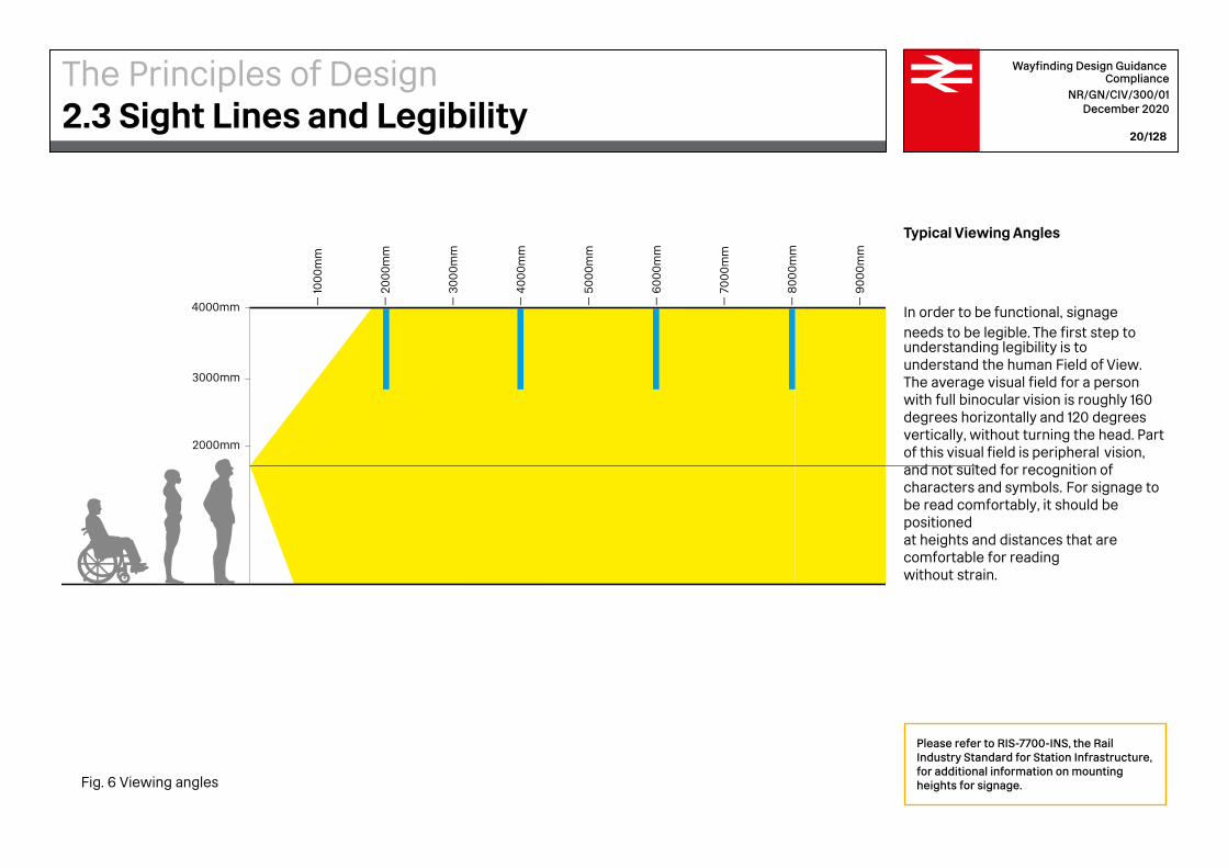
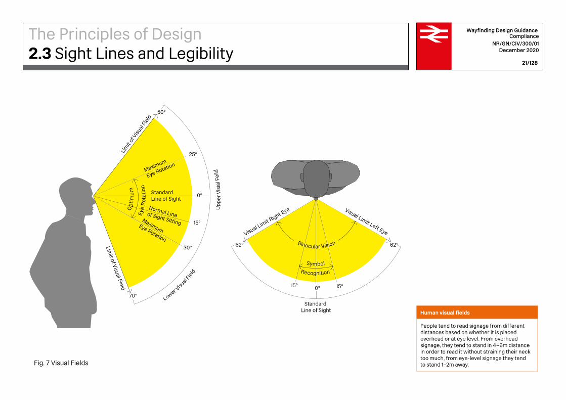
In order to be functional, signage needs to be legible. The first step to understanding legibility is to understand the human Field of View. The average visual field for a person with full binocular vision is roughly 160 degrees horizontally and 120 degrees vertically, without turning the head. Part of this visual field is peripheral vision, and not suited for recognition of characters and symbols. For signage to be read comfortably, it should be positioned at heights and distances that are comfortable for reading without strain.
Please refer to RIS-7700-INS, the Rail Industry Standard for Station Infrastructure, for additional information on mounting heights for signage.
The Principles of Design2.3 Sight Lines and Legibility
Fig. 6 Viewing angles
Symbol
Recognition
Standard Line of Sight
Visual Limit Right Eye
0° 15°15°
62°62°
Visual Limit Left Eye
Eye
Rot
atio
n
Lim
it of
Visu
al F
ield
Limit of V
isual Field
Lower V
isual Fie
ld
Upp
er V
isia
l Fei
ld
0°
15°
30°
70°
25°
50°
Maximum
Eye Rotation
Maximum Eye Rotation
Normal Lineof Sight Sitting
StandardLine of Sight
Op
tim
um
Binocular Vision Symbol
Recognition
Standard Line of Sight
Visual Limit Right Eye
0° 15°15°
62°62°
Visual Limit Left Eye
Eye
Rot
atio
n
Lim
it of
Visu
al F
ield
Limit of V
isual Field
Lower Visual Fie
ld
Upp
erV
isia
lFei
ld
0°
15°
30°
70°
25°
50°
Maximum
Eye Rotation
Maximum Eye Rotation
Normal Lineof Sight Sitting
StandardLine of Sight
Op
tim
um
Binocular Vision
Wayfinding Design Guidance Compliance
NR/GN/CIV/300/01 December 2020
21/128
Human visual fields
People tend to read signage from different distances based on whether it is placed overhead or at eye level. From overhead signage, they tend to stand in 4–6m distance in order to read it without straining their neck too much, from eye-level signage they tend to stand 1–2m away.
The Principles of Design2.3 Sight Lines and Legibility
Fig. 7 Visual Fields

Wayfinding Design GuidanceWayfinding Strategy 3
Station axis
Ticket gate
Platforms
Customer Information
Screens and signage placed
at an angle or perpendicular to
the main flow
Decision point
Concourse
Retail and advertising
parallel
Station axis
Ticket gate
Platforms
Wayfinding Design Guidance Compliance
NR/GN/CIV/300/01 December 2020
24/128
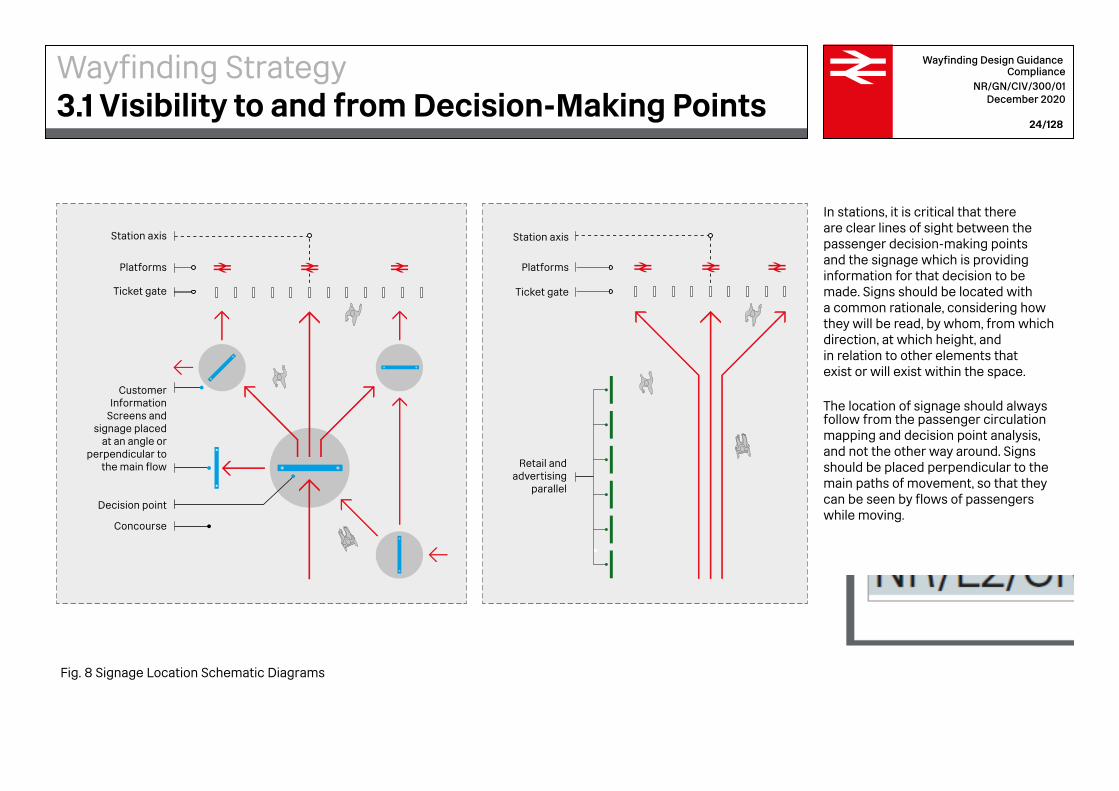
In stations, it is critical that there are clear lines of sight between the passenger decision-making points and the signage which is providing information for that decision to be made. Signs should be located with a common rationale, considering how they will be read, by whom, from which direction, at which height, and in relation to other elements that exist or will exist within the space.
The location of signage should always follow from the passenger circulation mapping and decision point analysis, and not the other way around. Signs should be placed perpendicular to the main paths of movement, so that they can be seen by flows of passengers while moving.
Wayfinding Strategy3.1 Visibility to and from Decision-Making Points
Fig. 8 Signage Location Schematic Diagrams
user
Stamp

1. Passenger Flow Mapping
2. Identifying Decision Points
3. Locating Signs
Wayfinding Design Guidance Compliance
NR/GN/CIV/300/01 December 2020
25/128
Care should be given to follow this sequence:1. passenger flow mapping;2. identifying decision points;3. locating signs.
This sequence has often not been considered in existing station design, leading to cross-flow and friction.
Wayfinding Strategy3.1 Visibility to and from Decision-Making Points
Fig. 9 Wayfinding Project Sequence
Platform
Platform
Platform
Platform
Platform
Platform
PlatformSLOW ZONE
FAST ZONE
SLOW ZONE
Services and amenities
Services and amenities
Food
Information
Retail
Tickets
Information
Food
Tickets
Retail
Primary access
Wayfinding Design Guidance Compliance
NR/GN/CIV/300/01 December 2020
26/128
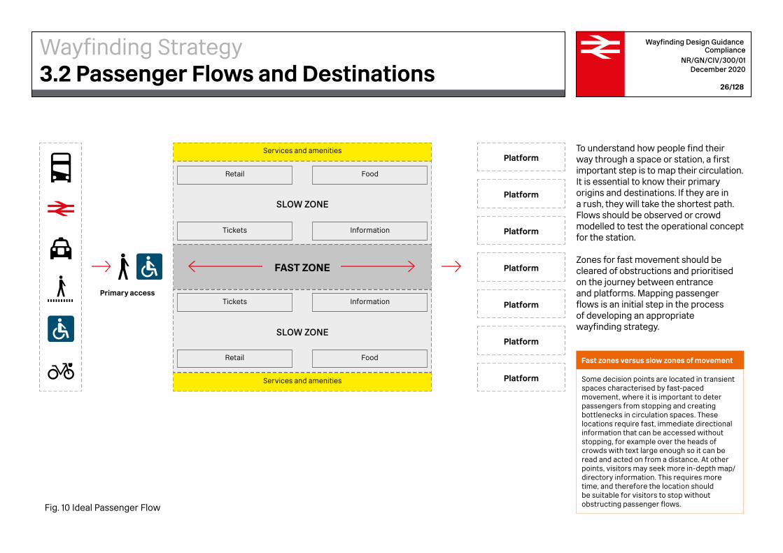
To understand how people find their way through a space or station, a first important step is to map their circulation. It is essential to know their primary origins and destinations. If they are in a rush, they will take the shortest path. Flows should be observed or crowd modelled to test the operational concept for the station.
Zones for fast movement should be cleared of obstructions and prioritised on the journey between entrance and platforms. Mapping passenger flows is an initial step in the process of developing an appropriate wayfinding strategy.
Fast zones versus slow zones of movement
Some decision points are located in transient spaces characterised by fast-paced movement, where it is important to deter passengers from stopping and creating bottlenecks in circulation spaces. These locations require fast, immediate directional information that can be accessed without stopping, for example over the heads of crowds with text large enough so it can be read and acted on from a distance. At other points, visitors may seek more in-depth map/ directory information. This requires more time, and therefore the location should be suitable for visitors to stop without obstructing passenger flows.
Wayfinding Strategy3.2 Passenger Flows and Destinations
Fig. 10 Ideal Passenger Flow
Tickets and Travel Centre
Gates
Amenities
Entrance
Facilities
Movement spaces (fast zone)
Decision points
Opportunity spaces
Dwelling spaces (slow zone)
Wayfinding Design Guidance Compliance
NR/GN/CIV/300/01 December 2020
27/128
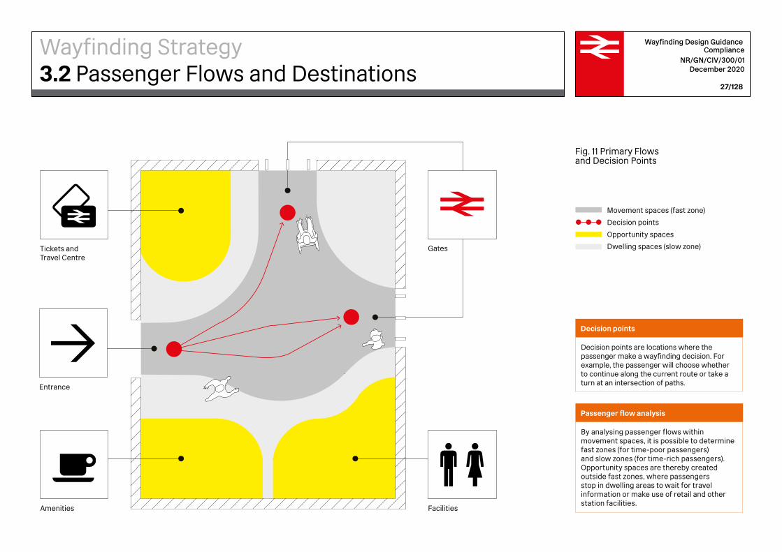
Decision points
Decision points are locations where the passenger make a wayfinding decision. For example, the passenger will choose whether to continue along the current route or take a turn at an intersection of paths.
Passenger flow analysis
By analysing passenger flows within movement spaces, it is possible to determine fast zones (for time-poor passengers) and slow zones (for time-rich passengers).Opportunity spaces are thereby created outside fast zones, where passengers stop in dwelling areas to wait for travel information or make use of retail and other station facilities.
Fig. 11 Primary Flows and Decision Points
Wayfinding Strategy3.2 Passenger Flows and Destinations

1.Station ApproachesUpon arrival, passengers look to confirm station ID and time. An Exterior Station Name Sign featuring the double arrow logo should be positioned at the Entrance. For stations with a building canopy the Station Name Sign should be incorporated into the station canopy. Where stations have more than one entrance, each station entrance should be numbered.
Liverpool Street
2.Entering the Ticket HallUpon entering the Ticket Hall passengers will require wayfinding to direct them. They may also meet a member of staff at the entrance, mobility assistance point or arranged meeting point. Directional signage is required to guide passengers to information, ticket facilities and the Departures board / passenger information screens.
Once passengers have confirmed their fastest or preferred route of travel with the assistance of staff or with the passenger information boards, they confirm train departure times and rail services. If passengers have time, they may use the amenities and services provided and familiarise themselves further with the station wayfinding to find the lift or escalators.
3.Ticket Hall to PlatformFrom the Departures board / passenger information screens, directional signage should be provided to platforms. Platform numbers should be clearly visible to passengers from the concourse. Typically, a bank of ticket gates will have only one accessible gate. To facilitate smooth flows on step-free routes toward the accessible ticket gate, both high level and low level signage should be provided to increase visibility for those using wheelchairs. Line diagram signs should be provided to passengers en route to platforms that illustrate the platform layout.
Once on the platform, passengers will look for confirmation that they are at the correct platform in order to board the right train. A platform number should be located on the platform. Accessible routes should be clearly marked.
Platform 2
Wayfinding Design Guidance Compliance
NR/GN/CIV/300/01 December 2020
28/128
A passenger will pass through a number of distinct stages on the journey to and from the station. At each stage during the journey, the passenger will ask a particular question, relating to the space and the decision to be made there, and these stages together make up the Whole Passenger Journey.
For information to be placed effectively at stations, a common approach is to be taken at all stations wherein specific information should consistently presented and positioned at each stage of the journey, regardless of constraints imposed by the station design. The journey of a passenger on departure from a station is shown on this page and the journey on arrival to the destination station is shown on the following page.
Wayfinding Strategy3.3 Whole Passenger Journey – Departures
Fig. 12 Departure Journey

3.Exit from the Ticket HallAt the station concourse passengers look to check the time, services and destination on passenger information screens, station wayfinding or by asking a member of staff at the information desk. If passengers have time, they may use amenities and services provided or look to find the exit, lift or escalators. Where there are alternative numbered exits routes leading to separate street locations, this information should be included on the Way Out sign.
The strategic placement of lift signs should encourage their usage in order to reduce accidents on stairs and escalators. Where stations have several lifts to provide level access to more than one line or mode of transport there should be a lift layout sign at each lift call point and inside each lift.
1.Alighting from the Train onto PlatformSignage should be consistently located on platforms so that the passenger can see the station name clearly from inside the train upon arrival. Passengers exit the train onto the platform. Upon alighting from the train, passengers should be able to see signs giving directions to the Way Out.
If required, a member of staff can be met on the platform, at a meeting point or mobility assistance point which should be clearly signed.
2.Exit from the Platform From anywhere within the station premises, a Way Out sign should always be clearly visible and an Emergency Exit sign legible by passengers under emergency operational conditions. Both types of signs require illumination in areas of low luminance.
Way Out signs should be instantly recognisable from the consistent use of a distinctive colour, proportions and layout. Where the usual way out is to be used as the emergency, then the Way Out signage should be subject to the same functional requirements as emergency exit signing.
4.Exit Onward Journey Some passengers may be looking for a different mode of transport within the station environment or just outside which should be supported by station wayfinding.
Signs displaying how to reach connecting modes of transport, including tram, underground, air travel, bus, taxi cycles and parking should be clearly visible from all directions in the ticket hall.
Way outLiverpool Street
Wayfinding Design Guidance Compliance
NR/GN/CIV/300/01 December 2020
29/128
On arrival into a new city, for example, upon alighting and accessing the main concourse, a passenger may ask ‘where is the taxi stand?’ The answer should appear within the concourse in the form of signage.
Signage should only respond with as much information as is absolutely necessary. This is termed Progressive Disclosure of Information and is a principle that should guide the signage information design and placement. Otherwise, if asked to think several steps ahead and to remember these details amongst the other distractions around, the passenger may become overloaded and forget essential information along the way.
Wayfinding Strategy3.4 Whole Passenger Journey – Arrivals
Fig. 13 Arrival Journey
1500
mm
1500
mm
1500mm
Ele
vati
on A
’A
Elevation A’A
1500
mm
1500
mm
1500mm
Ele
vati
on A
’A
Elevation A’A
Wayfinding Design Guidance Compliance
NR/GN/CIV/300/01 December 2020
30/128
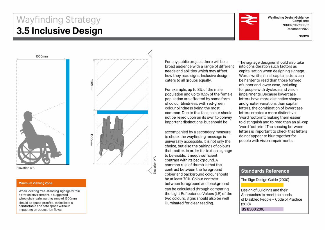
For any public project, there will be a broad audience with a range of different needs and abilities which may affect how they read signs. Inclusive design caters to all groups equally.
For example, up to 8% of the male population and up to 0.5% of the female population are affected by some form of colour blindness, with red-green colour blindness being the most common. Due to this fact, colour should not be relied upon on its own to convey important distinctions, but should be
accompanied by a secondary measure to check the wayfinding message is universally accessible. It is not only the choice, but also the pairings of colours that matter. In order for text on signage to be visible, it needs sufficient contrast with its background. A common rule of thumb is that the contrast between the foregroundcolour and background colour should be at least 70%. Colour contrast between foreground and background can be calculated through comparing the Light Reflectance Values (LR) of the two colours. Signs should also be well illuminated for clear reading.
Minimum Viewing Zone
When locating free-standing signage within a station environment, a suggested wheelchair-safe waiting zone of 1500mm should be space-proofed, to facilitate a comfortable and safe space without impacting on pedestrian flows.
The signage designer should also take into consideration such factors as capitalisation when designing signage. Words written in all capital letters can be harder to read than those formed of upper and lower case, including for people with dyslexia and vision impairments. Because lowercase letters have more distinctive shapes and greater variations than capital letters, the combination of lowercase letters creates a more distinctive ‘word footprint’, making them easier to distinguish and to read than an all-cap ‘word footprint’. The spacing between letters is important to check that letters do not appear to blur together for people with vision impairments.
The Sign Design Guide (2000)
Design of Buildings and their Approaches to meet the needs of Disabled People – Code of Practice (2018)BS 8300:2018
Standards Reference
Wayfinding Strategy3.5 Inclusive Design
Eye level Eye level
Eye level Eye level
Eye level Eye level
2800mm
3200mm
3600mm
4000mm
4400mm
4800mm
1600mm
2000mm
1200mm
800mm
400mm
2400mm
2800mm
3200mm
3600mm
4000mm
4400mm
4800mm
1600mm
2000mm
1200mm
800mm
400mm
0
2400mm
200
0m
m
160
0m
m
1200
mm
80
0m
m
400
mm
02400
mm
2800mm
3200mm
3600mm
4000mm
4400mm
4800mm
1600mm
2000mm
1200mm
800mm
400mm
0
2400mm
2800mm
3200mm
3600mm
4000mm
4400mm
4800mm
1600mm
2000mm
1200mm
800mm
400mm
0
2400mm
2800mm
3200mm
3600mm
4000mm
4400mm
4800mm
1600mm
2000mm
1200mm
800mm
400mm
0
2400mm
200
0m
m
160
0m
m
1200
mm
80
0m
m
400
mm
03200
mm
360
0m
m
400
0m
m
2400
mm
2800mm
3200mm
3600mm
4000mm
4400mm
4800mm
1600mm
2000mm
1200mm
800mm
400mm
0
2400mm
200
0m
m
160
0m
m
1200
mm
80
0m
m
400
mm
02400
mm
200
0m
m
160
0m
m
1200
mm
80
0m
m
400
mm
03200
mm
360
0m
m
400
0m
m
2400
mm
4800mm
0
200
0m
m
160
0m
m
1200
mm
80
0m
m
400
mm
02400
mm
200
0m
m
160
0m
m
1200
mm
80
0m
m
400
mm
03200
mm
360
0m
m
400
0m
m
2400
mm
Eye level Eye level
Eye level Eye level
Eye level Eye level
2800mm
3200mm
3600mm
4000mm
4400mm
4800mm
1600mm
2000mm
1200mm
800mm
400mm
2400mm
2800mm
3200mm
3600mm
4000mm
4400mm
4800mm
1600mm
2000mm
1200mm
800mm
400mm
0
2400mm
200
0m
m
160
0m
m
1200
mm
80
0m
m
400
mm
02400
mm
2800mm
3200mm
3600mm
4000mm
4400mm
4800mm
1600mm
2000mm
1200mm
800mm
400mm
0
2400mm
2800mm
3200mm
3600mm
4000mm
4400mm
4800mm
1600mm
2000mm
1200mm
800mm
400mm
0
2400mm
2800mm
3200mm
3600mm
4000mm
4400mm
4800mm
1600mm
2000mm
1200mm
800mm
400mm
0
2400mm
200
0m
m
160
0m
m
1200
mm
80
0m
m
400
mm
03200
mm
360
0m
m
400
0m
m
2400
mm
2800mm
3200mm
3600mm
4000mm
4400mm
4800mm
1600mm
2000mm
1200mm
800mm
400mm
0
2400mm
200
0m
m
160
0m
m
1200
mm
80
0m
m
400
mm
02400
mm
200
0m
m
160
0m
m
1200
mm
80
0m
m
400
mm
03200
mm
360
0m
m
400
0m
m
2400
mm
4800mm
0
200
0m
m
160
0m
m
1200
mm
80
0m
m
400
mm
02400
mm
200
0m
m
160
0m
m
1200
mm
80
0m
m
400
mm
03200
mm
360
0m
m
400
0m
m
2400
mm
Eye level Eye level
Eye level Eye level
Eye level Eye level
2800mm
3200mm
3600mm
4000mm
4400mm
4800mm
1600mm
2000mm
1200mm
800mm
400mm
2400mm
2800mm
3200mm
3600mm
4000mm
4400mm
4800mm
1600mm
2000mm
1200mm
800mm
400mm
0
2400mm
200
0m
m
160
0m
m
1200
mm
80
0m
m
400
mm
02400
mm
2800mm
3200mm
3600mm
4000mm
4400mm
4800mm
1600mm
2000mm
1200mm
800mm
400mm
0
2400mm
2800mm
3200mm
3600mm
4000mm
4400mm
4800mm
1600mm
2000mm
1200mm
800mm
400mm
0
2400mm
2800mm
3200mm
3600mm
4000mm
4400mm
4800mm
1600mm
2000mm
1200mm
800mm
400mm
0
2400mm
200
0m
m
160
0m
m
1200
mm
80
0m
m
400
mm
03200
mm
360
0m
m
400
0m
m
2400
mm
2800mm
3200mm
3600mm
4000mm
4400mm
4800mm
1600mm
2000mm
1200mm
800mm
400mm
0
2400mm
200
0m
m
160
0m
m
1200
mm
80
0m
m
400
mm
02400
mm
200
0m
m
160
0m
m
1200
mm
80
0m
m
400
mm
03200
mm
360
0m
m
400
0m
m
2400
mm
4800mm
0
200
0m
m
160
0m
m
1200
mm
80
0m
m
400
mm
02400
mm
200
0m
m
160
0m
m
1200
mm
80
0m
m
400
mm
03200
mm
360
0m
m
400
0m
m
2400
mm
Wayfinding Design GuidanceCompliance
NR/GN/CIV/300/01December 2020
31/128
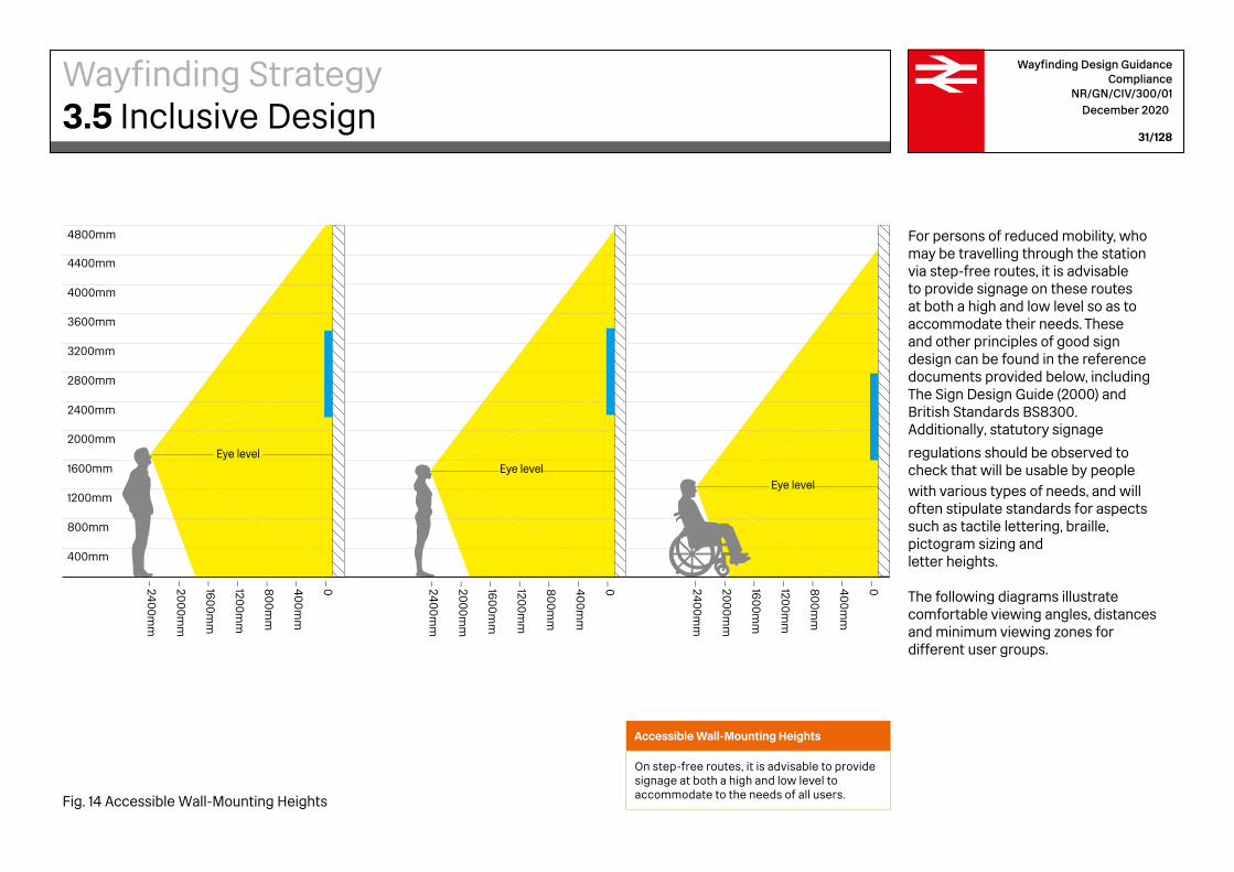
Accessible Wall-Mounting Heights
On step-free routes, it is advisable to provide signage at both a high and low level to accommodate to the needs of all users.Fig. 14 Accessible Wall-Mounting Heights
For persons of reduced mobility, who may be travelling through the station via step-free routes, it is advisable to provide signage on these routes at both a high and low level so as to accommodate their needs. These and other principles of good sign design can be found in the reference documents provided below, including The Sign Design Guide (2000) and British Standards BS8300. Additionally, statutory signage
regulations should be observed to check that will be usable by peoplewith various types of needs, and will often stipulate standards for aspects such as tactile lettering, braille, pictogram sizing and letter heights.
The following diagrams illustrate comfortable viewing angles, distances and minimum viewing zones for different user groups.
Wayfinding Strategy3.5 Inclusive Design
Decision points
Visitor routes
Circulation zone – main axis
Circulation zone
Other transport services
Customer Information Screen
Wayfinding Design Guidance Compliance
NR/GN/CIV/300/01 December 2020
32/128
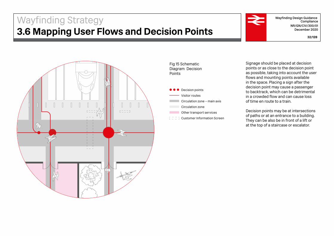
Signage should be placed at decision points or as close to the decision point as possible, taking into account the user flows and mounting points available in the space. Placing a sign after the decision point may cause a passenger to backtrack, which can be detrimental in a crowded flow and can cause loss of time en route to a train.
Decision points may be at intersections of paths or at an entrance to a building. They can be also be in front of a lift or at the top of a staircase or escalator.
Fig 15 Schematic Diagram Decision Points
Wayfinding Strategy3.6 Mapping User Flows and Decision Points

Way Out sign
Perimeter ribbon
Totem
Customer Information Screen
Platform number sign
Circulation zone
Other transport services
Wayfinding Design Guidance Compliance
NR/GN/CIV/300/01 December 2020
33/128
Having identified the decision points within a project, the next step is to pinpoint locations for wayfinding and signage in a form of documentation that can be used by the extended design team and contractor. Typically, a CAD programme may be the most suitable software, as locations should be recorded with accuracy.
At this stage, the location plans represent a strategy for signage within the site, charting the categories of signs, the specific typologies of signs, their locations and unique address within the sign type series.
Fig 16 Schematic Diagram Signage Location Planning
Wayfinding Strategy3.7 Signage Location Planning

4Wayfinding Design GuidanceInformation Structure
Arrival
Entrance
Tickets and Information Amenities
Platform
Customer Information Screen (CIS)
Wayfinding Design Guidance Compliance
NR/GN/CIV/300/01 December 2020
36/128
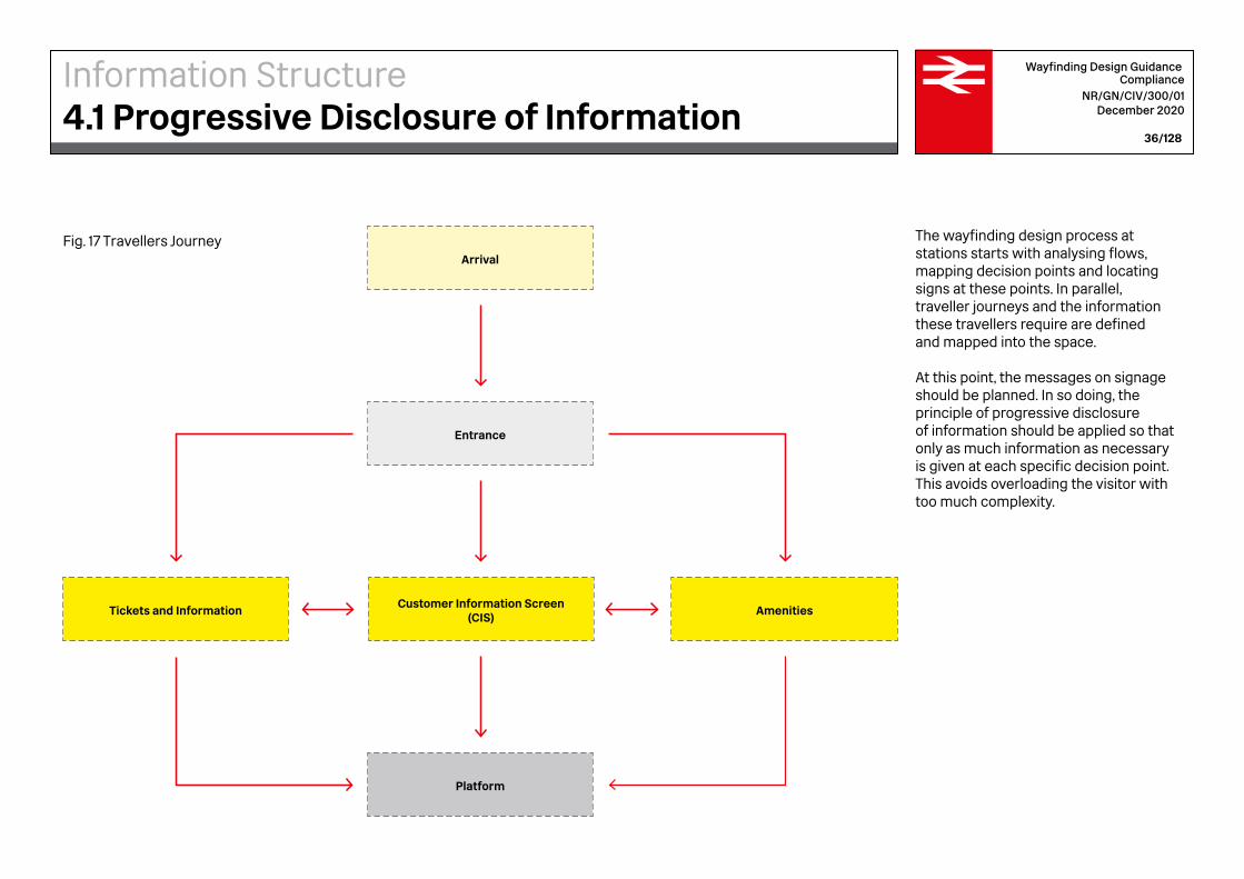
The wayfinding design process at stations starts with analysing flows, mapping decision points and locating signs at these points. In parallel, traveller journeys and the information these travellers require are defined and mapped into the space.
At this point, the messages on signage should be planned. In so doing, the principle of progressive disclosure of information should be applied so that only as much information as necessary is given at each specific decision point. This avoids overloading the visitor with too much complexity.
Fig. 17 Travellers Journey
Information Structure4.1 Progressive Disclosure of Information

Wayfinding Design Guidance Compliance
NR/GN/CIV/300/01 December 2020
37/128
Maslow’s hierarchy of needs is a psychological theory put forward by Abraham Maslow in 1943, which uses a classification system to describe how human needs correlate with motivational behaviour. Four classes of human needs are represented as a pyramid with the more basic needs at the bottom and the more acquired needs and desires at the top. Starting at the base and rising upward, an individual should have the needs of each stage met within themselves before their motivation rise to the next level.
Much the same way, a hierarchy of importance should be followed within station signage design, which correlates with station users’ needs.
Commercial facilities
Amenities & facilitiesOther customer
information
Directional informationMandatory information
Safety information (inc. Way Out)
Information Structure4.2 Hierarchy of User’s Needs
Fig. 18 Hierarchy of importance triangle

1. Essential journey information — Train travel— Way Out
4. Commercial establishments— Restaurants, cafes,
shops, hotels
3. Amenities & facilities — Toilet and shower facilities— Main station facilities— Other amenities
2. Onward journey information— Transport Interchange— Journey inside station
Wayfinding Design Guidance Compliance
NR/GN/CIV/300/01 December 2020
38/128
A clear and consistent hierarchy of information is essential to wayfinding. This hierarchy defines how information is presented consistently across all channels of information. Designing an information hierarchy requires thinking from the passenger’s point of view about their primary, secondary and tertiary needs and then using graphic means to emphasise importance.
As passengers read a list of destinations in signage from the top down, the hierarchy of information for passengers should start with the station user’s most critical needs at the top, working down to their least essential needs. The high importance of safety, directional and mandatory signage should be reflected visually in the information design. Essential rail travel, tickets and Way Out information should be listed at the top, followed by onward journey information, internal station circulation, amenities and facilities, working down to less essential commercial services at the bottom.
Information Structure4.3 Information Hierarchy
Taxis via bus station
Tickets
Bus station
InformationCustomer lounge
All platforms
Overground
Cycle parking
Lift to platformsEscalatorsStairsWay out
1
3
2
Wayfinding Design Guidance Compliance
NR/GN/CIV/300/01 December 2020
39/128
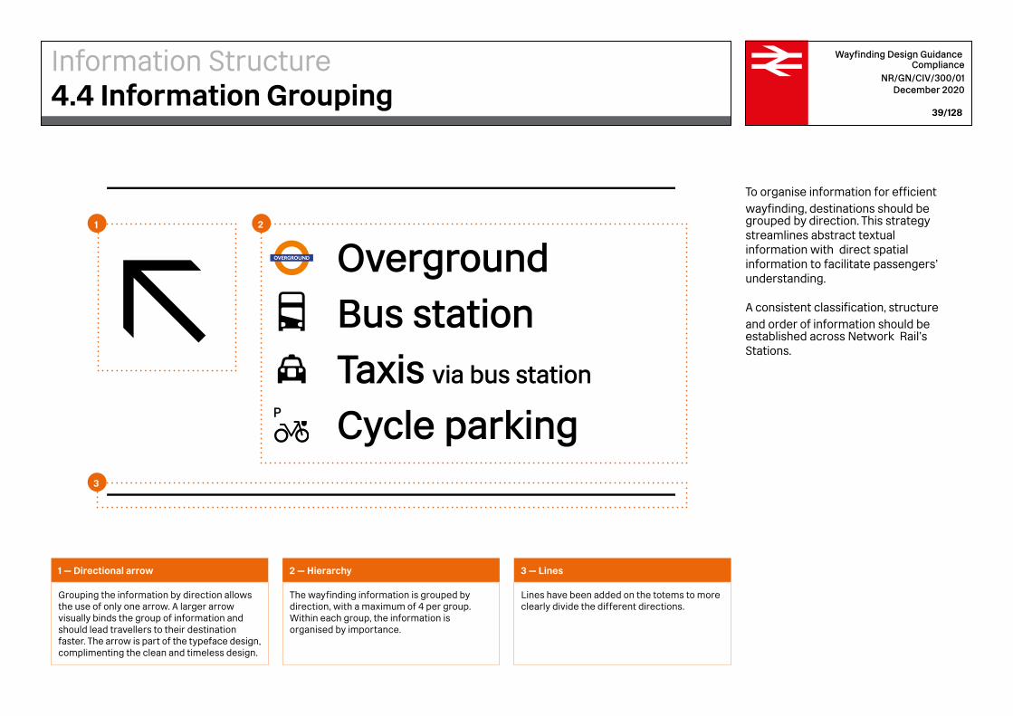
To organise information for efficient wayfinding, destinations should be grouped by direction. This strategy streamlines abstract textual information with direct spatial information to facilitate passengers’ understanding.
A consistent classification, structure and order of information should be established across Network Rail’s Stations.
1 — Directional arrow
Grouping the information by direction allows the use of only one arrow. A larger arrow visually binds the group of information and should lead travellers to their destination faster. The arrow is part of the typeface design, complimenting the clean and timeless design.
2 — Hierarchy
The wayfinding information is grouped by direction, with a maximum of 4 per group. Within each group, the information is organised by importance.
3 — Lines
Lines have been added on the totems to more clearly divide the different directions.
Information Structure4.4 Information Grouping
Wayfinding Design Guidance Compliance
NR/GN/CIV/300/01 December 2020
40/128
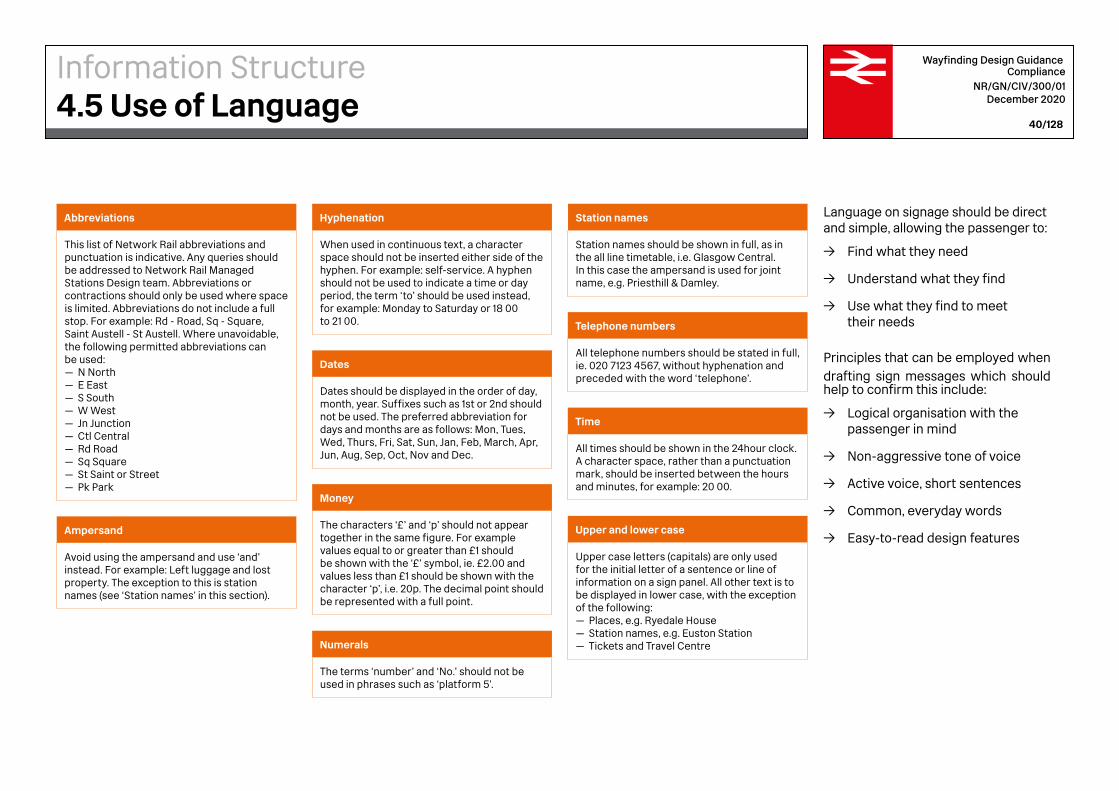
Language on signage should be direct and simple, allowing the passenger to:
→ Find what they need
→ Understand what they find
→ Use what they find to meet their needs
Principles that can be employed when drafting sign messages which should help to confirm this include:
→ Logical organisation with thepassenger in mind
→ Non-aggressive tone of voice
→ Active voice, short sentences
→ Common, everyday words
→ Easy-to-read design features
Abbreviations
This list of Network Rail abbreviations and punctuation is indicative. Any queries should be addressed to Network Rail Managed Stations Design team. Abbreviations or contractions should only be used where space is limited. Abbreviations do not include a full stop. For example: Rd - Road, Sq - Square, Saint Austell - St Austell. Where unavoidable, the following permitted abbreviations can be used:— N North— E East— S South— W West— Jn Junction— Ctl Central— Rd Road— Sq Square— St Saint or Street— Pk Park
Hyphenation
When used in continuous text, a character space should not be inserted either side of the hyphen. For example: self-service. A hyphen should not be used to indicate a time or day period, the term ‘to’ should be used instead, for example: Monday to Saturday or 18 00 to 21 00.
Money
The characters ‘£’ and ‘p’ should not appear together in the same figure. For example values equal to or greater than £1 should be shown with the ‘£’ symbol, ie. £2.00 and values less than £1 should be shown with the character ‘p’, i.e. 20p. The decimal point should be represented with a full point.
Ampersand
Avoid using the ampersand and use ‘and’ instead. For example: Left luggage and lost property. The exception to this is station names (see ‘Station names’ in this section).
Dates
Dates should be displayed in the order of day, month, year. Suffixes such as 1st or 2nd should not be used. The preferred abbreviation for days and months are as follows: Mon, Tues, Wed, Thurs, Fri, Sat, Sun, Jan, Feb, March, Apr, Jun, Aug, Sep, Oct, Nov and Dec.
Numerals
The terms ‘number’ and ‘No.’ should not be used in phrases such as ‘platform 5’.
Station names
Station names should be shown in full, as in the all line timetable, i.e. Glasgow Central. In this case the ampersand is used for joint name, e.g. Priesthill & Damley.
Telephone numbers
All telephone numbers should be stated in full, ie. 020 7123 4567, without hyphenation and preceded with the word ‘telephone’.
Time
All times should be shown in the 24hour clock. A character space, rather than a punctuation mark, should be inserted between the hours and minutes, for example: 20 00.
Upper and lower case
Upper case letters (capitals) are only used for the initial letter of a sentence or line of information on a sign panel. All other text is to be displayed in lower case, with the exception of the following:— Places, e.g. Ryedale House— Station names, e.g. Euston Station— Tickets and Travel Centre
Information Structure4.5 Use of Language
5Wayfinding Design GuidanceGraphic Standards

Fig. 19 Rail Alphabet 2 SIGN Medium
Network RailTypography Sign systems TravellersSuper graphicsJourneyTrain stationsOn time
Wayfinding Design Guidance Compliance
NR/GN/CIV/300/01 December 2020
43/128
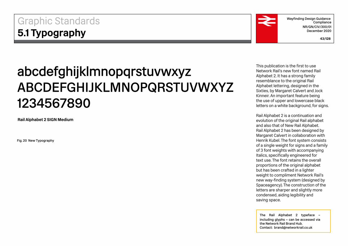
This publication is the first to use Network Rail’s new font named Rail Alphabet 2. It has a strong family resemblance to the original Rail Alphabet lettering, designed in the Sixties, by Margaret Calvert and Jock Kinneir. An important feature being the use of upper and lowercase black letters on a white background, for signs.
Rail Alphabet 2 is a continuation and evolution of the original Rail alphabet and also that of New Rail Alphabet. Rail Alphabet 2 has been designed by Margaret Calvert in collaboration with Henrik Kubel. The font system consists of a single weight for signs and a family of 3 font weights with accompanying Italics, specifically engineered for text use. The font retains the overall proportions of the original alphabet but has been crafted in a lighter weight to compliment Network Rail’s new way-finding system (designed by Spaceagency). The construction of the letters are sharper and slightly more condensed, aiding legibility and saving space.
The Rail Alphabet 2 typeface – including glyphs – can be accessed via the Network Rail Brand Hub.Contact: [email protected]
Graphic Standards5.1 Typography
abcdefghijklmnopqrstuvwxyz ABCDEFGHIJKLMNOPQRSTUVWXYZ 1234567890Rail Alphabet 2 SIGN Medium
Fig. 20 New Typography

Fig. 21 Margins
All platformsUndergroundToiletsCustomer lounge
1.25xCH2xCHCH CH CH4xCH
Wayfinding Design Guidance Compliance
NR/GN/CIV/300/01 December 2020
44/128
It is not only the size and weight of type which matters when viewed from a distance. The spacing of letterforms and vertical distance between lines of text also have an impact on legibility.
For people with vision impairments, letters and lines of text can blur when spaced too close together. A balance should be sought between spacing text so as to be accessible for people with vision impairments, and laying out blocks of text that read as a single message.
Margins
The Cap-Height (CH) is used to determine the margins and vertical spacing. The space between the pictograms and the typography is the Cap-Height.
Graphic Standards5.2 Line Spacing and Graphic Lock-ups

Fig. 22 Leading and Tracking
All platformsUndergroundToiletsCustomer lounge
tracking: 0
tracking: 0
tracking: 0
tracking: 0 CH
CH
CH
CH
CH
CH
CH
CH
CH
1.547xCH
1.547xCH
1.25xCH
1.25xCH
4xC
HWayfinding Design Guidance
Compliance NR/GN/CIV/300/01
December 2020
45/128
Pictogram alignment
The height and width of the pictograms is most often 1.25 times the Cap-Height (CH) of the typography. However, exceptions include Platforms, Underground and Overground pictograms, where the width is 1.547 times the Cap-height (CH), and they are centred horizontally and vertically within the space.
Leading
Leading refers to the vertical spacing between lines of text. It is relevant to legibility in that lines of text which are spaced too close together will appear to blur together.
Tracking
Tracking sets out the spacing between letters within a word or block of text. This will affect the density of word or group of words. The density of the group of letters affects their legibility.
Graphic Standards5.2 Line Spacing and Graphic Lock-ups

5 m
10 m
15 m
25 m
50 m
20 m
30 m
50mm
100mm
250mm
200mm
300mm
500mm
150mm
Crossrail Heathrow Airport Average
Inclusive Mobility
(DfT)
Text size (CH: mm)
Text size (CH: mm)
Text size (CH: mm)
Text size (CH: mm)
Text size (CH: mm)
Text size (CH: mm)
Text size (CH: mm)
Text size (CH: mm)
DISTANCE FROM TEXT
(METRES)
Docklands Light
Railway
Gatwick Airport
Centre for Inclusive
Design and Environmental
Access
Recommended Sizes For
Network Rail
12.5mm
25mm
37.5mm 53mm 50mm
62.5mm 85mm
125mm 170mm
50mm 67mm
75mm 103mm
18mm
36mm
18mm
34mm
14mm
28mm
34mm
40mm
22.5mm
39.5mm
77mm
159mm
57.5mm
108mm
265mm
45-68mm
210mm
210mm
210-375mm
100-210mm
68mm
100mm
28mm
14mm
21mm
35mm
Wayfinding Design Guidance Compliance
NR/GN/CIV/300/01 December 2020
46/128
In order for signage to be functional, information should be legible, including by those with impairments.
Text legibility standards are written into most universal accessibility regulations. However, which size of text is legible from which distance is not universally agreed upon. It is important to be aware that standards vary based on country, on setting, on whether the viewer is walking or driving etc. and to use judgement on each project about which standards are more appropriate in that case.
Fig. 23 Other International Standards
Graphic Standards5.3 Sizing to Distance
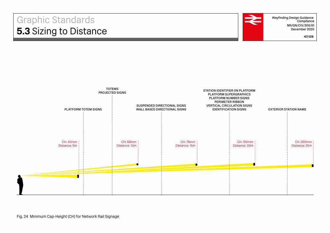
CH: 40mmDistance: 5m
EXTERIOR STATION NAME
STATION IDENTIFIER ON PLATFORMPLATFORM SUPERGRAPHICSPLATFORM NUMBER SIGNS
PERIMETER RIBBONVERTICAL CIRCULATION SIGNS
IDENTIFICATION SIGNSSUSPENDED DIRECTIONAL SIGNSWALL BASED DIRECTIONAL SIGNS
TOTEMSPROJECTED SIGNS
PLATFORM TOTEM SIGNS
CH: 68mmDistance: 10m
CH: 75mmDistance: 15m
CH: 100mmDistance: 20m
CH: 200mmDistance: 25m
Wayfinding Design Guidance Compliance
NR/GN/CIV/300/01 December 2020
47/128
Fig. 24 Minimum Cap-Height (CH) for Network Rail Signage
Graphic Standards5.3 Sizing to Distance

Wayfinding Design Guidance Compliance
NR/GN/CIV/300/01 December 2020
48/128
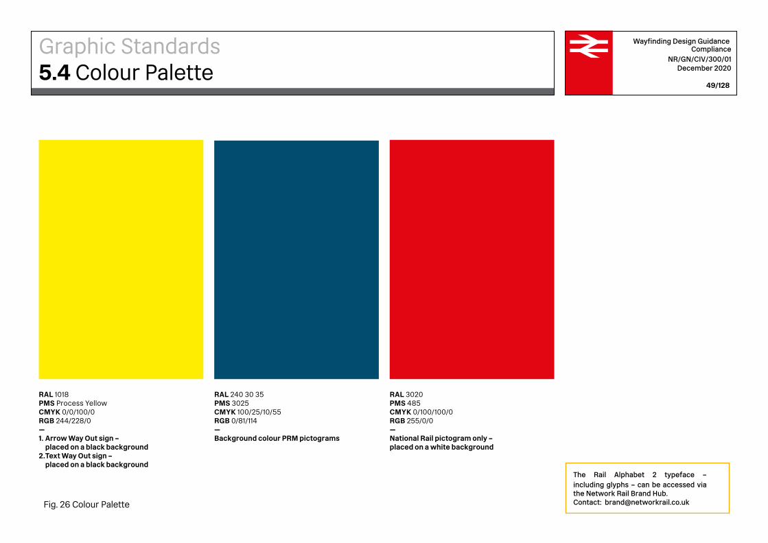
The sign colours are defined in accordance to the Reichs-ausschuss für Lieferbedingungen (RAL) standard for paint application. Approximate matches for Pantone Matching System (PMS) are provided as reference only. Die cut vinyl application or inkjet printing are not acceptable on permanent signs. CMYK (Cyan, Magenta, Yellow and Black) and RGB (Red, Green and Blue) approximate matches are provided as reference for printed (CMYK) and digital (RGB) temporary signs only.
RAL 9016PMS Bright WhiteCMYK 0/0/0/0RGB 255/255/255—1. Background colour2. PRM pictograms –
placed on a blue background
RAL 9005 PMS Process BlackCMYK 0/0/0/100RGB 0/0/0—1. Arrows, pictograms and text – placed on a white background2. Background colour Way Out sign
Graphic Standards5.4 Colour Palette
Fig. 25 Colour Palette
Wayfinding Design Guidance Compliance
NR/GN/CIV/300/01 December 2020
49/128
RAL 1018PMS Process YellowCMYK 0/0/100/0RGB 244/228/0—1. Arrow Way Out sign –
placed on a black background2. Text Way Out sign –
placed on a black background
RAL 240 30 35 PMS 3025CMYK 100/25/10/55RGB 0/81/114—Background colour PRM pictograms
RAL 3020 PMS 485CMYK 0/100/100/0RGB 255/0/0—National Rail pictogram only – placed on a white background
Graphic Standards5.4 Colour Palette
Fig. 26 Colour Palette
The Rail Alphabet 2 typeface – including glyphs – can be accessed via the Network Rail Brand Hub.Contact: [email protected]
Wayfinding Design Guidance Compliance
NR/GN/CIV/300/01 December 2020
50/128
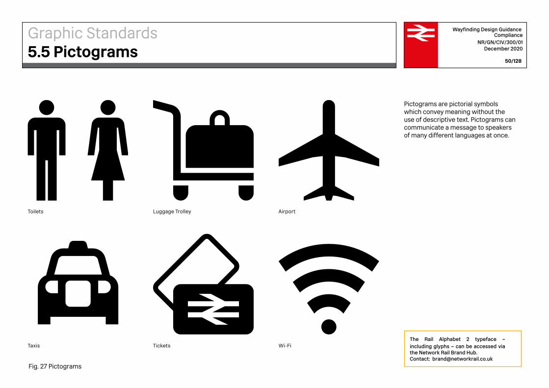
Pictograms are pictorial symbols which convey meaning without the use of descriptive text. Pictograms can communicate a message to speakers of many different languages at once.
Taxis
Toilets Luggage Trolley
Tickets Wi-Fi
Airport
Graphic Standards5.5 Pictograms
Fig. 27 Pictograms
The Rail Alphabet 2 typeface – including glyphs – can be accessed via the Network Rail Brand Hub.Contact: [email protected]

Wayfinding Design Guidance Compliance
NR/GN/CIV/300/01 December 2020
51/128
Priority Seating
PRM pictogram colours
This guidance follows the European Union Technical Standard for Interoperability 2014 on PRM in its interpretation that the subject of colour raised in Appendix N.3 refers specifically to clause (9) of point 4.2.1.10, as referred to in clause (9). PRM pictograms should therefore always be white, with a dark blue background.
People with Reduced Mobility
Accessibility
Auditory Impairment Vision Impairment
Changing Facilities WC
As a direct and universally accessible form of communication, internationally recognised pictograms are often required on statutory signage. Thus, pictograms used for statutory signage are also governed by strict legibility standards to check they are large enough and recognisable enough to be clear and visible for all travellers.
Please note that three different pictograms representing Priority Seating have been provided within the Network Rail pictograms library displayed on the next page. These Priority Seating pictograms - showing a pregnant woman, a mobility impaired passenger and a parent and small child – may be used together or separately.
Graphic Standards5.5 Pictograms – PRM
Fig. 28 Pictograms

Wayfinding Design Guidance Compliance
NR/GN/CIV/300/01 December 2020
52/128
Platforms
Lift
Bus Coach Tram Taxi Cycle CycleParking
Car Parking Park and Ride
Ferry Airport
Cycle Hire Car Hire
Travelator Escalator Hold the Handrail
Stand on the Right
Footbridge Stairs Hold on to Your Child
Hold on to Your Dog
Pushchair
First-class Lounge
Customer Lounge
Shower
Tickets Information StationReception
Café Food and Drink
Grab and Go ShoppingTicket Machine
Toilets Gender Neutral
Toilet
Gentlemen Ladies Baby Changing
Pedestrian
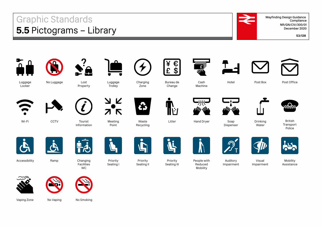
Graphic Standards5.5 Pictograms – Library
Wayfinding Design Guidance Compliance
NR/GN/CIV/300/01 December 2020
53/128
Vaping Zone
British Transport
Police
Accessibility Ramp Changing Facilities
WC
Priority Seating I
Priority Seating II
Priority Seating III
People with Reduced Mobility
Auditory Impairment
Visual Impairment
Mobility Assistance
No Vaping
Hand Dryer Soap Dispenser
Drinking Water
No Smoking
Wi-Fi CCTV TouristInformation
Meeting Point
Waste Recycling
Litter
Post Box Post Office
Graphic Standards5.5 Pictograms – Library
Luggage Locker
No Luggage Lost Property
LuggageTrolley
HotelCharging Zone
Bureau de Change
Cash Machine

Wayfinding Design Guidance Compliance
NR/GN/CIV/300/01 December 2020
54/128
The Network Rail directional arrows are bespoke, designed to compliment the wayfinding design. Arrows accompany the typography. The scale of arrow depends on the sign type. For further information, please refer to Section 6: Sign Family.
Graphic Standards5.6 Arrows
The Rail Alphabet 2 typeface – including glyphs – can be accessed via the Network Rail Brand Hub.Contact: [email protected]
Wayfinding Design Guidance Compliance
NR/GN/CIV/300/01 December 2020
55/128
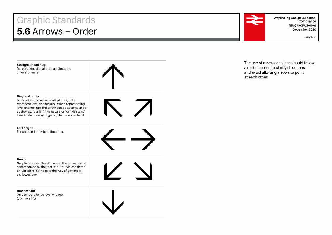
The use of arrows on signs should follow a certain order, to clarify directions and avoid allowing arrows to point at each other.
Straight ahead / UpTo represent straight-ahead direction, or level change
Diagonal or UpTo direct across a diagonal flat area, or to represent level change (up). When representing level change (up), the arrow can be accompanied by the text “via lift”, “via escalator” or “via stairs” to indicate the way of getting to the upper level
Left / rightFor standard left/right directions
DownOnly to represent level change. The arrow can be accompanied by the text “via lift”, “via escalator” or “via stairs” to indicate the way of getting to the lower level
Down via liftOnly to represent a level change (down via lift)
Graphic Standards5.6 Arrows – Order

Wayfinding Design Guidance Compliance
NR/GN/CIV/300/01 December 2020
56/128
The arrow tail is longer than the width of the arrow head. In order to keep the arrow size consistent, regardless of orientation, they are contained with a square grid and aligned to the square equally horizontally and vertically.
Graphic Standards5.6 Arrows – Alignment

6Wayfinding Design GuidanceSign Family
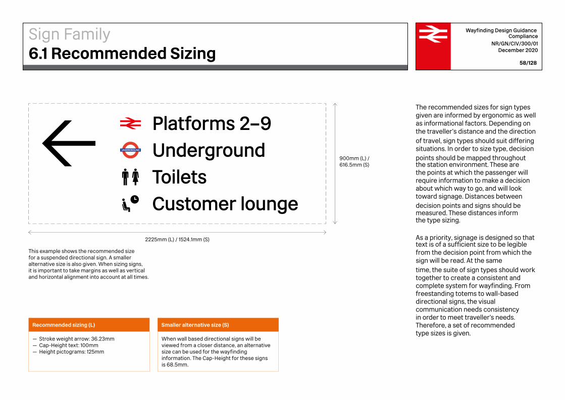
This example shows the recommended size for a suspended directional sign. A smaller alternative size is also given. When sizing signs, it is important to take margins as well as vertical and horizontal alignment into account at all times.
Recommended sizing (L)
— Stroke weight arrow: 36.23mm— Cap-Height text: 100mm— Height pictograms: 125mm
Smaller alternative size (S)
When wall based directional signs will be viewed from a closer distance, an alternative size can be used for the wayfinding information. The Cap-Height for these signs is 68.5mm.
Platforms 2–9UndergroundToiletsCustomer lounge
900mm (L) /616.5mm (S)
2225mm (L) / 1524.1mm (S)
Wayfinding Design Guidance Compliance
NR/GN/CIV/300/01 December 2020
58/128
The recommended sizes for sign types given are informed by ergonomic as well as informational factors. Depending on the traveller’s distance and the direction of travel, sign types should suit differing situations. In order to size type, decision points should be mapped throughout the station environment. These are the points at which the passenger will require information to make a decision about which way to go, and will look toward signage. Distances between decision points and signs should be measured. These distances inform the type sizing.
As a priority, signage is designed so that text is of a sufficient size to be legible from the decision point from which the sign will be read. At the same time, the suite of sign types should work together to create a consistent and complete system for wayfinding. From freestanding totems to wall-based directional signs, the visual communication needs consistency in order to meet traveller’s needs. Therefore, a set of recommended type sizes is given.
Sign Family6.1 Recommended Sizing
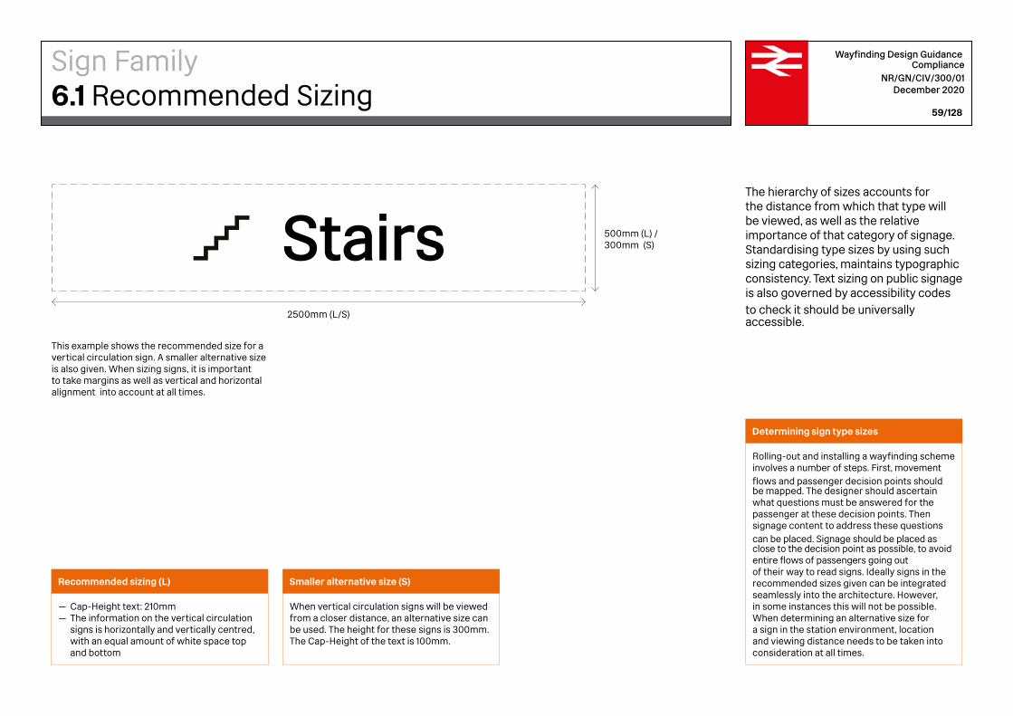
Determining sign type sizes
Rolling-out and installing a wayfinding scheme involves a number of steps. First, movement flows and passenger decision points should be mapped. The designer should ascertain what questions must be answered for the passenger at these decision points. Then signage content to address these questions can be placed. Signage should be placed as close to the decision point as possible, to avoid entire flows of passengers going out of their way to read signs. Ideally signs in the recommended sizes given can be integrated seamlessly into the architecture. However, in some instances this will not be possible. When determining an alternative size for a sign in the station environment, location and viewing distance needs to be taken into consideration at all times.
Stairs
500mm (L) / 300mm (S)
2500mm (L/S)
This example shows the recommended size for a vertical circulation sign. A smaller alternative size is also given. When sizing signs, it is important to take margins as well as vertical and horizontal alignment into account at all times.
Smaller alternative size (S)
When vertical circulation signs will be viewed from a closer distance, an alternative size can be used. The height for these signs is 300mm. The Cap-Height of the text is 100mm.
Recommended sizing (L)
— Cap-Height text: 210mm— The information on the vertical circulation
signs is horizontally and vertically centred, with an equal amount of white space top and bottom
Wayfinding Design Guidance Compliance
NR/GN/CIV/300/01 December 2020
59/128
The hierarchy of sizes accounts for the distance from which that type will be viewed, as well as the relative importance of that category of signage. Standardising type sizes by using such sizing categories, maintains typographic consistency. Text sizing on public signage is also governed by accessibility codes to check it should be universally accessible.
Sign Family6.1 Recommended Sizing
Exterior Station Name
Totems
Perimeter Ribbon
Suspended Directional Signs
Underground
Liverpool Street
Platforms 2–9UndergroundToiletsCustomer lounge
Taxis via bus station
Tickets
Bus station
InformationCustomer lounge
All platforms
Overground
Cycle parking
Lift to platformsEscalatorsStairsWay out
1m 2m 8m 12m 20m
CH: 210/375mm
CH: 68.5/45.7mm
CH: 210mm
CH: 100mm
10m ›
10–20m
5–15m
2–10m
Wayfinding Design Guidance Compliance
NR/GN/CIV/300/01 December 2020
60/128
A series of text sizes are required to respond to the different parameters of a station. The hierarchy of text sizes should account for the distance from which that text will be viewed, as well as the relative importance of that category of signage. Some signs may be eye-level for close viewing within a confined space or very tall beacons to be viewed from across a concourse. The traveller may be stopped or may be moving. All of these considerations should be weighed in sizing text. The charts on this page and the next page set out text sizes for the sign types at stations.
Sign Family6.2 Sign Family Sizing

Identification Signs
Vertical Circulation Signs
Projected Signs
Wall Based Directional Signs
EscalatorsFood and drinkShoppingWay out
EscalatorsWay out
1m 2m 8m 12m 20m
CH: 700mm
10–20m
CH: 210mm
2–10m
CH: 68.5/45.7mm
CH: 100mm
5–15m
Wayfinding Design Guidance Compliance
NR/GN/CIV/300/01 December 2020
61/128
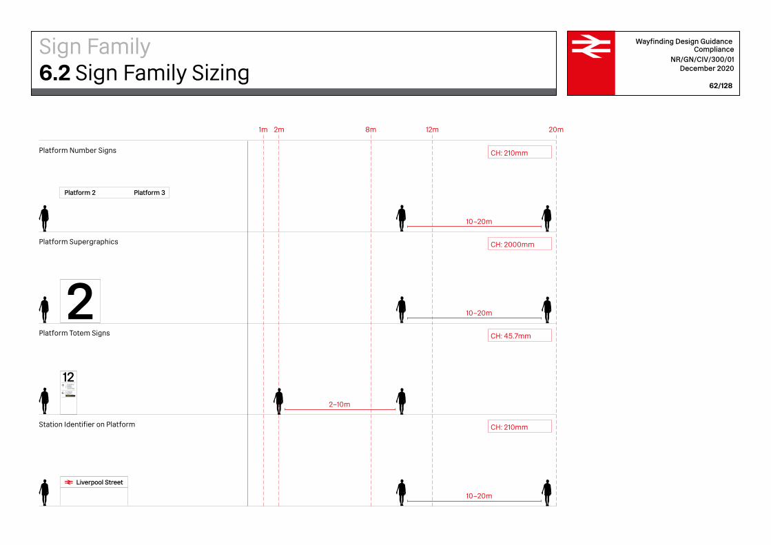
Sign Family6.2 Sign Family Sizing
Liverpool Street
Taxis via bus station
Bus station
InformationCustomer lounge
Overground
Lift to platformsEscalators
Way out
Platform Number Signs
Platform Supergraphics
Platform Totem Signs
Station Identifier on Platform
1m 2m 8m 12m 20m
10–20m
10–20m
2–10m
CH: 210mm
Platform 3Platform 2
10–20m
CH: 210mm
CH: 2000mm
CH: 45.7mm
Wayfinding Design Guidance Compliance
NR/GN/CIV/300/01 December 2020
62/128
Sign Family6.2 Sign Family Sizing

Liverpool Street 500mm (S)
3075mm (S)
500mm (S)
105mm (S)
750mm (L)
187.5mm (L)
Liverpool Street 750mm (L)
4612.5mm (L)
Wayfinding Design Guidance Compliance
NR/GN/CIV/300/01 December 2020
63/128
The exterior station name sign identifies the station and signifies the its presence. It should be placed in a prominent position to allow it to be clearly seen from key pedestrian access routes to the station. Monumental lettering can be attached permanently to the station building. As such it is as much an architectural feature as an environmental wayfinding element. The typography should comply with these guidelines. The name of the station is accompanied by the National Rail logo. The information should be horizontal whenever possible.
Exterior Station Name Sign (small, front)
Exterior Station Name Sign (large, front)
Exterior Station Name Sign (small, side) Exterior Station Name Sign (large, side)
— Cap-Height (CH) small exterior station name sign (S): 210mm— Cap-Height (CH) large exterior station name sign (L): 375mm— The National Rail logo is always placed
before the station name. The logo is aligned to the CH of the station name— All information is centred horizontally,
with equal space (EQ.) top and bottom
Recommended sizing
Sign Family6.3 Exterior Station Name

Wayfinding Design Guidance Compliance
NR/GN/CIV/300/01 December 2020
64/128
Horizontal Alignment
Vertical Alignment
Liverpool StreetCH CH0.75xCH
Liverpool Street CH xH
EQ.
EQ.
Sign Family6.3 Exterior Station Name

Liverpool Street
Wayfinding Design Guidance Compliance
NR/GN/CIV/300/01 December 2020
65/128
— Text should be horizontal where possible— If the design requires a vertical sign, this should be achieved by rotating the whole
station name by 90 degrees clockwise— Letters should never be stacked vertically
Placement
— It is important to provide sufficient contrast between the station name and
the backgound.— The National Rail logo is always recognisible
by its red colour.
Contrasting colours
Sign Family6.3 Exterior Station Name
All platformsTicketsInformationCustomer lounge
Bus stationOverground
TaxisCycle parking
ToiletsFood and drinkShoppingMeeting point
via bus station
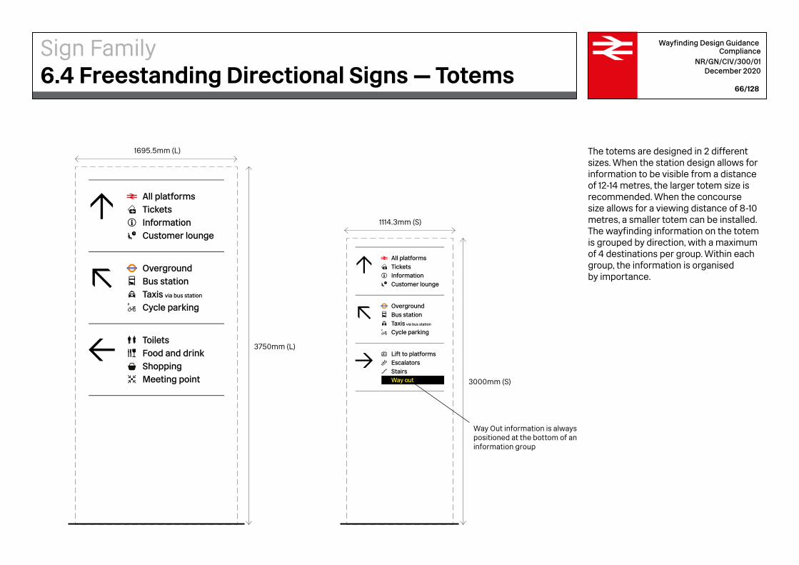
3750mm (L)
1695.5mm (L)
Taxis via bus station
Tickets
Bus station
InformationCustomer lounge
All platforms
Overground
Cycle parking
Lift to platformsEscalatorsStairsWay out 3000mm (S)
1114.3mm (S)
Way Out information is always positioned at the bottom of an information group
Wayfinding Design Guidance Compliance
NR/GN/CIV/300/01 December 2020
66/128
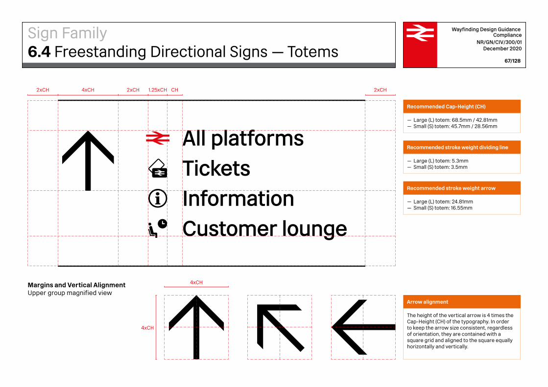
The totems are designed in 2 different sizes. When the station design allows for information to be visible from a distance of 12-14 metres, the larger totem size is recommended. When the concourse size allows for a viewing distance of 8-10 metres, a smaller totem can be installed. The wayfinding information on the totem is grouped by direction, with a maximum of 4 destinations per group. Within each group, the information is organised by importance.
Sign Family6.4 Freestanding Directional Signs — Totems
Taxis via bus station
Tickets
Bus station
InformationCustomer lounge
All platforms
Overground
Cycle parking
Lift to platformsEscalatorsStairsWay out
Margins and Vertical AlignmentUpper group magnified view
2xCH 2xCH2xCH4xCH CH1.25xCH
4xCH
4xCH
Wayfinding Design Guidance Compliance
NR/GN/CIV/300/01 December 2020
67/128
Arrow alignment
The height of the vertical arrow is 4 times the Cap-Height (CH) of the typography. In order to keep the arrow size consistent, regardless of orientation, they are contained with a square grid and aligned to the square equally horizontally and vertically.
Sign Family6.4 Freestanding Directional Signs — Totems
Recommended Cap-Height (CH)
— Large (L) totem: 68.5mm / 42.81mm— Small (S) totem: 45.7mm / 28.56mm
Recommended stroke weight dividing line
— Large (L) totem: 5.3mm— Small (S) totem: 3.5mm
Recommended stroke weight arrow
— Large (L) totem: 24.81mm— Small (S) totem: 16.55mm
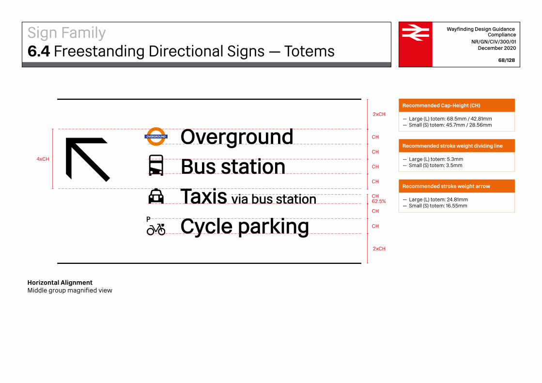
Taxis via bus station
Tickets
Bus station
InformationCustomer lounge
All platforms
Overground
Cycle parking
Lift to platformsEscalatorsStairsWay out
Horizontal AlignmentMiddle group magnified view
2xCH
2xCH
CH
CH
CH
CH
CH
CH62.5%
CH
4xCH
Wayfinding Design Guidance Compliance
NR/GN/CIV/300/01 December 2020
68/128
Sign Family6.4 Freestanding Directional Signs — Totems
Recommended Cap-Height (CH)
— Large (L) totem: 68.5mm / 42.81mm— Small (S) totem: 45.7mm / 28.56mm
Recommended stroke weight dividing line
— Large (L) totem: 5.3mm— Small (S) totem: 3.5mm
Recommended stroke weight arrow
— Large (L) totem: 24.81mm— Small (S) totem: 16.55mm
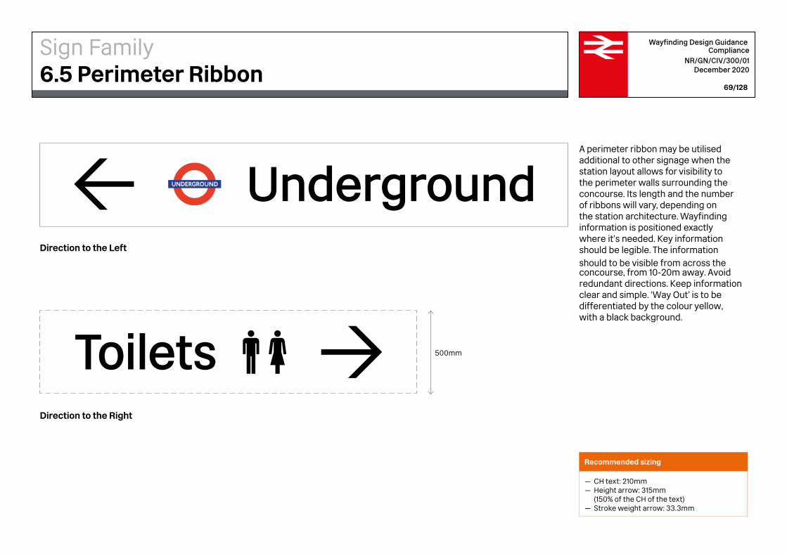
500mmToilets
Underground
Wayfinding Design Guidance Compliance
NR/GN/CIV/300/01 December 2020
69/128
A perimeter ribbon may be utilised additional to other signage when the station layout allows for visibility to the perimeter walls surrounding the concourse. Its length and the number of ribbons will vary, depending on the station architecture. Wayfinding information is positioned exactly where it’s needed. Key information should be legible. The information should to be visible from across the concourse, from 10-20m away. Avoid redundant directions. Keep information clear and simple. ‘Way Out’ is to be differentiated by the colour yellow, with a black background.
Direction to the Left
Direction to the Right
Recommended sizing
— CH text: 210mm— Height arrow: 315mm (150% of the CH of the text)— Stroke weight arrow: 33.3mm
Sign Family6.5 Perimeter Ribbon

Underground
Underground1.5xCH
EQ.
EQ.
EQ.
CH
EQ.
CH CH CH0.75xCH1.547xCH
Wayfinding Design Guidance Compliance
NR/GN/CIV/300/01 December 2020
70/128
Vertical Alignment
Horizontal Alignment
Sign Family6.5 Perimeter Ribbon
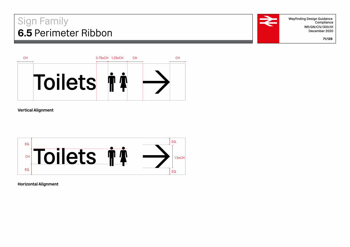
Toilets 1.5xCH
EQ.
EQ.
EQ.
CH
EQ.
CHCH 0.75xCH CH1.25xCH
Toilets
Wayfinding Design Guidance Compliance
NR/GN/CIV/300/01 December 2020
71/128
Vertical Alignment
Horizontal Alignment
Sign Family6.5 Perimeter Ribbon
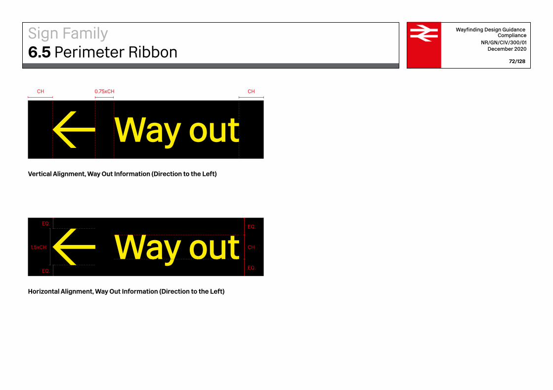
Way out
Way out
EQ.
CH
EQ.
1.5xCH
EQ.
EQ.
CHCH 0.75xCH
Wayfinding Design Guidance Compliance
NR/GN/CIV/300/01 December 2020
72/128
Vertical Alignment, Way Out Information (Direction to the Left)
Horizontal Alignment, Way Out Information (Direction to the Left)
Sign Family6.5 Perimeter Ribbon

Way outEQ.
CH
EQ.
1.5xCH
EQ.
EQ.
CH CH0.75xCH
Way out
Wayfinding Design Guidance Compliance
NR/GN/CIV/300/01 December 2020
73/128
Vertical Alignment, Way Out Information (Direction to the Right)
Horizontal Alignment, Way Out Information (Direction to the Right)
Sign Family6.5 Perimeter Ribbon

Platforms 2–9UndergroundToiletsCustomer lounge
900mm (L) /616.5mm (S)
2225mm (L) / 1524.1mm (S)
Wayfinding Design Guidance Compliance
NR/GN/CIV/300/01 December 2020
74/128
Directional signs provide information about facilities and destinations within the station. The information on these signs needs to be visible from a long distance so that passengers can make decisions on which way to go while moving. The signs are ceiling suspended, ensuring they can be seen above the crowd. The wayfinding information on these signs is grouped by direction, with a maximum of 4 destinations per group. The arrow is always positioned on the left, pointing people in the right direction.
Recommended sizing
— Stroke weight arrow: 36.23mm— Cap-Height text: 100mm— A minimum headroom clearance of 2.3
metres needs to be maintained at all times
Sign Family6.6 Suspended Directional Signs

Where there are alternative numbered exits routes leading to separate street locations, this information should be included on the Way Out sign.
All platformsUndergroundToiletsWay out Middlesborough
High Street10
Wayfinding Design Guidance Compliance
NR/GN/CIV/300/01 December 2020
75/128
Smaller alternative size (S)
When suspended directional signs will be viewed from a closer distance, an alternative size can be used for the wayfinding information. The Cap-Height for these signs is 68.5mm.
Sign Family6.6 Suspended Directional Signs
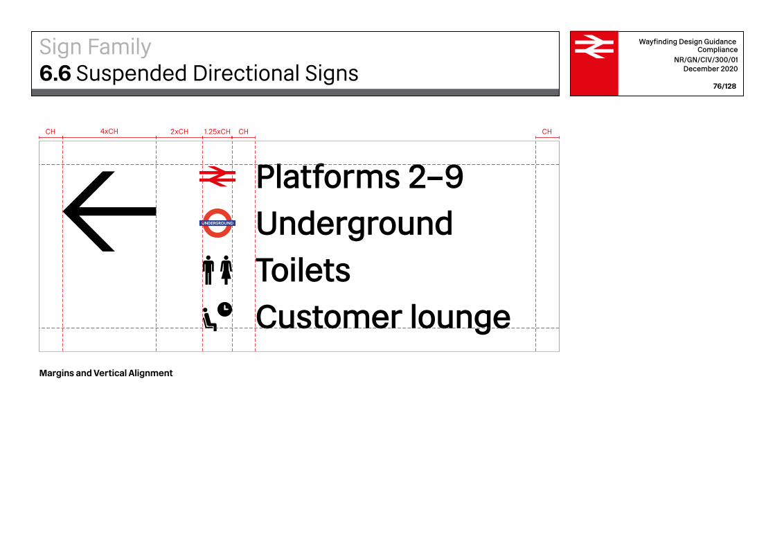
Platforms 2–9UndergroundToiletsCustomer lounge
1.25xCH2xCHCH CH CH4xCH
Wayfinding Design Guidance Compliance
NR/GN/CIV/300/01 December 2020
76/128
Margins and Vertical Alignment
Sign Family6.6 Suspended Directional Signs

Horizontal Alignment
Platforms 2–9UndergroundToiletsCustomer lounge
CH
CH
CH
CH
CH
CH
CH
CH
CH
4xC
HWayfinding Design Guidance
Compliance NR/GN/CIV/300/01
December 2020
77/128
Sign Family6.6 Suspended Directional Signs

Margins and Alignment Lift Sign
The centre of the text is aligned with the centre of the arrow as shown here
EQ.
EQ.
0.5xCH 0.5xCH2xCH 0.75xCH1.25xCHCH
Wayfinding Design Guidance Compliance
NR/GN/CIV/300/01 December 2020
78/128
Sign Family6.6 Suspended Directional Signs
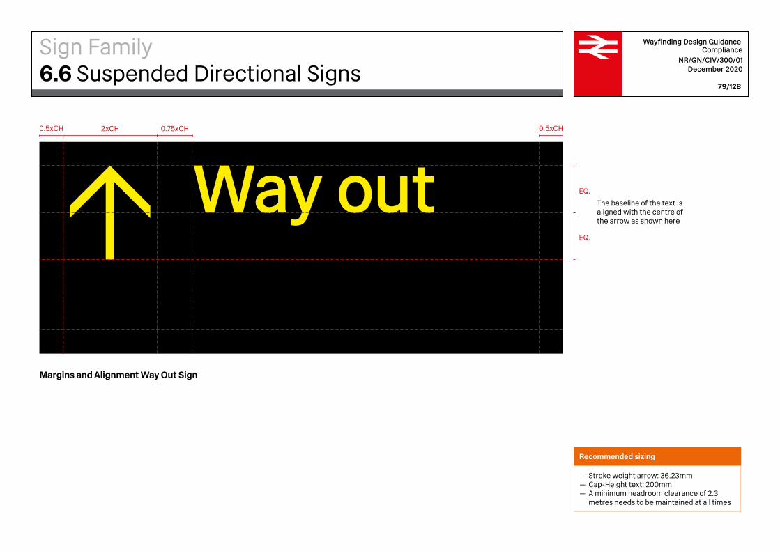
Way out
Margins and Alignment Way Out Sign
0.5xCH 0.5xCH2xCH 0.75xCH
The baseline of the text is aligned with the centre of the arrow as shown here
EQ.
EQ.
Wayfinding Design Guidance Compliance
NR/GN/CIV/300/01 December 2020
79/128
Recommended sizing
— Stroke weight arrow: 36.23mm— Cap-Height text: 200mm— A minimum headroom clearance of 2.3
metres needs to be maintained at all times
Sign Family6.6 Suspended Directional Signs
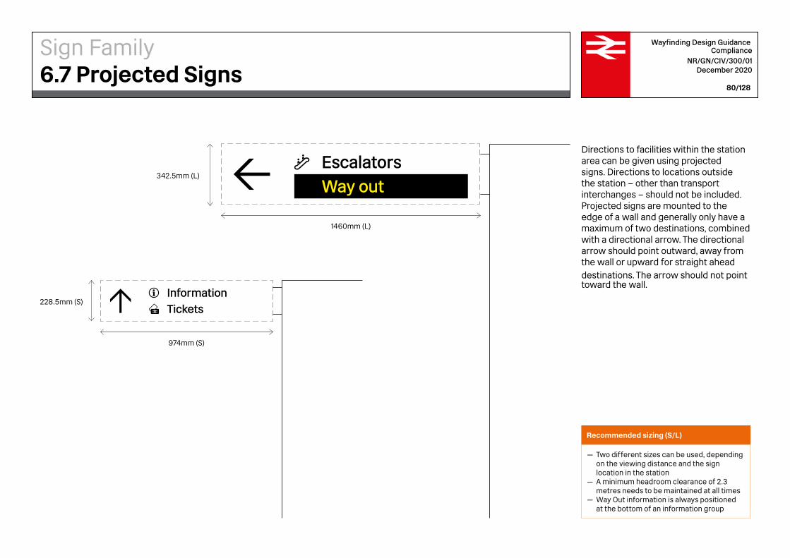
1460mm (L)
974mm (S)
342.5mm (L)
228.5mm (S)
EscalatorsWay out
InformationTickets
Wayfinding Design Guidance Compliance
NR/GN/CIV/300/01 December 2020
80/128
Directions to facilities within the station area can be given using projected signs. Directions to locations outside the station – other than transport interchanges – should not be included. Projected signs are mounted to the edge of a wall and generally only have a maximum of two destinations, combined with a directional arrow. The directional arrow should point outward, away from the wall or upward for straight ahead destinations. The arrow should not point toward the wall.
Recommended sizing (S/L)
— Two different sizes can be used, depending on the viewing distance and the sign
location in the station— A minimum headroom clearance of 2.3
metres needs to be maintained at all times— Way Out information is always positioned at the bottom of an information group
Sign Family6.7 Projected Signs
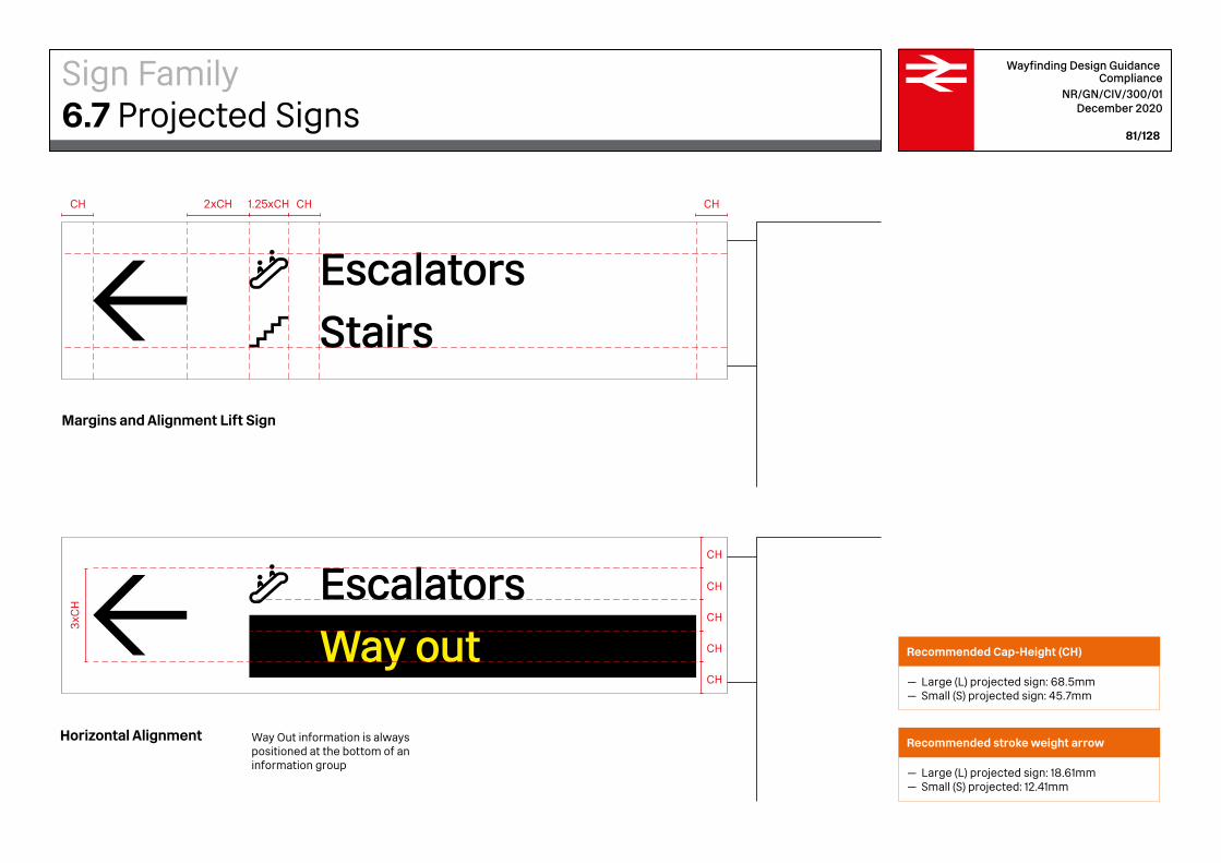
EscalatorsStairs
Margins and Alignment Lift Sign
Horizontal Alignment
EscalatorsWay out
Way Out information is always positioned at the bottom of an information group
CHCH CH2xCH 1.25xCH
3xC
H
CH
CH
CH
CH
CH
Wayfinding Design Guidance Compliance
NR/GN/CIV/300/01 December 2020
81/128
Recommended Cap-Height (CH)
— Large (L) projected sign: 68.5mm— Small (S) projected sign: 45.7mm
Recommended stroke weight arrow
— Large (L) projected sign: 18.61mm— Small (S) projected: 12.41mm
Sign Family6.7 Projected Signs
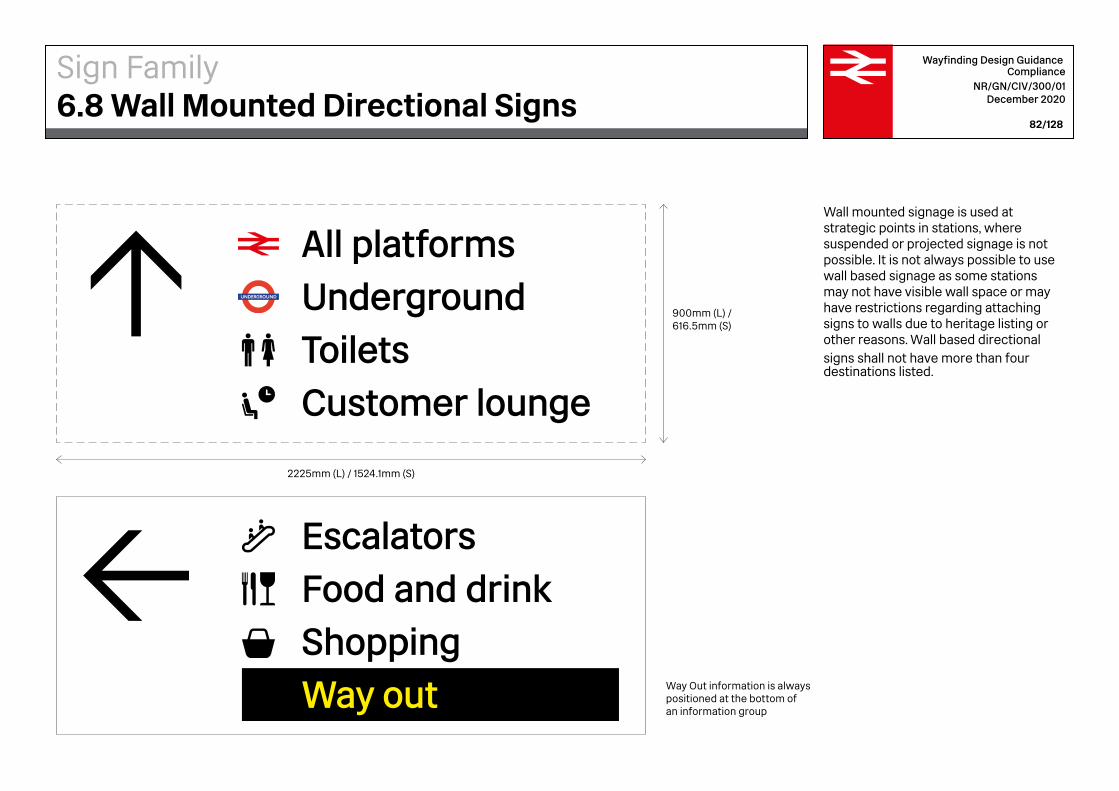
Way Out information is always positioned at the bottom of an information group
EscalatorsFood and drinkShoppingWay out
All platformsUndergroundToiletsCustomer lounge
900mm (L) /616.5mm (S)
2225mm (L) / 1524.1mm (S)
Wayfinding Design Guidance Compliance
NR/GN/CIV/300/01 December 2020
82/128
Wall mounted signage is used at strategic points in stations, where suspended or projected signage is not possible. It is not always possible to use wall based signage as some stations may not have visible wall space or may have restrictions regarding attaching signs to walls due to heritage listing or other reasons. Wall based directional signs shall not have more than four destinations listed.
Sign Family6.8 Wall Mounted Directional Signs
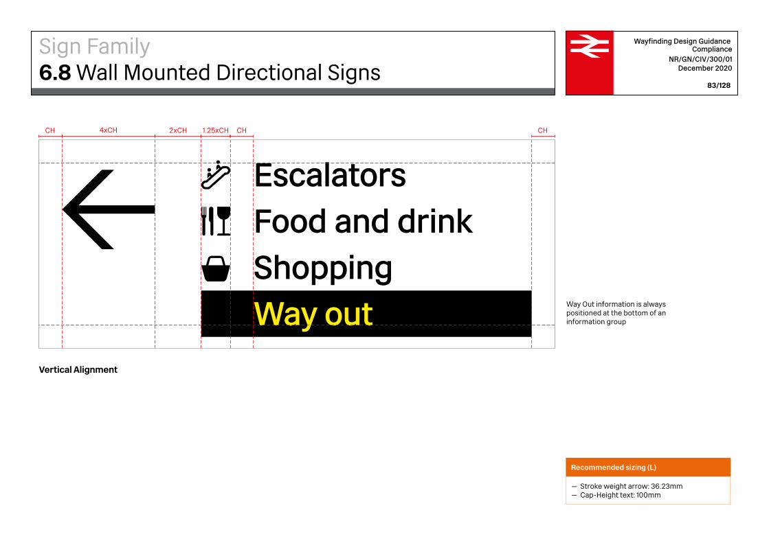
Way Out information is always positioned at the bottom of an information group
EscalatorsFood and drinkShoppingWay out
1.25xCH2xCHCH CH CH4xCH
Wayfinding Design Guidance Compliance
NR/GN/CIV/300/01 December 2020
83/128
Vertical Alignment
Recommended sizing (L)
— Stroke weight arrow: 36.23mm— Cap-Height text: 100mm
Sign Family6.8 Wall Mounted Directional Signs
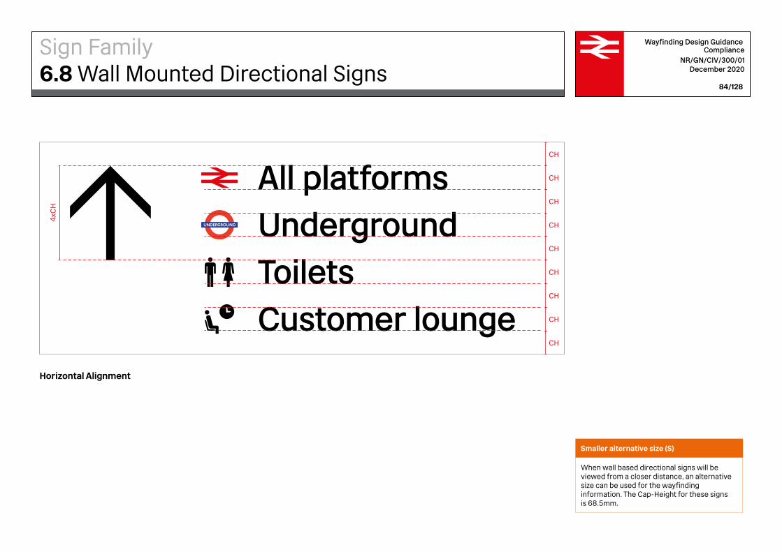
All platformsUndergroundToiletsCustomer lounge
CH
CH
CH
CH
CH
CH
CH
CH
CH
4xC
HWayfinding Design Guidance
Compliance NR/GN/CIV/300/01
December 2020
84/128
Horizontal Alignment
Smaller alternative size (S)
When wall based directional signs will be viewed from a closer distance, an alternative size can be used for the wayfinding information. The Cap-Height for these signs is 68.5mm.
Sign Family6.8 Wall Mounted Directional Signs

200mm
Recommended minimum distance from the floor to the bottom of the sign
2300mmRecommended minimum distance from the floor to the bottom of the sign
2300mm
All platformsUndergroundToiletsCustomer lounge
EscalatorsFood and drinkShoppingWay out
Wayfinding Design Guidance Compliance
NR/GN/CIV/300/01 December 2020
85/128
Positioning
— Wall mounted directional signs need to be fixed sufficiently high as not to be obscured by passengers. They should never be placed lower than 1000mm. The recommended distance between the floor and the bottom of the sign is 2300mm
— When multiple signs are placed next to each other, they should be aligned to the top — The minimum distance between signs is 200mm— Arrows should not point at each other— Way Out information is always positioned
at the bottom of an information group
Positioning
Sign Family6.8 Wall Mounted Directional Signs
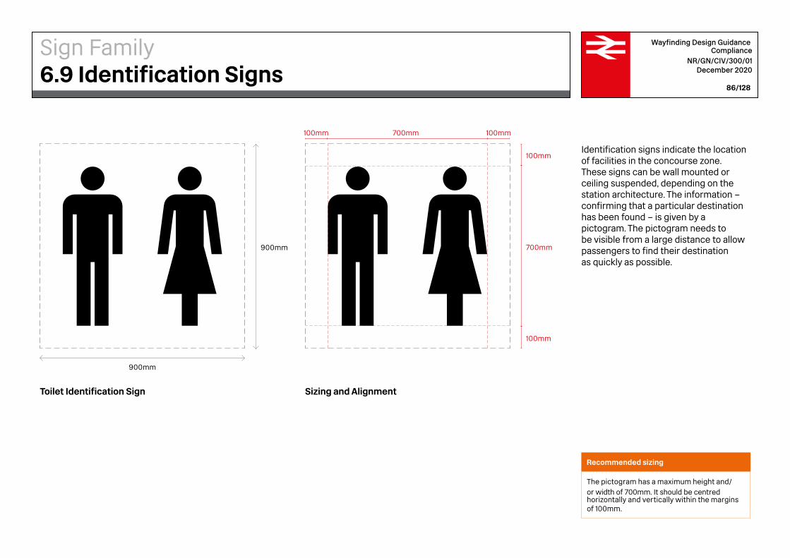
900mm
900mm 700mm
100mm
100mm
100mm 100mm700mm
Wayfinding Design Guidance Compliance
NR/GN/CIV/300/01 December 2020
86/128
Identification signs indicate the location of facilities in the concourse zone. These signs can be wall mounted or ceiling suspended, depending on the station architecture. The information – confirming that a particular destination has been found – is given by a pictogram. The pictogram needs to be visible from a large distance to allow passengers to find their destination as quickly as possible.
Toilet Identification Sign Sizing and Alignment
Recommended sizing
The pictogram has a maximum height and/or width of 700mm. It should be centred horizontally and vertically within the margins of 100mm.
Sign Family6.9 Identification Signs

Tickets Information Food and Drink Shopping
Wayfinding Design Guidance Compliance
NR/GN/CIV/300/01 December 2020
87/128
Other Examples of Identification Signs
Sign Family6.9 Identification Signs

500mm (L)
2500mm (L)
Stairs
300mm (S)
2500mm (S)
Wayfinding Design Guidance Compliance
NR/GN/CIV/300/01 December 2020
88/128
Vertical Circulation Lift Sign
Vertical Circulation Stairs Sign
Vertical circulation signs mark the location of lifts, stairs or escalators, identifying facilities travellers can use to make their way up or down to a different level. They use a single overhead panel – wall mounted, suspended or column mounted – with one line of information. The information needs to be visible from a large distance.
Recommended sizing (L)
— Cap-Height text: 210mm— The information on the vertical circulation
signs is horizontally and vertically centred, with an equal amount of white space top and bottom
Smaller alternative size (S)
When vertical circulation signs will be viewed from a closer distance, an alternative size can be used. The height for these signs is 300mm. The Cap-Height of the text is 100mm.
Sign Family6.10 Vertical Circulation Signs
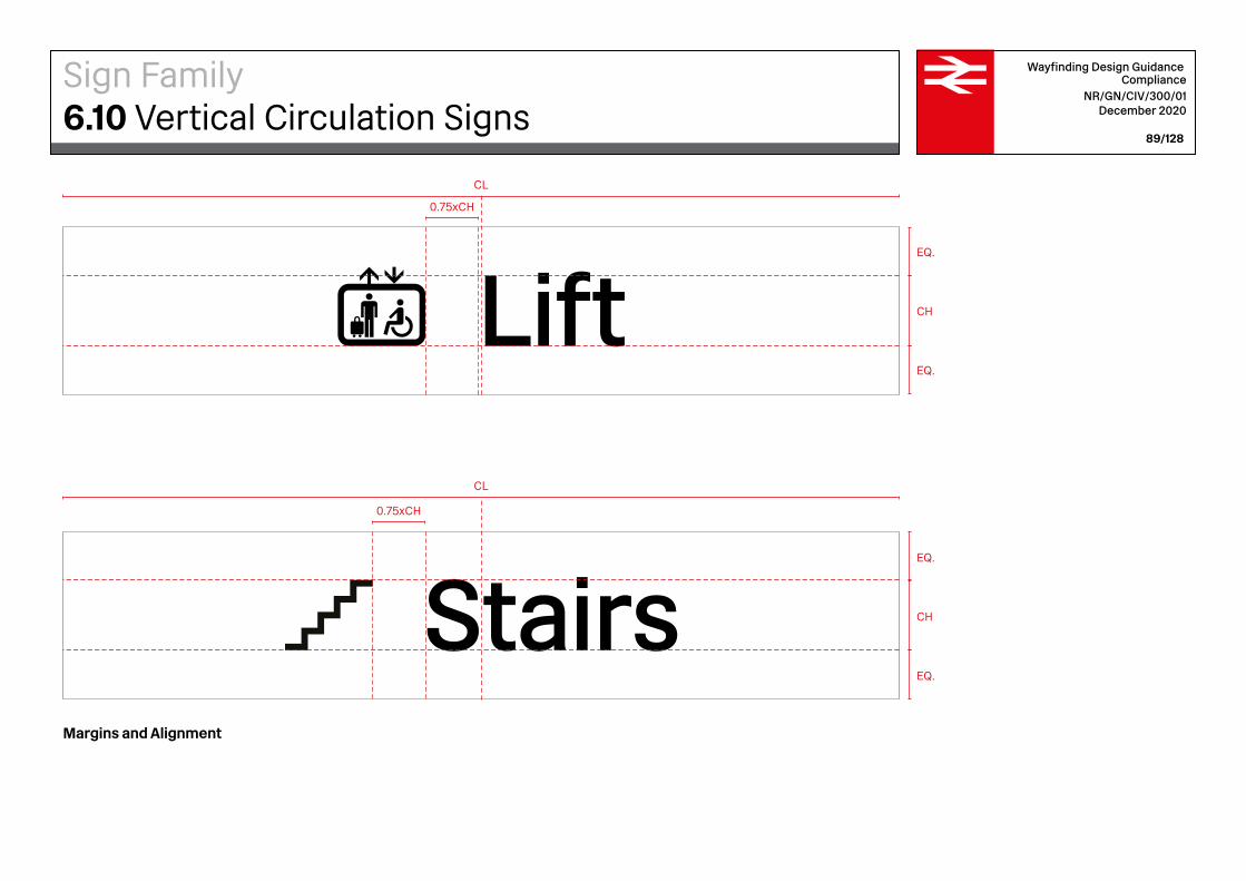
0.75xCH
0.75xCH
Stairs
EQ.
EQ.
CH
EQ.
EQ.
CH
CL
CL
Wayfinding Design Guidance Compliance
NR/GN/CIV/300/01 December 2020
89/128
Margins and Alignment
Sign Family6.10 Vertical Circulation Signs
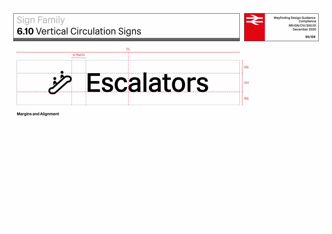
Wayfinding Design Guidance Compliance
NR/GN/CIV/300/01 December 2020
90/128
0.75xCH
EQ.
EQ.
CH
CL
EscalatorsMargins and Alignment
Sign Family6.10 Vertical Circulation Signs

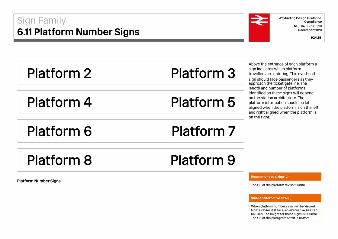
Platform 3Platform 2
Platform 5Platform 4
Platform 7Platform 6
Platform 9Platform 8
Wayfinding Design Guidance Compliance
NR/GN/CIV/300/01 December 2020
92/128
Above the entrance of each platform a sign indicates which platform travellers are entering. This overhead sign should face passengers as they approach the ticket gateline. The length and number of platforms identified on these signs will depend on the station architecture. The platform information should be left aligned when the platform is on the left and right aligned when the platform is on the right.
Platform Number SignsRecommended sizing (L)
The CH of the platform text is 210mm
Smaller alternative size (S)
When platform number signs will be viewed from a closer distance, an alternative size can be used. The height for these signs is 300mm. The CH of the pictograms/text is 100mm.
Sign Family6.11 Platform Number Signs
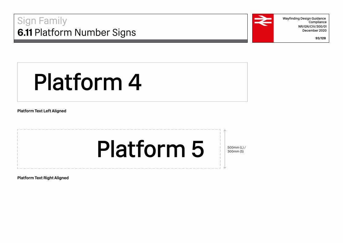
Platform 4
Platform 5 500mm (L) /300mm (S)
Wayfinding Design Guidance Compliance
NR/GN/CIV/300/01 December 2020
93/128
Platform Text Right Aligned
Platform Text Left Aligned
Sign Family6.11 Platform Number Signs
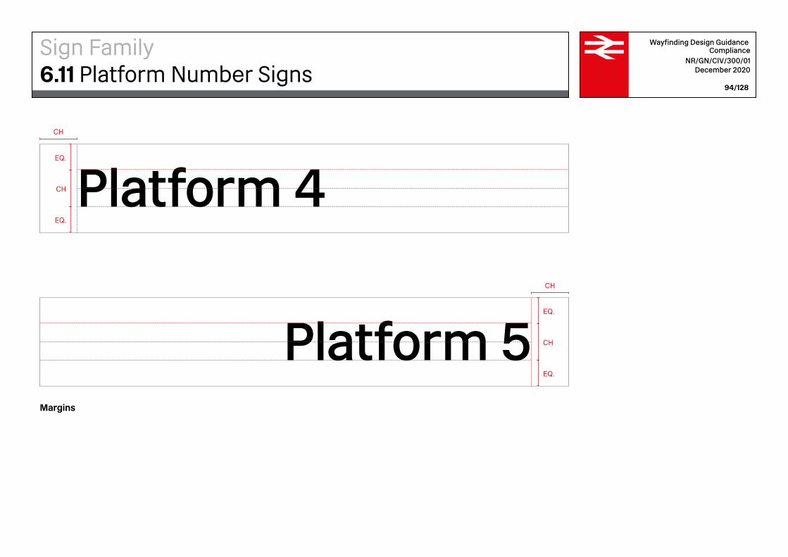
Platform 4
Platform 5
CH
CH
EQ.
CH
EQ.
EQ.
CH
EQ.
Wayfinding Design Guidance Compliance
NR/GN/CIV/300/01 December 2020
94/128
Margins
Sign Family6.11 Platform Number Signs

2400mm
2200mm
Wayfinding Design Guidance Compliance
NR/GN/CIV/300/01 December 2020
95/128
Supergraphics are large graphics used in the environment. These can be employed strategically in stations to attract people’s attention quickly. Platform numbers should be identified using supergraphics as a supplementary sign to the overhead Platform Number Signs. Supergraphics should be placed on the side return walls leading to platforms so that platforms can be identified quickly and efficiently while traversing through the station.
Platform Supergraphic, Single-Digit
Sign Family6.12 Platform Supergraphics
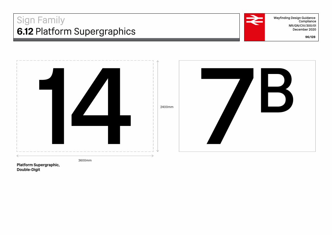
2400mm
3600mm
Wayfinding Design Guidance Compliance
NR/GN/CIV/300/01 December 2020
96/128
Platform Supergraphic, Double-Digit
Sign Family6.12 Platform Supergraphics
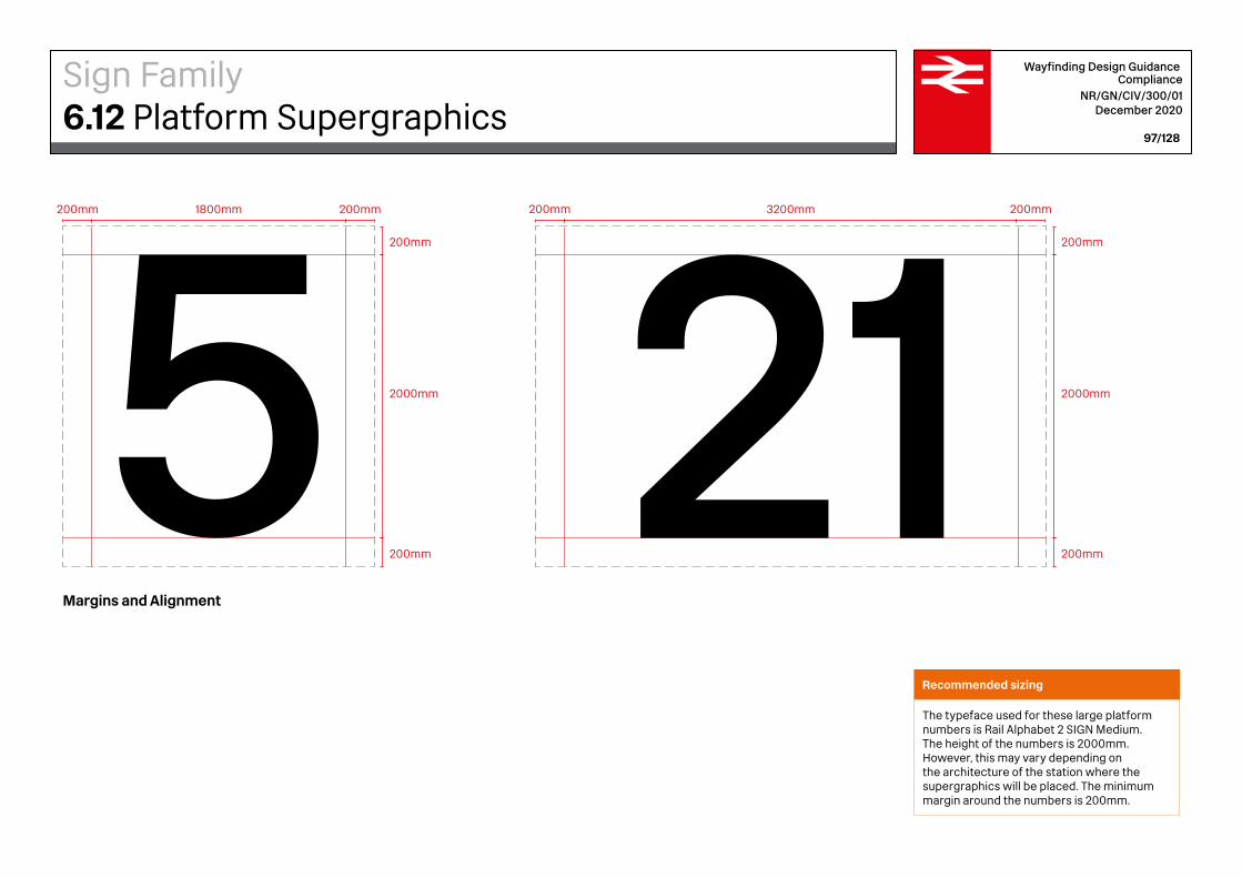
200mm 200mm 200mm200mm
200mm
200mm
2000mm
200mm
200mm
2000mm
1800mm 3200mm
Wayfinding Design Guidance Compliance
NR/GN/CIV/300/01 December 2020
97/128
Margins and Alignment
Recommended sizing
The typeface used for these large platform numbers is Rail Alphabet 2 SIGN Medium. The height of the numbers is 2000mm. However, this may vary depending on the architecture of the station where the supergraphics will be placed. The minimum margin around the numbers is 200mm.
Sign Family6.12 Platform Supergraphics
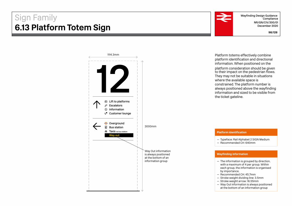
Taxis via bus station
Bus station
InformationCustomer lounge
Overground
Lift to platformsEscalators
Way out
3000mm
1114.3mm
Way Out information is always positioned at the bottom of an information group
Wayfinding Design Guidance Compliance
NR/GN/CIV/300/01 December 2020
98/128
Platform totems effectively combine platform identification and directional information. When positioned on the platform consideration should be given to their impact on the pedestrian flows. They may not be suitable in situations where the available space is constrained. The platform number is always positioned above the wayfinding information and sized to be visible from the ticket gateline.
Platform identification
— Typeface: Rail Alphabet 2 SIGN Medium— Recommended CH: 640mm
Wayfinding information
— The information is grouped by direction, with a maximum of 4 per group. Within each group, the information is organised by importance.
— Recommended CH: 45.7mm — Stroke weight dividing line: 3.5mm — Stroke weight arrow: 16.55mm— Way Out information is always positioned
at the bottom of an information group
Sign Family6.13 Platform Totem Sign
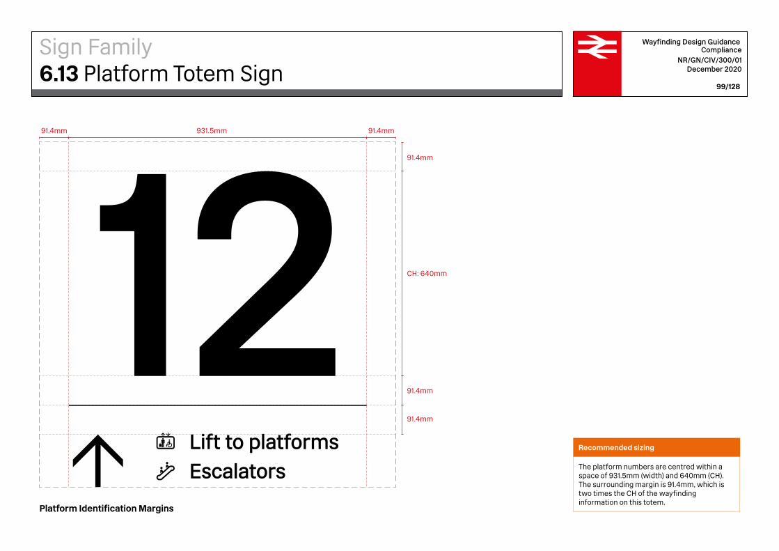
91.4mm 91.4mm
91.4mm
91.4mm
91.4mm
CH: 640mm
931.5mm
Taxis via bus station
Bus station
InformationCustomer lounge
Overground
Lift to platformsEscalators
Way out
Wayfinding Design Guidance Compliance
NR/GN/CIV/300/01 December 2020
99/128
Platform Identification Margins
Recommended sizing
The platform numbers are centred within a space of 931.5mm (width) and 640mm (CH). The surrounding margin is 91.4mm, which is two times the CH of the wayfinding information on this totem.
Sign Family6.13 Platform Totem Sign
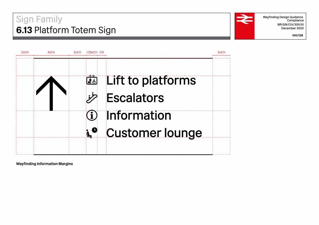
Taxis via bus station
Bus station
InformationCustomer lounge
Overground
Lift to platformsEscalators
Way out
2xCH 2xCH2xCH4xCH CH1.25xCH
Wayfinding Design Guidance Compliance
NR/GN/CIV/300/01 December 2020
100/128
Wayfinding Information Margins
Sign Family6.13 Platform Totem Sign
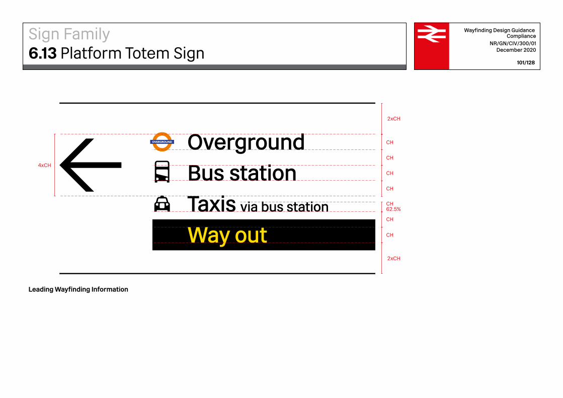
Taxis via bus station
Bus station
InformationCustomer lounge
Overground
Lift to platformsEscalators
Way out
2xCH
2xCH
CH
CH
CH
CH
CH
CH62.5%
CH
4xCH
Wayfinding Design Guidance Compliance
NR/GN/CIV/300/01 December 2020
101/128
Leading Wayfinding Information
Sign Family6.13 Platform Totem Sign

Liverpool Street 500mm (S)
3075mm (S)
Wayfinding Design Guidance Compliance
NR/GN/CIV/300/01 December 2020
102/128
Liverpool Street Platform Identifier
Station identifier signs are used along the platforms at regular intervals. The interval should be defined by the platform function, length and configuration, with signs spaced on through platforms such that they can be visible from any position on a train. They can be wall, ceiling or pole mounted, depending on the station’s architecture.
Sign Family6.14 Station Identifier on Platforms

Liverpool StreetCH CH0.75xCH
Liverpool Street CH xH
EQ.
EQ.
Wayfinding Design Guidance Compliance
NR/GN/CIV/300/01 December 2020
103/128
Liverpool Street Platform Identifier
Recommended sizing
The Cap-Height (CH) of the information on the station identifiers is 210mm. The typeface used is Rail Alphabet 2 SIGN Medium.
Sign Family6.14 Station Identifier on Platforms

No Smoking Sign No Trolleys Sign
Smoking isnot permittedanywhere inthe station
No trolleysbeyond
this point
810mm 810mm
480mm 480mm
Wayfinding Design Guidance Compliance
NR/GN/CIV/300/01 December 2020
104/128
In addition to wayfinding signage, regulatory signage warns passengers of restricted access, hazards, rules and regulations. This type of signage is designed to align with the same visual system as the wayfinding signage, but should stand out as having an authoritative tone. Regulatory signs are for example: emergency exit; keep clear; caution; do not enter; no smoking; staff only and mobility access signs.
Sign Family6.15 Regulatory and Prohibition Signs
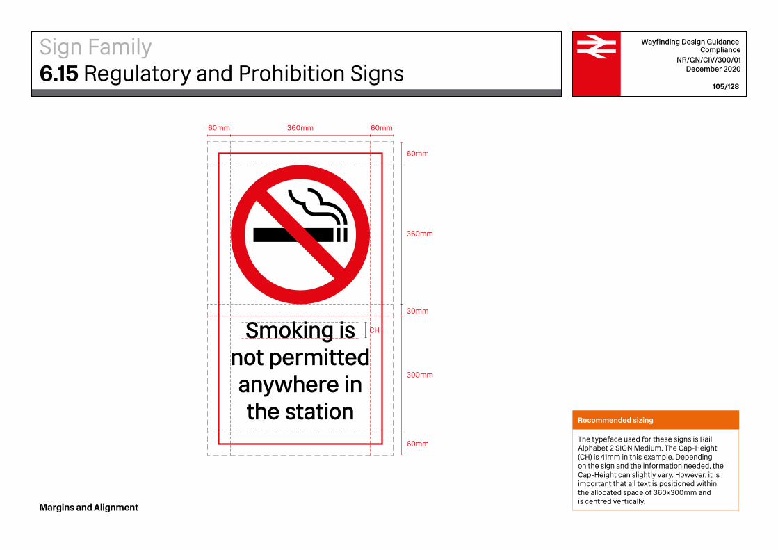
Smoking isnot permittedanywhere inthe station
CH
60mm 60mm
60mm
60mm
360mm
30mm
300mm
360mm
Wayfinding Design Guidance Compliance
NR/GN/CIV/300/01 December 2020
105/128
Recommended sizing
The typeface used for these signs is Rail Alphabet 2 SIGN Medium. The Cap-Height (CH) is 41mm in this example. Depending on the sign and the information needed, the Cap-Height can slightly vary. However, it is important that all text is positioned within the allocated space of 360x300mm and is centred vertically.
Margins and Alignment
Sign Family6.15 Regulatory and Prohibition Signs
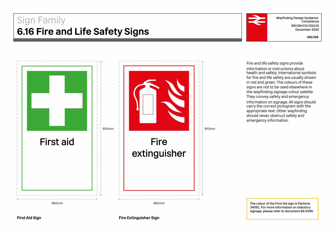
The colour of the First Aid sign is Pantone 3405C. For more information on statutory signage, please refer to document BS 5499.
Wayfinding Design Guidance Compliance
NR/GN/CIV/300/01 December 2020
106/128
First Aid Sign Fire Extinguisher Sign
Fire and life safety signs provide information or instructions about health and safety. International symbols for fire and life safety are usually shown in red and green. The colours of these signs are not to be used elsewhere in the wayfinding signage colour palette. They convey safety and emergency information on signage. All signs should carry the correct pictogram with the appropriate text. Other wayfinding should never obstruct safety and emergency information.
810mm 810mm
480mm 480mm
First aid Fireextinguisher
Sign Family6.16 Fire and Life Safety Signs

First aid
60mm 60mm
60mm
60mm
360mm
30mm
300mm
360mm
CH
Wayfinding Design Guidance Compliance
NR/GN/CIV/300/01 December 2020
107/128
Margins and Alignment
Recommended sizing
The typeface used for these signs is Rail Alphabet 2 SIGN Medium. The Cap-Height (CH) is 41mm in this example. Depending on the sign and the information needed, the Cap-Height can slightly vary. However, it is important that all text is positioned within the allocated space of 360x300mm and is centred vertically.
Sign Family6.16 Fire and Life Safety Signs
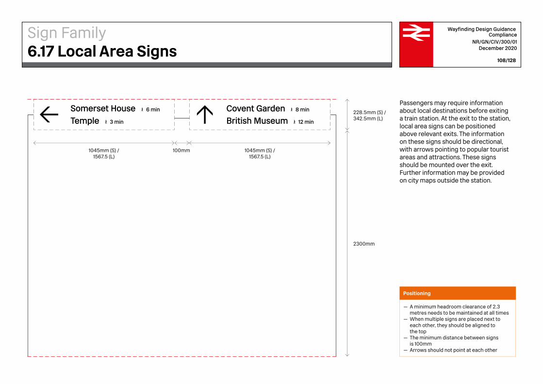
1045mm (S) /1567.5 (L)
1045mm (S) /1567.5 (L)
100mm
228.5mm (S) /342.5mm (L)
2300mm
TempleSomerset House
3 min
6 min
British MuseumCovent Garden
12 min
8 min
Wayfinding Design Guidance Compliance
NR/GN/CIV/300/01 December 2020
108/128
Passengers may require information about local destinations before exiting a train station. At the exit to the station, local area signs can be positioned above relevant exits. The information on these signs should be directional, with arrows pointing to popular tourist areas and attractions. These signs should be mounted over the exit. Further information may be provided on city maps outside the station.
Positioning
— A minimum headroom clearance of 2.3 metres needs to be maintained at all times— When multiple signs are placed next to
each other, they should be aligned to the top — The minimum distance between signs
is 100mm— Arrows should not point at each other
Sign Family6.17 Local Area Signs
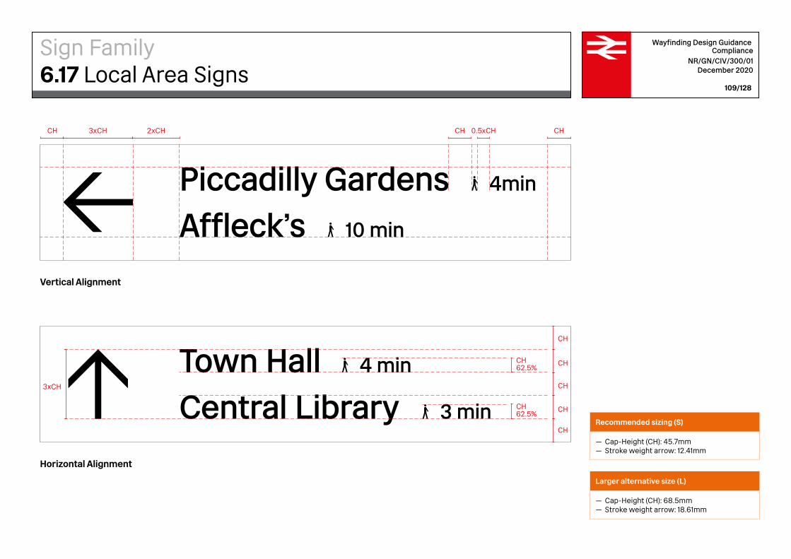
2xCH
Central LibraryTown Hall
3 min
4 minCH
CHCH62.5%
CH62.5%
CH
CH
CH
Piccadilly GardensAffleck’s 10 min
4min
3xCH
CH CH 0.5xCH CH3xCH
Wayfinding Design Guidance Compliance
NR/GN/CIV/300/01 December 2020
109/128
Vertical Alignment
Horizontal Alignment
Recommended sizing (S)
— Cap-Height (CH): 45.7mm— Stroke weight arrow: 12.41mm
Larger alternative size (L)
— Cap-Height (CH): 68.5mm — Stroke weight arrow: 18.61mm
Sign Family6.17 Local Area Signs
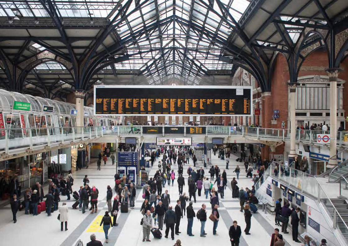

Wayfinding Design GuidanceIntegration with Other Systems 7
Customer Information Screen
Advertising
Wayfinding
Retail signage
Wayfinding Design Guidance Compliance
NR/GN/CIV/300/01 December 2020
112/128
Advertising materials, including posters, banners, mobile units and exhibition stands, present a potential conflict with wayfinding. Digital advertising material particularly with moving images can be distracting to many people with impairments and can be problematic for people who are neurodiverse. To check wayfinding is not compromised, a balance should be struck between maintaining the legibility of concourses and providing opportunities for retailers. Wayfinding signage should always take visual priority over other signs, and its view should always remain unobstructed from key decision points. Advertising cannot be combined with wayfinding on the same sign. Advertisements should not be placed in positions where they will visually obstruct, obscure, or distract from, station wayfinding or signage. Any adjacent advertising should have a reasonable level of illuminance in relation to station wayfinding.
Visual clutter
A key issue impairing the usability of stations from a passenger’s perspective is visual clutter. Standing on the concourse, passengers are bombarded with signs and messages from all angles with no easily discernible hierarchy or consistency.
Fig. 29 Cluttered Signage
Integration with Other Systems7.1 Advertising, Retail and Customer Information
user
Stamp
Customer Information Screen
Advertising
Wayfinding
Retail signage
Customer Information Screen
Advertising
Wayfinding
Retail signage
1
2
3
4
Wayfinding Design Guidance Compliance
NR/GN/CIV/300/01 December 2020
113/128
Aligned bands of information
The proposed solution of fluid visual bands of information helps to reduce clutter and create greater visual impact. Easily distinguishable levels for wayfinding, CIS, retail and advertising elements should increase the usability of the station and improve the passenger experience. Moreover, through consistent signage and by creating a strong visual identity, the wayfinding can stand out more than it does at present.
Fig. 30 Aligned Signage
Integration with Other Systems7.1 Advertising, Retail and Customer Information

The mode of transport that is most dominant at each station will vary depending upon its location. In many cases, the default choice of transport for travel to and from rail stations is by car. 58% of CO2 emissions in Britain come from cars, and each year this figure continues to rise. Therefore, it is beneficial to encourage staff and passengers to use sustainable forms of transportation and become less dependent on cars.
Walk
Car
Tram / Underground
Bus / Coach
Taxi
Bike
Wayfinding Design Guidance Compliance
NR/GN/CIV/300/01 December 2020
114/128
Operators
Operators produce printed timetables and route maps. These are available from company offices, Travel Centres, or can be ordered online from bus and tram company websites.
Local councils / PTEs
Most councils and all PTEs have detailed public transport information available on their websites.
Posters
Many local authorities and/or bus operators supply National Rail stations with timetable literature and/or posters about local bus services.
Interchange signage
Clear and easy to follow signage through the station, directing passengers from train to bus, is becoming more commonplace.
Timetable displays
Local authorities and local bus operators provide timetable information about bus services at most local bus stops.
Integration with Other Systems7.2 Onward Transportation Information
Leaflet Information point
Visitor information desk
Route 1 & stop
Route 2 & stop
Direction of travel
Route 2 peak time only
Free bus services
Fare payable
National Rail
Metrolink tram
Bus station
Coach station
Wayfinding Design Guidance Compliance
NR/GN/CIV/300/01 December 2020
115/128
Very few rail passenger journeys actually start or finish at rail stations. Passengers live and work elsewhere and need to travel to and from rail stations by other forms of transport. Railway stations are therefore interchanges, where passengers change between various modes of transport, not just start or finish train journeys.
Passenger research has shown that across Britain 45% of National Rail passengers walk to the station. Therefore, over half of them use another form of transport (bus, bike, car or taxi) to get to the station.
Onward transportation information
The onward transportation map above is an example of an in-station guide which visitors can use when looking for further information on public transport options. Visitor information desks should provide information on onward transportation and further (repeated) information such as bus times should be placed by the exits and bus stops. Additionally, onward transport information should include train times, car rentals and taxi points.
Public Transport Connections
Great Manchester Connected Wayfinding 2018. Public Transport Map, by Spaceagency.
Integration with Other Systems7.2 Onward Transportation Information
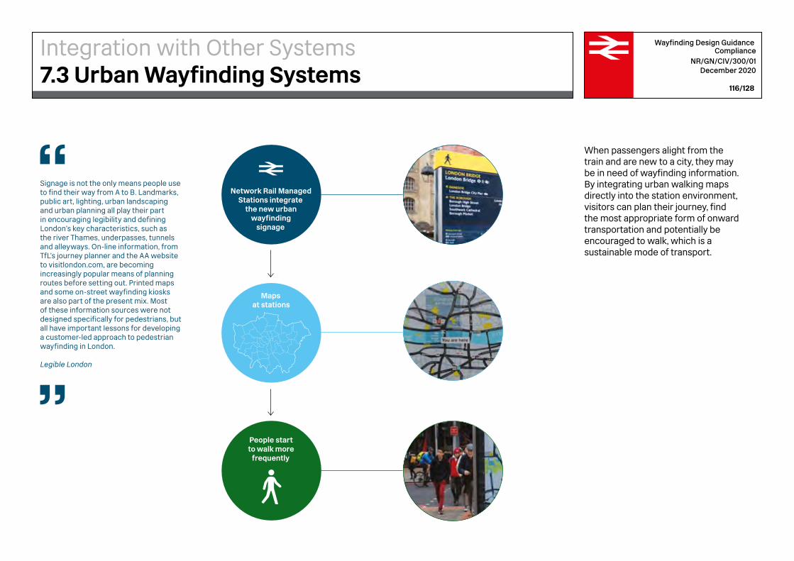
Signage is not the only means people use to find their way from A to B. Landmarks, public art, lighting, urban landscaping and urban planning all play their part in encouraging legibility and defining London’s key characteristics, such as the river Thames, underpasses, tunnels and alleyways. On-line information, from TfL’s journey planner and the AA website to visitlondon.com, are becoming increasingly popular means of planning routes before setting out. Printed maps and some on-street wayfinding kiosks are also part of the present mix. Most of these information sources were not designed specifically for pedestrians, but all have important lessons for developing a customer-led approach to pedestrian wayfinding in London.
Legible London
Network Rail Managed Stations integrate
the new urban wayfinding
signage
People start to walk more
frequently
Maps at stations
Wayfinding Design Guidance Compliance
NR/GN/CIV/300/01 December 2020
116/128
When passengers alight from the train and are new to a city, they may be in need of wayfinding information. By integrating urban walking maps directly into the station environment, visitors can plan their journey, find the most appropriate form of onward transportation and potentially be encouraged to walk, which is a sustainable mode of transport.
Integration with Other Systems7.3 Urban Wayfinding Systems

Example of In-Station Urban Wayfinding Integration
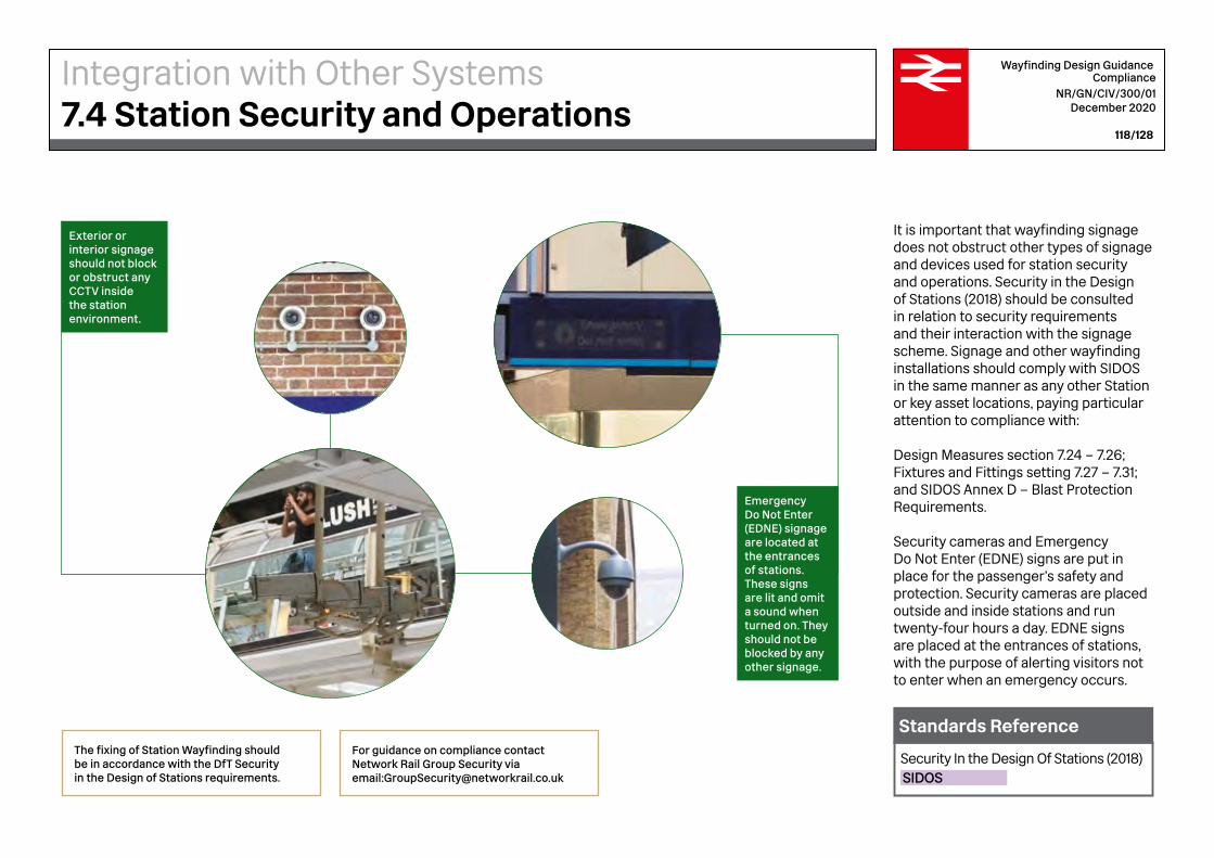
Exterior or interior signage should not block or obstruct any CCTV inside the station environment.
Emergency Do Not Enter (EDNE) signage are located at the entrances of stations. These signs are lit and omit a sound when turned on. They should not be blocked by any other signage.
Wayfinding Design Guidance Compliance
NR/GN/CIV/300/01 December 2020
118/128
It is important that wayfinding signage does not obstruct other types of signage and devices used for station security and operations. Security in the Design of Stations (2018) should be consulted in relation to security requirements and their interaction with the signage scheme. Signage and other wayfinding installations should comply with SIDOS in the same manner as any other Station or key asset locations, paying particular attention to compliance with:
Design Measures section 7.24 – 7.26;Fixtures and Fittings setting 7.27 – 7.31; and SIDOS Annex D – Blast Protection Requirements.
Security cameras and Emergency Do Not Enter (EDNE) signs are put in place for the passenger’s safety and protection. Security cameras are placed outside and inside stations and run twenty-four hours a day. EDNE signs are placed at the entrances of stations, with the purpose of alerting visitors not to enter when an emergency occurs.
The fixing of Station Wayfinding should be in accordance with the DfT Security in the Design of Stations requirements.
For guidance on compliance contact Network Rail Group Security via email:[email protected]
Security In the Design Of Stations (2018)SIDOS
Standards Reference
Integration with Other Systems7.4 Station Security and Operations

Network Rail’s digital signage is currently not fully integrated with the other wayfinding elements in the station environment. Moving forward, it is important that digital signage is implemented according to the NR Wayfinding Design Guidance, using the correct typography, alignment, scale and colour palette.
Please refer to NR/L2/TEL/30114, Specification for the Maintenance of CIS control equipment, for additional information on CIS screens.
Wayfinding Design Guidance Compliance
NR/GN/CIV/300/01 December 2020
119/128
Digital signage is increasingly used for station wayfinding and should be gradually integrated with other wayfinding elements. The benefits of using digital wayfinding include the flexibility to reconfigure wayfindingmessaging, the seamless combination of customer information with wayfinding and the ease of connecting wayfinding information with the Network Rail customer information database. As the provision of digital information in spaces becomes more prevalent, screen usability factors should be considered. Digital screens, particularly touch screens, can be inaccessible to people with vision impairments and may be inaccessible to wheelchair users and people of short stature if the touch area is out of reach. New technologies allow the usable portion of a touchscreen to be interactively lowered to suit the height of the user. This allows people of different heights and in wheelchairs to customise the working area to their height, if configured properly. These digital touchpoints can also include audio output and the ability to increase font size and screen contrast. It is important that digital advertising is not combined with the wayfinding information, and is always visually separated.
Integration with Other Systems7.5 Digital Signage
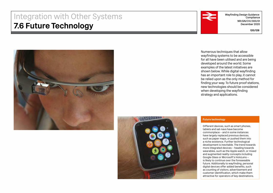
Wayfinding Design Guidance Compliance
NR/GN/CIV/300/01 December 2020
120/128
Numerous techniques that allow wayfinding systems to be accessible for all have been utilised and are being developed around the world. Some examples of the latest initiatives are shown below. While digital wayfinding has an important role to play, it cannot be relied upon as the only method for finding your way. To future proof stations, new technologies should be considered when developing the wayfinding strategy and applications.
Future technology
Different devices, such as smart phones, tablets and sat-navs have become commonplace – and in some instances have largely replaced previous devices, such as paper maps, or pushed them into a niche existence. Further technological development is inevitable. The trend towards more integrated devices – heading towards wearables, such as the Apple watch, or mixed and augmented reality concepts including Google Glass or Microsoft’s HoloLens – is likely to continue over the foreseeable future. Additionally to wayfinding, personal digital devices offer added benefits, such as counting of visitors, advertisement and customer identification, which make them attractive for operators of key destinations.
Integration with Other Systems7.6 Future Technology

Wayfinding Design Guidance Compliance
NR/GN/CIV/300/01 December 2020
121/128
iBeacon
iBeacons can be used to provide information for people with hearing impairments (as well as other travellers). iBeacons are a small, inexpensive product that can be integrated into wayfinding. They transmit a signal to a person’s smartphone or other wearable technology that can provide a description of the information on an adjacent sign or even of the surrounding environment.
Next generation
Next generation wayfinding research and development focuses on user experience. Augmented reality is technology that allows for a digitally enhanced view of the world, connecting the user with an informational content overlay on the environment. With the camera and sensors in a smartphone, or with a holographic glass running on Intel Core processors, AR adds layers of digital information – videos, photos, sounds – directly onto the world around us.
Integration with Other Systems7.6 Future Technology
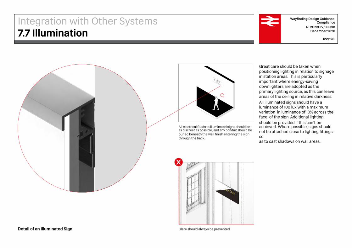
All electrical feeds to illuminated signs should be as discreet as possible, and any conduit should be buried beneath the wall finish entering the sign through the back.
Glare should always be prevented
Wayfinding Design Guidance Compliance
NR/GN/CIV/300/01 December 2020
122/128
Great care should be taken when positioning lighting in relation to signage in station areas. This is particularly important where energy-saving downlighters are adopted as the primary lighting source, as this can leave areas of the ceiling in relative darkness. All illuminated signs should have a luminance of 100 lux with a maximum variation in luminance of 10% across the face of the sign. Additional lighting should be provided if this can’t be achieved. Where possible, signs should not be attached close to lighting fittings so as to cast shadows on wall areas.
Detail of an Illuminated Sign
Integration with Other Systems7.7 Illumination
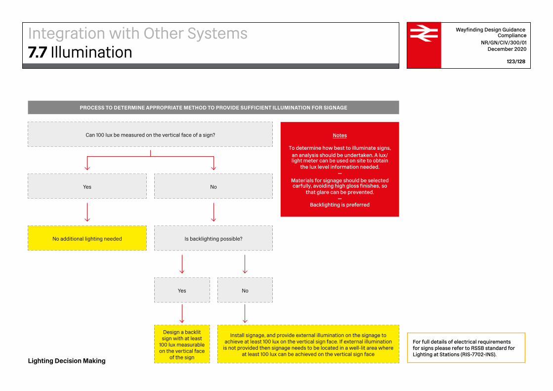
Install signage, and provide external illumination on the signage to achieve at least 100 lux on the vertical sign face. If external illumination
is not provided then signage needs to be located in a well-lit area where at least 100 lux can be achieved on the vertical sign face
PROCESS TO DETERMINE APPROPRIATE METHOD TO PROVIDE SUFFICIENT ILLUMINATION FOR SIGNAGE
Can 100 lux be measured on the vertical face of a sign?
Yes
Design a backlit sign with at least
100 lux measurable on the vertical face
of the sign
Is backlighting possible?
No
Notes
To determine how best to illuminate signs, an analysis should be undertaken. A lux/light meter can be used on site to obtain
the lux level information needed.—
Materials for signage should be selected carfully, avoiding high gloss finishes, so
that glare can be prevented.—
Backlighting is preferred
Yes
No additional lighting needed
No
Wayfinding Design Guidance Compliance
NR/GN/CIV/300/01 December 2020
123/128
Lighting Decision Making
For full details of electrical requirements for signs please refer to RSSB standard for Lighting at Stations (RIS-7702-INS).
Integration with Other Systems7.7 Illumination
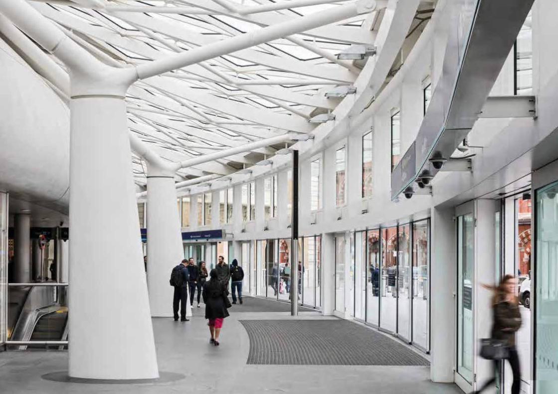

AWayfinding Design GuidanceAppendix A
Reference Documentation
Wayfinding Design Guidance Compliance
NR/GN/CIV/300/01 December 2020
126/128
Sign Design Guide – A guide to Inclusive signage. Sign Design Society (2004)
Further reading
Crossrail, RIBA Stage E - C100 Wayfinding, signage, advertising and public art design guideline. (2010). 1st ed. London: Crossrail Limited.
Legible London Evaluation 2013/14 Report. (2014). [PDF] steer davies gleave.
Legible London Product Range. (2019). [PDF] Transport for London.
Legible London Yellow Book A prototype wayfinding system for London. (2007). 1st ed. Transport for London.
London Gatwick Airport (2019). London Gatwick Airport New Supplementary Sign Standard. London: Gatwick Airport Ltd.
Rail Delivery Group Wayfinding Best Practice Guide (2018)
British StandardsBS 8300-1-2018 Design of an Accessible and Inclusive Built Environment – External
BS 8300-2-2018 Design of an Accessible and Inclusive Built Environment – Internal
Wayfinding at Stations: A Good Practice Guide RSSB T321 (2006)
London Underground Signs Manual – Issue 4
RIBA Plan of Work 2020. (2020). [PDF] RIBA. Station Design Principles for Network Rail. (2019).
Transport for London (2004). Docklands Light Railway Signs Standard. 2nd ed. London: Transport for London.
BooksSpaceagency. (2018). The Spaceagency Guide To Wayfinding. [Hong Kong, China]: Artpower International Publishing Co., Ltd.
Design of buildings and their approaches to meet the needs of disabled people : code of practice. (2001). London: BSI.
Equality Act
PRM TSI, Persons with Reduced Mobility -Technical Specification for Interoperability
Design Standards for Accessible Railway Stations (DfT 2015) – A joint Code of Practice by the Department for Transport and Transport Scotland
Department for Transport-Security in the Design of Stations (SIDOS) Recommended Best Practice (2018)
Inclusive Mobility – A guide to best practice on access to pedestrian and transport infrastructure (DfT 2005)
Network Rail
NR/L2/CIV/003 Engineering and Architectural Assurance of Building and Civil Engineering Works
NR/L2/CIV/003/F004 Architectural and Layout Acceptance
NR/L2/CIV/150 Station Wayfinding design and assurance procedure
Appendix A Referenced Standards and Guidance
Designs which claim compliance with relevant standards are expected to be able to justify any course of action that deviates from recommendations.
For dated references, only the edition cited applies. For undated references, the latest edition of the referenced document (including any amendments) applies.
BWayfinding Design GuidanceAppendix B
Acknowledgements
Image Credits
Network Rail8 (Manchester Piccadilly), 17 (London Bridge), 19 (Leeds), 91 (London Bridge)
Spaceagency16 (Waterloo), 37 (Liverpool Street), 116 (London Bridge), 117 (London Bridge), 118 (London Bridge and Liverpool Street), 119 (St Pancras International Station, Farringdon Station, London Bridge Station, Liverpool Street Station),
Adam Parker2 (King’s Cross), 12 (King’s Cross), 14 (King’s Cross), 22 (Manchester Piccadilly), 34 (Birmingham New Street) 124 (King’s Cross)
Ralph Hodgson 110 (Liverpool Street)
Others120 Google Glass (www.siliconbeat.com)120 Apple Watch (www.techradar.com.uk)121 Dispositivo Beacon (es.wikipedia.org)121 Next Generation Technology: Aihong, L.
Illustration CreditsAll illustrations and diagrams by Spaceagency.
This document was written and produced on behalf of Network Rail by Spaceagency in partnership with Weston Williamson + Partners.
Wayfinding Design Guidance Compliance
NR/GN/CIV/300/01 December 2020
128/128
Appendix BAcknowledgements

300/


![[2016] JMSC Civ. 221 - Supreme Court of Jamaica](https://static.fdokumen.com/doc/165x107/63245e343a06c6d45f0688d3/2016-jmsc-civ-221-supreme-court-of-jamaica.jpg)
![[2020] JMSC Civ 12 - Supreme Court of Jamaica](https://static.fdokumen.com/doc/165x107/6332a23a5006b418e20b2006/2020-jmsc-civ-12-supreme-court-of-jamaica.jpg)