ADDRESSING WAYFINDING AT BUMRUNGRAD HOSPITAL
156
Project Number: SWP-BKK2 ADDRESSING WAYFINDING AT BUMRUNGRAD HOSPITAL An Interactive Qualifying Project Report Submitted to the Faculty of the WORCESTER POLYTECHNIC INSTITUTE in partial fulfillment of the requirements for the Degree of Bachelor of Science by Jennifer M. Mclaughlin ___ Brendan B. McNeil Sarah E. Sebald In cooperation with Bumrungrad Hospital, Bangkok, Thailand. Date: March 1, 2005 Professor Steve Pierson, Co-Advisor Professor Rob Krueger, Co-Advisor
-
Upload
khangminh22 -
Category
Documents
-
view
1 -
download
0
Transcript of ADDRESSING WAYFINDING AT BUMRUNGRAD HOSPITAL

Project Number: SWP-BKK2
ADDRESSING WAYFINDING AT BUMRUNGRAD HOSPITAL
An Interactive Qualifying Project Report
Submitted to the Faculty
of the
WORCESTER POLYTECHNIC INSTITUTE
in partial fulfillment of the requirements for the
Degree of Bachelor of Science
by
Jennifer M. Mclaughlin
___ Brendan B. McNeil
Sarah E. Sebald
In cooperation with Bumrungrad Hospital, Bangkok, Thailand.
Date: March 1, 2005
Professor Steve Pierson, Co-Advisor
Professor Rob Krueger, Co-Advisor
ii
Abstract The internationally accredited Bumrungrad Hospital (BH), located in Bangkok,
Thailand, sponsored this project in order to develop fresh and unique ideas for the
revamping of their interior and exterior wayfinding system. We determined wayfinding
criteria and findings specific to BH through interviews, surveys, mock tests, observations,
and email correspondence. Recommendations were made for BH’s multiple facility
complex, which addresses both the current and expected wayfinding problems, with an
emphasis on technology.

iii
Acknowledgements We would like to thank the following people for their effort in helping us make our
project a success:
• Bumrungrad Hospital (BH) for sponsoring our project.
• Dennis Brown, our liaison and at BH, for assisting our project with daily guidance
and aiding us in setting up our surveys and mock test.
• Edgar Hernandez, the Division Director at BH, for his guidance and help with
setting up interviews and surveys.
• Khun Wanpisut, Customer Service Manager at BH, for ensuring that our surveys
were distributed and taken by several employees.
• All of the BH staff for their support and generosity.
• All of our interviewees, mock test volunteers and survey respondents for their
valuable feedback.
• Khun Apple and Khun Orm for their assistance in scheduling meetings and
interviews as well as providing us with several office supplies.
• Professor Krueger and Professor Pierson for their continued feedback and
guidance towards project completion.
• Aacaan Supawan, for providing us with housing and the use of the Chemistry
building and internet at Chulalongkorn University.
• Professor Demetry and Professor Vaz for finding our project.
We could not have completed our project successfully without all the help and support
from these people. Thank you very much!

iv
Table of Contents
Abstract.......................................................................................................... ii Acknowledgements ...................................................................................... iii Table of Contents ......................................................................................... iv Table of Figures ........................................................................................... vi Table of Tables ............................................................................................ vii Findings and Discussion:............................................................................ vii Executive Summary................................................................................... viii 1.0 Introduction............................................................................................. 1 2.0 Background ............................................................................................. 3
2.1 Bumrungrad Hospital............................................................................................. 3 2.1.1 Bumrungrad Hospital’s Exterior Wayfinding System................................. 4 2.1.2 Bumrungrad Hospital’s Interior Wayfinding System.................................. 6 2.1.3 Patient Services ................................................................................................ 7 2.1.4 Hospital 2000 .................................................................................................... 8
2.2 The Purpose of Signage .......................................................................................... 9 2.2.1 Direction............................................................................................................ 9 2.2.2 Identification .................................................................................................. 11 2.2.3 Information..................................................................................................... 13
2.3 Types of Signage.................................................................................................... 13 2.3.1 Static................................................................................................................ 14 2.3.2 Existing Technology....................................................................................... 14 2.3.3 Cutting-Edge Technology.............................................................................. 16
2.4 Design Considerations .......................................................................................... 17 2.4.1 Language Barrier........................................................................................... 18 2.4.2 Symbols and Color......................................................................................... 18 2.4.3 Visibility for the Disabled.............................................................................. 19
2.5 Conclusion ............................................................................................................. 19 3.0 Methodology .......................................................................................... 20
3.1 Prioritizing and Evaluating Project Scope ......................................................... 20 3.1.1 Determining Decision Points......................................................................... 21 3.1.2 Determining High Traffic Areas................................................................... 22
3.2 Assessing Current Wayfinding System ............................................................... 22 3.2.1 Interviews........................................................................................................ 23 3.2.2 Mock Test and Observations ........................................................................ 24 3.2.3 Surveys and TQM.......................................................................................... 25
3.3 Researching Wayfinding Criteria and Technology ........................................... 26 3.3.1 Patient and Administration Wayfinding Criteria....................................... 27 3.3.2 Researching Wayfinding Technology .......................................................... 28
3.4 Meeting Hospital Criteria .................................................................................... 30 3.5 Summary................................................................................................................ 32
4.0 Findings and Discussion....................................................................... 33 4.1 Establishing Wayfinding Criteria ....................................................................... 33

v
4.1.1 Visibility .......................................................................................................... 34 4.1.2 Flexibility ........................................................................................................ 39 4.1.3 Ease of Use ...................................................................................................... 41 4.1.4 Displaying Proper Amount of Information ................................................. 45 4.1.5 Appropriateness to Location......................................................................... 47 4.1.6 Reliability........................................................................................................ 49 4.1.7 Consistency ..................................................................................................... 49 4.1.8 Feasibility........................................................................................................ 51
4.2 Recommendations for Bumrungrad Hospital’s Wayfinding System............... 51 4.2.1 Car to Hospital Entrance .............................................................................. 52 4.2.2 Hospital Entrance .......................................................................................... 54 4.2.3 Main Lobby .................................................................................................... 56 4.2.4 Mezzanine-Level Entrance and Lobby ........................................................ 58 4.2.5 Elevator Lobby............................................................................................... 60 4.2.6 Escalators........................................................................................................ 62 4.2.7 Hallway Intersections .................................................................................... 63 4.2.8 Department Identification............................................................................. 64
5.0 Summary................................................................................................ 66 Appendices................................................................................................... 69
A1: Observations of Hospitals and Hotels ................................................................ 69 A2-A7: Mock Test Survey and Results ..................................................................... 72 A8-A13: Employee Survey and Results .................................................................... 86 A14-A18: Language Survey and Results .................................................................. 93 A19-A25: Administrative Interviews ........................................................................ 98 A26: TQM Summary ................................................................................................ 115 A27-A31: Sample Email sent out to Companies .................................................... 116 A32: Technology Features........................................................................................ 125 A33: Technology Summary...................................................................................... 126 A34-A39: Pros and Cons of Technologies............................................................... 127 A40: Features Meeting Hospital Criteria ............................................................... 133 A41: Display Comparison ........................................................................................ 134 A42: Technologies ranking at Each Decision Point ............................................... 135 A43: Telesys Minutes ................................................................................................ 138 A44: Shrimp Minutes ............................................................................................... 140 A45: Infrastructure Minutes.................................................................................... 141 A46: Talking Signs Contact Information ............................................................... 142

vi
Table of Figures
Executive Summary: Figure i: Recommended Technologies ............................................................................... x Background: Figure 2.1: Exterior Signs at Bumrungrad Hospital ........................................................... 6 Findings and Discussion: Figure 4.1: Exterior Signs at Conrad Hotel ...................................................................... 35 Figure 4.2: Exterior Signs at Bumrungrad Hospital ......................................................... 36 Figure 4.3: Helpfulness of Signs During the Mock Test .................................................. 38 Figure 4.4: Interior Signs at Bumrungrad Hospital .......................................................... 38 Figure 4.5: Shangri-La Hotel’s Digital Signage System .................................................. 40 Figure 4.6: One of three screens displayed on Shangri-La’s rotating main directory ...... 42 Figure 4.7: Directions that are Given Most Frequently by Customer Service.................. 42 Figure 4.8: Mock Test Volunteer Complaints .................................................................. 43 Figure 4.9: Languages Patients Would Like to See on Signs at BH................................. 44 Figure 4.10: Mock Test Survey Responses....................................................................... 46 Figure 4.11: Display Case of the Main Directory at the Shangri-La Hotel ...................... 48 Figure 4.12: Picture in the Parking Garage of Bumrungrad Hospital............................... 53 Figure 4.13: Picture of the Hospital Entrance................................................................... 55 Figure 4.14: Picture of a Poorly Lit Sign at Bumrungrad Hospital .................................. 56 Figure 4.15: Picture of a Where a Plasma Sign Could be Places ..................................... 59 Figure 4.16: Picture of the Mezzanine Level Connecting Hallways ................................ 60 Summary: Figure 4.1: Electronic Parking System at Baltimore Washington International Airport .. 67

vii
Table of Tables
Methodology: Table 3.1: Technology Features........................................................................................ 30 Table 3.2: Example Table Showing the Recommendation for Elevator Lobbies............. 31 Findings and Discussion: Table 4.1: Recommended Technology for Car to Hospital Entrance............................... 52 Table 4.2: Recommended Technology for Hospital Entrance.......................................... 54 Table 4.3: Recommended Technology for Main Lobby................................................... 57 Table 4.4: Recommended Technology for Mezzanine Level Entrance............................ 59 Table 4.5: Recommended Technology for Elevator Lobby.............................................. 61 Table 4.6: Recommended Technology for Escalators ...................................................... 62 Table 4.7: Recommended Technology for Hallway Intersections.................................... 63 Table 4.8: Recommended Technology for Department Identification ............................. 64

viii
Executive Summary Bumrungrad Hospital (BH), located in the heart of Bangkok, Thailand, is
considered the largest private hospital in Southeast Asia. The facility is an international
hospital, treating patients from over 140 countries for routine medical care as well as
elective surgery. Over the next five to seven years, BH expects its outpatient and
inpatient numbers to double, exceeding the current building and car park capacity. To
accommodate this, BH is adding a fourth building to its complex. The building will add
parking spaces and additional beds, gradually spreading outpatient and inpatient
department functions from one to three buildings. This change will cause confusion for
repeat patients as well as the need for constant updates in the wayfinding system. The
new parking garage will only add to the confusion, forcing the patient to decide the
correct parking garage as well as how to get to their destinations via the twelve new
entrances. BH plans to handle its future wayfinding problems by completely replacing its
current system with a more advanced and flexible one. To aid BH in doing this, the goal
of our project was to provide recommendations for the hospital’s interior and exterior
wayfinding system, with an emphasis on technology.
In order to provide recommendations, four objectives were established. We first
evaluated and prioritized exactly what aspects of signage and wayfinding would be in the
scope of our project. We then assessed BH’s current wayfinding system and determined
its pros and cons. Our third objective was researching existing and upcoming wayfinding
technologies as well as determining different wayfinding and signage criteria.
This led to our final objective: evaluating which wayfinding systems would best fit the
hospital’s needs.
When narrowing the scope of our project, we chose to concentrate on the type of
technology and placement, rather than design aspects. We were able to narrow the
number of decision points1 in the hospital into nine categories. Categorizing decision
points led to consistent technologies being recommended throughout the hospital, which
aids in patient understanding and usage of the hospital wayfinding system.
1 A decision point is any area where a person is forced to decide which direction they will travel in order to reach their final destination.

ix
The existing signage system at BH was evaluated by performing observations,
mock tests, surveys, interviews, and an analysis of complaints given by patients. Our
recommendations of technologies had to fulfill the needs of the patients, departments, and
administration in order for the new system to be successful. This was done by
developing the hospital criteria as well as researching wayfinding technologies that could
be used. Searching for wayfinding technologies was done using the World Wide Web
and observing several wayfinding systems currently in use in Bangkok. A language
survey of international patients, employee surveys, department head and administration
interviews were used. Comparing the decision points at Bumrungrad Hospital, Bangkok
Hospital, Conrad Hotel, and the Shangri-La Hotel further developed the criteria. At each
type of decision point, the wayfinding system was evaluated for evidence of best
practices via our field form checklist, such as large directional signs, good contrast, large
font size, and multi-lingual signs in low-traffic areas. These criteria, in order of
importance were:
1. Visibility – Signs should be both clear of physical obstructions and designed to be readable (i.e. good contrast, large font size, etc.)
2. Flexibility – Signs should be able to accommodate changes to the hospital layout throughout the hospital expansion.
3. Ease of Use – Signage should be easy to use and accessible to all patients and visitors, regardless of language ability and technical experience.
4. Proper Amount of Information – Information provided should ease the flow of traffic while getting people to their destinations quickly and easily.
5. Appropriateness to Location – Signs should serve the needs of a user in a specific location, with regards to traffic, and fit in with the surroundings, etc.
6. Consistency – A consistent design should be followed throughout a signage system, both reinforcing a brand and allowing visitors to find their way more easily.
7. Reliability – Signage should be durable and easy to upgrade, have low power consumption, and a long life expectancy.
8. Feasibility – Signage should be available in Thailand, cost effective, and reasonably secure against damage.
Using our criteria and the best practices of the industry, we gave each criterion a
score multiplier, then assigned each type of signage (Interactive Kiosk, LCD screen,
Plasma Screen, Static Sign) a score from one to four for each criterion, depending on how
well the signs fit the needs. The technology with the highest end score was

x
recommended for installation by the hospital, as seen in Figure I. The graph below
displays the scores received by the different technologies at each decision point.
0
20
40
60
80
100
120
140
160
180
Car t
o Hos
pital
Entra
nce
Hospit
al En
tranc
e
Mezza
nine
Main Lo
bby
Eleva
tor Lo
bby
Esca
lator
Hallway
Int.
Depar
tmen
t Ide
nt.
Decision Point
Scor
e
Interactive Kiosk
LCD Signage
Plasma Signage
Static Signs
Figure I: Recommended Technologies
Due to project limitations, we were not able to study areas of wayfinding that did
not relate directly to directional signage. However, we have observed several areas
which merit further study, the first being building designations. Wayfinding at Bangkok
Hospital was spread between the facility’s multiple buildings, but giving each building a
letter, which was marked on all signs, alleviated problems. Another area needing study is
the numbering of floors between buildings. Floor levels currently do not match up. For
example the third floor of the BH Residence building is connected by a walkway to the
Mezzanine level of the BH hospital building. This can cause confusion for patients and
visitors. Color schemes should be evaluated for differentiating between outpatient and
inpatient functions. Finally, an electronic parking management system should be
considered, which would mark free and occupied spaces and reduce traffic caused by cars
circling for parking spaces.
Our recommendations for the future interior and exterior wayfinding system at
BH will be able to accommodate the hospital’s needs as it expands over the coming
xi
years. BH patients and visitors will have an improved ability to reach their final
destinations without the help of porters and other hospital personnel, and the image of the
hospital as a state-of-the-art facility will be improved as a result. With its expansion to
four buildings, BH has a unique opportunity to design a brand new wayfinding system
customized for its needs. This plan for the hospital systems will fill those needs while
making each patient’s visit more enjoyable.

1.0 Introduction With the world’s healthcare business becoming more competitive each year, it
becomes harder to maintain the world-class care expected of hospitals. Hospitals seek
greater enrollment in fulfilling the needs and wants of their patients and consistently look
to expand their capabilities and capacities in order to both provide better care and remain
competitive (Blanchard, 2004). Large healthcare facilities are built over long periods of
time, causing inconsistencies in department locations and confusing corridors with
outdated signs. This leads to poor signage, incoherent room numbering, and poor
wayfinding tools that don’t support the behavioral needs of their customers (Carpman
Grant Associates, 2004c). A hospital with poor wayfinding tools may have a harder time
maintaining with competitors around the world. In the case of Bumrungrad Hospital
(BH), the top list of competitors includes the Parkway Group in Singapore, Apollo
Hospitals in India, and the Mayo Clinic located in the United States. Each facility holds
some level of distinction in the attempt to distinguish itself from each other. The
Parkway Clinic is the largest healthcare group in Asia; Apollo holds the spot for the
largest private hospital group in Asia, and the Mayo Clinic has America’s largest
transplantation program.2
BH, located in the heart of Bangkok, Thailand, strives to separate itself from the
rest of the field. BH’s current wayfinding system has several flaws and in order to satisfy
current patients and attract new ones, a new wayfinding system must be introduced. The
signage currently in place is in both English and Thai, causing inconveniences for the
rapidly increasing international patient population within the hospital. BH’s planned
expansion into four buildings within the next 5-7 years is expected to double its
out/inpatient volume. This expansion is expected to cause even more wayfinding
problems, due to an increase of entrances from two to fourteen. A new layout of
departments will necessitate traffic between the buildings. Unfortunately, due to there
only being one level of connection on the Mezzanine floor, there is a large need to
eliminate aimless wandering to lesson the amount of congestion. One of the greatest
problems BH will experience during the transition period is redirecting patients. The
2 The information for each of these hospitals was found on the hospital web pages. The websites can be found on our reference page.

2
moving of departments will cause confusion when redirecting regular patients to
unfamiliar areas while not having to completely replace the signage system. If not
handled properly, wayfinding confusion may lead to loss of patients to competing
hospitals.
BH has taken numerous steps to alleviate some of the existing and expected
wayfinding concerns. The first major step was taken during August 2004, when a traffic
study of the hospital complex was completed. The evaluation provided suggestions for
traffic routing and helped to reiterate that exterior signage is an existing problem (Motor
Vehicle Association, 2004). Exterior signage is not the only problem with the
wayfinding system. In order to deal with the interior wayfinding confusions, the
concierge and porter services have been adapted to escort confused and disoriented
patients to their destinations. It is the hope that the new wayfinding system will eliminate
some of the reliance on the escorting service. To meet the need of determining a better
wayfinding system, BH developed a design brief to distribute to signage companies
throughout Thailand. It lists current and future signage needs that will aid in finding a
permanent wayfinding solution (Bumrungrad Hospital, 2004). The goal of this project is
to provide recommendations for BH’s interior and exterior wayfinding system, with an
emphasis on technology.
In order to achieve this goal, our team had to first determine several criteria that
BH should meet. Gaining knowledge of the most recent and upcoming technologies will
assist BH when hiring a signage consultant. Creativity in this area is essential for BH to
maintain its image as a state-of-the-art facility (Toral, 2005). Each party within the
hospital has specific criteria for signage, which must be determined.
Our main objectives will indicate how signage and technology can aid in directing
pedestrian flow. These research questions include determining the pros and cons of
existing and upcoming signage technologies, as well as the different criteria of patients,
departments and administrators. The collected data will provide the team with a solid
platform on which recommendations for the use of technology can be made. The logic
obtained can be directly applied to the new building upon completion. Utilization of our
recommendations will create a better environment for all parties. With a better, more
efficient wayfinding system, BH will remain ahead of its growing number of competitors.

3
2.0 Background In a visitor-oriented facility such as a hospital, signage plays a key role in
expediting horizontal and vertical flow. Hospital employees are expected to know where
they should go throughout the day in order to get work done, but this cannot be expected
of patients and visitors. Patients should be able to quickly and easily determine where
they need to go. As on a highway, one slow individual can slow the progress of others
around him or her. People often move slowly because of the unfamiliarity of
surroundings. This issue can be addressed by effective signage.
When designing a building directory for a hospital, two factors must be
considered: aesthetics and information. Without information, the sign is worthless, but if
a sign does not clearly portray the information, the patient will not understand what is
provided. Wright (2001) found that signage is often a neglected aspect of hospital
design. In his study, which included wayfinding strategies in relation to signage, he
found that signage systems are only developed superficially; never beyond the obvious
conclusion that something is wrong. Often, the signage system of a building is not
updated as the building undergoes expansion or renovations, resulting in a confusing
assortment of mismatched and outdated signs. In these situations, it is often necessary to
start over with a brand new system.
Regardless of the system incorporated into a hospital, a directory system is
necessary, along with a simple, easy to follow system of signs for patients and visitors to
use as guides. Patients should not need to ask for directions more than once in their visit
(Fetzer, 2004). Increased knowledge of the building will make pedestrians more
comfortable and eliminate excess wandering. The following sections will discuss
different considerations that must be taken into account when designing a new signage
system for BH. This includes the entire process of patient transportation, both entering
the hospital from the exterior and finding specific areas once inside.
2.1 Bumrungrad Hospital Founded in 1980, Bumrungrad Hospital (BH) is the largest privately owned
hospital in Southeast Asia and is located in the heart of Bangkok, Thailand. It is
considered to be one of the top international hospitals in the world, competing with

4
hospitals such as the Mayo Clinic located in the United States. Bumrungrad treats over
1,000,000 patients yearly, of which, 350,000 are international patients coming from over
154 countries (Bumrungrad Hospital, 2004). Patients come primarily for tertiary medical
care, which is defined as “specialized consultative care, usually on referral from primary
or secondary medical care personnel,” (John Hopkins, 2004). Due to language barriers
caused by the large number of international patients, the hospital employs over six
hundred internationally trained doctors and dentists, as well as a large number of
translators.
BH is managed by an American-led international management team and is the
first hospital in Asia to earn all four quality awards available to Thai hospitals: ISO
9001:2000, ISO 14001, Thai Hospital Accreditation, and the Joint Commission
International Accreditation (BH, 2004). Currently there are over 140 outpatient clinics
with a capacity of three thousand patients per day. The one million square foot, twelve-
story building contains 554 inpatient beds (Global Care Solutions, 2005). Patients seen at
BH tend to come from the upper middle socio-economic class and have relatively high
degrees of education (BH, 2004). They demand high quality service from the hospital,
and are willing to travel to other parts of the world if their needs are not met.
BH needs an improved wayfinding system both for the present and future to
accommodate its gradual expansion to four buildings over the next five to seven years.
The hospital must have a system that is flexible and easy to update by hospital personnel,
while still easy to understand by the visiting patients. During our first week at
Bumrungrad Hospital, learning our way around, we were able to pick out a few of the
more obvious problems with the existing wayfinding system in place. The following
sections will provide more information as to some of the current problems in place at BH
as well as some of the services provided.
2.1.1 Bumrungrad Hospital’s Exterior Wayfinding System
Exterior signage and wayfinding begins with the signs one sees from the highway
or main road and continues until a foot is placed safely within the correct building that
contains the final destination (SignDesign, 2005). Proper signage is needed to get a
patient on the facility campus and quickly into the correct building. Exterior wayfinding

5
systems are the first and last things seen and used by visiting patrons. First and last
impressions are very important in keeping business coming back.
The exterior signage at BH leaves much to be desired. A main identification sign
is located at the top of their main building, which can only be seen from above street
level. A person can see this sign when coming in from the sky train, which is located
about a half-mile from the hospital. When driving on the major roads north and south of
BH, there is no clear signage to show a driver he or she needs to turn onto Soi One or
Three. There is also no visible welcoming sign when walking or driving into the hospital
campus.
As of right now, BH has three main parking areas, labeled A, B, and C. There is
no indication which garage a driver should use to reach his or her destination, or whether
the garages are even associated with BH. The study conducted at BH by the Motor
Vehicle Association, advised that visitors park in lots B and C while doctors and other
employees park in lot A (MVA, 2004). There are only occasional blue signs with a white
‘H’ directing pedestrian in the general direction to the entrance of the hospital. Once one
walks to the ramps, that the cars use, there is no clear indication whether he or she should
walk up or down.
When pedestrians arrive on the hospital campus, there is some signage to guide
them to the correct areas. Two simple directory systems are located in the underpass of
the main building. One directs people to the Main (North) lobby, outpatient clinics, and
parking lot A. The other directs people to the South lobby and indicates the primary
functions present; emergency room, MRI, CAT scans, and the cancer center. Figure 2.1
is photographs of the signs found in the underpass. Walking towards the Main lobby one
can see a sign indicating outpatient clinics are located there. The size of the sign is good;
however, its silver letters on the gray wall make it hard to read from a distance. When
walking from Soi 1, pedestrians must walk through the parking garage with lots B and C.
There is no signage here telling them where they should walk in regards to safety or
destination.

6
A B
C
Figure 2.1: Exterior Signs at Bumrungrad Hospital (A) North Lobby Main Entrance Sign (B) South Lobby Main Entrance Sign
(C) Parking Garage Main Entrance Sign
There are numerous ways in which the exterior wayfinding system can be
improved upon at Bumrungrad Hospital. By improving upon the system, BH will also be
maintaining its image of a state-of-the-art facility. A pleasant drive in and out with very
few hassles is always appreciated by patients and will help in keeping them coming back.
2.1.2 Bumrungrad Hospital’s Interior Wayfinding System
A well designed interior signage system easily informs the pedestrian where they
are, where they want to go, the best route to get there, realization when they arrive, and
how to get back. BH currently has a mismatched assortment of signs, many of which are
badly placed and outdated. Upon entering the building, it is unclear which way patients
and visitors must go to get to their destinations. From the parking garage in the BH
residence tower it is not marked indicating visitors must cross the pedestrian bridge in

7
order to find the main building. This causes confusion as to what building they are in.
From the main entrance the visitor only sees a lobby, and does not receive any
information indicating that he or she must ride the escalators up two stories in order to get
to the outpatient facilities on the second floor.
Directory signs are gray-colored, causes them to blend in with the rest of the
facility. This makes it difficult for patients and visitors to see any information. The
lettering on the signs is very small and inconsistently used. Arrows used to point to
necessary hallways are also confusing to read.
Interior wayfinding systems are especially important in hospitals with multiple
buildings. Floors often do not line up and connections between buildings can become
congested with lost patients. It is possible that in the future this unnecessary traffic will
impede upon the efficiency of the hospital and potentially cause them to lose customers.
A new interior wayfinding system is needed to hopefully eliminate this from happening.
2.1.3 Patient Services
Bumrungrad Hospital spends a great deal of money making sure that the patients
are comfortable while inside the hospital. Customer Service, Concierge and Porter
stations can be found throughout the hospital. Each has its own function in helping the
hospital to run smoothly. Each system is currently playing a part in the existing
wayfinding system whether it was originally intended to or not. The services will also
become a part of the new wayfinding system as well.
The Porter service for BH’s guests, both for patient assistance in transportation
and for providing directions, has been around for a long time. According to Changdaeng
(2005), BH currently employs 67 porters, available to guests 24 hours a day. This service
is provided to patients mainly when they enter the hospital. Therefore, main porter stands
are located at all drop-off points, as well as the Emergency Room.
In situations where they are too busy to individually escort each patient, or the
patient prefers to walk by him- or herself, porters are expected to give clear directions
around the hospital. This process is flawed, however, because patients have difficulty
understanding the directions being provided. This is either because of the inherent
language barrier or the lack of clear signage, such as which side of the building is north

8
and/or south. The language barrier issue is being addressed by implementing an
educational program for its employees.
2.1.4 Hospital 2000
Being able to easily maintain and update the wayfinding system is a large part of
deciding what technology should be used. The ability to integrate a wayfinding system
into the hospital information system at BH would be ideal. Their information system is
run by Hospital 2000; a powerful database software system created by Global Care
Solutions (GCS, 2005). It stores all the hospital information in a single database,
including clinical, statistical, and financial information.
Hospital 2000 stores all the hospital’s information in a single database, including
clinical, statistical, and financial information. It not only has the capability to give
patient demographics, but it can illustrate them with easy to read graphs. The
Registration, Admission, Discharge, Transfer (RADT) module manages the patient care
workflow, which may provide the most beneficial information. The RADT has features,
which deliver occupancy statistics and information regarding admissions, transfers, and
discharges.
We found that Hospital 2000 eases the flow of traffic through hallways because it
eliminates the need of transporting documents. It has the ability to store electronic
medical records (EMR) and BH takes full advantage of this. The EMR system lets
employees scan, store, and retrieve both electronically generated and handwritten
material (GCS, 2005). This eliminates walks made by staff to the pharmacy, medical
record department, and anywhere else when a document must be moved. It should be
noted that Hospital 2000 has a user-friendly terminal as well as multilingual support. It
allows for a user to toggle instantly between any languages.
By integrating hospital 2000 into the new wayfinding system, it will eliminate
some of the existing problems. All messages and directions displayed on the signage
system will be able to be changed by one person sitting at a computer. This will allow
for the signs to remain up to-date and consistent throughout the hospital.

9
2.2 The Purpose of Signage The goal of all signage and wayfinding systems is to “devise a logical system that
quickly, understandably and easily guides visitors through a space” (Flinchpaugh, 2004).
Disorientation is a significant cause of stress in modern life. Life or death issues are at
stake if seriously ill patients can't quickly find emergency rooms (Kalusmeier, n.d.).
Successful wayfinding can add to the image of a well-designed and well-managed facility
that prides itself on its consumer-driven visions and user-friendliness (CGA, 2004a).
Wayfinding and signage includes visual messages seen from a highway or major
road all the way to the individual room designation (DoD, 2002). The wayfinding
systems should be easy to use for a first time user and should be understandable to people
of all languages. It is especially important in hospital settings for the signage to be
understandable by the disabled (Flinchpaugh, 2004).
Three aspects that affect wayfinding systems: direction, identification and
information. The following sections give greater detail on the uses of each signage
function, and their relevance to this project. Each aspect is equally important. Without
one, the other two cannot properly direct someone to their destination. Therefore, it is
important to make sure that every sign contains each one.
2.2.1 Direction
The first purpose of signage is to provide direction for the patient or visitor. At a
large facility such as BH, visitors need to have proper directions throughout the process
of reaching their final destinations. In addition to the obvious signs throughout the
hallways, directional signage must also be present in parking signage and in main
directory displays, such as “you are here” signs.
Parking
The demand for parking has increased greatly at BH due to the increase in the
number of outpatients. It is expected that in the next few years, the number of outpatients
will double from 3,000 to 6,000 a day (Brown, 2005). BH has taken steps in order to
accommodate this large increase and is currently constructing a third building that will
house an additional 800 cars (MVA, 2004).

10
Parking signage and wayfinding becomes very important when an establishment
has multiple parking garages. The garages need to accommodate employees, patients,
and visitors. Most establishments tend to break up the parking for these needs by
assigning different garages to each. It is crucial that incoming cars know exactly which
garage they should park in as well as where that garage is located. Secondary signage
needs to be placed in appropriate areas throughout the traffic route once on the grounds
of the establishment. A parking garage must be easy to negotiate, or drivers become
frustrated. This frustration leads to bad driving and people preferring to use valet parking
or going elsewhere (CGA, 2004b).
Signage included within parking garages consists of: entrance/exit signs,
clearance signs, level status indicators, and sometimes space counters indicating an open
parking spot. Other optional signs include: full and open signs for different levels
indicating whether or not you can park there (http://signs.com). All signs should be
located in areas where drivers can read them in a timely fashion. Parking garage signage
should also indicate all major internal pedestrian access points as well as major external
roads and buildings (CGA, 2004b).
Most of the problems for wayfinding occur after the car is parked (CGA, 2004b).
Finding elevators or stairs can often be difficult for pedestrians due to inadequate lighting
within garages. Floor numbers are difficult to comprehend since parking floors are often
not aligned with floors in the adjacent buildings. Finding one’s way back to their car can
be difficult. Retracing steps of finding an elevator, exiting on correct floors and
remembering exactly where the car is parked can be a lot to remember (CGA, 2004b).
Therefore, it is often useful to use color-coding, numbering, visual cues, music, and
machines for marking tickets with exact location printed on it. Since ease of wayfinding
can affect driver and pedestrian safety, as well as the overall pleasantness of the facility,
it should be considered carefully.
Main Directory (“You are Here” Signs)
The main directory signage should be one of the first things a pedestrian sees
when he or she comes in from a main entrance. Main lobbies are a logical place to install
this signage. Main directory signage should allow the user to become oriented with the

11
building. “You are here” maps can be helpful for that purpose. The minimal information
on these signs is the locations of all the major departments and services.
Directory signage is among the most complicated for a user to figure out. The
user must evaluate different options, and decide which he or she wants to take. The signs
should be located in low-density areas or areas in which users can take their time to read
and understand all information given.
Directional Signage
Directional signage includes the signs located throughout streets and hallway
intersections that provide directions as to how to reach a final destination (DoD, 2002).
The main purpose of this signage is to guide people through decision points. Decision
points are intersections where a patient has to make a decision in what direction they
should go to get to their final destination. It is often this type of signage that causes the
most frustration and confusion in patients and visitors. In the case of an emergency, one
does not want to be traveling in the wrong direction because they happened to miss a sign
that was too small, which indicated they needed to turn right. It is most important to keep
the number of information presented to a minimum while still being able to accurately
convey the information needed (DoD, 2002).
2.2.2 Identification
The second purpose of signage is identification. The brand (logo) should be in
clear view for everyone to see. Each building should have its own name and identify
what departments are located within it. For BH, the identification part of wayfinding
spans from a patient driving on the main highway until entering the correct medical
department. The following sections go into more detail of the different types of
identification signage.
Main Identification Signage
Main Identification Signage includes signs seen from major roadways and
highways advertising the establishment (e.g. Bumrungrad Hospital). They also include

12
the initial sign welcoming the visitor and stating the establishment’s name and logo
(DoD, 2002).
Advertising from main roads and highways becomes important when working on
getting your name out to the public. These signs should attract ones attention but also
provide information as to the establishment’s purpose. These signs tend to be static and
have the establishment’s logo and name placed where all can easily see. Information as
to exits and turns to take are also displayed. As in the case of all signage, signs should be
placed far enough away from other signs and obstructions to avoid clutter, which often
leads to confusion (DoD, 2002).
The final area of Main Identification Signage seen by the patient is the welcome
sign indicating that he or she has reached the establishment. These signs consist solely of
the name and logo and are placed at the main entrances of the hospital. The welcome
sign develops a memory for a location and the products or services available at the
location. It also reinforces a memory and causes one to recall other advertising efforts
done by the establishment (Understanding Values of Signage). It is often here that first
impressions are made. A great deal of thought goes into a welcome sign’s final design.
Building Identification
Building Identification signs should be placed at all of the main entrances. These
signs not only identify main entrances, but also describe the departments that can be
found within the building including: main entrance, outpatient, inpatient, etc. (DoD,
2002). These signs play a large part directing patients to the correct building.
In order for entrance signs to be useful, certain criteria must be kept in mind when
designing them. First, building entrance signs must be visible to approaching traffic.
This is especially important for patrons using drop-off and pick-up areas. Therefore, the
signage should contrast with the buildings. Second, the signs should be informative. If
there is more than one main entrance to a building, the sign should indicate which main
entrance should be used. For example, BH’s North and South entrances should be
distinguished from each other (DoD, 2002). By doing this, visitors and patients will have
a better indication of where they are once they enter the building, which will make it
easier when finding their way once inside.

13
Department Identification
The patient must also be able to identify which department is behind each door,
and be able to recognize the department to which he or she is traveling. Each department
should be well marked by signage indicating the name and purpose. To eliminate
confusion, signage should be consistent throughout the building, both in appearance and
location. Colors and fonts should remain constant, as should the pattern of department
symbols.
2.2.3 Information
All signage presents information, but informational signage provides the patient
with excess information that doesn’t necessarily provide him or her with direction. Some
information that could be included would be: statistical information, patient services,
scheduling information and dining services. Informational signs are used in conjunction
with directional signs, providing information about the hospital at large. The marketing
department often chooses this type of information. Therefore, we will not be addressing
this directly, but informational signage directly affects the directional and identification
wayfinding systems and need to be taken into account.
2.3 Types of Signage A well-designed signage system easily informs the patient where they are, where
they want to go, the best routes to get there, and how to get back. In order to achieve this,
there are certain factors one has to keep in mind when choosing the style of signage.
Two key factors are flexibility and maintainability. It is important to note that
departments can be moved for various reasons, forcing the signage system to change. For
this reason, flexibility is extremely important. (DoD, 2002)
Signage covers a wide range of uses and styles, but can be reduced into three
categories: static signage, existing technology, and upcoming technology. Static and
existing technology must be evaluated for current application, while upcoming
technology should be observed in order to properly utilize it when it becomes feasible.

14
2.3.1 Static
Static signs are widely implemented around the world, and have advantages and
disadvantages to a modern wayfinding system. Older hospitals across the world, as well
as facilities such as clinics which do not experience constant change, still incorporate a
system with permanent, wall-mounted signs. These require constant replacement, and are
often neglected or covered up with papers or other signs bearing new information. Such
signs are the cheapest to install, but are rarely incorporated into new designs because of
the future commitment to new sign replacement (DoD, 2002).
The majority of systems, including BH’s current one, rely on permanently located
signboards with changeable plates. The signs are updated whenever departments change
location, with new plates made and inserted in place of the old. In theory, this is both
practical and cost effective, requiring no maintenance unless other changes are being
made to the facility. In practice, updating of these signs is often neglected until problems
occur, and in many cases new plates do not match the old, in font, size, or coloring (DoD,
2002).
Static signs, however, have the constant benefit of easy access to all information
they convey. Because the signs do not have the ability to rotate through information, all
information is available in a single glance by the patient or visitor. In crowded areas,
then, or in areas where quick movement is necessary, static signage is often the best
solution available, because the pedestrian will immediately use the information, though
limited.
2.3.2 Existing Technology
Today’s existing technology is dynamic signage, which is defined as signs that
have digitally created motion. Common digital signs can take the form of plasma display
panels, liquid crystal displays (LCD), large projection screens or any flat screen displays.
(Scala Broadcast Multimedia, 2004). Kiosks are also commonly used to allow users to
interact with the signage system.
A kiosk is a booth that has a digital display and a means to let the user interact.
Wirespring defines the kiosk as a self-contained computing system used for accessing
information (Wirespring Technologies, 2004). Users can interact with the computing

15
system via touch screen, card readers, and barcode scanners. They are typically used for
displaying information on products, events, and locations (SCM, 2004).
MontegoNet, a software company, points out that a kiosk is only effective if
combined with the correct software. Their software, QuickPath, runs a web-based
database used as an interactive wayfinding and mapping system, which is used by
shopping malls, high-rise buildings, hospitals, and universities (Kiosk Magazine, 2004).
It allows the user to perform numerous types of searches, such as departments, doctors, or
other different categories. QuickPath can display maps, floor plans, and department
descriptions, along with other desirable information. The system can be hosted via the
Internet, or locally by a subcontracting company. Their software allows the display to be
customized so companies can have their own logo and look (MontegoNet, 2004).
Much like kiosks, an LCD signage system can be interactive or non-interactive
(MRG Systems, 2004a). An LCD signage system can display a variety of information
such as building maps, conference room usage, queuing status, and more. These systems
consist of three subsystems. The first is a video information display system that uses an
unlimited amount of smaller LCDs. This system is placed all around the building at
places convenient for the user. The second is a video information display system that
uses larger LCDs, typically larger then eighteen inches. This system is placed in high
profile locations and should have high brightness and large viewing angles. The third
system is an interactive display system that has LCD panels with touch screen
capabilities. The main purpose of this system is to allow the user to access maps of the
building. All three subsystems can be run from a single PC (MRG Systems, 2004b).
Dynamic signage has certain benefits when compared to static signage. It has the
ability to store a large amount of information. Static signs are limited to its dimensions
while dynamic signs can move information via scrolling or alternating different
information (WT, 2004). Dynamic signage has the ability to interact with the user,
furthering its ability to store and present large amounts of information. Dynamic signage
can handle multilingual issues by letting the user choose their language or by alternating
languages (Schwartz, 2003).

16
2.3.3 Cutting-Edge Technology
Emerging technologies for displaying information are constantly being researched
and produced. Cutting edge display methods include organic LEDs and polarized
projection film (WT, 2004). Polarized projection signage has the capability to projecting
images onto windows. An organic LED is a newly developed technology, similar to the
LCD screen, but produced and operated at a much lower cost. The equipment is only a
third of the thickness of an LCD, and is visible at large viewing angles and in any light
condition. The technology is currently limited by a short equipment lifespan and limited
sizes, but it has the potential to replace the LCD in the future. The equipment is more
efficient, and flexible, which is important when considering the most effective signage is
located around bends so users can observe it for the greatest amount of time (Sign Biz
Network, n.d.).
IBM is developing a technology, called the “Everywhere Displays Project,” which
will add a new dimension to signage. Using an LCD projector, a pan/tilt mirror, and a
camera, this technology will turn any flat surface into an interactive touch screen (IBM
Research, 2004). Marples (2005), the CTO of Global Care Solutions, indicated that this
new technology might be useful in hospital wayfinding systems when it is finished. To
influence proper wayfinding, this technology could be used to project arrows on both the
ground and walls telling pedestrians the correct direction to travel. Like the kiosk and
LCD signage systems, other pertinent information can be displayed, with interactivity. A
large advantage this technology has over the previous systems mentioned is that it will
not have any contact with the user. To interact with IBM’s product the user would only
touch the projected surface, rather than any actual computer equipment, leading to a
longer equipment lifespan. IBM has already built three successful prototypes. This
technology may not be ready at the present date, but in the near future this could be a
plausible investment.
Another technology that has been around longer than IBM’s Everywhere Displays
project is Radio Frequency Identification (RFID). This technology is being used by large
corporations such as Wal-Mart to find the exact locations of objects, but so far has not
been implemented as part of a wayfinding system. RFID tags are attached to objects,
which can then be sensed by permanent broadcasting equipment within a facility. The
17
signals sent and received by the RFID tags can enable users to find exact locations as to
where they are. RFID could prove to be extremely useful to both patients and doctors. If
a device can be created which detects a person’s position and superimposes it onto a
digital map, the user could easily navigate throughout the hospital. In addition to
indicating location, the RFID tags can monitor health, if attached to the proper sensors.
A device called Digital Angel is being developed which will monitor patients and issue
an alert if there is a medical emergency. The combination of the two uses of RFID tags
would prove extremely useful in a hospital setting. This technology is still undergoing
development but it has the potential to be cutting-edge in the near future.
Technology developed by Talking Signs Inc. provides another possible high tech
solution for aiding pedestrians in a hospital. Currently, the Talking Signs application is
used in assistance for the blind, which carry a hand-held device that scan their
environment with an infrared signal. Transmitters, powered by a twelve-volt DC supply,
are embedded throughout the environment. When it senses the infrared signal, it sends a
recorded message back to the user (Talking Signs, 2004). For example, if the user scans
an information desk, the hand held device would announce that there is an information
desk in front of him or her. If transmitters were placed at decisions points throughout a
hospital, they could give the user their locations and the hand held device could then give
the user directions of where to go.
2.4 Design Considerations Any signage chosen by BH must accommodate the varying needs of the patient
population. Because it is an international facility, these concerns are essential for
continued patient business. According to Morley (2005), BH is focused on the “Three
C’s:” care, comfort, and cost, and must make an extreme effort to provide these to its
patients. Morley, the Associate Medical Director of BH, is primarily concerned with the
comfort of the patients coming through. BH is an international hospital serving over
350,000 non-Thai patients per year and all design elements and systems must
accommodate its visitors (BH, 2004). The hospital must accommodate its visitors in
areas such as overcoming the language barrier, and accommodating the visibility needs of
the disabled. The following sections explain how this is best done.

18
2.4.1 Language Barrier
“Luring them with Language” (2002) presents the need for signs with either
multiple languages or a pictorial system, in order to impart information to the widest
range of visitor backgrounds. Lingual signs should be presented in the most common
languages spoken by patients. However, in situations with more than two primary
languages, this signage system becomes extremely complex (SBN, n.d.).
A graphical system of marking locations and directions, then, would prove very
beneficial, limiting the number of multi-language signs needed throughout the facility
(Mulhausen, 2002). This system can incorporate either symbolic representations or
color-coding of departments. Whenever possible, the maximum amount of information
should be presented on one sign in order to minimize clutter and provide maximum
visibility (Buxton, 2004).
2.4.2 Symbols and Color
A common way of overcoming the language barrier is to incorporate a pictorial or
color-based system of department designation, then direct patients using those
indications. It is also recommended that any pictograms be accompanied by an
equivalent verbal description (ADA, 1994). This is very much an effective and viable
way of directing people speaking multiple languages; however, caution must be used to
accommodate the different cultures using these signs. For example, BH’s patients from
the Middle East are not comfortable with symbols depicting people or animals. There is
no technical reason to not use such symbols, because patients can follow them with no
difficulty, but it is important to accommodate the different cultures using the hospital.
Color is an often-used alternative in customer-oriented facilities, providing a clear
reference for where the person must travel. An individual department would be assigned
a color, and it would be used on all maps and directions given. This method, however,
works well only in small facilities, due to the limited amount of colors a patient is able to
distinguish. In large facilities having similar colors adds to the confusion of an already
stressful situation (ADA, 1994).

19
2.4.3 Visibility for the Disabled
Signage should be visible to patients in wheelchairs, because a large number of
people in the halls will have limited mobility. The size of letters or characters on signs
should be easy for patients to read at a distance. Ideally, letter height should be three
inches (75 mm), with a width-to-height ratio between 3:5 and 1:1, and stroke-width-to-
height ratio of between 1:5 and 1:10 (ADA, 1994). Fonts should be simple and
unadorned, and should match on every sign.
Signage should have a high contrast level and be made of a matte, non-glare
surface material. This will reduce eyestrain for those without vision impairments, and
will allow patients with minor vision loss to still make their way around the hospital
(Jones and Tamari, 1997). Directions are primarily explained for the seeing, so must be
carefully evaluated in order to provide service for those with impairments (Talking Signs,
2004).
2.5 Conclusion In the process of developing recommendations for the new signage system at BH,
we had to comprehensively evaluate the current system at the hospital, as well as systems
and technologies designed to solve wayfinding problems. Once background research had
been completed, we moved on to finding the implementation if signage at BH, both
systems that worked and systems that didn’t. We needed to discover what the basic
needs of the hospital were, and which available technology would fill those needs. Once
all data was gathered and evaluated, we were able to mold the information into solid
recommendations for BH’s new signage system.

20
3.0 Methodology “The key to developing a successful wayfinding system is to put one’s self in the
user’s seat” (Reinert, 2004). This quote explains our primary method of achieving our
goal of providing recommendations for the use of technology in the interior and exterior
wayfinding system at Bumrungrad Hospital (BH). Experiencing the wayfinding system
firsthand allows for a better understanding of what one is actually dealing with.
Before our team began, we determined our four objectives. We first evaluated
and prioritized exactly what aspects of signage and wayfinding would be in the scope of
our project. We then assessed BH’s current wayfinding system and determined its pros
and cons. The third objective was researching existing and upcoming wayfinding
technologies as well as determining different wayfinding and signage criteria. Our final
objective tied the previous objectives together by evaluating which wayfinding systems
would best fit the hospital’s needs. The completion of our objectives enabled us to
provide a list of recommendations for BH. The following sections explain how we went
about accomplishing our goal while in Thailand.
3.1 Prioritizing and Evaluating Project Scope Signage and wayfinding systems cover a large range of definitions. Due to time
limitations, we were forced to narrow the scope of our project. We decided that the main
focus of our project would be to determine the types of technologies that should be used
and where they should be placed in the hospital. The design aspects of signage, with
regards to style and attractiveness, were left to the professional signage company hired by
BH to actually implement the new wayfinding system at the hospital.
In order to determine what technologies best fit the hospital’s needs, we first
determined areas in which patients would most likely use signage, called decision points.
A decision point is an area where a person is forced to decide which way they will
continue in order to reach their final destination. Common decision points within a
hospital include elevator lobbies, hallway intersections, main entrances, etc. Wayfinding
systems are most important at decision points.
The technology chosen does not rely merely on the type of decision point in which
it will be placed. The amount of traffic through these decision points also plays a large

21
role. The following sections will clarify how we went about categorizing and choosing
decision points as well as how areas of high traffic were determined.
3.1.1 Determining Decision Points
In order to narrow the hospital’s decision points into classes, it was necessary to
evaluate the functions of each type of sign placed within these areas. We were able to
classify the vast number of signs into eleven categories based on the type of decision
point it would be used in. When a patient or visitor needs to make a directional decision,
his or her signage needs is different, based on where in the process of wayfinding he or
she is. Upon entering the building, the user has different needs than upon encountering a
hallway intersection.
We identified ten decision points by evaluating the different paths patients must
take in order to enter the hospital and find their destinations. Due to the lack of access to
a car, we were not able to evaluate two decision points: main road signage and vehicular
entry to the parking garage. For the pedestrian-accessible parts of the facility, we
evaluated each time the patient must make a decision, and then listed what type of
decision must be made. Decision point categories encompass the situations found at each
location; factors such as layout, traffic, and type of decision were taken into account. The
following ten categories encompass all the possible wayfinding decisions that must be
made by visitors and patients. The decision points were chosen after walking around the
hospital and noticing that several areas in which decisions were made could be grouped
together according to decision-making similarities.
• Signage on main roads • Vehicular entry to parking garage • Walking from the parking garage to the hospital • Hospital entrances • Main lobby • Mezzanine-level entrance and lobby • Elevator lobby • Escalator • Hallway intersections • Department identification

22
Almost anywhere a pedestrian can turn is considered a decision point. Because
Bumrungrad is a large hospital, grouping similar ones together later aided in providing
recommendations for the hospital. For example, recommendations for technology to be
used in the north building elevator lobby would be the same for every elevator lobby in
all four of the buildings. Providing a comparable system in similar areas throughout the
hospital campus will aid in patient understanding and usage of the wayfinding system.
3.1.2 Determining High Traffic Areas
The locations of high traffic areas are important knowledge when determining the
type of signage that should be installed. Some signs need longer periods of time to be
understood and should not be placed in busy, fast-moving areas. High traffic areas do not
allow a user much time to stand and analyze a sign. These locations create a need for the
user to easily identify a direction while walking. The information should be provided in a
way in which the person would not have to stop.
Due to time constraints we could not perform a proper traffic study, so we
simply observed where traffic was heaviest. In order to identify these areas, we decided
to evaluate one example of each decision point. We observed each of the ten categories
and ranked them from one to three according to the amount of congestion observed (one
being the lowest, three being the highest). Numerical designations were given based on
how many pedestrians passed through each area as we observed for a period of 15
minutes. The rankings were comparative with each other as opposed to being based on
hard counting data due to the complexity of pedestrian traffic counts. These results were
included in a final comprehensive chart evaluating the hospital’s decision points.
3.2 Assessing Current Wayfinding System Knowledge of the hospital’s current conditions helped us gain a better
understanding of what does and does not work within a large international hospital.
When recommending a wayfinding system to BH, we did not want to reinvent the wheel
or repeat history. After the decision points and high traffic areas were determined and
categorized, we then looked into the signage and wayfinding characteristics at BH.
Wayfinding confusion and lacking signage were determined by means of observations,

23
surveys, interviews, mock tests and Total Quality Management (TQM) data. The
procedures followed can be found in the subsequent sections.
3.2.1 Interviews
Directing patients where to go can be just as hard as following directions. Many
departments require different signage and the information must be conveyed accurately.
It is known from our background section that customer service personnel currently need
to escort patients to their destinations because verbal directions often do not work. With
proper signage in place, one should have the ability to verbally direct a patient to his or
her destination. Discovering the department criteria gave us another viewpoint on what
signs should include. This information could not be obtained from patients.
We first began addressing BH’s wayfinding system by conducting a series of
interviews with several different department heads. This allowed us to familiarize
ourselves with the current system in place and how the different departments are using it.
The department heads were able to provide us with valuable information as to how their
department is directly or indirectly involved in providing wayfinding information. Some
department heads that were interviewed include Chief Concierge, Manager of Customer
Service, and Division Director of Materials Resource Services.3 The interviews provided
us with the foundation to begin our project.
To ensure that we got the most out of each interview, a list of general questions
was compiled and appointments were made with each department head. Each interview
began with a general description of the function of the department. The discussion then
followed with our questions and often a tour was provided. The interviews were all
completed within the first two weeks of our stay at Bumrungrad. When an interview was
completed, digital copies of the minutes were made.4 A comprehensive list of criteria for
that particular department was then created.
The interviews provided a starting point, which we were able to build from. More
information and data was needed, however, in order to properly assess BH’s current
3 For a complete list of department heads interviewed, refer to A19. 4 List of interviews can be found in A19

24
wayfinding system. Information as to where signs are lacking, confusing, and
inconsistent still needed to be addressed.
3.2.2 Mock Test and Observations
The next area researched was pertaining to current signage availability,
placement, and use within the hospital. We know the existing signage has flaws, and
much can be learned from these. We were able to assess these flaws as well as areas
lacking signage by means of observation and a mock test.
For our data observation, a walkthrough of the three buildings currently in use by
the hospital was conducted. During our observations, inconsistencies in the signage were
noted. Things looked for were: color, visibility, font size, font type, direction of arrows,
order of information provided, etc. Next, we defined the different types of signage used
throughout BH using knowledge obtained from our Background. Pros and cons were
stated for each. Areas of lacking signage were determined by physically observing
whether wayfinding signs were present at the decision points. A checklist was made of
these results as well.
After noting inconsistencies and lacking signage by means of observation, a mock
test was performed to confirm our observations. By following volunteers, we received
first-hand data on problems patients have with the current wayfinding system. The points
of confusion were noted and compared with our previous observations.
The mock test consisted of several steps. Our first step in this procedure was
devising four tests consisting of a typical visit by an outpatient, and one test for an
inpatient visitor. Due to conveniences and time concerns, twelve volunteers were
selected, with the condition that none had previously visited BH. They were then divided
into groups of three, each person taking one test.
With the knowledge provided by Brown (2005) that the main source of
transportation to BH is by car, three starting points were decided upon. The outpatient
tests began at the taxi and valet drop-off, and the inpatient test inside the parking garage.
From the starting points, the volunteers were instructed to find a customer service desk
where they would be provided with the necessary information to get to where they
needed to go. Destinations and routes were chosen based on the knowledge of the path
25
an outpatient visitor must follow when coming to the hospital. Exact requirements varied
based on whether the volunteer was designated international or local (different
registration areas), appointment or walk-in (patients with appointments are informed
beforehand where they must go to register). Inpatient visitors found the following
locations, in order: customer service, bookstore, room 615, Italian restaurant, concierge
desk, and finally the taxi stand. Outpatient visitors were observed in the process of
finding registration, specific departments, check out and pharmacy. The specific
departments visited included EENT, the Women’s Center, and the Digestive Center.
During the entire test, one of our team members followed closely behind, taking
notes on areas where the subjects stopped or proceeded in the wrong direction. The
chosen destinations were decided upon by resembling a typical visit by a patient or
visitor. Once the mock test was completed, each volunteer took a survey.5 Our results
were displayed on a bar graph.
3.2.3 Surveys and TQM
While conducting mock tests and observations, we were also conducting several
surveys. People surveyed were the mock test volunteers, concierge, customer service and
department receptionist personnel. The mock test surveys gave us direct indications as to
how easily a new visitor or patient can follow the current wayfinding system. The
employee survey provided us with first-hand information regarding work in the
departments and providing directions to the patients. Both views were necessary to best
assess the current system.
The mock test survey consisted of several questions that aided us in gaining a
better understanding of what the volunteers were thinking and feeling during their travel
through the hospital.6 The survey also gave us the means for collecting information that
may have been missed or unable to be seen through observation. It also allowed for
feedback and comments on ideas that the volunteers may have. The feedback is
especially helpful when looking for new and fresh ideas.
5 The survey used can be found in A2. 6 See A2 for survey.

26
The surveys distributed to the different departments contained a series of questions
geared to aid us in understanding how they direct people and any problems they
encounter.7 Several employees completed the survey, allowing for a large sample size.
The concierge, customer service and registration were chosen due to them most likely
having to provide wayfinding directions on a daily basis.
Each type of survey was distributed in a different way. The mock test survey was
handed to the volunteers upon completion of the test. Each volunteer answered the
questions and were able to leave once done. The employee survey was distributed by
supplying each department head with the surveys, who then distributed the forms to
individual employees. New ideas of possible improvements were noted.
The final method used to assess BH’s current wayfinding system was through
complaints provided by patients. Patient wayfinding complaints were obtained from
Total Quality Management (TQM), the complaint department of BH. TQM data is
volunteered, meaning it is not skewed by negative feelings such as being rushed to give
answers. The head of the department, Khun Arunee, sifted through the complaints on
wayfinding and presented us with her findings. We later sifted through the complaints
ourselves and organized our findings by interior and exterior signage. The information
collected from TQM was not comprehensive enough to analyze on its own merits, but
served to reinforce findings from other data.
3.3 Researching Wayfinding Criteria and Technology Our next objective was to determine the hospital wayfinding criteria and set in
motion our research of different wayfinding technologies. The specific criteria we
needed were patient, department and administration. All methodology used to research
department criteria were also used when assessing BH’s current wayfinding system. The
methods shared were the mock test and employee interviews.
We researched existing technology as well as new and upcoming technology.
Methods used to obtain this information included: emails to technology and signage
companies, searching the World Wide Web, and observation of several types of
wayfinding systems used in Bangkok. While conducting our search for new and 7 See A8 for employee survey.

27
upcoming technologies, we made sure not to limit ourselves to just wayfinding devices.
Any technology that had potential wayfinding abilities was also researched. This forced
us to keep open minds and consider all possibilities in order to provide BH with a state-
of-the-art wayfinding system. Explanations for the methods used can be found in the
following sections.
3.3.1 Patient and Administration Wayfinding Criteria
The needs of the hospital community are extremely important when developing a
wayfinding system. If a given system does not fit the needs of the people using it, a great
deal of time and money will have been wasted. There is also the chance of customers
becoming frustrated and choosing to use a different facility for their medical care. The
hospital criteria were grouped into three subsections: patient, department, and
administrative. Patient criteria must be defined in order to efficiently get patients where
they need to go. Departmental criteria must be defined in order to let staff efficiently
direct patients to their destinations. Finally, administrative criteria must be defined to
ensure that the correct image of the hospital is being displayed through BH’s wayfinding
system.
The patient’s criteria within a large hospital can be both diverse and complex.
Knowledge of these criteria is imperative for a good, intuitive signage system. Even the
best system is of no value if its users are incapable of using it. Due to the large number
of international patients at BH, one criterion the new wayfinding system needed to
accommodate was a large number of languages. This was addressed by first conducting a
language survey.
The language survey was carefully crafted to enable us to get the information
needed from the patients regarding the languages they can speak and understand,
knowing that some patients might be able to speak a language but not read it and vice
versa. The survey was distributed at the International Patient Registration desk during
registration. Due to the area in which it was distributed, the survey needed to be short
and precise; otherwise it would be pushed aside. We were able to accommodate this,

28
however, by creating the survey with only four short questions.8 The survey was run
for one week and the data was organized as it came in. The collected data was compiled
using excel and placed in a table.
The administration of a hospital has vastly different wayfinding criteria from
departments and patients. Our first step in determining these criteria was to come up with
a list of questions for personal interviews. Meetings were scheduled with all the
necessary personnel and interviews completed. Our list of administrators included
Dennis Brown, Edgar Hernandez, and Ruben Toral. Brown is the COO of BH and is in
charge of hospital operations. Everything must pass through him; therefore, it was
important to learn his perspective. Hernandez is the division director of support services
and plays a large role in dealing with customer satisfaction. Toral is the marketing
director of BH. He ensures that BH portrays the desired image. Our findings from the
personal interviews were compiled into a list of wants and needs.
The minutes from each of the meetings were transformed into hard copies and
stored for reference later on. Administrators we spoke to were able to provide us with
information as to what BH was looking for in their new wayfinding system. This
information later aided us in choosing what technologies should be used and where. The
administrators were also able to provide us with the most recent advancements as to what
is happening with the new building under construction. This type of information made it
easier for us to apply our recommendations to the new building considering we were only
able to study the current conditions.
3.3.2 Researching Wayfinding Technology
Once the hospital’s criteria were known, we had a better understanding of the type
of technologies we should be looking for and researching. Our next step was to actually
investigate. BH’s commitment to being a state-of-the-art facility compels knowledge and
use of fresh new solutions to its problems. Discovery of several wayfinding systems,
both cutting edge technologies as well as typical systems in use, was our next step in
completing our goal.
8 Language Survey can be found in A14.

29
Several procedures were used to find the different wayfinding systems discussed
in our background. First, a basic search of wayfinding on the World Wide Web
introduced us to typical wayfinding systems. To further our investigation, we visited two
hotels recommended by Edgar Hernandez. The Conrad Hotel was observed for its
exterior wayfinding system and the Shangri-La Hotel for its interior wayfinding system.
We then proceeded by investigating several innovative and fresh wayfinding technologies
that haven’t been used out in the field yet. Some were not even specifically used for
wayfinding purposes. Ideas were brainstormed as a group and remotely plausible ones
were then further researched. In order to continue finding innovative and new
technologies, we proceeded by contacting Mark Marples, CTO of Global Care Solutions.
His expertise is in technology and he had previously looked into upcoming wayfinding
technologies for Bumrungrad Hospital. Constant contact was kept with Marples
throughout our project. New discoveries of technologies that could help us were
transferred via email.
Once several technologies were researched and companies were found that
produced them, we then proceeded with contacting each of them via email. A basic
explanation of what we were doing at Bumrungrad and what BH is looking for in its new
wayfinding system was provided to each of the companies.9 A list of questions was also
asked pertaining to the company’s product. Dates on which the emails were sent and
responses received were marked in a chart along with all of the contact information for
each.10 Several companies responded to our questions. One company set up a meeting
with us in order to provide us with some of their own ideas as to a new wayfinding
system for BH. Additional emails were sent to the companies, containing specific
questions regarding issues such as cost and integration possibilities with Hospital 2000.
All information provided was filed.
Obtaining information from technology companies let us see certain features that
gave them advantages over others. This was done by reading through all the email
responses as well as brochures and reports provided by the technologies. We were then
able to compile a list of technology features that can be seen in Table 3.1.
9 A sample email can be found in A27-A30. 10 Chart can be found in A31.

30
Table 3.1: Technology Features
Certain technologies have these features in a higher degree than others. To
determine this, we ranked which technologies where the best for each feature. This was
done by analyzing the data and putting it all into a chart.11 The discovered features were
heavily used in the next section to help determine which technologies meet the hospital
criteria.
3.4 Meeting Hospital Criteria The hospital’s varying wayfinding criteria must be met in order for our
recommendations to be successful. Each group of users has specific criteria, and to not
accommodate those would be a detriment to the hospital as a whole. Our final objective
was to determine what technology best fit the needs of the hospital for each decision
point. The nature of the objective called for analysis of our previously obtained data as
well as additional data.
11 The chart can be seen in A32.

31
To determine if the hospital needs would be met by the different wayfinding
systems, we retrieved the criteria that were synthesized from objectives two and three.
We then compiled a chart, with a list of wayfinding systems on the x-axis, and criteria on
the y-axis. Separate charts had to be created for each decision point because different
technologies were a more logical choice then others for each decision point. The chart
used for making recommendations for Elevator Lobbies can be seen in Table 3.2. The
needs were listed according to importance. The importance was determined according to
results from our mock tests as well as administrative interviews. The highest need was
then multiplied by 9 to give a greater weight to the most important need. As the list of
needs continued, the amount of weight multiplied was lessened. When needs were
fulfilled by a wayfinding system, numbers were given from zero to four (four being
complete fulfillment and zero being no fulfillment) to indicate the level in which it met
the need. The numbers where given according to charts seen in Appendix A32 and A40
as well as the observations and complaints for each decision point. Once a number was
assigned for each of the technologies according to the needs, the numbers were totaled
and listed below. In addition to the chart we listed the pros and cons for each system,
which can be seen in Appendix A34-A39.
Table 3.2: Example Table Showing the Recommendation for Elevator Lobbies
This indicates that interactive kiosks should be used for elevator lobbies
Once the checklist was made and pros and cons were stated, we were able to see
more clearly what technologies would be best for each decision point. All the necessary
information was laid out in front of us to begin making recommendations. As you can

32
see from Figure 3.2, the interactive kiosk has the largest total and was suggested as one of
the main technologies to be used in elevator lobbies throughout the hospital. It is
important to note that even though our methodology dealt with only the existing
wayfinding system and buildings, the logic used to devise our recommendations can also
be applied to BH’s new building upon its completion. This means interactive kiosks
would be recommended for the elevator lobbies in the new building as well as the
existing buildings.
3.5 Summary Wayfinding systems are critical to a hospital’s functionality. Determining the
best system involves complex decisions. The complexity of the decisions is increased
due to BH having patients from over 140 countries with several languages that need to be
accommodated. Completing our four objectives guided us through this complex process.
There are numerous kinds of wayfinding systems and more are being created as time goes
on. The data we collected aided us in determining the best systems for BH’s particular
needs. Each objective built off the previous completed objective and added to the
foundation on which our recommendations were built.
33
4.0 Findings and Discussion Completion of our surveys, mock tests, and observations gave us the ability to devise
a list of findings, which ultimately resulted in a list of recommendations for Bumrungrad
Hospital’s (BH) new interior and exterior wayfinding system. The recommendations are
supported in this chapter through charts and graphs of our synthesized data. All findings
have been categorized under two main categories: establishing wayfinding criteria and
revamping BH’s interior and exterior wayfinding system to meet the established criteria.
The following sections give explanations as to how we came about choosing our list of
recommendations.
4.1 Establishing Wayfinding Criteria Devising a wayfinding system that will eliminate all problems associated with a
multiple building facility is extremely difficult. Confusion in an unfamiliar area is
inevitable. However, it is the goal of every wayfinding system to eliminate as much
patient and visitor confusion and disorientation as possible. By establishing a list of
criteria for an effective wayfinding system, we were able to better provide a list of
recommendations that would meet the needs of the hospital. This section serves two
main purposes. The first is to define and weigh the criteria that should be met at each
decision point, which can be seen in Table 4.1. The weight of each criterion was
determined partly by our methodology, but mostly though our background research. The
second purpose of this section is to provide a list of general considerations that should be
kept in mind for all types of wayfinding systems. Both signage criteria and general
considerations were determined by comparisons of best practices to BH’s practices.
These were then used to determine which technology would best fit the needs of each
decision point.

34
Table 4.1: Hospital Criteria
4.1.1 Visibility
We determined visibility to be most important when analyzing and synthesizing
our mock test results and observations. Therefore, it was given the greatest weight when
determining technologies that should be used for each decision point. It was found from
our mock test that the most common cause of confusion was due to signs not being
noticed. As can be seen in Appendix A6, the number one complaint from volunteers was
not noticing floor level indication signs. To prevent this in the future, we recommend
that technologies at each decision point must have good contrast and appropriate size.
The problems with exterior and interior visibility at BH are clearly seen when comparing
its practices to best practices found in Bangkok. Once visibility problems were realized,
we were able to provide a recommendation that will help to ensure that all signs are
visible at BH.
Exterior Visibility
Best practices for exterior visibility were determined from the four facilities we
observed. The best practices observed came from the Conrad Hotel. All signs found on
the main roads leading to the Conrad Hotel were large and well placed to eliminate
viewing obstructions for both pedestrians and vehicles. All lettering was high enough on
the signs so that passing cars would not block information being displayed. The contrast
of background and wording were excellent, as seen in Figure 4.1, allowing for visibility
from a distance. Part of good exterior signage is allowing enough time for driver

35
preparation, as shown in Figure 4.1 A. It can be seen from figure 4.1 B, that best
practices include using multiple signs to ensure that the entrance is seen from all
directions. All three signs shown provide direction by means of a large, easy to
understand arrow. Viewing during day and night was also found to be excellent.
A B C
Figure 4.1: Exterior Signs at Conrad Hotel Several signs located on Wireless Road and throughout the All Seasons Complex directing cars and
pedestrians to the Conrad Hotel. Note the contrasting colors, large font size and height of information in all three pictures.
(A) Sign located on main road to Conrad Hotel (B) Signs found at main entrance turning from main road
(C) Sign found in All Seasons Place plaza
When comparing BH to the best practices, several problems with visibility can be
seen. Very few signs can be found on the main roads to BH. Electrical wires and
telephone poles obstruct the few signs distributed throughout the area, as seen in figure
4.2 B. Certain signs at BH do not give the driver enough time to turn because they are
too small, such as the sign shown in Figure 4.2 A. Dirt and pollution have coated visible
signs, causing poor contrast and poor visibility at night. As can be seen in Figure 4.2 C,
the letters on several of the BH signs are located low to the ground, allowing vehicles to
block important information.

36
A B C
Figure 4.2: Exterior Signs at Bumrungrad Hospital (A) Sign located on Soi 1
(B) Sign found on main road to Soi 1 (C) Sign seen when entering facility from Soi 3
BH could provide better wayfinding for patients and visitors by making a few
adjustments to the existing exterior wayfinding system. We recommend that BH provide
more signs on main roads, indicating directions at least 150 meters before the actual turn,
and periodically in between. All information provided on signs should be placed high
and large enough to be seen over cars from a distance. If signs are obstructed from one
direction, another sign should be placed on the other side of the obstruction to allow for
visibility from all sides. Contrasting colors should be used to provide the greatest degree
of visibility. Finally, light colors should be avoided as sign backgrounds due to pollution
and dirt build up which will eventually lead to poor visibility. If it becomes necessary for
light colored backgrounds to be used on exterior signs, maintenance issues must be
researched and analyzed. By making these improvements, BH will be able to better
inform their patients and visitors of directions indicating where they should go.
Interior Visibility
For interior visibility, best practices were taken from Bangkok Hospital, Shangri-
La Hotel, and BH. Three characteristics of Bangkok Hospital’s interior signs stood out
when comparing them to BH.12 All signs at Bangkok Hospital were well lit and had blue
lettering on a white background, providing good contrast and light. Each sign was placed
12 Please note that pictures of their signs showing these characteristics cannot be shown because we were not allowed to take pictures while inside the hospital.

37
in a way that when a turn was taken, the person was walking directly towards the next
sign. This allowed for a long viewing time to take in all the information and to make
decisions as to where to turn next. The final characteristic that stood out was the labeling
of each sign with the type of information it was providing (i.e. “Directory”). Bangkok
Hospital is also a multi-building hospital, where each building was given a letter
designation. Signs indicating departments were labeled according to which building they
were located in. This system allowed for each of the buildings to be named so that
patients and visitors could easily remember them.
Both the Shangri La Hotel and BH added to the best practices because they had
signs that were noticeable for specific decision points. In the Shangri-La Hotel, one can
see a large plasma display upon entering the main lobby. The good placement and size of
their sign ensured that the user would recognize where to get needed information. BH
had well positioned signs in their hallway intersections. This can be confirmed from
Figure 4.3, due to the fact that their hanging signs where noticed by all. It should be
noted that just because they noticed the sign, does not mean the sign was helpful. Other
visibility factors caused just 58% of the volunteers to find the hanging signs at BH
helpful.
Areas in which BH could make improvements to the visibility of their interior
signs were placement and contrast. Through analysis of our mock test survey and
observations, we discovered that the main source of confusion was poor visibility of floor
level indicators. As seen in Figure 4.3, less than half of the volunteers that took the mock
test noticed a floor level indicator, and even fewer noticed the map and elevator lobby
standing directories. The blue bars found in the graph are the number of volunteers who
noticed each type of sign, and the purple bars display how many volunteers felt each sign
was helpful. Several volunteers did not notice the Mezzanine level indicator, and
believed that they were on the second floor when they had only traveled as far as the
Mezzanine level. This especially caused problems when trying to find the international
patient registration on the third floor. Several volunteers had to ask what floor they were
on.
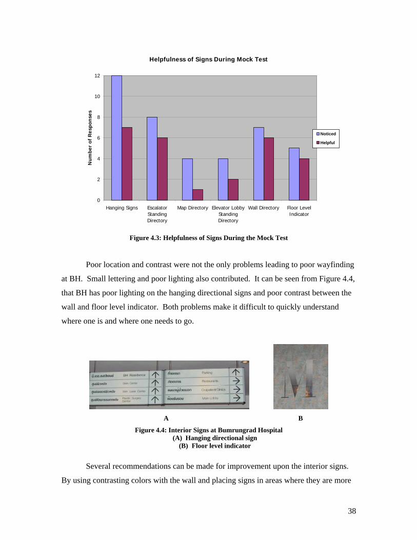
38
Helpfulness of Signs During Mock Test
0
2
4
6
8
10
12
Hanging Signs EscalatorStandingDirectory
Map Directory Elevator LobbyStandingDirectory
Wall Directory Floor LevelIndicator
Nu
mbe
r of
Res
pon
ses
Noticed
Helpful
Figure 4.3: Helpfulness of Signs During the Mock Test
Poor location and contrast were not the only problems leading to poor wayfinding
at BH. Small lettering and poor lighting also contributed. It can be seen from Figure 4.4,
that BH has poor lighting on the hanging directional signs and poor contrast between the
wall and floor level indicator. Both problems make it difficult to quickly understand
where one is and where one needs to go.
A B
Figure 4.4: Interior Signs at Bumrungrad Hospital (A) Hanging directional sign
(B) Floor level indicator
Several recommendations can be made for improvement upon the interior signs.
By using contrasting colors with the wall and placing signs in areas where they are more

39
visible for longer periods of time, BH will be able to increase the number of signs seen by
patients. Also, by better illuminating signs in dark areas and increasing the font size,
signs will be noticeable from a farther distance allowing more time for patients to take in
all the information needed. The use of several technologies in key decision points will
aid in meeting these recommendations.
4.1.2 Flexibility
Flexibility was given the second highest weight for choosing the appropriate
technology. All the administrators except one mentioned that the wayfinding system
must be flexible13. This means the system has to be easily upgradeable and updateable.
Upon completion of the fourth building, departments will begin to move and be
rearranged. Signs will need to be changed frequently to keep up with the reorganization
of the hospital demanding a flexible system. The inflexibility of BH’s existing system
was shown prominently when comparing their practices to best practices in Bangkok.
Once flexibility problems were realized, we were able to provide recommendations that
BH should follow when choosing a new system.
Best practices regarding flexibility were found at the Shangri-La Hotel and
Conrad Hotel. The Shangri-La uses a digital system displaying “you are here maps” and
lists of conference rooms with arrows pointing a visitor in the correct direction which can
be seen in Figure 4.5. During a meeting with TeleSys, the designers of Shangri-La’s
digital wayfinding system, it was stated that along with the map, the system’s capabilities
could also include: interactive touch screens, multiple languages, and voice output.14
Both the Shangri-La Hotel and Conrad Hotel have digital systems that can be updated
months in advance for expected changes and will automatically update itself on the
specified date.15
13 Summary of the Administration interviews can be seen in A19 14 Meeting minutes with TeleSys can be found in A43 15 Meeting meetings with Shrimp, the designers of the digital signage of the Conrad Hotel, can be found in A44

40
A B
Figure 4.5: Shangri-La Hotel’s Digital Signage System (A) “You are here map”
(B) LCD conference room screen
The signage system currently in use at BH is static. This creates a problem when
a department or clinic is moved. As learned in a meeting with Khun Lawrence, the static
sign plates are manufactured in the United Kingdom (U.K.) and must be ordered in
advance.16 Once ordered, the metal plates must then be engraved or silk-screened. This
system becomes long and tedious and often departments go without signs for long
periods of time. In order to compensate for the long retrieval time of plates from the
U.K., plates are ordered in advance and often letters are cut and pasted on until the new
ones arrive. The current system will make it difficult for BH to keep up with the moving
of departments in the future and the amount of patients becoming lost and confused will
increase immensely. It is imperative that a system be found which will eliminate the
ordering of new signs.
We recommend that BH incorporate a digital system in their wayfinding system
to accommodate their future needs. It is recommended that the digital system be easy to
update and easy to maintain. The software should also be able to integrate with Hospital
2000. It should be fully automatic and upgradeable. The ability to play streaming videos
would be useful but not a requirement. Using a digital system throughout all four
buildings will allow the signs to be updated when necessary as well as redirect patients to
the appropriate locations. The type of technology chosen for each decision point will be
based upon the flexibility needed in that particular location.
16 Meeting minutes with Khun Lawrence can be found in A21

41
4.1.3 Ease of Use
The criteria ranked third for importance is ease of use which has to do with the
functionality of the sign. It was discovered through our background research and
observing volunteers in the mock test that the wayfinding system will not be useful if the
information is not easily accessible or easy to understand. It is imperative for BH’s
wayfinding system to meet this criterion; therefore it is ranked ahead of the remaining
criteria. Different problems exist for exterior and interior signs at BH, and were better
realized once we compared BH with best practices in Bangkok. With this knowledge, we
were able to provide recommendations that will ensure that signs are easy to use on the
BH campus.
Best practices for exterior ease of use were found at the Conrad Hotel and
Bangkok Hospital. Reasons for this are similar to the explanations given in the
recommendations for visibility. As seen in Figure 4.1, large displays allow for large
arrows and visuals. Driving to Bangkok Hospital, we saw they also had large signs with
simple and short phrases. These qualities are effective for getting all the needed
information quickly.
Best practices for ease of use in interior signage were found from the Shangri-La
Hotel as well as BH. The Shangri-La Hotel lists its conference rooms and has clear
arrows pointing to their directions. As can be seen in Figure 4.6, this presentation of
information is easy to understand and follow. The display system rotates every ten
seconds to display three different screens. One screen is a map of the building, while the
other two screens provide directions to each conference room using arrows. The screen
changes automatically and no knowledge is needed to operate the system by the user. As
mentioned in the flexibility section, the digital system has the ability to display multiple
languages. Shangri-La Hotel has also named each wing of their building. When looking
at the “you are here map,” a visitor knows the wing they are located in and the conference
rooms located nearby. BH was included in the best practices because of its staff. During
our mock tests, it was observed that the staff gave helpful information and successfully
aided volunteers in getting to their destinations. The staff was not only helpful, but
personnel were also positioned throughout the hospital, making it easy to find someone
when help was needed.

42
Figure 4.6: One of three screens displayed on Shangri-La’s rotating main directory
Areas that need improvement with BH’s exterior wayfinding system pertaining to
ease of use are similar to the problems experienced with visibility. Therefore, the same
considerations should be made for ease of use as for visibility. For the interior system,
however, several problems arose when moving between buildings. As seen in Figure 4.7,
patients ask most frequently for directions to the skin and plastic clinic, which are located
in a separate building from the main hospital. This indicates that their current wayfinding
system is not clear enough in informing the patient that they must enter another building.
We also found through observations that floor levels not lining up between connecting
buildings was another cause of confusion. Even after extensive experience traveling
throughout the hospital, there were several times when we got off the elevator at the
wrong floor level, forgetting that they weren’t same for each building. These issues
detract from the ease of use of BH’s current wayfinding system.
Figure 4.7: Directions Given Most Frequently by Customer Service

43
Traveling between buildings was not the only problem associated with ease of use
in interior wayfinding at BH. Every volunteer was given directions to find registration
during some point of their test. One problem brought to our attention was that
registration is not listed on any of the signs and therefore directions are not provided
unless a visitor specifically asks. Each volunteer had to stop and ask for assistance. This
was surprising, considering every patient at BH has to go to registration at some point
during his or her visit to the hospital. Several mock test volunteers also became confused
with the word “mezzanine.” Once the volunteers had reached the correct building, the
number one complaint with BH’s current system was the mezzanine level. As can be
seen in Figure 4.8, the two areas receiving the largest number of complaints were the
hospital entrances and mezzanine level.
0
5
10
15
20
25
30
35
40
Parking garageto hospitalentrance
HospitalEntrances
Mezzanine-Level Entrance
Elevator Lobby Escalator HallwayIntersections
DepartmentIdentification
Figure 4.8: Mock Test Volunteer Complaints
A final area in which BH lacks in ease of use is the number of languages provided
on their signs. From our language survey conducted at the International Patient
Registration, we learned that the existing signage does not accommodate a large portion
of the international patient population. As seen in Figure 4.9, the largest portion of the
patients surveyed would like to see Arabic on signs in the future. Once our language

44
survey, encompassing 160 respondents, was analyzed, we discovered that there are five
main languages that should be accommodated for: Thai, Arabic, English, Japanese, and
Chinese. However, currently only Thai and English are found on the signs. Therefore,
our general recommendation to Bumrungrad is to have a minimum of Thai, Arabic, and
English on all signs and through use of technology accommodate Japanese and Chinese.
Languages Patients Would Like to See on Signs
22%
28%
17%
16%
10%
7%
English Arabic Japanese Chinese Korean French Figure 4.9: Languages Patients Would Like to See on Signs at BH
When revamping the interior wayfinding system, BH should provide listings of
the departments that can be found in each of the buildings, through use of digital or static
signs. Providing names for each of the buildings will also aid in directing patients to
their clinics, as well as the outpatient or inpatient building. Though the hospital will be
limiting the amount of traffic as much as possible, some traveling between buildings will
still exist and it is important that the visitor or patient understands which departments can
be found in the building they are entering. Renaming floor levels so they are consistent
between buildings will eliminate confusion when traveling over connections between
buildings. The best way to solve the confusion about the location of registration is to list

45
it on all signs and indicate a floor level. Finally, using technology to accommodate all
languages possible will aid in directing non-Thai or non-English speaking patients to
their destinations.
4.1.4 Displaying Proper Amount of Information
Ranked fourth for criteria is displaying the proper amount of information. Giving
the proper amount of information means once the user enters a decision point, they will
have all the necessary information, nothing less and nothing more, to make the correct
decision. For example, one would not need to know all the clinics in each building at a
hallway intersection. This criterion seems similar to ease of use because showing the
right information is part of an efficient wayfinding system. However, showing the proper
amount of information does not mean the system will be easy to use. For example, if one
uses a dynamic sign in hallway intersections, they can show the proper amount of
information, but patients would be confused by the moving information. For this reason,
proper amount of information was ranked just below ease of use. The slight difference
between the two criteria was important in our analysis of deciding which technologies
should be used for each decision point. Comparing BH to best practices for providing the
proper amount of information allowed recommendations to be made to ensure that BH
signs in the future will also display the proper amount of information.
Best practices for displaying the proper amount of information were found when
observing the Conrad Hotel, Shangri-La Hotel and Bangkok Hospital. The Conrad
showed the proper amount of information on all their exterior signs. Their signs identify
direction for all building destinations, nothing more and nothing less. Bangkok Hospital
and Shangri-La Hotel showed the proper amount of information in their interior
wayfinding system. The labeling of buildings at Bangkok Hospital allowed the user to be
informed quickly of departments found within each of the buildings. Signs were placed
containing information on how to get to registration throughout the entire hospital.
Departments were named under their appropriate building with floor levels in which the
user would find them. All signs had short phrases or names and arrows pointing in the
correct destination. Signs in high traffic areas needed only a few seconds to absorb all
information, and signs that displayed quite a bit of information, usually found in lobbies,

46
were placed to the side so not to obstruct pedestrian flow. The Shangri-La Hotel showed
the proper amount of information in its main lobby and outside of its conference rooms.
As said before, while in the main lobby, one can determine which wing they need to go to
and how to get there. Outside of the conference rooms, digital signs gave only
information pertaining to that room.
BH’s current problems with displaying the proper amount of information are
mostly due to displaying incorrect information or no information at all. It can be seen in
Figure 4.10 that seventy-eight percent of the volunteers surveyed agreed that wayfinding
signs were lacking at BH. Specifically, directions to registration were missing. Many
volunteers found it rather difficult to find their way around until they reached registration.
In the main lobby of BH, there is no signage upon entering, meaning BH does not give
the proper amount of information to its patients.
Mock Test Survey Responses
0%
10%
20%
30%
40%
50%
60%
70%
80%
90%
been
to ho
spita
l
comfor
table
with te
rmino
logy
signs
hard
to un
derst
and
enou
gh si
gns
too fe
w sign
s
too m
any s
igns
signa
ge la
cking
prob
lems d
ue to
desig
n
Per
cen
tage
of
Yes
Figure 4.10: Mock Test Survey Responses
Ways in which BH can improve its exterior wayfinding system are the same as for
visibility and ease of use. For interior wayfinding, however, ensuring that signs provide
the correct information and all destinations are accounted for will improve the system

47
dramatically. Correct information refers to showing just what the user needs in order to
choose the correct direction. Areas where different amounts of information are needed
will translate into different technologies being used.
4.1.5 Appropriateness to Location
The next criterion in line for importance is whether or not the technology used is
appropriate to the location in which it is placed. This criterion is not as concerned with
the actual wayfinding aspects but rather whether or not it fits into its surroundings. For
this reason it was not given a high importance level. However, it did play a large part in
deciding between similar technologies with the same features. BH puts a large amount of
emphasis on the overall look of the hospital and this should play into the final decision of
choosing a wayfinding system. By looking at wayfinding systems found at other
facilities, we were able to pick out systems that fit in with the functions and themes of the
building and those that did not. Once best practices were observed, we were able to
better narrow down our choices of technology for each decision point to best fit the
hospital’s theme.
Best practices of a wayfinding systems being appropriate to its location were
found from the Shangri-La Hotel and Bangkok Hospital. The Shangri-La Hotel was
designed using earth tones with wood trimming throughout the entire building, and an
overall color scheme of maroon and white. The digital wayfinding system chosen for
Shangri-La was then designed around this color scheme. As seen in Figure 4.11, all main
directories were displayed in wooden cases, which matched the building’s interior trim,
and the colors displayed on the screen were maroon and white. The smaller LCD screens
used a gold frame which accented the wall and furniture found close by. All of the signs
in place were noticeable, but were not the main focal point of the room.
Bangkok Hospital added to best practices because they had appropriate
technologies at certain decision points. Upon walking into the building, the first signs
seen were large digital displays. Their location was appropriate because it was within a
large area and did not look out of place. When walking though the hallways, information
was on static signs, which were all that was needed. Again, visually, the type of signs fit
the surroundings.

48
Figure 4.11: Display Case of the Main Directory at the Shangri-La Hotel
Currently at BH there is not much of a problem with the wayfinding system fitting
in with its surroundings. All wayfinding signs are static. Though they do not portray a
bad image, they do not provide an upscale image. The use of plasma screens, LCD
screens and kiosks placed in decorative displays would enhance the image of the hospital
while making the wayfinding system seem as though it was a furnishing chosen as part of
the interior design. Display cases would be able to better accent the main lobbies with a
sleek new look, and hallways could be made more inviting with more colorful sign
displays. The common look of a white walled hospital would no longer be identified
with BH. According to Edgar Hernandez (2005), BH is eventually looking to eliminate
the blank hallways to provide a ‘homier’ feeling.17
Our recommendations for BH for appropriateness of location are to use the
wayfinding system not only as a directional tool but also to enhance the overall look.
This can be done by implementing decorative cases surrounding signs distributed
throughout the hospital and using colors that match the design already in use at BH. The
use of technology, therefore, is an easy way to incorporate a new design ‘feel’ into an
older building. It should be noted that not all technologies are visually appropriate for
each decision point.
17 Information regarding interview with Edgar Hernandez and Dennis Brown can be found in A24

49
4.1.6 Reliability
Reliability refers to how stable a system is, regarding breakages and system
failures. It was ranked sixth because it can be expected that any system offered by a
major company will be trustworthy, and that maintenance contracts will ensure that the
system will remain functioning. However, this is still a concern for the hospital
administration, because valuable time and money must be spent when a system fails.18
Unfortunately, best practices in terns of digital signage could not be observed because
statistical information regarding downtime was not available for the digital systems being
used at both the Conrad and Shangri-La Hotels.
A signage system used by the hospital must be reliable in order to provide
effective wayfinding. If information cannot always be accessed, it does no good for users
who need it. Also, if a system breaks frequently, any cost-effectiveness it may once have
is nullified. For these reasons, we recommend that BH retrieve all pertinent information
regarding reliability from the signage companies it is considering. Examples of this
information include how well digital signs fare in the outside conditions and the expected
lifespan of any electronic equipment based on continuous usage.
4.1.7 Consistency
Consistency was determined to be an important criterion upon completion of our
administration interviews19. It aids a visitor when following a comprehensive signage
system by providing reassurance that the person is doing what they need to. However,
because it was not considered critical to the functionality of a wayfinding system, it was
given a lower weight then the previously mentioned criteria when choosing the
appropriate technology.
Exterior Consistency
The best system found in terms of exterior consistency was that of the Conrad
Hotel. The All Seasons Place, in which the Conrad Hotel is located, has a number of
different roads and entrances, all of which carry drivers going to and from the hotel. No
18 Information regarding interview with Khun Lawrence Koh-Khee can be found in A21 19 See interview with Khun Pantanavadee in A25.

50
matter the area, the hotel’s signs are all very similar, giving a very clear identity to the
hotel. All signs are the same type, color, and font, and feature the same arrow symbols
pointing in the correct direction. The system also features signs every fifty feet,
reminding and reassuring the visitor of the direction to travel.20
The BH system, conversely, does not fit the description of a consistent
wayfinding system, according to observations of the hospital. There are very few
exterior signs providing guidance, only located at the entrances on Soi 1 and Soi 3, with
some small green signs located along Soi 1. Each sign is of a different type and all have
different font sizes, giving the entering visitor no unifying characteristic to look for in
order to receive direction.21
In order to be consistent, we recommend that BH exterior signs must all look
alike. They should be the same type and color in order to provide a comprehensive
image. Font sizes and any directional symbols should be alike in order to make
wayfinding clearer for entering visitors.
Interior Consistency
The best example of good interior sign consistency is at the Shangri-La Hotel.
The same type of frame encases each sign, in this case dark wood podium-type cases with
glass over the screen. Each sign uses the same type of technology, with rotating
informational screens with maps, names of places, and arrows on each. When one walks
though the hotel, he or she will notice the same type of signage at every decision point.
For example, at every elevator lobby, one will see the exact same sign, seen in Figure
4.10. The entire wayfinding system depends on technology; static signs were not
necessary for use by visitors. The digital system incorporated by Shangri-La will enable
the system to stay consistent in the future, because with changes of information it will not
be necessary to order new signs.22
BH only partially meets this good example of consistency. Signs inside BH23 are
fairly consistent in type, with hanging signs at all hallway intersections and various types
20 Photographs of the Conrad exterior signs can be found in Figure 4.1. 21 Photographs of BH exterior signs can be found in Figure 4.2. 22 Photographs of the Shangri-La wayfinding system can be found in Figures 4.5, 4.6, and 4.10. 23 Photographs of the BH interior wayfinding system can be found in Figure 4.4.

51
of other signs consistently used at escalator and elevator lobbies. However, inconsistent
font sizes make the systems hard for visitors to use the signs at a quick glance. As
departments within BH have moved over the past several years, not enough attention has
been paid to the font sizes and types, and this has become harmful to proper wayfinding.
In order to provide good interior consistency, we recommend that all signs in BH
feature the same type of technology and casing. Font sizes should all be the same, and
colors should be consistent as well. In addition, any technology used should remain
consistent in type and placement throughout the facility. If technology is chosen well, it
will enable the system to stay consistent in the future.
4.1.8 Feasibility
Feasibility refers to the overall availability of a system, and whether or not it is
currently available in Thailand. This received the lowest ranking because in this age of
globalization, it is not unreasonable to expect that a company located abroad will be
willing and able to set up any type of system.24 Feasibility in regards to the cost of the
wayfinding system was brought up in meetings with Dennis Brown as well as the
infrastructure meeting. However, we did not limit our recommendations due to cost
because a large aspect of our project was to identify fresh ideas that a typical signage
company may not suggest. It is still a matter of importance, however, because if a system
is not feasible, then recommending it would not be helpful for BH25.
4.2 Recommendations for Bumrungrad Hospital’s Wayfinding System Once we established criteria for the hospital’s signage, the next logical step was to
compare at each decision point how each technology fit each criterion. In order to do
this, we combined all previous steps, especially using the ranking of criteria based on
which was most important and which was least important. This directly weighed into the
scores given to each technology.
24 See e-mails with technology companies, A27-A31. 25 See interview with Dennis Brown (January 18, 2005), A24

52
4.2.1 Car to Hospital Entrance
After assessing the current parking situation at BH and considering future hospital
needs pertaining to parking, we found that static signs would be the most logical choice
for the car to hospital entrance decision point. Once a visitor parks in a garage, they want
to reach their destination as quickly as possible. While pedestrian traffic currently is not
heavy in the parking garages at BH, elimination of valet parking in the future will cause
more patients to use the garages. Wayfinding information directing patients to the correct
buildings will become more important. As seen in Table 4.2, the criteria that separated
static signs from the three other technologies are proper amount of information, visibility,
ease of use, and reliability.
Table 4.2: Recommended Technology for Car to Hospital Entrance
Static signs were the appropriate recommendation for BH, because their simple
nature fulfills all the needs of the user. One need in particular is to be able to understand
the sign at a quick glance in order to exit the garage as quickly as possible. According to
Prayuth, static signs would be feasible in a parking garage because little information
needs to be displayed. Patients are only traveling to one of two destinations when
walking in a parking garage; to the hospital or back to their car.26 Static signs have the
capability to provide this type of information easily. Information needed entails
directional information towards the hospital, including the name of the building being
entered as well as the different parking levels and regions. We identified in our mock test 26 Refer to A24 to see interview notes

53
that people had a difficult time finding their way around when they did not know which
level they were on.27 This will give people a starting point for once they enter the
building as well as aid them when returning to their vehicle.
The logic behind choosing static signs is strengthened when one realizes that
language is not an issue in parking garages. According to Prayuth, mostly Thai or
English reading patients and visitors drive to the hospital, meaning at most, Thai and
English should be on the signs.28 Providing information in two languages is well within
the capabilities of static signs.
Static signage has an edge over other technologies not only because it can display
needed information, but is durable as well. Parking garages are full of grime and dirt due
to the car traffic within the building and the relative lack of ventilation as compared to the
outside.
Figure 4.12: Parking Garage Sign at Bumrungrad Hospital
This picture displays on of the dirty signs found within the parking garage of BH
Signs within the parking garage will need the ability to withstand all the dirt and grime.
Digital signage may have technical problems if dirt was to get into the system. However,
the bigger issue comes with maintenance. All types of signage will need to be cleaned
27 Results for this can be seen A7 28 Refer to A22 to see interview notes

54
frequently. Great care must be taken when cleaning digital signs. Static signs, however,
are easy and safe to clean, making them the better choice for parking garages.
Though there are several pros to using static signs within a parking garage, there
is one limitation. Static signs do not have the ability to easily be updated when compared
to digital signs. We did not consider this to be a significant problem in the parking
garage because the information displayed will only be directing pedestrians to the
buildings and parking regions. Due to buildings not moving in the future, the need for
flexibility at this decision point is very low.
4.2.2 Hospital Entrance
It was determined that static signs would be the best choice for all BH hospital
entrances. Signage at the hospital entrance purpose is to direct pedestrians to the correct
building and entrance. Hospital entrances contain a high volume of traffic due to the
necessity of all patients and visitors entering the facility.29 Therefore, the signage must
accommodate everyone. The criteria that made static signs the most appropriate
recommendation are: visibility, ease of use, and reliability, as seen in Table 4.3.
Table 4.3: Recommended Technology for Hospital Entrance
Patients and visitors at BH quickly need to use the signs at hospital entrances. As
can be seen in Figure 4.13, heavy traffic surrounds the current main hospital entrance, not
only people, but vehicles as well. The vehicular traffic adds to pedestrian confusion, 29 Refer to A1 to see traffic observations of Bumrungrad Hospital

55
making simplicity of the signage more important. The limited quantity of information
displayed on static signs makes them easy to use.
Figure 4.13: Picture of the Hospital Entrance
It can be seen that the traffic at hospital entrances are busy.
The fact that limited information can be displayed on static signs is not a
limitation in regards to the hospital entrances. Outside of the building, the patient does
not need a directory of every department. According to Brown, it is most important that
patients enter the correct building.30 Depending on how the departments are arranged,
this can be done by categorizing destinations, such as outpatients and inpatients. If
patients and visitors are directed to the correct building, specific department location can
be determined once inside.
Similar to the parking garage, reliability and visibility provided static signage an
advantage over the more advanced wayfinding systems. The signs will not only be
subjected to the dirt and grime present in Bangkok, but glare due to the sun as well.
Typically, digital signs can be difficult to see in bright locations. As long as contrasting
colors and non-reflective material are used, static signs will not have this problem. Static
signs must be visible at night as well. An example of poor lighting at BH can be seen in
Figure 4.14. The affects seen in Figure 4.14 of an interior sign of BH can also be applied
30 Refer to A24 to see interview minutes for Brown

56
to exterior signs of BH if lit in the same way. Shrimp Company presented BH with a
solution for this by having their static signs internally lit.31
Figure 4.14: Picture of a Poorly Lit Sign at Bumrungrad Hospital
Shinning light onto a sign does not give equal lighting
Unlike the parking garage, the language limitation of static signs is a concern for
hospital entrances. Patients going through the hospital entrance come from over 150
countries, and may not all speak English or Thai. Using static signs will not have the
ability to accommodate for all that travel through the entrance. While this is a drawback
for the use of static signs, we feel that the positive aspects of static signage, including
durability and simplicity, outweigh the negatives.
4.2.3 Main Lobby
After observing twelve volunteers taking our mock test, we concluded that a
combination of interactive kiosks and plasma displays would be the signs of choice for
the main lobbies. Upon entering the hospital, all patients will find themselves in one of
the many lobbies throughout BH. These lobbies currently have quite a bit of room for
wayfinding improvement, mostly because there is close to no signage in its main lobby.
The mock test confirmed this, as can be seen in Figure 4.8, which shows the number of
complaints at the different decision points. Note that most of the complaints were related
to the main lobby. Users of the main lobby wayfinding system are of all nationalities and
need to be directed to their different locations. This makes language a large concern,
especially considering the main lobby is where people first begin the interior wayfinding
process.
As can be seen in Table 4.4, the criteria that set plasma signs apart are visibility,
ease of use, and flexibility. Interactive kiosks were recommended because of their 31 Refer to A44 to see interview notes

57
interactive abilities that enable them to fulfill the criteria of multiple languages and
proper amount of information.
Table 4.4: Recommended Technology for Main Lobby
When a patient or visitor walks into a lobby, they should be able to immediately
pick out the signage that will aid them. Plasma screens have the ability to do this because
of the capabilities inherent with large size.32 Kiosks are not as noticeable but have key
features that make them a good choice to have in lobbies. To accommodate kiosk
visibility in a large setting such as a lobby, we suggest that BH either have signs pointing
to the kiosks, or have a kiosk station containing multiple kiosks, catching the eyes of
passers by.
As already mentioned, large amounts of information is needed in the main
lobbies. The ability for kiosks and plasma signs to hold information made them the
logical suggestion. Interactive kiosks allow for an unlimited amount of information to be
available to the user and BH will be able to set its limits. Plasma signs cannot have as
much information readily available as kiosks, but their ability to have dynamic
information as well as a large viewing area can be a quite attractive addition to the main
lobby.
Plasma displays and interactive kiosks can not only display large amounts of
information, but are also easy to operate. Companies who design kiosk software, such as
32 To see specifications of plasma displays, refer to A41

58
Telesys, claim that no technical background is needed by the user.33 A step-by-step
process can be used, providing the user with simple choices. Part of making operation
easier for the user is having the interactive kiosk and plasma signs perform in multiple
languages. Interactive kiosks are able to do this in any number of ways. Two ways we
suggest to BH include the user choosing their language via their nation’s flag or by
touching a sentence written in their language. As mentioned earlier, plasma signs can
accommodate several languages by using their large display capabilities and scrolling
through different ones. However, if plasma signs display too many languages, it could
become confusing and difficult to understand for the user.
Both interactive kiosks and plasma screens can make wayfinding easier by
displaying maps of the building. The fact that there is not a map directory clearly visible
upon walking into the hospital was a common complaint received during the mock
tests.34 Interactive kiosks can take use of maps a step further by being interactive. This
would give the user the ability to see more detailed maps specific to their destination.
Telesys claims this type of map interaction is easy to implement.35
Flexibility, another feature of these technologies, helped to make them a logical
choice for main lobbies. Digital signs have the ability to be easily updated once BH
begins to rearrange the clinics and departments from one location to the next. Both
Telesys and Shrimp claim that Hospital 2000 could easily be integrated with the digital
sign software.36
4.2.4 Mezzanine-Level Entrance and Lobby
To reduce confusion when traveling between buildings in the future, we
determined that BH should use plasma and static signs at the Mezzanine-level lobby. All
the BH buildings are connected through the Mezzanine level and as seen in Figure 4.8,
this level caused much confusion when using the current wayfinding system. Figure 4.7
helps to confirm the confusion by displaying the departments that directions are provided
to patients most frequently by customer service. The two departments needing directions
33 Refer to A43 to see Telesys minutes 34 Refer to A7 to see Mock test complaints 35 Refer to A43 to see Telesys minutes 36 Refer to A43 to see Telesys minutes and A44 to see Shrimp minutes
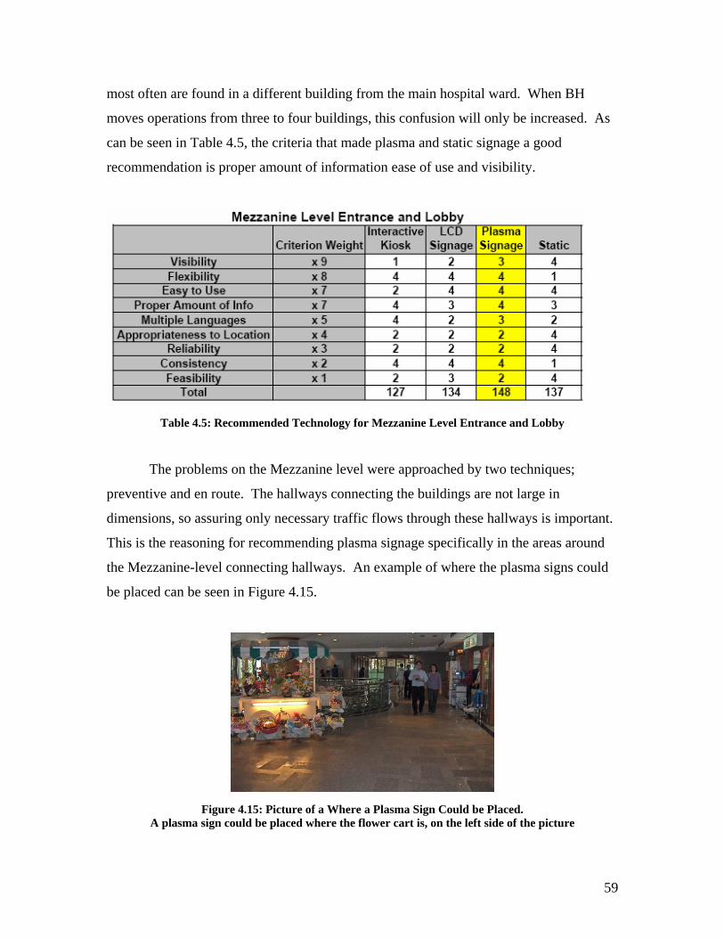
59
most often are found in a different building from the main hospital ward. When BH
moves operations from three to four buildings, this confusion will only be increased. As
can be seen in Table 4.5, the criteria that made plasma and static signage a good
recommendation is proper amount of information ease of use and visibility.
Table 4.5: Recommended Technology for Mezzanine Level Entrance and Lobby
The problems on the Mezzanine level were approached by two techniques;
preventive and en route. The hallways connecting the buildings are not large in
dimensions, so assuring only necessary traffic flows through these hallways is important.
This is the reasoning for recommending plasma signage specifically in the areas around
the Mezzanine-level connecting hallways. An example of where the plasma signs could
be placed can be seen in Figure 4.15.
Figure 4.15: Picture of a Where a Plasma Sign Could be Placed.
A plasma sign could be placed where the flower cart is, on the left side of the picture

60
This signage found within the Mezzanine-level Lobby should have large amounts
of information, to inform the user of what building they need to be in for their specific
need. This means there should be directories of all clinics in each of the buildings.
Plasma signs would be most capable of handling this. Its large display and scrolling
information would have the ability to inform the user of where they are and where they
need to go. An interactive kiosk has the same ability; however, the high traffic in the
limited space makes the plasma sign more visible for the user.37 The plasma sign should
not be placed too close to the hallways connecting the buildings to eliminate unwanted
congestion.
Once a patient or visitor is en route to another building, the signs need to be
simple to understand. This is the reason for recommending static signage in the
connecting hallways. With limited space available, as can be seen in Figure 4.16,
hallways will become crowded, meaning the patient will want to see and comprehend the
information quickly. The same type of information found in hospital entrances should be
present at the mezzanine-level entrances. The user should know what buildings they are
heading towards as well as general information regarding what is in each building.
Figure 4.16: Picture of the Mezzanine-Level Connecting Hallways
4.2.5 Elevator Lobby
Due to the high traffic found in elevator lobbies at BH, we determined that
interactive kiosks as well as static signs would be the most the most logical solution to
the wayfinding problems experienced at this decision point. People who enter an elevator
lobby are either looking to get on or off an elevator. When people get on an elevator, it
should already be know what floor they should get off on, meaning a directory system is
needed. People getting off the elevator need to confirm what level they are on and where 37 Refer to A1 to see traffic observations of Bumrungrad Hospital

61
they should go upon exiting the elevator lobby. Part of confirming what level one is on,
is making sure the level indication is visible and easy to understand. Referring back to
Figure 4.4B, the “M” on the wall was hard for users to see because of the contrast and
location of the sign. According to our mock test, the word Mezzanine confused all Thai
volunteers and most international volunteers.38 As can be seen in Table 4.6, interactive
kiosks are our main recommendation because they can provide the proper amount of
information as well as accommodate multiple languages.
Table 4.6: Recommended Technology for Elevator Lobby
One can see that the interactive kiosk is a better choice then the static signs
mainly because an interactive kiosk could provide the user all the necessary information
easily. It seemed illogical to place an interactive kiosk on every elevator lobby in the
hospital, however, so we decided to deviate slightly from our original plan of staying
consistent for each decision point. It was decided that the interactive kiosks only needed
to be placed in the outpatient main elevator lobbies. The user will typically have enough
time to use it as they wait for their elevator. As stated previously, the kiosk can
accommodate multiple languages as well as give the user an interactive map so they can
see exactly where they are and where they need to go. According to Virat, porters escort
most of the inpatients, therefore, these patients do not need the same amount of
information an outpatient would to find their way around.39 Visitors of inpatients should
38 Refer to A7 to see complaints at Elevator Lobbies 39 Refer to A20 to see the interview minutes for Virat

62
receive all their necessary information once they enter a main lobby. For that reason, we
recommend that BH use static directories in the elevator lobbies on the inpatient floors.
4.2.6 Escalators
Due to the amount and type of information needed at each escalator, deciding the
best technology to use here was rather difficult. After comparing all the data collected
and determining which technologies best fit all of the criteria, our group settled on static
signs being the appropriate choice. Currently the highest traffic for escalators can be
found on the Mezzanine-level.40 At the end of each escalator, patients need a variety of
information: whether they should go up, down, or stay on their current level. All
information should be readily available once exiting the escalator. This includes a floor
level indication. Much like the elevator lobby, there is currently confusion regarding to
what floor one is on.41 This is more of an issue when using escalators because there are
no buttons as in an elevator. After analyzing these conditions, there was originally no
clear solution. As can be seen in Table 4.7, each technology had features that had both
advantages and disadvantages.
Table 4.7: Recommended Technology for Escalators
The deciding factor was determining which technology was most appropriate for the
location. A technology was determined appropriate if it fit in with its surrounding
40 Refer to A1 to see traffic observations of Bumrungrad Hospital 41 Refer to A7 to see complaints at Escalators

63
environment. It was this reason that we recommended BH use static signs at their
escalators.
The other criteria making static signs a good recommendation is their visibility
when coming off an escalator and them being easy to use. The drawbacks for using static
signs are once again its inability to accommodate several languages and its lack of
flexibility.
4.2.7 Hallway Intersections
After studying current hallway intersections at BH, it was found that static signs
would be the most appropriate choice. At hallway intersections, patients have three
options: continue going straight, turn right, or turn left. People typically like to make
these decisions without stopping, meaning the information has to be understood quickly.
Hallway intersections tend to have less traffic then other areas found within the hospital
due to traffic dispersing most often in elevators and escalators.42 As seen in Table 4.8,
the criteria that gave static signs an advantage over the other technologies are visibility,
ease of use, and displaying the proper amount of information.
Table 4.8: Recommended Technology for Hallway Intersections
A great deal of information does not have to be displayed on these signs.
Primarily, arrows providing directions to departments are all that is needed. It is
42 Refer to A1 to see traffic observations of Bumrungrad Hospital

64
important to note that currently BH does not have all the appropriate destinations
displayed on their signs. It was observed while running our mock tests that none of the
signs provided information as to the location of registration. Missing information should
not be tolerated in BH’s new wayfinding system.
The major limitations of the use of static signs for hallway intersections are once
again the inability to accommodate several languages and to be updated easily. With so
many departments being moved over the next five years, BH will have to make sure it
keeps the signs updated. For this reason, we also recommend that BH keep an updated
log of where all the signs are place within the hospital. According to Virat, they currently
have a book to do this, but it has never been updated.43
4.2.8 Department Identification
It was decided that the technology appropriate for displaying department names
and additional information would be LCD and/or static signs. The function of a
department identification sign is to inform the patient when they have reached the correct
department. According to Toral, the only information that should be displayed on the
sign is the name of the department and BH’s logo.44 As can be seen in Table 4.9, static
signs did have a slight advantage because they are easily visible, easy to use, and can
display the proper amount of information.
Table 4.9: Recommended Technology for Department Identification
43 Refer to A20 to see interview minutes with Virat 44 Refer to A23 to see interview minutes with Toral

65
LCD screens are also recommended after learning that the administration had
been looking into displaying more information about each department by use of digital
displays.45 The reason for recommending static and LCD together are due to the
limitation of sizes of LCD screens.46 Outside of departments, static signs are easier to see
and understand. Static signs alone would be sufficient to fulfill the need of department
identification. However, digital signs could add a different look as well as provide
beneficial information to patients.
45 Refer to A45 to see the minutes of the Infrastructure Meeting, which is where this was mentioned 46 Refer to A41 to see specifications of LCD displays

66
5.0 Summary The recommendations provided in our report give guidance to Bumrungrad
Hospital (BH)’s administration for evaluating signage proposals submitted by
professional firms. Professional signage companies may not have envisioned the highly
versatile capabilities of modern technology, or BH’s commitment to bring a high-tech
leader in their field.
To recap, certain technologies were recommended for use at each type of decision
point. Static signs were recommended for all decision points excluding the Mezzanine
lobby and main lobby. Interactive kiosks were recommended in the elevator lobby along
with static signs as well as in the main lobby with plasma screens. Plasma screens were
also recommended for the Mezzanine lobby.
The technologies we evaluated in this report are the most widely used for the purpose
of wayfinding. The most information could be accessed for these technologies due to
them all currently being available in Bangkok, Thailand. However, other technologies
should be considered for future wayfinding capabilities. Some of the most feasible
technologies are:
• Talking Signs47 – A patient would carry around a small receiver, which would connect with hospital infrastructure and verbally direct them to a destination. This could potentially help to solve the language barrier issue;
• Projected Signs – Permanent physical screens would no longer be required, as interactive maps could be projected onto any flat surface;
• RFID – Patients would carry individual RFID tags, which would be able to provide personalized directions at either special kiosks or hand-held units;
• Cell Phones – Personalized directional information would be delivered to each patient’s cell phone.
Because BH’s building is not complete, it is close to impossible to make specific
recommendations for the wayfinding system pertaining to this area. However, certain
wayfinding issues can be anticipated from observations of the hospital as it currently
functions.
The first issue brought to our attention is that of building designations. The
buildings at BH are not currently named. Currently this does not cause significant
confusion, because there is only one “main” building. However, when directions will
47 See A46 for more information.

67
need to be provided to different buildings for different appointments in the future, this is
likely to cause a problem. Further studies should be done to decide on official names for
each of the buildings.
A second issue is confusion caused by floor number labeling being inconsistent
between buildings. For example, the third floor in the BH Residence building is
connected to the Mezzanine floor of the BH Hospital building. It is possible that by
renaming the floors of the buildings in order to match at crossover levels, confusion as to
what level you’re on could be alleviated.
A third suggestion for improvement of patient confusion is to use separate color
schemes for inpatient and outpatient functions. This would be likely to give patients
more confidence in their movements throughout the buildings. Signs indicating
outpatient clinics would follow one color scheme, while inpatient departments would
follow another. Using color schemes in parking garages as well as walkways to and from
buildings would aid in directing the patients to the correct building or car park.
Parking in the new garage will both alleviate current parking headaches and create
new ones, with a greater number of vehicles seeking to find parking within each garage.
It is likely that an electronic parking management system (as seen in Figure 5.1) will help
to solve this problem, indicating to drivers where there are free spaces, and eliminating
the congestion and frustration associated with parking facilities everywhere.
Figure 5.1: Electronic Parking System at Baltimore Washington International Airport
Note the digital sign indicating the number of free spaces, and the colored LED lights above each space, indicating whether it is free (green) or occupied (red).

68
We did not evaluate certain wayfinding concerns due to limited time and
resources. Further aspects of outdoor signage should be evaluated in the future, with
special consideration of signage directed at entering vehicles. Due to lack of vehicle
access for the team, it was impossible to collect accurate data on the ease or difficulty of
wayfinding for vehicular traffic. A study should also be done determining placement of
emergency signage within the hospital buildings. The team noticed inconsistency
pertaining to the design and placement of fire exit signs. This has the potential to pose
significant risk to the well being of patients, and should be taken seriously.
The recommendations presented in this report will serve the purposes of any
international organization that deals one-on-one with customers. Wayfinding principles
can be translated into uses in airports, convention centers, and many other facilities
without much complexity. As a result of being an international hospital, BH has the
unique opportunity to influence a new generation of wayfinding systems, which could be
used all over the world. It can influence the expansion of little-known technologies (such
as Talking Signs, if it is deemed suitable as a multi-lingual wayfinding tool), or an
industry-wide adoption of technologies currently only in use by facilities that do not
utilize them to their full potential.

69
Appendices A1: Observations of Hospitals and Hotels
Bumrungrad Hospital

70
Observations of Bangkok Hospital

71
Observations of Shangri-La Hotel
Observations of Conrad Hotel

72
A2-A7: Mock Test Survey and Results A2: Mock Test survey Name______________________ Date____________ Email__________________
Mock Test Survey
Thank you for taking the time to complete the mock test. Below is a list of questions in which we would like you to answer. These will help us to better understand your wayfinding experience at Bumrungrad Hospital. 1. Which mock test did you take? (To be answered by the BH team) _____Pre-registered International Outpatient _____Walk-in International Outpatient _____Pre-registered Local Outpatient _____Walk-in Local Outpatient _____Inpatient 2. Have you ever been to a hospital before? _____Yes _____No 3. Were you comfortable with the hospital terminology currently in place at Bumrungrad? _____Yes _____No If you answered no, what were you uncomfortable with? 4. Did you find the signs hard to understand? If so, why? _____Yes _____No Why: 5. Do you consider the amount of signs currently in place: (please explain your answer) _____enough _____too little _____too much Explanation:

73
6. What signs currently in place did you find helpful? (i.e. maps, hanging signs, listing of departments on each floor, etc.)
7. Did you encounter areas in which you thought signage was lacking? If so, where? _____Yes _____No 8. Did you find the signs difficult to follow due to language problems? _____Yes _____No 9. What languages do you speak/ read?
Speak:______________________________________________________________
Read:_______________________________________________________________ 10. Did you have difficulty finding your way, due to font size, type or lighting? Please explain. _____Yes _____No Explanation: 11. Were you approached by a Bumrungrad employee and given help at any point during the mock test? If so, how did they help you reach your destination?

74
12. Would the experience you had today with the signage system affect your decision to come back in the future? _____Yes _____No If answered yes, please explain. 13. Do you have suggestions on how the signage system can be improved for the future? Can you think of any technologies that are currently being used for signage systems, which would benefit Bumrungrad Hospital? 14. Any additional comments or suggestions? ***PLEASE REFER TO PHOTOS*** 15. Did you notice photo 1? _____Yes _____No Was it helpful to you? _____Yes _____No Any comments for this type of sign?

75
16. Did you notice photo 2? _____Yes _____No Was it helpful to you? _____Yes _____No Any comments for this type of sign? 17. Did you notice photo 3? _____Yes _____No Was it helpful to you? _____Yes _____No Any comments for this type of sign? 18. Did you notice photo 4? _____Yes _____No Was it helpful to you? _____Yes _____No Any comments for this type of sign? 19. Did you notice photo 5? _____Yes _____No Was it helpful to you? _____Yes _____No

76
Any comments for this type of sign? 20. Did you notice photo 6? _____Yes _____No Was it helpful to you? _____Yes _____No Any comments for this type of sign? ***OUTPATIENTS ONLY*** 23. Where were you sent after registration? Were appropriate directions provided? Where____________________________________ Appropriate Directions: _____Yes _____No How were the directions provided? (i.e. map, verbally, pointing, escorting, etc.)

77
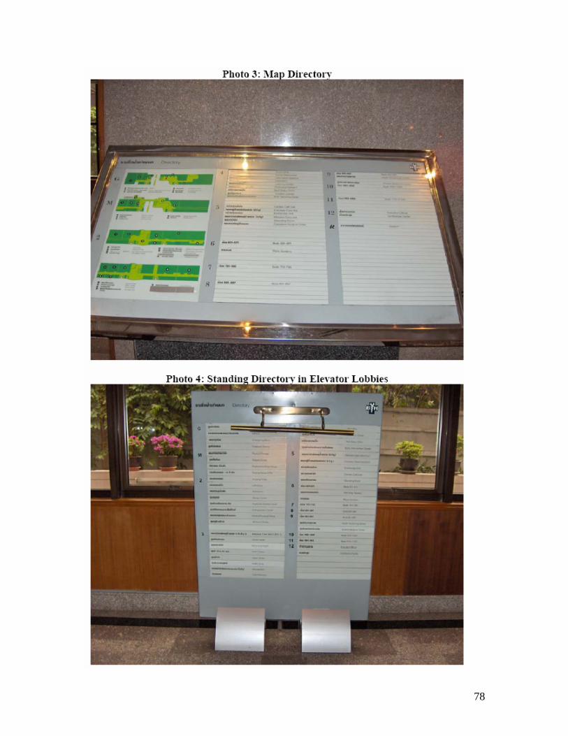
78

79

80
A3: Mock test – Volunteers

81
A4: Mock test – Sign Acknowledgement

82
A5: Mock test – Number of Complaints by Decision Point

83
A6: Mock test – Comments

84
A7: Mock test – Comments Specific to Decision Point Comments from the Mock Test Grouped by Decision Points
Decision Point 1: Signage on main roads Due to time constraints, could not incorporate into our mock test. Decision Point 2: Vehicular entry to parking garage Due to limitations of using a car, could not incorporate into our mock test. Decision Point 3: Walking from parking garage to hospital entrance
Couldn’t see floor designation signs (7) Confused about Mezzanine level (4) Lighting is be a problem (4) Signs should indicate which building you’re in or entering (2) Should have signs indicating taxi stand (1)
Decision Point 4: Main Lobby
Should be directional map (possibly interactive) at building entrance (7) Confused about Mezzanine level (4) Couldn’t see floor designation signs (7) Current building layout map not helpful (2) Signs should point to registration (2) Lighting is a problem (4) Signs should indicate which building you’re entering (2) Signs are needed for direction to other buildings (1) Too much information provided on one sign (2) Should have signs indicating taxi stand (1)
Decision Point 5: Mezzanine-Level Entrance
Confused about Mezzanine floor (4) Couldn’t see floor designation signs (7) Current building layout map not helpful (2) Signs should point to registration (2) Directional arrows should be separated from each other when pointing
different directions (2) Lighting is a problem (4) Signs should indicate which building you’re entering (2) Floors not lining up becomes confusing (3rd floor BH Residence and
Mezzanine) (1) More signs are needed directing to other buildings (1) Font size too small (1) Too much information provided on one signs (2)
Decision Point 6: Elevator Lobby
Confused about Mezzanine floor (4)

85
Couldn’t see floor designation signs (7) Current building layout map not helpful (2) Signs should point to registration (2) Lighting is a problem (4) Too much information provided on one sign (2) More contrast between signs and walls (1) Font size too small (1)
Decision Point 7: Escalator
Confused about Mezzanine floor (4) Couldn’t see floor designation signs (7) Signs should point to registration (2) Directional arrows should be separated from each other when pointing in
different directions (2) Lighting is a problem (4) More contrast between signs and walls (1) Correct departments not always listed on signs (1) Font size too small (1) Department listings on third floor not sufficient (1) Too much information provided on one sign (2) Should be more signs above escalators (2)
Decision Point 8: Hallway Intersections
Signs should point to registration (2) Directional arrows should be separated from each other when pointing in
different directions (2) Lighting is a problem (4) Correct departments not always listed on signs (1) Font size too small (1) Too much information provided on one sign (2)
Decision Point 9: Department Identification
Lighting is a problem (4) Notes:
Can’t hear/read numbers in elevator (1) Should be more signs indicating where elevators are (1) Should be more signs above escalators (1) Directory map should have signs pointing to it (1) Different color for different areas should be used (1)
Likes:
Hanging directional signs with clear arrows (6) List of departments by floors (1)

86
A8-A13: Employee Survey and Results
A8: Employee Survey
Survey for Receptionists, Concierge and Customer Service แบบสอบถามสาหรบเจาหนาทตอนรบ เจาหนาทแผนก Concierge
และเจาหนาทลกคาสมพนธ
1. What department do you work in? ทานทางานแผนกอะไร?
2. Have you ever provided wayfinding directions? ____ Yes ____ No
ทานเคยแนะนาทางบางหรอไม? ____ เคย ____ไมเคย ** If answered Yes, please continue with survey ** (ถาเคย กรณาทาขอสอบถามตอไป)
3. How often do you provide directions? ____ Frequently ____ Very little
ทานแนะนาทางบอยหรอไม? ____ บอย ____ ไมบอย
4. Do you find it difficult to provide directions to patients who do not speak Thai or English? ____Yes ____No
คณรสกยงยากหรอไมเมอแนะนาทางใหคนไขชาวตางชาต? _____ ใช ____ ไมเลย
5. Do you provide directions by: ____Pointing ____Escorting ____Calling porter ____Drawing map ____Use signage system Other___________________________
ทานแนะนาทางอยางไร? ____ชทาง ____ พาไป ____โทรหา Porter ____ เขยนแผนท ____ใชสญลกษณบอกทาง อน_______________________________
6. Are they sufficient? ____Yes ____No If answered No, state reasons for why. โดยวธแนะนาในขอ 6 ทานคดวาเปนวธทเพยงพอหรอไม, ถาไมเพราะอะไร? ____ เพยงพอ ____ไมเพยงพอ เหตผล______________________________________________________

87
7. Are there departments that patients need directions to more often than others? ____Yes ____No If so, what departments are they? มแผนกใดบางทผปวย/ผมาตดตอ ถามทางไปมากทสด? _____ ม _____ ไมม

88
A9: Employee Survey Results – How often Employees give Directions

89
A10: Employee Survey Results – How Employees Give Directions

90
A11: Employee Survey Results – Where Customer Service Gives Directions

91
A12: Employee Survey Results – Where Concierge Gives Directions

92
A13: Employee Survey Results – Where Registration Gives Directions

93
A14-A18: Language Survey and Results A14: Language Survey

94
A15: Languages Patients Would Like on Signs
Languages Patients Would Like to See on Signs
22%
28%
17%
16%
10%
7%
English Arabic Japanese Chinese Korean French

95
A16: Languages Patients Read
Languages Read
23%
23%
14%
14%
11%
8%
7%
English Arabic Japanese Chinese Thai Korean French
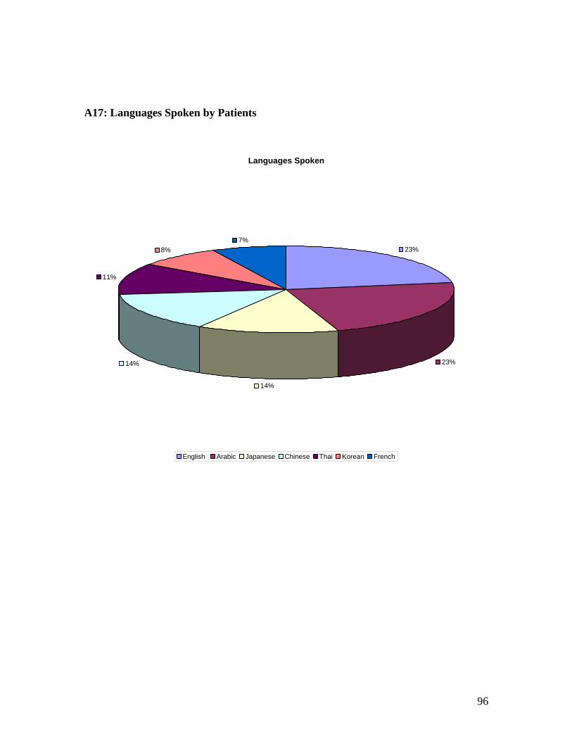
96
A17: Languages Spoken by Patients
Languages Spoken
23%
23%
14%
14%
11%
8%7%
English Arabic Japanese Chinese Thai Korean French

97
A18: Languages Understood by Patients
Languages Understood
26%
22%14%
14%
9%
8%7%
English Arabic Japanese Chinese Thai Korean French
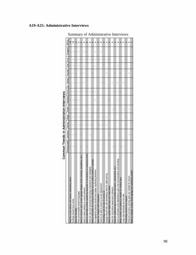
98
A19-A25: Administrative Interviews
Summary of Administrative Interviews

99
A20: Referenced Interview with Virat
INTERVIEW MINUTES
Khon Virat Changdaeng, Chief Concierge Minutes Outline: The interview was on January 13, 2005 and began at 10:00 am. People present were: Virat Changdaeng, Jennifer McLaughlin, Brendan McNeil and Sarah Sebald. The meeting’s purpose was to understand the role of porter and concierge services at the hospital with respect to wayfinding, and to learn what signage systems could prove useful to the porters and concierges. What services do you currently offer?
• Concierge Service o Started August 2004 o 5 Concierges on staff o Business Center in BH Hospital building o Trained in English o Give directions
• Porter Service o Counters at each entrance. o 67 porters on staff. o Porters stationed at all drop-off points o Transport patients, equipment, and luggage. o Accompany patients to departments. o Give directions o Most only know Thai o 24 hour service o Taxi queue 8am-8pm o Porter Management System: nurses use a computer to indicate the need
for a porter, then porters can be dispatched immediately.
What areas could currently be improved? • English speaking abilities of the porters (Training in progress) • There are no signs to the concierge desks, people don’t know where to go. • Directions can be/are given using the north or south sides of the building.
However, there are no signs marking north and south. How will your service function with the new building?
• One porter station at each parking level. • Elevators available for emergencies (fit beds, stretchers, etc.)

100
A21: Referenced Interview with Lawrence
INTERVIEW MINUTES Minutes Outline: The interview was on January 17 and began at 10:00 am. People present were Khon Lawrence Koh Khee, Jennifer McLaughlin, Brendan McNeil and Sarah Sebald. The meeting began with a description of Khon Lawrence’s responsibilities, then went into a discussion on signage systems which based around the main questions we had. Job description: Division Director, Material Resources. He is in charge of all supplies except for pharmacy. This includes purchasing signage when needed Question: What is wrong with your current system? Response:
• Tedious System o Current signage is manufactured in the UK o Their distributor is located in Singapore o Original Company who created signage is no longer in business o Metals must be engraved or silk screened o Takes two to three weeks to receive the new signage
To compensate long retrieval time, they buy spare strips They will cut out letters and past it on Letters do not correspond for each sign
• Book indicating where current signage is located has not been updated Question: What would make your wayfinding system better? Response:
• Use a computerized system • Better technology for signs
o He found a French company whose signs are made from a special material o At night time the signs are illuminated
Questions: What are the components that make up a wayfinding system? Response:
• It starts with a main directory o You need something to quickly identify where you are upon arrival
• Directional signs to guide patients

101
Question: What concerns do you have for putting in a new signage system? Response:
• There will be problems if BH tries to change all the signage at one time o He suggests that they start with just changing the signage in the main
building
Meeting Adjourned at 10:26 a.m.

102
A22: Referenced Interview with Prayuth
BANGKOK PROJECT CENTER
INTERVIEW MINUTES
Khun Prayuth, Supervisor, Transportation/Security
Minutes Outline: The interview was on January 13, 2005 and began at 2:00 pm. People present were: Khun Prayuth, Jennifer McLaughlin, Brendan McNeil and Sarah Sebald. The meeting’s purpose was to understand the current traffic and parking situation at Bumrungrad. How do cars currently use the garage here?
• Anyone entering the garage collects a card, which is used for anti-theft purposes. • They find a parking place, then go about their visit. • Non-patients also use the parking garage, then leave the campus to go to work.
How many cars enter and exit the garage each day?
• 1000 cars per day • There are 400 spaces in the current garage.
What changes will be made with the addition of the new building?
• Valet parking will be eliminated • Considering a way to validate parking for those using the hospital, otherwise
charging a fee. Notes:
• Mostly Thai people park their cars • Others use valet parking

103
A23: Referenced Interview with Toral
BANGKOK PROJECT CENTER
INTERVIEW MINUTES
Ruben Toral: Marketing Director Minutes Outline: The interview was on January 14 and began at 11:00 am. People present were Ruben Toral, Jennifer McLaughlin, Brendan McNeil and Sarah Sebald. The interview began with a description of Ruben’s responsibilities, then went into a discussion on signage systems which based around the main questions we had. Job description: Marketing Director. He is in charge of all the marketing aspects of BH Important Note: BH is going to have a new brand. This includes a new logo and a new name (Bumrungrad International)
Question: What are the sign requirements which you want your signs to have? Response:
• All signs must have the BH logo on it o They needs to reinforce the new brand
• There needs to be inbound and outbound directional signs • All fixed signs must be uniform
o These includes department identification signs (clinics, centers) o The only information on department identifications signs will be the logo
and name of the department • Do not want them to have a local look • Wants sign to have a “cool” look • Signs have to communicate different languages
o Directional signs may need transitional data • They needs a signage system which will aid them in competing with their
competitors o Apollo located in India and Parko located in Singapore
Question: What different aspects do you wish the signage system to have? Response:
• Rotating information o Signs should have the ability to rotate images of what they are all about
• Static images of who they are • Signs should be intelligent and interactive

104
Question: What are the problems with the current signage system? Response: (Included a tour)
• Internal Issues o Coloring scheme makes certain signs difficult to read o All the clinics and centers have different signs o Directory system impossible to read – Nobody reads them o Directional signs are too small and not in enough languages o “Dead Spots” need to made more active o Elevators – People want color here
• External Issues o There are no earlier warnings indicating where people need to turn into the
hospital o No big logo/ welcoming sign when people are coming into the hospital
Comments and suggestions:
• We need to determine how people interact with the signs in regards to how the sign works
• We should keep in mind that the volume of traffic is mostly around the outpatient clinics
• We should get a site map which shows where signs are all around the building • Entrances with dead spots should have mostly plasma screens • Top and bottom of escalators should have plasma billboards
Meeting Adjourned at 11:47 a.m.

105
A24: Referenced Interviews with Brown
BANGKOK PROJECT CENTER
INTERVIEW MINUTES
Dennis Brown, Group COO Minutes Outline: The interview was on January 11, 2005 and began at 9:00 am. People present were: Dennis Brown, Edgar Hernandez, Jennifer McLaughlin, Brendan McNeil and Sarah Sebald. The meeting’s purpose was to reacquaint ourselves with Bumrungrad’s needs, and to learn exactly what Dennis Brown wanted us to do with our project.
• Centralization versus Decentralization o Collection of lab work could be decentralized o Outpatients have 3-4 tests per visit. use pneumatic tube?
• Signage o Need exterior and interior update o New building in 5-7 years, must keep up with construction o Need dynamic signs, new technology a must. o Most popular languages: Thai, English, Japanese, Arabic, Bengali,
Mandarin, various European languages. • Statistics
o 70 translators work in the hospital o Doctors speak 17 languages o Patients visit from 152 countries. o 140 clinics. o Hospital open from 8am to 8pm, some clinics open to 12am. o 7 days a week, peak day is Saturday. o Peak hours: 9-10am, 2-4pm, 530-7pm
• Dr. Morley is in the international referral center, assists overseas patients. • New building:
o 10 levels of parking o 800 new spaces o Patients will park and ride the elevator to their clinic in the same building. o Need to distribute porter service.
• Visitors bring family, etc, add to the traffic problem. • Patients must know which doctor they are visiting when they arrive, causes
problems.

106
BANGKOK PROJECT CENTER
MEETING MINUTES Minutes Outline: The meeting was on January 18 and began at 2:30 pm. People present were Dennis Brown, Jennifer McLaughlin, Brendan McNeil, Sarah Sebald, Rob Krueger, Steve Pierson The meeting covered the following topics in the respected order: General Comments from Dennis Brown, language questions, goal of our team, objectives of our team, discovered technologies, recent activities, and future plans. General Comments from Dennis:
• We should look into government hospitals in Singapore o Ministry of health o Refer to studies done (if anyone has done a study on signage, it would be
in Singapore • Recommendation: Provide basic shortcomings • There are problems with empty taxis
o Hotels have systems to deal with this • Ex. When a taxi is needed they a sign will be lit up
• Issues of ratrunning o Can this be reduced by the usage of signs?
Language Survey Questions:
• Language Survey – We should be able to use registration to do this survey o What languages would you like to appear on signage at the hospital
(possible question) o Note: Just because they speak a language, does not mean they can read it o Grammar creates problems when translating o Medical terminology is in Latin making it conventional world wide
• Definition changes (common vs medical term) o Important to note the audience of our survey
• Seasons peak in the summer (middle east) • People coming to the hospital varies depending on the season • Check ups significantly increase during the summer • Seasonality for clinics as well • % of patients (distribution by nationality to language requested

107
General Discussion: • Discussion on new building
o Parking Level – Changes to mezzanine level (addition of lifts) o All elevators go to every floor
• Many only know doctors names and not departments – This means you cannot have department specific elevators
• There are four buildings, not three (We were forgetting about BH Small) • We can get statistics from Eddie about how many people have to escort patients
o Wheelchairs (porters) o Translators o Customer service (Dennis is not sure if they keep records)
• Keep considerations of volume when thinking of technology
o Possible segmentation of non speaking English o Tate modern museum, London
• Significant problem during changes from new building o It will take 5-7 years to finish the process of moving all the departments –
Meaning signage will be changes a lot in this time period o There will be redirections of old locations
• About 50% of the patients schedule ahead of time and about 50% of the patients are walk-ins
• There is no building location or map on the BH website • Roughly 10% of the patients are new patients and 90% of the patients are repeats • Possible Confirmations (human compliance)
o Complete registration when here • Registration Notes
o When registering, you don’t even have to give your names at times and they will still book you
o This causes problems as far as sending them email or cell phone messages telling them when and where their appt is
• Many people now depend on cell phones rather then land lines o Text message to confirm appt o Possibility for parking
• Ability for patients to get to BH
Meeting Adjourned at 4:00 pm.

108
BANGKOK PROJECT CENTER
MEETING MINUTES Minutes Outline: The meeting was on January 25 and began at 2:00 pm. People present were Dennis Brown, Jennifer McLaughlin, Brendan McNeil, Rob Krueger, Steve Pierson The meeting covered the following topics in the respected order: Our goal statement, Methodology details, (Mock Test, Employee Survey, E-mailing companies), and plans for the future
o Interior Design Firm – Shrimp Asia
Goal Statement:
o Just wayfinding o Not designing o Language Barrier
Mock Test:
o 3 persons (first-time users) o Fellow peers o Chula students
o Starting Points o 99% don’t take the sky train o problems with driving in (excluded b/c site will change) o valet parking should be included (vast majority dropped off)
going to get rid off b/c doubles car traffic • Will lead to elimination of some congestion
o Restrict to drop-off entrances Should see if greeter meets them
o Choosing Destinations o Majority to out patient dept.
Central Clinic Look into clinic cycle and visitor cycle
• Registration • Ancillary • Back to doctor • Cashier • Meds
o Inpatients are wheeled around meaning that wayfinding isn’t as important Dennis’s Motive:
o Customer service is #1 goal

109
o Volume between 2 connections is a distant #2 o Parking Structures #3 (eliminate lift traffic)
o Traffic Problems – queuing system Department Use:
o Middle east – diabetically influenced (Not enough to make a difference though as far as what clinics they travel to)
o There is no particular place that Thais go to more o Clinics have individual registration o Customer service – few languages – some are grad students o Porters – not much education (required 6th grade education only)
Language Survey:
Send email to Dennis when ready to begin survey Medical Clinic will provide highest volume and greatest range of patients
Kiosk Info:
Need to know from different companies. o Support structure and after service
Look into talking and voice-activated kiosks
Meeting Adjourned at 4:00 pm.

110
BANGKOK PROJECT CENTER
MEETING MINUTES Minutes Outline: The meeting was on February 1 and began at 2:00 pm. People present were Dennis Brown, Jennifer McLaughlin, Brendan McNeil and Sarah Sebald, Steve Pierson The meeting covered the following topics, respectively: Accomplishments, Mock Test comments, Surveys, and upcoming meetings Accomplishments:
• Contacted Technology Companies o Telesys – Meeting scheduled for February 8 o NanoNation – Kiosk
• Methodology o TQM – Dennis talked to Wanee (need to schedule a meeting with her)
Mock Test:
• Already set up inpatient route • Outpatient routes need to be defined
o 1. Local patients (Chula students) • Scheduled • Unscheduled (First timers)
o Chief Complaint o Assign doctor o Go from there
o 2. International Patients (WPI) • pre-contact (Talk to Khun Thimaporn) • new patients go through her • referral from relative or friend • appropriate directions from referral patients
o use staff to be directed • Have to register as a new patient • Bumrungrad responds to emails (They do send maps)
• 2 questions o Can they find the starting line o Can they find there way around the hospital from there
• Can use mock test to see if staff help in main lobby • Questions for survey
o What would they do o Have they ever been in a hospital

111
o How does experience have an affect Surveys:
• Lee Chan (CFO) Need to talk to for getting out a survey • Nuk – reports to Lee Chan – Could be our local contact • Probably will want to use Access to form our database • Concierge and CS
o What % of population speaks English (surveys may need to be translated) o Orm can help o Questions will be asked in English to international patients, but Thai for
the locals • Language survey
o Going to have to be few and short (may get pushed aside otherwise) Meetings:
• Infrastructure in new building o Thursday at 1pm o Fiber, backbone, copper, and wireless o We will need to find info on what technologies would need
• Power and Data seems to be it • Master Planning Board
o 2-02-05 at 3pm RFID:
• Check-up o Looking into RFID’s
• Osco does RFID o Australian Company
Side Notes for Lerdsin Hospital – Tam is head of pharmacy
Meeting Adjourned at 2:35 pm.

112
BANGKOK PROJECT CENTER
MEETING MINUTES Minutes Outline: The meeting was on February 7 and began at 2:00 pm. People present were Dennis Brown, Jennifer McLaughlin, Brendan McNeil, Sarah Sebald, Rob Krueger, Steve Pierson Major Accomplishments: Language Survey
Don’t know volume of patients per day Mock Test
Call Nuk (Tiwaporn) before mock test, about % pre-registered Ask background of individuals taking the test (insight into the decisions made)
Continuing contacts with tech. Companies Dennis didn’t know of any parking garages using digital signage
In Singapore, Wilson Parking. Talk to Parking Management Companies
Meeting Adjourned at 2:30 pm.

113
A25: Referenced Interview with Pantanavadee
BANGKOK PROJECT CENTER
INTERVIEW MINUTES
Khun Pantanavadee: Property Management Director Minutes Outline: The interview was on January 14 and began at 10:00 am. People present were Khun Pantanavadee, Jennifer McLaughlin, Brendan McNeil and Sarah Sebald. The interview began with a description of the departments housed within BH Residence. We then proceeded with a discussion on signage systems that was based around questions we had. Departments Housed within BH Residence:
• Ground floor Hotel check-out, restaurants and shops • 2nd Vital Life Clinic • 3rd Skin Clinic • 4th Plastic surgery Clinic • 5th-8th Offices (finance, etc.) • 9th Education dept. (Training) • 10th Maintenance and American Embassy Research Facility • 11th Nurses dormitory • 12th-18th Hotel rooms • 19th Global Care Communications (Hospital 2000)
Question: What are common problems seen within this building pertaining to signage? Response:
• BH Residence is often mistaken for the hospital ward o Patients aimlessly wandering on different floors
• Very little signage explaining elevator system (which to use) o 3 elevators allow access to all floors o 2 allow access to only parking garage floors o 2 allow access to a strange variety of floors and no access to parking
garage floors • BH Residence is comprised of two different buildings
o Smaller building is difficult to navigate Need people to walk with them
• Signs are often hidden by objects and difficult to see o Placed on the side walls instead of hanging signs

114
o Lighting is poor Question: Are there signs located within the parking garage that indicate directions to go? Response:
• Small signs are located in parking garage o Extremely easy to miss
Question: What types of signage are lacking? Response: (Included a tour)
• Maintenance signs needed for closets and rooms • Very few arrows indicating fire escape routes • No maps within the elevator of the building • No signs indicating restrooms • No building identification signs • No signage indicating where shops are located • Signs are needed to indicate location of ATM • Floor levels need to be indicated in stairwell • Many departments don’t have an identification sign (Global Care on 19th
floor) Question: What current signage needs improvement? Response:
• Directories aren’t clear enough • Color schemes should be used • Uniform signs are needed • For hotel and dormitory rooms, out-dated system is still in place
Comments and suggestions:
• Should keep in mind that the clinics will be moving to the new building upon completion.
• BH Residence will most likely become an in-patient facility Meeting Adjourned at 10:32 a.m.

115
A26: TQM Summary

116
A27-A31: Sample Email sent out to Companies A27: Sample Email sent out to Kiosk Companies To Whom it May Concern, We are a group of students from Worcester Polytechnic Institute who are currently working for Bumrungrad Hospital (www.bumrungrad.com). Bumrungrad Hospital, located in Bangkok Thailand, is the largest private hospital in Southeast Asia. Patients travel from over 140 countries to receive their world-class healthcare. The hospital is currently in the process of expanding locally as well as globally. They are expecting to double their already large patient volume of 3000 patients per day to 6000 within the next few years. Because of this expected increase in patient volume, we were hired to address their signage situation. Bumrungrad Hospital is looking for the newest technology that can be used as an efficient wayfinding system that will meet their hospital needs. Our job is to discover and research these technologies. A formal recommendation will be given to Bumrungrad Hospital by early March. We believe your kiosk technology could be used within the hospital and are hoping you could provide us with more information about your product. We have some very basic questions we hope you can answer.
• When purchasing kiosks, do you have to purchase the kiosk and the software together?
o What software can be used on your kiosk? o Is it limited to your software?
• Do you have software specific for wayfinding? o If you do, can you give us specific features of your software having
to do with user functionality? How can they interact with it? “You are here” maps? Printable maps? Etc.
• Can your software be adapted to our specific needs? o This includes possible integration with Hospital 2000. The software
covers all of the administrative and clinical needs (www.hospital2000.com) and was produced by Global Care Solutions, which is based in Bangkok, Thailand.
• Do you have software that can be run by voice activation? • Are there distributors of your product based in Thailand?

117
Do you think NanoNation would be interested in pursuing the possibility of working with Bumrungrad Hospital and their wayfinding system? The hospital receives hundreds of visitors every year from people interested in seeing how technology has helped Bumrungrad become one of the most admired facilities in Asia. Additionally they see over 250,000 international patients every year; many of whom are VIP or executive level. We look forward to hearing from you. Sincerely, Jennifer McLaughlin, Sarah Sebald, Brendan McNeil ______________ Email: [email protected]

118
A28: Sample Email sent out to Digital Signage Companies To Whom it May Concern, We are a group of students from Worcester Polytechnic Institute who are currently working for Bumrungrad Hospital (www.bumrungrad.com). Bumrungrad Hospital, located in Bangkok Thailand, is the largest private hospital in Southeast Asia. Patients travel from over 140 countries to receive their world-class healthcare. The hospital is currently in the process of expanding locally as well as globally. Bumrungrad is expecting to double their already large patient volume of 3000 patients per day to 6000 within the next few years. Because of this expected increase in patient volume, we were hired to address their signage situation. Bumrungrad Hospital is looking for the newest technology that can be used as an efficient wayfinding system that will meet their hospital needs. Our job is to discover and research these technologies. A formal recommendation will be given to Bumrungrad Hospital by early March. We believe your technology could be used within the hospital and are hoping you could provide us with more information about your product. We have brainstormed a few ideas of how your LCD Signage System technology could be applied to our wayfinding system.
• Your interactive wayfinding display systems are used by means of touch screens. Due to our demand of providing for several languages, we are looking for voice activation features. Due to a large amount of customers coming from the Middle East, many clients are able to speak English but not read or write it. It would be ideal for the device to be able to recognize several different languages and provide wayfinding directions in the spoken language. We are trying to determine if voice activation is a feasible solution to our language barrier problems.
• Your website states that the video information display system, LCD information display system and the interactive display system can all be run from a single PC. Would it be possible to integrate this type of wayfinding system into hospital 2000, our hospital information system? The software covers all of the administrative and clinical needs (www.hospital2000.com) and was produced by Global Care Solutions, which is based in Bangkok, Thailand.
Do you think MRG Systems would be interested in looking into these different applications? Bumrungrad Hospital gets hundreds of visitors every year from people interested in seeing how technology has helped them become one of the most admired facilities in Asia. Additionally they see over 250,000 international patients every year; many of whom are VIP or executive level.

119
We look forward to hearing from you. Sincerely, Jennifer McLaughlin, Sarah Sebald, Brendan McNeil

120
A29: Sample Email sent out to Talking Signs Companies To Whom it May Concern, We are a group of students from Worcester Polytechnic Institute, currently working for Bumrungrad Hospital (www.bumrungrad.com). Bumrungrad Hospital, located in Bangkok Thailand, is the largest private hospital in Southeast Asia. Patients travel from over 140 countries to receive their world-class healthcare. The hospital is currently in the process of expanding locally as well as globally. They are expecting to double their already large patient volume of 3000 patients per day to 6000 within the next few years. Because of this expected increase in patient volume, we were hired to address their signage situation. Bumrungrad Hospital is looking for the newest technology that can be used as an efficient wayfinding system that will meet their hospital needs. Our job is to discover and research these technologies. A formal recommendation will be given to Bumrungrad Hospital by early March. We believe your technology could be used within the hospital and are hoping you could provide us with more information about your product. We have brainstormed a few ideas of how your technology could be applied to hospital wayfinding systems.
• The hospital would have transmitters set up at key decision points (anywhere someone has the option of changing direction) which sends information to a hand held receiver. The receiver could give information audibly or visually. The patient would be given the receiver upon arrival. The receiver would have preprogrammed information concerning the destination of the patient. When the device received information from the transmitters, it could process the information and give the user directions on which direction to go.
Can your technology adapt to a hospital environment? Would we be able to program multiple languages on the receiver? Do you think Talking Signs would be interested in pursuing this? Bumrungrad Hospital gets hundreds of visitors every year from people interested in seeing how technology has helped them become one of the most admired facilities in Asia. Additionally they see over 250,000 international patients every year; many of whom are VIP or executive level.

121
We would love to hear any ideas you have regarding how Talking Signs can be applied to wayfinding in a hospital. We would hope to use your technology for several of our patients, not just the visually impaired. We look forward to hearing from you. Sincerely, Jennifer McLaughlin, Sarah Sebald, Brendan McNeil _______________ Email: [email protected]

122
A30: Sample Email sent out to RFID Companies To Whom it May Concern, We are a group of students from Worcester Polytechnic Institute, currently working for Bumrungrad Hospital (www.bumrungrad.com). Bumrungrad Hospital, located in Bangkok Thailand, is the largest private hospital in Southeast Asia. Patients travel from over 140 countries to receive their world-class healthcare. The hospital is currently in the process of expanding locally as well as globally. They are expecting to double their already large patient volume of 3000 patients per day to 6000 within the next few years. Because of this expected increase in patient volume, we were hired to address their signage situation. Bumrungrad Hospital is looking for the newest technology that can be used as an efficient wayfinding system that will meet their hospital needs. Our job is to discover and research these technologies. A formal recommendation will be given to Bumrungrad Hospital by early March. We believe your technology could be used within the hospital and are hoping you could provide us with more information on your product. We have brainstormed a few ideas of how your RFID technology could be applied to a hospital wayfinding system.
• We saw from your website that one of your applications for transportation is: Worker location & ID. Your website states that it can “Provide RFID based ID tags that can monitor location of worker in factory”
o This statement gave us the following idea: A patient can be given a handheld device that has an ID tag upon arrival. Much like a portable wireless GPS receiver you would purchase at a store. We are hoping your technology could indicate to the user where they are in the hospital via a map and provide directions to their destination. All of this would be preprogrammed.
Does this sound possible?
Do you think Infosys would be interested in pursuing this? Bumrungrad Hospital gets hundreds of visitors every year from people interested in seeing how technology has helped them become one of the most admired facilities in Asia. Additionally they see over 250,000 international patients every year; many of whom are VIP or executive level. We would love to hear any ideas you have regarding how RFID can be applied to wayfinding in hospitals. We look forward to hearing from you.

123
Sincerely, Jennifer McLaughlin, Sarah Sebald, Brendan McNeil _______________ Email: [email protected]

124
A31: Technology Companies Emailed

125
A32: Technology Features

126
A33: Technology Summary

127
A34-A39: Pros and Cons of Technologies A34: Pros and Cons of Static Signage Individual Technology Evaluation Static Signage Pros:
• Durable o Will not malfunction due to environmental elements
• Life Expediency o Can be long lasting with appropriate material
• No power consumption • No technical requirements for it to operate • Cheap to purchase then digital signage • Available in Thailand • Would not compromise Hospital 2000 security because they are not tied into it • Display size can be any size, large or small • Simple to use – user only has to look at it, and they will receive all the
information the sign has to offer Cons:
• Cannot be easily or quickly modified o Cannot tie into Hospital 2000
• Cannot display a large quantity of information in comparison to digital signage o Information display is limited to how much you can fit on the sign
• Multi-lingual limitations – usually only two languages can be displayed • Cannot interact with the user by any means • It cannot have any accessories to help with wayfinding (barcode scanners, etc) • Cannot locate patient

128
A35: Pros and Cons of LCD Signage Individual Technology Evaluation LCD Signage Pros:
• Can be easily modified o Can tie into Hospital 2000 (Telesys)
• Consumes less power then plasma signage • Smaller Displays are cheaper then plasma signage • Longevity is better then plasma (appendix 41) • No burn-in effect (Appendix 41) • Available in Thailand • Can store larger quantities of info then static signs
o Ability to have dynamic information (scrolling information, etc) • Can display multiple languages due to dynamic information • Can have a mapping system on display • Easier to use then interactive kiosks
Cons:
• Not as durable as other wayfinding systems o More fragile then plasma signs and static signs
• There are technical requirements for it to operate (power, networking cable) o If these fail to operate, the whole system can be unusable
• Not as cheap as static signage • Security issues
o If it is tied in with Hospital 2000 there may be security concerns o Not a large issue in comparison to interactive kiosks
• Display size is limited right now (Appendix 41) o Cannot be as large as plasma, and price goes up greatly for the larger
displays • Cannot be interactive like the interactive kiosks • Does not have accessories to assist user in wayfinding • Does not have a patient locator

129
A36: Pros and Cons of Plasma Signage Individual Technology Evaluation Plasma Signs Pros:
• Can be easily modified o Can tie into Hospital 2000 (Telesys)
• Not as fragile as LCD signage, although not as good as static signage • Larger Displays are cheaper then LCD signage • Available in Thailand • Can store larger quantities of info then static signs
o Ability to have dynamic information (scrolling information, etc) o Large Viewing area
• Can display multiple languages due to dynamic information • Can have a mapping system on display • Easier to use then interactive kiosks
Cons:
• There are technical requirements for it to operate (power, networking cable) o If these fail to operate, the whole system can be unusable
• Not as cheap as static signage • Consumes a high amount of power (appendix 41) • Longevity is not as good as LCD signage (appendix 41) • Security issues
o If it is tied in with Hospital 2000 there may be security concerns o Not a large issue in comparison to interactive kiosks
• Cannot be interactive like the interactive kiosks • Does not have accessories to assist user in wayfinding • Does not have a patient locator

130
A37: Pros and Cons of Interactive Kiosk Individual Technology Evaluation Interactive Kiosk Pros:
• Can be easily modified o Can integrate with Hospital 2000 (Telesys confirmed)
• Is available in Thailand • Can store large amounts of information – As much as a computer can hold • Can deal with multi-lingual issues via user interaction (Telesys confirmed) • Can having a mapping system to aid user in see where they are where they need
to go (Telesys confirmed) • Can interactive with the user
o Touch screen o Voice input o Voice output
• Has accessories which can aid in wayfinding (keyboard, headphones, barcode scanners, etc)
Cons:
• Not as durable as other wayfinding systems o Children tend to play with touch screens, cause system malfunctions
• Display and Computer consumes power • There are technical requirements for it to operate (power, networking cable)
o If these fail to operate, the whole system can be unusable • Not as cheap as static signage
o Also, needs more then just a display • Security issues
o If the user can interact with, this will compromise the security of Hospital 2000 more so then any of the other technologies
• Touch screens are typically smaller displays • Can be user-friendly problems
o Telesys claims their system is user-friendly, but if the user has to interact with the system, it will be more complicated then just having to observe the sign
• Does not have a patient locator
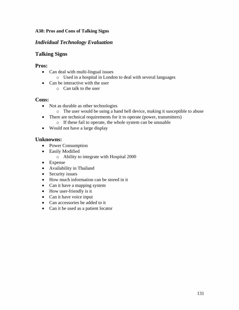
131
A38: Pros and Cons of Talking Signs Individual Technology Evaluation Talking Signs Pros:
• Can deal with multi-lingual issues o Used in a hospital in London to deal with several languages
• Can be interactive with the user o Can talk to the user
Cons:
• Not as durable as other technologies o The user would be using a hand hell device, making it susceptible to abuse
• There are technical requirements for it to operate (power, transmitters) o If these fail to operate, the whole system can be unusable
• Would not have a large display Unknowns:
• Power Consumption • Easily Modified
o Ability to integrate with Hospital 2000 • Expense • Availability in Thailand • Security issues • How much information can be stored in it • Can it have a mapping system • How user-friendly is it • Can it have voice input • Can accessories be added to it • Can it be used as a patient locator

132
A39: Pros and Cons of Radio Frequency Identification Individual Technology Evaluation Radio Frequency Identification (RFID) Pros:
• Can locate patients Cons:
• Not as durable as other technologies o The user would be using a hand held device, making it susceptible to
abuse • There are technical requirements for it to operate (power, transmitters)
o If these fail to operate, the whole system can be unusable • Would not have a large display
Unknowns:
• Power Consumption • Easily Modified
o Ability to integrate with Hospital 2000 • Expense • Availability in Thailand • Security issues • How much information can be stored in it • How can it accommodate different languages • Can it have a mapping system • How user-friendly is it • Can it be interactive with the user • Can it have voice input • Can accessories be added to it
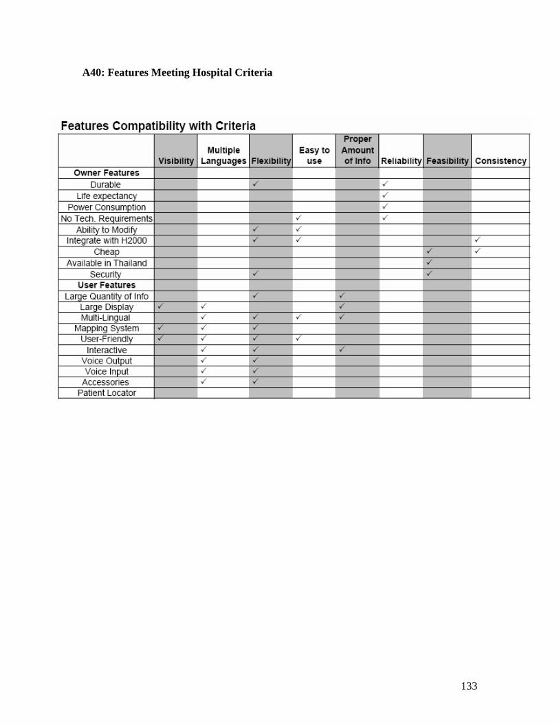
133
A40: Features Meeting Hospital Criteria

134
A41: Display Comparison

135
A42: Technologies ranking at Each Decision Point
Car to Hospital Entrance
Criterion Weight Interactive
Kiosk LCD
Signage Plasma Signage Static
Visibility x 9 0 1 2 4 Flexibility x 8 4 4 4 1
Easy to Use x 7 0 1 2 4 Proper Amount of Info x 7 1 2 2 4
Multiple Languages x 5 4 3 4 4 Appropriateness to Location x 4 0 0 0 4
Reliability x 3 1 1 1 4 Consistency x 2 4 4 4 1 Feasibility x 1 2 3 2 4
Total 72 91 111 154
Hospital Entrance
Criterion WeightInteractive
Kiosk LCD
Signage Plasma Signage Static
Visibility x 9 1 1 2 4 Flexibility x 8 4 4 4 1
Easy to Use x 7 1 4 4 4 Proper Amount of Info x 7 1 2 2 4
Multiple Languages x 5 4 2 3 2 Appropriateness to Location x 4 1 2 2 4
Reliability x 3 1 1 1 4 Consistency x 2 4 4 4 1 Feasibility x 1 2 3 2 4
Total 92 115 128 145

136
Mezzanine Level Entrance
Criterion Weight
Interactive Kiosk
LCD Signage
Plasma Signage Static
Visibility x 9 1 2 3 4 Flexibility x 8 4 4 4 1
Easy to Use x 7 2 4 4 4 Proper Amount of Info x 7 4 3 4 3
Multiple Languages x 5 4 2 3 2 Appropriateness to Location x 4 2 2 2 4
Durability x 3 2 2 2 4 Consistency x 2 4 4 4 1 Feasibility x 1 2 3 2 4
Total 127 134 148 137
Main Lobby
Criterion Weight
Interactive Kiosk
LCD Signage
Plasma Signage Static
Visibility x 9 2 2 4 4 Flexibility x 8 4 4 4 1
Easy to Use x 7 3 4 4 4 Proper Amount of Info x 7 4 2 3 2
Multiple Languages x 5 4 2 3 2 Appropriateness to Location x 4 4 2 3 3
Reliability x 3 2 2 2 4 Consistency x 2 4 4 4 1 Feasibility x 1 2 3 2 4
Total 151 127 160 126
Elevator Lobby
Criterion Weight
Interactive Kiosk
LCD Signage
Plasma Signage Static
Visibility x 9 3 3 4 4 Flexibility x 8 4 4 4 1
Easy to Use x 7 3 3 4 4 Proper Amount of Info x 7 4 1 2 1
Multiple Languages x 5 4 2 3 2 Appropriateness to Location x 4 4 1 2 3
Reliability x 3 2 2 2 4 Consistency x 2 4 4 4 1 Feasibility X 1 2 3 2 4
Total 160 113 149 119

137
Escalator
Criterion Weight
Interactive Kiosk
LCD Signage
Plasma Signage Static
Visibility x 9 2 3 2 4 Flexibility x 8 4 4 4 1
Easy to Use x 7 2 4 4 4 Proper Amount of Info x 7 4 2 3 3
Multiple Languages x 5 4 2 3 2 Appropriateness to Location x 4 1 2 1 4
Reliability x 3 2 2 2 4 Consistency x 2 4 4 4 1 Feasibility x 1 2 3 2 4
Total 132 136 134 137
Hallway Intersections
Criterion Weight
Interactive Kiosk
LCD Signage
Plasma Signage Static
Visibility x 9 2 3 3 4 Flexibility x 8 4 4 4 1
Easy to Use x 7 1 3 3 4 Proper Amount of Info x 7 1 3 2 4
Multiple Languages x 5 4 2 3 2 Appropriateness to Location x 4 0 1 0 4
Reliability x 3 2 2 2 4 Consistency x 2 4 4 4 1 Feasibility x 1 2 3 2 4
Total 100 132 125 144
Department Identification
Criterion Weight
Interactive Kiosk
LCD Signage
Plasma Signage Static
Visibility x 9 2 3 3 4 Flexibility x 8 4 4 4 1
Easy to Use x 7 1 3 3 4 Proper Amount of Info x 7 1 4 2 4
Multiple Languages x 5 4 2 3 2 Appropriateness to Location x 4 1 3 1 4
Reliability x 3 2 2 2 4 Consistency x 2 4 4 4 1 Feasibility x 1 2 3 2 4
Total 104 140 129 144

138
A43: Telesys Minutes Telesys Meeting Minutes Minutes Outline: The meeting was on February 7 and began at 3:30 pm. People present were Edgar Hernandez, Jennifer McLaughlin, Brendan McNeil, Sarah Sebald, and two representatives from Telesys.
Telesys provides hardware and software for signage o Both customizable
Hardware • Any size • Interactive/non-interactive • Wireless (outside)/Wired (inside)
Software • MSIE based • Can integrate with Hospital 2000
Wayfinding Capabilities o Map System o Interactive touch-screen o Multi-lingual capability o Can play voice to inform o Touch screen computers at entrances
Software Capabilities o Fully Automatic o Can turn signs on/off o Integrate with doctor locator o Can play streaming video o Automatic updates from Windows o Signs can be broadcast to unlimited clients
BH o Can select own sign housing, have it built separately o Needs step-by-step menus for easy interaction o Provides graphics unless on a yearly contract with Telesys o Can select signs from a catalogue of dimensions/types o Signs to keep up with Rebranding at the end of March o Wants Telesys to do thorough analysis and recommendations for BH
Telesys o Main Customers
AIS Shangri-La

139
• 39 clients, 2 servers (Hardware and Software) – B5,500,000
o Can provide Demo o 85% cost hardware and labor
Meeting Adjourned at 4:50 pm.

140
A44: Shrimp Minutes BANGKOK PROJECT CENTER
Shrimp Proposal Meeting Minutes Minutes Outline: The meeting was on February 11 and began at 1:30 pm. People present were Dennis Brown, Jennifer McLaughlin, Brendan McNeil, Sarah Sebald, the Shrimp team, and hospital executives.
• Large pylon exterior signs • Use high quality material – aluminum/steel • Assignment – objectives
o Improve system, give contemporary look o Consistency o Clarity o Readability o Automated LED car park system
• Consideration to rebranding • Observations – how the project will move forward • Scope of work
o Project installing o Analysis of phases o Establish phases
• Phase 1 o Rooftop signs – only one side (no visibility) o Entrances from soi 1, 3 – canopy ID o Specialty clinics
• Phase 2 o Making signage ID constant o LED – indicate full parking lot o Summary plasma screens for general info o Touch screen in certain areas o Each car park level o Info center – any language (software) o Training for employees to help visitors (language still a problem)
• Phase 3 o Establish brand o Don’t want time too long for signs o Logo sign on hospital – seen from highway
• Phase 4 o Signing new building o Back of house signage
Meeting Adjourned at 2:30 pm.
141
A45: Infrastructure Minutes
Minutes for Infrastructure Board Meeting
Minutes Outline: The meeting was on February 3 2005 and began at 1:30 pm. People present were Dennis Brown, Jennifer McLaughlin, Brendan McNeil, Sarah Sebald and members of the Infrastructure Board Team.
• Outlining Infrastructure Requirements o Figuring out security (digital, motion?) o Wiring o Entertainment, internet (looking into) o RFID core (monitor people)
Make sure core is properly sized • Wireless network to locate persons throughout the hospital
o Anything but RFID? • Entertainment
o PA o Regular TV o Music intercom
• Stanford just put in digital signage (not interactive) • Besides written – voice becomes interactive
o How long wait is, show picture of doctor, etc • Parking
o Parking overnight (take care of) • They have antennas for cell phones located throughout building
o Look into some of these companies • Thais want a person • RFID tagging wheelchairs • 50% scheduled • How address registration will affect wayfinding • Get in elevator, want to let know they can go anywhere in the building • 20 noodle vendors die a year from electrocution during the rainy season

142
A46: Talking Signs Contact Information -----Original Message----- From: [email protected] [mailto:[email protected]] Sent: Tuesday, February 15, 2005 5:07 AM To: Ward Bond Cc: [email protected]; [email protected]; [email protected] Subject: Re: FW: Using Talkingsigns in hospital facilities Dear Mr. Bond, Yes, we have several TS application examples installed in hospitals also here in Japan. But as you can imagine, these examples are all applied for the purpose to assits mainly or only blind inpartients or eye-operated patients to move around during being in the hospital. The guidance system which the medical students inquried seems to be the other concept of system which could mainly assist outpatients to access to certain locations or destinations in the hospital in easier ways based on a certain intellegent technology by computers, although TS could of cource be a part of the system which would play a role as what we call "RIAS - wireless, harmless and silent audible signage". It is importnat whether the students could understand this point well enough. Below as an reference, I attach an abstract of report telling about the development of guidance system by Nagasaki Medical Center in Japan, and this concept of system may be the one the students are looking for. ;++++++++++++++++++++++++++++++++++++++++++++++++++++++++++++++++++++++ Developement of the Guidance system at the Outpatient's clinic TAKEHIRO MATSUMOTO1) HIRONORI KIMURA1) YUKIHISA KOUYAMA1) MAKI UCHIKAWA1) KOUSEI MIYASHITA1) HIROMI ISHIBASHI2) Department of Medical Informatics, Nagasaki Medical Center, Nagasaki, Japan1) Division of Medical Informatics, Clincal Research Center, Nagasaki Medical Center, Nagasaki, Japan2) Abstract: At the outpatient clinic the service of display of waiting time And consultation turn or protection of privacy are very important. We developed new Guidance system which could show the waiting time and consulting turn and voiceless guidance to the consultation room by displaying reception number. When a doctor pushed new patient button on the client computer, next number of the patient was showed more clearly and waiting time was re-calculated automatically and showed on the display and Electronic medical record of this patient was opened. Because this system can show the information of 4 patients at the same time, developing cost is about 1/4. Keywords: Guidance system, Electronic medical record, Outpatient's Clinic, Waiting time ;++++++++++++++++++++++++++++++++++++++++++++++++++++++++++++++++++++++++ Thank you for your consideration.

143
Tori, MPC

144
References ADA Standards for Accessible Design (July 1994). Title III Regulations. Bumrungrad Hospital (BH). (2004). Bumrungrad Hospital. Retrieved January 13, 2005
from http://www.bumrungrad.com Buxton, Pamela (January 2004). Lead the way: as the most conspicuous part of a
building's wayfinding system, signs have to look good and work well, but they now also have a significant role to play in branding. Design Week, 19(3), p 20.
Carpman Grant Associates (CGA). (2004a). Disorientation. Retrieved January 14,
2005, from http://www.wayfinding.com/pg-disorientation.htm Carpman Grant Associates (CGA). (2004b). Wayfinding in Parking Garages. Retrieved
January 14, 2005, from http://www.wayfinding.com/parking_structures.htm Carpman Grant Associates (CGA). (2004c). Wayfinding in Hospitals. Retrieved January
14, 2005, from http://www.wayfinding.com/hospitals.htm DoD. (2004). Understanding the Value of Signage. Retrieved January15, 2005, from
http://www.sba.gov/starting/signage/understand.html Fetzer, James (May 2004). Information: Does it Have to be True? Minds and Machines.
14(2), 223-229 Flinchpaugh, Jennifer. (December 2004). ADAptations. Signs of the Times.
Retrieved January 13, 2005, from http://www.signweb.com/ada/cont/adasigns0800.html
Global Care Solutions Ltd. (GCS). (2005). Hospital 2000 Overview. Retrieved
November 11, 2004, from http://www.hospital2000.com/english/product_h2000_overview.asp
Goodwins, Rupert. (2003). Organic LED’s are the Future of Displays. ZDNet UK, March
19,2003. Retrieved January15, 2005, from http://insight.zdnet.co.uk/hardware/chips/0,39020436,2132170,00.htm
IBM Research. (February 6, 2003). The Everywhere Displays Project. Retrieved January
14, 2005, from http://www.research.ibm.com/ed/ Johns Hopkins Medicine. (2004) Patient Information. Definition of Tertiary Care.
Retrieved November 30, 2004, from the World Wide Web: http://www.hopkinsmedicine.org/patients/insurance_footnotes.html
Jones, KE and Tamari, IE (1997). Making Our Offices Universally Accessible: Guidelines for Physicians. Canadian Medical Association Journal. 156, 647-56.

145
Kalusmeier, Bob. (n.d.). Choosing a Message. Retrieved January 14, 2005, from
http://www.signweb.com/moving/cont/chooseamessage.html KIOSK MAGAZINE. (2004). Self-Service News, Trends & Commentary. Retrieved
January 18, 2005, from http://www.kiomag.com MontegoNet. (2004). Welcome. Retrieved January16, 2005, from
http://www.montegonet.com MRG Systems. (2004a). LCD Graphics Controller. Retrieved January14, 2005,
from http://www.mrgsystems.co.uk/graphics/lcdsignage/lcdgraphics.htm MRG Systems. (2004b). LCD Sinage System. Retrieved January14, 2005, from
http://www.mrgsystems.co.uk/graphics/lcdsignage/lcdsignage.htm
Motor Vehicle Association (MVA). (2004). Traffic Study for Bumrungrad Hospital. Bangkok: Thailand.
Mulhausen, John (2002). Wayfinding is Not Signage. Signs of the Times. Reinert, Shannon. (2004). Superlarge-Format Graphics. Retrieved January 25,
2005, from http://www.signweb.com/outdoor/cont/superlarge.html Scala Broadcast Multimedia (SCM). (2004). Scala-What is Active Signage.
Retrieved January 14, 2005, from http://www.scala.com/what/active-signage.html Schwartz, Adele C. (2003). Signing the Terminal. Airport Equipment & Technology, Spring
2003. Retrieved January 17, 2005, from http://www.appledesigns.net/news_03.htm The Sign Biz Network (SBN). (n.d.). Signage Guidelines: Multilingual Messages.
Retrieved January 15, 2005, from http://signbiznet.com/language.htm Sign Design. (2005). Hospital Signage. Retrieved January 16, 2005, from
http://www.hospitalsignage.com Taylor, Kenneth (August 1995). Wayfinding. Health Facilities Management, 8(8),
66. Talking Signs, Inc. (2004). Infrared Communications System. Retrieved January 12.
2005, from http://talkingsigns.com Wirespring Technologies, Inc (WT). (2004). New to Kiosks and Digital Signage?
Retrieved January 13, 2005, from http://wirespring.com Wright, Gordon (January 2001). Wayfinding as a learning tool. Building Design &
Construction, 42(1), 5.