
User's Guide - NET
684
User’s Guide
-
Upload
khangminh22 -
Category
Documents
-
view
0 -
download
0
Transcript of User's Guide - NET

User’s Guide

Copyright © 1987-2005 ComponentOne LLC. All rights reserved.
Corporate Headquarters ComponentOne LLC 4516 Henry Street Suite 500 Pittsburgh, PA 15213 USA
Internet: [email protected] Web site: http://www.componentone.com Sales E-mail: [email protected] Telephone: 1.800.858.2739 or 1.412.681.4343 (Pittsburgh, PA USA Office)
Technical Support See Technical Support in this manual for information on obtaining technical support.
Trademarks ComponentOne True DBGrid for .NET and the ComponentOne True DBGrid for .NET logo are trademarks, and ComponentOne is a registered trademark of ComponentOne LLC. All other trademarks used herein are the properties of their respective owners.
Warranty ComponentOne warrants that the original CD (or diskettes) are free from defects in material and workmanship, assuming normal use, for a period of 90 days from the date of purchase. If a defect occurs during this time, you may return the defective CD (or disk) to ComponentOne, along with a dated proof of purchase, and ComponentOne will replace it at no charge. After 90 days, you can obtain a replacement for a defective CD (or disk) by sending it and a check for $25 (to cover postage and handling) to ComponentOne. Except for the express warranty of the original CD (or disks) set forth here, ComponentOne makes no other warranties, express or implied. Every attempt has been made to ensure that the information contained in this manual is correct as of the time it was written. We are not responsible for any errors or omissions. ComponentOne’s liability is limited to the amount you paid for the product. ComponentOne is not liable for any special, consequential, or other damages for any reason.
Copying and Distribution While you are welcome to make backup copies of the software for your own use and protection, you are not permitted to make copies for the use of anyone else. We put a lot of time and effort into creating this product, and we appreciate your support in seeing that it is used by licensed users only. Please read License Agreement and Licensing sections in this manual before copying and redistributing any ComponentOne True DBGrid for .NET files.

· iii
Table of Contents Table of Contents ....................................................................................................................... iii Welcome to ComponentOne True DBGrid for .NET............................................................. 1
Product Profile ........................................................................................................................ 1 Installation............................................................................................................................... 3 Adding the C1TrueDBGrid Component to the Toolbox................................................... 3 END-USER LICENSE AGREEMENT FOR COMPONENTONE SOFTWARE.............. 4 Licensing FAQs..................................................................................................................... 11 Redistributable Files............................................................................................................. 14 Technical Support................................................................................................................. 15 Namespaces........................................................................................................................... 15
Object Model............................................................................................................................... 19 True DBGrid Objects and Collections................................................................................ 19 C1TrueDBGrid Class............................................................................................................ 20 C1TrueDBDropDown Class................................................................................................ 20 C1DataColumnCollection Class ......................................................................................... 21 C1DisplayColumnCollection Class.................................................................................... 21 GroupedColumnCollection Class ...................................................................................... 22 SplitCollection Class ............................................................................................................ 22 GridStyleCollection Class.................................................................................................... 23 ValueItems Class .................................................................................................................. 24 PrintInfo Class ...................................................................................................................... 25 PrintPreviewWinSettings Class.......................................................................................... 25 HBar Class ............................................................................................................................. 25 VBar Class.............................................................................................................................. 25 GridLines Class..................................................................................................................... 26 GridBorders Class ................................................................................................................ 26 SelectedRowCollection Class.............................................................................................. 26 SelectedColumnCollection Class........................................................................................ 26 Working with Objects and Collections.............................................................................. 26
Design Time Interaction ........................................................................................................... 35 Understanding the Object Model and Property Access.................................................. 35 Using the SplitCollection Editor......................................................................................... 37 Using the C1DisplayColumnCollection Editor ................................................................ 39 Using the ValueItemCollection Editor .............................................................................. 41 Using the GridStyleCollection Editor ................................................................................ 41 Using the C1TrueDBGrid Designer ................................................................................... 42 Context Menu ....................................................................................................................... 45
Run Time Interaction................................................................................................................. 47 Navigation and Scrolling..................................................................................................... 47 Selection and Movement ..................................................................................................... 51 Sizing and Splitting .............................................................................................................. 54 Database Operations ............................................................................................................ 56 Customized Grid Editors .................................................................................................... 58 Additional User Interaction Features ................................................................................ 60

iv ·
Data Binding................................................................................................................................ 61 Binding True DBGrid to a Data Source ............................................................................. 61 Unbound Columns............................................................................................................... 61
Customizing the Grid's Appearance ....................................................................................... 67 Captions, Headers, and Footers.......................................................................................... 67 Three-dimensional Versus Flat Display ............................................................................ 70 Borders and Dividing Lines ................................................................................................ 72 Unpopulated Regions .......................................................................................................... 73 Highlighting the Current Row or Cell............................................................................... 75 Row Height and Word Wrap.............................................................................................. 78 Alternating Row Colors....................................................................................................... 79 Horizontal and Vertical Alignment ................................................................................... 79
Data Presentation Techniques.................................................................................................. 81 Text Formatting .................................................................................................................... 81 Automatic Data Translation with ValueItems.................................................................. 85 Context-Sensitive Help with CellTips ............................................................................... 95 Scroll Tracking and ScrollTips ............................................................................................ 97 Data-Sensitive Cell Merging ............................................................................................... 98 Column Grouping .............................................................................................................. 100 Hierarchical Data Display ................................................................................................. 101 Dropdown Hierarchical Data Display............................................................................. 102 Form Data Display ............................................................................................................. 104 Inverted Data Display........................................................................................................ 104 Multiple Line Data Display............................................................................................... 104 Owner-Drawn Cells ........................................................................................................... 106 Filtering Data in DataSets.................................................................................................. 109
How to Use Splits ..................................................................................................................... 111 Referencing Splits and their Properties ........................................................................... 111 Split Matrix Notation ......................................................................................................... 114 Creating and Removing Splits .......................................................................................... 115 Working with Columns in Splits ...................................................................................... 116 Sizing and Scaling Splits.................................................................................................... 117 Creating and Resizing Splits through User Interaction................................................. 120 Vertical Scrolling and Split Groups.................................................................................. 122 Horizontal Scrolling and Fixed Columns........................................................................ 124 Navigation across Splits .................................................................................................... 126
How to Use Styles..................................................................................................................... 127 Built-in Named Styles ........................................................................................................ 127 Working with Style Properties.......................................................................................... 130 Applying Styles to Cells .................................................................................................... 140 Applying Pictures to Grid Elements ................................................................................ 148
Cell Editing Techniques.......................................................................................................... 155 How Cell Editing Works ................................................................................................... 155 Handling Editing Events ................................................................................................... 156 Working with Text ............................................................................................................. 160 Input Masking..................................................................................................................... 162 In-Cell Buttons .................................................................................................................... 163 Dropdown Controls ........................................................................................................... 166

· v
True DBGrid Samples ............................................................................................................. 171 Visual Basic and C# Samples............................................................................................ 171 Borland Samples................................................................................................................. 172
Tutorials ..................................................................................................................................... 173 Introduction ........................................................................................................................ 173 Tutorial 1 - Binding True DBGrid to a DataSet .............................................................. 173 Tutorial 2 - Using True DBGrid with SQL Query Results ............................................ 175 Tutorial 3 - Linking Multiple True DBGrid Controls .................................................... 178 Tutorial 4 - Interacting with Code and Other Bound Controls .................................... 180 Tutorial 5 - Selecting Multiple Rows Using Bookmarks ............................................... 187 Tutorial 6 - Defining Unbound Columns in a Bound Grid........................................... 189 Tutorial 7 - Displaying Translated Data with the Built-in Combo .............................. 192 Tutorial 8 - Attaching a Dropdown Control to a Grid Cell .......................................... 193 Tutorial 9 - Attaching an Arbitrary Dropdown Control to a Grid Cell ...................... 195 Tutorial 10 - Enhancing the User Interface with In-Cell Bitmaps................................ 200 Tutorial 11 - Using Styles to Highlight Related Data .................................................... 202 Tutorial 12 - Displaying Rows in Alternating Colors.................................................... 206 Tutorial 13 – Implementing Drag-and-Drop in True DBGrid...................................... 207 Tutorial 14 - Creating a Grid with Fixed, Nonscrolling Columns ............................... 213 Tutorial 15 – PrintInfo and Print Preview....................................................................... 215 Tutorial 16 – Hierarchical Display ................................................................................... 220 Tutorial 17 – Grouping Display........................................................................................ 221 Tutorial 18 – Value Translation ........................................................................................ 222 Tutorial 19 – Range Selection............................................................................................ 223 Tutorial 20 – Multiple Data Views ................................................................................... 225 Tutorial 21 – Filter Bar ....................................................................................................... 229 Tutorial 22 – Borders, Scroll Tracking, and Scroll Tips ................................................. 230
C1TrueDBGrid Reference....................................................................................................... 243 C1TrueDBGrid Class.......................................................................................................... 243 Split Class ............................................................................................................................ 399 C1DisplayColumn Class.................................................................................................... 435 C1DataColumn class.......................................................................................................... 460 Style Class............................................................................................................................ 480 ValueItems Class ................................................................................................................ 494 ValueItem Class .................................................................................................................. 499 PrintPreviewWinSettings Class........................................................................................ 501 PrintInfo Class .................................................................................................................... 504 HBar Class ........................................................................................................................... 518 VBar Class............................................................................................................................ 519 GridLines Class................................................................................................................... 520 GridBorders Class .............................................................................................................. 521 GridStyleCollection Class.................................................................................................. 524 GroupedColumnCollection Class .................................................................................... 527 GroupInfo Class.................................................................................................................. 529 SelectedColumnCollection class....................................................................................... 531 SelectedRowCollection class ............................................................................................. 533 SplitCollection class ........................................................................................................... 536 ValueItemCollection class ................................................................................................. 538 C1OwnerDrawPrint Class................................................................................................. 540 ViewRow Class ................................................................................................................... 544 GroupRow Class................................................................................................................. 546

vi ·
Event Handler Reference................................................................................................... 548 Event Argument Reference ............................................................................................... 561 Enumeration Reference...................................................................................................... 576 PrintInfo Enumerations ..................................................................................................... 594
C1TrueDBDropDown Reference........................................................................................... 597 C1TrueDBDropDown Class.............................................................................................. 597
Index............................................................................................................................................ 671

Product Profile · 1
Welcome to ComponentOne True DBGrid for .NET
Welcome to ComponentOne True DBGrid for .NET, a grid control for Microsoft Visual Studio.NET developed by ComponentOne LLC, was designed to allow end users to browse, edit, add, and delete data in a tabular format. Using the latest data-binding technologies built into Visual Studio.NET, including ADO.NET, True DBGrid completely manages the database interface, allowing developers to concentrate on important application-specific tasks.
True DBGrid was designed to be a powerful, versatile, and easy-to-use data presentation tool. Novice programmers can use True DBGrid to create a fully functional database browser with only writing a few lines of code. Professional developers can use the grid control's many properties and events to create sophisticated and user-friendly database front-end applications.
If you like True DBGrid for .NET, you can check out our other products by visiting our web site at http://www.componentone.com.
ComponentOne has a user-friendly distribution policy. We want every programmer to obtain a copy of True DBGrid for .NET to try for as long as they wish. Those who like the product and find it useful may buy a license for a reasonable price. The only restriction is that unlicensed copies of True DBGrid for .NET will display a ComponentOne banner every time they are loaded to remind developers to license the product. We are confident that you'll like True DBGrid for .NET. If you have any suggestions or ideas for new features or tools that you'd like to see included in a future version please call us or write:
Corporate Headquarters
ComponentOne LLC 4516 Henry Street Suite 500 Pittsburgh, PA 15213 USA 412.681.4343 412.681.4384 (Fax)
http://www.componentone.com
Product Profile True DBGrid includes dozens of advanced data access, data presentation, and user interface features that enable developers to build intuitive, professional-looking applications:
Excel and Word-like styles Hierarchical style objects encapsulate font, color, picture, and formatting information, facilitating easy customization of grid components at design time and run time.
Excel-like splits Developers and end users can divide the grid into separate vertical and horizontal panes to provide multiple views of the data. The splits can scroll independently or simultaneously.
Fixed, nonscrolling columns
Splits can also be used to create nonscrolling columns anywhere in the grid (at the left or right edges, or in the middle).

2 · Welcome to ComponentOne True DBGrid for .NET
In-cell objects The grid supports a variety of in-cell objects for data display and editing, including bitmaps, command buttons, check boxes, and radio buttons.
Drop-down objects The grid supports a variety of drop-down objects for data entry, including a multicolumn control (C1TrueDBDropDown), a combo box, and a multiline text editor. Third-party drop-down controls also supported.
Automatic data translation Database values can be automatically translated into alternate text or graphics without coding. For example, numeric codes can be rendered as words or even bitmaps.
Data-sensitive display A powerful regular expression facility can be used to apply different styles to individual cells depending upon their contents. For example, negative numbers can be shown in red, or fields containing a particular substring can be shown in bold.
Unbound columns The grid supports unbound columns while other columns are bound to a data control.
Input masking Input templates can be assigned to columns in order to reduce end-user data entry errors.
Run-time CellTips Provides context-sensitive help for end users.
Alternating row colors Enhances the readability of the grid's display.
Excellent documentation True DBGrid includes an extensive manual and online help with plenty of tutorials and examples.
Free run-time distribution No royalty fees required.
New Vertical Splits Like Microsoft Excel, the grid now has the ability to split both horizontally and vertically allowing for a grid matrix as well as singular horizontal and vertical views. In addition, a user-friendly matrix dereferencing notation makes splits quite accessible even with multiple horizontal and vertical splits.
New column objects The True DBGrid now has two separate column objects to help simplify the sometimes daunting object model. The C1DataColumn object contains all of the properties related to data and data processing, while the C1DisplayColumn object contains all of the properties related to the column’s display.
Expanded data views True DBGrid for .NET now has three alternate display formats. Form view presents data in a standard “form” that can be modified as needed. Inverted view transposes rows and columns, providing a more convenient “read down” format. While, the MultipleLines view displays all of the columns on multiple lines in the viewable grid.
Style border properties The expanded style object now includes properties that let you customize the appearance, size, color, and type of cell borders.
Scroll tracking and ScrollTips
The vertical scroll bar thumb can now scroll records as it is moved. You can also use the ScrollTips feature to provide an informational pop-up during scrolling.
Filter bar A special data entry row below the column headers, the filter bar lets you implement custom end-user operations such as incremental search and recordset filtering.

Installation · 3
And much more… Auto completion for dropdowns, cell range selection, customizable ENTER key behavior, dropdown hierarchical grid, tag property for column objects, right to left support, and a wide variety of print enhancements.
Installation The installation program will create a directory called "ComponentOne Studio.NET" under "Program Files". This directory will contain the following subdirectories:
bin Contains copies of all binaries (DLLs, EXEs) in the ComponentOne Visual Studio.NET package.
Common Contains support and data files that are used by many of the demo programs.
Demos Contains demo projects for all Studio components.
Help Contains online documentation for all Studio components.
C1TrueDBGrid Contains samples and tutorials for the C1TrueDBGrid component.
Other Samples and tutorials for the other Studio components.
Installing Demonstration Versions If you wish to try True DBGrid for .NET and do not have a registration key, install the product as usual but do not provide a registration key. The only difference between unregistered (evaluation) and registered (purchased) versions of the software is that the unregistered version will display a banner when it starts executing.
Uninstalling True DBGrid for .NET To uninstall True DBGrid for .NET, open the Control Panel application, select the "Add or Remove Programs" option, select True DBGrid for .NET and click the "Remove" button.
Adding the C1TrueDBGrid Component to the Toolbox After installing C1TrueDBGrid on your computer, add the C1TrueDBGrid components to the Visual Studio Toolbox:
Open the Visual Studio IDE (Microsoft Development Environment). Make sure the Toolbox is visible (select Toolbox in the View menu if necessary). Press the right mouse button over the Toolbox to open the toolbox context menu.
To make C1TrueDBGrid components appear on their own tab in the Toolbox, select Add Tab from the context menu and type in the tab name, for example, “C1TrueDBGrid”. Select the tab where the C1TrueDBGrid components are to appear. Press the right mouse button over that tab and select Customize Toolbox… from the context menu. The Customize Toolbox dialog box will open.
In the Customize Toolbox dialog box, go to the .NET Framework Components tab. Sort the list by Namespace (click the Namespace column header) and check the check boxes for all components belonging to namespace C1.Win.C1TrueDBGrid. Note that there may be more than one component for each namespace.

4 · Welcome to ComponentOne True DBGrid for .NET
END-USER LICENSE AGREEMENT FOR COMPONENTONE SOFTWARE
IMPORTANT-READ CAREFULLY: This End User License Agreement (this "EULA") contains the terms and conditions regarding your use of the SOFTWARE (as defined below). This EULA contains material limitations to your rights in that regard. You should read this EULA carefully and treat it as valuable property.
I. THIS EULA.
1. Software Covered by this EULA. This EULA governs your use of the ComponentOne, LLC ("C1") software product(s) enclosed or otherwise accompanied herewith (individually and collectively, the "SOFTWARE"). The term "SOFTWARE" includes, to the extent provided by C1: 1) any revisions, updates and/or upgrades thereto; 2) any data, image or executable files, databases, data engines, computer software, or similar items customarily used or distributed with computer software products; 3) anything in any form whatsoever intended to be used with or in conjunction with the SOFTWARE; and 4) any associated media, documentation (including physical, electronic and on-line) and printed materials (the "Documentation").
2. This EULA is a Legally Binding Agreement Between You and C1. If you are acting as an agent of a company or another legal person, such as an officer or other employee acting for your employer, then "you" and "your" mean your principal, the entity or other legal person for whom you are acting. However, importantly, even if you are acting as an agent for another, you may still be personally liable for violation of federal and State laws, such as copyright infringement.
This EULA is a legally binding agreement between you and C1. You intend to be legally bound to this EULA to the same extent as if C1 and you physically signed this EULA. By installing, copying, or otherwise using the SOFTWARE, you agree to be bound by the terms and conditions contained in this EULA. If you do not agree to all of the terms and conditions contained in this EULA, you may not install or use the SOFTWARE. If, for whatever reason, installation has begun or has been completed, you should cancel installation or un-install the SOFTWARE, as the case may be. (You may click on the "exit" button or its equivalent to immediately abort installation.) If you do not agree to all of these terms and conditions, then you must promptly return the SOFTWARE to the place of business from which you obtained it in accordance with any return policies of such place of business. Return policies may vary between or among resellers, and you must comply with your particular reseller's return policies as agreed at the point of purchase. If the place of business from which you purchased the SOFTWARE does not honor a complete refund for a period of thirty (30) days from the date of proof of purchase, then you may return the SOFTWARE directly to C1 for a period of thirty (30) days from the date of your purchase. To return the product directly to C1, you must obtain a C1 Return Authorization Number by contacting C1, and you must forward all items purchased, including the proof of purchase, directly to C1. The return must be postage-prepaid, and post-marked within thirty (30) days from the proof of purchase, time being of the essence. The return option to C1 is only available to the original purchaser of an unopened factory packaged item.
II. YOUR LICENSE TO DEVELOP AND TO DISTRIBUTE.
As provided in more detail below, this EULA grants you two licenses: 1) a license to use the SOFTWARE to develop other software products (the "Development License"); and 2) a license to use and/or distribute the Developed Software (the "Distribution License"). Both of these licenses (individually and collectively, the "Licenses") are explained and defined in more detail below.
1. Definitions. The following terms have the respective meanings as used in this EULA:

END-USER LICENSE AGREEMENT FOR COMPONENTONE SOFTWARE · 5
"Network Server" means a computer with one or more computer central processing units (CPU's) that operates for the purpose of serving other computers logically or physically connected to it, including, but not limited to, other computers connected to it on an internal network, intranet or the Internet. "Web Server" means a type of Network Server that serves other computers more particularly connected to it over an intranet or the Internet.
"Developed Software" means those computer software products that are developed by or through the use of the SOFTWARE. "Developed Web Server Software" means those Developed Software products that reside logically or physically on at least one Web Server and are operated (meaning the computer software instruction set is carried out) by the Web Server's central processing unit(s) (CPU). "Developed Legacy Software" means those Developed Software products that are not Developed Web Server Software, including, for example, stand-alone applications and applications accessed by a file server only. "Redistributable Files" means the SOFTWARE files or other portions of the SOFTWARE that are provided by C1 and are identified as such in the Documentation for distribution by you with the Developed Software. "Developer" means a human being or any other automated device using the SOFTWARE in accordance with the terms and conditions of this EULA.
"Developer Seat License" means that each Developer using or otherwise accessing the programmatic interface or the SOFTWARE must obtain the right to do so by purchasing a separate End User License.
“Source Code” shall mean computer software code or programs in human readable format, such as a printed listing of such a program written in a high-level computer language. The term "Source Code" includes, but is not limited to, documents and materials in support of the development effort of the SOFTWARE, such as flow charts, pseudo code and program notes.
2. Your Development License. You are hereby granted a limited, royalty-free, non-exclusive right to use the SOFTWARE to design, develop, and test Developed Software, on the express condition that, and only for so long as, you fully comply with all terms and conditions of this EULA.
The SOFTWARE is licensed to you on a Developer Seat License basis.
The Developer Seat License means that you may perform an installation of the SOFTWARE for use in designing, testing and creating Developed Software by a single Developer on one or more computers, each with a single set of input devices, so long as such computer/computers is/are used only by one single Developer at any given time and not concurrently. Conversely, you may not install or use the SOFTWARE on a computer that is a network server or a computer at which the SOFTWARE is used by more than one Developer. You may not network the SOFTWARE or any component part of it, where it is or may be used by more than one Developer unless you purchase an additional Development License for each Developer. You must purchase another separate license to the SOFTWARE in order to add additional developer seats, whether the additional developers are accessing the SOFTWARE in a stand-alone environment or on a computer network.
In all cases, you may not use C1's name, logo, or trademarks to market your Developed Software without the express written consent of C1; (b) you must include the following C1 copyright notice in your Developed Software documentation and/or in the "About Box" of your Developed Software, and wherever the copyright/rights notice is located in the Developed Software (“Portions Copyright © ComponentOne, LLC 1991-2002. All Rights Reserved.”); (c) agree to indemnify, hold harmless, and defend C1, its suppliers and resellers, from and against any claims or lawsuits, including attorney's fees that may arise from the use or distribution of your

6 · Welcome to ComponentOne True DBGrid for .NET
Developed Software; (d) you may use the SOFTWARE only to create Developed Software that is significantly different than the SOFTWARE.
3. Your Distribution License.
License to Distribute Developed Software. Subject to the terms and conditions in this EULA, you are granted the license to use and to distribute Developed Software on a royalty-free basis, provided that the Developed Software incorporates the SOFTWARE as an integral part of the Developed Software in machine-language compiled format (customarily an ".exe", or ".dll", etc.). You may not distribute, bundle, wrap or subclass the SOFTWARE as Developed Software which, when used in a "designtime" development environment, exposes the programmatic interface of the SOFTWARE. You may distribute, on a royalty-free basis, Redistributable Files with Developed Software only.
4. Specific Product Limitations. Notwithstanding anything in this EULA to the contrary, if the license you have purchased is for any of the following products, then the following additional limitations will apply:
a. ComponentOne Reports for .NET Designer Edition. ComponentOne Reports for .NET Designer Edition includes at least: 1) one dynamic link library (c1.win.c1reportdesigner.dll) file known as C1ReportDesigner Component, 2) one executable (ReportDesigner.exe) file known as C1ReportDesigner Application and, 3) the Source Code of the C1ReportDesigner Application. The C1ReportDesigner Component is subject to the general terms and restrictions set forth in this EULA. The C1ReportDesigner Application is an executable file used to design and prepare reports; the C1ReportDesigner Application may be distributed, free of royalties, only in conjunction with the Developed Software.
Subject to the terms and conditions in this EULA, C1 hereby grants you the right to use the C1ReportDesigner Application Source Code. You are hereby also granted the right to modify such Source Code and to create derivative works that are based on the licensed Source Code. You may distribute the derivative works that you develop, solely in object code format and exclusively in conjunction with and/or as a part of the Developed Software. You are expressly not granted the right to distribute, disclose or otherwise make available to any third party the licensed Source Code, any modified version, derivative work, or any portion thereof, in source code format.
C1 shall retain all right, title and interest in and to the licensed Source Code, and all C1 updates, modifications or enhancements thereof. Nothing herein shall be deemed to transfer any ownership or title rights in and to the licensed Source Code from C1 to you.
SOURCE CODE IS LICENSED TO YOU AS IS. C1 DOES NOT AND SHALL NOT PROVIDE YOU WITH ANY TECHNICAL SUPPORT FOR YOUR SOURCE CODE LICENSE.
b. VSView Reporting Edition. VSView Reporting Edition includes at least one executable file listed as “VSRptX.exe” (where X indicates the version number i.e.7,8, etc.), known as “Designer.” The file "VSRptX.exe”, or any upgrade or future versions of the Designer, are subject to the restrictions set forth in this EULA and may not be distributed with your Developed Software or in any other way.
c. Doc-to-Help and ComponentOne Natural Search. You may use Doc-To-Help to create online help, manuals or other documentation in electronic or printed format (the "Output Documents"). You may distribute and incorporate in such Output Documents those files identified in the

END-USER LICENSE AGREEMENT FOR COMPONENTONE SOFTWARE · 7
documentation as Redistributable Files. Except for those specific Redistributable Files, you MAY NOT distribute the SOFTWARE, in any format, to others.
d. Studio Products. You may not share the component parts of the Studio Products licensed to you with other Developers, nor may you allow the use and/or installation of such components by other Developers.
e. ComponentOne Response and SOAP Channel. ComponentOne Response is intended to be installed on a Network Server. C1 grants to you the following rights to the SOFTWARE: a) Installation: You may install one copy of the SOFTWARE on a single Network Server; b) Use: When installed and initialized, the SOFTWARE creates a database file which contains the embodiment of a solution knowledge base (the database hereinafter referred to as the "Knowledge Base").
You may use the SOFTWARE to create Knowledge Bases on one Network Server only. To create or to operate Knowledge Bases in more than one Network Server, you must purchase one additional SOFTWARE license for each additional Network Server.
5. Updates/Upgrades; Studio Subscription. Subject to the terms and conditions of this EULA, the Licenses are perpetual. Updates and upgrades to the SOFTWARE may be provided by C1 from time-to-time, and, if so provided by C1, are provided upon the terms and conditions offered at that time by C1 in its sole discretion. C1 may provide updates and upgrades to the SOFTWARE for free or for any charge, at any time or never, and through its chosen manner of access and distribution, all in C1's sole and complete discretion.
C1 licenses certain of its separately-licensed products bundled together in a product suite, called the C1 "Studio" product line (the "Studio Products"). The exact separately-licensed products that are bundled into the Studio Products may change from time-to-time in C1's sole discretion. If the SOFTWARE is identified as a C1 "Studio" product, then the SOFTWARE is one of the Studio Products. The SOFTWARE and the Studio Products are revised from time-to-time (meaning, for example, revised with updates, upgrades and, in the case of Studio products, possibly changes to which specific products are included in the bundle). For you to be entitled to receive any such revisions to the SOFTWARE or the Studio Products, as the case may be, you must have a valid SOFTWARE license or a valid Studio subscription. The original purchaser of the SOFTWARE or of a Studio product receives a one-year subscription from the date of purchase of the SOFTWARE. After one year, the Studio subscription and/or the SOFTWARE license must be renewed to continue to be entitled to receive the SOFTWARE and/or the Studio Products revisions as the case may be.
6. Serial Number. Within the packaging of the SOFTWARE, a unique serial number (the "Serial Number") is included, which allows for the registration of the SOFTWARE. The Serial Number is subject to the restrictions set forth in this EULA and may not be disclosed or distributed either with your Developed Software or in any other way. The disclosure or distribution of the Serial Number shall constitute a breach of this EULA, the effect of which shall be the automatic termination and revocation of all the rights granted herein.
7. Evaluation Copy. If you are using an "evaluation copy" or similar version, specifically designated as such by C1 on its website or otherwise, then the Licenses are limited as follows: a) you are granted a license to use the SOFTWARE for a period of thirty (30) days counted from the day of installation (the "Evaluation Period"); b) upon completion of the Evaluation Period, you shall either i) delete the SOFTWARE from the computer containing the installation, or you may ii) contact C1 or one of its authorized dealers to purchase a license of the SOFTWARE, which is

8 · Welcome to ComponentOne True DBGrid for .NET
subject to the terms and limitations contained herein; and c) any Developed Software may not be distributed or used for any commercial purpose.
III. INTELLECTUAL PROPERTY.
1. Copyright. You agree that all right, title, and interest in and to the SOFTWARE (including, but not limited to, any images, photographs, animations, video, audio, music, text, and “applets” incorporated into the SOFTWARE), and any copies of the SOFTWARE, and any copyrights and other intellectual properties therein or related thereto are owned exclusively by C1, except to the limited extent that C1 may be the rightful license holder of certain third-party technologies incorporated into the SOFTWARE. The SOFTWARE is protected by copyright laws and international treaty provisions. The SOFTWARE is licensed to you, not sold to you. C1 reserves all rights not otherwise expressly and specifically granted to you in this EULA.
2. Backups. You may either: (a) copy the SOFTWARE solely for backup or archival purposes; or (b) install the SOFTWARE on a single computer, provided you keep the original solely for backup or archival purposes. Notwithstanding the foregoing, you may not copy the Documentation.
3. General Limitations. You may not reverse engineer, decompile, or disassemble the SOFTWARE, except and only to the extent that applicable law expressly permits such activity notwithstanding this limitation.
4. Software Transfers. You may not rent or lease the SOFTWARE. You may transfer the SOFTWARE to another computer, provided that it is completely removed from the computer from which it was transferred. You may permanently transfer all of your rights under the EULA, provided that you retain no copies, that you transfer all the SOFTWARE (including all component parts, the media and printed materials, any dates, upgrades, this EULA and, if applicable, the Certificate of Authenticity), and that the recipient agrees to the terms and conditions of this EULA as provided herein. If the SOFTWARE is an update or upgrade, any transfer must include all prior versions of the SOFTWARE.
5. Termination. Without prejudice to any other rights it may have, C1 may terminate this EULA and the Licenses if you fail to comply with the terms and conditions contained herein. In such an event, you must destroy all copies of the SOFTWARE and all of its component parts.
6. Export Restrictions. You acknowledge that the SOFTWARE is of U.S. origin. You acknowledge that the license and distribution of the SOFTWARE is subject to the export control laws and regulations of the United States of America, and any amendments thereof, which restrict exports and re-exports of software, technical data, and direct products of technical data, including services and Developed Software. You agree that you will not export or re-export the SOFTWARE or any Developed Software, or any information, documentation and/or printed materials related thereto, directly or indirectly, without first obtaining permission to do so as required from the United States of America Department of Commerce's Bureau of Export Administration ("BXA"), or other appropriate governmental agencies, to any countries, end-users, or for any end-uses that are restricted by U.S. export laws and regulations, and any amendments thereof, which include, but are not limited to, the following:
Restricted Countries: Restricted Countries currently include, but are not necessarily limited to Cuba, Iran, Iraq, Libya, Montenegro, North Korea, Serbia, Sudan, and Syria.
Restricted End-Users: Any End-User whom you know or have reason to know will use SOFTWARE or Developed Software in the design, development, or production of missiles and missile technology, nuclear weapons and weapons technology, or chemical and biological weapons. Any national of any of the Restricted Countries, wherever located, who intends to transmit or transport the SOFTWARE or Developed Software to one of the Restricted Countries.

END-USER LICENSE AGREEMENT FOR COMPONENTONE SOFTWARE · 9
Restricted End-Uses: Any use of SOFTWARE and Developed Software related to the design, development, or production of missiles and missile technology, nuclear weapons and weapons technology, or chemical and biological weapons.
These restrictions change from time to time. You represent and warrant that neither the BXA nor any other United States federal agency has suspended, revoked or denied your export privileges. C1 acknowledges that it shall use reasonable efforts to supply you with all reasonably necessary information regarding the SOFTWARE and its business to enable you to fully comply with the provisions of this Section. If you have any questions regarding your obligations under United States of America export regulations, you should contact the Bureau of Export Administration, United States Department of Commerce, Exporter Counseling Division, Washington DC. U.S.A. (202) 482-4811, http://www.bxa.doc.gov.
7. U.S. Government Restricted Rights. The SOFTWARE and documentation are provided with RESTRICTED RIGHTS. For solicitations issued before December 1, 1995, by the United States of America, its agencies and/or instrumentalities (the "Government"), other than the Department of Defense, the use, duplication or disclosure of the software and documentation provided to the Government under this EULA shall be subject to the RESTRICTED RIGHTS as set forth in subparagraphs (c)(1) and (2) of the Commercial Computer Software - Restricted Rights clause at 48 CFR ch.1 52.227-19. For solicitations issued before September 29, 1995, by the Department of Defense, the use, duplication or disclosure of the software and documentation provided under this EULA shall be subject to the RESTRICTED RIGHTS as set forth in subparagraph (c)(1)(ii) of the Rights in Technical Data and Computer Software clause at 48 CFR ch.2 252.227-7013. You will comply with any requirements of the Government to obtain such RESTRICTED RIGHTS protection, including without limitation, the placement of any restrictive legends on the SOFTWARE, and any license agreement used in connection with the distribution of the SOFTWARE. Manufacturer is ComponentOne, LLC, 4516 Henry Street, Suite 501, Pittsburgh, Pennsylvania 15213 USA. For solicitations issued by the Government on or after December 1, 1995 and the Department of Defense on or after September 29, 1995, the only rights provided in the software and documentation provided herein shall be those contained in this EULA. Under no circumstances shall C1 be obligated to comply with any Governmental requirements regarding the submission of or the request for exemption from submission of cost or pricing data or cost accounting requirements. For any distribution of the SOFTWARE that would require compliance by C1 with the Government's requirements relating to cost or pricing data or cost accounting requirements, you must obtain an appropriate waiver or exemption from such requirements for the benefit of C1 from the appropriate Government authority before the distribution and/or license of the SOFTWARE to the Government.
IV. WARRANTIES AND REMEDIES.
1. Limited Warranty. C1 warrants that the original media, if any, are free from defects for ninety (90) days from the date of delivery of the SOFTWARE. EXCEPT AS OTHERWISE PROVIDED IN THE PRECEDING SENTENCE, AND TO THE MAXIMUM EXTENT PERMITTED BY APPLICABLE LAW, C1 EXPRESSLY DISCLAIMS ANY WARRANTY FOR THE SOFTWARE, DOCUMENTATION AND ANYTHING ELSE PROVIDED BY C1 HEREBY AND C1 PROVIDES THE SAME IN “AS IS” CONDITION WITHOUT WARRANTY OF ANY KIND, EITHER EXPRESS OR IMPLIED, INCLUDING, WITHOUT LIMITATION, THE IMPLIED WARRANTIES OF MERCHANTABILITY OR FITNESS FOR A PARTICULAR PURPOSE. THE ENTIRE RISK ARISING OUT OF USE OR PERFORMANCE OF THE SOFTWARE AND DOCUMENTATION REMAINS WITH YOU. THIS LIMITED WARRANTY GIVES YOU SPECIFIC LEGAL RIGHTS. YOU MAY HAVE OTHERS WHICH VARY FROM STATE TO STATE.

10 · Welcome to ComponentOne True DBGrid for .NET
2. Limited Remedy. C1's entire liability and your exclusive remedy under this EULA shall be, at C1's sole option, either (a) return of the price paid for the SOFTWARE; (b) repair the SOFTWARE through updates distributed online or otherwise in C1's discretion; or (c) replace the SOFTWARE with SOFTWARE that substantially performs as described in the SOFTWARE documentation, provided that you return the SOFTWARE in the same manner as provided in Section I.2 for return of the SOFTWARE for non-acceptance of this EULA. Any media for any repaired or replacement SOFTWARE will be warranted for the remainder of the original warranty period or thirty (30) days, whichever is longer. THESE REMEDIES ARE NOT AVAILABLE OUTSIDE OF THE UNITED STATES OF AMERICA. TO THE MAXIMUM EXTENT PERMITTED BY APPLICABLE LAW, IN NO EVENT SHALL C1 BE LIABLE FOR ANY DAMAGES WHATSOEVER (INCLUDING, WITHOUT LIMITATION, DAMAGES FOR LOSS OF BUSINESS PROFIT, BUSINESS INTERRUPTION, LOSS OF BUSINESS INFORMATION, OR ANY OTHER PECUNIARY LOSS) ARISING OUT OF THE USE OR INABILITY TO USE THE SOFTWARE, EVEN IF C1 HAS BEEN ADVISED OF THE POSSIBILITY OF SUCH DAMAGES. BECAUSE SOME STATES/JURISDICTIONS DO NOT ALLOW THE EXCLUSION OR LIMITATION OF LIABILITY FOR CONSEQUENTIAL OR INCIDENTAL DAMAGES IN CERTAIN CASES, THE ABOVE LIMITATION MAY NOT APPLY TO YOU.
V. MISCELLANEOUS.
1. This is the Entire Agreement. This EULA (including any addendum or amendment to this EULA included with the SOFTWARE) is the final, complete and exclusive statement of the entire agreement between you and C1 relating to the SOFTWARE. This EULA supersedes any prior and contemporaneous proposals, purchase orders, advertisements, and all other communications in relation to the subject matter of this EULA, whether oral or written. No terms or conditions, other than those contained in this EULA, and no other understanding or agreement which in any way modifies these terms and conditions, shall be binding upon the parties unless entered into in writing executed between the parties, or by other non-oral manner of agreement whereby the parties objectively and definitively act in a manner to be bound (such as by continuing with an installation of the SOFTWARE, "clicking-through" a questionnaire, etc.) Employees, agents and other representatives of C1 are not permitted to orally modify this EULA.
2. You Indemnify C1. . You agree to indemnify, hold harmless, and defend C1 and its suppliers and resellers from and against any and all claims or lawsuits, including attorney's fees, which arise out of or result from your breach of any of the terms and conditions of this EULA.
3. Interpretation of this EULA. If for any reason a court of competent jurisdiction finds any provision of this EULA, or any portion thereof, to be unenforceable, that provision of this EULA will be enforced to the maximum extent permissible so as to effect the intent of the parties, and the remainder of this EULA will continue in full force and effect. Formatives of defined terms shall have the same meaning of the defined term. Failure by either party to enforce any provision of this EULA will not be deemed a waiver of future enforcement of that or any other provision. Except as otherwise required or superseded by law, this EULA is governed by the laws of the Commonwealth of Pennsylvania, without regard to its conflict of laws principles. The parties consent to the personal jurisdiction and venue of the Commonwealth of Pennsylvania, in the County of Allegheny, and agree that any legal proceedings arising out of this EULA shall be conducted solely in such Commonwealth. If the SOFTWARE was acquired outside the United States, then local law may apply.

Licensing FAQs · 11
Licensing FAQs This section describes the main technical aspects of licensing. It may help the user to understand and resolve licensing problems he may experience when using ComponentOne .NET and ASP.NET products.
What is Licensing? Licensing is a mechanism used to protect intellectual property by ensuring that users are authorized to use software products.
Licensing is not only used to prevent illegal distribution of software products. Many software vendors, including ComponentOne, use licensing to allow potential users to test products before they decide to purchase them.
Without licensing, this type of distribution would not be practical for the vendor or convenient for the user. Vendors would either have to distribute evaluation software with limited functionality, or shift the burden of managing software licenses to customers, who could easily forget that the software being used is an evaluation version and has not been purchased.
How does Licensing Work? ComponentOne uses a licensing model based on the standard set by Microsoft, which works with all types of components.
When a user decides to purchase a product, he receives an installation program and a Serial Number. During the installation process, the user is prompted for the serial number that is saved on the system. (Users can also enter the serial number by clicking the "License" button on the About Box of any ComponentOne product.)
When a licensed component is added to a form or web page, Visual Studio asks the newly created component for licensing information. The component looks for licensing information stored in the system and generates a key, which Visual Studio saves in two files:
1. a "<projectName>.licenses" resource file which contains the actual key and
2. a "licenses.licx" file that contains references to those resources.
These files are automatically added to the project.
Note that the licenses.licx file is usually not shown in the Solution Explorer; it appears if you press the "Show All Files" button in the Solution Explorer's toolbox, or select "Project | Show All Files" from Visual Studio's main menu.
Later, when the component is created at run time, it gets passed the key that was created at design time and can decide whether to simply accept the key, to throw an exception and fail altogether, or to display some information reminding the user that the software has not been licensed.
All ComponentOne products are designed to display licensing information if the product is not licensed. None will throw licensing exceptions and prevent applications from running.
12 · Welcome to ComponentOne True DBGrid for .NET
Common Scenarios
Creating components at design time This is the most common scenario and also the simplest: the user adds one or more controls to the form, the licensing information is stored in the licenses.licx file, and the component works.
Note that the mechanism is exactly the same for Windows Forms and Web Forms (ASP.NET) projects.
Creating components at run time This is also a fairly common scenario. You do not need an instance of the component on the form, but would like to create one or more instances at run time.
In this case, the project will not contain a licenses.licx file (or the file will not contain an appropriate key for the component) and therefore licensing will fail.
To fix this problem, add an instance of the component to a form in the project. This will create the licenses.licx file and things will then work as expected. (The component can be removed from the form after the licenses.licx file has been created).
Inheriting from licensed components If a component that inherits from a licensed component is created, the licensing information to be stored in the form is still needed. This can be done in two ways:
1. Add a LicenseProvider attribute to the component.
This will mark the component as licensed. When a component is added to a form, Visual Studio will create and manage the licenses.licx file, and the base class will handle the licensing process as usual. No additional work is needed. For example:
[LicenseProvider(typeof(LicenseProvider))] class MyGrid: C1.Win.C1FlexGrid.C1FlexGrid { // ... }
2. Add an instance of the base component to the form.
This will embed the licensing information into the licenses.licx file as in the previous scenario, and the base component will find it and use it. As before, the extra instance can be deleted after the licenses.licx file has been created.
Using licensed components in console applications When building console applications, there are no forms to add components to, and therefore Visual Studio won't create a licenses.licx file.
In these cases, create a temporary Windows Forms application and add all the desired licensed components to a form. Then close the Windows Forms application and copy the licenses.licx file into the console application project.
Make sure the licensex.licx file is configured as an embedded resource. To do this, right-click the licenses.licx file in the Solution Explorer window and select Properties. In the property window, set the "Build Action" property to "Embedded Resource".

Licensing FAQs · 13
Using licensed components in Visual C++ applications It seems there is a bug in VC++ 2003. The licenses.licx is ignored during the build process, therefore the licensing information is not included in VC++ applications.
To fix this problem, extra steps must be taken to compile the licensing resources and link them to the project. Note the following:
1. Build the C++ project as usual. This should create an exe file and also a licenses.licx file with licensing information in it.
2. Copy the licenses.licx file from the app directory to the target folder (Debug or Release).
3. Copy the C1Lc.exe utility and the licensed dlls to the target folder. (Don't use the standard lc.exe, it has bugs.)
4. Use C1Lc.exe to compile the licenses.licx file. The command line should look like this: c1lc /target:MyApp.exe /complist:licenses.licx /i:C1.Win.C1FlexGrid.dll
5. Link the licenses into the project. To do this, go back to Visual Studio, right-click the project, select properties, and go to the Linker/Command Line option. Enter the following: /ASSEMBLYRESOURCE:Debug\MyApp.exe.licenses
6. Rebuild the executable to include the licensing information in the application.
Troubleshooting We try very hard to make the licensing mechanism as unobtrusive as possible, but problems may occur for a number of reasons.
Below is a description of the most common problems and their solutions.
I have a licensed version of a ComponentOne product but I still get the splash screen when I run my project.
If this happens, there must be a problem with the licenses.licx file in the project. It either doesn't exist, contains wrong information, or is not configured correctly.
First, try a full rebuild ("Rebuild All" from the Visual Studio Build menu). This will usually rebuild the correct licensing resources.
If that fails, follow these steps:
1. Open the project and go to the Solution Explorer window.
2. Click the "Show All Files" button on the top of the window.
3. Find the licenses.licx file and delete it.
4. Close the project and reopen it.
5. Open the main form and add an instance of each licensed control.
6. Check the Solution Explorer window, there should be a licenses.licx file there.
7. Rebuild the project using the "Rebuild All" option (not just "Rebuild").

14 · Welcome to ComponentOne True DBGrid for .NET
I have a licensed version of a ComponentOne product on my web server but the components still behave as unlicensed.
There is no need to install any licenses on machines used as servers and not used for development.
The components must be licensed on the development machine, therefore the licensing information will be saved into the executable (exe or dll) when the project is built. After that, the application can be deployed on any machine, including web servers.
I downloaded a new build of a component that I have purchased, and now I'm getting the splash screen when I build my projects.
Make sure that the license key is still valid. If you licensed the component over a year ago, your subscription may have expired. In this case, you have two options:
Option 1 - Renew your subscription to get a new license key.
If you choose this option, you will receive a new key that you can use to license the new components (from the installation utility or directly from the About Box).
The new subscription will entitle you to a full year of upgrades and to download the latest maintenance builds directly from http://prerelease.componentone.com/.
Option 2 – Continue to use the components you have.
Subscriptions expire, products do not. You can continue to use the components you received or downloaded while your subscription was valid.
Redistributable Files ComponentOne True DBGrid for .NET is developed and published by ComponentOne LLC. You may use it to develop applications in conjunction with Microsoft Visual Studio or any other programming environment that enables the user to use and integrate the control(s). You may also distribute, free of royalties, the following Redistributable Files with any such application you develop to the extent that they are used separately on a single CPU on the client/workstation side of the network:
• C1.Win.C1TrueDBGrid.dll
• C1.Common.dll
If using the print, preview, or export features, you may also distribute:
• C1.PrintUtil.dll
• C1.C1PrintDocument.dll
• C1.Win.C1PrintPreview.dll
Site licenses are available for groups of multiple developers. Please contact [email protected] for details.

Technical Support · 15
Technical Support True DBGrid for .NET is developed and supported by ComponentOne LLC, a company formed by the merger of APEX Software Corporation and VideoSoft. Technical support can be obtained using any of the following methods:
ComponentOne Web site The ComponentOne Web site at www.componentone.com provides a wealth of information and software downloads for True DBGrid users:
• Descriptions of the various support options available through the ComponentOne Service Team.
• Answers to frequently asked questions (FAQ's) about True DBGrid, organized by functionality. Please consult the FAQ's before contacting us directly, as this can save time and also provide an introduction to other useful information pertaining to True DBGrid.
• Free product updates, which provide bug fixes and new features.
Internet E-mail For technical support through the Internet, e-mail us at:
To help us provide you with the best support, please include the following information when contacting ComponentOne:
• Your ComponentOne product serial number.
• The version and name of your operating system.
• Your development environment and its version.
For more information on technical support, go to:
www.componentone.com/support
Peer-to-Peer Newsgroup ComponentOne also sponsors a peer-to-peer newsgroup for True DBGrid users. ComponentOne does not offer formal technical support in this newsgroup, but instead sponsors it as a forum for users to post and answer each other's questions regarding True DBGrid. However, ComponentOne may monitor the newsgroup to ensure accuracy of information and provide comments when necessary. You can access the newsgroup from the ComponentOne Web site at www.componentone.com/newsgroups.
Namespaces Namespaces organize the objects defined in an assembly. Assemblies can contain multiple namespaces, which can in turn contain other namespaces. Namespaces prevent ambiguity and simplify references when using large groups of objects such as class libraries.
The general namespace for ComponentOne Windows products is C1.Win. The namespace for the True DBGrid control is C1.Win.C1TrueDBGrid. The following code fragment shows how to declare a C1FlexGrid control using the fully qualified name for this class:

16 · Welcome to ComponentOne True DBGrid for .NET
• Visual Basic Dim tdbgrid As C1.Win.C1TrueDBGrid.C1TrueDBGrid
• C# C1.Win.C1TrueDBGrid.C1TrueDBGrid tdbgrid;
• Delphi var tdbgrid: C1.Win.C1TrueDBGrid.C1TrueDBGrid;
Namespaces address a problem sometimes known as namespace pollution, in which the developer of a class library is hampered by the use of similar names in another library. These conflicts with existing components are sometimes called name collisions.
For example, if you create a new class named Split, you can use it inside the project without qualification. However, the C1TrueDBGrid assembly also implements a class called Split. So, to use the C1TrueDBGrid class in the same project, a fully qualified reference must be used to make the reference unique. If the reference is not unique, Visual Studio .NET produces an error stating that the name is ambiguous.
Fully qualified names are object references that are prefixed with the name of the namespace where the object is defined. Objects defined in other projects can be used if a reference to the class is created (by choosing Add Reference from the Project menu) and then the fully qualified name for the object can be used in the code.
Fully qualified names prevent naming conflicts because the compiler can always determine which object is being used. However, the names themselves can get long and cumbersome. To get around this, use the Imports statement (using in C#) to define an alias — an abbreviated name that can be used in place of a fully qualified name. For example, the following code snippet creates aliases for two fully qualified names, and uses these aliases to define two objects:
• Visual Basic Imports C1Split = C1.Win.C1TrueDBGrid.Split Imports MySplit = MyProject.Split Dim c1 As C1Split Dim c2 As MySplit
• C# using C1Split = C1.Win.C1TrueDBGrid.Split; using MySplit = MyProject.Split; C1Split c1; MySplit c2;
• Delphi uses C1.Win.C1TrueDBGrid, MyProject; type C1Split = C1.WinC1TrueDBGrid.Split; type TMySplit = MyProject.Split; var c1: C1Split; c2: TMySplit;
If the Imports statement is used without an alias, all the names in that namespace can be used without qualification provided they are unique to the project.

Namespaces · 17
As a warning, unless specified explicitly in the code, it is taken for granted that the Imports statement has been specified.
• Visual Basic imports C1.Win.C1TrueDBGrid
• C# using C1.Win.C1TrueDBGrid ;
• Delphi uses C1.Win.C1TrueDBGrid;
This applies only to small code samples. Tutorials and other longer samples will specify complete qualifiers.

True DBGrid Objects and Collections · 19
Object Model True DBGrid for .NET was developed using the latest .NET technologies. The True DBGrid control and its programmable components are all .NET objects designed according to Microsoft specifications. If you are already familiar with the Microsoft .NET object and collection models, you will have no problem using True DBGrid.
If you are new to Visual Basic, please read Working with Objects and Collections (page 26), which illustrates how to manipulate True DBGrid objects in code. Although individual objects are designed to perform different tasks, the techniques used to manipulate them are the same. Once you have mastered these common programming constructs, using Visual Basic and .NET controls will be quite easy and intuitive.
Regardless of your experience level, please read the following section, as it provides a thumbnail sketch of all True DBGrid objects and collections.
True DBGrid Objects and Collections True DBGrid for .NET provides a rich set of properties, methods, and events that enable you to develop sophisticated database applications. The organization imposed by True DBGrid's object model makes it easier to work with such a large feature set.
Objects and collections that refer to visual entities, such as columns, can be customized at design time or run time. Objects and collections that refer to abstract entities, such as arrays and bookmarks, are only available in code at run time.
Two controls are available in the .NET toolbox for addition into a project:
C1TrueDBGrid True DBGrid .NET control.
C1TrueDBDropDown True DBDropDown .NET control.
The namespace for True DBGrid also contains definitions for the following objects:
C1DataColumn Represents a column of data within a grid.
C1DisplayColumn Represents a column of data relative to a split.
GridLines Represents the gridlines which separate items in the grid.
HBar Represents the horizontal scroll bar and its properties.
PrintPreviewWinSettings Encapsulates the print preview window and its properties.
PrintInfo Encapsulates page setup and print job settings.
Split Represents a group of adjacent columns that scroll as a unit.
Style Encapsulates font, color, picture, and formatting information.
ValueItems Encapsulates both the Values collection and valueitem properties.
ValueItem Allowable column input values, with optional translation.

20 · Object Model
VBar Represents the vertical scroll bar and its properties.
A collection is an object used to group similar data items, such as grid columns or styles. In general, a group of similar items in True DBGrid is implemented as a collection. Since a collection is an object, it can be manipulated in code just like any other object. True DBGrid exposes the following collections:
C1DataColumnCollection Contains zero or more C1DataColumn objects in a grid.
C1DisplayColumnCollection Contains zero or more C1DisplayColumn objects in a grid.
GroupedColumnCollection Contains zero or more C1DataColumn objects in the grouping area.
SelectedRowCollection Contains zero or more selected row bookmarks
SelectedColumnCollection Contains zero or more selected row bookmarks
SplitCollection Contains one or more Split objects in a grid.
GridStyleCollection Contains built-in and user-defined Style objects for a grid.
ValueItemCollection Contains zero or more ValueItem objects for a column.
The following sections provide a brief overview of True DBGrid's objects and collections.
C1TrueDBGrid Class The C1TrueDBGrid control is the primary object of True DBGrid for .NET. Use its C1DataColumnCollection and C1DisplayColumnCollection objects to create, access, and modify the column objects that define the mappings between the grid's physical columns and the underlying database fields. Using its SplitCollection object, the grid can be divided into multiple vertical panes to provide different views of the same data source.
See Also
Design Time Interaction (page 35)
Run Time Interaction (page 47)
Reference Topics
C1TrueDBGrid Public Properties (page 243)
C1TrueDBGrid Public Methods (page 247)
C1TrueDBGrid Public Events (page 249)
C1TrueDBDropDown Class The C1TrueDBDropDown control, which is a subset of the C1TrueDBGrid control, is used as a multicolumn drop-down list box for a grid column. The C1TrueDBDropDown control cannot be used as a standalone control.
At design time, place a C1TrueDBDropDown control on a Visual Basic form just as you would a C1TrueDBGrid control. However, the drop-down control will be invisible at run time unless it is attached to a C1DataColumn object of a C1TrueDBGrid control.
To use the drop-down control, set the DropDown property of a grid column to the name of a C1TrueDBDropDown control at either design time or run time. At run time, when the user clicks the in-

C1DataColumnCollection Class · 21
cell button for that column, the C1TrueDBDropDown control will appear below the grid's current cell. If the user selects an item from the drop-down control, the grid's current cell is updated. The C1TrueDBDropDown control also supports incremental search.
See Also
Using the C1TrueDBDropDown Control (page 167)
Reference Topics
C1TrueDBDropDown Public Properties (page 597)
C1TrueDBDropDown Public Methods (page 599)
C1TrueDBDropDown Public Events (page 599)
C1DataColumnCollection Class The C1TrueDBGrid control and the C1TrueDBDropDown control both maintain a C1DataColumnCollection object to hold and manipulate C1DataColumn objects. This collection is contained under the C1TrueDBGrid object, and can be modified through the C1TrueDBGrid Designer. It can be accessed through the Columns property of the True DBGrid.
C1DataColumn Object Each column within a C1TrueDBGrid control, C1TrueDBDropDown control, or Split object is represented by two column objects, one global and one split-specific. All of the properties related to data access and formatting are contained under the C1DataColumn object. The properties of the C1DataColumn object are global in scope. Changing a C1DataColumn property changes that value for all columns, even across splits. The DataColumn object can be accessed as follows:
• Visual Basic Me.C1TrueDBGrid1.Columns(0).Caption = “Region”
• C# this.C1TrueDBGrid1.Columns(0).Caption = “Region”;
• Delphi Self.C1TrueDBGrid1.Columns[0].Caption := ‘Region’;
See Also
Using the C1TrueDBGrid Designer (page 42)
Reference Topics
C1DataColumn Public Properties (page 460)
C1DataColumn Public Methods (page 461)
C1DisplayColumnCollection Class The C1TrueDBGrid control and the C1TrueDBDropDown control both maintain a C1DisplayColumnCollection object to hold and manipulate C1DisplayColumn objects. This collection is contained under the Split object, and is available through the Split’s DisplayColumns property. In addition, this collection can be modified in .NET through the C1DisplayColumnCollection Editor.

22 · Object Model
C1DisplayColumn Class Each split within the grid contains at least one C1DisplayColumn object. All of the properties related to a column’s display are contained under this object. Unlike the C1DataColumn properties, the properties of the C1DisplayColumn object are split-specific. Changing a C1DisplayColumn property will change that value for only the specified column inside the specified split. The object can be accessed as follows:
• Visual Basic Me.C1TrueDBGrid1.Splits(0,0).DisplayColumns(0).ForeColor = System.Drawing.Color.Blue
• C# this.C1TrueDBGrid1.Splits[0,0].DisplayColumns[0].ForeColor = System.Drawing.Color.Blue;
• Delphi Self.C1TrueDBGrid1.Splits[0,0].DisplayColumns[0].ForeColor := System.Drawing.Color.Blue;
See Also
Using the C1DisplayColumnCollection Editor (page 39)
Reference Topics
C1DisplayColumn Public Properties (page 435)
C1DisplayColumn Public Methods (page 437)
GroupedColumnCollection Class When the DataView property is set to DataViewEnum.GroupBy, a grouping area is created above the grid. This collection object represents the columns (C1DataColumn object) in the grouping area. As columns are dragged into or dragged out of the grouping area, the corresponding column in the collection will be added or deleted.
See Also
Column Grouping (page 100)
Reference Topics
GroupedColumnCollection Public Methods (page 527)
SplitCollection Class The C1TrueDBGrid control maintains a SplitCollection collection to hold and manipulate Split objects. A grid has one split by default, but may contain multiple splits. This collection is accessed using the Splits property of the C1TrueDBGrid. In addition this collection can be modified in .NET through the SplitCollection editor.
Split Object True DBGrid for .NET supports Excel-like splits that divide the grid into vertical and horizontal panes to provide users with different views of the data source. Each split is represented by a Split object and contains a group of adjacent columns that scroll as a unit.

GridStyleCollection Class · 23
When a C1TrueDBGrid control is created, it contains one Split object by default. Many of the properties of the Split object also apply to the C1TrueDBGrid control as a whole, so there is no need to be concerned with splits until needed such as when creating fixed, nonscrolling columns. The object can be accessed as follows:
• Visual Basic Me.C1TrueDBGrid1.Splits(0).Caption = “Split00”
• C# this.C1TrueDBGrid1.Splits(0).Caption = “Split00”;
• Delphi Self.C1TrueDBGrid1.Splits[0].Caption := ‘Split00’;
See Also
How to Use Splits (page 111)
Using the SplitCollection Editor (page 37)
Reference Topics
Split Public Properties (page 399)
Split Public Methods (page 401)
GridStyleCollection Class The C1TrueDBGrid and C1TrueDBDropDown controls store all built-in and user-defined Style objects in the GridStyleCollection object. Access the members of this collection by name at run time, then apply them to a grid, column, or split in order to control the appearance of the object in question. This collection is accessed using the Styles property in the TrueDBGrid. In addition, this collection and its members can be modified in .NET through the StyleCollection editor.
Style Object Style objects encapsulate font, color, picture, and formatting information for a C1TrueDBGrid, C1TrueDBDropDown, Split, or C1DataColumn object. The Style object is a very flexible and powerful tool that provides Excel- and Word-like formatting capabilities for controlling the appearance of the grid's display.
When a C1TrueDBGrid or C1TrueDBDropDown control is created, it contains ten built-in styles. Modify the built-in styles or add custom styles at either design time or run time. Both controls also support several optional events that use Style objects to convey formatting information on a per-cell or per-row basis. The object can be accessed as follows:
• Visual Basic Me.C1TrueDBGrid1.Styles(“Normal”).Backcolor = System.Drawing.Color.Gray
• C# this.C1TrueDBGrid1.Styles(“Normal”).Backcolor = System.Drawing.Color.Gray;
• Delphi Self.C1TrueDBGrid1.Styles[‘Normal’].Backcolor := System.Drawing.Color.Gray;

24 · Object Model
See Also
How to Use Styles (page 127)
Using the GridStyleCollection Editor (page 41)
Reference Topics
Style Public Properties (page 480)
ValueItems Class The ValueItems object contains a collection and a couple of properties that can create alternate display values for database values in the grid. It can specify an allowable input value for a given C1DataColumn object, or it can also be used to translate raw data values into alternate text or graphics for display (for example, to display Balance Due and Paid in Full instead of the numeric data values 0 and 1). The ValueItems object contains display properties and a collection of ValueItem objects, the ValueItemCollection. This object can be accessed as follows:
• Visual Basic Me.C1TrueDBGrid.Columns(0).ValueItems.MaxComboItems = 5
• C# this.C1TrueDBGrid.Columns(0).ValueItems.MaxComboItems = 5;
• Delphi Self.C1TrueDBGrid.Columns[0].ValueItems.MaxComboItems := 5;
ValueItemCollection Class Each C1DataColumn object within a C1TrueDBGrid or C1TrueDBDropDown control stores its set of display value/value pairs in objects called ValueItem objects. The ValueItemCollection object is a collection of these pairs. This collection can be accessed through the Values property of the ValueItems object. For instance, in order to alter the first ValueItem in the collection, the code would look like:
• Visual Basic Me.C1TrueDBGrid.Columns(0).ValueItems.Values(0).DisplayValue = “Canada”
• C# this.C1TrueDBGrid.Columns(0).ValueItems.Values(0).DisplayValue = “Canada”;
• Delphi Self.C1TrueDBGrid.Columns[0].ValueItems.Values[0].DisplayValue := ‘Canada’;
ValueItem Class The ValueItem object consists of two properties: DisplayValue and Value. The Value property specifies the underlying value in the database and the DisplayValue property specifies the value to be displayed in the grid. These objects are contained in the ValueItemCollection object, and can be edited in .NET’s ValueItemCollection Editor. This editor is available in the C1TrueDBGrid Designer under the ValueItems object.

PrintInfo Class · 25
See Also
Automatic Data Translation with ValueItems (page 85)
Automatic Data Translation with C1TrueDBDropdown (page 168)
Using the ValueItemCollection Editor (page 41)
Reference Topics
ValueItems Public Properties (page 494)
ValueItem Public Properties (page 499)
PrintInfo Class The PrintInfo object is used to specify page layout and print job characteristics such as the name of the output device, margin settings, page headers and footers, and the number of copies to print.
The PrintInfo property of a C1TrueDBGrid control returns the object that modifies the print job.
The PrintInfo object is persistent, which means that a print layout can be defined at design time, then recalled in code at run time.
Reference Topics
PrintInfo Public Properties (page 504)
PrintInfo Public Methods (page 505)
PrintPreviewWinSettings Class The PrintPreviewWinSettings object provides access to properties of the Print Preview window of the grid. Through this object, page headers, page footers, and other visual aspects can be set to the preview window. This object is accessed through the PreviewInfo property of the C1TrueDBGrid.
Reference Topics
PrintPreviewWinSettings Public Properties (page 501)
HBar Class The HBar object is used to specify properties of the horizontal scrollbar. Through the use of the HScrollBar property, the developer can specify the height of the scroll bar, and whether is shows up automatically or not at all.
Reference Topics
HBar Public Properties (page 518)
VBar Class The VBar object is used to specify properties of the vertical scrollbar. Through the use of the VScrollBar property, the developer can specify the width of the scroll bar, and whether is shows up automatically or not at all.
Reference Topics
HBar Public Properties (page 518)

26 · Object Model
GridLines Class The GridLines object is used to specify characteristics of the ColumnDivider and RowDivider properties. Both the color and style of the column and row lines can be manipulated at run-time or design-time through the use of the GridLines object.
Reference Topics
GridLines Public Properties (page 520)
GridBorders Class The GridBorders object is used to specify the characteristics of the Borders property of a Style. This property sets the column borders for the cell. Through the use of this object, the developer can specify the width of each border around a cell, and the color of the cell border.
Reference Topics
GridBorders Public Properties (page 521)
SelectedRowCollection Class When the user selects and highlights one or more rows of a C1TrueDBGrid control at run time, the bookmarks of the selected rows are stored in the SelectedRowCollection object. In code, the Count property and Item method of the collection can be used to determine which rows are selected. Also select and deselect records programmatically using its Add and RemoveAt methods.
See Also
Selection and Movement (page 51)
SelectedColumnCollection Class When the user selects and highlights one or more columns of a C1TrueDBGrid control at run time, the C1DataColumn objects for those rows are stored in the SelectedColumnCollection object. In code, use the Count property and Item method of the collection to determine which rows are selected. Also select and deselect records programmatically using its Add and RemoveAt methods.
See Also
Selection and Movement (page 51)
Working with Objects and Collections This section describes how to work with objects and collections in Visual Basic code, with an emphasis on efficiency. Although the concepts are illustrated with True DBGrid objects and collections, the same fundamentals can be applied to all Visual Basic objects and collections.
A C1TrueDBGrid object is created when a True DBGrid control is placed on a Visual Basic.NET form. C1TrueDBGrid objects created in Visual Basic will have default names of C1TrueDBGrid1, C1TrueDBGrid2, and so forth. Change the control name in the Visual Basic Properties window at design time.

Working with Objects and Collections · 27
Working with Collections A C1TrueDBGrid object has eight separate collections that govern its diverse objects. Each of these collections has an associated property within the C1TrueDBGrid object that returns the collection object. This prevents the need for the developer to enter the entire collection name when using the grid in code. The following table outlines these mappings:
C1DataColumnCollection C1DisplayColumnCollection GridStyleCollection SelectedColumnCollection SelectedRowCollection SplitCollection ValueItemCollection
Columns property DisplayColumns property Styles property SelectedCols property SelectedRows property Splits property Values property
By default, the SplitCollection object contains one Split object. The GridStyleCollection object contains ten default Style objects: Normal, Heading, Footing, Selected, Caption, HighlightRow, EvenRow, OddRow, RecordSelector, and FilterBar.
Reference an object in a collection using its zero-based index. Read or set the Split object's properties as follows:
• Visual Basic ' Read a Split object property variable = Me.C1TrueDBGrid1.Splits(0).Property ' Set a Split object property Me.C1TrueDBGrid1.Splits(0).Property = variable
• C# // Read a Split object property variable = this.C1TrueDBGrid1.Splits[0].Property; // set a Split object property this.C1TrueDBGrid1.Splits[0].Property = variable;
• Delphi // Read a Split object property; variable := Self.C1TrueDBGrid1.Splits[0].Property; // Set a Split object property; Self.C1TrueDBGrid1.Splits[0].Property := variable;
Create a reference to an object in a collection using the collection's Item method. The following code creates a reference to a grid's default Split object:
• Visual Basic ' Declare Split0 as a Split object Dim Split0 As C1.Win.C1TrueDBGrid.Split ' Set Split0 to reference the first Split in the collection Split0 = Me.C1TrueDBGrid1.Splits(0)
• C# //Declare Split0 as Split object C1.Win.C1TrueDBGrid.Split Split0;

28 · Object Model
// set { Split0 to reference the first Split in the collection Split0 = this.C1TrueDBGrid1.Splits[0];
• Delphi // Declare Split0 as a Split object; var Split0: C1.Win.C1TrueDBGrid.Split; // Set Split0 to reference the first Split in the collection; Split0 := Self.C1TrueDBGrid1.Splits.Item[0];
Note the use of the namespace qualifier in the preceding example. Using the namespace qualifier is recommended in order to resolve potential naming conflicts with other controls. For example, if another control is used in the same project that also defines an object named Split, the C1TrueDBGrid namespace qualifier is required, as is the namespace qualifier for the other control.
Since the Item method is implicit for collections, it can be omitted:
• Visual Basic ' Declare Split0 as a Split object Dim Split0 As C1.Win.C1TrueDBGrid.Split ' Set Split0 to reference the first Split in the collection Split0 = Me.C1TrueDBGrid1.Splits(0)
• C# //Declare Split0 as Split object C1.Win.C1TrueDBGrid.Split Split0; // set Split0 to reference the first Split in the collection Split0 = this.C1TrueDBGrid1.Splits(0);
• Delphi // Declare Split0 as a Split object; var Split0: C1.Win.C1TrueDBGrid.Split; // Set Split0 to reference the first Split in the collection; Split0 := Self.C1TrueDBGrid1.Splits[0];
Use Split0 to read or set the Split object's properties or to execute its methods:
• Visual Basic variable = Split0.Property ' Read a Split object property Split0.Property = variable ' Set a Split object property Split0.Method (arg1, arg2, ...) ' Execute a Split object method
• C# variable = Split0.Property // Read a Split object property; { Split0.Property = variable // set { a Split object property; { Split0.Method (arg1, arg2, ...) // Execute a Split object method;
• Delphi variable := Split0.Property; // Read a Split object property; Split0.Property := variable; // Set a Split object property; Split0.Method(arg1, arg2, ...); // Execute a Split object method;
Working with Objects and Collections · 29
Very often, you need to read and set more than one of an object's properties. For example:
• Visual Basic ' Read a Split object's properties variable1 = Me.TrueDBGrid1.Splits(0,0).Property1 variable2 = Me.TrueDBGrid1.Splits(0,0).Property2 ' Set a Split object's properties Me.TrueDBGrid1.Splits(0,0).Property1 = variable1 Me.TrueDBGrid1.Splits(0,0).Property2 = variable2
• C# // Read a Split object//s properties variable1 = this.TrueDBGrid1.Splits(0,0).Property1; variable2 = this.TrueDBGrid1.Splits(0,0).Property2; // set { a Split object//s properties this.TrueDBGrid1.Splits(0,0).Property1 = variable1; this.TrueDBGrid1.Splits(0,0).Property2 = variable2;
• Delphi // Read a Split object's properties; variable1 := Self.TrueDBGrid1.Splits[0,0].Property1; variable2 := Self.TrueDBGrid1.Splits[0,0].Property2; // Set a Split object's properties; Self.TrueDBGrid1.Splits[0,0].Property1 := variable1; Self.TrueDBGrid1.Splits[0,0].Property2 := variable2;
This code is very inefficient because the amount of times the object Me.C1TrueDBGrid1.Splits(0,0) is accessed. It is more efficient to create a single reference to the object up front and use it repeatedly:
• Visual Basic ' Declare Split0 as a Split Dim Split0 As C1TrueDBGrid.Split ' Set Split0 to reference the first Split in the collection Split0 = Me.C1TrueDBGrid1.Splits.Item(0,0) ' Read a Split object's properties variable1 = Split0.Property1 variable2 = Split0.Property2 ' Set a Split object's properties Split0.Property1 = variable1 Split0.Property2 = variable2
• C# //Declare Split0 as Split object C1TrueDBGrid.Split Split0; // set Split0 to reference the first Split in the collection Split0 = this.C1TrueDBGrid1.Splits[0,0]; // Read a Split object//s properties variable1 = Split0.Property1; variable2 = Split0.Property2; // set { a Split object//s properties Split0.Property1 = variable1; Split0.Property2 = variable2;

30 · Object Model
• Delphi // Declare Split0 as a Split; var Split0: C1TrueDBGrid.Split; // Set Split0 to reference the first Split in the collection; Split0 := Self.C1TrueDBGrid1.Splits.Item[0,0]; // Read a Split object's properties; variable1 := Split0.Property1; variable2 := Split0.Property2; // Set a Split object's properties; Split0.Property1 := variable1; Split0.Property2 := variable2;
This code is much more efficient and also easier to read. If the Visual Basic application accesses collection objects frequently, the performance of your code can be improved significantly by adhering to these guidelines.
Similarly, this technique can be applied to other objects and collections of True DBGrid, and of Visual Basic in general. Of particular importance to the grid are the C1DataColumn object and C1DataColumnCollection object (also applies to C1DisplayColumn object):
• Visual Basic ' Declare Cols as a Columns collection object, then set it to reference C1TrueDBGrid1's C1DataColumnCollection object. Dim Cols As C1.Win.C1TrueDBGrid.C1DataColumnCollection Cols = Me.C1TrueDBGrid1.Columns ' Declare Col0 as a C1DataColumn object, then set it to ' reference the first Column object in the collection. Dim Col0 As New C1.Win.C1TrueDBGrid.C1DataColumn Col0 = Cols(0) ' Read and set the C1DataColumn object's Property1 variable1 = Col0.Property1 Col0.Property1 = variable1 ' Execute the C1DataColumn object's Method1 (declared as a Sub) Col0.Method1 (arg1, arg2, ...) ' Execute the C1DataColumn object's Method2 (declared as a Function) variable2 = Col0.Method2(arg1)
• C# // Declare Cols as a Columns collection object, then set it to reference C1TrueDBGrid1's C1DataColumnCollection object. C1.Win.C1TrueDBGrid.C1DataColumnCollection Cols; Cols = this.C1TrueDBGrid1.Columns; // Declare Col0 as a C1DataColumn object, then set it to // reference the first Column object in the collection. C1.Win.C1TrueDBGrid.C1DataColumn Col0 = new C1TrueDBGrid.DataColumn(); Col0 = Cols[0]; // Read and set the C1DataColumn object's Property1 variable1 = Col0.Property1;

Working with Objects and Collections · 31
Col0.Property1 = variable1; // Execute the C1DataColumn object's Method1 (declared as a Sub) Col0.Method1 (arg1, arg2, ...); // Execute the C1DataColumn object's Method2 (declared as a Function) variable2 = Col0.Method2(arg1);
• Delphi // Declare Cols as a Columns collection object, then set it // to reference C1TrueDBGrid1's C1DataColumnCollection object. // Declare Col0 as a DataColumn object, then set it to // reference the first Column object in the collection. var Cols: C1TrueDBGrid.C1DataColumnCollection; Col0: C1TrueDBGrid.C1DataColumn; … Cols := Self.C1TrueDBGrid1.Columns; Col0 := Cols[0]; // Read and set the DataColumn object's Property1; variable1 := Col0.Property1; Col0.Property1 := variable1; // Execute the DataColumn object's Method1 (declared as a Sub); Col0.Method1 (arg1, arg2, ...); // Execute the DataColumn object's Method2 (declared as a Function); variable2 := Col0.Method2(arg1);
Visual Basic also provides an efficient With...End With statement for setting multiple properties of an object without explicitly assigning it to a variable. For example, the following code sets multiple properties of the first column of a grid (recall that collections are zero-based):
• Visual Basic With Me.C1TrueDBGrid1.Columns(0) .Property1 = variable1 .Property2 = variable2 End With
• C# this.C1TrueDBGrid1.Columns[0].Property1 = variable1; this.C1TrueDBGrid1.Columns[0].Property2 = variable2;
• Delphi with Self.C1TrueDBGrid1.Columns[0] begin Property1 := variable1; Property2 := variable2; end;
Adding Members To create and add an object to a collection, use the collection's Add method. The method takes an object as its only argument. For example, create more valueitems for a column by adding new ValueItem objects to the ValueItemCollection object:
• Visual Basic ' Create a ValueItem object Dim v As C1TrueDBGrid.ValueItem = new C1TrueDbGrid.ValueItem() Me.C1TrueDBGrid1.Columns(0).ValueItems.Values.Add(v)

32 · Object Model
• C# // Create a ValueItem object C1TrueDBGrid.ValueItem v = new C1TrueDBGrid.ValueItem(); this.C1TrueDBGrid1.Columns(0).ValueItems.Values.Add(v);
• Delphi // Create a ValueItem object; var S: C1TrueDBGrid.ValueItem; Self.C1TrueDBGrid1.Columns[0].ValueItems.Values.Add(S);
This code adds a ValueItem object to the ValueItemCollection of C1TrueDBGrid1. Alternatively, create a ValueItem object with index 1 with the Insert method:
• Visual Basic ' Create a Split object with index 1 Dim S As C1TrueDBGrid.ValueItem Me.TrueDBGrid1.Columns(0).ValueItems.Insert(1, S)
• C# // Create a Split object with index 1 C1TrueDBGrid.ValueItem S; this.TrueDBGrid1.Columns(0).ValueItems.Insert(1, S);
• Delphi // Create a Split object with index 1; var S: C1TrueDBGrid.ValueItem; Self.TrueDBGrid1.Columns[0].ValueItems.Insert(1, S);
The only object that is unable to add or remove members using the Add or RemoveAt methods is the Split object. InsertHorizontalSplit/RemoveHorizontalSplit and InsertVerticalSplit/RemoveVerticalSplit methods of the split object must be used to correctly add or remove Splits. These methods are also available in the grid’s right-click context menu at design-time
Removing Members Regardless of how a collection implements the Add or Insert methods, the syntax for removing items is the same. To remove an existing item from a collection, use the RemoveAt method:
• Visual Basic ' Remove the Split object with index 1 Me.TrueDBGrid1.Columns(0).ValueItems.Values.RemoveAt(1)
• C# // Remove the Split object with index 1 this.TrueDBGrid1.Columns(0).ValueItems.Values.RemoveAt(1);
• Delphi // Remove the Split object with index 1; Self.TrueDBGrid1.Columns[0].ValueItems.Values.RemoveAt(1);
After this statement is executed, all splits with collection indexes greater than 1 will be shifted down by 1 to fill the place of the removed split. Note that the RemoveAt method’s parameter is the location of the member to be removed.

Working with Objects and Collections · 33
Working with the Count Property Determine the number of objects in a collection using the collection's Count property:
• Visual Basic ' Set a variable equal to the number of Splits in C1TrueDBGrid1 variable = Me.C1TrueDBGrid1.Splits.Count
• C# // set a variable equal to the number of Splits in C1TrueDBGrid1 variable = this.C1TrueDBGrid1.Splits.Count;
• Delphi // Set a variable equal to the number of Splits in C1TrueDBGrid1; variable := Self.C1TrueDBGrid1.Splits.Count;
Iterate through all objects in a collection using the Count property as in the following example, which prints the Caption string of each C1DataColumn object in a grid:
• Visual Basic For n = 0 To Me.C1TrueDBGrid1.Columns.Count - 1 Debug.WriteLine(Me.C1TrueDBGrid1.Columns(n).Caption) Next n
• C# for (n = 0; n < this.c1TrueDBGrid1.Columns.Count; n++) { Console.WriteLine(this.c1TrueDBGrid1.Columns[n].Caption); }
• Delphi for n := 0 to Self.C1TrueDBGrid1.Columns.Count – 1 do Debug.WriteLine(Self.C1TrueDBGrid1.Columns[n].Caption);
The Count property is also useful for appending and removing columns:
• Visual Basic ' Determine how many columns there are Dim NumCols As Integer NumCols = Me.C1TrueDBGrid1.Columns.Count ' Append a column to the end of the Columns collection Dim C As C1TrueDBGrid.C1DataColumn = New C1TrueDBGrid.C1DataColumn() Me.TrueDBGrid1.Columns.Insert(NumCols, C) ' Make the new column visible, since columns created ' at run time are invisible by default Me.TrueDBGrid1.Splits(0).DisplayColumns(C).Visible = True ' The following loop removes all columns from the grid While Me.C1TrueDBGrid1.Columns.Count Me.C1TrueDBGrid1.Columns.RemoveAt(0) Wend
• C# // Determine how many columns there are int NumCols; NumCols = this.C1TrueDBGrid1.Columns.Count; // Append a column to the end of the Columns collection

34 · Object Model
C1TrueDBGrid.C1DataColumn C = new C1TrueDBGrid.C1DataColumn(); this.TrueDBGrid1.Columns.Insert(NumCols, C); // Make the new column visible, since columns created // at run time are invisible by default this.TrueDBGrid1.Splits[0].DisplayColumns[C].Visible = true; // The following loop removes all columns from the grid while ( this.C1TrueDBGrid1.Columns.Count > 0 ) { this.C1TrueDBGrid1.Columns.RemoveAt(0); }
• Delphi var NumCols: Integer; C: C1TrueDBGrid.C1DataColumn;
// Determine how many columns there are; NumCols := Self.C1TrueDBGrid1.Columns.Count; // Append a column to the end of the Columns collection; Self.TrueDBGrid1.Columns.Insert(NumCols, C); // Make the new column visible, since columns created; // at run time are invisible by default; Self.TrueDBGrid1.Columns[NumCols].Visible := True; // The following loop removes all columns from the grid; while (Self.C1TrueDBGrid1.Columns.Count > 0) do Self.C1TrueDBGrid1.Columns.RemoveAt(0);
Visual Basic also provides an efficient For Each...Next statement that can be used iterate through the objects in a collection without using the Count property:
• Visual Basic Dim C As C1TrueDBGrid.C1DataColumn For Each C In Me.C1TrueDBGrid1.Columns Debug.WriteLine(C.Caption) Next S
• C# C1TrueDBGrid.C1DataColumn C; foreach ( C In this.C1TrueDBGrid1.Columns Debug.WriteLine(C.Caption); } // S
• Delphi var C: C1TrueDBGrid.C1DataColumn; i: Integer; for i := 0 to Self.C1TrueDBGrid1.Columns.Count-1 do begin C := Self.C1TrueDBGrid1.Columns[i]; // Determine how many columns there are Debug.WriteLine(C.Caption); end;
In fact, using the For Each...Next statement is the preferred way to iterate through the objects in a collection.

Understanding the Object Model and Property Access · 35
Design Time Interaction You can easily configure True DBGrid for.NET at design time using the property grid in Visual Studio. The following sections describe how to use True DBGrid's design-time environment to configure the C1TrueDBGrid control. Most of the following material also applies to the C1TrueDBDropDown control since it is a subset of C1TrueDBGrid. Specific differences between the two controls are discussed at the end of this chapter.
Understanding the Object Model and Property Access True DBGrid for .NET supports a rich object model that reflects the organization of its visual components. Therefore, in order to customize a grid's appearance and behavior, you need to know how the Visual Basic properties window and collection editors reflect the grid’s object model.
A split is similar to the split window features of products such as Microsoft Excel and Word. Splits can be used to present data in multiple vertical or horizontal panes. These panes, or splits, can display data in different colors and fonts. The panes can scroll as a unit or individually, and they can display different sets of columns or the same set. Splits can also be used to prevent one or more columns or rows from scrolling. By default, a grid contains a single split comprising all of its columns. Note that most of the split properties are not present in the main properties window. For example, the AlternatingRows property cannot be set without opening up the Splits Collection editor and modifying the Split object, because the value of this property can vary from split to split. The term split-specific is used to describe such properties, since they apply to individual splits rather than the grid as a whole.
Conversely, the term global is used to describe properties that apply to the grid as a whole, such as DataView and BorderStyle. Global properties are accessible through the Visual Basic Properties window, which is initially located in the lower right of the .NET IDE. The latter also shows extender properties specific to the Visual Basic environment, such as Align and Tag.
The distinction between split-specific and global properties also extends to the two column objects which represent the columns of data within the grid. Both of these objects govern a column’s properties. The C1DataColumn object contains all of the column properties related to data access and formatting. The C1DisplayColumn object contains all of the column properties related to the column’s visual display. The C1DataColumn properties are global column properties. These are properties that apply to all of the columns in the grid, no matter their placement among the splits. For instance, when a column is added or removed, the associated C1DataColumn would be added or removed. On the other hand, the C1DisplayColumn properties are split-specific properties. Setting one of these properties in one split does not mean that the properties are then set in all splits.
Accessing Global Grid Properties Properties which apply to the entire grid object are considered global properties. Once set these properties will remain set no matter what split-specific or column properties are set. These properties can be accessed through Visual Basic’s properties window. It enables easy access to all of the grid’s properties and allows you to set their values at design-time. The property window orders the properties either categorically or alphabetically. In order to allow the user access to objects and collections, the property page supports a tree view structure where objects can be expanded to show their constituent properties.

36 · Design Time Interaction
Accessing Split-Specific Properties In the Visual Basic properties window, split properties are accessed through the Splits property. By clicking on the ellipsis next to the Splits node, the editor for the Split Collection will appear. This editor can be used to access all of the split-specific properties as well as the C1DisplayColumnCollection properties for the current split. For more information on using the collection editor see Using the SplitCollection Editor (page 37).
In addition, split-specific properties are available in the C1TrueDBGrid designer. For more information see Using the C1TrueDBGrid Designer (page 42).
Accessing Column Properties In the Visual Basic properties window, global column properties, also known as C1DataColumn properties, are accessed through the C1DataColumnCollection object property. By clicking on the ellipsis next to the Columns node in the Visual Studio property grid, the C1TrueDBGrid Designer will appear. For more information on using the collection editor see Using the C1TrueDBGrid Designer (page 42).
In the Visual Studio property grid, each member of the SplitCollection exposes a DisplayColumns property, also known as the C1DisplayColumnCollection object. These C1DisplayColumn properties are split-specific properties. By clicking on the ellipsis next to the Splits node in the property grid, then clicking on the ellipsis next to the DisplayColumns node in the editor for the Split Collection, the editor for the C1DisplayColumnCollection will be brought up. For more information on using this editor, see Using the C1DisplayColumnCollection Editor (page 39).

Using the SplitCollection Editor · 37
Using the SplitCollection Editor The SplitCollection is a collection of Split objects which provides access to most of the grid’s display properties and properties specific to a Split. Accessing these properties in code is done through the C1TrueDBGrid object and is demonstrated by the following:
• Visual Basic Me.C1TrueDBGrid.Splits(0).AllowColMove = True
• C# this.C1TrueDBGrid.Splits(0).AllowColMove = true;
• Delphi Self.C1TrueDBGrid.Splits[0].AllowColMove := True;
.NET contains useful collection editors which make the altering of a collection much easier. The SplitCollection can be modified at design-time through a .NET collection editor. The collection editor for the SplitCollection can be accessed by clicking on the ellipsis next to the Splits property in the Visual Basic Properties Window. Notice that clicking on the ellipsis next to the DisplayColumns property in the SplitCollection Collection editor will bring up the C1DisplayColumnCollection editor.
Notice that the editor does not contain buttons to add and delete Splits. Even though the collection editor cannot be used to create and delete splits, this can still be accomplished at design-time. Right-clicking the grid will bring up the grid’s context menu. From the context menu, choose Design and use the C1TrueDBGrid Designer to add or remove splits.
Splits Properties The following SplitCollection object properties are available in the Split Collection Editor through the Visual Basic properties window:
AllowColMove Enables Column Movement.
AllowColSelect Enables interactive row selection.

38 · Design Time Interaction
AllowFocus Enables interactive column selection.
AllowRowSelect Enables interactive row selection.
AllowRowSizing Controls whether rows can be sized.
AllowSizing Controls whether splits can be sized.
AlternatingRowStyle Sets whether even/odd styles are applied to a split.
Caption Sets split caption.
CaptionStyle Controls the caption style for a grid.
ColumnCaptionHeight Sets caption height for column.
ColumnFooterHeight Sets the height of the footer captions.
DisplayColumns Returns a collection of C1DisplayColumn objects.
EditorStyle Returns the Style object that controls the appearance of the cell editor within a grid.
EvenRowStyle Sets or returns the Style object that controls the appearance of an even-numbered row.
ExtendRightColumn Sets whether the last column will extend to fill the dead area of the grid.
FetchRowStyles Specifies whether the FetchRowStyle event will be fired.
FilterBar Specifies whether the FilterBar is active.
FilterBarStyle Returns the FilterBarStyle Style object.
FooterStyle Returns the Style object that controls the appearance of column footers.
GroupStyle Returns a collection of C1DataColumn objects.
HeadingStyle Returns the HeadingStyle Style object.
HighlightRowStyle Returns the HighlightRowStyle Style object.
HorizontalScrollGroup Synchronizes horizontal scrolling between splits.
HScrollBar Returns the HBar object that controls the appearance of the horizontal scrollbar.
InactiveStyle Returns the InactiveStyle Style object.
Locked Sets or returns a value indicating whether an object can be edited.
MarqueeStyle Returns or sets the MarqueeStyle for a grid.
OddRowStyle Returns the OddRowStyle Style object.
RecordSelectors Returns or sets a value indicating if record selectors are displayed in a grid or split.
RecordSelectorStyle Returns the RecordSelector Style object.
RecordSelectorWidth Returns or sets the width of the RecordSelectors.
SelectedStyle Returns the SelectedStyle Style object.
SplitSize Returns or sets the size of a split.
SplitSizeMode Determines how the SplitSize property is used to determine the actual size of a split.
SpringMode Specifies whether the columns will resize when the grid is resized.

Using the C1DisplayColumnCollection Editor · 39
VerticalScrollGroup Synchronizes vertical scrolling between splits.
VScrollBar Sets or returns the VBar object that controls the appearance of the vertical scrollbar.
Using the C1DisplayColumnCollection Editor The C1DisplayColumnCollection is a collection of the column properties which relate to display, color, font, etc. These properties are contained under the Columns identifier under the SplitCollection. These properties are also split-specific; each C1DisplayColumn property can have a different value in different splits. Accessing these properties in code is done through this SplitCollection, and is demonstrated by the following:
• Visual Basic Me.C1TrueDBGrid1.Splits(0).DisplayColumns(0).Merge = True
• C# this.C1TrueDBGrid1.Splits(0).DisplayColumns(0).Merge = true;
• Delphi Self.C1TrueDBGrid1.Splits[0].DisplayColumns[0].Merge := True;
Given the True DBGrid’s object model with its split-specific column properties and diverse collections, many of its properties might be tough to find and set efficiently. Luckily, .NET contains collection editors which help in categorizing and setting the C1TrueDBGrid’s collection properties. This editor is accessible through the Split Collection Editor, which can be accessed by clicking on the ellipsis next to the Splits property of the grid in the Visual Basic property pages. In the Split Collection Editor, clicking on the ellipsis next to the DisplayColumns property will bring up the editor.
The editor has two panes. The left pane contains the current columns in the grid under the Members heading. By clicking on the Add or Remove buttons the columns in the left pane can be created or

40 · Design Time Interaction
deleted accordingly. The right pane contains the display-related properties for the specific column highlighted in the left pane.
Notice that there are not any add or remove buttons in the C1DisplayColumnCollection editor. Due to the fact that there can be multiple DisplayColumns for each split in the grid, the addition or deletion of columns must occur in the C1TrueDBGrid Designer. This ensures that a column is added to all splits, or removed from all splits.
DisplayColumns Properties The following C1DisplayColumnCollection object properties are available in the C1DisplayColumn Collection Editor in the Visual Basic properties window:
AllowFocus Controls whether a column can receive focus.
AllowSizing Specifies whether the user has the ability to size a column.
AutoComplete Specifies if the data entry is completed automatically.
AutoDropDown Determines if the drop-down opens in response to input.
Button Controls whether a button appears within the current cell.
ButtonAlways Controls when an in-cell button is displayed.
ButtonFooter Specifies whether the column footer is also a button.
ButtonText Controls whether a cell is rendered as a button.
ColumnDivider Controls the divider between columns.
DataColumn Returns the associated C1DataColumn object.
DropDownList Determines if drop-down control acts like a list box.
EditorStyle Controls the editor style for a column.
FetchStyle Specifies whether the FetchCellStyle event will be fired.
FilterButton Specifies whether a button will be displayed in the filter cell.
FooterStyle Controls the footing style for a column.
HeaderDivider Specifies whether the right edge of the column's header is drawn with a vertical dividing line.
HeadingStyle Controls the heading style for a column in Inverted or Form Data Views.
Height Controls the height of the column.
Locked Determines if the column is locked to editing.
Merge True if a column merges adjacent rows of like-valued cells.
MinWidth Specifies the minimum width of the column.
OwnerDraw Specifies whether the OwnerDrawCell event will be fired.
Style Controls the normal style for a column.
Visible Shows/hides a column.
Width Sets/returns column width in container coordinates.

Using the ValueItemCollection Editor · 41
Using the ValueItemCollection Editor The ValueItemCollection is a collection of values and display values which allows for translated data within a column. This collection object can be accessed through C1DataColumn.ValueItems.Values property. Accessing these properties in code is done through this collection, and is demonstrated by the following:
• Visual Basic Me.C1TrueDBGrid1.Columns(0).ValueItems.Values
• C# this.C1TrueDBGrid1.Columns(0).ValueItems.Values;
• Delphi Self.C1TrueDBGrid1.Columns[0].ValueItems.Values;
In order to make these properties more easily modifiable, there is a ValueItem Collection Editor which enables the user to add ValueItems, remove ValueItems, and alter their Value and DisplayValue properties. This editor is accessible through the Visual Basic properties window. Clicking on the ellipsis next to the Columns item in the VB properties window will bring up the C1TrueDBGrid Designer, then expanding the ValueItems node will expose the ValueItems collection items. Clicking on the ellipsis next to the Values node will bring up the ValueItem Collection Editor.
Using the GridStyleCollection Editor The Style collection is a collection of Microsoft Word-like styles which can associate certain sections for the grid with a style. The Styles collection is located under the C1TrueDBGrid object, and contains individual Style objects as its members. Accessing the individual Style objects and their properties in code is done through this collection, and is demonstrated by the following:

42 · Design Time Interaction
• Visual Basic Me.C1TrueDBGrid1.Styles(“Normal”).WrapText = False
• C# this.C1TrueDBGrid1.Styles(“Normal”).WrapText = false;
• Delphi Self.C1TrueDBGrid1.Styles[‘Normal’].WrapText := False;
In order to make these properties more easily modifiable, there is a Style Collection Editor which enables the user to add styles and modify the properties of existing styles. The Style Collection Editor is available in the Visual Basic Properties Window. Clicking on the ellipsis button next to the Styles node in the VB Properties window will bring up the editor.
Using the C1TrueDBGrid Designer The normal method of modifying the properties of DisplayColumns, DataColumns, and Splits through the property editor may seem like a complex and probably more than a bit confusing process. Keeping DataColumns and DisplayColumns straight is a task in and of itself. But to make this whole process much easer the C1TrueDBGrid contains a Designer which has been constructed for ease of use.
This designer allows grid columns to be set up easily at design time instead of having to write code. Just select the grid, then right-click to bring up the context menu, then click on the Design… menu item. This will bring up the Column Editor shown below:

Using the C1TrueDBGrid Designer · 43
The editor displays the grid columns in a window on the right and the properties for these columns on the left. The first button on the toolbar above defines which set of properties, DataColumn, DisplayColumn, or Split, are displayed in the properties grid.
The editor performs the following actions:
1. Reorder Columns: Move columns to new positions by dragging them by the header cells with the mouse.
2. Adjust Column Widths: Adjust column widths with the mouse, by dragging the right edge of the header cells with the mouse. You can also select multiple columns by shift-clicking the header cells, and then set all column widths at once using the property window. Setting the column width to –1 restores the default width.
3. Set Column Properties: Whenever one or more columns are selected, their properties can be viewed and edited in the property grid on the left of the editor.
4. Insert or Remove Columns: Use the toolbar to insert columns before or after the selection (useful mostly in unbound mode), or to remove columns.
5. Use the Toolbar to Perform Common Tasks: The table below describes the function of the buttons on the toolbar:
This button determines which set of properties are available for modification in the designer. The dropdown allows you to choose between the DataColumns property set which contains data-related column properties, the DisplayColumns property set which contains display-related column properties, and the split property set which contains split-related properties.
These buttons are toggles that control the property grid. The first one determines whether the properties for the selected columns should be displayed in alphabetical or categorized order. The second determines whether the property grid should displays description for the properties selected.
These buttons set the column widths for the grid. Selecting the first button will set all the column’s to have the same width. Selecting the second button will increase the width of all the columns in the grid, and selecting the third will decrease the width of all the columns in the grid.

44 · Design Time Interaction
These buttons either add or delete columns from the grid. By clicking on the first button you can add columns to the grid, and by clicking on the second button you can delete columns from the grid.
This button allows the programmer to set which column receives focus. By choosing a column from the drop down list, the associated properties for this column will appear in the property grid to the left.
This button makes all columns visible. If you change the Visible property of a column to false, it will be hidden, and therefore you won't be able to select it with the mouse. Use this button to show all columns so you can select and edit them.
These buttons set the Vertical Alignment of the selected column. The first button sets all of the column contents to be aligned to the top. The second button sets all of the column contents to be aligned to the center, and the third button sets all of the column contents to be aligned to the bottom.
Alignment: Align column content to the left, center, or right. These buttons only affect the scrollable area of the grid. To set the alignment for the header columns, select the columns and set the TextAlignFixed property.
These buttons add or remove vertical or horizontal splits. The first button adds a vertical split to the grid, while the second one adds a horizontal split. The third button removes a vertical split, while the fourth one removes a horizontal split.
C1DataColumn Properties The following C1DataColumnCollection object properties are available in the C1TrueDBGrid Designer in the Visual Basic properties window:
ButtonPicture Sets/returns the bitmap used for the in-cell button.
Caption Sets/returns column heading text.
DataField Data table field name for a column
DataWidth Maximum number of characters available for column input.
DefaultValue Default value for new column data.
DropDown Sets/returns the C1TrueDBDropDown for the column.
EditMask Input mask string for a column.
EditMaskUpdate Controls whether masked data is used for updates.
FilterButtonPicture Sets/returns the bitmap for the in-cell button in the current filter.
FilterText Sets/returns the data associated with the value of the filter.
FooterText Column footing text.
NumberFormat Data formatting string for a column.

Context Menu · 45
ValueItems Exposes the ValueItems object.
Context Menu Right-click anywhere on the grid to display the True DBGrid for .NET context menu, which is a context menu that Visual Basic provides for all .NET controls. Although the True DBGrid’s context menu has a few extra features.
The context menu commands operate as follows.
About ComponentOne C1TrueDBGrid....
This command displays the grid’s About box, which is helpful when needing to know the build number of the grid.
Add Absent Fields
This option adds fields from the datasource that are not currently in the Columns collection.
Retrieve Fields/Clear Fields
These commands initiate the RetrieveFields and ClearFields methods of the grid. RetrieveFields goes back to the data source and retrieves all of the formatting information and base data for the column. ClearFields clears out any existing column formatting.

46 · Design Time Interaction
Design….
This command brings up the C1TrueDBGrid Designer. This designer will enable the developer to: add or delete columns; set DataColumn, DisplayColumn, and Split properties; configure column order and many other aspects of the grid’s design. For more information see Using the C1TrueDBGrid Designer (page 42.)
Save Layout/Load Layout
These commands save the current layout of the grid (style properties, column widths, etc) to an xml file, or retrieve the xml files, loading a new grid setup.
Cut, Copy, Paste, Delete
These commands are identical to those on the Visual Basic Edit menu. Cut (CTRL+X) moves the grid from the Visual Basic form to the Clipboard. Copy (CTRL+C) moves a copy of the grid to the Clipboard while leaving the grid on the form intact. Paste (CTRL+V) copies the grid from the Clipboard to the form. Delete (the DEL key) removes the grid but does not move it to the Clipboard. You can undo the Delete command by selecting Undo (CTRL+Z) from the Visual Basic Edit menu.
Bring To Front, Send To Back
These commands control the z-order of the grid relative to the other objects on the Visual Basic form. Bring To Front (CTRL+J) places the grid in front of other objects; Send To Back (CTRL+K) places it behind other objects.
View Code
This command displays the grid's code window, which enables the viewing and editing of the grid's event handling code.
Align to Grid
This command automatically aligns the outer edges of the grid control to the design-time grid lines on the form.

Navigation and Scrolling · 47
Run Time Interaction This chapter describes how users of your application interact with True DBGrid for .NET at run time. You can give users the ability to perform any or all of the following:
• Navigate within the grid using the mouse or keyboard.
• Select rows or columns.
• Add, update, and delete records.
• Configure the grid's layout.
In the following sections, the properties and events associated with a particular user action are noted where applicable.
Navigation and Scrolling The following sections describe the grid's default navigation and scrolling behavior. You always have complete control over the behavior of the TAB and arrow keys as well as the position of the current cell when a row or split boundary is reached.
Mouse Navigation When the user clicks a non-current cell, the grid fires the BeforeRowColChange event. Unless this event is cancelled, the clicked cell becomes current and the grid subsequently fires the RowColChange event after any pending update operations have completed. The only exceptions to this are:
• If the user clicks a cell in a column or split that has the AllowFocus property set to False, and the cell belongs to the current row, then the current cell does not change.
• If the user clicks a cell in a column or split that has the AllowFocus property set to False, and the cell does not belong to the current row, then the current row changes, but the column with the focus retains it.
• If the current cell has been modified, and the BeforeColUpdate event is canceled, then the current cell does not change.
• If the current row has been modified, and the user clicks a cell in a different row, and the BeforeUpdate event is canceled, then the current cell does not change.
The user can also use the mouse to manipulate the grid's scroll bars, bringing cells that lie outside the grid's display area into view. The vertical scroll bar governs rows; the horizontal scroll bar governs columns. The HScrollBar property controls whether the horizontal scroll bars are displayed, while the VscrollBar property controls the vertical scroll bar.
Scrolling always occurs in discrete cell units; the user cannot scroll on a per-pixel basis in either direction.
Note that the scroll bars do not change the current cell. Therefore, the current cell may not always be visible.
To respond to vertical scrolling operations in code, use the FirstRowChange event. To respond to horizontal scrolling operations in code, use the LeftColChange event.

48 · Run Time Interaction
Clicking the Rightmost Column The grid always displays the leftmost column (the first visible column) in its entirety. The rightmost column, however, is usually clipped. The behavior of the last partially visible column when clicked by the user is controlled by the grid's ExposeCellMode property.
The default value for the ExposeCellMode property is ExposeCellModeEnum.ScrollOnSelect. If the user clicks the rightmost column when it is partially visible, the grid will scroll to the left to display this column in its entirety. This may be less desirable for users who commonly click on the grid to begin editing, as the grid will always shift to the left when the user clicks on a partially visible rightmost column.
If ExposeCellMode is set to ExposeCellModeEnum.ScrollOnEdit, the grid will not scroll when the rightmost visible column is clicked. However, if the user attempts to edit the cell, then the grid will scroll to the left to display the column in its entirety. This is how Microsoft Excel works and is probably the most familiar setting to users.
If ExposeCellMode is set to ExposeCellModeEnum.ScrolNeverl, the grid will not scroll to make the rightmost column visible, even if the user subsequently attempts to edit the cell. Note that editing may be difficult if only a small portion of the column is visible. The chief reason to use this setting is to ensure enough space is available for editing (or if editing is disallowed) and to prevent the grid from shifting accidentally.
Note that the ExposeCellMode property controls the behavior of the rightmost visible column only when the user clicks it with the mouse. If the rightmost column becomes visible by code (setting the grid's Col property) or by keyboard navigation, then the grid will always scroll to make it totally visible.
Keyboard Navigation By default, the user can navigate the grid with the arrow keys, the ENTER key, the TAB key, the PGUP and PGDN keys, and the HOME and END keys.
UP/DOWN ARROWS These keys move the current cell to adjacent rows.
LEFT/RIGHT ARROWS If the AllowArrows property is True (the default), these keys move the current cell to adjacent columns.
If the AllowArrows property is False, then these keys move focus from control to control and cannot be used to move between cells.
ENTER By default, the ENTER key behaves in the same manner as the RIGHT ARROW key, by moving the current cell from left to right along the adjacent columns. The behavior for the ENTER key can be modified by using the DirectionAfterEnter property.
TAB If the TabAction property is 0 - Control Navigation (the default), the TAB key moves focus to the next control on the form, as determined by the tab order.
If the TabAction property is ColumnNavigation or GridNavigation, the TAB key moves the current cell to the next column, while SHIFT + TAB moves to the previous column. The differences between column and grid navigation are discussed in the next section.
PGUP, PGDN These keys scroll the grid up or down an entire page at a time. Unlike the vertical scroll bar, the PGUP and PGDN keys change the current row by the number of visible rows in the grid's display. When paging up, the current row becomes the first row in the display area. When paging down, the current row becomes the last row in the display area, including the AddNew row. The current column does not change.

Navigation and Scrolling · 49
HOME, END These keys move the current cell to the first or last column. If necessary, the grid will scroll horizontally so that the current cell becomes visible. The current row does not change. If the current cell is being edited, HOME and END move the insertion point to the beginning or end of the cell's text.
Navigation at Row Boundaries At row boundaries, namely the first and last column, grid navigation depends on the WrapCellPointer property. The following explanation assumes that the AllowArrows property is True, and that the TabAction property is set to either TabActionEnum.ColumnNavigation or TabActionEnum.GridNavigation.
LEFT/RIGHT ARROWS If the WrapCellPointer property is True, the current cell wraps across row boundaries. If the current cell is in the last column, the RIGHT ARROW key moves it to the first column of the next row. If the current cell is in the first column, the LEFT ARROW key moves it to the last column of the previous row.
If the WrapCellPointer property is False (the default), these keys cannot move the current cell at row boundaries.
TAB If the TabAction property is ColumnNavigation, the cell pointer does not wrap to an adjacent row, and the WrapCellPointer property is ignored. If the current cell is in the last column, TAB moves focus to the next control in the tab order. If the current cell is in the first column, SHIFT+TAB moves focus to the previous control in the tab order.
If the TabAction property is GridNavigation and WrapCellPointer is True, TAB and SHIFT+TAB move the current cell to the next or previous row. The current cell will not cross row boundaries if WrapCellPointer is False.
Navigation at Split Boundaries At split boundaries, grid navigation depends on the TabAcrossSplits property as follows:
LEFT/RIGHT ARROWS If the TabAcrossSplits property is True, these keys move the current cell across split boundaries to the next or previous split.
If the TabAcrossSplits property is False (the default), the behavior of these keys at split boundaries will be the same as their behavior at row boundaries. Note that a split's AllowFocus property must be True in order for these keys to move the current cell to that split.
TAB The TAB and SHIFT+TAB keys honor TabAcrossSplits as previously described for the arrow keys.
Restricting Cell Navigation The BeforeRowColChange event can be used to prevent the user from moving to a different cell, regardless of whether the current cell is modified. Set the Cancel argument to True to keep another cell from becoming current.
If the current cell has been modified, use the BeforeColUpdate event to examine its value before moving to another grid cell. If the value entered is invalid, set the Cancel argument to True to prevent the current cell from changing, and optionally beep or display an error message for the user. The BeforeColUpdate event provides a flexible way to validate user input and restrict cell navigation.
• Visual Basic Private Sub C1TrueDBGrid1_BeforeColUpdate(ByVal sender As Object, ByVal e As C1.Win.C1TrueDBGrid.BeforeColUpdateEventArgs) Handles C1TrueDBGrid1.BeforeColUpdate

50 · Run Time Interaction
Dim CharCode As Integer If e.ColIndex = 1 Then ' Data in Column 1 must start with upper case CharCode = Asc(Me.C1TrueDBGrid1.Columns(1).Text) If CharCode > 64 And CharCode < 91 Then Exit Sub ' Display warning message for user MessageBox.Show("Last name must start with upper case") ' Data validation fails, prohibit user from moving to ' another cell e.Cancel = True End If End Sub
• C# private void C1TrueDBGrid1_BeforeColUpdate( object sender, C1.Win.C1TrueDBGrid.BeforeColUpdateEventArgs e)
{ int CharCode; if ( e.ColIndex == 1 ) { // Data in Column 1 must start with upper case CharCode = this.C1TrueDBGrid1.Columns[1].Text[0]; if ( CharCode > 64 && CharCode < 91 ) return; // Display warning message for user MessagBox.Show("Last name must start with upper case"); // Data validation fails, prohibit user from moving to // another cell e.Cancel = true; } }
• Delphi procedure TWinForm.C1TrueDBGrid1_BeforeColUpdate(sender: System.Object; e: C1.Win.C1TrueDBGrid.BeforeColUpdateEventArgs); var CharCode: Integer; begin if (e.ColIndex = 1) then begin // Data in Column 1 must start with upper case CharCode := Integer(this.C1TrueDBGrid1.Columns[1].Text[0]); if ( CharCode > 64 && CharCode < 91 ) then Exit; // Display warning message for user MessageBox.Show(‘Last name must start with upper case’); // Data validation fails, prohibit user from moving to // another cell e.Cancel = true; end; end;

Selection and Movement · 51
Selection and Movement The following sections describe how users can select columns, move selected columns, and select rows. Restrict any or all of these operations at design time or in code.
Selecting Columns If the AllowColSelect property is True, the user can select an individual column or a range of columns with the mouse. Nonadjacent column selections are not supported.
When the user points to the header of an unselected column, the mouse pointer changes to a down arrow to indicate that the column can be selected.
When the user clicks a column header, that column is selected and highlighted, and any columns or rows that were previously selected are deselected.
There are two ways for the user to select a range of columns:
1. After selecting the first column in the range by clicking its header, the user can select the last column in the range by holding down the SHIFT key and clicking another column header. If necessary, the horizontal scroll bar can be used to bring additional columns into view.
2. Alternatively, the user can hold and drag the mouse pointer within the column headers to select multiple columns.
In order to manipulate the columns that have been selected at run-time, query the SelectedColumnCollection. This is a collection of all the C1DataColumn objects for the selected columns. For instance, if columns 5 through 10 are selected, the SelectedColumnCollection will have six members, each a C1DataColumn object. This feature enables the display properties of the column to be altered directly. Using the Item property to access the C1DisplayColumn properties, the code to change the forecolor to red for the first column selected would be:

52 · Run Time Interaction
• Visual Basic Dim dc as C1TrueDBGrid.C1DataColumn dc = Me.C1TrueDBGrid1.SelectedCols(0) Me.C1TrueDBGrid1.Splits(0).DisplayColumns(dc).Style.ForeColor = System.Drawing.Color.Red
• C# dc as C1TrueDBGrid.C1DataColumn; dc = this.C1TrueDBGrid1.SelectedCols[0]; this.C1TrueDBGrid1.Splits[0].DisplayColumns[dc].Style.ForeColor = System.Drawing.Color.Red;
• Delphi var dc: C1TrueDBGrid.C1DataColumn; dc := Self.C1TrueDBGrid1.SelectedCols[0]; Self.C1TrueDBGrid1.Splits[0].DisplayColumns.Item[dc].Style.ForeColor := System.Drawing.Color.Red;
Prevent a column selection from occurring at run time by setting the Cancel argument to True in the grid's SelChange event.
Moving Columns If the AllowColMove property is True, the user can move previously selected columns as a unit to a different location by pressing the mouse button within the header area of any selected column. The pointer will change to an arrow with a column header box on its tip, a small box at its lower right corner, and a position marker consisting of two red triangles will appear at the left edge of the column being pointed to and highlighted.
The user specifies the desired location of the selected columns by dragging position marker, which changes position as the mouse pointer crosses the right edge of a column.

Selection and Movement · 53
The user completes the operation by releasing the mouse button, which moves the selected columns immediately to the left of the position marker. The moved columns remain selected.
If the user drags the marker to a position within the currently selected range, no movement occurs. Columns that are not selected cannot be moved interactively.
When a move occurs, the index in the Columns Collection is adjusted for all affected columns.
Prevent interactive column movement from occurring at run time by setting the Cancel argument to True in the ColMove event.
Moving Columns at Run-Time If the AllowColMove property is True, the user can move columns at run-time also. Since there is no order property for a C1DisplayColumn the C1DisplayColumnCollection needs to be manipulated to move a column at run-time. The C1DisplayColumnCollection holds all of the columns in a split. So to move a column, the user needs to remove the DisplayColumn from the collection, and then replace the column in the new position. The commonplace collection methods of RemoveAt and Add help accomplish this quite easily. The code which would transpose the first two columns in the default split would look as follows:
• Visual Basic Dim dc as C1TrueDBGrid.C1DisplayColumn dc = Me.C1TrueDBGrid1.Splits(0).DisplayColumns(1) Me.C1TrueDBGrid1.Splits(0).DisplayColumns.RemoveAt(1) Me.C1TrueDBGrid1.Splits(0).DisplayColumns.Insert(0, dc)
• C# dc as C1TrueDBGrid.C1DisplayColumn; dc = this.C1TrueDBGrid1.Splits(0).DisplayColumns[1]; this.C1TrueDBGrid1.Splits[0].DisplayColumns.RemoveAt(1); this.C1TrueDBGrid1.Splits[0].DisplayColumns.Insert(0, dc);

54 · Run Time Interaction
• Delphi var dc: C1TrueDBGrid.C1DataColumn; dc := Self.C1TrueDBGrid1.Splits[0].DisplayColumns.Item[1]; Self.C1TrueDBGrid1.Splits[0].DisplayColumns.RemoveAt(1); Self.C1TrueDBGrid1.Splits[0].DisplayColumns.Insert(0, dc);
Selecting Rows Row selection is also very easy to master with the True DBGrid. When the cursor hovers over the recordselector to the left of a row, a small arrow will indicate that this row is about to be selected. Then by clicking on this recordselector, the row then becomes selected. To select a contiguous range of rows, manipulate the arrow keys while holding down the shift button. This will select the cells in every field for the range of rows that the user has selected. To select a non-contiguous range of rows, click on the rows to be selected while holding down the control button. This will select the cells in every field for the set of non-contiguous rows that the user has selected.
In order to find out which rows have been selected at run-time, query the SelectedRowCollection. This is a collection of all the row indices for the selected rows. For instance, if rows 5 through 10 are selected, the SelectedRowCollection will have six members. Each member will be an integer value and will be an integer that corresponds to the absolute row position of the selected row.
Selecting a Range of Cells When it comes to cell selection, the True DBGrid has a very similar to Microsoft Excel, a multi-select capability enabled at all times. By clicking on a cell and dragging the mouse, or by using the arrow keys, a range of cells can be selected. In turn, by clicking on a recordselector and manipulating the mouse a set of rows can be selected. This range is not restricted to the row or column of the initial cells origin, although non-contiguous cell selection is not supported.
When a range of cells is selected the grid’s SelRange property becomes True. This will indicate that neither just the SelectedRowCollection nor just the SelectedColumnCollection collections will tell which cells are selected. By evaluating both collections, though, and taking the intersection of the two collections, the selected cell range can be discovered at run-time. For instance, if the user clicked on the second row, second column, and dragged the mouse to the fourth row, fourth column, the SelectedRowCollection collection would contain the integers 2, 3, and 4, while the SelectedColumnCollection collection would contain the C1DataColumn objects for columns 2, 3, and 4. From this, it can be discerned at run-time that there is a nine-cell range selected from column 2, row 2, to column 4, row 4.
Sizing and Splitting The following sections describe how users can resize rows, columns, and splits. Restrict any or all of these operations at design time or in code.
Sizing Rows If the AllowRowSizing property is set to either RowSizingEnum.AllRows or RowSizingEnum.IndividualRows, the user can change the row height at run time. When the user points to a row divider in the record selector column, the pointer changes to a vertical double arrow, which the user can drag to adjust the height of all rows.

Sizing and Splitting · 55
Dragging the pointer upward makes the rows smaller; dragging it downward makes the rows larger. If the property is set to AllRows, then all rows in the grid will be resized to the same height; it is not possible to resize individual rows. If the property is set to IndividualRows, then each row can be sized independently.
In addition, if the grid does not display the record selector column (that is, the RecordSelectors property is False), users cannot interactively change the row height.
The RowHeight property of the grid will be adjusted when the user completes the resize operation.
Prevent row resizing from occurring at run time by setting the Cancel argument to True in the RowResize event. Change the RowHeight of the grid in code, even if AllowRowSizing is RowSizingEnum.None or the RowResize event is cancelled.
Sizing Columns If the AllowSizing property is True for a column, the user can adjust the width of the column individually at run time. When the user points to the divider at the right edge of a column's header, the pointer changes to a horizontal double arrow, which the user can drag to resize the column in question.
Dragging the pointer to the left makes the column smaller; dragging it to the right makes the column larger. The column's Width property will be adjusted when the user completes the resize operation.
If the grid does not display column headers (that is, the ColumnHeaders property is False), the horizontal double arrow will appear when the pointer is over the column divider within the grid's data area.
If the user drags the pointer all the way to the left, the column retains its original Width property setting, but its Visible property is set to False. To make the column visible again, the user can point to the right side of the divider of the column that preceded it. The pointer turns into a vertical bar with a right arrow.

56 · Run Time Interaction
Dragging the pointer to the right establishes a new column width and sets the column's Visible property back to True.
Another way to resize columns is to use the AutoSize method to specify auto-sizing for a specific Column object in code. When a column is auto-sized, its width is adjusted to fit the longest visible field in that column. Longer records that are not displayed in a visible row when AutoSize is invoked do not participate in the width calculations. Furthermore, if the specified column is either hidden or scrolled out of view, a trappable error occurs.
Prevent column resizing from occurring at run time by setting the Cancel argument to True in the ColResize event. Change the width of a column in code, even if AllowSizing is False for that column.
Database Operations The editing, deleting, and adding permissions granted to the user at run time are controlled by the AllowUpdate, AllowDelete, and AllowAddNew properties. The default values of these properties are:
• Visual Basic AllowUpdate = True AllowDelete = False AllowAddNew = False
• C# AllowUpdate = true; AllowDelete = false; AllowAddNew = false;
• Delphi AllowUpdate := True; AllowDelete := False; AllowAddNew := False;
Note that these properties only control user interaction with the grid at run time. They do not control whether database operations can be performed by the DataSet or other bound controls, or by the application code.
Editing Data True DBGrid's AllowUpdate property must be True in order for the user to edit data in the grid. The default value is True.
If the user moves to a cell and starts typing, the cell's data will be replaced by what is typed. Alternatively, clicking within the current cell will put the grid into edit mode (its EditActive property becomes True), enabling the user to modify the cell's data.

Database Operations · 57
While editing, the LEFT ARROW and RIGHT ARROW keys move the insertion point within the cell. If the insertion point is at the beginning or end of the cell's text, the LEFT ARROW and RIGHT ARROW keys will terminate editing by moving to the adjacent cell. The UP ARROW and DOWN ARROW keys terminate editing by moving the current cell to the row above or below the current one. The user can also end editing without moving the current cell by pressing the ENTER key.
When one or more cells in a row have been modified, a pencil icon will appear in the record selector column to indicate that data in the row has been changed. The pencil icon does not mean that the grid's EditActive property is True; it means that the grid's DataChanged property is True. To cancel the changes made to the current cell, the user can press the ESC key. In fact, before moving to another row, the user can revisit any column within the current row and press the ESC key to restore the cell to its original value. If the user repeats this procedure for all modified cells in the row, the pencil icon in the record selector will disappear.
Moving to another row by clicking it, using the UP ARROW or DOWN ARROW keys, or by clicking the navigation buttons of the Data control will update the modified record to the database. If the update is successful, the pencil icon will disappear. If no grid columns have been modified, no update will occur when changing rows.
Adding a New Record True DBGrid's AllowAddNew property must be True in order for the user to add new records to the grid interactively. The default value is False.
If the AllowAddNew property is True, an empty AddNew row, marked by an asterisk in the record selector column, will be displayed after the last record. The user can initiate an add operation by navigating to the AddNew row, either by clicking it or by using the DOWN ARROW key, then typing new data. The first character typed will cause the grid to insert a blank row before the AddNew row. The newly inserted blank row becomes the current row, and the grid fires the OnAddNew event.
At this point, the new row exists only in the grid—it does not have a bookmark, and it does not yet represent a physical database record. The new row is added to the underlying data source when the user navigates to another data row or the AddNew row.
Deleting a Record True DBGrid's AllowDelete property must be True in order for the user to delete records through the grid. The default value is False.
To delete a record, the user selects the row to be deleted by clicking its record selector, then pressing the DEL key. Only one record can be deleted at a time. The user cannot select multiple records and press the DEL key to delete them all.
NOTE: In order for the record to be deleted, the grid must have focus so it can receive the DEL key. Clicking the grid's record selector column does not set focus to the grid. However, if you always want the grid to receive focus when the user clicks the record selector column, set focus to the grid in the grid's SelChange event:
• Visual Basic Private Sub C1TrueDBGrid1_SelChange(ByVal sender As Object, ByVal e As C1.Win.C1TrueDBGrid.CancelEventArgs) Handles C1TrueDBGrid1.SelChange Me.C1TrueDBGrid1.Focus() End Sub

58 · Run Time Interaction
• C#
private void C1TrueDBGrid1_SelChange( object sender, C1.Win.C1TrueDBGrid.CancelEventArgs e) { this.C1TrueDBGrid1.Focus(); }
• Delphi
procedure TWinForm.C1TrueDBGrid1_SelChange(sender: System.Object; e: C1.Win.C1TrueDBGrid.CancelEventArgs); begin Self.C1TrueDBGrid1.Focus; end;
Customized Grid Editors The following sections describe how to use and create custom grid editors.
Using Custom Editors
The built-in editors provide a lot of flexibility and power, but in some cases you may want to use external controls as specialized editors. For example, you may want to use the C1NumericEdit control that provides a drop-down calculator for entering numbers, or an editor for selecting from multi-column lists, or a specialized control that you wrote to edit your business objects.
Any control that derives from the base Control class can be used as a basic grid editor. Controls that implement the IC1EmbeddedEditor interface (defined in C1Common.dll) can provide better integration with the grid and more advanced features. For details on the IC1EmbeddedEditor interface, see the Editor property.
To use a control as a custom editor, all you have to do is associate an instance of the control with a grid column using the Editor property. You can do this at run time using the C1DataColumn.Editor property. After that, the control will be automatically used by the grid.
For example, to use a C1NumericEdit control as a grid editor, follow these steps:
1. Add a C1TrueDBGrid control to the form.
2. Add a C1NumericInput control to the form and set its BorderStyle property to "None".
3. In the From_Load event assign the custom editor to the grid column.
• Visual Basic
Private Sub Form_Load(EventArgs e) ' create custom editor Dim editor as New C1NuumericEdit() editor.BorderStyle = BorderStyle.None ' assign custom editor to the grid C1TrueDBGrid1.Columns(0).Editor = editor End Sub
• C#
private void Form_Load(EventArgs e) { // create custom editor

Customized Grid Editors · 59
C1NumericEdit editor = new C1NumericEdit(); editor.BorderStyle = BorderStyle.None; // assign custom editor to the grid C1TrueDBGrid1.Columns[0].Editor = editor; }
• Delphi
procedure TWinForm.TWinForm_Load(e: System.EventArgs); var editor: C1NumericEdit; begin // create custom editor editor := C1NumericEdit.Create; editor.BorderStyle := BorderStyle.None; // assign custom editor to the grid C1TrueDBGrid1.Columns[0].Editor := editor; end;
Run the project and edit some values in the first column. Notice how the grid positions and initializes the C1NumericEdit control so you can edit cell values. When you are done editing a cell, click a different cell or press the Tab key to move to the next one. Notice how the new value is applied to the cell.
Creating Custom Editors
Any control that derives from the Control base class can be used as a grid editor. This is possible because the grid knows enough about the base class to access properties such as Text and Bounds, and events such as Leave and TextChanged. In many cases this level of support is adequate.
In some cases, however, you may want to use controls that do not follow the base class that closely. For example, a DateTimePicker control has a Value property that should be used to retrieve the edited value instead of Text. In these cases, you can implement one or more methods in the IC1EmbeddedEditor interface to override the default behavior. For example, all controls in the C1Input library support IC1EmbeddedEditor and therefore integrate closely with C1TrueDBGrid (and also C1FlexGrid).
The IC1EmbeddedEditor interface is fairly simple, and because the grid binds to it using late binding, you do not even have to implement all its members. Only implement the ones that make sense to your editor control.
The interface does provide enough flexibility to allow virtually any control to be used as a grid editor. You can even use UITypeEditor classes as grid editors. To do this, you need a wrapper class that (1) derives from Control (UITypeEditor does not), (2) implements the IC1EmbeddedEditor interface, and (3), encapsulates the appropriate UITypeEditor. We provide source code for this wrapper class in the "CustomEditors" sample.
Using the UITypeEditor wrapper class, you can use any UITypeEditors with the C1TrueDBGrid. .NET provides several UITypeEditors for editing colors, fonts, file names, etc. You can also write your own UITypeEditors, in some cases that is easier than writing a control.
For an example of using built-in, custom, and UITypeEditor editors with the C1TrueDBGrid, see the "CustomEditors" sample in our on-line sample library.

60 · Run Time Interaction
Additional User Interaction Features True DBGrid for .NET provides additional data presentation and manipulation functionality that can be exposed to users at run time. For more information, please see the following topics:
Context-sensitive Help with CellTips (page 95)
Scroll Tracking and ScrollTips (page 97)
Hierarchical Data Display (page 101)
Dropdown Hierarchical Data Display (page 102)
Column Grouping (page 100)

Binding True DBGrid to a Data Source · 61
Data Binding Binding True DBGrid to a Data Source
With an amazing ease of use, C1TrueDBGrid for .NET can universally bind to any .NET data source. Requiring little or no code at all, the C1TrueDBGrid can create a fully-navigational database browser in mere seconds.
C1TrueDBGrid for .NET fully supports data binding to ADO.NET objects such as DataTable, DataView and DataSet. You also have an even easier option of binding to ComponentOne DataObjects Express data sources, C1ExpressTable and C1ExpressConnection. C1TrueDBGrid also fully supports the powerful ComponentOne DataObjects Enterprise framework included in ComponentOne Studio for .NET.
To associate a True DBGrid control (C1TrueDBGrid) with an ADO.NET or C1DataObjects data source, set the DataSource property of the grid to a DataSet on the same form. If the DataSet contains multiple tables, you can select a table name in the DataMember property combo box. The DataSource and DataMember properties can be set both through code, and through Visual Studio’s Property Window. This is all that is required to make True DBGrid fully aware of the database or DataTable in your application.
Once such a link exists, True DBGrid and the DataSet automatically notify and respond to operations performed by the other, simplifying your application development.
Unbound Columns Normally, True DBGrid automatically displays data from bound database fields. However, you may need to augment the set of fields present in your layouts with columns derived from database fields, or columns that are unrelated (or only loosely related) to database information. For example, if your database contains a Balance field, you may instead want to display two columns, Credit and Debit, to show positive and negative numbers separately. Or, you may want to look up data in another database, or convert field data to some other form, such as mapping numeric codes to textual descriptions.
To accomplish such tasks you can use unbound columns. The term unbound column refers to a column that is part of a bound grid, but is not tied directly to a database field.
Columns that do not have the DataField property set (that is, the DataField property is equal to an empty string), but do have the column Caption property set are considered unbound columns. The grid will request data for these columns through the UnboundColumnFetch event.
Columns with their DataField property set will be bound, if the DataField property is the same as one of the fields of the Data Source.
Columns with their DataField property set to a value that is not in the DataSet are ignored for the purposes of fetching data. Similarly, columns that have no value for both the DataField and Caption properties set are also ignored.
Creating Unbound Columns The first step in using an unbound column is creating the column itself. This may be done at design time by adding a column throughC1TrueDBGrid Designer. At run time, unbound columns may be added using the Insert method of the C1DataColumnCollection. The column must be given a name by setting

62 · Data Binding
its Caption property. At design time, this is done using the C1TrueDBGrid Designer. At run time, the Caption property of the appropriate C1DataColumn object is set. C1DataColumn objects that are added to the C1DataColumnCollection cause a corresponding C1DisplayColumn to be added to the C1DisplayColumnCollection for all splits. The default visible property of the newly added C1DisplayColumn will be false.
NOTE: When attempting to insert an unbound column in code, use the Rebind method to ensure that the column appears at the desired position within the grid:
• Visual Basic Dim Col As New C1.Win.C1TrueDBGrid.C1DataColumn Dim dc As C1.Win.C1TrueDBGrid.C1DisplayColumn With Me.C1TrueDBGrid1 .Columns.Insert(0, Col) Col.Caption = "Unbound" dc = .Splits(0).DisplayColumns.Item("Unbound") 'move newly added column to leftmost position in the grid .Splits(0).DisplayColumns.RemoveAt(.Splits(0).DisplayColumns.IndexOf(dc)) .Splits(0).DisplayColumns.Insert(0, dc) dc.Visible = True .Rebind(True) End With
• C# C1.Win.C1TrueDBGrid.C1DataColumn Col = new C1TrueDBGrid.C1DataColumn(); C1.Win.C1TrueDBGrid.C1DisplayColumn dc; C1TrueDBGrid1.Columns.Insert(0, Col]; Col.Caption = "Unbound"; dc = C1TrueDBGrid1.Splits[0].DisplayColumns["Unbound"); //move newly added column to leftmost position in the grid C1TrueDBGrid1.Splits[0].DisplayColumns.RemoveAt(C1TrueDBGrid1.Splits[0].DisplayColumns.IndexOf(dc])); C1TrueDBGrid1.Splits[0].DisplayColumns.Insert(0, dc); dc.Visible = true; C1TrueDBGrid1.Rebind(true);
• Delphi var Col1: C1TrueDBGrid.C1DataColumn; dc: C1.Win.C1TrueDBGrid.C1DisplayColumn; with Self.C1TrueDBGrid1 do begin Columns.Insert(0, Col1); Col.Caption := 'Unbound'; dc := Splits[0].DisplayColumns.Item['Unbound']; // move newly added column to leftmost position in the grid;

Unbound Columns · 63
Splits[0].DisplayColumns.RemoveAt(Splits[0].DisplayColumns.IndexOf(dc)); Splits[0].DisplayColumns.Insert(0, dc); dc.Visible := True; Rebind(True); end;
When the grid needs to display the value of an unbound column, it fires the UnboundColumnFetch event. This event supplies the user with a row and column index as the means of identifying the grid cell being requested. The Value argument to the event is of type Object that by default is Null, but can be changed to any desired value, and will be used to fill the contents of the cell specified by the given bookmark and column index.
• Visual Basic Private Sub C1TrueDBGrid1_UnboundColumnFetch(ByVal sender As Object, ByVal e As C1.Win.C1TrueDBGrid.UnboundColumnFetchEventArgs) Handles C1TrueDBGrid1.UnboundColumnFetch
• C# private void C1TrueDBGrid1_UnboundColumnFetch(object sender, C1.Win.C1TrueDBGrid.UnboundColumnFetchEventArgs e)
• Delphi procedure C1TrueDBGrid1_UnboundColumnFetch(sender: System.Object; e: C1.Win.C1TrueDBGrid.UnboundColumnFetchEventArgs);
Implementing Multiple Unbound Columns So far, our examples have demonstrated the UnboundColumnFetch event using only a single unbound column but more than one unbound column can be used. Since the UnboundColumnFetch is fired for each unbound column of each row, only one column value may be set at a time, and each column must be identified for the value to be properly determined. The second UnboundColumnFetch argument, Col , is used to identify the column of the grid for which the value is required.
• Visual Basic Dim dtCopy As Data.DataTable 'Will be used as the Copy Private Sub Form1_Load(ByVal sender As System.Object, ByVal e As System.EventArgs) Handles MyBase.Load dtCopy = Me.DataSet11.Tables(0).Copy() End Sub Private Sub C1TrueDBGrid1_UnboundColumnFetch(ByVal sender As System.Object, ByVal e As C1.Win.C1TrueDBGrid.UnboundColumnFetchEventArgs) Handles C1TrueDBGrid1.UnboundColumnFetch Select Case e.Column.Catpion Case “Area” ‘Calculate “Area” column of the grid e.Value = dtCopy.Rows(e.Row).Item(“Length”) * dtCopy.Rows(e.Row).Item(“Width”) Case “Perimeter” ‘Calculate “Perimeter” column of the grid e.Value = 2 * (dtCopy.Rows(e.Row).Item(“Length”) + dtCopy.Rows(e.Row).Item(“Width”)) End Select End Sub

64 · Data Binding
• C# Data.DataTable dtCopy; //Will be used as the Copy private void Form1_Load( System.object sender, System.EventArgs e) { dtCopy = this.DataSet11.Tables[0].Copy(); } private void C1TrueDBGrid1_UnboundColumnFetch(object sender, C1.Win.C1TrueDBGrid.UnboundColumnFetchEventArgs e) { switch (e.Column.Caption;) { case “Area”; // Calculate “Area” column of the grid; e.value = dtCopy.Rows[e.Row].Item[“Length”] * dtCopy.Rows(e.Row).Item(“Width”); break; case “Perimeter”; // Calculate “Perimeter” column of the grid; e.value = 2 * (dtCopy.Rows[e.Row].Item[“Length”] + dtCopy.Rows[e.Row].Item[“Width”]); break; } }
• Delphi var dtCopy: System.Data.DataTable; // Will be used as the Copy; procedure TWinForm.Form1_Load(sender: System.Object; e: System.EventArgs); begin dtCopy := Self.DataSet11DsContacts1.Tables[0].Copy; end; procedure TWinForm.C1TrueDBGrid1_UnboundColumnFetch(sender: System.Object; e: C1.Win.C1TrueDBGrid.UnboundColumnFetchEventArgs); var s: string; begin s := Self.C1TrueDBGrid1.Columns[e.Col].Caption; if (s = ‘Area’) then //calculate “Area” column of the grid e.Value := dtCopy.Rows[e.Row].Item[’Length’] * dtCopy.Rows[e.Row].Item[‘Width’]; else if (s = ‘Perimeter’) then //Calculate “Perimeter” column of the grid e.Value := 2 * (dtCopy.Rows[e.Row].Item[‘Length’] + dtCopy.Rows[e.Row].Item[‘Width’]); end;
Updating Unbound Columns In most cases, unbound columns will be read-only, as the values are derived from other data in the grid. In these cases, set the Locked property of the column’s style to True.
If Locked is False and updates are allowed, the user can edit the values of an unbound column. If editing of an unbound column occurs, the row will be marked as dirty (a pencil icon will be shown in the record selector column) and the update sequence will be performed as usual. However, the grid does not know what to do with the modified data, since there is no database field in which to store it. Therefore, put code in the BeforeUpdate and AfterUpdate events (or BeforeInsert and AfterInsert for AddNew operations) to properly store the edited values. These values may be stored in any manner desired, including another database table.

Unbound Columns · 65
BeforeUpdate can be used to cancel the update operation. Therefore, if the unbound column is to be used in cooperation with another database, the update of the unbound column should be performed in BeforeUpdate. If the operation fails, then the event should be canceled. However, if the operation succeeds, then the bound update should be allowed to proceed. The bound update may then fail, hence any database actions associated with unbound columns would best be handled on a transactional basis.
If the bound update succeeds, the AfterUpdate event is fired, and the unbound column transaction should be committed. If the bound update fails, the unbound column transaction should be rolled back within .NET’s trappable error handler, depending on how the update was initiated. If transactions are not available, then store the original unbound column values prior to the update, then perform another update to restore these values should the bound update fail.
Editing Unbound Columns Another technique for updating an unbound column is to use the AfterColUpdate event to adjust the value of other (bound) columns. For example, imagine a pair of columns for Debit and Credit, as shown in this portion of a grid display:
Assume that there is no database field for these, but that they are unbound columns that derive their value from a single Balance column, which is either positive or negative. From the user's perspective, it would be desirable to edit these values directly. From you’re the developer’s perspective, it would be desirable to have the grid update the dependent Balance column automatically.
True DBGrid makes such tasks easy. The following code would be put in the grid's AfterColUpdate event to cause either column to change the Balance column when updated:
• Visual Basic Private Sub C1TrueDBGrid1_AfterColUpdate(ByVal sender As Object, ByVal e As C1.Win.C1TrueDBGrid.ColEventArgs) Handles C1TrueDBGrid1.AfterColUpdate Dim row as Integer = Me.C1TrueDBGrid1.Row Me.C1TrueDBGrid1(row, “Balance”) = -e.Column.DataColumn.Value End Sub
• C# private void C1TrueDBGrid1_AfterColUpdate( object sender, C1.Win.C1TrueDBGrid.ColEventArgs e) { int row = this.C1TrueDBGrid1.Row; Me.C1TrueDBGrid1[row, “Balance”] = -e.Column.DataColumn.Value; } }

66 · Data Binding
• Delphi procedure TWinForm.C1TrueDBGrid1_AfterColUpdate(sender: System.Object; e: C1.Win.C1TrueDBGrid.ColEventArgs); var Cols: Columns; S: string; begin Cols := Self.C1TrueDBGrid1.C1DataColumnCollection; S := Cols[e.ColIndex].Caption; if (S = 'Debit') then Cols['Balance'].Value = -Cols[e.ColIndex].Value else if (S = ‘Credit’) then Cols['Balance'].Value = Cols[e.ColIndex].Value; end;
Notice that, when updating these columns, the code actually changes the value of the Balance column, which is both bound and invisible.

Captions, Headers, and Footers · 67
Customizing the Grid's Appearance This chapter explains how to configure the non-interactive elements of True DBGrid's display, such as captions, headers, footers, record selectors, and dividing lines.
Captions, Headers, and Footers Affix a title to a grid, column, or split by setting the Caption property of the appropriate object.
• Visual Basic Me.C1TrueDBGrid1.Caption = "Grid Caption" Me.C1TrueDBGrid1.Columns(0).Caption = "Column 0 Caption" Me.C1TrueDBGrid1.Splits(0).Caption = "Split 0 Caption"
• C# this.C1trueDBGrid1.Caption = "Grid Caption" ; this.C1trueDBGrid1.Columns
• Delphi Self.C1TrueDBGrid1.Caption := 'Grid Caption'; Self.C1TrueDBGrid1.Columns[0].Caption := 'Column 0 Caption'; Self.C1TrueDBGrid1.Splits[0].Caption := 'Split 0 Caption';
Column and Grid Captions For C1DataColumn objects, the Caption property specifies the text that appears in each column's header area.
If using True DBGrid bound to a DataSet, the column captions are set automatically at run time.
Column captions can also be set at design time using the C1TrueDBGrid Designer, or at run time by manipulating the C1DataColumnCollection in code.
The Caption property also applies to the C1TrueDBGrid control itself, which provides a descriptive header for the entire grid.

68 · Customizing the Grid's Appearance
By default, True DBGrid displays headings for each column, even the Caption property of an individual column is never set explicitly. However, all column headings can be hidden by setting the ColumnHeaders property to False.
Column Footers Just as the ColumnHeaders property controls the display of column captions, the ColumnFooters property controls the display of the column footer row. Column footers, which are similar in appearance to column headers, are always displayed at the bottom of the grid, even if it is under populated.
For each C1DataColumn object, the FooterText property determines the text that is displayed within the footer row. Set the footer text at design time using the C1TrueDBGrid Designer, or at run time by manipulating the C1DataColumnCollection collection in code, as in the following example:
• Visual Basic Me.C1TrueDBGrid1.Columns(0).FooterText = "Footer0" Me.C1TrueDBGrid1.Columns(1).FooterText = "Footer1"
• C# this.C1trueDBGrid1.Columns[0].FooterText = "Footer0" ; this.C1trueDBGrid1.Columns[1].FooterText = "Footer1" ;
• Delphi Self.C1TrueDBGrid1.Columns[0].FooterText := 'Footer0'; Self.C1TrueDBGrid1.Columns[1].FooterText := 'Footer1';
Unlike the Caption property, the FooterText property is not set automatically from a bound data source, so you will have to set it yourself.
Multiple-line Headers and Footers The split specific property ColumnCaptionHeight property controls the height of the column headers. By default, it is based upon the font setting of the HeadingStyle. To display more than one line of text in a column header, increase the ColumnCaptionHeight property to accommodate additional lines, as in the following example:
• Visual Basic With Me.C1TrueDBGrid1 .Splits(0).ColumnCaptionHeight = .Splits(0).ColumnCaptionHeight * 2 .Columns(0).Caption = "First line" + vbCrLf + "Second line" End With

Captions, Headers, and Footers · 69
• C# this.C1trueDBGrid1.Splits[0].ColumnCaptionHeitght = this.C1trueDBGrid1.Splits[0].ColumnCaptionHeight * 2 ; this.C1trueDBGrid1.Columns[0].Caption = "First line\nSecond line" ;
• Delphi With Self.C1TrueDBGrid1 do begin Splits[0].ColumnCaptionHeight := Splits[0].ColumnCaptionHeight * 2; Columns[0].Caption := 'First line' + #13#10 + 'Second line'; end;
Note the use of the Visual Basic constant vbCrLf to specify a line break within the caption text. After this code executes, the first column's caption will contain two lines of text, and the second column's caption will be centered vertically.
Similarly, set the ColumnFooterHeight property to control the height of column footers, and use the vbCrLf constant to specify a line break when setting the FooterText property of a column.
Split Captions Split objects can also have their own captions. For a grid with one split, a split caption can serve as a second grid caption.
However, split captions are best used in grids with at least two splits, as they are ideal for categorizing groups of columns for end users.

70 · Customizing the Grid's Appearance
Three-dimensional Versus Flat Display True DBGrid for .NET supports a standard, "flat" control appearance, the more attractive three-dimensional appearance used by many controls, and a third that combines the flat appearance with the 3D. By default, the grid's FlatStyle property is set to FlatModeEnum.Standard so that the 3-D look is used. However, this property only controls whether 3D effects are used to draw the grid's border, caption bars, column headings and footings, and the record selector column. It does not affect the grid's data cells or row and column dividers.
When FlatStyle is set to FlatModeEnum.Standard, the grid looks like this.
When FlatStyle is set to FlatModeEnum.PopUp, the grid looks like this.
Note that the initial grid has the same in appearance as FlatModeEnum.Flat. As the mouse moves over any control element, the appearance of that element takes on a 3D look.
When FlatStyle is set to FlatModeEnum.Flat, the grid looks like this.

Three-dimensional Versus Flat Display · 71
To achieve a 3D appearance for the entire grid, including its interior, set the following properties at either design time or run time:
• In the Visual Basic properties window, set the RowDivider style property to Inset. Or, in code:
• Visual Basic Me.C1TrueDBGrid1.RowDivider.Style = LineStyleEnum.Inset
• C# this.C1trueDBGrid1.RowDivider.Style = LineStyleEnum.Inset ;
• Delphi Self.C1TrueDBGrid1.RowDivider.Style := LineStyleEnum.Inset;
• In the Splits Collection editor, set the Style property to LineStyleEnum.Inset for all ColumnDivider style objects for each split. Or, in code:
• Visual Basic Dim C As C1.Win.C1TrueDBGrid.C1DisplayColumn For Each C In Me.C1TrueDBGrid1.Splits(0).DisplayColumns C.ColumnDivider.Style = LineStyleEnum.Inset Next
• C# C1.Win.C1trueDBGrid.C1DisplayColumn C ; for each(C in this.C1trueDBGrid1.Splits[0].DisplayColumns) { C.ColumnDivider.Style – LineStyleEnum.Inset ; }
• Delphi var i: Integer; C: C1TrueDBGrid.C1DisplayColumn; for i := 0 to Self.C1TrueDBGrid1.Splits[0].DisplayColumns.Count-1 do begin C := Self.C1TrueDBGrid1.Splits[0].DisplayColumns[i]; C.ColumnDivider.Style := LineStyleEnum.Inset; end;

72 · Customizing the Grid's Appearance
• In the Visual Basic properties window, set the BackColor property of the Normal Style to gray. Or, in code:
• Visual Basic Me.C1TrueDBGrid1.Styles(“Normal”).BackColor = System.Drawing.Color.Gray
• C# this.C1trueDBGrid1.Styles[“Normal”].BackColor = System.Drawing.Color.Gray ;
• Delphi Self.C1TrueDBGrid1.Styles[‘Normal’].BackColor := System.Drawing.Color.Gray;
The resulting grid will look something like this.
Note that changing the Style property of the RowDivider object to Inset consumes an extra vertical pixel in each data row, resulting in fewer visible rows.
Experiment to achieve different 3D effects using other color combinations and divider styles, as explained in the next section.
Borders and Dividing Lines The RowDivider and ColumnDivider properties enable different horizontal and vertical lines to be selected and also enable the color of the lines to be set. The properties return an underlying GridLines object that has two properties. These two properties, Style and Color define how the grid’s cell borders will look. The allowable values for the Style property are as follows:
LineStyleEnum.Double
LineStyleEnum.Inset
LineStyleEnum.Raised
LineStyleEnum.None
LineStyleEnum.Single

Unpopulated Regions · 73
For example, setting the style property of RowDivider to LineStyleEnum.None eliminates the dividing lines between rows and enables you to cram a bit more data into the available area.
For ColumnDivider properties, you can set the Style property to LineStyleEnum.No dividers, and the HeaderDivider property to False. This enables you to visually group related columns, as shown in the following figure.
Unpopulated Regions Depending upon the number of rows and columns in the data source, a portion of the grid's interior may not contain data cells. However, these "dead zones" can be eliminated using the ExtendRightColumn and EmptyRows properties. Change the color of the dead areas by using the BackColor property.
The Rightmost Column As the grid scrolls horizontally until the last column is totally visible, there is usually a blank area between the last column and the right border of the grid.

74 · Customizing the Grid's Appearance
The color of this blank area depends on the setting of your system's 3D Objects color (or Button Face color), which is usually gray. Eliminate this blank area with the ExtendRightColumn property. The default value of this property is False, but if set it True, the last column will extend its width to the right edge of the grid.
Unused Data Rows If the data source contains fewer rows than the grid can display, the area below the AddNew row (or the last data row, if AllowAddNew is False) is left blank.
The color of this blank area depends on the setting of your system's 3D Objects color (or Button Face color), which is usually gray. Eliminate this blank area with the EmptyRows property. The default value of this property is False, but if set to True, the grid will display empty rows below the last usable data row.
Note that the empty rows cannot receive focus.
Both the EmptyRows and ExtendRightColumn properties can be set to True to ensure that no blank areas appear within the interior of the grid.
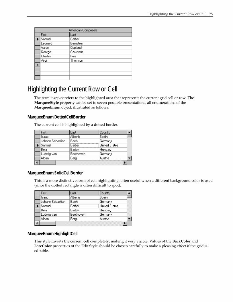
Highlighting the Current Row or Cell · 75
Highlighting the Current Row or Cell The term marquee refers to the highlighted area that represents the current grid cell or row. The MarqueeStyle property can be set to seven possible presentations, all enumerations of the MarqueeEnum object, illustrated as follows.
MarqueeEnum.DottedCellBorder The current cell is highlighted by a dotted border.
MarqueeEnum.SolidCellBorder This is a more distinctive form of cell highlighting, often useful when a different background color is used (since the dotted rectangle is often difficult to spot).
MarqueeEnum.HighlightCell This style inverts the current cell completely, making it very visible. Values of the BackColor and ForeColor properties of the Edit Style should be chosen carefully to make a pleasing effect if the grid is editable.

76 · Customizing the Grid's Appearance
MarqueeEnum.HighlightRow The entire row will be highlighted, but it will not be possible to tell which cell is the current cell in the row. To change highlight colors, edit the built-in HighlightRow style on the GridStyle Collection editor. This style is most useful when the grid is not editable and users would view the data one record at a time.
MarqueeEnum.HighlightRowRaiseCell This value should only be used if 3D lines are used in the grid, since cell highlighting is accomplished using a "raised" appearance for the current cell.
MarqueeEnum.NoMarquee This setting will make the marquee disappear completely. Often this setting is useful for cases where the current row is irrelevant, or where you do not want to draw the user's attention to the grid until necessary.

Highlighting the Current Row or Cell · 77
MarqueeEnum.FloatingEditor This is the default marquee style of the grid. The cell text (the actual text only, not the entire cell) is highlighted and there is a blinking text cursor (caret) at the end of the text.
The color of the highlight is your system's highlight color. The floating editor style simulates the look and feel of the Microsoft Access datasheet. The blinking text cursor indicates that the cell is edit-ready, hence the name floating editor for this marquee style. Since no other marquee style places the cell in a similar edit-ready mode, the behavior of the grid with the floating editor is sometimes different from the other marquee styles. The following list summarizes the differences when the MarqueeStyle property is set to MarqueeEnum.Floating Editor:
1. The following properties are ignored by the floating editor: EditDropDown and EditorStyle.
2. When using the AddCellStyle and AddRegexCellStyle methods with the floating editor, the grid ignores the current cell bit (CellStyleFlag.CurrentCell) and highlighted row bit (MarqueeRow) of the Condition argument. For more details, see Applying Styles to Cells (page 140).
3. The floating editor will not be displayed in a cell with radio buttons or a picture, as described in Automatic Data Translation with ValueItems (page 85). A dotted cell marquee will be used instead. The floating editor highlight will return when the current cell is changed to one with normal text display.
4. The CycleOnClick property (applies to ValueItemCollection ) has no effect when the MarqueeStyle property is set to MarqueeEnum.Floating Editor.
5. The DoubleClick event of the C1TrueDBGrid control does not fire when the user double-clicks a non-current cell within the grid. This is because the first click is used by the floating editor to begin editing, placing the cell into edit mode at the character on which the click occurred. Double-clicking the current cell of the grid fires the DoubleClick event normally, however.
MarqueeStyleEnum.DottedRowBorder This setting highlights the entire row with a dotted rectangle. Use this setting instead of Highlight Row if a more subdued highlight is preferred.

78 · Customizing the Grid's Appearance
Row Height and Word Wrap Adjusting the Height of All Grid Rows
Configure the row height interactively at design time by placing the grid in its visual editing mode or by changing the grid's RowHeight property in Visual Basic’s properties window. At run time, the user can adjust the row height interactively if AllowRowSizing is set to RowSizingEnum.AllRows or RowSizingEnum.IndividualRows. For more information, see Run Time Interaction (page 47).
The RowHeight property is expressed in units of the container's coordinate system. However, a setting of 0 causes the grid to readjust its display so that each row occupies a single line of text in the current font. Therefore, use the following code to adjust the row height to display exactly three lines of text:
• Visual Basic Me.C1TrueDBGrid1.RowHeight = 0 Me.C1TrueDBGrid1.RowHeight = 3 * Me.C1TrueDBGrid1.RowHeight
• C# this.C1trueDBGrid1.RowHeight = 0 ; this.C1trueDBGrid1.RowHeight = 3 * this.C1trueDBGrid1.RowHeight ;
• Delphi Self.C1TrueDBGrid1.RowHeight := 0; Self.C1TrueDBGrid1.RowHeight := 3 * Me.C1TrueDBGrid1.RowHeight;
This technique is particularly effective when displaying multiple-line memo fields, as in this example.
Note that the Description column’s Style object must have its WrapText property set to True; otherwise, the memo field display will be truncated after the first line.
Enabling Wordwrap in Cells By default, a grid cell displays a single line of text, truncated at the cell's right boundary. Display multiple lines of text in a cell by increasing the grid's RowHeight property and setting the WrapText property of the desired column’s Style object to True. If WrapText is True (the default is False), a line break occurs before words that would otherwise be partially displayed in a cell. The cell contents will continue to display on the next line, assuming that the grid's row height accommodates multiple lines.
Use the following loop to enable wordwrap for all grid columns:
• Visual Basic Dim C As C1.Win.C1TrueDBGrid.C1DisplayColumn For Each C In Me.C1TrueDBGrid1.Splits(0).DisplayColumns

Alternating Row Colors · 79
C.Style.WrapText = True Next
• C# C1.Win.C1trueDBGrid.C1DisplayColumn C ; for each(C in this.C1trueDBGrid1.Splits[0].DisplayColumns) { C.Style.WrapText = true ; }
• Delphi var C: C1TrueDBGrid.C1DisplayColumn; i: Integer; for i := 0 to Self.C1TrueDBGrid1.Splits[0].DisplayColumns.Count-1 do begin C := Self.C1TrueDBGrid1.Splits[0].DisplayColumns[i]; C.Style.WrapText := True; end;
Alternating Row Colors The readability of the display can often be improved by alternating the background colors of adjacent rows. When the AlternatingRows property to True is set, the grid displays odd-numbered rows (the first displayed row is 1) using the built-in style OddRow, and even-numbered rows using the built-in style EvenRow.
Horizontal and Vertical Alignment Use the HorizontalAlignment property of the Column’s Style object to control the horizontal placement of cell text within a column. The allowable values for this property are as follows:
AlignHorzEnum.General AlignHorzEnum.Near AlignHorzEnum.Center AlignHorzEnum.Far AlignHorzEnum.Justify
The setting General, which is the default for data cells, indicates that the alignment should be based upon the underlying data type. For example, strings are left-aligned, while numbers are right-aligned.

80 · Customizing the Grid's Appearance
Use the VerticalAlignment member of the Style object to control the vertical placement of text within the cells of a grid, split, or column. The allowable values for this property are as follows:
AlignVertEnum.Top AlignVertEnum.Center AlignVertEnum.Bottom
For data cells, the default value is Top. For static grid elements such as caption bars, column headers, and column footers, the default value is Center. See the section Named style defaults (page 128) to learn how the default values are derived.
The following grid depicts all possible combinations of the HorizontalAlignment and VerticalAlignment properties (the general setting is omitted because it is ultimately rendered as left, right, or center).
The HorizontalAlignment and VerticalAlignment properties are tightly integrated with the concept of styles. For more information, see How to Use Styles (page 127).

Text Formatting · 81
Data Presentation Techniques This chapter explains how to display cell data in a variety of textual and graphical formats. To learn how to customize the behavior of cell editing in True DBGrid for .NET, see Cell Editing Techniques (page 155).
Text Formatting In many cases, the raw numeric data that True DBGrid for .NET receives from its data source is not suitable for end-user display. For example, date fields may need to be converted to a specific international format; currency fields may contain too many insignificant digits after the decimal point. Therefore, True DBGrid for .NET provides a method with which you can alter the format of numerical fields, the NumberFormat property.
In addition, for situations where universal formatting of the database information is inadequate, True DBGrid provides an event, FormatText, that enables your application to override the default formatting on a per-column basis. By writing a simple handler for this event, you can customize the display of your column data in a myriad of ways.
Numeric Field Formatting True DBGrid supports a variety of data formatting options through the C1DataColumn object's NumberFormat property. NumberFormat reconfigures the data format that is handed to the grid from the database. It can alter most types of numeric values for a particular column. For example, to display all date values within a column according to the form 26-Apr-01, use the Medium Date setting:
• Visual Basic Me.C1TrueDBGrid1.Columns("HireDate").NumberFormat = "Medium Date"
• C# this.C1TrueDBGrid1.Columns("HireDate").NumberFormat = "Medium Date";
• Delphi Self.C1TrueDBGrid1.Columns['HireDate'];
Note that if the NumberFormat property of a column is changed at run time, the display does not need to refresh since True DBGrid handles this automatically.
For numeric data, the following predefined options are available:
Standard Display number with thousands separator, at least one digit to the left and two digits to the right of the decimal separator.
General Number Display number as is, with no thousand separators.
Currency Display number with thousand separator, if appropriate; display two digits to the right of the decimal separator. Note that output is based on system locale settings.
Percent Display number multiplied by 100 with a percent sign (%) appended to the right; always display two digits to the right of the decimal separator.
Fixed Display at least one digit to the left and two digits to the right of the decimal separator.
Scientific Use standard scientific notation.

82 · Data Presentation Techniques
Yes/No Display No if number is 0; otherwise, display Yes.
True/False Display False if number is 0; otherwise, display True.
On/Off Display Off if number is 0; otherwise, display On.
0% Display number multiplied by 100, then rounded to the nearest integer, with a percent sign (%) appended to the right.
0.00% Same as Percent.
For date and time data, the following predefined options are available:
General Date Display a date and/or time. For real numbers, display a date and time (for example, 4/3/93 05:34 PM); if there is no fractional part, display only a date (for example, 4/3/93); if there is no integer part, display only a time (for example, 05:34 PM). Date display is determined by your system settings.
Long Date Display a date using your system's long date format.
Medium Date Display a date using the medium date format appropriate for the language version of Visual Basic.
Short Date Display a date using your system's short date format.
Long Time Display a time using your system's long time format: includes hours, minutes, and seconds.
Medium Time Display a time in 12-hour format using hours and minutes and the AM/PM designator.
Short Time Display a time using the 24-hour format (for example, 17:45).
Input Validation with Built-in Formatting It is important to note that the NumberFormat property affects only the display of data in the grid. Unless you also specify a value for the EditMask property, True DBGrid does not enforce an input template, and the user is free to type anything into the formatted cell. When moving to another cell, the grid will reasonably interprets the user's input value and redisplay the data according to the NumberFormat setting.
For example, if Medium Date formatting is in effect for a column, a date of Saturday, April 25, 1998, 12:00:00 AM will be displayed as 25-Apr-98 with the day of the week and time ignored. If a user enters July and moves to another row, the grid cannot reasonably interpret the input date value and a trappable error will occur. If the user enters oct 5 or 10/5, the grid will interpret the entered date as October 5, 1998 (that is, the current year is assumed). If the database update is successful, the entered date will be redisplayed as 05-Oct-98, since Medium Date formatting is in effect.
Formatting with an Input Mask Since it is common for the input and display formats to be the same, the NumberFormat property has an Edit Mask option (note the space between words). If this option is selected, then the EditMask property setting will be used for both data input and display. However, the input and display formats need not be the same, so you are free to select a NumberFormat option that differs from the EditMask property.
For example, the following code applies a phone number template to a column for both display and editing:
• Visual Basic With Me.C1TrueDBGrid1.Columns("Phone") .EditMask = "(###) ###-####"
Text Formatting · 83
.NumberFormat = "Edit Mask" End With
• C# this.C1TrueDBGrid1.Columns("Phone").EditMask = "(###) ###-####"; this.C1TrueDBGrid1.Columns("Phone").NumberFormat = "Edit Mask";
• Delphi with Self.C1TrueDBGrid1.Columns['Phone'] do begin EditMask := '(###) ###-####'; NumberFormat := 'Edit Mask'; end;
For more information on how to specify a data input mask, see Input Masking (page 162).
Formatting with a Custom Event Handler On occasion, you may find that your current formatting options do not suit your particular needs. Furthermore, you may be restricted in the type of formatting that you can use or need a custom formatting option. In these cases, the FormatText Event option can be specified for the NumberFormat property. Choosing this option for a column will cause the FormatText event to fire each time data is about to be displayed in that column. The event allows you to reformat, translate, indent, or do anything you want to the data just prior to display:
• Visual Basic Private Sub C1TrueDBGrid1_FormatText(ByVal sender As Object, ByVal e As C1.Win.C1TrueDBGrid.FormatTextArgs) Handles C1TrueDBGrid1.FormatText
• C# private void C1TrueDBGrid1_FormatText(object sender, C1.Win.C1TrueDBGrid.FormatTextArgs e)
• Delphi procedure C1TrueDBGrid1_FormatText(sender: System.Object; e: C1.Win.C1TrueDBGrid.FormatTextArgs);
A member of the FormatTextEventArgs object, ColIndex is the column number of the grid to be reformatted. While the Value member contains the current value of the data and also serves as a placeholder for the formatted display value. For example, suppose the first column contains numeric values from 1 to 30, and you wish to display the data as Roman numerals:
• Visual Basic Private Sub C1TrueDBGrid1_FormatText(ByVal sender As Object, ByVal e As C1.Win.C1TrueDBGrid.FormatTextEventArgs) Handles C1TrueDBGrid1.FormatText Dim result As String If e.ColIndex = 0 Then ' Determine how many X's While e.Value >= 10 result = result & "X" e.Value = e.Value - 10 Wend ' Append "digits" 1-9 Select Case e.Value

84 · Data Presentation Techniques
Case 1 result = result & "I" Case 2 result = result & "II" Case 3 result = result & "III" Case 4 result = result & "IV" Case 5 result = result & "V" Case 6 result = result & "VI" Case 7 result = result & "VII" Case 8 result = result & "VIII" Case 9 result = result & "IX" End Select ' Change the actual format e.Value = result End If End Sub
• C# private void C1TrueDBGrid1_FormatText(object sender, C1.Win.C1TrueDBGrid.FormatTextEventArgs e) string result; if ( e.ColIndex = 0 ) { // Determine how many X//s while ( e.Value >= 10 )
{ result = result + "X"; e.Value = e.Value - 10; } // Append "digits" 1-9 switch (e.Value) { case 1; result = result + "I"; case 2; result = result + "II"; case 3; result = result + "III"; case 4; result = result + "IV"; case 5; result = result + "V"; case 6; result = result + "VI"; case 7; result = result + "VII"; case 8; result = result + "VIII"; case 9; result = result + "IX"; } // Change the actual format e.Value = result; } }

Automatic Data Translation with ValueItems · 85
• Delphi procedure TWinForm.C1TrueDBGrid1_FormatText(sender: System.Object; e: C1.Win.C1TrueDBGrid.FormatTextEventArgs); var res: string; val: Integer; begin if e.ColIndex = 0 then begin res := ‘’; val := Int32.Parse(e.Value); // Determine how many X's; while e.Value >= 10 do begin res := res + 'X'; val := val - 10; end; // Append'digits' 1-9; else if (val = 1) then res := res + 'I'; else if (val = 2) then res := res + 'II'; else if (val = 3) then res := res + 'III'; else if (val = 4) then res := res + 'IV'; else if (val = 5) then res := res + 'V'; else if (val = 6) then res := res + 'VI'; else if (val = 7) then res := res + 'VII'; else if (val = 8) then res := res + 'VIII'; else if (val = 9) then res := res + 'IX'; // Change the actual format; e.Value := res; end; end;
Since the FormatText event has fewer restrictions than other formatting techniques, you can always use it to gain full control over the textual content of any value displayed in the grid.
Automatic Data Translation with ValueItems Although the FormatText event can be used to map data values into more descriptive display values, True DBGrid for .NET also provides a mechanism for performing such data translations automatically without code. Through the use of the ValueItem object, alternate text or even pictures can be specified to be displayed in place of the underlying data values.
This feature is ideally suited for displaying numeric codes or cryptic abbreviations in a form that makes sense to end-users. For example, country codes can be rendered as proper names or even as pictures of their respective flags. Or, the numbers 0, 1, and 2 may be displayed as Yes, No, and Maybe. Either the actual values (0, 1, 2) or the translated values (Yes, No, Maybe) may be displayed as radio buttons in a cell or in a drop-down combo box.

86 · Data Presentation Techniques
What are ValueItems? The ValueItems object contains a collection and properties that define the association between an underlying data value and its visual representation within the grid. The ValueItems object contains a ValueItemsCollection of zero or more ValueItem objects. Each ValueItem supports two main properties: Value, the underlying data value, and DisplayValue, its visual representation. Both properties are of type Object.
Each C1DataColumn object contains ValueItems object.
At run time, manipulate the collection of ValueItem pairs as you would any other True DBGrid or Visual Basic collection. ValueItems can be added, removed, or manipulated through the ValueItemCollection object.
At design time a ValueItemCollection Editor is available through the C1TrueDBGrid Designer. For more information see Using the ValueItemCollection Editor (page 41).
Specifying Text-to-Text Translations Consider the following example, in which the Country field is represented by a short character code.
To display the character codes as proper names, use the column's ValueItemCollection object to specify automatic data translations. At design time, this is done with .NET’s ValueItemCollection editor.

Automatic Data Translation with ValueItems · 87
Altering the ValueItemCollection object through the collection editor enables you to specify data translations on a per-column basis in a simple window. To construct a list of data translations for an individual column, do the following:
1. Open up the C1TrueDBGrid Designer by clicking on the ellipsis next to the Columns collection in the Visual Basic properties window.
2. Select the column whose contents you would like translated. In the left pane expand the ValueItems Node. Clicking on the ellipsis next to the Values Node will bring up the ValueItemCollection editor.
3. Clicking on the Add button in the left pane will add ValueItem objects. In the right pane specify a Value and DisplayValue for each ValueItem. When entering the ValueItem text disregard the ellipsis. This is used for entering a bitmap as a DisplayValue.
4. After the ValueItem objects are configured correctly, select OK and return to the C1TrueDBGrid Designer. In the right pane under the ValueItems node, set the Translate property to true.
5. Select OK or Apply to commit the changes.
When the program is run, Country field values that match an item in the Value column appear as the corresponding DisplayValue entry. For example, CAN becomes Canada, UK becomes United Kingdom, and so forth.
Note that the underlying database is not affected; only the presentation of the data value is different. The same effect can be achieved in code as follows:
• Visual Basic Dim v as C1.Win.C1TrueDBGrid.ValueItemCollection v = Me.C1TrueDBGrid1.Columns(“Country”).ValueItems.Values v.Add(new C1TrueDBGrid.ValueItem(“CAN”,”Canada”)) v.Add(new C1TrueDBGrid.ValueItem(“UK”,”United Kingdom”)) v.Add(new C1TrueDBGrid.ValueItem(“USA”,”United States”)) v.Add(new C1TrueDBGrid.ValueItem(“JPN”,”Japan”)) v.Add(new C1TrueDBGrid.ValueItem(“AUS”,”Australia”)) Me.C1TrueDBGrid1.Columns("Country").ValueItems.Translate = True
• C# C1.Win.C1TrueDBGrid.ValueItemCollection v = this.C1TrueDBGrid.Columns[“Country”].ValueItems.Values; v.Add(new C1TrueDBGrid.ValueItem(“CAN”,”Canada”)); v.Add(new C1TrueDBGrid.ValueItem(“UK”,”United Kingdom”)); v.Add(new C1TrueDBGrid.ValueItem(“USA”,”United States”)); v.Add(new C1TrueDBGrid.ValueItem(“JPN”,”Japan”)); v.Add(new C1TrueDBGrid.ValueItem(“AUS”,”Australia”)); this.C1TrueDBGrid1.Columns["Country"].ValueItems.Translate = true;

88 · Data Presentation Techniques
• Delphi var item1: C1TrueDBGrid.ValueItem; with Self.C1TrueDBGrid1.Columns['Country'] do begin item1 := C1.Win.C1TrueDBGrid.ValueItem.Create; item1.Value :='CAN'; item1.DisplayValue :='Canada'; Add(item1); item1 := C1.Win.C1TrueDBGrid.ValueItem.Create; item1.Value :='UK'; item1.DisplayValue :='United Kingdom'; Add(item1); item1 := C1.Win.C1TrueDBGrid.ValueItem.Create; item1.Value :='USA'; item1.DisplayValue :='United States'; Add(item1); item1 := C1.Win.C1TrueDBGrid.ValueItem.Create; item1.Value :='JPN'; item1.DisplayValue :='Japan'; Add(item1); item1 := C1.Win.C1TrueDBGrid.ValueItem.Create; item1.Value :='AUS'; item1.DisplayValue :='Australia'; Add(item1); Self.C1TrueDBGrid1.Columns[‘Country’].ValueItems.Translate := true; end;
Specifying Text-to-Picture Translations The same techniques used to specify text-to-text translations can also be used for text-to-picture translations. Within the Values Collection Editor, instead of typing a string into the DisplayValue column, use the ellipsis button to select a bitmap to be used for data translations. To delete your bitmap selection simply delete the text in the DisplayValue property box and either select another bitmap or type in text.

Automatic Data Translation with ValueItems · 89
Note that the Translate property for the ValueItems object must be set to true. Depending upon the height of the bitmaps, it may be necessary to increase the value of the RowHeight property. If that is done, change the VerticalAlignment member of the grid's Style property to Center to ensure that the bitmaps (as well as textual data in other columns) are centered vertically within grid cells instead of being anchored at the top.
When the program is run, Country field values that match an item in the Value column appear as the corresponding DisplayValue picture.
As with textual translations, the underlying database is not affected; only the presentation of the data value is different. The same effect can be achieved in code as follows:
• Visual Basic Dim Item As New C1.Win.C1TrueDBGrid.ValueItem() With Me.C1TrueDBGrid1.Columns("Country").ValueItems.Values Item.Value = "CAN" Item.DisplayValue = System.Drawing.Image.FromFile("canada.bmp") .Add(Item) Item = New C1.Win.C1TrueDBGrid.ValueItem() Item.Value = "UK" Item.DisplayValue = System.Drawing.Image.FromFile("uk.bmp") .Add(Item) Item = New C1.Win.C1TrueDBGrid.ValueItem() Item.Value = "USA" Item.DisplayValue = System.Drawing.Image.FromFile("usa.bmp") .Add(Item) Item = New C1.Win.C1TrueDBGrid.ValueItem() Item.Value = "JPN" Item.DisplayValue = System.Drawing.Image.FromFile("japan.bmp") .Add(Item) Item = New C1.Win.C1TrueDBGrid.ValueItem() Item.Value = "AUS" Item.DisplayValue = System.Drawing.Image.FromFile("australia.bmp") .Add(Item) Me.C1TrueDBGrid1.Columns("Country").ValueItems.Translate = True End With
• C# C1.Win.C1TrueDBGrid.ValueItemCollection v = this.C1TrueDBGrid.Columns[“Country”].ValueItems.Values;
C1.Win.C1TrueDBGrid.ValueItem Item = new C1.Win.C1TrueDBGrid.ValueItem(); Item.value = "CAN"; Item.DisplayValue = System.Drawing.Image.FromFile["canada.bmp"]; v.Add[Item];

90 · Data Presentation Techniques
Item = new C1.Win.C1TrueDBGrid.ValueItem(); Item.value = "UK"; Item.DisplayValue = System.Drawing.Image.FromFile["uk.bmp"]; v.Add[Item]; Item = new C1.Win.C1TrueDBGrid.ValueItem(); Item.value = "USA"; Item.DisplayValue = System.Drawing.Image.FromFile["usa.bmp"]; v.Add[Item]; Item = new C1.Win.C1TrueDBGrid.ValueItem(); Item.value = "JPN"; Item.DisplayValue = System.Drawing.Image.FromFile["japan.bmp"]; v.Add[Item]; Item = new C1.Win.C1TrueDBGrid.ValueItem(); Item.value = "AUS"; Item.DisplayValue = System.Drawing.Image.FromFile["australia.bmp"]; v.Add[Item]; this.C1TrueDBGrid1.Columns["Country"].ValueItems.Translate = true;
• Delphi var item1: C1TrueDBGrid.ValueItem; with Self.C1TrueDBGrid1.Columns['Country'] do begin item1 := C1.Win.C1TrueDBGrid.ValueItem.Create; item1.Value := ‘CAN’; item1.DisplayValue := System.Drawing.Image.FromFile('canada.bmp'); Add(item1); item1 := C1.Win.C1TrueDBGrid.ValueItem.Create; item1.Value := ‘UK’; item1.DisplayValue := System.Drawing.Image.FromFile('uk.bmp'); Add(item1); item1 := C1.Win.C1TrueDBGrid.ValueItem.Create; item1.Value := ‘USA’; item1.DisplayValue := System.Drawing.Image.FromFile('us.bmp'); Add(item1); item1 := C1.Win.C1TrueDBGrid.ValueItem.Create; item1.Value := ‘JPN’; item1.DisplayValue := System.Drawing.Image.FromFile('japan.bmp'); Add(item1); item1 := C1.Win.C1TrueDBGrid.ValueItem.Create; item1.Value := ‘AUS’; item1.DisplayValue := System.Drawing.Image.FromFile('australia.bmp'); Add(item1); Self.C1TrueDBGrid1.Columns[‘Country’].ValueItems.Translate := true; end;
Displaying Both Text and Pictures in a Cell Once the ValueItems object is configured to perform text-to-picture translations for a column, you can display both the Value string and the DisplayValue bitmap to appear within the same cell by selecting the AnnotatePicture property. Or, in code:
• Visual Basic Me.C1TrueDBGrid1.Columns("Country").ValueItems.AnnotatePicture = True
• C# this.C1TrueDBGrid1.Columns["Country"].ValueItems..AnnotatePicture = true;

Automatic Data Translation with ValueItems · 91
• Delphi With SelfC1TrueDBGrid1.Columns['Country'] do AnnotatePicture := True;
The horizontal placement of the bitmap with respect to the cell text is determined by the HorizontalAlignment and ForegroundPicturePosition properties of the column's Style object. The enumeration objects for these two properties are the AlignHorzEnum and ForegroundPicturePositionEnum objects respectively. In the following example, HorizontalAlignment is set to AlignHorzEnum.General. Since the Country column represents a string field, the cell text is left-aligned. However, since the ForegroundPicturePosition property is set to the default value of ForegroundPicturePosition.Near, the bitmap is placed at the left edge of the cell, and the cell text is left-aligned in the remaining space.
However, if you change the ForegroundPicturePosition property to ForegroundPicturePositionEnum.Far, then the cell text is left-aligned as usual, but the bitmap is right-aligned.
To place the cell text below the bitmap while centering both items, set the HorizontalAlignment property to AlignHorzEnum.Center and the ForegroundPicturePosition property to ForegroundPicturePositionEnum.Top of Text.

92 · Data Presentation Techniques
NOTE: For an illustration of all possible combinations of the HorizontalAlignment and ForegroundPicturePosition properties, see Displaying foreground pictures (page 153).
When editing, the editor uses all space available in the text portion of the cell. When the Presentation property of the ValueItemCollection object is set to one of the combo box options, the bitmap will not change until editing is completed.
Note that in the preceding examples, the text is displayed as it is stored in the database without formatting. Since the ValueItem object can only accommodate one translation, displaying both a picture and formatted text cannot be accomplished with ValueItems alone. Therefore, use the FormatText event to translate the text, and then use the ValueItems to associate the translated text (not the underlying data value) with a picture:
• Visual Basic Me.C1TrueDBGrid1.Columns("Country").NumberFormat = "FormatText Event"
• C# this.C1TrueDBGrid1.Columns("Country").NumberFormat = "FormatText event";
• Delphi Self.C1TrueDBGrid1.Columns['Country'].NumberFormat := ‘FormatText event’;
In this example, the NumberFormat property is set to a special value that causes the FormatText event to fire:
• Visual Basic Private Sub C1TrueDBGrid1_FormatText(ByVal sender As Object, ByVal e As C1.Win.C1TrueDBGrid.FormatTextArgs) Handles C1TrueDBGrid1.FormatText Select Case e.Value Case "CAN" e.Value = "Canada" Case "UK" e.Value = "United Kingdom" Case "USA" e.Value = "United States" Case "JPN" e.Value = "Japan"

Automatic Data Translation with ValueItems · 93
Case "AUS" e.Value = "Australia" End Select End Sub
• C# private void C1TrueDBGrid1_FormatText( object sender, C1.Win.C1TrueDBGrid.FormatTextArgs e) C1TrueDBGrid1.FormatText { switch (e.value) { case "CAN": e.value = "Canada"; break; case "UK": e.value = "United Kingdom"; break; case "USA": e.value = "United States"; break; case "JPN": e.value = "Japan"; break; case "AUS": e.value = "Australia"; break; } }
• Delphi procedure TWinForm.C1TrueDBGrid1_FormatText(sender: System.Object; e: C1.Win.C1TrueDBGrid.FormatTextArgs); begin if (e.Value = 'CAN'); e.Value := 'Canada' else if (e.Value = 'UK') then e.Value := 'United Kingdom' else if (e.Value = 'USA') then e.Value := 'United States' else if (e.Value = 'JPN') then e.Value := 'Japan' else if (e.Value = 'AUS') then e.Value := 'Australia'; end;
Since the FormatText event now translates the country codes stored in the database into actual names for display, the Value property of each ValueItem in the ValueItemCollection object must be changed accordingly.
Assuming that the HorizontalAlignment and ForegroundPicturePosition properties are set as in the previous example, the end result is that the underlying data is displayed as both descriptive text and a picture.

94 · Data Presentation Techniques
NOTE: DisplayValue pictures are ideally suited for translating status codes or other fields where the number of allowable values is relatively small. To get a more generalized picture display mechanism than the ValueItemCollection object offers, use the ForegroundPicturePosition property in conjunction with the FetchCellStyle event to display arbitrary pictures on a per-cell basis. For more information, see Displaying foreground pictures (page 153).
Displaying Boolean Values as Check Boxes Use the ValueItems object to represent Boolean values as in-cell checkboxes. The effect of a working Boolean checkbox can be achieved without defining any ValueItem objects—just set the Presentation property to PresentationEnum.Check Box.
Note that the Translate checkbox does not need to be selected to enable automatic data translation, nor does the CycleOnClick checkbox need to be selected to enable end users to toggle the value of a cell by clicking it. The following figure shows a typical checkbox display.
NOTE: To use different check box bitmaps, define a two-state collection of ValueItem objects through the Values property of the C1DataColumn. Set the Presentation property to PresentationEnum.Normal, and set the Translate and CycleOnClick properties to True.
Displaying Allowable Values as Radio Buttons If the number of allowable values for a column is relatively small, consider a radio button presentation. At design time, go to the C1TrueDBGrid Designer, then to the Valueitems node for the column and set the Presentation property to PresentationEnum.RadioButton. Or, in code:

Context-Sensitive Help with CellTips · 95
• Visual Basic Me.C1TrueDBGrid1.Columns("Country").ValueItems.Presentation = PresentationEnum.RadioButton
• C# this.C1TrueDBGrid1.Columns["Country"].ValueItems.Presentation = PresentationEnum.RadioButton;
• Delphi with Self.C1TrueDBGrid1.Columns['Country'] do Presentation := PresentationEnum.RadioButton;
If necessary, adjust the Width property of the column style and the RowHeight property of the grid to accommodate all of the items.
For a given cell, if the underlying data does not match any of the available values, none of the radio buttons will be selected for that cell. However, a default ValueItem object can be provided that will be selected instead.
In this example, the last ValueItem has an empty Value property, but the DisplayValue is set to “Other”. This means that when Country fields that do not match any of the items are displayed their value in the grid will be displayed as Other.
• Visual Basic Me.C1TrueDBGrid1.Columns("Country").ValueItems.DefaultItem = 5
• C# this.C1TrueDBGrid1.Columns["Country"].ValueItems.Presentation = PresentationEnum.RadioButton;
• Delphi With Self.C1TrueDBGrid1.Columns['Country'] DefaultItem := 5;
In this example, 5 is the zero-based index of the default item.
Context-Sensitive Help with CellTips In many Windows applications, when the user points to a toolbar button and leaves the mouse at rest for a short time, a ToolTip window appears with the name of the associated command. Provide similar context-sensitive help for users with the CellTips property of True DBGrid for .NET.
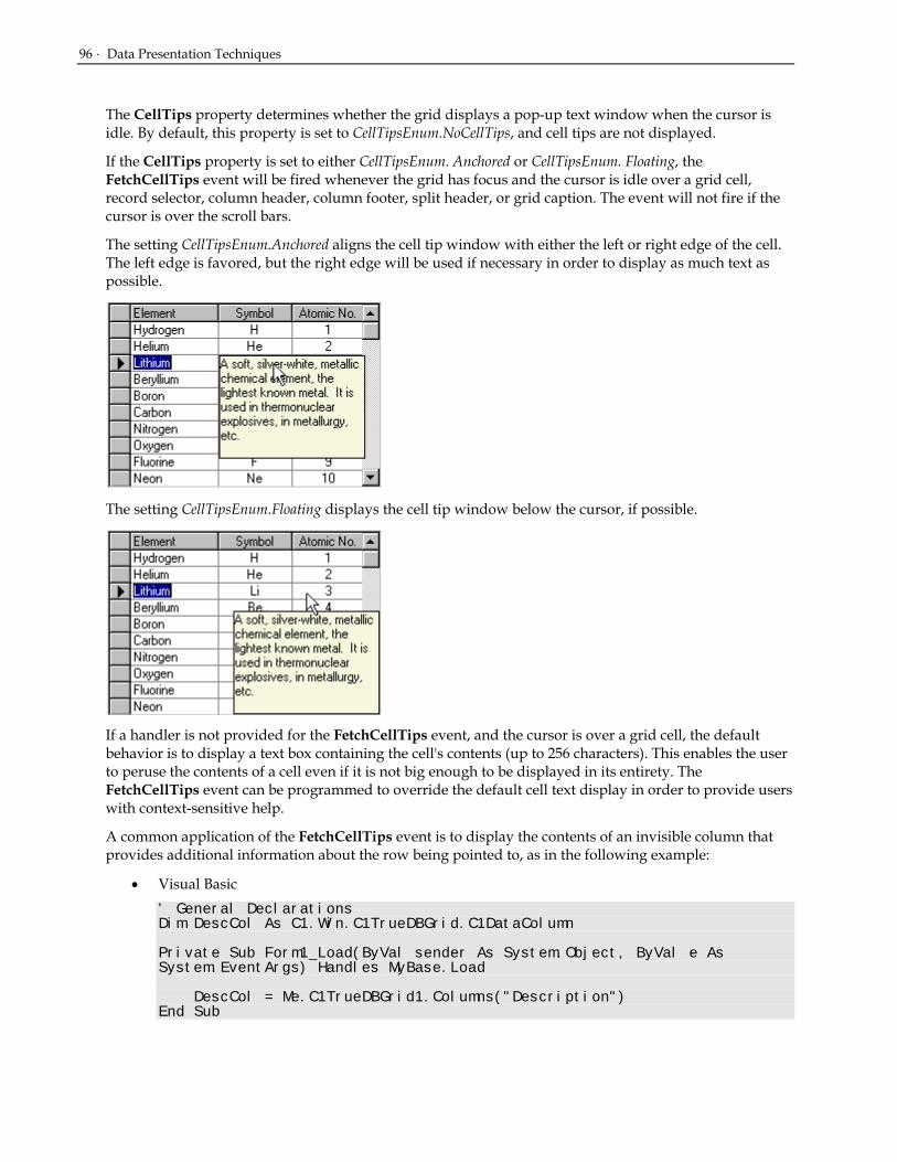
96 · Data Presentation Techniques
The CellTips property determines whether the grid displays a pop-up text window when the cursor is idle. By default, this property is set to CellTipsEnum.NoCellTips, and cell tips are not displayed.
If the CellTips property is set to either CellTipsEnum. Anchored or CellTipsEnum. Floating, the FetchCellTips event will be fired whenever the grid has focus and the cursor is idle over a grid cell, record selector, column header, column footer, split header, or grid caption. The event will not fire if the cursor is over the scroll bars.
The setting CellTipsEnum.Anchored aligns the cell tip window with either the left or right edge of the cell. The left edge is favored, but the right edge will be used if necessary in order to display as much text as possible.
The setting CellTipsEnum.Floating displays the cell tip window below the cursor, if possible.
If a handler is not provided for the FetchCellTips event, and the cursor is over a grid cell, the default behavior is to display a text box containing the cell's contents (up to 256 characters). This enables the user to peruse the contents of a cell even if it is not big enough to be displayed in its entirety. The FetchCellTips event can be programmed to override the default cell text display in order to provide users with context-sensitive help.
A common application of the FetchCellTips event is to display the contents of an invisible column that provides additional information about the row being pointed to, as in the following example:
• Visual Basic ' General Declarations Dim DescCol As C1.Win.C1TrueDBGrid.C1DataColumn Private Sub Form1_Load(ByVal sender As System.Object, ByVal e As System.EventArgs) Handles MyBase.Load DescCol = Me.C1TrueDBGrid1.Columns("Description") End Sub
Scroll Tracking and ScrollTips · 97
Private Sub C1TrueDBGrid1_FetchCellTips(ByVal sender As System.Object, ByVal e As C1.Win.C1TrueDBGrid.FetchCellTipsEventArgs) Handles C1TrueDBGrid.FetchCellTips e.CellTip = DescCol.CellText(e.Row) End Sub
• C# // General Declarations C1.Win.C1TrueDBGrid.C1DataColumn DescCol; private void Form1_Load( System.object sender, System.EventArgs e) base.Load { DescCol = this.C1TrueDBGrid1.Columns["Description"] } private void C1TrueDBGrid1_FetchCellTips( System.object sender, C1.Win.C1TrueDBGrid.FetchCellTipsEventArgs e) C1TrueDBGrid.FetchCellTips { e.CellTip = DescCol.CellText(e.Row); }
• Delphi var DescCol: C1TrueDBGrid.C1DataColumn; Procedure TWinForm.TWinForm_Load(sender: System.Object; e: System.EventArgs); begin DescCol := Self.C1TrueDBGrid1.Columns['Description']; end; procedure TWinForm.C1TrueDBGrid1_FetchCellTips(sender: System.Object; e: C1.Win.C1TrueDBGrid.FetchCellTipsEventArgs); begin e.CellTip := DescCol.CellText(e.Row); End Sub;
Use the CellTipsDelay property to control the amount of time that must elapse before the cell tip window is displayed.
Use the CellTipsWidth property to control the width of the cell tip window.
Scroll Tracking and ScrollTips If the ScrollTrack property is set to True, moving the scrollbar thumb causes vertical scrolling of the grid's display. By default, this property is False, and no scrolling occurs until the thumb is released.
If the ScrollTips property is set to True, moving the scrollbar thumb causes the FetchScrollTips event to fire. Use this event to track the position of the scroll bar on a record-by-record basis. Also use this event to present the user with useful information relating to the current record or recordset. When used in tandem, the ScrollTrack and ScrollTips properties provide users with visual feedback when scrolling through large DataSets.

98 · Data Presentation Techniques
Data-Sensitive Cell Merging If the underlying grid data is sorted, the readability of the display may be improved by grouping adjacent like-valued cells within the sorted column(s). The Merge property of the C1DisplayColumn object controls whether its data cells are grouped in this manner to form a single non-editable cell. By default, this property is False, and each physical row within a column displays a data value, if any.
Consider the following grid, which is sorted on the Country field.
If data-sensitive cell merging is enabled for the Country column at run time, then its cells are grouped according to their contents:
• Visual Basic Me.C1TrueDBGrid1.Splits(0).DisplayColumns("Country").Merge = True
• C# this.C1TrueDBGrid1.Splits(0).DisplayColumns("Country").Merge = true;
• Delphi Self.C1TrueDBGrid1.Splits[0].DisplayColumns]['Country'].Merge := true;
Executing this statement produces the following display. Note that when the current cell is in the Country column, the marquee spans all like-valued rows and takes on the appearance of a dotted rectangle, regardless of the setting of the MarqueeStyle property. The behavior of the marquee in other columns is not affected, however.

Data-Sensitive Cell Merging · 99
If a design-time layout is specified, the same effect can be achieved by setting the Merge property of the desired C1DisplayColumn object within the Split Collection Editor.
If the Merge property is True for a column, then none of its data cells can be edited, even if all rows contain unique values. The only exception to this is the AddNew row. However, once the new row is added to the underlying database, then its data will also be uneditable within the merged column(s).
Use the HorizontalAlignment and VerticalAlignment properties of the column's Style object to center the data within the merged cell, as in the following figure.
In the Splits Collection Editor, access these properties by expanding the Style property node at the same level of the tree as the Merge property. Or, in code:
• Visual Basic With Me.C1TrueDBGrid1.Splits(0).DisplayColumns("Country").Style .HorizontalAlignment = AlignHorzEnum.Center .VerticalAlignment = AlignVertEnum.Center End With
• C# C1.Win.C1TrueDBGrid.Style s; s = this.C1TrueDBGrid1.Splits[0].DisplayColumns["Country"].Style; s.HorizontalAlignment = AlignHorzEnum.Center;

100 · Data Presentation Techniques
s.VerticalAlignment = AlignVertEnum.Center;
• Delphi with Self.C1TrueDBGrid1.Splits[0].DisplayColumns['Country'] do begin HorizontalAlignment := AlignHorzEnum.Center; VerticalAlignment := AlignVertEnum.Center; end;
NOTE: Merged cells are not restricted to displaying text. Display bitmaps within merged cells by populating the ValueItems object as described earlier in Specifying text-to-picture translations (page 88. )The section Applying Pictures to Grid Elements (page 148) describes a more flexible method for displaying in-cell graphics using Style objects.
Column Grouping The purpose of this feature is to allow users to dynamically configure a tree view type structure. When in Group mode, a "grouping area" is added to the top of the grid, providing an intuitive interface for specifying column groups. In code, this collection is accessed through the GroupedColumns collection and consists of C1DataColumn objects that have been moved to the grouping area; it is similar to the C1DataColumnCollection class.
The grouping area is created when DataView is set to DataViewEnum. GroupBy. When AllowColMove is set to True, the grid will support the ability to move one or more columns into this area. Users can do this by selecting a single column and dragging its header into the grouping area. This action can also be performed in code at run time by invoking the Add method of the GroupedColumnCollection. When a column is first added to the grouping area, nodes are added to the grid. Each node represents the unique value of the grouped column. Similarly when the last grouped column is removed from the area, the nodes are removed and the display will be similar to a normal grid.
When the expand icon is clicked the grid expands and the next set of grouping column data appears. If there is another grouped column, then this column has an expand icon next to it also. With the addition of each grouped column, another level of sorted information gets added to the tree view. When the expand icon on the final column in the GroupedColumns collection is clicked the data in the remaining columns is displayed in the grid’s Normal style, as shown below:
To manipulate the grouping area in code, use the GroupedColumn identifiers to access the collection of grouped columns. Like the Columns property, the GroupedColumns supports Add, and RemoveAt
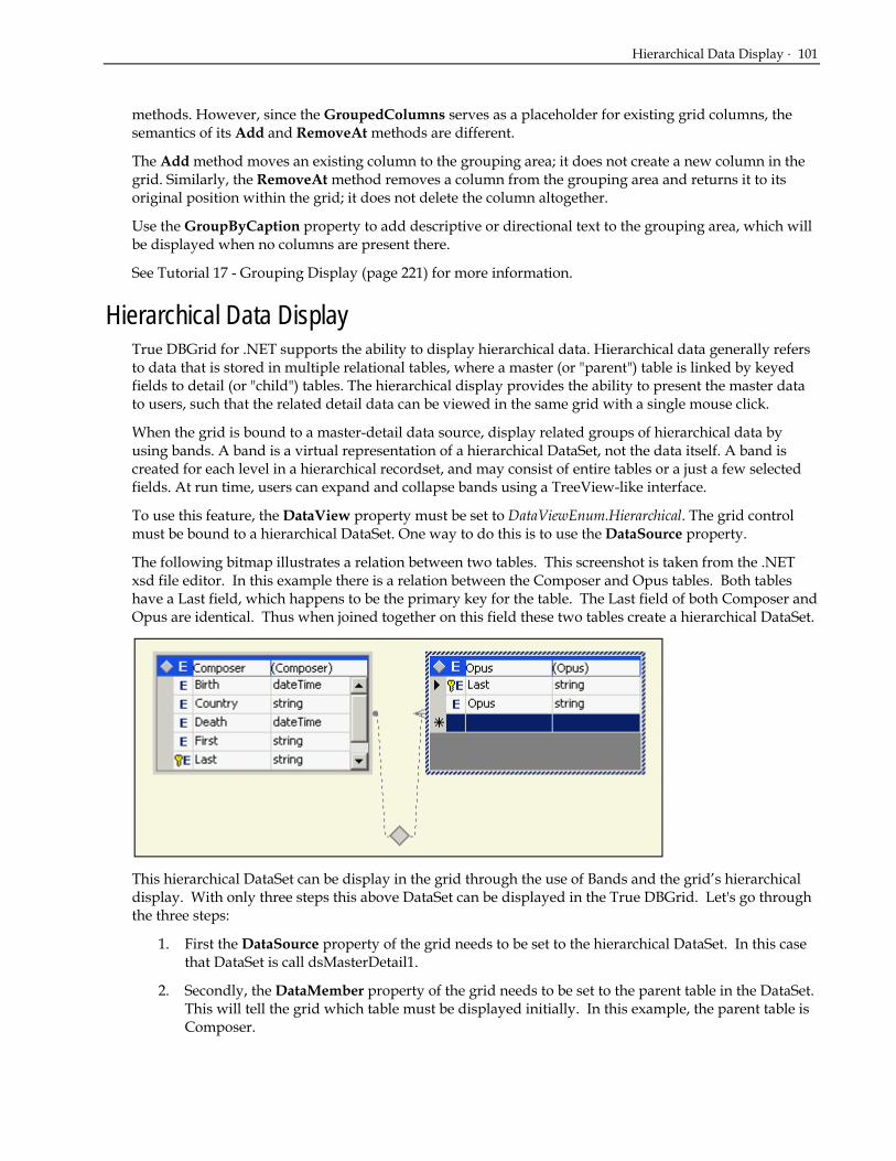
Hierarchical Data Display · 101
methods. However, since the GroupedColumns serves as a placeholder for existing grid columns, the semantics of its Add and RemoveAt methods are different.
The Add method moves an existing column to the grouping area; it does not create a new column in the grid. Similarly, the RemoveAt method removes a column from the grouping area and returns it to its original position within the grid; it does not delete the column altogether.
Use the GroupByCaption property to add descriptive or directional text to the grouping area, which will be displayed when no columns are present there.
See Tutorial 17 - Grouping Display (page 221) for more information.
Hierarchical Data Display True DBGrid for .NET supports the ability to display hierarchical data. Hierarchical data generally refers to data that is stored in multiple relational tables, where a master (or "parent") table is linked by keyed fields to detail (or "child") tables. The hierarchical display provides the ability to present the master data to users, such that the related detail data can be viewed in the same grid with a single mouse click.
When the grid is bound to a master-detail data source, display related groups of hierarchical data by using bands. A band is a virtual representation of a hierarchical DataSet, not the data itself. A band is created for each level in a hierarchical recordset, and may consist of entire tables or a just a few selected fields. At run time, users can expand and collapse bands using a TreeView-like interface.
To use this feature, the DataView property must be set to DataViewEnum.Hierarchical. The grid control must be bound to a hierarchical DataSet. One way to do this is to use the DataSource property.
The following bitmap illustrates a relation between two tables. This screenshot is taken from the .NET xsd file editor. In this example there is a relation between the Composer and Opus tables. Both tables have a Last field, which happens to be the primary key for the table. The Last field of both Composer and Opus are identical. Thus when joined together on this field these two tables create a hierarchical DataSet.
This hierarchical DataSet can be display in the grid through the use of Bands and the grid’s hierarchical display. With only three steps this above DataSet can be displayed in the True DBGrid. Let's go through the three steps:
1. First the DataSource property of the grid needs to be set to the hierarchical DataSet. In this case that DataSet is call dsMasterDetail1.
2. Secondly, the DataMember property of the grid needs to be set to the parent table in the DataSet. This will tell the grid which table must be displayed initially. In this example, the parent table is Composer.

102 · Data Presentation Techniques
3. Finally, the grid needs to know to switch to the hierarchical display. By setting the DataView property to DataViewEnum.Hierarchical, the grid will display the above dataset with its bands structure.
At run time, the grid displays read-only data. The next figure illustrates the initial display of the grid. The data from the master recordset (Composer) is displayed first, and the fields from the detail recordset bands appear to the right. The detail recordset fields initially contain no data, however. An expand icon ("+") at the left edge of a record indicates the presence of hierarchical data.
When the user clicks an expand icon, it changes to a collapse icon ("–") and the next band (Orders) expands to show the detail records for the clicked row.
NOTE: If the DataView property is set to its default value of Normal, the grid will only display flat files; it will not support a hierarchical view. Even if the data source is a hierarchical DataSet, the grid will only display data from the master table.
The DataView property must be set at design time; it cannot be changed at run time.
The following methods are provided for manipulating hierarchical grid displays:
GetBand Returns the band for a specified column index.
CollapseBand Collapses all rows for the specified band.
ExpandBand Expands all rows for the specified band.
RowExpanded Returns True if the current row is expanded within the specified band.
If the number of recordset levels in a master-detail data source is not known in advance, examine the Bands property in code. Allowable band numbers range from 0 to Bands-1.
The following events enable the application to respond to hierarchical view operation initiated by the user:
Collapse Fired when a band is collapsed by a user.
Expand Fired when a band is expanded by a user.
Dropdown Hierarchical Data Display True DBGrid for .NET allows you to display a master/child relationship between data sources in such a way that the child data records are available from within the master table in a completely new True DBGrid. By simply setting the ChildGrid property to connect two grid controls and a few lines of code, you can create a fully editable dropdown child that appears within the master table with a simple click.
Assuming that your hierarchical dataset is already configured, you can create the master/child relationship by entering C1TrueDBGrid2 into the ChildGrid property textbox of C1TrueDBGrid1.

Dropdown Hierarchical Data Display · 103
Notice that C1TrueDBGrid2 is rendered invisible and there is an expand icon (“+”) beside the left most cell in each row. The master table, contains a list of composers including vital statistics. Note, that as you scroll right, the expand icon remains in the left most cell at all times.
By left clicking on any of the expand icons, our child table appears in a dropdown. In this case, the dropdown lists the written works of the specific composer that you expanded.
This demonstrates how very simple it is to attach a child grid to its master grid and display hierarchical data in a convenient display.

104 · Data Presentation Techniques
Form Data Display In situations where you would like to display data one record at a time, you can set the DataView property to 3 - Form. You can set this property at either design time or run time to display data in an editable form similar to the one in the following illustration.
To adjust the width of the data column area or the caption column area, change the ViewColumnWidth and ViewCaptionWidth properties to create the appropriate column spacing.
Inverted Data Display The inverted option of the DataView property inverts each row in your data into columns. In effect, the leftmost column becomes the top row, the second column becomes the second row, and so forth. Use this display to maximize screen real estate for tables that have many columns. Set the DataView property to DataViewEnum.Inverted to display an inverted grid as depicted in the following illustration.
To adjust the width of the data column area or the caption column area, you can change the ViewColumnWidth and ViewCaptionWidth properties to create the appropriate column spacing.
Multiple Line Data Display Normally, a record is displayed in a single row in the grid. If the grid is not wide enough to display all of the columns in the record, a horizontal scroll bar automatically appears to enable users to scroll columns in and out of view. For discussion purposes, the following will be distinguished:
• A line in a grid is a single physical row of cells displayed in the grid. Do not confuse this with a line of text inside a grid cell; depending upon the settings of the RowHeight and WrapText properties, data in a grid cell may be displayed in multiple lines of text.
• A row in a grid is used to display a single record. A row may contain multiple lines or multiple physical rows.

Multiple Line Data Display · 105
Setting the DataView property to DataViewEnum.MultipleLines will display every field of data in the dataset in the available grid area. Ultimately, if the dataset contains more fields than can fit in the grid area, then a single record will span multiple lines. This feature enables the end user to view simultaneously all of the columns (fields) of a record within the width of the grid without scrolling horizontally, as in the following figure:
If the resulting column layout is not appropriate, adjust it at either design time or run time by changing the widths and orders of the columns. When changing the width of a column, the grid will only increase the size of the column at the expense of the other columns in the line. Unlike previous versions of the grid, the columns will not wrap to another line if a column is resized.
To change the order of the columns while in Multiple Line view, click and drag the column header to the new position. A red arrow should indicate where the column is to be placed. After the column has been dropped, the grid will reposition the columns accordingly.
NOTE: At design time, if the HScrollBar and VScrollBar style property is set to ScrollBarStyleEnum. Automatic, and the DataView property is set to Multiple Lines, a vertical scroll bar appears even though no data is displayed. This is done so the width of the scroll bar can be taken into account when adjusting columns at design time.
Implications of Multiple-Line Mode
Existing row-related properties, methods, and events fit well with the earlier definitions of records, rows, and lines (with two exceptions to be described later). For example:
• The VisibleRows property returns the number of visible rows or records displayed on the grid—not the number of visible lines. If a row spans 2 lines, and the VisibleRows property is 5, then there are 10 visible lines displayed on the grid.
• The RowTop method accepts a row number argument ranging from 0 to VisibleRows - 1. If a row spans 2 lines, then RowTop returns the position of the top of the third displayed row (that is, the fifth displayed line).
• The RowResize event will be fired whenever a row is resized by the user at run time. In fact, at the record selector column, only row divider boundaries are displayed; thus, the user can only resize rows, not lines.
Other row-related properties, methods, and events can be interpreted similarly. There are two exceptions:
1. The first is the RowHeight property. The RowHeight property returns the height of a cell or a line, not the height of a row. Changing this property would break users' existing code.

106 · Data Presentation Techniques
2. The second is more of a limitation than an exception. Currently the dividers between rows and lines are the same. When the RowDivider object’s style property is changed, all dividers between rows and lines change to the same style. That is, different dividers cannot exist for rows and for lines.
Owner-Drawn Cells For cases where complex per-cell customizations need to be performed you can render the contents of the cell by writing a handler for the OwnerDrawCell event. This event is raised as needed to display the contents of cells that have their OwnerDraw property set to True.
• Visual Basic
Public Structure RECT Dim Left As Long Dim Top As Long Dim Right As Long Dim Bottom As Long End Structure
• C#
public struct RECT long Left; long Top; long Right; long Bottom; } struct
• Delphi
type RECT = record Left: LongInt; Top: LongInt; Right: LongInt; Bottom: LongInt; end;
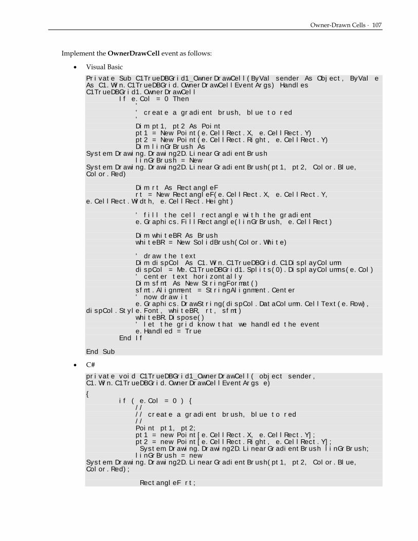
Owner-Drawn Cells · 107
Implement the OwnerDrawCell event as follows:
• Visual Basic Private Sub C1TrueDBGrid1_OwnerDrawCell(ByVal sender As Object, ByVal e As C1.Win.C1TrueDBGrid.OwnerDrawCellEventArgs) Handles C1TrueDBGrid1.OwnerDrawCell If e.Col = 0 Then ' ' create a gradient brush, blue to red ' Dim pt1, pt2 As Point pt1 = New Point(e.CellRect.X, e.CellRect.Y) pt2 = New Point(e.CellRect.Right, e.CellRect.Y) Dim linGrBrush As System.Drawing.Drawing2D.LinearGradientBrush linGrBrush = New System.Drawing.Drawing2D.LinearGradientBrush(pt1, pt2, Color.Blue, Color.Red) Dim rt As RectangleF rt = New RectangleF(e.CellRect.X, e.CellRect.Y, e.CellRect.Width, e.CellRect.Height) ' fill the cell rectangle with the gradient e.Graphics.FillRectangle(linGrBrush, e.CellRect) Dim whiteBR As Brush whiteBR = New SolidBrush(Color.White) ' draw the text Dim dispCol As C1.Win.C1TrueDBGrid.C1DisplayColumn dispCol = Me.C1TrueDBGrid1.Splits(0).DisplayColumns(e.Col) ' center text horizontally Dim sfmt As New StringFormat() sfmt.Alignment = StringAlignment.Center ' now draw it e.Graphics.DrawString(dispCol.DataColumn.CellText(e.Row), dispCol.Style.Font, whiteBR, rt, sfmt) whiteBR.Dispose() ' let the grid know that we handled the event e.Handled = True End If End Sub
• C# private void C1TrueDBGrid1_OwnerDrawCell( object sender, C1.Win.C1TrueDBGrid.OwnerDrawCellEventArgs e)
{ if ( e.Col = 0 ) { // // create a gradient brush, blue to red // Point pt1, pt2; pt1 = new Point[e.CellRect.X, e.CellRect.Y]; pt2 = new Point[e.CellRect.Right, e.CellRect.Y]; System.Drawing.Drawing2D.LinearGradientBrush linGrBrush; linGrBrush = new System.Drawing.Drawing2D.LinearGradientBrush(pt1, pt2, Color.Blue, Color.Red); RectangleF rt;

108 · Data Presentation Techniques
rt = new RectangleF(e.CellRect.X, e.CellRect.Y, e.CellRect.Width, e.CellRect.Height); // fill the cell rectangle with the gradient e.Graphics.FillRectangle(linGrBrush, e.CellRect); Brush whiteBR; whiteBR = new SolidBrush(Color.White); // draw the text C1.Win.C1TrueDBGrid.C1DisplayColumn dispCol; dispCol = this.C1TrueDBGrid1.Splits[0].DisplayColumns[e.Col]; // center text horizontally StringFormat sfmt = new StringFormat(); sfmt.Alignment = StringAlignment.Center; // now draw it e.Graphics.DrawString(dispCol.DataColumn.CellText[e.Row], dispCol.Style.Font, whiteBR, rt, sfmt); whiteBR.Dispose(); // let the grid know that we handled the event e.Handled = true; } }
• Delphi procedure TWinForm.C1TrueDBGrid1_OwnerDrawCell(sender: System.Object; e: C1.Win.C1TrueDBGrid.OwnerDrawCellEventArgs); var pt1, pt2: Point; linGrBrush: System.Drawing.Drawing2D.LinearGradientBrush; rt: RectangleF; whiteBR: Brush; dispCol: C1.Win.C1TrueDBGrid.C1DisplayColumn; sfmt: StringFormat; begin if e.Col = 0 then begin // // create a gradient brush, blue to red // pt1 := Point.Create(e.CellRect.X, e.CellRect.Y); pt2 := Point.Create(e.CellRect.Copy, e.CellRect.Y); linGrBrush := System.Drawing.Drawing2D.LinearGradientBrush.Create(pt1, pt2, Color.Blue, Color.Red); rt := RectangleF.Create(e.CellRect.X, e.CellRect.Y, e.CellRect.Width, e.CellRect.Height); // fill the cell rectangle with the gradient; e.Graphics.FillRectangle(linGrBrush, e.CellRect); whiteBR := SolidBrush.Create(Color.White); // draw the text; dispCol := Self.C1TrueDBGrid1.Splits[0].DisplayColumns[e.Col]; // center text horizontally; sfmt := StringFormat.Create; sfmt.Alignment := StringAlignment.Center; // now draw it; e.Graphics.DrawString(dispCol.DataColumn.CellText(e.Row), dispCol.Style.Font, whiteBR, rt, sfmt); whiteBR.Dispose;

Filtering Data in DataSets · 109
// let the grid know that we handled the event; e.Handled := True; end; end;
There are a couple key points worth noting in this example:
• If the e.Handled argument is set to True, the grid will not fill in the cell's background, nor will it display cell text or graphics. Therefore, you are responsible for filling in the entire cell, even if there is no data to display.
• Even a relatively simple example such as the one illustrated here requires a fair amount of coding, so consider using background bitmaps instead of owner-drawn cells if possible.
Filtering Data in DataSets In some cases, you might want to filter the underlying recordset by limiting the number of items in a given field or fields. With the True DBGrid, this is a very simple two-step process. By using the FilterBar and AllowFilter property, and entering the filter text appropriately, the number of field entries can be reduced almost effortlessly. When the FilterBar property of a C1TrueDBGrid control is set, a blank row with a gray separator line appears directly above the uppermost data row in the grid.
Next, in order to implement the filter in the grid, set the AllowFilter property to be set to True, which will tell the grid to implement the filtering process. If the FilterBar and AllowFilter properties are both set to True, the Filter Bar will appear in the grid and the grid will also handle automatically the handling of the DataSet.
In the event that you would prefer to handle the filtering process yourself, leaving the AllowFilter property as False will not implement the grid’s automatic filter. In order to create a filter, the FilterChange event, must be used to manually sort the data. This event fires whenever there the user changes the state of the Filter Bar.
In this event a handler would have to be created which filters the dataset for each character the user enters. For example, if the user would happen to type a "B" into the filter bar cell, the underlying dataset would have to be limited to just those column items whose values start with the letter B. If the user then extended the filter to "BR", then the list would have to be reduced to only those whose values that start with BR.

110 · Data Presentation Techniques

Referencing Splits and their Properties · 111
How to Use Splits In True DBGrid for .NET, a split is similar to the split window features of products such as Microsoft Excel and Word. Use splits to present data in multiple horizontal or vertical panes. These panes, or splits, can display data in different colors and fonts. The splits can scroll as a unit or individually and can display different sets of columns or the same set. Also use splits to prevent one or more columns or a set of rows from scrolling. Unlike other grid products, fixed (nonscrolling) columns or rows in True DBGrid for .NET do not have to be at the left edge of the grid, but can be at the right edge or anywhere in the middle. Multiple groups of fixed columns or rows can exist within a grid. Splits open up an endless variety of possibilities for presenting data to users of your applications.
Whenever you use True DBGrid for .NET, you are always using a split. A grid always contains at least one horizontal split, and the default values for the split properties are set so splits can be ignored until needed. Therefore, skip this chapter if you do not need to create and manipulate more than one split within a grid.
Create and manipulate splits by working with Split objects and the SplitCollection object. Since an individual column can be visible in one split but hidden in another, each Split object maintains its own collection of columns, known as C1DisplayColumnCollection. This collection provides complete control over the appearance of each split and the columns it contains.
Referencing Splits and their Properties A C1TrueDBGrid object initially contains a single horizontal split. If additional splits are created, you can determine or set the current split (that is, the split that has received focus) using the grid's SplitIndex property:
• Visual Basic ' Read the zero-based index of the current split Dim idx as Integer = Me.C1TrueDBGrid1.SplitIndex ' Set focus to the split with an index equal to Variable% Me.C1TrueDBGrid1.SplitIndex = idx
• C# // Read the zero-based index of the current split int idx = this.C1TrueDBGrid1.SplitIndex; // set focus to the split with an index equal to Variable% this.C1TrueDBGrid1.SplitIndex = idx;
• Delphi // Read the zero-based index of the current split; Variable% := Self.C1TrueDBGrid1.SplitIndex; // Set focus to the split with an index equal to Variable%; Self.C1TrueDBGrid1.SplitIndex := Variable%;
Each split in a grid is a different view of the same data source, and behaves just like an independent grid. If additional splits are created without customizing any of the split properties, all splits will be identical and each will behave very much like the original grid with one split.

112 · How to Use Splits
Note that some properties, such as RecordSelectors and MarqueeStyle, are supported by both the C1TrueDBGrid and Split objects. Three rules of thumb apply to properties that are common to a grid and its splits:
1. When you set or get the property of a Split object, you are accessing a specific split, and other splits in the same grid are not affected.
2. When you get the property of a C1TrueDBGrid object, you are accessing the same property within the current split.
3. When you set the property of a C1TrueDBGrid object, you are setting the same property within all splits.
To understand how these rules work in code, consider a grid with two horizontal splits, and assume that the current split index is 1. To determine which marquee style is in use, the following statements are equivalent:
• Visual Basic marquee = Me.C1TrueDBGrid1.MarqueeStyle marquee = Me.C1TrueDBGrid1.Splits(1).MarqueeStyle marquee = Me.C1TrueDBGrid1.Splits(Me.C1TrueDBGrid1.SplitIndex).MarqueeStyle
• C# marquee = this.C1TrueDBGrid1.MarqueeStyle; marquee = this.C1TrueDBGrid1.Splits[1].MarqueeStyle; marquee = this.C1TrueDBGrid1.Splits[this.C1TrueDBGrid1.SplitIndex].MarqueeStyle;
• Delphi marquee% := Self.C1TrueDBGrid1.MarqueeStyle; marquee% := Self.C1TrueDBGrid1.Splits[1].MarqueeStyle; marquee% := Self.C1TrueDBGrid1.Splits[Self.C1TrueDBGrid1.SplitIndex].MarqueeStyle;
To change the marquee style to a solid cell border for all of the splits in the grid, use:
• Visual Basic Me.C1TrueDBGrid1.MarqueeStyle = MarqueeEnum.SolidCellBorder
• C# this.C1TrueDBGrid1.MarqueeStyle = MarqueeEnum.SolidCellBorder;
• Delphi Self.C1TrueDBGrid1.MarqueeStyle := MarqueeEnum.SolidCellBorder;
Note that this statement is equivalent to:
• Visual Basic Me.C1TrueDBGrid1.Splits(0).MarqueeStyle = MarqueeEnum.SolidCellBorder Me.C1TrueDBGrid1.Splits(1).MarqueeStyle = MarqueeEnum.SolidCellBorder
• C# this.C1TrueDBGrid1.Splits(0).MarqueeStyle = MarqueeEnum.SolidCellBorder; this.C1TrueDBGrid1.Splits(1).MarqueeStyle = MarqueeEnum.SolidCellBorder;

Referencing Splits and their Properties · 113
• Delphi Self.C1TrueDBGrid1.Splits[0].MarqueeStyle := MarqueeEnum.SolidCellBorder; Self.C1TrueDBGrid1.Splits[1].MarqueeStyle := MarqueeEnum.SolidCellBorder;
Likewise, to set the marquee style of each split to a different value:
• Visual Basic Me.C1TrueDBGrid1.Splits(0).MarqueeStyle = MarqueeEnum.NoMarquee Me.C1TrueDBGrid1.Splits(1).MarqueeStyle = MarqueeEnum.FloatingEditor
• C# this.C1TrueDBGrid1.Splits(0).MarqueeStyle = MarqueeEnum.NoMarquee; this.C1TrueDBGrid1.Splits(1).MarqueeStyle = MarqueeEnum.FloatingEditor;
• Delphi Self.C1TrueDBGrid1.Splits[0].MarqueeStyle := MarqueeEnum.NoMarquee; Self.C1TrueDBGrid1.Splits[1].MarqueeStyle := MarqueeEnum.FloatingEditor;
These rules apply only to a C1TrueDBGrid object and its associated Split objects. No other object pairs possess similar relationships.
Split Properties Common to C1TrueDBGrid The following properties, which are supported by both Split and C1TrueDBGrid objects, adhere to the rules described in the preceding section:
AllowColMove Enables interactive column movement.
AllowColSelect Enables interactive column selection.
AllowRowSelect Enables interactive row selection.
AllowRowSizing Enables interactive row resizing.
AlternatingRowStyle Controls whether even/odd row styles are applied to a split.
CaptionStyle Controls the caption style for a split.
CurrentCellVisible Sets/returns modification status of the current cell.
ExtendRightColumn Sets/returns extended right column for a split.
FetchRowStyles Controls whether the FetchRowStyle event will be fired.
FirstRow Bookmark of row occupying first display line.
LeftCol Returns the leftmost visible column.
MarqueeStyle Sets/returns marquee style for a split.
RecordSelectors Shows/hides selection panel at left border.
NOTE: The Caption property is not included in this list, even though it is supported by both objects. Since grids and splits maintain separate caption bars, setting the Caption property of the grid does not apply the same string to each split caption.

114 · How to Use Splits
Split-Only Properties Not Supported by TDBGrid The following properties are supported by Split objects but not by C1TrueDBGrid. Therefore, to apply a value to the entire grid, set the value for each split individually.
AllowFocus Allows cells within a split to receive focus.
AllowSizing Enables interactive resizing for a split.
HorizontalScrollGroup Controls the HorizontalScrollBar.
Locked True if data entry is prohibited for a split.
SplitSize Sets/returns split width according to SizeMode.
SplitSizeMode Controls whether a split is scalable or fixed size.
VerticalScrollGroup Controls the Vertical Scroll Bar.
Split Matrix Notation When the grid contains both horizontal and vertical splits, it is said to be organized in a two-dimensional split matrix. Reference and access to the properties of the split objects in the matrix is accomplished with a two-dimensional matrix notation. The index for a particular split in a split matrix is the split row, then the column delimited by a comma. For instance, accessing the second vertical split (column) in the third horizontal split (row) would look like the following:
• Visual Basic Me.C1TrueDBGrid1.Splits.Item(2,1).Style.ForeColor = System.Drawing.Color.Blue
• C# this.C1TrueDBGrid1.Splits[2,1].Style.ForeColor = System.Drawing.Color.Blue;
• Delphi Self.C1TrueDBGrid1.Splits.Item[2,1].Style.ForeColor := System.Drawing.Color.Blue;
Note: Notice that the Item property is used in the previous example. When accessing a split through split matrix notation, the item property must be explicitly specified. When accessing a split in a grid with a one-dimensional structure, the Item property is taken as implicit and can be omitted. For instance, accessing the second split in a grid with only horizontal splits would look like the following
• Visual Basic Me.C1TrueDBGrid1.Splits(1).Style.ForeColor = System.Drawing.Color.Blue
• C# this.C1TrueDBGrid1.Splits(1).Style.ForeColor = System.Drawing.Color.Blue ;
• Delphi Self.C1TrueDBGrid1.Splits[1].Style.ForeColor := System.Drawing.Color.Blue;

Creating and Removing Splits · 115
Creating and Removing Splits At run time, you must create and remove splits using the RemoveHorizontalSplit, InsertHorizontalSplit, RemoveVerticalSplit, and RemoveHorizontalSplit method. Each method takes a zero-based split index:
• Visual Basic Dim S As C1TrueDBGrid.Split Me.C1TrueDBGrid1.InsertVerticalSplit(7) ' Create a split with index 7 Me.C1TrueDBGrid1.RemoveVerticalSplit(5) ' Remove the split with index 5
• C# C1TrueDBGrid.Split S; this.C1TrueDBGrid1.InsertVerticalSplit(7); // Create a split with index 7 this.C1TrueDBGrid1.RemoveVerticalSplit(5); // Remove the split with index 5
• Delphi Self.C1TrueDBGrid1.InsertVerticalSplit(7); // Create a split with index 7 Self.C1TrueDBGrid1.RemoveVerticalSplit(5); // Remove the split with index 5
You can determine the number of splits in a grid using the SplitCollection Count property:
• Visual Basic ' Set variable equal to the number of splits in C1TrueDBGrid1 variable = Me.C1TrueDBGrid1.Splits.Count
• C# // set { variable equal to the number of splits in C1TrueDBGrid1 variable = this.C1TrueDBGrid1.Splits.Count;
• Delphi // Set variable equal to the number of splits in C1TrueDBGrid1; variable := Self.C1TrueDBGrid1.Splits.Count;
You can iterate through all splits using the Count property, for example:
• Visual Basic For n = 0 To Me.C1TrueDBGrid1.Splits.Count - 1 Debug.WriteLine (Me.C1TrueDBGrid1.Splits(n).Caption) Next n
• C# for ( n = 0 ; n < this.C1TrueDBGrid1.Splits.Count; n++) { Console.WriteLine (this.C1TrueDBGrid1.Splits[n].Caption); }
• Delphi for n := 0 To Self.C1TrueDBGrid1.Splits.Count – 1 do Debug.WriteLine (Self.C1TrueDBGrid1.Splits(n).Caption);

116 · How to Use Splits
Of course, a more efficient way to code this would be to use a For Each...Next loop:
• Visual Basic Dim S As C1TrueDBGrid.Split For Each S In Me.C1TrueDBGrid1.Splits Debug.WriteLine (S.Caption) Next
• C# C1TrueDBGrid.Split S; foreach ( S In this.C1TrueDBGrid1.Splits Debug.WriteLine (S.Caption); } //
• Delphi var S: C1TrueDBGrid.Split; i: Integer; for i := 0 to Self.C1TrueDBGrid1.Splits.Count-1 do begin S := C1TrueDBGrid1.Splits[i]; Debug.WriteLine(S.Caption); end;
The new Split object will inherit all of its properties from the last object in the collection.
Working with Columns in Splits Each split in a True DBGrid for .NET control maintains its own collection of columns. The C1DisplayColumnCollection object provides access to both split-specific display properties for columns inside a split. The split-specific properties of the C1DisplayColumnCollection allow for tremendous flexibility in controlling the look and behavior of individual splits. The grid is connected to a single data source, so the splits just present different views of the same data. Therefore, the C1DisplayColumnCollection in each split contains the same number of columns and the columns are bound to the same data fields.
However, the values of other C1DisplayColumn object properties, such as Visible, may vary from split to split. These properties are said to be split-specific. For example, a column created at run time is not visible by default. Thus, the LastName column created in the preceding example is invisible in all splits. The following code makes it visible in the second split:
• Visual Basic Me.C1TrueDBGrid1.Splits(1).DisplayColumns("LastName").Visible = True
• C# this.C1TrueDBGrid1.Splits(1).DisplayColumns("LastName").Visible = true;
• Delphi Self.C1TrueDBGrid1.Splits[1].DisplayColumns['LastName'];
Since Visible is a split-specific property, the LastName column remains invisible in other splits.

Sizing and Scaling Splits · 117
Sizing and Scaling Splits True DBGrid for .NET provides full control over the size and scaling of individual splits. Configure a split to occupy an exact width or height, hold a fixed number of columns or rows, or adjust its size proportionally in relation to other splits. When initially starting out with True DBGrid, splits can still be used in a variety of ways without having to master all of the details.
At run time, the actual size of a Split object depends upon its SplitSize and SplitSizeMode properties. The SplitSizeMode property specifies the unit of measurement; the SplitSize property specifies the number of units. True DBGrid supports three different sizing modes for splits, as determined by the setting of the SplitSizeMode property:
SizeModeEnum.Scalable denotes relative width in relation to other splits
SizeModeEnum.Exact specifies a fixed width in container coordinates
SizeModeEnum.NumberofColumns specifies a fixed number of columns
A scalable split uses the value of its SplitSize property to determine the percentage of space the split will occupy. For any scalable split, the percentage is determined by dividing its SplitSize value by the sum of the SplitSize values of all other scalable splits. Thus, consider the SplitSize property of a scalable split to be the numerator of a fraction, the denominator of which is the sum of the scalable split sizes. Scalable splits compete for the space remaining after nonscalable splits have been allocated. By default, all splits are scalable, so they compete for the entire grid display region. SplitSizeMode is always Scalable when a grid contains only one split.
An exact split uses the value of its SplitSize property as its fixed width in container coordinates. Exact splits will be truncated if they will not fit within the horizontal grid boundaries. This mode is not applicable when a grid contains only one split.
A fixed-column split uses the SplitSize property to indicate the exact number of columns that should always be displayed within the split. These splits automatically reconfigure the entire grid if the size of the displayed columns changes (either by code or user interaction), or if columns in the split are scrolled horizontally so that the widths of the displayed columns are different. This mode is primarily used to create fixed columns that do not scroll horizontally. However, it can be used for a variety of other purposes as well. This mode is not applicable when a grid contains only one split.
Note that when there is only one split (the grid's default behavior), the split spans the entire width of the grid, the SplitSizeMode property is always Scalable, and the SplitSize property is always 1. Setting either of these properties has no effect when there is only one split. If there are multiple splits, and then remove all but one so the SplitSizeMode and SplitSize properties of the remaining split automatically revert to 0 and 1, respectively.
By default, the SplitSizeMode property for a newly created split is Scalable, and the SplitSize property is set to 1. For example, two additional splits can be created with the following code:
• Visual Basic Me.C1TrueDBGrid1.InsertHorizontalSplit(0) 'Create Split on the left Me.C1TrueDBGrid1.InsertHorizontalSplit(0) 'Create another
• C# this.C1TrueDBGrid1.InsertHorizontalSplit(0); //Create Split on the left this.C1TrueDBGrid1.InsertHorizontalSplit(0); //Create another
• Delphi Self.C1TrueDBGrid1.InsertHorizontalSplit(0); // Create Split on the left Self.C1TrueDBGrid1.InsertHorizontalSplit(0); // Create another

118 · How to Use Splits
The resulting grid display will appear as follows:
Notice that each split occupies 1/3 of the total grid space. This is because there are three scalable splits, and each split has a SplitSize of 1. If the sizes of the splits are changed to 1, 2, and 3, respectively:
• Visual Basic Me.C1TrueDBGrid1.Splits(0).SplitSize = 1 ' Change relative size to 1 Me.C1TrueDBGrid1.Splits(1).SplitSize = 2 ' Change relative size to 2 Me.C1TrueDBGrid1.Splits(2).SplitSize = 3 ' Change relative size to 3
• C# this.C1TrueDBGrid1.Splits(0).SplitSize = 1 // Change relative size to 1; this.C1TrueDBGrid1.Splits(1).SplitSize = 2 // Change relative size to 2; this.C1TrueDBGrid1.Splits(2).SplitSize = 3 // Change relative size to 3;
• Delphi Self.C1TrueDBGrid1.Splits[0].SplitSize := 1; // Change relative size to 1 Self.C1TrueDBGrid1.Splits[1].SplitSize := 2; // Change relative size to 2 Self.C1TrueDBGrid1.Splits[2].SplitSize := 3; // Change relative size to 3
The resulting grid display will appear as follows:
Notice the sum of the split sizes (1+2+3) is 6, so the size of each split is a fraction with the numerator being the value of its SplitSize property and a denominator of 6.

Sizing and Scaling Splits · 119
When a split's SplitSizeMode is set to Exact, that split receives space before the other splits. This behavior is somewhat more complex, but understanding how scalable splits work is helpful. For example, assume that splits are set in the following way:
• Visual Basic Split0.SplitSizeMode = SizeModeEnum.Scalable Split0.SplitSize = 1 Split1.SplitSizeMode = SizeModeEnum.Exact Split1.SplitSize = 2500 Split2.SplitSizeMode = SizeModeEnum.Scalable Split2.SplitSize = 2
• C# Split0.SplitSizeMode = SizeModeEnum.Scalable; Split0.SplitSize = 1; Split1.SplitSizeMode = SizeModeEnum.Exact; Split1.SplitSize = 2500; Split2.SplitSizeMode = SizeModeEnum.Scalable; Split2.SplitSize = 2;
• Delphi Split0.SplitSizeMode := SizeModeEnum.Scalable; Split0.SplitSize := 1; Split1.SplitSizeMode := SizeModeEnum.Exact; Split1.SplitSize := 2500; Split2.SplitSizeMode := SizeModeEnum.Scalable; Split2.SplitSize := 2;
After configuring the splits in this way, the resulting grid display will look like this.
The fixed-size split in the middle (Split1) is configured to exactly 250 pixels, and the remaining splits compete for the space remaining in the grid. Since the remaining splits are both scalable splits, they divide the remaining space among themselves according to the percentages calculated using their SplitSize property values. So, the leftmost split occupies 1/3 of the remaining space, and the rightmost split occupies 2/3.

120 · How to Use Splits
Splits with SplitSizeMode set to Number of Columns behave almost identically to exact splits, except their size is determined by the width of an integral number of columns. The width, however, is dynamic, so resizing the columns or scrolling so that different columns are in view will cause the entire grid to reconfigure itself.
Avoid creating a grid with no scalable splits. Although True DBGrid handles this situation, it is difficult to work with a grid configured in this way. For example, if no splits are scalable, all splits will have an exact size, which may not fill the entire horizontal width of the grid. If the total width of the splits is too short, True DBGrid displays a "null-zone" where there are no splits. If the total width of the splits is wider than the grid, then True DBGrid will show only the separator lines for the splits that cannot be shown.
Creating and Resizing Splits through User Interaction Create and resize splits in code. However, users can also create and resize splits interactively by setting the AllowHorizontalSplit or AllowVerticalSplit property of a split to True. By default, both properties are set to False, and users are prevented from creating and resizing splits.
A typical grid with these properties set to False is shown in the following figure. Notice that there is no split box at the left edge of the horizontal scroll bar or at the top of the vertical scroll bar.
If the split's AllowVerticalSplit property is set to True:
• Visual Basic Me.C1TrueDBGrid1.AllowVerticalSplit = True
• C# this.C1TrueDBGrid1.AllowVerticalSplit = true;
• Delphi Self.C1TrueDBGrid1.AllowVerticalSplit := True;
A split box will appear at the top edge of the vertical scroll bar, and the user will be able to create new splits at run time.

Creating and Resizing Splits through User Interaction · 121
If the split's AllowHorizontalSplit property is set to True:
• Visual Basic Me.C1TrueDBGrid1.AllowHorizontalSplit = True
• C# this.C1TrueDBGrid1.AllowHorizontalSplit = true;
• Delphi Self.C1TrueDBGrid1.AllowHorizontalSplit := True;
A split box will appear at the left edge of the horizontal scroll bar, and the user will be able to create new splits at run time.
The new split will inherit its properties from the original split. The SplitSizeMode properties of both splits will be automatically set to 0 - Scalable, regardless of the SplitSizeMode of the original split. The

122 · How to Use Splits
SplitSize properties of both splits will be set to the correct ratio of the splits' sizes. The values of the SplitSize properties may end up being rather large. This is because True DBGrid needs to choose the least common denominator for the total split size, and the user may drag the pointer to an arbitrary position.
If the user points to the split box between the two splits, the pointer will turn into a double vertical bar with horizontal arrows. The user can drag this pointer to the left or right to adjust the relative sizes of the splits.
To summarize:
• Splits can always be created or resized in code, but the AllowHorizontalSplit and AllowVerticalSplit property control whether users can create or resize splits interactively at run time.
• The user can resize the relative sizes of two splits only if both splits' AllowSizing properties are True. When the user completes a resize operation, the total size of the two splits remains unchanged, but the SplitSizeMode properties of both splits will automatically be set to Scalable regardless of their previous settings. The SplitSize properties of the two splits will be set to reflect the ratio of their new sizes.
Vertical Scrolling and Split Groups By default, the grid has only one horizontal split, with split index 0, and its HScrollBar and VScrollBar style property is set to ScrollBarStyleEnum.Automatic. That is, the horizontal or vertical scroll bar will appear as necessary depending upon the column widths and the number of data rows available. The default split's HorizontalScrollGroup and VerticalScrollGroup properties are set to 1. Splits having the same scrollgroup property setting will scroll vertically or horizontally together. When a new split is created, it will inherit both the state of the scroll bars and the Scroll Group properties from the parent split. If all of the splits belonging to the same HorizontalScrollGroup or VerticalScrollGroup have their HScrollBar and VScrollBar style property is set to ScrollBarStyleEnum.Automatic, then True DBGrid will display the vertical scroll bar or horizontal scroll bar only at the rightmost or bottommost split of the scroll group. Manipulating this single scroll bar will cause all splits in the same scroll group to scroll simultaneously.
For example, two additional splits can be created with the following code:
• Visual Basic Me.C1TrueDBGrid1.InsertHorizontalSplit(0) 'Create a Split at the left Me.C1TrueDBGrid1.InsertHorizontalSplit(0) ' Create another
• C# this.C1TrueDBGrid1.InsertHorizontalSplit(0); //Create a Split at the left this.C1TrueDBGrid1.InsertHorizontalSplit(0); // Create another
• Delphi Self.C1TrueDBGrid1.InsertHorizontalSplit(0); // Create a Split at the left; Self.C1TrueDBGrid1.InsertHorizontalSplit(0); // Create another;

Vertical Scrolling and Split Groups · 123
The resulting grid display will display as follows:
All three splits will have the same HScrollBar and VScrollBar settings and VerticalScrollGroup setting of 1. However, only one vertical scroll bar will be displayed, within the rightmost split. When the user operates this scroll bar, all three splits will scroll simultaneously.
Vertical splits react in the same manner. After adding two vertical splits to the grid, all of the splits have the same HorizontalScrollGroup value of 1. Thus there is only one horizontal scroll bar at the bottom of the grid, and if this scroll bar is scrolled all three splits will scroll simultaneously.
Change one of the scroll group properties of the splits to create split groups that scroll independently. In the preceding example, setting the HorizontalScrollGroup property of the middle split to 2 creates a new scroll group:
• Visual Basic Me.C1TrueDBGrid1.Splits.Item(0,1).HorizontalScrollGroup = 2
• C# this.C1TrueDBGrid1.Splits[0,1].HorizontalScrollGroup = 2;
• Delphi Self.C1TrueDBGrid1.Splits.Item[0,1].HorizontalScrollGroup := 2;

124 · How to Use Splits
After this statement executes, scrolling the middle split will not disturb the others, as shown in the following figure.
Note that the middle split now contains a horizontal scroll bar. This scroll bar operates only on the middle split, since it is the only one with its HorizontalScrollGroup property equal to 2. The horizontal scroll bar in the bottommost split now controls the bottom and top splits only. It no longer affects the middle split.
A common application of this feature is to create two independent split groups so that users can compare field values from different records by scrolling each split to view a different set of rows.
Horizontal Scrolling and Fixed Columns Scrolling is independent for each split. Often, one or more columns need to be prevented from scrolling horizontally or vertically so that the columns will always be in view. True DBGrid provides an easy way to keep any number of columns from scrolling at any location within the grid (even in the middle!) by setting a few split properties.
As an example, with a grid with three horizontal splits, the following code will "fix" columns 0 and 1 in the middle split:
• Visual Basic ' Hide all columns in Splits(1) except for columns 0 and 1 Dim Cols As C1TrueDBGrid.C1DisplayColumnCollection Dim C As C1TrueDBGrid.C1DisplayColumn Cols = Me.C1TrueDBGrid1.Splits(1).DisplayColumns For Each C In Cols C.Visible = False Next C Cols(0).Visible = True Cols(1).Visible = True ' Configure Splits(1) to display exactly two columns, and ' disable resizing With Me.C1TrueDBGrid1.Splits(1) .SplitSizeMode = SizeModeEnum.NumberOfColumns .SplitSize = 2

Horizontal Scrolling and Fixed Columns · 125
.AllowHorizontalSizing = False End With
• C# // Hide all columns in Splits[1] except for columns 0 and 1 C1TrueDBGrid.C1DisplayColumnCollection Cols; C1TrueDBGrid.C1DisplayColumn C; Cols = this.C1TrueDBGrid1.Splits[1].DisplayColumns foreach (C In Cols) C.Visible = false; } Cols(0).Visible = true; Cols(1).Visible = true; // Configure Splits[1] to display exactly two columns, and // disable resizing C1TrueDBGrid1.Splits[1].SplitSizeMode = SizeModeEnum.NumberOfColumns; C1TrueDBGrid1.Splits[1].SplitSize = 2; C1TrueDBGrid1.Splits[1].AllowHorizontalSizing = false;
• Delphi var Cols: C1TrueDBGrid.C1DisplayColumnCollection; // Hide all columns in Splits(1) except for columns 0 and 1; Cols := Self.C1TrueDBGrid1.Splits[1].Columns; for i := 0 to Cols.Count-1 do Cols[i].Visible := False; Cols[0].Visible := True; Cols[1].Visible := True; // Configure Splits(1) to display exactly two columns, and; // disable resizing; with Self.C1TrueDBGrid1.Splits[1] do begin SplitSizeMode := SizeModeEnum.NumberOfColumns; SplitSize := 2; AllowHorizontalSplit := False; end;
Usually, if columns 0 and 1 are kept from scrolling in one split, it will be desirable to have them invisible in the other splits:
• Visual Basic ' Make columns 0 and 1 invisible in splits 0 and 2 Dim Cols As C1TrueDBGrid.C1DisplayColumnCollection Cols = Me.C1TrueDBGrid1.Splits(0).DisplayColumns Cols(0).Visible = False Cols(1).Visible = False Cols = Me.C1TrueDBGrid1.Splits(2).DisplayColumns Cols(0)Visible = False Cols(1)Visible = False
• C# // Make columns 0 and 1 invisible in splits 0 and 2 C1TrueDBGrid.C1DisplayColumnCollection Cols; Cols = this.C1TrueDBGrid1.Splits[0].DisplayColumns; Cols[0].Visible = false; Cols[1].Visible = false; Cols = this.C1TrueDBGrid1.Splits[2].DisplayColumns; Cols[0]Visible = false; Cols[1]Visible = false;

126 · How to Use Splits
• Delphi // Make columns 0 and 1 invisible in splits 0 and 2; var Cols: C1TrueDBGrid.C1DisplayColumnCollection; Cols := Self.C1TrueDBGrid1.Splits[0].Columns; Cols[0].Visible := False; Cols[1].Visible := False; Cols := Me.C1TrueDBGrid1.Splits[2].Columns; Cols[0].Visible := False; Cols[1].Visible := False;
Navigation across Splits Navigation across splits is controlled by the grid's TabAcrossSplits property and each split's AllowFocus property. Navigation across splits is best discussed with grid navigation as a whole. For more information, please refer to Run Time Interaction (page 47).
Built-in Named Styles · 127
How to Use Styles True DBGrid for .NET uses a style model similar to that of Microsoft Word and Excel to simplify the task of customizing a grid's appearance. A Style object is a combination of font, color, picture, and formatting information comprising the following properties:
BackColor Controls the background color.
BackgroundImage Sets/returns a style's background picture.
BackgroundPictureDrawMode Controls how a style's background picture is displayed.
Font Specifies typeface, size, and other text characteristics.
ForeColor Controls the foreground color.
ForeGroundImage Sets/returns a style's foreground picture.
ForegroundPicturePosition Controls how a style's foreground picture is positioned.
HorizontalAlignment Specifies cell text alignment.
Locked Disallows in-cell editing when true.
Trimming Determines how a string is trimmed.
VerticalAlignment Specifies vertical text alignment.
WrapText Word wraps cell text when true.
Built-in Named Styles When a grid is first created, it has a collection of built-in named styles that control various aspects of its display. For example, the Heading style determines the attributes used to display column headers. At design time, change the appearance of the grid as a whole by modifying the built-in named styles in the GridStyle Collection Editor. At run time, the GridStyleCollection provides access to the same set of named styles. Initially, all grids contain ten built-in styles, which control the display of the following grid elements:
Caption Grid and split caption bars.
Editor Cell editor within grid.
EvenRow Data cells in even numbered rows.
Filter Bar Data in the filter bar columns.
Footer Column footers.
Group Group columns in grid grouping area.
Heading Column headers.
HighlightRow Data cells in highlighted rows.

128 · How to Use Styles
Inactive Column headings when another column has focus.
Normal Data cells in unselected, unhighlighted rows.
OddRow Data cells in odd numbered rows.
Record Selector Data in the record selector column.
Selected Data cells in selected rows.
A selected row is one whose bookmark has been added to the SelectedRowCollection , either in code or through user interaction. The term highlighted row refers to the current row when the MarqueeStyle property is set to MarqueeEnuim.Highligh Row or MarqueeEnum.HighlightRowRaiseCell.
The EvenRow and OddRow styles are used only when the AlternatingRows property is set to True.
Named Style Defaults As in Microsoft Word, a Style object in True DBGrid can inherit its characteristics from another style, referred to as the parent style. For a newly created grid, the Normal style is the parent (or grandparent) of all named styles. Its default properties are as follows:
BackColor System.Drawing.Color.White
BackgroundImage None
BackgroundPictureDrawMode BackgroundPictureDrawModeEnum.Stretch
Font Microsoft Sans Serif, 8.25pt
ForeColor System.Drawing.Color.Black
ForeGroundImage None
ForegroundPicturePosition ForegroundPicturePositionEnum.LeftOfText
HorizontalAlignment AlignHorzEnum.General
Locked False
Trimming Character
VerticalAlignment AlignVertEnum.Top
WrapText False
The Heading and Footing styles are defined similarly. Each inherits from Normal, and each overrides the following properties:
BackColor System.Drawing.SystemColors.Control
ForeColor System.Drawing.Color.Black
VerticalAlignment AlignVertEnum.Center
The Heading style overrides one additional property that the Footing style does not:
WrapText True
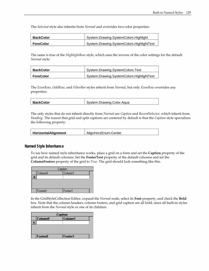
Built-in Named Styles · 129
The Selected style also inherits from Normal and overrides two color properties:
BackColor System.Drawing.SystemColors.Highlight
ForeColor System.Drawing.SystemColors.HighlightText
The same is true of the HighlightRow style, which uses the inverse of the color settings for the default Normal style:
BackColor System.Drawing.SystemColors.Text
ForeColor System.Drawing.SystemColors.HighlightText
The EvenRow, OddRow, and FilterBar styles inherit from Normal, but only EvenRow overrides any properties:
BackColor System.Drawing.Color.Aqua
The only styles that do not inherit directly from Normal are Caption and RecordSelector, which inherit from Heading. The reason that grid and split captions are centered by default is that the Caption style specializes the following property:
HorizontalAlignment AlignHorzEnum.Center
Named Style Inheritance To see how named style inheritance works, place a grid on a form and set the Caption property of the grid and its default columns. Set the FooterText property of the default columns and set the ColumnFooters property of the grid to True. The grid should look something like this.
In the GridStyleCollection Editor, expand the Normal node, select its Font property, and check the Bold box. Note that the column headers, column footers, and grid caption are all bold, since all built-in styles inherit from the Normal style or one of its children.

130 · How to Use Styles
Next, expand the Heading node and select its ForeColor property. Choose Web from the color tabs, then select White. Note that the text color of both the column headers and the grid's caption bar is now white, since the Caption style inherits its color properties from the Heading style. The column footers remain the same because the Footer style inherits from Normal, not Heading.
Finally, expand the Caption node and select its BackColor property. Choose Web from the color tabs, then select Gray. Note that the background color of the column headers is not changed, and that the Caption style continues to inherit its text color from its parent style, Heading.
Modifying Named Styles Change the appearance of the overall grid at design time by using .NET’s collection editors to modify the GridStyleCollection. For example, to force all column headers to center their caption text, change the HorizontalAlignment property of the built-in Heading style to AlignHorzEnum.Center.
The following statement accomplishes the same result in code:
• Visual Basic Me.C1TrueDBGrid1.Styles("Heading").HorizontalAlignment = AlignHorzEnum.Center
• C# this.C1TrueDBGrid1.Styles("Heading").HorizontalAlignment = AlignHorzEnum.Center;
• Delphi Self.C1TrueDBGrid1.Styles['Heading'].HorizontalAlignment = AlignHorzEnum.Center;
However, it is not necessary to use the GridStyleCollection Editor or manipulate named members of the GridStyleCollection in code, as the grid and its component objects expose several properties that return Style objects. As the next section describes, the appearance of the grid can be fine-tuned by manipulating these objects directly. For more information see Using the GridStyleCollection Editor (page 41).
Working with Style Properties Just as a document template in Microsoft Word specifies the overall appearance of individual paragraphs in a document, the named members of the GridStyleCollection object provide an overall display template for a C1TrueDBGrid or C1TrueDBDropDown control. However, to customize the appearance of individual Split or C1DisplayColumn objects, modify the appropriate Style object property:

Working with Style Properties · 131
CaptionStyle Controls the caption style for an object.
EditorStyle Controls the editor style for an object.
EvenRowStyle Controls the row style for even-numbered rows.
FilterBarStyle Controls the style of the columns in the filter bar.
FooterStyle Controls the footing style for an object.
HeadingStyle Controls the heading style for an object.
HighlightRowStyle Controls the marquee style when set to Highlight Row.
InactiveStyle Controls the inactive heading style for an object.
OddRowStyle Controls the row style for odd-numbered rows.
RecordSelectorStyle Controls the record selector style for an object.
SelectedStyle Controls the selected row/column style for an object.
Style Controls the normal style for an object.
Modifying a Style Property Directly Customize the appearance of a grid component by modifying one or more members of an appropriate style property. For example, to make the grid's caption text bold, change the Font object associated with the CaptionStyle property. At design time, this is done by expanding the CaptionStyle tree node on the Visual Basic properties window, expanding the Font node, and checking the Bold box. The change is committed to the grid when you click out of this particular property.
Note when switching to the GridStyle collection editor, it will be seen that the built-in Caption style has not changed.
This means that the following statements are not equivalent:
• Visual Basic Dim myfont As New Font(Me.C1TrueDBGrid1.Font, FontStyle.Bold) Me.C1TrueDBGrid1.CaptionStyle.Font = myfont Me.C1TrueDBGrid1.Styles("Caption").Font = myfont
• C# Font myfont = new Font(this.C1TrueDBGrid1.Font, FontStyle.Bold); this.C1TrueDBGrid1.CaptionStyle.Font = myfont; this.C1TrueDBGrid1.Styles("Caption").Font = myfont;
• Delphi var myfont: Font; myfont := Font.Create(Self.C1TrueDBGrid1.Font, FontStyle.Bold); Self.C1TrueDBGrid1.CaptionStyle.Font := myfont; Self.C1TrueDBGrid1.Styles['Caption'].Font := myfont;
The first statement specializes the font of the grid's caption bar without changing the named Caption style. The second statement changes the named Caption style, which may or may not affect the display of the grid's caption bar, depending on whether the Font member of the CaptionStyle property was specialized previously. For example, if the grid's CaptionStyle font is changed to Arial, and then the font of the built-in Caption style is changed to Courier, the grid caption will remain Arial. However, if the CaptionStyle

132 · How to Use Styles
font is never changed, then any font change to the built-in Caption style will be instantly reflected in the grid's caption bar.
Named Styles Versus Anonymous Styles When setting style properties at design time, it is important to understand the distinction between named styles and the anonymous styles exposed by grid properties.
Named styles provide templates that govern the appearance of the grid, its splits, and its columns. At design time, create, modify, and delete named styles using the GridStyleCollection Editor. At run time, the GridStyleCollection is used to represent the same set of named Style objects.
Anonymous styles are not members of the GridStyleCollection. However, anonymous styles are provided so that the appearance of an individual split or column can be easily and directly customized without having to define a separate named style.
The following analogy should help to clarify the distinction between named and anonymous styles. Consider a Microsoft Word document that consists of several paragraphs based on the default normal style. Suppose that one of the paragraphs is a quotation that needs to be indented and displayed in italics. If the document is part of a larger work that contains several quotations, it makes sense to define a special style for that purpose and apply it to all paragraphs that contain quotations. If the document is an early draft or is not likely to be updated, defining a style for one paragraph is overkill, and it would be more convenient to apply indentation and italics to the quotation itself.
In this analogy, specifying paragraph attributes directly is akin to setting the members of a property that returns an anonymous style. For example, to vertically center cell data within a particular grid column, modify the VerticalAlignment member of the column's Style property in the C1DisplayColumnCollection editor.
Note that modifying an anonymous style is just like modifying a named style. Expand the desired Style object node in a property tree, and then select and edit one or more of its member properties.

Working with Style Properties · 133
Anonymous Style Inheritance Just as one named style can inherit font, color, and formatting characteristics from another, an anonymous style in a Split object can inherit from its counterpart in the containing C1TrueDBGrid control. Similarly, an anonymous style in a C1DisplayColumn object can inherit from its counterpart in the containing Split object. Since the C1TrueDBDropDown control does not have a Splits collection, the anonymous styles of its C1DisplayColumn objects can inherit values from the control itself.
When a grid is first created, its Style property inherits all of its attributes from the built-in Normal style, which controls the appearance of all data cells. Any changes to the Normal style are propagated to all splits, and in turn to the columns within each split. However, change the appearance of all data cells within a Split or C1DisplayColumn object by modifying the members of its anonymous Style property.
Consider the following grid layout, which uses the default values of all built-in styles and contains two identical splits.
All of the subsequent examples use this layout as a starting point. For clarity, the examples use code to illustrate the relationships between style properties and the grid's display; however, you can perform the same operations at design time using the grid's collection editors.
Example 1:
• Visual Basic Dim myfont As Font myfont = New Font (Me.C1TrueDBGrid1.Styles(“Normal”).Font, FontStyle.Bold) Me.C1TrueDBGrid1.Styles(“Normal”).Font = myfont
• C# Font myfont; myfont = new Font (this.C1TrueDBGrid1.Styles(“Normal”).Font, FontStyle.Bold); this.C1TrueDBGrid1.Styles(“Normal”).Font = myfont;
• Delphi var myfont: Font; myfont := Font.Create(Self.C1TrueDBGrid1.Styles[‘Normal’].Font, FontStyle.Bold); Self.C1TrueDBGrid1.Styles[‘Normal’].Font := myfont;
Since the default values of all built-in styles are in effect, columns inherit from their containing splits, which in turn inherit from the grid as a whole. Therefore, this statement affects not only data cells, but

134 · How to Use Styles
also all headers, footers, and caption bars. This statement has the same visual effect as changing the Normal style directly using the GridStyle Collection Editor; however, the built-in Normal style itself is not changed.
Example 2:
• Visual Basic Dim myfont As Font myfont = New Font (Me.C1TrueDBGrid1.Splits(0).Styles(“Normal”).Font, FontStyle.Bold) Me.C1TrueDBGrid1.Splits(0).Styles(“Normal”).Font = myfont
• C# Font myfont; myfont = new Font (this.C1TrueDBGrid1.Splits(0).Styles(“Normal”).Font, FontStyle.Bold); this.C1TrueDBGrid1.Splits(0).Styles(“Normal”).Font = myfont;
• Delphi var myfont: Font; myfont := Font.Create(Self.C1TrueDBGrid1.Splits[0].Styles[‘Normal’].Font, FontStyle.Bold); Self.C1TrueDBGrid1.Splits[0].Styles[‘Normal’].Font := myfont;
In this example, only the data cells of the first split are affected. This is because the split caption, column headers, and column footers inherit their fonts from the built-in styles Caption, Heading, and Footing, respectively.
Example 3:
• Visual Basic Dim myfont As Font Dim myfont1 As Font Dim myfont2 As Font Dim myfont3 As Font myfont = New Font (Me.C1TrueDBGrid1.Splits(0).Styles.Font, FontStyle.Bold) Me.C1TrueDBGrid1.Splits(0).Styles(“Normal).Font = myfont myfont1 = New Font (Me.C1TrueDBGrid1.Splits(0).CaptionStyle.Font, FontStyle.Bold) Me.C1TrueDBGrid1.Splits(0).CaptionStyle.Font = myfont1 myfont2 = New Font (Me.C1TrueDBGrid1.Splits(0).HeadingStyle.Font, FontStyle.Bold) Me.C1TrueDBGrid1.Splits(0).HeadingStyle.Font = myfont2 myfont3 = New Font (Me.C1TrueDBGrid1.Splits(0).FooterStyle.Font, FontStyle.Bold) Me.C1TrueDBGrid1.Splits(0).FooterStyle.Font = myfont3

Working with Style Properties · 135
• C# Font myfont; Font myfont1; Font myfont2; Font myfont3; myfont = new Font (this.C1TrueDBGrid1.Splits(0).Styles.Font, FontStyle.Bold); this.C1TrueDBGrid1.Splits(0).Styles(“Normal).Font = myfont; myfont1 = new Font (this.C1TrueDBGrid1.Splits(0).CaptionStyle.Font, FontStyle.Bold); this.C1TrueDBGrid1.Splits(0).CaptionStyle.Font = myfont1; myfont2 = new Font (this.C1TrueDBGrid1.Splits(0).HeadingStyle.Font, FontStyle.Bold); this.C1TrueDBGrid1.Splits(0).HeadingStyle.Font = myfont2; myfont3 = new Font (this.C1TrueDBGrid1.Splits(0).FooterStyle.Font, FontStyle.Bold); this.C1TrueDBGrid1.Splits(0).FooterStyle.Font = myfont3;
• Delphi var myfont: Font; myfont1: Font; myfont2: Font; myfont3: Font; myfont := Font.Create (Self.C1TrueDBGrid1.Splits[0].Styles.Font, FontStyle.Bold); Self.C1TrueDBGrid1.Splits[0].Styles[‘Normal’].Font := myfont; myfont1 := Font.Create(Self.C1TrueDBGrid1.Splits(0).CaptionStyle.Font, FontStyle.Bold); Self.C1TrueDBGrid1.Splits[0].CaptionStyle.Font := myfont1; myfont2 := Font.Create(Self.C1TrueDBGrid1.Splits[0].HeadingStyle.Font, FontStyle.Bold); Self.C1TrueDBGrid1.Splits[0].HeadingStyle.Font := myfont2; myfont3 := Font.Create(Self.C1TrueDBGrid1.Splits[0].FooterStyle.Font, FontStyle.Bold); Self.C1TrueDBGrid1.Splits[0].FooterStyle.Font := myfont3;
This example extends the previous one to render all elements of the first split in bold. In addition to the Style property, it is necessary to set the CaptionStyle, HeadingStyle, and FooterStyle properties.
Example 4:
• Visual Basic Dim myfont As Font myfont = New Font (Me.C1TrueDBGrid1.Splits(0).DisplayColumns(0).Style.Font, FontStyle.Bold)

136 · How to Use Styles
Me.C1TrueDBGrid1.Splits(0).DisplayColumns(0).Style.Font = myfont
• C# Font myfont; myfont = new Font (this.C1TrueDBGrid1.Splits(0).DisplayColumns(0).Style.Font, FontStyle.Bold); this.C1TrueDBGrid1.Splits(0).DisplayColumns(0).Style.Font = myfont;
• Delphi var myfont: Font; myfont := Font.Create(Self.C1TrueDBGrid1.Splits[0].DisplayColumns[0].Style.Font, FontStyle.Bold); Self.C1TrueDBGrid1.Splits[0].DisplayColumns[0].Style.Font := myfont;
In this example, only the data cells of the first column of the first split are affected. This is because the column headers and column footers inherit their fonts from the built-in styles Heading and Footing, respectively.
Example 5:
• Visual Basic Dim myfont As Font Dim myfont1 As Font Dim myfont2 As Font myfont = New Font (Me.C1TrueDBGrid1.Splits(0).DisplayColumns(0).Style.Font, FontStyle.Bold) Me.C1TrueDBGrid1.Splits(0).DisplayColumns(0).Style.Font = myfont myfont1 = New Font (Me.C1TrueDBGrid1.Splits(0).DisplayColumns(0).HeadingStyle.Font, FontStyle.Bold) Me.C1TrueDBGrid1.Splits(0).DisplayColumns(0).HeadingStyle.Font = myfont1 myfont2 = New Font (Me.C1TrueDBGrid1.Splits(0).DisplayColumns(0).FooterStyle.Font, FontStyle.Bold)
Me.C1TrueDBGrid1.Splits(0).DisplayColumns(0).FooterStyle.Font = myfont2
• C# Font myfont; Font myfont1; Font myfont2; myfont = new Font (this.C1TrueDBGrid1.Splits(0).DisplayColumns(0).Style.Font, FontStyle.Bold); this.C1TrueDBGrid1.Splits(0).DisplayColumns(0).Style.Font = myfont;

Working with Style Properties · 137
myfont1 = new Font (this.C1TrueDBGrid1.Splits(0).DisplayColumns(0).HeadingStyle.Font, FontStyle.Bold); this.C1TrueDBGrid1.Splits(0).DisplayColumns(0).HeadingStyle.Font = myfont1; myfont2 = new Font (this.C1TrueDBGrid1.Splits(0).DisplayColumns(0).FooterStyle.Font, FontStyle.Bold); this.C1TrueDBGrid1.Splits(0).DisplayColumns(0).FooterStyle.Font = myfont2;
• Delphi var myfont: Font; myfont1: Font; myfont2: Font; myfont := Font.Create(Self.C1TrueDBGrid1.Splits[0].DisplayColumns[0].Style.Font, FontStyle.Bold); Self.C1TrueDBGrid1.Splits[0].DisplayColumns[0].Style.Font := myfont; myfont1 := Font.Create(Self.C1TrueDBGrid1.Splits[0].DisplayColumns[0].HeadingStyle.Font, FontStyle.Bold); Self.C1TrueDBGrid1.Splits[0].DisplayColumns[0].HeadingStyle.Font := myfont1; myfont2 := Font.Create(Self.C1TrueDBGrid1.Splits[0].DisplayColumns[0].FooterStyle.Font, FontStyle.Bold); Self.C1TrueDBGrid1.Splits[0].DisplayColumns[0].FooterStyle.Font := myfont2;
This example extends the previous one to render all elements of the first column of the first split in bold. In addition to the Style property, it is necessary to set the HeadingStyle and FooterStyle properties.
Example 6:
• Visual Basic Me.C1TrueDBGrid1.Style.BackColor = System.Drawing.Color.Gray
• C# this.C1TrueDBGrid1.Style.BackColor = System.Drawing.Color.Gray;
• Delphi Self.C1TrueDBGrid1.Style.BackColor := System.Drawing.Color.Gray;

138 · How to Use Styles
In the first example, setting the Font member of the grid's Style property affected the entire grid, including each caption bar, column header, and column footer. However, the same is not true of the BackColor and ForeColor properties. Since the built-in Caption, Heading, and Footing styles override both of these properties, only the data cells of the grid are displayed with a dark gray background.
Example 7:
• Visual Basic Me.C1TrueDBGrid1.Splits(0).Style.BackColor = System.Drawing.Color.Gray
• C# this.C1TrueDBGrid1.Splits(0).Style.BackColor = System.Drawing.Color.Gray;
• Delphi Self.C1TrueDBGrid1.Splits(0).Style.BackColor := System.Drawing.Color.Gray;
In this example, only the data cells of the first split are affected. This is because the split caption, column headers, and column footers inherit their background colors from the built-in styles Caption, Heading, and Footing, respectively.
Example 8:
• Visual Basic Me.C1TrueDBGrid1.Splits(0).DisplayColumns(0).Style.BackColor = System.Drawing.Color.Gray
• C# this.C1TrueDBGrid1.Splits(0).DisplayColumns(0).Style.BackColor = System.Drawing.Color.Gray;
• Delphi Self.C1TrueDBGrid1.Splits[0].DisplayColumns[0].Style.BackColor := System.Drawing.Color.Gray;
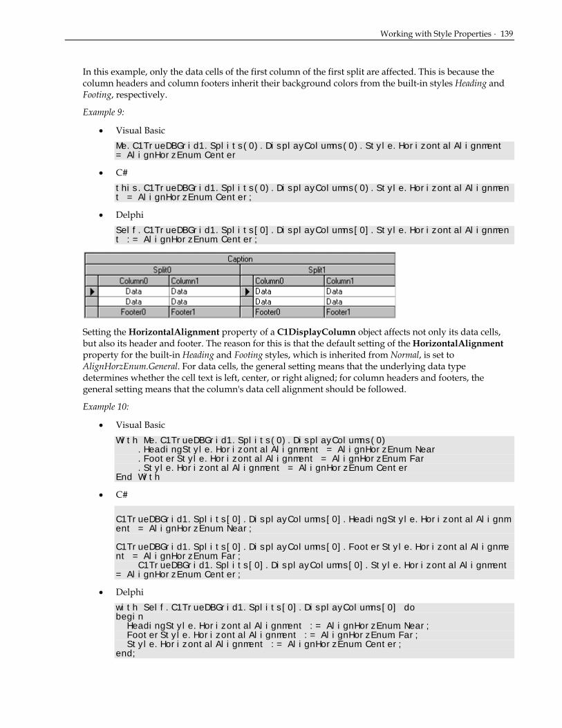
Working with Style Properties · 139
In this example, only the data cells of the first column of the first split are affected. This is because the column headers and column footers inherit their background colors from the built-in styles Heading and Footing, respectively.
Example 9:
• Visual Basic Me.C1TrueDBGrid1.Splits(0).DisplayColumns(0).Style.HorizontalAlignment = AlignHorzEnum.Center
• C# this.C1TrueDBGrid1.Splits(0).DisplayColumns(0).Style.HorizontalAlignment = AlignHorzEnum.Center;
• Delphi Self.C1TrueDBGrid1.Splits[0].DisplayColumns[0].Style.HorizontalAlignment := AlignHorzEnum.Center;
Setting the HorizontalAlignment property of a C1DisplayColumn object affects not only its data cells, but also its header and footer. The reason for this is that the default setting of the HorizontalAlignment property for the built-in Heading and Footing styles, which is inherited from Normal, is set to AlignHorzEnum.General. For data cells, the general setting means that the underlying data type determines whether the cell text is left, center, or right aligned; for column headers and footers, the general setting means that the column's data cell alignment should be followed.
Example 10:
• Visual Basic With Me.C1TrueDBGrid1.Splits(0).DisplayColumns(0) .HeadingStyle.HorizontalAlignment = AlignHorzEnum.Near .FooterStyle.HorizontalAlignment = AlignHorzEnum.Far .Style.HorizontalAlignment = AlignHorzEnum.Center End With
• C# C1TrueDBGrid1.Splits[0].DisplayColumns[0].HeadingStyle.HorizontalAlignment = AlignHorzEnum.Near; C1TrueDBGrid1.Splits[0].DisplayColumns[0].FooterStyle.HorizontalAlignment = AlignHorzEnum.Far; C1TrueDBGrid1.Splits[0].DisplayColumns[0].Style.HorizontalAlignment = AlignHorzEnum.Center;
• Delphi with Self.C1TrueDBGrid1.Splits[0].DisplayColumns[0] do begin HeadingStyle.HorizontalAlignment := AlignHorzEnum.Near; FooterStyle.HorizontalAlignment := AlignHorzEnum.Far; Style.HorizontalAlignment := AlignHorzEnum.Center; end;

140 · How to Use Styles
This example illustrates the distinction between general and specific alignment for column headers and footers. If the HorizontalAlignment member of the HeadingStyle (or FooterStyle) property is not set to AlignHorzEnum.General, then the header (or footer) is aligned independently of the data cells.
Applying Styles to Cells True DBGrid for .NET provides three ways to control the display characteristics of individual cells:
By Status Each grid cell has a cell status that identifies its disposition (any combination of current, modified, part of a selected row, or part of a highlighted row). Using the AddCellStyle method, set style attributes that apply to any possible combination of cell status values.
By Contents Specify a pattern (called a regular expression) that is used to perform pattern matching on cell contents. When the contents match the pattern supplied in the AddRegexCellStyle method, True DBGrid will automatically apply pre-selected style attributes to the cell.
By Custom Criteria Using the FetchCellStyle (or FetchRowStyle) event, make decisions about cell colors and fonts each time a cell (or row) is displayed.
Use Style objects defined at design time as arguments to the AddCellStyle and AddRegexCellStyle methods. Or, create a temporary style in code and use it to specialize one or more attributes.
The FetchCellStyle and FetchRowStyle events pass a temporary Style object as the final parameter. By setting its properties, control the appearance of the cell specified by the other event parameters.
In this version of True DBGrid, per-cell font and color control can only be achieved by writing code. However, by creating styles at design time, this code is kept to a minimum. To learn how to create named styles at design time, see Using the GridStyleCollection Editor (page 41).
Specifying Cell Status Values True DBGrid recognizes 16 distinct cell status values that are used in code to indicate the disposition of a cell. A cell status value is a combination of four separate conditions. These conditions are enumerations which have the flag attribute, which means that they can be combined with the Or operator:
Current Cell The cell is the current cell as specified by the Bookmark, Col, and SplitIndex properties. At any given time, only one cell can have this status. When the floating editor MarqueeStyle property setting is in effect, this condition is ignored.
Marquee Row The cell is part of a highlighted row marquee. When the MarqueeStyle property indicates that the entire current row is to be highlighted, all visible cells in the current row have this additional condition set.
Updated Cell The cell contents have been modified by the user but not yet written to the database. This condition is also set when cell contents have been modified in code with the Text or Value properties.
Selected Row The cell is part of a row selected by the user or in code. The SelectedRowCollection contains a bookmark for each selected row.

Applying Styles to Cells · 141
True DBGrid defines the following constants corresponding to these cell conditions: CellStyleFlag.CurrentCell Applies to the current cell CellStyleFlag.MarqueeRow Applies to cells in a highlighted row marquee CellStyleFlag.UpdatedCell Applies to cells that have been modified CellStyleFlag.SelectedRow Applies to cells in a selected row
True DBGrid also defines the following constants, which are not meant to be combined with those listed earlier: CellStyleFlag.AllCells Applies to all cells CellStyleFlag.NormalCell Applies to cells without status conditions
Use AllCells to refer to all cells regardless of status. Use NormalCell to refer to only those cells without any of the four basic cell conditions described earlier.
Applying Cell Styles by Status Each cell in the True DBGrid display has a status value which identifies its disposition (any combination of current, modified, part of a selected row, or part of a highlighted row). Using the AddCellStyle method, set style attributes that apply to any possible combination of cell status values. The AddCellStyle method is supported by the C1TrueDBGrid, C1TrueDBDropDown, Split, and C1DisplayColumn objects, enabling the range of cells for which certain conditions apply to be controlled.
For each unique status combination, you can set the color, font, and picture attributes to be used for cells of that status. When a cell's status changes, True DBGrid checks to see if any style property overrides are defined for that cell, and applies those attributes to the cell when it is displayed. Style objects are used to specify the color and font for a cell, as in the following example:
• Visual Basic Dim S As New C1TrueDBGrid.Style() Dim myfont As Font myfont = New Font(S.Font, FontStyle.Bold) S.Font = myfont S.ForeColor = System.Drawing.Color.Red Me.C1TrueDBGrid1.AddCellStyle (CellStyleFlag.CurrentCell, S)
• C# C1TrueDBGrid.Style S = new C1TrueDBGrid.Style(); Font myfont; myfont = new Font(S.Font, FontStyle.Bold); S.Font = myfont; S.ForeColor = System.Drawing.Color.Red; this.C1TrueDBGrid1.AddCellStyle (CellStyleFlag.CurrentCell, S);
• Delphi var S: C1TrueDBGrid.Style; myfont: Font; S := C1TrueDBGrid.Style.Create; myfont := Font(S.Font, FontStyle.Bold); S.Font := myfont; S.ForeColor := System.Drawing.Color.Red; Self.C1TrueDBGrid1.AddCellStyle(CellStyleFlag.CurrentCell, S);

142 · How to Use Styles
Here, a new temporary style object is created to specify the color and font overrides (red text, bold) to be applied to the current cell throughout the entire grid. Since the style object's BackColor property is not set explicitly, the background color of the current cell is not changed.
Also use styles defined at design time as arguments to the AddCellStyle method:
• Visual Basic Dim S As C1TrueDBGrid.Style Set S = Me.C1TrueDBGrid1.Styles("RedBold") Me.C1TrueDBGrid1.AddCellStyle (CellStyleFlag.CurrentCell, S)
• C# C1TrueDBGrid.Style S; set { S = this.C1TrueDBGrid1.Styles("RedBold") this.C1TrueDBGrid1.AddCellStyle (CellStyleFlag.CurrentCell, S);
• Delphi var S: C1TrueDBGrid.Style; S := Self.C1TrueDBGrid1.Styles['RedBold']; Self.C1TrueDBGrid1.AddCellStyle(CellStyleFlag.CurrentCell, S);
The preceding example can be simplified since the AddCellStyle method accepts a style name as well as an actual style object:
• Visual Basic Me.C1TrueDBGrid1.AddCellStyle (CellStyleFlag.CurrentCell, "RedBold")
• C# this.C1TrueDBGrid1.AddCellStyle (CellStyleFlag.CurrentCell, "RedBold");
• Delphi Self.C1TrueDBGrid1.AddCellStyle(CellStyleFlag.CurrentCell,'RedBold');
All of the preceding examples cause the text of the current cell to appear in red and bold. However, it is important to note that the status CurrentCell applies only to cells that have only this status. Thus, cells that are current but also updated (CurrentCell + UpdatedCell) will not be displayed in red and bold unless the following statement is executed:
• Visual Basic Me.C1TrueDBGrid1.AddCellStyle (CellStyleFlag.CurrentCell + CellStyleFlag.UpdatedCell, Me.C1TrueDBGrid1.Styles("RedBold"))
• C# this.C1TrueDBGrid1.AddCellStyle (CellStyleFlag.CurrentCell | CellStyleFlag.UpdatedCell, this.C1TrueDBGrid1.Styles["RedBold"]);
Applying Styles to Cells · 143
• Delphi Self.C1TrueDBGrid1.AddCellStyle(CellStyleFlag.CurrentCell and CellStyleFlag.UpdatedCell, Me.C1TrueDBGrid1.Styles['RedBold']);
NOTE: The current cell status is only honored when the MarqueeStyle property is not set to MarqueeEnum.Floating Editor. The floating editor marquee always uses the system highlight colors as determined by Control Panel settings.
Although this method of specifying cell conditions offers more control and flexibility, it also requires that additional code be written for some common cases.
Calls to AddCellStyle take effect immediately, and can be used for interactive effects as well as overall grid characteristics.
Applying Cell Styles by Contents True DBGrid can automatically apply colors and fonts to particular cells, based upon their displayed contents. To do so, provide a pattern, called a regular expression that the grid tests against the displayed value of each cell. Using the AddRegexCellStyle method, associate a regular expression with a set of style attributes, and then apply them to any possible combination of cell status values. The AddRegexCellStyle method is supported by the C1TrueDBGrid, C1TrueDBDropDown, Split, and C1DisplayColumn objects, allowing the range of cells for which certain conditions apply to be controlled.
The AddRegexCellStyle method is similar to the AddCellStyle method, but it requires an additional argument for the regular expression string. As with AddCellStyle, use either temporary or named styles. The following example uses a temporary style to display all cells in the first column that contain the string "Windows" in bold:
• Visual Basic Dim S As New C1TrueDBGrid.Style() Dim myfont As Font myfont = New Font (S.Font, FontStyle.Bold) S.Font = myfont Me.C1TrueDBGrid1.Columns(0).AddRegexCellStyle (CellStyleFlag.AllCells, S, "Windows")
• C# C1TrueDBGrid.Style S = new C1TrueDBGrid.Style(); Font myfont; myfont = new Font (S.Font, FontStyle.Bold); S.Font = myfont; this.C1TrueDBGrid1.Columns[0].AddRegexCellStyle (CellStyleFlag.AllCells, S, "Windows");
• Delphi var S: C1TrueDBGrid.Style; myfont: Font; S := C1TrueDBGrid.Style.Create; myfont := Font.Create(S.Font, FontStyle.Bold); S.Font := myfont; Self.C1TrueDBGrid1.Columns[0].AddRegexCellStyle(CellStyleFlag.AllCells, S,'Windows');
This feature allows the implementation of "visual queries" that attach distinctive font or color attributes to cells that match a certain pattern.

144 · How to Use Styles
Applying Cell Styles by Custom Criteria For cases where regular expressions are insufficient to express formatting requirements, use the FetchCellStyle event to customize fonts and colors on a per-cell basis. This event will only be fired for columns that have the FetchStyle property set to True.
For example, provide color coding for values that fall within a certain range. The following code assumes that the FetchStyle property is True for a single column of numeric data, and handles the FetchCellStyle event to display values greater than 1000 in blue:
• Visual Basic Private Sub C1TrueDBGrid1_FetchCellStyle(ByVal sender As Object, ByVal e As C1.Win.C1TrueDBGrid.FetchCellStyleEventArgs) Handles C1TrueDBGrid1.FetchCellSTyle Dim N As Integer N = Val(Me.C1TrueDBGrid1(e.Row, e.Col) If N > 1000 Then e.CellStyle.ForeColor = System.Drawing.Color.Blue End Sub
• C# private void C1TrueDBGrid1_FetchCellStyle( object sender, C1.Win.C1TrueDBGrid.FetchCellStyleEventArgs e) int N; N = (int) this.C1TrueDBGrid1[e.Row, e.Col]; if ( N > 1000 ) e.CellStyle.ForeColor = System.Drawing.Color.Blue;
• Delphi procedure TWinForm.C1TrueDBGrid1_FetchCellStyle(sender: System.Object, e: C1.Win.C1TrueDBGrid.FetchCellStyleEventArgs); var N: Integer; begin N := Int32.Parse(Self.C1TrueDBGrid1.Columns[e.Col].CellText(e.Row)); if N > 1000 then e.CellStyle.ForeColor := System.Drawing.Color.Blue; end;
The Split, Row, and Col arguments identify which cell the grid is displaying. The CellStyle argument conveys formatting information from the application to the grid. Since the CellStyle argument is a Style object, a cell's font characteristics can also be changed in the FetchCellStyle event:

Applying Styles to Cells · 145
• Visual Basic If N > 1000 Then e.CellStyle.Font.Italic = True Dim myfont As Font myfont = New Font (e.CellStyle.Font, FontStyle.Italic) If N > 1000 Then e.CellStyle.Font = myfont
• C# if ( N > 1000 ) e.CellStyle.Font.Italic = true Font myfont; myfont = new Font (e.CellStyle.Font, FontStyle.Italic); if ( N > 1000 ) e.CellStyle.Font = myfont;
• Delphi If N > 1000 Then e.CellStyle.Font.Italic := True; var myfont: Font; myfont := Font.Create(e.CellStyle.Font, FontStyle.Italic); if N > 1000 then e.CellStyle.Font := myfont;
The FetchCellStyle event can also be used to apply formatting to one cell based upon the values of other cells, or even other controls. For example, suppose that you want to:
• Make the cell text red in column 4 if column 1 minus column 2 is negative.
• Make the cell text bold in column 7 if it matches the contents of a text box.
In this case, set the FetchStyle property to True for columns 4 and 7, and handle the FetchCellStyle event as follows:
• Visual Basic Private Sub C1TrueDBGrid1_FetchCellStyle(ByVal sender As Object, ByVal e As C1.Win.C1TrueDBGrid.FetchCellStyleEventArgs) Handles C1TrueDBGrid1.FetchCellSTyle Select Case e.Col Case 4 Dim Col1 As Long, Col2 As Long Col1 = CLng(Me.C1TrueDBGrid1(e.Row, 1)) Col2 = CLng(Me.C1TrueDBGrid1(e.Row, 2)) If Col1 - Col2 < 0 Then CellStyle.ForeColor = System.Drawing.Color.Red Case 7 Dim S As String S = Me.C1TrueDBGrid1(e.Row, 7).ToString() If S = TextBox1.Text Then Dim myfont = New Font(CellStyle.Font, FontStyle.Bold) CellStyle.Font = myfont End If Case Else Debug.WriteLine ("FetchCellStyle not handled: " & e.Col) End Select End Sub

146 · How to Use Styles
• C# private void C1TrueDBGrid1_FetchCellStyle( object sender, C1.Win.C1TrueDBGrid.FetchCellStyleEventArgs e) switch (e.Col) { case 4: long Col1, long Col2; Col1 = (long)this.C1TrueDBGrid1[e.Row, 1]; Col2 = (long)this.C1TrueDBGrid1[e.Row, 2]; if ( Col1 - Col2 < 0 ) CellStyle.ForeColor = System.Drawing.Color.Red break; case 7: string S; S = this.C1TrueDBGrid1[e.Row, 7].ToString(); if ( S == TextBox1.Text ) { Font myfont = new Font(CellStyle.Font, FontStyle.Bold); CellStyle.Font = myfont; } break; default: Console.WriteLine ("FetchCellStyle not handled: " + e.Col); } }
• Delphi procedure TWinForm.C1TrueDBGrid1_FetchCellStyle(sender: System.Object; e: C1.Win.C1TrueDBGrid.FetchCellStyleEventArgs); var Col1, Col2: LongInt; S: String; begin case e.Col of 4: begin Col1 := LongInt(Self.C1TrueDBGrid1.Columns[1].CellText(e.Row)); Col2 := LongInt(Self.C1TrueDBGrid1.Columns[2].CellText(e.Row)); if Col1 - Col2 < 0 then CellStyle.ForeColor := System.Drawing.Color.Red; end; 7: begin S := Self.C1TrueDBGrid1.Columns[7].CellText(e.Row); if S := TextBox1.Text then begin Dim myfont := New Font(CellStyle.Font, FontStyle.Bold); CellStyle.Font := myfont; end; end else Debug.WriteLine ('FetchCellStyle not handled: '); end; end;
For efficiency reasons, only set FetchStyle to True for columns that you plan to handle in the FetchCellStyle event.
NOTE: The preceding examples use the CellText method for simplicity. However, the CellText and CellValue methods always create and destroy an internal clone of the dataset each time they are called, which may make them too inefficient to use in the FetchCellStyle event. To improve the performance of the grid's display cycle, try an unbound application. Unbound applications can access the underlying data source directly, which is generally faster than calling CellText or CellValue.

Applying Styles to Cells · 147
To customize fonts and colors on a per-row instead of a per-cell basis, use the FetchRowStyle event, which will only be fired once per row for grids that have the FetchRowStyles property set to True. The syntax for this event is as follows:
• Visual Basic Private Sub TDBGrid1_FetchRowStyle(ByVal sender As Object, ByVal e As C1.Win.C1TrueDBGrid.FetchRowStyleEventArgs) Handles C1TrueDBGrid1.FetchRowStyle
• C# private void TDBGrid1_FetchRowStyle( object sender, C1.Win.C1TrueDBGrid.FetchRowStyleEventArgs e)
• Delphi procedure TDBGrid1_FetchRowStyle(sender: System.Object; e: C1.Win.C1TrueDBGrid.FetchRowStyleEventArgs);
Although the FetchRowStyle event can be used to implement an alternating row color scheme, an easier and more efficient way to accomplish the same task would be to use the AlternatingRows property, together with the built-in EvenRow and OddRow styles.
Cell Style Evaluation Order The following list defines the order in which cell styles are applied relative to the anonymous styles of a grid, split, or column.
1. Style property, C1TrueDBGrid control. The default named parent of this anonymous style is Normal.
2. Style property, Split object. By default, this anonymous style inherits from its C1TrueDBGrid control counterpart.
3. EvenRowStyle and OddRowStyle properties, Split object. By default, these anonymous styles inherit from their C1TrueDBGrid control counterparts, which in turn have default named parents of EvenRow and OddRow. These properties apply only if the AlternatingRows property is True.
4. Style property, C1DisplayColumn object. By default, this anonymous style inherits from its Split object counterpart.
5. FetchRowStyle event. This event fires only if the FetchRowStyles property is True for a grid or split.
6. SelectedStyle property, Split object. By default, this anonymous style inherits from its C1TrueDBGrid control counterpart, which in turn has a default named parent of Selected. This property applies only to selected rows; that is, rows whose bookmarks have been added to the SelectedRowCollection through code or user interaction.
7. HighlightRowStyle property, Split object. By default, this anonymous style inherits from its C1TrueDBGrid control counterpart, which in turn has a default named parent of HighlightRow. This property applies only to highlighted rows; that is, the current row in a grid or split whose MarqueeStyle property is set to MarqueeEnum.Highlight Row or MarqueeEnum.HighlightRowRaiseCell.
8. AddCellStyle and AddRegexCellStyle methods, if called. Cell styles specified at the C1DisplayColumn object level have the highest priority, followed by those specified at the Split object and C1TrueDBGrid control levels. Within an object level, cell styles are tested in the order

148 · How to Use Styles
in which they were added in code. Cell styles do not inherit from one another; as soon as a match is found, testing stops.
9. FetchCellStyle event. This event fires only if the FetchStyle property is True for a C1DisplayColumn object.
Thus, you always have final control over the rendering of a cell via the FetchCellStyle event.
Applying Pictures to Grid Elements In earlier versions of True DBGrid, styles were used to specify font, color, and alignment attributes. This version extends the concept of styles to include background and foreground pictures, enabling adornments to be added to headers, footers, and caption bars, specify a background pattern for data cells, and render picture data in cells without having to populate a ValueItems object. The following properties of the Style object determine how pictures are displayed:
BackgroundImage Sets/returns a style's background picture
BackgroundPictureDrawMode Controls how a style's background picture is displayed
ForeGroundImage Sets/returns a style's foreground picture
ForegroundPicturePosition Controls how a style's foreground picture is positioned
Since picture properties follow the same inheritance rules as other style attributes, any technique described earlier in this chapter also works with pictures. This means that pictures can be attached to a grid element using any of the following methods:
• Setting the BackgroundImage or ForeGroundImage property of a built-in named style at design time or run time.
• Setting the BackgroundImage or ForeGroundImage property of an anonymous style at design time or run time.
• Calling the AddCellStyle or AddRegexCellStyle methods.
• Writing a handler for the FetchCellStyle or FetchRowStyle events.
Displaying Background Pictures Use background pictures to customize static grid elements such as caption bars, column headers, and column footers. For example, the following code applies a colored gradient bitmap to the BackgroundImage member of the Style object returned by the grid's CaptionStyle property:
• Visual Basic With Me.C1TrueDBGrid1.CaptionStyle .BackgroundImage = System.Drawing.Image.FromFile("gradient.bmp") .ForeColor = System.Drawing.Color.White .Font = New Font(.Font, FontStyle.Bold) End With
• C# C1TrueDBGrid1.CaptionStyle.BackgroundImage = System.Drawing.Image.FromFile("gradient.bmp"); C1TrueDBGrid1.CaptionStyle.ForeColor = System.Drawing.Color.White;

Applying Pictures to Grid Elements · 149
C1TrueDBGrid1.CaptionStyle.Font = new Font(C1TrueDBGrid1.CaptionStyle.Font, FontStyle.Bold);
• Delphi var myfont: Font; with Self.C1TrueDBGrid1.CaptionStyle do begin BackgroundImage := System.Drawing.Image.FromFile('gradient.bmp'); ForeColor := System.Drawing.Color.White; myfont := Font.Create(Font, FontStyle.Bold); Font := myfont; end;
This code also adjusts the color of the caption text and makes it bold, producing the following display.
Achieve the same effect at design time by editing either the built-in Caption style on the GridStyleCollection Editor, or the members of the CaptionStyle property in Visual Basic’s Properties Window.
By default, background pictures are centered within the associated grid element. Depending upon the height of the background bitmap, adjust the value of the BackgroundPictureDrawMode property to ensure that the entire area is filled. This property determines whether the picture is centered, tiled, or stretched to fit the entire area, as shown in the following figure.
Also use background pictures within data cells to produce interesting visual effects. For example, the following patterns were designed to be replicated in adjacent rows.

150 · How to Use Styles
By eliminating the record selector column, the dividing lines between data rows, and the column header dividers, these patterns can be used to produce the following display.
The trick is to insert an empty unbound column on the left to display the binder rings, as the following code sample demonstrates:
• Visual Basic ' Give the grid a flat appearance and remove its record ' selectors, row dividers, and scroll bars. With Me.C1TrueDBGrid1 .InactiveStyle.ForeColor = System.Drawing.Color.White .RecordSelectors = False .RowDivider.Style = LineStyleEnum.None .RowHeight = 16 .HScrollBar.Style = ScrollBarStyleEnum.None .VScrolBar.Style = ScrollBarStyleEnum.None .MarqueeStyle = MarqueeEnum.NoMarquee End With ' Set the background pattern to be used by data cells in ' the default split (so as not to disturb the Normal style). With Me.C1TrueDBGrid1.Splits(0).Style .BackgroundImage = System.Drawing.Image.FromFile("paper.bmp") .BackgroundPictureDrawMode = BackgroundPictureDrawModeEnum.Tile End With ' Create an empty unbound column on the left to hold the ' binder rings. Remove its dividing lines and set the ' BackroundBitmap property of its Style object. Dim col as New C1TrueDBGrid.C1DataColumn() Me.C1TrueDBGrid.Columns.InsertAt(0, col) Dim C As C1TrueDBGrid.C1DisplayColumn C = Me.C1TrueDBGrid1.Splits(0).DisplayColumns(col) With C .Width = 48 .Visible = True .Style.BackgroundImage = System.Drawing.Image.FromFile("rings.bmp")
.HeaderDivider = False .ColumnDivider.Style = LineStyleEnum.None End With

Applying Pictures to Grid Elements · 151
Me.C1TrueDBGrid1.Col = 0 ' Scroll the unbound column into view ' Resize the Title column and remove its header dividers. Set C = Me.C1TrueDBGrid1.Splits(0).DisplayColumns("Title") With C .Width = 380 .HeaderDivider = False End With ' Use a small corner of the binder ring bitmap as the ' background of the column headers, and adjust the font ' and text color accordingly. Dim myfont As Font With Me.C1TrueDBGrid1.HeadingStyle .BackgroundImage = System.Drawing.Image.FromFile("corner.bmp") .BackgroundPictureDrawMode = BackgroundPictureDrawModeEnum.Tile myfont = New Font(.Font, 10, FontStyle.Bold) .Font = myfont .ForeColor = System.Drawing.Color.White End With
• C# // Give the grid a flat appearance and remove its record // selectors, row dividers, and scroll bars. Assume that // the ScaleMode of the containing form is in pixels. C1TrueDBGrid1.InactiveStyle.ForeColor = System.Drawing.Color.White; C1TrueDBGrid1.RecordSelectors = false; C1TrueDBGrid1.RowDivider.Style = LineStyleEnum.None; C1TrueDBGrid1.RowHeight = 16; C1TrueDBGrid1.HScrollBar.Style = ScrollBarStyleEnum.None; C1TrueDBGrid1.VScrolBar.Style = ScrollBarStyleEnum.None; C1TrueDBGrid1.MarqueeStyle = MarqueeEnum.NoMarquee; // set the background pattern to be used by data cells in // the default split (so as not to disturb the Normal style). C1TrueDBGrid1.Splits[0].Style.BackgroundImage = System.Drawing.Image.FromFile("paper.bmp"); C1TrueDBGrid1.Splits[0].Style.BackgroundPictureDrawMode = BackgroundPictureDrawModeEnum.Tile; // Create an empty unbound column on the left to hold the // binder rings. Remove its dividing lines and set the // BackroundBitmap property of its Style object. C1TrueDBGrid.C1DataColumn col = new C1TrueDBGrid.C1DataColumn(); this.C1TrueDBGrid.Columns.InsertAt(0, col); C1TrueDBGrid.C1DisplayColumn C = this.C1TrueDBGrid1.Splits[0].DisplayColumns[col]; C.Width = 48; C.Visible = true; C.Style.BackgroundImage = System.Drawing.Image.FromFile["rings.bmp"]; C.HeaderDivider = false; C.ColumnDivider.Style = LineStyleEnum.None; this.C1TrueDBGrid1.Col = 0 // Scroll the unbound column into view; // Resize the Title column and remove its header dividers.

152 · How to Use Styles
C = this.C1TrueDBGrid1.Splits[0].DisplayColumns["Title"] ; C.Width = 380; C.HeaderDivider = false; // Use a small corner of the binder ring bitmap as the // background of the column headers, and adjust the font // and text color accordingly. Font myfont; C1TrueDBGrid1.HeadingStyle.BackgroundImage = System.Drawing.Image.FromFile("corner.bmp"); C1TrueDBGrid1.HeadingStyle.BackgroundPictureDrawMode = BackgroundPictureDrawModeEnum.Tile; myfont = new Font(.Font, 10, FontStyle.Bold); C1TrueDBGrid1.HeadingStyle.Font = myfont; C1TrueDBGrid1.HeadingStyle.ForeColor = System.Drawing.Color.White;
• Delphi var C: C1TrueDBGrid.C1DisplayColumn; myfont: Font;
// Give the grid a flat appearance and remove its record; // selectors, row dividers, and scroll bars. Assume that; // the ScaleMode of the containing form is in pixels.; with Self.C1TrueDBGrid1 do begin InactiveStyle.ForeColor := System.Drawing.Color.White; RecordSelectors := False; RowDivider.Style := LineStyleEnum.None; RowHeight := 16; HScrollBar.Style := ScrollBarStyleEnum.None; .VScrolBar.Style := ScrollBarStyleEnum.None; MarqueeStyle := MarqueeEnum.NoMarquee; end; // Set the background pattern to be used by data cells in; // the default split (so as not to disturb the Normal style).; with Self.C1TrueDBGrid1.Splits[0].Style do begin BackgroundImage := System.Drawing.Image.FromFile('paper.bmp'); BackgroundPictureDrawMode := BackgroundPictureDrawModeEnum.Tile; End With; // Create an empty unbound column on the left to hold the; // binder rings. Remove its dividing lines and set the; // BackroundBitmap property of its Style object.; C := C1TrueDBGrid.C1DisplayColumn.Create; Self.C1TrueDBGrid1.Splits[0].DisplayColumns.Insert(0, C); with C do begin Width := 48; Visible := True; Style.BackgroundImage := System.Drawing.Image.FromFile('rings.bmp'); HeaderDivider := False; ColumnDivider.Style := LineStyleEnum.None; End With; Self.C1TrueDBGrid1.Col := 0; // Scroll the unbound column into view;

Applying Pictures to Grid Elements · 153
// Resize the Title column and remove its header dividers.; C := Self.C1TrueDBGrid1.Splits[0].DisplayColumns['Title']; with C do begin Width := 380; HeaderDivider := False; end; // Use a small corner of the binder ring bitmap as the; // background of the column headers, and adjust the font; // and text color accordingly.; with Self.C1TrueDBGrid1.HeadingStyle do begin BackgroundImage := System.Drawing.Image.FromFile('corner.bmp'); BackgroundPictureDrawMode := BackgroundPictureDrawModeEnum.Tile; myfont := Font.Create(Font, 10, FontStyle.Bold); Font := myfont; ForeColor := System.Drawing.Color.White; end;
Displaying Foreground Pictures Use foreground pictures to add visual cues to static grid elements such as caption bars, column headers, and column footers. Foreground Pictures are specified by the ForeGroundImage property of the Style. Foreground pictures can be displayed beside some text or in place of it, but cannot be displayed over text. For an example of Foreground picture positions, see below.
Foreground pictures have the ForegroundPicturePosition property, which specifies where a foreground picture is situated in comparison to the cell text. The values and their representations are displayed below:


How Cell Editing Works · 155
Cell Editing Techniques This chapter explains how to customize the behavior of cell editing in True DBGrid for .NET. For text entry fields, write code in the grid's editing events, specify an input mask template, or display a drop-down text editor for long strings. To provide a list of choices for the user, use the ValueItemCollection object, the C1TrueDBDropDown control, or even an arbitrary intrinsic or third-party control.
How Cell Editing Works True DBGrid for .NET provides many features for customizing and controlling in-cell editing. The grid's default editing behavior depends on the setting of the MarqueeStyle property. If the floating editor marquee style is used, the editing behavior differs from that of other marquee styles. The following sections summarize True DBGrid's editing behavior and state any exceptions that arise when using the floating editor.
For more information on the MarqueeStyle property, see Highlighting the Current Row or Cell (page 75).
Initiating Cell Editing A cell is either in display or edit mode. The EditActive property sets and returns the desired mode. Place the current cell in edit mode by setting EditActive to True, or end editing by setting it to False. The user may enter edit mode by clicking once on the current cell or by pressing the F2 key. A blinking text cursor (caret) will appear in the cell—at the beginning of the text when the cell is clicked and at the end when the F2 key is used. The BeforeColEdit event will be triggered when the cell enters edit mode. The EditActive property is True when the cell is in edit mode.
Floating Editor Differences: A blinking caret already exists at the beginning of the cell highlight even when in display mode. To enter edit mode, the user can click on any character location within the cell text to specify the text insertion point. The BeforeColEdit event is not triggered and the EditActive property is False until the user has made changes to the cell text.
Color and Wordwrap In edit mode, the cell color is determined by the ForeColor and BackColor properties of the EditorStyle style object. The text being edited will wordwrap, regardless of the setting of the column style’s WrapText property. If the text is too big to fit into the cell, a built-in drop-down edit control will automatically appear. For more information, see Working with Text (page 160).
Floating Editor Differences: In edit mode, the text highlight disappears, and the cell color is the same as the normal cell color. The text being edited is wordwrapped only if the column style’s WrapText property is True. The built-in drop-down edit control is not available.
Determining Modification Status While editing is in progress, inspect the DataChanged property of the grid to determine whether the user has made any changes to the current row.
Set the grid's DataChanged property to False to exit editing, discard all changes to the current row, and refresh the current row display from the data source.

156 · Cell Editing Techniques
The icon in the record selector column of the current row reflects the status of the grid's DataChanged property. If DataChanged is False, a triangle-shaped arrow will be shown in the record selector column. If DataChanged is True, a pencil icon will appear instead.
Determining Cell Contents While editing is in progress, the column's Text and Value properties contain the text the user currently sees in the modified row. Whenever the user presses a key, the Change event fires to notify the application that the user has just modified the current cell. However, the Change event does not mean the user is finished with the process, only that a single change has been made and the grid is still in edit mode.
The Change event does not fire when the grid is not in edit mode, such as when the contents of a cell are changed through code or when the user clicks a cell to cycle through ValueItem objects.
Terminating Cell Editing The user completes the editing process by performing any of the following:
• Pressing the ENTER key.
• Pressing the ESC key.
• Moving to another cell with the arrow keys, the TAB key, or the mouse.
• Setting focus to another control on the form.
Handling Editing Events The following sections describe the default editing behavior of True DBGrid for .NET can be altered by responding to its events.
Standard Keystroke Events True DBGrid supports the standard keystroke events contained in the .NET environment:
KeyDown Fired when the user presses a key.
KeyPress Fired when the user presses an ANSI key.
KeyUp Fired when the user releases a key.
The KeyDown and KeyUp events trap all keys, including function keys, ALT and SHIFT keys, and numeric keypad keys. The KeyPress event only traps letters and numbers, punctuation marks and symbols, and editing keys such as TAB, ENTER, and BACKSPACE.
Use these events to restrict and modify user input as you would be done for any other intrinsic .NET control. For example, the following KeyDown event handler prevents the user from entering non-alphanumeric characters:
• Visual Basic Private Sub C1TrueDBGrid1_KeyPress(ByVal sender As Object, ByVal e As System.Windows.Forms.KeyPressEventArgs) Handles C1TrueDBGrid1.KeyPress ' Cancel user key input if it is not a letter or a digit If Not e.KeyChar.IsLetterOrDigit(e.KeyChar) Then e.Handled = True End If End Sub

Handling Editing Events · 157
• C# private void C1trueDBGrid1_KeyPress(object sender, System.Windows.Forms.KeyPressEventArgs e){ // Cancel user key input if it is not a letter or a digit if (! e.Keychar.IsLetterOrDigit(e.KeyChar]){ e.Handled = true ; } }
• Delphi procedure TWinForm.C1TrueDBGrid1_KeyPress(sender: System.Object; e: System.Windows.Forms.KeyPressEventArgs); begin // Cancel user key input if it is not a letter or a digit If not e.KeyChar.IsLetterOrDigit(e.KeyChar) then e.Handled := True; end;
For more information on these or any other native .NET events see MSDN or .NET help.
Column Editing Events True DBGrid provides full control over the cell editing process with the following events, listed in the order in which they occur during a successful editing attempt:
BeforeColEdit Fired upon an attempt to edit column data.
ColEdit Fired when the current cell enters edit mode.
AfterColEdit Fired after column data is edited.
Use the BeforeColEdit event to control the editability of cells on a per-cell basis, or to translate the initial keystroke into a default value.
The ColEdit event signals that the current cell has entered edit mode; the AfterColEdit event signals that edit mode was terminated. Use these two events to provide additional feedback while editing is in progress:
• Visual Basic Private Sub C1TrueDBGrid1_ColEdit(ByVal sender As Object, ByVal e As C1.Win.C1TrueDBGrid.ColEventArgs) Handles C1TrueDBGrid1.ColEdit Select Case e.Columns.DataColumn.Caption Case "Code" Me.Label1.Text = "Enter 4-digit company code" Case "Description" Me.Label1.Text = "Enter full company name" End Select
End Sub Private Sub C1TrueDBGrid1_AfterColEdit (ByVal sender As Object, ByVal e As C1.Win.C1TrueDBGrid.ColEventArgs) Handles C1TrueDBGrid1.AfterColEdit Me.Label1.Text = "" ' Clear editing instructions End Sub

158 · Cell Editing Techniques
• C# private void C1trueDBGrid1_ColEdit(object sender, C1.Win.C1TrueDBGrid.ColEventArgs e) { switch(e.Columns.DataColumn.Caption) { case "Code": this.Label1.Text = "Enter 4-digit company code"; break; Case "Description"; this.Label1.Text = "Enter full company name"; break;
} } private void C1TrueDBGrid1_AfterColEdit(object sender, C1.Win.C1TrueDBGrid.ColEventArgs e) } this.Label1.Text = ""; // Clear editing instructions }
• Delphi procedure TWinForm.C1TrueDBGrid1_ColEdit(sender: System.Object; e: C1.Win.C1TrueDBGrid.ColEventArgs); var S: string; begin S := Self.C1TrueDBGrid1.Columns[e.ColIndex].Caption; if (S = 'Code') then; Self.Label1.Text := 'Enter 4-digit company code'; else if (S = 'Description') then Self.Label1.Text := 'Enter full company name'; end;
Changing Cell Contents with a Single Keystroke The BeforeColEdit event is an extremely versatile way to customize the behavior of True DBGrid editing. BeforeColEdit is fired before any other editing events occur, which provide the opportunity to do virtually anything desired before editing begins. For example, cancel the edit request and override the built-in text editor with your own drop-down list box.
A True DBGrid control can enter edit mode in one of four ways:
1. If the user clicks on the current cell with the mouse, editing begins with the current cell contents.
2. If the user presses the F2 key, editing also begins using the current cell contents.
3. If the user begins typing, the typed character replaces the contents of the cell and editing begins.
4. You can set the EditActive property in your code to force editing to begin.
The BeforeColEdit event fires in cases 1, 2, and 3, but not in case 4, since True DBGrid assumes you will never want to cancel a request made from code.
To differentiate a user's edit request based upon whether he or she used the mouse or the keyboard to start editing, set BeforeColEdit to KeyChar, which will be zero if the user clicked on the cell with the mouse, and will be an ASCII character if the user typed a character to begin editing.
When BeforeColEdit is fired, the ASCII character has not yet been placed into the current cell, so if editing in BeforeColEdit is cancelled, the ASCII key is discarded. This leads to an interesting technique.

Handling Editing Events · 159
Assume a Boolean field called Done exists, and its NumberFormat property is set to specify Yes/No as the display format. Further assume that, when the user presses Y or N, the cell contents change immediately instead of entering edit mode. This process is accomplished in BeforeColEdit as follows:
• Visual Basic Private Sub C1TrueDBGrid1_BeforeColEdit(ByVal sender As Object, ByVal e As C1.Win.C1TrueDBGrid.BeforeColEditEventArgs) Handles C1TrueDBGrid1.BeforeColEdit With Me.C1TrueDBGrid1.Columns(e.ColIndex) ' If this isn't the "Done" column, or if the user ' clicked with the mouse, then simply continue. If .DataField <> "Done" Or e.KeyChar = Chr(0) Then Exit Sub ' Cancel normal editing and set the field to the ' proper result based upon KeyAscii. Beep if an ' invalid character was typed. e.Cancel = True Select Case UCase(e.KeyChar) Case "Y" .Value = -1 Case "N" .Value = 0 Case Else Beep() End Select End With End Sub
• C# private void C1TrueDBGrid1_BeforeColEdit( object sender, C1.Win.C1TrueDBGrid.BeforeColEditEventArgs e) C1TrueDBGrid1.BeforeColEdit { C1.Win.C1DataColumn col = e.Column.DataColumn; // if this isn’t the "Done" column, or if the user // clicked with the mouse, then simply continue. if (col.DataField != "Done" || e.KeyChar == 0 ) return; // Cancel normal editing and set the field to the // proper result based upon KeyAscii. Beep if an // invalid character was typed. e.Cancel = true; switch (e.KeyChar. .ToUpper()) { case "Y"; Col.Value = -1; break; case "N"; Col.Value = 0; default:; Beep(); } }
• Delphi procedure TWinForm.C1TrueDBGrid1_BeforeColEdit(sender: System.Object; e: C1.Win.C1TrueDBGrid.BeforeColEditEventArgs); begin

160 · Cell Editing Techniques
with Self.C1TrueDBGrid1.Columns[e.ColIndex] do begin // If this isn't the'Done' column, or if the user // clicked with the mouse, then simply continue.; if (DataField <> 'Done') Or (e.KeyChar = Char(0)) Then Exit; // Cancel normal editing and set the field to the; // proper result based upon KeyAscii. Beep if an // invalid character was typed.; e.Cancel := True; if (char.ToUpper(e.KeyChar) = ‘Y') then Value := -1; else if (char.ToUpper(e.KeyChar) = ‘N') then Value := 0; end; end;
Note that the event handler terminates when KeyAscii is zero, so mouse editing is still permitted.
Working with Text This section briefly describes the properties related to text editing.
Limiting the Size of Data Entry Fields Use the DataWidth property of a C1DataColumn object to restrict the number of characters the user can enter. Setting this property to zero imposes no limits.
Providing a Dropdown Edit Control for Long Fields Whenever the user attempts to edit cell text that is too big to fit within the cell, the grid will automatically activate a multiple-line drop-down text editor. While editing, text in the drop-down edit control will be wordwrapped regardless of the setting of the column style’s WrapText property. The drop-down text editor can be turned off and editing can be forced to occur within cell boundaries by setting the grid's EditDropDown property to False (the default is True). The drop-down text editor is not available if the grid's MarqueeStyle property is set to 6 - Floating Editor. The following code uses the grid's built-in column button feature to activate the drop-down edit control to modify the cell data in the Comments column:
• Visual Basic Private Sub Form1_Load(ByVal sender As System.Object, ByVal e As System.EventArgs) Handles MyBase.Load With Me.C1TrueDBGrid1 .MarqueeStyle = MarqueeEnum.SolidCellBorder .Splits(0).DisplayColumns("Comments").Button = True .EditDropDown = True ' Redundant since default = True End With End Sub Private Sub C1TrueDBGrid1_ButtonClick(ByVal sender As Object, ByVal e As C1.Win.C1TrueDBGrid.ColEventArgs) Handles C1TrueDBGrid1.ButtonClick Me.C1TrueDBGrid1.EditActive = True ' Place the cell into edit mode End Sub

Working with Text · 161
• C# private void Form1_Load( System.object sender, System.EventArgs e) base.Load { C1TrueDBGrid1.MarqueeStyle = MarqueeEnum.SolidCellBorder; C1TrueDBGrid1.Splits[0].DisplayColumns["Comments"].Button = true; C1TrueDBGrid1.EditDropDown = true; // Redundant since default = true } private void C1TrueDBGrid1_ButtonClick( object sender, C1.Win.C1TrueDBGrid.ColEventArgs e) C1TrueDBGrid1.ButtonClick { this.C1TrueDBGrid1.EditActive = true; // Place the cell into edit mode }
• Delphi procedure TWinForm.TWinForm_Load(sender: System.Object; e: System.EventArgs); begin with Self.C1TrueDBGrid1 do begin MarqueeStyle := MarqueeEnum.SolidCellBorder; Splits[0].DisplayColumns['Comments'].Button := true; EditDropDown := True // Redundant since default = True; end; end; procedure TWinForm.C1TrueDBGrid1_ButtonClick(sender: Object; e: C1.Win.C1TrueDBGrid.ColEventArgs); begin Self.C1TrueDBGrid1.EditActive := True; // Place the cell into edit mode; end;
If the current cell is in the Comments column, initiate editing either by clicking on the current cell or by clicking the built-in button.
Selecting and Replacing Text True DBGrid for .NET supports the standard text selection properties found in many ActiveX or .NET controls:
SelectionLength Sets/returns the length of the selected text.
SelectionStart Sets/returns the start position of the selected text.
SelectedText Sets/returns the selected text.
NOTE: These properties are only effective when the grid is in edit mode, that is, when its EditActive property is True.

162 · Cell Editing Techniques
Input Masking Use the NumberFormat property to control the display format of column data. If users need to edit a formatted column, it is desirable to maintain a consistent format during the editing process. True DBGrid for .NET provides an EditMask property that optionally works in concert with the NumberFormat property to ensure consistent data entry.
Specifying an Input Mask for a Column The EditMask property of the C1DataColumn object is used to specify an input mask template for end-user data entry. The input mask string is composed of special characters that represent either an input character that the user must enter, or a literal character that will be skipped over on input. Valid template characters are as follows:
The EditMask must be a string composed of the following symbols:
1. Wildcards
0 digit
9 digit or space
# digit or sign
L letter
? letter or space
A letter or digit
a letter, digit, or space
& any character
2. Localized characters
. localized decimal separator
, localized thousand separator
: localized time separator
/ localized date separator
3. Command characters
\ next character is taken as a literal
> translate letters to uppercase
< translate letters to lowercase

In-Cell Buttons · 163
For example:
• Visual Basic ' set the mask so the user can enter a phone number, ' with optional area code, and a state in capitals. Me.C1TrueDBGrid1.Columns(0).EditMask = "(###) 000-0000 St\ate\: >LL"
• C# // set the mask so the user can enter a phone number, // with optional area code, and a state in capitals. this.C1TrueDBGrid1.Columns(0).EditMask = "(###) 000-0000 St\ate\: >LL";
• Delphi // set the mask so the user can enter a phone number,; // with optional area code, and a state in capitals.; Self.C1TrueDBGrid1.Columns[0].EditMask := '(###) 000-0000 St\ate\: >LL';
Using an Input Mask for Formatting Whereas the EditMask property is used to specify an input mask for data entry, the NumberFormat property is used to specify the display format of data in a grid cell. If the NumberFormat property of the column is not specified, the grid simply displays the cached text (stripped of literals) as is; if the NumberFormat property is specified, the grid sends the cached text to the display formatter.
Since it is common for the input and display formats to be the same, the NumberFormat property has an Edit Mask option. If this option is selected, then the EditMask property setting will be used for both data input and display. However, the input and display formats need not be the same, so a NumberFormat option that differs from the EditMask property can be selected.
Controlling How Masked Input is Updated Normally, after the user finishes editing a cell in a column which has its EditMask property set, True DBGrid caches the modified cell text, but any literal characters in the input mask template will be stripped from the modified cell text beforehand. However, this behavior can be overridden with the EditMaskUpdate property.
By default, the EditMaskUpdate property is False. This means that when the modified cell text is updated to the database, the grid sends the cached text (stripped of literals), not the formatted text displayed in the cell. Override this default behavior by setting the EditMaskUpdate property to True, which causes the cached text to be formatted according to the EditMask property before being updated to the database.
Therefore, it is important to set EditMaskUpdate properly to ensure that the correct data is sent to the database for update.
In-Cell Buttons True DBGrid for .NET supports a variety of in-cell button options for the current cell or for all cells within specified columns. Use in-cell buttons to indicate that a list of choices is available, to perform a command associated with the contents of the cell, or to display an arbitrary control or form for editing.

164 · Cell Editing Techniques
Enabling the In-Cell Button To enable the in-cell button for a C1DisplayColumn object, set its Button property to true in code:
• Visual Basic Me.C1TrueDBGrid1.Splits(0).DisplayColumns(0).Button = True
• C# this.C1TrueDBGrid1.Splits(0).DisplayColumns(0).Button = true;
• Delphi Self.C1TrueDBGrid1.Splits[0].DisplayColumns[0].Button := True;
The Button property is also enabled when the column's DropDown property is set to the name of a C1TrueDBDropDown control, or when the Presentation property of the associated ValueItemCollection object is set to one of the combo box options.
By default, the in-cell button displays only for the current cell, as shown in the following figure.
However, by setting the column's ButtonAlways property to True, force the in-cell button to be displayed in every row.
Rendering Cells as Command Buttons To render the current cell as a non-editable command button within a C1DisplayColumn object, set its ButtonText property to True in code:
• Visual Basic Me.C1TrueDBGrid1.Splits(0).DisplayColumns(0).ButtonText = True
• C# this.C1TrueDBGrid1.Splits(0).DisplayColumns(0).ButtonText = true;
• Delphi Self.C1TrueDBGrid1.Splits[0].DisplayColumns[0].ButtonText := True;

In-Cell Buttons · 165
When a cell within the column receives focus, it is rendered as a standard Windows command button using the cell text as the caption. The cell text is not centered automatically, but respects the column's horizontal and vertical alignment settings.
If both the Button and ButtonText properties are True, the ButtonText property takes precedence.
As with the default in-cell button, set the column's ButtonAlways property to True to force all of its cells to be displayed as command buttons. Only the current cell is drawn with a focus rectangle, however.
Detecting In-Cell Button Clicks The ButtonClick event is provided so that code can respond when the user clicks the in-cell button. Its syntax is as follows:
• Visual Basic Private Sub C1TrueDBGrid1_ButtonClick(ByVal sender As Object, ByVal e As C1.Win.C1TrueDBGrid.ColEventArgs) Handles C1TrueDBGrid1.ButtonClick
• C# private void C1TrueDBGrid1_ButtonClick( object sender, C1.Win.C1TrueDBGrid.ColEventArgs e)
• Delphi procedure C1TrueDBGrid1_ButtonClick(sender: Object; e: C1.Win.C1TrueDBGrid.ColEventArgs);
In-cell buttons always fire this event when clicked, regardless of whether they were enabled by the Button or ButtonText properties. An example of the ButtonClick event was presented earlier in the section Working with Text (page 160.)
Customizing the In-Cell Button Bitmap
By default, True DBGrid uses a down arrow for the in-cell button.
However, the button bitmap can be changed for a C1DisplayColumn object at design time by setting the ButtonPicture property in code:

166 · Cell Editing Techniques
• Visual Basic Me.C1TrueDBGrid1.Columns(0).DisplayColumns(0).ButtonPicture = System.Drawing.Image.FromFile("dollar.bmp")
• C# this.C1TrueDBGrid1. Columns[0].DisplayColumns[0].ButtonPicture = System.Drawing.Image.FromFile("dollar.bmp");
• Delphi Self.C1TrueDBGrid1. Columns[0].DisplayColumns[0].ButtonPicture := System.Drawing.Image.FromFile('dollar.bmp');
The grid automatically draws the edges corresponding to the button's up/down states as appropriate, so only the interior image of the button needs to be provided. A light gray background is recommended.
Dropdown Controls True DBGrid for .NET offers a wide variety of built-in controls and programming constructs that enable you to implement virtually any kind of drop-down cell editing interface. Use the ValueItems object and its collection of ValueItem objects to provide a simple pick list, or the C1TrueDBDropDown control to implement a data-aware multicolumn combo box. Arbitrary Visual Basic or third-party controls can be used to perform specialized editing functions.
Using the Built-in Combo Box The C1DataColumn object's ValueItems object optionally provides a built-in combo box interface that works in concert with its automatic data translation features. By default, the Presentation property is set to 0 - Normal, and the usual cell editing behavior is in effect for textual data. However, if the Presentation property is set to either PresentationEnum.ComboBox or PresentationEnum.SortedComboBox, then cells in the affected column display the in-cell button upon receiving focus. When the user clicks the in-cell button, a drop-down combo box appears.
The drop-down combo box contains one item for each member of the ValueItemCollection object. If the collection's Translate property is True, then the DisplayValue text is used for the combo box items; if it is False, then the Value text is used.

Dropdown Controls · 167
True DBGrid automatically sizes the drop-down combo box to fit the width of the column in which it is displayed. The height of the combo box is determined by the number of items in the collection and the MaxComboItems property. If the number of items is less than or equal to MaxComboItems, which has a default value of 5, then all value items will be shown. If the number of items exceeds MaxComboItems, only MaxComboItems will be shown, but a scroll bar will appear at the right edge of the combo box to allow users to bring the other items into view.
Detecting Built-in Combo Box Selections The ComboSelect event is fired when the user selects an item from the built-in combo box. This event is useful for determining the contents of the cell before the user exits edit mode.
Since the items displayed in the built-in combo box are often the only allowable values for the underlying data source, you may need to prevent your users from typing in the cell after making a selection. By setting the C1DisplayColumn property DropDownList equal to True, the attached C1TrueDBDropDown control will now be limited to use only as a listbox. No new values or changes will be allowed in the dropdown and so the underlying database cannot be updated with false information.
Using the C1TrueDBDropDown Control The built-in drop-down combo box described in the preceding example is most useful when the allowable values are both known in advance and relatively few in number. A large collection of ValueItem objects can be unwieldy to maintain at design time, and requires substantial coding to set up at run time. Moreover, the built-in combo box cannot be bound to a data control and be populated automatically.
Using the techniques outlined later in this chapter, set up a secondary C1TrueDBGrid control to be used as a drop-down. However, to display a list of values from another data source, the C1TrueDBDropDown control offers a more elegant solution, as it was designed explicitly for that purpose and can be set up entirely at design time.
To use the drop-down control, set the DropDown property of a grid column to the C1TrueDBDropDown control at either design time or run time. At run time, when the user clicks the in-cell button for that column, the C1TrueDBDropDown control will appear below the grid's current cell. If the user selects an item from the drop-down control, the grid's current cell is updated.
Since the C1TrueDBDropDown control is a subset of C1TrueDBGrid, it shares many of the same properties, methods, and events. However, the following two properties are specific to the C1TrueDBDropDown control:

168 · Cell Editing Techniques
DataField Not to be confused with the DataField property of a C1DataColumn object, this property specifies the drop-down column used to update the associated grid column when a selection is made.
ListField This property specifies the name of the drop-down column to be used for incremental search.
When a C1TrueDBDropDown control becomes visible, its DropDownOpen event fires. Similarly, when the user makes a selection or the control loses focus, its DropDownClose event fires.
Automatic Data Translation with C1TrueDBDropDown Suppose a grid dropdown is needed using data that contains a value and a corresponding text representation, as in the following figure:
In this situation, you may not want the user to see the somewhat ambiguous TypeId, but instead want the more understandable TypeDesc to show in the dropdown. The ValueTranslate property automatically maps the TypeId value to the TypeDesc representation. In this way, when the user accesses the dropdown, it will display the TypeDesc text.
Using an Arbitrary Dropdown Control Normally, True DBGrid's default editing behavior is sufficient for most applications. In some cases, however, you may want to customize this behavior. One valuable technique is to use a drop-down list or combo box, or even another True DBGrid control, to allow selection from a list of possible values. This is easy to do with True DBGrid using virtually any Visual Basic or third-party control. The general approach follows, and a working example is given in Tutorial 9.
In general, displaying a drop-down list or combo instead of the standard True DBGrid editor involves the following steps:
1. True DBGrid fires the BeforeColEdit event each time the user wants to edit a cell. To override the default editing process, cancel True DBGrid's default editor by setting the Cancel argument to True. Put code in BeforeColEdit to display the editing control you wish to show instead. Typically, you place the substitute editing control or drop-down on the same form as the grid, but make it invisible until you need it.
2. When BeforeColEdit is triggered, there are five properties and one method that can be used to determine the exact coordinates of the cell that is to be edited. The properties are Left (applies to grid and column), Top (grid and column), CellTop (column only, used with multiple line displays), Width (column only), and RowHeight (grid only). The method is RowTop (grid only). Use these properties and method to position the custom editing control or drop-down relative to a grid cell. For example, place a ListBox control at the right edge of a cell and align its top border with that of the cell using the following code:

Dropdown Controls · 169
• Visual Basic
Dim Col As C1.Win.C1TrueDBGrid.C1DataColumn = C1TrueDBGrid1.Columns(e.ColIndex) Dim r As Rectangle r = Me.C1TrueDBGrid1.Splits(0).GetCellBounds(Me.C1TrueDBGrid1.Row, e.ColIndex) r = Me.C1TrueDBGrid1.RectangleToScreen(r) r = Me.RectangleToClient(r) Me.ListBox1.Left = r.Left Me.ListBox1.Top = r.Bottom
• C#
Rectangle r = Me.C1TrueDBGrid1.Splits(0).GetCellBounds(Me.C1TrueDBGrid1.Row, e.ColIndex) r = Me.C1TrueDBGrid1.RectangleToScreen(r) r = Me.RectangleToClient(r) Me.ListBox1.Left = r.Left Me.ListBox1.Top = r.Bottom
• Delphi
var Col1: C1TrueDBGrid.C1DataColumn; Col1 := C1TrueDBGrid1.Columns[e.ColIndex]; with Self.C1TrueDBGrid1 do begin Self.ListBox1.Left := Left + Col1.Left + Col1.Width; Self.ListBox1.Top := Top + RowTop(Row); End With;
3. Put code in the drop-down or combo which completes the editing process by assigning the selected value to the Text or Value property of the column being edited.
This method does not work, however, when the grid's MarqueeStyle property is set to the value of 6 - Floating Editor. When the floating editor marquee is used, the BeforeColEdit event does not fire until the cell has been changed by the user. However, use the built-in column button feature to activate the drop-down as described in the next section.
For illustrations of other MarqueeStyle settings, see Highlighting the Current Row or Cell (page 75). An example of dropping down a Visual Basic ListBox control from a grid cell is given in Tutorial 9.
Using the Built-in Column Button
An alternative way to drop down a control from a cell is to use True DBGrid's built-in column button feature. If a column's Button property is set to True, a button will be displayed at the right edge of the current cell when it is in that column. Clicking the button fires the grid's ButtonClick event. Drop down a control from the cell using code inside the ButtonClick event. Also use this event to trigger any action or calculation inside the cell.
For more information, see In-Cell Buttons (page 163.)


Visual Basic and C# Samples · 171
True DBGrid Samples Please be advised that this ComponentOne software title is accompanied by various sample projects and/or demos, which may or not make use of other ComponentOne development tools. While the sample projects and/or demos included with the software are used to demonstrate and highlight the product’s features, and how the control may be integrated with the rest of the ComponentOne product line, some of the controls used in the demo/sample project may not be included with the purchase of certain individual products.
Visual Basic and C# Samples AggreGateFooter Using notifications to customize the grids footer. This sample uses the
C1TrueDBGrid control.
AutoFilter Using C1TrueDBDropdown in the filterbar. This sample uses the C1TrueDBGrid and C1TrueDBDropdown controls.
CustomFiltering Roll your own filtering for the grid. This sample uses the C1TrueDBGrid control.
CustomSorting Roll your own sorting. This sample uses the C1TrueDBGrid control.
DataTimePicker How to use a datetimepicker control in the grid for date columns. This sample uses the C1TrueDBGrid control.
FindRow How to find a row in the underlying datasource. This sample uses the C1TrueDBGrid control.
HyperLink Add hyperlinks to cells. This sample uses the C1TrueDBGrid control.
IncrementalSearch Add incremental search to the grid. This sample uses the C1TrueDBGrid control.
MultipleLayouts How to store multiple layout files. This sample uses the C1TrueDBGrid control.
SettingCellToNull How to set the underlying datasource value to null. This sample uses the C1TrueDBGrid control.
ToggleGroupRows Programmatically expand/collapse rows in a grouped grid. This sample uses the C1TrueDBGrid control.
TriStateCheckBox How to add a tristate checkbox to the grid. This sample uses the C1TrueDBGrid control.
UsingC1TDBDropdown How to use C1TrueDBDropdown to map IDs to Names. This sample uses the C1TrueDBGrid and C1TrueDBDropdown controls.
Zoom Change the size of the grid. This sample uses the C1TrueDBDropdown control.

172 · True DBGrid Samples
Borland Samples AutoFilter Using C1TrueDBDropdown in the filterbar. This sample uses the
C1TrueDBGrid and C1TrueDBDropdown controls.
CustomFiltering Roll your own filtering for the grid. This sample uses the C1TrueDBGrid control.
CustomSorting Roll your own sorting. This sample uses the C1TrueDBGrid control.
FindRow How to find a row in the underlying datasource. This sample uses the C1TrueDBGrid control.
SettingCellToNull How to set the underlying datasource value to null. This sample uses the C1TrueDBGrid control.
ToggleGroupRows Programmatically expand/collapse rows in a grouped grid. This sample uses the C1TrueDBGrid control.
TriStateCheckBox How to add a tristate checkbox to the grid. This sample uses the C1TrueDBGrid control.
Zoom Change the size of the grid. This sample uses the C1TrueDBDropdown control.
Tutorials · 173
Tutorials Introduction
Twenty-Two tutorials are presented in this chapter. The tutorials assume that you are familiar with programming in Visual Basic.NET, know what a DataSet is, and know how to use bound controls in general. The tutorials provide step-by-step instructions—no prior knowledge of True DBGrid is needed. By following the steps outlined in this chapter, you will be able to create projects demonstrating a variety of True DBGrid features, and get a good sense of what the True DBGrid can do and how to do it.
The tutorials use an Access database, TDBGDemo.MDB. The database files TDBGDemo.MDB and the tutorial projects are in the TUTORIAL subdirectory of the True DBGrid installation directory.
We encourage you to run the tutorial projects in Visual Basic, examine the code, and experiment with your own modifications. This is the best and quickest way to realize the full potential of True DBGrid. You will find that True DBGrid is very easy to use, and it enables you to create powerful database applications.
The tutorials assume that the database file TDBGDemo.MDB is in the C:\Program Files\ComponentOne Studio.NET\C1TrueDBGrid\common directory, and refer to it by filename instead of the full pathname for the sake of brevity.
NOTE: Depending on where you store the projects and database files, you may need to change the location of the TDBGDemo.mdb reference in the DataSet.
Tutorial 1 - Binding True DBGrid to a DataSet In this tutorial, you will learn how to bind True DBGrid to a DataSet and create a fully functional database browser. You will also learn about the basic properties of the True DBGrid and then be able to run the program and observe the run-time features of the grid.
1. Start a new .NET project.
2. Open the toolbox, which is initially located on the left side of the IDE and has a hammer and a wrench as its icon. From the Toolbox, select the Windows Forms tab and then find the C1TrueDBGrid control on this form. The C1TrueDBGrid icon looks like the following:
Double-click on the C1TrueDBGrid icon to add the grid to Form1.
3. Go to the Data tab in the ToolBox and add an OledbDataAdapter to the form. In the adapter’s Data Configuration wizard, either select a connection to TDBGrid.mdb or create a new OleDBConnection to this database. In the ‘Choose a Query Type’ window of the wizard select the ‘Use SQL statements’ radio button. In the Generate SQL statements window, set the SQL statement to “Select * from Composer”, and then finish out the wizard.
4. Select the ‘Generate DataSet…’ item from .NET’s Data menu or right-click on the DataAdapter to bring up the ‘Generate Dataset….’ wizard. Select the ‘New’ radio button in the Generate Dataset

174 · Tutorials
window, and type “DsComposer” into the listbox. Click OK. At this point, the .NET design window and form should look like the following:
5. In the VB Properties Window on the right side of the .NET IDE, set the True DBGrid’s DataSource property to DsComposer1, and the DataMember property to Composer.
6. Now in the Form’s Load event add the following code:
• Visual Basic Me.OleDbDataAdapter1.Fill(Me.DsComposer1)
• C# this.OleDbDataAdapter1.Fill(this.DsComposer1);
• Delphi Self.OleDbDataAdapter1.Fill(Me.DsComposer1);
7. Set the AllowAddNew and AllowDelete properties of C1TrueDBGrid1 to True (note that the default value of AllowUpdate is True).
Run the program and observe the following:
• True DBGrid retrieves the database schema information from the DataSet and automatically configures itself to display all of the fields contained in the database table. Note that the field names are used as the default column headings.
• True DBGrid automatically communicates with the DataSet. Any actions taken on the DataSet will be reflected in the grid.
• A fully functional database browser has been created by only writing four lines of simple code.
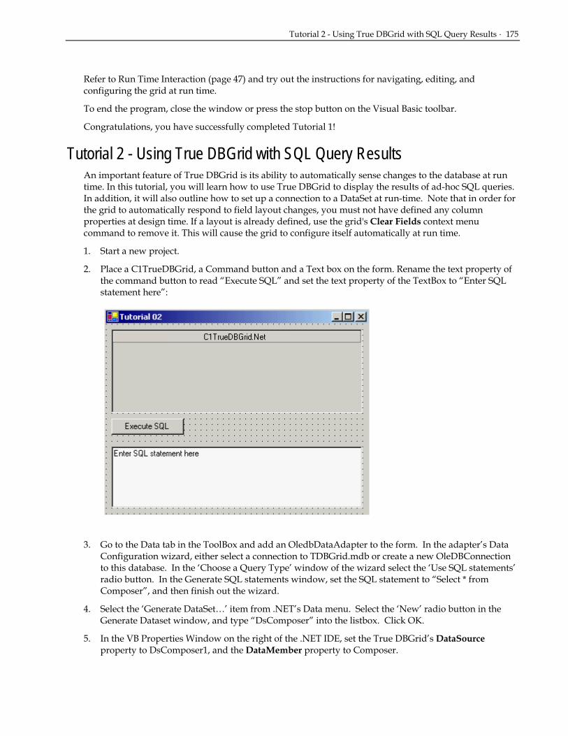
Tutorial 2 - Using True DBGrid with SQL Query Results · 175
Refer to Run Time Interaction (page 47) and try out the instructions for navigating, editing, and configuring the grid at run time.
To end the program, close the window or press the stop button on the Visual Basic toolbar.
Congratulations, you have successfully completed Tutorial 1!
Tutorial 2 - Using True DBGrid with SQL Query Results An important feature of True DBGrid is its ability to automatically sense changes to the database at run time. In this tutorial, you will learn how to use True DBGrid to display the results of ad-hoc SQL queries. In addition, it will also outline how to set up a connection to a DataSet at run-time. Note that in order for the grid to automatically respond to field layout changes, you must not have defined any column properties at design time. If a layout is already defined, use the grid's Clear Fields context menu command to remove it. This will cause the grid to configure itself automatically at run time.
1. Start a new project.
2. Place a C1TrueDBGrid, a Command button and a Text box on the form. Rename the text property of the command button to read “Execute SQL” and set the text property of the TextBox to “Enter SQL statement here”:
3. Go to the Data tab in the ToolBox and add an OledbDataAdapter to the form. In the adapter’s Data Configuration wizard, either select a connection to TDBGrid.mdb or create a new OleDBConnection to this database. In the ‘Choose a Query Type’ window of the wizard select the ‘Use SQL statements’ radio button. In the Generate SQL statements window, set the SQL statement to “Select * from Composer”, and then finish out the wizard.
4. Select the ‘Generate DataSet…’ item from .NET’s Data menu. Select the ‘New’ radio button in the Generate Dataset window, and type “DsComposer” into the listbox. Click OK.
5. In the VB Properties Window on the right of the .NET IDE, set the True DBGrid’s DataSource property to DsComposer1, and the DataMember property to Composer.

176 · Tutorials
6. Now in the Form’s Load event add the following code:
• Visual Basic Me.OleDbDataAdapter1.Fill(Me.DsComposer1)
• C# this.OleDbDataAdapter1.Fill(this.DsComposer1);
• Delphi Self.OleDbDataAdapter1.Fill(Me.DsComposer1);
7. Add the following code to the click event of Button1:
• Visual Basic Private Sub Button1_Click(ByVal sender As System.Object, ByVal e As System.EventArgs) Handles Button1.Click Dim sqlStr As String = TextBox1.Text Dim da as Oledb.OleDbDataAdapter = New_ Oledb.OleDbDataAdapter (sqlStr, Me.OleDbConnection1) Dim ds As DataSet = New DataSet() ds.Clear() Try da.Fill(ds, "mySQL") Me.C1TrueDBGrid1.SetDataBinding(ds.Tables(“mySQL”), “”, False) Catch MessageBox.Show("Error in SQL clause") End Try End Sub
• C# private void Button1_Click( System.object sender, System.EventArgs e) Button1.Click { string sqlStr = TextBox1.Text; da as Oledb.OleDbDataAdapter = New_ Oledb.OleDbDataAdapter (sqlStr, this.OleDbConnection1); DataSet DataSet ds = new DataSet(); ds.Clear(); try { da.Fill(ds, "mySQL"); this.C1TrueDBGrid1.SetDataBinding(ds.Tables[“mySQL”], “”, false); }
catch () { MessageBox.Show ("Error in SQL clause"); } }
• Delphi procedure TWinForm.button1_Click(sender: System.Object; e: System.EventArgs); var SqlStr: string; Adapter: OleDbDataAdapter; Ds: DataSet; begin SqlStr := textBox1.Text; Adapter := OleDbDataAdapter.Create(SqlStr, oleDbConnection1); Ds := DataSet.Create; Ds.Clear; try

Tutorial 2 - Using True DBGrid with SQL Query Results · 177
Adapter.Fill(Ds, 'mySQL'); c1TrueDBGrid1.DataSource := nil; c1TrueDBGrid1.ClearFields; c1TrueDBGrid1.DataSource := Ds.Tables['mySQL']; except MessageBox.Show('Error in SQL clause.'); end; end;
Run the program and observe the following:
• As in Tutorial 1, True DBGrid retrieves the database schema information from the DataSet and automatically configures itself to display the data for all fields in the database table. Note that the field names are used as the default column headings.
8. In the TextBox control, type the following SQL statement: SELECT * FROM Customer
then press the Execute SQL command button. The above SQL statement displays all fields from the Customer table and is equivalent to the default display.
9. In the TextBox control, type the following SQL statement: SELECT Company FROM CUSTOMER
then press the Execute SQL command button. The grid responds by displaying only one column for the Company field.
10. In the TextBox control, type the following SQL statement: SELECT LastName, COMPANY FROM Customer
then press the Execute SQL command button. This is similar to the previous SQL statement except that two columns (LastName and Company) are now displayed.
11. In the TextBox control, type the following SQL statement: SELECT Count(*) FROM Customer
then press the Execute SQL command button. The above SQL statement uses an aggregate function, Count(*), to return the total number of records in the Customer table. Even though the SQL result is not a set of records, the grid faithfully responds by displaying the number of records in a single column. By default, Expr1000 is used as the column heading, indicating that the display is the result of an expression.
12. In the TextBox control, type the following SQL statement: SELECT UCASE(LastName) AS ULAST, UCase(FirstName) AS UFIRST FROM Customer
then press the Execute SQL command button. The above SQL statement produces two calculated columns that display the LastName and FirstName fields in upper case. The grid also displays the (assigned) calculated column names, ULAST and UFIRST, as the column headings.
13. In the TextBox control, type the following SQL statement: SELECT * FROM Customer WHERE FirstName = "Jerry"
then press the Execute SQL command button. The above SQL statement displays only records with FirstName equal to Jerry.
14. In the TextBox control, type the following SQL statement:

178 · Tutorials
SELECT * FROM Customer ORDER BY LastName
then press the Execute SQL command button. The above SQL statement displays records in alphabetical order according to the LastName field.
You can also use an SQL statement to join two database tables, as demonstrated in Tutorial 3. This concludes Tutorial 2.
Tutorial 3 - Linking Multiple True DBGrid Controls This tutorial demonstrates how to link multiple True DBGrid controls using a Master Detail dataset.
1. Start a new project and then add two C1TrueDBGrid controls to the form (C1TrueDBGrid1 and C1TrueDBGrid2).
2. Next, go to the Data tab in the ToolBox and add an OledbDataAdapter to the form. In the adapter’s Data Configuration wizard, either select a connection to TDBGrid.mdb or create a new OleDBConnection to this database. In the ‘Choose a Query Type’ window of the wizard select the ‘Use SQL statements’ radio button. In the Generate SQL statements window, set the SQL statement to “Select * from Composer”, and then finish out the wizard.
3. Go to the Data tab in the ToolBox and add an OledbDataAdapter to the form. In the adapter’s Data Configuration wizard, either select a connection to TDBGrid.mdb or create a new OleDBConnection to this database. In the ‘Choose a Query Type’ window of the wizard select the ‘Use SQL statements’ radio button. In the Generate SQL statements window, set the SQL statement to “Select * from Opus”, and then finish out the wizard.
4. Select the ‘Generate DataSet…’ item from .NET’s Data menu. Select the ‘New’ radio button in the Generate Dataset window, and type “DsMasterDetail” into the listbox. Select both the Composer and Opus tables to be added to the dataset:

Tutorial 3 - Linking Multiple True DBGrid Controls · 179
5. Right-click on the DsMasterDetail1 object that was added to the designer and choose “View Schema” from the context menu. This will open the DsMasterDetail.xds file, which will appear like this:
6. To make a relation between two tables, click and hold down the mouse button in the light gray area next to the Last field in Composer, and then drag the mouse up over the composers table over to the gray column of the opus table, then release the mouse over the light gray area next to the last field. This will bring up the following screen:
Make sure Parent element is set to composer and the child element is set to opus. In addition make sure both fields are set to the ‘Last’ column (as in the preceding screenshot). Click Ok and exit the Edit Relation window.

180 · Tutorials
7. Now go to the Build Menu of .NET and choose Build Solution. This will ensure that this new relation is available in the project.
8. Now in the VB Properties window, set the DataSource property for the first True DBGrid to DsMasterDetail1 and the DataMember property to Composer. For the second TrueDBGrid, set the DataSource property to DsMasterDetail1 and the Datamember property to Composer.ComposerOpus.
9. All that is left is to populate the DataAdapters. Add the following code to the Load event of Form1:
• Visual Basic Me.OleDbDataAdapter1.Fill(Me.DsMasterDetail1) Me.OleDBDataAdapter2.Fill(Me.DsMasterDetail1)
• C# this.OleDbDataAdapter1.Fill(this.DsMasterDetail1); this.OleDBDataAdapter2.Fill(this.DsMasterDetail1) ;
• Delphi Self.OleDbDataAdapter1.Fill(Self.DsMasterDetail1); Self.OleDBDataAdapter2.Fill(Self.DsMasterDetail1);
Run the program and observe the following: • When Form1 is loaded, C1TrueDBGrid1 and C1TrueDBGrid2 retrieve the database schema
information from dsMasterDetail1.
• Change the current record position of the first grid by clicking on different rows. Observe that C1TrueDBGrid2 (the detail grid) will configure itself to display a new record set every time the row changes in C1TrueDBGrid1 (the master grid).
This concludes Tutorial 3.
Tutorial 4 - Interacting with Code and Other Bound Controls In this tutorial, you will learn how True DBGrid interacts with other bound controls and with Visual Basic code that manipulates the same DataSet to which the grid is bound.
1. Start a new VB.NET project.
2. Place the following controls on the form (Form1) as shown in the figure: a True DBGrid control (C1TrueDBGrid1), a ListBox control (ListBox1), three text controls (TextBox1 to 3), seven buttons (btnFirst, btnNext, btnPrevious, btnLast, btnDelete, btnUpdate, btnAdd), and four labels (Label1 to 4). Set the Text properties for each of the labels and buttons seen below:

Tutorial 4 - Interacting with Code and Other Bound Controls · 181
3. Go to the Data tab in the ToolBox and add an OledbDataAdapter to the form. In the adapter’s Data Configuration wizard, either select a connection to TDBDemo.mdb or create a new OleDBConnection to this database. In the ‘Choose a Query Type’ window of the wizard select the ‘Use SQL statements’ radio button. In the Generate SQL statements window, set the SQL statement to “SELECT Company, Contacted, CustType, FirstName, LastName, Phone, UserCode FROM Customers”, and then finish out the wizard.
4. Select the ‘Generate DataSet…’ item from .NET’s Data menu. Select the ‘New’ radio button in the Generate Dataset window, and type “DsCustomers” into the listbox. Click OK.
5. In the VB Properties Window on the right of the .NET IDE, set the grid’s DataSource property to DsCustomers1, and the DataMember property to Customer.
6. Now in the Form’s Load event add the following code:
• Visual Basic Me.OleDbDataAdapter1.Fill(Me.DsCustomers1)
• C# this.OleDbDataAdapter1.Fill(this.DsCustomers1);
• Delphi Self.OleDbDataAdapter1.Fill(Self.DsCustomers1);
7. Now for each of the four Buttons (Button4, 5, 6, 7) on the lower right in the above image, add the following code:

182 · Tutorials
• Visual Basic Private Sub btnFirst_Click(ByVal sender As System.Object, ByVal e As System.EventArgs) Handles btnFirst.Click 'Move to the first record in the grid Me.C1TrueDBGrid1.MoveFirst() End Sub Private Sub btnNext_Click(ByVal sender As System.Object, ByVal e As System.EventArgs) Handles btnNext.Click 'Move to the next record in the grid Me.C1TrueDBGrid1.MoveNext() End Sub Private Sub btnPrevious_Click(ByVal sender As System.Object, ByVal e As System.EventArgs) Handles btnPrevious.Click 'Move to the previous record in the grid Me.C1TrueDBGrid1.MovePrevious() End Sub Private Sub btnLast_Click(ByVal sender As System.Object, ByVal e As System.EventArgs) Handles btnLast.Click 'Move to the last record in the grid Me.C1TrueDBGrid1.MoveLast() End Sub
• C# private void btnFirst_Click( System.object sender, System.EventArgs e) { //Move to the first record in the grid this.C1TrueDBGrid1.MoveFirst(); } private void btnNext_Click( System.object sender, System.EventArgs e) { //Move to the next record in the grid this.C1TrueDBGrid1.MoveNext(); } private void btnPrevious_Click( System.object sender, System.EventArgs e) { //Move to the previous record in the grid this.C1TrueDBGrid1.MovePrevious(); } private void btnLast_Click( System.object sender, System.EventArgs e) { //Move to the last record in the grid this.C1TrueDBGrid1.MoveLast(); }
• Delphi procedure TWinForm.button4_Click(sender: System.Object; e: System.EventArgs); begin
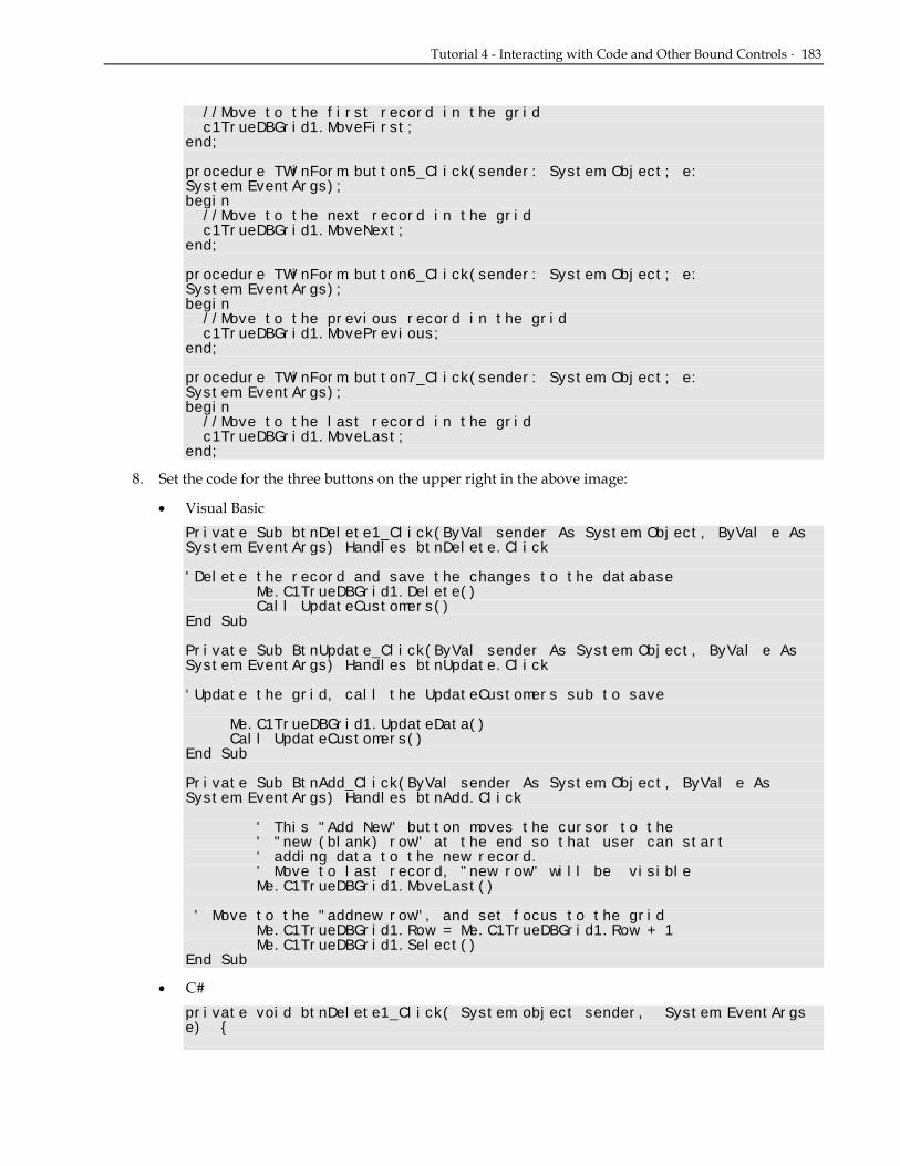
Tutorial 4 - Interacting with Code and Other Bound Controls · 183
//Move to the first record in the grid c1TrueDBGrid1.MoveFirst; end; procedure TWinForm.button5_Click(sender: System.Object; e: System.EventArgs); begin //Move to the next record in the grid c1TrueDBGrid1.MoveNext; end; procedure TWinForm.button6_Click(sender: System.Object; e: System.EventArgs); begin //Move to the previous record in the grid c1TrueDBGrid1.MovePrevious; end; procedure TWinForm.button7_Click(sender: System.Object; e: System.EventArgs); begin //Move to the last record in the grid c1TrueDBGrid1.MoveLast; end;
8. Set the code for the three buttons on the upper right in the above image:
• Visual Basic Private Sub btnDelete1_Click(ByVal sender As System.Object, ByVal e As System.EventArgs) Handles btnDelete.Click 'Delete the record and save the changes to the database Me.C1TrueDBGrid1.Delete() Call UpdateCustomers() End Sub Private Sub BtnUpdate_Click(ByVal sender As System.Object, ByVal e As System.EventArgs) Handles btnUpdate.Click ‘Update the grid, call the UpdateCustomers sub to save Me.C1TrueDBGrid1.UpdateData() Call UpdateCustomers() End Sub Private Sub BtnAdd_Click(ByVal sender As System.Object, ByVal e As System.EventArgs) Handles btnAdd.Click ' This "Add New" button moves the cursor to the ' "new (blank) row" at the end so that user can start ' adding data to the new record. ' Move to last record, "new row" will be visible Me.C1TrueDBGrid1.MoveLast() ' Move to the "addnew row", and set focus to the grid Me.C1TrueDBGrid1.Row = Me.C1TrueDBGrid1.Row + 1 Me.C1TrueDBGrid1.Select() End Sub
• C# private void btnDelete1_Click( System.object sender, System.EventArgs e) {
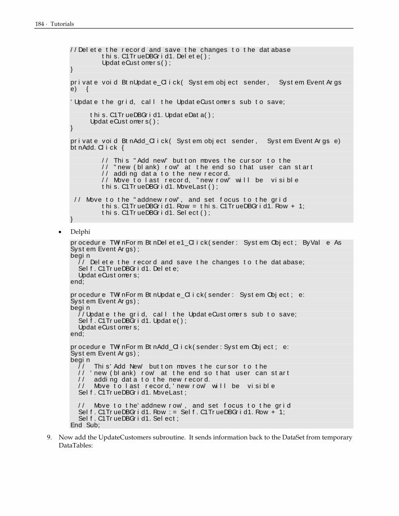
184 · Tutorials
//Delete the record and save the changes to the database this.C1TrueDBGrid1.Delete(); UpdateCustomers(); } private void BtnUpdate_Click( System.object sender, System.EventArgs e) { ‘Update the grid, call the UpdateCustomers sub to save; this.C1TrueDBGrid1.UpdateData(); UpdateCustomers(); } private void BtnAdd_Click( System.object sender, System.EventArgs e) btnAdd.Click { // This "Add new" button moves the cursor to the // "new (blank) row" at the end so that user can start // adding data to the new record. // Move to last record, "new row" will be visible this.C1TrueDBGrid1.MoveLast(); // Move to the "addnew row", and set focus to the grid this.C1TrueDBGrid1.Row = this.C1TrueDBGrid1.Row + 1; this.C1TrueDBGrid1.Select(); }
• Delphi procedure TWinForm.BtnDelete1_Click(sender: System.Object; ByVal e As System.EventArgs); begin // Delete the record and save the changes to the database; Self.C1TrueDBGrid1.Delete; UpdateCustomers; end; procedure TWinForm.BtnUpdate_Click(sender: System.Object; e: System.EventArgs); begin //Update the grid, call the UpdateCustomers sub to save; Self.C1TrueDBGrid1.Update(); UpdateCustomers; end; procedure TWinForm.BtnAdd_Click(sender:System.Object; e: System.EventArgs); begin // This'Add New' button moves the cursor to the // 'new (blank) row' at the end so that user can start // adding data to the new record. // Move to last record,'new row' will be visible Self.C1TrueDBGrid1.MoveLast; // Move to the'addnew row', and set focus to the grid Self.C1TrueDBGrid1.Row := Self.C1TrueDBGrid1.Row + 1; Self.C1TrueDBGrid1.Select; End Sub;
9. Now add the UpdateCustomers subroutine. It sends information back to the DataSet from temporary DataTables:

Tutorial 4 - Interacting with Code and Other Bound Controls · 185
• Visual Basic Private Sub UpdateCustomers() Me.OleDbConnection1.Open() Dim UpdatedRows As System.Data.DataSet Dim InsertedRows As System.Data.DataSet Dim DeletedRows As System.Data.DataSet 'these three are Data Tables that hold any changes that have been made to the dataset since the last update. UpdatedRows = Me.DsCustomers1.GetChanges(DataRowState.Modified) InsertedRows = Me.DsCustomers1.GetChanges(DataRowState.Added) DeletedRows = Me.DsCustomers1.GetChanges(DataRowState.Deleted) Try ‘For each of these, we have to make sure that the Data Tables contain any records, otherwise, we will get an error. If Not UpdatedRows Is Nothing Then Me.OleDbDataAdapter1.Update(UpdatedRows) If Not InsertedRows Is Nothing Then Me.OleDbDataAdapter1.Update(InsertedRows) If Not DeletedRows Is Nothing Then Me.OleDbDataAdapter1.Update(DeletedRows) Catch eUpdate As System.Exception MessageBox.Show ("Caught exception: " & eUpdate.Message) End Try Me.OleDbConnection1.Close() End Sub
• C# private void UpdateCustomers() { this.OleDbConnection1.Open(); System.Data.DataSet UpdatedRows; System.Data.DataSet InsertedRows; System.Data.DataSet DeletedRows; //these three are Data Tables that hold any changes that have been made to the dataset since the last update. UpdatedRows = this.DsCustomers1.GetChanges(DataRowState.Modified); InsertedRows = this.DsCustomers1.GetChanges(DataRowState.Added); DeletedRows = this.DsCustomers1.GetChanges(DataRowState.Deleted); try { //for each of these, we have to make sure that the Data Tables contain any records, otherwise, we will get an error. if (! UpdatedRows == null ) this.OleDbDataAdapter1.Update(UpdatedRows) if (! InsertedRows == null ) this.OleDbDataAdapter1.Update(InsertedRows) if (! DeletedRows == null ) this.OleDbDataAdapter1.Update(DeletedRows)

186 · Tutorials
} catch (System.Exception eUpdate) {
MessageBox.Show ("Caught exception: " + eUpdate.Message); } this.OleDbConnection1.Close(); }
• Delphi procedure TWinForm.UpdateCustomers; var UpdatedRows: System.Data.DataSet; InsertedRows: System.Data.DataSet; DeletedRows: System.Data.DataSet; begin Self.OleDbConnection1.Open; // these three are Data Tables that hold any changes that have // been made to the dataset since the last update. UpdatedRows := Self.DsCustomers1.GetChanges(DataRowState.Modified); InsertedRows := Self.DsCustomers1.GetChanges(DataRowState.Added); DeletedRows := Self.DsCustomers1.GetChanges(DataRowState.Deleted); try // For each of these, we have to make sure that the Data Tables contain // any records, otherwise, we will get an error.; If (UpdatedRows <> nil) then Self.OleDbDataAdapter1.Update(UpdatedRows); If (InsertedRows <> nil) then Self.OleDbDataAdapter1.Update(InsertedRows); If (DeletedRows <> nil) then Self.OleDbDataAdapter1.Update(DeletedRows); except on Ex: System.Exception do MessageBox.Show('Caught exception: ' + Ex.Message); end; Self.OleDbConnection1.Close; end;
10. Now back in the .NET designer, click on the ListBox1 control. In the VB Properties window set its DataSource property to DsCustomers1, and its DisplayMember property to Customers.LastName.
11. Click on the first TextBox (TextBox1) on the form. In the VB Properties window, expand its DataBindings object. set the Text property under the DataBindings object to DsCustomers1 – Customers.FirstName. In a similar manner set the same Text property under the associated DataBindings object for the next two TextBoxes. TextBox2 should be set to Customers.LastName, and TextBox3 should be set to Customers.Company.
12. Finally in the VB Properties window set the AllowAddNew, AllowDelete, and AllowUpdate properties to True for the True DBGrid.
Run the program and observe the following:
• Use the mouse or the keyboard to change the current row position in the grid, and observe the other bound controls (ListBox1 and the TextBoxes) changing their record positions along with the grid, even though they contain no code.
• Click the Next, Previous, Last, and First command buttons and observe that they have the same effects as the corresponding buttons on the Data control.

Tutorial 5 - Selecting Multiple Rows Using Bookmarks · 187
• Modify data in a few cells (in the same row) on the grid. Press the Update command button. Observe that the modified data has been updated to the database and the pencil icon on the record selector column disappears. Other bound controls on the form now display the modified data.
• Modify data in one or more of the Text controls. Press the Update or the Next command button. The grid will automatically update its data to reflect the new changes.
• Move the current cell of the grid to any record you wish to delete, then click the Delete command button. The record will be deleted and disappears from the grid. The grid automatically moves the current row to the record after the deleted record. Other bound controls on the form also respond by moving their record positions.
This concludes Tutorial 4.
Tutorial 5 - Selecting Multiple Rows Using Bookmarks In this tutorial, you will learn how to select and highlight records that satisfy specified criteria. A group of similar items is generally implemented as a collection in True DBGrid. When manipulating a group of items in True DBGrid, use techniques similar to those described here.
1. Start a new VB.NET project.
2. From the Toolbox on the left side of the IDE draw two command buttons and the C1TrueDBGrid object onto the form. The C1TrueDBGrid icon looks like this:
3. Set Button1’s Text property to “Select” and set Button2’s Text property to “Clear.”
4. Go to the Data tab in the ToolBox and add an OledbDataAdapter to the form. In the adapter’s Data Configuration wizard, either select a connection to TDBGDemo.mdb or create a new OleDBConnection to this database. In the ‘Choose a Query Type’ window of the wizard select the ‘Use SQL statements’ radio button. In the Generate SQL statements window, set the SQL statement to “Select * from Composer”, and then finish out the wizard.
5. Select the ‘Generate DataSet…’ item from .NET’s Data menu. Select the ‘New’ radio button in the Generate Dataset window, and type “DsComposer” into the listbox. Click OK. At this point, the .NET design window and form should look like the following:
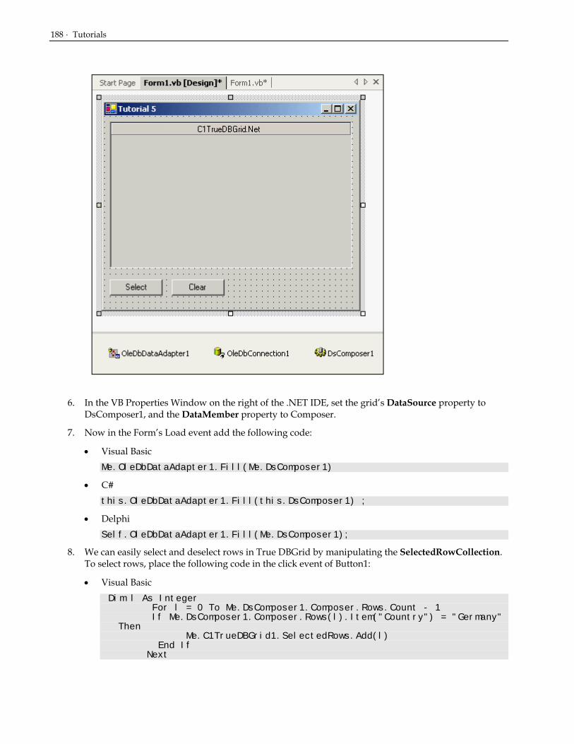
188 · Tutorials
6. In the VB Properties Window on the right of the .NET IDE, set the grid’s DataSource property to DsComposer1, and the DataMember property to Composer.
7. Now in the Form’s Load event add the following code:
• Visual Basic Me.OleDbDataAdapter1.Fill(Me.DsComposer1)
• C# this.OleDbDataAdapter1.Fill(this.DsComposer1) ;
• Delphi Self.OleDbDataAdapter1.Fill(Me.DsComposer1);
8. We can easily select and deselect rows in True DBGrid by manipulating the SelectedRowCollection. To select rows, place the following code in the click event of Button1:
• Visual Basic Dim l As Integer
For l = 0 To Me.DsComposer1.Composer.Rows.Count - 1 If Me.DsComposer1.Composer.Rows(l).Item("Country") = "Germany"
Then Me.C1TrueDBGrid1.SelectedRows.Add(l) End If Next

Tutorial 6 - Defining Unbound Columns in a Bound Grid · 189
• C# int l; for ( l = 0 ; l < this.DsComposer1.Composer.Rows.Count; l++){ if ( this.DsComposer1.Composer. Rows[l][“Country”] == "Germany" ) { this.C1TrueDBGrid1.SelectedRows.Add(l); } }
• Delphi procedure TWinForm.button1_Click(sender: System.Object; e: System.EventArgs); var I : Integer; begin for I := 0 to Self.DsComposer1.Composer.Rows.Count – 1 do begin if (Self.DsComposer1.Composer.Rows[i].Item[‘Country’].ToString = ‘Germany’) then c1TrueDBGrid1.SelectedRows.Add(i); end; end;
9. To deselect rows, place the following code in the click event of Button2:
• Visual Basic Me.C1TrueDBGrid1.SelectedRows.Clear()
• C# this.C1TrueDBGrid1.SelectedRows.Clear();
• Delphi Self.C1TrueDBGrid1.SelectedRows.Clear;
Run the program and observe the following:
• C1TrueDBGrid1 retrieves the database schema information from the DataSet and automatically configures itself to display all of the fields in the joined database tables. This is again similar to the behavior of the grid in Tutorial 1.
• Click the Select command button and observe that all records with the Country field equal to Germany will be highlighted.
• To deselect the highlighted records, click the Clear command button. Alternatively, clicking anywhere on a grid cell will also clear the selected rows.
This concludes Tutorial 5.
Tutorial 6 - Defining Unbound Columns in a Bound Grid In this tutorial, you will learn how to use the UnboundColumnFetch event to display two fields (FirstName and LastName) together in one column. You will also learn how to use an SQL statement to create a join between two tables in a database. The project we set up for this tutorial will also be used in Tutorials 7 through 12.
1. Start a new .NET project.

190 · Tutorials
2. From the Toolbox on the left side of the IDE draw a C1TrueDBGrid object onto the form. The C1TrueDBGrid icon looks like this:
3. Go to the Data tab in the ToolBox and add an OledbDataAdapter to the form. In the adapter’s Data Configuration wizard, either select a connection to TDBGrid.mdb or create a new OleDBConnection to this database. In the ‘Choose a Query Type’ window of the wizard select the ‘Use SQL statements’ radio button. In the Generate SQL statements window, open the Query Builder by clicking the 'Query Builder...' button. From the Tables List, add the tables 'Customers' And 'Contacts' to the top window. Then, select the following fields (in order): Customers.FirstName, Customers.LastName, Customers.CustType, Contacts.ContactType, Contacts.Callback, Contacts.ContactDate, Contacts.UserCode, Customers.UserCode. This should produce an SQL statement that reads as follows: "SELECT Customers.FirstName, Customers.LastName, Customers.CustType, Contacts.ContactType, Contacts.Callback, Contacts.ContactDate, Contacts.UserCode, Customers.UserCode AS Expr1 FROM Contacts INNER JOIN Customers ON Contacts.UserCode = Customers.UserCode." Click 'OK' to save and exit the query, and then finish out the wizard.
4. Select the ‘Generate DataSet…’ item from .NET’s Data menu. Select the ‘New’ radio button in the Generate Dataset window, and type “DsContacts” into the listbox. Click OK.
5. In the VB Properties Window on the right of the .NET IDE, set the grid’s DataSource property to DsContacts1, and the DataMember property to Customers.
6. Declare a new global DataTable object in Form1
• Visual Basic Dim dtCopy As New DataTable
• C# DataTable dtCopy = new DataTable ;
• Delphi var dtCopy: DataTable; dtCopy := DataTable.Create;
7. Now in the Form’s Load event add the following code. The first line fills the dataset, the second lines make a copy of this DataSet, which we will use later to populate the unbound column:
• Visual Basic Me.OleDbDataAdapter1.Fill(Me.DsContacts1) dtCopy = Me.DsContacts1.Tables(0).Copy()
• C# this.OleDbDataAdapter1.Fill(this.DsContacts1); dtCopy = this.DsContacts1.Tables(0).Copy();
• Delphi Self.OleDbDataAdapter1.Fill(Self.DsContacts1); dtCopy := Self.DsContacts1.Tables[0].Copy;
8. To create an unbound column, open up the C1TrueDBGrid Designer by clicking on the ellipsis button next to the Columns property in the VB Properties Window. Next click the Insert column button to create a new column. Set the new columns Caption property to “Name” in the left pane.

Tutorial 6 - Defining Unbound Columns in a Bound Grid · 191
Notice that a value resides in the Caption field, but no value in the DataField, which is how the grid knows that this is an unbound column. The grid now knows to fire the UnboundColumnFetch event.
9. Open the SplitCollection editor by clicking on the ellipsis button next to the Splits property in the VB Properties window. Now open up the C1DisplayColumnCollection editor by clicking on the ellipsis button next to the DisplayColumns property. In this editor find the unbound column that we just created in the left pane, but it is positioned as the last column in the grid. The DisplayColumns Collection determines the position of the field. Maneuver column to the desired location by using the up and down arrow buttons in the left pane. Then in the right pane, set its Visible property equal to true. Now our unbound column is visible to the end-user and not just the True DBGrid.
You can hide columns here that are used in the unbound column. Select the FirstName column from the left pane, then in the right, set its Visible property equal to False. This hides the FirstName column from view. Repeat the above steps, selecting the LastName column.
10. Add the following code to the UnboundColumnFetch event. This code uses dtCopy to gather values to place into the unbound column, then setting these values equal to e.Value, places the value into the unbound column:
• Visual Basic Private Sub C1TrueDBGrid1_UnboundColumnFetch(ByVal sender As System.Object, ByVal e As C1.Win.C1TrueDBGrid.UnboundColumnFetchEventArgs) Handles C1TrueDBGrid1.UnboundColumnFetch If e.Col = 0 And e.Row < dtCopy.Rows.Count Then e.Value = dtCopy.Rows(e.Row).Item("FirstName") & " " & dtCopy.Rows(e.Row).Item("LastName") End If End Sub
• C# private void C1TrueDBGrid1_UnboundColumnFetch( System.object sender, C1.Win.C1TrueDBGrid.UnboundColumnFetchEventArgs e) { if ( e.Col == 0 && e.Row < dtCopy.Rows.Count ) { e.value = dtCopy.Rows[e.Row] ["FirstName"] + " " + dtCopy.Rows[e.Row] ["LastName"]; } }
• Delphi procedure TWinForm.c1TrueDBGrid1_UnboundColumnFetch(sender: System.Object; e: C1.Win.C1TrueDBGrid.UnboundColumnFetchEventArgs); begin if((e.Col = 0) and (e.Row < dtCopy.Rows.Count)) then e.Value := dtCopy.Rows[e.Row]['FirstName'].ToString + ' ' + dtCopy.Rows[e.Row]['LastName'].ToString; end;

192 · Tutorials
When the application is run, it should look like the following:
Run the program and observe the following:
• C1TrueDBGrid1 displays data from the joined table according to the five columns configured at design time.
• The first column displays the combined FirstName and LastName fields as defined in the UnboundColumnFetch event.
• The CustType, ContactType and Callback columns display numeric values that are quite cryptic to users and provide an unappealing data presentation. In the next three tutorials (7, 8, and 9), techniques will be illustrated that improve both the display and the user interface.
This concludes Tutorial 6.
Tutorial 7 - Displaying Translated Data with the Built-in Combo In this tutorial, you will learn how to use the ValueItems object to display translated text and enable the grid's built-in drop-down combo for editing—all without writing a single line of code.
1. Start with the project created in Tutorial 6.
2. Make sure the C1TrueDBGrid has focus, then click on the ellipsis button next to the Columns property in the VB Properties Window. This brings up the C1TrueDBGrid Designer.
3. Select the CustType column member. Then in the left pane, click on the expand icon next to the Valueitems property. This will display all of the members of the Valueitems object.
4. Click on the ellipsis button next to the Values property in the C1TrueDBGrid Designer. This brings up the ValueitemCollection editor.
5. In the left pane create 5 new ValueItem objects by clicking on the Add button 5 times. Notice that a ValueItem has two properties: DisplayValue and Value.
6. Enter the following DisplayValue/Value pairs into the right pane, then close the ValueItemCollection editor:
DisplayValue Value
Value 0

Tutorial 8 - Attaching a Dropdown Control to a Grid Cell · 193
DisplayValue Value
Prospective 1
Normal 2
Buyer 3
Distributor 4
Other 5
7. Under the Valueitems object in the C1DataColumn editor, set the Presentation property to ComboBox, and the Translate property to True.
8. Click the OK button at the bottom of the Property Pages dialog to accept the changes.
Run the program and observe the following:
• C1TrueDBGrid1 displays data from the joined tables as in Tutorial 6.
• The CustType column now displays the translated text instead of numeric values.
• Click a cell in the CustType column to make it the current cell. Notice that a dropdown button appears at the right edge of the cell.
• Click the dropdown button or press ALT+DOWN ARROW to display the built-in combo box containing translated values, as shown in the following figure. Change the data in the current cell by selecting the desired item from the combo box.
This concludes Tutorial 7.
Tutorial 8 - Attaching a Dropdown Control to a Grid Cell In this tutorial, you will learn how to attach a multicolumn True DBDropDown control to a grid cell. Unlike the built-in combo demonstrated in Tutorial 7 the C1TrueDBDropDown control can be bound to a data source, which makes it ideal for data entry involving a secondary lookup table. The drop-down control appears whenever the user clicks a button within the current cell. This button appears automatically when the user gives focus to a column that has a drop-down control connected to it.
1. Start with the project constructed in Tutorial 6.
2. Add a C1TrueDBDropDown control (C1TrueDBDropDown1) and another DataAdapter to the form. The icon for the C1TrueDBDropDown looks like the following:
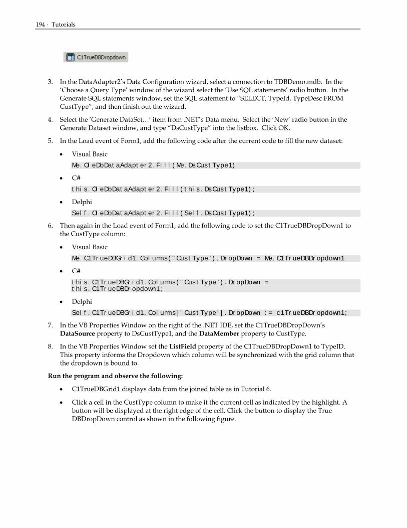
194 · Tutorials
3. In the DataAdapter2’s Data Configuration wizard, select a connection to TDBDemo.mdb. In the ‘Choose a Query Type’ window of the wizard select the ‘Use SQL statements’ radio button. In the Generate SQL statements window, set the SQL statement to “SELECT, TypeId, TypeDesc FROM CustType”, and then finish out the wizard.
4. Select the ‘Generate DataSet…’ item from .NET’s Data menu. Select the ‘New’ radio button in the Generate Dataset window, and type “DsCustType” into the listbox. Click OK.
5. In the Load event of Form1, add the following code after the current code to fill the new dataset:
• Visual Basic Me.OleDbDataAdapter2.Fill(Me.DsCustType1)
• C# this.OleDbDataAdapter2.Fill(this.DsCustType1);
• Delphi Self.OleDbDataAdapter2.Fill(Self.DsCustType1);
6. Then again in the Load event of Form1, add the following code to set the C1TrueDBDropDown1 to the CustType column:
• Visual Basic Me.C1TrueDBGrid1.Columns("CustType").DropDown = Me.C1TrueDBDropdown1
• C# this.C1TrueDBGrid1.Columns("CustType").DropDown = this.C1TrueDBDropdown1;
• Delphi Self.C1TrueDBGrid1.Columns['CustType'].DropDown := c1TrueDBDropdown1;
7. In the VB Properties Window on the right of the .NET IDE, set the C1TrueDBDropDown’s DataSource property to DsCustType1, and the DataMember property to CustType.
8. In the VB Properties Window set the ListField property of the C1TrueDBDropDown1 to TypeID. This property informs the Dropdown which column will be synchronized with the grid column that the dropdown is bound to.
Run the program and observe the following:
• C1TrueDBGrid1 displays data from the joined table as in Tutorial 6.
• Click a cell in the CustType column to make it the current cell as indicated by the highlight. A button will be displayed at the right edge of the cell. Click the button to display the True DBDropDown control as shown in the following figure.

Tutorial 9 - Attaching an Arbitrary Dropdown Control to a Grid Cell · 195
• Use the UP ARROW and DOWN ARROW keys to move the highlight bar of True DBDropDown. If another cell in the grid is clicked, True DBDropDown will lose focus and become invisible.
• Select any item in True DBDropDown. The current cell in the grid will be updated with the selected item, and True DBDropDown will disappear until editing is initiated again.
• If the current cell is moved to another column, the button will disappear from the cell in the CustType column.
This concludes Tutorial 8.
Tutorial 9 - Attaching an Arbitrary Dropdown Control to a Grid Cell In this tutorial, you will learn how to dropdown an arbitrary control from a grid cell. This example uses a ListBox control containing pre-defined input values in order to facilitate user data entry. The list will drop down whenever the user initiates editing, such as by clicking the current cell. You will also learn how to place a button in the cell which, when clicked, will cause the ListBox control to appear. You can dropdown any control from a grid cell using techniques similar to those described in this tutorial.
1. Start with the project constructed in Tutorial 6.
2. Add a ListBox control (ListBox1) to the form as shown in the figure.
3. Set the Visible property of ListBox1 to False.

196 · Tutorials
Adding code to drop down a ListBox control
The CustType field in the second column (Column1) of the grid displays numeric values ranging from 1 through 5, which represent the following customer types:
1 = Prospective 2 = Normal 3 = Buyer 4 = Distributor 5 = Other
Drop down ListBox1, which will contain textual customer type descriptions, and allow users to double-click an item in order to enter the associated value into the grid.
4. Include the following code in the general declaration section of Form1. Adding these namespaces will simplify the code we will need to write later.
• Visual Basic Imports System.Data Imports System.Data.Oledb Imports System.IO Imports System.Collections
• C# using System.Data; using System.Data.Oledb; using System.IO; using System.Collections;
• Delphi uses System.Data; uses System.Data.Oledb; uses System.IO; uses System.Collections;
5. In the Load event of Form1, we place code to add the customer types to ListBox1. We also place a button in the CustType column using the Button property. The Form1_Load event handler now looks like this:
• Visual Basic Private Sub Form1_Load(ByVal sender As System.Object, ByVal e As System.EventArgs) Handles MyBase.Load Me.OleDbDataAdapter1.Fill(Me.DsContacts1) 'add customer types to listbox1 With Me.ListBox1 .Items.Add("Prospective") .Items.Add("Normal") .Items.Add("Buyer") .Items.Add("Distributor") .Items.Add("Other") .Visible = False End With 'place a button in the CustType column Me.C1TrueDBGrid1.Splits(0).DisplayColumns("CustType").Button = True End Sub
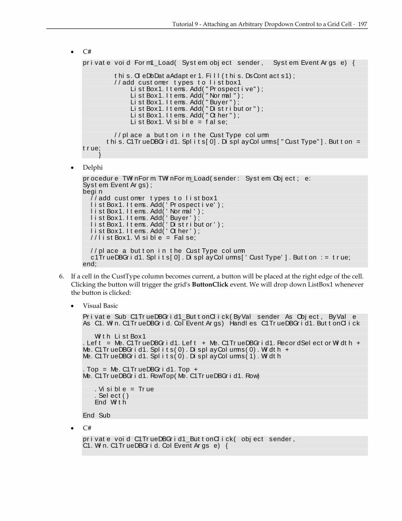
Tutorial 9 - Attaching an Arbitrary Dropdown Control to a Grid Cell · 197
• C# private void Form1_Load( System.object sender, System.EventArgs e) { this.OleDbDataAdapter1.Fill(this.DsContacts1); //add customer types to listbox1 ListBox1.Items.Add("Prospective"); ListBox1.Items.Add("Normal"); ListBox1.Items.Add("Buyer"); ListBox1.Items.Add("Distributor"); ListBox1.Items.Add("Other"); ListBox1.Visible = false; //place a button in the CustType column this.C1TrueDBGrid1.Splits[0].DisplayColumns["CustType"].Button = true; }
• Delphi procedure TWinForm.TWinForm_Load(sender: System.Object; e: System.EventArgs); begin //add customer types to listbox1 listBox1.Items.Add('Prospective'); listBox1.Items.Add('Normal'); listBox1.Items.Add('Buyer'); listBox1.Items.Add('Distributor'); listBox1.Items.Add('Other'); //listBox1.Visible = False; //place a button in the CustType column c1TrueDBGrid1.Splits[0].DisplayColumns['CustType'].Button := true; end;
6. If a cell in the CustType column becomes current, a button will be placed at the right edge of the cell. Clicking the button will trigger the grid's ButtonClick event. We will drop down ListBox1 whenever the button is clicked:
• Visual Basic Private Sub C1TrueDBGrid1_ButtonClick(ByVal sender As Object, ByVal e As C1.Win.C1TrueDBGrid.ColEventArgs) Handles C1TrueDBGrid1.ButtonClick
With ListBox1 .Left = Me.C1TrueDBGrid1.Left + Me.C1TrueDBGrid1.RecordSelectorWidth + Me.C1TrueDBGrid1.Splits(0).DisplayColumns(0).Width + Me.C1TrueDBGrid1.Splits(0).DisplayColumns(1).Width .Top = Me.C1TrueDBGrid1.Top + Me.C1TrueDBGrid1.RowTop(Me.C1TrueDBGrid1.Row)
.Visible = True
.Select() End With
End Sub
• C# private void C1TrueDBGrid1_ButtonClick( object sender, C1.Win.C1TrueDBGrid.ColEventArgs e) {

198 · Tutorials
ListBox1.Left = this.C1TrueDBGrid1.Left + this.C1TrueDBGrid1.RecordSelectorWidth + this.C1TrueDBGrid1.Splits[0].DisplayColumns[0].Width + this.C1TrueDBGrid1.Splits[0].DisplayColumns[1].Width; ListBox1.Top = this.C1TrueDBGrid1.Top + this.C1TrueDBGrid1.RowTop(this.C1TrueDBGrid1.Row); ListBox1.Visible = true; ListBox1.Select(); }
• Delphi procedure TWinForm.c1TrueDBGrid1_ButtonClick(sender: System.Object; e: C1.Win.C1TrueDBGrid.ColEventArgs); begin listBox1.Left := c1TrueDBGrid1.Left + c1TrueDBGrid1.RecordSelectorWidth + c1TrueDBGrid1.Splits[0].DisplayColumns[0].Width + c1TrueDBGrid1.Splits[0].DisplayColumns[1].Width + c1TrueDBGrid1.Splits[0].DisplayColumns[2].Width; listBox1.Top := c1TrueDBGrid1.Top + c1TrueDBGrid1.RowTop(c1TrueDBGrid1.Row); listBox1.Visible := true; listBox1.Select; end;
7. In the DoubleClick event of ListBox1, add the following code. When an item is selected in ListBox1, this code will copy its index to the proper column in C1TrueDBGrid1, then make ListBox1 invisible.
• Visual Basic Private Sub ListBox1_DoubleClick(ByVal sender As Object, ByVal e As System.EventArgs) Handles ListBox1.DoubleClick Me.C1TrueDBGrid1.Columns(“CustType”).Text = Me.ListBox1.SelectedIndex + 1
Me.ListBox1.Visible = False End Sub
• C# private void ListBox1_DoubleClick( object sender, System.EventArgs e) { this.C1TrueDBGrid1.Columns[“CustType”].Text = (this.ListBox1.SelectedIndex + 1).ToString(); this.ListBox1.Visible = false; }
• Delphi procedure TWinForm.listBox1_DoubleClick(sender: System.Object; e: System.EventArgs); begin c1TrueDBGrid1.Columns[2].Text := listBox1.SelectedIndex.ToString; listBox1.Visible := false; end;
8. Then in the Leave event of ListBox1, add the following code to make sure the listbox becomes invisible once the selection has been made:

Tutorial 9 - Attaching an Arbitrary Dropdown Control to a Grid Cell · 199
• Visual Basic Private Sub ListBox1_Leave(ByVal sender As Object, ByVal e As System.EventArgs) Handles ListBox1.Leave Me.ListBox1.Visible = False
End Sub
• C# private void ListBox1_Leave( object sender, System.EventArgs e) { this.ListBox1.Visible = false; }
• Delphi procedure TWinForm.listBox1_Leave(sender: System.Object; e: System.EventArgs); begin listBox1.Visible := false; end;
9. Then in the Scroll event of C1TrueDBGrid1, add the following code to make sure the listbox becomes invisible once the grid is scrolled:
• Visual Basic Private Sub C1TrueDBGrid1_Scroll(ByVal sender As Object, ByVal e As C1.Win.C1TrueDBGrid.CancelEventArgs) Handles C1TrueDBGrid1.Scroll Me.ListBox1.Visible = False
End Sub
• C# private void C1TrueDBGrid1_Scroll( object sender, C1.Win.C1TrueDBGrid.CancelEventArgs e) { this.ListBox1.Visible = false; }
• Delphi procedure TWinForm.C1TrueDBGrid1_Scroll(sender: System.Object; e: C1.Win.C1TrueDBGrid.CancelEventArgs); begin Self.ListBox1.Visible := false; end;
Run the program and observe the following:
• C1TrueDBGrid1 displays data from the joined table as in Tutorial 6.
• Click a cell in the CustType column to make it the current cell as indicated by the highlight. A button will be displayed at the right edge of the cell. Click the button to fire the ButtonClick event. ListBox1 will drop down at the right edge of the cell as shown in the following illustration.

200 · Tutorials
• Use the mouse or the UP ARROW and DOWN ARROW keys to move the highlight bar of ListBox1. If another cell in the grid is clicked, ListBox1 will lose focus and become invisible.
• Double-click any item in ListBox1. The current cell in the grid will be updated with the selected item, and ListBox1 will disappear until editing is again initiated.
• If the current cell is moved to another column, the button will disappear from the cell in the CustType column.
This concludes Tutorial 9.
Tutorial 10 - Enhancing the User Interface with In-Cell Bitmaps In this tutorial, you will learn how to use the ValueItems object and its collection of ValueItem objects to display bitmaps and check boxes in a cell—without writing a single line of code!
1. Start with the project used in Tutorial 7.
2. First, change the captions of the ContactType and Callback columns. Open up the C1TrueDBGrid Designer by clicking on the ellipsis button next to the Columns property in the VB Properties window.
3. Select the ContactType column, then in the left pane, change its caption property to “How”. Then in a similar manner, change the CallBack column caption to “Call?”
4. Change the HorizontalAlignment property of these two columns by clicking the Align center button so that the bitmaps will be centered within each cell. Open the SplitCollection editor by clicking on the ellipsis button next to the Splits property in the VB Properties window. Next open the C1DisplayColumnCollection editor by clicking on the ellipsis next to the DisplayColumn property in the Splits editor. Select the How column in the left pane, then in the right pane, click on the expand icon next to the Styles property. Under the Styles object for this column set the HorizontalAlignment property to Center. Then set the VerticalAlignment properties to Center also. In a similar manner, set the HorizontalAlignment and VerticalAlignment properties for the Call? Column.
5. Next, assign bitmaps and check boxes to selected columns by populating the corresponding ValueItems object. We will start with the bitmaps in column 2. Open up the C1TrueDBGrid Designer by clicking on the ellipsis button next to the Columns property in the VB Properties window. Select the How column, and then in the left pane, click on the expand icon next to the Valueitem object. Open up the ValueItemCollection editor by clicking on the ellipsis button next to the Values property:

Tutorial 10 - Enhancing the User Interface with In-Cell Bitmaps · 201
6. Create three new ValueItem objects by clicking on the Add button in the left pane. The possible values of the ContactType field are 0, 1, and 2, which represent telephone, mail, and personal contact, respectively. Bitmaps shall be displayed in the cell instead of these numeric values. If the full product is installed, the following files will be found in the BITMAPS subdirectory of the True DBGrid installation directory: PHONE.BMP, MAIL.BMP, and PERSON.BMP.
7. In the right pane, for the first ValueItem, enter 0 as the value, then in the DisplayValue property box, click on the ellipsis button to search for the Image file to display in the cell. Locate the Phone.bmp file in the bitmaps subdirectory of the ComponentOne Studio.NET directory. In a similar manner set the other two ValueItem objects to a Value of 1, DisplayValue of Mail.bmp, and a Value of 2, DisplayValue of Person.BMP, respectively. Return to the ValueItems object in the C1TrueDBGrid Designer and set the Translate and CycleOnClick properties equal to True.
8. To set the checkboxes for column 3, in the C1TrueDBGrid Designer, select the Call column. In the left pane, expand the ValueItems object and set the Presentation property to CheckBox. This will display the column’s Boolean values as checkboxes. Then finally, under the same object set the Translate and CycleOnClick properties to True.
Run the program and observe the following:
• C1TrueDBGrid1 displays data from the joined table as in Tutorials 10 through 11.
• The How and Call? columns now display bitmaps instead of numeric values as shown in the following figure.

202 · Tutorials
• Click a cell in the How column to make it the current cell. Then click it again several times and observe how the cell cycles through the PHONE, MAIL, and PERSON bitmaps.
• Click a cell in the Call? Column and observe how the cell cycles through the check box bitmaps.
This concludes Tutorial 10.
Tutorial 11 - Using Styles to Highlight Related Data In this tutorial, you will learn how to change the grid's display to highlight rows by creating row styles depending upon a value in the grid. True DBGrid uses the FetchRowStyle event to create style characteristics and apply them to rows dynamically.
1. Start with the project used in Tutorial 10.
2. Add thee buttons to the form. Change the caption of Button1 to Prospective Customers, Button2 to Distributors, and Button3 to Reset the Grid so that the form appears as follows.
3. Add the following declarations to the General section of Form1:
• Visual Basic Dim bflag As Integer
• C# int bflag;

Tutorial 11 - Using Styles to Highlight Related Data · 203
• Delphi var bflag: Integer;
4. Enter the following code in the Click event of Button1:
• Visual Basic 'prospective Me.C1TrueDBGrid1.FetchRowStyles = True bFlag = 1 Me.C1TrueDBGrid1.Refresh()
• C# //prospective this.C1TrueDBGrid1.FetchRowStyles = true; bFlag = 1; this.C1TrueDBGrid1.Refresh();
• Delphi begin //prospective c1TrueDBGrid1.FetchRowStyles := true; FFlag := 1; Self.C1TrueDBGrid1.Refresh; end;
5. Enter the following code in the Click event of Button2:
• Visual Basic 'distributors Me.C1TrueDBGrid1.FetchRowStyles = True bFlag = 2 Me.C1TrueDBGrid1.Refresh()
• C# //distributors this.C1TrueDBGrid1.FetchRowStyles = true; bFlag = 2; this.C1TrueDBGrid1.Refresh();
• Delphi begin //distributors c1TrueDBGrid1.FetchRowStyles := true; FFlag := 2; c1TrueDBGrid1.Refresh; end;
6. Enter the following code in the Click event of Button3:
• Visual Basic 'reset styles Me.C1TrueDBGrid1.FetchRowStyles = False Me.C1TrueDBGrid1.Refresh()
• C# //reset styles this.C1TrueDBGrid1.FetchRowStyles = false; this.C1TrueDBGrid1.Refresh();

204 · Tutorials
• Delphi begin //reset styles c1TrueDBGrid1.FetchRowStyles := false; c1TrueDBGrid1.Refresh; end;
7. Next enter the following code into the FetchRowStyles event. This code interacts with the setting of the FetchRowStyles property in the click event. When the FetchRowStyles is set to true, the grid fires the FetchRowStyle event when it needs to repaint the cells. Thus the row style is applied according to the value of the bflag flag integer:
• Visual Basic Private Sub C1TrueDBGrid1_FetchRowStyle(ByVal sender As Object, ByVal e As C1.Win.C1TrueDBGrid.FetchRowStyleEventArgs) Handles C1TrueDBGrid1.FetchRowStyle If bFlag = 1 And Me.C1TrueDBGrid1 (e.Row,"CustType") = 1 Then Dim fntFont As New Font(e.CellStyle.Font.Name, e.CellStyle.Font.Size, FontStyle.Bold) e.CellStyle.Font = fntFont e.CellStyle.ForeColor = System.Drawing.Color.Blue End If If bFlag = 2 And Me.C1TrueDBGrid1 (e.Row, "CustType") = 4 Then e.CellStyle.ForeColor = System.Drawing.Color.White e.CellStyle.BackColor = System.Drawing.Color.Red End If End Sub
• C# private void C1TrueDBGrid1_FetchRowStyle( object sender, C1.Win.C1TrueDBGrid.FetchRowStyleEventArgs e) { if ( bFlag == 1 && (int)this.C1TrueDBGrid1 [e.Row, "CustType"] == 1 ) { Font fntFont = new Font(e.CellStyle.Font.Name, e.CellStyle.Font.Size, FontStyle.Bold); e.CellStyle.Font = fntFont; e.CellStyle.ForeColor = System.Drawing.Color.Blue; } if ( bFlag == 2 && this.C1TrueDBGrid1 [e.Row, "CustType"] == 4 ) { e.CellStyle.ForeColor = System.Drawing.Color.White; e.CellStyle.BackColor = System.Drawing.Color.Red; } }
• Delphi procedure TWinForm.c1TrueDBGrid1_FetchRowStyle(sender: System.Object; e: C1.Win.C1TrueDBGrid.FetchRowStyleEventArgs);

Tutorial 11 - Using Styles to Highlight Related Data · 205
var MyFont: System.Drawing.Font; begin if ((FFlag = 1) and (c1TrueDBGrid1.Columns['CustType'].CellValue(e.Row).ToString = '1')) then begin MyFont := System.Drawing.Font.Create(e.CellStyle.Font.Name, e.CellStyle.Font.Size, FontStyle.Bold); e.CellStyle.Font := MyFont; e.CellStyle.ForeColor := System.Drawing.Color.Blue; end else if ((FFlag = 2) and (c1TrueDBGrid1.Columns['CustType'].CellValue(e.Row).ToString = '4')) then begin e.CellStyle.ForeColor := System.Drawing.Color.White; e.CellStyle.BackColor := System.Drawing.Color.Red; end; end;
Run the program and observe the following:
• C1TrueDBGrid1 displays data as in Tutorial 10.
• Click the Prospective Customers button. The grid should appear as follows.
• Click the Distributors button. The grid should now appear as follows:

206 · Tutorials
• Finally, click the Reset the Grid button. The grid should now clear itself of the styles.
This concludes Tutorial 11.
Tutorial 12 - Displaying Rows in Alternating Colors In this tutorial, you will learn how to use the AlternatingRows property and built-in styles to apply alternating colors to grid rows to improve their readability.
1. Start with the project used in Tutorial 10.
2. In the VB Properties window, set the AlternatingRows property to True. The grid has default settings for both the EvenRow and OddRow styles. Use the default settings first and then change the settings for the EvenRowStyle.
Run the program and observe the following:
• C1TrueDBGrid1 displays data as in Tutorial 10 except that even-numbered rows have a light cyan background.
3. Click on the ellipsis button next to the Styles property in the VB Properties window. This will bring up the GridStyleCollection editor. Select the EvenRowStyle in the left pane, and in the right pane change its backcolor to LightGray. Click OK and close the editor.
Run the program and observe the following:
• C1TrueDBGrid1 displays data as in the previous figure, except that even-numbered rows now have a light gray background.

Tutorial 13 – Implementing Drag-and-Drop in True DBGrid · 207
This concludes Tutorial 12.
Tutorial 13 – Implementing Drag-and-Drop in True DBGrid 1. Start a new .NET project
2. Place two True DBGrid controls (C1TrueDBGrid1, C1TrueDBGrid2) onto the form. Also add three labels onto the form and arrange them to look like the picture below.
3. Load a DataAdapter onto the form. In the DataAdapter1’s Data Configuration wizard, select a connection to TDBDemo.mdb. In the ‘Choose a Query Type’ window of the wizard select the ‘Use SQL statements’ radio button. In the Generate SQL statements window, set the SQL statement to “SELECT * FROM Customers”, and then finish out the wizard. Load a second DataAdapter onto the form, but this time connect this adapter to the SQL statement “SELECT * FROM CallList”.
4. Select the ‘Generate DataSet…’ item from .NET’s Data menu. Select the ‘New’ radio button in the Generate Dataset window, and type “DsCustomers” into the listbox. Click OK.
5. Select the ‘Generate DataSet…’ item from .NET’s Data menu. Select the ‘New’ radio button in the Generate Dataset window, and type “DsCallList” into the listbox. Click OK.
6. In the general section of the form, add the following declarations:
• Visual Basic Dim _ptStartDrag As Point Dim _dragRow As Long
• C# Point _ptStartDrag; long _dragRow;
• Delphi FDragRow: LongInt; FptStartDrag: Point;
7. In the Load event of Form1, add the following code after the current code to fill the new datasets:
• Visual Basic Me.OleDbDataAdapter1.Fill(Me.DsCustomers1) Me.OleDbDataAdapter2.Fill(Me.DsCallList1)
• C# this.OleDbDataAdapter1.Fill(this.DsCustomers1); this.OleDbDataAdapter2.Fill(this.DsCallList1);
• Delphi Self.OleDbDataAdapter1.Fill(Self.DsCustomers1); Self.OleDbDataAdapter2.Fill(Self.DsCallList1);
8. For the first grid (C1TrueDBGrid1) set the AllowDrag property to True. While, for the second grid, set the AllowDrop property to True.
9. Right-click on C1TrueDBGrid1 and select Retrieve Fields. Do the same with the other grid. Open up the C1TrueDBGrid Designer for C1TrueDBGrid1 by clicking on the ellipsis button next to the Columns property for the True DBGrid in the VB Properties Window.

208 · Tutorials
10. Remove all of the Columns from the grid except LastName, FirstName, Company, and Phone by clicking the Delete selected columns button . Enter the C1TrueDBGrid Designer for the other grid and remove all of its columns except Customer, Phone, and CallDate.
11. In the VB Properties Window set the MarqueeStyle for C1TrueDBGrid1 to SolidCellBorder. In the C1DataColumnCollectionEditor set Column 3’s (Phone) NumberFormat property to “(###)###-####”. Open up the C1TrueDBGrid Designer for the second grid and set its Column 2’s NumberFormat property to “(###)###-####”. The grid should now look like the following:
Adding code to your project
This section describes the code needed to drag the contents of a cell or row from C1TrueDBGrid1 to C1TrueDBGrid2. The code assumes that if you want to drag the entire row of data to C1TrueDBGrid2 in order to add a new record there.
12. Add the following subroutine to the project to reset the MarqueeStyle property of each grid, which is used to provide visual feedback while dragging is in progress. The reset routine will be called to perform clean-up after a drag-and-drop operation concludes.
• Visual Basic Private Sub ResetDragDrop() ' Turn off drag-and-drop by resetting the highlight and label text. Me._ptStartDrag = Point.Empty Me._dragRow = - 1 Me.C1TrueDBGrid1.MarqueeStyle = C1.Win.C1TrueDBGrid.MarqueeEnum.SolidCellBorder Me.C1TrueDBGrid2.MarqueeStyle = C1.Win.C1TrueDBGrid.MarqueeEnum.SolidCellBorder Me.Label3.Text = "Drag a row from the top grid and drop it on the bottom grid." End Sub

Tutorial 13 – Implementing Drag-and-Drop in True DBGrid · 209
• C# private void ResetDragDrop() { // Turn off drag-and-drop by resetting the highlight and label text. this._ptStartDrag = Point.Empty; this._dragRow = - 1; this.C1TrueDBGrid1.MarqueeStyle = C1.Win.C1TrueDBGrid.MarqueeEnum.SolidCellBorder; this.C1TrueDBGrid2.MarqueeStyle = C1.Win.C1TrueDBGrid.MarqueeEnum.SolidCellBorder; this.Label3.Text = "Drag a row from the top grid and drop it on the bottom grid."; }
• Delphi procedure TWinForm.ResetDragDrop; begin // Turn off drag-and-drop by resetting the highlight and label text. FptStartDrag := Point.Empty; FDragRow := -1; c1TrueDBGrid1.MarqueeStyle := MarqueeEnum.SolidCellBorder; c1TrueDBGrid2.MarqueeStyle := MarqueeEnum.SolidCellBorder; label1.Text := 'Drag a row from the top grid and drop it on the bottom grid.'; end;
13. Enter the following code to handle the mouse related events:
• Visual Basic Private Sub C1TrueDBGrid1_MouseDown(ByVal sender As Object, ByVal e As System.Windows.Forms.MouseEventArgs) Handles C1TrueDBGrid1.MouseDown Dim row, col As Integer Me._ptStartDrag = Point.Empty Me._dragRow = - 1 If Me.C1TrueDBGrid1.CellContaining(e.X, e.Y, row, col) Then ' save the starting point of the drag operation Me._ptStartDrag = New Point(e.X, e.Y) Me._dragRow = row End If End Sub Private Sub C1TrueDBGrid1_MouseMove(ByVal sender As Object, ByVal e As System.Windows.Forms.MouseEventArgs) Handles C1TrueDBGrid1.MouseMove ' if we don't have an empty start drag point, then the drag has been initiated If Not Me._ptStartDrag.IsEmpty Then ' create a rectangle that bounds the start of the drag operation by 2 pixels Dim r As New Rectangle(Me._ptStartDrag, Size.Empty) r.Inflate(2, 2) ' if we've moved more than 2 pixels, lets start the drag operation If Not r.Contains(e.X, e.Y) Then Me.C1TrueDBGrid1.Row = Me._dragRow Me.C1TrueDBGrid1.MarqueeStyle = C1.Win.C1TrueDBGrid.MarqueeEnum.HighlightRow Me.C1TrueDBGrid1.DoDragDrop(Me._dragRow, DragDropEffects.Copy) End If End If End Sub

210 · Tutorials
• C# private void C1TrueDBGrid1_MouseDown( object sender, System.Windows.Forms.MouseEventArgs e) { int row, col; this._ptStartDrag = Point.Empty; this._dragRow = - 1; if ( this.C1TrueDBGrid1.CellContaining(e.X, e.Y, row, col) ) { // save the starting point of the drag operation this._ptStartDrag = new Point(e.X, e.Y); this._dragRow = row; } } private void C1TrueDBGrid1_MouseMove( object sender, System.Windows.Forms.MouseEventArgs e) { // if we don’t have an empty start drag point, then the drag has been initiated if (!this._ptStartDrag.IsEmpty ) { // create a rectangle that bounds the start of the drag operation by 2 pixels Rectangle r = new Rectangle(this._ptStartDrag, Size.Empty); r.Inflate(2, 2); // if we//ve moved more than 2 pixels, lets start the drag operation if (!r.Contains(e.X, e.Y) ) { this.C1TrueDBGrid1.Row = this._dragRow; this.C1TrueDBGrid1.MarqueeStyle = C1.Win.C1TrueDBGrid.MarqueeEnum.HighlightRow; this.C1TrueDBGrid1.DoDragDrop(this._dragRow, DragDropEffects.Copy); } } }
• Delphi procedure TWinForm.C1TrueDBGrid1_MouseMove(sender: System.Object; e: System.Windows.Forms.MouseEventArgs); var R: Rectangle; begin // if we don't have an empty start drag point, then //the drag has been initiated if (not FPtStartDrag.IsEmpty) then begin // create a rectangle that bounds the start of the drag operation by 2 pixels R := Rectangle.Create(FptStartDrag,Size.Empty); R.Inflate(2,2); // if we've moved more than 2 pixels, lets start the drag operation if (not r.Contains(e.X,e.Y)) then begin c1TrueDBGrid1.Row := FDragRow; c1TrueDBGrid1.MarqueeStyle := MarqueeEnum.HighlightRow; c1TrueDBGrid1.DoDragDrop(System.Object(FDragRow), DragDropEffects.Copy); end; end; end; procedure TWinForm.C1TrueDBGrid1_MouseDown(sender: System.Object; e: System.Windows.Forms.MouseEventArgs); var Row, Col: Integer;

Tutorial 13 – Implementing Drag-and-Drop in True DBGrid · 211
begin FPtStartDrag := Point.Empty; FDragRow := -1; if (c1TrueDBGrid1.CellContaining(e.X, e.Y, row, col)) then begin // save the starting point of the drag operation FPtStartDrag := Point.Create(e.X, e.Y); FDragRow := row; end; end;
14. Enter the following code to handle the dragging and dropping events:
• Visual Basic Private Sub C1TrueDBGrid2_DragEnter(ByVal sender As Object, ByVal e As System.Windows.Forms.DragEventArgs) Handles C1TrueDBGrid2.DragEnter
Me.Label3.Text = "Create a new record when dropped..." e.Effect = DragDropEffects.Copy
End Sub Private Sub C1TrueDBGrid2_DragDrop(ByVal sender As Object, ByVal e As System.Windows.Forms.DragEventArgs) Handles C1TrueDBGrid2.DragDrop Try Dim row As Integer = CInt(e.Data.GetData(GetType(Integer))) ' use the grids indexer to get some data Dim custname As String = Me.C1TrueDBGrid1(row, "FirstName").ToString() ' use the CellText() method to get some data custname += " " + Me.C1TrueDBGrid1.Columns("LastName").CellText(row) ' use the CellValue() method to get some data custname += " " + Me.C1TrueDBGrid1.Columns("Company").CellValue(row).ToString() ' add a new row to the data set for the bottom grid Dim drv As DataRowView = Me.DsCallList1.CallList.DefaultView.AddNew() drv("CallDate") = DateTime.Now drv("Customer") = custname drv("Phone") = Me.C1TrueDBGrid1.Columns("Phone").Value.ToString() drv.EndEdit() Me.C1TrueDBGrid2.MoveLast() Me.C1TrueDBGrid2.Select() ' commit changes to the database Dim inserted As DataSet = Me.DsCallList1.GetChanges(DataRowState.Added) If Not (inserted Is Nothing) Then Me.OleDbDataAdapter2.Update(inserted) End If Catch ex As System.Exception MessageBox.Show(ex.Message) End Try End Sub
• C# private void C1TrueDBGrid2_DragEnter( object sender, System.Windows.Forms.DragEventArgs e) { this.Label3.Text = "Create a new record when dropped..."; e.Effect = DragDropEffects.Copy; }

212 · Tutorials
private void C1TrueDBGrid2_DragDrop( object sender, System.Windows.Forms.DragEventArgs e) { try { int row = (int)e.Data.GetData(typeof(int)); // use the grids indexer to get some data string custname = this.C1TrueDBGrid1[row, "FirstName"].ToString(); // use the CellText() method to get some data custname += " " + this.C1TrueDBGrid1.Columns["LastName"].CellText(row); // use the CellValue() method to get some data custname += " " + this.C1TrueDBGrid1.Columns["Company"].CellValue(row).ToString(); // add a new row to the data set for the bottom grid DataRowView drv = this.DsCallList1.CallList.DefaultView.AddNew(); drv["CallDate"] = DateTime.Now; drv["Customer"] = custname; drv["Phone"] = this.C1TrueDBGrid1.Columns["Phone"].Value.ToString(); drv.EndEdit(); this.C1TrueDBGrid2.MoveLast(); this.C1TrueDBGrid2.Select(); // commit changes to the database DataSet inserted = this.DsCallList1.GetChanges(DataRowState.Added); if (! (inserted == null) ) { this.OleDbDataAdapter2.Update(inserted); } } catch (System.Exception ex) { MessageBox.Show(ex.Message); } }
• Delphi procedure TWinForm.C1TrueDBGrid2_DragEnter(sender: System.Object; e: System.Windows.Forms.DragEventArgs); begin Label1.Text := 'Create a new record when dropped...'; e.Effect := DragDropEffects.Copy; end; procedure TWinForm.C1TrueDBGrid2_DragDrop(sender: System.Object; e: System.Windows.Forms.DragEventArgs); var Row: Integer; CustName: String; Drv: C1.Data.C1DataRow; begin try Row := Integer(e.Data.GetData(typeof(Integer))); // use the grids indexer to get some data CustName := c1TrueDBGrid1[Row,'FirstName'].ToString; // use the CellText() method to get some data CustName := CustName + ' ' + c1TrueDBGrid1.Columns['LastName'].CellText(Row); // use the CellValue() method to get some data CustName := CustName + ' ' + c1TrueDBGrid1.Columns['Company'].CellValue(Row).ToString; // add a new row to the data set for the bottom grid Drv := c1ExpressTable2.DataTable.AddNew; Drv['CallDate'] := DateTime.Now; Drv['Customer'] := CustName; Drv['Phone'] := c1TrueDBGrid1.Columns['Phone'].Value.ToString; Drv.EndEdit;

Tutorial 14 - Creating a Grid with Fixed, Nonscrolling Columns · 213
c1TrueDBGrid2.MoveLast; c1TrueDBGrid2.Select; // commit changes to the database c1ExpressTable2.ExpressConnection.Update; except on Ex: System.Exception do MessageBox.Show(Ex.Message); end; end;
Run the program and observe the following:
• If an item in a column in C1TrueDBGrid1 is dragged, the entire row in C1TrueDBGrid1 is highlighted, indicating that the entire row of data is being dragged.
• When dragging to TDBGrid2, the current cell marquee (a solid border around the cell) disappears.
• If the data is dropped on C1TrueDBGrid2, a new record is created using the data from the current row of C1TrueDBGrid1.
This concludes Tutorial 13.
Tutorial 14 - Creating a Grid with Fixed, Nonscrolling Columns Often, you would like to prevent one or more columns from scrolling horizontally or vertically so that they will always be in view. The SplitCollection of True DBGrid provides a generalized mechanism for defining groups of adjacent columns, and can be used to implement any number of fixed, nonscrolling columns or rows. In this tutorial, you will learn how to write code to create a grid with two horizontal splits, and then "fix" a pair of columns in the leftmost split.
1. Follow steps 1 through 6 of Tutorial 1 to create a project with a C1TrueDBGrid bound to a Data Set.

214 · Tutorials
2. In the Load event for Form1, place the following code to create an additional split and to fix columns 0 and 1 in the leftmost split:
• Visual Basic Private Sub Form1_Load(ByVal sender As System.Object, ByVal e As System.EventArgs) Handles MyBase.Load 'create an additional split Me.C1TrueDBGrid1.InsertHorizontalSplit(0) 'hide all columns in the leftmost split except 0 and 1 Dim x As Integer For x = 2 To Me.C1TrueDBGrid1.Columns.Count - 1 Me.C1TrueDBGrid1.Splits(0).DisplayColumns(x).Visible = False Next 'configure split 0 to display exactly 2 columns With Me.C1TrueDBGrid1.Splits(0) .SplitSizeMode = C1.Win.C1TrueDBGrid.SizeModeEnum.NumberOfColumns .SplitSize = 2 .AllowHorizontalSizing = False End With 'make columns 0 and 1 invisible in split 1 Me.C1TrueDBGrid1.Splits(1).DisplayColumns(0).Visible = False Me.C1TrueDBGrid1.Splits(1).DisplayColumns(1).Visible = False 'turn off recordselectors in split 1 Me.C1TrueDBGrid1.Splits(1).RecordSelectors = False End Sub
• C# private void Form1_Load( System.object sender, System.EventArgs e) { //create an additional split this.C1TrueDBGrid1.InsertHorizontalSplit(0); //hide all columns in the leftmost split except 0 and 1 int x; for ( x = 2 ; x < this.C1TrueDBGrid1.Columns.Count; x++) { this.C1TrueDBGrid1.Splits[0].DisplayColumns[x].Visible = false; } // //configure split 0 to display exactly 2 columns C1TrueDBGrid1.Splits[0].SplitSizeMode = C1.Win.C1TrueDBGrid.SizeModeEnum.NumberOfColumns; C1TrueDBGrid1.Splits[0].SplitSize = 2; C1TrueDBGrid1.Splits[0].AllowHorizontalSizing = false; //make columns 0 and 1 invisible in split 1 this.C1TrueDBGrid1.Splits[1].DisplayColumns[0].Visible = false; this.C1TrueDBGrid1.Splits[1].DisplayColumns[1].Visible = false; //turn off recordselectors in split 1 this.C1TrueDBGrid1.Splits[1].RecordSelectors = false; }
• Delphi procedure TWinForm.TWinForm_Load(sender: System.Object; e: System.EventArgs); var x: Integer; begin //create an additional split

Tutorial 15 – PrintInfo and Print Preview · 215
C1TrueDBGrid1.InsertHorizontalSplit(0); //hide all columns in the leftmost split except 0 and 1 x := 2; while (x < Self.c1TrueDBGrid1.Columns.Count) do begin C1TrueDBGrid1.Splits[0].DisplayColumns[x].Visible := False; x := x + 1; end; //configure split 0 to display exactly 2 columns C1TrueDBGrid1.Splits[0].SplitSizeMode := C1.Win.C1TrueDBGrid.SizeModeEnum.NumberOfColumns; C1TrueDBGrid1.Splits[0].SplitSize := 2; C1TrueDBGrid1.Splits[0].AllowHorizontalSizing := False; C1TrueDBGrid1.Splits[1].DisplayColumns[0].Visible := False; C1TrueDBGrid1.Splits[1].DisplayColumns[1].Visible := False; C1TrueDBGrid1.Splits[1].RecordSelectors := False; end;
Run the program and observe the following:
• C1TrueDBGrid displays data from the Data control as in Tutorial 1.
• The two columns (First and Last) in the leftmost split are fixed and cannot be scrolled. In fact, there is no horizontal scroll bar present under the left split. A horizontal scroll bar appears under the rightmost split, allowing users to scroll the columns in this split.
Use splits to create fixed, non-scrolling columns anywhere within the grid—even in the middle. Also use splits to present different views of data. For example, splits can be created that scroll independently (in the vertical direction) so that users may compare records at the beginning of the database with those at the end. For more information, see How to Use Splits (page 111).
This concludes Tutorial 14.
Tutorial 15 – PrintInfo and Print Preview In this tutorial, you will learn how to use the printing and exporting capabilities of True DBGrid.
1. Start with the project created in Tutorial 1.

216 · Tutorials
2. Add one Button to the form (Button1) and change its text property to “Print Preview”.
3. Enter the following code in the Load event of Form1. It changes the BackColor of a column, changes a column’s font, sets the NumberFormat property for a column to the FormatText event, and changes the HeadingStyle:
• Visual Basic 'change the presentation of the grid With Me.C1TrueDBGrid1.Splits(0).DisplayColumns .Item("Country").Style.BackColor = System.Drawing.Color.Cyan Dim fntFont As Font fntFont = New Font("Times New Roman", .Item("Country").Style.Font.Size, FontStyle.Regular) .Item("Country").Style.Font = fntFont .Item("Last").Style.ForeColor = System.Drawing.Color.Red End With Me.C1TrueDBGrid1.Columns("last").NumberFormat = "FormatText Event" With Me.C1TrueDBGrid1.HeadingStyle Dim fntfont As Font fntfont = New Font(.Font.Name, .Font.Size, FontStyle.Bold) .Font = fntfont .BackColor = System.Drawing.Color.Blue .ForeColor = System.Drawing.Color.Yellow End With
• C# //change the presentation of the grid C1DisplayColumn col = this.C1TrueDBGrid1.Splits[0].DisplayColumns[“Country”]; col..Style.BackColor = System.Drawing.Color.Cyan; Font fntFont; fntFont = new Font("Times new Roman", col..Style.Font.Size, FontStyle.Regular); col..Style.Font = fntFont; C1TrueDBGrid1.Splits[0].DisplayColumns[“Last”].Style.ForeColor = System.Drawing.Color.Red; this.C1TrueDBGrid1.Columns["last"].NumberFormat = "FormatText event"; Font fntfont; fntfont = new Font(.Font.Name, C1TrueDBGrid1.HeadingStyle.Font.Size, FontStyle.Bold); C1TrueDBGrid1.HeadingStyle.Font = fntfont; C1TrueDBGrid1.HeadingStyle.BackColor = System.Drawing.Color.Blue; C1TrueDBGrid1.HeadingStyle.ForeColor = System.Drawing.Color.Yellow;
• Delphi procedure TWinForm.TWinForm_Load(sender: System.Object; e: System.EventArgs); var Style: C1.Win.C1TrueDBGrid.Style; FntFont: System.Drawing.Font; Split: C1.Win.C1TrueDBGrid.Split; begin

Tutorial 15 – PrintInfo and Print Preview · 217
Split := Self.c1TrueDBGrid1.Splits[0]; Split.DisplayColumns['Country'].Style.BackColor := Color.Cyan; FntFont := System.Drawing.Font.Create('Times New Roman', Split.DisplayColumns['Country'].Style.Font.Size, FontStyle.Regular); Split.DisplayColumns['Country'].Style.Font := fntFont; Split.DisplayColumns['Last'].Style.ForeColor := System.Drawing.Color.Red; C1TrueDBGrid1.Columns['Last'].NumberFormat := 'FormatTextEvent'; Style := C1TrueDBGrid1.HeadingStyle; FntFont := System.Drawing.Font.Create(style.Font.Name, style.Font.Size, FontStyle.Bold); Style.BackColor := System.Drawing.Color.Blue; Style.ForeColor := System.Drawing.Color.Yellow; end;
4. In the previous code the NumberFormat property for a column was set to FormatText. This means that the FormatText event will fire enabling the programmer to change the style and format of column values. Enter the following code into the FormatText event, which changes the column values to uppercase:
• Visual Basic Private Sub C1TrueDBGrid1_FormatText(ByVal sender As Object, ByVal e As C1.Win.C1TrueDBGrid.FormatTextEventArgs) Handles C1TrueDBGrid1.FormatText e.Value = UCase(e.Value) End Sub
• C# private void C1TrueDBGrid1_FormatText( object sender, C1.Win.C1TrueDBGrid.FormatTextEventArgs e) { e.value = e.Value.ToUpper();}
• Delphi procedure TWinForm.C1TrueDBGrid1_FormatText(sender: System.Object; e: C1.Win.C1TrueDBGrid.FormatTextEventArgs); begin e.Value := e.Value.ToUpper; end;
5. Add the following code to the click event of Button1. It uses the PrintInfo object and its properties and methods to create a print page header and footer. It ends by calling the PrintPreview method that invokes the Print Preview window:
• Visual Basic With Me.C1TrueDBGrid1.PrintInfo Dim fntFont As Font fntFont = New Font(.PageHeaderStyle.Font.Name, .PageHeaderStyle.Font.Size, FontStyle.Italic) .PageHeaderStyle.Font = fntFont .PageHeader = "Composers Table" 'column headers will be on every page .RepeatColumnHeaders = True 'display page numbers (centered) .PageFooter = "Page: \p"

218 · Tutorials
'invoke print preview .UseGridColors = True .PrintPreview() End With
• C# Font fntFont; fntFont = new Font(C1TrueDBGrid1.PrintInfo.PageHeaderStyle.Font.Name, C1TrueDBGrid1.PrintInfo.PageHeaderStyle.Font.Size, FontStyle.Italic); C1TrueDBGrid1.PrintInfo.PageHeaderStyle.Font = fntFont; C1TrueDBGrid1.PrintInfo.PageHeader = "Composers Table"; //column headers will be on every page C1TrueDBGrid1.PrintInfo.RepeatColumnHeaders = true; //display page numbers (centered) C1TrueDBGrid1.PrintInfo.PageFooter = "Page: \p"; //invoke print preview C1TrueDBGrid1.PrintInfo.UseGridColors = true; C1TrueDBGrid1.PrintInfo.PrintPreview();
• Delphi procedure TWinForm.Button1_Click(sender: System.Object; e: System.EventArgs); var FntFont: System.Drawing.Font; PrintInfo: C1.Win.C1TrueDBGrid.PrintInfo; begin PrintInfo := C1TrueDBGrid1.PrintInfo; FntFont := System.Drawing.Font.Create(printInfo.PageHeaderStyle.Font.Name, printInfo.PageHeaderStyle.Font.Size, FontStyle.Italic); PrintInfo.PageHeaderStyle.Font := fntFont; PrintInfo.PageHeader := 'Composer Table'; PrintInfo.RepeatColumnHeaders := True; PrintInfo.PageFooter := 'Page: \p'; PrintInfo.UseGridColors := True; PrintInfo.PrintPreview; end;
Run the program and observe the following:
• C1TrueDBGrid1 displays the data using the font and color changes specified in step 4.
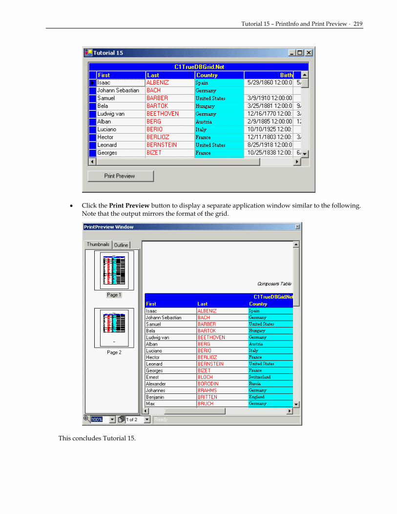
Tutorial 15 – PrintInfo and Print Preview · 219
• Click the Print Preview button to display a separate application window similar to the following. Note that the output mirrors the format of the grid.
This concludes Tutorial 15.

220 · Tutorials
Tutorial 16 – Hierarchical Display In this tutorial, you will learn how to display Master Detail DataSet information through the grid’s hierarchical display. This tutorial is similar to Tutorial 3, but this tutorial displays the same master detail information as Tutorial 3, except it only uses on True DBGrid object.
1. Start by setting up a form with a grid and Master Detail DataSet by following the first 6 steps of Tutorial 3.
2. In the VB Properties Window, set the DataSource property of the grid to dsMasterDetail1 and the DataMember property to Composer.
3. Next in the Load event of Form1 add the following code, which fills both the DataAdapters and sets the grid’s display to hierarchical:
• Visual Basic Me.OleDbDataAdapter1.Fill(Me.DsMasterDetail1) Me.OleDBDataAdapter2.Fill(Me.DsMasterDetail1) Me.C1TrueDBGrid1.DataView = C1.Win.C1TrueDBGrid.DataViewEnum.Hierarchical
• C# this.OleDbDataAdapter1.Fill(this.DsMasterDetail1); this.OleDBDataAdapter2.Fill(this.DsMasterDetail1); this.C1TrueDBGrid1.DataView = C1.Win.C1TrueDBGrid.DataViewEnum.Hierarchical;
• Delphi Self.OleDbDataAdapter1.Fill(Me.DsMasterDetail1); Self.OleDBDataAdapter2.Fill(Me.DsMasterDetail1); Self.C1TrueDBGrid1.DataView := C1.Win.C1TrueDBGrid.DataViewEnum.Hierarchical;
Run the program and observe the following:
• C1TrueDBGrid1 displays the Composers table as it would if it were bound to it, but each row has an expand icon. Expand one of the rows. Notice that the associated Opus column data is displayed in the far columns of the grid. The data showing relates to the record in the Composers table that was expanded:
This concludes Tutorial 16.

Tutorial 17 – Grouping Display · 221
Tutorial 17 – Grouping Display In this tutorial, you will learn how to use the DataView property to create a Grouping area above the grid, which enables the user to sort the data by columns at runtime.
1. Start with the project created in Tutorial 1.
2. Add the following code to the Load event of Form1 after the current DataAdapter code:
• Visual Basic Me.C1TrueDBGrid1.DataView = C1.Win.C1TrueDBGrid.DataViewEnum.GroupBy
• C# this.C1TrueDBGrid1.DataView = C1.Win.C1TrueDBGrid.DataViewEnum.GroupBy;
• Delphi Self.C1TrueDBGrid1.DataView := C1.Win.C1TrueDBGrid.DataViewEnum.GroupBy;
Run the program and observe the following:
• C1TrueDBGrid1 displays the data specified in Tutorial 1.
• Notice that there is a gray grouping section above the grid now.
• Click on the “Country” column header and drag it into the grouping area. Your grid should now look like the following:
• Notice that the C1TrueDBGrid has placed all of the members of the Country class into the left column and each row has an expand icon. Clicking on the expand icon will show you the data for every composer born in this country.
• Now drag the “Last” column header into the grouping area, then click on the Germany expand icon. Notice that the data is first sorted by country, then sorted by the last name of the composer. Clicking on the expand icon for one of the composers under last will bring up the remaining columns of data:

222 · Tutorials
This concludes Tutorial 17.
Tutorial 18 – Value Translation In this tutorial, you will learn how to use the C1TrueDBDropDown’s ValueTranslate property to automatically translate data from the dropdown detail data to the grid’s master data.
1. Start with the project created in Tutorial 8.
2. In the Load event of the form add the following code to the existing code:
• Visual Basic Me.C1TrueDBDropDown1.ValueTranslate = True Me.C1TrueDBDropDown1.ListField = “TypeDesc” Me.C1TrueDBDropDown1.DataField = “TypeID”
• C# this.C1TrueDBDropDown1.ValueTranslate = true; this.C1TrueDBDropDown1.ListField = “TypeDesc”; this.C1TrueDBDropDown1.DataField = “TypeID”;
• Delphi Self.C1TrueDBDropDown1.ValueTranslate := True; Self.C1TrueDBDropDown1.ListField := ’TypeDesc’; Self.C1TrueDBDropDown1.DataField := ’TypeID’;
Run the program and observe the following:
• C1TrueDBGrid1 displays the data specified in Tutorial 8.
• The values in the CustType column of the grid now display the long descriptions displayed in the dropdown. The values were automatically translated from the dropdown to the grid column at run-time.
This concludes Tutorial 18.
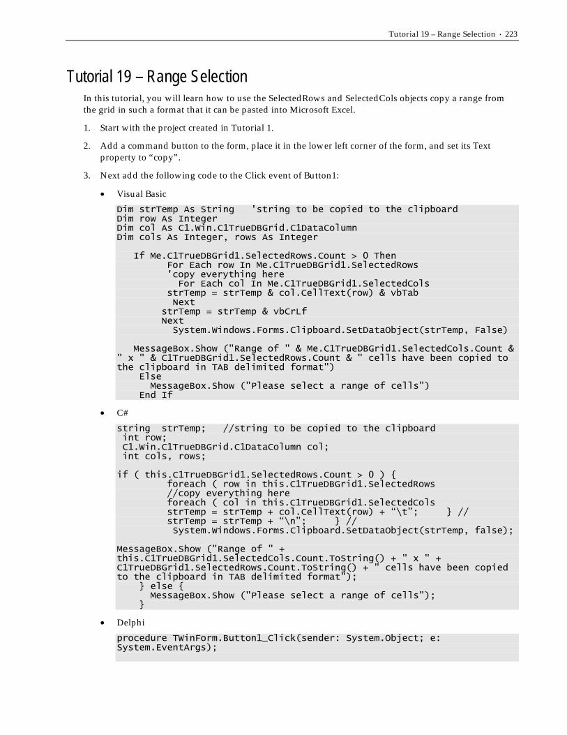
Tutorial 19 – Range Selection · 223
Tutorial 19 – Range Selection In this tutorial, you will learn how to use the SelectedRows and SelectedCols objects copy a range from the grid in such a format that it can be pasted into Microsoft Excel.
1. Start with the project created in Tutorial 1.
2. Add a command button to the form, place it in the lower left corner of the form, and set its Text property to “copy”.
3. Next add the following code to the Click event of Button1:
• Visual Basic
Dim strTemp As String 'string to be copied to the clipboard Dim row As Integer Dim col As C1.Win.C1TrueDBGrid.C1DataColumn Dim cols As Integer, rows As Integer
If Me.C1TrueDBGrid1.SelectedRows.Count > 0 Then For Each row In Me.C1TrueDBGrid1.SelectedRows 'copy everything here For Each col In Me.C1TrueDBGrid1.SelectedCols strTemp = strTemp & col.CellText(row) & vbTab Next strTemp = strTemp & vbCrLf Next System.Windows.Forms.Clipboard.SetDataObject(strTemp, False)
MessageBox.Show ("Range of " & Me.C1TrueDBGrid1.SelectedCols.Count & " x " & C1TrueDBGrid1.SelectedRows.Count & " cells have been copied to the clipboard in TAB delimited format") Else MessageBox.Show ("Please select a range of cells") End If
• C#
string strTemp; //string to be copied to the clipboard int row; C1.Win.C1TrueDBGrid.C1DataColumn col; int cols, rows; if ( this.C1TrueDBGrid1.SelectedRows.Count > 0 ) { foreach ( row in this.C1TrueDBGrid1.SelectedRows //copy everything here foreach ( col in this.C1TrueDBGrid1.SelectedCols strTemp = strTemp + col.CellText(row) + “\t”; } // strTemp = strTemp + “\n”; } // System.Windows.Forms.Clipboard.SetDataObject(strTemp, false); MessageBox.Show ("Range of " + this.C1TrueDBGrid1.SelectedCols.Count.ToString() + " x " + C1TrueDBGrid1.SelectedRows.Count.ToString() + " cells have been copied to the clipboard in TAB delimited format"); } else { MessageBox.Show ("Please select a range of cells"); }
• Delphi
procedure TWinForm.Button1_Click(sender: System.Object; e: System.EventArgs);

224 · Tutorials
var StrTemp: string; i, j, Row: Integer; Col: C1.Win.C1TrueDBGrid.C1DataColumn; begin StrTemp := ''; if (C1TrueDBGrid1.SelectedRows.Count > 0) then begin for i := 0 to C1TrueDBGrid1.SelectedRows.Count-1 do begin Row := c1TrueDBGrid1.SelectedRows[i]; //copy everything here for j := 0 to C1TrueDBGrid1.SelectedCols.Count-1 do begin Col := C1TrueDBGrid1.SelectedCols[j]; StrTemp := StrTemp + col.CellText(Row) + #9; strTemp := strTemp + #13; end; end; System.Windows.Forms.Clipboard.SetDataObject(StrTemp, False); MessageBox.Show('Range of ' + C1TrueDBGrid1.SelectedCols.Count.ToString + ' x ' + Self.c1TrueDBGrid1.SelectedRows.Count.ToString + ' cells have been copied to the clipboard in TAB delimited format'); end else MessageBox.Show('Please select a range of cells'); end;
Run the program and observe the following: • C1TrueDBGrid1 displays the data specified in Tutorial 1.
• If you select a range of cells in the True DBGrid, then press the copy button a message box will appear detailing the cells that you have copied to the clipboard.

Tutorial 20 – Multiple Data Views · 225
• Now open Microsoft Excel. Select the exact amount of row and column cells as you’ve selected in the True DBGrid, then press paste. You will see that the cells that you copied in the grid are now pasted into Microsoft Excel
• This concludes Tutorial 19.
Tutorial 20 – Multiple Data Views In this tutorial, you will learn how to use the grid’s DataView property to display data in uncommon display formats such as Inverted View, GroupBy View, and Form View.
1. Start with the project created in Tutorial 1.
2. Add a ComboBox (ComboBox1) to the project, and set its Text property to “Data View.”
3. In the VB Properties window, open up the List editor for the ComboBox by clicking on the ellipsis button next to the Items property. In this editor add the following items:
Normal Inverted Form GroupBy MultipleLines Hierarchical
4. Now add the following code to the existing code in the Load event of Form1:
• Visual Basic Me.C1TrueDBGrid1.DataView = C1.Win.C1TrueDBGrid.DataViewEnum.Normal Me.ComboBox1.SelectedIndex = 0
• C# this.C1TrueDBGrid1.DataView = C1.Win.C1TrueDBGrid.DataViewEnum.Normal; this.ComboBox1.SelectedIndex = 0;
• Delphi C1TrueDBGrid1.DataView := C1.Win.C1TrueDBGrid.DataViewEnum.Normal; ComboBox1.SelectedIndex := 0;
5. Now add the following code to the SelectedIndexChanged event of ComboBox1. It changes the DataView property of the grid for each value the user selects in the ComboBox:
• Visual Basic Private Sub ComboBox1_SelectedIndexChanged(ByVal sender As Object, ByVal e As System.EventArgs) Handles ComboBox1.SelectedIndexChanged
Select Case ComboBox1.SelectedItem Case "Normal" Me.C1TrueDBGrid1.DataView = C1.Win.C1TrueDBGrid.DataViewEnum.Normal Case "Inverted" Me.C1TrueDBGrid1.DataView = C1.Win.C1TrueDBGrid.DataViewEnum.Inverted Case "Form" Me.C1TrueDBGrid1.DataView = C1.Win.C1TrueDBGrid.DataViewEnum.Form Case "GroupBy"

226 · Tutorials
Me.C1TrueDBGrid1.DataView = C1.Win.C1TrueDBGrid.DataViewEnum.GroupBy Case "MultipleLines" Me.C1TrueDBGrid1.DataView = C1.Win.C1TrueDBGrid.DataViewEnum.MultipleLines Case "Hierarchical" MessageBox.Show (“Hierarchical View can’t be set at run-time. See Tutorial 16”) End Select End Sub
• C# private void ComboBox1_SelectedIndexChanged( object sender, System.EventArgs e) { switch (ComboBox1.SelectedItem) { case "Normal": this.C1TrueDBGrid1.DataView = C1.Win.C1TrueDBGrid.DataViewEnum.Normal; break; case "Inverted": this.C1TrueDBGrid1.DataView = C1.Win.C1TrueDBGrid.DataViewEnum.Inverted; break; case "Form": this.C1TrueDBGrid1.DataView = C1.Win.C1TrueDBGrid.DataViewEnum.Form; break; case "GroupBy": this.C1TrueDBGrid1.DataView = C1.Win.C1TrueDBGrid.DataViewEnum.GroupBy; break; case "MultipleLines": this.C1TrueDBGrid1.DataView = C1.Win.C1TrueDBGrid.DataViewEnum.MultipleLines; break; case "Hierarchical"; MessageBox.Show (“Hierarchical View can’t be set at run-time. See Tutorial 16”); break; } }
• Delphi procedure TWinForm.ComboBox1_SelectedIndexChanged(sender: System.Object; e: System.EventArgs); begin case ComboBox1.SelectedIndex of 0: C1TrueDBGrid1.DataView := C1.Win.C1TrueDBGrid.DataViewEnum.Normal; 1: C1TrueDBGrid1.DataView := C1.Win.C1TrueDBGrid.DataViewEnum.Inverted; 2: C1TrueDBGrid1.DataView := C1.Win.C1TrueDBGrid.DataViewEnum.Form; 3: C1TrueDBGrid1.DataView := C1.Win.C1TrueDBGrid.DataViewEnum.GroupBy; 4: C1TrueDBGrid1.DataView := C1.Win.C1TrueDBGrid.DataViewEnum.MultipleLines; 5: MessageBox.Show('Hierarchical View can't be set at run-time. Please see Tutorial 16'); end; end;
Run the program and observe the following: • C1TrueDBGrid1 displays the data specified in Tutorial 1.

Tutorial 20 – Multiple Data Views · 227
• Change the ComboBox to Inverted. Inverted view shows the grid columns as rows and the grid rows as column. The grid should now look like the following:
• Change the ComboBox to Form. Form view shows each record in a Form-like view that is optimal for data-entry. The grid should now look like the following:
• Change the ComboBox to GroupBy. GroupBy View contains a grouping section above the grid where columns can be dragged. Dragging a column to this area sorts the rest of the grid by this column. Drag the Company column to the grouping area. The grid should now look like the following:

228 · Tutorials
• Change the ComboBox to MultipleLines. The MultipleLines View shows all of the columns in the current grid area, wrapping the columns that will not fit to successive lines. Notice that the three columns that would have spilled off of the grid are now on a second line. The grid should now look like the following:
• Now set the ComboBox to Hierarchical. No changes occur and the Message Box statement included in the event above pops up which is due to the fact that the hierarchical DataView cannot be set at run-time. Hierarchical data must be set before the application runs. For more information on this view, see Tutorial 16.
This concludes Tutorial 20.

Tutorial 21 – Filter Bar · 229
Tutorial 21 – Filter Bar In this tutorial, you will learn how to use the grid’s Filter Bar functionality to allow the end user to sort column data dynamically at runtime.
1. Start with the project created in Tutorial 1.
2. After the existing code in the Load event of Form1 add the following line:
• Visual Basic Me.C1TrueDBGrid1.FilterBar = True
• C# this.C1TrueDBGrid1.FilterBar = true;
• Delphi C1TrueDBGrid1.FilterBar := True;
Run the program and observe the following: • C1TrueDBGrid1 displays the data specified in Tutorial 1.
• Above the grid data is now a line that accepts user input. This is the Filter Bar. When a user enters data into the bar the grid automatically filters the column data.
Before Filter:

230 · Tutorials
After Filter:
• If you would prefer to handle the filtering yourself, then you would have to change the AllowFilter property to false (keeping FilterBar equal to True). Then you would have to handle the FilterChange event which fires each time the state of the Filter Bar changes.
This concludes Tutorial 21.
Tutorial 22 – Borders, Scroll Tracking, and Scroll Tips In this tutorial, you will learn how to use the grid’s Filter Bar functionality to allow the end user to sort column data dynamically at runtime.
1. Create a new project. Add a C1TrueDBGrid control to the form.
2. Add the following items to the form and situate them like they appear in the following image. Add 5 ComboBoxes (ComboBox1 – 5), add two frames and set their text property to “Border Size” and “Scrolling” respectively. Add four Labels (Label1 – 5) and set their Text properties to “Top Width”, “Bottom Width”, “Left Width”, “Right Width”, and “Border Appearance” respectively. Add a Button (Button1) and set its Text property to “Border Color”. Finally Add two Checkboxes and set their text properties to “ScrollTips” and “ScrollTracking”.

Tutorial 22 – Borders, Scroll Tracking, and Scroll Tips · 231
3. Add a Color Dialog to the form (ColorDialog1)
4. Go to the Data tab in the ToolBox and add an OledbDataAdapter to the form. In the adapter’s Data Configuration wizard, either select a connection to TDBDemo.mdb or create a new OleDBConnection to this database. In the ‘Choose a Query Type’ window of the wizard select the ‘Use SQL statements’ radio button. In the Generate SQL statements window, set the SQL statement to “Select * from Customer”, and then finish out the wizard.
5. Select the ‘Generate DataSet…’ item from .NET’s Data menu. Select the ‘New’ radio button in the Generate Dataset window, and type “DsCustomer” into the listbox. Click OK.
6. Click on the grid to give it focus, then in the VB Properties window set the RowHeight property to 40.
7. Again in the VB Properties window set the DataSource property for the grid to DsCustomer1 and the DataMember to Customer.
8. Now in the Form’s Load event add the following code:
• Visual Basic Me.OleDbDataAdapter1.Fill(Me.DsCustomer1)
• C# this.OleDbDataAdapter1.Fill(this.DsCustomer1);

232 · Tutorials
• Delphi Self.OleDbDataAdapter1.Fill(Self.DsCustomer1);
9. In the general section of Form1 add the following declarations:
• Visual Basic Dim dbTable As DataTable 'a copy of the data Dim borderColor As Color Dim borderLeft As Integer, borderTop As Integer, borderRight As Integer, borderBottom As Integer Dim borderType As C1.Win.C1TrueDBGrid.BorderTypeEnum
• C# DataTable dbTable; //a copy of the data Color borderColor; int borderLeft, int borderTop, int borderRight, int borderBottom; C1.Win.C1TrueDBGrid.BorderTypeEnum borderType;
• Delphi FBorderColor: System.Drawing.Color; BorderLeft, BorderTop, BorderRight, BorderBottom: Integer; FBorderType: C1.Win.C1TrueDBGrid.BorderTypeEnum;
10. Into the Load event of Form1 add the following code:
• Visual Basic dbTable = Me.DsCustomers1.Tables(0).Copy() 'fill each combobox FillComboBox1() FillCombo(ComboBox2) FillCombo(ComboBox3) FillCombo(ComboBox4) FillCombo(ComboBox5) Me.CheckBox2.Checked = True 'init border sizes Me.borderBottom = 1 Me.borderLeft = 1 Me.borderRight = 1 Me.borderTop = 1
• C# dbTable = this.DsCustomers1.Tables[0].Copy(); //fill each combobox FillComboBox1(); FillCombo(ComboBox2); FillCombo(ComboBox3); FillCombo(ComboBox4); FillCombo(ComboBox5); this.CheckBox2.Checked = true; //init border sizes this.borderBottom = 1;

Tutorial 22 – Borders, Scroll Tracking, and Scroll Tips · 233
this.borderLeft = 1; this.borderRight = 1; this.borderTop = 1;
• Delphi begin FillComboBorderAppearance; FillComboBorderSize(Self.comboBox1); FillComboBorderSize(Self.comboBox2); FillComboBorderSize(Self.comboBox3); FillComboBorderSize(Self.comboBox4); CheckBox2.Checked := True; BorderBottom := 1; BorderLeft := 1; BorderRight := 1; BorderTop := 1; end;
11. Now add the functions that will fill the ComboBoxes:
• Visual Basic 'fill each combo with numbers from 1 to 10 Private Sub FillCombo(ByRef com As ComboBox) Dim i As Integer com.Text = 1 For i = 1 To 10 com.Items.Add(i) Next End Sub 'fill the first combo with border types Private Sub FillComboBox1() Me.ComboBox1.Text = "None" With Me.ComboBox1.Items .Add("Fillet") .Add("Flat") .Add("Groove") .Add("Inset") .Add("InsetBevel") .Add("None") .Add("Raised") .Add("RaisedBevel") End With End Sub
• C# //fill each combo with numbers from 1 to 10 private void FillCombo(ref ComboBox com) { int i; com.Text = 1; for ( i = 1 ; i <= 10; i++)
{ com.Items.Add[I]; } } //fill the first combo with border types private void FillComboBox1() { this.ComboBox1.Text = "None"; With this.ComboBox1.Items; .Add("Fillet");

234 · Tutorials
.Add("Flat"); .Add("Groove"); .Add("Inset"); .Add("InsetBevel"); .Add("None"); .Add("Raised"); .Add("RaisedBevel"); } With }
• Delphi procedure TWinForm.FillComboBorderAppearance; begin Self.comboBox5.Items.Add('Fillet'); Self.comboBox5.Items.Add('Flat'); Self.comboBox5.Items.Add('Groove'); Self.comboBox5.Items.Add('Inset'); Self.comboBox5.Items.Add('InsetBevel'); Self.comboBox5.Items.Add('None'); Self.comboBox5.Items.Add('Raised'); Self.comboBox5.Items.Add('RaisedBevel'); end; procedure TWinForm.FillComboBorderSize(combo: ComboBox); var i: Integer; begin combo.Text := '1'; i := 1; while (i <> 11) do begin combo.Items.Add(i.ToString); i := i + 1; end; end;
12. Now create a handler for the Click event of Button1 that will set the color of the border using the color dialog:
• Visual Basic Private Sub Button1_Click(ByVal sender As System.Object, ByVal e As System.EventArgs) Handles Button1.Click Dim result As DialogResult result = Me.ColorDialog1.ShowDialog() If result = DialogResult.OK Then borderColor = Me.ColorDialog1.Color Button1.BackColor = borderColor End If UpdateBorder() End Sub
• C# private void Button1_Click( System.object sender, System.EventArgs e) Button1.Click { DialogResult result; result = this.ColorDialog1.ShowDialog(); if ( result == DialogResult.OK ) {

Tutorial 22 – Borders, Scroll Tracking, and Scroll Tips · 235
borderColor = this.ColorDialog1.Color; Button1.BackColor = borderColor; } UpdateBorder(); }
• Delphi procedure TWinForm.Button1_Click(sender: System.Object; e: System.EventArgs); var result: System.Windows.Forms.DialogResult; begin result := ColorDialog1.ShowDialog; if (result = System.Windows.Forms.DialogResult.OK) then begin FBorderColor := ColorDialog1.Color; Button1.BackColor := FBorderColor; end; UpdateBorder; end;
13. Now include the function that updates the borders:
• Visual Basic Private Sub UpdateBorder() With Me.C1TrueDBGrid1.Splits(0).DisplayColumns(Me.C1TrueDBGrid1.Col).Style.Borders .Color = ColorDialog1.Color .BorderType = borderType .Bottom = borderBottom .Left = borderLeft .Right = borderRight .Top = borderTop End With End Sub
• C# private void UpdateBorder() { C1.Win.C1TrueDBGrid.GridBorders b; b = his.C1TrueDBGrid1.Splits[0].DisplayColumns(this.C1TrueDBGrid1.Col).Style.Borders; b.Color = ColorDialog1.Color; b.BorderType = borderType; b.Bottom = borderBottom; b.Left = borderLeft; b.Right = borderRight; b.Top = borderTop; }
• Delphi procedure TWinForm.UpdateBorder; var Column: C1.Win.C1TrueDBGrid.C1DisplayColumn; begin Column := C1TrueDBGrid1.Splits[0].DisplayColumns[Self.c1TrueDBGrid1.Col];

236 · Tutorials
Column.Style.Borders.Color := ColorDialog1.Color; Column.Style.Borders.BorderType := FBorderType; Column.Style.Borders.Bottom := BorderBottom; Column.Style.Borders.Left := BorderLeft; Column.Style.Borders.Top := BorderTop; Column.Style.Borders.Right := BorderRight; end;
14. Now include the code that handles changes in the ComboBox values:
• Visual Basic Private Sub ComboBox1_SelectionChangeCommitted(ByVal sender As Object, ByVal e As System.EventArgs) Handles ComboBox1.SelectionChangeCommitted Select Case Me.ComboBox1.SelectedItem Case "Fillet" Me.borderType = C1.Win.C1TrueDBGrid.BorderTypeEnum.Fillet Case "Flat" Me.borderType = C1.Win.C1TrueDBGrid.BorderTypeEnum.Flat Case "Groove" Me.borderType = C1.Win.C1TrueDBGrid.BorderTypeEnum.Groove Case "Inset" Me.borderType = C1.Win.C1TrueDBGrid.BorderTypeEnum.Inset Case "InsetBevel" Me.borderType = C1.Win.C1TrueDBGrid.BorderTypeEnum.InsetBevel Case "None" Me.borderType = C1.Win.C1TrueDBGrid.BorderTypeEnum.None Case "Raised" Me.borderType = C1.Win.C1TrueDBGrid.BorderTypeEnum.Raised Case "RaisedBevel" Me.borderType = C1.Win.C1TrueDBGrid.BorderTypeEnum.RaisedBevel End Select Me.UpdateBorder() End Sub Private Sub ComboBox2_SelectionChangeCommitted(ByVal sender As Object, ByVal e As System.EventArgs) Handles ComboBox2.SelectionChangeCommitted Me.borderTop = Me.ComboBox2.SelectedItem Me.UpdateBorder() End Sub Private Sub ComboBox3_SelectionChangeCommitted(ByVal sender As Object, ByVal e As System.EventArgs) Handles ComboBox3.SelectionChangeCommitted Me.borderBottom = Me.ComboBox3.SelectedItem Me.UpdateBorder() End Sub Private Sub ComboBox4_SelectionChangeCommitted(ByVal sender As Object, ByVal e As System.EventArgs) Handles ComboBox4.SelectionChangeCommitted Me.borderLeft = Me.ComboBox4.SelectedItem Me.UpdateBorder() End Sub Private Sub ComboBox5_SelectionChangeCommitted(ByVal sender As Object, ByVal e As System.EventArgs) Handles ComboBox5.SelectionChangeCommitted Me.borderRight = Me.ComboBox5.SelectedItem Me.UpdateBorder() End Sub

Tutorial 22 – Borders, Scroll Tracking, and Scroll Tips · 237
• C# private void ComboBox1_SelectionChangeCommitted( object sender, System.EventArgs e) { switch (this.ComboBox1.SelectedItem) { case "Fillet"; this.borderType = C1.Win.C1TrueDBGrid.BorderTypeEnum.Fillet; break; case "Flat"; this.borderType = C1.Win.C1TrueDBGrid.BorderTypeEnum.Flat; break; case "Groove"; this.borderType = C1.Win.C1TrueDBGrid.BorderTypeEnum.Groove; break; case "Inset"; this.borderType = C1.Win.C1TrueDBGrid.BorderTypeEnum.Inset; break; case "InsetBevel"; this.borderType = C1.Win.C1TrueDBGrid.BorderTypeEnum.InsetBevel; break; case "None"; this.borderType = C1.Win.C1TrueDBGrid.BorderTypeEnum.None; break; case "Raised"; this.borderType = C1.Win.C1TrueDBGrid.BorderTypeEnum.Raised; break; case "RaisedBevel"; this.borderType = C1.Win.C1TrueDBGrid.BorderTypeEnum.RaisedBevel; break; } this.UpdateBorder(); } private void ComboBox2_SelectionChangeCommitted( object sender, System.EventArgs e) { this.borderTop = this.ComboBox2.SelectedItem; this.UpdateBorder(); } private void ComboBox3_SelectionChangeCommitted( object sender, System.EventArgs e) { this.borderBottom = this.ComboBox3.SelectedItem; this.UpdateBorder(); } private void ComboBox4_SelectionChangeCommitted( object sender, System.EventArgs e) { this.borderLeft = this.ComboBox4.SelectedItem; this.UpdateBorder(); } private void ComboBox5_SelectionChangeCommitted( object sender, System.EventArgs e) { this.borderRight = this.ComboBox5.SelectedItem; this.UpdateBorder(); }

238 · Tutorials
• Delphi procedure TWinForm.ComboBox5_SelectedIndexChanged(sender: System.Object; e: System.EventArgs); begin case ComboBox5.SelectedIndex of 0: FBorderType := C1.Win.C1TrueDBGrid.BorderTypeEnum.Fillet; 1: FBorderType := C1.Win.C1TrueDBGrid.BorderTypeEnum.Flat; 2: FBorderType := C1.Win.C1TrueDBGrid.BorderTypeEnum.Groove; 3: FBorderType := C1.Win.C1TrueDBGrid.BorderTypeEnum.Inset; 4: FBorderType := C1.Win.C1TrueDBGrid.BorderTypeEnum.InsetBevel; 5: FBorderType := C1.Win.C1TrueDBGrid.BorderTypeEnum.None; 6: FBorderType := C1.Win.C1TrueDBGrid.BorderTypeEnum.Raised; 7: FBorderType := C1.Win.C1TrueDBGrid.BorderTypeEnum.RaisedBevel; end; UpdateBorder; end; procedure TWinForm.ComboBox4_SelectedIndexChanged(sender: System.Object; e: System.EventArgs); begin BorderRight := System.Int32.Parse(ComboBox4.SelectedItem.ToString); UpdateBorder; end; procedure TWinForm.ComboBox3_SelectedIndexChanged(sender: System.Object; e: System.EventArgs); begin BorderLeft := System.Int32.Parse(ComboBox3.SelectedItem.ToString); UpdateBorder; end; procedure TWinForm.ComboBox2_SelectedIndexChanged(sender: System.Object; e: System.EventArgs); begin BorderBottom := System.Int32.Parse(ComboBox2.SelectedItem.ToString); UpdateBorder; end; procedure TWinForm.ComboBox1_SelectedIndexChanged(sender: System.Object; e: System.EventArgs); begin BorderTop := System.Int32.Parse(ComboBox1.SelectedItem.ToString); UpdateBorder; end;
15. Finally include the code that handles the checkboxes and the FetchScrollTips event that sets the Tooltip box that displays when the user is scrolling:
• Visual Basic Private Sub CheckBox1_Click(ByVal sender As Object, ByVal e As System.EventArgs) Handles CheckBox1.Click Me.C1TrueDBGrid1.ScrollTips = Me.CheckBox1.Checked End Sub Private Sub CheckBox2_Click(ByVal sender As Object, ByVal e As System.EventArgs) Handles CheckBox2.Click Me.C1TrueDBGrid1.ScrollTrack = Me.CheckBox2.Checked End Sub Private Sub C1TrueDBGrid1_FetchScrollTips(ByVal sender As System.Object, ByVal e As C1.Win.C1TrueDBGrid.FetchScrollTipsEventArgs) Handles C1TrueDBGrid1.FetchScrollTips ' Set the ScrollTip depending on which

Tutorial 22 – Borders, Scroll Tracking, and Scroll Tips · 239
' scroll bar was moved Select Case e.ScrollBar Case C1.Win.C1TrueDBGrid.ScrollBarEnum.Horizontal e.ScrollTip = Me.C1TrueDBGrid1.Columns(e.ColIndex).Caption Case C1.Win.C1TrueDBGrid.ScrollBarEnum.Vertical e.ScrollTip = "Record: " & CStr(e.Row + 1) & " of " & _ CStr(Me.dbTable.Rows.Count) & vbCrLf & "Company: " & _ Me.dbTable.Rows(e.Row).Item("Company") & vbCrLf & "User code: " & Me.dbTable.Rows(e.Row).Item("UserCode") End Select e.TipStyle.ForeColor = Color.Blue End Sub
• C# private void CheckBox1_Click( object sender, System.EventArgs e) { this.C1TrueDBGrid1.ScrollTips = this.CheckBox1.Checked; } private void CheckBox2_Click( object sender, System.EventArgs e) { this.C1TrueDBGrid1.ScrollTrack = this.CheckBox2.Checked; } private void C1TrueDBGrid1_FetchScrollTips( System.object sender, C1.Win.C1TrueDBGrid.FetchScrollTipsEventArgs e) { // set the ScrollTip depending on which // scroll bar was moved switch (e.ScrollBar) { case C1.Win.C1TrueDBGrid.ScrollBarEnum.Horizontal: e.ScrollTip = this.C1TrueDBGrid1.Columns[e.ColIndex].Caption; break; case C1.Win.C1TrueDBGrid.ScrollBarEnum.Vertical: e.ScrollTip = "Record: " + (e.Row + 1).ToString() + " of " + this.dbTable.Rows.Count.ToString() + “\n” + "Company: " + this.dbTable.Rows[e.Row]["Company"].ToString() + “\n” + "User code: " + this.dbTable.Rows[e.Row]["UserCode"].ToString(); break; } e.TipStyle.ForeColor = Color.Blue; }
• Delphi procedure TWinForm.C1TrueDBGrid1_FetchScrollTips(sender: System.Object; e: C1.Win.C1TrueDBGrid.FetchScrollTipsEventArgs); var Row: Integer; begin case e.ScrollBar of C1.Win.C1TrueDBGrid.ScrollBarEnum.Horizontal: e.ScrollTip := c1TrueDBGrid1.Columns[e.ColIndex].Caption; C1.Win.C1TrueDBGrid.ScrollBarEnum.Vertical: begin Row := e.Row + 1; e.ScrollTip := 'Record: ' + Row.ToString + ' of ' + dbTable.Rows.Count.ToString + #10#13 + 'Company: ' + dbTable.Rows[e.Row]['Company'].ToString + #10#13 + 'User code: ' + dbTable.Rows[e.Row]['UserCode'].ToString; end; end;

240 · Tutorials
e.TipStyle.ForeColor := Color.Blue; end; procedure TWinForm.CheckBox2_CheckedChanged(sender: System.Object; e: System.EventArgs); begin C1TrueDBGrid1.ScrollTrack := CheckBox2.Checked; end; procedure TWinForm.CheckBox1_CheckedChanged(sender: System.Object; e: System.EventArgs); begin C1TrueDBGrid1.ScrollTips := CheckBox1.Checked; end;
Run the program and observe the following: • C1TrueDBGrid1 displays the data specified.
• Setting ScrollTrack to true lets you see the data as it is being scrolled
• Setting ScrollTips to true shows a Tooltip box with column information while the user is scrolling.
• By manipulating the ComboBoxes, and the Color Dialog, create a border around a column’s cells and set them to a System color.

Tutorial 22 – Borders, Scroll Tracking, and Scroll Tips · 241
This concludes tutorial 22.


C1TrueDBGrid Class · 243
C1TrueDBGrid Reference C1TrueDBGrid Class C1TrueDBGrid All Members
C1TrueDBGrid Public Properties
AddNewMode Returns a value that describes the location of the current cell with respect to the grid's AddNew row.
AllowAddNew Specifies whether the user has the ability to add new rows.
AllowArrows Specifies whether the user has the abilities to use the arrow keys to navigate around the grid.
AllowColMove Specifies if the user has the ability to move columns in the grid.
AllowColSelect Specifies if the user has the ability to select columns in the grid.
AllowDelete Specifies if the user has the ability to delete records from the grid.
AllowDrag Specifies if the user has the ability to drag from the grid.
AllowDrop Specifies if the user has the ability to drop data into the grid.
AllowFilter Specifies if the grid should automatically filter data in the filter bar.
AllowHorizontalSplit Specifies if a user is allowed to create horizontal splits.
AllowRowSelect Specifies if a user is allowed to select rows in the grid.
AllowRowSizing Specifies if a user is allowed to resize the rows in the grid.
AllowSort Specifies if a user is allowed to sort columns.
AllowUpdate Specifies if a user is allowed to modify data.
AllowUpdateOnBlur Enables or disables updates when the grid loses focus.
AllowVerticalSplit Specifies if a user is allowed to create vertical splits.
AlternatingRows Determines if a grid or split displays odd-numbered rows in one style and even-numbered rows in.
BackColor Controls the background color of the C1TrueDBGrid Object.
BackgroundImage Sets or returns the background bitmap of the C1TrueDBGrid Object.
Bands Returns the number of levels within a hierarchical grid.
Bookmark Returns or sets the bookmark identifying the current row in the grid.
BorderStyle Returns or sets whether the grid has a border.
Caption Returns or sets the caption to the grid.
CaptionHeight Sets the height of the grid’s caption area.

244 · C1TrueDBGrid Reference
CaptionStyle Sets or returns the Style object that controls the appearance of the caption area.
CellTips Determines whether the grid displays a pop-up text window when the cursor is idle.
CellTipsDelay Determines the amount of time before the cell tip window is displayed.
CellTipsWidth Returns or sets the width of the cell tip window.
ChildGrid Returns or sets the name of the grid used as a child grid in a hierarchical presentation.
Col Returns or sets the column position of the current cell in the current split.
CollapseColor Returns or sets the color of the collapse icon.
ColumnFooters Specifies whether footers are displayed.
ColumnHeaders Specifies whether headers are displayed.
Columns Returns a collection of C1DataColumn objects.
CurrentCellVisible Determines if the current cell is visible within the displayed area of the grid.
DataChanged Indicates the modification status of the current row.
DataMember Returns or sets the name of the data member used to populate the grid.
DataSource Specifies the data control used to bind a grid to a database.
DataView Returns or sets the method by which the grid will display data.
DeadAreaBackColor Obsolete. Use the BackColor property.
DefColWidth Returns or sets the default width for all grid columns.
DestinationCol Indicates which grid column will be the destination after cell movement.
DestinationRow Indicates which grid row will be the destination after cell movement.
DestinationSplit Indicates which grid split will be the destination after cell movement.
DirectionAfterEnter Specifies the relative position of the next cell when the user presses the Enter key.
DoubleBuffer Used to disable the use of double buffering when the grid renders it's output to the screen.
EditActive Specifies the editing status of the current cell.
EditDropDown Specifies whether editing will take place in a popup window or within cell boundaries.
EditorStyle Returns the Style object that controls the appearance of the cell editor within a grid.
EmptyRows Returns or sets a value that determines how the grid displays rows below the last data row.
ErrorImage Sets or returns the image used for ErrorProvider.
EvenRowStyle Sets or returns the Style object that controls the appearance of an even-numbered row.
ExpandColor Returns or sets the color of the expand icon in hierarchical grids.
ExposeCellMode Controls how the rightmost column reacts when clicked by the user.

C1TrueDBGrid Class · 245
ExtendRightColumn Sets whether the last column will extend to fill the dead area of the grid.
FetchRowStyles Specifies whether the FetchRowStyle event will be raised.
FilterActive Returns or sets whether the user is engaged in editing in the filter bar.
FilterBar Specifies whether the FilterBar is active.
FilterBarStyle Returns the FilterBarStyle Style object.
FilterKeys Controls when the filtering operation takes effect as the user types in the filterbar.
FirstRow Returns or sets a value containing the bookmark for the first visible row in a grid or split.
FlatStyle Sets the general appearance of the whole grid.
Font Sets the font object associated with the C1TrueDBGrid Object.
FooterStyle Returns the Style object that controls the appearance of column footers.
ForeColor Specifies the foreground color of the C1TrueDBGrid Object.
GroupByAreaVisible Controls the visibility of the Grouping area of the grid when the DataView property is set to GroupBy.
GroupByCaption Returns or sets the text displayed in the grouping area when no group is defined.
GroupByRectangle Returns the rectangle occupied by the grouping area.
GroupedColumns Contains a collection of C1DataColumn objects that represent the columns being grouped.
GroupStyle Returns the grouping area style.
HeadingStyle Returns the HeadingStyle Style object.
HighLightRowStyle Returns the HighlightRowStyle Style object.
HScrollBar Returns the HBar object that controls the appearance of the horizontal scrollbar.
InactiveStyle Returns the InactiveStyle Style object.
LayoutFileName [Obsolete] Sets or returns the string containing the filename used to save and retrieve grid layouts.
LayoutName [Obsolete] Sets or returns the string containing the current layout name.
LeftCol Returns or sets the zero-based index of the leftmost column in a grid or split.
LinesPerRow Controls the number of subrows in a MutlipleLinesFixed grid.
MaintainRowCurrency Controls the behavior of the grid and row currency when the grid's datasource is sorted.
MarqueeStyle Returns or sets the MarqueeStyle for a grid.
MatchEntryTimeOut Gets or sets the time, in milliseconds, in which the incremental search string will reset for a dropdown when the DropdownList property is True.
MultiSelect Sets or returns the selection state of the grid.
OddRowStyle Returns the OddRowStyle Style object.
246 · C1TrueDBGrid Reference
PictureAddNewRow Sets or returns the bitmap used in the record selector column to indicate the AddNew row.
PictureCurrentRow Sets or returns the bitmap used in the record selector column to indicate the Current row.
PictureFilterBar Sets or returns the bitmap used in the record selector column to indicate the FilterBar row.
PictureFooterRow Sets or returns the bitmap used in the record selector column to indicate the Footer row.
PictureHeaderRow Sets or returns the bitmap used in the record selector column to indicate the Header row.
PictureModifiedRow Sets or returns the bitmap used in the record selector column to indicate the Modified row.
PictureStandardRow Sets or returns the bitmap used in the record selector column to indicate the Standard row.
PreviewInfo Returns the PrintPreviewWinSettings object.
PrintInfo Returns the default PrintInfo object.
RecordSelectors Returns or sets a value indicating if record selectors are displayed in a grid or split.
RecordSelectorStyle Returns the RecordSelector Style object.
RecordSelectorWidth Returns or sets the width of the RecordSelectors.
RightToLeft Provides right to left text functionality familiar to Middle East or Latin users.
Row Specifies the current row.
RowDivider Determines the style of the border drawn between grid rows.
RowHeight Returns or sets the height of all grid rows.
RowSubDividerColor Returns or sets the color of a RowSubDivider.
ScrollTips Determines whether the grid displays a pop-up text window when the scrollbar thumb is dragged.
ScrollTrack Determines whether the grid constantly displays information as it scrolls.
SelectedCols Returns the SelectedColumnCollection object.
SelectedRows Returns the SelectedRowCollection object.
SelectedStyle Returns the SelectedStyle Style object.
SelectedText Returns or sets the string containing the currently selected text within the grid's editing window.
SelectionLength Returns or sets the number of characters selected within the grid's editing window.
SelectionStart Returns or sets the starting point of the text selection within the grid's editing window.
SelRange Specifies whether a user has selected a range of cells.
SplitIndex Specifies the current Split.
Splits Returns a Collection of Split objects.

C1TrueDBGrid Class · 247
SpringMode Specifies whether the columns will resize when the grid is resized.
Style Returns or sets the Style object.
Styles Returns a collection of named Style objects.
TabAcrossSplits Controls the behavior of the tab and arrow keys at split borders.
TabAction Defines the behavior of the tab key.
ViewCaptionWidth Returns or sets the width of the presentation area of the column caption.
ViewColumnWidth Returns or sets the width of a column in terms of the coordinate system of the grid's container.
Visible Sets or returns whether the grid object is visible.
VisibleCols Returns the number of visible columns in the current split.
VisibleRows Returns the number of visible rows in the grid.
VScrollBar Sets or returns the VBar object that controls the appearance of the vertical scrollbar.
Width Sets or returns the width of the grid object.
WrapCellPointer Determines the behavior of the arrow keys if AllowArrows is True.
C1TrueDBGrid Public Methods
AddCellStyle Controls the font and color of cells within a grid, column, or split according to value.
AddRegexCellStyle Controls the font and color of cells within a grid, column, or split according to their contents.
CellContaining Returns the cell position for a set of coordinates.
ClearCellStyle Removes a cell condition established with a previous call to the AddCellStyle method.
ClearFields Restores the default grid layout.
ClearRegexCellStyle Removes a cell condition established with a previous call to the AddRegexCellStyle method.
ColContaining Returns the ColIndex value of the grid column containing the specified coordinate.
CollapseBand Collapses all rows in a hierarchical grid display for the specified band.
CollapseChild Closes a child grid via code.
CollapseGroupRow Collapses the given row in GroupBy DataView.
Delete Deletes the current record.
ExpandBand Expands all rows in a hierarchical grid display for the specified band.
ExpandChild Expands the child grid via code.
ExpandGroupRow Expands the given row in GroupBy DataView.

248 · C1TrueDBGrid Reference
ExportTo Displays a dialog box in which the user can select the export type.
ExportToDelimitedFile Exports the specified rows from the grid to the specified file as delimited ASCII text.
ExportToExcel Exports the grid to an Excel file.
ExportToHTML Exports the grid to an HTML file.
ExportToPDF Exports the grid to a PDF file.
ExportToRTF Exports the grid to a Rich Text Format file.
GetBand Returns the band number corresponding to a grid column.
GetBandRow Returns the underlying row object for the given band and row.
GetPrinter Retrieves information about a specified printer.
InsertHorizontalSplit Inserts a horizontal split at the specified index.
InsertVerticalSplit Inserts a vertical split at the specified index.
LoadLayout Loads a saved layout from the given file.
MoveFirst Moves the current record to the first record available.
MoveLast Moves the current record to the last record available.
MoveNext Moves the current record to the next record available.
MovePrevious Moves the current record to the previous record available.
MoveRelative Moves the current record offset rows relative to the specified bookmark.
PointAt Returns one of the PointAtEnum constants, which indicates the kind of grid element beneath the specified coordinate.
Rebind Reinitializes grid with data from its data source.
RefetchRow Repopulates the specified row from a data source.
Refresh Discards all data and repopulates all cells from a data source.
RefreshCol Repaints the visible cells in the specified column.
RefreshRow Repaints the specified row.
RemoveHorizontalSplit Removes a horizontal split at the specified index.
RemoveVerticalSplit Removes a vertical split at the specified index.
ResumeBinding Resumes IBindingList.ListChange notifications from the data source to the grid.
RowBookmark Returns the row index of the DataSource for a display row.
RowContaining Returns the zero-based index of the display row containing the specified coordinate.
RowExpanded Specifies if the specified band is expanded within the current row.
RowTop Returns the Y coordinate of the top of a visible row.
SaveLayout Saves the grid's layout to the given file.
ScrollGrid Scrolls the grid data area by the specified number of rows and columns.

C1TrueDBGrid Class · 249
SetDataBinding Sets the DataSource and DataMember properties at runtime, optionally preserving the design time layout.
SplitContaining Returns the Index value of the split containing the specified coordinate pair.
SuspendBinding Instructs the grid to temporarily ignore IBindingList.ListChange notifications from the data source.
UpdateData Updates any changes on the current row to the data source.
C1TrueDBGrid Public Events
AfterColEdit Raised after editing is completed in a grid cell.
AfterColUpdate Raised after data is moved from a cell to the grid's internal copy buffer.
AfterDelete Raised after the user deletes a selected record from the grid.
AfterFilter Raised after the grid automatically filters the datasource.
AfterInsert Raised after the user inserts a new record into the grid.
AfterSort Raised after the grid automatically sorts the datasource.
AfterUpdate Raised after changed data has been written to the database from the grid.
BeforeClose Raised when the user attempts to close a child grid.
BeforeColEdit Raised before the user enters edit mode.
BeforeColUpdate Raised before data is moved from the cell to the grid’s internal copy buffer.
BeforeDelete Raised before a selected record is deleted from the grid.
BeforeInsert Raised before a new record is inserted into the grid.
BeforeOpen Raised when the user attempts to open a child grid.
BeforeRowColChange Raised when the user attempts to move to a different cell.
BeforeUpdate Raised before data is updated to the database.
ButtonClick Raised when the current cell's built-in button is clicked.
Change Raised when the user changes the text within a grid cell.
ColEdit Raised when a cell first enters edit mode.
Collapse Raised when a user clicks on the collapse row icon.
ColMove Raised when the user has finished moving the selected columns.
ColResize Raised after the user has finished resizing a column.
ComboSelect Raised when the user selects a built-in combo box item.
DataSourceChanged Raised when a bound data source is changed or requeried.
Error Raised when an error occurs in the grid.
Expand Raised when a user clicks on the expand row icon.
FetchCellStyle Raised when the grid is about to display cell data in a column whose FetchStyle property is set to.
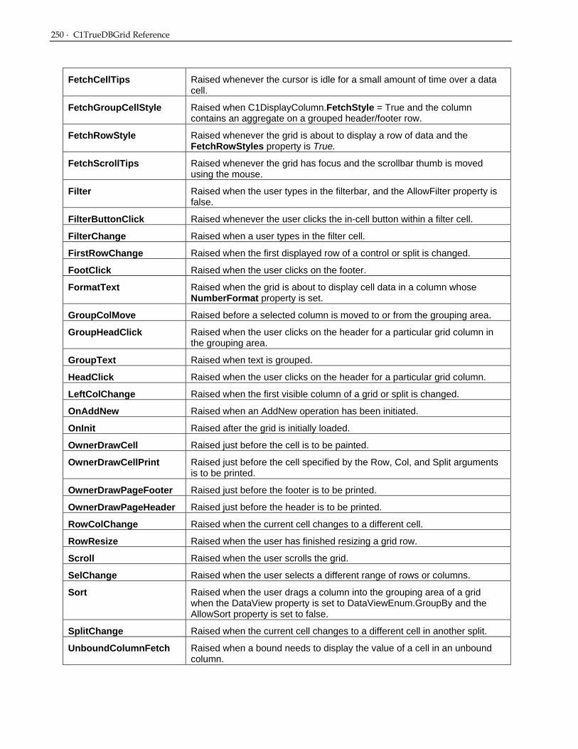
250 · C1TrueDBGrid Reference
FetchCellTips Raised whenever the cursor is idle for a small amount of time over a data cell.
FetchGroupCellStyle Raised when C1DisplayColumn.FetchStyle = True and the column contains an aggregate on a grouped header/footer row.
FetchRowStyle Raised whenever the grid is about to display a row of data and the FetchRowStyles property is True.
FetchScrollTips Raised whenever the grid has focus and the scrollbar thumb is moved using the mouse.
Filter Raised when the user types in the filterbar, and the AllowFilter property is false.
FilterButtonClick Raised whenever the user clicks the in-cell button within a filter cell.
FilterChange Raised when a user types in the filter cell.
FirstRowChange Raised when the first displayed row of a control or split is changed.
FootClick Raised when the user clicks on the footer.
FormatText Raised when the grid is about to display cell data in a column whose NumberFormat property is set.
GroupColMove Raised before a selected column is moved to or from the grouping area.
GroupHeadClick Raised when the user clicks on the header for a particular grid column in the grouping area.
GroupText Raised when text is grouped.
HeadClick Raised when the user clicks on the header for a particular grid column.
LeftColChange Raised when the first visible column of a grid or split is changed.
OnAddNew Raised when an AddNew operation has been initiated.
OnInit Raised after the grid is initially loaded.
OwnerDrawCell Raised just before the cell is to be painted.
OwnerDrawCellPrint Raised just before the cell specified by the Row, Col, and Split arguments is to be printed.
OwnerDrawPageFooter Raised just before the footer is to be printed.
OwnerDrawPageHeader Raised just before the header is to be printed.
RowColChange Raised when the current cell changes to a different cell.
RowResize Raised when the user has finished resizing a grid row.
Scroll Raised when the user scrolls the grid.
SelChange Raised when the user selects a different range of rows or columns.
Sort Raised when the user drags a column into the grouping area of a grid when the DataView property is set to DataViewEnum.GroupBy and the AllowSort property is set to false.
SplitChange Raised when the current cell changes to a different cell in another split.
UnboundColumnFetch Raised when a bound needs to display the value of a cell in an unbound column.

AddNewMode Property · 251
ValueItemError Raised when the user attempts to enter invalid data into a column that is using value lists.
C1TrueDBGrid Properties
AddNewMode Property Returns a value that describes the location of the current cell with respect to the grid's AddNew row.
Syntax
[VB]
Public ReadOnly Property AddNewMode As AddNewModeEnum
[C#]
public AddNewModeEnum AddNewMode {get;}
[Delphi]
property AddNewMode: AddNewModeEnum;
Remarks
The AddNewMode property returns a value that describes the location of the current cell with respect to the grid's AddNew row.
If the AllowAddNew property is True, the last row displayed in the grid is left blank to permit users to enter new records. If the AllowAddNew property is False, the blank row is not displayed, and AddNewMode always returns 0.
When AllowAddNew is True, the AddNewMode property returns one of the following values:
Member Name Description
NoAddNew The current cell is not in the last row, and no AddNew operation is pending.
AddNewCurrent The current cell is in the last row, but no AddNew operation is pending.
AddNewPending
The current cell is in the next to last row as a result of a pending AddNew operation initiated by the user through the grid's user interface, or by code as a result of setting the Value or Text properties of a column.
See Also
C1TrueDBGrid class (page 20)
AllowAddNew Property Specifies whether the user has the ability to add new rows.

252 · C1TrueDBGrid Reference
Syntax
[VB]
Public Property AddNewRow As Boolean
[C#]
public bool AddNewRow {get; set;}
[Delphi]
property AddNewRow: Boolean;
Remarks
If True, the user can add records to the data source underlying the C1TrueDBGrid control.
If False (the default), the user cannot add records to the data source underlying the C1TrueDBGrid control.
If the AllowAddNew property is True, the last row displayed in the grid is left blank to permit users to enter new records. If the AllowAddNew property is False, the blank row (usually referred to as the AddNew row) is not displayed.
The underlying data source may not permit insertions even if the AllowAddNew property is True for the C1TrueDBGrid control. In this case, a trappable error occurs when the user tries to add a record.
If AllowAddNew is True, also set AllowUpdate to True so that users will be able to type in the cells of the AddNew row.
See Also
C1TrueDBGrid class (page 20)
AllowArrows Property Specifies whether the user has the abilities to use the arrow keys to navigate around the grid.
Syntax
[VB]
Public Property AllowArrows As Boolean
[C#]
public bool AllowArrows {get; set;}
[Delphi]
property AllowArrows: Boolean;
Remarks
If True (the default), the user can use the arrow keys to move from cell to cell within the same row.
If False, the left and right arrow keys will move focus from control to control and cannot be used to move between cells.
The user cannot use the arrow keys to move out of the C1TrueDBGrid control when this property is set to True. If the WrapCellPointer property is also set to True, then the arrow keys will wrap around rows and the user can navigate the entire grid using the arrow keys.

AllowColMove Property (C1TrueDBGrid) · 253
See Also
C1TrueDBGrid class (page 20)
AllowColMove Property (C1TrueDBGrid) Specifies if the user has the ability to move columns in the grid.
Syntax
[VB]
Public Property AllowColMove As Boolean
[C#]
public bool AllowColMove {get; set;}
[Delphi]
property AllowColMove: Boolean;
Remarks
If True, the user can move columns.
If False (the default), the user cannot move columns.
Use the AllowColMove property to control whether the user can move columns by dragging the column header to the desired location. Any change in column order causes a ColMove event.
If AllowColMove is set to True, and the DataView property is set to Group, a grouping area is added to the grid. Columns can be added or dragged to this area at run time.
See Column Grouping (page 100) for more information.
See Also
C1TrueDBGrid class (page 20)
C1TrueDBDropDown class (page 20)
Split class (page 399)
AllowColSelect Property (C1TrueDBGrid) Specifies if the user has the ability to select columns in the grid.
Syntax
[VB]
Public Property AllowColSelect As Boolean
[C#]
public bool AllowColSelect {get; set;}
[Delphi]
property AllowColSelect: Boolean;

254 · C1TrueDBGrid Reference
Remarks
If True (the default), the user can select columns.
If False, the user cannot select columns.
Use the AllowColSelect property to control whether the user can select columns by clicking within the column header area. Setting this property to False suppresses highlighting when the user clicks a column header, which is useful for applications that respond to the HeadClick event.
See Also
C1TrueDBGrid class (page 20)
C1TrueDBDropDown class (page 20)
Split class (page 399)
AllowDelete Property Specifies if the user has the ability to delete records from the grid.
Syntax
[VB]
Public Property AllowDelete As Boolean
[C#]
public bool AllowDelete {get; set;}
[Delphi]
property AllowDelete: Boolean;
Remarks
If True, the user can delete records from the data source underlying the C1TrueDBGrid control.
If False (the default), the user cannot delete records from the data source underlying the C1TrueDBGrid control.
Use the AllowDelete property to prevent the user from deleting records from the data source through interaction with the C1TrueDBGrid control.
The underlying data source may not permit deletions even if the AllowDelete property is True for the C1TrueDBGrid control. In this case, a trappable error occurs when the user tries to delete a record.
See Also
C1TrueDBGrid class (page 20)
AllowDrag Property Specifies if the user has the ability to drag from the grid.
Syntax
[VB]
Public Property AllowDrag As Boolean

AllowDrop Property · 255
[C#]
public bool AllowDrag {get; set;}
[Delphi]
property AllowDrag: Boolean;
Remarks
If this property is set to true the user has the ability to drag from the grid. The dragging procedure must still be handled, though, by the developer. For an example of drag and drop in the True DBGrid, see Tutorial 13.
See Also
C1TrueDBGrid class (page 20)
AllowDrop Property Specifies if the user has the ability to drop data into the grid.
Syntax
[VB]
Public Property AllowDrop As Boolean
[C#]
public bool AllowDrop {get; set;}
[Delphi]
property AllowDrop: Boolean;
Remarks
If this property is set to true the user has the ability to drop information into the grid from another control. The dragging procedure must still be handled, though, by the developer. For an example of drag and drop in the True DBGrid, see Tutorial 13.
See Also
C1TrueDBGrid class (page 20)
AllowFilter Property Specifies if the grid should automatically filter data in the filter bar.
Syntax
[VB]
Public Property AllowFilter As Boolean
[C#]
public bool AllowFilter {get; set;}
[Delphi]
property AllowFilter: Boolean;

256 · C1TrueDBGrid Reference
Remarks
If True, and if the Filter Bar is active, the grid will automatically filter data.
If False, the grid will fire the Filter event.
If the FilterBar property is true and the user attempts to filter column data, the grid will automatically filter the column data according to the value in the Filter Bar.
If False, the Filter event allows the application to filter the data.
See Also
C1TrueDBGrid class (page 20)
AllowHorizontalSplit Property Specifies if a user is allowed to create horizontal splits.
Syntax
[VB]
Public Property AllowHorizontalSplit As Boolean
[C#]
public bool AllowHorizontalSplit {get; set;}
[Delphi]
property AllowHorizontalSplit: Boolean;
Remarks
If True, then the user is able to split the current grid into multiple horizontal splits at run-time.
If False, then the user is prevented from splitting the grid horizontally.
See Also
C1TrueDBGrid class (page 20)
AllowRowSelect Property (C1TrueDBGrid) Specifies if a user is allowed to select rows in the grid.
Syntax
[VB]
Public Property AllowRowSelect As Boolean
[C#]
public bool AllowRowSelect {get; set;}
[Delphi]
property AllowRowSelect: Boolean;
Remarks
If True (the default), the user can select rows.
AllowRowSizing Property (C1TrueDBGrid) · 257
If False, the user cannot select rows.
Use the AllowRowSelect property to control whether the user can select rows by clicking the record selector buttons. By setting this property to False, record selection can be selected without hiding the record selectors altogether, since the record selectors may want to used to provide visual feedback when the current row is modified.
Note
The user cannot select rows if the RecordSelectors property is set to False for all splits, even if AllowRowSelect is True.
See Also
C1TrueDBGrid class (page 20)
Split class (page 399)
AllowRowSizing Property (C1TrueDBGrid) Specifies if a user is allowed to resize the rows in the grid.
Syntax
[VB]
Public ReadOnly Property AllowRowSizing As Boolean
[C#]
public bool AllowRowSizing {get;}
[Delphi]
property AllowRowSizing: Boolean;
Remarks
If the AllowRowSizing property is True, the mouse pointer turns into a double-headed arrow when positioned over the row divider in the RecordSelectors column between any pair of record selectors in the grid. The user can interactively resize the rows by dragging the mouse while the double-headed arrow cursor is showing. Any change in row size causes a RowResize event to fire.
If the AllowRowSizing property is False, the user cannot interactively resize rows.
All rows of the C1TrueDBGrid control are always the same height, which is determined by the RowHeight property.
The default value of the property is True.
Note
RecordSelectors must be visible in a split in order for the user to resize rows interactively in that split. If RecordSelectors are disabled for all splits in a C1TrueDBGrid control, the user cannot resize rows interactively in that grid.
See Also
C1TrueDBGrid class (page 20)
C1TrueDBDropDown class (page 20)
Split class (page 399)

258 · C1TrueDBGrid Reference
AllowSort Property Specifies if a user is allowed to sort columns.
Syntax
[VB]
Public Property AllowSort As Boolean
[C#]
public bool AllowSort {get; set;}
[Delphi]
property AllowSort: Boolean;
Remarks
If True, and if the DataView property is set to GroupBy, the grid will automatically filter column data upon grouping action.
If False, the grid will fire the Sort event.
If the DataView property is set to Group By and the user attempts to drag a column header into the grouping area, the grid will automatically sort the column data.
If False, the Sort event allows the application to sort the data.
See Also
C1TrueDBGrid class (page 20)
AllowUpdate Property Specifies if a user is allowed to modify data.
Syntax
[VB]
Public Property AllowUpdate As Boolean
[C#]
public bool AllowUpdate {get; set;}
[Delphi]
property AllowUpdate: Boolean;
Remarks
If True (the default), the user can modify data in the C1TrueDBGrid control.
If False, the user cannot modify data in the C1TrueDBGrid control.
When the AllowUpdate property is False, the user can still scroll through the C1TrueDBGrid control and select data, but cannot change any of the values; any attempt to change the data in the grid is ignored.
The underlying data source may not permit updates even if the AllowUpdate property is True for the C1TrueDBGrid control. In this case, a trappable error occurs when the user tries to change the record.

AllowUpdateOnBlur Property · 259
See Also
C1TrueDBGrid class (page 20)
AllowUpdateOnBlur Property Enables or disables updates when the grid loses focus.
Syntax
[VB]
Public Property AllowUpdateOnBlur As Boolean
[C#]
public bool AllowUpdateOnBlur {get; set;}
[Delphi]
property AllowUpdateOnBlur: Boolean;
NOTE:
This property of the grid is ignored if the CausesValidation property of the grid is set to False.
See Also
C1TrueDBGrid class (page 20)
AllowVerticalSizing Property (C1TrueDBGrid) Specifies if a user is allowed to resize vertical splits.
Syntax
[VB]
Public Property AllowVerticalSizing As Boolean
[C#]
public bool AllowVerticalSizing {get; set;}
[Delphi]
property AllowVerticalSizing: Boolean;
Remarks
If True, then the user is able to resize vertical splits in the grid.
If False, then the user is restricted from resizing vertical splits.
See Also
C1TrueDBGrid class (page 20)
C1TrueDBDropDown class (page 20)
Split class (page 399)

260 · C1TrueDBGrid Reference
AllowVerticalSplit Property (C1TrueDBGrid) Specifies if a user is allowed to create vertical splits.
Syntax
[VB]
Public Property AllowVerticalSplit As Boolean
[C#]
public bool AllowVerticalSplit {get; set;}
[Delphi]
property AllowVerticalSplit: Boolean;
Remarks
If True, then the user is able to create multiple vertical splits in the grid.
If False, then the user is restricted from creating vertical splits.
See Also
C1TrueDBGrid class (page 20)
C1TrueDBDropDown class (page 20)
AlternatingRows Property (C1TrueDBGrid) Determines if a grid or split displays odd-numbered rows in one style and even-numbered rows in another.
Syntax
[VB]
Public Property AlternatingRows As Boolean
[C#]
public bool AlternatingRows {get; set;}
[Delphi]
property AlternatingRows: Boolean;
Remarks
If True, the OddRowStyle and EvenRowStyle properties control the appearance of rows within the specified object.
If False (the default), the Style property controls the display of rows within the specified object.
At design time, change the colors and fonts used to render odd (even) rows by modifying the built-in OddRow (EvenRow) style using the Styles property page.
At run time, change the colors and fonts used to render odd (even) rows by modifying the Style object returned by the OddRowStyle (EvenRowStyle) property.

BackColor Property (C1TrueDBGrid) · 261
See Also
C1TrueDBGrid class (page 20)
C1TrueDBDropDown class (page 20)
Split class (page 399)
BackColor Property (C1TrueDBGrid) Controls the background color of the grid object.
Syntax
[VB]
Public BackColor As Color
[C#]
public Color BackColor {get; set;}
[Delphi]
property BackColor: Color;
Remarks
This property controls the background color of an object. Colors may be specified as RGB values or system default colors.
The background color of a grid, column, or split is determined by its Style property setting. For these objects, the BackColor property is a shortcut to the BackColor member of the Style property.
See Also
C1TrueDBGrid class (page 20)
BackgroundImage Property (C1TrueDBGrid) Sets or returns the background bitmap of the TrueDBGrid Object.
Syntax
[VB]
Public BackgroundImage As Image
[C#]
public Image BackgroundImage {get; set;}
[Delphi]
property BackgroundImage: Image;
Remarks
This property sets or returns the background bitmap of a style object. If a style has no background bitmap, then this property returns a null.
A bitmap can be assigned to the BackgroundImage property in code at run time:

262 · C1TrueDBGrid Reference
• Visual Basic Me.C1TrueDBGrid1.BackgroundImage = System.Drawing.Image.FromFile(“C:\Seaside.bmp”)
• C# this.C1TrueDBGrid1.BackgroundImage = System.Drawing.Image.FromFile([“C:\Seaside.bmp”]);
• Delphi Self.C1TrueDBGrid1.BackgroundImage := System.Drawing.Image.FromFile(’C:\Seaside.bmp’);
Note
Use the BackgroundPictureDrawMode property to control how the background bitmap is displayed when the style is applied to an object.
See Also
C1TrueDBGrid class (page 20)
Bands Property Returns the number of levels within a hierarchical grid.
Syntax
[VB]
Public ReadOnly Property Bands As Integer
[C#]
public int Bands {get;}
[Delphi]
property Bands: Integer;
Remarks
When a grid is bound to a master-detail data source, display related groups of hierarchical data using bands. A band is created for each level in a hierarchical recordset, and may consist of entire tables or a just a few selected fields. A band is a virtual representation of a hierarchical recordset; it is not the data itself.
The Bands property is provided for cases where the number of levels in a hierarchical recordset is not known in advance. The following example uses the Bands property and the ExpandBand method to display all available bands:
• Visual Basic Dim n As Integer For n = 0 To Me.C1TrueTDBGrid1.Bands – 1 Me.C1TrueDBGrid1.ExpandBand(n) Next n
• C# int n; for ( n = 0 ; n < this.C1TrueTDBGrid1.Bands) {

Bookmark Property (C1TrueDBGrid) · 263
this.C1TrueDBGrid1.ExpandBand(n); }
• Delphi var n: Integer; for n := 0 To Self.C1TrueTDBGrid1.Bands – 1 do Self.C1TrueDBGrid1.ExpandBand(n);
See Also
C1TrueDBGrid class (page 20)
Bookmark Property (C1TrueDBGrid) Returns or sets the bookmark identifying the current row in the grid.
Syntax
[VB]
Public Property Bookmark As Integer
[C#]
public int Bookmark {get; set;}
[Delphi]
property Bookmark: Integer;
Remarks
Use the value returned by the Bookmark property to save a reference to the current row that remains valid even after another row becomes current.
When the Bookmark property is set to a valid value in code, the row associated with that value becomes the current row, and the grid adjusts its display to bring the new current row into view if necessary.
See Also
C1TrueDBGrid class (page 20)
C1TrueDBDropDown class (page 20)
BorderStyle Property (C1TrueDBGrid) Returns or sets whether the grid has a border.
Syntax
[VB]
Public Property BorderStyle As System.Windows.Forms.BorderStyle
[C#]
public System.Windows.Forms.BorderStyle BorderStyle {get; set;}
[Delphi]
property BorderStyle: System.Windows.Forms.BorderStyle;

264 · C1TrueDBGrid Reference
Remarks
This property determines whether a C1TrueDBGrid control has a border.
See Also
C1TrueDBGrid class (page 20)
C1TrueDBDropDown class (page 20)
Caption Property (C1TrueDBGrid) Returns or sets the caption to the grid.
Syntax
[VB]
Public Property Caption As System.String
[C#]
public string Caption {get; set;}
[Delphi]
property Caption: string;
Remarks
For a C1TrueDBGrid control, this property determines the text displayed in the caption bar at the top of the grid.
Setting the Caption property to an empty string for a C1TrueDBGrid control hides its caption bar.
For a C1DataColumn object, this property determines the text displayed in the object's heading area.
Setting the Caption property to an empty string for a C1DataColumn object clears the text in the column's heading area but does not hide the heading. Column captions are only displayed if the grid's ColumnHeaders property is set to True.
Setting the Caption property to an empty string for a Split object hides the heading area, even if other splits have non-empty captions.
See Also
C1TrueDBGrid class (page 20)
C1DisplayColumn class (page 22)
Split class (page 399)
CaptionHeight Property (C1TrueDBGrid) Sets the height of the grid’s caption area.
Syntax
[VB]
Public Property CaptionHeight As Integer

CaptionStyle Property (C1TrueDBGrid) · 265
[C#]
public int CaptionHeight {get; set;}
[Delphi]
property CaptionHeight: Integer;
Remarks
This property requires that the Caption property of the grid has a value.
See Also
C1TrueDBGrid class (page 20)
CaptionStyle Property (C1TrueDBGrid) Sets or returns the Style object that controls the appearance of the caption area.
Syntax
[VB]
Public Property CaptionStyle As Style
[C#]
public Style CaptionStyle {get; set;}
[Delphi]
property CaptionStyle: Style;
Remarks
This property sets or returns the Style object that controls the appearance of a TDBGrid control's caption bar or a Split object's heading area. By default, this is the built-in Caption style.
The value of the Caption property is not affected by changes to the CaptionStyle property.
See Also
C1TrueDBGrid class (page 20)
Split class (page 399)
C1TrueDBDropDown class (page 20)
CellTips Property Determines whether the grid displays a pop-up text window when the cursor is idle.
Syntax
[VB]
Public Property CellTips as CellTipEnum
[C#]
public CellTipEnum CellTips {get; set;}
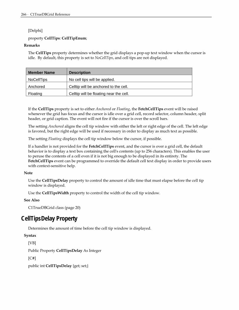
266 · C1TrueDBGrid Reference
[Delphi]
property CellTips: CellTipEnum;
Remarks
The CellTips property determines whether the grid displays a pop-up text window when the cursor is idle. By default, this property is set to NoCellTips, and cell tips are not displayed.
Member Name Description
NoCellTips No cell tips will be applied.
Anchored Celltip will be anchored to the cell.
Floating Celltip will be floating near the cell.
If the CellTips property is set to either Anchored or Floating, the FetchCellTips event will be raised whenever the grid has focus and the cursor is idle over a grid cell, record selector, column header, split header, or grid caption. The event will not fire if the cursor is over the scroll bars.
The setting Anchored aligns the cell tip window with either the left or right edge of the cell. The left edge is favored, but the right edge will be used if necessary in order to display as much text as possible.
The setting Floating displays the cell tip window below the cursor, if possible.
If a handler is not provided for the FetchCellTips event, and the cursor is over a grid cell, the default behavior is to display a text box containing the cell's contents (up to 256 characters). This enables the user to peruse the contents of a cell even if it is not big enough to be displayed in its entirety. The FetchCellTips event can be programmed to override the default cell text display in order to provide users with context-sensitive help.
Note
Use the CellTipsDelay property to control the amount of idle time that must elapse before the cell tip window is displayed.
Use the CellTipsWidth property to control the width of the cell tip window.
See Also
C1TrueDBGrid class (page 20)
CellTipsDelay Property Determines the amount of time before the cell tip window is displayed.
Syntax
[VB]
Public Property CellTipsDelay As Integer
[C#]
public int CellTipsDelay {get; set;}

CellTipsWidth Property · 267
[Delphi]
property CellTipsDelay: Integer;
Remarks
The CellTipsDelay property controls the amount of idle time, in milliseconds, that must elapse before the cell tip window is displayed. By default, this property is set to 1000 (one second).
Setting this property to zero does not disable cell tips, but restores the default value of 1000. To disable cell tips, set the CellTips property to NoCellTips.
See Also
C1TrueDBGrid class (page 20)
CellTipsWidth Property Returns or sets the width of the cell tip window.
Syntax
[VB]
Public Property CellTipsWidth As Integer
[C#]
public int CellTipsWidth {get; set;}
[Delphi]
property CellTipsWidth: Integer;
Remarks
The CellTipsWidth property returns or sets the width of the cell tip window in terms of the coordinate system of the grid's container.
By default, this property is set to zero, which causes the cell tip window to grow or shrink to accommodate the cell tip text. Override this behavior and give the cell tip window a fixed width by specifying a non-zero value for this property.
See Also
C1TrueDBGrid class (page 20)
ChildGrid Property Returns or sets the name of the grid used as a child grid in a hierarchical presentation.
Syntax
[VB]
Public Property ChildGrid As C1TrueDBGrid
[C#]
public C1TrueDBGrid ChildGrid {get; set;}

268 · C1TrueDBGrid Reference
[Delphi]
property ChildGrid: C1TrueDBGrid;
Remarks
This property associates a C1TrueDBGrid control that can be used to represent hierarchical data at run time. When the user clicks the leftmost columns expand icon (“+”) the associated C1TrueDBGrid control is displayed below the current cell.
Use the ChildGrid property and a C1TrueDBGrid control to implement a fully editable master/detail presentation.
See Also
C1TrueDBGrid class (page 20)
Col Property (C1TrueDBGrid) Returns or sets the column position of the current cell.
Syntax
[VB]
Public Property Col As Integer
[C#]
public int Col {get; set;}
[Delphi]
property Col: Integer;
Remarks
This property specifies the zero-based index of the current cell's column position. It may be set at run time to highlight a different cell within the current row. If the column is visible, the caret or marquee will be moved to the selected column. If the column is not visible, the grid will scroll to make it visible as a result of setting this property.
Setting the Col property at run time does not affect selected columns.
See Also
C1TrueDBGrid class (page 20)
C1TrueDBDropDown class (page 20)
CollapseColor Property Returns or sets the color of the collapse icon.
Syntax
[VB]
Public Property CollapseColor As Color

ColumnCaptionHeight Property (C1TrueDBGrid) · 269
[C#]
public Color CollapseColor {get; set;}
[Delphi]
property CollapseColor: Color;
Remarks
Allows the user to change the color of the collapse icon for hierarchical DataSets.
See Also
C1TrueDBGrid class (page 20)
ColumnCaptionHeight Property (C1TrueDBGrid) Sets the height of the column captions.
Syntax
[VB]
Public Property ColumnCaptionHeight As Integer
[C#]
public int ColumnCaptionHeight {get; set;}
[Delphi]
property ColumnCaptionHeight: Integer;
Remarks
Sets the height for the columns captions in pixels. The ColumnFooterHeight property sets the associated property for the footers.
See Also
Split class (page 399)
ColumnFooterHeight Property (C1TrueDBGrid) Sets the height of the column captions.
Syntax
[VB]
Public Property ColumnFooterHeight As Integer
[C#]
public int ColumnFooterHeight {get; set;}
[Delphi]
property ColumnFooterHeight: Integer;

270 · C1TrueDBGrid Reference
Remarks
Sets the height for the columns footers in pixels. The ColumnCaptionHeight property sets the associated property for the headers.
See Also
Split class (page 399)
ColumnFooters Property (C1TrueDBGrid) Specifies whether footers are displayed.
Syntax
[VB]
Public Property ColumnFooters As Boolean
[C#]
public bool ColumnFooters {get; set;}
[Delphi]
property ColumnFooters: Boolean;
Remarks
If True, the control's column footers are displayed.
If False (the default), the control's column footers are not displayed.
Use the FooterText property to set the footing text of an individual column.
See Also
C1TrueDBGrid class (page 20)
C1TrueDBDropDown class (page 20)
ColumnHeaders Property (C1TrueDBGrid) Specifies whether headers are displayed.
Syntax
[VB]
Public Property ColumnHeaders As Boolean
[C#]
public bool ColumnHeaders {get; set;}
[Delphi]
property ColumnHeaders: Boolean;
Remarks
If True (the default), the control's column headers are displayed.
If False, the control's column headers are not displayed.

Columns Property (C1TrueDBGrid) · 271
Use the Caption property to set the heading text of an individual Column.
See Also
C1TrueDBGrid class (page 20)
C1TrueDBDropDown class (page 20)
Columns Property (C1TrueDBGrid) Returns a collection of C1DataColumn objects.
Syntax
[VB]
Public ReadOnly Property Columns As C1DataColumnCollection
[C#]
public C1DataColumnCollection Columns {get;}
[Delphi]
property Columns: C1DataColumnCollection;
Remarks
This property returns a collection of C1DataColumn objects for a grid or drop-down control.
See Also
C1TrueDBGrid class (page 20)
C1TrueDBDropDown class (page 20)
CurrentCellVisible Property (C1TrueDBGrid) Determines if the current cell is visible within the displayed area of the grid.
Syntax
[VB]
Public Property CurrentCellVisible As Boolean
[C#]
public bool CurrentCellVisible {get; set;}
[Delphi]
property CurrentCellVisible: Boolean;
Remarks
This property returns True if the current cell (indicated by the Bookmark and Col properties) is visible within the displayed area of a grid or split. It returns False if the cell is not visible.
Setting the CurrentCellVisible property to True causes the grid to scroll so that the current cell is brought into view. If a grid contains multiple splits, then the current cell becomes visible in each split.
In all cases, setting this property to False is meaningless and is ignored.

272 · C1TrueDBGrid Reference
See Also
C1TrueDBGrid class (page 20)
C1TrueDBDropDown class (page 20)
Split class (page 399)
DataChanged Property Indicates the modification status of the current row.
Syntax
[VB]
Public Property DataChanged As Boolean
[C#]
public bool DataChanged {get; set;}
[Delphi]
property DataChanged: Boolean;
Remarks
The DataChanged property indicates the modification status of the current row. If True, then one or more columns in the current row have been modified. If False, then any edits on the column are cancelled.
Setting this property to True has no effect. Setting this property to False exits editing, discards all changes to the current row, and refreshes the current row from the data source. Setting this property within the BeforeColUpdate event is disallowed, however.
Note
The pencil in the RecordSelector column reflects the state of the grid's DataChanged property.
See Also
C1TrueDBGrid class (page 20)
DataMember Property (C1TrueDBGrid) Returns or sets the name of the data member used to populate the grid.
Syntax
[VB]
Public Property DataMember As String
[C#]
public string DataMember {get; set;}
[Delphi]
property DataMember: string;

DataSource Property (C1TrueDBGrid) · 273
Remarks
This property returns or sets the name of the data member used to populate the grid. Typically, a data member represents a database table or query.
A bound DataSource can expose multiple sets of data that consumers can bind to. Each set of data is called a data member, and is identified by a unique string.
See Also
C1TrueDBGrid class (page 20)
C1TrueDBDropDown class (page 20)
DataSource Property (C1TrueDBGrid) Specifies the data control used to bind a grid to a database.
Syntax
[VB]
Public Property DataSource As Object
[C#]
public object DataSource {get; set;}
[Delphi]
property DataSource: Object;
Remarks
The DataSource property specifies the data control used to bind a C1TrueDBGrid or C1TrueDBDropDown control to a database.
See Also
C1TrueDBGrid class (page 20)
C1TrueDBDropDown class (page 20)
DataView Property Returns or sets the method by which the grid will display data.
Syntax
[VB]
Public Property DataView As DataViewEnum
[C#]
public DataViewEnum DataView {get; set;}
[Delphi]
property DataView: DataViewEnum;

274 · C1TrueDBGrid Reference
Remarks
The DataView property returns or sets the method by which the grid will display data.
Member Name Description
Normal The grid will only display flat files and will not support a hierarchical view. If the data source is a hierarchical dataset, the grid will only display data from the master table.
Inverted The grid will flip the display, rows will be represented horizontally and columns vertically.
Form The grid will display the data in a convenient data entry form.
GroupBy
A grouping area is created at the top of the grid; any columns that are placed into this area become part of the GroupedColumn collection. When in group mode, grid columns can be moved into or out of the grouping area with the Add and RemoveAt methods, respectively. Users can also perform this action by selecting and dragging a column into or out of the grouping. Users can customize the display of the grouped row with styles and automatically compute aggregates for columns that are grouped. The expanded/collapsed state of the grouping can also be specified.
MultipleLines The grid will display all the fields in the current grid area with multiple lines. Columns that would have occluded by the bounds of the grid are all displayed in the current grid area.
MultipleLinesFixed This dataview is similar to MultipleLines dataview with one important exception; the number of subrows does not change once set. The number of subrows can be set using the LinesPerRow property.
Hierarchical The grid will display DataSets in a hierarchical format. At run time, users can expand and collapse hierarchical recordset Bands using a treeview-like interface.
See Also
C1TrueDBGrid class (page 20)
DeadAreaBackColor Property (C1TrueDBGrid) Obsolete. Use the BackColor property.
See Also
C1TrueDBDropDown class (page 20)
DefColWidth Property (C1TrueDBGrid) Returns or sets the default width for all grid columns.
Syntax
[VB]
Public Property DefColWidth As Integer

DestinationCol Property · 275
[C#]
public int DefColWidth {get; set;}
[Delphi]
property DefColWidth: Integer;
Remarks
This property returns or sets the default width for all grid columns in terms of the coordinate system of the grid's container.
For bound grids, the DefColWidth property is respected under the following circumstances:
• When the grid's layout is initialized at run time.
• When a new column is created at run time.
If the DefColWidth property is set to 0, the grid automatically sizes all columns based on either the width of the column heading or the display width of the underlying field, whichever is larger. For example, to set the default column width to the width of the first column:
• Visual Basic C1TrueDBGrid1.DefColWidth = Me.C1TrueDBGrid1.Splits(0).DisplayColumns(0).Width
• C# C1TrueDBGrid1.DefColWidth = this.C1TrueDBGrid1.Splits(0).DisplayColumns(0).Width ;
• Delphi C1TrueDBGrid1.DefColWidth := Self.C1TrueDBGrid1.Splits[0].DisplayColumns[0].Width;
Note
Setting the DefColWidth property at run time does not affect existing columns, only those that are subsequently created in code.
In bound mode, some data sources do not provide text field widths when requested by the grid. Therefore, if DefColWidth is 0, the actual column widths may not be as expected since the grid must supply a default width.
See Also
C1TrueDBGrid class (page 20)
C1TrueDBDropDown class (page 20)
DestinationCol Property Indicates which grid column will be the destination after cell movement.
Syntax
[VB]
Public ReadOnly Property DestinationCol As Integer

276 · C1TrueDBGrid Reference
[C#]
public int DestinationCol {get;}
[Delphi]
property DestinationCol: Integer;
Remarks
This property is used when moving from one cell to another in the grid. It indicates which grid column will be the destination of the movement. The value returned is the zero-based index of the column containing the destination cell. If you click outside of the column data area, (for example, in the record selector area on the left), DestinationCol returns -1.
This property is available only during those events related to cell movement: AfterColEdit, AfterColUpdate, BeforeColUpdate, BeforeRowColChange, ButtonClick, Click, DoubleClick, FootClick, GroupHeadClick, HeadClick, MouseDown, MouseUp. Any attempt to access the DestinationCol property outside of these events results in a trappable error ("Property not available in this context").
The property can only be used if the movement is initiated interactively by the user, via the keyboard or mouse. The property is not available when movement is initiated programmatically (for example, when setting the grid's Col property).
Note
Care must be exercised when using this property, because it is possible to use the value of this property in an event (such as MouseDown) before knowing whether or not the movement will actually succeed. The value returned by this property only indicates what the correct destination column will be if the cell movement is successful.
The DestinationCol property does not guarantee that the cell movement will succeed (for example, movement may fail if the contents of the current cell are not valid). In such cases, the DestinationCol property will not reflect the actual destination position (usually the cell position will remain at the previous location).
See Also
C1TrueDBGrid class (page 20)
DestinationRow Property Indicates which grid row will be the destination after cell movement.
Syntax
[VB]
Public ReadOnly Property DestinationRow As Integer
[C#]
public int DestinationRow {get;}
[Delphi]
property DestinationRow: Integer;

DestinationSplit Property · 277
Remarks
This property is used when moving from one cell to another in the grid. It indicates which grid row will be the destination of the movement. The value returned is the bookmark of the row containing the destination cell. If click occurs outside any visible row (for example, on the header), DestinationRow returns Null. If the AddNew row is clicked, DestinationRow returns "" (empty string).
This property is available only during those events related to cell movement: AfterColEdit, AfterColUpdate, BeforeColUpdate, BeforeRowColChange, ButtonClick, Click, DoubleClick, FootClick, GroupHeadClick, HeadClick, MouseDown, MouseUp. Any attempt to access the DestinationRow property outside of these events results in a trappable error ("Property not available in this context").
The property can only be used if the movement is initiated interactively by the user, via the keyboard or mouse. The property is not available when movement is initiated programmatically (for example, when using the grid's MoveNext method).
Note
Care must be exercised when using this property, because it is possible to use the value of this property in an event (such as MouseDown) before knowing whether or not the movement will actually succeed. The value returned by this property only indicates what the correct destination row will be if the cell movement is successful.
The DestinationRow property does not guarantee that the cell movement will succeed (for example, movement may fail if contents of the current cell are not valid). In such cases, the DestinationRow property will not reflect the actual destination position (usually the cell position will remain at the previous location).
See Also
C1TrueDBGrid class (page 20)
DestinationSplit Property Indicates which grid split will be the destination after cell movement.
Syntax
[VB]
Public ReadOnly Property DestinationSplit As Integer
[C#]
public int DestinationSplit {get;}
[Delphi]
property DestinationSplit: Integer;
Remarks
This property is used when moving from one cell to another in the grid. It indicates which grid split will be the destination of the movement. The value returned is the zero-based index of the split containing the destination cell. In the case of a click on an area of the grid not belonging to any split, such as the corner between the vertical and horizontal scrollbars, or on a split border, DestinationSplit returns -1.
This property is available only during those events related to cell movement: AfterColEdit, AfterColUpdate, BeforeColUpdate, BeforeRowColChange, ButtonClick, Click, DoubleClick,

278 · C1TrueDBGrid Reference
FootClick, GroupHeadClick, HeadClick, MouseDown, MouseUp. Any attempt to access the DestinationSplit property outside of these events results in a trappable error ("Property not available in this context").
The property can only be used if the movement is initiated interactively by the user, via the keyboard or mouse. The property is not available when movement is initiated programmatically (for example, when setting the grid's SplitIndex property).
Note
Care must be exercised when using this property, because it is possible to use the value of this property in an event (such as MouseDown) before knowing whether or not the movement will actually succeed. The value returned by this property only indicates what the correct destination split will be if the cell movement is successful.
The DestinationSplit property does not guarantee that the cell movement will succeed (for example, movement may fail if the contents of the current cell are not valid). In such cases, the DestinationSplit property will not reflect the actual destination position (usually the cell position will remain at the previous location).
See Also
C1TrueDBGrid class (page 20)
DirectionAfterEnter Property Specifies the relative position of the next cell when the user presses the Enter key.
Syntax
[VB]
Public Property DirectionAfterEnter As DirectionAfterEnterEnum
[C#]
public DirectionAfterEnterEnum DirectionAfterEnter {get; set;}
[Delphi]
property DirectionAfterEnter: DirectionAfterEnterEnum;
Remarks
The DirectionAfterEnter property specifies the relative position of the next cell when the user presses the ENTER key.
Member Name Description
MoveNone Cursor will not move after Enter is pressed.
MoveRight Cursor will move to the next cell to the right after Enter is pressed.
MoveDown Cursor will move to the next cell below after Enter is pressed.
MoveLeft Cursor will move to the next cell to the left after Enter is pressed.
MoveUp Cursor will move to the next cell above after Enter is pressed.

DoubleBuffer Property · 279
See Also
C1TrueDBGrid class (page 20)
DoubleBuffer Property This property can be used to disable the use of double buffering when the grid renders its output to the screen.
Syntax
[VB]
Public Property DoubleBuffer As Boolean
[C#]
public bool DoubleBuffer {get; set;}
[Delphi]
property DoubleBuffer: Boolean;
Remarks
Member of C1.Win.C1TrueDBGrid.BaseGrid.
Setting this value to False may cause the grid to flicker when the control is painting.
You may want to set DoubleBuffer to False to increase performance when deploying applications that run on terminal servers.
See Also
Frame class
EditActive Property Specifies the editing status of the current cell.
Syntax
[VB]
Public Property EditActive As Boolean
[C#]
public bool EditActive {get; set;}
[Delphi]
property EditActive: Boolean;
Remarks
If this property returns True, then the current cell is currently being edited by the user. If False, then no editing is in progress.
If the grid is not already in edit mode, setting EditActive to True will initiate editing on the current cell. The caret will be positioned at the end of the cell and the ColEdit event will be triggered.

280 · C1TrueDBGrid Reference
If the grid is already in edit mode, setting EditActive to False will exit edit mode. If the cell has been modified, this will trigger the following events: BeforeColUpdate, AfterColUpdate, and AfterColEdit.
Note
To cancel editing completely, set EditActive to False.
The EditActive property does not correspond to the pencil in the RecordSelector column. The pencil reflects the state of the grid's DataChanged property.
See Also
C1TrueDBGrid class (page 20)
EditDropDown Property Specifies whether editing will take place in a popup window or within cell boundaries.
Syntax
[VB]
Public Property EditDropDown As Boolean
[C#]
public bool EditDropDown {get; set;}
[Delphi]
property EditDropDown: Boolean;
Remarks
If True (the default), an edit window will pop up when the user attempts to edit a cell whose contents cannot be displayed completely within the confines of the current cell's boundaries. Unlike the built-in combo box, the drop-down edit window will only extend to the bottom of the grid.
If False, editing will be confined to the current cell's boundaries.
The drop-down edit window behaves just like a standard multiple-line TextBox control in Visual Basic. The SelectionLength, SelectionStart, and SelectedText properties are still available, and the arrow keys can be used to navigate within the edit window.
Note
If the user tries to edit the last row in the grid, the drop-down edit window will not be displayed and the user will have to edit within the current cell's boundaries.
The EditDropDown property only applies when the floating editor marquee (MarqueeStyle = 6) is not in effect.
See Also
C1TrueDBGrid class (page 20)
EditorStyle Property (C1TrueDBGrid) Returns the Style object that controls the appearance of the cell editor within a grid.

EmptyRows Property (C1TrueDBGrid) · 281
Syntax
[VB]
Public Property EditorStyle As Style
[C#]
public Style EditorStyle {get; set;}
[Delphi]
property EditorStyle: Style;
Remarks
This property returns the Style object that controls the appearance of the cell editor within a grid.
Note
The EditorStyle property only applies when the floating editor marquee (MarqueeStyle = 6) is not in effect.
See Also
C1TrueDBGrid class (page 20)
C1DisplayColumn class (page 22)
Split class (page 399)
EmptyRows Property (C1TrueDBGrid) Returns or sets a value that determines how the grid displays rows below the last data row.
Syntax
[VB]
Public Property EmptyRows As Boolean
[C#]
public bool EmptyRows {get; set;}
[Delphi]
property EmptyRows: Boolean;
Remarks
If all of the records in the data source do not fill up the entire grid, setting EmptyRows to True will fill the unpopulated grid area with empty data rows. If EmptyRows is False (the default), then the unpopulated grid area will be blank and will be filled with the system 3D Objects color (or the system Button Face color) as determined by Control Panel settings.
Note
The RowDivider property applies to data rows and empty rows alike. Row dividers cannot be suppressed for just the empty rows when EmptyRows is True.
282 · C1TrueDBGrid Reference
See Also
C1TrueDBGrid class (page 20)
C1TrueDBDropDown class (page 20)
ErrorImage Property Sets or returns the image used for ErrorProvider.
Syntax
[VB]
Public Property ErrorImage As System.Drawing.Image
[C#]
public Image ErrorImage {get; set;}
[Delphi]
property ErrorImage: System.Drawing.Image;
Remarks
Setting this property to null (Nothing) disables IDataErrorInfo for the grid.
See Also
C1TrueDBGrid class (page 20)
EvenRowStyle Property (C1TrueDBGrid) Sets or returns the Style object that controls the appearance of an even-numbered row.
Syntax
[VB]
Public Property EvenRowStyle As Style
[C#]
public Style EvenRowStyle {get; set;}
[Delphi]
property EvenRowStyle: Style;
Remarks
This property sets or returns the Style object that controls the appearance of an even-numbered row in a grid or split where the AlternatingRows property is set to True. By default, this is the built-in EvenRow style.
To change the appearance of odd-numbered rows, set the OddRowStyle property.

ExpandColor Property · 283
See Also
C1TrueDBGrid class (page 20)
C1TrueDBDropDown class (page 20)
Split class (page 399)
ExpandColor Property Returns or sets the color of the expand icon in hierarchical grids.
Syntax
[VB]
Public Property ExpandColor As Color
[C#]
public Color ExpandColor {get; set;}
[Delphi]
property ExpandColor: Color;
Remarks
Allows the user to change the color of the expand icon for hierarchical DataSets.
See Also
C1TrueDBGrid class (page 20)
ExposeCellMode Property Controls how the rightmost column reacts when clicked by the user.
Syntax
[VB]
Public Property ExposeCellMode As ExposeCellModeEnum
[C#]
public ExposeCellModeEnum ExposeCellMode {get; set;}
[Delphi]
property ExposeCellMode: ExposeCellModeEnum;
Remarks
Member Name Description
ScrollOnSelect
The grid will scroll to the left to display the rightmost column in its entirety. This can be somewhat disconcerting to users who commonly click on the grid to begin editing, as the grid will always shift to the left when the user clicks on the rightmost column.
284 · C1TrueDBGrid Reference
Member Name Description
ScrollOnEdit
The grid will not move when the rightmost column is clicked initially. However, if the user attempts to edit the cell, then the grid will scroll to the left to display the rightmost column in its entirety. This is exactly how Microsoft Excel works and is probably the most intuitive setting.
ScrollNever
The grid will always leave the rightmost column clipped when clicked, even if the user subsequently attempts to edit the cell. Note that editing may be difficult if only a small portion of the column is visible. The chief reason to use this setting is if there will always be enough space available for editing (or if you disallow editing) and to prevent the grid from shifting accidentally.
Note
The ExposeCellMode property only governs mouse clicks, not keyboard navigation.
See Also
C1TrueDBGrid class (page 20)
ExtendRightColumn Property (C1TrueDBGrid) Sets whether the last column will extend to fill the dead area of the grid.
Syntax
[VB]
Public Property ExtendRightColumn As Boolean
[C#]
public bool ExtendRightColumn {get; set;}
[Delphi]
property ExtendRightColumn: Boolean;
Remarks
If the columns in the grid do not take up all of the space available, then an exposed area exists. This area is called the dead area and has a default back color of gray. This property sets whether this area is to be filled with the last column of the grid.
See Also
C1TrueDBGrid class (page 20)
C1TrueDBDropDown class (page 20)
Split class (page 399)
FetchRowStyles Property (C1TrueDBGrid) Specifies whether the FetchRowStyle event will be raised.

FilterActive Property (C1TrueDBGrid) · 285
Syntax
[VB]
Public Property FetchRowStyles As Boolean
[C#]
public bool FetchRowStyles {get; set;}
[Delphi]
property FetchRowStyles: Boolean;
Remarks
If True, the FetchRowStyle event will be raised whenever the grid is about to display a row of data.
If False (the default), the FetchRowStyle event is not raised.
Set this value to True when needing to perform complex per-row formatting operations that can only be done using the FetchRowStyle event. For example, to apply fonts and/or colors to all rows that satisfy certain criteria, then set the FetchRowStyles property to True and write code for the FetchRowStyle event.
Note
To display every other row in a different color or font, set the AlternatingRows property to True.
See Also
C1TrueDBGrid class (page 20)
C1TrueDBDropDown class (page 20)
Split class (page 399)
FilterActive Property (C1TrueDBGrid) Returns or sets whether the user is engaged in editing in the filter bar.
Syntax
[VB]
Public Property FilterActive As Boolean
[C#]
public bool FilterActive {get; set;}
[Delphi]
property FilterActive: Boolean;
Remarks
This property returns True if the user is currently editing within the filter bar. Use the Col property to identify the filter column being edited.
Setting this property to True initiates editing in the filter bar.

286 · C1TrueDBGrid Reference
See Also
C1TrueDBGrid class (page 20)
Split class (page 399)
FilterBar Property (C1TrueDBGrid) Specifies whether the FilterBar is active.
Syntax
[VB]
Public Property FilterBar As Boolean
[C#]
public bool FilterBar {get; set;}
[Delphi]
property FilterBar: Boolean;
Remarks
When set to True, the grid displays a row of data under the column headers in which the user can type. Use the FilterButtonClick and FilterChange events to implement custom operations such as incremental search or recordset filtering.
See Also
C1TrueDBGrid class (page 20)
Split class (page 399)
FilterBarStyle Property (C1TrueDBGrid) Returns the FilterBarStyle Style object.
Syntax
[VB]
Public Property FilterBarStyle As Style
[C#]
public Style FilterBarStyle {get; set;}
[Delphi]
property FilterBarStyle: Style;
Remarks
This property returns the Style object that controls the appearance of the FilterBar cells within a grid or split.

FilterKeys Property · 287
See Also
C1TrueDBGrid class (page 20)
Split class (page 399)
FilterKeys Property Controls when the filtering operation takes effect as the user types in the filterbar.
Syntax
[VB]
Public Property FilterKeys As System.Windows.Forms.Keys
[C#]
public Keys FilterKeys {get; set;}
[Delphi]
property FilterKeys: System.Windows.Forms.Keys;
Remarks
If the property is set to Keys.None (the default value), any key typed in will filter the grid's datasource. This property is checked in response to the KeyPress event. For example, if you have a DateTime column, you may only want the filter to take effect when the user presses the Enter key. In this case you would set FilterKeys = Keys.Enter.
See Also
C1TrueDBGrid class (page 20)
FirstRow Property (C1TrueDBGrid) Returns or sets a value containing the bookmark for the first visible row in a grid or split.
Syntax
[VB]
Public Property FirstRow As Integer
[C#]
public int FirstRow {get; set;}
[Delphi]
property FirstRow: Integer;
Remarks
For a C1TrueDBGrid or C1TrueDBDropDown control, setting the FirstRow property causes the grid to scroll so that the specified row becomes the topmost row. If a grid contains multiple splits, then the topmost row or column changes in each split.
For a Split object, setting the FirstRow property causes the specified row to become the topmost row for that split only.

288 · C1TrueDBGrid Reference
See Also
C1TrueDBGrid class (page 20)
C1TrueDBDropDown class (page 20)
Split class (page 399)
FlatStyle Property (C1TrueDBGrid) Controls the 3D look of headers and buttons.
Syntax
[VB]
Public Property FlatStyle As FlatModeEnum
[C#]
public FlatModeEnum FlatStyle {get; set;}
[Delphi]
property FlatStyle: FlatModeEnum;
Remarks
The FlatStyle property sets the general appearance of the whole grid. The default setting for this property is FlatModeEnum.Standard. The Standard FlatStyle gives the grid’s column headers and recordselectors an inset three-dimensional look.
The FlatModeEnum.Flat setting takes away all three-dimensional features of the grid and gives it a plain flat appearance.
The FlatModeEnum.PopUp setting for this property looks similar to the Flat FlatStyle, but when the user drags the cursor over a column heading or recordselector, they become three-dimensional and appear to pop up.
The FlatModeEnum.System setting for this property draws 3D items using XP Themes.
See Also
C1TrueDBGrid class (page 20)
FooterStyle Property (C1TrueDBGrid) Returns the Style object that controls the appearance of column footers.
Syntax
[VB]
Public Property FooterStyle As Style
[C#]
public Style FooterStyle {get; set;}
[Delphi]
property FooterStyle: Style;

Font Property (C1TrueDBGrid) · 289
Remarks
This property returns the Style object that controls the appearance of column footings within a grid, column, or split. By default, this is the built-in Footing style.
See Also
C1TrueDBGrid class (page 20)
C1TrueDBDropDown class (page 20)
C1DisplayColumn class (page 22)
Split class (page 399)
Font Property (C1TrueDBGrid) Sets the font object associated with the C1TrueDBGrid Object.
Syntax
[VB]
Public Font As Font
[C#]
public Font Font {get; set;}
[Delphi]
property Font: Font;
See Also
C1TrueDBGrid class (page 20)
ForeColor Property (C1TrueDBGrid) Specifies the foreground color of the C1TrueDBGrid object.
Syntax
[VB]
Public ForeColor As Color
[C#]
public Color ForeColor {get; set;}
[Delphi]
property ForeColor: Color;
Remarks
This property controls the foreground color of an object. Colors may be specified as RGB values or system default colors.
See Also
C1TrueDBGrid class (page 20)

290 · C1TrueDBGrid Reference
GroupByAreaVisible Property Controls the visibility of the Grouping area of the grid when the DataView property is set to GroupBy.
Syntax
[VB]
Public Property GroupByAreaVisible As Boolean
[C#]
public bool GroupByAreaVisible {get; set;}
[Delphi]
property GroupByAreaVisible: Boolean;
Remarks
Controls the visibility of the Grouping area of the grid when the DataView property is set to GroupBy.
See Also
C1TrueDBGrid class (page 20)
GroupByCaption Property Returns or sets the text displayed in the grouping area when no group is defined.
Syntax
[VB]
Public Property GroupByCaption As String
[C#]
public string GroupByCaption {get; set;}
[Delphi]
property GroupByCaption: string;
Remarks
When the DataView property is set to Group, a grouping area is created above the grid. Until column headers have been moved there, the GroupByCaption text is displayed in the grouping area. The default caption is: "Drag a column header here to group by that column" The maximum length of the caption string is 255 characters.
See Column Grouping (page 100) for more information.
See Also
C1TrueDBGrid class (page 20)
GroupByRectangle Property Returns the rectangle occupied by the grouping area.

GroupedColumns Property · 291
Syntax
[VB]
Public ReadOnly Property GroupByRectangle As System.Drawing.Rectangle
[C#]
public Rectangle GroupByRectangle { get; }
[Delphi]
property GroupByRectangle: System.Drawing.Rectangle;
See Also
C1TrueDBGrid class (page 20)
GroupedColumns Property Contains a collection of C1DataColumn objects that represent the columns being grouped
Syntax
[VB]
Public ReadOnly Property GroupedColumns As C1.Win.C1TrueDBGrid.GroupedColumnCollection
[C#]
public GroupedColumnCollection GroupedColumns { get; }
[Delphi]
property GroupedColumns: C1.Win.C1TrueDBGrid.GroupedColumnCollection;
See Also
C1TrueDBGrid class (page 20)
GroupStyle Property (C1TrueDBGrid) Sets or returns the Style object that controls the appearance of the grouping area.
Syntax
[VB]
Public Property GroupStyle As Style
[C#]
public Style GroupStyle {get; set;}
[Delphi]
property GroupStyle: Style;
Remarks
This property sets or returns the Style object that controls the appearance of the grouping area for a grid whose DataView property is set to GroupBy.

292 · C1TrueDBGrid Reference
See Also
C1TrueDBGrid class (page 20)
Split class (page 399)
HeadingStyle Property (C1TrueDBGrid) Returns the HeadingStyle Style object.
Syntax
[VB]
Public Property HeadingStyle As Style
[C#]
public Style HeadingStyle {get; set;}
[Delphi]
property HeadingStyle: Style;
Remarks
This property returns the Style object that controls the appearance of column headings within a grid, column, or split. By default, this is the built-in Heading style.
See Also
C1TrueDBGrid class (page 20)
C1TrueDBDropDown class (page 20)
C1DisplayColumn class (page 22)
Split class (page 399)
HighlightRowStyle Property (C1TrueDBGrid) Returns the HighlightRowStyle Style object.
Syntax
[VB]
Public Property HighlightRowStyle As Style
[C#]
public Style HighlightRowStyle {get; set;}
[Delphi]
property HighlightRowStyle: Style;
Remarks
This property sets or returns the Style object that controls the appearance of a highlighted row or cell marquee. By default, this is the built-in HighlightRow style.

HScrollBar Property (C1TrueDBGrid) · 293
The HighlightRowStyle value is only used when one of the following MarqueeStyle settings is in effect: Highlight Cell, Highlight Row, or HighlightRow, RaiseCell.
The value of the MarqueeStyle property is not affected by changes to the HighlightRowStyle property.
See Also
C1TrueDBGrid class (page 20)
C1TrueDBDropDown class (page 20)
Split class (page 399)
HScrollBar Property (C1TrueDBGrid) Returns the HBar object that controls the appearance of the horizontal scrollbar.
Syntax
[VB]
Public ReadOnly Property HScrollBar As HBar
[C#]
public HBar HScrollBar {get; }
[Delphi]
property HScrollBar: HBar;
See Also
C1TrueDBGrid class (page 20)
C1TrueDBDropDown class (page 20)
Split class (page 399)
InactiveStyle Property (C1TrueDBGrid) Returns the InactiveStyle Style object.
Syntax
[VB]
Public Property InactiveStyle As Style
[C#]
public Style InactiveStyle {get; set;}
[Delphi]
property InactiveStyle: Style;
Remarks
This property returns the Style object that controls the appearance of column headings within a grid or split when another object has focus.

294 · C1TrueDBGrid Reference
Note
The inactive style is only used when the grid's FlatStyle property is set to Flat. If the FlatStyle property is set to the default value of Standard, then the headings do not change when a grid or split receives or loses focus.
See Also
C1TrueDBGrid class (page 20)
Split class (page 399)
C1TrueDBDropDown class (page 20)
LayoutFileName Property (C1TrueDBGrid) Sets or returns the string containing the filename used to save and retrieve grid layouts.
Syntax
[VB]
Public Property LayoutFileName As String
[C#]
public string LayoutFileName {get; set;}
[Delphi]
property LayoutFileName: string;
Remarks
This property is obsolete and should not be used.
See Also
C1TrueDBGrid class (page 20)
C1TrueDBDropDown class (page 20)
LayoutName Property (C1TrueDBGrid) This property is obsolete and should not be used.
LeftCol Property (C1TrueDBGrid) Returns or sets the zero-based index of the leftmost column in a grid or split.
Syntax
[VB]
Public Property LeftCol As Integer
[C#]
public int LeftCol {get; set;}

LinesPerRow Property · 295
[Delphi]
property LeftCol: Integer;
Remarks
For a C1TrueDBGrid or C1TrueDBDropDown control, setting the LeftCol property causes the grid to scroll so that the specified column becomes the leftmost column. If a grid contains multiple splits, then the leftmost column changes in each split.
For a Split object, setting the LeftCol property causes the specified column to become the leftmost column for that split only.
Use the LeftCol property in code to scroll a grid or split horizontally. Use the FirstRow property to determine the bookmark of the first visible row in a grid or split.
See Also
C1TrueDBGrid class (page 20)
C1TrueDBDropDown class (page 20)
Split class (page 399)
LinesPerRow Property Controls the number of subrows in a MutlipleLinesFixed grid.
Syntax
[VB]
Public Property LinesPerRow As Integer
[C#]
public int LinesPerRow {get; set;}
[Delphi]
property LinesPerRow: Integer;
See Also
C1TrueDBGrid class (page 20)
MaintainRowCurrency Property Controls the behavior of the grid and row currency when the grid's datasource is sorted.
Syntax
[VB]
Public Property MaintainRowCurrency As Boolean
[C#]
public bool MaintainRowCurrency {get; set;}
[Delphi]
property MaintainRowCurrency: Boolean;

296 · C1TrueDBGrid Reference
Remarks
The default value for this property is False.
For example, set this property to True and click the grid's column header to sort the grid. The grid's current row position will be adjusted so that its new position will be on the same row that was current prior to the sort.
See Also
C1TrueDBGrid class (page 20)
MarqueeStyle Property (C1TrueDBGrid) Returns or sets the MarqueeStyle for a grid.
Syntax
[VB]
Public Property MarqueeStyle As MarqueeEnum
[C#]
public MarqueeEnum MarqueeStyle {get; set;}
[Delphi]
property MarqueeStyle: MarqueeEnum;
Remarks
This property determines how the current row and cell are highlighted within a grid or split. There are seven possible values for this property:
Member Name Description
DottedCellBorder The current cell within the current row will be highlighted by drawing a dotted border around the cell. In Microsoft Windows terminology, this is usually called a focus rectangle. This is the default setting.
SolidCellBorder The current cell within the current row will be highlighted by drawing a solid box around the current cell. This is more visible than the dotted cell border, especially when 3D divider properties are used for the grid.
HighlightCell The entire current cell will be drawn using the attributes of the HighlightRowStyle property. This provides a very distinctive block-style highlight for the current cell.
HighlightRow
The entire row containing the current cell will be drawn using the attributes of the HighlightRowStyle property. In this mode, it is not possible to visually determine which cell is the current cell, only the current row. When the grid or split is not editable, this setting is often preferred, since cell position is then irrelevant.
HighlightRowRaiseCell
The entire row will be highlighted as in setting 3, but the current cell within the row will be "raised" so that it appears distinctive. This setting does not appear clearly with all background color and divider settings. The best effect is achieved by using 3D dividers and a light gray background.

MatchEntryTimeOut Property · 297
Member Name Description
NoMarquee The marquee will not be shown. This setting is useful for cases where the current row is irrelevant, or where you do not want to draw the user's attention to the grid until necessary.
FloatingEditor The current cell will be highlighted by a floating text editor window with a blinking caret (as in Microsoft Access).
DottedRowBorder The entire current row will be highlighted by drawing a dotted border around it. This effect is similar to setting 0.
Note
If a grid contains multiple splits, then setting its MarqueeStyle property has the same effect as setting the MarqueeStyle property of each split individually.
See Also
C1TrueDBGrid class (page 20)
Split class (page 399)
MatchEntryTimeOut Property Gets or sets the time, in milliseconds, in which the incremental search string will reset for a dropdown when the DropdownList property is True.
Syntax
[VB]
Public Property MatchEntryTimeOut As Integer
[C#]
public int MatchEntryTimeOut { get; set; }
[Delphi]
property MatchEntryTimeOut: Integer;
Remarks
Setting this value to 0 will cause the incremental search to behave like the built in ComboBox control.
See Also
C1TrueDBGrid class (page 20)
MultiSelect Property Sets or returns the selection state of the grid.
Syntax
[VB]
Public Property MultiSelect As MultiSelectEnum

298 · C1TrueDBGrid Reference
[C#]
public MultiSelectEnum MultiSelect {get; set;}
[Delphi]
property MultiSelect: MultiSelectEnum;
Remarks
If set to MulitSelectEnum.None, multiple selection is disabled but single selection is permitted. When the user clicks a record selector, the current selection is cleared, and the clicked row is then selected and added to either the SelectedRows or SelectedCols collections. The CTRL and SHIFT keys are ignored, and the user can only select one row at a time.
If set to MultiSelectEnum.Simple (the default), multiple selection is enabled using the mouse. When the user clicks a record selector, the selection is cleared and the clicked row is selected and added to either the SelectedRows or Selected Cols collections. However, if the user holds down the CTRL key while clicking, the clicked row is added to the current selection. The user can also select a range of rows by selecting the first row in the range, then selecting the last row in the range while holding down the SHIFT key.
If set to MultiSelectEnum.Extended, multiple selection is enabled using the mouse as described in the previous paragraph. The user can also select records with the following key combinations: SHIFT + UP ARROW, SHIFT + DOWN ARROW, SHIFT + PGUP, and SHIFT + PGDN.
NOTE: When MultiSelectEnum.Extended is chosen, the user will not be able to select a single cell, instead the entire corresponding row will be selected.
See Also
C1TrueDBGrid class (page 20)
OddRowStyle Property (C1TrueDBGrid) Returns the OddRowStyle Style object.
Syntax
[VB]
Public Property OddRowStyle As Style
[C#]
public Style OddRowStyle {get; set;}
[Delphi]
property OddRowStyle: Style;
Remarks
This property sets or returns the Style object that controls the appearance of an odd-numbered row in a grid or split where the AlternatingRows property is set to True. By default, this is the built-in OddRow style.
To change the appearance of even-numbered rows, set the EvenRowStyle property.
PictureAddNewRow Property · 299
See Also
C1TrueDBGrid class (page 20)
C1TrueDBDropDown class (page 20)
Split class (page 399)
PictureAddNewRow Property Sets or returns the bitmap used in the record selector column to indicate the AddNew row.
Syntax
[VB]
Public Property PictureAddNewRow As Image
[C#]
public Image PictureAddNewRow {get; set;}
[Delphi]
property PictureAddNewRow: Image;
Remarks
This property sets or returns the bitmap used in the record selector column to indicate the AddNew row, which is displayed after the last data row when the AllowAddNew property is True.
By default, True DBGrid uses an asterisk to indicate the AddNew row.
However, a different bitmap can be specified at design time using the General property page. Or, a bitmap can be assigned to the PictureAddNewRow property in code at run time:
• Visual Basic Me.C1TrueDBGrid1.PictureAddNewRow = System.Drawing.Image.FromFile("asterisk.bmp")
• C# this.C1TrueDBGrid1.PictureAddNewRow = System.Drawing.Image.FromFile("asterisk.bmp");
• Delphi Self.C1TrueDBGrid1.PictureAddNewRow := System.Drawing.Image.FromFile('asterisk.bmp');
Note
The grid draws 3D effects within the record selector column, so only the interior image needs to be provided.
See Also
C1TrueDBGrid class (page 20)

300 · C1TrueDBGrid Reference
PictureCurrentRow Property Sets or returns the bitmap used in the record selector column to indicate the Current row.
Syntax
[VB]
Public Property PictureCurrentRow As Image
[C#]
public Image PictureCurrentRow {get; set;}
[Delphi]
property PictureCurrentRow: Image;
Remarks
This property sets or returns the bitmap used in the record selector column to indicate the current row when there are no modifications pending.
By default, True DBGrid uses an arrow to indicate that the current row is unmodified.
However, a different bitmap can be specified at design time using the General property page. Or, a bitmap can be assigned to the PictureCurrentRow property in code at run time:
• Visual Basic Me.C1TrueDBGrid1.PictureCurrentRow = System.Drawing.Image.FromFile ("arrow.bmp")
• C# this.C1TrueDBGrid1.PictureCurrentRow = System.Drawing.Image.FromFile ("arrow.bmp");
• Delphi Self.C1TrueDBGrid1.PictureCurrentRow := System.Drawing.Image.FromFile ('arrow.bmp');
Note
The grid draws 3D effects within the record selector column, so only the interior image needs to be provided.
See Also
C1TrueDBGrid class (page 20)
PictureFilterBar Property Sets or returns the bitmap used in the record selector column to indicate the FilterBar row.
Syntax
[VB]
Public Property PictureFilterBar As Image

PictureFooterRow Property · 301
[C#]
public Image PictureFilterBar {get; set;}
[Delphi]
property PictureFilterBar: Image;
Remarks
This property sets or returns the bitmap used in the record selector column on the FilterBar row. By default, True DBGrid does not display a picture for this row. However, a bitmap for this row can be specified at design time using the General property page. Or, a bitmap can be assigned to the PictureFilterBar property in code at run time:
• Visual Basic Me.C1TrueDBGrid1.PictureFilterBar = System.Drawing.Image.FromFile ("funnel.bmp")
• C# this.C1TrueDBGrid1.PictureFilterBar = System.Drawing.Image.FromFile ("funnel.bmp");
• Delphi Self.C1TrueDBGrid1.PictureFilterBar := System.Drawing.Image.FromFile ('funnel.bmp');
Note
The grid draws 3D effects within the record selector column, so you only the interior image needs to be provided.
See Also
C1TrueDBGrid class (page 20)
PictureFooterRow Property Sets or returns the bitmap used in the record selector column to indicate the Footer row.
Syntax
[VB]
Public Property PictureFooterRow As Image
[C#]
public Image PictureFooterRow {get; set;}
[Delphi]
property PictureFooterRow: Image;
Remarks
This property sets or returns the bitmap used in the record selector column within the grid's footer row, which is only displayed when the ColumnFooters property is True.

302 · C1TrueDBGrid Reference
By default, True DBGrid does not display a picture within the footer row. However, a bitmap for this row can be specified at design time using the General property page. Or, a bitmap can be assigned to the PictureFooterRow property in code at run time:
• Visual Basic Me.C1TrueDBGrid1.PictureFooterRow = System.Drawing.Image.FromFile ("pattern.bmp")
• C# this.C1TrueDBGrid1.PictureFooterRow = System.Drawing.Image.FromFile ("pattern.bmp");
• Delphi Self.C1TrueDBGrid1.PictureFooterRow := System.Drawing.Image.FromFile ('pattern.bmp');
Note
The grid draws 3D effects within the record selector column, so only the interior image needs to be provided.
See Also
C1TrueDBGrid class (page 20)
PictureHeaderRow Property Sets or returns the bitmap used in the record selector column to indicate the Header row.
Syntax
[VB]
Public Property PictureHeaderRow As Image
[C#]
public Image PictureHeaderRow {get; set;}
[Delphi]
property PictureHeaderRow: Image;
Remarks
This property sets or returns the bitmap used in the record selector column within the grid's header row, which is only displayed when the ColumnHeaders property is True.
By default, True DBGrid does not display a picture within the header row. However, a bitmap for this row can be specified at design time using the General property page. Or, a bitmap can be assigned to the PictureHeaderRow property in code at run time:
• Visual Basic Me.C1TrueDBGrid1.PictureHeaderRow = System.Drawing.Image.FromFile("pattern.bmp")
• C# this.C1TrueDBGrid1.PictureHeaderRow = System.Drawing.Image.FromFile("pattern.bmp");

PictureModifiedRow Property · 303
• Delphi Self.C1TrueDBGrid1.PictureHeaderRow := System.Drawing.Image.FromFile('pattern.bmp');
Note
The grid draws 3D effects within the record selector column, so only the interior image needs to be provided.
See Also
C1TrueDBGrid class (page 20)
PictureModifiedRow Property Sets or returns the bitmap used in the record selector column to indicate the Modified row.
Syntax
[VB]
Public Property PictureModifiedRow As Image
[C#]
public Image PictureModifiedRow {get; set;}
[Delphi]
property PictureModifiedRow: Image;
Remarks
This property sets or returns the bitmap used in the record selector column to indicate the current row when there are unsaved modifications pending.
By default, True DBGrid uses a pencil to indicate that the current row is modified.
However, a different bitmap can be specified at design time using the General property page. Or, a bitmap can be assigned to the PictureModifiedRow property in code at run time:
• Visual Basic Me.C1TrueDBGrid1.PictureModifiedRow = System.Drawing.Image.FromFile("pencil.bmp")
• C# this.C1TrueDBGrid1.PictureModifiedRow = System.Drawing.Image.FromFile("pencil.bmp");
• Delphi Self.C1TrueDBGrid1.PictureModifiedRow := System.Drawing.Image.FromFile('pencil.bmp');
Note
The grid draws 3D effects within the record selector column, so only the interior image needs to be provided.

304 · C1TrueDBGrid Reference
See Also
C1TrueDBGrid class (page 20)
PictureStandardRow Property Sets or returns the bitmap used in the record selector column to indicate the Standard row.
Syntax
[VB]
Public Property PictureStandardRow As Image
[C#]
public Image PictureStandardRow {get; set;}
[Delphi]
property PictureStandardRow: Image;
Remarks
This property sets or returns the bitmap used in the record selector column to indicate noncurrent, unmodified rows.
By default, True DBGrid does not display a picture for standard rows. However, a bitmap can be specified for these rows at design time using the General property page. Or, a bitmap can be assigned to the PictureStandardRow property in code at run time:
• Visual Basic Me.C1TrueDBGrid1.PictureStandardRow = System.Drawing.Image.FromFile("star.bmp")
• C# this.C1TrueDBGrid1.PictureStandardRow = System.Drawing.Image.FromFile("star.bmp");
• Delphi Self.C1TrueDBGrid1.PictureStandardRow := System.Drawing.Image.FromFile('star.bmp');
Note
The grid draws 3D effects within the record selector column, so only the interior image needs to be provided.
See Also
C1TrueDBGrid class (page 20)
PreviewInfo Property Returns the PrintPreviewWinSettings object.
Syntax
[VB]
Public ReadOnly Property PreviewInfo As PrintPreviewWinSettings

PrintInfo Property · 305
[C#]
public PrintPreviewWinSettings PreviewInfo {get;}
[Delphi]
property PreviewInfo: PrintPreviewWinSettings;
Remarks
This property provides access to the PrintPreviewWinSettings object. This object sets the properties for the print preview window that appears when the PrintPreview method is called.
See Also
C1TrueDBGrid class (page 20)
PrintInfo Property Returns the default PrintInfo object.
Syntax
[VB]
Public ReadOnly Property PrintInfo As PrintInfo
[C#]
public PrintInfo PrintInfo {get;}
[Delphi]
property PrintInfo: PrintInfo;
Remarks
This property returns the default PrintInfo object of the grid. PrintInfo objects are used to specify page layout and print job characteristics.
See Also
C1TrueDBGrid class (page 20)
RecordSelectors Property (C1TrueDBGrid) Returns or sets a value indicating if record selectors are displayed in a grid or split.
Syntax
[VB]
Public Property RecordSelectors As Boolean
[C#]
public bool RecordSelectors {get; set;}
[Delphi]
property RecordSelectors: Boolean;

306 · C1TrueDBGrid Reference
Remarks
If True (the default), record selectors are displayed at the left edge of the grid or split.
If False, record selectors are not displayed.
If a grid contains multiple splits, then setting its RecordSelectors property has the same effect as setting the RecordSelectors property of each split individually.
See Also
C1TrueDBGrid class (page 20)
Split class (page 399)
RecordSelectorStyle Property (C1TrueDBGrid) Returns the RecordSelector Style object.
Syntax
[VB]
Public Property RecordSelectorStyle As Style
[C#]
public Style RecordSelectorStyle {get; set;}
[Delphi]
property RecordSelectorStyle: Style;
Remarks
This property returns the Style object that controls the appearance of RecordSelectors within a grid or split.
See Also
C1TrueDBGrid class (page 20)
Split class (page 399)
RecordSelectorWidth Property (C1TrueDBGrid) Returns or sets the width of the RecordSelectors.
Syntax
[VB]
Public Property RecordSelectorWidth As Integer
[C#]
public int RecordSelectorWidth {get; set;}
[Delphi]
property RecordSelectorWidth: Integer;
RightToLeft Property · 307
Remarks
The RecordSelectorWidth property returns or sets the width of the RecordSelectors based on the coordinate system of the grid's container.
The RecordSelectorWidth returns to default when set to 0. The default width of the record selector column is equal to the width of the vertical scroll bar.
See Also
C1TrueDBGrid class (page 20)
Split class (page 399)
RightToLeft Property Provides right to left text functionality familiar to Middle East or Latin users.
Syntax
[VB]
Public Property RightToLeft As Boolean
[C#]
public bool RightToLeft {get; set;}
[Delphi]
property RightToLeft: Boolean;
Remarks
When the RightToLeft property is set to True:
• Grid columns begin at the right boundary of the grid.
• Fixed columns are located on the right side of the grid.
• LeftCol identifies the rightmost visible column (the first column beyond the leftmost fixed column).
• Cell values have right to left reading order.
When the RightToLeft property is set to False, the control behavior is the same as described in the standard documentation.
See Also
C1TrueDBGrid class (page 20)
Row Property (C1TrueDBGrid) Specifies the current row.
Syntax
[VB]
Public Property Row As Integer

308 · C1TrueDBGrid Reference
[C#]
public int Row {get; set;}
[Delphi]
property Row: Integer;
Remarks
This property specifies the zero-based index of the current row in the grid.
For a C1TrueDBGrid control, changing the Row property at run time does not affect selected rows.
See Also
C1TrueDBGrid class (page 20)
C1TrueDBDropDown class (page 20)
RowDivider Property (C1TrueDBGrid) Determines the style of the border drawn between grid rows.
Syntax
[VB]
Public Property RowDivider As GridLines
[C#]
public GridLines RowDivider {get; set;}
[Delphi]
property RowDivider: GridLines;
Remarks
This property determines the style of the border drawn between grid rows.
The Style property of RowDivider does not control whether rows can be resized by dragging their border. Use the AllowRowSizing property to control this behavior.
See Also
C1TrueDBGrid class (page 20)
RowHeight Property (C1TrueDBGrid) Returns or sets the height of all grid rows.
Syntax
[VB]
Public Property RowHeight As Integer
[C#]
public int RowHeight {get; set;}

RowSubDividerColor Property (C1TrueDBGrid) · 309
[Delphi]
property RowHeight: Integer;
Remarks
This property returns or sets the height of all grid rows.
The default value depends upon the character height of the current font.
A setting of 0 causes the grid to readjust its display so that each row occupies a single line of text in the current font. Therefore, the following statements will set the row height so that exactly two lines of text are shown in each row:
• Visual Basic Me.C1TrueDBGrid1.RowHeight = 0 Me.C1TrueDBGrid1.RowHeight = Me.C1TrueDBGrid1.RowHeight * 2
• C# this.C1TrueDBGrid1.RowHeight = 0; this.C1TrueDBGrid1.RowHeight = this.C1TrueDBGrid1.RowHeight * 2;
• Delphi Self.C1TrueDBGrid1.RowHeight := 0; Self.C1TrueDBGrid1.RowHeight := Self.C1TrueDBGrid1.RowHeight * 2;
If the control's AllowRowSizing property is set to True, then the user can adjust the RowHeight property at run time by dragging the row divider between any pair of record selectors.
Note
Increasing the RowHeight property does not wrap cell text at column boundaries unless the column Style’s WrapText property is True.
See Also
C1TrueDBGrid class (page 20)
C1TrueDBDropDown class (page 20)
RowSubDividerColor Property (C1TrueDBGrid) Returns or sets the color of a RowSubDivider.
Syntax
[VB]
Public Property RowSubDividerColor As Color
[C#]
public Color RowSubDividerColor {get; set;}
[Delphi]
property RowSubDividerColor: Color;
Remarks
This property controls the row subdivider color of the grid. This property is used when the DataView is set to DataViewEnum.MultipleLines.

310 · C1TrueDBGrid Reference
See Also
C1TrueDBGrid class (page 20)
C1TrueDBDropDown class (page 20)
ScrollTips Property (C1TrueDBGrid) Determines whether the grid displays a pop-up text window when the scrollbar thumb is dragged.
Syntax
[VB]
Public Property ScrollTips As Boolean
[C#]
public bool ScrollTips {get; set;}
[Delphi]
property ScrollTips: Boolean;
Remarks
The ScrollTips property determines whether the grid displays a pop-up text window when the scrollbar thumb is dragged. By default, this property is set to False, and ScrollTips are not displayed.
If the ScrollTips property is set to True, the FetchScrollTips event will be raised whenever the grid’s scrollbar thumb is dragged.
If a handler is not provided for the FetchScrollTips event, tips will not be displayed.
See Also
C1TrueDBGrid class (page 20)
C1TrueDBDropDown class (page 20)
ScrollTrack Property Determines whether the grid constantly displays information as it scrolls.
Syntax
[VB]
Public Property ScrollTrack As Boolean
[C#]
public bool ScrollTrack {get; set;}
[Delphi]
property ScrollTrack: Boolean;
Remarks
If True, moving the scrollbar thumb causes the grid’s display to update with new data. If False (the default), moving the scrollbar thumb does not change the display. If the ScrollTrack property is True, moving the scrollbar thumb causes the grid to scroll.

SelectedCols Property (C1TrueDBGrid) · 311
See Also
C1TrueDBGrid class (page 20)
SelectedCols Property (C1TrueDBGrid) Returns the SelectedColumnCollection object.
Syntax
[VB]
Public ReadOnly Property SelectedCols As SelectedColumnCollection
[C#]
public SelectedColumnCollection SelectedCols {get;}
[Delphi]
property SelectedCols: SelectedColumnCollection;
Remarks
This property returns the SelectedColumnCollection object. The SelectedColumnCollection object is a collection of C1DataColumn objects.
See Also
C1TrueDBGrid class (page 20)
C1TrueDBDropDown class (page 20)
SelectedRows Property (C1TrueDBGrid) Returns the SelectedRowCollection object.
Syntax
[VB]
Public ReadOnly Property SelectedRows As SelectedRowCollection
[C#]
public SelectedRowCollection SelectedRows {get;}
[Delphi]
property SelectedRows: SelectedRowCollection;
Remarks
This property returns the SelectedRowCollection object. The SelectedRowCollection object is a collection of integers that specify the currently selected rows.
See Also
C1TrueDBGrid class (page 20)
C1TrueDBDropDown class (page 20)

312 · C1TrueDBGrid Reference
SelectedStyle Property (C1TrueDBGrid) Returns the SelectedStyle Style object.
Syntax
[VB]
Public Property SelectedStyle As Style
[C#]
public Style SelectedStyle {get; set;}
[Delphi]
property SelectedStyle: Style;
Remarks
This property returns or sets the Style object that controls the appearance of selected rows and columns within a grid or split. By default, this is the built-in Selected style.
See Also
C1TrueDBGrid class (page 20)
Split class (page 399)
C1TrueDBDropDown class (page 20)
SelectedText Property Returns or sets the string containing the currently selected text within the grid's editing window.
Syntax
[VB]
Public Property SelectedText As String
[C#]
public string SelectedText {get; set;}
[Delphi]
property SelectedText: string;
Remarks
If no text is currently selected, then this property returns an empty string.
Setting SelectedText to a new value sets SelectionLength to 0 and replaces the selected text with the new string.
Use the SelectedText property in combination with the SelectionStart and SelectionLength properties to set the insertion point, establish an insertion range, select substrings, or clear text. These properties are useful for implementing copy, cut, and paste operations that transfer string data to and from the clipboard.

SelectionLength Property · 313
See Also
C1TrueDBGrid class (page 20)
SelectionLength Property Returns or sets the number of characters selected within the grid's editing window.
Syntax
[VB]
Public Property SelectionLength As Integer
[C#]
public int SelectionLength {get; set;}
[Delphi]
property SelectionLength: Integer;
Remarks
When editing is not is progress, this property returns 0.
Setting SelectionLength to a value less than 0 causes a run time error.
Use the SelectionLength property in combination with the SelectionStart and SelectedText properties to set the insertion point, establish an insertion range, select substrings, or clear text. These properties are useful for implementing copy, cut, and paste operations that transfer string data to and from the clipboard.
See Also
C1TrueDBGrid class (page 20)
SelectionStart Property Returns or sets the starting point of the text selection within the grid's editing window.
Syntax
[VB]
Public Property SelectionStart As Integer
[C#]
public int SelectionStart {get; set;}
[Delphi]
property SelectionStart: Integer;
Remarks
If no text is currently selected, then this property indicates the position of the insertion point.
When editing is not is progress, this property returns 0.

314 · C1TrueDBGrid Reference
Setting SelectionStart to a value greater than the length of the text in the cell sets it to this length. Changing SelectionStart moves the entire selection while preserving the value of SelectionLength, if possible. If there are not enough characters, SelectionLength is decreased accordingly.
Use the SelectionStart property in combination with the SelectionLength and SelectedText properties to set the insertion point, establish an insertion range, select substrings, or clear text. These properties are useful for implementing copy, cut, and paste operations that transfer string data to and from the clipboard.
See Also
C1TrueDBGrid class (page 20)
SelRange Property Specifies whether a user has selected a range of cells.
Syntax
[VB]
Public ReadOnly Property SelRange As Boolean
[C#]
public bool SelRange {get;}
[Delphi]
property SelRange: Boolean;
Remarks
This property returns True if the user has selected a range of cells (both rows and columns), False otherwise.
See Also
C1TrueDBGrid class (page 20)
SplitIndex Property Returns or sets the current split index.
Syntax
[VB]
Public Property SplitIndex As Integer
[C#]
public int SplitIndex {get; set;}
[Delphi]
property SplitIndex: Integer;
Remarks
To set the current split to the third split in the grid, for instance, the code would look like the following:

Splits Property · 315
• Visual Basic Me.C1TrueDBGrid1.SplitIndex = 2
• C# this.C1TrueDBGrid1.SplitIndex = 2;
• Delphi Self.C1TrueDBGrid1.SplitIndex := 2;
Notice that the index is 0 based.
See Also
C1TrueDBGrid class (page 20)
Splits Property Returns a collection of Split objects.
Syntax
[VB]
Public ReadOnly Property Splits As SplitCollection
[C#]
public SplitCollection Splits {get;}
[Delphi]
property Splits: SplitCollection;
Remarks
This property returns a collection of Split objects. The split indexer accepts three types of values. First it accepts a single Integer and returns a horizontal split object:
• Visual Basic Me.C1TrueDBGrid.Splits(2).SpringMode = True
• C# this.C1TrueDBGrid.Splits(2).SpringMode = true;
• Delphi Self.C1TrueDBGrid.Splits[2].SpringMode := True;
Secondly, it accepts the name of the split as a String (if one was specified), and returns either the horizontal or vertical split specified:
• Visual Basic Me.C1TrueDBGrid.Splits(“ThirdSplit”).SpringMode = True
• C# this.C1TrueDBGrid.Splits(“ThirdSplit”).SpringMode = true;
• Delphi Self.C1TrueDBGrid.Splits[’ThirdSplit’].SpringMode := True;

316 · C1TrueDBGrid Reference
Thirdly, in order to return splits from a split matrix, this property also accepts two integers delimited by a comma that define the split index in the split matrix. For instance, to access the 1st split in the 3rd row, the indexer would look as follows:
• Visual Basic Me.C1TrueDBGrid.Splits(2, 0).SpringMode = true
• C# this.C1TrueDBGrid.Splits(2, 0).SpringMode = true;
• Delphi Self.C1TrueDBGrid.Splits[2, 0].SpringMode := true;
See Also
C1TrueDBGrid class (page 20)
SpringMode Property (C1TrueDBGrid) Specifies whether the columns will resize when the grid is resized.
Syntax
[VB]
Public Property SpringMode As Boolean
[C#]
public bool SpringMode {get; set;}
[Delphi]
property SpringMode: Boolean;
Remarks
When this property is set to True and the grid is horizontally resized, the column widths for visible columns will expand and/or shrink proportionally.
When set to False (the default), column widths do not change as the grid is horizontally resized.
Note
Control the minimum width on a per column basis by using the MinWidth property of individual C1DataColumn objects.
See Also
C1TrueDBGrid class (page 20)
Split class (page 399)
Style Property (C1TrueDBGrid) Returns or sets the Style object.

Styles Property (C1TrueDBGrid) · 317
Syntax
[VB]
Public Property Style As Style
[C#]
public Style Style {get; set;}
[Delphi]
property Style: Style;
Remarks
This property returns or sets the Style object that controls the normal appearance of a cell within a grid, column, or split. By default, this is the built-in Normal style.
See Also
C1TrueDBGrid class (page 20)
C1TrueDBDropDown class (page 20)
C1DisplayColumn class (page 22)
Split class (page 399)
Styles Property (C1TrueDBGrid) Returns a collection of named Style objects.
Syntax
[VB]
Public Property Styles As GridStyleCollection
[C#]
public GridStyleCollection Styles {get; set;}
[Delphi]
property Styles: GridStyleCollection;
Remarks
This property returns a collection of named Style objects. When a grid is first created, it contains ten built-in styles, which control the following display aspects:
Normal Data cells in unselected, unhighlighted rows.
Heading Column headers.
Footing Column footers.
Selected Data cells in selected rows.
Caption Grid and split caption bars.
HighlightRow Data cells in highlighted rows.
EvenRow Data cells in even numbered rows.

318 · C1TrueDBGrid Reference
OddRow Data cells in odd numbered rows.
FilterBar Cells in the filter bar row.
RecordSelector Cells in the record selector column.
Note
At design time, use the GridStyle property page to modify these built-in styles or create custom- named styles.
See Also
C1TrueDBGrid class (page 20)
TabAcrossSplits Property Controls the behavior of the tab and arrow keys at split borders.
Syntax
[VB]
Public Property TabAcrossSplits As Boolean
[C#]
public bool TabAcrossSplits {get; set;}
[Delphi]
property TabAcrossSplits: Boolean;
Remarks
If True, the tab and arrow keys will move the current cell across split boundaries. When at the last column of the rightmost split (or the first column of the leftmost split), they will either wrap to the next row, stop, or move to other controls depending on the values of the WrapCellPointer and TabAction properties.
If False (the default), the tab and arrow keys will not move the current cell across split boundaries. They will either wrap to the next row, stop, or move to other controls depending on the values of the WrapCellPointer and TabAction properties.
Note
The TabAcrossSplits property does not determine if the tab and arrow keys will move from cell to cell, or from control to control, or wrap to the next row. Use the AllowArrows, WrapCellPointer, and TabAction properties to control this behavior. If the tab and arrow keys are able to move from cell to cell, this property determines whether they will move across split boundaries to adjacent splits.
See Also
C1TrueDBGrid class (page 20)
TabAction Property Defines the behavior of the tab key.

ViewCaptionWidth Property · 319
Syntax
[VB]
Public Property TabAction As TabActionEnum
[C#]
public TabActionEnum TabAction {get; set;}
[Delphi]
property TabAction: TabActionEnum;
Remarks
Member Name Description
ControlNavigation The tab key moves to the next or previous control on the form.
ColumnNavigation The tab key moves the current cell to the next or previous column. However, if this action would cause the current row to change, then the next or previous control on the form receives focus.
GridNavigation
The tab key moves the current cell to the next or previous column. The behavior of the tab key at row boundaries is determined by the WrapCellPointer property. When this setting is used, the tab key never results in movement to another control.
Note
The TabAction property does not determine if the tab key will cross split boundaries. Use the TabAcrossSplits property to control this behavior.
See Also
C1TrueDBGrid class (page 20)
ViewCaptionWidth Property Returns or sets the width of the presentation area of the column caption.
Syntax
[VB]
Public Property ViewCaptionWidth As Integer
[C#]
public int ViewCaptionWidth {get; set;}
[Delphi]
property ViewCaptionWidth: Integer;
Remarks
This property returns or sets the width of the presentation area of the column caption in terms of the coordinate system of the grid's container.
320 · C1TrueDBGrid Reference
Note
This property is only applicable when the DataView property is set to Form or Inverted.
See Also
C1TrueDBGrid class (page 20)
ViewColumnWidth Property Returns or sets the width of a column in terms of the coordinate system of the grid's container.
Syntax
[VB]
Public Property ViewColumnWidth As Integer
[C#]
public int ViewColumnWidth {get; set;}
[Delphi]
property ViewColumnWidth: Integer;
Remarks
This property returns or sets the width of a column in terms of the coordinate system of the grid's container.
Note
This property is only applicable when the DataView property is set to Form or Inverted.
See Also
C1TrueDBGrid class (page 20)
Visible Property (C1TrueDBGrid) Sets or returns whether the grid object is visible.
Syntax
[VB]
Public Property Visible As Boolean
[C#]
public bool Visible {get; set;}
[Delphi]
property Visible: Boolean;
See Also
C1TrueDBGrid class (page 20)

VisibleCols Property (C1TrueDBGrid) · 321
VisibleCols Property (C1TrueDBGrid) Returns the number of visible columns in the current split.
Syntax
[VB]
Public ReadOnly Property VisibleCols As Integer
[C#]
public int VisibleCols {get;}
[Delphi]
property VisibleCols: Integer;
Remarks
C1TrueDBGrid controls, this property returns the number of visible columns in the current split. The value returned includes both fully and partially displayed columns. Use the SplitIndex property of the C1TrueDBGrid control to determine the index of the current split.
For C1TrueDBDropDown controls, this property returns the number of visible columns in the entire control, since there can only be one split. The value returned includes both fully and partially displayed columns.
See Also
C1TrueDBGrid class (page 20)
C1TrueDBDropDown class (page 20)
VisibleRows Property (C1TrueDBGrid) Returns the number of visible rows in the grid.
Syntax
[VB]
Public Property VisibleRows As Integer
[C#]
public int VisibleRows {get; set;}
[Delphi]
property VisibleRows: Integer;
Remarks
This property returns the number of visible rows in the control. The value returned includes both fully and partially displayed rows.
See Also
C1TrueDBGrid class (page 20)
C1TrueDBDropDown class (page 20)

322 · C1TrueDBGrid Reference
VScrollBar Property (C1TrueDBGrid) Sets or returns the VBar object that controls the appearance of the vertical scrollbar.
Syntax
[VB]
Public ReadOnly Property VScrollBar As VBar
[C#]
public VBar VScrollBar {get;}
[Delphi]
property VScrollBar: VBar;
Remarks
This property returns or sets the VBar object that controls the appearance of the vertical scrollbar.
See Also
C1TrueDBGrid class (page 20)
Split class (page 399)
C1TrueDBDropDown class (page 20)
Width Property (C1TrueDBGrid) Sets or returns the width of the grid object.
Syntax
[VB]
Public Property Width As Integer
[C#]
public int Width {get; set;}
[Delphi]
property Width: Integer;
See Also
C1TrueDBGrid class (page 20)
WrapCellPointer Property Determines the behavior of the arrow keys if AllowArrows is True.
Syntax
[VB]
Public Property WrapCellPointer As Boolean
AddCellStyle Method (C1TrueDBGrid) · 323
[C#]
public bool WrapCellPointer {get; set;}
[Delphi]
property WrapCellPointer: Boolean;
Remarks
If True, the cell pointer will wrap from the last column to the first in the next row (or from the first column to the last in the previous row).
If False (the default), the cell pointer will not wrap to the next (or previous) row, but will stop at the last (or first) column of the current row.
If TabAcrossSplits is False, the cell pointer will wrap only within the current split. If TabAcrossSplits is True, the cell pointer will move from one split to the next before wrapping occurs.
If TabAction is set to 2 - Grid Navigation, the tab key will behave like the arrow keys, and will automatically wrap to the next or previous cell.
See Also
C1TrueDBGrid class (page 20)
C1TrueDBGrid Methods
AddCellStyle Method (C1TrueDBGrid) Controls the font and color of cells within a grid, column, or split according to value.
Syntax
[VB]
Public Sub AddCellStyle(ByVal Condition As CellStyleFlag, ByVal Style As Style)
[C#]
object.AddCellStyle (CellStyleFlag condition, Style style)
[Delphi]
procedure AddCellStyle(Condition: CellStyleFlag; Style: Style);
Parameter Description
condition Combination of one or more CellstyleFlag constants.
style Style object that specifies font and color attributes.
Remarks
This method allows you to control the font and color of cells within a grid, column, or split according to the status values (CellStyleFlag enumeration) specified by the condition argument:

324 · C1TrueDBGrid Reference
Member Name Description
NormalCell The cell satisfies none of the conditions. For grouped rows, this is the only applicable cell style.
CurrentCell The cell is the current cell as specified by the Bookmark, Col, and SplitIndex properties. At any given time, only one cell can have this status. When the MarqueeStyle property is set to Floating Editor, this condition is ignored.
MarqueeRow The cell is part of a highlighted row marquee. When the MarqueeStyle property indicates that the entire current row is to be highlighted, all visible cells in the current row have this additional condition set.
UpdatedCell The cell contents have been modified by the user but not yet written to the database. This condition is also set when cell contents have been modified in code with the Text or Value properties.
SelectedRow The cell is part of a row selected by the user or in code. The SelectedRowCollection contains a bookmark for each selected row.
AllCells All Cells.
Add the first four values together to specify multiple cell conditions. For example, a cell status value of 9 (CellStyleFlag.CurrentCell + CellStyleFlag.SelectedRow) denotes a current cell within a selected row. Also use a cell status value of 0 (CellStyleFlag.NormalCell) to refer to only those cells without any of the four basic cell conditions.
The style argument specifies the attributes that will override the default font and color characteristics for cells within an object. For example, the following code causes updated cells to be displayed in red:
• Visual Basic Dim S As New C1.Win.C1TrueDBGrid.Style() S.ForeColor = System.Drawing.Color.Red C1TrueDBGrid1.AddCellStyle C1.Win.C1TrueDBGRid.CellStyleFlag.UpdatedCell, S
• C# C1.Win.C1TrueDBGrid.Style S = new C1.Win.C1TrueDBGrid.Style(); S.ForeColor = System.Drawing.Color.Red; C1TrueDBGrid1.AddCellStyle C1.Win.C1TrueDBGRid.CellStyleFlag.UpdatedCell, S;
• Delphi var S: C1.Win.C1TrueDBGrid.Style; S := C1.Win.C1TrueDBGrid.Style.Create; S.ForeColor := System.Drawing.Color.Red; C1TrueDBGrid1.AddCellStyle(C1.Win.C1TrueDBGRid.CellStyleFlag.UpdatedCell, S);
Each time the AddCellStyle method is invoked, the specified cell condition is added to the list of existing conditions. Hence, by repeated use of this method it is possible to set up multiple conditions to affect the appearance of a grid, column, or split.
Note
If a cell condition already exists for a particular condition value, the new style setting replaces the existing one.

AddRegexCellStyle Method (C1TrueDBGrid) · 325
See Also
C1TrueDBGrid class (page 20)
C1TrueDBDropDown class (page 20)
C1DisplayColumn class (page 22)
Split class (page 399)
AddRegexCellStyle Method (C1TrueDBGrid) Controls the font and color of cells within a grid, column, or split according to their contents.
Syntax
[VB]
Public Sub AddRegexCellStyle(ByVal Condition As CellStyleFlag, ByVal Style As Style, ByVal Regex As String)
[C#]
object.AddRegexCellStyle (CellStyleFlag condition, Style style, String regex)
[Delphi]
procedure AddRegexCellStyle (Condition: CellStyleFlag; Style: Style; Regex: string);
Parameter Description
condition Combination of one or more CellstyleFlag constants.
Style Style object that specifies font and color attributes.
regex A regular expression string.
Remarks
This method allows the font and color of cells within a grid, column, or split to be controlled according to their contents. The status values (CellStyleFlag enumeration) specified by the condition argument determine which cells are affected:
Member Name Description
NormalCell The cell satisfies none of the conditions. For grouped rows, this is the only applicable cell style.
CurrentCell The cell is the current cell as specified by the Bookmark, Col, and SplitIndex properties. At any given time, only one cell can have this status. When the MarqueeStyle property is set to Floating Editor, this condition is ignored.
MarqueeRow The cell is part of a highlighted row marquee. When the MarqueeStyle property indicates that the entire current row is to be highlighted, all visible cells in the current row have this additional condition set.
UpdatedCell The cell contents have been modified by the user but not yet written to the database. This condition is also set when cell contents have been modified in code with the Text or Value properties.

326 · C1TrueDBGrid Reference
Member Name Description
SelectedRow The cell is part of a row selected by the user or in code. The SelectedRowCollection contains a bookmark for each selected row.
AllCells All Cells.
Add the first four values together to specify multiple cell conditions. For example, a cell status value of (CellStyleFlag.CurrentCell + CellStyleFlag.SelectedRow) denotes a current cell within a selected row. Also use a cell status value of (CellStyleFlag.NormalCell) to refer to only those cells without any of the four basic cell conditions. To designate that a cell condition should apply to all cells regardless of status, use a cell status value of CellStyleFlag.AllCells.
The regex argument is a regular expression string that describes the pattern matching to be performed on cell contents. The regular expressions supported by True DBGrid are a subset of standard Unix regular expression syntax:
p* Any pattern followed by an asterisk matches zero or more occurrences of that pattern. For example, ab*c matches ac, abc, and abbcy (partial match).
p+ Any pattern followed by a plus sign matches one or more occurrences of that pattern. For example, ab+c matches abc and abbcy, but not ac.
[list] A list of case-sensitive characters enclosed in brackets matches any one of those characters in the given position in the string. Character ranges can be used, as in [abcd], which is equivalent to [a-d]. Multiple ranges can also be used. For example, [A-Za-z0-9] matches any letter or digit. Bracketed patterns can also be combined with either the * or + operators. The pattern [A-Z]+ matches a sequence of one or more uppercase letters.
[^list] If a list starts with a caret, it matches any character except those specified in the list.
. (period) A period represents any single character.
^p A caret at the beginning of a pattern forces a match to occur at the start of a cell. Otherwise, the pattern can match anywhere within a cell.
p$ A dollar sign at the end of a pattern forces a match to occur at the end of a cell. Otherwise, the pattern can match anywhere within a cell.
\c Any character preceded by a backslash represents itself, unless enclosed in brackets, in which case the backslash is interpreted literally.
Any other character represents itself and will be compared with respect to case.
The style argument specifies the attributes that will override the default font and color characteristics for cells within an object. For example, the following code causes normal cells containing the letters "SQL" to be displayed in bold:
• Visual Basic Dim S As New C1.Win.C1TrueDBGrid.Style() Dim fntFont As New Font(S.Font.Name, S.Font.Size, FontStyle.Bold) S.Font = fntFont C1TrueDBGrid1.AddRegexCellStyle(CellStyleFlag.NormalCell, S, "SQL")
• C# C1.Win.C1TrueDBGrid.Style S = new C1.Win.C1TrueDBGrid.Style(); Font fntFont = new Font(S.Font.Name, S.Font.Size, FontStyle.Bold); S.Font = fntFont;

CellContaining Method (C1TrueDBGrid) · 327
C1TrueDBGrid1.AddRegexCellStyle(CellStyleFlag.NormalCell, S, "SQL");
• Delphi var S: C1.Win.C1TrueDBGrid.Style; fntFont: Font; S := C1.Win.C1TrueDBGrid.Style.Create; fntFont := Font.Create(S.Font.Name, S.Font.Size, FontStyle.Bold); S.Font := fntFont; C1TrueDBGrid1.AddRegexCellStyle(CellStyleFlag.NormalCell, S, 'SQL');
Each time the AddRegexCellStyle method is invoked, the specified cell condition is added to the list of existing conditions. Hence, by repeated use of this method it is possible to set up multiple conditions to affect the appearance of a grid, column, or split.
Note
If a cell condition already exists for a particular pair of condition and regex values, the new style setting replaces the existing one.
See Also
C1TrueDBGrid class (page 20)
C1TrueDBDropDown class (page 20)
C1DisplayColumn class (page 22)
Split class (page 399)
CellContaining Method (C1TrueDBGrid) Returns the cell position for a set of coordinates.
Syntax
[VB]
Public Function CellContaining(ByVal X As Integer, ByVal Y As Integer, ByRef RowAt As Integer, ByRef ColAt As Integer) As Boolean
[C#]
object.CellContaining (Integer x, Integer y, Integer rowindex, Integer colindex)
[Delphi]
function CellContaining (X: Integer; Y: Integer; RowAt: Integer; ColAt: Integer): Boolean;
Parameter Description
x, y Integers that define a coordinate pair in pixels
rowindex Integer that receives the zero-based index of the row beneath the specified Y coordinate
colindex Integer that receives the zero-based index of the column beneath the specified X coordinate.

328 · C1TrueDBGrid Reference
Return Value
A Boolean that indicates whether a data cell is beneath the specified coordinate pair.
Remarks
The CellContaining method combines the ColContaining and RowContaining methods into one call. If the coordinate pair specified by x and y points to a data cell, this method returns True, and the rowindex and colindex arguments receive zero-based indexes that identify the cell.
This method is useful when working with mouse and drag events when trying to determine where the user clicked or dropped another control in terms of a grid cell.
If the specified coordinate is outside of the grid's data area, this method returns False. Use the PointAt method to determine what kind of grid element, if any, is beneath the specified coordinate.
Note
Convert the x and y arguments to pixels, even if the container's ScaleMode setting specifies a different unit of measurement.
See Also
C1TrueDBGrid class (page 20)
C1TrueDBDropDown class (page 20)
ClearCellStyle Method (C1TrueDBGrid) Removes a cell condition established with a previous call to the AddCellStyle method.
Syntax
[VB]
Public Sub ClearCellStyle(ByVal Condition As CellStyleFlag)
[C#]
object.ClearCellStyle (CellStyleFlag condition)
[Delphi]
procedure ClearCellStyle (Condition: CellStyleFlag);
Parameter Description
condition A combination of one or more CellStyleFlag constants.
Remarks
The ClearCellStyle method removes a cell condition established with a previous call to the AddCellStyle method for the object in question. If no such cell condition exists, then calling this method has no effect.
If the condition argument is CellStyleFlag.AllCells, then all non-regex cell conditions are removed, regardless of status.

ClearFields Method (C1TrueDBGrid) · 329
See Also
C1TrueDBGrid class (page 20)
C1TrueDBDropDown class (page 20)
C1DisplayColumn class (page 22)
Split class (page 399)
ClearFields Method (C1TrueDBGrid) Restores the default grid layout.
Syntax
[VB]
Public Sub ClearFields()
[C#]
object.ClearFields ()
[Delphi]
procedure ClearFields;
See Also
C1TrueDBGrid class (page 20)
C1TrueDBDropDown class (page 20)
ClearRegexCellStyle Method (C1TrueDBGrid) Removes a cell condition established with a previous call to the AddRegexCellStyle method.
Syntax
[VB]
Public Sub ClearRegexCellStyle(ByVal Condition As CellStyleFlag)
Public Sub ClearRegexCellStyle(ByVal Condition As CellStyleFlag, ByVal Regex As String)
[C#]
object.ClearRegexCellStyle (CellStyleFlag condition, String regex)
object.ClearRegexCellstyle (CellStyleFlag condition)
[Delphi]
procedure ClearRegexCellStyle(Condition: CellStyleFlag);
procedure ClearRegexCellStyle(Condition: CellStyleFlag; Regex: string);
330 · C1TrueDBGrid Reference
Parameter Description
condition Combination of one or more CellStyleFlag constants.
regex A regular expression string.
Remarks
The ClearRegexCellStyle method removes a cell condition established with a previous call to the AddRegexCellStyle method for the object in question. If no such cell condition exists, then calling this method has no effect.
If regex is omitted, then all cell conditions for any regular expression matching the condition argument are removed. If condition is CellStyleFlag.AllCells, then all regex cell conditions are removed, regardless of status or expression.
If regex is supplied, then the single cell condition matching both arguments is removed. However, if condition is CellStyleFalg.AllCells, then all cell conditions for the specified regular expression are removed, regardless of status.
See Also
C1TrueDBGrid class (page 20)
C1TrueDBDropDown class (page 20)
C1DisplayColumn class (page 22)
Split class (page 399)
ColContaining Method (C1TrueDBGrid) Returns the index value of the grid column containing the specified coordinate.
Syntax
[VB]
Public Function ColContaining(ByVal X As Integer) As Integer
[C#]
public int ColContaining ( int X)
[Delphi]
function ColContaining (X: Integer): Integer;
Parameter Description
X Integer that defines a horizontal coordinate (X value) in pixels.
Return Value
An integer corresponding to the index of the column beneath the specified X coordinate.

CollapseBand Method · 331
Remarks
The ColContaining method returns the index value of the grid column containing the specified coordinate. This value ranges from 0 to Columns.Count - 1
This method is useful when working with mouse and drag events when trying to determine where the user clicked or dropped another control in terms of a grid column.
If coordinate is outside of the grid's data area, this method returns -1.
The ColContaining method returns the index value of the column indicated, not the visible column position. For example, if coordinate falls within the first visible column, but two columns have been scrolled off the left side of the control, the ColContaining method returns 2, not 0 (assuming that the user did not move any columns previously).
Note
Convert the coordinate argument to pixels, even if the container's ScaleMode setting specifies a different unit of measurement.
See Also
C1TrueDBGrid class (page 20)
C1TrueDBDropDown class (page 20)
CollapseBand Method Collapses all rows in a hierarchical grid display for the specified band.
Syntax
[VB]
Public Function CollapseBand(ByVal Band As Integer) As Boolean
[C#]
C1TrueDBGrid.CollapseBand (Integer band)
[Delphi]
function CollapseBand (Band: Integer): Boolean;
Parameter Description
band a zero-based index that identifies a particular band.
Remarks
The CollapseBand method collapses all rows in a hierarchical grid display for the specified band. This is a useful way to quickly collapse all of the records in the band with one step, instead of one record at a time. Note that all of the Bands that are below the one specified in the hierarchy will also be collapsed.
Use the GetBand method to obtain the band number corresponding to a particular grid column.
See Also
C1TrueDBGrid class (page 20)

332 · C1TrueDBGrid Reference
CollapseChild Method Closes a child grid via code.
Syntax
[VB]
Public Sub CollapseChild()
[C#]
C1TrueDBGrid.CollapseChild ()
[Delphi]
procedure CollapseChild;
See Also
C1TrueDBGrid class (page 20)
CollapseGroupRow Method Collapses the given row in GroupBy DataView.
Syntax
[VB]
Public Sub CollapseGroupRow(ByVal row As Integer)
[C#]
C1TrueDBGrid.CollapseGroupRow (Integer row)
[Delphi]
procedure CollapseGroupRow(row: Integer);
Parameter Description
row The row to be collapsed.
Remarks
Expanding/collapsing a row in a GroupBy grid also expands/collapses the row in a split that shares the same vertical scroll group.
See Also
C1TrueDBGrid class (page 20)
Delete Method Deletes the current record.
ExpandBand Method · 333
Syntax
[VB]
Public Overridable Sub Delete()
[C#]
C1TrueDBGrid.Delete()
[Delphi]
procedure Delete;
Remarks
The Delete method deletes the current record, then automatically moves to the next available record. If the last record is deleted, then EOF becomes the current position.
See Also
C1TrueDBGrid class (page 20)
ExpandBand Method Expands all rows in a hierarchical grid display for the specified band.
Syntax
[VB]
Public Function ExpandBand(ByVal Band As Integer) As Boolean
[C#]
C1TrueDBGrid.ExpandBand (Integer band)
[Delphi]
function ExpandBand(Band: Integer): Boolean;
Parameter Description
band A zero-based index that identifies a particular band.
Remarks
The ExpandBand method expands all rows in a hierarchical grid display for the specified band. This is a useful way to quickly expand the records in the specified band with one step, instead of one row at a time.
Use the GetBand method to obtain the band number corresponding to a particular grid column.
See Also
C1TrueDBGrid class (page 20)
ExpandChild Method Expands the child grid via code.

334 · C1TrueDBGrid Reference
Syntax
[VB]
Public Sub ExpandChild()
[C#]
public void ExpandChild ()
[Delphi]
procedure ExpandChild;
See Also
C1TrueDBGrid class (page 20)
ExpandGroupRow Method Expands the given row in GroupBy DataView.
Syntax
[VB]
Public Sub ExpandGroupRow(ByVal row As Integer)
[C#]
C1TrueDBGrid.ExpandGroupRow (Integer row)
[Delphi]
procedure ExpandGroupRow(row: Integer);
Parameter Description
row The row to be expanded.
Remarks
Expanding/collapsing a row in a GroupBy grid also expands/collapses the row in a split that shares the same vertical scroll group.
See Also
C1TrueDBGrid class (page 20)
ExportTo Method Displays a dialog box in which the user can select the export type.
Syntax
[VB]
Public Sub ExportTo()
Public Sub ExportTo(ByVal filename As String)

ExportToDelimitedFile Method · 335
[C#]
public void ExportTo()
public void ExportTo( string filename )
[Delphi]
procedure ExportTo;
procedure ExportTo(filename: String);
Remarks
You can export the grid based on a file extension. For example:
table.rtf – Exports to an RTF file
table.xls – Exports to an Excel file
See Also
C1TrueDBGrid class (page 20)
ExportToDelimitedFile Method Exports the specified rows from the grid to the specified file as delimited ASCII text.
Syntax
[VB]
Public Sub ExportToDelimitedFile(ByVal filename As String, ByVal selector As RowSelectorEnum)
Public Sub ExportToDelimitedFile(ByVal filename As String, ByVal selector As RowSelectorEnum, ByVal delim As String)
Public Sub ExportToDelimitedFile(ByVal filename As String, ByVal selector As RowSelectorEnum, ByVal delim As String, ByVal prefix As String)
Public Sub ExportToDelimitedFile(ByVal filename As String, ByVal selector As RowSelectorEnum, ByVal delim As String, ByVal prefix As String, ByVal suffix As String)
Public Sub ExportToDelimitedFile(ByVal filename As String, ByVal selector As RowSelectorEnum, ByVal delim As String, ByVal prefix As String, ByVal suffix As String, ByVal headers As Boolean)
Public Sub ExportToDelimitedFile(ByVal filename As String, ByVal selector As RowSelectorEnum, ByVal delim As String, ByVal prefix As String, ByVal suffix As String, ByVal headers As Boolean, ByVal encoding As String)
[C#]
C1TrueDBGrid.ExportToDelimitedFile (String filename, RowSelectorEnum selector)
C1TrueDBGrid.ExportToDelimitedFile (String filename, RowSelectorEnum selector, String delim)
C1TrueDBGrid.ExportToDelimitedFile (String filename, RowSelectorEnum selector, String delim, String prefix)
C1TrueDBGrid.ExportToDelimitedFile (String filename, RowSelectorEnum selector, String delim, String prefix, String suffix)

336 · C1TrueDBGrid Reference
C1TrueDBGrid.ExportToDelimitedFile (String filename, RowSelectorEnum selector, String delim, String prefix, String suffix, Boolean columnheader)
C1TrueDBGrid.ExportToDelimitedFile (String filename, RowSelectorEnum selector, String delim, String prefix, String suffix, Boolean columnheader, string encoding)
[Delphi]
procedure ExportToDelimitedFile (filename: string; selector: RowSelectorEnum);
procedure ExportToDelimitedFile (filename: string; selector: RowSelectorEnum; delim: string);
procedure ExportToDelimitedFile (filename: string; selector: RowSelectorEnum; delim: string; prefix: string);
procedure ExportToDelimitedFile (filename: string; selector: RowSelectorEnum; delim: string; prefix: string; suffix: string);
procedure ExportToDelimitedFile (filename: string; selector: RowSelectorEnum; delim: string; prefix: string; suffix: string; columnheader: Boolean);
procedure ExportToDelimitedFile (filename: string; selector: RowSelectorEnum; delim: string; prefix: string; suffix: string; columnheader: Boolean; encoding: string);
Parameter Description
pathname Specifies the file to which grid rows are exported.
delim Specifies an optional delimiter string used to separate fields.
selector Specifies an optional value that specifies the rows to be exported.
prefix Specifies an optional string used with suffix to surround each value.
suffix Specifies an optional string used with prefix to surround each value.
columnheader Specifies whether the columns headers will be written to the file on the first line.
encoding Specifies the text encoder to use when exporting.
Remarks
The ExportToDelimitedFile method exports the specified rows from the grid to the specified file as delimited ASCII text, where each row (record) occupies its own line. Fields are delimited by the delim string (the default delim is empty). Field values can also be placed between a prefix string and suffix string.
The selector argument determines the rows to be exported. It can be one of the following constant values:
Member Name Description
AllRows All available rows are exported. If the selector argument is omitted, this value is assumed.
SelectedRows Only selected rows are exported. The grid's SelectedRowCollection contains a bookmark for each selected row.
CurrentRow Only the current row is exported.
ExportToExcel Method · 337
See Also
C1TrueDBGrid class (page 20)
ExportToExcel Method Exports the grid to an Excel file.
Syntax
[VB]
Public Sub ExportToExcel(ByVal filename As String)
[C#]
C1TrueDBGrid. ExportToExcel (String filename)
[Delphi]
procedure ExportToExcel (filename: string);
Parameter Description
filename A string corresponding to the Excel file.
See Also
C1TrueDBGrid class (page 20)
ExportToHTML Method Exports the grid to an HTML file.
Syntax
[VB]
Public Sub ExportToHTML(ByVal filename As String)
[C#]
C1TrueDBGrid.ExportToHTML (String filename)
[Delphi]
procedure ExportToHTML (filename: string);
Parameter Description
filename A string corresponding to the HTML file.
See Also
C1TrueDBGrid class (page 20)

338 · C1TrueDBGrid Reference
ExportToPDF Method Exports the grid to a PDF file.
Syntax
[VB]
Public Sub ExportToPDF(ByVal filename As String)
[C#]
C1TrueDBGrid.ExportToPDF (String filename)
[Delphi]
procedure ExportToPDF (filename: string);
Parameter Description
filename A string corresponding to the PDF file.
See Also
C1TrueDBGrid class (page 20)
ExportToRTF Method Exports the grid to a Rich Text Format file.
Syntax
[VB]
Public Sub ExportToRTF(ByVal filename As String)
[C#]
C1TrueDBGrid.ExportToRTF (String filename)
[Delphi]
procedure ExportToRTF (filename: string);
Parameter Description
filename A string corresponding to the RTF file.
See Also
C1TrueDBGrid class (page 20)
GetBand Method Returns the band number corresponding to a grid column.

GetBandRow Method · 339
Syntax
[VB]
Public Function GetBand(ByVal ColumnIndex As Integer) As Integer
[C#]
C1TrueDBGrid.GetBand (Integer columnindex)
[Delphi]
procedure GetBand(ColumnIndex: Integer): Integer;
Parameter Description
columnindex A zero-based integer that identifies a Column object.
Return Value
An integer corresponding to the index of the band of a particular grid column.
Remarks
The GetBand method returns the band number corresponding to a grid column. The return value is used with the CollapseBand and ExpandBand methods when manipulating master-detail displays in code.
See Also
C1TrueDBGrid class (page 20)
GetBandRow Method Returns the underlying row object for the given band and row.
Syntax
[VB]
Public Function GetBandRow(ByVal band As Integer, ByVal row As Integer) As Object
[C#]
public System.Object GetBandRow ( System.Int32 band , System.Int32 row )
[Delphi]
function GetBandRow(band: Integer; row: Integer): Object;
Parameter Description
band The specified band for which the underlying row object will be returned.
row The specified row for which the underlying row object will be returned.
See Also
C1TrueDBGrid class (page 20)

340 · C1TrueDBGrid Reference
GetPrinter Method Retrieves information about a specified printer.
Syntax
[VB]
Public NotOverridable Function GetPrinter() As C1.C1PrintDocument.ControlPrinters.IC1ControlPrinter
[C#]
C1TrueDBGrid.GetPrinter() As C1.C1PrintDocument.ControlPrinters.IC1ControlPrinter
[Delphi]
function GetPrinter: C1.C1PrintDocument.ControlPrinters.IC1ControlPrinter;
See Also
C1TrueDBGrid class (page 20)
InsertHorizontalSplit Method (C1TrueDBGrid) Inserts a horizontal split at the specified index.
Syntax
[VB]
Public Sub InsertHorizontalSplit(ByVal idx As Integer)
[C#]
object.InsertHorizontalSplit (Integer index)
[Delphi]
procedure InsertHorizontalSplit(idx: Integer);
Parameter Description
index A zero-based integer that identifies the position of the new split.
Remarks
This property inserts a horizontal split into the grid at the index specified. By default the grid has one horizontal split.
See Also
C1TrueDBGrid class (page 20)
C1TrueDBDropDown class (page 20)
InsertVerticalSplit Method (C1TrueDBGrid) Inserts a vertical split at the specified index.

LoadLayout Method · 341
Syntax
[VB]
Public Sub InsertVerticalSplit(ByVal idx As Integer)
[C#]
object.InsertVerticalSplit (Integer index)
[Delphi]
procedure InsertVerticalSplit(idx: Integer);
Parameter Description
index A zero-based integer that identifies the position of the new split.
Remarks
This property inserts a vertical split into the grid at the index specified. By default the grid has one vertical split.
See Also
C1TrueDBGrid class (page 20)
C1TrueDBDropDown class (page 20)
LoadLayout Method Loads a saved layout from the given file or stream.
Syntax
[VB]
Public Sub LoadLayout(ByVal filename As String)
Public Sub LoadLayout(ByVal stream As Stream)
[C#]
object.LoadLayout (String filename)
object.LoadLayout (System.IO.Stream stream)
[Delphi]
procedure LoadLayout(filename: string);
procedure LoadLayout(stream: Stream);
Parameter Description
filename The specified file containing a saved layout.
stream The specified stream containing a saved layout.

342 · C1TrueDBGrid Reference
See Also
C1TrueDBGrid class (page 20)
MoveFirst Method Moves the current record to the first record available.
Syntax
[VB]
Public Overridable Sub MoveFirst()
[C#]
C1TrueDBGrid.MoveFirst ()
[Delphi]
procedure MoveFirst;
Remarks
The MoveFirst method operates like its DataSet counterpart; it moves the current record to the first record available.
See Also
C1TrueDBGrid class (page 20)
MoveLast Method Moves the current record to the last record available.
Syntax
[VB]
Public Overridable Sub MoveLast()
[C#]
C1TrueDBGrid.MoveLast ()
[Delphi]
procedure MoveLast;
Remarks
The MoveLast method operates like its DataSet counterpart; it moves the current record to the last record available.
See Also
C1TrueDBGrid class (page 20)
MoveNext Method Moves the current record to the next record available.

MovePrevious Method · 343
Syntax
[VB]
Public Overridable Sub MoveNext()
[C#]
C1TrueDBGrid.MoveNext ()
[Delphi]
procedure MoveNext;
Remarks
The MoveNext method operates like its DataSet counterpart; it moves the current record to the next record available.
See Also
C1TrueDBGrid class (page 20)
MovePrevious Method Moves the current record to the previous record available.
Syntax
[VB]
Public Overridable Sub MovePrevious()
[C#]
C1TrueDBGrid.MovePrevious ()
[Delphi]
procedure MovePrevious;
Remarks
The MovePrevious method operates like its DataSet counterpart; it moves the current record to the next previous record available.
See Also
C1TrueDBGrid class (page 20)
MoveRelative Method Moves the current record offset rows relative to the specified bookmark.
Syntax
[VB]
Public Overridable Sub MoveRelative(ByVal offset As Integer)
Public Overridable Sub MoveRelative(ByVal offset As Integer, ByVal row As Integer)

344 · C1TrueDBGrid Reference
[C#]
C1TrueDBGrid.MoveRelative (Integer offset)
C1TrueDBGrid.MoveRelative (Integer offset, Integer row)
[Delphi]
procedure MoveRelative(offset: Integer);
procedure MoveRelative(offset: Integer; row: Integer);
Parameter Description
offset A long integer that specifies the number of records to move. A positive value indicates forward movement; a negative value indicates backward movement.
row An optional variant that specifies the origin of the relative movement. If not specified, the current record is assumed.
Remarks
The MoveRelative method operates like the Move method of the DataSet object; it moves the current record offset rows relative to the specified bookmark.
See Also
C1TrueDBGrid class (page 20)
PointAt Method Returns one of the PointAtEnum constants, which indicates the kind of grid element beneath the specified coordinate pair.
Syntax
[VB]
Public Function PointAt(ByVal x As Integer, ByVal y As Integer) As PointAtEnum
Public Function PointAt(ByVal p As System.Drawing.Point) As C1.Win.C1TrueDBGrid.PointAtEnum
[C#]
public PointAtEnum PointAt ( int x , int y )
public C1.Win.C1TrueDBGrid.PointAtEnum PointAt ( System.Drawing.Point p )
[Delphi]
function PointAt (x: Integer; y: Integer): PointAtEnum;
function PointAt (p: System.Drawing.Point): PointAtEnum;
Parameter Description
x, y Singles that define a coordinate pair in pixels.
p System.Drawing.Point

Rebind Method (C1TrueDBGrid) · 345
Return Value
PointAtEnum constants:
Member Name Description
NotInGrid Coordinates are not in grid area.
AtCaption Coordinates are in caption area.
AtSplitHeader Coordinates are in a split’s header.
AtSplitSizeBox Coordinates are in a splits resizing box.
AtRowSelect Coordinates are in a row selector.
AtRowSize Coordinates are in a row resizing box.
AtColumnHeader Coordinates are in a column’s header.
AtColumnFooter Coordinates are in a column’s footer.
AtColumnSize Coordinates are in a column’s resizing box.
AtDataArea Coordinates are in the grid’s data area.
AtGroupArea Coordinates are in the grid’s GroupBy area.
AtGroupHeader Coordinates are in the grid’s GroupBy header.
Remarks
The PointAt method returns one of the constants in the preceding list, which indicates the kind of grid element beneath the specified coordinate pair.
This method is useful when working with mouse and drag events when trying to determine where the user clicked or dropped another control in terms of a grid element.
Note
Convert the x and y arguments to pixels, even if the container's ScaleMode setting specifies a different unit of measurement.
See Also
C1TrueDBGrid class (page 20)
Rebind Method (C1TrueDBGrid) Reinitializes grid with data from its data source.
Syntax
[VB]
Public Sub Rebind()
Public Sub Rebind(ByVal holdFields As Boolean)
[C#]
public void Rebind ()

346 · C1TrueDBGrid Reference
public void Rebind ( bool holdFields )
[Delphi]
procedure Rebind;
procedure Rebind(holdFields: Boolean);
Parameter Description
holdFields Calling this with True preserves current column configuration. Setting to False retrieves the schema from the datasource.
See Also
C1TrueDBGrid class (page 20)
RefetchRow Method Repopulates the specified row from a data source.
Syntax
[VB]
Public Sub RefetchRow()
Public Sub RefetchRow(ByVal row As Integer)
[C#]
C1TrueDBGrid.RefetchRow ()
C1TrueDBGrid.RefetchRow [Integer row]
[Delphi]
procedure RefetchRow;
procedure RefetchRow(row: Integer);
Parameter Description
row An optional variant that specifies the row to refetch. If not specified, the current row is assumed. If specified, it must be a valid bookmark.
Remarks
The RefetchRow method repopulates the specified row from a data source. It also repaints the row, firing all events necessary for redisplay.
By default, the grid retrieves data automatically as needed. In some circumstances, the underlying datasource may change without the grid receiving notification that a change has occurred. The RefetchRow method is provided for this purpose.

Refresh Method (C1TrueDBGrid) · 347
Note
The RefetchRow method does not force the data source control to refresh its own data from the underlying database. Use data control methods or options to accomplish this.
See Also
C1TrueDBGrid class (page 20)
Refresh Method (C1TrueDBGrid) Discards all data and repopulates all cells from a data source.
Syntax
[VB]
Public Overridable Sub Refresh()
[C#]
C1TrueDBGrid.Refresh ()
[Delphi]
procedure Refresh;
Remarks
The Refresh method repaints the entire grid. Use this method to force the grid to be repainted and hence cause the appropriate events to fire.
See Also
C1TrueDBGrid class (page 20)
RefreshCol Method Repaints the visible cells in the specified column.
Syntax
[VB]
Public Sub RefreshCol()
Public Sub RefreshCol(ByVal Col As Integer)
[C#]
C1TrueDBGrid.RefreshCol ()
C1TrueDBGrid.RefreshCol [Integer Col]
[Delphi]
procedure RefreshCol;
procedure RefreshCol(Col: Integer);
348 · C1TrueDBGrid Reference
Parameter Description
Col An optional variant that specifies the column to refresh. If not specified, the current column is assumed. If specified, it must be a valid column number or name.
Remarks
The RefreshCol method repaints the visible cells in the specified column. Normally, the grid repaints automatically as needed. However, if handlers have been written for the Paint OwnerDrawCell events, use this method to force a column to be repainted and hence cause the appropriate events to fire.
See Also
C1TrueDBGrid class (page 20)
RefreshRow Method Repaints the specified row.
Syntax
[VB]
Public Sub RefreshRow()
Public Sub RefreshRow(ByVal Row As Integer)
[C#]
C1TrueDBGrid.RefreshRow ()
C1TrueDBGrid.RefreshRow (Integer Row)
[Delphi]
procedure RefreshRow;
procedure RefreshRow(Row: Integer);
Parameter Description
Row An optional variant that specifies the row to refetch. If not specified, the current row is assumed. If specified, it must be a valid bookmark.
Remarks
The RefreshRow method repaints the specified row. Normally, the grid repaints automatically as needed. However, if handlers have been written for the Paint or OwnerDrawCell events, use this method to force a row to be repainted and hence cause the appropriate events to fire.
See Also
C1TrueDBGrid class (page 20)

RemoveHorizontalSplit Method (C1TrueDBGrid) · 349
RemoveHorizontalSplit Method (C1TrueDBGrid) Removes a horizontal split at the specified index.
Syntax
[VB]
Public Sub RemoveHorizontalSplit(ByVal idx As Integer)
[C#]
object.RemoveHorizontalSplit (Integer idx)
[Delphi]
procedure RemoveHorizontalSplit(idx: Integer);
Parameter Description
idx A zero-based integer that identifies the position of the split to be removed.
Remarks
This property removes a horizontal split from the grid at the index specified. By default the grid has one horizontal split.
See Also
C1TrueDBGrid class (page 20)
C1TrueDBDropDown class (page 20)
RemoveVerticalSplit Method (C1TrueDBGrid) Removes a vertical split at the specified index.
Syntax
[VB]
Public Sub RemoveVerticalSplit(ByVal idx As Integer)
[C#]
object.RemoveVerticalSplit (Integer idx)
[Delphi]
procedure RemoveVerticalSplit(idx: Integer);
Parameter Description
idx A zero-based integer that identifies the position of the split to be removed.

350 · C1TrueDBGrid Reference
Remarks
This property removes a vertical split from the grid at the index specified. By default the grid has one vertical split.
See Also
C1TrueDBGrid class (page 20)
C1TrueDBDropDown class (page 20)
ResumeBinding Method Resumes data binding notification from the datasource.
Syntax
[VB]
Public Sub ResumeBinding()
[C#]
object.ResumeBinding ()
[Delphi]
procedure ResumeBinding;
See Also
C1TrueDBGrid class (page 20)
RowBookmark Method Returns the row index of the DataSource for a display row.
Syntax
[VB]
Public Function RowBookmark(ByVal row As Integer) As Integer
[C#]
object.RowBookmark (Integer row)
[Delphi]
function RowBookmark(row: Integer): Integer;
Parameter Description
row The row index of the DataSource.
Remarks
Typically the row and bookmark properties are the same for a given row. When in GroupBy DataView, the visible row may or may not be the correct index for the underlying datasource. This method maps the row number to the underlying datasource row index.

RowContaining Method (C1TrueDBGrid) · 351
See Also
C1TrueDBGrid class (page 20)
RowContaining Method (C1TrueDBGrid) Returns the zero-based index of the display row containing the specified coordinate.
Syntax
[VB]
Public Function RowContaining(ByVal Y As Integer) As Integer
[C#]
object.RowContaining (Integer Y)
[Delphi]
function RowContaining(row: Integer): Integer;
Parameter Description
Y A single that defines a vertical coordinate (Y value) in pixels.
Return Value
An integer corresponding to the display row beneath the specified Y coordinate.
Remarks
The RowContaining method returns the zero-based index of the display row containing the specified coordinate. This value ranges from 0 to VisibleRows - 1.
If coordinate is outside of the grid's data area, this method returns -1.
See Also
C1TrueDBGrid class (page 20)
C1TrueDBDropDown class (page 20)
RowExpanded Method Specifies if the specified band is expanded within the current row.
Syntax
[VB]
Public Function RowExpanded(ByVal Band As Integer) As Boolean
[C#]
C1TrueDBGrid.RowExpanded (Integer band)
[Delphi]
function RowExpanded(Band: Integer): Boolean;

352 · C1TrueDBGrid Reference
Parameter Description
Band A zero-based index that identifies which level holds the current row within a master-detail hierarchy
Return Value
A Boolean that indicates whether a row in the specified band has been expanded.
Remarks
The RowExpanded method returns True if the specified band is expanded within the current row. Use this method to determine whether the current row of a hierarchical grid has been expanded to display its related data.
See Also
C1TrueDBGrid class (page 20)
RowTop Method (C1TrueDBGrid) Returns the Y coordinate of the top of a visible row.
Syntax
[VB]
Public Function RowTop(ByVal Row As Integer) As Integer
[C#]
public System.Int32 RowTop ( System.Int32 Row )
[Delphi]
function RowTop(Row: Integer): Integer;
Parameter Description
Row An integer denoting a displayed row.
Return Value
A single corresponding to the Y position of the specified display row, based on the coordinate system of the grid's container.
Remarks
The RowTop method returns the Y coordinate of the top of a visible row relative to the top of the grid, as given by the grid's Top property.
Allowable values for the rownumber argument range from 0 to VisibleRows - 1.
Use the RowTop method in conjunction with RowHeight, Left, and Width to determine the size and placement of controls displayed on top of a grid cell.
SaveLayout Method · 353
See Also
C1TrueDBGrid class (page 20)
C1TrueDBDropDown class (page 20)
SaveLayout Method Saves the grids layout to the given file.
Syntax
[VB]
Public Sub SaveLayout(ByVal filename As String)
Public Sub SaveLayout(ByVal stream As System.IO.Stream)
[C#]
object.SaveLayout (String filename)
object.SaveLayout (System.IO.Stream stream)
[Delphi]
procedure SaveLayout(filename: string);
procedure SaveLayout(stream: Stream);
Parameter Description
filename File to contain the grid layout.
stream Stream to contain the grid layout.
See Also
C1TrueDBGrid class (page 20)
C1TrueDBDropDown class (page 20)
ScrollGrid Method Scrolls the grid data area by the specified number of rows and columns.
Syntax
[VB]
Public Sub ScrollGrid(ByVal Cols As Integer, ByVal Rows As Integer)
[C#]
object.ScrollGrid (Integer Cols, Integer Rows)
[Delphi]
procedure ScrollGrid(Cols: Integer; Rows: Integer);

354 · C1TrueDBGrid Reference
Parameter Description
Cols Number of columns
Rows Number of rows
See Also
C1TrueDBGrid class (page 20)
C1TrueDBDropDown class (page 20)
SetDataBinding Method (C1TrueDBGrid) Sets the DataSource and DataMember properties at runtime, optionally preserving the design time layout.
Syntax
[VB]
Public Sub SetDataBinding(ByVal dataSource As Object, ByVal dataMember As String)
Public Sub SetDataBinding(ByVal dataSource As Object, ByVal dataMember As String, ByVal holdFields As Boolean)
[C#]
C1TrueDBGrid.SetDataBinding (object dataSource, string dataMember)
C1TrueDBGrid.SetDataBinding (object dataSource, string dataMember, bool holdFields)
[Delphi]
procedure SetDataBinding(dataSource: Object; dataMember: string);
procedure SetDataBinding(dataSource: Object; dataMember: string; holdFields: Boolean);
Parameter Description
dataSource The data source, typed as Object.
dataMember The DataMember string that specifies the table to bind to within the object returned by the DataSource property.
holdFields True to preserve column layouts.
Remarks
The call to SetDataBinding(object dataSource, string dataMember) assumes false for the holdFields arguments.
See Also
C1TrueDBGrid class (page 20)
C1TrueDBDropDown class (page 20)

SplitContaining Method · 355
SplitContaining Method Returns the Index value of the split containing the specified coordinate pair.
Syntax
[VB]
Public Function SplitContaining(ByVal x As Integer, ByVal y As Integer) As Integer
[C#]
C1TrueDBGrid.SplitContaining (Integer x, Integer y)
[Delphi]
function SplitContaining(x: Integer; y: Integer): Integer;
Parameter Description
x, y Singles that define a coordinate pair in pixels.
Return Value
An integer corresponding to the index of the split beneath the specified coordinate pair.
Remarks
The SplitContaining method returns the Index value of the split containing the specified coordinate pair. This value ranges from 0 to Split.Count – 1.
This method is useful when working with mouse and drag events when trying to determine where the user clicked or dropped another control in terms of a grid column.
If either argument is outside of the grid's data area, this method returns -1.
Note
Convert the x and y arguments to pixels, even if the container's ScaleMode setting specifies a different unit of measurement.
See Also
C1TrueDBGrid class (page 20)
SuspendBinding Method Temporary suspension of data binding notifications from the datasource.
Syntax
[VB]
Public Sub SuspendBinding()
[C#]
C1TrueDBGrid.SuspendBinding ()
356 · C1TrueDBGrid Reference
[Delphi]
procedure SuspendBinding;
See Also
C1TrueDBGrid class (page 20)
UpdateData Method Updates any changes on the current row to the data source.
Syntax
[VB]
Public Overridable Sub UpdateData()
[C#]
C1TrueDBGrid.UpdateData ()
[Delphi]
procedure UpdateData;
See Also
C1TrueDBGrid class (page 20)
C1TrueDBGrid Events
AfterColEdit Event (C1TrueDBGrid) Raised after editing is completed in a grid cell.
Syntax
[VB]
Public Event AfterColEdit As ColEventHandler
[C#]
public event ColEventHandler AfterColEdit
[Delphi]
property AfterColEdit: ColEventHandler;
Event Data
The event handler receives an argument of type ColEventArgs containing data related to this event. The following properties provide information specific to this event.
Argument Description
ColIndex An integer that identifies the column that was edited.

AfterColUpdate Event (C1TrueDBGrid) · 357
Remarks
The AfterColEdit event occurs after editing is completed in a grid cell.
When the user completes editing within a grid cell, as when tabbing to another column in the same row, pressing the ENTER key, or clicking on another cell, the BeforeColUpdate and AfterColUpdate events are executed, and data from the cell is moved to the grid's copy buffer. The AfterColEdit event immediately follows the AfterColUpdate event.
When editing is completed in a grid cell, this event is always triggered, even if no changes were made to the cell or the BeforeColUpdate event was canceled.
The AfterColEdit event will not be raised if the BeforeColEdit event is canceled.
See Also
C1TrueDBGrid class (page 20)
C1TrueDBDropDown class (page 20)
AfterColUpdate Event (C1TrueDBGrid) Raised after data is moved from a cell to the grid's internal copy buffer.
Syntax
[VB]
Public Event AfterColUpdate As ColEventHandler
[C#]
public event ColEventHandler AfterColUpdate
[Delphi]
property AfterColUpdate: ColEventHandler;
Event Data
The event handler receives an argument of type ColEventArgs containing data related to this event. The following properties provide information specific to this event.
Argument Description
ColIndex An integer that identifies the column that was updated.
Remarks
When the user completes editing within a grid cell, as when tabbing to another column in the same row, pressing the ENTER key, or clicking on another cell, the BeforeColUpdate event is executed, and unless canceled, data from the cell is moved to the grid's copy buffer. Once moved, the AfterColUpdate event is executed.
The AfterColUpdate event occurs after the BeforeColUpdate event, and only if the Cancel argument in the BeforeColUpdate event is not set to True.

358 · C1TrueDBGrid Reference
Once the AfterColUpdate event procedure begins, the cell data has already been moved to the grid's copy buffer and cannot be canceled, but other updates can occur before the data is committed to the data source.
See Also
C1TrueDBGrid class (page 20)
C1TrueDBDropDown class (page 20)
AfterDelete Event (C1TrueDBGrid) Raised after the user deletes a selected record from the grid.
Syntax
[VB]
Public Event AfterDelete As EventHandler
[C#]
public event EventHandler AfterDelete
[Delphi]
property AfterDelete: EventHandler;
Event Data
No arguments
Remarks
When the user selects a record selector in the grid and presses DEL or CTRL+X, the BeforeDelete event is executed, and unless canceled, the row is deleted. Once the row is deleted, the AfterDelete event is executed.
While the AfterDelete event procedure is executing, the bookmark of the deleted row is available in the collection provided by the SelectedRows property.
The AfterDelete event cannot be canceled.
See Also
C1TrueDBGrid class (page 20)
C1TrueDBDropDown class (page 20)
AfterFilter Event Raised after the grid automatically filters the datasource.
Syntax
[VB]
Public Event AfterFilter (ByVal sender As Object, ByVal e As C1.Win.C1TrueDBGrid.FilterEventArgs) As C1.Win.C1TrueDBGrid.FilterEventHandler

AfterInsert Event (C1TrueDBGrid) · 359
[C#]
public event FilterEventHandler AfterFilter
[Delphi]
property AfterFilter: FilterEventHandler;
Event Data
The event handler receives an argument of type FilterEventArgs containing data related to this event. The following properties provide information specific to this event.
Argument Description
Condition The condition that can be used to sort or filter the data source.
See Also
C1TrueDBGrid class (page 20)
AfterInsert Event (C1TrueDBGrid) Raised after the user inserts a new record into the grid.
Syntax
[VB]
Public Event AfterInsert As EventHandler
[C#]
public event EventHandler AfterInsert
[Delphi]
property AfterInsert: EventHandler;
Event Data
No arguments
Remarks
The AfterInsert event occurs after the user inserts a new record into the grid. It can be used to update other tables or to perform post-update cleanup of other controls.
When the user selects the AddNew row (the last row in the grid) and enters a character in one of the cells, the BeforeInsert event is executed, and unless canceled, the row is scrolled up one line and its record selector changes to show that it has been modified. However, a new row has not yet been added to the database.
Once the user commits the new row by moving to another row within the grid, the BeforeUpdate event is triggered, followed by the AfterUpdate and AfterInsert events. If the BeforeUpdate event is canceled, then the AfterUpdate and AfterInsert events will not be raised.
When the AfterInsert event is triggered, the record has already been added to the database. The Bookmark property can be used to access the new record.

360 · C1TrueDBGrid Reference
The AfterInsert event cannot be canceled.
See Also
C1TrueDBGrid class (page 20)
C1TrueDBDropDown class (page 20)
AfterSort Event Raised after the grid automatically sorts the datasource.
Syntax
[VB]
Public Event AfterSort(ByVal sender As Object, ByVal e As C1.Win.C1TrueDBGrid.FilterEventArgs) As FilterEventHandler
[C#]
public event FilterEventHandler AfterSort
[Delphi]
property AfterSort: FilterEventHandler;
Event Data
The event handler receives an argument of type FilterEventArgs containing data related to this event. The following properties provide information specific to this event.
Argument Description
Condition The condition that can be used to sort or filter the data source.
See Also
C1TrueDBGrid class (page 20)
AfterUpdate Event (C1TrueDBGrid) Raised after changed data has been written to the database from the grid.
Syntax
[VB]
Public Event AfterUpdate As EventHandler
[C#]
public event EventHandler AfterUpdate
[Delphi]
property AfterUpdate: EventHandler;

BeforeClose Event · 361
Event Data
No arguments
Remarks
The AfterUpdate event occurs after changed data has been written to the database from the grid.
When the user moves to another row, or the UpdateData method of the grid or the DataSet object is executed, data is moved from the grid's copy buffer to the Data control's copy buffer and written to the database. Once the write operation is complete, the AfterUpdate event is triggered.
The Bookmark property does not reflect the newly added row because of the row being inserted.
The AfterUpdate event cannot be canceled.
See Also
C1TrueDBGrid class (page 20)
C1TrueDBDropDown class (page 20)
BeforeClose Event Raised when the user attempts to close a child grid.
Syntax
[VB]
Public Event BeforeClose As CancelEventHandler
[C#]
public event CancelEventHandler BeforeClose
[Delphi]
property BeforeClose: CancelEventHandler;
Event Data
The event handler receives an argument of type CancelEventArgs containing data related to this event. The following properties provide information specific to this event.
Argument Description
Cancel A Boolean.
See Also
C1TrueDBGrid class (page 20)
C1TrueDBDropDown class (page 20)
BeforeColEdit Event (C1TrueDBGrid) Raised before the user enters edit mode.

362 · C1TrueDBGrid Reference
Syntax
[VB]
Public Event BeforeColEdit As BeforeColEditEventHandler
[C#]
public event BeforeColEditEventHandler BeforeColEdit
[Delphi]
property BeforeColEdit: BeforeColEditEventHandler;
Event Data
The event handler receives an argument of type BeforeColEditEventArgs containing data related to this event. The following properties provide information specific to this event.
Argument Description
ColIndex An integer that identifies the column about to be edited.
KeyChar A character that identifies which character the user last typed in.
Cancel An integer that may be set to True (1) to prevent the user from editing the cell.
Remarks
The BeforeColEdit event occurs just before the user enters edit mode by typing a character. If a floating editor marquee is not in use, this event also occurs when the user clicks the current cell or double clicks another cell.
If event procedure sets the Cancel argument to True, the cell will not enter edit mode. Otherwise, the ColEdit event is raised immediately, followed by the Change event for the KeyAscii argument, if non-zero.
Use this event to control the editability of cells on a per-cell basis.
Note
The KeyAscii argument can only be 0 if a floating editor marquee is not in use.
See Also
C1TrueDBGrid class (page 20)
C1TrueDBDropDown class (page 20)
BeforeColUpdate Event (C1TrueDBGrid) Raised after editing is completed in a cell.
Syntax
[VB]
Public Event BeforeColUpdate As BeforeColUpdateEventHandler

BeforeColUpdate Event (C1TrueDBGrid) · 363
[C#]
public event BeforeColUpdateEventHandler BeforeColUpdate
[Delphi]
property BeforeColUpdate: BeforeColUpdateEventHandler;
Event Data
The event handler receives an argument of type BeforeColUpdateEventArgs containing data related to this event. The following properties provide information specific to this event.
Argument Description
ColIndex An integer that identifies the column about to be edited.
OldValue A string containing the original data.
Cancel A Boolean that may be set to True to prevent the update from occurring.
Remarks
The BeforeColUpdate event occurs after editing is completed in a cell, but before data is moved from the cell to the grid's internal copy buffer.
The data specified by the OldValue argument moves from the cell to the grid's copy buffer when the user completes editing within a cell, as when tabbing to another column in the same row, pressing the ENTER key, or clicking on another cell. Before the data has been moved from the cell into the grid's copy buffer, the BeforeColUpdate event is triggered. This event gives the application an opportunity to check the individual grid cells before they are committed to the grid's copy buffer.
If your event procedure sets the Cancel argument to True, the previous value is restored in the cell, the grid retains focus, and the AfterColUpdate event is not triggered. Change the current cell text by setting OldValue to the value wanted to display (other than the previous value).
To restore OldValue in the cell and permit the user to move focus off of the cell, set Cancel to False and set the cell to OldValue as follows:
• Visual Basic e.Cancel = False C1TrueDBGrid1.Columns(e.ColIndex).Value = e.OldValue
• C# e.Cancel = false; C1TrueDBGrid1.Columns[e.ColIndex].Value = e.OldValue ;
• Delphi e.Cancel := False; C1TrueDBGrid1.Columns[e.ColIndex].Value := e.OldValue;
Setting the Cancel argument to True prevents the user from moving focus away from the control until the application determines that the data can be safely moved back to the grid's copy buffer.
See Also
C1TrueDBGrid class (page 20)
C1TrueDBDropDown class (page 20)

364 · C1TrueDBGrid Reference
BeforeDelete Event (C1TrueDBGrid) Raised before a selected record is deleted from the grid.
Syntax
[VB]
Public Event BeforeDelete As CancelEventHandler
[C#]
public event CancelEventHandler BeforeDelete
[Delphi]
property BeforeDelete: CancelEventHandler;
Event Data
The event handler receives an argument of type CancelEventArgs containing data related to this event. The following properties provide information specific to this event.
Argument Description
Cancel A Boolean that may be set to True to prevent the deletion from occurring.
Remarks
When the user selects a record selector in the grid and presses DEL or CTRL+X, the BeforeDelete event is triggered to give the application a chance to override the user's action.
If event procedure sets the Cancel argument to True, the row is not deleted. Otherwise, the grid deletes the row and triggers the AfterDelete event.
The bookmark of the row selected for deletion is available in the collection provided by the SelectedRows property.
Note
If more than one row is selected, the error message Cannot delete multiple rows is displayed, and the BeforeDelete event will not be raised.
See Also
C1TrueDBGrid class (page 20)
C1TrueDBDropDown class (page 20)
BeforeInsert Event (C1TrueDBGrid) Raised before a new record is inserted into the grid.
Syntax
[VB]
Public Event BeforeInsert As CancelEventHandler
BeforeOpen Event (C1TrueDBGrid) · 365
[C#]
public event CancelEventHandler BeforeInsert
[Delphi]
property BeforeInsert: CancelEventHandler;
Event Data
The event handler receives an argument of type CancelEventArgs containing data related to this event. The following properties provide information specific to this event.
Argument Description
Cancel A Boolean that may be set to True to prevent the insertion from occurring.
Remarks
When the user selects the AddNew row (the last row in the grid) and enters a character in one of the cells, the BeforeInsert event is triggered to give the application a chance to override the user's action.
If event procedure sets the Cancel argument to True, no insertion takes place and the cell is cleared. Otherwise, the AddNew row is scrolled up one line and its record selector changes to show that it has been modified. However, a new row has not yet been added to the database.
Once the user commits the new row by moving to another row within the grid, the BeforeUpdate event is triggered, followed by the AfterUpdate and AfterInsert events. If the BeforeUpdate event is canceled, then the AfterUpdate and AfterInsert events will not be raised.
See Also
C1TrueDBGrid class (page 20)
C1TrueDBDropDown class (page 20)
BeforeOpen Event (C1TrueDBGrid) Raised when the user attempts to open a child grid.
Syntax
[VB]
Public Event BeforeOpen As CancelEventHandler
[C#]
public event CancelEventHandler BeforeOpen
[Delphi]
property BeforeOpen: CancelEventHandler;
Event Data
The event handler receives an argument of type CancelEventArgs containing data related to this event. The following properties provide information specific to this event.
366 · C1TrueDBGrid Reference
Argument Description
Cancel A Boolean that may be set to True to prevent the user from displaying the detail grid for the row.
Remarks
The BeforeOpen event occurs when the user clicks the + indicator in a cell. Setting the Cancel argument to True prevents the detail grid from opening.
See Also
C1TrueDBGrid class (page 20)
C1TrueDBDropDown class (page 20)
BeforeRowColChange Event (C1TrueDBGrid) Raised when the user attempts to move to a different cell.
Syntax
[VB]
Public Event BeforeRowColChange As CancelEventHandler
[C#]
public event CancelEventHandler BeforeRowColChange
[Delphi]
property BeforeRowColChange: CancelEventHandler;
Event Data
The event handler receives an argument of type CancelEventArgs containing data related to this event. The following properties provide information specific to this event.
Argument Description
Cancel A Boolean that may be set to True to prevent the user from changing the current cell.
Remarks
The BeforeRowColChange event occurs when the user attempts to move to a different cell using the navigation keys or the mouse. This event is raised regardless of whether the current cell is modified.
Setting the Cancel argument to True prevents the user from moving to a different cell. If this event is not canceled, the behavior depends upon the modification status of the current cell. If the current cell is unmodified, then cell movement proceeds as usual and the RowColChange event is raised. If the current cell is modified, then cell movement may be restricted by the BeforeColUpdate, BeforeUpdate, or BeforeInsert events, in which case the RowColChange event will not fire.

BeforeUpdate Event (C1TrueDBGrid) · 367
Note
The BeforeRowColChange event does not fire if the current cell is changed in code, such as by setting the Bookmark or Col properties of the grid.
See Also
C1TrueDBGrid class (page 20)
C1TrueDBDropDown class (page 20)
BeforeUpdate Event (C1TrueDBGrid) Raised before data is updated to the database.
Syntax
[VB]
Public Event BeforeUpdate As CancelEventHandler
[C#]
public event CancelEventHandler BeforeUpdate
[Delphi]
property BeforeUpdate: CancelEventHandler;
Event Data
The event handler receives an argument of type CancelEventArgs containing data related to this event. The following properties provide information specific to this event.
Argument Description
Cancel A Boolean that may be set to True to prevent the update from occurring
Remarks
The BeforeUpdate event occurs before data is moved from the grid's internal copy buffer to the DataSet’s copy buffer and then written to the database.
When the user moves to another row, or the UpdateData method of the grid or DataSet object is executed, data is moved from the grid's copy buffer to the DataSet’s copy buffer and then written to the database.
Just before the data is moved from the grid's copy buffer back into the DataSet’s copy buffer, the BeforeUpdate event is triggered. Unless the copy operation is canceled, the AfterUpdate event is triggered after the data has been moved back into the DataSet’s copy buffer and written to the database.
The Bookmark property can be used to access the updated record.
If your event procedure sets the Cancel argument to True, focus remains on the control, the AfterUpdate event is not triggered, and the record is not saved to the database.
Use this event to validate data in a record before permitting the user to commit the change to the DataSet's copy buffer. Setting the Cancel argument to True prevents the user from moving focus to

368 · C1TrueDBGrid Reference
another control until the application determines whether the data can be safely moved back to the DataSet's copy buffer.
See Also
C1TrueDBGrid class (page 20)
C1TrueDBDropDown class (page 20)
ButtonClick Event (C1TrueDBGrid) Raised when the current cell's built-in button is clicked.
Syntax
[VB]
Public Event ButtonClick As ColEventHandler
[C#]
public event ColEventHandler ButtonClick
[Delphi]
property ButtonClick: ColEventHandler;
Event Data
The event handler receives an argument of type ColEventArgs containing data related to this event. The following properties provide information specific to this event.
Argument Description
ColIndex An integer that identifies the column whose button was clicked.
Remarks
This event is raised when the current cell's built-in button is clicked. The built-in button is enabled for a column when its Button property is set to True, its DropDown property is set to the name of a valid C1TrueDBDropDown control, or the Presentation property of its associated ValueItems collection is set to one of the combo box options.
Typically, the column button is enabled when wanting to drop down a Visual Basic control (such as the built-in combo box, a bound list box, or even another True DBGrid control) for editing or data entry. When the button in the current cell is clicked, the ButtonClick event will be raised. Code can then be written to drop down the desired control from the cell.
See Also
C1TrueDBGrid class (page 20)
C1TrueDBDropDown class (page 20)
Change Event (C1TrueDBGrid) Raised when the user changes the text within a grid cell.

Click Event (C1TrueDBGrid) · 369
Syntax
[VB]
Public Event Change As EventHandler
[C#]
public event EventHandler Change
[Delphi]
property Change: EventHandler;
Event Data
No arguments
Remarks
This event is only raised when the current cell is being edited and the user enters or deletes a character, pastes text from the clipboard, or cuts text to the clipboard. It does not apply to database changes
See Also
C1TrueDBGrid class (page 20)
C1TrueDBDropDown class (page 20)
Click Event (C1TrueDBGrid) Raised when the user clicks inside the grid.
Syntax
[VB]
Public Event Click As EventHandler
[C#]
public event EventHandler Click
[Delphi]
property Click: EventHandler;
See Also
C1TrueDBGrid class (page 20)
C1TrueDBDropDown class (page 20)
ColEdit Event (C1TrueDBGrid) Raised when a cell first enters edit mode.
Syntax
[VB]
Public Event ColEdit As ColEventHandler

370 · C1TrueDBGrid Reference
[C#]
public event ColEventHandler ColEdit
[Delphi]
property ColEdit: ColEventHandler;
Event Data
The event handler receives an argument of type ColEventArgs containing data related to this event. The following properties provide information specific to this event.
Argument Description
ColIndex An integer that identifies the column being edited.
Remarks
The ColEdit event occurs when a cell first enters edit mode by typing a character. If a floating editor marquee is not in use, this event also occurs when the user clicks the current cell or double clicks another cell.
The ColEdit event immediately follows the BeforeColEdit event only when the latter is not canceled.
When the user completes editing within a grid cell, as when tabbing to another column in the same row, pressing the ENTER key, or clicking on another cell, the BeforeColUpdate and AfterColUpdate events are executed if the data has been changed. The AfterColEdit event is then raised to indicate that editing is completed.
See Also
C1TrueDBGrid class (page 20)
C1TrueDBDropDown class (page 20)
Collapse Event (C1TrueDBGrid) Raised when a user clicks on the collapse row icon.
Syntax
[VB]
Public Event Collapse As BandEventHandler
[C#]
public event BandEventHandler Collapse
[Delphi]
property Collapse: BandEventHandler;
Event Data
The event handler receives an argument of type BandEventArgs containing data related to this event. The following properties provide information specific to this event.

ColMove Event (C1TrueDBGrid) · 371
Argument Description
Band A zero-based index that identifies which recordset level holds the current row within a master-detail hierarchy.
Cancel A Boolean that may be set to True to prohibit the user from collapsing the current row.
Remarks
The Collapse event is raised when a user clicks on the collapse row icon ("–") in an expanded hierarchical grid row.
Note
Setting the Cancel parameter to True ignores the user action and does not collapse the row.
See Also
C1TrueDBGrid class (page 20)
C1TrueDBDropDown class (page 20)
ColMove Event (C1TrueDBGrid) Raised when the user has finished moving the selected columns.
Syntax
[VB]
Public Event ColMove As ColMoveEventHandler
[C#]
public event ColMoveEventHandler ColMove
[Delphi]
property ColMove: ColMoveEventHandler;
Event Data
The event handler receives an argument of type ColMoveEventArgs containing data related to this event. The following properties provide information specific to this event.
Argument Description
Position An integer that specifies the target location of the selected columns.
Cancel A Boolean that may be set to True to prohibit movement.
Remarks
The ColMove event occurs when the user has finished moving the selected columns. Event procedure can either accept the movement or cancel it altogether.
372 · C1TrueDBGrid Reference
The Position argument ranges from 0, which denotes the left edge, to the total number of columns, which denotes the right edge.
If the Cancel argument is set to True, no movement occurs. Selected columns always remain selected, regardless of the Cancel setting.
Note
This event is only raised when the user moves the selected columns to a new location.
See Also
C1TrueDBGrid class (page 20)
C1TrueDBDropDown class (page 20)
ColResize Event (C1TrueDBGrid) Raised after the user has finished resizing a column.
Syntax
[VB]
Public Event ColResize As ColResizeEventHandler
[C#]
public event ColResizeEventHandler ColResize
[Delphi]
property ColResize: ColResizeEventHandler;
Event Data
The event handler receives an argument of type ColResizeEventArgs containing data related to this event. The following properties provide information specific to this event.
Argument Description
ColIndex An integer that identifies the column that was resized.
Cancel A Boolean that may be set to True to undo resizing.
Remarks
The ColResize event occurs after the user has finished resizing a column, but before columns to the right are repositioned. Event procedure can accept the change, alter the degree of change, or cancel the change completely.
If the Cancel argument is set to True, the previous column width is restored and no repainting occurs. To alter the degree of change, set the Width property of the C1DataColumn object specified by the ColIndex argument to the desired value.
It is not necessary to execute the Refresh method within this event procedure, but doing so causes the grid to be repainted even if the Cancel argument is True.

ComboSelect Event · 373
See Also
C1TrueDBGrid class (page 20)
C1TrueDBDropDown class (page 20)
ComboSelect Event Raised when the user selects a built-in combo box item.
Syntax
[VB]
Public Event ComboSelect As ColEventHandler
[C#]
public event ColEventHandler ComboSelect
[Delphi]
property ComboSelect: ColEventHandler;
Event Data
The event handler receives an argument of type ColEventArgs containing data related to this event. The following properties provide information specific to this event.
Argument Description
ColIndex An integer that identifies the column being edited.
Remarks
The ComboSelect event is triggered when the user selects (by clicking) a built-in combo box item. The built-in combo box is enabled for a column when the Presentation property of its associated ValueItems collection is set to one of the combo box options.
This event is useful for determining the contents of the cell before the user exits editing mode. By setting the EditActive property to False within this event procedure, the grid can be forced to exit editing mode without allowing the user a chance to edit his selection.
See Also
C1TrueDBGrid class (page 20)
DataSourceChanged Event (C1TrueDBGrid) Raised when a bound data source is changed or requeried.
Syntax
[VB]
Public Event DataSourceChanged As EventHandler

374 · C1TrueDBGrid Reference
[C#]
public event EventHandler DataSourceChanged
[Delphi]
property DataSourceChanged: EventHandler;
Event Data
No arguments
Remarks
The DataSourceChanged event occurs when a bound data source is changed or requeried. This event is also raised when a bound grid control is first loaded.
The DataSourceChanged event is raised before the grid is filled with data. Therefore, use this event to initialize the grid according to information obtained from the data source, if necessary.
See Also
C1TrueDBGrid class (page 20)
C1TrueDBDropDown class (page 20)
DoubleClick Event Raised when the user double clicks inside the grid.
Syntax
[VB]
Public Event DoubleClick As EventHandler
[C#]
public event EventHandler DoubleClick
[Delphi]
property DoubleClick: EventHandler;
Event Data
No arguments
See Also
C1TrueDBGrid class (page 20)
Error Event Event that is raised when an error occurs.
Syntax
[VB]
Public Event Error As ErrorEventHandler

Expand Event · 375
[C#]
public event ErrorEventHandler Error
[Delphi]
property Error: ErrorEventHandler;
Event Data
The event handler receives an argument of type ErrorEventArgs.
Argument Description
Exception Exception that caused this event to be raised.
Handled Used to suppress the MessageBox displayed by the grid.
See Also
C1TrueDBGrid class (page 20)
Expand Event Raised when a user clicks on the expand row icon.
Syntax
[VB]
Public Event Expand As BandEventHandler
[C#]
public event BandEventHandler Expand
[Delphi]
property Expand: BandEventHandler;
Event Data
The event handler receives an argument of type BandEventArgs containing data related to this event. The following properties provide information specific to this event.
Argument Description
Band A zero-based index that identifies which recordset level holds the current row within a master-detail hierarchy.
Cancel A Boolean that may be set to True to prohibit the user from expanding the current row.
Remarks
The Expand event is raised when a user clicks on the expand row icon ("+") in a collapsed hierarchical grid row.

376 · C1TrueDBGrid Reference
Setting the Cancel parameter to True ignores the user action and does not expand the row.
See Also
C1TrueDBGrid class (page 20)
FetchCellStyle Event (C1TrueDBGrid) Raised when the grid is about to display cell data in a column whose FetchStyle property is set to True.
Syntax
[VB]
Public Event FetchCellStyle As FetchCellStyleEventHandler
[C#]
public event FetchCellStyleEventHandler FetchCellStyle
[Delphi]
property FetchCellStyle: FetchCellStyleEventHandler;
Event Data
The event handler receives an argument of type FetchCellStyleEventArgs containing data related to this event. The following properties provide information specific to this event.
Argument Description
Condition The sum of one or more CellStyleFlag constants describing the disposition of the cell being displayed.
Split An integer that identifies the split containing the cell being displayed. This argument is omitted for C1TrueDBDropDown controls.
Row An integer that identifies the row containing the cell being displayed.
Col An integer that identifies the column containing the cell being displayed.
CellStyle A Style object used to override the font and color characteristics of the cell being displayed.
Remarks
The FetchCellStyle event occurs when the grid is about to display cell data in a column whose FetchStyle property is set to True. By setting one or more properties of the Style object passed in the CellStyle parameter, the application can change the appearance of individual cells.
The ForeGroundImage property of the CellStyle parameter can be set to display distinct bitmaps on a per-cell basis.
See Also
C1TrueDBGrid class (page 20)
C1TrueDBDropDown class (page 20)
FetchCellTips Event · 377
FetchCellTips Event Raised whenever the cursor is idle for a small amount of time over a data cell.
Syntax
[VB]
Public Event FetchCellTips As FetchCellTipsEventHandler
[C#]
public event FetchCellTipsEventHandler FetchCellTips
[Delphi]
property FetchCellTips: FetchCellTipsEventHandler;
Event Data
The event handler receives an argument of type FetchCellTipsEventArgs containing data related to this event. The following properties provide information specific to this event.
Argument Description
SplitIndex The zero-based index of the split the cursor is over.
ColIndex An integer that identifies the column the cursor is over. This is either a zero-based column index or a (negative) CellTipEnum value.
RowIndex An integer that identifies the row the cursor is over. This is either a zero-based row index or a (negative) CellTipEnum value.
CellTip The text to be displayed in the pop-up text box.
FullyDisplayed A boolean that is True if CellTip will fit entirely within the boundaries of the cell.
TipStyle Style object used to override the font and color characteristics of the cell tip text.
Remarks
If the CellTips property is not set to CellTipsEnum.NoCellTips, the FetchCellTips event will be raised whenever the grid has focus and the cursor is idle for a small amount of time (defined by the CellTipsDelay property) over a data cell, record selector, column header, column footer, split header, or grid caption bar. This event will not fire if the cursor is over the scroll bars.
If the cursor is over a data cell, CellTip contains the contents of the cell as text. By default, the grid will display up to 256 characters of the cell contents in a pop-up text box, enabling the user to peruse the contents of a cell even if it is not big enough to be displayed in its entirety. Instead of displaying the cell text, modify CellTip to display a custom message. However, if CellTip to Null or an empty string is set, the text box will not be displayed.
Program this event to provide context-sensitive help or tips to users. For example, if the user points to column header, provide a more detailed description of the column. If the user points to a record selector, display instructions for selecting multiple records.

378 · C1TrueDBGrid Reference
Also provide content-sensitive help to users using this event. By default, CellTip contains the text of the cell under the cursor. However, other cell values can be determined if desired. Using the grid's Row property, retrieve the bookmark of the row under the cursor, then use the CellValue or CellText method to derive other cell values.
See Also
C1TrueDBGrid class (page 20)
FetchGroupCellStyle Event Raised when C1DisplayColumn.FetchStyle = True and the column contains an aggregate on a grouped header/footer row.
Syntax
[VB]
Public Event FetchGroupCellStyle As FetchCellStyleEventHandler
[C#]
public event FetchCellStyleEventHandler FetchGroupCellStyle
[Delphi]
property FetchGroupCellStyle: FetchCellStyleEventHandler;
Event Data
The event handler receives an argument of type FetchCellStyleEventArgs containing data related to this event. The following properties provide information specific to this event:
Member Description
Condition The sum of one or more CellStyleFlag constants describing the disposition of the cell being displayed.
Split An integer that identifies the split containing the cell being displayed. This argument is omitted for C1TrueDBDropDown controls.
Row An integer that identifies the row containing the cell being displayed.
Col An integer that identifies the column containing the cell being displayed.
CellStyle A Style object used to override the font and color characteristics of the cell being displayed.
Column A C1DisplayColumn object within the split.
See Also
C1TrueDBGrid class (page 20)
FetchRowStyle Event (C1TrueDBGrid) Raised whenever the grid is about to display a row of data and the FetchRowStyles property is True.

FetchScrollTips Event (C1TrueDBGrid) · 379
Syntax
[VB]
Public Event FetchRowStyle As FetchRowStyleEventHandler
[C#]
public event FetchRowStyleEventHandler FetchRowStyle
[Delphi]
property FetchRowStyle: FetchRowStyleEventHandler;
Event Data
The event handler receives an argument of type FetchRowStyleEventArgs containing data related to this event. The following properties provide information specific to this event:
Argument Description
Split The zero-based index of the split for which formatting information is being requested. This argument is omitted for C1TrueDBDropDown controls.
Row An integer that uniquely identifies the row to be displayed.
RowStyle A Style object used to convey font and color information to the grid.
Remarks
The FetchRowStyle event is raised whenever the grid is about to display a row of data, but only if the FetchRowStyles property is True for the grid or one of its splits.
Use the FetchRowStyle event to control formatting on a per-row basis, as it is much more efficient than coding the FetchCellStyle event to apply the same formatting to all columns.
Note
A common application of row-based formatting is to present rows in alternating colors to enhance their readability. Although the FetchRowStyle event could be used to achieve this effect, the AlternatingRows property is easier to use, as it requires no coding.
See Also
C1TrueDBGrid class (page 20)
C1TrueDBDropDown class (page 20)
FetchScrollTips Event (C1TrueDBGrid) Raised whenever the grid has focus and the scrollbar thumb is moved using the mouse.
Syntax
[VB]
Public Event FetchScrollTips As FetchScrollTipsEventHandler

380 · C1TrueDBGrid Reference
[C#]
public event FetchScrollTipsEventHandler FetchScrollTips
[Delphi]
property FetchScrollTips: FetchScrollTipsEventHandler;
Event Data
The event handler receives an argument of type FetchScrollTipsEventArgs containing data related to this event. The following properties provide information specific to this event:
Argument Description
SplitIndex The zero-based index of the split that the scrollbar is associated with. This argument is omitted for C1TrueDBDropDown controls.
Row An integer that uniquely identifies the topmost grid row.
ScrollBar A ScrollBarEnum constant that identifies the scrollbar that was moved.
ScrollTip The text to be displayed in the pop-up text box.
TipStyle A Style object used to override the font and color characteristics of the scroll tip text.
Remarks
If the ScrollTips property is True, the FetchScrollTips event will be raised whenever the grid has focus and the scrollbar thumb is moved using the mouse.
By setting the properties of the TipStyle object, control the background color, text color, and font of the pop-up text box. By default, the TipStyle object uses the system ToolTip colors and the font attributes of the current split.
See Also
C1TrueDBGrid class (page 20)
C1TrueDBDropDown class (page 20)
Filter Event Raised when the user types in the filterbar and the AllowFilter property is false.
Syntax
[VB]
Public Event Filter As FilterEventHandler
[C#]
public event FilterEventHandler Filter
[Delphi]
property Filter: FilterEventHandler;

FilterButtonClick Event · 381
Event Data
The event handler receives an argument of type FilterEventArgs containing data related to this event. The following properties provide information specific to this event.
Argument Description
Condition A string that contains the description of the filter criteria that the grid needs to satisfy the current state of all the filtered columns.
Remarks
The Filter event occurs when the user types a character into the filter cell. It is expected that upon return from this event, the datasource that the C1TrueDBGrid is attached to will be filtered by the given condition.
See Also
C1TrueDBGrid class (page 20)
FilterButtonClick Event Raised whenever the user clicks the in-cell button within a filter cell.
Syntax
[VB]
Public Event FilterButtonClick As ColEventHandler
[C#]
public event ColEventHandler FilterButtonClick
[Delphi]
property FilterButtonClick: ColEventHandler;
Event Data
The event handler receives an argument of type ColEventArgs containing data related to this event. The following properties provide information specific to this event:
Argument Description
ColIndex The zero-based index of the column whose filter button was pressed.
Remarks
If the FilterBar property is set to True, the FilterButtonClick event will be raised whenever the user clicks the in-cell button within a filter cell.
See Also
C1TrueDBGrid class (page 20)

382 · C1TrueDBGrid Reference
FilterChange Event Raised when a user types in the filter cell.
Syntax
[VB]
Public Event FilterChange As EventHandler
[C#]
public event EventHandler FilterChange
[Delphi]
property FilterChange: EventHandler;
Event Data
No arguments
See Also
C1TrueDBGrid class (page 20)
FirstRowChange Event (C1TrueDBGrid) Raised when the first displayed row of a control or split is changed.
Syntax
[VB]
Public Event FirstRowChange As SplitEventHandler
[C#]
public event SplitEventHandler FirstRowChange
[Delphi]
property FirstRowChange: SplitEventHandler;
Event Data
The event handler receives an argument of type SplitEventArgs containing data related to this event. The following properties provide information specific to this event:
Argument Description
SplitIndex The zero-based index of the split in which the row change occurred. This argument is omitted for C1TrueDBDropDown controls.
Remarks
The FirstRowChange event occurs when the first displayed row of a control or split is changed. This event is triggered under several circumstances:
• When the grid is first displayed.

FootClick Event (C1TrueDBGrid) · 383
• When the user scrolls through the grid with the vertical scroll bar or navigation keys.
• When data in the grid is changed in a way that implicitly affects the first row, such as when the first displayed record is deleted.
• When the FirstRow property is changed in code to a different value.
When multiple cell change events are sent, the order will be SplitChange, FirstRowChange, LeftColChange, and RowColChange. None of these events will be sent until any modified data has been validated with the BeforeColUpdate event.
See Also
C1TrueDBGrid class (page 20)
C1TrueDBDropDown class (page 20)
FootClick Event (C1TrueDBGrid) Raised when the user clicks on the footer.
Syntax
[VB]
Public Event FootClick As ColEventHandler
[C#]
public event ColEventHandler FootClick
[Delphi]
property FootClick: ColEventHandler;
Event Data
The event handler receives an argument of type ColEventArgs containing data related to this event. The following properties provide information specific to this event.
Argument Description
ColIndex An integer that identifies the column footer that was clicked.
Remarks
The FootClick event occurs when the user clicks on the footer for a particular grid column.
One possible action for this event is to re-sort the DataSet object based on the selected column.
See Also
C1TrueDBGrid class (page 20)
C1TrueDBDropDown class (page 20)

384 · C1TrueDBGrid Reference
FormatText Event (C1TrueDBGrid) Raised when the grid is about to display cell data in a column whose NumberFormat property is set to the string FormatText Event.
Syntax
[VB]
Public Event FormatText As FormatTextEventHandler
[C#]
public event FormatTextEventHandler FormatText
[Delphi]
property FormatText: FormatTextEventHandler;
Event Data
The event handler receives an argument of type FormatTextEventArgs containing data related to this event. The following properties provide information specific to this event:
Argument Description
ColIndex An integer that identifies the column being displayed.
Value An string containing the underlying data value.
Row An integer that uniquely identifies the row from which the underlying data value was obtained.
Remarks
The FormatText event occurs when the grid is about to display cell data in a column whose NumberFormat property is set to the string FormatText Event.
The Value argument contains the underlying data value and also serves as a placeholder for the formatted data to be displayed.
This event allows custom text formatting for circumstances where Visual Basic's intrinsic formatting is either unavailable or does not suit the project needs.
See Also
C1TrueDBGrid class (page 20)
C1TrueDBDropDown class (page 20)
GroupColMove Event Raised before a selected column is moved to or from the grouping area.
Syntax
[VB]
Public Event GroupColMove As GroupColMoveEventHandler

GroupHeadClick Event · 385
[C#]
public event GroupColMoveEventHandler GroupColMove
[Delphi]
property GroupColMove: GroupColMoveEventHandler;
Event Data
The event handler receives an argument of type GroupColMoveEventArgs containing data related to this event. The following properties provide information specific to this event:
Member Description
Position Position in the collection.
ColIndex Column Index.
Column C1DisplayColumn that was moved.
DataColumn C1DataColumn that is being moved.
Cancel Allows one to cancel the move operation.
Remarks
The GroupColMove event occurs before a selected column is moved to or from the grouping area. The event procedure can either accept the movement or cancel it altogether.
The Position argument ranges from 0, which denotes the left edge, to the total number of columns, which denotes the right edge. A position of -1 is used to indicate that a column is being moved from the grouping area back to the grid.
To determine which column is being moved, use the Item Method.
If the Cancel argument is set to True, no movement occurs. Selected columns always remain selected, regardless of the Cancel setting.
See Column Grouping (page 100) for more information.
See Also
C1TrueDBGrid class (page 20)
GroupHeadClick Event Raised when the user clicks on the header for a particular grid column in the grouping area.
Syntax
[VB]
Public Event GroupHeadClick As GroupColEventHandler
[C#]
public event GroupColEventHandler GroupHeadClick
386 · C1TrueDBGrid Reference
[Delphi]
property GroupHeadClick: GroupColEventHandler;
Event Data
The event handler receives an argument of type GroupColEventArgs containing data related to this event. The following properties provide information specific to this event:
Member Description
ColIndex Index into the GroupedColumns collection.
DataColumn C1DataColumn that was clicked.
Remarks
One possible action for this event is to re-sort the DataSet object based on the selected column.
See Column Grouping (page 100) for more information.
See Also
C1TrueDBGrid class (page 20)
GroupText Event Raised when text is grouped.
Syntax
[VB]
Public Event GroupText As GroupTextEventHandler
[C#]
public event GroupTextEventHandler GroupText
[Delphi]
property GroupText: GroupTextEventHandler;
Event Data
The event handler receives an argument of type GroupTextEventArgs containing data related to this event. The following properties provide information specific to this event:
Argument Description
Col C1DisplayColumn that is being grouped.
EndRowIndex Last row index of the datasource that is being grouped.
GroupText Value that the data is being grouped on.
RowType Type of row being grouped.
StartRowIndex First row index of the datasource that is being grouped.
Text Custom text for the grouped row.

HeadClick Event (C1TrueDBGrid) · 387
Remarks
See Column Grouping (page 100) for more information.
See Also
C1TrueDBGrid class (page 20)
HeadClick Event (C1TrueDBGrid) Raised when the user clicks on the header for a particular grid column.
Syntax
[VB]
Public Event HeadClick As ColEventHandler
[C#]
public event ColEventHandler HeadClick
[Delphi]
property HeadClick: ColEventHandler;
Event Data
The event handler receives an argument of type ColEventArgs containing data related to this event. The following properties provide information specific to this event.
Argument Description
ColIndex An integer that identifies the column header that was clicked.
Remarks
One possible action for this event is to re-sort the DataSet object based on the selected column.
See Also
C1TrueDBGrid class (page 20)
C1TrueDBDropDown class (page 20)
LeftColChange Event (C1TrueDBGrid) Raised when the first visible column of a grid or split is changed.
Syntax
[VB]
Public Event LeftColChange As SplitEventHandler
[C#]
public event SplitEventHandler LeftColChange

388 · C1TrueDBGrid Reference
[Delphi]
property LeftColChange: SplitEventHandler;
Event Data
The event handler receives an argument of type SplitEventArgs containing data related to this event. The following properties provide information specific to this event.
Argument Description
SplitIndex The zero-based index of the split in which the column change occurred. This argument is omitted for C1TrueDBDropDown controls.
Remarks
The LeftColChange event occurs when the first visible column of a grid or split is changed. This event is triggered under several circumstances:
• When the grid is first displayed.
• When the user scrolls through the grid with the horizontal scroll bar or navigation keys.
• When the LeftCol property is changed in code to a different value.
• When the Visible property of the current left column is set to False.
• When the Width property of the current left column is set to 0.
• When the user resizes the current left column so that it is no longer visible.
• When the user moves the current left column or moves another column into its place.
When multiple cell change events are sent, the order will be SplitChange, FirstRowChange, LeftColChange, and RowColChange. None of these events will be sent until any modified data has been validated with the BeforeColUpdate event.
See Also
C1TrueDBGrid class (page 20)
C1TrueDBDropDown class (page 20)
OnAddNew Event (C1TrueDBGrid) Raised when an AddNew operation has been initiated.
Syntax
[VB]
Public Event OnAddNew As EventHandler
[C#]
public event EventHandler OnAddNew
[Delphi]
property OnAddNew: EventHandler;

OnInit Event (C1TrueDBGrid) · 389
Event Data
No arguments
Remarks
The OnAddNew event occurs when an AddNew operation has been initiated by either of the following:
• The user modifies a cell within the AddNew row. Typically, this occurs as soon as the user types a character, but may also occur as a result of a built-in radio button or combo box selection.
• The Value or Text property of a column is set in code when the current cell is within the AddNew row.
This event is raised only if the grid's AllowAddNew property is True.
When the OnAddNew event is raised, the value of the AddNewMode property is AddNew Pending.
See Also
C1TrueDBGrid class (page 20)
C1TrueDBDropDown class (page 20)
OnInit Event (C1TrueDBGrid) Raised after the grid is initially loaded.
Syntax
[VB]
Public Event OnInit As EventHandler
[C#]
public event EventHandler OnInit
[Delphi]
property OnInit: EventHandler;
Event Data
No arguments
Remarks
The OnInit event occurs after the grid is initially loaded. This event precedes DataSourceChanged. You can always use this event to initialize the grid independent of its container.
See Also
C1TrueDBGrid class (page 20)
C1TrueDBDropDown class (page 20)
OwnerDrawCell Event Raised just before the cell is to be painted.

390 · C1TrueDBGrid Reference
Syntax
[VB]
Public Event OwnerDrawCell As OwnerDrawCellEventHandler
[C#]
public event OwnerDrawCellEventHandler OwnerDrawCell
[Delphi]
property OwnerDrawCell: OwnerDrawCellEventHandler;
Event Data
The event handler receives an argument of type OwnerDrawCellEventArgs containing data related to this event. The following properties provide information specific to this event:
Argument Description
CellRect The cell rectangle that needs drawn.
Row The row index of the cell that needs drawn.
Split The split index of the cell that needs drawn.
Col The column index of the cell that needs drawn.
Graphics The GDI+ graphics object to render on.
Handled Boolean which is set to true if event performed OwnerDraw.
Remarks
The OwnerDrawCell event occurs just before the cell specified by the Row, Col, and Split arguments is to be painted. This event is only raised for columns in which the OwnerDraw property is set to True.
Use this event to customize the appearance of individual cells by drawing directly to the grid's device context using standard Windows GDI calls.
See Also
C1TrueDBGrid class (page 20)
OwnerDrawCellPrint Event Raised just before the cell specified by the Row, Col, and Split arguments is to be printed.
Syntax
[VB]
Public Event OwnerDrawCellPrint As OwnerDrawCellEventHandler
[C#]
public event OwnerDrawCellEventHandler OwnerDrawCellPrint

OwnerDrawPageFooter Event · 391
[Delphi]
property OwnerDrawCellPrint: OwnerDrawCellEventHandler;
Event Data
The event handler receives an argument of type OwnerDrawCellEventArgs containing data related to this event. The following properties provide information specific to this event:
Argument Description
CellRect The cell rectangle that needs drawn.
Row The row index of the cell that needs drawn.
Split The split index of the cell that needs drawn.
Col The column index of the cell that needs drawn.
Graphics The GDI+ graphics object to render on.
Handled Boolean which is set to true if event performed OwnerDraw.
Remarks
The OwnerDrawCellPrint event occurs just before the cell specified by the Row, Col, and Split arguments is to be printed. This event is only raised for columns in which the OwnerDraw property is set to True.
Use this event to customize the appearance of individual cells by drawing directly to the printer device context using standard Windows GDI calls. Note that this is an enhanced metafile device context, so some operations (such as BitBlt) are not available.
See Also
C1TrueDBGrid class (page 20)
OwnerDrawPageFooter Event Raised just before the footer is to be printed.
Syntax
[VB]
Public Event OwnerDrawPageFooter As OwnerDrawPageEventHandler
[C#]
public event OwnerDrawPageEventHandler OwnerDrawPageFooter
[Delphi]
property OwnerDrawPageFooter: OwnerDrawPageEventHandler;
Event Data
The event handler receives an argument of type OwnerDrawPageEventArgs containing data related to this event. The following properties provide information specific to this event:

392 · C1TrueDBGrid Reference
Argument Description
OwnerDrawPrint Object that can be used to render Text, Images, and Lines for the footer.
Remarks
The OwnerDrawPageFooter event occurs once per print session. By using the methods of the OwnerDrawPrint object you can customize the appearance of Printed Page footers. This event is only raised for PrintInfo objects in which the OwnerDrawPageFooter property is set to True.
The only argument for this event is the OwnerDrawPrint argument. This event and OwnerDrawPageHeader both use an object called the OwnerDrawPrint object to render the appropriate text and images. The OwnerDrawPrint argument provides access to this object that has one property and three methods to aid in rendering the correct images. For more information see the OwnerDrawPageEventArgs reference.
See Also
C1TrueDBGrid class (page 20)
OwnerDrawPageHeader Event Raised just before the header is to be printed.
Syntax
[VB]
Public Event OwnerDrawPageHeader As OwnerDrawPageEventHandler
[C#]
public event OwnerDrawPageEventHandler OwnerDrawPageHeader
[Delphi]
property OwnerDrawPageHeader: OwnerDrawPageEventHandler;
Event Data
The event handler receives an argument of type OwnerDrawPageEventArgs containing data related to this event. The following properties provide information specific to this event.
Argument Description
OwnerDrawPrint Object that can be used to render Text, Images, and Lines for the header.
Remarks
The OwnerDrawPageHeader event occurs once per print session just before the header is to be printed. This event is only raised for PrintInfo objects in which the OwnerDrawPageHeader property is set to True.
The only argument for this event is the OwnerDrawPrint argument. This event and OwnerDrawPageFooter both use an object called the OwnerDrawPrint object to render the appropriate text and images. The OwnerDrawPrint argument provides access to this object that has one property and

RowColChange Event · 393
three methods to aid in rendering the correct images. For more information see the OwnerDrawPageEventArgs reference.
See Also
C1TrueDBGrid class (page 20)
RowColChange Event Raised when the current cell changes to a different cell.
Syntax
[VB]
Public Event RowColChange As RowColChangeEventHandler
[C#]
public event RowColChangeEventHandler RowColChange
[Delphi]
property RowColChange: RowColChangeEventHandler;
Event Data
The event handler receives an argument of type RowColChangeEventArgs containing data related to this event. The following properties provide information specific to this event:
Argument Description
LastRow Bookmark that identifies the former current row.
LastCol An integer that identifies the former current column.
Remarks
The RowColChange event occurs when the current cell changes to a different cell. This event is triggered under several circumstances:
• When the grid is first displayed.
• When the user moves the current cell by clicking another cell or using the navigation keys.
• When data in the grid is changed in a way that implicitly affects the current row, such as when the current row is deleted when it is the last row in the grid.
• When the Bookmark, Row, Col, or SplitIndex properties are changed in code to a different value.
The current cell position is provided by the Bookmark and Col properties. The previous cell position is specified by the LastRow and LastCol arguments.
If the user edits data and then moves the current cell position to a new row, the update events for the original row are completed before another cell becomes the current cell.
If a cell change also results in a change to the current split, then the SplitChange event will always precede the RowColChange event.

394 · C1TrueDBGrid Reference
See Also
C1TrueDBGrid class (page 20)
RowResize Event (C1TrueDBGrid) Raised when the user has finished resizing a grid row.
Syntax
[VB]
Public Event RowResize As CancelEventHandler
[C#]
public event CancelEventHandler RowResize
[Delphi]
property RowResize: CancelEventHandler;
Event Data
The event handler receives an argument of type CancelEventArgs containing data related to this event. The following properties provide information specific to this event.
Argument Description
Cancel A Boolean that may be set to True to undo resizing.
Remarks
The RowResize event occurs when the user has finished resizing a grid row. The event procedure can accept the change, alter the degree of change, or cancel the change completely.
The C1TrueDBGrid control's RowHeight property determines the height of all rows in the control.
If the Cancel argument is set to True, the previous row height is restored and no repainting occurs. To alter the degree of change, set the RowHeight property to the desired value.
It is not necessary to execute the Refresh method within this event procedure. Doing so causes the grid to be repainted even if the Cancel argument is True.
See Also
C1TrueDBGrid class (page 20)
C1TrueDBDropDown class (page 20)
Scroll Event Raised when the user scrolls the grid.
Syntax
[VB]
Public Event Scroll As EventHandler

SelChange Event (C1TrueDBGrid) · 395
[C#]
public event EventHandler Scroll
[Delphi]
property Scroll: EventHandler;
See Also
C1TrueDBGrid class (page 20)
C1TrueDBDropDown class (page 20)
SelChange Event (C1TrueDBGrid) Raised when the user selects a different range of rows or columns.
Syntax
[VB]
Public Event SelChange As CancelEventHandler
[C#]
public event CancelEventHandler SelChange
[Delphi]
property SelChange: CancelEventHandler;
Event Data
The event handler receives an argument of type CancelEventArgs containing data related to this event. The following properties provide information specific to this event.
Argument Description
Cancel A boolean that may be set to True to undo the new selection.
Remarks
The SelChange event occurs when the user selects a different range of rows or columns. This event is triggered under several circumstances:
• When the user selects a single row by clicking its record selector.
• When the user adds a row to the list of selected rows by clicking its record selector while holding down the CTRL key.
• When the user selects a single column by clicking its header.
• When the user changes the range of selected columns by dragging to an adjacent column within the header row.
• When the user extends the range of selected columns by holding down the SHIFT key and clicking an unselected column header.

396 · C1TrueDBGrid Reference
• When the user clears the current row or column selection by clicking an individual cell, in which case this event precedes RowColChange.
The current range of selected columns is provided by the SelectedRows and SelectedCols properties. The bookmarks of the selected rows are available in the SelectedRowCollection. Within this event procedure, these properties and collections reflect the user's pending selection(s).
If the event procedure sets the Cancel argument to True, the previous row and column selections (if any) are restored, and the aforementioned properties revert to their previous values.
This event is only triggered by user interaction with the grid. It cannot be triggered by code.
Note
When the user selects a column, any row selections are cleared. Similarly, when the user selects a row, any column selections are cleared.
See Also
C1TrueDBGrid class (page 20)
C1TrueDBDropDown class (page 20)
Sort Event Raised when the user drags a column into the grouping area of a grid when the DataView property is set to DataViewEnum.GroupBy and the AllowSort property is false.
Syntax
[VB]
Public event Sort As FilterEventHandler
[C#]
public event FilterEventHandler Sort
[Delphi]
property Sort: FilterEventHandler;
Event Data
The event handler receives an argument of type FilterEventArgs containing data related to this event. The following properties provide information specific to this event.
Argument Description
Condition A string that contains the description of the filter criteria that the grid needs to satisfy the current state of all the filtered columns.
Remarks
The Sort event occurs when the user drags a column into the grouping area of the grid. It is expected that upon return from this event, the datasource that the C1TrueDBGrid is attached to will be sorted by the given database fields provided within the condition argument.

SplitChange Event · 397
See Also
C1TrueDBGrid class (page 20)
SplitChange Event Raised when the current cell changes to a different cell in another split
Syntax
[VB]
Public Event SplitChange As EventHandler
[C#]
public event EventHandler SplitChange
[Delphi]
property SplitChange: EventHandler;
Event Data
No arguments
Remarks
The SplitChange event occurs when the current cell changes to a different cell in another split. This event is triggered under several circumstances:
• When the grid is first displayed.
• When the user clicks a cell in another split, subject to the setting of the AllowFocus property.
• When the user presses a navigation key to cross a split boundary, subject to the setting of the TabAcrossSplits property.
• When the SplitIndex property is changed in code to a different value.
• When a new split is inserted before the current split via code or user interaction.
• When the current split is removed via code or user interaction.
If the user edits data and then moves the current cell position to a new row in another split, the update events for the original row are completed before the SplitChange event is executed.
If a split change also results in a change to the current row or column, then the SplitChange event will always precede the RowColChange event.
See Also
C1TrueDBGrid class (page 20)
UnboundColumnFetch Event (C1TrueDBGrid) Raised when a bound needs to display the value of a cell in an unbound column.

398 · C1TrueDBGrid Reference
Syntax
[VB]
Public Event UnboundColumnFetch As UnboundColumnFetchEventHandler
[C#]
public event UnboundColumnFetchEventHandler UnboundColumnFetch
[Delphi]
property UnboundColumnFetch: UnboundColumnFetchEventHandler;
Event Data
The event handler receives an argument of type UnboundColumnFetchEventArgs containing data related to this event. The following properties provide information specific to this event:
Argument Description
Row An integer that that identifies the row being requested.
Col An integer that identifies the column being requested.
Value A String used to transfer unbound column data to the grid.
Remarks
The UnboundColumnFetch event is raised when a bound needs to display the value of a cell in an unbound column as specified by the Row and Col arguments. For a bound grid, any column with an empty DataField property and a non-empty Caption property is considered an unbound column.
To return an unbound value to the grid, simply set the Value argument to the desired result. If a value is not assigned, the cell will remain blank.
Use this event to implement calculated fields based on other columns or to display local data alongside remote bound data.
The application is responsible for storing data entered into an unbound column by the user. Use the C1DataColumn object's Text property to retrieve unbound values within the BeforeUpdate and BeforeInsert events.
If an unbound column is used to display a calculated result based on other columns, then the unbound values do not need to be stored since they can always be calculated "on the fly" using either the C1DataColumn object's Text property or data access objects.
Note
During the execution of this event, row movement is not permitted.
See Also
C1TrueDBGrid class (page 20)
C1TrueDBDropDown class (page 20)

ValueItemError Event (C1TrueDBGrid) · 399
ValueItemError Event (C1TrueDBGrid) Raised when the user attempts to enter invalid data into a column that is using value lists.
Syntax
[VB]
Public Event ValueItemError As ColEventHandler
[C#]
public event ColEventHandler ValueItemError
[Delphi]
property ValueItemError: ColEventHandler;
Event Data
The event handler receives an argument of type ColEventArgs containing data related to this event. The following properties provide information specific to this event.
Argument Description
ColIndex An integer that identifies the column being edited.
Remarks
The ValueItemError event is triggered when the user attempts to enter invalid data into a column that is using value lists. This event is only triggered when the associated ValueItems collection has its Validate property set to True.
This event is useful even if the user is permitted to enter values not present in the ValueItems collection, such as add a new value to the collection in this event. It also controls how to respond to incorrect input.
See Also
C1TrueDBGrid class (page 20)
C1TrueDBDropDown class (page 20)
Split Class Split All Members
Split Public Properties
AllowColMove Specifies if the user has the ability to move columns in the grid.
AllowColSelect Specifies if the user has the ability to select columns in the grid.
AllowFocus Specifies whether the user has the ability to set focus to the column.
AllowHorizontalSizing Specifies if a user is allowed to resize horizontal splits.

400 · C1TrueDBGrid Reference
AllowRowSelect Specifies if a user is allowed to select rows in the grid.
AllowRowSizing Specifies if a user is allowed to resize the rows in the grid.
AllowVerticalSizing Specifies if a user is allowed to resize vertical splits.
AlternatingRowStyle Determines if a grid or split displays odd-numbered rows in one style and even-numbered rows in another.
Caption Returns or sets the caption to the grid.
CaptionHeight Sets the height of the grid’s caption area.
CaptionStyle Sets or returns the Style object that controls the appearance of the caption area.
ColumnCaptionHeight Sets the height of the column captions.
ColumnFooterHeight Sets the height of the footer captions.
CurrentCellVisible Determines if the current cell is visible within the displayed area of the grid.
DisplayColumns Returns a collection of C1DisplayColumn objects.
EditorStyle Returns the Style object that controls the appearance of the cell editor within a grid.
EvenRowStyle Sets or returns the Style object that controls the appearance of an even-numbered row.
ExtendRightColumn Sets whether the last column will extend to fill the dead area of the grid.
FetchRowStyles Specifies whether the FetchRowStyle event will be raised.
FilterActive Returns or sets whether the user is engaged in editing in the filter bar.
FilterBar Specifies whether the FilterBar is active.
FilterBarStyle Returns the FilterBarStyle Style object.
FirstRow Returns or sets a value containing the bookmark for the first visible row in a grid or split.
FooterStyle Returns the Style object that controls the appearance of column footers.
GroupStyle Returns the grouping area style.
HeadingStyle Returns the HeadingStyle Style object.
HighLightRowStyle Returns the HighlightRowStyle Style object.
HorizontalOffset Scrolls the grid horizontally.
HorizontalScrollGroup Synchronizes horizontal scrolling between splits.
HScrollBar Returns the HBar object that controls the appearance of the horizontal scrollbar.
InactiveStyle Returns the InactiveStyle Style object.
LeftCol Returns or sets the zero-based index of the leftmost column in a grid or split.

Split Class · 401
Locked Sets or returns a value indicating whether an object can be edited.
MarqueeStyle Returns or sets the MarqueeStyle for a grid.
MinHeight Returns or sets the minimum height that a split can be resized interactively.
MinWidth Returns or sets the minimum width that a split can be resized interactively.
OddRowStyle Returns the OddRowStyle Style object.
RecordSelectors Returns or sets a value indicating if record selectors are displayed in a grid or split.
RecordSelectorStyle Returns the RecordSelector Style object.
RecordSelectorWidth Returns or sets the width of the RecordSelectors.
Rows Returns the collection of rows within the grid.
SelectedStyle Returns the SelectedStyle Style object.
SplitSize Returns or sets the size of a split.
SplitSizeMode Determines how the SplitSize property is used to determine the actual size of a split.
SpringMode Specifies whether the columns will resize when the grid is resized.
Style Returns or sets the Style object.
VerticalOffset Scrolls the grid vertically.
VerticalScrollGroup Synchronizes vertical scrolling between splits.
VScrollBar Sets or returns the VBar object that controls the appearance of the vertical scrollbar.
Split Public Methods
AddCellStyle Controls the font and color of cells within a grid, column, or split according to value.
AddRegExCellStyle Controls the font and color of cells within a grid, column, or split according to their contents.
ClearCellStyle Removes a cell condition established with a previous call to the AddCellStyle method.
ClearRegexCellStyle Removes a cell condition established with a previous call to the AddRegExCellStyle method.
GetCellBounds Gets the rectangle that specifies the four corners of a cell.

402 · C1TrueDBGrid Reference
Split Properties
AllowColMove Property (Split) Specifies if the user has the ability to move columns in the grid.
Syntax
[VB]
Public Property AllowColMove As Boolean
[C#]
public bool AllowColMove {get; set;}
[Delphi]
property AllowColMove: Boolean;
Remarks
If True, the user can move columns.
If False (the default), the user cannot move columns.
Use the AllowColMove property to control whether the user can move columns by dragging the column header to the desired location. Any change in column order causes a ColMove event.
If AllowColMove is set to True, and the DataView property is set to Group, a grouping area is added to the grid. Columns can be added or dragged to this area at run time.
See Column Grouping (page 100) for more information.
See Also
C1TrueDBGrid class (page 20)
C1TrueDBDropDown class (page 20)
Split class (page 399)
AllowColSelect Property (Split) Specifies if the user has the ability to select columns in the grid.
Syntax
[VB]
Public Property AllowColSelect As Boolean
[C#]
public bool AllowColSelect {get; set;}
[Delphi]
property AllowColSelect: Boolean;
Remarks
If True (the default), the user can select columns.

AllowFocus Property (Split) · 403
If False, the user cannot select columns.
Use the AllowColSelect property to control whether the user can select columns by clicking within the column header area. Setting this property to False suppresses highlighting when the user clicks a column header, which is useful for applications that respond to the HeadClick event.
See Also
C1TrueDBGrid class (page 20)
C1TrueDBDropDown class (page 20)
Split class (page 399)
AllowFocus Property (Split) Specifies whether the user has the ability to set focus to the column.
Syntax
[VB]
Public Property AllowFocus As Boolean
[C#]
public bool AllowFocus {get; set;}
[Delphi]
property AllowFocus: Boolean;
Remarks
If True (the default), the user will be able to interactively select the object, giving it focus.
If False, the user will not be able to interactively select the object. When clicked, the object will not receive focus and the control (or grid column) that previously had focus will retain it.
For C1DisplayColumn objects, setting AllowFocus to True enables cells within the object to receive focus. If set to False, there is no way to change the focus to a cell within the object. However, if an object already has the focus, setting AllowFocus to False will not give focus to another split, column, or control.
If a cell in a column which does not allow focus is clicked, and the cell is in a row other than the current row, then the row is changed, but the column with the focus retains it.
See Also
C1DisplayColumn class (page 22)
Split class (page 399)
AllowHorizontalSizing Property Specifies if a user is allowed to resize horizontal splits.
Syntax
[VB]
Public Property AllowHorizontalSizing As Boolean

404 · C1TrueDBGrid Reference
[C#]
public bool AllowHorizontalSizing {get; set;}
[Delphi]
property AllowHorizontalSizing: Boolean;
Remarks
If True, then the user is able to resize horizontal splits at run-time.
If False, then the user is prevented from resizing horizontal splits at run-time.
See Also
Split class (page 399)
AllowRowSelect Property (Split) Specifies if a user is allowed to select rows in the grid.
Syntax
[VB]
Public Property AllowRowSelect As Boolean
[C#]
public bool AllowRowSelect {get; set;}
[Delphi]
property AllowRowSelect: Boolean;
Remarks
If True (the default), the user can select rows.
If False, the user cannot select rows.
Use the AllowRowSelect property to control whether the user can select rows by clicking the record selector buttons. By setting this property to False, record selection can be disabled without hiding the record selectors altogether, since you may want to use the record selectors to provide visual feedback when the current row is modified.
Note
The user cannot select rows if the RecordSelectors property is set to False for all splits, even if AllowRowSelect is True.
See Also
C1TrueDBGrid class (page 20)
Split class (page 399)
AllowRowSizing Property (Split) Specifies if a user is allowed to resize the rows in the grid.

AllowSizing Property (Split) · 405
Syntax
[VB]
Public ReadOnly Property AllowRowSizing As Boolean
[C#]
public bool AllowRowSizing {get;}
[Delphi]
property AllowRowSizing: Boolean;
Remarks
If the AllowRowSizing property is True, the mouse pointer turns into a double-headed arrow when positioned over the row divider in the RecordSelectors column between any pair of record selectors in the grid. The user can interactively resize the rows by dragging the mouse while the double-headed arrow cursor is showing. Any change in row size causes a RowResize event to fire.
If the AllowRowSizing property is False, the user cannot interactively resize rows.
All rows of the C1TrueDBGrid control are always the same height, which is determined by the RowHeight property.
The default value of the property is True.
Note
RecordSelectors must be visible in a split in order for the user to resize rows interactively in that split. If RecordSelectors are disabled for all splits in a C1TrueDBGrid control, the user cannot resize rows interactively in that grid.
See Also
C1TrueDBGrid class (page 20)
C1TrueDBDropDown class (page 20)
Split class (page 399)
AllowSizing Property (Split) Specifies whether the user has the ability to size a column.
Syntax
[VB]
Public Property AllowSizing As Boolean
[C#]
public bool AllowSizing {get; set;}
[Delphi]
property AllowSizing: Boolean;
Remarks
If True, the user can resize the column or split.

406 · C1TrueDBGrid Reference
If False, the user cannot resize the column or split.
For columns, AllowSizing defaults to True.
If AllowSizing is True for a column, the mouse pointer turns into a double-headed arrow when positioned over that column's divider within the column heading area, and the user can resize the column by dragging. Any change in column size causes a ColResize event.
See Also
C1DisplayColumn class (page 22)
Split class (page 399)
AllowVerticalSizing Property (Split) Specifies if a user is allowed to resize vertical splits.
Syntax
[VB]
Public Property AllowVerticalSizing As Boolean
[C#]
public bool AllowVerticalSizing {get; set;}
[Delphi]
property AllowVerticalSizing: Boolean;
Remarks
If True, then the user is able to resize vertical splits in the grid.
If False, then the user is restricted from resizing vertical splits.
See Also
C1TrueDBGrid class (page 20)
C1TrueDBDropDown class (page 20)
Split class (page 399)
AlternatingRowStyle Property (Split) Determines if a grid or split displays odd-numbered rows in one style and even-numbered rows in another.
Syntax
[VB]
Public Property AlternatingRowStyle As Boolean
[C#]
public bool AlternatingRowStyle {get; set;}

Caption Property (Split) · 407
[Delphi]
property AlternatingRowStyle: Boolean;
Remarks
If True, the OddRowStyle and EvenRowStyle properties control the appearance of rows within the specified object.
If False (the default), the Style property controls the display of rows within the specified object.
At design time, you can change the colors and fonts used to render odd (even) rows by modifying the built-in OddRow (EvenRow) style using the Styles property page.
At run time, change the colors and fonts used to render odd (even) rows by modifying the Style object returned by the OddRowStyle (EvenRowStyle) property.
See Also
C1TrueDBDropDown class (page 20)
Split class (page 399)
Caption Property (Split) Returns or sets the caption associated with a split.
Syntax
[VB]
Public Property Caption As System.String
[C#]
public string Caption {get; set;}
[Delphi]
property Caption: string;
Remarks
For a C1TrueDBGrid control, this property determines the text displayed in the caption bar at the top of the grid.
Setting the Caption property to an empty string for a C1TrueDBGrid control hides its caption bar.
For a C1DataColumn object, this property determines the text displayed in the object's heading area.
Setting the Caption property to an empty string for a C1DataColumn object clears the text in the column's heading area but does not hide the heading. Column captions are only displayed if the grid's ColumnHeaders property is set to True.
Setting the Caption property to an empty string for a Split class (page 399) object hides the heading area, even if other splits have non-empty captions.

408 · C1TrueDBGrid Reference
See Also
C1TrueDBGrid class (page 20)
C1DisplayColumn class (page 22)
Split class (page 399)
CaptionHeight Property (Split) Sets or returns the height of the grid’s caption area.
Syntax
[VB]
Public Property CaptionHeight As Integer
[C#]
public Integer CaptionHeight {get; set;}
[Delphi]
property CaptionHeight: Integer;
See Also
Split class (page 399)
CaptionStyle Property (Split) Sets or returns the Style object that controls the appearance of the caption area.
Syntax
[VB]
Public Property CaptionStyle As Style
[C#]
public Style CaptionStyle {get; set;}
[Delphi]
property CaptionStyle: Style;
Remarks
This property sets or returns the Style object that controls the appearance of a TDBGrid control's caption bar or a Split object's heading area. By default, this is the built-in Caption style.
The value of the Caption property is not affected by changes to the CaptionStyle property.
See Also
C1TrueDBGrid class (page 20)
Split class (page 399)

ColumnCaptionHeight Property (Split) · 409
ColumnCaptionHeight Property (Split) Sets the height of the column captions.
Syntax
[VB]
Public ColumnCaptionHeight As Integer
[C#]
public int ColumnCaptionHeight {get; set;}
[Delphi]
property ColumnCaptionHeight: Integer;
Remarks
Sets the height for the columns captions in pixels. The ColumnFooterHeight property sets the associated property for the footers.
See Also
C1TrueDBGrid class (page 20)
Split class (page 399)
ColumnFooterHeight Property (Split) Sets the height of the column captions.
Syntax
[VB]
Public ColumnFooterHeight As Integer
[C#]
public int ColumnFooterHeight {get; set;}
[Delphi]
property ColumnFooterHeight: Integer;
Remarks
Sets the height for the columns footers in pixels. The ColumnCaptionHeight property sets the associated property for the headers.
See Also
C1TrueDBGrid class (page 20)
Split class (page 399)
CurrentCellVisible Property (Split) Determines if the current cell is visible within the displayed area of the grid.

410 · C1TrueDBGrid Reference
Syntax
[VB]
Public Property CurrentCellVisible As Boolean
[C#]
public bool CurrentCellVisible {get; set;}
[Delphi]
property CurrentCellVisible: Boolean;
Remarks
This property returns True if the current cell (indicated by the Bookmark and Col properties) is visible within the displayed area of a grid or split. It returns False if the cell is not visible.
Setting the CurrentCellVisible property to True causes the grid to scroll so that the current cell is brought into view. If a grid contains multiple splits, then the current cell becomes visible in each split.
In all cases, setting this property to False is meaningless and is ignored.
See Also
C1TrueDBGrid class (page 20)
C1TrueDBDropDown class (page 20)
Split class (page 399)
DisplayColumns Property (Split) Returns a collection of C1DisplayColumn objects.
Syntax
[VB]
Public ReadOnly Property DisplayColumns As C1DisplayColumnCollection
[C#]
public C1DisplayColumnCollection DisplayColumns {get;}
[Delphi]
property DisplayColumns: C1DisplayColumnCollection;
Remarks
This Split property returns its collection of DisplayColumns. This collection can be also modified in the C1DisplayColumnCollection editor.
See Also
Split class (page 399)
EditorStyle Property (Split) Returns the Style object that controls the appearance of the cell editor within a grid.

EvenRowStyle Property (Split) · 411
Syntax
[VB]
Public Property EditorStyle As Style
[C#]
public Style EditorStyle {get; set;}
[Delphi]
property EditorStyle: Style;
Remarks
This property returns the Style object that controls the appearance of the cell editor within a grid.
Note
The EditorStyle property only applies when the floating editor marquee (MarqueeStyle = 6) is not in effect.
See Also
C1TrueDBGrid class (page 20)
C1DisplayColumn class (page 22)
Split class (page 399)
EvenRowStyle Property (Split) Sets or returns the Style object that controls the appearance of an even-numbered row.
Syntax
[VB]
Public Property EvenRowStyle As Style
[C#]
public Style EvenRowStyle {get; set;}
[Delphi]
property EvenRowStyle: Style;
Remarks
This property sets or returns the Style object that controls the appearance of an even-numbered row in a grid or split where the AlternatingRowStyle property is set to True. By default, this is the built-in EvenRow style.
To change the appearance of odd-numbered rows, set the OddRowStyle property.
See Also
C1TrueDBGrid class (page 20)
C1TrueDBDropDown class (page 20)
Split class (page 399)
412 · C1TrueDBGrid Reference
ExtendRightColumn Property (Split) Extends the right column to the right edge of the controls when all columns are visible.
Syntax
[VB]
Public Property ExtendRightColumn As Boolean
[C#]
public bool ExtendRightColumn {get; set;}
[Delphi]
property ExtendRightColumn: Boolean;
See Also
C1TrueDBGrid class (page 20)
C1TrueDBDropDown class (page 20)
Split class (page 399)
FetchRowStyles Property (Split) Specifies whether the FetchRowStyle event will be raised.
Syntax
[VB]
Public Property FetchRowStyles As Boolean
[C#]
public bool FetchRowStyles {get; set;}
[Delphi]
property FetchRowStyles: Boolean;
Remarks
If True, the FetchRowStyle event will be raised whenever the grid is about to display a row of data.
If False (the default), the FetchRowStyle event is not raised.
Set this value to True when you need to perform complex per-row formatting operations that can only be done using the FetchRowStyle event. For example, to apply fonts and/or colors to all rows that satisfy certain criteria, then set the FetchRowStyles property to True and write code for the FetchRowStyle event.
Note
To display every other row in a different color or font, set the AlternatingRowStyle property to True.

FilterActive Property (Split) · 413
See Also
C1TrueDBGrid class (page 20)
C1TrueDBDropDown class (page 20)
Split class (page 399)
FilterActive Property (Split) Returns or sets whether the user is engaged in editing in the filter bar.
Syntax
[VB]
Public Property FilterActive As Boolean
[C#]
public bool FilterActive {get; set;}
[Delphi]
property FilterActive: Boolean;
Remarks
This property returns True if the user is currently editing within the filter bar. Use the Col property to identify the filter column being edited.
Setting this property to True initiates editing in the filter bar.
See Also
C1TrueDBGrid class (page 20)
Split class (page 399)
FilterBar Property (Split) Specifies whether the FilterBar is active.
Syntax
[VB]
Public Property FilterBar As Boolean
[C#]
public bool FilterBar {get; set;}
[Delphi]
property FilterBar: Boolean;
Remarks
When set to True, the grid displays a row of data under the column headers in which the user can type. Use the FilterButtonClick and FilterChange events to implement custom operations such as incremental search or recordset filtering.

414 · C1TrueDBGrid Reference
See Also
C1TrueDBGrid class (page 20)
Split class (page 399)
FilterBarStyle Property (Split) Returns the FilterBarStyle Style object.
Syntax
[VB]
Public Property FilterBarStyle As Style
[C#]
public Style FilterBarStyle {get; set;}
[Delphi]
property FilterBarStyle: Style;
Remarks
This property returns the Style object that controls the appearance of the FilterBar cells within a grid or split.
See Also
C1TrueDBGrid class (page 20)
Split class (page 399)
FirstRow Property (Split) Returns or sets a value containing the bookmark for the first visible row in a grid or split.
Syntax
[VB]
Public Property FirstRow As Integer
[C#]
public int FirstRow {get; set;}
[Delphi]
property FirstRow: Integer;
Remarks
For a C1TrueDBGrid or C1TrueDBDropDown control, setting the FirstRow property causes the grid to scroll so that the specified row becomes the topmost row. If a grid contains multiple splits, then the topmost row or column changes in each split, even if the splits have different HorizontalScrollGroup or VerticalScrollGroup property settings.
For a Split object, setting the FirstRow property causes the specified row to become the topmost row for that split only.

FooterStyle Property (Split) · 415
See Also
C1TrueDBGrid class (page 20)
C1TrueDBDropDown class (page 20)
Split class (page 399)
FooterStyle Property (Split) Returns the Style object that controls the appearance of column footers.
Syntax
[VB]
Public Property FooterStyle As Style
[C#]
public Style FooterStyle {get; set;}
[Delphi]
property FooterStyle: Style;
Remarks
This property returns the Style object that controls the appearance of column footings within a grid, column, or split. By default, this is the built-in Footing style.
See Also
C1TrueDBGrid class (page 20)
C1TrueDBDropDown class (page 20)
C1DisplayColumn class (page 22)
Split class (page 399)
GroupColumns Property (Split) Obsolete.
GroupStyle Property (Split) Sets or returns the Style object that controls the appearance of the grouping area.
Syntax
[VB]
Public Property GroupStyle As Style
[C#]
public Style GroupStyle {get; set;}
[Delphi]
property GroupStyle: Style;

416 · C1TrueDBGrid Reference
Remarks
This property sets or returns the Style object that controls the appearance of the grouping area for a grid whose DataView property is set to GroupBy.
See Also
C1TrueDBGrid class (page 20)
Split class (page 399)
HeadingStyle Property (Split) Returns the HeadingStyle Style object.
Syntax
[VB]
Public Property HeadingStyle As Style
[C#]
public Style HeadingStyle {get; set;}
[Delphi]
property HeadingStyle: Style;
Remarks
This property returns the Style object that controls the appearance of column headings within a grid, column, or split. By default, this is the built-in Heading style.
See Also
C1TrueDBGrid class (page 20)
C1TrueDBDropDown class (page 20)
C1DisplayColumn class (page 22)
Split class (page 399)
HighlightRowStyle Property (Split) Returns the HighlightRowStyle Style object.
Syntax
[VB]
Public Property HighlightRowStyle As Style
[C#]
public Style HighlightRowStyle {get; set;}
[Delphi]
property HighlightRowStyle: Style;

HorizontalOffset Property · 417
Remarks
This property sets or returns the Style object that controls the appearance of a highlighted row or cell marquee. By default, this is the built-in HighlightRow style.
The HighlightRowStyle value is only used when one of the following MarqueeStyle settings is in effect: Highlight Cell, Highlight Row, or HighlightRow, RaiseCell.
The value of the MarqueeStyle property is not affected by changes to the HighlightRowStyle property.
See Also
C1TrueDBGrid class (page 20)
C1TrueDBDropDown class (page 20)
Split class (page 399)
HorizontalOffset Property Scrolls the grid horizontally.
Syntax
[VB]
Public Property HorizontalOffset As Integer
[C#]
public int HorizontalOffset {get; set;}
[Delphi]
property HorizontalOffset: Integer;
See Also
Split class (page 399)
HorizontalScrollGroup Property (Split) Synchronizes horizontal scrolling between splits.
Syntax
[VB]
Public HorizontalScrollGroup As Integer
[C#]
public int HorizontalScrollGroup {get; set;}
[Delphi]
property HorizontalScrollGroup: Integer;
Remarks
This property is used to synchronize horizontal scrolling between splits. All splits with the same ScrollGroup setting will be synchronized when horizontal scrolling occurs within any one of them. Splits

418 · C1TrueDBGrid Reference
belonging to different groups can scroll independently, allowing different splits to display different parts of the database.
Note
Setting the FirstRow property for one split affects all other splits in the same group, keeping the group synchronized.
Newly created splits have a ScrollGroup value of 1.
See Also
C1TrueDBGrid class (page 20)
Split class (page 399)
HScrollBar Property (Split) Returns the HBar object that controls the appearance of the horizontal scrollbar.
Syntax
[VB]
Public ReadOnly Property HScrollBar As HBar
[C#]
public HBar HScrollBar {get; }
[Delphi]
property HScrollBar: HBar;
See Also
C1TrueDBGrid class (page 20)
C1TrueDBDropDown class (page 20)
Split class (page 399)
InactiveStyle Property (Split) Returns the InactiveStyle Style object.
Syntax
[VB]
Public Property InactiveStyle As Style
[C#]
public Style InactiveStyle {get; set;}
[Delphi]
property InactiveStyle: Style;

LeftCol Property (Split) · 419
Remarks
This property returns the Style object that controls the appearance of column headings within a grid or split when another object has focus.
Note
The inactive style is only used when the grid's FlatStyle property is set to Flat. If the FlatStyle property is set to the default value of Standard, then the headings do not change when a grid or split receives or loses focus.
See Also
C1TrueDBGrid class (page 20)
Split class (page 399)
LeftCol Property (Split) Returns or sets the zero-based index of the leftmost column in a grid or split.
Syntax
[VB]
Public Property LeftCol As Integer
[C#]
public int LeftCol {get; set;}
[Delphi]
property LeftCol: Integer;
Remarks
For a C1TrueDBGrid or C1TrueDBDropDown control, setting the LeftCol property causes the grid to scroll so that the specified column becomes the leftmost column. If a grid contains multiple splits, then the leftmost column changes in each split.
For a Split object, setting the LeftCol property causes the specified column to become the leftmost column for that split only.
Use the LeftCol property in code to scroll a grid or split horizontally. Use the FirstRow property to determine the bookmark of the first visible row in a grid or split.
See Also
C1TrueDBGrid class (page 20)
C1TrueDBDropDown class (page 20)
Split class (page 399)
Locked Property (Split) Sets or returns a value indicating whether an object can be edited.

420 · C1TrueDBGrid Reference
Syntax
[VB]
Public Property Locked As Boolean
[C#]
public bool Locked {get; set;}
[Delphi]
property Locked: Boolean;
Remarks
If True, the user cannot modify data in the column or split.
If False (the default), the user can modify data in the column or split.
For Style objects, the Locked property controls the editability of the object to which the style is applied. It does not control the editability of the style object itself.
The value of the Locked property is inherited from the parent style (if any) unless explicitly overridden.
See Also
C1DisplayColumn class (page 22)
Style class (page 480)
Split class (page 399)
MarqueeStyle Property (Split) Returns or sets the marquee style for a grid.
Syntax
[VB]
Public Property MarqueeStyle As MarqueeEnum
[C#]
public MarqueeEnum MarqueeStyle {get; set;}
[Delphi]
property MarqueeStyle: MarqueeEnum;
Remarks
This property determines how the current row and cell are highlighted within a grid or split. There are seven possible values for this property:
Member Name Description
DottedCellBorder The current cell within the current row will be highlighted by drawing a dotted border around the cell. In Microsoft Windows terminology, this is usually called a focus rectangle.
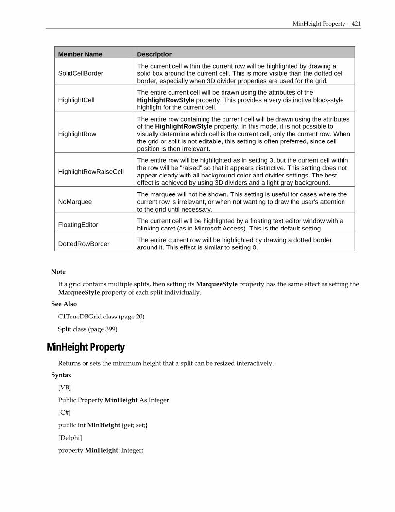
MinHeight Property · 421
Member Name Description
SolidCellBorder The current cell within the current row will be highlighted by drawing a solid box around the current cell. This is more visible than the dotted cell border, especially when 3D divider properties are used for the grid.
HighlightCell The entire current cell will be drawn using the attributes of the HighlightRowStyle property. This provides a very distinctive block-style highlight for the current cell.
HighlightRow
The entire row containing the current cell will be drawn using the attributes of the HighlightRowStyle property. In this mode, it is not possible to visually determine which cell is the current cell, only the current row. When the grid or split is not editable, this setting is often preferred, since cell position is then irrelevant.
HighlightRowRaiseCell
The entire row will be highlighted as in setting 3, but the current cell within the row will be "raised" so that it appears distinctive. This setting does not appear clearly with all background color and divider settings. The best effect is achieved by using 3D dividers and a light gray background.
NoMarquee The marquee will not be shown. This setting is useful for cases where the current row is irrelevant, or when not wanting to draw the user's attention to the grid until necessary.
FloatingEditor The current cell will be highlighted by a floating text editor window with a blinking caret (as in Microsoft Access). This is the default setting.
DottedRowBorder The entire current row will be highlighted by drawing a dotted border around it. This effect is similar to setting 0.
Note
If a grid contains multiple splits, then setting its MarqueeStyle property has the same effect as setting the MarqueeStyle property of each split individually.
See Also
C1TrueDBGrid class (page 20)
Split class (page 399)
MinHeight Property Returns or sets the minimum height that a split can be resized interactively.
Syntax
[VB]
Public Property MinHeight As Integer
[C#]
public int MinHeight {get; set;}
[Delphi]
property MinHeight: Integer;

422 · C1TrueDBGrid Reference
See Also
Split class (page 399)
MinWidth Property (Split) Returns or sets the minimum width that a split can be resized interactively.
Syntax
[VB]
Public Property MinWidth As Integer
[C#]
public int MinWidth {get; set;}
[Delphi]
property MinWidth: Integer;
See Also
Split class (page 399)
OddRowStyle Property (Split) Returns the OddRowStyle Style object.
Syntax
[VB]
Public Property OddRowStyle As Style
[C#]
public Style OddRowStyle {get; set;}
[Delphi]
property OddRowStyle: Style;
Remarks
This property sets or returns the Style object that controls the appearance of an odd-numbered row in a grid or split where the AlternatingRowStyle property is set to True. By default, this is the built-in OddRow style.
To change the appearance of even-numbered rows, set the EvenRowStyle property.
See Also
C1TrueDBGrid class (page 20)
C1TrueDBDropDown class (page 20)
Split class (page 399)
RecordSelectors Property (Split) · 423
RecordSelectors Property (Split) Returns or sets a value indicating if record selectors are displayed in a grid or split.
Syntax
[VB]
Public Property RecordSelectors As Boolean
[C#]
public bool RecordSelectors {get; set;}
[Delphi]
property RecordSelectors: Boolean;
Remarks
If True (the default), record selectors are displayed at the left edge of the grid or split.
If False, record selectors are not displayed.
If a grid contains multiple splits, then setting its RecordSelectors property has the same effect as setting the RecordSelectors property of each split individually.
See Also
C1TrueDBGrid class (page 20)
Split class (page 399)
RecordSelectorStyle Property (Split) Returns the RecordSelector Style object.
Syntax
[VB]
Public Property RecordSelectorStyle As Style
[C#]
public Style RecordSelectorStyle {get; set;}
[Delphi]
property RecordSelectorStyle: Style;
Remarks
This property returns the Style object that controls the appearance of RecordSelectors within a grid or split.
See Also
C1TrueDBGrid class (page 20)
Split class (page 399)
424 · C1TrueDBGrid Reference
RecordSelectorWidth Property (Split) Returns or sets the width of the RecordSelectors.
Syntax
[VB]
Public Property RecordSelectorWidth As Integer
[C#]
public int RecordSelectorWidth {get; set;}
[Delphi]
property RecordSelectorWidth: Integer;
Remarks
The RecordSelectorWidth property returns or sets the width of the RecordSelectors based on the coordinate system of the grid's container.
The RecordSelectorWidth returns to default when set to 0. The default width of the record selector column is equal to the width of the vertical scroll bar.
See Also
C1TrueDBGrid class (page 20)
Split class (page 399)
Rows Property Returns the collection of rows within the grid.
Syntax
[VB]
Public ReadOnly Property Rows As C1.Win.C1TrueDBGrid.BaseGrid.ViewRowList
[C#]
public C1.Win.C1TrueDBGrid.BaseGrid.ViewRowList Rows {get;}
[Delphi]
property Rows: C1.Win.C1TrueDBGrid.BaseGrid.ViewRowList;
See Also
Split class (page 399)
SelectedStyle Property (Split) Returns the SelectedStyle Style object.

SplitSize Property · 425
Syntax
[VB]
Public Property SelectedStyle As Style
[C#]
public Style SelectedStyle {get; set;}
[Delphi]
property SelectedStyle: Style;
Remarks
This property returns or sets the Style object that controls the appearance of selected rows and columns within a grid or split. By default, this is the built-in Selected style.
See Also
C1TrueDBGrid class (page 20)
Split class (page 399)
SplitSize Property Returns or sets the size of a split.
Syntax
[VB]
Public Property SplitSize As Integer
[C#]
public int SplitSize {get; set}
[Delphi]
property SplitSize: Integer;
Remarks
The meaning of the value returned by this property is determined by the split's SplitSizeMode property setting.
If SplitSizeMode is set to the default value of 0 - Scalable, then the value returned by the SplitSize property is an integer indicating the relative size of the split with respect to other scalable splits.
If SplitSizeMode is set to 1 - Exact, then the value returned by the SplitSize property is a floating point number indicating the exact size of the split in terms of the coordinate system of the grid's container.
If SplitSizeMode is set to 2 - Number of Columns, then the value returned by the SplitSize property is an integer indicating the number of columns displayed in the split.
Note
Note that when there is only one split (the grid's default behavior), the split spans the entire width of the grid, the SplitSizeMode property is always Scalable, and the SplitSize property is always 1. Setting either of these properties has no effect when there is only one split. If there are multiple splits, and all but

426 · C1TrueDBGrid Reference
one is removed, the SplitSizeMode and SplitSize properties of the remaining split automatically revert to 0 and 1, respectively.
See Also
Split class (page 399)
SplitSizeMode Property Determines how the SplitSize property is used to determine the actual size of a split.
Syntax
[VB]
Public Property SplitSizeMode As SizeModeEnum
[C#]
public SizeModeEnum SplitSizeMode {get; set;}
[Delphi]
property SplitSizeMode: SizeModeEnum;
Remarks
If set to 0 - Scalable (the default), then the value returned by the SplitSize property is an integer indicating the relative size of the split with respect to other scalable splits. For example, if a grid contains 3 scalable splits with SplitSize properties equal to 1, 2, and 3, then the size of each split would be 1/6, 1/3, and 1/2 of the total grid width, respectively.
If set to 1 - Exact, then the value returned by the SplitSize property is a floating point number indicating the exact size of the split in terms of the coordinate system of the grid's container. This setting allows the size of the split to be adjusted so that it always has the same width, even if new splits are added or existing splits are removed.
If set to 2 - Number of Columns, then the value returned by the SplitSize property is an integer indicating the number of columns displayed in the split, and the split will adjust its width to display the number of full columns specified by the SplitSize property. For example, if SplitSize is set to 2, and the user scrolls the split horizontally, then the width of the split will change so that 2 full columns are displayed, regardless of how wide the columns are.
Note
Consider a grid containing both scalable splits and splits with a fixed number of columns. If a split with a fixed number of columns is scrolled horizontally, the total width remaining for the scalable splits may change because grid columns are generally of different widths. However, the ratios of the sizes of the scalable splits remain the same as specified by their SplitSize properties.
Note that when there is only one split (the grid's default behavior), the split spans the entire width of the grid, the SplitSizeMode property is always 0 - Scalable, and the SplitSize property is always 1. Setting either of these properties has no effect when there is only one split. If there are multiple splits, and all but one is removed, the SplitSizeMode and SplitSize properties of the remaining split automatically revert to 0 and 1, respectively.
See Also
Split class (page 399)

SpringMode Property (Split) · 427
SpringMode Property (Split) Specifies whether the columns will resize when the grid is resized.
Syntax
[VB]
Public Property SpringMode As Boolean
[C#]
public bool SpringMode {get; set;}
[Delphi]
property SpringMode: Boolean;
Remarks
When this property is set to True and the grid is horizontally resized, the column widths for visible columns will expand and/or shrink proportionally.
When set to False (the default), column widths do not change as the grid is horizontally resized.
Note
Control the minimum width on a per column basis by using the MinWidth property of individual C1DataColumn objects.
See Also
C1TrueDBGrid class (page 20)
Split class (page 399)
Style Property (Split) Returns or sets the Style object.
Syntax
[VB]
Public Property Style As Style
[C#]
public Style Style {get; set;}
[Delphi]
property Style: Style;
Remarks
This property returns or sets the Style object that controls the normal appearance of a cell within a grid, column, or split. By default, this is the built-in Normal style.
See Also
C1TrueDBGrid class (page 20)
C1TrueDBDropDown class (page 20)

428 · C1TrueDBGrid Reference
See Also
C1DisplayColumn class (page 22)
Split class (page 399)
VerticalOffset Property Scrolls the grid vertically.
Syntax
[VB]
Public VerticalOffset As Integer
[C#]
public int VerticalOffset {get; set;}
[Delphi]
property VerticalOffset: Integer;
See Also
Split class (page 399)
VerticalScrollGroup Property (Split) Synchronizes vertical scrolling between splits.
Syntax
[VB]
Public VerticalScrollGroup As Integer
[C#]
public int VerticalScrollGroup {get; set;}
[Delphi]
property VerticalScrollGroup: Integer;
Remarks
This property is used to synchronize vertical scrolling between splits. All splits with the same ScrollGroup setting will be synchronized when vertical scrolling occurs within any one of them. Splits belonging to different groups can scroll independently, allowing different splits to display different parts of the database.
Note
Newly created splits have a ScrollGroup value of 1.
See Also
C1TrueDBGrid class (page 20)
Split class (page 399)

VScrollBar Property (Split) · 429
See Also
C1TrueDBDropDown class (page 20)
VScrollBar Property (Split) Sets the VBar object that controls the appearance of the vertical scrollbar.
Syntax
[VB]
Public ReadOnly Property VScrollBar As VBar
[C#]
public VBar VScrollBar {get;}
[Delphi]
property VScrollBar: VBar;
Remarks
This property returns or sets the VBar object that controls the appearance of the vertical scrollbar.
See Also
C1TrueDBGrid class (page 20)
Split class (page 399)
Split Methods
AddCellStyle Method (Split) Controls the font and color of cells within a grid, column, or split according to value.
Syntax
[VB]
Public Sub AddCellStyle(ByVal Condition As CellStyleFlag, ByVal Style As Style)
[C#]
object.AddCellStyle (CellStyleFlag condition, Style style)
[Delphi]
procedure AddCellStyle(Condition: CellStyleFlag; Style: Style);
Parameter Description
condition Combination of one or more CellStyleFlag constants.
style Style object that specifies font and color attributes.

430 · C1TrueDBGrid Reference
Remarks
This method allows the font and color of cells within a grid, column, or split to be controlled according to the status values (CellStyleFlag enumeration) specified by the condition argument:
Member Name Description
NormalCell The cell satisfies none of the conditions. For grouped rows, this is the only applicable cell style.
CurrentCell The cell is the current cell as specified by the Bookmark, Col, and SplitIndex properties. At any given time, only one cell can have this status. When the MarqueeStyle property is set to Floating Editor, this condition is ignored.
MarqueeRow The cell is part of a highlighted row marquee. When the MarqueeStyle property indicates that the entire current row is to be highlighted, all visible cells in the current row have this additional condition set.
UpdatedCell The cell contents have been modified by the user but not yet written to the database. This condition is also set when cell contents have been modified in code with the Text or Value properties.
SelectedRow The cell is part of a row selected by the user or in code. The SelectedRowCollection contains a bookmark for each selected row.
AllCells All Cells.
Add the first four values together to specify multiple cell conditions. For example, a cell status value of 9 (CellStyleFlag.CurrentCell + CellStyleFlag.SelectedRow) denotes a current cell within a selected row. Also a cell status value of 0 (CellStyleFlag.NormalCell) can be used to refer to only those cells without any of the four basic cell conditions.
The style argument specifies the attributes that will override the default font and color characteristics for cells within an object. For example, the following code causes updated cells to be displayed in red:
• Visual Basic Dim S As New C1.Win.C1TrueDBGrid.Style() S.ForeColor = System.Drawing.Color.Red C1TrueDBGrid1.AddCellStyle(C1.Win.C1TrueDBGRid.CellStyleFlag.UpdatedCell, S)
• C# C1.Win.C1TrueDBGrid.Style S = new C1.Win.C1TrueDBGrid.Style(); S.ForeColor = System.Drawing.Color.Red; C1TrueDBGrid1.AddCellStyle(C1.Win.C1TrueDBGRid.CellStyleFlag.UpdatedCell, S);
• Delphi var S: C1.Win.C1TrueDBGrid.Style; S := C1.Win.C1TrueDBGrid.Style.Create; S.ForeColor := System.Drawing.Color.Red; C1TrueDBGrid1.AddCellStyle(C1.Win.C1TrueDBGRid.CellStyleFlag.UpdatedCell, S);

AddRegexCellStyle Method (Split) · 431
Each time the AddCellStyle method is invoked, the specified cell condition is added to the list of existing conditions. Hence, by repeated use of this method it is possible to set up multiple conditions to affect the appearance of a grid, column, or split.
Note
If a cell condition already exists for a particular condition value, the new style setting replaces the existing one.
See Also
C1TrueDBGrid class (page 20)
C1TrueDBDropDown class (page 20)
C1DisplayColumn class (page 22)
Split class (page 399)
AddRegexCellStyle Method (Split) Controls the font and color of cells within a grid, column, or split according to their contents.
Syntax
[VB]
Public Sub AddRegexCellStyle(ByVal Condition As CellStyleFlag, ByVal Style As Style, ByVal Regex As String)
[C#]
object.AddRegexCellStyle (CellStyleFlag condition, Style style, String regex)
[Delphi]
procedure AddRegexCellStyle(Condition: CellStyleFlag; Style: Style; Regex: String);
Parameter Description
condition Combination of one or more CellstyleFlag constants.
style Style object that specifies font and color attributes.
regex A regular expression string.
Remarks
This method allows you to control the font and color of cells within a grid, column, or split according to their contents. The status values (CellStyleFlag enumeration) specified by the condition argument determine which cells are affected:
Member Name Description
NormalCell The cell satisfies none of the conditions. For grouped rows, this is the only applicable cell style.
CurrentCell The cell is the current cell as specified by the Bookmark, Col, and SplitIndex properties. At any given time, only one cell can have this status. When the MarqueeStyle property is set to Floating Editor, this condition is ignored.

432 · C1TrueDBGrid Reference
Member Name Description
MarqueeRow The cell is part of a highlighted row marquee. When the MarqueeStyle property indicates that the entire current row is to be highlighted, all visible cells in the current row have this additional condition set.
UpdatedCell The cell contents have been modified by the user but not yet written to the database. This condition is also set when cell contents have been modified in code with the Text or Value properties.
SelectedRow The cell is part of a row selected by the user or in code. The SelectedRowCollection contains a bookmark for each selected row.
AllCells All Cells.
Add the first four values together to specify multiple cell conditions. For example, a cell status value of (CellStyleFlag.CurrentCell + CellStyleFlag.SelectedRow) denotes a current cell within a selected row. Use a cell status value of (CellStyleFlag.NormalCell) to refer to only those cells without any of the four basic cell conditions. To designate that a cell condition should apply to all cells regardless of status, use a cell status value of CellStyleFlag.AllCells.
The regex argument is a regular expression string that describes the pattern matching to be performed on cell contents. The regular expressions supported by True DBGrid are a subset of standard Unix regular expression syntax:
p* Any pattern followed by an asterisk matches zero or more occurrences of that pattern. For example, ab*c matches ac, abc, and abbcy (partial match).
p+ Any pattern followed by a plus sign matches one or more occurrences of that pattern. For example, ab+c matches abc and abbcy, but not ac.
[list] A list of case-sensitive characters enclosed in brackets matches any one of those characters in the given position in the string. Character ranges can be used, as in [abcd], which is equivalent to [a-d]. Multiple ranges can also be used. For example, [A-Za-z0-9] matches any letter or digit. Bracketed patterns can also be combined with either the * or + operators. The pattern [A-Z]+ matches a sequence of one or more uppercase letters.
[^list] If a list starts with a caret, it matches any character except those specified in the list.
. (period) A period represents any single character.
^p A caret at the beginning of a pattern forces a match to occur at the start of a cell. Otherwise, the pattern can match anywhere within a cell.
p$ A dollar sign at the end of a pattern forces a match to occur at the end of a cell. Otherwise, the pattern can match anywhere within a cell.
\c Any character preceded by a backslash represents itself, unless enclosed in brackets, in which case the backslash is interpreted literally.
Any other character represents itself and will be compared with respect to case.
The style argument specifies the attributes that will override the default font and color characteristics for cells within an object. For example, the following code causes normal cells containing the letters "SQL" to be displayed in bold:
• Visual Basic Dim S As New C1.Win.C1TrueDBGrid.Style() Dim fntFont As New Font(S.Font.Name, S.Font.Size, FontStyle.Bold)

ClearCellStyle Method (Split) · 433
S.Font = fntFont C1TrueDBGrid1.AddRegexCellStyle(CellStyleFlag.NormalCell, S, "SQL")
• C# C1.Win.C1TrueDBGrid.Style S = new C1.Win.C1TrueDBGrid.Style(); Font fntFont = new Font(S.Font.Name, S.Font.Size, FontStyle.Bold); S.Font = fntFont; C1TrueDBGrid1.AddRegexCellStyle(CellStyleFlag.NormalCell, S, "SQL") ;
• Delphi var S: C1.Win.C1TrueDBGrid.Style; fntFont: Font; S := C1.Win.C1TrueDBGrid.Style.Create; fntFont := Font.Create(S.Font.Name, S.Font.Size, FontStyle.Bold); S.Font := fntFont; C1TrueDBGrid1.AddRegexCellStyle(CellStyleFlag.NormalCell, S,'SQL');
Each time the AddRegexCellStyle method is invoked, the specified cell condition is added to the list of existing conditions. Hence, by repeated use of this method it is possible to set up multiple conditions to affect the appearance of a grid, column, or split.
Note
If a cell condition already exists for a particular pair of condition and regex values, the new style setting replaces the existing one.
See Also
C1TrueDBGrid class (page 20)
C1TrueDBDropDown class (page 20)
C1DisplayColumn class (page 22)
Split class (page 399)
ClearCellStyle Method (Split) Removes a cell condition established with a previous call to the AddCellStyle method.
Syntax
[VB]
Public Sub ClearCellStyle(ByVal Condition As CellStyleFlag)
[C#]
object.ClearCellStyle (CellStyleFlag condition)
[Delphi]
procedure ClearCellStyle(Condition: CellStyleFlag);
Parameter Description
condition A combination of one or more CellStyleFlag constants.

434 · C1TrueDBGrid Reference
Remarks
The ClearCellStyle method removes a cell condition established with a previous call to the AddCellStyle method for the object in question. If no such cell condition exists, then calling this method has no effect.
If the condition argument is CellStyleFlag.AllCells, then all non-regex cell conditions are removed, regardless of status.
See Also
C1TrueDBGrid class (page 20)
C1TrueDBDropDown class (page 20)
C1DisplayColumn class (page 22)
Split class (page 399)
ClearRegexCellStyle Method (Split) Removes a cell condition established with a previous call to the AddRegexCellStyle method.
Syntax
[VB]
Public Sub ClearRegexCellStyle(ByVal Condition As CellStyleFlag)
Public Sub ClearRegexCellStyle(ByVal Condition As CellStyleFlag, ByVal Regex As String)
[C#]
object.ClearRegexCellStyle (CellStyleFlag condition, String regex)
object.ClearRegexCellstyle (CellStyleFlag condition)
[Delphi]
procedure ClearRegexCellStyle(Condition: CellStyleFlag);
procedure ClearRegexCellStyle(Condition: CellStyleFlag; Regex: string);
Parameter Description
Condition Combination of one or more CellStyleFlag constants.
Regex A regular expression string.
Remarks
The ClearRegexCellStyle method removes a cell condition established with a previous call to the AddRegexCellStyle method for the object in question. If no such cell condition exists, then calling this method has no effect.
If regex is omitted, then all cell conditions for any regular expression matching the condition argument are removed. If condition is CellStyleFlag.AllCells, then all regex cell conditions are removed, regardless of status or expression.

GetCellBounds Method · 435
If regex is supplied, then the single cell condition matching both arguments is removed. However, if condition is CellStyleFalg.AllCells, then all cell conditions for the specified regular expression are removed, regardless of status.
See Also
C1TrueDBGrid class (page 20)
C1TrueDBDropDown class (page 20)
C1DisplayColumn class (page 22)
Split class (page 399)
GetCellBounds Method Gets the rectangle that specifies the four corners of a cell.
Syntax
[VB]
Public Overridable Function GetCellBounds(ByVal Row As Integer, ByVal Col As Integer) As System.Drawing.Rectangle
[C#]
object.GetCellBounds (Integer Row, Integer Col) As System.Drawing.Rectangle
[Delphi]
function GetCellBounds(Row: Integer, Col: Integer): System.Drawing.Rectangle);
Parameter Description
Row Gets the rectangle row.
Col Gets the rectangle column.
See Also
Split class (page 399)
C1DisplayColumn Class C1DisplayColumn All Members
C1DisplayColumn Public Properties
AllowFocus Specifies whether the user has the ability to set focus to the column.
AllowSizing Specifies whether the user has the ability to size a column.
AutoComplete Specifies whether the user’s entry into the column is completed automatically.

436 · C1TrueDBGrid Reference
AutoDropDown Determines whether the drop-down control is displayed in response to keyboard input.
Button Specifies whether a button will be displayed in the upper right corner of the current cell.
ButtonAlways Determines whether a button is displayed on every row at all times.
ButtonFooter Specifies whether the column footer is also a button.
ButtonHeader Specifies whether the column header is also a button.
ButtonText Specifies whether the current cell takes on the appearance of a standard Windows command button.
CellTop Returns the vertical offset of the top of any cell in the specified column.
ColumnDivider Determines the style of the border drawn between Columns rows.
DataColumn Returns the associated C1DataColumn object.
DropDownList Determines whether an attached drop-down control acts like a list box.
EditorStyle Returns the Style object that controls the appearance of the cell editor within a grid.
FetchStyle Specifies whether the FetchCellStyle event will be raised.
FilterButton Specifies whether a button will be displayed in the upper right corner of the current filter cell.
FooterDivider Specifies whether the right edge of the column's footer is drawn with a vertical dividing line.
FooterStyle Returns the Style object that controls the appearance of column footers.
HeaderDivider Specifies whether the right edge of the column's header is drawn with a vertical dividing line.
HeadingStyle Returns the HeadingStyle Style object.
Height Height of Columns when the grid is in Inverted or Form DataView.
Locked Sets or returns a value indicating whether an object can be edited.
Merge Determines whether adjacent rows of like-valued data are merged within the specified column.
MinWidth Sets or returns the minimum width that a column can be sized to when the grid is resized.
OwnerDraw Specifies whether the OwnerDrawCell event will be raised.
Style Returns or sets the Style object for the column.
SubLine Returns the subline of a column in a multiline grid.
Visible Determines if the current cell is visible within the displayed area of the grid.
Width Sets or returns the width of a column.

AllowFocus Property (C1DisplayColumn) · 437
C1DisplayColumn Public Methods
AddCellStyle Controls the font and color of cells within a grid, column, or split according to value.
AddRegexCellStyle Controls the font and color of cells within a grid, column, or split according to their contents.
AutoSize Adjusts the width of a column to accommodate the longest visible field within that column.
ClearCellStyle Removes a cell condition established with a previous call to the AddCellStyle method.
ClearRegexCellStyle Removes a cell condition established with a previous call to the AddRegexCellStyle method.
C1DisplayColumn Properties
AllowFocus Property (C1DisplayColumn) Specifies whether the user has the ability to set focus to the column.
Syntax
[VB]
Public Property AllowFocus As Boolean
[C#]
public bool AllowFocus {get; set;}
[Delphi]
property AllowFocus: Boolean;
Remarks
If True (the default), the user will be able to interactively select the object, giving it focus.
If False, the user will not be able to interactively select the object. When clicked, the object will not receive focus and the control (or grid column) that previously had focus will retain it.
For C1DisplayColumn objects, setting AllowFocus to True enables cells within the object to receive focus. If set to False, there is no way to change the focus to a cell within the object. However, if an object already has the focus, setting AllowFocus to False will not give focus to another split, column, or control.
If a cell in a column which does not allow focus is clicked, and the cell is in a row other than the current row, then the row is changed, but the column with the focus retains it.
See Also
C1DisplayColumn class (page 22)
Split class (page 399)

438 · C1TrueDBGrid Reference
AllowSizing Property (C1DisplayColumn) Specifies whether the user has the ability to size a column.
Syntax
[VB]
Public Property AllowSizing As Boolean
[C#]
public bool AllowSizing {get; set;}
[Delphi]
property AllowSizing: Boolean;
Remarks
If True, the user can resize the column or split.
If False, the user cannot resize the column or split.
For columns, AllowSizing defaults to True.
If AllowSizing is True for a column, the mouse pointer turns into a double-headed arrow when positioned over that column's divider within the column heading area, and the user can resize the column by dragging. Any change in column size causes a ColResize event.
See Also
C1DisplayColumn class (page 22)
Split class (page 399)
AutoComplete Property Specifies whether the user’s entry into the column is completed automatically.
Syntax
[VB]
Public Property AutoComplete As Boolean
[C#]
public bool AutoComplete {get; set;}
[Delphi]
property AutoComplete: Boolean;
Remarks
This property determines whether matching incremental search values are automatically copied to the text portion of the column drop down during editing.
If True, when the user enters one or more characters that match a value in the drop down list, the entire matching string is copied to the text portion of the control. The caret is positioned after the last character typed, and the remainder of the string is selected.

AutoDropDown Property · 439
If False (the default), the automatic completion does not occur, and the text portion of the control contains only the characters entered by the user.
See Also
C1DisplayColumn class (page 22)
AutoDropDown Property Determines whether the drop-down control is displayed in response to keyboard input.
Syntax
[VB]
Public Property AutoDropDown As Boolean
[C#]
public bool AutoDropDown {get; set;}
[Delphi]
property AutoDropDown: Boolean;
Remarks
For columns with a built-in ValueItems combo box or associated C1TrueDBDropDown control, this property determines whether the drop-down control is displayed in response to keyboard input.
If True, the drop-down control automatically opens when the user types a character into a cell.
If False (the default), the user can only open the drop-down control by clicking the in-cell button or by pressing ALT + DOWN ARROW when a cell within the column has focus.
See Also
C1DisplayColumn class (page 22)
Button Property Specifies whether a button will be displayed in the upper right corner of the current cell.
Syntax
[VB]
Public Property Button As Boolean
[C#]
public bool Button {get; set;}
[Delphi]
property Button: Boolean;
Remarks
If True, a button will be displayed in the upper right corner of the current cell at run time.
If False (the default), no button will be displayed.

440 · C1TrueDBGrid Reference
Typically, the column button is enabled when wanting to drop down a Visual Basic control (such as the built-in combo box, a bound list box, or even another True DBGrid control) for editing or data entry. When the button in the current cell is clicked, the ButtonClick event will be raised. Then code can be written to drop down the desired control from the cell.
When you set the Presentation property of a column's ValueItems collection to either of the combo box options (sorted or unsorted), then the Button property for that column will be set to True. Similarly, if the Presentation property is set to the normal (text) or radio button option, then the Button property for that column will be set to False.
When you set the DropDown property of a column to a C1TrueDBDropDown control, then the Button property for that column will be set to True. Similarly, if you set the DropDown property of a column to an empty string, then the Button property for that column will be set to False.
Note
If both the Button and ButtonAlways properties are True, then all cells within the column are displayed with in-cell buttons, not just the current cell.
See Also
C1DisplayColumn class (page 22)
ButtonAlways Property Determines whether a button is displayed on every row at all times.
Syntax
[VB]
Public Property ButtonAlways As Boolean
[C#]
public bool ButtonAlways {get; set;}
[Delphi]
property ButtonAlways: Boolean;
Remarks
For columns with in-cell buttons, this property determines whether a button is displayed on every row at all times or only within the current cell.
If True, a button will always be displayed within every visible cell, even if another column or control has focus.
If False (the default), a button will be displayed within the current cell only.
Note
This property has no effect on columns without in-cell buttons. In-cell buttons are enabled for a column when any of the following are true:
• The column's Button property is set to True.
• The column's ButtonText property is set to True.
• The column's DropDown property is set to a C1TrueDBDropDown control.

ButtonFooter Property · 441
The Presentation property of the column's ValueItems collection is set to Combo Box or Sorted Combo Box.
See Also
C1DisplayColumn class (page 22)
ButtonFooter Property Specifies whether the column footer is also a button.
Syntax
[VB]
Public Property ButtonFooter As Boolean
[C#]
public bool ButtonFooter {get; set;}
[Delphi]
property ButtonFooter: Boolean;
Remarks
If True, the column footer depresses like a standard Windows command button when clicked by the user.
If False (the default), the column footer does not change its appearance when clicked by the user.
Typically, set the ButtonFooter property to True when wanting to perform a column-based action (such as summation) when the user clicks a column footer. Note that the FootClick event always is raised when the user clicks a column footer, even if ButtonFooter is False.
See Also
C1DisplayColumn class (page 22)
ButtonHeader Property Specifies whether the column header is also a button.
Syntax
[VB]
Public Property ButtonHeader As Boolean
[C#]
public bool ButtonHeader {get; set;}
[Delphi]
property ButtonHeader: Boolean;
Remarks
If True, the column header depresses like a standard Windows command button when clicked by the user.
If False (the default), the AllowColSelect property determines how the column header responds to mouse input.

442 · C1TrueDBGrid Reference
Typically, you set the ButtonHeader property to True when you want to perform a column-based action (such as sorting) when the user clicks a column header. Note that the HeadClick event always is raised when the user clicks a column header, even if ButtonHeader is False.
Note
If ButtonHeader is True, the user must hold down the CTRL key in order to select columns with the mouse.
See Also
C1DisplayColumn class (page 22)
ButtonText Property Specifies whether the current cell takes on the appearance of a standard Windows command button.
Syntax
[VB]
Public Property ButtonText As Boolean
[C#]
public bool ButtonText {get; set;}
[Delphi]
property ButtonText: Boolean;
Remarks
This property controls whether the current cell takes on the appearance of a standard Windows command button within the specified column.
If True, the current cell is rendered as a command button with the cell text as the label. When clicked by the user, the ButtonClick event is raised, just as it does for a graphical in-cell button.
If False (the default), the current cell is rendered as normal text and editing is permitted (unless otherwise restricted).
The ButtonText property takes precedence over the Button property. If both are True, then the graphical in-cell button is not displayed.
Note
If both the ButtonText and ButtonAlways properties are True, then all cells within the column are displayed as buttons, not just the current cell.
See Also
C1DisplayColumn class (page 22)
Caption Property (C1DisplayColumn) Returns or sets the caption to the grid.

CellTop Property · 443
Syntax
[VB]
Public Property Caption As System.String
[C#]
public string Caption {get; set;}
[Delphi]
property Caption: Boolean;
Remarks
For a C1TrueDBGrid control, this property determines the text displayed in the caption bar at the top of the grid.
Setting the Caption property to an empty string for a C1TrueDBGrid control hides its caption bar.
For a C1DataColumn object, this property determines the text displayed in the object's heading area.
Setting the Caption property to an empty string for a C1DataColumn object clears the text in the column's heading area but does not hide the heading. Column captions are only displayed if the grid's ColumnHeaders property is set to True.
Setting the Caption property to an empty string for a Split object hides the heading area, even if other splits have non-empty captions.
See Also
C1TrueDBGrid class (page 20)
C1DisplayColumn class (page 22)
Split class (page 399)
CellTop Property Returns the vertical offset of the top of any cell in the specified column.
Syntax
[VB]
Public ReadOnly Property CellTop As Integer
[C#]
public int CellTop {get;}
[Delphi]
property CellTop: Integer;
Remarks
The CellTop property returns the vertical offset of the top of any cell in the specified column relative to the top of the containing row in terms of the coordinate system of the grid's container.
A single record may span multiple lines in the grid. For columns on the first line, the CellTop property returns zero. For columns on the second line, the CellTop property returns the cell height (the grid's

444 · C1TrueDBGrid Reference
RowHeight property). For columns on the third line, the CellTop property returns twice the cell height, and so on.
For example, the following code places a text box on top of the grid cell in the first column of the fourth displayed row:
• Visual Basic With Me.C1TrueDBGrid1 Text1.Top = .Top + .RowTop(3) + .Columns(0).CellTop End With
• C# Text1.Top = .Top + C1TrueDBGrid1.RowTop[3] + C1TrueDBGrid1.Columns[0].CellTop;
• Delphi with Self.C1TrueDBGrid1 do Text1.Top := Top + RowTop[3] + Columns[0].CellTop;
See Also
C1DisplayColumn class (page 22)
ColumnDivider Property Determines the style of the border drawn between Columns rows.
Syntax
[VB]
Public ColumnDivider As GridLines
[C#]
public GridLines ColumnDivider {get; set;}
[Delphi]
property ColumnDivider: GridLines;
Remarks
This property determines the style of the border drawn between grid columns.
The ColumnDivider property does not control whether columns can be resized by dragging their border. Use the AllowSizing property to control this behavior.
See Also
C1DisplayColumn class (page 22)
DataColumn Property Returns the C1DataColumn object.
Syntax
[VB]
Public ReadOnly Property DataColumn As C1DataColumn
DropDownList Property · 445
[C#]
public C1DataColumn DataColumn {get;}
[Delphi]
property DataColumn: C1DataColumn;
Remarks
This property allows one to get a reference to the C1DataColumn object from a C1DisplayColumn.
See Also
C1DisplayColumn class (page 22)
DropDownList Property Determines whether an attached drop-down control acts like a list box.
Syntax
[VB]
Public Property DropDownList As Boolean
[C#]
public bool DropDownList {get; set;}
[Delphi]
property DropDownList: Boolean;
Remarks
For columns with a built-in ValueItems combo box or associated C1TrueDBDropDown control, this property determines whether the drop-down control acts like a list box.
If True, the drop-down control acts like a list box. That is, the user cannot type directly into the current cell, but can select a new value from the drop-down control.
If False (the default), the drop-down control acts like a combo box. That is, the user can either type directly into the current cell or select a new value from the drop-down control.
See Also
C1DisplayColumn class (page 22)
EditorStyle Property (C1DisplayColumn) Returns the Style object that controls the appearance of the cell editor within a grid.
Syntax
[VB]
Public Property EditorStyle As Style
[C#]
public Style EditorStyle {get; set;}

446 · C1TrueDBGrid Reference
[Delphi]
property EditorStyle: Style;
Remarks
This property returns the Style object that controls the appearance of the cell editor within a grid.
Note
The EditorStyle property only applies when the floating editor marquee (MarqueeStyle = 6) is not in effect.
See Also
C1TrueDBGrid class (page 20)
C1DisplayColumn class (page 22)
Split class (page 399)
FetchStyle Property Specifies whether the FetchCellStyle event will be raised.
Syntax
[VB]
Public Property FetchStyle As Boolean
[C#]
public bool FetchStyle {get; set;}
[Delphi]
property FetchStyle: Boolean;
Remarks
If True, the FetchCellStyle event will be raised as needed to determine the font and color characteristics of each cell in the associated column.
If False (the default), the FetchCellStyle event will not be raised.
Set this value to True when needing to perform complex per-cell formatting operations that can only be done using the FetchCellStyle event. For example, when wanting to apply fonts and/or colors to cells within a certain range, or cells that satisfy a complex expression, then set FetchStyle to True for the desired column(s) and write code for the FetchCellStyle event.
Note
To apply the same formatting to all cells within a row, then set the FetchRowStyles property instead of FetchStyle, and write code for the FetchRowStyle event instead of FetchCellStyle. This is much more efficient because events are raised on a per-row rather than on a per-cell basis.
See Also
C1DisplayColumn class (page 22)

FilterButton Property · 447
FilterButton Property Specifies whether a button will be displayed in the upper right corner of the current filter cell.
Syntax
[VB]
Public Property FilterButton As Boolean
[C#]
public bool FilterButton {get; set;}
[Delphi]
property FilterButton: Boolean;
Remarks
If True, a button will be displayed in the upper right corner of the current filter cell at run time. If False (the default), no button will be displayed. Typically, the column button is enabled when wanting to drop down a Visual Basic control (such as the built-in combo box, a bound list box, or even another True DBGrid control) for editing or data entry. When the button in the current cell is clicked, the FilterButtonClick event will be raised and then code can be written to drop down the desired control from the cell.
See Also
C1DisplayColumn class (page 22)
FooterDivider Property Specifies whether the right edge of the column's footer is drawn with a vertical dividing line.
Syntax
[VB]
Public Property FooterDivider As Boolean
[C#]
public bool FooterDivider {get; set;}
[Delphi]
property FooterDivider: Boolean;
Remarks
If True (the default), the right edge of the column's footer is drawn with a vertical dividing line.
If False, no dividing line is drawn in the column's header area.
See Also
C1DisplayColumn class (page 22)
FooterStyle Property (C1DisplayColumn) Returns the Style object that controls the appearance of column footers.

448 · C1TrueDBGrid Reference
Syntax
[VB]
Public Property FooterStyle As Style
[C#]
public Style FooterStyle {get; set;}
[Delphi]
property FooterStyle: Style;
Remarks
This property returns the Style object that controls the appearance of column footings within a grid, column, or split. By default, this is the built-in Footing style.
See Also
C1TrueDBGrid class (page 20)
C1TrueDBDropDown class (page 20)
C1DisplayColumn class (page 22)
Split class (page 399)
HeaderDivider Property Specifies whether the right edge of the column's header is drawn with a vertical dividing line.
Syntax
[VB]
Public Property HeaderDivider As Boolean
[C#]
public bool HeaderDivider {get; set;}
[Delphi]
property HeaderDivider: Boolean;
Remarks
If True (the default), the right edge of the column's header is drawn with a vertical dividing line.
If False, no dividing line is drawn in the column's header area.
Note
Setting this property to False does not prevent the user from resizing the column. Set the AllowSizing property to False to disable column resizing.
See Also
C1DisplayColumn class (page 22)

HeadingStyle Property (C1DisplayColumn) · 449
HeadingStyle Property (C1DisplayColumn) Returns the HeadingStyle Style object.
Syntax
[VB]
Public Property HeadingStyle As Style
[C#]
public Style HeadingStyle {get; set;}
[Delphi]
property HeadingStyle: Style;
Remarks
This property returns the Style object that controls the appearance of column headings within a grid, column, or split. By default, this is the built-in Heading style.
See Also
C1TrueDBGrid class (page 20)
C1TrueDBDropDown class (page 20)
C1DisplayColumn class (page 22)
Split class (page 399)
Height Property (C1DisplayColumn) Height of Columns when the grid is in Inverted or Form DataView.
Syntax
[VB]
Public Property Height as Integer
[C#]
Public int Height {get; set;}
[Delphi]
property Height: Integer;
See Also
C1DisplayColumn class (page 22)
Locked Property (C1DisplayColumn) Sets or returns a value indicating whether an object can be edited.

450 · C1TrueDBGrid Reference
Syntax
[VB]
Public Property Locked As Boolean
[C#]
public bool Locked {get; set;}
[Delphi]
property Locked: Boolean;
Remarks
If True, the user cannot modify data in the column or split.
If False (the default), the user can modify data in the column or split.
For Style objects, the Locked property controls the editability of the object to which the style is applied. It does not control the editability of the style object itself.
The value of the Locked property is inherited from the parent style (if any) unless explicitly overridden.
See Also
C1DisplayColumn class (page 22)
Style class (page 480)
Split class (page 399)
Merge Property Determines whether adjacent rows of like-valued data are merged within the specified column.
Syntax
[VB]
Public Property Merge As Boolean
[C#]
public bool Merge {get; set;}
[Delphi]
property Merge: Boolean;
Remarks
If True, then adjacent rows of like-valued data are merged into a single non-editable cell.
If False (the default), then all cell values are displayed individually, and editing is permitted (unless otherwise restricted).
Note
If the underlying data is translated by the FormatText event or the ValueItems collection, the translated (displayed) data is used for comparison.

MinWidth Property · 451
See Also
C1DisplayColumn class (page 22)
MinWidth Property Sets or returns the minimum width that a column can be sized to when the grid is resized.
Syntax
[VB]
Public MinWidth As Integer
[C#]
public int MinWidth {get; set;}
[Delphi]
property MinWidth: Integer;
Remarks
This property returns or sets the minimum width that a column can be sized to when the grid is resized and the SpringMode property is True.
See Also
C1DataColumn class (page 460)
OwnerDraw Property Specifies whether the OwnerDrawCell event will be raised.
Syntax
[VB]
Public Property OwnerDraw As Boolean
[C#]
public bool OwnerDraw {get; set;}
[Delphi]
property OwnerDraw: Boolean;
Remarks
If True, the OwnerDrawCell event will be raised as needed to display the contents of each cell in the associated column.
If False (the default), the OwnerDrawCell event will not be raised.
Set this value to True when you need to perform complex per-cell display operations that can only be done using the OwnerDrawCell event. For example, to display a metafile within a cell, set OwnerDraw to True for the desired column and write code for the OwnerDrawCell event.
See Also
C1DisplayColumn class (page 22)

452 · C1TrueDBGrid Reference
Style Property (C1DisplayColumn) Returns or sets the Style object.
Syntax
[VB]
Public Property Style As Style
[C#]
public Style Style {get; set;}
[Delphi]
property Style: Style;
Remarks
This property returns or sets the Style object that controls the normal appearance of a cell within a grid, column, or split. By default, this is the built-in Normal style.
See Also
C1TrueDBGrid class (page 20)
C1TrueDBDropDown class (page 20)
C1DisplayColumn class (page 22)
Split class (page 399)
SubLine Property Returns the subline of a column in a multiline grid.
Syntax
[VB]
Public Property SubLine As Integer
[C#]
public int SubLine {get;}
[Delphi]
property SubLine: Integer;
See Also
C1DisplayColumn class (page 22)
Visible Property (C1DisplayColumn) Specifies whether a column in a grid or split is currently visible.

Width Property (C1DisplayColumn) · 453
Syntax
[VB]
Public Property Visible As Boolean
[C#]
public bool Visible {get; set;}
[Delphi]
property Visible: Boolean;
Remarks
This property returns a Boolean indicating whether a column in a grid or split is currently visible or capable of being scrolled into view.
If True, then the column has not been hidden in code or by the user.
If False, then the column is hidden and cannot be scrolled into view.
For columns created at design time, the default value of this property is True. For columns created in code at run time, the default value of this property is False.
Note
If a column has been scrolled out of view, its Visible property remains True.
See Also
C1DisplayColumn class (page 22)
Width Property (C1DisplayColumn) Sets or returns the width of a column.
Syntax
[VB]
Public Property Width As Integer
[C#]
public int Width {get; set;}
[Delphi]
property Width: Integer;
Remarks
This property returns or sets the width of a column in terms of the coordinate system of the grid's container.
Use the Width property in conjunction with Left, RowHeight, and RowTop to determine the size and placement of controls displayed on top of a grid cell.
Note
The DefColWidth property controls the default width of new columns created at run time.

454 · C1TrueDBGrid Reference
See Also
C1DisplayColumn class (page 22)
C1DisplayColumn Methods
AddCellStyle Method (C1DisplayColumn) Controls the font and color of cells within a grid, column, or split according to value.
Syntax
[VB]
Public Sub AddCellStyle(ByVal Condition As CellStyleFlag, ByVal Style As Style)
[C#]
object.AddCellStyle (CellStyleFlag condition, Style style)
[Delphi]
procedure AddCellStyle(Condition: CellStyleFlag; Style: Style);
Parameter Description
condition Combination of one or more CellstyleFlag constants.
style Style object that specifies font and color attributes.
Remarks
This method controls the font and color of cells within a grid, column, or split according to the status values (CellStyleFlag enumeration) specified by the condition argument:
Member Name Description
NormalCell The cell satisfies none of the conditions. For grouped rows, this is the only applicable cell style.
CurrentCell The cell is the current cell as specified by the Bookmark, Col, and SplitIndex properties. At any given time, only one cell can have this status. When the MarqueeStyle property is set to Floating Editor, this condition is ignored.
MarqueeRow The cell is part of a highlighted row marquee. When the MarqueeStyle property indicates that the entire current row is to be highlighted, all visible cells in the current row have this additional condition set.
UpdatedCell The cell contents have been modified by the user but not yet written to the database. This condition is also set when cell contents have been modified in code with the Text or Value properties.
SelectedRow The cell is part of a row selected by the user or in code. The SelectedRowCollection contains a bookmark for each selected row.
AllCells All Cells.

AddRegexCellStyle Method (C1DisplayColumn) · 455
Add the first four values together to specify multiple cell conditions. For example, a cell status value of 9 (CellStyleFlag.CurrentCell + CellStyleFlag.SelectedRow) denotes a current cell within a selected row. A cell status value of 0 (CellStyleFlag.NormalCell) can also be used to refer to only those cells without any of the four basic cell conditions.
The style argument specifies the attributes that will override the default font and color characteristics for cells within an object. For example, the following code causes updated cells to be displayed in red:
• Visual Basic Dim S As New C1.Win.C1TrueDBGrid.Style() S.ForeColor = System.Drawing.Color.Red C1TrueDBGrid1.AddCellStyle(C1.Win.C1TrueDBGRid.CellStyleFlag.UpdatedCell, S)
• C# C1.Win.C1TrueDBGrid.Style S = new C1.Win.C1TrueDBGrid.Style(); S.ForeColor = System.Drawing.Color.Red; C1TrueDBGrid1.AddCellStyle(C1.Win.C1TrueDBGRid.CellStyleFlag.UpdatedCell, S)
• Delphi var S: C1.Win.C1TrueDBGrid.Style; S := C1.Win.C1TrueDBGrid.Style.Create; S.ForeColor := System.Drawing.Color.Red; C1TrueDBGrid1.AddCellStyle(C1.Win.C1TrueDBGRid.CellStyleFlag.UpdatedCell, S);
Each time the AddCellStyle method is invoked, the specified cell condition is added to the list of existing conditions. Hence, by repeated use of this method it is possible to set up multiple conditions to affect the appearance of a grid, column, or split.
Note
If a cell condition already exists for a particular condition value, the new style setting replaces the existing one.
See Also
C1TrueDBGrid class (page 20)
C1TrueDBDropDown class (page 20)
C1DisplayColumn class (page 22)
Split class (page 399)
AddRegexCellStyle Method (C1DisplayColumn) Controls the font and color of cells within a grid, column, or split according to their contents.
Syntax
[VB]
Public Sub AddRegexCellStyle(ByVal Condition As CellStyleFlag, ByVal Style As Style, ByVal Regex As String)

456 · C1TrueDBGrid Reference
[C#]
object.AddRegexCellStyle (CellStyleFlag condition, Style style, String regex)
[Delphi]
procedure AddRegexCellStyle(Condition: CellStyleFlag; Style: Style; Regex: string);
Parameter Description
condition Combination of one or more CellstyleFlag constants.
style Style object that specifies font and color attributes.
regex A regular expression string.
Remarks
This method allows you to control the font and color of cells within a grid, column, or split according to their contents. The status values (CellStyleFlag enumeration) specified by the condition argument determine which cells are affected:
Member Name Description
NormalCell The cell satisfies none of the conditions. For grouped rows, this is the only applicable cell style.
CurrentCell The cell is the current cell as specified by the Bookmark, Col, and SplitIndex properties. At any given time, only one cell can have this status. When the MarqueeStyle property is set to Floating Editor, this condition is ignored.
MarqueeRow The cell is part of a highlighted row marquee. When the MarqueeStyle property indicates that the entire current row is to be highlighted, all visible cells in the current row have this additional condition set.
UpdatedCell The cell contents have been modified by the user but not yet written to the database. This condition is also set when cell contents have been modified in code with the Text or Value properties.
SelectedRow The cell is part of a row selected by the user or in code. The SelectedRowCollection contains a bookmark for each selected row.
AllCells All Cells.
Add the first four values together to specify multiple cell conditions. For example, a cell status value of (CellStyleFlag.CurrentCell + CellStyleFlag.SelectedRow) denotes a current cell within a selected row. Also use a cell status value of (CellStyleFlag.NormalCell) to refer to only those cells without any of the four basic cell conditions. To designate that a cell condition should apply to all cells regardless of status, use a cell status value of CellStyleFlag.AllCells.
The regex argument is a regular expression string that describes the pattern matching to be performed on cell contents. The regular expressions supported by True DBGrid are a subset of standard Unix regular expression syntax:
p* Any pattern followed by an asterisk matches zero or more occurrences of that pattern. For example, ab*c matches ac, abc, and abbcy (partial match).
AddRegexCellStyle Method (C1DisplayColumn) · 457
p+ Any pattern followed by a plus sign matches one or more occurrences of that pattern. For example, ab+c matches abc and abbcy, but not ac.
[list] A list of case-sensitive characters enclosed in brackets matches any one of those characters in the given position in the string. Character ranges can be used, as in [abcd], which is equivalent to [a-d]. Multiple ranges can also be used. For example, [A-Za-z0-9] matches any letter or digit. Bracketed patterns can also be combined with either the * or + operators. The pattern [A-Z]+ matches a sequence of one or more uppercase letters.
[^list] If a list starts with a caret, it matches any character except those specified in the list.
. (period) A period represents any single character.
^p A caret at the beginning of a pattern forces a match to occur at the start of a cell. Otherwise, the pattern can match anywhere within a cell.
p$ A dollar sign at the end of a pattern forces a match to occur at the end of a cell. Otherwise, the pattern can match anywhere within a cell.
\c Any character preceded by a backslash represents itself, unless enclosed in brackets, in which case the backslash is interpreted literally.
Any other character represents itself and will be compared with respect to case.
The style argument specifies the attributes that will override the default font and color characteristics for cells within an object. For example, the following code causes normal cells containing the letters "SQL" to be displayed in bold:
• Visual Basic Dim S As New C1.Win.C1TrueDBGrid.Style() Dim fntFont As New Font(S.Font.Name, S.Font.Size, FontStyle.Bold) S.Font = fntFont C1TrueDBGrid1.AddRegexCellStyle(CellStyleFlag.NormalCell, S, "SQL")
• C# C1.Win.C1TrueDBGrid.Style S = new C1.Win.C1TrueDBGrid.Style(); FontfntFont =new Font(S.Font.Name, S.Font.Size, FontStyle.Bold); S.Font = fntFont C1TrueDBGrid1.AddRegexCellStyle(CellStyleFlag.NormalCell, S, "SQL")
• Delphi var S: C1.Win.C1TrueDBGrid.Style; fntFont: Font; S := C1.Win.C1TrueDBGrid.Style.Create; fntFont := Font.Create(S.Font.Name, S.Font.Size, FontStyle.Bold); S.Font := fntFont; C1TrueDBGrid1.AddRegexCellStyle(CellStyleFlag.NormalCell, S,'SQL');
Each time the AddRegexCellStyle method is invoked, the specified cell condition is added to the list of existing conditions. Hence, by repeated use of this method it is possible to set up multiple conditions to affect the appearance of a grid, column, or split.
Note
If a cell condition already exists for a particular pair of condition and regex values, the new style setting replaces the existing one.

458 · C1TrueDBGrid Reference
See Also
C1TrueDBGrid class (page 20)
C1TrueDBDropDown class (page 20)
C1DisplayColumn class (page 22)
Split class (page 399)
AutoSize Method (C1DisplayColumn) Adjusts the width of a column to accommodate the longest visible field within that column.
Syntax
[VB]
Public Sub AutoSize()
[C#]
C1DisplayColumn.AutoSize ()
[Delphi]
procedure AutoSize;
Remarks
The AutoSize method adjusts the width of a column to accommodate the longest visible field within that column. Calling this method in code has the same effect as the user double-clicking a column divider.
If the column is hidden or scrolled out of view, calling this method results in a trappable error.
The AllowSizing property must be set to True for columns to be resized by the user. However, the AutoSize method can be used when the column's AllowSizing property is False, just as the column width can be set when AllowSizing is False.
See Also
C1DisplayColumn class (page 22)
ClearCellStyle Method (C1DisplayColumn) Removes a cell condition established with a previous call to the AddCellStyle method.
Syntax
[VB]
Public Sub ClearCellStyle(ByVal Condition As CellStyleFlag)
[C#]
object.ClearCellStyle (CellStyleFlag condition)
[Delphi]
procedure ClearCellStyle(Condition: CellStyleFlag);

ClearRegexCellStyle Method (C1DisplayColumn) · 459
Parameter Description
condition A combination of one or more CellStyleFlag constants.
Remarks
The ClearCellStyle method removes a cell condition established with a previous call to the AddCellStyle method for the object in question. If no such cell condition exists, then calling this method has no effect.
If the condition argument is CellStyleFlag.AllCells, then all non-regex cell conditions are removed, regardless of status.
See Also
C1TrueDBGrid class (page 20)
C1TrueDBDropDown class (page 20)
C1DisplayColumn class (page 22)
Split class (page 399)
ClearRegexCellStyle Method (C1DisplayColumn) Removes a cell condition established with a previous call to the AddRegexCellStyle method.
Syntax
[VB]
Public Sub ClearRegexCellStyle(ByVal Condition As CellStyleFlag)
Public Sub ClearRegexCellStyle(ByVal Condition As CellStyleFlag, ByVal Regex As String)
[C#]
object.ClearRegexCellStyle (CellStyleFlag condition, String regex)
object.ClearRegexCellstyle (CellStyleFlag condition)
[Delphi]
procedure ClearRegexCellStyle (Condition: CellStyleFlag);
procedure ClearRegexCellStyle (Condition: CellStyleFlag; Regex: string);
Parameter Description
condition Combination of one or more CellStyleFlag constants.
regex A regular expression string.
Remarks
The ClearRegexCellStyle method removes a cell condition established with a previous call to the AddRegexCellStyle method for the object in question. If no such cell condition exists, then calling this method has no effect.

460 · C1TrueDBGrid Reference
If regex is omitted, then all cell conditions for any regular expression matching the condition argument are removed. If condition is CellStyleFlag.AllCells, then all regex cell conditions are removed, regardless of status or expression.
If regex is supplied, then the single cell condition matching both arguments is removed. However, if condition is CellStyleFalg.AllCells, then all cell conditions for the specified regular expression are removed, regardless of status.
See Also
C1TrueDBGrid class (page 20)
C1TrueDBDropDown class (page 20)
C1DisplayColumn class (page 22)
Split class (page 399)
C1DataColumn class C1DataColumn All Members
C1DataColumn Public Properties
Aggregate Returns the type of aggregate computed for a grouped row.
ButtonPicture Sets or returns the bitmap used to draw the in-cell button for the current cell in a column.
Caption Returns or sets the caption to the grid.
DataChanged Returns or sets a value indicating that the data in the bound control has been changed by some process other than that of retrieving data from the current record. Not available at design time.
DataField Sets or returns the name of the field in the database table to which a grid column is bound.
DataWidth Holds the database width, in bytes, for a grid column.
DefaultValue Sets or returns the default value of an unbound grid column in a bound grid.
DropDown Determines whether the drop-down control is displayed in response to keyboard input.
EditMask Specifies an input mask template for end-user data entry.
EditMaskUpdate Specifies whether the modified cell text is updated to the database.
Editor Allows editing of cell data using external controls (e.g., C1Input).
FilterButtonPicture Sets or returns the bitmap used to draw the in-cell button for the current filter in a column.
FilterEscape Used to identify those characters that should be escaped when applying the filter criteria to the datasource.
FilterOperator Controls the operator that is used for a filter expression.
FilterText Sets or returns the data associated with the value of the filter for a column.

Aggregate Property · 461
FooterText Sets or returns the text displayed in the column's footing area.
GroupInfo Returns the GroupInfo associated with this column.
Level Specifies what level in the hierarchy the column object belongs to.
NumberFormat Sets or returns a value indicating the format string for a grid column.
SortDirection Indicates the sort director for a column.
Tag Sets or returns an expression that stores any extra data needed for the application.
Text Sets or returns the formatted data value in a column for the current row.
Value Sets or returns the underlying data value in a column for the current row.
ValueItems Returns a ValueItems object for a column.
C1DataColumn Public Methods
CellText Returns a formatted string representation of the data in a column.
CellValue Returns the raw data value in a column for the specified row.
Refresh Discards all data and repopulates all cells from a data source.
RefreshCell Repaints the specified cell.
Refetch Repopulates the cells of the specified column from a data source.
RefetchCell Repopulates the specified cell from a data source control.
C1DataColumn Properties
Aggregate Property Returns the type of aggregate computed for a grouped row.
Syntax
[VB]
Public Property Aggregate As AggregateEnum
[C#]
public AggregateEnum Aggregate {get; set;}
[Delphi]
property Aggregate: AggregateEnum;
Remarks
Possible values for this property are:
462 · C1TrueDBGrid Reference
Member Name Description
Average Average of the numerical values.
Count Count of non-empty values.
Custom Causes the GroupAggregate event to be raised.
Max Maximum value (numerical, string, or date).
Min Minimum value (numerical, string, or date).
None No aggregate is calculated or displayed.
Std Standard deviation (using formula for Sample, n-1).
StdPop Standard deviation (using formula for Population, n).
Sum Sum of numerical values.
Var Variance (using formula for Sample, n-1).
VarPop Variance (using formula for Population, n).
See Also
C1TrueDBGrid class (page 20)
ButtonPicture Property Sets or returns the bitmap used to draw the in-cell button for the current cell in a column.
Syntax
[VB]
Public Property ButtonPicture As Image
[C#]
public Image ButtonPicture {get; set;}
[Delphi]
property ButtonPicture: Image;
Remarks
This property sets or returns the bitmap used to draw the in-cell button for the current cell in the specified column. The in-cell button bitmap is enabled when any of the following are true:
• The column's Button property is set to True.
• The column's DropDown property is set to the name of a C1TrueDBDropDown control.
• The Presentation property of the column's ValueItems collection is set to Combo Box or Sorted Combo Box.
By default, True DBGrid uses a down arrow for the in-cell button.
Caption Property (C1DataColumn) · 463
However, the button bitmap can be changed at design time using either the General or Columns property page. Or, a bitmap can be assigned to the ButtonPicture property in code at run time:
• Visual Basic Me.C1TrueDBGrid1.Columns(1).ButtonPicture = System.Drawing.Image.FromFile(“C:\Seaside.bmp”)
• C# this.C1TrueDBGrid1.Columns(1).ButtonPicture = System.Drawing.Image.FromFile(“C:\Seaside.bmp”)
• Delphi Self.C1TrueDBGrid1.Columns[1].ButtonPicture := System.Drawing.Image.FromFile(‘C:\Seaside.bmp’);
Note
The grid automatically draws the edges corresponding to the button's up/down states as appropriate, so only the interior image needs provided(a light gray background is recommended).
See Also
C1DataColumn class (page 460)
Caption Property (C1DataColumn) Returns or sets the caption to the grid.
Syntax
[VB]
Public Caption As System.String
[C#]
public string Caption {get; set;}
[Delphi]
property Caption: string;
Remarks
For a C1TrueDBGrid control, this property determines the text displayed in the caption bar at the top of the grid.
Setting the Caption property to an empty string for a C1TrueDBGrid control hides its caption bar.
For a C1DataColumn object, this property determines the text displayed in the object's heading area.
Setting the Caption property to an empty string for a C1DataColumn object clears the text in the column's heading area but does not hide the heading. Column captions are only displayed if the grid's ColumnHeaders property is set to True.
Setting the Caption property to an empty string for a Split object hides the heading area, even if other splits have non-empty captions.

464 · C1TrueDBGrid Reference
See Also
C1TrueDBGrid class (page 20)
C1DisplayColumn class (page 22)
C1DataColumn class (page 460)
Split class (page 399)
DataField Property (C1DataColumn) Sets or returns the name of the field in the database table to which a grid column is bound.
Syntax
[VB]
Public DataField As String
[C#]
public string DataField {get; set;}
[Delphi]
property DataField: string;
Remarks
The DataField property returns or sets the name of the field in the database table to which a grid column is bound.
The DataField property is used to bind a column to a particular field in the database table. If the specified field does not exist in the database table, binding does not occur, and the column will be blank at run time.
To specify an unbound column in a bound grid, the DataField property must be empty in order for the column data to be requested in the UnboundColumnFetch event.
See Also
C1DataColumn class (page 460)
DataWidth Property Holds the database width, in bytes, for a grid column.
Syntax
[VB]
Public Property DataWidth As Integer
[C#]
public int DataWidth {get; set;}
[Delphi]
property DataWidth: Integer;

DefaultValue Property · 465
Remarks
This property holds the database width, in bytes, for a grid column. It is set to the appropriate field width (not display width) automatically when the layout of a bound grid is initialized at run time.
This property does not affect the physical size of a column, but imposes a limit on the number of characters that may be entered when editing a cell. If set to 0, no such limits are imposed. Setting this property does not cause truncation of existing data.
See Also
C1DataColumn class (page 460)
DefaultValue Property Sets or returns the default value of an unbound grid column in a bound grid.
Syntax
[VB]
Public Property DefaultValue As String
[C#]
public string DefaultValue {get; set;}
[Delphi]
property DefaultValue: string;
Remarks
This property returns or sets the default value of an unbound grid column in a bound grid. Unbound columns are typically used to display calculated fields or local data not maintained by the primary data source.
This property applies only to unbound columns. The value specified will be preloaded into the last argument passed to the UnboundColumnFetch event.
The DefaultValue property can also be used to identify specific columns in the UnboundColumnFetch event when columns are added, moved, or removed at run time.
This property can also be used as a tag for a column (whether it is bound or unbound). Arbitrary values can be stored and retrieved later.
See Also
C1DataColumn class (page 460)
DropDown Property Associates a C1TrueDBDropDown control with a column in a C1TrueDBGrid control.
Syntax
[VB]
Public Property DropDown As C1TrueDBDropDown

466 · C1TrueDBGrid Reference
[C#]
public C1TrueDBDropDown DropDown {get; set;}
[Delphi]
property DropDown: C1TrueDBDropDown;
Remarks
This property associates a C1TrueDBDropDown control with a column in a C1TrueDBGrid control. When the user clicks the column's in-cell button, the associated C1TrueDBDropDown control is displayed below the current cell.
Use the DropDown property and a C1TrueDBDropDown control to implement a multicolumn drop-down list box that works seamlessly with a C1TrueDBGrid control. The ListField property of the drop-down control determines which column is used for incremental search. The DataField property of the drop-down control determines which grid column is updated when the user selects an item.
Note
When the DropDown property of a column is set to a C1TrueDBDropDown control, then the Button property for that column will be set to True. Similarly, if the DropDown property of a column is set to null, then the Button property for that column will be set to False.
See Also
C1DataColumn class (page 460)
EditMask Property Specifies an input mask template for end-user data entry.
Syntax
[VB]
Public Property EditMask As String
[C#]
public string EditMask {get; set;}
[Delphi]
property EditMask: string;
Remarks
The EditMask property allows an input mask to be specified for automatic input formatting and validation. The mask syntax is similar to the one used by Microsoft Access. Setting the input mask for a column will prevent the user from entering any information in the cell that is not in the format of the EditMask string.
The EditMask must be a string composed of the following symbols:
1. Wildcards
0 digit
9 digit or space

EditMaskUpdate Property · 467
# digit or sign
L letter
? letter or space
a letter or digit
a letter, digit, or space
& any character
2. Localized characters
. localized decimal separator
, localized thousand separator
: localized time separator
/ localized date separator
3. Command characters
\ next character is taken as a literal
> translate letters to uppercase
< translate letters to lowercase
For example:
• Visual Basic ' set the mask so the user can enter a phone number, ' with optional area code, and a state in capitals. Me.C1TrueDBGrid.Columns(0).EditMask = "(###) 000-0000 St\ate\: >LL";
• C# " set the mask so the user can enter a phone number, " with optional area code, && a state in capitals. Me.C1TrueDBGrid.Columns(0).EditMask = "(###) 000-0000 St\ate\: >LL";
• Delphi // set the mask so the user can enter a phone number,; // with optional area code, and a state in capitals.; Self.C1TrueDBGrid.EditMask := '(###) 000-0000 St\ate\: >LL';
See Also
C1DataColumn class (page 460)
EditMaskUpdate Property Specifies whether the modified cell text is updated to the database.

468 · C1TrueDBGrid Reference
Syntax
[VB]
Public Property EditMaskUpdate As Boolean
[C#]
public bool EditMaskUpdate {get; set;}
[Delphi]
property EditMaskUpdate: Boolean;
Remarks
Normally, after the user finishes editing a cell in a column that has its EditMask property set, C1TrueDBGrid caches the modified cell text, but any literal characters in the input mask template will be stripped from the modified cell text beforehand. However, this behavior can be overridden with the EditMaskUpdate property.
By default, the EditMaskUpdate property is False. This means that when the modified cell text is updated to the database, the grid sends the cached text (stripped of literals), not the formatted text displayed in the cell. This default behavior can be overridden by setting the EditMaskUpdate property to True, which causes the cached text to be formatted according to the EditMask property before being updated to the database.
See Also
C1DataColumn class (page 460)
Editor Property Allows editing of cell data using external controls.
Syntax
[VB]
Public Property Editor As System.Windows.Forms.Control
[C#]
public System.Windows.Forms.Control Editor {get; set;}
[Delphi]
property Editor: System.Windows.Forms.Control;
See Also
C1DataColumn class (page 460)
FilterButtonPicture Property Sets or returns the bitmap used to draw the in-cell button for the current filter in a column.
Syntax
[VB]
Public Property FilterButtonPicture As Image

FilterEscape Property · 469
[C#]
public Image FilterButtonPicture {get; set;}
[Delphi]
property FilterButtonPicture: Image;
Remarks
This property sets or returns the bitmap used to draw the in-cell button for the current filter in the specified column. The in-cell button bitmap is enabled when any of the following are true:
• The column's Button property is set to True.
• The column's DropDown property is set to the name of a C1TrueDBDropDown control.
The Presentation property of the column's ValueItems collection is set to Combo Box or Sorted Combo Box.
See Also
C1DataColumn class (page 460)
FilterEscape Property Used to identify those characters that should be escaped when applying the filter criteria to the datasource.
Syntax
[VB]
Public Property FilterEscape As String
[C#]
public string FilterEscape {get; set;}
[Delphi]
property FilterEscape: string;
Remarks
The default value for this property is "*%".
See Also
C1DataColumn class (page 460)
FilterOperator Property Controls the operator that is used for a filter expression.
Syntax
[VB]
Public Property FilterOperator As String
[C#]
public string FilterOperator {get; set;}

470 · C1TrueDBGrid Reference
[Delphi]
property FilterOperator: string;
Remarks
Leaving this property at it's default state uses the "=" operator for all expressions except for strings. String data types use the Like operator for example:
CustName like "john*"
If you define an operator for string type columns, no wildcards are inserted into the filter. For example if you set the FilterOperator to "=" then the above sample would filter as:
CustName = "john"
See Also
C1DataColumn class (page 460)
FilterText Property Sets or returns the data associated with the value of the filter for a column.
Syntax
[VB]
Public Property FilterText As String
[C#]
public string FilterText {get; set;}
[Delphi]
property FilterText: string;
Remarks
When applied to a C1DataColumn object, this property returns or sets the data associated with the value of the filter for the specified column.
See Also
C1DataColumn class (page 460)
FooterText Property Sets or returns the text displayed in the column's footing area.
Syntax
[VB]
Public Property FooterText As String
[C#]
public string FooterText {get; set;}
[Delphi]
property FooterText: string;

GroupInfo Property · 471
Remarks
This property returns or sets the text displayed in the column's footing area.
Setting the FooterText property to an empty string clears the text in the column's footing area but does not hide the footing. Column footings are only displayed if the grid's ColumnFooters property is set to True and the ColumnFooterHeight property is not set to 0.
The FooterText property is limited to 255 characters. Attempting to set the footer text to more than 255 characters results in a trappable error.
See Also
C1DataColumn class (page 460)
GroupInfo Property Returns the GroupInfo associated with this column.
Syntax
[VB]
Public Property GroupInfo As GroupInfo
[C#]
public GroupInfo GroupInfo {get; set;}
[Delphi]
property GroupInfo: GroupInfo;
See Also
C1DataColumn class (page 460)
Level Property Specifies what level in the hierarchy this column object belongs to.
Syntax
[VB]
Public Property Level As Integer
[C#]
public int Level {get; set;}
[Delphi]
property Level: Integer;
Remarks
This property should only be used when defining columns at design time when using a hierarchical datasource.
See Also
C1DataColumn class (page 460)

472 · C1TrueDBGrid Reference
NumberFormat Property Sets or returns a value indicating the format string for a grid column.
Syntax
[VB]
Public Property NumberFormat As String
[C#]
public string NumberFormat {get; set;}
[Delphi]
property NumberFormat: string;
Remarks
This property returns or sets a value indicating the format string for a grid column. By default, the NumberFormat property contains an empty string, and column data is unformatted.
For numeric data, the following predefined format names can be used:
General Number Display number as is, with no thousand separators.
Currency Display number with thousand separator, if appropriate; display two digits to the right of the decimal separator. Note that output is based on system locale settings.
Fixed Display at least one digit to the left and two digits to the right of the decimal separator.
Standard Display number with thousands separator, at least one digit to the left and two digits to the right of the decimal separator.
Percent Display number multiplied by 100 with a percent sign (%) appended to the right; always display two digits to the right of the decimal separator.
Scientific Use standard scientific notation.
Yes/No Display No if number is 0; otherwise, display Yes.
True/False Display False if number is 0; otherwise, display True.
On/Off Display Off if number is 0; otherwise, display On.
For date and time data, the following predefined format names can be used:
General Date Display a date and/or time. For real numbers, display a date and time (for example, 4/3/93 05:34 PM); if there is no fractional part, display only a date (for example, 4/3/93); if there is no integer part, display only a time (for example, 05:34 PM). Date display is determined by your system settings.
Long Date Display a date according to your system's long date format.
Medium Date Display a date using the medium date format appropriate for the language version of Visual Basic.
Short Date Display a date using your system's short date format.
Long Time Display a time using your system's long time format: includes hours, minutes, and seconds.

SortDirection Property · 473
Medium Time Display a time in 12-hour format using hours and minutes and the AM/PM designator.
Short Time Display a time using the 24-hour format (for example, 17:45).
For arbitrary data, the following predefined format names can be used:
Edit Mask Use the column's EditMask property to format the data for display as well as editing.
FormatText Event Fire the FormatText event for the associated column. This option allows you to write your own formatting code for situations where Visual Basic's intrinsic formatting is unavailable or does not suit your needs.
The NumberFormat property also accepts user-defined format strings. See the Microsoft Visual Basic documentation (Format function) for details.
If the NumberFormat property is set to an invalid string, cell data are displayed as #ERR#.
See Also
C1DataColumn class (page 460)
SortDirection Property Sets or returns the state of the sort direction indicators in the column caption.
Syntax
[VB]
Public Property SortDirection As SortDirEnum
[C#]
public SortDirEnum SortDirection {get; set;}
[Delphi]
property SortDirection: SortDirEnum;
See Also
C1DataColumn class (page 460)
Tag Property Sets or returns an expression that stores any extra data needed for the application.
Syntax
[VB]
Public Property Tag As Object
[C#]
public object Tag {get; set;}

474 · C1TrueDBGrid Reference
[Delphi]
property Tag: Object;
Remarks
This property returns or sets an expression that stores any extra data needed for the application. Unlike other properties, the value of the Tag property is not used by the grid.
See Also
C1DataColumn class (page 460)
Text Property Sets or returns the formatted data value in a column for the current row.
Syntax
[VB]
Public Property Text As String
[C#]
public string Text {get; set;}
[Delphi]
property Text: string;
Remarks
When applied to a C1DataColumn object, this property returns or sets the formatted data value in a column for the current row.
The value returned by the Text property is derived from the underlying data value by applying the formatting as specified by the NumberFormat property of the C1DataColumn object.
When the Text property is set for a formatted column, the underlying data value cannot be derived, and the Text and Value properties will subsequently return the same result.
Use the Value property to access the underlying data value in a column for the current row.
See Also
C1DataColumn class (page 460)
Value Property (C1DataColumn) Sets or returns the underlying data value in a column for the current row.
Syntax
[VB]
Public Property Value As Object
[C#]
public object Value {get; set;}

ValueItems Property · 475
[Delphi]
property Value: Object;
Remarks
This property returns or sets the underlying data value in a column for the current row.
The Value property is useful for simulating data entry within a cell. When this property is set, the value displayed in the cell respects the setting of the column's NumberFormat property.
This property always returns a string variant, even if the data type of the underlying field is numeric.
Use the Text property to access the formatted data value in a column for the current row.
See Also
C1DataColumn class (page 460)
ValueItems Property Returns a ValueItems object for a column.
Syntax
[VB]
Public ReadOnly Property ValueItems As ValueItems
[C#]
public ValueItems ValueItems {get;}
[Delphi]
property ValueItems: ValueItems;
Remarks
This property returns a ValueItems object for a column.
Note
At design time, use the ValueItems object to set presentation properties for a column.
In the ActiveX versions, Valueitems was a collection. In .NET, ValueItems is an object that has properties and also exposes a collection of Value/DisplayValue pairs.
See Also
C1DataColumn class (page 460)
C1DataColumn Methods
CellText Method Returns a formatted string representation of the data in a column.
Syntax
[VB]
Public Function CellText(ByVal Row As Integer) As String

476 · C1TrueDBGrid Reference
[C#]
C1DataColumn.CellText (Integer row)
[Delphi]
function CellText(Row: Integer): string;
Parameter Description
row An integer representing a grid row.
Return Value
A string containing the displayed column text for the specified row.
Remarks
The CellText method returns a formatted string representation of the data in a column for the row specified by the bookmark argument. Using the CellText method is similar to accessing the Text property, except that you can select a specific row from which to retrieve the value.
The value returned by the CellText method is derived from the underlying data value by applying the formatting as specified by the NumberFormat property of the C1DataColumn object.
Using the CellText method to extract information from a cell does not affect the current selection.
Use the CellValue method to access the unformatted data value for the specified row.
See Also
C1DataColumn class (page 460)
CellValue Method Returns the raw data value in a column for the specified row.
Syntax
[VB]
Public Function CellValue(ByVal Row As Integer) As Object
[C#]
public System.Object CellValue ( System.Int32 Row)
[Delphi]
function CellValue (Row: Integer): Object;
Parameter Description
row An integer representing a grid row.

Refetch Method · 477
Return Value
A variant containing the underlying data value for the specified row.
Remarks
The CellValue method returns the raw data value in a column for the row specified by the bookmark argument. Using the CellValue method is similar to accessing the Value property, except that a specific row can be selected from which to retrieve the value.
Using the CellValue method to extract information from a cell does not affect the current selection.
Use the CellText method to access the formatted data value for the specified row.
See Also
C1DataColumn class (page 460)
Refetch Method Repopulates the cells of the specified column from a data source.
Syntax
[VB]
Public Sub Refetch()
[C#]
C1DataColumn.Refetch ()
[Delphi]
procedure Refetch;
Remarks
The Refetch method repopulates the cells of the specified column from a data source control and/or unbound events. It also repaints the column's visible cells, firing all events necessary for redisplay.
By default, the grid retrieves data automatically as needed. It fetches rows in blocks of ten, and only gathers data for visible columns. However, in some cases, performance can be improved by fetching only the data for a single (changed) column. The Refetch method is provided for this purpose.
Note
The Refetch method does not force the data source control to refresh its own data from the underlying database. Use data control methods or options to accomplish this.
See Also
C1DataColumn class (page 460)
RefetchCell Method Repopulates the specified cell from a data source control.

478 · C1TrueDBGrid Reference
Syntax
[VB]
Public Sub RefetchCell()
Public Sub RefetchCell(ByVal Row As Integer)
[C#]
C1DataColumn.RefetchCell ()
C1DataColumn.RefetchCell [Integer Row]
[Delphi]
procedure RefetchCell;
procedure RefetchCell(Row: Integer);
Parameter Description
bookmark An optional variant that specifies the row containing the cell to refetch. If not specified, the current row is assumed. If specified, it must be a valid bookmark.
Remarks
The RefetchCell method repopulates the specified cell from a data source control and/or unbound events. It also repaints the cell, firing all events necessary for redisplay.
By default, the grid retrieves data automatically as needed. It fetches rows in blocks of ten, and only gathers data for visible columns. However, in some cases, performance can be improved by fetching only the data for a single (changed) cell. The RefetchCell method is provided for this purpose.
Note
The RefetchCell method does not force the data source control to refresh its own data from the underlying database. Data control methods or options must be used to accomplish this.
See Also
C1DataColumn class (page 460)
Refresh Method (C1DataColumn) Discards all data and repopulates all cells from a data source.
Syntax
[VB]
Public Sub Refresh()
[C#]
C1DataColumn.Refresh ()
RefreshCell Method · 479
[Delphi]
procedure Refresh;
Remarks
For a C1DataColumn object, the Refresh method repaints the entire column. Normally, the grid repaints automatically as needed. However, if handlers have been written for the Paint or OwnerDrawCell events, use this method to force a column to be repainted and hence cause the appropriate events to fire.
See Also
C1DataColumn class (page 460)
RefreshCell Method Repaints the specified cell.
Syntax
[VB]
Public Sub RefreshCell()
Public Sub RefreshCell(ByVal Row As Integer)
[C#]
C1DataColumn.RefreshCell ()
public void RefreshCell ( System.Int32 Row)
[Delphi]
procedure RefreshCell;
procedure RefreshCell(Row: Integer);
Parameter Description
bookmark An optional variant that specifies the row containing the cell to refresh. If not specified, the current row is assumed. If specified, it must be a valid bookmark.
Remarks
The Refresh method repaints the specified cell. Normally, the grid repaints automatically as needed. However, if handlers have been written for the Paint or OwnerDrawCell events, use this method to force a cell to be repainted and hence cause the appropriate events to fire.
Note
The RefreshCell method does not refetch data from a data source control.
See Also
C1DataColumn class (page 460)

480 · C1TrueDBGrid Reference
Style Class Style All Members
Style Public Properties
BackColor Controls the background color of an object.
BackgroundImage Specifies the background picture.
BackgroundPictureDrawMode Specifies the draw mode for the background picture.
Borders Sets a border style and color for a Style.
Font Specifies the font object for a Style
ForeColor Specifies the foreground color of an object.
ForeGroundImage Specifies the foreground picture.
ForeGroundPicturePosition Specifies the cell position of a foreground picture.
HorizontalAlignment Specifies the horizontal alignment of a cell.
Locked Specifies whether the column is read-only.
Trimming Specifies how cell text gets trimmed if necessary.
VerticalAlignment Specifies the vertical alignment of a cell.
WrapText Specifies if cell text gets wrapped.
Style Public Methods
Render Allows you to render the Style object with the given string.
Reset Resets the style to it’s initial state.
ResetBackColor Resets the BackColor property to its default value.
ResetBackgroundImage Resets the BackGroundImage property to its default value.
ResetBackgroundPictureDrawMode Resets the BackgroundPictureDrawMode property to its default value.
ResetFont Resets the Font property to its default value.
ResetForeColor Resets the ForeColor property to its default value.
ResetForegroundImage Resets the ForegroundImage property to its default value.
ResetForeGroundPicturePosition Resets the ForeGroundPicturePosition property to its default value.
ResetHorizontalAlignment Resets the HorizontalAlignment property to its default value.
ResetLocked Resets the Locked property to its default value.
ResetTrimming Resets the Trimming property to its default value.

BackColor Property (Style) · 481
ResetVerticalAlignment Resets the VerticalAlignment property to its default value.
ResetWrapText Resets the WrapText property to its default value.
Style Properties
BackColor Property (Style) Controls the background color of an object.
Syntax
[VB]
Public Property BackColor As Color
[C#]
public Color BackColor {get; set;}
[Delphi]
property BackColor: Color;
Remarks
This property controls the background color of an object. Colors may be specified as RGB values or system default colors.
The background color of a grid, column, or split is determined by its Style property setting. For these objects, the BackColor property is a shortcut to the BackColor member of the Style property.
For Style objects, the value of the BackColor property is inherited from the parent style (if any) unless explicitly overridden.
See Also
Style class (page 480)
BackgroundImage Property (Style) Sets or returns the background bitmap of a style object.
Syntax
[VB]
Public Property BackgroundImage As Image
[C#]
public Image BackgroundImage {get; set;}
[Delphi]
property BackgroundImage: Image;

482 · C1TrueDBGrid Reference
Remarks
This property sets or returns the background bitmap of a style object. If a style has no background bitmap, then this property returns a null.
Assign a bitmap to the BackgroundImage property in code at run time:
• Visual Basic Me.C1TrueDBGrid1.HeadingStyle.BackgroundPicture = System.Drawing.Image.FromFile(“C:\Seaside.bmp”)
• C# this.C1TrueDBGrid1.HeadingStyle.BackgroundPicture = System.Drawing.Image.FromFile(“C:\Seaside.bmp”);
• Delphi Self.C1TrueDBGrid1.HeadingStyle.BackgroundPicture := System.Drawing.Image.FromFile(‘C:\Seaside.bmp’);
Note
Use the BackgroundPictureDrawMode property to control how the background bitmap is displayed when the style is applied to an object.
See Also
Style class (page 480)
BackgroundPictureDrawMode Property Determines how a style's background bitmap is displayed when the style is applied to an object.
Syntax
[VB]
Public Property BackgroundPictureDrawMode as BackgroundPictureDrawModeEnum
[C#]
public BackgroundPictureDrawModeEnum BackgroundPictureDrawMode {get; set;}
[Delphi]
property BackgroundPictureDrawMode: BackgroundPictureDrawModeEnum;
Remarks
This property determines how a style's background bitmap is displayed when the style is applied to a data cell, header, footer, or caption bar.
Member Name Description
Center The background bitmap is centered within the object to which the style is applied.
Tile The background bitmap is drawn repeatedly, starting at the upper left corner of the object, until the entire area is filled.
Stretch The bitmap displayed is resized to fit the area occupied by the object. The original bitmap is not altered.

Borders Property · 483
Note
Use the BackgroundImage property to specify a background bitmap for a style.
See Also
Style class (page 480)
Borders Property Sets the style, color, and width for a set of cell borders.
Syntax
[VB]
Public Property Borders As GridBorders
[C#]
public GridBorders Borders {get; set;}
[Delphi]
property Borders: GridBorders;
Remarks
Every Style has a Borders property that allows the cell borders for the cells with that applied style to be altered. The five properties that make up the GridBorders object set the line width for each side of the cell and set its line style. In addition, it also lets the setting of the color of the cell border to any color within .NET.
See Also
Style class (page 480)
Font Property (Style) Sets the font object associated with a style.
Syntax
[VB]
Public Property Font As Font
[C#]
public Font Font {get; set;}
[Delphi]
property Font: Font;
Remarks
This property returns or sets the font object associated with a style.
For Style objects, the value of the Font property is inherited from the parent style (if any) unless explicitly overridden.

484 · C1TrueDBGrid Reference
See Also
Style class (page 480)
ForeColor Property (Style) Specifies the foreground color of an object.
Syntax
[VB]
Public Property ForeColor As Color
[C#]
public Color ForeColor {get; set;}
[Delphi]
property ForeColor: Color;
Remarks
This property controls the foreground color of an object. Colors may be specified as RGB values or system default colors.
For Style objects, the value of the ForeColor property is inherited from the parent style (if any) unless explicitly overridden.
See Also
Style class (page 480)
ForegroundImage Property (Style) Sets or returns the foreground bitmap of a style object.
Syntax
[VB]
Public Property ForegroundImage As Image
[C#]
public Image ForegroundImage {get; set;}
[Delphi]
property ForegroundImage: Image;
Remarks
This property sets or returns the foreground bitmap of a style object. If a style has no foreground bitmap, then this property returns a null variant.
Change a style's foreground bitmap at design time using the Style Factory property page. Or, assign a bitmap to the ForeGroundImage property in code at run time:

ForegroundPicturePosition Property · 485
• Visual Basic Me.C1TrueBGrid1.HeadingStyle.ForegroundImage = System.Drawing.Image.FromFile(“C:\Seaside.bmp”)
• C# this.C1TrueBGrid1.HeadingStyle.ForegroundImage = System.Drawing.Image.FromFile(“C:\Seaside.bmp”);
• Delphi Self.C1TrueBGrid1.HeadingStyle.ForegroundImage := System.Drawing.Image.FromFile(‘C:\Seaside.bmp’);
Note
Use the ForegroundPicturePosition property to control the placement of the bitmap relative to the cell or heading text when the style is applied to an object.
See Also
Style class (page 480)
ForegroundPicturePosition Property Determines where a style's foreground bitmap is displayed when the style is applied to an object
Syntax
[VB]
Public Property ForeGroundPicturePosition As ForegroundPicturePositionEnum
[C#]
public ForegroundPicturePositionEnum ForeGroundPicturePosition {get; set;}
[Delphi]
property ForeGroundPicturePosition: ForegroundPicturePositionEnum;
Remarks
This property determines where a style's foreground bitmap is displayed when the style is applied to a data cell, header, footer, or caption bar.
Member Name Description
Near Positions text on far side of cell.
Far Positions text on near side of cell.
LeftOfText Positions Foreground picture to the left of the cell text.
RightOfText Positions Foreground picture to the right of the cell text.
TopOfText Positions Foreground picture on top of the cell text.
BottomOfText Positions Foreground picture below the cell text.
PictureOnly Foreground picture is only display object included.
TextOnly Text is only display object included.

486 · C1TrueDBGrid Reference
Note
Use the ForeGroundImage property to specify a foreground bitmap for a style.
See Also
Style class (page 480)
HorizontalAlignment Property Sets or returns a value that determines the horizontal alignment of the values in an object.
Syntax
[VB]
Public Property HorizontalAlignment As AlignHorzEnum
[C#]
public AlignHorzEnum HorizontalAlignment {get; set;}
[Delphi]
property HorizontalAlignment: AlignHorzEnum;
Remarks
The HorizontalAlignment property returns or sets a value that determines the horizontal alignment of the values in a grid column or style object.
Member Name Description
General Sets cell text to be left-aligned and numbers to be right-aligned.
Near Aligns cell text to the near side of the cell (left side in left-to-right mode).
Center Aligns text in a cell to the center.
Far Aligns cell text to the far side of the cell (right side in left-to-right mode).
Justify Spreads text throughout cell.
For data cells, the setting General means that text will be left-aligned and numbers will be right-aligned. This setting is only useful in bound mode, where the grid can query the data source to determine the data types of individual columns.
For column headers and footers, the setting General means that the alignment of the column's data cells should be used. Thus, if a column's data cells, headers, and footers all use general alignment, then the underlying data type determines the alignment for all aspects of the column's display.
See Also
Style class (page 480)
Locked Property (Style) Sets or returns a value indicating whether an object can be edited.

Trimming Property · 487
Syntax
[VB]
Public Property Locked As Boolean
[C#]
public bool Locked {get; set;}
[Delphi]
property Locked: Boolean;
Remarks
If True, the user cannot modify data in the column or split.
If False (the default), the user can modify data in the column or split.
For Style objects, the Locked property controls the editability of the object to which the style is applied. It does not control the editability of the style object itself.
The value of the Locked property is inherited from the parent style (if any) unless explicitly overridden.
See Also
C1DisplayColumn class (page 22)
Style class (page 480)
Split class (page 399)
Trimming Property Gets or sets the StringTrimming enumeration for this StringFormat object.
Syntax
[VB]
Public Property Trimming As StringTrimming
[C#]
public StringTrimming Trimming {get; set}
[Delphi]
property Trimming: StringTrimming;
Remarks
Determines how a word gets trimmed if it exceeds the rectangle layout area. The StringTrimming enumeration object is located within .NET’s System.Drawing namespace.
Note
See Microsoft’s .NET documentation for more information.
See Also
Style class (page 480)

488 · C1TrueDBGrid Reference
VerticalAlignment Property Sets a value that determines the vertical alignment of data in an object.
Syntax
[VB]
Public Property VerticalAlignment As AlignVertEnum
[C#]
public AlignVertEnum VerticalAlignment {get; set;}
[Delphi]
property VerticalAlignment: AlignVertEnum;
Remarks
This property returns or sets a value that determines the vertical alignment of data when the style is applied to a data cell, header, footer, or caption bar.
Member Name Description
Top Aligns text in a cell to the top.
Center Aligns text in a cell in the center.
Bottom Aligns text in a cell to the bottom.
See Also
Style class (page 480)
WrapText Property (Style) Sets or returns a value indicating whether an object wordwraps text at cell boundaries.
Syntax
[VB]
Public Property WrapText As Boolean
[C#]
public bool WrapText {get; set;}
[Delphi]
property WrapText: Boolean;
Remarks
If True, a line break occurs before words that would otherwise be partially displayed.
If False (the default), no line break occurs and text is clipped at the cell's right edge.

Render Method · 489
For Style objects, the value of the WrapText property is inherited from the parent style (if any) unless explicitly overridden.
See Also
Style class (page 480)
Style Methods
Render Method Allows you to render the Style object with the given string.
Syntax
[VB]
Public Sub Render(ByVal g As System.Drawing.Graphics, ByVal r As System.Drawing.Rectangle, ByVal s As String)
[C#]
public void Render ( System.Drawing.Graphics g , System.Drawing.Rectangle r , System.String s )
[Delphi]
procedure Render(g: System.Drawing.Graphics; r: System.Drawing.Rectangle; s: String);
See Also
Style class (page 480)
Reset Method Resets the entire object to it’s initial state.
Syntax
[VB]
Public Sub Reset()
[C#]
Style.Reset ()
[Delphi]
procedure Reset;
See Also
Style class (page 480)
ResetBackColor Method Resets the BackColor property to its default value.

490 · C1TrueDBGrid Reference
Syntax
[VB]
Public Sub ResetBackColor()
[C#]
Style.ResetBackColor ()
[Delphi]
procedure ResetBackColor;
See Also
Style class (page 480)
ResetBackgroundImage Method Resets the BackgroundImage property to its default value.
Syntax
[VB]
Public Sub ResetBackgroundImage()
[C#]
Style.ResetBackgroundImage ()
[Delphi]
procedure ResetBackgroundImage;
See Also
Style class (page 480)
ResetBackgroundPictureDrawMode Method Resets the BackgroundPictureDrawMode property to its default value.
Syntax
[VB]
Public Sub ResetBackgroundPictureDrawMode()
[C#]
Style.ResetBackgroundPictureDrawMode ()
[Delphi]
procedure ResetBackgroundPictureDrawMode;
See Also
Style class (page 480)

ResetFont Method · 491
ResetFont Method Resets the Font property to its default value.
Syntax
[VB]
Public Sub ResetFont()
[C#]
Style.ResetFont ()
[Delphi]
procedure ResetFont;
See Also
Style class (page 480)
ResetForeColor Method Resets the ForeColor property to its default value.
Syntax
[VB]
Public Sub ResetForeColor()
[C#]
Style.ResetForeColor ()
[Delphi]
procedure ResetForeColor;
See Also
Style class (page 480)
ResetForegroundImage Method Resets the ForegroundImage property to its default value.
Syntax
[VB]
Public Sub ResetForegroundImage()
[C#]
Style.ResetForegroundImage ()
[Delphi]
procedure ResetForegroundImage;

492 · C1TrueDBGrid Reference
See Also
Style class (page 480)
ResetForeGroundPicturePosition Method Resets the ForeGroundPicturePosition property to its default value.
Syntax
[VB]
Public Sub ResetForeGroundPicturePosition()
[C#]
Style.ResetForeGroundPicturePosition ()
[Delphi]
procedure ResetForeGroundPicturePosition;
See Also
Style class (page 480)
ResetHorizontalAlignment Method Resets the HorizontalAlignment property to its default value.
Syntax
[VB]
Public Sub ResetHorizontalAlignment()
[C#]
Style.ResetHorizontalAlignment ()
[Delphi]
procedure ResetHorizontalAlignment;
See Also
Style class (page 480)
ResetLocked Method Resets the Locked property to its default value.
Syntax
[VB]
Public Sub ResetLocked()
[C#]
Style.ResetLocked ()

ResetTrimming Method · 493
[Delphi]
procedure ResetLocked;
See Also
Style class (page 480)
ResetTrimming Method Resets the Trimming property to its default value.
Syntax
[VB]
Public Sub ResetTrimming()
[C#]
Style.ResetTrimming ()
[Delphi]
procedure ResetTrimming;
See Also
Style class (page 480)
ResetVerticalAlignment Method Resets the VerticalAlignment property to its default value.
Syntax
[VB]
Public Sub ResetVerticalAlignment()
[C#]
Style.ResetVerticalAlignment ()
[Delphi]
procedure ResetVerticalAlignment;
See Also
Style class (page 480)
ResetWrapText Method Resets the WrapText property to its default value.
Syntax
[VB]
Public Sub ResetWrapText()

494 · C1TrueDBGrid Reference
[C#]
Style.ResetWrapText ()
[Delphi]
procedure ResetWrapText;
See Also
Style class (page 480)
ValueItems Class ValueItems All Members
ValueItems Public Properties
AnnotatePicture Specifies whether a column can display both text and graphics in a single cell.
CycleOnClick Determines whether the user can cycle through ValueItem objects by clicking on the current cell.
DefaultItem Sets or returns the zero-based index of the default item for a ValueItems object.
MaxComboItems Controls the maximum number of items to be displayed in the built-in combo box.
Presentation Determines how the members of a ValueItems collection are displayed.
Translate Determines whether a column's underlying data values are displayed in a translated form.
Validate Determines whether values entered by the user must match one of the ValueItem objects.
Values Returns a collection of DisplayValue/Value pairs.
ValueItems Properties
AnnotatePicture Property Specifies whether a column can display both text and graphics in a single cell.
Syntax
[VB]
Public Property AnnotatePicture As Boolean
[C#]
public bool AnnotatePicture {get; set;}
[Delphi]
property AnnotatePicture: Boolean;

CycleOnClick Property · 495
Remarks
This property determines whether the column associated with a ValueItem can display both text and graphics in a single cell.
If True, both text and graphics are displayed in a cell when all of the following conditions are met:
• The Presentation property of the ValueItems object is set to any value except Radio Button.
• The Translate property of the ValueItems object is set to True.
• The underlying data value for a cell matches the Value property of a ValueItem member.
• The corresponding DisplayValue contains a bitmap, not text.
If False (the default), matching cells are rendered as the Value or DisplayValue setting, depending upon the value of the Translate property.
When both text and graphics are displayed, the horizontal placement of the bitmap with respect to the cell text is determined by the HorizontalAlignment and ForegroundPicturePosition properties of the column's Style object. For example, if HorizontalAlignment is set to Center, and ForegroundPicturePosition is set to Left, the bitmap is placed at the left edge of the cell, and the cell text is centered in the remaining space. For more information, see Displaying foreground pictures (page 153).
When editing, the editor uses all space available in the text portion of the cell. If the Presentation property is set to one of the combo box options, the bitmap will not change until editing is completed.
See Also
ValueItems class (page 24)
CycleOnClick Property Determines whether the user can cycle through ValueItem objects by clicking on the current cell.
Syntax
[VB]
Public Property CycleOnClick As Boolean
[C#]
public bool CycleOnClick {get; set;}
[Delphi]
property CycleOnClick: Boolean;
Remarks
This property determines whether the user can cycle through the ValueItem objects contained in a column's ValueItems object by clicking on the current cell.
If True, the user can click on the current cell to display the next available item. If the last value item is displayed, then clicking displays the first item in the list.
If False (the default), then the mouse operates as usual within the associated column.
Note
The CycleOnClick property has no effect when the MarqueeStyle property is set to Floating Editor.

496 · C1TrueDBGrid Reference
See Also
ValueItems class (page 24)
DefaultItem Property Sets or returns the zero-based index of the default item for a ValueItems object.
Syntax
[VB]
Public Property DefaultItem As Integer
[C#]
public int DefaultItem {get; set;}
[Delphi]
property DefaultItem: Integer;
Remarks
This property returns or sets the zero-based index of the default item for a ValueItems object associated with a column. The default value for this property is -1, which is used to indicate that there is no default item.
Use the DefaultItem property to provide an alternate display for data values not present in the ValueItems object.
When the DefaultItem property is set to a valid collection index (an integer between 0 and Count – 1 inclusive), then the corresponding ValueItem is displayed when the grid encounters a value that is not present in the ValueItems object.
When the DefaultItem property is set to -1, then the grid will not substitute a ValueItem when it encounters a value that is not present in the ValueItems object.
A trappable error will occur if you attempt to set this property to an invalid value.
See Also
ValueItems class (page 24)
MaxComboItems Property Controls the maximum number of items to be displayed in the built-in combo box.
Syntax
[VB]
Public Property MaxComboItems As Integer
[C#]
public int MaxComboItems {get; set;}
[Delphi]
property MaxComboItems: Integer;
Presentation Property · 497
Remarks
This property controls the maximum number of items to be displayed in the built-in combo box. The default value for this property is 5.
When the Presentation property of a column's ValueItems object is set to either of the combo box options (sorted or unsorted), the MaxComboItems property determines the combo box height in terms of the number of value items displayed.
If the total number of value items is less than or equal to MaxComboItems, then all value items will be shown. If the total number of value items exceeds MaxComboItems, only MaxComboItems will be shown, but a scroll bar will appear at the right edge of the drop-down combo to allow users to bring the other value items into view.
See Also
ValueItems class (page 24)
Presentation Property Determines how the members of a ValueItems collection are displayed.
Syntax
[VB]
Public Property Presentation As PresentationEnum
[C#]
public PresentationEnum Presentation {get; set;}
[Delphi]
property Presentation: PresentationEnum;
Remarks
This property determines how the members of a ValueItems collection are displayed within the associated column.
Member Name Description
Normal Value items are displayed as text or graphics depending upon the setting of the DisplayValue and Translate properties.
RadioButton Value items are displayed as a group of radio buttons within the cell.
ComboBox Value items are displayed in a drop-down combo box within the current cell.
SortedComboBox Value items are displayed in sorted order in a drop-down combo box within the current cell.
CheckBox Value items are displayed as a check box within the current cell.
Use the ValueItems property to access the ValueItems collection for a C1DataColumn object.

498 · C1TrueDBGrid Reference
Note
If using setting Check Box with Boolean data, it is not necessary to add any members to the ValueItems collection, as Boolean values are handled automatically.
See Also
ValueItems class (page 24)
Translate Property Determines whether a column's underlying data values are displayed in a translated form.
Syntax
[VB]
Public Property Translate As Boolean
[C#]
public bool Translate {get; set;}
[Delphi]
property Translate: Boolean;
Remarks
This property determines whether a column's underlying data values are automatically displayed in an alternate form as specified by the ValueItem objects contained in a column's ValueItems collection.
If True, data values that match the Value property of a ValueItem are displayed using the corresponding DisplayValue setting. The DisplayValue property may contain either text or graphics.
If False (the default), no translation is performed.
See Also
ValueItems class (page 24)
Validate Property Determines whether values entered by the user must match one of the ValueItem objects.
Syntax
[VB]
Public Property Validate As Boolean
[C#]
public bool Validate {get; set;}
[Delphi]
property Validate: Boolean;
Remarks
This property determines whether values entered by the user must match one of the ValueItem objects contained in a column's ValueItems collection.

Values Property · 499
If True, the grid automatically validates the user's input when the current cell is changed. If the cell contents do not match the DisplayValue setting of one of the ValueItem objects, then focus remains on the current cell and its prior contents are restored.
If False (the default), the grid performs no validation. However, the BeforeColUpdate event can still be used to validate the user's changes.
The BeforeColUpdate event will not be executed for a column if both of the following are true:
1. The associated ValueItems collection contains at least one ValueItem.
2. The Validate property of the ValueItems collection is set to True.
See Also
ValueItems class (page 24)
Values Property Returns a collection of DisplayValue/Value pairs.
Syntax
[VB]
Public ReadOnly Property Values As ValueItemCollection
[C#]
public ValueItemCollection Values {get;}
[Delphi]
property Values: ValueItemCollection;
Remarks
This property provides access to the DisplayValue and Value pairs that make up the ValueItems object. This collection can also be modified at design-time through the ValueItems collection editor. The ValueItemsCollection Editor is available through the C1TrueDBGrid Designer.
See Also
ValueItems class (page 24)
ValueItem Class ValueItem All Members
ValueItem Public Properties
DisplayValue Sets or returns the translated data value for a member of a ValueItems object.
Value Sets the underlying data value for a member of a ValueItems collection.

500 · C1TrueDBGrid Reference
ValueItem Properties
DisplayValue Property Sets or returns the translated data value for a member of a ValueItems object.
Syntax
[VB]
Public Property DisplayValue As Object
[C#]
public object DisplayValue {get; set;}
[Delphi]
property DisplayValue: Object;
Remarks
The DisplayValue property may be set to a string that specifies the mapping between the underlying data value and its displayed representation.
If the DisplayValue property is not explicitly set, it returns the same result as the Value property.
See Also
ValueItem class (page 499)
Value Property Sets the underlying data value for a member of a ValueItems collection.
Syntax
[VB]
Public Property Value As String
[C#]
public string Value {get; set;}
[Delphi]
property Value: string;
Remarks
This property returns or sets the underlying data value for a member of a ValueItems collection.
The DisplayValue property returns the translated data value for a value item.
See Also
ValueItem class (page 499)

AllowSizing Property (PrintPreviewWinSettings) · 501
PrintPreviewWinSettings Class PrintPreviewWinSettings All Members
PrintPreviewWinSettings Public Properties
AllowSizing Specifies whether the user has the ability to size a column.
Caption Returns or sets the caption to the grid.
Location Gets or sets the coordinates of the upper-left corner of the control relative to the upper-left corner of its container.
NavigationPaneDockingStyle Specifies the position and manner in which a control is docked in the navigation pane.
Size Sets or returns the size of the form.
ToolBars Determines whether a toolbar appears.
ZoomFactor Gets or sets the current zoom level of the page.
PrintPreviewWinSettings Properties
AllowSizing Property (PrintPreviewWinSettings) Specifies whether the user has the ability to size a column.
Syntax
[VB]
Public Property AllowSizing As Boolean
[C#]
public bool AllowSizing {get; set}
[Delphi]
property AllowSizing: Boolean;
See Also
PrintPreviewWinSettings class (page 25)
Caption Property (PrintPreviewWinSettings) Returns or sets the caption to the grid.
Syntax
[VB]
Public Property Caption As String
[C#]
public string Caption {get; set}

502 · C1TrueDBGrid Reference
[Delphi]
property Caption: string;
See Also
PrintPreviewWinSettings class (page 25)
Location Property Gets or sets the coordinates of the upper-left corner of the control relative to the upper-left corner of its container.
Syntax
[VB]
Public Property Location As System.Drawing.Point
[C#]
public System.Drawing.Point Location {get; set}
[Delphi]
property Location: System.Drawing.Point;
See Also
PrintPreviewWinSettings class (page 25)
NavigationPaneDockingStyle Property Specifies the position and manner in which a control is docked in the navigation pane.
Syntax
[VB]
Public Property NavigationPaneDockingStyle As System.Windows.Forms.DockStyle
[C#]
public System.Windows.Forms.DockStyle NavigationPaneDockingStyle {get; set}
[Delphi]
property NavigationPaneDockingStyle: System.Windows.Forms.DockStyle;
See Also
PrintPreviewWinSettings class (page 25)
Size Property Sets or returns the size of the form.
Syntax
[VB]
Public Property Size As System.Drawing.Size

ToolBars Property · 503
[C#]
public System.Drawing.Size Size {get; set}
[Delphi]
property Size: System.Drawing.Size;
See Also
PrintPreviewWinSettings class (page 25)
ToolBars Property Determines whether a toolbar appears.
Syntax
[VB]
Public Property ToolBars As Boolean
[C#]
public bool ToolBars {get; set}
[Delphi]
property ToolBars: Boolean;
See Also
PrintPreviewWinSettings class (page 25)
ZoomFactor Property Gets or sets the current zoom level of the page.
Syntax
[VB]
Public Property ZoomFactor As Double
[C#]
public double ZoomFactor {get; set}
[Delphi]
property ZoomFactor: Double;
See Also
PrintPreviewWinSettings class (page 25)

504 · C1TrueDBGrid Reference
PrintInfo Class PrintInfo All Members
PrintInfo Public Properties
FillAreaWidth Modes of stretching to the page width.
MaxRowHeight Row height in hundredths of an inch.
OwnerDrawPageFooter Determines whether the page footer is owner-drawn.
OwnerDrawPageHeader Determines whether the page header is owner-drawn.
PageBreak Horizontal page break mode.
PageFooter Sets or returns a string to be printed at the bottom of each page.
PageFooterHeight Height of page footer in hundredths of an inch.
PageFooterStyle Style for printing page footer.
PageHeader Sets or returns a string to be printed at the top of each page.
PageHeaderHeight Height of page header in hundreds of an inch.
PageHeaderStyle Style for printing page header.
PageSettings Page settings for printing.
PreviewFormClassName Contains the class name of the form which will be used as the preview form.
PrintHorizontalSplits Controls the printing of horizontal splits when previewing and printing.
PrintOptionsFormClassName Contains the class name of the form which will be used as the Print Options form.
ProgressCaption Controls the caption of the Progress dialog box.
RepeatColumnFooters Determines whether column footers should appear on each page.
RepeatColumnHeaders Determines whether column headers should appear on each page.
RepeatGridHeader Determines whether the grid caption should appear on each page.
RepeatSplitHeaders Determines whether split captions should appear on each page.
ShowOptionsDialog Determines whether the Options dialog box appears.
ShowProgressForm Determines whether the Progress Form appears.
ShowSelection Controls the visibility of selected cells for previewing and printing the grid.
UseGridColors Specifies whether the grid’s color scheme is translated to the print out of the grid.
VarRowHeight RowHeight mode.
WrapText Sets or returns a value indicating whether an object wordwraps text at cell boundaries.

FillAreaWidth Property · 505
PrintInfo Public Methods
Print Generates printed pages.
PrintPreview Opens a separate application window in which end users can preview the output that would be generated by the print operation.
PrintInfo Properties
FillAreaWidth Property Modes of stretching to the page width.
Syntax
[VB]
Public Property FillAreaWidth As C1.Win.C1TrueDBGrid.PrintInfo.FillEmptyEnum
[C#]
public C1.Win.C1TrueDBGrid.PrintInfo.FillEmptyEnum FillAreaWidth {get; set;}
[Delphi]
property FillAreaWidth: C1.Win.C1TrueDBGrid.PrintInfo.FillEmptyEnum;
See Also
PrintInfo class (page 25)
MaxRowHeight Property Row height in hundredths of an inch.
Syntax
[VB]
Public Property MaxRowHeight As Integer
[C#]
public int MaxRowHeight {get; set;}
[Delphi]
property MaxRowHeight: Integer;
See Also
PrintInfo class (page 25)
OwnerDrawPageFooter Property Determines whether the page footer is owner-drawn.
506 · C1TrueDBGrid Reference
Syntax
[VB]
Public Property OwnerDrawPageFooter As Boolean
[C#]
public bool OwnerDrawPageFooter {get; set;}
[Delphi]
property OwnerDrawPageFooter: Boolean
See Also
PrintInfo class (page 25)
OwnerDrawPageHeader Property Determines whether the page header is owner-drawn.
Syntax
[VB]
Public Property OwnerDrawPageHeader As Boolean
[C#]
public bool OwnerDrawPageHeader {get; set;}
[Delphi]
property OwnerDrawPageHeader: Boolean
See Also
PrintInfo class (page 25)
PageBreak Property Horizontal page break mode.
Syntax
[VB]
Public Property PageBreak As C1.Win.C1TrueDBGrid.PrintInfo.PageBreaksEnum
[C#]
public C1.Win.C1TrueDBGrid.PrintInfo.PageBreaksEnum PageBreak {get; set;}
[Delphi]
property PageBreak: As C1.Win.C1TrueDBGrid.PrintInfo.PageBreaksEnum
See Also
PrintInfo class (page 25)

PageFooter Property · 507
PageFooter Property Sets or returns a string to be printed at the bottom of each page.
Syntax
[VB]
Public Property PageFooter As String
[C#]
Public String PageFooter {get; set;}
[Delphi]
property PageFooter: string;
Remarks
By default, this property returns an empty string, and no page footer is printed.
If specified, the page footer can consist of up to three substrings separated by the \t character sequence. The first substring will be left-aligned, the second centered, and the third right-aligned on the printed page. The \p sequence will be replaced by the current page number during printing.
For example, the following statement sets the PageFooter property of the default PrintInfo object so that the word "CONFIDENTIAL" is centered at the bottom of each page:
• Visual Basic Me.C1TrueDBGrid1.PrintInfo.PageFooter = Chr(Keys.Tab) + "CONFIDENTIAL"
• C# this.C1TrueDBGrid1.PrintInfo.PageFooter = "\tCONFIDENTIAL";
• Delphi Self.C1TrueDBGrid1.PrintInfo.PageFooter := '\tCONFIDENTIAL';
In addition, the following characters provide even greater control over the appearance of the PageFooter property, especially when the grid is so large that columns span more than one printed page.
\p Current page number. 1-based, and incremented by subpages (i.e., the group of pages that hold all of the columns for a set of records).
\P Total number of pages; each sub-page is counted separately.
\g Current subpage group number. 1-based.
\G Total number of subpage groups.
\s Current subpage number. 1-based.
\S Total number of subpages.
For example, the following statement sets the PageFooter property of the default PrintInfo object so that the number of groups is on the left, the sub-page number is in the center, and the total number of pages is on the right, preceded by the word "Page:"

508 · C1TrueDBGrid Reference
• Visual Basic Me.C1TrueDBGrid1.PrintInfo.PageFooter = _ Chr(Keys.Tab) + "Page: \g of group \G, \s of subpage \S, \p of page \P"
• C# this.C1TrueDBGrid1.PrintInfo.PageFooter ="\tPage: \g of group \G, \s of subpage \S, \p of page \P";
• Delphi Self.C1TrueDBGrid1.PrintInfo.PageFooter := '\tPage: \g of group \G, \s of subpage \S, \p of page \P';
The page footer will look something like this:
Page: 1 of group 169, 1 of subpage 2, 1 of page 338
See Also
PrintInfo class (page 25)
PageFooterHeight Property Height of page footer in hundredths of an inch.
Syntax
[VB]
Public Property PageFooterHeight As String
[C#]
public int PageFooterHeight {get; set}
[Delphi]
property PageFooterHeight: string;
See Also
PrintInfo class (page 25)
PageFooterStyle Property Style for printing page footer.
Syntax
[VB]
Public Property PageFooterStyle As C1.Win.C1TrueDBGrid.Style
[C#]
public C1.Win.C1TrueDBGrid.Style PageFooterStyle {get; set;}
[Delphi]
property PageFooterStyle: string;

PageHeader Property · 509
See Also
PrintInfo class (page 25)
PageHeader Property Sets or returns a string to be printed at the top of each page.
Syntax
[VB]
Public Property PageHeader As String
[C#]
Public String PageHeader {get; set;}
[Delphi]
property PageHeader: string;
Remarks
By default, this property returns an empty string, and no page header is printed.
If specified, the page header can consist of up to three substrings separated by the \t character sequence. The first substring will be left-aligned, the second centered, and the third right-aligned on the printed page. The \p sequence will be replaced by the current page number during printing.
For example, the following statement sets the PageHeader property of the default PrintInfo object so that the current date is on the left, and the page number is on the right, preceded by the word "Page."
• Visual Basic Me.C1TrueDBGrid1.PrintInfo.PageHeader = CStr(Now) + Chr(Keys.Tab) + Chr(Keys.Tab) "Page\p"
• C# this.C1TrueDBGrid1.PrintInfo.PageHeader = DateTime.Now.ToString() + "\t\tPage\p";
• Delphi Self.C1TrueDBGrid1.PrintInfo.PageHeader := DateTime.Now.ToString() + '\t\tPage\p';
In addition, the following characters provide even greater control over the appearance of the PageHeader property when the grid is so large that columns span more than one printed page.
\p Current page number. 1-based, and incremented by subpages (i.e., the group of pages that hold all of the columns for a set of records).
\P Total number of pages; each sub-page is counted separately.
\g Current subpage group number. 1-based.
\G Total number of subpage groups.
\s Current subpage number. 1-based.
\S Total number of subpages.

510 · C1TrueDBGrid Reference
For example, the following statement sets the PageHeader property of the default PrintInfo object so that the number of groups is on the left, the sub-page number is in the center, and the total number of pages is on the right, preceded by the word "Page:"
• Visual Basic Me.C1TrueDBGrid1.PrintInfo.PageHeader=_ Chr(Keys.Tab) + "Page:\g of group \G, \s of subpage \S, \p of page \P"
• C# this.C1TrueDBGrid1.PrintInfo.PageHeader=_ "\tPage:\g of group \G, \s of subpage \S, \p of page \P";
• Delphi Self.C1TrueDBGrid1.PrintInfo.PageHeader:= '\tPage:\g of group \G, \s of subpage \S, \p of page \P';
The page header will look something like this:
Page: 1 of group 169, 1 of subpage 2, 1 of page 338
See Also
PrintInfo class (page 25)
PageHeaderHeight Property Height of page header in hundreds of an inch.
Syntax
[VB]
Public Property PageHeaderHeight As Integer
[C#]
public int PageHeaderHeight {get; set;}
[Delphi]
property PageHeaderHeight: string;
See Also
PrintInfo class (page 25)
PageHeaderStyle Property Style for printing page header.
Syntax
[VB]
Public Property PageHeaderStyle As C1.Win.C1TrueDBGrid.Style
[C#]
public C1.Win.C1TrueDBGrid.Style PageHeaderStyle {get; set;}

PageSettings Property · 511
[Delphi]
property PageHeaderStyle: Style;
See Also
PrintInfo class (page 25)
PageSettings Property Page settings for printing.
Syntax
[VB]
Public Property PageSettings As System.Drawing.Printing.PageSettings
[C#]
public System.Drawing.Printing.PageSettings PageSettings {get; set;}
[Delphi]
property PageSettings: System.Drawing.Printing.PageSettings;
See Also
PrintInfo class (page 25)
PreviewFormClassName Property Gets or sets the class name of the form which will be used as the preview form.
Syntax
[VB]
Public Property PreviewFormClassName As String
[C#]
public string PreviewFormClassName {get; set;}
[Delphi]
property PreviewFormClassName: String;
Remarks
This property contains the class name of the form which will be used as the preview form.
To customize the Print Preview form you must derive your preview form from the C1.Win.C1TrueDBGrid.PrintForm class. Assign this property the class name of your derived form.
See Also
PrintInfo class (page 25)
PrintHorizontalSplits Property Controls the printing of horizontal splits when previewing and printing.

512 · C1TrueDBGrid Reference
Syntax
[VB]
Public Property PrintHorizontalSplits As Boolean
[C#]
public bool PrintHorizontalSplits {get; set;}
[Delphi]
property PrintHorizontalSplits: Boolean;
Remarks
The default value for this property is False.
See Also
PrintInfo class (page 25)
PrintOptionsFormClassName Property Contains the class name of the form which will be used as the Print Options form.
Syntax
[VB]
Public Property PrintOptionsFormClassName As String
[C#]
public string PrintOptionsFormClassName {get; set;}
[Delphi]
property PrintOptionsFormClassName: String;
Remarks
To customize the Print Options form you must derive your options form from C1.Win.C1TrueDBGrid.PrintOptionsForm class. Assign this property to the class name of your derived form.
See Also
PrintInfo class (page 25)
ProgressCaption Property Controls the caption of the Progress dialog box.
Syntax
[VB]
Public Property ProgressCaption As String
[C#]
public string ProgressCaption { get; set; }

RepeatColumnFooters Property · 513
[Delphi]
property ProgressCaption: String;
See Also
PrintInfo class (page 25)
RepeatColumnFooters Property Determines whether column footers should appear on each page.
Syntax
[VB]
Public Property RepeatColumnFooters As Boolean
[C#]
public bool RepeatColumnFooters {get; set;}
[Delphi]
property RepeatColumnFooters: Boolean;
Remarks
If True, column footers are printed at the bottom of each physical page.
If False (the default), column footers are printed on the last page only.
Note
If the ColumnFooters property of the associated C1TrueDBGrid control is False, then column footers are not printed, regardless of the setting of this property.
See Also
PrintInfo class (page 25)
RepeatColumnHeaders Property Determines whether column headers should appear on each page.
Syntax
[VB]
Public Property RepeatColumnHeaders As Boolean
[C#]
public bool RepeatColumnHeaders {get; set;}
[Delphi]
property RepeatColumnHeaders: Boolean;
Remarks
If True, column headers are printed at the top of each physical page below the split headers and grid header, if present.

514 · C1TrueDBGrid Reference
If False (the default), column headers are printed on the first page only.
Note
If the ColumnHeaders property of the associated C1TrueDBGrid control is False, then column headers are not printed, regardless of the setting of this property.
See Also
PrintInfo class (page 25)
RepeatGridHeader Property Determines whether the grid caption should appear on each page.
Syntax
[VB]
Public Property RepeatGridHeader As Boolean
[C#]
public bool RepeatGridHeader {get; set;}
[Delphi]
property RepeatGridHeader: Boolean;
Remarks
If True, the grid caption is printed at the top of each physical page.
If False (the default), the grid caption is printed on the first page only.
Note
If the Caption property of the associated C1TrueDBGrid control is not set, then the grid header is not printed, regardless of the setting of this property.
See Also
PrintInfo class (page 25)
RepeatSplitHeaders Property Determines whether split captions should appear on each page.
Syntax
[VB]
Public Property RepeatSplitHeaders As Boolean
[C#]
public bool RepeatSplitHeaders {get; set;}
[Delphi]
property RepeatSplitHeaders: Boolean;

ShowOptionsDialog Property · 515
Remarks
If True, split captions are printed at the top of each physical page below the grid header and above the column headers, if present.
If False (the default), split captions are printed on the first page only.
Note
If split captions are not set within the associated C1TrueDBGrid control, then the split headers are not printed, regardless of the setting of this property.
See Also
PrintInfo class (page 25)
ShowOptionsDialog Property Determines whether the Options dialog box appears.
Syntax
[VB]
Public Property ShowOptionsDialog As Boolean
[C#]
public bool ShowOptionsDialog {get; set;}
[Delphi]
property ShowOptionsDialog: Boolean;
See Also
PrintInfo class (page 25)
ShowProgressForm Property Determines whether the Progress Form appears.
Syntax
[VB]
Public Property ShowProgressForm As Boolean
[C#]
public bool ShowProgressForm {get; set;}
[Delphi]
property ShowProgressForm: Boolean;
See Also
PrintInfo class (page 25)
516 · C1TrueDBGrid Reference
ShowSelection Property Controls the visibility of selected cells for previewing and printing the grid.
Syntax
[VB]
Public Property ShowSelection As Boolean
[C#]
public bool ShowSelection {get; set;}
[Delphi]
property ShowSelection: Boolean;
Remarks
The default value for this property is True.
See Also
PrintInfo class (page 25)
UseGridColors Property Determines whether the printout of the grid will use the grid’s color scheme.
Syntax
[VB]
Public Property UseGridColors As Boolean
[C#]
public bool UseGridColors {get; set;}
[Delphi]
property UseGridColors: Boolean;
Remarks
Determines whether the printout of the grid will use the grid’s color scheme. This property can be set through the PrintInfo object of the C1TrueDBGrid control.
See Also
PrintInfo class (page 25)
VarRowHeight Property RowHeight mode.
Syntax
[VB]
Public Property VarRowHeight As C1.Win.C1TrueDBGrid.PrintInfo.RowHeightEnum

WrapText Property (PrintInfo) · 517
[C#]
public C1.Win.C1TrueDBGrid.PrintInfo.RowHeightEnum VarRowHeight {get; set;}
[Delphi]
property VarRowHeight: RowHeightEnum;
See Also
PrintInfo class (page 25)
WrapText Property (PrintInfo) Sets or returns a value indicating whether an object wordwraps text at cell boundaries.
Syntax
[VB]
Public Property WrapText As C1.Win.C1TrueDBGrid.PrintInfo.WrapTextEnum
[C#]
public C1.Win.C1TrueDBGrid.PrintInfo.WrapTextEnum WrapText {get; set;}
[Delphi]
property WrapText: WrapTextEnum;
See Also
PrintInfo class (page 25)
PrintInfo Methods
Print Method Generates printed pages.
Syntax
[VB]
Public Sub Print()
[C#]
object.Print ()
[Delphi]
procedure Print;
See Also
PrintInfo class (page 25)

518 · C1TrueDBGrid Reference
PrintPreview Method Opens a separate application window in which end users can preview the output that would be generated by the print operation.
Syntax
[VB]
Public Sub PrintPreview()
[C#]
object.PrintPreview ()
[Delphi]
procedure PrintPreview;
See Also
PrintInfo class (page 25)
HBar Class HBar All Members
HBar Public Properties
Height Specifies the horizontal scroll bar height.
Style Specifies the ScrollBarEnum value for the horizontal scroll bar.
HBar Properties
Height Property (HBar) Returns or sets the horizontal scroll bar height.
Syntax
[VB]
Public Property Height as Integer
[C#]
Public int Height {get; set;}
[Delphi]
property Height: Integer;
See Also
HBar class (page 518)

Style Property (HBar) · 519
Style Property (HBar) Specifies the ScrollBarEnum value for the horizontal scroll bar.
Syntax
[VB]
Public Property Style As ScrollBarEnum
[C#]
Public ScrollBarEnum Style {get; set;}
[Delphi]
property Style: ScrollBarEnum;
See Also
HBar class (page 518)
VBar Class VBar All Members
VBar Public Properties
Width Specifies the vertical scroll bar width.
Style Specifies the ScrollBarEnum value for the vertical scroll bar.
VBar Properties
Width Property (VBar) Specifies the vertical scroll bar width.
Syntax
[VB]
Public Property Width As Integer
[C#]
public int Width {get; set;}
[Delphi]
property Width: Integer;
See Also
VBar class (page 519)

520 · C1TrueDBGrid Reference
Style Property (VBar) Specifies the ScrollBarEnum value for the vertical scroll bar.
Syntax
[VB]
Public Property Style As ScrollBarEnum
[C#]
public ScrollBarEnum Style {get; set;}
[Delphi]
property Style: ScrollBarEnum;
See Also
VBar class (page 519)
GridLines Class GridLines All Members
GridLines Public Properties
Color Specifies the color of the Gridlines object.
Style Specifies the LineStyleEnum value for the GridLines object.
GridLines Properties
Color Property (GridLines) Specifies the color of the Gridlines object.
Syntax
[VB]
Public Property Color As Color
[C#]
public Color Color {get; set;}
[Delphi]
property Color: Color;
See Also
GridLines class (page 520)

Style Property (GridLines) · 521
Style Property (GridLines) Returns or sets the line style for a set of grid lines.
Syntax
[VB]
Public Property Style As LineStyleEnum
[C#]
public LineStyleEnum Style {get; set;}
[Delphi]
property Style: LineStyleEnum;
Remarks
One of the Gridlines two properties. This sets either the grid’s column or row lines to the style specified by LineStyleEnum.
See Also
GridLines class (page 520)
GridBorders Class GridBorders All Members
GridBorders Public Properties
BorderType Sets or returns the type of border.
Bottom Specifies the width of the bottom border of a cell.
Color Specifies the BorderTypeEnum value for the GridBorders object.
Left Specifies the width of the left border of a cell.
Right Specifies the width of the right border of a cell.
Top Specifies the width of the top border of a cell.
GridBorders Properties
BorderType Property Sets or returns the type of border.
Syntax
[VB]
Public Property BorderType As C1.Win.C1TrueDBGrid.BorderTypeEnum

522 · C1TrueDBGrid Reference
[C#]
public C1.Win.C1TrueDBGrid.BorderTypeEnum BorderType {get; set;}
[Delphi]
property BorderType: BorderTypeEnum;
Remarks
One of the GridBorders five properties. This property sets the width of the bottom cell border to the integer specified.
See Also
GridBorders class (page 26)
Bottom Property Sets the width of the bottom cell border.
Syntax
[VB]
Public Property Bottom As Integer
[C#]
public int Bottom {get; set;}
[Delphi]
property Bottom: Integer;
Remarks
One of the GridBorders five properties. This property sets the width of the bottom cell border to the integer specified.
See Also
GridBorders class (page 26)
Color Property (GridBorders) Returns or sets the color characteristic for an object.
Syntax
[VB]
Public Property Color As Color
[C#]
public Color Color {get; set;}
[Delphi]
property Color: Color;

Left Property · 523
See Also
GridBorders class (page 26)
Left Property Sets the width of the left border of a cell.
Syntax
[VB]
Public Property Left As Integer
[C#]
public int Left {get; set}
[Delphi]
property Left: Integer;
Remarks
One of the GridBorders five properties. This property sets the width of the left cell border to the integer specified.
See Also
GridBorders class (page 26)
Right Property Sets the width of the right border of a cell.
Syntax
[VB]
Public Property Right As Integer
[C#]
public int Right {get; set;}
[Delphi]
property Right: Integer;
Remarks
One of the GridBorders five properties. This property sets the width of the right cell border to the integer specified.
See Also
GridBorders class (page 26)
Top Property Sets the width of the top border of a cell.

524 · C1TrueDBGrid Reference
Syntax
[VB]
Public Property Top As Integer
[C#]
public int Top {get; set;}
[Delphi]
property Top: Integer;
Remarks
One of the GridBorders five properties. This property sets the width of the top cell border to the integer specified.
See Also
GridBorders class (page 26)
GridStyleCollection Class GridStyleCollection All Members
GridStyleCollection Public Properties
Item Exposes a specified item from the collection.
GridStyleCollection Public Methods
Add Adds an item to the collection.
IndexOf Gets the index of the specified item in the collection.
Insert Inserts the specified item into the collection.
RemoveAt Removes the specified item from the collection.
GridStyleCollection Properties
Item Property (GridStyleCollection) Exposes a specified item from the collection.
Syntax
[VB]
Default Public ReadOnly Property Item(ByVal index As Integer) As C1.Win.C1TrueDBGrid.Style

Add Method (GridStyleCollection) · 525
[C#]
public C1.Win.C1TrueDBGrid.Style Item {get;}
[Delphi]
property Item(index: Integer): Style;
See Also
GridStyleCollection class (page 23)
GridStyleCollection Methods
Add Method (GridStyleCollection) Adds an item to the collection.
Syntax
[VB]
Public Function Add(ByVal gs As Style) As Integer
[C#]
public System.Int32 Add(Style gs)
[Delphi]
function Add(gs: Style): Integer;
Parameter Description
gs Style to be added.
See Also
GridStyleCollection class (page 23)
IndexOf Method (GridStyleCollection) Gets the index of the specified item in the collection.
Syntax
[VB]
Public Function IndexOf(ByVal gs As Style) As Integer
[C#]
public System.Int32 IndexOf(Style gs)
[Delphi]
function IndexOf(gs: Style): Integer;

526 · C1TrueDBGrid Reference
Parameter Description
gs Gets the index of the specified style.
See Also
GridStyleCollection class (page 23)
Insert Method (GridStyleCollection) Inserts the specified item into the collection.
Syntax
[VB]
Public Sub Insert(ByVal index As Integer, ByVal gs As C1.Win.C1TrueDBGrid.Style)
[C#]
public void Insert (System.Int32 index, Style gs)
[Delphi]
procedure Insert(index: Integer; gs: Style): Integer;
Parameter Description
gs An integer
See Also
GridStyleCollection class (page 23)
RemoveAt Method (GridStyleCollection) Removes the specified item from the collection.
Syntax
[VB]
Public Sub RemoveAt(ByVal index As Integer)
[C#]
public void RemoveAt (System.Int32 index)
[Delphi]
procedure RemoveAt(index: Integer: Style): Integer;
Parameter Description
index The item to be removed.

Add Method (GroupedColumnCollection) · 527
See Also
GridStyleCollection class (page 23)
GroupedColumnCollection Class GroupedColumnCollection All Members
GroupedColumnCollection Public Methods
Add Adds an item to the collection.
Clear Removes all items from the collection.
Exchange Convenient method to swap the order of columns that are grouped.
Insert Inserts the specified item into the collection.
RemoveAt Removes the specified item from the collection.
GroupedColumnCollection Methods
Add Method (GroupedColumnCollection) Adds an item to the collection.
Syntax
[VB]
Public Overridable Function Add(ByVal dc As C1.Win.C1TrueDBGrid.C1DataColumn) As Integer
[C#]
public virtual int Add ( C1.Win.C1TrueDBGrid.C1DataColumn dc )
[Delphi]
function Add(dc: C1.Win.C1TrueDBGrid.C1DataColumn): Integer; virtual;
Remarks
GroupedColumnCollection class (page 22)
Clear Method (GroupedColumnCollection) Removes all items from the collection.
Syntax
[VB]
Public Sub Clear()
[C#]
public void Clear ( )

528 · C1TrueDBGrid Reference
[Delphi]
procedure Clear;
Remarks
GroupedColumnCollection class (page 22)
Exchange Method Swaps the position of objects in the collection.
Syntax
[VB]
Public Sub Exchange(ByVal src As Integer, ByVal dst As Integer)
[C#]
public void Exchange ( System.Int32 src , System.Int32 dst )
[Delphi]
procedure Exchange(src: Integer, dst: Integer);
Remarks
GroupedColumnCollection class (page 22)
Insert Method (GroupedColumnCollection) Inserts the specified item into the collection.
Syntax
[VB]
Public Overridable Sub Insert(ByVal index As Integer, ByVal dc As C1.Win.C1TrueDBGrid.C1DataColumn)
[C#]
public virtual void Insert ( int index , C1.Win.C1TrueDBGrid.C1DataColumn dc )
[Delphi]
procedure Insert(index As Integer, ByVal dc As C1.Win.C1TrueDBGrid.C1DataColumn);
Remarks
GroupedColumnCollection class (page 22)
RemoveAt Method (GroupedColumnCollection) Removes the specified item from the collection.
Syntax
[VB]
Public Sub RemoveAt(ByVal index As Integer)

FooterText Property (GroupInfo) · 529
[C#]
public void RemoveAt ( int index )
[Delphi]
procedure RemoveAt(index: Integer);
Remarks
GroupedColumnCollection class (page 22)
GroupInfo Class GroupInfo All Members
GroupInfo Public Properties
FooterText Gets or sets the text that is displayed in the group footer rows.
HeaderText Gets or sets the text that is displayed in the group header row
OutlineMode Gets or sets the initial state of the grouped rows (expanded or collapsed).
Position Determines whether the grid should insert group header and/or group footer rows for the column being grouped.
GroupInfo Properties
FooterText Property (GroupInfo) Gets or sets the text that is displayed in the group footer rows.
Syntax
[VB]
Public Property FooterText As String
[C#]
public string FooterText {get; set;}
[Delphi]
property FooterText: string
See Also
GroupInfo class (page 529)
HeaderText Property Gets or sets the text that is displayed in the group header rows.

530 · C1TrueDBGrid Reference
Syntax
[VB]
Public Property HeaderText As String
[C#]
public string HeaderText {get; set;}
[Delphi]
property HeaderText: string
See Also
GroupInfo class (page 529)
OutlineMode Property Gets or sets the initial state of the grouped rows (expanded or collapsed).
Syntax
[VB]
Public Property OutlineMode As OutlineModeEnum
[C#]
public OutlineModeEnum OutlineMode {get; set;}
[Delphi]
property OutlineMode: string
See Also
GroupInfo class (page 529)
Position Property Determines whether the grid should insert group header and/or group footer rows for the column being grouped.
Syntax
[VB]
Public Property Position As GroupPositionEnum
[C#]
public GroupPositionEnum Position {get; set;}
[Delphi]
property Position: GroupPositionEnum
See Also
GroupInfo class (page 529)

Add Method (SelectedColumnCollection) · 531
SelectedColumnCollection class SelectedColumnCollection All Members
SelectedColumnCollection Public Methods
Add Adds an item to the collection.
Clear Removes all items from the collection.
Insert Inserts the specified item into the collection.
RemoveAt Removes the specified item from the collection.
SelectedColumnCollection Methods
Add Method (SelectedColumnCollection) Adds an item to the collection.
Syntax
[VB]
Public Overridable Function Add(ByVal dc As C1DataColumn) As Integer
[C#]
public virtual System.Int32 Add (C1DataColumn dc)
[Delphi]
function Add(dc: C1DataColumn): Integer;
Parameter Description
dc C1DataColumn to be added.
See Also
SelectedColumnCollection class (page 26)
Clear Method (SelectedColumnCollection) Removes all items from the collection.
Syntax
[VB]
Public Sub Clear()
[C#]
public void Clear ()
532 · C1TrueDBGrid Reference
[Delphi]
procedure Clear;
See Also
SelectedColumnCollection class (page 26)
Insert Method (SelectedColumnCollection) Inserts the specified item into the collection.
Syntax
[VB]
Public Overridable Sub Insert(ByVal index As Integer, ByVal dc As C1DataColumn)
[C#]
public virtual void Insert (System.Int32 index , C1DataColumn dc )
[Delphi]
procedure Insert(index: Integer; dc: C1DataColumn);
Parameter Description
index Index of the item to be added.
dc C1DataColumn to be added.
See Also
SelectedColumnCollection class (page 26)
RemoveAt Method (SelectedColumnCollection) Removes the specified item from the collection.
Syntax
[VB]
Public Sub RemoveAt(ByVal index As Integer)
[C#]
public void RemoveAt ( System.Int32 index )
[Delphi]
procedure RemoveAt(index: Integer);
Parameter Description
index The item to be removed.

Item Property (SelectedRowCollection) · 533
See Also
SelectedColumnCollection class (page 26)
SelectedRowCollection class SelectedRowCollection All Members
SelectedRowCollection Public Properties
Item Exposes a specified item from the collection.
SelectedRowCollection Public Methods
Add Adds an item to the collection.
Clear Removes all items from the collection.
IndexOf Gets the index of the specified item in the collection.
Insert Inserts the specified item into the collection.
RemoveAt Removes the specified item from the collection.
SelectedRowCollection Properties
Item Property (SelectedRowCollection) Exposes a specified item from the collection.
Syntax
[VB]
Default Public Property Item(ByVal index As Integer) As Integer
[C#]
public int Item {get; set}
[Delphi]
property Item(index: Integer): string;
See Also
SelectedRowCollection class (page 26)
SelectedRowCollection Methods
Add Method (SelectedRowCollection) Adds an item to the collection.

534 · C1TrueDBGrid Reference
Syntax
[VB]
Public Function Add(ByVal row As Integer) As Integer
[C#]
public System.Int32 Add ( System.Int32 row)
[Delphi]
function Add(row: Integer): Integer;
Parameter Description
row Row to be added.
See Also
SelectedRowCollection class (page 26)
Clear Method (SelectedRowCollection) Removes all items from the collection.
Syntax
[VB]
Public Sub Clear()
[C#]
public void Clear ()
[Delphi]
procedure Clear;
See Also
SelectedRowCollection class (page 26)
IndexOf Method (SelectedRowCollection) Gets the index of the specified item in the collection.
Syntax
[VB]
Public Function IndexOf(ByVal row As Integer) As Integer
[C#]
public System.Int32 IndexOf ( System.Int32 row)

Insert Method (SelectedRowCollection) · 535
[Delphi]
function IndexOf(row: Integer): Integer;
Parameter Description
row Gets the index of the specified row.
See Also
SelectedRowCollection class (page 26)
Insert Method (SelectedRowCollection) Inserts the specified item into the collection.
Syntax
[VB]
Public Sub Insert(ByVal index As Integer, ByVal row As Integer)
[C#]
public void Insert ( System.Int32 index, System.Int32 row)
[Delphi]
procedure Insert(index: Integer; row: Integer);
Parameter Description
index Index of the item to be added.
row Row where the item should be added.
See Also
SelectedRowCollection class (page 26)
RemoveAt Method (SelectedRowCollection) Removes the specified item from the collection.
Syntax
[VB]
Public Sub RemoveAt(ByVal index As Integer)
[C#]
public void RemoveAt ( System.Int32 index)

536 · C1TrueDBGrid Reference
[Delphi]
procedure RemoveAt(index: Integer);
Parameter Description
index The item to be removed.
See Also
SelectedRowCollection class (page 26)
SplitCollection class SplitCollection All Members
SplitCollection Public Properties
ColCount Sets or returns how many columns there are in each split.
Item Exposes a specified item from the collection.
RowCount Sets or returns how many rows there are in each split.
SplitCollection Public Methods
IndexOf Gets the index of the specified item in the collection.
SplitCollection Properties
ColCount Property Sets or returns how many horizontal splits in the collection.
Syntax
[VB]
Public ReadOnly Property ColCount As Integer
[C#]
public int ColCount {get;}
[Delphi]
property ColCount: Integer;
See Also
SplitCollection class (page 22)

Item Property (SplitCollection) · 537
Item Property (SplitCollection) Exposes a specified item from the collection.
Syntax
[VB]
Default Public Property Item(ByVal index As Integer) As C1.Win.C1TrueDBGrid.Split
Default Public Property Item(ByVal row As Integer, ByVal col As Integer) As C1.Win.C1TrueDBGrid.Split
Default Public ReadOnly Property Item(ByVal name As String) As C1.Win.C1TrueDBGrid.Split
[C#]
public Split this[int index] {get; set;}
public Split this[int row, int col] {get; set;}
public Split this[string name] {get;}
[Delphi]
property Item(index: Integer): Split;
property Item(row: Integer, col: Integer): Split
property Item(name: string): Split
Note
This is the indexer for the collection.
See Also
SplitCollection class (page 22)
RowCount Property Sets or returns how many vertical splits are in the collection.
Syntax
[VB]
Public Property RowCount As Integer
[C#]
public int RowCount {get; set}
[Delphi]
property RowCount: Integer;
See Also
SplitCollection class (page 22)

538 · C1TrueDBGrid Reference
SplitCollection Methods
IndexOf Method (SplitCollection) Gets the index of the specified item in the collection.
Syntax
[VB]
SplitCollection.IndexOf (ByVal v As C1.Win.C1TrueDBGrid.BaseGrid.View) As Integer
[C#]
public System.Int32 IndexOf ( C1.Win.C1TrueDBGrid.BaseGrid.View v)
[Delphi]
function IndexOf(v: C1.Win.C1TrueDBGrid.BaseGrid.View): Integer;
Parameter Description
v Gets the index of the specified view in the collection.
See Also
SplitCollection class (page 22)
ValueItemCollection class Collection of value/display value pairs.
ValueItemCollection All Members
ValueItemCollection Public Properties
Item Exposes a specified item from the collection.
ValueItemCollection Public Methods
Add Adds an item to the collection.
IndexOf Gets the index of the specified item in the collection.
Insert Inserts the specified item into the collection.
ValueItemCollection Properties
Item Property (ValueItemCollection) Exposes a specified item from the collection.

Add Method (ValueItemCollection) · 539
Syntax
[VB]
Default Public Property Item(ByVal index As Integer) As ValueItem
[C#]
public ValueItem Item {get; set;}
[Delphi]
property Item(index: Integer): ValueItem;
See Also
ValueItemCollection class (page 24)
ValueItemCollection Methods
Add Method (ValueItemCollection) Adds an item to the collection.
Syntax
[VB]
Public Function Add(ByVal vi As ValueItem) As Integer
[C#]
public System.Int32 Add (ValueItem vi)
[Delphi]
function Add(vi: ValueItem): Integer;
Parameter Description
vi The ValueItem to be added.
See Also
ValueItemCollection class (page 24)
IndexOf Method (ValueItemCollection) Gets the index of the specified item in the collection.
Syntax
[VB]
Public Function IndexOf(ByVal vi As ValueItem) As Integer
[C#]
public System.Int32 IndexOf (ValueItem vi)

540 · C1TrueDBGrid Reference
[Delphi]
function IndexOf(vi: ValueItem): Integer;
Parameter Description
vi Gets the index of the specified ValueItem.
See Also
ValueItemCollection class (page 24)
Insert Method (ValueItemCollection) Inserts the specified item into the collection.
Syntax
[VB]
Public Function Insert (ByVal index As Integer, ByVal vi As ValueItem) As Integer
[C#]
public void Insert ( System.Int32 index , C1.Win.C1TrueDBGrid.ValueItem vi )
[Delphi]
function Insert(index: Integer; vi: ValueItem): Integer;
Parameter Description
index An integer
vi The ValueItem to be inserted.
See Also
ValueItemCollection class (page 24)
C1OwnerDrawPrint Class Object used to print customized page headers and footers when printing the grid. Used within the OwnerDrawPageHeader and OwnerDrawPageFooter events.
C1OwnerDrawPrint All Members
C1OwnerDrawPrint Public Properties
HeightInch Returns the height in inches of the current print region.

HeightInch Property · 541
C1OwnerDrawPrint Public Methods
RenderDirectImage Renders the specified image into the specified position on the current page.
RenderDirectLine Renders the specified line into the specified position on the current page.
RenderDirectText Renders the specified string into the specified position on the page.
C1OwnerDrawPrint Properties
HeightInch Property Returns the height in inches of the current print region.
Syntax
[VB]
Public ReadOnly Property HeightInch As Double
[C#]
public double HeightInch {get;}
[Delphi]
property HeightInch: Double;
See Also
C1OwnerDrawPrint Class (page 540)
C1OwnerDrawPrint Methods
RenderDirectImage Method Renders the specified image into the specified position on the current page.
Syntax
[VB]
Public Sub RenderDirectImage(ByVal x As Object, ByVal y As Object, ByVal image As System.Drawing.Image, ByVal width As Object, ByVal height As Object, ByVal imageAlign As BackgroundPictureDrawModeEnum)
[C#]
public void RenderDirectImage (Object x, Object y, System.Drawing.Image image, Object width, Object height, BackgroundPictureDrawModeEnum imageAlign)
[Delphi]
procedure RenderDirectImage(x: Object; y: Object; image: System.Drawing.Image; width: Object; height: Object; imageAlign: BackgroundPictureDrawModeEnum);

542 · C1TrueDBGrid Reference
Argument Description
x The x coordinate of the position where the image is to be rendered.
y The y coordinate of the position where the image is to be rendered.
Image Image to render into the specified position.
Width Width of the area to render the image into.
Height Height of the area to render the image into.
imageAlign BackgroundPictureDrawModeEnum to use when rendering the image.
Remarks
Position and size (x, y, width and height) may be specified either as numbers (in which case they are interpreted in default units), as strings consisting of a number followed by a unit name (in which case units may be specified).
Return Value
None
See Also
C1OwnerDrawPrint Class (page 540)
RenderDirectLine Method Renders the specified line into the specified position on the current page.
Syntax
[VB]
Public Sub RenderDirectLine (ByVal fromX As Object, ByVal fromY As Object, ByVal toX As Object, ByVal toY As Object, ByVal color As System.Drawing.Color, ByVal width As Double)
[C#]
public void RenderDirectLine ( System.Object fromX, System.Object fromY, System.Object toX, System.Object toY, System.Drawing.Color color, System.Double width)
[Delphi]
procedure RenderDirectLine(fromX: Object; fromY: Object; toX: Object; toY: Object; color: System.Drawing.Color; width: Double);
Argument Description
fromX The x coordinate of the position where the line should start.
fromY The y coordinate of the position where the line should start.
toX The x coordinate of the position where the line should end.
toY The y coordinate of the position where the line should end.
color The color of the line.
width The width of the line.

RenderDirectText Method · 543
Remarks
Positions (fromX, fromY, toX and toY) may be specified either as numbers (in which case they are interpreted in default units), as strings consisting of a number followed by a unit name (in which case units may be specified).
Note
For position and size arguments, use the following:
Abbreviation Description
cm Centimeters.
em The height of the element’s font.
ex The height of the letter “x”.
in Inches.
mm Millimeters.
% Percent of the parent’s size.
pc Picas (1 pica = 1/6 inch).
pix Pixels.
pt Points (1 point = 1/72 inch).
tw Pixels (1 twip = 1/1440 inch).
doc Document units (1 unit = 1/300 inch).
For example: “25pix” would be 25 pixels, “25cm” 25 centimeters
Return Value
None
See Also
C1OwnerDrawPrint Class (page 540)
RenderDirectText Method Renders the specified string into the specified position on the page.
Syntax
[VB]
Public Function RenderDirectText (x As Object, y As Object, text As String, width As Object, height As Object, font As Font, textColor as Color, horzAlign as AlignHorzEnum)
[C#]
public RenderDirectText (Object x, Object y, String text, Object width, System.Drawing.Font font, System.Drawing.Color textColor, AlignHorzEnum horzAlign )

544 · C1TrueDBGrid Reference
[Delphi]
function RenderDirectText(x: Object; y: Object; text: string; height: Object; font: Font; textcolor: Color; horzAlign: AlignHorzEnum);
Argument Description
x The x coordinate of the top left corner of the text box.
y The y coordinate of the top left corner of the text box.
Width The width of the text box.
Height The height of the text box.
Font Font to use when rendering the text.
Color Foreground color to use when rendering the text.
HorzAlign Horizontal alignment to use when rendering the text.
Remarks
Position and size of the text box (x, y, width and height) may be specified either as numbers (in which case they are interpreted in default units), as strings consisting of a number followed by a unit name (in which case units may be specified).
Return Value
None
See Also
C1OwnerDrawPrint Class (page 540)
ViewRow Class Object that represents the displayed row in a split.
ViewRow All Members
ViewRow Public Properties
Height Height of the row.
RowType Type of row that this object represents.
Visible Determines whether the row is visible.
Width Width of the row.
ViewRow Public Methods
AutoSize Automatically sizes the row.
Height Property (ViewRow) · 545
ViewRow Properties
Height Property (ViewRow) Height of the row.
Syntax
[VB]
Public Property Height As Integer
[C#]
public int Height {get; set;}
[Delphi]
property Height: Integer;
See Also
ViewRow Class (page 544)
RowType Property Type of row that this object represents.
Syntax
[VB]
Public Overridable ReadOnly Property RowType As RowTypeEnum
[C#]
public RowTypeEnum RowType {get;}
[Delphi]
property RowType: RowTypeEnum;
See Also
ViewRow Class (page 544)
Visible Property (ViewRow) Determines whether the row is visible.
Syntax
[VB]
Public Property Visible As Boolean
[C#]
public bool Visible {get; set;}

546 · C1TrueDBGrid Reference
[Delphi]
property Visible: Boolean;
See Also
ViewRow Class (page 544)
Width Property (ViewRow) Sets or returns the width of the row.
Syntax
[VB]
Public Property Width As Integer
[C#]
public int Width {get; set;}
[Delphi]
property Width: Integer;
See Also
ViewRow Class (page 544)
ViewRow Methods
AutoSize Method (ViewRow) Adjusts the width of a row.
Syntax
[VB]
Public Sub AutoSize()
[C#]
public void AutoSize ()
[Delphi]
procedure AutoSize;
See Also
ViewRow Class (page 544)
GroupRow Class Object that represents the row being grouped on.

GroupedText Property · 547
GroupRow All Members
GroupRow Public Properties
GroupedText Returns the text of the row grouped on.
Level Returns the level of the grouping for a grouped row.
RowType Type of row that this object represents.
GroupRow Properties
GroupedText Property Returns the text of the row grouped on.
Syntax
[VB]
Public ReadOnly Property GroupedText As String
[C#]
public string GroupedText {get;}
[Delphi]
property GroupedText: string;
• Visual Basic Dim gr As GroupRow = c1tdbgrid.splits(0).Rows(0) as Grouprow If Not gr Is Nothing Then Debug.WriteLine("Row grouped on: " + gr.GroupedText) End If
• C# GroupRow gr = c1tdbgrid.splits[0].Rows[0] as Grouprow; if( gr != null ) Debug.WriteLine("Row grouped on: " + gr.GroupedText);
• Delphi var gr: GroupRow; gr := C1TrueDBGrid1.Splits[0].Rows[0] as GroupRow; if (gr <> nil) then Debug.WriteLine('Row grouped on: ' + gr.GroupedText);
See Also
GroupRow Class (page 546)
Level Property (GroupRow) Returns the level of the grouping for a grouped row.

548 · C1TrueDBGrid Reference
Syntax
[VB]
Public ReadOnly Property Level As Integer
[C#]
public int Level {get;}
[Delphi]
property Level: Integer;
See Also
GroupRow Class (page 546)
RowType Property (GroupRow) Type of row that this object represents.
Syntax
[VB]
Public Overridable ReadOnly Property RowType As RowTypeEnum
[C#]
public RowTypeEnum RowType {get;}
[Delphi]
property RowType: RowTypeEnum;
See Also
GroupRow Class (page 546)
Event Handler Reference BandEventHandler Delegate
Syntax
[VB]
Public Delegate Sub BandEventHandler (object sender, BandEventArgs e)
[C#]
public delegate BandEventHandler
[Delphi]
type BandEventHandler = procedure(sender: System.Object, e: BandEventArgs) of object;

BeforeColEditEventHandler Delegate · 549
Arguments
Argument Description
sender The source of the event.
e A BandEventArgs object that contains the event data.
See Also
Collapse Event (C1TrueDBGrid) (page 370)
Expand Event (page 375)
BeforeColEditEventHandler Delegate Syntax
[VB]
Public Delegate Sub BeforeColEditEventHandler (object sender, BeforeColEditEventArgs e)
[C#]
public delegate BeforeColEditEventHandler
[Delphi]
type BeforeColEditEventHandler = procedure(sender: System.Object, e: BeforeColEditEventArgs) of object;
Arguments
Argument Description
sender The source of the event.
e A BeforeColEditEventArgs object that contains the event data.
See Also
BeforeColEdit Event (C1TrueDBGrid) (page 361)
BeforeColUpdateEventHandler Delegate Syntax
[VB]
Public Delegate Sub BeforeColUpdateEventHandler (object sender, BeforeColUpdateEventArgs e)
[C#]
public delegate BeforeColUpdateEventHandler

550 · C1TrueDBGrid Reference
[Delphi]
type BeforeColUpdateEventHandler = procedure(sender: System.Object, e: BeforeColUpdateEventArgs) of object;
Arguments
Argument Description
sender The source of the event.
e A BeforeColUpdateEventArgs object that contains the event data.
See Also
BeforeColUpdate Event (C1TrueDBGrid) (page 362)
CancelEventHandler Delegate Syntax
[VB]
Public Delegate Sub CancelEventHandler (object sender, CancelEventArgs e)
[C#]
public delegate CancelEventHandler
[Delphi]
type CancelEventHandler = procedure(sender: System.Object, e: CancelEventArgs) of object;
Arguments
Argument Description
sender The source of the event.
e A CancelEventArgs object that contains the event data.
See Also
BeforeDelete Event (C1TrueDBGrid) (page 364)
BeforeInsert Event (C1TrueDBGrid) (page 364)
BeforeOpen Event (C1TrueDBGrid) (page 365)
BeforeRowColChange Event (C1TrueDBGrid) (page 366)
BeforeUpdate Event (C1TrueDBGrid) (page 367)
RowResize Event (C1TrueDBGrid) (page 394)
SelChange Event (C1TrueDBGrid) (page 395)

ColEventHandler Delegate · 551
ColEventHandler Delegate Syntax
[VB]
Public Delegate Sub ColEventHandler (object sender, ColEventArgs e)
[C#]
public delegate ColEventHandler
[Delphi]
type ColEventHandler = procedure(sender: System.Object, e: ColEventArgs) of object;
Arguments
Argument Description
sender The source of the event.
e A ColEventArgs object that contains the event data.
See Also
AfterColEdit Event (C1TrueDBGrid) (page 356)
AfterColUpdate Event (C1TrueDBGrid) (page 357)
ButtonClick Event (C1TrueDBGrid) (page 368)
ColEdit Event (C1TrueDBGrid) (page 369)
ComboSelect Event (page 373)
FilterButtonClick Event (page 381)
FootClick Event (C1TrueDBGrid) (page 383)
GroupHeadClick Event (page 385)
HeadClick Event (C1TrueDBGrid) (page 387)
ValueItemError Event (C1TrueDBGrid) (page 399)
ColMoveEventHandler Delegate Syntax
[VB]
Public Delegate Sub ColMoveEventHandler (object sender, ColMoveEventArgs e)
[C#]
public delegate ColMoveEventHandler
[Delphi]
type ColMoveEventHandler = procedure(sender: System.Object, e: ColMoveEventArgs) of object;

552 · C1TrueDBGrid Reference
Arguments
Argument Description
sender The source of the event.
e A ColMoveEventArgs object that contains the event data.
See Also
ColMove Event (C1TrueDBGrid) (page 371)
GroupColMove Event (page 384)
ColResizeEventHandler Delegate Syntax
[VB]
Public Delegate Sub ColResizeEventHandler (object sender, ColResizeEventArgs e)
[C#]
public delegate ColResizeEventHandler
[Delphi]
type ColResizeEventHandler = procedure(sender: System.Object, e: ColResizeEventArgs) of object;
Arguments
Argument Description
sender The source of the event.
e A ColResizeEventArgs object that contains the event data.
See Also
ColResize Event (C1TrueDBGrid) (page 372)
EventHandler Delegate Remarks
See Microsoft .NET Documentation.
See Also
AfterDelete Event (C1TrueDBGrid) (page 358)
AfterInsert Event (C1TrueDBGrid) (page 359)
AfterUpdate Event (C1TrueDBGrid) (page 360)
Change Event (C1TrueDBGrid) (page 368)

ErrorEventHandler Delegate · 553
See Also
DataSourceChanged Event (C1TrueDBGrid) (page 373)
FilterChange Event (page 382)
SplitChange Event (page 397)
OnAddNew Event (C1TrueDBGrid) (page 388)
OnInit Event (C1TrueDBGrid) (page 389)
ErrorEventHandler Delegate Syntax
[VB]
Public NonInheritable Delegate Sub ErrorEventHandler (object sender, ErrorEventArgs e)
[C#]
public delegate ErrorEventHandler
[Delphi]
type ErrorEventHandler = procedure(sender: System.Object, e: ErrorEventArgs) of object;
Arguments
Argument Description
sender The source of the event.
e An ErrorEventArgs object that contains the event data.
See Also
Error Event (page 374)
FetchCellStyleEventHandler Delegate Syntax
[VB]
Public Delegate Sub FetchCellStyleEventHandler (object sender, FetchCellStyleEventArgs e)
[C#]
public delegate FetchCellStyleEventHandler
[Delphi]
type FetchCellStyleEventHandler = procedure(sender: System.Object, e: FetchCellStyleEventArgs) of object;

554 · C1TrueDBGrid Reference
Arguments
Argument Description
sender The source of the event.
e A FetchCellStyleEventArgs object that contains the event data.
See Also
FetchCellStyle Event (C1TrueDBGrid) (page 376)
FetchCellTipsEventHandler Delegate Syntax
[VB]
Public Delegate Sub FetchCellTipsEventHandler (object sender, FetchCellTipsEventArgs e)
[C#]
public delegate FetchCellTipsEventHandler
[Delphi]
type FetchCellTipsEventHandler = procedure(sender: System.Object, e: FetchCellTipsEventArgs) of object;
Arguments
Argument Description
sender The source of the event.
e A FetchCellTipsEventArgs object that contains the event data.
See Also
FetchCellTips Event (page 377)
FetchRowStyleEventHandler Delegate Syntax
[VB]
Public Delegate Sub FetchRowStyleEventHandler (object sender, FetchRowStyleEventArgs e)
[C#]
public delegate FetchRowStyleEventHandler
FetchScrollTipsEventHandler Delegate · 555
[Delphi]
type FetchRowStyleEventHandler = procedure(sender: System.Object, e: FetchRowStyleEventArgs) of object;
Arguments
Argument Description
sender The source of the event.
e A FetchRowStyleEventArgs object that contains the event data.
See Also
FetchRowStyle Event (C1TrueDBGrid) (page 378)
FetchScrollTipsEventHandler Delegate Syntax
[VB]
Public Delegate Sub FetchScrollTipsEventHandler (object sender, FetchScrollTipsEventArgs e)
[C#]
public delegate FetchScrollTipsEventHandler
[Delphi]
type FetchScrollTipsEventHandler = procedure(sender: System.Object, e: FetchScrollTipsEventArgs) of object;
Arguments
Argument Description
sender The source of the event.
e A FetchScrollTipsEventArgs object that contains the event data.
See Also
FetchScrollTips Event (C1TrueDBGrid) (page 379)
FilterEventHandler Delegate Syntax
[VB]
Public Delegate Sub FilterEventHandler (object sender, FilterEventArgs e)

556 · C1TrueDBGrid Reference
[C#]
public delegate FilterEventHandler
[Delphi]
type FilterEventHandler = procedure(sender: System.Object, e: FilterEventArgs) of object;
Arguments
Argument Description
sender The source of the event.
e A FilterEventArgs object that contains the event data.
See Also
AfterFilter Event (page 358)
AfterSort Event (page 360)
Filter Event (page 380)
Sort Event (page 396)
FormatTextEventHandler Delegate Syntax
[VB]
Public Delegate Sub FormatTextEventHandler (object sender, FormatTextEventArgs e)
[C#]
public delegate FormatTextEventHandler
[Delphi]
type FormatTextEventHandler = procedure(sender: System.Object, e: FormatTextEventArgs) of object;
Arguments
Argument Description
sender The source of the event.
e A FormatTextEventArgs object that contains the event data.
See Also
FormatText Event (C1TrueDBGrid) (page 384)

GroupColEventHandler Delegate · 557
GroupColEventHandler Delegate Syntax
[VB]
Public Delegate Sub GroupColEventHandler (object sender, GroupColEventArgs e)
[C#]
public delegate GroupColEventHandler
[Delphi]
type GroupColEventHandler = procedure(sender: System.Object, e: GroupColEventArgs) of object;
Arguments
Argument Description
sender The source of the event.
e A GroupColEventArgs object that contains the event data.
See Also
GroupHeadClick Event (page 385)
GroupColMoveEventHandler Delegate Syntax
[VB]
Public Delegate Sub GroupColMoveEventHandler (object sender, GroupColMoveEventArgs e)
[C#]
public delegate GroupColMoveEventHandler
[Delphi]
type GroupColMoveEventHandler = procedure(sender: System.Object, e: GroupColMoveEventArgs) of object;
Arguments
Argument Description
sender The source of the event.
e A GroupColMoveEventArgs object that contains the event data.
See Also
GroupColMove Event (page 384)

558 · C1TrueDBGrid Reference
GroupTextEventHandler Delegate Syntax
[VB]
Public Delegate Sub GroupTextEventHandler (object sender, GroupTextEventArgs e)
[C#]
public delegate GroupTextEventHandler
[Delphi]
type GroupTextEventHandler = procedure(sender: System.Object, e: GroupTextEventArgs) of object;
Arguments
Argument Description
sender The source of the event.
e A GroupTextEventArgs object that contains the event data.
See Also
GroupText Event (page 386)
OwnerDrawCellEventHandler Delegate Syntax
[VB]
Public Delegate Sub OwnerDrawCellEventHandler (object sender, OwnerDrawCellEventArgs e)
[C#]
public delegate OwnerDrawCellEventHandler
[Delphi]
type OwnerDrawCellEventHandler = procedure(sender: System.Object, e: OwnerDrawCellEventArgs) of object;
Arguments
Argument Description
sender The source of the event.
e An OwnerDrawCellEventArgs object that contains the event data.
See Also
OwnerDrawCell Event (page 389)
OwnerDrawCellPrint Event (page 390)

OwnerDrawPageEventHandler Delegate · 559
OwnerDrawPageEventHandler Delegate Syntax
[VB]
Public Delegate Sub OwnerDrawPageEventHandler (object sender, OwnerDrawPageEventArgs e)
[C#]
public delegate OwnerDrawPageEventHandler
[Delphi]
type OwnerDrawPageEventHandler = procedure(sender: System.Object, e: OwnerDrawPageEventArgs) of object;
Arguments
Argument Description
sender The source of the event.
e An OwnerDrawPageEventArgs object that contains the event data.
See Also
OwnerDrawPageHeader Event (page 392)
OwnerDrawPageFooter Event (page 391)
RowColChangeEventHandler Delegate Syntax
[VB]
Public Delegate Sub RowColChangeEventHandler (object sender, RowColChangeEventArgs e)
[C#]
public delegate RowColChangeEventHandler
[Delphi]
type RowColChangeEventHandler = procedure(sender: System.Object, e: RowColChangeEventArgs) of object;
Arguments
Argument Description
Sender The source of the event.
e A RowColChangeEventArgs object that contains the event data.

560 · C1TrueDBGrid Reference
See Also
RowColChange Event (page 393)
SplitEventHandler Delegate Syntax
[VB]
Public Delegate Sub SplitEventHandler (object sender, SplitEventArgs e)
[C#]
public delegate SplitEventHandler
[Delphi]
type SplitEventHandler = procedure(sender: System.Object, e: SplitEventArgs) of object;
Arguments
Argument Description
sender The source of the event.
e A SplitEventArgs object that contains the event data.
See Also
FirstRowChange Event (C1TrueDBGrid) (page 382)
LeftColChange Event (C1TrueDBGrid) (page 387)
UnboundColumnFetchEventHandler Delegate Syntax
[VB]
Public Delegate Sub UnboundColumnFetchEventHandler (object sender, UnboundColumnFetchEventArgs e)
[C#]
public delegate UnboundColumnFetchEventHandler
[Delphi]
type UnboundColumnFetchEventHandler = procedure(sender: System.Object, e: UnboundColumnFetchEventArgs) of object;
Arguments
Argument Description
sender The source of the event.
e An UnboundColumnFetchEventArgs object that contains the event data.

BandEventArgs Argument · 561
See Also
UnboundColumnFetch Event (C1TrueDBGrid) (page 397)
Event Argument Reference BandEventArgs Argument
Syntax
[VB]
Public Class BandEventArgs
[C#]
public class BandEventArgs
[Delphi]
type BandEventArgs: class(EventArgs);
Members
Public Readonly Integer Band
Public Boolean Cancel
Member Description
Band A zero-based index that identifies which recordset level holds the current row within a master-detail hierarchy.
Cancel A boolean that may be set to True to prohibit the user from collapsing the current row.
See Also
BandEventHandler Delegate (page 548)
BeforeColEditEventArgs Argument Syntax
[VB]
Public Class BeforeColEditEventArgs
[C#]
public class BeforeColEditEventArgs
[Delphi]
type BeforeColEditEventArgs: class(EventArgs);

562 · C1TrueDBGrid Reference
Members
Public Readonly Integer ColIndex
Public Readonly Char KeyChar
Public Boolean Cancel
Public ReadOnly C1DisplayColumn Column
Member Description
ColIndex An integer that identifies the column about to be edited.
KeyChar The character that the user typed in.
Cancel A Boolean that may be set to True (1) to prevent the user from editing the cell.
Column The C1DisplayColumn object to be edited.
See Also
BeforeColEditEventHandler Delegate (page 549)
BeforeColUpdateEventArgs Argument Syntax
[VB]
Public Class BeforeColUpdateEventArgs
[C#]
public class BeforeColUpdateEventArgs
[Delphi]
type BeforeColUpdateEventArgs: class(EventArgs);
Members
Public Readonly Integer ColIndex
Public String OldValue
Public Boolean Cancel
Public ReadOnly C1DisplayColumn Column
Member Description
ColIndex An integer that identifies the column about to be edited.
OldValue A String containing the original data.
Cancel A Boolean that may be set to True to prevent the update from occurring.
Column The C1DisplayColumn object to be edited.

CancelEventArgs Argument · 563
See Also
BeforeColUpdateEventHandler Delegate (page 549)
CancelEventArgs Argument Syntax
[VB]
Public Class CancelEventArgs
[C#]
public class CancelEventArgs
[Delphi]
type CancelEventArgs: class(EventArgs);
Members
Public Boolean Cancel
Member Description
Cancel A boolean that may be set to True to prevent the executing of a task.
See Also
CancelEventHandler Delegate (page 550)
ColEventArgs Argument Syntax
[VB]
Public Class ColEventArgs
[C#]
public class ColEventArgs
[Delphi]
type ColEventArgs: class(EventArgs);
Members
Public Readonly Integer ColIndex
Public ReadOnly C1DisplayColumn Column
Member Description
ColIndex An integer that identifies the column that an action is to be executed upon.
Column The C1DisplayColumn object to be edited.
564 · C1TrueDBGrid Reference
See Also
ColEventHandler Delegate (page 551)
ColMoveEventArgs Argument Syntax
[VB]
Public Class ColMoveEventArgs
[C#]
public class ColMoveEventArgs
[Delphi]
type ColMoveEventArgs: class(EventArgs);
Members
Public Readonly Integer Position
Public Readonly Integer ColIndex
Public Boolean Cancel
Public ReadOnly C1DisplayColumn Column
Member Description
Position An integer that specifies the target location of the selected columns.
ColIndex An integer that specifies the current location of the selected column.
Cancel A boolean that may be set to True to prohibit movement.
Column A C1DisplayColumn object that controls the appearance of the column in the split.
See Also
ColMoveEventHandler Delegate (page 551)
ColResizeEventArgs Argument Syntax
[VB]
Public Class ColResizeEventArgs
[C#]
public class ColResizeEventArgs
[Delphi]
type ColResizeEventArgs: class(EventArgs);

ErrorEventArgs Argument · 565
Members
Public Readonly Integer ColIndex
Public Boolean Cancel
Public ReadOnly C1DisplayColumn Column
Member Description
ColIndex An integer that identifies the column that was resized.
Cancel A boolean that may be set to True to undo resizing.
Column A C1DisplayColumn object.
See Also
ColResizeEventHandler Delegate (page 552)
ErrorEventArgs Argument Syntax
[VB]
Public Class ErrorEventArgs
[C#]
public class ErrorEventArgs
[Delphi]
type ErrorEventArgs: class(EventArgs);
Members
Member Description
Continue
Boolean used to direct the grid on how to proceed after an exception has been handled in the Error() event. This value is only used when setting Handled = True. Setting this value to True notifies the grid that it should continue processing as if no error has occurred. If False (the default), the grid will not show a message box, but will behave as if an error has occurred.
Handled True to suppress the grid from display a MessageBox for the exception.
Exception Exception that caused this event to be raised.
See Also
ErrorEventHandler Delegate (page 553)

566 · C1TrueDBGrid Reference
FetchCellStyleEventArgs Argument Syntax
[VB]
Public Class FetchCellStyleEventArgs
[C#]
public class FetchCellStyleEventArgs
[Delphi]
type FetchCellStyleEventArgs: class(EventArgs);
Members
Public Readonly CellStyleFlag Condition
Public Readonly Integer Split
Public Readonly Integer Row
Public Readonly Integer Col
Public Readonly Style CellStyle
Public ReadOnly C1DisplayColumn Column
Member Description
Condition The sum of one or more CellStyleFlag constants describing the disposition of the cell being displayed.
Split An integer that identifies the split containing the cell being displayed. This argument is omitted for C1TrueDBDropDown controls.
Row An integer that identifies the row containing the cell being displayed.
Col An integer that identifies the column containing the cell being displayed.
CellStyle A Style object used to override the font and color characteristics of the cell being displayed.
Column A C1DisplayColumn object within the split.
See Also
FetchCellStyleEventHandler Delegate (page 553)
FetchCellTipsEventArgs Argument Syntax
[VB]
Public Class FetchCellTipsEventArgs

FetchRowStyleEventArgs Argument · 567
[C#]
public class FetchCellTipsEventArgs
[Delphi]
type FetchCellTipsEventArgs: class(EventArgs);
Members
Public Readonly Integer SplitIndex
Public Readonly Integer ColIndex
Public Readonly Integer Row
Public String CellTip
Public Readonly Boolean FullyDisplayed
Public Readonly Style TipStyle
Public ReadOnly C1DisplayColumn Column
Member Description
SplitIndex The zero-based index of the split the cursor is over.
ColIndex An integer that identifies the column the cursor is over. This is either a zero-based column index or a (negative) CellTipEnum value.
RowIndex An integer that identifies the row the cursor is over. This is either a zero-based row index or a (negative) CellTipEnum value.
CellTip The text to be displayed in the pop-up text box.
FullyDisplayed A Boolean that is True if CellTip will fit entirely within the boundaries of the cell.
TipStyle A Style object used to override the font and color characteristics of the cell tip text.
Column A C1DisplayColumn object within the split.
See Also
FetchCellTipsEventHandler Delegate (page 554)
FetchRowStyleEventArgs Argument Syntax
[VB]
Public Class FetchRowStyleEventArgs
[C#]
public class FetchRowStyleEventArgs

568 · C1TrueDBGrid Reference
[Delphi]
type FetchRowStyleEventArgs: class(EventArgs);
Members
Public Readonly Integer Split
Public Readonly Integer Row
Public Readonly Style CellStyle
Member Description
Split The zero-based index of the split for which formatting information is being requested. This argument is omitted for C1TrueDBDropDown controls.
Row An integer that uniquely identifies the row to be displayed.
RowStyle A Style object used to convey font and color information to the grid.
See Also
FetchRowStyleEventHandler Delegate (page 554)
FetchScrollTipsEventArgs Argument Syntax
[VB]
Public Class FetchScrollTipsEventArgs
[C#]
public class FetchScrollTipsEventArgs
[Delphi]
type FetchScrollTipsEventArgs: class(EventArgs);
Members
Public Readonly Integer SplitIndex
Public Readonly Integer ColIndex
Public Readonly Integer Row
Public Readonly ScrollBarEnum ScrollBar
Public String ScrollTip
Public Readonly Style TipStyle
Public ReadOnly C1DisplayColumn Column

FilterEventArgs Argument · 569
Member Description
SplitIndex The zero-based index of the split that the scrollbar is associated with. This argument is omitted for C1TrueDBDropDown controls.
ColIndex An integer that identifies the current column.
Row An integer that uniquely identifies the topmost grid row.
ScrollBar A ScrollBarEnum constant that identifies the scrollbar that was moved.
ScrollTip The text to be displayed in the pop-up text box.
TipStyle A Style object used to override the font and color characteristics of the scroll tip text.
Column A C1DisplayColumn object within the split.
See Also
FetchScrollTipsEventHandler Delegate (page 555)
FilterEventArgs Argument Syntax
[VB]
Public Class FilterEventArgs
[C#]
public class FilterEventArgs
[Delphi]
type FilterEventArgs: class(EventArgs);
Members
Public Readonly String Condition
Member Description
Condition The condition that can be used to sort or filter the data source.
See Also
FilterEventHandler Delegate (page 555)
FormatTextEventArgs Argument Syntax
[VB]
Public Class FormatTextEventArgs
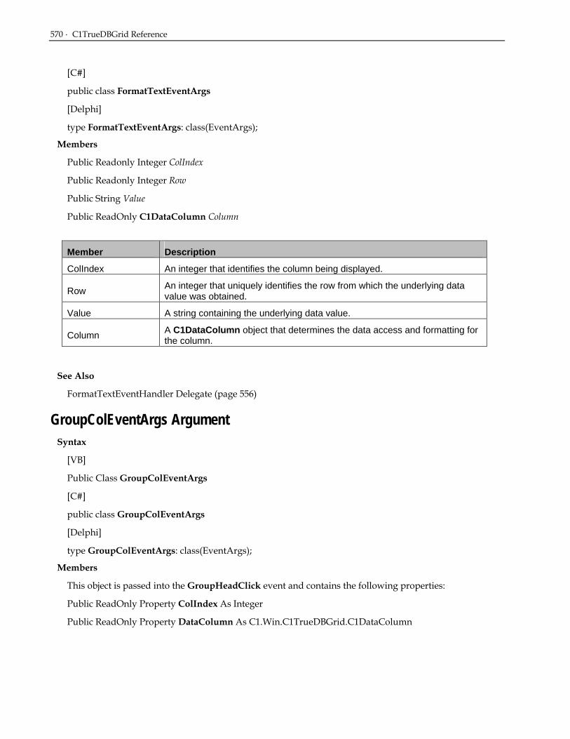
570 · C1TrueDBGrid Reference
[C#]
public class FormatTextEventArgs
[Delphi]
type FormatTextEventArgs: class(EventArgs);
Members
Public Readonly Integer ColIndex
Public Readonly Integer Row
Public String Value
Public ReadOnly C1DataColumn Column
Member Description
ColIndex An integer that identifies the column being displayed.
Row An integer that uniquely identifies the row from which the underlying data value was obtained.
Value A string containing the underlying data value.
Column A C1DataColumn object that determines the data access and formatting for the column.
See Also
FormatTextEventHandler Delegate (page 556)
GroupColEventArgs Argument Syntax
[VB]
Public Class GroupColEventArgs
[C#]
public class GroupColEventArgs
[Delphi]
type GroupColEventArgs: class(EventArgs);
Members
This object is passed into the GroupHeadClick event and contains the following properties:
Public ReadOnly Property ColIndex As Integer
Public ReadOnly Property DataColumn As C1.Win.C1TrueDBGrid.C1DataColumn

GroupColMoveEventArgs Argument · 571
Member Description
ColIndex Index into the GroupedColumns collection.
DataColumn C1DataColumn that was clicked.
See Also
GroupColEventHandler Delegate (page 557)
GroupColMoveEventArgs Argument Syntax
[VB]
Public Class GroupColMoveEventArgs
[C#]
public class GroupColMoveEventArgs
[Delphi]
type GroupColMoveEventArgs: class(EventArgs);
Members
This object is passed into the GroupColMove event and contains the following properties:
Public ReadOnly Property Position As Integer
Public ReadOnly Property ColIndex As Integer
Public ReadOnly Property Column As Integer
Public ReadOnly Property DataColumn As C1.Win.C1TrueDBGrid.C1DataColumn
Public ReadOnly Property Cancel As Boolean
Member Description
Position Position in the collection.
ColIndex Column Index.
Column C1DisplayColumn that was moved.
DataColumn C1DataColumn that is being moved.
Cancel Allows one to cancel the move operation.
Remarks
The above properties can mean different things depending on what operation is being performed.
If a column is being dragged into the grouping area from a split, ColIndex is the index into the Split.DisplayColumns collection. Position is the index into the GroupedColumns collection.

572 · C1TrueDBGrid Reference
If a column is rearranged within the grouping area, the Column property will be null (Nothing). ColIndex is the current position within the GroupedColumns collection; Position will be the new position.
If a column is dragged from the grouping area into a split, the Position property will be –1. ColIndex denotes the insertion point within the Split.DisplayColumns collection.
See Also
GroupColMoveEventHandler Delegate (page 557)
GroupTextEventArgs Argument Syntax
[VB]
Public Class GroupTextEventArgs
[C#]
public class GroupTextEventArgs
[Delphi]
type GroupTextEventArgs: class(EventArgs);
Members
Public ReadOnly Property Col As C1.Win.C1TrueDBGrid.C1DisplayColumn
Public ReadOnly Property EndRowIndex As Integer
Public ReadOnly Property GroupText As String
Public ReadOnly Property RowType As C1.Win.C1TrueDBGrid.RowTypeEnum
Public ReadOnly Property StartRowIndex As Integer
Public Property Text As String
Member Description
Col C1DisplayColumn that is being grouped.
EndRowIndex Last row index of the datasource that is being grouped.
GroupText Value that the data is being grouped on.
RowType Type of row being grouped.
StartRowIndex First row index of the datasource that is being grouped.
Text Custom text for the grouped row.
See Also
GroupTextEventHandler Delegate (page 558)

OwnerDrawCellEventArgs Argument · 573
OwnerDrawCellEventArgs Argument Syntax
[VB]
Public Class OwnerDrawCellEventArgs
[C#]
public class OwnerDrawCellEventArgs
[Delphi]
type OwnerDrawCellEventArgs: class(EventArgs);
Members
Public Readonly Rectangle CellRect
Public Readonly Integer Row, Split, Col
Public Readonly Graphics Graphics
Public Const Style As C1.Win.C1TrueDBGrid.Style
Public Const Text As String
Public ReadOnly C1DisplayColumn Column
Member Description
CellRect The cell rectangle that needs drawn.
Row The row index of the cell that needs drawn.
Split The split index of the cell that needs drawn.
Col The column index of the cell that needs drawn.
Graphics The GDI+ graphics object to render on.
Style The style of the cell that needs drawn.
Text The text of the cell that needs drawn.
Column The C1DisplayColumn object that needs drawn.
See Also
OwnerDrawCellEventHandler Delegate (page 558)
OwnerDrawPageEventArgs Argument Syntax
[VB]
Public Class OwnerDrawPageEventArgs

574 · C1TrueDBGrid Reference
[C#]
public class OwnerDrawPageEventArgs
[Delphi]
type OwnerDrawPageEventArgs: class(EventArgs);
Members
Public Const OwnerDrawPrint As C1.Win.C1TrueDBGrid.C1OwnerDrawPrint
Member Description
OwnerDrawPrint Object that can be used to render Text, Images, and Lines for the page footer.
OwnerDrawPageFooter and OwnerDrawPageHeader both use an object called the C1OwnerDrawPrint object to render the appropriate text and images. The OwnerDrawPrint argument provides access to this object that has one property and three methods to aid in rendering the correct images.
See Also
OwnerDrawPageEventHandler Delegate (page 559)
RowColChangeEventArgs Argument Syntax
[VB]
Public class RowColChangeEventArgs
[C#]
public class RowColChangeEventArgs
[Delphi]
type RowColChangeEventArgs: class(EventArgs);
Members
Public Readonly Integer LastRow
Public Readonly Integer LastCol
Members Description
LastRow Bookmark that identifies the former current row.
LastCol An integer that identifies the former current column.
See Also
RowColChangeEventHandler Delegate (page 559)
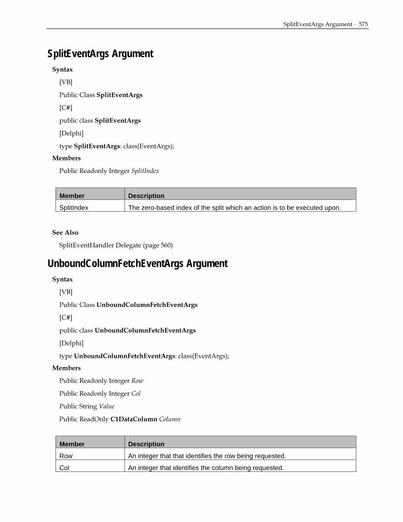
SplitEventArgs Argument · 575
SplitEventArgs Argument Syntax
[VB]
Public Class SplitEventArgs
[C#]
public class SplitEventArgs
[Delphi]
type SplitEventArgs: class(EventArgs);
Members
Public Readonly Integer SplitIndex
Member Description
SplitIndex The zero-based index of the split which an action is to be executed upon.
See Also
SplitEventHandler Delegate (page 560)
UnboundColumnFetchEventArgs Argument Syntax
[VB]
Public Class UnboundColumnFetchEventArgs
[C#]
public class UnboundColumnFetchEventArgs
[Delphi]
type UnboundColumnFetchEventArgs: class(EventArgs);
Members
Public Readonly Integer Row
Public Readonly Integer Col
Public String Value
Public ReadOnly C1DataColumn Column
Member Description
Row An integer that that identifies the row being requested.
Col An integer that identifies the column being requested.

576 · C1TrueDBGrid Reference
Member Description
Value A string used to transfer unbound column data to the grid.
Column A C1DataColumn object that determines the data access and formatting for the column.
See Also
UnboundColumnFetchEventHandler Delegate (page 560)
Enumeration Reference AddNewModeEnum Enumeration
Specifies the current state of the AddNew row.
Syntax
[VB]
Public Enum AddNewModeEnum
[C#]
public enum AddNewModeEnum
[Delphi]
type AddNewModeEnum = (NoAddNew, AddNewCurrent, AddNewPending);
Remarks
Use the members of this enumeration to set the value of the AddNewMode property in the C1TrueDBGrid class.
Member Name Description
NoAddNew The current cell is not in the AddNew row.
AddNewCurrent The current cell is in the Add New row.
AddNewPending There is an Add New operation pending.
AggregateEnum Enumeration Syntax
[VB]
Public Enum AggregateEnum
[C#]
public enum AggregateEnum

AlignVertEnum Enumeration · 577
[Delphi]
type AggregateEnum = (Average, Count, Custom, Max, Min, None, Std, StdPop, Sum, Var, VarPop);
Remarks
Use the members of this enumeration to set the value of the Aggregate property in the C1DataColumn class.
Member Name Description
Average Average of the numerical values.
Count Count of non-empty values.
Custom Causes the GroupAggregate event to be raised.
Max Maximum value (numerical, string, or date).
Min Minimum value (numerical, string, or date).
None No aggregate is calculated or displayed.
Std Standard deviation (using formula for Sample, n-1).
StdPop Standard deviation (using formula for Population, n).
Sum Sum of numerical values.
Var Variance (using formula for Sample, n-1).
VarPop Variance (using formula for Population, n).
AlignVertEnum Enumeration Specifies the Vertical Alignment in a cell.
Syntax
[VB]
Public Enum AlignVertEnum
[C#]
public enum AlignVertEnum
[Delphi]
type AlignVertEnum = (Top, Center, Bottom);
Remarks
Use the members of this enumeration to set the value of the VerticalAlignment property in the C1TrueDBGrid class.
Member Name Description
Top Aligns text in a cell to the top.

578 · C1TrueDBGrid Reference
Member Name Description
Center Aligns text in a cell in the center.
Bottom Aligns text in a cell to the bottom.
AlignHorzEnum Enumeration Specifies the Horizontal Alignment in a cell.
Syntax
[VB]
Public Enum AlignHorzEnum
[C#]
public enum AlignHorzEnum
[Delphi]
type AlignHorzEnum = (General, Near, Center, Far, Justify);
Remarks
Use the members of this enumeration to set the value of the Alignment property in the C1TrueDBGrid class.
Member Name Description
General Sets cell text to be left-aligned and numbers to be right-aligned.
Near Aligns cell text to the near side of the cell (left side in left-to-right mode).
Center Aligns text in a cell to the center.
Far Aligns cell text to the far side of the cell (right side in left-to-right mode).
Justify Spreads text throughout cell.
BackgroundPictureDrawModeEnum Enumeration Syntax
[VB]
Public Enum BackgroundPictureDrawModeEnum
[C#]
public enum BackgroundPictureDrawModeEnum
[Delphi]
type BackgroundPictureDrawModeEnum = (Center, Tile, Stretch);

BorderTypeEnum Enumeration · 579
Remarks
Use the members of this enumeration to set the value of the BackgroundPictureDrawMode property in the C1TrueDBGrid class.
Member Name Description
Center Aligns Background picture to the center of the cell.
Tile Tiles Background picture in cell.
Stretch Stretches background picture to fit cell.
BorderTypeEnum Enumeration Syntax
[VB]
Public Enum BorderTypeEnum
[C#]
public enum BorderTypeEnum
[Delphi]
type BorderTypeEnum = (None, Flat, Raised, Inset, Groove, Fillet, RaisedBevel, InsetBevel);
Remarks
Use the members of this enumeration to set the value of the BorderStyle property in the C1TrueDBGrid class.
Member Name Description
None No cell borders are used when the cell is painted.
Flat No Visual Effects are used when the cell is painted.
Raised The control paints the cell border as 3D raised.
Inset The control paints the cell border as 3D inset.
Groove The control paints a line around the inside of the border.
Fillet The control paints a fillet type border.
RaisedBevel The control paints the cell border as 3D raised with bevel.
InsetBevel The control paints the cell border as 3D inset with bevel.

580 · C1TrueDBGrid Reference
CellStyleFlag Enumeration Syntax
[VB]
Public Enum CellStyleFlag
[C#]
public enum CellStyleFlag
[Delphi]
type CellStyleFlag = (NormalCell, CurrentCell, MarqueeRow, UpdatedCell, SelectedRow, AllCells);
Remarks
Use the members of this enumeration to set one of the values of the AddCellStyle or AddRegExCellStyle methods in the C1TrueDBGrid class.
This enum has the [Flags] attribute and can be combined.
Member Name Description
NormalCell The cell satisfies none of the conditions. For grouped rows, this is the only applicable cell style.
CurrentCell
The cell is the current cell as specified by the Bookmark, Col, and SplitIndex properties. At any given time, only one cell can have this status. When the MarqueeStyle property is set to Floating Editor, this condition is ignored.
MarqueeRow
The cell is part of a highlighted row marquee. When the MarqueeStyle property indicates that the entire current row is to be highlighted, all visible cells in the current row have this additional condition set.
UpdatedCell The cell contents have been modified by the user but not yet written to the database. This condition is also set when cell contents have been modified in code with the Text or Value properties.
SelectedRow The cell is part of a row selected by the user or in code. The SelectedRowCollection contains a bookmark for each selected row.
AllCells All Cells.
CellTipEnum Enumeration Syntax
[VB]
Public Enum CellTipEnum
[C#]
public enum CellTipEnum

DataViewEnum Enumeration · 581
[Delphi]
type CellTipEnum = (NoCellTips, Anchored, Floating);
Remarks
Use the members of this enumeration to set the value of the CellTips property in the C1TrueDBGrid class.
Member Name Description
NoCellTips No cell tips will be applied.
Anchored Celltip will be anchored to the cell.
Floating Celltip will be floating near the cell.
DataViewEnum Enumeration Syntax
[VB]
Public Enum DataViewEnum
[C#]
public enum DataViewEnum
[Delphi]
type DataViewEnum = (Normal, Inverted, Form, GroupBy, MultipleLines, MultipleLinesFixed, Hierarchical);
Remarks
Use the members of this enumeration to set the value of the DataView property in the C1TrueDBGrid class.
Member Name Description
Normal The grid will only display flat files and will not support a hierarchical view. If the data source is a hierarchical dataset, the grid will only display data from the master table.
Inverted The grid will flip the display, rows will be represented horizontally and columns vertically.
Form The grid will display the recordset data in a convenient data entry form.
GroupBy
A grouping area is created at the top of the grid; any columns that are placed into this area become part of the GroupedColumn collection. When in group mode, grid columns can be moved into or out of the grouping area with the Add and RemoveAt methods, respectively. Users can also perform this action by selecting and dragging a column into or out of the grouping. Users can customize the display of the grouped row with styles and automatically compute aggregates for columns that are grouped. The expanded/collapsed state of the grouping can also be specified.

582 · C1TrueDBGrid Reference
Member Name Description
MultipleLines The grid will display all the fields in the current grid area with multiple lines.
MultipleLinesFixed This dataview is similar to MultipleLines dataview with one important exception: the number of subrows does not change once set. The number of subrows can be set using the LinesPerRow property.
Hierarchical The grid will display DataSets in a hierarchical format. At run time, users can expand and collapse hierarchical recordset Bands using a treeview-like interface.
DirectionAfterEnterEnum Enumeration Syntax
[VB]
Public Enum DirectionAfterEnterEnum
[C#]
public enum DirectionAfterEnterEnum
[Delphi]
type DirectionAfterEnterEnum = (MoveNone, MoveRight, MoveDown, MoveLeft, MoveUp);
Remarks
Use the members of this enumeration to set the value of the DirectionAfterEnter property in the C1TrueDBGrid class.
Member Name Description
MoveNone Cursor will not move after Enter is pressed.
MoveRight Cursor will move to the next cell to the right after Enter is pressed.
MoveDown Cursor will move to the next cell below after Enter is pressed.
MoveLeft Cursor will move to the next cell to the left after Enter is pressed.
MoveUp Cursor will move to the next cell above after Enter is pressed.
DropdownWidthEnum Enumeration Syntax
[VB]
Public Enum DropdownWidthEnum
[C#]
public enum DropdownWidthEnum

ExposeCellModeEnum Enumeration · 583
[Delphi]
type DropdownWidthEnum = (Default, Column);
Remarks
Use the members of this enumeration to set the value of the DropdownWidth property in the C1TrueDBDropDown class.
Member Name Description
Default The width of the dropdown is the control width.
Column The width of the dropdown is the column width.
ExposeCellModeEnum Enumeration Syntax
[VB]
Public Enum ExposeCellMode
[C#]
public enum ExposeCellMode
[Delphi]
type ExposeCellMode = (ScrollOnSelect, ScrollOnEdit, ScrollNever);
Remarks
Use the members of this enumeration to set the value of the ExposeCellMode property in the C1TrueDBGrid class.
Member Name Description
ScrollOnSelect
The grid will scroll to the left to display the rightmost column in its entirety. This can be somewhat disconcerting to users who commonly click on the grid to begin editing, as the grid will always shift to the left when the user clicks on the rightmost column.
ScrollOnEdit
The grid will not move when the rightmost column is clicked initially. However, if the user attempts to edit the cell, then the grid will scroll to the left to display the rightmost column in its entirety. This is exactly how Microsoft Excel works and is probably the most intuitive setting.
ScrollNever
The grid will always leave the rightmost column clipped when clicked, even if the user subsequently attempts to edit the cell. Note that editing may be difficult if only a small portion of the column is visible. The chief reason to use this setting is to know there will always be enough space available for editing (or if you disallow editing) and to prevent the grid from shifting accidentally.

584 · C1TrueDBGrid Reference
FlatModeEnum Enumeration Syntax
[VB]
Public Enum FlatModeEnum
[C#]
public enum FlatModeEnum
[Delphi]
type FlatModeEnum = (Flat, PopUp, Standard, System);
Remarks
Use the members of this enumeration to set the value of the FlatStyle property in the C1TrueDBGrid class.
Member Name Description
Flat Takes away all three-dimensional features of the grid and gives it a plain flat appearance
PopUp Looks similar to the Flat FlatStyle, but when the user drags the cursor over a column heading or recordselector, they become three-dimensional and appear to pop up.
Standard The Standard FlatStyle gives the grid’s column headers and recordselectors an inset three-dimensional look
System Draws 3D items using XP Themes.
ForeGroundPicturePositionEnum Enumeration Syntax
[VB]
Public Enum ForeGroundPicturePositionEnum
[C#]
public enum ForeGroundPicturePositionEnum
[Delphi]
type ForeGroundPicturePositionEnum = (Near, Far, LeftOfText, RightOfText, TopOfText, BottomOfText, PictureOnly, TextOnly);
Remarks
Use the members of this enumeration to set the value of the ForegroundPicturePosition property in the C1TrueDBGrid class.

GroupPositionEnum Enumeration · 585
Member Name Description
Near Positions Foreground picture on the near side of the cell.
Far Positions Foreground picture on the far side of the cell.
LeftOfText Positions Foreground picture to the left of the cell text.
RightOfText Positions Foreground picture to the right of the cell text.
TopOfText Positions Foreground picture on top of the cell text.
BottomOfText Positions Foreground picture below the cell text.
PictureOnly Foreground picture is only included.
TextOnly Text is only included.
GroupPositionEnum Enumeration Syntax
[VB]
Public Enum GroupPositionEnum
[C#]
public enum GroupPositionEnum
[Delphi]
type GroupPositionEnum = (Header, HeaderAndFooter);
Remarks
Use the members of this enumeration to set the value of the Position property in the GroupInfo class.
Member Name Description
Header Grouped columns contain just a header row (default).
HeaderAndFooter Grouped columns contain a header and footer row.
LineStyleEnum Enumeration Syntax
[VB]
Public Enum LineStyleEnum
[C#]
public enum LineStyleEnum

586 · C1TrueDBGrid Reference
[Delphi]
type LineStyleEnum = (None, Single, Double, Raised, Insert);
Remarks
This enumeration is used to set the line style for row and column divider.
Member Name Description
None No line style.
Single Single line.
Double Double line.
Raised Line with 3D raised appearance.
Inset Line with 3D inset appearance.
MarqueeEnum Enumeration Syntax
[VB]
Public Enum MarqueeEnum
[C#]
public enum MarqueeEnum
[Delphi]
type MarqueeEnum = (DottedCellBorder, SolidCellBorder, HighlightCell, HighlightRow, HighlightRowRaiseCell, NoMarquee, FloatingEditor, DottedRowBorder);
Remarks
Use the members of this enumeration to set the value of the MarqueeStyle property in the C1TrueDBGrid class.
Member Name Description
DottedCellBorder The current cell within the current row will be highlighted by drawing a dotted border around the cell. In Microsoft Windows terminology, this is usually called a focus rectangle.
SolidCellBorder The current cell within the current row will be highlighted by drawing a solid box around the current cell. This is more visible than the dotted cell border, especially when 3D divider properties are used for the grid.
HighlightCell The entire current cell will be drawn using the attributes of the HighlightRowStyle property. This provides a very distinctive block-style highlight for the current cell.

MultiSelectEnum Enumeration · 587
Member Name Description
HighlightRow
The entire row containing the current cell will be drawn using the attributes of the HighlightRowStyle property. In this mode, it is not possible to visually determine which cell is the current cell, only the current row. When the grid or split is not editable, this setting is often preferred, since cell position is then irrelevant.
HighlightRowRaiseCell
The entire row will be highlighted as in setting 3, but the current cell within the row will be "raised" so that it appears distinctive. This setting does not appear clearly with all background color and divider settings. The best effect is achieved by using 3D dividers and a light gray background.
NoMarquee The marquee will not be shown. This setting is useful for cases where the current row is irrelevant, or when not wanting to draw the user's attention to the grid until necessary.
FloatingEditor The current cell will be highlighted by a floating text editor window with a blinking caret (as in Microsoft Access). This is the default setting.
DottedRowBorder The entire current row will be highlighted by drawing a dotted border around it. This effect is similar to setting 0.
MultiSelectEnum Enumeration Syntax
[VB]
Public Enum MultiSelectEnum
[C#]
public enum MultiSelectEnum
[Delphi]
type MultiSelectEnum = (None, Simple, Extended);
Remarks
Use the members of this enumeration to set the value of the MultiSelect property in the C1TrueDBGrid class.
Member Name Description
None
If set to MulitSelectEnum.None, multiple selection is disabled but single selection is permitted. When the user clicks a record selector, the current selection is cleared, and the clicked row is then selected and added to either the SelectedRows or SelectedCols collections. The CTRL and SHIFT keys are ignored, and the user can only select one row at a time.

588 · C1TrueDBGrid Reference
Member Name Description
Simple
If set to MultiSelectEnum.Simple (the default), multiple selection is enabled using the mouse. When the user clicks a record selector, the selection is cleared and the clicked row is selected and added to either the SelectedRows or Selected Cols collections. However, if the user holds down the CTRL key while clicking, the clicked row is added to the current selection. The user can also select a range of rows by selecting the first row in the range, then selecting the last row in the range while holding down the SHIFT key.
Extended
If set to MultiSelectEnum.Extended, multiple selection is enabled using the mouse as described in the previous paragraph. The user can also select records with the following key combinations: SHIFT + UP ARROW, SHIFT + DOWN ARROW, SHIFT + PGUP, and SHIFT + PGDN. NOTE: When MultiSelectEnum.Extended is chosen, the user will not be able to select a single cell, instead the entire corresponding row will be selected.
OutlineModeEnum Enumeration Syntax
[VB]
Public Enum OutlineModeEnum
[C#]
public enum OutlineModeEnum
[Delphi]
type OutlineModeEnum = (StartCollapsed, StartExpanded);
Remarks
Use the members of this enumeration to access the return value of the OutlineMode property in the GroupInfo class.
Member Name Description
StartCollapsed Grouped rows initial display is collapsed (default).
StartExpanded Grouped rows initial display is expanded.
PointAtEnum Enumeration Syntax
[VB]
Public Enum PointAtEnum
[C#]
public enum PointAtEnum

PresentationEnum Enumeration · 589
[Delphi]
type PointAtEnum = (NotInGrid, AtCaption, AtSplitHeader, AtSplitSizeBox, AtRowSelect, AtRowSize, AtColumnHeader, AtColumnFooter, AtColumnSize, AtDataArea, AtGroupArea, AtGroupHeader);
Remarks
Use the members of this enumeration to access the return value of the PointAt method in the C1TrueDBGrid class.
Member Name Description
AtAddNewRow Coordinates are in the new row.
AtCaption Coordinates are in caption area.
AtColumnFooter Coordinates are in a column’s footer.
AtColumnHeader Coordinates are in a column’s header.
AtColumnSize Coordinates are in a column’s resizing box.
AtDataArea Coordinates are in the grid’s data area.
AtEmptyColumn Coordinates are in the empty column.
AtEmptyRow Coordinates are in the empty row.
AtFilterBar Coordinates are in the filter bar.
AtGroupArea Coordinates are in the grid’s GroupBy area.
AtGroupHeader Coordinates are in the grid’s GroupBy header.
AtRowSelect Coordinates are in a row selector.
AtRowSize Coordinates are in a row resizing box.
AtSplitHeader Coordinates are in a split’s header.
AtSplitSizeBox Coordinates are in a splits resizing box.
NotInGrid Coordinates are not in grid area.
PresentationEnum Enumeration Syntax
[VB]
Public Enum PresentationEnum
[C#]
public enum PresentationEnum
[Delphi]
type PresentationEnum = (Normal, RadioButton, ComboBox, SortedComboBox, CheckBox);

590 · C1TrueDBGrid Reference
Remarks
Use the members of this enumeration to set the value of the Presentation property in the C1TrueDBGrid class.
Member Name Description
Normal Value items are displayed as text or graphics depending upon the setting of the DisplayValue and Translate properties.
RadioButton Value items are displayed as a group of radio buttons within the cell.
ComboBox Value items are displayed in a drop-down combo box within the current cell.
SortedComboBox Value items are displayed in sorted order in a drop-down combo box within the current cell.
CheckBox Value items are displayed as a check box within the current cell.
RowSelectorEnum Enumeration Syntax
[VB]
Public Enum RowSelectorEnum
[C#]
public enum RowSelectorEnum
[Delphi]
type RowSelectorEnum = (AllRows, SelectedRows, CurrentRow);
Remarks
Use the members of this enumeration to access the value of the PrintPreview methods in the C1TrueDBGrid class.
Member Name Description
AllRows All rows.
SelectedRows Only user-selected rows.
CurrentRow Only the current row.
RowSizingEnum Enumeration Syntax
[VB]
Public Enum RowSizingEnum

RowTypeEnum Enumeration · 591
[C#]
public enum RowSizingEnum
[Delphi]
type RowSizingEnum = (None, AllRows, IndividualRows);
Remarks
Use the members of this enumeration to set the value of the AllowRowSizing property in the C1TrueDBGrid class.
Member Name Description
None No sizing will be allowed.
AllRows All rows will be sized as a group.
IndividualRows Rows can be resized independently.
RowTypeEnum Enumeration Syntax
[VB]
Public Enum RowTypeEnum
[C#]
public enum RowTypeEnum
[Delphi]
type RowTypeEnum = (DataRow, ExpandedGroupRow, CollapsedGroupRow, FooterRow);
Remarks
Use the members of this enumeration to query the value of the RowType property in the ViewRow class.
Member Name Description
DataRow This object is associated with a datarow.
ExpandedGroupRow Row is an expanded group row.
CollapsedGroupRow Row is a collapsed group row.
FooterRow This object is associated with a footerrow.

592 · C1TrueDBGrid Reference
ScrollBarEnum Enumeration Syntax
[VB]
Public Enum ScrollBarEnum
[C#]
public enum ScrollBarEnum
[Delphi]
type ScrollBarEnum = (Horizontal, Vertical);
Remarks
This enumeration identifies which scrollbar is being scrolled for the FetchScrollTips event.
Member Name Description
Horizontal The Horizontal ScrollBar is being scrolled.
Vertical The Vertical ScrollBar is being scrolled.
ScrollBarStyleEnum Enumeration Syntax
[VB]
Public Enum ScrollBarStyleEnum
[C#]
public enum ScrollBarStyleEnum
[Delphi]
type ScrollBarStyleEnum = (None, Always, Automatic);
Remarks
Use the members of this enumeration to set the style of the HBar and VBar object.
Member Name Description
None No Scroll Bars.
Always ScrollBars always visible.
Automatic Horizontal and/or vertical scroll bars are displayed only if the object's contents extend beyond its borders.

SizeModeEnum Enumeration · 593
SizeModeEnum Enumeration Syntax
[VB]
Public Enum SizeModeEnum
[C#]
public enum SizeModeEnum
[Delphi]
type SizeModeEnum = (Exact, NumberOfColumns, Scalable);
Remarks
Use the members of this enumeration to set the value of the SplitSizeMode property.
Member Name Description
Exact The value returned is a floating point number indicating the exact size of the split in terms of the coordinate system of the grid's container.
NumberOfColumns The value returned is an integer indicating the number of columns displayed in the split.
Scalable The value returned by the property is an integer indicating the relative size of the split with respect to other scalable splits.
SortDirEnum Enumeration Syntax
[VB]
Public Enum SortDirEnum
[C#]
public enum SortDirEnum
[Delphi]
type SortDirEnum = (Ascending, Descending, None);
Remarks
Use the members of this enumeration to set the style of the SortDirection property in the C1DataColumn class.
Member Name Description
Ascending Sorts in ascending order.
Descending Sorts in descending order.
None Does not sort.

594 · C1TrueDBGrid Reference
TabActionEnum Enumeration Syntax
[VB]
Public Enum TabActionEnum
[C#]
public enum TabActionEnum
[Delphi]
type TabActionEnum = (ControlNavigation, ColumnNavigation, GridNavigation);
Remarks
Use the members of this enumeration to set the value of the TabAction property in the C1TrueDBGrid class.
Member Name Description
ControlNavigation The tab key moves to the next or previous control on the form.
ColumnNavigation The tab key moves the current cell to the next or previous column. However, if this action would cause the current row to change, then the next or previous control on the form receives focus.
GridNavigation
The tab key moves the current cell to the next or previous column. The behavior of the tab key at row boundaries is determined by the WrapCellPointer property. When this setting is used, the tab key never results in movement to another control.
PrintInfo Enumerations FillEmptyEnum Enumeration
Syntax
[VB]
Public Enum PrintInfo.FillEmptyEnum
[C#]
public enum PrintInfo.FillEmptyEnum
[Delphi]
type PrintInfo.FillEmptyEnum = (ExtendAll, ExtendLast, None);
Remarks
Use the members of this enumeration to set the style of the FillAreaWidth property of the PrintInfo class.

PageBreaksEnum · 595
Member Name Description
ExtendAll Default. All columns are extended proportionally.
ExtendLast Last column is extended to fill space.
None Empty space on the right.
PageBreaksEnum Syntax
[VB]
Public Enum PrintInfo.PageBreaksEnum
[C#]
public enum PrintInfo.PageBreaksEnum
[Delphi]
type PrintInfo.PageBreaksEnum = (ClipInArea, FitIntoArea, OnColumn, OnSplit);
Remarks
Use the members of this enumeration to set the style of the PageBreak property of the PrintInfo class.
Member Name Description
ClipInArea Clip columns without fitting in area (i.e., do not cause a page break).
FitIntoArea Default. No page breaks. Fit all columns in one page.
OnColumn Page breaks on any column that does not fit.
OnSplit Page breaks on a new split or any column that does not fit.
RowHeightEnum Syntax
[VB]
Public Enum PrintInfo.RowHeigthEnum
[C#]
public enum PrintInfo.RowHeigthEnum
[Delphi]
type PrintInfo.RowHeigthEnum = (LikeGrid, StretchToFit, StretchToMax);
Remarks
Use the members of this enumeration to set the style of the VarRowHeight property of the PrintInfo class.

596 · C1TrueDBGrid Reference
Member Name Description
LikeGrid Do not stretch any row. Use the grid row height.
StretchToFit Default. Stretch row to fit all data in cells.
StretchToMax Stretch row as needed, but not greater when max height.
WrapTextEnum Syntax
[VB]
Public Enum PrintInfo.WrapTextEnum
[C#]
public enum PrintInfo.WrapTextEnum
[Delphi]
type PrintInfo.WrapTextEnum = (Wrap, NoWrap, LikeColumn);
Remarks
Use the members of this enumeration to set the style of the WrapText property of the PrintInfo class.
Member Name Description
Wrap Default. Always wrap text in cells.
NoWrap Never wrap text in cells.
LikeColumn Wrap text in the cell depends on the column style's WrapText property.

C1TrueDBDropDown Class · 597
C1TrueDBDropDown Reference C1TrueDBDropDown Class All C1TrueDBDropDown Members
C1TrueDBDropDown Public Properties
AllowColMove Specifies if the user has the ability to move columns in the grid.
AllowColSelect Specifies if the user has the ability to select columns in the grid.
AllowRowSizing Specifies if a user is allowed to resize the rows in the grid.
AlternatingRows Determines if a grid or split displays odd-numbered rows in one style and even-numbered rows in another style.
Bookmark Returns or sets the bookmark identifying the current row in the grid.
BorderStyle Returns or sets whether the grid has a border.
Caption Returns or sets the caption to the grid.
CaptionStyle Sets or returns the Style object that controls the appearance of the caption area.
Col Returns or sets the column position of the current cell.
ColumnCaptionHeight Sets the height of the column captions.
ColumnFooterHeight Sets the height of the column footers.
ColumnFooters Specifies whether footers are displayed.
ColumnHeaders Specifies whether headers are displayed.
Columns Returns a collection of C1DataColumn objects.
CurrentCellVisible Determines if the current cell is visible within the displayed area of the grid.
DataField Sets the name of the dropdown column used to update the associated grid column.
DataMember Returns or sets the name of the data member used to populate the grid.
DataSource Specifies the data control used to bind a grid to a database
DeadAreaBackColor Controls the background color of the dead area object.
DefColWidth Returns or sets the default width for all grid columns.
DisplayColumns Returns a collection of C1DisplayColumn objects.
DropdownWidth Returns or sets the width of the dropdown box.
EmptyRows Returns or sets a value that determines how the grid displays rows below the last data row.

598 · C1TrueDBDropDown Reference
EvenRowStyle Sets or returns the Style object that controls the appearance of an even-numbered row.
ExtendRightColumn Extends the right column to the right edge of the controls when all columns are visible.
FetchRowStyles Specifies whether the FetchRowStyle event will be raised.
FirstRow Returns or sets a value containing the bookmark for the first visible row in a grid or split.
FlatStyle Controls the 3D look of headers and buttons.
FooterStyle Returns the Style object that controls the appearance of column footers.
HeadingStyle Returns the HeadingStyle Style object.
HighLightRowStyle Returns the HighlightRowStyle Style object.
HScrollBar Returns the HBar object that controls the appearance of the horizontal scrollbar.
IntegralHeight Gets or sets a value indicating whether the control should resize to avoid showing partial items.
LeftCol Returns or sets the zero-based index of the leftmost column in a grid or split.
ListField Returns or sets the name of the column used for incremental search within a C1TrueDBDropDown control.
OddRowStyle Returns the OddRowStyle Style object.
RecordSelectorStyle Returns the RecordSelector Style object.
Row Specifies the current row.
RowDivider Specifies the style and color of row dividers.
RowHeight Returns or sets the height of all grid rows.
RowSubDividerColor Color of the subrow divider in a multi-line grid.
RowTracking True to highlight rows on mouse move.
ScrollTips Determines whether the grid displays a pop-up text window when the scrollbar thumb is dragged.
Style Returns or sets the Style object.
Styles Returns a collection of named Style objects.
ValueTranslate Determines the state of value translation in the dropdown.
VisibleCols Returns the number of visible columns in the current split.
VisibleRows Returns the number of visible rows in the grid.
VScrollBar Returns the VBar object that controls the appearance of the vertical scrollbar.

C1TrueDBDropDown Class · 599
C1TrueDBDropDown Public Methods
AddCellStyle Controls the font and color of cells within a grid, column, or split according to value.
AddRegexCellStyle Controls the font and color of cells within a grid, column, or split according to their contents.
ClearCellStyle Removes a cell condition established with a previous call to the AddCellStyle method.
ClearFields Restores the default grid layout
ColContaining Returns the index value of the grid column containing the specified coordinate.
GetCurrentSelIndex Gets the selected index.
HoldFields Preserves the current column/field layout when binding to a datasource.
Rebind Re-establishes the connection with the bound data source.
ScrollCtl Scrolls the grid data area by the specified number of rows and columns.
C1TrueDBDropDown Public Events
ColMove Raised when the user has finished moving the selected columns.
ColResize Raised after the user has finished resizing a column.
DataSourceChanged Raised when a bound data source is changed or requeried.
DropDownClose Raised when the drop down closes.
DropDownOpen Raised when the drop down opens.
FetchRowStyle Raised whenever the grid is about to display a row of data and the FetchRowStyles property is True.
FirstRowChange Raised when the first displayed row of a control or split is changed.
FootClick Raised when the user clicks on the footer
FormatText Raised when the grid is about to display cell data in a column whose NumberFormat property is set.
HeadClick Raised when the user clicks on the header for a particular grid column in the grouping area.
LeftColChange Raised when the first visible column of a grid or split is changed.
RowChange Raised when a the user changes the current row.
RowResize Raised when the user has finished resizing a grid row.
Scroll Raised when the user scrolls the grid.
SelChange Raised when the user selects a different range of rows or columns.

600 · C1TrueDBDropDown Reference
UnboundColumnFetch Raised when a bound needs to display the value of a cell in an unbound column.
ValueItemError Raised when the user attempts to enter invalid data into a column that is using value lists.
C1TrueDBDropDown Properties
AllowColMove Property (C1TrueDBDropDown) Specifies if the user has the ability to move columns in the grid.
Syntax
[VB]
Public Property AllowColMove As Boolean
[C#]
public bool AllowColMove {get; set;}
[Delphi]
property AllowColMove: Boolean;
Remarks
If True, the user can move columns.
If False (the default), the user cannot move columns.
Use the AllowColMove property to control whether the user can move columns by dragging the column header to the desired location. Any change in column order causes a ColMove event.
If AllowColMove is set to True, and the DataView property is set to Group, a grouping area is added to the grid. Columns can be added or dragged to this area at run time.
See Column Grouping (page 100) for more information.
See Also
C1TrueDBGrid class (page 20)
C1TrueDBDropDown class (page 20)
Split class (page 399)
AllowColSelect Property (C1TrueDBDropDown) Specifies if the user has the ability to select columns in the grid.
Syntax
[VB]
Public Property AllowColSelect As Boolean
AllowRowSizing Property (C1TrueDBDropDown) · 601
[C#]
public bool AllowColSelect {get; set;}
[Delphi]
property AllowColSelect: Boolean;
Remarks
If True (the default), the user can select columns.
If False, the user cannot select columns.
Use the AllowColSelect property to control whether the user can select columns by clicking within the column header area. Setting this property to False suppresses highlighting when the user clicks a column header, which is useful for applications that respond to the HeadClick event.
See Also
C1TrueDBGrid class (page 20)
C1TrueDBDropDown class (page 20)
Split class (page 399)
AllowRowSizing Property (C1TrueDBDropDown) Specifies if a user is allowed to resize the rows in the grid.
Syntax
[VB]
Public ReadOnly Property AllowRowSizing As Boolean
[C#]
public bool AllowRowSizing {get;}
[Delphi]
property AllowRowSizing: Boolean;
Remarks
If the AllowRowSizing property is True, the mouse pointer turns into a double-headed arrow when positioned over the row divider in the RecordSelectors column between any pair of record selectors in the grid. The user can interactively resize the rows by dragging the mouse while the double-headed arrow cursor is showing. Any change in row size causes a RowResize event to fire.
If the AllowRowSizing property is False, the user cannot interactively resize rows.
All rows of the C1TrueDBGrid control are always the same height, which is determined by the RowHeight property.
The default value of the property is True.
Note
RecordSelectors must be visible in a split in order for the user to resize rows interactively in that split. If RecordSelectors are disabled for all splits in a C1TrueDBGrid control, the user cannot resize rows interactively in that grid.

602 · C1TrueDBDropDown Reference
See Also
C1TrueDBGrid class (page 20)
C1TrueDBDropDown class (page 20)
Split class (page 399)
AllowVerticalSizing Property (C1TrueDBDropDown) Specifies if a user is allowed to resize vertical splits.
Syntax
[VB]
Public Property AllowVerticalSizing As Boolean
[C#]
public bool AllowVerticalSizing {get; set;}
[Delphi]
property AllowRowSizing: Boolean;
Remarks
If True, then the user is able to resize vertical splits in the grid.
If False, then the user is restricted from resizing vertical splits.
See Also
C1TrueDBGrid class (page 20)
C1TrueDBDropDown class (page 20)
AllowVerticalSplit Property (C1TrueDBDropDown) Specifies if a user is allowed to create vertical splits.
Syntax
[VB]
Public Property AllowVerticalSplit As Boolean
[C#]
public bool AllowVerticalSplit {get; set;}
[Delphi]
property AllowVerticalSplit: Boolean;
Remarks
If True, then the user is able to create multiple vertical splits in the grid.
If False, then the user is restricted from creating vertical splits.

AlternatingRows Property (C1TrueDBDropDown) · 603
See Also
C1TrueDBGrid class (page 20)
C1TrueDBDropDown class (page 20)
AlternatingRows Property (C1TrueDBDropDown) Determines if a grid or split displays odd-numbered rows in one style and even-numbered rows in another.
Syntax
[VB]
Public Property AlternatingRows As Boolean
[C#]
public bool AlternatingRows {get; set;}
[Delphi]
property AlternatingRows: Boolean;
Remarks
If True, the OddRowStyle and EvenRowStyle properties control the appearance of rows within the specified object.
If False (the default), the Style property controls the display of rows within the specified object.
At design time, you can change the colors and fonts used to render odd (even) rows by modifying the built-in OddRow (EvenRow) style using the Styles property page.
At run time, you can change the colors and fonts used to render odd (even) rows by modifying the Style object returned by the OddRowStyle (EvenRowStyle) property.
See Also
C1TrueDBGrid class (page 20)
C1TrueDBDropDown class (page 20)
Split class (page 399)
Bookmark Property (C1TrueDBDropDown) Returns or sets the bookmark identifying the current row in the grid.
Syntax
[VB]
Public Property Bookmark As Integer
[C#]
public int Bookmark {get; set;}
[Delphi]
property Bookmark: Integer;

604 · C1TrueDBDropDown Reference
Remarks
Use the value returned by the Bookmark property to save a reference to the current row that remains valid even after another row becomes current.
When you set the Bookmark property to a valid value in code, the row associated with that value becomes the current row, and the grid adjusts its display to bring the new current row into view if necessary.
See Also
C1TrueDBGrid class (page 20)
C1TrueDBDropDown class (page 20)
BorderStyle Property (C1TrueDBDropDown) Returns or sets whether the grid has a border.
Syntax
[VB]
Public Property BorderStyle As System.Windows.Forms.BorderStyle
[C#]
public System.Windows.Forms.BorderStyle BorderStyle {get; set;}
[Delphi]
property BorderStyle: System.Windows.Forms.BorderStyle;
Remarks
This property determines whether a C1TrueDBGrid control has a border.
See Also
C1TrueDBGrid class (page 20)
C1TrueDBDropDown class (page 20)
Caption Property (C1TrueDBDropDown) Returns or sets the caption to the grid.
Syntax
[VB]
Public Property Caption As System.String
[C#]
public string Caption {get; set;}
[Delphi]
property Caption: string;
CaptionStyle Property (C1TrueDBDropDown) · 605
Remarks
For a C1TrueDBGrid control, this property determines the text displayed in the caption bar at the top of the grid.
Setting the Caption property to an empty string for a C1TrueDBGrid control hides its caption bar.
For a C1DataColumn object, this property determines the text displayed in the object's heading area.
Setting the Caption property to an empty string for a C1DataColumn object clears the text in the column's heading area but does not hide the heading. Column captions are only displayed if the grid's ColumnHeaders property is set to True.
Setting the Caption property to an empty string for a Split object hides the heading area, even if other splits have non-empty captions.
See Also
C1TrueDBGrid class (page 20)
C1DisplayColumn class (page 22)
Split class (page 399)
CaptionStyle Property (C1TrueDBDropDown) Sets or returns the Style object that controls the appearance of the caption area.
Syntax
[VB]
Public Property CaptionStyle As Style
[C#]
public Style CaptionStyle {get; set;}
[Delphi]
property CaptionStyle: Style;
Remarks
This property sets or returns the Style object that controls the appearance of a TDBGrid control's caption bar or a Split object's heading area. By default, this is the built-in Caption style.
The value of the Caption property is not affected by changes to the CaptionStyle property.
See Also
C1TrueDBGrid class (page 20)
Split class (page 399)
C1TrueDBDropDown class (page 20)
ColumnCaptionHeight Property (C1TrueDBDropDown) Sets the height of the column captions.
606 · C1TrueDBDropDown Reference
Syntax
[VB]
Public Property ColumnCaptionHeight As Integer
[C#]
public int ColumnCaptionHeight {get; set;}
[Delphi]
property ColumnCaptionHeight: Integer;
See Also
C1TrueDBDropDown class (page 20)
ColumnFooterHeight Property (C1TrueDBDropDown) Sets the height of the column footers.
Syntax
[VB]
Public Property ColumnFooterHeight As Integer
[C#]
public int ColumnFooterHeight {get; set;}
[Delphi]
property ColumnFooterHeight: Integer;
See Also
C1TrueDBDropDown class (page 20)
Col Property (C1TrueDBDropDown) Returns or sets the column position of the current cell.
Syntax
[VB]
Public Property Col As Integer
[C#]
public int Col {get; set;}
[Delphi]
property Col: Integer;
Remarks
This property specifies the zero-based index of the current cell's column position. It may be set at run time to highlight a different cell within the current row. If the column is visible, the caret or marquee will

ColumnFooters Property (C1TrueDBDropDown) · 607
be moved to the selected column. If the column is not visible, the grid will scroll to make it visible as a result of setting this property.
Setting the Col property at run time does not affect selected columns.
See Also
C1TrueDBGrid class (page 20)
C1TrueDBDropDown class (page 20)
ColumnFooters Property (C1TrueDBDropDown) Specifies whether footers are displayed.
Syntax
[VB]
Public Property ColumnFooters As Boolean
[C#]
public bool ColumnFooters {get; set;}
[Delphi]
property ColumnFooters: Boolean;
Remarks
If True, the control's column footers are displayed.
If False (the default), the control's column footers are not displayed.
Use the FooterText property to set the footing text of an individual column.
See Also
C1TrueDBGrid class (page 20)
C1TrueDBDropDown class (page 20)
ColumnHeaders Property (C1TrueDBDropDown) Specifies whether headers are displayed.
Syntax
[VB]
Public Property ColumnHeaders As Boolean
[C#]
public bool ColumnHeaders {get; set;}
[Delphi]
property ColumnHeaders: Boolean;
Remarks
If True (the default), the control's column headers are displayed.

608 · C1TrueDBDropDown Reference
If False, the control's column headers are not displayed.
Use the Caption property to set the heading text of an individual Column.
See Also
C1TrueDBGrid class (page 20)
C1TrueDBDropDown class (page 20)
Columns Property (C1TrueDBDropDown) Returns a collection of C1DataColumn objects.
Syntax
[VB]
Public ReadOnly Property Columns As C1DataColumnCollection
[C#]
public C1DataColumnCollection Columns {get;}
[Delphi]
property Columns: C1DataColumnCollection;
Remarks
This property returns a collection of C1DataColumn objects for a grid or drop-down control.
See Also
C1TrueDBGrid class (page 20)
C1TrueDBDropDown class (page 20)
CurrentCellVisible Property (C1TrueDBDropDown) Determines if the current cell is visible within the displayed area of the grid.
Syntax
[VB]
Public Property CurrentCellVisible As Boolean
[C#]
public bool CurrentCellVisible {get; set;}
[Delphi]
property CurrentCellVisible: Boolean;
Remarks
This property returns True if the current cell (indicated by the Bookmark and Col properties) is visible within the displayed area of a grid or split. It returns False if the cell is not visible.
Setting the CurrentCellVisible property to True causes the grid to scroll so that the current cell is brought into view. If a grid contains multiple splits, then the current cell becomes visible in each split.

DataField Property (C1TrueDBDropDown) · 609
In all cases, setting this property to False is meaningless and is ignored.
See Also
C1TrueDBGrid class (page 20)
C1TrueDBDropDown class (page 20)
Split class (page 399)
DataField Property (C1TrueDBDropDown) Sets the name of the dropdown column used to update the associated grid column.
Syntax
[VB]
Public Property DataField As String
[C#]
public string DataField {get; set;}
[Delphi]
property DataField: string;
Remarks
The DataField property returns or sets the name of the drop-down column used to update the associated grid column when the user selects an item from a C1TrueDBDropDown control. The DataField property need not be the same as the ListField property used for incremental search.
If the DataField property is not specified, the ListField property specifies the column to be used for both incremental search and the selection value. If neither property is specified, then the first column in the C1TrueDBDropDown control will be used.
Note
Do not confuse the DataField property of the C1TrueDBDropDown control with the DataField property of the C1DataColumn object or intrinsic Visual Basic controls.
To associate a C1TrueDBDropDown control with a C1DataColumn object that belongs to a C1TrueDBGrid control, set the column's DropDown property to the name of the drop-down control at either design time or run time.
See Also
C1TrueDBDropDown class (page 20)
DataMember Property (C1TrueDBDropDown) Returns or sets the name of the data member used to populate the grid.
Syntax
[VB]
Public Property DataMember As String

610 · C1TrueDBDropDown Reference
[C#]
public string DataMember {get; set;}
[Delphi]
property DataMember: string;
Remarks
This property returns or sets the name of the data member used to populate the grid. Typically, a data member represents a database table or query.
A bound DataSource can expose multiple sets of data that consumers can bind to. Each set of data is called a data member, and is identified by a unique string.
See Also
C1TrueDBGrid class (page 20)
C1TrueDBDropDown class (page 20)
DataSource Property (C1TrueDBDropDown) Specifies the data control used to bind a grid to a database.
Syntax
[VB]
Public Property DataSource As Object
[C#]
public object DataSource {get; set;}
[Delphi]
property DataSource: Object;
Remarks
The DataSource property specifies the data control used to bind a C1TrueDBGrid or C1TrueDBDropDown control to a database.
See Also
C1TrueDBGrid class (page 20)
C1TrueDBDropDown class (page 20)
DeadAreaBackColor Property (C1TrueDBDropDown) Controls the background color of the dead area object.
Syntax
[VB]
Public Property DeadAreaBackColor As Color

DefColWidth Property (C1TrueDBDropDown) · 611
[C#]
public Color DeadAreaBackColor {get; set;}
[Delphi]
property DeadAreaBackColor: Color;
Remarks
This property controls the background color of the dead area object. Colors may be specified as RGB values or system default colors.
Setting this property will affect the appearance of the "dead area" of under populated controls, such as the area to the right of the last column, the area below the last data row, and the Outlook Grouping area.
Note
If the EmptyRows property is True, the empty data rows it creates are not considered part of the "dead area" and will not be displayed in the DeadAreaBackColor. If you wish for the area occupied by the empty rows to be shown in the DeadAreaBackColor, you should first set the EmptyRows property to False.
See Also
C1TrueDBDropDown class (page 20)
DefColWidth Property (C1TrueDBDropDown) Returns or sets the default width for all grid columns.
Syntax
[VB]
Public Property DefColWidth As Integer
[C#]
public int DefColWidth {get; set;}
[Delphi]
property DefColWidth: Integer;
Remarks
This property returns or sets the default width for all grid columns in terms of the coordinate system of the grid's container.
For bound grids, the DefColWidth property is respected under the following circumstances:
• When the grid's layout is initialized at run time.
• When a new column is created at run time.
If the DefColWidth property is set to 0, the grid automatically sizes all columns based on either the width of the column heading or the display width of the underlying field, whichever is larger. For example, to set the default column width to the width of the first column:

612 · C1TrueDBDropDown Reference
• Visual Basic C1TrueDBGrid1.DefColWidth = Me.C1TrueDBGrid1.Splits(0).DisplayColumns(0).Width
• C# C1TrueDBGrid1.DefColWidth = this.C1TrueDBGrid1.Splits(0).DisplayColumns(0).Width ;
• Delphi C1TrueDBGrid1.DefColWidth := Self.C1TrueDBGrid1.Splits[0].DisplayColumns[0].Width;
Note
Setting the DefColWidth property at run time does not affect existing columns, only those that are subsequently created in code.
In bound mode, some data sources do not provide text field widths when requested by the grid. Therefore, if DefColWidth is 0, the actual column widths may not be what is expected since the grid must supply a default width.
See Also
C1TrueDBGrid class (page 20)
C1TrueDBDropDown class (page 20)
DisplayColumns Property (C1TrueDBDropDown) Returns a collection of C1DisplayColumn objects.
Syntax
[VB]
Public ReadOnly Property DisplayColumns As C1DisplayColumnCollection
[C#]
public C1DisplayColumnCollection DisplayColumns {get;}
[Delphi]
property DisplayColumns: C1DisplayColumnCollection;
See Also
C1TrueDBDropDown class (page 20)
DropdownWidth Property Returns or sets the width of the dropdown box.
Syntax
[VB]
Public Property DropdownWidth As C1.Win.C1TrueDBGrid.DropdownWidthEnum

EmptyRows Property (C1TrueDBDropDown) · 613
[C#]
public DropdownWidthEnum DropdownWidth {get; set;}
[Delphi]
property DropdownWidth: DropdownWidthEnum;
Remarks
The possible values for this property are:
Member Name Description
Default The width of the dropdown is the control width.
Column The width of the dropdown is the column width.
See Also
C1TrueDBDropDown class (page 20)
EmptyRows Property (C1TrueDBDropDown) Returns or sets a value that determines how the grid displays rows below the last data row.
Syntax
[VB]
Public Property EmptyRows As Boolean
[C#]
public bool EmptyRows {get; set;}
[Delphi]
property EmptyRows: Boolean;
Remarks
If all of the records in the data source do not fill up the entire grid, setting EmptyRows to True will fill the unpopulated grid area with empty data rows. If EmptyRows is False (the default), then the unpopulated grid area will be blank and will be filled with the system 3D Objects color (or the system Button Face color) as determined by your Control Panel settings.
Note
The RowDivider property applies to data rows and empty rows alike. You cannot suppress row dividers for just the empty rows when EmptyRows is True.
See Also
C1TrueDBGrid class (page 20)
C1TrueDBDropDown class (page 20)

614 · C1TrueDBDropDown Reference
EvenRowStyle Property (C1TrueDBDropDown) Sets or returns the Style object that controls the appearance of an even-numbered row.
Syntax
[VB]
Public Property EvenRowStyle As Style
[C#]
public Style EvenRowStyle {get; set;}
[Delphi]
property EvenRowStyle: Style;
Remarks
This property sets or returns the Style object that controls the appearance of an even-numbered row in a grid or split where the AlternatingRows property is set to True. By default, this is the built-in EvenRow style.
To change the appearance of odd-numbered rows, set the OddRowStyle property.
See Also
C1TrueDBGrid class (page 20)
C1TrueDBDropDown class (page 20)
Split class (page 399)
ExtendRightColumn Property (C1TrueDBDropDown) Extends the right column to the right edge of the controls when all columns are visible.
Syntax
[VB]
Public Property ExtendRightColumn As Boolean
[C#]
public bool ExtendRightColumn {get; set;}
[Delphi]
property ExtendRightColumn: Boolean;
See Also
C1TrueDBGrid class (page 20)
C1TrueDBDropDown class (page 20)
Split class (page 399)

FetchRowStyles Property (C1TrueDBDropDown) · 615
FetchRowStyles Property (C1TrueDBDropDown) Specifies whether the FetchRowStyle event will be raised.
Syntax
[VB]
Public Property FetchRowStyles As Boolean
[C#]
public bool FetchRowStyles {get; set;}
[Delphi]
property FetchRowStyles: Boolean;
Remarks
If True, the FetchRowStyle event will be raised whenever the grid is about to display a row of data.
If False (the default), the FetchRowStyle event is not raised.
Set this value to True when you need to perform complex per-row formatting operations that can only be done using the FetchRowStyle event. For example, to apply fonts and/or colors to all rows that satisfy certain criteria, then set the FetchRowStyles property to True and write code for the FetchRowStyle event.
Note
To display every other row in a different color or font, set the AlternatingRows property to True.
See Also
C1TrueDBGrid class (page 20)
C1TrueDBDropDown class (page 20)
Split class (page 399)
FirstRow Property (C1TrueDBDropDown) Returns or sets a value containing the bookmark for the first visible row in a grid or split.
Syntax
[VB]
Public Property FirstRow As Integer
[C#]
public int FirstRow {get; set;}
[Delphi]
property FirstRow: Integer;
Remarks
For a C1TrueDBGrid or C1TrueDBDropDown control, setting the FirstRow property causes the grid to scroll so that the specified row becomes the topmost row. If a grid contains multiple splits, then the

616 · C1TrueDBDropDown Reference
topmost row or column changes in each split, even if the splits have different HorizontalScrollGroup or VerticalScrollGroup property settings.
For a Split object, setting the FirstRow property causes the specified row to become the topmost row for that split only.
See Also
C1TrueDBGrid class (page 20)
C1TrueDBDropDown class (page 20)
Split class (page 399)
FlatStyle Property (C1TrueDBDropDown) Controls the 3D look of headers and buttons.
Syntax
[VB]
Public Property FlatStyle As C1.Win.C1TrueDBGrid.FlatModeEnum
[C#]
public C1.Win.C1TrueDBGrid.FlatModeEnum FlatStyle {get; set;}
[Delphi]
property FlatStyle: FlatModeEnum;
See Also
C1TrueDBDropDown class (page 20)
FooterStyle Property (C1TrueDBDropDown) Returns the Style object that controls the appearance of column footers.
Syntax
[VB]
Public Property FooterStyle As Style
[C#]
public Style FooterStyle {get; set;}
[Delphi]
property FooterStyle: Style;
Remarks
This property returns the Style object that controls the appearance of column footings within a grid, column, or split. By default, this is the built-in Footing style.

HeadingStyle Property (C1TrueDBDropDown) · 617
See Also
C1TrueDBGrid class (page 20)
C1TrueDBDropDown class (page 20)
C1DisplayColumn class (page 22)
Split class (page 399)
HeadingStyle Property (C1TrueDBDropDown) Returns the HeadingStyle Style object.
Syntax
[VB]
Public Property HeadingStyle As Style
[C#]
public Style HeadingStyle {get; set;}
[Delphi]
property HeadingStyle: Style;
Remarks
This property returns the Style object that controls the appearance of column headings within a grid, column, or split. By default, this is the built-in Heading style.
See Also
C1TrueDBGrid class (page 20)
C1TrueDBDropDown class (page 20)
C1DisplayColumn class (page 22)
Split class (page 399)
HighlightRowStyle Property (C1TrueDBDropDown) Returns the HighlightRowStyle Style object.
Syntax
[VB]
Public Property HighlightRowStyle As Style
[C#]
public Style HighlightRowStyle {get; set;}
[Delphi]
property HighlightRowStyle: Style;

618 · C1TrueDBDropDown Reference
Remarks
This property sets or returns the Style object that controls the appearance of a highlighted row or cell marquee. By default, this is the built-in HighlightRow style.
The HighlightRowStyle value is only used when one of the following MarqueeStyle settings is in effect: Highlight Cell, Highlight Row, or HighlightRow, RaiseCell.
The value of the MarqueeStyle property is not affected by changes to the HighlightRowStyle property.
See Also
C1TrueDBGrid class (page 20)
C1TrueDBDropDown class (page 20)
Split class (page 399)
HScrollBar Property (C1TrueDBDropDown) Returns the HBar object that controls the appearance of the horizontal scrollbar.
Syntax
[VB]
Public ReadOnly Property HScrollBar As C1.Win.C1TrueDBGrid.Util.HBar
[C#]
public C1.Win.C1TrueDBGrid.Util.HBar HScrollBar {get;}
[Delphi]
property HScrollBar: C1.Win.C1TrueDBGrid.Util.HBar;
See Also
C1TrueDBGrid class (page 20)
C1TrueDBDropDown class (page 20)
Split class (page 399)
InactiveStyle Property (C1TrueDBDropDown) Returns the InactiveStyle Style object.
Syntax
[VB]
Public Property InactiveStyle As Style
[C#]
public Style InactiveStyle {get; set;}
[Delphi]
property InactiveStyle: Style;

IntegralHeight Property · 619
Remarks
This property returns the Style object that controls the appearance of column headings within a grid or split when another object has focus.
Note
The inactive style is only used when the grid's FlatStyle property is set to Flat. If the FlatStyle property is set to the default value of Standard, then the headings do not change when a grid or split receives or loses focus.
See Also
C1TrueDBGrid class (page 20)
Split class (page 399)
C1TrueDBDropDown class (page 20)
IntegralHeight Property Gets or sets a value indicating whether the control should resize to avoid showing partial items.
Syntax
[VB]
Public Property IntegralHeight As Boolean
[C#]
public bool IntegralHeight {get; set;}
[Delphi]
property IntegralHeight: Boolean;
See Also
C1TrueDBGrid class (page 20)
C1TrueDBDropDown class (page 20)
LeftCol Property (C1TrueDBDropDown) Returns or sets the zero-based index of the leftmost column in a grid or split.
Syntax
[VB]
Public Property LeftCol As Integer
[C#]
public int LeftCol {get; set;}
[Delphi]
property LeftCol: Integer;

620 · C1TrueDBDropDown Reference
Remarks
For a C1TrueDBGrid or C1TrueDBDropDown control, setting the LeftCol property causes the grid to scroll so that the specified column becomes the leftmost column. If a grid contains multiple splits, then the leftmost column changes in each split.
For a Split object, setting the LeftCol property causes the specified column to become the leftmost column for that split only.
Use the LeftCol property in code to scroll a grid or split horizontally. Use the FirstRow property to determine the bookmark of the first visible row in a grid or split.
See Also
C1TrueDBGrid class (page 20)
C1TrueDBDropDown class (page 20)
Split class (page 399)
ListField Property Returns or sets the name of the column used for incremental search within a C1TrueDBDropDown control.
Syntax
[VB]
Public Property ListField As String
[C#]
public string ListField {get; set;}
[Delphi]
property ListField: string;
Remarks
The ListField property need not be the same as the DataField property used to specify the name of the drop-down column used to update the associated grid column when the user selects an item from a C1TrueDBDropDown control.
If the ListField property is not specified, the DataField property specifies the column to be used for both incremental search and the selection value. If neither property is specified, then the first column in the C1TrueDBDropDown control will be used.
See Also
C1TrueDBDropDown class (page 20)
OddRowStyle Property (C1TrueDBDropDown) Returns the OddRowStyle Style object.

RecordSelectorStyle Property (C1TrueDBDropDown) · 621
Syntax
[VB]
Public Property OddRowStyle As Style
[C#]
public Style OddRowStyle {get; set;}
[Delphi]
property OddRowStyle: Style;
Remarks
This property sets or returns the Style object that controls the appearance of an odd-numbered row in a grid or split where the AlternatingRows property is set to True. By default, this is the built-in OddRow style.
To change the appearance of even-numbered rows, set the EvenRowStyle property.
See Also
C1TrueDBGrid class (page 20)
C1TrueDBDropDown class (page 20)
Split class (page 399)
RecordSelectorStyle Property (C1TrueDBDropDown) Returns the RecordSelector Style object.
Syntax
[VB]
Public Property RecordSelectorStyle As Style
[C#]
public Style RecordSelectorStyle {get; set;}
[Delphi]
property RecordSelectorStyle: Style;
See Also
C1TrueDBDropDown class (page 20)
Row Property (C1TrueDBDropDown) Specifies the current row.
Syntax
[VB]
Public Property Row As Integer

622 · C1TrueDBDropDown Reference
[C#]
public int Row {get; set;}
[Delphi]
property Row: Integer;
Remarks
This property specifies the zero-based index of the current row relative to the first displayed row. It may be set at run time to highlight a different cell within the current column.
The Row property accepts values ranging from 0 to VisibleRows - 1. An error occurs if you attempt to set it to an invalid row index.
If the current row is not visible, then this property returns -1.
For a C1TrueDBGrid control, changing the Row property at run time does not affect selected rows.
See Also
C1TrueDBGrid class (page 20)
C1TrueDBDropDown class (page 20)
RowDivider Property (C1TrueDBDropDown) Specifies the style and color of row dividers.
Syntax
[VB]
Public Property RowDivider As C1.Win.C1TrueDBGrid.Util.GridLines
[C#]
public C1.Win.C1TrueDBGrid.Util.GridLines RowDivider {get; set;}
[Delphi]
property RowDivider: C1.Win.C1TrueDBGrid.Util.GridLines;
See Also
C1TrueDBGrid class (page 20)
C1TrueDBDropDown class (page 20)
RowHeight Property (C1TrueDBDropDown) Returns or sets the height of all grid rows.
Syntax
[VB]
Public Property RowHeight As Integer
[C#]
public int RowHeight {get; set;}

RowSubDividerColor Property (C1TrueDBDropDown) · 623
[Delphi]
property RowHeight: Integer;
See Also
C1TrueDBDropDown class (page 20)
RowSubDividerColor Property (C1TrueDBDropDown) Color of the subrow divider in a multi-line grid.
Syntax
[VB]
Public Property RowSubDividerColor As System.Drawing.Color
[C#]
public System.Drawing.Color RowSubDividerColor {get; set;}
[Delphi]
property RowSubDividerColor: System.Drawing.Color;
See Also
C1TrueDBDropDown class (page 20)
RowTracking Property Highlights the row under the mouse when set to true.
Syntax
[VB]
Public Property RowTracking As Boolean
[C#]
public bool RowTracking {get; set;}
[Delphi]
property RowTracking: Boolean;
See Also
C1TrueDBDropDown class (page 20)
ScrollTips Property (C1TrueDBDropDown) Determines whether the grid displays a pop-up text window when the scrollbar thumb is dragged.
Syntax
[VB]
Public Property ScrollTips As Boolean

624 · C1TrueDBDropDown Reference
[C#]
public bool ScrollTips {get; set;}
[Delphi]
property ScrollTips: Boolean;
Remarks
The ScrollTips property determines whether the grid displays a pop-up text window when the scrollbar thumb is dragged. By default, this property is set to False, and ScrollTips are not displayed.
If the ScrollTips property is set to True, the FetchScrollTips event will be raised whenever the grid’s scrollbar thumb is dragged.
If a handler is not provided for the FetchScrollTips event, tips will not be displayed.
See Also
C1TrueDBGrid class (page 20)
C1TrueDBDropDown class (page 20)
SelectedCols Property (C1TrueDBDropDown) Returns the SelectedColumnCollection object.
Syntax
[VB]
Public ReadOnly Property SelectedCols As SelectedColumnCollection
[C#]
public SelectedColumnCollection SelectedCols {get;}
[Delphi]
property SelectedCols: SelectedColumnCollection;
Remarks
This property returns the SelectedColumnCollection object. The SelectedColumnCollection object is a collection of C1DataColumn objects.
See Also
C1TrueDBGrid class (page 20)
C1TrueDBDropDown class (page 20)
SelectedRows Property (C1TrueDBDropDown) Returns the SelectedRowCollection object.
Syntax
[VB]
Public ReadOnly Property SelectedRows As SelectedRowCollection

SelectedStyle Property (C1TrueDBDropDown) · 625
[C#]
public SelectedRowCollection SelectedRows {get;}
[Delphi]
property SelectedRows: SelectedColumnCollection;
Remarks
This property returns the SelectedRowCollection object. The SelectedRowCollection object is a collection of the row bookmarks for the currently selected rows.
See Also
C1TrueDBGrid class (page 20)
C1TrueDBDropDown class (page 20)
SelectedStyle Property (C1TrueDBDropDown) Returns the SelectedStyle Style object.
Syntax
[VB]
Public Property SelectedStyle As Style
[C#]
public Style SelectedStyle {get; set;}
[Delphi]
property SelectedStyle: Style;
Remarks
This property returns or sets the Style object that controls the appearance of selected rows and columns within a grid or split. By default, this is the built-in Selected style.
See Also
C1TrueDBGrid class (page 20)
Split class (page 399)
C1TrueDBDropDown class (page 20)
Style Property (C1TrueDBDropDown) Returns or sets the Style object.
Syntax
[VB]
Public Property Style Style {get; set;}
[C#]
public Style Style {get; set;}
626 · C1TrueDBDropDown Reference
[Delphi]
property Style: Style;
Remarks
This property returns or sets the Style object that controls the normal appearance of a cell within a grid, column, or split. By default, this is the built-in Normal style.
See Also
C1TrueDBGrid class (page 20)
C1TrueDBDropDown class (page 20)
C1DisplayColumn class (page 22)
Split class (page 399)
Styles Property (C1TrueDBDropDown) Returns a collection of named Style objects.
Syntax
[VB]
Public ReadOnly Property Styles GridStyleCollection
[C#]
public GridStyleCollection Styles {get;}
[Delphi]
property Styles: GridStyleCollection;
See Also
C1TrueDBGrid class (page 20)
C1TrueDBDropDown class (page 20)
ValueTranslate Property Determines the state of value translation in the dropdown.
Syntax
[VB]
Public Property ValueTranslate As Boolean
[C#]
public bool ValueTranslate {get; set;}
[Delphi]
property ValueTranslate: Boolean;

VisibleCols Property (C1TrueDBDropDown) · 627
Remarks
This property determines whether a grid column associated with a C1TrueDBDropDown control automatically performs value translation at run time. To use this property, set the following C1TrueDBDropDown properties:
DataField is the field containing the underlying data.
ListField is the field that contains a descriptive version of DataField.
When this property is set to True, the grid will automatically display the ListField values in the associated column.
See Also
C1TrueDBDropDown class (page 20)
VisibleCols Property (C1TrueDBDropDown) Returns the number of visible columns in the current split.
Syntax
[VB]
Public ReadOnly Property VisibleCols As Integer
[C#]
public int VisibleCols {get;}
[Delphi]
property VisibleCols: Integer;
See Also
C1TrueDBGrid class (page 20)
C1TrueDBDropDown class (page 20)
VisibleRows Property (C1TrueDBDropDown) Returns the number of visible columns in the current split.
Syntax
[VB]
Public ReadOnly Property VisibleRows As Integer
[C#]
public int VisibleRows {get;}
[Delphi]
property VisibleRows: Integer;

628 · C1TrueDBDropDown Reference
See Also
C1TrueDBGrid class (page 20)
C1TrueDBDropDown class (page 20)
VScrollBar Property (C1TrueDBDropDown) Sets or returns the VBar object that controls the appearance of the vertical scrollbar.
Syntax
[VB]
Public Property VScrollBar As C1.Win.C1TrueDBGrid.Util.VBar
[C#]
public C1.Win.C1TrueDBGrid.Util.VBar VScrollBar {get; set;}
[Delphi]
property VScrollBar: C1.Win.C1TrueDBGrid.Util.VBar;
Remarks
This property returns or sets the VBar object that controls the appearance of the vertical scrollbar.
See Also
C1TrueDBGrid class (page 20)
Split class (page 399)
C1TrueDBDropDown class (page 20)
C1TrueDBDropDown Methods
AddCellStyle Method (C1TrueDBDropDown) Controls the font and color of cells within a grid, column, or split according to value.
Syntax
[VB]
Public Sub AddCellStyle(ByVal Condition As CellStyleFlag, ByVal Style As C1.Win.C1TrueDBGrid.Style)
[C#]
object.AddCellStyle (CellStyleFlag condition, Style style)
[Delphi]
procedure AddCellStyle(Condition: CellStyleFlag; Style: Style);
Parameter Description
condition Combination of one or more CellstyleFlag constants.

AddCellStyle Method (C1TrueDBDropDown) · 629
Parameter Description
style Style object that specifies font and color attributes.
Remarks
This method allows you to control the font and color of cells within a grid, column, or split according to the status values (CellStyleFlag enumeration) specified by the condition argument:
Member Name Description
NormalCell The cell satisfies none of the conditions. For grouped rows, this is the only applicable cell style.
CurrentCell The cell is the current cell as specified by the Bookmark, Col, and SplitIndex properties. At any given time, only one cell can have this status. When the MarqueeStyle property is set to Floating Editor, this condition is ignored.
MarqueeRow The cell is part of a highlighted row marquee. When the MarqueeStyle property indicates that the entire current row is to be highlighted, all visible cells in the current row have this additional condition set.
UpdatedCell The cell contents have been modified by the user but not yet written to the database. This condition is also set when cell contents have been modified in code with the Text or Value properties.
SelectedRow The cell is part of a row selected by the user or in code. The SelectedRowCollection contains a bookmark for each selected row.
AllCells All Cells.
Add the first four values together to specify multiple cell conditions. For example, a cell status value of 9 (CellStyleFlag.CurrentCell + CellStyleFlag.SelectedRow) denotes a current cell within a selected row. Also use a cell status value of 0 (CellStyleFlag.NormalCell) to refer to only those cells without any of the four basic cell conditions.
The style argument specifies the attributes that will override the default font and color characteristics for cells within an object. For example, the following code causes updated cells to be displayed in red:
• Visual Basic Dim S As New C1.Win.C1TrueDBGrid.Style() S.ForeColor = System.Drawing.Color.Red C1TrueDBGrid1.AddCellStyle(C1.Win.C1TrueDBGRid.CellStyleFlag.UpdatedCell, S)
• C# C1.Win.C1TrueDBGrid.Style S = new C1.Win.C1TrueDBGrid.Style(); S.ForeColor = System.Drawing.Color.Red; C1TrueDBGrid1.AddCellStyle(C1.Win.C1TrueDBGRid.CellStyleFlag.UpdatedCell, S);
• Delphi var S: C1.Win.C1TrueDBGrid.Style; S := C1.Win.C1TrueDBGrid.Style.Create;

630 · C1TrueDBDropDown Reference
S.ForeColor := System.Drawing.Color.Red; C1TrueDBGrid1.AddCellStyle(C1.Win.C1TrueDBGrid.CellStyleFlag.UpdatedCell, S);
Each time the AddCellStyle method is invoked, the specified cell condition is added to the list of existing conditions. Hence, by repeated use of this method it is possible to set up multiple conditions to affect the appearance of a grid, column, or split.
Note
If a cell condition already exists for a particular condition value, the new style setting replaces the existing one.
See Also
C1TrueDBGrid class (page 20)
C1TrueDBDropDown class (page 20)
C1DisplayColumn class (page 22)
Split class (page 399)
AddRegexCellStyle Method (C1TrueDBDropDown) Controls the font and color of cells within a grid, column, or split according to their contents.
Syntax
[VB]
Public Sub AddRegexCellStyle(ByVal Condition As CellStyleFlag, ByVal Style As C1.Win.C1TrueDBGrid.Style, ByVal Regex As String)
[C#]
object.AddRegexCellStyle (CellStyleFlag condition, Style style, String regex)
[Delphi]
procedure AddRegexCellStyle(Condition: CellStyleFlag; Style: Style; Regex: string);
Parameter Description
condition Combination of one or more CellstyleFlag constants.
Style Style object that specifies font and color attributes.
regex A regular expression string.
Remarks
This method allows the font and color of cells to be controlled within a grid, column, or split according to their contents. The status values (CellStyleFlag enumeration) specified by the condition argument determine which cells are affected:

AddRegexCellStyle Method (C1TrueDBDropDown) · 631
Member Name Description
NormalCell The cell satisfies none of the conditions. For grouped rows, this is the only applicable cell style.
CurrentCell The cell is the current cell as specified by the Bookmark, Col, and SplitIndex properties. At any given time, only one cell can have this status. When the MarqueeStyle property is set to Floating Editor, this condition is ignored.
MarqueeRow The cell is part of a highlighted row marquee. When the MarqueeStyle property indicates that the entire current row is to be highlighted, all visible cells in the current row have this additional condition set.
UpdatedCell The cell contents have been modified by the user but not yet written to the database. This condition is also set when cell contents have been modified in code with the Text or Value properties.
SelectedRow The cell is part of a row selected by the user or in code. The SelectedRowCollection contains a bookmark for each selected row.
AllCells All Cells.
Add the first four values together to specify multiple cell conditions. For example, a cell status value of (CellStyleFlag.CurrentCell + CellStyleFlag.SelectedRow) denotes a current cell within a selected row. Also use a cell status value of (CellStyleFlag.NormalCell) to refer to only those cells without any of the four basic cell conditions. To designate that a cell condition should apply to all cells regardless of status, use a cell status value of CellStyleFlag.AllCells.
The regex argument is a regular expression string that describes the pattern matching to be performed on cell contents. The regular expressions supported by True DBGrid are a subset of standard Unix regular expression syntax:
p* Any pattern followed by an asterisk matches zero or more occurrences of that pattern. For example, ab*c matches ac, abc, and abbcy (partial match).
p+ Any pattern followed by a plus sign matches one or more occurrences of that pattern. For example, ab+c matches abc and abbcy, but not ac.
[list] A list of case-sensitive characters enclosed in brackets matches any one of those characters in the given position in the string. Character ranges can be used, as in [abcd], which is equivalent to [a-d]. Multiple ranges can also be used. For example, [A-Za-z0-9] matches any letter or digit. Bracketed patterns can also be combined with either the * or + operators. The pattern [A-Z]+ matches a sequence of one or more uppercase letters.
[^list] If a list starts with a caret, it matches any character except those specified in the list.
. (period) A period represents any single character.
^p A caret at the beginning of a pattern forces a match to occur at the start of a cell. Otherwise, the pattern can match anywhere within a cell.
p$ A dollar sign at the end of a pattern forces a match to occur at the end of a cell. Otherwise, the pattern can match anywhere within a cell.
\c Any character preceded by a backslash represents itself, unless enclosed in brackets, in which case the backslash is interpreted literally.
Any other character represents itself and will be compared with respect to case.

632 · C1TrueDBDropDown Reference
The style argument specifies the attributes that will override the default font and color characteristics for cells within an object. For example, the following code causes normal cells containing the letters "SQL" to be displayed in bold:
• Visual Basic Dim S As New C1.Win.C1TrueDBGrid.Style() Dim fntFont As New Font(S.Font.Name, S.Font.Size, FontStyle.Bold) S.Font = fntFont C1TrueDBGrid1.AddRegexCellStyle(CellStyleFlag.NormalCell, S, "SQL")
• C# C1.Win.C1TrueDBGrid.Style S = new C1.Win.C1TrueDBGrid.Style(); Font fntFont = new Font(S.Font.Name, S.Font.Size, FontStyle.Bold); S.Font = fntFont C1TrueDBGrid1.AddRegexCellStyle(CellStyleFlag.NormalCell, S, "SQL") ;
• Delphi var S: C1.Win.C1TrueDBGrid.Style; fntFont: Font; S := C1.Win.C1TrueDBGrid.Style.Create; fntFont := Font.Create(S.Font.Name, S.Font.Size, FontStyle.Bold); S.Font := fntFont; C1TrueDBGrid1.AddRegexCellStyle(CellStyleFlag.NormalCell, S,'SQL');
Each time the AddRegexCellStyle method is invoked, the specified cell condition is added to the list of existing conditions. Hence, by repeated use of this method it is possible to set up multiple conditions to affect the appearance of a grid, column, or split.
Note
If a cell condition already exists for a particular pair of condition and regex values, the new style setting replaces the existing one.
See Also
C1TrueDBGrid class (page 20)
C1TrueDBDropDown class (page 20)
C1DisplayColumn class (page 22)
Split class (page 399)
CellContaining Method (C1TrueDBDropDown) Returns the cell position for a set of coordinates.
Syntax
[VB]
Public Sub CellContaining(ByVal x As Integer, ByVal y As Integer, ByVal rowindex As Integer, ByVal colindex As Integer)
[C#]
object.CellContaining (Integer x, Integer y, Integer rowindex, Integer colindex)

ClearCellStyle Method (C1TrueDBDropDown) · 633
[Delphi]
procedure CellContaining(x: Integer; Style: Integer; rowindex: Integer; colindex: Integer);
Parameter Description
x, y Integers that define a coordinate pair in pixels.
rowindex Integer that receives the zero-based index of the row beneath the specified Y coordinate.
colindex Integer that receives the zero-based index of the column beneath the specified X coordinate.
Return Value
A boolean that indicates whether a data cell is beneath the specified coordinate pair.
Remarks
The CellContaining method combines the ColContaining and RowContaining methods into one call. If the coordinate pair specified by x and y points to a data cell, this method returns True, and the rowindex and colindex arguments receive zero-based indexes that identify the cell.
This method is useful when working with mouse and drag events when trying to determine where the user clicked or dropped another control in terms of a grid cell.
If the specified coordinate is outside of the grid's data area, this method returns False. Use the PointAt method to determine what kind of grid element, if any, is beneath the specified coordinate.
Note
Convert the x and y arguments to pixels, even if the container's ScaleMode setting specifies a different unit of measurement.
See Also
C1TrueDBGrid class (page 20)
C1TrueDBDropDown class (page 20)
ClearCellStyle Method (C1TrueDBDropDown) Removes a cell condition established with a previous call to the AddCellStyle method.
Syntax
[VB]
Public Sub ClearCellStyle(ByVal Condition As C1.Win.C1TrueDBGrid.CellStyleFlag)
[C#]
object.ClearCellStyle (CellStyleFlag condition)
[Delphi]
procedure ClearCellStyle(Condition: CellStyleFlag);

634 · C1TrueDBDropDown Reference
Parameter Description
Condition A combination of one or more CellStyleFlag constants.
Remarks
The ClearCellStyle method removes a cell condition established with a previous call to the AddCellStyle method for the object in question. If no such cell condition exists, then calling this method has no effect.
If the condition argument is CellStyleFlag.AllCells, then all non-regex cell conditions are removed, regardless of status.
See Also
C1TrueDBGrid class (page 20)
C1TrueDBDropDown class (page 20)
C1DisplayColumn class (page 22)
Split class (page 399)
ClearFields Method (C1TrueDBDropDown) Restores the default grid layout.
Syntax
[VB]
Public Sub ClearFields()
[C#]
object.ClearFields ()
[Delphi]
procedure ClearFields;
Remarks
The ClearFields method restores the default grid layout so that subsequent ReBind operations will automatically derive new column bindings from the (possibly changed) data source. Cancel the grid's automatic layout behavior by invoking the HoldFields method.
See Also
C1TrueDBGrid class (page 20)
C1TrueDBDropDown class (page 20)
ClearRegexCellStyle Method (C1TrueDBDropDown) Removes a cell condition established with a previous call to the AddRegexCellStyle method.

ColContaining Method (C1TrueDBDropDown) · 635
Syntax
[VB]
Public Sub ClearRegexCellStyle(ByVal condition As CellStyleFlag)
Public Sub ClearRegexCellStyle(ByVal condition As CellStyleFlag, ByVal regex As String)
[C#]
object.ClearRegexCellStyle (CellStyleFlag condition, String regex)
object.ClearRegexCellstyle (CellStyleFlag condition)
[Delphi]
procedure ClearRegexCellstyle (condition: CellStyleFlag);
procedure ClearRegexCellstyle (condition: CellStyleFlag, regex: string);
Parameter Description
condition Combination of one or more CellStyleFlag constants.
regex A regular expression string.
Remarks
The ClearRegexCellStyle method removes a cell condition established with a previous call to the AddRegexCellStyle method for the object in question. If no such cell condition exists, then calling this method has no effect.
If regex is omitted, then all cell conditions for any regular expression matching the condition argument are removed. If condition is CellStyleFlag.AllCells, then all regex cell conditions are removed, regardless of status or expression.
If regex is supplied, then the single cell condition matching both arguments is removed. However, if condition is CellStyleFalg.AllCells, then all cell conditions for the specified regular expression are removed, regardless of status.
See Also
C1TrueDBGrid class (page 20)
C1TrueDBDropDown class (page 20)
C1DisplayColumn class (page 22)
Split class (page 399)
ColContaining Method (C1TrueDBDropDown) Returns the index value of the grid column containing the specified coordinate.
Syntax
[VB]
Public Function ColContaining(ByVal X As Integer) As Integer

636 · C1TrueDBDropDown Reference
[C#]
public System.Int32 ColContaining ( System.Int32 X)
[Delphi]
function ColContaining(X: Integer): Integer;
Parameter Description
X Integer that defines a horizontal coordinate (X value) in pixels.
Return Value
An integer corresponding to the index of the column beneath the specified X coordinate.
Remarks
The ColContaining method returns the index value of the grid column containing the specified coordinate. This value ranges from 0 to Columns.Count – 1.
This method is useful when working with mouse and drag events when you are trying to determine where the user clicked or dropped another control in terms of a grid column.
If coordinate is outside of the grid's data area, this method returns -1.
The ColContaining method returns the index value of the column indicated, not the visible column position. For example, if coordinate falls within the first visible column, but two columns have been scrolled off the left side of the control, the ColContaining method returns 2, not 0 (assuming that the user did not move any columns previously).
Note
Convert the coordinate argument to pixels, even if the container's ScaleMode setting specifies a different unit of measurement.
See Also
C1TrueDBGrid class (page 20)
C1TrueDBDropDown class (page 20)
GetCurrentSelIndex Method Gets the selected index.
Syntax
[VB]
Public Function GetCurrentSelIndex() As Integer
[C#]
public System.Int32 GetCurrentSelIndex ()
[Delphi]
function GetCurrentSelIndex: Integer;
HoldFields Method (C1TrueDBDropDown) · 637
See Also
C1TrueDBDropDown class (page 20)
HoldFields Method (C1TrueDBDropDown) Preserves the current column/field layout when binding to a datasource.
Syntax
[VB]
Public Sub HoldFields()
[C#]
public void HoldFields ()
[Delphi]
procedure HoldFields;
Remarks
The HoldFields method sets the current column/field layout as the customized layout so that subsequent ReBind operations will use the current layout for display. Resume the grid's automatic layout behavior by invoking the ClearFields method.
The HoldFields method is especially useful in the unbound modes when the column layout have been specified in code and to the layout is to remain intact after a ReBind operation.
See Also
C1TrueDBGrid class (page 20)
C1TrueDBDropDown class (page 20)
ReBind Method (C1TrueDBDropDown) Re-establishes the connection with the bound data source.
Syntax
[VB]
Public Sub ReBind()
[C#]
public void ReBind()
[Delphi]
procedure ReBind;
Remarks
This method re-establishes the connection with the bound data source, causing the control to perform the same operations that occur when you set the DataSource property at design time.
If you have not modified the grid columns at design time, then executing the ReBind method will reset the columns, headings, and other properties based on the current data source.

638 · C1TrueDBDropDown Reference
However, if the columns are altered in any way at design time (even if the DataField properties are left blank), then the grid will maintain the modified grid layout and will not automatically reset the columns.
Note
To force the grid to reset the column bindings even if the columns were modified at design time, invoke the ClearFields method immediately before ReBind. Conversely, to cancel the grid's automatic layout response and force the grid to use the current column/field layout, invoke the HoldFields method immediately before ReBind.
The HoldFields method is especially useful in the unbound modes when you have specified the column layout in code and would like to keep it intact after a ReBind operation.
See Also
C1TrueDBGrid class (page 20)
C1TrueDBDropDown class (page 20)
RowContaining Method (C1TrueDBDropDown) Returns the zero-based index of the display row containing the specified coordinate.
Syntax
[VB]
Public Function RowContaining(ByVal Y As Integer) As Integer
[C#]
public System.Int32 RowContaining ( System.Int32 Y)
[Delphi]
function RowContaining(Y: Integer): Integer;
Parameter Description
Y A single that defines a vertical coordinate (Y value) in pixels.
Return Value
An integer corresponding to the display row beneath the specified Y coordinate.
Remarks
The RowContaining method returns the zero-based index of the display row containing the specified coordinate. This value ranges from 0 to VisibleRows - 1.
If coordinate is outside of the grid's data area, this method returns -1.
Note
You must convert the coordinate argument to pixels, even if the container's ScaleMode setting specifies a different unit of measurement.

RowTop Method (C1TrueDBDropDown) · 639
See Also
C1TrueDBGrid class (page 20)
C1TrueDBDropDown class (page 20)
RowTop Method (C1TrueDBDropDown) Returns the Y coordinate of the top of a visible row.
Syntax
[VB]
Public Function RowTop(ByVal rownumber As Integer)
[C#]
object.RowTop (Integer rownumber)
[Delphi]
function RowTop(rownumber: Integer);
Parameter Description
rownumber An integer denoting a displayed row.
Return Value
A single corresponding to the Y position of the specified display row, based on the coordinate system of the grid's container.
Remarks
The RowTop method returns the Y coordinate of the top of a visible row relative to the top of the grid, as given by the grid's Top property.
Allowable values for the rownumber argument range from 0 to VisibleRows - 1.
Use the RowTop method in conjunction with RowHeight, Left, and Width to determine the size and placement of controls displayed on top of a grid cell.
See Also
C1TrueDBGrid class (page 20)
C1TrueDBDropDown class (page 20)
Scroll Method (C1TrueDBDropDown) Scrolls the grid horizontally and vertically in a single operation.
Syntax
[VB]
Public Sub Scroll(ByVal Cols As Integer, ByVal Rows As Integer)

640 · C1TrueDBDropDown Reference
[C#]
object.Scroll (Integer coloffset, Integer rowoffset)
[Delphi]
procedure Scroll(Cols: Integer; Rows: Integer): Integer;
Parameter Description
coloffset A long integer denoting the number of columns to scroll and the direction in which to scroll them.
rowoffset A long integer denoting the number of rows to scroll and the direction in which to scroll them.
Remarks
This method scrolls the grid horizontally and vertically in a single operation.
Positive offsets scroll right and down. Negative offsets scroll left and up. Column offsets that are out of range cause a trappable error. Row offsets that are out of range scroll to the beginning or end of the database.
The same effect can be achieved by setting the LeftCol and FirstRow properties, but these must be set independently.
See Also
C1TrueDBGrid class (page 20)
C1TrueDBDropDown class (page 20)
ScrollCtl Method Scrolls the grid data area by the specified number of rows and columns.
Syntax
[VB]
Public Sub ScrollCtl(ByVal Cols As Integer, ByVal Rows As Integer)
[C#]
C1TrueDBDropdown.ScrollCtl (Integer Cols, Integer Rows)
[Delphi]
procedure ScrollCtl(Cols: Integer; Rows: Integer): Integer;
Parameter Description
Cols Number of columns
Rows Number of rows

SetDataBinding Method (C1TrueDBDropDown) · 641
See Also
C1TrueDBDropDown class (page 20)
SetDataBinding Method (C1TrueDBDropDown) Sets the DataSource and DataMember properties at runtime, optionally preserving the design time layout.
Syntax
[VB]
Public Sub SetDataBinding(ByVal dataSource As Object, ByVal dataMember As String)
Public Sub SetDataBinding(ByVal dataSource As Object, ByVal dataMember As String, ByVal holdFields As Boolean)
[C#]
C1TrueDBGrid.SetDataBinding (object dataSource, string dataMember)
C1TrueDBGrid.SetDataBinding (object dataSource, string dataMember, bool holdFields)
[Delphi]
procedure SetDataBinding(dataSource: Object; dataMember: string);
procedure SetDataBinding(dataSource: Object; dataMember: string; holdFields: Boolean);
Parameter Description
dataSource The data source, typed as Object.
dataMember The DataMember string that specifies the table to bind to within the object returned by the DataSource property.
holdFields True to preserve column layouts.
Remarks
The call to SetDataBinding(object dataSource, string dataMember) assumes false for the holdFields arguments.
See Also
C1TrueDBGrid class (page 20)
C1TrueDBDropDown class (page 20)
C1TrueDBDropDown Events
AfterColEdit Event (C1TrueDBDropDown) Raised after editing is completed in a grid cell.

642 · C1TrueDBDropDown Reference
Syntax
[VB]
Public Event AfterColEdit As ColEventHandler
[C#]
public event ColEventHandler AfterColEdit
[Delphi]
property AfterColEdit: ColEventHandler;
Event Data
The event handler receives an argument of type ColEventArgs containing data related to this event. The following properties provide information specific to this event.
Argument Description
ColIndex An integer that identifies the column that was edited.
Remarks
The AfterColEdit event occurs after editing is completed in a grid cell.
When the user completes editing within a grid cell, as when tabbing to another column in the same row, pressing the ENTER key, or clicking on another cell, the BeforeColUpdate and AfterColUpdate events are executed, and data from the cell is moved to the grid's copy buffer. The AfterColEdit event immediately follows the AfterColUpdate event.
When editing is completed in a grid cell, this event is always triggered, even if no changes were made to the cell or the BeforeColUpdate event was canceled.
The AfterColEdit event will not be raised if the BeforeColEdit event is canceled.
See Also
C1TrueDBGrid class (page 20)
C1TrueDBDropDown class (page 20)
AfterColUpdate Event (C1TrueDBDropDown) Raised after data is moved from a cell to the grid's internal copy buffer.
Syntax
[VB]
Public Event AfterColUpdate As ColEventHandler
[C#]
public event C1.Win.C1TrueDBGrid.ColEventHandler AfterColUpdate

AfterDelete Event (C1TrueDBDropDown) · 643
[Delphi]
property AfterColUpdate: ColEventHandler;
Event Data
The event handler receives an argument of type ColEventArgs containing data related to this event. The following properties provide information specific to this event.
Argument Description
ColIndex An integer that identifies the column that was updated.
Remarks
When the user completes editing within a grid cell, as when tabbing to another column in the same row, pressing the ENTER key, or clicking on another cell, the BeforeColUpdate event is executed, and unless canceled, data from the cell is moved to the grid's copy buffer. Once moved, the AfterColUpdate event is executed.
The AfterColUpdate event occurs after the BeforeColUpdate event, and only if the Cancel argument in the BeforeColUpdate event is not set to True.
Once the AfterColUpdate event procedure begins, the cell data has already been moved to the grid's copy buffer and cannot be canceled, but other updates can occur before the data is committed to the data source.
See Also
C1TrueDBGrid class (page 20)
C1TrueDBDropDown class (page 20)
AfterDelete Event (C1TrueDBDropDown) Raised after the user deletes a selected record from the grid.
Syntax
[VB]
Public Event AfterDelete As EventHandler
[C#]
public event System.EventHandler AfterDelete
[Delphi]
property AfterDelete: EventHandler;
Event Data
No arguments

644 · C1TrueDBDropDown Reference
Remarks
When the user selects a record selector in the grid and presses DEL or CTRL+X, the BeforeDelete event is executed, and unless canceled, the row is deleted. Once the row is deleted, the AfterDelete event is executed.
While the AfterDelete event procedure is executing, the bookmark of the deleted row is available in the collection provided by the SelectedRows property.
The AfterDelete event cannot be canceled.
See Also
C1TrueDBGrid class (page 20)
C1TrueDBDropDown class (page 20)
AfterInsert Event (C1TrueDBDropDown) Raised after the user inserts a new record into the grid.
Syntax
[VB]
Public Event AfterInsert As EventHandler
[C#]
public event System.EventHandler AfterInsert
[Delphi]
property AfterInsert: EventHandler;
Event Data
No arguments
Remarks
The AfterInsert event occurs after the user inserts a new record into the grid. It can be used to update other tables or to perform post-update cleanup of other controls.
When the user selects the AddNew row (the last row in the grid) and enters a character in one of the cells, the BeforeInsert event is executed, and unless canceled, the row is scrolled up one line and its record selector changes to show that it has been modified. However, a new row has not yet been added to the database.
Once the user commits the new row by moving to another row within the grid, the BeforeUpdate event is triggered, followed by the AfterUpdate and AfterInsert events. If the BeforeUpdate event is canceled, then the AfterUpdate and AfterInsert events will not be raised.
When the AfterInsert event is triggered, the record has already been added to the database. The Bookmark property can be used to access the new record.
The AfterInsert event cannot be canceled.

AfterUpdate Event (C1TrueDBDropDown) · 645
See Also
C1TrueDBGrid class (page 20)
C1TrueDBDropDown class (page 20)
AfterUpdate Event (C1TrueDBDropDown) Raised after changed data has been written to the database from the grid.
Syntax
[VB]
Public Event AfterUpdate As EventHandler
[C#]
public event System.EventHandler AfterUpdate
[Delphi]
property AfterUpdate: EventHandler;
Event Data
No arguments
Remarks
The AfterUpdate event occurs after changed data has been written to the database from the grid.
When the user moves to another row, or the UpdateData method of the grid or the DataSet object is executed, data is moved from the grid's copy buffer to the Data control's copy buffer and written to the database. Once the write operation is complete, the AfterUpdate event is triggered.
The Bookmark property does not reflect the newly added row because of the row being inserted.
The AfterUpdate event cannot be canceled.
See Also
C1TrueDBGrid class (page 20)
C1TrueDBDropDown class (page 20)
BeforeColEdit Event (C1TrueDBDropDown) Raised before the user enters edit mode.
Syntax
[VB]
Public Event BeforeColEdit As BeforeColEditEventHandler
[C#]
public event C1.Win.C1TrueDBGrid.BeforeColEditEventHandler BeforeColEdit
[Delphi]
property BeforeColEdit: BeforeColEditEventHandler;

646 · C1TrueDBDropDown Reference
Event Data
The event handler receives an argument of type BeforeColEditEventArgs containing data related to this event. The following properties provide information specific to this event.
Argument Description
ColIndex An integer that identifies the column about to be edited.
KeyChar A character that identifies which character the user last typed in.
Cancel An integer that may be set to True (1) to prevent the user from editing the cell.
Remarks
The BeforeColEdit event occurs just before the user enters edit mode by typing a character. If a floating editor marquee is not in use, this event also occurs when the user clicks the current cell or double clicks another cell.
If the event procedure sets the Cancel argument to True, the cell will not enter edit mode. Otherwise, the ColEdit event is raised immediately, followed by the Change event for the KeyAscii argument, if non-zero.
Use this event to control the editability of cells on a per-cell basis.
Note
The KeyAscii argument can only be 0 if a floating editor marquee is not in use.
See Also
C1TrueDBGrid class (page 20)
C1TrueDBDropDown class (page 20)
BeforeColUpdate Event (C1TrueDBDropDown) Raised after editing is completed in a cell.
Syntax
[VB]
Public Event BeforeColUpdate As BeforeColUpdateEventHandler
[C#]
public event C1.Win.C1TrueDBGrid.BeforeColUpdateEventHandler BeforeColUpdate
[Delphi]
property BeforeColUpdate: BeforeColUpdateEventHandler;
Event Data
The event handler receives an argument of type BeforeColUpdateEventArgs containing data related to this event. The following properties provide information specific to this event:

BeforeDelete Event (C1TrueDBDropDown) · 647
Argument Description
ColIndex An integer that identifies the column about to be edited.
OldValue A string containing the original data.
Cancel A boolean that may be set to True to prevent the update from occurring.
Remarks
The BeforeColUpdate event occurs after editing is completed in a cell, but before data is moved from the cell to the grid's internal copy buffer.
The data specified by the OldValue argument moves from the cell to the grid's copy buffer when the user completes editing within a cell, as when tabbing to another column in the same row, pressing the ENTER key, or clicking on another cell. Before the data has been moved from the cell into the grid's copy buffer, the BeforeColUpdate event is triggered. This event gives the application an opportunity to check the individual grid cells before they are committed to the grid's copy buffer.
If the event procedure sets the Cancel argument to True, the previous value is restored in the cell, the grid retains focus, and the AfterColUpdate event is not triggered. Also change the current cell text by setting OldValue to the value to display (other than the previous value).
To restore OldValue in the cell and permit the user to move focus off of the cell, set Cancel to False and set the cell to OldValue as follows:
• Visual Basic e.Cancel = False C1TrueDBGrid1.Columns(e.ColIndex).Value = e.OldValue
• C# e.Cancel = false; C1TrueDBGrid1.Columns[e.ColIndex].Value = e.OldValue ;
• Delphi e.Cancel := False; C1TrueDBGrid1.Columns[e.ColIndex].Value := e.OldValue;
Setting the Cancel argument to True prevents the user from moving focus away from the control until the application determines that the data can be safely moved back to the grid's copy buffer.
See Also
C1TrueDBGrid class (page 20)
C1TrueDBDropDown class (page 20)
BeforeDelete Event (C1TrueDBDropDown) Raised before a selected record is deleted from the grid.
Syntax
[VB]
Public Event BeforeDelete As CancelEventHandler

648 · C1TrueDBDropDown Reference
[C#]
public event C1.Win.C1TrueDBGrid.CancelEventHandler BeforeDelete
[Delphi]
property BeforeDelete: CancelEventHandler;
Event Data
The event handler receives an argument of type CancelEventArgs containing data related to this event. The following properties provide information specific to this event.
Argument Description
Cancel A Boolean that may be set to True to prevent the deletion from occurring.
Remarks
When the user selects a record selector in the grid and presses DEL or CTRL+X, the BeforeDelete event is triggered to give your application a chance to override the user's action.
If the event procedure sets the Cancel argument to True, the row is not deleted. Otherwise, the grid deletes the row and triggers the AfterDelete event.
The bookmark of the row selected for deletion is available in the collection provided by the SelectedRows property.
Note
If more than one row is selected, the error message Cannot delete multiple rows is displayed, and the BeforeDelete event will not be raised.
See Also
C1TrueDBGrid class (page 20)
C1TrueDBDropDown class (page 20)
BeforeInsert Event (C1TrueDBDropDown) Raised before a new record is inserted into the grid.
Syntax
[VB]
Public Event BeforeInsert As CancelEventHandler
[C#]
public event C1.Win.C1TrueDBGrid.CancelEventHandler BeforeInsert
[Delphi]
property BeforeInsert: CancelEventHandler;

BeforeOpen Event (C1TrueDBDropDown) · 649
Event Data
The event handler receives an argument of type CancelEventArgs containing data related to this event. The following properties provide information specific to this event.
Argument Description
Cancel A Boolean that may be set to True to prevent the insertion from occurring
Remarks
When the user selects the AddNew row (the last row in the grid) and enters a character in one of the cells, the BeforeInsert event is triggered to give the application a chance to override the user's action.
If the event procedure sets the Cancel argument to True, no insertion takes place and the cell is cleared. Otherwise, the AddNew row is scrolled up one line and its record selector changes to show that it has been modified. However, a new row has not yet been added to the database.
Once the user commits the new row by moving to another row within the grid, the BeforeUpdate event is triggered, followed by the AfterUpdate and AfterInsert events. If the BeforeUpdate event is canceled, then the AfterUpdate and AfterInsert events will not be raised.
See Also
C1TrueDBGrid class (page 20)
C1TrueDBDropDown class (page 20)
BeforeOpen Event (C1TrueDBDropDown) Raised when the user attempts to open a child grid.
Syntax
[VB]
Public Event BeforeOpen As CancelEventHandler
[C#]
public event C1.Win.C1TrueDBGrid.CancelEventHandler BeforeOpen
[Delphi]
property BeforeOpen: CancelEventHandler;
Event Data
The event handler receives an argument of type CancelEventArgs containing data related to this event. The following properties provide information specific to this event.
Argument Description
Cancel A Boolean that may be set to True to prevent the user from displaying the detail grid for the row.

650 · C1TrueDBDropDown Reference
Remarks
The BeforeOpen event occurs when the user clicks the + indicator in a cell. Setting the Cancel argument to True prevents the detail grid from opening.
See Also
C1TrueDBGrid class (page 20)
C1TrueDBDropDown class (page 20)
BeforeRowColChange Event (C1TrueDBDropDown) Raised when the user attempts to move to a different cell.
Syntax
[VB]
Public Event BeforeRowColChange As CancelEventHandler
[C#]
public event C1.Win.C1TrueDBGrid.CancelEventHandler BeforeRowColChange
[Delphi]
property BeforeRowColChange: CancelEventHandler;
Event Data
The event handler receives an argument of type CancelEventArgs containing data related to this event. The following properties provide information specific to this event.
Argument Description
Cancel A Boolean that may be set to True to prevent the user from changing the current cell.
Remarks
The BeforeRowColChange event occurs when the user attempts to move to a different cell using the navigation keys or the mouse. This event is raised regardless of whether the current cell is modified.
Setting the Cancel argument to True prevents the user from moving to a different cell. If this event is not cancelled, the behavior depends upon the modification status of the current cell. If the current cell is unmodified, then cell movement proceeds as usual and the RowColChange event is raised. If the current cell is modified, then cell movement may be restricted by the BeforeColUpdate, BeforeUpdate, or BeforeInsert events, in which case the RowColChange event will not fire.
Note
The BeforeRowColChange event does not fire if the current cell is changed in code, such as by setting the Bookmark or Col properties of the grid.
See Also
C1TrueDBGrid class (page 20)
C1TrueDBDropDown class (page 20)

BeforeUpdate Event (C1TrueDBDropDown) · 651
BeforeUpdate Event (C1TrueDBDropDown) Raised before data is updated to the database.
Syntax
[VB]
Public Event BeforeUpdate As CancelEventHandler
[C#]
public event C1.Win.C1TrueDBGrid.CancelEventHandler BeforeUpdate
[Delphi]
property BeforeUpdate: CancelEventHandler;
Event Data
The event handler receives an argument of type CancelEventArgs containing data related to this event. The following properties provide information specific to this event.
Argument Description
Cancel A boolean that may be set to True to prevent the update from occurring.
Remarks
The BeforeUpdate event occurs before data is moved from the grid's internal copy buffer to the DataSet’s copy buffer and then written to the database.
When the user moves to another row, or the UpdateData method of the grid or DataSet object is executed, data is moved from the grid's copy buffer to the DataSet’s copy buffer and then written to the database.
Just before the data is moved from the grid's copy buffer back into the DataSet’s copy buffer, the BeforeUpdate event is triggered. Unless the copy operation is canceled, the AfterUpdate event is triggered after the data has been moved back into the DataSet’s copy buffer and written to the database.
The Bookmark property can be used to access the updated record.
If the event procedure sets the Cancel argument to True, focus remains on the control, the AfterUpdate event is not triggered, and the record is not saved to the database.
Use this event to validate data in a record before permitting the user to commit the change to the DataSet's copy buffer. Setting the Cancel argument to True prevents the user from moving focus to another control until the application determines whether the data can be safely moved back to the DataSet's copy buffer.
See Also
C1TrueDBGrid class (page 20)
C1TrueDBDropDown class (page 20)

652 · C1TrueDBDropDown Reference
ButtonClick Event (C1TrueDBDropDown) Raised when the current cell's built-in button is clicked.
Syntax
[VB]
Public Event ButtonClick As ColEventHandler
[C#]
public event C1.Win.C1TrueDBGrid.ColEventHandler ButtonClick
[Delphi]
property ButtonClick: ColEventHandler;
Event Data
The event handler receives an argument of type ColEventArgs containing data related to this event. The following properties provide information specific to this event.
Argument Description
ColIndex An integer that identifies the column whose button was clicked.
Remarks
This event is raised when the current cell's built-in button is clicked. The built-in button is enabled for a column when its Button property is set to True, its DropDown property is set to the name of a valid C1TrueDBDropDown control, or the Presentation property of its associated ValueItems collection is set to one of the combo box options.
Typically, the column button is enabled when wanting to drop down a Visual Basic control (such as the built-in combo box, a bound list box, or even another True DBGrid control) for editing or data entry. When the button in the current cell is clicked, the ButtonClick event will be raised. Then write code to drop down the desired control from the cell.
See Also
C1TrueDBGrid class (page 20)
C1TrueDBDropDown class (page 20)
Change Event (C1TrueDBDropDown) Raised when the user changes the text within a grid cell.
Syntax
[VB]
Public Event Change As EventHandler
[C#]
public event System.EventHandler Change

Click Event (C1TrueDBDropDown) · 653
[Delphi]
property Change: EventHandler;
Event Data
No arguments
Remarks
This event is only raised when the current cell is being edited and the user enters or deletes a character, pastes text from the clipboard, or cuts text to the clipboard. It does not apply to database changes.
See Also
C1TrueDBGrid class (page 20)
C1TrueDBDropDown class (page 20)
Click Event (C1TrueDBDropDown) Raised when the user clicks inside the grid.
Syntax
[VB]
Public Event Click As EventHandler
[C#]
public event System.EventHandler Click
[Delphi]
property Click: EventHandler;
See Also
C1TrueDBGrid class (page 20)
C1TrueDBDropDown class (page 20)
ColEdit Event (C1TrueDBDropDown) Raised when a cell first enters edit mode.
Syntax
[VB]
Public Event ColEdit As ColEventHandler
[C#]
public event C1.Win.C1TrueDBGrid.ColEventHandler ColEdit
[Delphi]
property ColEdit: ColEventHandler;

654 · C1TrueDBDropDown Reference
Event Data
The event handler receives an argument of type ColEventArgs containing data related to this event. The following properties provide information specific to this event.
Argument Description
ColIndex An integer that identifies the column being edited.
Remarks
The ColEdit event occurs when a cell first enters edit mode by typing a character. If a floating editor marquee is not in use, this event also occurs when the user clicks the current cell or double clicks another cell.
The ColEdit event immediately follows the BeforeColEdit event only when the latter is not canceled.
When the user completes editing within a grid cell, as when tabbing to another column in the same row, pressing the ENTER key, or clicking on another cell, the BeforeColUpdate and AfterColUpdate events are executed if the data has been changed. The AfterColEdit event is then raised to indicate that editing is completed.
See Also
C1TrueDBGrid class (page 20)
C1TrueDBDropDown class (page 20)
Collapse Event (C1TrueDBDropDown) Raised when a user clicks on the collapse row icon.
Syntax
[VB]
Public Event Collapse As BandEventHandler
[C#]
public event C1.Win.C1TrueDBGrid.BandEventHandler Collapse
[Delphi]
property Collapse: BandEventHandler;
Event Data
The event handler receives an argument of type BandEventArgs containing data related to this event. The following properties provide information specific to this event.
Argument Description
Band A zero-based index that identifies which recordset level holds the current row within a master-detail hierarchy.
Cancel A Boolean that may be set to True to prohibit the user from collapsing the current row.
ColMove Event (C1TrueDBDropDown) · 655
Remarks
The Collapse event is raised when a user clicks on the collapse row icon ("–") in an expanded hierarchical grid row.
Note
Setting the Cancel parameter to True ignores the user action and does not collapse the row.
See Also
C1TrueDBGrid class (page 20)
C1TrueDBDropDown class (page 20)
ColMove Event (C1TrueDBDropDown) Raised when the user has finished moving the selected columns.
Syntax
[VB]
Public Event ColMove As ColMoveEventHandler
[C#]
public event C1.Win.C1TrueDBGrid.ColMoveEventHandler ColMove
[Delphi]
property ColMove: ColMoveEventHandler;
Event Data
The event handler receives an argument of type ColMoveEventArgs containing data related to this event. The following properties provide information specific to this event.
Argument Description
Position An integer that specifies the target location of the selected columns.
Cancel A Boolean that may be set to True to prohibit movement.
Remarks
The ColMove event occurs when the user has finished moving the selected columns. The event procedure can either accept the movement or cancel it altogether.
The Position argument ranges from 0, which denotes the left edge, to the total number of columns, which denotes the right edge.
If the Cancel argument is set to True, no movement occurs. Selected columns always remain selected, regardless of the Cancel setting.
Note
This event is only raised when the user moves the selected columns to a new location.

656 · C1TrueDBDropDown Reference
See Also
C1TrueDBGrid class (page 20)
C1TrueDBDropDown class (page 20)
ColResize Event (C1TrueDBDropDown) Raised after the user has finished resizing a column.
Syntax
[VB]
Public Event ColResize As ColResizeEventHandler
[C#]
public event C1.Win.C1TrueDBGrid.ColResizeEventHandler ColResize
[Delphi]
property ColResize: ColResizeEventHandler;
Event Data
The event handler receives an argument of type ColResizeEventArgs containing data related to this event. The following properties provide information specific to this event.
Argument Description
ColIndex An integer that identifies the column that was resized.
Cancel A boolean that may be set to True to undo resizing.
Remarks
The ColResize event occurs after the user has finished resizing a column, but before columns to the right are repositioned. The event procedure can accept the change, alter the degree of change, or cancel the change completely.
If the Cancel argument to True, the previous column width is restored and no repainting occurs. To alter the degree of change, set the Width property of the C1DataColumn object specified by the ColIndex argument to the desired value.
It is not necessary to execute the Refresh method within this event procedure. Doing so causes the grid to be repainted even if the Cancel argument is True.
See Also
C1TrueDBGrid class (page 20)
C1TrueDBDropDown class (page 20)
DataSourceChanged Event (C1TrueDBDropDown) Raised when a bound data source is changed or requeried.
DropDownClose Event · 657
Syntax
[VB]
Public Event DataSourceChanged As EventHandler
[C#]
public event System.EventHandler DataSourceChanged
[Delphi]
property DataSourceChanged: EventHandler;
Event Data
No arguments
Remarks
The DataSourceChanged event occurs when a bound data source is changed or requeried. This event is also raised when a bound grid control is first loaded.
The DataSourceChanged event is raised before the grid is filled with data. Therefore, use this event to initialize the grid according to information obtained from the data source, if necessary.
See Also
C1TrueDBGrid class (page 20)
C1TrueDBDropDown class (page 20)
DropDownClose Event Raised when the dropdown closes.
Syntax
[VB]
Public Event DropDownClose As EventHandler
[C#]
public event System.EventHandler DropDownClose
[Delphi]
property DropDownClose: EventHandler;
Event Data
No arguments
Remarks
This event occurs when the dropdown closes. The actions that will cause the dropdown to close are when the user selects an item from the dropdown, clicks the current cell's built-in button, presses Alt+Down Arrow, or when the dropdown loses focus.
See Also
C1TrueDBDropDown class (page 20)

658 · C1TrueDBDropDown Reference
DropDownOpen Event Raised when the dropdown opens.
Syntax
[VB]
Public Event DropDownOpen As EventHandler
[C#]
public event System.EventHandler DropDownOpen
[Delphi]
property DropDownOpen: EventHandler;
Event Data
No arguments
Remarks
This event occurs when the dropdown initially appears. The actions that will cause the dropdown to appear are when the user clicks the current cell's built-in button, or presses Alt+Down Arrow.
See Also
C1TrueDBDropDown class (page 20)
FetchCellStyle Event (C1TrueDBDropDown) Raised when the grid is about to display cell data in a column whose FetchStyle property is set to True.
Syntax
[VB]
Public Event FetchCellStyle As FetchCellStyleEventHandler
[C#]
public event FetchCellStyleEventHandler FetchCellStyle
[Delphi]
property FetchCellStyle: FetchCellStyleEventHandler;
Event Data
The event handler receives an argument of type FetchCellStyleEventArgs containing data related to this event. The following properties provide information specific to this event.
Argument Description
Condition The sum of one or more CellStyleFlag constants describing the disposition of the cell being displayed.
Split An integer that identifies the split containing the cell being displayed. This argument is omitted for C1TrueDBDropDown controls.

FetchRowStyle Event (C1TrueDBDropDown) · 659
Argument Description
Row An integer that identifies the row containing the cell being displayed.
Col An integer that identifies the column containing the cell being displayed.
CellStyle A Style object used to override the font and color characteristics of the cell being displayed.
Remarks
The FetchCellStyle event occurs when the grid is about to display cell data in a column whose FetchStyle property is set to True. By setting one or more properties of the Style object passed in the CellStyle parameter, the application can change the appearance of individual cells.
The ForeGroundImage property of the CellStyle parameter can also be set to display distinct bitmaps on a per-cell basis.
See Also
C1TrueDBGrid class (page 20)
C1TrueDBDropDown class (page 20)
FetchRowStyle Event (C1TrueDBDropDown) Raised whenever the grid is about to display a row of data and the FetchRowStyles property is True.
Syntax
[VB]
Public Event FetchRowStyle As FetchRowStyleEventHandler
[C#]
public event C1.Win.C1TrueDBGrid.FetchRowStyleEventHandler FetchRowStyle
[Delphi]
property FetchRowStyle: FetchRowStyleEventHandler;
Event Data
The event handler receives an argument of type FetchRowStyleEventArgs containing data related to this event. The following properties provide information specific to this event:
Argument Description
Split The zero-based index of the split for which formatting information is being requested. This argument is omitted for C1TrueDBDropDown controls.
Row An integer that uniquely identifies the row to be displayed.
RowStyle A Style object used to convey font and color information to the grid.

660 · C1TrueDBDropDown Reference
Remarks
The FetchRowStyle event is raised whenever the grid is about to display a row of data, but only if the FetchRowStyles property is True for the grid or one of its splits.
Use the FetchRowStyle event to control formatting on a per-row basis, as it is much more efficient than coding the FetchCellStyle event to apply the same formatting to all columns.
Note
A common application of row-based formatting is to present rows in alternating colors to enhance their readability. Although you could use the FetchRowStyle event to achieve this effect, the AlternatingRows property is easier to use, as it requires no coding.
See Also
C1TrueDBGrid class (page 20)
C1TrueDBDropDown class (page 20)
FetchScrollTips Event (C1TrueDBDropDown) Raised whenever the grid has focus and the scrollbar thumb is moved using the mouse.
Syntax
[VB]
Public Event FetchScrollTips As FetchScrollTipsEventHandler
[C#]
public event FetchScrollTipsEventHandler FetchScrollTips
[Delphi]
property FetchScrollTips: FetchScrollTipsEventHandler;
Event Data
The event handler receives an argument of type FetchScrollTipsEventArgs containing data related to this event. The following properties provide information specific to this event.
Argument Description
SplitIndex The zero-based index of the split that the scrollbar is associated with. This argument is omitted for C1TrueDBDropDown controls.
Row An integer that uniquely identifies the topmost grid row.
ScrollBar A ScrollBarEnum constant that identifies the scrollbar that was moved.
ScrollTip The text to be displayed in the pop-up text box.
TipStyle A Style object used to override the font and color characteristics of the scroll tip text.

FirstRowChange Event (C1TrueDBDropDown) · 661
Remarks
If the ScrollTips property is True, the FetchScrollTips event will be raised whenever the grid has focus and the scrollbar thumb is moved using the mouse.
By setting the properties of the TipStyle object, you can control the background color, text color, and font of the pop-up text box. By default, the TipStyle object uses the system ToolTip colors and the font attributes of the current split.
See Also
C1TrueDBGrid class (page 20)
C1TrueDBDropDown class (page 20)
FirstRowChange Event (C1TrueDBDropDown) Raised when the first displayed row of a control or split is changed.
Syntax
[VB]
Public Event FirstRowChange As SplitEventHandler
[C#]
public event C1.Win.C1TrueDBGrid.SplitEventHandler FirstRowChange
[Delphi]
property FirstRowChange: SplitEventHandler;
Event Data
The event handler receives an argument of type SplitEventArgs containing data related to this event. The following properties provide information specific to this event.
Argument Description
SplitIndex The zero-based index of the split in which the row change occurred. This argument is omitted for C1TrueDBDropDown controls.
Remarks
The FirstRowChange event occurs when the first displayed row of a control or split is changed. This event is triggered under several circumstances:
• When the grid is first displayed.
• When the user scrolls through the grid with the vertical scroll bar or navigation keys.
• When data in the grid is changed in a way that implicitly affects the first row, such as when the first displayed record is deleted.
• When the FirstRow property is changed in code to a different value.

662 · C1TrueDBDropDown Reference
When multiple cell change events are sent, the order will be SplitChange, FirstRowChange, LeftColChange, and RowColChange. None of these events will be sent until any modified data has been validated with the BeforeColUpdate event.
See Also
C1TrueDBGrid class (page 20)
C1TrueDBDropDown class (page 20)
FootClick Event (C1TrueDBDropDown) Raised when the user clicks on the footer.
Syntax
[VB]
Public Event FootClick As ColEventHandler
[C#]
public event C1.Win.C1TrueDBGrid.ColEventHandler FootClick
[Delphi]
property FootClick: ColEventHandler;
Event Data
The event handler receives an argument of type ColEventArgs containing data related to this event. The following properties provide information specific to this event.
Argument Description
ColIndex An integer that identifies the column footer that was clicked.
Remarks
The FootClick event occurs when the user clicks on the footer for a particular grid column.
One possible action for this event is to re-sort the DataSet object based on the selected column.
See Also
C1TrueDBGrid class (page 20)
C1TrueDBDropDown class (page 20)
FormatText Event (C1TrueDBDropDown) Raised when the grid is about to display cell data in a column whose NumberFormat property is set to the string FormatText Event.
Syntax
[VB]
Public Event FormatText As FormatTextEventHandler
HeadClick Event (C1TrueDBDropDown) · 663
[C#]
public event C1.Win.C1TrueDBGrid.FormatTextEventHandler FormatText
[Delphi]
property FormatText: FormatTextEventHandler;
Event Data
The event handler receives an argument of type FormatTextEventArgs containing data related to this event. The following properties provide information specific to this event.
Argument Description
ColIndex An integer that identifies the column being displayed.
Value An string containing the underlying data value.
Row An integer that uniquely identifies the row from which the underlying data value was obtained.
Remarks
The FormatText event occurs when the grid is about to display cell data in a column whose NumberFormat property is set to the string FormatText Event.
The Value argument contains the underlying data value and also serves as a placeholder for the formatted data to be displayed.
This event allows you to provide your own text formatting for cases where Visual Basic's intrinsic formatting is either unavailable or does not suit your needs.
See Also
C1TrueDBGrid class (page 20)
C1TrueDBDropDown class (page 20)
HeadClick Event (C1TrueDBDropDown) Raised when the user clicks on the header for a particular grid column.
Syntax
[VB]
Public Event HeadClick As ColEventHandler
[C#]
public event C1.Win.C1TrueDBGrid.ColEventHandler HeadClick
[Delphi]
property HeadClick: ColEventHandler;

664 · C1TrueDBDropDown Reference
Event Data
The event handler receives an argument of type ColEventArgs containing data related to this event. The following properties provide information specific to this event.
Argument Description
ColIndex An integer that identifies the column header that was clicked.
Remarks
One possible action for this event is to re-sort the DataSet object based on the selected column.
See Also
C1TrueDBGrid class (page 20)
C1TrueDBDropDown class (page 20)
LeftColChange Event (C1TrueDBDropDown) Raised when the first visible column of a grid or split is changed.
Syntax
[VB]
Public Event LeftColChange As SplitEventHandler
[C#]
public event C1.Win.C1TrueDBGrid.SplitEventHandler LeftColChange
[Delphi]
property LeftColChange: SplitEventHandler;
Event Data
The event handler receives an argument of type SplitEventArgs containing data related to this event. The following properties provide information specific to this event.
Argument Description
SplitIndex The zero-based index of the split in which the column change occurred. This argument is omitted for C1TrueDBDropDown controls.
Remarks
The LeftColChange event occurs when the first visible column of a grid or split is changed. This event is triggered under several circumstances:
• When the grid is first displayed.
• When the user scrolls through the grid with the horizontal scroll bar or navigation keys.
• When the LeftCol property is changed in code to a different value.

OnAddNew Event (C1TrueDBDropDown) · 665
• When the Visible property of the current left column is set to False.
• When the Width property of the current left column is set to 0.
• When the user resizes the current left column so that it is no longer visible.
• When the user moves the current left column or moves another column into its place.
When multiple cell change events are sent, the order will be SplitChange, FirstRowChange, LeftColChange, and RowColChange. None of these events will be sent until any modified data has been validated with the BeforeColUpdate event.
See Also
C1TrueDBGrid class (page 20)
C1TrueDBDropDown class (page 20)
OnAddNew Event (C1TrueDBDropDown) Raised when an AddNew operation has been initiated.
Syntax
[VB]
Public Event OnAddNew As EventHandler
[C#]
public event EventHandler OnAddNew
[Delphi]
property OnAddNew: EventHandler;
Event Data
No arguments
Remarks
The OnAddNew event occurs when an AddNew operation has been initiated by either of the following:
• The user modifies a cell within the AddNew row. Typically, this occurs as soon as the user types a character, but may also occur as a result of a built-in radio button or combo box selection.
• The Value or Text property of a column is set in code when the current cell is within the AddNew row.
This event is raised only if the grid's AllowAddNew property is True.
When the OnAddNew event is raised, the value of the AddNewMode property is AddNew Pending.
See Also
C1TrueDBGrid class (page 20)
C1TrueDBDropDown class (page 20)

666 · C1TrueDBDropDown Reference
OnInit Event (C1TrueDBDropDown) Raised after the grid is initially loaded.
Syntax
[VB]
Public Event OnInit As EventHandler
[C#]
public event EventHandler OnInit
[Delphi]
property OnInit: EventHandler;
Event Data
No arguments
Remarks
The OnInit event occurs after the grid is initially loaded. This event precedes DataSourceChanged. Use this event to initialize the grid independent of its container.
See Also
C1TrueDBGrid class (page 20)
C1TrueDBDropDown class (page 20)
RowChange Event Raised when the user changes a row in the dropdown.
Syntax
[VB]
Public Event RowChange As EventHandler
[C#]
public event System.EventHandler RowChange
[Delphi]
property RowChange: EventHandler;
Event Data
No arguments
See Also
C1TrueDBDropDown class (page 20)
RowResize Event (C1TrueDBDropDown) Raised when the user has finished resizing a grid row.

SelChange Event (C1TrueDBDropDown) · 667
Syntax
[VB]
Public Event RowResize As CancelEventHandler
[C#]
public event C1.Win.C1TrueDBGrid.CancelEventHandler RowResize
[Delphi]
property RowResize: CancelEventHandler;
Event Data
The event handler receives an argument of type CancelEventArgs containing data related to this event. The following properties provide information specific to this event.
Argument Description
Cancel A Boolean that may be set to True to undo resizing.
Remarks
The RowResize event occurs when the user has finished resizing a grid row. The event procedure can accept the change, alter the degree of change, or cancel the change completely.
The C1TrueDBGrid control's RowHeight property determines the height of all rows in the control.
If the Cancel argument is set to True, the previous row height is restored and no repainting occurs. To alter the degree of change, set the RowHeight property to the desired value.
It is not necessary to execute the Refresh method within this event procedure. Doing so causes the grid to be repainted even if the Cancel argument is True.
See Also
C1TrueDBGrid class (page 20)
C1TrueDBDropDown class (page 20)
SelChange Event (C1TrueDBDropDown) Raised when the user selects a different range of rows or columns.
Syntax
[VB]
Public Event SelChange As CancelEventHandler
[C#]
public event C1.Win.C1TrueDBGrid.CancelEventHandler SelChange
[Delphi]
property SelChange: CancelEventHandler;

668 · C1TrueDBDropDown Reference
Event Data
The event handler receives an argument of type CancelEventArgs containing data related to this event. The following properties provide information specific to this event.
Argument Description
Cancel A Boolean that may be set to True to undo the new selection.
Remarks
The SelChange event occurs when the user selects a different range of rows or columns. This event is triggered under several circumstances:
• When the user selects a single row by clicking its record selector.
• When the user adds a row to the list of selected rows by clicking its record selector while holding down the CTRL key.
• When the user selects a single column by clicking its header.
• When the user changes the range of selected columns by dragging to an adjacent column within the header row.
• When the user extends the range of selected columns by holding down the SHIFT key and clicking an unselected column header.
• When the user clears the current row or column selection by clicking an individual cell, in which case this event precedes RowColChange.
The current range of selected columns is provided by the SelectedRows and SelectedCols properties. The bookmarks of the selected rows are available in the SelectedRowCollection. Within this event procedure, these properties and collections reflect the user's pending selection(s).
If the event procedure sets the Cancel argument to True, the previous row and column selections (if any) are restored, and the aforementioned properties revert to their previous values.
This event is only triggered by user interaction with the grid. It cannot be triggered by code.
Note
When the user selects a column, any row selections are cleared. Similarly, when the user selects a row, any column selections are cleared.
See Also
C1TrueDBGrid class (page 20)
C1TrueDBDropDown class (page 20)
UnboundColumnFetch Event (C1TrueDBDropDown) Raised when a bound needs to display the value of a cell in an unbound column.
UnboundColumnFetch Event (C1TrueDBDropDown) · 669
Syntax
[VB]
Public Event UnboundColumnFetch As UnboundColumnFetchEventHandler
[C#]
public event C1.Win.C1TrueDBGrid.UnboundColumnFetchEventHandler UnboundColumnFetch
[Delphi]
property UnboundColumnFetch: UnboundColumnFetchEventHandler;
Event Data
The event handler receives an argument of type UnboundColumnFetchEventArgs containing data related to this event. The following properties provide information specific to this event.
Argument Description
Row An integer that that identifies the row being requested.
Col An integer that identifies the column being requested.
Value A String used to transfer unbound column data to the grid.
Remarks
The UnboundColumnFetch event is raised when a bound needs to display the value of a cell in an unbound column as specified by the Row and Col arguments. For a bound grid, any column with an empty DataField property and a non-empty Caption property is considered an unbound column.
To return an unbound value to the grid, simply set the Value argument to the desired result. If a value is not assigned, the cell will remain blank.
Use this event to implement calculated fields based on other columns or to display local data alongside remote bound data.
The application is responsible for storing data entered into an unbound column by the user. Use the C1DataColumn object's Text property to retrieve unbound values within the BeforeUpdate and BeforeInsert events.
If an unbound column is used to display a calculated result based on other columns, then the unbound values do not need to be stored since they can always be calculated "on the fly" using either the C1DataColumn object's Text property or data access objects.
Note
During the execution of this event, row movement is not permitted.
See Also
C1TrueDBGrid class (page 20)
C1TrueDBDropDown class (page 20)

670 · C1TrueDBDropDown Reference
ValueItemError Event (C1TrueDBDropDown) Raised when the user attempts to enter invalid data into a column that is using value lists.
Syntax
[VB]
Public Event ValueItemError As ColEventHandler
[C#]
public event C1.Win.C1TrueDBGrid.ColEventHandler ValueItemError
[Delphi]
property ValueItemError: ColEventHandler;
Event Data
The event handler receives an argument of type ColEventArgs containing data related to this event. The following properties provide information specific to this event.
Argument Description
ColIndex An integer that identifies the column being edited.
Remarks
The ValueItemError event is triggered when the user attempts to enter invalid data into a column that is using value lists. This event is only triggered when the associated ValueItems collection has its Validate property set to True.
This event is useful even if the user is permitted to enter values not present in the ValueItems collection, as you may want to add the new value to the collection in this event. It also allows you to control how you want to respond to incorrect input.
See Also
C1TrueDBGrid class (page 20)
C1TrueDBDropDown class (page 20)
Index · 671
Index A Add method 525, 527, 531, 533, 539
of GridStyleCollection 525 of GroupedColumnCollection 527 of SelectedColumnCollection 531 of SelectedRowCollection 533 of ValueItemCollection 539
AddCellStyle method 323, 429, 454, 628 of C1DisplayColumn 454 of C1TrueDBDropDown 628 of C1TrueDBGrid 323 of Split 429
AddNewMode property 251 AddRegexCellStyle method 325, 431, 455, 630
of C1DisplayColumn 455 of C1TrueDBDropDown 630 of C1TrueDBGrid 325 of Split 431
AfterColEdit event 356, 641 of C1TrueDBDropDown 641 of C1TrueDBGrid 356
AfterColUpdate event 357, 642 of C1TrueDBDropDown 642 of C1TrueDBGrid 357
AfterDelete event 358, 643 of C1TrueDBDropDown 643 of C1TrueDBGrid 358
AfterFilter event 358 AfterInsert event 359, 644
of C1TrueDBDropDown 644 of C1TrueDBGrid 359
AfterSort event 360 AfterUpdate event 360, 645
of C1TrueDBDropDown 645 of C1TrueDBGrid 360
Aggregate property 461 AllowAddNew property 251 AllowArrows property 252 AllowColMove property 253, 402, 600
of C1TrueDBDropDown 600 of C1TrueDBGrid 253 of Split 402
AllowColSelect property 253, 402, 600 of C1TrueDBDropDown 600 of C1TrueDBGrid 253 of Split 402
AllowDelete property 254 AllowDrag property 254 AllowDrop property 255 AllowFilter property 255 AllowFocus property 403, 437
of C1DisplayColumn 437 of Split 403
AllowHorizontalSizing property 403 AllowHorizontalSplit property 256 AllowRowSelect property 256, 404
of C1TrueDBGrid 256 of Split 404
AllowRowSizing property 257, 404, 601 of C1TrueDBDropDown 601 of C1TrueDBGrid 257 of Split 404
AllowSizing property 405, 438, 501 of C1DisplayColumn 438 of PrintPreviewWinSettings 501 of Split 405
AllowSort property 258 AllowUpdate property 258 AllowUpdateOnBlur property 259 AllowVerticalSizing property 259, 406, 602
of C1TrueDBDropDown 602 of C1TrueDBGrid 259 of Split 406
AllowVerticalSplit property 260, 602 of C1TrueDBDropDown 602 of C1TrueDBGrid 260
AlternatingRows property 260, 603 of C1TrueDBDropDown 603 of C1TrueDBGrid 260
AlternatingRowStyle property 406 of Split 406
AnnotatePicture property 494 AutoComplete property 438 AutoDropDown property 439 AutoSize method 458, 546
of C1DisplayColumn 458 of ViewRow 546
B BackColor property 261, 481
of C1TrueDBGrid 261 of Style 481
BackgroundImage property 261, 481

672 · Index
of C1TrueDBGrid 261 of Style 481
BackgroundPictureDrawMode property 482 Bands property 262 BeforeClose event 361 BeforeColEdit event 361, 645
of C1TrueDBDropDown 645 of C1TrueDBGrid 361
BeforeColUpdate event 362, 646 of C1TrueDBDropDown 646 of C1TrueDBGrid 362
BeforeDelete event 364, 647 of C1TrueDBDropDown 647 of C1TrueDBGrid 364
BeforeInsert event 364, 648 of C1TrueDBDropDown 648 of C1TrueDBGrid 364
BeforeOpen event 365, 649 of C1TrueDBDropDown 649 of C1TrueDBGrid 365
BeforeRowColChange event 366, 650 of C1TrueDBDropDown 650 of C1TrueDBGrid 366
BeforeUpdate event 367, 651 of C1TrueDBDropDown 651 of C1TrueDBGrid 367
Bookmark property 263, 603 of C1TrueDBDropDown 603 of C1TrueDBGrid 263
Borders property 483 BorderStyle property 263, 604
of C1TrueDBDropDown 604 of C1TrueDBGrid 263
BorderType property 521 Bottom property 522 Button property 439 ButtonAlways property 440 ButtonClick event 368, 652
of C1TrueDBDropDown 652 of C1TrueDBGrid 368
ButtonFooter property 441 ButtonHeader property 441 ButtonPicture property 462 ButtonText property 442
C C1.Win.C1TrueDBGrid.Split 399 Caption property 264, 407, 442, 463, 501, 604
of C1DataColumn 463 of C1DisplayColumn 442 of C1TrueDBDropDown 604
of C1TrueDBGrid 264 of PrintPreviewWinSettings 501 of Split 407
CaptionHeight property 264, 408 of C1TrueDBGrid 264 of Split 408
CaptionStyle property 265, 408, 605 of C1TrueDBDropDown 605 of C1TrueDBGrid 265 of Split 408
CellContaining method 327, 632 of C1TrueDBDropDown 632 of C1TrueDBGrid 327
CellText method 475 CellTips property 265 CellTipsDelay property 266 CellTipsWidth property 267 CellTop property 443 CellValue method 476 Change event 368, 652
of C1TrueDBDropDown 652 of C1TrueDBGrid 368
ChildGrid property 267 Clear method 527, 531, 534
of GroupedColumnCollection 527 of SelectedColumnCollection 531 of SelectedRowCollection 534
ClearCellStyle method 328, 433, 458, 633 of C1DisplayColumn 458 of C1TrueDBDropDown 633 of C1TrueDBGrid 328 of Split 433
ClearFields method 329, 634 of C1TrueDBDropDown 634 of C1TrueDBGrid 329
ClearRegexCellStyle method 329, 434, 459, 634 of C1DisplayColumn 459 of C1TrueDBDropDown 634 of C1TrueDBGrid 329 of Split 434
Click event 369, 653 of C1TrueDBDropDown 653 of C1TrueDBGrid 369
Col property 268, 606 of C1TrueDBDropDown 606 of C1TrueDBGrid 268
ColContaining method 330, 635 of C1TrueDBDropDown 635 of C1TrueDBGrid 330
ColCount property 536 ColEdit event 369, 653
of C1TrueDBDropDown 653

Index · 673
of C1TrueDBGrid 369 Collapse event 370, 654
of C1TrueDBDropDown 654 of C1TrueDBGrid 370
CollapseBand method 331 CollapseChild method 332 CollapseColor property 268 CollapseGroupRow method 332 ColMove event 371, 655
of C1TrueDBDropDown 655 of C1TrueDBGrid 371
Color property 520, 522 of GridBorders 522 of GridLines 520
ColResize event 372, 656 of C1TrueDBDropDown 656 of C1TrueDBGrid 372
ColumnCaptionHeight property 269, 409, 605 of C1TrueDBDropDown 605 of C1TrueDBGrid 269 of Split 409
ColumnDivider property 444 ColumnFooterHeight property 269, 409, 606
of C1TrueDBDropDown 606 of C1TrueDBGrid 269 of Split 409
ColumnFooters property 270, 607 of C1TrueDBDropDown 607 of C1TrueDBGrid 270
ColumnHeaders property 270, 607 of C1TrueDBDropDown 607 of C1TrueDBGrid 270
Columns property 271, 608 of C1TrueDBDropDown 608 of C1TrueDBGrid 271
ComboSelect event 373 CurrentCellVisible property 271, 409, 608
of C1TrueDBDropDown 608 of C1TrueDBGrid 271 of Split 409
CycleOnClick property 495
D DataChanged property 272 DataColumn property 444 DataField property 464, 609
of C1DataColumn 464 of C1TrueDBDropDown 609
DataMember property 272, 609 of C1TrueDBDropDown 609 of C1TrueDBGrid 272
DataSource property 273, 610 of C1TrueDBDropDown 610 of C1TrueDBGrid 273
DataSourceChanged event 373, 656 of C1TrueDBDropDown 656 of C1TrueDBGrid 373
DataView property 273 DataWidth property 464 DeadAreaBackColor property 274, 610
of C1TrueDBDropDown 610 of C1TrueDBGrid 274
DefaultItem property 496 DefaultValue property 465 DefColWidth property 274, 611
of C1TrueDBDropDown 611 of C1TrueDBGrid 274
Delete method 332 DestinationCol property 275 DestinationRow property 276 DestinationSplit property 277 DirectionAfterEnter property 278 DisplayColumns property 410, 612
of C1TrueDBDropDown 612 of Split 410
DisplayValue property 500 DoubleBuffer property 279 DoubleClick event 374 DropDown property 465 DropDownClose event 657 DropDownList property 445 DropDownOpen event 658 DropdownWidth property 612
E EditActive property 279 EditDropDown property 280 EditMask property 466 EditMaskUpdate property 467 Editor property 468 Editors
C1DisplayColumnCollection 39 creating custom 59 GridStyleCollection 41 SplitCollection 37 using custom 58 ValueItemCollection 41
EditorStyle property 280, 410, 445 of C1DisplayColumn 445 of C1TrueDBGrid 280 of Split 410
EmptyRows property 281, 613

674 · Index
of C1TrueDBDropDown 613 of C1TrueDBGrid 281
Error event 374 ErrorImage property 282 EvenRowStyle property 282, 411, 614
of C1TrueDBDropDown 614 of C1TrueDBGrid 282 of Split 411
Exchange method 528 Expand event 375 ExpandBand method 333 ExpandChild method 333 ExpandColor property 283 ExpandGroupRow method 334 ExportTo method 334 ExportToDelimitedFile method 335 ExportToExcel method 337 ExportToHTML method 337 ExportToPDF method 338 ExportToRTF method 338 ExposeCellMode property 283 ExtendRightColumn property 284, 412, 614
of C1TrueDBDropDown 614 of C1TrueDBGrid 284 of Split 412
F FetchCellStyle event 376, 658
of C1TrueDBDropDown 658 of C1TrueDBGrid 376
FetchCellTips event 377 FetchGroupCellStyle event 378 FetchRowStyle event 378, 659
of C1TrueDBDropDown 659 of C1TrueDBGrid 378
FetchRowStyles property 284, 412, 615 of C1TrueDBDropDown 615 of C1TrueDBGrid 284 of Split 412
FetchScrollTips event 379, 660 of C1TrueDBDropDown 660 of C1TrueDBGrid 379
FetchStyle property 446 FillAreaWidth property 505 FillEmptyEnum enumeration 594 Filter event 380 FilterActive property 285, 413
of C1TrueDBGrid 285 of Split 413
FilterBar property 286, 413 of C1TrueDBGrid 286
of Split 413 FilterBarStyle property 286, 414
of C1TrueDBGrid 286 of Split 414
FilterButton property 447 FilterButtonClick event 381 FilterButtonPicture property 468 FilterChange event 382 FilterEscape property 469 FilterKeys property 287 FilterOperator property 469 FilterText property 470 FirstRow property 287, 414, 615
of C1TrueDBDropDown 615 of C1TrueDBGrid 287 of Split 414
FirstRowChange event 382, 661 of C1TrueDBDropDown 661 of C1TrueDBGrid 382
FlatStyle property 288, 616 of C1TrueDBDropDown 616 of C1TrueDBGrid 288
Font property 289, 483 of C1TrueDBGrid 289 of Style 483
FootClick event 383, 662 of C1TrueDBDropDown 662 of C1TrueDBGrid 383
FooterDivider property 447 FooterStyle property 288, 415, 447, 616
of C1DisplayColumn 447 of C1TrueDBDropDown 616 of C1TrueDBGrid 288 of Split 415
FooterText property 470, 529 of GroupInfo 529
ForeColor property 289, 484 of C1TrueDBGrid 289 of Style 484
ForegroundImage property 484 of Style 484
ForegroundPicturePosition property 485 FormatText event 384, 662
of C1TrueDBDropDown 662 of C1TrueDBGrid 384
G GetBand method 338 GetBandRow method 339 GetCellBounds method 435 GetCurrentSelIndex method 636

Index · 675
GetPrinter method 340 GroupByAreaVisible property 290 GroupByCaption property 290 GroupByRectangle property 290 GroupColMove event 384 GroupColumns property 415
of Split 415 GroupedColumns property 291 GroupedText property 547 GroupHeadClick event 385 GroupInfo property 471 GroupStyle property 291, 415
of C1TrueDBGrid 291 of Split 415
GroupText event 386
H HeadClick event 387, 663
of C1TrueDBDropDown 663 of C1TrueDBGrid 387
HeaderDivider property 448 HeaderText property 529 HeadingStyle property 292, 416, 449, 617
of C1DisplayColumn 449 of C1TrueDBDropDown 617 of C1TrueDBGrid 292 of Split 416
Height property 449, 518, 545 of C1DisplayColumn 449 of HBar 518 of ViewRow 545
HeightInch property 541 HighlightRowStyle property 292, 416, 617
of C1TrueDBDropDown 617 of C1TrueDBGrid 292 of Split 416
HoldFields method 637 of C1TrueDBDropDown 637
HorizontalAlignment property 486 HorizontalOffset property 417 HorizontalScrollGroup property 417
of Split 417 HScrollBar property 293, 418, 618
of C1TrueDBDropDown 618 of C1TrueDBGrid 293 of Split 418
I InactiveStyle property 293, 418, 618
of C1TrueDBDropDown 618 of C1TrueDBGrid 293
of Split 418 IndexOf method 525, 534, 538, 539
of GridStyleCollection 525 of SelectedRowCollection 534 of SplitCollection 538 of ValueItemCollection 539
Insert method 526, 528, 532, 535, 540 of GridStyleCollection 526 of GroupedColumnCollection 528 of SelectedColumnCollection 532 of SelectedRowCollection 535 of ValueItemCollection 540
InsertHorizontalSplit method 340 of C1TrueDBGrid 340
InsertVerticalSplit method 340 of C1TrueDBGrid 340
IntegralHeight property 619 Item property 524, 533, 537, 538
of GridStyleCollection 524 of SelectedRowCollection 533 of SplitCollection 537 of ValueItemCollection 538
L LayoutFileName property 294
of C1TrueDBGrid 294 LayoutName property 294
of C1TrueDBGrid 294 Left property 523 LeftCol property 294, 419, 619
of C1TrueDBDropDown 619 of C1TrueDBGrid 294 of Split 419
LeftColChange event 387, 664 of C1TrueDBDropDown 664 of C1TrueDBGrid 387
Level property 471, 547 of GroupRow 547
LinesPerRow property 295 ListField property 620 LoadLayout method 341 Location property 502 Locked property 419, 449, 486
of C1DisplayColumn 449 of Split 419 of Style 486
M MaintainRowCurrency property 295 MarqueeStyle property 296, 420
of C1TrueDBGrid 296

676 · Index
of Split 420 MatchEntryTimeOut property 297 MaxComboItems property 496 MaxRowHeight property 505 Merge property 450 MinHeight property 421 MinWidth property 422, 451
of Split 422 MoveFirst method 342 MoveLast method 342 MoveNext method 342 MovePrevious method 343 MoveRelative method 343 MultiSelect property 297
N NavigationPaneDockingStyle property 502 NumberFormat property 472
O OddRowStyle property 298, 422, 620
of C1TrueDBDropDown 620 of C1TrueDBGrid 298 of Split 422
OnAddNew event 388, 665 of C1TrueDBDropDown 665 of C1TrueDBGrid 388
OnInit event 389, 666 of C1TrueDBDropDown 666 of C1TrueDBGrid 389
OutlineMode property 530 OwnerDraw property 451 OwnerDrawCell event 389 OwnerDrawCellPrint event 390 OwnerDrawPageFooter event 391 OwnerDrawPageFooter property 505 OwnerDrawPageHeader event 392 OwnerDrawPageHeader property 506
P PageBreak property 506 PageBreaksEnum 595 PageFooter property 507 PageFooterHeight property 508 PageFooterStyle property 508 PageHeader property 509 PageHeaderHeight property 510 PageHeaderStyle property 510 PageSettings property 511 PictureAddNewRow property 299
PictureCurrentRow property 300 PictureFilterBar property 300 PictureFooterRow property 301 PictureHeaderRow property 302 PictureModifiedRow property 303 PictureStandardRow property 304 PointAt method 344 Position property 530 Presentation property 497 PreviewFormClassName property 511 PreviewInfo property 304 Print method 517 PrintHorizontalSplits property 511 PrintInfo property 305 PrintOptionsFormClassName property 512 PrintPreview method 518 ProgressCaption property 512
R ReBind method 345, 637
of C1TrueDBDropDown 637 of C1TrueDBGrid 345
RecordSelectors property 305, 423 of C1TrueDBGrid 305 of Split 423
RecordSelectorStyle property 306, 423, 621 of C1TrueDBDropDown 621 of C1TrueDBGrid 306 of Split 423
RecordSelectorWidth property 306, 424 of C1TrueDBGrid 306 of Split 424
Refetch method 477 RefetchCell method 477 RefetchRow method 346 Refresh method 347, 478
of C1DataColumn 478 of C1TrueDBGrid 347
RefreshCell method 479 RefreshCol method 347 RefreshRow method 348 RemoveAt method 526, 528, 532, 535
of GridStyleCollection 526 of GroupedColumnCollection 528 of SelectedColumnCollection 532 of SelectedRowCollection 535
RemoveHorizontalSplit method 349 of C1TrueDBGrid 349
RemoveVerticalSplit method 349 of C1TrueDBGrid 349
Render method 489

Index · 677
RenderDirectImage method 541 RenderDirectLine method 542 RenderDirectText method 543 RepeatColumnFooters property 513 RepeatColumnHeaders property 513 RepeatGridHeader property 514 RepeatSplitHeaders property 514 Reset method 489 ResetBackColor method 489 ResetBackgroundImage method 490 ResetBackgroundPictureDrawMode method 490 ResetFont method 491 ResetForeColor method 491 ResetForegroundImage method 491 ResetForeGroundPicturePosition method 492 ResetHorizontalAlignment method 492 ResetLocked method 492 ResetTrimming method 493 ResetVerticalAlignment method 493 ResetWrapText method 493 ResumeBinding method 350 Right property 523 RightToLeft property 307 Row property 307, 621
of C1TrueDBDropDown 621 of C1TrueDBGrid 307
RowBookmark method 350 RowChange event 666 RowColChange event 393 RowColChangeEventArgs argument 574 RowContaining method 351, 638
of C1TrueDBDropDown 638 of C1TrueDBGrid 351
RowCount property 537 RowDivider property 308, 622
of C1TrueDBDropDown 622 of C1TrueDBGrid 308
RowExpanded method 351 RowHeight property 308, 622
of C1TrueDBDropDown 622 of C1TrueDBGrid 308
RowHeightEnum 595 RowResize event 394, 666
of C1TrueDBDropDown 666 of C1TrueDBGrid 394
Rows property 424 RowSubDividerColor property 309, 623
of C1TrueDBDropDown 623 of C1TrueDBGrid 309
RowTop method 352, 639 of C1TrueDBDropDown 639 of C1TrueDBGrid 352
RowTracking property 623 RowType property 545, 548
of GroupRow 548
S SaveLayout method 353 Scroll event 394 Scroll method 639
of C1TrueDBDropDown 639 ScrollCtl method 640 ScrollGrid method 353 ScrollTips property 310, 623
of C1TrueDBDropDown 623 of C1TrueDBGrid 310
ScrollTrack property 310 SelChange event 395, 667
of C1TrueDBDropDown 667 of C1TrueDBGrid 395
SelectedCols property 311, 624 of C1TrueDBDropDown 624 of C1TrueDBGrid 311
SelectedRows property 311, 624 of C1TrueDBDropDown 624 of C1TrueDBGrid 311
SelectedStyle property 312, 424, 625 of C1TrueDBDropDown 625 of C1TrueDBGrid 312 of Split 424
SelectedText property 312 SelectionLength property 313 SelectionStart property 313 SelRange property 314 SetDataBinding method 354, 641
of C1TrueDBDropDown 641 of C1TrueDBGrid 354
ShowOptionsDialog property 515 ShowProgressForm property 515 ShowSelection property 516 Size property 502 Sort event 396 SortDirection property 473 SplitChange event 397 SplitContaining method 355 SplitEventArgs argument 575 SplitIndex property 314 Splits property 315 SplitSize property 425 SplitSizeMode property 426 SpringMode property 316, 427
of C1TrueDBGrid 316 of Split 427

678 · Index
Style property 316, 427, 452, 519, 520, 521, 625 of C1DisplayColumn 452 of C1TrueDBDropDown 625 of C1TrueDBGrid 316 of GridLines 521 of HBar 519 of Split 427 of Vbar 520
Styles property 317, 626 of C1TrueDBDropDown 626 of C1TrueDBGrid 317
Subline property 452 SuspendBinding method 355
T TabAcrossSplits property 318 TabAction property 318 Tag property 473 Text property 474 ToolBars property 503 Top property 523 Translate property 498 Trimming property 487
U UnboundColumnFetch event 397, 668
of C1TrueDBDropDown 668 of C1TrueDBGrid 397
UnboundColumnFetchEventArgs argument 575 UpdateData method 356 UseGridColors property 516
V Validate property 498 Value property 474, 500
of C1DataColumn 474 ValueItemError event 399, 670
of C1TrueDBDropDown 670 of C1TrueDBGrid 399
ValueItems 86 ValueItems property 475 Values property 499 ValueTranslate property 626 VarRowHeight property 516 VerticalAlignment property 488 VerticalOffset property 428 VerticalScrollGroup property 428
of Split 428 ViewCaptionWidth property 319 ViewColumnWidth property 320
Visible property 320, 452, 545 of C1DisplayColumn 452 of C1TrueDBGrid 320 of ViewRow 545
VisibleCols property 321, 627 of C1TrueDBDropDown 627 of C1TrueDBGrid 321
VisibleRows property 321, 627 of C1TrueDBDropDown 627 of C1TrueDBGrid 321
VScrollBar property 322, 429, 628 of C1TrueDBDropDown 628 of C1TrueDBGrid 322 of Split 429
W Width property 322, 453, 519, 546
of C1DisplayColumn 453 of C1TrueDBGrid 322 of Vbar 519 of ViewRow 546
WrapCellPointer property 322 WrapText property 488, 517
of PrintInfo 517 of Style 488
WrapTextEnum 596
Z ZoomFactor property 503