TANYA MOISEIWITSCH'S APPLICATION OF BY CECILE M ...
381
SERVING THE PRODUCTION : TANYA MOISEIWITSCH'S APPLICATION OF COLOUR IN SHAKESPEAREAN THEATRICAL COSTUME DESIGN BY CECILE M. CLAYTON-GOUTHRO A Thesis Submitted to the Faculty of Graduate Studies in Par"tial Fulfillment of the Requirements for the Degree of DOCTOR OF PHILOSOPHY Interdisciplinary Univelsity of Manitoba Winnipeg, Manitoba (c) March 1994
-
Upload
khangminh22 -
Category
Documents
-
view
0 -
download
0
Transcript of TANYA MOISEIWITSCH'S APPLICATION OF BY CECILE M ...

SERVING THE PRODUCTION : TANYA MOISEIWITSCH'S APPLICATION OFCOLOUR IN SHAKESPEAREAN THEATRICAL COSTUME DESIGN
BY
CECILE M. CLAYTON-GOUTHRO
A ThesisSubmitted to the Faculty of Graduate Studies
in Par"tial Fulfillment of the Requirementsfor the Degree of
DOCTOR OF PHILOSOPHY
InterdisciplinaryUnivelsity of ManitobaWinnipeg, Manitoba
(c) March 1994

!*E N,flonarLibrav
Acquisitions andBibliographic Services Branch
395 Wellington StreetOttawa, OntarioK1A ON4
Bibliothèque nationaledu Canada
Direction des acquisitions etdes services bibliographiques
395, rue WellingtonOttawa (Ontario)K1A ON4
The author has granted anirrevocable non-exclus¡ve licenceallowing the National Library ofCanada to reproduce, loan,distribute or sell copies ofhis/her thesis by any means andin any form or format, makingthis thesis available to interestedpersons.
The author retains ownership ofthe copyright in his/her thesis.Neither the thesis nor substantialextracts from it may be printed orotherwise reproduced withouthis/her permission.
ISBN 0-315-92144-7
Yout lile Volrc tétércnce
Ou lile Noùe èlércnce
L'auteur a accordé une licenceirrévocable et non exclus¡vepermettant à la Bibliothèquenationale du Canada dereprodu¡re, prêter, distribuer ouvendre des copies de sa thèsede quelque manière et sousquelque forme que ce soit pourmettre des exemplaires de cettethèse à la disposition desperson nes intéressées.
L'auteur conserve la propriété dudroit d'auteur qu¡ protège sathèse. Ni la thèse ni des extraitssubstantiels de celle-ci nedoivent être imprimés ouautrement reproduits sans sonautorisation.
Canadä

NomeDissertotion Abslracls lnlernotionol is
neorly describes the content of your di
Subiect Cotegories
fHE IIIJMANIilES AND 5OC¡AL SGIENCESCOfrITIUNICÄTIOilS AND THT ARISArchitectu re ....... ....................... 07 29Arl H istorv ......... ....... -.. -...... -.. -.. ænCinemo ..'.................................. 0900Donce ...................................... 0378Fine Arts ..................................0357lnformotion Science .............. ..... 07 23Journo1ism................................ 0391[ibrorv Science ......................... 0399Moss tommunicotions............... 0708Music ....................................... 04,l 3Sosh Communicotion ............. 0459Tåæter .................................... 04ó5
y brood, generol subiect cotegories. Pleose select the one subiect which mostEnter the corresponding four-digit code in the spoces provided.
tõl-ilml IJ.M.ISUBJECÍ CODE
Psycholooy .....0525Rei:dino 11................................. 0535Relioioüs ........0527Scie-nces ............. ...................... 07 1 4Secondory............ ..... .....0533Sociol Scíences ......................... 0534Socioloqvof ... . ... .........0340Specio111................................... 0529Töocher Troininq .. . .... . .... .....0530Technoloov ..... I........................ 071 0Tests ondÑleosurements ............ 0288Vocotionol .......... ...................... 07 47
IANGUAGT, I.ITERATURT ÂND
ilNGUtSII(SLonouooe
öeñero1 ............. ................. 067 9Ancient .............. ....... -..... -... 0289Linouistics ........................... 0290MoTern .............................. 0291
LiterotureGenerol .............................. 0¿01Clossicol ............ ................. 029 4Comporotive ....................... 0295Medíevol ............................ 0297Modern ............. .................0298Africon ............................... 03 I óAmericon............................ 05914sion ................................. 0305Conodion (Eno|ish1 .............. 0352Conodion (Fre"nchl .............. 035sEno1ish................ . . ...0593Ge-rmonic ........................... 031 ILolin Americon .................... 03 I 2Middle Eostern .................... 03 I 5Romonce ............................ 03 I 3Slovic ond Eost Europeon..... 031 4
ETUGTNEERING
PHIIOSOPHY, REI.IGION AI{DTHEOI.OGYPhilosophv.......... ......................0422RelioioÀ
ëenero1 .............................. O3 I IBiblicol Studies .................... 0321Clerqy ................................ 03 I 9Hirõrv of ............................ 0320Philosôphv of ...................... 0322
Theolosy . i... :.................... ........ 0 469
soctAt s(lEt{ctsAmericon Studies ...................... 0323Anthrooolæv
ArËhoeðfoov ....................... 032ÁCulturol .. 11......................... 032óPhvsicol ............. .................0327
Busineis Adminisf rotionGenerol .............................. 03 I 0Accounling ......................... 027 28onkinq ..................-.-....-....0770MonogËment ...................... OA54Morketino ........................... 0338
Conodion Stüdies ..................... 0385Economics
Generol .............................. 050']Aoriculturol ......................... 0503Cõmmerce-Business ............. 0505Finonce .............................. 0508Historv................................ 0509Lobor'................................. 05 1 0Theorv ................................ 05 I I
Folklore ..'.................................. 0358Geooroohv............................... 03óóGero-ntcilogy ............................. 035 IHistorv
Gånerol .............................. 0578
..0ór 5
..0626
..0627
..0938
..0ó31
o628
.0629
.0ó30
TIIE SG¡Eru€ES AruDBt0t0GtcÀL sqEN(EsAoricuhure
" G"n"ro1 .............................. 04734qronomy .......................... 0285Añimol CLlture ond
Nutrition ............ .......... -...047 5Animol Potholow ................ 047 6Fæd Science oñål
Tæhnoloov ...................... 0359Foresrry onäwildliÍe ........... 0478Plont Culture .......................0479Plont Potholoqy ................... 0¿80Plont Phvsiolòäv .................. 08 I 7Ronoe rúonooäme n¡ ............ 0777woðd Technõ|ogy ...............07 46
Biolævdínerol .............................. 030óAnotomy ............................ 0287Bìostotisiics ............ . ...0308Bofony ................................ 0309Cell ..'................. ................. O37 IEcolæv .............................. 0329Entomilogy......... .. .. . . .. . 0353Genetics ............................. 03ó9Limnoloov........... ........0793Microbiõfoov ...................... 041 0Molæulor I1........................ o¡ozNeuroscience ...................... 03 I 7Ocænooroohv.................... 041 óPhvsioloäv :...1..................... 0¿33RoiJiorioi'............................ 082 IVeterinorv Science............... 0778Zælæv .'............ ................. 0472
Bioohvsicí''Gánerol ............ .................. 07 86Medicol ............. ................. 07 60
TARIH SqtN(tSBiooshemistry.. . ...................0425Geãchemistry .'.......................... 099 6
Speech PolhologyToxicoloov -........
Home Econolnlics .....
PHYSICAI SCITNCTS
HTÄI.TH AND ENVIRONMTNTAT
sct$rcEsEnvironmentol Sciences ............. 0Zó8Heolth Sciences
Generol .............................. 05óó4udio1oov........................... 0300Chemotñ'éropy ................... 0992Dentistrv ............ ....... -......... O 5 67Educotiôn ........................... 0350Hosoitol Monooem en| .......... 07 69Humon Develoõment ........... 0758lmmunoloov ..'........ .....0982Medicine ãhd Suroerv ......... 05ó4Mentol Hælth ....:....'............0347Nursino .............................. 05ó9Nulritio-n ............................. 0570Obstelrics ond Gvnecoloov ..0380Occuootionol Heâlrh onJ'
Theiroov ........................... 0354Oohtholrioloov ................... 0381Pcitholoov ....1i..................... oszlPhormoZôloqv ..................... 04'l 9Phormocy ..::....................... 0 57 2Phvsicol Theroov ................. 0382Public Heolth .:.:................... 0573Rodiology ........................... 057 4Recrætion .......................... 057 5
Pure SciencesChemistry
Genérol .............................. 0485Aoriculturol ........ ................. 07 49Añolvticol ........................... 048óBiocliemistry ....................... 0A87lnorqonic ............................ 0¿88Nucleor .............................. 0738Oroonic .............................. 0¿90Pho-rmoceulicol .................... 0¿91Phvsico1 ............. ................. 0Á9 4Po|vmer .............................. 0495Roóiotion ............. -.. -...... -.... 07 54
Mothemotics ............................. 0405Phvsics' Generol .............................. 0ó05
Acoustics ............................ 098óAstronomv ond
Astroph'ysics..................... 0óOóAtmosphe'ric Science............ 0ó08Atomic ............................... 0748Electronics ond ElectriciV ..... 0óO7Elementory Porticles ond
High En'ergy...... ............... 0798FIuid ond Plosmo ................. 0759Moleculor ........................... 0ó09Nucleor .............................. 0ól 0Optics .........................-....-.07 52Rcidiotion ............................ 07 5 6Solid Stote .......................... 0ó I I
Srotistics ................................... 04ó3
Aoolied SciencesAååtied Mechonics ................... 034óCäinputer Science ..................... 0984

Disserlolion Abslrocls lnlernolional esf orgonisé en colégor¡es de sujels. Veuillez s,v.p, choìsir le suiet qui décrit le mieux volrelhèse et inscrivez le code numêrique opproprié dons l'espoce réservé ci-dessous.
|-|-l-n {JM.ISUJET
Cotégories por suiets
H¡'!AñA¡{¡IÊS ET SGIEN€ES SOGIAIEs
CODE DE SUJII
SE¡EN€85 ET INGÉNIER¡F
1ecrure.....................................0535Molhémorioues.................... 0280Musioue .1.. os22O¡¡eniorion êr conr!ho1ion....... .05ì9Philosoohie de l'éducotion ......... 0998Phvsio,ie 0523P¡óq¿mme! d érudes êr
enseionemenr .. .. 0727Psvcho!ãoie os255crences .................. ....... . .. . (J/ l4Sciences so<ioìes....................... 0534Sociolooie de l'èducorion........... 03¿0Technofôsie............... ......... .. 07ì0
I.ÂNGUT, TIflÉRAfURT TfUNGUT5Í0Utto¡gles. ,. _trenerolrlê! .................... .. .uôly
Ancieññes.... .... .................02891inouis|ioue...................... ..0290Mo?erne!.................. . 029t
LitlérolureGênêrolirés..................... ...04014nciennes........................... 029¿ComDorée ..........................0295Medíévo|e.... ......................02e2Moderne.............................0298Alricoine ............ .. .. . .......031óA¡éricoine ......................... 0591Anolôise....................... .. . 0593Asi¿lioue.-............. 0305conoúenne lAnoloisel ........ 03s2conodrenne lfronco,sel . ....0JJ5Ge¡monioue 03ì ìtorìno om'áricoine................ 03l 2Moyen.or;e.role......... .. 03r5Romõne 0313Slove êl €t.europænne .....0314
Çèolçie. . . 0372
Hvd;ol6oiå. ... o38sMi',¿¡olåoie or'ì ìOcèonosiophie physique . ... ....0415P.lèôhôrõ¡idL,ê O3¿5Poleðko|ooii........................ ..0¿2óP.lÉÒ¡r.ld:è or'l8Polèozooloäie...........................0985Polynolosie-........... .. .... ......... 0427
s(lt (ts Dt ta saNli It DtrrNvtR0 Ntft$NrÉconomie dome!rioue............. .. 038ó5c ences de I envroñnement 0/óaSciences de lo sontê
Générolirés .........................05óóA¿minislrorion des hìóitôux O7ó9Alimenrôlionelnukilitn . ..0570audiolø;e.... . o3oochimiôrÊ'érÒôie o99)Dênriterie..:...... .. ........ .....05ó7Déveloooementhrmoin 073AEnseioååmenr................ .. . 0350l.-,;"|""i. oga?1or5rrs.................................(J5/5Médecine du hovoilel
thérôó;e 035¿Mede¿ile er ¡hnu¡oie 05ó¿Obsréhioùe er ovñËcôlôôiê 0380oohrolmhlôore:i........ .:...... 038ìOhhoohonie-.. .... .. . .... OaóoPorhofooie O57lPhormocre .................... .....u5/2Pho¡mocolooie . .... .. . .... . .0a19Phv<iorhé¡oàie 0382RôiliôlMiÞ o57ÀSonré mËnrol-" . .... .... .........0347
5orn5 nlrrmreß ...............U5óvloxicologie . .... ..................0383
4ncienne...................-........ 0579Mediévo|e...... .... ...............0581Moderñe.......... .. ..........0582H¡roire des ¡oir'.... .... . .0328
Conodi€iñe........................033¿8rors.Unis ............... .......... 0337Eurooèenne 0335Movån-orienrole 0333Loti'no ornéricoiñe.... ........... 033óAsie, Aurrolie et Océonie....0332
Hisroire des sciences... 0585Loisìrs...................... . ........081¿Plonilicorion urboine ei
- régionole ........... .. . ....A999
çenero rles ..... ........ . uô l5Adrni¡irroiionÕuhlioùe 0617Droil et relôrio;!
internorionoles .............. ..0ól óSociolôo;e
Génirolites............... a626Aidê er bien.òrre sociol........ 0ó30
élobli";menisoénitenrioire3 O6t7
DémooroÞhie.......... .... ......0938Erudeidd l' indi"id, er
- de lo fomi |e........... .. .. ...0ó28ErL:des des relotions
inierethñ;ôùe3 erdes relorions rocioles 0ó31
Slruclure et develoooemenrso<iol.............11........ ozoo
Théorie er mérhodes ...........03¿¿TrovoileÌ relorions
industrie|jes......................0ó29Tronloorls ... . ..... 0709Tro'oìlsociol.................... 0¿52
Bioméd]co|e........... .. ..... .. 05alCholeur ei ther
modvnomioue.......... . .. .03¿8Condirìonne"i.*
{Embo |oqel .....................05¿9Gèñie oèroiooriol ...... . 0s38
Génie civil .:................... ...05¿3Génie élecìronioue et
elê(k;a!e . . .054aGénie inJurriel..... .. 05¡óGènie mèconioue................05a8çenenucleorre........... u5llMeconroùe ¡ôvôlê l)5Á/Mèro lurbie . .. .. o7Á3Science ðes rnorériou^ .... ....079aTechnioue du oèlrole . a765le.hnr.re mrnrÞrê (ì551Ìê.hni;1,ê( (ô.ir^i,êr pt
muni¿iooles.. .... .... . oss¿T€chnoloiie hvd¡oLJlioue.. . osa5
Mèconiouê ôåôliiuéê o:]r'¿,Céorechnoìosii . .......... O¿28
fTê¿h""!"l,i.l a7e5Recheiche ooé¡ãtiónnelle. . .. .. .079óTenieserris!us (Tech¡olosie) ....079¿
PSY(H0t0GtI(Jenerolrles |J621Pe¡sonnoliré............ .................0ó25Psvchobiolooie.... o3¿9Psicholøie-cl;nioue aó??Psicholdie d! c¿moo¡remenr o3B¿Pricholoãie du dev¿lÒóóéñênr 0ó20P!;choloãieexoérime;iirle.. 0ó23Psicholoðie in¿ur,ielle .. o62aPsicholoËie ohvsiolooioue........ 0989Psicholoãie lo.iole .: .:. . o¿51Psichom5r,ie .... .. ............ oó32
@
...0422
...........03r 0.........0454
...........0770
..........0272
..........0338
..........0578
o4730285
S(IINCTS PHYSIOUTS
Sciences Pu¡esChìmie
Genê¡ol'rés....... .................0¿85Biochimie . ............... .. ¿87Chi¡nie ooricole..... ....... . 07a9Chimie oñol¡io¡e 0Á86Chimie min¿'rolå........... .. . O¿8e(hrm e nucl-ÀoÍe ... . O/34Chim;e o¡oonioue ............... 0490Chimieohãrmoceurioue. 0491Phvsiouå... : oÄ9aPofvmCres ............. .... .. .0¿95Rodrolron.. .. . O/54
Molhémo1ioues..................... .. 0¿05
' c¿nè,olirés .........................oóosAcoulioLre.............. O98ó
orroohvlioue.-..... 0ó0óElecrroniqire èr élecrricir€ ...... Oó07rru des el Dlosmo......... . .. ..o/5yMéréo¡olobie . ....... . ...qéaqupnqu€,.,, -........................u/J2Porlicules {Phy!iquenucleonel.... ........0798Phvsioue orôñioùe 07 ÁgPhisiciue de l étår solide oól IPhísiciue moleculoire ........ .. oó09Pl,i¡iciuenuclæire.... 0óloRoijioi;on....... . .......025ó
Sloliliques ......................... .. . 04ó35ciences Appliqués Et
1nformorioJe........................ . .098¡lnqè¡ie¡ie
(Jenerolrles.. l)t.l/Asrico|e ................. .. .......0539Aulomobile . . 05r'O

SERVING THE PRODTICTION:
TANYA HOISEIWITSCEIS APPLICATION OF COLOUR
IN SHAreSPEAREAN TffiATRICAI COSflIUE DESIGN
BY
CECILE M. CI,AY:TON-GOIITtrRO
A Thesis submitted to the Faculfy of G¡aduate Studies of the Universify of Manitobain partial fulfillment of the requirements of the degree of
DOCTOR OF PEILOSOPEY
@ 7994
Pennission has been granted to the LIBRARY OF T}IE LrNñrERSfY OF MANTIOBAto lend or sell copies of this thesis, to the NATIONAL LIBRARY OF CANADA tomic¡ofilm this thesis and to lend or sell copies of the film, and LIBRARYMICROEILMS to publish an abstract of this thesis.
The author reserves other publication rights, and neithe¡ the thesis no¡ extensiveextracts from it may be printed o¡ othe¡-wise reproduced without the authoy's writtenpennission

Serving the production: ranya J::trrîs apptication or cotour inShakespearean costume design.
Tanya Moiseiwitsch's theatre costume and set designs are particularly significant within
Canadian theatre because of her association with and assistance in the development of the
Stratford Festival. Her costume creations for Stratford spanned a period of 32 years and
influenced numerous designers who followed. Through her association with the Festival,
Moiseiwitsch contributed to the 20th century ftansplantation of British design tradition to
North America. Moiseiwitsch's position within that tadition was clarified by tracing the
development of the designer role in British theatre. Beginning in the mid 1930s, she
helped to shape a more metaphorical, less decorative-oriented design approach,
emphasizing a collaborative production process and incorporating aspects of Gordon Craig
and Adolphe Appia's design theories. Studies pertaining to Tanya Moiseiwitsch's
theatrical experience have described some of the stong and consistent characteristics in her
work (Behl, 1981; Blom, 1982; Bundick, 1979; Stuart,I974). The purpose of this srudy
was to identify Tanya Moiseiwitsch's application of colour in Shakespearean costume
designs and to add to our understanding of costume colour and characterization
relationships. By examining selected costume designs from two Shakespeare plays, All's
Well That Ends Well and Romeo and Juliet, created by a variety of designers in Britain,
Canada and the United States, it was possible to distinguish Tanya Moiseiwitsch's
approach to colour and characterization. Costume designs from selected theafes in all three
countries were colour coded using the Pantone Professional Colour System to ensure
accuracy in colour readings. Colour charts for each character provided a visual reference
from which to establish chanctnnzation and colour relationships.
u

Using established colour associations compiled by Pantone, costume colour and characûer
interpretations were correlated. By researching numerous designers' applications of colour
for the selected characters in the two productions, it was possible to determine pervasive
cultural colour attributes existing both geographically and temporally. The research
findings indicate that Moiseiwitsch's palette for these plays favored a low to medium hue
saturation with an emphasis on the warm colour spectrum. Overall she applied a colour
coding similar to that used by the other designers, but often used different hues having
similar associative meaning.
111

ACKNOWLEDGEMENTS
Six years ago, when I first considered studying for my doctoral degree, knowing that I
wanted to research theaffe costume, Dr. Francis Canoll suggested that I look at the work
of Tanya Moiseiwitsch. That was a wonderful suggestion. Dr. Marilyn Baker supported
this idea and encouraged me to pursue my studies. I am grateful for her sustained support
and guidance as my thesis advisor. Dr. Susan Turnbull Caton was equally important in
encouraging my decision to do this research. I want to thank Dr. Peter Bailey and Dr.
Chris Johnson for helping me to negotiate less familiar disciplines. I am proud to have
worked with these scholars. I appreciate the comments of Dr. Richard Knowles, my
external reader, whose rigor strengthened my work.
Many indiviuals who are closely associated with the theatre were generous with their
time and information. Their names, too numerous to be listed here, are recorded in
Appendix G. I need to thank Tanya Moiseiwitsch herself. Her anecdotes about her
costume design experiences and her enthusiasm for her life's work contributed greatly to
my understanding of the subject. Most of the material related to Tanya Moiseiwitsch is
preserved at the Stratford Theafre Archives. Lisa Brant from the Stratford Theatre
Archives is a great resource person.
I acknowledge the financial support of a University of Manitoba Graduate Fellowship
and a University of Birmingham Scholarship which helped to make the research project
possible.
In the course of writing this thesis, I have gained new respect and appreciation for the
role of editing. I want to thank Louise Jonasson for taking this role, and before her, my
husband Steve Gouthro and my son Ian Clayton for their help. Thank you to them, to my
daughter, and to my friends for their patience and encouragement while I did my
research. I recognize my good fortune in having the friends and colleagues that I have.
lv.

CONTENTS
ABSTRACT
ACKNOWLEDGEMENTS
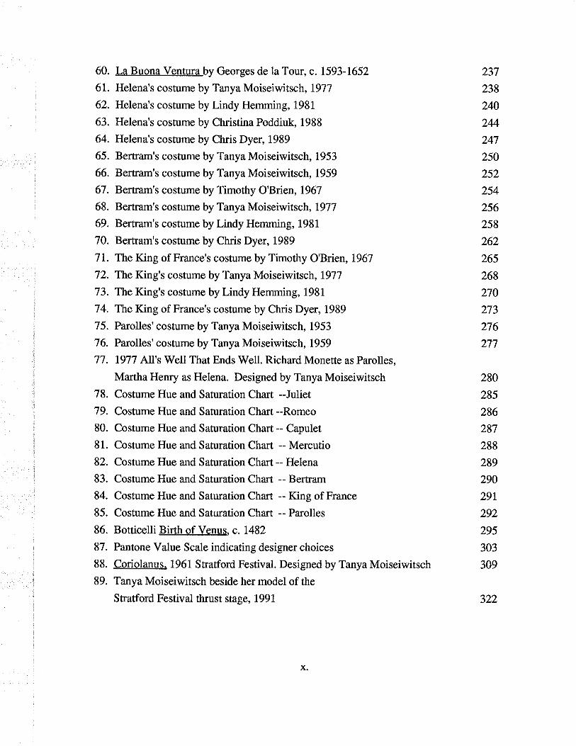
LIST OF FIGURES
PREFACE: Thesis Structure
Chapær I. TAI.IYA MOISEIWTISCHTanya Moiseiwitsch: Costume DesignObjectives and Purposes of the StudyJustification for the Study
Tanya MoiseiwitschShakespeare Costume as FocusCostume Colour and ShakespeareCostume Colour as Cultural Signifier
Chapter tr. LITERATURE REVIEWInterdisciplinary IntegrationTanya Moiseiwitsch: Biographical Det¿il and Design
Developmental Stages: Origins and Associations with TheatreWork Across the Ocean:Tyrone Guthrie and the Sratford Festival
Design ApproachTheatrical Components
Theafe HistoryCostume and Set Design HistoryThe Production ProcessThe Thrust Stage
Colour and Critical ElementsColourÆmotional As sociationColour as Cultural Signifier
The Play
Chapúer III. METHOD OF INQUIRYOverviewResearch sourcesProductionsRomeo and JulietAll's Well That Ends V/ell
Dramatis PersonaeResearch ToolCostume Colour Data CollectionCostume Colour Analysis/ Research ModelParameters and Limitations of the Study
PAGE
ü
iv
vü
x
1
I5889
10t3
1515t6T6)<32363639404246465053
57575960
6365687T75
v.

chapær rv. TANYA MOISEIWITSCH'S pOSmON IN THE HISTORY OFBRITISH THEATRICAL COSTUME DESIGNShifts of FocusModel of British Design StylesExperimental Style: Turning from Realism
The New StagecraftDecorative Style: Towards High SocietyMorphologicat Style: Metaphor and StructureIdeological: Defining the MessageMaterialistic: Affluent FluencyBritish Design TraditionTanya Moiseiwitsch's Position
Serving ttre Production
Chapûer V. ROMEO AND JULIET COSTUME COLOUR/CHARACTERIZATIONANALYSIS
Romeo and Juliet: Theme, Content and Production HistoryBlumed LinesCharacær ChoicesThematic ColourCostume Colour / Characterizatton: Juliet
ThirtiesFortiesFiftiesSixtiesSeventiesEighties
Costume Colour / Characteri zation: RomeoFortiesFiftiesSixtiesSeventiesEighties
Costume Colour / Characteri zation: CapuletFiftiesSixtiesSeventies
Costume Colour / Characterization: MercutioFiftiesSixtiesSeventiesEighties
828282849T98
1031081,13
115116r22
7271281311,33138t41t4r145148153t59165r691,69t701741801861901901,92196r99200202207209
v1.

Chapær VI. ALL'S WELL THAT ENDS WELL COSTUME COLOUR/CHARACTERIZATION ANALYS ISAll's Well That Ends Well: Theme and ContentBlurred LinesCha¡acter ChoicesThematic ColourCostume Colour / Characterization: Helena
FiftiesSixtiesSeventiesEighties
Costume Colour/ Characterization: BertamFiftiesSixtiesSeventiesEighties
Costume Colour/ Characterization: King of FranceFifriesSixtiesSeventiesEighties
Costume Colour/ Characterization : ParollesFiftiesSeventiesEighties
chapær vII. MERGING COSTUME COLOUR CONTENTSCostume Colour: saturation and hueCostume colour: complementary coloursCostume colour: value for valueFashionable Colours and Theatre Costume
Chapær VIII. CONCLUSIONSNexusTanya Moiseiwitsch: Subtlety in Colour and Design
LIST OF REFERENCES
APPENDICESA. Costume Colour/Character ChartsB. Production ListsC. Designer BiographiesD.Tanya Moiseiwitsch DesignologyE. Theate InformationF. Data Collection SheetG. Museum/Archives Resource IndividualsH. Pantone Colour/Word Association
2132r32t7221,22923023023423624024924925325525726426426526626927427527928t
284284301302310
3t43r4318
323
3343453503s33s936L362364
vll.

1.
)3.
4.
5.
6.
7.
8.
9.
10.
11.
t2.
13.
t4.15.
16.
t7.
18.
19.
20.
2t.
22.
23.
LIST OF FIGURES
Fizure
Harry Showalter welcoming the Guthries and Tanya Moiseiwitsch
to Canada, 1953
Tanya Moiseiwitsch: resident designer at Abbey Theafe, Dublin, 1938
Costume design for Richard Itr by Tanya Moiseiwitsch , 1953
Twelfth Night. 1957 Straford Festival, designed by Tanya Moiseiwitsch
Pantone Colour Wheel
Pantone Value Scale
Pantone Chroma Designation
Gray Mask used to eliminate simultaneous conffast distortion
Research Model
Potential Colour Families
Model of 20th Century British Design Styles
Charles Kean as Hamlet, 1850
Designs by Gordon Craig for The Vikings. 1903
Paul Shelving's design for Back to Methuselah, 1920
Claud Lovat Fraser's designs for As You Like It. 1919
Claud Lovat Fraser's designs for The Beggar's Opera,1920
Norma Shearer as Juliet, 1936. Costume designed by Oliver Messel
Cecil Beaton's designs for Lad)'Windemere's Fan. 1945
Design for Richard II by Motley, 1937
Design by Leslie Hurry for Sadler lVells Hanlet. t942
RSC King Lear directed by Peter Brook,1962
Designs by Ultz for Julius Caesar, Sûatford Festival, 1990
Set and costume designs by Tanya Moiseiwitsch for
A Month in the Country. 1947
Costume design for King Oedipus,1954, Snaford Festival
Tanya Moiseiwitsch
Design for Argan by Tanya Moiseiwitsch for the 1974
Sratford Festival production of The Imaginary Invalid
Approximate costume colour ratios used in costume colour
and character analysis
Page
2
23
3l33
66
66
67
69
72
77
84
85
89
92
95
97
100
101
105
t07
111
t14
TT9
t24
1,25
r40
24.
25.
v111.
26.

27. Juliet's costume by Motley, 1935
28. Raphael's Marriage of the Virgin c. 1504
29. Exanryle of Spanish style costume from Goya. The Maja c. 1811
30. Juliet's costume by Rolf Genrd,1947
31. Juliet's costume by Motley, 1954
32. Juliet's costume by Motley, 1958
33. Juliet's costume by Tanya Moiseiwitsch, 1960
34. Juliet's costume by Desmond Heeley, 1961
35. Juliet's costume by Carolyn Parker, 1968
36. Juliet's costume by Chris Dyer,1976
37. Juliet's costume by John Ferguson, L977
38. Juliet's costume by Dunya Ramicova, 1979
39. Juliet's costume by Wa:ren Travis, 1979
40. Juliet's costume by David Walker, 1984
41. Juliet's costume by Ginny Humphries, 1986
42. Romeo's costume by Motley, 1954
43. Romeo's costume by Motley, 1958
44. Romeo's costume by Tanya Moiseiwitsch, 1960
45. Romeo's costume by Carloyn Parker, 1968
46. Romeo's costume by Chris Dyer,1976
47. Romeo's costume by John Ferguson, 1977
48. Romeo's costume by Dunya Ramicova, 1979
49. Romeo's costume by \ila:ren Travis, 1979
50. Romeo's costume by David V/alker, 1984
51. Romeo's costume by Ginny Humphries/Chris Dyer, 1986
52. Capulet's costume by Tanya Moiseiwitsch, 1960
53. Capulet by Desmond Heeley, 1961
54. Capulet by John Ferguson, 1977
55. Mercutio's costume by Motley, 1954
56. Mercutio's costume by Carolyn Parker, 1968
57. Mercutio's costume by David Walker, 1984
58. Helena's costume by Tanya Moiseiwitsch, 1953
59. Helena's costume by Timothy O'Brien, 1967
t4I142
t46
t47
149
151
t54\56
r57
159
L61,
r621,64
165
167
t72
t73175
178
181
r82184
r85
187
189
193
195
t97
207
205
210
23t235
lX.
60. La Buona Ventura by Georges de la Tour, c.1593-1652
61. Helena's costume by Tanya Moiseiwitsch,I9TT
62. Helena's costume by Lindy Hemming, 1981
63. Helena's costume by Christina Poddiuk, 1988
64. Helena's costume by Chris Dyer, 1989
65. Bertram's costume by Tanya Moiseiwitsch, 1953
66. Berram's costume by Tanya Moiseiwitsch,1959
67. Berram's costume by Timothy O'Brien, 1967
68. Bertam's costume by Tanya Moiseiwitsch, T9TT
69. Bertram's costume by Lindy Hemming, 1981
70. Berram's costume by Chris Dyer, 1989
71. The King of France's costume by Timothy O'Brien, 1967
72. The King's costume by Tanya Moiseiwitsch,l9TT
73. T}lre King's costume by Lindy Hemming, 1981
74. Tlrre King of France's costume by Chris Dyer, 1989
75. Parolles'costume by Tanya Moiseiwitsch, 1953
76. Parolles' costume by Tanya Moiseiwitsch, 1959
77. 1977 All's Well That Ends V/ell. Richard Monette as Parolles,
Martha Henry as Helena. Designed by Tanya Moiseiwitsch
78. Costume Hue and Saturation Chart --Juliet
79. Costume Hue and Saturation Chart --Romeo
80. Costume Hue and Satu¡ation Chart -- Capulet
81. Costume Hue and Saturation Chart -- Mercutio
82. Costume Hue and Saturation Chart -- Helena
83. Costume Hue and Saturation Chart -- Bertram
84. Costume Hue and Saturation Chart -- King of France
85. Costume Hue and Saturation Chart -- Parolles
86. Botticelli Birth of Venus, c. 1482
87. Pantone Value Scale indicating designer choices
88. Coriolanus. 1961 Straford Festival. Designed by Tanya Moiseiwitsch
89. Tanya Moiseiwitsch beside her model of the
Stratford Festival thrust stage, 1991
237
238
240
244
247
250
252
254
256
258
262
265
268
270
273
276
277
280
285
286
287
288
289
290
29t292
295
303
309
322
x.

PREFACE
Thesis sÍucture
The first chapter of this study presents the thesis topic: Serving the production : Tanya
Moiseiwitsch's application of colour in Shakespearean theatrical costume. This chapter
establishes Tanya Moiseiwitsch's importance within international theatre since 1934 and
within Canadian thean'e since 1953. It provides the justification for studying costume
colour in relation to characterization and outlines the reasons for choosing two of
Shakespeare's plays , Romeoancl.lúlig! and All's V/ell That Ends Well, as the basis for
the costume data collection. The objectives and pulposes of the research are stated
within this chapter.
The second chapter is a review and discussion of the literature lelated to this study.
The literature is organized in sections introducing biographical data about Tanya
Moiseiwitsch, her association with Tyrone Guthrie, and the establishment of the Stratford
Festival in Canada. Literature related to her design approach, to colour research
generally, and literature which considels costume on the thrust stage (a stage which she
helped to reintoduce) are also rcported on in this chapter.
Chapter three explains the method of inquily for the research. The development of a
research model, the Theanical Costume Colour Analysis Model, based on an established
colour system is detailed and research sources listed. The lirnitations and parameters of
the study are delineated in this chapter.
The next three chapters outline the findings of the study. An analysis of Tanya
Moiseiwitsch's position within British theatre design history is presented in chapter four.
xl

As part of the analysis, a diagrammatic model indicating the larger tendencies in British
design and clarifying Tanya Moiseiwitsch's place within that n'adition was developed.
That model is shown here in approximate chronological order. Chapters five and six
document the analyses of costume colour within the two plays. Chapter five examines
costume colour for four characters in 14 productions of Romeo ancl Juliet. while the next
chapter follows suit with 7 productions of All's Well That Ends Well. The analyses in
these chapters ¿Lre based on charts of the different costume colours utilized by the various
designers. Watercolour illusn'ations of the various characters are reproduced thloughout
chapters 5 and 6.
The information in the last three chapters of the disseltation is summalized, the
connections addressed, and conclusions drawn, in the final two chaptels. The study's
findings both reinforce existing knowledge regalding coloul and Tanya Moiseiwitsch's
use of it in Shakespearean costume, and suggest fulther possibilities for investigation.
The thesis concludes with appendices containing the costume colour'/characterization
charts, references to Tanya Moiseiwitsch's extensive production designs, designer
biographies, production lists, and other relevant matedal.
xll

I. TANYA MOISETWITSCH
Tanya Moiseiwitsch : Costume design
Even without the actors animating the script of a play, theatre costumes retain
characteristics that allow them to be viewed from a variety of figurative and literal
perspectives. When removed from their original context and placed in a gallery setting, the
costumes exist as artifacts worthy of appreciation in their own right. They can be evocative
referents to remembered scenes and emotions, or celebratory evidence of a particular
creative endeavour; the dominant perspective ultimately rests with the viewer. However,
when the Lieutenant-Govemor of Ontario opened a major theatrical costume exhibition on
the 27th of June, L974, the focus was celebratory. The artifacts included hundreds of
costumes, a selection of design sketches, and several masks. They were chosen from
productions at the Stratford Festival in Ontario, the Guthrie Theatre in Minneapolis and
from production designs in Great Britain. All were the work of one designer: Tanya
Moiseiwitsch.
In mounting this exhibit, the citizens of Statford honoured the designer who helped
launch its Shakespeare Festival2l years earlier. Tanya Moiseiwitsch's contribution to the
Festival began with her designs for two Shakespeare plays, Richard III and All's Well That
Ends Well, and spanned the years from 1953 to 1985. During that time she designed
costumes and sets for 29 Sratford Festival productions: two-thirds of these were plays by
William Shakespeare.
During her career, which began in the 1930s and continued into the 1980s, Tanya
Moiseiwitsch achieved international distinction as a designer of both sets and costumes.
Her importance to theatre design was clear even before her 1953 Canadian debut.
Moiseiwitsch's talent was first recognized with her student designs for The Faithful at the
2
Westminster Theate in London (1934). She honed her skills as a designer at theatres in
the United Kingdom including the Abbey Theate in Dublin (from L935-39), commercial
theatres in London's West End (from 1940), the Oxford Playhouse (classical repertory
from 1941-44), the Old Vic (classical repertory from l9M), the Royal Opera House
Covent Garden (1947), and tinally, the Shakespe¿ue Memorial Theatre in Stratford-Upon-
Avon (from 1949) before working in North America.
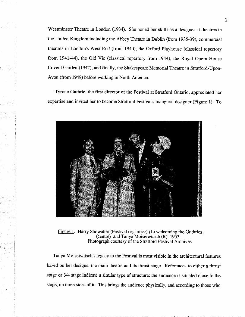
Tyrone Guthrie, the first director of the Festival at Straford Ontario, appreciated her
expertise and invited her to become Sratford Festival's inaugural designer (Figure 1). To
Figure 1 Harry Showalter @estival organizer) (L) welcoming the Guthries,(cenfre) and Tanya Moiseiwitsch @). 1953
Photograph courtesy of the Staford Festival Archives
Tanya Moiseiwitsch's legacy to the Festival is most visible in the architectural features
based on her designs: the main theatre and its thrust stage. References to either a thrust
stage or 314 sta5e indicate a similar type of structure: the audience is situated close to the
stage, on three sides of it. This brings the audience physically, and according to those who
prefer it, emotionally closer to the action of the play when compared to the proscenium
st¿ge, with the audience seated in front and the play presented within a framed pictorial
format. Moiseiwitsch's collaboration with Tyrone Guthrie in designing the thrust stage at
the Statford Festival and later at the Guthrie Theatre count among her most noteworthy
accomplishments.
In addition to her contribution to the structue of the theatre, her influence on costume
design at Stratford went beyond her own productions and can be observed to the present
time. Debra Hanson, the head of Design at the Festival in 1992, attested to this when she
asserted that the Festival's production team strives to be the best (M¿glgÊS, 29 June,
1992). To this end, the article states, the Festival has allocated considerable time and
money for the design and construction of high quality costumes. According to Louise
Champion, then Head of Wardrobe, that degree of commitment to high standards of
costume production, observable in the choice of materials and the attention to construction
details, began with Moiseiwitsch's involvement at the Festival (personal communication,
1991) .
Tanya Moiseiwitsch also contributed to the Festival through her roles as teacher and
mentor to other international designers who worked at the Sradord Festival. Desmond
Heeley and Brian Jackson are not¿ble in this regard. In an interview with Pat Quigley of
the Festival, Desmond Heeley referred to Tanya Moiseiwitsch as "such a graceful
teacher..." (1990) and stated that he was very much aware of following in her footsteps.
His development as a designer reveals an emphasis on painterly costumes that blur
structural details rather than feature them. Heeley crediæd Moiseiwitsch as a mentor who
influenced his own design approach through her appreciation of apparel as architectural
forms. His finished product might be significantly different in aesthetic sensibility, but,
like Moiseiwitsch, Heeley always respected the shape of a costume as one of its foremost
elements. Moiseiwitsch's influence in Heeley's work was more apparent in the earlier

4
st¿ges of his career, prior to the expressionistic fabric colours and textures which have
since become his nademark. Moiseiwitsch's role as mentor can be seen in Brian Jackson's
designs during the time he worked with her at the Festival in the 1960s. His designs have
a resffaint in decorative detail and an impressionistic sense of period- Sometimes they even
look like Moiseiwitsch's renderings.
Throughout the years, analysts of Tanya Moiseiwitsch's costume designs have
frequentþ noted two distinctive features: their striking sculptural quality and their distinct
orchesfation of colour. Asked to describe her most salient design characteristics, theate
scholars refer to Moiseiwitsch's costume designs as "architectonic" (Ingram, personal
communication, I99I) or "sculptural" (Bryden, personal communication, 1990). These
qualities are closely (though not exclusively) related to her capacity as a designer of, and
designer on, a thrust stage. The archiæctural and sculptural assessments of Moiseiwitsch's
costume designs arise from the clear style silhouettes and often flat colouring of her stage
costumes. These ftaits are emphasized by the contrasting minimal background of the thrust
stage and the proximity of the audience to the players.
However important this sculptural quality is in the visualization of the production, it is
Tanya Moiseiwitsch's use of colour that attracted the most attention from the reviewers.
Toronto Globe and Mail critic Herbert V/hittaker felt she had a "...rare sense of color"
(1964, January 4), which he later defined as a "...subtle color sense" (I974, May 25).
That sense of colour was perceived as a "...low-key palette" (Sangster, 1977), but it could
also feature vibrant accents. Writing as critic for the Toronto Globe and Mail, Whitüaker's
description of the splendour of Moiseiwitsch's designs for the Festival's opening
production Richard III particularly focused on her application of costume colour.
Whittaker wrote: " The colors are muted for the most part, with many blacks and greys, so
that Richard's enormous coronation robe filled the eye richly with its crimson splendor"
(Bryden, 1985, p.39). This costume must have been stunning as it swept the stage, but it

was particularly the contast of the brilliant red colour set against a muted background
which enthralled the critic. Costume stucture supported by colour functioned as an
expressive symbolic tool within this production. Whittaker's account is significant because
it offers clues to Moiseiwitsch's colour sensibility, a sensibility that is mostly associated
with a suMued colourpaletæ.
Objectives and purposes of the study
It was the specific description of her application of colour in the fust few seasons at the
Stradord Festival in Ontario that initiaæd my inquiry into the way Tanya Moiseiwitsch used
colour in costume. A number of questions shaped the research system. What is
distinctive about her application of colour, what is culturally related, and what is related to
the raditions of staging?
Three purposes exist within this study. The first is to add to the appreciation of Tanya
Moiseiwitsch's place in the history of design with particular reference to her use of colour.
The second evolves from that: to expand our knowledge of the dynamics of costume design
within theatre history. The third pur?ose of this study is to increase our understanding of
colour meaning in a specific cultural context (the theatre) and within the framework of a
classical repertoire (Shakespeare).
It is the objective of this study to identify Moiseiwitsch's choices of colour in costume
design and to understand how they relate to characterization. In order to inte¡pret the
material, a contextual framework for the British design traditions out of which her work
evolved was established. Further, this study set out to analyse how her use of colour
compared with that of her contemporary colleagues in costume design, and finally, to
distinguish references to cultural colour attributes as they exist in costume design. To do
this, a central basis of comparison was required. Accordingly, costumes from
Shakespeare's plays were chosen for this study. A futl explanation for this choice of

playwright and specific productions is provided in the section outlining ttre justification for
the study.
Careful independent investigation by the researcher was required to answer the
questions shaping this study. Design is not a subject which Tanya Moiseiwitsch is willing
to look at in a systematic way. She is known for her reluctance to analyse her design
work, believing that to do so is, in her own words " ...a very dangerous thing" (Hayes &
Barlow, l99L). While Moiseiwitsch's accounts of her experiences in the theafe are filled
with gentle humour and sprinkled with brief references ûo specific productions and the odd
design generalization, she remains veiled with regard to any dissection of her design
approach. This attitude seems to have developed while she was still a student at school in
England where, as pa-rt of her studies, she was required to attend productions at the Old
Vic. Moiseiwitsch found that the plays were better appreciated when they were acted on
the stage "...rather than torn apart line by line in an English class" (S_AaÉq{_eaçq
Herald, 1974, June 1). The same appreciation for the potential magic of any theatrical
experience underscores her beliefs with regard to being analytical about her own designs.
She has stated: " There's a feeling of mystery and surprise which applies to almost
anything in life. Talk about it, and it usually falls through in some way or other" (.Strag[or<!
Beacon-Herald, 1970, June 6). Analysis of her work must therefore evolve from an
examination of the designs themselves in the context of other variables: Shakespeare
productions, theatrical conventions, and cultural influences.
Tanya Moiseiwitsch orchestrates meaning through her signature colour application in
costume design, establishing characterization and setting the tenor of the scene. In the
1961 production of Love's Labours Lost for Stratford Festival, a play that begins with an
atmosphere of warmth and laughter but concludes in a sombre mood, Moiseiwitsch
supported the script by first dressing all the court women in different tints of palest white
silks to establish the carefree feeling at the start of the play. "The mood of 'Love's Labours
7
Lost' is pastoral and soft, light colors ...", she explained at the time of its performance at
Stratford (Stratford Beacon-Herald,196I, June 17). The atmosphere of the play shifts
dramatically with the French messenger's arrival announcing the King's death. At that
point in the 1961 production the women donned dark brown chiffon cloaks, evoking the
saddened atmosphere. The ethereal quality of the garments so suited to the characters of
the princess and her ladies, was thus undiminished and the shift in mood was instantly
conveyed through the use of a deeper shade. It was a beautiful, practical, and effective
measure on Moiseiwitsch's part, one regarded as a typical "Tanya touch" @ehl, 1986).
This recollection exemplifies Tanya Moiseiwitsch's well declared intent to make
costume subservient to the production's needs. She achieved this through collaborative
interaction and decision making with directors and other members of the production team
(Behl, 1982; Blom, 1981). In any interview, recorded or otherwise, she stresses this
aspect of the production process over and over: designing costumes must be a collaborative
effort in order to elicit a unified experience. This includes making decisions regarding
costume colour. " A designer must always work with the idea he's serving the production
not just decorating the play, but interpreting what's inside the text, what has to be got out
of it" @,l974,June 1).
Tanya Moisiewitsch was always careful to convey a sense of a specific period if it was
integral to the production, regardless of playwright. She sought to interpret the material in
a manner intended to capture the essence of the production rather than literally ranscribing
it. Her designs, including her choices of colour, were based on research of the period.
The examination of a particular work of art often guided her decisions. This approach to
design interpretation reflects her roots within the British theatrical ftadition which, even in
its modern exposition, continued to show vestiges of the 19th century ideal of careful
historical research as a component of quality. Her distilled use of a period or an artist's
colour, and attention to historical detail attest to her early interest in how people dressed
(Hayes & Barlow, 1991).
Justification
Tanva Moiseiwitsch
In the realm of the theate world, Tanya Moiseiwitsch's influence has been far-reaching
both in time and place. Her design work on costumes, props, settings, and stages has
brought her recognition as one of the most important theatre designers of the 20th century
(8eh1,1986). In a career spanning 51 years worldwide, she designed over 170
productions. She helped to reintoduce the concept of staging in 314 round, and was, as
noted, directly involved in the establishment of two theates in North America.
Rarely do any discussions of theatrical productions at the Snatford Festival in Canada
occur without the eventual mention of Moiseiwitsch's designs. ln 1952, with the support
of the Canada Council, Tom Patterson set about to bring his dream of a Shakespeare
festival to his hometown of Sratford, Ont¿rio. He sought Tyrone Guthrie's assistance in
establishing the Festival. Guthrie advised Patterson to secure the help of one of England's
greatest designers, Tanya Moiseiwitsch (Patterson, 1987). At that time, Moiseiwitsch was
in "...her mid-career" (fæech, 1985, p.18). She had distinguished herself with designs for
Uncle Vanya at the Old Vic in 1945, and assured her place in British design with her
designs for Shakespeare's history cycle at the Shakespeare Memorial Theate in 1951.
Although she was an established designer in Britain, Canadians were unfamiliar with her
accomplishments. However, by the beginning of the 60s, the Toronto Dail)' Star was
reporting that she was "...at the summit of her costume-designing profession: a name that
has become a standard by which others are often judged" (1962, June 16).
An examination of Tanya Moiseiwitsch's work is important not only because of her
association with the development of a major theafre in Canada, but also because of her role

9
as mentor in theatre design. Along with Heeley and Jackson noted earlier, Dennis Behl
(1981, p. 356) included John Jensen, James Bakkom, and Rodney Ford in the list of those
whose work she has influenced.
Tanya Moiseiwitsch's contributions to North American theafe are evident both in
Canadian theatre and in the United States, particularly at the Guthrie Theatre in
Minneapolis. Such a strong connection with North American theatre, and specifically with
the development of a major Canadian thearical venture, firrrùy est¿blishes her as someone
whose design approach warrants study.
\ilhile various articles and two theses (Behl, 1981; Btom, 1982) have been written
about her work, a comprehensive examination of the specific character and content of
individual costumes as they relate to characters within productions remains to be more
extensively explored. In Thrice the Brinded Cat Hath Mew'd, a record of the Stratford
Festival in Canada (1955, p.113), Tyrone Guthrie and Tanya Moiseiwitsch urged
scholars to place more emphasis on technical accounts of productions for future use as
historical sources of information about theatrical practice of their times. They pointed out
that such accounts would establish context for the interpretation of classics.
Shakespearean costume as focus
A catalogue of Tanya Moiseiwitsch's designology is included in Appendix D. It
includes 171 productions. Of these, 42 (constituting ttre largest percent¿ge of works by one
author) are works by Wiltiam Shakespeare. Out of Shakespeare's 37 plays, Moiseiwitsch
designed 28 of them; she has worked on a tot¿l of 42 Shakespeare productions. Forty-two
Shakespeare productions in 51 years constitutes an impressive record, and argues well for
choosing costumes from productions of his plays as a focus for analyzing Moiseiwitsch's
use of costume colour.

10
The decision to focus on Shakespeare's plays was also guided by broader
considerations. Tanya Moiseiwitsch's disinclination to analyse her work created a need for
some method of establishing its distinctiveness beyond pure description. The
distinguishing features with regard to her use of colour would be most recognizable if they
were compared to the work of other designers. Because of this approach, it was important
to choose plays with a record of several accessible productions so that a basis for
comparative evaluation would be possible. Shakespeare productions are profuse and
universal; they were therefore a logical choice as vehicles for comparing numerous
designers' application of costume colour. Together with Tanya Moiseiwitsch's extensive
record of Shakespearean production design, this element reinforced an investigative focus
based on his plays. Shakespeare's texts are thus the connectors linking the costume colour
choices made by Tanya Moiseiwitsch and other designers. The d,ifferences between
Moiseiwitsch and other designers' applications of colour are more easily discernible when
we study them within the same time frame. To provide an expanded context for costume
colour application in theatre within that analysis, the influence of culturally related variables
such as period fashion colours and theatrical conventions were also considered.
Costume colour and Shakespeare
Shakespeare used colour symbolically, as well as to evoke certain moods. V/hen the
Prince of Morocco asks " What says the silver with her virgin hue?" (lI.vri.22) in The
Merchant of Venice, he was making a reference to a well-understood and specific
Elizabethan conception of that colour. In the sixteenth century, silver was understood to
represent purity. Fashion was determined at the court of Elizabeth I by the Queen herself,
trickling down through the courtiers and their ladies only with her approval. Clothing and
clothing colour were symbolic vehicles of expression during her reign, and the language
could be very complex. Jane Ashleford (1988, p.102) records that in 1583 one of the most
influential teatises on colour symbolism was franslated into English from its French

11
origins. The book, entitled A Rare True and Proper Blazon of Coloures and Ensignes
Militalv with theyr Peculiar Signification by Sicile, outlined the meaning of colours and
was taken very seriously by those caught up in the courtly love tradition. Allen (1936,
p.82) suggested that there were four treatises on the subject during the 16th century and
that the colour symbolism they decoded "became an intrinsic form of symbolism in the
English literatute" of that time. He explained that the symbolism was derived from uses in
art, folk customs, blazonry, and church ritual of medieval times; but actually it had
widespread use in the 16th century because of intentional incorporation by English
Renaissance writers such as Shakespeare, Spenser, Ford and Jonson.
Queen Elizabeth's favorite colours were black and white (Ashelford, 1988; Norris,
1938; Strong, 1983) because they symbolized virginity and constancy at that time. Many
of her courtiers wore those colours in deference to her. In 1578, while on a visit to
Suffolk, she was met by a number of men who were described as " two hundred yong
Gentlemen, cladde in white velvet and three hundfed l-sigl of the graver sort€ apparelled in
blacke velvet coates" (quoted in McCracken, 1985, p.51S).
From the various treatises, we learn that black indicated grief as well as constancy.
Black as a symbol of mourning has been an enduring symbol in the Western world. Roy
Srong (1983, p.80) believed that association of constancy with black resulted from of its
inability to take other colour. Black is the only colour unaffected by others, thereby
remaining constant in hue. Because of this associative meaning, it was the favoured colour
for the background of small portraits in the Elizabethan period (Strong, 1933). There were
likely more practical reasons for such a colour choice, such as the high contrast which a
dark background provided, but black's symbolic association with constancy was
significant. Within the Western world, black has also signified malevolence, aggression,
and the darker side of life. Even in Shakespeare's comedies, it appears in this context. In
one of the loquacious speeches in Love's Labours Lost, the King enunciates this sentiment:

t2"O Paradox! Black is the badge of hell/The hue of dungeons, and the school of the night:
(ry.iii. 249-50). In As You Like It. Ganymede scathingly alludes to Phebe's letter: " Such
Ethiop words, blacker in their effect / Than in their countenance." (IV.iii. 34-5) imptying
quite clearly that they were not welcome to her.
Other colour meanings included yellow, which signifed joy, but could also represent
jealousy. This is the interpret¿tion that Shakespeare gave it in The Winter's Tale: "...
mongst all colour / No yellow in't lest she suspect, as he does, / Her children not her
husband's."([.iii.106-8.). Red signifed prowess, tawny signified that one was forsaken,
russet signified prudence, hope and constancy (Bruster, 1991), green signified love and
youthfulness or freshness, and blue signified amity (Ashleford,l988) and fidelity in love
(Allen,1936). In Love's Labours Lost. the Spaniard Don de Armado states emphatically:
"Green, indeed is the colour of lovers," (I.ii.85). Shakespeare seems to have been familiar
with the colour meanings listed, and it is possible, from the examples given, to observe in
his use of colour an accord with the stated symbolism.
With the death of Queen Elizabeth in 1603, the structures inherent in the literature of
the time were emptied of their meanings. These structures, dominant from the 12th to the
17th century, were part of the romantic genre associated with the medieval poet Francesco
Petrarch. This romantic concept idealized courtly behaviour based on chival¡ic codes of
honour. As the preceeding review of colour in 16th century literature suggests, colour
symbolism was an important visual component in the genre's elaborate system. Given the
period Shakespeare wrote in -- late 16th and early 17th century -- there is ample
justification in literature to suggest that his active writing career occurred at a time when
colour meaning was entrenched within English verbal and visual language. The codes that
established those meanings have long disappeared, but remnants of their colour symbolism
remain today.

t3Costume colour as cultural sig¡ifier
Costume historians have long recognized that their area of study provides an intriguing
method of documenting the history of mankind. While the majority of past studies have
concenfaûed on describing the costume of moneyed classes, new approaches to inærpreting
costume as aspects of material history have increasingly been explored. Paoletti (1983)
recognizes the social significance of clothing colour in helping to define masculine roles.
Her study shows how blue came to be recognized as the colour for boys and pink deemed a
feminine colour in the first two decades of this century. Prior to that time, the opposite
had been the social norm in the Western world. Paoletti's study underlines the significance
of colour's potency as a visual signifier of gender at an early age in addition to indicating
the changes in cultural attitudes which the colours connoted.
Kidwell and Steele (1989) further demonstrate the role of costume colour in the
evolution of men's and women's roles. Their report examines aspects of clothing as
gender symbols in sporting wear, work clothes, children's clothes, and clothing of an
erotic nature. They indicated that the shift to darker colours in men's apparel reflected the
class consciousness of 18th century England in which: "The new masculine ideal became
the English counûry gentleman....In place of the old belief that gentle birth alone made one
noble was the new idea that by acquiring gentle manners (including gentle appearance) any
man might potentially achieve distinction" (p.16). The darker country and sporting clothes
of the aristocracy became a visible means to affect this particular persona. Studies such as
these exemplify the semiotic importance of clothing colour within the broader confines of a
culture.
By extension, the role of costume within a production is an important one, for it serves
to accentuate a character, and perhaps describe a mood or attitude. As the examples above
reveal, sha¡ed cultural colour associations establish colour as one of the most powedul
means for offering particular clues through costuming, signifying characûer taits that enrich

T4
audience perception of the play as a whole. Within a production, colour makes the
strongest initial visual impact. It has a direct sensory appeal, causing definite subjective
conscious or unconscious reactions in the beholder (Gilette, 1987; Hope and Watch,1990;
Pantone, I99I). It is this emotional potential of colour that gives it its consummate status
as a vehicle of artistic expression, and makes it such a valuable tool in establishing
character relationships within a production. Individual charactenzation as well as gïoup
identification can be charted through colour specification. Designers are aware, both
consciously and unconsciously, of colour's potency as a social signpost of
cha¡actenzation. Their application of colour is a response to the associated meanings at the
time in which they design: it enables them to manipulate colour as a design tool either by
choosing it to make characterization immediately recognizable, or conversely, by using
ambiguous colour associations to intentionally confuse, in order to complement carefully
orchesftated character development. Tanya Moiseiwitsch's ftaining in art reinforced such
an arwareness and she was influenced by the understanding of colour meaning cturent to the
period during which she designed. The cultural significance of colour is therefore a
relevant focus within this study of costume.
Within the framework of the larger societal associations of colour, personal preferences
contribute to costume colour choices. Individual designers' works can often be instantly
recognizable by their distinctive colour palettes, suggesting idiosyncratic methods of
conveying characterization to an audience. The degree to which they vary in costume
colour and character interpretation within different times will add to our knowledge of
theatre history, and, through the designers' societal translation of clothing colour, material
clues of their culture are documented for the future. The value of academic study of
designers' work within particular productions has been recognized only within the past
twenty years (Cordner, University of Birmingham lecture, 1991). In the annals of theate
history, this is a relatively brief time period. For these reasons, research of this nature is
especially timely.
tr. LITERATURE REVIEW
Interdisciplinary integration
Three concerns determined the focus of this literature review: first, the need to know
Tanya Moiseiwitsch and her work; second, the necessity to see her work in the context of
theatre design and its evolution, particularly in Britain; and third, the need to develop a
comprehensive framework for that work within the realm of costume and colour meaning.
A review of literature pertaining to the first concern is addressed in the section entitled
Tanya Moiseiwitsch: Biographical detail and design As its title suggests, the focus is on
biographical literature specific to her life and her design work: dissertations written
specifically about her, piecemeal information gleaned from interviews, articles related to the
theatres where she worked and books on theatre. Literature deøiling her collaborative
endeavors with director Tyrone Guthrie and their association with the Stratford Festival in
Canada provided further insight into her design career and its Canadian context. Finally,
interpretive literature outlining Tanya Moiseiwitsch's design approach constitutes the
remaining component examined in this section.
The next section, Theatrical components, addresses the second concern. It is a survey
of literature on theatre, costume, and set design history from an historical perspective.
Included in this literature is technical information regarding the mechanics of the production
process and the special considerations associated with ttre thrust stage.
The third section, Colour and critical elements, addresses the final issue, through a
review of literature on costume and colour meaning. Out of this material a system was
developed for examining Moiseiwitsch's application of colour in costume and changing
trends in the associated meanings for colour. The literature supports the scope and
importance of colour association within both the theaûe and the non-theatre community.
15

I6Along with information about costume colour, critical reviews examining the two
Shakespeare plays serving as source material for the costume colour analysis are included
in this section. The selection of scholarly writing on Shakespeare's plays emphasizes
literary thought current to the time of Tanya Moiseiwitsch's career. In addition, there are
some examples of earlier Iiterary thinking that helped to define her work. There have been
new developments in literary theory since that time, but because of the stated focus they
remain outside the parameters of this study.
Ianya Moiseiwitsch: Biographical detail and design
Development¿l stages: Origins and associations with theate
Looking at the forces that shape a personality and identifying the stages in their creative
development is cenffal to any investigation of an individual's achievement. Psychologists
are particularly concerned with the rudimentary foundations which may have effected a
certain life course. For similar reasons, scholars in other fields are also concerned with an
individual's formative period. With respect to Tanya Moiseiwitsch's background, three
questions were prominent: Were there discernible early influences that favoured her
development as one of the 20th century's most eminent theatrical designers? What was the
nature of her education? How is it reflecæd in her laær work?
References to Tanya Moiseiwitsch's early life are brief and are mostly concerned with
her illustrious parentage and her artistic education. Dennis Behl's unpublished doctoral
dissertation TanJ¡a Moiseiwitsch: Her contribution to theatre arts 1935-1980 (1981)
provides the most extensive discussion in this regard. He presents an amalgam of facts in
his thesis chapter dealing with Moiseiwitsch's parents, her apprenticeship, and her first ten
years in design. Behl's information is derived from a variety of sources including
interviews with Tanya Moiseiwitsch herself. His communication with Ruth Keating, a
teacher at the Cental School of Arts and Crafts where Moiseiwitsch was a student, yielded
T7
insight into the emphasis on thoroughness that was part of the educational process and
which is a characteristic of British design work. It was from this tradition that Tanya
Moiseiwitsch evolved. In addition to the interviews, Behl drew from the numerous brief
references to Moiseiwitsch in published works such as Tyrone Guthrie's A life in the
theatre (1959) and James Forsyrh's T),rone Guthrie: a biography (1976). Behl presents a
biographical pornait of a shy individual whose creative development was fostered by her
parent¿ge and by her family's social position within the world of entertainment. Focusing
primarily on Moiseiwitsch's set designs, Behl begins his account with her early education,
reviews her work experience, and concludes with his analyses of her contribution to
design. Behl's text, interspersed with photographic documentation for some of the
productions she designed, is by no means a complete suryey, but it is a respectable
presentation of a woman known for her reticence and desire for privacy.
Patricia Blom used many of the same sources as Behl. In addition to archival reviews in
her unpublished doctoral dissertation Tanya Moiseiwitsch. costume designer: The creative
g (1982), she also relied on personal interviews with Moiseiwitsch . The biographic
details in this work concenffate on the designer's early years in the theatre in England, wittr
selective allusions to family influences. Blom's discussion is much narrower in orientation
and less comprehensive than Behl's. Beyond a brief examination of Tanya Moiseiwitsch's
early years in the British theaüe, her investigation offers mostly generalized information
related to Moiseiwitsch's time at Stratford and the people who worked there. Overall, it
fails to offer any substantial new insights into Tanya Moiseiwitsch's career as a designer,
nor does it adequately investigate the designer's role in the creative process. Her topic is
not an easy one. Blom's thesis outlines the general stages in the creative process and the
designer's involvement along the way. This is essentially a blend of the costume design
job description defined in most technical theatre texts with the established creative stages
outlined in design texts such as Bevlin (1980), and Evans and Dumesnil (1982).

18Nevertheless, her dissertation does augment the modest amount of literature written about
Tanya Moiseiwitsch and so was useful to this study.
Many newspaper clippings of interviews and articles written about Tanya
Moiseiwitsch, her work at Stratford, Onta¡io, and at the Guthrie Theatre in Minneapolis
contain pockets of biographical data germane to any discussion regarding this designer.
An article written by Betty Lee in the Globe Magazine JuIy 22,1967 provides a colourful
and informative image of the young woman destined for international recognition. The
article informs the reader that Tanya Moiseiwitsch grew up "...in drawing rooms lwhich
had beenl peopled by musical luminaries, literary figures and such public giants as George
Bernard Shaw." Even the country house she lived in in Brampton, Huntingdon, near
Cambridge, was a tourist attraction. It had been owned by the 17th century gossip Samuel
Pepys (Moiseiwitsch, personal communication, l99l). In a revealing aside, Lee's article
relates how Moiseiwitsch cÍune across a family photograph on exhibit at the Victoria and
Albert Museum, on which her mother had written: "'Where's Tanya?" Besides her family,
the photograph included a group of celebrities, and in reftospect it seems to foreshadow her
'behind the scenes'attitude from a very early age.
These solrces make it very clear that Tanya Moiseiwitsch began her life in exceptional
circumstances. She was born in England in 1914. Her father, Benno Moiseiwitsch, was a
concert pianist who, having won the Anton Rubinstein Pnze at the Imperial School of
Music in Russia at the age of nine, moved to England and developed into a world
renowned musician (Behl, 1981; Candee, 1955). Her mother, Daisy Kennedy, was an
Austalian and, like Benno Moiseiwitsch, was a professional musician. In an interview
with the theafe critic Herbert Whittaker published in The Toronto Globe and Mail Qvlay 25,
1974), Moiseiwitsch described herself as lrish-Scottish-Russian-Jewish. Her mother's
family resided in Australia, and although her father's family were from Russia, Whittaker's
article relayed Moiseiwitsch's seeming lack of concern as to whether her actual ancestry

l9was Latvian or Lithuanian. Years later, her friend and fellow designer Desmond Heeley
(1992) referred to her as looking like a "Russian Countess"; but although she travelled
extensively, her father's homeland was never one of the places visited. By contast,
Australia was often inctuded in her ûavel itinerary.
Despite her diverse ancestry, it would appear that her aft was firrnly rooted in British
traditions and nourished by her musical environment and the atmosphere of the British
stage. As a young child, Moiseiwitsch often accompanied her parents to concert halls.
From her observations of her parents'public engagements, she came to appreciate the
demands made on performers. In an interview with Hayes and Barlow (1991),
Moiseiwitsch recounted how she listened to an unusual rendering of Beethoven played by
her father in a London concert hall during the Great War. The concert hall was packed,
leaving no extra seat for the musician's young child. Tanya Moiseiwitsch listened to the
concert seated beneath the piano, at her father's feet. It was to be one of her few
appeamnces on stage; from an early age, the future designer showed no inclination to
actually perform.
One connection with her Russian ancestry seems to have had a direct influence in
guiding her towards design. The Ballet Russes'Bluebird ballet from The Sleeping Beauty
made a tremendous impression on her. Since their frst visit to the west in 1909, the Ballet
Russes had influenced general fashion and theanical costume. Their designers, including
l-eon Bakst, used exotic fabrics and colours that, when combined with the freer expression
of the human figure, had a dramatic effect on all areas of western design during the first
two decades of the 20th century. In 1919, when Moiseiwitsch first saw Bluebird, the
colourful and lavish ballet served as a catalyst for her first design efforts; she dressed both
herself and her dolls up in ribbons. Many years later, reflecting on her career, she regretted
that although she had created costumes for theafte, opera and television, she had never
designed for ballet ( Hayes & Barlow, 1991).
20With her parents'divorce in 1924 and her mother's subsequent marriage to playwright
John Drinkwater (Candee, 1955), Moiseiwitsch's artistic milieu extended beyond music to
encompass the sphere of theatre. She credited her stepfather with guiding her towards a
career in theafte design (Blom, 1982;Hayes and Barlow, 1991). Drinkwater had been one
of the founders of the Birmingham Repertory Theatre in 1913. J.Trewin's account of that
theatrical venture, The Birmingham Repertory Theatre 1913-1963 (1963) , provides useful
background on the man who became Tanya Moiseiwitsch's stepfather. Both a playwright
and producer, John Drinkwater staged over sixty plays, including many of his own works.
The Birminghzun Repertory Theaffe ìüvas an experimental cenffe of progressive design in its
first two decades, making it a strong regional presence in England at a time when British
theaffe was mostly concenfated in London. Paul Shelving's designs for Sir Barry
Jackson's productions, referred to in chapter four of this thesis, exemplify this pioneering
spirit (Rosenfeld, I97 3).
In 7927, a modern dress production of All's Well That Ends Well was enacted at the
theatre. Whether or not fifteen year old Tanya Moiseiwitsch saw that particular production
is a matter of speculation. What is certain is that she did attend productions at the theate at
a time when modern dress for Shakespeare's plays was a relatively new and innovative
occlurence. Twenty-four years later, when Moiseiwitsch came to design the same play for
the opening of the Stratford Festival, she also chose to give it a modern dress
interpretationl6.
l6The 1953 All's Well at the Stratford Festival was designed in a pseudo-Edwardian style.
Anything from the 20th century is considered to be modern dress. This explains the
reference to precedent
21Tanya Moiseiwitsch's professional association with the theate began in 1930 with her
enrollment in theafre related studies at the Central School of Arts and Crafts in London.
Both Behl (1981) and Blom (L982) provide some account of the training which helped to
shape her career. While Blom traces Moiseiwitsch's experience from her apprenticeship
with Lilian Baylis at the Old Vic in London in the early 30s to her eventual association with
Tyrone Guthrie, Behl reaches even further back to examine the philosophy of the
educational program at the Central School of Arts and Crafts. His discussion of the school
includes some attention to its position within British theatre, a tradition examined in more
detail in chapter four of this thesis. The school set out to produce individuals who were
highly accomplished in their fields, both practically and theoretically. Teachers such as
Ruth Keating were actively involved in theatre design and assisted students to bridge theory
with practical experience.
Tanya Moiseiwitsch's theatrical palette was guided by an understanding of design and
colour theory leamed as a student at the school. There she learned the value of researching
paintings and prints in order to develop an underst¿nding of period costume. Along with
fellow students such as designer Alix Stone, Moiseiwitsch's design training was
sftengthened by visits to the Victoria and Albert Museum where she studied artifacts and
heard lectures on period costume given by such notable costume historians as James Laver
(Behl, 1988).
In 1932, following her formal education, Tanya Moiseiwitsch began an apprenticeship
at the Old Vic, an established London theatre with a rich history of Shakespeare
productions dating from 1898.2 Throughout the 34 years that Litlian Baylis operared it,
2 From 1963 untit 1976 itbecame the home of Laurence Olivier's National Theafe
Company. After a period of disuse, the theatre was bought in 1983 and refurbished by a

22and in the time of Moiseiwitsch's involvement there, the Old Vic was an important taining
ground for all facets of theatre. The theate provided apprentices the opportunity to observe
and work with some of Britain's leading designers and directors. It was here that
Moiseiwitch's t¿lent was first recognized. In 1935, following her student design work on
The Faithful at the Westminster Theate (one of London's West end theatres), director
Hugh Hunt was sufficiently impressed to offer Moiseiwitsch a position designing for
repertory3 at the Abbey Theatre in Dublin (Figure 2).
Her appointment at the age of 21 was an undeniable opportunity and it launched her
career. From its beginnings in 1904, the Abbey Theafre was Ireland's most important
theatre, serving as both the "...home and symbol of the Irish dramatic movement"
(Thomson & Salgado, 1985, p.77). It was also a challenging position for a young
designer. Prior to Moiseiwitsch's arrival at the Abbey, costuming was haphazard, but
Hugh Hunt was, she stated, " open minded about costume" (Hayes & Barlow, 1991). In
consequence, her time at the theatre was a valuable learning experience. Designing more
than 50 productions over a four year period, Moiseiwitsch learned ûo expedite design work
by adopting practical measures for meeting the demands of productions which had high
standards but small budgets and short deadlines.
Canadian businessman named Ed Mirvish, better known as 'Honest Ed' ( Thomson &
Salgado 1985).
3 Repertory theaffes presented a series of their own plays (independent of touring
companies) for short runs. It was a British system that began in the 20th century. The
movement thrived particularly well, though not exclusively, in the provinces. Variations
existed in the brevity of the production runs and policies of operation. As an example, the
Old Vic under Lillian Baylis was considered part of the Repertory Theatre Movement, but
did not operate under the weekly demands for new productions which marked some of the
other Repertory theates (Ihomson & Salgado, 1985).

23
al!::,
1
:
Figure 2. Tanya Moiseiwitsch : resident designer at the Abbey Theatre in Dublin, 1938Photo courtesy of the Straford Festival Archives
Following her designs for repertory at Oxford and her work at West End theatres,
Tanya Moiseiwitsch began working with director Tyrone Guthrie at the Old Vic's
Liverpool Playhouse in 1,943. She had previously observed his work while serving her
apprenticeship at the Old Vic in London. Of the seven plays Guthrie produced ar rhe Old
Vic between 1933-34, five of them were by Shakespeare. As a new director, Guthrie had
very definite ideas regarding the best way to produce Shakespeare plays. Moiseiwitsch
observed that "He k¡rew what he wanted -- and he got it" (Hayes & Barlow, 1991). One of
the things Guthrie wanted was a permanent st¿ge set -- a built up central structure. It
marked a radical departure from the more usual painted scenic backdrops. His Shakespeare
productions immediately became known for their severe spare sets, which in the prevailing
24decorative atmosphere of the time, were not always appreciated. Critic J. C.Trewin
cornmented: "The Old Vic audiences were loyal to what they were used to. Now they
could not get used to Guthrie's pace. They found his setting bleak..." (quoted in Rossi,
1980, p. 32). Guthrie's innovative approach offered a style of presenting Shakespeare's
plays that suited Moiseiwitsch's readiness to explore new deóigns. Their collaboration in
7943 initiated a fruitful partnership and from that time forward Moiseiwitsch became
Guthrie's foremost designer and colleague, progressing steadily to gain prominence on an
inæmational level.
Apart from the public information regarding her parentage and schooling, remarkably
little has been written about Tanya Moiseiwitsch's personal life. She has a reputation for
being a warm and generous individual who quietly but adroitly channels conversations
away from private issues. Despite all the attention that her work has brought her for over
50 years, she has managed to remain a very private person. She had a sister named Sandra
(Behl, 1981), but few other personal details about her life outside the theatre are known.
She was married in t9M to a young actor-director from the Oxford Playhouse Theate
named Felix Krish who died in a plane crash shortly afterwards; she never remarried.
Krish had been with the Royal Air Force at the time. Raymond Ingram, the Head of Drama
and Television at King Alfred College in Winchester, England is now gathering dat¿ for an
official biography. His completed volume will no doubt resolve the gaps in biographical
information. What is clear from all research sources is her total committnent, privaæly and
publicly, to the world of theate.
ln 1949, while working on Henr)¡ VIII at the Shakespeare Memorial Theatre in
Stratford-Upon-Avon, England, Moiseiwitsch had the help of an apprentice designer
Desmond Heeley. Their association blossomed into a lifelong friendship. Desmond
Heeley considers he found, that day in 1949, " ...a truly brave new world and a friend for
life" (Heeley, 1992). Heeley later joined Moiseiwitsch as a designer for the Stratford
25Festival in Canada. His comment affirms what Behl (1986) and others have noted:
Moiseiwitsch was an important role model for emerging designers from the post-war years
to the early eighties and was instrument¿l in tansplanting aspects of the British theatrical
tradition to North America.
Work across the ocean: Tyrone Guthrie and the Statford Festival
Tanya Moiseiwitsch's lengthy artistic association with the late Tyrone Guthrie has been
well chronicled. Their theatrical collaboration spanned 27 years on tlree continents and
helped to shape the development of the major Shakespeare festival at Sraford, Ontario,
beginning in 1953. Many sources ( Behl, 1981; Blom, 1982; Bundick, 1979; Goodwin,
1988 ) assert that Guthrie was the greatest influence on Moiseiwitsch's career, an assertion
justified by Tanya Moiseiwitsch's own frequent comments. Their association was based
on mutual respect both within and without the theatre environment. Behl (1981) points out
that Guthrie and Moiseiwitsch's professional affiliation was enhanced by a strong
friendship that, as Heeley's account suggests, typified many of Moiseiwitsch's relations
with her theate co-workers.
In IgM Guthrie offered Moiseiwitsch a position with the Liverpool Old Vic Company.
It was the beginning of a highly creative professional association. Audrey Williamson saw
them as a most complementary team from their initial collaboration. In Old Vic Drama 2,
(1958) she described their mutual suitability:
He (Guthrie) has worked fairly continuously in recent years with TanyaMoiseiwitsch, a designer whose sensitivity for a drama's style is expressedthrough a strictly functional medium. Her colours can sing, her coìtumesand banners be radiant, but her settings usually have the spare lineararchitecture that plots the action rather than decorates it. She is the idealpartner in Guthrie's mobility, his clustering of group and waving standardagainst the clean angles of step and terrace, and hii ability to think of astage picJure perpendicularly as well as three dimensionally- Together theyshow influences of the style of Adolph Appia which enormously affecteäcontinental design and the work of Gordon Craig... (p.87)
26Allusions to their collaborative work history are included in most of the literature relating
to Tanya Moiseiwitsch's experience in Canada. These sources underline her significance in
Canadian theatre design.
Together Guthrie and Moiseiwitsch were responsible for the design of the first stage at
Sratford. The thrust stage was an idea which intrigued Guthrie. While there was British
interest in the concept, it was not until 1953 that Guthrie and Moiseiwitsch had the
opportunity to turn interest into reality when he was commissioned to design a new theatre
at Statford in Canada (Hayes & Barlow, l99l). Tom Patterson, who provided the initial
push leading to the development of the Stratford Shakespeare Festival in Ontario,
emphatically acknowledges the importance of the Guthrie/lVloiseiwitsch collaboration to the
Festival's success in First stage:The making of the Stratford Festival (1987). Patterson's
book is a detailed account of the roller-coaster events that led to the development of a
Canadian Shakespeare theatre, an account which is more concerned with'stating the facts'
than with any technical production information. As a first-hand account of the Festival's
inception, Patterson's book is an important contribution to Canadian theatre history.
Nora Campbell's unpublished doctoral dissert¿tion, The Stratford Shakespeare Festival
of Canada: Evolution of an artistic polic)¡ (1953-1980) written in L982, is helpful in its
assessment of the people and policies influencing the Festival's direction from its beginning
in 1953 through to 1980. The thesis includes an interview with Moiseiwitsch, augmenting
the information already available about her design approach.
The issue of design at Sratford (and Tanya Moiseiwitsch's role) has been featured in
literature regarding other aspects of the Festival's history. An article by Richard Knowles
illustrates the interpretive dynamics existing between both artistic direction and design, and
the physical structure of this particular theatre. In "The legacy of the Festival stage" (1988)
Knowles emphasizes the powerful presence of the theatre's thrust stage. As part of his
analysis, Knowles describes the physical attributes of the stage and includes examples of

27how the structure both affects and has been affected by differing design approaches at
Stratford. Within the broader context of his article, Knowles' outlines a polemic design
history exemplified by "...the larger-than-life thearicality of Desmond Heeley's decorative
designs, or the cleatr, understated lines of those by Daphne Dare" (p. 40). For Knowles,
Tanya Moiseiwitsch's designs are situated alongside of Heeley's more opulent and.
theatrical costuming.
Thrice the brinded cat hath mew'd (Davies, R., Guthrie, T., Neel, 8., Moiseiwitsch,
T., 1955) a record of the Snatford Festival in Canada, includes a section by Guthrie and
Moiseiwitsch about their production of King Oedipus. It is an account offering some
insight into their design approach within a specific production. The text makes it clear that
Guthrie and Moiseiwitsch were an integrated team. Guthrie himself is reported to have
said: " By the time I've uttered three words of a sentence, Tanya knows how it's going to
end "( Behl, 1981, p.42). It seems likely, given the tone of the text and his interest in
recording his ideas, that of the two, Guthrie was the main voice in Thrice the brinded cat
hath mew'd. Design concepts are explained, but the tenor of the discussion is largely
directorial. Guthrie felt strongly that any theafre should be associated with pleasure;
theaffe, he believed, was a form of illusionistic ritual. This was reflecæd in his grand scale
productions, and it was a perspective that influenced Tanya Moiseiwitsch's approach to
design by virtue of her extensive collaboration with him.
Two other volumes written specifically about the Sfatford Festival contain useful
resource material. Stratford: the first thirty years. Volumes I and IL written by John
Pettigrew and Jamie Portman (1985), provides a chatty review of all aspects of the
Festival. The books are primarily the work of Pettigrew but were completed by Portman
following Pettigrew's death. They acquaint the reader with numerous personalities
involved in the development of the Festival from its conception in Tom Patterson's mind ûo
John Hirsch's leadership in the eighties. Volume I considers the formative years from

281953 to 1967, while Volume II continues from 1968 to L982. These volumes relate
numerous anecdotes illuminating the forces within the Festival. They provide a
straightforward account of the events leading up to the Festival and throughout its
formative years, and include reviews of many productions. All productions during the
period covered are listed in the second volume's appendix. A helpful index is also
included. Moiseiwitsch and Guthrie are discussed in both volumes.
The published excerpts from a series of CBC radio interviews by Grace Lydiatt Shaw
commemorating the 25th anniversary of the Festival in 1977 include talks with both
Moiseiwitsch and Guthrie. In Statford under cover Shaw incorporates cameo interviews
from those programs into her text illustrating the roles various individuals had at Snatford.
The interview with Tanya Moiseiwitsch confirms her design approach: creating design
solutions that serve the needs of the production.
Joan Ganong's Backstage at Stratford is a popularized account of the 1961 season at
Sratford. Her book profiles two Shakespeare productions, Coriolanus and Love's
Labours Lost, from their initial preparations to opening night. Ganong's report is not from
an academic perspective, but it does include an extensive account of Moiseiwitsch's role as
costume designer for the two productions. Ganong observed the day to day decisions
made concerning all aspects of these plays. In this respect, her insight into Moiseiwitsch's
approach to design is useful. The author's observations are mirored in the numerous
vignettes about Moiseiwitsch that have been written in newspaper articles as well as in the
material included at the st¿rt of this section.
Tanya Moiseiwitsch was very involved with the establishment of a permanent
Canadian Shakespeare Festival, an institution which has been the subject of considerable
controversy at various times. In the years following the initial euphoria at its launching, the
Festival has often been the target of criticism accusing it of being stagnant or decadent, and
having an "...excessive emphasis on spectacle and lavish costume at the expense of the

29inner life of the drama" (Pettigrew & Portman, 1985, p.41). One of the most persistent
irritants nagging the Festival involved Moiseiwitsch indirectly. In what Pettigrew and
Portrnan (1985) refer to as the "nationalistic seventies", the decision to hire an Englishman,
Robin Phillips, as the new artistic director resulted in loud disapproval. It was felt, both in
the theatre world as well as outside of it, that the Festival had relied too heavily on imported
t¿lent rather than what was readily available at home. Articles such as the one by Canadian
designer Maurice Strike, published in the Canadian Theatre Review (1974), reveal the
extent of discontent at this time. Strike argued that the number of imported designers hired
by the Festival was disproportionately large. He asserted that between 1953, when the
Festival began, up until the 1973 season, " an approximate tot¿l of 20 designers have been
employed at the Festival and Avon theafes. Six of those were Canadian residents -- 14
came from abroad or the United States. Extaordinary for any so-called National Theafre.
It is unfortunate to have to emphasize this point for its [siq] is essential that artistic
interchange between counfies continue -- the arts, above all, are not the place for petty and
adolescent nationalism -- but when there is equal t¿lent at home, it is absurd, and, indeed,
irresponsible, not to use it equally " (p.45). This was a criticism that had surfaced from
time to time since the st¿rt of the Festival, and although it was not directed at Tanya
Moiseiwitsch, it included her by implication.
Tyrone Guthrie undoubtedly had this issue in mind when he wrote about the Festival in
Twice have the trumpets sounded (1954). He made it clear that while the Festival relied.
heavily on British actors at the outset, by the second season the majority of players were
Canadian actors whom he felt had shown a "...remarkable display of technique and
discipline..." (p. 145). How Moiseiwitsch felt about the use-of-outsiders criticism is not
known. By Phillip's time, when the controversy reached its height, she had largely moved
on to the Guthrie Theafte in Minneapolis and the Crucible Theaûe in Sheffield, England, as
well as to other international venues. Between 1970 and 1985, she designed or co-
designed seven productions for Stratford, a sparse number within the extent of her career.

30Moiseiwitsch's design energy was concentrated elsewhere, but her interest in the festival
she had helped to initiate in 1953 continued.
Guthrie's choice of designer for the new Statford Festival in Canada then was a crucial
one because the Festival's organizers aspired to world class st¿tus. Guthrie sought to
provide exciting theatre in order to ensure its continued development. He understood the
power of pageantry and the importance of historical aptness with regard to the Festival's
infoductory production. But the excitement needed to embark on the new venture had to
be generated within the confines of the financial restaints imposed on the Festival founders
and the production team. To achieve the one while coping with the other required the talent
of individuals who were both imaginative and practical.
Tyrone Guthrie's choice of Richard III to inaugurate this new Canadian Shakespeare
venture was significant in its symbolism because this play had also been the one to first
mark the Shakespeare celebrations at Statford-Upon-Avon in 1827. ^tthat
time, Charles
Kean, who was the son of the $eat Shakespearean actor Edmund Kean (and a central
figure in the 19th century's pictorial staging of Shakespeare), played the title-role of
Richard III in a performance staged on the site of the bard's last home (Beauman, 1982,
p.3). Fifty-three years later the Shakespeare Memorial Theatre was consüucted in
Statford-Upon-Avon, assuring the presentation of Shakespeare's plays in his hometown.
Theatrical productions at Statford-Upon-Avon subsequently became the standard for other
Shakespeare productions throughout the world.
In 1953 at Stratford in Canada, the regal stage-covering cloak worn by Alec Guinness
in his role as Richard III also had a precedent; Gordon Craig had used a sweeping cloak
symbolically in a 1911 Moscow production of Hamlet (Rosenfeld , 1973).4 Moiseiwitsch
4 Craig's theories at the turn of the century though regarded as radical at the time,
influenced a change in design concepts from the high realism of the 19th century to a more

3T
appreciated Craig's use of poetic expressionism: design which interpreted the essence of an
original setting in place of historical realism. Her cloak for the 1953 Richa¡d III (Frgure 3)
at the Sratford Festival replicated Craig's interpretive sensibility. The cloak filled a stage
extending approximately twelve meters across its widest part. The cloak was apparently so
heavy that AIec Guinness had to wearprotective padding and required assistance in getting
the momentum to walk in it (Festival Theatre personnel 1,992). The effort was worth it.
Richard III's cloak is still talked about today.
Figure 3. Costume design for Richard Itr by Tanya MoiseiwitschFrom Designs for Stratford,1992.
expressionistic approach which was variously adopted by designers in the 20th century.
His influence on Moiseiwitsch and other British designers is further outlined in chapær
four.
32The parallels between Guthrie's choice of the same play as the one which had begun
the parent Shakespeare Festival in Briøin, and Tanya Moiseiwitsch's translation of a
majestic and massively proportioned robe similar to Craig's symbolic cloak design in
Hamlet some 42 years earlier are sniking. The sweeping cloak design is the kind of poetic
link to historical precedent which characterized Tanya Moiseiwitsch's work:
acknowledging the past and fanslating it within a new expressive context. The grandeur of
the costume set the stage at Stratford in more ways than one, expressing as it did not only
Richard III's exalted power, but also, however unintentionally, the Festival promoters'
grand hopes for the theatre's future. Guthrie's imprint was clear. He had chosen a
designer who understood his style of presentation, who was sensitive to the symbolism
inherent in his choice of opening play, and who was capable of visually interpreting his
ideas.
Design approach
Every source in this discussion comments directly or indirectly on Tanya
Moiseiwitsch's approach to design: in essence, it was poetic realism achieved through
collaboration. Behl (1981, 1986), Blom (1982), Bundick (1979), Campbell (1982),
Ganong (1962), and Shaw (1977), provide some of the best writæn information.
In Costume Design at the Guthrie Theatre in Its First Ten Years (1979), Theresa
Bundick focuses on what she terms "design concepts": decisions made in the design
process by costume designers who were at the Guthrie Theafe during its first ten years'
operation. Bundick reviews design theory and its interpretation at the Guthrie analyzing
materials from the theaüe and interviews with the costume designers. Her dissertation
contains interview fanscripts with three of the four most productive designers working
there from 1963-1972: Tanya Moiseiwitsch, Lewis Brown, Desmond Heeley, and John
Jensen. These interviews form the basis of her study.

33Bundick notes the importance original art works have as inspirational sources for
costume designers. Tanya Moiseiwitsch (personal communication, 1991) emphasized that
art was one of her main sources of inspiration and guidance in costume and set design.
She particularly stessed how fortunate she was to have worked with so many visually
articulate directors. Tyrone Guthrie and Douglas Campbelt were especially gifted in this
respect, according to the designer. However, most other directors also relied on the fine
arß to coalesce their visual concept of a production.
Moiseiwitsch cited Picasso's The Three Musicíans as the inspiration for Douglas
Campbell's 1963 production of The Miser at the Guthrie Theatre (Bundick, 1979, p.50),
and several other examples of art as reference source exist within her oeuvre. Holbein,
suggested by Guthrie, was an obvious choice for Henry VIII at Stratford-Upon-Avon in
1949. For the 1957 production of Twelfth Night at the Stratford Festival Canada, the
GuthrieMoiseiwitsch collaborative reference to 17th century Dutch painters such as Van
Dyck and Frans Hals was perceptible in the silhouettes and colours of the costumes (Figure
4).
Figure 4. Twelfth Night. 1957 Statford FesrivalDesigned by Tanya Moiseiwitsch
Photo courtesy of Srarford Festival Archives

34"The Cavalier period sets and costumes had the flavor of a Frans Hals painting with the
palette gradually evolving from russets and browns at the beginning to brighter pinks and
yellows at the finish" ( L. Brown in læiter, 1986, p. 779). The shift from a more sombre
palette to a brighter one assisted the action of the play, which begins in confusion and
sorrow and ends with clarity and resolution.
Seventeenth century Spanish artists influenced Moiseiwitsch's designs for the 1961
Love's Labours Lost at the Stratford Festival, and Titian was cited as a source for the 1964
production of Volpone at the Guthrie Theate (Behl,198l). In her London sitting room,
Moisewitsch recalled that Daumier was the design source for the 1973 Guthrie Theane
production of The Goverment Inspector and Hogarth for the following year's Snatford
Festival's The Imaginary Invalid.
In addition to the silhouette and style of a period, the artist's colour palette also offered
guidance and direction (Moiseiwitsch, personal communication, l99l). A designer's work
might be instantly recognizable by its colour, according to costumers (McGibbons, 1990;
Nohner, 1991, personal communication ), and yet still have reference to the palette of a
specific art source. A quote by Desmond Heeley in Bundick's (1979) thesis offers his
perspective on Moiseiwitsch's preferred palette and at the same time relates how the
apparent connadiction in the previous statement is resolved: "Tanya Moiseiwitsch always
refers to two of the most useful colors in the theane--blue and brown, the Madonna and St.
Francis. One can play endless variations and the audience is not aw¿ìre of the fact that we
have used a limited palette" (p.196). Heeley's reference to the variations of the two hues
makes it possible to include them within most artists'palettes while still retaining (not
necessarily consciously) a designer's preferred base hues.
Tanya Moiseiwitsch's colour application was guided by her belief that it is only one
mechanism a designer uses to assist the playwright and actor define the character. This
recognition helps to explain her frequent use of restrained colour. Desmond Heeley told

35Behl (1988) that Tanya Moiseiwitsch taught him to "spend" colour by carefully contolling
how it is applied, using it to make a dramatic psychological or aesthetic statement when that
is essential to the movement of the play: " ...only by holding back with resfrained earth
tones, brown, blacks, or very dappled, muted shades, can the bold display of color create
the contrasts to demand the spectator's attention" (Behl, 1988, p.2a!. The group photo
from the 1961 production of Coriolanus (figure 88) illusftates how this was done. In
contrast with the sombre but rich deep blues and browns, the figure wearing the yellow
costume was thrown into greater relief within the crowd. At the same time, the chosen
yellow was not brilliantly saturated, allowing it to blend comfort¿bly within the overall
colour composition.
Production reviews that include commentaries on Tanya Moisewitsch's designs offer
another perspective on how her application ofcolour has been perceived, describing her
stage colours from the audience's vantage. Magazine articles, such as Dorothy Sangster's
The designing woman of Stratford, Maclean's Magazine (July 20, 1957), and Betty læe's
Tanya: mystery by design, The Globe Magazine (Júy 22,1967), and numerous thematic
newspaper stories, provide additional confirmation of a distinctive colour application in
Moiseiwitsch's work. Her use of colour's warm and cool attributes was often mentioned
as a means to distinguish between two groups within a play. For Michael Langham's 1967
Antony and Cleopatra at the Stratford Festival, she chose w¿um colours for the Egyptians
and pale "calculating" colouts for the Romans in order to clearly delineate the two camps
for the audience (Lee, 1967). Although warm and cool colour signals were frequently
present in her work, their use was not formulaic.
In addition to the above commentary on costume colour, a text by Esme Crampton, A
handbook of the theatre (1972) includes a section on costumes listing Moiseiwitsch as a
contributor. It discusses the importance of colour decisions in costuming: a topic which is
germane to this study. The preceeding account has singled out references to

36Moiseiwitsch's costume designs, but overall, literature that specifically addressed her
design approach tended to focus on her set designs (Behl, 1986, 1981; Blom, 1982;
Campbell, 1982) rather than on her costume designs and use of colour.
Theatrical components
An examination of three study areas related to theafe was integral for this research:
theatre set and costume design history, the elements of production, and scholarly criticism
relating to the plays themselves. The particular attributes of a thrust stage with respect to
costume design is included as a corollary of the second component.
Theatre historv
Literature relating the history of the Snatford Festival has been included in the
preceeding paragraphs dealing with the GuthrieMoiseiwitsch theatrical association. As the
chronicles indicate, the Festival has been a subject of varied commentary ranging from the
memoirs-type material of those involved with its inception, such as Tom Patterson and
Gould (1987), to more introspective accounts such as Guthrie, Davies and Macdonald
(1954), Davies, Guthrie, Neel, and Moiseiwitsch (1955), and Pettigrew and Portman
(1985). Ganong's (1962) gossipy review of the 1961 season and Shaw's (1977) capsule
portraits add colourful details to the available information. Campbell's (1982), and
Knowles (1990, 1988) academic investigations provide some understanding of the political
and operational events which helped to shape the Festival. Because of the focus of this
study, the issues of theate politics and mangement were not intensively reviewed, but their
importance to an understanding of the theatre's development is recognized.
A recent publication, the Stratford Festival stor)¡ by Somerset (1991), which only
became available in the final stages of this research, provides a complete record of all the
productions at the Festival since its inception; it includes lists of review sources for each
production. While accounts of these productions are recorded elsewhere, their accessiblity,

37alongside the review lists in a single volume, will be useful to researchers wishing to
investigaûe Snatford Festival theatre production history.
Mullin and Muriello's Theatre at Stratford-Upon-Avon,I (1980), offers similar
information about productions at Sratford-Upon-Avon. The Shakespeare Memorial
Theafre has been the subject of numerous texts. Addenbroke (1974), Beauman (1982),
and Ellis (1948) all record particulars of the theatre's history. Beauman's account, a well
rounded source of information, begins with the intensified interest in Shakespeare that
occurred during the eighteenth century. The anecdotal material interspersed throughout the
text makes it not only a good reference source, but equally, a good read.
Because of Tanya Moiseiwitsch's connection to the Old Vic, the Abbey Theatre, and
through her stepfather to the Birmingharn Repertory Theatre, literature focused on these
theatres was reviewed. The relevance of Trewin's (1963) history of the Birmingham
Repertory Theafre to this study, has already been addressed at the beginning of this
chapter. Similarly, L. Robinson's (1951) study of heland's Abbey Theatre provides a
detailed record of the productions for which Moiseiwitsch designed; it also offers insight
into the theatre milieu during the 1930s.
L. Hale (1950), P. Roberts (I976), and A. Williamson (1958, 1948), all examine the
Old Vic Theatre specifically, while J. Gielgud (1974) necessarily refers ro it within the
context of his own work in British theatre. Hale's text book det¿ils the 7949 season at the
Otd Vic. At that time, Tanya Moiseiwitsch designed sets and costumes for A Month in the
Countr)¡. Hale reviewed the production and included visual documentation of the
performance. Of the four texts mentioned here, Williamson gives the most comprehensive
examination. Williamson's volumes incorporate references to Tanya Moiseiwitsch, thus
providing some information about her early design work in Britain. The author also
includes more general contextual information for design and theare during the 1940s and
50s, and his texts contain some visual documentation of Moiseiwitsch's work.

38The British theatrical tradition was Tanya Moiseiwitsch's background and for that
reason it has received the most attentive historical review in this study. Her extensive
association with the Stratford Festival made researching that theafe a logical focus for
examining aspects of Canadian theatre history. The same rationale has informed
investigation of her work within the context of the American theatre. In relation to her
work in Brit¿in and Canada, her American experience was not as extensive. Out of the
nutnerous productions she designed in those counÍies, approximately 73Vo were in Britain,
tTVo were in Canada and only IÙVo were in the United Staæs.
Relevant literature on American Shakespeare theatre history was limited. Theresa
Bundick's (1979) unpublished doctoral dissertation provides information not only about
design at the Guthrie Theafte, but also some of that theatre's history as well. O. Larson
(1989) dealt specifically with American stagecraft from 1915 to 1960. His accounr
suggests that American design history was closely connected to British design. The author
chose 1915 as the starting point for his discussion because it marked the appearance of
stage designs by Robert Edmond Jones whose work, according to Larson, embodied the
teaching of Appia and Craig. In the United States, Jones singlehandedly changed the
fundamental idea of set design: moving it from decorative representation of reality, to
design which embodied a far more expressive manifestation of the central concept of a
production. Larson's thesis shows that American theatrical design paralleled British design
during the first part of the 20th century.
Burdick, Hansen andZanger's (1974) Contemporary stage design discusses the links
between British and American design specifically through the seminal theories of Adolphe
Appia and Gordon Craig. It also has a helpful biographical section about some American
designers whose work is reviewed in this study.
39Costume and set design history
Perhaps because it is a relatively recent area of academic inærest, set and costume design
history in all three countries is not a well documented topic. In order to analyze Tanya
Moiseiwitsch's position within British design history, it was necessary to search out
literature specific to individual designer's work, (such as Gordon Craig and Adolphe
Appia). An examination of specific production examples found in more general theatre
history texts was also helpful. From this it was possible to compile a composite of the
designer's evolution in Britain, and discover how Moiseiwitsch fits within it. In addition
to the paucity of design history literature, most available information did not distinguish
precisely between costume and set design because they were most frequently carried out by
the same individual.
Two works specifically addressing the evolution of costume design throughout Western
history were written by the noted costume historian, James Laver (1964), and by the
experimental director Theodore Komisarjevsky (1932). The materials in these ûexts overlap
to a considerable degree, but offer an overview for both theatre and costume. Anne
Hollander's (1978) provocative examination of the relationship of the human figure in art
and fashion includes some pertinent back$ound information on the topic of theatre design
history, specifically with relation to the cultural context of theatrical costume.
S. Rosenfeld (1973) was a particularly helpful source for explaining some of the
changes within British theaffe design, supplying visual documentation and connecting
designers with directors and theatres during the first half of this century. J. Elsom's
(1976) text on theatre trends helped to outline the role of design in British theatre
productions after the Second World War. While Elsom's work is not specifically about
design, it offers a detailed academic examination of some of the forces of change in British
theare. By co-ordinating the dates and locations of productions with the significance of
40specific directors and the more well-documented changes within the theate, it was possible
to develop some sense of the corresponding evolution of the designer's role.
Theatre design: The modern age edited by J.Goodwin (1988), gives one of the most
concentrated reviews of British design history to this time. The book, which has the
blessing of the Society of British Theatre Designers (founded in I97l), includes essays
written by such notables as British directors Peter Hall and Trevor Nunn, former director
of the Victoria and Albert Museum Roy Strong, and designers such as Timothy O'Brien,
among others. The essays complement the multitude of photographic and illusnative
documentation covering all forms of contemporary British performance (opera, plays,
musical, and dance). Further references to British design history can be found within the
various biographical writings about contemporary designers. These elements, together
with the richness of its visual documentation, make this book an exffemely valuable
resource for the study of theafe design in Britåin. A more detailed explication of some of
the individual essayist's interpretation is incorporated in the analysis of Tanya
Moiseiwitsch's position within British design history in chapter four of this thesis.
The production process
Much of the previous material contains references to the various elements in a
production. Other literature addressing the visual components within productions was also
consulted. The distinctive roles of three production agents -- the playwright, the director,
and the designer -- were specifically examined.
One of the most direct discussions with regard to the relationship of the designer to the
director is Charles Marowitz's (1986) Directing the action. Marowitz sees the process of
visually expressing a production as a ripartite agency amongst the playwright (living or
deceased), the designer, and the director. Control should never be equally distributed
amongst the collaborators, but rest with the director, according to Marowitz. "A production

4tis not a parliament with everyone entitled to a vote, but a dict¿torship in which members
serve the higher will of one man ..." (p.44). However, the degree of control shifts from
production to production. Marowitz states that there is always constant jockeying for the
controlling position in visually expressing a production:
Which vision ultimately dominates depends on the weight and influence ofthe respective collaborators. An established director with a clear personalview can usually call the tune. Sometimes, if the strongest member of thetriumvirate is the playwright, he can insist on the supremacy of hisvision.... Sometimes, where a star designer is involvéd, the directorgratefully accepts his visual concoctions and adapts his productionaccordingly (p.42).
It is important to recognize that the author wrote during a time many refer to as
"designer's theatre", in the 1980s. Marowitz's perspective on production advocates the
opposite of designer's theatre, favoring instead a distinctly stated phitosophy with
hierarchical relationships between director and designer and between ptaywright and
director respectively. Tanya Moiseiwitsch's assessment of the designer's role is in accord
with Marowitz's theories. This premise is based on her comments to Hayes and Barlow
(1991) that the idea of having other members of the production team, such as actors, æll the
director what to do was a potential recipe for chaos.
Several textbooks have been written in an attempt to guide potential costume designers
and define their role. The work by B. and C. Anderson (1984) concentrates on actual
costume design. Crampton (1972) discusses costume design within the broader overview
of theatre production, as J. Gillette does in his more detailed text (1987). A very important
contribution to this category of discussion is Designing and making stage costume
originally published in 1964 by the design team named Motley. The book was reissued in
1992, edited by M. Mullin. Written by a design team who were leading designers in
Britain and the United States (1932-1976), the text contains practical and informative
material about costume design. Their discussion of specific methods for applying costume
colour helps to explain why certain colour choices were made in the productions of Romeo

42and Juliet which the team designed for John Gielgud (1935) and for Glen Byam Shaw
(1954). Costume colours from both productions are analyzed in this study.
The thrust stase
The thrust stage presents distinct challenges for costume designers. It must be
considered in this study because of Tanya Moiseiwitsch's involvement with its
reintroduction and her extensive experience designing costumes for it. Euan Ross Stuart's
unpublished doctoral dissertation An analysis of productions on the open stage at Stratford
(1974), examined the effectiveness of the thrust st¿ge and by virtue of their role in
designing it, made some reference to the GuthrieÄ\¿loiseiwitsch association. The value of
Stuart's thesis for this study is in its discussion of costume on the thrust st¿ge. He states
that costume is the most emphatic design element on the open stage. The accentuation
occurs, Stuart says, because the "...stress on movement on the open stage" (p.222)
emphasizes costumes in the same way a fashion runway reaching out into an audience
does.
Stuart includes a few specific examples from productions, demonsffating the impact a
thrust stage has on a play's presentation:
In the 1970 production of The Merchant of Venice, Desmond Heeleycovered the stage floor and background in gold to support Gascon'sthematic concept. The set, without costumes and properties, was attractiveand impressive and successfully conveyed the desired mood. However,Heeley's beautiful costumes appeared less impressive when they blendedinto the colourful floor. In contrast, the costumes for Guthrie's 1955production seemed most striking, because they stood out against the neufralcolour of the stage (1974,p.205)
The 1955 production of The Merchant of Venice had been designed by Tanya
Moiseiwitsch. She had also designed the stage, and, as Stuart implied, she understood the
efficacy of the neufral floor in providing a foil for the players movements, costumes, and

43props. In the 1970 production, Desmond Heeley inadvertently demonstrated its dynamic
presence by attempting to disguise it.
Knowles (1988) also identified some of the design challenges related to the thrust stage.
He reiterated director Urjo Kareda's observation that because the stage has fewer props and
sets, costumes become one of the principal indicators of a play's context, suggesting
period, place, season and social setting. Furthermore, the focus on costume is intensified
by the natural material of the stage. The actors st¿nd out in high sculptural relief against the
rich wood floor and surrounding background. Costumes are delineated more distinctly
against the solid unbroken surface; they are contrasted with a genuinely natural ground.
As a consequence, director David Jones noted: "Wood offers a very strong criticism of any
object you put against it, and nothing can be on that stage that does not seem to be the real
article. Excellent props and costumes are essential" (quoted in Knowles, 1988, p. 41).
Designers have an additional challenge created by a thrust stage: accomodating the
audience vantage point. Designing for the thrust stage requfues particular attention to the
shape of a garment, according to Heeley (1990). Costumes become "like architecture"
with an increased focus on three-dimensionality created by the three vantage points of the
audience. The players become the manipulators of space; they have greater exposure than
they would within the enveloping architectural structure of a proscenium stage. In addition
to the increased visibility, the players on a thrust stage are closer to the audience. This
means designers must be careful and pay attention to garment details that would be less
obvious from a distance. As Tanya Moiseiwitsch once pointed out to a volunteer who had
spent hours on part of a costume which was ultimately covered with a cloak on stage, if
the actress had turned quickly or tripped and so on, the audience would have immediately
seen that the costume's integrity was questionable (D. Sangster, 1957; D. Bell, 1.990,
personal communication). The same attention to detail explains the use of natural fibres on
a thrust stage. Natural fibres such as cotton, linen and silk take dyes more readily than

44synthetic fibres, and more closely resemble the fabrics of the period the costumes
represent.
Bundick's (1979) unpublished doctoral dissertation records some designer and director
discussion with respect to the thrust stage and costume requirements. Designer Fred
Voelpel elaborated on Heeley's reference to the costume as architecture and Moiseiwitsch's
reference to detail: "...the sculptural quatity has to be a strong consideration. Also,...
there's no backstage. ... It's just all there so that the backs and all of that have to be as
carefully designed, and the closures and all of that have to be considered much more than ifyou're designing a proscenium play" (p.223). Michael Langham observed that because
three-fourths of the house is above eye level, for many audience members, the floor
becomes partially or all of the background. This further enhances the costume's impact.
Designer Carolyn Parker explains how costumes become more sculptural in response to
this neutral ground when compared to the more pictorial presentation of a proscenium
st¿ge. She felt that this called for simplified costumes in order for a unified whole to
evolve. Bundick concludes that during the first ten years at the Guthrie, costume designs
were influenced by the thrust stage format and tended to be more representational -- more
recognizably period clothing, "albeit heighæned clorhing" (p.250).
Bundick's distinction between clothing and "heightened clothing" is an important one,
for it identifies the difference between costume for the stage and clothing. Boucher (1965)
defines clothing as a body covering necessitated by external factors, whereas costume
implies a matter of choice: a particular garment for a particular use. The latter term applied
within the context of the theatre concurs with this distinction: costume in the theafre is "...
an enlargement, a corffnent, and a focus on the use of costume in real life" ( Crampton,
1972, p.1a0).
At Stratford, prior to the addition of a more sophisticated søge lighting system,
designers were faced with other challenges due to the stage lighting effects on the

45costumes. For the majority of the time that Tanya Moiseiwitsch designed for the Festival,
the lights were entirely white and flooded the stage equally from three sides; the lights
could be dimmed, but not tinted (Ganong, 1962). As a result, shadows had to be carefully
painæd onto the costumes in order to create curves and highlights. Otherwise the costumes
would look flat.
From a colour perspective, the fact that the costumes were often the main props meant
potentially greater freedom to explore colour. Just as the floor provides a neutral
background for the audience situated above eye level, the reduction in background stage
detail acts in much the same way for the rest of the audience. Primarily, the audience focus
is on the player within the costume. Hence, clues to setting are embodied in actor and
costume, and a corresponding audience reliance on colour meaning to express character
status consciously or subconsciously occurs. According to Dennis Behl (1981), Tanya
Moiseiwitsch learned that the thrust stage required stronger and bolder statements. Behl
cited Richard III's coronation robe as an example of how Moiseiwitsch effectively dealt
with this. The dramatic effect of a cloak filling the stage "...with a sea of bloody red"
(p.237) has been the subject of numerous accounts and is referred to elsewhere in this
thesis.
Behl's choice of metaphor to describe the colour of the king's cloak is certainly an
evocative one. Moiseiwitsch chose a colour that was both regal and brutal, strongly
suggesting the bloody deeds attributed to Richard III in his quest for the English cro,wn.
Neither the vivid image of all that red nor its pointed double meaning were easily forgotæn
by those who saw the production.

46
Colour and critical elements
Colour/ emotional association
Because colour is central to this study, it was looked at from a variety of perspectives:
scientific, technical, historical, and cultural. Numerous studies have been done to
determine the extent of human psychological and physiological response to colour.
Although their results are not always in accord, they do offer direction for further research.
By examining this information, the foundation for assessing Tanya Moiseiwitsch's
application of colour was established.
References to the effects of colour are made on a regular basis in our daily lives. We
speak of feeling "blue", believing that those addressed understand it to mean that
psychologically we are feeling somewhat depressed- Another time we may recount that we
were so angry we saw "red", clearly describing not only a state of mind but also some
associated physiological reaction. These culturally understood meanings are at the basis of
colour choices designers make to clarify a character's role in a production. Tanya
Moiseiwitsch's choice of red for Richard III's robe is an obvious example of this, but
frequently the meaning is more subtly contained within the costume colour, emitting clues
which the observer may never consciously regisær but react to nevertheless. This is a well
established belief and the subject of a wide variety of liærature.
Various sources are available ûo identify colour with emotional association. In the realm
of theatrical texts, B. and C. Anderson (1984) Costume desiqn and H. Heffner et al (1973)
Modern theafre practice briefly discuss its role in characterization. R. Fuelop-Miller (1972)
gives accounts about colour symbolism throughout history in a variety of cultu¡es. Works
such as Burnham, Hanes and Bartleson (1963), Color: A guide to basic facts and concepts
and Sharpe (1974), The psychology of color and design include pertinent information.

47Some of the most renowned publications on colour involve the work of Johannes ltten.
His text The elements of color. which was tanslated and published in 1970, addresses
both colour theory and its emotional atfibutes. Faber Biren also has written extensively
on colour and focuses specifically on the emotional perception of colour in Color
psycholog)¡ and color therap)¡ (1950) and in other popularized publications such as Color
in your world (1962). These sources emphatically assert that colour is a strong emotional
force.
More recent studies in colour theory substantiate similar theories regarding colour and
emotion. Johnson, Johnson and Baksh examine the relationship between colour terms and
emotion tems cross-culturally in "The colors of emotions in Machiguenga" (1986). R.
D'Andrade and Egan address the same issue in "The Colors of emotion" (1974). An
important study by M. Frank and T. Gilovich, "The dark side of self-and social perception:
Black uniforms and aggression in professional sports" (1988) demonsüates how different
colours affect perceptions of the wearer. Through a study of professional Nofh American
sports teams, they found a direct relationship between the colour black and aggressiveness,
both perceived and actual. The researchers conclude that "... there are strong universal
trends in the atfibute of affect in the color domain" (p. 135).
Several studies concentrate on clothing colour as it relates to perception of the wearer.
While S. Francis and P. Evans (1987) investigate the effects of hue, value, garment style
and personal colouring on "person perception" generally, most recent studies concentate
on the effect clothing colour has on employment potential. Results from studies by L.
Gibson, and C. Balkwell, (1990), Francis and Evans, (1988), and C. Scherbaum and D.
Shepherd (1987) suggest person perception is influenced by colour, and that value is
frequently more potent than hue. Overall, employers were more apt to favour males
wearing blue, and were more accepting of greater colour variation in female clothing
suitablility.

48Two studies that directly investigate physiological responses to colour were carried out
by P. Hamid (1992) and H. Wohlfarth (1986). Hamid's research into the effect of warm
(pink, yellow) and cool (blue, green) coloured pages on student performance supports the
theory that colour can have a physiological effect on humans. He observes that students
made fewer errors when using the cooler coloured paper, concluding that "... on a task that
required prolonged attention colour of the pages affected performance" þ.690). While he
was cautious about the results, Hamid suggests his study justifies further examination of
the effect page colour has on fatigue. V/ohlfarttr (1986) also was concemed with student's
response to colour. His research directly investigates the effect of colour and light on
students' achievement, behaviour, and physiology. Wohlfarth observes some increases in
student blood pressures and "...significant relationships ...between the independent
variables of colorflight and student pre-adolescent mood variations and noise levels" (p. iÐ.
Further support for the physiological effects of colour include a 1988 study on the
function of epidermis cells, reported in Hope and Walch (1990); it states that "human skin
is highly sensitive to coloured light and, in fact, does aid in the conversion of spectral
colors to chemical reactions within the human body" (p. 75). The work of Antonio
Torrice, a designer specializing in children's environments, is based on such findings. His
own research in clinical, hospital, and residential settings led him to believe in the healing
power of colour. As recorded in Hope and Walch (1990), Torrice asserts: " The restorative
effect of colors was emphasized by the shortening in patient hospital stays following a
facility's renovation with color" (p. 75).
In the same text, Hope and Walch present a negative opinion regarding human response
to colour. They cite a critical review was undertaken for the National Aeronautics and
Space Administration (NASA) in 1987 that largely discredits subconscious response to
colour. The authors of the study, B. Krya V/ise and J. Wise, conclude: " There are no
'hard-wired' linkages between environmental colors and particular judgmental or emotional

49states. Specifying colors on the basis of spaces being 'active', 'contemplative', 'resful',
or whatever to be congruent with the mental or behavioral activities they enclose is simply
unjustified" (p.264). The two opposing studies emphasize the diverse interest in colour
and the controversy existing with regard to its real impact.
The field of colour study is often the site of contention, but studies such as the
examples referred to in this chapter attest to the inærest in colour phenomena generally and
indicate the scope of research possibilities within it. Overall, the literature indicates less
doubt about colour conventions and the recognized meanings of different colours than
about the reliability of experiments examining its physiological effects.
Costume in the theatre is a forceful transmitter of culturally encoded meanings and
colour is an inherent aspect of this: as placards for an actor's character, costume colours are
powerful agents in this dynamic. Colour meaning is used to both reflect and consequently
reinforce, or challenge and thereby change established perceptions. Such considerations
are important to character clarification, and Tanya Moiseiwitsch and other designers give
evidence of understanding this. For Moiseiwitsch, it was an understanding reinforced by
her theatrical association with Tyrone Guthrie. A. Rossi's (1980) section on
Moiseiwitsch's recollections of her work with Guthrie includes the following explanation
of how Guthrie influenced her appreciation for colour's potency:
...I know from working with him, that he paid unfailing attention to theauthor's shaping, phrasing, colouring of scene, as it followed scene. Andthis, in turn, would have an effect on the colours that we chose to dresspeople in and the background against which they were seen. And Idiscovered that colour meant a great deal to Tony in the effect that it hadeither on one's nerves or one's senses (p. 53).
These statements reveal that as a designer, Tanya Moiseiwitsch believed costume colour
could elicit physiological and psychological responses. This knowledge, in conjunction
with her own colour preferences, affected the colour choices she made. Through an
examination of those choices within the context of Shakespeare's plays, her distinctive

50application of colour can be assessed. But ultimately, recognizing how Moiseiwitsch
applied colour in production is of interest because it provides a more concrete, less
speculative understanding of costume colour in general and its uses for theatrical
charactenzation.
Colour as Cultural Signifier
As the previous review of studies indicates, colours may share a degree of common
emotional significance across cultures, but colours can also be applied in distinctive ways
within particular cultures and thus provide another approach to identify elements of that
culture at any given time. Historically, dress colour has frequently provided immediate
clues to an individual's social, and even political standing.
Grant McCracken's article "Dress colour at the court of Elizabeth I: an essay in
historical anthropology" (1985), illustrates the significance of specific clothing colour
within a cultwal situation. He was able to demonstrate that black, worn by older men at the
court of Elizabeth I, and white or light colours, worn by younger couftiers, had distinct
political signification and it was manipulated by each group to achieve their own aims.
McCracken has written a provocative article that supports the relevance of colour research
in Shakespearean costume design by virtue of its historical specificity and its verification of
colour signification. Jane Ashleford's study, Dress in the age of Elizabeth I (1988),
provides additional weight of purpose in this regard. She places considerable emphasis on
the symbolic meaning of colours during that era giving examples of how they were used.
Of particular import to this research is an article by D. Allen: "Symbolic color in the
literature of the English Renaissance" (1935). Allen was able to show how writers during
Shakespeare's time shared a vocabulary of common colour meaning within their texts.
How designers and directors subsequently interpret the colour references has the potential
to reinforce colour meanings or redirect the audience toward new colour associations.

51Either way, some degree of cultural signification is recognizable. Douglas Bruster's
(1'991) examination of the meaning of a 'russet mantle' is a more recent study in the same
fradition as Allen's. Brusær compares colour terminology and meaning in the Hamlet and
Love's Labours Lost scripts with similar references by Shakespeare's contemporaries, and
he determined that russet consistently symbolized hope and steadfastness. Bruster then
applied these symbolic interpret¿tions to Horatio's lines in Hamlet (I.i ) with similar
results.
A recent translation of A history of colors by Manilo Brusatin (1991) includes an
excellent account of colour meaning in the Western world. Beginning with the ancient
Egyptians, Brusatin taces some of the origins of specific colour symbolism within a larger
discourse on the evolution of colour theory. This scholarly text is based on
comprehensive reference sources.
British costume historian James Laver's review of theatrical costume, Costume in the
theatre (1964), includes the premise that any creative endeavor carries with it an imprint of
the time in which it evolved. Edward Maeder convincingly argues in his curatorial
statement for the exhibit Hollywood and history (1987) that while costume designers may
strive to achieve an accurate portrayal of a specific period, üaces of their own time and
place are almost always evident to the observant eye. Hollander devotes a subst¿ntial
section to theatrical costume history in Seeing through clothes (1978) and addresses this
issue. Her work is an interdisciplinary study of art and fashion history. Her work
employs the visual arts as a device for understanding how clothing is perceived throughout
history, establishing a social context for effective study in lieu of limiting research to a
purely technical understanding of how garments were constructed. She provides a clear
rationale for the contemporary traits evident in period st¿ge costume described by Maeder
and Laver. With respect to clothing for the stage, Hollander states: "However fantastic,
they [actors] had to connect with the public's sense of itself in its own clothes. Costume

52design was continuously wedded to curent conceptions of appropriaæ and attractive dress,
and current habits of mind about personal expression through dress" (p.2al. She
supports her discussion with numerous visual examples. This is a worthwhile text to read
for its fresh perspective and for its expansion of ttre costume material Laver outlines.
In The color compendium (1990), A. Hope and M. Walch state that apparel colours
may charactenze a historical period by reflecting on the continuing human need for change.
They offer examples of period colour reference and discuss apparel colour as a miror of
technologies (aniline dye invention in 19th century Europe is an example), politics (a
preference for black in the 16th century due to Spanish influence in taste as well as power),
artistic tastes (Tutankhamen exhibit in 1970s instantly popularized earthtoned golds and
browns) and economics þractical colours during the 1930s depression).
E. Wilson and L. Taylor (1989) concentrate on the history of dress in Great Britain
from 1860 to the laæ 1980s in Through the looking glass. Thei¡ work is primarily a social
history investigating the individual elements that influenced fashion changes in Britain
during those years. References to specific colour associations for particular periods are
interspersed throughout the text: it is a solid accounl
Respected costume historians such as James Laver (1969) make clear associations
between certain colours and certain periods. In A concise history of costume, Laver goes
so far as to charactenze some decades by colour as shown in statements such as the one
describing the late 1890s as favouring yellow. He further states: " It is no accident that the
most exciting publication of the decade was called The Yellow Book " G). 210).
Two other clothing history sources emphasize the extent of colour's cultural
signification: C. Kidwell and V. Steele's (1989) Men and women: Dressing the part. and J.
Paoletti's (1983) "Clothes make the boy". Both sources indicate how colour visibly

53signifies a social attitude at a specific time. Furthermore, through historical research, they
reveal the origins of some of our contemporary views.
It is possible that the findings regarding the intrusiveness of contemporary influence in
any period representation of costume cut and style may also hold true for "fashionable"
colour. The identification of such a phenomenon was considered as a possibility in this
study because of the time span it surveys and the number of productions reviewed. The
additional dimension of comparing fashionable colour with colour concurrently used in
theatre costume may provide furttrer historical insight and conribute to an understanding of
how colour is used as a cultural signifier within theate.
The play
Much of the research literature stressed the impofance of the playwright's text for
developing relevant costumes. Tanya Moiseiwitsch reiterated what Marowitz (1986) and
others understand to be the most important element of a production, the raison d'etre of any
production process: the language and corresponding meaning of the play. " Shakespeare
dictates -- listen to the words and there you are..." (Moiseiwitsch in Hayes & Barlow,
I99I). Moiseiwitsch's seeminlgy staightforward approach to interpreting Shakespeare's
text skips lightly over the meticulous examination and ongoing questioning that
charactenzes the prepatory stage of production. As the following review of some of the
critical literature relating to Shakespeare indicates, interpretive possibitities are varied and
sometimes confroversial.
A review of critical literature relating to the playwright's text was essential for suggesting
character readings pertinent to the analysis of the costume colours and characterization.
Anne Barton's essays, which preface All's V/ell That End Well and Romeo and Juliet in the
Riverside Shakespeare (1979), are clearly stated treatises describing the action and
characæization in both plays. More specific references to these essays are included in the

54relevant chapters. Other critical literature, which was helpful in the same way, includes
V/ilders (1988) New prefaces to Shakespeare and Price (1968) The unfortunate comed)¡
(specific to All's Well).
c. Lenz, G. Greene, and c. Neely (1980), Neely (1985), M. French (1981), I. Dash
(1981), J. Dusinbene (1975), and C. Rutter (1989) present feminist perspectives on
Shakespeare's oeuvre and subsequent performances. Juliet Dusinberre argues that
Shakespeare and his contemporaries wrote about women from a revisionist viewpoint,
reflecting the Renaissance intellectual's questioning of accepted beliefs. She suggests
Shakespeare's female characters were frequently modelled after real women in an age when
an awareness of gender equality already existed. Irene Dash shares Dusinberre's view of
Shakespeare being an early proponent of feminist thinking. For Dash, Shakespeare ,',vas a
man "...whose understanding of the human condition extended beyond his sex and beyond
his own time" (p.6). Marilyn French also agrees that Shakespeare was deliberate in testing
and probing established ideals regarding gender equality. She suggests this was especially
evident in his problem plays such as All's Well. Carol Rutter is particularly concerned
with female representations in Shakespearean productions. Rutter's work was also
helpful, providing first-hand accounts of players' performances in production, one of
which is included in this study.
From another theoretical base, recent literary scholarship presents new ways to
consider the text and characters in drama. V/orks such as J. Dollimore and A. Sinfield's
Political Shakespeare (1985) challenge the idea of continuity of meaning within
Shakespeare's texts. They suggest that any reading of the text is not dependent on a
continuum of unified audience understanding, but is reconstructed for subsequent
audiences according to their ideological context. In essence they chaltenge the authority of
the text, maintaining an a-historical position that emphasizes dynamic fluidity in textual
meaning. J. Reinelt and J. Roach's (1992) edition of essays on critical theory and

55performance includes succinct introductions, explaining some of the new theory underlying
Dollimore and Sinfield's discourse. Referring to these theories within a postmodern
performance "condition", Reinelt and Roach include essays on cultural studies, semiotics
and deconstruction, post-Marxism, feminism, new historiography, psychoanalysis,
hermeneutics and phenomenology. The editors recognize that while the development of
new ideas about acquiring knowledge challenges more established thought, these new ideas
do not necessarily represent a replacement of theories such as Marxism and feminism, that
"...are in fact changing but vitally alive" (p. 1). Reinelt and Roach's text provides a helpful
introduction to understanding both the new thinking and how it affects various types of
performance. These new literary interpretations espoused by postmodern theory are,
however, outside the focus of this study. I have concentrated instead on representative
literary theory relating ûo Romeo and Juliet and All's Well that is specific úo the time period
of Tanya Moiseiwitsch's working career, on literature that has necessarily influenced the
research approach in this inærdisciplinary study.
A scholarly understanding of Romeo and Juliet and All's V/ell was required in order to
tecogtttze characterization possibilities inherent in the texts. In addition to liærary criticism,
examination of reviews for specific productions pertinent to this study provides information
about the actual inærpretations as they were understood by the audience. The reviews were
obtained from a variety of sources. Newspaper or popular journal reviews written at the
time of the performance are balanced with more directed critical analysis from literary
journals such as Shakespeare Survey and Shakespeare Oua¡terl}¡. Occasionally, books
such as R. Bryden and B. Neal's Whittaker's theatre (1985) yielded information about
characterization in specific productions. Whittaker's reviews are mostly oriented towards
Canadian theatre, while James Agate (1937;1948) reviews pre-World War Two British
theaffe, and K. Tynan (1984) focuses on British rheatre nromlgØ to 1965.

56Two reference sources offer brief synopses of production reviews within single
volumes. Of the two, W. Babula's Shakespeare in production (1981) was less reliable and
not as complete as S. Leiter's Shakesoeare around the globe (1986). Although Babula
includes a greater number of reviews, læiter's text has accounts that are more extensive and
intensive, and proved most helpful for suggesting further reference sources.
The literature review highlighted in this chapter reflects the interdisciptinary nature and
scope of this study. In addition to providing information related to my research, the
various sources referred to in this chapter helped to shape the investigative approach.
Influenced by facets within the literature,I developed a method of inquiry for collecting and
examining data. The research method includes a working model designed for the analysis
of Tanya Moisewitsch's application of colour in Shakespearean theatrical costumes. The
following chapter offers an explanation of my method of inquiry.

trr. METHOD OF TNQUTRY
Overview
To serve the production by providing designs in styles and colours that complement the
director's artistic vision and the play's content, is the objective of most designers' work.
This study examines how Tanya Moiseiwitsch used costume colour to achieve this. It
examines her colour choices for two selected plays: Romeo and Juliet, and All's Well That
Ends Well. The specific objectives of this research and how these objectives were met are
explained in this chapter.
Tanya Moiseiwitsch's colour choices for costume design are relevant to the
characterization and content of specific productions. Thus, visual evidence such as design
sketches and photographs from various Shakespeare productions form the primary
materials in this investigation. The foci of study are two plays Tanya Moiseiwitsch
designed for: two productions of Romeo and Juliet (in 1943 and again in 1960) and three
productions of All's Well (in 1953, 1959, and 1977). A review of these five productions
allows for a comparison of her interpretive colour choices over time.
As there were numerous productions of both plays, information on how several of her
contemporaries used costume colour in their productions of these same two plays, helps to
pinpoint Tanya Moiseiwitsch's singularity as well as her connection to a shared interpretive
tradition. Characters selected from Romeo and Juliet and All's Well form the interweave
for all the costume colour analysis. The rationale for choosing the characters examined in
depth is provided in this chapter. To establish a similar bank of comparative data with
regard to work by other designers, only those productions of Romeo and Juliet and All's
Well performed in one of the three countries where Moiseiwitsch mainly worked, and only
those produced during or close to the time she was active in design are surveyed. In total,
57

58
the productions reviewed for this research span a period of 50 years (the 1930s to the
1980s), corresponding to the time of Moiseiwitsch's own career.
In addition to the review and comparison of costume colour from productions of the
two plays, it was also necessary to establish the context in which Tanya Moiseiwitsch's
work developed. The study of theatrical design is still in its infancy and because design is
so connected to the movements within theafe generally, a review of 20th century British
theatre provides a structure essential to this research. Yet to understand Moiseiwitsch's
place in this historical context it was necessary to chronicle and organize that history.
Thus, significant individuals and movements of 20th century British theame are included
here as a counterpoint to the discussion of Tanya Moiseiwitsch. From this information, a
model indicating the evolution of different design styles evolved and Tanya Moiseiwitsch's
position within it is highlighted. A description of the development of Brirish theatrical
design, showing how Moiseiwitsch contributed to it, is contained in the next chapter.
Theatrical reviews that describe costume colour in productions have mostly been
impressionistic in nature. The unique approach of this research attempts a more systematic
examination of colour application in order to gain new insights, and confirm, or challenge
the predominantly impressionistic attitude pervading the literature. Through a methodical
analysis the following aspects of colour implementation are examined: what role colour
meaning plays in a designer's costume decisions, how colour choices are affected by
cultural context, and how they are affecæd by convention.
The way designers have applied costume colours for selected characters in the two plays
Romeo and Juliet and All's Well throughout the chosen decades of their presentation offers
clues to pervasive colour meanings. To distinguish references to culturally specific colour
attributes as they exist in costume design, a model was developed using the Pantone
Professional Colour Selector System. This model has been labeled the Theatrical Costume

59
Colour Analysis Model CICCA Model). The Pantone System was used in the collection
and analysis of research data because it provided a consistent means for recording costume
colour from the various sources and offered the most comprehensive compendium of
associative colour meanings. Explanations of the Pantone System and how the TCCA
Model were applied are also given within ttris chapær.
With regard to cultural signification, it seemed appropriate to look beyond
Shakespeare's plays to women's fashion in order to further identify any colour specificity.
Consistent parellels between women's apparel colours and the production costume colours
chosen by all the designers over the 50 year period would help to establish whether a
colour relationship existed between the two areas. In the presence of a parallel accord
between fashionable and costume colours from a particular time, the degree of resonance
between the two areas would indicate an added dimension in which colour serves as a
cultural signifier.
Negotiating the avenues of an interdisciplinary study has its own unique challenges.
Chief ¿Lmong these is the need to maintain a sfiong focus despite the digressive pulls from
the different disciplines. The previous chapter illusfrates the diverse data sources that were
reviewed in order to gain knowledge of the thesis subject and clarify the importance of the
different scholarship areas within it. Guided by this literature review, a research plan for
the collection and analysis of necessary dat¿ has evolved. The limitations and parameters of
the research are also stated in this chapter.
Research sources
The materials for this research were obtained through :
1. Library searches. This included literature containing information about
Tanya Moiseiwitsch and her work: critical interpretation of the plays; visual documentation

60
of the productions; revie,ws of the productions; theatre personnel's biographies, diaries,
and memoirs. The review of this literature is recorded in chapter nvo of this study.
2. Personal Communication. Interviews and correspondence with designers,
co-workers, and others having first hand information regarding this topic augmented
written material. A list of those consulted is included in appendix G.
3. Archival and theafre searches. A¡chival and theatre searches have provided
primary documents about the productions: director's notes, design sketches, production
reviews, and costume or wardrobe "bibles". The bibles contain coloured renderings or
photographs and fabric swatches of the original designs in the same folio. Because
costumes are frequently used more than once and thus often reworked for an entirely
different production, the costumes themselves were not considered to be consistently
reliable representations of designers' colour interpretations. Therefore, the primary data
sources in this research were designers' sketches within costume bibles or photographic
reproductions of costumes from a specific production. Inconsistencies are inherent in
reviewing this type of material, but the value in having a record of the available visual
references to the costume colour was considered to outweigh these difficulties. Although
the designers' initial conceptions -- as they were recorded in the costume bibles -- might
change somewhat following production team meetings or initial rehearsals, it was the
original design interpretion of the character's part and thus is valid for consideration in this
study. The archives and theafe collections consulted for this study are listed in appendix
G.
Productions
As previously noted, two Shakespeare plays provide the impetus for investigative
information. A familiar play with well known characters offers a reliable model for
observing relationships amongst costume colour choices, colour meaning, and

6tcharacterization: Romeo and Juliet met this critieria. To undermine any bias or
preconceptions regarding that well-known story, a play of lesser renown was also needed.
Furthermore, a play with distinctly contrasting characters and/or context would more
convincingly demonstrate costume colour and character relationships. All's Well fulfilts
these requirements. It is one of Shakespeare's lesser known ptays and contains
characterizations that contrast both socially and psychologically with those in Romeo and
Juliet.
Various considerations led to the decision to focus on Shakespeare. First, his plays are
widely staged and provide a representative assemblage of productions to examine. The
extensive material, which exists because there are myriad Shakespeare productions,
ensures a broad base for comparative study. A second reason for this focus was Tanya
Moiseiwitsch's association with the Shakespeare Festival at Stratford in Canada and her
role in its development. Her work there and in Britain with Tyrone Guthrie, one of the
20th century's most notable Shakespearean directors, reinforces this reasoning. Finally,
this particular focus was chosen because of Moiseiwitsch's international experience
designing for Shakespeare productions, which included the two plays featured in this
study.
Tanya Moiseiwitsch designed costumes for Romeo and Juliet produced for repertory
theatre in Great Britain at the Oxford Playhouse (1943), and in 1960 for the Stratford
Festival. She designed costumes for All's Well the fîrst season of the Sraford Festivat in
1953, again in 1959 for Britain's Shakespeare Memorial Theatre at Straford-on-Avon, and
once more for the Statford Festival (1977). These spans of time and place provide ample
room for comparative analysis. Further, by observing similarities and changes in colour
choices made by Moiseiwitsch and other designers within that time, the cultural
significance of those colours might be betær understood.

62
Since Tanya Moiseiwitsch is associated with ttreaffes in Canada, Great Britain and the
United St¿tes, this study includes Shakespeare plays produced in all three countries. Her
close and longstanding association with the Sratford Festival made that location essential
for researching productions by herself and other designers. The same rationale governed
research at the Guthrie Theatre in Minneapolis and at Straford-Upon-Avon in Britain.
Tanya Moiseiwitsch designed for each of these theates within the 50 years in which the
various productions were reviewed.
Other theatre archives that were independent of any association with Tanya
Moiseiwitsch were also utilized. They provided primary production dat¿ in a field which
has relatively few examples. At the American Conservatory Theatre in San Francisco it
was possible to research costume colours for one of the two plays within the production
dateline for this research, and to interview the designer who offered insights into the
designer's rationale for particular colour choices. Thus, the reasons for choosing specific
productions for this research analysis were based on their relationship to Tanya
Moiseiwitsch's design experience with respect to time and location, or the expedient
accessibility of material that fit within those parameters. It is not really possible to state
precisely how representative the dramatic interpretations researched in this study are for all
Romeo and Juliet and All's Well productions during those 50 years. We can gain some
sense of this matter from the descriptions of different interpretåtions given at the start of the
forthcoming individual chapter analyses on the two plays.
Coloured visual documentation (designer sketches, fabric swatches, photographs,
prints) of the costumes from each play are the reference source for this study. In total,
there are more than 40 characters within the two plays. By multiplying that number by the
21 productions examined, it would have been possible, hypothetically, to study a
minimum of 840 separate costumes. This number does not include any costume changes

63
integral to the particular production, which could potentially increase the number threefold.
I therefore decided to reduce the number of characters studied to four from each play. The
complete number of costume colours observed for the two plays was over 300. Because
fewer chatacters were reviewed, the number of costume colours analyzed, tot¿lled
approximately half that amount. This number excludes costume colours from other
productions designed by Tanya Moiseiwitsch which are cited in order to illustrate her
particular application of costume colour and characterization. In addition to Moiseiwitsch's
designs, the work of fourteen other designers is included in this study.
A cast of characters for the two productions, as listed in the Alexander text (1951),
follows. The four characters whose costume colours were analyzed arc highlighted within
this list of dramatis personae. The particular characters were chosen as a result of two
considerations: their importance within the play, and the availability of coloured visual
costume document¿tion. A more detailed explanation of the selection process accompanies
the analyses of the respective plays.
Dramatis Personae
Romeo and Juliet
Escalus - Prince of Verona
Paris - a young nobleman, kinsman to the prince.
Montague and Capulet - heads of two houses at va¡iance with each other.
An old man - of the Capulet family.
Romeo - son to Montague.
Mercutio - kinsman to the prince, and friend to Romeo.
Benvolio - nephew to Montague, and friend to Romeo.
Tybalt - nephew to Lady Capuler
Friar Laurence and Friar John - Fransiscans.

64
Balthasar - servant to Romeo.
Sampson and Gregory - servants to Capulet.
Peter - servant to Juliet's nurse.
Abraham - servant to Montague.
An Apothecary.
Three Musicians.
Lady Montague - wife to Montague.
Lady Capulet - wife to Capulet.
Juliet - daughter to Capulet.
Nurse to Juliet.
Citizens of Verona: Gentlemen and Gentlerwomen of both houses; Maskers, Torchbearers,Pages, Guards, Watchmen, Servants, and Attendants.
All's'Well That Ends Well
, King of France.
. Duke of Florence.
: Bertram, Count of Rousillon.
Lafew - an old Lord.
: Parolles - a follower of Bertram.:
I Steward, Clown, Page - servants of the Countess of Rousillon.
, Countess of Rousillon - mother to Bertram.
, Helena - a gentlewoman protected by the Countess.a
r A V/idow of Florence.
Dia¡ra, daughær of the Widow.
Violenta Mariana - neighbors and friends to the Widow.
Lords, Officers, Soldiers, (both French and Florentine).
Lavache - a clown (servant to the Countess of Rousillon.

65
Research Tool
Each set of costume colours was examined and the specific colour interpretation
matched with the corresponding hue classified in the Pantone Professional Color Selector
System (Pantone System). This system, along with others like it, provides a means by
which colours can be accwately described and compared. The Pantone System was chosen
as a comparison gauge for this study because of its accessibility and comprehensiveness.
The Pantone System has colours arranged in order of value, hue and chroma as they are
perceived by the eye, with each strip devoted to a single hue. Hue is understood to mean
the name assigned to a colour. The Pantone System plots a range of hues described on the
colour wheel (Figure 5) which is divided into 64 radial sectors that distinguish different
hues and variations of particular hues.
Each colour has a numerical designation consisting of three paired numbers, for
example: I4-L234. The fi¡st pair of digits (14) represents the value of the hue, the second
pur (12) represents the hue itself, and the third pair (34) indicates the degree of saturation.
According to the Pantone system, the number 12 (designating hue in this example), places
this colour within the orange family of hues: it is indicaæd by an x in figure 5.
Value describes the lightness or darkness of a colour. The Pantone value scale ranges
from 19 (the equivalent of black), to 10 (the equivalent of white) (Figure 6). The value of
the example hue (14) is designated by x on the scale.

66
Figure 5. Pantone Colour Wheel
1O=White11
t2t3t415
T6
t718
19=Black
Figure 6. Pantone Value Scale
The scale is represented in a cyndrilical form to illustrate that the numerical designation
is consistent with that particular colour's position on the colour wheel. This form of
recording demonstrates how the notation for the Pantone System numbers is based on a
solid colour wedge from the cylinder. For the example (14) given, this visual
representation of value suggests a medium range orange colour.
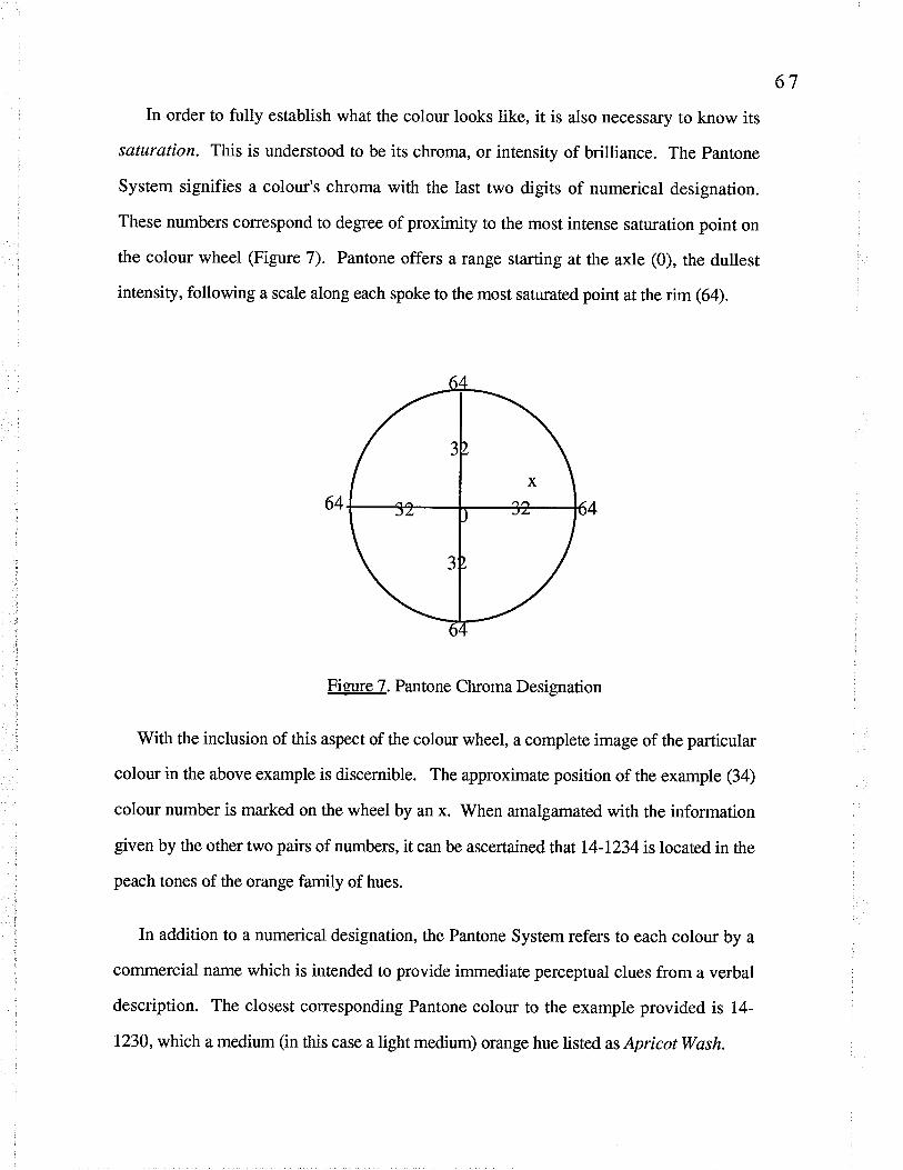
67
In order to fully establish what the colour looks like, it is also necessary to know its
saturation This is understood to be its chroma, or intensity of brilliance. The Pantone
System signifies a colour's chroma with the last two digits of numerical designation.
These numbers correspond to degree of proximity to the most intense saturation point on
the colour wheel (Figure 7). Pantone offers a range starting at the axle (0), the dullest
intensity, following a scale along each spoke to the most saturaûed point at the rim (64).
Fieure 7. Pantone Chroma Designation
With the inclusion of this aspect of the colour wheel, a complete image of the particular
colour in the above example is discernible. The approximate position of the example (34)
colour number is marked on the wheel by an x. When amalgamated with the information
given by the other two pairs of numbers, it can be ascertained that I4-I234 is locaæd in the
peach tones of the orange family of hues.
In addition to a numerical designation, the Pantone System refers to each colour by a
commercial nalne which is intended to provide immediate perceptual clues from a verbal
description. The closest corresponding Pantone colour to the example provided is 14-
1230, which a medium (in this case a light medium) orange hue listed as ApricotWash.
6B
Costume colour data collection
The method employed to record the costume colours has components similar to the
American Society for Testing and Materials (ASTM) standard for Visual Evaluation of
Color Differences of Opaque Materials (Designation D 1729 -89), and the Canadian
Government Specifications Board (CGSB) Grey Scale for Evaluating Change in Color
(Method 46 - 1977). Both standards outline the procedure for attaining optimal accuracy
and consistency in matching and evaluating colours visually without the aid of colour
measuring insfuments. Like the CGSB, ASTM recommends the use of illumination
conditions equivalent to "...light from a moderately overcast northern sky" þ.246) ifdaylight illumination is used, and recommends artificial daylight (incandescent) or cool-
white fluorscent illumination from lamps "...commonly used for home and business
lighting" (p. 247), which meet specific requirements set out by the International
Commission on lllumination. In both methods the coloured object is viewed at a 45
degree angle (to avoid any glare), in an area free from extaneous light, with the colour
surrounded by a neunal enclosure equivalent to a medium grey from the Munsell Color
System's chroma of neutrals. The Munsell Color System is a method of colour
standarization conunonly used in science and industry. White the CGSB procedure
compares the color sample against a Grey Scale, the ASTM method matches perceived
colours with the equivalent Munsell colour system notation describing hue, value, and
chroma. Ideally, both procedures are carried out in carefully controlled viewing booths,
with every item viewed under the exact same conditions.
Although it was impossible to control the viewing situations for this study, certain
controls were utilized thatreflect the ASTM and CGSB standards. All the data used in this
study were examined under overhead artificial light sources with the data placed directly
below. The fragile nature of the older illustrations examined, and the cumbersome fan
Íurangement of the Pantone colour swatches, necessit¿ted a flat viewing rather than the

69
recoÍlmended 45 degree angle set out in the ASTM and CGSB standards. A medium gray,
dual opening mask (Figwe 8) assisæd in matching of the colours on the Pantone stips with
the costume material being viewed.
Figure 8. Gray mask used to eliminate simultaneous contrast distortion
The use of a mask, in which windows for the material examined are swïounded by the
same medium gray neutral ensured that both colours were seen without the bias of
simultaneous contrast which negates accurate colour perception. Simultaneous contast is
the phenomenon whereby an intensified contrast results when two different colours are
placed side by side. This may result in a distoræd perception. The same colour will appear
/
70
to be more or less intense than it really is dependent upon which colours surround it (Itten,
r970).
Costume colours were matched as closely as possible with the Pantone equivalent
notation of hue-value-chroma. The corresponding Pantone number was then recorded on a
data collection sheet developed for this purpose (an example of this sheet is included in
Appendix F). Incolporating this information with the other data collected for the costume,
character, production, period setting, director, designer, and date of production provides a
more complete reference base. This consistent method of recording ensured a verifiable
data base.
Using the corresponding Pantone colour chips, individual charts were then established
for each of the eight selected characters. Each chart documents the palettes chosen by the
15 designers in chronological order of production date. This enables a comparison among
different designers' approaches to colour application for the same roles, and serves as a
reference for identifying any differences or similarities to the colours fashionable at the time
of production. References such as Hope and Walch (1990) provide an overview of
women's fashion colours decade by decade; they were used to compile the costume
colours chosen by theatrical designers in the productions reviewed. Costume colour
choices not related to convention or Pantone's cultural associations were assessed for
influence by the appropriaæ decade's current fashion colours.
The costume colour charts help to identify any colour related to a particular emotional
association by making apparent the use of repeated colours to describe the same character.
Analyzing the colours was critical and descriptive in nature, incorporating the colour
meaning recognized by Pantone. A consistent and repeatable reading of the costume
colours was thus possible. Pantone asserts that "...each famity of colour evokes particular
emotions and associations." They caution those who choose colour in clothing to be aware
7lof the potency and strength of colours' associate meanings: " When someone approaches
from a distance, the first thing seen is the color of the clothes. The closer the individual
approaches, the more space he or she occupies in our visual field and the greater its effect
on our nervous system" (Pantone,1990, p.25). They inform us that because most colours
¿ìre not viewed alone, the dominant colour carries the most emphatic message. To
understand the associate attributes of the various hues, Pantone carried out research at the
Pantone Color Institute adding their results to existent studies such as "Basic Color Terms"
by anthropologists Berlin and Kay (1969). From this research, a list of associated colour
meanings was developed. This list formed the basis for the analysis of individual costume
colours in this study, and it is included in Appendix H.
In addition to the overall costume colour charts, separate graphs identifying the ascribed
allocation of hue and saturation used by Tanya Moiseiwitsch are set in comparison to the
other designers. A comparative value scale for each character was also drawn up. The
charts and graphs are included in chapters five, six and seven.
Theatrical Costume Colour Analysis Model
The analysis for this research was carried out using a model derived from two related
examples. C. Johnson's (University of Manitoba, personal communication, 1992)
thearical model views any production as an integrated interactivity amongst the text, the
actor, and the audience with change in one area affecting the other two: a triangle of forces.
In this model, "...the actor point of the triangle really includes all aspects of production
excluding text" (Johnson 1992). This includes not only acting and acting style, but also the
director's interpretation, all aspects of design, and the specifics of ttre production site itself.
The text point of the triangle is the playwright's script, and the audience point of the
triangle comprises the audience from a societal perspective. In this model, the concept of
an audience is culturally specific, requiring "... reference to the society from which the

72
audience is drawn" (Johnson 1992). The dynamics amongst the three areas are fluid and
determine the theatrical experience. C. Rutter's (University of Birmingham Summer
School, 199I) performance model also consists of a ftiad, among playwright's text,
performance text, and production text. In the latter model, the performance text
incorporates those directions actually outlined in the text as opposed to a director's
interpretation of it. The production text encompasses the entire interpretation includ,ing
direction, design, and actors' performance of the play as it is presented to an audience.
Both of these models include all aspecs of thearical experience. A model that isolaæs the
role of costume colour wittrin the thearical experience was required for this study.
Based on the interactive concept of the Johnson and Rutter models, a new three-step
model was developed for this study, incorporating the three fundamental texts that had to
be examined before a conclusive analysis of costume colour and characterization could be
achieved. These were: Shakespeare's Text, the Performance oÍ Interpretive Text, and the
Audience or Interpreted Text. This paradigm can be readily explained by referring to the
following figure (figure 9):
CAudience TextInterpreted
Text
a) play contentb) critical literature
-Actor,/1
Director I\t'Designer
a) costume/colourcharacterization analysis
b) verification:production reviews: actor's documentation:desigrer interviews
Figure 9. Theanical Costume Colour Analysis Model

73
Step A explores the possibilities for charactenzation provided by Shnkespeare's text.
Physical descriptions of the characters, their ages, particulars of nationality and any
costume references were extracted from the text to provide a composite image of the
character. In addition to the physical character ûaits, any clues offered regarding his/her
intellectual or psychological make up were also examined. Finally, the text was reviewed
to identify any references Shakespeare himseH made to colour. Having established the data
base, the results of an investigation of the literature were factored in. This two-pronged
analysis enhanced a fuller comprehension of the potential for characterization within the
plays, and assisted in understanding the liærary climate current to the various productions.
Step B addresses the context within which the agents of interpretation -- the director,
the designer, and the actors -- approached the text. This step primarily served to identify
who these interpreûers were, and the cultural conditions of time and place for the particular
productions. At this point, the designers' costume colour decisions and period choice
were recorded. Cultural variables -- such as the date, location and social climate of the time
a play was produced in -- were considered important factors for gaining clarity in
understanding a particular production's interpretive focus. At this step also, Tanya
Moiseiwitsch's position within British design history becomes evident.
The arrows connecting the director, designer, and actor are intended to illusffate the
dynamics of the interpretive process. Within the history of theatre, each of the three have
had their turn to dominate production inærpretation at one time or another. English director
Peter Brook's outline of the different types of directors demonsfates some of these
possible shifts. The first type of director is clearly at the helm of a production, and uses
"...all the elements of theatre, actors, designers, musicians, etc. as his servants, to
communicate to the rest of the world what he has to say" (Marowitz, 19g6, p. xi). Incontrast to this type is the director who "...makes himself the servant, becoming the
coordinator of a group of actors, limiting himself to suggestions, criticisms, and

74
encouragement." Finally, Brook describes what he perceives to be the ideal director:
someone who takes charge "...making decisions, saying yes and no, having the final say."
At the same time, that director guides the action while keeping an open mind for other
approaches to the production, and is prepared to "radically modify and tansform his own
ideas " if other's suggestions warrant it (Marowitz, 1986, p.xi-xii). This synopsis of
directorial style illustrates how shifts in one area affect the interpretive energy of the others.
The final stage in this analysis model is Step C, the Audíence or Interpreted Text. The
focus shifts from what is possible in a production to what was actually done: how the text
was represenæd by the producers making inteqpretive decisions, and how that interpretation
affected the audience's reaction.
This step encompasses the actual analysis of the costume colour data in relation to
characterization, and seeks to verify that analysis with those who produced it, or with those
who saw it, by gleaning all the available information. The tool for carrying out this
inquiry -- the Pantone Professional Color Selector System -- and its use within colour dat¿
collection in this study has been described in detail. Its application is demonsrated in
chapters five, six and seven.
In order to assess the accuracy of my character interpretation based on costume colour
readings (as a means of attesting to the power of colour meaning), three sources were
examined. Whenever possible, a player's or designer's own description of the character
was matched to the character reading suggested by the costume colour. These sources
were regrettably not abundant. The main source for verification of characterization c¿une
from newspaper or journal production reviews. The reviewers' perceptions of a
production's character interpretations were then compared with my character interpretation
based on costume colour. This is not to suggest that the reviewers' perceptions of a
particular character relies on costume colour but rather, that the production's overall

75
interpretation formed the basis of comparison for the researcher's colour based
inærpretation.
These sources were reviewed after the costume colour analysis thus minimizing
possible influence from accounts of the production. As the following chapters'records of
those analyses indicate, inaccutacies in colour and cha¡acter assessment did occur, but not
as frequently as they were in accord with the perceptions of a particular production's
characterization.
Interviews formed an integral part of this research, helping to create a more precise
image of some of the personalities involved in costume design overall, and Tanya
Moiseiwitsch specifically. They assisted in substantiating the visual analysis. Interviews
helped to fill information gaps in the current theatrical journals and the monographs written
for specific (but sporadic) costume exhibits.
In the initial data collection stages, an interview questionnaire based on a model by
Bundick (1979) was developed for use in formal interview situations. It was only used
once because it was found to be limiting by both the interviewer and the individual being
interviewed. All subsequent interviews took the shape of informal discussions about
theatre design, and many helpful insights were gleaned in this manner. Even when what
was said was understood to be "off-the-record" (and therefore not incorporated in this
study), the background it provided assisted in guiding further questions, and led to an
understanding that might not have been learned otherwise.
Limitations and parameters of the study
As the literature indicates, Tanya Moiseiwitsch is world renowned for her theaEe, set,
and costume designs. This research is confined to an investigation of her application of
colour in costumes from selected Shakespeare productions. These costume colours were

76
examined in relation to those from other productions of the same play prior to, during, and
following Tanya Moiseiwitsch's designs. In this way, stylistic changes could be perceived
both in her own work over time, and between her work and that of others, before, during
and after her individual productions. At the same time, the ¡eview of costume colour and
charactenzation over six decades and within three counfies serves to identify specific
shared conceptions of colour meaning.
While this study necessarily includes biographical references and an analysis of Tanya
Moisewitsch's position within British theatre design history, these are not the primary
purposes of this research. Summaries of these components serve to provide background
details that help explain her colour approach in costume design. References to the
production team as a whole are also included as reminders of the complex elements
involved in creating costume designs.
This study is extremely dependent on what Barzun and Graff (1977) refer to as mute
sources of evidence.' visual documentation, as opposed to written material. In order to
identify Tanya Moiseiwitsch's stylistic colour characteristics and the colour choices
preferred by other designers, a variety of visual documentation was examined. Exact
perceptions of costume colours as the designers' concieved them were not always possible
because of the variations in materials studied. Original design sketches or their
reproductions in costume bibles, actual photographs of the costumes from production, and
coloured reproductions in promotional material constitute the visual documentary source
for this study. Working with this ag$egation was essential in order to garner sufficient
visual information from scattered and all too frequently non-existent records.
The use of such diverse sources of visual document¿tion is troublesome for colour
analysis. Saturation, hue and value are invariably altered by the different light diffusions
existing between photographs and sketches, and between glossy and matt-finish brochure

77
images. The result may not represent the precise colour conception of the designer's initial
sketch, but the essential colour is conveyed. In each production it was possible to identify
a general colour sense, or reference to colour families, for the costumes reviewed. These
colour families are groups of colours related to a common name. 'We can thus speak of a
red family, or a blue family of colours, etc. Figure 10 provides some of the potential
colour family classifications.
Secondary
Figure 10. Poæntial Colour Families
Colour families may consist of colours whose base hue is similar and situated within the
primary, secondary, or tertiary section of the colour wheel. The example given above
(reds, blues) falls within the primary category. Designers may choose to orient the
costume colours towards one or two basic hues and so provide colour themes. Lindy
Hemming's designs for the 1981 production of All's Well at the Shakespeare Memorial
Theatre illustate this approach. The designer used different hues to define the location of

78
the action. At court, the predominant costume colours were subtle degrees of blue, while
the final scene at Rousillon was presenûed on a stage filled with characters wearing various
crearn/beige coloured co stumes.
Colour families may contain shades of similar value or tints of different hues. For
example, differently coloured costumes might all be the same number on the Pantone value
scale, resulting in a balanced range of hues for the audience to focus on as a whole. Tanya
Moiseiwitsch's designs for the 1961 Stratford Festival production of Coriolanus provide an
example of this approach. Even though the costumes were predominantly from opposite
sides of the colour wheel, photographs suggest that the blue and brown (orange base) hue
costumes were roughly equal in their degrees of darkness and lightness. Because of this
costume colour treatment for the majority of the characters, individuals who needed to be
highlighted at specific points in the production could be readily made more visible by
increasing the value of their costume. The lighter coloured costume would act as a beacon,
compelling the audience's gaze. Figure 88 in the fînal chapær demonstates this effect.
In a similar vein, costumes might be from differing hues, or one costume might have
several components which are differently coloured but have a similar degree of intensity or
saturation, to the other costumes on stage. A production that has most of the characters
wearing different -- but all highly saturated -- hues would have a high energy impact on the
audience; the aural equivalent would be a stage filted with continually screaming players.
Contrarily, a stage filled with low saturation costumes would more likely create a soothing,
restful composite image for the audience. Both approaches have their place within
theatrical productions.
All of these costume colour applications can be considered to form distinct colour
families. Reference to costume colours might incorporate particular colour families for the
production as a whole, for groups of costumes, or for individual costumes. Most

79
imporøntly, by providing this type of colou¡ affiliation, preserving the essence of the
designers' colour choices for characterization enhancement is possible despiæ the variations
in the material viewed.
In addition to the unavailability of consistent documentation for each production set of
costumes, observing the variation of hue, value and saturation could not always be precise
because the viewing conditions were uncontrollable. Also, the disparity in age between
respective costumes incurred additional imprecision. Some of the costume bibles and
photographs reviewed have existed for over a quarter of a century. These items were not
always maintained in optimum archival conditions. Uncontrolled storage conditions
accelerate the reduction of colour saturation over time, and because certain colours are more
fugitive than others, the changes are not necessarily uniform. To minimize lighting
distortion in the different viewing chambers, a natural light source was used for viewing
the material whenever possible. This was feasible at the Stratford Festival Archives, the
Shakespeare Centre Library, and the American Conservatory Theate costume storage and
record area. However, the same conditions did not exist at other locations such as the
Menopoliøn Toronto Public Library, the Guthrie Theatre, and the Theafe Museum, where
artificial fluorescent lighting is the norm.
The completeness of visual documentation varies considerably for the different
productions reviewed in this study. The majority of archives did not have material that
provides a colour sense of the whole cast. This not only influenced the choice of characters
available for study (a limitation in itself), but it also represented the potential for costume
colour -- and hence the perceived character associations -- to be understood outside of the
original production context. This is a significant limitation. There were two reasons for
proceeding: it seemed possible to determine similarities in the choices of costume colour
regardless of those limitations, and in so doing provide some support for shared
perceptions of the colour, if these exist. The interdisciplinary nature of the research

80
w¿urants such an undertaking where a pure theatre history study might not. Most
importantly, in view of the often ephemeral nature of the dat¿ and the incomplete accounts
of available information, the value of a collective record of these costume colours
outweighs these limiøtions. A single text encompassing a review of the intellectual and
emotional colour/character associations in these specific theatrical costume designs,
coloured illustrations of many of these costumes, reviews of specific productions'
characterization, and records of the individual production players, d.irectors and designers,
will provide valuable reference material for future theatrical costume designers, theatrical
historians, costume historians, art historians and theate pafons generally.
There are nxmy sources (sometimes contradictory) that include interpretations of colours
different meanings. Theafe texts by Anderson (1984) and Gilletre (1937) include reference
to colour meaning. They agree that red is an active, powerful hue, but offer varying
attributes for most other colours. For example, Anderson describes orange positively, as a
festive stimulating colour. Gillette agrees, but at the same time he also assigns the more
negative qualities of "disturbed" and "distressed" to it (p.91). Another example concerns
blue; Gillette sees this colour almost entirely as a positive hue, while Anderson begins her
description of it with "coldness". Anderson's text presents colour meaning very
definitively, 'whereas Gillette cautions the reader that his list of affective meanings is
necessarily ambiguous because it is constantly in flux.
Hope and Walch's (1990) comprehensive text includes descriptions of colour attributes,
illustrating some cross-cultwal differences and changes within specific cultures over time.
They point out that within the Western world, colour meaning became firmly entrenched
through the infroduction of heraldry in medieval times. At that time, the colours were
carefully chosen to convey " ...very exact symbolic meanings, exemplifying real or hoped-
for qualities of the leader. For inst¿nce, red stood for love and martyrdom, purple for
majesty, blue for piety, green for contemplation, and yellow for wisdom" (p. 281). The

81
authors sfess the subsequent appropriation of related colour coding by later societies. "The
direct descendant of this tadition can be seen in modern company logos and images. The
green of American banknotes recalled not only the uniforms of the Revolutionary soldiers,
but also the rise of a youthful new order from British colonialism" (p. 281).
The Pantone list of associative colour meaning was adhered to as the standard for
costume colour meaning in this study because of its connection to the tool of inquiry, the
Pantone Professional Colour Selector System. It offers one of the most curent reports
regarding colour meaning and is both authoritative and accessible. The Pantone system has
the limitations of any colour coding system, but its virtues -- ensuring the consistency of
analysis both within and across productions -- makes it suitable for this research.
This study uses an interdisciplinary approach. It is based on a wide range of
understandings: an understanding of the dynamics of psychological colour choices in
clothing at a cultural and individual level, an understanding of the aesthetic principles
underlying those choices within the theatre, an understanding of the history of theatre, art
and costume, an understanding of design and colour theory, and an understanding of
theatrical costume requirements within a production.
The first findings of the research analysis focus on Tanya Moiseiwitsch's position
within the development of British theatrical design: that analysis is in the next chapter. It is
followed by two chapters containing the colour analysis of costumes from the various
productions of the selected Shakespeare plays, and the final chapters outline the research
results.

TV TAI.IYA MOISETWTTSCH: POSITION IN BRITISH TIIEATRE COSTUME DESIGN
Shifts of focus
In the latter part of the 1980s, a $oup of prominent British Shakespearean actresses
expressed dissatisfaction with what they described as "designer's theatre". They were
referring to the "..spiralling dependence of directors on their designers..." which, they
said, contrasted with the "director's theatre" of the 1960s and 70s ( Rutter, 1989, xxi-ii).
Their reference to the changes occurring within theatrical production sheds light on Tanya
Moiseiwitsch's position in British theatre costume design. It offers a perspective on the
tradition from which Moiseiwitsch emerge<l; it gives information about the theate in which
she prospered; and it suggests that in the realm of British design, as Marowitz's comments
recorded in the previous chapter establish, production dominance is often contentious. For
these reasons an appreciation of Moiseiwitsch's early work experience in Britain requires
an understanding of the changing forces within British theaffe.
Costume and set design are barometers for the continually negotiated positions within
theatre production. Yet the study of costume design in its own right has only recently
received the scholarly attention warranted by its impoftance to the interpretation of a
production. This topic has been addressed by contemporary theatre historians such as
Cordner (University of Birmingham lecture, lggl),Ingram (1990), Knowles (1985),
Mullin (1991) and Rutter (1991).
Model of British design styles
Art historian Anne Hollander argued that "recognizing signals is the main visual
pleasure in theatrical experience..." (1978, p.303). In Shakespeare's time, costumes were
"dominant signifiers" used by the playwright to provide an audience with immed.iate clues
to the wearer's status within the setting of the play (Rutter, personal communication, July,
82

83
L99l). Consciously or unconsciously, this type of signification has continued to the
present time. The subtle and not-so-subtle signals costumes embody reflect designers'
own cultural context (as the ensuing overview of designers discussed in this chapter
indicates). And, although most designers resist categorrzatton, certain tendencies in their
design approaches are apparent.
Understanding the tradition that helped to shape Tanya Moiseiwitsch's design approach
was achieved through a review of prominent 20th century British costume designers. The
survey identifies stylistic similarities and the relationship of personal styles to more general
theatre movements in this century. This representative review recognizes the existence of
five design styles closely allied to the times in which they appeared. For purposes of
discussion these tendencies were assigned the following labels: experimental, decorative,
morphological, ideological, and materialistic (Figure 11). Against this model of general
tendencies Tanya Moiseiwitsch's position within British design history was further
clarified, providing the important context for her ca.reer, if only summarily.
The result is a diagram outlining some of the shifts that have occurred in British
design history in the last 90 years at the same time as it indicates costume design's dynamic
nature. It is important to note that the categories are not constrained by either their stylistic
characteristics or by time. It would be inaccurate to suggest these distinctions are absolute.
The model is designed to clarify stylistic variation, not to confine designers to one style or
period. The following section examines the various design styles and includes examples of
designers' work, through an analysis of their stylistic characteristics.

84
Twentieth Century British Design Styles
(Gordon Craie)Paul ShelvingG. SheringhamC. Lovat Fraser
OliverMesselCecil BeatonRex Whistler
MotleyTanya MoisewitschRoger FurseAlix Stone
J. BuryJ. HerbertR.Koltai
Ultz
Experimental1900s-1930s
Decorative1920s-1940s
Læslie Hurry
Morphologicalmid 1930s-1950s
Desmond Heeley
Ideological1960s-1970s
Maærialisticlate 1980s
with actors/highsociety
new approaches(eclectic)
establishment ofdesigner role
ornamentalþainterly)glamour linked
Rejection of19th centurypredílectíonfor hístorícalreproduction
Tendency fordesign to beimposed on
text
functional(sculptural)metaphorical
Interpretstext
minimalist ScriptGpare) reínterpreted
anti-illusionistic
: post-modern Super-imposition(designer's theatre): inundating visual actionof TV/pop video era )
Figure 11. Model of 20th century British design styles
Experimental style: turning from realism
During the mid-l9th century, actor Charles Kean made every effort to draw upon
authentic costume sources, choosing garments in which that information was meticulously
reproduced- Laver credits him with making historical veracity an important component in
theatrical design. Kean's costume for Hamlet (Figure 12) is an example of this. Although
the length of his tunic reflects the Victorian code of modesty the costume, complete with
actual swod indicates an attempt to replicate medieval costume.

85
Figure 12. Charles Kean as Hamlet, c. 1850.Laver, 1964,p.131
By 1925 the desire for period accuracy, which had charactenzed 19th century
naturalism, was supplanted by a new expressiveness in theate. After almost a century's
focus on historical costuming, some directors and designers cast Shakespeare's characters
in modem dress. Sir Barry Jackson helped to establish the fashion for contemporary dress
in costume with his production of Hamlet (1925). Jackson's experimental production at
the Kingsway Theatre, London is one example amongst many from the decade prior to
when Tanya Moiseiwitsch began her career (1934). During that time, a group of designers
explored new design means. Within this study, these designers are classified as
experimental.

86
The experimental classification encompasses those designers at the beginning of this
century who, largely following Edward Gordon Craig's teachings, moved away from the
naturalism and exactitude of the 19th century costume radition towards a modern design
style, encompassing ideas such as abstract poetic expression and the use of contemporary
dress. There are parallels to general tendencies in the fine arts. In the same way that visual
artists came more and more to ignore the details of realism in order to explore a more
abstract or expressionist sensibility in both two and three-dimensional art, set and costume
designers also sought to convey similar attitudes on the 20th century stage.
It was during this period, from the turn of the century to the I920s, that the particular
role of costume designer was frst recognized as a distinct entity. Previously, costumes
were often made by a separate firm, independent of theafre and stage designers @osenfeld,
1973). When costumes were made as part of the full production proceedings, they were
likely to be handled by the same person designing the set: a scene painter. Costume design
was thus affected by the evolution of scene painters, whose inventiveness changed the
conceptual attitude towards productions in the first two decades of this century. Gordon
Craig, Paul Shelving, George Sheringham, and Claud Lovat Fraser were the main
exponents of this style. The new scenic artists strove for a unified visual effect, in confrast
to earlier staging techniques that featured different sets and costumes for each subdivision
of an act with, as Mullin (1988) noted, program credits for the individual scenes. In
essence, the scenes served to illustrate the production. Artists such as those listed above
believed design should do more and pursued more expressive design interpretations.
Gordon Craig's concept of poetic expressionism offered one way to achieve this.
Thus the 19th century theatrical appreciation for historical veracity, which required
settings and costumes of historical, geographical, and even archeological accuracy (Mullin,
1988), was replaced by "poetic expressionism". Instead of merely illusnating the play,
sets and costumes became the visual interpreters of the play. This was an important

87
moment for theatrical design: essentially, this formative period heralded the recognition of a
distinctly new and vit¿l role within theatrical production, the role of the designer. It was
also a significant moment within theatre as a whole, for the changes yielding more
recognition for the designer also gave designers greater agency within the production,
leading to more inærpretive poæntial in place of the role of staightforward embellisher.
The change from illustrative design to inærpretive design was greatly influenced by the
aesthetic theories of theatrical mavericks Adolphe Appia and Gordon Craig, two of the
most import¿nt influences in British theatrical design during the first two decades of the
20th century. These two men had minimal production experience, but their ideas about
design led to significant conceptual changes within it. Appia was writing about theatre
design as early as 1895, but his L'oeuvre d'art vivant (I92I) provides the most complete
account of his aesthetic theories. Appia designed his first full-scale production, Tristan at
La Scala (I923),just five years before he died (Taylor, 1985). Like Craig, Appia's
influence upon design was based on his concept of a unified theatrical production where
"the word, the music, the movements of the performers, [and] the whole stage picture --
would be fused into one infinitely complex experience" (Taylor, 1985, p. 13). A single
artistic vision would give the production a cohesive unity. Appia also espoused a more
abstract design concept. One of his methods for realising this promise was to use light to
establish the appropriate atmosphere: changes in lighting could create colour in place of a
painted scenic backdrop and emphasize the players'three-dimensional presence.
Both Craig and Appia emphasized the three-dimensionality of theate, placing the actors
within a stage environment rather than in front of a painted backdrop. A player's three-
dimensional presence was accentuated on a stage that had fewer set changes. Appia
promoted altered lighting effects to convey a different scenic atmosphere while Craig
adapted a set rather than replace it with another. Craig's famous screens are an example of
this. Both approaches result in a metaphorical rather than representational stage setting and

88
place greater emphasis on costumes. As Johnson points out, an approach minimizing the
number of sets suited Tyrone Guthrie's interest in Elizabethan staging, a staging style that
requires versatility and fluidity from scene to scene. Craig and Appia's üeachings anticipate
Guthrie's own approach to theatical productions: hence, directly and indirectly, the two
designers' influenced Tanya Moiseiwitsch's work.
Gordon Craig, working prior to World War I, is credited with promoting met¿phorical
expressiveness (from which the term poetic expression is derived) and with advocating a
unified artistic vision in the theafe. His actual designs were created primarily for theatres
outside of Britain, in Berlin G¿øicc-Prescrvcd, 1905), Ireland (!þE Hgur GI¿gl, 1911),
Moscow (Hamle!, I9ll-12), and Copenhagen Ghe Preænders,1926) (Salgado,1985).
Craig also promoted the idea of a single individual at the helm of production design. He
maintained that a total theatrical realization was best effected if the same person had
technical control over all aspects of design from lighting to sets to costumes. Craig
particularly saw design and direction as being intimately connected. His career in this
capacity, as a designer/director, did not begin until 1900 and was over, in effect, by I9l2
with his work on Stanislavsky's Hamlet in Moscow (Taylor, 1985).
Gordon Craig's poetic interpretation was realized through abskact, symbolic costume
design and eloquent use of material. In the 1911 production of Hamþ1, for instance,
Claudius was clothed in an enoffnous gold cloak that covered most of the stage. It was a
poetic rather than literal expression of regal status. His costumes (Figwe 13) for The
Vikings (1903) allude to actual Viking costume, but abandon Kean's style of realism for a
more lyrical inûerpretation of the original garments.

B9
-w
I
'\, /
tl^;
ii'.
-::¡-=' ûþ\
It¿:**-+" :cLtt-@4.&:sDç' õood-
é==:-ffi<
Figure 13. Designs þV .Go{on C}aig for The Vikings, 1903Nash, (1967). Figures 37 and38.
The free form bands circling the arms in the two figures illusfrated are an example of
this expressive style. They evoke the original Viking attire, but the kinetic experience of
these costume elements, created by the players' movements, would also have been
enhanced by the sound and lighting on the stage. The entire sensory evocation is one
illustration of Craig's unified conception of total theatrical experience, reflecting the ,,...
tone of the times: synaesthesia..." (faylor, 19g5, p.IZ).
Synaesthesia is a term used to describe the response of one sense to stimulus applied to
another sense. Seeing particular colours when hearing specific words, referred to as

90
"chromatic-lexical synesthesia", is the most common form of sensory pairing (Honore,
Globe and Mail. 8 August, 1992). But it also includes the association of particular sights
with smell, and textures with sounds. The possibilities of the phenomenon were
particularly intriguing for scientists, musicians, and artists at the beginning of the 20th
century. For example, composers Nicholas Rimsky-Korsakov and Aleksandr Scriabin,
and visual artist Wassiliy Kandinsky "saw" colours for musical notes (Hope and Walch,
1990).
As proponents for a totality of experience related to their interest in synaesthesia, Craig
and Appia worked towards synthesizing as many artistic media as possible within dramatic
presentations (faylor, 1985). Their theories reflect an attitude towards the arts that the
French poet Charles Baudelaire had espoused in the mid-lgth century. Baudelaire asserts
that "All the arts are one, the one manifestation of the universal essence" in his sonnet
Correspondances (Chamber's Encyclopaedia,3.p.l63). In essence, Baudelaire's belief in
the indivisibitity of the a.rts 'was a forerunner of the holistic approach promoted by Craig
and Appia, one that echoed the basic tenets of synaesthesia.
Craig and Appia's ideas regarding unity in theate really encompass two "unities". The
concept of synaesthesia illustrates a unity of the arts, with all the elements interacting to
produce a central image. A second unity relaæs to the overall effect of staging a production
by following the dictates of a single vision, guided by the stage director's "benign
dictatorship". The concept of "serving the production", an unwritten but universally
understood corollary effective for most of this century, derives from the second position
(C. Johnson, personal communication, 1992).
Craig and Appia's concepts of unified productions represent theories that have
subsequently been challenged. A growing number of contemporary theatre associates are
convinced it is no longer essential, or even possible, to achieve unity within a production.
This stems from the belief that viewers gain differing and individual experiences from the

91
same production because they approach the production from distinct and unique
perspectives which necessarily influence how they perceive a play's meaning. The
materíalistic classification embodies this new attitude. The dramatic shift in thinking from
Craig and Appia's turn-of-the-century theories to end-of-the-millenium postrnodern thought
demonstrates the dynamic nature of the designer's role and its interconnectedness with the
inællectual developments of a particular time.
Within the changing environment of Western theatre, Appia and Craig's theories
encouraged an experimental approach to stage and costume design amongst a group of
British designers working in the first three decades of this century. In what is often
referred to as the "new stagecraft" ( Larson, 1989; Multin, 1990), the designers employed
new means, achieving innovative absfact visualization of a text. They turned away from
what was primarily decorative and realistic design, striving instead for a new presentation
that both visually supported and expressed the central idea of the production (Larson,
1989). It was their fresh eclectic approach to design coupled with the emerging status of
the designer role that gave their style its experimental nature.
The new stagecraft
Prominent costume designers from the 1900s to the 1930s, often worked
interchangeably in a variety of venues: London's West End commercial theatres, ballet,
opera, and British repertory theatre. During the first 30 years of this century, designers
such as George Sheringham, Paul Shelving, and Claud Lovat Fraser were especially
notable for their designs of both costumes and sets.
Throughout the 1920s and 30s Shelving was the principal designer for British director
Barry Jackson at the Birmingham Repertory Theatre. He also worked at Stratford-Upon-
Avon in the 1940s. Shelving's set work (Figure 14) manifests the influence of Appia's
and Craig's teachings.

92
Figure 14. Paul Shelving's design for Back to Methuselah c.1920.Sheringham and Laver (1927),plaæ 30.
In place of realistic scenery, the stage design relies on abstact shapes and spare stage
props to create atmosphere. The background incorporates bold outlines and expressive
forms not so much representative as evocative of plant life. It is difficult to determine the
exact details of the costume, but the overall effect, which the lighting, colour values and
silhouette create, was sculptural rather than painterly. The restraint in decor and costume
detail ensure audience focus on the player and the words s/he spoke.
In addition to his experimental use of light and abstract forms, Shelving was known for
his modern dress Shakespeare productions, such as the 1923 Cymbeline at the Birmingham

93
Repertory Theatre. For both reasons, he may be regarded as belonging within the
e xp er ime ntal classification.
George Sheringham was another designer active during the 1920s and 30s. He was one
member of a design team for Shakespeare productions at Snatford-Upon-Avon in 1932 and
1934. Ear1ier, in 1927 Sheringham co-authored a book on design with James Laver: it
outlines the position of British designers within British theates during the 20s. In Design
in the theatre, they suggest how the designer's role should develop.
Sheringham's reference to the designer's work as "stage decoration" attests to his
seminal position within 20th century British design history. At the time of his writing, the
two terms, stage decoration, to describe the role of the designer as Sheringham used it,
and the newly defined concept of stage desígn, were contested. Two letters written by
producers prominent at that time, Nigel Playfair and Charles B. Cochran, delineate the
contest. Facing each other on separate pages in Sheringham's and Laver's book, their
letters reveal the contention surrounding the designer's role in the theatre. Ptayfair was in
favour of the increased recognition for designers and welcomed change, stating: " I am glad
to feel that ... you will use the word "Design" and not "Decor", ... It is an art which is of
the utmost importance to the well-being of our theatre -- since -- for most of us at any rate
-- the opportunity of deceiving the public with empty omament is at an end" (Sheringham
& Laver, 1927, p.14). By confrast, Cochrane used the opportunity to caution designers to
remember their place:
...keen as I am on seeing the finest pictorial and decorative talents of ourtime being made contributory, if not tributary, to the contemporary stage,and much as I have worked personally to bring about this coniummation, Ifeel very definitely that the art of the decorator must always be -- and mustextend, and never threaten to submerge, the talent and personality of theindividual actor þ. 15).
These producers use the different terms designer and decorator quiæ distinctively and quiæ
deliberately. Their letters indicate that the role of theafie designers was in an important

94
tansition phase from embellisher, which the term dccorator implies, to the more active role
infened by the ærm desígner .
Sheringham offers further proof regarding the tentative state of his art-form in his
introductory essay: " Why do we fill our theatres month after month and year after year
with t¿steless, joyless and often anachronistic scenery and costumes? Why? -- because
theatre managers so rarely employ designers" (1927, p.3). What he understood to be poor
stage design was inevitable, he felt, because most theatres had costumes and sets contracted
out independent of each other so that the results were often incompatible.
Sheringham acknowledged two important forces having an influence on design in the
1920s: the work of Claud Lovat Fraser and the "well designed...[and] fine colour" of the
Ballet Russes which toured in Britain and Europe during that decade and was first
introduced to the V/est in 1909 by the brilliant Russian promoter Sergei Diaghilev. By the
time the company first performed in London for the Coronation Gala on June 26, l9ll,audiences were aware of the Ballet Russes's exotic nature. The artisûry of dancers, such as
Nijinsky and Pavlova, in choreography set to music by composers like Stravinsky had
already thilled audiences in Paris, Monte Carlo and Rome. Designer Leon Bakst's
unusual costume colours and set designs also ensured their enthusiastic welcome. Two of
the first Parisian productions designed by Bakst, Cleopatra (1909) and Scheherazade
(1910), incorporate fantastical references to ancient civilizations (Egypt and Arabia), highly
decorative costume surfaces, and the Eastern love for fine fabrics in rich jewel colours.
The impact of such colourful design work was dramatic. The costumes and sets had an
immediate effect on contemporary fashions (most notably the work of Parisian dress
designer Paul Poiret, working in the first decade of this century), and home furnishings
and decor through vivid colours and Eastern references.
The Ballet Russes was one of the first artistic ventures from the pre-World War I era to
sffess collaboration of composer, designer and choreographer. Numerous visual artists of

95
the Modernist Movement (in the first decades of the 20th century), including Picasso,
Miro, Braque, Unillo and Matisse, designed for this ballet. In England, Sheringham
credits Ballet Russes with both getting the public interested in the art of modern stage
design, and changing public taste, which resulted in removing some of the barriers that "...
had kept the form of costume and scene in the rut of Victorian naturalism" (1927 , p.4).
Although Claud Lovat Fraser died in I92I at the age of 31, he made an impressive
contribution to theate during his short career as a stage designer. Like Shelving, Fraser is
regarded as an innovator. His 1919 designs for As You Like It were denounced by critics
for being "futuristic" @osenfeld, 1973, p.175). His costume sketch for the First Forest
Lord (Figure 15) illustrates his adventurous exploration of styles that only remotely
resembled accurate period dress. The high contrast of the first lord's cowl-like cape,
which on its own is reminiscent of the Middle Ages, in combination with the wide brimmed
hat and bold linear-patterned gown create a sfiong silhouetted figure, more imaginative than
realistic.
Figure 15. Claud Lovat Fraser's design for As You Like It. 1919,Shakespeare Memorial Theate. Steinberg, (1985), p.24.

96
Fraser's best-known design was for the famous revival of The Beggar's Opera.
performed in 1920 at the Lyric Hammersmith under Nigel Playfair's direction. For this
production, Fraser designed a pennanent set which he adapted according to scenic
requirements. His costumes for the same production (Figure 16) suggest 18th century
apparel but eliminate all unnecessary detail, thus simplifying the overall design and
ensuring that the viewer would not be distracted from the action of the play (Banham,
1988; Laver, 1964).
These changes are very subtle. The silhouettes of the specific design illustrated -- the
hoop, wigs, and style of shoes -- are accurate, though less decorative than their period
sources would have been. Fraser chose to disregard the use of ribbons,laces and trimming
generally associated with 18th century dress, retaining only the distinctive lines of the
garments. Also, he opted for fabric in solid, unsentimental colours: these were more suited
to the hard edge of the play than the flowered and figured characteristics of actual period
apparel.
His working method, incorporating a distillation of period costume, influenced future
designers. Furthermore, the Beggar's Opera helped make permanent sets popular.
Fraser's use of a central stage set eliminated the need for massive amounts of maærials and
numerous scenic changes. This was a welcome development particularly for the financially
hardpressed repertory theatres throughout Britain (Rosenfeld, 1973). The idea that
modernism in design was successful partially due to a lack of resources is a provocative
one. The fact that Fraser was of particular importance to designers at less financially secure
theatres in the 20s and also for designers during the difficult Second World War years,
strengthens such speculation.

97
ß[L- .
i,
dÁI:
di 'j
':rl th.^tù<l
þ¡l:
i'ri,
-Ll,
itå;l
il,i
iïl
Figure 16. C. Lovat Fraser's designs for The Beggar's Opera. 1920Sheringham and Laver (L927), plates 5 and 6.

98
Fraser helped est¿blish a more practical and functional approach to design which was
visible in the work of some designers active in the 1930s. This functionalism was
chancteized by an emphasis on adapting the design to suit a particular purpose within the
production. It was rooted in practicality and, at the same time it visually enhanced the play.
Fraser's adoption of the pennanent stage is one example of this functionalism, and his
paring down of period detail in favor of more metaphorically expressive costume is
another.
Thus Shelving, Sheringham and Fraser were important pioneers in theatre design.
Their novel approaches, based on Appia and Craig's theories, have influenced designers,
from the 30s and 40s forward, while their colourful aesthetic flourished in the generation of
designers who were their immediate successors. Successive designers, such as Messel and
Beaton, were less concerned with new theories than with exploring the visual possibilities
for decorating a production.
Decorative Style: towards high society
Decorative design incorporates highly ornamental, colourful, and painærly elements in
order to convey a high degree of theatricality. British theatre up until the 1930s and 40s,
frequently reflected this genre and its main purveyors r,vere designers such as Oliver
Messel, Rex Whistler and Cecil Beaton. These designers emphasized decorative details,
heightening the visual components of a production.
If the theaEe in the 1920s and 30s continued to be an experimental one, it was also,
through much of the 30s and 1940s a theatre whose emphasis was on its stars, as David
(1978), and Hinchcliffe (1974) suggest. Actors such as Laurence Olivier, John Gielgud,
Peggy Ashcroft, Michael Redgrave and Edith Evans mostly performed in heroic roles
within productions retrospectively regarded as providing "...elegant escapism..."

99
(Hinchcliffe, I9'74,p.zl). Stressful political and economic conditions, coupled with new
developments in the competitive film media led, it may be conjectured, to a tendency by
British theatres to offer productions more likely to be "crowd-pleasers".
Beginning with his use of costume masks in 1925, and continuing with his work for
Cochran's Revues from 1926 into the 1930s, Oliver Messel helped fashion the lavish
decorative stage characteristic of British theafe between the two wars. Messel's
application of colour and design favored costly baroque and rococo styles. His painterly
sets and costumes conveyed the colour and ornament¿tion of those periods in add.ition to
embodying picturesque elements of pure fantasy. Messel reached his peak as a theatrical
costume and set designer in the late 1940s, and later became an interior designer in the
United Søtes and the Barbados.
Oliver Messel's first credited work consisted of his "masks and symbols" for the Ballet
Russes's Zeph)¡re et Flore performed fîrst in Paris, and later in London in 1925 (Pinkham,
1983). It was a prestigious enterprise for the young designer, and one which suited his
love of elaborate and exotic style. In addition to revues and plays, he also designed opera
costumes and sets for the Sadler's Wells Company. He worked with Tyrone Guthrie at the
Old Vic from L932 to 1940: most notably in The Counr-r¡ tüife (1936); A Midsummer
Night's Dream, (1937); and The Temoest. (1940) (Pinkham,1983). Messel designed the
costumes for two productions of Romeo and Juliet. The first was an M.G.M. film version
starring Norma Shearer and Leslie Howard in 1936. Messel supervised and assisted with
every costume detail. His painterly, decorative approach can be seen in the costumes'
lavish patterns. Their extensive painted and hand embroidered surfaces required six
months to execute. One of Juliet's costumes, which critics recognized as a direct reference
to Botticelli (Castle, 1986) (figure 17), illusfiates Messel's style. The visual reproduction
of the illusnation does not fully reflect its opulent detail, but it does illusnaþ Messel's

10CI
fantasy. The dress may evoke the Renaissance period, but it includes elements such as the
crown and sleeve details which are mainly imaginative.
With reference to Sleeping Beauty, one of Messel's best known works, Roy Strong
(1988, p. l7) asserts that for the designer: "Enchantment was the keynote, reflected in the
fact that Messel prefered to be crediæd as having 'decorated' a production rather that having
designed it." Stong's description of the termpainterly is relevant to the proposed design
model (Figure 11). He specifically harnessed it, creating pictures bound by a frame (the
proscenium stage) with cut cloths (muslin or canvas backdrops) and flats (a scenic element
consisting of a standing wooden frame over which canvas or muslin has been snetched)
that were scenically painæd in some way. Elaborately ornamented and colourful costumes
completed the pictorial image.
Figure 17. Norma Shearer as Juliet, 1936. Costume designed by Oliver MesselCastle (1986). p.103

101
Messel's contemporary, Rex Whistler, also approached design in a similar painterly
manner. ln 1922, they had been students at the Slade School of Art. Whistler was better
known for his painted sets, particularly his murals, but he designed costumes as well. He
worked with Messel on Cochran's Revues at the London Pavilion in t929 and 1931.
Cecil Beaton, whose c¿ueer spanned the years from 1922 to t970, was another British
designer working in a decorative manner. In addition to ballet and film, he designed
costumes and sets for numerous West End productions. Beaton particularly delighted in
the Edwardian (1901-1911) style, and often replicated that period in the fashionable
society-oriented productions which were his speciality. By the 1930s, Beaton was well
established. In productions such as Osca¡ Wilde's Lady Windemere's Fan at the
Haymarket Theate (1945) he continued to present elegant designs (Figure 18) for a post-
war British audience whom he described as "...starved for bright colours, rich silks,
artificial flowers..." (Spencer, 1975, p.34).
Fizure 18. cecil Beaton's designs for Lad)' windemere's Fan ' 1945
-
Goodwin, t-989, p.t8.

102
Beaton's position within the decorative style is clearly illusnated by his designs for this
production. This is confirmed by Roy Strong's statement that Beaton "... swept his
audiences away into a beau monde of high glamour and chic bearing no relation to the
reality of Wilde's play; instead he presented them -- in a grey era of austerity -- with a
never-never land of security before the devastation of two world wars and the dissolution
of the old class system" (Goodwin, 1989,p. I7).
Despite the desire to hold on to an elegant theatrical experience, the denial of a world
irrevocably changed could not prevent reality from seeping in, even within the world of
theatre. In the years prior to World War II, Beaton was lavishly praised for his designs.
But in the Cold War era of the early 1950s, his opulent, decorative period extravaganzas
lost favor according to a then young critic Kenneth Tynan. Tynan wrote of Beaton's
designs in the 1950s: "Modern English decor, as we have smiled at it in many a Victorian
revival, really amounts to little more than a prolonged duel with icing-guns between Cecil
Beaton and Oliver Messel" (Spencer, 1975, p.48). Indeed, both Messel and Beaton's
designing cateers waned after World War II. They were clearly in one camp, committed to
an ideal that conveyed a beautiful, fanciful world which appealed to and played for the
upper classes (and those who wished to emulate them). They were unable, or perhaps
chose not to adapt to what one commentor referred to as the "barbed wire and concrete
schools" (Pinkham, 1983, p.7.) that were part of the post-w¿r scene. Roy Strong saw
designers, such as Beaton and Messel, as "...exponents of British insularity, firm
adherents to that between-the-wars neo-romanticism which had so firmly rejected the
modernist movement" (1988, p.l7).
T)ne decorative penod in British design'was a flourishing one and it sought not so much
to explore the change Appia and Craig promoted, but to celebrate magical and colourful
theatre. At the same time, it was a period of recognition for the designer within theatre.
Roy Strong credits Messel and Beaton as the first British designers to achieve public

103
awareness for the status of their profession. This was not primarily because of their
considerable talent, but because of their social connections. Messel's nephew was the
future Lord Snowden and Beaton was an established member of the society which he loved
to portray. That society in turn supported their work. The public recognition both
designers received in the popular press and fashionable journals of their time ensured a
high profile for costume designers.
Morphological Style: metaphor and structure
Ingram (personal communication, July, l99I) regards the 1930s as a critical time of
change because the prevailing decorative design style began to be challenged by a more
structured orientation. The design collective known as Motley exemplifies this tendency.
In 1930, director/actor John Gielgud began a professional association with three
designers who called themselves Motley. The name represented the artistic amalgamation
of Elizabeth Montgoffiery, Margaret Harris and her sister Sophie Harris. The Motley
collaboration with Gielgud began with his 1932 production of Romeo and Juliet for the
Oxford Dramatic Society, and continued with numerous productions in Britain and later in
the Uniæd States. Mullin characterizes their role as "part of a $oup of young people who
revolutionized theatrical production in London during the years between the two World
'Wars" (1988, p.1). He refers to a move away from the tradition of overly-elaborate
costume and sets in prevailing Shakespeare productions, and to the cessation of frequent
scene changes requiring blackouts or curtains (Eaton, 1988; Mullin, 1988).
læss overtly, the Motley team epitomizes a design philosophy whose stated purpose
was to assist the director's interpretation of the production. They were more concerned
with demonstrating the inner meaning of the play than designers such as Messel, who were
more intent on decorating a production. Stylisticatly, their costumes capture the essence of
a period but are not perfectly representative of it

104.
This group of designers placed greater emphasis on the interrelationship between the
various components of a production and saw themselves as collaborative interpreters of the
director's artistic vision. Their costume style seems more sculptural than painterly and is
visually leaner than the decorative style. It represents a move away from scenic painting
and its accompanying highly embellished costumes, which were characteristic of the
decorative mode. This style is metaphorical rather than realistic, and it is often practical in
its approach. Because the practioners' st¿ted intent to have design serve as a formative
structure, assisting the interpretation of the production, it was labelled a morphologícat
design style. (Morphology refers to the form and structure of an organism, regarded as a
whole). And because of its metaphorical, practical and collaborative approach, it is seen as
a style which tends to interpret the text.
In many ways the exponents of the morphological style applied the teachings of Appia
and Craig: they used metaphorical designs within the realization of a total production plan,
as marshalled by the director. Thus the adherents of this style were active participants in
the new stagecraft which commenced at the turn of the century. Experimenting with new
materials they achieved more practical, less elaborate costumes and sets. Design was
viewed as a supportive structure for the overall production. Its purpose was to reinforce the
director's vision, and "collaboration" became the operating credo. Motley stated this quite
simply: "The success of the designer depends in a large measure upon his collaboration
with the di-rector, who, in the very real sense, is like the highest ranking officer in a chain
of command" (Motley , 1964, p.11). One example of this style, illustrated by the Motley
team's costume sketch (Figure 19), reflects their interest in fostering the director's
interpretation of the play. Their sketches are, in the fullest sense of the word sketches,
existing only to support the production. The sketches only function as visual blueprints for
a single entity within the entire production. This is reflected in the fact that the sketches
were rarely polished works of a¡t in themselves, even though they were often sought after
by collectors.
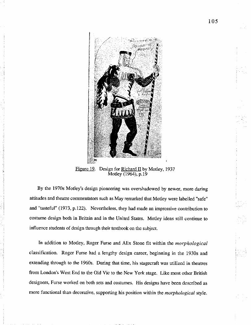
105
Fisure 10' o"'þ"f,"iffi#.?ð too"t ' 1e37
By the 1970s Motley's design pioneering was overshadowed by newer, more daring
attitudes and theane commentators such as May remarked that Motley were labelled "safe"
and "tasteful" (1973, p.122). Nevertheless, they had made an impressive contribution to
costume design both in Britåin and in the United States. Motley ideas still continue to
influence students of design through their textbook on the subject.
In addition to Motley, Roger Furse and Alix Stone fit within the morphological
classification. Roger Furse had a lengthy design career, beginning in the 1930s and
extending through to the 1960s. During that time, his stagecraft was utilized in theatres
from London's West End to the Old Vic to the New York stage. Like most other British
designers, Furse worked on both sets and costumes. His designs have been described as
more functional than decorative, supporting his position within the morphological style.
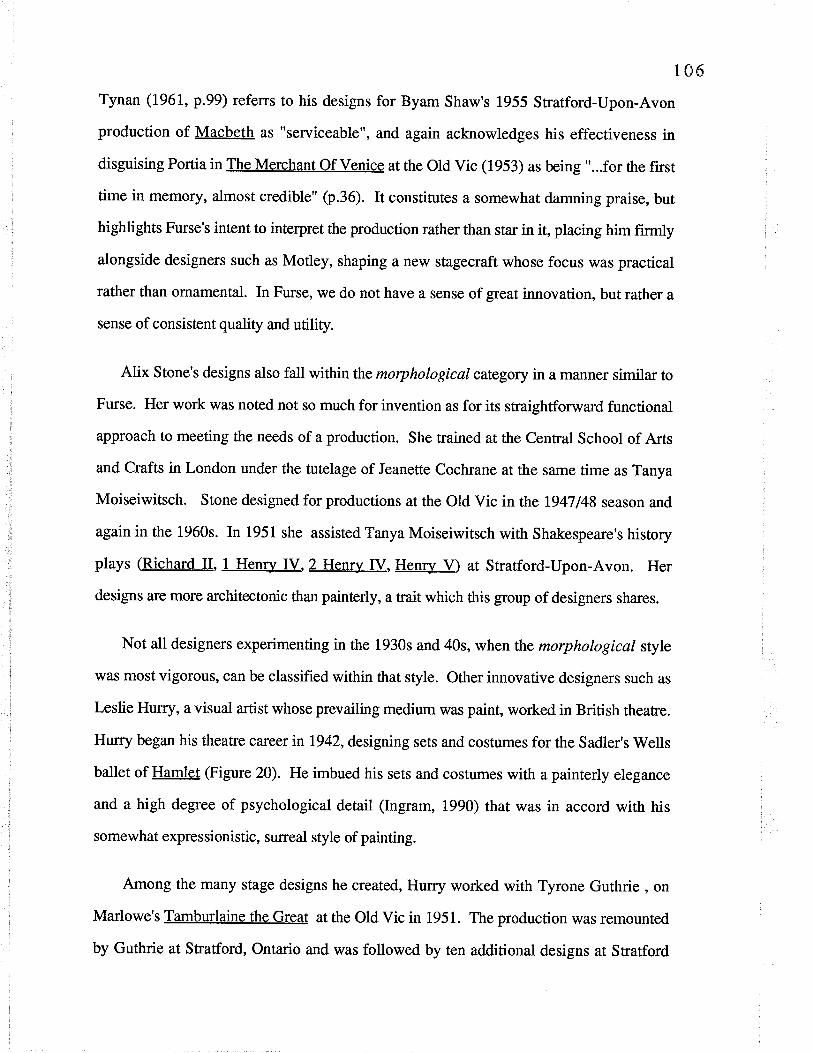
106
Tynan (1961, p.99) referrs to his designs for Byam Shaw's 1955 Stratford-Upon-Avon
production of Macbeth as "serviceable", and again acknowledges his effectiveness in
disguising Portia in The Merchant Of Venice at the Old Vic (1953) as being "...for ttre first
time in memory, almost credible" (p.36). It constitutes a somewhat damning praise, but
highlights Furse's intent to interpret the production rather than star in it, placing him firrnly
alongside designers such as Motley, shaping a new stagecraft whose focus was practical
rather than ornament¿l. In Furse, we do not have a sense of great innovation, but rather a
sense of consisúent quality and utility.
Alix Stone's designs also fall within themorphological category in a manner similar to
Furse. Her work was noted not so much for invention as for its straightforward functional
approach to meeting the needs of a production. She tained at the Central School of Arts
and Crafts in London under the tutelage of Jeanette Cochrane at the same time as Tanya
Moiseiwitsch. Stone designed for productions at the Old Vic in the 1947 /48 season and
again in the 1960s. In 1951 she assisted Tanya Moiseiwitsch with Shakespeare's history
plays (Richard II, 1 Henry IV,2 Henry IV, Henry v) at stratford-upon-Avon. Her
designs are more architectonic than painterly, a Fait which this group of designers shares.
Not all designers experimenting in the 1930s and 40s, when the morphological style
was most vigorous, can be classified within that style. Other innovative designers such as
læslie Hurry, a visual artist whose prevailing medium was paint, worked in British theate.
Hurry began his theane career in 1942, designing sets and costumes for the Sadler's Wells
ballet of Hamlet @igure 20). He imbued his sets and costumes with a painterly elegance
and a high degree of psychological detail (Ingram, 1990) that was in accord with his
somewhat expressionistic, surreal style of painting.
Among the many stage designs he created, Hurry worked with Tyrone Guthrie , on
Marlowe's Tamburlaine the Great at the Old Vic in 1951. The producúon was remounted
by Guthrie at Stratford, Ontario and was followed by ten additional designs at Statford

t07between 1964 - 1973. By this time, at British director Peter Hall's urging, Hurry had
begun to employ a more sculptural design approach (Ingram,1990). It was particularly
suitable for the thrust stage at Stratford, Canada.
Figure 20. Design by læslie Hurry, for Sadler Wells Hamlet, 1942.Ingram (1990).
Hurry's paintings express his own very personal artistic vision. Frequently filled with
violent swirls of colour and imagery, his work reflects his horror of the two World Wars.
But while Hurry's work was highly fantastic and painterly, his style of set and costume
design is not completely classifiable within the decorative school of Messel and Beaton,
nor is it as functional as Motley's work. Hurry's surreal imagery, brilliant colour and
juxt¿position of design elements foreshadowed aspects of the materíalistic style. Although
it was highly individualistic, it must be considered within any discussions of British
costume and set design. As the design style model suggests, Hurry's work sfraddles the
de c orativ e and materíallsrlc styles.

l0B
Ideological: defining the message
Following the second World War, new theatrical perspectives emerged, something
critic James Agate and others had foreseen. Agate, one of the leading critics, asserted that
change in the theaúe was long overdo; he believed that theatre was not addressing the needs
of a new audience in the changing post-war society. In an article for the Sunda)¡ Times
(December 2,1945) he writes: "I just do not believe that the theatre can pass through the
greatest of wars into the era of the atom without having something to say about it. It is too
early to say what that something will be, but I feel it will not be entirely expressed, though
it may be partly expressed, by the dramas of Sophocles and Shakespeare" (1946, p.za\.
Almost ten years later, Hinchcliffe notes, Shakespeare was still being performed in
"...elaborate and curious settings" in British theartre. He goes on to describe it: "Certainly
the theatre looked like Harrods at Christmas" (1974, p.46). But by the mid 50s, the
period of time to which Hinchcliffe refers, change had begun: change that was not without
concern for designers. A sense of tansformation and anxiety over design's evolution
existed, and is clearly seen in the theatrical journals of the time. Articles such as the one
designer James Bailey wrote for Theatre World, January 1956 appeared, which
"...defended escapism and suggested that the charm of the theate lay precisely in its being
a refuge from humdrum realities" (Hinchcliffe, 1974,p.46).
The London visit of Brecht's Berliner Ensemble to the Palace Theatre in 1956 proved to
be a key event in British theafe history. The post-Brechtian years are charactenzed by a
movement towards a more skeptical and grim viewpoint in playwriting as influential
playwrights placed greater emphasis on ideology than entertainment. Costume and set
design inevitably underwent changes. The visual expression accompanying this change
resulted in more sombre, darker and grimmer sets and costumes. According to Hunt
(|e62):
...The social revolution was deeper than the form of the play itself; itconcerned a total change in the theate: a change in the architectural form of
109
theatre, in its scenic art, in its acting, management, and direction. The oldconception of theatre as a cultural decoration was dead; so too, was theconception of the theate as the entertainment of an exclusive leisured class(pp. 1s0-51).
Because of the concern for veracity in production designs, and because of the st¿ted
intent to deliver a message free of fanciful thearical rappings, the related design style for
this time can be best labelled as ideological. In this style, there is a predominant agenda:
the script's ideological position is immediately recognizable. The text is interpreted in a
manner relevant for the audience regardless of the play's actual period setting. The related
style is thus considered to assist in the reinterpetation of the text, to make obvious its sub-
textual meaning. Costume and set design provide a direct means to alienate or persuade the
audience with regard to the action of the play, thereby participating in its ideological nature.
In the ideologícal style, the set and costumes are designed with austere lines and spare
functionality, emphasizing anti-illusionism rather than expressive metaphor or decoration.
This was demonstrated by Jocelyn Herbert's designs for the Royal Court Theatre, London
during the mid-5Os, and by the work of individuals like John Bury who designed for
directors such as Peter Hall and Peter Brook at Statford-Upon-Avon in the 1960s.
Much has been written about Bertolt Brecht and his influence in theate throughout
Europe. Elsom (1976) describes the more salient attributes of Brecht's art as being anti-
illusionistic, imbued with political consciousness, and having a preference for plain and
simple ståtements. Elsom believes that "Brecht used to insist that no bourgeois fappings
should disguise how theatrical effects were achieved...", maintaining that an anti-
illusionistic treatment would "...allow[ing] a truer concentation upon the dramatic
arguments" O.114).
Elsom suggests that the fullest extent of Brecht's influence can be seen in British theatre
of the 1960s: " If, as has sometimes been claimed, British theaÍe in the 1960s was to
become a director's theatre, the ultimate responsiblility lies with the persuasiveness of
110
Brecht" (p.IzÐ. One of the British dfuectors influenced by Brecht was Peter Hall.
Interviewed by Marowitz (1967), he describes the importance of creating productions
having a message: " I think our job is to put on plays in order to convey such meanings
relevant to our lives, and so take away that which doesn't mean. One tries constantly to
strip away things which are decorative" þ.151). For Hall and other directors influenced
by the reality-oriented attitude of Brechtian theafre, it was theatre's responsibility to 'tell it
like it really is'. Their focus was reflected in productions that "...ceased to be an escape
from the dreariness of post-war Britain into a magical world; rather, in the 1960s and
1970s, it was theafe which reminded its audiences -- buoyant in the 'You never had it so
good'era -- that an unpleasant real world still existed" (Goodwin, 1988, p.19).
Ultimately, in terms of stagecraft, Brecht fostered a change from a more formal, ornate
theatre setting -- both in the design of the auditorium and the visual design of a production
-- to a more informal, functional, even austere setting. Sombre colours prevailed in
costumes and sets, so that "... whole theatres and sets became monuments to a Stygian
gloom" (Goodwin, 1988, p. 19). This was possible because, as Agate had foreseen,
World V/ar II had rattled the social balance within British society and helped to create a
society that could no longer be totally satisfied wittr a fantasy-oriented dramatic experience.
Another event in 1956 was part of this theatrical zeitgeist: John Osborne's play Look
Back In Anger deals, on an individualized basis, with the overall mood of frustration and
sense of st¿sis characærizing the social and political attitudes of the British in the immediaæ
post-war years. The nature of the play and its success decisively mark, as Hinchcliffe
recognizes, a major change in Britain from pre-war theatre to a theatre of a new age (1974,
p.45). Look Back In Anger , with its focus on the ordinary environment and coffunon
British people, reflects the shift in attention from the exalted and fanciful imagery that had
dominated pre-wff British theaúe to the prosaic and the every-day.

1n1
The resulting attitudinal shift marked by these two events could be seen in all areas of
British theatre, including Shakespeare productions at Snatford-Upon-Avon. Hinchcliffe
wrote of the Royal Shakespeare Company during the early 1960s that so many of the
productions: "... suggest a view of the world as an existential nightmare, a world bereft of
hope, gentleness, and compassion" (Elsom, 1976, p.175.). He was particularly referring
to such productions as director Peter Brook's King Lear (1962) (Figure 21) which critic
Robert Speaight describes as a "Brechtian inte¡pretation" @abula, 1981, p.1a0).
Figure 21. RSC King Lear directed by Peter Brook, 1962, showing Brechtian influence:spare, somber and dark design. Steinberg, (1985), p. 85.
The designers embracing this attitude largely came from the "left-wing stable of
[director] Joan Littlewood" (Goodwin, 1988, p.19) and worked in the more experimental

t12theatres outside of London. They worked closely with the director to ensure a parallel
vision and to establish relevant meaning in the text. Designers working in this mode
stressed visual elements aimed at clearly distinguishing the production from reality. The
audience viewed scenery changes and ttre stage lighting instruments, reminding them of the
theatrical situation. Sympathetic to Brecht's concept of "alienation", costumes and sets
were not necessarily intended to be historically accurate, nor even to create the illusion of
place. Rather, by virtue of their anti-illusionistic nature, designs were intended to connect
the audience very directly to the action of the play: "Such devices prevent a production from
lulling the audience into a feeling of security and timelessness, and engage the spectator's
judgement in such a way as to arouse his social consciousness." ( Brockett, I974,p.366).
The costumes and sets became a strategic means for delivering the message of the ptay in a
more pointed fashion than ever done previously.
Philosophically, the intent to interpret the text, which was the basis of Craig's theories,
is also present in the ideological style, but the the approach to illusion upon the stage
differs. Craig advocated poetic expressionism in contrast to the Brechtian anti-illusionism.
They also differed in their use of materials. Craig utilized painted or sculptural
representations in contrast to the ideologícal style's use of actual objects made out of their
predictable materials. In essence, the first approach was representational, engaging the
viewer through allusion to known images, whereas the second one veered towards being
presentational -- placing greater empahsis on theatricality.
John Bury's design experience is closely related to the ideologícal style through his
work with Joan Littlewood and Peter Hall. He worked almost exclusively with Littlewood
from 1947 to 1962, and with Hall from 1962 to 1985. In keeping with their anti-
illusionistic stance, he used authentic materials such as metals, stone, and natural wood (as
opposed to painted cloths and flats) for his set designs and his costumes were never
designed beforehand, but evolved after he "...saw what the actors would do"; dressing

113
them in a " believable, acceptable way" (Lampefi, 1992, p.51). He was forthright
regarding the dominant influence on his work, describing it as a "...more realistic style,
inspired by Brecht" and additionally, by the realism of the cinema (Lampert 1.992,p. 51).
Bury was instrumental in establishing The Society of British TheaÍe Designers in the late
1970s. Witlt its institution, British designers achieved official professional stânding.
Maærialistic: affluent fluency
Finally, there is the materialístic style, which celebrates the visual diversity of several
sources in a single production. This style reflects the post-modern society from which it
evolved. Designers such as Ultz employ modern technology and often combine eclectic
materials to provide a stimulating visual entity.
In contast to the more overt convictions, to deliver the text in a manner which has
relevance for those who watch, and the rejection of decoration marking the previous style,
materialistic designs tend to be a celebration of materials and art forms. The audience is
ofæn bombarded by visual stimuli in much the same way that television videos deliver fast-
paced excitement.
One of the most striking characteristics of this style is its post-modern attitude,
borrowing from different sources and presenting several diverse elements within the same
production. Ultz's production of Julius Ceasar for the 1990 season at the Straford Festival
is an example of this. As figure 22 indtcates, actors appear in costumes varying from jeans
and logo T-shirts, to togas and military tunics within the same scene. The colours for the
costumes are in garrish contemporary hues: vibrant purples, orange-reds and bright
yellows, as well as the ubiquitous black and white.
Audiences familiar with the text, expecting to see a period piece, may have been
disconcerted to see "Roman citizens" sauntering about wearing familiar clothing advertising
their favorite gym, at the same time as a toga and laurel wreathed protagonist delivered a
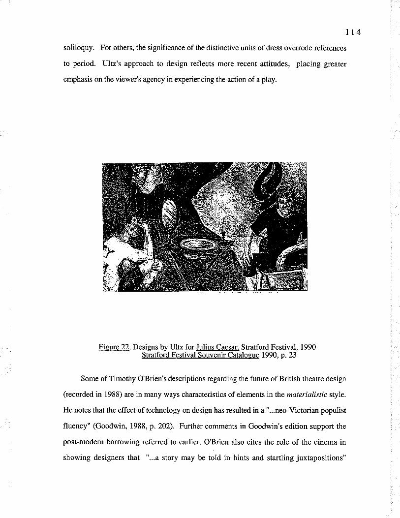
11,4
soliloquy. For others, the significance of the distinctive units of dress overrode references
to period. Ultz's approach to design reflects more recent attitudes, placing greater
emphasis on the viewer's agency in experiencing the action of a play.
Figure22. Designs by Ultz for Julius Caesar. Snatford Festival, 1990Sfatford Festival Souvenir Catalogue 1990, p. 23
Some of Timothy O'Brien's descriptions regarding the future of British theate design
(recorded in 1988) are in many ways characteristics of elements in the materíalistic style.
He notes that the effect of æchnology on design has resulted in a "...neo-Victorian populist
fluency" (Goodwin, 1988, p.202). Further comments in Goodwin's edition support the
post-modern borrowing referred to earlier. O'Brien also cites the role of the cinema in
showing designers that "...a story may be told in hints and startling juxtapositions"

115
(p.202). While O'Brien refers primarily to set design, the comments serve costume design
equally well.
British design úadition
By reviewing the various styles as they have evolved both chronologically and in
relation to the wider culture, it is possible to identify certain tendencies within British
design nadition. Thus, the proposed model (supported by the literature review) suggests
the broader outlines of British design history.
The design style model also traces the development of the role of the designer in the
production team, specifically as it relates to the director. It indicates quite conclusively,
what Marowitz described as a process of negotiaæd dominancy, amongst the director, the
playwright, and the designer. Which production agent dominates appears to have a
relationship to the wider cultural zeitgies! as the various labels such as "actor's theafe" of
the glamour seeking 1930s and 40s, " director's theafre" of the revolutionary 1960's, and
the "designer's theate" of the materialistic 1980s indicate. Since such considerations are
not the focus of this study, this synopsis is somewhat abbreviated, but its application in
characterizing elements of British design tradition is helpful for situating Tanya
Moiseiwitsch's position within it.
What appe¿us to emerge from the British tadition is a strong collaborative system in
which a particular designer and director work in an inte¡pretive union that often reaches
beyond time and place. Beginning with the Shelving/Jackson collaboration at the
Birmingham Repertory Theatre in the 1920s, this system can be seen in the
LittlewoodÆury, Hall/Bury, Motley/Gielgud, and later, Motley/Glen Byam Shaw
productions (so much so that Mullin remarks on it especially when they did not) (1988,
p.8). It was a tradition that continued in its tansplantation to Canadian theatre, not only
through the Tanya MoiseiwitschÆyrone Guthrie team, but also with the Robin

116
Phillips/Daphne Dare collaboration at Sratford Ont¿rio, in the 1970s and early 80s. This
strong director/designer alliance can be readily understood within the context of the
"direÆtor's theaffe", which writers (Elsom, 1976;Hinchcliffe; 1974, Miller, 1986) in the
post-war period describe as the fall-out from the Brechtian-sensibility (while recognizing
that Brecht was not the sole cause of such an attitude). As collaborators in the theatrical
experience, these director's designers present a highly responsive, adjunctive visual
articulation of a particular director's interpretation. But the fact remains that in essence, as
the examples from the 30s (Motley/Gielgud etc.) indicate, this close interpretive association
existed prior to that time. The earlier examples suggest this was an established part of
British theatical fadition, in place well before the years attribuæd to director's theate.
Tanya Moiseiwitsch's position
With this understanding of the forces shaping the development of British costume
design, it is easier to understand Tanya Moiseiwitsch's position within it and her ind,ividuat
contribution to it. The definition of the morphologícal style -- sculptural rather than
painterly, metaphorical rather than realistic, interpretive rather than decorative, tending
towards the practical, and having a dominant collaborative focus -- clearly links her to that
nadition. It is possible to trace her position within it, not only contextually through time
and place, but also by comparing her work with the morphological styhsnc characteristics.
While still a student at the Central School of Arts and Crafts in 1932, Tanya
Moiseiwitsch helped to make costumes at the Old Vic in London. The experience led to her
apprenticehip at that theatre for the next two years. There she had the opportunity to work
with and observe some of the most prominent individuals in theatre at that time. While still
an apprentice and a young women barely out of her teens, Tanya Moiseiwitsch designed
her first production, The Faithful, for the Westminster theatre in London (1934). This
occurred two years after the debut of the Motley firm in British design. In fact, Motley
designs were patr of the 1932 production of The Merchant of Venice at the Old Vic in the
TT7
same year that Moiseiwitsch began her brief apprenticeship there. She thus had the
opportunity to observe Motley's progressive but practical methods fïrsthand.
The young designer so sufficiently impressed director Hugh Hunt that he invited her to
be resident designer at the Abbey Theatre in heland (1935). She remained there unt'rl 1939,
leaving at the same time as Hunt did. From the beginning of her work at that theatre, as
the Cambridge Guide to World Theatre, (1988) describes, Tanya Moiseiwitsch's work was
typified by simple, direct, presentational sets embodying the visual metaphor of the play.
Moiseiwitsch regards that time as a period of apprenticeship when she learned how to
design for repertory theatre with director Hugh Hunt's guidance. It was also her first
director/designer collaborative association, resulting in over fifty productions at the Abbey
Theatre, followed by others at ttre Old Vic.
Behl (1981) notes that Moisewitsch singled out her experience designing for Uncle
Van)¡a, directed by John Burrell, as an important step in her career. According to Behl, she
pointed to the 1945 production at the Old Vic as the beginning of what was to become a
frademark of her design work: poetic realism. She described it as a blending of historical
references in costumes and set with the director's inærpretation in order to achieve a unified
work. Behl concluded: " Rather than be true to a reference book, she prefers costumes and
setting be true to one anottrer so they reveal character relations, atmosphere and locale and
reflect the director's point of view" (1981, pp.23-24).
Tanya Moiseiwitsch began her career at a time when some of the greatest theafe
designers were establishing design as a profession. While Cecil Beaton's work is most
aligned with the commercial theare and films, Oliver Messel was present at the Old Vic
during the time of Moiseiwitsch's apprenticeship. His rich and opulent design style seems
to have had some influence on the young designer's early work. Two productions
designed by her reveal a decorative influence: Bless The Bride at the Adelphi Theatre,
London (L947), and A Month In The Country produced at the Old Vic during the 1949-50
118
season. Bless The Bride was produced by C.B.Cochrane, allowing Moiseiwitsch six
months to prepare for it. She responded with exuberant and lavish designs whose
descriptions, along with the tenor of reviews for the production, suggest they were more
decorative than functional. The London Times (April 28, 1,947) describes it as an
"...omate valentine painted and lavendered by artists whose taste commands respect".
Tanya Moiseiwitsch continued to explore her art and at times revealed her development
within a predominantly decorative era of theatrical design style. In 1949 she designed sets
and costumes for Michel SainçDenis' A Month in the CountÏ at the Old Vic. Viewing her
designs, (Figure 23) critic Philip Hope-Wallace seems to have observed traces of
decorative elements alongside of a d,istinct leaning towards a more functional, structured
approach. Hope-V/allace cornments:
And Tanya Moiseiwitsch had designed rooms which looked neither tooopulent nor too crowded with period bric-a-brac, with a garden beyondyhgre raspberry canes and a pampas hedge hid from us thé sultry einptylandscape that washes this tormented household round about with-silence.Such atmospherics are well worthwhile getting right for an author whoelsewhere showed so keen a sense of the genius loci, and if Rakitin was atrifle too dashing and Natalya a shade over-bonneted these were very minorblemishes in a production which may not have satisfied the heart or theintellect, but certainly lingers happily on the inward eye (Hale, 1950, p.68).
It is significant that Hope-Wallace's review of the production praised Moiseiwitsch's
set designs while gently tapping her wrist for some of the costumes. His apportion of
praise for the set and costumes has particular import because it reflects the state of
Moiseiwitsch's design at this point and foreshadowed her futue stylistic attributes; her set
design led the way. Shifts in her design style were evident in her sets before they were
recognizeable in her costume designs. The photograph (figure 23) from the Old Vic
production of A Month in the Country demonstrates some of this. The set is spacious and
free of numerous distinctive props identifying a specific location. Instead, there exists a
combination of impressionistic landscape references and fiellis-like structures suggesting
archiæctural features. But while the set may be impressionistic, the costumes appear to be

tt9accurate represent¿tions of fancy period
costumes were a weak design feature when
dress. For critic Hope-Wallace, the literal
situaæd in the poetic expression of place.
Figure 23.Set and.osjl1p 0_e¡r,eng_!V_Ja1ya Moiseiwitsc_h for A Month in the Counrry,1,947. Hale (1950), berween pages 56-57.
From recorded descriptions, it seems clear that Tanya Moiseiwitsch had established her
design style by the late 1940s, passing from decorative exploration to morphological
interpreøtion. Her apprenticeship was complete. The poetic realism characterizing the
production of Uncle Van)¡a (1945) was significant, not least because it assisted in
establishing her forthcoming collaborative work with Tyrone Guthrie. By the end of the
1940s she had become his favorite designer. In 1947 when she designed a Month in the
Country, she had already collaborated with Tyrone Guthrie on four productions. His
preference for more abstact, poetic expression helped to shape Moiseiwitsch's design
style immeasurably, but Guthrie's vision, combined with her visual interpretation were not

120
always avidly received. Benjamin Britten was less than enthusiastic about their work for
his opera Peter Grimes at Sadler Wells (1947). Guthrie and Moiseiwitsch had chosen a
design approach that, in the director's own words, incorporated "...boldly abstract
expressions of atmosphere and emotion...expressions of a far-reaching imagination"
(quoted in Behl, 1981, p.34). At the time, Britten preferred a more realistic design
approach. By the time that Guthrie and Moiseiwitsch tackled the production for the New
York Metropolitan Opera in 1967, Britten had changed his attitude (Hayes & Barlow,
1991). Theatrical design had undergone dramatic tansformations, and the nvo members of
the repeat production team had by then reached their apex. Stylistically, Moiseiwitsch's
designs had moved away from the painterly, becoming distinctly more sculptural.
In 1953, before the effects of Brechtian staging and Osborne's gritty focus were felt in
Britain, Moiseiwitsch joined Guthrie in launching a new Shakespeare Festival in Canada.
Roy Srong infers that she left Brit¿in as one of the " ...victims of a cruel fate...going out
of fashion at the opening of the 1960s as a result of a revolution in the theatre" (Goodwin,
1988, p.18). He categorized her work within the same galaxy as Messel, Beaton, and
Hurry, all of whom had largely disappeared from the British design scene in the 60s.
Hurry and Moiseiwitsch, he stated "...found work abroad at SÍatford" þ.18). Sfong was
certainly correct about the revolution in the theatre at the beginning of the 1960s, but he
was off ftack with both his assessment of her design style and her reasons for leaving
Britain (not to mention her date of departure). As this study indicates, her work may have
begun at a time when the decorative genius of Messel and Beaton prevailed, and indeed, it
was influenced by it, but her design appoach quickly shifæd towards a more functional and
structured style. Her style was informed by a different attitude than Messel's st¿ted intent
of decorating a production. Desmond Heeley places the two designers at the opposiæ end
of the spectrum (Quigley, 1990). "According to Heeley, who served apprenticeships under
both Moiseiwitsch and designer Oliver Messel, Tanya taught him about creating worlds of
reality blended with poetry, while Messel was the mentor of a magical world of moon-
121,
lighted fantasies" (Behl, 1981, p.356). Moiseiwitsch had been gone for at least three years
before the visit of the Berliner Ensemble to Britain, and nearly a decade before its real
effects were firmly est¿blished within British design.
Like the other designer/director associations, Tanya Moiseiwitsch's artistic
collaboration with Tyrone Guthrie has become something of a legend. She has credited
him with being one of the greatest influences on her work and her career ( Candee, 1955).
Guthrie was one of Britain's most acclaimed di¡ectors, known for his dramatic staging and
his propensity for bending the rules in all aspects of thearical production, to the exænt that
critics sometimes accused him of taking tiberties with the script. Kenneth Tynan suggests
that Guthrie was "inventive" (1961). Moiseiwitsch adamantly disagrees with this
perception. She asserts that Guthrie paid untailing attention to the text (Rossi, 1980). The
GuthrieMoiseiwitsch team complemented each other's method of working and developing
innovative design ideas through a shared appreciation for practicality, experimentation, and
humor. Together they shared an appreciation for the "...professional discipline of
separating the essential from the rim and meeting deadlines." These were values which had
been leamed in their separate experiences with repertory theatres in England (Behl, 19SS).
When Tanya Moiseiwitsch boarded the Beaverford at the Tilbury Docks, London in
1953, with a model of the Stratford Festival stage in the cargo, she embarked on what she
later described as "...the turning point of my theatre designing life" (Moiseiwitsch, 1988).
In many ways it was also the key point in her refinement of stylistic traits, which were
present in her work in Britåin -- of traits that were directly connected to her development of
a perrnanent set. These began with her designs for the cycle of the histories (Ric.hA$l-[L1
Henry IV,2 Henry IV, Henr)¡ V) at the Shakespeare Memorial Theatre in 1951. "Few
acknowledged the radical and ingenious nature of Tanya Moiseiwitsch's permanent
staging, which in an era of opulent and operatic sets was astonishingly and
uncompromisingly plain..." (Beauman, 1982, p.208). By creating a single, swiftly

r22adaptable, uncluttered platform for the four plays Moiseiwitsch saw how the focus on the
actors was highlighted. Costumes became like props and were shown in greater relief
against a more neutral background.
Two years later she was able to push her ideas further through her collaboration with
Guthrie in the development and refïnement of design for the open stage at Straford Festival
Theatre, Ontario. The experiment proved successful and was repeated at The Guthrie
Theatre in Minneapolis and The Crucible Theatre in Sheffield, England. In response to the
clean lines of the stage and its neutral setting, her costume design style became clarified.
Its most salient features consisted of a blend of poetic realism intended to assist the
interpretation of the play, subdued costume colours allowing the player to be the focus of
the action by not overshadowing actions or speech, and the use of architectonic costume
lines that ensured the player's dominance through a sharply etched contast with the stage.
Her work in Canada and the United States did not end her association with British
theatre. As the account of her designology in Appendix D indicates, she was involved with
theafre design in Britain throughout her career, creating her only designs for television there
in 1983. From 1953 when she left Britain to begin her work in Canada until 1985, she
continued to design almost yearly for plays in the United Kingdom: 26 productions in 32
years. Tanya Moiseiwitsch's active career in theate design was completed in 1985 with
the staging of The Government Inspector. which she co-designed with Polly Bodhanetzky
at the Stratford Festival.
Servins the oroduction
All of the literature and inærviews with Tanya Moiseiwitsch reiterate her integration of
the collaborative credo that characterizes designers' attitudes towards the production team
distinguished in the morphological design style classification. Moiseiwitsch describes it as

r23"serving the production" (Behl, 1981), an endeavor that could best be carried out by
collaborating with the director and visually interpreting his artistic conception of the text.
Her attitude towards this process of design supports Marowitz's viewpoint: the d.irector's
position as the chief interpreter of the playwright's text should prevail. Speaking to critic
Herbert 'Whittaker, Moiseiwitsch described the designer's job as one which is " to get
inside a director's think" (Whittaker,1974). It is a design approach which parallels that of
the morphological design style within British design history, and supports Tanya
Moiseiwitsch's placement within it.
Tanya Moiseiwitsch, like the Motley group, created design sketches that were
intended to be guidelines, not works of art in their own right. "Not a draftsman but a
designer, Moiseiwitsch drew to be understood, not to impress. Her purpose was
ultimately practical since the end product was a costume that came to life when it was worn
by the actor" (Behl, 1981, p.50). This is another example of her collaborative effort to
privilege the real work of art: the play itself. With its underlying singular intent --
facilitating the director's vison -- it further establishes her position within the morphological
design style.
Her belief that a designer's role was to collaborate went beyond merely meeting the
needs of the director, but through his direction ûo support the actor's charactenzation within
the production. This was not always accurately perceived by the actors themselves, a
situation which seems to rankle somewhat. In a recent interview, she looked back on her
experience and stated ttrat following her costume designs for King Oedipus at the Straford
Festival in 1954 (Figure 24), someone asked her if she'd "...got it in for actors" (Hayes &
Barlow, 1991).

t24
Figure 24.Costume design for Statford Festival by Tanya(1958),p.29
Moiseiwitsch assured the questioner that she was in fact very fond of actors; the
costulne requirements dictated materials that made them bulky and hot for the players in the
production. She had placed the players behind paper mache masks, on raised platform
footwear, and under voluminous garments. As the performance progressed, the
temperature within their costumes arose, making the actors increasingly more
uncomfortable. The discomfort of the costumes was offset by ttreir extraordinary theatrical
effect, emphasizing the ritual aspects of the production.
From a contrary position, actors such as V/illiam Hutt praised her flexibility in
recognizing players' costume needs. He recalls her readiness to heed his advice in the
design of Argan's cap in the Festival production of The Imaginary Invalid (1974). She had
designed a cap for Hutt in the part of Argan (Figure 25). In performance, when his stage

125
Fi$lre 25 . Design for Argan by Tanya Moiseiwitsch for the Stratford Festival 1974production of The Imaginary Invalid.f1nyg Moiseiwtsch adjusts William Hutt's cap.
Photograph courtesy of the Staford Festival Archives
wife (played by Dawn Greenhalgh) admonished him to cover his ears, he would anempt to
pull the cap over his ears. After several performances, Moiseiwitsch decided to rework the
cap. "Bill suggested ear-flaps. I was delighted. We have achieved a double effect. The
new cap fits Dawn Greenhalgh's line and it also makes Bill look babyish, which is the way
he's acting as the invalid" ffiittaker,1974). This quote is a small but explicit example of
her desire to support the actor.
Tanya Moiseiwitsch's contributions to theatre design gïew out of her experience in
Britain. From the information reviewed in this study, it is justifiable to integrate her
position within the mainsfream of that country's evolving design ftadition. The literature
and examples of her work suppoft her position within a classification of a design style
labelled morphologícalbecause of its concern for structure and form, and its service to the
production as a means of interpreting the text rather than merely illustating it.
It is possible to trace how she arrived at this particular style by reviewing the
decorative atmosphere of design at the time of her inroduction to it, her exploration of it,

t26and the forces which influenced her redirection from it. Simpty put, her own talents and
preferences for the theories of Craig and her respect for the theatricality of the work of
Messel, combined with her association with director Tyrone Guthrie (who not only shared
her stylistic preferences, but provided her with the opportunity to express them), meshed
together to create her own design history. She arrived at her position within British design
history through a well voiced process of collaboration: a process in which she succeeded in
aligning her creative insight as a designer with the director's vision in a manner enriching
the overall production rather than compromising it. Moiseiwitsch's actual designs may
serve as credits to the results of these endeavors, but it is her inherent philosophy of
collaboration that has formed her outstanding contribution for the designers whom she has
influenced.
This philosophy can be recognized in her costume colour choices. The following two
chapters review costume colours for four characters from two plays as they have been
treated in a total of 21 productions, five of which were designed by Tanya Moiseiwitsch.

V. ROMEO AND JULIET: COSTUME COLOUR/CHARACTERTZATION ANALYSIS
With Shakespeare's own experience as playwright, actor and production manager, it is
not surprising that his scripts reveal a sensitivity towards the stage business the actor
engages in while speaking his part and the visual features that help to define a role: his
drama is meant to be seen as well as heard. Then, as now, costume acts as a signal for
chatacteization. In any analysis, colour, along with the costume's architectonic and kinetic
components, contribute to its visual impact. As the literature discussed in Chapter IIindicates, colour has historically been one of the means for instantly recognizing a person's
status. McCracken (1985) Bruster (1991) and Allen (1935) have all shown how colour
codes were employed during Elizabethan times. Bruster's specific focus on Shakespeare's
use of colour symbolism attests to the playwright's application of colour to assist
characterization. Shifts in character interpretations in Romeo and Juliet since
Shakespeare's time have been realized by differing textual emphasis (youthfulness vs
maturity, impulsiveness vs aggressiveness, etc.), with corresponding changes in the visual
appearances of stage characters. The varied possibilities for compatible colour
inærpretations pose several questions. How do costume colours reflect the changing times
in which productions have occurred? Have the clues to characterization offered by the
costume colour meanings remained constant? In spite of the differences in costume
periodization, can we expect to see similar colour choices? Is there agreement or dissent
between Tanya Moiseiwitsch's colour interpretation of costume colours and other
designers'application? The following discussion indicates that any attempt to correlate the
efficacy of inherent colour meaning with its use as an interpretive tool for drama
demonstates both the consistency and the ambiguity of meaning within different contexts.
This chapær presents the examination of four characters' costume colours in 15 d.ifferent
productions of Romeo and Juliet. Using the Pantone System as reference, the possible
meanings for these colour choices are documented. The account -- of how the suggested
127

128
costume colour and character readings compare with what can be d.iscerned from the
available literature regarding the direction of these productions -- forms an important
component in this analysis. The comparison relies on a variety of production reviews and
wherever possible, on reports by the actors themselves. While this system of analysis does
not assure a definitive understanding of the production teams' intent, or the audience's
perception and reception of it, some estimation of particular costume colours'
communicative status can be determined. The resultant rendering makes it possible to
observe Tanya Moiseiwitsch's particular attendance to, or divergence from the collective
norrn in her choice of costume colows. Such an analysis also avails the examination of
individual interpretation with relation to cultural stereotypes.
Fifæen Romeo and Juliet productions were reviewed because this was the number that
had production records available in theatre archives at the Shakespeare Centre (Snatford-
Upon-Avon), the Theatre Museum (london), the Stratford Festival, the Guthrie Theane
(Minneapolis), and the American Conservatory Theatre (San Francisco), for productions
staged within the same five decades that Tanya Moiseiwitsch was active in design.
Moiseiwitsch's work is featured in the total discussion rather than in a separate section in
order to maintain a chronological overview. The following review, of the four characters
forming the core of the character and costume colour analysis, outlines the widely accepted
character readings presented in mainsfream theaEe productions. This overview is included
here to 'set the stage' for the character analyses which ensue. Greater ranges of character
inærpretation exist within academic criticism and experimental theanes, but they fall outside
the parameters of this study.
Romeo and Juliet: theme, content and production history
Romeo and Juliet was writûen by Shakespeare circa 1595. The play closely resembles
an Italian tale entitled Storia ...di due nobili Amanti (1530), and set in Verona, about two
feuding families (Montecchi and Cappellati). Shakespeare's play is a retelling of that story,
r29based on an intermediary source: fellow-Englishman Arthur Brooke's na:rative poem The
Tragical History of Romeus and Juliet (1562) ( Kermode in Riverside Shakespeare,
1977). Within that text, the Friar's opinion that: "These violent delights have violent ends,
/ And in their triumph die" (II.vi. 9-10), is in many respects an apt synopsis for the action
in Romeo and Juliet.
Romeo and Juliet is a play filled with dynamic conffasts: young love thriving in an
atmosphere of old hate, the simple but poignant juxtaposition of youth and maturity, and
vibrant life prematurely quelled by tragic death, all within a brief temporal span. The
young protagonists, Romeo and Juliet, meet in forbidden circumstances under the cloud of
a bitter vendetta surrendering themselves ûo each other with a confidence and hope that can
only be explained by their youth. With the assist¿nce of the Friar and Juliet's nurse, their
romance flourishes in spite of seemingly impossible odds and a good deal of bawdy
business provided by the Nurse and the young men from both families. Ultimately, a
series of fat¿l misadventures conspires to destroy them both: their surrender to destiny is
mutual and complete, forever ensured by their coupled deaths.
With its archetypical depiction of ragic teenage love, and its blend of bawdiness,
laughter, and lyrical beauty, Romeo and Juliet is one of Shakespeare's best known and
most loved plays. And while this may ensure good box office returns, it inevitably
presents a special challenge to the director and the designer wishing to present a fresh
interpretation to their audiences. Because the plot is so well known, certain deeply rooted
expectations are held by audiences concerning appropriate visual depictions of the
characúers. Moreover, as Trewin (I978,p.92) has noted, the names of Romeo and Juliet "
have been cheapened, punned upon, pushed into the world's 'epic love stories', [and]
dragged through the thorn-brakes of minor fiction. Much has to be forgotten before a
Romeo begins".

130
Directors have met this challenge in different ways. Fresh approaches have been
presenûed by shifting thematic emphasis, highlighting individual actors'interpretations, and
presenting innovative production designs. In some instances, the resulting success has
seemed so complete that dfuectors, actors, and designers have been intimidated by the past
triumphs of particular predecessors. Two British productions are repeatedly cited in this
regard: John Gielgud's 1935 New Theatre production and Franco Zeffirelli's 1960 Otd Vic
production. The Gielgud production was notable because he alternaæd playing the roles of
Romeo and Mercutio with Laurence Olivier, and also because it starred Edith Evans as the
Nurse and Peggy Ashcroft as Juliet The staging of It¿lian Renaissance Verona presented
in this Romeo and Juliet. combined with its distinguished cast, est¿blished a dramatic
standard. A discussion of its characterization dynamics is included in the analysis of
Juliet's costume for that production. Znffirelli's Romeo and Juliet cast young unknown
actors which contributed to the realistic feel of the production. Zeffrelli later produced a
film version using a similar approach. Director Michael Kahn, who was at the Shakespeare
Theatre in Stratford, Connecticut in the 70s, felt that Zeffirelli's "... film has really
investigated the visual aspects of the Renaissance so completely that there's no way for us
to do it [in that period]" (Berry, 1977, p.85). For Kahn and other directors, productions
such as these two become particularly "hard acts to follow".
Londre (in Leiær, 1986) reiterates Kahn's view regarding the impact of these particular
productions. "British directors who wished neither to seem to imitate nor to rebel against
those two [Gielgud (1935) andZntrrelli (1960)] memorable revivals simply avoided the
play altogether" (p.625). He suggests that this has contributed to diminished production
popularity in recent years. According to Londre, the number of Romeo and Juliet
productions in Britain and the United States peaked in the 1950s and then swiftly declined.
Londre lists the following production statistics for three decades in the United States and
Britain:

13i
Britain Uniæd States
57
24
t3 (p.62s)
Blurred lines
Romeo and Juliet has thus far had a diverse interpretive history. In the 18th century
David Garrick, one of the major actor-m¿magers of the English theatre, cast it to suit the
decorum of his audience. Garrick idealized the characters of Romeo and Juliet
exaggerating their noble qualities so that as tragic figures, they would conform to
acceptable 18th century stereotypes. During this time, the play's tragic theme pre-empted
the love theme. Ganick encouraged more individual actor interpreted characterization:
actors expressed "inner responses through voice, face, and body" (Levenson,'1,987,p.28).
The subjective acting style promoted by Garrick led to the dominance of an actor-as-
interpreter approach, considered to be søndard until the 20th century when the more
controlling vision of the director gained pre-eminence.
Lond¡e (in læiter, 1986) has suggested four predominant foci in Romeo and Juliet
productions throughout North America and Britain. Prior to the 1950s, the emphasis was
on lyric romanticism celebrating and lamenting the passionate young love destoyed by hot-
blooded family feuding. By the 1960s, the play presented a medium for social
commentary, with an increased stress on realism and physical action. West Side Story, a
modern day re-writing of the same theme, provides a clear example of this approach. This
thematic adaptation of a tale of interracial love doomed in the midst of racial intolerance was
1950s
1960s
1970s
3t
7
11

r32dramatically real for a North American audience stiving to overcome similar prejudices. In
the same spirit, director Philip Burton (V/ashington Shakespeare Summer Festival)
presented an element of racial conflict in his 1968 Romeo and Juliet production, and in the
s¿rme year at the Stadord Festival in Canada, director Douglas Campbell emphasized a
FrenchÆnglish political conflict. By the 1970s, an increased societ¿l focus on "sexual
liberation" was reflected in productions of Romeo and Juliet: bawdiness was emphasized.
During the decade of the 80s, numerous productions presented a darker more pessimistic
play, either from the viewpoint of youth's turmoils (Ron Daniels, 1980 RSC), or through
a return to racial and political conflict themes,such as Gavin Cameron-Webb's direction of
the Boston Shakespeare Company in 1982. Set in contemporary Northern Ireland, the
lovers became pawns in the present-day conflict between Catholics and Proæstants.
Throughout these shifts in thematic focus, costumes and costume colour have assisted
interpretation. In a 1983 production of Romeo and Juliet atLa Jolla Playhouse, Des
McAnuff used staging effects to dramatically emphasize the extent of the century-long feud
between the Capulets and Montagues. The play began with the actors wearing simplified
modern clothing. As the play advanced to the Capulet's ball, the actors appeared in
costumes from successively earlier eras, back to the Renaissance and then again returning
to black and white modern dress at the end. In this way, a sense of "forever feuding" was
subliminally ennenched in the audience's consciousness, adding another dimension to the
play.
Tanya Moiseiwitsch designed costumes and sets for Romeo and Juliet in 1943 at the
Oxford Playhouse Theatre in England, and in 1960 at the Stratford Festival Theatre in
Canada. During the interval between the two design experiences, as this examination of
production history shows, major shifts in focus had occurred. Her first Romeo and Juliet
was designed for repertory outside of London during \ñ/orld War II, and at the outset of her
career. The second production was designed after she had est¿blished herself in both

133
Britain and Canada, at a time when she was one of the most prominent designers in theatre.
The accounts of the 1960 production of Romeo and Juliet , directed by Michael Langham,
are numerous, making it possible to thoroughly examine her use of costume colour within
it. Unfortunately, the scant information surrounding the wartime production makes it
impossible to do more than assume that it followed the general trends described in this
study.
Character choices
The four characters whose costume colour and meaning are the subject of analysis in
this study are the protagonists Juliet and Romeo, Capulet, an authority figure in opposition
to the central characters, and Mercutio who, as a vibrant foil to Romeo, is central to the
action of the play and therefore a pivotal character. As the production history suggests
above, Juliet may be portrayed in different ways. Many directors have chosen to emphasize
her status as that of a young girl on the threshhold of womanhood but not yet aware of it.
In this type of view, she is porrayed with a childtike naivety compatible with the notion of
a sheltered, doted-upon daughter from a wealthy household. Her instant and
overwhelming passion for Romeo is thus explained as a rite of passage, with the expected
course ovem¡led by the story's evolving circumstances: the shift from hopeful maiden to
doomed heroine is thus enhanced. Earlier productions such as Gielgud's (1935) were
more likely to feature this sort of interpreøtion.
Other productions have attempted to capitalize on possible political readings,
presenting Juliet as a strong-willed young woman whose love for Romeo is a symbol of
revolt in a socially hostile world. Tamas Major's 1971 Hungarian production portrayed
Juliet in this manner. In Terry Hands 1973 RSC production, Estelle Kohler's Juliet was
"...no shrinking young virgin, but a vigorous young woman who was intrigued by the
possibility of sexual experience from the outset" (Gross in Leiter, 1986, p.6al.It is also
possible to interpret Juliet like a 1980 Swiss production did, characterizing her as a 'typical
134
teenager' who, like Romeo, is a product of middle-class parental oppression, eager to
grasp the fust chance for escape.
Critics were not always kind to the individual productions or their varying
interpretations, and overall, the more conventional reading of a youthful innocent Juliet has
remained the one most favored by audiences. As recently as John Caird's 1984 RSC
production, Amanda Root personified Juliet as a "...breathless, wondering young girl on
the threshold of adulthood. " (N.Jgarbook_ 1984/85, p.43).
Regardless of later interpretative variation, Shakespeare's text introduces Juliet as a
young woman. Responding to Paris's marriage proposal, her father says of her: " My
child is yet a stranger in the world, / She hath not seen the change of fouteen years;"
(I.ii.6-7). Capulet would have Paris wait two more years, but his wife is more resolved
and advises Juliet : " Well, think of ma:riage now. / Younger than you, I Here in Verona,
ladies of esteem, I Are made already mothers." (I.äi.69-72). Between the two clues to
Juliet's chronological, emotional, and cultural maturity, directors, acffesses, and designers
are given considerable scope for characterization and visual expression.
From the text we are told by Capulet that Romeo "A bears him like a portly gentleman;
/ And to say truth, Verona brags of him / To be a virtuous and well-governed
youth."(I.v.64-66). We have his parents'concerns about his secretive and mournful state
at the beginning of the play, suggesting he is a romantic figure: "Away from light steals
home my heavy son, / And private in his chamber pens himself, / Shuts up his windows,
locks fair daylight,out, / And makes himself an artificial night"(I.i.135-8). His friends
engage him in lusty chatter to which he readily responds, and his speech regarding
Rosaline situates him as a sexually eager youttr: "She hath Dian's wit, / And in srong proof
of chastity well arm'd...She will not stay the siege of loving terms, / Nor bide th'
encounter of assailing eyes, / Nor ope her lap to saint-seducing gold."G.i.207-2I2). It is
tempting to attribute his impetuosity in love and feuding üo the youth Friar Lawrence refers

135
to when he asks: "Art thou a man? Thy form cries out thou art: /Tlny t€ars are womanish;"
(u.iii.109-10).
Although Romeo has received greater interpretative range than Juliet has, he was
invariably represented as being t¿ll, dark and handsome in the early history of modern
Romeo and Juliet productions. Referring to pre-1960 productions, Brown observes
Romeo's predictable image: "A white shirt is usually open at the neck; a dark wig
accentuates a tall noble brow; the eyes are made up to appeil large and deep" (1962,
p.Iafl. This image reflects the actor-oriented theatre, wherein'stars'dominated the stage,
assuring by their presence the support of adoring audiences. It was a pattern broken,
Brown suggests, by ZnfireIli's 1960 Old Vic production which featured a less romantic,
more exuberant John Stride as Romeo. Subsequently, as the noted in Leiter's text (1986),
Romeo's romantic qualities were not always emphasized and his physical appearance has
correspondingly been given a wider range of expression. He has been variously poffiayed
as a "...lovable buffoon, big, blond, and callow-1ooking..." (Spencer Theatre, Kansas
city, 1985, p. 65), and as "...graceful, lean, and elegant ..." with a suggestion of
mannered, dispassionate presence (Old Vic, 1955, p. 637). Romeo also has been cast as a
"...sorrowful Hamlet" (Moscow, 1956, p. 638), as restless and physically engaged, (
RSC, 1973), or as "...pale and cerebral... " (Globe Playhouse, Los Angeles, 1977,p.
649). Other productions have presented him as a privileged, decent young man caught in
the midst of a blood feud that he does not really care about: a youth preoccupied with the
wonders of romance.
Shakespeare's text suggests rather than dictates characterization. When we are
introduced to Juliet's father, Capulet, he is in his gown impetuously calling for his sword
to attack his family's old enemy. " My sword, I say! old Montague is come, / And
flourishes his blade in spite of me." G.i.74-76) By the next scene, he has calmed down
and incidentally offers a relative clue to his character age when he states; "...and 'tis not

136
hard, I think, / For men so old as we to keep the peace." (I.ii.2-3) Thus far, we are
presented with a man who is fiercely proud of his family honour, but showing signs of
mellowing. Capulet can also be seen as an approachable and loving parent, justified ifclose attention is given to his words to Paris regarding Juliet: " She is the hopeful lady of
my earth. / But woo her, gentle Paris, get her heart; / My will to her consent is but apart. /And, she agreed, within her scope of choice / Lies my consent and fair according voice."
(I.ii.15-19) Capulet is not prepared to arbitrarily arrange a ma:riage for his daughær at the
expense of her happiness.
Shakespeare's texts are filled with an understanding of human nature: Capulet's
generous concern for his daughter's well-being is withdrawn when his once pliant daughter
defiantly refuses to marry Paris. In a short span of time, the loving father turns on his
daughter in a manner that can only be described as brutal: " Unworthy as she is, that we
have wrought / So worthy a gentleman to be her bridegroom?...proud me no prouds, / But
fettle your fine joints 'gainst Thursday next, / To go with Paris to Saint Peter's Church / Or
I will drag thee on a hurdle thither. / Out, you green-sickness carrion! Out, you baggage! IYou tallow-face!" QA.v.144-45/153-152-58). When Juliet does not give in he threatens úo
disown her: " An you be mine, I'll give you to my friend; / An you be not, hang, beg,
starve, die in the streets, For, by my soul, I'll ne'er acknowledge thee, / Nor what is mine
shall never do thee good." (III.v.192-5). Capulet's words appeil to establish him as a
domineering patriarchal figure. And yet, becasue of the caring sensitivity to Juliet's wishes
he displays earlier, he may merely be a frustrated parent unused to the changes associated
with youth's developing independence. Shakespeare may have created the image of a man
who has been pushed beyond what he comprehends as acceptable behaviour from his once
obedient daughær: a man who, in the modern idiom, would be described as someone who
has "lost it".
137
Further information provided in the text suggests that pride might, in fact, be at the root
of his reversed sentiments. As the head of a proud family, it is important for Capulet to
show his position. He is referred to as "the rich Capulet", but a good number of lines are
dedicated to conversation concerning hiring suitable servants for the ma:riage feast. It
would be possible for a director to hint that the alliance to Paris was an essential one for the
family coffers. Juliet's refusal can thus be seen in a different light, which by default, hints
at Capulet's charactenzation as someone determined to maintain his place in society.
If Romeo sought his spiritual and paternal solace from Friar Lawrence, his secular
counterpaft in the streetworld of Verona was Mercutio. Regardless of interpretation,
Mercutio represents the cynical member of Romeo's crowd with respect to love. He
advises a suffering Romeo: "If love be rough with you, be rough with love; / Prick love for
pricking, and you beat love do\ryn." (I.iv.27-8). Mercutio may be cast as an intelligent
young man whose genteel demeanor cloaks his underlying bitterness. This was how Paul
Rogers characterized him in Robert Helpmann's 1955 production for the Old Vic, London.
At ttre other end of the spectrum, Mercutio could also be porfrayed as a slightly older jaded
figure, whose worldly experiences have left him weary of romance, but whose experience
and wit place him as a leader for Romeo's companions.
Between these extremes, several variations in characterization have occurred. Bernard
Lloyd's Mercutio (1973, RSC) reflected both the Brechtian dark mood of that production
and the punk subculture emerging in that period. As Gross (in Leiter, 1986, p.6 7)
reports: in a brutal Verona staged on an austere metallic set "Mercutio was a perverse punk
who made his first entrance dragging along a lifesized doll that he dismembered, with
savage glee, in his later conjuration of Rosaline. Slightly drunk in his early scenes, hung
over in the later, Mercutio was disgusted by sex and contemptuous in raillery." Some
productions have explored other new manners of characærization for this role. In the 1985
Missouri Repertory Theatre at Kansas City, Michael LaGue's Mercutio conveyed a sense

138
of borderline madness, presenting his speeches in a "...compulsive oratory that is
absolutely chilling" (Londre in læiter, 1986, p.655).
By contrast however, most productions present Mercutio as an intelligent, privileged
young man whose aggression is explained by his youth and leisure. This view is more in
keeping with Wilders' (1988) opinion that "Mercutio and Benvolio are boisterous, earthy,
daring, irresponsible youths affectionate towards one another but contemptuous of thei¡
sworn enemies" (p.91). In whichever way directors, actors, and designers have chosen to
present him, Mercutio is an important figure in Romeo and Juliet: in many ways, his
mocking attitude in the fust half of the play presages ttre action in ttre second half. V/ith his
death, the entire mood of the play shifts dramatically from romantic/bawdylhumorous to
tragic. His characterization is therefore inægral to the action of the play and very early on is
a foil not only to Romeo's character, but to the innocent context of Romeo and Juliet's
love. Mercutio's metaphor to describe Romeo's lovesick mooning is strikingly prophetic: "
Alas, poor Romeo, he is already dead: stabb'd with a white wench's black eye;" (tr.iv.14).
Thematic colour
Colour references are gently peppered throughout Romeo and Juliet providing an
emphatic comment on the mood of the play. Colour references also underscore individual
characterization. In the very first scene, Montague laments his son's secretive
preoccupation with Rosaline, worrying about his son's disposition: " Black and portentous
must this humour prove," (I.i.138). It is the first of many references to black and in itself a
portent for the play's resolution.
Costume colour is not specifically referred to in Romeo and Juliet. Shakespeare's
primary use of colour in this play is to establish mood and embellish sombre imagery.
Green and yellow are negatively descripted: "Be not her maid, since she is envious; /Her
vestal livery is but sick and green, / And none but fools do wear it;" (tr.ü.7-9), "With reeþ

139
shanks and yellow chapless skulls;" (ry.i. 83). Crimson and scarlet are associated with a
lover's lips and cheeks: " By her high forehead and her scarlet lip," (II.i.18). White
symbolizes the courtly ideal of refined womanhood: "On the white wonder of Juliet's
hand," (m.iii.36). References to idealized women's white hands appeil in several
Elizabethan plays besides Shakespeare's, and at times he appears to gently mock the
convenúon. The only other colours mentioned are grey, used descriptively as in the
'Queen Mab speech': "Her waggoner, a small gray-coated gnat,"(I.iv.64); purple,used to
describe passion and blood (I.i.82); pink used to allude to sex (II.iv.56-7); and silver
employed in lyrical imagery as well as to describe the time of day: "How silver-sweet
sound lover's tongues by night," ([.ii.166). 'Whether or not they heeded Shakespeare's
implicit textual colour references, designers in the following 15 productions, used costume
colour to underscore the characterizations within this play.
As indicated in the section on methodology, the costume colours/characterization
method of analysis employss the Pantone Colour System. An example of how this system
works is provided in Chapter III. Reference to it may be initially helpful in undersranding
the process of numerical designations for the hues and the corresponding Pantone colour
reading. A list showing Pantone colour meaning is included in Appendix H. Associative
colour meanings are not listed in any rank order, but are randomly recorded within this
study. When the colour being described has been given a colour name by Pantone, it is
recorded n italics. All associative colour meanings are based on Pantone's findings unless
otherwise specified.
Because costume components vary in their proportions, the allocation of colour content
in the costume colour/character charts has been assigned according to the relative
proportions shown in figure 26.

140
Figure 26. Approximate costume/colour ratios used in costume colourand characteri zatton analysis

t4t
Costume colour/characterization: ruLIET
Thirties
Motley's design @igure 27) for the Gielgud Old Vic production (1935) of Romeo and
Juliet at the New Theafre combined gold star shapes and trim on a fiery red background,
over a white catnisia (chemise). Juliet wears the dress in both the ball and balcony scenes.
Figure 27. Juliet costume by Motley, 1935
Although Pantone labels the hue Mandarín Red, itrecalls the Renaissance colours of
Raphael and his contemporaries. Christ's mother's gown in Raphael's Marriage of the
Virgin c.1504 (Figure 28) could have been an inspirational source, or perhaps Botticelli's
Adoration of the Magi c.1470. Michael Mullin þersonal communicaton 1992) states that
Motley referred to the work of Vitorre Carpaccio (c.1460-1526) in particular. These artists
have similar palettes.

142
Figure 28. Raphael's Marriage of the Virgin c.1504
In technical terrns Mandarin Red (17-1562) reflects 20-307o according to Pantone,
making it a relatively darker value. It is a highly saturated hue in the orangey-red position
on the Pantone colour wheel. Combined together, these elements present a dramatic image,
ensuring a stong costume st¿ge presence. Because Mandarin Red is almost mid-point
between the orange and red sectors, it was necessary to extrapolate meaning from both
colours, placing particular weight on repeated descriptors. In Pantone, the costume colour
signifies a warm, even hot, vital, glowing, happy, excited, passionate individual. Both
hues were described as hot and happy, while many of the other descriptors were similar in
meaning (for example, vital and active). Bright red is often associated with passion,
provocativeness and sex, and also carries the negative connotation of rage. Choosing gold
for pattern and trim underlines a noble reading, befrtting to an only daughær of the Capulet

143
household. Gold has maintained its rich and valuable connotations consistently over time
and place, throughout the world. Another costume, a nightgown of white with gold trim,
carries associations of cleanliness, coolness and purity, as well as the pristine. White
reinforces our concept of Juliet as young, virginal, and pure; the repetition of gold in the
trim strengthens the aristocratic motif. This reading can be either verified or disputed by
referring to reviews and other literature writæn about the production.
From the associative meaning for the colours described above, we may detect that this
interpretation of Juliet was a dynamic one, enhancing the sexual tension within the script
alongside youthful passion. Juliet was perhaps presented as an intense young woman,
whose self assurance and warm personality had blossomed due to her privileged position in
a secure and adoring world.
While Gielgud's Romeo and Juliet has received considerable attention in theatre
literature, James Agate (1937) appears to be the only critic to specifically refer to Peggy
Ashcroft's interpretation. His statement is regrettably brief: "Miss Peggy Ashcroft's Juliet
has been $eatly praised. Certainly the eager and touching childishness of the early part
could not be bettered, so that,we prepared to be greatly moved. Personally I found the
performance hearüending until it came to the part where the heart should be rent. And then
nothing happened,..." (pps. 185-6). Following a subsequent visit to the same production,
he revised his opinion somewhat, noting: " Miss Ashcroft's Juliet is gaining in depth and
power while losing nothing of the childish fragrance,..." (p.206). Five decades later, one
of the most complete composites of production reviews states: " Peggy Ashcroft was a
never to be equalled Juliet,..." (Londre in Leiter, 1986, p. 625).
Any correlation of the initial costume colour and character reading with these
descriptions of Juliet appears tenuous. Agate's first description of a young and eager,
innocent youth suits the orange-red colour concept of vitality within a protected
environment, but not much else can be discerned- Overall, the production seemed to dwell

t44on the play's pathos, stressing the grief inherent in such tragic events. For this production,
Mullin (1991) is in accord, emphasizing Juliet's passion and youth rather than accentuating
her innocence and naivety (p.47).
When we are fortunate enough to have the particular actor's description of hislher
interpreøtion, the result is more than a happy coincidence. Dame Peggy Ashcroft wrote
that she felt she had in porraying the 14 year-old Juliet (even though she herseH was closer
to 30), as an eager and excited young girl. With regard to the famous balcony scene, she
states: " Instead of it being what you might think of as a languishing moonlight scene,
gazing at the sky, it's a girl who is almost out of breath with excitement, who rushes out
into the air "(1987, p.13). With such an understanding, the vital qlality of the intense
orange-red costume colour is fitting: it expresses a young girl's first heady experience of
romantic passion.
Levenson (1987) provides an account of Motley's costume interpretation for the
production as a whole. According to her, the design team "...emphasized colour (rather
than detail) to differentiate both between the houses and among the characters...[and]
presented the Montagues as aristocratic and the Capulets as commercial: Romeo's family
appeared resplendent in greens and reds, while Juliet's looked sombre in darker colours
and much more black" (p.60). Juliet's vibrant red dress would have made her even more
remarkable when seen in contrast to the apparel worn by the rest of the Capulets.
According to lævenson, Motley consciously chose the costume colours to reflect the
character's physical and psychological states. She provides a written description of Juliet's
second costume colour to illustate this point. Following her initial appearance when she is
dressed in the red and gold gown, Juliet wears a "...sage-green brocade covered in light
flowers" alluding to Botticelli's Primavera. "With its allusions to the painting, this dress
associated Juliet with fertility and new life, heightening the irony of her unwitting, swift
progress towards death" (p.61)
r45Forties
Contextually, the richness and the vibrancy of the colour chosen reflects the period of
theatre history it belongs to. During the 30s the focus was on star performers. By
choosing an orange-red hue for Juliet, Motley ensured attention would be concentrated on
the female lead, and contributed to the richness of theatrical staging for the 30s' audience.
The production of Romeo and Juliet from the 40s designed by Tanya Moiseiwitsch for the
Oxford Playhouse, also reflects the period in which it was produced. As she describes it
(personal communication, l99l), it was a clear case of the "make-do and mend"
philosophy made necessary by World V/ar II. Costume and stage materials were scarce,
especially for the smaller theatrical companies outside London. A surplus of lace curt¿in
material supplied the impulse to design "Goya-esque" (Figure 29) costumes and colours:
the limiøtion of black or white lace dict¿ted the period choice. Juliet wore white; Romeo
wore black.
Unfortunately, visual documentation for this production appears to be non-existent, and
in general, information about it is scarce. Those with recollections of it usually date it
between the years 1941-M. A survey of British newspapers did elicit one reference to a
production of Romeo and Juliet at the Oxford Playhouse during this period of time. The
London Times of May 18,1943 (6e) describes a "Romeo and Juliet in Spanish costume at
the Playhouse as part of the second Oxford Summer Festival of the Arts." It seems likely
that this was the production designed and described by Tanya Moiseiwitsch. White was
considered to be suiøble for Juliet because it has associations with purity, innocence and
virginity. It is a colour that continues to appear for Juliet's costumes in subsequent
productions.

146
Figure 29. Example of Spanish style costume from Goya. The Maja c.1811
In 1947, 2I year old Peter Brook produced a Romeo and Juliet at the Shakespeare
Memorial Theatre, Sraford-Upon-Avon that he felt was the play int€nded by Shakespeare
(News Chronicle. April 8, 1947). Designer Rolf Gerard chose an impressionistic
Elizabethan-Italianate atmosphere for both costumes and set. The stage had a central
ediface created from blocks, suggesting a child's forhess. As an alternative to changing
sets, Gerard relied on the play of light to create different locales and moods. Against a
simple indigo backcloth Juliet wore a Renaissance-style costume, predominantly whiæ wittr
a gold metallic border snipe and stylized overall pomegranate design in black (Figure 30).
These colours were gleaned from the single costume sketch available at the Shakespeare
Centre Library. Black and white photographs suggest that another costume worn by 18
year-old Daphne Slater (who played Juliet) was mostly dark in value.
Gerard's choice of fabric pattern for Juliet's costume has a basis in historical dress and
is in itself a highly symbolic one. The pomegranate was regarded as a symbol of fertility in

r47
Greek mythology and in ancient Rome newly wedded women wore wreaths of
pomegranates for this reason (Matthews, 1986). As early as the 15th century, Italian
weavers absorbed ancient motifs such as pomegranates within their decorative repertory,
continuing the incorporation of the motif for personal adornment (Boucher, 1984). By
using fabric which resembled the rich silks of the Italian Renaissance period, Gerard drew
attention to that time; by choosing a traditional symbol of fertility in a colour associated
with death, Juliet's costume served as a reminder of the thwarted fruition of her love for
Romeo.
Figure 30. Juliet's costume by Rolf Gerard 1947
The significance of gold (in the detailing) and white have already been discussed, but
black is a new element. Black suggests boldness, sophistication, mystery, strength,
invulnerability and sexiness. It also holds strong negative connotations in'Western society:
death, depression and sinister agencies. Hence, Juliet was characterized as an innocent
(white), privileged (gold), young girl whose fate (black) was st¿mped all over her apparel.
As with all costume colour, a range of possible interpretation does exist for this costume,
but within the purview of the theafre and the production date, the suggested reading is

148
credible. Regardless of whether designers make consciously or subconsciously symbolic
colour decisions, the literature reviewed for this study (Bundick, 1979; Behl, 1981;
Moiseiwitsch, 1990, l99l; Mullin I99l) indicates that designers are very attentive to
colour's overall effect on mood.
Brook's 1947 production was perceived as a somewhat dark and sinister one, lending
credence to the negative qualities associated with the black accent. Critics decried Slater's
youth and inexperience, suggesting she was out of her depth portraying anything more than
a "puppyish" girl (Bail$Aú, April 7,1947), "appealing if sometimes immature" (Dêily
WgfÀgl, April 8, 1947), Juliet who was "better at girlish speed than tragic depth"
(Manchester Guardian, April 7, 1947). Speaking for himself, Brook's intention was, to
highlight Romeo and Juliet as "..two children lost in the maelstom around them, and I
think this emphasizes the real pathos..." (News Chronicle, April 7). In terms of colour
association, as the colour/character reading above suggests, the strong value confrast in
Juliet's costume colours reflects this idea- The critics seem to have missed the point.
Fifties
Motley designed a 1954 production of Romeo and Juliet (Figure 31) for Glen Byam
Shaw, then co-director of the Shakespeare Memorial Theane. Mullin (1991) points out that
although this Romeo and Juliet (along with numerous other plays) was billed "designed by
Motley", it was principally the work of only one team member, Margaret Harris.
The designs were illusnaæded on storyboards displaying critical moments in each scene
(Mullin, 1991). Mullin goes on to record that, based on their interpret¿tion of the play,
Motley used colour very symbolically in this production, dressing " the nouveaux riches
Capulets somewhat ostentatiously" in bright colours, while the older more established
Montagues appeil in more sombre dark" conservative colours" @.47). In colour and in
cut, the costrunes give the impression of the It¿lian Renaissance period.

149
Pantone describes Juliet's costume colow (15-1523) as Shrimp. Technically, it is of
medium value @t0-507o reflectance), and like Motley's 1935 Juliet, has an orange-red base.
However, unlike the earlier costume hue, the saturation for this colour is weak. Overall,
the costume colour is soft and subdued. The closest match for Pantone colour meaning is
Terra Cotta (16-1526) associated with warmth, wholesomeness, earthiness, welcome, and
rustic. For Motley, Juliet began her role in this manner, as a fresh, responsive and
approachable young woman.
Figure 31. Juliet's costume by Motley 1954
The other costume assessed from this production is the one Juliet wore in the laSt act.
Juliet approached her death dressed in blue (Cloud Blu¿, L4-4306). This colour is in
approximately the same value r¿mge as her first garment's colour, but shifts to the other
side of the spectrum, possibly supporting the impending shifts in mood as the play
progresses. The closest Pantone colour with associated meaning is Sþ Blue (1,4-4318); it
has a higher saturation, but is otherwise comparable. This hue has associations with being
calm, clean, cool, happy, peaceful, fresh, soft, faithful, constant, and true. Given that the
costumes (and their colours) were specifically selected for critical moments in the søging, it

1s0
seems tikely that the last three colour meanings were (consciously or subconsciously) at the
heart of choosing a gentle muted blue for Juliet's dress, once her destiny was sealed. The
audience knows the tale's sad ending, and would appreciate the signals received, however
subliminally, regarding Juliet's constancy andfaithfulness inher love. This use of a cool,
calmblae is in stong confiast to the earlier (1935) version with its fiery red, af.act seeming
to suggest an emphatic shift from Juliet, the uncertain changeable young girl to Juliet, the
more purposeful matu¡ing woman. The tansition from rwarm to cool hues also reiterates
the play's changes, shifting from warmhearted romance and bawdy jocularity to the
menacing conspiracy of fate.
Reviews of the production were generally less favorable than otherwise. Critics found
fault with everything, from Motley's set to Shaw's direction. The actors shared the brunt
of negative criticism and Znna Walker, the 20 year old playing Juliet, received a good
percentage of it. While the majority felt she did not convey the mature expression
necessary in the role's rite of passage, all seemed to agree that her portrayal of 14 year old
adolescence was successful. The Gloucester Echo (April 28, 7954) puts it plainly: "The
mistake seems to lie in the emphasis on Juliet's 14 years and the all-too-successful attempt
to show the girl as a child is disconcerting." Alan Dent of the News Chronicle (April
28,1954) basically agrces: " Z.enaWalker is a dear and roguish little dumpling, ...who has
been chosen to play Juliet. But Juliet is an Italian girl ablaze with her first passion and not
just a little candle alight on a child's birthday cake. This Juliet, in short, needs a year or
two more." What both critics fault is the less passionate, softer, more childlike
intelpretation of Juliet's character. And, what both critics bemoan (supported by other
reviews) is Znna Walker's unsuccessful portrayal of the more mature, resolved young
woman who emerges during the course of the play. This criticism supports the colour
interpretation implemented by Motley. The first dress represents Juliet's soft,fresh,
wholesome youthfulness. The second dress heralds the metamorphosis to a cooler, more

151
mature image of faithfulness, constancy andtruthfhatwas apparcntly unconvincing due to
Miss V/alker's acting.
Four years later, in 1958, Motley designed another Romeo and Juliet for Glen Byzun
Shaw, at the Shakespeare Memorial Theaffe. Once again, the design team chose costume
styling reminiscent of the Iteli¿n Renaissance, dressing Juliet in white, with red and green
trim (Figure 32).
Figure 32. Juliet's costume by Motley 1958
As with the previous productions, the colours convey a distinctive interpretation. We
could expect Juliet to be as fresh and as pure as her dominant dress colour (white)
suggests, but the touches of gteen and red hint at further characterization depth. Once
more the red chosen by Motley was an orange-red, the red in their 1935 production,

r52suggesting passion. The green (Stone Green, 17-01,23) a medium-dark value (20 to 30 Vo
reflectance) containing a hint of yellow (making it warm) and low in saturation. It most
closely resembles Pantone's Dark Green, a hue described as classic, cool, earthy, rich,
quiet, expensive, arboreal, and taditional. The descriptors allude to "est¿blished values"
(classic, rich, quíet, expensíve), and to an elemental connection with nature (cool, earthy,
arboreal). The colour composite portrays a substantial character of good breeding,
capable of deep and enduring emotion.
Motley chose costume colours of high contrast for this production; g¡een, red and black
were featured. When juxtaposed with the intense overall palette, Juliet's predominantly
white costume would ensure her prominence on the stage. Dorothy Tutin was a much
heralded acffess, and by having her stand out visually, Motley supported the star-oriented
theate system referred to earlier.
In contrast to the 1954 production, critics had fulsome praise for Dorothy Tutin's Juliet
and their descriptions of her characterization carries the costume colour reading suggested
above. Rosemary Sisson of the Stratford-Upon-Avon Herald (April 11, 1958), saw
Tutin's Juliet as a real person participating in the full range of human emotions: with fits of
temper and defiance, a believable engaging youth capable of passing from exciøble child to
passionate woman. The Stage (April 10, 1958) describes her as a "...fresh young Juliet
full of ardor and new-found passion. This is a girl with the joy and ache of love in her
breast and with faith and hope in her eyes. ...But when nagedy breaks on her innocence
and ecstasy, she grips us powerfully." While the critics' reviews may seem on first
reading to refer solely to the actors' abilities, they can also reveal much about the specific
inte¡pretation of a particular part. Thus, the costume colour reading reflects the personality
potrayed by Tutin. She was fresh and innocent (white), but capable of deep passion
(orange-red), and seemed like a "real" person who behaved naturally (green ).

153
Sixties
The second Romeo and Juliet designed by Tanya Moiseiwitsch was produced in 1960
for the Stratford Festival in Canada. Michael Langham was the director and Juliet was
played by Julie Hamis. Like most earlier productions, the costume and set designs were
inspired by the It¿lian Renaissance period. This production has one of the most complete
costume colour records. Five separate costume sketches were examined and individually
analyzed. The first dress, Juliet's ball gown, was a soft peach colour (Apricot lce, 13-
1020) (Figure 33). This colour has a medium-light value (60-70Vo reflectance), an orange
hue, and a weak saturation. It most closely corresponds to Pantone's Peach colour
reading, listing its qualities as fresh, soft, sweet, and warm in addition to being luscious
and inviting. Any one of those adjectives could describe a young girl in the first flush of
romance. In accord with Motley's choice 25 years earlier, white was the colour of Juliet's
nightgown in this production, most likely with similar significance.
For Act II Juliet's dress colour was a pinker cast than that of the ball gown. The
colour (Coral Blush, 14-1909) is a medium value (50-607o reflectance), a red-hue base
and a low saturation most closely resembling Pantone's Dusty Pink . Some of the
adjectives describing its colour meaning are: soft, soothing, cozy, classic, romantic, rosy
and subtle. Applytng these descriptors ûo a character elicits an image of malleable romantic
femininity. It is a porrait that could comfortably suit the young JulieL caught bet'ween her
parents' demands for her to marry Paris, and the advice of her nurse, and the wonder of
her love for and consequent marriage úo Romeo.

r54
-il"rsi
Figure 33. Juliet's costume by Tanya Moiseiwitsch 1960
There are two more costume changes for Juliet in this production. She wore what was
described as a "day dress" of softest blue (Plume,13-4809), with two-coloured trim and
whiæ fichu detail at the neck. The soft blue is akin to Pantone's Sþ Blue: its attributes are
addressed in the discussion of the 1954 Motley designs. As the most prominent colour, its
associated meaning would also colour any charactenzation it was meant to support.
However, adding the two trim colours could give subtle hints not otherwise available in a
one colour garment. The first trim colour Pastel Yellow (11-0616), is a pale yellow
suggesting mellowness, softness, warmth, sweetness, sun, and cheer. The second trim
colour Sierra (18-1239) correspondstoTerra Cotta (16-1526), also previously described
for the 1954 Motley designs. The colour balance suggests an interpretive continuation of
the warm, inviting (yellow, terra cotta) young woman whose dominant colour ("rue
blue"), subtly emphasizesheÍ constancy and depth of commitment to her new husband in
spite of the numerous obstacles before them.

155
In the final scene, her dress is covered with a cloak; the colour dramatically underscores
the shift in the mood of the play. The cloak was a rich dark brown, Brown Stone (I9-
1322), a colour having positive associations of warmth and dependability, but also
suggesting more negative elements such as sombemess and something soiled. The peach-
tinted (Apricot lce l3-I020) lining sustains the fresh soft feminine perspective presented in
Act I, removing any potential character aspersions, but the sober darkness of the deep
brown suites Juliet's new status, announcing her sad and poignant future. Throughout the
performance, Juliet's pale costume colours were in contrast to the production palette as a
whole. Costume colours for others in the cast ranged from plum, indigo, green, and
brown tones to greys, golds and silver all in medium values. Juliet was the exception,
having the only lighter costume colour values.
Julie Harris is said to have provided a "...grave, modest, and introspective Juliet ",
conspicuous against the colourful background at her father's ball. She convincingly
portrayed a " Shy and inexperienced [girl] in the ways of the world, her earnestness was
that of a girl largely sequestered from the world" (Gross in læiter, 1986, p. 639). Further
mention describes her as "so young and yet so willing" (p.639). Directly and indirectly,
Tanya Moiseiwitsch's colour choices suppoft such a chanctenzation.
Dorothy Tutin, Juliet in the 1958 Shakespeare Memorial Theatre production, played the
role again in Peter Hall's 1961 production at the same theafie. Desmond Heeley designed
the sets and costumes. (Figure 34) He chose dusty pink and white for Juliet's costume,
with a silhouette likely inspired by Callot's Venetian etchings, according to one critic
(Glasgow Herald, August 17,196l). Juliet's dress was chiefly dusty pink (Corat
Blush,74-I909), with white sleeves and head veil. The colour appears to be the exact
match to the one used by Tanya Moiseiwitsch in the Staford Festival production the year
before, suggesting a similar characterization of Juliet's role. And like Moiseiwitsch,
Heeley set Juliet's (light) costume colour values in confrast to those of her fellow actors.

156
When in proximity to her nurse's efficient practical navy blue costume, the sweet fresh
qualities of Juliet's dusty pink costume would have been accentuated.
Production reviews reinforce this surmise. Peter Hall may have filled his production
with high jinks and laughter, but the play's main emphasis "... is upon the youthfulness of
the legendary lovers.... Dorothy Tutin's Juliet is a keenly observed portrayal of the
sensitive adolescent girl dreaming of love, wanting to love and be loved, trying desperately
to cope with all the conflicts that arise" Clh-gAIIg, August 17, 196l). As the previous
production's costume colour analysis for dusty pink indicates, the dress colour suggests a
malleable romantic femininity, an image evocative of the critic's description.
Figure 34. Juliet's costume by Desmond Heeley 1961

r57A review of the various costumes from the 1930s to the 1960s indicates that there is a
repeated usage ofcertain colours, suggesting a degree of consistency between character and
colour association during this time. Juliet's costume colours most frequently have
associated meanings with innocence andfemininity. Pale colours are most frequently
utilized, a phenomenon that continues with the exception of one or two productions. In
other productions, such as the following description of the one at the Statford Festival in
1968 (Figure 35), more intense colours were added.
Figure 35. Juliet's costume by Carolyn Parker 1968
The play, direcæd by Douglas Campbell and designed by Carolyn Parker, was set in the
early 1800s, in an era often referred to as the Empire or Napoleonic period. For women, it
heralded a return to the more classic, high waisted "empire line" dress silhouette. For

158
men, it was a period when breeches were waning in favour of pants. Carolyn Parker used
the costume styles of this period to introduce fresh colour possibilities for the characters.
On the whole, the production palette was a mixture of warm greens, varied yellows and
golds contrasted with burgundy, grey and an assortment of blues. In addition to donning a
coat for the final scene, actress Louise Marleau appears to have had three actual costume
changes. Her frst dress was in shimmering gold, emphasizing her position as the daughter
of a wealthy ffiffi, and perhaps, her own preciousness.
Juliet is again wearing w¿um colours in her second costume, a pale yellow. The colour
(Sunshíne,I2-0727) is of light value Q0-80Vo reflectance) and medium saturation. It most
closely resembles Pantone's Yellow Cream with its connotations of sunshine, warmth,
softness, sweetness, and cheerfulness. Carolyn Parker's colour choices during the first
half of the play are a visual metaphor for Juliet's radiant contentment.
Parker chose virginal white for Juliet's third costume change, perhaps suggesting a
sacrificial lamb rather than a chaste maiden at this point in the play. And, finally, Juliet is
clad in a golden coat. The gold (Golden Glow,I5-1050) is a medium value (40-507o
reflectance) with a highly saturated orange base hue. It most closely resembles Pantone's
Golden Yellow (15-0953) a colour with autumnal associations of wheat, warmth, richness
and harvest. After consistently presenting the audience with a radiant Juliet, Parker then
subtly expresses a transition from summer sunshine towards the fall, signifying in
metaphorical terms, the phase of decline preceding death. This colour interpretation
presents a costume colour/characterization most likely perceived by the audience on a
subliminal level, reinforcing the tenor of the play.
In reviewing the production, John Pettigrew (in Raby, 1968) found Louise Marleau's
Juliet inadequate due to her inexperience with the part; however, this rendered a charming
attitude. Pettigrew wrote: "Of Juliet's devotion to Romeo, Miss Marleau left no doubt, and
both lovers caught the bewilderment of innocence in the face of hard experience" (p.166).

159
Nevertheless, he did not find much evidence for what he felt the play called for: the two
lovers engaging in an extraordinary gowth to maturity. This is little substance to go on,
and this analysis can only suggest a possible colour/character interpretation for this
particular production, that on the surface, at least, supports the conception of Juliet's role in
the play.
Seventies
Trevor Nunn and Barry Kyle co-directed Romeo and Juliet at the Shakespeare
Memorial Theafe in Straford-Upon-Avon (1976). Francesca Annis was cast as Juliet,
and was clothed in an Italian Renaissance-style gown featuring an overall gold (Shrimp,l1-
L234)jacquard fabric design on a white background (Figure 36).
Figure 36. Juliet's costume by Chris Dyer L976

160
The golden colour evokes the sunshine warmth of Italy and holds the promise of an
equally glowing receptive being within it. In combination with virginal white, it can
describe a loving, happy and innocent young girl: her eventual fate thus seems sacrificial in
natule.
Francesca Annis characteized Juliet as a very young girl, seemingly appropriate for the
play's first half. But according to critic Richard David (1978, p.118), her "nervous chatter
and constant fluttering movement dissipate the mood of ecstasy" in the balcony scene.
Taken together with David's (1978) image of a "perpetually laughing Juliet" who does not
mature until too late in the play, it suggests a rather playful charactenzation, one that is
supporæd by the sunshine and innocence of her costume colour.
Two costume colours for Marti Maraden's Juliet in the 1977 production at the Straford
Festival were recorded. These costumes were designed by John Ferguson and the play
was directed by David William. Juliet's principal costume was cream coloured
(Angora,l2-0605) with tiny floral sprays embroidered all over it. (Figure 37)
The other costume was a nightgown of the palest cream colour (Cream Pearl,I2-1006).
The two costumes'colours üe very close to each other on the colour wheel and share
associated colour meaning. Cream expresses smoothness, richness, sweetness, warmth,
and softness. It is classic and neutral and also has the negative connotation of blandness.
The term classic often implies fiadition, wealth and taste - traits appropriate to associate
with an old and established Veronese family such as the Capulets.
The associated meanings for the colours chosen by Ferguson are similar to the majority
chosen by other designers examined in this study. By far, most of the previous
productions' palettes encourage similar readings of Juliet: waffi, soft and sweet young girl.
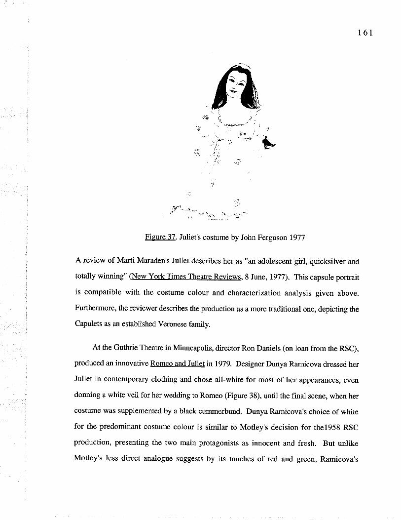
161
sÞ
q,
:r€
ù'
;lL-^ '*
I
jÊ
:.1.
'v.\r, \ _i:*^- -.ê
Figure 37. Juliet's costume by John Ferguson 1977
A review of Marti Maraden's Juliet describes her as "an adolescent gful, quicksilver and
tota11ywinning'',8June,I977).Thiscapsuleportrait
is compatible with the costume colour and characterization analysis given above.
Furthermore, the reviewer describes the production as a more traditional one, depicting ttre
Capulets as an established Veronese family.
At the Guthrie Theatre in Minneapolis, director Ron Daniels (on loan from the RSC),
produced an innovative Romeo and Juliet in 1979. Designer Dunya Ramicova dressed her
Juliet in contemporary clothing and chose all-white for most of her appearances, even
donning a whiæ veil for her wedding to Romeo (Figure 38), until the final scene, when her
costume was supplemented by a black cummerbund. Dunya Ramicova's choice of white
for the predominant costume colour is similar to Motley's decision for thel958 RSC
production, presenting the two main protagonists as innocent and fresh. But unlike
Motley's less direct analogue suggests by its touches of red and green, Ramicova's
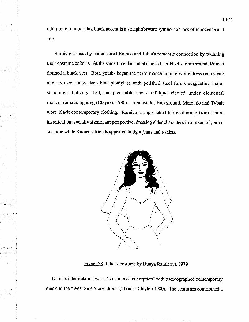
r62addition of a mourning black accent is a sftaightforward symbol for loss of innocence and
life.
Ramicova visually underscored Romeo and Juliet's romantic connection by twinning
their costume colours. At the same time that Juliet cinched her black cummerbund, Romeo
donned a black vest. Both youths began the performance in pure white dress on a spare
and stylized stage, deep blue plexiglass with polished steel forms suggesting major
structures: balcony, bed, banquet table and catafalque viewed under elemental
monochromatic lighting (Clayton, 1980). Against this background, Mercutio and Tybalt
wore black contemporary clothing. Ramicova approached her costuming from a non-
historical but socially significant perspective, dressing elder characters in a blend of period
costume while Romeo's friends appeared in tight jeans and t-shirts.
Figure 38. Juliet's costume by Dunya Ramicova 1979
Daniels inærpretation was a "sfreamlined conception" with choreographed contemporary
music in the "West Side Story idiom" (Thomas Clayton 1980). The costumes contributed a

163
"sense of contemporaneity and sensuality" in the younger characters (Londre in Leiter,
1986, p.629). Both descriptives reflect this chapter's intoductory stat€ment regarding the
tendency for productions from this decade to have more emphasis on the play's inherent
sexuality. The only comment about Juliet's characterization comes from Clayton (1980)
who wrote: "...she looked a woman in her late twenties working to play an early-teenage
girl suddenly become a woman" (p.24I). Regretfully, it is not substantive enough to make
a comparison with the colour and character analysis; on the surface, the two images do not
mesh.
Again in the United States, Warren Travis's designs for the American Conservatory
Theatre at the Geary Theatre in San Francisco, led to an affectionate labelling of the
production as the "bathroom show" because of the extensive use of velour fabric (personal
communication with costume workers, 1991). This 1979 production was directed by Allen
Fletcher and seems to have been a family affafu, starring as it did Fletcher's daughter Julia
(who was a student at the Conservatory), his wife Anne Lawder as Juliet's Nurse and his
son as the assistant director. Fletcher was known for his adherence to the text (Travis,
personal communication, 1991).
Essentially, in this production, Juliet has three costume changes, but the addition of
accessories such as a paisley shawl in tr.ii. create the illusion of more. She first appears in
a peachy-pink dress (Tropical Peach,l3-1318) (Figure 39) for the Capulet ball and her
initial meeting with Romeo. The colour connotations of peach have been described
previously in Tanya Moiseiwitsch's designs for the 1960 Stratford Festival production.
These associations underpin the depiction of a warm and inviting young woman whose
merriment at her father's ball is suddenly altered when she comes face to face with Romeo.
At first sight (despite the masks they are wearing) she is instantly smitten, and in the same
moment, captivates Romeo. The endearing and inviting qualities alluded to with the peach
colour linger in the fim on her cream (Cream Pearl,l2-1006) coloured negligee and robe.

r64For her final scene she wears her wedding dress, predominantly cream-coloured (12-1006)
with whiæ trim. Once again, the image of Juliet conveyed by these colours parallels those
presented in earlier productions, most notably the t977 Stratford Festival performance.
This conventional reading of costume colour/characterization fit director Allen Fletcher's
interpretation of Romeo and Juliet .
iì
Figure 30. Juliet's costume by Wa:ren Travis 1979
Warren Travis deliberated over his colour presentation, using it very consciously to
manipulate the mood on the stage and the correspondent audience reaction. He søtes his
approach was intentionally "very theafical" (personal communication, 1991). The
performance began with a dark monochromatic colour theme, shifting with the ball scene to
purples/mauves/reds/peaches connected by a thread of yellow touches throughout the
collective stage imagery. As the play progressed, the colours lost their intensity, until
finally, in keeping with the action of the play, the colour was entirely " leeched out"

165
(Travis, personal communication, l99l) so that essentially, only stark black and white
modulations remained to emphasize the bleakness of the conclusion.
Eighties
If the San Francisco production colours adhered to a more traditional characterization
of Juliet, director Peter Dews's 1984 production at the Stratford Festival presented
innovations. Designer David Walker also applied the pale tints so prevalent in the last two
decades, but added some intensity, thus hinting at a parallel degree of character intensity.
Seana McKenna starred as Juliet, and wore a cream (Cream Pearl,72-1006) dress (Figure
40) with pearl trim, suggesting the wealth and refinement of person and position referred to
earlier.
Figure 40. Juliet's costume by David Walker 1984

r66Juliet is then attired in a pale mauve (Chalk,l2-2902) nightdress and cloak for her
balcony scene. This colour has a light value (70-807o reflectance), falls in the red-purple
range of hues, and has very light saturation. It is most similar to Pantone's Mauve,
continuing the allusion to the classic, soft, soothing, and subdued. Mauve is also regarded
as a sophisticated colour. With a base hue of very pale red-purple, it likely serves in this
instance as a transition colour both actual and symbolically. Alttrough the restrained colour
hints at the subdued child, the red-purple base suggests a newly awakened sexuality,
underscored by the young woman's tryst with Romeo. This idea is amplified by her third
costume colours, Terra Cotta (16-1350), and white. By dressing the actress primarily in
earthy terra cotta with innocent white, the designer implies that Juliet's has an increased
understanding of her sexuality.
Shakespeare provides numerous opportunities for emphasis on sexuality in Romeo and
Juliet: in the nurse's banter and the interplay between Romeo and his friends, especially
Mercutio. Director Peter Dews appears to have run with this element of the play, exploiting
every double entendre towards this end (Iæiter, 1986). Owen Brady (reported in Leiter,
p.654) shtes: " Everyone in Verona seemed to have a dirty mind except Romeo and Juliet,
the purity of whose love shone out amid the lewdness that surrounded them. Their love,
however, is "not Platonic; instead they embody both physical passion and love, projecting
an image of wholesome and innocent sexuality."
The internal conflict and strength of character suggested by the greater colour intensity
of Juliet's terra cotta dress was recognized by Ralph Berry (in Leiter, p.65a). He refers to
her as a "...sensitive, willful Juliet, very much in transition from girlhood to
womanhood... V/hen she delivers "What satisfaction can thou h.ave tonight?" it startles
from her, leaving no doubt in the mind of the laughing audience that childish chastity is
hard-pressed by womanly passion." Overall, Walker presented a carefully co-ordinated
paletæ of costume colours: teal, russet, burgundy, cream and black predominated

r67
In Michael Bogdanov's 1986 production at the Shakespeare Memorial Theatre in
StraÉord-Upon-Avon, Ginny Humphries and Chris Dyer chose contemporary clothing for
the cast, placing Juliet in white and blue (Figure 41). By doing so, Juliet's innocence is
once again emphasized, but the choice of blues seems to have offered a thematic twist.
Juliet's top is completely white, while her skirt is white with a blue design. This blue
(Niagra,lT-4123) is like Pantone's Sþ Blue with its calm, fresh, constant, faithful, and
ffue connotations. Juliet's belt is a darker-valued blue (Deep Cobalt,l9-3935), most
closely resembling Pantone's Navy. Navy is a colour identified with positions of
authority in the Western world, from business men's suits to military and policeman's
uniforms. Navy and by association the person wearing it, is perceived as dependable,
traditional, classic, credible, and strong hence the aphorism "true blue." What is not
included in the Pantone colour associations is the sense of blue describing emotional
depression, as it is used in the reference to feeling blue.
--*-*-" \''-,r--7-,i - ''-'\r
Figure 41. Juliet's costume by Ginny Humphries 1986
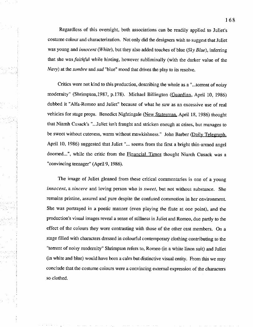
168
Regardless of this oversight, both associations can be readily applied to Juliet's
costume colour and characterization. Not only did the designers wish to suggest that Juliet
was young and innocent (White), but they also added touches of blue (Slq Blue), inferring
that she was faithful while hinting, however subliminally (with the darker value of the
Natry) at the sombre and sad "blue" mood that drives the play to its resolve.
Critics were not kind to this production, describing the whole as a "...torrent of noisy
modernity" (Shrimpton,1987, p.178). Michael Billington fGuardian, April 10, 1986)
dubbed it "Alfa-Romeo and Juliet" because of what he saw as an excessive use of real
vehicles for stage props. Benedict Nightingale (Newltæesman- Aprit 18, 1986) thought
that Niamh Cusack's "...Juliet isn't fraught and stricken enough at crises, but manages to
be sweet without cuteness, warm without mawkishness." John Barber (p¿ilVJClCgaBh,
April 10, 1986) suggested that Juliet "... seems from the first a bright thin-armed angel
doomed...", while the critic from the Financial Times thought Niamh Cusack was a
"convincing teenager" (April 9, 1986).
The image of Juliet gleaned from these critical commentaries is one of a young
innocent, a sincere and loving person who is sweet, but not without substance. She
remains pristine, assured and pure despite the confused commotion in her environment.
She was portrayed in a poetic manner (even playing the flute at one point), and the
production's visual images reveal a sense of stillness in Juliet and Romeo, due partly to the
effect of the colours they wore confrasting with those of the other cast members. On a
stage filled with characters dressed in colourful contemporary clothing contributing to the
"torrent of noisy modernity" Shrimpton refers to, Romeo (in a white linen suit) and Juliet
(in whiûe and blue) would have been a calm but distinctive visual entity. From this we may
conclude that the costume colours were a convincing external expression of the cha¡acters
so clothed.

169
This analysis encompasses 14 of the 15 productions researched. Colour images of
Roger Furse's designs for Juliet for the 1952 Old Vic production di¡ected by Hugh Hunt
were not located, but black and white images indicate that one of her costumes had a light
value while a second one seemed to be of medium-light value. As the overview of Juliet's
costume colours and associated meanings show, lighter valued colours have been the most
frequent choices by designers, includingTanya Moiseiwitsch, in the decades from the
1940s to the 1980s.
Costume colour/characterization : ROMEO
Coloured images of Romeo's costumes were examined for 12 of the 15 productions.
Romeo's costume by Motley for Gielgud's 1935 production of Romeo and Juliet was not
viewed, but a description contained in Levenson's (1987) review of performances of the
play illustrates the designer team's symbolic expressiveness regarding costume colour.
According to Levenson: "When Romeo first appeared in a melancholy state...he wore a
sober dove-grey and pale blue short tunic - but a yellow hat berayed higher spirits. ... In
banishment, Romeo's appearance became emblematic of his desperation and his exile: a
blood-red tunic ... with dark blackberry-coloured tights and boots for ffavel" (p.61).
No colour image of Rolf Gerard's 1947 design for the Shakespeare Memorial Theatre
was located, although a black and white picture (Steinberg, 1985, p.51) seems to indicate
an all-black costume. Levenson (1987) substantiates that costume colour for Romeo's
tights, worn with an "oilskin cape" (p.71). Desmond Heeley's 1961 costume for Romeo
was not verified and therefore not included in the colour chart. (One distant group image
suggests he may have worn a costume entirely of dark brown.)
Forties
Tanya Moiseiwitsch's first Romeo (1941-4, Oxford Playhouse Theatre) was dressed in
black, in keeping with the Spanish motif referred to in the discussion on Juliet. In many
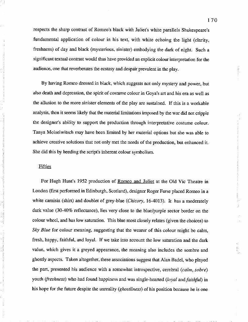
r70respects the sharp contrast of Romeo's black with Juliet's white parallels Shakespeare's
fundamental application of colour in his text, with white echoing the light (clarity,
freshness) of day and black (mysterious, sinister) embodying the dark of night. Such a
significant textual contrast would thus have provided an explicit colour interpreøtion for the
audience, one that reverberates the ecstasy and despair prevalent in the play.
By having Romeo dressed in black, which suggests not only mystery and power, but
also death and depression, the spirit of costume colour in Goya's art and his era as well as
the allusion to the more sinister elements of the play are sustained. If this is a workable
analysis, then it seems likely ttrat the material limiøtions imposed by the war did not cripple
the designer's ability to support the production through interpretative costume colour.
Tanya Moiseiwitsch may have been limited by her material options but she was able to
achieve creative solutions that not only met the needs of the production, but enhanced it.
She did this by heeding the script's inherent colour symbolism.
Fifties
For Hugh Hunt's 1952 production of Romeo and Juliet at the Old Vic Theaüe in
London (first performed in Edinburgh, Scotland), designer Roger Furse ptaced Romeo in a
white camisia (shirt) and doublet of grey-blue (Chicory, 16-4013). It has a moderately
dark value (30-40Vo reflectance), lies very close to the blueþurple sector border on the
colour wheel, and has low saturation. This blue most closely relates (given the choices) to
Sþ Blue for colour meaning, suggesting that the wearer of this colour might be calm,
fresh, happy, faithful, and loyal. If we øke into account the low saturation and the dark
value, which gives it a greyed appearance, the meaning also includes the sombre and
ghostly aspects. Taken altogether, these associations suggest that Alan Badel, who played
the part, presented his audience with a somewhat inEospective, cerebral (calm, sobre)
youth (freshness) who had found happiness and was single-hearted (loyal andfaithfut) in
his hope for the future despite the unreality @hostliness) of his position because he is one

L7T
of the Capulet family's long-standing enemies. Over-all, the suMued colour and its
associative meanings tend to downplay the character's presence on stage, particularly on a
stage filled with "...pink, white and olive green houses" (Londre in læiter, 1986, p.633)
and other Renaissance costume colours in medium values of blue, rust, gold, and purple.
It is unfortunate that a colour image of Juliet was not found for this production as the
part was played by Claire Bloom, who was referred to as "an exquisite Juliet" (Londre,
p.633). By conffast, the same critics who had praised Bloom so highly, found that " Alan
Badel's Romeo was an ill-defined character, and Badel was thought physically and
emotionally unsuited to the part" (Londre, p.633). Arguably, Badel's stage presence might
have benefiæd from a sEonger saturation, or a warmer more attention-demanding costume
colour. While it may not have alæred the critics estimation of Badel's interpretive abilities,
a more intensely coloured costume would have been more in keeping with the conventions
of that star oriented theatrical age.
Continuing with the Renaissance period as the production setting, Motley's design
(Figure 42) for the 1954 RSC production dressed Laurence Harvey in a wine-coloured
(Ruby Wine, I9-L629) doublet, white camisia, and grey (Goat, l6-0806) hose (tights).
Ruby Wíne has a very dark value (0-10Vo reflectance), borders red and orange on the
colour wheel, and is moderately saturated. Its associative meaning would be similar to
Burgundy: rich, elegant, classic, expensive and refined. 'Worn in combination with grey
(classic, cool, sober, practical, ghostly), it reinforces the c/øssic attribute, intimates the
play's sombre resolution and foretells the character's fate. Furthermore, the dichotomy
presented by a deep warm hue and a neutal cool one might indicate inconsistencies in the
characûer, revealed in mood swings from intense to suave behaviour.
Critic Alan Dent (Ng:ryslhqigþ, April 28,1954) described Harvey's characterization
as being somewhat resfained and tentative: "As soon as Mr. Harvey learns the subtle art of
seeming to lose control without losing it, he will be the most superb Romeo of our time -

172
passionate, urgent, stricken Italianate, and proud even in his distress." The most
informative review with regard to characterizatton was in the Bristol Evening post (April
28, 1954) which states that Harvey "...played down the young comedy hero side of the
character in favour of the man and was less overshadowed by Mercutio than one might
have expected." Assessing the two descriptions, we are presented with a young man who
wavers between passion and sobriety: from the analysis of the colours Motley cast him in,
it is an image that his costume abetted.
Figure 42. Romeo's costume by Motley 1954
In the 1958 RSC production directed by Glen Byzun Shaw, Motley chose to
emphasize strong colour conüasts within individual costumes and between character pairs
such as Romeo and Juliet. Whereas Jutiet was dressed in white with red and green
touches, Romeo was garbed in black and white, sometimes donning ared,(Geraníum,l'l-
1753) cloak with a whiæ lining (Figure 43), perhaps suggesting a lusry passion bridled by
a pure heart

173
Figure 43. Romeo's costume by Motley 1958
The conffasted costumes would thus serve to emphasize the play's overall tonal shifts
from light to dark and from joy to despair in the same way that Tanya Moiseiwitsch's
costume colours were considered to do so in the Oxford production. The addition of the
bright red cloak with its white lining both adds to, and changes the costume colour and
characterization for Romeo within the larger context of the play. The red is similar to the
Mandarin Red worn by Juliet in the 1935 production designed by Motley. Just as it was
suggestive of passion in that part, so too, it functions as an indication of the vibrancy of the
character wearing it in this one. It can also be regarded as a direct signal for the btoodshed
vested in the play, with the white lining symbolizing its sacrificiat quality. This Romeo is
no "shrinking violet". On the other hand, he is young and his youth may cause him to
behave impetuously at times -- but never maliciously.
Most of the reviews called for more depth in Richard Johnson's Romeo. They suggest
that while his Romeo was sincere and caring, with style and "...manliness of young blood"

r74(The Stage, April 10, 1958), he lacked nobility and passion. Generally, as Rosemary
Sisson from the Stratford-Uoon-Avon Herald (April 11, 1958) st¿tes, Romeo's youth and
inexperience were not emphasized: "His [porfrayal] has instead a strength and maturity
which blessedly save him from seeming namby-pamby (ttre greatest danger), but which do
forfeit some necessary sympathy". The reviews indicate some discrepencies with the
colour reading of Romeo's charactenzation in this production: the strength of the black is
evident in these comments, but the passion suggested by the red appears to have been
absent.
Sixties
Tanya Moiseiwitsch's designs for the Sradord Festival in 1960 offer some variation
from the costume colour and characterization inteqpretations reviewed to this point. Bruno
Gerussi, as Romeo, first appeared in a tunic-type top of a warm reddish colour and most
similar to Pantone's Barn Red (18-1531) (Figure 44). Moiseiwitsch had made a notation
next to the costume sketch calling for a "glowing red." The tunic was worn over a white
camisia and darker red hose (Brick Red 19-1543).
Barn Red has a dark value (10-20Vo reflectant), falls within the orange sector of the
colour wheel (which accounts for its capability to appear glowing), and is a moderately
saturated colour. The hose colouring of Brick Red has an even darker value (0 to lÙVo
reflectance) and is also within the orange colour wheel sector, but it is highly saturate. The
colours are closely related. Brick Red is deemed to be classic, earthy, sffong, warm and
bucolic. From conversations with the designer about how red is perceived and from her
reference to glowing, it is clear that she had hoped to focus attention on Romeo at the
play's outset by placing him in a colour demanding of audience attention; thus she
portayed him as exciting and energetic.

t75
Figure 44. Romeo's costume by Tanya Moiseiwitsch 1960
The first impression of this young man was of stength and vitality. This was a full-
blooded Romeo resonating with sexual (earthy) allure rather than the intangible poetic love
he professed to feel for Rosaline when he first set foot on the stage. The colour of
Romeo's cloak promoted this point of view: it was a rich terra cotta colour called Míneral
Red (17-1537), with a muted green lining that Pantone labels Balsam Green (18-5606).
Mineral Red has a dark value (20-307o reflect¿nce), falls within the orange sector of the
colour wheel, and is fairly well saturated. Altogether, it can be related to both Brick Red
andTerra Cotta in its colour associations. Both colours feature warmth, ruralíty, and.
earthiness, redoubling the previous reading. Balsam Green has a dark value (10-20Vo
reflectance), a green-yellow base, and a weak saturation. It most closely resembles
Pantone's Dark Green associations: classic, rich, quiet, woodsy, arboreal, traditional and
earthy. Once again, certain connotåtions reappear, with the addition of wealth. Thus, the
fact that Romeo is a physical, sensual human being rather than a cerebral, spiritual aesthete
is restated through his cloak colours. Additionally, his position as the son of an est¿blished

t76and wealthy noble family is highlighted (in the lining) by the taditional and classic taits
associated with Balsam Green.
By the second half of the play, the story's tragic elements are insinuated by Romeo's
costume colours. His jacket was a deep plum colour (Raisin,19-1606) worn with a white
camisia and dark blue (Blue Níghts,I9-4023) hose. Raisin has a very dark value (0-l0%o
reflectance), borders red and orange on the colour wheel, and has low saturation. It is akin
to Pantone's Plum, with its associations of wealth, royalty, mystery, spirituality and
power. It bears the sadness of mourning and melancholy. Each of these associations,
when applied to Romeo in the second haH of the play, imply the doom of his situation.
The colour of Romeo's hose, Blue Nighrs like Raisin has a dark value. In hue, it
borders blue and blue-purple, and is moderately saturate. Because of its resemblance to
Navy, it shares similar attributes such as credibility, authority, strength, dependability,
serenity and quiet. When the sum of qualities are ascribed to Romeo's character, the result
is an image of someone with a strength of purpose and an ability to carry action through to
its conclusion.
Romeo's nobility is embellished by the colour of his cloak in the second half of the
play. It is a deep rich purple (Mulberry Purple,19-3722) with a charcoal-coloured lining
(Black Olive,19-0608). The predominate cloak colour corresponds to Pantone's Royal
Purple (19-4642) associations: excitement, sensuality, flamboyance, and royalty, as well as
the negative association of loudness. The charcoal grey associations provide a
countercheck to these attributes vis-a-vis its own connotations of solidity, endurance and
maturity. The audience was thus presented with the opportunity to consciously or
subconsciously enhance their understanding of Romeo's part as a dramatic (flamboyant,
excíting) individual capable of tough and mature (solidity, endurance) decisions whose
actions spoke forcefully (loudly) against his family's vendett¿.

r77
Some critics describe Bruno Gerussi's Romeo as a "...spirited young man pained and
horrified by situations beyond his control...constantly in the grip of situations and
emotions beyond his experience, he grew more desperately confused and grief-stricken as
the tragedies multiplied" (Gross in læiter, 1986, p. 639). Gross further refers to him as
''on1yashademoreworldlythanhisJu1iet.''BrooksAtkinson@,Ju1y
1, 1960) saw him as "...young and defenseless." Tanya Moiseiwitsch's choice of colours
amplified Romeo's characterization, sounding the depths of feeling and change in the
young man as he matures (perhaps unwittingly) from a high-spirited youth, to a sorrowful,
determined man.
In contrast to the previous Italian Renaissance-inspired productions of Romeo and
Juliet, Carolyn Parker's designs for the Snatford Festival in 1968 suggest the Napoleonic
period. Besides the addition of two different capes, Romeo had three complete costume
changes; most productions have only two. Romeo begins the performance dressed in a
blue-grey (Trellis, 17-5110) coloured jacket, buff coloured breeches (Brush,16-1317) and
white shirt (Figure 45).
Trellis is a colour with a moderately dark value Q0-30Vo reflectance) and low saturation,
in the blue-green sector of the colour wheel. It most closely corresponds to Pantone's
Aqua, a colour that is cool, fresh, soft, with a soothing, aqueous natue. The buff colour
of the breeches also has a medium dark value (30-40Vo reflectance), comes from the orange
family of hues and has low saturation. Brush is most similar to Pantone's Betge: classic,
earthy, neutral, soft and warm. The image of Romeo thus presented is of a rather
unassuming (soft, neutra[) youth who is approachable (warm, soothíng), sensual (earthy),
of good bearing (classic), and undogmanc (aqueous).

t78
Figure 45. Romeo by Carolyn Parker 1968
He next appears dressed elaborately in a silver-grey tailcoat (Limestone,I6-4702),Iight
buff breeches (Reed Yellow, 13-0915) and gitt silver vest. Limestone has a medium dark
value (30-407o reflectance), belongs to the blue family of hues and has very low satu¡ation.
It is closest to Pantone'sNeutral Grey havtng the following attributes: classic, cool, sober,
and practical. Reed Yellow has a light value (60-70Vo reflectance), is situated just inside
the orange sector of the colour wheel close to yellow, and has a low saturation. It is
situated somewhere between Pantone's Cream andYellow Cream colours with respect to
associative meaning. These two colours share warm, soft, and sweet connotations, but
also individually have attributes suggesting cheerfulness, being classic, and neutral. The
resulting picture accents the concept of a youth of good bearing who is gentle and
unassuming, but it offers no sign of his situation's impending sadness.
This was likely redressed when he donned a black cape, dramatically changing his
mellow image to a more sombre one. This tansition from light to dark is continued with

179
his third costume change: a jacket having a considerably darker value than the previous
one. The jacket is in a deep burgundy colour (Mauve Wine,19-L716) and was worn with
buff coloured breeches similar to the ones in the previous costume. Mauve Wine has the
darkest value (0-l0Vo reflectance), a low saturation, and belongs to the red family of hues.
Burgundy is the closest related Pantone associative reading. As noted before, Burgundy is
associated with being classic, expensive, deep, warm, elegant, and refined. The associated
meanings do not significantly change with this particular costume and hue, but the degree
of darkness added to the base hue likely enhanced the audience's appreciation for the
met¿morphosis in the young man himself. By the time he returns from banishment in
Mantua and is at the tomb where he finds Juliet, Romeo's youthful view of the world has
changed dramatically. He has been forced by circumstances to a maturity well beyond his
young years, a fact that was likely conveyed to the audience by the dark grey cape
(Gunmetal, 18-0306), in which he haveled to that lonely reality. Dark grey is associated
with maturity and sobriety, perfectly enveloping Romeo's final altered state.
John Pettigrew (in Raby, 1968, p.166) felt the choice of costume period, particularly
for Romeo, probably added to the production's romanticism. Furthermore, he felt that
Romeo, like Juliet, did not convey the extraordinary growth to maturity which he felt the
play called for. According to Pettigrew, Christopher Walken's Romeo showed little
intensity in his devotion to Juliet. Acknowledging the traditional visual stereotype of tall,
dark and handsome Romeos, Pettigrew found Romeo "...refreshingly fair-haired, looked
like everyone's image of Shelley, and clearly brought out the maternal instincts...." This
review suggests that the initial costume colour interpretation of Romeo as a gentle
somewhat sweet and approachable young man was accurately reflected in the actual
performance. The implications of the subsequent tonal shifts in costume colour appear not
to have been fully realized in the performance. The importance of the supporting cues
provided by the costume colour would have been more poignant to the action of the play.
If Christopher Walken's porftayal of Romeo did not convey the degree of growth of

180
maturity the part called for, the darkened colours of his costume in the second half of the
play would have helped to impress the gravity of his position upon the audience.
Seventies
The use of highly contrasting colours to symbolize the dualistic light and dark elements
in Romeo and Juliet was evident in the 1976 RSC production co-direcæd by Trevor Nunn
and Barry Kyle. Romeo was played by Ian McKellen, who "... first entered in a black
cloak with dress as disordered as Hamlet's when he frightened Ophelia" (David, 1978,
p.116). He continued to wear black in an Italian Renaissance doublet and hose of
somewhat bulky appe¿uance with a bunched up fiery red cloak on his upper back
(Mandnrin Red 17-1753), lined in Hedge Green (17-6323) (Figure 46). The red added a
dynamic element to his costume, suggesting an exciting, intense, daring, energetic and
passionate character. The touch ofgreenrevealed his earthiness andnaturalness.
David's (7978, pp.116-7) review of this production describes these characteristics quite
directly. Romeo was an engaging young man who was filled with the natural energy and
emotionalism of youth. This energetic adolescent "... jumped off stools, popped up
unexpectedly in various balconies, and finally made a jet-landing from the staircase stage-
left to snatch Juliet for their first meeting."
For the contemporary 1970s' audience it was an imaginable action, in keeping with the
daring and aggressive behaviour of many of that decade's less socially consfrained youth.
A clear image of the contemporary expressiveness of this production and Romeo's
characterization is given by Benedict Nightingale (in Babula, 1981, p.290) when he refers
to Romeo as "a libido in search of an object" who at one point lay on his back and
simulated an orgasm. Obsessive, incapable of patience, Romeo is "unstoppable whether
his aim is sex or death."

181
Figure 46. Romeo's costume by Chris Dyer 1.976
Romeo's black costume colour provided a foil to Juliet's white and gold colours,
and also served to emphasize his forceful spirit throughout the play, culminating with his
grim resolution. The red cloak was not only signing his energy and passion, but it was
also emblematic of the bloodshed that would remove any chance of a happy future for the
two lovers.
One year later at the Stratford Festival (1977) designer John Ferguson returned to
Renaissance artists' colours for director David William's concept of Romeo. Richard
Monette wore a teal blue (Blue Coral,19-4526) doublet over a white camisia, and wheat-
coloured (Gravel, 14-1014) hose. For his marriage to Juliet, he wore a vibrant red
(Grenndine, 17-1558) pillbox-type hat (Figure 47)

r82Blue Coral has a very dark value (0-I07o reflectance), is finnly in the centre of the blue
sector of the colour wheel, and has moderately low saturation. It relates to pantone'sTeal
Blue, a colour described as classic, cool, expensive, sophisticated, unique and rich.
Figure 47. Romeo's costume by John Ferguson 1977
Gravel has a medium light value (50-60Vo reflectance), falls within the orange family of
hues, but has a very low saturation. No closely corresponding Pantone colour with
associated meaning could be found. Overall, it appears to be a neutral colour, with related
associations of underst¿tement (neutral, btand). Grenadíne has a moderately dark value
(20-30 7o rcflectance), sits just inside the orange sector bordering with red on the colour
wheel, and has strong saturation. It is similar to Pantone's Fiery Red and, thus carries
those associated colour meanings: excitement, passion, intensity, as well as being dramatic,
stimulating, daring, and happy. Ferguson's colour reading for Romeo implies a reserved
(coo[), well-bred (classic) and wealthy ffiil, with a degree of experien ce (sophisticated)
with life suggesting he is not a young teenager. The warmth of the neutralwheat colour of

183
his hose contrasted with the coolblue colour, suggests a receptive individual. The addition
of the red touch for his ma:riage implies an intensity and passion that the cool blue colour
keeps in check.
The associative meanings of colour do not of their own accord create characterization,
but the reality embedded in these clues, perceived from costume colours, has been
repeatedly demonstrated. In a performance, which was not seen as sparkling, Ralph Berry
reports: " Richard Monette's Romeo, struck many critics as too mature" (1978, p.223).
However imperceptibly, Romeo's suMued and sophisticated costume colours visually
embodied that criticism.
The emphasis on the fresh appeal of youth seems to have been uppermost in the 1979
casting of Christopher Rich as Romeo in the Guthrie Theate production directed by Ron
Daniels. Designer Dunya Ramicova sought to present a timeless quality in the costumes.
These were very deliberately intended to reveal the characters' age, sex, status, and
occupation (Clayton, 1980) by blending formal and informal dress from differing periods.
Romeo appears in tight jeans and shirt, all in white until the apothecary scene (V.i.),
when he adds a black vest (Figure 48). He is very much the image of a contemporary
teenager from the 70s. By presenting him in pristine dramatic confast to the rest of his
more colourful friends, Ramicova highlighted both Romeo's fresh and pristine position,
and his union with the other white-robed figure, Juliet. Thus attired they would have stood
out: a quiet oasis in the urban maelsfrom of frenzied contemporary Verona. The addition of
black to both costumes rwas an obvious "mourning armband" symbol heightening
perceptions of their tragic situation. Overall the costume colour provides a straighfforward,
overt statement of characterization: a costuming solution in which the danger of
oversimplification and superficiality is always present.

184
Figure 48. Romeo's costume by Dunya Ramicova 1979
While not specifically referring to costume colour, reviewer Thomas Clayton seems ûo
have found that this danger tainted Christopher Rich's charactenzation of Romeo. He
describes him as "... an appealing Romeo of the clean-cut, athletic, blond and blue-eyed
type, with a pronounced taste for rhetoric, repartee, and horseplay as well as love. ...better
at the surface than the depths of nagedy: full of necessary action, dispatch, and fret, but
perhaps lacking something of the core of deeper feelings" (1980, p.za\. Clayton suggests
that the audience was not given enough substance to engage their fullest attention and
interest. In short, the characterization was too superficial and too predictable -- an "easy
read". That the costume added to this is indicated by Ctayton's further remark: "The
character of Romeo may have been iremediably foreshortened as well as naturalized by the
contemporary-teen image and subtext" (p.241). This is more than a critique of
Shakespeare in modern dress: it points to a degree of oversimplification that appears to
have prevenæd an engrossing probe into Romeo's character. The seemingly overt costume
colour symbolism may have aggravated this difficulty.
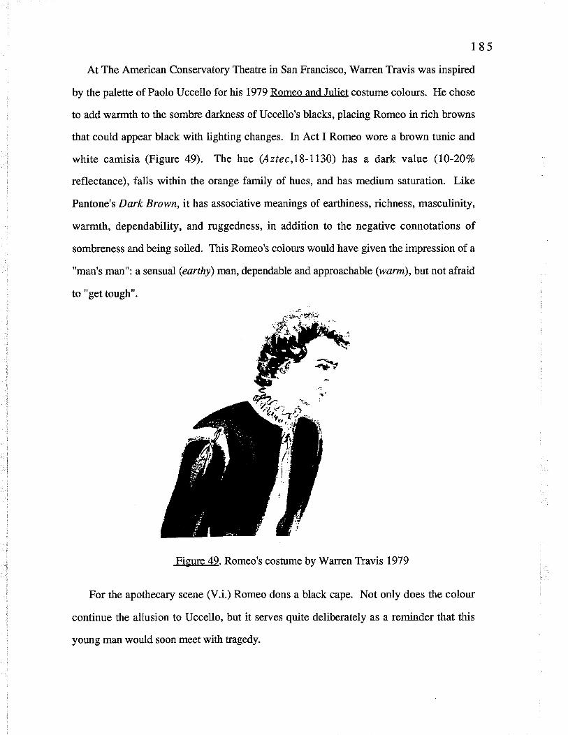
185
At The American Conservatory Theatre in San Francisco, V/arren Travis was inspired
by the palette of Paolo Uccello for his 1979 Romeo and Juliet costume colours. He chose
to add warmth to the sombre darkness of Uccello's blacks, placing Romeo in rich browns
that could appear black with lighting changes. In Act I Romeo wore a brown tunic and
white camisia (Figure 49). The hue (Aztec,1.8-1130) has a dark value (10-20Vo
reflectance), falls within the orange family of hues, and has medium saturation. Like
Pantone's Dark Brown, it has associative meanings of earthiness, richness, masculinity,
warmth, dependability, and ruggedness, in addition to the negative connotations of
sombreness and being soiled. This Romeo's colours would have given the impression of a
"man's man": a sensual (earthy) man, dependable and approachable (warm), but not afraid
to "get tough".
Figure 49. Romeo's costume by Warren Travis 1979
For the apothecary scene (V.i.) Romeo dons a black cape. Not only does the colour
continue the allusion to Uccello, but it serves quite deliberately as a reminder that this
young man would soon meet with nagedy.

186
L. Jacobs (1980, p.276) made few comments regarding specific chaructenzation in this
production, but did st¿te that Thomas Nalrwold's Romeo met the challenge of his part
while remaining "the male ingénu." The image of an innocent, inexperienced and
unworldly young man does not completely correlate with the description that the colours
suggest. Besides the inherent approachability that we might assume an "ingénu" to have,
the only other moment where the two readings meld is with respect to Romeo's
ruggedness, for Jacobs describes how "...Romeo was allowed to dispatch Paris with one
thrust of his sword"þ.276). lt is hard to imagine an audience accepting this violent and
expert action as that of a complete ingenu.
Eishties
The theme of darkness after light permeating Romeo and Juliet is evident in David
'Walker's designs for Peter Dews's production at the Stratford Festival in 1984. Romeo
first appears dressed in a rich and warm rust coloured doublet and hose, and a white
camisia (Figure 50), but changes into a more sombre coloured costume for the second half
of the play.
The rust colour (Red Earth,IS-1444) has a dark value (10-20Vo reflectance), falls
within the orange family of hues, and has low saturation. This colour is very similar to
Pantone's Brick Redwith its meanings of classic, earthy, homey, sffong, warm, and rural.
These adjectives suggest a characterization resembling Gerusi's Romeo in the 1960 Festival
production designed by Moiseiwitsch: a sensual, robust and vital young man fully aware of
his manhood.
For the final scenes, Romeo wears a deep teal blue and black doublet and hose. This
blae (Seaport,l9-4342) is only a slight variation on John Ferguson's colour choice for the
Festival's 1977 Romeo (Blue Coral,l9-4526). They share the same dark value, fall within
the same blue colour range (with Seaportbeing slightly further from blue-green than Blu¿
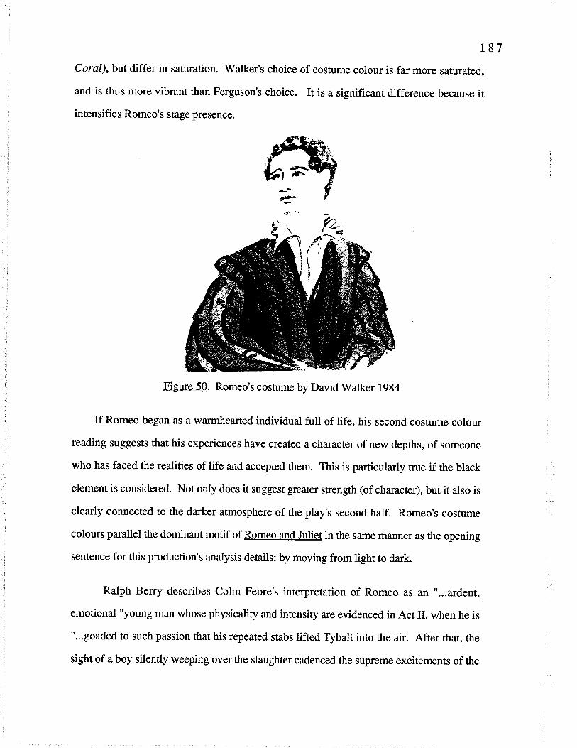
187
Coral), but differ in saturation. Walker's choice of costume colour is far more saturated,
and is thus more vibrant than Ferguson's choice. It is a significant d,ifference because it
intensifies Romeo's stage presence.
Figure 50. Romeo's costume by David Walker 1984
If Romeo began as a warmhearted individual full of life, his second costume colour
reading suggests that his experiences have created a character of new depths, of someone
who has faced the realities of life and accepted them. This is particularly true if the black
element is considered. Not only does it suggest greater sfrength (of characær), but it also is
clearly connected to the darker atmosphere of the play's second half. Romeo's costume
colours parallel the dominant motif of Romeo and Juliet in the same manner as the opening
sentence for this production's analysis derails: by moving from light to dark.
Ralph Berry describes Colm Feore's interpretation of Romeo as an "...ardent,
emotional "young man whose physicality and intensity are evidenced in Act II. when he is
"...goaded to such passion that his repeated stabs lifted Tybalt into the air. After that, the
sight of a boy silently weeping over the slaughter cadenced the supreme excitements of the

188
violence" (1985, p.90). Overall, Berry perceived a mostly youthful Romeo: one who did
not suggest a real sense of development from youthful innocence to experienced maturity
demanded by the play. Berry's comments about Romeo's slaughter of Tybalt and his
subsequent behaviour do not offer an image of transformed persona, but only of a
frightened young man who was not in control when he behaved so rashly: one who is
anguished by the senseless vendetta deaths for which he feels responsible, but who is
without any real sense of underst¿nding. Both Berry (1985) and Brady (in [æiter, 19S6)
agree that this Romeo was aware of his sexuality. The characterization Berry (and Brady
regarding sexuality) describes, fits well with Romeo's first suit of colour, but Berry's
perception of Feore's characterization suggests that the second set of costume colours more
effectively suits the broader action of the play and Romeo's fate within it, rather than his
acting persona.
The final production analyzed for Romeo's costume colour is from the 1986 Royal
Shakespeare Company production directed by Michael Bogdanov, designed by Ginny
Humphries and Chris Dyer (who also designed the set). The play is set in contemporary
(1986) Verona amidst an atmosphere of urban violence and oppression. On a set filled
with the accouterments of the 20th century, Romeo's all-white costume stands out starkly
and symbolically. Romeo wears a suit (Figure 51) that struck Sheridan Morley (Punch,
April 4, 1986) as "a natty set of white lounging pyjamas."
We can expect to have a similar character reading to that of Ron Daniels 1979
production at the Guth¡ie Theane in Minneapolis. Romeo was a wholesome youth in the
midst of a sordid aÍnosphere, an individual who steps outside of his milieu and presents an
element of reason and calm in an otherwise frenzied situation.
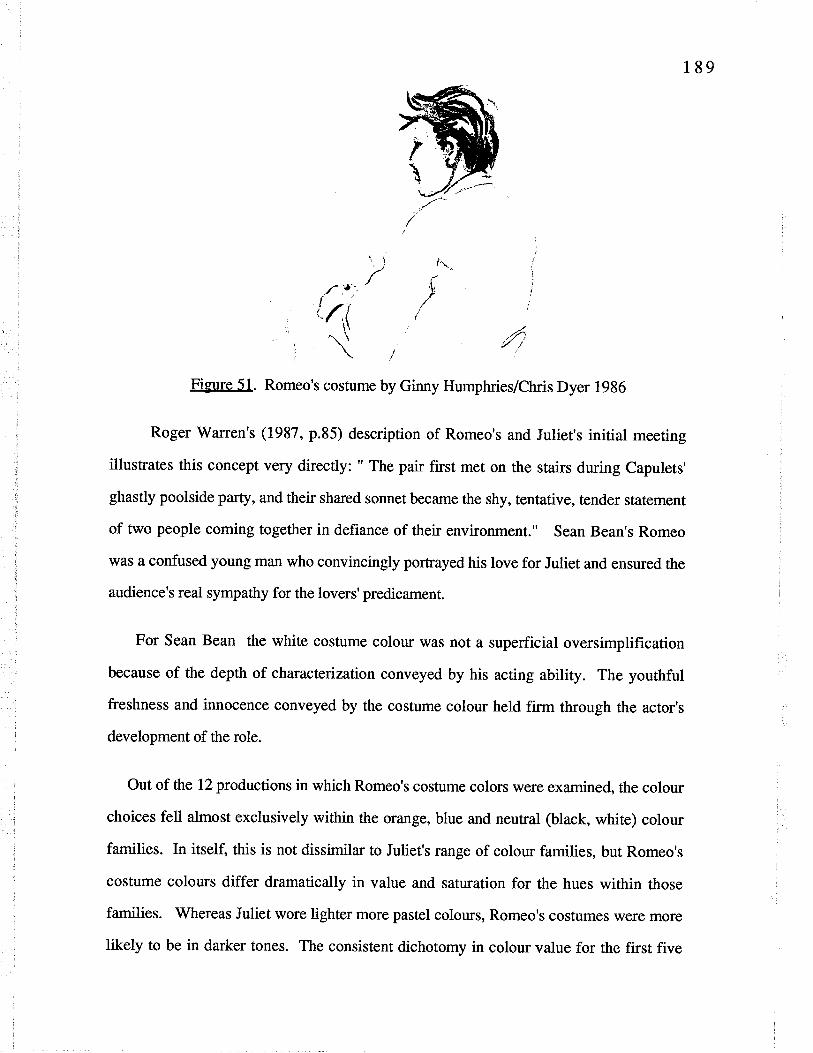
189
.t
Figure 51. Romeo's costume by Ginny Humphries/Chris Dyer 1986
Roger Warren's (1987, p.85) description of Romeo's and Juliet's initial meeting
illustrates this concept very directly: " The pair first met on the stairs during Capulets'
ghastly poolside party, and their shared sonnet became the shy, tentative, tender statement
of two people coming together in defiance of their envilonment." Sean Bean's Romeo
was a confused young man who convincingly porrayed his love for Juliet and ensured the
audience's real sympathy for the lovers'predicament.
For Sean Bean the white costume colour was not a superficial oversimplification
because of the depth of characterization conveyed by his acting ability. The youthful
freshness and innocence conveyed by the costume colour held firm through the actor's
development of the role.
Out of the 12 productions in which Romeo's costume colors were examined, the colour
choices fell almost exclusively within the orange, blue and neutral (black, white) colour
families. In itself, this is not dissimilar to Juliet's range of colour families, but Romeo's
costume colours differ dramatically in value and saturation for the hues within those
families. Whereas Juliet wore lighter more pastel colours, Romeo's costumes were more
likely to be in darker tones. The consistent dichotomy in colour value for the first five
,/^/t
'ri
/.f t'-.-
trí\\'\ir'1

190
decades, from the 1930s to the 1970s, suggests that a stong cultural association for
gender appropriate clothing colour existed during this time. Contextually, the freer
expression of sexuality within productions of Romeo and Juliet in the 1970s corresponds
with fashionable clothing colour shifts for men and women at the same time. Both of these
issues are addressed more fully in chapter seven.
Costume colour/characterization: CAPULET
Fifties
Only seven of the 15 productions reviewed include coloured documentation of Capulet.
Black and white images from at least two productions give fairly strong evidence of value,
but not of specific hue and intensity. They will be referred to, but do not form part of the
core of the following analyses.
The first analysis is from the 1954 RSC production directed by Glen Byam Shaw and
designed by Motley. The design team chose to place Capulet in a long black robe with gold
trim over a white shirt and sash. The robe is in keeping with Shakespeare's production cue
stating that Capulet wore a gown (I.ii.). Such a dark and powerful colour has marked
associations with authority (ínvulnerable, powerful, sober, aggressive, prestigious,
expensive, bold and strong) in addition to its more sophisticated connotations regarding its
sexual appeal (nighttime, sexy, elegant and mysterious). The hue also has negative
associations with death, depression, toughness and sinister elements. In a production set
in the Italian Renaissance, the black gown also denotes revered age and wisdom as well as
patriarchal power. Its remnant can be found today in our academic and judicial gowns
@1e88).
The gold tim is almost certainly an allusion to Capulet's wealth and position, while the
addition of the white sash suggests a gentler patriarch than a severe unbroken black might
have implied. Motley may have been interpreting a director's reading of the part,

191,
emphasizing Capulet's stern (black=powerfu[) but inherently good (white=pure) character,
whose stature in Veronese society was important to advertise (gold trim=wealth).
This reading seems to be accurate, according to a review in the Wolverhampton
Express. (April 28,1954) stating that William Devlin porhayed a "...Capulet with a bark far
worse than his bite." Other reviews refer to him as an "...amusing fusspot" (llgJry_ol
Chronicle London. April28,1954), while the reviewer from the South V/ales Argus (April
28, 1954) seems to have found him "rather vulgar" as well as fussy in comparison to
Monøgue. The fact that Capulet was intentionally presented as patriarchal seems borne
out not only by the first reviewer, but also by the Liverpool Post's (April 28,1954)
description of his character: " Capulet seems to be far removed from Shakespeare's
conception. It is irascible rather than fussy and energetically dictatorial rather than
beguiling in a senile way." On the basis of their associative meanings, Motley's colour
choices would have suiæd the "old" gentleman very well.
Motley essentially repeated their colour choices for Capulet in the 1958 Royal
Shakespeare Company production, also set in the Italian Renaissance period. Capulet wore
a type of dressing gown, all in black with a yellow-gold (Cream Gold,l3-07 39) trim and a
cream coloured sash. Apart from the slight tonal shift in the trim's gold and the warmer
sash colour (from white to cream), the colours are virn"rally parallel in colour meaning. The
cream does, perhaps, suggest more warmth of character, but otherwise the associative
meanings remain the same and our expectations for this Capulet's character are similar to
those in the 1954 production.
Critics seem unable to agree in their assessment of Mark Dignam's Capulet. The Stage
(April 10,1958) assefts that he lacked authority and depth in his role; The Sunday Times
(April 13,1958) claims that he deserved commendation. Given the three day difference in
their leadlines, it is possible that the actor's performance improved past opening night. The
Stratford-Upon-Avon Herald (Aprit 11,1958) was most verbal about Capulet's
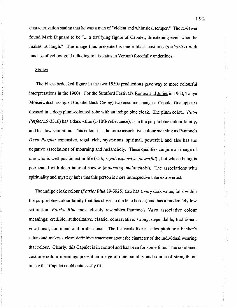
192
characterization stating that he was a man of "violent and whimsical æmper." The reviewer
found Mark Dignam to be "... a terrifying figure of Capulet, threatening even when he
makes us laugh." The image thus presented is one a black costume (authority) with
touches of yellow-gold (alluding to his status in Verona) forcefully underlines.
Sixties
The black-bedecked figure in the two 1950s productions gave way to more colourful
interpretations in the 1960s. For the Stratford Festival's Romeo and Juliet in 1960, Tanya
Moiseiwitsch assigned Capulet (Jack Creley) two costume changes. Capulet first appears
dressed in a deep plum-coloured robe with an indigo blue cloak. The plum colour (Plum
Perfect,l9-3316) has a dark value (l-107o reflectance), is in the purple-blue colour family,
and has low saturation. This colour has the same associative colour meaning as Pantone's
Deep Purple: expensive, regal, rich, mysterious, spiritual, powerful, and also has the
negative associations of mourning and melancholy. These qualities conjure an image of
one who is well positioned in life (rich, regal, expensive, powerfut), but whose being is
permeated with deep internal sorrow (mourning, melancholy). The associations with
spirinrality and mysûery infer that this person is more intospective than extroverted.
The indigo cloak colour (Patriot Blue,l9-3925) also has a very dark value, falls within
the purple-blue colour family (but lies closer to the blue border) and has a moderately low
saturation. Patriot Blue most closely resembles Pantone's Navy associative colour
meanings: credible, authorit¿tive, classic, conservative, strong, dependable, taditional,
vocational, confident, and professional. The list reads like a sales pitch or a banker's
salute and makes a clear, definitive statement about the character of the individual wearing
that colour. Clearly, this Capulet is in contol and has been for some time. The combined
costume colour meanings present an image of quiet solidity and source of strength, an
image that Capulet could quiæ easily fit
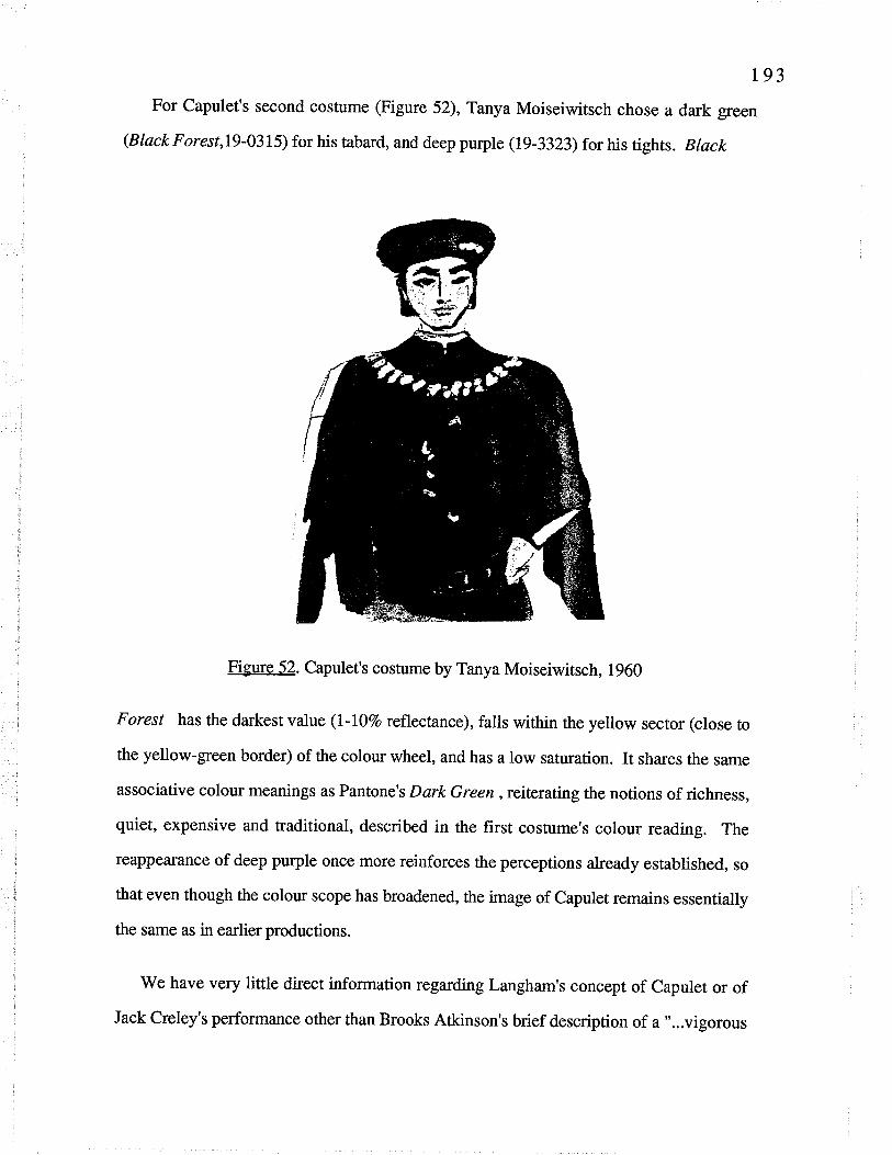
r93For Capulet's second costume (Figure 52), Tanya Moiseiwitsch chose a dark green
(Black Forest,19-0315) for his tabard, and deep purple (19-3323) for his tights. Black
Figure 52. Capulet's costume by Tanya Moiseiwitsch, 1960
Forest has the darkest value (1-l0Vo reflectance), falls within the yellow sector (close to
the yellow-green border) of the colour wheel, and has a low saturation. It shares the same
associative colour meanings as Pantone's Dark Green, reiterating the notions of richness,
quiet, expensive and traditional, described in the first costume's colour reading. The
reappearance of deep puple once more reinforces the perceptions already established, so
that even though the colour scope has broadened, the image of Capulet remains essentially
the same as in earlier productions.
We have very little direct information regarding Langham's concept of Capulet or of
Jack Creley's performance other than Brooks Atkinson's brief description of a "...vigorous
t94characterization" (New York Times Reviews,7.1960-66). Gross (in Leiter, 1986, p.
639) søtes that this production was not solely the story of the lovers and notes that
Langham "... paid careful attention to the reconciliation of the families in the final scene."
The accent on sorrowful colours, when examined in the light of a production that
emphasized an increased understanding of life's brevity (alluded to by Capulet's second
costume colour), supports this sad finale.
Desmond Heeley (196I, RSC) echoed Motley's use of black with contrasting light
components for Capulet, with a black gown (Figure 53) and white camisia. Taken
altogether, Heeley provided his audience with a costume colour reading similar to
Motley's. The black gown added to Capulet's sombre position as the father of a calamitous
daughter. And, the stark relief provided by white would not only enhance the other
colour's dark value by conftast, but also (like the Motley team) hinted that Capulet was
inherently a good man. The sole critical review found referring to his character is in the
Glasgow Herald (August L7, 196I) informing readers that " ...the Capulets look like
Juliet's p¿uents and not grandparents." The critic was commenting on the tendency to cast
Capulet as an old man in most productions to that time. Referring not only to Heeley's
costumes but also to the set, this same critic faulted what he perceived as an emphasis on
the "visual side of the play." Desmond Heeley is known for his love for painting with
costume colour, often literally layering and appliquéing different fabrics and colours,
creating a new material altogether: the result can be quite lavish. Whether or not this was
the case for this production, the degree of focus on design was considered to be
overwhelming, and the critic felt this production suffered because of it.

195
Figure 53. Capulet by Desmond Heeley 1961
The costume colour choices made by Carolyn Parker for the 1968 Stratford Festival
production of Romeo and Juliet yield more variety for Capulet than in other productions
reviewed. Capulet fi-rst appe¿us in a deep yellow-gold øilcoat (GoldenYellow 15-0953), a
corn yellow vest and breeches (Cornsilk, 13-0932). Golden Yellow is of medium value,
distinctly yellow in hue, and is highly saturated. Cornsilk is also of medium value and
distinctly yellow in hue but it has medium saturation. Both colours share associative
meanings with Pantone's Golden Yellow: wheat, autumn, harvest, rich, sun, and warm.
By association, the character wearing these colours could be perceived as privileged (rich)
and gregarious (søn, warm). It is less likely, but still possible for the autumnal
associations to be subconsciously recognized. The extent of consistent coverage for such a
warm and light colour seems more in keeping with a younger, active man because of its
association with sun and wheat (wheat = staff of life).
When Capulet next appeils, he is clad in an olive grcen dressing gown (Ecru Olive,l7 -
0836) with a deeper olive green tim (Plantation, 18-0832). Apart from the degree of
value, the two colours are virtually the same: both are from the yellow famity of hues, both
are moderately saturated colours, but the trim has a I07o darker value (20-30Vo versus 10-
207o rcflectance). Pantone's Olive colour resembles Capulet's dressing gown colours and
suggests things miliøry, camouflaged, European, classic and the negative quality of

r96drabness. The colour and character reading carries foreward the sense of the prestige
conveyed by the previous costume colour, with only barely perceptible tonal changes in
mood from light to shade, signalling a gmver more serious demeanour on the character's
part.
Finally, Capulet is dressed in a dark brown tailcoat (Olive Brown, l9-1L16), pale
golden vest (Raffia, I3-O725), charcoal grey breeches (Gunmetal,18-0306), and a black
cape. Through the sustained darkness of value (18 and l9=0-207o reflectance), the
maturity and gravity associated with the costume colours (dark brown and charcoal grey in
combination with the black) carry powerful messages of deep and enduring change for both
this character and his plight, corresponding with his movement from lightness to dark.
Only the pale gold vest remains, a reffnant of Capulet's sunshine spirit.
:
John Pettigrew (in Raby, 1968, p.15) offers us some insight into Kenneth Pogue's
portrayal of Capulet. He sees Pogue's Capulet as a man who is only 40 or so: a man
whose humanity is emphasized through his bewilderment. Pettigrew concludes that
Pogue's Capulet offers "...4 good reminder of just how much that character (yet another in
the play who means "all for the best") provides a first sketch for lÆar." Pettigrew is not the
first to perceive parallels between Capulet's predicament and King Lear's shift from a state
of power with a reasoning mind to that of an outcast madman caught betwixt forces he
cannot fully comprehend. In this production, the shifts in Capulet's costume colours and
their associative meanings support this perception.
Seventies
For the Stratford Festival's 1977 production of Romeo and Juliet Leslie Yeo, as
Capulet, wore a dark brown gown (Mustang,l9-1217) over a burnt orange tunic (Orange
Ochre, 16-1253) and a matching hat @igure 54). Mustang has the da¡kest value (0-I0Vo
reflectance), is situated within the orange sector of the colour wheel, and has low

t97saturation. Its associative meaning is the same as Dark Brown: earthy, rich, masculine,
warm, dependable, secure, durable and rugged. It also has the negative connotations of
being sombre and soiled. Because this colour predominates, the costume colour/
characterization seems to emphasize Capulet's manliness: as head of the household, he
provides security.
Figure 54. Capulet's costume by John Ferguson 1977
The addition of the orange colour (resembling Pantone's Orange Peel : happy, w¿um,
hot, glowing, vital, harvest, playful, gregarious, friendly and the negative of being loud)
further invests such character attributes as warmth and vitality. Adding this warm colour
heralds a strong physical presence (earthy,rugged) more attuned to the external world
(6regarious) than to his own internal or spiritual estate. We gain the sense of a middle-aged
man who is confident in his position, comfortable with himself and happiest when he is
with others.
198
Regretfully, neither the role of Capulet nor Leslie Yeo's characterization of it are
referred to in any available reviews for this production. Ralph Berry (1978) gave most of
the actors'performances (Nicholas Pennell's Mercutio excepted) a poor review generally,
while the critic for the New York Times Reviews (L977-78) found it to be a pure delight.
Although a colour image was not discovered for the 1979 Guthrie Theatre production,
the written material st¿tes that Capulet wore a frock coat and dark "regular" trousers
(Clayton, 1980, p.2a\. Robert Pastene who played the part was an "admirable aging
Capulet...fond and solicitous of both his wife and daughter, and as resfrained and penitent
under normal circumstances as [he was] ready with anger when crossed by Juliet in his
very best efforts on her behalf."
The visual image of Capulet designed by Warren Travis for the 1979 American
Conservatory Theatre production presents the warmest interpretation of Capulet thus far.
Capulet is clothed in a deep red-brown outer gown (Red Earth,lS-I444), and an inner
gown of suMued ochre (Gold Earth, 15-1234). Red Earth has a dark value (70-20Vo
reflectance), falls within the orange sector of the colour wheel, and has a moderately high
saturation. It most closely resembles the associative meanings of Pantone's Brick Red:
classic, earthy, homey, sfong, warm and bucolic. Gold Earth has medium value (40-50Vo
reflectance), is also within the orange family of hues but is situated closer to yellow than
Red Earth., and it has medium saturation. In hue it most closely matches Pantone's
Orange Peel, though it is more suMued. (Orønge Peel has a darker value and is more
saturat€.) As we have seen in John Ferguson's costume colour choices (1977), this colour
suggests a gregarious, outgoing, vital man. In fact, given the attributes of Capulet's
gowns, the colour reading matches that of Ferguson's Capulet addressed earlier.
Unfortunately, we can only speculate how accurate this interpretation is as the only
comments found regarding actor Michael Winter's characterization state only that he
"...managed the nearly impossible task of avoiding absurdity in Lord Capulet's strangely

199
fluctuating behaviour in his dealings with his daughter" (Jacobs, 1980, p.276). From this
statement we can surmise that Winters presented a very natural and convincing portrayal of
Capulet. The humanity such an inte¡pret¿tion would require, given the cues written by
Shakespeare, would have been readily perceived by the audience reading of his costume
colour.
No other colour images of Capulet were accessible for the remaining productions.
Black and white photographs suggest that Capulet wore a very dark colour in David
Walker's 1984 design for the Stratford Festival, but the hue was not ascertainable. It is
therefore not included in this analysis. Overall, examples of costume colour for the seven
productions observed indicate a tendency towards dressing Capulet in darker values.
Carolyn Parker was the exception, but even she reverted to darker colours for Capulet's
costume in the play's final scene.
Costume colour/ characteization: MERCUTIO
Colour images of Mercutio were observed for eight of the 15 productions in this study.
Numerous black and white images of John Gielgud's 1935 Romeo and Juliet production
exist, indicating Mercutio was clad in a dark doublet and hose, with a white shirt and
metallic belt. The only reference to Mercutio's costume colour was found in l,evenson's
discussion of the Gielgud production. Commenting on Motley's use of costume colour to
emphasize the focus on youth in Romeo and Juliet, Levenson reports that most of the
younger characters, wore the colours of springtime: "light, fresh, and clear colours"
(p.60). Mercutio wore green with a bit of red, emphasizing the young man's vitality.
Because the precise green colour of Mercutio's costume is impossible to determine from
IÆvenson's description, it is not included in the overall analysis.

200
Fifties
Roger Furse's design sketch of Mercutio for the 1952 Old Vic production shows a
costume from the It¿lian Renaissance period in a warm medium brown colour. The brown
(Tobacco Brown,lT-1327) has a dark value (20-30Vo reflectance), belongs to the orange
family of hues, and has medium saturation. Pantone does not have a parallel colour for
associative meanings, the closest being Dark Brown.
Thus, Peter,Finch, who played Mercutio, may have conveyed üaits of earthiness,
richness, masculinity, warmth, dependability, durability, or ruggedness for his audience.
The resulting characterization was probably of a friendly (warm) privileged (rich) man
skilled in manly pursuits (ruggedness, durability). Seen in contrast to a Romeo clad in cool
blue, Mercutio may have appeared more energetic and responsive to those around him.
The only corrìment found regarding Peter Finch's Mercutio was in a London Times review
(September 2, 1952), stating very succinctly that he was "..an excellent Mercutio."
Unfortr¡nately it does not allow for any extrapolation of specific characterization.
Motley also designed a brown coloured costume for Mercutio in the 1954 Royal
Shakespeare Company production at Stratford-Upon-Avon figure 55). His doublet is a
reddish-brown colour (Paprika,l7-1553) with black and dark green sleeves and is worn
over a white camisia. Papril<n has a dark value (20-30Vo refle*tance), belongs to the orange
colour family and has high saturation. It has a darker value and is more saturated than
Terra Cotta, the Pantone colour it most closely resembles for associative meaning: earthy,
w¿um, wholesome, and bucolic (counfry). Transferred to the characterization, these
attributes suggest a man not unlike the Mercutio in Furse's design: someone who is more
physical than cerebral, who is friendly and approachable, a welcome member of a group of
men. The touches of dark green on his sleeves add to his earthy, natural image, while the
black echoes the impending demise of his stage life.

201
Figure 55. Mercutio's costume by Motley 1954
Motley completed Mercutio's costume with Slate Grey hose (16-5804) and a white
cloak. Taken altogether, it is an inæresting colow combination, and one that might seem to
send conflicting messages. Slate Grey has medium dark value (30-40Vo reflectance),
belongs to the green family of hues, and has very low saturation. Like Neutral Grey, the
Pantone colour it resembles, it suggests the classic, cool, sober, practical and. timeless. It
also has the more negative connotations of being boring, mousy, and ghostly. White is
also a cool and classic colour that can have sterile negative associations.
The practicality of the grey colour was likely uppermost in the designers' minds,
serving both as a foil to the warm brown doublet and as a reference to the Renaissance

202
period, the production's setting. However, when juxtaposed with the vitality of the
costume's upper half, the sober, cool and ghostly grey suggests, perhaps, that Mercutio is
no longer "grounded" and not long for this earth. When these colours are seen in
conjunction with a pure white cape on an energetic young man, the subconscious is likely
to perceive a more ethereal overall impression than the warmth promised by brown and
gleen.
The extended associations for "counffy" frequently include "common sense", a terrn
onecriticappliedtoTonyBritton'schaructenzationofMercutio@,
April 28, 1954). The same critic calls him "fu11-blooded", a euphemism alluding to
sexuality, readily identifiable alongside such terrns as earthiness and warmth. This
Mercutio is labelled by turns, "gay and gallant" (CtoucesæLEchg, April 28, 1954),
''Attractive'',April28,l954)and''audaciousbutgallant''
GiyçtpdPgsl, April 28,1954). All these descriptors fit the image Mercutio's doublet
colour conveys. With no reference to intospective characteristics, the meanings associated
with the white and grey colours seem not to have prevailed over the reassuring warmth of
the reddish brown.
Sixties
Thus far, rwarm brownish hues seem to have been the accepted colour preference for
Mercutio. At the Snadord Festival in 1960 Tanya Moiseiwitsch continued in this vein,
choosing a reddish brown colour (Barn Red,18-1,531) for both his tunic and his cloak,
with a tan coloured lining (Brush,16-1317). The prevailing colour attitude would have
been one that parallels the connot¿tions associated with Pantone's Brick Red: earthy,
homey, strong, warm, rural. From these associations, the picture gained of Mercutio is
one of a strong and masculine, warm-hearted individual. Given Mercutio's role in the
play, we may also surmise from the warm red-brown costume colour that he presented an
image of a somewhat hot headed individual more apt to resort to action than t¿lk.

203
The use of a neutral colour such as Brush for Mercutio's lining is (apart from an
obvious colour contrast for the waÍmer brown) a reminder that there is another side to his
character -- one that like the lining of his cloak, a glimpse is caught from time to time.
Brush has medium value (30-407o reflectance), falls within the orange sector of the colour
wheel and has low saturation. Its associative meanings are closest to Pantone's Beíge:
classic, earthy, sandy, neufial, soft and w¿um. Mercutio's costume colours suggest that he
was not only a warmhearted individual but was also a somewhat ambivalent character, as
the associations with neutral, sandy (sifting/shifting) and solr (undogmatic) indicaæ.
Brooks Atkinson (The New York Times, July 1, 1960) describes Christopher
Plummer's characterization as: " ...swaggering, witty...an exciting person, gallantly
humorous." It is a descriptionhis Barn R¿d costume colour provides accessible signals
for. Atkinson does not distinguish any uncertainty or softness in Mercutio's character,
that aspect of Mercutio's costume colour analysis may have been too hypothetical, or it
may simply not have registered significantly enough to influence the critic's perceptions.
The critic's characterization assessment provides the necessary measure for evaluating the
costume colour analysis in this study. The incomplete substantiation of this costume colour
analysis illustrates the interconnectedness of production units: costume colour exists as
only one element in the total visual entity. As a supportive elemen! it serves to amplify the
player's characterization. Thus it is clear that correlating the efficacy of inherent colour
meaning with its use as an interprteive tool for drama demonstrates both the consistency
and the ambiguity of meaning within different contexts.
If the previous interpretations appear to focus on the w¿um qualities of Mercutio's
character, Desmond Heeley's colour interpreøtion provides a more direct reference to his
fate, as well as suggesting other character traits. Heeley's design for the 1961 Royal
Shakespeare Company production at Statford-Upon-Avon was a black "Italianate" doublet
with black hose over a white camisia. Perhaps this Mercutio delivered a very different

204
impression to the audience than those in earlier productions, presenting a more
sophisticated, powerful, aggressive individual. Heeley's palette visualizes a Mercutio that
is connected to elemental human behaviour (specifically, sex) in a way somehow more
mysterious and sinister than previous portraits of Mercutio. All these adjectives are
connected to the meaning of black; collectively they provide us (some thirty years later),
with a picture of Mercutio as an experienced and provocative man most likely older than his
friend Romeo.
Ian Bannen's characterization emphasized the role's bawdiness and seems to have aimed
at being humorous (Dail)¡ Worker London, August 17, 196I). Levin @Aily_E¡pIçSS,,
August I7, 196l), reviewing Bannen's action, leaves us in no doubt of the self-confidence
which Mercutio exhibits as an indication of his more experienced demeanor: "When he
fights a duel with Tybalt he stops in the middle, produces a Spanish wine bottle,... squirts
the wine high in the air, and catches it in his mouth." Thus, Mercutio's black costume
colour would not only have hinted at his darker fate, but pointed to his "cool" more
"bohemian" outlook on life.
With Carolyn Parker's designs for the Sratford Festival in 1968, Mercutio begins his
performance dressed in somewhat vibrant colours, in conftast to the other productions
reviewed. Wearing attire set in the Napoleonic era, Mercutio first appears in a dark teal
blue frock coat (Blue Coral,l9-4526) with red trim and sash (Poinsetta, 17-1654), buff
coloured pants (Gravel, 14-1014), and wine coloured cloak (Pompeii, 18-1426) (Figure
s6).

205
Figure 56. Mercutio's costume by Carolyn parker 1968
Blu¿ Coral has a dark value (0-l0%o reflectance), is situated within the blue range of
hues, and has moderately low saturation. Teal Blue's associative meanings relate most
closely to it: classic, cool, expensive, sophisticated, pleasing, rich, unique. If we add to
this a reading of the red trim (similar to Pantone's Fiery Red in meaning), we are presented
with an image of Mercutio as a privileged (rich, expensive) individual who appears to be
restrained (cool, sophisticated, classic), but who is also passionate. The buff coloured
pants are typical of the period (as is the deep blue colour of his frockcoat, but not usually in
combination with the red) and support the elegant sophistication the deep blue frockcoat
colour suggests. The pale yellow vest, with its suggestion of sunshine and cheer, could
visually cue the audience to a jocular sensibility in ttre character who wears it.
The wine coloured cloak (Pompeü is closest to Pantone's Burgundy) implies the classic,
expensive, w¿um, elegant, rich, and refined. The combination of costume colours is thus
consistent with a colour/character reading emphasizing Mercutio's status and sophistication
(teal blue coat, wine cloak), and yet hinting at a fiery core (vibrant red trim). From the

246
many descriptors referring to the sophisticated and the classic for this particular costume,
there is an inference that Mercutio is more mature than either Romeo or their friends.
The colours chosen for Mercutio's second costume colours diverged from those chosen
for the first, moving towards a more subtle, complex costume colour/ character reading.
His frock-coat is in an olive green colour (Amber Green,18-0840), a greenish-yellow tone
similar to his pant colour (Raffía, 1.3-0725), and his vest (Oxblood Red,19-1524) and sash
(Dry Rose, 18-1725) are reddish brown. Olive Green is readily associated with
camouflage, the military, with aggression and defense. Olíve Green can also refer to
drabness (lacking vital colour, hence lifeless and depressed). The total effect is decidedly
more sombre and less joyous than his first costume colour. Whether or not olive green's
warrior references are recognized on a conscious or subconscious level, the associative
meanings for the main body of Mercutio's costume (his frock-coat), in combination with
the deep red accents ofhis vest and sash, cogently represent a saddened individual. The
yellow pant colour is the only vestige of the fun-loving character first encountered by the
audience.
For this production, Mercutio appeares to be a man in his forties, closer in age to
Capulet than Romeo. From Leo Ciceri's porrayal, John Pettigrew (in Raby, 1968, p.167)
developed a narrative explaining Mercutio's character make-up and this, incidentally, paints
a rema¡kable portrait of Mercutio for readers today:
The gaiety of this middle-aged Mercutio -- experienced soldier rather thandashing gallant -- was seldom felt; it was rather a visor for defense againstworld and life that he had found bad and that had hurt him. His face wasdeeply scarred and tough. His eyes were sunken, sad and haunted. Hiscompanionship with the younger men was one in which he perhaps hopedto find vicariously a happiness that had been denied him. He was clearlytroubled by bad dreams. The "poetry" of the Queen Mab speech wasjettisoned to make the speech epitomize his proud and bitter cynicism foranything romantic and reflect his attempt to hide from life....The bawdinesswas stressed in every way more intensely than it probably ever has beenbefore; this Mercutio was earthy rather than airy, obsessed by death ratherthan fascinated by life.

207
The clues to characterization inherent in the costume colours are borne out by this
perception. Furthermore, Pettigrew recognizes the accord between the costume colour and
characterization directly when he states that Mercutio's " ...aloneness [was] wonderfully
emphasized by a heavy and richly coloured costume that set him apart from the prevailing
lightness and pastels of the others" (p.167). Although he refers specifically to the second
costume, in which Mercutio dies, his statement also holds true for the first one.
Seventies
At the Guthrie Theatre in1979, Dunya Ramicova returned to the more straightforward
colour charactenzation approach applied by Desmond Heeley in 1961. Despite the several
hundred years difference between the two costume periods depicted (1500's and 1970's),
both Mercutios are dressed primarily in black. Ramicova embellishes the costume with a
lavender scarf, in lieu of Heeley's touch of white. Lavender is likened to softness,
sweetness, delicacy and nostalgia. It is also associated with aging, and in the past when
mourning apparel was more strictly prescribed, it was deemed to be an acceptable
transition colour following a certain period of time wearing black. Ramicova may have
intended (on whatever level) to refer to gentle fiaits in Mercutio's character, but in
combination with the concentrated black and Mercutio's well-known fate, the message
conveyed by the costume colour leans more conclusively towards sombreness and sorrow.
It also suggests, in a manner similar to Heeley's earlier design, a certain toughness and
aggressiveness on the part of its wearer. The lavender and black offer a dual reference to
an older, more experienced Mercutio, rather than to a younger, lighthearted individual.
Overall, these costume colours reflect the darker side of Mercutio's role in the play.
Reviewer Thomas Clayton felt this production's Mercutio had, like Tybalt, a sinister
appeal. He describes a "deep voiced " Justine Deas (who played Mercutio) as "a Mick
Jagger of a Mercutio with a youthfully Rabelaisian elan and swagger impossible to
upstage" (1980, p.241). In contrast to his costume's colour reading, Mercutio's age was

208
not as dominant a factor as his life experience. Clayton's review alludes to a world-weary
and street-wise individual. The image of Mercutio as a tough, somewhat bored
streetfighter, which the black of his costume suggests, is tempered by the hint of softness
inherent in the lavender colour. Together, the black and the lavender costume colours
contribute to the image of a blasé young man who is unguarded in his action (and doomed
because of it). Clayton's description of Mercutio's duel with Tybalt illustrates this concept
precisely: " The match began half in jest, Mercutio once sparing a floored Tybalt with
amused contempt, but ended in deadly earnest shortly after Tybalt spat in Mercutio's
face..." (p.242). This quote paints the portrait of a somewhat disengaged individual who
considers himself deøched from the intense affairs of other human beings. He is a man
who does not pay enough attention to real danger until it is too late.
Warren Travis' colour interpretation of Mercutio's character is essentially the same as
Roger Furse's design for the 1952 Old Vic production. Travis dressed Mercutio primarily
in warm browns for the American Conservatory Theaffe production in 1979. Mercutio's
doublet and parti-coloured hose are Amber Brown (17-1147). The second hose coloul,
which is also a brown (Tobacco Brown, 17-1327), is the exact colour Roger Furse used
for his Mercutio costume colour. Amber Brownhas a dark value (20-30Vo reflectance), is
located in the orange sector of the colour wheel, and has medium saturation. It combines
the associative meanings of dark brown and orange: earthy, rich, masculine, w¿um,
rugged, vital, fun, playful and gregarious. A character with these atributes could be
perceived as friendly and approachable (warm, gregarious), eager to be part of a 'good
nme' (playful,fun,vita[), and aware of his body (masculine,rugged). 'When he dons his
black cape, this image may have been somewhat suMued, but the repetition of the warm
brown colour in the cloak lining would have preserved the first impression. No mention
of Daniel Davis's portayal of this part was found in the reviews, but discussions with the
designer indicate that Mercutio was considered to be " ... arogant and somewhat older and
more worldly than Romeo and his friends" (personal communication, 1991). Apart from

209
the addition of the stronger black colour, this perception would not have been overtly
emphasized by his costume colour.
Eighties
The sole 80s costume colour observed for Mercutio was from the 1984 Stratford
Festival production designed by David Walker. Richard Monette first appears in a deep
blue colour (Seaport,19-4342), and ends his performance wearing a grey (Frost Grey,LT-
0000) doublet and hose with red (American Beauty,Ig-1759) tabs on his shoulder "wings"
and the lining seen through the panning (slashes) of his sleeves @gure 57).
Seaport has the darkest value (0-I0Vo reflectance), is from the blue family of hues, and
has medium saturation. It approximates the associative colour meanings for a darkTeal
Blue in the same way that Carolyn Parker's 1968 design for Mercutio did: classic, cool,
expensive, sophisticated, rich, and unique. On its own, this appears to be a very rich
colour particularly well suited to a privileged scion of a noble Veronese family. From the
aspect of visual design, the single cool colour provides a strong contrasting foil for
Romeo's warm wine coloured costume. However, as the previous st¿tement reveals, it
does suggest a colder, less approachable character.
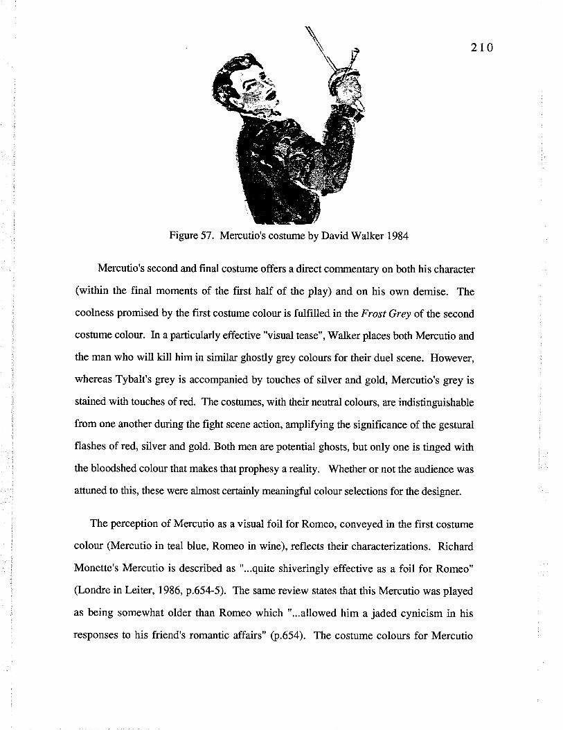
210
Figure 57. Mercutio's costume by David Walker 1984
Mercutio's second and final costume offers a direct commentary on both his character
(within the final moments of the first half of the play) and on his own demise. The
coolness promised by the ffust costume colour is fulfilled in the Frost Grey of. the second
costume colour. In a particularly effective "visual tease", Walker places both Mercutio and
the man who will kill him in similar ghostly grey colours for their duel scene. However,
whereas Tybalt's grey is accompanied by touches of silver and gold, Mercutio's grey is
stained with touches of red. The costumes, with their neunal colours, are indistinguishable
from one another during the fight scene action, amplifying the significance of the gestural
flashes of red, silver and gold. Both men are potential ghosts, but only one is tinged with
the bloodshed colour that makes that prophesy a reality. Whether or not the audience was
attuned to this, these were almost certainly meaningful colour selections for the designer.
The perception of Mercutio as a visual foil for Romeo, conveyed in the first costume
colour (Mercutio in teal blue, Romeo in wine), reflects their characterizations. Richard
Monette's Mercutio is described as "...quite shiveringly effective as a foil for Romeo"
(Londre in Leiter, 1986, p.65a-5). The same review states that this Mercutio was played
as being somewhat older than Romeo which "...allowed him a jaded cynicism in his
responses to his friend's romantic affairs" (p.654). The costume colours for Mercutio
2t\thus serve to emphasize his specific characterization and its role within the broader context
of the play.
Although a colour image of Mercutio from the 1986 Royal Shakespeare Company
production was not available, a black and white photograph shows a shades-bespectacled
and rumpled figure dressed in jeans, plaid shirt, bomber-style lightweight dark-coloured
jacket and light-coloured fedora type hat. In contast to Romeo's all-white apparel, other
youths' T-shirts and jeans, and particularly in contrast to Tybalt (dressed all in black
leather, and chasing Mercutio around a poolside table rattling a chain), Mercutio appears úo
be somewhat middle-aged and pedestian in appearance. Critics describe Michael
Kitchen's portrayal as depicting a mocking, laid-back boozer (Ncw_States¡qu, April 18,
1986, Time Out. April 16, 1986). His confasting costume and colour value support the
image of someone who was less concerned about his external appearance blending in as
part of the crowd, than as someone who knew himself to b¿ outside of it
In the final analysis, as the charactnnzation from the 1986 Royal Shakespeare Company
production of Romeo and Juliet implied, Mercutio remains a distinctive character in all
productions reviewed. It is a position that the costume colours chosen by the various
designers supports, frequently using costume colour confasting with Romeo's in the same
way that the two characters are often contrasted in the play.
As a whole, the costume colour and characterization relationships reviewed from these
productions show considerable consistency. Out of the 15 productions examined, costume
colours for 14 different Juliets, 12 different Romeos, 7 different Capulets, and 8 different
Mercutios ranging over a period of 51 years were analyzed. Costume colour readings were
applied within the various productions. The character commentaries, supplied by the
readings, were subsequently appraised through a comparison with information provided by
the actors', designers' and critics' assessments of related performance interpretations. The
information in this chapter has provided a response to the questions posiæd at this chapter's

212
outset. Based on this dâtâ, those initial questions are more fully considered i¡ the
concluding chapter of this thesis.
The familiarity of Romeo a¡d Juliet creates particular problems for any fresh analysis of
costume colour and character association. By closely following an established colour
system that lists associative meanings, an attempt has been made to adjust the imbalance
inhe¡ent between what ¡s observed and whatis øeected to be observed. This is less of a
problem in the following analysis of All's Well That Ends Well. because of its complexity
and its relatively limited production history.

VI. ALL'S WELL THAT ENDS WELL: COSTUME COLOUR/CHARACTERIZATION
The second play chosen for costume colour and character analysis reads opposite to
Romeo and Juliet. In con$ast to that play, All's Well That Ends Well challenges what
Anne Barton, in her preface to the BjyerEde_Sl¿kcslcare edition of the play (1974, p.500),
describes as the "laws of established [Elizabethan] society". Barton refers to the
convention wherein a young man and woman of unequal status wishing to marry for love
must frst overcome resistance from their authority figures such as parents, guardians and
rulers. All's Well deviates from this convention because the conhary situation exists: the
authority figues encorrrage and assist the heroine in achieving her desired union, Both of
the plays examined in this thesis address fairy-tale aspects of romance, either within a form
that more closely parallels the "laws of established society " mentioned above (as Romeo
and Juliet does), or the "happily-ever-after" mode represented by All's Well .
Following a similar format to the one set out in the previous chaptÊr to address the same
questions, the costume colou¡s for four characters from seven different productions of
All's Well in England and Canada were studied No coloured visual documentation for this
play was available at the American theaFe archives visiæd in the cou¡se of this research.
All's Well was one of the opening season productions designed by Tanya
Moiseiwitsch for the Stratford Festival in Canada. Because of this, the play has particulæ
significance and importance not only within Canadian theatre history, but also within the
study of Tanya Moiseiwitsch's application of colour.
All's Well That Ends Well: theme and content
In an exceedingly wry summary of ÁIlSlUcIL a critic for The Toronto Star (June 17,
1977) asks her readers to:
213
2t4Picture a disheveled playlrright being urged by an impetuous actor-managerto produce a play in a hurry: "something light, funny, fanciful, pulls ihecrowds in, Put in some sex, and remember, we've got lots of actois out ofwork." Thus William Shakespeare may have sat down, and, probablylonging for a drink, spun off All's Well That Ends Well....
Shakespeare almost certainly did write under pressure, in an age that relished the
spoken word and fresh conceptions of its enactrnent. And this critic's narrative conjures a
whimsical context for the origins of this play, promising a tighthearted theatrical romp. In
theatre hisûory since Shakespeare's time, it is a promise that has not often b€€n fufilled.
The directions of the imaginary acûor-manager suggest that All's Well will be a romantic
comedy, but the text is permeated by a strong melancholia. For the first half of this
century, most Shakespeare scholars have noted that All's Well. along with Trolius and
Cressida and Measure for Measure were written at a time when Shakespeare had undergone
a psychological crisis (Jamieson in Mui¡ and Wells, 1981, p.1217). The three plays reflect a
reassessment of moral issues and a challenge to d¡amatic structure itself. For these
reasons, they are often referred to as "problem plays" (Muir & Wells, 1982; Price, 1968).
Apparently, Shakespeare borrowed his plot fiom a trusted source, Boccaccio's
Decameron. @anon in Evans, 1974). It contains a story about a young woman named
Giletta of Narbona whose ingenuity and determination secure her marriage to Beltramo, a
man of higher social standing. The porrayal of Gilettå's character, as a vigorously
determined and selfish woman, is implicit in the tale (Smallwood in Muir and Wells,
1982). Shakespeare very likely read the story in William Painter's English translation
written in 1575 @aton in Evans, 1974). Helena, Shakespeare's heroine in A!]5_S&]L is
clearly fashioned afær Gilena
In part, it is this sou¡ce for Helena that has contributed to the problem play label that has
dogged A,lllWell. Critics, directors, and actors have been unable to agree about her
virtue. Is she, as Giletta so forthrightly was presented, a conniving female out to get her

215
man at any cost? Or is she a genuinely fine young woman using her talents to achieve \ryhat
she justly deserves, the hand of a nobleman in marriage? Just how did Shakespeare
envision her, and how did he want his audience to perceive her? How directors choose to
answer these questions influences whether the play is performed as a serious morality play,
or as some form of romantic comedy.
In Shakespeare's tale, Helena is the genteel but impoverished daughüer of a highly
esteemed physician, now deceased. Helena is under the guardianship of the recently
widowed Countess of Rousillon. Also in this household is the son of the Countess,
BerEam, whom Helena has grown up with and secretly and hopelessly worships. Helena
is devastated when Bertram, accompanied by a swaggering soldier named Parolles, leaves
for the court of the King of France. With the death of his father, Berüam has become the
ward of the King. The young man is eager to engage in the courtly pursuits championed
by his more experienced friend Parolles.
When the news that the King is suffering from an incurable fistula reaches her, Helena
is determined to cure him by using some of the semi-magical skills that were her father's
bequest. This decision sets the action in motion, culminating in her marriage to BertÍam
and her elevation in st¿tus to that of his wife and social equal. As with any arresting tale,
the path to this point is littered with obstacles, not only creating the play's tension, but also
diverting the audience's sympathies for the various characters within it.
The King's cure is effected and Helena's reward, the right to choose a husband of her
liking, is granted, Bertram, the husband-to-be, does not want to be a part of the
proceedings. He is essentially forced into the role, and deærmines rather cruelly to be her
husband in name only by rushing off to soldier in Italy with Parolles. Shakespeare makes
it clear that Parolles has a negative effect on young BerEam, who otherwise has many of
the virtues of his deceased noble father, the Count of Rousillon. Eventually, Parolles's
true nature is disclosed. Through this revelation BerÍam advances in his own maturing

2t6process, but not before he attempts to compromise Diana, the vi¡tuous daughter of an
Italian widow. By coincidence, Helena, who in shame has fled the court of France to
become a pilgrim, arrives in Italy and meets the widow and her daughter. Together they
devise a ruse, exchanging Helena in Diana's place, that leads to Bertram's unwitting
consummation of their marriage.
Helena disappears from sight and word is received by the Countess (and a remorseful
BerÍam) that she has died. In the final scene, Helena teturns to a crowded stage,
obviously pregnant. The child belongs, of course, to BerEam. Expressing contrition
about his dishonorable treatment of both Diana and Helena, Bertram vows to cherish his
returned wife. The King's words reiterate the line that gives the play its title, suggesting
that all seems well that has apparently ended well: "All yet seems well, and if it end so
meet, / The bitter past, more welcome is the sweet." (Y.äi.326'7). The audience is not
always convinced that this is the case.
Theplotis, as Barton (in Evans, 197 4, p.499) has so eloquently noted, a "...tissue of
Eaditional folk motifs. " It features a heroine who achieves geat good fortune by knowing
how to cure the king (when everyone else has failed), the association of virginity with
magical power (Helena as a mysterious agent of health), and a united couple beginning a
new life together (at the play's tentative happy ever after ending). In All's Well, the plot
winds its way to a victorious romantic resolution, but that victory is disturbing.
Shakespeare has created a complex situation with this "love story"; it has never been
considered an audience favorite.
All's Well's particular focus on an intelligent but aggressive heroine has posed
interesting interpretive challenges in re¡ent times. Helena's significance as a replesentative
of changing attitudes during the Renaissance intrigued Marilyn French (1981)' She
believes that Shakespeare's text gives evidence of anxiety conceming issues ofpower and
sex, and seryes as a testing ground for exploring shifting assumptions suÍounding these

issues. In ¡\!þ[9]!, French asserts: "shakespeare tests his own ideals, probes *, o*n'
t t
prejudices" þ.332), but ultimately, acceptance of women's sÍength and their agency in the
area of sexuality remains in an uneasy limbo within the play. French concludes that in
All's Well. constancy and chastity remain idealized symbols of feminine virtue and the
ûentative hansferance of power from male !o female is uneasily explored.
Iuliet Dusinberre (197 5) has a somewhat similar opinion. She contends that
Shakespeare's plays challenged the accepted gender roles and that his female characters
were often modelled on some of his contemporaries. Dusinberre believes Shakespeare
lived at a time when reform thinking towards gender equality "... dominaæd the society for
which Shakespeare and his contemporaries wrote their plays" (p.1). Helena's
assertiveness, inælligence, and social ambition can thus be understood as a ¡eflection of the
overall inællectual questioning associaæd with the Renaissance.
The tent¿tiveness with which the issues of gender power and sexuality are presented in
All's Well is reflected in its conclusion. Does the ending signify a hopeful beginning, a
dismal jailterm for Berfam, or a disappointing capitulation to the søtus quo by Helena?
Bluned Lines
Aside from the differing character interpretations, the ambivalence regarding the play's
ending is partially responsible for its limited production history. Remarkably few
production accounts exist prior to Tyrone Guthrie's 1953 All's Well at the Stratford
Festival in Canada. And since that time, as Londre (in Leiter, 1986, p.3) points out: "
Although directors are no longer as squeamish about tackling All's Well That Ends Well as
they once were, the play has incurred -- even in recent years -- a relatively high percentage
of 'failure' ratings in production." This play was produced fairly frequently in ttre 50s and
during the 1975 to 1989 period, but with few performances between 1960 and 1,97 4,

P¡oductions of All's Well have been presented in a variety of interpretation, *norl
t t
conceptions "...impose some stylistic unity or context within which the story can be made
to be credible" (Londre in læiter, 1986, p.3). For example, the play can b€ treated as a
fai¡y-tale: Michael Benthall's production at the Old Vic in 1953 depicted Claire Bloom as a
blonde Cinderella figure, with BerEam as her hi-¡rce Charming, a young man whose faults
could all be attributed to Parolles's overwhelming influence. "Indeed, the fairy-tale
approach to the plot was reinforced by a morality pattern of the goodness of Helena vying
with the demonic influence of Parolles" (Price, 1968, p.53).
Another production approach emphasizes the comedic elements of All's Well. In some
cases, this has resulted in little more than a farce - a criticism made regarding Jon Jory's
production for the Oregon Shakespeare Festival in 1975. By eliminating the darker side of
the play, or covering it over with " broad physical humour" (I-ondre in læiter, 1986, p.1 1),
Jory ensured a good audience response. On the other hand, by skewing the tone of the
play so dramatically in one direction, tændre points out that "while greatly appreciated by
its audiences, this production was only half of Shakespeare's play" þ.12). Other similar
approaches to All's Well have extended to musical farce. The 1978 Central Park version
di¡ected by Wilford Leach is an example of this: "... with a cast of caricatures. The
Flo¡entines speak with thick Italian accents; some speeches are tumed into arias. Marching
songs and serenades punctuate the script" (Simon in Leiter, 1986, p.5). In a 1979 Los
Angeles musical production directed by David Schweizer, Helena's II.i. persuasive speech
to the King beginning "What I can do can do no hurt to try," became an earthy rhythm and
blues piece (t¡nd¡e in tæite¡ p.5).
If focusing extensively on the comic elements of the play risks subverting
Shakespeare's text, a similar danger exists with swaying the balance in the other direction,
emphasizing the play's melancholic elements. Helmut Strassburger and Ernstgeorg
Hering's first 1979 production at the Volksbuhne in East Berlin had Brechtian overtones,

2r9intended to show "the conflict between impotent senility in power and youth still uncertain
of its aims and ideals." The production was redirected laûer the same year and turned more
towards slapstick and farce, a move that made it more favorably received (Londre in
Leiter, 1986, p.13).
Sexuality could be accentuated in productions of AllllWell. Konrad Swinæski's 1979
production at the Teatr Stary im in K¡akow, Poland, featured both hetero and homo-
eroticism. Helena cured the King by giving him a "half-sexual" massage, and the whole
story between BerEam and Parolles was presented as a homosexual one, based on the
intrigue of the old lord Lafeu wanting to get Parolles for himself @erry in tæiter, 1986).
Critic Robert Speaight saw Jonathan Miller's 1975 production at the Greenwich
TheaEe, England as a morality play wherein Helena's devotion to BerEam was a means of
curing his "moral obliquity", while Bill Pryde's 1979 production for the Birmingham
Reportory Studio, England accentuated class and political conflicts. This production was
set in 1930s Europe, with Florence suggesting General Franco's Spain and Rousillon
Mussolini's ltaly. Within this fascist atmosphere, characterizations intended to reflect class
structure, such as the depiction of Helena as a genteel spinster in tweeds and the clown
Lavache as a Scots caddie, managed instead to give the audience a confused impression,
according !o one reviewer @abula, 1978).
Inevitably, feminist theory has affected the play's interpretation and incre¿sed interest in
it. In particular, Helena's portrayal has been influenced. Assessing the play from an
academic viewpoint, Carol Rutter (1991) observes two aspects of All's Well that make it
"...ripe for feminist recuperation": "A female role that initiaæs the play's action" and " a
clean performance text, unencrusted with the sediment of theatrical nadition and previous
performances" (p.2). Rutter believes that a retum to a more sympathetic portrayal was
possible because of these two elements. hoductions such as Ulf Gran's, in Sweden in
1981, have addressed the issue dhectly, giving it a feminist emphasis: "The women...were

220
strong, intelligent, and enterprising. They also shared a coÍlmon sense of purpose...The
men... were foolish boys still playing war games and afraid of the women around them"
(Londre in læiter, 1986, p.a).
From a contemporary feminist point of view, Helena's determination to take conhol of
her own destiny is laudible, but any interpretation which emphasizes that she can only
achieve higher social standing and wealth by marrying Bertram presents a dilemma. Carol
Rutter's observation regarding the play's "clean performance text" underscores her belief in
the potential for productions of A!!3_Well to present fresh interpretations that fight
stereotypes. She perceives sufficient latitude in Shakespeare's text to support feminisç
acceptable representations of Helena's character.
The scope of interpretation in these examples demonstrates the challenges the
production team must meet. They may choose to emphasize the inherent sexuality within
the play, its comedic elements, its melancholic strâins, the conhast between youth and age,
or an equal proportion of these. hoductions offering a balance amongst these various
aspects of the play are described as "straight" or "Eaditional" interpretations (Londre in
Leiter, 1986).
Tanya Moiseiwitsch designed three productions of All's Well: two in Canada, and one
in England. The 1959 version for the Shakespeare Memorial Theatre was a revision of the
earlier 1953 Canadian production. Tyrone Guthrie was the director for both productions.
The third production was directed by David Jones at the SFatford Festival in 1977.
221
Character Choices
The four characters chosen for costume colour analysis are Helena, Bertram, The King
of France, and Pa¡olles. They were chosen for the reasons outlined below. Most
productions of Alll:lflell focus on the inherent problems of the relationship between
Helena and Bertram. Like Romeo and luliet, Bertram's and Helena's dilemma is at the
heart of the play. They were both, therefore, necessary choices for this study. In contrast
to Berham's and Helena's youthfulness, the King of France and the Countess of Rousillon
represent the matule authority forces in the play. To present a balanced assessment of the
play, at least one of these two characters had to be included in this study. Because a greater
amount of coloued visual documentation was available for the King, he was chosen. The
fourth character whose costume colour was examined in this study is Parolles because, as
Barton (in Evans, 1974, p.501) notes, he is "...the embodiment of the discrepancy
between words and deeds which plays so important a part in the play as a whole."
Parolles's character is clear to the audience from the outset; but the very traits that reveal
his superficiality are important to the play's impetus because they initially influence
BerEam's quest toward manhood and his eventual discovery of Parolles true value. To
Bertram, Parolles appears to be as a free-spirit, a brave and sophisticated individual who
will assist him in becoming established at court. Shakespeare offers the most direct
instructions for Parolles costume colour, giving a clear indication ofhis imporønce to the
play. Because Parolles provides such a conEast to Bertram throughout the play, it was
essential to examine how designers have incorporated those insructions into their costume
schemes.
The establishment of credibility in BerEam's and Helena's relationship must be resolved
through thefu individual character porEayals. Some di¡ectors have opted for creating an
admirable Bertram whose attractiveness provides a convincing enough reason for Helena to
love him, or conve$ely, a Helena with such obvious cha¡acter defects that Bertram's initial

222
revulsion is excusable. Michael Kahn's 1970 production for the American Shakespeare
Festival at SÍatford, Connecticut adopted the latter position: " BerEam's reluctance to
marry is understrndable given Roberta Maxwell's Helena, an unbearably perfect 'girl scout
leader' " (Smith in Babula, 1978, p.6). One method of assuring audience sympathy for
BerÍam is to cast him (as he was in Kahn's production) as an inexperienced young man
unfamiliar with courtly behaviour because of his provincial upbringing. In other
productions, his character is presented as a "...baby-faced mischievous moppet'r (New
York Shakespeare Festival 1978), (Simon in Babula,1978,p,9).
According to R. Smallwood (1982, p.38), establishing Berham's immaturity is crucial
to the play's effect, for understanding how the play could indeed end well. Recognizing
that not everyone agrees Bertram is deserving of the happiness Helena is determined to
bring him, Smallwood st¿ûes:
It is essential that the audience should acquiesce in the forgiveness ofBertram at the end, and not go away,...unable to reconcile their hearts to thefact that he is dismissed to happiness. So the shape of his career is carefullycontrolled by Shakespeare; his relationship with Helena is suggested at thebeginning with economy and precision, so that his hor¡or at the marriage isunderstandable, and the terms in which he expresses it, ,.,not unexpected.
Smallwood asserts that Shakespeare ensures this eventuality by presenting Berffam as a
"...foolish and misled boy, in need of rescue from the dangers of his own folly" (p.38).
Smallwood perceives BerEam to be a young man possessing the virtuous essence of his
noble parentåge -- an innate nobility that will eventually overcome the confusion of youth.
Emphasizing Bertram's youth to justify his arrogance and discourtesy towards Helena,
to explain his initial absorption with Parolles, and to excuse his rutting instinct towa¡ds
Diana makes sense, according to Carol Neely (1985), because in Shakespeare's text
Bertram remains completely subordinate to his elders. Neely observes: "Unlike both the
heroes of the comedies, who are usually parentless, and those of tragedy, who often
struggle with fathers or father figures, Bertram either submits or flees [from the demands
223
made by authority figuresl " (p. 66). In order for the relationship of Bertram and Helena to
succeed, Neely asserts: "Berüam must escape the suffocating authority of his mother and
the King..." (p. 71).
Shakespeare establishes BerEam's parentage and position at the play's outset. Very
early in the action, his mother the Countess of Rousillon, offers Bertram her blessing as he
leaves for the court of the King of France: " Be thou blest Berfiam, and succeed thy father,
/ In manners, as in shape! Thy blood and virtue / Contend for empire in thee, and thy
goodness / Share with thy birthright!" 0.i. 54-57). At the same time, Helena lamenrs the
fact that "... he is so above me" (I.i. 81).
With a mother's eye and concern, the Countess gently worries that her son is "...an
unseasoned courtier;" (I.i.64), suggesting BerEam is young and untested in his filial
obligations. The King regards him with a favo¡able eye, recalling the young man's father
and hoping that Bertam also shares "Thy father's moral parts" (I.ii. 21). This hope seems
doomed when Bertram rudely rejects Helena's request to marry him. BerEam deems
Helena to be too far beneath him socially: " A poor physician's daughter my wife! / Disdain
/ Rather corrupt me ever!" ([.iii. 112-3). The King's response is rapid and c¡itical,
further attesting to Bertram's immaturity: " Here, take her hand, / Proud scornful boy,
unworthy this good gift," @.i1i.148-9).
Like any caring mother hearing of her child's misbehaviour, the Countess believes the
root of such defiance to be another individual's undesirable influence. She identifies
BerEam's friend Pæolles as the problem, referring to him as " a very tainted fellow, and
full of wickedness. / My son corrupts a well-deserved nature / lVith his inducement"
(ru.ii.85-86). Some critics believe that Shakespeare intended Bertram's character to
progressively develop and mature as the play evolves. Rob€rtson Davies is adamant in
this belief: "Without getting into a welter of psychological surmise, we can see Bertram

224
moving toward maturity from his first appearance until at last he recognizes Helena as she
really is" (1953, p.75).
Two other aspects of BerÍam's character are given notice in AlIlWel!: the account of
his success at war given by the \Vidow and her daughter Diana in III.v. suggests Bertram
is couragous and brave, while his behavior towa¡ds Diana reveals another less palatable
side of his character. Regarding Bertram's attempts to divest Diana of her virginity,
Parolles declares: " ... a foolish idle boy, but for all that very ruttish...for I knew the
young Count to be a dangerous and lascivious boy, who is whale to virginity, and devours
up all the fry it finds" (IV.üi.199-205). Parolles being Parolles, however unreliable a
soruce, offers an embellished description of Bertram's lustiness a colourful image of
youthful vi¡ility, reinforcing the preceding poffâit of vigorous youth.
Reviews of various productions of All's Well reflect the varying degrees of sympathy
that Bertram's part has received. One reviewer, who saw Joseph Papp's New York
Shakespeare Festival production at the Delacorte Theahe in 1966, suggests " Berûam [is]
porEayed as a bored nincompoop with a low blood pressure" ( Babula, 1981, p.5). As the
script frequently infers, BerÍam is most often seen as being a young, inexperienced boy,
susceptible to Pa¡olles's influence. At the 1975 Oregon Shakespeare Festival production
directed by Jon Jory, Berfam was a "Shallow, petulant youth, clearly under Parolles's
control. Bertram nearly kisses Helena as they part, but is forestalled by a signal from
Parolles; she blows the kiss, he catches it, but the kiss is wiped off by Parolles" (Babula,
1981, p.7).
Among the di¡ectors who have chosen to emphasize Bertram's youth and so gain
audience sympathy for his apparent boorishness, John Barton seems to have been very
effective with his 1968 production for the Royal Shakespeare Theatre. Berfam was
presented as a very young man " filled with boyish uncertainty before the King." It is
difficult not to have an indulgent tolerance for a young man who " bumps into fellow
225
courtiers, catches his sword in a hanging banner, coughs when he smokes a pipe" (Babula,
1981, p.6).
If Berram is everywhere criticized and requiring forgiveness, Helena is one of the chief
mediums for obtaining it. In conEast to Bertram, the elder personages such as the
Countess, the King, and the courtier Lafeu all offer continual commendations with respect
to Helena's character and worth. Smallwood believes that the attitude these older
characters show towards Helena is consistently used by Shakespeare "...to guide the
reactions of the audience" (in Muir and Wells, 1982, p.27). The Countess approves of
Helena's plan to win BerÍam by curing the King, assuring Helena that she will "...pray
God's blessing into thy attempt. / ...and be sure of this, / What I can help thee to thou shalt
not miss." (fi.i.245-47), The King of France praises her courage and daring: " Thy life is
dear; for all that life can rate / Worth name of life in thee hath estimate: / Youth, beauty,
wisdom, cowage, all / That happiness and prime can happy call" (ILi. 178-81). When
word reaches the Cow of Rousillon that Helena has died of grief for the love of Bertram,
the Countess laments that Helena was " the most virtuous gentlewoman that ever nature had
praise for creating. If she had partaken of my flesh and cost me the dearest groans of a
mother I could not have owed her a more rooted love"( IV.v. 8- 1 1). And Lafeu
sorrowfully speaks for the entire corut rflhen he says "Twas a good lady, 'twas a good
lady" (IV.v. 12).
Despite this favourable regard, Helena's character has likely suffered the most
disparagement over time. Robertson Davies, when writing in the conservative 1950s, felt
that the explanation rested in the fact that :
... Helena belongs to a type of woman uncommon, but c¡edible andadmirable in Shakespeare's day, though not in the eighteenth and nineteenthcenturies. Not everyone likes or undentands the type today, but two warsand a social revolution have made it commoner than it was; intelligent,determined women, perfectly capable of managing a romance and aprofession, and ready !o do so on the same terms as men, are to be met witheverywhere (1953, p.49).

226
Davies even went so far as to state that "...compared with Helena, [other Shakespeare
heroines such asl Juliet, Desdemona and Ophelia are ninnies" (p.49). His words suggest a
degree of tolerance towards women's increased independence at the time of his writing, but
they also point to the anxiety surrounding the ner women. Davies's appreciation for
independent women was unusual in the 1950s, a decade commonly regarded as
conservative, when the more traditional women's roles of wife and mother were advocated.
There is no question that Helena is a very determined young lady, so much so that she is
prepared to gamble her life in the course of achieving her goal. When the King thanks her
kindly but rejects her offer to try to cure him, Helena pushes beyond her position to try to
convince him, even staking her life on the outcome. In response to the King's question:
"Upon thy certainty and confidence / \Vhat dar'st thou venture?" she replys: " Tax of
impudence, / A strumpet's boldness, a divulged shame, / Traduc'd by odious ballads; my
maiden's name / Sear'd otherwise; ne worse of worst -- extended / With vilest tortue let
my life be ended" (II.i.169-70). And although she originally flees France on a pilgrimage
to atone for the danger to which she feels she has driven BerEam, her choice of location
coincidentally happens to cross his. Having done so, she once again takes advantage of
her situation, convincing Diana to trade places with her and so trick Bertram into
consummating their marriage. Helena is clearly a risk taker, prepared to engage in
subterfuge in her determined pursuit of Bertram. Actresses have approached the role in
different ways, from Claire Bloom's Cinderella-like porEayal of the part at the Old Vic in
1953, to the cooly confident young woman expressed by Lyn Farleigh at London's
Aldwych Theafe in 1968. As noted earlier, the 1950s societal attitude towards women's
roles is in accord with the "cinderella" teaûnent of ttre Old Vic production from that time,
while the more confident character portrayal in the later production mirrors changing
attitudes in the 1960s. The shifting emphasis on Helena's agency frequently reflected the
prevailing social attitudes of the production period.

227
The role of the King of France has been tempered by ttre play's overall di¡ection. He is
frequently a comic focus in productions that emphasize the humorous aspects of the play.
For Michael Benthall's 1953 production at the OId Vic, London, he was, according to critic
J. Trewin, mocked "as a senile valetudinarian" @abula, 1981, p.3). At the 1961 Oregon
Shakespeare Festival he was seen as "both funny and amusingly fussy" (Babula, 1981,
p.5), while Jon Jory's production at the same site in 1975 pushed the comic elements
further, presenting a King who was a "doddering, comic figure, mocked behind his back
by young courtiers" (Babula, 1981, p.7).
Such interpretations are possible when the comedy inherent in All's Well is
emphasized, but as R. Smallwood (1982, p.28) states, Shakepeare's text introduces the
King as a melancholy and diseased figure whose reminiscences regarding his youthful
friendships are poignant and distressing. Productions which present a "straight",
"balanced" version, or ones focussing on the sadder side of the play, present the King in a
more dignified manner, sFessing his authority a¡rd benevolent leadership.
The part of Parolles offers many opportunities for an actor to hone his skills. The role
calls for swaggering flashy talk and delicately steps along a fine line between cruelty and
comedy, all the while masking a cowa¡dice that, when exposed, extracts audience
sympathy. Shakespeare is not kind to Parolles and summarizes the core of his being in
Lafeu's cautionary advice to Bertram " There can be no kernel in this light nut; the soul of
this man is his clothes; trust him not in matter of heavy consequence" (II.v. 42-4). It is
Lafeu, more than any other character in the play, who provides an early and ongoing
assessment of Parolles. And it is Lafeu who contrasts Parolles's dishonour with his own
when in the end, he offers shelter to the humiliated and humbled characte¡ Parolles has
become by the play's climax. Roberson Davies did not find this pairing Eoublesome:
It is not as strange as it may at first appear that Lafeu takes a fancy toPa¡olles and, in the end, seems about to add the rascal to his household.They have much in common, these two. Both know a great deal of the

228
world; both know themselves and their own worth; ... It is rue that Lafeuhas honour and dignity, and that Pa¡olles has neither. But Lafeuunderstands Parolles, and Parolles understands himself. If Lafeu hasdecided to keep Parolles for the amusement he can get out of him, we maybe sure that Parolles will not give short weight (1953, p.82).
Many of the play's scripted stances conceming Parolles use his appæel as the focus of
ridicule. Lafeu asks him: " Why dost thou garter up thy arms o' this fashion?" (nr11.242-
9), Diana refers to him as "That jack-an-apes with scarfs" (trI.v. 82). And following the
public disclosure of Parolles's cowardice, a courtier vows: " I will never trust a man again
for keeping his sword clean; nor believe he can have everything in him by wearing his
apparel neatly" (fv.iii. 137-9). ExÍavagant dress masking the real person parallels the
theme of fine words cloaking innate baseness (Barton, 1974). Shakespeæe employs these
references to Parolles's extemal appearance as metaphors for disguising the man hidden
within; these passages also provide designers with guidelines for costuming Parolles.
hoductions of A]ll:lüell may present Pa¡olles as a stereotypic swaggering comic
figure, like the 1961 Oregon Shakespeare Festival did, or as a "trviæhy victim of the bullies
in the officer's mess" like he was portrayed in the 1979 Birmingham Repertory Studio
performance directed by Bill Pryde. Jonathan Miller's 1975 production at the Greenwich
Theatre in England chose to downplay the exEemes in his personality, presenting Parolles
as more of a regulæ fellow without swagger and arrogance, Critics found this poffiayal to
be lacking conviction and impact. In a production emphasizing eroticism, Polish di¡ector
Konrad Swinarski cast Parolles (and Bernam) as homosexual When Parolles addresses
Bertram as "sweetheart" (ILüi. 261, 264), it was explored more overtly, and his acceptance
into the old courtier Lafeu's household was explained as a lovers'union. The numerous
examples provided here indicate the inærpretive scope has been expansive and diverse.

229
Thematic colour
While Shakespeare offers clues to Parolles's costume within the script, his actual
references to colour are very spare. All's Well begins with the stage direction: "enter
Bertram, the Countess of Rousillon, Helena, and Lafeu, all in black.". Reference is made
again to wearing black in l.iii.89, and it is used by a Lord to emphasize the vi¡tuous
position of the Italian Duke's side in the war with his enemy: "Holy seems the quarrel /Upon your Grace's part; black and fearful / On the opposer. (IILi. 4-5). The first
references allude to the mouming aspects of black, while the latter reference clearly
presents its darker more aggressive meaning. In another reference to colour, Helena hopes
that she will not blush with the shame of being refused by her chosen husband-to-b€: "The
blushes in my cheeks thus whisper me: / 'We blush that thou shouldst choose; but, / be
refused / Let the white death sit on thy cheek for / ever, / We'll ne'er come there again"'
(Il.iii. 67-70). Helena's musing is prophetic, and Berfram's recantation will ensure that
her maidenly blushes of hope and humiliation are tested in a ma¡rner that removes her need
to ever blush again.
In a scathing, but reassuring statement to the Countess regarding her son, Lafeu tells
her: "No, no, no, yorr son was misled with a snipt-taffeta fellow there, whose villainous
saffron would have made all the unbak'd and doughy youth of a nation in his colour"
(IV.v. 1-4). He is clearly associating the colour yellow with showiness, and with
cowa¡dice. Once again, Shakespeare offers a suggestion for costume and costume colour
to some degree. But the colou¡ reference designers seem to acknowledge mos! apart from
the directions regarding black at the play's outset, is delivered by Lafeu in IV.v.6 as part of
the discussion conìmented on above. Lafeu describes Parolles as ".,.that red-tail'd humble
bee." In Shakespeare's time, red signified prowess (Ashleford, 1988) and it is possible
that Lafeu is describing Parolles as a man whose proficiency and mastery is backward, or
significantly diminished. Given the Elizabethan love for word-plays, it more likely refers,
230
quite overdy, to the fact that Parolles is, by this poinl embarrassød: being thus figuratively
exposed, Parolles's true colours æe revealed. The following analysis indicates designers'
use of Shakespeate's colour cues.
Costume colou¡/ cha¡acterization: HELENA
Fifties
Two designs for Helena by Tanya Moiseiwitsch have been examined from the 1953
All's Well production (in modem dress) at the Shatford Festival, Canada, for this study.
Although images for three costumes have been assessed, two were observed in black and
white reproduction. The first costume, a dateless coat-gown had a light value. Arnold
Edinborough (1954) described it as being all white, so it has therefore been included in this
study. The second costume was described as a black gown and blue doctor's ¡obe.
Because the actual blue colour was not observed, it has not been included in this analysis
other than in respect to black as a colour of mouming. The coloured costume observed for
Helena was the yellow evening dress designed by Tanya Moseiwitsch and constructed by
Valentino in New York @igure 58).
Helena wore a white d¡ess when she went to court to cure the King and select her future
husband. With Helena wearing only white, the connection between virginity and white
magic became more pronounced (although this was not necessarily consciously recognized
by the audience). At the same time, a negative association attribut€d to white -- sterility --
acted as a forewaming of Helena's frustrated marital expectations. Edinborough provides a
visual description of the moment: "The vivacious Helena, when choosing her husband,
stood out in white against a group of dresses varying from tangerine though b€ige and
grey to purple;" (1954, p.50). The image depicts a woman who is clearly outside of, and
free from, courtly conventions. The confast created by her stark white d¡ess against the
multi-colours of the other gowns also underlined her virginal status.
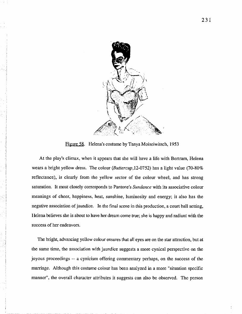
231
.\,
Figure 58. Helena's costume by Tanya Moiseiwitsch, 1953
At the play's climax, when it appears that she will have a life with Bertram, Helena
wears a bright yellow dress. The colour (Buttercup,l2-0752) has a light value Q0-80Vo
reflectance), is clearly from the yellow sector of the colour wheel, and has strong
satuation. It most closely conesponds to Pantone's Sundance with its associative colour
meanings of cheer, happiness, heat, sunshine, luminosity and energy; it also has the
negative association ofjaundice. In the final scene in this production, a court ball setting,
Helena believes she is about to have her dream come fue; she is happy and radiant with the
success of her endeavors,
The bright, advancing yellow colour ensu¡es that all eyes are on the star atEaction, but at
the same time, the association with jaundice suggests a more cynical perspective on the
joyous proceedings -- a cynicism offering commentary perhaps, on the success of the
marriage. Although this costume colour has been analyzed in a more "situation specific
manner", the overall character attributes it suggests can also be observed. The person

232
wearing this colou¡ is someone who is at the center of her universe. This Helena is a giver
of life, both liærally (she is pregnant by the last scene) and figuratively. Those around her
receive energy from their proximity to her, and are made richer through their association
with her, Those who saw the performance of this production recall how vividly Helena
stood out ftom the crowd of women gowned in soft pastels (ranging from violets through
blues and pinls) and men attired in dark tuxedos @ell, Hayes, personal communication,
1990).
Critics refer to Helena's modesty and sincere passion: "Irene Worth as Helena
communicated by her soulful gaze her love for Berfam from her first silent entrance"
(-ondre, in læiær, 1986, p.6). ln a production minimizing the darker elements of the play,
Helena's amorous pursuit of Bertram seemed to Edinborough no more than a "...sweetly
logical wifely manoeuvre" (1954, p.49). Robertson Davies describes this Helena as
having a "lovely presentation of constancy and tenderness wedded to intellect and spirit.
Her greatest niumph, perhaps, was that she won our compassion for BerEam" (1953,
p.51). Reviewers from Edinborough to Davies all rema¡k on the costumes and their ability
to convey the essence of the production, noting not only the illumination the modern d¡ess
provided for clarifying the context of the play, but also the mood the colours expressed.
Taken together, the critics' descriptions of Helena's character in this production suggest
a young optimistic woman who plays an active role in achieving what her heart desires.
Her naturally buoyant spirit sustains her throughout the drama and ultimaûely, it reaches not
only its intended target, Bertram, but the audience as well. Tanya Moiseiwitsch's decision
to employ white (presenting Helena as pure) and yellow (reflecting her energetic spirit)
enhanced such a character reading.
Six years later, the Guthrie/À4oiseiwitsch team produced a second ÂlllWelL this time
at the Shakespeare Memorial Theate in Stradord-Upon-Avon, U.K. They chose to set the
play in "Ruritrnia", the imaginary time and place intoduced in Anthony Hope's Èisg4crcf

&¡gþ. The period was loosely interpreted as Edwardian, with a costume palette orr*";"g¡eens, grays, burgundy, pink/violets and some blues. In keeping with Shakespeare's
stage directions, Helena first appears all in black, in deference to the mouming household.
Because of this overt cultual costume association, it will not be consecutively analysed in
this section.
For her Eavels, Helena donned a pale beige coloured robe (Pearl Grey, 13-1106) with a
large white collar. The colour most closely resembles Pantone's Bøige : classic, earthy,
sandy, neufal, soft, and warm. Earthy is not an inappropriate attribute for a young woman
who not only has an understanding of such indelicate diseases as the King's fistula, but
also is prepared to do what is necessary to cure it. The colour's inheren| classic
association is equally appropriate for describing an impoverished but essentially noble
individual; sofi and warm suggest a füendly, concerned and caring woman.
For her triumphant "coranto" dance with the King following his cure and immediately
prior to the choosing scene, Helena appears in an all white ball gown. It is a fitting colour
for a prospective bride, overtly reiterating her virginal quality, and subliminally reinforcing
the association of white magic with virginity. The relationship between white magic and
virginity is considered to be implicit in fairy-tales (Barton in Evans, 1974).
Muriel St. Clare Byrne commends the decision to set the RSC production in Ruritania:
It is one of the chief recommendations of Ruriønia, with its stately salonsand its nostalgic landscapes, that it has developed a traditional costumewhich, true to its thearical origins, is no stickler for rigid time schemes butconsiders ttrat the first requirement for a good stage costume is that it shouldbe completely in cha¡acter and suit its wearer...dress should observeconventions indicating the status and quâlity of the wearer, and for the restshould be simply an idealized version of more or less cunent modes (1959,p.559).
She describes Tanya Moiseiwitsch's choice of white for Helena's ball gown as a
reversion to tradition : "theatrically, it is 'white for heroines' " (1959, p.560), Reviewers
did not doubt that this Helena was a heroine and felt that Guthrie *u, obuiourtl
sympathetic to her character. Zoe Caldwell's Helena was a fresh, ardent, enthusiastic and
confident heroine. "Rather than hesitantly approaching the King's wards and
acknowledging her presumption in giving herself to Bertram, Helena made her choice
spontaneously after engaging in a series of lively dances" (læiter, 1986, p.8). Helena is
presented as a young woman whose love for Berham and her determination in gaining his
hand is derived entirely from her youthful zeal. J.Price describes Caldwell's Helena as
being "...ecstatic in girlish love" (1968, p.59). Her understated but straightforward
costume colours offer quiet supplementation for this characterization, assisting the acEess
in presenting a natural and believable young woman who was cast more in the active
modem spirit than in the passive mode so cornmon to heroines of the pasL
Sixties
Timothy O'Brien's costumes for the 1967 All's Well at the Royal Shakespeare Theafe
in Stratford-Upon-Avon, England are set in the Cavalier (mid 1600s) period. In an explicit
design manouever, he employs thematic colour to set the ståge for the play's three different
locales: deep blue for the Court, yellow and brown for Rousillon and bright red for Iøly.
The costume colours correspond to this scheme for the most part, so that a distinctly
unified visual theme enveloped the production. Helena's dress is cream-colou¡ed (Auamn
Blonde, 12-0813) with white accents. The tint is similar to Pantone's Cream ,suggesting
the classic, neutral, sweet, soothing, soft, warm, and rich. It also bears the negative
connotation of blandness. Autumn Blonde has a light value (70-80Vo reflectance), hovers
between yellow and orange on the colour wheel, and has low satuation.
When Helena returned from Italy in the final scene, she wore a brown dress covered by
a cream colou¡ed cloak (Figure 59). The cloak colour (Linen,12-1008) appears to be
slightly warmer and paler than her previous cream costume colour. It has the same value,
but its base is orange and it has a lower saturation. Linen carries the same associative
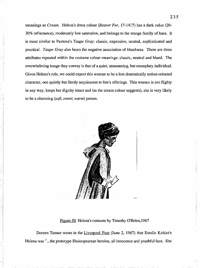
)35
meanings as Cream. Helena's dress colour (Beaver Fur, 17 -1417) has a dark value (20-
307o refTerta¡ce), moderately low satu¡ation, and belongs to the orange family of hues. It
is most similar to Pantone's Taupe Gray: classic, expensive, neutral, sophisticated and
practical. Taupe Gray also bears the negative association of blandness. There are three
attributes repeated within the costume colour meanings: classic, neuEal and bland. The
overwhelming image they convey is that of a quiet, unassuming, but exemplary individual.
Given Helena's role, we could expect this woman to be a less dramatically action-oriented
character, one quietly but firmly acquiescent to fate's offerings. This woman is not flighty
in any way, keeps her dignity intact and (as tlre cream colour suggests), she is very likely
to be a charming (soft, sweet, wørm) percon,
Figure 59. Helena's costume by Timothy O'Brien,1967
Doreen Tanner wrote in the Liverpool Post (June 2, 1967) that Estelle Kohler's
Helena was "...the prototype Shakespearean heroine, all innocence and youthful face. She

236
was younger than Juliet; more determined than Rosalind, She conveyed ever¡hing except
the heartbreak of being rejected by the man she loved." The critic from the Birmingham
Mail (June 2, 1,967) refers to her "sheer charm", while the bksbi¡e-hs! Qune 2, 1967)
describes her as "tender." These critics may have found Helena's youthfulness effective,
but at least one critic did not. "As Helena, Estelle Kohler has a wistful manner but her
'little girl' voice is hardly suitable" Nottingham Evening P (June 2, 1967).
Robert Speaight seems not !o have been at the same production, having found Helena to be
too "mature and confident" (in læiter, 1986, p.9).
Seventies
Tanya Moiseiwitsch worked with David Jones for her third ÁlllWell designs. This
production was performed at the Sratford Festival, Canada in 1977. Her design decisions
were influenced by Jones's discovery of a Georges de la Tow painTin5, La Buonaventurd
(The Fortune Teller) (Figure 60). The painting depicts a gentleman (c.mid-1600s) being
slyly robbed by a group of gypsyish women. Jones felt it suited the play's plots and
counterplots, and suggested it as a design source. Moiseiwitsch found it to be a
"wonderful sparking off" point, even fo¡ suggesting a sense of season: "The play opens
with a feeling of autumn, then goes into a winter campaign, and ends in spring"
(Moiseiwitsch in SlraÉqlùBcaca¡üclêld. June 4, 1977). Besides the prominent red
colour (which particularly suits Parolles) Moiseiwitsch created a costume palette referential
to the painting. The costumes tones lean towards rusts, browns, beiges, dull greens, greys
and black with flashes of other colours such as blue, mauve and peach.
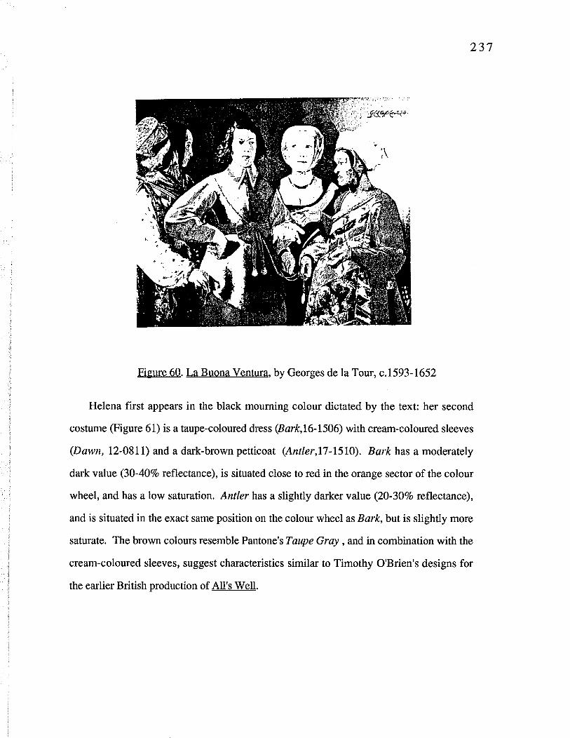
237
Figure 60. La Buona Ventura, by Georges de la Tour, c.1593-1652
Helena fi¡st appears in the black mourning colour dictated by the text: her second
costume (Figure 61) is a taupe-coloured dress (B¿rk,16-1506) with cream-colou¡ed sleeves
(Dawn, 12-0871) and a dark-brown petticoat (Antler,lT -1510). Bark has a moderately
dark value (30-407o reflectance), is situated close to red in the orange sector of the colour
wheel, and has a low saturation, Antler has a slightly darker value (20-30Vo reflectance),
and is situated in the exact same position on the colour wheel as Bark, but is slightly more
satnrate. The brown colours resemble Pantone'sTaupe Gray , and tn combination with the
cream-coloured sleeves, suggest cha¡acteristics similar to Timothy O'Brien's designs for
the earlier British production of Alll:_S&ll.

238
Figure 61. Helena's costume by Tanya Moiseiwitsch, 1977
With her second costume, Helena wore a deep blue cloak (Dark Blue,l9-át035). The
associative colour meanings for Dark Blue are similu to Pantone's Nøyy.' classic, credible,
authoritative, basic, conservative, strong, dependable, service-oriented, confident,
professional, serene and quiet. For a young woman off to cure a King, something which
the most eminent physicians had been unable to do, it was a most suitable apparel colour
for inspiring the King's confidence.
With her next costume, Helena continued to appear in autumnal shades (Toasted
Almond, 14-1213). This colour has a medium value (50-607o reflectance), is from the
orange family of hues and has low saturation. It also sha¡es associative attributes similar to
Taupe Gray ,
The last costume reviewed for Helena in this production is her pilgrim's dress and
cloak. The dres s (Elder Berry, 17-1605), has a dark va\te (20-30Vo reflectance), b€longs
to the red family of hues (although on the border with orange) and has a very low
saturation. Its most proximate Pantone color.r is Mauvel classic, relaxing, sophisticaæd,
soothing , soft, suMued. From these attributes we anticipaæ this Helena retuming from
her travels, not in a blazing flush of triumph, but rather with a quiet calmness of mind and
body, more experienced in matters of the heart and prepared to restore a harmonious
balance in the domestic affairs of Rousillon. Her cloak (Apricot lce,13-1020) conveys a
timid warmth, while the petticoat and undersleeves continue the Tøupe Gray attributes.
Apricot lce has a moderately light value (60-70Vo rcflæ,tance), belongs to the orange family
of hues, and has medium saturation. The Pantone colour whose associative meanings it
shares is P¿øcå; fresh, soft, sweet, warm, luscious and inviting. The colour gives Helena
the appearance of an appealing character and her presence helps create a soothing,
refreshing atmosphere for the "stressed-out" gathering at Rousillon.
Based on the costume colours, the personality we are presented with suggests an
essentially calm individual who has a strong and quiet confidence and is basically unselfish
and caring. The dramatic contrast between the warm colours and the dark blue establish
her as someone prepared to give of herself, be resolute and set her feelings aside in the
course of a required duty.
Ralph Berry describes Martha Hen¡y's Helena as being "overwhelmed by passion"
within a "russet-brown, autumnal, Chekhovian" atmosophere, while Roger Warren felt that
in spite of a sense of genuine harmony at the climax, Helena lacked an "intense,
impassioned commitment to the play." In-between, Arthur Holmberg saw her as a "level-
headed woman" (in Leiter, 1986, pps. 8-9). Gina Mallet was most critical of Martha
Henry's Helena, stating that she was unconvincing:
... she becomes an undeniably powerful but rather negative presence. Hervoice growls with sensuality, she looks beautiful, when she weeps realtears course down her cheeks. But she never springs the release catch,allows herself to be caught off-balance, to be vulnerable. ( The TorontoSla!, June 17,1977).

240
Most of the character traits the critics observed are essentially reflected in Helena's
costume colours. Her colours present a warm and caring woman with a degree of resEaint
and self control. Even allowing for the differing individual responses, it is possible that the
criticism regarding the lack of passion and commitment was underlined by the suMued,
non-showy colours.
Eighties
Trevor Nunn's 1981 All's Well at the Royal Shakespeare Theatre, Stratford-Upon-
Avon, had a distinct class context as well as Chekhovian overtones. The production was
set in the Edwardian period, immediately preceding World War L For Helena's d¿nce wittr
the King, designer Lindy Hemming chose a silvery colour (Figure 62).
Figure 62. Helena's costume by Lindy Hemming, 1981
241
Silver has connotations of wealth and class: expensive, glitzy, moneyed, rich, vatuable
and cool. Helena had just cured the King, an act the courtiers regard as a mi¡acle. she had
every reason to feel valuable, to show some sparkle, believing a reward would soon be
hers. Helena had gambled her tife for high stakes: a noble (and it is implied, wealthy) heir.
Not only had she won her immediate prize, but her future was also secured. In a
production which emphasized class consciousness, Helena's silver-coloured gaÍnent also
signalled her change in status.
Caught at the stårt of the war while on her pilgrimage, Helena tended the wounded in a
sombre muted-purple costume (Putple Sage, 18-3712), with a white bib. It is a sombre
colour because of its dark valte (10-20Vo reflectance), blue-purple base, and low
satuation. It is most closely allied to Pantone's Deep Purple,with its connotations of being
regal, rich, mysterious, spidtual, artistic and powe¡ful. Given this colour's context in the
production it seems likely that in addition to its spiritual (idealistic, moral) aspects, its
negative attributes were also intended -- mourning and melancholy for a world out of
balance.
The reading with respect to the silver dress fits precisely with the description of the
production's class structure, as the following quote i.llusEates:
The play began with a pantomime of figures on a dance-floor, a man and awoman slowly_circling each other, shoulders barely brushing, but withoutany contact. Such was the tone of the relationship between Helena andBertram. Each belonged to a separate world, Helena justified in heradmi¡ation of Bertram, and Bertram almost justified iñ his fears thatmarriage to Helena would mean the loss of the crystal-palace world of thecourt, with its shining young men and elegant laãies.
- Helena,s role was
ambiguous_ at Rousillon, where she stood halfway between her noblepafons and the army of chambermaids and servanti; at court she was ananomaly-altogether, out of place beside the bejeweled ladies (l\4azer inLeiter, 1986, p.14).
The critic for the Dailv Express (November 18, 1981) thought Harriet Walter's
Helena conveyed passion, artfulness and relentless determination. Two critics describe he¡
242
as being believably disnessed by her situation, labelling her "weepy" ßrnancral Times.
Nov.18, 1981) and a "...love sricken medico's daughter, seemingly always on the verge
of tears and bursting with undentable passion" (Çuê¡1li¿L Nov. 18, 1981). Another critic
was not favorably impressed by Ha¡riet Walter's characterization, calling it "selfishly aloof
and hardly sympathetic" fWo¡sesterEvetringÀevs, Nov. 18, 1981).
Harriet Walter discusses the part of Helena for this production in an account
documented by Carol Rutær. For Haniet Walter, Helena is a very complex character.
When I came innocent !o Helena's text, I had no trouble finding in the linesa woman who was very internal -- dark, intense, ... But one who was notsure of herself -- whose lines kept exposing her tentativeness, her sense of ,' I know this is crazy. I know I'm mad. I will probably fail. But I'm goingto try' (Ruttef, 1989, p.78).
Rutter discerned this interpretation on stâge: " Helena was hesitant, secretive, internal, her
language broken" (p.75).
The sense of determination Harriet Walter recognized in Helena was crucial to the
interpretation of her cha¡acter because, Walter believes, it is emblematic of Helena's ability
to be an achieve¡ within a male-oriented wo¡ld. Helena is prepared to take responsibility
for her life despite her rational fears regarding the necessary actions achieving those goals
required. She is a woman "...proving something in a man's world...by taking on various
properties of maleness, in decision-making, pursuing, wooing." Furthermore, she kept
her ski¡t on. "Helena is perhaps Shakespeare's only heroine who achieves things in a male
way without putting on trousers" ( Rutter, 1989, p.75).
What Rutter and Walter identify as tentativeness and defensive determination does not
appear to have been understood by the critics who were more impressed by Helena's
passionate and unswerving spirit (that one critic directly addressed as selfish), On the
other hand, Lindy Hemmings colour choices for Helena's costume reflect some of the
attitudes informing Harriet Walte¡'s characterization. At the risk of delving too deeply into

243
subconscious colour interpretation, the spirituality inherent in the somb¡e purple of the
nursing uniform is in complete accord with Harriet walter's belief that: " rn Att's wett ...
you have to believe in the possibility of forgiveness and reconciliation. " As Rutt€r states:
"For Harriet, it's this sense of awe that lifts female achievement [in this play] into a
metaphysical area. ... in her winning of a husband Helena achieves something higher: she
exposes the secret workings of Fate, humanity's relationship to the gods,' (Rutter, 19g9,
p.89).
In contrast to the productions reviewed to this point, christina poddubiuk's designs for
the 1988 straford Festival's All's well in canada, were set in the crinoline period (1850s),
Tkee costumes were observed for this analysis. The first dress is a subdued grey-blue
colour (Provincial BIue, 18-4220) (Figure 63). The colour has a dark vahte (10-20Vo
reflectance), a blue base, and medium-Iow saturation. It is a colour with no single close
match to a Pantone associative colour meaning, resting between Neutral Gray and Sky
Blu¿. Il we examine those colours' meanings and extrapolate similar attributes, the only
one repeated is coolness. But Helena's dress also incorporates a sash, trim at the sle€ves
and cuffs, and flashes of colour all over its su¡face. The trim is white, suggesting its
occupant has pristine qualities. The sash is a blue-grey colour (Cadet Gray, 1T-4l l l) with
a tiny overall pattern in peach (Gossamer Pink, 1,3-1513). Cadet Gray has a moderately
dark value (20-30Vo reflectance), is situated in the blue family of hues, and has low
saturation. It is similar to Provincial Blue nd shares its cool attribute.
Gossamer Pink has a much lighter value (60-707o reflectance), is from the orange
family of hues, and has low saturation. Its presence in the costume colour composition
offers relief from the overall coolness. The Pantone colour meanings associated with
Gossamer Pink are the same as those given for Peach:soft, sweet, fresh, warm, luscious,
inviting. In a sense, the character defined by Carol Rutter and Harriet \valter in the
previous production assessed is here colour coded. This Helena was reserved (cool) and

244pure (white), but her character was permeated by a disposition that was essentially loving
and receptive of others (warm, sweet, inviting).
Figure 63. Helena's costume by Christina poddiuk, 1988
Helena dons a greenish-blue cloak for her favels. The colotr (Sagebrush Green, lg-
5612) has a very dark value (10-207o reflectance), sits on the blue-green bo¡der of the
colour wheel and has low saturation, giving it a subdued look. It closely resembles
Pantone's Teal, thus sharing its associative meanings: classic, cool, expensive,
sophisticaæd, rich and unique. whether it is the same cloak worn for her visit to cure the
King or as she emba¡ks on her pilgrimage on BerEam,s behalf, the ctoak colour suggests a
more manue (sophisticated, c/øsslc) figure who had a degree of self-confidenc e (cool), and
is self-reliant (cool).
Helena's thi¡d costume is a black jacket and a dress with a small white all-over pattern
on it. The mouming attributes of the black have already been rema¡ked upon. The tiny
white design establishes a sharp conÍast in the complete colour perception, from the

245
audience's vantage. Once again, it is possible that Helena's intemal conflict and sFength of
¡esolve are reflected in the sEong conEasting costume colours. Helena has suffered a
series of sonowful events: the deaths of her father and her patron Count Rousillon, and
rejection by the man she loves. At the same time, her character remains essentially intact
and, having recognized in I.ii. that: "Our remedies oft in ourselves do lie, / Which we
ascribe to heaven" (202-3), Helena's resolve to obtain the life she desires never waivers.
Throughout this production, sharply conrasting costume colours such as the black and
white of this ensemble, incorporating loss (black) and rebirth (white) could be recognized
as signals underlining her characterization.
Lucy Peacock's Helena was not favorably reviewed. She was, according to Ray
Conlogue ofThe Globe and Mail (June 2, 1988), "beautiful, sweet-tempered and vi¡tuous
... But Peacock delivers only a kind of hale and hearty, generic good-feelingness. It is a
charm so insistent thât it loses all charm. " The attributes suggested by her peach-coloured
dress pattern appear to be present in this critique, but the dignified reserve, which the
balance of her costume colours imply, appears to have been unobserved. On the other
hand, the charm that does not in the end seem sincere, as suggested by Conlogue, and the
smothering sense of "good-feelingness" with which Lucy Peacock portrayed Helena's
character, could certainly have been emphasized by the cool, passionless tone of the
costume colour.
The final production reviewed for this analysis is Barry Kyle's 1989 All's Well at the
Royal Shakespeare Theahe, Stratford-Upon-Avon, U.K. Chris Dyer set the costumes in
the Cavalier period, favouring a costume palette in greyed beiges, browns, burgundy and
blues. She followed Shakespeare's directions to introduce the Countess's household
dressed all in a black: "pilgrim father...dress with square lace collar...[and then changed]
into a t¿rtan smock" @utter, 1991). The black garment denotes Helena's mourning ståtus;
the tartån smock was not observed and is therefore not included in this analysis. For her

246
next appearance, Helena was âttired in a deep blue dress, with white sleeves and neckli¡e.
This colour (Midníght, 19-4127) has the darkest v alue (0-107o reflectance), a blue base,
and medium saturation. It shares Pantone's Nøuy atfibutes: credible, authoritative, classic,
conservative, strong, dependable, traditional, service-oriented, confident, professional,
serene and qruiet. Midnighf is very similar to tåe costume colour Tanya Moiseiwitsch
(1977) introduced in Helena's dress at the same point in the play. In a situation requiring
conviction in her ability to cure the King, Helena's appearance is srengthened by the
authoritative seriousness of her conservatively-coloured garment, while the touches of
white both reiûerate the classic "authority model" (navy suit and white shirt), and harken to
the purity of her magical cure.
Having gained her reward, Helena appeared for the "choosing scene" (also known as
the recantation scene) in a brighter blue-coloured dress (Figure 64). The colow (M ilky
Blue, 15-4415) has a medium vzÃue (40-50Va reflectance), a sûong blue base, and low
saturation. It most closely resembles Pantone's Aqua: cool, soothing, soft, refreshing
and liquid. This Helena is sober and calm as she approaches her dream, but the reality of
her hopes is as ungrounded as the liquid allusions to which her costume hints. With
Bertram's rejection of he¡ suit, the atmosphere of the scene changes rapidly, like swirling
wate¡ shifting the mood from cheerfulness to misery.
The "blue" state of Helena's mood at the moment of BerFam's recantation is carried in
the colour of her favelling cloak, but its brighter intensity suggests that even when
Helena's triumph is grounded in shame, her character remains constant, in her resolution
and her heart. The cloak is a clear blue colour (Amparo Blue,18-3945) has a dark value
(10-20Vo reflecønce), purple-blue base and fairly high satuation. It shares Pantone's
Bright BIuz colour meanings: electric, energetic, vibrant, happy, dramatic and stining.

247
Figure 64. Helena's costume by Chris Dyer, 1989
chris Dyer's costume colour cues served as a reminder to the audience (consciously or
unconsciously) of Helena's valiant character, someone who was not prepared to waste
away as other Renaissance heroines had been known to do. She may not have been happy,
but Helena was certainly energetic and action-o¡iented in her travels to Italy. Even further,
this particular colour choice suggests that in this production, Helena's ambitions were
emphasized, allowing for the possibility that she was negatively perceived as a man-hunter.
This reading is supported by Helena's last costume which was all whiæ. The choice of
white suggests a rebirth, and a renewed woman, intimating that she needed to change in
order for a happy ending to be attained. By presenting Helena in a virginal colour, her role

248
as BerEam's rede€mer was also communicated. The power of pure intentions resulting in a
magical' happy resolution would have been underlined though the virginal presentation of
the cenÍal character who had effected forgiveness and reconciliation.
R. Smallwood detecæd a "... srong hint of white witchery " (1990, p.494) in the
production, thereby providing support for some of the previous comments. This is
particularly evident (according to Smallwood) in the curing of the King, when Helena
kicked " ...off her shoes to perform a circling, energetic, sexually assertive, slightly fey
dance around him" (p.494). He describes Patricia Kerrigan's characterization as red-
haired, Scottish, and "slightly gauche." She was ptesented as being clearly of a lower
class than Bertram and as someone who had grown up more as his sister. This achieved
two things: it justified Bertram's honor at what amounted to an incestuous union and it
explained Helena's despair (based on similæ reasons) at the stårt of the play. Smallwood
observes that this Helena was both self assured, and self-aware from the beginning of the
performance. The cool quality of her predominantly blue costume colours enhances these
latter perceptions. In the same way, the final white costume colour assists in the white
magical overtones needed ûo explain how the initial allusions to incest could be acceptåbly
wo¡ked out.
From a feminist perspective, Rutter (1991) is convinced that director Barry Kyle got ttre
"choosing scene" (Il.iii.) all wrong. It is an important moment in the play, one that reveals
at an early stage how Helena is characterized in the production. Patricia Kerrigan's Helena
paced before the row of men " the only agent in the choosing process." As she progressed
to the next soldier, the rejected one she had passed "..,sighed a huge exhalation of relief
and slumped, then straightened out irn¡nediately when Helena glanced back and slumped
again when she tumed around. " The exaggerated relief at being rejected was repeated in a
variety of ways, one fellow officer shook another's hand in comradely congratulations at
being spared: "wiping his brow with an oversized gesture." When Helena came to
249Berram, she knelt before him " and she remained kneeling until the King forced Berram
to take he¡ hand some seventy lines later . " The King had to revert to brute force, slapping
Berham's face and finally drawing his sword befo¡e Berham would obey.
The scene was an utterly humiliating one for Helena. "The Helena their [soldiers']
reactions created was nobody's choice, a complete loser" (Rutter 1991). By having all the
men reject her, there was no sense that BerEam's behaviour was a violation. Helena's
character was demeaned and in the process, the credibility of the play's ending was
weakened.
Costume colour/chartacte¡ization: BERTRAM
At least one coloured documentation of Berham's costume was found for each of the
seven productions analyzed.
Fifties
BerEam was attfued in a black tuxedo with a white shirt, vest and tie (Figure 65) in the
1953 production of All's well designed by Tanya Moiseiwitsch fo¡ the opening season of
the stradord Festival in canada. It is a costume colour combination closely associated
with the formal style of tuxedo dress and also closely interwoven with the context in which
it is worn. The costume and colour combination is one srongly associated with getting
"d¡essed up" for important events such as weddings or balls in the 50s. Futhermore, the
tuxedo style had definite associations with high society, something a diversely composite
audience from that era would have immediately recognized.
Both colours have classic connotations, supporting the distinguished attributes referred
to above. The strong contrast between the two colours would have clearly etched the
silhouette of a character on a stage that reaches out into the audience. The character
wearing the costume would have had an aura of suave urbanity, if he wore his costume
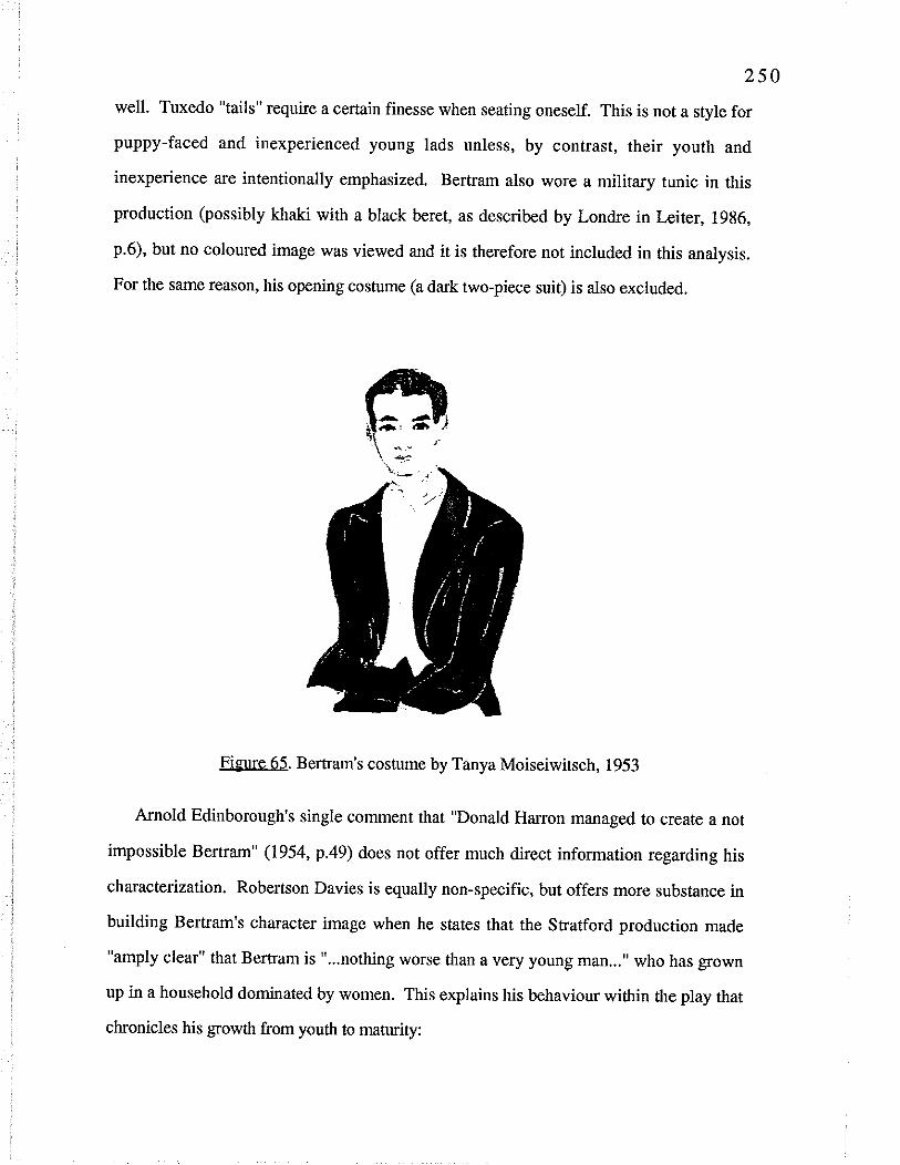
250well. Tuxedo "tails" require a certåin finesse when seating oneself. This is not a style for
puppy-faced and inexperienced young lads unless, by contrast, their youth and
inexperience are intentionally emphasized. Bertram also wore a mititary tunic in this
production þossibly khaki with a black beret, as described by Londre in læiter, 19g6,
p.6)' but no coloured image was viewed and it is therefore not included in this anatysis.
For the same reason, his opening costume (a dark two-piece suit) is also excluded.
Figure 65. Berham's costume by Tanya Moiseiwitsch, 1953
Arnold Edinborough's single comment that "Donald Harron managed to c¡eate a not
impossible Bertram" Q95a, p.49) does not offer much direct information regarding his
cha¡acterization. Robertson Davies is equally non-specific, but offe¡s more substance in
building Bertram's character image when he states that the sEatford production made
"amply clear" that Berfam is "...nothing worse than a very young man..." who has grown
up in a household dominated by women. This explains his behaviour within the play that
ch¡onicles his growth from youth to matudty:

251
His fi¡st move, characteristically, is to idealize someone of his own sex,who happens to be the attractive though unworthy pæolles... His nexiforward step is to seek a girl of his own ðhoosine at the same time as he isdisillusioned with Parolles. At last, when he is ready for the kind ofwoman that Helena is, Helena is waiting for him. It needs nopsychoanalyst, surely, to understand this enthelt normal pattem of a youngman's development? (1953, p.75).
For Davies, Berfram's behaviour is perfectly normal and understandable given the
ci¡cumstances of his upbringing. He suggests that Bernam is no callow fellow, nothing
more than a youth needing to sow his wild oats before he can settle down. Given this
capsule commentary on Berham's character and the court setting, it seems likely that
Bertram conveys an image of privileged youth, perhaps awkward at the start, but later
appearing more confident as he progressively matures .
The only costume colour for Bertram observed from the 1959 revival at the Royal
Shakespeare Theatre, Stratford-Upon-Avon, is a khaki drill uniform (Figure 66), although
black and white photo$aphs indicate a da¡k-coloured two-piece suit for his leave-øking
from his mother, and a dress cadet-like uniform for the ball scene. Khaki (16-0726) has a
medium-dark value (30-407o reflectance), is situated in the yellow sector of the colour
wheel and has medium saturation. L*e Olive Green, Khaki has associations with
camouflage, safari, the military and with being classic. \vithin this production Kåøft1 was
used !o convey a direct military affiliation. ln the decade following the war, the strength of
its military meaning would have been heightened, assuring audience sympathy for the
young soldier Beffiam. This could have been especially compelling in the later scenes,
when the pre-World tilar I setting changed !o a post-World War II one with microphones
and sophisticated equipmenl

252
Figure 66. Berfam's costume by Tanya Moiseiwitsch, 1959
Edward de souza's characterization seems to have been similar to Donald Har¡on's
Bertram (Guthrie/\rloiseiwitsch production at the strarford Festival). Muriel st.clæe
By¡ne felt that de souza had exactly the right kind of male good looks for the part. He
was:
...very, very young, stiff with undergraduate-level masculine andaristocratic self-conceit, cut exactly to theionventional pattem, as gullibleand selfish as, th_ey come,_ the type that is always- taken in -by
theknowingness, the flattery and the Íiai-of-the-wo¡ld swagger of a parolles,and mentally about twenty years younger than Helena. ...He is too normaito
-betasically unlikeable: one simply hãs to wait for him to grow up (1959,P.562).
According to another critic, Tyrone Guth¡ie saw Bertram as "obstinate yet ambivalent"
(shaw in læiter, 1986, p.8), which also supports the youthful characterization. Berham,s
seeming ambivalence thus offers hope for his union with Helena. Following Berfam's
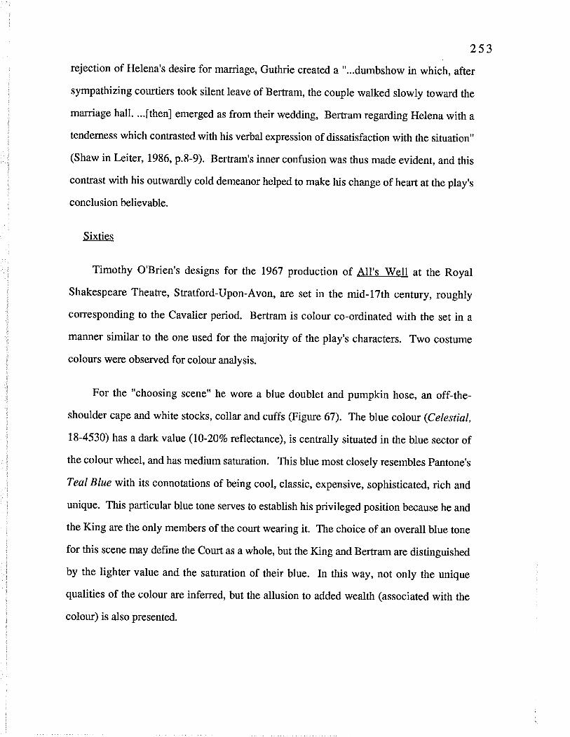
253rejection of Helena's desire for marriage, Guth¡ie created a ,,...dumbshow in which, afte¡
sympathizing courtiers took silent leave of Berfam, the couple walked slowly toward the
marriage hall. '..[then] emerged as from thei¡ wedding, Bernam regarding Helena with a
tendemess which contrasted with his verbal expression of dissatisfaction with the situation"
(Shaw in tæiter, 1986, p.8-9). Bernam's inner confusion was thus made evident, and this
contrast with his outwardly cold demeanor helped to make his change of heart at the play,s
conclusion believable.
Sixties
Timothy O'Brien's designs for the 1967 production of All's Well at the Royal
Shakespeare Theare, Stratford-Upon-Avon, are set in the mid-l7th century, roughly
corresponding to the cavalier period. Bertram is colour co-ordinated with the set in a
manner similar to the one used for the majority of the play's characters. Two costume
colours were observed for colour analysis.
For the "choosing scene" he wore a blue doublet and pumpkin hose, an off-the-
shoulder cape and white stocks, collar and cuffs (Figure 67). The blue colour (celestial,
l8-4530) has a dark value (10-20vo reflectance), is cenrally situated in the blue sector of
the colour wheel, and has medium saturation. This blue most closely resembles pantone's
Teal Blue with its connotations of being cool, classic, expensive, sophisticated, rich and
unique. This panicula¡ blue tone serves to esøblish his privileged position because he and
the King are the only members of the court wearing it. The choice of an overall blue tone
for this scene may define the court as a whole, but the King and Berram are distinguished
by the lighter value and the saturation of their blue. In this way, not only the unique
qualities of the colour are inferred, but the allusion to added wealth (associated with the
colour) is also presented

254
,Figure 67. Berram's costume by Timothy O'Brien, 1967
When Helena returned from her pilgrimage (and figuratively, from the dead), she
encountered a BerEam suitably dressed in mourning black, with white cuffs and collar in
the manner of the Puritans. The colour connotation was utilized snaightforwardly to
convey his remorse and grief for a wife he thought he had lost
Critics refer to the production as "all sweetness and light" (Liverpool post, June 2,
1967), " staightforward" lNottingham Evening Post & News. Iune 2, 196?), and "a
simple production ...set out to conEast the final frushations of age and the fi¡st frustrations
of youth" Ge¡lshj¡s Jpù1, June 2, 1967). Within rhis production, Ian Richardson's
Bertram was "... an energetic youth with all the off-handedness of the self-cenffed man,,
G@shjæ lps¡. Iune 2, 1967), and "a sulky boy, comically pulling a long face when
Helena chose him for a husband and getting his laughs for it" (tiyeryAglp!$, June 2,
1967). The critic for the Coventr]¡ Evening Telegraph (Iune 2, 1967) perceives, in his
characterization, " a slight sa¡donicism, coupled with an almost belligerent hypocrisy
towards his mother and the King. " It is difficult to reconcile these descriptions with the

255
same character whom another critic describes as: "charming and intelligent, but too young
for the demands of either married life or courtly life" (Gross in læiter, 1986, p.9).
Apart from the allusion to a privileged, even pampered youth, which Bertram's blue
costume colou¡ contextually implies, and apart from the idea of a certain maturity b€ing
attained by the play's end @erEam presents at least the extemal motions of mouming), his
costume colours offer little clue !o his character, This is very likely due to the prcdominant,
overt colour coding the designer employed to describe locale and status. From this late
vantage, the pervasiveness of the general colour associations overshadow individual
character readings.
Seventies
Two complete costume changes, plus the addition of a cloak, were observed from the
1977 Sftatford Festival production designs by Tanya Moiseiwitsch. Bertram fùst enúered
the play clad in a mourning-black Cavalier-style jacket and breeches, with an off-white
shin. His next costume consisted of a brass-studded brown jacket (Nutmeg, 18-1,326)
with darker brown sleeves a¡rd breeches (Dark Earth, 19-1020), wom with a khaki-tinted
shtrt (Gravel,l4-1014) (Figure 68). Nutmeg has a dark value (10-20Vo reflecrance), is
from the orange family of hues, and has medium low saturation. Dark Earth has the
darkest value (0- 107o relfectance), is also situated in the orange section of the colour wheel,
and has a slightly lower saturation.
Both colours correspond to Pantone's Dørfr Brown : earthy, rich, masculine, wæm,
dependable, secu¡e and rugged. Dark Brown also carries negative associations: sombre
and dirty. These attributes are continued into the cloak's dominant colovr (pinecone,1.9-
1121) , n even darker shade of brown.

2s6
Figure 68. Bertram's costume by Tanya Moiseiwitsch, 197
The suggestion of added warmth of character is conveyed though the cloak's lining
colorx (Burnt Henna,1,9-1540). This colou¡ also has the darkest value (0-10Vo reflecønce)
and belongs to the orange family of hues, but it is situated almost on the bo¡der between
orange and red, which, along with its higher satuation, gives it greater heat. The shirt's
Gravel colour, similar to Khaki, bat lighter in value, adds to the masculine qualities
associated with the pervasive b¡own-tones of his costume through Khaki's military
attribut€s.
The overall image conveyed suggests a very masculine figure, one who is sensual
(earthy), and has a tendency to be emotional (warm), or perhaps somewhat hot-headed.
We do not gain any sense of sophistication (he is rugged) or ptetense (he is secure and
therefore has no need to pretend) in this individual, but rather perceive someone having
innate solid valu es (dependable) and being more a ma¡r than boy (masculine). On the other
hand, the possibility for becoming soiled might well suggest that this Bertram is not an

)57angel, and the negative attribute of being sombre points to a man not essentially gay and
light-hearted.
Ralph Berry (in Babula, 1981, p.8) saw, in Nicholas pennell's characterization, a
Bertram with more than one of the above attributes. Bertram had ",..a certain charm, but
no wholesomeness", adding that to his credit, Bert¡am was "...unreseryed in his finat
pledge of love." Roger warren hints at the essential strength of Bertram's character when
he states that: "The production does not senfiment¡rize Bertram by suggesting that parolles
is his 'evil genius' " ( in Babula, p.9). our most complete character pichue is sketched by
Gina Mallet ohe Toronto sta¡. June 17, 1977) whose portait confirms the costume colou¡
reading offered above. Mallet's criticism, that Nicholas pennell,s Bertram does ,'...not
have the callous swagger", agtees with a reading that indicates a secure masculine core,
and her criticism that he lacked "...boyish impetuosity" negates the ,'hot-head" label, but
confirms the preconception of a more manly figure. Her final appellation, "sourpuss",
affirms the sombre attribution.
Eishties
The fi¡st costume examined for Trevor Nunn's 1981 All's well p¡oduction at the Royal
Shakespeare Theafe is a black Tuxedo-type of costume with a red pantJeg stripe (Figure
69). The similarity of this costume style and colour suggests the same characterization as
Donald Harron's Bertram in the Stratford Festival production designed by Tanya
Moiseiwitsch in 1953: Bertram was a very young and essentially harmless individual
whose behaviour was largely the result of youth and privilege.

258
Figure 69. Berram's costume by Lindy Hemming,198l
The addition of the red stripe gives a spark to the costume, relaying supplemenøry
cha¡acter attributes. The stripe (Poinsetta, l7 -1654) has a moderately dark value (20-307o
reflectance), sits on the border between orange and red on the colour wheel, and is highly
saturate. It conesponds to Pantone's Fiery Red, signifying heat, excitement, blood,
passion, fire, intensity, sexiness, energy, drama, happiness, daring and provocativeness,
as well as the negative attribute of rage.
From the addition of Fiery Redwe may judge this Berüam to be part of the proper and
eståblished environment suggested by his tuxedo apparel, but he also had a strong sEeak of
youthful rebellion and willfulness (drama, daring, excitement, provocativeness). He was
eager to experience ljfe ( intensity, energy,), especially its sensual elements (sexiness,
passion,fire, blood). This Bertram was essentially a happy being. Such are the
connotations the red coloured stripe may have conveyed on some level to the audienc¿.
259
Without negating this colour reading, it is recognized that the stripe is likely part of a
standard uniform style for all the young soldiers at Court, signifying their position of
honou¡ within it. The meanings remain, but a greater degree of non-specificity with
respect to the bearer would apply. Thus, the red stripe's associative colour meaning would
chæacterize the unit of soldiers as a whole, and ttre individuals belonging to it would inherit
the atributes by virtue of affi.liation.
In the play's final scene the cast of cha¡acters were all attired in beige tints. BerEam
wore a two-piece light-beige Edwardian suit (Mauve Morn, 12-2102). This colour has a
light value Q0-80Vo rcflectance), is situated in the red sector of the colour wheel, and has a
very low saturation. It most closely resembles Pantone's Cream, having smooth, rich,
softness, sweet, classic, neutral and bland associations. Msuve Corn conveys a very
diffe¡ent attitude than that of Bertram's first costume colour, perhaps suggesting a
conespondent change in the characte¡ himself. This colour is quieter and implies a gentle¡
less attention-seeking characterization. Altematively, the colour may be a commentary on
Berram's lack of commitment (å land), with respect to his marriage with Helena-
P¡oduction reviews support both the individual and the status associations offered in the
colour readings. BerÍam was perceived as essentially unlikeabte because he remained "...a
callow selfish cub until the last moments" (Dadylxpress, November 18, 1981). Michael
Billington, one of the major critics of British theatre in recent years, is of the opinion that
Parolles spoke the truth when he described Berram as " a foolish, idle boy but very
ruttish" (The Guardian, November 18, 1981) thus confriming the sensuality suggested by
the ¡ed colou¡.
Other critics were more forgiving of his behaviour, believing it to be a result of his
environment. The Worcester Evening News reviewer states that " Mike Gwilyms' Bertram
blends with his surroundings to suggest his insensitivity" (November 18, 1981), while
the Financial Times reviewe¡ frankly observes BerEam's affiliation with the world of

260
soldiering: "... [Bernam] is the uncaring Beau Soldnt, oblivious to promises and notions
of duty until the circumstances of the comedy prepare him to accept them" (November 18,
1981). The same reviewer also refers to Bertram's chatacter as having been given a ,'sharp
amoral contemporary kick", implying that BerEam r as out for what he could get: that he
was eager and willing to "make out", to engage in sex. Overall, the reviews seem to
indicate a characlenzation that, by the play's end, had indeed changed. The seeming
incompatibilty of the two diverse costume colour messages is thus eliminaæd.
In a production that appears to be set in the American Civil War, Christina poddubiuk
(Stratford Festival, 1988) dressed Bertram in a dark grey military frock coat with lighter
gley trousers. The frock coat colour (Steel Gray,1,8-4005) has a dark value (1.0-20Vo
reflecunce), belongs to the blue colou¡ family, and has very low saturation. The trousers'
colour (Cadet Gray,lT -4111) has a slighter lighær value (20-3080 reflectffice), and is more
saturate, but like ,S¡¿¿l Grøy, belongs to the blue family of hues. The darker value and
lower saturation of Steel Gray places it closer to Pantone's Neutral Gray with its
associative meanings of quality, classic, cool, sober, corporate and practical, and the
negative associations of boring, mousy and ghostly.
As the earlier notation regarding Cadet Gray (for Helena's costume in the same
production) indicates, its predominant associative colour meaning is coolness, We could
conclude from this repeated idea of coolness that this Bertram was the opposite of a hot-
headed youth. And, as the other attributes suggest, duty to his position (corporate), both
as a soldier and as the male head of his father's estate, ranked above personal desire. This
BerEam was perhaps more cruelly determined in his behaviou¡, and less caring about the
hu¡t he inflicted on others. Once again, the strong association of this colour with a
recognizable uniform probably dominated any particular character attributes the colouls
may have signified on an individual level,

26tConlogue Gls'lilobe¿¡üldail, June 2, 1988) saw a clear reflecrion of Gone With The
Wind in this production, with Berram as a stand in for Rhett Butler. BerEam was: " ...a
disdainful, womanizing hero who torments the true love of the heroine. " This description
of Nigel Hamer's characterization corresponds to the costume colour reading given above.
By dressing Berham in the same hue as the rest of the soldiers, the risk of his character
having enough p¡esence did exist. ultimately, it could have been a factor contributing to
Conlogue's perception that : "Hamer plays Bertram with a sonorous ¡hetorical quality but
no personality."
Chris Dyer's costume colour choices for Bertram in the 1989 production of All's Welt
at the Royal Shakespeare Theatre, Sraford-Upon-Avon, are mote individualized. For the
"choosing scene" Bertram was clad in cream-coloured doublet and breeches (Figure 70).
The colour (Cream Pearl,12-1,106) has a lighr value Q}-B\Vo reflecønce), belongs to the
orange colour family, and has very low saturation. It is most like panfone,s Cream:
connoting smoothness, richness, neuEality, softness, sweetness, being classic and warm,
with the negative attribute of blandness. By association, the character wearing it would
have signaled that he was an untested youth (Jolt, neutra[) who appeared to be charming
(sweet, warm) and was f¡om an established family (rích, smooth, classic). In view of the
play's relatively limited production history, an audience approaching the performance wittr
no preconceptions would have no reason to challenge such a reading as they gazed at
Bertram amongst his fellow courtiers. His cruelty towa¡ds Helena would thus be all the
more unsettling, sharpening the scene's dramatic edge while at the same time alluding to a
youth would have helped to make his behaviour mo¡e palliative for the audience.
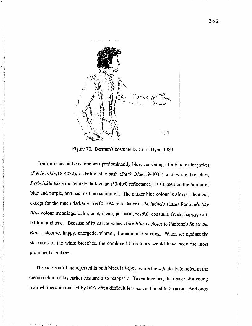
262
\il.I \i i,í\tti¡
l-rìI1
-..\ .t--)r'*--:-.r--6"'c.=!1 * --t
'' 'jC*'-_!
, t:t
Figure 70. Berram's costume by Chris Dyer, 19g9
Bertram's second costume was predominantly blue, consisting of a blue cadet jacket
(P eriwinkle,T6-4032), a darker blue sash (Dør& Blue,lg-4035) and white b¡eeches.
Periwinkle has a moderately da¡k value Q0-40vo reflectance), is situated on the border of
blue and purple, and has medium satlration. The darker blue colour is almost identical,
except for the much darker value (0- 107o reflectan ce). periwinkle shares pantone's ,!þBlue colour meanings: calm, cool, clean, peaceful, restful, constant, fresh, happy, soft,
faithful and true. Because of its darker valu e, Dark Blu¿ is closer to pantone,s spectwn
Blue : elect¡ic, happy, energetic, vibrant, d¡amatic and stirring. When set against the
starkness of the white breeches, the combined blue tones would have been the most
prominent signifiers.
The single attribute rcpeated in both blues is happy, whrle thesof attribute nored in the
cream colour of his earlier costume also reappears. Taken together, the image of a young
man who was untouched by life's often difficult lessons continued to be seen. And once
263
again, the associations of the cadet uniforn would sway much of the colour and characte¡
inûerpretation lowards group affiliation and a corresponding unit characterization.
Just as Timothy o'Brien decided to assist the credibility of BerÍam's grief in the last
scene of the L967 RST production by dressing him in mourning btack, Chris Dyer
followed suit in this one. Bertram appeared all in black, except for his white shi¡t, The
choice of one of the Purit¿n's "sadde colours" in a production set around that historical
period, provided strong signals of Bertram's changed status to the audience. Not only
was he grieving for his (assumed) dead wife, but he also no longer wore a soft or happy
colour, thereby revealing his alæred personality very directly. The colour provided a cleæ
message that Bernam had matured from boyhood to manhood.
The initial costume colour/character readings offered above seem to have been
understood by at least one reviewer, who desc¡ibes Bertram as " Fair-haired, not
unhandsome in a baby-faced sort of way, a little smug in his aristocratic immaturity and
with a certain guilelessness, even in the hopelessly transparent lies of the final scene"
(Smallwood, 1990, p.494). Smallwood's comments suggest that Bertram was
convincingly young, untouched by real life problems, and happy in his position. The lack
of guile, ".,.even ...in the final scene" is more problematic. Reviewing it \rith the
particulff black associative meanings described above, we do not gain a sense of the
implied maturation, but this is resolved by Smallwood's further description of paul
Venable's Bertram. In the final scene, Bertram embraced his mother and Helena
simultaneously. Smallwood believed that "The simultaneous embracing of wife and
mother, of the feminine principle itself, one was surely meant to perceive, signaled
Bertram's final escape from boyhood" (1989, p.495). His words parallel the intent that is
apparent in the shift to the black costume colour.

264
Costume colour/ characterization: KING of FRANCE
Coloured reproductions of costumes from five productions were examined for this
study. Black and white photographs of the Guthrie/À4oiseiwirsch AIIllWell at the
sÍaford Festival show the King wearing a dark-valued smoking jacket over a white shi¡t
in the "curing scene" (tr.i.), and what is almost certainly a black tuxedo/white shirt and tie
combination for the final ball scene at the end of this production. Because this exact
costume colour and style combination has been analyzed in the section on Bertram's
costume colour, it is not repeated here.
Fifties
The British revival of the Guth¡ie4\,foiseiwitsch All's Well at the Shakespeare Memorial
Theatre, Stratford-Upon-Avon in 1959 also featured a smoking jacket for the King's
costume. Moiseiwitsch had specified that it should be a "da¡k brownish wine " colour.
She had a very precise idea of what that meant, as indicated by her emphatic ,,nol" jotted
beside a sample that was slightly less saturated.
The jacket colour (Rasewo od,l9-1532) had a rich reddish-brown tone. It has the
darkest value (0-1070 feflectance), belongs to the orange family of hues, and has medium
saturation. The closest corresponding Pantone colour is Burgundy: classic, expensive,
deep, warm, elegant, rich and refined. These atfibutes seem entirely appropriate for a man
who represents royalty. Even further, the colol¡I suggests that the type of person wearing
it was, in addition to being a man of statu¡e, akrnd (warm) individual, This King was no
shallow man encased in the trappings of royalty, but was a truly noble individual with a
profound (deøp) understanding of human nature. The King's costume included a white
scarf. The c/øssic association of the wine colou¡ is repeated in the attributes of the white
colour, thus reinforcing the inherent good breeding of this individual.
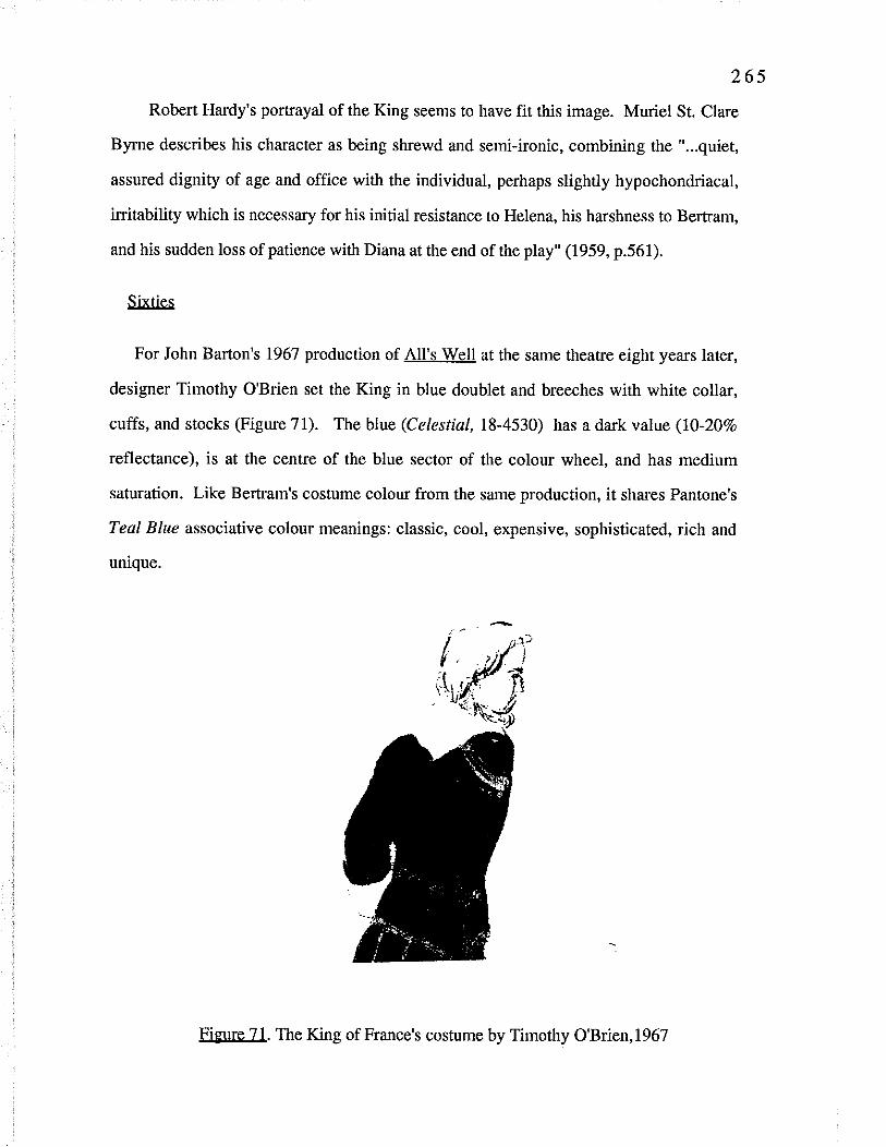
265
Robert Hardy's pornayal of the King seems to have fit this image. MuÌiel St. Clare
Byme describes his character as being shrewd and semi-ironic, combining the "...quiet,
assured dignity of age and office with the individual, perhaps slightly hypochondriacal,
irritability which is necessary for his initial resistance to Helena, his harshness to BerÍam,
and his sudden loss of patience with Diana at the end of the play" (1959, p.561).
S ixties
For John Barton's 1967 production of All's Well at the same theahe eighr yeæs later,
designer Timothy O'Brien set the King in blue doublet and breeches with white collar,
cuffs, and stocks @igure 71). The blæ(Celestial, 18-4530) has a dark value (10-207o
reflectance), is at the centre of the blue sector of the colour wheel, and has medium
saturation. Like Bertram's costume colou¡ from the same production, it sha¡es Pantone's
Teal Blue associative colour meanings: classic, cool, expensive, sophisticated, rich and
unique.
Figure 71. The King of France's costume by Timothy O'Brien,l967

266
Just as Bertram's costume set him apart (¿¿r¿ ique) from the rcst of the courtiers and allied
his st¿tus more di¡ectly with the King, this colour coding distinguished the King of France
as a man of stature and position. O'Brien's king was in control (coof, understood his
subject's foibles (sopålstlcated) nd knew how to handle them in a dignified and effective
manner (c/øssíc). The relative brightness of his costume, like Berüam's, does not,
however, suggest the depth of character that the 1959 ptoduction's colour attributes do.
Critics had little to say about the characterization. Desmond hatt called Sebastian
Shaw's character a "...reminiscent King of France" Gglt$hjlc_Posl, June 2, 1967), while
Doreen Tanner described his as one of three "...extremely sympathetic performances" that
"...managed to temper down their charm with wit and sharpness, something the production
as a whole didn't do" GivcrpoolPost June 2, 7967). And, despiæ the obvious focus on
the conFasting attitudes of age and youth, the King's character was also presented with a
light touch: "...the King was played lightly, even whimsically, lying sprawled on a sofa
with his hands over his ears while Helena tried to persuade him to submit to her
minisrations" (Gross in læiter, 1986, p.9). These conìments seem to indicate a somewhat
"hit and miss" situation with respect to the above costume colour and character reading.
The more superficial teaunent of the character is subsøntiated, and to a certain degree, the
tempered and "\ilit" commented upon suits the sophisticated individual that the
costume colour suggests. What se€ms to be lacking is the autumnal tone the "¡eminiscent"
King appellation conjures. We do have a sense that this r as someone reflecting back on
his life. The emphasis on age conrasting with youth is not in any way expressed through
the costume colour, thus conFibuting to rather than inærfering with the lighter interpretation
of the play as a whole.
Seventies
Age and infirmity appear to be more directly alluded to in Tanya Moiseiwitsch's designs
for the King in the 197 Stratfo¡d Festival production. When Helena approached him with
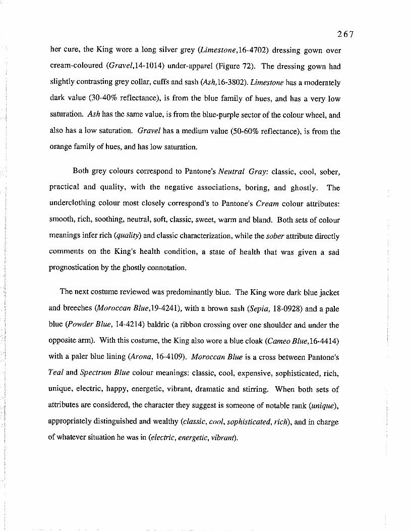
267
her cure, the King wore a long silver grey (Limestone,I6-4702) dressing gown over
cream-coloured (Gravel,l4-1014) under-apparel (Figure 72). The dressing gown had
slightly conrasting grey collar, cuffs and sash (Ash,l6-3802). Límestone has a moderately
dark value (30-40Vo reflectance), is from the blue family of hues, and has a very low
saturation. Aså has the same value, is from the blue-purple se€tor of the colour wheel, and
also has a low saturation. Gravel has a medium value (50-607o reflectance), is from the
orange family of hues, and has low satu¡ation.
Both grey colours correspond to Pantone's Neutøl Grøy: classic, cool, sober,
practical and quality, with the negative associations, boring, and ghostly. The
underclothing colour most closely correspond's to Pantone's Cream colour attributes:
smooth, rich, soothing, neutral, soft, classic, sweet, warm and bland. Both sets of colour
meanings infer rich (quølity) and classic characterization, while the soåer attribute directly
comments on the King's health condition, a state of health that was given a sad
prognostication by the ghostly connotation.
The next costume reviewed was predominantly blue. The King wore da¡k blue jacket
and breeches (Moroccan Blue,19-4241), with a brown sash (,Sepiø, 18-0928) and a pale
blue (Powder BIue,14-4214) baldric (a ribbon crossing over one shoulder and unde¡ the
opposite arm). With this costume, the King also wore a blue cloak (Cameo Blue,l6-4414)
with a paler blue lining (Arona, 16-4109). Moroccan Blue is a c¡oss between Pantone's
Teal and Spectrum BIue cololr meanings: classic, cool, expensive, sophisticated, rich,
unique, electric, happy, energetic, vibrant, dramatic and stining. When both sets of
attributes are considered, the cha¡acter they suggest is someone of notable rank (unique),
appropriately distinguished and wealthy (classic, cool, sophisticated, rich), and in charge
of whatever situation he was in (elecftic, energetic, vibrant).
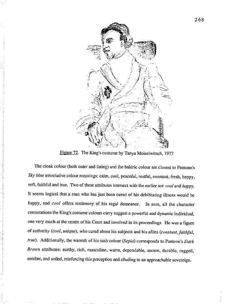
268
.'i' ..) -)
Figure 72.
The cloak colour (both outer and lining) and the bald¡ic colour are closest to pantone's
sþ blue associative colour meanings: calm, cool, peaceful, restful, constant, fresh, happy,
soft, faithful and true. Two of these attributes intersect with ttre earlier set: cool and happy.
It seems logical that a man who has just been cured of his debilitating illness would be
happy, and cool offers testimony of his regal demeanor. In sum, all the character
connotations the King's costume colours carry suggest a powerful and dynamic individual,
one very much at the cente of his cou¡t and involved in its proceedings. He was a figure
of authority (cool, unique), who cared about his subjects and his allies (constant, faithful,trøe). Additionally, the warmth of his sash colour (.sepia) corresponds to pantone's D¿r*
Brown atúbutes: earthy, rich, masculine, warm, dependable, secure, durable, rugged,
sombre, and soiled, reinforcing this perception and alluding to an approachable sovereign.

269
As one review indicates, the change from the sombre neutral gray to the more vibrant
and energetic blue paralleled the King's character development: "William Hutt's King
moves from listlessness to animation" (Berry in Babula, 1981, p.8). The King's authority
and his warm approachability were remarked upon by Gina Mallet who described Hutt's
characterization as a "fairy-tale" style king who rules with "grandfatherly reproof" lThe
Toronto Star, June 17, 1977). These reviews support the costume colour reading.
Eighties
In keeping with the pale tints colouring the cast and stage for the final scene of Trevor
Nunn's 1981 All's Well at the Royal Shakespeare TheaÍe in England, the King wore a
beige-coloured Edwardian suit (Figure 73). The colow (Sheer Pink,12-1106) has a light
value (70-80Vo relfectance), belongs to the otange colour family, and has low saturation.
Like Bertram's costume colour for the same production, it shares Pantorre's Cream
associative colour meanings: smooth, rich, soothing, neutral, soft, classic, sweet, warm
and bland. Given the scene in which the King wears this colour, these atfibutes are very
appropriate to his role. Not only do they convey his position (rich, classic), but they
directly comment on his behaviour in that particular scene. It is the King who suggests that
"All yet seems well; / and if it end so meet, / The bitter past, more welcome is the sweet"
(V.iii.326-7). His words evidence a peacemaker, a soothing presence after the initial
confusion and dishess created by Diana and Helena's disclosures; they suggest a
benevolent type of King.

270
*-Jh¿ 'il\-rl \!i\rì1. a
icili- iiÌ ;rr". à;ì .i\l ì| -. il. ., \
-,_--/ I :l,,ì 1 ì
. , \*; tzf/¡-4
í. i!; In lt'
.xtI u'
Figure 73. The King's costume by Lindy Hemming, 1981
The Dail]¡ Express reviewer refers to John Franklyn-Robbins as portraying a
"...benign King" suggesting that his costume colour reading is accurate. The following
quote also supports this image of him: ''The tone for the final scenes (of accept¿nce and
reconciliation) was set, not by the young lovers, butby the older generation..." @4azer in
Leiter, 1986,p.14). The King was part of the dignified group of authority figures whose
integrity and understanding assisted the transition from Helena's alienation to her
acceptance by Bertram at the play's end.
Three costumes were examined from the 1988 stratford Festival production of All's
[9!!. Besides the military grey frock coat and trousers (the second costume) wom by
Bertram and other men at Court, the King entered the play in an offwhite frock coat
(Vapour,12-4302), blue vest (Pearl Blw,14-4206), brown trousers (Orer, 18-1018), and
tte (Brown Sugør,|1 -1134). Vøpour has a light value (70-80% reftectance), belongs to the

271
blue family of hues and has a very low saturation. It is most closely related to pantone's
White: pure, cool, classic and pristine, in addition to the negative attribute, sterile. The
image of this character is a noble one. The costume's second largest colour coverage is of
Otter, conesponding to Pantone's Taupe colour meanings: classic, expensive, neutral,
sophisticated, practical and negatively, bland. These attributes embellish the note of
distinction (classic) and add the element of experience (sophísticated) and solidity
(practica[) to t]re cha¡acter.
The Pearl BIue vest colour is similar to Pantone's Sþ Blue, connoting calm, cool,
peaceful, resful, constant, fresh, happy, soft, faithful and true cha¡acter attributes for those
who wore it. The Brown Sugar tie colour reinforces Otter's colour reading. The King's
thi¡d costume colour was a very deep green (Dark Green, 19-5573) frock coat and
Eousers, with a white shirt. This colour has the darkest value (0-107o reflectance), is
centrally situated in the green sector of the colour wheel, and has a low saturation. D¿rlc
Green's Pantone associative colour meanings are: classic, cool, earthy, rich, quiet,
expensive and Eaditional.
Two attributes are repeated, classic and caol, suggesting a reading based on those
meanings. This could indicate that the character of the King was perceived to be a
traditional one ("in the classic mold of") and somewhat emotionally restrained (cool). Thus
we gain an image of a regal individual who had authority but did not exercise it at the
expense of forgetting his more gentle and humane qualities, nor did he forget the value of
consistency in his dealings with people.
A statement from Ray Conlogue's review of the production for The Globe and Mail
supports this conception entirely: " The King is presented with dignity and verisimilitude"
(June 12, 1988). Joseph Shaw's characterization appears to have been in accord with the
associative meanings inherent in his costume coloüs.

272
Chris Dyer is the only designer whose observed costume colours for the King are
connected overtly with the traditional royal colour, purple. The designer's first costume for
Barry Kyle's 1989 All's Well production at the RST, Sfaford-Upon-Avon is a deep blue
cloak (Stt'ong Blue, 18-4051) with white ermine collar (another royal symbol) over a white
robe. Over all this, the King wore a rich purple shawl (Petunía,19-3632). Strong Blue has
a dark value (10-207o relfectance), is situated on the border between blue and purple on the
colour wheel, and is highly saturated. This colou¡ lies between Pantone's Spectrwn Blue
and,Teal fot its associative colou¡ meanings: happy, electric, energetic, vibrant, dramatic,
sthring, classic, cool, expensive, sophisticated, rich and unique. Petunía has the da¡kest
vahe (0-107o reflectant), is from the purple family of hues, and has a medium saturation.
It is most closely related to Pantone's Royal Purple for associative colour meaning: royal,
happy, exciting, sensual, flamboyant, creative and negatively, loud.
The only attribute that embraces the two colours is happy. It seems unsuitable for the
context of a costume worn at a time when the King was in ill health. The purple colour's
strong association with royalty was lilely the uppermost reason for the designer's choice.
In combination with the richness of the blue cloak and the pristine white robe, it would
present a sFikingly regal figure and provide an immediate signal of his status. This
characterization was sEengthened by his second costume colou¡.
Following his cure, the King discarded his robe, cloak and shawl, and appeared in a
cream-coloured (Linen, 12-7008) jacket and breeches, with a white shirt and stocks
(Figure 74).

273
Figure 74. King of France's costume by Chris Dyer,l989
He then donned a deep-purple vest and cloak over this costume. The colour was the
same one as in his earlier costume and held the same significanc e. Linen has a light value
Q0-807o reflectance), belongs to the orange colour family, and has a low saturation. It
most closely resembles Pantone's Cream colour attributes: smooth, rich, soothing, neutral,
soft, classic and sweet, with the associated negative connotation of blandness. Given the
character's pafi, the audience would perceive that this King, above all else, conveyed the
impression his prestigious position dictates; he was confident (smooth), regal (classic, rich)
and impartial Qleuh'a[) n his rule,
R. Smallwood was left in no doubt as to the King's char acteÅzatton. Despite his feeling
that the production concepts worked against the role, the King remained a respected regal

figure: " ...for all his ailments, and his court full of effete young men lmeant to n**":'Oback to the tired court of James Il, Hugh Ross's King \ryas never anything but dignified
and stylish, and, in his defense of Helena's claims to honor, or his control of the final
scene, right-minded and decisive" (1990, p.494). It is interesting rhat the negarive
association (bland) of the King's cream costume colour should have been one of
Smallwood's choices to describe the production as a whole: "Although in places a little
bland, a little unresponsive to some of the more bitter tones...the production offered a
coherent and engaging version of the play" þ.495).
Costume colour/characterization: PAROLLES
When George Bernard Shaw saw the Birmingham Repertory's production of All's Well
in 192i1 , (a play which he stated thenceforth became "rooted in my deeper affections") the
part of Parolles was "...presented as an amiable, too smart young man, a sommelier,s
scourge, þlayed by) a youth of nineteen, virile, heavy-browed, darkly handsome"
(Trewin, 1963, p.90), The legendary actress Ellen Terry's diary notarion referring to this
handsome young man as "Already a gteat actor'was accurate, for the part of Parolles had
been played by Laurence Olivier. Regrettably, that production does not form part of this
analysis, but it does provide a preface for the appearance and the character perception of
Parolles. It is worthwhile to note rhat rhis 1927 production, directed by H,K,Ayliff, was
performed in contemporary clothing, making it one of the trail-blazers for that design
approach. Equally of note is the reminder that Tanya Moiseiwitsch's step-father was a
director at the theatre at that time.
For the productions in this research, only four coloured costume images for Parolles
were found; three were designed by Tanya Moiseiwitsch. The following analysis includes
one costume from each production of All's Well that she designed.
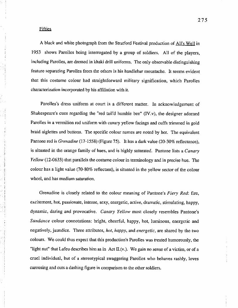
275
Fifties
A black and whiæ photograph from the SÍadord Festival production of All's Well in
1953 shows Parolles being interrogated by a group of soldiers. All of the players,
including Parolles, are d¡essed in khaki drill uniforms. The only observable distinguishing
feature separating Parolles from the others is his ha¡rdlebar moustache. It seems evident
that this costume colour had straightforward military signification, which Parolles
characterization incorporaæd by his affiliation with it.
Parolles's dress uniform at court is a different matter. In acknowledgement of
Shakespeæe's cues regarding the "red tail'd humble bee" (IV.v), the designer adorned
Pa¡olles in a vermilion red uniform with canary yellow facings and cuffs trimmed in gold
braid aiglettes and buttons. The specific colour names are noted by her. The equivalent
Pantone red is Grenødine (17-1558) (Figure 75). It has a dark value (20-307o rcfTertance),
is situated in the orânge family of hues, and is highly saturated, Pantone lists a Canary
Yellow (12-0633) that parallels the costume colour in terminology and in precise hue. The
colour has a light value (70-80Vo reflectant), is situated in the yellow sector of the colou¡
wheel, and has medium satu¡ation.
Grenadine is closely related to the colour meaning of Pantone's Fiery Red: flke,
excitement, hot, passionate, intense, sexy, energetic, active, dramatic, stimulating, happy,
dynamic, daring and provocative. Canary Yellow most closely resembles Pantone's
Sundance colour connotations: bright, cheerful, happy, hot, luminous, energetic and
negatively, jaundice. Thee attributes , hot, happy, and energetic, are shared by the two
colours. We could thus expect that this production's Parolles was Eeated humorously, the
"light nut" that Lafeu describes him as in Act tr.(v.). We gain no sense of a victim, or of a
cruel individual, but of a stereotypical swaggering Parolles who behaves rashly, loves
carousing and cuts a dashing figure in comparison to the other soldiers.

2'7 6
ffi,.€{.=,
¡+"..,.-i.-*rì\-.-.1-,-:.
Figure 75. Pa¡olles costume by Tanya Moiseiwitsch, 1953
Whittacker (1953, p.xxi) describes Douglas Campbell as a " ...rude ¡ed parolles." Orher
reviews refer to the "...low comedy" that he and his fellow soldiers provided
(Edinborough, 1954, p.50). It is little ro go on, but taken together with the production's
overall comic emphasis, there is ample support for the costume colour/ character reading
offered above.
There was no red costume found for the 1959 revival of All's Well, designed by Tanya
Moiseiwitsch for the RST, Stratford-Upon-Avon. Parolles wore miliøry summer dress,
consisting of a khaki-coloured jacket, shirt and shorts, with black beret and socks for Act II
(Figure 76). In addition to this standard uniform, he had an orange-coloured (Cheddar
Cheese,l5-I750) cravat and a beret plume of similar hue.

277
The khaki-coloured uniform and its associations with the traditional military d¡ess so
familiar to the post-World War II audience has already been add¡essed (Bertram, 1959;
Parolles, 1953). The orange cravat and plume offer a distinctive colour signal to the
audience. Cheddar Cheese has a moderately da¡k value (40-507o reflectance), is situated in
the orange sector of the colour wheel, and is highly saturate. It shares Pantone's Orange
P¿¿l associative colour meanings: bright, happy, warm, hot, glowing, vital, harvest, fun,
playful, gregarious, friendly, and negatively, loud.
Figure 76. Parolles' costume by Tanya Moiseiwitsch, 1959
The attributes appear to be similar to those suggested for his 1953 costume colours, but
extend that character's costume colour connotations further. This colour directly signals
fun and playful along with the happy, and l¡ot atFibutes. The character they seem to
convey is not intended to be taken seriously in any way. The negative attribution of
loudness extends the notion that Parolles was likely somewhat of a buffoon within the
regiment, the type of swaggering "loudmouth" who appears !o need to be the cenüe of any
,.tÆ
¿l .l:
f¡.t; ,,

278jovial crowd. The orange cravat and plume sewe as the colourful costume components that
the old courtier Lafeu draws atûention to throughout the play.
I.Trewin calls Cyril Luckham's Parolles a "...saloon-bar blowhæd" (in Babula, 1981,
p.5), but another reviewer states that the exfeme " comic horseplay in the camp scenes ...
minimzed the singularity of Parolles, placing the braggan among a confederation of
incompetents" (Shaw in Leiter, 1986, p.8). J. Price (1968, p.57) describes those camp
scenes as being even more farcical than they had been in the earlier 1953 production. Cyril
Luckham's depiciton of Parolles's character is described by another reviewer as a ".,.
beautifully observed parody of a sham officer" (fhe New York Times. Apin 22, 1959).
Muriel St. Clare Byrne's comprehensive review in the Shakespeare Ouarterly offers the
most complete account of characterization within this production. She recounts Cyril
Luckham's Pa¡olles as being:
... a special sponger, an Edwardian bounder with touches of the post-1945"temporary gentleman" recognizably a modern equivalent for thè parasite-þraggart soldier. The Edwardian lady distrusted him at sight: withhis tastefor loud checks he belonged in a male demi-monde of club smoking rooms.In our time he has again become a propper-up of bar counters. He pushes inwith his betters, is tolerated by his own sex for stooge-value ratheithan richroguery, but remains an outside¡. He must sing for his supper whatevertune they call, unless he has a Bertram in tow.... By makiñg no bid forsympathy but submitting with complete artistic integrity to the author'sruthless onion-peeling, this outstandingly sympathetic actor wins ouradmiration for his truthful anatomy of the parasite's progress (1959,p.s62).
Sifting through the rich descriptions provided by the critics, a clear image of Cyril
Luckham's Pa¡olles emerges. The loud and playful colour of his cravat and beret plume
would have enhanced it for the audience. At the same time, placing him in the basic
uniform of his fellow soldiers lends a degree of subtlety, and makes his character
believably real.
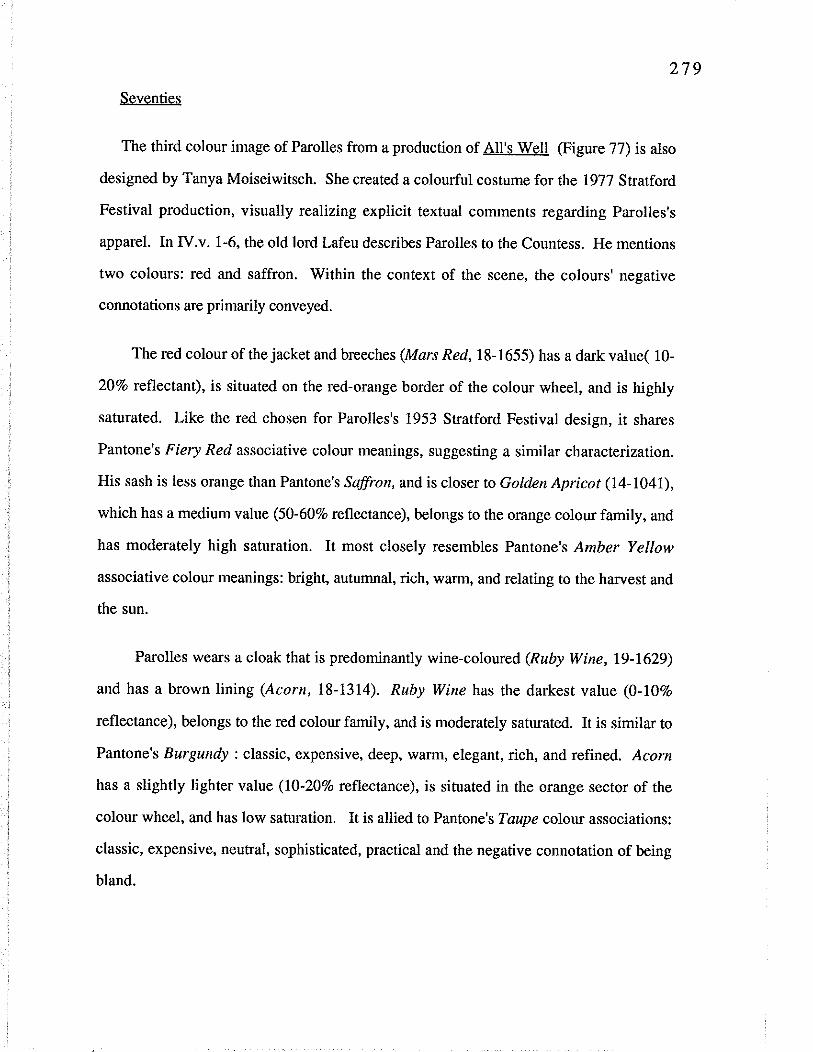
279
Seventies
The third colour image of Parolles from a production of All's Well (Figure 77) is also
designed by Tanya Moiseiwitsch. She created a colourful costume for the 1977 Stratford
Festival production, visually realizing explicit textual comments regarding Parolles's
apparel. In W.v. 1-ó, the old lo¡d Lafeu describes Parolles to the Countess. He mentions
two colours: red and saffron. Within the context of the scene, the colours' negative
connotations are primarily conveyed.
The red colour of the jacket and bree*hes (Mars Red,18-1655) has a dark value( 10-
207o reflecturt), is situated on the red-orange border of the colour wheel, and is highly
saturated. Like the red chosen for Parolles's 1953 Stratford Festival design, it shares
Pantone's Fíery Red associative colour meanings, suggesting a similar characterization.
His sash is less orange than Pantone's Saffron, and is closer to Golden Apricot (14-1041),
which has a medium value (50-607o reflectance), belongs to the orange colour family, and
has moderately high saturation. It most closely resembles Pantone's Amber Yellow
associative colour meanings: bright, autumnal, rich, warm, and relating to the harvest and
the sun.
Parolles wears a cloak that is predominantly wine-coloured (Ruby Wine, I9-L629)
and has a brown lining (Acorn, 18-1314). Ruby Wine has the darkest valne (0-l0Vo
reflectance), belongs to the red colour family, and is moderately satuated. It is simila¡ to
Pantone's Burgundy: classic, expensive, deep, warm, elegant, rich, and rcfineì,. Acorn
has a slightly lighter value (10-2080 reflectance), is situated in the orange sector of the
colour wheel, and has low satuation. It is allied to Pantone's Taupe colotx associations:
classic, expensive, neuEal, sophisticated, practical and the negative connotation of being
bland.
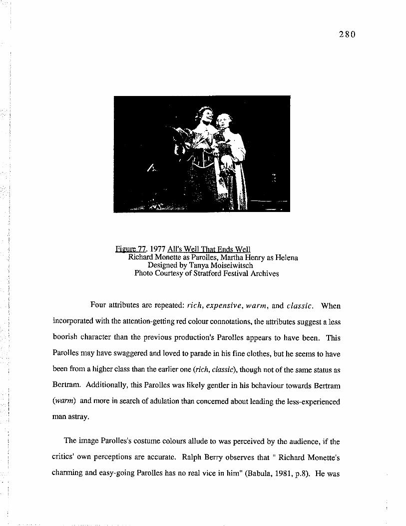
280
Figure 77. 1977 All's Well That Ends V/ellRichard Monette as Parolles, Martha Henry as Helena
Ph",?"dlm,illtr.iräå'È::i,i'JLn,u",
Folrr attributes are repeated: rich, expensive, warm, and c/øssjc. When
incorporated with the attention-getting red colour connotations, the attribuæs suggest a less
boorish character than the previous production's Parolles appears to have been. This
Parolles may have swaggered and loved to parade in his fine clothes, but he seems to have
been from a higher class than the earlier one (rlcå, classic), though not of the same status as
Bertram. Additionally, this Parolles was likely gentler in his behaviour towards Bertram
(warm) and mo¡e in search of adulation than concemed about leading the less-experienced
man asEay.
The image Pa¡olles's costume colours allude to was perceived by the audience, if the
critics' own perceptions are accurate. Ralph Berry observes that " Richard Monette,s
charming and easy-going Parolles has no real vice in him" (Babula, 1981, p.8). He was

28rviewed as an ingratiating paræite: less the hard-core com¡pter, someone who is eager to be
part of the group. This is how Gina Mallet, then The Toronto Sta¡'s theatre critic,
perceived the role she saw played at the Stratford production. Mallet states: " Richa¡d
Monette makes Parolles, Berram's faithless sidekick, into a baby Falstaff, all hot ai¡ and
bad jokes" (June 17, 1977). Her observations confirm a costume colour reading for this
character: Parolles was a younger man whose insecurities necessitated his hitching himself
to someone who had the keys to the club, and who would altow him to come along.
Eighties
The only set of Parolles' costume colours examined from an 80s production was that of
the 1989 RST, SÍatford-Upon-Avon All's Well, It was directed by Barry Kyle, designed
by Chris Dyer and was set in the mid-l7th century.
When Parolles prepared to accompany Berfam as he left Rousillon fo¡ the court of the
King of France, he was dressed all in red, with a brown Favelling cloak. The red colour
(Poinsetta, 17 -1654) has a dark value (20-30Vo reflectance), sits on the red,/orange border
of the colour wheel and is highly saturated. It most closely resembles Pantone's Fíery Red
for its colour meaning: fire, excitement, hot, passionate, intense, sexy, energetic,
active,dramatic, stimulating, happy, dynamic, daring and provocative. The cloak colour
(Marron, 18-1415) also has a dark value (10-20Vo reflectance), belongs to the orange
colour family, and has a low saturation. It shares Pantone's Dark Brown associative
colour meanings: earthy, rich, masculine, warm, dependable, secu¡e, durable, and rugged,
and the negative attributes of sombre and soiled. Confasting with each other, the two
colours present a colourful and dramatic figure, filled with the heat of earthy masculinity
and bawdiness. His hat had yellow, red and white plumes. In addition to the red cue and
Lafeu's ¡eference to saffron in IV.v., the white is a convenient symbolic truce device for
when Pa¡olles's duplicity is discovered in [V.i..
282
Pa¡olles wears arcd.jacket (Cardinal,18-1643) and buff-colou¡ed breeches (Ecru Drab,
14-1212) fo¡ his discourse with Lafeu (while the King danced the coranto with Helena),
Cardinal has a dark value (10 -2-0Vo rcf7e*tznce), sits on the red,/orange border of the colou¡
wheel, and has a moderately high saturation. Ecru Drab has a moderately light vatue (50-
60Vo rcfTectance), belongs to the orange family of hues and has a low saturation. The
character connot¿tions for Fiery Red also apply to Cardinal, reinforcing the previous
analysis, while the colour atfibutes of Ecru Drab most closely resemble Pantone's .Beige:
classic, earthy, sandy, neutral, soft, warm, and bland. Two of these attributes repeat ones
used earlier: warm and earthy. This suggests that the more gregarious, bawdy side of
Pæolles's character was emphasized in this production: an image that primarily reiterates
what is suggested by his previous costume.
In the final scene, Parolles donned the clown's hat and had changed his enti¡e costume
to suit his altered status. He appeared all in brown (Partridge, 18-11,24), with touches of
black and white , Partridge has a dark vatue (10-20Vo reflectance), belongs to the orange
colour family and has a medium saturation. Thus, Parolles ends his appearance in the play
wearing a colour similar to that in which he began. The two browns share the same
associative colour meanings of being earthy aÍd u,)ørm, bu't now the more negative
attribuûes were likely foremost, for Parolles's character had be€ome soiled and he no longer
maintained his earlier status. Furthermore, the sombreness of mood suggested by his
costume colour was reinforced by the grieving black colour (as though mourning his earlier
stature), while the white signified the truce he had arrived at with himself: having come !o
terms with what he really was, a coward.
This last costume colour/cha¡acter analysis seems to have hit the mark. R.smallwood
describes Parolles's final scene in a manner that substantiates this:
Stripped of his black leather, I which was not observed] his feathers, andhis ribbons, and of his nearly plausible military-academy accent, BruceAlexander's splendid Pa¡olles, always aware of the ihinness of his
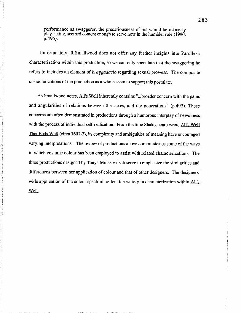
283
performance as swaggerer, the precariousness of his would-be officerlyplay-acting, seemed content enough ûo serve now in the humbler role (1990,p.a9s).
Unfortunately, R.Smallwood does not offer any further insights into Parolles's
characterization within this production, so we can only speculate that the swaggering he
refers to includes an element of braggadacio regarding sexual prowess. The composite
characterizations of the production as a whole seem to support this postulat€.
As Smallwood notes, All's Well inherently contains "...b¡oader concem with the pains
and angularities of relations between the sexes, and the generations" (p.495). These
concems are often demonsffated in productions through a humorous interplay of bawdiness
with the process of individual self-realisation. From ttre time Shakespeare wrote All's Well
That Ends Well (circa 1601-3), its complexity and ambiguities of meaning have encouraged
varying interpretrtions. The review of productions above communicates some of the ways
in which costume colour has been employed to assist with related characterizations. The
three productions designed by Tanya Moiseiwitsch serve to emphasize the similarities and
differences between her application of colour and that of other designers. The designers'
wide application of the colour specÍum reflect the variety in chancterization within All's
Well.

VII. MERGING COSTUME COLOI,JR CONCEPTS
The review of costume colour from 14 productions of Romeo and Juliet and seven
productions of All's Well indicates the presence of some insistent and pervasive cultural
associations and shared colour interpretations with regard to characterization. Designers'
interpretive accord and differences are recognizeable when charts outlining the components
of their applied colou¡ are examined.
Costume colour : sanration and hue
A current text by Gillette (1987) advises theatre students that set designers generally use
hues of medium saturation and value " ...because most sets serve as a background
envi¡onment for the action of the play, and the set needs to recede from the audience's
consciousness after it has made its original statement" (p.91). However, the author
informs us, costume designers work with a "...less constricted palette. Colors of full
saturation and brilliance will di¡ect ttre audience's attention !o the actors. The only provisio
for thei¡ use is that the hue and value be an appropriate reflection of the actor's character"
þ.91). And yet, the preceeding analysis of costume designer's palettes, for ¿\!þ[9!! and
Romeo and Juliet indicates, for the most part, a more restrained use of hue and satuation
than Gillette's text suggests. The cha¡ts identifying costume hue and satwation (Figures
78-85) show that although the costume colours encompass a wide saturation range, a
dominance of low to medium exists, and the most frequently used colours come from the
limiæd scope of orange and blue family hues.
284

285
YEI.TOW
PANTONE COLOURWHEELJULIET
HUE and SATURATION allocation - AII Designers
Tanya MoiseiwitschOther Designersrnultiple choice / more than one designer
symbols // ratio of costume colour )
o-þ
\
r6
Iã4
6=(â)=
(srze ot
c
9\'aé
^ ^oJ ot#rN..o'
aoo--T-,/\ o
32
PURPLE
Figure 78, Costume hue and saturation chart: Juliet

286
¡rÞ¿bW
PURPLE
PANTONE COLOURWHEELROMEO
HUE and SATURATION allocation _ All Designers
A = Tanya Moiseiwitsch(Ð = Othér Designers
ô= multiple cñoice / more than one desisner(siãof symbols // ratio of costume colour ) "
Figure 79. Costume hue and saturation cha¡t: Romeo
o,þ
%
6q
16
d
rìë'i'..'\ CA
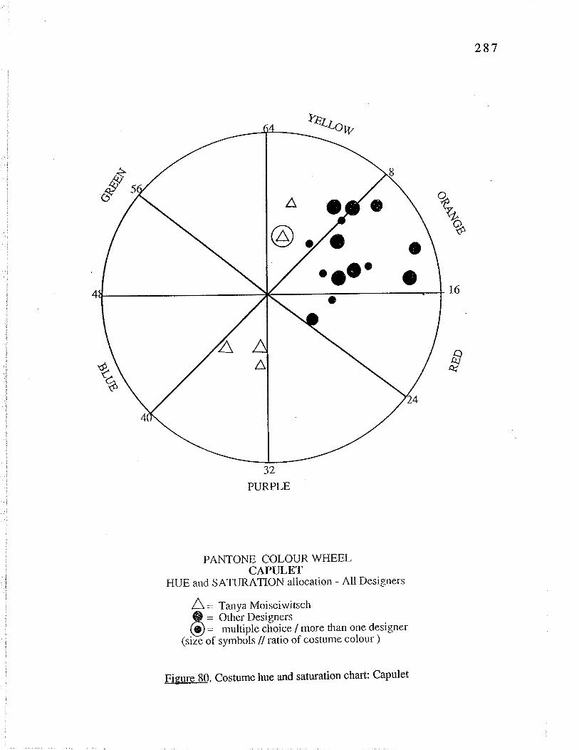
287
YÈLLOW
3Z
PURPLE
PANTONE COLOURWHEELCAPULET
HUE and SATURATION allocation - All Designers
A= Tanva MoiseiwitschQ = otnát DesignerslO) = multiple choice / more than one designer
(siX of symbols // ratio of costume colour )
Figure 80, Costume hue and saturation chart: Capulet
o,þ
u\-ç1
l6
6q
d ate \
@4 .,/ tCOt a\o
%
LA

288
YELLOW
o.þ,\
raq
32
PURPLE
PANTONE COLOURWHEELMERCUTIO
HUE a¡rd SATURATION allocation - All Designers
 = Tanva Moiseiwitsch(Ð = Other Desisners@)= multiple cñ'oice / more than one designer
(siàé of symbols // ratio of costume colour )
!!gulq8-l. Costume hue and satumtion cha¡t: Mercutio
g
%'
v^i"_(to

W
5l8'
cyA
&\:"oE\ ,4
289
Pð¿¿O
þ
h
6È
32
PURPLE
PANTONE COLOURWHEELHELENA
HUE and SATURATTON allocation - All Designers
Â= Tanya Moiseiwitsch€ = Other Desisners@ = multiple cñoice / more rlan one designer
(size of symbols // ratio of cosrume colour )
Figure 82. Costume hue a¡rd saturation chart: Helena

290
YÈLI,OW
o-þ
tLn
t\
16
õ4
)zPURPLE
PANTONE COLOURWHEELBBRTRAM
HUE and SATURAION allocation - All Designers
A= Tanya Moiseiwitsch(ê = Other Designers6)= multiple choice / more than one designer
(siãof symbols // ratio of costume colour )
Figure 83. Costume hue and saturation cha¡t: BerEam
pô
a,//^^
OA oOO
9\â

291
YEI.I{)W
of
%"
a14q
PURPLE
PANTONE COLOURWHEELKING OF FRANCE
HUE and SATURAION allocation - AII Designers
A = Tanya Moiseiwitschê = Other Designersfã= multiple cñ'oice / more ùan one designer
(sËof symbdls // ratio of costume colour )
Figure 84. Costume hue and saturation chart: King of France
c
"ó\ã

292
YEI.LOW
32
PURPLE
PANTONE COLOURWHEELPAROLLES
HUE and SATURATION allocation - All Designers
A = Tanya Moiseiwitsch!Q = Oûrer Designers(C) = multiple choice / more rhan one designer
(si-e of symbols // ratio of costume colour ) *
Figu¡e 85. Costume hue and saturation chart: parolles
o,þ
\
16
a¡¡J4
d"/
a \
/\
41 , 'r_l__-_-
9\å

\93
Apart from other considerations regarding appropriate colour brilliance (chroma,
satuation), the designers' concern not to "kick the lights" is likely a practical explanation
for the predominance of low to medium satüation choices. This phenomenon causes a
colour to appear to be glowing and almost fluorescent. For this reason, pure white is
avoided. Instead, designers will often choose a slightly off-white colour in order to avoid
this effect.
In Romeo and Juliel the costume colour choices fall within the orange family of hues for
almost all of the productions. Tanya Moiseiwitsch uses an orange hue base for Mercutio's
and Romeo's costume colours, but her choices for Juliet's costume colours contrast
somewhat with the others. Compared with other designers' decisions, Moiseiwitsch's
colour choices have a greater range of hue variation, which includes blue-green, blue, ¡ed,
and yellow, in addition to the orange. Tanya Moiseiwitsch differs entirely from the other
designers for Capulet's colour choices, dressing him in yellow- and blue-based hues rather
than an orange hue variation,
Most designers, apart from Motley and to some extent Carolyn Parker, chose colours
that were more muted (low saturation) for Juliet's costume colours. Moiseiwitsch's
highest saturation is in the medium range. The reasons for Motley's use of higher
saturation are likely twofold. The first of these is Motley's søted design philosophy,
suggesting that: "The principal characters in any production must stand out: reds, whites
and blacks are colours that will make them do so...as a general rule, the costumes of the
principals should be either the darkest o¡ the lightest or the most brilliant ..," (Motley,
1992). The second reason follows f¡om the first and is contextual. The saturate red
colour used by the Motley for Peggy Ashcroft's costume in 1935 was chosen at a time
when the theafe was resoundingly a vehicle for "star" performances, as described in

)94
Chapter IV. Together, the two explanations clarify the seeming discrepancy in ofierwise
consistent saturation choices,
It is not as simple to explain Carolyn Parker's use of more saturate colours, except to
offer another contextual explanation. The production she designed occured at a time when
both men's and women's clothing were composed of vibrant colours. Writers on fashion
in the mid-60s though the 70s sometimes tefer to that time as the "peacock generation"
because of the prevailing satu¡ate colours worn by both genders. It is possible that in
addition to extrapolating the essence of the production's period colours (1820s), Pa¡ker's
brighter-coloured costumes were influenced by the chromatic clothing celeb¡ation of her
time.
So enEenched is the cultural idea of Juliet, that one colo:ur, Cream Pearl, (12-1,006),
was chosen by different designers in each of the three countries reviewed over a time
period spanning three decades. Its associative meanings (soft, sweet,warm, rich and
classic) reveal an enÍenched and shared porception of luliet's character. Other colour
choices are in proximity to Cream Pearl on the colour wheel, sharing similar attribuæs and
thus reinforcing this conclusion. Tanya Moiseiwitsch is not amongst the group of
designers incorporating Cra am Pearl , but she did choose a closely related, one, Apricot lce,
(13-1020).
In addition to this collective agreement with respect to Juliet's costume colouring, most
of the costumes sha¡e a similar Renaissance style interpretation. In particular, the
costumes'style a¡d coloüs bear striking similarities to the dress of ttre Horae in Bonicelli's
Birth of Venus (Figure 86). The ethereal dress of Hora, the Greek goddess of the seasons
poffiayed in Botticelli's painting, reappea¡s in almost exact form and colour in several of
the Juliet costumes by various designers: John Ferguson, 1977 (Figure 37); Tanya
Moiseiwitsch, 1960 (Figure 33); Wanen Travis (the silhouette resembles it) (Figure 39);
Rolf Gerard, 1947 (Figure 30); and David Walker, 1984 (Figure 40). Most

295
representations of women's dress from the Italian Renaissance period indicate heavier
fabrication, such as brocades and silk damasks in dæker and more saturate colou$. Given
designers' acknowledgments to referencing prominent works of aÍ, the Botticelli source
seems to be a reasonable supposition.
Figure 86. Botticelli, Birth of Venus c.1482
In addition to her orange hue choices, Moiseiwitsch also selected light blue for the
main body of two costumes, Ginny Humphries added blue costume accents, but no other
designs reviewed for Juliet come from the blue family of hues. From observations of
Tanya Moiseiwitsch's work for other productions, it is interesting to note how frequently
she dressed the heroine in blues or pale blue-greens. For example, beginning with Portia's
blue-green gown in the 1955 Merchant of Venice, and continuing with Hermione's light

296
blue dress in the 1958 Winte¡'s Tale, Juliet's light blue robe in the 1960 Romeo a¡d Juliet,
the Princess of France's blue gown in the 1961 Love's Labours [,ost, and Imogen's blue-
violet dress for the 1970 Cymbeline , a connecting link between blue and Shakespeare's
heroines is prominent in Tanya Moiseiwitsch's work.
The heroine's costumes in All's Well also support this observation. Moiseiwitsch uses
blue as a major part of Helena's costume twice: first, a medium-light blue colour for
Helena's docûor robes in 1953 and second,with her dark blue cloak in the 1977 production.
From the same play, Diana (also a virtuous lady), wears a blue dress in the 1959 RSC
production and again for the 1977 Festival production. As we have seen, blue is a colour
with connotations of authority, credibility, calmness, softness, coolness, peacefulness,
constancy, faithfulness, truth, happiness, and strength (depending on its value and
saturation). The above list of heroines all have characters for whom the blue attributes are
particularly suitable, thus offering a range of possible explanations for Moiseiwitsch's
colour choices. The darker blues' connotati ons of authority, credibility and strength
reinforce the confidence Helena requires to approach the King of France (1977 All's Welt),
while the peaceful, calm, soft and faithful attributes associated with the paler blues
emphasize those traits in characte¡s such as Hermoine (1958 Winter's Tale), or Juliet (1960
Romeo and Juliet).
The fact that Juliet is robed in much paler blues than Helena suggests a perception of her
chæacte¡ as being less forceful than Helena's. The director for the 1960 production of
Romeo and Juliet ¡efers to Juliet's cha¡acter in terms that support this observation. Michael
Langham states that "... the part calls for extreme innocence... coupled with an enormous
depth of passion" (Carter,1960). Helena's character by contrast, is more dedicated than
passionate, and her early banter with Parolles as well as her knowledge of medical
conditions suggests a greater degree of worldliness. Moiseiwitsch's choices of darker
value and deeper saturation reflect this va¡iance in character, while the base hue solidly

297
supports both characters' innate goodness (since, as Desmond Heeley observes, in
Christian cultu¡es blue is the colour of the Madonna, of the Virgin Mother).
Although a limited number of costume colours for Capulet were studied, the charts
indicaæ that he is dressed by all designers in very similar colour choices (within the orange
family of hues or in blacþ exc€pt by Moiseiwitsch. She uses blue-purple and a gteen tone,
offering a slightly different perspective on Capulet's chæacter. The blue-purple ha¡kens ûo
his more spiritual side, while the inclusion of green connects him more closely to the cycles
of nature -- life and death. These Capulet costume colours suggest a more introverted and
complex character than the other designers' interpretations while still essentially presenting
him as the authority figure that dominates all of the Capulet characterizations. This
interpretation is emblematic of Moiseiwitsch's belief that the audience should not ahvays be
handed obvious cha¡acter readings. She believes designers shouldn't ne€essarily use the
obvious colou¡ for characterization, observing that " You can look just as fagic in whiæ as
you can in black" (Carter, 1960). This design approach is frequently demonsrable in her
costume colour choices and is a significant feature of her costume colour application.
On the saturation and hue charts, Romeo's costume colour choices form a column
between orange and blue with sporadic stragglers in the blue-green, blue-purple, yellow,
and ¡ed sectors of the colour wheel. On a subtle level, the dispersion of colour choices
predominantly polarized between the blue and orange suggests greater interpretive
possibilities for his characterization; it also illushates the confusion within his character
itself. Whereas the consistency of hue and saturation choices for Juliet's costume across
time and place implies shared perceptions, Romeo is not as unanimously colour-coded,
One explanation may be the difference in character presented by Shakespeare's text. Juliet
never wavers from her chosen love. Shakespeare implies that Romeo is her fust and her
only love. When the nurse tries to fansfer Juliet's allegiance from Romeo to Paris, Juliet
doesn't hesitate ûo tum from her, reje.cting her lifelong support and nurnring. By contrast,

298
Romeo rapidly swings from pining for Rosalind to being enraprured by Juliet and he is tom
between his ma¡ital obligations to Juliet, and the obligations of chival¡ous honour that
decree he kill Tybalt in revenge for Mercutio's death.
Of the two lovers, Romeo's broader dimensions of human ambiguity are reflected in ttre
more va¡ied costume colour choices supporting his characterization. Tanya Moiseiwitsch is
in ch¡omatic accord with the warmth of the orange hue base, but is the only designer to
create a blue-purple costume for Romeo. By doing so, she emphasizes both his family
heritage (purple=royalty=noblity) and his sad demise (deep purple = mourning,
melancholy). The use of a less overt hue to guide the audience's understanding of his faæ
not only underline the sad conclusion, but also reinforce Romeo's lack of agency in the
light of that fate. He is conditioned by a noble code decreeing he avenge his friend's death,
even if it meants killing a member of his wife's family. The choice of blue-purple once
again illustrates Moiseiwitsch's attitude towards a more subtle approach to sending
characterization signals through costume colours. Two other designers shift Romeo's
costume hue from warm tones to cool within their productions: Carolyn Pa¡ker in 1968,
and David Walker in 1984. The shift from warm to cool colours accentuates the parallel
shift in mood from laughter to grief that characærizes the play as a whole.
Mercutio's character also seems to be quite clearly described: predominantly orange
tones, with a few additions of blue, one green, and some yellow- and red-based hues.
Tanya Moiseiwitsch's colour choices closely conespond with those of other designers but
differ somewhat in saturation. She chose low saturation for the main body of Mercutio's
costume, while the majority of other designers chose a higher saturation, saving the lower
satuation range for costume colour accents. By choosing a predorninantly low saturation,
Moiseiwitsch offers an added degree of sombre dignity to his character, in addition to
suggesting more directly his grim fate. This observation is bome out by a comparison of

299
Mercutio's costume colou¡ with that of the more outageous chæacter Parolles from ¡\!lþ
Well.
Tanya Moiseiwitsch chose a highly saturate warm red colour for one of Parolles's
costumes in both the 1953 and 1977 productions at Stratford Festival. In part, the hue
choice was dicøted by Shakespeare's textual reference to the "red tail'd bee" (which most
designers seem to acknowledge), but her choice is underlined by a distinctive attitude to
that hue. The designer saw red as a potentially provocative colou¡. One of the comments
she recorded on a working sketch for the 1955 production of The Merchant of Venice notes
that "red is a licentious colour." In conversation with her in 1990, she described the power
of red as a colour demanding attention because it is a "hot colour" and therefore "advances"
perceptually. By giving full reign to the saturate level of Parolles's reddish-orange
costumes in the two productions, she is making a definite statement about that character's
potentially hazardous qualities. By comparison, Mercutio's more subdued costume
colouration suggests a less pointed commentary. Overall, Parolles's costume colours from
all designs reviewed suggest that designers have followed Shakepeare's metaphorical
reference regarding Parolles's costume and corresponding character.
Costumes from the seven productions of All's Well studied indicate that the King of
France is viewed in a manner that is quite opposite to Parolles. The concentration of
costume colou¡ choice made by all designers is in the blue family of hues, extending into
blue-green and blue-purple. Within the warm range of hues, Tanya Moiseiwitsch is the
only designer to include a predominantly orange hue-based costume, although some
designers use it as an accent colour. In combination with Moiseiwitsch's choices for other
characters' costume colours, this application of a brownish-o¡ange base colour supports a
design palene preference featuring variations of that hue.
The limited use of purple for the King's costume suggests that the ancient allocation of
purple to distinguish royalty only has undergone shifts in cultural consciousness. The
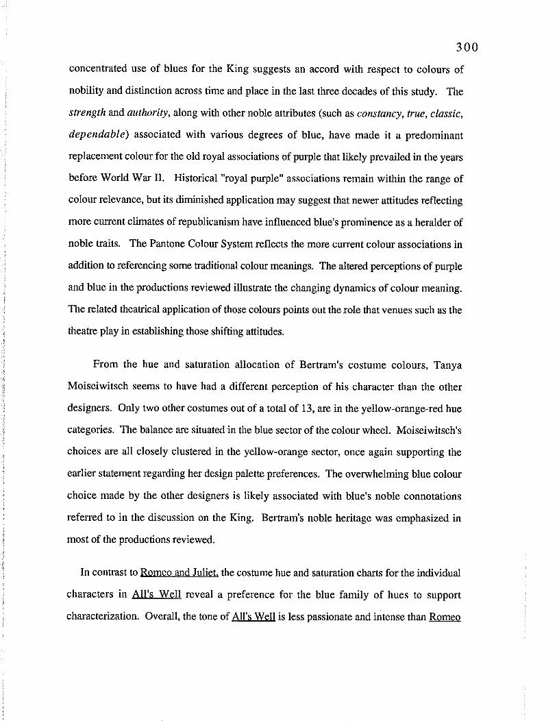
300
concentrated use of blues for the King suggests an accord with respect to colours of
nobility and distinction across time and place in the last three decades of this study. The
strength and authority, along with other noble attributes (such as constancy, true, classic,
dependable) associated with various degrees of blue, have made it a predominant
replacement colour for the old royal æsociations of purple that likely prevailed in the years
before World War II. Historical "royal purple" associations remain within the range of
colour relevance, but its diminished application may suggest that newer attitudes reflecting
more curent climates of republicanism have influenced blue's prominence as a heralder of
noble traits. The Pantone Colour System reflects the more curent colour associations in
addition to referencing some Eaditional colour meanings. The altered perceptions of purple
and blue in the productions reviewed illusÍate the changing dynamics of colour meaning.
The related thearical application of those colours points out the role that venues such as the
theate play in establishing those shifting auitudes.
From the hue and saturation allocation of Bertram's costume colours, Tanya
Moiseiwitsch seems to have had a different perception of his character than the other
designers. Only two other costumes out of a tot¿l of 13, are in the yellow-orange-red hue
categories. The balance are situated in the blue secto¡ of the colour wheel. Moiseiwitsch's
choices are all closely clustered in the yellow-orange sector, once again supporting the
earlie¡ statement regarding her design paletæ preferences. The overwhelming blue colour
choice made by the other designers is likely associated with blue's noble connotations
referred to in the discussion on the King. BerEam's noble heritage was emphasized in
most of the productions reviewed.
In contrast úo Romeo and Juliet. the costume hue and satu¡ation charts for the individual
characters in All's Well reveal a preference for the blue family of hues to support
characterization, Overall, the tone of Álll$&ll is less passionate and intense than fugg

301
and Juliet. This attitude is reflected in the greater application of cooler colours in ¡\!]}Well.
Costume colour: complementary colours
One of the most stri-king observations that can b€ made from all the costume colour
choices is the dominant polarization between orange and blue hue-based costumes. The
two colours are known in colour theory as "complementary colours" because they are
found opposiæ to each othe¡ on the colou¡ wheel, and because they complete each other in
the composition of the primary triad. Orange is made up of yellow and red, two of the
primary triad of colours. Blue is required to form the complete triad, hence it is the
complementary colour of orange. In the same manner, yellow complements violet, and red
complements green. This phenomenon, translated into costume colours, suggests a sEong
innate need to provide a harmonious whole within a production's overall costume colour
scheme. Established design principles recognize the need for the balance this
complementary colour phenomenon provides (Bevlin, 1980). Additionally, orange is
regarded as being in lhe warm group of colours. These colours are perceived as having a
warming, brightening effect. Blue is regarded as a c¿ol colour, having both positive and
negative associations within the western world (Hope and Walch, 1990). And, as colour
researchers have observed:
"Of all the complementary combinations in natu¡e and ar¿ those of blue andorange, or yellow-orange, appear to be the most coÍtmon.... The greatestconEast in the qualities lmown as warmth and coolness of colors is found inthis pair of complements for the reason that blue impresses most people asthe coldest of hues and orange as the warmest" (Sarfent, 1964, p.125j.
Costume colours from several productions of the two Shakespeare plays reviewed in
this study indicate a continuance of this phenomenon. Along with the innate desire to
provide the balanced visual staging suggested earlier, it may be that the polar opposiæs of
colour "temperatures", orange and blue elicit correspondingly strong emotional responses
in the viewer. As a bridge between the imaginary action on the stage and the audience

302
involvement with it, these emotionally charged hues add to the likelihood that the
communication will be effective. Consciously or unconsciously, designers for the two
plays in this study seem to have subscribed to that premise. Another reason for the sfong
concentration of orange and blue-based costume colours may exist in the fact that the
productions resea¡ched in this study were comprised of casts who were white-skinned.
Blue and orange hues are most complementary to white skin lones.
Costume colour: value for value
At first glance the charts describing hue and satüation (Figures 78-85) appear to offer
the complete costume colour pofile. If they are matched with the initial production costume
colou¡ and character charts in Appendix A, the resulting composite image does not mesh
perfectly. The explanation lies in the variation of the value of the hues. And, in many
respects, it is the value that most clearly articulates the costume colour description of the
character who wea¡s them. This is so because value is one of the chief determinants that
fragments hues into several apparently "new" colours, although they are in truth, simply
darker or lighter versions of specific hues. In colour theory, a hue with added white to
lighten it is referred to as a tint of thât hue, and a hue with added black to darken it is
regarded as its shade. Culturally in the Western wo¡ld, the degree of lightness and
darkness of a colour has distinct emotional associations, with the darker values being more
negatively and more powerfully perceived (Frank & Gilovich 1988). For the productions
reviewed in this study, the values of the main portion of the costume colours (Figure 87)
provide some interesting and conclusive information regarding cultural colour perception
with relation üo character attribution.
The Pantone Value Scale begins with the numerical designation of 10, which is equal
to white, and progresses downwards to 19, which is equal to black. This system of
recording hue lightness and darkness allows for some variation at the top and bottom of the
scale. Because 10 = 90-100Vo reflectance, this means that an off white can also be
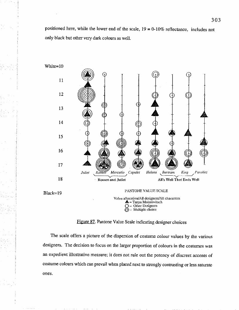
303
positioned here, while the lower end of the scale, 19 = 0-l0vo reflectance, includes not
only black but other very dark colours as well,
Btack=19 PANTONE VALUE scALE
Value allocatiorVAll designeß/All charactersA = Tanva MoiseiwitschO = Oth'er Designers
@ = MultiPle choice
Figure 87. Pantone Value Scale indicating designer choices
The scale offers a pictüe of the dispersion of costume colour values by the various
designers. The decision to focus on the larger proportion of colou¡s in the costumes was
an expedient illustrative measue; it does not rule out the potency of discreet accents of
costume coloüs which can prevail when placed next to sÍongly contrasting or less saturate
ones.
\________.v--_-____
' Romeo and Juliet
Ortt
å1@aLióó
6@
@_6-------\/'-'-----
Romeo ând .Iuliet
13Jå10Ar++l+ltÅ83Åildó ó lóö@óó@@@@ö r
Capulet Helena . Ber[ram Kitg_-JPaÌollcs
Allrs Well That Ends Well

304
One of the outstanding aspects of the value chart for both Romeo and Juliet is the
dramatic polarization between the two lover's costume colour values. For Juliet's
costumes, almost all of the designers overwhelmingly chose colours in the four lightest
ranges on the Pantone scale of value. The uppermost value (90-1007o reflectance), white,
is repeated several times fo¡ Juliet's costumes, The greatest number of costume colours a¡e
situated in the third lightest value range, at 70-80Vo ¡eflectance, with decreasing and
sporadic choices made the lower, a¡rd darker, the scale descended.
By contrast, Romeo's costume colours are grounded in the darker values. There are at
Ieast two reasonable explanations for this. The frst suggests that lighter values are chosen
for young women, with a correlation between the lightest values and innocence. A
second, more textually dependent explanation also exists. Romeo and Juliet is filled with
references to light and dark, and the young lovers identify each other with these attribuúes.
Clemen (1977) states that light is the most important symbol for luliet, and Spurgeon
(1935) points out that the two lovers always appear to each othe¡ as light against a dark
background. The text suppoÍs both positions. One of the most famous lines in the play
refers to Juliet as a symbol of light when Romeo asks: "But, soft! What light through
yonder window breaks?/ It is the east, and Juliet is the sun" (II.ii.,2-3). The parallel
connecting Iuliet to light is made early in the text and is woven into and through the scenes
up to the play's climax, at which time some of Romeo's last words entrench the
connection: " For here lies Juliet, and her beauty makes/ This vault a feasting presence full
of light" (V.üi. 85-ó). Equally, as Spurgeon notes, Romeo also serves as a source of light
for luliet: "Come night; come, Romeo; come, thou day in night; / For thou wilt lie upon the
wings of night / Whiter than new snow on a raven's back" (Itr.i. 1?-9). Designers' have
chosen to interpret this by highlighting the value differences between Romeo's and Juliet's
costume colours þlacing Romeo in darker values and Juliet in lighter ones), or by
emphasizing value diffe¡ences between the two lovers and the rest of the cast (having
Romeo and Juliet all in white next to a colourfully-attired cast).

305
The overall consensus with respect to Julieds and Romeo's costume values suggests
that extensive agreement exists regarding suitable colour descriptions of the two characters.
It is also possible that this is the result of familiarity with the play's production history and
a conesponding bow to Íadition within it. Given the concenEation of darker values for
Mercutio's and Capulet's costumes, the same conclusion is applicable. Designers,
including Tanya Moiseiwitsch, appear ûo concur regarding the appropriate costume colour
value needed to assist those characterizations. Therefore, this study supports the expected
outcome regarding the costume colour meaning for these characters, but the inclusion of a
lesser known play offers a countercheck to examine the consistency of colour readings.
All's Well provides that balance. Because of its limited production history, directors
have explored a broader range of interpretation. The costume value choices made by
designers ¡eviewed in this study thus allow for some provocative insights into colour and
characterization relationships within it. This is particularly so with respect to Helena's and
BerEam's costume values. Gilovich's (1988) article demonsFates the de$ee to which the
perception exists regarding the potent fo¡ce of the darkest colour, black, By extension,
lighter and darker values of the various hues are capable of subtly signifying related
meanings. The corresponding degree of visual weight the darker values convey easily
tanslates into related character atFibutes ( darker values=heavie¡ weight=sEonger character
figuratively or literally). The relationship of colour value and visual weight is an
established phenomenon within colour theory (Hope and Walch, 1990).
Because black depicts the social convention of a public state of mourning that marks the
beginning of All's Well, it has not really been included in these observations. Almost
without exeception, all designers for All's Well incorporate black costume colour to
describe the mouming status of the Rousillon household in the first act of the play.
The variation existing in Helena's costumes' scale ofvalues, especially when compared
to luliet's more consistent costume colours, confirms a less congruent reading of Helena's
306
character and greater variation in its interpretation. A review of the play's production
history subsøntiates this statement. The three productions Tanya Moiseiwitsch designed
present different character emphases in Helena's role. In 1953 at the Stratfod Festival, she
was depicted as a sweet, open, generous and optimistic young woman. Her corresponding
costume colours had medium-light values, in conEast to the medium-dark values in the
other two productions. In 1959 at the RST Helena was a more confident, ardent young
woman, while in 1977 at the Statford Festival, Helena appeared as a quieter, more
restrained individual. The wide range in her corresponding costume colour values reflects
these varying interpretations. A similar application of widely ranging values is evident in
other productions of All's Well. Timothy O'Brien's (1967 RSC) chosen value range (12-
17) helps to describe a youthfully innocent and determined Helena; Christina Poddubiuk's
(1977 Stratford Festival) value range (18-19) reflects Helena's virtue; Lindy Hemming's
(1981 RSC) chosen value range (10-18) supports a characterization that emphasizes a quiet
intense passion ; and Chris Dyer's (1989 RSC) range of values (10-15-19) assists a
characûerization that includes hints of "white witchery" and basic earthiness .
By conEast, Bertam's costume values are more consistently concentrated in the darker
ranges, suggesting a greater shared perception of his cha¡acter by all designers. But in
fact, this is not completely accurate. Although the characterizations can generally be
perceived as having negative attributes, variations exist. In the 1977 production at the
Stratford Festival, Bertram was porfayed as a more mature individual than in any of the
other productions reviewed. Critics mostly describe him as being somewhat of a
"sourpuss." This contrasts with a cha¡acterization in the 1981 RSC production that
emphasized Bertram's self-centred sensual nature, and the 1988 Stratford Festival
production wherein he was porrayed as a womanizing "beau soldat." In the remaining
four of the seven productions, BerEam was essentially a privileged, sometimes spoiled,
young man. The most ready explanation for the concenfated value choices is the cultural
association of darker values with male clothing. And, because darker values carry more
307
visual weight (often associated with power), the cultural perceptions of appropriate gender
depictions æe accordingly referenced; lighter values are more frequently relaæd to females,
and darker ones (culturally perceived as being more potent) to males. In this respect, it is
interesting !o note that beginning with Tanya Moisewitisch's dæk blue cloak for Helena in
1977, the use of darker values for the female costumes by all designers increases the more
recent the production. The shift in value and gender relationship parallels Westem
society's revisions in attitudes towards gender roles. læss rigid definitions of what
constitutes approprate male and female roles are reflected within the clothing of the "real"
world, not only in androgynous dressing, but also in the increased use of darke¡ colours in
women's fashions. It is something that has been addressed by numerous clothing
historians (Hollander, 1978; Kidwell & Steele, 1989; Laver 1969; Wilson & Taylor,
1989). The phenomenon of shifting value and gender relationship is evident in Berram's
costume as well. In conÍast to Helena's costume values, his lightest value costumes occur
in productions after 1981.
Tanya Moiseiwitsch uses a fairly consistent value range for three of the four characte¡s
reviewed from ¿\!þ$þ!1. This seems to be a prevalent design approach on her part. Ask
anyone familiar with her work what they regard as characterisitic of her costume designs,
and the response will almost certainly include reference to a subdued colour palette.
Moiseiwitsch is sometimes accused of dipping her brush in dirty water (Sangster, 1957)
and known to apply a "tea-wash" (Behl, 1981) over dye in her costumes, thus lowering
their saturation and darkening thei¡ value. Her considered resEaint in the use of light and
bright colours reflects, in part, the legacy of her collaborative theaEe experience with
Tyrone Guthrie. He is renowned for his mastery of crowd orchestration on stage,
integrating movement with visual elements in the same manner as his favorite artist
Rembrandt employed light and colour to highlight figures within a crowd. By balancing
the distribution of light- and dark-valued costumes, or by varying the visual weight,
Moiseiwitsch wo¡ked with Guth¡ie's a¡tistic vision to shift the moods within a production.

308
The same approach could be used to isolate and thus highlight a specific character in some
manner, Parolles's costume value and satr¡ration are an example of this. Because its
intensity differs from the other three characters, it is certain to focus attention on him, as the
photograph with Helena from the 1977 Stratford Festival production of All's Well
demonstrates (Figure 77). A more obvious example of this design approach can be seen in
the photograph from the 1961 Stratford Festival production of egig!¡¡¡¡S on which both
Moiseiwitsch and Cuthrie worked (figure 88). On a stage filled with figures costumed in
suMued colour, the intensity of the golden yellow costume acts like a spotlight similar to
Rembrandt's cast light on selecæd figures in his otherwise sombre-toned paintings.
These examples illustrate Tanya Moiseiwitsch's distinctive blending of costume colours
as well. One of the chief ways she achieves this harmonious mix and situational
highlighting is through the use of related values, something that the value scales identify.
The majority of her chosen values fall within the bottom four readings on the scale. In
taking this approach Tanya Moiseiwitsch excercised (consciously or unconsciously) her
belief that clues to cha¡acterization not be too obvious. By maintaining comparable values,
several different hues could be harmoniously presented at one time without jarring the
audience's perception of the play's action or disúacting them before it was necessary. As
the examples above illusEate, Moiseiwitsch's neuÍâlizing tea-wash or use of close value
ranges help to maintain a balanced focus on the cha¡acters until such time as a more directed
one is necessary.
This is not to imply that Tanya Moiseiwitsch is the only designer using this type of
design approach, but rather, to demonstrate her specific colour application within the two
plays chosen for this study. And it is an approach to costume colour that is partially a
response to the dictates of the stage she helped reintroduce ûo Shakespeare audiences in the
this century. She prefers to call it "theatre in 3/4 round" rather than by the more widely
used terms by which it is known: as a thrust søge (Hayes & Barlow, 1991).
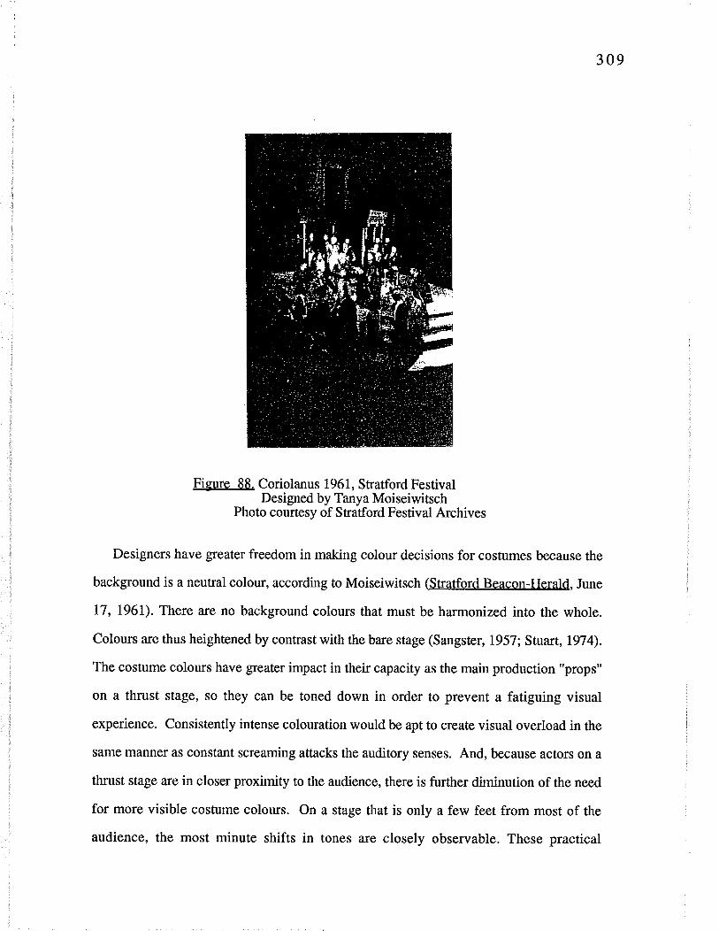
309
Figure 88. Coriolanus 1961, Stratford Festival
Ph","T;iff$bJf iffi'åx"i::'#'jii1..n,u",
Designers have greater freedom in making colour decisions fo¡ costumes because the
background is a neuÍal colour, according to Moiseiwitsch (S.EafotùBçaçe4$gdd, June
17, 1961). There are no background colours that must be harmonized into the whole.
Colou¡s are thus heightened by contrast with the bare stâge (Sangsær, 1957; Stuart, 1974).
The costume colours have $eater impact in their capacity as the main production "props"
on a thnst stage, so they can be toned down in order to prevent a fatiguing visual
experience. Consistently intense colou¡ation would be apt to create visual overload in the
same manner as constant screaming attacks the auditory senses. And, because actors on a
thrust stage are in closer proximity to the audience, there is further diminution of the need
for more visible costume colours. On a stage that is only a few feet from most of the
audience, the most minute shifts in tones are closely observable. These practical

310
considerations offe¡ a balanced perspective to any analysis of designers' application of
colour value in costumes on that type of stage.
A comparison between the costume colours wom on the proscenium and the thrust
stages indicates that higher contrast palettes are employed more frequently on the
proscenium stage. As an example of this, Motley's intense orange-red hue for Juliet's
costume in the 1935 production, followed by their 1958 production, illusEate their
recommendations (Motley, 1992) to dress prominent characters in brighter colours than the
rest of the cast, Warren Travis's designs for the 1979 ACT production of Ra.lsca_æfl
Juliet also feature a high contrast between all the costume colours. These productions were
on a proscenium stage. By conEast, most of the productions in this study that were
featured on a thrust stage tend have a closer value relationship amongst all the costumes,
suppofting the perspectives of costume on the thrust stage given by Moiseiwitsch in 1961,
Sangster in 1957, and Stuart in 1974.
Fashionable colours and theatre costume
Like other designers, Tanya Moiseiwitsch recognizes thât even in the historically-
oriented costumes so prevelant in Shakespeare productions, contemporary influences are
inevitable. She states that it was never a conscious effect: "It would be terrible if it were.
But you have the feeling of your o\rn period. It can't be avoided" (Carter, 1960).
Hollander (1978) and others Q-aver,1,964; Maeder, 1984) outline the insidious influence of
the designer/actorþudience symbiotic cultural relationship on theatrical and film costume.
Actors a¡e the impetus that make sense of the costumes' relevence to the play and
accordingly, !o the audience through their kinetic energy. Hollander points out that actors'
shared understanding of cultural codes connects them emphatically to their contemporary
audience in a way that can never be fully eliminated through costume disguise.

3ltDebra Hansen, @ersonal communication, 1990) Head of Design at the SFatford
Festival, distinguishes three bases for her own costume colour decisions in the order of
influence: personal palette, period colours, emotional association, She recognizes that
fashionable colours within her prefened colour range may appear more readily in her
designs, both because of their popularity and because of their availabilty. It seems to b€ a
forthright and logical rationale, one that likely underlies most designers' creative process.
Although contemporary fashionable colou¡ influence forms an area of investigation in
this study, it was not overtly observable in the choice of costume colows. Hope and
Walch's text (1990) contains a comprehensive survey of fashionable colours for the six
decades from which examples of costume colours in this study were observed. The text
indicates that fashionable colours in the 1930s include pinks, b¡owns and greens. By
contrast, Motley chose a vibrant red for Juliet. It was not a fashionable colour at the time,
but it did suit the star-centred theatre of the 1930s: a theatre that offered a glamorous
altemative !o the grim realities s¡ daily life.
In the 1940s, during and immediately after World War II, navy blue, khaki, earth-
browns, and red were populæ fashion colours, with hot pink, chartreuse (yellow-g¡een),
turquoise and purple appearing at the outgoing tum of the decade. Although there are really
too few examples to make a substantive comparison, the three costumes
@4osieiwitscly'l943; Geræd11947) examined for this time were black and white. These do
not really pamllel the cont€mporary fashionable colours of the 40s. Tanya Moiseiwitsch's
colou¡s were chosen in part because of the availability of materials during the war; white
and black lace curtains could be successfully tranformed into Spanish dress. Gerard's
costumes were created immediately following the war at a time when resources continued
to be meagre. With respect to fashion, black and white are considered to be classic colours
in almost any era.
312
By the 1950s, the buoyancy of a world in the process of recuperation is reflecæd in
cheerful fashion colours such as pastels, turquoise, sþ blue, baby pink, cherry red and
navy blue. Apart from Motley's light blue dress for Juliet in the 1954 RSC production, no
other costumes matched these. Tanya Moiseiwitsch's use of khaki-coloured uniforms for
both productions of All's Well in 1953 at the Stratford Festival, and in 1959 at rhe RST,
could be said to reflect the taste for that colour immediately following the war, but it was
specifically chosen for its military appropriateness.
During the 1960s, such colours as acid yellow and funky purple existed alongside
saturate primary colours and the newly popular denim blue. Carolyn Parker comes closest
to reflecting the primary colours in the 1968 Stratford Festival Romeo and Juliet, but it is
only a vague reference. Her use of bright yellows approaches, but does not meet, the
vividness of the psychedelic colours that exemplified the Camaby Street colou¡s so
prominent in 60s' fashion.
For most of the 70s, south-westem earth-tones consisting of browns, beiges and golds
were fashionable in clothing and interior deco¡. By the end of that decade, the beginnings
of the punk movement is reflected in Eendy orange, lime green, and black fashions. It is
possible to attribute some contemporary fashion colour influence on the colour choices
made by three designers in the productions reviewed. Iohn Ferguson's 1977 designs for
the Seatford Festival Romeo and Juliet incorporate beige tones for Juliet's costume, and
the prevailing b¡own and orange colour combination for Capulet's costume. Like
Ferguson, Warren Travis incorporated browns and oranges in the 1979 Romeo and Juliet
costumes he designed for the American Conservatory Theatre in San Francisco. Tanya
Moiseiwitsch used browns nthe lg77 AllltWel! at the Staford Festival. She is noæd for
he¡ love of brown tones, so that their popularity would have been a secondary
consideration.

313
By the 1980s, the strongest impression of fashionable colour is of black. It is a decade
that saw the adventurous use of black for b¡idal and children's wear. Within that decade,
there was also a retum to bright colours such as fuschia, magenta and purple in addition to
the reinnoduction of neon colours. In haute couture, red was very prominent. It is
difficult to se€ any overt influence of these fashionable colours on the costumes from the
productions reviewed in this study. Even when the play was staged in a contemporary
period, such as the 1986 RSC Romeo and Juliet. the colours chosen for the hero and
heroine were more symbolically representative (whitÐ than reflective of contemporary
fashion colours.
From the limited observations of fashion and theaEe costume colour parallels in this
study, there is little evidence that a direct link exists. Perhaps the natures of these particular
Shakespeare plays frustrate any direct relationship between fashion and theatre. It may be
easier to remain relatively true to period colours when the play's setting is further removed
from the present time, allowing designers to feel freer (however consciously) to choose
more symbolically expressive colou¡s or to follow tradition in a period play. While the
fashionable colours of a period may not have prevailed, the discussion on values and
gender suggests that compliance with the cultural "zeitgeist" of the time exists with respect
to the application of gender-suitable degrees of lighÍress or da¡kness.

YItr. CONCLUSIONS
Nexus
Across two continents, within three different countries in the Western world, and
spanning a period of 51 years, designers have frequently shared costume colour visions for
the eight cha¡acters examined in this study. The preceeding analysis of their accord is
important because it reinforces the recognition that colour is a sustaining and powerful
signifier within the theatre and within the b¡oader concourse of daily life. This is a well
accepted belief within our culture, a phenomenon that has been examined by numerous
disciplines including theatre, where an a\{areness and appreciation for colour's
communicative potential exists although colour signification has not received extensive
research focus. An understanding of colour meaning (on either a conscious or
subconscious level) helps an audience to make sense of the character roles within a play,
assisting the play's momentum. Substantiating colour meaning is especially important in
the theaEe since it is a public forum wherein cultural signifiers are disseminated and their
meanings perpetuated or challenged.
The composite analyses of costume colours from several productions having the same
script, has helped to determine certain characteristic colour choices made by Tanya
Moiseiwitsch and her colleagues: colour choices observed, evaluated, and compared across
time and place. Costume colour profiles for lg¡qçq¿¡glfuþ¡ and All's Well supply futüe
researchers and interested theatre patrons with a sound, accurate record from which to
observe other productions and designers, to assess originality, to consider Eadition, and to
wonder at chance in the symbiotic world of theafe production and design.
Using the model described in Chapter III, a broad base of material was examined to
establish essential costume colour and characterization as it was applied by Tanya
Moiseiwitsch and 14 other designers in 21 productions. The first step necessitated the
314

315identification of cha¡acterization revealed in Shakespeare's text and a review of critical
thought with respect to the relevant characters. Because it di¡ectly investigated the sou¡ce
and content of the plays it was labelled Shakespeare's Text.
The second step involved the examination of. the Performance Text (also labelled
Interpretive Texr ), to esøblish how the play was perceived by those who produced it. At
this point, written direction or explanation by a director, designer, or actor regarding
characterization or the production as a whole, was integrated into developing a composite
picture of the Interpretive Text. This process recognizes the context in which the
production occuned, specifically the cultural time and place. It was at this stage that the
costume colours themselves were examined and their hue, value, and saturation recorded
using the Pantone Professional Colou System Selector.
Finally, a thfud step was necessary: the analysis of the costume colour meanings and
characterization, and subsequent verification of what was understood by the audience.
This step was labelled the Audíence Tex.t or Interpreted Text. First, from a retrospective
perspective, I have analyzed the costume colours using Pantone's list of colour meanings.
Once this was done, reviews of the productions werc utilized to correlate the reEospective
perceptions of characterization with that of an actual member of the audience (the theatre
critic). In addition to reviews, any writing by the actors themselves, as well as fi¡sthand or
recorded interviews with the designers, were also instructional for verifying the costume
colour/characterization readings.
With one or two exceptions, the interpret¿tions based on this reseârch model support
commonly held colour associations within Westem society over the past 50 years. Most
importantly, the model offered a consistent comparative tool and less impressionistic
method for assessing Tanya Moiseiwtsch's application of colour in Shakespearean
costume. These features validate is use. At the same time, as it was applied in this study,
the model could not address all the variables involved in theatrical design and production.

3t6The retrospective nattrre of much of the material being examined presented challenges
which could not always be resolved. It was not possible to gain a complete picture of
costume colours viewed in different lighting situations from those in which they had
initially been presented, or to gain a consistent knowledge of which point in the play a
particular colour appeared. Additionally, it was not always possible to determine if the
audience was presented with an intentional character choice of costume colour within the
action of the play. In the second half of the play, for instance, is Romeo represented as
making a deliberate costume colow choice differing from his family colours, to signify his
break with the family feud? What of Parolles's recognizeable acknowledgement of his
character and his changed position at the play's end through his donning suMued, even
d¡ab colours as he did in Barry Kyle's 1989 RST production? Wherever possible, I have
included this information, but the volume of productions, the detail involved, and the
inconsistent available data made it impossible to add¡ess many of these interpretive
nuances. The model needs to be tested using a smaller data base. Perhaps an application
of the model on two productions with complete records, and subsequent verification of the
analysis with the designers would provide a solid test for the system. Nevertheless,
certain patterns did emerge through the application of the model which provided a format
for the examination of Tanya Moiseiwitsch's approach to colour in costume design, as the
discussion of the results in the previous chapter has shown.
The majority of productions reviewed for this study have characteristics of design
associated with the morphological classification; for the most part, the costumes serve as
functional aids to characterization. Increasingly, costume and set design reflects the
materialistic style. Michael Bogdanov's 1986 production of Rg.nseg_U(Lluligl, with its
blend of contemporary attire and props ananged, according to one critic, as "...a series of
unconnected set pieces, choreographed with an eye to the promotion-video public"
(Financial Times, April 9, 1986) reveals aspects of the materialistic classification that his
curent 1993 production at the Lyric, Hamme$mith seems to unabashedly celebrate. Like

3l'lthe 1986 production, Bogdanov's 1993 Romeo and Juliet increases the level of stage
business, emphasizing humour, even when Mercutio and Tybalt battle:
The Tybalt-Mercutio duel is played mostly for laughs; it goes on for ages;the two men even stop for drinks; and a gtotesque old man prances aroundand between them, beating time on a pair of bongo drums. Mercutio mimesmasturbation on a champagne bottle held against his groin and sprinkles thegrateful citzens with exploding foam. Capulet dictates his conxnents on thelovers' death to a comiclooking reporter, and there is a long dumbshow inwhich the main characters get photographed against the lovers' goldenstatues (Peter, 1993, 9.22).
Bogdanov deliberately challenges traditional reverential interpretations of Shakespeare's
plays and presents productions that reflect changes in society, Concurring with newer
critical thinking, he feels that the Ba¡d's plays have been "...hijacked by a literary and
cultural elite.., in order to shore up its own position and to ensure the continuation of a
conservative status quo" (Bogdanov, 1993,2.7). As more new productions set out to de-
mystify and de-mythologize Shakespeare, the potential for new expressions of costume
colour meaning arise. Is colour used differently in such productions? If it is, how clear are
the diffe¡ent costume colour clues, resulting from any correspondent changed cultural
meaning for contemporary audiences? The a¡rswer to these questions will help to establish
a more complete understanding of the history of costume colour in production and
contribute further to an aw¿ueness of the role of colour meaning on stage. With some
modification in its application, the Theatrical Costume Colour Analysis research model
offers a foundation for future study in this area by providing a consistent methodology.

3r8Tanya Moiseiwitsch : subdety in colour and design
The results of this research support the literatue describing Tanya Moiseiwitsch's
favoured costume palette as warm with subdued colou¡s. Asked what he¡ preferred colour
palette is, Moiseiwitsch replied in 1977 , thati "One does ænd to lean on black and magenta,
gay and brown,...but there are certain degrees of in-between colors, that do act in my
palette quite often because of the nature of the work that I'm asked to do" (Bundick, 1979,
p.487). Moiseiwitsch reviewed this st¿tement 12 years later, and firmly erased the magenta
reference, asserting that it was never a favoured hue. Her colour palette is frequently
associated with warm earth-tones, but any queries regarding her tendency towards earth
colou¡s ¡eceive the response that the script determines colour choices. Again and again,
she reiterates her conviction that the script must b€ "listened to" with respect to every part
of its realization in production. Her application of colour in costume for the two
Shakespeare plays reviewed in this study indicate that while she may have had a similar
understanding of the playright's cha¡acterization as other designers, she frequently chose to
express that characterization by using similarly coded but less direct colours. Dressing
Romeo ând Capulet (Stratford Festival 1960) in dark purple rather than mourning black is
an example of this. The darker value denotes the sombre quality of their positions in a less
overt manner than the stark black colour.
Tanya Moiseiwitsch's subde application of colour is a means, she believes, of engaging
the audience. While the language and action of the actors remain the predominant
mechanisms for underst¿nding what is being communicated, the costumes exist as
supportive elements. This is succinctly articulated in an interview with Bundick (1979,
p.485) when Moiseiwitsch states:
I think, if you can help an audience to follow what's going on, that's quiteimportant. But again, you don't want to dot the i's and cross the t's forthem so that it leaves no work for them to do. ...you have to mystify themon occasion, and there are some times you don't want !o be black and whiteand snaight-forward, but you want more of a little gray, where you can be alittle mysærious.

3t9Her appreciation for the allu¡e of mystery is a core element not only in her use of
costume colour, but also in her total design approach. Beginning at an early age, she
recognized that there could be magic in theatre: illusion could be used to heighten the
audience's enjoyment of the play. Added to her natural reticence, this attitude is pivotal to
her reluctance to methodically analyze how she wo¡ked. It is an attitude that has been said
to characterize the British tradition from which she developed. Irving Wardle's
introduction to Marowitz & Trussler's Theatre at work (1967) asserts that those in British
theatre "...as a rule keep thei¡ mouths shut. They get on with their work and leave it to
critics and other outsiders to make sense of what they have done" (p.9). This tradition
grew out of the belief that theaue exists as a "fairy-tale ghetto" whose magic is apt to vanish
if its mysteries are revealed, According to Wardle, that attitude was changed along with
the larger theafical shifts, in the 1960s.
In many ways, Tanya Moiseiwitsch herself personifies the mysterious aura of theatre, a
situation created not only by her origins within the British theare that promoted the
uadition, but also through the romance that surrounded her personal life. We know some
details about Moiseiwitsch as a talented young \ryoman who, intimidated by the public
demands of her parents' professional music careers, channeled her own artistic energy inûo
theare design. Appreciation fo¡ her devotion to her art has been further heighæned by the
knowledge of her young widowhood. Moiseiwitsch's reluctance to speak about her work
and her personal life contribute to her enigmatic image, an image perpetuated by articles
written about her bearing titles such as "Tanya: mystery by design" (læe, 1967), and by
associates' references to her as a "Russian Countess" (Desmond Heeley in Tanya
Moiseiwitsch: Designs for Staford, 1992). Altogether, these qualities depict a mysterious
and roma¡tic portrait: an image that has remained impenetable by all but her closest
associates. The softly muted overtones of the costume colours she favours function as a
metaphor for her own person, never shouting to be the c€ntre of attention, meshing with

320others to create a harmonious environment, and never superficial but suggestive of multi-
layered depths.
Tanya Moiseiwitsch's design approach was shaped not only by the British theatre
traditions that fosæ¡ed her belief in the mysterious aura of theatre, but also by an education
suited to her tâlents and by world events that affected her personally and professionally (the
death of her new husband in World War II, and opportunities to test her craft in repertory
theatre during that difficult time). Her design approach was influenced by her association
with some of the best-known dire€tots in 20th century classical theate -- Tyrone Guthrie,
Anthony Quayle, and Micheal Langham to name a few. Her willingness to take
imaginative risks to realize their visions (designing pared down stages and architectonic
costumes at a time when decorative design was still preferred, as she did for Guthrie's
production of Britæn's Peter Grimes in 1947), indicated she had the strength to succeed.
Moiseiwitsch's collaborative genius, particularly with Tyrone Guthrie, reflects not only
her personal vision of what a designer's role should be, but is also representative of the
expected gender roles during the time they worked together. Guthrie dominated the
production and she accommodated his design requirements. Marowitz's ¡ecognition of the
negotiated power amongst the members of the production team supports this idea. The
role of designer grew alongside other developments in British theatre. Up to the time that
Moiseiwitsch began her career, the design team had been led primarily by men. From the
turn of the century, when the role of designer really took shape, the prominent designers
were men. It was only during the 1930s that female designers such as Motley, Alix Stone
and Tanya Moiseiwitsch established themselves in British theafe design, working in an
atmosphere of co-operation aimed at serving the production. As part of a designer/director
team, it was the director (almost without exception a man), who dominated the production
team. Moiseiwitsch has said that Guthrie was a directo¡ who knew what he wanted. It is
possible then, that some of Tanya Moiseiwitsch's quiet attitude toì ards her achievements

321throughout her career are related to her role as a woman breaking new ground in what had
primarily been a male arena.
Tanya Moiseiwitsch's position within design history is firmly established. In 1953,
when Canadians welcomed the Guthrie and Moiseiwitsch ûeam (figure 1), they greeted two
representatives of the British theatrical radition who were leaders within it. Thirty-nine
years later, Stratford Festival once again embraced her by mounting an exhibit of her
costumes and design sketches at the Gallery Stratford. The exhibit was one of the
highlights in a series of special events to celebrate the 40th season of the theatre's
existence. Tanya Moiseiwitsch quietly smiled at the kind words spoken by the current
Lieutenant Governor of Ont¿rio and celebrated the anniversary with many ofthe individuals
who had worked to produce the first season. She wore her trademark headscarf, as she
had fo¡ the commemorative photo she posed for, standing next to the model of the stage
she and Tyrone Guthrie had designed (figure 89). The 40th season opened with a
performance of The Temoest, The next evening, on the main stage, with the Moiseiwitsch
cenÍe balcony pillar restored, another production of fu¡gçq¿4¡llUlig! began.

322
Figure 89. Tanya Moiseiwisch beside he¡ model of the thrust stage 1991.Photo courtesy of Stratford Festival A¡chives

323
References
Addenbrooke, D. (1974). London: WilliamKimber & Co. Limited.
Agate, J. (1946).& Co, Ltd,
l¡ndon: George G. Harrap
Agate, J. (1937). More fust nights. London: Vocto¡ Gallancz Ltd.
Albers, J. (1963). Interaction of color. New Haven: Yale University Press,
Alexander, P. (Ed.), (1951). The compleæ works of William Shakespea¡e. l¡ndon:Harper Collins Publishers.
Allen, D.C. (1936). Symbolic color in the literature of the English Renaissance.Philological Ouarterl)¡, !l (4), January. 81-92.
ing And Materials. Designation: D 1729, (1989).
: Anderson, B, & C. (1984). Costume design. New York: CBS College Publishing.
: Ashleford, J. (1988). Dress in the age of Elizabeth L New York: Holmes & Meier.
. Babula, W. (1981). Shakespeare in production: 1935-78. New York: GarlandPublishing Inc.
:. Banham, M. @d.). (1988). The Cambridge guide to world theatre. Cambridge University, Press.
: Barzun, J., & Graff, H, (1977). The modern researcher. New York: Harcourt Brace, Jovanovich, Inc.
I "eauman, S. (1982). The Roval Shakesoea¡e Company. Oxford: Oxford University Press.
i Behl, D. (1986). Architect of the open stage: Tanya Moiseiwitsch's alliance with art andcraft. Tjatre.lesfts, n 16-23 Aug/Sept.
Behl, D. (1981). Tanya Moiseiwitsch: Her contribution to theatre arts from 1935-1980.Unpublished Doctoral Dissertation. Kent State University.
Benson,8., & Conolly, L. ( 1987). English-Canadian theatre. Toronto: OxfordUniversity Press.
i Serlin, 8., & Kay, P. (1969). Basic color terms: Thei¡ universality and evolution.! Berkeley: University of California hess.
. Berry, R. (1985). Suaford Festival in Canada. Shakespeare Ouarterly , 36, 87 -93.
I Berry, R. (1978). Stratfo¡d Festival in Canada, Slaksspça¡slQua4sly,nQ),222-223.
Berry, R. (1977). On directing Shakespeare. l¡ndon: Croom Helm Ltd.

324Bevlin, M. (1980). Design through discovery. New York: HoIt, Rinehart and Winston.
Biren, F. (1969). Principles of color. New York: Van Nostrand Reinhold Company.
Bi¡ren F. (1965). History of color in painting. New York: Van Nostrand ReinholdCompany.
Birren, F. (1962). Color in vour world. New York: Collier Books.
Bi¡ren, F. (1950). Color ps:¡chology and color therapy. New York: McGraw-Hill BookCompany , Inc.
Blom. P.V. (1982). Tanya Moiseiwitsch. costume design: The creative orocess.Unpublished Doctoral Dissertation. University of Michigan.
Bogdanov, M. (1993, June 13). Vulgar Shakespeare. Ihs.'.'Srnd,AÉilqeg,2.7
Boucher, F. (1965).20.000 years of fashion. New York: Harry Ab¡ams Inc., Publishers.
(1983). Oxford: Holywell Press.
Brockbank, P. (1985). Players of Shakesoeare. Cambridge: University Press.
Brockett, O. (1974). The theatre. New York: Holt, Rinehart and Winston, Inc.
Brown, J. (1963). Dramatis personae. London: Hamish Hamilton Ltd.
Brown, J, (1962). S. Franco Zeffirelli's Romeo and Juliet. Shakespeare Survey, þ,144-145.
Brusatin, M, (1991). A historv of colors. Boston: Shambhala.
Bruster, D. (1991). 'Russet mantle'. Notes and Oueries,236. March. 63-64.
Bryden, R. & Neil, B. (1985). Whittaker's theatre. Greenbank: The Whittaker Project.
Bryden, R. (1969). The unfinished hero. London: Faber & Faber.
Bundick, Theresa. (1979). Costume designs at the Guthrie Theatre in its first ten ]¡ears.Unpublished Doctoral Dissertation, University of Minnesota.
Burdick, E., Hansen, P. &. Zange4 (Fds.). (1974).Middleton: Wesleyan University Press.
Burnham, R., Hanes, R.& Bartleson, C. ( 1963). Color: a guide to basic facts andconcepts. London: John Wiley and Sons, lnc.
N. R.( 1e82).
Canadian Government Specifications Board. Method 46. (1977),

325Candee, M. D., (1955). Cunent biograohv }¡earbook (16th annual cumulation ).
New York: The H.\Y.Wilson Company.
Ca¡ær, J. (1960, April 21). Statford costumers emphasize character. (!þþ949¡\Materloo Rcd.
Castle, C. (1986). Oliver Messel. l¡ndon: Thames and Hudson.
Cavanagh, J. (1989). British theâfe. a bibliography: 1909-1985. Romsey: Motley Press.
Chamber's EncJ¿çlooaedia, 3.Q967). Oxford: Pergamon P¡ess.
Clayton, T. (1980). Shakespeare at the Guthrie, Minneapolis. Shakespeare Ouarterly,3l(t), 239-243.
Clemen, W. (1977), The development of Shakespeare's imagery. London: Methuen andCo. Ltd.
Clurman, H. (1966). The naked image. New York: The Macmillan Company.
Cobb, D. (1962, June 16). Garland of praise for a very shy lady, The Toronto Dâil], Star.
Craig, H., & Bevington, D. @ds.). ( 1973). The complete works of Shakespeare.Glenview: Scott, Foresman and Company.
Crampton, Esme.(1972). A handbook of the theatre.Toronto: Gage Educational PublishingLimited.
Creative Canada (Vol. 2). (1972). Toronto: University of Toronto Press.
Cunnington,C. & Cunnington,P, (1954). Handbook of English costume in thesixteenth centu{v. l¡ndon: Faber and Faber Limite¡.
D'Andrade, R., & Egan, M. The colors of emotion. American Ethnologist, L, 49-63,
Dash, I. (1981). Wooing. wedding and power: Women in Shakespeare's plays. NewYork: Columbia University hess.
David. R. 11978). Shakesoea¡e in the theatre. Cambridse: Cambridse Universitv Press.
Davies, R., Guthrie,T., Neel, B., & Moiseiwitsch, T. (1955). Thrice the brinded cat hath¡gçrv!!.Toronto: Cla¡ke, hwin &Company Limited.
Davies, R., Guthrie, T., & Macdonald, G, (1953). Renown at Stratford. Toronto:Clarke, kwin & Company Limited.
De Grandis, L. (1986). Theory and use of color. New York: Harry N. Abrams, Inc.,Publishers.
Dessen, A. (1984).
Diesel,L. (1951). Liz Montgomery of Motley-one third of a team. ThgaEs.Á!L:,39-40.68.

326
Dollimore, J. & Sinfreld, A. @ds.). (1985). Political Shakespeare. Ithica: ComellUniversity hess.
Drakakis, J. (Ed.). (1985). Alternative Shakesoeares. l¡ndon: Methuen.
Dusinberre, J. (1975). Shakespeare and the natue of women. l¡ndon and Basingstoke:The MacMillan hess Ltd.
Eaton, A. (1988, February l).Honourable designs. The Independent
Edinborough, A. (1954). A New Stratford Festival. Shakespeare Ouarterl),. 5, Jøn. 47-50.
Eiseman, L. & Herbert, L. (1990). The Pantone book of color. New York: Harry N.Abrams, Inc. Publishers.
Ellinger, R. (1963). Color structure and design. New York: Van Nosfand ReinholdCompany.
Ellis, R. (1948). The Shakespea¡e Memorial Theatre. l¡ndon: Winchester PublicationsLimited.
Elsom, J. (1976). Post-war British theat¡e. l¡ndon: Routledge & Kegan Paul.
Evans, B. (Ed.). (1974). The riverside Shakespeare. Boston: Houghton Mifflin Company.
Evans, H. & Dumesnil, C. (1982). An invitation to design. New York: MacmillanPublishing Co. Inc.
Evans, L. ( 1976). Fashion colors in women's apparel as related to business c]¡cles andindividual attitudes. Unpublished Doctoral Disseration. Texas Woman's University.
Foakes, R.A. (1952). Suggestions for a new approach to Shakespeare's imagery.Shakespeare Suwe]¡, I.
Francis, S., & Evans, P.(1988). Effects of hue, value, and garment style on collegerecruiters' assessments of employment potential. Pjlcf¿p!¡al4¿MalÉ&[ls, (67),87-93.
Francis, S., & Evans, P. (1987). Effects ofhue, value, and style of garment and personalclothing of model on person perception. Perceptual and Motor Skills, (64), 383-390.
Frank, M., & Gilovich, T. (1988). The dark side of self and social perception: Blackuniforms and aggression in professional sports. Joumal of personality and social$ychafgcy, 54 (1), 74-85.
French, M. (1981). Shakespeare's division of experience. New York: Summit Books.
Fuelop-Mille¡ R. (1972). Color symbolism. American Fabrics, (96) Winter. 63-66.
Ganong, Joan. (1962). Backstage at Sfatford. Toronto: l-ongmans Canada Limiæd.
London: The Saturn Press.

327
Gibson, L. & Balkwell, C. (1990). Effects of harmony between personal and apparelcoloring on perceptions of a woman's employment potential. Clothing a¡rd TextilesResearch Journal, E Q), 23-28.
Gielgud, J. (197 4). Early ståges. London: Heinemann Educational Books Ltd.
Gillette, J.M. (1987). Theatrical design and production. Mountain View: MayfieldPublishing Company.
Goodwin, J. (Fd.). (1988). British Theatre design. London: Weidenfield and Nicolson.
Grebanier, B. (1975). Then came each actor. New York: David McKay Company, Inc.
Guth¡ie, T., Davies, R., & Macdonald, G. (1954). Twice have the trumpets sounded.Toronlo: Cla¡ke, Irwin & Company Limiæd.
Habicht, W., Palmer, D., & Pringle, R. (Eds.). (1986). Images of Shakespeare. Delaware:University of Delaware.
Hale, L. (1950). The Old Vic: 1949-50. London: Evans Brothers Limiûed.
Hamid, P. (1992). Colour of reading maærial and performance decrement. !ç¿ggp¡qglgg!Motor Skills, (7 4), 689-690.
Ha¡tnoll, P. (1968). A Concise history of the theatre. London: Thames and Hudson.
Ha¡nroll, P. (Fd.), (1951). The Oxford companion to the theatre. Oxford: OxfordUniversity Press.
Hayes, E. & Barlow, A. (1991) Conversation with Tanya Moiseiwitsch. (Video)S taford Festival Archives.
Heffner, H., Selden, S., Sellman, H., Walkup, T., & Jones, K. (1973). Modern theatreoractice. (Fifth Edition). New York: Appleton-Century-Crofts.
Herbert, I. (Ed.).(l981Company.
(17th ed.). London: Gale Research
Hinchcliffe, 4,. (197 4). British theatre: 1q50 - 1970. Oxford: Basil Blackwell.
Hollander, A. (1978). Seeing through clothes. New York: Penguin Books.
Honore, C. (1992, August 8). Reflections in a golden eye. The Globe and Mail.
Hope, 4., & Walch, M. ( 1990). The color comoendium. New York: Van NostrandReinhold,
Hunt, H. (1973). Old Vic prefaces. Westport, Connecticut: Greenwood Press.
Hunt, H. (1962). The live theatre. London: Oxford University Press.
Ingram, R. (1990). Cambridge: Chadwyck-Healey Ltd.

328Ingram, R. (1990). Leslie Hurry. London: The South Bank Cenüe.
Itten, I. (1970). The elements of color. New York: Van Nostrand Reinhold Company.
Jacobs, L. (1980). Shakespeare in the San Francisco Bay Area. Shakespeare Ouarterly,3J, 0), n6-277.
Johnson, 4., Johnson, O. & Baksh, M. (1986). The colors of emotions in Machiguenga.American Anth¡opologisl EE, (3), 674-681.
Kelly, K. (1990)."The Queen's two bodies": Shakespeare's boy actress in breeches.Theatre Joumal. 42,G), 81-93.
Kidwell, C. & Sæele, V. (1989). Men and women: Dressing the oart. Vy'ashington:Smithsonian Institution Press.
Knowles, R. (1988). The legacy of the Festival stage. Canadian Theatre Review, 
329
(1977). Catalogue from the Gallery
Maeder, E. (1987). Hollywood and history. l¡ndon: Thames and Hudson.
Maerz, A. & Paul, M.R. (1950). A dictionary of color. New York: McGraw-Hill BookCompany, Inc.
Matthews, B. (Trans.). (1986). The Herder symbol dictionary. Wilmette: ChironPublications.
Marowitz, C. (1986). Di¡ecting the action. New York: Applause Theatre Books.
Mæowitz, C., & Trussler, S. (Eds.). (1967). Theatre at work. L¡ndon: Methuen & Co.Lrd.
May, R. (1973). A companion to the theatre. New York: Hippocrene Books Inc.
Mechanics of Magic. (1992, June) Maclean's, 50-51.
McCracken,G. (1985). Dress colour at the court of Elizabeth I: An essay in historicalanthopology. The Canadian Review of Sociology and Anthropolog)¡,22, (4),515-532.
Miller, J. (1986). Subseouent performances. London: Faber and Faber Limited.
Moiseiwitsch, T. (1988), Convocation address, University of Toronto. Sratford FestivalArchives Collection.
Motley (1992). (Revised edition). Designing and making stage costumes. New York:Theatre Arts Books.
Mui¡, K. & V/ells, S. (Eds.). (1982). Aspects of Shakespeare's problem pla]'s.Cambridge: Cambridge University Press.
Mullin, M. (1991). Motley and Romeo: the designers and the text. Theatre Journal, {!,The John Hopkins University Press, 475-469.
Mullin, M. (1990). Design by Motley. The University of Illinois at Urbana - Champaign.
Mullin, M. & Muriello, K. (1980). Theatre at Statford-Uoon- Avon, f. London: TheLibrary Association.
Nash, G. (1967). Edwa¡d Gordon Craig. London: Victoria and Albert Museum.
Neely, C. (1985). Broken nuptials in Shakesoeare's ola]¡s. New Haven and London:Yale University Press,
Norris, H. (1938). Costume and fashion: Vol.3. the Tudors. London: J.M. Dentand Sons Ltd.
On directing in Ca¡rada: John Hi¡sch. (1974, Winter). Canadian Theafe Review, 49-55,

330Paoletti, f. (1983). Clothes make the boy 1860-1910. Dress, 9, 1,6-20.
Patterson, T., & Gould, A. (1987). First søge: The making of the StraÉordFestival.Toronto: McClelland and Stewart.
Peter, J. (1993, June 6). User-friendly tosh. The Sunday Times, 9.22.
Pettigrer , J., & Portman, J. (1985).Stratford: the fi¡st thirtv yea¡s. (Vols. I and. Ð.Toronto: Macmillan of Canada.
: Pinkham, R. (Ed.).(1983). Oliver Messel. Victoria and Albert Museum
Price, J. (1968). The unfortunate comedy. Liverpool University Press, University ofToronto Press.
Quigley, P. (1990). Behind the scenes. SraÉord Festival Archives.
, Raby, P.(Ed.), (1968). The Sratford scene. Toronto: Clarke, Irwin and Company Ltd.i, Radeloff, D. (1991). Psychological types, color atEibutes, and color preferences of, clothing, textiles, and design students. Clothing and Textiles Journal ,2, Q), 59-67 .
:
' Reinelt, I.G. & Roach, J.R. (Eds.) (1992). Critical theory and performance. Universityof Michigan Press.
Robets, P. (1976). The OId Vic story. London: W.H. Allen & Co. Ltd.
Robinson, L. (1951). Ireland's Abbey Theatre. London: Sidgwick and Jackson, Limited.
Rosenfeld, S. (1973). A short history of scenic design in Great Britain. Totowa, NewJersey: Rowman and Littlefield.
Rossi, A. (1977). Astonish us in the moming. DeEoit: Wayne State University Press.
i Rutter, C. (1991). Helena's choosing: Writing the couplets in a choreography ofj discontinuity ( All's Well That Ends Well 2.3). Essal¡s in Theahe , 9, (2), May, l2l-39.
: Rutter, C. (1989). Clamorous voices: Shakespea¡e's women toda]¡. New York:Routledge, Chapman and Hall.
Sahlins, M.(1976). Colors and cultures. Semiotica, f.(. (1),1-22.
Sangster, D. (1957, July 20). The designing woman of Stratford. Maclean's Magazine,17-19; 55-58.
Sargent, W. (1964). The enjoyment and use of color. New York: Dover Publications, Inc. l
Scherbaum, C. & Shepherd, D.(1987), Dressing for success: Effects of color and layeringon perceptions of women in business. Sex Roles, f,f, (718),391-399.
Shakesoeare Memorial Theatre 1957-1959. l¡ndon: Max Reinhardt.
Sharpe, D. (1974). The psvchologv ofcolor and design. Chicago: Nelson-Hall Company.
331Shaw, Grace Lydrafl. (1977). Stratford under cover.Toronto: N.C.P¡ess Limited.
Sheringham, G. & Laver, J. (1927), Design in the theatre. New York: Benjamin Blom,Inc.
Shrimpton, N. (1986). Shakespeare performances in London, Manchester, and Stratford-Upon -Avon 1985-6. Shakespeare Surve]¡,40. Cambridge University Press. 169-183.
Shrimpton, N. (1982). Shakespeare perfoffnances in Straford-Upon-Avon and London,1981-2. Shakespeare Surve], , 36, 149-156.
Sidnell, M. (1990-91) Designers' texts and other plays: the Statford Festival. Joumal ofCanadian Studies,25, Ø), 129-140.
Slater, A.P. (1982). Shakespeare the director. Sussex: The Harvester Press.
Smallwood,R. (1990). Shakespeare at SEatford-Upon-Avon: 1989. ShakespeareOuarterly, {l (1), Spring, 101-14.
Somerset, J.A.B. (1991). The Stratford Festival story. New York: G¡eenwood Press.
Sprague, A. & Trewin, J. (197l). Shakespeare's ola]¡s toda)¡. Columbia: University ofSouth Carolina Press.
Spurgeon, C. (1935) Shakespea¡e's imagerv and what it tells us. Cambridge:Cambridge University Press.
Speaight, R. (1977). Shakespeare in Britain. Shakespeare Ouarterly,28. 187-188.
Soeaisht. R. 11973). Shakesoea¡e on the stase. l,ondon: Georse Rainbird Limited.
Soencer. C. (1975\. Cecil Beaton: stase and film desisns. l,ondon: Academv Editions.
Sprague, A. & Trewin, J. (1970). Shakespeare's plays todal,. Columbia: Universityof South Carolina Press.
St Clare Byrne, M. (1959). The Shakespeare season at The Old Vic: 1958-59.Shakesoeare Ouarterlv, Autumn, 556-67.
Sæinbers.M. (1985).Flashback: A oictorial histor1fl9. Statford-Upon-Avon: RSC Publications
Stratford Designs: The Make Believers . (1979). (Video). Ontario EducationalCommunications.
Stratford Festival. (1958). Toronto: Clarke, Irwin & Company Limited.
Strike, M. (1974). The designer's dilemma. Canadian Theatre Review. Winter. 45-48.
Srong, R. (1983). Artist's of the Tudor court. Exhibition Catalogue.The Victoria andAlbert Museum .
Stuart, E. ( 1974). An analysis of productions on the open stage at Stratford Ontario.Unpublished Docûoral Dissertation. University of Toronto.

332
Styan, J.L. (1967). Shakespeare's søgecraft. Cambridge: Cambridge University Press.
(1 992) S tratford Festival.
Ta¡]¡a Moiseiwitsch: designs for Straford. (1992). (Video)
Taylor, J. (1985). Painting the stage II. Plays a¡d Players,3'18. 12-15.
Taylor, J. (1985). Painting the stage III. Plays and Pla]¡ers,379. 14-15.
, L. (1990). Fabric in women's costumes from 1860 to 1880: A comparison ofion periodicals and selected museum collections. Unpublished Master of Science
of Alberta.
Thomson, P. & Salgado, G. (1985). The everyman companion to the theane. l,ondon:J.M. Dent & Sons Ltd.
Tortora, P. & Eubank, K. (1989). A survey of historic costume. New York: Fai¡childsPublications.
Trewin, J. (1978). Going to Shakespeare. London: George Allen & Unwin.
Trewin, J. (1963). The Birmingham Repertory Theatre: 1913-1963. London: Barrie &Rockliff.
Tynan, K. (1984). A view of the English stage: 19¿14-1965. l¡ndon: Methuen & Co. Ltd.
Tynan, K. (1977). Curtains. London: Longmans, Green and Co. Ltd.
Tynan, K. (1961). Curtains. New York: Atheneum.
Vanthal, H. @d.). (1961). James Agate: An anthology. I¡ndon: Rupert Hart-Davis.
Walch, M. (1971). American fabrics color source book. (Vols I and tr). New York:Doric Publishing Company.
Watts, A. (1992), DelSignl ificant assumptions. Canadian Theafe Review,L,32-36.
Warren, R. (1987), Shakespeare at Sratford-Upon-Avon: 1986. Shakeoeare Oua¡terl],,38,82-96.
'Watson, E. (1950). Liz Montgomery of Motley. American Artist, 38-62.
Weil, H, (1966). Discussions of Shakespeare's romantic comedl¡. Boston: D.C. Heathand Company.
Wells, S. (Ed.). (1990). Shakespeare: A bibliographic guide. Oxford: Clarendon Press.
Wells, S. (1990). Shakespeare production in England. Shakespeare Survey, 43,185-7.
Wells, S. (1978). Shakespeare: an illustrated dictionar,v. Oxford: Oxfo¡d University Press.

t943:t947:
333
Whittaker, H. (1974,May 25). The Great Moiseiwitsch touch is magic by design. fþToronto Globe and Mail.
Wilders, J. (1988). Oxford: Basil Blackwell Ltd.
Williamson, A. (1958). Old Vic drama,2. London: Rockliff.
Williamson, A. (1948), Old Vic drama, 1. l¡ndon: Salisbury Square.
Wilson,8., and Tâylor, L. (1989). Through the looking glass. London: BBCBooks.
Wohlfarth, H. (1986).physiology. Edmonton: Alberta
Newspaper Reviews
Deparunent.
London Times. May 18Daily Mail. April TLondon Times. April 28,Manchester Gua¡dian. April 7News Chronicle, April 8
1952: The Times. September 16The Times. September 2
IVIT:
The Toronto Star. June 171981: Dail], Express, November 18
The Guardian, November 18Worcester Evening News, November 18Financial Times, November 18
1986: New Statesman. Aoril 18Time Out. April 16
1954: Bj¡¡sinCb¿lsGsze$e. April 28Liverpool Post. April 28News Chronicle. April 28
April 28

Costume colou¡ by date and designerJULIET
334
i935Motley
1943TanyaMoiseiwitsch
1947RolfGerar d
1954Motley
1958Modey
i960TanyaMoiseiwitsch
t96rDesmondHeeley

33sCostume colour by date and designer
JULIET
19'76ChrisDyer
, 1984: DavidI Walker'
i968CarolynPa¡ker
197'7JohnFerguson
1979DunyaRamicova
1979WanenTravis
1986GinnyHumptu'ies/ChrisDyer

336Costume colour by date and designer
ROMEO
t943TanyaMoiseiwitsch
1,952RogerFurse
1954Modey
1968CarolynParker
1958Motley
1960TanyaMoiseiwisch
1976ChrisDyer

337
Costume colour by date and designerROMEO
19'17JohnFerguson
1979DunyaRamicova
1979WanenTravis
1986GinnyHumphries/ChrisDyer
1984DavidWalker'
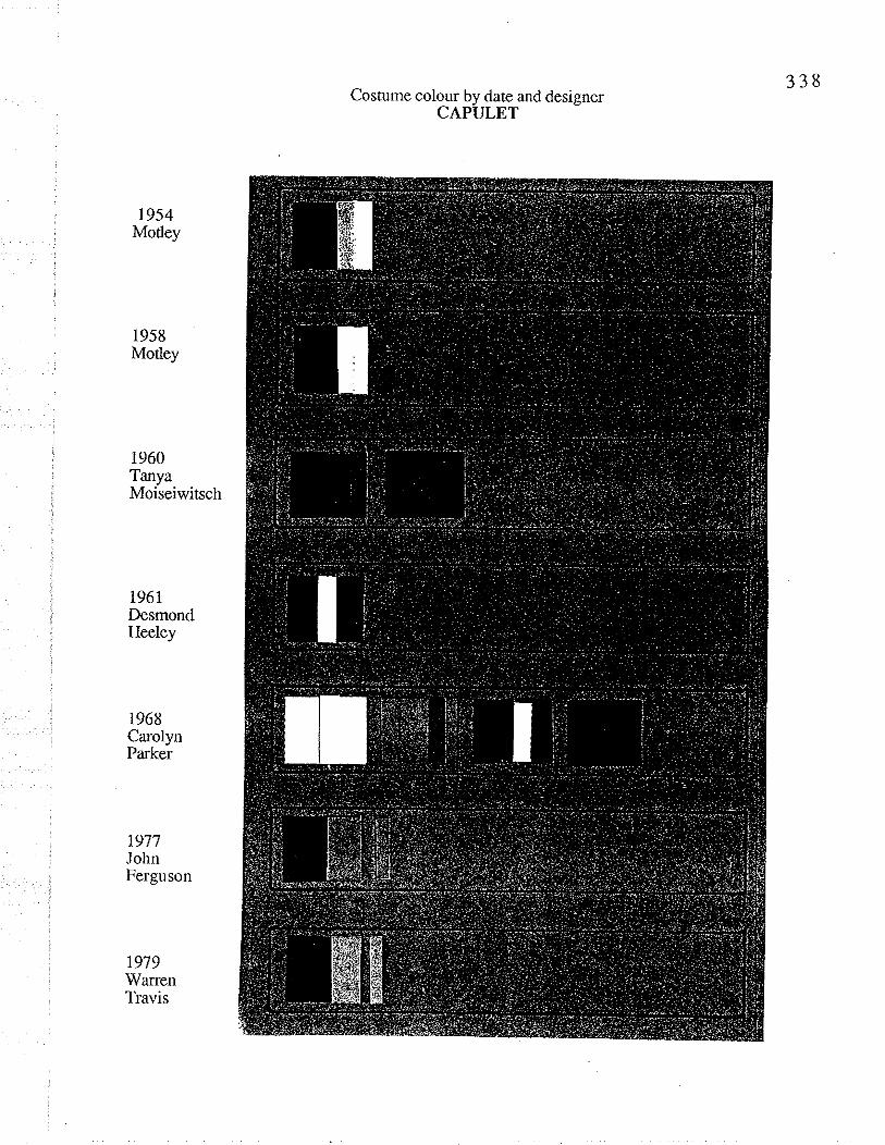
338Costume colour by date and designer
CAPULET
t954Modey
1958Modey
1960TanyaMoiseiwitsch
1961DesmondHeeley
1968CarolynParker
1977IohnFerguson
r979WarrenT¡avis

339Costume colour by date and designer
MERCUTIO
1952RogerFurse
t954Motley
1960TanyaMoiseiwitsch
1961DesmondHeeley
1968CarolynParker
1979DunyaRamicova
t979WanenTravis

340
Costume colour by date and designerMERCUTIO
1984DavidWalker

34'Costume colour by date and designer
HELENA
1967TimothyO'Brien
1953TanyaMoiseiwitsch
1959TanyaMoiseiwitsch
1,977TanyaMoiseiwitsch
1981LindyHemming
1988ChristinaPoddubiuk
1989ChrisDyer

342
Costume colour by date and designerBERTRAM
1953TanyaMoiseiwitsch
1959TanyaMoiseiwitsch
t967TimothyO'Brien
t9'7'7TanyaMoiseiwisch
1981LindyHemming
1988Ch¡istinaPoddubiuk
1989ChrisDyer

343Costume colour by date and designer
KING of FRANCE
1959TanyaMoiseiwitsch
196'tTimothyO'Brien
t9'1'lTanyaMoiseiwitsch
1988ChristinaPoddubiuk
1981LindyHemming
1989ChrisDyer
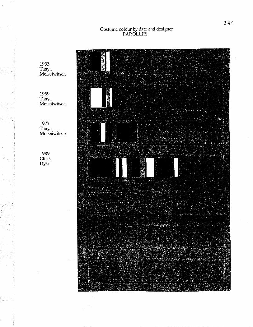
344Costume colour by date and designer
PAROLLES
1953TanyaMoiseiwitsch
1959TanyaMoiseiwitsch
1977TanyaMoiseiwitscb
1989ChrisDyer
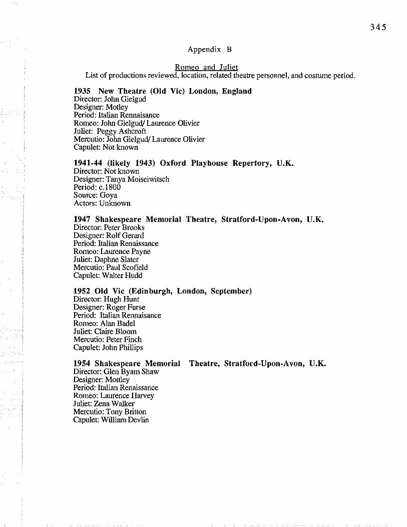
345
Appendix B
Romeo and JulietList of productions reviewed, location, related theate personnel, and costume period.
1935 New Theatre (Old Vic) London, EnglandDirector: John GielgudDesigner: MotleyPeriod: Italian RennaisanceRomeo: John Gielgud/ Laurence OlivierJuliet: Peggy AshcroftMercutio: John Gielgud/ Laurence OlivierCapulet: Not known
l94l-44 (likely 1943) Oxford Playhouse Repertory, U.K.Director: Not knownDesigner: Tanya MoiseiwitschPeriod: c,1800Source: GoyaActors: Unknown
1947 Shakespeare Memorial Theatre, Stratford-Upon-Avon, U.K.Director: Peúer BrooksDesigner: Rolf Gera¡dPeriod: Italian RenaissanceRomeo: laurence PayneJuliet: Daphne Slat€rMercutio: Paul ScofieldCapulet: Walter Hudd
1952 Otd Vic (Edinburgh, London, September)Di¡ecûor: Hugh HuntDesigner: Roger FursePeriod: Italian RennaisanceRomeo: Alan BadelJuliet: Claire BloomMercutio: Peter FinchCapulet: John Phillips
1954 Shakespeare Memorial Theatre, Stratford-Upon-Avon, U.K.Director: Glen Byam ShawDesigner: MottleyPeriod: Italian RenaissanceRomeo: Laurence HarveyJuliet: Zena WalkerMercutio: Tony BrittonCapulet: William Devlin

346
Appendix B1958 Shakespeare Memorial Theatre, Stratford-Upon-Avon, U.K.Director: Glen Byam ShawDesigner: ModeyPeriod: Italian RenaissanceRomeo: Richard JohnsonJuliet: Dorothy TutinMercutio: Edward Woodwa¡dCapulet: Mark Dignam
1960 Stratford Festival CanadaDirecton Michael tanghamDesigner: Tanya MoiseiwitschPe¡iod: Italian RenaissanceRomeo: Bruno GerussiJuliet: Julie Ha¡risMercutio: Christopher PlummerCapulet: Jack Creley
1961 Royal Shakespeare Theatre, Stratford.Upon.Avon, U.K.Di¡ector: Peter HallDesigner: Desmond HeeleyPeriod: F¡ench BurgundianRomeo: Brian MurrayJuliet: Dorothy TutinMercutio: Ian Ban¡renCapulet: Unknown
1968 Stratford Festival CanadaDirector: Douglas CampbellDesigner: Carolyn ParkerPeriod: c.1800s - NapoleonicRomeo: Christopher WalkenIuliet: Louis€ MarleauMercutio: tæo CiceriCapuleü Kenneth Pogue
1976 Royal Shakespeare Theatre, Stratford-Upon-Avon, U.K.Director: Trevor Nun/Barry KyleDesigner: Chris DyerPeriod: Italian RenaissanceRomeo: Ian McKellenJuliet: Francesca AnnisMercutio: Michael PenningtonCapulet John Woodvine
1977 Stratford Festival CanadaDirec¡or: David WilliamDesigner: John FergusonPeriod: Italian RenaissanceRomeo: Richard MonetteJuliet: Marti Ma¡adenMercutio: Nicholas PennellCapulet: læslie Yeo

347
Appendix B1979 Guthrie Theatre, MinneapolisDi¡ecûor: Ron DanielsDesigner: Dunya RamicovaPeriod: Conæmporary (1970s)Romeo: Chrisûopher RichJuliet: Tara l,oewenst€mMercutio: Justin DeasCapulet: Roben Pætene
1979 American Conservatory Theatre, San FranciscoDirec¡or: Allen FletcherDesigner: Warren TravisPeriod: Italian RenaissanceRomeo: Thomas M. NalrwoldJuliet: Julia FletcherMercutio: Daniel DavisCapulet: Michael Winters
1984 Stratford Festival CanadaDirector: Peter DewsDesigner: David WalkerPeriod: Italian RenaissanceRomeo: Colm FeoreIuliet: Seana McKennaMercutio: Richard MonetteCapule[ Kenneth Pogue
1986 Royal Shakespeare Theatre, Stratford-Upon-Avon, U.K.Director: Michael BogdanovDesigner: Chris Dyer/Ginny HumphriesPeriod: Conæmporary (1 980s)Romeo: Sean BeanJuliet: Niamh CusackMe¡cutio: Michael KitchenCapulet: Richa¡d Moore

348
Appendix BAll's Well That Ends Well
List of productions reviewed, location, related theafe personnel, and costume period.
1953 Stratford Festival CanadaDirector: Tyrone GuthrieDesigner: Tanya MoiseiwitschPeriod: ModemÆdwa¡dianHelena: hene WorthBertram: Donald HanonKing of France: Alec GuinnessParolles: Dou glas Campbell
1959 Shakespeare Memorial Theatre, Stratford-Upon-Avon, U.K.Director: Tyrone GuthrieDesigner: Tanya MoiseiwitschPeriod: EdwardianHelena: Z,æ CaldwellBerFam: Edward de SouzaKing of France: Robert HardyParolles: Cyril Luckham
1967 Royal Shakespeare Theatre, Stratford-Upon-Avon, U.K.Director: John BartonDesigner: Timothy O'BrienPeriod: CavalierHelena: Estelle KohlerBertam: Ian RichardsonKing of France: Sebastion ShawPa¡olles: Clive Swift
1977 Stratford Festival CanadaDi¡ector: David JonesDesigner: Tanya MoiseiwitschPeriod: CavalierHelena: Martha HenryBerram: Nicholas PennellKing of France: William HuttParolles: Richard Monette
1981 Royal Shakespeare Theatre, Stratford-Upon-Avon, U.K.Director: Trevor NunnDesigner: Lindy HemmingPeriod: EdwardianHelena: Harriet WalærBertam: Miïe GwilymKing of France: John Franklyn-RobbinsParolles: Sæphen Moore

349
Appendix B
1988 Stratford Festival CanadaDi¡ector: Peter MossDesigner: Christina PoddubiukPeriod: Crinoline (1850s)Helena: Lucy PeacockBertram: Nigel HamerKing of France: Joseph ShawParolles: Bernard Hopkins
1989 Royal Shakespeare Theatre, Stratford-Upon-Avon, U.K.Director: Barry KyleDesigner: Chris DyerPeriod: CavalierHelena: Paricia KerriganBertram: Paul VenableKing of France: Hugh RossPa¡olles: Bruce Alexander

3s0
John Bury:
Chris Dyer:
John Ferguson:
Roger Furse:
Rolf Gerard:
Desmond Heeley:
Appendix C
Abbreviated Designer Biographies
British designer, B. 1925 Aberystwyth1947 -1962 at Joan Littlewood's TheatreWorkshop: A Taste of Honey, 1958.1962-1985 at Rsc/National Theare:designer for Peær Hall; War of the Roses,l963Elected a fellow of the Royal Society of Arts, 1968.
British designerMember of British Design representatives awa¡dedtop honours at the 1975 Inærnational exhibition ofdesign and architecture in Prague.Designed RSC Romeo and Juliet, 1976,RSC Romeo and Juliet 1986, with G. HumphriesRSC A//'s Well That Ends Well, 1989
B. Kitchener,Ontario7977 Romeo and Juliet , Statfotd Festival CanadaTrained at Onta¡io College of Art, and NationalTheatre SchoolTaught set design at York UniversiTy n 1981182.Association wittr /SÍadord began in 1972
B. September 1903, Ightham, Kent.1952 Romeo atd Juliet, OldYic
Worked at the Old Vic and London's Vy'est EndFilm costumes for lvanhae,The road to Hong Kong
B. 1910, Berlin7947 Romeo and,/ø/¿¿¡, Shakespeare Memorial TheatePrimarily a set designer, but designs costumes as wellAttended school in Germany and S',¡/itzerland, movedto England in 1936
designed for theatre, ballet, and opera throughout Europepainær and scnlptor7960 lrma ln Deøce on Braodway
B, June 1, 1931, West Bromich, Staffo¡dshire1961 RSCRon¿o and JulietTrained at Ryland School of ArtFirst designed for Birmingham Repertory TheareRSC in 1948Freelance design at Straford FestivalWinner of two Tony awards for Broadway RosencrøntzGuild¿nstern are Deaì
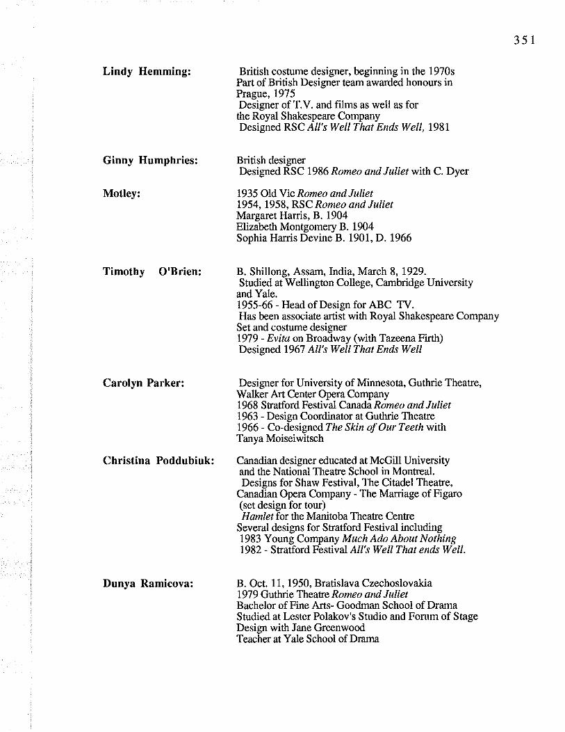
35r
Lindy Hemming:
Ginny Humphries:
Motley:
Timothy O'Brien:
Carolyn Parker:
Chrisfina Poddubiuk:
Dunya Ramicova:
British costume designer, beginning in the 1970sPart of British Designer team awarded honours inPrague, 1975Designer of T.V. and films as well as for
the Royal Shakespeare CompanyDesigned RSC A ll's Well Thnt Ends Well, 1981
British designerDesigned RSC 7986 Romeo and Juliet with C. Dyer
1935 OldYic Romeo andJuliet1954, 1958, RSCRomeo andJulietMargaret Harris, B. 1904Elizabeú Montgomery B. 1904Sophia Harris Devine B. 1901, D. 1966
B. Shillong, Assam, India, Ma¡ch 8, 1929.Studied at Wellington College, Cambridge Universityand Yale.1955-66 - Head of Design for ABC TV.Has been associate artist with Royal Shakespeare Company
Set and costume designer!979 - Evita onBroadway (with Tazeæna Firth)Designed 1967 All's Well That Ends Well
Designer for University of Minnesota, Guthrie Theafe,'Walker Art C-enûer Opera Company1968 Sratford Festival Canada Romeo and Juliet1963 - Design Coordinator at Guthrie Theafe1966 - Co-designedThe Skin of Our Teeth wirhTanya Moiseiwitsch
Canadian designer educated at McGill Universityand the National Theate School in MonEeal.Designs for Shaw Festival, The Cit¿del Theate,
Canadian Opera C-ompany - The Marriage of Figaro(set design for tour)Hømlet for theManitoba Theate Cente
Several designs for Snatford Festival including1983 Young Company Much Ada About Nothing1982 - Stratford Festival A//'s Well Thot ends Well.
B. Oct. 11, 1950, Bratislava Czechoslovakia1979 Guthrie Theate Romeo ønd JulietBachelor of Fine Arts- Goodman School of D¡amaStudied at tæster Polakov's Studio and Forum of StageDesign with Jane GreenwoodTeacher at Yale School of Drama

352
Alix Stone:
John l{arren Travis:
Ultzz
David \{alker:
British DesignerTrained at Cental School of Arts and Crafts at sametime as Tanya Moiseiwitsch.Designed RSC History cycle with Moiseiwitsch in 1950sDesigned for Old Vic in 1960sAlso designed for Opera and television in Britain.
B.Texas, studied at the University of Texas (B.F.A.)St¿nford University (M.F.A.)Designer of Off Broadway productions - predominantþin CalifomiaTheane Arts Professor (Costume Design)at University ofCalifomia, Berkeley1979 American Consewaü0ry The Íe Romeo and Juliet
Intemational designer - including RSCThe MaidslDeathwatchldesigns for Stockholm include .4 s You Lik¿ Itat the Stadsteatem.Adrian Noble's Japanese production ofTwelftl'Night in Toþo.1987 Staford FestivalThe Cherry Orchard.1990 - StaÉord Festival Julius Caesar
B.July 18, 1934, Calcutta, India1984 Statford festival Canada Romeo and JulietStudied at Central School of Arts and Crafts and withJeanette CochraneDesigned for Theare lYorkshop in England (1960)Metopoliøn Opera, New York, TelevisionIllustrator

Yea¡ Daþ
353Appendix D
Designolog.v
Abbey Theare, kelandProduction Director Costumes/Set
193519351935
19361936r93619361936193619361936
19371937193719371937t937t937t937
19381938193819381938
19381938193819381938
Sept.16Dæ,.2Dec. 9
Feb.3Feb.24Mar. 16April 13Sept. 1
Nov. 9Nov.Dec.26
Jan. 17Feb. 14Feb. 28April4May 9
SeprSept. 1
Oct. l0Dec. 12De¡,.2
cscsCS
csS
csCS
Scs
Ss
sss
cssssS
Sss
cscs
sss
csCS
Jan. 25Mat29April 19May 17May 3lAug.5Sept. 27Oct. 18
A Deuce O' JacksA Saint in a HurrySummer's Day
The Grand House in the CityBoyd's ShopKatie RocheThe Passing DayThe Silver JubileeThe Wild GooseWind from the WestBlind Man's Buff
Shadow and SubstanceQuin's SecretKillycregg's in TwitghtWho Will Remember... ?In the TrainThe PatiotThe Man in the CloakThe Invincibles
Neal MaquadeA Spot in the SunMoses' RockThe Dear QueenCassadh An T-Sugain(Ihe Twisting of the Rope)Bi¡ds NestThe Great AdventurePilgrimsBaintig hearna An GhortaTime's Pocket
Michael J. Dolanlænnox RobinsonHugh Hunt
Hugh HuntHugh HuntHugh HuntHugh HuntHugh HuntHugh HuntHugh HuntHugh Hunt
Hugh HuntHugh HuntHugh HuntHugh HuntHugh HuntHugh HuntHugh HuntHugh Hunt
Hugh HuntHugh HuntHugh HuntHugh Hunt
Hugh HuntHugh HuntHugh Hunt
C= costumes/ S= sets designed by Tanya Moiseiwitsch. Shakespeare plays in bold.Source: Robinson, L. (1951).

354Appendix D
Dennis Behl (1986) also includes the following productions as designed by Tanya Moiseiwitschat the Abbey Theahe between 1935-39,
Candida Parnell of AvondaleCartney and KevneyChurch StreetCoriolanusDamer's GoldDeidreDeworgillaEnd of the BeginningHassanJailbirdThe Lost LeaderNoah
Playboy of the Western WorldSyngePlough and the StarsShadowy WatersShewing Up of Bianco PosuetShe Had to do SomethingThomas MuskerryVillage WooingWell of the SaintsWords on the Window Pane
19341934
Desigw at oth¿r theatresYear Production TheaÍe/Location
WesÍninster TheaÍe
Duchess Theatre, LondonDuke of York Theate,l,ondon
Repertory/Oxford Playhou se/Cambridge
y 1943) at Oxford
Old Vic Company atThe Playhouse,Liverpool
Old Vic Company at theNew TheaEe, l¡ndon
Old Vic Company at theTheatre Royal, BristolNew TheaEe, LondonLyric Hammersmith, l¡ndon
Adelphi Theare, LondonRoyal Opera House,Covent Garden
Director
Tyrone Guthrie
John Burell
Hugh HuntHugh HuntTyrone Guthrie
C.B. CochraneTyrone Guthrie
The FaithfulAlien Com
Golden CuckooHigh Temperature
Androcles and the LionThe Docto¡'s DilemmaThe Gentle PeopleGeorge and MargaretGoodness How SadMerchant of VeniceRomeo and JulietRope
The AlchemistDr. FaustusJohn GabrielPoint Valaine
Uncle VanyaThe Critic
Beaux SÍatagemTwelfth NightCyrano de BergeracTime of Your Life
Bless the BridePeter G¡imes
CSCScscscscscsCS
19401940
19411t9M
t94411945
t94511946
1947 csCS

1948
1949
1951
1952
1954
Beggar's Opera
Lady of RhodesiaCherry Orchard
Henry VtrI
Treasure HuntA Month in the Counûry
Captain CarvalloDon Giovanni (?)Holly and the Ivy
Home at Seven
Figure of FunThe Passing DayA Midsummer NightrsDreamRichard IIHenry IV 1Henry IV 2Henry V(assisted by Alix Stone)
The Deep Blue SeaOthello
Timons of Äthens
Henry VtrIJulius Caesar
Richard ItrAll's l{ell ThatEnds Well
The Matclmaker
Measure For MeasureOedipus Rexwith Jacqueline Cundall)
Aldenburgh Festival TheatreCambridgeSadler's Wells Theatre,Old Vic Company, New
Memorial TheateSEadord-Upon-Avon
rllo Theafe, LondonVic Company, New Theare
St. James Theatre, LondonSadler's Wells, LondonLyric Hammersmith, l,ondonQater at the Duchess Theate)Vy'yndham's Theatre, London
Aldwych Theahe, LondonLyric Theatre, HammersmithOld Vic Theane, London
Memorial TheareStratford-Upon-Avon
Duchess TheaEe, l¡ndonShakespeare Memorial Theatre(toured Au snalia/New ZealandOld Vic Theatre, l¡ndon
Old Vic, London
Stratford Festival, Canada
Edinburgh Festivallater at Haymæket, London)
Festival, Canada
355
Tyrone Guthrie CS
Hugh Hunt CS
Tyrone Guthrie CS
Michel Saint-Denis CS
l¿u¡ence Olivier C
Tyrone GuthrieTyrone Guthrie
Anthony QuayleAnthony Quayle CSAnthony QuayleAnthony Quayle
Anthony Quayle
Tyrone Guthrie
Tyrone GuthrieHugh Hunt
Tyrone GuthrieTyrone Guthrie
Tyrone Guthrie
Tyrone GuthrieTyrone Guthrie
css
cscs
cs
CScs

1955
1956
1957
1958
1959
1960
t96r
t962
A Life in the Sun
The Cherry OrchardJulius CaesarMerchant of VeniceOedipus Rex (revival)
MatchmakerOedipus Rex (revival)Me¿sure For MeasureHenry VMerry lVivesof I{indsor
Twelfth NightTwo Gentlemen ofVerona
The Bright OneMuch Ado AboutNothingA Winter's TaleHenry IV I
(with Marie Day)Two Gentlemen ofVerona
The Broken Jug
Merchant of VeniceAlIs Well That EndsI{ell
Wrong Side of the Park
King JohnRomeo and Juliet
Ondine
CoriolanusLove's Labour's Lost
The AlchemistCyrano de Bergeraciwith Desmond Heeley)Taming of the Shrew
Edinburgh Festival, AssemblyHall
Piccolo Tearo, MilanFestival
Royale TheaEe, New YorkEdinburgh Festival
Shakespeare Memorial TheatreSrado¡d Festival
Sradord FestivalOld Vic Theare, London
Winær Garden, LondonShakespeare MemorialTheatreStratford Festival
Canadian Tour (SnatfordFestival) also to Phoenix
Theafe, New York
Habimah, Tel AvivShakespeare Memorial
Cambridge Theatre (laterSt Martin Theare, London)
Festival
Royal Shakespeare CompanyAldwych Theate, l¡ndon
Stratford Festival
Old Vic Theare, l¡ndonSraÉord Festival
356
Tyrone Guthrie
Michael LanghamTyrone GuthrieTyrone Guthrie
Tyrone GuthrieTyrone GuthrieAnthony QuayleMichael Langham
Tyrone GuthrieMichael Langham
Douglas Seale S
Douglas Campbell CSichael Langham/George McCowan
Don HaÍon S
Tyrone GuthrieTyrone Guthrie CS
Douglas Sealeichael Langham
Jean Gi¡audoux CS
Michael Langham.ichael Langham
Tyrone GuthrieMichael Langham
cscs
csCSCScs
cscs
csCS
csCS

1,963
1964
1965
1966
t967
1968
1969
1970
1971
1972
1973
Cyrano de Bergerac(revival)Hamlet
The MiserThe Three Sisters
Saint JoanVolpone
The Way of the WorldThe Cherry O¡chard
As You Like ItThe Skin of Ou¡ Teeth(with Carolyn Parker)
House of AEeusAntony and CleopatraPeter Grimes
House of Atreus( revival)Volpone
Macook's Corner
SwiftUncle VanyaCaucasian Chalk Circle
Cymbeline
Barber of Seville
Shoemaker's Holiday
A Man for all SeasonsThe Persians
The GovemmentInspector(with John Jenson)
Stirrings in ShefFreldon a Saturday NightThe Misanthrope
Stratford Festival
Guthrie Theatre, Minneapolis
Guthrie Theate
Guthrie Theatre
Guth¡ie theaEeStratford FestivalMeropolitan OperaNew York
Guthrie Theare(tours lns Angeles, New YorkNational Theatre Company,Old Vic, London
The Opera House, Belfast(and Abbey TheaEe, Dublin)Abbey Theate, DublinGuth¡ie TheareSheffield Playhouse, G.B.
Sratford Festival
Phoenix Opera Company,Brighton Festival,
Crucible Theate, Sheffield
Guthrie Theafe
Crucible Theare, Sheffield
National TheaEe CompanyOld Vic, London
357
Michael Langham
Guthrie CSDouglas Campbell CSTyrone Guthrie CS
Tyrone Guthrie CSTyrone Guthrie CS
John Hirsch
Edward Call
Tyrone Guthrie CSMichael Langham CS
Tyrone Gutlrie CS
Tyrone Guthrie CS
Tyrone Guthrie
Tyrone Guthrie
Tyrone GutlrieTyrone Guthrie
Iean Gascon
Tyrone Guthrie
John Dexter CS

358
1974
r975
tn6
197'l
1978
tn9
1980
1981
1982
1983
1984
1985
The Imaginary lnvalid
The Misantlrope
Phaedra Brittanica
The Voyage of EdgarAllan PoeRigoletto
All's Well That EndsWellThe Voyage of EdgarAllan Poe
Oedipus RexOedipus at Colonnus
Double Dealer
Red Roses for MeLa Traviata
Kidnapped in London
Mary Stuart
King LearTartuffe
Tartuffe (revival)The ClandestineMarriage
The GovernmentInspector
Sratford Festival
National TheaÍe production,St.James TheaÍe, New YorkNational Theate, Old Vic
Minnesota Opera Company
Metropolitan Opera, New Y
Festival
Monis A. Mechanic TheatreBaltimore, Maryland
AusEaIia Theafre
ional Theate of Greativier Theatre
Abbey Theate, DublinMetropolitan Opera, New Y
Children's Theatre Company,Minneapolis
Stratford Festival
¡anada TelevisionSradord Festival
CBC (Straford Festival)Abbey Theatre English Tour
Snaford Festival
1981), Ellis (
Jean Gascon CS
John Dexter
John Dexter
David Iones CS
Colin George
John Hirsch
Michael ElliottJohn Hirsch
John Hi¡sch
Ronald Eyre
C
ccs
(Co-designed withPolly Scranton Bu
Behlurces: Beauman (1982),1980), Somerset (1991), (1e85)

Appendix E. 359
Theaffe Information
United Kingdom
Abbey Theatre : Dublin, heland. Opened December 1904. Served as home to IrishNational Theare Society with guidance from, among others, W.B.Yeats. The theaEe featured the work of playrights such asLennox Robinson (from 1908), and Sean O'Casey (from 1923-28).Deshoyed by fhe in 1951 and rebuilt in 1966. (Salgado &Thomson,1985).
Crucible Theatre: Sheffield, England. Tanya Moiseiwitsch principal designer of theaÍeand consultant for the thrust stage.
Old Vic The¿tre: London, England. Opened in 1818 as the Coburg. Name changed tothe Royal Victoria in 1833 from which the nickname 'Old Vic'evolved. The theaÍe closed in 1880 but was bought by Emma Conswho "...wedded it, as an amusemenþhall, to tìe temperencemovement" (Salgado & Thomson, 1985, p. 109). Cons' niece LillianBaylis joined her in 1898 and promoted Shakespearean productions.Throughout the 30s, it was known for its high standards. It wasbombed in 1941, but remained the site for Michel Sain¡Denis' OldVic School from 1947 to L952. Fully restored in 1950, it continued asa centre of Shakespearean productions. From 1963 to 1976, it becamethe site of Laurence Olivier's National Theatre Company. In 1983 itwas bought by a Canadian -- Ed Mirvish, better known as 'Honest Ed.'Mi¡vish restored the theaEe and reopened it as a commercial venture.
Oxford Playhouse Theatre: Oxford, England. Repertory theate.
Shakespeare Memorial Theatre: Sratford-Upon-Avon, England, Opened in 1879 aspermanent site for Shakespearean productions. The original theaEewas desroyed in a fire in 1926, and in 1932, the present theatre wasbuilt. Since that time, the stage has been extended. In 1960, under thedirection of di¡ector Peter Hall, the theaEe's name was changed to theRoyal Shakespea¡e Theare, and b€€ame the home of the RoyalShakespeare Company ( Beauman, 1982).
West End Theatres : London, England. Haymarket, Lyceum, Westminster, Duchess,Duke of York, Adelphi, Apollo, Wyndham's, Aldwych, WinterGarden , Phoenix.

360
Canada
Festival Theatre: Stratford, Ontario. Begun in 1953, initially operating out of a tent onthe site of the present theate. In 1956 a permanent building to housethe theare designed by architect Robert Fai¡field was built whichincorporated Tanya Moiseiwitsch's thrust stage. It opened for the 1957season. Now the main stage for the Sratford festival which also hasthe Avon theatre (bought in 1963) and the Tom Patterson theaEe(formerly the Thfud Stage) opened in 1971 for new and experimentalwork'
United States
American Conservatory Theatre: San Francisco. Repertory theatre opened in 1967 tofill a vacuum created by the demise of the non-commercial Actor'sWorkshop. Set up to provide a centre for the development anduaining of theatre artists (as a link between formal schools andcommercial theaEes). The theatre operated out of the CearyTheatre until the 1991 earthquake.
Guthrie Theatres Walker Art Center, Minneapolis, Minnesota. Opened 1963. Named forSir Tyrone Guthrie who was also its first director. TanyaMoiseiwitsch was the stage design consultant for the thrust stage andwas its fhst principl resident designer.

Appendix F
Data Collection Sheet
Dara co[ection sheer ¡"t" -G+:11-/-1t -Location __fuo*_._tåK.
361
Accompanying visuals -------- ,/-z,S'\p¡¡¿g¿1¡6¡ ---Kef- Dæe ot prod. \:!91------Desi gner --J19IrÆ:----lÆation ------l¡¡.*¿- -G.ls:o--9.:¡er¡-S-l4eid-'_--Stage Setring : _
tnt€rpretatiori -- - period --l-{-e-nai ssa4(9' ' -
Design inspira¡.ior¡ source lf known -Mareriaf observed - garment - original ----- nodified ----
- Phot6 -----. - sketches (cætume ¡iOte) -:<í
- video/film --- othe. ------
P.rUr^ag*"""'
"a.l^ ré: n e.-t¿
CTIARACTER:
'r ìta C!¿^ -i.riL,, -.

362
Appendix G.
' Theahefi\4useum/Archives Resource Ind.ividuals
:' Tanya Moiseiwitsch, (August 3,1990) Stratford, Ontario.
: (tuly 17, 1991) London, England.
. Britain:
læela Meinartas, Registrar: TheaEe Museum, London, England
Marion Pringle, Senior Librarian: Shakespeare Cenre Library and Theatre Archives.
Sylvia Morris, Assistant Librarian: Shakespeare Cenre Library and Theatre Archives,
, Christopher Robinson: Keeper, University of Bristol, Theare Collection .
:, Carol Rutter, hofessor: Warwick University/ University of Birmingham, School of' continuing studies
: Raymond Ingram, Head of Drama and Television: King Alfred's College, Winchesær:
Canada
: Dama Bell: - one of the original founders of the Stratford Festival, Canada.:, Polly Bohdanetzky, Designer: Stratford Festival::
' Lisa Brant, Archivist: Sradord Festival A¡chives.,
ì Ronald Bryden, Department Head , Graduaæ Studies in Theate, University of Toronto,
Ì Carolyn Cato, Executive Assistant, and Joan Stevens, Communications Director:' Mantitoba Theatre Centre
" Louise Champion, Head of Wardrobe, Straford Festival, Stratford, Ontario,
Matt Downey,/Robin McGibbon: Snatford Festival A¡chives
I Debra Hanson, Head of Design: Stratford Festival
; Margaret Lamb, Costume Cutter - Mary Stuar-t: SÍado¡d Festival¡
I Robin McGibben, Wardrobe Custodian, Sratford Festival.
i Anne Sutherland, Librarian: Special Collections, Mefopolitan To¡onto Library
: ITnited States
Dennis Behl, Press Di¡ector: Guthrie TheaEe foundation, Minneapolis Minnesota

Karin Kopischke, Head of Costume: American Conservatory Theatre, San Francisco 363
Michael Mullin, Associate Professor of English, University of Illinois at Urbana-Champaign
Beth Nohner, Assistant to Costume Director: Guthrie Theatre
Warren Travis, Professor:Department of Dramatic Art, University of Califomia(Berkley).

Appendix H. 364
Pantone Colour/Word AssociationEiseman, L, & !eJy91t, L. (1990). The Pantone Book of Color. New york: Harry N.
Abrams, Inc. Publishers.
NECÀTIVE
\tilhtRed Fi¡e, blood, excilcmenl,hoi, p¿ssronale. inlense, Rage
(Ficry Red) sexy,energclic,acl¡vc,dranralic,slimulâlins, happv,
d}1ìarnrc, datinS, Provoc¡li!c
Brighl, exciling, f un, hol, lrendf wild, high encrgy
Classic, €alhy, hom€y, slrong,lvarm, counl¡y
Buryundy Cl¿ssìc, erpensive. dcep, wa rm, w ine, elegànl, lastv,
(Euqundy) velv€r, rich,¡enned
Ligh! P¡nþ Eabies,cule, icing, femininc, soll. swecl, lender, loosweel
(CandyPink) romanl¡c
(tuchsiaR€d)
(ErickRed)
Btight Pinà Excilins, happy, hol, lrendf al lenlion-gel ling, Loud
(Phlox P¡nk) eners€r ic, you(hful/ spiriled. fu n
DustyPinh Soll,soolhing,cozy, sopììiricaled, clãssic
(DusryPìnk) romanIic, ¡osy.sobile
(tav€nd€r)Flow€ß, scenl s, !ofl, swe€1, delicâle, noralSic ASing
NeutrclArot Classic,cool, sober, corpotale, p¡acl ic¿|. lìmeless, Boring' mousy gh
(Neùlr¿l6ray) qualily
Bt4htPutple Royal, hâppy, ercilins, scnsual,nãmboyàn!, crc¿l¡vc Loud
(RoyalPurDlc)
Deep Puryle Expensive, rcgal. ¡ich, mysler ious, spir ilual. a tl islic. I'loutning ' mcla n(
(Plum) po\v€lul
BtightBlue Eleclrjc, happy,enersclic.vibranl, nags, bri8hl,
(Spedrum 8lu€) d¡amalic, slirrinS
Chot.ool Arcy P¡ofcs sional, classic, c\pc n s¡vc, t ich. sophis lical€d,
(Chô rcoal Cray) . solid, end! rin8, mãlu!€
Be¡Se
(Beise)Classic, ea rlhy, sandy. neultal, soll, wâ r m Bla nd
rþupe
CIàupec'ay)
Cl¿ssic,€¡pensive.neulral,sophislicâted.praclical Bland
Dañ Brcan Chocol¿t€, €¿rlhy,'ich, nascu line, warm, \voodsy, somber'soiled
lDârk Brolvn) deÞendable,s€cule,durable,¡u8sed, rooled
lvh¡te Erighl,c¡assic,cle¿n,purc,ai¡y,cool,Prisline, Slerik(Snovwhirc) glisl€ning
BIøch Ba sic, bold, clåssic, d r¿mal ic, el€ganl, sl¡o n8, Dealh, d€pres sion
(Jel Black) e\pensiv€, myslerious, magic¿l, sophislicâled, sinisler.loù8h
powerful, niShllime, seÌy, sobc¡, invulnerable,
P¡.li3ious. aSSressitc
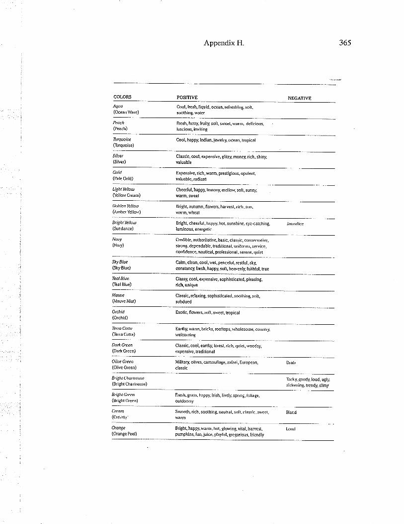
Appendix H. 365
NEGATIVE
(Oceân wave)Cool, ÍÍesh, liqü ld, ocean, rclr€shing. soft,soolhing,wåle¡
(Peach)F¡esh, tu22y, l¡u llJl soll, $reel, warm, d€lic¡ous,luscious, invilinE
TLquo¡se
Clbrcuoise)
C{)ol, happy lndian, jewel¡X ocean, trop¡cal
(silve¡)Classic,cool, erpensive, glitzy mon€y, rich, shin),,
AoU(Påle cold)
Erpensivê, rich,warm, prerigious, opul€nt,vâluable, Ìadianl
C/ellowcream)Cheerlì.¡1, happy, lemony. mellow, so't, sunny,
(AmbcÌYellow)B¡ighl. au lumn, ñoweß, harvest, ¡ich, su¡ì,
(sundance)B¡ighl, clìeerlul, happf hol. sonshine, ey€-catching,Iu mlnous, energelic
(Nà!y)Credible, aulhor¡lâtive, basic, classic, conservative,nrong. dependåble, lrôditiona l, uniforms, service,con6dence. nåutlcal. prof essionà1. serene, quiet
Shy Blue(skyBlue)
câlm, cleân, cool,wel, æaceful, retlul, skfc!nstancy, fresh, hðpp, sofl, heavenlJ,, faithlul,truê
Teal Blue.(tealBlue)
Oa!sy, cool. expensive, sophhlicâled, pleôsing,rich,unique
(MauveMisl)Cla5slc, relax¡ng,soph¡sticared, soolhing,soft ,
lOrchid)Exolic. fìowers, sof(, sweet, kooicãl
Clena CoÍâ)Eårlhy, warm, bricks, roof tops, \rholcsome, country.welcomi¡g
(Dôrkcreen)Clåssic, cool, earlhy. for€1, ¡¡ch, quiet,woodsy,
e¡pensiv€, lradillonal
Oliuee¡een(Olivec,een)
M¡¡ilary, olives, c¿mou na ge, sã lari, EuroÞean,
(BrighlChârlreuse)Tacky, 8¿udy, loüd, ugly,
sicken¡ng, l¡endf dimy
BùrhtCrcen(SriBhlCreen)
Fr€sh, g¡ass, happx kish.lively, sp¡ins, foliag€
(Cre¿m¡Smoolh, rich, soorhing, neutra l, sol(, classic. sw€€1,
Orcnee(O¡ange Peel)
gr¡ghl, happfwôrm, hor, glowins, vilal. hð¡vert,ptmpkins, fùn, juice, playlü1, gr€g¿rious, hiendly