RECH2 | Proceedings
281
Transcript of RECH2 | Proceedings
2nd International Meeting on Retouching of Cultural Heritage
Porto, Portugal | 24-25 October 2014
PROCEEDINGS
RECH2
ACKNOWLEDGEMENTS
2nd International Meeting on Retouching of Cultural Heritage, RECH2
Held at Casa das Artes in the City of Porto (Portugal), in October 24 - 25, 2014
Organized by Escola Artística e Profissional Árvore
Title | RECH2: PROCEEDINGS
Edition | Escola Artística e Profissional Árvore
Editorial coordinators: Ana Bailão, Frederico Henriques, Ana Bidarra
Local and date |Porto, September 2015
Cover page: Ana Bailão and Aurora Pinheiro
Legal Deposit | 398132/15
Responsibility for statements made in these papers rests solely with the contributors. The views expressed by
individual authors are not necessarily those of the Editors or ARVORE.
The Editorial coordinators would like to acknowledge the contribution of the members of the Scientific Committee who made the selection of the papers for the Meeting, and for technical proof-reading.
We are grateful to the team of ARVORE for making this Meeting possible.
We also would like to acknowledge the conservators Alexandra Fonseca, Susana Mendes, Alexandra Marco, Leonel Costa, Nelson Neves and Pedro Antunes for the help given during the Meeting.
2nd International Meeting on Retouching of Cultural Heritage, RECH2
Proceedings of the 2nd Conference
Organizing committee
Ana Bailão (Escola Artística e Profissional Árvore; Universidade Católica Portuguesa/ CITAR, Portugal) Frederico Henriques (Escola Artística e Profissional Árvore; Universidade Católica Portuguesa/ CITAR, Portugal); Ana Bidarra (Cinábrio, Conservação e Restauro; GeoBioTec Research Centre, Universidade de Aveiro, Portugal)
Scientific Committee
Ana Calvo (Universidad Complutense de Madrid, Spain; Universidade Católica Portuguesa/ CITAR, Portugal) José Manuel de la Roja (Universidad Complutense de Madrid, Spain) Silvia García Fernández-Villa (Universidad Complutense de Madrid, Spain) Sandra Sústic (Croatian Conservation Institute, Croatia)
Collaborators and support:
AUTHORS INDEX
ADRIANO MACHADO
ANA BAILÃO
ANA CALVO
ANA TERESA TEVES REIS
ANNALISA COLOMBO
ANTONI COLOMINA SUBIELA
CAMILA MORTARI
CARLA REGO
CÁTIA SILVA
CLÁUDIA FALCÃO
CRISTINA REIS
DAPHNE DE LUCA
DAVID TEVES REIS
DIANA AVELAR PIRES
DIRK JAN DIKKEN
ELLEN JANSEN
EUNICE GUEDES
FERNANDO ANTUNES
FREDERICO MATOS
GAËLLE PENTIER
HERMAN OFFERHAUS
IGNASI GIRONÉS-SARRIÓ
ILARIA SACCANI
INGEBORG SMIT
ISABEL POMBO CARDOSO
JEROEN KORTERIK
JOÃO RAMOS
JOSÉ ARTUR PESTANA
KARIN M. VAN DER LEM
LEONOR LOUREIRO
LESLIE CARLYLE
MAR CUSSO SOLANO
MARGARIDA FERNANDES
MARGARIDA MANARTE
MERCÊS LORENA
MIGUEL MATEUS
NATALIA MEJÍA MURILLO
NELSON NEVES
RAFAEL ROBLE
RAQUEL MARQUES
RICARDO TRIÃES
ROBERTO BESTETTI
SANDRA ŠUSTIĆ
SARA BABO
SÓNIA TAVARES
TAMAR DAVIDOWITZ
TIAGO OLIVEIRA
VALENTINA EMANUELA SELVA BONINO
VANESSA UBALDI
VICENTE GUEROLA-BLAY
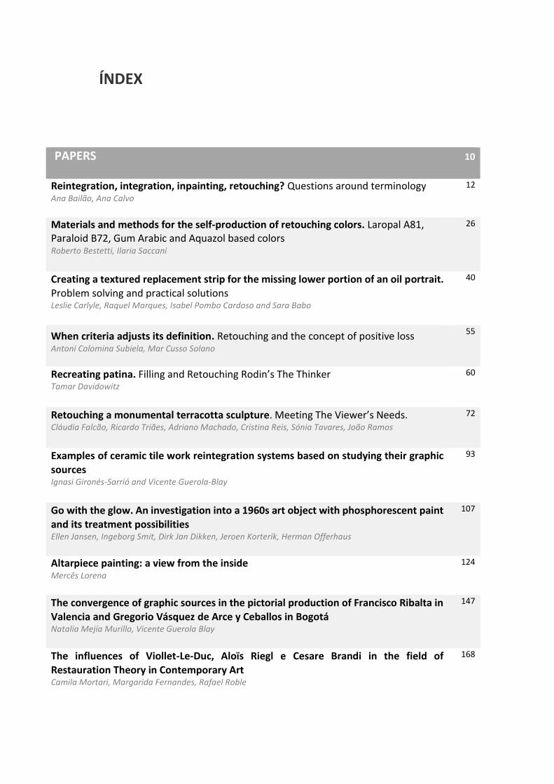
ÍNDEX
PAPERS 10
Reintegration, integration, inpainting, retouching? Questions around terminology Ana Bailão, Ana Calvo
12
Materials and methods for the self-production of retouching colors. Laropal A81, Paraloid B72, Gum Arabic and Aquazol based colors Roberto Bestetti, Ilaria Saccani
26
Creating a textured replacement strip for the missing lower portion of an oil portrait. Problem solving and practical solutions Leslie Carlyle, Raquel Marques, Isabel Pombo Cardoso and Sara Babo
40
When criteria adjusts its definition. Retouching and the concept of positive loss Antoni Colomina Subiela, Mar Cusso Solano
55
Recreating patina. Filling and Retouching Rodin’s The Thinker Tamar Davidowitz
60
Retouching a monumental terracotta sculpture. Meeting The Viewer’s Needs. Cláudia Falcão, Ricardo Triães, Adriano Machado, Cristina Reis, Sónia Tavares, João Ramos
72
Examples of ceramic tile work reintegration systems based on studying their graphic sources Ignasi Gironés-Sarrió and Vicente Guerola-Blay
93
Go with the glow. An investigation into a 1960s art object with phosphorescent paint and its treatment possibilities Ellen Jansen, Ingeborg Smit, Dirk Jan Dikken, Jeroen Korterik, Herman Offerhaus
107
Altarpiece painting: a view from the inside Mercês Lorena
124
The convergence of graphic sources in the pictorial production of Francisco Ribalta in Valencia and Gregorio Vásquez de Arce y Ceballos in Bogotá Natalia Mejía Murillo, Vicente Guerola Blay
147
The influences of Viollet-Le-Duc, Aloïs Riegl e Cesare Brandi in the field of Restauration Theory in Contemporary Art Camila Mortari, Margarida Fernandes, Rafael Roble
168
Stick it on! Temporary transfer papers as retouching media for ceramics conservation
Tiago Oliveira
180
Structuring at the retouching step. State of the art: Study of the issues, materials and techniques Gaëlle Pentier
192
Chromatic (re) integration in Charola do Convento de Cristo, Tomar. A short history of interventions in conservation and restoration of mural painting
José Artur Pestana
210
In-painting for bookbinding conservation. Materials and Techniques
Diana Avelar Pires
218
Overpaints with cultural significance. How to define authenticity? The case of Afonso de Albuquerque’s portrait
Ana Teresa Teves Reis, Miguel Mateus, David Teves Reis
226
Inpainting a Urania 19th century toy theatre: problems and solutions.
Cátia Silva, Leonor Loureiro, Fernando Antunes
240
POSTERS 261 Conservation and restoration of the Pipe Organ from the Church Our Lady of Grace: Chromatic and pictorial reintegration practice. Fernando dos Santos Antunes
Aquazol based retouching colors: preliminary tests and advancement of an experiment Roberto Bestetti, Annalisa Colombo, Daphne De Luca, Valentina Emanuela Selva Bonino, Vanessa Ubaldi
When criteria adjusts its definition. Retouching and the concept of positive loss Antoni Colomina Subiela, Mar Cusso Solano
Retouch and chromatic reintegration distinction of both terms in the conservation of photographs Carina Fonseca
Petrified Paint. ‘Reversible’ retouching media in the conservation of mural paintings on porous substrates made with Keim silicate paint- Karin van der Lem
Handmade paints production. Materials and the process of manufacturing watercolor and gouaches. Selection criteria’s for paints. Leonel Costa
Retouching of sculptures with worship function Margarida Manarte, Carla Rêgo
Retouching complex losses of altarpieces with mica pigments Frederico Matos, Nelson Neves, Eunice Guedes, Ana Bailão
The convergence of graphic sources in the pictorial production of Francisco Ribalta in Valencia and Gregorio Vásquez de Arce y Ceballos in Bogotá Natalia Mejía Murillo, Vicente Guerola Blay
Structuring at the retouching step. State of the art: Study of the stakes, materials and techniques Gaëlle Pentier
Exploring Leonardo’s sfumato techniquein context of mimetic retouching Sandra Šustić
PRACTICAL DEMONSTRATION 273 Handmade watercolous. Leonel Costa
Spatial analysis operations for the characterization of losses Frederico Henriques
Linocut Tomás Dias
Colour discrimination test Ana Bailão
Visible retouching technique for gilded surfaces Alexandra Marco
Assessment of Hue, Value and Chroma chart Ana Bailão
FOREWORD
As in the first Meeting, which was held in October of 2013, the main focus of RECH2 was to
promote the exchange of ideas, concepts, terminology, methods, techniques and materials
applied to the retouching process in different areas of conservation: mural painting, easel
painting, sculpture, graphic documentation, architectural, plasterwork, photography and
contemporary art, among others. Also, these Meetings provided an excellent opportunity for
friendly discussion about all kinds of ideas related to the Retouching process/methods in
Cultural Heritage.
A lot of valuable information can be gained through these proceedings. In this online
publication, which aims to make the information more accessible to the international
scientific community, are summarized studies from Portugal, Spain, Italy, France, the
Netherlands, United Kingdom. These investigations strengthen the relationship between the
retouching process and the conservator. The Meeting also allowed to the conservators much
greater insight about the retouching criteria, methodologies and materials, but this insight
came with the alert for certain risks that the conservator must address before and during the
retouching process.
The international feedback is an importante factor to continue. The first International
Meeting on Retouching of Cultural Heritage (RECH), held in 2013, presented the experiences
from private and academic conservators about this issue, especially from Portugal and Spain.
However, the second RECH, in 2014, has attracted even more international attention.
Hopefully this conference will continue to be a platform for improving and sharing our
retouching practices between countries and also to increase better understanding about our
criteria and our deontological actions.
To finish, on behalf of the organizing committee, I would like to thank all the colleagues,
professionals and friends who help in this event.
5 August 2015
Ana Bailão
RECH2 conference Chair

PAPERS
Reintegraon, integraon, inpainng, retouching?Quesons around terminology
Ana BAILAO, Ana CALVO
2nd International Meeting on Retouching of Cultural Heritage RECH2
Porto, Portugal | 24-25 October 2014
________________________________________________________________________
12
Reintegration, integration, inpainting, retouching?
Questions around terminology1
Ana BAILÃO1; Ana CALVO1,2*
1 CITAR, Escola das Artes, Universidade Católica Portuguesa, Rua Diogo Botelho 1327, Porto
2 Universidad Complutense de Madrid, Calle El Greco 2, Madrid.
Abstract
Different terms are used in the several countries and specialized publications to define the chromatic or volumetric intervention to complete an object. Especially in painting conservation we can find applied to this phase: restoration, reintegration, integration, retouching, inpainting…
We have tried to know the different meanings applied to these terms, and to look at some bibliographic reference sources in order to understand which of the terms are the most used.
The terminological question is not just a simple matter of words, but also a question about the different criteria applied over time to this intervention.
Keywords: terminology, painting, reintegration, integration, inpainting, retouching.
1 This text, now reformulated, is published in Portuguese, with further elaboration in the magazine Conservar Património 18 (2013) 55-62, (2013) 55-62, by Ana Bailão, in the article entitled "Terminologia associada á conservação e restauro de pintura."
Ana BAILÃO, Ana CALVO
13
Introduction
In conservation as in other fields of knowledge it is crucial to have a specific and technical vocabulary. However, there are still synonymous terms that are used, with large or slightly different meanings, which hinder and complicate communication between professionals. An example, are the different words used to define this step, that consist on the complete renovation of objects in order to minimize damage that can disturb its contemplation, as losses, premature cracks or wear, without interfere in its historicity. In Portugal and Spain this stage of the painting intervention is currently called reintegration or integration, pictorial or chromatic. An example of the proliferation of the words "reintegration" and "integration" as synonyms is presented in the recent proccedings of V Congresso Internazionale Colore e Conservazione, Le fasi finali nel restauro delle opere policrome mobili (CESMAR7: 2011), held in the city of Trento in 2010. Also in that same congress, Erminio Signorini (2011: 9-15) defines this operation as «(…) quindi una questione, come tutte quelle di natura estetica o storica, spesso scivolosa o, per usare l’espressione di Brandi, “un campo minato”. Di qui ancora l’invito alla prudenza (…)».Thus, it is posible to understand that the whole process of intervention is coated controversial, sometimes, with great differences of opinion and little consensus. Recently, a word, commonly used in Portugal and Spain, has achieved negative connotations. That word is "retoque", or "retouching" in English. Due to this fame, conservators have been looking for alternatives more in line with the proposals of the professional sectors or with similarities with other countries. The purpose of this communication is contribute to the understanding of the three most commonly terms used to define the step of aesthetic reconstruction of an artistic object: "reintegration", "integration" and "retouch", resorting to documentary sources and publications. Some precedents in the use of terminology: retouching and overpainting. We can find in the artistic literature numerous references about painters giving their finishing retouching in their own works, even after the painting varnished, with the aim of getting perfection. Similarly we find allusions to interventions of some artists on, the more or less deteriorated works, of other painters. These artists who dared to correct or amend the original, usually with little success, were widely criticized by their actions. These interventions are termed as overpainting, but also as retouching. Giorgio Vasari (1998) makes this comment in the "Lives of the Most Eminent Painters Sculptors and Architects" (1568): «Sería mejor, algunas veces, quedarse con las cosas hechas por hombres excelentes un poco destruidas, que hacerlas retocar por quein sabe mucho menos». ["It would be better, sometimes, to keep things made by great men a bit destroyed, that weak them by who know much less."] Thus, by this way he used the term "retouch", as an synonymous of overpainting. Baldinucci in 1681 (2003), in his book Vocabolario toscano dell’arte del disegno, define retouching as «Di nuovo toccare. E ritoccare un'opera, vale aggiugnervi qualche cosa di migliore, o lavorarvi sopra di nuovo, o ricorreggere gli errori. Onde ritoccare una pittura, una scultura, un disegno, e simili, vale darle l'ultima mano». Also, mention the term “Rifiorire” to define the act of overpainting the colour:

Ana BAILÃO, Ana CALVO
14
“Molti però non del tutto imperiti dell'Arte, sono stati di parere, che l'ottime pitture nè punto nè poco si ritocchino, anche da chi si sia; perchè essendo assai difficile, che o poco o molto, o subito o in tempo, non si riconosca la restaurazione per piccola che sia; è anche vero che la pittura, che non schietta, va sempre accompagnata con gran discredito. Sotto questo termine rifiorire, intendono anche gl'igno-ranti, il lavare l'antiche pitture…” The spanish writers Francisco Pacheco (1638) and Antonio Palomino (1724) also cite the word "retouch" when refering to finishing touches made by other artists. Throughout history, until the nineteenth century, is possible to found in the texts terms such as “reparar”, “retocar”, “resanar”, “restaurar” and “aderezar” as work done by artists on the works of others. In the restoration treaties of the nineteenth century the term "retouching" also appears in Vicente Polero and Toledo (1853), in Spain, or in Ulise Forni (1866), in Italy. The term retouch, although used informally in Portugal among the conservation and restoration professionals, is rarely written in technical documentation. The main reason for the restriction in the use of this word is due to the negative connotation that it acquired throughout history. This word was frequently used by painters-restorers, especially until the early twentieth century, being for that reason associated with overpaint and treatments where minimal intervention, compatibility and material reversibility were not a priority. In reality the line that separated the retouch in a moderated intervention, from the retouch in an excessive one was tenuos. Manuel de Macedo, conservator at Museu Nacional de Belas Artes in 1885, warned that the action of “retouching” had to be practiced with care and only when absolutely necessary, he also recommends it’s execution in a imitative way following the pictorical technique. In the absence of reference images, he suggests that it is legitimate for the restorer to reconstruct elements, as long as it is done «(…) com modéstia, para evitar improvisar arbitrariamente qualquer pormenor» [with modesty, to avoid arbitrarily improvisation of details]. He also considers that to overpaint excessively was to use «bárbaras mãos» [a heavy hand] (Macedo, 1885:6). According to Luciano Freire2, the majority of interventions that he made were not only caused by the time or the «modificação orgânica da matéria empregada, mas sim, na maior parte das vezes, dos tratamentos ou intervenções imprudentes» [alteration of the organic matter used, but, mainly from reckless treatments or interventions] (Moura, 1942:9). Based on Freire words, the triptic from Mestre do Retábulo de Palmela «(...) além de muito sujo, grosseiramente retocado.» [(…) besides being very dirty, it was also roughly retouched.]3 The retouches and overpaints are an example of those treatments that beside covering natural causes of degradation, also disguised «as avarias resultantes da brutal limpeza» [damages from brutal cleanings], or «faltas de tinta (…) resultante de antigas fricções para levantamento de vernizes» [paint losses (…) that were the result of old frictions for removing the varnish] (Freire, 2007: 14-52). However retouching also had other purposes. According to Luís Burnay the restoration of paintings also had the purpose of «change it as the customer please» (Burnay, 1945:62). These changes varied according to the taste of the time, owner or even political and ecclesiastical context. However, regardless the reasons that led to the overpaint, and quoting Luciano Freire (2007) «the overpaint(ed), that is judged to be equally damaging, had the advantage of saving a lot of paintings from being left on the side and consequently disappearing».
2 Luciano Freire was born in 1864 and attended the drawing and painting course at the Academy of Fine Arts in Lisbon, becoming professor
of chair of this school and also Academic Merit. Completes the course in 1886 (Macedo, 1954:15, 16). 3 MUSEU NACIONAL ARTE ANTIGA – Restauro n.º 154, Daniel e a Casta Suzana. Profissão de um cavaleiro de S. Tiago. Mestre do
Retábulo de Palmela. Escola Portuguesa N.º Inv. 16. Biblioteca de conservação e Museus, Lisboa.
Ana BAILÃO, Ana CALVO
15
In Spain, during the twentieth century, one of the first specialised publications was the translation of The Conservation of Antiquities and Works of Art, from H. J. Plenderleith (1956), translated by Arturo Díaz Martos (1967), by the then called Instituto Central de Conservación y Restauración de Obras de Arte, Arqueología y Etnología4 [Central Institute for Conservation and Restoration of Works of Art, Archaeology and Ethnology]. Regarding the paintings, we find in the epigraph “Retouch” (Plenderleith, 1967: 199) the following explanations: «The English term “inpainting” used in the restoration of paintings serves to underline that the original painting is sacred and should not be coated with modern additions of color. The only exception is when the paint is abraded and the appearance is compromise; In that case it may be necessary for aesthetic reasons to retouch the paint layer (…). To reintegrate losses (…). If it is desired to facilitate the eventual elimination of the retouch in the future…». It is to say, that reintegration and retouching are similar. Reintegration versus integration Albert and Paul Philippot (1959:5-19), in 1959, used the term ["integration"] even though they also introduced the word ["retouch"]: «(...) If the disruption caused in a medieval fresco may often be filled by a single tone (…) the importance of detail, finish and varnish to create the proper atmosphere to a Flemish Primitive, will require, for the realization of an equivalent integration, an infinitely more advanced retouching». In another texto from 1972, Paul Philippot (1972: 367-374) uses [“integration”] in the title of the article Lacunae and Their Integration, and [“reintegration”] in the remaining text: «The reintegration (used in preference to the terms “retouching” and “inpainting”) should then aim to reestablish the continuity under normal conditions, while being easily identified on closer inspection. There are various technical solutions to this problem, and the restorer will have to use his artistic feeling, as well as his knowledge of materials, to find the best answer, one essential point being the consistency of the reintegration system.» In the famous publication La conservation des peintures murales [The conservation of mural paintings] in which Paul Philippot is co-author along with Paolo e Laura Mora (1975: 352), the term reintegration is used: «(…) problème de la réintégration, à distinguer cinq types de lacunes (…)». Phrase that in the American translation from 1984 (Mora et al., 1984: 305) states: «(…) the problem of the re-integration, losses may be divided into five different types (…)». Following these writings, Luz de Lourdes Velázquez Thierry (1991: 43) mention that it seems like Philippot was the main responsible for introducing the term Reintegration and its connotations in Mexico. This is an example of a text that even though is not written in its author language, ends up influencing another country, for having a diffusion and origin due to a country of great visibility. Cesare Brandi (1963: 146151), other familiar name for conservators, used in 1963 the word "integrazione" [integration], the reason why he uses that term instead of other is not explicit: «(…) l´integrazione proposta dovrà allora contenersi in limiti e modalità tali da essere riconoscibile a prima vista, senza speciali documentazioni, ma próprio come una proposta che si assoggetta al giudizio critico altrui. Perciò ogni eventuale integrazione, anche mínima, dovrà essere facilmente identificabile: ed è così che noi elaborammo al l´Istituto Central del Restauro, per le pitture, la técnica del tratteggio ad acquarello che si differenzia per técnica e per matéria dalla técnica e dalla matéria della pittura integrate». In the castilian version Teoría de la Restauración (Brandi, 1988: 74), largely
4 Under the Directorate of Fine Arts, now called the Institute of Cultural Heritage of Spain [Instituto del Patrimonio Cultural de España –
IPCE].
Ana BAILÃO, Ana CALVO
16
diffused in Portugal, in which appears Brandi’s text from 1963, translates occasionally in several paragraphs the word “integrazione” [integration] to “reintegración” [reintegration]. So, the corresponding paragraph to the previously cited was: «(…) la integración propuesta deberá restringirse a limites y modalidades tales que sea reconocible a primeira vista, sin especiales documentaciones, sino precisamente como una propuesta que se somete al juicio crítico de otros. Por ello, toda eventual reintegración, por mínima que sea, deberá ser facilmente identificable; así fue como elaboramos en el Istituto Centrale del Restauro la técnica del rayado a la acuarela para las pinturas, procedimento que se diferencia por técnica y por materia de la técnica y de la materia de la pintura original.» [(…) The proposed integration should be restricted to such limits and conditions that it is recognizable at first sight, without any special documentation, being precisely as proposition that is submitted to the critical judgement of others. Therefore, any eventual reintegration, however small, must be easily identifiable; that's how we developed, at the Istituto Centrale del Restauro, the tratteggio technique with watercolor for paintings, retouching technique which differs from the original painting.”] Therefore, it is verified that both terms are used synonymously in the translation. However, in the Portuguese version of 2006 the words are faithfully translated to the original using the word “integração” [integration] (Brandi, 2006: 88-89). The restoration intervencion here mentioned almost always involve the recovery of a loss, where the intention is is to restore the lost image. Therefore, the main objective is to minimize the temporal interferences and handling of the work, as well as the losses, abrasions or premature cracking. How this minimization can be achieved was once studied by Cesare Brandi. Starting with the analysis of one of the Gestalt concepst, “figure-background”, Brandi interprets the loss, in the context of a pictorial image, such as an unjustified interruption of form, which when observed with the spontaneity of perception is interpreted as a “figure” while the pictorial image is seen as “background” (Brandi 1961: 149; 2006:19). Paul Philippot (1995: 8), later in 1995, mentions that the term “reintegração” [reintegration] was introduced by Cesare Brandi: «Le terme réintégration introduit par Brandi, est une intervention pratiquée sur une oeuvre présentant des lacunes de couche picturale. Ces lacunes sont considérées comme des ruptures de la forme et de la couleur qui interferent dans la lecture et la compréhension de l'ímage portée par la matière. La réintégration picturale ne consiste pas à combler les lacunes coûte que coûte, mais à faire passer au second plan afin de «rendre à l´original subsistant (…)».” [The term reintegration introduced by Brandi is a procedure performed on a work presenting losses on the pictorial layer. These losses are considered disruptions of form and color which cause interference in reading and understanding the image carried by the matter. The pictorial reintegration is not to fill losses at any cost, but to make them to "get to the remaining original (...)"]. Within the scope of architecture and monuments restoration, it is important to note that other au-thors as Giovanni Carbonara (1976), Piero Sanpaolesi (1972), Salvador Dìaz-Berrio y Olga Orive B. (1984: 5-10), Luz de Lourdes Velazquez Thierry (1991: 22-49), and Ignacio González-Varas (1999) also analysed the terms “integração” [integration] and “reintegração” [reintegration]. Giovanni Carbonara (1976), also manifested a preference for the expression “reintegración de la imagen” [reintegration of the image] over “integración” [integration]. This option is due to the fact that Carbonara believes that if the term “intergración” [integration] means to complete or redo the missing parts of a monument with new or similar materials to the originals, then a new image of the cultural work is being created. So, according to his point of view, the aim is to restore the image,
Ana BAILÃO, Ana CALVO
17
restoring the original fragments to its place in the monument, and for that it would be “reintegrar” [reintegrate]. The Venice Charter from 1964 served as the basis for this intervention based on the respect for the work of art and with the objective of conservate and reveal the aesthetic and historical values of the monument. The articles 12º and 15º contain some important guidelines for the definition of the concept “integração” [integration], such as conditions and procedure limits. Artigo 12º - «Gli elementi destinati a sostituire le parti mancanti devono integrarsi armoniosamente nell'insieme, distinguendosi tuttavia dalle parti originali, affinché il restauro non falsifichi il monumento, e risultino rispettate, sia l'istanza estetica che quella storica.» Artigo 15º - About excavations and anastylosis is said «(…) Gli elementi di integrazione dovranno sempre essere riconoscibili, e limitati a quel minimo che sarà necessario a garantire la conservazione del monumento e ristabilire la continuità delle sue forme.» Returning to the issue of “Reintegração da imagem” [Image reintegration], the glossary that is part of the NARCISSE (Network of Art Research Compurter Image System in Europe) seminar proceedings which was held at the Musée d'Orsay-Palais du Louvre, in Paris, in the 25 and 26 of November in 1993, and had the collaboration of the portuguese Instituto José de Figueiredo, seems to support the use of the word reintegration (Mendonça et al. 1993: 211-237): «Reintegração da camada pictórica - intervenção tendo em vista a reconstituição da unidade ou integridade de uma obra por recurso a massas, e se necessário, a retoques de cor nas diferentes lacunas, estritamente limitadas ao seu contorno». [Reintegration of the pictorial layer – intervention that aims to reconstruct the unity or integrity of a work of art through the use of fills, and if necessary, colour retouches in the different losses but strictly limited to its contours.] Also in the technical dictionary from Ana Calvo (1997: 188-189), are present the words “Reintegração” [Reintegration] and “integração” [integration]: «Acción y efecto de reintegrar o restituir una parte perdida. Técnica de restauración que permite integrar estéticamente una obra completando sus pérdidas, ya sea de soporte, de decoración o de policromía. Con independencia del criterio estético selecionado, se limita exclusivamente a las lagunas existentes en la pieza, y se realiza con materiales inocuos, reversibles y reconocibles con respecto al original.» [Action and effect of reintegrate or replace a lost part. Restoration technique that allows to integrate aesthetically a work by completing its losses, either from the support, decoration or polychromy. Regardless the aesthetic criteria selected, it is exclusively limited to the losses in the object, and it is performed with inert, reversible and recognisable materials in relationship to the original.] A. Jean E. Brown and Anne Bacon (2002: 5-12) wrote the following: «Image reintegration is an aesthetic procedure that replaces areas of media that have been lost or damaged. The technique is not intended to stabilize the condition of the object in a physical sense. The distinction provides a clear reminder of the stereotypical demarcation between the restorer and the conservator that was commonly held by practitioners in the UK during the mid-twentieth century». Here there is an intention of distinguishing between the practice of conservators from the twenty-first century and the restorers from the twentieth century, through the use of words. In 2007, the postprints from the interdisciplinar meeting in 2003 are published by Northumbria University Press, The Postprints of the Image Re-integration Conference, edited by A. Jean E. Brown, who aimed to investigate a variety of approaches adopted by the different disciplines of conservation and restoration to the issues of image reintegration. Either in the article from A. Jean E. Brown and
Ana BAILÃO, Ana CALVO
18
Anne Bacon in 2002, or this postprints, the concept [reintegration] is dominant, simply “reintegration” or the hyphenated “re-integration”. Ana Macarrón (2008: 66) based on Cartas do Património [Heritage Letters], wrote a summary regarding the criteria of the final phase of an intervention, using the term reintegration throughout the work: «En cuanto a las reintegraciones y reconstrucciones, todos los textos son claros y unánimes en cuanto al rechazo de las adiciones integrales y las hipóteses (Carta de Atenas y de Venecia) y las adiciones de estilo o analógicas (Carta del Restauro), prefiriendo reintegraciones harmoniosas y distinguibles, dentro de toda una gama de soluciones técnicas: anastylosis (…) sobre todo en el caso de las ruinas, materiales diferentes pero compatibles cromáticamente, zonas neutras, discreta señalización de la zona reconstruída mediante surcos o nível diferente del original, etc. Pero todos rechazan la reconstrucción.» [«As for the reintegration and reconstructions, all texts are clear and unanimous in the rejection of whole additions and hypotheses (Athens and Venice Charter) and the additions of style (Carta del Restauro), preferring harmonious and distinguishable reintegrations, within a range of technical solutions: anastylosis (...) especially in case of ruins, different but compatible materials, neutral zones, discreet signage of the area reconstructed, etc. But all reject the reconstruction. »] Based on this data, it can be said that “reintegration” implies on one hand the return of the disrupted parts to its original place and on the other hand the reconstruction of an element or building from its fragments by replacing the deteriorated elements or making additions that provide stability and visual unity to the intervened work. Thus, the main objectives of a reintegration are the formal, structural and aesthetic restitution of the cultural object. If in the first situation, the restitution, the point of view is associated to the union of the original fragments, in the second, the discussion is towards the introduction of new materiais in order to give the object structural and visual uniformity. Both approaches are intended to act upon the matter that makes the object. In the european standard UNI EN 15898:2012, that is related to terminology, “reintegration” is defined as: "(...) addition of material in order to facilitate the perception and understanding of an object. Reintegration respects the significance of the object and is based on evidence.” It is also considered in this text the French correspondence “réintégration” and in german “ergänzung”. It is also showed as synonymous words “retouching”, “gap filling”, “insertion” and “in-painting”. The Portuguese Perspective In Portugal, the words “reintegration” and “reintegrate” have been frequently used since the begin-ning of the 20th century, either in a more general context or limited to the aesthetic process of resti-tution of form and color. After consultation of the restoration reports in Biblioteca de Conservação e Museus (BCM) [Conservation and Museum Library], dated from 1911 until 2014, it was found that the word “reintegration” is mentioned in 1912 by Luciano Freire in the report Restauro nº37, related to the intervention in the Aparição do Anjo a Santa Clara, Santa Coleta e Santa Inês painting, from Igreja Madre de Deus.The term appears to be used with the meaning of reconstruction of the picto-rial image: «As azas do anjo estavam douradas, bem como a coroa que o mesmo empunha, tudo modelado a traço negro, grosseiro trabalho de pincel. Para esta boa obra rasparam previamente o quadro nesse logar, mas de maneira que ainda restavam vestígios suficientes para servirem de guia e se poder restabelecer o aspecto primitivo. Na coroa, por falta de indicação, não foi tentada a rein-tegração.» [«The angel wings were gold, as well as it crown, all modeled with black line, coarse brushwork. For this good work they previously scraped the frame in that place, but in a way that still
Ana BAILÃO, Ana CALVO
19
left enough traces as a guide, to be able to restore the original appearance. In the crown, for lack of indication, it was not tempted to reintegration. »] The rare use of the word “reintegration” by Luciano Freire, shows a clear preference for the term “retouching” when he wants to refer to the recovery of shapes and colours of a chromatic surface. Although it has only been found in five citations until the 1930s when Fernando Mardel and Luís de Ortigão Burnay started writing the reports, it is likely that there are more. These texts, which integrate the restoration archives, are entitled as «Cópia de Relatório de Luciano Freire” [Luciano Freire Report Copy]. This are brief memories written by Luciano Freire to report the conservation condition and interventions that he considered relevant. Although written differentely, some of these texts are part of the famous conservation and restoration report entitled «Elementos para um relatório acerca do tratamento da pintura antiga em Portugal segundo notas tomadas no período da execução desses trabalhos» [Elements for a report regarding the treatment of old paintings in Portugal according to notes taken in the period of execution of those works]. This known report was hand written by the painter-restorer Luciano Freire since the first decade of the twentieth century, being published in 2007 in the Conservar Património magazine (Freire, 2007: 9-65). It is a personal text in which Freire writes its memories and interventions. In there the term “reintegration” is used with a similar meaning to restoration, as it appears to happen in the Restauro N.º 366 e 381 reports, and as proposed and publicly accepted by the writer Afonso Lopes Vieira (1923: 10) in 1922, during a conference at Museu Nacional de Arte Antiga de Lisboa (MNAA). He attributed to “restoration” a negative and pejorative connotation for stealing the honour of authenticity to the work of art (Vieira, 1923: 10-13). Therefore, the use of the word “reintegration” in Portugal, as characterization of an aesthetic task of recovering the damaged pictorical image, appears to have been introduced in the early 1910s, by Luciano Freire, but with some inaccuracy. Only since 1930 it is found in other texts with more conviction. In Restauro Nº 2665 report, concerning the painting Santa Ana e a Virgem, from Museu Nacional de Arte Antiga (MNAA), it is possible to consult a text6 signed by Luís de Ortigão Burnay, writen in the 1930s, in which some maturity is noticeable in the description of both painting condition, procedure and use of the intervention materials. The term “reintegration” is used in the sense of chromatic harmonization and mimetism: «(…) resolveu-se portanto proceder a uma reintegração na harmonia patinada da moldura por forma quasi a dar a impressão de não ter havido restauro.» [(…) therefore it was decided to carry out a reintegration in the patinated harmony of the frame in a way to almost give the impression that there was no restoration.] Here the diference in meaning between the two words is clear: “reintegration” and “restoration”. In 1938, João Couto writes «Sôbre esta base o restaurador, Sr. Fernando Mardel, assistido pelo Sr. Luís de Ortigão Burnay, iniciou o trabalho de reintegração, já minuciosamente descrito no relatório a que agora é uso proceder-se na oficina» [Upon this basis the restorer Mr. Fernando Mardel, assisted by Mr. Luís de Ortigão Burnay, iniciated the reintegration work, already described in detail in the report that is now usual to make in the studio] (Couto & Valadares, 1938: 39-54). Also Luís de Ortigão Burnay, in 1945, and during a communication on the subject says: «Para o retoque das falhas de tinta é necessária uma boa percepção dos tons e das côres, por forma a evitar as tentações de ultrapassar o estritamente necessário, pois é inadmissível, em reintegração séria, o modelar e pintar sôbre qualquer parte original em bom estado, com vista o obter um fundido de côres ou tons» [For the retouching of paint losses it is necessary to have a good perception of tones and colours in order 5 MUSEU NACIONAL ARTE ANTIGA – Restauro n.º 266: Santa Ana e a Virgem. N.º Inv. 1643. Biblioteca de Conservação e Museus, Lisboa. 6 The text is written on the typewriter and some comments and corrections are made by hand and black pen.

Ana BAILÃO, Ana CALVO
20
to avoid the temptations to exceed the extremelly necessary, because it is inadmissible, in a serious reintegration to modeling and paint over any original part that is in good condition, in order to get a mix of colours or tones.] (Burnay, 1945: 61-70). As verified throughout the literature, the use of the word “reintegration” dates back to the early twentieth century, being commonly used for the aesthetic reconstruction since the 1930s, although always in conjunction with the term “retouching”. Considering the case of Luís de Ortigão Burnay, close follower of Helmut Ruhemann, that said in 1945, that the «(…) trabalho de reintegração con-sistirá rigorosamente em só tocar no estritamente necessário; o retoque só deve exercer-se nos pon-tos em que falte a tinta ou onde o preparo de base tenha caído. O retoque tem por fim unicamente harmonizar e valorizar o que de outra forma seria uma cacofonia (…)» [the work of reintegration will consist strictly in touching just the absolutely necessary; retouching should only be done in areas where there is paint loss or where the ground fell. The retouch has the sole purpose of harmonize and value what would otherwise be a cacophony (…)].(Burnay, 1945: 65, 67). The words “reintegra-tion” and “retouch” are clearly synonymous. In the Restauro N.º 1820 report there is a treatment file, signed by Manuel Reys-Santosin (1971), where it is possible to read for the first time the term “integration”: «Nova entretelagem, remoção dos vernizes e repintes; integração das diversas lacunas.» [New lining, varnish removal and overpaints; integration of the different losses.] This word will beused by colleagues and followers of Reys-Santos over the years, to the present day, such are the cases of Maria Fernanda Viana7, Maria Luisa Santos8, among others. Other concept used in Instituto José de Figueiredo is “toning”: [toning the losses with oil paint…]. Appears in 1965 in the Restauro N.º 3509 report and is used throughout the 70s, 80s and 90s, to the present day. In a publication from the 1980s (Viana, 1987) and in the recent publications from the current Instituto José de Figueiredo, it is possible to find the terms “reintegration” (Seruya & Pereira, 2005: 68-73) and “integration” (Oleiro et al., 2008/2009:125, 126). Since 1989, with the appearance of two higher education schools of conservation and restoration in Tomar and Lisbon, new criteria were permanently imposed, and the purpose was no longer to perform any kind of corrections or improvements in the intervened works. The new conservator-restorer without artistic pretensions, different from the common conservator, seeks to limit its action solely to the loss. Final considerations From the mentioned terms, the word “integration” is the least used in Portugal. Retouch is informally used and mainly when referring to the interventions of painters-restorers. In the remaining situations with or without discernible interventions the term “chromatic reintegration” is widely accepted by academics and professionals. The use of the term “reintegration” comes from the fact that it is an historical term well recognised by the peers, and “chromatic” because it is a task performed with colour, regardless of whether or not there is pictorical composition. Similarly to Portugal other countries also prefer the term “reintegration” instead of “retouching”. In Italy, for example, the term commonly used by the Istituto Superiore per la Conservazione e il Restauro (ISCR) in Rome and by the Opifício Delle Pietre Dure (ODPD) in Florence is “Reintegrazione” [Reintegration]. Pilar Legorburu Escudero (1995: 254) suggests in her phD thesis that the word reintegration began to be used at Istituto Centrale per il Restauro (ICR), currently Istituto Superiore
7 BIBLIOTECA DE CONSERVAÇÃO E MUSEUS – Restauro N.º2070. 8 BIBLIOTECA DE CONSERVAÇÃO E MUSEUS - Restauro Nº 67/89, Arquivo 1990. 9 BIBLIOTECA DA CONSERVAÇÃO E MUSEUS – Restauro N.º 3501.

Ana BAILÃO, Ana CALVO
21
per la Conservazione e il Restauro (ISCR), since the year of 1945. The same is verified in Spain. Examples include: Instituto Andaluz de Patrimonio Histórico (IAPH), in Andalusia; the Instituto del Patrimonio Cultural de España (IPCE), in Madrid; the Instituto de Restauración del Patrimonio (IRP), from Universidad Politécnica de Valencia (UPV), in Valencia, among others. In France the terms “réintégration” and “retouche” 10 [reintegration and retouch] (Bergeon, 1990: 192-195) are used, being the first one commonly found in recent publications from the Centre de recherche et de restauration des musées de France (C2RMF). In bibliographic references from North America and Canada the words “loss compensation” and “inpainting” appear frequently over the english concept of “retouching” (Metzger et al., 2011). As Helmut Ruheman (1968: 241) stated: «In imitative or «deceptive» retouching (or “compensation” as the Americans call it) the matching of the texture is of importance; for, however well you match the surrounding colour, your patch will look quite wrong (…) if you leave it too smooth or in some way dissimilar (…). Retouching, or “inpainting” as the Americans aptly call it, should be kept to the minimum necessary to restore the coherence in composition and the character of a damage painting. No new paint must be allowed to cover the smallest part of well-preserved original». Therefore the author makes a distinction between the two words, defining “loss compensation” as the mimetic process of reconstruction of the loss, which involves matching the original surface texture in the infill, followed by the application of colour; and “inpainting” as the act of applying the paint on top of the previously filled loss. Regarding the definition of “loss compensation”, it is possible to read in Frank G. Matero (2007: 45-58) the following: «In modern conservation practice, the term compensation is used to denote all aspects of intervention designed to address visual and structural reintegration resulting from material loss». In the recent english publication Mixing and Matching. Approaches to Retouching Paintings (2010), the editors Rebecca Ellison, Patricia Smithen e Rachel Turnbull use in the Foreword the term “retouching” and note that “inpainting”: (…) retouching (or inpainting for those across the pond) (…)». The expression «for those across the pond» means “from the other side of the Atlantic Ocean”, and is used to refer either to the United States of America or the United Kingdom, depending on the geographical location of those who used it. In this case, and since the editors are from the United Kigndom, they note that the term “inpainting” is used by the Americans. From the stated, it is possible to conclude that each country has its own specific terminology, and it cannot be generalised. The term used depends mainly of its geographical location and social environment, and for that reason it should be interpreted according to the historical evolution of conservation and restoration in each country. In the Portuguese case, it is verified that “reintegração cromática” [“chromatic reintegration”] is the term with technical, scientifical and historical acceptation, as proved by its regular use in the documentation of reference. Despite some lexical deviations, this word appear as adequate for the aesthetic operation of colour and form restitution in a painting’s conservation and restoration process. From the mentioned terms it is proposed to use the word “retoque” [“retouch”] when reffering to paintors-restores interventions, and “reintegração cromática” [“chromatic reintegration”] in the remaining situation.
10 The term most used by Ségolène Bergeon is "retouche", although also used as a synonym for "reintegration".
Ana BAILÃO, Ana CALVO
22
Acknowledgements
The scholarship from FCT SFRH / BD / 69783/2010, the Foundation for Science and Technology (FCT) and from NSRF - POPH, co-financiated by the Portuguese government and the European Union through MCTES. Also we want to thank you to the conservator-restorer Raquel Marques for helping with the translation.
References
BAILÃO, Ana. 2015. Critérios de intervenção e estratégias para a avaliação da qualidade da reintegração cromática em pintura. Porto: Universidade Católica Portuguesa. PhD Thesis.
BAILÃO, A. 2010. O gestaltismo aplicado à reintegração cromática de pintura de cavalete. ESC – estudos de conservação e restauro. Porto: Universidade Católica Portuguesa; Citar. nº1, (2010), pp. 128-139.
BAILAO, A. 2013. Terminologia associada à conservaçao e restauro de pintura. Conservar Património 18 (2013) 55-62.
BALDINUCCI, F. 2003. Vocabolario toscano dell’arte del disegno (1681), Firenze: CRIBeCu, Scuola Normale Superiore. http://baldinucci.sns.it/html/index.html.
BERGEON, S. 1990. Science et patience. Paris: Editions des musées nationaux.
BRANDI, C. 1961. Il Trattamento delle lacune della gestalt psychologie. In XX International Congress of History of Art. New York, pp. 146-151.
BRANDI, C. 1988. Teoría de la Restauración. Madrid: Alianza Editorial.
BRANDI, C. 2006. Teoria do Restauro. Amadora: Edições Orion.
BROWN, A. J. E. (ed.) 2007. The Postprints of the Image Re- integration Conference, England: Northumbria University Press.
BROWN, A. J. E.; BACON, A. 2002. Perspectives on image reintegration. The Paper Conservator 26 (2002) pp. 5-12.
BURNAY, L. de O. 1945. Algumas considerações sobre o restauro das pinturas antigas. Boletim da Academia Nacional de Belas-Arte. Lisboa: A.N.B.A. n.º 14 (1945), pp. 61-70.
CALVO, A. 1997. Conservación y Restauración. Materiales, Técnicas y Procedimientos. De la A a la Z. Barcelona: Ediciones del Serbal.
CARBONARA, G. 1976. La reintegrazione dell´immagine. Roma: Bulzoni Editore. CESMAR7 (2011) V Congresso Internazionale “Colore e Conservazione”, Le fasi finali nel restauro delle opere policrome mobili Saonara: ed. Cesmar7, il prato.
Conservation of Cultural Property — Main General Terms and Definitions. 2011. European standard UNI EN 15898. Brussels, Comité Européen de Normalisation.
COUTO, J.; VALADARES, M. 1938. «A Salomé» de L. Cranach, o Velho — A intervenção do «Laboratório para o exame das obras de arte» do Museu das Janelas Verdes nos trabalhos preparatórios do restauro de pintura — Salomé — de Lucas Cranach, o Velho. In Boletim da Academia Nacional de Belas Artes, fasc. IV. Lisboa, [s.l.], 1938, pp. 39-54.
Ana BAILÃO, Ana CALVO
23
DÍAZ-BERRIO, S.; ORIVE B., O. 1984. Terminología General en Materia de Conservación del Patrimonio Cultural Prehispánico. In Cuadernos de Arquitectura Mesoamericana, n.º 3. México: División de Estudios de Posgrado, Facultad de Arquitectura, UNAM, 1984, pp. 5-10.
ELLISON, R.; SMITHEN, P.; TURNBULL, R. (eds.) 2010. Mixing and Matching. Approaches to Retouching Paintings. London. Archetype.
FORNI, Ulise (1866). Manuale del pittore restauratore. Firenze.
FREIRE, L. 2007. Elementos para um relatório acerca do tratamento da pintura antiga em Portugal, Conservar Património, Lisboa (2007) nº5, pp. 9-65.
GONZÁLEZ-VARAS, I. 1999. Conservación de Bienes Culturales: teoria, historia, princípios y normas. Madrid: Manuales Arte Cátedra.
LEGORBURU ESCUDERO, P. 1995. Criterios sobre la reintegracion de lagunas en obras de Arte y trascendencia del estuco en el resultado final, segun su composicion y aplicacion. País Basco: Universidad País vasco, Facultad Bellas Artes. Tese de doutoramento.
MACARRÓN, A. 2008. Conservación del Patrimonio Cultural. Criterios y normativas. Madrid: Editorial Sintesis.
MACEDO, D. de. 1954. Veloso Salgado, Luciano Freire. Lisboa: Museu Nacional de Arte Contemporânea.
MACEDO, M. de. 1885. Restauração de Quadros e gravuras. Lisboa; Rio de Janeiro: David Corazzi Editor.
MATERO, F. G. 2007. Loss, Compensation, Authenticity: The Contribution of Cesare Brandi to Architectural Conservation in America, Future Anterior, 4 (1) (2007), pp. 45-58.
MENDONÇA, M. (ed. lit.); LAHANIER, Ch. (ed. lit); MEILI, D. (ed. lit.). 1993. Comunidade Europeia. Direcção Geral das Telecomunicações, Indústria da Informação e Inovação, (co-autor) – Seminaire Narcisse: actes, Paris, Musée d'Orsay-Palais du Louvre, 25-26 novembre 1993. Lisboa: Arquivos Nacionais/Torre do Tombo. METZGER, C. A.; MAINES, Ch.; DUNN, J. (compilers). 2011. Painting Conservation Catalog. Vol. III: Inpainting. USA: American Institute for Conservation, The Paintings Specialty Group. MORA, P.; MORA, L.; PHILIPPOT, P. 1975. La conservation des peintures murales. Bologna: Editrice Compositori.
MORA, P.; MORA, L.; PHILIPPOT, P. 1984. Problems of Presentation. In Conservation of wall paintings. Londres/Boston: Butterworths, p. 305.
MOURA, A. de 1942. Exame e ficha de restauro de uma pintura portuguesa do século XVI, [s.n], Porto. OLEIRO, M. B.; MAGALHÃES, I. R. de; CAMACHO, C. F. (2008/2009). O retábulo flamengo de Évora. Cadernos de Conservação e Restauro, (6/7) (2008/2009).
PACHECO, F. 1990. Arte de la Pintura (1638). Madrid: Cátedra.
PALOMINO, A. 1947. El museo pictórico y escala óptica (1724). Madrid: Aguilar.
PHILIPPOT, A.; PHILIPPOT, P. 1959. Le probleme de l'integration des lacunes dans la restauration peintures, Bulletin de l Institut Royal du Patrimoine Artistique 2 (1959) 5-19.
PHILIPPOT, P. 1996. The fragmented object; lacunae and their integration; archaeology and museum objects. In Historical and Philosophical Issues in the Conservation of Cultural Heritage, ed. N. S. Price, M. K. Talley, A. Melucco Vaccaro. Los Angeles. Getty Conservation Institute, 358-363.
Ana BAILÃO, Ana CALVO
24
PHILIPPOT, P. 1972. Historic Preservation: Philosophy, Criteria, Guidelines. In Preservation and Conservation: Principles and Practices, Proceeding of the North American International Regional Conference, Williamsburg, Virginia and Philadelphia, Pennsylvania, 1972, pp. 367-374.
PHILIPPOT, P. 1996. The Fragmented Object; Lacunae and Their Integration; Archaeology and Museum Objects. In PRICE, N. S.; TALLEY, M. K.; MELUCCO VACCARO, A. Historical and Philosophical Issues in the Conservation of Cultural Heritage. Los Angeles: Getty Conservation Institute, pp. 358-363.
PHILIPPOT, P. 1995. L´oeuvre d´art, le temps et la restauration. In Histoire de l´art, De la restauration à l´histoire de l´art 32 (1995).
PLENDERLEITH, H.J. 1967. La conservación de antigüedades y obras de arte. Valencia: I.C.C.R.
POLERÓ Y TOLEDO, V. 1973. “Arte de la restauración” (1853). In A. Díaz Martos “Aportaciones a la história de la restauración en España”, Informes y Trabajos del ICCR, nº 12. Madrid.
RUHEMANN, H. 1968. Cleaning of Paintings. Problems and Potentialities. London: Faber and Faber.
SANPAOLESI, P. 1972. Conservation and restauration: operational techniques. In Preserving and restoring monuments and historic buildings. París: UNESCO, (Museums and Monuments XIV). p. 160.
SERUYA, A. I.; PEREIRA, M., (dir.). 2005. As Tábuas da Charola. Lisboa: IPCR.
SIGNORINI, E. 2011. Fasi finali o nuova tappa del restauro? In V Congresso Internazionale ‘Colore e Conservazione’ — Le Fasi Finali Nel Restauro Delle Opere Policrome Mobili, Saonara. Cesmar7. 9-15.
TERÁN BONILLA, J. A. 2004. Consideraciones que deben tenerse en cuenta para la restauración arquitectónica, Conserva 8 (2004) 101-122, http://www.dibam.cl/dinamicas/DocAdjunto_631.pdf.
UNI EN 15898 (2012) (English): Conservation of cultural property - Main general terms and definitions.
VASARI, G. 1998. Las vidas de los más excelentes arquitectos, pintores y escultores italianos desde Cimabue a nuestros tiempos (antología) (1568). Madrid: Tecnos.
VELÁZQUEZ THIERRY, L. de L. 1991. Terminología en Restauración de Bienes Culturales. In Boletín de Monumentos Históricos 14 (1991) pp. 22-49.
VIANA, F. V. (coord.) 1987. Conservação e restauro no Instituto José de Figueiredo. Lisboa: Instituto Português do Patrimonio Cultural. VIEIRA, A. L. 1923. Da Reintegração dos Primitivos Portugueses. Lisboa: Amigos do Museu Nacional de Arte Antiga.
Materials and methods for the self-producon of retouching colors
2nd International Meeting on Retouching of Cultural Heritage RECH2
Porto, Portugal | 24-25 October 2014 _____________________________________________________________________
26
Materials and methods for the self-production of retouching colours
Laropal A81, Paraloid B72, Gum Arabic and Aquazol based colours
Roberto BESTETTI1*, Ilaria SACCANI1
1 CESMAR7- Centro per lo Studio dei Materiali per il Restauro [email protected]
Abstract
CESMAR7 Association is composed of both conservators and scientists; among the activities organized by the group, there are refresher courses on new materials for conservation, like the one on self-production of retouching colours. The aim of this course is to have a close control of the color components, in order to obtain the highest quality possible. For this reason, pigments belonging to ASTM lightfastness classes I and II have been selected; as binders, natural materials and high stability synthetic resins have been chosen: an urea aldehyde resin, Laropal® A 81, for the solvent-borne color range and for water-borne colours Gum Arabic and Aquazol® (PEOX, Poly-2-Ethyl-2-Oxazoline). Keywords: Laropal A81, Paraloid B72, Gum Arabic, Aquazol based Colours
Roberto BESTETTI, Ilaria SACCANI
27
Introduction
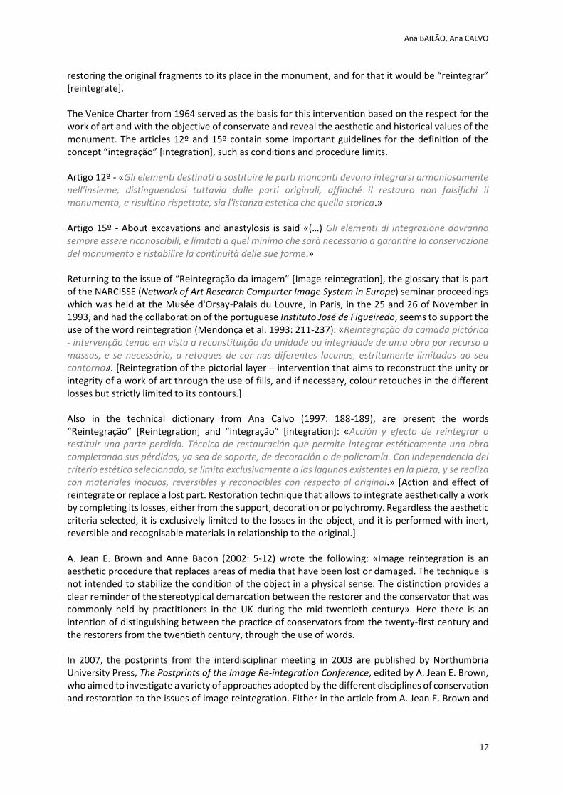
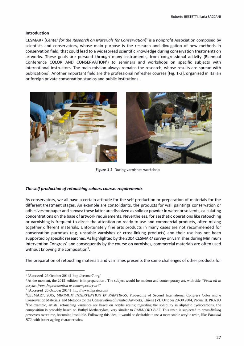
CESMAR7 (Center for the Research on Materials for Conservation)1 is a nonprofit Association composed by scientists and conservators, whose main purpose is the research and divulgation of new methods in conservation field, that could lead to a widespread scientific knowledge during conservation treatments on artworks. These goals are pursued through many instruments, from congressional activity (Biannual Conference COLOR AND CONSERVATION2) to seminars and workshops on specific subjects with international instructors. The main mission always remains the research, whose results are spread with publications3. Another important field are the professional refresher courses [Fig. 1-2], organized in Italian or foreign private conservation studios and public institutions.
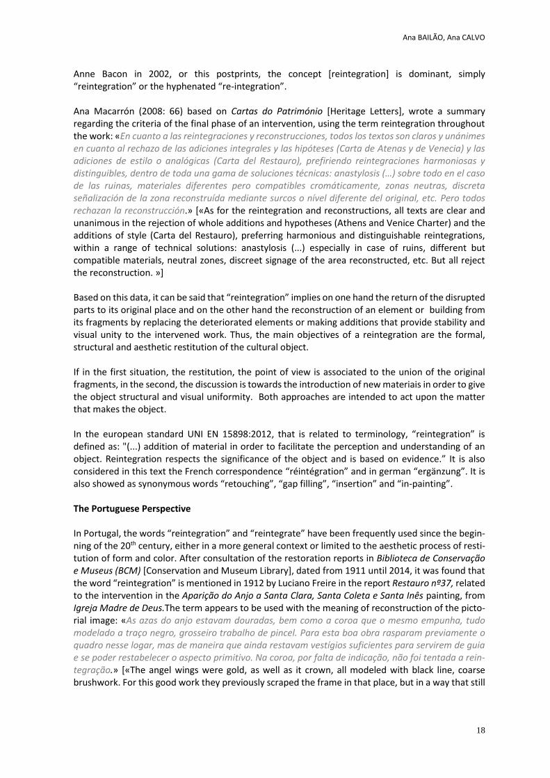
The self production of retouching colours course: requirements As conservators, we all have a certain attitude for the self-production or preparation of materials for the different treatment stages. An example are consolidants, the products for wall paintings conservation or adhesives for paper and canvas: these latter are dissolved as solid or powder in water or solvents, calculating concentrations on the base of artwork requirements. Nevertheless, for aesthetic operations like retouching or varnishing is frequent to direct the attention on ready-to-use and commercial products, often mixing together different materials. Unfortunately fine arts products in many cases are not recommended for conservation purposes (e.g. unstable varnishes or cross-linking products) and their use has not been supported by specific researches. As highlighted by the 2004 CESMAR7 survey on varnishes during Minimum Intervention Congress4 and consequently by the course on varnishes, commercial materials are often used without knowing the composition5. The preparation of retouching materials and varnishes presents the same challenges of other products for
1 [Accessed 26 October 2014] http://cesmar7.org/ 2 At the moment, the 2015 edition is in preparation . The subject would be modern and contemporary art, with title “From oil to
acrylic, from Impressionism to contemporary art” 3 [Accessed 26 October 2014] http://www.ilprato.com/ 4CESMAR7, 2005, MINIMUM INTERVENTION IN PAINTINGS, Proceeding of Second International Congress Color and e Conservation Materials and Methods for the Conservation of Painted Artworks, Thiene (VI) October 29-30 2004, Padua: IL PRATO 5For example, artists’ retouching varnishes are based on acrylic resins; regarding the solubility in aliphatic hydrocarbons, the composition is probably based on Buthyl Methacrylate, very similar to PARALOID B-67. This resin is subjected to cross-linking processes over time, becoming insoluble. Following this idea, it would be desirable to use a more stable acrylic resin, like Paraloid B72, with better ageing characteristics.
Figure 1-2. During varnishes workshop
Roberto BESTETTI, Ilaria SACCANI
28
conservation treatments; moreover, these self-produced materials could be of higher quality in comparison with commercial products, having a close control on pigments, binders and solvents. The finals products could be also engineered and designed on the base of specific demands, modifying them case by case. CESMAR7 workshop on retouching colours is based on these latter reflections: the aim is the diffusion of international literature results, applying them by a practical point of view during the conservation operations6.
Preparation of retouching colours: scientific references and methods
Laropal® A81 based colours
The first step of the workshop fine-tuning was an extensive bibliographic research on pigments and binding media7. In literature there are only few examples of specific studies on retouching materials; generally speaking, the binders’ behavior is supposed to be based on data related on the medium itself, without the pigment, even though the influence of this latter on the binders’ characteristics is well known (e.g enhancement of the drying process of oils by Lead based pigments). In this perspective, a fundamental research is the one carried on by Renè De La Rie8 (De La Rie, et al, 2000a), that determined the development of Gamblin Conservation Colours based on Laropal® A81. An outstanding study is the one in which De la Rie (De la Rie, et al., 2000) compared the behavior of different commercial retouching colours samples9; for each binder, a range of colours has been selected. During ageing, the solubility was checked by Feller test. Laropal® A81 based colours showed interesting characteristics, as they are not subjected to an increase in polarity. In the recent past we would probably named this feature reversibility, but nowadays we define it in a more precise way with the term REMOVABILITY. This characteristic endures over time with the same solvent (or close in polarity) used for the application; this fact is the direct consequence of a resin free of functional groups that during ageing would lead to cross-linking or increase in polarity.
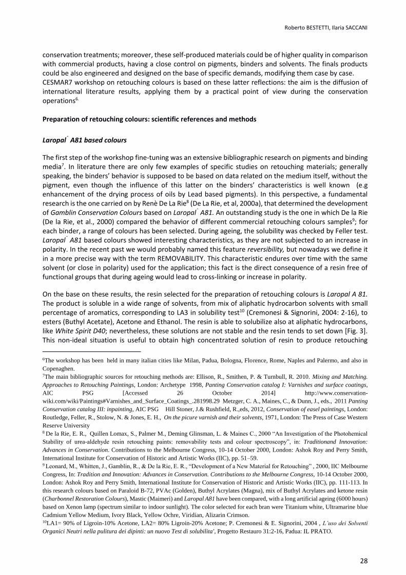
On the base on these results, the resin selected for the preparation of retouching colours is Laropal A 81. The product is soluble in a wide range of solvents, from mix of aliphatic hydrocarbon solvents with small percentage of aromatics, corresponding to LA3 in solubility test10 (Cremonesi & Signorini, 2004: 2-16), to esters (Buthyl Acetate), Acetone and Ethanol. The resin is able to solubilize also at aliphatic hydrocarbons, like White Spirit D40; nevertheless, these solutions are not stable and the resin tends to set down [Fig. 3]. This non-ideal situation is useful to obtain high concentrated solution of resin to produce retouching
6The workshop has been held in many italian cities like Milan, Padua, Bologna, Florence, Rome, Naples and Palermo, and also in Copenaghen. 7The main bibliographic sources for retouching methods are: Ellison, R., Smithen, P. & Turnbull, R. 2010. Mixing and Matching. Approaches to Retouching Paintings, London: Archetype 1998, Panting Conservation catalog I: Varnishes and surface coatings, AIC PSG [Accessed 26 October 2014] http://www.conservation-wiki.com/wiki/Paintings#Varnishes_and_Surface_Coatings_.281998.29 Metzger, C. A., Maines, C., & Dunn, J., eds., 2011 Panting Conservation catalog III: inpainting, AIC PSG Hill Stoner, J.& Rushfield, R.,eds, 2012, Conservation of easel paintings, London: Routledge, Feller, R., Stolow, N. & Jones, E. H., On the picure varnish and their solvents, 1971, London: The Press of Case Western Reserve University 8 De la Rie, E. R., Quillen Lomax, S., Palmer M., Deming Glinsman, L. & Maines C., 2000 “An Investigation of the Photohemical
Stability of urea-aldehyde resin retouching paints: removability tests and colour spectroscopy”, in: Traditionand Innovation: Advances in Conservation. Contributions to the Melbourne Congress, 10-14 October 2000, London: Ashok Roy and Perry Smith, International Institute for Conservation of Historic and Artistic Works (IIC), pp. 51–59. 9 Leonard, M., Whitten, J., Gamblin, R., & De la Rie, E. R., “Development of a New Material for Retouching” , 2000, IIC Melbourne Congress, In: Tradition and Innovation: Advances in Conservation. Contributions to the Melbourne Congress, 10-14 October 2000, London: Ashok Roy and Perry Smith, International Institute for Conservation of Historic and Artistic Works (IIC), pp. 111-113. In this research colours based on Paraloid B-72, PVAc (Golden), Buthyl Acrylates (Magna), mix of Buthyl Acrylates and ketone resin (Charbonnel Restoration Colours), Mastic (Maimeri) and Laropal A81 have been compared, with a long artificial ageing (6000 hours) based on Xenon lamp (spectrum similar to indoor sunlight). The color selected for each bran were Titanium white, Ultramarine blue Cadmium Yellow Medium, Ivory Black, Yellow Ochre, Viridian, Alizarin Crimson. 10LA1= 90% of Ligroin-10% Acetone, LA2= 80% Ligroin-20% Acetone; P. Cremonesi & E. Signorini, 2004 , L’uso dei Solventi
Organici Neutri nella pulitura dei dipinti: un nuovo Test di solubilita', Progetto Restauro 31:2-16, Padua: IL PRATO.
Roberto BESTETTI, Ilaria SACCANI
29
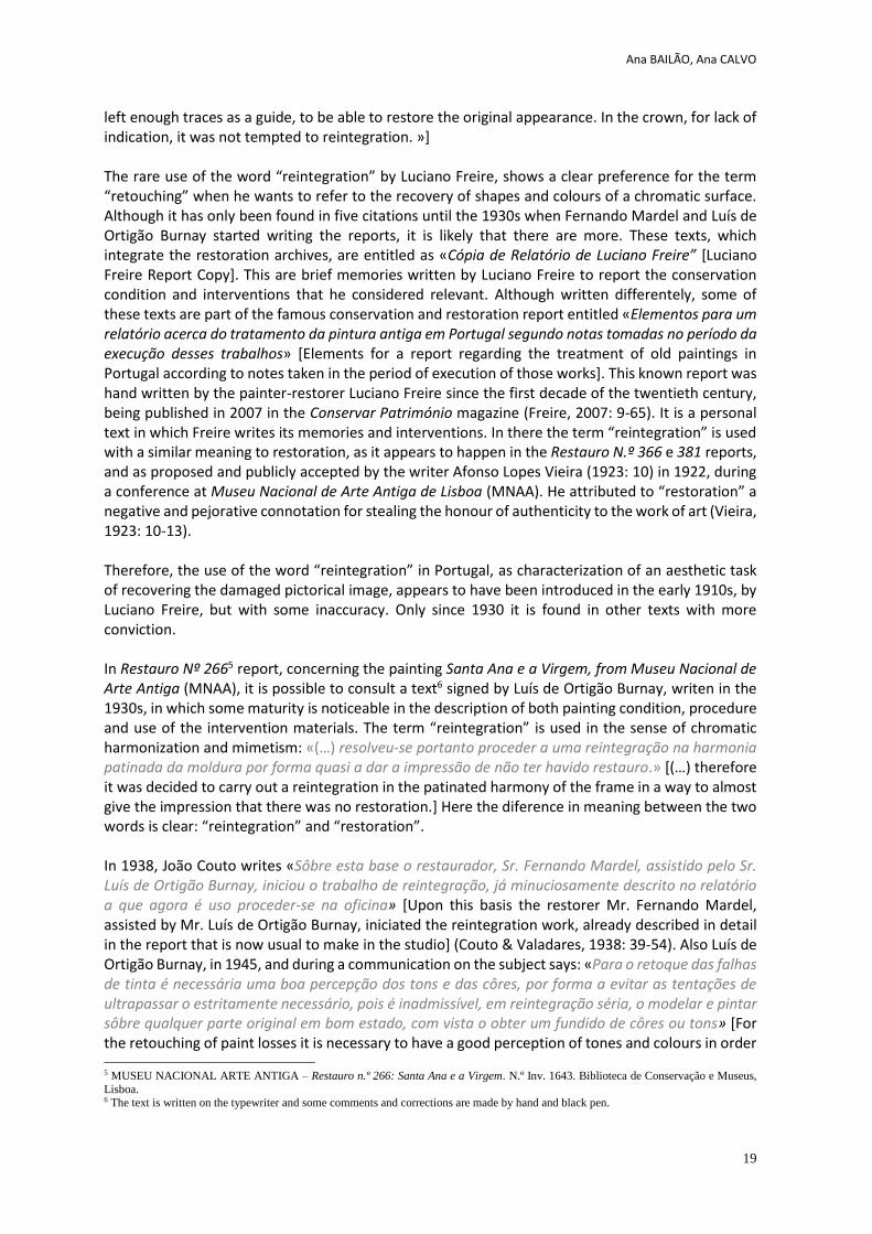
colours; an high percentage of binder means bright and intense colours. These concentrated and viscous solutions don’t allow the use of glass mullers; this fact doesn’t constitute a problem, because the pigments chosen are grinded in a very fine grain.
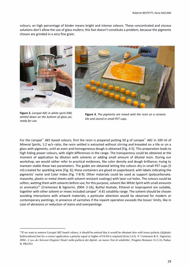
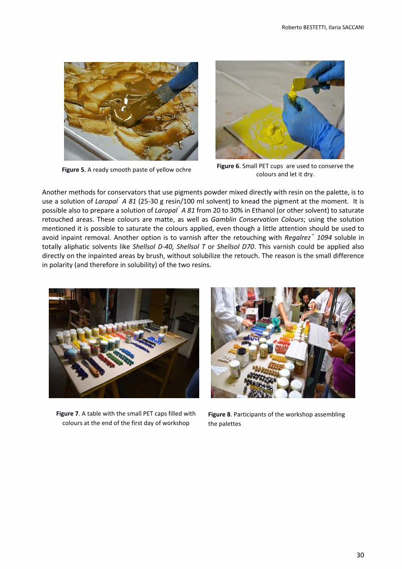
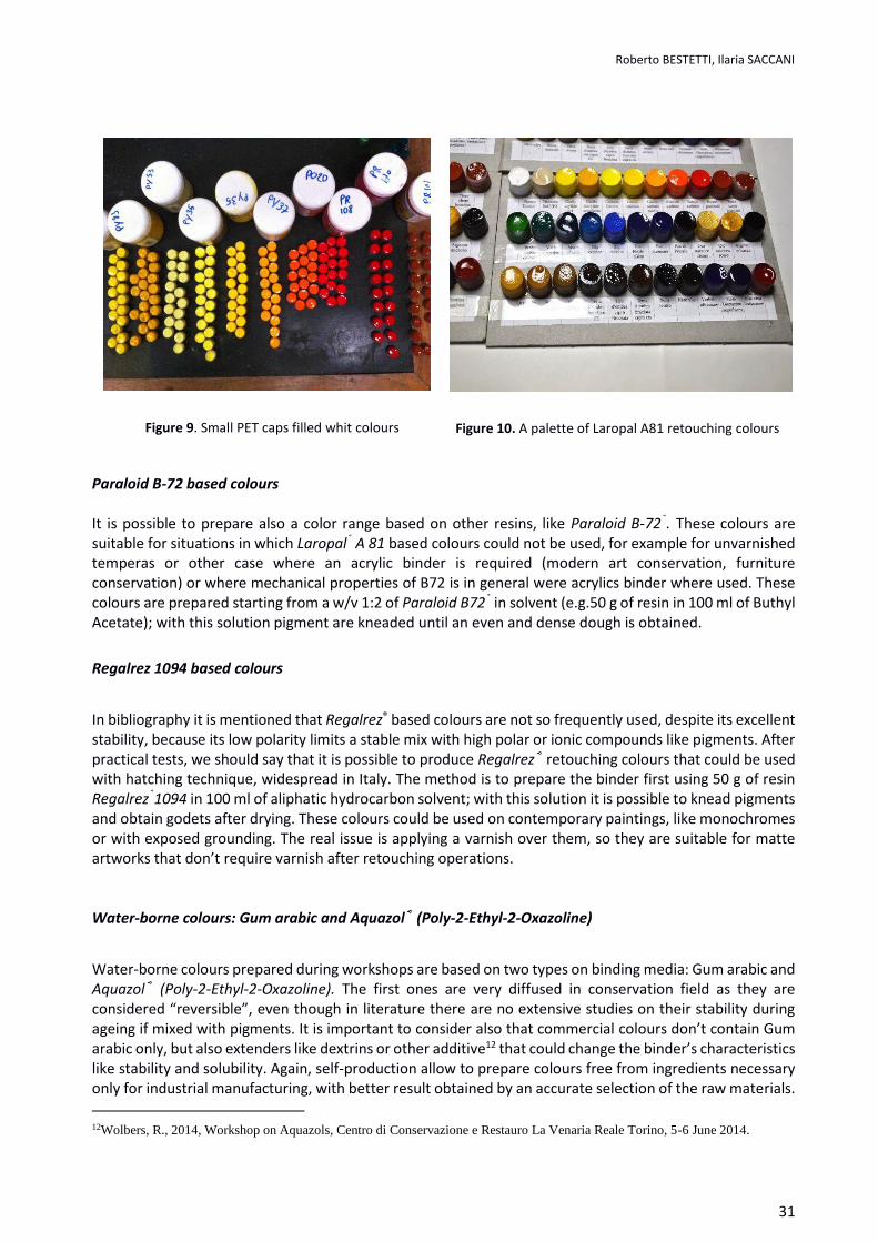
For the Laropal® A81 based colours, first the resin is prepared putting 50 g of Laropal® A81 in 100 ml of Mineral Spirits, 1:2 w/v ratio; the resin settled is extracted without stirring and kneaded on a tile or on a glass with pigments, until an even and homogeneous dough is obtained [Fig. 4-5]. This preparation leads to high hiding power colours, with slight differences in the range. The transparency could be obtained at the moment of application by dilution with solvents or adding small amount of diluted resin. During our workshop, we would rather refer to practical evidences, like color density and dough brilliance; trying to mantain stable these two parameters. The godet are obtained letting the colours dry in small PET cups (5 ml) created for sparkling wine [Fig. 6]; these containers are glued on paperboard, with labels indicating the pigments’ name and Color Index [Fig. 7-8-9]. Other materials could be used as support (polycarbonate, masonite, plastic or metal sheets with solvent resistant coatings) with laser cut holes. The colours could be soften, wetting them with solvents before use; for this purpose, solvent like White Spirit with small amounts or aromatics11 (Cremonesi & Signorini, 2004: 2-16), Buthyl Acetate, Ethanol or Isopropanol are suitable, together with other solvent or mixes included Laropal® A 81 solubility range. The solvent should be chosen avoiding interactions with artwork materials; a particular attention would be observed for modern or contemporary paintings, in presence of varnishes if the inpaint operation exceeds the losses’ limits, like in case of abrasions or reduction of stains and overpaintings
11If we want to remove Laropal A81 based colours, it should be noticed that it would be obtained also with lower polarity (aliphatic hydrocarbons) but for a correct application a polarity equal or higher of Fd 84 is required (from LA3). P. Cremonesi & E. Signorini, 2004 , L’uso dei Solventi Organici Neutri nella pulitura dei dipinti: un nuovo Test di solubilita', Progetto Restauro 31:2-16, Padua: IL PRATO
Figure 3. Laropal A81 in white spirit D40, settled down on the bottom of glass jar, ready for use.
Figure 4. The pigments are mixed whit the resin on a ceramic
tile and stored in small PET cups.
Roberto BESTETTI, Ilaria SACCANI
30
Another methods for conservators that use pigments powder mixed directly with resin on the palette, is to use a solution of Laropal® A 81 (25-30 g resin/100 ml solvent) to knead the pigment at the moment. It is possible also to prepare a solution of Laropal® A 81 from 20 to 30% in Ethanol (or other solvent) to saturate retouched areas. These colours are matte, as well as Gamblin Conservation Colours; using the solution mentioned it is possible to saturate the colours applied, even though a little attention should be used to avoid inpaint removal. Another option is to varnish after the retouching with Regalrez® 1094 soluble in totally aliphatic solvents like Shellsol D-40, Shellsol T or Shellsol D70. This varnish could be applied also directly on the inpainted areas by brush, without solubilize the retouch. The reason is the small difference in polarity (and therefore in solubility) of the two resins.
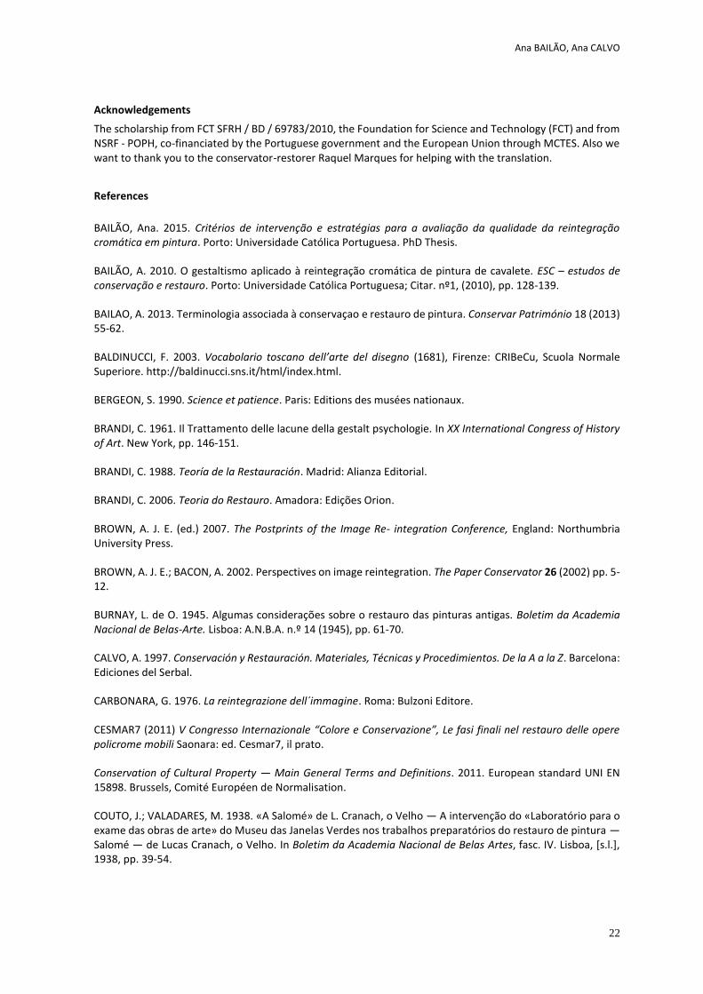
Figure 6. Small PET cups are used to conserve the colours and let it dry.
Figure 5. A ready smooth paste of yellow ochre
Figure 8. Participants of the workshop assembling
the palettes
Figure 7. A table with the small PET caps filled with
colours at the end of the first day of workshop
Roberto BESTETTI, Ilaria SACCANI
31
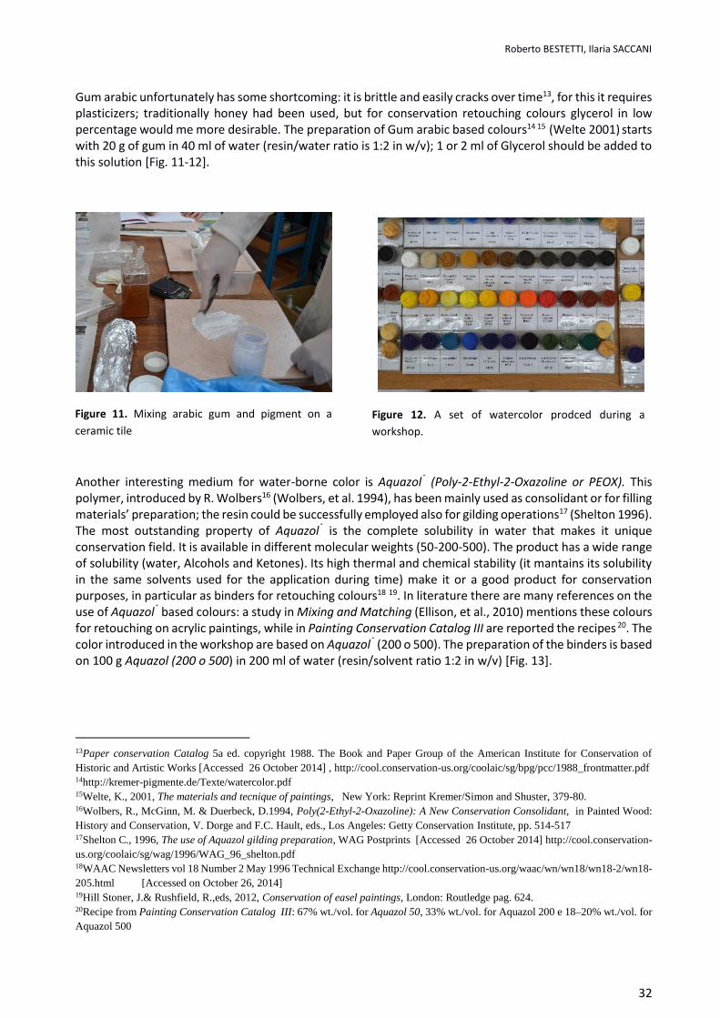
Paraloid B-72 based colours It is possible to prepare also a color range based on other resins, like Paraloid B-72®. These colours are suitable for situations in which Laropal® A 81 based colours could not be used, for example for unvarnished temperas or other case where an acrylic binder is required (modern art conservation, furniture conservation) or where mechanical properties of B72 is in general were acrylics binder where used. These colours are prepared starting from a w/v 1:2 of Paraloid B72® in solvent (e.g.50 g of resin in 100 ml of Buthyl Acetate); with this solution pigment are kneaded until an even and dense dough is obtained.
Regalrez 1094 based colours
In bibliography it is mentioned that Regalrez® based colours are not so frequently used, despite its excellent stability, because its low polarity limits a stable mix with high polar or ionic compounds like pigments. After practical tests, we should say that it is possible to produce Regalrez® retouching colours that could be used with hatching technique, widespread in Italy. The method is to prepare the binder first using 50 g of resin Regalrez®1094 in 100 ml of aliphatic hydrocarbon solvent; with this solution it is possible to knead pigments and obtain godets after drying. These colours could be used on contemporary paintings, like monochromes or with exposed grounding. The real issue is applying a varnish over them, so they are suitable for matte artworks that don’t require varnish after retouching operations. Water-borne colours: Gum arabic and Aquazol® (Poly-2-Ethyl-2-Oxazoline)
Water-borne colours prepared during workshops are based on two types on binding media: Gum arabic and Aquazol® (Poly-2-Ethyl-2-Oxazoline). The first ones are very diffused in conservation field as they are considered “reversible”, even though in literature there are no extensive studies on their stability during ageing if mixed with pigments. It is important to consider also that commercial colours don’t contain Gum arabic only, but also extenders like dextrins or other additive12 that could change the binder’s characteristics like stability and solubility. Again, self-production allow to prepare colours free from ingredients necessary only for industrial manufacturing, with better result obtained by an accurate selection of the raw materials.
12Wolbers, R., 2014, Workshop on Aquazols, Centro di Conservazione e Restauro La Venaria Reale Torino, 5-6 June 2014.
Figure 9. Small PET caps filled whit colours Figure 10. A palette of Laropal A81 retouching colours
Roberto BESTETTI, Ilaria SACCANI
32
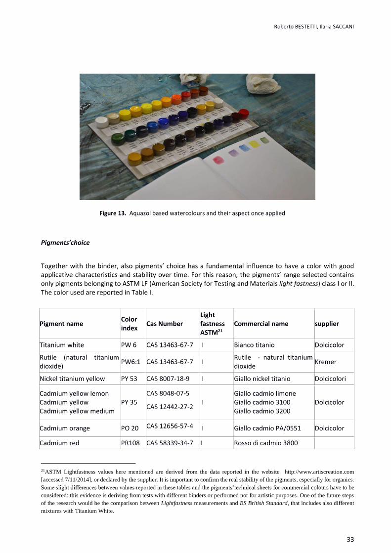
Gum arabic unfortunately has some shortcoming: it is brittle and easily cracks over time13, for this it requires plasticizers; traditionally honey had been used, but for conservation retouching colours glycerol in low percentage would me more desirable. The preparation of Gum arabic based colours14 15 (Welte 2001) starts with 20 g of gum in 40 ml of water (resin/water ratio is 1:2 in w/v); 1 or 2 ml of Glycerol should be added to this solution [Fig. 11-12].
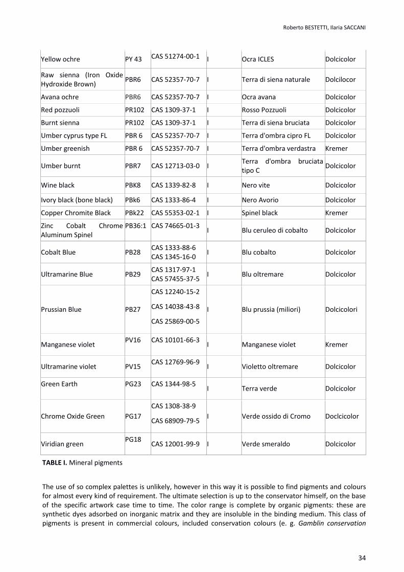
Another interesting medium for water-borne color is Aquazol® (Poly-2-Ethyl-2-Oxazoline or PEOX). This polymer, introduced by R. Wolbers16 (Wolbers, et al. 1994), has been mainly used as consolidant or for filling materials’ preparation; the resin could be successfully employed also for gilding operations17 (Shelton 1996). The most outstanding property of Aquazol® is the complete solubility in water that makes it unique conservation field. It is available in different molecular weights (50-200-500). The product has a wide range of solubility (water, Alcohols and Ketones). Its high thermal and chemical stability (it mantains its solubility in the same solvents used for the application during time) make it or a good product for conservation purposes, in particular as binders for retouching colours18 19. In literature there are many references on the use of Aquazol® based colours: a study in Mixing and Matching (Ellison, et al., 2010) mentions these colours for retouching on acrylic paintings, while in Painting Conservation Catalog III are reported the recipes 20. The color introduced in the workshop are based on Aquazol® (200 o 500). The preparation of the binders is based on 100 g Aquazol (200 o 500) in 200 ml of water (resin/solvent ratio 1:2 in w/v) [Fig. 13].
13Paper conservation Catalog 5a ed. copyright 1988. The Book and Paper Group of the American Institute for Conservation of Historic and Artistic Works [Accessed 26 October 2014] , http://cool.conservation-us.org/coolaic/sg/bpg/pcc/1988_frontmatter.pdf 14http://kremer-pigmente.de/Texte/watercolor.pdf 15Welte, K., 2001, The materials and tecnique of paintings, New York: Reprint Kremer/Simon and Shuster, 379-80. 16Wolbers, R., McGinn, M. & Duerbeck, D.1994, Poly(2-Ethyl-2-Oxazoline): A New Conservation Consolidant, in Painted Wood: History and Conservation, V. Dorge and F.C. Hault, eds., Los Angeles: Getty Conservation Institute, pp. 514-517 17Shelton C., 1996, The use of Aquazol gilding preparation, WAG Postprints [Accessed 26 October 2014] http://cool.conservation-us.org/coolaic/sg/wag/1996/WAG_96_shelton.pdf 18WAAC Newsletters vol 18 Number 2 May 1996 Technical Exchange http://cool.conservation-us.org/waac/wn/wn18/wn18-2/wn18-205.html [Accessed on October 26, 2014] 19Hill Stoner, J.& Rushfield, R.,eds, 2012, Conservation of easel paintings, London: Routledge pag. 624. 20Recipe from Painting Conservation Catalog III: 67% wt./vol. for Aquazol 50, 33% wt./vol. for Aquazol 200 e 18–20% wt./vol. for Aquazol 500
Figure 11. Mixing arabic gum and pigment on a
ceramic tile
Figure 12. A set of watercolor prodced during a
workshop.
Roberto BESTETTI, Ilaria SACCANI
33
Pigments’choice
Together with the binder, also pigments’ choice has a fundamental influence to have a color with good applicative characteristics and stability over time. For this reason, the pigments’ range selected contains only pigments belonging to ASTM LF (American Society for Testing and Materials light fastness) class I or II. The color used are reported in Table I.
Pigment name Color index
Cas Number Light fastness ASTM21
Commercial name supplier
Titanium white PW 6 CAS 13463-67-7 I Bianco titanio Dolcicolor
Rutile (natural titanium dioxide)
PW6:1 CAS 13463-67-7 I Rutile - natural titanium dioxide
Kremer
Nickel titanium yellow PY 53 CAS 8007-18-9 I Giallo nickel titanio Dolcicolori
Cadmium yellow lemon Cadmium yellow Cadmium yellow medium
PY 35 CAS 8048-07-5
CAS 12442-27-2 I
Giallo cadmio limone Giallo cadmio 3100 Giallo cadmio 3200
Dolcicolor
Cadmium orange PO 20 CAS 12656-57-4 I Giallo cadmio PA/0551 Dolcicolor
Cadmium red PR108 CAS 58339-34-7 I Rosso di cadmio 3800
21ASTM Lightfastness values here mentioned are derived from the data reported in the website http://www.artiscreation.com [accessed 7/11/2014], or declared by the supplier. It is important to confirm the real stability of the pigments, especially for organics. Some slight differences between values reported in these tables and the pigments’technical sheets for commercial colours have to be considered: this evidence is deriving from tests with different binders or performed not for artistic purposes. One of the future steps of the research would be the comparison between Lightfastness measurements and BS British Standard, that includes also different mixtures with Titanium White.
Figure 13. Aquazol based watercolours and their aspect once applied
Roberto BESTETTI, Ilaria SACCANI
34
Yellow ochre PY 43 CAS 51274-00-1 I Ocra ICLES Dolcicolor
Raw sienna (Iron Oxide Hydroxide Brown)
PBR6 CAS 52357-70-7 I Terra di siena naturale Dolcilocor
Avana ochre PBR6 CAS 52357-70-7 I Ocra avana Dolcicolor
Red pozzuoli PR102 CAS 1309-37-1 I Rosso Pozzuoli Dolcicolor
Burnt sienna PR102 CAS 1309-37-1 I Terra di siena bruciata Dolcicolor
Umber cyprus type FL PBR 6 CAS 52357-70-7 I Terra d'ombra cipro FL Dolcicolor
Umber greenish PBR 6 CAS 52357-70-7 I Terra d'ombra verdastra Kremer
Umber burnt PBR7 CAS 12713-03-0 I Terra d'ombra bruciata tipo C
Dolcicolor
Wine black PBK8 CAS 1339-82-8 I Nero vite Dolcicolor
Ivory black (bone black) PBk6 CAS 1333-86-4 I Nero Avorio Dolcicolor
Copper Chromite Black PBk22 CAS 55353-02-1 I Spinel black Kremer
Zinc Cobalt Chrome Aluminum Spinel
PB36:1
CAS 74665-01-3
I Blu ceruleo di cobalto Dolcicolor
Cobalt Blue PB28 CAS 1333-88-6 CAS 1345-16-0
I Blu cobalto Dolcicolor
Ultramarine Blue PB29 CAS 1317-97-1 CAS 57455-37-5
I Blu oltremare Dolcicolor
Prussian Blue PB27
CAS 12240-15-2
CAS 14038-43-8
CAS 25869-00-5
I Blu prussia (miliori) Dolcicolori
Manganese violet PV16
CAS 10101-66-3
I Manganese violet Kremer
Ultramarine violet PV15 CAS 12769-96-9
I Violetto oltremare Dolcicolor
Green Earth
PG23
CAS 1344-98-5
I Terra verde Dolcicolor
Chrome Oxide Green PG17
CAS 1308-38-9
CAS 68909-79-5 I Verde ossido di Cromo Doclcicolor
Viridian green PG18
CAS 12001-99-9 I Verde smeraldo Dolcicolor
TABLE I. Mineral pigments
The use of so complex palettes is unlikely, however in this way it is possible to find pigments and colours for almost every kind of requirement. The ultimate selection is up to the conservator himself, on the base of the specific artwork case time to time. The color range is complete by organic pigments: these are synthetic dyes adsorbed on inorganic matrix and they are insoluble in the binding medium. This class of pigments is present in commercial colours, included conservation colours (e. g. Gamblin conservation
Roberto BESTETTI, Ilaria SACCANI
35
colours and Maimeri); they are widespread also in acrylics and in oil based colours22 (Bracci, et al., 2010). A tipical exemple is Naples Yellow by Maimeri: the historic pigment changed the composition (Lead Antimoniate) for toxicity reasons, but mantain the name. The denomination indicates a yellow hue, rather than a chemical composition; from manufacturer’s indication it is possible to deduce that the color cointains Zinc White, and organic dyes like Arylide Yellow (PY97). The concealed presence of Zinc White, which is not desirable in retouching operations, makes the mixed color dull and opalescent. The organic pigments are shown in the Table 2.
Pigment name Color index and constitution number
CAS number
Light fastness ASTM23
Commercial name Producer/seller
Nikel azo Yellow
PY 150 12764
CAS 68511-62-6
I Indian yellow imitation
Kremer
Arylide Yellow PY 74 11741
CAS 6538-31-2
II24 Giallo KC4 Dolcicolor
Dyarilide Yellow
Py 83 21108
CAS 5567-15-7
I Giallo artiglieria Dolcicolor
Naphtol red PR 170 12475
CAS 2786-76-7
I-III25 Rosso cinabro sint. Dolcicolor
Quinacridone red-gold
PO 48 73900 73920
CAS1047-16-1
CAS 1503-48-6
CAS 71819-74-4
I Cinquasia® gold Kremer
Quinacridone Burnt scarlett
PR 206 73900/7392
CAS 1503-48-6 I
Cinquasia®chestnut brown
Kremer
22Bracci, S., Casari, G., Pandolfo, A., Perini, R., Raffaelli, F., Tomasi, M.L., Volpin & S., Picollo, M., 2011, Studio comparativo di colori da ritocco pittorico, In: Contribution to the 4th COLOR AND CONSERVATION Congress, Trento, Padua: IL PRATO, pag 61-69. The colours exposed to artificial ageing show that in Restaurarte Colours analyzed there are none of the characteristics elements e.g. in the green Chrome oxide there is no chrome, as well as in Manganese in Raw umber. The reason should be found in the fact that the colours are composed mainly by organic pigments. 23 See note 21 24From http://www.artiscreation.com [accessed 7/11/2014] A good primary yellow for color mixing in artist paints, although it is slightly transparent. Transparency depends on formulation. It comes in both opaque and transparent versions. It appears that the lightfastness is better in opaque formulations. 25From http://www.artiscreation.com [accessed 7/11/2014] : PR 170 is a family of red azo compounds, some might not belong to the same lightfastness class (ref: Handprint.com). Chroma lists the artist grade Naphthol Crimson (PR170) in the Atelier line with a lightfastness of ASTM 2 having a Blue Wool scale of 6 in mass tone and 4-5 in tints, which would make it a marginal rating of II - at best. In the Jo Sonja line they state it as ASTM I. They also rate their student grade Cadmium Red Medium Hue (PR170) as ASTM I. Guerra paint & pigment clearly put their 'Naphthol Brilliant' (semi-opaque) as excellent to very good in all tints with a Blue Wool Scale rating of 7-8 in mass tone and 6-7 in tints. Again, Guerra paint & pigment Naphthol Red Medium (semi-transparent) is rated with a blue wool scale of 6 in mass tone and 4-5 in tints. It seems that the more opaque versions of this pigment are more lightfast. Careful attention of brand specs should be made prior to any purchase, recommend making your own light fastness tests on the formulation you have

Roberto BESTETTI, Ilaria SACCANI
36
CAS 71819-76-6
Quinacridone Red
PV 19 73900
CAS 1047-16-1
I
Quindo® Pink D Kremer
Diketo-pyrrolo-pyrole red rubine
PR 264 561300
- I-II Irgazine® Ruby DPP-TR
Kremer
Phtalo Blue PB 15:1 74160
CAS 12239-87-1
I Eliogen blue kremer
PhtaloGreen PG 7 74260
CAS 1328-53-6
I Phtalo green dark Kremer
Dioxazine Violet
PV23 513192
CAS 6358-30-1
II-IV26 Viola superlacca Dolcicolor
Table 2. Organic pigments
These colours are useful in particular for contemporary art, where common commercial conservation colours would not be able to reproduce hues of the artwork; they are also important for transparent colours imitation like lakes and color glazes. Organic pigments have high dyeing power, maintaining a good transparency, unlike the inorganic pigments with both high dyeing and hiding power like Cadmium pigments, or low dyeing and hiding power like earths
Commercial pigment name Producer/seller
Oro Perlescente/iridescente 10-60 Dolcicolor
Oro Perlescente/iridescente 40-400 Dolcicolor
Bianco perlescente PA/0592 Dolcicolor
Pearl Luster Colibri Gold Kremer Pigmente
Pearl Luster Colibri Star gold Kremer Pigmente
Pearl Luster Colibri gold Kremer Pigmente
Table 3. Mica pigments
26From http://www.artiscreation.com [accessed 7/11/2014]: ASTM gives light fastness ratings for the red shade of Dioxazine as fair III and the blue shade as poor IV. Most paint manufacturers give it at least a good light fastness rating. In tests on watercolor paints, Bruce MacEvoy of Handprint.com gives this pigment a II, with a wide variation between brands (Handprint.com). Guerra paint & Pigment rate their water dispersion as a blue wool scale of 8 in mass tone and 7-8 in tints which is clearly in the excellent category. It stands to reason that source, manufacturing process or impurities play a role in the light fastness of this pigment. Different mediums or binders may also give different results. I would suggest making your own tests on the formulation or brand of artist paint you have.
Roberto BESTETTI, Ilaria SACCANI
37
In the suggested palettes are included also mica pigments (see Table 3) recently introduced in conservation practice27. These materials are characterized by a mica layer on which is deposed a metal oxide, typically Fe or Al. It is important to consider that metals are already in the oxidized state, so these colours are stable powders, resistant to oxidation processes. The shape of particles is lamellar, that confers the colours special working properties; nevertheless, their hiding power is not so high. Many test have been performed with mica pigments for retouching of gilded surfaces, achieving outstanding results on abraded gold leaf. If used with hatching technique, they have proved to be useful for selezione oro or with similar inpaint techniques. It is possible to bind these pigments both with water-borne media or resins like Laropal® A 81 and Paraloid® B72.
Conclusions
The self-production of retouching colours is not just an alternative solution in retouching rather it is a recommended practice. The preparation of the color palette during the workshops, through a working group and purchasing of large amounts of raw materials, allows to prepare a complete color sets quickly, limiting the costs. Through an accurate selection of resins used as binders and stable pigments, it is possible also to obtain high quality colours with reduced economic efforts. It is also easy to calibrate the components to achieve particular effects, creating solutions specific for each issue. The feedback received by conservators who are using these self-prepared colours is positive. It is possible to solve also problems due to the limited color range of browns or low brightness of commercial earth colours, frequently blended with opaque and highly covering pigments that altered the original hue28. After a short period necessary to become familiar with the working properties of these new materials, the retouching operations are faster, reaching the right color in an easier way; this would be relevant especially for conservators used to commercial Mastic based colours.
References Arslanoglu, J., 2003, Evaluation of the Use of Aquazol as an Adhesive in Paintings Conservation WAAC Newsletter Volume 25 Number 2 Ashok Roy and Perry Smith, International Institute for Conservation of Historic and Artistic Works (IIC), pp. 51–59. Bailão A. & Šustic S., 2013 Retouching with mica pigments, E-conservation Journal 1, pp. 45-60 Bracci, S., Casari, G., Pandolfo, A., Perini, R., Raffaelli, F., Tomasi, M.L., Volpin, S. & Picollo, M.& 2011, Studio comparativo di colori da ritocco pittorico, In: Contribution to the 4th COLOR AND CONSERVATION Congress, Trento, Padua: IL PRATO, pag 61-69. Bestetti, R., Colombo, A., De Luca, D., Selva Bonino, E.V. & Ubaldi, V., Use of Aquazol for retouching color in Italy, Poster at: Aquazol Esperienze e applicazioni nel panorama italiano, Centro Conservazione e Restauro La Venaria Reale, June 2014 Borgioli, L., & Camaiti, M., 2004, Stabilizzazione di polimeri per la verniciatura di dipinti, Poster at 2nd CESMAR7 Congress COLOR AND CONSERVATION, Thiene 2004, Padua: IL PRATO Calore, R., Frizza, L., Jaxa-Chamiec, M., Rizzonelli, L., Stevanato, N. & Tisato, F., 2011, AQUAZOL 500. Una possibile alternativa ecocompatibile alla colla animale nella preparazione degli stucchi per il restauro dei dipinti. Test preliminari per la stabilità, lavorabilità e comportamenti; In: Contribution to 5th COLOR AND CONSERVATION Congress, Padua: IL
27 A. Bailão & S. Šustic, 2013, Retouching with mica pigments, E-conservation Journal 1, 2013, pp. 45-60 http://www.e-conservation.org/issue-1/18-retouching-with-mica-pigments [Accessed 26 October 2014] 28It is frequent to find red grains in burnt earths and green ones in raw ones. These are blends that make the pigments quite different from earths and ochers found in ancient artworks
Roberto BESTETTI, Ilaria SACCANI
38
PRATO, pagg. 79-87 Cremonesi, P., 2004, Le vernici finali per i dipinti, Progetto Restauro (32). CremonesI,P. & Signorini, E. 2004 , L’uso dei Solventi Organici Neutri nella pulitura dei dipinti: un nuovo Test di solubilità, Progetto Restauro 31:2-16, Padua: IL PRATO Cremonesi, P. & Borgioli L., 2005, Le resine di sintesi per il trattamento di opere policrome, Padova: Il Prato De la Rie, E.R.& McGlinchey, C.W., 1990, New synthetic resins for picture varnishes, in Cleaning, retouching and coatings, London: Mills & Smith, pp.168-173. De la Rie, E. R, Quillen Lomax, S., Palmer M., Deming Glinsman, L.& Maines C., 2000 “An Investigation of the Photohemical Stability of urea-aldehyde resin retouching paints: removability tests and colour spectroscopy”, in: Tradition and Innovation: Advances in Conservation. Contributions to the Melbourne Congress, 10-14 October 2000, De Luca, D., Borgioli, L.& Sabatini, L. & Viti V. 2012, Manufatti su supporto tessile, Reintegrazione delle lacune, proposta di materiali alternativi. Kermes 88: pagg.42-54 Dorge V. & F. Carey H. (eds.), 1998. Painted Wood: History and Conservation. Los Angeles: Getty Conservation Institute. Ellison, R., Smithen, P. & Turnbull, R. 2010. Mixing and Matching. Approaches to Retouching Paintings. London:Archetype Feller, R., Stolow, N.& Jones, E. H., On the picture varnish and their solvents, 1971, London: The Press of Case Western Reserve University Hill Stoner, J.& Rushfield, R.,eds, 2012, Conservation of easel paintings, London: Routledge Leonard, M., Whitten, J., Gamblin, R., & De la Rie, E. R., “Development of a New Material for Retouching” , 2000, IIC Melbourne Congress, In: Tradition and Innovation: Advances in Conservation. Contributions to the Melbourne Congress, 10-14 October 2000, London: Ashok Roy and Perry Smith, International Institute for Conservation of Historic and Artistic Works (IIC), pp. 111-113 Metzger, C. A.& Maines, C.& & Dunn, J., eds., 2011 Panting Conservation catalog III: inpainting, AIC PSG Samet, W. (compiler) 1998, Panting Conservation catalog I: Varnishes and surface coatings, AIC PSG Welte, K., 2001, The materials and tecnique of paintings, New York: Reprint Kremer/Simon and Shuster
Creang a textured replacement strip for the missing lower poron of an oil portrait.
Problem solving and praccal soluons
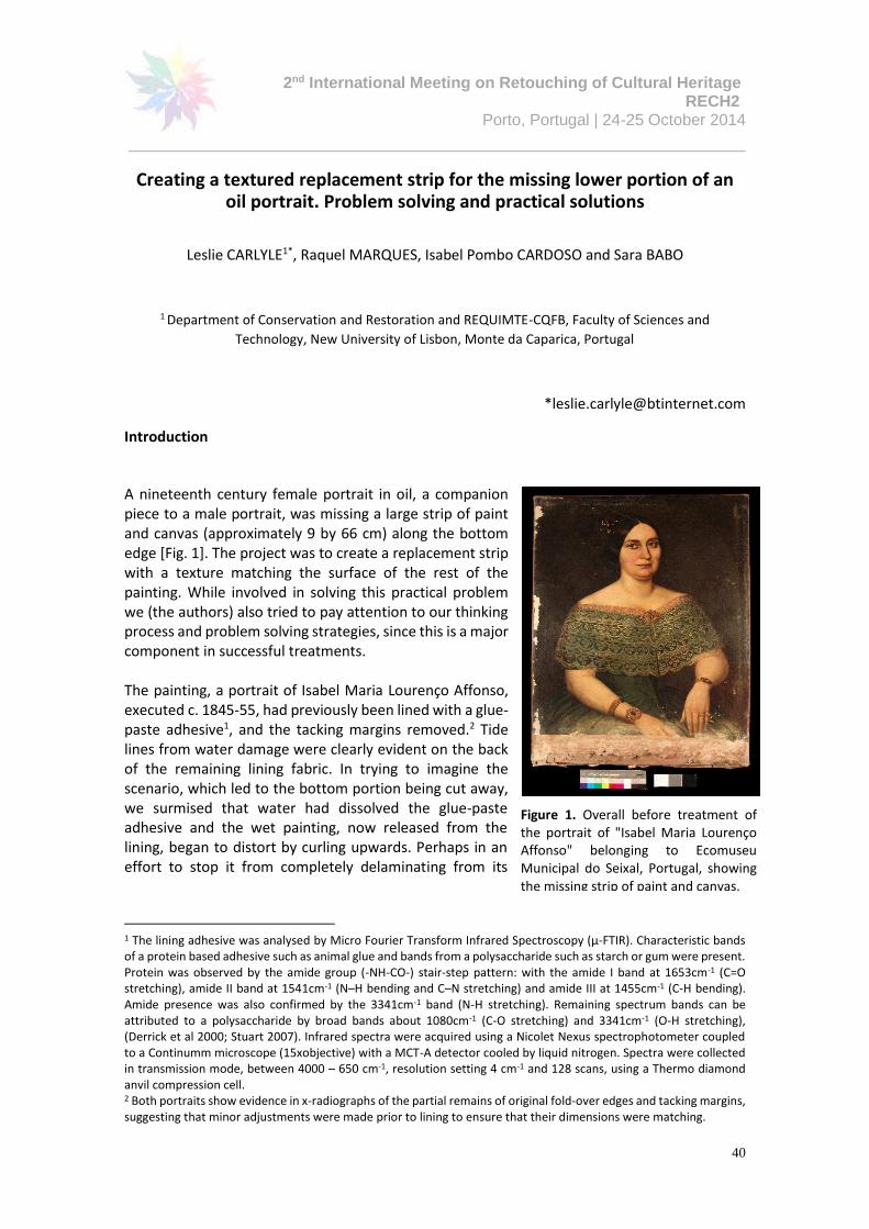
2nd International Meeting on Retouching of Cultural Heritage RECH2
Porto, Portugal | 24-25 October 2014
_____________________________________________________________________
40
Creating a textured replacement strip for the missing lower portion of an oil portrait. Problem solving and practical solutions
Leslie CARLYLE1*, Raquel MARQUES, Isabel Pombo CARDOSO and Sara BABO
1 Department of Conservation and Restoration and REQUIMTE-CQFB, Faculty of Sciences and
Technology, New University of Lisbon, Monte da Caparica, Portugal
Introduction
A nineteenth century female portrait in oil, a companion piece to a male portrait, was missing a large strip of paint and canvas (approximately 9 by 66 cm) along the bottom edge [Fig. 1]. The project was to create a replacement strip with a texture matching the surface of the rest of the painting. While involved in solving this practical problem we (the authors) also tried to pay attention to our thinking process and problem solving strategies, since this is a major component in successful treatments. The painting, a portrait of Isabel Maria Lourenço Affonso, executed c. 1845-55, had previously been lined with a glue-paste adhesive1, and the tacking margins removed.2 Tide lines from water damage were clearly evident on the back of the remaining lining fabric. In trying to imagine the scenario, which led to the bottom portion being cut away, we surmised that water had dissolved the glue-paste adhesive and the wet painting, now released from the lining, began to distort by curling upwards. Perhaps in an effort to stop it from completely delaminating from its
1 The lining adhesive was analysed by Micro Fourier Transform Infrared Spectroscopy (μ-FTIR). Characteristic bands of a protein based adhesive such as animal glue and bands from a polysaccharide such as starch or gum were present. Protein was observed by the amide group (-NH-CO-) stair-step pattern: with the amide I band at 1653cm-1 (C=O stretching), amide II band at 1541cm-1 (N–H bending and C–N stretching) and amide III at 1455cm-1 (C-H bending). Amide presence was also confirmed by the 3341cm-1 band (N-H stretching). Remaining spectrum bands can be attributed to a polysaccharide by broad bands about 1080cm-1 (C-O stretching) and 3341cm-1 (O-H stretching), (Derrick et al 2000; Stuart 2007). Infrared spectra were acquired using a Nicolet Nexus spectrophotometer coupled to a Continumm microscope (15xobjective) with a MCT-A detector cooled by liquid nitrogen. Spectra were collected in transmission mode, between 4000 – 650 cm-1, resolution setting 4 cm-1 and 128 scans, using a Thermo diamond anvil compression cell. 2 Both portraits show evidence in x-radiographs of the partial remains of original fold-over edges and tacking margins, suggesting that minor adjustments were made prior to lining to ensure that their dimensions were matching.
Figure 1. Overall before treatment of the portrait of "Isabel Maria Lourenço Affonso" belonging to Ecomuseu Municipal do Seixal, Portugal, showing the missing strip of paint and canvas.

Leslie CARLYLE, Raquel MARQUES, Isabel Pombo CARDOSO and Sara BABO
41
lining and presumably to halt the distortion and paint loss, the painting was simply cut off in a line across the bottom.
As the portrait is a companion piece, it was considered essential to restore it to its original dimensions, which had matched the male portrait. Therefore our goal was to create a replacement strip of material which would match the paint in both texture and flexibility.
Articulating the process
While treatment reports ensure that the steps taken to conserve and restore a work are well documented, we rarely voice how we develope and manage the individual steps. In a field often dominated by science, the conservator’s experiential process and the decision making behind a practical treatment can go unremarked. In Barclay’s book on the preservation of musical instruments, his chapter entitled ‘The Silent Artisan’ describes the undocumented work of the restorer, where the owner of the instrument (read cultural object) simply takes delivery of the restored piece and pays for services without questioning what has been done (Barclay 2002: 35). Even today, much of the detail regarding our problem solving can fall into this category.
Like science, practical conservation demands a high level of creativity and flexibility and in addition, a profound internalized knowledge or ‘feel’ for materials. This relationship to our materials relies on sensory feedback resulting in constant adjustments in our behaviour and our relationship to the object and the materials in use. When engaged with practical activities, potential problems due to unanticipated responses of treatment materials or materials in the painting can arise which require adjustments and innovations on the spot. Although this is routine to the conservator, when describing a treatment for our documentation, these activities are usually not fully captured. Because so much of what we do is difficult to articulate, it does not therefore get expressed, and the sophistication of our practical work can go unappreciated. In recent years the importance of our unconscious or unarticulated responses has gained attention (and value) through scientific research and in psychology has been called ‘the adaptive unconscious’ (Wilson 2002). In order to see whether we could actually tap into our own unarticulated behaviours during the problem solving and practical work ahead, we made a conscious effort to observe each other and ourselves at each stage and to try to explain why we felt the need to progress in a certain direction, or what compelled us to make a specific decision. In fact this was not always easy, as we would see or feel the next step but have trouble then explaining why. This exercise demonstrated to us that many decisions and manipulations were happening at an unconscious level which then required translation into words. We met frequently with blank paper and pens to revisit our immediate and long term objectives, and to carry out option appraisals. We constantly monitored ourselves to explore any unconscious assumptions that could limit our options and might be blocking our thinking (limiting assumptions and how to recognize and unblock them are explored in Time to Think, Listening to Ignite the Human Mind (Kline 1999)). Throughout we found that like most conservators, we needed to be able to draw schematics to show each other what we were thinking, and that we would follow up our drawings with a series of maquettes to test out the feasibility of a given option. This particular project was dogged by the issue of scaling up. Many times we could perform a successful trial with small amounts of materials, then find that when we attempted to do the same thing, but over a much larger scale, new and unexpected problems arose.
Leslie CARLYLE, Raquel MARQUES, Isabel Pombo CARDOSO and Sara BABO
42
Crafting the Replacement Strip
We intended to reline the painting and to incorporate the missing strip during the lining. Our goal was to identify a suitable archival quality material for the replacement strip that would match the physical characteristics of the painting and its thickness (approximately 0.1cm including the painting and canvas); therefore we would need a uniform thin flexible layer of a slightly rubbery quality. This ruled out a range of infill materials, which would be too stiff and brittle in the thickness required. Another goal was to create a surface texture echoing the painting’s such that the strip could be convincingly reintegrated.
The SRAL System using Modified BEVA® 371
Thanks to the work of our colleagues at SRAL3 , we were aware of a method they had developed for adapting BEVA® 371 (see Materials) to form a flexible infill material capable of receiving texture. BEVA® 371 is modified by allowing solvents from the stock material to evaporate overnight, then heating the remaining material and mixing it with kaolin or another choice of filler. The hot BEVA® 371-filler mixture (referred to here as Modified BEVA® 371= MB) is then pressed between sheets of silicone paper using an iron and a hot plate to achieve a thin, even film. In a separate step, the surface texture of the painting is reproduced by casting a very thin layer of silicone moulding material (Aquasil Ultra XLV Regular Set) onto the paint surface. The MB infill is then applied to areas of paint loss by heating it directly using a hot spatula; pressing it into the lacuna and bringing the infill material flush with the paint surface. Texture is created at the surface of the MB infill by heating through the back of the thin silicone mould with a hot spatula (Chavannes and Noble in Fuster survey 2009, as cited in Fuster 2012). A two-part investigation
Since we were adopting the SRAL model, our project involved two separate streams of investigation: Part A, finding an appropriate material and method for casting a mould of the surface texture, and Part B, finding an appropriate fill material and method for casting a large textured strip 0.1cm thick. These two questions were interdependent, and we found ourselves exploring one, and then stopping to reconsider the other, so that our thinking and trials worked in tandem.
Part A: The Surface Texture Mould
We found that the price of the silicone mould material used by SRAL was prohibitive for our project, since we not only required a final mould with a surface area of 594 cm2 but would need to make at least 3 trials in order to perfect our system of casting both the mould material and the final infill. The two part dental silicone moulding compound within our budget (Duplosil®, see below) was found to permanently stain our porous test surface [Fig.2].4 Therefore our project took a detour to see whether we could find an alternate material. An essential criterion was that the mould, once made, could be easily lifted off the surface of the painting by peeling, hence it could not be rigid at the time of removal. We recognized that once removed, if it then became rigid, this was acceptable. However since drying often involves shrinkage, we
3 First demonstrated to us by Petria Noble, then Head of Conservation, Mauritshuis, The Hague, using a method developed at the Stichting Restauratie Atelier Limburg (SRAL), Maastricht. In 2013 Kate Seymour, Head of Education at SRAL, instructed us on the use of this method (originally developed by SRAL’s Head of Paintings Conservation Jos van Och). 4 A matt porous ‘paint’ developed by Carlyle for testing the impact of conservation treatments; consisting of powdered pigment (burnt sienna) added to commercial fine finishing plaster (e.g. Polyfilla) diluted with water and brushed onto an artist’s canvas. The porous ‘paint’ darkens dramatically where saturated showing the extent and degree of penetration of silicone.
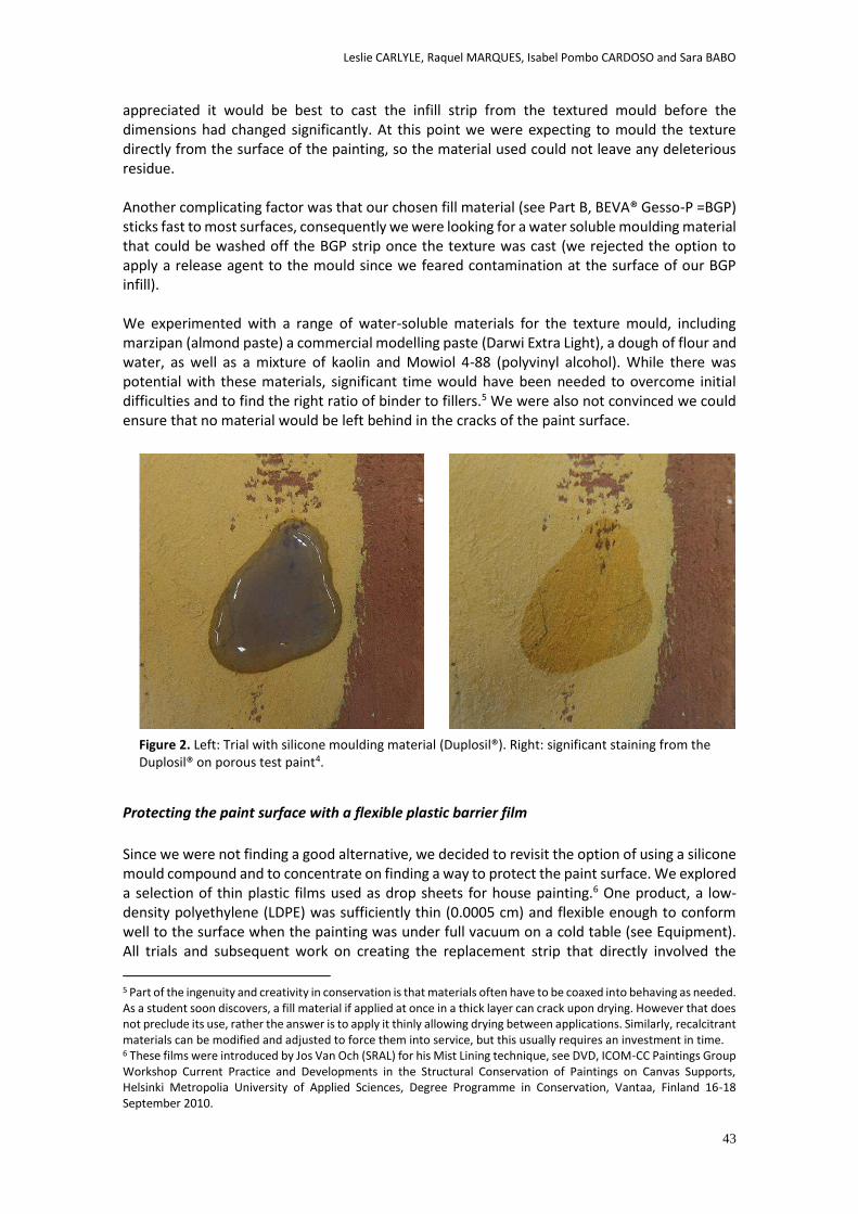
Leslie CARLYLE, Raquel MARQUES, Isabel Pombo CARDOSO and Sara BABO
43
appreciated it would be best to cast the infill strip from the textured mould before the dimensions had changed significantly. At this point we were expecting to mould the texture directly from the surface of the painting, so the material used could not leave any deleterious residue. Another complicating factor was that our chosen fill material (see Part B, BEVA® Gesso-P =BGP) sticks fast to most surfaces, consequently we were looking for a water soluble moulding material that could be washed off the BGP strip once the texture was cast (we rejected the option to apply a release agent to the mould since we feared contamination at the surface of our BGP infill). We experimented with a range of water-soluble materials for the texture mould, including marzipan (almond paste) a commercial modelling paste (Darwi Extra Light), a dough of flour and water, as well as a mixture of kaolin and Mowiol 4-88 (polyvinyl alcohol). While there was potential with these materials, significant time would have been needed to overcome initial difficulties and to find the right ratio of binder to fillers.5 We were also not convinced we could ensure that no material would be left behind in the cracks of the paint surface.
Protecting the paint surface with a flexible plastic barrier film
Since we were not finding a good alternative, we decided to revisit the option of using a silicone mould compound and to concentrate on finding a way to protect the paint surface. We explored a selection of thin plastic films used as drop sheets for house painting.6 One product, a low-density polyethylene (LDPE) was sufficiently thin (0.0005 cm) and flexible enough to conform well to the surface when the painting was under full vacuum on a cold table (see Equipment). All trials and subsequent work on creating the replacement strip that directly involved the
5 Part of the ingenuity and creativity in conservation is that materials often have to be coaxed into behaving as needed. As a student soon discovers, a fill material if applied at once in a thick layer can crack upon drying. However that does not preclude its use, rather the answer is to apply it thinly allowing drying between applications. Similarly, recalcitrant materials can be modified and adjusted to force them into service, but this usually requires an investment in time. 6 These films were introduced by Jos Van Och (SRAL) for his Mist Lining technique, see DVD, ICOM-CC Paintings Group Workshop Current Practice and Developments in the Structural Conservation of Paintings on Canvas Supports, Helsinki Metropolia University of Applied Sciences, Degree Programme in Conservation, Vantaa, Finland 16-18 September 2010.
Figure 2. Left: Trial with silicone moulding material (Duplosil®). Right: significant staining from the Duplosil® on porous test paint4.
Leslie CARLYLE, Raquel MARQUES, Isabel Pombo CARDOSO and Sara BABO
44
portrait were done with the painting strip lined and held in a loom, with the old lining and adhesive removed from the original canvas. Silicone moulding compound
We found an economical two-component dental silicone mould material (Duplosil®, see Materials) with a reasonable working time of 5 minutes and a cure time of 20-30 minutes. In tests Duplosil® had no effect on the plastic barrier film and we could achieve a reasonable cast of the topography of the painting without significant loss of detail (see the end result Fig. 7). Creating a textured mould of uniform thickness Since our ultimate goal was to achieve a thin uniform film of textured infill material, our textured mould also needed to be of uniform thickness (see below). In trials Duplosil® quickly levelled out by itself after pouring into a 6 by 12 cm area damned off with lengths of rolled plasticine or modelling paste (see Materials). However in our first trial with the area required for the finished strip, Duplosil® spread with palette knives did not achieve enough flow to form a level film before setting. Our next trial involved placing a layer of silicone release Melinex® on top of the Duplosil® immediately after pouring. This was followed by an 8ply matt board, with the addition of heavy flat boards and weights in an effort to force greater flow and create an even surface. While we succeeded in achieving a mould of the correct thickness, unfortunately large air bubbles were trapped between the Melinex® and Duplosil® which meant that the underside of the mould was not flat. Simultaneously, we were also exploring ways to achieve thin layers of infill material with uniform thickness by constructing thickness guides to form the sides of the long rectangle required to form our replacement strip. After application as a semi-viscous paste, the infill material was smoothed out using an applicator drawn along the guides [see Fig. 5]. We decided to use the same idea to draw down a uniform layer of Duplosil® on top of the barrier film on the painting. We found lengths of smooth white plastic (1.55 cm wide x 0.2 cm deep by 100 cm long) (see Materials), to form the sides of the strip while also acting as thickness guides. Two strips were placed 12 cm apart [Fig.3]. Once the silicone was poured into the channel created, a piece of 8ply matt board could be pulled at a fixed angle along the strips to effect an even 0.2 cm thick layer (similar to the application of BGP, see Fig.6). Various options had been explored for holding the white strips in place on top of the plastic film (after the vacuum was pulled so the plastic film was in full conformation to the surface). Double-sided adhesive tape, thin rolls of plasticine or modelling paste were considered while we stood looking at the white plastic strips. Each was problematic (double sided adhesive might not allow close enough conformation of the strips to the textured surface; rolls of plasticine or modelling paste had to be formed uniformly and then applied below the surface of the plastic strips so as not to interrupt the smooth progress of the draw down applicator). Fortunately no time was needed to explore these options in trials, because the solution suddenly became obvious: the strips could be held in place on top of the barrier film by running a bead of Duplosil® (extruded from a syringe) along the centre of each, then placing the strips silicone side down on top of the plastic film. Once the Duplosil® cured it both sealed and held the plastic strips in place while conforming perfectly to the surface.
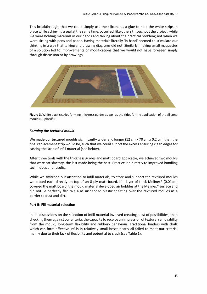
Leslie CARLYLE, Raquel MARQUES, Isabel Pombo CARDOSO and Sara BABO
45
This breakthrough, that we could simply use the silicone as a glue to hold the white strips in place while achieving a seal at the same time, occurred, like others throughout the project, while we were holding materials in our hands and talking about the practical problem; not when we were sitting with pens and paper. Having materials literally ‘in hand’ seemed to stimulate our thinking in a way that talking and drawing diagrams did not. Similarly, making small maquettes of a solution led to improvements or modifications that we would not have foreseen simply through discussion or by drawings.
Forming the textured mould
We made our textured moulds significantly wider and longer (12 cm x 70 cm x 0.2 cm) than the final replacement strip would be, such that we could cut off the excess ensuring clean edges for casting the strip of infill material (see below). After three trials with the thickness guides and matt board applicator, we achieved two moulds that were satisfactory, the last made being the best. Practice led directly to improved handling techniques and results. While we switched our attention to infill materials, to store and support the textured moulds we placed each directly on top of an 8 ply matt board. If a layer of thick Melinex® (0.01cm) covered the matt board, the mould material developed air bubbles at the Melinex® surface and did not lie perfectly flat. We also suspended plastic sheeting over the textured moulds as a barrier to dust and dirt.
Part B: Fill material selection
Initial discussions on the selection of infill material involved creating a list of possibilities, then checking them against our criteria: the capacity to receive an impression of texture; removability from the mould; long-term flexibility and rubbery behaviour. Traditional binders with chalk which can form effective infills in relatively small losses nearly all failed to meet our criteria, mainly due to their lack of flexibility and potential to crack (see Table 1).
Figure 3. White plastic strips forming thickness guides as well as the sides for the application of the silicone mould (Duplosil®).
Leslie CARLYLE, Raquel MARQUES, Isabel Pombo CARDOSO and Sara BABO
46
BINDER FILLER OBSERVATIONS
Rabbit Skin Glue
Chalk
Based on previous experience with these materials, it was felt
that all films formed in the required thickness and size would
be too brittle to be handled prior to lining, and once in place
could form an independent cracking system visually
incompatible with the painting.
Steps to overcome this problem, such as infusing a cast film
with BEVA® 371 to impart flexibility were not explored since
other alternatives with flexible materials were available.
Gelatin
Isinglass
Mowiol (PVOH)
Mowilith DMC-2 (PVA)
Lascaux 4176
Chalk
Both were rejected early on, because they are not heat
sensitive and we were still considering MB. There was no need
to return to them because we found BGP. Aquazol 200 or 500
Wax-Resin Chalk
+ Pigments
These materials were all flexible enough. Wax-resin was
rejected due to the unpredictability of its behaviour in high
temperatures and the possible formation of exudates.
Therefore the BEVA® options were the more favourable
choices.
Modified BEVA®371b7
(MB) Kaolin
BEVA® Gesso-P (BGP) BEVA® Gesso-P (BGP)
Table 1. Infill options8
Option 1: Modified BEVA® 371b (MB)
Our samples of thin sheets made using the SRAL recipe with kaolin alone had a similar flexibility to the painting by feel. Furthermore the MB could accept texture because the surface was heat sensitive. Option 1 Trials
Initial trials with MB (10 g BEVA® 371 to 7.5 g kaolin) were promising, but were relatively small in surface area. In our attempt to scale up to the required dimensions, we discovered that our hot table cut off at 70.5°C, well before the MB was hot enough to form an even flat film over the surface area required. Using electric hand irons on top of the MB on the hot table was rejected due to the anticipated difficulty of achieving a film of uniform thickness with the irons. Attempts to dilute warmed MB with solvent to facilitate spreading at room temperature did not succeed as the MB solution would not form an even film and cracked badly upon drying, presumably due to shrinkage. Therefore we decided to reconsider our options. Option 2: BEVA® Gesso-P
The product, BEVA® Gesso-P (BGP) supplied with the fill material already incorporated was explored since it had the potential to provide a thin, flexible, durable film that would accept texture from the mould (see Materials). Beva® Gessos9 are commercial vinyl resin fillers designed specifically for conservation use (see Craft and Solz 1998; Berger 2000). According to Kremer Pigmente, BGP is composed of ‘a compressible, inert mineral powder, oxidation
7 According to (http://www.conservationsupportsystems.com/system/assets/msds/New_Beva_Formula), BEVA® 371b uses an aldehyde resin to replace Laropal K80 (formerly Ketone N, a cyclohexanone resin) used in the original formula. See Ploeger et al. 2014 for a study of the photochemical stability of BEVA® 371 and BEVA® 371b. 8 This Table has been corrected from the version in the original paper published in The Picture Restorer.
Leslie CARLYLE, Raquel MARQUES, Isabel Pombo CARDOSO and Sara BABO
47
inhibitors, UV stabilizers, a buffer to remain at a non-acidic pH and BEVA® resins.’ We analysed our sample using µ-FTIR9.
Option 2 Trials
BGP directly from the can is a paste-like material which could not be applied in a continuous thin even film over the textured Duplosil® using a palette knife or with the drawdown method. Furthermore the stock material cracked significantly as it dried. To avoid these problems, the plan was to dilute the BGP with solvent, then to build it up to the required thickness by applying a series of thin layers allowing each to dry between applications. A small textured infill strip (8 cm x 3 cm) was successfully created on a Duplosil® mould by applying four thin layers of BGP diluted with toluene, using an applicator of semi-flexible plastic (3.5 cm x 11.5 cm).10 Immediately after application of the fourth layer, a piece of white polyester fabric (see Materials), was laid on top and became incorporated into the textured strip.
The polyester fabric was felt to be necessary to allow the thin BGP strip to be handled easily without tearing and to form good mechanical adhesion with the Mist Lining adhesive. We assessed the quality of the texture transfer (evaluating not only BGP, but in earlier trials, the marzipan, Darwi® modelling paste, etc.) by cutting a series of parallel lines into a plastic cutting board, then casting the infill material onto it. We also cast from a silicone mould made from a portion of a figure painted in relief (using porous paint4). It was easier to ‘read’ the texture for comparison in our trials when there was a recognisable figure (the head of a lion) or a series of sharp parallel lines rather than a pattern of cracks or generalised low relief brushwork
Scaling up with BGP
After several successful small scale trials with BGP over various textured Duplosil® moulds, an unexpected problem arose: the Duplosil® began reacting to the solvent in the BGP by swelling dramatically as soon as the BGP was applied. By this time, we had already cast our full size textured moulds from the painting surface, and wanted to continue to use them (see conclusions). We investigated our solvent options again by testing a range of free solvents on a piece of Duplosil® and then with each solvent in BGP (Table 2). We cast more textured films on another supply of Duplosil® to establish if ours was defective or out of date, or if the thickness of the mould was influential. There were no conclusive results. We decided to go ahead with a trial over a large surface area (1/2 the total of the strip) with the idea that we would control the Duplosil® response by keeping the BGP layer extremely thin and uniform, and by using Shellsol D40 which has a low aromatic content.
9 There are two types of BEVA® Gesso, BEVA® Gesso-P fine-grained and BEVA® Gesso-V medium-grained (Craft and Solz 1998). We analysed our sample of BEVA ® Gesso-P using μ-FTIR (see endnote 1). The presence of the ‘BEVA® resins’ were confirmed by the characteristic bands of ethylene/vinyl acetate copolymer mixed with polycyclohexanone at 2919cm-1 and 850cm-1 (C-H stretching), 1738cm-1 (C=O stretching), 1448cm-1 and 1372cm-1 (C-H bending) and 1239cm-1 (C-O stretching) (Derrick et al 2000). Another material was evident with a strong band around 1063 cm-1 (possibly the filler). It was not possible to identify this material further since characteristic bands could be hidden by the synthetic resins peaks. Other analytical methods will be pursued. 10 The applicator was cut from a thin flexible plastic sheet (0.123 cm thick) sold as a kitchen cutting board. Other plastic sheets used as thickness guides for the infill material were sold as place mats (thicknesses from 0.027 cm to 0.037 cm).

Leslie CARLYLE, Raquel MARQUES, Isabel Pombo CARDOSO and Sara BABO
48
Shellsol A Xylene Toluene Shellsol D40 Shellsol T White Spirits
Aromatics (%)11 >97% 100% 100% <0.4% <0.05% 16-20%
Relative Evaporation
Rate (ether=1) 10
45 13.5 6.1 55-70 123 -
Table 2. Solvent trials on Duplosil® Silicone moulding compound
Application of BGP in a thin even film
To apply a uniform film of BGP with the required thickness, we built a platform for the textured mould with guides on either side at a fixed distance the correct height above the mould [Fig. 4]. White plastic strips (described in Part A) were placed on top of strips of thin (0.027 cm) plastic sheets 9 cut to size and all were held in place with double-sided tape. A rigid applicator was pulled along the smooth uninterrupted surfaces of the white plastic guides in order to spread the BGP evenly. We explored several applicator options and settled on a piece of lightweight corrugated Lexan (23.5 cm x 12.5 cm x 0.4 cm) with a piece of the white plastic guide material to form a straight edge (held on with double sided adhesive tape), see figure 6. Since the Duplosil® began to distort immediately on contact with BGP, we placed a piece of thick Melinex® over the spot where the BGP would be poured [Fig. 5]. In our first attempt to spread the BGP, the Duplosil®, unable to expand across its width due to the thickness guides, distorted dramatically along the edges. At the suggestion of Marques, we designed ‘break away guides’ so that as soon as the BGP was applied, the guides could be removed allowing the silicone to expand unrestricted [Fig.4].
Further fast action involved the use of a hairdryer blowing cool air over the length of the strip until the distortions in the Duplosil® were reduced and the BGP film was surface dry (approximately 30 minutes).12 An 8ply matt board cut to size was placed over the whole BGP strip once it was surface dry, then boards and weights were placed on top to hold the strip flat
11 Solvent Information compiled from the following: Shellsol: http://www.shell.com/global/products-services/solutions-for-businesses/chemicals/products/solvents/hydrocarbon-solvents.html. Toluene and Xylene: http://www.siegwerk.com/fileadmin/user_upload/cc/Data_Sheets/TM/Verdunstungsgeschwindigkeit_e.pdf. White Spirit values, the Supplier Valente & Ribeiro Lda, (oral communication). 12 Based on a dilution of BGP with Shellsol D40, from the time it was poured onto the strip of textured silicone and spread over the surface, the working time was approximately 2 minutes.
Figura 4. Illustration of the use of "break away" thickness guides which can be removed immediately after application of BGP such that the Duplosil® is able to swell and expand freely.
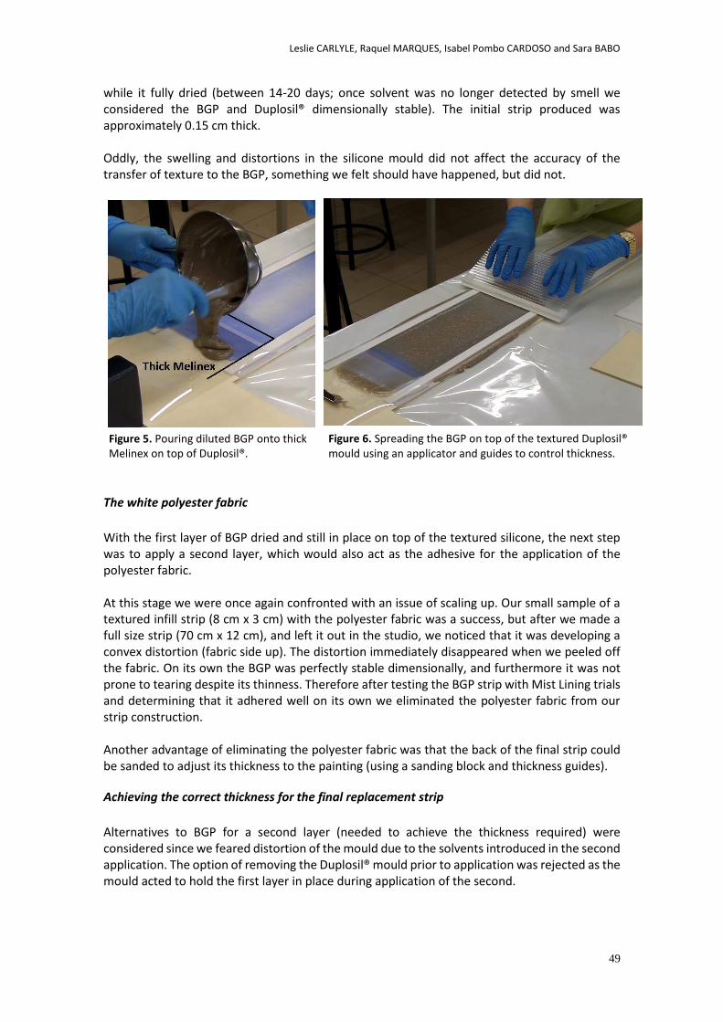
Leslie CARLYLE, Raquel MARQUES, Isabel Pombo CARDOSO and Sara BABO
49
while it fully dried (between 14-20 days; once solvent was no longer detected by smell we considered the BGP and Duplosil® dimensionally stable). The initial strip produced was approximately 0.15 cm thick. Oddly, the swelling and distortions in the silicone mould did not affect the accuracy of the transfer of texture to the BGP, something we felt should have happened, but did not.
The white polyester fabric
With the first layer of BGP dried and still in place on top of the textured silicone, the next step was to apply a second layer, which would also act as the adhesive for the application of the polyester fabric. At this stage we were once again confronted with an issue of scaling up. Our small sample of a textured infill strip (8 cm x 3 cm) with the polyester fabric was a success, but after we made a full size strip (70 cm x 12 cm), and left it out in the studio, we noticed that it was developing a convex distortion (fabric side up). The distortion immediately disappeared when we peeled off the fabric. On its own the BGP was perfectly stable dimensionally, and furthermore it was not prone to tearing despite its thinness. Therefore after testing the BGP strip with Mist Lining trials and determining that it adhered well on its own we eliminated the polyester fabric from our strip construction. Another advantage of eliminating the polyester fabric was that the back of the final strip could be sanded to adjust its thickness to the painting (using a sanding block and thickness guides).
Achieving the correct thickness for the final replacement strip
Alternatives to BGP for a second layer (needed to achieve the thickness required) were considered since we feared distortion of the mould due to the solvents introduced in the second application. The option of removing the Duplosil® mould prior to application was rejected as the mould acted to hold the first layer in place during application of the second.
Figure 5. Pouring diluted BGP onto thick Melinex on top of Duplosil®.
Figure 6. Spreading the BGP on top of the textured Duplosil® mould using an applicator and guides to control thickness.
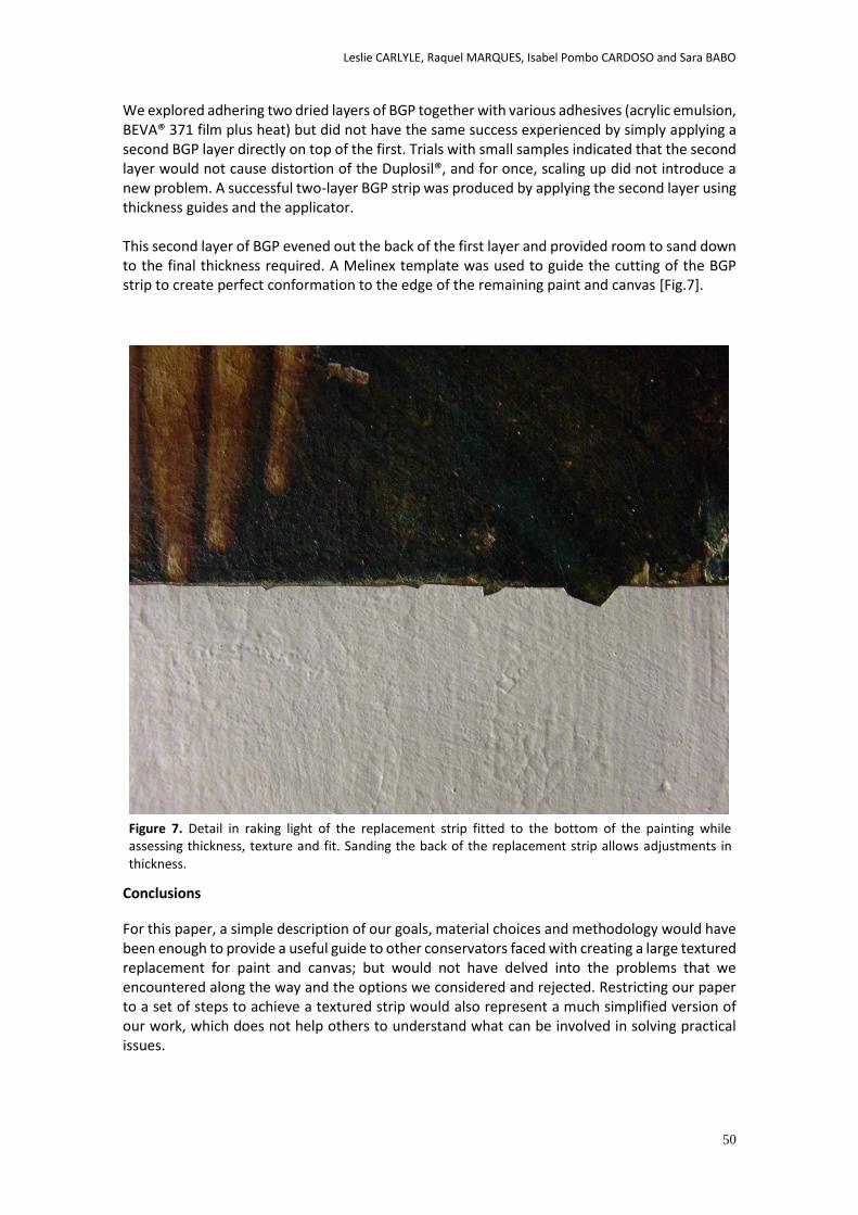
Leslie CARLYLE, Raquel MARQUES, Isabel Pombo CARDOSO and Sara BABO
50
We explored adhering two dried layers of BGP together with various adhesives (acrylic emulsion, BEVA® 371 film plus heat) but did not have the same success experienced by simply applying a second BGP layer directly on top of the first. Trials with small samples indicated that the second layer would not cause distortion of the Duplosil®, and for once, scaling up did not introduce a new problem. A successful two-layer BGP strip was produced by applying the second layer using thickness guides and the applicator. This second layer of BGP evened out the back of the first layer and provided room to sand down to the final thickness required. A Melinex template was used to guide the cutting of the BGP strip to create perfect conformation to the edge of the remaining paint and canvas [Fig.7].
Conclusions For this paper, a simple description of our goals, material choices and methodology would have been enough to provide a useful guide to other conservators faced with creating a large textured replacement for paint and canvas; but would not have delved into the problems that we encountered along the way and the options we considered and rejected. Restricting our paper to a set of steps to achieve a textured strip would also represent a much simplified version of our work, which does not help others to understand what can be involved in solving practical issues.
Figure 7. Detail in raking light of the replacement strip fitted to the bottom of the painting while assessing thickness, texture and fit. Sanding the back of the replacement strip allows adjustments in thickness.
Leslie CARLYLE, Raquel MARQUES, Isabel Pombo CARDOSO and Sara BABO
51
The immediate value of this level of description is to offer an illustration of the problem of scaling up - showing that in small samples and trials materials can behave perfectly, but not necessarily on a larger scale. It also illustrates where conservation treatment issues can depart dramatically from scientific experimental or even industrial design. In the latter cases, pilot projects are used to develop reproducible techniques and methodologies. In a single conservation treatment, we rarely have the opportunity (time and funding) to leave the ‘prototype’ phase. The solution is usually directed to a one-off situation, and time already invested in a single material (such as our use of Duplosil®) can be the driver to solving a new set of problems. The questions we face can often hinge on whether to abandon a particular material or process and redesign, or to overcome difficulties. It is somewhat ironic that much of the creativity and flexibility required for complex treatments is in terms of meeting the challenge of problems encountered along the way. With time and funding, problematic materials could be rejected and the project redesigned, but this is rarely the circumstance in which treatments are carried out. Furthermore a successful solution for one particular case will not necessarily be applicable to any other treatments due to the unique nature of the objects being treated. But the approach to problem solving is transferable, as is the feel for how materials behave. In many of our conservation journals and publications there has been a move away from treatment descriptions (case histories). We hope that this article offers an argument for more explorations of treatments, not only because of what we learn ourselves, but also because of what this can illustrate to others about our practical work and its challenges.
Acknowledgements
This paper, originally published in The Picture Restorer, Number 45, Autumn 2014, 44-32, is reproduced here by kind permission from The British Association of Paintings Conservator-Restorers.
We are very grateful to Kate Seymour for her workshop on infills, and for her comments and corrections to the text, as well as to Petria Nobel for introducing us to the SRAL modified BEVA® 371 technique some years ago. We would like to thank Professor Maria João Melo for her kind help with the μ-FTIR analysis of BEVA® samples, and to thank the owners of the portrait, Ecomuseu Municipal do Seixal, Portugal, and their representative, Ana Luísa Duarte for permission to treat the painting and to describe the treatment here. References
Barclay, R. 2005. The Preservation and Use of Historic Music Instruments: Display Case and Concert Hall. London: Earthscan.
Berger, G. A. 2000. Conservation of Paintings: Research and Innovations. London: Archetype Publications.
Craft, M.L. and Solz, J. A. 1998. ‘Commercial Vinyl and Acrylic Fill Materials’. Journal of the American Institute for Conservation, 37(1):23-34.
Derrick, M. R., Stulik, D., Landry, J. M. 1999. Infrared Spectroscopy in Conservation Science - Scientific Tools for Conservation. Los Angeles: The Getty Conservation Institute.
Fuster, L. 2009. Survey carried out on filling techniques on the American Institute for Conservation Paintings Specialty Group distlist with electronic mail responses from: Ameringer, C.; Bernstein, J.; Bisacca, G.; Chavannes, M.; Noble, P.; Schwartz, G.; and Tomkiewicz, C., unpublished. Cited in Fuster, L. 2012. ‘Filling’. In The conservation of easel paintings, Stoner, J. H., Rushfield, R. A. (ed.). Abingdon, Oxon [England]: Routledge: 592.
Leslie CARLYLE, Raquel MARQUES, Isabel Pombo CARDOSO and Sara BABO
52
Kline, N. 1999. Time to Think, Listening to Ignite the Human Mind. London: Cassell Illustrated
Ploeger, R., de la Rie, E. R., McGlinchey, C.W. et al. 2014. ‘The long-term stability of a popular heat-seal adhesive for the conservation of painted cultural objects’. Polymer Degradation and Stability. In press.
Stuart, B. 2007. Analytical Techniques in Materials Conservation. Chichester, England: John Wiley & Sons.
Wilson, T. D. 2002. Strangers to Ourselves: Discovering the Adaptive Unconscious. Cambridge, Mass.: Belknap Press of Harvard University Press.
Materials and Suppliers
Equipment
Hot/Cold Vacuum Table: Combined BMZ low-pressure hot stage standard, Hofmann und Schildbach GmbH, Restoration Equipment from Sachsen, Breithauptstrasse 4, 08056 Zwickau. Heat Spatula: Willards of Chichester, Sussex, England. Controller type ‘E’. Serial No. 0471-479.
Materials
Product Supplier Date of Receipt
BEVA® 371b (Gustav Berger’s Original
Formula® 371, 40% solution)
Kremer Pigmente GmbH & Co. KG
www.kremer-pigmente.de
FCT-PNT Stock
2013
Duplosil®, 9°-10° shore A, two
components A and B.
Simed, Dental equipment and
products
Deffner & Johann GmbH
http://www.deffner-johann.de FCT-PNT Stock
2011
Extra Light Modelling paste, Darwi®
Made in Belgium
www.darwi.com
Artist’s Materials Supply store, Lisbon, Portugal FCT-PNT Stock
2012
Modelling paste,
Colorplus
Ponto das Artes, Artist’s Materials Supply store,
Lisbon, Portugal
http://www.pontodasartes.com/pt
Purchased 2014
Plasticine Artist’s Materials Supply store, Lisbon, Portugal FCT-PNT Stock
White Spirits Valente & Ribeiro Lda
Bairro Xetaria Campina Pequena
2605-012 BELAS (Sintra - Queluz e Belas)
http://valenteribeiro.com/pt
FCT-PNT Stock
BEVA® Artist Gesso-P Kremer Pigmente GmbH & Co. KG
www.kremer-pigmente.de Purchased 2014

Leslie CARLYLE, Raquel MARQUES, Isabel Pombo CARDOSO and Sara BABO
53
White Polyester Fabric:
Polyester Restoration Fabric
Thread count 51x23cm2
Russell & Chaple UK
www.randc.net FCT-PNT Stock
2011
White plastic thickness guides
Perfil liso PVC branco
(0.2 cm thick)
Hardware store
Leroy Merlin, Lisbon, Portugal
www.leroymerlin.pt
Purchased 2014
Plastic cutting board
(0.123 cm thick)
Hardware store, Lisbon, Portugal
White Place mat (0.1 cm thick)
Muji, Made in Japan
www.muji.eu
Muiji store, Lisbon, Portugal
Thin Place mat
(0.027 cm thick)
Home goods store, Lisbon, Portugal
Thicker Place mat
(0.037 cm thick)
Home goods store, Lisbon, Portugal
Double sided tape
Domingos Esponja,
(2cm width, 0.011 cm thick)
Hardware store
Leroy Merlin, Lisbon, Portugal
www.leroymerlin.pt
When criteria adjusts its definionRetouching and the concept of posive loss
Antoni COLOMINA SUBIELA and Mar CUSSO SOLANO
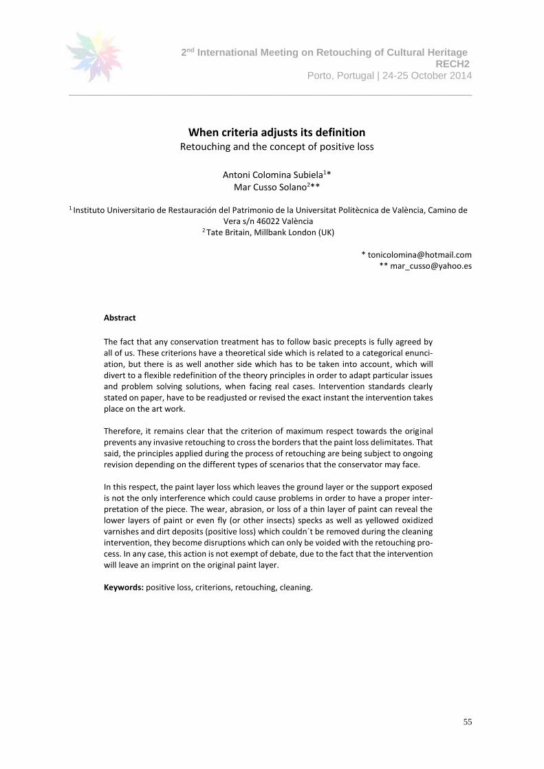
2nd International Meeting on Retouching of Cultural Heritage RECH2
Porto, Portugal | 24-25 October 2014
________________________________________________________________________
55
When criteria adjusts its definition Retouching and the concept of positive loss
Antoni Colomina Subiela1*
Mar Cusso Solano2**
1 Instituto Universitario de Restauración del Patrimonio de la Universitat Politècnica de València, Camino de Vera s/n 46022 València
2 Tate Britain, Millbank London (UK)
* [email protected] ** [email protected]
Abstract
The fact that any conservation treatment has to follow basic precepts is fully agreed by all of us. These criterions have a theoretical side which is related to a categorical enunci-ation, but there is as well another side which has to be taken into account, which will divert to a flexible redefinition of the theory principles in order to adapt particular issues and problem solving solutions, when facing real cases. Intervention standards clearly stated on paper, have to be readjusted or revised the exact instant the intervention takes place on the art work.
Therefore, it remains clear that the criterion of maximum respect towards the original prevents any invasive retouching to cross the borders that the paint loss delimitates. That said, the principles applied during the process of retouching are being subject to ongoing revision depending on the different types of scenarios that the conservator may face. In this respect, the paint layer loss which leaves the ground layer or the support exposed is not the only interference which could cause problems in order to have a proper inter-pretation of the piece. The wear, abrasion, or loss of a thin layer of paint can reveal the lower layers of paint or even fly (or other insects) specks as well as yellowed oxidized varnishes and dirt deposits (positive loss) which couldn´t be removed during the cleaning intervention, they become disruptions which can only be voided with the retouching pro-cess. In any case, this action is not exempt of debate, due to the fact that the intervention will leave an imprint on the original paint layer.
Keywords: positive loss, criterions, retouching, cleaning.
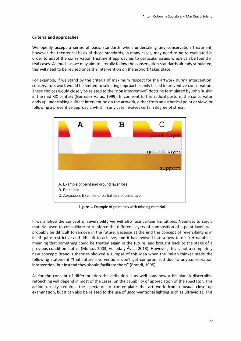
Antoni Colomina Subiela and Mar Cusso Solano
56
Criteria and approaches
We openly accept a series of basic standards when undertaking any conservation treatment, however the theoretical basis of those standards, in many cases, may need to be re-evaluated in order to adapt the conservation treatment approaches to particular issues which can be found in real cases. As much as we may aim to literally follow the conservation standards already stipulated, this will need to be revised once the intervention on the artwork takes place. For example, if we stand by the criteria of maximum respect for the artwork during intervention, conservators work would be limited to selecting approaches only based in preventive conservation. These choices would closely be related to the “non interventive” doctrine formulated by John Ruskin in the mid XIX century (Gonzalez-Varas, 1999). In confront to this radical posture, the conservator ends up undertaking a direct intervention on the artwork, either from an esthetical point or view, or following a preventive approach, which in any case involves certain degree of stress.
Figure 1. Example of paint loss with missing material.
If we analyze the concept of reversibility we will also face certain limitations. Needless to say, a material used to consolidate or reinforce the different layers of composition of a paint layer, will probably be difficult to remove in the future. Because at the end the concept of reversibility is in itself quite restrictive and difficult to achieve, and it has evolved into a new term: “retreatable”, meaning that something could be treated again in the future, and brought back to the stage of a previous condition status. (Muñoz, 2003; Velleda y Ávila, 2013). However, this is not a completely new concept: Brandi's theories showed a glimpse of this idea when the Italian thinker made the following statement “that future interventions don't get compromised due to any conservation intervention, but instead they should facilitate them” (Brandi, 1995) As for the concept of differentiation the definition is as well somehow a bit blur. A discernible retouching will depend in most of the cases, on the capability of appreciation of the spectator. This action usually requires the spectator to contemplate the art work from unusual close up examination, but it can also be related to the use of unconventional lighting such as ultraviolet. This
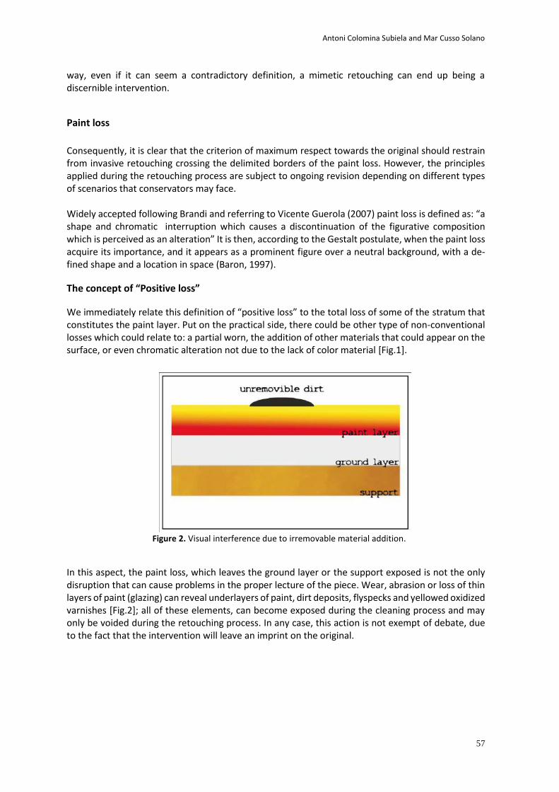
Antoni Colomina Subiela and Mar Cusso Solano
57
way, even if it can seem a contradictory definition, a mimetic retouching can end up being a discernible intervention.
Paint loss
Consequently, it is clear that the criterion of maximum respect towards the original should restrain from invasive retouching crossing the delimited borders of the paint loss. However, the principles applied during the retouching process are subject to ongoing revision depending on different types of scenarios that conservators may face. Widely accepted following Brandi and referring to Vicente Guerola (2007) paint loss is defined as: “a shape and chromatic interruption which causes a discontinuation of the figurative composition which is perceived as an alteration” It is then, according to the Gestalt postulate, when the paint loss acquire its importance, and it appears as a prominent figure over a neutral background, with a de-fined shape and a location in space (Baron, 1997).
The concept of “Positive loss”
We immediately relate this definition of “positive loss” to the total loss of some of the stratum that constitutes the paint layer. Put on the practical side, there could be other type of non-conventional losses which could relate to: a partial worn, the addition of other materials that could appear on the surface, or even chromatic alteration not due to the lack of color material [Fig.1].
Figure 2. Visual interference due to irremovable material addition.
In this aspect, the paint loss, which leaves the ground layer or the support exposed is not the only disruption that can cause problems in the proper lecture of the piece. Wear, abrasion or loss of thin layers of paint (glazing) can reveal underlayers of paint, dirt deposits, flyspecks and yellowed oxidized varnishes [Fig.2]; all of these elements, can become exposed during the cleaning process and may only be voided during the retouching process. In any case, this action is not exempt of debate, due to the fact that the intervention will leave an imprint on the original.
Antoni Colomina Subiela and Mar Cusso Solano
58
The definition of “positive loss” relates to the same type of concept that defines the notion of con-ventional paint loss: it is identified as an inflexion of disruption on the art work but with the differ-ence that in this case the surrounding area preserves some or all of the original layers of color [Fig. 3]. The debate remains open. The treatment of this type of visual obstacle will depend mainly in the critical eye of the conservator. But at the same time, this will also depend on other factors such as the location of the loss, where the art work is exhibited and its function, and in summary and in last instance, it will depend on the owner's decision.
References
Baron, R. A. (1997). Fundamentos de psicología. México, Pearson Educación. p. 125. Brandi, C. (1995). Teoría de la restauración. Madrid, Alianza Forma (5ª edición). p 27. González-Varas, I. (1999). Conservación de Bienes Culturales. Teoría, historia, principios y normas. Madrid, Cátedra. p.193. Guerola, V. (2007). “La ideología y metodología en la reintegración de lagunas. De la técnica del ne rien faire al retoque pleno, pasando por los sistemas ópticos de texturización basados en los filamenti y tratteggi de C. Brandi”, en A 100 anni della nascita di Cesare Brandi. Valencia, Universitat Politècnica de València. p. 104. Muñoz, S. (2003). Teoría Contemporánea de la Restauración. Madrid, Síntesis. p 107-114. Velleda, K. y Ávila, C. (2013). "La retratabilidad: la emergencia e implicaciones de un nuevo concepto en la restaura-ción", en Contribuciones a las Ciencias Sociales.www.eumed.net/rev/cccss/25/retratabilidad.htm
Figure 3. Retouching of “positive losses” due to embed dirt. Detail of the Virgen de Gracia from the Iglesia Parroquial de San Miguel de Enguera (Valencia); work by Paolo de San Leo-cadio, 1483.
Recreang PanaFilling and Retouching Rodins The Thinker
Tamar DAVIDOWITZ
2nd International Meeting on Retouching of Cultural Heritage RECH2
Porto, Portugal | 24-25 October 2014
_____________________________________________________________________
60
Recreating Patina
Filling and Retouching Rodin’s The Thinker
Tamar DAVIDOWITZ1*
1University of Amsterdam
Programme Conservation and Restoration of Cultural Heritage
Johannes Vermeerplein 1
1071 DV Amsterdam
The Netherlands
Abstract
The retouching of cast bronze sculpture presents a great variety of challenges. The passive
corrosion on the surface, or patina, is often made up of many layers, and can manifest itself
in different textures, hues, opacities and gloss.
In January of 2007, The Thinker by August Rodin was stolen from the garden of the Singer
Museum in Laren, The Netherlands. The thieves, who intended to melt it down for its
material value, attempted to render it unrecognizable and cut it into pieces for smelting
using an angle grinder. The sculpture suffered considerable injury, including saw-marks,
plastic deformation of the metal, and surface damage.
The sculpture was subsequently treated by conservators at the University of Amsterdam,
using the original plaster model as a reference and innovative 3D scanning and printing
techniques. Using these methods, it was possible to re-cast and re-apply the missing parts
in their original form. While the larger elements were cast in bronze, the finer fills were cast
using a mixture of epoxy and bronze powder. This proved essential in the retouching
process, as it allowed for a polished substrate very similar to the surrounding bronze.
Perhaps the greatest variety was in the tools used to apply the retouching paints, in an effort
to replicate the myriad of textures and layers found on the sculpture. Ultimately, these
methods and the treatment of the sculpture as a whole proved very successful, and The
Thinker is now back on display.
Keywords: Rodin, patina, sculpture, 3D scanning, filling, retouching.
Tamar DAVIDOWITZ
61
Introduction
For over 50 years, a sculpture of The Thinker by August Rodin stood in the garden of the Singer
Museum in Laren, The Netherlands. It was acquired by the museum’s founder, Anna Singer, in
1937, and has since been one of the Museum’s most prized pieces. In January of 2007, the
sculpture was stolen from the garden, along with six other pieces, by copper thieves intending
to melt it down for its material value. The thieves were quickly identified and caught by the
police, but unfortunately only The Thinker could be retrieved.
While The Thinker was thankfully returned to the Singer Museum, it was in a very poor state.
The thieves had attempted to render it unrecognizable by sawing it into pieces using an angle
grinder. Fortunately, they were not entirely successful, and only the right lower leg is now
missing. The rest of the sculpture did suffer considerable injury, however, including saw-cuts,
plastic deformation of the metal, and surface damage [Fig. 1].
Once the sculpture had been returned, the Singer Museum was faced with the question of what
to do with the heavily disfigured piece. An advisory committee was formed to discuss whether
the sculpture should be restored, and if so, to what degree. This was followed by the
establishment of an expert committee to decide on the feasibility and the type of treatment(s)
to be carried out. After much deliberation, the Singer Museum entrusted the sculpture to Tonny
Beentjes at the University of Amsterdam, and two master students, to research the possible
restoration methods and to carry out the subsequent treatment.
Ultimately the museum chose to use 3-D scanning and stereolithography techniques, recent
advances in the field of conservation, to aid in the reconstruction of the missing and damaged
elements. By using the original plaster foundry model preserved in the Musée Rodin in Meudon
(France) as a reference, it was possible to cast and apply the missing parts while staying true to
their original form. The use of these innovative techniques, and the results they achieved, has
been published in the proceedings of the ICOM-CC Metals conference of 2010 (Beentjes, 2010),
the LACONA IX conference of 2011 (Beentjes, 2013), as well as in the catalog accompanying the
Figure 1. The extensive damage resulting from the theft, including extensive saw-cuts, plastic deformation
of the metal, and surface damage (photo: M. Svenson).
Tamar DAVIDOWITZ
62
sculpture’s exhibition (Tilanus, 2011). The present paper will focus predominantly on the filling
of the missing areas, their finishing, and the extensive retouching required to return The Thinker
to its intended appearance.
Filling
There were several important factors to consider when deciding on the fill material for The
Thinker. In order to preserve the remaining original material and patina, the Singer Museum
elected early on for a reversible treatment that prevented any heat treatments such as welding
or soldering. It was also agreed the sculpture would not be placed outside after restoration,
which afforded the conservators many more options in terms of what materials could be used.
The sculpture would not need to be watertight, and weather-resistant materials would not be
necessary, allowing for far less intrusive treatments to be carried out. The next step would be to
select the appropriate material with which to replicate the missing parts.
Both bronze and epoxy were considered for the replica fillings, as each had its advantages and
disadvantages. The benefit of bronze was that it would be equally reactive as the original
material and that the added pieces would have the same life expectancy as the sculpture itself.
Alternatively, epoxy would be less durable but much easier to manipulate. It was decided that
for the missing leg, bronze was the better option. As this was a large piece, it was important for
the material to be robust and that it behaves similarly to the rest of the sculpture.
For the saw-cuts, however, casting in bronze would was not as suitable. The thin, long forms
would not lend themselves well to accurate casting in metal as deformation and an uneven rate
in shrinkage could occur both in the mold and in the metal after cooling. Furthermore, highly
accurate castings could not be done directly by the conservators, making small adjustments or
replacements problematic and time-consuming.
Each saw-cut has a unique inner shape, which could not be entirely replicated using the 3-D
scan, which only examined the surface. This meant that the back of each replicated piece
(unseen once put in place) would have to be extensively reshaped to achieve an ideal fit. Bronze
castings would simply be too rigid to apply in one piece without extensive working of the metal.
This would not only have compromised the accuracy of the replicas, but would have been
considerably more laborious than if they would be filled with epoxy.
Ultimately, a solution was found combining the advantages of both materials. This was done by
casting the missing parts in a mixture of epoxy and bronze powder. When cured and polished,
this material gave the appearance of a bronze metal surface, while still remaining easy to work.
This metallic substrate would help greatly in achieving a highly realistic retouching. In order to
find the best combination of materials extensive testing was first carried out.
Epoxy
While epoxy resins filled with metallic powder have been used commercially for a long time,
very little is published on the use of this material in conservation. There were therefore many
questions about how it would behave, and which combination of resin and metal would have
the most agreeable physical and aesthetic properties. Furthermore, it was important to
determine which epoxy would be most stable in terms of aging, degradation, and in its reaction
to the surrounding (as well as the incorporated) bronze.
The most crucial characteristics required of the epoxy were that it should be exceptionally
durable and stable. Three epoxies satisfied these requirements: Hxtal Nyl-1, Fynebond, and
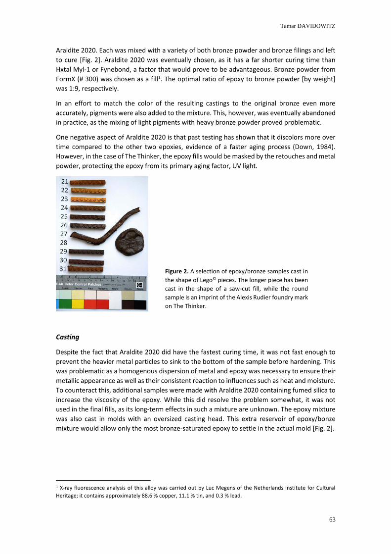
Tamar DAVIDOWITZ
63
Araldite 2020. Each was mixed with a variety of both bronze powder and bronze filings and left
to cure [Fig. 2]. Araldite 2020 was eventually chosen, as it has a far shorter curing time than
Hxtal Myl-1 or Fynebond, a factor that would prove to be advantageous. Bronze powder from
FormX (# 300) was chosen as a fill1. The optimal ratio of epoxy to bronze powder [by weight]
was 1:9, respectively.
In an effort to match the color of the resulting castings to the original bronze even more
accurately, pigments were also added to the mixture. This, however, was eventually abandoned
in practice, as the mixing of light pigments with heavy bronze powder proved problematic.
One negative aspect of Araldite 2020 is that past testing has shown that it discolors more over
time compared to the other two epoxies, evidence of a faster aging process (Down, 1984).
However, in the case of The Thinker, the epoxy fills would be masked by the retouches and metal
powder, protecting the epoxy from its primary aging factor, UV light.
Casting
Despite the fact that Araldite 2020 did have the fastest curing time, it was not fast enough to
prevent the heavier metal particles to sink to the bottom of the sample before hardening. This
was problematic as a homogenous dispersion of metal and epoxy was necessary to ensure their
metallic appearance as well as their consistent reaction to influences such as heat and moisture.
To counteract this, additional samples were made with Araldite 2020 containing fumed silica to
increase the viscosity of the epoxy. While this did resolve the problem somewhat, it was not
used in the final fills, as its long-term effects in such a mixture are unknown. The epoxy mixture
was also cast in molds with an oversized casting head. This extra reservoir of epoxy/bonze
mixture would allow only the most bronze-saturated epoxy to settle in the actual mold [Fig. 2].
1 X-ray fluorescence analysis of this alloy was carried out by Luc Megens of the Netherlands Institute for Cultural
Heritage; it contains approximately 88.6 % copper, 11.1 % tin, and 0.3 % lead.
Figure 2. A selection of epoxy/bronze samples cast in
the shape of Lego© pieces. The longer piece has been
cast in the shape of a saw-cut fill, while the round
sample is an imprint of the Alexis Rudier foundry mark
on The Thinker.
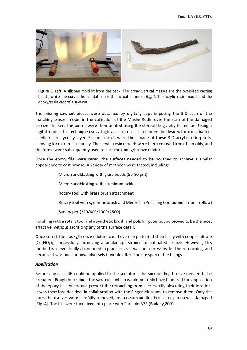
Tamar DAVIDOWITZ
64
The missing saw-cut pieces were obtained by digitally superimposing the 3-D scan of the
matching plaster model in the collection of the Musée Rodin over the scan of the damaged
bronze Thinker. The pieces were then printed using the stereolithography technique. Using a
digital model, this technique uses a highly accurate laser to harden the desired form in a bath of
acrylic resin layer by layer. Silicone molds were then made of these 3-D acrylic resin prints,
allowing for extreme accuracy. The acrylic resin models were then removed from the molds, and
the forms were subsequently used to cast the epoxy/bronze mixture.
Once the epoxy fills were cured, the surfaces needed to be polished to achieve a similar
appearance to cast bronze. A variety of methods were tested, including:
Micro-sandblasting with glass beads (50-80 grit)
Micro-sandblasting with aluminum oxide
Rotary tool with brass brush attachment
Rotary tool with synthetic brush and Menzerna Polishing Compound (Tripoli Yellow)
Sandpaper (220/600/1000/2500)
Polishing with a rotary tool and a synthetic brush and polishing compound proved to be the most
effective, without sacrificing any of the surface detail.
Once cured, the epoxy/bronze mixture could even be patinated chemically with copper nitrate
[Cu(NO3)2] successfully, achieving a similar appearance to patinated bronze. However, this
method was eventually abandoned in practice, as it was not necessary for the retouching, and
because it was unclear how adversely it would affect the life span of the fillings.
Application
Before any cast fills could be applied to the sculpture, the surrounding bronze needed to be
prepared. Rough burrs lined the saw-cuts, which would not only have hindered the application
of the epoxy fills, but would prevent the retouching from successfully obscuring their location.
It was therefore decided, in collaboration with the Singer Museum, to remove them. Only the
burrs themselves were carefully removed, and no surrounding bronze or patina was damaged
[Fig. 4]. The fills were then fixed into place with Paraloid B72 (Podany,2001).
Figure 3. Left: A silicone mold lit from the back. The broad vertical masses are the oversized casting
heads, while the curved horizontal line is the actual fill mold. Right: The acrylic resin model and the
epoxy/resin cast of a saw-cut.
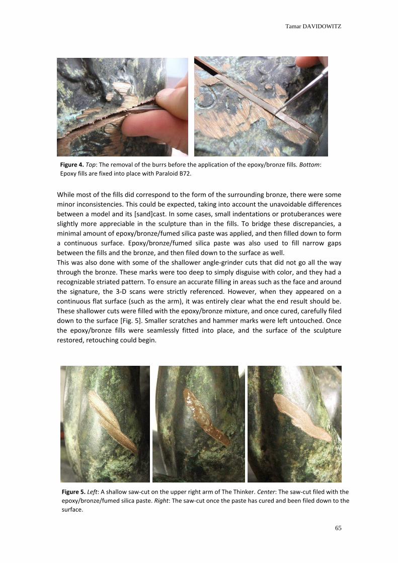
Tamar DAVIDOWITZ
65
While most of the fills did correspond to the form of the surrounding bronze, there were some
minor inconsistencies. This could be expected, taking into account the unavoidable differences
between a model and its [sand]cast. In some cases, small indentations or protuberances were
slightly more appreciable in the sculpture than in the fills. To bridge these discrepancies, a
minimal amount of epoxy/bronze/fumed silica paste was applied, and then filled down to form
a continuous surface. Epoxy/bronze/fumed silica paste was also used to fill narrow gaps
between the fills and the bronze, and then filed down to the surface as well.
This was also done with some of the shallower angle-grinder cuts that did not go all the way
through the bronze. These marks were too deep to simply disguise with color, and they had a
recognizable striated pattern. To ensure an accurate filling in areas such as the face and around
the signature, the 3-D scans were strictly referenced. However, when they appeared on a
continuous flat surface (such as the arm), it was entirely clear what the end result should be.
These shallower cuts were filled with the epoxy/bronze mixture, and once cured, carefully filed
down to the surface [Fig. 5]. Smaller scratches and hammer marks were left untouched. Once
the epoxy/bronze fills were seamlessly fitted into place, and the surface of the sculpture
restored, retouching could begin.
Figure 4. Top: The removal of the burrs before the application of the epoxy/bronze fills. Bottom:
Epoxy fills are fixed into place with Paraloid B72.
Figure 5. Left: A shallow saw-cut on the upper right arm of The Thinker. Center: The saw-cut filed with the
epoxy/bronze/fumed silica paste. Right: The saw-cut once the paste has cured and been filed down to the
surface.
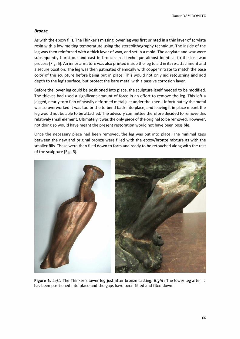
Tamar DAVIDOWITZ
66
Bronze
As with the epoxy fills, The Thinker’s missing lower leg was first printed in a thin layer of acrylate
resin with a low melting temperature using the stereolithography technique. The inside of the
leg was then reinforced with a thick layer of wax, and set in a mold. The acrylate and wax were
subsequently burnt out and cast in bronze, in a technique almost identical to the lost wax
process [Fig. 6]. An inner armature was also printed inside the leg to aid in its re-attachment and
a secure position. The leg was then patinated chemically with copper nitrate to match the base
color of the sculpture before being put in place. This would not only aid retouching and add
depth to the leg’s surface, but protect the bare metal with a passive corrosion layer.
Before the lower leg could be positioned into place, the sculpture itself needed to be modified.
The thieves had used a significant amount of force in an effort to remove the leg. This left a
jagged, nearly torn flap of heavily deformed metal just under the knee. Unfortunately the metal
was so overworked it was too brittle to bend back into place, and leaving it in place meant the
leg would not be able to be attached. The advisory committee therefore decided to remove this
relatively small element. Ultimately it was the only piece of the original to be removed. However,
not doing so would have meant the present restoration would not have been possible.
Once the necessary piece had been removed, the leg was put into place. The minimal gaps
between the new and original bronze were filled with the epoxy/bronze mixture as with the
smaller fills. These were then filed down to form and ready to be retouched along with the rest
of the sculpture [Fig. 6].
Figure 6. Left: The Thinker’s lower leg just after bronze casting. Right: The lower leg after it
has been positioned into place and the gaps have been filled and filed down.
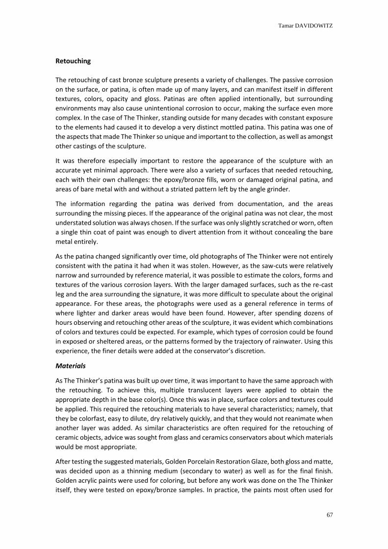
Tamar DAVIDOWITZ
67
Retouching
The retouching of cast bronze sculpture presents a variety of challenges. The passive corrosion
on the surface, or patina, is often made up of many layers, and can manifest itself in different
textures, colors, opacity and gloss. Patinas are often applied intentionally, but surrounding
environments may also cause unintentional corrosion to occur, making the surface even more
complex. In the case of The Thinker, standing outside for many decades with constant exposure
to the elements had caused it to develop a very distinct mottled patina. This patina was one of
the aspects that made The Thinker so unique and important to the collection, as well as amongst
other castings of the sculpture.
It was therefore especially important to restore the appearance of the sculpture with an
accurate yet minimal approach. There were also a variety of surfaces that needed retouching,
each with their own challenges: the epoxy/bronze fills, worn or damaged original patina, and
areas of bare metal with and without a striated pattern left by the angle grinder.
The information regarding the patina was derived from documentation, and the areas
surrounding the missing pieces. If the appearance of the original patina was not clear, the most
understated solution was always chosen. If the surface was only slightly scratched or worn, often
a single thin coat of paint was enough to divert attention from it without concealing the bare
metal entirely.
As the patina changed significantly over time, old photographs of The Thinker were not entirely
consistent with the patina it had when it was stolen. However, as the saw-cuts were relatively
narrow and surrounded by reference material, it was possible to estimate the colors, forms and
textures of the various corrosion layers. With the larger damaged surfaces, such as the re-cast
leg and the area surrounding the signature, it was more difficult to speculate about the original
appearance. For these areas, the photographs were used as a general reference in terms of
where lighter and darker areas would have been found. However, after spending dozens of
hours observing and retouching other areas of the sculpture, it was evident which combinations
of colors and textures could be expected. For example, which types of corrosion could be found
in exposed or sheltered areas, or the patterns formed by the trajectory of rainwater. Using this
experience, the finer details were added at the conservator’s discretion.
Materials
As The Thinker’s patina was built up over time, it was important to have the same approach with
the retouching. To achieve this, multiple translucent layers were applied to obtain the
appropriate depth in the base color(s). Once this was in place, surface colors and textures could
be applied. This required the retouching materials to have several characteristics; namely, that
they be colorfast, easy to dilute, dry relatively quickly, and that they would not reanimate when
another layer was added. As similar characteristics are often required for the retouching of
ceramic objects, advice was sought from glass and ceramics conservators about which materials
would be most appropriate.
After testing the suggested materials, Golden Porcelain Restoration Glaze, both gloss and matte,
was decided upon as a thinning medium (secondary to water) as well as for the final finish.
Golden acrylic paints were used for coloring, but before any work was done on the The Thinker
itself, they were tested on epoxy/bronze samples. In practice, the paints most often used for
Tamar DAVIDOWITZ
68
this particular patina included:
Burnt Sienna PBr 7 [1010-2]
Raw Sienna PY 43 [1340-2]
Raw Umber PBr 7 [1350-2]
Yellow Ochre PY 43 [1407-2]
Zinc White PW 4 [1415-2]
Phthalo Green PG 36 [1275-2]
Phthalo Blue PB 15:4 [1255-2]
Primary Cyan PW 6 [1500-2]
These pigments were used in countless combinations, depending entirely on the specific area
being retouched. Several base colors, such as darker greens and browns were mixed and used
to create new variations of colors throughout the retouching process. However, if not kept in an
airtight container, the paints dried relatively quickly. This meant that colors mixed on the palette
could not be preserved longer than half an hour. This was not too problematic as the variation
in the patina was so nuanced it was necessary to mix new colors continuously regardless.
Perhaps the greatest variety was in the tools used to apply the paints, in an effort to replicate
the myriad of textures and layers of color found on the sculpture.
Application
Finding the best way to apply the paints was largely a process of trial and error. After seeking
instruction from ceramics and glass conservators, their suggested methods were the first to be
implemented. This meant multiple thin layers of paint were applied with soft brushes until the
desired hue was attained. Once the base color was in place, the lighter surface colors were
applied in a similar way. While this was useful on relatively uniform areas such as the upper arm,
it was not possible to accurately replicate the patina’s considerable variety of textures in other
areas using this technique. The surface ranged from smooth and blotted to powdery and rough,
meaning an equally diverse range of tools and techniques had to be devised.
To successfully reproduce these textures, application techniques were continuously improvised.
This included the use of an assortment of sponges, textiles, pieces of wood, and coarse brushes
adjusted to the desired form and finish. Even the properties of the paint itself was used to
achieve a specific result [Fig. 7 , 8].
The acrylic paints, depending on the amount of Golden Restoration Glaze and [demineralized]
water that was added, would dry within approximately one to ten minutes. This provided an
advantageous window in which to adjust the texture. For example, a dilute paint could be
dabbed with a coarse brush just before drying to avoid the re-leveling of the surface. This type
of manipulation of the paint, along with the modification of the paint’s viscosity, was extremely
useful in reproducing some of the more powdery textures. To recreate exceptionally matte
surfaces, Golden Restoration Glaze was applied with a fine sponge and applied more liberally to
the surface.
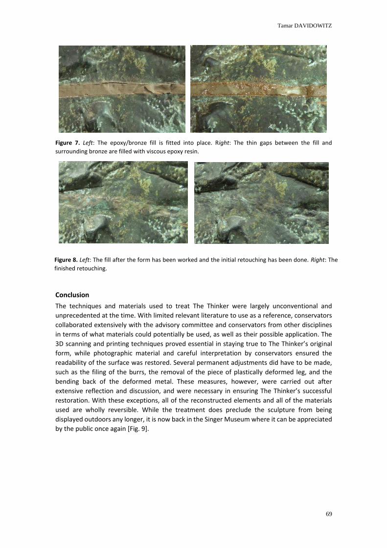
Tamar DAVIDOWITZ
69
Figure 7. Left: The epoxy/bronze fill is fitted into place. Right: The thin gaps between the fill and
surrounding bronze are filled with viscous epoxy resin.
Conclusion
The techniques and materials used to treat The Thinker were largely unconventional and
unprecedented at the time. With limited relevant literature to use as a reference, conservators
collaborated extensively with the advisory committee and conservators from other disciplines
in terms of what materials could potentially be used, as well as their possible application. The
3D scanning and printing techniques proved essential in staying true to The Thinker’s original
form, while photographic material and careful interpretation by conservators ensured the
readability of the surface was restored. Several permanent adjustments did have to be made,
such as the filing of the burrs, the removal of the piece of plastically deformed leg, and the
bending back of the deformed metal. These measures, however, were carried out after
extensive reflection and discussion, and were necessary in ensuring The Thinker’s successful
restoration. With these exceptions, all of the reconstructed elements and all of the materials
used are wholly reversible. While the treatment does preclude the sculpture from being
displayed outdoors any longer, it is now back in the Singer Museum where it can be appreciated
by the public once again [Fig. 9].
Figure 8. Left: The fill after the form has been worked and the initial retouching has been done. Right: The
finished retouching.
Tamar DAVIDOWITZ
70
References
Beentjes, T., Davidowitz, T., van der Molen, R. 2010. Treatment Of The Damaged Bronze Of Rodin’s The
Thinker From The Singer Museum In Laren, The Netherlands: An Innovative Approach. Metals 2010
Preprints.
Beentjes, T., van der Molen, R. 3D Scanning and Printing as Conservation Tools: An Innovative Treatment
of a Vandalized Bronze Statue, The Thinker by Rodin. 2013. Lasers in the Conservation of Artworks IX.
Archetype Publications, London.
Down, J.L. The Yellowing of Epoxy Resin Adhesives: Report on Natural Dark. Studies in Conservation, Vol.
29, No. 2, May 1984, pp. 63-76. Maney Publishing on behalf of the International Institute for Conservation
of Historic and Artistic Works.
Podany, J., Kathleen M. Garland, William R. Freeman and Joe Rogers. Paraloid B-72 as a Structural
Adhesive and as a Barrier within Structural Adhesive Bonds: Evaluations of Strength and Reversibility
Journal of the American Institute for Conservation, Vol. 40, No. 1, Spring, 2001, pp.15-3. Maney Publishing
on behalf of The American Institute for Conservation of Historic &Artistic Works.
Tilanus, P., Blanchetière, F., Beentjes, T., van der Molen, R., de Komen, A., de Rijk, Agnes. 2011. Rodin: De
Denker. Uitgeverij Thoth, Bussum.
Figure 9. The Singer Museum Thinker after treatment.
Retouching a monumental terracoa sculpture Meeng the viewers needs
Cláudia FALCÃO, Ricardo TRIÃES, Adriano MACHADO, Crisna REIS, Sónia TAVARES, João RAMOS
2nd International Meeting on Retouching of Cultural Heritage RECH2
Porto, Portugal | 24-25 October 2014 _____________________________________________________________________
72
Retouching a monumental terracotta sculpture
Meeting the viewer’s needs.
Cláudia FALCÃO1*, Ricardo TRIÃES1, Adriano MACHADO1, Cristina REIS1, Sónia TAVARES2, João
RAMOS2
1 Instituto Politécnico de Tomar, Quinta do Contador – Estrada da Serra, 2300-313 Tomar
2 Mosteiro de Alcobaça, 2460-018 Alcobaça
Abstract
The Monastery of Alcobaça (Portugal), classified by UNESCO as World Heritage since
1989, holds a wide and valuable collection of monumental terracotta sculptures
from the 17th century. Most of the sculptures had estofado decoration originally.
Some of them were totally repainted in the past - a thick white paint was applied
while they were still in the original altarpiece. This set of sculptures offered different
challenges, both at structural and aesthetic levels, and the complexity and
heterogeneity of the surface demanded serious reflection. The intervention implied
the complete removal of the white paintlayer, which exposed considerable
extensions of the original white ground layer and, in some cases, the terracotta itself.
This created a very disturbing effect for common viewers. The contrast between the
white ground layer and the other colours, including the orange terracotta areas, had
considerable visual weight, creating a major interference; plus, it produced a certain
ambiguity, which generated confusion to the general public.
Considering the needs of the visitor, enabling the visual interpretation of the
sculpture after the removal of the overpaint was mandatory but had restrictions,
especially due to major polychromy loss. The solution was keeping the intervention
to a minimum, by approximating the white ground layer to the terracotta tone
through colour retouching. A transparency obtained with water based acrylic paint
was applied exclusively over the ground layer, previously protected with an acrylic
film. However, this transparency was not effective in joint areas, filled with a
geopolymer, which demanded other approach. The results were very satisfying. The
original sculpting work and even the few remains of the original polychromy were
definitely enhanced.
Keywords: monumental sculpture, polychrome terracotta sculpture, colour
retouching, water based acrylic paints, geopolymer
Cláudia FALCÃO, Ricardo TRIÃES, Adriano MACHADO, Cristina REIS, Sónia TAVARES, João RAMOS
73
Introduction.
Project TACELO and the baroque terracotta sculptures from the Monastery of Alcobaça.
The Cistercian Monastery of Santa Maria d'Alcobaça is a masterpiece of gothic Cistercian art. It
was the first example of gothic architecture in Portugal and, simultaneously, is the best-
preserved Cistercian abbey in the European context. The Monastery of Alcobaça integrates the
UNESCO World Heritage list mostly due to its extensive medieval core. However, other
contextually unexpected artistic features, such as the baroque sets, accentuate its richness and
uniqueness. The terracotta sculptures were produced locally during the last third of the 17th
century, and are one of the most important sets and original works of art from this period in
Portugal.
Project TACELO took place between 2011 and 2014 and its main intention was to develop studies
leading to a better knowledge of the activity of Alcobaça as an important production and
exportation ceramic center, and also to characterize the terracotta and polychromy layers, as
well as their degradation processes. Some sculptures were in a very frail state, and their visibility
had been compromised by poor preservation conditions, which put them in a serious risk of total
loss. Some past treatments did not have the best effect, so to sustain the preservation of this
set of sculptures, project TACELO also contemplated research and development of
products/materials and solutions, such as structural consolidants and fillers based in
geopolymers composites made with metakaolinite (Shi & Day, 2001: 403-418; Hanzlíček et al.,
2009) with specific properties to mitigate the challenging degradation process showed by the
sculptures.
For these objectives to be met, studies, analysis and testing took place, oriented by four
complementary action guidelines (Coroado et al., 2012):
1) Historical and artistic study of the pieces in the Portuguese and European context of the 17th
century terracotta sculptures.
2) Characterization of ceramic composition and raw clay material provenance (geological
context). Several analytical methods have been used: for the study of ceramic and clay raw
materials X-ray diffraction (XRD), wavelength dispersive X-ray fluorescence spectrometry
(WDXRF) and scanning electron microscopy coupled to energy dispersive X-ray spectrometry
(SEM-EDS) were also employed. The results, namely those relating to the elemental
composition, were treated by multivariate statistical analysis (such as grouped and principal
component analysis) in order to find similarities that can help in the determination of the raw
materials sources.
3) Study of the several layers present over the ceramic body, namely the polychromy and the
ground layers. This involved the identification and characterization of materials used both in the
original layers and also in the subsequent polychromies, added in different moments in time
(pigments, specially the mineral ones, and the gold leaf). The polychromy analysis was carried
out in situ with the use of non-intrusive techniques such as colourimetry and energy dispersive
X-ray micro-fluorescence spectrometry (μEDXRF). Material characterization was complemented
with a micro-sampling study, by optical, spectrometric and diffractometric techniques.
Cláudia FALCÃO, Ricardo TRIÃES, Adriano MACHADO, Cristina REIS, Sónia TAVARES, João RAMOS
74
4) Investigation and development of inorganic structural consolidants and fillers, based in
metakaolinite geopolymeric composites.
The team gathered to develop project TACELO was designed to encompass the essential skills
and knowledge in order to consistently accomplish the determined objectives. Researchers from
different scientific fields and institutions were part of this group that covered history of art,
conservation and restoration, chemistry, physics, geology and biology.
The terracotta sculptures from the main chapel - study and diagnosis
In formal aspects, the conventual polychrome sculptures in terracotta studied by project
TACELO, follow strictly tridentine parameters, which means ethics clearly overlaps the
aesthetics. Images should serve pedagogical purposes of faith - hence its iconographic rigor and
exuberance signs of intense distress or even martyrdom, which appeal to emotion and devotion
in face of the sacred. Despite the principles of the rule of St. Benedict, whose theological
sensitivity is deviant in all the ways of the baroque, and opposing the main tendency in Portugal
during that time, it was through erudite production that Alcobaça Monastery stood out in the
reporting period (Serrão, 2003). But the context was key: by ending commendatory abbots, D.
João IV, gives back to the monks of Alcobaça their national pride. Prosperous and victorious, the
Cistercians take the lead in something close to a 17th century cultural apotheosis. The sculptural
production was one of their most iconic brands, represented in five different canters within the
Monastery: the Sanctuary or Chapel of Relics, the Chapel of Christ the Redeemer, the Main
Chapel, the Altarpiece of Saint Bernard and the Kings of Portugal.
Although the sculptures have different contexts, the origin of their raw materials, essentially
illite-kaolinite and calcite clays, is similar and local (Coroado et al., 2012; Coroado et al., 2013).
The production is also local (Coroado et al., 2012; Coroado et al., 2013). Sculptures were
modelled and cut into slices, the tacelos, for easy handling, and then dried and fired. The firing
was carried out in furnaces that didn’t allow homogeneous maximum firing temperature. This
fact is demonstrated since there are well-fired pieces, with the formation of new crystalline
phases such as gehlenite, which occur at temperature higher than 850º C, that also show other
clay phases such as kaolinite, that collapses at temperatures above 550º C (Coroado et al., 2013).
In what concerns water absorption, ceramic properties of this local terracottas are within
expectable parameters for such materials (Coroado et al., 2013).
For the polychromy, a glue sizing was applied to the terracotta to close the pores and prevent
the absorption of paint media; joints between tacelos were meticulously covered, to create the
illusion of a one-piece monumental sculpture. The figure then received several layers of a white
ground and Armenian bole, which served as a support for metal leaf and for opaque and
translucent layers of pigment. The artist could achieve highly illusionistic effects, especially in
the rendering of textiles and the treatment of flesh tones, which greatly enhanced the
immediacy of the sculpture. The quality of decorations in the Alcobaça set of terracotta
sculptures is inconstant. Most of the sculptures had estofado decoration. Some of them are
practically untouched and still have their original aspect and polychromies, but others were
totally repainted in the past, for different reasons and with different purposes. For instance, in
the case of the set of sculptures that were originally in the Main Chapel of the monastery and
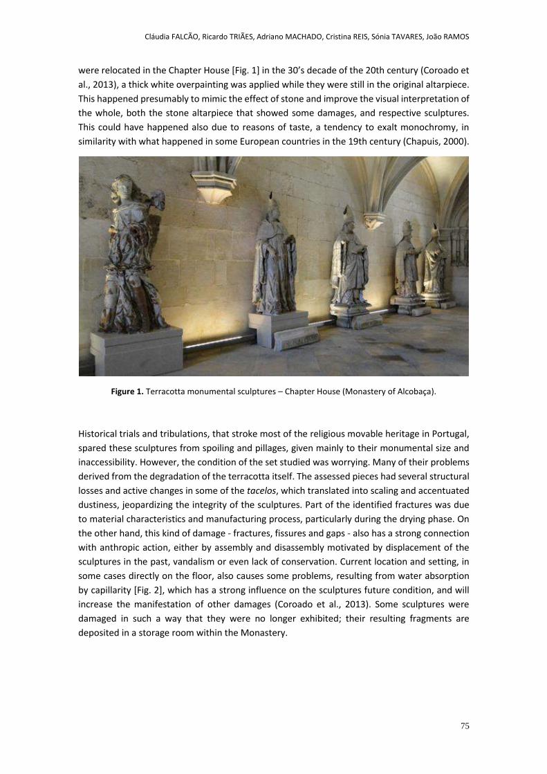
Cláudia FALCÃO, Ricardo TRIÃES, Adriano MACHADO, Cristina REIS, Sónia TAVARES, João RAMOS
75
were relocated in the Chapter House [Fig. 1] in the 30’s decade of the 20th century (Coroado et
al., 2013), a thick white overpainting was applied while they were still in the original altarpiece.
This happened presumably to mimic the effect of stone and improve the visual interpretation of
the whole, both the stone altarpiece that showed some damages, and respective sculptures.
This could have happened also due to reasons of taste, a tendency to exalt monochromy, in
similarity with what happened in some European countries in the 19th century (Chapuis, 2000).
Figure 1. Terracotta monumental sculptures – Chapter House (Monastery of Alcobaça).
Historical trials and tribulations, that stroke most of the religious movable heritage in Portugal,
spared these sculptures from spoiling and pillages, given mainly to their monumental size and
inaccessibility. However, the condition of the set studied was worrying. Many of their problems
derived from the degradation of the terracotta itself. The assessed pieces had several structural
losses and active changes in some of the tacelos, which translated into scaling and accentuated
dustiness, jeopardizing the integrity of the sculptures. Part of the identified fractures was due
to material characteristics and manufacturing process, particularly during the drying phase. On
the other hand, this kind of damage - fractures, fissures and gaps - also has a strong connection
with anthropic action, either by assembly and disassembly motivated by displacement of the
sculptures in the past, vandalism or even lack of conservation. Current location and setting, in
some cases directly on the floor, also causes some problems, resulting from water absorption
by capillarity [Fig. 2], which has a strong influence on the sculptures future condition, and will
increase the manifestation of other damages (Coroado et al., 2013). Some sculptures were
damaged in such a way that they were no longer exhibited; their resulting fragments are
deposited in a storage room within the Monastery.

Cláudia FALCÃO, Ricardo TRIÃES, Adriano MACHADO, Cristina REIS, Sónia TAVARES, João RAMOS
76
Figure 2. Bottom tacelo of one of the sculptures (Our Lady of Annunciation) placed directly on the floor,
showing a poor conservation condition, due to water absorption.
In terms of surface, heterogeneity is very noticeable. There are significant areas of abrasion and
areas of exposed terracotta and also a generalized overpaint that hides a probable much
degraded original material. The original polychromy is barely visible since its covered by a layer
of white paint [Fig. 3]. This white layer is also very degraded and its application was probably
due to the deterioration of the original polychromy. Some of the damage found is also originated
by the different behaviors of the materials (original and non-original) and their alteration.
Besides lacunae, craquelures in the original polychromy were a major problem, causing flaking
and losses [Fig. 3]. Such damage and its possible association with other factors, of biological and
environmental origin, causes an intense level of degradation. These monumental pieces were
once inaccessible and now are within reach; distress and aging of the surface is evident in the
most prominent areas and is greatly due to unwanted manipulation by visitors, who touch the
sculptures.
Figure 3. The original polychromy was totally covered by a white paint, imitating stone.
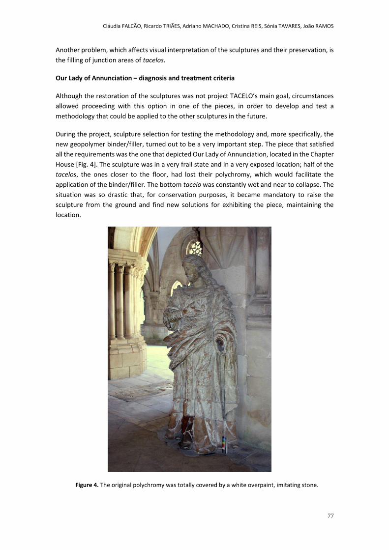
Cláudia FALCÃO, Ricardo TRIÃES, Adriano MACHADO, Cristina REIS, Sónia TAVARES, João RAMOS
77
Another problem, which affects visual interpretation of the sculptures and their preservation, is
the filling of junction areas of tacelos.
Our Lady of Annunciation – diagnosis and treatment criteria
Although the restoration of the sculptures was not project TACELO’s main goal, circumstances
allowed proceeding with this option in one of the pieces, in order to develop and test a
methodology that could be applied to the other sculptures in the future.
During the project, sculpture selection for testing the methodology and, more specifically, the
new geopolymer binder/filler, turned out to be a very important step. The piece that satisfied
all the requirements was the one that depicted Our Lady of Annunciation, located in the Chapter
House [Fig. 4]. The sculpture was in a very frail state and in a very exposed location; half of the
tacelos, the ones closer to the floor, had lost their polychromy, which would facilitate the
application of the binder/filler. The bottom tacelo was constantly wet and near to collapse. The
situation was so drastic that, for conservation purposes, it became mandatory to raise the
sculpture from the ground and find new solutions for exhibiting the piece, maintaining the
location.
Figure 4. The original polychromy was totally covered by a white overpaint, imitating stone.
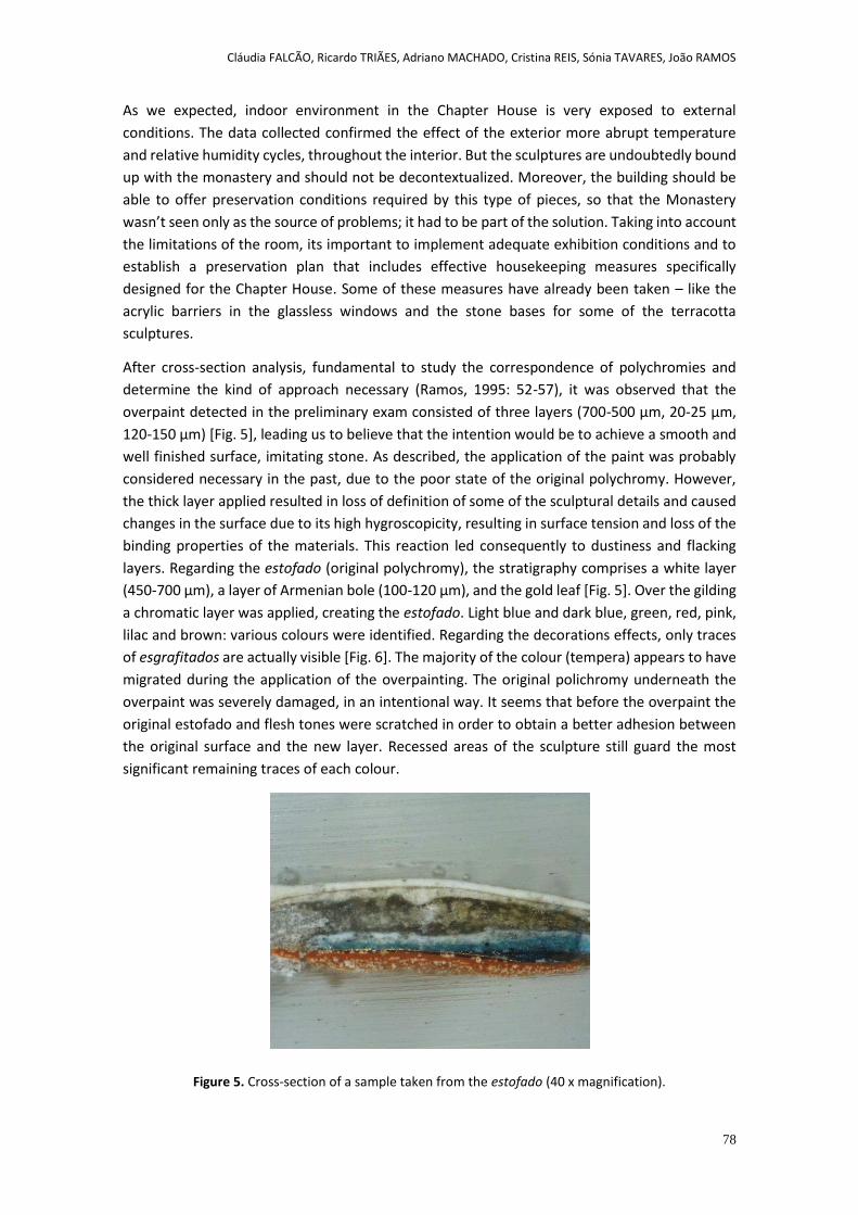
Cláudia FALCÃO, Ricardo TRIÃES, Adriano MACHADO, Cristina REIS, Sónia TAVARES, João RAMOS
78
As we expected, indoor environment in the Chapter House is very exposed to external
conditions. The data collected confirmed the effect of the exterior more abrupt temperature
and relative humidity cycles, throughout the interior. But the sculptures are undoubtedly bound
up with the monastery and should not be decontextualized. Moreover, the building should be
able to offer preservation conditions required by this type of pieces, so that the Monastery
wasn’t seen only as the source of problems; it had to be part of the solution. Taking into account
the limitations of the room, its important to implement adequate exhibition conditions and to
establish a preservation plan that includes effective housekeeping measures specifically
designed for the Chapter House. Some of these measures have already been taken – like the
acrylic barriers in the glassless windows and the stone bases for some of the terracotta
sculptures.
After cross-section analysis, fundamental to study the correspondence of polychromies and
determine the kind of approach necessary (Ramos, 1995: 52-57), it was observed that the
overpaint detected in the preliminary exam consisted of three layers (700-500 µm, 20-25 µm,
120-150 µm) [Fig. 5], leading us to believe that the intention would be to achieve a smooth and
well finished surface, imitating stone. As described, the application of the paint was probably
considered necessary in the past, due to the poor state of the original polychromy. However,
the thick layer applied resulted in loss of definition of some of the sculptural details and caused
changes in the surface due to its high hygroscopicity, resulting in surface tension and loss of the
binding properties of the materials. This reaction led consequently to dustiness and flacking
layers. Regarding the estofado (original polychromy), the stratigraphy comprises a white layer
(450-700 µm), a layer of Armenian bole (100-120 µm), and the gold leaf [Fig. 5]. Over the gilding
a chromatic layer was applied, creating the estofado. Light blue and dark blue, green, red, pink,
lilac and brown: various colours were identified. Regarding the decorations effects, only traces
of esgrafitados are actually visible [Fig. 6]. The majority of the colour (tempera) appears to have
migrated during the application of the overpainting. The original polichromy underneath the
overpaint was severely damaged, in an intentional way. It seems that before the overpaint the
original estofado and flesh tones were scratched in order to obtain a better adhesion between
the original surface and the new layer. Recessed areas of the sculpture still guard the most
significant remaining traces of each colour.
Figure 5. Cross-section of a sample taken from the estofado (40 x magnification).
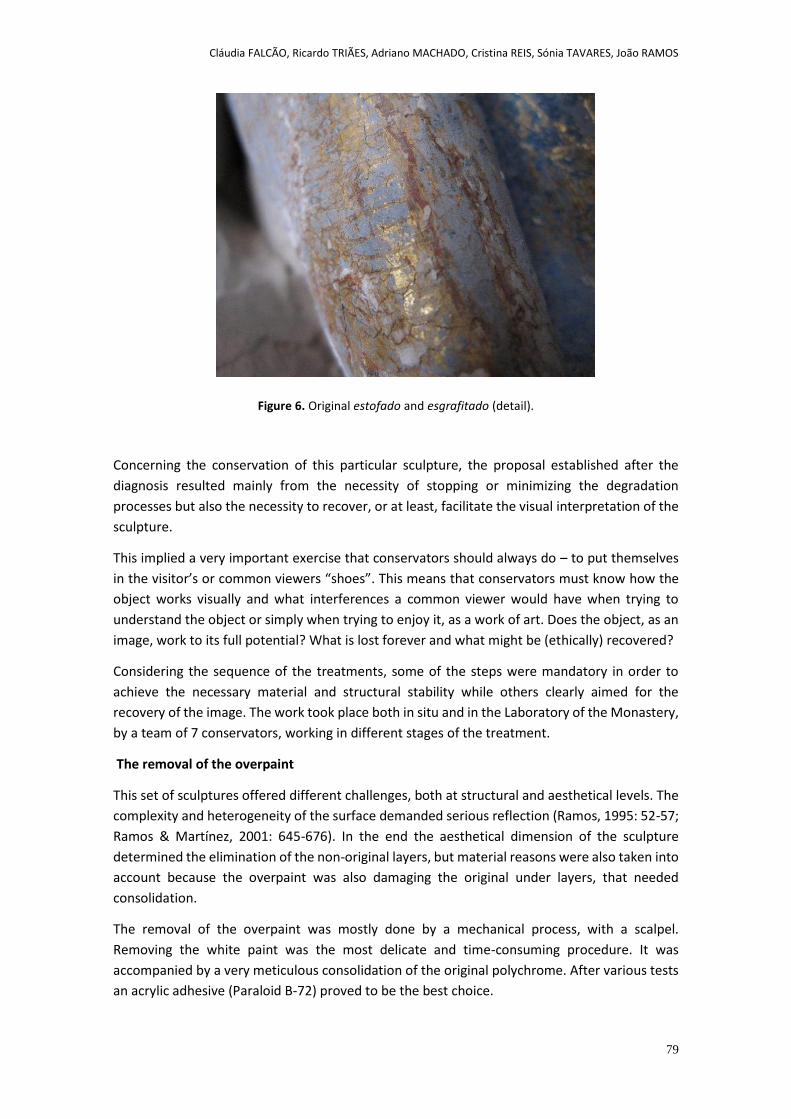
Cláudia FALCÃO, Ricardo TRIÃES, Adriano MACHADO, Cristina REIS, Sónia TAVARES, João RAMOS
79
Figure 6. Original estofado and esgrafitado (detail).
Concerning the conservation of this particular sculpture, the proposal established after the
diagnosis resulted mainly from the necessity of stopping or minimizing the degradation
processes but also the necessity to recover, or at least, facilitate the visual interpretation of the
sculpture.
This implied a very important exercise that conservators should always do – to put themselves
in the visitor’s or common viewers “shoes”. This means that conservators must know how the
object works visually and what interferences a common viewer would have when trying to
understand the object or simply when trying to enjoy it, as a work of art. Does the object, as an
image, work to its full potential? What is lost forever and what might be (ethically) recovered?
Considering the sequence of the treatments, some of the steps were mandatory in order to
achieve the necessary material and structural stability while others clearly aimed for the
recovery of the image. The work took place both in situ and in the Laboratory of the Monastery,
by a team of 7 conservators, working in different stages of the treatment.
The removal of the overpaint
This set of sculptures offered different challenges, both at structural and aesthetical levels. The
complexity and heterogeneity of the surface demanded serious reflection (Ramos, 1995: 52-57;
Ramos & Martínez, 2001: 645-676). In the end the aesthetical dimension of the sculpture
determined the elimination of the non-original layers, but material reasons were also taken into
account because the overpaint was also damaging the original under layers, that needed
consolidation.
The removal of the overpaint was mostly done by a mechanical process, with a scalpel.
Removing the white paint was the most delicate and time-consuming procedure. It was
accompanied by a very meticulous consolidation of the original polychrome. After various tests
an acrylic adhesive (Paraloid B-72) proved to be the best choice.
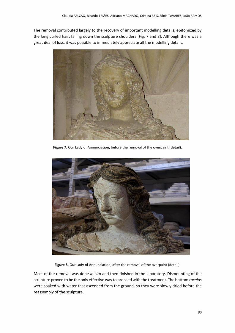
Cláudia FALCÃO, Ricardo TRIÃES, Adriano MACHADO, Cristina REIS, Sónia TAVARES, João RAMOS
80
The removal contributed largely to the recovery of important modelling details, epitomized by
the long curled hair, falling down the sculpture shoulders [Fig. 7 and 8]. Although there was a
great deal of loss, it was possible to immediately appreciate all the modelling details.
Figure 7. Our Lady of Annunciation, before the removal of the overpaint (detail).
Figure 8. Our Lady of Annunciation, after the removal of the overpaint (detail).
Most of the removal was done in situ and then finished in the laboratory. Dismounting of the
sculpture proved to be the only effective way to proceed with the treatment. The bottom tacelos
were soaked with water that ascended from the ground, so they were slowly dried before the
reassembly of the sculpture.
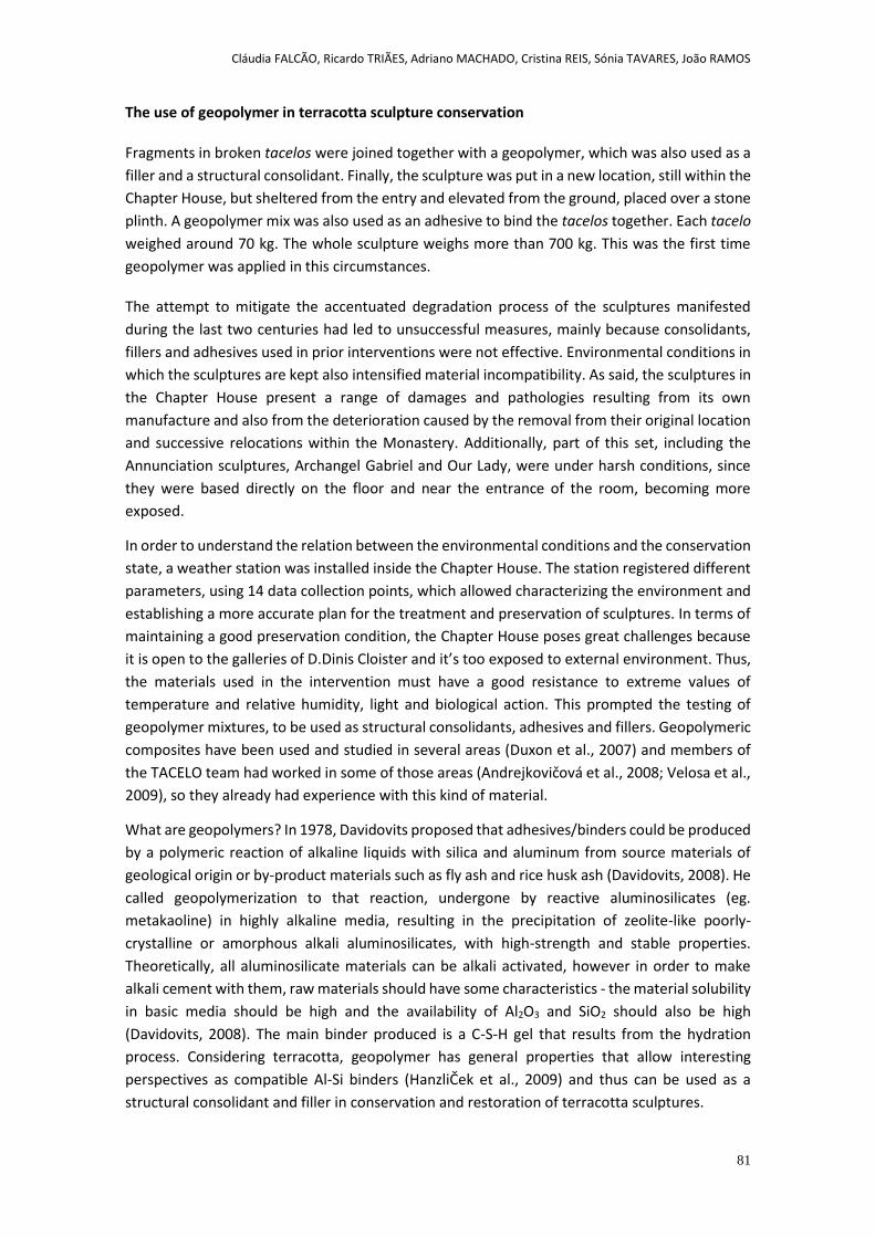
Cláudia FALCÃO, Ricardo TRIÃES, Adriano MACHADO, Cristina REIS, Sónia TAVARES, João RAMOS
81
The use of geopolymer in terracotta sculpture conservation
Fragments in broken tacelos were joined together with a geopolymer, which was also used as a
filler and a structural consolidant. Finally, the sculpture was put in a new location, still within the
Chapter House, but sheltered from the entry and elevated from the ground, placed over a stone
plinth. A geopolymer mix was also used as an adhesive to bind the tacelos together. Each tacelo
weighed around 70 kg. The whole sculpture weighs more than 700 kg. This was the first time
geopolymer was applied in this circumstances.
The attempt to mitigate the accentuated degradation process of the sculptures manifested
during the last two centuries had led to unsuccessful measures, mainly because consolidants,
fillers and adhesives used in prior interventions were not effective. Environmental conditions in
which the sculptures are kept also intensified material incompatibility. As said, the sculptures in
the Chapter House present a range of damages and pathologies resulting from its own
manufacture and also from the deterioration caused by the removal from their original location
and successive relocations within the Monastery. Additionally, part of this set, including the
Annunciation sculptures, Archangel Gabriel and Our Lady, were under harsh conditions, since
they were based directly on the floor and near the entrance of the room, becoming more
exposed.
In order to understand the relation between the environmental conditions and the conservation
state, a weather station was installed inside the Chapter House. The station registered different
parameters, using 14 data collection points, which allowed characterizing the environment and
establishing a more accurate plan for the treatment and preservation of sculptures. In terms of
maintaining a good preservation condition, the Chapter House poses great challenges because
it is open to the galleries of D.Dinis Cloister and it’s too exposed to external environment. Thus,
the materials used in the intervention must have a good resistance to extreme values of
temperature and relative humidity, light and biological action. This prompted the testing of
geopolymer mixtures, to be used as structural consolidants, adhesives and fillers. Geopolymeric
composites have been used and studied in several areas (Duxon et al., 2007) and members of
the TACELO team had worked in some of those areas (Andrejkovičová et al., 2008; Velosa et al.,
2009), so they already had experience with this kind of material.
What are geopolymers? In 1978, Davidovits proposed that adhesives/binders could be produced
by a polymeric reaction of alkaline liquids with silica and aluminum from source materials of
geological origin or by-product materials such as fly ash and rice husk ash (Davidovits, 2008). He
called geopolymerization to that reaction, undergone by reactive aluminosilicates (eg.
metakaoline) in highly alkaline media, resulting in the precipitation of zeolite-like poorly-
crystalline or amorphous alkali aluminosilicates, with high-strength and stable properties.
Theoretically, all aluminosilicate materials can be alkali activated, however in order to make
alkali cement with them, raw materials should have some characteristics - the material solubility
in basic media should be high and the availability of Al2O3 and SiO2 should also be high
(Davidovits, 2008). The main binder produced is a C-S-H gel that results from the hydration
process. Considering terracotta, geopolymer has general properties that allow interesting
perspectives as compatible Al-Si binders (HanzliČek et al., 2009) and thus can be used as a
structural consolidant and filler in conservation and restoration of terracotta sculptures.
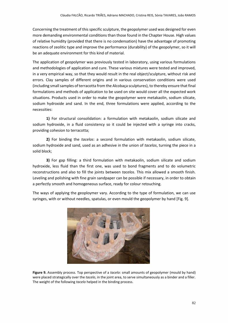
Cláudia FALCÃO, Ricardo TRIÃES, Adriano MACHADO, Cristina REIS, Sónia TAVARES, João RAMOS
82
Concerning the treatment of this specific sculpture, the geopolymer used was designed for even
more demanding environmental conditions than those found in the Chapter House. High values
of relative humidity (provided that there is no condensation) have the advantage of promoting
reactions of zeolitic type and improve the performance (durability) of the geopolymer, so it will
be an adequate environment for this kind of material.
The application of geopolymer was previously tested in laboratory, using various formulations
and methodologies of application and cure. These various mixtures were tested and improved,
in a very empirical way, so that they would result in the real object/sculpture, without risk and
errors. Clay samples of different origins and in various conservation conditions were used
(including small samples of terracotta from the Alcobaça sculptures), to thereby ensure that final
formulations and methods of application to be used on site would cover all the expected work
situations. Products used in order to make the geopolymer were metakaolin, sodium silicate,
sodium hydroxide and sand. In the end, three formulations were applied, according to the
necessities:
1) For structural consolidation: a formulation with metakaolin, sodium silicate and
sodium hydroxide, in a fluid consistency so it could be injected with a syringe into cracks,
providing cohesion to terracotta;
2) For binding the tacelos: a second formulation with metakaolin, sodium silicate,
sodium hydroxide and sand, used as an adhesive in the union of tacelos, turning the piece in a
solid block;
3) For gap filling: a third formulation with metakaolin, sodium silicate and sodium
hydroxide, less fluid than the first one, was used to bond fragments and to do volumetric
reconstructions and also to fill the joints between tacelos. This mix allowed a smooth finish.
Leveling and polishing with fine grain sandpaper can be possible if necessary, in order to obtain
a perfectly smooth and homogeneous surface, ready for colour retouching.
The ways of applying the geoploymer vary. According to the type of formulation, we can use
syringes, with or without needles, spatulas, or even mould the geopolymer by hand [Fig. 9].
Figure 9. Assembly process. Top perspective of a tacelo: small amounts of geopolymer (mould by hand) were placed strategically over the tacelo, in the joint area, to serve simultaneously as a binder and a filler. The weight of the following tacelo helped in the binding process.
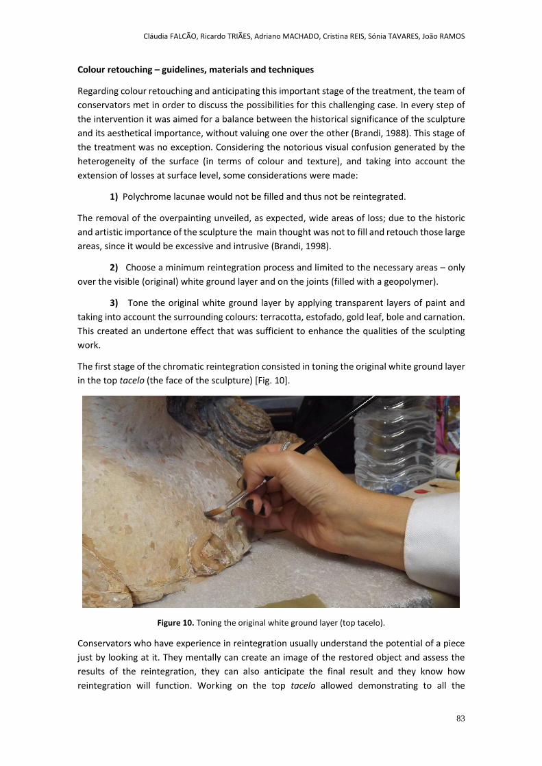
Cláudia FALCÃO, Ricardo TRIÃES, Adriano MACHADO, Cristina REIS, Sónia TAVARES, João RAMOS
83
Colour retouching – guidelines, materials and techniques
Regarding colour retouching and anticipating this important stage of the treatment, the team of
conservators met in order to discuss the possibilities for this challenging case. In every step of
the intervention it was aimed for a balance between the historical significance of the sculpture
and its aesthetical importance, without valuing one over the other (Brandi, 1988). This stage of
the treatment was no exception. Considering the notorious visual confusion generated by the
heterogeneity of the surface (in terms of colour and texture), and taking into account the
extension of losses at surface level, some considerations were made:
1) Polychrome lacunae would not be filled and thus not be reintegrated.
The removal of the overpainting unveiled, as expected, wide areas of loss; due to the historic
and artistic importance of the sculpture the main thought was not to fill and retouch those large
areas, since it would be excessive and intrusive (Brandi, 1998).
2) Choose a minimum reintegration process and limited to the necessary areas – only
over the visible (original) white ground layer and on the joints (filled with a geopolymer).
3) Tone the original white ground layer by applying transparent layers of paint and
taking into account the surrounding colours: terracotta, estofado, gold leaf, bole and carnation.
This created an undertone effect that was sufficient to enhance the qualities of the sculpting
work.
The first stage of the chromatic reintegration consisted in toning the original white ground layer
in the top tacelo (the face of the sculpture) [Fig. 10].
Figure 10. Toning the original white ground layer (top tacelo).
Conservators who have experience in reintegration usually understand the potential of a piece
just by looking at it. They mentally can create an image of the restored object and assess the
results of the reintegration, they can also anticipate the final result and they know how
reintegration will function. Working on the top tacelo allowed demonstrating to all the
Cláudia FALCÃO, Ricardo TRIÃES, Adriano MACHADO, Cristina REIS, Sónia TAVARES, João RAMOS
84
interested parts of the intervention/project what was intended and what we could achieve with
colour retouching.
Choosing the right materials was particularly important, due to the challenging environmental
conditions of the Chapter House. Usually watercolours are applied in this process, due to its
known advantages; in this case, especially since the environment was not appropriated for
watercolour, we opted for a water based acrylic paint, more permanent and less susceptible to
humidity (Jablonski et al., 2003). It is a very versatile paint, it allows from the finest
transparencies to the application of extremely thick textures. Once dry, it has a great deal of
resistance to almost all outside influences, including light and humidity (Jablonski et al., 2003).
There were other acrylic products also used during the surface treatment that prompted the use
of an acrylic paint. Later on it proved to be the best choice also to reintegrate the geopolimeric
joints because acrylic paints have considerable power grip and also excellent covering power.
The transparency used to undertone the original white ground layer was obtained by mixing two
or three colours and was applied with soft strokes of the brush. To facilitate future removal, a
barrier was created between the ground layer and the paint, using a mix of Paraloid B72 in
acetone (3%). The reintegration was completed in situ, with the sculpture definitely in place,
using an undertone for the visible white areas that corresponded to the original ground layer.
Comparing the following images [Fig. 11 and 12], we can notice the subtle differences.
Figure 11. Detail – before toning the white ground layer.
Cláudia FALCÃO, Ricardo TRIÃES, Adriano MACHADO, Cristina REIS, Sónia TAVARES, João RAMOS
85
Figure 12. Detail – after toning the white ground layer.
Using an undertone had the purpose of diminish the contrast between the white and the
different shades of terracotta and traces of gold leaf, red Armenian bole and colours from
estofado. This way the surface was harmonized and, at the same time, the reintegration was
kept differentiated.
After toning the white areas, the joints between tacelos, filled with geopolymer became more
noticed. In this case the undertone would not work well because it wouldn’t dissimulate
effectively the “stripe effect” [Fig. 13]. Brighter colours and regular shapes (like the horizontal
stripes) attract our eyes (Scarzanella & Cianfanelli, 1992), so the geopolymer joints would still
maintain a high visual weight.

Cláudia FALCÃO, Ricardo TRIÃES, Adriano MACHADO, Cristina REIS, Sónia TAVARES, João RAMOS
86
Figure 13. The “stripe effect”, after toning the original white ground layer.
The best solution was to approximate the tone of the surrounding area, in a mimetic way [Fig.
14 and 15]. After the reintegration of the joints, the viewer doesn’t lose the idea of having a
sculpture that is composed by pieces (the tacelos) because he still has different shades and
textures in the different tacelos. But that recognition is very subtle and doesn’t interfere with
the appreciation of the sculpture as a whole [Fig. 16].
Cláudia FALCÃO, Ricardo TRIÃES, Adriano MACHADO, Cristina REIS, Sónia TAVARES, João RAMOS
87
Figure 14. Detail - joints reintegrated in a mimetic way.
Figure 15. Joints reintegrated according to the colour of the surrounding area.
Cláudia FALCÃO, Ricardo TRIÃES, Adriano MACHADO, Cristina REIS, Sónia TAVARES, João RAMOS
88
Figure 16. Our Lady of Annunciation, after the treatment. The original white ground layer was under-toned and the geopolymer joints were reintegrated in a mimetic way.
Using an acrylic paint facilitated the reintegration of geopolymer joints because it has enough
coverage, or hiding power, and it is easy to achieve the perfect colour rapidly. The geopolymer
can be leveled and polished, has a perfectly smooth finish and is porous, so acrylic paints adhere
to its surface perfectly (Jablonski et al., 2003). The geopolymer can also be toned with pigments
and then applied as a coloured filler, but this process would be very difficult in this case, since
there was an immense variety of hues.
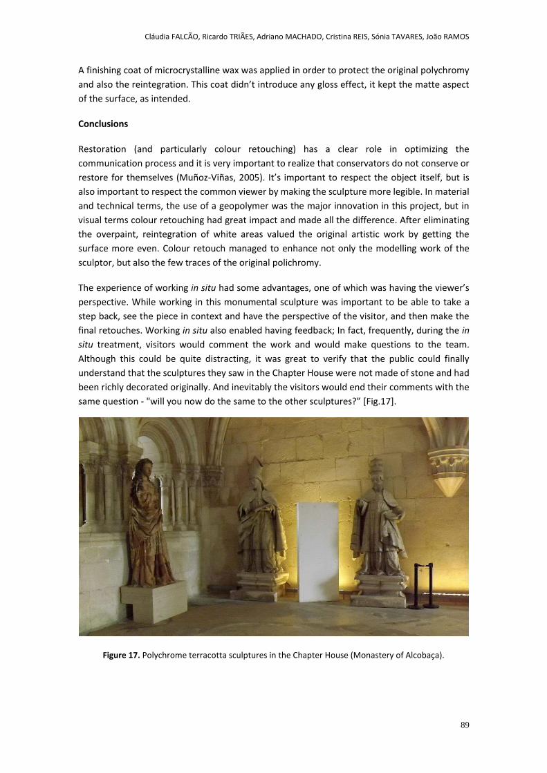
Cláudia FALCÃO, Ricardo TRIÃES, Adriano MACHADO, Cristina REIS, Sónia TAVARES, João RAMOS
89
A finishing coat of microcrystalline wax was applied in order to protect the original polychromy
and also the reintegration. This coat didn’t introduce any gloss effect, it kept the matte aspect
of the surface, as intended.
Conclusions
Restoration (and particularly colour retouching) has a clear role in optimizing the
communication process and it is very important to realize that conservators do not conserve or
restore for themselves (Muñoz-Viñas, 2005). It’s important to respect the object itself, but is
also important to respect the common viewer by making the sculpture more legible. In material
and technical terms, the use of a geopolymer was the major innovation in this project, but in
visual terms colour retouching had great impact and made all the difference. After eliminating
the overpaint, reintegration of white areas valued the original artistic work by getting the
surface more even. Colour retouch managed to enhance not only the modelling work of the
sculptor, but also the few traces of the original polichromy.
The experience of working in situ had some advantages, one of which was having the viewer’s
perspective. While working in this monumental sculpture was important to be able to take a
step back, see the piece in context and have the perspective of the visitor, and then make the
final retouches. Working in situ also enabled having feedback; In fact, frequently, during the in
situ treatment, visitors would comment the work and would make questions to the team.
Although this could be quite distracting, it was great to verify that the public could finally
understand that the sculptures they saw in the Chapter House were not made of stone and had
been richly decorated originally. And inevitably the visitors would end their comments with the
same question - "will you now do the same to the other sculptures?” [Fig.17].
Figure 17. Polychrome terracotta sculptures in the Chapter House (Monastery of Alcobaça).
Cláudia FALCÃO, Ricardo TRIÃES, Adriano MACHADO, Cristina REIS, Sónia TAVARES, João RAMOS
90
Acknowledgements
Project TACELO was funded by FEDER, COMPETE Program and by FCT – Foundation for Science and
Technology (project PTDC/HIS-HEC/111825/2009).
Project TACELO was an initiative of the Polytechnic Institute of Tomar (IPT) and had the contributions of
other Portuguese institutions: Atomic Physics Centre – University of Lisbon (CFA-UL), Directorate General
of Cultural Heritage (DGPC), Faculty of Social and Human Sciences – NOVA University of Lisbon (FCSH-
NOVA), GeoBioTec - University of Aveiro (UA), University of Lisbon Foundation (FUL).
References
Andrejkovičová, S.; Rocha, F.; Janotka, I.; Komadel, P. 2008. Blends of sodium Al-rich and Fe-rich
bentonites - potentially suitable fillers for geosynthetic clay liners. Geotextiles and Geomembranes, 26(5):
436-445.
Brandi, C. 1988. Teoría de la Restauración. Madrid: Alianza Editorial.
Chapuis, Julien. 2000. Late Medieval German Sculpture: Polychromy and Monochromy. In Heilbrunn
Timeline of Art History. New York: The Metropolitan Museum of Art. [online] (October 2002) [Accessed
March 2014]. Available at: http://www.metmuseum.org/toah/hd/grmn_3/hd_grmn_3.htm.
Coroado, J., Triães, R., Gil, C., Ferraz, E. & Rocha, F. 2013. Estudos para a conservação das esculturas
monumentais em terracota do Mosteiro de Alcobaça: Projecto Tacelo. In José Albuquerque Carreiras (ed.)
Mosteiros Cistercienses. História, arte, espiritualidade e património (Separata): Tomo 1. Alcobaça: Jorlis,
pp. 105-118
Coroado, J., Triães, R., Gil, C. & Rocha, F. 2012. Projecto TACELO: Estudos para a conservação das
esculturas monumentais em terracota do mosteiro de Alcobaça. In Actas do I Encontro Luso-Brasileiro de
Conservação e Restauro, Universidade Católica Portuguesa, pp. 25-39.
Davidovits, J. 2008. Geopolymer Chemistry And Applications. France: Geopolymer Institute.
De Naeyer, A., Arroyo, S., & Blanco, J. 2000. Krakow Charter 2000: principles for conservation and
restoration of built heritage. Krakow, Poland: Bureau Krakow 2000.
Duxson, P.; Fernández-Jiménez, A.; Provis, J.L.; Lukey, G.C.; Palomo, A. & Deventer, J. 2007. Geopolymer
technology: the current state of the art. Journal of Materials Science: 42 (9): 2917-2933.
HanzliČek, T.; Steinerov., M.; Straka, P.; Pern., I.; Siegl, P. & Švarcov., T. 2009. Reinforcement of the
terracotta sculpture by geopolymer composite. Materials & Design, 30 (8): 3229-3234.
Jablonski, E., Learner, T., Hayes, J. & Golden, M. 2003. Conservation concerns for acrylic emulsion paints.
Reviews in Conservation 4: 3-12.
Moura, C. 1986. O Limiar do Barroco. In História da Arte em Portugal, 8. Lisboa: Alfa.
Muñoz-Viñas, S. 2005. Contemporary Theory of Conservation. Oxford: Elsevier Butterworth-Heinemann.
Pereira, P. (ed.). 1995. História da Arte Portuguesa, Vol. III. Lisboa: Círculo de Leitores.
Cláudia FALCÃO, Ricardo TRIÃES, Adriano MACHADO, Cristina REIS, Sónia TAVARES, João RAMOS
91
Ramos, R. G. 1995. Examen material de la obra de arte. La correspondencia de policromias. Boletín
Informativo. Sevilla: IAPH, (12): 52-57.
Ramos, R. G. & Martínez, E. R. A. 2001. La escultura policromada: critérios de intervención y técnicas de
estúdio. Arbor: ciencia, pensamento y cultura. Madrid: Editorial CSIC, (667-668): 645-676.
Scarzanella C. R. & Cianfanelli, T. 1992. La percezione visiva nel restauro dei dipinti. L’intervento pittorico.
In Problemi di Restauro, Riflessione e Ricerche. Firenze: Edifir Edizione, Firenze, pp. 185-211.
Serrão, V. 2003. História da Arte em Portugal. O Barroco. Lisboa: Presença.
Shi, C. & Day, R. 2001. Comparison of different methods for enhancing reactivity of pozzolans. Cement
and Concrete Research, 31: 403-418.
Velosa, A.L.; Rocha, F. & Veiga, M.R. 2009. Influence of Chemical and Mineralogical Composition of
Metakaolin on Mortar Characteristics. Acta Geodynamica et Geomaterialia: 6, 1 (153): 121–126.
Examples of ceramic le work reintegraonsystems based on studying their graphic sources
Ignasi GIRONÉS-SARRIÓ and Vicent GUEROLA-BLAY
2nd International Meeting on Retouching of Cultural Heritage RECH2
Porto, Portugal | 24-25 October 2014
_____________________________________________________________________
93
Examples of ceramic tile work reintegration systems based on studying their graphic sources
Ignasi GIRONÉS-SARRIÓ* and Vicente GUEROLA-BLAY
Instituto Universitario de Restauración del Patrimonio de la Universitat Politècnica de València
Abstract
In this paper, we show several reintegration examples of ceramic tile works whose level of losses hamper its reinterpretation. Our study intends to provide a solution to the ever committed pictorial reintegration discipline within the devotional ceramic tile work subject matter. The large number of circumstances that enclose creative action, patronage, iconography, sources, format, etc., mean that an approach to creative action is required from its own phenomenology. In line with this, our study attempts to provide a working pattern protocol around the study of the graphic sources employed by virtually all the Valencian manufacturers throughout the 18th century. Thus, knowledge of sources of inspiration, either literal copies or direct sources, require thorough research work to locate the deposits, archives and collections where an information acquisition programme can be systemised, or even protocoled. The first part of our theoretical work attempts to demonstrate the incidence and importance that the use of these engraved repertoires had, while the second part focuses on the direct application of sources to the reintegration process of formal graphic aspects. This point of view reverses the traditional process carried out by ceramic masters and craftsmen based on the examination of a work of art to seek or attempt to come closer to its formal and graphic genesis. Only the utilisation of these resources can validate the process of retouching these ceramic tile works. This validity is based on recovering their original message and their visual rhetoric, otherwise we may commit a transgression against the symbolic and iconic sense of works.
Keywords: reintegration, ceramic tile work, Laborda press, graphic sources, Valencia, devotional, 18th-century.
Ignasi GIRONÉS-SARRIÓ, Vicente GUEROLA-BLAY
94
1. Introduction: Graphic and aesthetic sources in Valencian devotional ceramic tile works
When considering the existence of sources of inspiration, or of literal or partial copies, in the production of panels that are sacred, also implies reviewing production before the period to be studied. However in the Valencian case, we cannot talk about production in terms of productive regularity parameters until well into the 18th century. In approximately 1740, production commenced in accordance with certain singular characteristics with its own autonomous tone which, under no circumstances, established relations with the other peninsular production centers led by Talavera and Catalonia (Pérez Guillén, 1991: 156-169). In our particular case, graphic and aesthetic sources are basically related, and progressively follow an order of importance, starting with xylography and engraving, to be followed by imagery, painting and drawing.
Xylographic pictures are probably, by far, the formula which had the greatest influence on sources of inspiration in devotional ceramic tile works [Fig. 1, 2]. Doubtlessly, this kind of clearly popular engraving was deeply rooted in the 18th century. Many of these small photogravures were employed as headings for sheets, known as “verses”, to accompany stanzas and choruses, and they told stories and miraculous facts around the images that the sheet contained. These sheets served as a written guide to musical intonation. Another side to the product type were pictures with a single image, generally a larger sized one, whose purpose was more aesthetic and was, therefore, less literary or melodic.
In general terms, these boxwood engravings denote standardized production which, furthermore, did not permit excellent graphic works. Likewise, it is worth indicating that impressions respond to an intermediate drawing which, in turn, responds to the basic representation formulae of a main figure, perhaps a sculpture, a painting, relief work, etc. Therefore before the ceramic-painting process came into being, several graphic filters interpreting an original image, generally unknown, would have been produced by an anonymous ceramist painter. It is worth insisting on this theme because minor changes or interpretations from the real image and the ceramic panel are observed in many cases.
One of the most important backgrounds to study this type of Valencian graphic work of art is the so-called Imprenta Laborda (the Laborda Press), whose xylographic blocks are conserved and are kept in relatively good condition in the Valencia Fine Arts Academy (AAVV, 2006). Baltasar Talamantes worked for this workroom, who was one of the most prolific and outstanding photogravure engravers, whose production showed excellent technique and style.
The original xylographs can be consulted in the Valencia City Museum (Pérez Contel, 1983), in the Collection of Pictures and Plates in the Fine Arts Museum (Tomás, Silvestre, 1982), in the Library belonging to Valencia University, in the Valencian Library, and also in the List of Archives on Popular Religiousness in the Archbishop’s Palace in Valencia.
Ignasi GIRONÉS-SARRIÓ, Vicente GUEROLA-BLAY
95
Figure 1. San Antonio de Padua. Ceramic tile work, 1779, 85x64 cm. Inscription in the lower margin: “A espensas de Bartolome Este/ue en 23 de Octubre de 1779”. La Fontana Fundation
Figure 2. San Antonio de Padua Engraved, arround 1875, 24,7x16,2 cm Laborda press, Valencia.
In order of importance, perhaps engraving is the second tool used by workers and manufacturers of ceramic tile works in Valencia. In many cases, we can find literal and subordinate copies of the picture with consequent stylistic incongruity. Thus, a panel of tile works at the end of the 18th century, inspired by Rococo-style engraving, would produce inconsistencies in terms of period and style. The wide range of engravers, whose work was used as a source to create devotional ceramic panels, prevents us from listing these authors in this brief study. So we list some authors so that readers can consult the large previously listed collections.
Figure 3. La Purísima Concepción. Ceramic tile work, arround 1860, 101x81 cm. Inscription in the lower margin: “La Purissima Concepcion”. La Fontana Fundation.
Figure 4. Tota Pulchra. Juan de Juanes Oil on panel, arround 1575, 285x195 cm. The Company’s Church, Valencia.
Imagery, paintings and drawings often proved to be sources of inspiration [Fig. 3, 4], although very few cases of direct interpretation have been documented as one graphic source among them tended to be mediated. In this regard, it should also indicate that the use of source systems, mainly the engraved as a tool for the design and production of ceramics, is not limited only to the case of Valencia. Thus, for example, are well known repertoires performed by Marten de Vos (Antwerp, 1532-1603) to the liberal arts, in 1600, used in the manufacture of panels for the Arts Gallery of the Palace of the Marques of Fronteira Lisbon (ca. 1670).Nevertheless for the
Ignasi GIRONÉS-SARRIÓ, Vicente GUEROLA-BLAY
96
purpose of our study, the original sculptural image shall be fundamental since the engraving source is quite often unknown. Along the same lines, knowledge and management of catalogues of ceramic painting, which have proliferated in recent decades, shall be fundamental because, on many occasions, we will find solutions and workshop formulae; in other words, the reutilization of drawings and stenciling, which will adapt to various works with no distinction (Guerola Blay, 2003; Olivares, 2005; Pérez Guillén, 2006; Cebrian, Navarro, 2008; Vidal, 2009). Another important example is when a work is produced in the standard fashion; that is, when a stenciling serves to make several works with the same representational elements.
In this sense, our work has three particular objectives:
- To provide solutions to the reintegration of devotional ceramic tilework - To locate deposits, archives, collections of engraved and drawings - To prove the direct relationship between graphic sources and formal speeches -
And the methodology that we propose:
- To search direct and indirect sources, sketches, drawings, stenciling, copies - Study of patronage, iconography, sources, format, technical and materials - Analysis of the graphic sources to transfer the drawing and color in the ceramic
reconstruction - Technical and materials studies for the reconstructions of losses
2. Examples
2.1. San Bernardo de Alzira y los santos Addón y Senen “versus” San Bernardo de Alzira y sus hermanas María y Gracia (St. Bernard of Alzira and Saints Addón and Senen “versus” St. Bernard of Alzira and his sisters Mary and Grace)
Here we present an example as a paradigm of unfortunate reintegration without having assessed the possibility of interpreting either the graphic sources or studies prior to the formal reintegration process. The three tiles in the lower margin are new and were produced at the time this panel and The Trinity were placed with that of a pendant form in the Church Square of Benimuslem in 1967 [Fig. 5]. These two works originate from an old deserted spot known as Pujol and were donated to the population by Blai Ribelles and his wife, Consol Vila. The three tiles remade at the time were re-installed, reveal good technique and style, and accomplish effects of exceptional quality when imitating 18th-century loose brushstrokes and chromatism. Conversely, in terms of the reintegration of the drawing and inherent iconographic reinterpretation, this work is a clear example of a host of disastrous inconsistencies and, consequently, some catastrophic results. And so it was that the two crowned heads were mistakenly interpreted as the male gender, and they became the Saints Abdón and Senen, defenders against meteorological agents, storms, particularly hailstone, who were generally depicted as Persian kings [Fig.6]. Originally, as we have been able to document in the direct graphical source, these figures were actually Saint Bernard’s two sisters, Mary and Grace. Thus, the reintegration not only led to a profound iconographic change, but also to a transsexualism of these figures. In addition, these figures originally appeared to be kneeling down, as we can appreciate in the xylographic engraving of the Laborda Press in the Valencia Fine Arts Museum [Fig. 7], which now appear as two standing figures (Montagud, 1994: 469-484). There is also a cartouche with a plea written upon it in Valencian: “SANT BERNAT MARTIR” (St. Bernard, the Martyr). This is another historical inconsistency as no examples of wordings in the Valencian language among 18th-century ceramic painting production have been conserved.
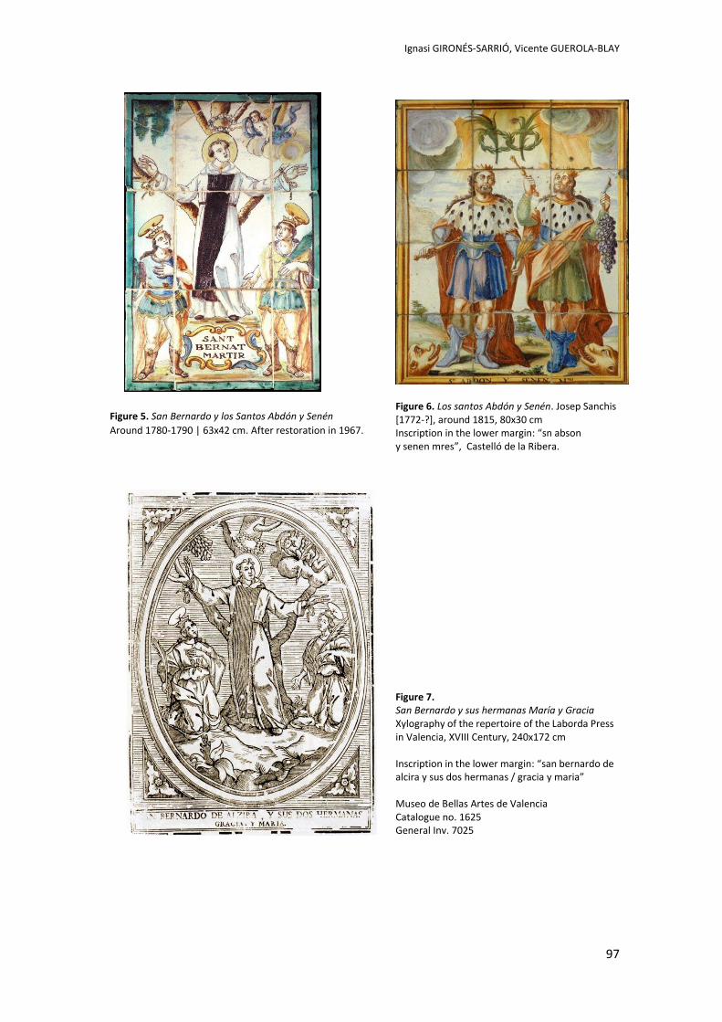
Ignasi GIRONÉS-SARRIÓ, Vicente GUEROLA-BLAY
97
Figure 5. San Bernardo y los Santos Abdón y Senén
Around 1780-1790 | 63x42 cm. After restoration in 1967.
Figure 6. Los santos Abdón y Senén. Josep Sanchis [1772-?], around 1815, 80x30 cm Inscription in the lower margin: “sn abson y senen mres”, Castelló de la Ribera.
Figure 7. San Bernardo y sus hermanas María y Gracia Xylography of the repertoire of the Laborda Press in Valencia, XVIII Century, 240x172 cm Inscription in the lower margin: “san bernardo de alcira y sus dos hermanas / gracia y maria” Museo de Bellas Artes de Valencia Catalogue no. 1625 General Inv. 7025
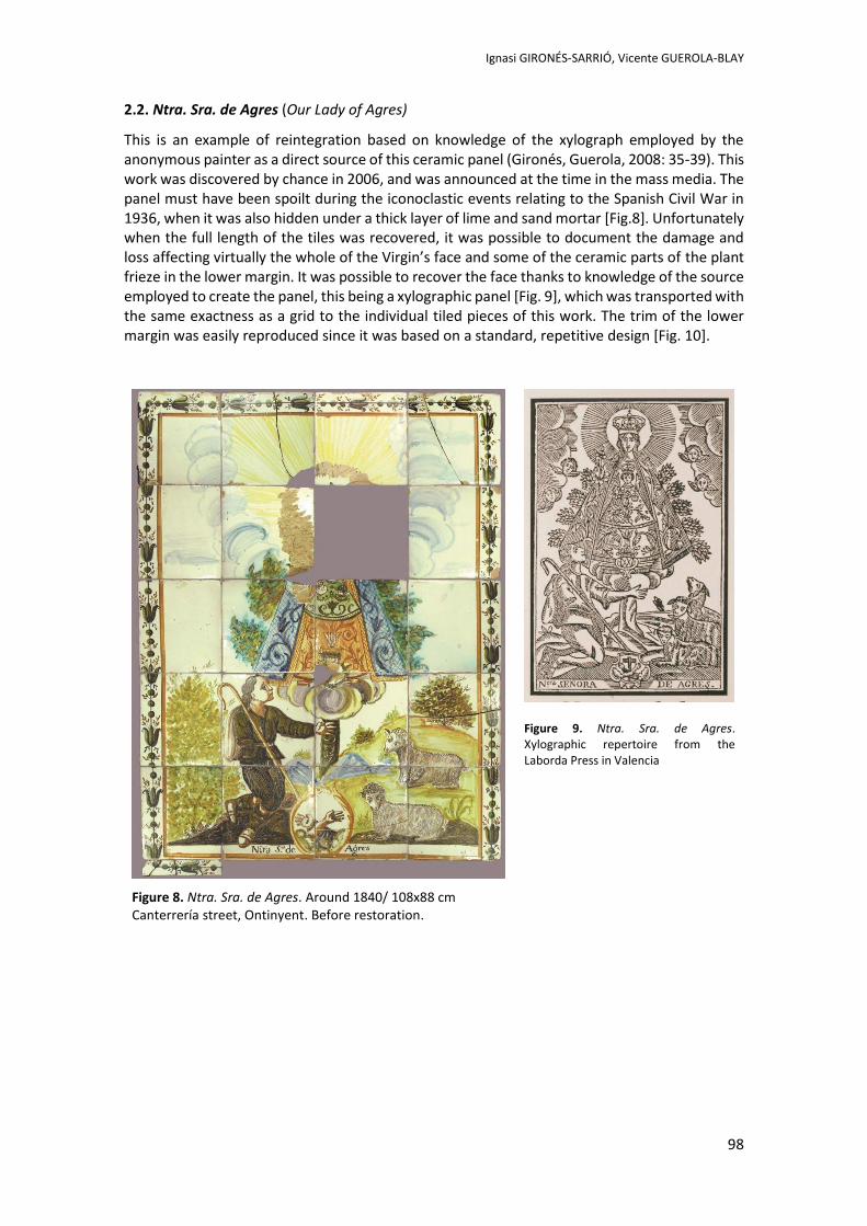
Ignasi GIRONÉS-SARRIÓ, Vicente GUEROLA-BLAY
98
2.2. Ntra. Sra. de Agres (Our Lady of Agres)
This is an example of reintegration based on knowledge of the xylograph employed by the anonymous painter as a direct source of this ceramic panel (Gironés, Guerola, 2008: 35-39). This work was discovered by chance in 2006, and was announced at the time in the mass media. The panel must have been spoilt during the iconoclastic events relating to the Spanish Civil War in 1936, when it was also hidden under a thick layer of lime and sand mortar [Fig.8]. Unfortunately when the full length of the tiles was recovered, it was possible to document the damage and loss affecting virtually the whole of the Virgin’s face and some of the ceramic parts of the plant frieze in the lower margin. It was possible to recover the face thanks to knowledge of the source employed to create the panel, this being a xylographic panel [Fig. 9], which was transported with the same exactness as a grid to the individual tiled pieces of this work. The trim of the lower margin was easily reproduced since it was based on a standard, repetitive design [Fig. 10].
Figure 8. Ntra. Sra. de Agres. Around 1840/ 108x88 cm Canterrería street, Ontinyent. Before restoration.
Figure 9. Ntra. Sra. de Agres. Xylographic repertoire from the Laborda Press in Valencia
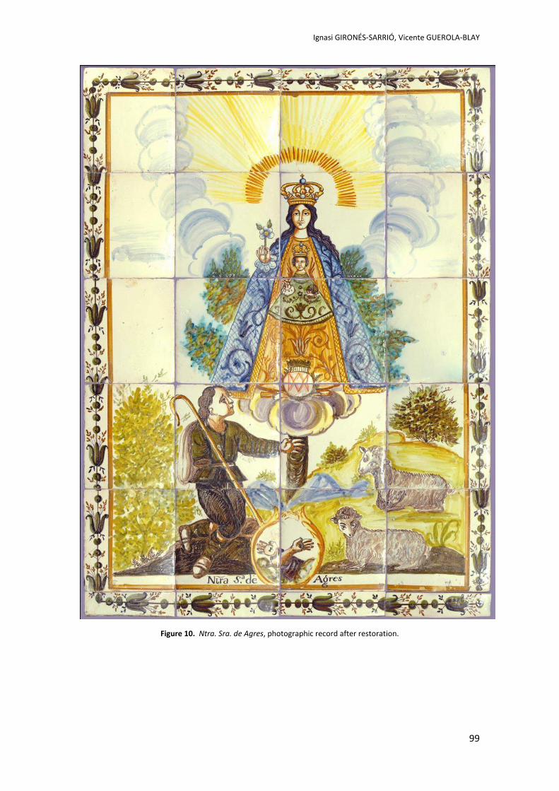
Ignasi GIRONÉS-SARRIÓ, Vicente GUEROLA-BLAY
99
Figure 10. Ntra. Sra. de Agres, photographic record after restoration.
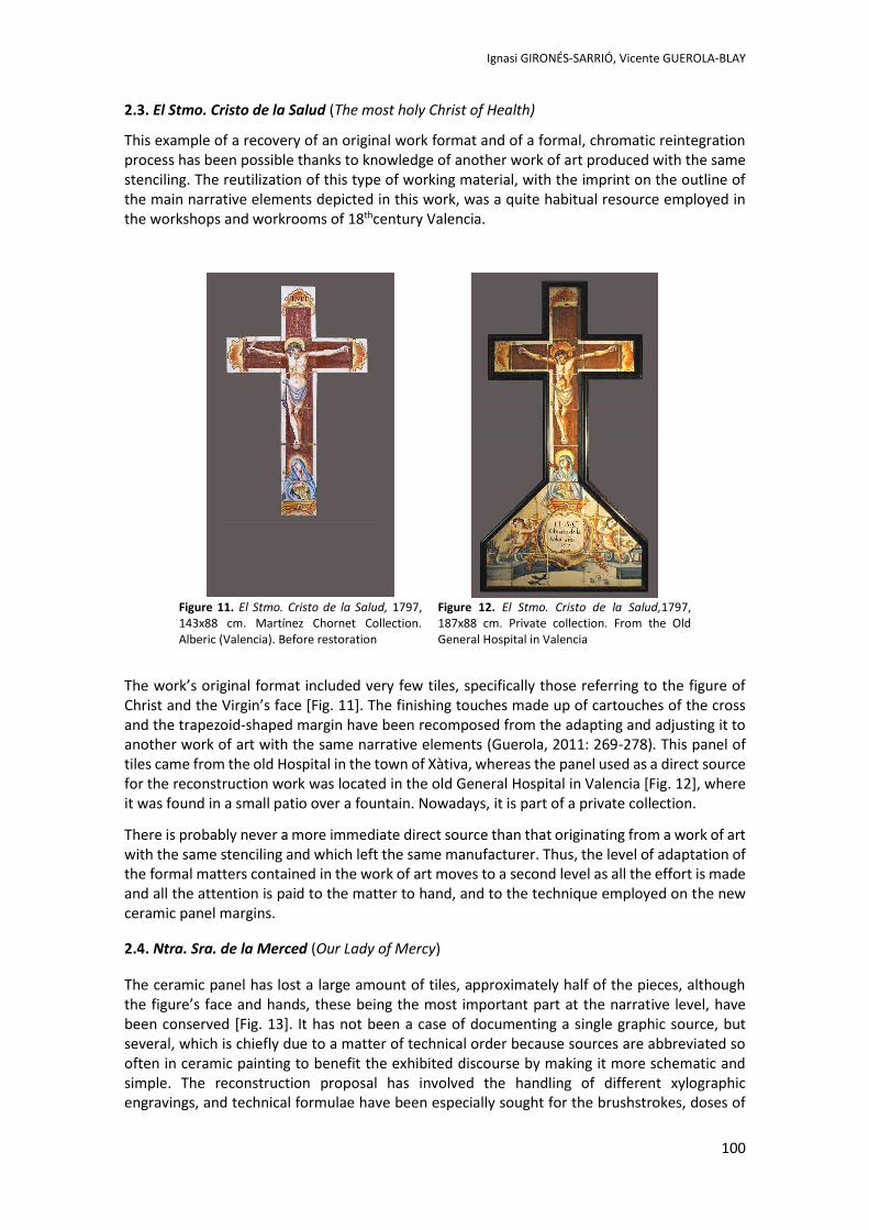
Ignasi GIRONÉS-SARRIÓ, Vicente GUEROLA-BLAY
100
2.3. El Stmo. Cristo de la Salud (The most holy Christ of Health)
This example of a recovery of an original work format and of a formal, chromatic reintegration process has been possible thanks to knowledge of another work of art produced with the same stenciling. The reutilization of this type of working material, with the imprint on the outline of the main narrative elements depicted in this work, was a quite habitual resource employed in the workshops and workrooms of 18thcentury Valencia.
Figure 11. El Stmo. Cristo de la Salud, 1797, 143x88 cm. Martínez Chornet Collection. Alberic (Valencia). Before restoration
Figure 12. El Stmo. Cristo de la Salud,1797, 187x88 cm. Private collection. From the Old General Hospital in Valencia
The work’s original format included very few tiles, specifically those referring to the figure of Christ and the Virgin’s face [Fig. 11]. The finishing touches made up of cartouches of the cross and the trapezoid-shaped margin have been recomposed from the adapting and adjusting it to another work of art with the same narrative elements (Guerola, 2011: 269-278). This panel of tiles came from the old Hospital in the town of Xàtiva, whereas the panel used as a direct source for the reconstruction work was located in the old General Hospital in Valencia [Fig. 12], where it was found in a small patio over a fountain. Nowadays, it is part of a private collection.
There is probably never a more immediate direct source than that originating from a work of art with the same stenciling and which left the same manufacturer. Thus, the level of adaptation of the formal matters contained in the work of art moves to a second level as all the effort is made and all the attention is paid to the matter to hand, and to the technique employed on the new ceramic panel margins.
2.4. Ntra. Sra. de la Merced (Our Lady of Mercy)
The ceramic panel has lost a large amount of tiles, approximately half of the pieces, although the figure’s face and hands, these being the most important part at the narrative level, have been conserved [Fig. 13]. It has not been a case of documenting a single graphic source, but several, which is chiefly due to a matter of technical order because sources are abbreviated so often in ceramic painting to benefit the exhibited discourse by making it more schematic and simple. The reconstruction proposal has involved the handling of different xylographic engravings, and technical formulae have been especially sought for the brushstrokes, doses of
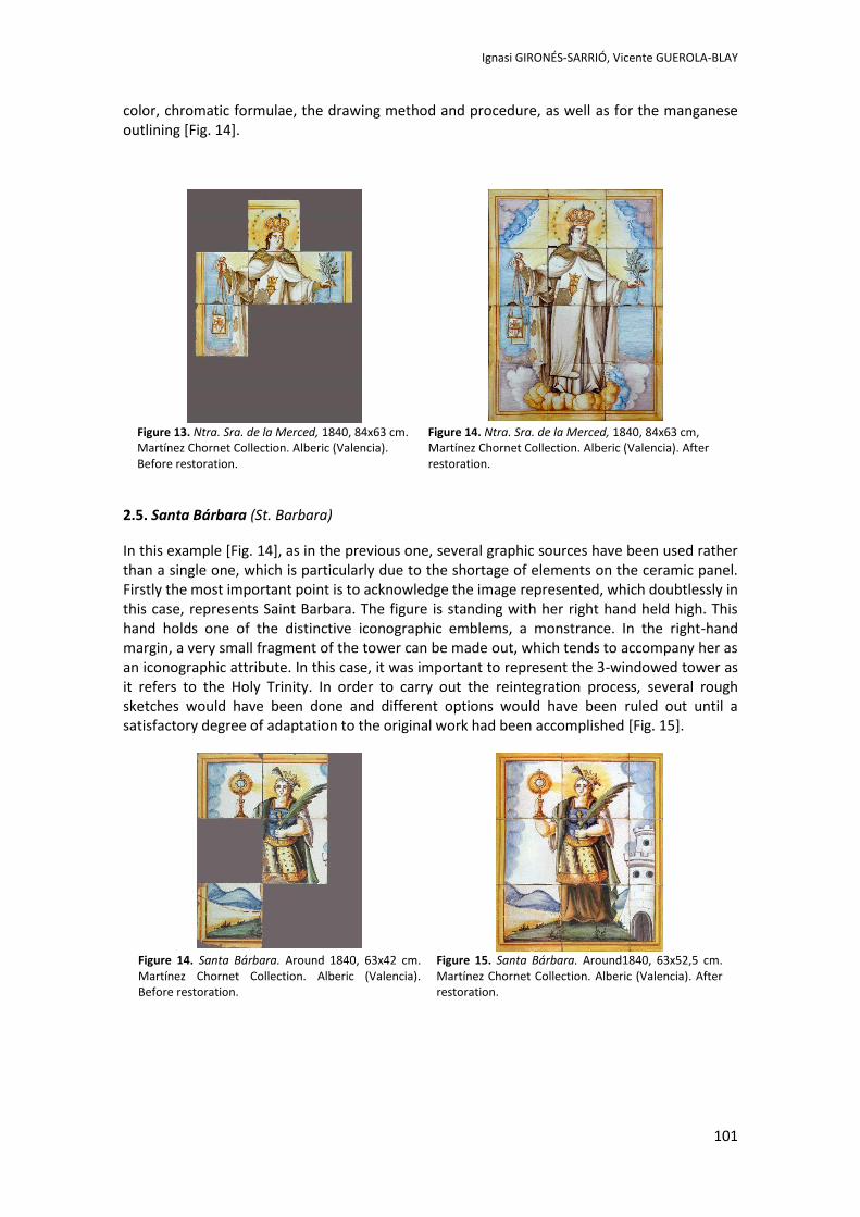
Ignasi GIRONÉS-SARRIÓ, Vicente GUEROLA-BLAY
101
color, chromatic formulae, the drawing method and procedure, as well as for the manganese outlining [Fig. 14].
Figure 13. Ntra. Sra. de la Merced, 1840, 84x63 cm. Martínez Chornet Collection. Alberic (Valencia). Before restoration.
Figure 14. Ntra. Sra. de la Merced, 1840, 84x63 cm, Martínez Chornet Collection. Alberic (Valencia). After restoration.
2.5. Santa Bárbara (St. Barbara)
In this example [Fig. 14], as in the previous one, several graphic sources have been used rather than a single one, which is particularly due to the shortage of elements on the ceramic panel. Firstly the most important point is to acknowledge the image represented, which doubtlessly in this case, represents Saint Barbara. The figure is standing with her right hand held high. This hand holds one of the distinctive iconographic emblems, a monstrance. In the right-hand margin, a very small fragment of the tower can be made out, which tends to accompany her as an iconographic attribute. In this case, it was important to represent the 3-windowed tower as it refers to the Holy Trinity. In order to carry out the reintegration process, several rough sketches would have been done and different options would have been ruled out until a satisfactory degree of adaptation to the original work had been accomplished [Fig. 15].
Figure 14. Santa Bárbara. Around 1840, 63x42 cm. Martínez Chornet Collection. Alberic (Valencia). Before restoration.
Figure 15. Santa Bárbara. Around1840, 63x52,5 cm. Martínez Chornet Collection. Alberic (Valencia). After restoration.
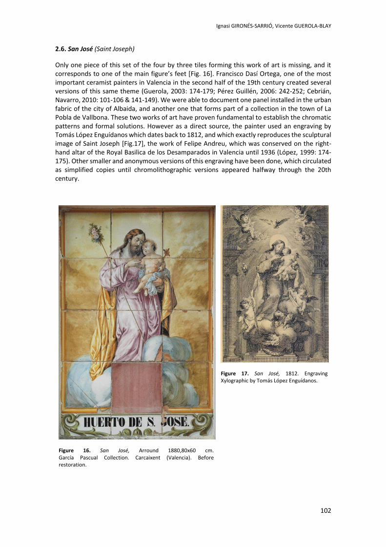
Ignasi GIRONÉS-SARRIÓ, Vicente GUEROLA-BLAY
102
2.6. San José (Saint Joseph)
Only one piece of this set of the four by three tiles forming this work of art is missing, and it corresponds to one of the main figure’s feet [Fig. 16]. Francisco Dasí Ortega, one of the most important ceramist painters in Valencia in the second half of the 19th century created several versions of this same theme (Guerola, 2003: 174-179; Pérez Guillén, 2006: 242-252; Cebrián, Navarro, 2010: 101-106 & 141-149). We were able to document one panel installed in the urban fabric of the city of Albaida, and another one that forms part of a collection in the town of La Pobla de Vallbona. These two works of art have proven fundamental to establish the chromatic patterns and formal solutions. However as a direct source, the painter used an engraving by Tomás López Enguídanos which dates back to 1812, and which exactly reproduces the sculptural image of Saint Joseph [Fig.17], the work of Felipe Andreu, which was conserved on the right-hand altar of the Royal Basilica de los Desamparados in Valencia until 1936 (López, 1999: 174-175). Other smaller and anonymous versions of this engraving have been done, which circulated as simplified copies until chromolithographic versions appeared halfway through the 20th century.
Figure 16. San José, Arround 1880,80x60 cm. García Pascual Collection. Carcaixent (Valencia). Before restoration.
Figure 17. San José, 1812. Engraving Xylographic by Tomás López Enguídanos.
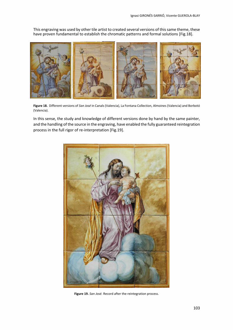
Ignasi GIRONÉS-SARRIÓ, Vicente GUEROLA-BLAY
103
This engraving was used by other tile artist to created several versions of this same theme, these have proven fundamental to establish the chromatic patterns and formal solutions [Fig.18].
Figure 18. Different versions of San José in Canals (Valencia), La Fontana Collection, Almoines (Valencia) and Borbotó
(Valencia).
In this sense, the study and knowledge of different versions done by hand by the same painter,
and the handling of the source in the engraving, have enabled the fully guaranteed reintegration
process in the full rigor of re-interpretation [Fig.19].
Figure 19. San José. Record after the reintegration process.
Ignasi GIRONÉS-SARRIÓ, Vicente GUEROLA-BLAY
104
3. Conclusion
The intention of this study was not to promote the ever committed action of reconstructing missing pieces in devotional tile works. Among all ceramics works, those demanding more meticulous reintegration action are probably those related with sacred aspects. The inclusion of solutions of a neutral or non-invasive kind has been virtually ruled out long since it was precisely works of worship which, quite often, were liturgically venerated or exposed to public worship. Hence, archeological-type interventions frequently ended up producing traumatic effects or the amputation of the image when, in fact, the intention of these works was to transmit a spiritual reality.
Technically speaking, due to the poorly controlled kiln conditions during the firing process, one piece or another of many ceramic panels of the 18th and 19th centuries presented breakages. These tiles which were ruled out from the very start were redone, and some mismatches appeared during their re-preparation process in terms of chromatism and the exact formal union of the drawing on each tile. This implied that whatever the problem encountered, broken or faulty pieces were replaced from the time they were produced with pieces in perfect condition.
During the Spanish Civil War, many of these devotional panels installed in the urban fabric of cities were the object of almost systematic devastation. In other cases, faces of figures were used as shooting targets while, at times, the main areas of representation were mutilated. By way of example, it is worth indicating the panel entitled Virgin of Consolation of 1786, located in the Trinquete de Caballeros Street in Valencia, whose central part was remade by the Vicente Gimeno workroom of the town of Manises in the 1940s (Pérez Guillén, 1991: 257-258). The central part of the work of art entitled Crucified Christ in the St. Luís Beltrán Square, also in the city of Valencia, was completely reconstructed, mainly owing to the restoration of the object of worship of the simulated ceramic altarpiece (Pérez Guillén, 1991: 262-263).
If in today’s recomposition process remade tiles are sufficiently documented and the assembly process always permits reversibleness, we shall be contributing to an improved observation of works of art by basing ourselves on the parameters of a work of art adapted from graphic sources.
This paper does not intend to deal with issues of methodology or technical matters related to the restoration process itself, but it is worth emphasizing that measures aimed at reconstructing missing pieces in any work of art should be addressed by a professional, who is specialized in this field and has sufficient experience to do it. A conservator will have to provide a treatment that ensures the utmost respect for the original work, use the appropriate system of distinction, as well as reversible materials that cause no harm to the work of art.
Glazed ceramic restoration could be regarded as a specific field of study in the discipline of conservation and restoration of works of art, which differs from common practices with regards to techniques and criteria. For example, several exclusive systems for chromatic reintegration of ceramic tiles in works of art have been studied and tested in recent years, among which we can highlight the well-known “reglatino” (Valero Ronda, 2008: 24) as an evolution of the classical “rigatino”, commonly used in canvas restoration (Bailão, 2011: 53).
However, irrespective of the system, technique or criterion used by a conservator in a concrete intervention, the aim of this paper is to show that the task of a professional in the field of conservation and restoration of cultural heritage and the handling of a work of art is not limited to the study, and material or technical treatment of a work of art, but it should also deal with all the formal, historical and cultural aspects that are intrinsic to every work of art and are essential for a successful restoration.
Ignasi GIRONÉS-SARRIÓ, Vicente GUEROLA-BLAY
105
References: AAVV. 2006. Imprenta valenciana. Siglos XVIII-XIX. Colección de entalladuras de la Real Academia de Bellas Artes de Valencia. Valencia: Museu Valencià de la Il·lustració i de la Modernitat-MUVIM. Bailão, A. 2011. As Técnicas de Reintegração Cromática na Pintura: revisão historiográfica. Ge-conservación, nº 2: 45-65. Cebrián i Molina, J. L. & Navarro i Buenaventura, B. 2008. Pintura ceràmica a Xàtiva. Plafons devocionals, làpides funeràries i taulells de mostra dels segles XVIII i XIX. Xàtiva: Ajuntament de Xàtiva. Cebrián i Molina, J. L. & Navarro Buenaventura, B. 2010. Francesc Dasí Ortega. Pintura ceràmica devocional. In: Llibre Alternatiu. Fira de Xàtiva 2010. Xàtiva: Ulleye, pp. 101-106 & 141-149. Gironés Sarrió, I. & Guerola Blay, V. 2008. El palfó ceràmic de la Mare de Déu d’Agres del carrer de Cantereria d’Ontinyent: la recuperació d’un patrimoni amagat. Revista Almaig, estudis i documents XXIV: 35-39. Guerola Blay, V. 2003. La pintura ceràmica a Carcaixent. Estudi, classificació i catàleg raonat. València: Universitat Politècnica de València – Ajuntament de Carcaixent. Guerola Blay, V. 2011. Una fe de cerámica. Origen y evolución de la pintura azulejera devocional valenciana. In: Oficios del pasado recursos patrimoniales del presente: La cerámica de Manises. Valencia: Universitat Politècnica de València, pp.269-278. López Catalá, E. 1999. San José. Cat. nº 221. In: La Luz de las Imágenes, Catedral de Valencia febrero – junio de 1999. Vol. II Áreas expositivas y análisis de las obras. Valencia: Generalitat Valeciana – Arzobispado de Valencia, pp. 174-175. Montagud Piera, B. 1994. Bernat: Sant Bernat mártir. Aproximación a las fuentes literarias e iconográficas. AL-GEZIRA. Revista d’Estudis Històrics, n. 8: 469-484. Olivares i Torres, E. 2005. Ceràmica devocional urbana d’Algemesí. Algemesí: Ajuntament d’Algemesí. Pérez Guillén. I. V. 1991. La pintura cerámica valenciana del S. XVIII. Barroco, Rococó y Academicismo clasicista. Valencia: Edicions Alfons el Magnànim. Pérez Contel, R. 1983. Colección de grabados del Excmo. Ayuntamiento de Valencia. Valencia: Ayuntamiento de Valencia. Pérez Guillén, I. V. 2006. Pintura cerámica religiosa: paneles de azulejos y placas. Fondos del Museo Nacional de Cerámica y Artes Suntuarias “González Martí”. Madrid: Ministerio de Cultura Tomás Sanmartín, A. & Silvestre Visa, M. 1982. Museo de Bellas Artes de Valencia. Estampas y planchas de la Real Academia de San Carlos. Madrid: Ministerio de Cultura. Vidal Belda, N. 2009. Un Patrimoni a descubrir: Ceràmica devocional, taulells ornamentals i paviment hidràulic d’Aielo de Malferit. Aielo de Malferit: Ajuntament d’Aielo de Malferit. Valero Ronda, A. 2008. Reconstrucción cromática de lagunas en piezas cerámicas mediante transferencia de impresiones digitales soportadas en papel gel. Tesina de Máster en Conservación y Restauración de Bienes Culturales. Universitat Politècnica de Valencia.

Go with the GlowAn invesgaon into a 1960s art object with
phosphorescent paint and its treatment possibilies
Ellen JANSEN, Ingeborg SMIT, Dirk Jan DIKKENJeroen KORTERIK, Herman OFFERHAUS
2nd International Meeting on Retouching of Cultural Heritage RECH2
Porto, Portugal | 24-25 October 2014
_____________________________________________________________________
107
Go with the Glow
An investigation into a 1960s art object with phosphorescent paint
and its treatment possibilities
Ellen JANSEN1*, Ingeborg SMIT2, Dirk Jan DIKKEN3, Jeroen KORTERIK3, Herman OFFERHAUS3
1 Lecturer at the University of Amsterdam, independent conservator of contemporary art
2 Conservator at Rijksmuseum Twenthe, Enschede 3 Department of Optical Sciences, University of Twente, Enschede
Abstract
This paper discusses phosphorescent or ‘glow in the dark’ paint and its problems, charac-teristics and treatment possibilities, while using an artwork without title (1968, RMT, En-schede) by IMI Giese as case study. To understand the problems that can occur with this little examined material, it is crucial to know how phosphorescence works and what the composition and properties of different phosphorescent pigments are.
The conservation challenges for this specific artwork are mostly due to the properties and composition of the paint: the lacunas for instance are a direct effect of the stickiness of the paint layer. The challenging search began for a phosphorescent retouching paint with an identical daylight colour and an afterglow with a similar colour, intensity, and duration as the original Wiedolux paint. Since all readily available phosphorescent paints and pigments did not match the properties of the original paint layer, it was necessary to manipulate self-made phosphorescent paints. The ways of manipulation have been tested through visual and technical analysis. This study provides insight into the results of the test sequences and offers useful information about the way conservators can adjust the properties of a phos-phorescent retouching material to suit their needs.
Keywords: phosphorescence, retouching, IMI Giese, zinc sulphide. ZnS:Cd
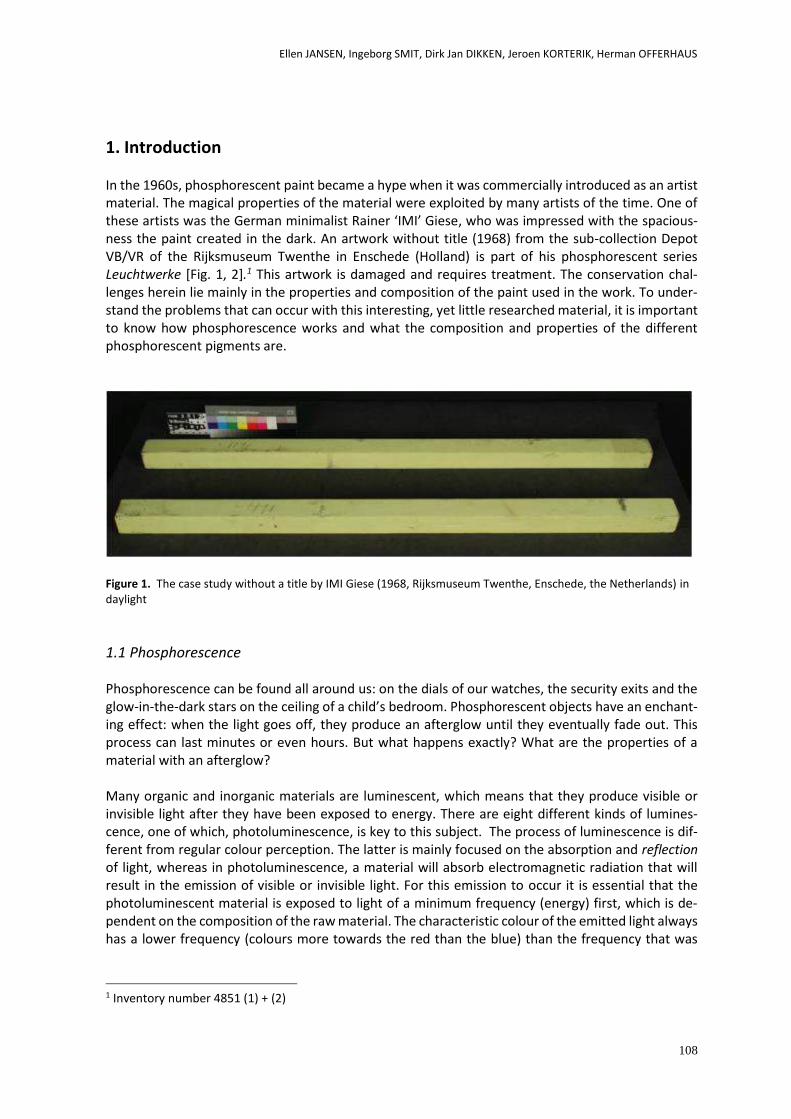
Ellen JANSEN, Ingeborg SMIT, Dirk Jan DIKKEN, Jeroen KORTERIK, Herman OFFERHAUS
108
1. Introduction In the 1960s, phosphorescent paint became a hype when it was commercially introduced as an artist material. The magical properties of the material were exploited by many artists of the time. One of these artists was the German minimalist Rainer ‘IMI’ Giese, who was impressed with the spacious-ness the paint created in the dark. An artwork without title (1968) from the sub-collection Depot VB/VR of the Rijksmuseum Twenthe in Enschede (Holland) is part of his phosphorescent series Leuchtwerke [Fig. 1, 2].1 This artwork is damaged and requires treatment. The conservation chal-lenges herein lie mainly in the properties and composition of the paint used in the work. To under-stand the problems that can occur with this interesting, yet little researched material, it is important to know how phosphorescence works and what the composition and properties of the different phosphorescent pigments are.
Figure 1. The case study without a title by IMI Giese (1968, Rijksmuseum Twenthe, Enschede, the Netherlands) in daylight
1.1 Phosphorescence Phosphorescence can be found all around us: on the dials of our watches, the security exits and the glow-in-the-dark stars on the ceiling of a child’s bedroom. Phosphorescent objects have an enchant-ing effect: when the light goes off, they produce an afterglow until they eventually fade out. This process can last minutes or even hours. But what happens exactly? What are the properties of a material with an afterglow? Many organic and inorganic materials are luminescent, which means that they produce visible or invisible light after they have been exposed to energy. There are eight different kinds of lumines-cence, one of which, photoluminescence, is key to this subject. The process of luminescence is dif-ferent from regular colour perception. The latter is mainly focused on the absorption and reflection of light, whereas in photoluminescence, a material will absorb electromagnetic radiation that will result in the emission of visible or invisible light. For this emission to occur it is essential that the photoluminescent material is exposed to light of a minimum frequency (energy) first, which is de-pendent on the composition of the raw material. The characteristic colour of the emitted light always has a lower frequency (colours more towards the red than the blue) than the frequency that was
1 Inventory number 4851 (1) + (2)
Ellen JANSEN, Ingeborg SMIT, Dirk Jan DIKKEN, Jeroen KORTERIK, Herman OFFERHAUS
109
absorbed.2 There are two different kinds of photoluminescence, namely fluorescence and phosphorescence. Even though there is a significant difference between the two, in practice these terms are often in-terchanged. When photoluminescent pigments emit light within a fraction of a second, we speak of fluorescence.3 Because this process happens within a very short period of time, the material will not produce an afterglow. When the source of energy is taken away, the photoluminescent effect of fluorescent material will not be visible. Phosphorescent materials, however, can retain energy after absorption and will produce an afterglow whilst slowly releasing this energy. The composition of the material will determine the duration of the afterglow.4
1.2 Phosphorescent pigments There are multiple materials that have phosphorescent qualities, and not all of them are suitable to use as a phosphorescent pigment. Although the phenomenon of phosphorescence has been recog-nized for some time, the development of a stable phosphorescent pigment proved to be difficult and even now industry is still improving the properties. The pigments that are most often applied are zinc sulfide pigments and rare earth pigments. Both phosphorescent materials have their own spe-cific composition and characteristics.
1.2.1 Zinc sulfide
Zinc sulfide (ZnS) was the first phosphorescent pigment produced on a large scale since the beginning of the twentieth century. It is an inorganic compound of zinc and sulfide, in the form of an opaque, white/yellow powder. Zinc sulfide itself is not phosphorescent, although a surplus of zinc or sulfide does give the material certain phosphorescent properties. The dopants in the pigment are crucial in obtaining an afterglow.5 A dopant is an impurity in the crystal matrix of a host material, which en-sures that the energy will be absorbed effectively. Also, a dopant can have an influence on the ab-sorption and emission spectrum of pigments. These impurities often consist of [transition] metals like copper, aluminum, cadmium, manganese and silver. They can also be halogens, like chlorine.6 The first dopants were usually small phases of copper in the crystal structure, resulting in the pig-ment ZnS:Cu. To bring about the best possible phosphorescence, the raw material needs to be very pure and the dopant should be carefully added in dosed quantities.7 The dopant and the concentration of the dopant have a crucial influence on the emission spectrum and the effectivity of the afterglow of the pigment. The optimal phosphorescence of zinc sulfide pigments is dependent on the exposure time.
2 Ashdown, I., ‘Glow and Behold’, Industry News, 25 March 1999, p.2 3 There are some exceptions to this rule. The most important differences between fluorescence and phospho-rescence take place at micro level. 4 Martindill, M.G., ‘A European Eye on Luminescence: Fluorescent and Phosphorescent Colours for the Visual Artist’, Leonardo, Vol. 21, No. 2, p. 187 5 Strange, J.W., ‘The Chemical and Physical Properties of Luminescent Materials’, paper read to the Colour Group, 11 December 1942, p.368 6 http://glowinc.com/glow-in-the-dark/glow-in-the-dark-technologies.aspx (consulted October 2014) 7 Mirhabibi, A.R., M. Rabiee, R. Aghababazadeh, F. Moztarzadeh en S. Hesaraki ‘Preparation of and Photo- and Electroluminescence Characteristics of ZnS:Cu fosfor’, Pigment and Resin Technology, Vol. 32, Iss.6, 2003, p.358
Ellen JANSEN, Ingeborg SMIT, Dirk Jan DIKKEN, Jeroen KORTERIK, Herman OFFERHAUS
110
When the material is exposed to visible light for a minimum of five minutes, the pigment is com-pletely ‘activated’.8 Also, ZnS:x pigments (zinc sulfide pigments doped with an unknown metal) are more effective when they absorb energy from deep blue to ultraviolet light.9 Even for optimal mix-tures, the zinc sulfide pigments are not very bright and have a short afterglow. These properties might seem undesirable, but ZnS:x is often still added to commercial glow-in-the-dark paint, plastics etc. because it is relatively cheap .10
1.2.2 Rare earth pigments
Rare earth pigments are inorganic, hard, opaque, phosphorescent pigments with a long afterglow. The base materials of the pigments are elements like strontium, magnesium, calcium, barium, silic-ium and titanium in an oxide crystal matrix to which rare-earth dopants are added. The raw material is easily mixable with other elements and it is chemically more stable than ZnS:x.11 The rare earth pigment that is used most often in the industry is strontium aluminate (SrO-Al2O3). Of the possible dopants, the rare earth metal europium is most widely used. Just like ZnS:x, the duration of the phosphorescence of rare earth aluminates is dependent on the exposure time. The rare earth aluminates have an excitation time of 30 minutes to become fully activated. This is six times longer than ZnS:x. but the afterglow of rare earth aluminates is fifteen times as bright as that of ZnS:x.12 The emission spectrum of rare earth aluminates can vary from green/yellow to a purplish blue.13
1.3 Phosphorescent paints in art In the 1950s and 1960s, artists from different art movements became interested in this ‘new’ mate-rial. Previously, phosphorescent pigments and paints were only available to a select group, like the army and industry. The popularity of the phosphorescent artist materials was mostly due to the ‘newness’ of the material, but the afterglow of the effect paint undoubtedly also triggered associa-tions with popular contemporary themes like the Russian and American fixation on space travel, science fiction and the moon landing in 1969. This fascination for glow-in-the-dark materials hasn’t dissipated, and contemporary artist still utilize them. Famous artists that have used phosphorescent paint in their art, are Lucio Fontana, Konrad Lueg, Piero Manzoni, Gilberto Zorio, Chris Ofili and An-tony Gormley, to name a few. Among all the artists found during the inventory, only one has used the material systematically in his oeuvre, namely Rainer ‘IMI’ Giese (Neheim-Husten, 1942-1974). IMI Giese was a German minimalis-tic artist. A part of his career is inextricably tied to the work of his colleague Klaus Wolf Knoebel (or ‘IMI’ Knoebel), whom he met during his studies at the Werkkunstschule in Darmstadt. In 1964 they formed the joint identity IMI (ich mit ihm, or I with him), however, despite this, they usually made their own artworks.14
8 About Photoluminescence. A Brief Technical Introduction, Baring Technologies P/L, 2011, p. 6 9 Ashdown, I., ‘Glow and Behold’, Industry News, 25 March 1999, p.3 10 http://glowinc.com/glow-in-the-dark/glow-in-the-dark-technologies.aspx (consulted October 2014) 11 Panigrahi, B.S., ‘Long Afterglow Phosphors’, Science 53, p.106 via website van de Indira Gandhi Centre for Atomic Research: www.igcar.ernet.in/benchmark/science/53-sci.pdf (consulted October 2014) 12 About Photoluminescence. A Brief Technical Introduction, Baring Technologies P/L, 2011, p. 6 13 http://glowinc.com/glow-in-the-dark/glow-in-the-dark-technologies.aspx (consulted October 2014) 14 Weibel, P. (ed.), IMI Giese, exhibition catalogue Kunstverein München, Kunsthalle Zürich, Neue Galerie am Landesmuseum Joanneum Graz, Ostfildern, 1994, p.42
Ellen JANSEN, Ingeborg SMIT, Dirk Jan DIKKEN, Jeroen KORTERIK, Herman OFFERHAUS
111
The use of phosphorescent paint in the artworks of IMI Giese is prevalent in his 2D and 3D works. The afterglow is used to create an extreme geometric spaciousness in a dark environment. In the catalogue of the solo exhibition Rainer Giese. Ausgewahlte Arbeiten that was organized four years after his death, photos of a small overview of his phosphorescent works were published. They con-sisted mostly of painted beams, frames, angles, blocks and plates of wood or fiberboard in different dimensions and arrangements.
1.4 Case study: without title by Rainer ‘IMI’ Giese (1967) The case study that forms the basis of this investigation was made during Giese’s sculptural period in which he wanted to emphasize spaciousness by applying a phosphorescent paint. The artwork consists of two timber pieces of the same length (110 x 4,7 x 4,7 cm). The phosphorescent paint is applied on a white ground. The paint layer looks yellow in daylight and has a green-yellow afterglow in the dark. On both beams, at about 20 cm from the far end, the word ‘IMI’ is written on the paint with a crayon (possibly Wasco). During exhibition, the two timber pieces are balanced against the wall, a few centimetres apart from each other. Figure 2 gives a good impression of how the artwork should be installed and its impact in a dark space.
Figure 2. The case study in the dark, positioned as it ought to be exhibited.
In the aforementioned exhibition catalogue from 1978, it is mentioned that Giese made use of a phosphorescent paint with the brandname Wiedolux. Unfortunately, this brand of paint is not in production anymore and there is no archival information available about the product. Because of this, it was necessary to carry out technical analyses to find out more about the composition of the layers. This was executed by the Cultural Heritage Agency of The Netherlands (RCE) and led by Katrien Keune. A combination of FTIR and SEM/EDX analysis indicated that the white ground consists of an acrylic, mixed with fine, tightly packed pigments. The elements titanium and barium are prev-alent, which is most likely due to the presence of the inexpensive white filling materials titanium dioxide and barium sulfate. The composition of the paint layer was determined with the same ana-lytical methods. The paint is an acrylic (most likely the same binder as the ground) with phosphores-cent zinc sulfide pigments that are doped with cadmium. Complementary research at the CICRP in Marseille, done by Alain Colombini, confirmed these findings and concluded that the binder of
Ellen JANSEN, Ingeborg SMIT, Dirk Jan DIKKEN, Jeroen KORTERIK, Herman OFFERHAUS
112
ground and paint is supposedly a poly methyl methacrylate (PMMA).
1.5 Properties of the material, consequences and challenges The binding material of the ground and the paint is an acrylic and the properties of this material are the most important reason for the majority of the damages. The soft paint layers with the con-sistency of chewing gum make the artwork sensitive to mechanical damage and the attraction – and enclosure – of dirt. When looking at the condition of the artwork, it is possible to see that the mate-rial causes problems. The lacunas in the paint layer are a direct effect of the stickiness and are the biggest conservation challenge. It appears that the beams have been in contact with each other for a long time, which presumably is the reason why they have adhered to each other. In an attempt to separate them, a paint transfer took place, where the paint layers of one piece of timber transferred onto the other exposing the wooden substrate. As no phosphorescent paint remains in these areas, they present as black spots when exhibited in the dark. The biggest lacunas can be re-filled with original material that is transferred back, but in some cases this is not possible. Suitable retouching pigments and medium had to be found. From the start, the search for a suitable retouching medium proved to be challenging. Due to health and safety regulations, cadmium can no longer be used for the production of phosphorescent pig-ments. This means that the materials available on the market today have different properties than the material that Giese used.15 The addition of a cadmium dopant has a positive influence on the intensity and duration of the afterglow: they are higher than that of the (mostly copper-doped) zinc sulphides which are widely available today, but not as high as that of the rare earth pigments. The presence of cadmium also changes the emission spectrum of the phosphorescent material by shifting it slightly from the green to the red range. These effects prove to be difficult to imitate with the phosphorescent pigments available today. To achieve the desired result, it was necessary to modify the available materials.
2. Methodology
2.1 Selecting test materials A suitable retouching medium needs to have similar colour as the original in daylight, but should also have a comparable colour, intensity, and duration of the afterglow in the dark. To find out how it would be possible to manipulate the available pigments, tips and tricks from industry were cata-logued and applied. In this case, it would be necessary to intensify the phosphorescence of zinc sul-fide pigments, or the strontium aluminates needed manipulation in order to decrease their effectiv-ity. Also, more information needed to be gained about how to manipulate the colours of the paint in daylight and in the dark. Aside from this manipulation, suitable phosphorescent pigments and a binder had to be chosen.
2.1.1 Selecting ways of manipulation
By comparing the information available in industry and the needs of the conservator, eleven differ-ent ways of manipulation have been chosen [Table 1].
15 Keune, P., ‘Fosforescerende Verven’, kM 0, autumn 1991, p.24
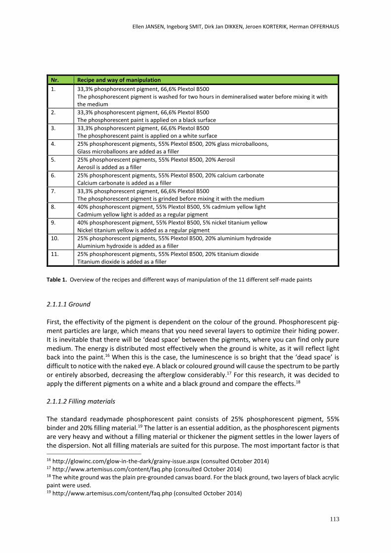
Ellen JANSEN, Ingeborg SMIT, Dirk Jan DIKKEN, Jeroen KORTERIK, Herman OFFERHAUS
113
Nr. Recipe and way of manipulation
1. 33,3% phosphorescent pigment, 66,6% Plextol B500 The phosphorescent pigment is washed for two hours in demineralised water before mixing it with the medium
2. 33,3% phosphorescent pigment, 66,6% Plextol B500 The phosphorescent paint is applied on a black surface
3. 33,3% phosphorescent pigment, 66,6% Plextol B500 The phosphorescent paint is applied on a white surface
4. 25% phosphorescent pigments, 55% Plextol B500, 20% glass microballoons, Glass microballoons are added as a filler
5. 25% phosphorescent pigments, 55% Plextol B500, 20% Aerosil Aerosil is added as a filler
6. 25% phosphorescent pigments, 55% Plextol B500, 20% calcium carbonate Calcium carbonate is added as a filler
7. 33,3% phosphorescent pigment, 66,6% Plextol B500 The phosphorescent pigment is grinded before mixing it with the medium
8. 40% phosphorescent pigment, 55% Plextol B500, 5% cadmium yellow light Cadmium yellow light is added as a regular pigment
9. 40% phosphorescent pigment, 55% Plextol B500, 5% nickel titanium yellow Nickel titanium yellow is added as a regular pigment
10. 25% phosphorescent pigments, 55% Plextol B500, 20% aluminium hydroxide Aluminium hydroxide is added as a filler
11. 25% phosphorescent pigments, 55% Plextol B500, 20% titanium dioxide Titanium dioxide is added as a filler
Table 1. Overview of the recipes and different ways of manipulation of the 11 different self-made paints
2.1.1.1 Ground
First, the effectivity of the pigment is dependent on the colour of the ground. Phosphorescent pig-ment particles are large, which means that you need several layers to optimize their hiding power. It is inevitable that there will be ‘dead space’ between the pigments, where you can find only pure medium. The energy is distributed most effectively when the ground is white, as it will reflect light back into the paint.16 When this is the case, the luminescence is so bright that the ‘dead space’ is difficult to notice with the naked eye. A black or coloured ground will cause the spectrum to be partly or entirely absorbed, decreasing the afterglow considerably.17 For this research, it was decided to apply the different pigments on a white and a black ground and compare the effects.18 2.1.1.2 Filling materials
The standard readymade phosphorescent paint consists of 25% phosphorescent pigment, 55% binder and 20% filling material.19 The latter is an essential addition, as the phosphorescent pigments are very heavy and without a filling material or thickener the pigment settles in the lower layers of the dispersion. Not all filling materials are suited for this purpose. The most important factor is that 16 http://glowinc.com/glow-in-the-dark/grainy-issue.aspx (consulted October 2014) 17 http://www.artemisus.com/content/faq.php (consulted October 2014) 18 The white ground was the plain pre-grounded canvas board. For the black ground, two layers of black acrylic paint were used. 19 http://www.artemisus.com/content/faq.php (consulted October 2014)
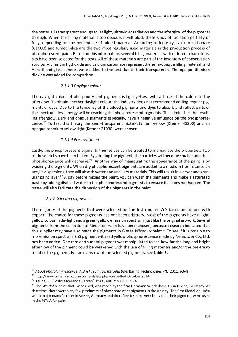
Ellen JANSEN, Ingeborg SMIT, Dirk Jan DIKKEN, Jeroen KORTERIK, Herman OFFERHAUS
114
the material is transparent enough to let light, ultraviolet radiation and the afterglow of the pigments through. When the filling material is too opaque, it will block these kinds of radiation partially or fully, depending on the percentage of added material. According to industry, calcium carbonate (CaCO3) and fumed silica are the two most regularly used materials in the production process of phosphorescent paint. Based on this information, several filling materials with different characteris-tics have been selected for the tests. All of these materials are part of the inventory of conservation studios. Aluminum hydroxide and calcium carbonate represent the semi-opaque filling material, and Aerosil and glass spheres were added to the test due to their transparency. The opaque titanium dioxide was added for comparison.
2.1.1.3 Daylight colour
The daylight colour of phosphorescent pigments is light yellow, with a trace of the colour of the afterglow. To obtain another daylight colour, the industry does not recommend adding regular pig-ments or dyes. Due to the tendency of the added pigments and dyes to absorb and reflect parts of the spectrum, less energy will be reaching the phosphorescent pigments. This diminishes the result-ing afterglow. Dark and opaque pigments especially, have a negative influence on the phosphores-cence.20 To test this theory the semi-transparent nickel-titanium yellow (Kremer 43200) and an opaque cadmium yellow light (Kremer 21030) were chosen.
2.1.1.4 Pre-treatment
Lastly, the phosphorescent pigments themselves can be treated to manipulate the properties. Two of these tricks have been tested. By grinding the pigment, the particles will become smaller and their phosphorescence will decrease.21 Another way of manipulating the appearance of the paint is by washing the pigments. When dry phosphorescent pigments are added to a medium (for instance an acrylic dispersion), they will absorb water and ancillary materials. This will result in a dryer and gran-ular paint layer.22 A day before mixing the paint, you can wash the pigments and make a saturated paste by adding distilled water to the phosphorescent pigments to ensure this does not happen. The paste will also facilitate the dispersion of the pigments in the paint.
2.1.2 Selecting pigments
The majority of the pigments that were selected for the test run, are ZnS based and doped with copper. The choice for these pigments has not been arbitrary. Most of the pigments have a light-yellow colour in daylight and a green-yellow emission spectrum, just like the original artwork. Several pigments from the collection of Riedel-de Haën have been chosen, because research indicated that this supplier may have also made the pigments in Gieses Wiedolux paint.23 To see if it is possible to mix emission spectra, a ZnS pigment with red yellow phosphorescence made by Nemoto & Co., Ltd. has been added. One rare earth metal pigment was manipulated to see how far the long and bright afterglow of the pigment could be weakened with the use of filling materials and/or the pre-treat-ment of the pigment. For an overview of the selected pigments, see table 2.
20 About Photoluminescence. A Brief Technical Introduction, Baring Technologies P/L, 2011, p.6-8 21 http://www.artemisus.com/content/faq.php (consulted October 2014) 22 Keune, P., ‘Fosforescerende Verven’, kM 0, autumn 1991, p.24 23 The Wiedolux paint that Giese used, was made by the firm Hermann Wiederhold KG in Hilden, Germany. At that time, there were very few producers of phosphorescent pigments in the vicinity. The firm Riedel-de Haën was a major manufacturer in Seelze, Germany and therefore it seems very likely that their pigments were used in the Wiedolux paint.
Ellen JANSEN, Ingeborg SMIT, Dirk Jan DIKKEN, Jeroen KORTERIK, Herman OFFERHAUS
115
Nr. Kind Color Manufacturer Type
1. ZnS:Cu Green Riedel-de Haën Lumilux Grün N5 (Effect Green)
2. ZnS:Cu Green Riedel-de Haën Lumilux Grün N5
3. ZnS:Cu Green/yellow Kremer Pigmente 56500
4. ZnS:Cu Green/yellow Nemoto GSS
5. ZnS:Cu Green/red Nemoto GSR
6. ZnS:Cu Green/yellow Green/red
Nemoto GSS/GSR (1:1)
7. SrAl Green Riedel-de Haën Lumilux SF-N2
Table 2. Overview of the different pigments that were used in the experiment
2.1.3 Selecting a binder
The binding medium has to be as transparent as possible, only then can the radiation reach the pig-ment and excite the electrons in the pigment in the best way possible. Examples of suitable media for these kind of paints are epoxies, polyesters, nitrocellulose, vinyl, urethane lacquers, oil lacquers and acrylics.24 Phosphorescent pigments cannot always be added to an arbitrary medium. Some pig-ments are specifically made for one medium (water based, oil based or solvent based), but others can be added to several binders. The medium that was selected for the tests is the acrylic dispersion Plextol B500, because of the similarities in appearance with the original binder and the availability of the product. Because Plextol B500 is known to be yellow, it would be advisable to use a dispersion that has stable additions for the final retouching medium, to reassure that all the added materials will not negatively influence the longevity of the self-made paint.
2.2 Set up tests
2.2.1 Making swatches
On pre-grounded canvas boards (Talens Amsterdam), swatches of 6 x 5 cm were drawn with a pencil. All the paints were mixed just before application and immediately applied on the corresponding swatch. The percentages of the added materials were equal to those that are usually standard for commercial paints (see paragraph 2.1.1). Since paints that consist solely of phosphorescent pigment and binder are not common in the industry, it was not possible to rely on these percentages. For these paints, a ratio of 1/3 phosphorescent pigment and 2/3 binder was employed. Because the consistency of the different mixtures was variable, not all paints were applied in the same way. A soft brush was used for the mixtures with a low viscosity, working in thin layers until all the paint was applied. For the more viscous paints, a plastic palette knife was deemed more suitable.
2.2.2 Set-up visual test
The swatches were visually evaluated under regular light and UV radiation, and also next to the orig-inal artwork for comparison. Aspects that were taken into account were properties such as the colour of the paint in daylight, the colour and intensity of the afterglow, the texture of the paint, the effect of a filling material or regular pigment on the visual properties of the paints etc. The swatches were inspected with the naked eye, a head-lens and a stereomicroscope.
24 http://www.artemisus.com/content/faq.php (consulted October 2014)
Ellen JANSEN, Ingeborg SMIT, Dirk Jan DIKKEN, Jeroen KORTERIK, Herman OFFERHAUS
116
2.2.3 Set-up technical analysis
Even though a lot of information can be acquired by visual analysis of the different phosphorescent paints, it is not possible to make a statement about the quantitative differences in the intensity of the afterglow. This is important complementary information, because it gives an objective insight into the influence of filling materials, pre-treatments etc. on the properties of the self-made paints. To obtain this information, the department of Optical Sciences at the University of Twente was con-tacted. They kindly offered their help which allowed for further tests into the paints to be done.25 At the University of Twente, a set-up was made on an optical table on which magnetic bases were stacked so they could hold a swatch and a black passe-partout. The passe-partout was necessary to make sure the sensor would not measure phosphorescence of other swatches. A light source (a KL1500 Schott microscopy lamp) was placed at a distance of 10 cm in front of the swatch. This low-tension halogen lamp (15 volt/150 watt) produces white light with a colour temperature of about 3200 Kelvin. A photodiode (UDT sensors PIN-10D) was placed at 5 cm from the phosphorescent sur-face. It was placed at an angle of about 45 degrees, so the excitation light would not be blocked. The signal from the photodiode was amplified using a 100MV/A transimpedance amplifier (University of Twente built) and digitized using a National Instruments USB-6212 Data Acquisition card. Each swatch was illuminated for 10 seconds and the decay of the phosphorescence was measured until the signal had dropped below a certain threshold. The optical responses of the various phosphores-cent compositions were plotted on a logarithmic scale, in order to show a single exponential decay as a straight line. These curves could eventually be compared to each other, using a curve of the original paint as a reference.
3. Results
3.1 Visual evaluation The visual characteristics of the different swatches were observed and compared in daylight, in UV light and in the dark. The most notable aspects will be discussed in the following paragraphs.
3.1.1 Ground
The colour of the ground is a decisive factor in the appearance of the paint in daylight. Since the hiding power of the paint is not optimal because of the large pigments, the transparent binder and the translucent pigments, one can see the ground through the paint. When looking at the swatches in the dark, it becomes clear that the colour of the ground is also an important factor in the ultimate intensity of the phosphorescence [Fig.3]. As the theory suggests, a black ground absorbs energy, which results in an afterglow with a diminished intensity and longevity.
25 My special thanks goes out to Herman Offerhaus, Jeroen Korterik and Dirk Jan Dikken.
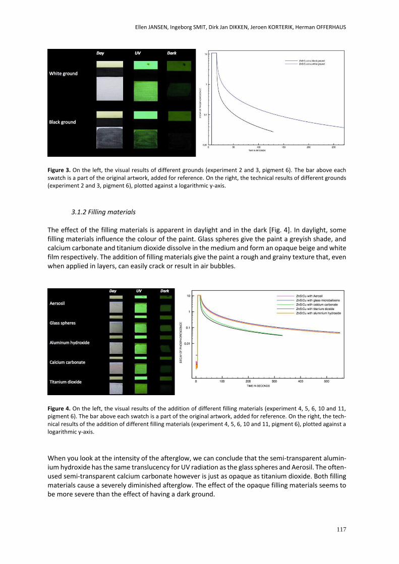
Ellen JANSEN, Ingeborg SMIT, Dirk Jan DIKKEN, Jeroen KORTERIK, Herman OFFERHAUS
117
Figure 3. On the left, the visual results of different grounds (experiment 2 and 3, pigment 6). The bar above each swatch is a part of the original artwork, added for reference. On the right, the technical results of different grounds (experiment 2 and 3, pigment 6), plotted against a logarithmic y-axis.
3.1.2 Filling materials
The effect of the filling materials is apparent in daylight and in the dark [Fig. 4]. In daylight, some filling materials influence the colour of the paint. Glass spheres give the paint a greyish shade, and calcium carbonate and titanium dioxide dissolve in the medium and form an opaque beige and white film respectively. The addition of filling materials give the paint a rough and grainy texture that, even when applied in layers, can easily crack or result in air bubbles.
Figure 4. On the left, the visual results of the addition of different filling materials (experiment 4, 5, 6, 10 and 11, pigment 6). The bar above each swatch is a part of the original artwork, added for reference. On the right, the tech-nical results of the addition of different filling materials (experiment 4, 5, 6, 10 and 11, pigment 6), plotted against a logarithmic y-axis.
When you look at the intensity of the afterglow, we can conclude that the semi-transparent alumin-ium hydroxide has the same translucency for UV radiation as the glass spheres and Aerosil. The often-used semi-transparent calcium carbonate however is just as opaque as titanium dioxide. Both filling materials cause a severely diminished afterglow. The effect of the opaque filling materials seems to be more severe than the effect of having a dark ground.
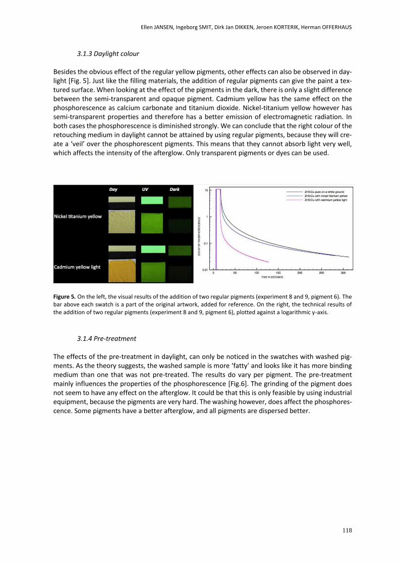
Ellen JANSEN, Ingeborg SMIT, Dirk Jan DIKKEN, Jeroen KORTERIK, Herman OFFERHAUS
118
3.1.3 Daylight colour
Besides the obvious effect of the regular yellow pigments, other effects can also be observed in day-light [Fig. 5]. Just like the filling materials, the addition of regular pigments can give the paint a tex-tured surface. When looking at the effect of the pigments in the dark, there is only a slight difference between the semi-transparent and opaque pigment. Cadmium yellow has the same effect on the phosphorescence as calcium carbonate and titanium dioxide. Nickel-titanium yellow however has semi-transparent properties and therefore has a better emission of electromagnetic radiation. In both cases the phosphorescence is diminished strongly. We can conclude that the right colour of the retouching medium in daylight cannot be attained by using regular pigments, because they will cre-ate a ‘veil’ over the phosphorescent pigments. This means that they cannot absorb light very well, which affects the intensity of the afterglow. Only transparent pigments or dyes can be used.
Figure 5. On the left, the visual results of the addition of two regular pigments (experiment 8 and 9, pigment 6). The bar above each swatch is a part of the original artwork, added for reference. On the right, the technical results of the addition of two regular pigments (experiment 8 and 9, pigment 6), plotted against a logarithmic y-axis.
3.1.4 Pre-treatment
The effects of the pre-treatment in daylight, can only be noticed in the swatches with washed pig-ments. As the theory suggests, the washed sample is more ‘fatty’ and looks like it has more binding medium than one that was not pre-treated. The results do vary per pigment. The pre-treatment mainly influences the properties of the phosphorescence [Fig.6]. The grinding of the pigment does not seem to have any effect on the afterglow. It could be that this is only feasible by using industrial equipment, because the pigments are very hard. The washing however, does affect the phosphores-cence. Some pigments have a better afterglow, and all pigments are dispersed better.
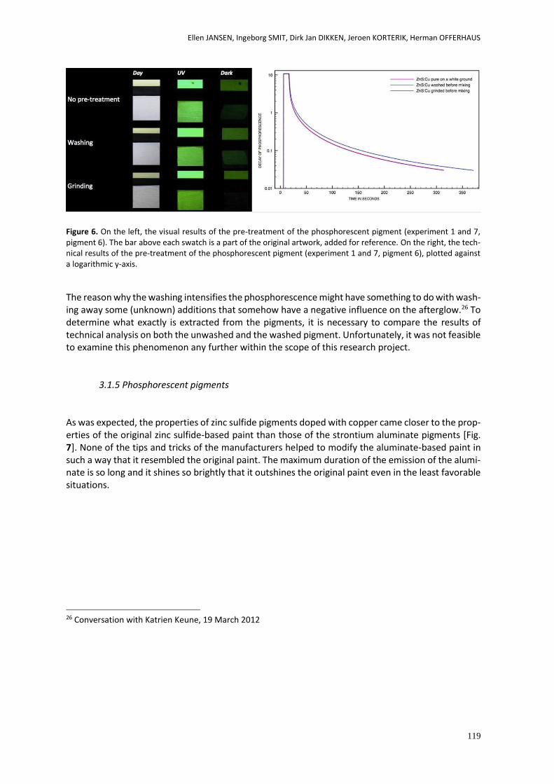
Ellen JANSEN, Ingeborg SMIT, Dirk Jan DIKKEN, Jeroen KORTERIK, Herman OFFERHAUS
119
Figure 6. On the left, the visual results of the pre-treatment of the phosphorescent pigment (experiment 1 and 7, pigment 6). The bar above each swatch is a part of the original artwork, added for reference. On the right, the tech-nical results of the pre-treatment of the phosphorescent pigment (experiment 1 and 7, pigment 6), plotted against a logarithmic y-axis.
The reason why the washing intensifies the phosphorescence might have something to do with wash-ing away some (unknown) additions that somehow have a negative influence on the afterglow.26 To determine what exactly is extracted from the pigments, it is necessary to compare the results of technical analysis on both the unwashed and the washed pigment. Unfortunately, it was not feasible to examine this phenomenon any further within the scope of this research project.
3.1.5 Phosphorescent pigments
As was expected, the properties of zinc sulfide pigments doped with copper came closer to the prop-erties of the original zinc sulfide-based paint than those of the strontium aluminate pigments [Fig. 7]. None of the tips and tricks of the manufacturers helped to modify the aluminate-based paint in such a way that it resembled the original paint. The maximum duration of the emission of the alumi-nate is so long and it shines so brightly that it outshines the original paint even in the least favorable situations.
26 Conversation with Katrien Keune, 19 March 2012
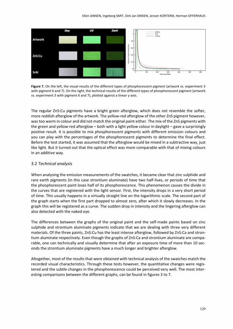
Ellen JANSEN, Ingeborg SMIT, Dirk Jan DIKKEN, Jeroen KORTERIK, Herman OFFERHAUS
120
Figure 7. On the left, the visual results of the different types of phosphorescent pigment (artwork vs. experiment 3 with pigment 6 and 7). On the right, the technical results of the different types of phosphorescent pigment (artwork vs. experiment 3 with pigment 6 and 7), plotted against a linear y-axis.
The regular ZnS:Cu pigments have a bright green afterglow, which does not resemble the softer, more reddish afterglow of the artwork. The yellow-red afterglow of the other ZnS pigment however, was too warm in colour and did not match the original paint either. The mix of the ZnS pigments with the green and yellow-red afterglow – both with a light yellow colour in daylight – gave a surprisingly positive result. It is possible to mix phosphorescent pigments with different emission colours and you can play with the percentages of the phosphorescent pigments to determine the final effect. Before the test started, it was assumed that the afterglow would be mixed in a subtractive way, just like light. But it turned out that the optical effect was more comparable with that of mixing colours in an additive way.
3.2 Technical analysis When analysing the emission measurements of the swatches, it became clear that zinc sulphide and rare earth pigments (in this case strontium aluminate) have two half-lives, or periods of time that the phosphorescent paint loses half of its phosphorescence. This phenomenon causes the divide in the curves that are registered with the light sensor. First, the intensity drops in a very short period of time. This usually happens in a virtually straight line on the logarithmic scale. The second part of the graph starts when the first part dropped to almost zero, after which it slowly decreases. In the graph this will be registered as a curve. The sudden drop in intensity and the lingering afterglow can also detected with the naked eye. The differences between the graphs of the original paint and the self-made paints based on zinc sulphide and strontium aluminate pigments indicate that we are dealing with three very different materials. Of the three paints, ZnS:Cu has the least intense afterglow, followed by ZnS:Ca and stron-tium aluminate respectively. Even though the graphs of ZnS:Ca and strontium aluminate are compa-rable, one can technically and visually determine that after an exposure time of more than 10 sec-onds the strontium aluminate pigments have a much longer and brighter afterglow. Altogether, most of the results that were obtained with technical analysis of the swatches match the recorded visual characteristics. Through these tests however, the quantitative changes were regis-tered and the subtle changes in the phosphorescence could be perceived very well. The most inter-esting comparisons between the different graphs, can be found in figures 3 to 7.
Ellen JANSEN, Ingeborg SMIT, Dirk Jan DIKKEN, Jeroen KORTERIK, Herman OFFERHAUS
121
4. Conclusion
Because an artwork without title (1968, Rijksmuseum Twenthe, Enschede, Holland) by the German minimalist Rainer ‘IMI’ Giese needed to be retouched, research was done into phosphorescent pig-ments and the possibility to compose one’s own phosphorescent paint to match the characteristics of the original paint layer. In this case, it became clear that a retouching material needed to be ma-nipulated after technical analysis revealed that the original pigment consisted of ZnS:Ca. These pig-ments are not on the market anymore because of health and safety regulations. The search began for a suitable retouching material that has a similar colour as the original in daylight and also has a comparable colour, intensity and duration of the afterglow. Tips and tricks from the paint industry were applied on different swatches and can broadly be divided into the following cat-egories: ground, filling materials, daylight colour, pre-treatment, and different phosphorescent pig-ments. The results were analysed visually and technically. On the whole the visual evaluations cor-responded with the findings in the technical analysis, but in some cases the paints differed less opti-cally than technical analysis indicated. The ground, filling materials, daylight colour and pre-treatment all have influence on the daylight colour. Since the phosphorescent pigments are translucent and cause ‘dead space’ because of their size, the colour of the filling material is visible. As expected, adding regular pigments to the paint alters the daylight colour of the phosphorescent paint but some filling materials also change the hue of the paint in daylight. Lastly, and perhaps most surprisingly, washing the phosphorescent pigments before adding them to the binder will make the paint layer look more saturated and glossy. Filling materials and regular pigments in the self-made paint can result in graininess of the paint layer, when the medium does not wet these materials entirely. Adding a small amount of water to the dry materials to create a smooth paste can prevent this problem. When the paste is added to the other components of the paint, it will result in a better dispersion of the material. The paint must be applied in very thin layers to prevent the occurrence of cracks and air bubbles. All the categories of manipulation also have an effect of the phosphorescence of the paint. When the ground is black or has a certain colour, the ground will absorb light. Less light is scattered back into the paint layer, which results in a diminished phosphorescence. The semi-transparent and often used calcium carbonate and the tested opaque filling materials have a negative influence on the intensity and duration of the afterglow. The right daylight colour of the retouching medium cannot be attained by using regular pigments, because they will create a ‘veil’ over the phosphorescent pig-ments. This means that they cannot absorb light very well, which affects the intensity of the after-glow. Only transparent pigments or dyes can be used. Only the washing of the pigments will increase the intensity of the afterglow of some of the tested materials, most likely due to the removal of an unknown addition that has a negative influence on the phosphorescence. All in all, a black ground and the addition of opaque filling materials seem to have the most severe influence on the properties of the paint. The phosphorescent pigments that are currently available do not have the same properties as the ZnS:Ca pigments that were found in the original paint layers. The tested zinc sulphide doped with copper has a shorter and less intense afterglow, and also has an emission spectrum that is greener. The strontium aluminate has a much longer and intense afterglow, and also has an afterglow that is too green. The effect of the ZnS:Ca pigments can be imitated by combining ZnS:Cu pigments with a green and a yellow-red afterglow. Further tests indicated that in this case they have to be mixed in a ratio of 1:1, or with slightly more phosphorescent pigment with a yellow red afterglow.
Ellen JANSEN, Ingeborg SMIT, Dirk Jan DIKKEN, Jeroen KORTERIK, Herman OFFERHAUS
122
When making a retouching medium for Giese’s artwork, all the information gained from these tests will be kept in mind. All the manipulations that will positively influence the phosphorescence will be applied. The mix of glow-in-the-dark pigments with a different colour afterglow shows good results but since these have a pastel colour in daylight, a way of successfully altering the daylight colour had to be found. Because it is not possible to add regular pigments, the industry developed coloured resin micro balloons that would be a good option for this specific case. The colours that are available correspond with the colour of the afterglow, and therefore have a very intense hue. The yellow that is available is not an exact match with the original paint layer, but it does come close. Even though there are complex differences between the material available on the market today and the original paint layer, the tests visually match the artwork enough to be able to restore the geometric unity that Giese had in mind when making this fascinating artwork.
Acknowledgements
Rijksmuseum Twenthe (Enschede, the Netherlands), University of Twente (Enschede, the Netherlands), Katrien Keune (Cultural Heritage Agency of the Netherlands), Alain Colombini (CICRP Marseille), Yas Takeshima (Nemoto Europe B.V.), Roy Brust (Brenntag Nederland B.V.)
References About Photoluminescence. A Brief Technical Introduction, Baring Technologies P/L, 2011 Ashdown, I., ‘Glow and Behold’, Industry News, 25 March 1999 Keune, P., ‘Fosforescerende Verven’, kM 0, autumn 1991 Martindill, M.G., ‘A European Eye on Luminescence: Fluorescent and Phosphorescent Colours for the Visual Artist’, Leonardo, Vol. 21, No. 2, 1998 Mirhabibi, A.R., M. Rabiee, R. Aghababazadeh, F. Moztarzadeh en S. Hesaraki ‘Preparation of and Photo- and Electroluminescence Characteristics of ZnS:Cu fosfor’, Pigment and Resin Technology, Vol. 32, Iss.6, 2003 Panigrahi, B.S., ‘Long Afterglow Phosphors’, Science 53, p.106 via website van de Indira Gandhi Centre for Atomic Research: www.igcar.ernet.in/benchmark/science/53-sci.pdf Strange, J.W., ‘The Chemical and Physical Properties of Luminescent Materials’, paper read to the Colour Group, 11 December 1942 Weibel, P. (ed.), IMI Giese, exhibition catalogue Kunstverein München, Kunsthalle Zürich, Neue Galerie am
Landesmuseum Joanneum Graz, Ostfildern, 1994 Links Artemis US: http://www.artemisus.com/content/faq.php Glow Inc: http://glowinc.com/glow-in-the-dark/glow-in-the-dark-technologies.aspx http://glowinc.com/glow-in-the-dark/grainy-issue.aspx
Altarpiece painng: a view from the inside
Mercês LORENA
2nd International Meeting on Retouching of Cultural Heritage RECH2
Porto, Portugal | 24-25 October 2014
_____________________________________________________________________
124
Altarpiece painting: a view from the inside
Mercês LORENA1
1Direcção Geral do Património Cultural - Laboratório José de Figueiredo (DGPC - LJF). Rua das Janelas Verdes, 1249-018 Lisboa
Abstract
Man has always conserved day to day and artistic objects. There are a number of examples of such interventions in paintings and sculptures from the 16th century, which show excesses of retouches and repaints to recover its original condition. Restoration artisans, many times following the owner’s request, didn’t hesitate in repainting over the existing damages. Only during the 20th century, the opinion concerning lacunae reintegration shifts: professionals start questioning the legitimacy of such interventions in art works. Interventions should not jeopardize the integrity of artistic production.
Over these last years, several altarpieces were restored. Their conservation state varied substantially from each other, mainly due to opportunistic, isolated interventions, many times completely out of context. As a result, the prevailing impression is the uneven character of final retouches and repaints, leading, potentially, to mistakes in the historical and artistic characterization: an art work conceived as a complete set could be perceived as a collection of individual works. Today, painting reintegration is still a compromise between the historical honesty and aesthetic demands. The fundamental need to respect the original trueness of the object, still remains as the boundary of the intervention. In this communication, several examples of restored altarpieces from the 1500’s will be presented and analyzed: the retable of the Virgin of Sorrows by Quentin Metsys from the Madre de Deus church in Lisbon; the retable of the Holy Virgin’s Life from Évora’s cathedral, and the retable from Funchal’s Cathedral in the Madeira Island.
Keywords: retable, altarpiece, retable painting, retouch, repaints, reintegration
Mercês LORENA
125
Introduction
The complexity of the questions intrinsic to the intervention of conservation and restoration, particularly when it intervenes in these sets of paintings as now presented, requires systematic work and sharing of opinions. In the end the decision is the result of the review. This fact encourages multidisciplinary research and preliminary studies based on existing documentation in archives and libraries. These studies were designed to define criteria and methods of intervention in the altarpiece sets resulting in a true original, without reading errors and/or interpretation.
It is not always easy even with analytical exams of the surface to demonstrate the difference between a glaci and a veneer applied later; it is not easy to understand that a particular colour is no longer original but a later repaint; on the other hand, it's not easy to explain that particular colour is original but has had serious pigment or binder alteration problems; it's especially difficult not to give in to outside pressures and act according to the correct criteria for preservation of the work.
It dates back to 1920, the changing views on the integration of lacunae: then one began to question the legitimacy of intervention by the restorer on the work of an artist. A discussion arises from two extremes: to intervene or not to intervene in the work. This decision depends on numerous factors and certain principles that appeal more to some than others, but it is mostly in compliance with the standards contained in the Code of Ethics that the Conservator-Restorer must act. The dissemination of the results obtained during an intervention on conservation and restoration of works of art is mandatory and is understood more as a civic duty, than as a demand for self-promotion.
When we resort to a direct intervention on a masterpiece it is because it is necessary for its physical and chemical preservation, and scientific and analytical methods are essential for this. When pictorial groups are intervened a conservation survey is always (or should be always) carried out as a first step on each individual piece and on the group of paintings. Direct eye observation of the object is fundamental but should be coupled with micro analytical tools. Some examples of 16th century altarpieces, previously intervened and analyzed are presented in this article: the retable of the Virgin of Sorrows by Quentin Metsys from the Madre de Deus church in Lisbon (NMAA); the retable of the Holy Virgin’s Life from Évora’s Cathedral (ME), and the retable from Funchal’s Cathedral in the Madeira Island (SF).
Methodology
The recents interventions on these three altarpieces permitted to collect data for its study using infrared reflectography, radiography and different photographic techniques, including normal and macro imaging under visible light using 450 and raking incidence infrared, and ultra violet lights. Analytical exams were performed to characterize the execution of the painting process and highlight any creative practice, autonomous or in partnership. The results obtained provided not only a comparison with other painter’s studios as well as the extension and locations of previous interventions through the identification of repaints. Material characterization of several of the paintings, provided a new perspective on the interventions to be carried out and the definition of the technical procedures to be adopted on each of the interventions. The identification of the pigments and their chemical composition was first carried out using a non-invasive in-situ method: X-ray Fluorescence Spectroscopy, permitted local analytical information of each pictorial layer based on a pondered average result. Micro-samples were collected and assembled in resin, to reveal all the stratigraphical layers (sections). They were later analyzed individually through each layer using microscopy techniques. The microscope also permitted to measure the thickness and determine the composition of each layer as well as view the structure
Mercês LORENA
126
of the sections and their particle distribution. The technical tests, which were crucial and allowed the characterization of the works under study, were carried out with the support of the Laboratório José de Figueiredo1 and the HERCULES Centre2 .
With the exception of the great altarpiece of Funchal’s Cathedral the remaining two altarpieces integrate the collections of public institutions having been removed from their place of origin. The thorough documental, technical and scientific investigations, which was carried out allowed to portrait rigoursly the creative process of each altarpiece. The research plan consisted of a direct analysis of selected works and considered three basic approaches:
1. Historical research, which included the gathering and evaluation of the available technical and historical documentation, and subsequent interpretation of the results obtained from the materials characterization and from the surface observation, permitting a critical analysis of the art works;
2. Analysis of the paintings surface through detailed exams using visible and raking photography, macro photography, and photography of UV fluorescence, X-ray and infrared reflectography. Analysis of the wooden supports. The adopted methodology permitted to obtain information on the working techniques and evaluate their present condition;
3. Material ccharacterization of the paintings using a combination of analytical techniques in-situ with laboratory tests as well as microscopic observation permitted to obtain information on the pictorial and constructing materials and on earlier interventions.
1 An organism that belongs to the Direcção Geral do Património Cultural (created in 2012, replacing the Instituto
dos Museus e da Conservação). 2 HERCULES is an analytical laboratory that belongs to the Universidade de Évora.
1 2
Figure 1. Altarpiece of the Virgin of Sorrows (c.1509/11) by Quentin Metsys from the Madre de Deus church in Lisbon.
1 - Virgin of Sorrows; 2 - Presentation of the Child in the Temple; 3 - Rest on the flight into Egypt; 4 - Christ among the Doctors; 5 - Christ on the way to Calvary; 6 - Calvary; 7 - Lamentation; 8 - The three Marys with St. John at the Tomb
( Jorge Oliveira, Mercês Lorena).
3
4 5 6
7
8
Mercês LORENA
127
In a very brief description, the altarpiece of the Virgin of Sorrows is composed of a set of eight Flemish paintings commissioned to Quentin Metsys for the Convent Madre de Deus in Lisbon. This altarpiece was commissioned by Queen Leonor for the church of Madre de Deus in 1509 through João Brandão, overseer in Antwerp in the years 1509-14 and 1521-26. It is unknown however, whether there was an initial draft order or if it was directly purchased in Antwerp. The theme of the Virgin of Sorrows has always been represented with the Virgin on a central panel, flanked by seven smaller panels representing the Seven Sorrows of the Virgin, the most painful scenes of Christ for the Virgin: Presentation of the Child in the Temple, Rest on the flight into Egypt, Christ among the Doctors, Christ on the way to Calvary, Calvary, Lamentation and The three Marys with St. John at the Tomb [Fig.1]. This altarpiece is presently exhibited at the National Museum of Ancient Art, Lisbon, Portugal, with the exception of two paintings: Rest on the flight into Egypt, which is in the Worcester Art Museum, Worcester Mass, USA, and the Lamentation which is in the Museum of the School of Fine Arts in Rio de Janeiro, Brazil.
Interventions
Through various analytical tests it was found that the works had different degrees of degradation and accumulation of dirt. These facts fact resulted mainly from, apart the different interventions they were submitted to, particularly along the 20th century. According to documental sources, it is referred that the works underwent restoration interventions few years after their elaboration having had support cuttings, which altered their original dimension.
Between 1931 and 1936 the panel paintings of the Virgin of Sorrows were intervened by Fernando Mardel at the National Museum of Ancient Art. Based on the information from the intervention nº 1275 from the restorer Fernando Mardel on the central panel of the Virgin, the museum’s director, João Couto in 1937, writes the following: – « dry wooden support made from oak, warped and attacked by insect. Was partially delaminated for the insect treatment and was reinforced locally. A type of cradling was applied, which does not adhere to the panels but is attached to the frame. This was thought to prevent new warping’s. Ground layer of calcium carbonate and animal glue. The painter used a mixed media technique, sketching tempera and continuing with resins. The existence of bulges on the painted membrane are signaled on the photograph3». And the author continues to write referring to the same restoration project– «This painting had begun to be cleaned by Professor Freire, who applied oil paints for this purpose. Recently it was thought that it was appropriate to continue the cleaning, initiated by Professor Freire, and restore it again. And although it was now understood that this restoration should have been done with a technique similar to the original painter, it was necessary for technical reasons, to continue to employ the process started by Professor Freire with slight modifications, which seemed advisable to do» [COUTO, 1937, pp.1-2].
The most interesting part of this text where we can draw some information about the course path of this work is as follows: - «As may be seen on the photographic image (unfortunately this photograph was not found), a laminate cutout is visible on the bottom of the painted panel». This was done so as to fit a tabernacle that was intended to be placed in front of the painting. Dr. José de Figueiredo, the preceding museum director, informed João Couto that he possessed a document dating from the 18th century, which described the placement of the altar in a chapel, and the aforementioned mutilation. According to further information from Dr. José de Figueiredo, João Couto found in the Madre de Deus convent, a painted thin board, which although had been repainted, fitted well the dimension of the cutout that had been done on the bottom of the panel painting. He brought this thin board to Professor Freire, who then fitted it into the missing cutout redoing the panel in its original format. Professor Freire had already depicted the folds of the robe of the Virgin on this missing part but the restaurateur Fernando
3 Free translation from Couto’s, 1937 citation
Mercês LORENA
128
Mardel undertook a new study, which resulted in the present pictorial depiction of the panel painting. The painting was varnished with two coats of resin varnish and a thin layer of oil varnish. A layer of protective was also applied to it» [COUTO, 1937, p.1-2].
At the present moment it is possible, through documentary research that was recently carried out on this panel painting, namely radiographical and dendrochronological studies, to confirm or deny the reported information about the originality of the thin board found by João Couto. Suspicion of this historical occurrence began with the 2009 cleaning of the chromatic layer, which was confirmed by radiography. Through the analysis of the painting it was found that this fragment was embedded with a cut ganzepe on to the original support and retouched mimically being practically invisible to the eye [Figs.2, 3].
All these panels are oak wood from the Baltic, just like other Flemish paintings. Dendrochronology studies were carried out only on the central painting of the Virgin of Sorrows (1495), by Lilia Esteves in 2011, and on the painting of the Calvary (1495), by Peter Klein in 2000. In the painting of the Virgin of Sorrows it was impossible to date all the boards, because some areas are in bad condition.
The dendrochronological study demonstrated that the rings of the thin embedded board made from Baltic oak do not correspond to the rings of the adjacent panels. [Table.1]. Later, during the material study for the identification of the pigments, it was again confirmed that this area was completely repainted and that its pigments do not correspond to the time-line of the panel painting, for example, the presence of Prussian blue. The ground layer of the embedded board is different from the original ground layer of the panel [Fig. 4 a,b,c,d]; suffice it to say that the ground layer of the embedded fragment is gypsum, while the remaining is chalk [Fig. 5 a,b,c,d]. This suggests us that quite possibly this fragment belongs to a Portuguese painting for in Flanders gypsum was not used for the ground layers. All these signs leave us no doubt in saying that this fragment does not belong and never belonged to the original panel painting of the Virgin of Sorrows.
Figure 2. Virgin of Sorrows - lower part of the panel applied in 1931-36 by L. Freire. ( Mercês Lorena)
Mercês LORENA
129
Figure 3. Radiography of the Virgin of Sorrows.
Table.1 Virgin of Sorrows, dendrochronology table - ( Lilia Esteves, DGPC)
Dendrochronological exam - Virgem das Dores
Boards Ring measurements Initial date End date
I 272 1201 1472
II 260 1206 1465
III 269 1207 1475
IV 236 - Não datada
V 218 - Não datada
VI 198 - Não datada
VII 66 1413 1478
27
7
25 16 120
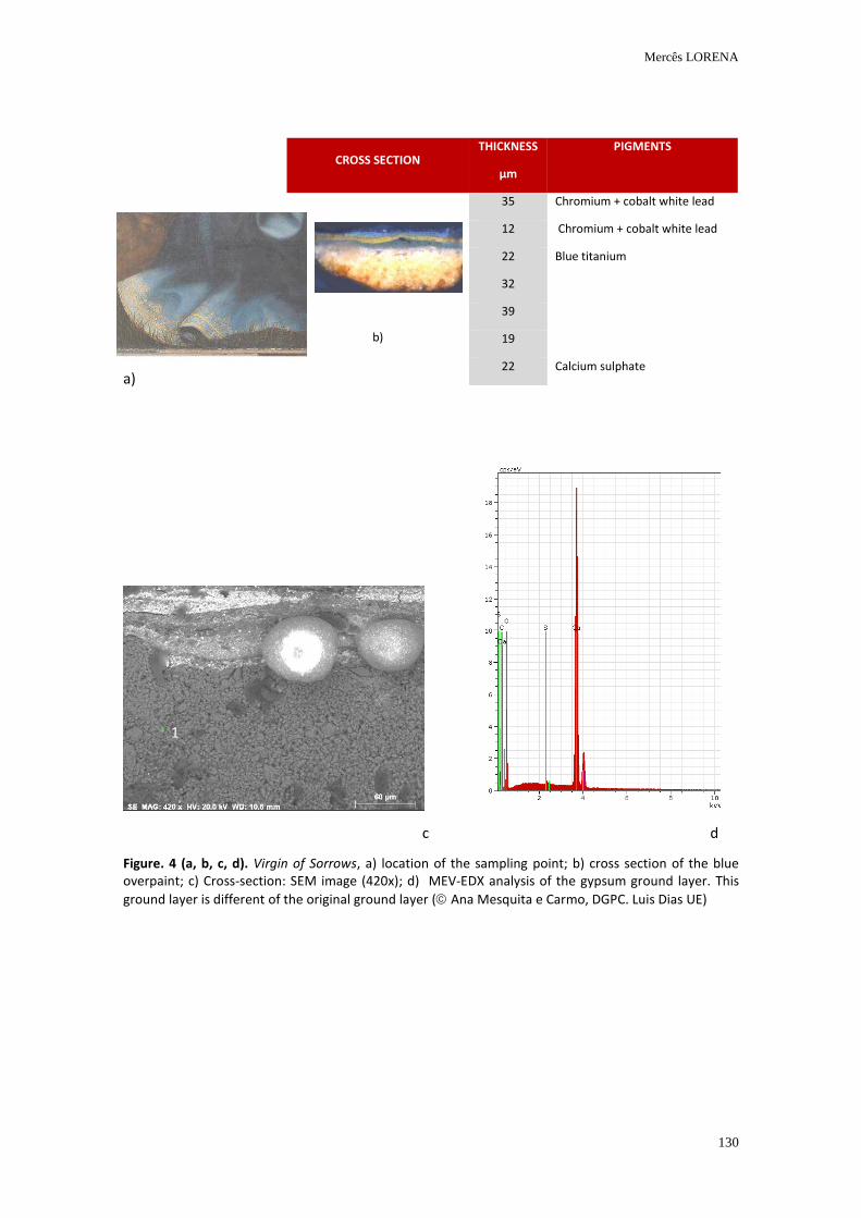
Mercês LORENA
130
a)
c d
Figure. 4 (a, b, c, d). Virgin of Sorrows, a) location of the sampling point; b) cross section of the blue overpaint; c) Cross-section: SEM image (420x); d) MEV-EDX analysis of the gypsum ground layer. This
ground layer is different of the original ground layer ( Ana Mesquita e Carmo, DGPC. Luis Dias UE)
CROSS SECTION THICKNESS
µm
PIGMENTS
b)
35 Chromium + cobalt white lead
12 Chromium + cobalt white lead
22 Blue titanium
32
39
19
22 Calcium sulphate
1
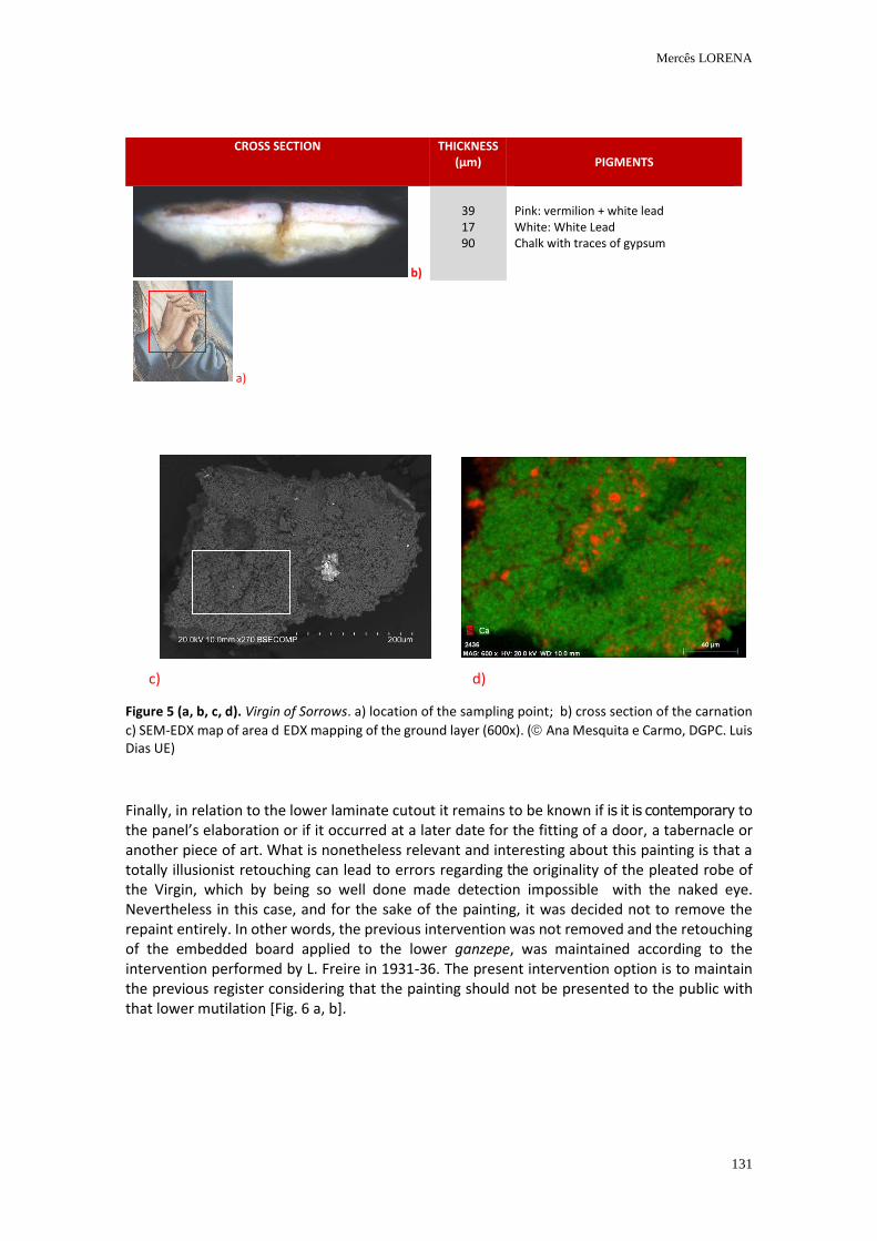
Mercês LORENA
131
Figure 5 (a, b, c, d). Virgin of Sorrows. a) location of the sampling point; b) cross section of the carnation
c) SEM-EDX map of area d EDX mapping of the ground layer (600x). ( Ana Mesquita e Carmo, DGPC. Luis Dias UE)
Finally, in relation to the lower laminate cutout it remains to be known if is it is contemporary to the panel’s elaboration or if it occurred at a later date for the fitting of a door, a tabernacle or another piece of art. What is nonetheless relevant and interesting about this painting is that a totally illusionist retouching can lead to errors regarding the originality of the pleated robe of the Virgin, which by being so well done made detection impossible with the naked eye. Nevertheless in this case, and for the sake of the painting, it was decided not to remove the repaint entirely. In other words, the previous intervention was not removed and the retouching of the embedded board applied to the lower ganzepe, was maintained according to the intervention performed by L. Freire in 1931-36. The present intervention option is to maintain the previous register considering that the painting should not be presented to the public with that lower mutilation [Fig. 6 a, b].
CROSS SECTION THICKNESS (µm)
PIGMENTS
b)
39 17 90
Pink: vermilion + white lead White: White Lead Chalk with traces of gypsum
a)
c) d)
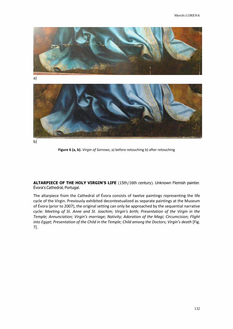
Mercês LORENA
132
a)
b)
Figure 6 (a, b). Virgin of Sorrows, a) before retouching b) after retouching
ALTARPIECE OF THE HOLY VIRGIN'S LIFE (15th/16th century). Unknown Flemish painter. Évora's Cathedral, Portugal.
The altarpiece from the Cathedral of Évora consists of twelve paintings representing the life cycle of the Virgin. Previously exhibited decontextualized as separate paintings at the Museum of Évora (prior to 2007), the original setting can only be approached by the sequential narrative cycle: Meeting of St. Anne and St. Joachim; Virgin’s birth; Presentation of the Virgin in the Temple; Annunciation; Virgin’s marriage; Nativity; Adoration of the Magi; Circumcision; Flight into Egypt; Presentation of the Child in the Temple; Child among the Doctors; Virgin’s death [Fig. 7].
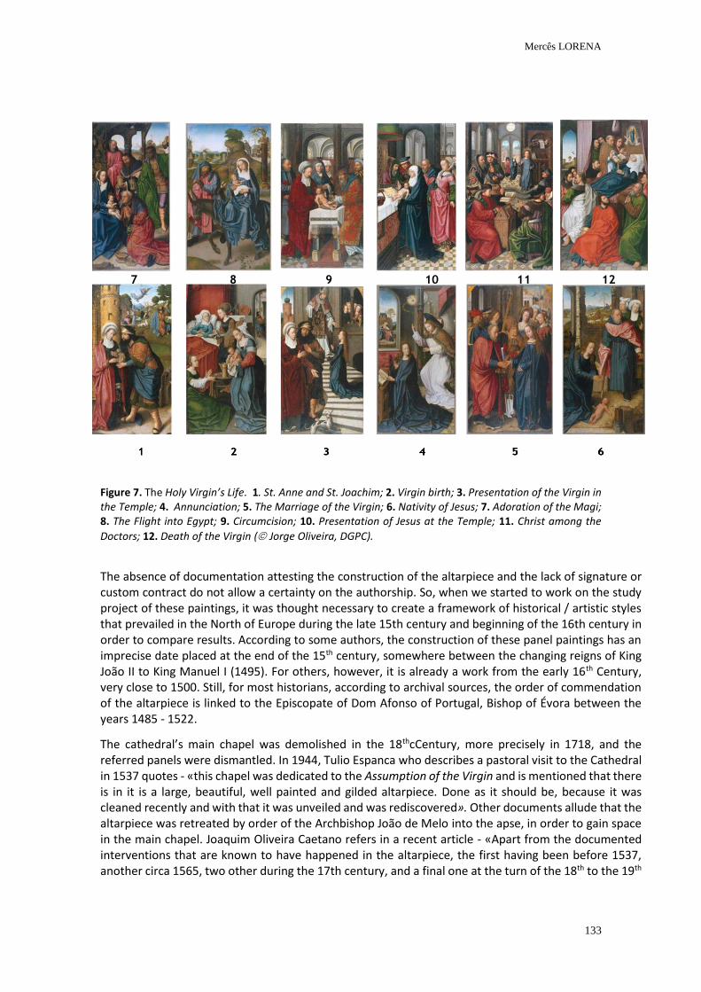
Mercês LORENA
133
Figure 7. The Holy Virgin’s Life. 1. St. Anne and St. Joachim; 2. Virgin birth; 3. Presentation of the Virgin in the Temple; 4. Annunciation; 5. The Marriage of the Virgin; 6. Nativity of Jesus; 7. Adoration of the Magi; 8. The Flight into Egypt; 9. Circumcision; 10. Presentation of Jesus at the Temple; 11. Christ among the
Doctors; 12. Death of the Virgin ( Jorge Oliveira, DGPC).
The absence of documentation attesting the construction of the altarpiece and the lack of signature or custom contract do not allow a certainty on the authorship. So, when we started to work on the study project of these paintings, it was thought necessary to create a framework of historical / artistic styles that prevailed in the North of Europe during the late 15th century and beginning of the 16th century in order to compare results. According to some authors, the construction of these panel paintings has an imprecise date placed at the end of the 15th century, somewhere between the changing reigns of King João II to King Manuel I (1495). For others, however, it is already a work from the early 16th Century, very close to 1500. Still, for most historians, according to archival sources, the order of commendation of the altarpiece is linked to the Episcopate of Dom Afonso of Portugal, Bishop of Évora between the years 1485 - 1522.
The cathedral’s main chapel was demolished in the 18thcCentury, more precisely in 1718, and the referred panels were dismantled. In 1944, Tulio Espanca who describes a pastoral visit to the Cathedral in 1537 quotes - «this chapel was dedicated to the Assumption of the Virgin and is mentioned that there is in it is a large, beautiful, well painted and gilded altarpiece. Done as it should be, because it was cleaned recently and with that it was unveiled and was rediscovered». Other documents allude that the altarpiece was retreated by order of the Archbishop João de Melo into the apse, in order to gain space in the main chapel. Joaquim Oliveira Caetano refers in a recent article - «Apart from the documented interventions that are known to have happened in the altarpiece, the first having been before 1537, another circa 1565, two other during the 17th century, and a final one at the turn of the 18th to the 19th
7 8 9 10 11 12
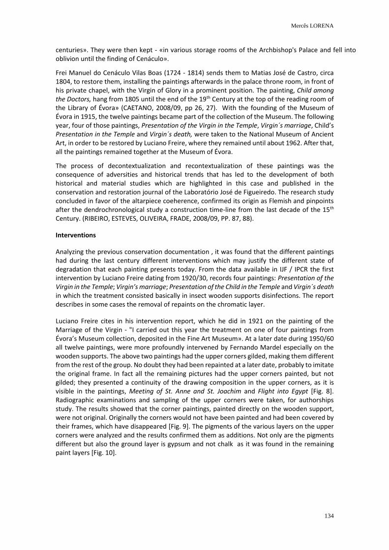
Mercês LORENA
134
centuries». They were then kept - «in various storage rooms of the Archbishop's Palace and fell into oblivion until the finding of Cenáculo».
Frei Manuel do Cenáculo Vilas Boas (1724 - 1814) sends them to Matias José de Castro, circa 1804, to restore them, installing the paintings afterwards in the palace throne room, in front of his private chapel, with the Virgin of Glory in a prominent position. The painting, Child among the Doctors, hang from 1805 until the end of the 19th Century at the top of the reading room of the Library of Évora» (CAETANO, 2008/09, pp 26, 27). With the founding of the Museum of Évora in 1915, the twelve paintings became part of the collection of the Museum. The following year, four of those paintings, Presentation of the Virgin in the Temple, Virgin´s marriage, Child’s Presentation in the Temple and Virgin´s death, were taken to the National Museum of Ancient Art, in order to be restored by Luciano Freire, where they remained until about 1962. After that, all the paintings remained together at the Museum of Évora.
The process of decontextualization and recontextualization of these paintings was the consequence of adversities and historical trends that has led to the development of both historical and material studies which are highlighted in this case and published in the conservation and restoration journal of the Laboratório José de Figueiredo. The research study concluded in favor of the altarpiece coeherence, confirmed its origin as Flemish and pinpoints after the dendrochronological study a construction time-line from the last decade of the 15th Century. (RIBEIRO, ESTEVES, OLIVEIRA, FRADE, 2008/09, PP. 87, 88).
Interventions
Analyzing the previous conservation documentation , it was found that the different paintings had during the last century different interventions which may justify the different state of degradation that each painting presents today. From the data available in IJF / IPCR the first intervention by Luciano Freire dating from 1920/30, records four paintings: Presentation of the Virgin in the Temple; Virgin’s marriage; Presentation of the Child in the Temple and Virgin´s death in which the treatment consisted basically in insect wooden supports disinfections. The report describes in some cases the removal of repaints on the chromatic layer.
Luciano Freire cites in his intervention report, which he did in 1921 on the painting of the Marriage of the Virgin - "I carried out this year the treatment on one of four paintings from Évora’s Museum collection, deposited in the Fine Art Museum». At a later date during 1950/60 all twelve paintings, were more profoundly intervened by Fernando Mardel especially on the wooden supports. The above two paintings had the upper corners gilded, making them different from the rest of the group. No doubt they had been repainted at a later date, probably to imitate the original frame. In fact all the remaining pictures had the upper corners painted, but not gilded; they presented a continuity of the drawing composition in the upper corners, as it is visible in the paintings, Meeting of St. Anne and St. Joachim and Flight into Egypt [Fig. 8]. Radiographic examinations and sampling of the upper corners were taken, for authorships study. The results showed that the corner paintings, painted directly on the wooden support, were not original. Originally the corners would not have been painted and had been covered by their frames, which have disappeared [Fig. 9]. The pigments of the various layers on the upper corners were analyzed and the results confirmed them as additions. Not only are the pigments different but also the ground layer is gypsum and not chalk as it was found in the remaining paint layers [Fig. 10].
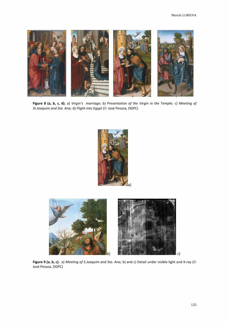
Mercês LORENA
135
a) b) c) d)
Figure 8 (a, b, c, d). a) Virgin’s marriage; b) Presentation of the Virgin in the Temple; c) Meeting of
St.Joaquim and Sta. Ana; d) Flight into Egypt ( José Pessoa, DGPC)
a)
b) c)
Figure 9 (a, b, c). a) Meeting of S.Joaquim and Sta. Ana; b) and c) Detail under visible light and X-ray ( José Pessoa, DGPC)
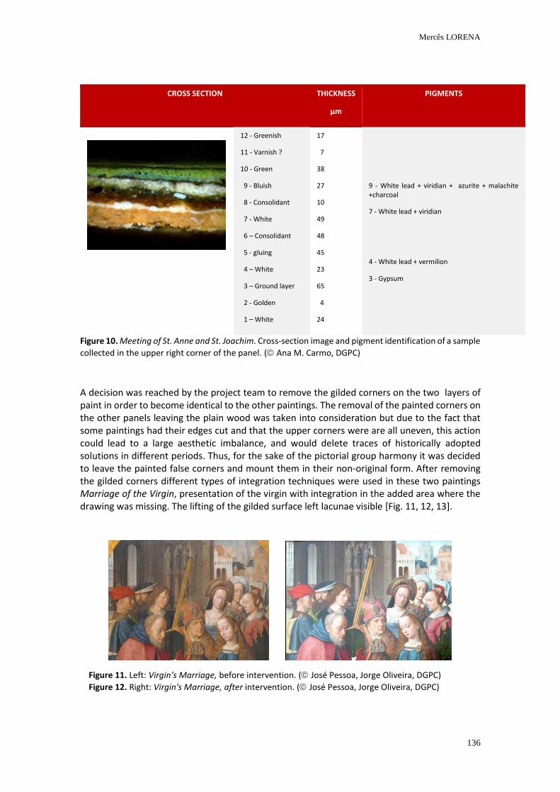
Mercês LORENA
136
CROSS SECTION THICKNESS
µm
PIGMENTS
12 - Greenish
11 - Varnish ?
10 - Green
9 - Bluish
8 - Consolidant
7 - White
6 – Consolidant
5 - gluing
4 – White
3 – Ground layer
2 - Golden
1 – White
17
7
38
27
10
49
48
45
23
65
4
24
9 - White lead + viridian + azurite + malachite +charcoal
7 - White lead + viridian
4 - White lead + vermilion
3 - Gypsum
Figure 10. Meeting of St. Anne and St. Joachim. Cross-section image and pigment identification of a sample
collected in the upper right corner of the panel. ( Ana M. Carmo, DGPC)
A decision was reached by the project team to remove the gilded corners on the two layers of paint in order to become identical to the other paintings. The removal of the painted corners on the other panels leaving the plain wood was taken into consideration but due to the fact that some paintings had their edges cut and that the upper corners were are all uneven, this action could lead to a large aesthetic imbalance, and would delete traces of historically adopted solutions in different periods. Thus, for the sake of the pictorial group harmony it was decided to leave the painted false corners and mount them in their non-original form. After removing the gilded corners different types of integration techniques were used in these two paintings Marriage of the Virgin, presentation of the virgin with integration in the added area where the drawing was missing. The lifting of the gilded surface left lacunae visible [Fig. 11, 12, 13].
Figure 11. Left: Virgin's Marriage, before intervention. ( José Pessoa, Jorge Oliveira, DGPC)
Figure 12. Right: Virgin's Marriage, after intervention. ( José Pessoa, Jorge Oliveira, DGPC)
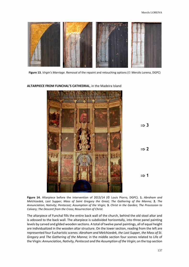
Mercês LORENA
137
Figure 13. Virgin's Marriage. Removal of the repaint and retouching options ( Mercês Lorena, DGPC)
ALTARPIECE FROM FUNCHAL’S CATHEDRAL, in the Madeira Island
Figure 14. Altarpiece before the intervention of 2013/14 (© Louis Piorro, DGPC). 1. Abraham and Melchizedek, Last Supper; Mass of Saint Gregory the Great; The Gathering of the Manna; 2. The Annunciation; Nativity; Pentecost; Assumption of the Virgin; 3. Christ in the Garden; The Procession to Calvary; The Descent from the Cross; Resurrection of Christ.
The altarpiece of Funchal fills the entire back wall of the church, behind the old stool altar and is adossed to the back wall. The altarpiece is subdivided horizontally, into three panel painting levels by carved and gilded wooden sections. A total of twelve panel paintings, all of equal height are individualized in the wooden altar structure. On the lower section, reading from the left are represented four Eucharistic scenes: Abraham and Melchizedek, the Last Supper, the Mass of St. Gregory and The Gathering of the Manna; in the middle section four scenes related to Life of the Virgin: Annunciation, Nativity, Pentecost and the Assumption of the Virgin; on the top section
3
2
1
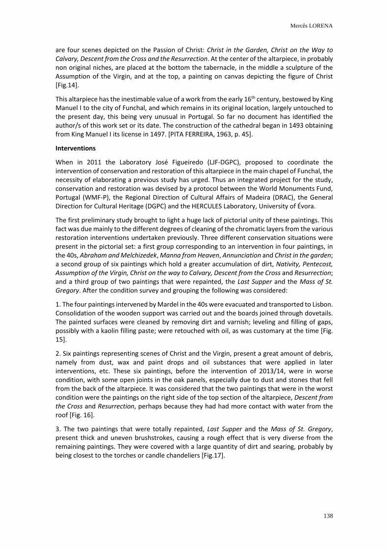
Mercês LORENA
138
are four scenes depicted on the Passion of Christ: Christ in the Garden, Christ on the Way to Calvary, Descent from the Cross and the Resurrection. At the center of the altarpiece, in probably non original niches, are placed at the bottom the tabernacle, in the middle a sculpture of the Assumption of the Virgin, and at the top, a painting on canvas depicting the figure of Christ [Fig.14].
This altarpiece has the inestimable value of a work from the early 16th century, bestowed by King Manuel I to the city of Funchal, and which remains in its original location, largely untouched to the present day, this being very unusual in Portugal. So far no document has identified the author/s of this work set or its date. The construction of the cathedral began in 1493 obtaining from King Manuel I its license in 1497. [PITA FERREIRA, 1963, p. 45].
Interventions
When in 2011 the Laboratory José Figueiredo (LJF-DGPC), proposed to coordinate the intervention of conservation and restoration of this altarpiece in the main chapel of Funchal, the necessity of elaborating a previous study has urged. Thus an integrated project for the study, conservation and restoration was devised by a protocol between the World Monuments Fund, Portugal (WMF-P), the Regional Direction of Cultural Affairs of Madeira (DRAC), the General Direction for Cultural Heritage (DGPC) and the HERCULES Laboratory, University of Évora.
The first preliminary study brought to light a huge lack of pictorial unity of these paintings. This fact was due mainly to the different degrees of cleaning of the chromatic layers from the various restoration interventions undertaken previously. Three different conservation situations were present in the pictorial set: a first group corresponding to an intervention in four paintings, in the 40s, Abraham and Melchizedek, Manna from Heaven, Annunciation and Christ in the garden; a second group of six paintings which hold a greater accumulation of dirt, Nativity, Pentecost, Assumption of the Virgin, Christ on the way to Calvary, Descent from the Cross and Resurrection; and a third group of two paintings that were repainted, the Last Supper and the Mass of St. Gregory. After the condition survey and grouping the following was considered:
1. The four paintings intervened by Mardel in the 40s were evacuated and transported to Lisbon. Consolidation of the wooden support was carried out and the boards joined through dovetails. The painted surfaces were cleaned by removing dirt and varnish; leveling and filling of gaps, possibly with a kaolin filling paste; were retouched with oil, as was customary at the time [Fig. 15].
2. Six paintings representing scenes of Christ and the Virgin, present a great amount of debris, namely from dust, wax and paint drops and oil substances that were applied in later interventions, etc. These six paintings, before the intervention of 2013/14, were in worse condition, with some open joints in the oak panels, especially due to dust and stones that fell from the back of the altarpiece. It was considered that the two paintings that were in the worst condition were the paintings on the right side of the top section of the altarpiece, Descent from the Cross and Resurrection, perhaps because they had had more contact with water from the roof [Fig. 16].
3. The two paintings that were totally repainted, Last Supper and the Mass of St. Gregory, present thick and uneven brushstrokes, causing a rough effect that is very diverse from the remaining paintings. They were covered with a large quantity of dirt and searing, probably by being closest to the torches or candle chandeliers [Fig.17].
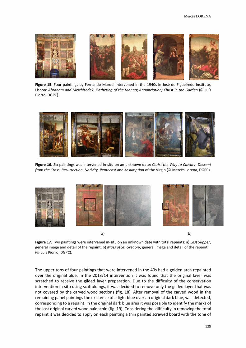
Mercês LORENA
139
Figure 15. Four paintings by Fernando Mardel intervened in the 1940s in José de Figueiredo Institute,
Lisbon: Abraham and Melchizedek; Gathering of the Manna; Annunciation; Christ in the Garden ( Luís Piorro, DGPC).
Figure 16. Six paintings was intervened in-situ on an unknown date: Christ the Way to Calvary, Descent
from the Cross, Resurrection, Nativity, Pentecost and Assumption of the Virgin ( Mercês Lorena, DGPC).
a) b)
Figure 17. Two paintings were intervened in-situ on an unknown date with total repaints: a) Last Supper, general image and detail of the repaint; b) Mass of St. Gregory, general image and detail of the repaint
( Luís Piorro, DGPC).
The upper tops of four paintings that were intervened in the 40s had a golden arch repainted over the original blue. In the 2013/14 intervention it was found that the original layer was scratched to receive the gilded layer preparation. Due to the difficulty of the conservation intervention in-situ using scaffoldings, it was decided to remove only the gilded layer that was not covered by the carved wood sections (fig. 18). After removal of the carved wood in the remaining panel paintings the existence of a light blue over an original dark blue, was detected, corresponding to a repaint. In the original dark blue area it was possible to identify the marks of the lost original carved wood baldachin (fig. 19). Considering the difficulty in removing the total repaint it was decided to apply on each painting a thin painted screwed board with the tone of
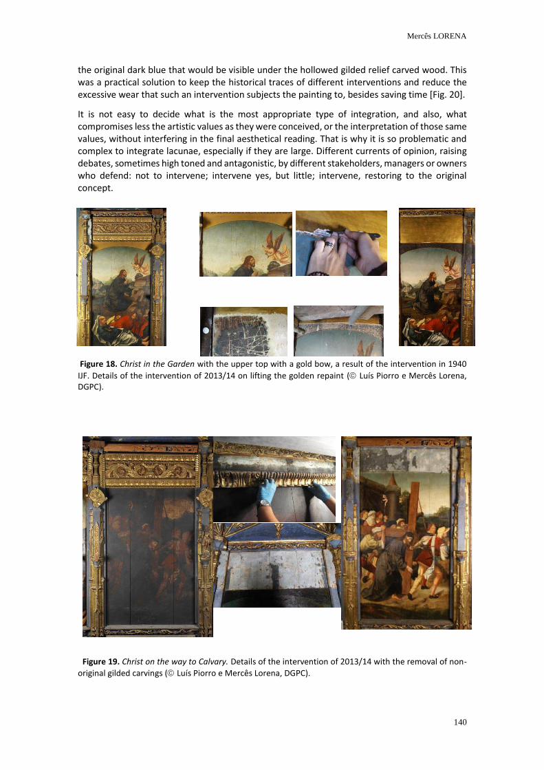
Mercês LORENA
140
the original dark blue that would be visible under the hollowed gilded relief carved wood. This was a practical solution to keep the historical traces of different interventions and reduce the excessive wear that such an intervention subjects the painting to, besides saving time [Fig. 20].
It is not easy to decide what is the most appropriate type of integration, and also, what compromises less the artistic values as they were conceived, or the interpretation of those same values, without interfering in the final aesthetical reading. That is why it is so problematic and complex to integrate lacunae, especially if they are large. Different currents of opinion, raising debates, sometimes high toned and antagonistic, by different stakeholders, managers or owners who defend: not to intervene; intervene yes, but little; intervene, restoring to the original concept.
Figure 18. Christ in the Garden with the upper top with a gold bow, a result of the intervention in 1940
IJF. Details of the intervention of 2013/14 on lifting the golden repaint ( Luís Piorro e Mercês Lorena, DGPC).
Figure 19. Christ on the way to Calvary. Details of the intervention of 2013/14 with the removal of non-
original gilded carvings ( Luís Piorro e Mercês Lorena, DGPC).
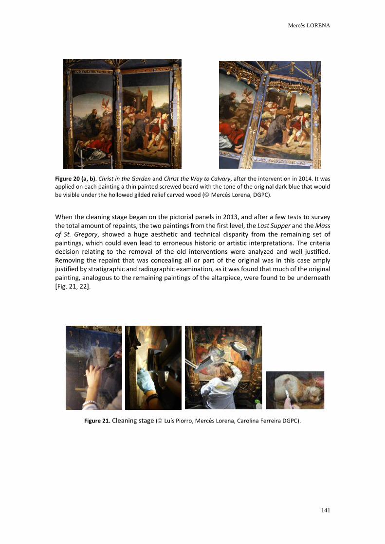
Mercês LORENA
141
Figure 20 (a, b). Christ in the Garden and Christ the Way to Calvary, after the intervention in 2014. It was applied on each painting a thin painted screwed board with the tone of the original dark blue that would
be visible under the hollowed gilded relief carved wood ( Mercês Lorena, DGPC).
When the cleaning stage began on the pictorial panels in 2013, and after a few tests to survey the total amount of repaints, the two paintings from the first level, the Last Supper and the Mass of St. Gregory, showed a huge aesthetic and technical disparity from the remaining set of paintings, which could even lead to erroneous historic or artistic interpretations. The criteria decision relating to the removal of the old interventions were analyzed and well justified. Removing the repaint that was concealing all or part of the original was in this case amply justified by stratigraphic and radiographic examination, as it was found that much of the original painting, analogous to the remaining paintings of the altarpiece, were found to be underneath [Fig. 21, 22].
Figure 21. Cleaning stage ( Luís Piorro, Mercês Lorena, Carolina Ferreira DGPC).
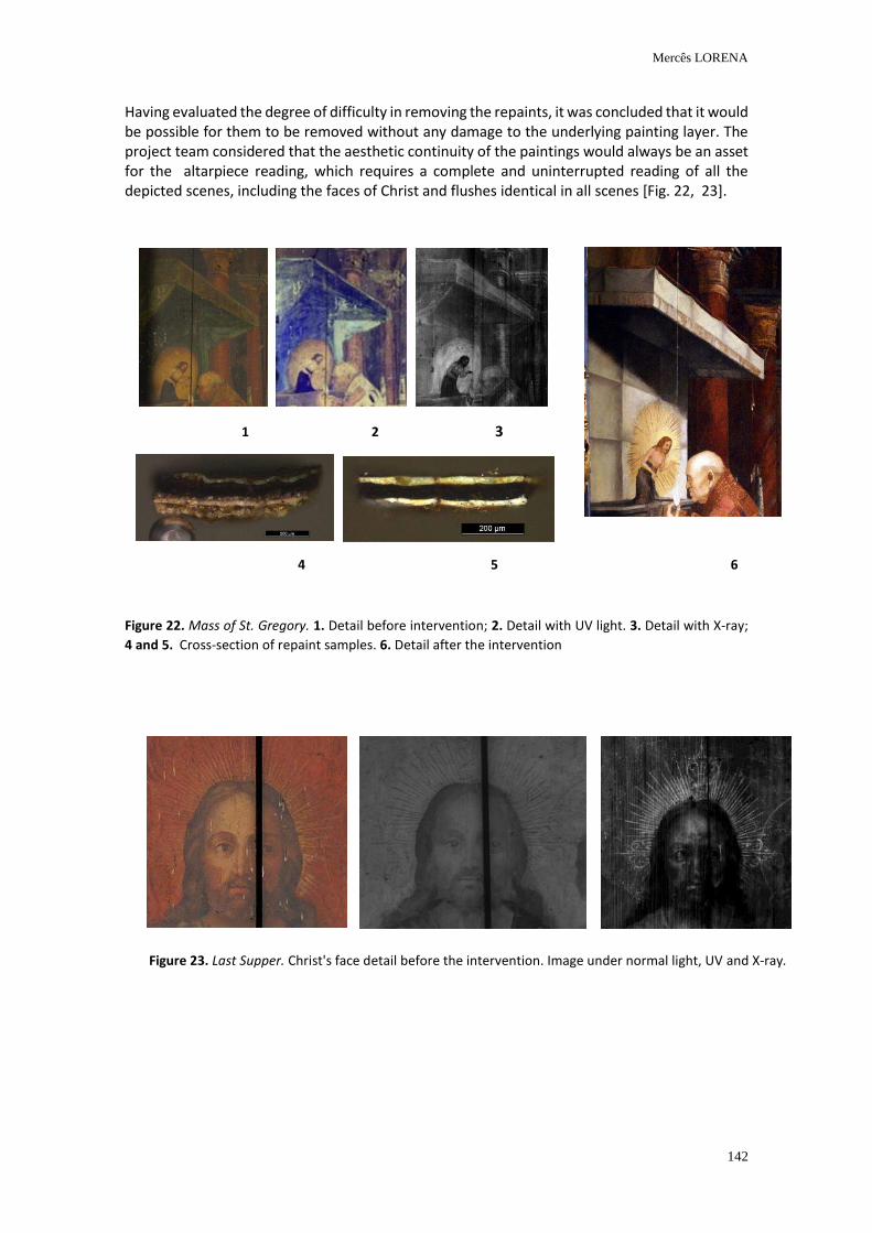
Mercês LORENA
142
Having evaluated the degree of difficulty in removing the repaints, it was concluded that it would be possible for them to be removed without any damage to the underlying painting layer. The project team considered that the aesthetic continuity of the paintings would always be an asset for the altarpiece reading, which requires a complete and uninterrupted reading of all the depicted scenes, including the faces of Christ and flushes identical in all scenes [Fig. 22, 23].
Figure 22. Mass of St. Gregory. 1. Detail before intervention; 2. Detail with UV light. 3. Detail with X-ray;
4 and 5. Cross-section of repaint samples. 6. Detail after the intervention
Figure 23. Last Supper. Christ's face detail before the intervention. Image under normal light, UV and X-ray.
1 2 3
4 5 6
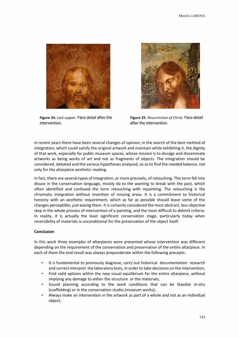
Mercês LORENA
143
In recent years there have been several changes of opinion, in the search of the best method of integration, which could satisfy the original artwork and maintain while exhibiting it, the dignity of that work, especially for public museum spaces, whose mission is to divulge and disseminate artworks as being works of art and not as fragments of objects. The integration should be considered, debated and the various hypotheses analyzed, so as to find the needed balance, not only for the altarpiece aesthetic reading.
In fact, there are several types of integration, or more precisely, of retouching. This term fell into disuse in the conservation language, mostly do to the wanting to break with the past, which often identified and confused the term retouching with repainting. The retouching is the chromatic integration without invention of missing areas. It is a commitment to historical honesty with an aesthetic requirement, which as far as possible should leave some of the changes perceptible, just easing them. It is certainly considered the most abstract, less objective step in the whole process of intervention of a painting, and the most difficult to delimit criteria. In reality, it is actually the least significant conservation stage, particularly today when reversibility of materials is unconditional for the preservation of the object itself.
Conclusion
In this work three examples of altarpieces were presented whose intervention was different depending on the requirement of the conservation and preservation of the entire altarpiece. In each of them the end result was always preponderate within the following precepts:
• It is fundamental to previously diagnose, carry out historical documentation research and correct interpret the laboratory tests, in order to take decisions on the intervention;
• Find valid options within the new visual equilibrium for the entire altarpiece, without implying any damage to either the structure or the materials;
• Sound planning according to the work conditions that can be feasible in-situ (scaffolding) or in the conservation studio (museum works);
• Always make an intervention in the artwork as part of a whole and not as an individual object;
Figure 24. Last supper. Face detail after the
intervention.
Figure 25. Resurrection of Christ. Face detail
after the intervention.
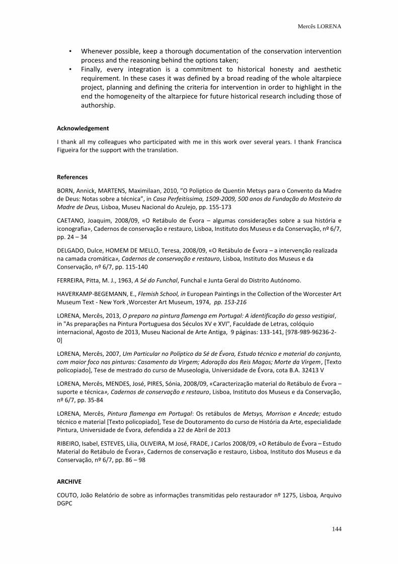
Mercês LORENA
144
• Whenever possible, keep a thorough documentation of the conservation intervention process and the reasoning behind the options taken;
• Finally, every integration is a commitment to historical honesty and aesthetic requirement. In these cases it was defined by a broad reading of the whole altarpiece project, planning and defining the criteria for intervention in order to highlight in the end the homogeneity of the altarpiece for future historical research including those of authorship.
Acknowledgement
I thank all my colleagues who participated with me in this work over several years. I thank Francisca Figueira for the support with the translation.
References
BORN, Annick, MARTENS, Maximilaan, 2010, ”O Poliptico de Quentin Metsys para o Convento da Madre de Deus: Notas sobre a técnica”, in Casa Perfeitíssima, 1509-2009, 500 anos da Fundação do Mosteiro da Madre de Deus, Lisboa, Museu Nacional do Azulejo, pp. 155-173
CAETANO, Joaquim, 2008/09, «O Retábulo de Évora – algumas considerações sobre a sua história e iconografia», Cadernos de conservação e restauro, Lisboa, Instituto dos Museus e da Conservação, nº 6/7, pp. 24 – 34
DELGADO, Dulce, HOMEM DE MELLO, Teresa, 2008/09, «O Retábulo de Évora – a intervenção realizada na camada cromática», Cadernos de conservação e restauro, Lisboa, Instituto dos Museus e da Conservação, nº 6/7, pp. 115-140
FERREIRA, Pitta, M. J., 1963, A Sé do Funchal, Funchal e Junta Geral do Distrito Autónomo.
HAVERKAMP-BEGEMANN, E., Flemish School, in European Paintings in the Collection of the Worcester Art Museum Text - New York ,Worcester Art Museum, 1974, pp. 153-216
LORENA, Mercês, 2013, O preparo na pintura flamenga em Portugal: A identificação do gesso vestigial, in "As preparações na Pintura Portuguesa dos Séculos XV e XVI", Faculdade de Letras, colóquio internacional, Agosto de 2013, Museu Nacional de Arte Antiga, 9 páginas: 133-141, [978-989-96236-2-0]
LORENA, Mercês, 2007, Um Particular no Políptico da Sé de Évora, Estudo técnico e material do conjunto, com maior foco nas pinturas: Casamento da Virgem; Adoração dos Reis Magos; Morte da Virgem, [Texto policopiado], Tese de mestrado do curso de Museologia, Universidade de Évora, cota B.A. 32413 V
LORENA, Mercês, MENDES, José, PIRES, Sónia, 2008/09, «Caracterização material do Retábulo de Évora – suporte e técnica», Cadernos de conservação e restauro, Lisboa, Instituto dos Museus e da Conservação, nº 6/7, pp. 35-84
LORENA, Mercês, Pintura flamenga em Portugal: Os retábulos de Metsys, Morrison e Ancede; estudo técnico e material [Texto policopiado], Tese de Doutoramento do curso de História da Arte, especialidade Pintura, Universidade de Évora, defendida a 22 de Abril de 2013
RIBEIRO, Isabel, ESTEVES, Lilia, OLIVEIRA, M José, FRADE, J Carlos 2008/09, «O Retábulo de Évora – Estudo Material do Retábulo de Évora», Cadernos de conservação e restauro, Lisboa, Instituto dos Museus e da Conservação, nº 6/7, pp. 86 – 98
ARCHIVE
COUTO, João Relatório de sobre as informações transmitidas pelo restaurador nº 1275, Lisboa, Arquivo DGPC
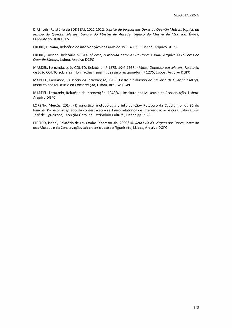
Mercês LORENA
145
DIAS, Luís, Relatório de EDS-SEM, 1011-1012, tríptico da Virgem das Dores de Quentin Metsys, tríptico da Paixão de Quentin Metsys, tríptico do Mestre de Ancede, tríptico do Mestre de Morrison, Évora, Laboratório HERCULES
FREIRE, Luciano, Relatório de intervenções nos anos de 1911 a 1933, Lisboa, Arquivo DGPC
FREIRE, Luciano, Relatório nº 314, s/ data, o Menino entre os Doutores Lisboa, Arquivo DGPC ores de Quentin Metsys, Lisboa, Arquivo DGPC
MARDEL, Fernando, João COUTO, Relatório nº 1275, 10-4-1937, - Mater Dolorosa por Metsys, Relatório de João COUTO sobre as informações transmitidas pelo restaurador nº 1275, Lisboa, Arquivo DGPC
MARDEL, Fernando, Relatório de intervenção, 1937, Cristo a Caminho do Calvário de Quentin Metsys, Instituto dos Museus e da Conservação, Lisboa, Arquivo DGPC
MARDEL, Fernando, Relatório de intervenção, 1940/41, Instituto dos Museus e da Conservação, Lisboa, Arquivo DGPC
LORENA, Mercês, 2014, «Diagnóstico, metodologia e intervenção» Retábulo da Capela-mor da Sé do Funchal Projecto integrado de conservação e restauro relatórios de intervenção – pintura, Laboratório José de Figueiredo, Direcção Geral do Património Cultural, Lisboa pp. 7-26
RIBEIRO, Isabel, Relatório de resultados laboratoriais, 2009/10, Retábulo da Virgem das Dores, Instituto dos Museus e da Conservação, Laboratório José de Figueiredo, Lisboa, Arquivo DGPC
The convergence of graphic sources in the pictorial
producon of Francisco Ribalta in Valencia
and Gregorio Vásquez de Arce y Ceballos in Bogotá
Natalia MEJÍA MURILLOand
Vicent GUEROLA BLAY
2nd International Meeting on Retouching of Cultural Heritage RECH2
Porto, Portugal | 24-25 October 2014 _____________________________________________________________________
147
The convergence of graphic sources in the pictorial production of Francisco Ribalta in Valencia and Gregorio Vásquez de Arce y Ceballos in Bogotá
Natalia MEJÍA MURILLO1*, Vicente GUEROLA BLAY*
1 Polytechnic University of Valencia, 46022, Valencia, Spain.
* [email protected] * [email protected]
ABSTRACT
The use of graphic sources as a formal mechanism for imaging is a topic that was widely applied in the pictorial production of the 16th and 17th century. The use of engravings, which was a common practice in European painting, in America became a necessity due to the absence of teachers in painting, forcing the Colonial artists to guess the right approach based on the tools they had at their disposal. The availability of European graphic sources established itself as a direct and decisive influence on the formation of painters.
From this perspective, similar representations were identified in the paintings of Gregorio Vásquez de Arce y Ceballos, one of the most prominent colonial painters in Colombia and Francisco Ribalta, an influential Spanish baroque painter. Both of these artist used the same model horse and soldiers found on Flemish and Italian engravings for the composition of their paintings entitled “Santiago en la batalla del Clavijo”.
The research aims to emphasize the importance of a chromatic reintegration based on valid sources that allows a respectful restoration of the original, and therefore misinterpretation affecting the correct reading of the paintings are avoided and thus the message that were conceived. For this reason the location of these prints are an important contribution, not only documentary and historical, but also as a tool for the restorer that would be able to use the same sources that have served as models for painters.
Keywords: European engravings, colonial painters, chromatic reintegration, Gregorio Vásquez, Santiago en la batalla de Clavijo.
Natalia MEJÍA MURILLO and Vicente GUEROLA BLAY
148
Introduction The study between formal relationships and the influences of engravings in the pictorial production of the 16th and 17th century in Europe and America has been an issue addressed in historiographical research, that allowed to obtain information about the use of graphic sources as formal mechanism for imaging. The technical possibilities offered by printed reproduction sources, played an important part in the reproduction and dissemination of ideas used on Counter-Reformation images. The spreading of these prints, mainly religious themes, through engravings, proved to be a formidable tool for artists. They were than able to found a visual repertoire that could be used for the making of their paintings, either by using fragments extracted from figures that compose the image or by direct copy of the whole picture. With the Conquest, engravings came also to America and became a useful tool to evangelize, educate and illustrate about faith dogmas as it had been previously in Europe. The wide diffusion of printed images in the New World, established itself as a direct and decisive influence on the formation of American artists that would find in graphic sources a formidable way to mitigate the lack of tools and knowledge necessary for the practice of painting. Thus, the copy of engravings, which was a common practice in European painting, in America became a necessity due to the absence of workshops, painting teachers and models for the drawing exercise. From that perspective, similar representations were identified in the paintings of Gregorio Vásquez de Arce y Ceballos in Colombia and Francisco Ribalta in Spain, for the composition of their images of “Santiago en la batalla de Clavijo”. These paintings are located in the Cathedral of Bogotá, Colombia and in the Church of St. James in Algemesí, Spain. Thus, the importance of the research is to acknowledge how these artists, that developed their artistic practice in completely different contexts, used the same model horse and some soldiers extracted from Flemish and Italian engravings to create these Jacobean themed compositions. Therefore, the identification of pictures that have served as models for painters, provide knowledge of the working methods of the artist and reveal how through these methods, the artist developed their own painting style. The role that engravings play in the creative process is essential, since the same image in the hands of different artists, would develop its own language, which certainly will be determined by the personal interests and context in which painters improve their artistic practice. Under this aspect, the graphic sources play a decisive role in the study of artistic processes in the field of restoration, as offering a compositional approach of the paintings. The use of engravings provide a useful tool for the restorer that would be able to employ the same sources that have served as models for painters and could be applied to solve processes of retouching in paintings.
Use of engravings as a tool for imaging
The study of the use of graphic sources as a formal mechanism for imaging is an issue that has been address from recent times, as stated Benito Navarrete Prieto (Prieto, 1998), author of one of the most recent studies of the subject; his work contributes to the understanding of the methods of Andalusian painters of the 16th century.
Natalia MEJÍA MURILLO and Vicente GUEROLA BLAY
149
Historically, artists have used visual codes to give plastic reality to concepts or ideas, through the search of graphic references that contribute to the creation process. Consciously or not, painters used for their own work images seen in reality, from imagination or works from other artists who preceded them. However, the engravings were not only used by modest local painters or minor and marginal artistic circles which found in printing sources an immediate solution for their decline in creativity through copying foreign models (Prieto, 1998). Some authors that have studied in detail the production of the most renowned painters, have warned the contributions of engravings in their artistic works. This modus operandi on visual elements outside of their own invention has been a common mechanism of creation even by the most prominent painters, those who have been considered as true creators of images, such as Michelangelo, Raphael, Tintoretto and Rubens. These artists have used the legacy of others and cannot be understood without references that supplied models and inspirations (Prieto, 1998). Specifically, in the Spanish Baroque painting, renowned masters such as Zurbarán, Velázquez, Murillo and Cano also used graphic sources for the configuration of their paintings. In this process of “image invention", the printing models provided a visual richness that was widely used by artists. This method even became an essential tool for the "craft recreation" of a composition, serving as easy source for those without creative impulse. Thanks to recent studies on the influence of engravings in the Spanish painting of the 16th and 17th century, it has been demonstrated that the movement of Germanic and Flemish prints of the 16th century in Europe and particularly in the Peninsula was very active, even penetrating in the most isolated circles of artists. The impact that had certain images such as the Rubens and Durer works among others -, is largely due to the powerful expressive force with which they were conceived and also for the iconographic load containing. This aspect was decisive for some works and were mostly repeated and instituted as icons in the painting production. While there are full compositions that maintained an important role in the choice of the artists to respond to an iconographic instance, there were also employed in a fragmented way, i.e., extracting the figures that compose it for reuse in a new context, immersed in other meanings and with a distinct character to the original image. This way of composing by "collage", which merge into the same image printed fragments from different graphic sources, manifests the extraordinary inventiveness with which some artists create their own compositions. Particularly it enhances the skill and ingenuity in the search of patterns of models. Indeed, the use of fragments for composing is the most recurrent method in the works of Gregorio Vasquez and Francisco Ribalta and from which, arises the study on the correlation of models in their process of creating image.
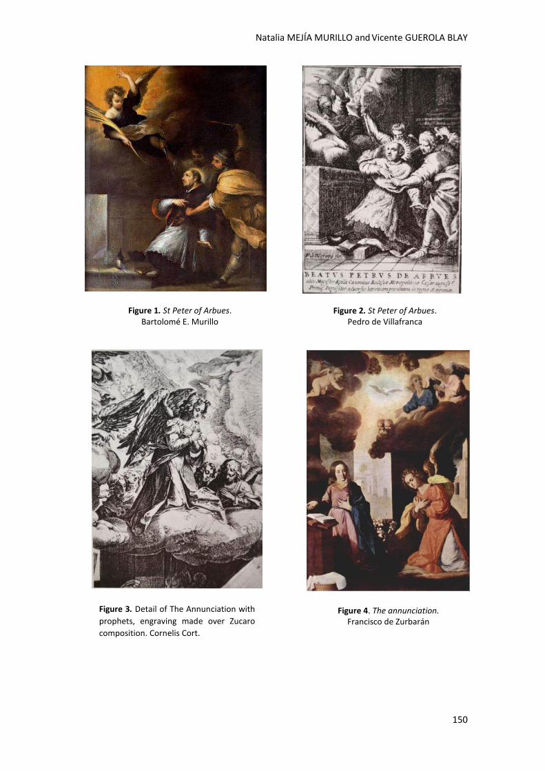
Natalia MEJÍA MURILLO and Vicente GUEROLA BLAY
150
Figure 3. Detail of The Annunciation with
prophets, engraving made over Zucaro
composition. Cornelis Cort.
Figure 4. The annunciation. Francisco de Zurbarán
Figure 2. St Peter of Arbues. Pedro de Villafranca
Figure 1. St Peter of Arbues. Bartolomé E. Murillo
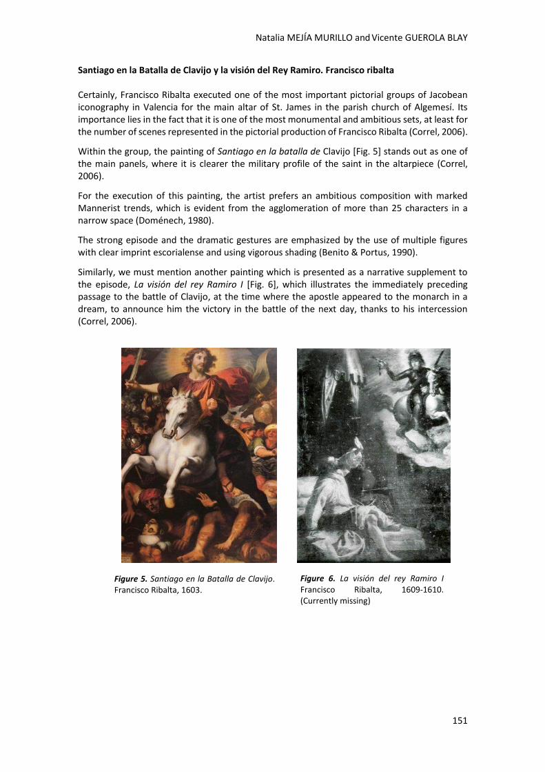
Natalia MEJÍA MURILLO and Vicente GUEROLA BLAY
151
Santiago en la Batalla de Clavijo y la visión del Rey Ramiro. Francisco ribalta Certainly, Francisco Ribalta executed one of the most important pictorial groups of Jacobean iconography in Valencia for the main altar of St. James in the parish church of Algemesí. Its importance lies in the fact that it is one of the most monumental and ambitious sets, at least for the number of scenes represented in the pictorial production of Francisco Ribalta (Correl, 2006).
Within the group, the painting of Santiago en la batalla de Clavijo [Fig. 5] stands out as one of the main panels, where it is clearer the military profile of the saint in the altarpiece (Correl, 2006).
For the execution of this painting, the artist prefers an ambitious composition with marked Mannerist trends, which is evident from the agglomeration of more than 25 characters in a narrow space (Doménech, 1980).
The strong episode and the dramatic gestures are emphasized by the use of multiple figures with clear imprint escorialense and using vigorous shading (Benito & Portus, 1990).
Similarly, we must mention another painting which is presented as a narrative supplement to the episode, La visión del rey Ramiro I [Fig. 6], which illustrates the immediately preceding passage to the battle of Clavijo, at the time where the apostle appeared to the monarch in a dream, to announce him the victory in the battle of the next day, thanks to his intercession (Correl, 2006).
Figure 5. Santiago en la Batalla de Clavijo. Francisco Ribalta, 1603.
Figure 6. La visión del rey Ramiro I Francisco Ribalta, 1609-1610. (Currently missing)
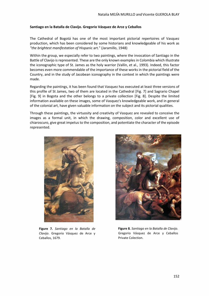
Natalia MEJÍA MURILLO and Vicente GUEROLA BLAY
152
Santiago en la Batalla de Clavijo. Gregorio Vásquez de Arce y Ceballos
The Cathedral of Bogotá has one of the most important pictorial repertoires of Vasquez production, which has been considered by some historians and knowledgeable of his work as "the brightest manifestation of Hispanic art." (Jaramillo, 1948)
Within the group, we especially refer to two paintings, where the invocation of Santiago in the Battle of Clavijo is represented. These are the only known examples in Colombia which illustrate the iconographic type of St. James as the holy warrior (Vallín, et al., 1993). Indeed, this factor becomes even more commendable of the importance of these works in the pictorial field of the Country, and in the study of Jacobean iconography in the context in which the paintings were made.
Regarding the paintings, it has been found that Vasquez has executed at least three versions of this profile of St James, two of them are located in the Cathedral [Fig. 7] and Sagrario Chapel [Fig. 9] in Bogota and the other belongs to a private collection [Fig. 8]. Despite the limited information available on these images, some of Vasquez's knowledgeable work, and in general of the colonial art, have given valuable information on the subject and its pictorial qualities.
Through these paintings, the virtuosity and creativity of Vasquez are revealed to conceive the images as a formal unit, in which the drawing, composition, color and excellent use of chiaroscuro, give great impetus to the composition, and potentiate the character of the episode represented.
Figure 8. Santiago en la Batalla de Clavijo.
Gregorio Vásquez de Arce y Ceballos
Private Colection.
Figure 7. Santiago en la Batalla de
Clavijo. Gregorio Vásquez de Arce y
Ceballos, 1679.

Natalia MEJÍA MURILLO and Vicente GUEROLA BLAY
153
The Stables of Don Juan of Austria and The Roman Caesars riding
After extensive observation of Vasquez and Ribalta paintings, and the subsequent comparative study of these with graphic sources, it has been possible to hypothesize that, in effect, these artists had in their visual repertoire some Flemish and Italian engravings in common, through which they extracted the model of the horse.
Thus, it is possible to propose that the engravings used by the painters are part of the series: "Roman Caesars riding" by the Italian Antonio Tempesta and the editing of pictures that illustrate the stables of Don Juan of Austria (Equile Ioannis austriaci Caroli V), executed by leading Flemish artists.
As a reference in common, it is important to note that these two sets of engravings depart from Stradanus designs (1523-1625), who also made pictures with scenes of battles that were widely disseminated (Prieto, 1998).
Thus, the location of these images was possible thanks to the contributions of Benito Navarrete, who postulated that "Tempesta and Stradanus are often used for issues or battles for equestrian figures ..." (Prieto, 1998).
Indeed, it is possible to pose that the artists had at their disposal an important visual repertoire which allowed them to take different sources models for the composition of Jacobean theme images.
Under this premise, the prints of Stradanus and Tempesta series could be used in the paintings of Vásquez and Ribalta in a fragmented way, mixing in a same image, and even in a same figure, different parts of several engravings.
Surely, it is possible to argue that the equine anatomy studies made by Stradanus and the representation of classic positions, reminiscent of sovereignty and greatness of Tempesta Caesars, may have been determining factors in the choice of these horses, as the most important iconographic attribute in the paintings of St James in the Battle of Clavijo.
Figure 9. Santiago en la Batalla de Clavijo. Gregorio Vásquez de Arce y Ceballos. Second half of the 17th century.
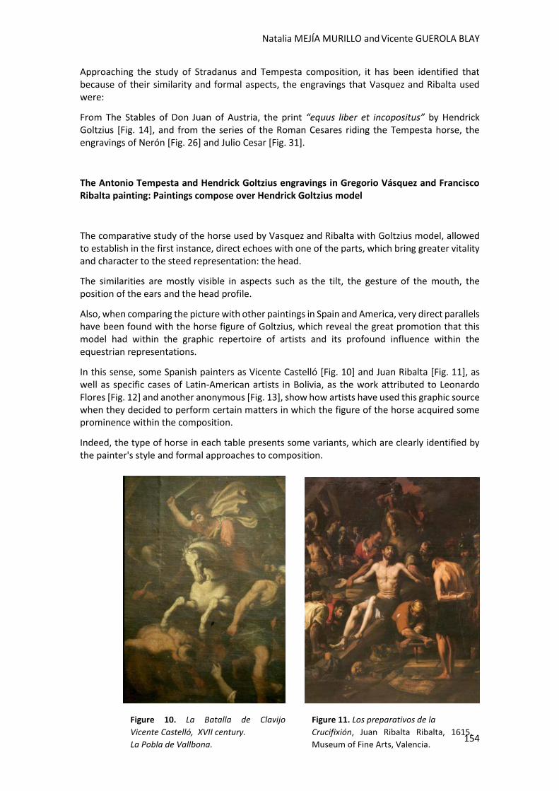
Natalia MEJÍA MURILLO and Vicente GUEROLA BLAY
154
Approaching the study of Stradanus and Tempesta composition, it has been identified that because of their similarity and formal aspects, the engravings that Vasquez and Ribalta used were:
From The Stables of Don Juan of Austria, the print “equus liber et incopositus” by Hendrick Goltzius [Fig. 14], and from the series of the Roman Cesares riding the Tempesta horse, the engravings of Nerón [Fig. 26] and Julio Cesar [Fig. 31].
The Antonio Tempesta and Hendrick Goltzius engravings in Gregorio Vásquez and Francisco Ribalta painting: Paintings compose over Hendrick Goltzius model
The comparative study of the horse used by Vasquez and Ribalta with Goltzius model, allowed to establish in the first instance, direct echoes with one of the parts, which bring greater vitality and character to the steed representation: the head.
The similarities are mostly visible in aspects such as the tilt, the gesture of the mouth, the position of the ears and the head profile.
Also, when comparing the picture with other paintings in Spain and America, very direct parallels have been found with the horse figure of Goltzius, which reveal the great promotion that this model had within the graphic repertoire of artists and its profound influence within the equestrian representations.
In this sense, some Spanish painters as Vicente Castelló [Fig. 10] and Juan Ribalta [Fig. 11], as well as specific cases of Latin-American artists in Bolivia, as the work attributed to Leonardo Flores [Fig. 12] and another anonymous [Fig. 13], show how artists have used this graphic source when they decided to perform certain matters in which the figure of the horse acquired some prominence within the composition.
Indeed, the type of horse in each table presents some variants, which are clearly identified by the painter's style and formal approaches to composition.
Figure 11. Los preparativos de la
Crucifixión, Juan Ribalta Ribalta, 1615.
Museum of Fine Arts, Valencia.
Figure 10. La Batalla de Clavijo
Vicente Castelló, XVII century.
La Pobla de Vallbona.
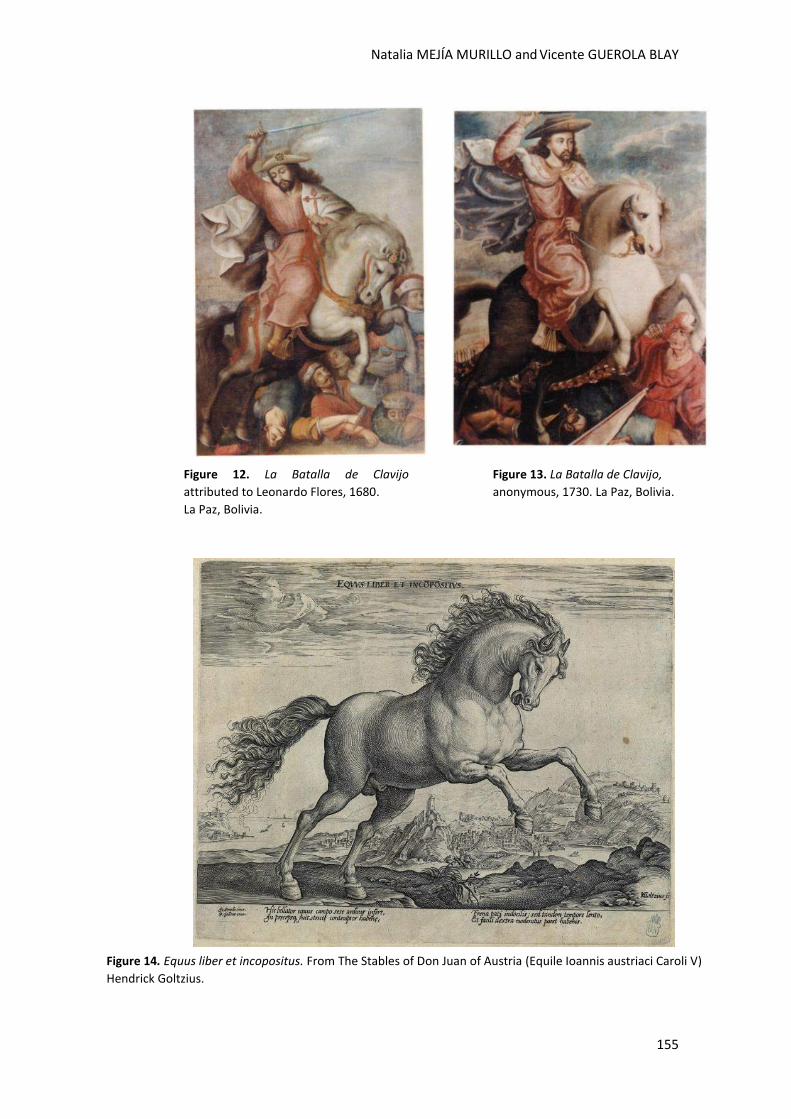
Natalia MEJÍA MURILLO and Vicente GUEROLA BLAY
155
Figure 12. La Batalla de Clavijo
attributed to Leonardo Flores, 1680.
La Paz, Bolivia.
Figure 13. La Batalla de Clavijo,
anonymous, 1730. La Paz, Bolivia.
Figure 14. Equus liber et incopositus. From The Stables of Don Juan of Austria (Equile Ioannis austriaci Caroli V)
Hendrick Goltzius.
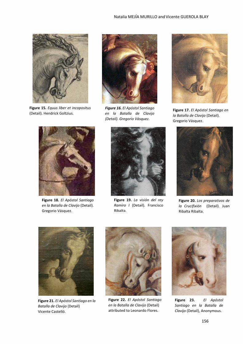
Natalia MEJÍA MURILLO and Vicente GUEROLA BLAY
156
Figure 15. Equus liber et incopositus
(Detail). Hendrick Goltzius.
Figure 17. El Apóstol Santiago en
la Batalla de Clavijo (Detail).
Gregorio Vásquez.
Figure 16. El Apóstol Santiago
en la Batalla de Clavijo
(Detail). Gregorio Vásquez.
Figure 18. El Apóstol Santiago
en la Batalla de Clavijo (Detail).
Gregorio Vásquez.
Figure 19. La visión del rey
Ramiro I (Detail). Francisco
Ribalta.
Figure 20. Los preparativos de
la Crucifixión (Detail). Juan
Ribalta Ribalta.
Figure 21. El Apóstol Santiago en la
Batalla de Clavijo (Detail)
Vicente Castelló.
Figure 22. El Apóstol Santiago
en la Batalla de Clavijo (Detail)
attributed to Leonardo Flores.
Figure 23. El Apóstol
Santiago en la Batalla de
Clavijo (Detail), Anonymous.
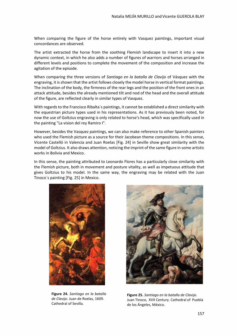
Natalia MEJÍA MURILLO and Vicente GUEROLA BLAY
157
When comparing the figure of the horse entirely with Vasquez paintings, important visual concordances are observed.
The artist extracted the horse from the soothing Flemish landscape to insert it into a new dynamic context, in which he also adds a number of figures of warriors and horses arranged in different levels and positions to complete the movement of the composition and increase the agitation of the episode.
When comparing the three versions of Santiago en la batalla de Clavijo of Vásquez with the engraving, it is shown that the artist follows closely the model horse in vertical format paintings. The inclination of the body, the firmness of the rear legs and the position of the front ones in an attack attitude, besides the already mentioned tilt and nod of the head and the overall attitude of the figure, are reflected clearly in similar types of Vasquez.
With regards to the Francisco Ribalta´s paintings, it cannot be established a direct similarity with the equestrian picture types used in his representations. As it has previously been noted, for now the use of Goltzius engraving is only related to horse's head, which was specifically used in the painting "La vision del rey Ramiro I".
However, besides the Vasquez paintings, we can also make reference to other Spanish painters who used the Flemish picture as a source for their Jacobean theme compositions. In this sense, Vicente Castelló in Valencia and Juan Roelas [Fig. 24] in Seville show great similarity with the model of Goltzius. It also draws attention, noticing the imprint of the same figure in some artistic works in Bolivia and Mexico.
In this sense, the painting attributed to Leonardo Flores has a particularly close similarity with the Flemish picture, both in movement and posture vitality, as well as impetuous attitude that gives Goltzius to his model. In the same way, the engraving may be related with the Juan Tinoco´s painting [Fig. 25] in Mexico.
Figure 25. Santiago en la batalla de Clavijo. Juan Tinoco, XVII Century. Cathedral of Puebla de los Ángeles, México.
Figure 24. Santiago en la batalla de Clavijo. Juan de Roelas, 1609. Cathedral of Sevilla.
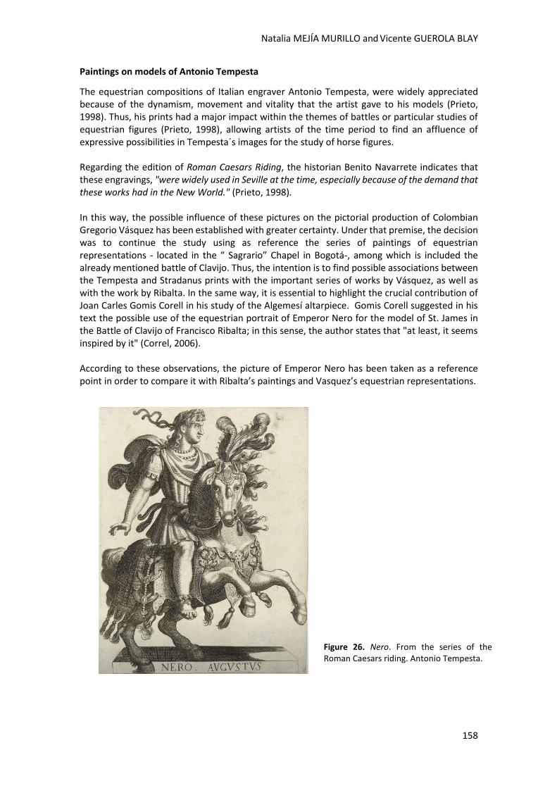
Natalia MEJÍA MURILLO and Vicente GUEROLA BLAY
158
Paintings on models of Antonio Tempesta
The equestrian compositions of Italian engraver Antonio Tempesta, were widely appreciated because of the dynamism, movement and vitality that the artist gave to his models (Prieto, 1998). Thus, his prints had a major impact within the themes of battles or particular studies of equestrian figures (Prieto, 1998), allowing artists of the time period to find an affluence of expressive possibilities in Tempesta´s images for the study of horse figures. Regarding the edition of Roman Caesars Riding, the historian Benito Navarrete indicates that these engravings, "were widely used in Seville at the time, especially because of the demand that these works had in the New World." (Prieto, 1998). In this way, the possible influence of these pictures on the pictorial production of Colombian Gregorio Vásquez has been established with greater certainty. Under that premise, the decision was to continue the study using as reference the series of paintings of equestrian representations - located in the “ Sagrario” Chapel in Bogotá-, among which is included the already mentioned battle of Clavijo. Thus, the intention is to find possible associations between the Tempesta and Stradanus prints with the important series of works by Vásquez, as well as with the work by Ribalta. In the same way, it is essential to highlight the crucial contribution of Joan Carles Gomis Corell in his study of the Algemesí altarpiece. Gomis Corell suggested in his text the possible use of the equestrian portrait of Emperor Nero for the model of St. James in the Battle of Clavijo of Francisco Ribalta; in this sense, the author states that "at least, it seems inspired by it" (Correl, 2006). According to these observations, the picture of Emperor Nero has been taken as a reference point in order to compare it with Ribalta’s paintings and Vasquez’s equestrian representations.
Figure 26. Nero. From the series of the Roman Caesars riding. Antonio Tempesta.

Natalia MEJÍA MURILLO and Vicente GUEROLA BLAY
159
Indeed, when the paintings are compared with the engravings, there are evident influences which are visible in the composition.
Figure 27. Santiago en la Batalla de Clavijo. Francisco Ribalta, 1603.
Figure 28. La visión del rey Ramiro I (Detail). Francisco Ribalta, 1609-1610.
Figure 29. El Milagro de San Luis Beltrán. Gregorio Vásquez de Arce y Ceballos. Church of Santo Domingo, Bogotá.
Natalia MEJÍA MURILLO and Vicente GUEROLA BLAY
160
Both Ribalta’s paintings, Santiago en la batalla de Clavijo and La visión del rey Ramiro I, as well as Vásquez’s, El Milagro de San Luis Beltran, maintain a similar posture and gesture as that of Tempesta’s model. This suggests that while the picture was not copied exactly, at least it could have been used as a reference point for both artists.
In the text “Iconografía de Santiago en el arte hispanoamericano” Santiago Sebastian points out an important factor which allows us to establish with greater assurance the use of the same source by both artists. The historian affirms that:
The Quito school of the eighteenth century presents compositions of a higher technical level, which were inspired on European engravings or paintings. The canvas of the convent of San Francisco in Quito is expressive, with an angry horse in a strong foreshortening position, which is partly similar to Francisco Ribalta’s model in the altarpiece of Algemesí, perhaps because both come from the same graphic source. (López, 1993)
In the same way, it was decided that another Tempesta image should be compared with the paintings, in order to establish with more security, the use of models from the edition The Caesars in the pictorial production of Gregorio Vásquez. For this study the engraving of Julius Caesar was taken as a reference, comparing it with the equestrian painting of Saint George and the Dragon, which is located in the Sagrario Chapel of Bogota [Fig.33]. By analyzing the painting in comparison to the engraving, several elements are clearly in common. The representation’s perspective, as well as the position and inclination of the horse’s
Figure 30. Equestrian Santiago, anonymous, 18th century. Quito, Ecuador.
Natalia MEJÍA MURILLO and Vicente GUEROLA BLAY
161
body, closely follow the model in the engraving. Similarly, the position of the front and back legs and the head profile coincides almost exactly with the Tempesta model. Finally, figures of soldiers with similar features have been identified in the paintings of the Battle of Clavijo by both artists. The characters, which are lying on the ground, have clear similarities in the expressions and body positions. Evidently, the differences that are observed are determined by the particular style of each artist, as well as by the use of different accessories that match the aesthetics of the historical period of each place in which the artists developed their works. This correspondence of figures in the compositions of Vasquez and Ribalta, must surely be due to the use of the same graphical source. Although this approach is entirely feasible, as we have already been able to confirm with previous studies, in this particular case it has not been possible to locate the engraving used by the artists to extract the figures.
Figure 31. Julio Cesar. Antonio Tempesta.
Figure 32. Retrato ecuestre del conde duque de Olivares. Diego Velázquez, 1638. Prado Museum, Madrid.
Figure 33. San Jorge y el Dragón. Gregorio Vásquez de Arce y Cabellos. Sagrario Chapel, Bogotá.
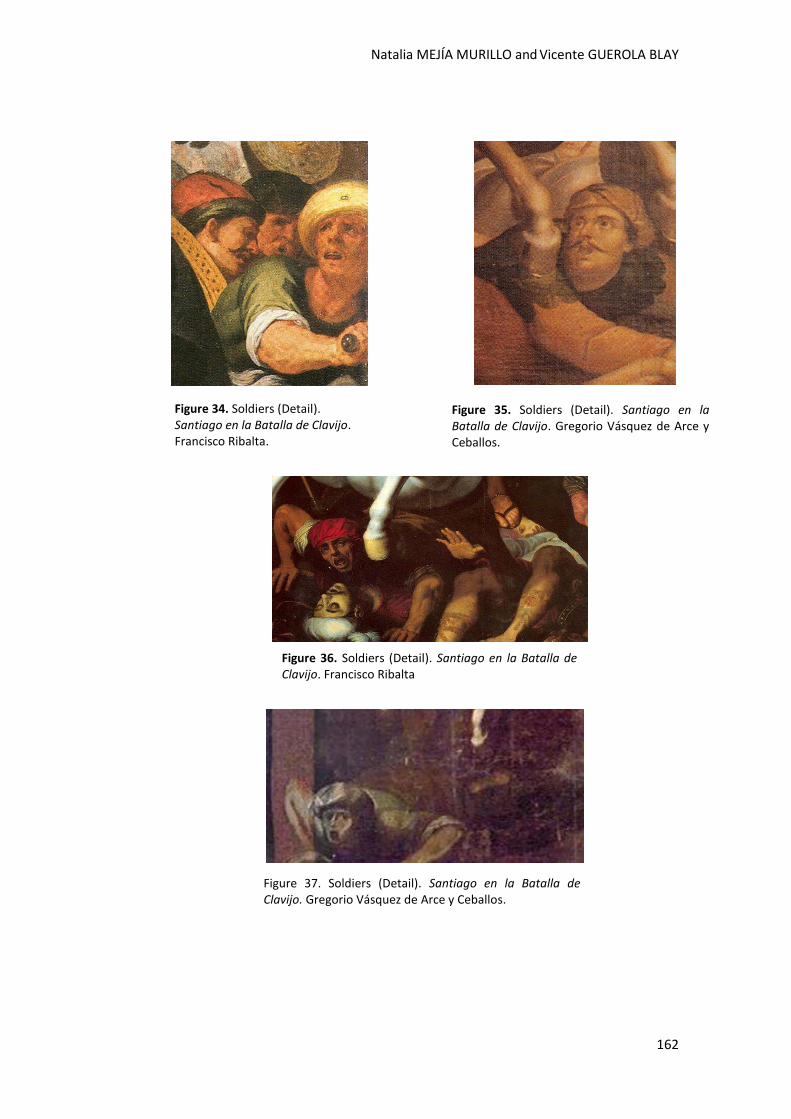
Natalia MEJÍA MURILLO and Vicente GUEROLA BLAY
162
Figure 34. Soldiers (Detail). Santiago en la Batalla de Clavijo. Francisco Ribalta.
Figure 35. Soldiers (Detail). Santiago en la Batalla de Clavijo. Gregorio Vásquez de Arce y Ceballos.
Figure 36. Soldiers (Detail). Santiago en la Batalla de Clavijo. Francisco Ribalta
Figure 37. Soldiers (Detail). Santiago en la Batalla de Clavijo. Gregorio Vásquez de Arce y Ceballos.
Natalia MEJÍA MURILLO and Vicente GUEROLA BLAY
163
Conclusions
The research has allowed establishing an historical and artistic relationship between the pictorial production of Francisco Ribalta and Gregorio Vásquez de Arce y Ceballos, leading artists during the 16th and 17th century in Spain and Colombia.
The identification and localization of common models extracted from Flemish and Italian engravings, is a contribution to the knowledge on the working methods that some painters followed for the composition of their images and works. Likewise, the research emphasizes on the important role played by graphic sources on the academic formation of painters.
In this sense, the use of Goltzius and Tempesta equestrian models for configuring certain iconographic figures in Colombia and Spain, as well as the comparison with other painters in Europe and Latin-America, demonstrates the influence of these models in the creation of paintings with similar iconographic subjects in both continents.
In light of the above, it is emphasized the value of engravings as documents that provide important information about the composition, history, iconography and working methods followed by the artists for the configuration of their images. Thus, graphic sources have been proved to be a useful tool in the study of paintings.
Finally, this work reveals the opening of new research lines in the study of the artistic production of both artists, as well as the influence of graphic sources in other colonial painters.
References
Baldó, S. R. 2009. Fuentes gráficas del arte valenciano. Uso y aplicación para la reintegración de obras de arte. Trabajo final de Master inédito. Master en Conservación y Restauración de Bienes Culturales. Valencia : Universidad Politécnica de Valencia.
Correl, J. C. 2006. L´obra pictórica de Francesc Ribalta a Algemesí. Algemesí: Ajuntament d´Algemesí.
Darby, D. F. 1980. Francisco Ribalta and His School. Ann Arbo: University Microfilms International.
Doménech, F. B. 1980. Pinturas y Pintores En El Real Colegio De Corpus Christi. Valencia.
Domenech, F. B. 1987. Los Ribalta y La Pintura Valenciana de su Tiempo. Valencia: Diputación Provincial.
González, A. R. 2001. Arte y naturaleza en la Colonia. Bogotá: Museo de Arte Colonial.
Irvins, W. M. (1975). Imagen Impresa y Conocimiento: Análisis De La Imagen Prefotográfica . Barcelona: Gustavo Gili.
Jaramillo, G. G. 1948. La Pintura en Colombia. México: Fondo de Cultura Económica.
Jaramillo, G. G. 1959. El Grabado en Colombia. Bogotá: ABC.
Jaramillo, G. G. 1980. La Miniatura, La Pintura y El Grabado En Colombia. Bogotá: Instituto Colombiano de Cultura.
Joaquín. Carrete Parrondo Fernando Checa Cremades, V. B. (2001). Summa Artis Historia General Del Arte. Vol. XXXI, El Grabado En España (Siglos XV Al XVIII). Madrid : Espasa-Calpe.
Male, E. (1985). El Barroco: Arte Religioso Del Siglo XVII : Italia, Francia, España, Flandes. Madrid: Encuentro.
Natalia MEJÍA MURILLO and Vicente GUEROLA BLAY
164
Miranda, Á. (2005). Gregorio Vázquez De Arce y Ceballos :Un Pintor Para Mirar El Arte Colonial. Bogotá . Bogotá: Banco de la República.
Pizano, R. (1930). Biografía De Gregorio Vázquez. Bogotá : Minerva.
Portus, F. B. (1990). Los Genios de la Pintura Española. (Vol. 16). Madrid: Sarpe.
Prieto, B. N. (1998). La pintura andaluza del siglo XVII y sus fuentes grabadas. Madrid: Fundación de apoyo a la Historial del Arte Hispanoamericano.
Sánchez, A. P. (1993). De Pintura y Pintores: La Configuración De Los Modelos Visuales en La Pintura Española. Madrid : Alianza Editorial.
Sebastian, S. & Vallín, R. 1993. Santiago e América: [exposición] Mosteiro de San Martiño Pinario. Santiago de Compostela.
Tovar, F. G. (1985). El Arte Colombiano. Santafé de Bogotá: 3a ed .
Zárate, J. G. (1994). Real Colección De Estampas De San Lorenzo De El Escorial. Vitoria: EPHIALTE.
Websites
BRINKMANN PIMENTEL, U. D. University of Utah, Salt Lake City, 1993. . [online]. [Accessed 27-April 2014] Available at: http://centralpt.com/upload/417/4610_Dutch_Flemish_Art_UMFA.pdf p. 54.
National Library of Spain. [online]. [Accessed :15 March 2014]. Available at: http://www.bne.es/es/Inicio/index.html Europeana [online]. [Accessed :20 March 2014]. Available at: http://www.europeana.eu
Figures References
Figure 1. Male, E. (1985). El Barroco: Arte Religioso Del Siglo XVII : Italia, Francia, España, Flandes. Madrid: Encuentro.
Figure 2. Available at: http://coleccionbbva.com/es/bartolome-esteban-murillo-martirio-de-san-pedro-de-arbues
Figure 3. Available at:http://www.uco.es/arte/revista/numeros/01/art02-federico-zuccari-compania-jesus/15.html
Figure 4. Available at: https://www.pinterest.com/santiago0455/anunciacion/
Figure 5. Correl, J. C. 2006. L´obra pictórica de Francesc Ribalta a Algemesí. Algemesí: Ajuntament d´Algemesí.
Figure 6. Correl, J. C. 2006. L´obra pictórica de Francesc Ribalta a Algemesí. Algemesí: Ajuntament d´Algemesí.
Figure 7. Sebastian, S. & Vallín, R. 1993. Santiago e América: [exposición] Mosteiro de San Martiño Pinario. Santiago de Compostela
Figure 8. Available at: http://www.colombiaaprende.edu.co/html/mediateca/1607/article-238289.html
Figure 9. Available at: http://www.colombiaaprende.edu.co/html/mediateca/1607/article-238287.html
Figure 10. Sebastian, S. & Vallín, R. 1993. Santiago e América: [exposición] Mosteiro de San Martiño Pinario. Santiago de Compostela
Natalia MEJÍA MURILLO and Vicente GUEROLA BLAY
165
Figure 11. Available at: http://es.wikipedia.org/wiki/Juan_Ribalta
Figure 12. Available at: http://www.ayuntamientodeclavijo.org/La-aparicion-del-Apostol-Santi.1813.0.html
Figure 13. Available at: http://www.ayuntamientodeclavijo.org/La-aparicion-del-Apostol-Santi.1813.0.html
Figure 14. Available at: http://bdh-rd.bne.es/viewer.vm?id=0000043254
Figure 15. Available at: http://bdh-rd.bne.es/viewer.vm?id=0000043254
Figure 16. Available at: http://www.colombiaaprende.edu.co/html/mediateca/1607/article-238289.html
Figure 17. Sebastian, S. & Vallín, R. 1993. Santiago e América: [exposición] Mosteiro de San Martiño Pinario. Santiago de Compostela
Figure 18. Available at: http://www.colombiaaprende.edu.co/html/mediateca/1607/article-238287.html
Figure 19. Sebastian, S. & Vallín, R. 1993. Santiago e América: [exposición] Mosteiro de San Martiño Pinario. Santiago de Compostela
Figure 20. Available at: http://es.wikipedia.org/wiki/Juan_Ribalta
Figure 21. Sebastian, S. & Vallín, R. 1993. Santiago e América: [exposición] Mosteiro de San Martiño Pinario. Santiago de Compostela
Figure 22. Available at: http://www.ayuntamientodeclavijo.org/La-aparicion-del-Apostol-Santi.1813.0.html
Figure 23. Available at: http://www.ayuntamientodeclavijo.org/La-aparicion-del-Apostol-Santi.1813.0.html
Figure 24. http://www.galeon.com/juliodominguez/2008b/roelas.html
Figure 25. Sebastian, S. & Vallín, R. 1993. Santiago e América: [exposición] Mosteiro de San Martiño Pinario. Santiago de Compostela
Figure 26. Available at: http://bdh-rd.bne.es/viewer.vm?id=0000001617
Figure 27. Correl, J. C. 2006. L´obra pictórica de Francesc Ribalta a Algemesí. Algemesí: Ajuntament d´Algemesí.
Figure 28. Correl, J. C. 2006. L´obra pictórica de Francesc Ribalta a Algemesí. Algemesí: Ajuntament d´Algemesí.
Figure 29. Available at: http://www.colarte.com/colarte/foto.asp?idfoto=669
Figure 30. Sebastian, S. & Vallín, R. 1993. Santiago e América: [exposición] Mosteiro de San Martiño Pinario. Santiago de Compostela
Figure 31. Prieto, B. N. (1998). La pintura andaluza del siglo XVII y sus fuentes grabadas. Madrid: Fundación de apoyo a la Historial del Arte Hispanoamericano.
Figure 32. Available at: http://es.wikipedia.org/wiki/El_Conde-Duque_de_Olivares_a_caballo
Figure 33. Available at: http://www.colarte.com/colarte/foto.asp?idfoto=43893
Figure 34. Correl, J. C. 2006. L´obra pictórica de Francesc Ribalta a Algemesí. Algemesí: Ajuntament d´Algemesí.

Natalia MEJÍA MURILLO and Vicente GUEROLA BLAY
166
Figure 35. Sebastian, S. & Vallín, R. 1993. Santiago e América: [exposición] Mosteiro de San Martiño Pinario. Santiago de Compostela
Figure 36. Correl, J. C. 2006. L´obra pictórica de Francesc Ribalta a Algemesí. Algemesí: Ajuntament d´Algemesí.
Figure 37. Available at: http://www.colombiaaprende.edu.co/html/mediateca/1607/article-238287.html
The influences of Viollet-Le-Duc. Alois Riegl
and Cesare Brandi in the field
of Restauraon Theory in Contemporary Art
Camila MORTARI, Margarida FERNANDESand
Rafael ROBLE

2nd International Meeting on Retouching of Cultural Heritage RECH2
Porto, Portugal | 24-25 October 2014 _____________________________________________________________________
168
The influences of Viollet-Le-Duc, Aloïs Riegl e Cesare Brandi in the field of Restauration Theory in Contemporary Art
Camila MORTARI1,2*; Margarida FERNANDES1; Rafael ROBLE1
1 Faculdade de Belas-Artes da Universidade de Lisboa, Largo da Academia Nacional de Belas-Artes,1249-058 Lisboa, Portugal
2 Centro de Física Atómica da Universidade de Lisboa, Av. Professor Gama Pinto 2, 1649-003 Lisboa, Portugal
Abstract
The development of Restoration as an autonomous discipline started in the 19th century. During this time, there were many theorists who contributed to the development of this scientific area. Over the years, some of their theories were refuted others were dropped or started getting a negative connotation. However, one must not forget that these theories were the basis for the development of this scientific field and have left their mark in the practice of restoration until the present day. This article aims to analyze the theoretical principles that, nowadays, guide restoration interventions, especially the criteria for retouching and chromatic reintegration. It aims to spotlight the remaining influences of three great restauration theorists: Viollet-Le-Duc, Aloïs Riegl and Cesare Brandi. Our selection of these theorists was not random. It seeks to cover a vast period of time extending from the principles of the autonomy of the discipline until contemporary times. This subject becomes relevant when you take into account the new restoration issues that emerge with interventions in Contemporary Art. Earlier obsolete theories now become pertinent again, in the theoretical field, being revisited consciously and, together with the required ethical principles, result in correct practices of restoration.
Keywords: Theory of Restoration; Painting; Intervention; Chromatic reintegration;
Contemporary Art
Camila MORTARI; Margarida FERNANDES; Rafael ROBLE
169
Introduction
Restoration was only developed as an autonomous discipline in the 19th century. Before that, however, interventions over artistic heritage were already practiced in order to preserve it, or even to adapt it. Nevertheless, the difference between before and after the 19th century lies in the consciousness of the act and its systemization, elevating restoration to an independent scientific area.
This paper seeks to analyze the precepts proposed by three different restoration theoreticians,
in order to identify elements that are still valid today; or concepts which, although already
considered outdated, eventually resurface in such a broad, and yet so specific field that is the
restoration of contemporary artworks, especially in what concerns the chromatic reintegration
and the appearance that is expected of a work of art.
Works of art, whether antique, modern or contemporary, suffer all kinds of transformations
over time. These changes occur both on a material level - undergoing modifications that alter
their appearance and cause implications not only in their reading, but also in their preservation
for the future; at an intangible level, transitioning between different levels of importance for the
history of art and the society that enjoys them.
With the first type of transformations, it is common to seek for causes and consequences of
these changes, ways to decelerate them and finally, ways to mitigate or reverse the degradation
signs. In the majority of cases, especially in more traditional mediums such as painting or
sculpture, the ways to mitigate or reverse the damage usually include chromatic reintegration,
also known as retouching.
Retouching, however, does not always happen in the same way. Sometimes, it implies an
imitation of the degraded surface; sometimes it is limited to mitigating gaps in the chromatic
layer with neutral colors, in order to keep the reading of the artwork from having interferences;
in some other cases, both processes are present in different proportions.
Historically, one of the first instances in which there are records of the practice of retouching
dates back to Giuseppe Bertani and five large sized 15th century paintings, restored at the Scuola
di San Giovanni Evangelista. On Bertani's personal records of the proceedings, dated June 1st,
1784, he refers filling gaps in the support, also mentioning his preference for chromatic
reintegration of these areas using the brush strictly where it is necessary." (Soltan, 2009)
This preference reveals, in a curious way, a concern that would only become common in later
centuries and still taken into consideration nowadays: the question of minimum intervention.
However, while these records are only small clues that help a hypothetical reconstruction of the
past, only from the 19th century forward do the first steps towards what we now call the theory
of the Restoration were taken.
The first man to systemize the practice of restoration in the form of a theory was the French
architect Viollet-le-Duc, defining in his Dictionaire Raisonné, criteria, methodologies and
techniques that could guide interventions to restore and protect artistic heritage, better serving
the preservation of the glorious past of the French nation.
Camila MORTARI; Margarida FERNANDES; Rafael ROBLE
170
Still in the 19th century, Alois Riegl, with his Modern Cult of Monuments, established different
values that define the most important aspects of a given monument, in turn implying different
approaches to preserve them. Then, in the 20th century, Cesare Brandi, a very important
theorist after the destruction caused by World War II, outlined criteria for intervention which
will assist in the restoration, especially of monuments damaged during the war.
Development
Viollet-le-Duc
The Notre Dame de Paris, the Abbey of Sainte Marie-Madeleine, Vezelay, the Sainte Chapelle,
the Abbey Church of Saint Denis, the Castle of Pierrefonds, the city of Carcassonne. All of these
French historical monuments, among others, underwent restoration interventions helmed by
the French architect Eugène-Emmanuel Viollet-le-Duc, the first theorist of restoration, the
precursor of the modern conservation science. (Murphy, 2000)
On one hand, the philosophy of Viollet-le-Duc, set in his Dictionnarie Raisonné, follows the lines
of restoring a building to its state of completeness, even if it had never existed, serving a
European context of the 19th century which lacked a strong and defining architectural style.
(Murphy, 2000) On the other hand, this inevitably led to the flourishing of the restorator-creator,
whose purpose was to maintain the freshness of monuments, adding elements that hardly
would have been a part of the original author's composition, but that appealed to the tastes of
it's contemporary public. (Lamas, 1980) Although Viollet-le-Duc hadn’t started the Stylistic
Restoration he advocated, he was the first man to theorize this practice.
This constant search for the pristine and fully original has much in common with the current
state of conservation and restoration of contemporary artworks. Before determining what are
the best strategies and techniques that will extend the life of an artistic object, it becomes
increasingly important to 'get into the author's head', as Viollet-le-Duc advocated. (Neto, 2001)
The only difference is that, if nowadays many of the artists can still be contacted about their
intentions and opinions about their creations, all that the French architects could do was invoke
them through a thorough analysis of records and other similar works. Scientific rigor is present
in an intense study and recording preceding each intervention, and the freshness that Viollet-le-
Duc allowed himself to give to a work is present in an almost complete refusal of any sign of the
passage of time in works of contemporary art.
Despite having tried to establish theoretical principles and working methods to assist in the
practice of restoration in his Dictionnaire raisonné de l'architecture française du XI au XVI siècle,
Viollet-le-Duc was, above all, a man of action, developing his theory all throughout the
numerous interventions on French monuments in which he was involved.
Present since his inaugural work - recommended by his master, Prosper Merimé, to spearhead
the intervention on the abbey of Sainte Marie-Madeleine of Vézelay - and throughout his career,
the concern of the architect with the pristine condition of the monument, as the original author
would have intended, even if this had never been a reality. He attained this through detailed
studying of different architectural styles and their local variations, favoring direct contact with
works of similar periods and geographical areas and of the same style, as it is expected from an
intervention on a work of contemporary art.
Furthermore, Viollet-le-Duc advocated an extensive and detailed graphic log of the monument
to be restored, all of his works being accompanied by numerous and beautiful drawings.
Camila MORTARI; Margarida FERNANDES; Rafael ROBLE
171
According to the Frenchman, this log is essential to document the previous state of the building
and to study the intervention that took place, an indispensable way to get in contact with the
monument.
Two entries from the Dictionnaire raisonné have particular interest in the study of his work:
RESTORATION: Both the word and the action are modern. Restoring a building means not to keep
it, or repair it, or rebuild it; it means to restore it to a finished state, which may never have existed
at any given time. (Viollet-Le-Duc, 1854)
And STYLE, defined basically as what helps differentiate different schools and some other times
[...] in order to facilitate the classification of monuments produced by these various types of
art."(Viollet-Le-Duc, 1854)
In terms of contemporary art, his theory fits perfectly in the refusal of the signs of the passing
of time presented by the artwork. All stylistic restoration interventions undertaken by the
French were known for selecting specific elements that refer to a style of interest and
eliminating and adding components to highlight this style. The result, more than conservation
or restoration, was configured as a renewal of heritage, very close to the maintenance of the
fresh appearance of newly completed artworks that is practiced in contemporary artworks.
Form is more important than matter, both nowadays and for Viollet-le-Duc, allowing, and even
encouraging, the use of different materials from the original ones, enabling a better
preservation of the artistic object and extending its useful life and, when necessary, even
disposing of the original materials. This attitude is taken to the extreme in some contemporary
cases, reaching complete reconstruction.
As far as retouching goes, Viollet-le-Duc is the perfect candidate for supporting exaggerated
reintegration’s, covering large areas of the original chromatic layer resulting in a surface with
clear reading of the present elements and ideal reference to the artist or time represented.
Complete reconstructions of objects in unrecoverable states are cases that are very close to the
theory, and especially the practice of the French architect, even more when the reconstructed
elements are artificially aged to resemble the original ones, as was the case of Zoo Geometrico,
1968, from the Italian Claudio Parmiggiani (Beerkens, 2011).
Alois Riegl
The pioneer work of Riegl marks the beginning of the theorizing around the disciplines of
conservation and restoration, opening the discussion about the rules and values applied to
heritage conservation and social and cultural meanings associated to it.
Alois Riegl was an art historian born in Vienna in 1858. He made a significant contribution to the
reflection about the concept of the historical monument. His eclectic training, academically a
jurist, historian and philosopher, having experience as a museum curator, allowed him a
spirituous and critical analysis. This way, the concept of historical monument is treated as a
subject of social and philosophical analysis, investigating the various meanings attributed by
society to it (Choay, 2000, p. 170). He distinguishes between monument and historic monument,
placing the latter's emergence in the 16th century in Italy. Thus defining historical monument
by assigning values it has conquered with time and the multiple meanings that have been
assigned to it by society. This analysis through the values is structured into two main categories,
"Memory Values" and "Newness Values", the first connected to the past, and the latter to the
present time (Choay, 2000, p. 170).
Camila MORTARI; Margarida FERNANDES; Rafael ROBLE
172
The wealth of Riegl’s analysis relates to his non-normative historian point of view, revealing on
one hand the contradictions of the values of a historical monument and, on the other hand, the
multiple demands that it is subjected to. This conflict is not insoluble for Riegl, who considers
that compromises may be required, particularly in cases of reuse and classification of historical
monuments, thus founding a relativistic conception of the historical monument that, according
to Françoise Choay, introduced the study of art history (Choay 2000, p. 170).
Despite the innovation brought by this analytical perspective and the contribution to restoration
and conservation of historical monuments conquering disciplinary status, the truth is that the
principles advocated by Alois Riegl were only the beginning of the issues and current concepts
and recommendations in the practices of conservation and restoration of heritage (Choay, 2000,
p. 170).
Ethical concepts defended in the conservation and restoration are a cultural and temporal
phenomena which may result in different interpretations and ways of applying its principles,
depending on the time and place in which we find ourselves (Zijlmans, 2005, pp. 247-249).
Often, the values defended by a conservator are mainly based on theories, which are often
committed to their own working experience. The practice of conservation and restoration is
always an interpretation of the object under study, having this artistic, historical or both values
always present increases the risk of misinterpretations.
The values registered by Alois Riegl in 1903 can be used in order to find an individual concept of
conservation for each work of art, not from a technical standpoint, but from a general approach.
Should art be left as it is? Should it be preserved at any cost? Or should it be restored or even
rebuilt? (Choay, 2000, p. 170)
The practice of conservation and restoration has the responsibility to allow future generations
to have a past, just as we have one. As Riegl defended in 1903, by defining his historical value,
which demonstrates the appreciation for the past and also showing the importance of the art
object for the observer as an historical-evolutionary moment. The conservation of the original
document is presented as a way of protecting the work, for the original material is necessary to
maintain its existence, or what remains of it, serving this physical matter as foundation for future
generations to build their own interpretations. Thus, conservation of the original material of the
object is the highest priority, so that it endures for future generations (Riegl, 2013, p. 34 - 42).
Even today, the practice of restoration is considered a method that allowed us to "bring back"
the works of the past to the present and for the "future" (Brandi, 2006).
In this same train of thought, Riegl elaborated the value of intentional memory, allocated to
works whose existence is defined by the intrinsic meaning they carry. If we relate this value to
works of conceptual character, it becomes ideal to preserve the artist's intention, as well as the
physical object that translates it. In these cases, the preservation of the artist's intent is essential
to understanding the work. Therefore material stability of the work becomes essential for the
artistic value to be maintained. In many cases, the replacement of the original material is
accepted by the artist who conceived it (Riegl, 2013, p. 42-43).
In some cases, restoration emerges as an indispensable tool for subsistence of historical
moments and memories, so that works of this nature are not forgotten, or even disappear.
As Brandi said in 1964 in his writings, regardless of the restoration process constituting itself as
a phase of the existence of the work, from the moment it is executed, it becomes a moment of
Camila MORTARI; Margarida FERNANDES; Rafael ROBLE
173
recognition of the work on a physical and historical level as a rise of the intention for that work
to endure.
Talking about contemporary art, values and principles defended by a conservator may vary, as
there is a new consciousness and a material and conceptual necessity. Decisions have to be
made case by case and always in favor of the physical and conceptual integrity of the artwork.
We are increasingly exposed to artworks whose focus is on experimentation, frailty and the
exploration of transience and decay of materials. One of the biggest cases is ephemeral art itself,
which holds that each work has its own life cycle, including the natural process of passing of time
from the moment of its conception, becoming the most important factor of this type of work.
These characteristics are similar to those that Riegl defined as the antiqueness value.
Considering this model, the most important thing is not to intervene, not trying to stop the
degradation of the work of art (Riegl, 2013, p. 27-34).
Another important character present in contemporary art is the interaction of the artwork with
the viewer. This is an art form that places the work in constant risk of degradation because it is
intended to get in direct contact with the public for it's designated functions to be met. If those
designated functions are not met, the work fails to follow the procedures laid down by the artist.
It also makes it so that all possible signs of degradations that may arise to be, as Riegl argues
with his newness value, neutralized and restored, keeping the works cohesive. The appreciation
of the work as a new recently conceived object is viewed by Riegl as a characteristic much
appreciated by the “masses” (Riegl, 2013, p. 48 - 58).
It is society that identifies the work as a work of art, enjoying it and therefore valuing it, giving
it artistic value. This phenomenon varies according to the space and time in which it takes place.
It arises from the desire and expectation of restoration of the work (Riegl, 2013, p. 58 - 65).
Often the observer assigns a higher value to works of art produced many centuries ago, over
works produced in the modern era. On this, Riegl mockingly states that, works that have not
pleased its audience by the time of their conception, nowadays could very well be "the pinnacle
of fine arts". This social and temporal phenomenon Riegl named the relative artistic value (Riegl,
2013, p. 58 - 65).
Theories advocated by Alois Riegl along the Modern Cult of Monuments can be used, not for a
conservation concept from a technical standpoint, but from a general approach for an individual
concept for each intervention.
Cesare Brandi
Looking into the study of Theory of Restoration, it is not too hard to come across the Italian
theorist Cesare Brandi. His work extends in the theoretical field, developing areas such as Critical
Philosophy, Aesthetics and Theory of Restoration.
His achievements are fairly extensive. He was born in 1906 in Siena, in 1927 obtained a degree
in law at the University of Siena and in 1928 a Humanities degree at the University of Florence.
In 1930, he begins working at the Administration of Antique and Fine Arts, being in Siena,
Bologna, Ferrara, Verona, Udine and Rhodes. In the late 1938, he is given the task of organizing
the Central Institute of Restoration, directing it until 1960. He also dedicated himself to teaching,
lecturing "theory of history and restoration of works of art" since 1948 at the Improvement
School of the University of Rome. He died in 1988 in Siena, leaving a vast collection of knowledge
Camila MORTARI; Margarida FERNANDES; Rafael ROBLE
174
in the field all throughout many books, as well as scientific papers and articles in magazines and
newspapers (Basile, 2006).
For the author, each restoration case is unique, making it impossible to define fixed sets of rules
and standards to be applied. Thus, deciding which path to take in an intervention should happen
in accordance to a critical and profound knowledge of history, aesthetics, and the materiality
that comprises the artwork. Only based on this prior knowledge, can one tailor the restoration
for each particular case (Gil, 2011).
Brandi opens the very first chapter of his Theory of Restoration defining some bases for this
concept, and the principles that should govern intervention in a work of art. His theoretical
systematization was of great importance to the development and advancement of Restoration
as a scientific discipline and is central to all its later development. In present times we observe
that some of the principles set by Brandi are applied to the restauration of cultural heritage.
However, with the many changes in the art field, especially in regard to new emerging concepts
in contemporary art, and relentless innovation in materials that artists have sought for the last
few decades, the practice of restoration is seen on a new light. In this new context, Brandi's
bases are part of the construction of new theories, sometimes being validated and enforced,
sometimes refuted and replaced.
Regarding the essence of the artwork as a work of art in itself, and in the recognition (or
activation) of the artwork from the fruition of the spectator (Brandi, 2006), this theory is still in
vogue and being debated by many other authors in the field of aesthetics and art criticism, not
solely by Brandi, being a part of a whole bigger discussion about the aesthetic experience (Fisher,
2003) (Bordo, 1996).
Another applicable base in the restoration of contemporary art is that it is the work of art that
conditions the intervention (Brandi, 2006, p. 3). The applicability of this concept is essential for
intervention in the field of contemporary art, as we see in many study cases presented in the
book Modern Art - Who Cares? (Zijlmans, 2005), since contemporary art raises very specific
issues that go beyond the merely physical and visual aspects, expanding to the conceptual field.
In this sense it is of utmost importance to know the object to be operated upon in all its essence
and perform the intervention in order to respect the precepts of the artwork.
When analyzing a work of art in its historical instance, however, we face a different question
from that presented by Brandi in his Theory of Restoration. A contemporary work of art, by
having this status and not being distanced enough from the present, always generates the
expectation of novelty. This way, the signs of the passage of time tend to be hidden or erased.
What Brandi regards as a historical falsehood (Brandi, 2006, p. 6) is often applied or aiming to
respect the essential nature of the work and the intentions of the artist. It is common, in
analyzing case studies of restoration of contemporary art (Zijlmans, 2005) (Netherlands Institute
for Cultural Heritage (ICN), 2007) to find cases where part of the work is rebuilt according to the
original pieces or the instructions left by the artists.
Concerning the concepts elaborated by Brandi about the materiality of the artwork (Brandi,
2006, pp. 7-12) numerous divergent points for the restoration of contemporary art can be found.
This is mainly because many artistic movements revalued the aspect of materiality in their
works.
Conceptualist strands have downgraded the value of the matter in the artwork. The artwork is
a work of art in itself as an idea. Thus the material aspect must only comply with the
Camila MORTARI; Margarida FERNANDES; Rafael ROBLE
175
requirements established by the artist, acting as a vehicle for the concept. Thus the substitution
of material elements, as long as they respect the guidelines given by the artist, does not
constitute a historical falsehood. On the contrary, it represents the proper maintenance and
preservation of the artwork. An example to illustrate this can be given through a set of works by
Joseph Kosuth called Object Definitions, where the same object is shown three times in different
ways: an object, an image of it (photo) and a definition in the form of a text taken from a
dictionary. In this specific case, there is a certain positioning that should be respected among
these elements, and the photographic image must be of the same object that is displayed, where
it is being displayed (Stingter, 2007). However changing the object but keeping its typology, or
making new photographs do not correspond at all to a bad intervention.
Other strands, such as Minimalism, grant a unique status to the material from which the work is
made of, being not only merely the support, but being the work of art itself. The autographic
trace of the artist does not exist here. The materials that each artist uses are, in a traditional
sense, more industrial than artistic; they are more in the market for builders than for fine arts
material distibutors [...] (Batchelor, 2000, p. 13).
However, following Brandi's line of thought, to intervene on contemporary works of art, it is
essential to deeply know their constituent materials. It is not surprising that current restoration
teams are interdisciplinary in order to gather a range of humanistic and scientific knowledge to
support the intervention.
In regards to the recovery of the potential unity of the work of contemporary art, we find
ourselves before a dichotomy of values in the practice of restoration, especially with respect to
reintegration of gaps in the chromatic layer. Some will say that restoration should be discernible,
following the same Brandi's precepts (2006, p. 17). However, mimetic restoration is also used
sometimes, since - as discussed previously - contemporary art raises different expectations,
often requiring a fresh aspect.
Nevertheless, a completely accepted factor studied in hopes of making it even more effective,
from a scientific stand point, is that of retractability of the restauration intervention. In other
words, the intervention can't make future interventions impossible and must be compatible
with the materials that comprise the artwork. Meanwhile, this concept isn't compatible with
every decision in the conservation of works of contemporary art. One exception to this precept,
for instance, can be observed when, in order to maintain the newness value already touched
upon by Riegl, the decision to substitute parts or elements of a work of art by completely new
ones is taken.
Another factor which ultimately clashes with Brandi's theorizations are those related to time
(Brandi, 2006, pp. 29-38). Because the work of contemporary art finds itself so close to our
existence, and the interval between the creation of a work and its fruition by the viewer being
so small, the restoration approach becomes a little different.
Respect for the patina (Brandi, 2006, p. 36) generally, is not adopted, since in the restoration of
contemporary works we seek to comply with the expectations around the artwork, as well as
respect for guidelines and ideals of the artist. In cases previously referred to as the art of
conceptual character, this aspect is not even presented as relevant.
However, we can always reflect on the work as a historical testimony. In this regard, the
preservation of the original elements (even if they have been replaced for exhibition purposes)
turns out to require value equal to the respect for the historical testimony of the work. The only
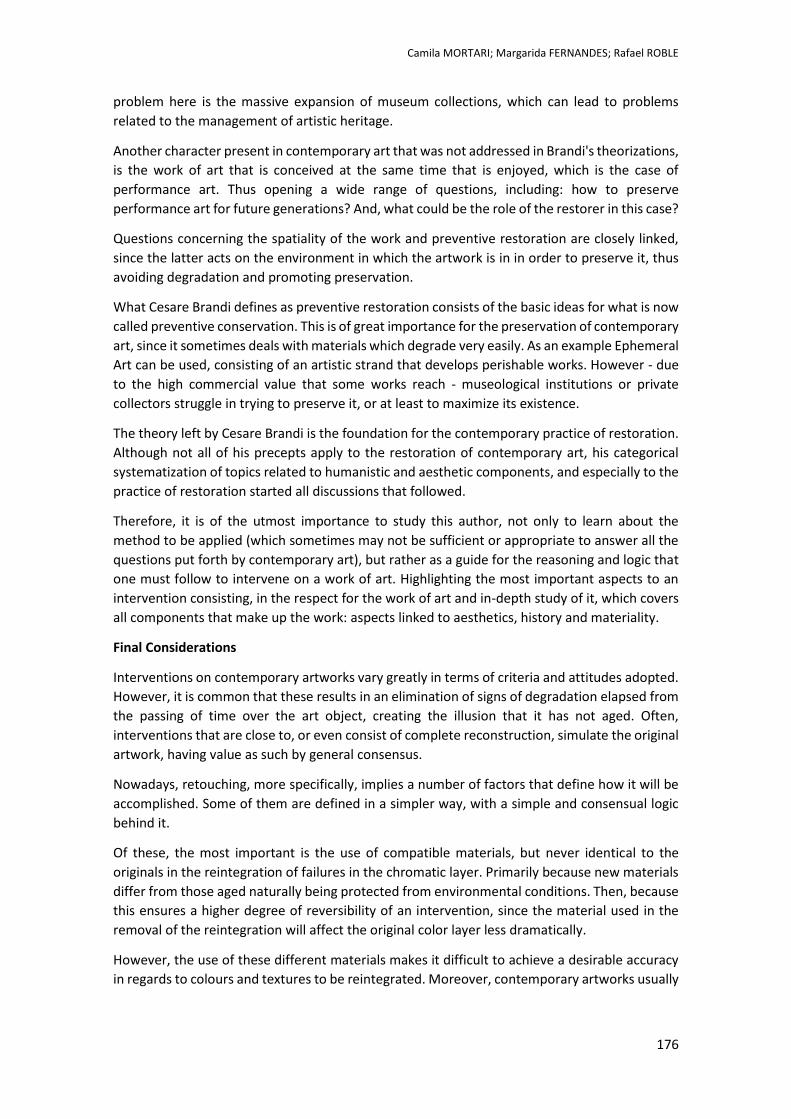
Camila MORTARI; Margarida FERNANDES; Rafael ROBLE
176
problem here is the massive expansion of museum collections, which can lead to problems
related to the management of artistic heritage.
Another character present in contemporary art that was not addressed in Brandi's theorizations,
is the work of art that is conceived at the same time that is enjoyed, which is the case of
performance art. Thus opening a wide range of questions, including: how to preserve
performance art for future generations? And, what could be the role of the restorer in this case?
Questions concerning the spatiality of the work and preventive restoration are closely linked,
since the latter acts on the environment in which the artwork is in in order to preserve it, thus
avoiding degradation and promoting preservation.
What Cesare Brandi defines as preventive restoration consists of the basic ideas for what is now
called preventive conservation. This is of great importance for the preservation of contemporary
art, since it sometimes deals with materials which degrade very easily. As an example Ephemeral
Art can be used, consisting of an artistic strand that develops perishable works. However - due
to the high commercial value that some works reach - museological institutions or private
collectors struggle in trying to preserve it, or at least to maximize its existence.
The theory left by Cesare Brandi is the foundation for the contemporary practice of restoration.
Although not all of his precepts apply to the restoration of contemporary art, his categorical
systematization of topics related to humanistic and aesthetic components, and especially to the
practice of restoration started all discussions that followed.
Therefore, it is of the utmost importance to study this author, not only to learn about the
method to be applied (which sometimes may not be sufficient or appropriate to answer all the
questions put forth by contemporary art), but rather as a guide for the reasoning and logic that
one must follow to intervene on a work of art. Highlighting the most important aspects to an
intervention consisting, in the respect for the work of art and in-depth study of it, which covers
all components that make up the work: aspects linked to aesthetics, history and materiality.
Final Considerations
Interventions on contemporary artworks vary greatly in terms of criteria and attitudes adopted.
However, it is common that these results in an elimination of signs of degradation elapsed from
the passing of time over the art object, creating the illusion that it has not aged. Often,
interventions that are close to, or even consist of complete reconstruction, simulate the original
artwork, having value as such by general consensus.
Nowadays, retouching, more specifically, implies a number of factors that define how it will be
accomplished. Some of them are defined in a simpler way, with a simple and consensual logic
behind it.
Of these, the most important is the use of compatible materials, but never identical to the
originals in the reintegration of failures in the chromatic layer. Primarily because new materials
differ from those aged naturally being protected from environmental conditions. Then, because
this ensures a higher degree of reversibility of an intervention, since the material used in the
removal of the reintegration will affect the original color layer less dramatically.
However, the use of these different materials makes it difficult to achieve a desirable accuracy
in regards to colours and textures to be reintegrated. Moreover, contemporary artworks usually
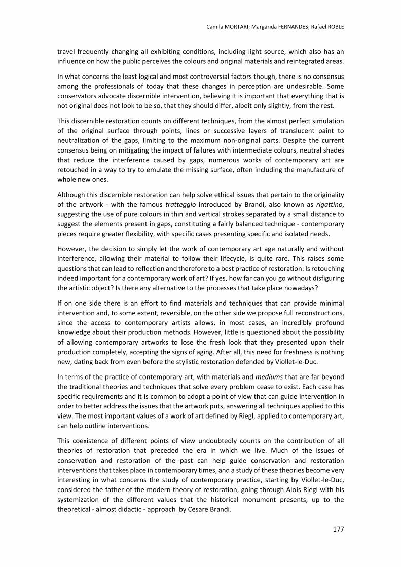
Camila MORTARI; Margarida FERNANDES; Rafael ROBLE
177
travel frequently changing all exhibiting conditions, including light source, which also has an
influence on how the public perceives the colours and original materials and reintegrated areas.
In what concerns the least logical and most controversial factors though, there is no consensus
among the professionals of today that these changes in perception are undesirable. Some
conservators advocate discernible intervention, believing it is important that everything that is
not original does not look to be so, that they should differ, albeit only slightly, from the rest.
This discernible restoration counts on different techniques, from the almost perfect simulation
of the original surface through points, lines or successive layers of translucent paint to
neutralization of the gaps, limiting to the maximum non-original parts. Despite the current
consensus being on mitigating the impact of failures with intermediate colours, neutral shades
that reduce the interference caused by gaps, numerous works of contemporary art are
retouched in a way to try to emulate the missing surface, often including the manufacture of
whole new ones.
Although this discernible restoration can help solve ethical issues that pertain to the originality
of the artwork - with the famous tratteggio introduced by Brandi, also known as rigattino,
suggesting the use of pure colours in thin and vertical strokes separated by a small distance to
suggest the elements present in gaps, constituting a fairly balanced technique - contemporary
pieces require greater flexibility, with specific cases presenting specific and isolated needs.
However, the decision to simply let the work of contemporary art age naturally and without
interference, allowing their material to follow their lifecycle, is quite rare. This raises some
questions that can lead to reflection and therefore to a best practice of restoration: Is retouching
indeed important for a contemporary work of art? If yes, how far can you go without disfiguring
the artistic object? Is there any alternative to the processes that take place nowadays?
If on one side there is an effort to find materials and techniques that can provide minimal
intervention and, to some extent, reversible, on the other side we propose full reconstructions,
since the access to contemporary artists allows, in most cases, an incredibly profound
knowledge about their production methods. However, little is questioned about the possibility
of allowing contemporary artworks to lose the fresh look that they presented upon their
production completely, accepting the signs of aging. After all, this need for freshness is nothing
new, dating back from even before the stylistic restoration defended by Viollet-le-Duc.
In terms of the practice of contemporary art, with materials and mediums that are far beyond
the traditional theories and techniques that solve every problem cease to exist. Each case has
specific requirements and it is common to adopt a point of view that can guide intervention in
order to better address the issues that the artwork puts, answering all techniques applied to this
view. The most important values of a work of art defined by Riegl, applied to contemporary art,
can help outline interventions.
This coexistence of different points of view undoubtedly counts on the contribution of all
theories of restoration that preceded the era in which we live. Much of the issues of
conservation and restoration of the past can help guide conservation and restoration
interventions that takes place in contemporary times, and a study of these theories become very
interesting in what concerns the study of contemporary practice, starting by Viollet-le-Duc,
considered the father of the modern theory of restoration, going through Alois Riegl with his
systemization of the different values that the historical monument presents, up to the
theoretical - almost didactic - approach by Cesare Brandi.
Camila MORTARI; Margarida FERNANDES; Rafael ROBLE
178
References
BASILE, G., 2006. Breve perfil de Cesare Brandi. In: Teoria do Restauro. s.l.:Edições Orion, pp. ix – xviii
BATCHELOR, D., 2000. Minimalismo. s.l.:Editorial Presença
BEERKENS, L., Restoration or Reconstruction? Towards a Conservation Approach for 'Arte Povera'
Installations Based1 on the Art Process and the Artist's Intent, texto da comunicação do congresso Modern
Materials and Contemporary Art, Lisboa, 2011, available at: [http://goo.gl/vHGd06]
BORDO, J., 1996. The Witness in the Errings of Contemporary Art.. In: The Retorico f the frame – Essays
on the Boundaries of the Artwork. s.l.: Cambridge University
BRANDI, C., 2006. Teoria do Restauro. Amadora: Edições Orion
CHOAY, F., 2000. A Alegoria do Património. Lisboa: Edições 70
FISHER, J., 2003. Vampire in the Text, Narratives of Contemporary Art.. s.l.:s.n
GIL, G. J. M. C., 2011. Dissertação: Intervenção em património (dois casos de estudo e duas contribuições
teóricas). [Online] Available at: http://hdl.handle.net/10316/16621 [Accessed 02 July 2014]
IVERSEN, M. 1993. Alois Riegl: Art History and Theory. Cambridge London: The MIT Press
LAMAS, J., Viollet-le-Duc Restaurado – Notas de uma exposição In revista bimestral Arquitectura –
Arquitectura. Planeamento. Design. Construção. Equipamento, ano II, 4º série, nº 139, Casa Viva Editora
ltda.: Lisboa, Dezembro de 1980
MODERN AND CONTEMPORARY ART. Conservation Perspectives, The GCI Newsletter, Volume 24, Número
2, Outono 2009
Netherlands Institute for Cultural Heritage (ICN), 2007. Inside Installations. [Online] Available at:
http://www.inside-installations.org/ [Accessed 8 July 2014]
NETO, M. J. B., MURPHY, K. D., Memory and Modernity: Viollet-le-Duc at Vezélay, The Pennsylvania State
University: USA, 2000;Memória, Propaganda e Poder: O Restauro dos Monumentso Nacionais (1929-
1960), Faculdade de Arquitetura da Universidade do Porto: Porto, 2001
RIEGL, A., 2013. O Culto Moderno dos Monumentos. Lisboa: Edições 70
RIEGL, A. 1980. Problemas de Estilo: Para una História de la Ornamentación, trad. Por F. M; [15] SALLER.
Barcelona: Gustavo Gili
SOLTAN, M. 2009. Image Reintegration Filling and In-Paiting. University of Northumbria at Newcastle
STINGTER, S., 2007. Installation history. [Online] Available at: www.inside-installations.org [Accessed 18
Dec. 2013]
URSULA, S. & ANGELA, W. 2010. Theory and Practice in the Conservation of Modern and Contemporary
Art. Londres: Archetype
VIÑAS, S. M. 2005. Contemporary Theory of Conservation, Oxford: Elsevier Butterworth-Heinemann
VIOLLET-LE-DUC E.E., Dictionnaire Raisonné de L'architecture Française du XI au XVI siécle, vol. 8, B. Bance
Éditeur: Paris, 1854
VIOLLET-LE-DUC E.E., The Foundations of Architecture – selections from the Dictionaire Raisonné, tradução
por WHITEHEAD K. D., George Braziller: Nova Iorque, 1990
ZIJLMANS, M., 2005. Modern Art: Who cares?. London: Archetype
Sck it on!
Temporary transfer papers as retouching
media for ceramics conservaon
Tiago OLIVEIRA
2nd International Meeting on Retouching of Cultural Heritage RECH2
Porto, Portugal | 24-25 October 2014 _____________________________________________________________________
180
Stick it on!
Temporary transfer papers as retouching media for ceramics conservation
Tiago OLIVEIRA1*
1 Sarah Peek Ltd., Brighton, United Kingdom
Abstract
This paper describes the use of temporary transfer papers as an alternative method for the retouching of plaster fills applied to ceramic objects. It also presents the results of accelerated light ageing analyses. A transfer printed tureen was the basis for this investigation. The original pattern was identified on the object and sourced online. The found image was adapted on Photoshop® to match the object's colour and shape. Preliminary tests investigated transfers’ workability properties and results were visually assessed. Given the good results, first steps were taken to assess their behaviour over time. Four types of water-based, cold-application transfers were tested for light fastness. A light dosimeter (Blue Wool Scale) placed alongside the samples suggests an equivalent exposure period of 50 to 100 years. Samples of these transfers (without printing ink) were aged under fluorescent light and colour change measured with a spectrophotometer. The four samples show average ΔE values under 1 (0.6-0.8) and over 1 (1-1.6) implying a very good light fastness quality if displayed with proper mounting.
Keywords: temporary transfers, ceramic, plaster, light ageing.

Tiago OLIVEIRA
181
Introduction
The use of printed transfers to decorate ceramic objects became a reality since mid-18th century and rapidly spread across the globe. Oriental decorated porcelain, traditionally hand-painted and expensive to acquire, were reproduced on transfer and applied to several types of ceramic objects, carrying a little of that exuberance to most households (PETRIE, 2011). Although the process of making one transfer was also very laborious, the ability to be mechanically reproduced made transfer printed china inexpensive to those who could not afford the porcelain coming from the East.
Given their proliferation conservators find themselves in constant presence of these objects at the workbench. If economically they might not have great value, conservators have been asked to conserve these pieces for their clients’ sentimental and historic interests. These objects have regularly been used domestically and show marks of time; often they were repaired to return to being used again and again.
Figure 1. Wood & Sons tureen before intervention. Note the foot-rim missing section.
Two years ago I had the opportunity to work on a Wood & Sons, transfer printed dinner service tureen [Fig.1]. It had a couple of sections detached, minimal staining and a large loss to the foot-rim. The process to reproduce this missing section is the basis for this investigation.
A commonly accepted method to reproduce the printed decoration is to apply a paint layer of background colour over a desired fill (plaster, resin, etc.) and hand-retouch the “dotted” transfer motifs (OAKLEY & JAIN, 2002). However meditative this might be, it is a time consuming process; often, private collectors do not want to pursue this costly approach and the fill is left “blank”.
Inspired by the tureen’s original manufacturing technique, I wondered whether a similar process could help achieve the same decorative finish, more quickly and efficiently than the hand-painted alternative.
The original transfer application requires special tools and equipment a ceramic conservator does not necessarily have, which are commonly seen in pottery and printing workshops. Therefore this paper looks to cold-application transfers as an alternative. In my pursuit I came across temporary transfer papers, often used for temporary tattoos that can be applied to several surfaces (plaster, glass, human skin, wood, wax, etc.). These are also known as decals or water-slide transfers.
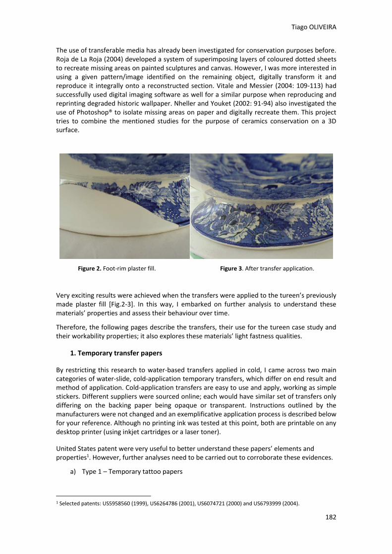
Tiago OLIVEIRA
182
The use of transferable media has already been investigated for conservation purposes before. Roja de La Roja (2004) developed a system of superimposing layers of coloured dotted sheets to recreate missing areas on painted sculptures and canvas. However, I was more interested in using a given pattern/image identified on the remaining object, digitally transform it and reproduce it integrally onto a reconstructed section. Vitale and Messier (2004: 109-113) had successfully used digital imaging software as well for a similar purpose when reproducing and reprinting degraded historic wallpaper. Nheller and Youket (2002: 91-94) also investigated the use of Photoshop® to isolate missing areas on paper and digitally recreate them. This project tries to combine the mentioned studies for the purpose of ceramics conservation on a 3D surface.
Figure 2. Foot-rim plaster fill. Figure 3. After transfer application.
Very exciting results were achieved when the transfers were applied to the tureen’s previously made plaster fill [Fig.2-3]. In this way, I embarked on further analysis to understand these materials’ properties and assess their behaviour over time.
Therefore, the following pages describe the transfers, their use for the tureen case study and their workability properties; it also explores these materials’ light fastness qualities.
1. Temporary transfer papers
By restricting this research to water-based transfers applied in cold, I came across two main categories of water-slide, cold-application temporary transfers, which differ on end result and method of application. Cold-application transfers are easy to use and apply, working as simple stickers. Different suppliers were sourced online; each would have similar set of transfers only differing on the backing paper being opaque or transparent. Instructions outlined by the manufacturers were not changed and an exemplificative application process is described below for your reference. Although no printing ink was tested at this point, both are printable on any desktop printer (using inkjet cartridges or a laser toner).
United States patent were very useful to better understand these papers’ elements and properties1. However, further analyses need to be carried out to corroborate these evidences.
a) Type 1 – Temporary tattoo papers
1 Selected patents: US5958560 (1999), US6264786 (2001), US6074721 (2000) and US6793999 (2004).
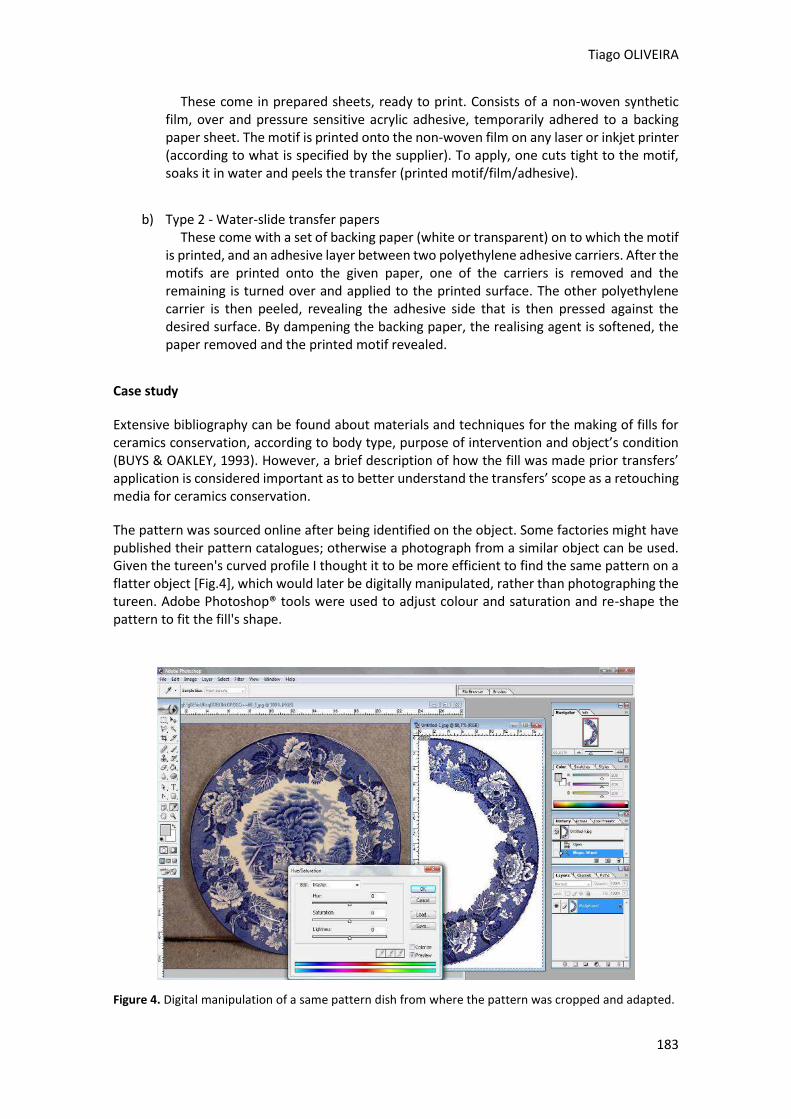
Tiago OLIVEIRA
183
These come in prepared sheets, ready to print. Consists of a non-woven synthetic film, over and pressure sensitive acrylic adhesive, temporarily adhered to a backing paper sheet. The motif is printed onto the non-woven film on any laser or inkjet printer (according to what is specified by the supplier). To apply, one cuts tight to the motif, soaks it in water and peels the transfer (printed motif/film/adhesive).
b) Type 2 - Water-slide transfer papers These come with a set of backing paper (white or transparent) on to which the motif
is printed, and an adhesive layer between two polyethylene adhesive carriers. After the motifs are printed onto the given paper, one of the carriers is removed and the remaining is turned over and applied to the printed surface. The other polyethylene carrier is then peeled, revealing the adhesive side that is then pressed against the desired surface. By dampening the backing paper, the realising agent is softened, the paper removed and the printed motif revealed.
Case study
Extensive bibliography can be found about materials and techniques for the making of fills for ceramics conservation, according to body type, purpose of intervention and object’s condition (BUYS & OAKLEY, 1993). However, a brief description of how the fill was made prior transfers’ application is considered important as to better understand the transfers’ scope as a retouching media for ceramics conservation.
The pattern was sourced online after being identified on the object. Some factories might have published their pattern catalogues; otherwise a photograph from a similar object can be used. Given the tureen's curved profile I thought it to be more efficient to find the same pattern on a flatter object [Fig.4], which would later be digitally manipulated, rather than photographing the tureen. Adobe Photoshop® tools were used to adjust colour and saturation and re-shape the pattern to fit the fill's shape.
Figure 4. Digital manipulation of a same pattern dish from where the pattern was cropped and adapted.
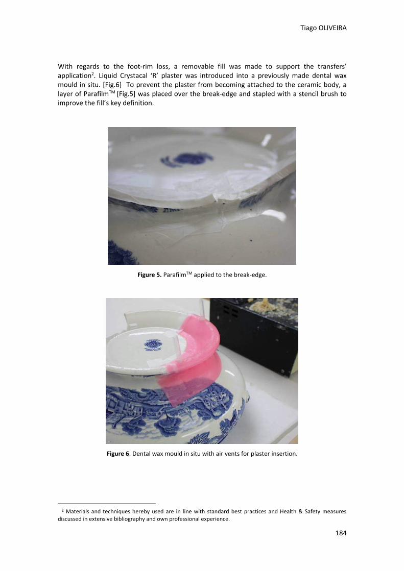
Tiago OLIVEIRA
184
With regards to the foot-rim loss, a removable fill was made to support the transfers’ application2. Liquid Crystacal ‘R’ plaster was introduced into a previously made dental wax mould in situ. [Fig.6] To prevent the plaster from becoming attached to the ceramic body, a layer of ParafilmTM [Fig.5] was placed over the break-edge and stapled with a stencil brush to improve the fill’s key definition.
Figure 5. ParafilmTM applied to the break-edge.
Figure 6. Dental wax mould in situ with air vents for plaster insertion.
2 Materials and techniques hereby used are in line with standard best practices and Health & Safety measures
discussed in extensive bibliography and own professional experience.
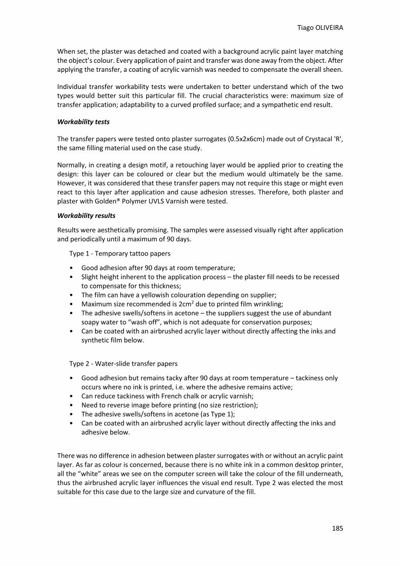
Tiago OLIVEIRA
185
When set, the plaster was detached and coated with a background acrylic paint layer matching the object’s colour. Every application of paint and transfer was done away from the object. After applying the transfer, a coating of acrylic varnish was needed to compensate the overall sheen.
Individual transfer workability tests were undertaken to better understand which of the two types would better suit this particular fill. The crucial characteristics were: maximum size of transfer application; adaptability to a curved profiled surface; and a sympathetic end result.
Workability tests
The transfer papers were tested onto plaster surrogates (0.5x2x6cm) made out of Crystacal 'R', the same filling material used on the case study.
Normally, in creating a design motif, a retouching layer would be applied prior to creating the design: this layer can be coloured or clear but the medium would ultimately be the same. However, it was considered that these transfer papers may not require this stage or might even react to this layer after application and cause adhesion stresses. Therefore, both plaster and plaster with Golden® Polymer UVLS Varnish were tested.
Workability results
Results were aesthetically promising. The samples were assessed visually right after application and periodically until a maximum of 90 days.
Type 1 - Temporary tattoo papers
• Good adhesion after 90 days at room temperature; • Slight height inherent to the application process – the plaster fill needs to be recessed
to compensate for this thickness; • The film can have a yellowish colouration depending on supplier; • Maximum size recommended is 2cm2 due to printed film wrinkling; • The adhesive swells/softens in acetone – the suppliers suggest the use of abundant
soapy water to “wash off”, which is not adequate for conservation purposes; • Can be coated with an airbrushed acrylic layer without directly affecting the inks and
synthetic film below.
Type 2 - Water-slide transfer papers
• Good adhesion but remains tacky after 90 days at room temperature – tackiness only occurs where no ink is printed, i.e. where the adhesive remains active;
• Can reduce tackiness with French chalk or acrylic varnish; • Need to reverse image before printing (no size restriction); • The adhesive swells/softens in acetone (as Type 1); • Can be coated with an airbrushed acrylic layer without directly affecting the inks and
adhesive below.
There was no difference in adhesion between plaster surrogates with or without an acrylic paint layer. As far as colour is concerned, because there is no white ink in a common desktop printer, all the “white” areas we see on the computer screen will take the colour of the fill underneath, thus the airbrushed acrylic layer influences the visual end result. Type 2 was elected the most suitable for this case due to the large size and curvature of the fill.
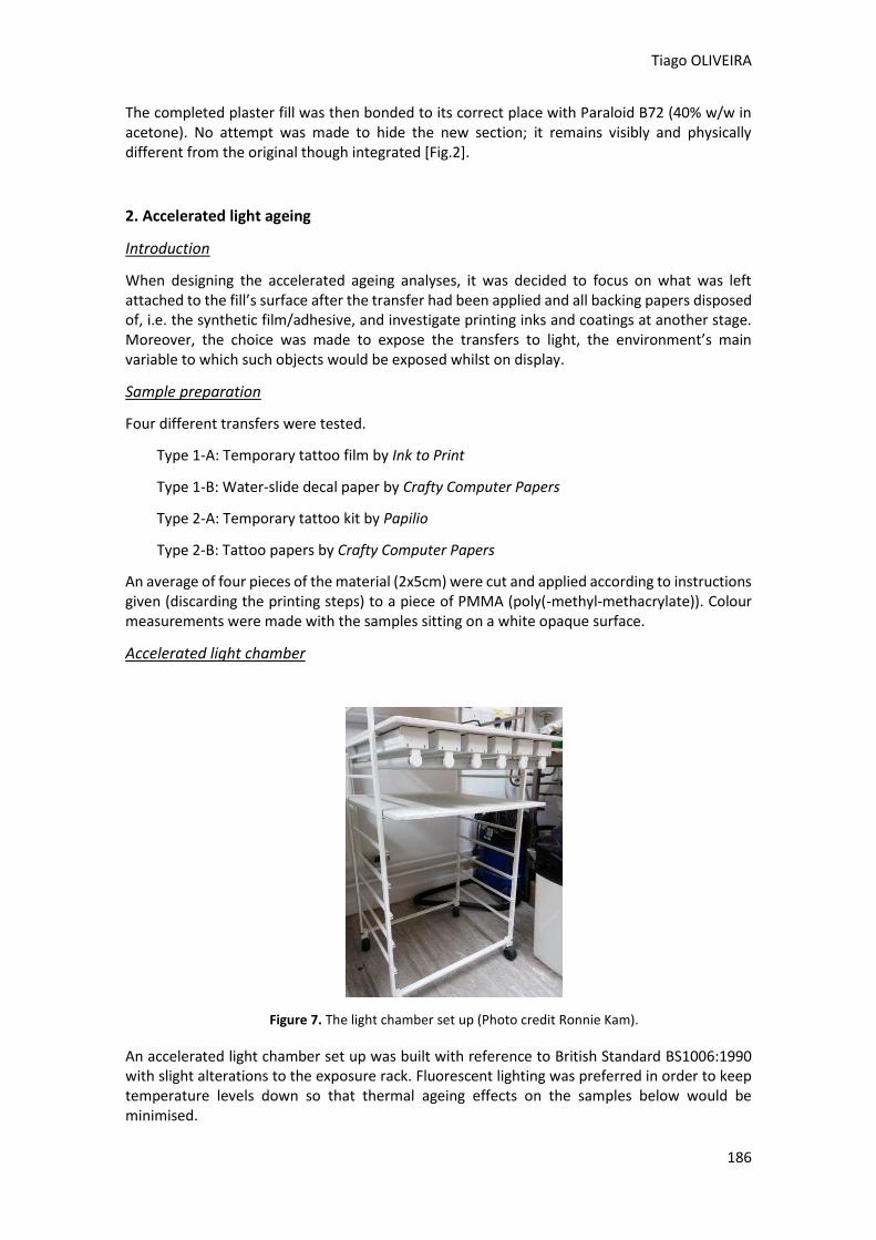
Tiago OLIVEIRA
186
The completed plaster fill was then bonded to its correct place with Paraloid B72 (40% w/w in acetone). No attempt was made to hide the new section; it remains visibly and physically different from the original though integrated [Fig.2].
2. Accelerated light ageing
Introduction
When designing the accelerated ageing analyses, it was decided to focus on what was left attached to the fill’s surface after the transfer had been applied and all backing papers disposed of, i.e. the synthetic film/adhesive, and investigate printing inks and coatings at another stage. Moreover, the choice was made to expose the transfers to light, the environment’s main variable to which such objects would be exposed whilst on display.
Sample preparation
Four different transfers were tested.
Type 1-A: Temporary tattoo film by Ink to Print
Type 1-B: Water-slide decal paper by Crafty Computer Papers
Type 2-A: Temporary tattoo kit by Papilio
Type 2-B: Tattoo papers by Crafty Computer Papers
An average of four pieces of the material (2x5cm) were cut and applied according to instructions given (discarding the printing steps) to a piece of PMMA (poly(-methyl-methacrylate)). Colour measurements were made with the samples sitting on a white opaque surface.
Accelerated light chamber
Figure 7. The light chamber set up (Photo credit Ronnie Kam).
An accelerated light chamber set up was built with reference to British Standard BS1006:1990 with slight alterations to the exposure rack. Fluorescent lighting was preferred in order to keep temperature levels down so that thermal ageing effects on the samples below would be minimised.
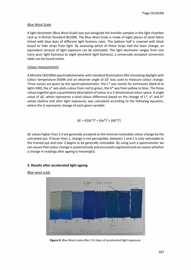
Tiago OLIVEIRA
187
Blue Wool Scale
A light dosimeter (Blue Wool Scale) was put alongside the transfer samples in the light chamber rack as in British Standard BS1006. The Blue Wool Scale is made of eight pieces of wool fabric tinted with blue dyes of different light fastness rates. The bottom half is covered with black board to hide strips from light. By assessing which of these strips had the least change, an equivalent amount of light exposure can be estimated. The light dosimeter ranges from one (very poor light fastness) to eight (excellent light fastness), a universally accepted conversion table can be found online.
Colour measurement
A Minolta CM2300d spectrophotometer with standard illumination D65 simulating daylight with colour temperature 6504K and an observer angle of 10˚ was used to measure colour change. Three values are given by the spectrophotometer: the L* axis stands for luminosity (dark=0 to light=100), the a* axis plots colour from red to green, the b* axis from yellow to blue. The three values together give a quantitative description of colour in a 3-dimensional colour space. A single value of ΔE, which represents a total colour difference based on the change of L*, a* and b* values (before and after light exposure), was calculated according to the following equation, where the Δ represents change of each given variable:
ΔE = √[(ΔL*)2 + (Δa*)2 + (Δb*)2]
ΔE values higher than 1.0 are generally accepted as the minimal noticeable colour change by the untrained eye. If lesser than 1, change is not perceptible, between 1 and 2 is only noticeable to the trained eye and over 2 begins to be generally noticeable. By using such a spectrometer we can assure that colour change is systematically and accurately registered and can assess whether a change in readings after ageing is meaningful.
3. Results after accelerated light ageing
Blue wool scale
Figure 8. Blue Wool scale after 115 days of accelerated light exposure.
Tiago OLIVEIRA
188
Figure 8 shows the Blue Wool scale after ageing; there is a visible change in colour towards the left side but it becomes less noticeable as it reaches the other end. According to the specification of ΔE greater than 1, a Blue Wool scale 6 was achieved, where the least colour change was measured (ΔE=5.7). The conversion table suggests an equivalent time period of 50 to 100 years of light exposure after 100 mega lux hours of illumination.
Blue Wool
Covered area Uncovered area ΔE
L*(D65) a*(D65) b*(D65) L*(D65) a*(D65) b*(D65)
#1 44.78 -5.69 -38.98 77.81 -2.22 8.31 57.8
#2 45.42 -7.45 -45.48 64.16 -9.29 -4.13 45.4
#3 40 0.64 -42.47 49.68 -5.28 -21.82 23.6
#4 39.88 3.11 -34.48 39.5 -7.07 -34.2 10.2
#5 33.86 2.79 -34.06 34.41 -4.22 -30.64 7.8
#6 35.63 -15.36 -22.88 32.77 -16.91 -27.61 5.7
#7 34.57 -2.26 -25.89 33.11 -6.95 -29.97 6.4
#8 36.4 -8.7 -21.24 33.15 -12.88 -27.16 7.9
Table 1. Spectrophotometer L*a*b* results from the Blue Wool Scale.
Temporary transfer papers
Table 2 shows the transfers’ colour change results measured with the spectrophotometer. These show that Type 1 transfers have the greatest change in colour (ΔE>1).
Although colour change is less noticeable on Type 2 samples, the adhesive remains active and tacky after ageing. Type 1 and Type 2 also show a ΔE value corresponding to change “unnoticeable to the untrained eye” or “invisible” respectively.
Papers Sample Before After 115 days
ΔE Average
ΔE L*(D65) a*(D65) b*(D65) L*(D65) a*(D65) b*(D65)
Type 1-A
#1 82.49 0.73 -1.77 82.83 0.9 -2.63 0.9
1.0 #2 84.04 0.46 -1.63 82.54 0.94 -2.51 1.8
#3 82.34 0.71 -2.08 82.63 0.89 -2.45 0.5
#4 82.35 0.62 -1.75 82.41 0.89 -2.42 0.7
Type 1-B
#5 91.02 1.26 -4.91 89.71 1.05 -3.18 2.2
1.6 #6 90.34 1.34 -4.65 90.46 1.09 -3.27 1.4
#7 91.11 1.28 -4.88 90.83 1.07 -3.47 1.5
Tiago OLIVEIRA
189
#8 90.92 1.29 -4.63 90.51 1.04 -3.47 1.3
Type 2-A
#9 91.02 1.27 -4.7 91.19 1.12 -4.53 0.3
0.8
#10 90.6 1.24 -4.7 89.69 0.99 -3.4 1.6
#11 91.84 1.31 -4.84 91.58 1.19 -4.5 0.4
#12 91.76 1.3 -4.94 91.59 1.18 -4.47 0.5
#13 91.51 1.33 -4.78 91.7 1.17 -4.54 0.3
#14 91.91 1.28 -5.08 90.98 1.2 -4.04 1.4
Type 2-B
#15 91.63 1.34 -4.98 91.98 1.21 -4.79 0.4
0.6 #16 91.48 1.35 -5.06 90.95 1.18 -4.3 0.9
#17 91.54 1.29 -5.06 91.65 1.21 -4.64 0.4
Table 2. Spectrophotometer L*a*b* results from the temporary transfer papers.
Conclusion
Important steps were taken with this investigation towards the use of this kind of material for reinstating large decorative areas of loss in the conservation of ceramic objects. Far from exhaustive, this investigation sheds a light on the benefits of their use, their applicability in conservation and discusses long-term properties.
The use of transfer papers in this case study exemplifies what can be achieved aesthetically. Problems related to tackiness of Type 2 transfers need to be better investigated in the future, as well as their relationship with posteriorly applied coatings. Because the fill is detachable, even if the transfer or ink discolours immensely, it can be easily reversed without any harm to the object being done. In the long term it remains an easy, cost efficient system of reinstating decorative motifs on large plaster fills when compared to the hand-retouching option.
The light ageing analyses suggest a more stable performance of Type 2 over a period of 50 to 100 years with proper lighting and mounting conditions. Within this time period the adhesive should not discolour to a degree that it becomes noticeable. Before adapting this technique, inks and coatings should also be investigated for long-term ageing.
Acknowledgements
The author wishes to thank his tutors David Dorning and Lorna Calcutt at West Dean College for their guidance and invaluable help whilst a student and as a graduate, especially with regards to the use of the accelerated light equipment. Also special thanks to Professor Norman Billingham (University of Sussex), Whitney Baker (University of Kansas Libraries). Ronnie Kam and Abigail Bainbridge (West Dean College).
References Buys, S. & Oakley, V. 1993. The conservation and restoration of ceramics. Oxford [England]: Butterworth-Heinemann
Nheller, D. & Youket, M. 2002. A Tale of Two Facsimiles: Incorporating Digital Technology in Conservation Treatments. The Book and Paper Group Annual, 21: 91-94
Tiago OLIVEIRA
190
Oakley, V. & Jain, K. 2002. Essentials in the care and conservation of historical ceramic objects. London: Archetype
Petrie, K. 2011. Ceramic Transfer Printing. London: A & C Black
Roja de la Roja, J. M. de la. 2004. Sistema de reintegración cromática asistido por medios transferibles obtenidos por procedimientos fotomecánicos: aplicación en la restauración de pintura de caballete. PHD thesis, Universidad Complutense de Madrid
Vitale, T. & Messier, P. 2004. Historic Wallpaper Digitally Remastered: Early Twentieth-Century Block-Printed English Wallpaper in the Yin Yu Tang House at the Peabody Essex Museum. The Book and Paper Group Annual, 23: 109-113
Websites
Crafty Computer papers, 2014. [online] [Accessed 13 November 2014]. Available at: <http://www.craftycomputerpaper.co.uk> EFI, 2014. Delta E, Delta H, Delta T: what does it mean? [online] [Accessed 2 October 2014]. Available at: http://w3.efi.com/pt/services/fiery-wide-format-services/~/media/1A8918DA81 B94403AB824E27536EDF58.pdf HandPrint, 2005. Blue wool, ASTM Light-fastness Standards. [online] [Accessed 6 October 2014]. Available at: <http://www.handprint.com/HP/WCL/pigmt6.html>
InkToPrint, 2014. [online] [Accessed 13 November 2014]. Available at: http://www.inktoprint.co.uk Papilio, 2014. [online] [Accessed 13 November 2014]. Available at: http://www.papilio.com
Structuring at the retouching step.
State of the art: Study of the issues,
materials and techniques
Gaëlle PENTIER
2nd International Meeting on Retouching of Cultural Heritage RECH2
Porto, Portugal | 24-25 October 2014 _____________________________________________________________________
192
Structuring at the retouching step
State of the art: Study of the issues, materials and techniques.
Gaëlle PENTIER*
1 Independent restorer
Abstract
Pictorial creation is in constant mutation in both ways of expression and materials used. This evolution gives rise to new problematics, which can challenge the current retouching methods. The recent commercialization of a range of mediums called the B72 Retouching Gels®, has introduced a new generation of retouching mediums inspired by 19th and 20th century practices.
What we chose to name “the structural retouching” consists in reintegrating, in one step, colours and physical surface texture of a lacuna. In contrast with the filling-retouching method that matches the surface texture and then the colour, this method would globally match the colour, plasticity and internal structure.
The wet-in wet effects, overlaying of glazing and the highest impastos would be some of the practical advantages of this method.
By contrasting the notion of structure with the notion of texture, a notion brought by traditional two step reintegration technique, this review first explores the singularity of the structural retouching. Furthermore, it then evaluates if the structural retouching can be used as an alternative to the current retouching methods: by first contrasting it with the practical and ethical requirements of conservation, by then investigating the different materials which can be used to create a bodied retouching, and finally by testing three categories of them through practical and aging tests.
Conclusions of this review reveal that, besides reproducing the idiosyncrasy of the pictorial vocabulary, the embodied retouching method brings a precious alternative through complex retouching cases where traditional methods have reached their limits.
Keywords: Retouching, B72 Retouching Gels®, Rheology, Structure, Wax.
Gaëlle PENTIER
193
Introduction Pictorial creation is in constant mutation in both ways of expression and materials used. This evolution gives rise to new problematics, which can challenge the current retouching methods. The recent commercialization of a range of retouching mediums in gel allows tackling complex cases of retouching, opening a new approach. The “structural retouching” offers body to retouching and is inspired by 19th and 20th century’s practices of retouching. It consists in a chromatic and structural lacuna filling in one step. This review defines the particularities of this method, delimits its practical fields and investigates on some products capable of implementing it. Those products are selected, defined and then tested within some experimentation. The purpose is to provide practical tools and reflection tracks to professionals curious to know in which extent structuring retouching constitutes an alternative. The «traditional » method of visual reintegration and its limits.
Reintegration: the traditional division in two steps… As for every step of a restoration process, the retouching stage demands a strict deontology and a case-by-case adaptability. However, one method is preferentially used for most of the cases. Indeed, filling a lacuna is traditionally divided into two distinct steps: in a first time a texture reconstruction, and in a second time a colours retouching. This step-by-step division allows the restorer to precisely adjust his approach by independently modulate the filler form, and the chromaticism of the lacuna. This two-step method is established in our modern practice. This legitimacy is obviously due to efficiency reasons, but also probably due to ethic reasons. By using a filling base, the restorer distinguishes his intervention from the painter’s. Moreover, the use of fluid retouching medium independently to the surface texture, allows visible retouching techniques as tratteggio or pointillism. …and its limits face to complex retouching cases and to the evolution of pictorial languages. If the traditional way of lacuna reintegration did prove its worth and proved that it is suitable to the majority of cases, it can be challenged by some particular situations. Those complex retouching cases can be due to different raisons: Evolution of pictorial languages. Since the Industrial Revolution, artists have at their disposition more and more new synthetic materials and adopt more individual pictorial researches. It gave rise to a large variety of pictorial structures that can challenge the traditional techniques of restoration. Each singular pictorial work of art requires a singular retouching approach. Lots of restorer adapted their approach spontaneously through specific methods in order to respond to the evolution of pictorial languages. For example, Eugène Leroy was a French artist who painted by accumulating thick oil paint layers. Still wet in the inside layers but seemingly dry on the outside, the whole paint structure is slowly moving in a way which is similar to tectonic plates. Grazia Nicosia developed few years ago a specific
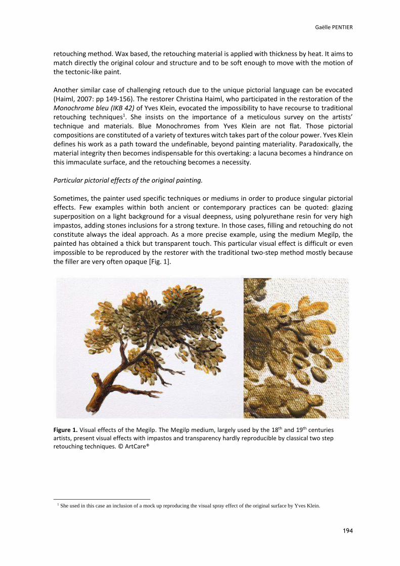
Gaëlle PENTIER
194
retouching method. Wax based, the retouching material is applied with thickness by heat. It aims to match directly the original colour and structure and to be soft enough to move with the motion of the tectonic-like paint. Another similar case of challenging retouch due to the unique pictorial language can be evocated (Haiml, 2007: pp 149-156). The restorer Christina Haiml, who participated in the restoration of the Monochrome bleu (IKB 42) of Yves Klein, evocated the impossibility to have recourse to traditional retouching techniques1. She insists on the importance of a meticulous survey on the artists’ technique and materials. Blue Monochromes from Yves Klein are not flat. Those pictorial compositions are constituted of a variety of textures witch takes part of the colour power. Yves Klein defines his work as a path toward the undefinable, beyond painting materiality. Paradoxically, the material integrity then becomes indispensable for this overtaking: a lacuna becomes a hindrance on this immaculate surface, and the retouching becomes a necessity. Particular pictorial effects of the original painting. Sometimes, the painter used specific techniques or mediums in order to produce singular pictorial effects. Few examples within both ancient or contemporary practices can be quoted: glazing superposition on a light background for a visual deepness, using polyurethane resin for very high impastos, adding stones inclusions for a strong texture. In those cases, filling and retouching do not constitute always the ideal approach. As a more precise example, using the medium Megilp, the painted has obtained a thick but transparent touch. This particular visual effect is difficult or even impossible to be reproduced by the restorer with the traditional two-step method mostly because the filler are very often opaque [Fig. 1].
Figure 1. Visual effects of the Megilp. The Megilp medium, largely used by the 18th and 19th centuries artists, present visual effects with impastos and transparency hardly reproducible by classical two step retouching techniques. © ArtCare®
1 She used in this case an inclusion of a mock up reproducing the visual spray effect of the original surface by Yves Klein.
Gaëlle PENTIER
195
Particular condition of the original painting. The conservation state of the painting can induce specific structures within the original paint layer. In some situations, traditional retouching methods can reach their limits. For example, a burn on a painting can create blisters. In this case, it seems impossible to fill the blister with traditional opaque filler without cover the original colour at the same time. As another example, if the painting is highly damaged and a large part of the composition is missing, a reconstruction can sometimes be decided by the restorer. The duo filling-retouching seems very laborious for large reconstructions (Maisey, 2012: pp. 20-23.). Constitutive materials of the painting. We can here broach the domain of retouching of oil painting on copper where the mastic question remains still open. Indeed the support is not compatible with organic materials traditionally used in fillers (wax, animal glue, natural resins...). For a corrosion matter, an isolation layer with a synthetic resin, often Paraloïd B72, is necessary. Moreover, mastic is a delicate operation on this type of smooth surface. The support presents no roughness to hold on and the pictorial layer is often very thin, up to few microns thick. Working in transparency is impossible with the mastic-retouching technique and yet it is very important in those particular cases. Usually for this type of painting, the warm red and sparkling presence of the copper stays slightly visible and has an influence on the global original composition. Notions of structure and texture All those situations quoted above emphasize the strong difference between notions of texture and structure. If the mastic-retouching process provides surface texture to the lacuna, the structuring retouching gives a deep masonry. Texture is the surface topography of a painting. Structure is the optical result of different interactions between layers composing it. What are the alternatives to restorers when “traditional” methods and material reach their limits? How adding structure to the material can be possible and is it a legitimate solution? Some answers can be found by studying creation materials of painters during the history and their interesting properties. Modify the matter structure: the artist’s mediums.
Through History, artists largely tried to modulate the body of paint matter. They elaborated and used various mediums added to the paint blend. These mediums exist in numerous forms as emulsions, wax based mixings, or additions of diverse texture additives. Among them, structure mediums have common purposes. They can hold in place the pictorial execution, fix texture of brush strokes, sharpen paint touch or even allow a good glaze superposition even before total drying. Animal origin ingredients as animal glue, egg yolk or egg white (Groen, 1997: 224), were thus used as emulsions in order to provide oil paint layer of various properties. Plant origin components2 could
2 Within artistic production of artists contemporary to Van Eyck, presence of a protein based substrate and of an oil substrate in the same paint composition has been recognized (sometimes in the underlayers for Van der Weyden, Campin or Bouts). (Masschelein-Kleiner, 2005 : 67).
For Van Eyck, it is still an open question. Theories explaining the exceptional aspect of his paintings abound (Effmann, 2006 :17-26.).
Gaëlle PENTIER
196
have played the same role as gums (gum arabic, sandarac,..), dextrin or starch (Carlyle, 2001: 108-110). Except the emulsions and among numerous other types, gel mediums could be evocated. Gels exploit the thixotropic combination of siccative oil and mastic resin. Those gels are known as thixotropic because they get fluid by stirring and regenerate at rest. Abundant variances of those recipes exists but are all based on one principle: the presence of mastic resin associated with high molecular weight metals, as lead, results in the formation of a gel within the blending. It is under this condition that singular handling properties can be obtained. Gel mediums peaked during Baroque period, but their interest had already been caught by Flemish Primitives who wanted a matter fluid but consistent, easy to handle, and allowing rich and sharp details. Primitives used it for a wet-in-wet glaze superposition; Baroque artists used it for a dynamic and personal execution as well as a fast work (Manguta, 2010: 191). Megilp and Gumtion mediums, used later by English artists from 18th and 19th centuries, are based on the same principle. One of the first mentions about the Megilp medium in literature sources was from Sir Joshua Reynolds who referred to a « Magilp » medium3 in 1767. It probably originated from abroad as several sources situating it from Italy. Others sources consider it as ensuing from one recipe of Van Dyck, who dwelt in England between 1632 and 1641 (Carlyle, 2001: 134).
One variant of Megilp medium is the Gumption or Gumtion medium, mentioned before. It was developed by the English painter Julius Caesar Ibbetson (1759-1817). He used the rough mastic resin instead of a mastic resin (dissolved in turpentine spirit as in Megilp recipes), a raw linseed oil instead of a modified siccative oil, and introduced lead in the form of acetates. The entire blending was then grinded without heat or solvents (Carlyle, 2001: 106,107). An interesting thing is that his first vocation was painting restoration. For this function, he wanted a medium able to match hue of ancient paintings. Convinced that colours transparency, richness of the paint touch and precision of ancient masters’ technique were due to a particular additive, he tested some mediums. Judging Megilp was a too fast drying medium, he developed Gumtion that he qualified as inestimable (Carlyle, 2001: 106,107). Wet-in-wet, fast superposition of layers, and the possibility to modify a precise area without compromising underlayers, are very interesting properties opened by the thixotropy, for artists but also a fortiori for restorers. Materials of the structural retouching Those researches of painters meet those of restorers: materials of structural retouching have to be inspired from the creation area. Nevertheless, those remarks have to tempered by precising that structure on an original painting is not always the consequence of creator‘s actions. It can be due to constitutive materials, to the passage of time, or accidental alterations. Moreover, closer to the original paint building, and inspired by artists’ materials and paint properties, the structural retouching needs to be restrained by some ethical markers. Because of the structural retouching mediums’ body, tools used within a retouching process are closer to original artists’ tools (larges brushes to create the same impasto effect, spray gun, paint knife). Bodied retouching has to ethically distinguish itself from the creation step. Similar to oil bodied retouching techniques from
3 Volume I of his accounting book of 1767.
Gaëlle PENTIER
197
the 19th and 20th centuries, the structural retouching however differs from them by using reversible materials. Finally, the structural retouching, insuring structure and colour in one step, is unable to create a vibrating visible retouching. The legitimate domain of use of the structural retouching is restrained to illusionist retouching. This review has to be considered with this information in mind. Through the prism of those ethical markers and of the artists’ mediums properties, few ranges of potential structural retouching mediums have been selected.
The specialized type: B72 Retouching® gels
Figure 2. Range of the eight Paraloïd® B-72 gels4 supplied by ArtCare® The range is here entirely presented. Three colours illustrate the three evaporation speeds of solvents present in the gels: purple for the solvent having a very slow speed of evaporation, green for the slow ones, and blue for the fast
evaporation gels. © G. Pentier.
The B72 Retouching gels® were created by an English restorer, Peter Koneczny. In 2007, he succeeded to develop a range of eight translucent gels from Paraloid B72 resin (Acryloid B72) without adding any thickener, and commercialized it in 2010. Those thixotropic gels are exclusively composed with this resin in solution and a HALS (Hindered Amine Light Stabiliser). Properties of each gel vary according to the concentration of Paraloid B72, the volatility of the solvent and organization degree of molecules. The consequence leads to variation of different consistencies, drying times, brilliance and sharpness of surface texture. Fumed silica is added in two of the eight gels to widen the properties. The thixotropy advantages of those gels and some different ways of use into retouching process are suggested in detail in the supplier website5 [Fig.2].
4 For practical matter, this review will use the term “ Paraloid gels “. 5 Artcare.org
Gaëlle PENTIER
198
Paraloïd B72 resin concentration
Dowanol® PM 1-methoxy-2-propanol6 / propylene glycol monomethyl ether / methylproxitol Volatility : + Slightly slower than Xylene.
Dowanol® PnP 1-propoxy-2-propanol /Propylene glycol n-propyl ether. Volatility : As white spirit or Shellsol® A100.
Dowanol® DPM 1-(2-methoxy isopropoxy)-2-propanol / Dipropylene glycol monomethyl ether/Methyl diproxitol As Shellsol® D60. Same sensation as working with oil paint.
Liquid crystal phase + Fumed silica
Liquid crystal phase
Liquid crystal phase Liquid crystal phase
25% Fast - Hard 25 Si
20% Fast - Heavy 20
Slow – Heavy 20
10% Fast - Light 10 Si
Fast - Light 10 Slow – Light 110 Very Slow – Light 10
7,5% Fast - Very Light 7,5
Figure 3. The eight gels are here classified following (Koneczny, 2010: 149) the solvent in the composition and the global Paraloïd B72 concentration leading to the consistency of each gel: « Very Light » / « Light »/ « Heavy »/ « Hard ».
Peter Koneczny precises that mixing gels or adding B72 Paraloïd liquid resin is a way to adjust properties (Koneczny, 2010: 158). The final effect then depends on the support porosity, the concentration of pigments added, application tools and the movement of the restorer [Fig.3].
Liquid crystal phase
The gel consistency and the thixotropic properties are due to a particular physical phase where molecules are ordered as in a crystalline solid but can move like in a liquid: the liquid crystal phase. Material presenting a liquid crystal phase are actually quite numerous in nature (as ADN, or some cellulosic derivatives) and, because of their molecules orientation, own particular optical properties (as molecules contained in the iridescent carapace of some beetles, or the LCD screens (Liquid Crystal Display).
Hals (Hindered Amine Light Stabilizer)
The liquid crystal phase results from the presence, within the resin solution, of a particular HALS. Restorer use to stabilize their varnishes with most of the time Tinuvin® 292. But this is a polymeric
6 This solvent can be a swelling agent for original paint, old oils or protein based layers (Lowry, 2010: 89).
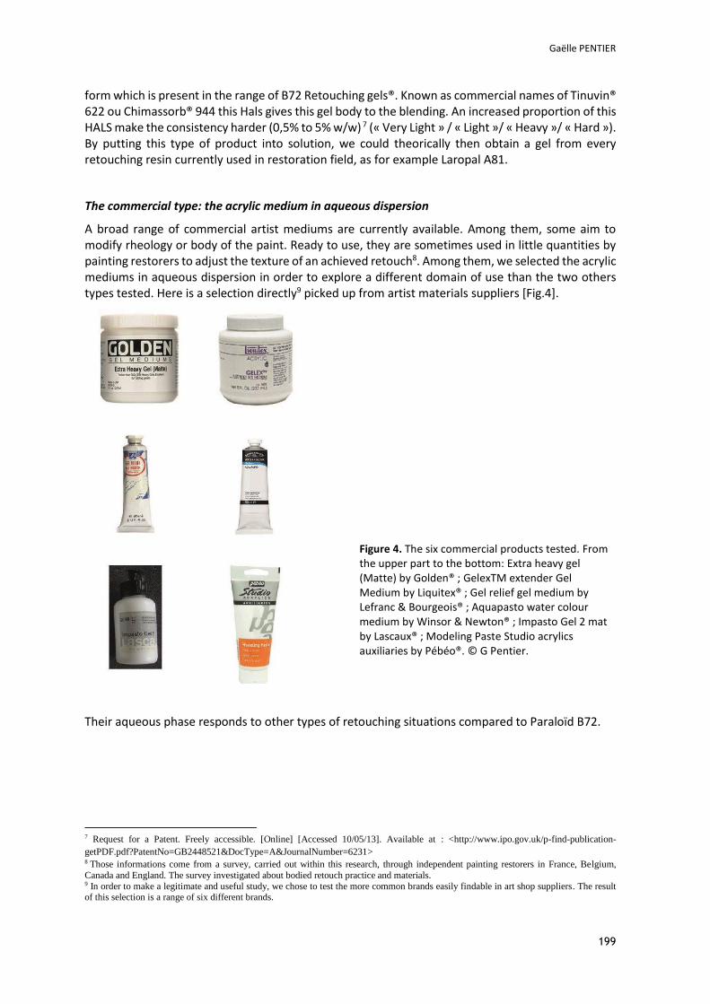
Gaëlle PENTIER
199
form which is present in the range of B72 Retouching gels®. Known as commercial names of Tinuvin® 622 ou Chimassorb® 944 this Hals gives this gel body to the blending. An increased proportion of this HALS make the consistency harder (0,5% to 5% w/w) 7 (« Very Light » / « Light »/ « Heavy »/ « Hard »). By putting this type of product into solution, we could theorically then obtain a gel from every retouching resin currently used in restoration field, as for example Laropal A81.
The commercial type: the acrylic medium in aqueous dispersion
A broad range of commercial artist mediums are currently available. Among them, some aim to modify rheology or body of the paint. Ready to use, they are sometimes used in little quantities by painting restorers to adjust the texture of an achieved retouch8. Among them, we selected the acrylic mediums in aqueous dispersion in order to explore a different domain of use than the two others types tested. Here is a selection directly9 picked up from artist materials suppliers [Fig.4].
Figure 4. The six commercial products tested. From the upper part to the bottom: Extra heavy gel (Matte) by Golden® ; GelexTM extender Gel Medium by Liquitex® ; Gel relief gel medium by Lefranc & Bourgeois® ; Aquapasto water colour medium by Winsor & Newton® ; Impasto Gel 2 mat by Lascaux® ; Modeling Paste Studio acrylics auxiliaries by Pébéo®. © G Pentier.
Their aqueous phase responds to other types of retouching situations compared to Paraloïd B72.
7 Request for a Patent. Freely accessible. [Online] [Accessed 10/05/13]. Available at : <http://www.ipo.gov.uk/p-find-publication-getPDF.pdf?PatentNo=GB2448521&DocType=A&JournalNumber=6231> 8 Those informations come from a survey, carried out within this research, through independent painting restorers in France, Belgium, Canada and England. The survey investigated about bodied retouch practice and materials. 9 In order to make a legitimate and useful study, we chose to test the more common brands easily findable in art shop suppliers. The result of this selection is a range of six different brands.
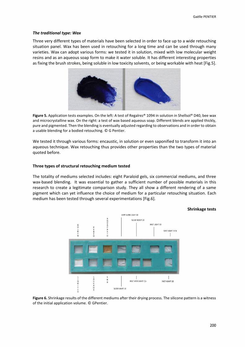
Gaëlle PENTIER
200
The traditional type: Wax
Three very different types of materials have been selected in order to face up to a wide retouching situation panel. Wax has been used in retouching for a long time and can be used through many varieties. Wax can adopt various forms: we tested it in solution, mixed with low molecular weight resins and as an aqueous soap form to make it water soluble. It has different interesting properties as fixing the brush strokes, being soluble in low toxicity solvents, or being workable with heat [Fig.5].
Figure 5. Application tests examples. On the left: A test of Regalrez® 1094 in solution in Shellsol® D40, bee wax and microcrystalline wax. On the right: a test of wax based aqueous soap. Different blends are applied thickly, pure and pigmented. Then the blending is eventually adjusted regarding to observations and in order to obtain a usable blending for a bodied retouching. © G Pentier.
We tested it through various forms: encaustic, in solution or even saponified to transform it into an aqueous technique. Wax retouching thus provides other properties than the two types of material quoted before.
Three types of structural retouching medium tested
The totality of mediums selected includes: eight Paraloid gels, six commercial mediums, and three wax-based blending. It was essential to gather a sufficient number of possible materials in this research to create a legitimate comparison study. They all show a different rendering of a same pigment which can yet influence the choice of medium for a particular retouching situation. Each medium has been tested through several experimentations [Fig.6].
Shrinkage tests
Figure 6. Shrinkage results of the different mediums after their drying process. The silicone pattern is a witness of the initial application volume. © GPentier.
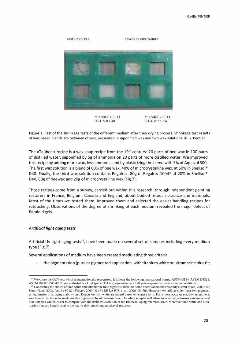
Gaëlle PENTIER
201
Figure 7. Rest of the shrinkage tests of the different medium after their drying process. Shrinkage test results of wax based blends are between others, presented: a saponified wax and two wax solutions. © G. Pentier.
The «Taüber » recipe is a wax soap recipe from the 19th century: 20 parts of bee wax in 100 parts of distilled water, saponified by 5g of ammonia on 20 parts of more distilled water. We improved this recipe by adding more wax, less ammonia and by plasticizing the blend with 5% of Aquazol 500. The first wax solution is a blend of 60% of bee wax, 40% of microcrystalline wax, at 50% in Shellsol® D40. Finally, the third wax solution contains Regalrez: 80g of Regalrez 1094® at 20% in Shellsol® D40, 60g of beewax and 20g of microcrystalline wax [Fig.7]. Those recipes come from a survey, carried out within this research, through independent painting restorers in France, Belgium, Canada and England, about bodied retouch practice and materials. Most of the times we tested them, improved them and selected the easier handling recipes for retouching. Observations of the degree of shrinking of each medium revealed the major defect of Paraloid gels. Artificial light aging tests
Artificial Uv Light aging tests10, have been made on several set of samples including every medium type [Fig.7].
Several applications of medium have been created modulating three criteria:
- the pigmentation (pure or pigmented application, with titanium white or ultramarine blue)11;
10 We chose the QUV test which is internationally recognized. It follows the following international norms: ASTM G154, ASTM D4329,
ASTM D4587, ISO 4892. We evaluated our UvA (pic at 351 nm) equivalent to a 120 years exposition under museum conditions. 11 Concerning the choice of titan white and ultramarine blue pigments: there are some doubts about their stability (Szmit-Naud, 2006 : 69;
Szmit-Naud, 2003, Part 2 : 80-82 ; Froyen, 2009 : 5-17 ; DE LA RIE, et al., 2000 : 51-59). However, we still consider those two pigments as legitimates in an aging stability test. Doubts on titan white are indeed based on anatase form. For a more accurate stability assessment, we chose to test the same mediums also pigmented by ultramarine blue. The white samples will allow an eventual yellowing assessment and blue samples will be easier to compare with the drabness evolution of the Bluewool aging reference scale. Moreover titan white and ultra-marine blue are largely used in the day-to-day retouching practice of restorers.
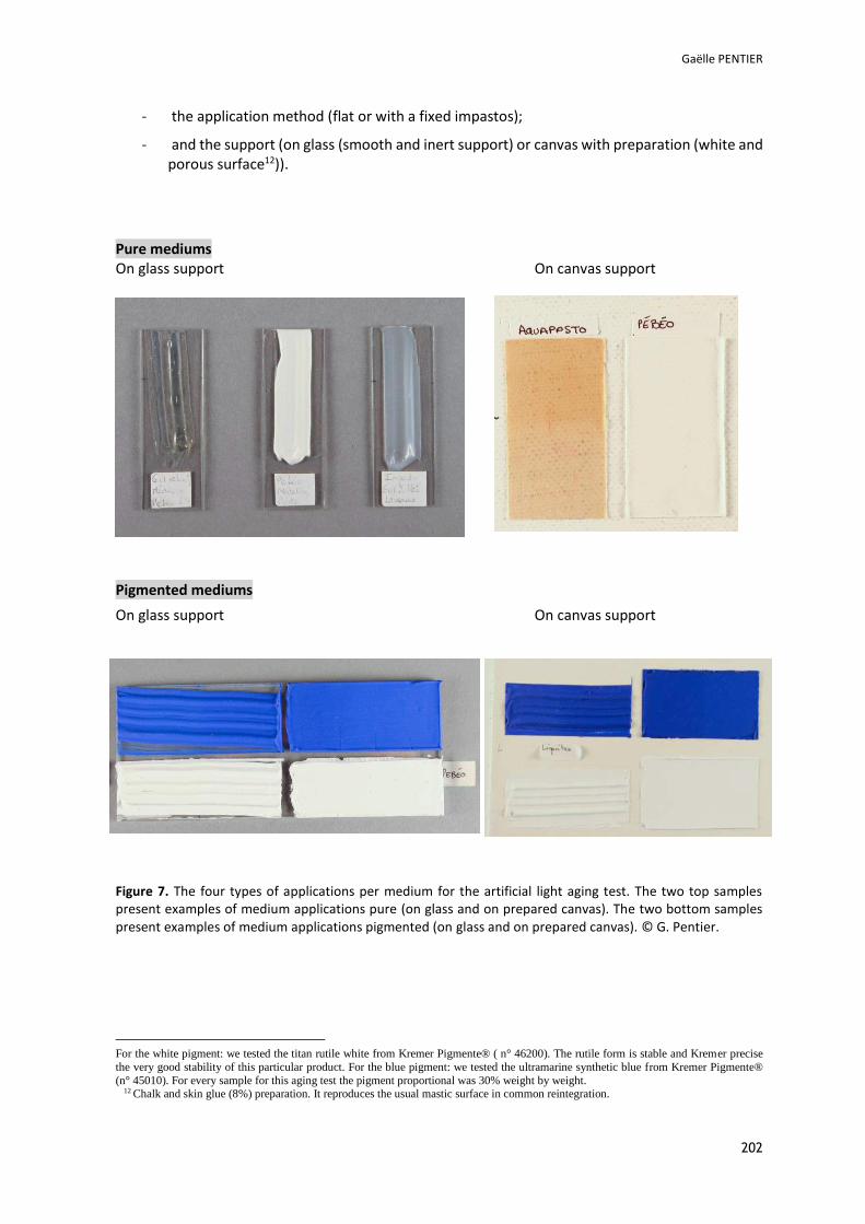
Gaëlle PENTIER
202
- the application method (flat or with a fixed impastos);
- and the support (on glass (smooth and inert support) or canvas with preparation (white and porous surface12)).
Pure mediums On glass support On canvas support
Pigmented mediums
On glass support On canvas support
Figure 7. The four types of applications per medium for the artificial light aging test. The two top samples present examples of medium applications pure (on glass and on prepared canvas). The two bottom samples present examples of medium applications pigmented (on glass and on prepared canvas). © G. Pentier.
For the white pigment: we tested the titan rutile white from Kremer Pigmente® ( n° 46200). The rutile form is stable and Kremer precise the very good stability of this particular product. For the blue pigment: we tested the ultramarine synthetic blue from Kremer Pigmente® (n° 45010). For every sample for this aging test the pigment proportional was 30% weight by weight.
12 Chalk and skin glue (8%) preparation. It reproduces the usual mastic surface in common reintegration.

Gaëlle PENTIER
203
Here are graphics of colourimetric measures resulting from the artificial aging tests13. Results are more visible for the applications of pure mediums. Three series of measures had been made14. Their results are summarized into the three following graphics [Fig. 8, 9, 10]:
Figure 8. Colour change results Delta E15 for the pigmented samples on glass support. For the pigmented tests, each medium had been pigmented with two different pigments. For the Ultramarine blue pigmented samples, results are coloured in blue, and in white for the Titanium white samples. The visibility of eventual colour change is considered to be detectable by naked eyes above 216. © G Pentier.
Figure 9. Colour change results Delta E for the pigmented samples on canvas support. For the pigmented tests, each medium had been pigmented with two different pigments. For the Ultramarine blue pigmented samples, results are coloured in blue, and in white for the Titanium white samples. The visibility of eventual colour change is considered to be detectable by naked eyes above 2. © G Pentier.
13 A Minolta CR-221 colourimeter (Illuminant D65 and standard observer 2° 1931) was used to make colour changes measurements.
Measurements are situated in the CIE Yxy colourimetric space. Each sample has been measured in the light exposed area and on the unex-posed area in order to compare those two measurements and assess the colour change resulting from the light aging process. Results were then converted into Lab space coordinates in order to measure Delta E.
14 The fourth range of samples (pure on glass support) could not be measured for practical reasons. It had been applied exclusively with structure : it is not suitable for the colourimeter device.
15 Delta E is the colourimetric difference between the unexposed area and the Uv-light exposed area of a precise sample. It is calculated from Lab coordinates measured with the colourimeter: ΔE=√(La’-La)2+(aa’-aa) 2+(bb’-bb) 2). Measurements ‘correspond to colourimetric coordinates of the exposed area.
16 Some results about Paraloid Gels are in the two following graphics, surprisingly higher than 2. It could be a colourimetric measurements error, because no colour changes had been visible in naked eyes after artificial light aging.
Delt
a E
: D
iffe
rence b
etw
een c
olo
urs
befo
re a
nd a
fter
art
ific
ial light
agin
g.
Materials tested
Evaluation of colour changes: Pigmented samples on glass support.
Evaluation of colour changes: Pigmented samples on canvas support.
Delt
a E
: D
iffe
rence b
etw
een c
olo
urs
befo
re a
nd a
fter
art
ific
ial light
agin
g.
Materials tested
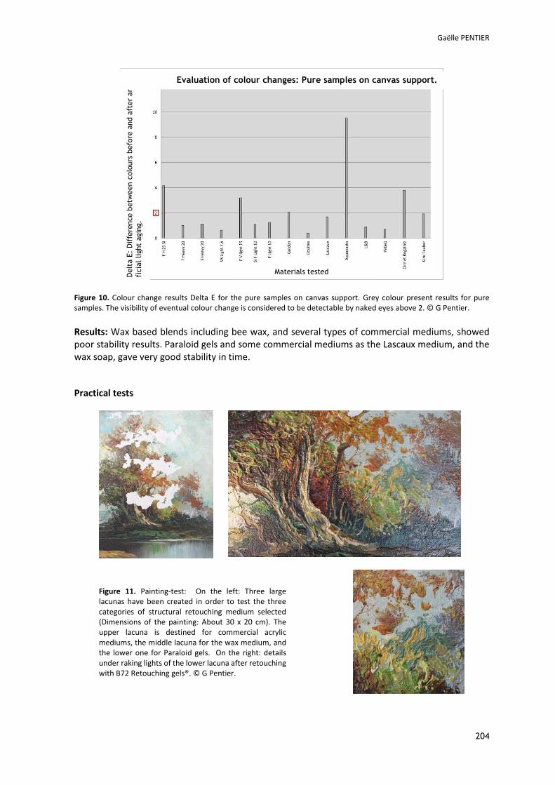
Gaëlle PENTIER
204
Figure 10. Colour change results Delta E for the pure samples on canvas support. Grey colour present results for pure samples. The visibility of eventual colour change is considered to be detectable by naked eyes above 2. © G Pentier.
Results: Wax based blends including bee wax, and several types of commercial mediums, showed poor stability results. Paraloid gels and some commercial mediums as the Lascaux medium, and the wax soap, gave very good stability in time.
Practical tests
Figure 11. Painting-test: On the left: Three large lacunas have been created in order to test the three categories of structural retouching medium selected (Dimensions of the painting: About 30 x 20 cm). The upper lacuna is destined for commercial acrylic mediums, the middle lacuna for the wax medium, and the lower one for Paraloid gels. On the right: details under raking lights of the lower lacuna after retouching with B72 Retouching gels®. © G Pentier.
Delt
a E
: D
iffe
rence b
etw
een c
olo
urs
befo
re a
nd a
fter
art
i-
ficia
l light
agin
g.
Materials tested
Evaluation of colour changes: Pure samples on canvas support.
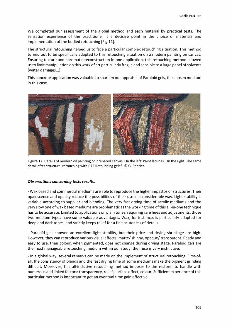
Gaëlle PENTIER
205
We completed our assessment of the global method and each material by practical tests. The sensation experience of the practitioner is a decisive point in the choice of materials and implementation of the bodied retouching [Fig.11].
The structural retouching helped us to face a particular complex retouching situation. This method turned out to be specifically adapted to this retouching situation on a modern painting on canvas. Ensuring texture and chromatic reconstruction in one application, this retouching method allowed us to limit manipulation on this work of art particularly fragile and sensible to a large panel of solvents (water damages...)
This concrete application was valuable to sharpen our appraisal of Paraloid gels, the chosen medium in this case.
Figure 12. Details of modern oil painting on prepared canvas. On the left: Paint lacunas. On the right: The same detail after structural retouching with B72 Retouching gels®. © G. Pentier.
Observations concerning tests results.
- Wax based and commercial mediums are able to reproduce the higher impastos or structures. Their opalescence and opacity reduce the possibilities of their use in a considerable way. Light stability is variable according to supplier and blending. The very fast drying time of acrylic mediums and the very slow one of wax based mediums are problematic as the working time of this all-in-one technique has to be accurate. Limited to applications on plain tones, requiring rare hues and adjustments, those two medium types have some valuable advantages. Wax, for instance, is particularly adapted for deep and dark tones, and strictly keeps relief for a fine acuteness of details.
- Paraloïd gels showed an excellent light stability, but their price and drying shrinkage are high. However, they can reproduce various visual effects: matte/ shinny, opaque/ transparent. Ready and easy to use, their colour, when pigmented, does not change during drying stage. Paraloid gels are the most manageable retouching medium within our study: their use is very instinctive.
- In a global way, several remarks can be made on the implement of structural retouching. First-of-all, the consistency of blends and the fast drying time of some mediums make the pigment grinding difficult. Moreover, this all-inclusive retouching method imposes to the restorer to handle with numerous and linked factors: transparency, relief, surface effect, colour. Sufficient experience of this particular method is important to get an eventual time gain effective.
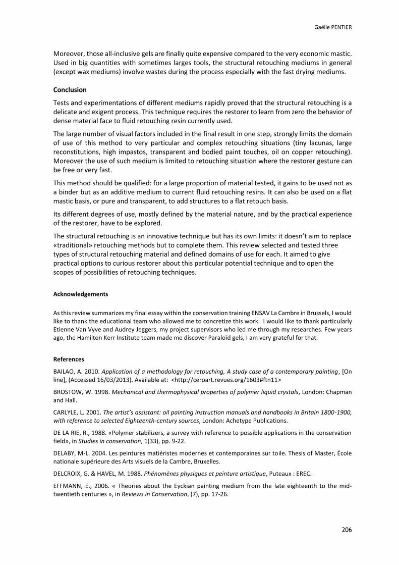
Gaëlle PENTIER
206
Moreover, those all-inclusive gels are finally quite expensive compared to the very economic mastic. Used in big quantities with sometimes larges tools, the structural retouching mediums in general (except wax mediums) involve wastes during the process especially with the fast drying mediums. Conclusion
Tests and experimentations of different mediums rapidly proved that the structural retouching is a delicate and exigent process. This technique requires the restorer to learn from zero the behavior of dense material face to fluid retouching resin currently used.
The large number of visual factors included in the final result in one step, strongly limits the domain of use of this method to very particular and complex retouching situations (tiny lacunas, large reconstitutions, high impastos, transparent and bodied paint touches, oil on copper retouching). Moreover the use of such medium is limited to retouching situation where the restorer gesture can be free or very fast.
This method should be qualified: for a large proportion of material tested, it gains to be used not as a binder but as an additive medium to current fluid retouching resins. It can also be used on a flat mastic basis, or pure and transparent, to add structures to a flat retouch basis.
Its different degrees of use, mostly defined by the material nature, and by the practical experience of the restorer, have to be explored.
The structural retouching is an innovative technique but has its own limits: it doesn’t aim to replace «traditional» retouching methods but to complete them. This review selected and tested three types of structural retouching material and defined domains of use for each. It aimed to give practical options to curious restorer about this particular potential technique and to open the scopes of possibilities of retouching techniques.
Acknowledgements
As this review summarizes my final essay within the conservation training ENSAV La Cambre in Brussels, I would like to thank the educational team who allowed me to concretize this work. I would like to thank particularly Etienne Van Vyve and Audrey Jeggers, my project supervisors who led me through my researches. Few years ago, the Hamilton Kerr Institute team made me discover Paraloïd gels, I am very grateful for that.
References
BAILAO, A. 2010. Application of a methodology for retouching, A study case of a contemporary painting, [On line], (Accessed 16/03/2013). Available at: <http://ceroart.revues.org/1603#ftn11>
BROSTOW, W. 1998. Mechanical and thermophysical properties of polymer liquid crystals, London: Chapman and Hall.
CARLYLE, L. 2001. The artist’s assistant: oil painting instruction manuals and handbooks in Britain 1800-1900, with reference to selected Eighteenth-century sources, London: Achetype Publications.
DE LA RIE, R., 1988. «Polymer stabilizers, a survey with reference to possible applications in the conservation field», in Studies in conservation, 1(33), pp. 9-22.
DELABY, M-L. 2004. Les peintures matiéristes modernes et contemporaines sur toile. Thesis of Master, École nationale supérieure des Arts visuels de la Cambre, Bruxelles.
DELCROIX, G. & HAVEL, M. 1988. Phénomènes physiques et peinture artistique, Puteaux : EREC.
EFFMANN, E., 2006. « Theories about the Eyckian painting medium from the late eighteenth to the mid-twentieth centuries », in Reviews in Conservation, (7), pp. 17-26.
Gaëlle PENTIER
207
FELLER, R., L., 2002. « Speeding up Chemical deterioration » in Contribution to conservation science. A collection of Robert Feller’s published studies on artists’ paints, paper and varnishes, Pittsburgh: Carnegie Mellon University Press, pp. 107-119.
FROYEN, K., 2009. « Recherche sur la stabilité et la réversibilité des Gamblin Conservation Colours à l'Institut Royal du Patrimoine Artistique », in Bulletin de l’Aproa-Brk, n°1, Brussels, pp. 5-17.
GROEN, K. 1997. « Investigation of the use of binding medium by Rembrandt », in Zeitschrift für Kunsttechnologie und Konservierung, 2(11), pp. 207-227.
HAIML, C. 2007. « Restoring the Immaterial: Study and treatment of Yves Klein’s Blue Monochrome (IKB 42) », in Modern Paint Uncovered, (Tate Modern, 16-19 May 2006), Getty Trust, pp. 149-156.
HAMM, J. & GAVETT, B. 1993. «The discolouration of acrylic dispersion media», in Saving the twenthieth century: the conservation of modern materials, Ottawa: Canadian Conservation Institute, pp. 381-392.
HILL STONER & J., RUSHFIELD, R. 2012. Conservation of Easel Paintings, London: Routledge.
KLEIN, K., 1995. « Wachsseifen und Wachsemulsionen als bindemittel. Möglichkeit ihrer Anwendung bei der Retusche. », in Restauro, 4(101), pp. 268-271.
KONECZNY, P., 2010. «An introduction to B72 Retouching Gels», in Mixing and Matching, Approaches to retouching paintings, London: Archetype publications, pp. 142-147.
KONECZNY, P., 2010. «Properties of B72 Retouching Gels and their use», in Mixing and Matching. Approaches to retouching, London: Archetype Publications, pp. 148-158.
KONECZNY, P., 2007. «Retouching complex surfaces, afternoon of workshop: B72 retouching gels», in The picture restorer, Autumn, 32, pp. 6-11.
LEARNER, T. J. S. 2004. Analysis of Modern paints, Los Angeles: Getty Conservation Institute.
LOWRY, K., 2010. « Retouching with Paraloïd B-72 », in Mixing and Matching, Approaches to retouching paintings, London: Archetype publications, p. 89.
MAISEY, S., 2012. « Reconstructing the volcano: reintegrating an expansive loss on John Martin’s “Destruction of Pompeii and Herculaneum”», in The picture restorer, n°40, spring, pp. 20-23.
MANGUTA, C., 2010. «The XVIIth century’s thixotropic painting medium, II. The old Flemish School and their reconstruction following Rubens and Van Dyck’s recipes», in Journal of Science and Art, Year 10, 1(12).
MASSCHELEIN-KLEINER, L., 2005. «La technique des Primitifs Flamands », in Studies in Conservation, 50, pp. 67-68.
MOTTA, E. & GUIMARÃES SALGADO, M. L. 1973. Restauração de pinturas: aplicações da encáustica, Rio de Janeiro : Instituto do Património Histórico e Artistico Nacional.
SAUTOIS, A., 2012. La retouche des peintures acryliques en émulsion non vernies : Aquazol 200. Etude des capacités physiques, chimiques et optique d’un liant, [Online], (accessed 29/09/12). Available at : <http://ceroart.revues.org/2708#article-2708>.
SZMIT-NAUD, E., 2006. « Stabilité de la couleur et réversibilité des matériaux contemporains pour retouche des peintures », in Couleur et temps, la couleur en conservation et restauration, 12ᵉ journées d’études de la SFIIC (Paris, 21-24 june 2006), Champs-sur-Marne : SFIIC, pp. 66-75.
SZMIT-NAUD, E., 2003. « Research on materials for easel painting retouches: Part 1 », in The picture restorer, Autumn, 23, pp. 5-9.
SZMIT-NAUD, E., 2003. « Research on materials for easel painting retouches: Part 2 », in The picture restorer, Autumn, 24, pp. 80-82.
SZMIT-NAUD, E., 2002. « Constat d’état des retouches en peintures de chevalet », in Bulletin de l’APROA-BRK, 4e trimestre, pp. 12-18.

Gaëlle PENTIER
208
Websites:
Artificial aging lights. [Online] [Accessed 11/02/13]. Available at : <www.q-lab.com>
B72 Retouching Gels® official website. [Online] [Accessed 20/05/13]. Available at : <www.artcare.org>
Request for a Patent. Freely accessible. [Online] [Accessed 10/05/13]. Available at : <http://www.ipo.gov.uk/p-find-publication-getPDF.pdf?PatentNo=GB2448521&DocType=A&JournalNumber=6231>
Chromac (re)integraon in Charola
do Convento de Cristo, Tomar
A short history of intervenons in conservaonand restoraon of mural painng
José Artur PESTANA
2nd International Meeting on Retouching of Cultural Heritage RECH2
Porto, Portugal | 24-25 October 2014 _____________________________________________________________________
210
Chromatic (re) integration in Charola do Convento de Cristo, Tomar
A short history of interventions in conservation and restoration of mural painting
José Artur PESTANA*
Mural da História – Rua Duques de Bragança 8, Ateliê B, 1200-162 Lisboa
*[email protected]/[email protected]
Introduction
“It can be said that the restoration of the Charola in Tomar posed a larger number of methodology
problems than technical ones and showed the importance of always having present the total context of
the monument”. Anna Marcone
As a direct consequence of the Civil War (1828 – 1834) the “Dissolution of the monasteries Act”
[“Decreto de extinção das Ordens Religiosas”] was written by Joaquim António de Aguiar and
published on the 30th of May 1834 after D. Pedro IV signed it on the 28th of the same month.
On the 7th of June of the same year the Convent of the Order of Christ [Convento de Cristo] is
closed and all its possessions were transferred to state control.
This monumental heritage remained abandoned for ten years and during that time was the
target of several acts of vandalism. However, there were several movements of the intellectuals
of the time in an attempt to safeguard the contents of the building through the creation of
commissions that succeeded in transporting some items to Lisbon, particularly from the Charola.
On the 24th of May 1843 this monument was sold in auction, and the buyer was António
Bernardo da Costa Cabral1, the future Count of Tomar.
The condition of conservation of the monument and particularly of its contents is believed to
have been appalling. In addition to the abandonment and vandalism it suffered it is important
not to forget the result of the previous cantonment in the building, during six months, by the
troops of General Masséna2.
From then António Bernardo da Costa Cabral promotes some works in the building, which will
undergo several interventions as well as additional projects. At this point it is necessary to
emphasize the occupation of the lodging-house cloister by the Republican National Guard (GNR)
and the area of the new dormitory, the crossing, the old novitiate and the Micha cloister by the
Attorney General of the Religious Missions of the Secular Priests. All these areas were assigned
to the Ministry of War3. In 1939 the Convent is bought by the State from the Count of Tomar’s
1 António Bernardo da Costa Cabral (1803 – 1889) 1st Count of Tomar by Decree of D. Maria II on 8 September 1845;
on 11 July 1878 he is elevated to Marquees by Decree of D. Luís. 2 - French General that in 1810 and 1811 commanded the third French Invasion. 3 - In 1917 the Ministry of War occupies the whole area of the convent except the church/charola (See Note 3).
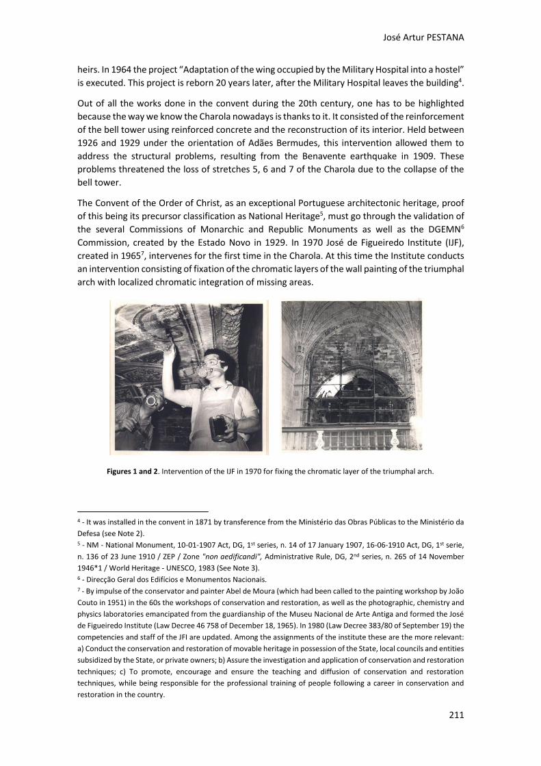
José Artur PESTANA
211
heirs. In 1964 the project “Adaptation of the wing occupied by the Military Hospital into a hostel”
is executed. This project is reborn 20 years later, after the Military Hospital leaves the building4.
Out of all the works done in the convent during the 20th century, one has to be highlighted
because the way we know the Charola nowadays is thanks to it. It consisted of the reinforcement
of the bell tower using reinforced concrete and the reconstruction of its interior. Held between
1926 and 1929 under the orientation of Adães Bermudes, this intervention allowed them to
address the structural problems, resulting from the Benavente earthquake in 1909. These
problems threatened the loss of stretches 5, 6 and 7 of the Charola due to the collapse of the
bell tower.
The Convent of the Order of Christ, as an exceptional Portuguese architectonic heritage, proof
of this being its precursor classification as National Heritage5, must go through the validation of
the several Commissions of Monarchic and Republic Monuments as well as the DGEMN6
Commission, created by the Estado Novo in 1929. In 1970 José de Figueiredo Institute (IJF),
created in 19657, intervenes for the first time in the Charola. At this time the Institute conducts
an intervention consisting of fixation of the chromatic layers of the wall painting of the triumphal
arch with localized chromatic integration of missing areas.
4 - It was installed in the convent in 1871 by transference from the Ministério das Obras Públicas to the Ministério da
Defesa (see Note 2). 5 - NM - National Monument, 10-01-1907 Act, DG, 1st series, n. 14 of 17 January 1907, 16-06-1910 Act, DG, 1st serie,
n. 136 of 23 June 1910 / ZEP / Zone "non aedificandi", Administrative Rule, DG, 2nd series, n. 265 of 14 November
1946*1 / World Heritage - UNESCO, 1983 (See Note 3). 6 - Direcção Geral dos Edifícios e Monumentos Nacionais. 7 - By impulse of the conservator and painter Abel de Moura (which had been called to the painting workshop by João
Couto in 1951) in the 60s the workshops of conservation and restoration, as well as the photographic, chemistry and
physics laboratories emancipated from the guardianship of the Museu Nacional de Arte Antiga and formed the José
de Figueiredo Institute (Law Decree 46 758 of December 18, 1965). In 1980 (Law Decree 383/80 of September 19) the
competencies and staff of the JFI are updated. Among the assignments of the institute these are the more relevant:
a) Conduct the conservation and restoration of movable heritage in possession of the State, local councils and entities
subsidized by the State, or private owners; b) Assure the investigation and application of conservation and restoration
techniques; c) To promote, encourage and ensure the teaching and diffusion of conservation and restoration
techniques, while being responsible for the professional training of people following a career in conservation and
restoration in the country.
Figures 1 and 2. Intervention of the IJF in 1970 for fixing the chromatic layer of the triumphal arch.
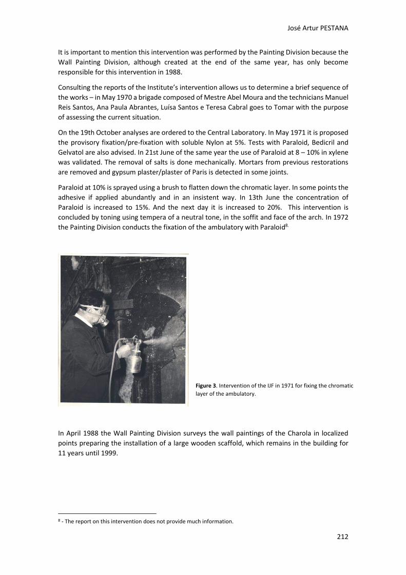
José Artur PESTANA
212
It is important to mention this intervention was performed by the Painting Division because the
Wall Painting Division, although created at the end of the same year, has only become
responsible for this intervention in 1988.
Consulting the reports of the Institute’s intervention allows us to determine a brief sequence of
the works – in May 1970 a brigade composed of Mestre Abel Moura and the technicians Manuel
Reis Santos, Ana Paula Abrantes, Luísa Santos e Teresa Cabral goes to Tomar with the purpose
of assessing the current situation.
On the 19th October analyses are ordered to the Central Laboratory. In May 1971 it is proposed
the provisory fixation/pre-fixation with soluble Nylon at 5%. Tests with Paraloid, Bedicril and
Gelvatol are also advised. In 21st June of the same year the use of Paraloid at 8 – 10% in xylene
was validated. The removal of salts is done mechanically. Mortars from previous restorations
are removed and gypsum plaster/plaster of Paris is detected in some joints.
Paraloid at 10% is sprayed using a brush to flatten down the chromatic layer. In some points the
adhesive if applied abundantly and in an insistent way. In 13th June the concentration of
Paraloid is increased to 15%. And the next day it is increased to 20%. This intervention is
concluded by toning using tempera of a neutral tone, in the soffit and face of the arch. In 1972
the Painting Division conducts the fixation of the ambulatory with Paraloid8.
In April 1988 the Wall Painting Division surveys the wall paintings of the Charola in localized
points preparing the installation of a large wooden scaffold, which remains in the building for
11 years until 1999.
8 - The report on this intervention does not provide much information.
Figure 3. Intervention of the IJF in 1971 for fixing the chromatic
layer of the ambulatory.
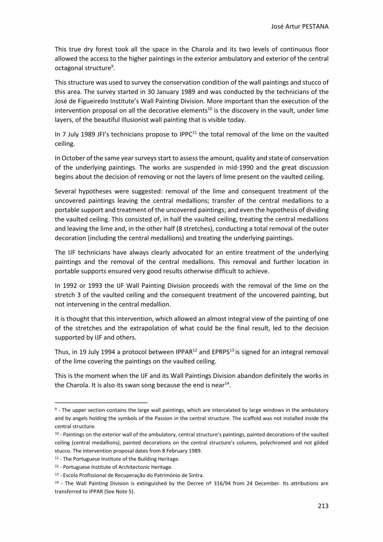
José Artur PESTANA
213
This true dry forest took all the space in the Charola and its two levels of continuous floor
allowed the access to the higher paintings in the exterior ambulatory and exterior of the central
octagonal structure9.
This structure was used to survey the conservation condition of the wall paintings and stucco of
this area. The survey started in 30 January 1989 and was conducted by the technicians of the
José de Figueiredo Institute’s Wall Painting Division. More important than the execution of the
intervention proposal on all the decorative elements10 is the discovery in the vault, under lime
layers, of the beautiful illusionist wall painting that is visible today.
In 7 July 1989 JFI’s technicians propose to IPPC11 the total removal of the lime on the vaulted
ceiling.
In October of the same year surveys start to assess the amount, quality and state of conservation
of the underlying paintings. The works are suspended in mid-1990 and the great discussion
begins about the decision of removing or not the layers of lime present on the vaulted ceiling.
Several hypotheses were suggested: removal of the lime and consequent treatment of the
uncovered paintings leaving the central medallions; transfer of the central medallions to a
portable support and treatment of the uncovered paintings; and even the hypothesis of dividing
the vaulted ceiling. This consisted of, in half the vaulted ceiling, treating the central medallions
and leaving the lime and, in the other half (8 stretches), conducting a total removal of the outer
decoration (including the central medallions) and treating the underlying paintings.
The IJF technicians have always clearly advocated for an entire treatment of the underlying
paintings and the removal of the central medallions. This removal and further location in
portable supports ensured very good results otherwise difficult to achieve.
In 1992 or 1993 the IJF Wall Painting Division proceeds with the removal of the lime on the
stretch 3 of the vaulted ceiling and the consequent treatment of the uncovered painting, but
not intervening in the central medallion.
It is thought that this intervention, which allowed an almost integral view of the painting of one
of the stretches and the extrapolation of what could be the final result, led to the decision
supported by IJF and others.
Thus, in 19 July 1994 a protocol between IPPAR12 and EPRPS13 is signed for an integral removal
of the lime covering the paintings on the vaulted ceiling.
This is the moment when the IJF and its Wall Paintings Division abandon definitely the works in
the Charola. It is also its swan song because the end is near14.
9 - The upper section contains the large wall paintings, which are intercalated by large windows in the ambulatory
and by angels holding the symbols of the Passion in the central structure. The scaffold was not installed inside the
central structure. 10 - Paintings on the exterior wall of the ambulatory, central structure’s paintings, painted decorations of the vaulted
ceiling (central medallions), painted decorations on the central structure’s columns, polychromed and not gilded
stucco. The intervention proposal dates from 8 February 1989. 11 - The Portuguese Institute of the Building Heritage. 12 - Portuguese Institute of Architectonic Heritage. 13 - Escola Profissional de Recuperação do Património de Sintra. 14 - The Wall Painting Division is extinguished by the Decree nº 316/94 from 24 December. Its attributions are
transferred to IPPAR (See Note 5).
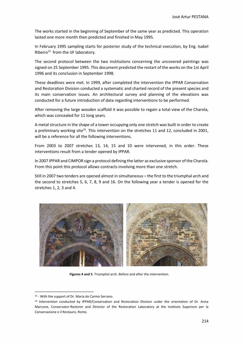
José Artur PESTANA
214
The works started in the beginning of September of the same year as predicted. This operation
lasted one more month then predicted and finished in May 1995.
In February 1995 sampling starts for posterior study of the technical execution, by Eng. Isabel
Ribeiro15 from the IJF laboratory.
The second protocol between the two institutions concerning the uncovered paintings was
signed on 25 September 1995. This document predicted the restart of the works on the 1st April
1996 and its conclusion in September 1998.
These deadlines were met. In 1999, after completed the intervention the IPPAR Conservation
and Restoration Division conducted a systematic and charted record of the present species and
its main conservation issues. An architectural survey and planning of the elevations was
conducted for a future introduction of data regarding interventions to be performed.
After removing the large wooden scaffold it was possible to regain a total view of the Charola,
which was concealed for 11 long years.
A metal structure in the shape of a tower occupying only one stretch was built in order to create
a preliminary working site16. This intervention on the stretches 11 and 12, concluded in 2001,
will be a reference for all the following interventions.
From 2003 to 2007 stretches 13, 14, 15 and 10 were intervened, in this order. These
interventions result from a tender opened by IPPAR.
In 2007 IPPAR and CIMPOR sign a protocol defining the latter as exclusive sponsor of the Charola.
From this point this protocol allows contracts involving more than one stretch.
Still in 2007 two tenders are opened almost in simultaneous – the first to the triumphal arch and
the second to stretches 5, 6, 7, 8, 9 and 16. On the following year a tender is opened for the
stretches 1, 2, 3 and 4.
15 - With the support of Dr. Maria do Carmo Serrano. 16 Intervention conducted by IPPAR/Conservation and Restoration Division under the orientation of Dr. Anna
Marcone, Conservator-Restorer and Director of the Restoration Laboratory at the Instituto Superiore per la
Conservazione e il Restauro, Rome.
Figures 4 and 5. Triumphal arch. Before and after the intervention.
José Artur PESTANA
215
Completed the intervention on the whole exterior ambulatory in 2013, works progress to the
central structure.
This intervention is the result of a second sponsoring protocol between DGPC17 and Cimpor-
InterCement, which again assumes exclusive sponsorship of the Charola.
All these operations were performed by the NC, Nova Conservação.
The Charola of the Convent of Christ is thus an excellent example of the evolution of the
conservation and restoration criteria in Portugal about the inpainting issue, as well the changing
role of the State Government, that from the role of main actor through fruitful activity of the
Instituto José de Figueiredo, becomes owner of the contract by delegating all conservative
action on private companies, first in simple and effective provision of services and currently
under restraining contracts.
The chromatic reintegration of this extraordinary group was extremely important because it was
necessary to give a readable and homogeneous view of a reality that was very fragmentary and
diverse.
The integration was executed using exclusively tempera from Talens® for the vaulted ceiling and
the stucco monochromatic background and Winsor & Newton watercolours for all the other
surfaces including the gilded areas. The main aim of using watercolours was, in addition to its
reversibility, a better transparency and luminosity. While smaller missing areas were integrated
following the surrounding tones, the larger ones were instead accepted with the concern of
reducing its “noise” by applying several glazing.
In the case of the face of the arch, where the larger missing areas were located, the presence of
an extremely visible red preparation made us opt for lowering the optical tone. This was done
by applying colder colours in order to neutralize the imposition of these gaps over the
image/painting and thus retrieving all its visual and unitary potential. The final protection was
applied on the vaulted ceiling, however on the figurative and decorative paintings of repetitive
pattern on the exterior ambulatory and central structure (interior and exterior) two hands of
17 - Direcção Geral do Património Cultural.
Figures 6, 7 and 8 - Central structure. Stretch that faces the triumphal arch - before, during and after the intervention.
José Artur PESTANA
216
retouching varnish were applied before and after the intervention - concentrations from
retouching varnish, n.0 004, to 50%, from Talens®.
Photographic credits
Figures 1, 2 and 3 from DGPC - Direção Geral do Património Cultural / DDCI - Divisão de
Documentação, Comunicação e Informática / Arquivo Técnico de Conservação e Restauro.
Figures 4, 5, 6, 7 and 8 from NC, Nova Conservação.
References
CUSTÓDIO, Jorge, 2014.“A Charola do Convento de Cristo em tempo de restauros: do empirismo à ciência
(1843 – 1932) ”. In A Charola do Convento de Cristo: História e Restauro, pp. 230-295, ISBN: 978-989-
8052-80-3, Lisboa, DGPC
MARCONE, Anna, 2014. “O Restauro da Charola: Problemáticas e metodologia”. In A Charola do Convento
de Cristo: História e Restauro, pp. 310-313, ISBN: 978-989-8052-80-3, Lisboa, DGPC
MOINHOS, Maria José; FRAZÃO, Irene, 2014.“O Restauro das superfícies arquitectónicas da Charola do
Convento de Cristo em Tomar”. In A Charola do Convento de Cristo: História e Restauro, pp. 298-309,
ISBN: 978-989-8052-80-3, Lisboa, DGPC
Websites
Diário da Républica, http://www.oasrn.org/upload/apoio/legislacao/pdf/patrimonio31694.pdf (Accessed
22 September 2014)
Património Cultural (Direção-Geral do Património Cultural), apontamentos para História da CR em
Portugal, http://www.patrimoniocultural.pt/en/patrimonio/conservacao-e-restauro-laboratorio-jose-
de-figueiredo/apontamentos-para-historia-da-conservacao-e-restauro-em-portugal/ (Accessed 23
September 2014)
SIPA, Convento de Cristo, http://www.monumentos.pt/Site/APP_PagesUser/SIPA.aspx?id=4718
(Accessed 22 September 2014)
Wikipedia, Bernardo Costa Cabral,
http://pt.wikipedia.org/wiki/Ant%C3%B3nio_Bernardo_da_Costa_Cabral,_Marqu%C3%AAs_de_Tomar
(Accessed 22 September 2014)
In-painng for Bookbinding Conservaon
Materials and Techniques
Diana Avelar PIRES
2nd International Meeting on Retouching of Cultural Heritage RECH2
Porto, Portugal | 24-25 October 2014 ________________________________________________________________________
218
In-painting for Bookbinding Conservation
Materials and Techniques
Diana AVELAR PIRES1*
1 Project Conservator, Digitisation Support. The National Archives**.
Kew, Richmond, Surrey. TW9 4DU London, United Kingdom
* [email protected] Davelarpires.com
** This paper does not represent the opinions of The National Archives
Abstract
As a junior Book and Paper Conservator with a Master's degree from the Tomar Poly-technic Institute (Instituto Politécnico de Tomar - IPT) I had the opportunity to take part in two international internships. Thanks to this experience, I was able to further study Bookbinding and Book Conservation.
In-painting is an important part of the conservation process because it gives the object a sense of cohesion and uniformity in form and colour. During my internships I learned and practiced different methods of in-painting and most importantly, I learned how to apply them in different situations. Specifically in Paper and Book Conservation in-painting often means that we have to tone or paint Japanese paper. The use of watercolours is widely accepted among Con-servators because it is reversible and compatible with most of the original materials pre-sent in a book.
In this paper I will present other methods that proved to be successful. For example, textile dyes may be used to tone the Japanese paper before infill; and dry pastels can be added after as a retouching technique (as learned in the Faculty of Conservation, Czech Republic, 2012). Acrylics are suitable in both preparation and retouching methods (as seen at the Sheridan Libraries, Johns Hopkins University, Baltimore, USA, 2013). When restoring an object Conservators have to consider the original materials, their state of conservation and function in order to use the most suitable techniques and ma-terials. Keywords: Acrylics, In-painting, Bookbinding, Techniques, Conservation treatments
Diana AVELAR PIRES
219
Considerations regarding Book Conservation
When we think about Book Conservation there are a few things to take into account. Books are objects composed by two distinct parts, a text-block and a binding. These two parts should work in such a way that enables the book to be opened. Books are called composite objects because they can be made of paper, wood, leather, cloth, parchment or metal and of course, pigment and inks. Because the binding of a book is its most exposed part, it is often there where we find more dam-age. The main deterioration factor is the environment (air, light, temperature and relative humidi-ty) and the second one is handling. So, the most common damages in a book are material loss in corners and edges, split boards and missing spines, as well as tears along the edges and hinges. All the factors mentioned will influence the choice of treatment and materials used to restore it. In a book the binding's main function is to protect the document, the written or printed text. This is an important factor when choosing which colouring material to use in in-painting. Do we want to add a paint who is water soluble and light sensitive or one that is more stable to environmental changes? Should it be a paint that keeps its flexibility after drying? Should it be a transparent paint or an opaque one? All these questions are important when we think about the durability and the life time we want to give the object, but there is second reason why in-painting becomes so important in Book Conser-vation. Over time the binding became an aesthetic element of the book and a work of artists. So, in-painting takes on an important role specifically as an aesthetic treatment. In-painting in Bookbinding Conservation: materials and techniques
In-painting is used as a resource to reduce the visual impact of repairs. Repairs are usually made with Japanese paper and an adhesive. However, it is also common to use Western paper, leather, and other compatible materials. Japanese paper is usually white or in a cream tone that rarely matches the colour of original materials in a book. Although we may thing a text-block is white, it is surprising the range of whites, creams and browns that a paper can have. Besides, there are also end papers or fly leaves made of decorative papers such as marbled, paste or embossed papers, which can be richly coloured. The boards of a book are also covered in a variety of materials like cloth, paper, leather or parchment, and these can have many different colours too. So, toning or in-painting Japanese paper is a very common procedure in a restoration treatment. Regarding the colouring materials available we can use watercolours, textile dyes, dry pastels, acryl-ics and leather dyes, amongst others. Techniques for toning Japanese paper Used to mend tears or infill gaps, Japanese paper can be toned prior to the treatment or in-painted afterwards. By using a coloured bath [Fig. 1], the Japanese paper is immersed between two sheets of Reemay® for a moment and removed to dry in a drying rack. The main advantage of this technique is that it is
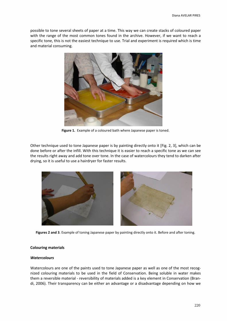
Diana AVELAR PIRES
220
possible to tone several sheets of paper at a time. This way we can create stacks of coloured paper with the range of the most common tones found in the archive. However, if we want to reach a specific tone, this is not the easiest technique to use. Trial and experiment is required which is time and material consuming.
Figure 1. Example of a coloured bath where Japanese paper is toned.
Other technique used to tone Japanese paper is by painting directly onto it [Fig. 2, 3], which can be done before or after the infill. With this technique it is easier to reach a specific tone as we can see the results right away and add tone over tone. In the case of watercolours they tend to darken after drying, so it is useful to use a hairdryer for faster results.
Figures 2 and 3. Example of toning Japanese paper by painting directly onto it. Before and after toning.
Colouring materials Watercolours Watercolours are one of the paints used to tone Japanese paper as well as one of the most recog-nized colouring materials to be used in the field of Conservation. Being soluble in water makes them a reversible material - reversibility of materials added is a key element in Conservation (Bran-di, 2006). Their transparency can be either an advantage or a disadvantage depending on how we
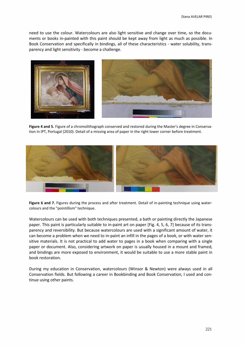
Diana AVELAR PIRES
221
need to use the colour. Watercolours are also light sensitive and change over time, so the docu-ments or books in-painted with this paint should be kept away from light as much as possible. In Book Conservation and specifically in bindings, all of these characteristics - water solubility, trans-parency and light sensitivity - become a challenge.
Figure 4 and 5. Figure of a chromolithograph conserved and restored during the Master's degree in Conserva-tion in IPT, Portugal (2010). Detail of a missing area of paper in the right lower corner before treatment.
Figure 6 and 7. Figures during the process and after treatment. Detail of in-painting technique using water-
colours and the "pointillism" technique. Watercolours can be used with both techniques presented, a bath or painting directly the Japanese paper. This paint is particularly suitable to in-paint art on paper [Fig. 4, 5, 6, 7] because of its trans-parency and reversibility. But because watercolours are used with a significant amount of water, it can become a problem when we need to in-paint an infill in the pages of a book, or with water sen-sitive materials. It is not practical to add water to pages in a book when comparing with a single paper or document. Also, considering artwork on paper is usually housed in a mount and framed, and bindings are more exposed to environment, it would be suitable to use a more stable paint in book restoration. During my education in Conservation, watercolours (Winsor & Newton) were always used in all Conservation fields. But following a career in Bookbinding and Book Conservation, I used and con-tinue using other paints.
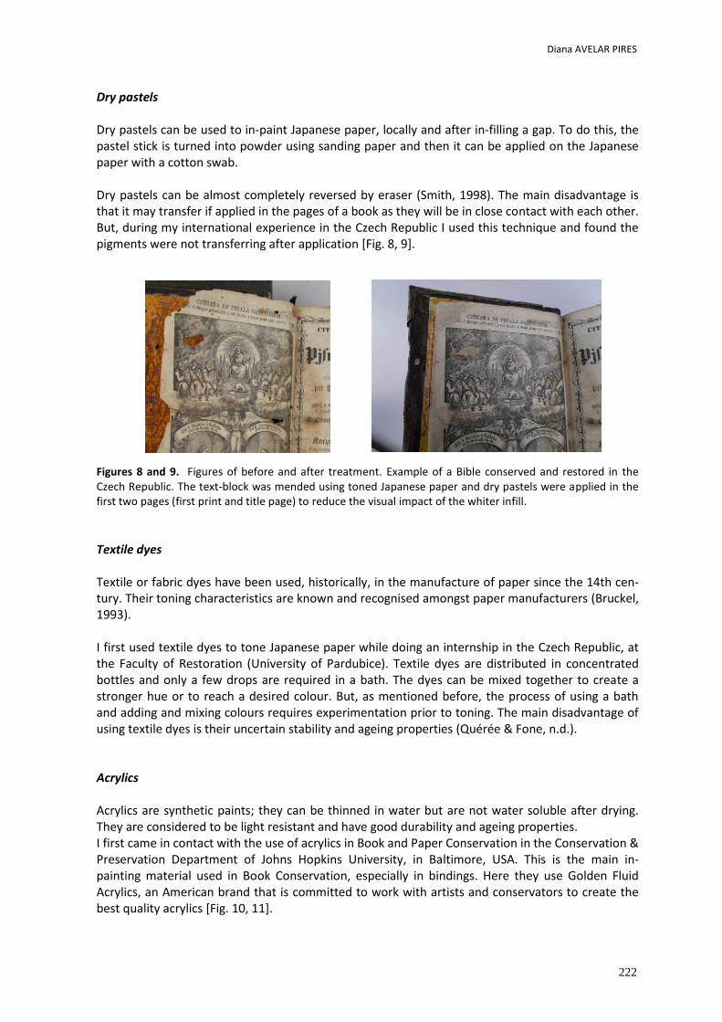
Diana AVELAR PIRES
222
Dry pastels Dry pastels can be used to in-paint Japanese paper, locally and after in-filling a gap. To do this, the pastel stick is turned into powder using sanding paper and then it can be applied on the Japanese paper with a cotton swab. Dry pastels can be almost completely reversed by eraser (Smith, 1998). The main disadvantage is that it may transfer if applied in the pages of a book as they will be in close contact with each other. But, during my international experience in the Czech Republic I used this technique and found the pigments were not transferring after application [Fig. 8, 9]. Figures 8 and 9. Figures of before and after treatment. Example of a Bible conserved and restored in the Czech Republic. The text-block was mended using toned Japanese paper and dry pastels were applied in the first two pages (first print and title page) to reduce the visual impact of the whiter infill.
Textile dyes Textile or fabric dyes have been used, historically, in the manufacture of paper since the 14th cen-tury. Their toning characteristics are known and recognised amongst paper manufacturers (Bruckel, 1993). I first used textile dyes to tone Japanese paper while doing an internship in the Czech Republic, at the Faculty of Restoration (University of Pardubice). Textile dyes are distributed in concentrated bottles and only a few drops are required in a bath. The dyes can be mixed together to create a stronger hue or to reach a desired colour. But, as mentioned before, the process of using a bath and adding and mixing colours requires experimentation prior to toning. The main disadvantage of using textile dyes is their uncertain stability and ageing properties (Quérée & Fone, n.d.). Acrylics Acrylics are synthetic paints; they can be thinned in water but are not water soluble after drying. They are considered to be light resistant and have good durability and ageing properties. I first came in contact with the use of acrylics in Book and Paper Conservation in the Conservation & Preservation Department of Johns Hopkins University, in Baltimore, USA. This is the main in-painting material used in Book Conservation, especially in bindings. Here they use Golden Fluid Acrylics, an American brand that is committed to work with artists and conservators to create the best quality acrylics [Fig. 10, 11].
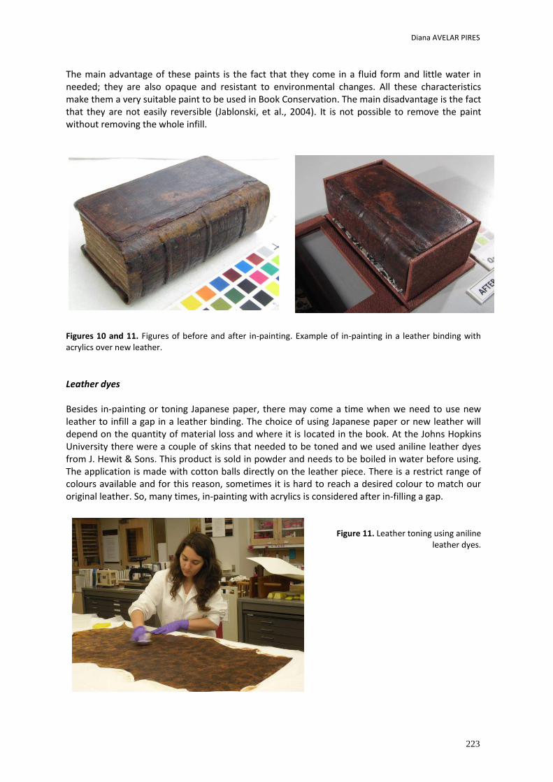
Diana AVELAR PIRES
223
The main advantage of these paints is the fact that they come in a fluid form and little water in needed; they are also opaque and resistant to environmental changes. All these characteristics make them a very suitable paint to be used in Book Conservation. The main disadvantage is the fact that they are not easily reversible (Jablonski, et al., 2004). It is not possible to remove the paint without removing the whole infill.
Figures 10 and 11. Figures of before and after in-painting. Example of in-painting in a leather binding with acrylics over new leather.
Leather dyes Besides in-painting or toning Japanese paper, there may come a time when we need to use new leather to infill a gap in a leather binding. The choice of using Japanese paper or new leather will depend on the quantity of material loss and where it is located in the book. At the Johns Hopkins University there were a couple of skins that needed to be toned and we used aniline leather dyes from J. Hewit & Sons. This product is sold in powder and needs to be boiled in water before using. The application is made with cotton balls directly on the leather piece. There is a restrict range of colours available and for this reason, sometimes it is hard to reach a desired colour to match our original leather. So, many times, in-painting with acrylics is considered after in-filling a gap.
Figure 11. Leather toning using aniline
leather dyes.
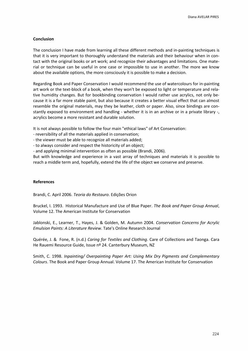
Diana AVELAR PIRES
224
Conclusion The conclusion I have made from learning all these different methods and in-painting techniques is that it is very important to thoroughly understand the materials and their behaviour when in con-tact with the original books or art work; and recognize their advantages and limitations. One mate-rial or technique can be useful in one case or impossible to use in another. The more we know about the available options, the more consciously it is possible to make a decision. Regarding Book and Paper Conservation I would recommend the use of watercolours for in-painting art work or the text-block of a book, when they won't be exposed to light or temperature and rela-tive humidity changes. But for bookbinding conservation I would rather use acrylics, not only be-cause it is a far more stable paint, but also because it creates a better visual effect that can almost resemble the original materials, may they be leather, cloth or paper. Also, since bindings are con-stantly exposed to environment and handling - whether it is in an archive or in a private library -, acrylics become a more resistant and durable solution. It is not always possible to follow the four main "ethical laws" of Art Conservation: - reversibility of all the materials applied in conservation; - the viewer must be able to recognize all materials added; - to always consider and respect the historicity of an object; - and applying minimal intervention as often as possible (Brandi, 2006). But with knowledge and experience in a vast array of techniques and materials it is possible to reach a middle term and, hopefully, extend the life of the object we conserve and preserve.
References
Brandi, C. April 2006. Teoria do Restauro. Edições Orion Bruckel, I. 1993. Historical Manufacture and Use of Blue Paper. The Book and Paper Group Annual, Volume 12. The American Institute for Conservation Jablonski, E., Learner, T., Hayes, J. & Golden, M. Autumn 2004. Conservation Concerns for Acrylic Emulsion Paints: A Literature Review. Tate's Online Research Journal Quérée, J. & Fone, R. (n.d.) Caring for Textiles and Clothing. Care of Collections and Taonga. Cara He Rauemi Resource Guide, Issue nº 24. Canterbury Museum, NZ Smith, C. 1998. Inpainting/ Overpainting Paper Art: Using Mix Dry Pigments and Complementary Colours. The Book and Paper Group Annual. Volume 17. The American Institute for Conservation
Overpaints with cultural significance.
How to define authencity?
The case of Afonso de Albuquerques portrait
Ana Teresa TEVES REIS, Miguel MATEUSand
David TEVES REIS
2nd International Meeting on Retouching of Cultural Heritage
RECH3 Porto, Portugal | 24-25 October 2014
_____________________________________________________________________
226
Overpaints with cultural significance. How to define authenticity?
The case of Afonso de Albuquerque’s portrait
Ana Teresa TEVES REIS1*; Miguel MATEUS2; David TEVES REIS3*
1 Escola das Artes-Universidade Católica Portuguesa. Rua Diogo Botelho, 1327, 4169-005 Porto 2 Freelance Conservator-restorer
3 Conservator-restorer
* [email protected] [email protected]
Abstract
The removal or not removal of repaints and overpaints is a complex subject and the justification for it isn’t always objective. This type of operation can sometimes result in a worn out surface with several losses of painting which normally are supposed to be restored and integrated. Justified by the search or by the reposition of authenticity, both of these operations (restoration and integration) will change the values formerly attributed to the object. When one is dealing with works of art, which are generally recognized as being cultural significant, different values should be interpreted and discussed between stakeholders and specialists from different areas of expertise in a multidisciplinary platform before carrying out any intervention. This isn’t always easy to achieve and the conservator usually has the difficult task of transforming subjective concepts into an objective solution. In this paper we present a case-study, the panel portrait of Afonso de Albuquerque, currently exhibited in the Museu Nacional de Arte Antiga (Lisboa), which the current investigation process as proven to be the portrait of another governor, but repainted to resemble the viceroy of Portuguese India during a restoration process in the 1960s regarded has “technically difficult”. Several episodes throughout the history of the Viceroy and Governors portrait Gallery and this specific panel gave the repaint historic, documental and iconographic values. Investigation is still ongoing and new facts may alter the definition of values attributed to this portrait and its authentic state in a process conservators should be even more concerned during restoration interventions, namely chromatic integration.
Keywords: Overpaints; Cultural significance; Values; Authenticity; Chromatic integration.
Ana Teresa TEVES REIS; Miguel MATEUS and David TEVES REIS
227
Historical background
The portrait gallery of the Viceroy and governors of Portuguese India
The portrait gallery of the Viceroy and governors of Portuguese India is currently located in the exhibit halls of the Archaeological Survey of India Museum, in Old Goa (Goa, India), except for three portraits that are incorporated in the collection of the Museu Nacional de Arte Antiga (National Museum of Ancient Art), in Lisbon (Portugal)1. Composed by 105 portraits, this gallery was first commissioned by the Viceroy D. João de Castro, in 1547, to honour the military and diplomatic achievements of his predecessors. Authorship is still unknown, but most investigators2 agree that the Portuguese chronicler Gaspar Correia (?-1560) gave instructions to a local painter regarding the first portraits of the 12 rulers before that Viceroy3.
The paintings that are exhibited in Old Goa are in a very poor state of conservation, especially in relation to the surface layers (paint flakes, paint losses and several layers of overpaints). This situation is the result of numerous factors, namely the several transfers of the collection during its existence, the uncontrolled exposure to a sub-tropical climate throughout 500 years and the result of various renovation/restoration interventions, which altered (to a great extent) the primitive compositions. Seven of these paintings were restored between 1954 and 19614 in the Instituto para o Exame e Restauro de Obras de Arte (Institute for the Examination and Restoration of Works of Art), in Lisbon, but only the ones that still remain today in the Ancient Art Museum (MNAA) are in a good state of conservation. Important values associated with this Gallery are not being clearly identified and interpreted due to the portraits current state of conservation. In fact, this is a very important collection to indo-portuguese history and art-history, which deserved several reproductions and quotations throughout the centuries by historians, travelers, chroniclers and investigators. Recently, through the initiative of Miguel Mateus (conservator-restorer) and António Candeias (heritage chemical)5, a project is being developed to examine all the paintings of this collection with portable scientific equipment also successfully used in other projects, like the Retable of Funchal’s Cathedral, in the Island of Madeira, Portugal. Teresa Reis (conservator-restorer) joined the investigation process in the context of her master thesis in conservation and restoration of paintings.
1 The portraits of D. Francisco de Almeida, Afonso de Albuquerque and D. Francisco Mascarenhas. 2 Authors like José Ferreira Martins, Alves Azevedo, Carlos Azevedo e António Vasconcelos de Saldanha. 3 In his work, “Lendas da India”, Gaspar Correa (which is deceased in 1560) illustrates some volumes with drawings of the
earliest Viceroys and governors. 4 Between 1954 and 1961, seven portraits of this gallery were restored in the Instituto para o Exame e Restauro de Obras
de Arte (Institute for the Exam and Restoration of Works of Art), in Lisboa, namely D. Francisco de Almeida, Diogo Lopes de Sequeira, D. Vasco da Gama, D. João de Castro, D. Miguel de Noronha, Afonso de Albuquerque and D. Francisco Mascarenhas
5 Miguel Mateus coordinated several conservation-restoration interventions in ancient churches of portuguese india, such as the Chapel of Our Lady of the Mount, in Old Goa, the Curch of Vypeen, in Kochi and currently the Church of Santa Monica’s Convent, in Old Goa. António Candeias is a chemical, with a phD in chemistry applied to heritage. Currently is the Director of HERCULES Laboratory (Évora University) and the scientific coordinator of José de Figueiredo Laboratory (General Directory of Cultural Heritage).
Ana Teresa TEVES REIS; Miguel MATEUS and David TEVES REIS
228
The investigation process The investigation started in December 2011 with the survey of all the portraits in exhibition. We registered the state of conservation of the paintings6 and the textures of the underpaintings that were visible in regular light conditions7. During the next two years, we researched several archives looking for information and records regarding the history of the Viceroys and Governors gallery. During that time, we had the opportunity of analyzing the portraits of the MNAA with the same equipment8 to be used in a future prospect in Old Goa, thus testing the possible outcomes of the exam process. More recently, while crosschecking all sources of information gathered so far, we realized that all the portraits have been profoundly altered during its existence (at least six different interventions can be identified by comparing old reproductions). Besides, we also realized that the portraits restored in Lisbon between 1954 and 1961, presumably all restored to their primitive composition, had some facts concealed under their “chromatic integration process”, namely the panel of Afonso de Albuquerque9. We discovered that the figure originally portrayed in this painting belongs, in fact, to the governor Lopo Soares de Albergaria (successor of Albuquerque), but “repainted” to resemble that viceroy through the addition of long beards and wrinkles, coat of arms and a new inscription. Criteria and technics of chromatic integration has evolved since that time and it’s not our purpose in this article to analyze the decisions taken then, but their effect in the painting’s values and authenticity at present time. How to interpret and manage an iconic image with general recognition that turns out to be a fake?
The panel portrait of Afonso de Albuquerque – a mystery still to be solved
The primitive portrait of Afonso de Albuquerque was included in the first series of 13 portraits commisssioned by Viceroy D. João de Castro in 1547. According to our research, the general appearance of the governor should have been with long beards, turned to his right side and with his right forefinger pointing upwards. This composition is reproduced in “Lendas da India”, by Gaspar Correia (who was his secretary), in “Livro de Lizuarte de Abreu”, by Lizuarte de Abreu (c. 1560) and in “Livro do Estado da India Oriental”, by Pedro Barreto de Resende (1646).
6 It was not possible to remove the portraits from the walls, neither to touch the surface during the survey. The
conservation state of the support could not be taken in account with accuracy. 7 We were allowed to photograph the paintings, but without the use of any artificial light, what limited in some way the use of lighting techniques to enhance some of these textures. All the photographic records were made by David Teves Reis
8 Photographic exams: Direct light, UV fluorescence; IV reflectography and radiographic exams. 9 Afonso de Albuquerque (1453-1515) was the second ruler of portuguese India between 1509 and 1515.
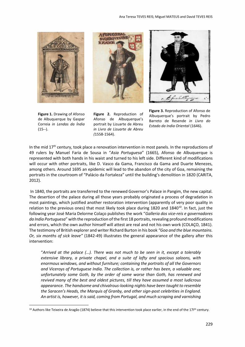
Ana Teresa TEVES REIS; Miguel MATEUS and David TEVES REIS
229
Figure 1. Drawing of Afonso de Albuquerque by Gaspar Correia in Lendas da Índia (15--).
Figure 2. Reproduction of Afonso de Albuquerque’s portrait by Lizuarte de Abreu in Livro de Lizuarte de Abreu (1558-1564).
Figure 3. Reproduction of Afonso de Albuquerque’s portrait by Pedro Barreto de Resende in Livro do Estado da India Oriental (1646).
In the mid 17th century, took place a renovation intervention in most panels. In the reproductions of 49 rulers by Manuel Faria de Sousa in “Asia Portuguesa” (1665), Afonso de Albuquerque is represented with both hands in his waist and turned to his left side. Different kind of modifications will occur with other portraits, like D. Vasco da Gama, Francisco da Gama and Duarte Menezes, among others. Around 1695 an epidemic will lead to the abandon of the city of Goa, remaining the portraits in the courtroom of “Palácio da Fortaleza” until the building’s demolition in 1820 (CARITA, 2012). In 1840, the portraits are transferred to the renewed Governor’s Palace in Pangim, the new capital. The desertion of the palace during all those years probably originated a process of degradation in most paintings, which justified another restoration intervention (apparently of very poor quality in relation to the previous ones) that most likely took place during 1820 and 184010. In fact, just the following year José Maria Delorme Colaço publishes the work “Galleria dos vice-reis e governadores da India Portuguesa” with the reproduction of the first 18 portraits, revealing profound modifications and errors, which the own author himself will attest are real and not his own work (COLAÇO, 1841). The testimony of British explorer and writer Richard Burton in his book “Goa and the blue mountains. Or, six months of sick leave” (1842-49) illustrates the general appearance of the gallery after this intervention:
“Arrived at the palace (…). There was not much to be seen in it, except a tolerably extensive library, a private chapel, and a suite of lofty and spacious saloons, with enormous windows, and without furniture; containing the portraits of all the Governors and Viceroys of Portuguese India. The collection is, or rather has been, a valuable one; unfortunately some Goth, by the order of some worse than Goth, has renewed and revived many of the best and oldest pictures, till they have assumed a most ludicrous appearance. The handsome and chivalrous-looking nights have been taught to resemble the Saracen’s Heads, the Marquis of Granby, and other sign-post celebrities in England. An artist is, however, it is said, coming from Portugal, and much scraping and varnishing
10 Authors like Teixeira de Aragão (1874) believe that this intervention took place earlier, in the end of the 17Ith century.
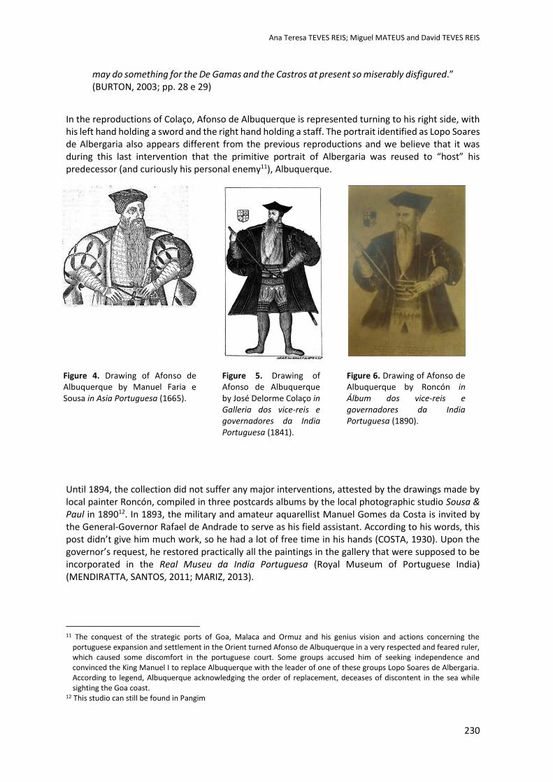
Ana Teresa TEVES REIS; Miguel MATEUS and David TEVES REIS
230
may do something for the De Gamas and the Castros at present so miserably disfigured.” (BURTON, 2003; pp. 28 e 29)
In the reproductions of Colaço, Afonso de Albuquerque is represented turning to his right side, with his left hand holding a sword and the right hand holding a staff. The portrait identified as Lopo Soares de Albergaria also appears different from the previous reproductions and we believe that it was during this last intervention that the primitive portrait of Albergaria was reused to “host” his predecessor (and curiously his personal enemy11), Albuquerque.
Until 1894, the collection did not suffer any major interventions, attested by the drawings made by local painter Roncón, compiled in three postcards albums by the local photographic studio Sousa & Paul in 189012. In 1893, the military and amateur aquarellist Manuel Gomes da Costa is invited by the General-Governor Rafael de Andrade to serve as his field assistant. According to his words, this post didn’t give him much work, so he had a lot of free time in his hands (COSTA, 1930). Upon the governor’s request, he restored practically all the paintings in the gallery that were supposed to be incorporated in the Real Museu da India Portuguesa (Royal Museum of Portuguese India) (MENDIRATTA, SANTOS, 2011; MARIZ, 2013).
11 The conquest of the strategic ports of Goa, Malaca and Ormuz and his genius vision and actions concerning the
portuguese expansion and settlement in the Orient turned Afonso de Albuquerque in a very respected and feared ruler, which caused some discomfort in the portuguese court. Some groups accused him of seeking independence and convinced the King Manuel I to replace Albuquerque with the leader of one of these groups Lopo Soares de Albergaria. According to legend, Albuquerque acknowledging the order of replacement, deceases of discontent in the sea while sighting the Goa coast.
12 This studio can still be found in Pangim
Figure 4. Drawing of Afonso de Albuquerque by Manuel Faria e Sousa in Asia Portuguesa (1665).
Figure 5. Drawing of Afonso de Albuquerque by José Delorme Colaço in Galleria dos vice-reis e governadores da India Portuguesa (1841).
Figure 6. Drawing of Afonso de Albuquerque by Roncón in Álbum dos vice-reis e governadores da India Portuguesa (1890).
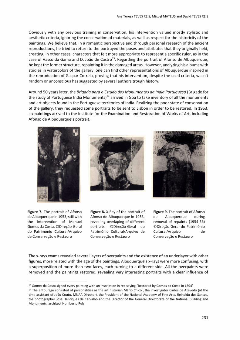
Ana Teresa TEVES REIS; Miguel MATEUS and David TEVES REIS
231
Obviously with any previous training in conservation, his intervention valued mostly stylistic and aesthetic criteria, ignoring the conservation of materials, as well as respect for the historicity of the paintings. We believe that, in a romantic perspective and through personal research of the ancient reproductions, he tried to return to the portrayed the poses and attributes that they originally held, creating, in other cases, characters that felt more appropriate to represent a specific ruler, as in the case of Vasco da Gama and D. João de Castro13. Regarding the portrait of Afonso de Albuquerque, he kept the former structure, repainting it in the damaged areas. However, analyzing his albums with studies in watercolors of the gallery, one can find other representations of Albuquerque inspired in the reproduction of Gaspar Correia, proving that his intervention, despite the used criteria, wasn’t random or unconscious has suggested by several authors trough history. Around 50 years later, the Brigada para o Estudo dos Monumentos da India Portuguesa (Brigade for the study of Portuguese India Monuments)14 arrived in Goa to take inventory of all the monuments and art objects found in the Portuguese territories of India. Realizing the poor state of conservation of the gallery, they requested some portraits to be sent to Lisbon in order to be restored. In 1953, six paintings arrived to the Institute for the Examination and Restoration of Works of Art, including Afonso de Albuquerque’s portrait.
The x-rays exams revealed several layers of overpaints and the existence of an underlayer with other figures, more related with the age of the paintings. Albuquerque’s x-rays were more confusing, with a superposition of more than two faces, each turning to a different side. All the overpaints were removed and the paintings restored, revealing very interesting portraits with a clear influence of
13 Gomes da Costa signed every painting with an inscription in red saying “Restored by Gomes da Costa in 1894" 14 The entourage consisted of personalities as the art historian Mário Chicó , the investigator Carlos de Azevedo (at the time assistant of João Couto, MNAA Director), the President of the National Academy of Fine Arts, Reinaldo dos Santos, the photographer José Henriques de Carvalho and the Director of the General Directorate of the National Building and Monuments, architect Humberto Reis.
Figure 7. The portrait of Afonso de Albuquerque in 1953, still with the intervention of Manuel Gomes da Costa. ©Direção-Geral do Património Cultural/Arquivo de Conservação e Restauro
Figure 8. X-Ray of the portrait of Afonso de Albuquerque in 1953, revealing overlaping of different portraits. ©Direção-Geral do Património Cultural/Arquivo de Conservação e Restauro
Figure 9. The portrait of Afonso de Albuquerque during removal of repaints (1954-56) ©Direção-Geral do Património Cultural/Arquivo de Conservação e Restauro
Ana Teresa TEVES REIS; Miguel MATEUS and David TEVES REIS
232
indo-portuguese art. The whole process was documented and the paintings were exhibited in 1956, before their return to Goa15, except for the portraits of D. Francisco de Almeida (which was sent to the overseas ministry) and of Afonso de Albuquerque, due to “technical difficulties”. Indeed, after the restoration process, the figure of Albuquerque was turned to his left side, had short dark bears and a youthful complexion. According to personal correspondence of João Couto (Director of the National Museum of Ancient Art), the minister of National Education at the time didn’t accept a portrait of the “Terribil” without his long white beards and suggested the painted addition of new ones. This situation was aggravated by the fact that during the removal of the overpaints, the restorers found another coat of arms, which belonged to the family of Soares de Albergaria.
João Couto wrote a statement to the minister assuming the complexity of this case in the context of the history of the collection (namely the renovation interventions) and decreed that the whole gallery should be examined before any more interventions (COUTO, 1957). He therefore condemned the addition of beards, considering it to be a “criminal misrepresentation that anything could justify as a proper rectification”. For that reason, he stated that until the first series of 13 paintings weren’t properly examined, the portrait of Albuquerque should remain in Lisbon due to “technical difficulties of the restoration” process. This statement convinced the minister to order, in 1961, the shipping of only one of the portraits, the panel identified as Lopo Soares de Albergaria, the one to who belonged the hidden coat of arms. Surprisingly, the removal of the overpaint, instead of providing the needed 15 In this year, the painter Costa Pinto makes four replicas of the portraits of D. Francisco de Almeida, D. João de Castro; D. Vasco da Gama and Afonso de Albuquerque, which are still in display in the Museu da Marinha (Navy Museum), in Belém, Lisboa.
Figure 10. The portrait of Afonso de Albuquerque during removal of repaints (1954-56), revealing underneath the coat of arms of Lopo Soares de Albergaria. ©Direção-Geral do Património Cultural/Arquivo de Conservação e Restauro
Figure 11. The portrait of Afonso de Albuquerque after the removal of repaints (1956). The coat of arms was covered and the lower inscription added. ©Direção-Geral do Património Cultural/Arquivo de Conservação e Restauro
Figure 12. The portrait of Afonso de Albuquerque at presente time (2013) ©LABORATÓRIO HÉRCULES/Direção-Geral do Património Cultural/Laboratório José de Figueiredo
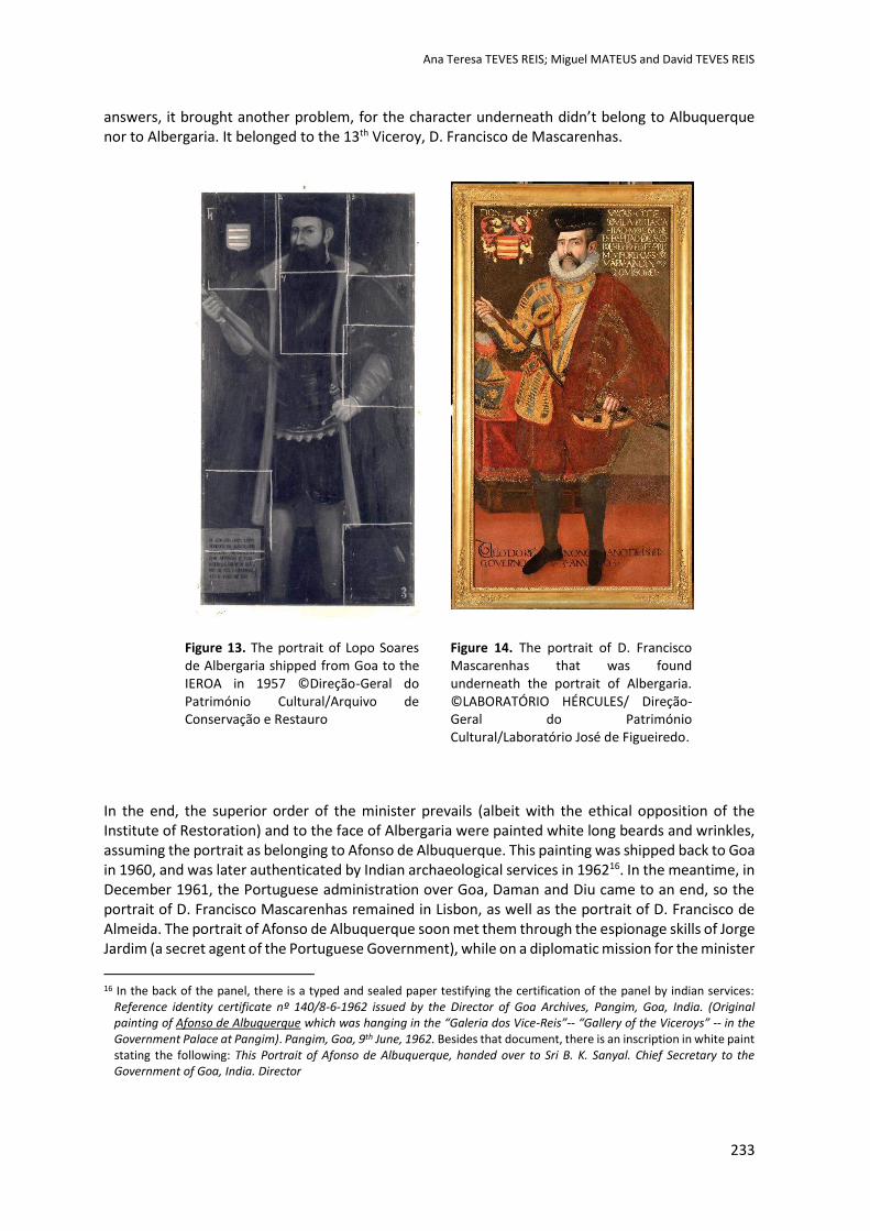
Ana Teresa TEVES REIS; Miguel MATEUS and David TEVES REIS
233
answers, it brought another problem, for the character underneath didn’t belong to Albuquerque nor to Albergaria. It belonged to the 13th Viceroy, D. Francisco de Mascarenhas.
In the end, the superior order of the minister prevails (albeit with the ethical opposition of the Institute of Restoration) and to the face of Albergaria were painted white long beards and wrinkles, assuming the portrait as belonging to Afonso de Albuquerque. This painting was shipped back to Goa in 1960, and was later authenticated by Indian archaeological services in 196216. In the meantime, in December 1961, the Portuguese administration over Goa, Daman and Diu came to an end, so the portrait of D. Francisco Mascarenhas remained in Lisbon, as well as the portrait of D. Francisco de Almeida. The portrait of Afonso de Albuquerque soon met them through the espionage skills of Jorge Jardim (a secret agent of the Portuguese Government), while on a diplomatic mission for the minister
16 In the back of the panel, there is a typed and sealed paper testifying the certification of the panel by indian services:
Reference identity certificate nº 140/8-6-1962 issued by the Director of Goa Archives, Pangim, Goa, India. (Original painting of Afonso de Albuquerque which was hanging in the “Galeria dos Vice-Reis”-- “Gallery of the Viceroys” -- in the Government Palace at Pangim). Pangim, Goa, 9th June, 1962. Besides that document, there is an inscription in white paint stating the following: This Portrait of Afonso de Albuquerque, handed over to Sri B. K. Sanyal. Chief Secretary to the Government of Goa, India. Director
Figure 13. The portrait of Lopo Soares de Albergaria shipped from Goa to the IEROA in 1957 ©Direção-Geral do Património Cultural/Arquivo de Conservação e Restauro
Figure 14. The portrait of D. Francisco Mascarenhas that was found underneath the portrait of Albergaria. ©LABORATÓRIO HÉRCULES/ Direção-Geral do Património Cultural/Laboratório José de Figueiredo.
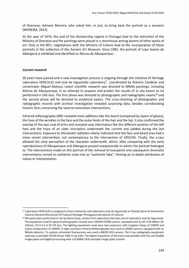
Ana Teresa TEVES REIS; Miguel MATEUS and David TEVES REIS
234
of Overseas, Adriano Moreira, who asked him, in jest, to bring back the portrait as a souvenir (MOREIRA, 2013).
At the year of 1974, the end of the dictatorship regime in Portugal lead to the extinction of the Ministry of Overseas and the paintings were placed in a storehouse among dozens of other works of art. Only in the 80’s, negotiations with the Ministry of Culture lead to the incorporation of these portraits in the collection of the Ancient Art Museum. Since 1982, the portrait of Lopo Soares de Albergaria is exhibited and identified as Afonso de Albuquerque.
Current research
30 years have passed and a new investigation process is ongoing through the initiative of Heritage Laboratory HERCULES and José de Figueiredo Laboratory17, coordinated by António Candeias and conservator Miguel Mateus. Latest scientific research was directed to MNAA paintings, including Afonso de Albuquerque, in an attempt to prepare and predict the results of in situ exams to be performed in Old Goa. The first phase was directed to photographic and radiographic exams18 and the second phase will be directed to analytical exams. The cross-checking of photographic and radiographic records with archival investigation revealed surprising data, besides corroborating historic facts concerning the several restoration interventions.
Infrared reflectography (IRR) revealed most additions like the beard (composed by layers of glazes), the lines of the wrinkles in the face and the outer limits of the hair and the hat. It also confirmed the overlap of the two coat of arms and revealed new information like the different position of the left foot and the trace of an older inscription underneath the current one (added during the last intervention). Exposure to Ultraviolet radiation clearly indicated that the face and beard area had a more recent intervention, not contemporary to the intervention of 1955/56. Finally, the x-rays allowed the clear perception of the character underneath, which, after comparing with the early reproductions of Albuquerque and Albergaria proved unequivocally to whom the portrait belonged to. The interventions made on this portrait of the removal of overpaints and subsequent chromatic interventions turned an authentic state into as “authentic fake”, limiting an in-depth attribution of values or interpretation.
17 Laboratory HERCULES is assigned to Évora University and Laboratory José de Figueiredo to Direção Geral do Património
Cultural (General Directorate Of Cultural Heritage–Portuguese Secretariat of Culture) 18 All exams were performed in situ by Sónia Costa, scholar from Laboratory Hércules and of Laboratory José de Figueiredo.
The equipment used for general photographic records was a NIKON D3200 camera, equipped with an AF-S DX Nikkor 18-105mm, f/3.5-5.6 G ED VR lens. The lighting equipment used were two projectors with tungsten lamps of 1000W and colour temperature of 3200ºK. In high resolution Infrared Reflectography was used an OSIRIS camera, equipped with an INGaAs detector. To capture ultraviolet fluorescence was used a NIKON D2X camera. The X-ray radiography equipment used was a portable YXLON Smart 160E X-ray tube. The digital acquisition of the exam was possible with the use flexible image plates and digital processing with a SCANNA CR35 portable image plate scanner.

Ana Teresa TEVES REIS; Miguel MATEUS and David TEVES REIS
235
Figures 15-17. Photographic exams on the portrait of Afonso de Albuquerque (direct light, UV fluorescence, IR reflectography) ©LABORATÓRIO HÉRCULES/Direção-Geral do Património Cultural/Laboratório José de Figueiredo
Figures 18-19. X-ray exams on the portrait of Afonso de Albuquerque (left) ©LABORATÓRIO HÉRCULES/Direção-Geral do Património Cultural/Laboratório José de Figueiredo; Drawing of Lopo Soares de Albergaria by Pedro Barreto de Resende (1646) (right) ©British Library. Notice the formal correspondence between the x-ray and the drawing.
Yet, this image has illustrated for the past 60 years all sort of publications, like schoolbooks and historic investigations as the icon of Portuguese presence in the Orient. More troubling is the fact that if this is Albergaria’s portrait, where is the first version of Albuquerque? Disappeared? Destroyed? Hidden under another portrait in Goa?…
Ana Teresa TEVES REIS; Miguel MATEUS and David TEVES REIS
236
Conclusions
The need for thorough exams and investigation of the whole collection before any decision is clear. Again, new historic facts revealed are modifying values, a process that should be accepted and not forgotten. We believe that, until then, the general public should be informed about these facts with the placement of some sort of notice near the painting to ensure correct interpretation and an opportunity to reflection and dialogue.
Resuming, in an attempt to answer the question that led to this article, “How can we define an authentic or ideal state in a portrait with culturally significant overpaints? We come to the conclusion that this is a question that we conservators shouldn’t have to respond on our own, especially when one is dealing with objects culturally significant to their stakeholders. On one hand, the quality of authenticity is given by a set of different values inherent to the object. In the case of this overpaint, the historic facts behind it also give it an important historic and documental value. In addition, the previous overpaints were also historic documents, whether we appreciate them or not in our present time. So, the later restoration process of this painting, modified the previous set of “layered authenticity” adding a new one. On the other hand, stakeholders, integrated in a multidisciplinary team, are the ones responsible for the perpetuation of the material and immaterial aspects of the object, not the conservators alone. Our job in that team, in our opinion, is to achieve and develop methodology and practice that allows that perpetuation, according to our deontology and ethics. We can hypothetically illustrate this aspect considering that a decision of removal of overpaints is taken. Then, the conservator must first survey (through thorough exams) the expected results and the different possibilities for chromatic integration, thus assisting the stakeholders on a more conscientious decision regarding the heritage they keep.
Authenticity in conservation has been acknowledged as a relative concept. It’s culturally constructed in the object by its layers of history, making it difficult to define it in absolute terms. It’s frequently confused with originality due to the association with genuine values. Sometimes, in our current practice, the search for original intention, or “protostate” (as defined by Muñoz Viñas), may lead to interventions that alter or conceal other important values like historicity or collective memory. Restoration criteria has evolved since the 60’s, but still today we can witness interventions where the urge to find what’s underneath can lead to unexpected interpretation problems that shouldn’t be solved with chromatic integration solutions. Ultimately, chromatic integration should be about helping interpretation and not to forge authenticity, as in the case of Afonso de Albuquerque.
Acknowledgements
We would like to acknowledge several professionals and institutions which kindly contributed to this research and to the ones who are committed to the development of this project, namely António Candeias and Sónia Costa (Laboratório HÉRCULES/Laboratório José de Figueiredo), José Alberto Seabra and Celina Bastos (Museu Nacional de Arte Antiga/Arquivo MNAA), Gabriela Carvalho and Rui Ferreira da Silva (Direção-Geral do Património Cultural/Laboratório José de Figueiredo/Arquivo de Conservação e Restauro) and Sri Guru Bagi (ASI Museum – Old Goa Circle).
Ana Teresa TEVES REIS; Miguel MATEUS and David TEVES REIS
237
References
Abreu, L. 1560. Livro de Lizuarte de Abreu. Nova Iorque. Copy of the Pierpont Morgan Library.
Appelbaum, B. 2010. Conservation Treatment Methodology. S.l. Appelbaum.
Azevedo, C. 1954. Algumas observações acerca do exame radiográfico dos retratos dos vice-reis da galeria de Pangim. Separata Garcia da Orta. Lisboa. Junta de Investigações do Ultramar; pp. 243-245
Barata, M. 1952. Algumas notas sobre os retratos da galeria do governador do Palácio de Goa. Separata da Revista Belas Artes, S. 2, n. 4; SNBA. Lisboa. p. 18-23.
Barreto de Resende, P. 1646. Livro do Estado da India Oriental. Digitized edition. Sloane Collection. London. British Library.
Brigada de Estudo dos Monumentos da Índia Portuguesa.1952. Restauro de quadros antigos portugueses existentes na Índia. Fundo Mário e Alice Chicó. Lisboa. Fundação Mário Soares. [online] [Accessed 13 May 2013]. Available at: http://casacomum.org/cc/arquivos.
Burton, R. 2003. Goa and the blue mountains. Or, Six Months of Sick Leave. New Delhi; Penguin Books.
Campos, A. 2014. Uma história com barbas. National Geographic Portugal, Junho.
Carita, H. 2012. Palácio dos Vice-Reis. [online] Lisboa. Fundação Calouste Gulbenkian. [accessed 08 September 2013]. Available at: Heritage Património de Influência Portuguesa. Available at: http://www.hpip.org/
Colaço, J. 1973. Galeria dos vice-reis da ïndia Portugues. Lisboa. Comissariado do Governo para os Assuntos da Índia Portuguesa.
Correia, G. 1866. Lendas da Índia. Lisboa; Ordem da Classe de Sciencias Moraes, Politicas e Bellas Artes da Academia Real das Sciencias de Lisboa.
Costa, M. 1930. Memórias. Lisboa. Livraria Clássica Editora
Couto, J. 1957. Letter from João Couto to General Luís de Pina. Registador 9/M/5-1957. Lisboa. Arquivo do Museu Nacional de Arte Antiga.
Couto, J. 1957. Restauro do retrato de Afonso de Albuquerque. Registador 9/M/5-1957. Lisboa. Arquivo do Museu Nacional de Arte Antiga.
Faria e Sousa, M. 1945. Ásia Portuguesa. Porto. Civilização.
Mariz, V. 2012. Os trabalhos de restauro de um capitão em 1894 – Os retratos dos vice-reis da Índia (do Archaeological Museum de Goa) e a faceta artística de Gomes da Costa. Conservar Património, n.º15-16. Lisboa. ARP. pp.31-42.
Mardel, F. 1956. Processo 1000A. Afonso de Albuquerque. Intervention report. Lisboa. Direção Geral do Património Cultural. Arquivo de Conservação e Restauro.
Martins, J. 1935. Os vice-reis da Índia:1505-1917. Lisboa; Imprensa Nacional.
Moreira, A. 2008. A Espuma do Tempo. Memórias do Tempo de Vésperas. Lisboa. Almedina.
Moura, A. 1961. Processo 1000B. Lopo Soares de Albergaria. Intervention report. Lisboa. Direção Geral do Património Cultural. Arquivo de Conservação e Restauro.
Muñoz Vinãs, S. 2003. Teoría contemporánea de la Restauración. Madrid. Sintesis.
Sousa & Paul. Ed. 1890. Vice-Reis e Governadores. Photographic album of Roncón’s drawings. Goa. Sousa &Paul

Ana Teresa TEVES REIS; Miguel MATEUS and David TEVES REIS
238
Torre, M.; Avrami, E. (coord.) 2000.Values and Heritage Conservation. Research Report. Los Angeles. Getty Conservation Institute
Websites
Faria e Sousa, M. 1665. Ásia portuguesa.Tomo I. [online] Lisboa. Impresso na Oficina de Henrique Valente de Oliveira. [Accessed 8 September 2013]. Available at: http://books.google.pt/books/about/Asia_portuguesa.html
UNESCO. 2003. Hoi An Protocols for best conservation practice in Asia. [online] [Accessed 20 July 2014]. Available at: http://unesdoc.unesco.org/images/0018/001826/182617e.pdf
Inpainng a Urania 19th Century Toy Theatre:
Problems and soluons
Cáa SILVA, Leonor LOUREIROand
Fernando ANTUNES
2nd International Meeting on Retouching of Cultural Heritage RECH2
Porto, Portugal | 24-25 October 2014 _____________________________________________________________________
240
Inpainting a Urania 19th Century Toy Theatre:
Problems and solutions.
Cátia SILVA1*, Leonor LOUREIRO1**, Fernando ANTUNES1
1 Polytechnic Institute of Tomar, ESTT, Quinta do Contador, Estrada da Serra, 2300-313 Tomar, PORTUGAL
* [email protected] ** [email protected]
Abstract
A Urania nineteenth century toy theatre is nowadays a rare object to find. Created for the entertainment of children, this particular object is of German origin, edited by Joseph Scholz, one of the main creators of games and books for children at the time. It is a composite object, with wooden structure covered with marbled paper, tinted paper and cardboard showing two distinct forms of paper decoration: lithography and watercolour painting. It also has a front complex scene in printed cotton, and some metal elements.
Structural problems and missing woody elements, countless tears in the papers, weaknesses and lacunae in the cardboards, papers and in papers decorations – printing designs, watercolours and marbling designs, oxidation of the metallic elements, stains and powdery textile printing, were some of the main problems encountered.
In order to solve these problems, the intervention of conservation and restoration focused on the disassembly of the object, cleaning, consolidation of tears, consolidation of powdery textile printing, filling gaps with Japanese papers and conservation pulp, and finally reintegration of the printed, watercoloured and marbled papers, essential for the full reading of the object. Regarding the characteristics of the different decorated papers, watercolours of the German brand Schmincke were chosen, and both mimetic and discernible pointillism techniques were applied – mimetic for printing lines and pointillism for the colour lacunae. The results obtained, being evident up close and unnoticeable when observing the whole object, were very satisfactory.
Keywords: Inpainting of paper; Paper Conservation; Urania toy theatre; Schmincke watercolours; Mimetic reintegration; Pointillism reintegration.

Cátia SILVA, Leonor LOUREIRO and Fernando ANTUNES
241
Introduction
The object of study and intervention is a 19th century toy theatre, named URANIA. This is of German origin, edited by Joseph Scholz, one of the main creators and developer of games and books for children at the time.
A miniature theatre was one of the most glittering toys of his age (Ribeiro & Vieira, 2008; Burke & HEARD, 1975), and it was not only a form of entertainment but also of education and training (Gomes, 1964; Fleming, 1996).
A toy theatre is a miniature copy of a theatre, and so it comprehends: a Proscenium (in Portuguese known as “boca de cena”) a Latin word meaning "in front of the scenery", that is, the portal arch that divides the audience from the stage, creating a “window” around the scene; a Drop Curtain (“pano de boca”) or the curtain located immediately behind the proscenium; a Regal Bambolina (“bambolina régia”) that is a printed paper and cardboard positioned behind the drop curtain; a Base or Stage (“palco”) that comprises the upstage (area further away from the audience) and the downstage (area closest to the audience), and it is open on the back and shows the grooves in which the figures were inserted and manipulated; the Side Wings (“bastidores laterais”) that are the side parts of a stage deck but offstage (three on each side), and that can or not show decorative features; and the Backdrop or Main Scenario (“imagem de fundo”) (Baldwin, 1992; Bastos, 1994; Solmer, 1999; Siefert, 2002).
The object in question measures 60,2 (length) x 44,3 (depth) x 74,9 (height) cm, and it is composed by all these different parts: the base supports the proscenium arch (which in its turn supports the drop curtain), the regal bambolina, the six side wings and the main scenario, so this miniature resembles the structure of a real theatre [Figs.1, 2, 3, 4 and 5]. Its structural and decorative composition is certainly related to the name Urania, common to an ancient and graceful German Theatre Company of that same time (Byrne, 1982; Sauer, 1982; Leisse & Flores, 2009).
Figure 1. Structural reconstitution of the theatre.
Cátia SILVA, Leonor LOUREIRO and Fernando ANTUNES
242
Figure 2. Urania Toy Theatre front view.
Figure 3. Urania Toy Theatre back view.
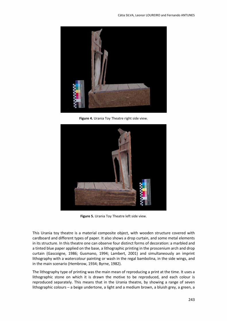
Cátia SILVA, Leonor LOUREIRO and Fernando ANTUNES
243
Figure 4. Urania Toy Theatre right side view.
Figure 5. Urania Toy Theatre left side view.
This Urania toy theatre is a material composite object, with wooden structure covered with cardboard and different types of paper. It also shows a drop curtain, and some metal elements in its structure. In this theatre one can observe four distinct forms of decoration: a marbled and a tinted blue paper applied on the base, a lithographic printing in the proscenium arch and drop curtain (Gascoigne, 1986; Gusmano, 1994; Lambert, 2001) and simultaneously an imprint lithography with a watercolour painting or wash in the regal bambolina, in the side wings, and in the main scenario (Hembrow, 1934; Byrne, 1982).
The lithography type of printing was the main mean of reproducing a print at the time. It uses a lithographic stone on which it is drawn the motive to be reproduced, and each colour is reproduced separately. This means that in the Urania theatre, by showing a range of seven lithographic colours – a beige undertone, a light and a medium brown, a bluish grey, a green, a
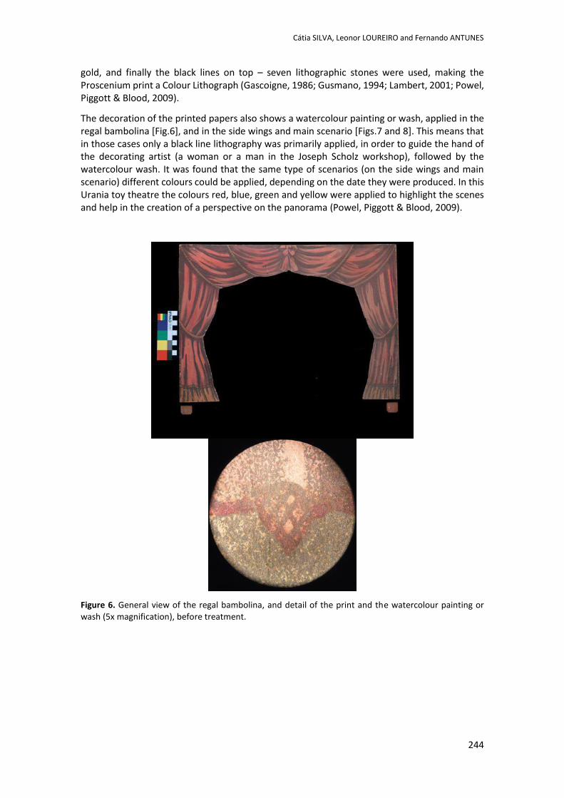
Cátia SILVA, Leonor LOUREIRO and Fernando ANTUNES
244
gold, and finally the black lines on top – seven lithographic stones were used, making the Proscenium print a Colour Lithograph (Gascoigne, 1986; Gusmano, 1994; Lambert, 2001; Powel, Piggott & Blood, 2009).
The decoration of the printed papers also shows a watercolour painting or wash, applied in the regal bambolina [Fig.6], and in the side wings and main scenario [Figs.7 and 8]. This means that in those cases only a black line lithography was primarily applied, in order to guide the hand of the decorating artist (a woman or a man in the Joseph Scholz workshop), followed by the watercolour wash. It was found that the same type of scenarios (on the side wings and main scenario) different colours could be applied, depending on the date they were produced. In this Urania toy theatre the colours red, blue, green and yellow were applied to highlight the scenes and help in the creation of a perspective on the panorama (Powel, Piggott & Blood, 2009).
Figure 6. General view of the regal bambolina, and detail of the print and the watercolour painting or wash (5x magnification), before treatment.
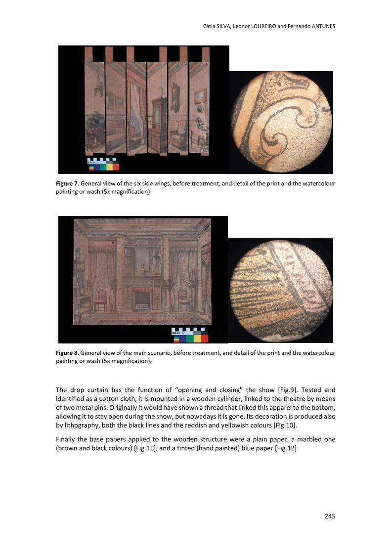
Cátia SILVA, Leonor LOUREIRO and Fernando ANTUNES
245
Figure 7. General view of the six side wings, before treatment, and detail of the print and the watercolour painting or wash (5x magnification).
Figure 8. General view of the main scenario, before treatment, and detail of the print and the watercolour painting or wash (5x magnification).
The drop curtain has the function of “opening and closing" the show [Fig.9]. Tested and identified as a cotton cloth, it is mounted in a wooden cylinder, linked to the theatre by means of two metal pins. Originally it would have shown a thread that linked this apparel to the bottom, allowing it to stay open during the show, but nowadays it is gone. Its decoration is produced also by lithography, both the black lines and the reddish and yellowish colours [Fig.10].
Finally the base papers applied to the wooden structure were a plain paper, a marbled one (brown and black colours) [Fig.11], and a tinted (hand painted) blue paper [Fig.12].
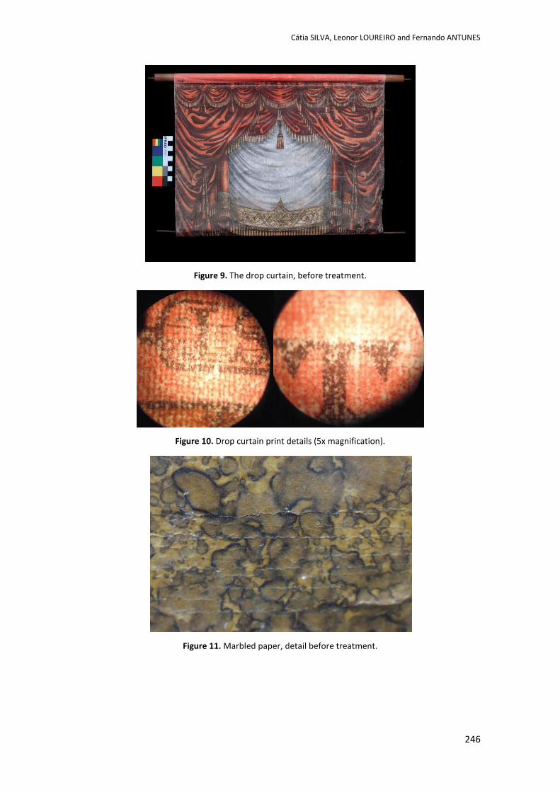
Cátia SILVA, Leonor LOUREIRO and Fernando ANTUNES
246
Figure 9. The drop curtain, before treatment.
Figure 10. Drop curtain print details (5x magnification).
Figure 11. Marbled paper, detail before treatment.
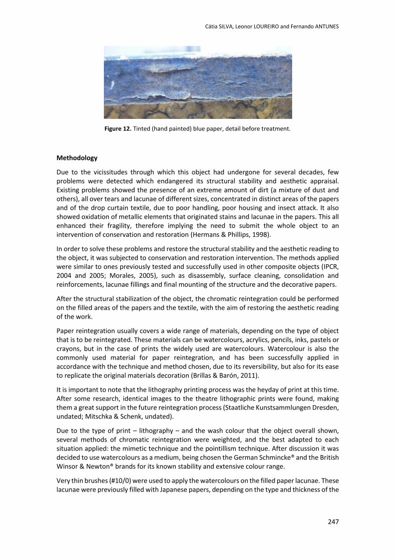
Cátia SILVA, Leonor LOUREIRO and Fernando ANTUNES
247
Figure 12. Tinted (hand painted) blue paper, detail before treatment.
Methodology
Due to the vicissitudes through which this object had undergone for several decades, few problems were detected which endangered its structural stability and aesthetic appraisal. Existing problems showed the presence of an extreme amount of dirt (a mixture of dust and others), all over tears and lacunae of different sizes, concentrated in distinct areas of the papers and of the drop curtain textile, due to poor handling, poor housing and insect attack. It also showed oxidation of metallic elements that originated stains and lacunae in the papers. This all enhanced their fragility, therefore implying the need to submit the whole object to an intervention of conservation and restoration (Hermans & Phillips, 1998).
In order to solve these problems and restore the structural stability and the aesthetic reading to the object, it was subjected to conservation and restoration intervention. The methods applied were similar to ones previously tested and successfully used in other composite objects (IPCR, 2004 and 2005; Morales, 2005), such as disassembly, surface cleaning, consolidation and reinforcements, lacunae fillings and final mounting of the structure and the decorative papers.
After the structural stabilization of the object, the chromatic reintegration could be performed on the filled areas of the papers and the textile, with the aim of restoring the aesthetic reading of the work.
Paper reintegration usually covers a wide range of materials, depending on the type of object that is to be reintegrated. These materials can be watercolours, acrylics, pencils, inks, pastels or crayons, but in the case of prints the widely used are watercolours. Watercolour is also the commonly used material for paper reintegration, and has been successfully applied in accordance with the technique and method chosen, due to its reversibility, but also for its ease to replicate the original materials decoration (Brillas & Barón, 2011).
It is important to note that the lithography printing process was the heyday of print at this time. After some research, identical images to the theatre lithographic prints were found, making them a great support in the future reintegration process (Staatliche Kunstsammlungen Dresden, undated; Mitschka & Schenk, undated).
Due to the type of print – lithography – and the wash colour that the object overall shown, several methods of chromatic reintegration were weighted, and the best adapted to each situation applied: the mimetic technique and the pointillism technique. After discussion it was decided to use watercolours as a medium, being chosen the German Schmincke® and the British Winsor & Newton® brands for its known stability and extensive colour range.
Very thin brushes (#10/0) were used to apply the watercolours on the filled paper lacunae. These lacunae were previously filled with Japanese papers, depending on the type and thickness of the
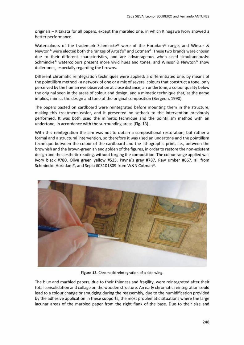
Cátia SILVA, Leonor LOUREIRO and Fernando ANTUNES
248
originals – Kitakata for all papers, except the marbled one, in which Kinugawa Ivory showed a better performance.
Watercolours of the trademark Schmincke® were of the Horadam® range, and Winsor & Newton® were elected both the ranges of Artist's® and Cotman®. These two brands were chosen due to their different characteristics, and are advantageous when used simultaneously: Schmincke® watercolours present more vivid hues and tones, and Winsor & Newton® show duller ones, especially regarding the browns.
Different chromatic reintegration techniques were applied: a differentiated one, by means of the pointillism method - a network of one or a mix of several colours that construct a tone, only perceived by the human eye observation at close distance; an undertone, a colour quality below the original seen in the areas of colour and design; and a mimetic technique that, as the name implies, mimics the design and tone of the original composition (Bergeon, 1990).
The papers pasted on cardboard were reintegrated before mounting them in the structure, making this treatment easier, and it presented no setback to the intervention previously performed. It was both used the mimetic technique and the pointillism method with an undertone, in accordance with the surrounding areas [Fig. 13].
With this reintegration the aim was not to obtain a compositional restoration, but rather a formal and a structural intervention, so therefore it was used an undertone and the pointillism technique between the colour of the cardboard and the lithographic print, i.e., between the brownish and the brown-greenish and golden of the figures, in order to restore the non-existent design and the aesthetic reading, without forging the composition. The colour range applied was Ivory black #780, Olive green yellow #525, Payne´s grey #787, Raw umber #667, all from Schmincke Horadam®, and Sepia #03101809 from W&N Cotman®.
Figure 13. Chromatic reintegration of a side wing.
The blue and marbled papers, due to their thinness and fragility, were reintegrated after their total consolidation and collage on the wooden structure. An early chromatic reintegration could lead to a colour change or smudging during the reassembly, due to the humidification provided by the adhesive application In these supports, the most problematic situations where the large lacunar areas of the marbled paper from the right flank of the base. Due to their size and
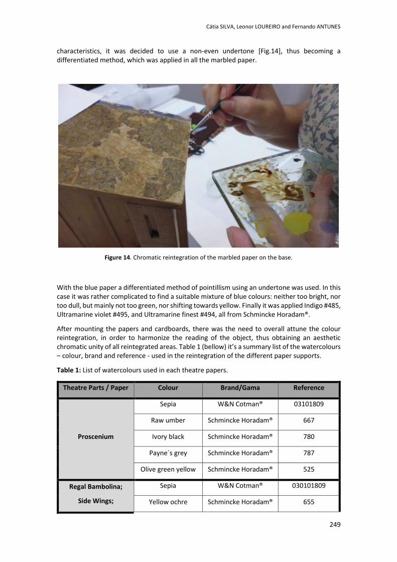
Cátia SILVA, Leonor LOUREIRO and Fernando ANTUNES
249
characteristics, it was decided to use a non-even undertone [Fig.14], thus becoming a differentiated method, which was applied in all the marbled paper.
Figure 14. Chromatic reintegration of the marbled paper on the base.
With the blue paper a differentiated method of pointillism using an undertone was used. In this case it was rather complicated to find a suitable mixture of blue colours: neither too bright, nor too dull, but mainly not too green, nor shifting towards yellow. Finally it was applied Indigo #485, Ultramarine violet #495, and Ultramarine finest #494, all from Schmincke Horadam®.
After mounting the papers and cardboards, there was the need to overall attune the colour reintegration, in order to harmonize the reading of the object, thus obtaining an aesthetic chromatic unity of all reintegrated areas. Table 1 (bellow) it’s a summary list of the watercolours – colour, brand and reference - used in the reintegration of the different paper supports.
Table 1: List of watercolours used in each theatre papers.
Theatre Parts / Paper Colour Brand/Gama Reference
Proscenium
Sepia W&N Cotman® 03101809
Raw umber Schmincke Horadam® 667
Ivory black Schmincke Horadam® 780
Payne´s grey Schmincke Horadam® 787
Olive green yellow Schmincke Horadam® 525
Regal Bambolina;
Side Wings;
Sepia W&N Cotman® 030101809
Yellow ochre Schmincke Horadam® 655
Cátia SILVA, Leonor LOUREIRO and Fernando ANTUNES
250
Main Scenario English venetian red Schmincke Horadam® 649
Cobalt turquoise Schmincke Horadam® 659
Vandyke brown W&N Artist’s® 0101076
Ivory black Schmincke Horadam® 780
Cobalt green Schmincke Horadam® 333
Raw sienna W&N Artist’s® 0101552
Base Marbled paper
Sepia W&N Cotman® 0301809
Raw umber Schmincke Horadam® 667
Burnt umber W&N Artist’s® 0101676
Base Blue paper
Indigo Schmincke Horadam® 485
Ultramarine violet Schmincke Horadam® 495
Ultramarine finest Schmincke Horadam® 494
Drop curtain
Madder Brown Schmincke Horadam® 670
Ivory black Schmincke Horadam® 780
Indian red Schmincke Horadam® 645
Results
With the chromatic reintegration of the papers and textile, one can observe certain details of each technique and tone used. For the glued on card papers of the Proscenium, the areas that presented the most problems and more difficulties to work with were those near the caryatids. Undertones were applied by the method of pointillism in the coloured areas [Fig.15], and the mimetic technique in gaps of the black printed lines [Figs.16 and 17]. The colours used for browns were Raw umber and Sepia, with Payne's Grey for bluish, and Olive green yellow for the greenish areas.
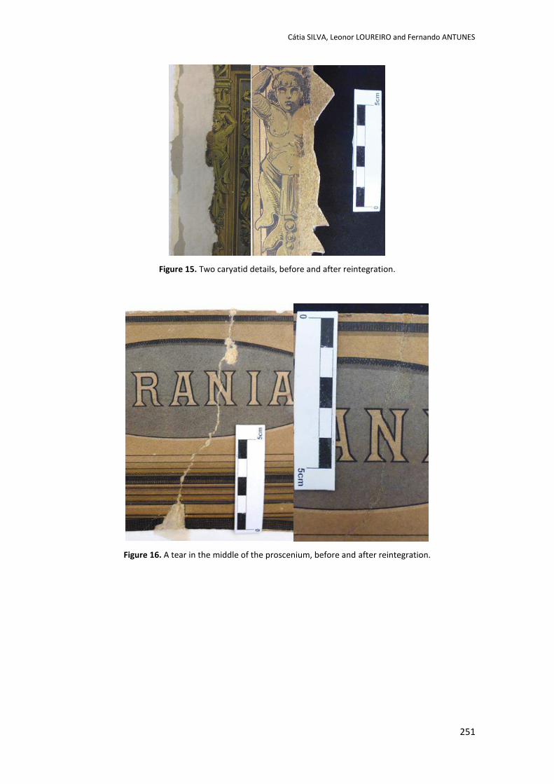
Cátia SILVA, Leonor LOUREIRO and Fernando ANTUNES
251
Figure 15. Two caryatid details, before and after reintegration.
Figure 16. A tear in the middle of the proscenium, before and after reintegration.
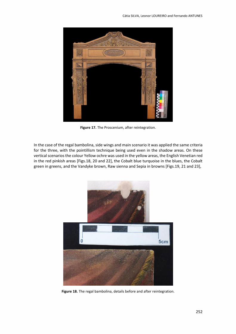
Cátia SILVA, Leonor LOUREIRO and Fernando ANTUNES
252
Figure 17. The Proscenium, after reintegration.
In the case of the regal bambolina, side wings and main scenario it was applied the same criteria for the three, with the pointillism technique being used even in the shadow areas. On these vertical scenarios the colour Yellow ochre was used in the yellow areas, the English Venetian red in the red pinkish areas [Figs.18, 20 and 22], the Cobalt blue turquoise in the blues, the Cobalt green in greens, and the Vandyke brown, Raw sienna and Sepia in browns [Figs.19, 21 and 23],
Figure 18. The regal bambolina, details before and after reintegration.
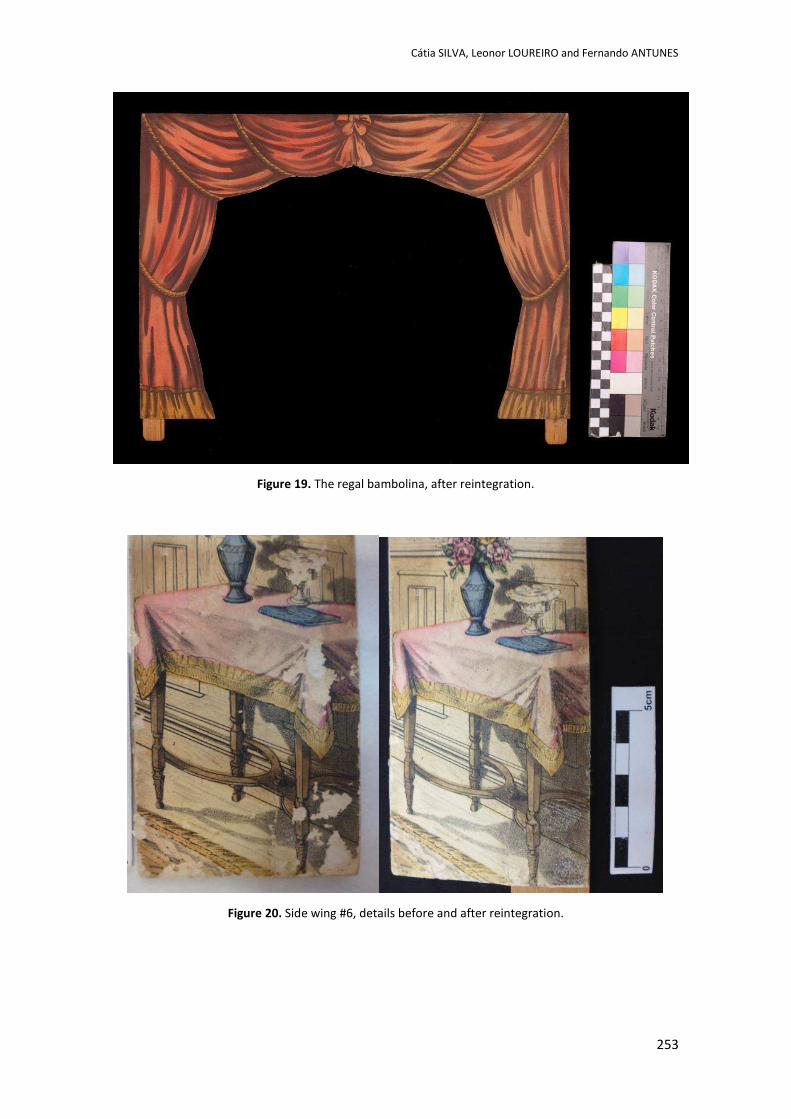
Cátia SILVA, Leonor LOUREIRO and Fernando ANTUNES
253
Figure 19. The regal bambolina, after reintegration.
Figure 20. Side wing #6, details before and after reintegration.
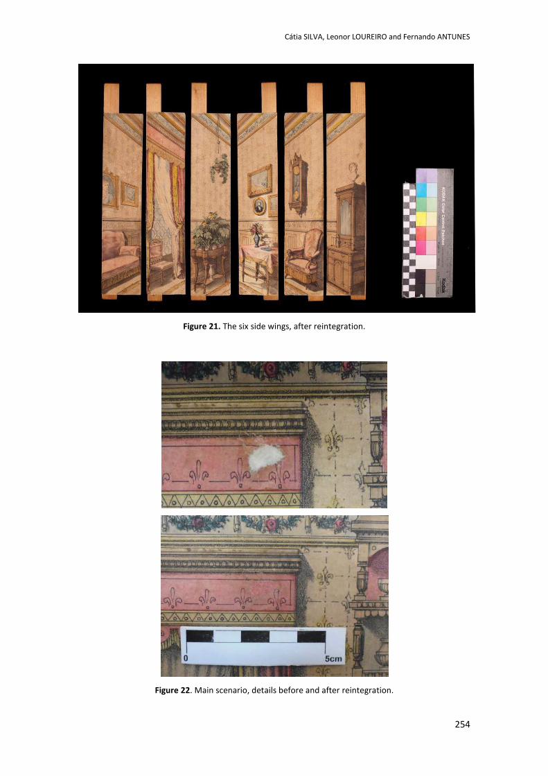
Cátia SILVA, Leonor LOUREIRO and Fernando ANTUNES
254
Figure 21. The six side wings, after reintegration.
Figure 22. Main scenario, details before and after reintegration.
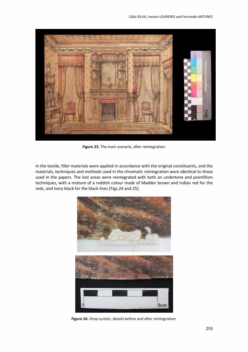
Cátia SILVA, Leonor LOUREIRO and Fernando ANTUNES
255
Figure 23. The main scenario, after reintegration.
In the textile, filler materials were applied in accordance with the original constituents, and the materials, techniques and methods used in the chromatic reintegration were identical to those used in the papers. The lost areas were reintegrated with both an undertone and pointillism techniques, with a mixture of a reddish colour made of Madder brown and Indian red for the reds, and Ivory black for the black lines [Figs.24 and 25].
Figure 24. Drop curtain, details before and after reintegration.
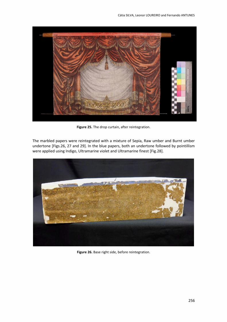
Cátia SILVA, Leonor LOUREIRO and Fernando ANTUNES
256
Figure 25. The drop curtain, after reintegration.
The marbled papers were reintegrated with a mixture of Sepia, Raw umber and Burnt umber undertone [Figs.26, 27 and 29]. In the blue papers, both an undertone followed by pointillism were applied using Indigo, Ultramarine violet and Ultramarine finest [Fig.28].
Figure 26. Base right side, before reintegration.
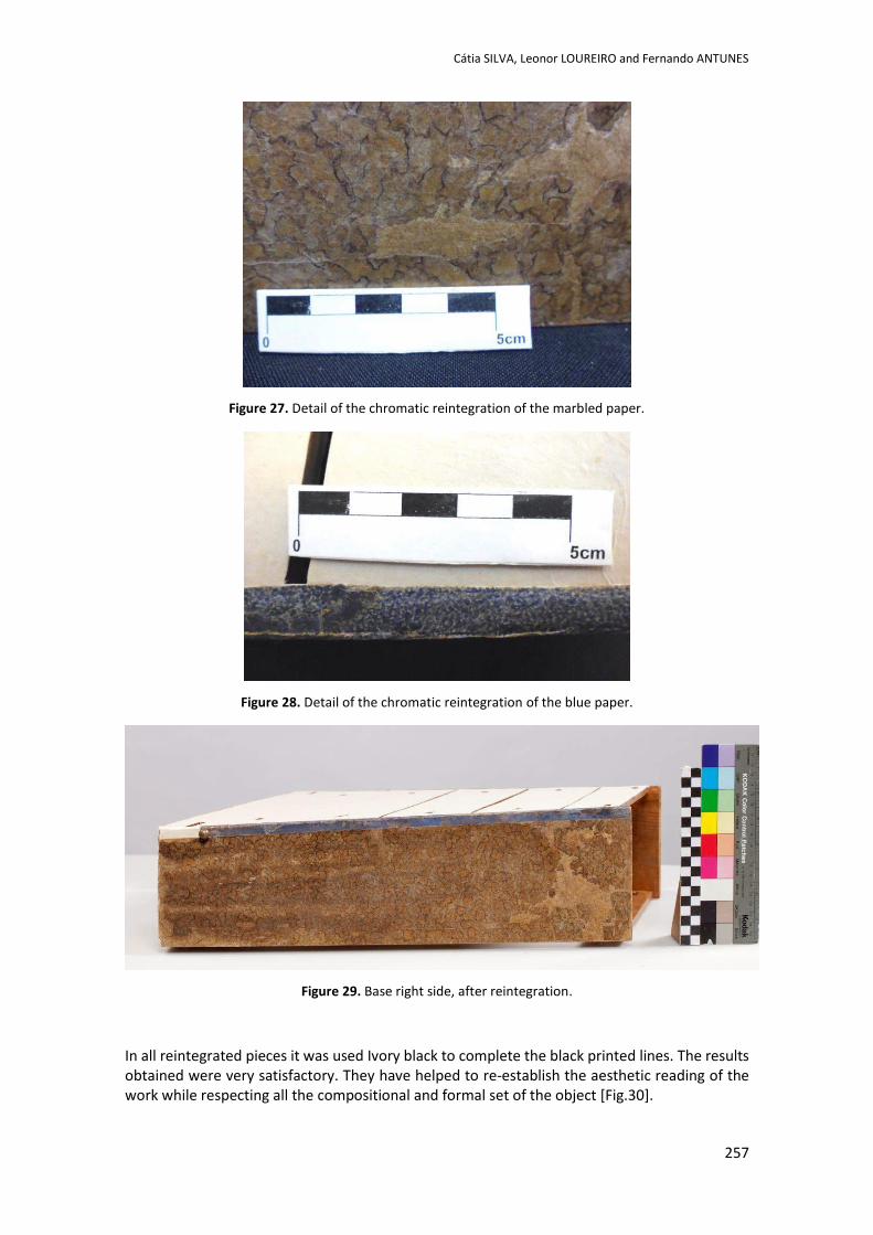
Cátia SILVA, Leonor LOUREIRO and Fernando ANTUNES
257
Figure 27. Detail of the chromatic reintegration of the marbled paper.
Figure 28. Detail of the chromatic reintegration of the blue paper.
Figure 29. Base right side, after reintegration.
In all reintegrated pieces it was used Ivory black to complete the black printed lines. The results obtained were very satisfactory. They have helped to re-establish the aesthetic reading of the work while respecting all the compositional and formal set of the object [Fig.30].
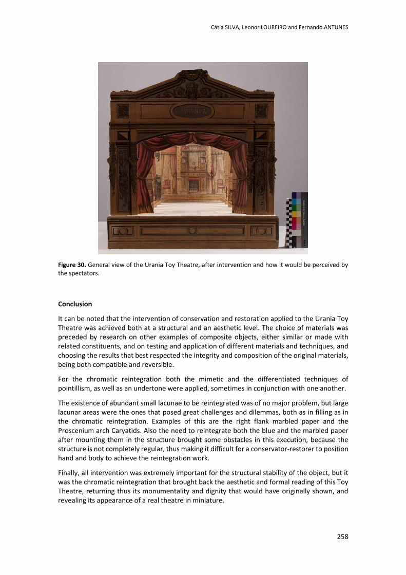
Cátia SILVA, Leonor LOUREIRO and Fernando ANTUNES
258
Figure 30. General view of the Urania Toy Theatre, after intervention and how it would be perceived by the spectators.
Conclusion
It can be noted that the intervention of conservation and restoration applied to the Urania Toy Theatre was achieved both at a structural and an aesthetic level. The choice of materials was preceded by research on other examples of composite objects, either similar or made with related constituents, and on testing and application of different materials and techniques, and choosing the results that best respected the integrity and composition of the original materials, being both compatible and reversible.
For the chromatic reintegration both the mimetic and the differentiated techniques of pointillism, as well as an undertone were applied, sometimes in conjunction with one another.
The existence of abundant small lacunae to be reintegrated was of no major problem, but large lacunar areas were the ones that posed great challenges and dilemmas, both as in filling as in the chromatic reintegration. Examples of this are the right flank marbled paper and the Proscenium arch Caryatids. Also the need to reintegrate both the blue and the marbled paper after mounting them in the structure brought some obstacles in this execution, because the structure is not completely regular, thus making it difficult for a conservator-restorer to position hand and body to achieve the reintegration work.
Finally, all intervention was extremely important for the structural stability of the object, but it was the chromatic reintegration that brought back the aesthetic and formal reading of this Toy Theatre, returning thus its monumentality and dignity that would have originally shown, and revealing its appearance of a real theatre in miniature.
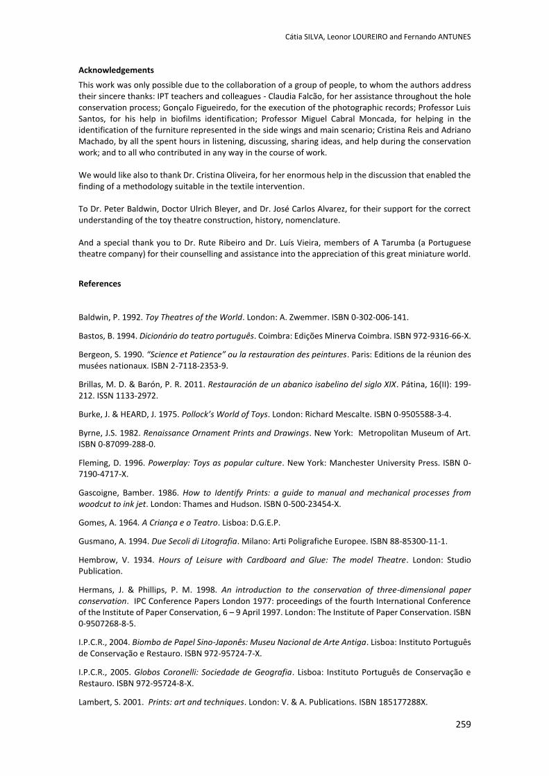
Cátia SILVA, Leonor LOUREIRO and Fernando ANTUNES
259
Acknowledgements
This work was only possible due to the collaboration of a group of people, to whom the authors address their sincere thanks: IPT teachers and colleagues - Claudia Falcão, for her assistance throughout the hole conservation process; Gonçalo Figueiredo, for the execution of the photographic records; Professor Luis Santos, for his help in biofilms identification; Professor Miguel Cabral Moncada, for helping in the identification of the furniture represented in the side wings and main scenario; Cristina Reis and Adriano Machado, by all the spent hours in listening, discussing, sharing ideas, and help during the conservation work; and to all who contributed in any way in the course of work. We would like also to thank Dr. Cristina Oliveira, for her enormous help in the discussion that enabled the finding of a methodology suitable in the textile intervention. To Dr. Peter Baldwin, Doctor Ulrich Bleyer, and Dr. José Carlos Alvarez, for their support for the correct understanding of the toy theatre construction, history, nomenclature. And a special thank you to Dr. Rute Ribeiro and Dr. Luís Vieira, members of A Tarumba (a Portuguese theatre company) for their counselling and assistance into the appreciation of this great miniature world.
References
Baldwin, P. 1992. Toy Theatres of the World. London: A. Zwemmer. ISBN 0-302-006-141.
Bastos, B. 1994. Dicionário do teatro português. Coimbra: Edições Minerva Coimbra. ISBN 972-9316-66-X.
Bergeon, S. 1990. “Science et Patience” ou la restauration des peintures. Paris: Editions de la réunion des musées nationaux. ISBN 2-7118-2353-9.
Brillas, M. D. & Barón, P. R. 2011. Restauración de un abanico isabelino del siglo XIX. Pátina, 16(II): 199-212. ISSN 1133-2972.
Burke, J. & HEARD, J. 1975. Pollock’s World of Toys. London: Richard Mescalte. ISBN 0-9505588-3-4.
Byrne, J.S. 1982. Renaissance Ornament Prints and Drawings. New York: Metropolitan Museum of Art. ISBN 0-87099-288-0.
Fleming, D. 1996. Powerplay: Toys as popular culture. New York: Manchester University Press. ISBN 0-7190-4717-X.
Gascoigne, Bamber. 1986. How to Identify Prints: a guide to manual and mechanical processes from woodcut to ink jet. London: Thames and Hudson. ISBN 0-500-23454-X.
Gomes, A. 1964. A Criança e o Teatro. Lisboa: D.G.E.P.
Gusmano, A. 1994. Due Secoli di Litografia. Milano: Arti Poligrafiche Europee. ISBN 88-85300-11-1.
Hembrow, V. 1934. Hours of Leisure with Cardboard and Glue: The model Theatre. London: Studio Publication.
Hermans, J. & Phillips, P. M. 1998. An introduction to the conservation of three-dimensional paper conservation. IPC Conference Papers London 1977: proceedings of the fourth International Conference of the Institute of Paper Conservation, 6 – 9 April 1997. London: The Institute of Paper Conservation. ISBN 0-9507268-8-5.
I.P.C.R., 2004. Biombo de Papel Sino-Japonês: Museu Nacional de Arte Antiga. Lisboa: Instituto Português de Conservação e Restauro. ISBN 972-95724-7-X.
I.P.C.R., 2005. Globos Coronelli: Sociedade de Geografia. Lisboa: Instituto Português de Conservação e Restauro. ISBN 972-95724-8-X.
Lambert, S. 2001. Prints: art and techniques. London: V. & A. Publications. ISBN 185177288X.
Cátia SILVA, Leonor LOUREIRO and Fernando ANTUNES
260
Morales, M. 2005. Soluciones para un país deteriorado: restauración de un abanico del siglo XVIII. Conserva, 9: 17-28.
Powel, D., Piggott, J. R. & Blood, H. 2009. Printing the toy theatre. London: Pollock’s Toy Museum Trust. ISBN 978-0-956442510-2.
Ribeiro, R. & Vieira, L. 2008. Teatros de Papel: A Arte da Precisão. Lisboa: R.P.O. - Produção Gráfica. ISBN 978-989-8167-00-2.
Sauer, O. 1982. Die Privat Theater Gesellschaft Urania von 1792 bis 1892. Berlim.
Siefert, K. 2002. PapierTheater: Die Bühne im Salon. Germany: Nationalmuseum Velarg. ISBN 3-926982-93-4.
Solmer, A. 1999. Manual de Teatro. Porto: Instituto Português de Artes do Espectáculo. ISBN 972-98139-0-6.
Websites
Leisse, G. P. & Flores, L. C. 2009. Dossier pliego, papel y tijeras. Educación y Biblioteca, nº173, p. 46-110. [online] [Accessed February 2014]. Available at:WWW: < https://dl.dropboxusercontent.com/u/28853704/EB%20173Dossier.pdf >.
Mitschka, B. & Schenk Christine. Multum in Parvo [online database] [Accessed June 2014]. Available at: <http://www.spielzeugtheater.com/pages/collections/scenes_scholz.html>.
Staatliche Kunstsammlungen Dresden. Online Collection [online database] [Acessed June 2014]. Available at: <http://skd-online-collection.skd.museum/en/contents/searchList?filter%5BtextSearch%5D=Mainz&submit_button=Search>.

POSTERS
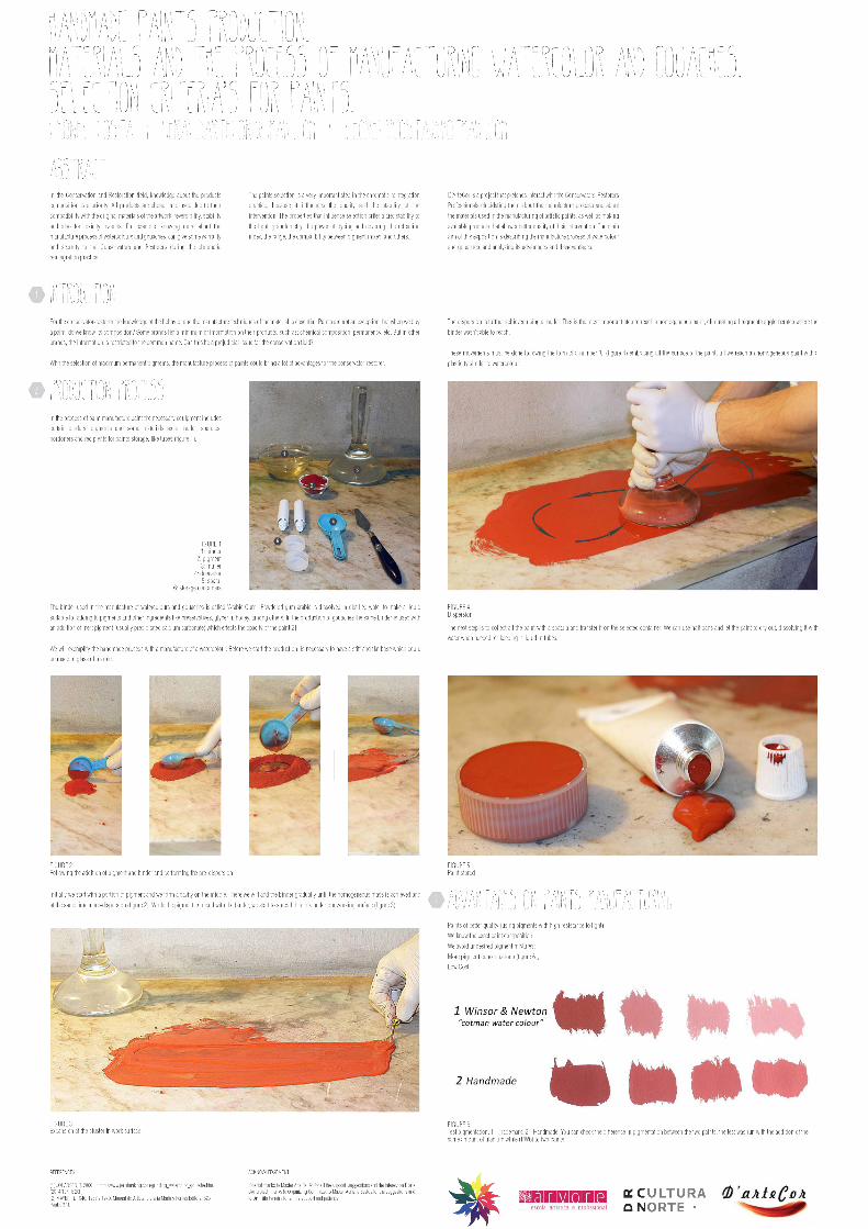

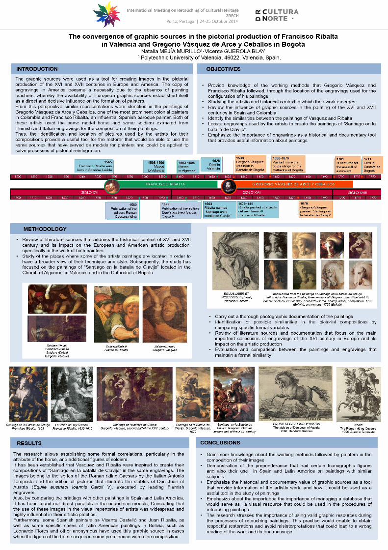
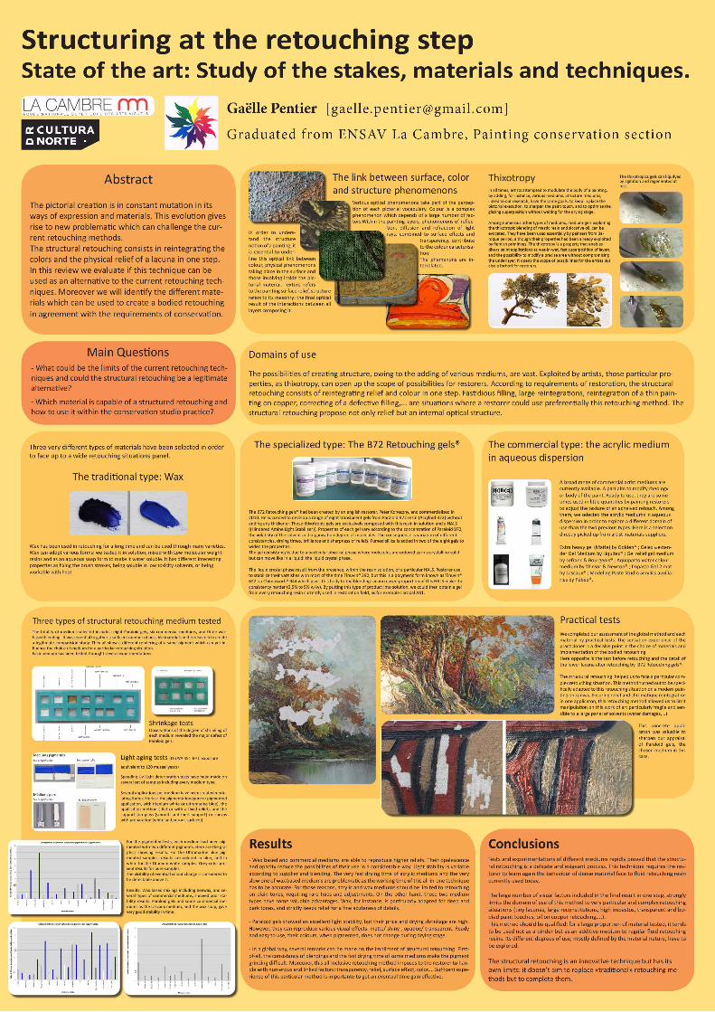
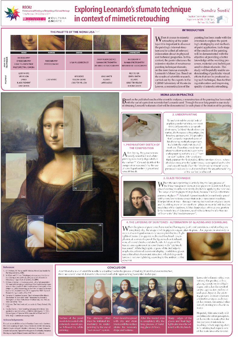

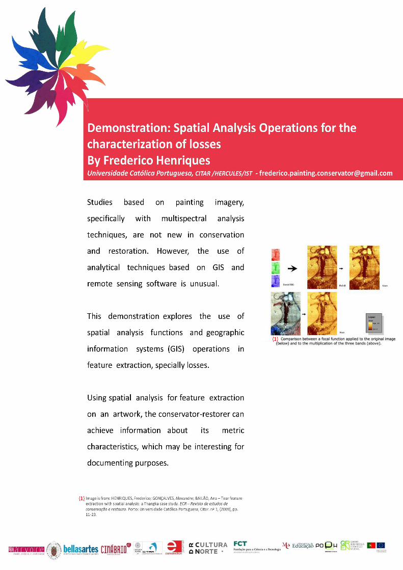
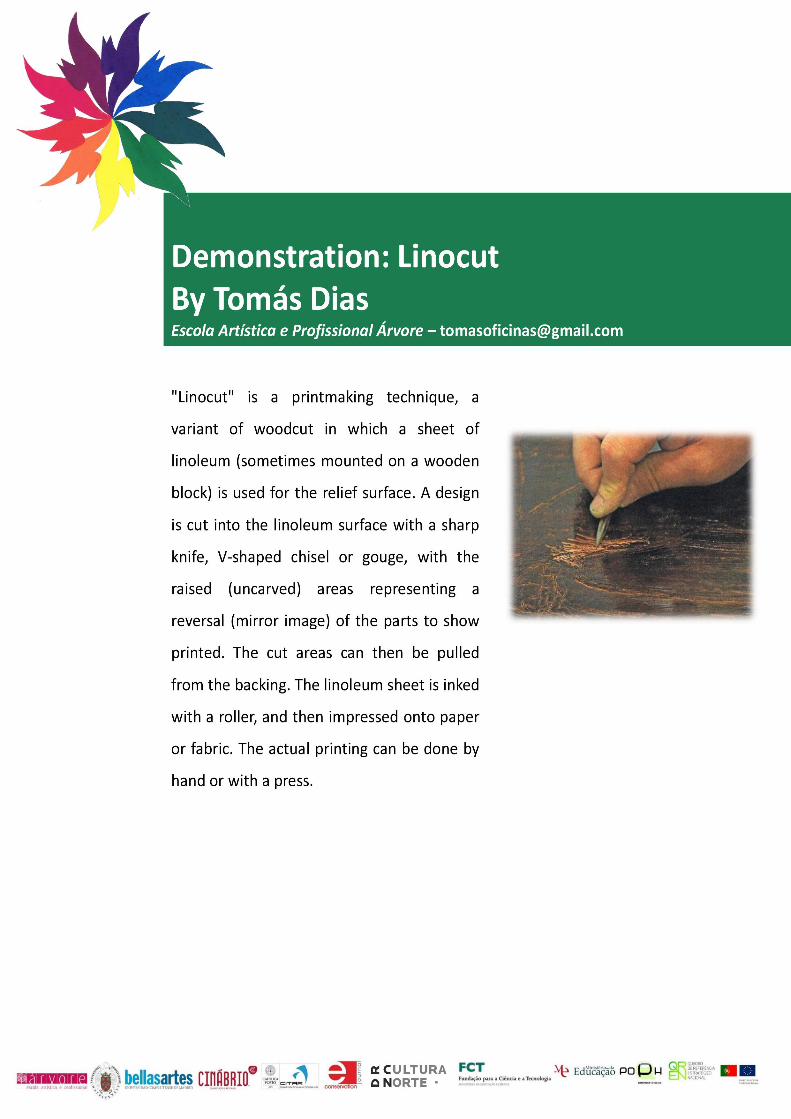
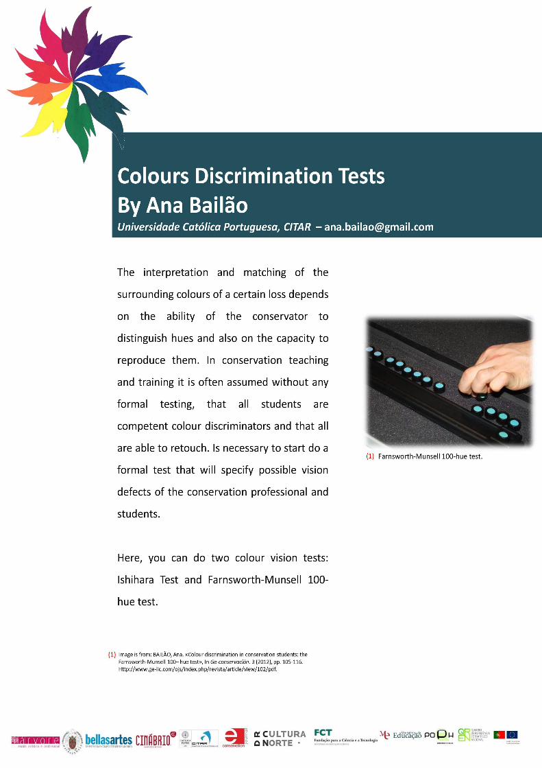
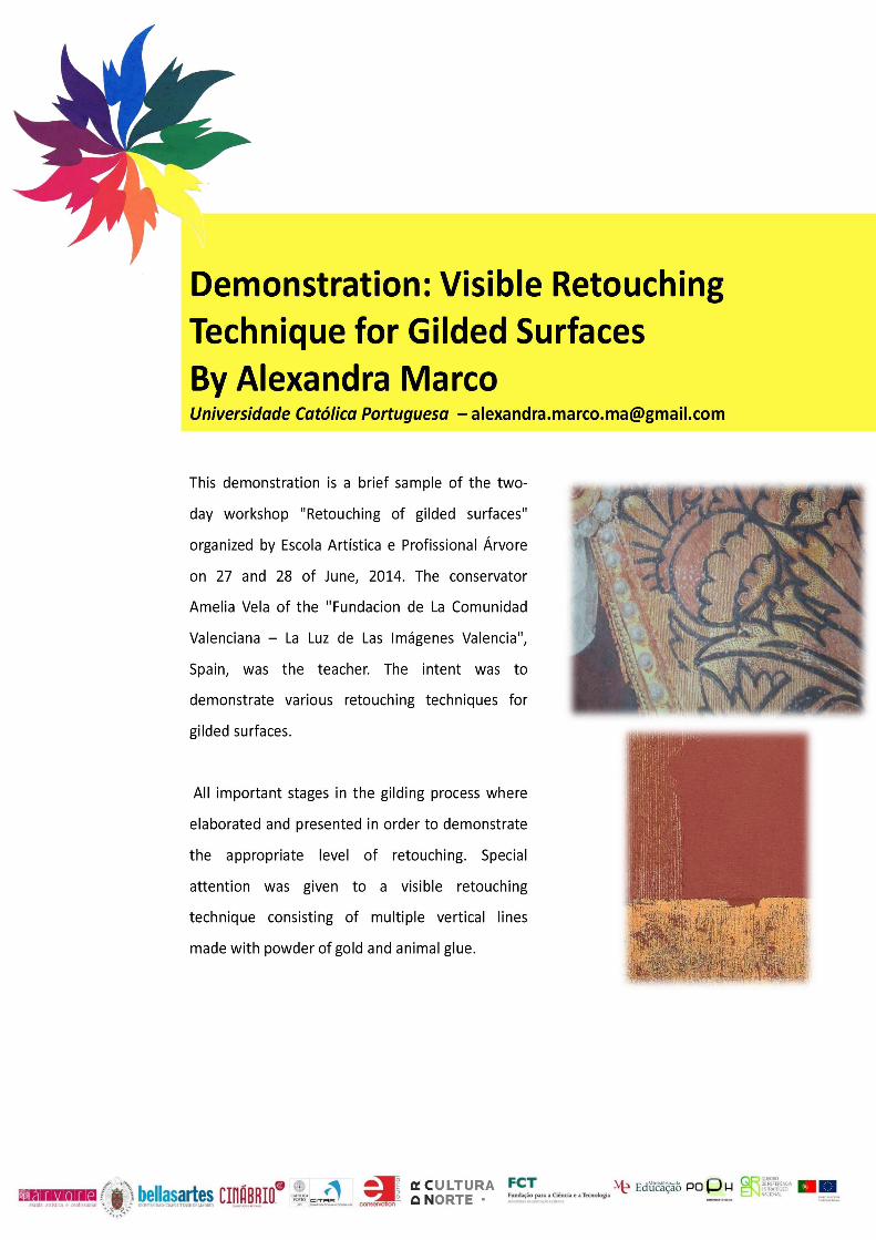
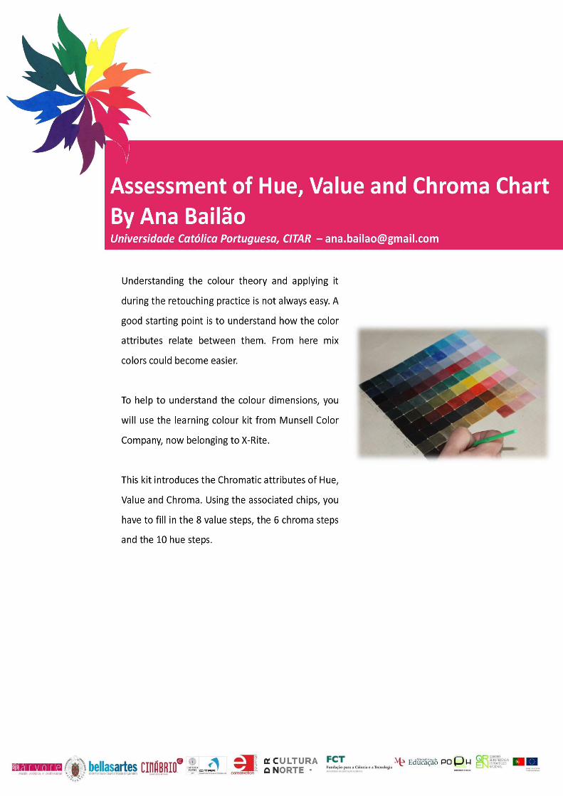


![[Acronym] Proceedings - UFG](https://static.fdokumen.com/doc/165x107/631430486ebca169bd0abf4b/acronym-proceedings-ufg.jpg)