Proceedings - UCDA
301
Tenth Annual UCDA Design Education Summit Proceedings May 19-20, 2014 THE MADISON CONCOURSE HOTEL MADISON, WISCONSIN
-
Upload
khangminh22 -
Category
Documents
-
view
1 -
download
0
Transcript of Proceedings - UCDA
Tenth Annual UCDA Design Education Summit | 1
Proceedings
May 19-20, 2014
THE Madison ConCoursE HoTELMadison, WisConsin
2 | Tenth Annual UCDA Design Education Summit
2014 Program ChairRandy ClarkAssociate ProfessorSouth Dakota State University
2014 Peer Review PanelBrytton BjorngaardAssistant ProfessorUniversity of Illinois at Springfield
Lisa HammershaimbSenior Associate DeanStevens Henager College
Rebecca LoarSenior Design ResearcherDesign Central
Leah McDougaldDirector of Design ResearchDesign Central
Pamela NapierAssistant ProfessorIndiana University
Kim ReiffChairAssistant Professor of ArtGrace College & Seminary
Published byUniversity & College Designers Association (UCDA) © 2013
ArticlesAll abstracts, articles, posters, and images in this publication are the property of their respective owners. None may be reproduced or duplicated without expressed written consent of the individual.
University & College Designers AssociationThe University & College Designers Association supports and recognizes all you do to create every day. We know what working in education is about. Our members are designers, design educators, art directors, creative directors, managers, directors of print shops, editors, writers, directors of media services, photographers, and businesses associated with visual communication.
UCDA provides a forum for new ideas, new perspectives on the design industry, professional development opportunities, and access to a large network of generous professionals.
UCDA Home Office199 Enon Springs Road West, Suite 400Smyrna, TN 37167615-459 -4559615-459-5229 [email protected]
Tenth Annual UCDA Design Education Summit | 1
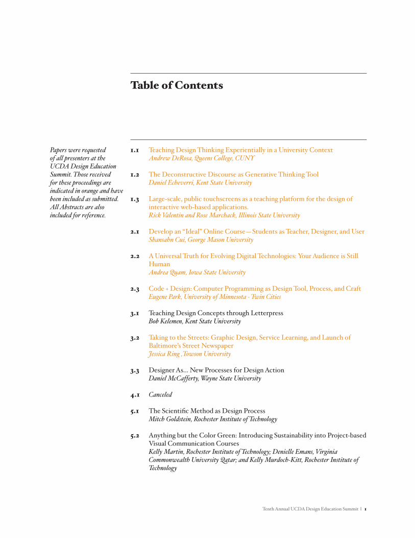
1.1 Teaching Design Thinking Experientially in a University Context Andrew DeRosa, Queens College, CUNY
1.2 The Deconstructive Discourse as Generative Thinking Tool Daniel Echeverri, Kent State University
1.3 Large-scale, public touchscreens as a teaching platform for the design of interactive web-based applications. Rick Valentin and Rose Marchack, Illinois State University
2.1 Develop an “Ideal” Online Course—Students as Teacher, Designer, and User Shansahn Cui, George Mason University
2.2 A Universal Truth for Evolving Digital Technologies: Your Audience is Still Human
Andrea Quam, Iowa State University
2.3 Code + Design: Computer Programming as Design Tool, Process, and Craft Eugene Park, University of Minnesota - Twin Cities
3.1 Teaching Design Concepts through Letterpress Bob Kelemen, Kent State University
3.2 Taking to the Streets: Graphic Design, Service Learning, and Launch of Baltimore’s Street Newspaper
Jessica Ring ,Towson University
3.3 Designer As... New Processes for Design Action Daniel McCafferty, Wayne State University
4.1 Canceled
5.1 The Scientific Method as Design Process Mitch Goldstein, Rochester Institute of Technology
5.2 Anything but the Color Green: Introducing Sustainability into Project-based Visual Communication Courses
Kelly Martin, Rochester Institute of Technology; Denielle Emans, Virginia Commonwealth University Qatar; and Kelly Murdoch-Kitt, Rochester Institute of Technology
Table of Contents
Papers were requestedof all presenters at theUCDA Design EducationSummit. Those receivedfor these proceedings areindicated in orange and havebeen included as submitted.All Abstracts are alsoincluded for reference.
2 | Tenth Annual UCDA Design Education Summit
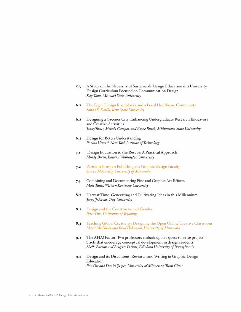
5.3 A Study on the Necessity of Sustainable Design Education in a University Design Curriculum Focused on Communication Design
Kay Youn, Missouri State University
6.1 The Big 6: Design Roadblocks and a Local Healthcare Community Sanda S. Katila, Kent State University
6.2 Designing a Greener City: Enhancing Undergraduate Research Endeavors and Creative Activities
JennyYucus, Melody Campos, and Royce Brock, Midwestern State University
6.3 Design for Better Understanding Rozina Vavetsi, New York Institute of Technology
7.1 Design Education to the Rescue: A Practical Approach Mindy Breen, Eastern Washington University
7.2 Perish or Prosper: Publishing for Graphic Design Faculty Steven McCarthy, University of Minnesota
7.3 Combining and Documenting Fine and Graphic Art Efforts Matt Tullis, Western Kentucky University
8.1 Harvest Time: Generating and Cultivating Ideas in this Millennium Jerry Johnson, Troy University
8.2 Design and the Construction of Gender Peter Fine, University of Wyoming
8.3 Teaching Global Creativity: Designing the Open Online Creative Classroom Marit McCluske and Brad Hokanson, University of Minnesota
9.1 The AHA! Factor: Two professors embark upon a quest to write project briefs that encourage conceptual development in design students.
Shelle Barron and Brigette Davitt, Edinboro University of Pennsylvania
9.2 Design and its Discontent: Research and Writing in Graphic Design Education
Ron Ott and Daniel Jasper, University of Minnesota, Twin Cities
Tenth Annual UCDA Design Education Summit | 3
10.1 Design Industry Versus Design Faculty: Comparing Perceptions of Students’ Preparedness with their Job Success
Claudia Scaff, University of North Florida
10.2 From Internships to Outcomes: A Study of a Graphic Design Internship Program in an Urban, Public, Four-Year College
Kathryn Weinstein, Queens College, CUNY
10.3 Thinking and Making: The First Year Design Experience Jeremy Shellhorn, University of Kansas
11.1 Beyond Hitting “PRINT”—Graphic Design Students Produce Intriguing Artist’s Books Starting with Typographic Study
Peter Bushell, Illinois State University
11.2 More Room to Fail, or, “All work can be resubmitted at the end of the semester.”
Dave Richardson, Eastern Illinois University
11.3 Maximizing Student Learning Opportunities by Implementing Agile Approaches to Interaction Design in the Classroom
Brad Tober, University of Illinois at Urbana-Champaign
12.1 Panel: Apples and Oranges, or Birds of a Feather? A discussion of the methodologies and goals of design education at a four year state university, private four year art school and a two year.
Panel Organizer: Chris Corneal, Michigan State University Panelists: Rebecca Tegtmeyer, Michigan State University, Jill Greene, College for
Creative Studies and James Shurter, Mott Community College
13.1 Canceled
13.2 Teaching Digital Design in the Flipped Classroom Ann Lemon, Kutztown University
13.3 To Teach Image by Its Function: Structuring Image Making for Graphic Design Students According to Cognitive Outcomes
Matthew Peterson, University of Illinois at Urbana-Champaign
4 | Tenth Annual UCDA Design Education Summit
14.1 Sound Connections in Design Education Jessica Barness, Kent State University
14.2 Teaching Motion and Interactive Design Principles through Poetry in Motion: Case Studies
Dave Richardson, Eastern Illinois University
14.3 Polyhedralness as Multiple Narratives Moon Jung Jang, University of Georgia
15.1 Sandboxing: Collaborative Environments Elizabeth Herrmann,University of South Florida St. Petersburg - ras+e and Ryan Shelley, Bowling Green State University - ras+e
15.2 Walk Home: Adding place based design projects and workshops to an undergraduate design education.
Jason Dilworth, State University of New York at Fredonia
15.3 ZoneA/Zone1: Reflection/Resilience Rachna Batra, Kristen Myers, Andrew Shea and David Frisco, Pratt Institute
16.1 Intercultural by Design: Exploring Virtually Mediated Cross-Cultural Relations Between Middle Eastern and Western Design Students
Denielle Emans, Virginia Commonwealth University Qatar and Kelly Murdoch-Kitt, Rochester Institute of Technology
16.2 Should Design Students Learn to Program? Josh Miller, Kutztown University
16.3 Polish Poster Collection and Undergraduate Student Research Opportunities
Mark Willie, Drexel University
17.1 An Update on the Vertical Studio Implementation at the University of Illinois
Matthew Peterson and Brad Tober, University of Illinois at Urbana-Champaign
Tenth Annual UCDA Design Education Summit | 5
Poster Presentations
1 Transform/Action Jean Brennan, Andrew Shea and David Frisco, Pratt Institute
2 So Many Topics So Little Time: An Overview of Half Semester Senior Seminars and Workshops
Elaine Cunfer, Kutztown University
3 Canceled
4 A Study Comparing Table-based and List-based Smartphone Interface Usability
Patrick Finley, Oklahoma State University
5 Should Graphic Design Students Need to Know How to Draw? The Role of Sketching in a Graphic Design Classroom
Jong-Yoon Kim, Plymouth State University
6 Sustainable Design Education: Defining Our Relationship with Nature Venancio A. Luz III, Viterbo University
7 Records for Life Sherri McElroy, Illinois Wesleyan University
8 The Complexity of Being Human and What it Means for Creativity Deb Shmerler, The University of Tennessee
9 The Art and Design of Basketball Marius Valdes, University of South Carolina
10 Designing a Greener City: Enhancing Undergraduate Research Endeavors and Creative Activities
JennyYucus, Melody Campos and Royce Brock, Midwestern State University
11 Student Acquired Web Hosting: A Classroom Tool for Success Michael Clayton, University of the Incarnate Word
12 Design for Social Change Project 2012 Doris Palmeros, University of the Incarnate Word
13 Case Study: Rebranding—a voice that speaks for many: a faculty union. Jane Milkie, Northern Michigan University
6 | Tenth Annual UCDA Design Education Summit
AbstractThe Social Design Lab is a design research project I launched last Spring structured around a series of community-based design practicums. Under my mentorship, a core team of five upper-division undergraduate and graduate students from different areas of concentration work together to carry out a semester-long project using design thinking to tackle a large community topic.
Student team members work together preparing and conducting field research. They collect stories and inspiration from real people through interviews, while gaining empathy, and making observations. We meet weekly and carry out workshops. We use our observations to find themes, create frameworks, and identify opportunities through abductive reasoning. Based on opportunity areas, team members worked together to identify and prototype solutions.
I believe what sets this work apart is its context within a large city university containing an extremely diverse student body. Bringing together students from diverse backgrounds has created meaningful interactions and peer-based learning, while contributing in rich ways to the project. Having access to student participants from a variety of programs of study (such as graphic design, urban studies, anthropology, sociology, psychology, social practice, media studies, and political science) creates a wide variety of trans-disciplinary collaborative opportunities.
My chief interest in the project comes from the perspective of design pedagogy. Bringing together students from diverse backgrounds and areas of practice (designers and non-designers alike) to work collaboratively using design thinking has benefits that go beyond merely learning design methodology around a special topic. My continuing research seeks to better understand the benefits and develop a design process within the context of the university I teach at, with the intention of advancing design education at large.
Teaching Design Thinking Experientially in a University Context
Andrew DeRosaQueens College, CUNY
1.1
A College-Wide Approach to Design Thinking 1
A College-Wide Approach to Design Thinking
Andrew DeRosa
Queens College, City University of New York
May, 2014
A College-Wide Approach to Design Thinking 2
Abstract
The Social Design Lab is a design research project I launched last spring
structured around a series of community-based design practicums. Under my mentorship,
a core team of five upper-division undergraduate and graduate students from different
areas of concentration work together to carry out a semester-long project using design
thinking to tackle a large community topic.
I believe what sets this work apart is its context within a large city college
containing an extremely diverse student body. Bringing together students from diverse
backgrounds has created meaningful interactions and peer-based learning, while
contributing in rich ways to the project. Having access to student participants from a
variety of programs of study creates a wide variety of trans-disciplinary collaborative
opportunities. These opportunities go beyond merely learning design methodology
around a special topic. My continuing research seeks to better understand the benefits and
develop a design process within the context of the university I teach at, with the intention
of advancing design education at large.
A College-Wide Approach to Design Thinking 3
Introduction
In spring of 2013 I began a special project at Queens College in New York City,
where I am currently Assistant Professor of Graphic Design. The project was modeled
largely on my experience as a communication designer at a design consultancy using a
human-centered approach to design and design research. The approach involved small
trans-disciplinary teams work together to tackle big issues using ethnography and
prototyping. The basic idea is that the team gains insights and inspiration by working
with the people they’re designing for. By gaining empathy you arrive at innovative
solutions to complex problems. In order to teach this process, it was necessary to adapt to
the unique constraints inherent to the college.
After receiving funding to run the project, my initial task was to find
student participants. Since the process involves collaboration across disciplines, I reached
out to other departments around the campus. I framed the project as a unique opportunity
for a few outstanding upper-division students from different areas of study to work
together on my research project — using a human-centered design approach to re-
designing the student experience at Queens College.
I’m not completely sure which aspect of this appealed the most to students,
but I got a great deal of passionate responses from an overall very talented pool. Given
the outpouring of response and the limited number of available positions, there was an air
of exclusivity and specialness. I wanted to keep and nurture that culture surrounding the
project.
I began by calling it the Social Design Lab. Students received course-credit
and met every week for the same amount of time as a standard studio design course, but it
A College-Wide Approach to Design Thinking 4
wasn’t framed as a class. Rather, it was framed as an exclusive club, a laboratory, a think
tank, and a unique research project.
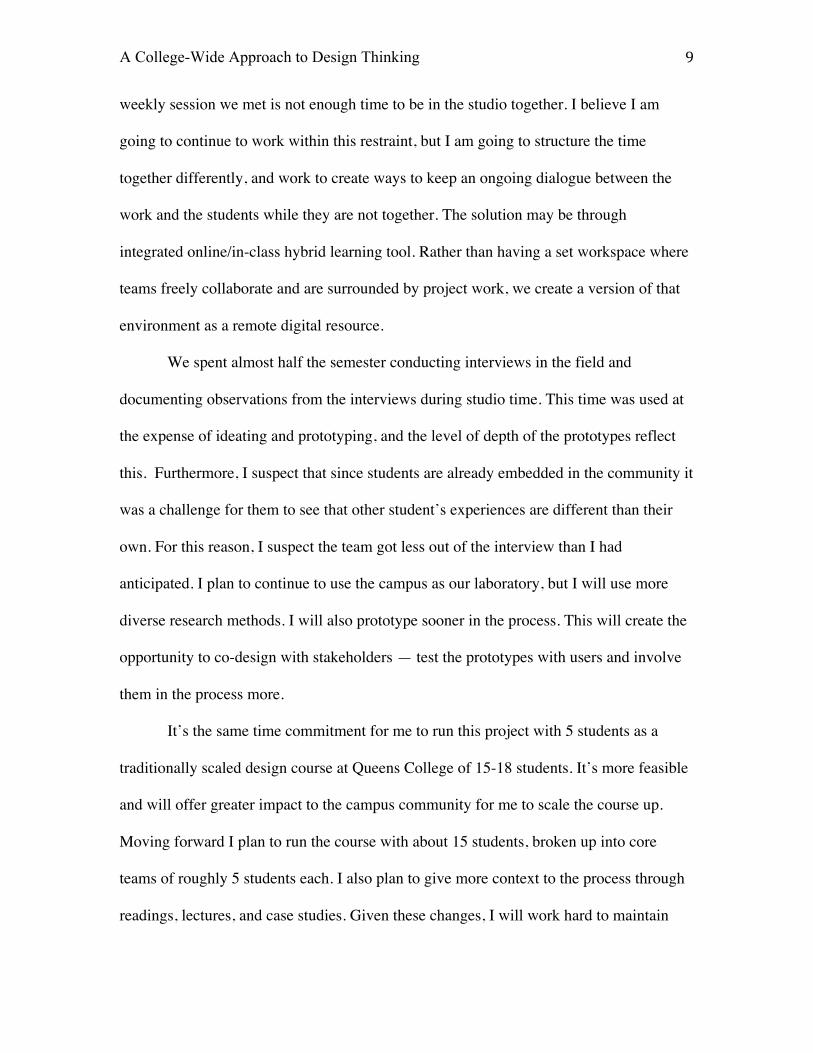
The team was composed of one Sociology major, two Graphic Design
majors, two Psychology majors, and myself (figure 1). Please note that I introduced
myself to the group as a team member not a teacher. I made it clear that I’m the team
leader responsible for the overall success of the project, planning and logistics. However
I maintained that during the duration of the semester-long project I was still just team
member. One way I underscored this is by having the students call me by my first name.
This mode of thinking is in part modeled after British theater teacher, Keith Johnston’s
approach to establishing a relationship with students as outlined in his book, Impro:
Improvisation and the Theatre: “The first thing I do when I meet a group of new students
is (probably) to sit on the floor. I play low status, and I’ll explain that if the students fail
they’re to blame me. Then they laugh, and relax, and I explain that really it’s obvious that
they should blame me, since I’m supposed to be the expert; and if I give them the wrong
material, they’ll fail; and if I give them the right material, then they’ll succeed. I play low
status physically but my actual status is going up, since only a very confident and
experienced person would put the blame for failure on himself. At this point they almost
certainly start sliding off their chairs, because they don’t want to be higher than me. I
have already changed the group profoundly, because failure is suddenly not so
frightening any more.” (Johnstone, 1979, 29)
I established a decentralized leadership hierarchy, with everyone working on all
phases of the project together. Different members take turns leading at different times. I
let students know that as team-members in a trans-disciplinary environment, they each
A College-Wide Approach to Design Thinking 5
had unique skills and perspectives to offer, and that were expected to bring them to the
project. In this experiential and peer-based learning environment, they aren’t here to
learn. Rather, they are here to participate. Given the exclusive nature of the small group
(they were chosen because they are the very best), they’re the experts. That said, just as I
exhibit “low status”, I let them know that in this environment of dynamic collaboration
that nobody was too good to work the copy machine or go on a coffee run. We all help
each other with everything. Furthermore, I established on the first day that everyone gets
an A in the class, and that everyone gets equal credit for the work upon completion.
I did everything I could to encourage collaboration, risk taking, leadership, teamwork,
and to generally raise the bar.
Process Overview
As previously mentioned, the project was “Re-designing the student experience at
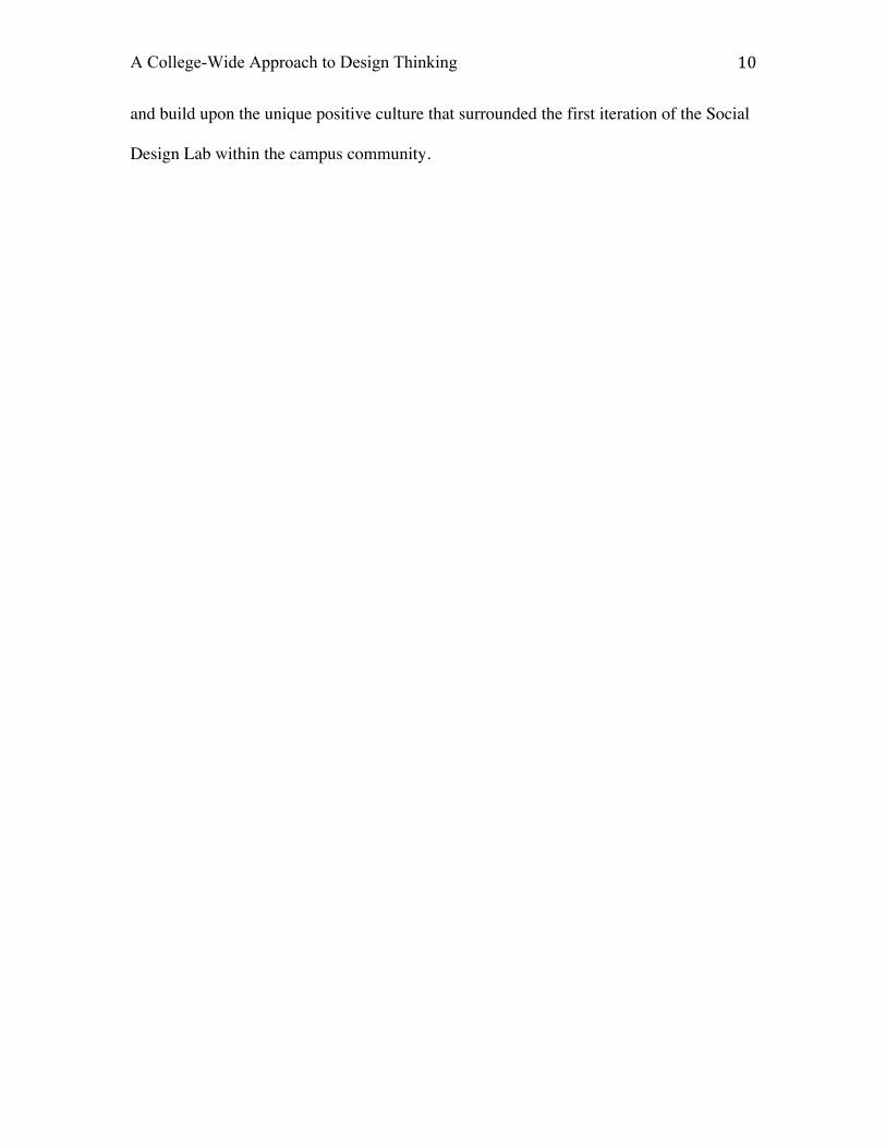
Queens College”. We used the campus as our laboratory. The duration of the project was
one semester. The process was divided into three main phases. The first is Research &
Inspiration, in which we schedule and complete field research — mostly student
interviews. We learn, listen, gain empathy, and make observations. The next phase is
Synthesis and Strategy, in which we develop themes and insights from the observations
we made during the previous phase. We created frameworks for developing concepts. For
the final phase — Concepts and Prototypes — we identified opportunities, developed
concepts, and prototyped solutions (figure 2). We also created the presentation design
that documented the process and prototyped solutions.
A College-Wide Approach to Design Thinking 6
Research and Inspiration
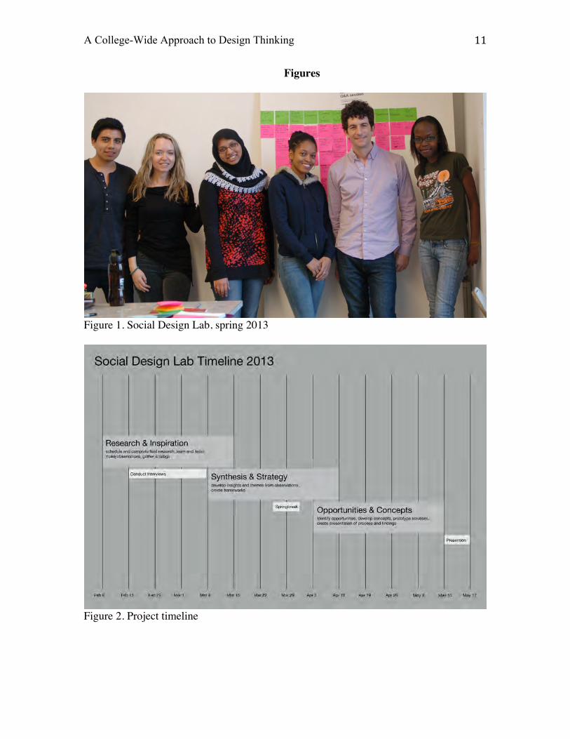
The Research & Inspiration phase began with students posting flyers around
campus to recruit research subjects. This was followed by them answering emails from
prospective candidates, and supplying them with a questionnaire they created. They
screened and selected applicants, and scheduling interviews in the interviewee’s native
habitat (usually their main building of study or dorm room). The team also worked
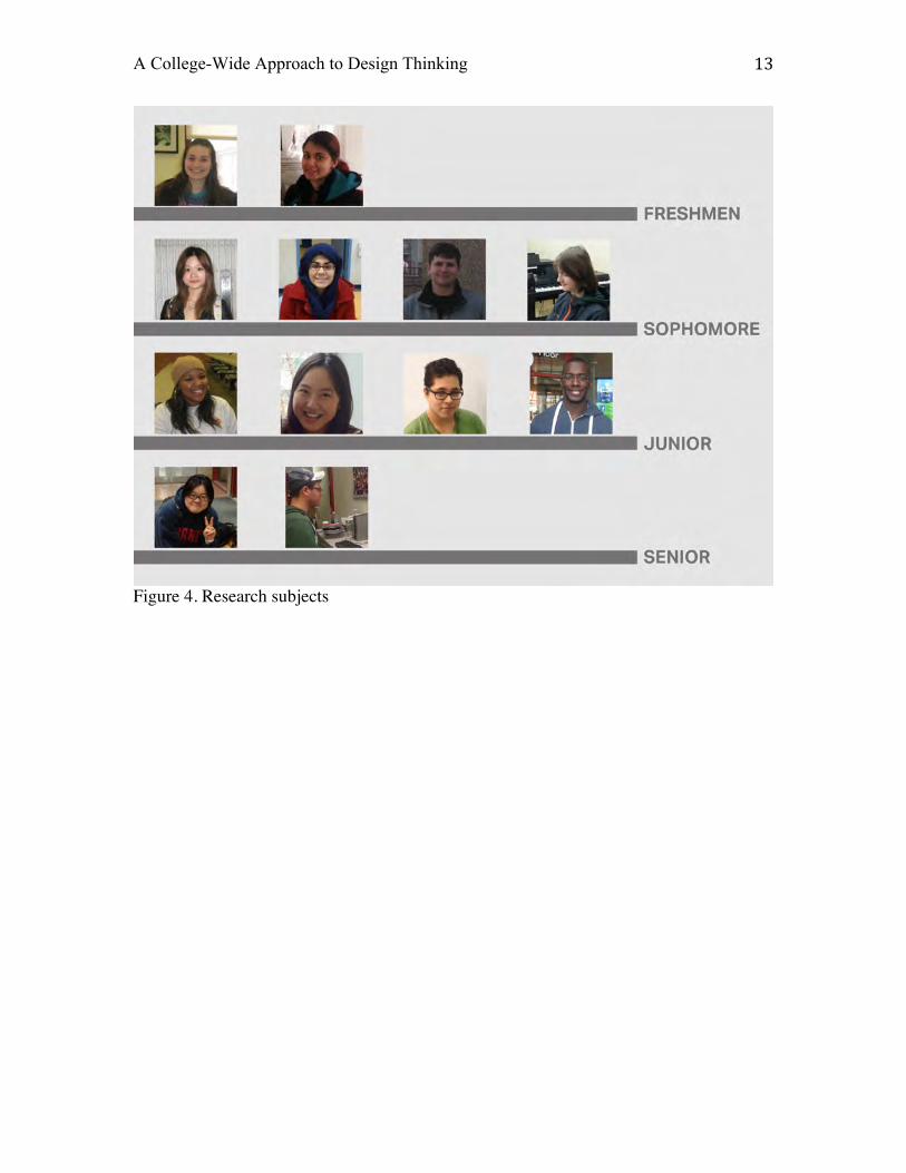
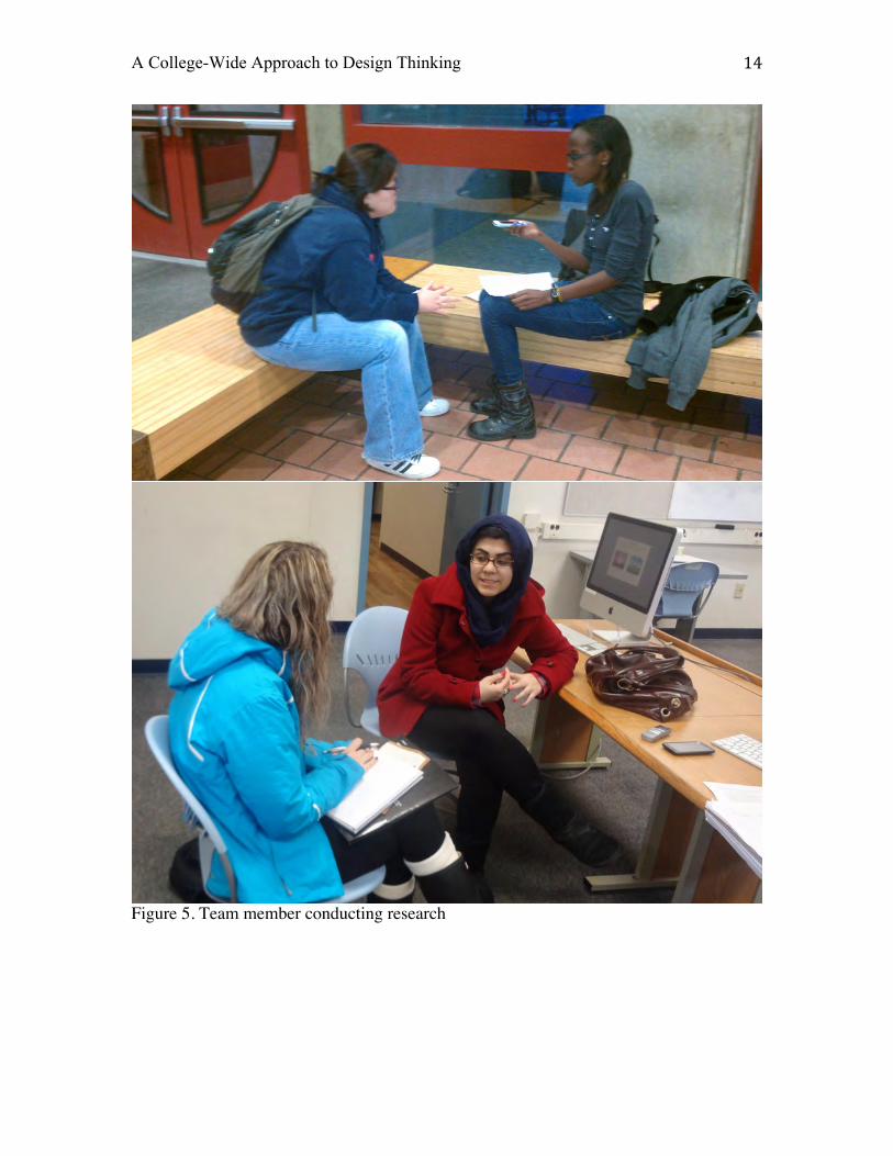
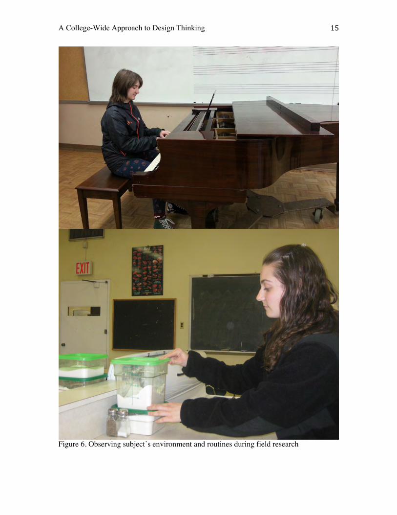
together to develop research methods for carrying out the interviews (Figure 3).
After scheduling the time and place of interviews, team members went out in
pairs to complete them. Generally one student would lead the interview, while another
was in charge of audio recording, photography, and taking notes by hand. In total, the
students carried out twelve interviews for about one hour each session. In addition to
conducting the interviews, team members looked for opportunities to shadow the
interviewees and observed their environment and routines (Figure 4, 5, 6).
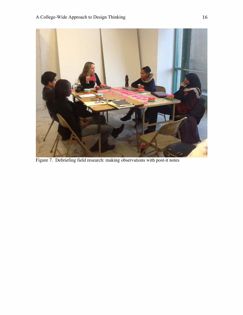
During this phase of the project, our studio time was spent debriefing on the field
research. This consisted of making observations and documenting them with post-it notes
on boards (Figure 7). Our studio time together was also important for working out the
logistics for coordinating next steps for the following week. It’s important to note that I
didn’t participate in the field research. I only interfaced with the students during our
weekly studio time together.
During the Research and Inspiration phase, the learning opportunities related to
experiential nature of the project became apparent. Students weren’t just learning about a
human-centered approach to design and becoming experts on topic of student experience.
They were learning to coordinate and work together as a team. They learned how to best
A College-Wide Approach to Design Thinking 7
complete tasks with outcomes that affected the whole team and the whole project’s
success. This involved a variety of common sense skills, courteous people skills, and
solid communication skills via email, text, google docs, etc.
Synthesis and Strategy
During the next phase of the project, Synthesis and Strategy, we worked together
grouping our observations into like-themes. This involved organizing our post-it notes of
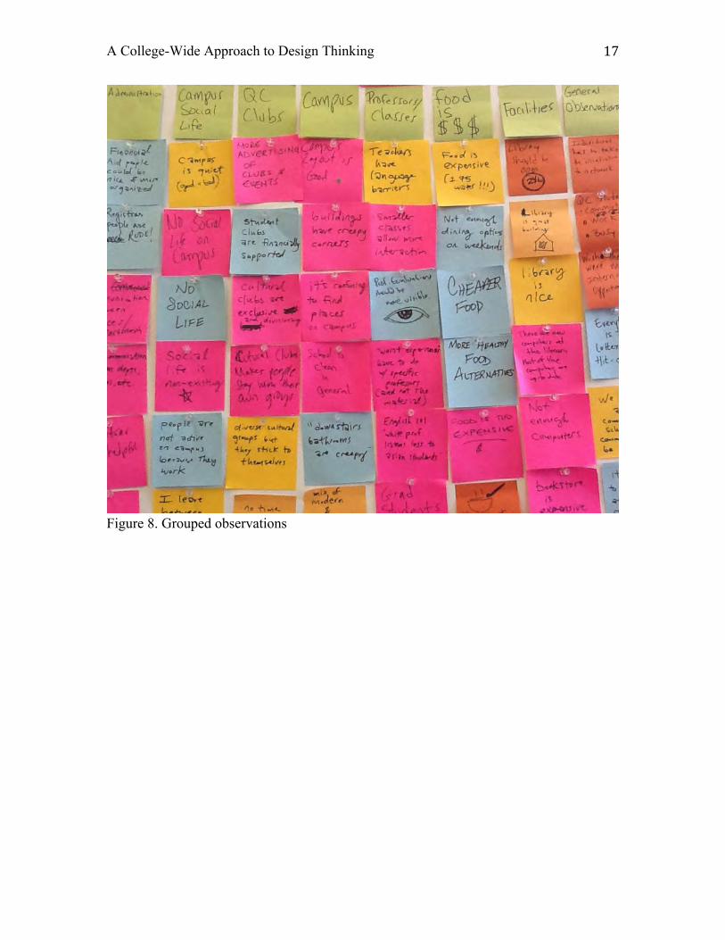
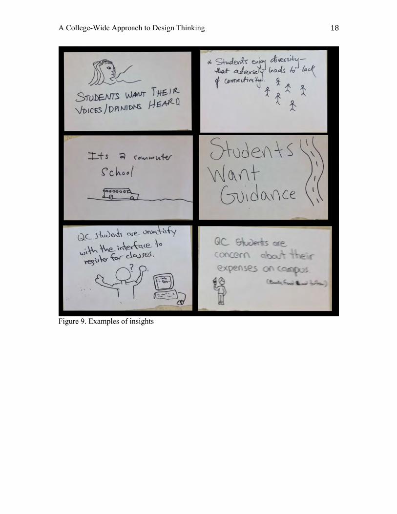
observations into groups (Figure 8). Through synthesis and abductive reasoning, we
distilled our observations into key insights (Figure 9).
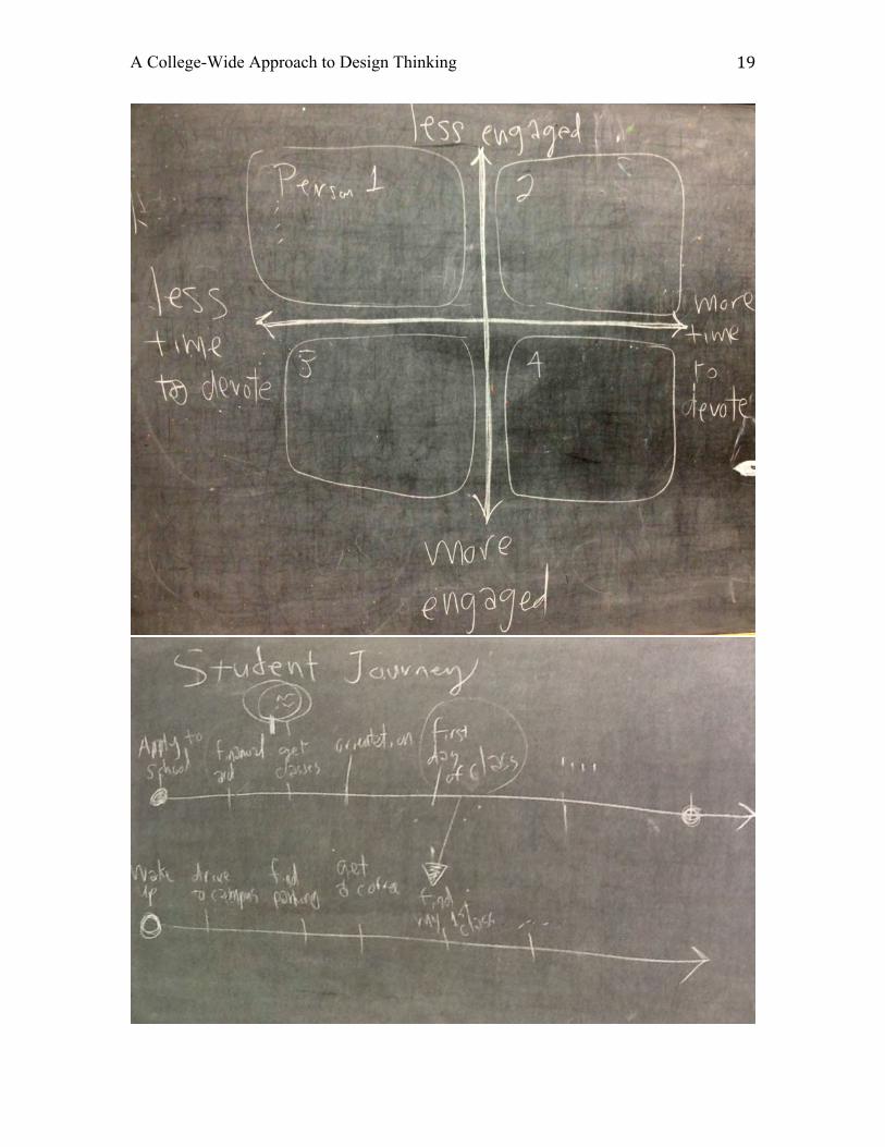
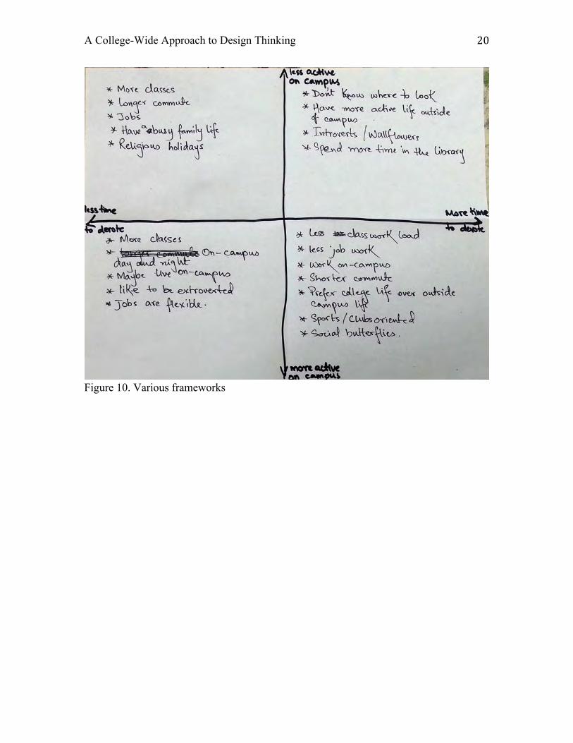
Next, we explored various frameworks to better understand and develop our
research. We generated student journey maps, personas, and matrix diagrams. We ended
up implementing a matrix diagram and then created personas for each of the four
quadrants of the diagram and designed services for each persona. These services could
then be presented as a series of touch points along each persona’s student journey (Figure
10).
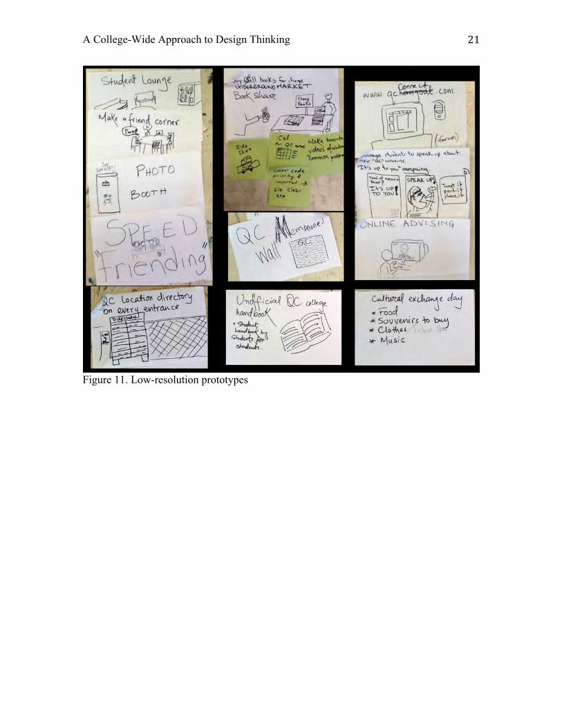
Next, we engaged in ideating and prototyping low-resolution design solutions
(Figure 11). They took form as quick sketches of concepts. At this point I encouraged
wild ideas and quantity. During studio time, we brainstormed as a group. We built off
each other’s ideas, and reviewed and grouped our concepts to choose which ones to
prototype in greater detail. We also begin designing the presentation document, which
offered structure to project.
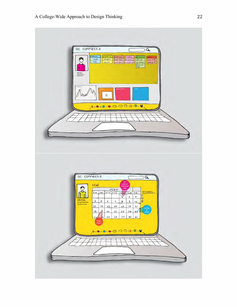
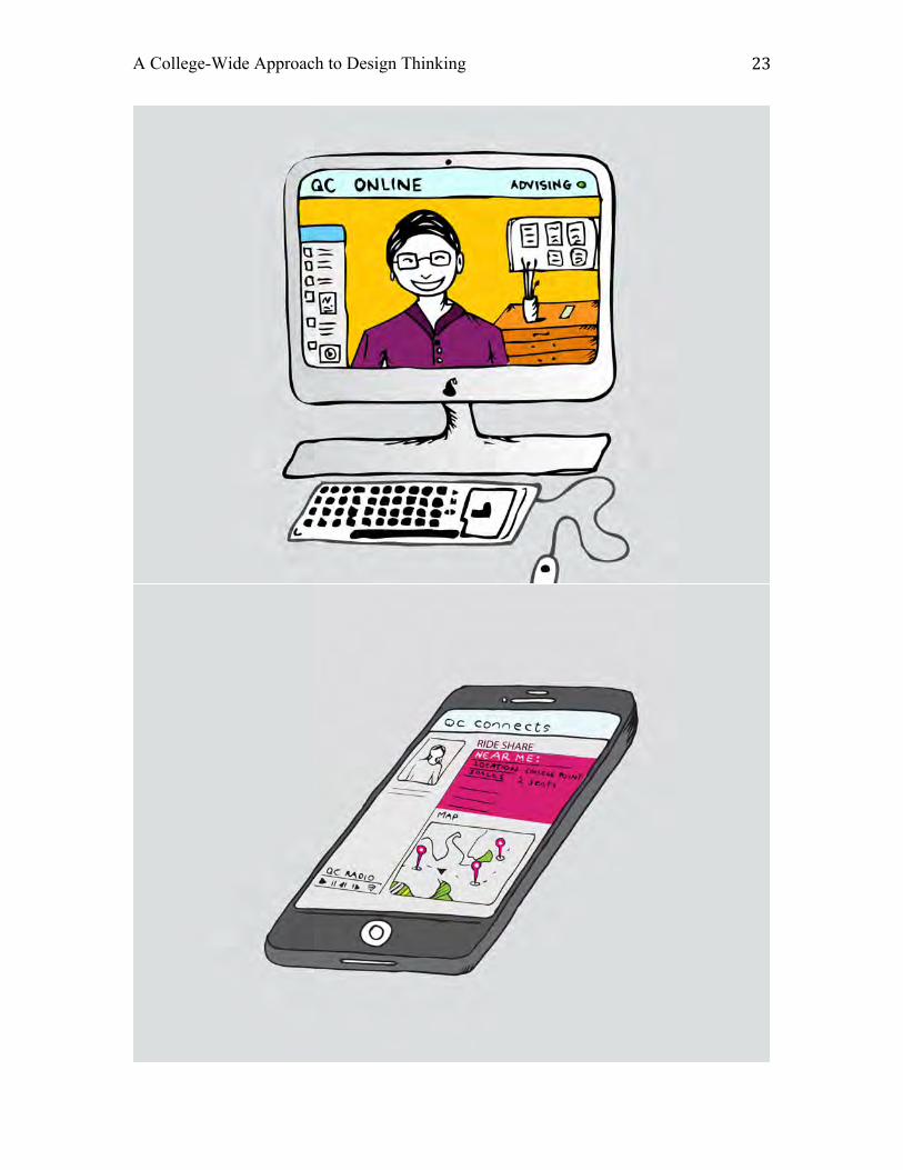
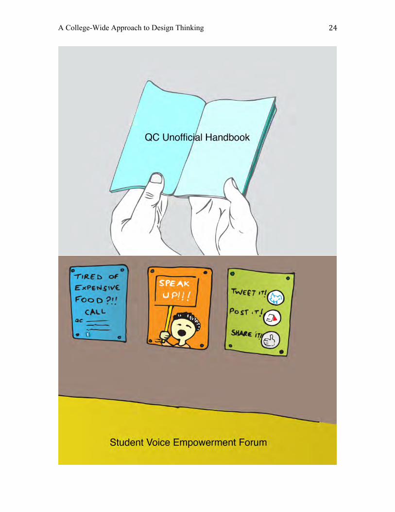
In the end, we prototyped a suite of solutions that connect and inform an
extremely diverse student body, in need of various levels of engagement, whether they
A College-Wide Approach to Design Thinking 8
are at work or home, commuting, or on-campus. This included a customizable all-in-one
media platform specifically for students with calendar features, video chat advising,
smart phone capabilities with mapping, and ride-shares. The solution also contained
print-based counterparts, such as the “unofficial handbook” that would be updated
annually through crowdsourcing. Upper-class students share work-around solutions and
special secrets with incoming students, to help navigate and build culture. We designed
environmental, analog, and digital means for students to have their voices’ heard. To
round out our solutions, we created environmental interaction-zones to connect students
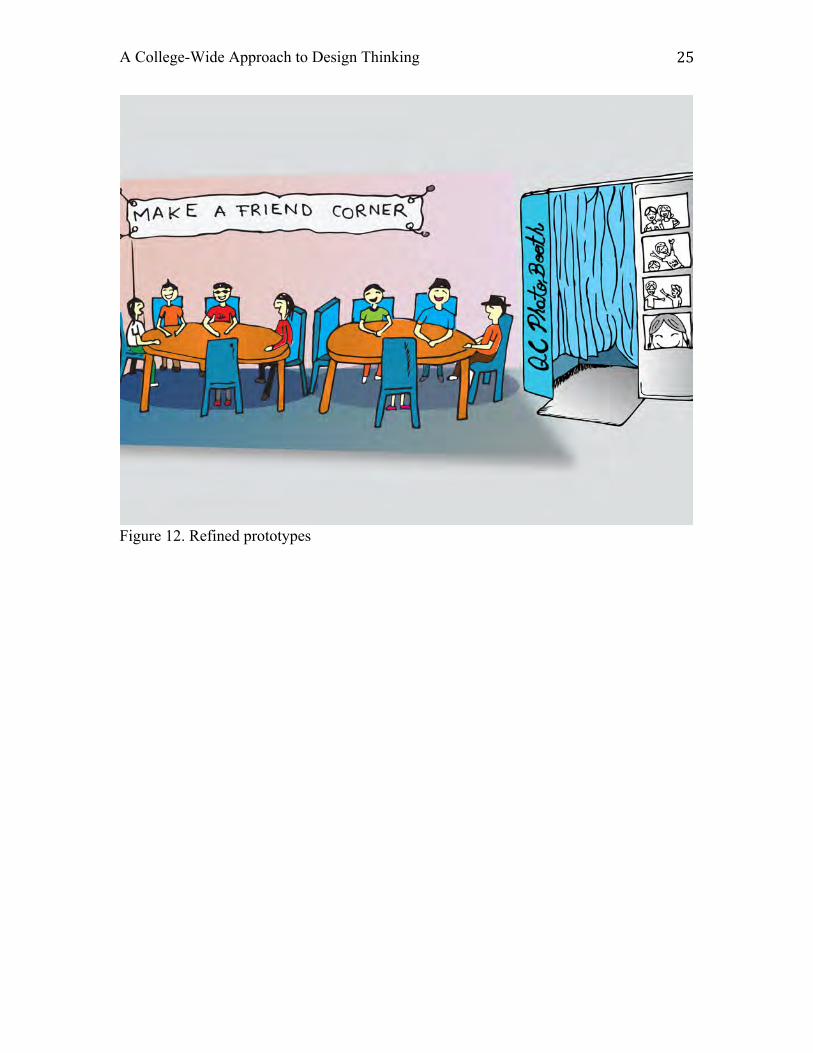
at different hotspots on campus (Figure 12).
Conclusion
The project was successful in many ways, and I plan to revise and continue it the
course. The small-group setting proved to be a meaningful experience for participants. In
the specific context of this project, that meant students from different countries, religions,
and areas of study learned and got to know one another. I also found that virtually all
participants and observers where genuinely interested in the theme of the project. People
genuinely cared about making their community better and wanted to support the project.
Through engagement with the campus community, this human-centered approach to
design create natural opportunities to educate people about the impact design can make. I
have also found that the process of reaching out to other departments and campus
organizations created future opportunities and good will.
Given the nature of transforming a professional process to an academic setting,
there are things that I would like to revise in the future. Four example, the one four hour
A College-Wide Approach to Design Thinking 9
weekly session we met is not enough time to be in the studio together. I believe I am
going to continue to work within this restraint, but I am going to structure the time
together differently, and work to create ways to keep an ongoing dialogue between the
work and the students while they are not together. The solution may be through
integrated online/in-class hybrid learning tool. Rather than having a set workspace where
teams freely collaborate and are surrounded by project work, we create a version of that
environment as a remote digital resource.
We spent almost half the semester conducting interviews in the field and
documenting observations from the interviews during studio time. This time was used at
the expense of ideating and prototyping, and the level of depth of the prototypes reflect
this. Furthermore, I suspect that since students are already embedded in the community it
was a challenge for them to see that other student’s experiences are different than their
own. For this reason, I suspect the team got less out of the interview than I had
anticipated. I plan to continue to use the campus as our laboratory, but I will use more
diverse research methods. I will also prototype sooner in the process. This will create the
opportunity to co-design with stakeholders — test the prototypes with users and involve
them in the process more.
It’s the same time commitment for me to run this project with 5 students as a
traditionally scaled design course at Queens College of 15-18 students. It’s more feasible
and will offer greater impact to the campus community for me to scale the course up.
Moving forward I plan to run the course with about 15 students, broken up into core
teams of roughly 5 students each. I also plan to give more context to the process through
readings, lectures, and case studies. Given these changes, I will work hard to maintain
A College-Wide Approach to Design Thinking 10
and build upon the unique positive culture that surrounded the first iteration of the Social
Design Lab within the campus community.
A College-Wide Approach to Design Thinking 11
Figures
Figure 1. Social Design Lab, spring 2013
Figure 2. Project timeline
A College-Wide Approach to Design Thinking 12
Figure 3. Examples of field research preparation
A College-Wide Approach to Design Thinking 13
Figure 4. Research subjects
A College-Wide Approach to Design Thinking 14
Figure 5. Team member conducting research
A College-Wide Approach to Design Thinking 15
Figure 6. Observing subject’s environment and routines during field research
A College-Wide Approach to Design Thinking 16
Figure 7. Debriefing field research: making observations with post-it notes
A College-Wide Approach to Design Thinking 17
Figure 8. Grouped observations
A College-Wide Approach to Design Thinking 18
Figure 9. Examples of insights
A College-Wide Approach to Design Thinking 19
A College-Wide Approach to Design Thinking 20
Figure 10. Various frameworks
A College-Wide Approach to Design Thinking 21
Figure 11. Low-resolution prototypes
A College-Wide Approach to Design Thinking 22
A College-Wide Approach to Design Thinking 23
A College-Wide Approach to Design Thinking 24
A College-Wide Approach to Design Thinking 25
Figure 12. Refined prototypes
A College-Wide Approach to Design Thinking 26
References Johnstone, Keith. 1979. Impro: Improvisation and the Theatre. London, UK: Routledge
Tenth Annual UCDA Design Education Summit | 7
AbstractStrategies, systems, experiences and services are part of the new challenges faced today by design students and designers. These challenges include shifting audiences with specific needs due to the broad offer of services and products that continuously create new needs; limited resources that require sustainable solutions with low impact to the environment, as well as low production costs. In addition there is a great demand for multidisciplinary designers that are able to generate and perform ideas in a cocreation environment.
An approach to meeting these challenges can include an open-ended scaffolded brainstorming process that involves design students and designers in multiple levels of its practice instead of advancing towards potential solutions from an unstructured ideation process. However, structured methods have many benefits such as collaboration between teammates, ordered and constructive creative sessions as well as increased efficiency in the ideation process.
One structured method that has found a place inside classrooms across the world is the Deconstructive discourse, mainly in the areas of philosophy, linguistics and literature, architecture, journalism and others. This paper describes the process, and findings of building a creative framework based on the Deconstructive discourse and its implications in the learning process of design students. Deconstruction provides a structured way of analyzing complex problems. One of the most regarded examples of successful application of Deconstructionist theories in design education is the academic work of Cranbrook Academy of Art in the late 1980 and early 1990s under the direction of Katherine McCoy. There, Graphic Design students explored the semantics and syntax of their projects to generate multidisciplinary solutions outside fixed visual and functional ideas. This demonstrated the importance and the value of the Deconstructive discourse in the studio class room as a result of its use as a critical tool that exposes the gap between sign and meaning in the context of culture.
Considering the above, this research follows the definition of Deconstruction as a mode of questioning stereotypes, traditional ideas and popular views by opposing them and exploiting their visual and verbal signs for their multiple meanings. This paper explores the use of Deconstruction as a generative thinking tool, that correlates the effort to educate students on the rationality of a design artifact and its context of use while allowing to think again and stimulate the designers creativity.
The Deconstructive Discourse asGenerative Thinking Tool
Daniel EcheverriKent State University
1.2
1
THE DECONSTRUCTIVE DISCOURSE AS A GENERATIVE THINKING TOOL
D.Echeverri
Keywords: Card Sorting, Deconstruction, Design Education, Representation, Design Methods Assessment, Brainstorming Methods
1. Introduction Strategies, systems, experiences and services are part of the new challenges faced today by design students and designers. These challenges include shifting audiences with specific needs due to the broad offer of services and products that often create new needs. These needs include limited resources, sustainable solutions with low enviromental impact, and production costs. Besides, there is a great demand for multidisciplinary designers that are able to generate and perform ideas in a co-creation environment. [AIGA, 2009; International Council of Graphic Design Association, 2011]. An approach to meeting these challenges can include an open-ended, scaffolded brainstorming process. This might involve design students and designers, instead of advancing towards potential solutions from an unstructured ideation process. Structured methods have many benefits such as collaboration between teammates, ordered and constructive creative sessions as well as increased efficiency. [OpenIDEO, 2011]. One structured method that has found a place inside classrooms across the world is the Deconstructive discourse, in the areas of philosophy, linguistics, architecture, and others. [Higgs, 2002; Hong, 2004; Stephens, 1991]. This paper describes the process, and findings of building a creative framework based on the Deconstructive discourse and its implications in the learning process of design students. Deconstruction provides a structured way of analyzing complex problems. An example of successful application of Deconstructionist theories in design education is the academic work of Cranbrook Academy of Art. In the late 1980 and early 1990s under the direction of Katherine McCoy, Graphic Design students explored the semantics and syntax of their. [Lupton, 1991]. This demonstrated the importance and the value of the Deconstructive discourse in the studio classroom. As a result, its use as a critical tool it exposed the gap between sign and meaning in the context of culture [Higgs, 2002; Lupton, 1991; Walker & Dell, 2008]. This research follows the definition of Deconstruction as a mode of questioning stereotypes, traditional ideas and popular views by comparing them and exploiting their visual and verbal signs for their meanings. [Hong, 2004; Lupton & Miller, 1994; The Museum of Modern Art, 1988]. This paper explores the use of Deconstruction as a generative thinking tool, that correlates the effort to educate students on the rationality of a design. [Hong & Hwang, 2006; Loscialpo, 2012; Poynor, 2003].
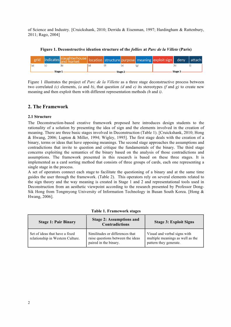
1.1 Context In 1982, philosopher Jacques Derrida and architects Peter Eisenman and Bernard Tschumi worked on a project called Parc de la Villette, an urban park located in the 19th arrondissement in Paris, as part of an urban redevelopment effort by the city. The place designated for the park was the former slaughterhouse and wholesale meat market area built by Napoleon III in 1867. Following the idea of Deconstruction fostered by Jacques Derrida, Bernard Tschumi defined a series of spaces that were located in the existing grid left by the previous buildings. By reviewing the relationship between what existed and what will exist in the same location of the grid, the architect denied the symbolic idea of a space that belonged to the erased market and the slaughterhouse and it became an urban refuge or follie re-inscribed with a new meaning. (See Figure 1). Follies were not only empty spaces that referred to something but they also functioned as directing cues for the visitors of the park. Parc de la Villette was completed in 1987 and became one of most important parks in Paris with cultural venues such as the Conservatoire de Paris, the Philharmonie de Paris and the City
2
of Science and Industry. [Cruickshank, 2010; Derrida & Eisenman, 1997; Hardingham & Rattenbury, 2011; Rago, 2004]
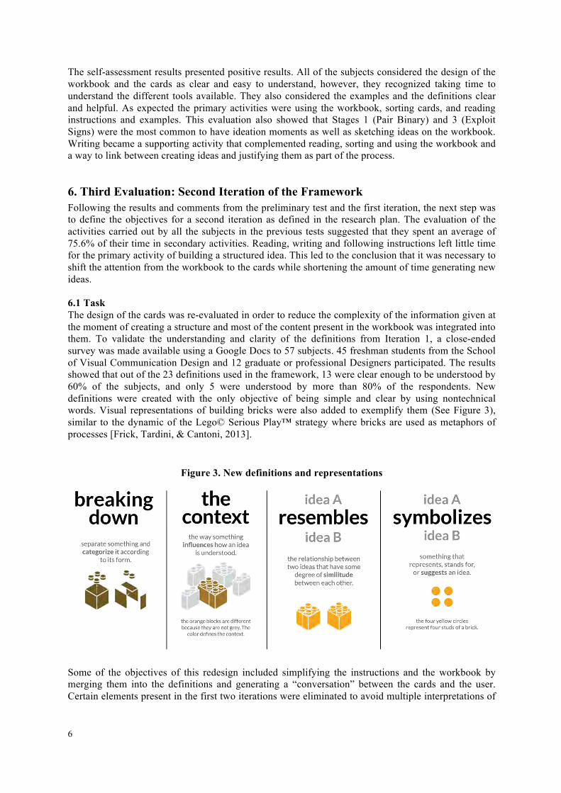
Figure 1. Deconstructive ideation structure of the follies at Parc de la Villete (Paris)
Figure 1 illustrates the project of Parc de la Villette as a three stage deconstructive process between two correlated (c) elements, (a and b), that question (d and e) its stereotypes (f and g) to create new meaning and then exploit them with different representation methods (h and i).
2. The Framework
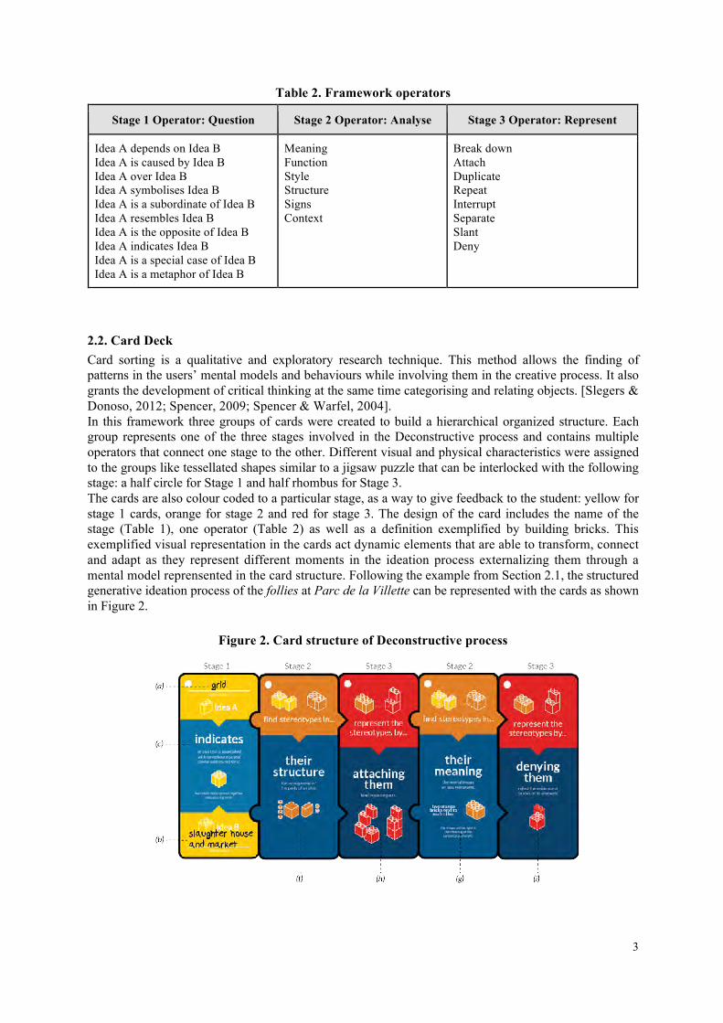
2.1 Structure The Deconstruction-based creative framework proposed here introduces design students to the rationality of a solution by presenting the idea of sign and the elements involved in the creation of meaning. There are three basic stages involved in Deconstruction (Table 1). [Cruickshank, 2010; Hong & Hwang, 2006; Lupton & Miller, 1994; Wigley, 1995]. The first stage deals with the creation of a binary, terms or ideas that have opposing meanings. The second stage approaches the assumptions and contradictions that invite to question and critique the fundamentals of the binary. The third stage concerns exploiting the semantics of the binary based on the analysis of those contradictions and assumptions. The framework presented in this research is based on these three stages. It is implemented as a card sorting method that consists of three groups of cards, each one representing a single stage in the process. A set of operators connect each stage to facilitate the questioning of a binary and at the same time guides the user through the framework. (Table 2). This operators rely on several elements related to the sign theory and the way meaning is created in Stage 1 and 2 and representational tools used in Deconstruction from an aesthetic viewpoint according to the research presented by Professor Dong-Sik Hong from Tongmyong University of Information Technology in Busan South Korea. [Hong & Hwang, 2006].
Table 1. Framework stages
Stage 1: Pair Binary Stage 2: Assumptions and Contradictions Stage 3: Exploit Signs
Set of ideas that have a fixed relationship in Western Culture.
Similitudes or differences that raise questions between the ideas paired in the binary.
Visual and verbal signs with multiple meanings as well as the pattern they generate.
3
Table 2. Framework operators
Stage 1 Operator: Question Stage 2 Operator: Analyse Stage 3 Operator: Represent
Idea A depends on Idea B Idea A is caused by Idea B Idea A over Idea B Idea A symbolises Idea B Idea A is a subordinate of Idea B Idea A resembles Idea B Idea A is the opposite of Idea B Idea A indicates Idea B Idea A is a special case of Idea B Idea A is a metaphor of Idea B
Meaning Function Style Structure Signs Context
Break down Attach Duplicate Repeat Interrupt Separate Slant Deny
2.2. Card Deck Card sorting is a qualitative and exploratory research technique. This method allows the finding of patterns in the users’ mental models and behaviours while involving them in the creative process. It also grants the development of critical thinking at the same time categorising and relating objects. [Slegers & Donoso, 2012; Spencer, 2009; Spencer & Warfel, 2004]. In this framework three groups of cards were created to build a hierarchical organized structure. Each group represents one of the three stages involved in the Deconstructive process and contains multiple operators that connect one stage to the other. Different visual and physical characteristics were assigned to the groups like tessellated shapes similar to a jigsaw puzzle that can be interlocked with the following stage: a half circle for Stage 1 and half rhombus for Stage 3. The cards are also colour coded to a particular stage, as a way to give feedback to the student: yellow for stage 1 cards, orange for stage 2 and red for stage 3. The design of the card includes the name of the stage (Table 1), one operator (Table 2) as well as a definition exemplified by building bricks. This exemplified visual representation in the cards act dynamic elements that are able to transform, connect and adapt as they represent different moments in the ideation process externalizing them through a mental model reprensented in the card structure. Following the example from Section 2.1, the structured generative ideation process of the follies at Parc de la Villette can be represented with the cards as shown in Figure 2.
Figure 2. Card structure of Deconstructive process
4
3. Assessment of the Framework The framework was assessed in two ways. First, a summative performance assessment that requires the subject to demonstrate a task using higher order skills such as creating and innovating. Second a diagnostic assessment to determine the skills acquired from the framework. [Allen, 2008; Southern Association of Colleges and Schools Commission on Colleges, 2012; Stiggins, 1987; Teach For America, 2010]. For each assessment, three groups of rubrics were defined to measure the responses and performance. In the summative performance assessment the rubrics were tied to the way the framework was used and applied during each one of the stages of the Framework (Table 3). In the second set of rubrics, the diagnostic assessment measured the usability of the different elements, the level of understanding in the examples and the effectiveness of the designed tools (Table 4).
Table 3. Rubrics for Summative Performance Assessment
Stage 1 Stage 2 Stage 3
•Two elements are paired by using the right operator. (+2) •Two elements are paired but there is no logical use of an operator card in the binary. (+1) •Two elements are paired but no relation between them. (-1) •There is no understanding of the idea of binary pairing. (-3)
•By using different analysis operators the subject finds assumptions or contradictions in the binary. (+2) •Subject uses operators but is unable to find assumptions or contradictions in the binary. (+1) •No logical relation between operators and assumptions. (-1) •No evidence of assumptions or contradictions. (-2)
•Representation tools are used in a logical way, and the result is coherent with the design process. (+2) •Representation tools are used but the result is incoherent with the process. (+1) •The subject struggles to use the tools and to set a strategy. (-1) •No evidence of using tools to generate a strategy. (-3)
Table 4. Rubrics for Diagnostic Assessment
Design Readability Examples
•Design is clear to the user. Tools are used in a logical way. Follows the rules of the framework. (+2) •Design is clear to the user takes time to understand it. (+1) •Design is confusing. Tools are used, rules are not followed. (-1) •There is no evidence of understanding the tools. (-2)
•Texts are easy to read and definitions are clear. (+2) •Texts are easy to read but definitions are difficult to understand. (0) •Definitions are difficult to understand. (-2)
•Examples help to clarify concepts. Student reads them and then acts. (+2) •Examples are good but don’t clarify the concepts and tools. (-1) •Examples are not clear and generate confusion. (-3)
4. First Evaluation: A Pilot Study A pilot study was scheduled with 5 designers with ages ranging from 18 to 27 years old: 1 freshman student, 1 junior student, 1 recently graduated designer and 2 professonal designers. Each one represents a particular stage in the professional life of a designer. The main objective of this pilot study was to set the duration, the pace, and find issues the subjects might come across as well as the tools they might need while using the Framework. This pilot study required the students to work on their ideas individually. It is important to note that while the Framework's main intention is focused on early design students, involving professional designers in this pilot study allowed also to measure its applicability in real life situations from the design practice.
5
4.1. Task The task for this test was adapted from the Electrolux Design Lab Contest which focuses on the changes and challenges design has, inspired in urban living and the need for sustainable design [Electrolux Design Lab, 2013]. This task was based on the broad oportunities it offered to the subjects in terms of creativity and their level of knowledge. They were asked to propose a solution using the framework based on any of the three topics in the task summary: Social Cooking, Natural Air and Effortless Cleaning. The test session was recorded using video and photographic cameras. Later, the process and the outcome were evaluated following the two sets of rubrics defined for this study and a series of experience maps was generated to evaluate patterns in the use of the different tools and identify potential issues. 4.2 Findings The results from the preliminary test suggested the potential of this framework for designers. The first stage showed more activity and less mastery in the use of the tools, mainly because the students discovered how to use the framework and the workbook—a supplement that helped students use and understand the cards. The pages were designed as a journal that involved the exploration of the cards while justifying their rational process when generating an idea. This process builds self-criticism and critical thinking of the subjects upon passing to the different levels of the Deconstructive process leading to skills that are learned, mastered and used in their design methods. By doing this, the subjects recognized a problem, structured a possible solution, drew conclussion and rendered judgment about the final outcome. The workbook played an important role in the assessment, especially to give context to the subjects in the validation process of the framework. It guided them through the entire deconstructive process; they were able to find assumptions and contradictions in their binaries. It was common for all the subjects to spend more time in Stage 3 (exploit signs) with structured activities while representing their ideas by applying deconstructive thought to their designs. There was evidence that they were able to use the cards and the workbook in a logical way, especially when pairing two elements to create a new binary.
5. Second Evaluation: Iterating the Framework A complete test of the framework was done during the last week of September of 2013. 5 freshman students were invited to be part of the research. They were selected based on their overall performance in their Introduction to VCD class taught by the author of this study and were awarded extra credit for their participation. Their ages ranged from 18 to 21 years old and all subjects had no previous knowledge of Deconstruction.
5.1 Task The test procedure was scheduled during a weekend day for a time of one and a half hours and took place in one of the studio rooms at the Visual Communication Design School at Kent State University. The studio was an open space with no external noise that guaranteed their full attention during the test. Video cameras were set up in the room to record their work and interactions with the cards and workbook, according to the same procedure followed in the pilot study. For this test the design brief was based on a Design contest organized by the Italian brand Alessi. This brief focused on the search for new ways to rethink the act of giving something as a way to express love through an emotional object such as a wedding favor, accessories for home or small bijoux pieces [Alessi, 2013].
5.2 Findings The study was scheduled to last one hour, but the average time was 45 minutes, which in comparison to the pilot test, lasted 52% less, mainly to fact that the subjects involved were non-native English speakers and this affected their overall performance.
6
The self-assessment results presented positive results. All of the subjects considered the design of the workbook and the cards as clear and easy to understand, however, they recognized taking time to understand the different tools available. They also considered the examples and the definitions clear and helpful. As expected the primary activities were using the workbook, sorting cards, and reading instructions and examples. This evaluation also showed that Stages 1 (Pair Binary) and 3 (Exploit Signs) were the most common to have ideation moments as well as sketching ideas on the workbook. Writing became a supporting activity that complemented reading, sorting and using the workbook and a way to link between creating ideas and justifying them as part of the process.
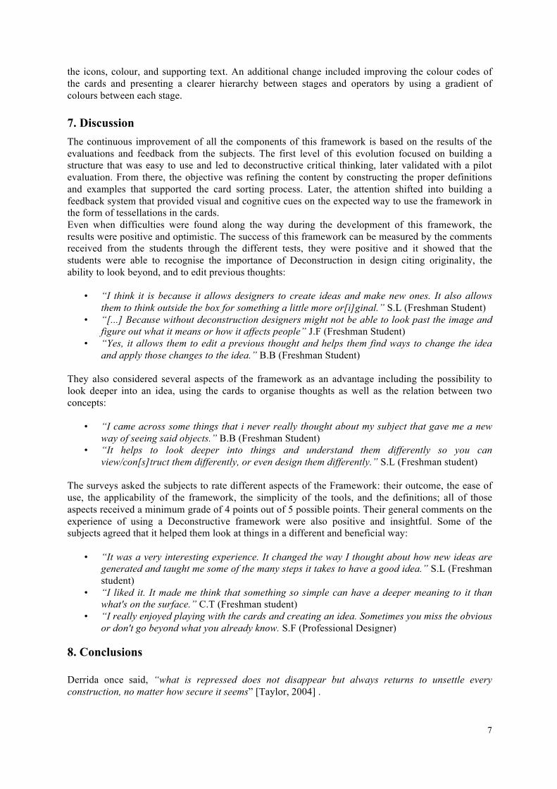
6. Third Evaluation: Second Iteration of the Framework Following the results and comments from the preliminary test and the first iteration, the next step was to define the objectives for a second iteration as defined in the research plan. The evaluation of the activities carried out by all the subjects in the previous tests suggested that they spent an average of 75.6% of their time in secondary activities. Reading, writing and following instructions left little time for the primary activity of building a structured idea. This led to the conclusion that it was necessary to shift the attention from the workbook to the cards while shortening the amount of time generating new ideas. 6.1 Task The design of the cards was re-evaluated in order to reduce the complexity of the information given at the moment of creating a structure and most of the content present in the workbook was integrated into them. To validate the understanding and clarity of the definitions from Iteration 1, a close-ended survey was made available using a Google Docs to 57 subjects. 45 freshman students from the School of Visual Communication Design and 12 graduate or professional Designers participated. The results showed that out of the 23 definitions used in the framework, 13 were clear enough to be understood by 60% of the subjects, and only 5 were understood by more than 80% of the respondents. New definitions were created with the only objective of being simple and clear by using nontechnical words. Visual representations of building bricks were also added to exemplify them (See Figure 3), similar to the dynamic of the Lego© Serious Play™ strategy where bricks are used as metaphors of processes [Frick, Tardini, & Cantoni, 2013].
Figure 3. New definitions and representations
Some of the objectives of this redesign included simplifying the instructions and the workbook by merging them into the definitions and generating a “conversation” between the cards and the user. Certain elements present in the first two iterations were eliminated to avoid multiple interpretations of
7
the icons, colour, and supporting text. An additional change included improving the colour codes of the cards and presenting a clearer hierarchy between stages and operators by using a gradient of colours between each stage. 7. Discussion The continuous improvement of all the components of this framework is based on the results of the evaluations and feedback from the subjects. The first level of this evolution focused on building a structure that was easy to use and led to deconstructive critical thinking, later validated with a pilot evaluation. From there, the objective was refining the content by constructing the proper definitions and examples that supported the card sorting process. Later, the attention shifted into building a feedback system that provided visual and cognitive cues on the expected way to use the framework in the form of tessellations in the cards. Even when difficulties were found along the way during the development of this framework, the results were positive and optimistic. The success of this framework can be measured by the comments received from the students through the different tests, they were positive and it showed that the students were able to recognise the importance of Deconstruction in design citing originality, the ability to look beyond, and to edit previous thoughts:
• “I think it is because it allows designers to create ideas and make new ones. It also allows them to think outside the box for something a little more or[i]ginal.” S.L (Freshman Student)
• “[...] Because without deconstruction designers might not be able to look past the image and figure out what it means or how it affects people” J.F (Freshman Student)
• “Yes, it allows them to edit a previous thought and helps them find ways to change the idea and apply those changes to the idea.” B.B (Freshman Student)
They also considered several aspects of the framework as an advantage including the possibility to look deeper into an idea, using the cards to organise thoughts as well as the relation between two concepts:
• “I came across some things that i never really thought about my subject that gave me a new way of seeing said objects.” B.B (Freshman Student)
• “It helps to look deeper into things and understand them differently so you can view/con[s]truct them differently, or even design them differently.” S.L (Freshman student)
The surveys asked the subjects to rate different aspects of the Framework: their outcome, the ease of use, the applicability of the framework, the simplicity of the tools, and the definitions; all of those aspects received a minimum grade of 4 points out of 5 possible points. Their general comments on the experience of using a Deconstructive framework were also positive and insightful. Some of the subjects agreed that it helped them look at things in a different and beneficial way:
• “It was a very interesting experience. It changed the way I thought about how new ideas are generated and taught me some of the many steps it takes to have a good idea.” S.L (Freshman student)
• “I liked it. It made me think that something so simple can have a deeper meaning to it than what's on the surface.” C.T (Freshman student)
• “I really enjoyed playing with the cards and creating an idea. Sometimes you miss the obvious or don't go beyond what you already know. S.F (Professional Designer)
8. Conclusions Derrida once said, “what is repressed does not disappear but always returns to unsettle every construction, no matter how secure it seems” [Taylor, 2004] .
8
This paper has sought to develop and validate a Deconstruction-based tool for generative ideation presented as a card sorting method. The results indicate that questioning stereotypes by using an open-ended structured tool is an effective way to generate ideas (by..). The correlation between sign and meaning in a cultural context is a key factor for exploring complex design challenges. By breaking stereotypes and approaching an idea from several points of view, designers and design students can create projects that can be developed in a collaborative environment. The diversity of the outcomes proposed by the subjects showed evidence that the framework is a flexible tool that can be adapted according to the needs of the designer. It only requires knowledge of the basic theory of semiotics, which makes it very appropriate for a wide range of users. Deconstruction helps the creation of new meaning by understanding an idea from its many angles and therefore prevents leaving its alternative meanings out. Every single idea that has a meaning is conditioned by the experience of its creator, and it takes those experiences and transforms them into tangible outcomes.
8.1. Future applications This research is a work in progress and is just the first step into the approach of generative ideation by using structured tools that aid the brainstorming process of creative solutions. A free version of the framework including the cards will be made available online as a downloadable file for private use by using the Creative Commons license. It allows redistribution, commercial and non-commercial use, as long as it is passed along unchanged and whole, with credit to the author of this study. It is the intention of the author to share the knowledge gained in this study with the entire design and academic community.
Acknowledgements The author wishes to thank Prof. Sanda Katila from the School of Visual Communication Design for her direction, support and dedication as the research advisor of this study and Prof. Karl Fast from the School of Library and Information Science for his involvement and constructive feedback during the development of this manuscript.
References AIGA., "Designer of 2015 Competencies". Retrieved January 28, 2013, from http://www.aiga.org/designer-of-2015-competencies/ , New York, 2009. Alessi., "ALESSI IN LOVE - Every time an act of love." Retrieved September 14, 2013, from http://desall.com/Contest/Alessi-In-Love--Every-time-an-act-of-love/Brief Allen, Mary J., "Strategies for Direct and Indirect Assessment of Student Learning". Paper presented at the SACS-COC Summer Institute, Orlando, FL, 2008. Cruickshank, L., "The Case for a Re-Evaluation of Deconstruction and Design; Against Derrida, Eisenman and their Choral Works". In E. Corte-Real (Ed.), O Triunfo do Desenho (pp. 353-361). Lisbon, Portugal: Livros Horizonte, 2010. Derrida, J, & Eisenman, P., "Chora L Work"s (J. Kipnis & T. Leeser Eds.): The Monacelli Press, 1997. Electrolux Design Lab., "Brief and Theme 2013", Retrieved September 14, 2013, from http://electroluxdesignlab.com/en/brief-and-theme-2013/ Frick, E., Tardini, S., & Cantoni, L., "LEGO®SERIOUS PLAY® A state of the art of its applications in Europe" (pp. 28). Switzerland: Università della Svizzera italiana, 2013. Hardingham, S., & Rattenbury, K.,"Parc de la Villette:SuperCrit #4" (Vol. 4): Routledge, 2011. Higgs, P., "Deconstruction and re-thinking education". South African J. of Education, 22(3), 170-176, 2002. Hong, D., "A Study on the Deconstructionist Representation in Graphic Design". Paper presented at the 6th Asian Design Conference., Tsukuba, 2004. Hong, D., & Hwang, M., "The Status and the Prospects of Deconstruction in Graphic Design". Paper presented at the WunderGround: 2006 Design Research Society International Conference, Lisbon, 2006. International Council of Graphic Design Association. "Icograda Design Education Manifesto 2011". Retrieved September 5, 2013, from http://www.icograda.org/education/manifesto.htm ,2011. Loscialpo, F.,"Fashion and Philosophical Deconstruction: a Fashion In- Deconstruction". Paper presented at the CEPHAD 2010 Copenhagen Working Papers on Design, Copenhagen, 2012.
9
Lupton, E., "The Academy of Deconstructed Design". Eye, 1(3), 1991. Lupton, E., & Miller, J.A., Deconstruction and Graphic Design: History Meets Theory. Visible Language, 28(4), 352, 1994. OpenIDEO. "7 Tips on Better Brainstorming". OpenIDEO Team Notes. Retrieved December 4th, 2013, from http://www.openideo.com/fieldnotes/openideo-team-notes/seven-tips-on-better-brainstorming Poynor, R., " No More Rules: Graphic Design and Postmodernism" (pp. 38-69): Yale University Press, 2003 Rago, D., "Deconstruction Architecture and Daniel Libeskind" (pp. 9): School of Architecture, Lehigh University, 2004 Slegers, K., & Donoso, V., "The impact of paper prototyping on card sorting: A case study". Interacting with Computers(24), 351-357, 2012. Southern Association of Colleges and Schools Commission on Colleges). Assessment Plans (pp. 20), 2012 Spencer, D.,"Card Sorting: Designing Usable Categories" Brooklyn, New York: Rosenfeld Media, 2009. Spencer, D., & Warfel,T., "Card sorting: a definitive guide". Retrieved from http://boxesandarrows.com/card-sorting-a-definitive-guide/ Stephens, M., "Jacques Derrida". Los Angeles Times Magazine, 1991. Stiggins, R., "Design and Development of Performance Assessments". Educational Measurement: Issues and Practice, 6(3), 33-42, 1987. Taylor, M., "The real meaning of deconstruction", The New York Times, October 15, 2004. Teach For America. "Instructional Planning & Delivery". In T. F. America (Ed.), (pp. 11-35). New York, NY: Teach For America, 2010. The Museum of Modern Art. "Deconstructivist Architecture". In MOMA (Ed.). New York: The Museum of Modern Art, 1988. Walker, R., & Dell, S., "Deconstructing Fashion Design: Integrating Theory and Practice in Design Education". Paper presented at the Learning from Research, Sussex, 2008. Wigley, M., (1995). "The Architecture of Deconstruction: Derrida's Haunt" (New edition ed.). Cambridge, MA: The MIT Press, 1995. Daniel Echeverri, BFA Colegiatura Colombiana, MFA Kent State University MFA Graduate Student / Graduate Assistant Kent State University, School of Visual Communication Design 105 Art Building, Kent, OH 323 246 91 45 [email protected] www.deconstruct.in
8 | Tenth Annual UCDA Design Education Summit
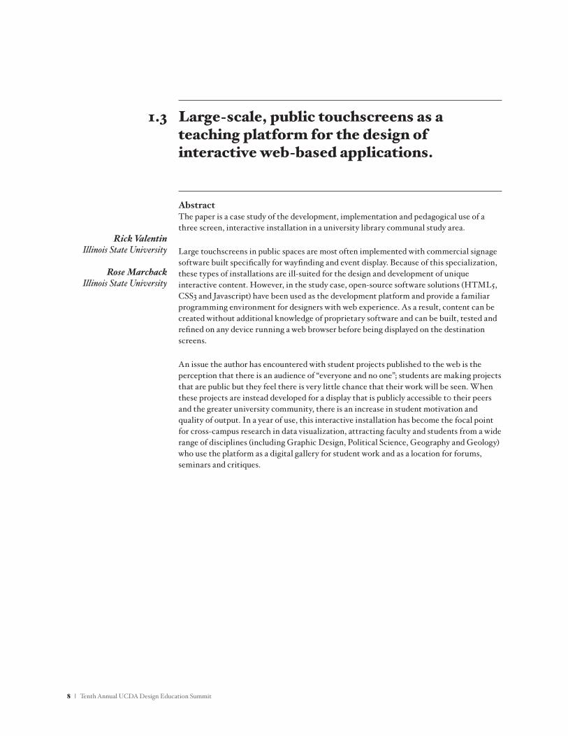
AbstractThe paper is a case study of the development, implementation and pedagogical use of a three screen, interactive installation in a university library communal study area.
Large touchscreens in public spaces are most often implemented with commercial signage software built specifically for wayfinding and event display. Because of this specialization, these types of installations are ill-suited for the design and development of unique interactive content. However, in the study case, open-source software solutions (HTML5, CSS3 and Javascript) have been used as the development platform and provide a familiar programming environment for designers with web experience. As a result, content can be created without additional knowledge of proprietary software and can be built, tested and refined on any device running a web browser before being displayed on the destination screens.
An issue the author has encountered with student projects published to the web is the perception that there is an audience of “everyone and no one”; students are making projects that are public but they feel there is very little chance that their work will be seen. When these projects are instead developed for a display that is publicly accessible t0 their peers and the greater university community, there is an increase in student motivation and quality of output. In a year of use, this interactive installation has become the focal point for cross-campus research in data visualization, attracting faculty and students from a wide range of disciplines (including Graphic Design, Political Science, Geography and Geology) who use the platform as a digital gallery for student work and as a location for forums, seminars and critiques.
Large-scale, public touchscreens as a teaching platform for the design of interactive web-based applications.
Rick ValentinIllinois State University
Rose MarchackIllinois State University
1.3
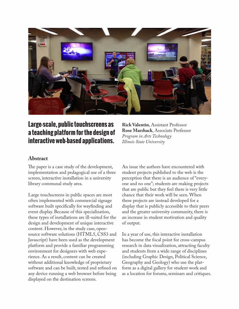
Large-scale, public touchscreens as a teaching platform for the design of interactive web-based applications.
Abstract
Rick Valentin, Assistant ProfessorRose Marshack, Associate ProfessorProgram in Arts TechnologyIllinois State University
The paper is a case study of the development, implementation and pedagogical use of a three screen, interactive installation in a university library communal study area.
Large touchscreens in public spaces are most often implemented with commercial signage software built specifically for wayfinding and event display. Because of this specialization, these types of installations are ill-suited for the design and development of unique interactive content. However, in the study case, open-source software solutions (HTML5, CSS3 and Javascript) have been used as the development platform and provide a familiar programming environment for designers with web expe-rience. As a result, content can be created without additional knowledge of proprietary software and can be built, tested and refined on any device running a web browser before being displayed on the destination screens.
An issue the authors have encountered with student projects published to the web is the perception that there is an audience of “every-one and no one”; students are making projects that are public but they feel there is very little chance that their work will be seen. When these projects are instead developed for a display that is publicly accessible to their peers and the greater university community, there is an increase in student motivation and quality of output.
In a year of use, this interactive installation has become the focal point for cross-campus research in data visualization, attracting faculty and students from a wide range of disciplines (including Graphic Design, Political Science, Geography and Geology) who use the plat-form as a digital gallery for student work and as a location for forums, seminars and critiques.
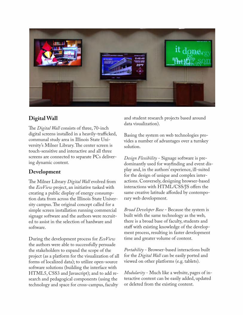
Digital WallThe Digital Wall consists of three, 70-inch digital screens installed in a heavily-trafficked, communal study area in Illinois State Uni-versity’s Milner Library. The center screen is touch-sensitive and interactive and all three screens are connected to separate PCs deliver-ing dynamic content.
DevelopmentThe Milner Library Digital Wall evolved from the EcoView project, an initiative tasked with creating a public display of energy consump-tion data from across the Illinois State Univer-sity campus. The original concept called for a simple screen installation running commercial signage software and the authors were recruit-ed to assist in the selection of hardware and software.
During the development process for EcoView the authors were able to successfully persuade the stakeholders to expand the scope of the project (as a platform for the visualization of all forms of localized data); to utilize open-source software solutions (building the interface with HTML5, CSS3 and Javascript); and to add re-search and pedagogical components (using the technology and space for cross-campus, faculty
and student research projects based around data visualization).
Basing the system on web technologies pro-vides a number of advantages over a turnkey solution.
Design Flexibility - Signage software is pre-dominantly used for wayfinding and event dis-play and, in the authors’ experience, ill-suited for the design of unique and complex inter-actions. Conversely, designing browser-based interactions with HTML/CSS/JS offers the same creative latitude afforded by contempo-rary web development.
Broad Developer Base - Because the system is built with the same technology as the web, there is a broad base of faculty, students and staff with existing knowledge of the develop-ment process, resulting in faster development time and greater volume of content.
Portability - Browser-based interactions built for the Digital Wall can be easily ported and viewed on other platforms (e.g. tablets).
Modularity - Much like a website, pages of in-teractive content can be easily added, updated or deleted from the existing content.
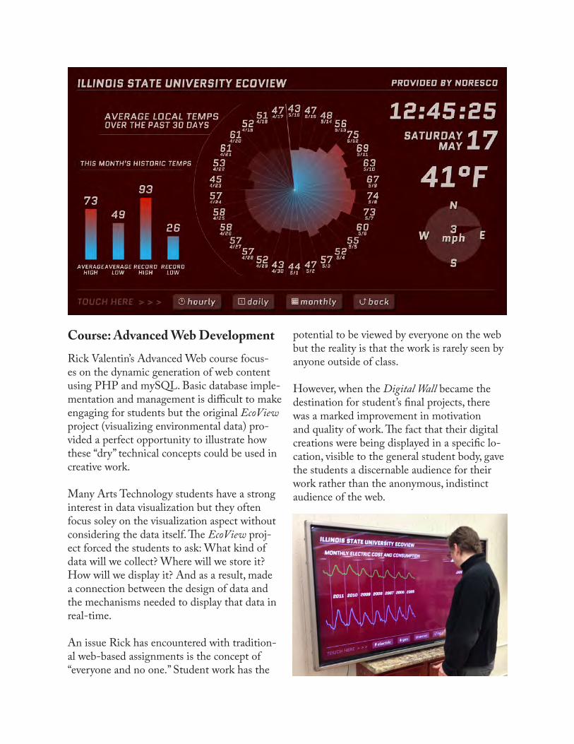
Course: Advanced Web DevelopmentRick Valentin’s Advanced Web course focus-es on the dynamic generation of web content using PHP and mySQL. Basic database imple-mentation and management is difficult to make engaging for students but the original EcoView project (visualizing environmental data) pro-vided a perfect opportunity to illustrate how these “dry” technical concepts could be used in creative work.
Many Arts Technology students have a strong interest in data visualization but they often focus soley on the visualization aspect without considering the data itself. The EcoView proj-ect forced the students to ask: What kind of data will we collect? Where will we store it? How will we display it? And as a result, made a connection between the design of data and the mechanisms needed to display that data in real-time.
An issue Rick has encountered with tradition-al web-based assignments is the concept of “everyone and no one.” Student work has the
potential to be viewed by everyone on the web but the reality is that the work is rarely seen by anyone outside of class.
However, when the Digital Wall became the destination for student’s final projects, there was a marked improvement in motivation and quality of work. The fact that their digital creations were being displayed in a specific lo-cation, visible to the general student body, gave the students a discernable audience for their work rather than the anonymous, indistinct audience of the web.
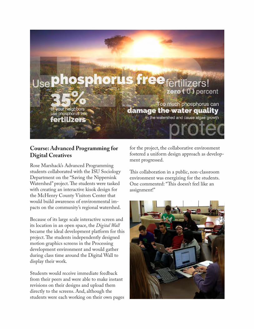
Course: Advanced Programming for Digital CreativesRose Marshack’s Advanced Programming students collaborated with the ISU Sociology Department on the “Saving the Nippersink Watershed” project. The students were tasked with creating an interactive kisok design for the McHenry County Visitors Center that would build awareness of environmental im-pacts on the community’s regional watershed.
Because of its large scale interactive screen and its location in an open space, the Digital Wall became the ideal development platform for this project. The students independently designed motion graphics screens in the Processing development environment and would gather during class time around the Digital Wall to display their work.
Students would receive immediate feedback from their peers and were able to make instant revisions on their designs and upload them directly to the screens. And, although the students were each working on their own pages
for the project, the collaborative environment fostered a uniform design approach as develop-ment progressed.
This collaboration in a public, non-classroom environment was energizing for the students. One commented: “This doesn’t feel like an assignment!”
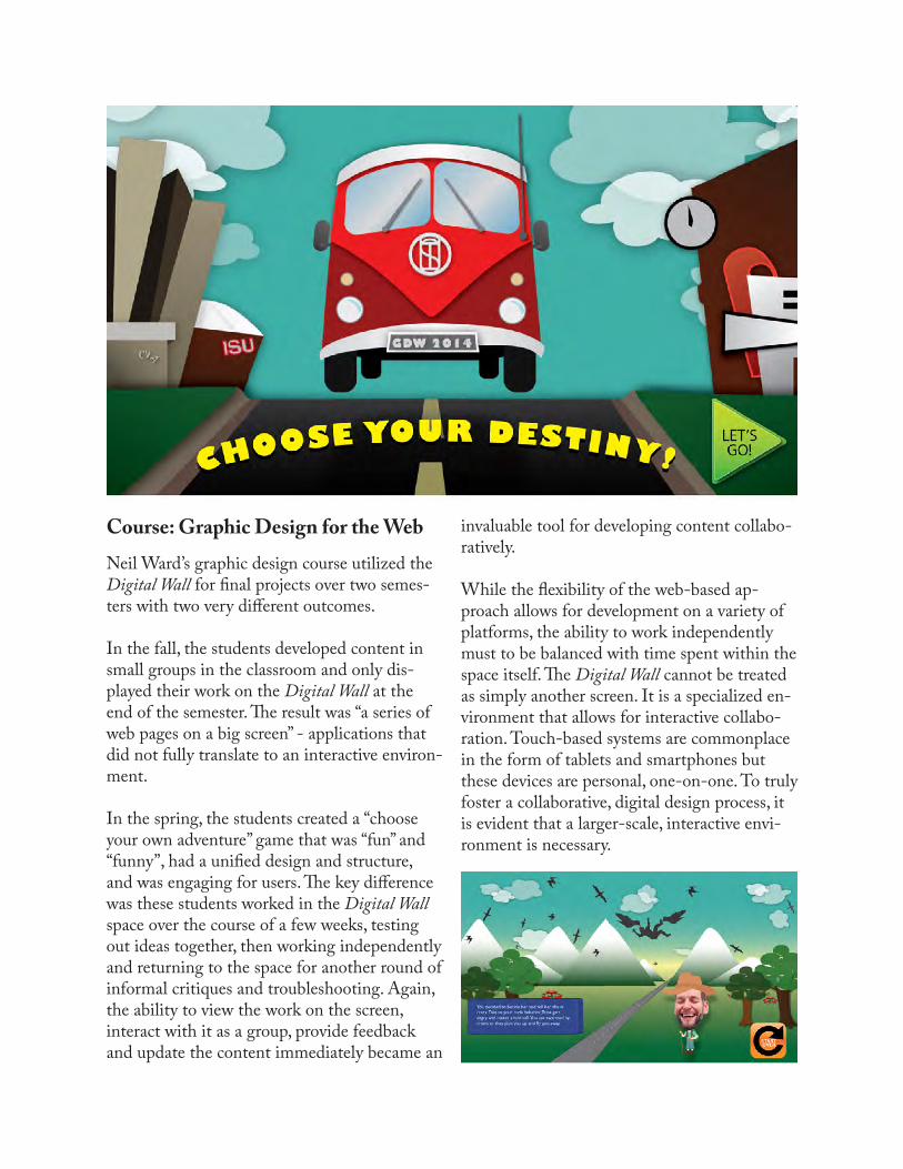
Course: Graphic Design for the WebNeil Ward’s graphic design course utilized the Digital Wall for final projects over two semes-ters with two very different outcomes.
In the fall, the students developed content in small groups in the classroom and only dis-played their work on the Digital Wall at the end of the semester. The result was “a series of web pages on a big screen” - applications that did not fully translate to an interactive environ-ment.
In the spring, the students created a “choose your own adventure” game that was “fun” and “funny”, had a unified design and structure, and was engaging for users. The key difference was these students worked in the Digital Wall space over the course of a few weeks, testing out ideas together, then working independently and returning to the space for another round of informal critiques and troubleshooting. Again, the ability to view the work on the screen, interact with it as a group, provide feedback and update the content immediately became an
invaluable tool for developing content collabo-ratively.
While the flexibility of the web-based ap-proach allows for development on a variety of platforms, the ability to work independently must to be balanced with time spent within the space itself. The Digital Wall cannot be treated as simply another screen. It is a specialized en-vironment that allows for interactive collabo-ration. Touch-based systems are commonplace in the form of tablets and smartphones but these devices are personal, one-on-one. To truly foster a collaborative, digital design process, it is evident that a larger-scale, interactive envi-ronment is necessary.
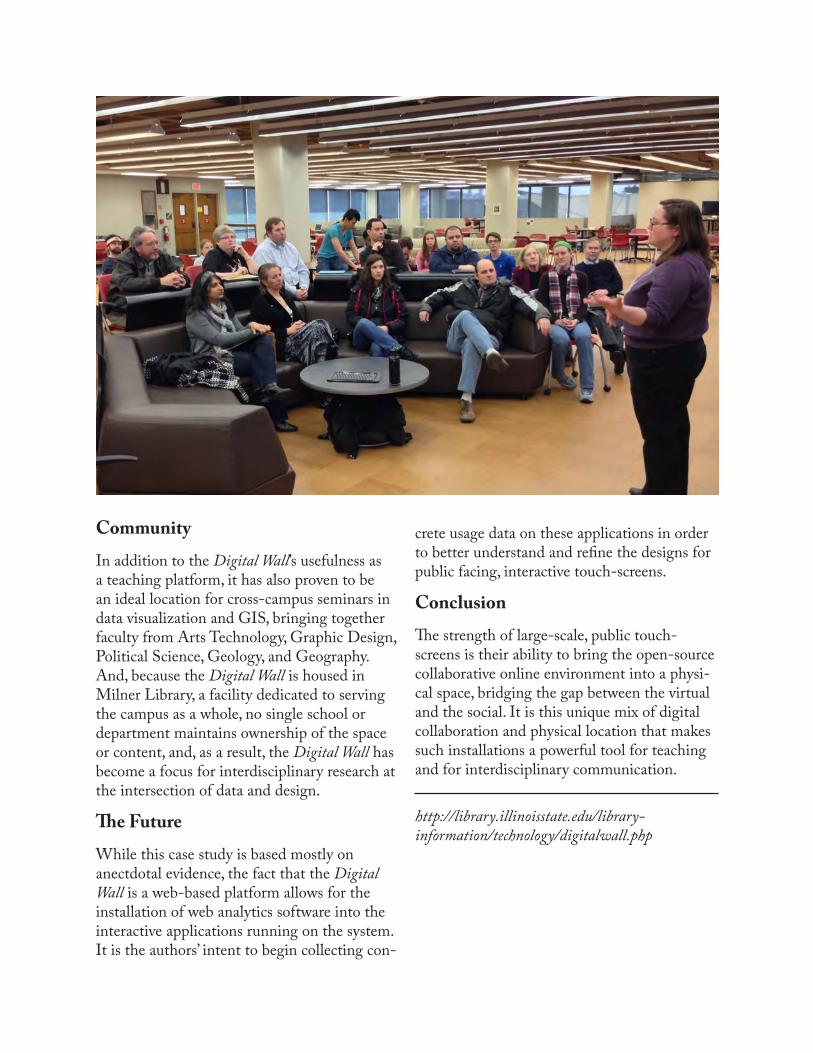
CommunityIn addition to the Digital Wall’s usefulness as a teaching platform, it has also proven to be an ideal location for cross-campus seminars in data visualization and GIS, bringing together faculty from Arts Technology, Graphic Design, Political Science, Geology, and Geography. And, because the Digital Wall is housed in Milner Library, a facility dedicated to serving the campus as a whole, no single school or department maintains ownership of the space or content, and, as a result, the Digital Wall has become a focus for interdisciplinary research at the intersection of data and design.
The FutureWhile this case study is based mostly on anectdotal evidence, the fact that the Digital Wall is a web-based platform allows for the installation of web analytics software into the interactive applications running on the system. It is the authors’ intent to begin collecting con-
crete usage data on these applications in order to better understand and refine the designs for public facing, interactive touch-screens.
ConclusionThe strength of large-scale, public touch-screens is their ability to bring the open-source collaborative online environment into a physi-cal space, bridging the gap between the virtual and the social. It is this unique mix of digital collaboration and physical location that makes such installations a powerful tool for teaching and for interdisciplinary communication.
http://library.illinoisstate.edu/library-information/technology/digitalwall.php
Tenth Annual UCDA Design Education Summit | 9
AbstractWith the advancement of information technology, more people are using online educational programs to learn new skills. In addition to the independent online learning institutions, many public and private universities are now viewing online education as a new opportunity to increase revenue and reputation.
Online education is not only an efficient delivery system for students and faculty but also provides unique opportunities for interface and instructional designers. Visual communication designers play a central role in online web design education, helping students to understand course development, to cultivate an understanding of pedagogical-driven goals and outcomes, and to fully engage the design process of concept development through design solutions with successful outcomes and delivery.
Since the spring semester of 2013, Advanced Web Design course has been offering a project to develop a prototype for an online course. The project’s initial phases requires students to assess their own online learning experiences, and to analyze the advantages and constraints of online education. This analysis enhances their understanding of media and design content as well as emerging methods of applying technology to improve the user experience without sacrificing the effectiveness of online learning through design. Then students identify a few key areas of concern in selected subject/field and propose a project plan for designing/redesigning an online course. As the table turns, design students become the teacher and teachers become the recipient of their students’ ability to work through the complexities of problem-solving for web and graphic design education. At the end of the project, students and faculty presented their design process and course prototypes to the Office of Distance Education and local design communities.
Here are some of the questions we address in this project.
1. What are the main problems that students/users experienced in online learning? How can we solve these problems and provide a better user experience?
2. Will a well-designed online course overcome the lack of in person interaction as in a traditional classroom?
3. How can we motivate students and increase the effectiveness of online learning through design?
4. What are the advantages of online content delivery? How can we utilize these technologies to maximize learning outcome?
This paper shares our research findings, design practices and outcomes. It also raises some questions for further discussions and research.
Develop an “Ideal” Online CourseStudents as Teacher, Designer, and User
Shanshan CuiGeorge Mason University
2.1
Developing an “ideal” online coursestudents as teachers, designers, and usersShanshan Cui, Associate professor, George Mason University
IntroductionStudents in the Advanced Web Design class at George Mason University accepted the challenge to develop an online course prototype in the spring semesters of 2013 and 2014. The goals include to improve the learning experience of the online user, to educate relevant interest groups on the course content and methodology, to improve the user experience, and to deepen students’ understanding of online media platform. The current paper summarizes the process and results of this project.
Creating, teaching, and taking a course online differ from doing the same in a traditional classroom setting. Whether the content of the online course is adapted from what has been designed for classroom teaching or created anew, the designer needs an in-depth understanding of online media platform, and the general knowledge of the most significant course users such as teachers, students, and advisors.
Why develop an online course prototype?Every student in the Advanced Web Design class has previously taken online courses. This first-hand experience serves as a starting point to further study the advantages and shortcomings of online course delivery. The difficulties the students encountered in their prior experience also motivate them to create a better online course.
With the skills acquired from the two prerequisites - “Introduction to Web Design” and “Web Design and Usability,” students are ready to take on more complex problems. The complexity and task driven nature of online course design certainly meet this criteria.
Students also have easy access to the users of online courses, including fellow students, teachers, advisors, mentors, instructional designers, administers and IT specialists. All of them are included in our user studies.
New employment opportunities go hand-in-hand with innovative developments in the design classroom. This recent innovation in online education focuses on multiple pathways to provide interface designers and instructional designers with a commanding knowledge of the comprehensive architecture of the program.
It is especially valuable to have the input from the students’ perspective. In this course, it is important for the teacher or teacher-designer to better understand students’ needs, and create more efficient and user-friendly online features for courses as well as refine the approach to a full program of study.
Project DescriptionIn this project, students may choose to develop one of two foundational courses for web development, including Web Fundamentals and/or Basic HTML and CSS. They may also work on a topic of their own liking with the instructor’s approval.
Students often choose to follow an already established course plan in designing and building a functional online course prototype. It is important that the prototype functions properly on different devices. Most students select the web development course with their own focus, such as the responsive web development, CSS box model, workflow, etc.
ScopeA. Develop contents Develop an overall plan for a one-semester long course, which comprises multiple learning units
Develop contents for one of the learning units
Define site-wide and course specific functionalities
B. Design and code web pages Design and code web pages to deliver the content of the selected learning unit
Design and code functionalities, including customized user homepage, help, message board, grade center, schedule, progress, etc.
Design additional design elements, including site ID and interface, graphic icons, etc.
Submission Publish the followings items online before the deadline.
1. Final design: a functional prototype
2. Documentation: all the materials created from the design process
MethodologyThe design process is heavily emphasized. The project guideline serves as a starting point only. Students have the option to propose new ideas and choose different approaches, including different UX design techniques, different course subject matter, and different type of course (for college or general training).
Phase 1. ResearchUnderstanding the problem Students start with sharing their personal online learning experience, followed by a literature review, which equips them with a broader understanding of advantages and constraints of the media and the issues of online education. Furthermore, students are required to take an online course from two websites and conduct a competitive analysis.
Define research plan Based on their findings, students define research questions and conduct user interviews and user testing.
Phase 2. UX design Following the identification of user demographics and learning objectives, students plan the course content and functionalities while exploring the options for delivering the course content.
Students may choose the appropriate UX design techniques to further define the site navigation and task flow. Sitemap, flow chart, and wireframe are frequently used. User scenario method is also used.
User testing is conducted one or two times a week. Students constantly revise their design based on findings from user testing.
Phase 3. User interface designVisualizing the proposed content and site functionalities through page mock-ups.
Phase 4. Development and productionStudents build prototypes using HTML, CSS, jQuery, etc.
The challenges of taking online coursesStudents identify problematic areas of their online learning experience and focus on resolving these issues to improve the course. The key areas for improvement are listed in the following paragraphs.
Critical thinking and problem solvingIn the case of a web development course, learning the basics of CSS and HTML by following instructional materials does not guarantee that a student will be able to code their own web pages. Online learning is not always about watching instructional videos, reading assigned materials, and memorizing the facts. A well-designed online course should nourish critical thinking, problem-solving skills, powers of analysis, and enable users to apply what they have learned to real-world problem-solving.
Social interactionFacilitating social interaction and collaboration in a virtual classroom environment engages users. Adopting the functionalities of the existing virtual social media into the online learning environment or building native applications are basic steps to compensate for the lack of personal interactions. Although learning online inhibits students from practicing collaborative thinking and communication skills necessary for success in a professional working environment, students find ways to reach out to their classmates via phone, share ideas and information via social networks, and break the workload into manageable sections.
Information accessibilityWhile students enjoyed the convenience of taking courses online, they also found that looking for information could be a challenge. This may be due to not only the confusing interface, but also the organization of course contents and overall information architecture. In addition, the homework assignment, schedule, quiz, things due, help, etc., may require better management in order to be more self-explanatory to users.
Self-motivation and time managementStudents believe that self-motivation and time management skills are crucial for the success of learning online. They identified constructive tactics, such as online learning community, online and off-line support, timely notification, reward system, and support to boost user motivation and engagement.
OutcomesThis project was first assigned in Spring 2013 as a group project. It was taught again in Spring 2014 as an individual project. The project requirements are the same and the students had the options to propose other ideas on both occasions.
Students in both classes facilitated online learning community, reinforced practice and application, and provided checkpoints on progress. They divided course contents into smaller sections and provided much quicker turn around in hope to compensate for the short attention span of learner.
The Spring 2013 class did a better job on the over all UX design, which may be a result of a team effort. Perhaps for the same reason, their designs work well on various devices, including desktop computers, tablets, and phones.
The prototypes from the Spring 2014 class are mostly independent online training courses. Students are more aware of the competitiveness of online courses. They tried to find a unique approach to stay ahead of the competition and attract users. One of the students indicated in his project proposal that “there are multiple free and paid programs for people to choose from, … an effective online learning service must provide some sort of incentive or difference in order to stand out.” This in part may be due to the various new online learning resources becoming available in 2013. As a result, students in the Spring 2014 class had more online resources to evaluate and learn from.
Students in the Spring 2014 class also focused on specific issues in a particular field. For example, one student tried to bridge the gap between learning HTML and CSS coding using an in-browser editor, and using an off line text editor.
Areas for improvements
Content strategyEven though every student realized the importance of the content and the needs to effectively delivery the content, many of them were not able to execute according to their original plans.
Collaboration Effective collaboration with other professionals, such as instructional designers, faculty and students in computer interface design in the Psychology Department, local professional designers, and experts from established online education institutions, such as Blackboard & Straighterline, would be helpful. Working with faculty members who are building online courses would also give students opportunities to work on a real project, with the benefits for collaborating with his/her clients and users.
Hands on in class activitiesEven though students have some working knowledge of the full cycle of web design and development, there are many areas that require further study and practice. For example, students frequently oversimplify the user flow. They have difficulties to integrate the functionalities into a site structure. Introducing other UX design methods, such as user scenario and user roles and practice them in class will be helpful. Conducting mock-up user interview, demonstrating online applications for quick mock-up of sitemap and task flow chart, wireframe, etc. can be added in to class activities.
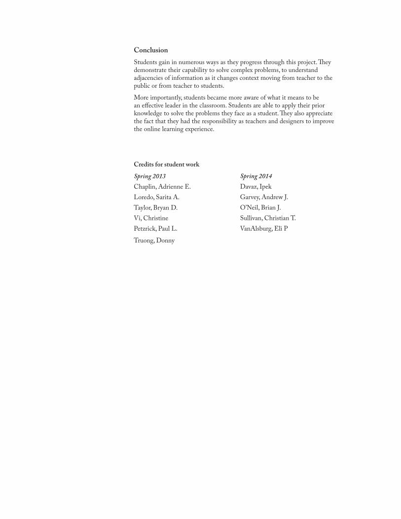
ConclusionStudents gain in numerous ways as they progress through this project. They demonstrate their capability to solve complex problems, to understand adjacencies of information as it changes context moving from teacher to the public or from teacher to students.
More importantly, students became more aware of what it means to be an effective leader in the classroom. Students are able to apply their prior knowledge to solve the problems they face as a student. They also appreciate the fact that they had the responsibility as teachers and designers to improve the online learning experience.
Credits for student work
Spring 2013Chaplin, Adrienne E.Loredo, Sarita A.Taylor, Bryan D.Vi, ChristinePetzrick, Paul L.
Truong, Donny
Spring 2014Davaz, IpekGarvey, Andrew J.O’Neil, Brian J.Sullivan, Christian T.VanAlsburg, Eli P
10 | Tenth Annual UCDA Design Education Summit
AbstractShort Description: Technology is constantly evolving, however human audiences remain constant. This presentation will examine design considerations for digital technology, which puts mankind’s ability (and limitations) in processing information at the forefront. With the rapid speed of developing technology, the manner in which designers craft communication and deliver information is continually evolving. And while the importance of the human audience is not shunned in design education, it often becomes subservient to the pursuit of evolving technology. However, it is crucial that emphasis be placed on utilizing new technology in a manner that puts the human audience at the forefront. No one can foresee what technological advances and opportunities students will face in the future. That is why a keen curiosity and understanding of how a human audience interacts with, receives, and processes information must be established to ensure students have a lifelong career of successful communication. This educational cornerstone retains currency with the passage of time and technology. It is imperative that even the most technologically driven designers consider the means in which their human audience receives and processes information when interacting with machines and technology. This paper and presentation will provide a survey of designers, theorists and researchers who all agree that no matter how technology evolves, we are all inextricably linked to the natural environment and all things that make us human.
Key points of this discussion will address human perception, psychology and qualitative ways of knowing as important foundations for design—especially those focusing on digital media. As precedents, the work of accomplished designers, authors and educators such as Terry Irwin, Maggie Macnab and Susan M. Weinscheik, Ph.D. will be surveyed and presented.
A Universal Truth for Evolving Digital Technologies:Your Audience is Still Human
Andrea L. Quam Iowa State University
2.2
A Universal Truth for Evolving Digital Technologies Your Audience is Still Human Andrea Quam, Assistant Professor of Graphic Design
Iowa State University
Abstract With the rapid speed of developing technology, the manner in which designers craft communication and
deliver information is continually evolving. And while the importance of the human audience is not shunned
in design education, it often becomes subservient to the pursuit of evolving technology. However, it is crucial
that emphasis be placed on utilizing new technology in a manner that puts the human audience at the
forefront.
No one can foresee what technological advances and opportunities students will face in the future. That is
why a keen curiosity and understanding of how a human audience interacts with, receives, and processes
information must be established to ensure students have a lifelong career of successful communication.
This educational cornerstone retains currency with the passage of time and technology.
It is imperative that even the most technologically driven designers consider the means in which their
human audience receives and processes information when interacting with machines and technology.
This paper and presentation will provide a survey of designers, theorists and researchers who all agree that
no matter how technology evolves, we are all inextricably linked to the natural environment and all things
that make us human.
Key points of this discussion will address human perception, psychology and qualitative ways of knowing as
important foundations for design—especially those focusing on digital media. As precedents, the work of
accomplished designers, authors and educators such as Terry Irwin, Donald A. Norman and Susan M.
Weinscheik, Ph.D. will be surveyed and presented.
Introduction The ideas and theories presented in this paper were developed as companion material to
technology presentations in a senior graphic design capstone class at Iowa State University in
Ames, Iowa. This content was presented as a series of lectures to help technology-‐oriented
students recalibrate and realize the importance of placing audience first. Students who learn to
value and understand their human audience will have acquired life-‐long learning skills
throughout their careers—versus a focus on technology trends will only see them through to
the next technological evolution. By emphasizing an understanding of one’s audience at a
human level and a true connection to the natural world, students will develop a sound
theoretical basis of valuing and appreciating their audience. This approach to design develops
thoughtful and overall sustainable solutions and skills needed for designers of the future.
While technology is an important part of future designers’ education, an emphasis on
technology is shortsighted.
The Facts The technology we use to communicate on a day-‐to-‐day basis is evolving at a mind-‐blowing
rate. Social media, electronic tablets and smart phones have all entered the scene within the
last decade. These new technologies have impacted the design industry in multi-‐fold and
unforeseen ways. From these technologies, designers have the opportunity to specialize in new
areas of expertise with app design and user experience considerations. The unexpected
development of these revolutionary technologies also illustrates the future is not predictable.
While we may speculate as to which technologies will be areas of growth, the reality is that we
cannot predict the exact skills and technology our students will need several years from now
as professionals. Among all this uncertainty, what is constant is that our audience is human.
And with that humanity, there are some certainties. As Donald A. Norman, author of Emotional
Design, points out:
One side effect of today’s technologically advanced world is that is not uncommon to hate
the things we interact with… we as humans are very driven by emotion. Consider the rage
and frustration many people feel when they use computers or the latest touch-‐screen
technology that is not working as they feel it should! It starts out with slight annoyance and
may soon escalate to yelling at an inanimate object. It has been scientifically proven that
emotion and cognition are thoroughly intertwined… we now understand how important
emotion is to everyday life and communication… without fun and pleasure, joy and
excitement and even anxiety and anger, fear and rage, our lives would be incomplete. As
designers this is important to understand.
Emotion is a necessary part of life affecting how people behave and think. Without emotions,
our decision-‐making ability would be impaired. Emotion is always passing judgments or
presenting one with immediate information about the world. As designers who seek to
typically change behavior and inform views through one’s work, these understandings help to
craft design that communicates on an emotional and human level. (Norman, 2004, p. 6) This
connection becomes of the utmost importance in design education. This is the constant aspect
of humanity. If design students are able to master this connection they will be set for life-‐long
learning in a career. Versus a focus on technology will have them struggling to remain current
within a few years of graduation.
The Human Audience Cognitive scientists, psychologists and even archaeologists all focus on the study of human
beings. These disciplines can provide valuable insight for designers and design students to
understand how their audience receives and processes information from their environment
and culture. When designers become informed of the theories and research from these fields,
they develop insights that make them well-‐rounded designers. This expanded understanding
of the human audience and their relationship with the environment and culture surrounding
them will enlighten the designer’s work well into the future.
While it is valuable for designers to become students of different disciplines to better
understand their human audience, it is also essential to realize human reactions cannot always
be precisely predicted or anticipated. In digital design, user testing has been widely
established to determine if the intended audience is able to navigate and glean information as
intended. Integrating a classroom exercise in which students use one another as test subjects
for user testing is a valuable tool to teach young designers not to make assumptions regarding
their audience. User testing can be integrated at multiple phases of a project and aid in re-‐
focusing students on their audience at each phase: planning, development and implementation.
User testing in the planning stages of a project can take the form of walk-‐throughs of
information architectures and paper prototypes. In the development phase students can utilize
wireframes in which design is not addressed, but rather the focus is on the functionality and
navigation of a website or app. Even after design implementation rounds of user testing can
further point out weaknesses and encourage iterations to better communicate and connect
with their audience.
Human Perspectives There are many professional designers, educators and scientists who advocate an
understanding of audiences at a human level—and even further consideration of the human
connection to the natural world—as an integral part of their world-‐view and use it to guide
their work. Each pull from multiple disciplines to round out their perspectives and apply them
to design. Three of the individuals whose theory and work were presented as precedents for
this project were: Terry Irwin, Donald A. Norman and Susan M. Weinschenk, Ph.D.
Terry Irwin is a designer and educator who is currently Head of the School of Design at
Carnegie Mellon. Irwin practiced professionally for 40 years—most prominently as one of the
founding partners of MetaDesign—before she returned to academia to complete her Masters
Degree in Holistic Science and PhD studies in 2007 at the Centre for the Study of Natural
Design. In an online article for a Communication Arts column, Irwin summarized her design
perspective:
Humans (and therefore designers) often rush headlong into solutions based upon new and/or
powerful technologies without considering the ramifications: The focus instead is on quick,
usually profit-‐related, results. Designing for society and the environment requires designers
to take a longer view. Designing this way requires students and faculty to develop: trans-‐
disciplinary collaborative skills, a commitment to lifelong learning, a fundamental
understanding of eco-‐literacy, place-‐based knowledge as well as a deep understanding of
living systems' principles such as emergence, self-‐organization and diversity. (Holland, 2014)
In a 2007 lecture at Virginia Commonwealth University, Irwin discussed her PhD studies focused on developing more responsible and appropriate design processes and methodologies
for traditionally trained designers. These processes addressed the components of a holistic
worldview and its implications for design. In the lecture titled: “The Web of Life —Designing
for Relationship,” Irwin shared four guidelines to help frame holistic world-‐views for
designers:
— Life is cooperative, not competitive: Eco-‐systems are comprised of symbiotic and
mutually beneficial relationships. The more symbiotic relationships an organism has
with its environment, the healthier and more robust it tends to be. Cooperation and
collaboration is key in solving complex problems. We need to see opportunities for
collaboration instead of fighting perceived “competition.” Most designers’ work is
closely linked to the consumer–led market place, which is highly competitive and based
solely on financial results. We need to design for and within models of cooperation. — Life is interdependent and interrelated: All forms derive from a single source: the Earth.
They are related not only in their material compositions but also in mutually beneficial
relationships forged through constant interaction with each other and their
environment. How and what we design is embedded within a dense web of
relationships that we can never fully see or understand. What we design affects both
the social and environmental biological domains in countless ways. The context for all
our design problems is the environment.
— Life is comprised of networked, “holarchic” structures: Holarchic structures are systems
nested within other systems. Each of these forms a “whole” with respect to its parts
while at the same time being part of a larger whole. Holarchic structure is characteristic
of the natural world. However, “parts” and “wholes” are a human concept; they do not
exist in nature or social organizations. What we find are intermediary structures on a
series of levels in an ascending order of complexity. In your design work operating with
and designing for networked structures provides stability, flexibility and greater
sensitivity to local environments. It provides clues for how to design in quantity, how
social organizations are most successfully organized and forces us to consider
relationships at every scale between our designs and their context. — Life is self-‐organizing and emergent: New forms of life/behavior arise spontaneously
and unpredictably out of very simple circumstances within complex systems. Order is
continually emerging and dissolving back within disorder. Change can be provoked
but never directed or predicted. Designers constantly design within and for open,
complex systems (we ourselves are such a system). These systems operate on the
edge of chaos where change is emergent and unpredictable. Small changes in initial
conditions can trigger radical results, which are unpredictable. It is beyond the
capability of any designer to do more than provoke change. To think we can ‘design’ it
is hubris. (Irwin, 2007)
When holistic perspectives such as these are introduced into the classroom, students are
“enlightened” by what they consider to be these “new” perspectives to design. In programs
driven by industry the introduction of “holistic” theories creates more responsible designers.
Donald A. Norman is a cognitive scientist and cofounder of the Nielsen Norman Group. He is a
professor of computer science at Northwestern and has served as vice president of Apple
Computers Advanced Technology Group. His books include: Emotional Design, The Design of
Everyday things, Things That Make Us Smart.
In Norman’s book, Emotional Design, he highlights an aspect unique and essential to the human
audience: emotion. In his research he explores the relationship between human beings and
design. Norman notes that much of human behavior is subconscious, beneath conscious
awareness. He takes this into consideration when he proposes that there are three levels of
design that designers should be aware of: visceral, behavioral and reflective. Each plays a role
in shaping experience. Human responses to the world are complex, determined by a wide
variety of factors. Some of these are outside the person, controlled by designer and
manufacturer, or by advertising and things such as brand image. And some come from within,
from your own private experiences. Each of these three levels of design—visceral, behavior
and reflective—plays a part in shaping your experience. Each is important to the others, but
each requires a different approach by the designer.
Visceral design is what nature does. We humans evolved to coexist in the environment of other
humans, animals, plants and landscapes, weather and other natural phenomena. As a result we
are exquisitely tuned to receiving powerful emotional signals from the environment that get
interpreted automatically at the visceral level. Thus, the colorful plumage on male birds was
selectively enhanced through the evolutionary process to be maximally attractive to female
birds—as, in turn, were the preferences of female birds so as to discriminate better among
male plumages. It’s an iterative, co-‐adaptive process, each animal adapting over many
generations to serve the other. A similar process occurs between males and females of other
species, between co-‐adaptive life forms across species.
The human preference for faces and bodies that are symmetrical presumably reflects selection
of the fittest; non-‐symmetrical bodies probably are the result of some deficiency in the genes
or the maturation process. Humans select for size, color and appearance, and what you are
biologically disposed of to think of as attractive derives from these considerations. When we
perceive something as “pretty,” that judgment comes directly from the visceral level and that
item becomes attractive and desirable to the viewer. The principles underlying visceral design
are wired in, consistent across people and cultures. If you design according to these rules, your
design will always be attractive, even if somewhat simple. (Norman, 2004, p.67)
Students will often under-‐value the degree to which emotion should be a design consideration.
Introducing Norman’s research brings to students’ attention the importance of the
unconscious levels of design, and initiates the opportunity for young designers to explore how
to best leverage them.
Dr. Susan M. Weinschenk has a Ph.D. in psychology and a thirty-‐year career in applying
psychology to the design of technology. She has written several books on user-‐centered design.
Her book titles include: Neuro Web Design: What Makes Them Click? And 100 Things Every
Designer Needs to Know About People. She is Chief of User Experience Strategy, Americas, at
Human Factors International and runs a popular blog: Whatmakesthemclick.net.
In 100 Things Every Designer Needs to Know About People, Weinschenk makes clear
connections between psychology’s understandings of human thought and behavior and clearly
links each to actionable items in design strategy and process. Students readily connect with
Weinschenk’s straightforward writing and logical connections for design.
A few examples of Weinschenk’s observations and connections are as follows:
— People make predictable type of errors: People will make different types of errors in
learning about and using your product. Before you conduct user testing or user
observation, decide on the possible errors you are most concerned about. During user
testing and observation, collect data on which category of errors people are making.
This will help you focus your redesign after testing. If you’re in a field where errors are
not just annoying or inefficient, but actually may result in accidents or loss of human
lives, then you should use a system like The Human Factors Analysis and Classification
System (HFACS) as is used for aviation to analyze and prevent errors. (Weinschenk
2011, p. 195)
— People are inherently lazy: Over eons of evolution, humans have learned that they will
survive longer and better if they conserve their energy. You want to spend enough
energy to have enough resources (food, water, sex, shelter) but beyond that you are
wasting your energy if you spend to much time getting or doing more stuff. Assume
that people will get things done with the least amount of work possible. That may not
always be the case, but it’s true more often than not. People will ‘satisfice’—that is,
look for the good-‐enough solution rather than the optimal solution. Designers should
design web sites for scanning not reading. (Weinschenk 2011, p. 132) — People are motivated by progress, mastery and control: Why do people donate their
time and creative thought process to Wikipedia? Or the open source movement? When
you stop and think about it, you realize that there are many activities people engage
in, even over a long period of time, that require high expertise, and yet offer no
monetary or career building effort. People like to feel that they are making progress.
They like to feel that they are learning and mastering new knowledge and skills.
Because mastery is such a powerful motivator, even small signs of progress can have
large effect in motivating people to move forward to the next step in a task. For
example think of all the surveys that constantly show your progress of how much
you’ve completed. If you want to build loyalty and have repeat customers (for example
repeat visitors your web site), you’ll need to have activities that people inherently
want to do. If people have to do a task that is boring, you can help motivate them by
acknowledging that it’s boring and then letting them do it their own way. Look for
ways to help people set their own goals and track them. Show people how they’re
progressing toward goals. (Weinschenk 2011, p. 127)
Each of the fore mentioned designers, educators and scientists have a different perspective on
the human connection and design. However, each offer philosophies that when introduced to
design projects help students refocus on their human audience. As technology radically
evolves the human audience is a constant. Helping students value and gain new perspectives
and respect towards their human audience will be life-‐long learning skills throughout their
careers and an asset for their professional development.
Bibliography: Holland, DK. “Blow Up the Design School! Rah! Rah! Sis! Boom! Bah!” Communication Arts. 2014. www.commarts.com/Columns.aspx?pub=5191&pageid=1552 Irwin, Terry. “Designing for Relationships”. Virginia Commonwealth University Workshop, Richmond,Virginia 2007. Norman, Donald A. Emotional Design. Basic Books, New York, New York 2004. Weinschenk, Susan M. PhD. 100 Things Every Designer Needs to Know About People. New Riders, Berkeley, California 2011.
Tenth Annual UCDA Design Education Summit | 11
AbstractThe histories of design and computing has always been intertwined as one influenced and redefined the other. Personal computers and the internet are just few of the many technological innovations that expanded the medium in which design can manifest itself. Conversely, the principles of visual communication design have helped technology, specifically in softwares, to become transparent and engaging experiences to its users. And these intersections between computer programming and design are not recent phenomenons but have existed since the earliest forms of computing in the 19th century. By examining the works from Sol LeWitt, Karl Gerstner, John Maeda, Ben Fry, and many others, this study traces the historical and contemporary influences of coding to the design field and proposes that the foundational ideas and practice of computer programming can serve as a valuable extension to the designer’s tool, process, and craft.
Code + Design:Computer Programming as Design Tool,Process, and Craft
Eugene ParkUniversity of Minnesota -
Twin Cities
2.3
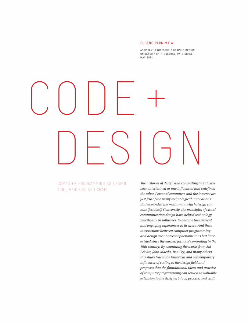
Code + design
Computer programming as design
tool, proCess, and Craft
EugEnE Park M.f.a.
assistant ProfEssor / graPhic dEsignunivErsity of MinnEsota, twin citiEsMay 2014
The histories of design and computing has always
been intertwined as one influenced and redefined
the other. Personal computers and the internet are
just few of the many technological innovations
that expanded the medium in which design can
manifest itself. Conversely, the principles of visual
communication design have helped technology,
specifically in softwares, to become transparent
and engaging experiences to its users. And these
intersections between computer programming
and design are not recent phenomenons but have
existed since the earliest forms of computing in the
19th century. By examining the works from Sol
LeWitt, John Maeda, Ben Fry, and many others,
this study traces the historical and contemporary
influences of coding to the design field and
proposes that the foundational ideas and practice
of computer programming can serve as a valuable
extension to the designer’s tool, process, and craft.
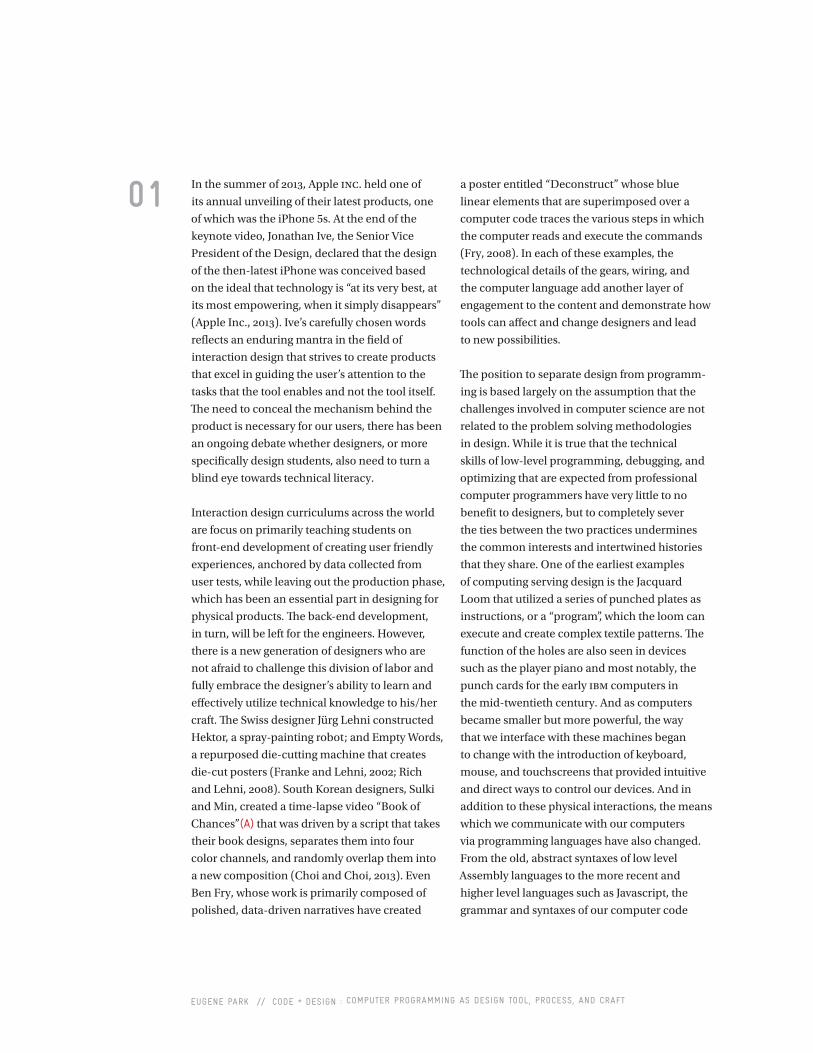
eugene park // code + design : computer programming as design tool, process, and craft
In the summer of 2013, Apple inc. held one of
its annual unveiling of their latest products, one
of which was the iPhone 5s. At the end of the
keynote video, Jonathan Ive, the Senior Vice
President of the Design, declared that the design
of the then-latest iPhone was conceived based
on the ideal that technology is “at its very best, at
its most empowering, when it simply disappears”
(Apple Inc., 2013). Ive’s carefully chosen words
reflects an enduring mantra in the field of
interaction design that strives to create products
that excel in guiding the user’s attention to the
tasks that the tool enables and not the tool itself.
The need to conceal the mechanism behind the
product is necessary for our users, there has been
an ongoing debate whether designers, or more
specifically design students, also need to turn a
blind eye towards technical literacy.
Interaction design curriculums across the world
are focus on primarily teaching students on
front-end development of creating user friendly
experiences, anchored by data collected from
user tests, while leaving out the production phase,
which has been an essential part in designing for
physical products. The back-end development,
in turn, will be left for the engineers. However,
there is a new generation of designers who are
not afraid to challenge this division of labor and
fully embrace the designer’s ability to learn and
effectively utilize technical knowledge to his/her
craft. The Swiss designer Jürg Lehni constructed
Hektor, a spray-painting robot; and Empty Words,
a repurposed die-cutting machine that creates
die-cut posters (Franke and Lehni, 2002; Rich
and Lehni, 2008). South Korean designers, Sulki
and Min, created a time-lapse video “Book of
Chances”(a) that was driven by a script that takes
their book designs, separates them into four
color channels, and randomly overlap them into
a new composition (Choi and Choi, 2013). Even
Ben Fry, whose work is primarily composed of
polished, data-driven narratives have created
01 a poster entitled “Deconstruct” whose blue
linear elements that are superimposed over a
computer code traces the various steps in which
the computer reads and execute the commands
(Fry, 2008). In each of these examples, the
technological details of the gears, wiring, and
the computer language add another layer of
engagement to the content and demonstrate how
tools can affect and change designers and lead
to new possibilities.
The position to separate design from programm-
ing is based largely on the assumption that the
challenges involved in computer science are not
related to the problem solving methodologies
in design. While it is true that the technical
skills of low-level programming, debugging, and
optimizing that are expected from professional
computer programmers have very little to no
benefit to designers, but to completely sever
the ties between the two practices undermines
the common interests and intertwined histories
that they share. One of the earliest examples
of computing serving design is the Jacquard
Loom that utilized a series of punched plates as
instructions, or a “program”, which the loom can
execute and create complex textile patterns. The
function of the holes are also seen in devices
such as the player piano and most notably, the
punch cards for the early ibm computers in
the mid-twentieth century. And as computers
became smaller but more powerful, the way
that we interface with these machines began
to change with the introduction of keyboard,
mouse, and touchscreens that provided intuitive
and direct ways to control our devices. And in
addition to these physical interactions, the means
which we communicate with our computers
via programming languages have also changed.
From the old, abstract syntaxes of low level
Assembly languages to the more recent and
higher level languages such as Javascript, the
grammar and syntaxes of our computer code
eugene park // code + design : computer programming as design tool, process, and craft
02 evolved to resemble more of the human language.
The result of this evolution is the recognition
of computer programming as a viable tool for
designers who sought to craft digital experiences
without the constraints of third party software
that severely limited the possibilities of what
a designer can do to construct digital and
mechanical experiences. But more importantly,
the assimilation of computer programming as
a tool reinforced the idea that a designer’s role
can expand from that of a mere tool user. As
Andrew Blauvet wrote in his essay “Tool (Or,
Post production for the Graphic Designer)”,
the “computer is not just another tool, nor is it
simply a combination of discrete tools, a kind of
digital Swiss army knife. Rather, the computer
is a meta-tool; it makes other tools… We must
learn to create tools ourselves. After all, the
computer is exactly that: a tool for creating tools”
(Blauvet, 2011, p. 24). And the designer’s desire
to develop these digital extension of their craft
is evident from the the works of Nicholas Felton,
who created Daytum, an app that was originally
meant to help him gather and organize data
for his annual reports instead of relying on the
traditional software that like Microsoft Excel.
The aforementioned Jürg Lehni have written
programs like Scriptographer, an open source
extension of Adobe Illustrator, as the means to
directly manipulate technology to the needs of
the designer as well as to question the industry
standard of tools that are dominated by the
standards and expectations of Adobe, thereby
limiting many designers to become mere tool-
users dependent on others to provide the tools for
them (Felton, 2014; Lehni, 2001).
As design educators, we do not expect all of
our students to become proficient computer
programmers, but introducing them to the
basic concepts of computer programming,
via algorithms, can enhance their learning
experience in various ways. An algorithm
can be defined as a step-by-step procedure
that formulates a systematical behavior
(Shackelford, 1998, p. 27). While they are central
to programming, algorithms are not restricted
to governing computerized tasks. Instructional
manuals, wayfinding, and board games can be
considered as algorithms for humans, because
they are meant to be operated within a list of
tasks that users follow to arrive at a particular
outcome. And by shifting our views of how design
works as an algorithm to instruct human tasks
rather than machines, students can pay more
attention to the process and gather a sense of
developing an “empathy” towards the audience/
users. Much of this practice can be traced back
to the Conceptual Artists in the sixties who
questioned the importance of an artist delivering
a “finished” piece. Sol LeWitt, for instance,
delivered instructions for wall paintings and
installations to galleries to construct the final
outcome. Contrasting to LeWitt’s prescriptive
measures of instruction, the Fluxus composer
John Cage created highly abstract musical
compositions to allow unpredictable outputs
and various interpretations (B). Despite the
differences of approach between the two
artists, their works are able to find common
ground on the idea that process should be
emphasized over the outcome, a value that is
often difficult to instill to design students. In
2008, Dutch designers, Luna Maurer and Roel
Wouters, have founded Conditional Design,
whose accompanying workbook (c) contains
instructions for various collaborative group
projects (Conditional Design, 2014). Their
algorithmic language operates within the careful
balance between prescriptive and interpretive
tasks with the intention of emphasizing the
importance of a systematical operation.
Algorithms applied to design practice can also
serve as moments of reflection and critique
for the designer. John Maeda, in his book
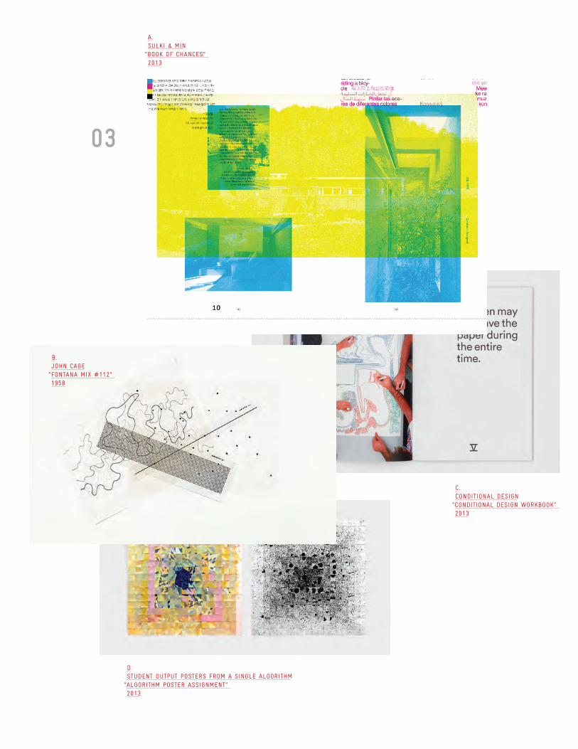
03
d.studEnt outPut PostErs froM a singlE algorithM
“algorithM PostEr assignMEnt”2013
c.conditional dEsign
“conditional dEsign workBook”2013
a.sulki & Min
“Book of chancEs”2013
B.John cagE
“fontana Mix #112”1958
eugene park // code + design : computer programming as design tool, process, and craft
04 “Maeda at Media” calls for a shift on our
perception that computers are more than just a
collection of hardware and software but places
its identity as “pure conceptual mass” and
turning our attention towards the “invisible—
to see into the expansive electrical conscious
of the computer. Our ability to comprehend
its multidimensional thinking patterns will
require intense inquiry into the very nature
of computation” (Maeda, 2000, p. iv). Maeda
continues by recalling his childhood memories
of observing the process in which his father
produced tofu. The intricate steps that were
involved in the creation of this delicacy required
filtering, measuring, timing, and repeating,
which are also tasks that relate to engineering
complex computer software and hardware.
From this example, it is apparent that crafts-
manship, one of the central pillars of design
practice, can be broken down into algorithmic
steps, with the potential for each task to be
influenced by variables such as time, quantity,
length, and volume. Beyond such parallels
between computer programs and human
actions, the challenge for design students is not
just awknowelding the framework of algorithms
applied to design but to put into practice of
deconstructing their design process in a way
that leads to projects that promote thoughtful
reflection and conversation.
One assignment that was developed to assimilate
algorithmic thinking in the design classroom
was an algorithm project in which students
had to create a poster that contained a list of
instructions for creating another poster. Once
the posters were completed, every student must
exchange their algorithm posters with their peers
and execute the new instructions s/he received.
To instill a logical framework of creating their
instructional posters, students were introduced
to the basic compositions of an algorithm applied
to computer programming. Elements such as
sequence, conditionals, loops, and functions can
serve as useful building blocks and vocabularies
for constructing and evaluating algorithms.
These lessons will be applied to the first draft
of the posters, where all algorithms had to be
presented as a logic diagram in order for students
to demonstrate their plans for how they expect
their users to process the information. Afterwards,
formal graphic design methods involving
typography, color and grid structures were
allowed in the next steps of the project. Students
also had the freedom to implement pictograms
and information design strategies to explore how
information can be imparted by purely visual
means. Finally, the term “poster” was open to
interpretation by the class in an effort to abandon
any presumptions of the medium as students
execute each other’s algorithms.
The critiques provided the most interesting
moments of this assignment as they invited
everyone to compare the resulting posters
from different students who executed the
same algorithm (d). The apparent similarities
and differences between the results became
discussion topics that demanded scrutiny of the
student’s instructions and determine which steps
led to the divergence of outcomes. While some
of the misunderstandings of the instructions are
attributed to certain design decisions such as
lackluster relationship between type and image
and no clear typographical hierarchies, much
of the critiques were based on the language that
students wrote in their instructions. Vague words
such as “large” and “colorful” meant different
interpretations between students, and terms
such as “line”, which are recognized as one of the
design “elements” led to different variations as
opposed to communicating a singular meaning.
These analysis also gave opportunities for
the class to question each other’s intention for
including or excluding certain steps.
eugene park // code + design : computer programming as design tool, process, and craft
05 As a result, the critique environment became
more conversational than presentational.
The algorithm assignment was a way for students
to focus on the construction and articulation
of their work. It was also a quick introductory
project aimed to teach students on how to create
programs before learning any specific coding
language such as html, css, and Javascript.
The requirement for students to execute each
other’s algorithms introduced the idea and
importance of user-testing before engaging
in any detailed exercises in measuring and
quantifying usability. But most importantly, this
project serves as a bridge between print and
interaction design. To avoid giving students the
impression that they must choose to specialize
in either print or interactive, design education
must emphasize that the lessons from traditional
graphic design projects can inform how they
approach interaction design. Traditional graphic
design projects, like creating a book, can also
be framed as an interactive design challenge;
the way that the book is shaped, the texture of
its paper, readability and legibility issues are all
part of human centered issues that are crucial to
designing meaningful interactions.
The motivation behind this paper is not to dictate
that design is a form of engineering but to offer a
useful framework and metaphor in which design
can be understood and appreciated. What the
algorithmic application to design has to offer
is the emphasis of process, its spoken/written
articulation, as well as serving as an effective
introductory exercise to human centered issues
of design. And while the algorithm poster
assignment is just one project, more assignments
that provide a smooth transition between
traditional and interactive design courses should
be developed in the future.
rEfErEncEs
Apple Inc. (2013). “Apple -iPhone5s - Video”. Accessed April 20, 2014, http://www.apple.com/iphone-5s/videos/#video-touch/.
Blauvelt, A., Lupton, E., & Giampietro, R. (2011). Graphic design: now in production. Minneapolis, MN: Walker Art Center.
Choi, Min and Choi, Sulki (2013). “The Book of Chances, Revised Edition”. Accessed April 21, 2014, http://www.sulki-min.com/wp/?p=9322/.
“Conditional Design: Manifesto” Accessed February 17, 2014, http://conditionaldesign.org/manifesto/.
Felton, Nicholas. “Daytum”. Accessed April 30, 2014, http://daytum.com/about/features/.
Franke, Uli and Lehni, Jürg. “Hektor” (2002). Accessed April 20, 2014, http://juerglehni.com/works/hektor/.
Fry, Ben (2008). “Deprocess”. Accessed April 21, 2014, http://benfry.com/deprocess/.
Lehni, Jürg (2001). “Scriptographer” Accessed April 20, 2014, http://juerglehni.com/works/scriptographer/.
Maeda, John. (2000). Maeda @ Media. London: Thames & Hudson.
Rich, Alex and and Lehni, Jürg (2008). “Empty Words” Accessed April 20, 2014, http://juerglehni.com/works/empty-words/.
Shackelford, Russell L. (1998). Computing and Algorithms, Introduction to. Reading, MA: Addison Wesley Longman.
12 | Tenth Annual UCDA Design Education Summit
AbstractAre tactile and visual demonstrations using letterpress equipment useful
in teaching basic design concepts to undergraduate graphic design students?
College freshmen have grown up with the computer as a learning tool. While designprograms teach software specific to the trade, most students arrive on campus havingused the computer for research, writing, creative endeavors and social communicationfor most of their elementary and secondary education.
But does this early introduction of technology into design curricula having an impacton the teaching of basic design principles?
As an instructor in basic type and design classes, I have found that a visit to the letterpress lab helps students better grasp typographic terms. Could demonstrations on letterpress equipment help undergraduate students better understand and retain basic design concepts? Is there a place for old technology to coexist in a curriculum with current technologies?
In order to understand if a tactile demonstration would be helpful in foundation design courses, this paper includes a survey of freshmen design majors to discern their self-reported learning styles, art background and other pertinent information.
Also included in this paper is a survey of university and college design programs concerning how their letterpress facilities are being utilized.
This paper proposes and documents four projects demonstrating basic design conceptson letterpress equipment. Demonstrations explaining additive color mixture, comparative type size and weight, pica measurement systems, and grid structure bring digital concepts into the physical world for students to see and touch.
This thesis was submitted in May 2013 as part of the requirements of an MFA degree.Paper author is a practicing design professional and adjunct faculty member with more than 25 years of teaching and professional experience..
Teaching Design Concepts through Letterpress
Bob KelemenKent State University
3.1
Tenth Annual UCDA Design Education Summit | 13
AbstractWord on the Street is the street newspaper for Baltimore City, launched in spring 2012. A street paper is an independent newspaper that provides opportunities for income, social support and advocacy, produced by homeless individuals and their allies. Work produced in the course Graphic Design: Social Issues was instrumental in launching the newspaper. We continue to partner with Word on the Street to design and produce each issue of the paper. Word on the Street is comprised of a diverse group of people. Many are individuals who are currently or have previously experienced homelessness, and who volunteer in roles such as editors, writers, photographers, vendors, or advisory board members. Other volunteers are individuals from a variety of organizations across Baltimore City. The components of this course and partnership are the perfect mixture for design students. The course combines a direct connection with and awareness of a social issue, the advancement of technical and creative skill, the ability to work on teams and with clients, and the development of professional practices. Faculty and students involved in this project benefit greatly. Students are exposed to a diverse group of people outside of their normal daily encounters, and many stereotypes are questioned. Because students’ work is disseminated in public, often for the first time in their design career, they are able evaluate the successes and weaknesses of their work in a public setting. Students advance their skill in design and teamwork, and gained an understanding of how they might use their knowledge in visual communication to have an impact in the community surrounding a social issue. Students have commented that this course is life changing.
Taking to the Streets: Graphic Design, Service Learning, and Launch of Baltimore’s Street Newspaper
Jessica RingTowson University
3.2
1
Taking to the Streets: Graphic Design, Service Learning, and Launch of Baltimore’s Street Newspaper UCDA Design Education Summit, Madison Wisconsin, May 2014 Jessica Ring, Associate Professor of Graphic Design Towson University Department of Art+Design, Art History, Art Education Introduction Word on the Street is the street newspaper for Baltimore, Maryland, launched in the spring of 2012. A street paper is an independent newspaper that provides opportunities for income, social support, and advocacy, produced by homeless individuals and their allies. (For more information about street papers, visit http://www.street-papers.org/.) Work produced in the course Graphic Design: Social Issues was instrumental in developing and launching the newspaper. We continue to partner with Word on the Street to design and produce each issue of the paper. The components of this course and partnership are the perfect mixture for design students. The course combines a direct connection with and awareness of a social issue, the advancement of technical and creative skills, the ability to work on teams and with clients, and the development of professional practices. Word on the Street Word on the Street is comprised of a diverse group of people. Many are individuals who are currently or have previously experienced homelessness, and who volunteer in roles such as editors, writers, photographers, vendors, or advisory board members. Other volunteers are individuals from a variety of organizations and universities across the Baltimore region, such as Health Care for the Homeless, Beans and Bread, Goucher College, the Indypendent Reader, Johns Hopkins University, Loyola University Maryland, and Towson University. The majority of the editorial team and advisory board members have had personal experience with homelessness. Vendors are initially given twenty to forty copies of an issue of the paper to sell for seed money. They purchase additional copies for twenty-five cents each. The papers are sold for one dollar. Vendors keep the seventy-five cent profit from each sale, some of which is then used to purchase additional papers. The twenty-five cents retained by Word on the Street is used to help pay for printing of the next issue. Word on the Street is more than just a newspaper. It gives a voice to a group of people who are largely ignored. Those involved learn about and strengthen their skills in areas such as writing, communication, teamwork, editing, and photography.
“When people become homeless, it is as if they lose their membership card to society.” –Bonnie (vendor, editor, contributor)
2
“Word on the Street is giving me a new start and helping me try to get my life back together.” –Ellis, (vendor)
The newspaper benefits many segments of the population. The number of people impacted by this work is estimated to be in the thousands and expected to grow. This includes contributors who are empowered by seeing their work in print and who gain many types of skills through the process (est. 30 individuals), vendors who sell the paper and gain some income (est. 93 individuals), planning/advisory board committee members (est. 25 individuals), the homeless population (est. to be more than 4000 on any given night in Baltimore City), and the general public who purchase and read the paper (18,100 papers have been sold to the public as of July 2013). Graphic Design: Social Issues students impact hundreds more through a required service activity. While it is impossible to estimate an exact number of those impacted, a low estimate is about 4000. Furthermore, the last two pages of the paper include a resources list and map. Free copies of the paper are distributed in appropriate locations in the city to assist people in need of locating resources and services. A supportive community has formed around Word on the Street. Not only does the organization produce and sell an actual newspaper, but it also coordinates events and activities that benefit individuals in the community. Many of the individuals are also involved in Baltimore’s Faces of Homelessness Speakers Bureau, a public education project of the National Coalition for the Homeless that works to dispel myths and stereotypes about homelessness and B’More Housing For All, a grassroots campaign led by people experiencing homelessness. Members of the community have testified at the city, state, and national levels on bills and other advocacy initiatives concerning issues of homelessness and poverty. For the past two summers, Word on the Street organized a barbecue that attracted new members, raised awareness of the newspaper among the homeless community, and served donated food to over 500 individuals currently experiencing homelessness. Saturday media workshops, co-organized by the Indypendent Reader, have provided opportunities to learn skills in areas such as writing, journalism, and photography, as well as opportunities to teach skills to others. The annual art auction is not simply a fundraiser, but also a way to introduce a whole new group of people to the organization. Many other events and meetings occur regularly. The Partnership Students in the course Graphic Design: Social Issues work on layout and other design aspects for each issue of Word on the Street. The course is an upper-level elective for students who have completed Graphic Design I and Typography I. The majority of the enrolled students are juniors. I had previously experimented and developed several components of the curriculum in a prior course focused on icon-based mapmaking, beginning specifically with maps highlighting environmentally friendly resources as part of the Green Map® Project (www.greenmap.org). During the second semester working with icon-based map projects, some groups of students worked on homelessness resource maps instead of Green Maps. (Word on the Street includes an icon-based resource map, inspired by the
3
work done in the previous course.) The connections made while doing research for the homelessness resource maps led to the collaboration with Word on the Street. The individuals establishing the new street paper asked if I would like to involve students in more of an ongoing, long-term project and invited me to participate as a member of the inaugural development team. Student work on the paper began in the fall semester of 2011. Students collaborated in groups. For many, this was their first experience working in a team on a large, long-term project. After hearing the goals and mission of Word on the Street, each group developed prototypes of the design and logo. Once a prototype was selected, the students developed a style manual so that subsequent designers could maintain the visual identity of the newspaper. During the semester that students were developing prototypes, I participated in a yearlong program called the Service Learning Faculty Fellows program at Towson University. There, I learned about resources for and best practices in service learning. Key components that I needed to incorporate were: maintaining a meaningful connection to the discipline; preparation; partnership and reciprocity; reflection; and assessment and evaluation. Preparation One key element of service learning is preparation, not just for the particular project or experience, but also to the concepts and principles of service learning. Several activities are incorporated into the Graphic Design: Social Issues course in order to prepare students for the experience. Prior to the semester, students are given an assignment to complete a service activity, which must be concluded by a specified date in the beginning portion of the semester. Students are given a list of approved activities and can request permission for others. The objective is for students to engage with individuals who are experiencing homelessness and/or poverty through their involvement, such as serving food at a soup kitchen. Students often cite this as an incredibly meaningful portion of the course. Several have continued to volunteer in this capacity. The first class session is purposefully unusual. Upon arrival to class, students discover a list of in-class assignments that they must complete without the instructor. The class syllabus and many materials related to service learning, homelessness, design for social issues, and Word on the Street are provided for students to review. There are also instructions for a time and place to meet the instructor. Once students locate the instructor, they are broken into groups to discuss any questions or concerns they have about the course. They are given specific protocols for methods of brainstorming and idea sharing. They report their findings back to the larger group, which provides an excellent basis for discussion as a class. The second class session typically features a field trip to Baltimore City. Word on the Street staff and the students meet one another and discuss the importance and mission of the street paper, as well as each individual’s reason for involvement. Speakers from the
4
Faces of Homelessness Speakers Bureau lead students on a tour of key sites in the city while sharing their personal stories of homelessness. The tour is called “The Injustice Walk.” Each trip is slightly different, with variation in the locations and stories. Health Care for the Homeless (HCH) is a nonprofit organization and health center that not only provides services, but is also a hub for advocacy and community engagement. HCH was home to many Word on the Street meetings before an office space was secured. The Baltimore Farmers’ Market takes place on Sundays under a highway. This location is also known as the Fallsway encampment, home to about 30 individuals who vacate the space each Sunday. The location of the former Camp 83 encampment was recently vacated by a city mandate. The Baltimore City Juvenile Justice Center and the Baltimore City Prison Complex are viewed from the exterior only. Personal experience and life in the men’s overflow shelter and city shelter is discussed. The homeless population is welcomed at St. Vincent de Paul Church and its adjacent park, a popular spot for groups and individuals to donate items like food and clothing. It is also the location of Word on the Street’s summer barbecues. Many students are familiar with Our Daily Bread Employment Center, a popular service-activity location. Our Daily Bread assists with employment transitions, housing and self-sufficiency, in addition to serving three meals each day. Our Daily Bread is well liked in the homeless community. Students often indicate that the field trip is a very impactful and memorable aspect of this course. Students are assigned readings from a variety of books and articles. Some are specifically about homelessness, and others illustrate the potential relationships between graphic design and social issues. The readings spark lively conversation on the class blog and provide entry points into discussions of difficult topics. For instance, students often comment that the only way to engage in design work related to a social issue is to donate design services for free. As the instructor, I am then able to show examples of situations in which this is not the case. Several of the illustrations come from alumni, such as an alumnus working for a non-profit with a good salary and excellent benefits. This leads to further debate and to the discovery of resources related to pro-bono design.
Assigned Readings About Homelessness: � Nickel and Dimed: On (Not) Getting By in America by Barbara Ehrenreich � Amazing Grace: Lives of Children and the Conscience of a Nation by
Jonathan Kozol � Ordinary Resurrections: Children in the Years of Hope by Jonathan Kozol � Rachel and Her Children: Homeless Families in America by Jonathan
Kozol � Tell Them Who I Am by Elliot Liebow � Down and Out in Paris and London by George Orwell � Grand Central Winter: Stories from the Street by Lee Stringer � Most Unlikely to Succeed by Donald Whitehead
Books on Design and Social Issues:
� Design Studies: Theory and Research in Graphic Design by Audrey Bennett and Steven Heller
5
� Do Good Design: How Designers Can Change the World by David B. Berman
� Conscientious Objectives: Designing for an Ethical Message by John Cranmer and Yolanda Zappaterra
� The Design of Dissent by Milton Glaser and Mirko Ilic � Design Literacy: Understanding Graphic Design by Steven Heller � The Design Entrepreneur: Turning Graphic Design Into Goods that Sell
by Steven Heller and Lita Talarico � Citizen Designer: Perspectives on Design Responsibility by Steven Heller
and Veronique Vienne � Massive Change by Bruce Mau, Jennifer Leonard and Institute Without
Boundaries � Cradle to Cradle: Remaking the Way We Make Things by William
McDonough and Michael Braungart � Good: An Introduction to Ethics in Graphic Design by Lucienne Roberts � Design for the Real World: Human Ecology and Social Change by Victor
Papanek � SustainAble by Aaris Sherin � Designing for Social Change: Strategies for Community-Based Graphic
Design by Andrew Shea, Ellen Lupton and William Drenttel � Worldchanging: A User’s Guide for the 21st Century edited by Alex
Steffen � Designing for the Greater Good by Peleg Top and Jonathan Cleveland � Design for Society by Nigel Whiteley
Articles and Links about Graphic Design and Social Issues:
� AIGA Society and Environment {http://www.aiga.org/society-and-environment/}
� Creative Cause {www.creativecause.blogspot.com/} � Good Magazine (focus on articles on design) {www.good.is/design} � Good 50 x 70 {good50x70.org} � First Things First Manifesto 1964
{http://www.designishistory.com/1960/first-things-first/} � First Things First Manifesto 2000
{http://www.emigre.com/Editorial.php?sect=1&id=14} � First Thing First Manifesto - about
{http://www.emigre.com/Editorial.php?sect=1&id=13} � Stefan Sagmeister Lecture: How Good is Good?
{https://www.typotheque.com/articles/how_good_is_good} � Milton Glaser video by Hillman Curtis {http://hillmancurtis.com/artist-
series/milton-glaser/} � Designer’s Accord (look for articles) {http://www.designersaccord.org/} � Design Observer (look for articles) {http://designobserver.com/} � Milton Glaser's Since Then and The Road to Hell
{http://www.miltonglaser.com/milton/c:essays/}
6
Examples of Graphic Design and Social Issues: � Design for Democracy {http://www.aiga.org/design-for-democracy/} � The Graphic Imperative {http://www.thegraphicimperative.org/} � James Victore {http://www.jamesvictore.com/} � Luba Lukova {http://www.lukova.net/} � Flrt PSA Project {http://flrt.com/#} � Worldstudio {http://www.worldstudioinc.com/home/} � Adbusters {https://www.adbusters.org/} � A420 {http://www.a420.com/index.htm} � UCDA 2010 Suicide Prevention Initiative {https://ucda.com/suicide.lasso}
Newspaper and Information Design Resources:
� The Information Design Handbook by Jen Visocky O'Grady and Ken Visocky O'Grady
� Information Design Workbook: Graphic Approaches, Solutions and Inspiration + 30 Case Studies by Kim Baer
� The Practical Guide to Information Design by Ronnie Lipton � The Newspaper Designer's Handbook by Tim Harrowe � Information Aesthetics {infosthetics.com}
Meaningful Connection to Discipline Service-learning activities should be tied directly to the academic content of the course. Professional development is a major aspect of Graphic Design: Social Issues. Students not only advance their graphic design, technical, and communication skills, but they do so while simultaneously working with actual clients and as part of a team. Together, the students and community partner work through deadlines and production schedules. The importance of a good plan, clear deadlines, flexibility, and good communication are undeniable, and students witness this first-hand. The instructor develops the production schedule with the Word on the Street editorial team. Contributors send submissions to the editorial team. Articles and artwork are selected, and the editors work with the contributors to edit the content as necessary. The editors then present the content and their vision for each issue to the class electronically or, ideally, in a face-to-face meeting. Students are divided into teams, one for each section of the paper. A rough layout is presented to the editors during the following class session, which doubles as a meeting with the editors. Together, the class and community partner review the layout and determine how well the content fits into the format and what content is still needed. At this point, there is a great deal of back-and-forth, and again, clear communication is key. The class members collaborate with Word on the Street editors and contributors. They give suggestions on how to fill holes and gaps in the paper, or how to develop more impactful materials. Students work with Word on the Street to capture compelling photography, to create illustrations, and to develop information graphics as appropriate to engage readers and to clarify the material. Students have been involved with Saturday
7
photography sessions, part of the grassroots media workshops. The class members often assist with copywriting, such as the creation of artist biographies, headlines, and captions. Students experience how graphic design work is produced from start to finish, a new opportunity for most of them. Each student layout team prepares the digital files of their assigned section for commercial printing. Even though students may have been taught best practices in file preparation in previous courses, it has not been to this extent nor has it been for a project that would be printed commercially. Students can no longer ignore the difference between a file that prints successfully from a desktop laser or inkjet printer and a file that is correctly prepared for commercial printing. The class takes two field trips to commercial printers. One trip is a visit to a newspaper printing facility—where Word on the Street is produced—to view web presses and the procedures of a pre-press department. The other trip is to the on-campus printing facility to see demonstrations of sheet fed offset lithography and digital printing. Postcards designed by the students are used for the demonstrations. Students learn to see their work differently in this class. Because students’ work is disseminated in public, often for the first time in their design careers, they can evaluate the successes and weaknesses of their work in a public setting. They are not working as individuals, but as a team, all moving towards the same goal. Many students are wary of group work, but almost all find that they actually really enjoy teamwork. To acclimate students to working in teams, we complete several activities in the first few class sessions. Group contracts are developed at the start of each project and evaluations —group, peer and self—are completed at the end of each project. A variety of online tools are utilized to facilitate collaboration amongst the groups, such as Dropbox, Google Drive and Wordpress. Students gain valuable experience using these tools, as many are often used in professional settings. Students design two issues of the paper each semester. In between each issue, students design postcards as promotional items for Word on the Street. This project allows students to learn about different printing methods, as well as spot color and process color. Perhaps more importantly, the postcard project emphasizes conceptual development and creativity. The course and partnership is carefully constructed to maintain a connection to the discipline of graphic design. In fact, the collaborative nature of the project and partnership facilitates a much deeper understanding of the graphic design profession than would otherwise be possible. Reciprocal Partnership A service-learning project should aid the community partner in their mission and enhance student learning, a mutually beneficial experience. This particular project benefits the larger organizations of Word on the Street and Towson University, as well as many individuals from both organizations.
8
The work done through the course Graphic Design: Social Issues is crucial to the success of the paper. Our valuable creative services aid in our community partner’s mission. Our deadlines—enforced by the instructor to maintain the class schedule—and ideas help to keep each issue of the paper moving forward. All of the initial design and layout work took place on the Towson University campus, since Word on the Street had no office space, computer, design software, or design staff. While Word on the Street now has an office space, the organization still lacks design software and design staff. Thus, the students’ contribution of design and layout is critical to the project and still occurs on campus. Design students have a much better understanding of audience and visual communication than many of the paper’s contributors and editors, and are therefore able provide valuable insights that strengthen and clarify the content of the paper. Individuals involved with Word on the Street often benefit personally from the experience. Two success stories stand out in particular. One vendor earned enough money to get his commercial driver’s license. An editor, who took on a challenging leadership role within the Word on the Street organization, earned a paid position as the Americorps Vista to manage the Faces of Homelessness Speakers Bureau. There is no question that the partnership is beneficial to the Word on the Street organization as a whole. While the class provides creative services, the students also gain from this partnership, beyond the benefits related to maintaining a meaningful connection to the discipline. Students see how they might use their knowledge in visual communication to have an impact in the community surrounding a social issue. Perhaps surprisingly, many students had never considered this possibility before taking the class, and if they did, were unsure of how to actualize this prospect. Students are exposed to a diverse group of people outside of their normal daily encounters, and many stereotypes are questioned. Our main collaborators, the editors from Word on the Street, are themselves representative of many walks of life and many different past experiences. Artists and writers sometimes visit our class to bring their artwork for reproduction and to tell their stories. Students involved in this project gain a unique—and often personal—perspective into the issue of homelessness. Awareness of the issue is spread to their friends and families. The instructor and university also benefit from the project. Towson University earned distinction on the President’s Higher Education Community Service Honor Roll in March 2013, with the Word on the Street collaboration highlighted as one of the projects in the university’s application. Additionally, the project and the class have gotten press attention in the local media. This class provides a rewarding and much different experience from completing a project that culminates in a grade for class, not just for the students, but also for the instructor.
9
Reflection Students write reflective essays on their various experiences and readings and post them on class blog, in addition to class discussions. Students often provide incredible insights, beyond the expectations of the instructor. The following are just a few of many statements highlighting students’ experiences in the course.
Working closely as a design team was new for me in this class, and I really enjoyed it. I learned that I actually like solving layout problems, and thinking of multiple ways to present information. I never got stuck on one idea, and found I could be quite flexible in changing things around. Often the best solution came about through quick collaboration in-person, and I saw how smoothly things go when you spend more time together, rather than trying to do it electronically. Most of all I liked getting past the idea that you are making something that is yours, but rather making something that works as a part of the whole. Working with a client was also new for me, and I became used to being better at communicating frequently with our editorial team member we worked with. Always being ready to change something became essential, since you could get new content or change things around at a moment’s notice. It is probably one of the most beneficial courses I have ever taken part in. I have also made some really cool friends and acquaintances along the way, people who I am proud to have just spoken to. When people ask me what classes I am taking, I always get extremely detailed about this class because I am so very proud of it. People I speak to are always very interested in what we are doing, and I just love it.
I think this course definitely prepared me for collaborative work in the future, and I expect that will be most of what all of us will end up doing. After working in teams, I am actually looking forward to working like this again, since the good work you create together feels almost more valuable than work you create alone. Having clients that are trying their best to create awareness in their community is also something I wish to experience in the future, and I feel lucky to have been a part of their efforts this semester.
I am so glad to have had the opportunity to work with [an] actual organization for an actual cause. It took me out of my comfort zone and made me do things I’ve never thought of doing, like volunteering at a shelter. I never thought I would take a class like this and work with the homeless in such a direct way. I am now glad that I chose to take this class because it makes me realize how fortunate I am to have everything I have today.
10
This is one of the most valuable classes I have taken, [namely] because I felt that we were helping to do real good in our community. By working with our editorial team and reading the stories we designed around, my eyes were opened to the struggles and successes of homeless citizens and their advocates. The efforts of the people written about and the hard work of the Word on the Street team made me want to do my job as a designer the best I could. Even if my work was a small part of the paper, it made me feel great when the WOTS team gave positive feedback on the design, because giving them peace of mind that their work is going to look excellent on paper meant so much to me. I really hope that I can continue designing for good in the future, because it’s causes like ending homelessness that really need good design to get noticed. I feel as thought his class was extremely relevant to my future as not only a designer but as a member of a community as well. This class opened my eyes to group work, working with clients, and community service, all of which will be used frequently throughout my life as a designer. Although community service will always be on my mind and need planning for, client work is the basis to my future career. It’s great to already have an idea of how it works. Depending on my job, group work could be quite prevalent and this really allowed me to get a feel for it prior to me being required to do it with my coworkers. Overall, this class was an excellent tool for the future in not only design but in living a fulfilling life as well. It’s hard to think that this class has already come to an end. Thinking back to when I started this class, I really wasn’t aware at how wholesome and rewarding this class would make me feel. Just coming from other classes from this major, many projects never really focused on client interaction, but focused on what we wanted to do as artists, most importantly, it was performed individually. Design is essentially done through the work of the designer, but I never realized how interaction with Word on the Street and the vendors became such a vital source for inspiration. Word on the Street definitely should be something that all the Towson Graphic Design majors should do. It involves a ton of group interaction between email and in class and out of class reviewing and reflection on the work completed. It provides students with essential group building blocks for jobs outside of college. As everyone knows, a designer isn’t always the one that approves all the work completed; you may work with people with little to no experience in design and you need to know how to explain your work and why you think it is the best solution. Not only does this class provide the technical skills, but it makes you think about your position as a designer and really helps you think about what you want to do later in life, especially relating to what you think is ethically wrong and right. I always brag about this class and will always recommend this class to anyone in
11
the design field at Towson. There has been no class that successfully makes you think and work more passionately than this class. This semester has taught me many things. I learned how to work successfully in a group setting. I discovered how I could help raise awareness and combat homelessness as a citizen and as a designer. I was able to see the printing process at work and learn the basics of newspaper design. I gained experience in working with a client and realized the best ways to adapt when collaborating with a variety of people and resources. I am happy that this class is offered in the Graphic Design program because I learned about newspaper design, homelessness in Baltimore, and how to apply my skills to real projects. I have never taken a class that is involved with the community as much as this one. My experiences this semester are relevant to my future because collaboration is essential. I have struggled in the past with working with others, but end my junior year with knowledge on how to succeed in an industry that is based entirely on working with clients and other designers.
Assessment and Evaluation Service-learning work should be evaluated from several different perspectives (student, community partner, faculty member) and clearly outlined in advance. For this particular project, students are evaluated through: essays on the class blog; periodic group-, peer- and self-evaluations as students reach certain benchmarks; and the students’ end products from an art and design viewpoint. The community partner is given a survey at the midpoint and end of the semester to evaluate if the their goals are being met, although the instructor is in discussion with Word on the Street continually throughout the project and the editors provide feedback on a regular basis. The instructor ensures that the learning objectives of the course are achieved and regularly communicates about any complications with the community partner. Conclusion Throughout the project, I have viewed my main responsibility as ensuring a quality learning experience for the students. To that end, the benefit to Word on the Street is secondary by necessity, although the success of the paper feeds right back into the student experience. Word on the Street is currently undergoing a transition, in which we are exploring the possibility of moving to layout created by design volunteers. This would allow Word on the Street to publish more frequently, outside of the constraints of a university’s semester schedule. The transition also gives more ownership to those who have experienced homelessness, an important goal for the organization. I have been collecting data during the first and last class sessions of each semester and plan to evaluate how student attitudes towards service might have changed after they have taken the course. I would also like to locate these students in a few years to see if this course has had a lasting impact. Hopefully, the students’ awareness of this particular
12
issue and their commitment to service will continue after students leave the course and university. This type of project and partnership entails a level of risk, since the outcome is unknown and a great deal of trust is given to the community partner and to the students. The collaborative nature of this course has changed the way I teach in other courses. I find I am more flexible. I have become more of a facilitator and guide, allowing students to explore a wider range of options and to take more risks instead of providing very tight parameters that nearly guarantee a specific outcome. As one might expect, this is serious work, but it is also immensely enjoyable and fulfilling. Class sessions are very energetic and active, and even seem chaotic at times. The process could be described as messy, and the students and instructor must be flexible. It is a very unique and rewarding classroom experience for all involved. Students have commented that this course is life changing. Bibliography Barkley , Elizabeth F., K. Patricia Cross, and Claire Howell Major. Collaborative Learning Techniques: A Handbook for College Faculty, 1st Edition. San Francisco, California: John Wiley and Sons, Inc., 2005. Print. Howard, Jeffrey, ed, Michigan Journal of Community Service Learning Service-Learning Course Design Workbook. Ann Arbor: OCSL Press, 2007. Print. Kezar, Adrianna. “Assessing Community Service Learning: Are We Identifying the Right Outcomes?” About Campus (serial online). 7.2 (2002): 14–20. ERIC, EBSCOhost. Service-Learning at Towson University: A Resource for Faculty and Community Partners. Print.
14 | Tenth Annual UCDA Design Education Summit
AbstractDesigners often happily self identify as problem solvers and our profession tends toembrace this solutions-oriented script. Design research that occurs with these metaphorsas a paradigmatic frame is oriented towards providing a marketplace with solutions forimperfect goods, services and experiences. This perspective does not account for theinherently dialectical nature of solutions, which is that they will always reveal newproblems.
In considering the context of cities—such as Detroit—that face unprecedented challenges,the description of designer as “problem solver” is especially fraught. Given the failure ofmassive public systems (economic, political, community), it is difficult to ignore therelational quality of problems and the contradictory nature of solutions. Here, thelinearity implied by the problem/solution metaphor suggests an approach that is at bestsurface-level.
Design needs to reimagine the prevailing (dead) metaphors that define practice and itsscope of action, and establish new perspectives that support the complexity of the worldwe engage in. This includes a move from reductionist approaches towards relationalthinking; it includes a move from thinking big to thinking small—or, from massproductionoriented to local, community oriented forms of engagement.
This paper will question what the absence of a useful disciplinary metaphor means fordesign and design research and what new metaphors could provide. It will offeralternatives. It might ask the question, “What would a design process look like under themetaphor ‘Designer as Gardener?” It will look toward the concerns and methodologiesengaged in by emerging forms of design (slow, critical, participatory, etc.) as a placewhere new metaphors for design action might be revealed.
Designer As... New Processes for Design Action
Daniel McCaffertyWayne State University
3.3
Tenth Annual UCDA Design Education Summit | 15
AbstractThis paper examines how designers can exploit the basic procedures of the scientific method to reach new, unpredictable places in their practice and teaching. The scientific method is used as a working methodology and procedural framework for the discovery of new knowledge by examining phenomena though questions and experiments. The six steps of asking questions, doing research, constructing a hypothesis, testing through experimentation, analysis, and communicating results are all cemented in the idea that this method allows the truth to emerge, rather than letting the scientist direct the results.
While the scientific method is a long-established model of examination in the STEM fields, there are valuable and dramatic implications for its application in art and design. While there are infinite ways of working into a design project, borrowing from the scientific method can yield surprising and exciting results—a kind of design truth. Instead of relying on a comfortable, predictable process, designers can start by asking questions, doing visual and written research, and formulating ideas about their methodology. When we are no longer driving towards a foreseeable outcome, we can test our design process, see what it gives us, and communicate these results in our visual work.
As educators, this methodology can deeply affect our pedagogy and how we approach the classroom. Rather than giving students step-by-step, prescriptive, linear assignments with fairly predictable outcomes, we can apply methodologies like the scientific method to help students expand the scope of their work through discovery. When faculty allow room for true experiments—some of which, by definition, will fail—we can help students break past what they think they know and open up new ideas.
The Scientific Method as Design Process
Mitch GoldsteinRochester Institute of
Technology
5.1
16 | Tenth Annual UCDA Design Education Summit
AbstractAlthough a range of academic disciplines in higher education have begun to introduce sustainability into their curricula, the need to introduce this concept to design and visual communication students is especially important. These fields influence trends in society and culture, and have great potential to impact decision-making in individuals, corporate practices, policy (corporate, governmental, etc), and politics.
Recent independent workforce surveys show that employers across many fields value “soft skills” more than technical skills. Students entering the workforce will be expected to thrive in a complex web of social, economic, cultural, technological and environmental factors and issues. Many college students never have the opportunity to learn how to collaborate, entering the job market ill-prepared to work with others. The unique project-based nature of the design classroom affords the opportunity to build these skills through interacting with the complex topic of sustainability in an engaging and meaningful manner.
Therefore, this paper considers a diverse collection of case studies from university-level design and communication courses at different international institutions that placed sustainability at the forefront of design challenges. Examining multiple curricular approaches helps to highlight broader themes, learning advantages, and best teaching practices. Working together, students and faculty could put their intellect, talents and resources toward solving real problems, making the classroom an instrumental force for environmental stewardship.
Students who use visual communication while tackling the complexity of sustainability in the classroom will develop unique problem-solving abilities that can extend to professional practice. Integrating sustainability into their higher education experience affords them a unique opportunity to explore and find ways to deal with complexity while learning about topical subject matter. This approach also contributes to the global conversation of sustainability and the need for collaborative, creative and innovative approaches to address incredibly difficult and pressing ecological issues.
Anything but the Color Green: Introducing Sustainability into Project-based Visual Communication Courses
Denielle EmansVirginia Commonwealth
University Qatar
Kelly Murdoch-KittRochester Institute
of Technology
Kelly MartinRochester Institute
of Technology
5.2
Tenth Annual UCDA Design Education Summit | 17
AbstractThere has been worldwide attention on issues pertaining to the environment of the earth, which is being devastated. To ensure the future of mankind, efforts to make our society become sustained are underway in every field, including design. The concept of environmental design includes concepts such as `green design`, `eco-design`, and `eco-friendly design`. But it is important to understand that sustainable design takes into consideration material, design, and the social and economic effect of a production process. Sustainable design refers not to the design of a product but to the design of a process. Thus, sustainable design education is not merely the information, which is placed on the final graphic of a product. In addition, it is important to teach students to understand the design process.
The purpose of this research is to investigate both the necessity of sustainable design education and its curricular direction via case studies of sustainable design, rather than to examine sustainable design itself. It is undeniable that design can have an important effect on the lives of people. Designers have an opportunity to change culture and environment through design. Sustainable design education is able to plant environmental notions, as well as a sense of moral value, in prospective designers. Through sustainable design, designers can change not only the consciousness of the consumers, but also change consumers` patterns of consumptions into patterns more positive for the environment.
A Study on the Necessity of Sustainable Design Education in a University Design Curriculum Focused on Communication Design
Kay YounMissouri State University
5.3
18 | Tenth Annual UCDA Design Education Summit
AbstractAs part of my ongoing visual healthcare communication investigations, I forged a partnership with a new client, Neighborhood Family Practice (NFP), for my Socially Responsible Design course last fall. This service project proposal did not include the typical array of design projects such as rebranding, website and brochure design but instead focused extensively on design research, deliverables and measurable results on an unframed problem presented by the client. While student background diversity was expected to be beneficial to the project, what I didn’t foresee was that fewer students in the course was actually going to be an asset. Three out of five were international students. One student wasn’t a designer but a healthcare informatics major, an interesting twist in the typical design studio. All five students were in their first semester in our graduate program. This paper outlines a one- year journey with five students who learned to apply research, overcome unexpected obstacles and find ways to work together to communicate and share their individual research results to solve a complex, multi- ‐pronged problem. In this project, roadblocks presented students with opportunities to create new frameworks to find solutions. The paper will specifically focus on unexpected obstacles that occur in research and how improvisation played a role in dealing with those roadblocks. As a result, students worked through the problems that led to 6 interwoven solutions. I will discuss all stages of the project including research, testing, deliverables and assessment for a healthcare clinic that sees 14,000 patients a year. Additionally, I will demonstrate how each roadblock served as a stepping- stone to finding one unified solution that produced measurable results in a local community.
The Big 6: Design Roadblocks and a Local Healthcare Community
Sanda KatilaKent State University
6.1
Design Roadblocks and a Local Healthcare Community
1
The Big 6: Design Roadblocks and a Local Healthcare Community
Sanda S. Katila
Kent State University
Author Note
Sanda S. Katila teaches at School of Visual Communication Design (VCD),
Kent State University
This project was conducted as part of the VCD graduate course in socially responsible design.
Correspondence concerning this article should be addressed to Sanda S. Katila, School of Visual
Communication Design, 231 Art Building, P.O. Box 5190, Kent State University, Kent, OH 44242-‐001
Contact: [email protected]
Design Roadblocks and a Local Healthcare Community
2
Abstract
As part of my ongoing visual healthcare communication investigations, I forged a partnership with a
new client, Neighborhood Family Practice (NFP), for my Socially Responsible Design course last fall.
This service project proposal did not include the typical array of design projects such as rebranding,
website and brochure design but instead focused extensively on design research, deliverables and
measurable results on an unframed problem presented by the client.
While student background diversity was expected to be beneficial to the project, what I didn’t foresee
was that fewer students in the course was actually going to be an asset. Three out of five were
international students. One student wasn’t a designer but a healthcare informatics major, an
interesting twist in the typical design studio. All five students were in their first semester in our
graduate program.
This paper outlines a one-‐year journey with five students who learned to apply research, overcome
unexpected obstacles and find ways to work together to communicate and share their individual
research results to solve a complex, multi-‐pronged problem. In this project, roadblocks presented
students with opportunities to create new frameworks to find solutions. The paper will specifically
focus on unexpected obstacles that occur in research and how improvisation played a role in dealing
with those roadblocks. As a result, students worked through the problems that led to 6 interwoven
solutions. I will discuss all stages of the project including research, testing, deliverables and
assessment for a healthcare clinic that sees 14,000 patients a year. Additionally, I will demonstrate
how each roadblock served as a stepping-‐stone to finding one unified solution that produced
measurable results in a local community.
Key Words: healthcare design, social change, graduate design, research, design education
Design Roadblocks and a Local Healthcare Community
3
Introduction
This paper outlines my one-‐year journey with five students who learned to apply research, overcome
obstacles and find ways to work together to communicate and share their individual research results
to solve a complex, multi-‐pronged problem for Neighborhood Family Practice Health Center in
Cleveland.
In this project, students learned to create new frameworks as they solved unframed problems. The
paper will specifically focus on unexpected roadblocks that occur in research and how students and
faculty improvise tools to deal with those roadblocks. As a result, students worked through the
problems that led to 6 interwoven solutions (Appendix A), three of which were implemented and
tested in 2013–2014. The paper highlights all stages of the project including research, testing,
deliverables and assessment for a healthcare clinic that sees 14,000 patients a year. Through this
paper, I will demonstrate how each roadblock served as a stepping-‐stone to finding one unified
solution that produced measurable results in a local community.
Project Brief and Course Outcomes
Project goals were straightforward and specified that we identify current and new patients,
communicate with those patients and discover the most effective ways to deliver the NFP message.
The message to patients is that NFP is located in three different locations in area neighborhoods
offering affordable array of healthcare services. Our objective was to discover and develop the best
delivery design vehicle for that message.
The client agreed that the first semester would be concentrated on research and the second semester
and summer 2013 on prototype testing, product manufacturing and post-‐design assessment. It was
slated to be a year project. Although design services were free, deliverables had to stay within a
$10,000 budget.
Design Roadblocks and a Local Healthcare Community
4
Course learning objectives included introduction to design research methods, design thinking,
creation of deliverables and post-‐design assessment. Students had to conduct secondary and primary
research; secondary research included literature review and competitive analysis; primary research
included qualitative ethnographic research consisting of interviews, observations, usability testing
and surveys (Laurel and Lunenfeld, 2003). Following secondary and primary research, students
would brainstorm ideas, create prototypes and conduct initial prototype testing.
The second round of prototype testing was based on the first round results, followed by
manufacturing of design products. Finally, the team would implement solutions in summer 2013
followed by post-‐design surveys measuring outcomes in January 2014.
Our Team
In the fall of 2012, my class consisted of five students: Daniel, Todd, Basma, Larrie and Don. Daniel
was Spanish speaking international student from Colombia with a background in television and
tablet development, motion and interaction design who also had several years of professional
experience in running his freelance business. He was uniquely qualified to assist the team in creating
interactive media, which became one of the main components in our solution. He also had some
research background, which enabled him to dive deeply into secondary research with the NFP’s
Latino community.
Todd, a new graduate student, was well versed in two-‐dimensional design, corporate identity and
information graphics. Todd had a strong formal design background as well as research experience.
He took it upon himself to acclimate the new students to our schools culture, which was immensely
helpful in forming our team.
Basma, international Kuwaiti student, had some research background as well as gaming expertise.
She also had professional baking and catering expertise, which turned out to be an unexpected asset
in the manufacturing part of the project.
Design Roadblocks and a Local Healthcare Community
5
A fourth member of the team, Larrie, had little research background but was familiar with social
media and had teaching experience. Larrie possessed strong leadership capabilities that enabled our
team to move forward at challenging junctures in the project.
Don majored in healthcare informatics. He had an undergraduate degree in journalism, which
assisted our team with newspapers and media investigations. Although Don had no previous design
experience, his input was invaluable to the team.
The first four weeks of the semester were spent on secondary research focusing on local and national
healthcare industry. Basma reviewed websites, magazines, annual reports and related periodicals.
Don researched newspapers and various media outlets in the local area. Larrie was responsible for
social networks and competitive analysis. Daniel studied local Spanish-‐speaking populations and
refugees, who were also part of the NFP patients group, and Todd researched outreach marketing in
the healthcare industry.
Roadblocks
We approached our research from the “purpose, activity, outcome” (Young, 2008) model framing our
problem and organizing research. We progressed through the semester in this way. With a solid plan
in place, the project began smoothly with secondary research but early in that process the first
roadblock hit. A roadblock, in our case, may be defined as an unexpected problem occurring in the
process, which has the potential to disrupt research and negatively impact the class. The three
roadblocks gave our team opportunities to find creative paths to new solutions.
Roadblock 1: Local healthcare competitive analysis provides little creative inspiration
for next steps
Design Roadblocks and a Local Healthcare Community
6
Activity
As part of our secondary research in examining existing marketing materials on similar audiences,
students conducted a competitive analysis. This began with examination of local, low-‐income
healthcare centers as well as major healthcare systems in the Akron and Cleveland area in order to
gain understanding of NFPs competitors. While NFP would not necessarily refer to these clinics as
their “competitors,” they were most closely aligned in terms of the type of audiences they serve. So,
this analysis was designed to give us insights into their marketing strengths and weaknesses. The
most closely aligned regional clinics in the area were: Northeast Ohio Neighborhood Health Services,
The Free Medical Clinic of Greater Cleveland, Care Alliance Health Center and Portage County
Community Health Center.
Assumptions
The team expected to find a range of marketing materials, from traditional to non-‐traditional,
learning from them before starting our project. We wanted to see how these clinics were marketing
their messages to patients. In previous healthcare client competitive analyses, my team found a wide
range of solutions that paved the way for us to understand similar patients. This analysis led us to
derive at a set of best practices used in communicating to our target audience. Based on that analysis,
we used that data to build our own solutions, pushing creative boundaries in design. It was assumed
that the NFP competitive analysis would lead to similar findings.
Roadblock
However, the competitive analysis did not yield variations in these materials as we expected. In
other words, all major NFP competitors communicated with their patients in traditional ways using
websites, newsletters and brochures— standard array of marketing materials with little
differentiation. These materials appeared to work, more or less, but we were unable to measure their
effectiveness. If they did have measurable data, we did not have access to it. In previous projects
during the competitive analysis, my team was able to find what we would consider best practices,
Design Roadblocks and a Local Healthcare Community
7
using them as a springboard for creative dialogue leading to new design solutions. This was not the
case with NFP’s competitors. At that point, the team felt that they had came to a dead end.
New Perspective
This roadblock required us to dig deeper, researching national healthcare providers, as well as non-‐
related industries, using innovative marketing solutions. Todd, who was in charge of researching
outreach marketing, began expanding the research, looking at other systems, such as transportation
and banking systems, amongst others, to see if their creative solutions would spark our team’s
innovation in healthcare communication. The inspiration came from a digital mammography and
bone density testing mobile unit (https://www.ohiohealth.com/mobile-‐mammography/) from
OhioHealth. "OhioHealth is a family of not-‐for-‐profit, faith-‐based hospitals and healthcare
organizations serving patients in central Ohio since 1891. The hospital dispatches buses containing
checkup rooms which go into the neighborhoods, parking lots and other businesses where patients
can be tested." (https://www.ohiohealth.com/aboutohiohealth/). Todd informed the team of this
discovery suggesting that we repurpose mobile unit idea as one of the key tenants of the Big 6.
Although giant buses were not a cost effective way for NFP to conduct digital mammography, bone
density testing, or any other testing, the ‘bus idea’ was practical way for NFP to go to the
neighborhoods establishing its presence in the community. The bus idea would not have to be taken
literally. Instead, it could be scaled to a mini van, or similar vehicle, depending on the budget. One or
two nurses with minimal staff could provide basic services, such as registering patients for my chart,
distributing literature, and administering blood pressure, diabetes or other simple tests to patients
who can't come to the clinic. It was suggested that NFP approach local car dealerships for vehicle
discounts, part of our referrals and rewards solution in The Big 6.
Roadblock 2: Students had difficulty sharing research data with the team
Activity
In team-‐based courses, students choose to work on one specific part of the project, especially during
the research phase. Various tools could be used for sharing data amongst members, including email,
Design Roadblocks and a Local Healthcare Community
8
blogs, journals, servers, etc.; but regardless of which tool is used outside the classroom, the most
important aspect of information sharing is the class discussions. During that time, students share and
explain how their part of research contributes to the overall investigation.
Assumptions
In the past, during class discussions, the team was able to understand how each piece of the puzzle fit
together enabling students to move to the next steps (Meadows, 2008). For example in the NFP
project, students had to explain how the Medicare and Medicaid systems impact NFP patients; or,
demonstrating how the sliding fee scale works for refugee patients. Similar types of complex
discussions went on in previous graduate classes with students normally progressing through the
research. On the NFP project, this particular methodology failed to produce expected results.
Roadblock
About halfway through the semester, it became evident that sharing individual data and showing
rough visuals in our discussions was not working. Students appeared stuck because they struggled to
synthesize the found data to clearly explain it to their teammates. More over, they could not
articulate why their data, may or may not, be applied to the overall body of research advancing our
understanding of the problem and leading to possible solutions. It was clear that this methodology
was not working and a new one had to be created for the team to go forward.
New Perspective
After several meetings, I began to notice that when students saw small bits of synthesized data
presented in a visual form by way of primitive graphs or hand made drawings, students were better
able to grasp complex processes. So, building on this idea of data visualization as a way of making
sense of information, I improvised a new tool that became a part of class our discussion. For each
class, students had to make individual presentations synthesizing their data using information
graphics that would later have to be included in their personal reports at the end of term. This tool
served a dual purpose; one, in synthesizing data to share with the group; and two, the information
Design Roadblocks and a Local Healthcare Community
9
graphic would be included in the final client presentation. Although this initially meant more work
for the students, they soon realized that the new methodology provided them with greater
understanding of how all the pieces fit together. The class meetings became more productive raising
awareness of the ‘big picture,’ leading to improved dialogue, better group questions, improved final
research analysis while giving students the opportunity to ‘make’ visuals during research.
Roadblock 3: Lack of client feedback in the design process
Activity
Based in IDEO's human centered design concepts (Kelley, 2001), involving clients in the design
process is a vital step in any project. The brainstorming and feedback sessions with nurses and staff
were planned at the onset of the project with the expressed purpose of generating new ideas on how
to improve patient experiences.
Assumptions
Students expected that NFP’s knowledgeable staff and nurses were in the best position to provide
insights into their client's experiences. They knew that the NFP staff was a group of caring
professionals who worked closely with their patients seeing them on a regular basis. They knew their
children and families by first names and could share valuable stories. The brainstorming session has
the potential to lead to insights that could add to the quality and variety of possible solutions. The
meetings would specifically focus on the weakest areas of patient experience discovered through our
research: patient waiting room experiences, outreach, social media and patient communication,
inside and outside the clinic. The students were excited at this opportunity.
Roadblock
The client brainstorming sessions yielded little responses from nurses and staff, and this was
disappointing. Although knowledgeable about their patients, staff and nurses were hesitant in
sharing their ideas on how to improve patient experiences. The reason for this is unclear. We
considered the possibility that NFP staff and nurses were unfamiliar with brainstorming sessions, or
Design Roadblocks and a Local Healthcare Community
10
that we may not have prepared them to participate in the brainstorming process, or they were
simply not used to thinking in this type of situation. Also, there may have been more effective ways to
conduct the brainstorming sessions, ones we did not investigate. Either way, the lack of feedback in
joint design collaboration was an unexpected barrier in our process.
New Perspectives
Unlike the two previous roadblocks, there was no way around the current problem because the end-‐
of-‐semester was approaching and students had no more access to nurses and staff due to their
schedule restraints. As a result, I decided that students should place more emphasis on creating and
testing their own ideas through more extensive prototypes, which were already part of the original
process, but became even more important in retrieving patient feedback. Final lesson learned in this
roadblock was that sometimes, when one is out of options, emphasis has to be placed in areas where
one has control. As it so happens, students derived at excellent solutions despite the lack of client
feedback. However, it is impossible to know how solutions and process would have been influenced
by client input.
Post-‐Design Assessment Survey Summary
Despite the roadblocks, the first two out of three products of the Big 6 solutions that were
manufactured and distributed showed evidence of meeting their objectives. Survey results (Appendix
F).
Surveys tested patients on the following: Facebook and Twitter, waiting room activity packs and
waiting room TV screens (Appendix B, C, D and E). Although Facebook and Twitter were both
underutilized by NFP patients, the two social networks show distinctly different data. 91%, of
respondents never use Twitter for anything. It wasn’t surprising then to learn that 0% patients never
go to Twitter to look for, submit or read NFP Twitter feeds.
Design Roadblocks and a Local Healthcare Community
11
Facebook, however, showed altogether different results. 65% of NFP patients use Facebook but only
5% visited NFP Facebook page in the last month. This indicates a number of possibilities: one, NFP is
not delivering content on Facebook that interests people; two, website, activity packs, waiting room
screens and word of mouth, are not directing patients to the NFP Facebook page; and three,
participants have gone to the NFP page but not in the last month.
One reason for this may be that Facebook and Twitter content was directed to the patients between
September and December with surveys conducted in January 2014. Four months, with major
holidays in between, may not have be adequate time allotted to test social media, which is dependent
on word-‐of-‐mouth and two recently deployed solutions; activity books and waiting room TV screens.
Activity packs emerged as consistent and positive content delivery vehicle. 52% of the respondents
said they have seen activity packs in the waiting rooms. This indicates that the staff is providing
activity packs to the patients who see them in the waiting room. Also on a positive note, over half the
participants said that activity packs provide them with useful information. These numbers are
overwhelmingly positive supporting our initial research that some type of activity in the waiting
room was necessary for relieving boredom, keeping children occupied while providing useful NFP
content for individuals and their families (Appendix F).
Similarly, TV screens received solid support from respondents. 52% of the respondents said they
watch screens in the waiting room. When asked what they like best about the TV screens, some said
they like the weather, some like the time and date. 83% percent of the people who watch the screens
said they find health information from various external sources to be the most beneficial to them.
75% of the respondents said that the content was helpful and interesting (Appendix F).
As we expected, the survey suggested that most patients received their information by word-‐of-‐
mouth. The Latino community, which comprises 40% of NFP patients, in general, receives most of
Design Roadblocks and a Local Healthcare Community
12
their healthcare information through family and friends. Not surprisingly, as in the beginning of the
project, brochures were still ineffective (only 5%) in delivering any kind of content.
Conclusions and Future Study
Project goals, identifying current and new patients, communicating with those patients and
discovering the most effective ways to deliver the NFP message were successful. Client was pleased
with the final outcome and students designed, tested and manufactured three out of six original
products while learning valuable lessons in the process.
Course objectives, requiring students to understand and apply new research methodologies on
complex, real-‐world problem also have been met. In the process, students and faculty learned to
identify, adapt and devise new tools introducing new possibilities for approaching design research.
During the research process, the team overcame three major roadblocks.
The first roadblock arose early during secondary research when healthcare competitive analysis
provided little creative inspiration for next the steps in the idea generating process. Assuming that
best creative marketing practices would most likely come from the healthcare industry proved to be
limiting so while the inspiration for outreach did ultimately come from a mammography health unit,
the team benefited from examining unrelated industry practices to more deeply incorporate systems
thinking into secondary research.
The second roadblock arose when students began to struggle with sharing and understanding how
individual findings fit into the entire body of research. When it became evident that solution had to
be devised to resolve the obstacle, information graphics, created by each student for every class
session, became part of the new process. It would appear that visualization of information is not just
an end product but also a necessary communication tool in the research process used to clarify,
Design Roadblocks and a Local Healthcare Community
13
connect and inspire students. The threaded series of visuals were also used in the student’s required
personal journals as well as final client presentation.
The final roadblock arose with the lack of client feedback in the design process, which isn’t
necessarily unique problem in professional practice. In the case of the NFP, this participation was a
built-‐in step specifically negotiated to be apart of the course pedagogy. When nurses and staff
provided little insights into patient waiting room experiences, the process had to change. Except the
class ran out of time. The solution, in this case, came in not creating another tool but adjusting the
tool already in place, which was student generated prototypes. By creating and testing more
extensive prototypes, students were able to effectively retrieve the necessary patient feedback
paving the way to answers. Ultimately, the students, on their own, found creative ways to improve
patient experiences. The lesson for future classes may be to possibly coach, or somehow prepare
clients for productive brainstorming sessions that could lead to greater participation between clients
and designers. By using the client’s valuable input, students may arrive at higher quality solutions.
As a client, NFP took risks in trusting our team with the creation of their communication materials.
Upon our recommendation, they purchased television screens for all three of their waiting rooms for
the first time in over 30 years. They trusted our first-‐time team of graduate students to build content
for those screens. They also approved our team’s decision to design six months of threaded content
for TV screens, activity packs and social media. For my graduate students and for NFP, this was a
groundbreaking accomplishment.
Future work for NFP needs to include the investigations into the remaining tenants of the Big 6:
rewards, referrals and outreach, designed to work in tandem with the current products. The
complete set of solutions was designed to effectively lead patients to vital healthcare information and
provide communications connections to NFP, their neighborhood healthcare provider which has
tremendous potential to change lives of individuals and family’s in Cleveland west side communities.
Design Roadblocks and a Local Healthcare Community
14
Creativity in research, by way of unexpected detours may have unspoken or unrecognized pockets of
potential growth for graduate students. Through group dynamics, team projects provide
opportunities for fostering and harnessing spontaneous creative energies that can advance design
thinking. This project may inspire future students to follow their instincts, encourage development of
new tools leading to new methodologies in design.
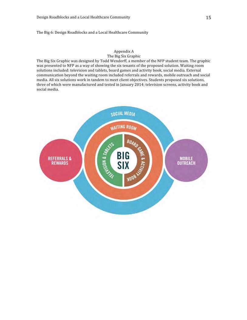
Design Roadblocks and a Local Healthcare Community
15
The Big 6: Design Roadblocks and a Local Healthcare Community
Appendix A The Big Six Graphic
The Big Six Graphic was designed by Todd Wendorff, a member of the NFP student team. The graphic was presented to NFP as a way of showing the six tenants of the proposed solution. Waiting room solutions included: television and tablets, board games and activity book, social media. External communication beyond the waiting room included referrals and rewards, mobile outreach and social media. All six solutions work in tandem to meet client objectives. Students proposed six solutions, three of which were manufactured and tested in January 2014; television screens, activity book and social media.
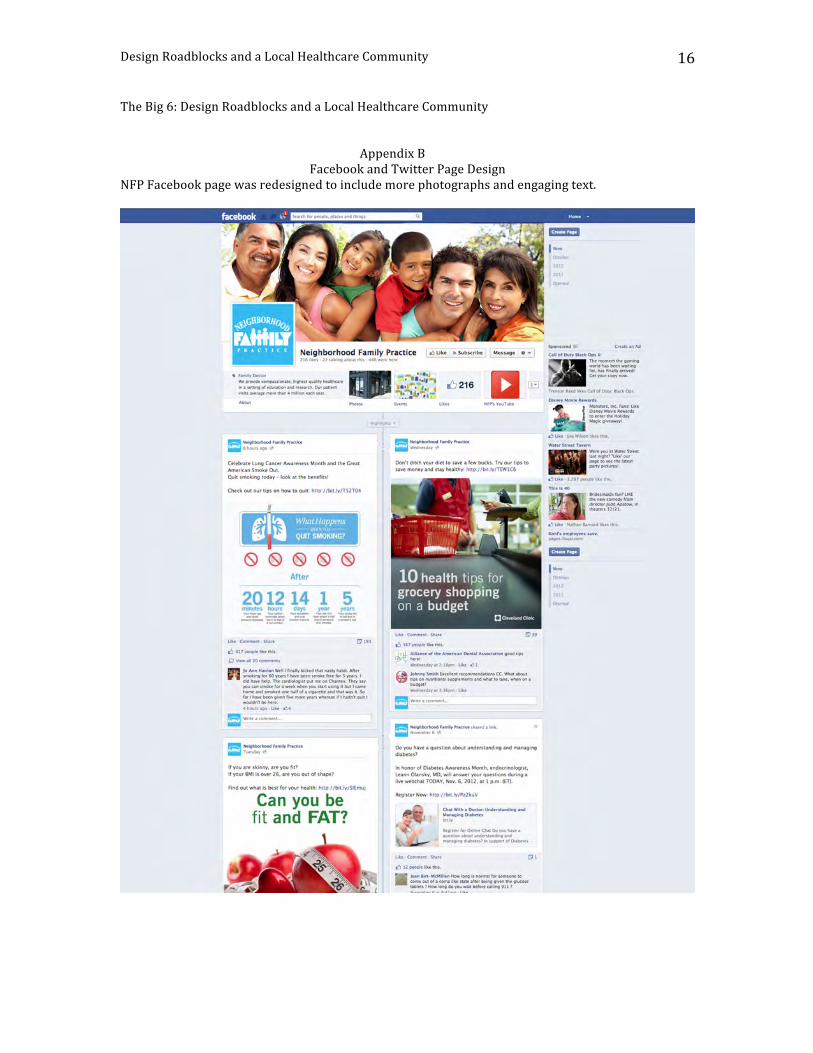
Design Roadblocks and a Local Healthcare Community
16
The Big 6: Design Roadblocks and a Local Healthcare Community
Appendix B
Facebook and Twitter Page Design NFP Facebook page was redesigned to include more photographs and engaging text.
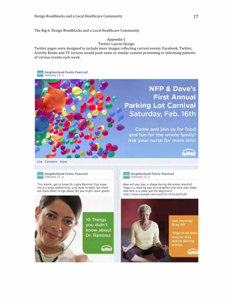
Design Roadblocks and a Local Healthcare Community
17
The Big 6: Design Roadblocks and a Local Healthcare Community
Appendix C Twitter Layout Design
Twitter pages were designed to include more images reflecting current events. Facebook, Twitter, Activity Books and TV screens would push same or similar content promoting or informing patients of various events each week.
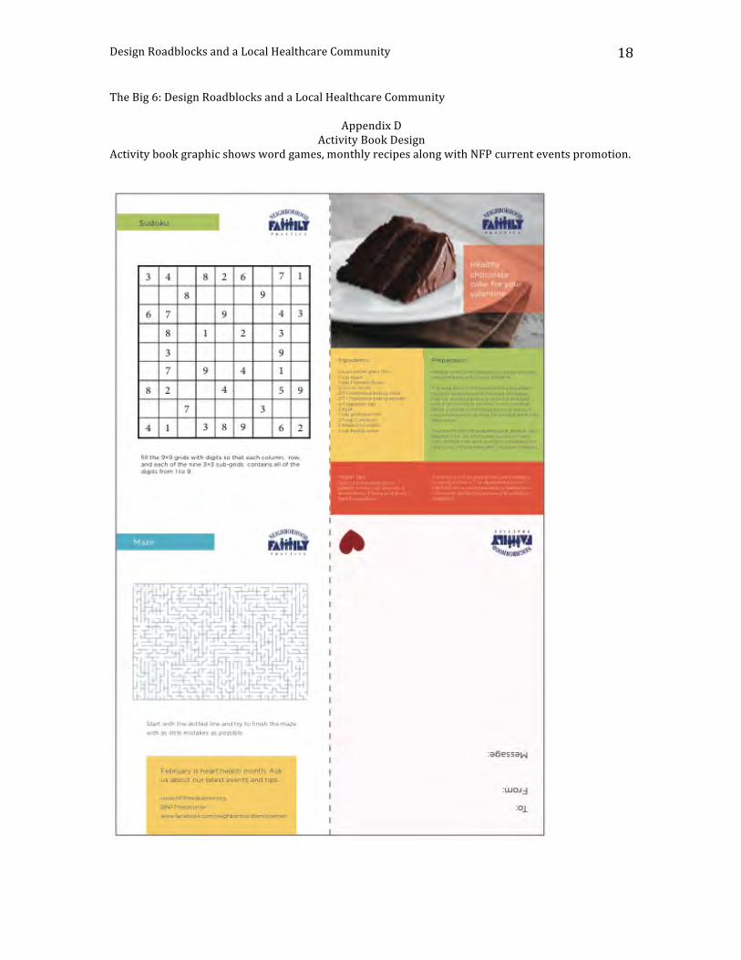
Design Roadblocks and a Local Healthcare Community
18
The Big 6: Design Roadblocks and a Local Healthcare Community
Appendix D Activity Book Design
Activity book graphic shows word games, monthly recipes along with NFP current events promotion.
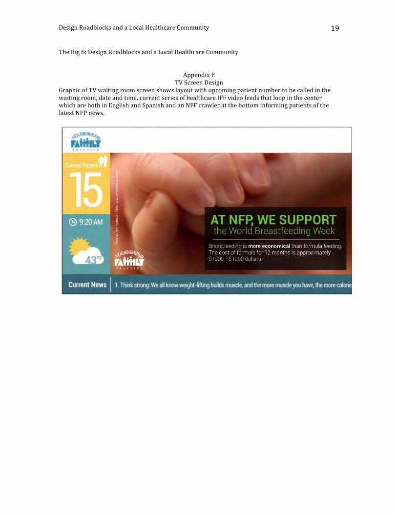
Design Roadblocks and a Local Healthcare Community
19
The Big 6: Design Roadblocks and a Local Healthcare Community
Appendix E
TV Screen Design Graphic of TV waiting room screen shows layout with upcoming patient number to be called in the waiting room, date and time, current series of healthcare IFF video feeds that loop in the center which are both in English and Spanish and an NFF crawler at the bottom informing patients of the latest NFP news.
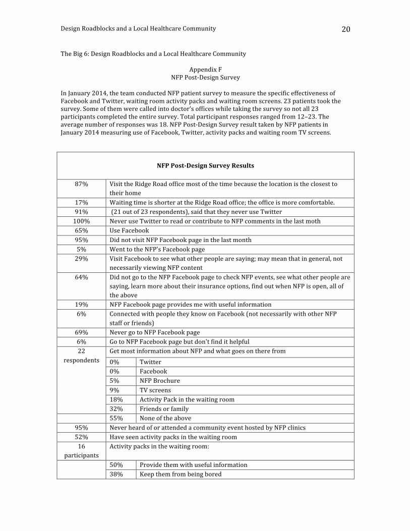
Design Roadblocks and a Local Healthcare Community
20
The Big 6: Design Roadblocks and a Local Healthcare Community
Appendix F NFP Post-‐Design Survey
In January 2014, the team conducted NFP patient survey to measure the specific effectiveness of Facebook and Twitter, waiting room activity packs and waiting room screens. 23 patients took the survey. Some of them were called into doctor’s offices while taking the survey so not all 23 participants completed the entire survey. Total participant responses ranged from 12–23. The average number of responses was 18. NFP Post-‐Design Survey result taken by NFP patients in January 2014 measuring use of Facebook, Twitter, activity packs and waiting room TV screens.
NFP Post-‐Design Survey Results
87% Visit the Ridge Road office most of the time because the location is the closest to
their home 17% Waiting time is shorter at the Ridge Road office; the office is more comfortable. 91% (21 out of 23 respondents), said that they never use Twitter 100% Never use Twitter to read or contribute to NFP comments in the last moth 65% Use Facebook 95% Did not visit NFP Facebook page in the last month 5% Went to the NFP's Facebook page 29% Visit Facebook to see what other people are saying; may mean that in general, not
necessarily viewing NFP content 64% Did not go to the NFP Facebook page to check NFP events, see what other people are
saying, learn more about their insurance options, find out when NFP is open, all of the above
19% NFP Facebook page provides me with useful information 6% Connected with people they know on Facebook (not necessarily with other NFP
staff or friends) 69% Never go to NFP Facebook page 6% Go to NFP Facebook page but don't find it helpful 22
respondents Get most information about NFP and what goes on there from 0% Twitter 0% Facebook 5% NFP Brochure 9% TV screens 18% Activity Pack in the waiting room 32% Friends or family
55% None of the above 95% Never heard of or attended a community event hosted by NFP clinics 52% Have seen activity packs in the waiting room 16
participants Activity packs in the waiting room:
50% Provide them with useful information 38% Keep them from being bored
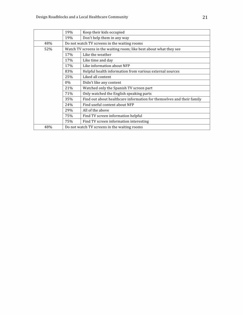
Design Roadblocks and a Local Healthcare Community
21
19% Keep their kids occupied 19% Don’t help them in any way
48% Do not watch TV screens in the waiting rooms 52% Watch TV screens in the waiting room; like best about what they see
17% Like the weather 17% Like time and day 17% Like information about NFP 83% Helpful health information from various external sources 25% Liked all content 0% Didn’t like any content 21% Watched only the Spanish TV screen part 71% Only watched the English speaking parts 35% Find out about healthcare information for themselves and their family 24% Find useful content about NFP 29% All of the above 75% Find TV screen information helpful 75% Find TV screen information interesting
48% Do not watch TV screens in the waiting rooms
Design Roadblocks and a Local Healthcare Community
22
References
Kelley, T. & Littman, J. Forward, T. Peters (2001). The Art of Innovation: Lessons in Creativity from IDEO, America's Leading Design Firm. Laurel, B. and Lunenfeld, P. (2003) Design Research: Methods and Perspectives. Meadows, D. H. (2008). Thinking in Systems, A Primer. Neighborhood Family Practice. Retrieved January 28, 2014, from www.nfpmedcenter.org/. Young, I. (2008). Mental Models: Aligning Design Strategy with Human Behavior.
Tenth Annual UCDA Design Education Summit | 19
Abstract
In order to promote research collaborations between students and faculty members, our university started the EURECA program during the 2013/2014 year. EURECA stands for enhancing undergraduate research endeavors and creative activities. Two of my students and myself, a graphic design faculty member, had our project funded under this initiative. This program falls under our QEP, quality enhancement plan, needed for accreditation at our university. As designers we act as problem solvers and as design educators we seek to challenge our students to create solutions to these problems. I recognized this EURECA opportunity to be the perfect platform to begin solving the citywide lack of recycling issue. Serving as the creative director and faculty mentor for this project I sought out the local recycling company’s involvement. Their excitement to have a new campaign that promoted recycling for our residents was the perfect start to this project. Now our project had a company sponsor that would utilize and produce our campaign. This took our creative endeavor from concept to conception. To unveil our new campaign, we have campus support to launch an Earth Day 2014 Event. All of the design work for this project will be on display as well as activities and handouts to increase campus and community recycling. An electronic recycling trailer will be on location for old electronics to be recycled in the hopes of more community involvement in this event. Our design work will be produced and dispersed throughout our community at local businesses and around campus. This model of combining student and faculty involvement through an out of classroom project has been extremely successful thus far. We are able to hit several objectives with this one creative endeavor; increase recycling in our city, teach student how to create a cohesive campaign while working with a real world client, and enhance creative/research activity on our campus, which is appealing for accreditation.
Designing a Greener City: Enhancing Undergraduate Research Endeavors and Creative Activities (EURECA)
JennyYucusMidwestern State
University
Melody CamposMidwestern State
University
Royce BrockMidwestern State
University
6.2
20 | Tenth Annual UCDA Design Education Summit
AbstractOur data and media- centric world bombards us with a plethora of information in every aspect of our lives. Graphic design is now tasked with helping soothe this visual overload, and communicate messages in understandable and meaningful ways; not just via its traditional manifestations (editorial, logos, posters, packaging, websites), but also via more complex, info- dense graphic representations. Voting ballots, airline boarding passes, drug labeling, assembly instruction manuals, maps and way- finding, electronic medical records, and visualizations of legal, ecological, political, financial issues are but just a few examples of areas in desperate need of good graphic design.
While the design expectations in the so- called real world are becoming more demanding, it seems that the majority of graphic design curricula don’t prepare students to deal with such complexity. Graphic design students are not able to handle the attack of the data. As they graduate with the standard fare of cliché design projects under their belts, they have not been prepared to deal with the complex, unobvious but maybe more substantive and prevalent applications of graphic design.
Design education needs to expose students more to these deeper manifestations of graphic design via rigorous analysis and case studies. It must immerse them in multi- disciplinary, real- world domains rich with complexity and constraints, augment their studies with the study of information architecture, statistics, and visualization methods.
Initially, nudging students into these non- traditional areas of graphic design may receive pushback as these may come across as “dry,” not typically creative and too restraining. But students eventually get satisfied and feel empowered by embracing real- world challenges in new domains, navigating constraints and employing new visualization tools while discovering broader horizons.
Design for Better Understanding
Rozina Vavetsi
New York Institute of Technology
6.3
Tenth Annual UCDA Design Education Summit | 21
AbstractInstitutions of higher education are putting increased emphasis on student success, persistence, and graduation rates and so, there is escalating demand for high impact practices, such as service learning, internships, community engagement, and cross- disciplinary collaboration. Design education is uniquely situated to contribute to the growth of these best practices because we have been doing them for years. Programs, departments, and community members seek out design students for their technical, visual, and problem- solving skills. As educators, we have the opportunity to teach design in the context of the real world because people value what our students do. On our campus, design students serve as interns in more than a dozen departments, including Marketing and Communications, Housing, Athletics, and Career Services and service learning is embedded in almost every design class. The products and processes of design education are desirable and considered a valuable service. In turn, practices such as internships, service learning, and project- based learning, offer design students the opportunity to solve problems outside of their discipline, apply their skills in real- world settings, and engage in authentic experiences that have a life beyond the classroom. What is it about design education that makes it so easy to model these educational best practices and how can we leverage this knowledge and these skills to help other disciplines that are struggling with it? This paper considers these questions, as well as: Can design education contribute to the essential learning outcomes of other disciplines? And, what do we gain/what do we lose from the practice of design education in real world contexts?
Design Education to the Rescue: A Practical Approach
Mindy BreenEastern Washington
University
7.1
22 | Tenth Annual UCDA Design Education Summit
AbstractDoes the old adage “publish or perish” apply to graphic design faculty aspiring to achieve tenure and promotion? Ostensibly, it refers to faculty engaged in traditional scholarship, like writing journal articles, book chapters and texts, but how might publishing in the graphic design field translate to today’s multi-modal, socially networked, technologically mediated environment? And what about other forms of dissemination and production, like exhibitions, performances, curation, installations, collections and entrepreneurial activities – how do they count?
For many years, distinction in graphic design education was determined by success as a practitioner. ‘Award-winning’ designers – with armfuls of Print, Communication Arts, Graphis, How and AIGA annuals as evidence – trained the next generation of employees at art schools and universities. The maturation of graphic design education now, inclusive of several PhD programs and new interdisplinary relationships, demands a more sophisticated and rigorous research and creative production portfolio. What then, is the role of professional practice? – of writing for the trade press? – of gallery shows? – of blogging?
This presentation will map out the current terrain of possibilities for scholarship in graphic design education, with discussion of peer-review, jurying, invitational opportunities, co- authorship and self-publishing. Metrics like selectivity rates, journal rankings, impact and visibility will be contextualized with issues like scope (local, regional, national and international), institutional expectations, and intangibles like reputation and influence.The author will share examples from his 25+ year career as a tenured design academic at two different institutions. A frequently-sought external reviewer for tenure and promotion cases, he has developed a broad view of national standards and cultures.
Perish or Prosper: Publishing for Graphic Design Faculty
Steven McCarthyUniversity of Minnesota
7.2
Perish or Prosper: Publishing for Graphic Design Faculty – S. McCarthy
Perish or Prosper: Publishing for Graphic Design Faculty
Steven McCarthy
Professor, University of Minnesota
Does the old adage “publish or perish” apply to graphic design faculty aspiring to achieve tenure
and promotion? Ostensibly, it refers to faculty engaged in traditional scholarship in the humanities
and sciences who write journal articles, book chapters and texts, but how might publishing in the
graphic design field today translate to our discipline’s shifting norms?
For many years, distinction in graphic design education was determined by success as a
practitioner. ‘Award-‐winning’ designers – with armfuls of Print, Communication Arts, Graphis, How
and AIGA annuals as evidence – trained the next generation of employees at art schools and
universities. The maturation of graphic design education now, inclusive of several PhD programs
and new interdisciplinary relationships, demands a more sophisticated and rigorous research and
creative production portfolio. What then, is the role of professional practice? – writing for the trade
press? – juried and invitational exhibitions? – design authorship? – blogging?
This paper will map out the current terrain of possibilities for scholarship in graphic design
education, with discussion of peer-‐review, jurying, invitational opportunities, co-‐authorship and
self-‐publishing. Particular emphasis will be on emerging and established graphic design journals.
Metrics like selectivity rates, journal rankings, impact and visibility will be contextualized with
issues like scope (local, regional, national and international), institutional expectations, and
intangibles like reputation and influence.
It’s a foregone conclusion in academia that peer review (inclusive of juried, blind-‐reviewed, editor-‐
reviewed, etc.) is the best way to judge scholarship on its intellectual and creative merits. Peer
review, especially when ‘double blind’ (the submitter and reviewer are both anonymous to each
other), is seen as furthering objectivity, elevating quality and avoiding possible bias or favoritism.
Although acceptance into design competitions might not qualify as scholarship per se, it does
involve peer review, in that the jury (typically made up of notable, high visibility professional
Perish or Prosper: Publishing for Graphic Design Faculty – S. McCarthy
designers; whether or not they are ‘peers’ of academics is open to debate) selects work based on its
criteria of excellence. If the competition was sponsored by a magazine, the selection results in
publication – a peer-‐reviewed publication.
Juried art and design exhibitions are also peer reviewed; indeed, they may be double-‐blind
reviewed, matching the gold standard from other fields. Invitational opportunities, while not
directly peer reviewed, can signal a design educator’s visibility and prominence, while the curator’s
reputation can confer prestige; innovative, unorthodox, experimental and themed exhibits often go
this route. But how do these intra-‐disciplinary activities translate to the broader academic culture,
one in which standards for perishing or prospering are beyond graphic design?
The quest for graphic design educators to achieve the same scholarly legitimacy and recognition as
other disciplines is ongoing. Publishing in generalist design, arts, media, humanities and social
science journals, and in specialist graphic design journals, is gaining momentum while also
presenting new challenges.
In spring of 2014 the Design Education Committee of AIGA, the professional organization for design,
proposed a new graphic design journal, Dialectic. In a position statement on their web site, the
AIGA DEC states:
“The current array of journals about graphic design—in print and online—that facilitate the
delivery of rigorously vetted knowledge on design research, criticism, history and practice
are well-‐known and respected, but are relatively few (compared to those that exist to
support other disciplines), and are not widely read by educators or practitioners in the U.S.
The insights offered by the likes of Visible Language, Design Issues, Design Studies, The
International Journal of Design, Design and Culture, Information Design Journal, Iridescent
and Design Research Quarterly, although important for design scholarship, do not tend to be
highly valued by those engaged in practice.” (educators.aiga.org, 2014)
A number of graphic design educators responded with comments, both critical and supportive. An
edited selection follows:
Perish or Prosper: Publishing for Graphic Design Faculty – S. McCarthy
“…there are many international design journals, and quite a few of them concern graphic
design (The Poster, Visual Design Scholarship, Book 2.0, Visual Communication and others).
Many now invite ‘visual submissions’ where the authorship of the scholarly text and its
designed graphic form are considered comprehensively. That many of these journals “are
not widely read by educators or practitioners in the U.S. … [and] do not tend to be highly
valued by those engaged in practice” might say more about us than the journals, I’m sorry to
say.” (S. McCarthy a.k.a. ‘designertrip’)
“It seems fairly clear that such a journal is needed, and the arguments made by the AIGA
Design Educator Community (DEC) Steering Committee are significant and well
reasoned. Where I have an issue, however, is with the assumption expressed through much
of the proposal text – that the journal will only address graphic or communication design.
My strong preference is that any new AIGA scholarly journal broaden its scope to include
Industrial and Interior Design, at least in cases where those disciplines overlap with our
own. I believe that the design professions are moving toward more ambitious activities – i.e.
the design of “interactions,” “services,” and “experiences” – where outcomes often include
coordinated application of communications, products, and spaces.” (P. Nini)
“This is a great idea and a good response to current conditions. From reading through the
outline, the issues of how this gets implemented will be the hardest to come to grips with
[regarding] how to straddle practice based research issues and the push for rigorous
academic metrics [regarding] research and design.” (S. Townsend)
“There may not be a surfeit of graphic design journals but the world does have way too
many academic journals whose existence seems to be more about people’s CVs than about
increasing valuable knowledge. If filling tenure dossiers is “the pivotal reason” for this
project, I’m not sure why AIGA would want to support it.” (G. Swanson)
“Emigre magazine is used in the proposal as an example of proposed “tone” for Dialectic. It
is exciting to read those words. I understand this primarily as a reference to visual
submissions … not the interviews, editorial content, merchandise and multimedia formats
that also comprised the magazine. However, the proposal's reference to Emigre – “the
magazine that ignores boundaries” – opens doors for experimental content and form. Truly
Perish or Prosper: Publishing for Graphic Design Faculty – S. McCarthy
taking that tone forward means we might also look at academic research that simply does
not sit well within a traditionally paginated journal. Now, THAT is exciting, and possibly
intimidating, too, for all involved (for example, a similar approach already exists outside
design, see rhetoric-‐technology-‐pedagogy journal Kairos).” (J. Barness)
Part of what made the remarks by these design educators particularly insightful is that they all have
peer-‐reviewed journal publishing records. But unfortunately for the well-‐intentioned efforts of the
DEC members, the AIGA board (of which only one member is an educator) voted to not support the
journal proposal.
Concurrent to the AIGA Dialectic proposal, Icograda, the International Council of Communication
Design, launched a new journal that replaces its publication Iridescent. Introducing the Journal of
Communication Design: Interdisciplinary and Graphic Design Research, its web site says:
“Edited by an international editorial team, led by Editor Teal Triggs, the new incarnation of
the journal will build on the rich groundwork already established. As a full double-‐blind
peer reviewed publication, available in print and online, it will develop and critically
examine the emerging discourses in research related to contemporary communication and
graphic design practice, education and methods, as well as their history, theory and
criticism.
Areas of emphasis include: craft and critical practice, pedagogy and curriculum
development, typography and image-‐making, book arts and publishing, information
visualization and digital spaces, sustainability and social design, politics and popular
culture.” (icograda.org, 2014)
Besides Editor-‐in-‐Chief Teal Triggs of the Royal College of Art (UK), other editors
include Leslie Atzmon of Eastern Michigan University (US), Kyle Hyunsuk Kim of Hongik University,
(South Korea), Paul Nini of The Ohio State University (US), and Karel van der Waarde, a graphic
design researcher from Belgium. The journal has a commitment from Bloomsbury Publishing to
publish it beginning in 2015.
Perish or Prosper: Publishing for Graphic Design Faculty – S. McCarthy
What made one journal prosper and the other perish? Acknowledging the new realities of design
education and research’s global interconnectedness, Icograda assembled an international editorial
team and publisher; the scope of the AIGA (whose initial “A” stands for American) is nationally
limiting, even without explicitly stating so. The editors of the Journal of Communication Design are
career academics who have deep and substantial peer-‐reviewed publishing records; the AIGA board
primarily consists of professionals who do not fully value or understand scholarly publishing, and
yet determine what the DEC can accomplish. The Journal of Communication Design builds on
Iridescent, while the AIGA DEC proposed a completely new journal (albeit with the promising aspect
to merge form and content – design authorship – a welcome quality in the relatively staid world of
academic publishing, which is very text-‐oriented). Finally, value systems, priorities, rewards,
contexts, and many other considerations suggest a widening gulf – an emerging academic versus
professional design culture war, perhaps? – of understanding between educators and practitioners.
The landscape of design journals is well-‐explicated in a report titled Design Research Journal
Ranking Study: Preliminary Results. (K. Friedman et al, 2008) The authors conducted a survey and
analyzed the results to draw conclusions about design journal perceptions on the global stage.
Scholars were polled about journal prominence from the following groups: members of the
international Design Research Society, the email bulletin of Design Studies Forum (the design and
design research division of the North American College Art Association), the Anthropology in
Design research discussion forum, the PhD-‐Design discussion forum, and a broad selection of
journal editors and editorial board members from a wide range of journals. (No member lists from
the AIGA were used.) About 3000 people were surveyed; 240 useable responses were received. The
authors then ranked the journals based on the number of mentions from those surveyed.
The results were a ‘long tail’ distribution, with a handful of journals receiving many mentions and
many journals receiving few, typically in the single digits (many of these were actually trade
magazines or other publications, and not academic journals; e.g. from graphic design: CMYK, Emigre,
How, Communication Arts, Graphis, Dot Dot Dot, Eye, Print, Baseline). Design Studies and Design
Issues were identified as the top journals globally, with each receiving over 140 mentions. Graphic
design–related journals mentioned included Visible Language, Visual Communication and Visual:
Design: Scholarship, among others.
Perish or Prosper: Publishing for Graphic Design Faculty – S. McCarthy
The intention of the study’s authors was to demonstrate to extra-‐disciplinary colleagues,
particularly in the arts, architecture and humanities, that consensus exists within design scholars
about identifying the most respected, rigorous and impactful journals. The long tail, however,
shows that there’s diversity at the fringes of the discipline (The Radical Designist, Design Poetics,
New Design, etc.). This is not to say that lesser known journals lack quality, or might never grow to
major recognition, but that their current obscurity might limit the dissemination of new knowledge.
Another concern about the proliferation of journals, especially those that are increasingly esoteric
and marginally selective, is that they are “more about people’s CVs” than creating new knowledge,
to quote Gunnar Swanson from his comment above.
This notion – the dissemination of new knowledge (knowledge is broadly defined to include the
absorbance of experiences and sensations, not just facts and information) – is central to scholarship
and creative production. But what of the stages before and after publishing (and exhibiting,
performing, etc.): the effort, the process, the results? How and why does scholarly publishing
matter? How does it count towards career prosperity?
This paper’s author headed a task force in the Department of Design, Housing and Apparel* (see
note below) in the College of Design at the University of Minnesota that was charged with expanding
the acknowledgement of scholarly productivity. This work has direct implications for tenure,
promotion, performance review and merit pay. A matrix with five columns was devised: Effort,
Product, Selection Criteria, Dissemination and Impact. (Figure 1) Most work would move from the
left to right columns, but exceptions exist; for example, a professor might be invited (selection) by
an editor to write (effort) a book review that is published in a journal (dissemination).
The matrix aims to offer broad language within a specific framework. It outlines a process for
faculty scholarship and creative production across the department’s diverse disciplines.
By supplying selection rate, journal rank, venue reputation, number of citations by other scholars,
acquisitions by collections, scope of dissemination (e.g. regional, national, international), and
impact, a level of excellence can be inferred. Of course, the subjective aspect of interpretation
abounds. Ultimately, it is a guideline (still in draft form), not a recipe for success.
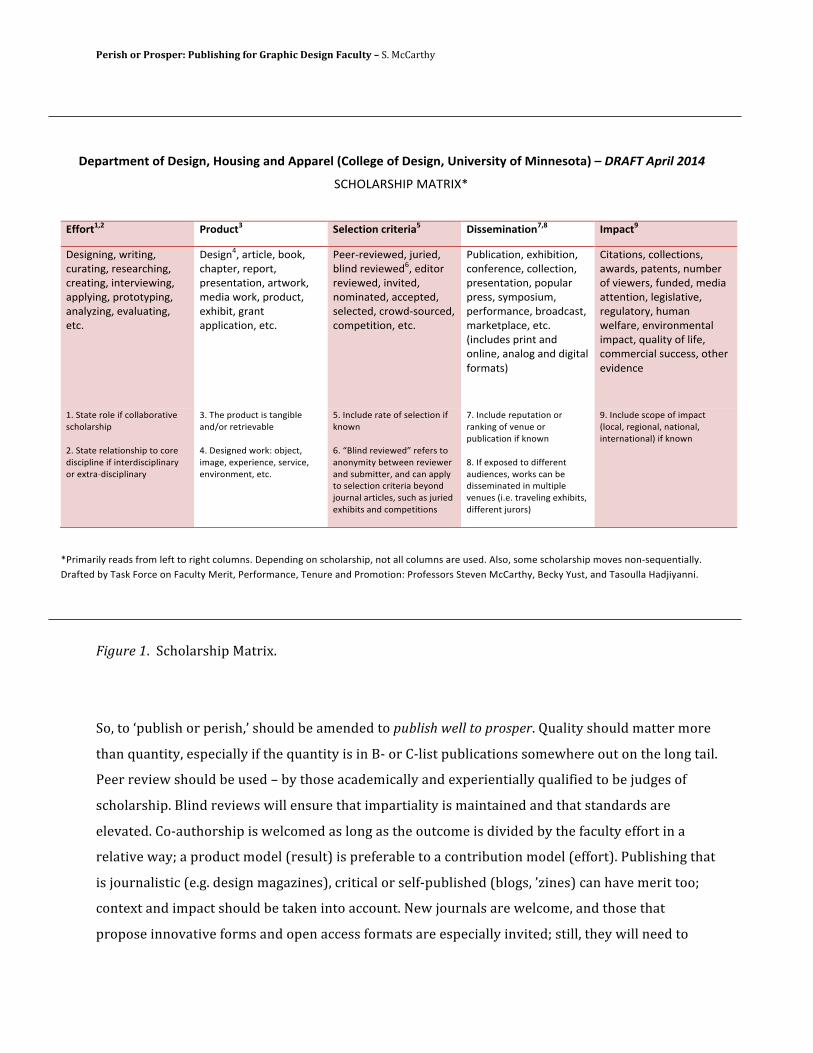
Perish or Prosper: Publishing for Graphic Design Faculty – S. McCarthy
Figure 1. Scholarship Matrix.
So, to ‘publish or perish,’ should be amended to publish well to prosper. Quality should matter more
than quantity, especially if the quantity is in B-‐ or C-‐list publications somewhere out on the long tail.
Peer review should be used – by those academically and experientially qualified to be judges of
scholarship. Blind reviews will ensure that impartiality is maintained and that standards are
elevated. Co-‐authorship is welcomed as long as the outcome is divided by the faculty effort in a
relative way; a product model (result) is preferable to a contribution model (effort). Publishing that
is journalistic (e.g. design magazines), critical or self-‐published (blogs, ’zines) can have merit too;
context and impact should be taken into account. New journals are welcome, and those that
propose innovative forms and open access formats are especially invited; still, they will need to
!"#$%&'"(&)*+)!",-.(/)0*1,-(.)$(2)3##$%"4)56*44".")*+)!",-.(/)7(-8"%,-&9)*+):-((",*&$;)<)!"#$%&#'()*&+,-.)
!"#$%&'!#()*+&,'(-.**
=++*%&>/?* @%*21A&B* C"4"A&-*()A%-&"%-$D) !-,,"'-($&-*(E/F* G'#$A&H*
/012342435*67282435*9:7;82435*7010;79<2435*970;82435*24807=2062435*;>>?@2435*>7A8A8@>2435*;4;?@B2435*0=;?:;82435*089C))
*
/01234D5*;7829?05*EAAF5*9<;>8075*70>A785*>701048;82A45*;786A7F5*G0H2;*6A7F5*>7AH:985*0I<2E285*37;48*;>>?29;82A45*089C*
)007J70=2060H5*K:720H5*E?24H*70=2060HL5*0H28A7*70=2060H5*24=280H5*4AG24;80H5*;990>80H5*10?0980H5*97A6HJ1A:790H5*9AG>08282A45*089C*
):E?29;82A45*0I<2E282A45*9A4M0704905*9A??0982A45*>701048;82A45*>A>:?;7*>70115*1@G>A12:G5*>07MA7G;4905*E7A;H9;185*G;7F08>?;905*089C*N249?:H01*>7248*;4H*A4?2405*;4;?A3*;4H*H2328;?*MA7G;81O*
"28;82A415*9A??0982A415*;6;7H15*>;804815*4:GE07*AM*=2060715*M:4H0H5*G0H2;*;880482A45*?0321?;82=05*703:?;8A7@5*<:G;4*60?M;705*04=27A4G048;?*2G>;985*P:;?28@*AM*?2M05*9AGG0792;?*1:990115*A8<07*0=2H0490***
QC*!8;80*7A?0*2M*9A??;EA7;82=0*19<A?;71<2>*)RC*!8;80*70?;82A41<2>*8A*9A70*H2192>?240*2M*24807H2192>?24;7@*A7*0I87;JH2192>?24;7@)
SC*,<0*>7AH:98*21*8;432E?0*;4HTA7*708720=;E?0**DC*/012340H*6A7FU*AEK0985*2G;305*0I>07204905*107=2905*04=27A4G0485*089C*
VC*(49?:H0*7;80*AM*10?0982A4*2M*F4A64**LC*WX?24H*70=2060HY*70M071*8A*;4A4@G28@*E086004*70=20607*;4H*1:EG288075*;4H*9;4*;>>?@*8A*10?0982A4*9728072;*E0@A4H*KA:74;?*;7829?015*1:9<*;1*K:720H*0I<2E281*;4H*9AG>08282A41**
ZC*(49?:H0*70>:8;82A4*A7*7;4F243*AM*=04:0*A7*>:E?29;82A4*2M*F4A64**[C*(M*0I>A10H*8A*H2MM07048*;:H2049015*6A7F1*9;4*E0*H2110G24;80H*24*G:?82>?0*=04:01*N2C0C*87;=0?243*0I<2E2815*H2MM07048*K:7A71O*
\C*(49?:H0*19A>0*AM*2G>;98*N?A9;?5*7032A4;?5*4;82A4;?5*248074;82A4;?O*2M*F4A64***
**
.)72G;72?@*70;H1*M7AG*?0M8*8A*723<8*9A?:G41C*/0>04H243*A4*19<A?;71<2>5*4A8*;??*9A?:G41*;70*:10HC*&?1A5*1AG0*19<A?;71<2>*GA=01*4A4J10P:0482;??@C**/7;M80H*E@*,;1F*]A790*A4*];9:?8@*+07285*)07MA7G;4905*,04:70*;4H*)7AGA82A4U*)7AM011A71*!80=04*+9";78<@5*X09F@*^:185*;4H*,;1A:??;*#;HK2@;442C*
Perish or Prosper: Publishing for Graphic Design Faculty – S. McCarthy
prevail in the marketplace of ideas where legitimacy and reputation govern the competition. Finally,
design writing of all kinds needs readers – if a tree falls in an uninhabited forest (and is pulped into
a journal few read), does it make any noise?
Sources
educators.aiga.org/dialectic-‐a-‐proposed-‐journal-‐for-‐the-‐design-‐community/ (online 22 May 2014) Friedman, K., Barron, D., Ferlazzo, S., Ivanka, T., Melles, G. and Yuille, J. (2008) Design Research Journal Ranking Study: Preliminary Results. http://researchbank.swinburne.edu.au/vital/access/manager/Repository/swin:10413 (online 26 May 2014) icograda.org/news/year/2014_news/articles2545.htm (online 22 May 2014)
Note
*The Department of Design, Housing and Apparel has programs in graphic design, apparel design, product design, interior design, housing studies and retail merchandising. It offers bachelor’s, master’s and doctorate degrees. Of the approximately 30 full-‐time faculty, there about two dozen PhDs and four MFAs, including this paper’s author.
Tenth Annual UCDA Design Education Summit | 23
AbstractTraditional four-year fine art program. I learned early in my teaching career that fine artists often have strong opinions and a limited view of the professional activities of a graphic designer. I developed habits of combining and documenting my fine and graphic art efforts and after six years I was awarded tenure and promotion to associate professor. I embraced the earliest opportunity to prepare my application package and apply for promotion to full. After six years of service to the University at the level of associate... I received promotion to full professor. My application materials celebrated my unique qualifications and highlighted my position as a graphic design professional teaching in a robust and active fine art department.
I originally designed my application package to combine traditional narratives with plenty of illustrations; the first section was essentially a picture book. I would like to share the key elements of my integrated application and by doing so... Outline ideas that can be used to bridge the traditional gap between the fine and graphic arts. I believe other graphic designers can adopt and use these methods for their own advancement toward tenure and promotion.
I have learned to thrive in a fine art department. I hope to interact with other designers concerned with the professional working relationships they experience within their own departments. I look forward to sharing ideas that any designer might use to attain promotion and tenure.
Combining and Documenting Fine and Graphic Art Efforts
Matt TullisWestern Kentucky
University
7.3
24 | Tenth Annual UCDA Design Education Summit
AbstractIdea generation and creativity are rapidly expanding as popular subject areas inside academe—and outside of art. What a momentous time for the traditional sector of academia (art and design—long known for cultivating creativity and ideation) to cross pollinate with other disciplines and lead the way. According to Doug Pierce, Internet guru of Blue Fountain Media/NY, “Businesses, too, more than ever, must depend on the creative impulses of their employees to stay on the cutting edge of their industry. From malls to movie theatres, in the struggle for shelf space and screen exposure, companies must stay ahead of the curve by putting forward ever more innovative products or services.” If a society is to stay relevant in this millennium, it must kindle the best environment possible to nurture creativity.
This presentation will expand effective (old or new) systems for ideation. This presentation will offer a selection of ways in which ideas are germinated, cultivated and perhaps more importantly—harvested in this Millennium..
Harvest Time: Generating and Cultivating Ideas in this Millennium
Jerry JohnsonTroy University
8.1
Tenth Annual UCDA Design Education Summit | 25
Abstract Beginning in 2004 and at three separate universities I have integrated critical content related to gender and design with courses on the design of branded identities. The outcomes have consistently shown that design students can capably engage with complex issues surrounding gender and design while also producing work consistent with accepted outcomes within design education and practice and because of their grounding in research though making both engage with highly complex social issues while also questioning the very forms and processes it employs. These forms complicate how gender is formulated within the identity of the individual in relation to branded identities, consistently gendered as male or female while being objectively neutral.
Several outcomes can be achieved through the interrogation of the intersection of gender and design. The student learns at minimum the following.
1. How the designer influences production and consumption and how design has historically served to associate production with the masculine and consumption with the feminine.
2. How representations created by designers serve to construct difference and reinforce gender roles both within and without design.
3. How graphic design is often taken for granted generating a lack of appreciation of its rhetorical power, furthering notions of the ‘natural’, and compounding the designer’s belief in the neutrality of their creative production.
4. How the primary identity of the individual operates in relation to gender and institutional identities.
5. The ability of design to visualize the often intangible aspects of inequality and to offer sound design solutions for concrete problems. 6. To subvert dominant and normative assumptions regarding gender that exist in the visual and material culture of graphic design.
7. That every design decision made, is never simply formal, purely functional or only theoretical but lends meaning to every object, image or experience..
Design and the Construction of Gender
Peter FineUniversity of Wyoming
8.2
Design and the Construction of Gender Beginning in 2005 and at three separate universities I have integrated critical content related to gender and design with courses on the design of branded identities. The outcomes have consistently shown that design students can capably engage with complex issues surrounding gender and design while also producing work consistent with accepted outcomes within design education and practice and because of their grounding in research though making can engage with highly complex social issues while simultaneously questioning the very forms and processes graphic design employs. This process complicates how gender is formulated within the identity of the individual in relation to branded identities, consistently gendered as male or female while being objectively neutral. Several outcomes can be achieved through the interrogation of the intersection of gender and design. The student learns at minimum the following.
1. How the designer influences production and consumption and how design has historically served to associate production with the masculine and consumption with the feminine.
2. How representations created by designers serve to construct difference and reinforce gender roles both within and without design.
3. How graphic design is often taken for granted, generating a lack of appreciation of its rhetorical power, furthering notions of its workings as natural, and compounding the designer’s belief in the neutrality of their creative production.
4. How the primary identity of the individual operates in relation to gender and institutional identities and what particular insights graphic designers have to offer to theorists working to understand gender and identity and through critical making.
5. The ability of design to visualize the many intangible aspects of inequality and to offer sound design solutions for concrete problems.
6. To subvert dominant and normative assumptions regarding gender existing in the visual and material culture of graphic design.
7. To make visible the complex social relations that design creates and how a feminist critique foregrounds the social, both historically and in the present.
8. That every design decision made, is never simply formal, purely functional or only theoretical but lends meaning to every object, image or experience through making.
EnGendering Design:
Gendered Design Case Studies
As a designer, writer and educator I engage constantly with images and their meanings
and explore critical issues of race, gender, and sustainability in my work. I am especially
interested in the history of design and the function of images in recording and
manufacturing social history.
In 2005 I began my teaching project, EnGendering Design. This project, examines the
emergence of gender as a vital factor in the industry of design. I draw upon feminist
critique to complicate the student’s understanding of design history and to reveal how
cultural notions of the masculine and the feminine influence the profession. My focus has
been on long-standing dichotomies such as as emotive versus rational, luxurious versus
functional, natural versus technological. In a word, gendered.
Importantly, the rise of the designer coincides with defining moments in women’s
history; especially in regards to the emergence of consumer culture. As a result our
assumptions regarding both design practice and gender are bound together. A further
result, I argue, is that many debates occurring in design history and persisting in design
education and practice have to do with the supposed opposition of the masculine and
feminine. Design education should seek to resolve this conflation of gender assumptions
within design education and practice.
In Anthea Callen’s article Sexual Division of Labor in the Arts and Crafts Movement
published in A View from the Interior, Feminism, Women and Design, she writes:
“What is needed in my opinion, is continual questioning and reappraisal of the personal
and of the political in its broadest sense: self critical analyses of our approaches to history
and the ways rewriting the past can transform the present, of our received ideas and
preconceptions of all oppositional categories–craft/fine art, female/male, nature/culture
and how the construction of such polarized binaries functions to constitute negative
‘others’ within our patriarchal culture. It is through lack of awareness and understanding
of these categories and of their ideological power that we collude in the construction and
limitations of our own sexual roles and creative potential.”
For Engendering Design I developed a course packet of critical readings examining
gender and design. Students engaged with the material through discussion and studio
projects involving notions of gender and the branding of products and services, and their
institutional identities. These projects and readings were intended to not only expose the
design student to critical theory but to demonstrate through the practice of design the
application of theory and its particular relevance to the construction of gender by
designers.
Assignment One: Masters and Mistresses
For their first assignment I asked the students to interpret, using typography, the everyday
titles: ‘Mr. Mrs. and Ms.’ This project began prior to the student’s exposure too much of
the critical language of the readings, though they were of course familiar with the design
process and the role of typography in connoting meaning. I was especially interested in
how they might interpret designations that were so clearly gendered and seemingly so
neutral and assumed to be natural. I was also intrigued by how they might perceive the
titles as typographical indicators of the marital status of women in contrast to the
seemingly neutral title assigned to men, no matter their status or supposed ‘mastery’.
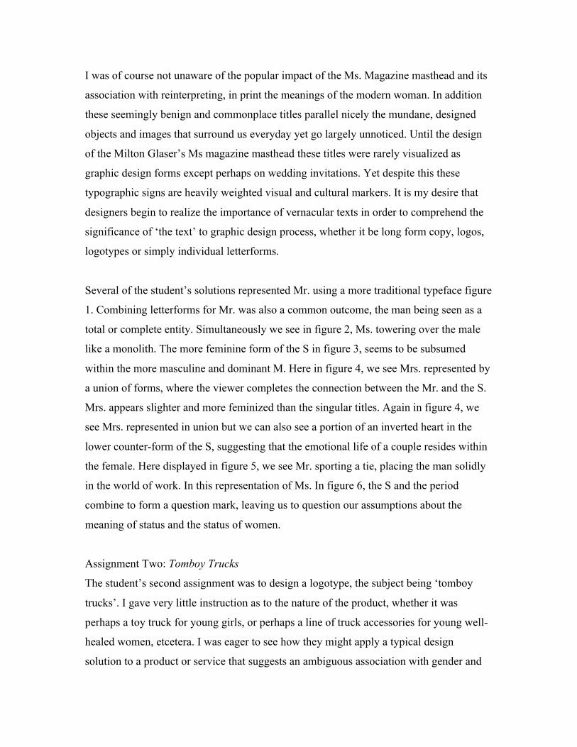
I was of course not unaware of the popular impact of the Ms. Magazine masthead and its
association with reinterpreting, in print the meanings of the modern woman. In addition
these seemingly benign and commonplace titles parallel nicely the mundane, designed
objects and images that surround us everyday yet go largely unnoticed. Until the design
of the Milton Glaser’s Ms magazine masthead these titles were rarely visualized as
graphic design forms except perhaps on wedding invitations. Yet despite this these
typographic signs are heavily weighted visual and cultural markers. It is my desire that
designers begin to realize the importance of vernacular texts in order to comprehend the
significance of ‘the text’ to graphic design process, whether it be long form copy, logos,
logotypes or simply individual letterforms.
Several of the student’s solutions represented Mr. using a more traditional typeface figure
1. Combining letterforms for Mr. was also a common outcome, the man being seen as a
total or complete entity. Simultaneously we see in figure 2, Ms. towering over the male
like a monolith. The more feminine form of the S in figure 3, seems to be subsumed
within the more masculine and dominant M. Here in figure 4, we see Mrs. represented by
a union of forms, where the viewer completes the connection between the Mr. and the S.
Mrs. appears slighter and more feminized than the singular titles. Again in figure 4, we
see Mrs. represented in union but we can also see a portion of an inverted heart in the
lower counter-form of the S, suggesting that the emotional life of a couple resides within
the female. Here displayed in figure 5, we see Mr. sporting a tie, placing the man solidly
in the world of work. In this representation of Ms. In figure 6, the S and the period
combine to form a question mark, leaving us to question our assumptions about the
meaning of status and the status of women.
Assignment Two: Tomboy Trucks
The student’s second assignment was to design a logotype, the subject being ‘tomboy
trucks’. I gave very little instruction as to the nature of the product, whether it was
perhaps a toy truck for young girls, or perhaps a line of truck accessories for young well-
healed women, etcetera. I was eager to see how they might apply a typical design
solution to a product or service that suggests an ambiguous association with gender and
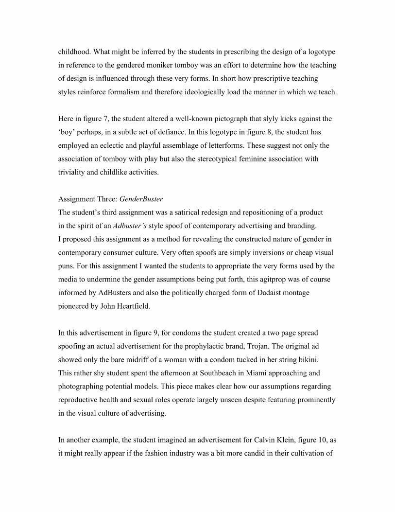
childhood. What might be inferred by the students in prescribing the design of a logotype
in reference to the gendered moniker tomboy was an effort to determine how the teaching
of design is influenced through these very forms. In short how prescriptive teaching
styles reinforce formalism and therefore ideologically load the manner in which we teach.
Here in figure 7, the student altered a well-known pictograph that slyly kicks against the
‘boy’ perhaps, in a subtle act of defiance. In this logotype in figure 8, the student has
employed an eclectic and playful assemblage of letterforms. These suggest not only the
association of tomboy with play but also the stereotypical feminine association with
triviality and childlike activities.
Assignment Three: GenderBuster
The student’s third assignment was a satirical redesign and repositioning of a product
in the spirit of an Adbuster’s style spoof of contemporary advertising and branding.
I proposed this assignment as a method for revealing the constructed nature of gender in
contemporary consumer culture. Very often spoofs are simply inversions or cheap visual
puns. For this assignment I wanted the students to appropriate the very forms used by the
media to undermine the gender assumptions being put forth, this agitprop was of course
informed by AdBusters and also the politically charged form of Dadaist montage
pioneered by John Heartfield.
In this advertisement in figure 9, for condoms the student created a two page spread
spoofing an actual advertisement for the prophylactic brand, Trojan. The original ad
showed only the bare midriff of a woman with a condom tucked in her string bikini.
This rather shy student spent the afternoon at Southbeach in Miami approaching and
photographing potential models. This piece makes clear how our assumptions regarding
reproductive health and sexual roles operate largely unseen despite featuring prominently
in the visual culture of advertising.
In another example, the student imagined an advertisement for Calvin Klein, figure 10, as
it might really appear if the fashion industry was a bit more candid in their cultivation of
younger and younger female consumers. The student carefully mimicked the precise
production values and aesthetic range of Calvin Klein’s advertising. The verisimilitude of
the piece ensures the satire’s success and speaks to the viewer’s complicity in reinforcing
gender roles.
This piece, figure 11, rather graphically explores gender and race and their relationship to
the bridal industry, diamonds and exploitation of workers. It moreover forcefully rejects
the fantasy spectacle of the bride, as feminized consumption, consumer and object. Like
figure 10, it reverses the gaze and calls for the viewer to consider their own investment in
systems that support their own privilege and pleasure. In this instance the marginal status
of the married female is compared with the even more inequitable relationship of those
who labor to support a lifestyle of consumption predicated on leisure and luxury.
Assignment Four: Glass Ceiling, Information Design
The fourth assignment involved an information design as interpretation of the subject of
the “glass ceiling”. The student’s were to assume that the treatment would appear in an
editorial context, along with copy and other images. Typically few if any of the students
are aware of what the term, ‘the glass ceiling’, refers to and have to search the internet
for its meaning.
This information design piece in figure 12, describes the vertical inversion of power and
labor in the work world in terms of actual numbers of women in management. In this
second information design piece, figure 13, a multitude of women make up the larger
figure of a man. Statistics regarding women’s rankings and earnings in business are
represented by individual female figures at a substantially smaller scale. The collective
representation of women within the larger male figure demonstrates our figuring of work
as male.
Assignment Five: Final Re-Branding Project
For their final project, the students designed an original and comprehensive brand
identity for a product or service that is typically gendered either female or male and
attempted to reposition it within its particular market or develop a new niche for it. As
with the satirical advertising pieces it was important that the students focus on the
specific ways that a particular product is gendered rather than generalize and risk
undermining the work. This also helped avoid simplistic, campy inversions of the
product. There are two solutions I’d like to present, as they complement each other
nicely.
“Amie” figure 14, is a new identity for an existing and rather uninspired product, the
female condom. This solution is an attempt to package and reposition the product for
retail sales, having never been sold over the counter. The student decided to reposition it
within the retail context of feminine hygiene products thus exposing it to a much wider
market. An attempt to loose the product from its clumsy, clinical, image, as well as
disassociate it from the ‘sexy’ male condom, point of purchase displays.
‘Opt’ figure 15, is the identity for the male ‘Pill’.
Opt is an effort to shift gender roles in the division of labor in birth control. There were at
the time of this project two as yet unnamed versions of the male ‘pill’ in development.
One which would stop the production of sperm and another, debilitating it, making it
slow and stupid, (which one could argue is perhaps in some cases redundant but never-
the-less).
Both of these design solutions are excellent examples of the role that design can play in
reassigning notions of gender to products long associated with reproductive health. In the
case of “Amie”, design can and should be enlisted in bringing to light a product that
languished behind pharmacy counters, even in the age of AIDS. Imagine if you will if the
same attention were paid to this existing product that has been poured into launching and
promoting Viagra, let alone the male condom.
In the case of ‘Opt’ we see the opportunity that design might have in launching the male
pill. Could the phrase, “the Pill”, come to mean an oral contraceptive employed and
enjoyed by both sexes or would it too languish. What restrains the economics of birth
control when men could easily make up a potentially large and virgin market? It is no
doubt our assumptions about the division of labor and the current status quo wherein birth
control represents the largest market for women’s pharmaceuticals. These design
solutions offer a positive role for design in the branding of products and the establishment
of product identities, a field that has come under increased scrutiny and criticism in
recent years, as it has grown in power to influence consumers.
My efforts to integrate the teaching of design with critical theory have been invigorating
and frustrating but rarely seamless. The very methods by which we teach design
emphasize the so called ‘rational’ and its reductionist techniques, which distill every idea
down to its most basic elements no matter how complex the nature of the problem. The
practice of graphic design is inextricably linked with modernism and its utopian vision of
a universal vocabulary of form. This transparent new language was to supposedly give
pure and direct expression to any content and yet was created largely by western
European males seeking a new aesthetic for modern technology that was itself construed
as masculine.
My ambition is that my students come to recognize that design practice operates within
cultural conventions of femininity and masculinity while also reinforcing these same
conventions; design that claims to be neutral or universal is very often coded masculine.
A feminist analysis reveals the socially constructed nature of design history, practice and
education. I strive to impart some sense of this to my students, so that they may
understand that every design decision we make, is never simply formal nor purely
functional but lends meaning to every object and image we design.
Pat Kirkham and Judy Attfield stated in their introduction to, The Gendered Object,
“Relationships between objects and gender are formed and take place in ways that are so
accepted as ‘normal’ as to become ‘invisible’ Thus we sometimes fail to appreciate the
effects that particular notions of femininity and masculinity have on the conception,
design, advertising, purchase, giving and use of objects, as well as on their critical and
popular reception.”
Package Design, Embodying and Containing
The second part of this paper is concerned with student projects integrating sustainable
packaging with my design studio teaching and which I began in 2008. Here I present two
projects wherein students took on the additional task of redesigning and rebranding
products having to do with reproductive health. In addition each is designed for disposal
and both deal with bodily health and hygiene, areas especially ripe for consideration as
artifacts that appear natural in their influence on our concepts of gender and
sustainability. These projects dovetail nicely with the earlier Amie and OPT case studies.
The challenge or complication beyond redesigning and rebranding a package to be
sustainable was the necessity of employing a nuanced intertextuality between the desire
of the consumer to make ethical purchases while also negotiating the complex
relationship between consumption, gender and identity. The current political debate
surrounding reproductive health in the US was also foremost in my mind. Furthering the
complexity of the two designs is that they do not simply deal in representations of female
identity as extensions of the bodily, as many products that are gendered female but with
products that deal with the female body itself, complicated further by the mistaken
assumption that gender is biology. The body as a site for investigation is crucial to any
discussion of sustainability. Each design group was assigned to investigate a product that
comes into direct contact with the body, be it edibles, topicals, clothing, pharmaceuticals,
etcetera. These two design groups chose products that also dealt in issues specific to
female reproductive health. An additional complication at least as concerns this paper is
the fact that one deals in a product category with a highly visible retail presence and
therefore a detailed visual vocabulary, easily investigated by a stroll down the grocery
aisle. The other is available in the US by prescription alone and therefore has little visible
presence as a product category beyond some advertising, especially around the launch of
the contraceptive patch. As Michael S. Kimmel asserts gender’s power resides in its
invisible and secretive operations. Perhaps these two case studies can suggest how
artifacts, visible and invisible equally influence how we prescribe gender on bodies and
also inscribe it on artifacts. Design and modernity are of course closely linked but as
Alison Light has detailed, women and men have experienced modernity differently and at
different rates with women’s experience existing in ‘invisible’ innovations such as the
sanitary napkin and men’s through very visible, concrete and public manifestations.
Important to the assignment is a consideration of both the product and the package and
the designer’s potential influence on both production and consumption. The package as a
container not simply of a product but of a set of assumptions, values, ideologies, and host
of other meanings is crucial to the success of these projects. The package as container is
especially significant when considering products gendered female or products designed
for the female body. As Heather Hendershot states “the proper female body is, above all
self-contained.” This containment of the adult female body is constantly represented in
products and packages and as Kimmel wrote “gender appears as a category, as two fixed,
static polar containers into which biological males and females are sorted.” This is most
evident in packaging that has a strong retail and advertising presence such as the tampon
but still exists in products that are representationally silent but are materially quite
present such as the pill. I assert that there is no relative difference between what we
metaphorically internalize as a culture and what we literally consume. In the silence
where little or no representation occurs in the form of consumer identification with a
specific brand of ‘the pill’ there is still the elephant in the room, the application of the
ideological assumptions of the technocratic, universal and rational especially in relation
to women’s bodies. What Forty refers to as “the spirit of technological rationalism”. This
is further complicated by what Penny Sparke describes as the Victorian conflation of
beauty with the feminine and the biological.
Important in understanding all of this is the figuring of the consumer as passive observer
at best and at worst as a dupe. This is quite problematic when the consumer is generally
seen as essentially feminine if not entirely female. These two products are meant almost
exclusively to be used in private spaces as opposed to the visible displays of cleanliness
that were vital to twentieth century modernism. As Ellen Lupton pointed out household
appliances became decorative objects, moving front and center in the home but what of
those objects associated with feminine hygine and reproductive health that remain largely
unseen? Adrian Forty’s description of the imagery of hygine as embodying ideas of
cleanliness largely describes surfaces and skins that surround, obscure or abstract our
relationship to both complex systems as well as the body.
Case Study
LURA: One World, One protection (re-design of the Tampax package)
This student group chose to redesign the Tampax package since the tampon as a product
category is used in the developed world by virtually every woman of reproductive age.
The students were also motivated to tackle this product and package due to the staggering
amount of waste left behind with every package. The group also considered two
competitors, Kotex and o.b. as a means to research their product. Initially all three
products were considered since it was the waste created by the product category that
motivated the redesign. After conducting visual audits and learning the history of the
products through advertising archives the group chose Tampax.
A life cycle analysis (LCA) was crucial to the group in deciding how to solve waste
problems associated with the product and packaging. Since it is both a product and a
package, ‘designed for disposal’ it made a rich target for research and redesign. The
group researched the plastic used to produce the applicators, what the tampon is
composed of, the plastic used to wrap the applicators and the paperboard box that serves
as the primary package. After opening a box of Tampax tampons the consumer is left
with the paperboard box, (the only obviously recyclable item), eighteen applicators and
plastic wrappers. This doesn’t include the tampon itself, which is destined for the waste
bin and perhaps to travel the world’s waterways for years to come.The product provided
an interesting challenge given it is designed for disposal and has different cultural
connotations and taboos associated with it worldwide.
The group decided to focus on literal ‘first adopters,’ girls ages 11-13 in order to engage
them with sustainable issues at a crucial time in the users physical, emotional and mental
growth. In Colorblind, Understanding How Consumers Think About the Environment
(produced by the innovation design firm Continuum) the group describes the issue of
timing as an important key in determining ‘green’ purchases. In this case the project
correlates with an actual human cycle. For mature users the green message may feel
incongruous but for very young females the alignment of eco-conciousness with early
identity formation rituals may sync well. This type of long range planning through design
is what defines a more sustainable design approach, given that most women in the
developed world will use the product for decades. The design also dovetails personal
health with ecological health a crucial connection that needs to be made to promote
sustainability.
The group redesigned the package as an attractive cylinder that fits in the hand. Using
rapid-prototyping they were able to both visualize the design and create a reasonable
likeness for the final mock-up. The group used humorous and graphically engaging
designs to communicate key aspects of the LCA to increase interest. The piece was
designed as a set of flip cards so it would fit in the small package they designed and to
limit the amount of paper used. This case study typifies our “Kleenex culture” and what
the Colorblind study described as one of the three key green impact categories, ‘disposal
impact’. Among products designed for disposal and therefore inevitably problematic are
those that deal in bio-medical waste and therefore taboos. Tampons, diapers, bandages
and prophylactics not being made from synthetics until relatively recently in human
history typify the modern concern with hygiene. Hygiene also being a chief concern of
modernists designers as well, linking design and hygiene in the public mind. This
technocratic relationship to disposal and health is reinforced by modern societies’
revulsion with the body especially female bodies. The LURA design seeks to overcome
this with accessible information design and packaging that closes the distance between
women and their bodies, which in the modern era have been the purview of experts.
Design also suffers from a similar affinity for specialists and specialization divorcing
humans from other natural systems and even the individual from her own body.
This product redesign is essentially one of identity formation and exposes how we come
to see ourselves through the consumption of products and the notions of identity attached
to them. Because industrialization separated conception from production, the idea and
therefore the designer became vitally important to driving consumption. This has only
increased in the twenty first century as our ideas about ourselves have been further and
further abstracted from real or tangible, designed objects and experiences.
In the case of the tampon, a product designed and packaged for disposal we see the
connection between consumption, waste, hygiene and femininity. As Ellen Lupton
described in Mechanical Brides the bathroom and the kitchen remained the most
feminized interiors while becoming domestic technocracies enforcing the notions and
connections between femininity and consumption. As Susan Strasser explained in Waste
and Want, A Social History of Trash women in the nineteenth century had to be
instructed in women’s periodicals, that also encouraged consumption, in the use of waste
bins. The very notion that the role of women would come to be dominated by consuming
over that of production occurring in the home, would have been absurd in an economy
where very little was wasted. As designers we must come to terms with the relatively
short history of over consumption and the ways it informs our myriad assumptions of
femininity.
Case Study
Essentia: Rethink Choice (re-design of the birth control package)
This case study explores how the birth control package, which is also typically a
dispenser might be redesigned to be more sustainable. The student design group entered
into a lengthy discussion of whether to tackle this redesign. The product itself did not
strictly fit the definition of the assignment not having a retail presence and lacking very
little visual material as a result. After much discussion amongst themselves and some
encouragement from myself they decided to proceed with the project. At this time
versions of the male pill were once again under investigation so that the division of labor
in regards to birth control could still shift. As with the others this group developed the
means to conduct an LCA so that it became a process of revealing the place of a single
package within a highly complex system. I designed the project in this way to accustom
the students to the lack of transparency typical of nearly all the products and packages we
consume. This is key to both a sustainable design approach and a feminist approach in
that it makes clear the degree of abstraction required to simplify, through a package a
complex health concern such as sexual reproduction. Simultaneously the students explore
their own curiosity allowing it to determine the form of the design and avoiding
prescribed solutions and using design as a means to visualize rather than obscure.
This particular package presented something of a challenge in that its lack of visibility
seems to mirror the lack of frank discussion of issues of sexual reproduction and the
concurrent minimizing of women’s issues. The primary practical concern for the students
was to reduce waste and increase efficiency. With the added interest involved in
designing for a product that as a dispenser is to a large degree also the product. It’s role in
mimicking an actual cycle through a rounded clamshell form and acting as a calendar
seemed already to consider the user in a fairly sensitive manner. The students, three out
of four who were potential users, decided to take the package to task despite this and
since a new dispenser is issued monthly with each prescription. It was ultimately decided
that a new reusable dispenser was truly needed as the means to eliminating the most
waste. A slimmer, more compact design was chosen as the best method for refiguring the
product in terms of style and discretion. The question of whether the package should look
like a typical birth-control package was determined by the need of some users to have
more opportunity for discretion if desired or required. The final prototype involved a
disposable one month’s pack that would slide into a smaller, slimmer, rectangular
package mimicking the approximate size the original iPod.
Conclusion
As I discussed at the start of this paper my engagement with feminist critique of design through making, began now nearly ten years ago. In fact I began my exploration of and fascination with a feminist critique of design while a graphic design student in a class on rhetoric now more than twenty years ago, writing papers on the several incarnations of the figure of Betty Crocker and of the popular and ground breaking Nike ads of the early nineties that foregrounded active female bodies. My own fascination has not always been matched by my students and has met with some resistance from design and art faculty. There is in graphic design an assumption that the forms employed exist in service of consumption alone while the history of design clearly denies this. Both students and faculty have insisted to varying degrees that this use-value is only realized if the work can be made profitable. That is if it takes on a commodity form. The design education is itself seen in this respect as a commodity as well and that role has been greatly reinforced in recent years in higher education. This seems to be accentuated when graphic design education exists side by side with a studio arts education as it has in each and every University in which I have taught. The graphic design education is often seen as duplicating the marketplace in hopes that this can be effectively and repeatedly reproduced by the student once they join the work force. But this duplicates the designer as consumer and denies the designer’s own agency in seeking fulfillment as a creative individual because consumption is seen as essentially passive and feminized. This clearly serves a particular master but ignores how as Ellen Lupton claims that ‘useful things perform functions beyond mere utility’. Concepts of the functional and the utilitarian are themselves clearly gendered as they emphasize ‘the work’ performed especially in concrete terms. This performance of production and consumption emphasizes the typically male sphere while continuing to trivialize important aspects of design through their association with consumption but especially process, collaboration, multiple points of view and voices, and complex social structures. By explicitly
foregrounding a feminist critique of the many ways that design contributes to gender norms through processes that privilege the social, design education can contribute to a much more nuanced understanding of how visual and material culture compounds these norms.
26 | Tenth Annual UCDA Design Education Summit
Abstract Teaching creativity as a skill in higher education is recognized as an area in need of emphasis and transformation. Creativity as a concept is contingent on social, personal and cultural standards, so course design requires careful consideration of this subjectivity. This paper presents results in two parts: data from a semester-long, design-based university class on creative problem solving; and data from a free, online, seven-week version of the class with a large and global population of participants. We discuss experiences of developing the online course by fusing the emerging learning environment with the design studio. Challenges included incorporating all cultural standards of creativity and engaging students through collaboration and critique rather than content delivery. Course development focused on graphic design and identity for communicating class assignments to a global audience. Class assignments included a series of creative challenges rooted in design thinking, so universal communication of expectations through design was a prominent ‘need’ area identified for this type of course. A pre/posttest analysis of both the verbal and figural Torrance Tests for Creative Thinking was used to analyze the effectiveness of the university class iteration, with significant improvement seen. Each metric supports components of the class design, and was then used to support the curriculum adaptation for a massive, free online course. Findings from survey data are discussed in regards to the success of the class in the online environment. Commentary on the success of translating critiques and for a peer-reviewed, online format in a diverse global environment is also included. Finally, processes of designing future iterations of the course and similar courses focusing specifically on design education and critique in an online setting are discussed.
Teaching Global Creativity: Designing the Open Online Creative Classroom
Marit McCluskeUniversity of Minnesota
Brad HokansonUniversity of Minnesota
8.3
Introduction Creativity is an essential skill that that can be taught, strengthened and measured. As a concept, creativity
is subject to social, personal and cultural standards. These two facets provided both the pedagogical
groundwork and the challenges in designing a massive open online course, or MOOC, adapted from
an in-person class on Creative Problem Solving. In their current stage of evolution as an educational
model, MOOCs provide free, online courses from higher education institutions to a global and diverse
population. Currently, most MOOCs center around didactic methods of content delivery and assessment.
We approached the MOOC model as a method of cultivating an environment for the global exchange
of ideas and critical feedback. The Coursera platform was used to host our seven week version of the
class, in which we emphasized creative skill development and collaboration, rather than rote instruction,
supported by creativity theory, critique training, and a diverse network of ideas. The challenge of teaching
creativity as a culturally subjective concept was met by utilizing design alongside a set of tools and
techniques for universal communication of expectations throughout the course.
Creative Problem Solving Course overview Our MOOC developed from a successful semester-long course on Creative Problem Solving, housed within
the College of Design at the University of Minnesota. The class ran every semester for several years in its
current form, and was open to all undergraduates at various stages in their education, across a range of
disciplines. The course emphasizes the development of divergent thinking, and cultivates the ability to
continually generate many ideas as quickly as possible, along with the techniques to develop those ideas
for solving problems. Though grounded within the culture of the graphic design studio critique, the crux of
the class focuses on coming up with ideas across topics that are novel, useful and applicable, depending
on student-defined constraints.
The core curriculum combined an active learning environment with instruction in creativity theory
and technique. The assignments were composed of weekly creative prompts that required students to
investigate their own definitions of creativity by ‘doing something different’. Each prompt was structured
Teaching Global Creativity: Designing the Open Online Creative Classroom
Brad HokansonCollege of DesignUniversity of Minnesota
Marit McCluskeCollege of DesignUniversity of Minnesota
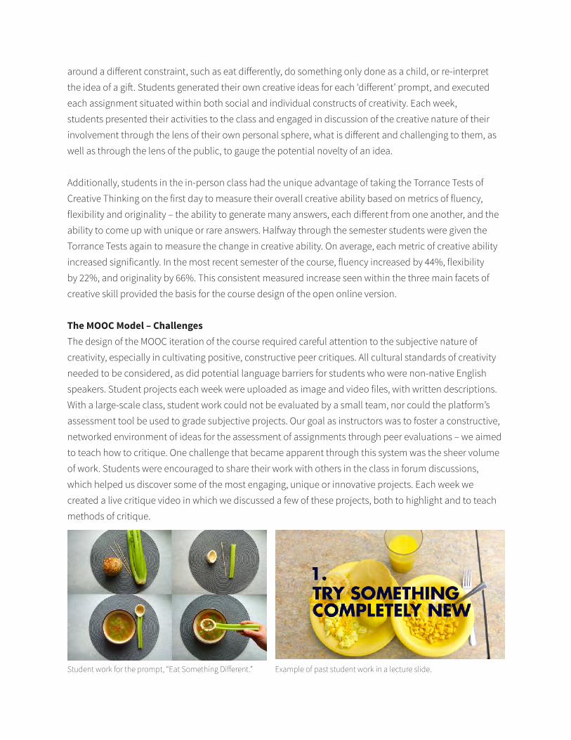
around a different constraint, such as eat differently, do something only done as a child, or re-interpret
the idea of a gift. Students generated their own creative ideas for each ‘different’ prompt, and executed
each assignment situated within both social and individual constructs of creativity. Each week,
students presented their activities to the class and engaged in discussion of the creative nature of their
involvement through the lens of their own personal sphere, what is different and challenging to them, as
well as through the lens of the public, to gauge the potential novelty of an idea.
Additionally, students in the in-person class had the unique advantage of taking the Torrance Tests of
Creative Thinking on the first day to measure their overall creative ability based on metrics of fluency,
flexibility and originality – the ability to generate many answers, each different from one another, and the
ability to come up with unique or rare answers. Halfway through the semester students were given the
Torrance Tests again to measure the change in creative ability. On average, each metric of creative ability
increased significantly. In the most recent semester of the course, fluency increased by 44%, flexibility
by 22%, and originality by 66%. This consistent measured increase seen within the three main facets of
creative skill provided the basis for the course design of the open online version.
The MOOC Model – Challenges The design of the MOOC iteration of the course required careful attention to the subjective nature of
creativity, especially in cultivating positive, constructive peer critiques. All cultural standards of creativity
needed to be considered, as did potential language barriers for students who were non-native English
speakers. Student projects each week were uploaded as image and video files, with written descriptions.
With a large-scale class, student work could not be evaluated by a small team, nor could the platform’s
assessment tool be used to grade subjective projects. Our goal as instructors was to foster a constructive,
networked environment of ideas for the assessment of assignments through peer evaluations – we aimed
to teach how to critique. One challenge that became apparent through this system was the sheer volume
of work. Students were encouraged to share their work with others in the class in forum discussions,
which helped us discover some of the most engaging, unique or innovative projects. Each week we
created a live critique video in which we discussed a few of these projects, both to highlight and to teach
methods of critique.
Student work for the prompt, “Eat Something Different.” Example of past student work in a lecture slide.
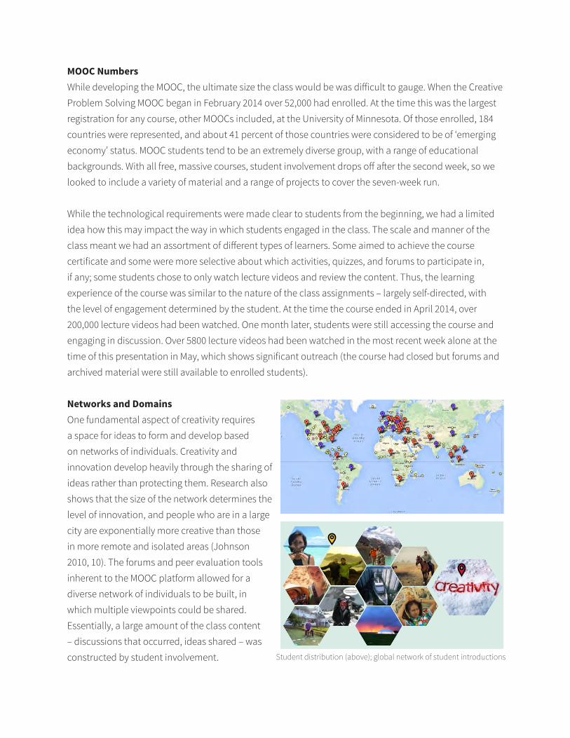
MOOC NumbersWhile developing the MOOC, the ultimate size the class would be was difficult to gauge. When the Creative
Problem Solving MOOC began in February 2014 over 52,000 had enrolled. At the time this was the largest
registration for any course, other MOOCs included, at the University of Minnesota. Of those enrolled, 184
countries were represented, and about 41 percent of those countries were considered to be of ‘emerging
economy’ status. MOOC students tend to be an extremely diverse group, with a range of educational
backgrounds. With all free, massive courses, student involvement drops off after the second week, so we
looked to include a variety of material and a range of projects to cover the seven-week run.
While the technological requirements were made clear to students from the beginning, we had a limited
idea how this may impact the way in which students engaged in the class. The scale and manner of the
class meant we had an assortment of different types of learners. Some aimed to achieve the course
certificate and some were more selective about which activities, quizzes, and forums to participate in,
if any; some students chose to only watch lecture videos and review the content. Thus, the learning
experience of the course was similar to the nature of the class assignments – largely self-directed, with
the level of engagement determined by the student. At the time the course ended in April 2014, over
200,000 lecture videos had been watched. One month later, students were still accessing the course and
engaging in discussion. Over 5800 lecture videos had been watched in the most recent week alone at the
time of this presentation in May, which shows significant outreach (the course had closed but forums and
archived material were still available to enrolled students).
Networks and Domains One fundamental aspect of creativity requires
a space for ideas to form and develop based
on networks of individuals. Creativity and
innovation develop heavily through the sharing of
ideas rather than protecting them. Research also
shows that the size of the network determines the
level of innovation, and people who are in a large
city are exponentially more creative than those
in more remote and isolated areas (Johnson
2010, 10). The forums and peer evaluation tools
inherent to the MOOC platform allowed for a
diverse network of individuals to be built, in
which multiple viewpoints could be shared.
Essentially, a large amount of the class content
– discussions that occurred, ideas shared – was
constructed by student involvement. Student distribution (above); global network of student introductions
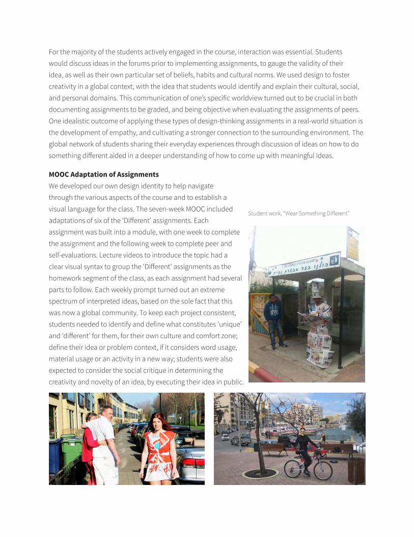
For the majority of the students actively engaged in the course, interaction was essential. Students
would discuss ideas in the forums prior to implementing assignments, to gauge the validity of their
idea, as well as their own particular set of beliefs, habits and cultural norms. We used design to foster
creativity in a global context, with the idea that students would identify and explain their cultural, social,
and personal domains. This communication of one’s specific worldview turned out to be crucial in both
documenting assignments to be graded, and being objective when evaluating the assignments of peers.
One idealistic outcome of applying these types of design-thinking assignments in a real-world situation is
the development of empathy, and cultivating a stronger connection to the surrounding environment. The
global network of students sharing their everyday experiences through discussion of ideas on how to do
something different aided in a deeper understanding of how to come up with meaningful ideas.
MOOC Adaptation of Assignments We developed our own design identity to help navigate
through the various aspects of the course and to establish a
visual language for the class. The seven-week MOOC included
adaptations of six of the ‘Different’ assignments. Each
assignment was built into a module, with one week to complete
the assignment and the following week to complete peer and
self-evaluations. Lecture videos to introduce the topic had a
clear visual syntax to group the ‘Different’ assignments as the
homework segment of the class, as each assignment had several
parts to follow. Each weekly prompt turned out an extreme
spectrum of interpreted ideas, based on the sole fact that this
was now a global community. To keep each project consistent,
students needed to identify and define what constitutes ‘unique’
and ‘different’ for them, for their own culture and comfort zone;
define their idea or problem context, if it considers word usage,
material usage or an activity in a new way; students were also
expected to consider the social critique in determining the
creativity and novelty of an idea, by executing their idea in public.
Student work, “Wear Something Different”
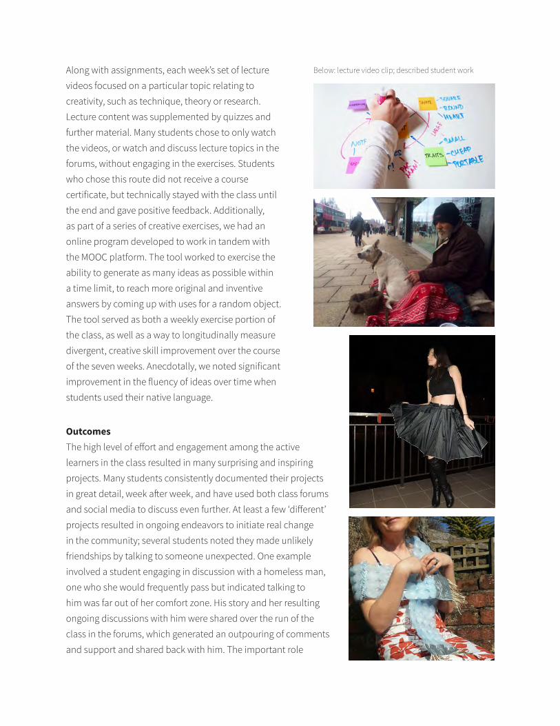
Along with assignments, each week’s set of lecture
videos focused on a particular topic relating to
creativity, such as technique, theory or research.
Lecture content was supplemented by quizzes and
further material. Many students chose to only watch
the videos, or watch and discuss lecture topics in the
forums, without engaging in the exercises. Students
who chose this route did not receive a course
certificate, but technically stayed with the class until
the end and gave positive feedback. Additionally,
as part of a series of creative exercises, we had an
online program developed to work in tandem with
the MOOC platform. The tool worked to exercise the
ability to generate as many ideas as possible within
a time limit, to reach more original and inventive
answers by coming up with uses for a random object.
The tool served as both a weekly exercise portion of
the class, as well as a way to longitudinally measure
divergent, creative skill improvement over the course
of the seven weeks. Anecdotally, we noted significant
improvement in the fluency of ideas over time when
students used their native language.
Outcomes The high level of effort and engagement among the active
learners in the class resulted in many surprising and inspiring
projects. Many students consistently documented their projects
in great detail, week after week, and have used both class forums
and social media to discuss even further. At least a few ‘different’
projects resulted in ongoing endeavors to initiate real change
in the community; several students noted they made unlikely
friendships by talking to someone unexpected. One example
involved a student engaging in discussion with a homeless man,
one who she would frequently pass but indicated talking to
him was far out of her comfort zone. His story and her resulting
ongoing discussions with him were shared over the run of the
class in the forums, which generated an outpouring of comments
and support and shared back with him. The important role
Below: lecture video clip; described student work
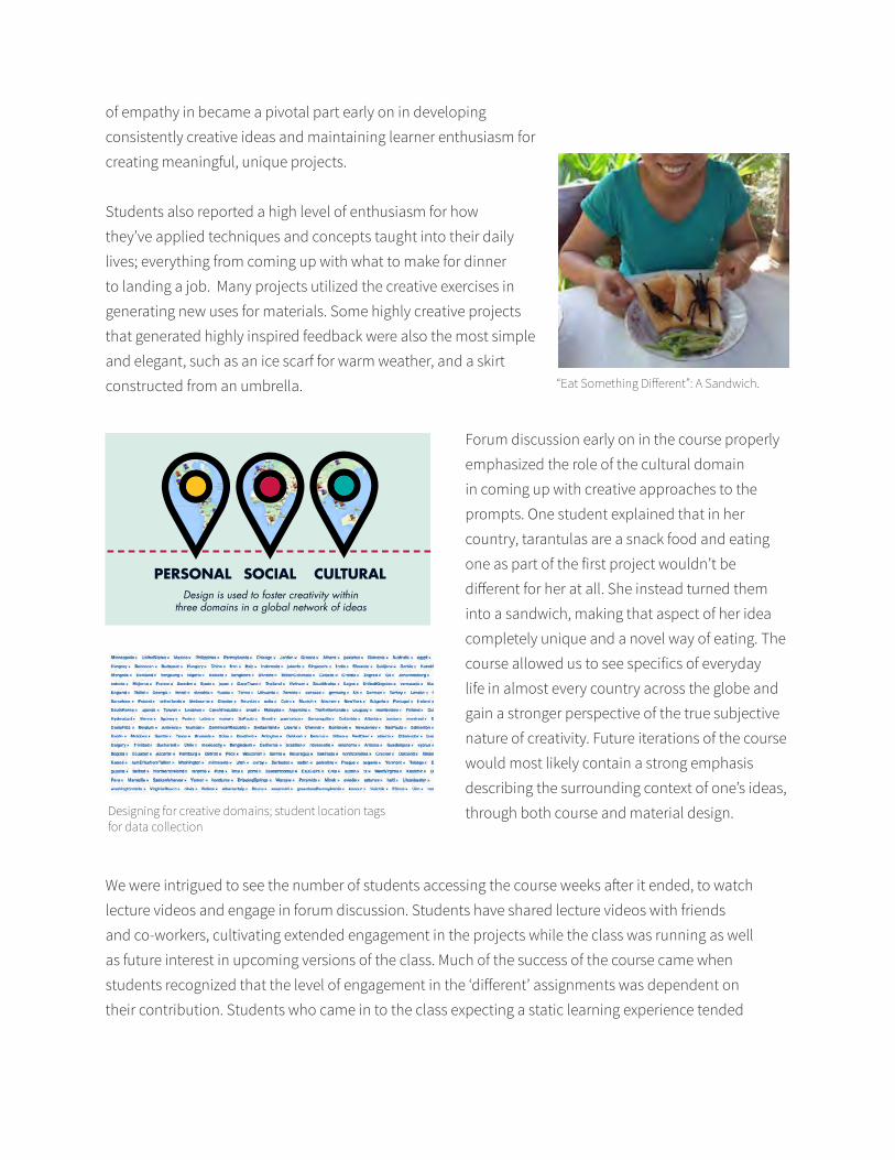
of empathy in became a pivotal part early on in developing
consistently creative ideas and maintaining learner enthusiasm for
creating meaningful, unique projects.
Students also reported a high level of enthusiasm for how
they’ve applied techniques and concepts taught into their daily
lives; everything from coming up with what to make for dinner
to landing a job. Many projects utilized the creative exercises in
generating new uses for materials. Some highly creative projects
that generated highly inspired feedback were also the most simple
and elegant, such as an ice scarf for warm weather, and a skirt
constructed from an umbrella. “Eat Something Different”: A Sandwich.
Forum discussion early on in the course properly
emphasized the role of the cultural domain
in coming up with creative approaches to the
prompts. One student explained that in her
country, tarantulas are a snack food and eating
one as part of the first project wouldn’t be
different for her at all. She instead turned them
into a sandwich, making that aspect of her idea
completely unique and a novel way of eating. The
course allowed us to see specifics of everyday
life in almost every country across the globe and
gain a stronger perspective of the true subjective
nature of creativity. Future iterations of the course
would most likely contain a strong emphasis
describing the surrounding context of one’s ideas,
through both course and material design.
PERSONAL SOCIAL CULTURALDesign is used to foster creativity within
three domains in a global network of ideas
Designing for creative domains; student location tags for data collection
We were intrigued to see the number of students accessing the course weeks after it ended, to watch
lecture videos and engage in forum discussion. Students have shared lecture videos with friends
and co-workers, cultivating extended engagement in the projects while the class was running as well
as future interest in upcoming versions of the class. Much of the success of the course came when
students recognized that the level of engagement in the ‘different’ assignments was dependent on
their contribution. Students who came in to the class expecting a static learning experience tended
to encounter difficulty at first in generating meaningful ideas to implement in their own habitat and realizing
opportunity to affect change within their own domain. Students who engaged in the course as a holistic entity,
applying techniques discussed in lectures to generate ideas for projects that were relevant to them, remained the
most motivated and energetic throughout the course.
Future DevelopmentsPresently, plans are for the MOOC to run again in the fall of 2014 in conjunction with the semester-long, for-credit
version, which will be fully online. Many of the MOOC students expressed a high level of enthusiasm for the peer
critique process, and found the opportunity to give helpful feedback on a diverse set of projects greatly rewarding.
We view this as a remarkable opportunity to bring a new perspective to the internal student group. Many of the
projects shared reveal intimate details of daily life from all different corners of the globe. We hope that seeing and
discussing ideas to implement change in a foreign environment through the lens of ‘eating’ or ‘wearing’ something
different will expand the network of possible ideas for each student.
References Bronson, P., & Merryman, A. (2010). The Creativity Crisis. Newsweek, July 10, 2010.
Johnson, S. (2010). Where Good Ideas Come From: The Natural History of Innovation.
New York, NY: Riverhead Books.
Runco, M. A., Millar, G., Acar, S., & Cramond, B. (2010). Torrance Tests of Creative
Thinking as Predictors of Personal and Public Achievement: A Fifty-Year
Follow-Up. Creativity Research Journal, 22(4), 361-368.
Scholastic Testing Service, Inc. (2008). Torrance Tests of Creative Thinking:
Interpretive Manual. Bensenville, IL: Scholastic Testing Service, Inc.
Tenth Annual UCDA Design Education Summit | 27
The AHA! Factor: Two professors embark upon a quest to write project briefs that encourage conceptual development in design students.
Shelle BarronEdinboro University of
Pennsylvania
Brigette DavittEdinboro University of
Pennsylvania
9.1
AbstractAs sophomore design majors, students often embrace an erroneous belief. What makes a design project successful? Software proficiency (the filters!) and endless Google image research mixed with a basic understanding of formal design principles... problem solved!! The resulting work often appears polished, and sometimes derivative... rarely original. Experience has taught us that students rush through research and exploration, viewing their computer as a place for the ‘real design’ to begin. They often miss the opportunity to create a unique and original solution that demonstrates a deeper understanding of the subject matter.
We began to write project briefs that focused on conceptual development. Through trial and error our briefs evolved, as did the manner in which we presented them. We found that showing current students examples of successful solutions (by former students) resulted in more imitative and derivative projects. When we stopped showing examples of successful solutions to a particular project, students were both confused and cranky—they begged for a place to start. We found that this is the optimum state for learning! By adjusting our evaluative process to reward concept over finish, students felt a freedom to investigate the subject matter, experiment, and take creative risks.
Our proposal includes a visual narrative of our students’ process and the resulting work created in response to our revisions of project brief content. Briefs that both value and evaluate student research, concept development and originality as the key to successful results in student production in intermediate branding and typography courses.
28 | Tenth Annual UCDA Design Education Summit
AbstractTo design scholars, research and writing are the coin of the realm, but to the majority of students who aspire to be practitioners, writing is often seen as an inconvenience. In this paper I discuss experiences from my past six years teaching a writing intensive design workshop within an undergraduate graphic design program. I will share strategies, tactics and highly visual outcomes resulting from these writing assignments. One writing intensive course, Design and its Discontents, looks critically at graphic design history and practice. Course structure and content are framed holistically using activities intended to build student’s personal relationship with consumerism, advertising and media. The projects are presented within the framework of phenomenological research where the study of lived experience is as relevant to their inquiry as quantitative methods. The course employs a variety of idiosyncratic writing assignments and processes that have contributed to innovative writing outcomes and also to powerful, reflective design pieces that emerged from these activities. In this regard the writing process is framed as a precursor to the design process and design as an extension of the writing. The resulting work is evidence that personal reflective practice, expressed verbally and visually, strengthens their design process and awareness of the culture and economy of graphic design. Undergraduate graphic design students, when their sensitivity to visual culture and materiality are fully engaged and writing is made relevant through a connection to their daily lives, are able to write insightful, compelling and scholarly analysis of design and culture. Students who are engaged in personal research assignments are better prepared for their thesis as well as for eventual graphic design practice, and their abilities to communicate through graphic design are strengthened because their efforts are empirical, originating with themselves while making connections to the society in which they practice.
Design and its Discontent: Research and Writing in Graphic Design Education
Ron OttUniversity of Minnesota,
Twin Cities
Daniel JasperUniversity of Minnesota,
Twin Cities
9.2
Tenth Annual UCDA Design Education Summit | 29
Design Industry Versus Design Faculty: Comparing Perceptions of Students’ Preparedness with their Job Success
Claudia ScaffUniversity of North Florida
10.1
AbstractMeasuring the success of college students has always been important, for example; it figures prominently when an institution promotes its programs and is key consideration for students who seek to select the right college. In the past, one of the major measures of success was related to how much time students took to graduate from a 2 or 4-year program. As the U.S. economy had its crises, so did the students. Needing to work at least part-time to be able to pay their expenses, many students had to take fewer classes per semester. As a result, a 4-year-college, became 6+. For many design students, finding good jobs after graduation takes on more significance as a result of the increased amount of time and money committed to design education.
“For research universities, the measure should be what our graduates become and what they contribute to society”, according to Alice P. Gast, president of Lehigh University, in a recent letter to the New York Times, Colleges Need Metrics to Measure Student Success. She proposes calculating the number of start-up companies begun by undergraduate students, contributions to society, and success in life and career after graduation. Accordingly significant measurement is essential to elevating the quality of student outcomes, educators, and institutions.
Every year, students enrolled in a senior capstone course are required to participate in the local AIGA Student Portfolio Review where their work and presentation skills are graded by both local professionals and design faculty. In many instances, faculty members grade students much harder than professionals in the area. This paper investigates the differences between faculty and local professionals’ evaluations of students’ work and presentation skills, student preparedness and networking expertise and how these factors relate to their success on the job market.
30 | Tenth Annual UCDA Design Education Summit
AbstractGraphic design internships have been incorporated widely into graphic design curricula with the assumption that an internship experience will strengthen skills, bolster portfolios and provide graduates with a competitive edge when searching for employment. However, little dialogue or research exists within the design educators’ community regarding what components and characteristics of program design are necessary to produce high-impact educational experiences for students or how these experiences impact students’ career pathways post-internship.
This paper describes one model of an internship program developed in an urban, public liberal arts college in partnership with a local economic development intermediary. From 2011-2013, the program provided 32 semester-long, paid, credited and supervised internships to juniors and seniors majoring in graphic design. Utilizing a mixed-method research approach, the program is assessed by tracking post-internship outcomes over a three year period including: retention and graduation rates; maintenance of connections to each other, their internship clients and the program; and the rate of finding employment in graphic design or related fields. Additionally student reflections were recorded and aggregated both before and after the internship. The study identifies several questions that should be examined in further research.
From Internships to Outcomes: A Study of a Graphic Design Internship Program in an Urban, Public, Four-Year College
Kathryn WeinsteinQueens College, CUNY
10.2
Kathryn Weinstein Associate Professor, Graphic Design Art Department, Queens College, CUNY May 2014
From Internships to Outcomes: A Study of a Graphic Design Internship Program in an Urban, Public Four-Year College
Abstract
Graphic design internships have been incorporated widely into graphic design curricula with the
assumption that an internship experience will strengthen skills, bolster portfolios and provide graduates
with a competitive edge when searching for employment. Little dialogue or research exists within the
design educators’ community, however, regarding what components and characteristics of program design
are necessary to produce high-impact educational experiences for students or how these experiences impact
students’ career pathways post-internship.
This paper describes one model of an internship program developed in an urban, public liberal arts college
in partnership with a local economic development intermediary.
From 2011-2013, the program provided 32 paid, credited and supervised internships to juniors and seniors
majoring in graphic design. Utilizing a mixed-method research approach, the program is assessed by
tracking post-internship outcomes over a three-year period including: retention and graduation rates;
maintenance of connections to clients; and the rate of finding employment in graphic design or related
fields. Additionally student reflections were recorded and aggregated. The paper identifies several
questions that should be examined in further research.
Kathryn Weinstein, Associate Professor, Graphic Design, Queens College, CUNY From Internships to Outcomes: Study of a Graphic Design Internship Program in an Urban, Public Four-Year College May, 2014
2
Kathryn Weinstein Associate Professor, Graphic Design Art Department, Queens College, CUNY May 2014
From Internships to Outcomes: Study of a Graphic Design Internship Program in an Urban, Public Four-Year College
Introduction
The Queens College Graphic Design (QCGD) program provides paid, credited and supervised design
internships for juniors and seniors majoring in graphic design. Through these internships, fledgling Queens-
based businesses receive pro bono design services that otherwise would be unaffordable.
This study seeks to build a better understanding of how to shape internships for undergraduate
graphic design students. The paper describes the components of a graphic design internship program and
identifies the criteria utilized to assess the program as a “high impact” educational experience. The study
details student outcomes from the first three years of the program through the measurement of retention and
graduation rates and the tracking of career pathways to date.
Background. Graphic Design internships have been widely incorporated into graphic design curricula with
the assumption that an internship experience will strengthen skills, bolster portfolios and provide graduates
with a competitive edge when searching for employment. There is, however, little public dialogue or
research within the design educators’ community about the components of an effective design internship or
the relationship between internships and student academic and/or career success.
Program Design. Informed by growing body of research that exists in other fields, this study identifies the
characteristics and benefits of well-conceived and thoughtfully implemented internship programs (Callanan
& Benzing 2004; Kuh 2008; Tynjälä 2008; Gault, Leach, & Duey 2010; Brownell & Swaner, 2010, O’Neil
2010, Keller 2012)[,] Best practices from other fields were adapted and incorporated into the program
Kathryn Weinstein, Associate Professor, Graphic Design, Queens College, CUNY From Internships to Outcomes: Study of a Graphic Design Internship Program in an Urban, Public Four-Year College May, 2014
3
design of the QCGD internship program. The quality of the internship experience was assessed though
intern reflections and filtered through the criteria developed by George Kuh.1
Federal guidelines regulating internships have been flagrantly ignored by industry-sponsored
internships that place students in activities unrelated to their fields of studies (Greenhouse 2012, Bloom
2013, Carey 2013). The growing debate about the quality of internships was an impetus to create internship
opportunities that connectstudents directly with the design process. Another consideration in program
design was the understanding that unpaid internships exclude low-income students from participation, due
to their need to earn as they learn (Edwards, 2010). Integral to the program design of QCGD internship
program was the provision of a paid stipend, with the value equivalent to a part-time job.
Queens College, CUNY. Queens College, located in the borough of Queens in New York City, is one of
the senior colleges of the City University of New York. There are over 20,000 matriculating students and
roughly two-thirds of those students are attending school full-time. Students at Queens College are as
diverse as the borough of Queens — they come from all walks of life and every corner of the world. The
undergraduate ethnic breakdown is as follows: White: 46.2%; Asian-Pacific Islander: 25.6%; Hispanic:
18.6%; Black: 9.4% (“QC at a Glance,” 2013). Many are the first in their families to seek a college
education or aspire towards a white-collar career. Seventy-seven percent of students receive some sort of
financial aid.
In 2005 a Bachelors of Science Graphic Design degree was implemented and quickly grew from
20 declared majors in the first year to over 300 declared majors in 2014. The majority of students enter the
program as juniors, transferring from CUNY and SUNY community colleges.
1 George Kuh (2008) has proposed that the following six criteria are required to yield high-‐impact educational experiences for students participating in internships:
• Investment of time and effort • Interaction with faculty & peers • Learning through real-‐world applications • Experience diversity • Opportunities to receive & respond to frequent feedback • Reflection & integration of learning
Kathryn Weinstein, Associate Professor, Graphic Design, Queens College, CUNY From Internships to Outcomes: Study of a Graphic Design Internship Program in an Urban, Public Four-Year College May, 2014
4
The Need for an Internship Program. Although the BS Graphic Design curriculum always included the
option of receiving academic credit for a graphic design internship, few students opted for this choice.
Despite the close proximity of Manhattan and potential large number of companies and design studios
offering internships, the school’s career center listed very few design-related internships and lacked a
system to distinguish legal from illegal internships. These gaps yielded a haphazard list of opportunities. A
few determined students found internships through their own searches of companies and organizations with
a strong track record of internship programs (Marvel Comics, Time Warner, The Asia Society) and these
opportunities proved to be a major asset in students’ career pathways — providing valuable on-the-job
experience, mentorship and, often, job offers at the end of the internships. Reputable internship programs
declined in the wake of the 2007-2009 recession while simultaneously illegal internships increased as
businesses replaced employees with unpaid interns. Often, these illegal internships were unsupervised,
unattached to academic studies, and, at times, blatantly exploitative of student labor. In an effort to provide
structured and supervised internship opportunities to students, Professor Weinstein, Associate Professor of
Graphic Design at Queens College, proposed the QCGD internship program in 2010 and the program was
implemented it in 2011.
The QCGD Internship Program. In January 2010 CUNY Workforce Development Initiative (WDI)
provided $15,000 to fund the development of a graphic design internship program at Queens College.
Internships were open to juniors and seniors majoring in Graphic Design to establish a bridge from their
academic studies to professional practice. These internships expose students to project development and
presentations, client meetings, professional behaviors, the refinement of job-seeking skills and for many,
their first graphic design job experience. The program was designed to build skills, confidence and provide
an on-going network of support for graduates entering the labor force.
Working primarily in collaboration with Queens Economic Development Corporation (QEDC),
interns were paired with clients of QEDC to develop branding and marketing materials. The clients, local
start-up or struggling businesses, were selected based on income eligibility and a demonstrated readiness to
begin promotion of their business.
Kathryn Weinstein, Associate Professor, Graphic Design, Queens College, CUNY From Internships to Outcomes: Study of a Graphic Design Internship Program in an Urban, Public Four-Year College May, 2014
5
Components of the Program
Outreach and Selection. Information sessions with a resume and portfolio workshop were organized to
provide an overview of the internship program, answer questions and assist students in the application
process. A representative of QEDC and Professor Weinstein, program director of the internship program,
reviewed the applications and selected interns for the following semester cycle based on the quality of
application materials and the anticipated needs of the clients.
Activities. Internships were a semester long and were structured to parallel the activities of a design studio.
Interns were paired with clients to work on every aspect of a project from inception to completion. Three to
four meetings each cycle were scheduled with the client, intern, faculty program director and QEDC
representative. In these meetings communication objectives were identified, initial concepts and subsequent
revisions were presented, and final files were handed off. On weeks without a scheduled client meeting,
interns met as a group with the program director to discuss projects and challenges, exchange feedback and
discuss professional behaviors. Technical assistance and tutorials in software were provided as needed. The
majority of the interns’ work time was spent offsite in the design and refinement of projects. Interns
received a stipend of $1,200 and the option of receiving three academic credits for participation as a design
elective.
Written Components. Integrated into the internship were a series of written components: a short biography
and statement of goals at the beginning of the internship, a creative brief after the initial meeting with the
client, reflections on the experience at the end of the internship, and surveys sent at six month intervals
after the completion of the internship.
Funding and Expenditures. As shown in Table 1, funds for the operation of the program were obtained
through a variety of sources, but the largest and most consistent source of funds were provided through
CUNY Workforce Development Initiative. As shown in Table 2, fifty-five percent of the funds were used
for intern stipends; forty percent for faculty release time and the reminder was used for intern reunions and
small printing stipends for client projects.
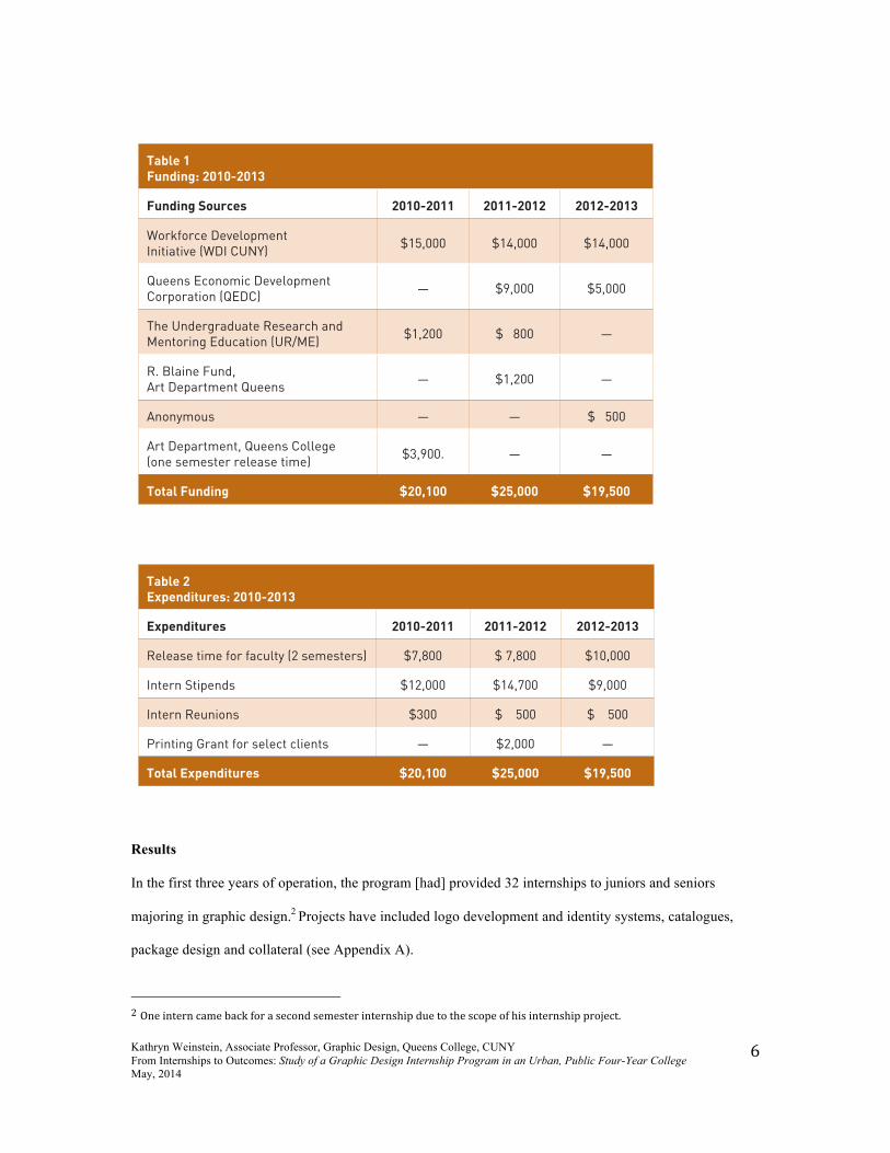
Kathryn Weinstein, Associate Professor, Graphic Design, Queens College, CUNY From Internships to Outcomes: Study of a Graphic Design Internship Program in an Urban, Public Four-Year College May, 2014
6
Results
In the first three years of operation, the program [had] provided 32 internships to juniors and seniors
majoring in graphic design.2 Projects have included logo development and identity systems, catalogues,
package design and collateral (see Appendix A).
2 One intern came back for a second semester internship due to the scope of his internship project.
Table 1 Funding: 2010-2013
Funding Sources 2010-2011 2011-2012 2012-2013
Workforce Development Initiative (WDI CUNY) $15,000 $14,000 $14,000
Queens Economic Development Corporation (QEDC) — $9,000 $5,000
The Undergraduate Research and Mentoring Education (UR/ME) $1,200 $ 800 —
R. Blaine Fund, Art Department Queens — $1,200 —
Anonymous — — $ 500
Art Department, Queens College (one semester release time) $3,900. — —
Total Funding $20,100 $25,000 $19,500
Table 2Expenditures: 2010-2013
Expenditures 2010-2011 2011-2012 2012-2013
Release time for faculty (2 semesters) $7,800 $ 7,800 $10,000
Intern Stipends $12,000 $14,700 $9,000
Intern Reunions $300 $ 500 $ 500
Printing Grant for select clients — $2,000 —
Total Expenditures $20,100 $25,000 $19,500
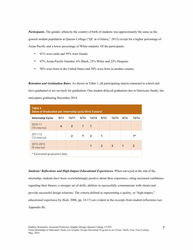
Kathryn Weinstein, Associate Professor, Graphic Design, Queens College, CUNY From Internships to Outcomes: Study of a Graphic Design Internship Program in an Urban, Public Four-Year College May, 2014
7
Participants. The gender, ethnicity the country of birth of students was approximately the same as the
general student population at Queens College (“QC at a Glance,” 2013) except for a higher percentage of
Asian-Pacific and a lower percentage of White students. Of the participants:
• 41% were male and 59% were female
• 47% Asian-Pacific Islander; 6% Black, 25% White and 22% Hispanic
• 50% were born in the United States and 50% were born in another country
Retention and Graduation Rates. As shown in Table 3, all participating interns remained in school and
have graduated or are on-track for graduation. One student delayed graduation due to Hurricane Sandy, but
anticipates graduating December 2014.
Students’ Reflections and High-Impact Educational Experiences. When surveyed at the end of the
internship, students have been overwhelmingly positive about their experience, citing increased confidence
regarding their futures, a stronger set of skills, abilities to successfully communicate with clients and
provide successful design solutions. The criteria defined as representing a quality, or “high-impact,”
educational experience by (Kuh, 2008, pp. 14-17) are evident in the excerpts from student reflections (see
Appendix B).
Table 3Dates of Graduation per internship cycle (first 3 years)
Internship Cycle 5/11 12/11 5/12 12/12 5/13 12/13 5/14 12/14
2010-11 (10 interns) 6 2 1 1
2011-12 (13 interns) 2 7 2 1 1*
2012-2013 (9 interns) 1 2 3 1 2
* Estimated graduation date
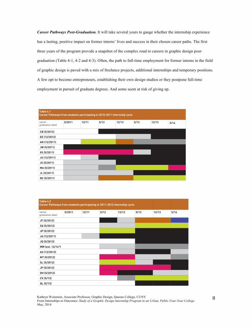
Kathryn Weinstein, Associate Professor, Graphic Design, Queens College, CUNY From Internships to Outcomes: Study of a Graphic Design Internship Program in an Urban, Public Four-Year College May, 2014
8
Career Pathways Post-Graduation. It will take several years to gauge whether the internship experience
has a lasting, positive impact on former interns’ lives and success in their chosen career paths. The first
three years of the program provide a snapshot of the complex road to careers in graphic design post-
graduation (Table 4-1, 4-2 and 4-3). Often, the path to full-time employment for former interns in the field
of graphic design is paved with a mix of freelance projects, additional internships and temporary positions.
A few opt to become entrepreneurs, establishing their own design studios or they postpone full-time
employment in pursuit of graduate degrees. And some seem at risk of giving up.
Table 4.1 Career Pathways from students participating in 2010-2011 internship cycle.name/graduation date)
5/2011 12/11 5/12 12/12 5/13 12/13 5/14
CB (5/2012)
EE (12/2012)
AN (12/2011)
JW (5/2011)
XS (5/2011)
JA (12/2011)
JS (5/2011)
MA (5/2011)
JL (5/2011)
NC (5/2011)
Table 4.2
Career Pathways from students participating in 2011-2012 internship cycle
.
name/graduation date)
5/2011 12/11 5/12 12/12 5/13 12/13 5/14
JF (5/2012)
SQ (5/2012)
JP (5/2012)
JA (12/2011)
JQ (5/2013) *
MM (est. 12/14*)
AS (12/2012)
MT (5/2012)
SL (5/2012)
JP (5/2012)
DH (5/2012)
CX (5/13)
QL (5/13)
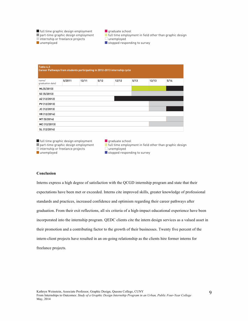
Kathryn Weinstein, Associate Professor, Graphic Design, Queens College, CUNY From Internships to Outcomes: Study of a Graphic Design Internship Program in an Urban, Public Four-Year College May, 2014
9
Conclusion
Interns express a high degree of satisfaction with the QCGD internship program and state that their
expectations have been met or exceeded. Interns cite improved skills, greater knowledge of professional
standards and practices, increased confidence and optimism regarding their career pathways after
graduation. From their exit reflections, all six criteria of a high-impact educational experience have been
incorporated into the internship program. QEDC clients cite the intern design services as a valued asset in
their promotion and a contributing factor to the growth of their businesses. Twenty five percent of the
intern-client projects have resulted in an on-going relationship as the clients hire former interns for
freelance projects.
full time graphic design employment part-time graphic design employment internship or freelance projects unemployed
graduate school full time employment in field other than graphic design unemployed stopped responding to survey
Table 4.3Career Pathways from students participating in 2012-2013 internship cycle
.name/graduation date)
5/2011 12/11 5/12 12/12 5/13 12/13 5/14
ML(5/2013)
SC (5/2013)
AZ (12/2012)
PV (12/2013)
JC (12/2013)
VR (12/2014)
MT (5/2014)
MC (12/2013)
SL (12/2014)
full time graphic design employment part-time graphic design employment internship or freelance projects unemployed
graduate school full time employment in field other than graphic design unemployed stopped responding to survey
Kathryn Weinstein, Associate Professor, Graphic Design, Queens College, CUNY From Internships to Outcomes: Study of a Graphic Design Internship Program in an Urban, Public Four-Year College May, 2014
10
Graduation rates of almost one hundred percent are significantly higher than the average graduation rates at
Queens College (53.1%) and other New York state four-year public colleges (59.7%).3 While these results
may be due in part to the competitive application and selection process of the internship program, the
results are very encouraging.
Today, the landscape of employment for entry-level graphic designers is constantly shifting and difficult to
evaluate. Adoption of new technologies requires up-to-date software skills, which may be advantageous to
tech-savvy new graduates. At the same time, erratic fluctuations in the economy may impact new graduates
first—hiring during boom periods and lay-offs during sluggish periods. The results from this study indicate
that obtainment of full-time employment requires diligence and resiliency, and when obtained may not be
secure. As a result of this uncertainty recent graduates must learn to be entrepreneurial, to continue to
expand their skills and to keep up-to-date with trends in the field.
An additional complication in assessing the nature of the career pathways is the widespread practice of
“freelance” as a component of employment. The term freelance is extremely broad—it could mean a
project with a small payment or it could mean working in a studio or business on a temporary basis without
benefits. Freelance work is often unreported income and it is difficult to estimate within this study the
percentage of income to former interns generated by such work, although the results of this study seem to
indicate that freelance work may constitute a significant percentage of work-related activities. While there
is little data available about national employment rates for graduates entering the field of graphic design, it
has been estimated that as many as 50% of B.A. of B.F.A. graduates (with degrees in graphic design or
communication design) never work in the field of their degree and cease looking for work related to their
degree within a year after graduation.4
3 Queens College has a 53% graduation rate and the average New York state graduation rate is 59.7% for four-‐year public colleges. (http://collegemeasures.org/4-‐year_colleges/institution/cuny-‐queens-‐college-‐ny/scorecard/graduation-‐rates/)
4 Fifty percent of graduates finding employment may be an optimistic number. Meredith Davis estimates that schools releasing 40,000 students per year (with and without degrees) into a field supporting around 200,000 jobs (US Department of Labor in 2010 lists the number of jobs as 279,200 with an estimated increase of 10-‐13% between 2010-‐2013. However these numbers are difficult to evaluate due to the large and growing number of freelance positions replacing full-‐time employees as businesses seek ways to curb costs. http://www.aiga.org/interior.aspx?pageid=3080&id=13910
Kathryn Weinstein, Associate Professor, Graphic Design, Queens College, CUNY From Internships to Outcomes: Study of a Graphic Design Internship Program in an Urban, Public Four-Year College May, 2014
11
The results from this study indicate that students participating in the internship program:
• Find employment in graphic design or related field at a higher rate than the national average;
• Seek and find work related experiences in the field through part-time employment, freelance free-
lance projects or design internships;
• Exhibit a greater determination and ability to stay within the field as they attempt to establish
careers than is reflected by the national average.
The outcomes from the first three years of the QCGD internship program point to a successful model
providing high-impact educational experiences and preparation for entering careers in graphic design.
Further tracking of students from the second and third year of the internship program is needed to assess
whether the outcomes will be consistent with the first year cohort of interns three years after the
experience.
To assist design educators in developing a stronger framework for internship program design and to further
test the effectiveness of the program model described in this paper, it is recommended that future research
include:
• Studies with an increased sample size for statistical relevance;
• Comparison studies that track students in other types of internship programs and students who do
not participate in any type of internship;
• Comparison studies with graduates of similar undergraduate programs located in a variety of
geographic locations.
It is hoped that this paper and the continuing effort to assess and describe the program will encourage
further discussion and increase the body of knowledge in design education regarding program design and
implementation of effective internship programs within undergraduate graphic design or communication
design curricula.
Kathryn Weinstein, Associate Professor, Graphic Design, Queens College, CUNY From Internships to Outcomes: Study of a Graphic Design Internship Program in an Urban, Public Four-Year College May, 2014
12
Works Cited
“America’s Top Colleges, Queens College, ” accessed January 19, 2014,
http://www.forbes.com/colleges/cuny-queens-college/
Bloom, Samuel and Bloom, Allan S. “Unpaid Internships Under Legal Scrutiny”New York Law Journal,
January 4, 2013. Accessed April 21, 2013.
http://www.newyorklawjournal.com/PubArticleNY.jsp?id=1202583208824&Unpaid_Internships_
Under_Legal_Scrutiny&slreturn=20130523084402
Brownell, Jayne E. and Swaner, Lynn E. 2010. Five high-‐impact practices: Research on learning
outcomes, completion, and quality. Washington, DC: Association of American Colleges and
Universities.
Callanan, Gerad and Benzing, Cynthia. “Assessing the role of internships in the career-‐oriented
employment of graduating college students.” Education & Training, 46, (2004): 82-‐89.
Carey, Kevin. “Giving Credit, but Is It Due?” New York Times, January 30, 2013. Accessed February 3,
2013.http://www.nytimes.com/2013/02/03/education/edlife/internships-for-credit-merited-or-
not.html?pagewanted=all
Edwards, Kathryn Ann and Hertel-Fernandez, Alexander. Paving the way through paid internships. New
York: Dēmos. 2010.
Gault, Jack; Leach, Evan; Duey, Mark (2010). “Effects of business internships on job marketability: The
employers' perspective.” Education & Training, 52.1 (2010) 76-88.
Greenhouse, Steven. “Jobs Few, Grads Flock to Unpaid Internships.” New York Times, May 5, 2012.
Accessed June 22,2013. http://www.nytimes.com/2012/05/06/business/unpaid-internships-dont-
always-deliver.html?pagewanted=all&_r=0
Heller, Steven. “Too Many Grads or Too Few Competencies? The Design School Dilemma” AIGA Voice,
Sept. 8, 2005. Accessed May 24, 2014. http://www.aiga.org/interior.aspx?pageid=3080&id=13910
Keller, Kerri Day, Examining internships as a high-impact educational practice (PhD diss., Kansas State
University, 2012.
Kuh, George. High-‐Impact educational practices: What they are, who has access to them, and why they
matter. Washington, DC: Association of American Colleges and Universities. 2008.
Kathryn Weinstein, Associate Professor, Graphic Design, Queens College, CUNY From Internships to Outcomes: Study of a Graphic Design Internship Program in an Urban, Public Four-Year College May, 2014
13
O'Neill, Nancy. “Internships as a high-impact practice: Some reflections on quality.” Peer Review:
Emerging Trends and Key Debates in Undergraduate Education, 12, (2010): 4-8.
Tynjälä, Päivi. (2008) Perspectives into learning at the workplace. Educational Research Review 3, 2
(2008) 130–154.
“QC at a Glance,” Queens College, accessed January 19, 2014,
http://www.qc.cuny.edu/about/Glance/Pages/default.aspx
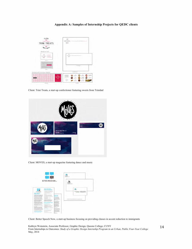
Kathryn Weinstein, Associate Professor, Graphic Design, Queens College, CUNY From Internships to Outcomes: Study of a Graphic Design Internship Program in an Urban, Public Four-Year College May, 2014
14
Appendix A: Samples of Internship Projects for QEDC clients
Client: Trini Treats, a start-up confectioner featuring sweets from Trinidad
Client: MOVES, a start-up magazine featuring dance and music
Client: Better Speech Now, a start-up business focusing on providing classes in accent reduction to immigrants
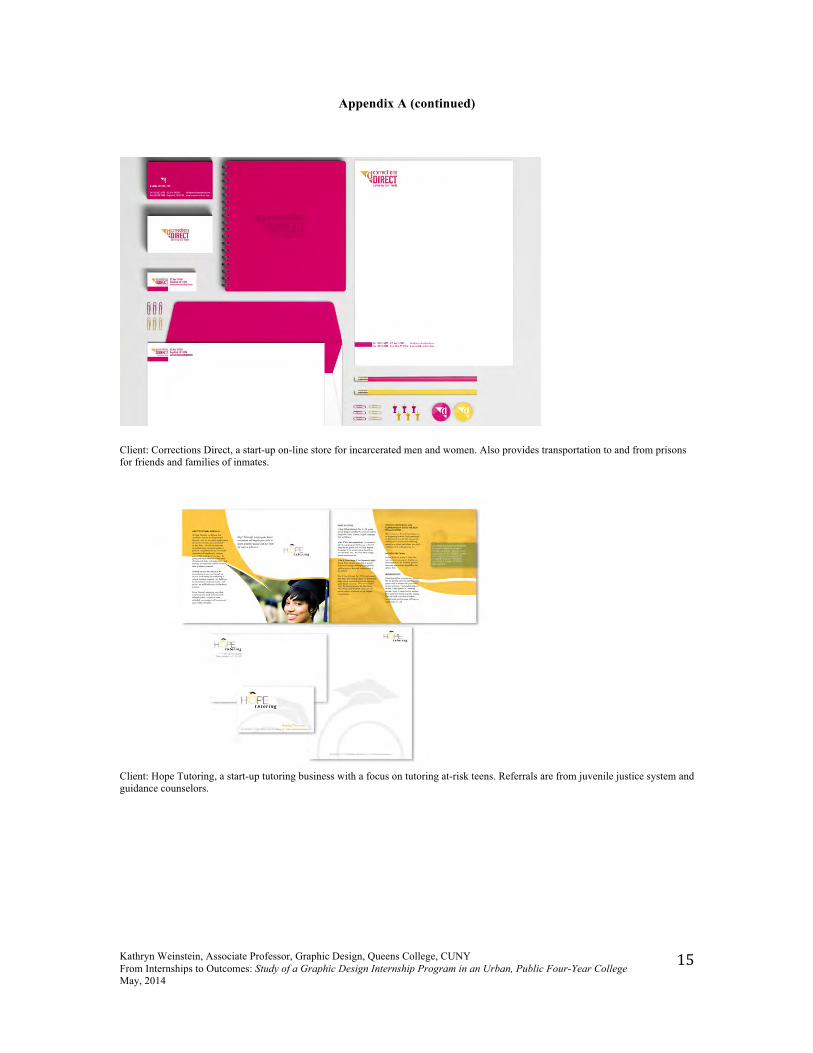
Kathryn Weinstein, Associate Professor, Graphic Design, Queens College, CUNY From Internships to Outcomes: Study of a Graphic Design Internship Program in an Urban, Public Four-Year College May, 2014
15
Appendix A (continued)
Client: Corrections Direct, a start-up on-line store for incarcerated men and women. Also provides transportation to and from prisons for friends and families of inmates.
Client: Hope Tutoring, a start-up tutoring business with a focus on tutoring at-risk teens. Referrals are from juvenile justice system and guidance counselors.
Kathryn Weinstein, Associate Professor, Graphic Design, Queens College, CUNY From Internships to Outcomes: Study of a Graphic Design Internship Program in an Urban, Public Four-Year College May, 2014
16
Appendix B: Six Criteria of High-Impact Educational Experiences and Intern Reflections
Interns invest time and effort Throughout the entire internship I learned the whole process of a working with a client. You might think it’s a straightforward process; giving options and going from there, but it isn’t. It is quite a long process. It is good to make many versions of a logo, even when you think you created a good one — the client might not have the same opinion and having a wide range of options is important to find a solution the client will like. I learned to always present strong pieces and to keep improving the work. —JC, 2013 Interaction with faculty and peers about substantive matters This is by far one of the best internship programs out there —the reason being is the time and effort put forth not only by the Professor to improve our skills but also by the encouragement of the other interns. —JS, 2012 Learning through real-world applications With the QCGD internship, I learned about working with the client and with real life-design restrictions. Previously, I only designed for school-projects without any restrictions. (In the internship) I had to design with limited fonts, deal with a large amount of text, and so on. This internship definitely challenged me in my design work. — JL, 2011 Experience diversity I learned how to engage clients in a meaningful way by introducing myself and listening both to their story and needs as well as asking key questions to accomplish the design objective in the best way possible… I now feel more confident when I talk to potential clients so I’m very glad I had this opportunity. — JA, 2011 Response to frequent feedback … from our many meetings on campus with the other interns I benefitted from their critical input on how to improve my design. The numerous meetings with the client and our exchanges through email improved my overall abilities and will allow me to interact in the workforce more effectively as a graphic designer — JS, 2011 Reflect and integrate learning I learned having a detailed “start-to-finish” plan and doing diligent research for a project is absolutely crucial to the success of a project. Most of all I learned to take advantage of every opportunity that comes my way and not be afraid to take chances to grow as a person and designer.— SC, 2013
Tenth Annual UCDA Design Education Summit | 31
Thinking and Making: The First Year Design Experience
Jeremy ShellhornUniversity of Kansas
10.3
AbstractThree years ago our Department of Design moved from the School of Fine Arts to the School of Architecture, Design and Planning and in this transition a shared foundations program between Art and Design disappeared and new Design First Year Experience was created.
This presentation will tell the story of how we collaborated, conceptualized and created Design Thinking & Making: a series of two courses that provide Department of Design freshmen with a comprehensive introduction to creative problem solving; and the fundamentals of two, three and four-dimensional design. Drawing, photography, 2D and 3D models are used in these courses as a means of design thinking to visually represent problems and opportunities. The intent is to encourage freshmen to think critically about the world around them, use the design process as a powerful tool for finding solutions and hone craftsmanship skill through studio making.
32 | Tenth Annual UCDA Design Education Summit
AbstractIn the context of a traditional graphic design program with students that will predominantly service the print industry, and in the context of students used to hitting “Print” to make their comps, producing artist’s books allowed my graphic design students to develop their hand skills and independent voices.
For the past several years, I have introduced graphic design students to the book arts and more specifically artist’s books. We’ve studied examples from our special collections library and my teaching collection. We’ve had engaging discussions about various readings and the myriad forms, materials, and production processes of artist’s books throughout history and in relation to contemporary art and design practice. The real learning seemed to start though, when we began production of our first artist’s books.
As a means to segue from their design courses to creating books, I’ve found it beneficial to begin close to their typographic studies. I had them produce a few artist’s books that dealt with letters in alphabetical order—but still challenged them to be inventive. These first few books included the familiar production lessons of paper grain, folding, gluing and covering boards, etc. They also allowed the students to begin to develop their own creative voices. In this presentation, I will expand on these details and more, as I showcase alphabooks and other inventive artist’s books from design students that went beyond hitting “PRINT”.
Beyond Hitting “PRINT”—Graphic Design Students Produce Intriguing Artist’s Books Starting with Typographic Study
Peter BushellIllinois State University
11.1
Tenth Annual UCDA Design Education Summit | 33
More Room to Fail, or, “All work can be resubmitted at the end of the semester.”
Dave RichardsonEastern Illinois University
11.2
AbstractFrom The New York Times (Feb. 22, 2014), Thomas L. Friedman writes: “ “What we’ve seen is that the people who are the most successful here {at Google}, who we want to hire, will have a fierce position. They’ll argue like hell. . . . But then you say, ‘here’s a new fact,’ and they’ll go, ‘Oh, well, that changes things; you’re right.’ ”
After three sequential courses (Interactive/Motion Graphics 1, 2, and 3), 20 seniors in an undergraduate program embarked on their last course, Interactive 4. On day one I said something new: “All work can be resubmitted at the end of the semester for a better grade. Failure is important.”
The presenter visually maps how he failed and then succeeded in allowing significant room for seniors in a graphic design program to fail repeatedly before achieving success in their semi-self-directed pursuits, which were related to interactive and motion design, such as learning CSS transitions in-depth, building responsively design sites, or concentrating primarily on video/animation.
The presenter, questioning a linear approach to the submission and evaluation of design projects (design/submit; design/submit...), embarked on an open-ended semester, the only point of which was to allow students room to focus on what they (and he) thought was most important to their after-graduation goals, such as learning more technically oriented skills or delving more deeply into more “artistic” video narratives.
Student self-assessment, coupled with creative briefs and documentation of creative exploration, played a crucial role in the evaluation of the process, which was paramount. This presentation unequivocally concludes that failure is very good for students; failure is not regarded as highly as it should be in the evaluations; and much more room, in the end, must be made for students getting things “wrong”.
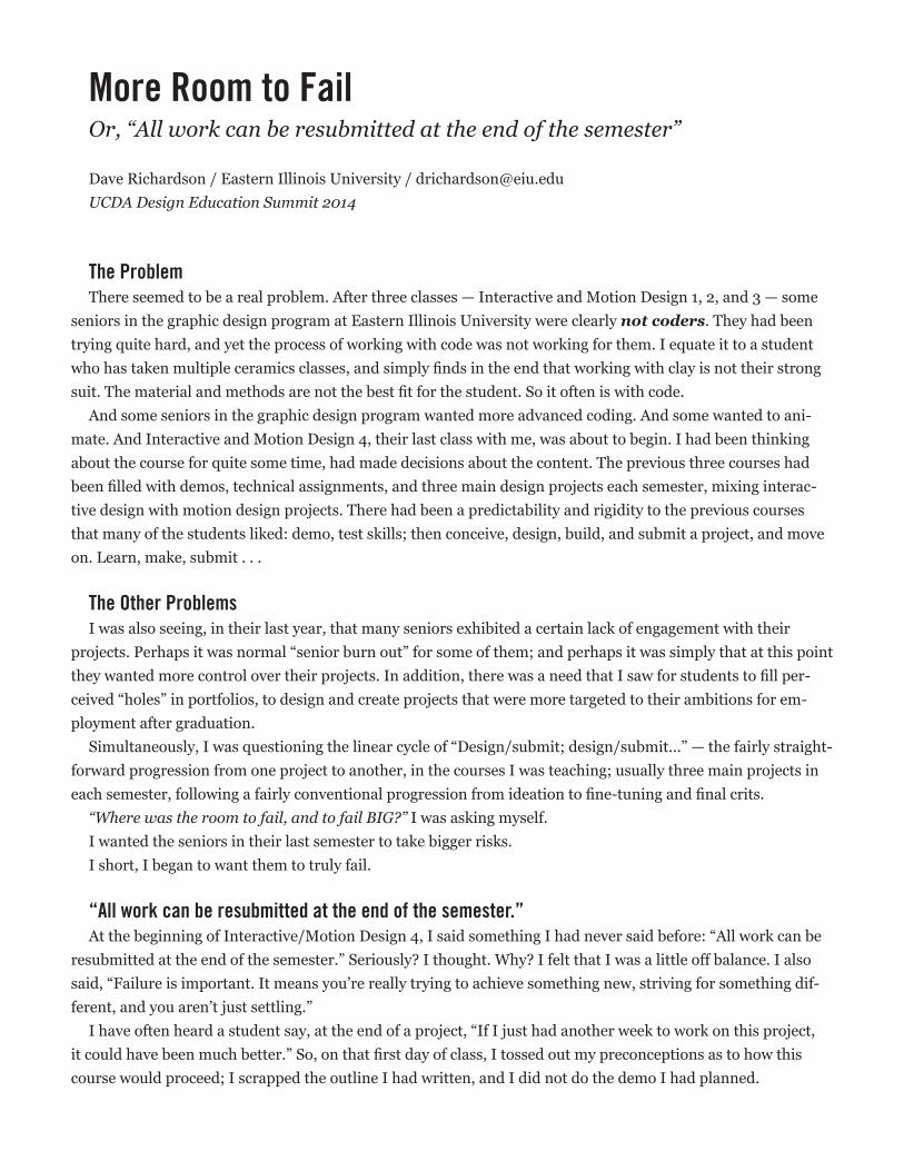
More Room to FailOr, “All work can be resubmitted at the end of the semester”
Dave Richardson / Eastern Illinois University / [email protected] Design Education Summit 2014
The ProblemThere seemed to be a real problem. After three classes — Interactive and Motion Design 1, 2, and 3 — some
seniors in the graphic design program at Eastern Illinois University were clearly not coders. They had been trying quite hard, and yet the process of working with code was not working for them. I equate it to a student who has taken multiple ceramics classes, and simply finds in the end that working with clay is not their strong suit. The material and methods are not the best fit for the student. So it often is with code.
And some seniors in the graphic design program wanted more advanced coding. And some wanted to ani-mate. And Interactive and Motion Design 4, their last class with me, was about to begin. I had been thinking about the course for quite some time, had made decisions about the content. The previous three courses had been filled with demos, technical assignments, and three main design projects each semester, mixing interac-tive design with motion design projects. There had been a predictability and rigidity to the previous courses that many of the students liked: demo, test skills; then conceive, design, build, and submit a project, and move on. Learn, make, submit . . .
The Other ProblemsI was also seeing, in their last year, that many seniors exhibited a certain lack of engagement with their
projects. Perhaps it was normal “senior burn out” for some of them; and perhaps it was simply that at this point they wanted more control over their projects. In addition, there was a need that I saw for students to fill per-ceived “holes” in portfolios, to design and create projects that were more targeted to their ambitions for em-ployment after graduation.
Simultaneously, I was questioning the linear cycle of “Design/submit; design/submit...” — the fairly straight-forward progression from one project to another, in the courses I was teaching; usually three main projects in each semester, following a fairly conventional progression from ideation to fine-tuning and final crits.
“Where was the room to fail, and to fail BIG?” I was asking myself. I wanted the seniors in their last semester to take bigger risks.I short, I began to want them to truly fail.
“All work can be resubmitted at the end of the semester.”At the beginning of Interactive/Motion Design 4, I said something I had never said before: “All work can be
resubmitted at the end of the semester.” Seriously? I thought. Why? I felt that I was a little off balance. I also said, “Failure is important. It means you’re really trying to achieve something new, striving for something dif-ferent, and you aren’t just settling.”
I have often heard a student say, at the end of a project, “If I just had another week to work on this project, it could have been much better.” So, on that first day of class, I tossed out my preconceptions as to how this course would proceed; I scrapped the outline I had written, and I did not do the demo I had planned.
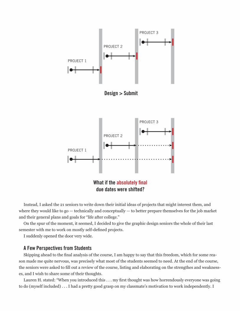
Instead, I asked the 21 seniors to write down their initial ideas of projects that might interest them, and where they would like to go — technically and conceptually — to better prepare themselves for the job market and their general plans and goals for “life after college.”
On the spur of the moment, it seemed, I decided to give the graphic design seniors the whole of their last semester with me to work on mostly self-defined projects.
I suddenly opened the door very wide.
A Few Perspectives from StudentsSkipping ahead to the final analysis of the course, I am happy to say that this freedom, which for some rea-
son made me quite nervous, was precisely what most of the students seemed to need. At the end of the course, the seniors were asked to fill out a review of the course, listing and elaborating on the strengthes and weakness-es, and I wish to share some of their thoughts.
Lauren H. stated: “When you introduced this . . . my first thought was how horrendously everyone was going to do (myself included) . . . I had a pretty good grasp on my classmate’s motivation to work independently. I
Design > Submit
PROJECT 1
PROJECT 2
PROJECT 3
What if the absolutely final due dates were shifted?
PROJECT 1
PROJECT 2
PROJECT 3
What if the absolutely final due dates were shifted?
PROJECT 1
PROJECT 2
PROJECT 3
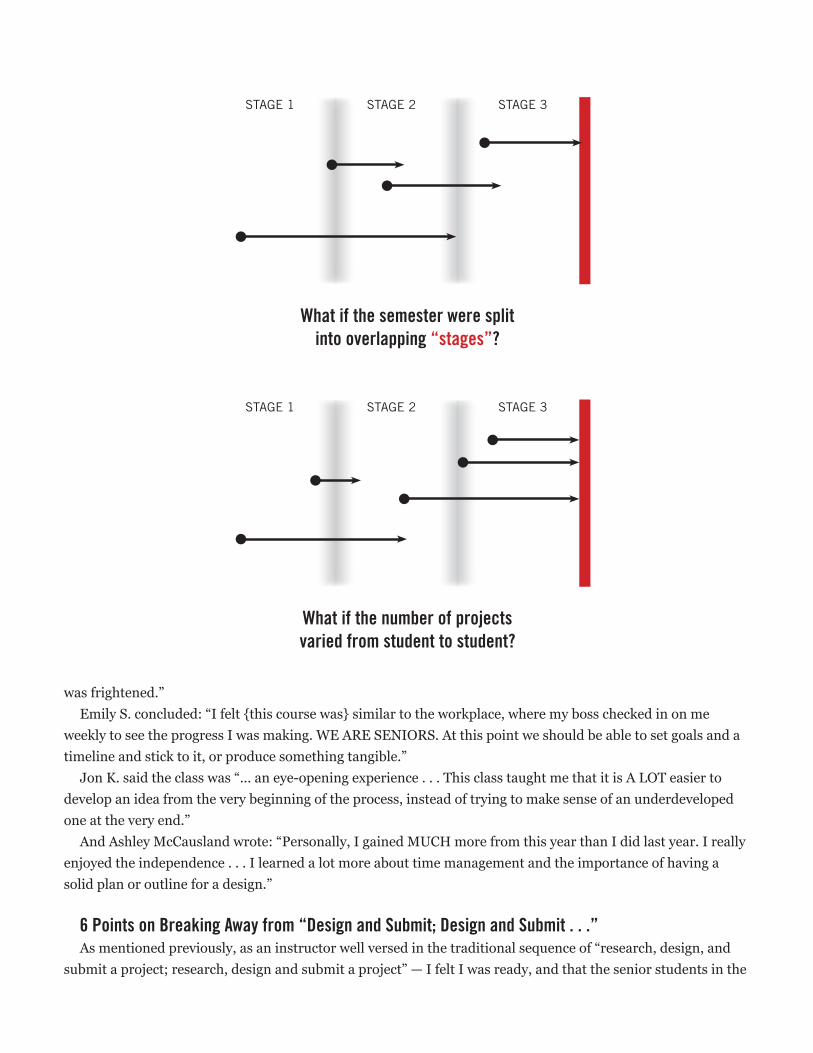
was frightened.”Emily S. concluded: “I felt {this course was} similar to the workplace, where my boss checked in on me
weekly to see the progress I was making. WE ARE SENIORS. At this point we should be able to set goals and a timeline and stick to it, or produce something tangible.”
Jon K. said the class was “... an eye-opening experience . . . This class taught me that it is A LOT easier to develop an idea from the very beginning of the process, instead of trying to make sense of an underdeveloped one at the very end.”
And Ashley McCausland wrote: “Personally, I gained MUCH more from this year than I did last year. I really enjoyed the independence . . . I learned a lot more about time management and the importance of having a solid plan or outline for a design.”
6 Points on Breaking Away from “Design and Submit; Design and Submit . . .”As mentioned previously, as an instructor well versed in the traditional sequence of “research, design, and
submit a project; research, design and submit a project” — I felt I was ready, and that the senior students in the
What if the semester were split into overlapping “stages”?
STAGE 1 STAGE 2 STAGE 3
STAGE 3
What if the number of projects varied from student to student?
STAGE 1 STAGE 2
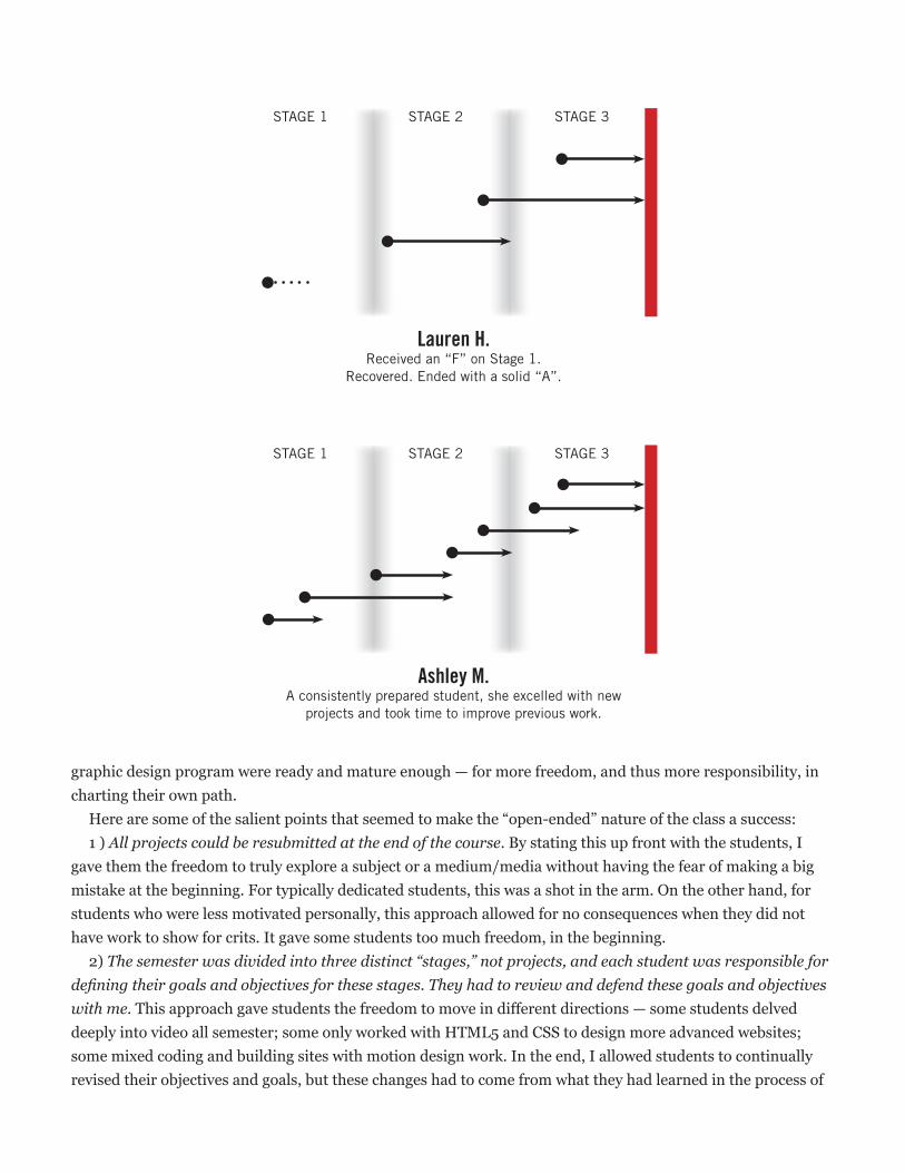
graphic design program were ready and mature enough — for more freedom, and thus more responsibility, in charting their own path.
Here are some of the salient points that seemed to make the “open-ended” nature of the class a success:1 ) All projects could be resubmitted at the end of the course. By stating this up front with the students, I
gave them the freedom to truly explore a subject or a medium/media without having the fear of making a big mistake at the beginning. For typically dedicated students, this was a shot in the arm. On the other hand, for students who were less motivated personally, this approach allowed for no consequences when they did not have work to show for crits. It gave some students too much freedom, in the beginning.
2) The semester was divided into three distinct “stages,” not projects, and each student was responsible for defining their goals and objectives for these stages. They had to review and defend these goals and objectives with me. This approach gave students the freedom to move in different directions — some students delved deeply into video all semester; some only worked with HTML5 and CSS to design more advanced websites; some mixed coding and building sites with motion design work. In the end, I allowed students to continually revised their objectives and goals, but these changes had to come from what they had learned in the process of
STAGE 3
Lauren H. Received an “F” on Stage 1.
Recovered. Ended with a solid “A”.
STAGE 1 STAGE 2
Ashley M. A consistently prepared student, she excelled with new
projects and took time to improve previous work.
STAGE 1 STAGE 2 STAGE 3
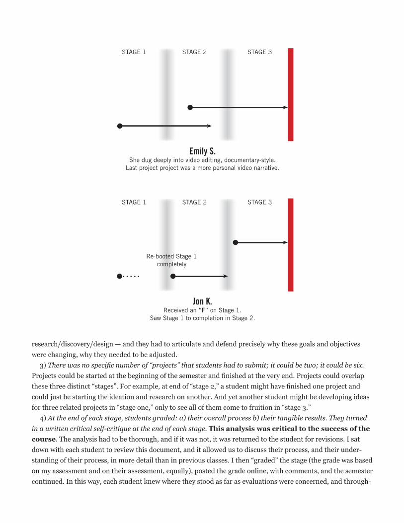
research/discovery/design — and they had to articulate and defend precisely why these goals and objectives were changing, why they needed to be adjusted.
3) There was no specific number of “projects” that students had to submit; it could be two; it could be six. Projects could be started at the beginning of the semester and finished at the very end. Projects could overlap these three distinct “stages”. For example, at end of “stage 2,” a student might have finished one project and could just be starting the ideation and research on another. And yet another student might be developing ideas for three related projects in “stage one,” only to see all of them come to fruition in “stage 3.”
4) At the end of each stage, students graded: a) their overall process b) their tangible results. They turned in a written critical self-critique at the end of each stage. This analysis was critical to the success of the course. The analysis had to be thorough, and if it was not, it was returned to the student for revisions. I sat down with each student to review this document, and it allowed us to discuss their process, and their under-standing of their process, in more detail than in previous classes. I then “graded” the stage (the grade was based on my assessment and on their assessment, equally), posted the grade online, with comments, and the semester continued. In this way, each student knew where they stood as far as evaluations were concerned, and through-
Emily S. She dug deeply into video editing, documentary-style.
Last project project was a more personal video narrative.
STAGE 1 STAGE 2 STAGE 3
Jon K. Received an “F” on Stage 1.
Saw Stage 1 to completion in Stage 2.
STAGE 1 STAGE 2 STAGE 3
Re-booted Stage 1 completely
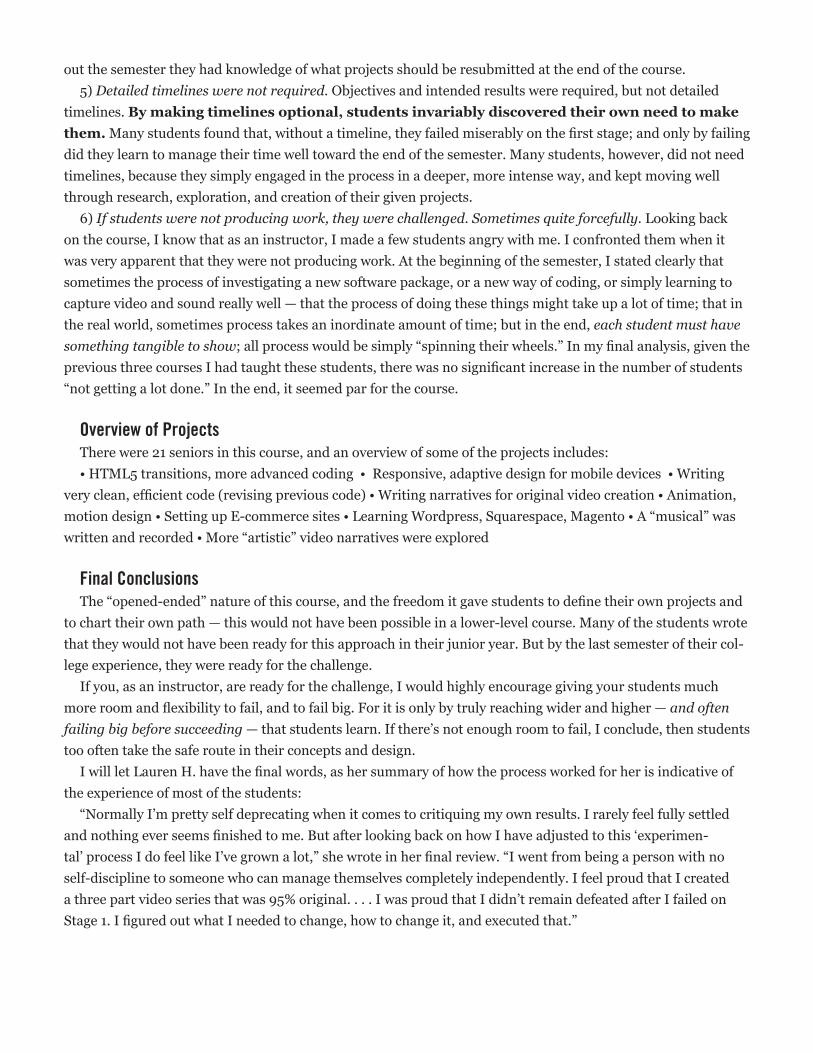
out the semester they had knowledge of what projects should be resubmitted at the end of the course.5) Detailed timelines were not required. Objectives and intended results were required, but not detailed
timelines. By making timelines optional, students invariably discovered their own need to make them. Many students found that, without a timeline, they failed miserably on the first stage; and only by failing did they learn to manage their time well toward the end of the semester. Many students, however, did not need timelines, because they simply engaged in the process in a deeper, more intense way, and kept moving well through research, exploration, and creation of their given projects.
6) If students were not producing work, they were challenged. Sometimes quite forcefully. Looking back on the course, I know that as an instructor, I made a few students angry with me. I confronted them when it was very apparent that they were not producing work. At the beginning of the semester, I stated clearly that sometimes the process of investigating a new software package, or a new way of coding, or simply learning to capture video and sound really well — that the process of doing these things might take up a lot of time; that in the real world, sometimes process takes an inordinate amount of time; but in the end, each student must have something tangible to show; all process would be simply “spinning their wheels.” In my final analysis, given the previous three courses I had taught these students, there was no significant increase in the number of students “not getting a lot done.” In the end, it seemed par for the course.
Overview of Projects There were 21 seniors in this course, and an overview of some of the projects includes:• HTML5 transitions, more advanced coding • Responsive, adaptive design for mobile devices • Writing
very clean, efficient code (revising previous code) • Writing narratives for original video creation • Animation, motion design • Setting up E-commerce sites • Learning Wordpress, Squarespace, Magento • A “musical” was written and recorded • More “artistic” video narratives were explored
Final Conclusions The “opened-ended” nature of this course, and the freedom it gave students to define their own projects and
to chart their own path — this would not have been possible in a lower-level course. Many of the students wrote that they would not have been ready for this approach in their junior year. But by the last semester of their col-lege experience, they were ready for the challenge.
If you, as an instructor, are ready for the challenge, I would highly encourage giving your students much more room and flexibility to fail, and to fail big. For it is only by truly reaching wider and higher — and often failing big before succeeding — that students learn. If there’s not enough room to fail, I conclude, then students too often take the safe route in their concepts and design.
I will let Lauren H. have the final words, as her summary of how the process worked for her is indicative of the experience of most of the students:
“Normally I’m pretty self deprecating when it comes to critiquing my own results. I rarely feel fully settled and nothing ever seems finished to me. But after looking back on how I have adjusted to this ‘experimen-tal’ process I do feel like I’ve grown a lot,” she wrote in her final review. “I went from being a person with no self-discipline to someone who can manage themselves completely independently. I feel proud that I created a three part video series that was 95% original. . . . I was proud that I didn’t remain defeated after I failed on Stage 1. I figured out what I needed to change, how to change it, and executed that.”
34 | Tenth Annual UCDA Design Education Summit
AbstractHugh Dubberly, in his 2008 article Design in the Age of Biology: Shifting From a Mechanical-Object Ethos toan Organic-Systems Ethos, characterizes contemporary design endeavors as organic systems with end states that are constantly adapting or evolving. This is particularly relevant to interaction design, where many of the dynamic digital tools and technologies being used enable the immediate implementation of design refinements, including those made in response to changing project / client requirements. This characterization necessitates a conceptualization of design that emphasizes process over product while simultaneously remaining responsive to the environment in which the process operates. Conventional process techniques, such as sketching, developing wireframes, and rendering refined mock-ups, may no longer be adequate when designing for contemporary interactive media; rather, agile approaches to the design process may be more appropriate.
Agile design is not new—it derives from the concept of agile development, originally created to help address problems with conventional software engineering approaches. Notably, the 2001 Manifesto for Agile Software Development claims “responding to change over following a plan” as one of its four core values. This statement, along with the other agile values, is clearly relevant to the practice of interaction design, but agile methods can also be relevant to learning interaction design, given that the learning process is one characterized by evolution and change. This paper presents an argument for incorporating aspects of the agile design methodology into the classroom as a tool to facilitate more opportunities for incremental change and corresponding critique of interaction design work. A sample process—one that emphasizes high-fidelity prototyping over conventional approaches like sketching and wireframing—is outlined, and a number of tools suited for engaging in such a process are discussed.
Maximizing Student Learning Opportunities by Implementing Agile Approaches to Interaction Design in the Classroom
Brad ToberUniversity of Illinois at
Urbana-Champaign
11.3
Maximizing student learning opportunities by implementing agile approaches to interaction design in the classroom
Introduction One of the biggest challenges facing faculty teaching in any discipline is that of limited resources—whether in terms of facilities, equipment, existing student knowledge, or time. For design educators, it could be argued that this challenge manifests itself most prominently when engaging students with both the technical and conceptual aspects of interaction design, or any area of design comprehensively integrating technology. The most advanced types of interaction design activities require a high level of technical skill on the part of students, yet being able to expect that this skill exists means that valuable class time must be devoted to skill development. In turn, this often prevents other, higher-level concepts from being addressed in detail. This paper outlines a provocation suggesting that the integration of agile approaches to interaction design (high-fidelity prototyping, in particular) can be leveraged to more effectively negotiate the balance between technical and conceptual interaction design instruction, thus maximizing the degree of learning that occurs in a classroom environment characterized by scarce resources. !Conventional approaches to the interaction design process Maximizing learning opportunities can also be thought of as minimizing non-learning opportunities. In the context of interaction design, practicing conventional aspects of the design process—such as rough sketches, wireframes, and static mock-ups—can be considered non-learning opportunities because they do not accurately reflect the medium of that which they are being used to document ideation and development of. Process forms are valuable, but only when they appropriately serve particular design goals; however, these conventional forms are not dynamic and do not respond to the user. Since these are characteristics that typically define interactive media, this ineffectiveness can be used to build an argument for the claim that extensive use of these forms in the classroom is, in fact, a waste of both student and faculty time. !Agile design Agile design proposes a solution to removing static forms of documentation from the interaction design process. Agile design is not new—it derives from the concept of agile development, originally created as a deliberate approach to improving conventional software engineering processes. Notably, the 2001 Manifesto for Agile Software Development states “responding to change over following a plan” as one of its
Brad Tober Assistant Professor, Graphic Design University of Illinois at Urbana-Champaign [email protected]
four core values (Beck et al.). One interpretation of this statement is that an agile design process must be flexible enough to easily implement changes and improvements over multiple recursive process iterations. Another agile value, the preference of “working [design] over comprehensive documentation,” conveniently coincides with this interpretation, suggesting that the full value of evaluating the output of a recursive process can only be realized when the output of each process iteration closely reflects the form of the desired final design (Beck et al.). While these values are clearly relevant to the dynamic practice of interaction design, agile methods can also be relevant to learning interaction design, given that the learning process is one characterized by evolution and change. !High-fidelity prototyping This conceptualization of an agile approach to the interaction design process can be implemented through an approach to documentation that emphasizes high-fidelity prototyping over the conventional forms of rough sketches, wireframes, and static mock-ups. High-fidelity refers to a form of prototyping/documentation that is well-refined and attempts to closely reflect the form of the desired final design. High-fidelity prototyping points to a form of process that addresses the issues with more conventional forms noted previously. This type of prototyping documents the interaction design process effectively and authentically, as the process work exists in the same medium as the desired final design (or, at least, a medium closer to it). The dynamic nature of a high-fidelity prototype enables the immediate implementation of necessary refinements and changes, made possible in part by the fact that an earlier (in the process) focus on functionality can provide greater insight into the successful and/or unsuccessful parts of a design. !Tools Including high-fidelity prototyping in the interaction design process is best done through the use of tools developed specifically for the task. While there are many such tools available, this paper outlines three options that are optimized for mobile app design—each with a varying degree of fidelity within high-fidelity. InVision, and many other similar offerings, is a web-based service that allows a designer to build a prototype by uploading a series of static mock-up images that have been produced using some other application of the designer’s choice. The designer is then able to demonstrate user flows through the app prototype by creating hotspot buttons that link the uploaded screens together in accordance with the designer’s desire. While this approach to prototyping can offer valuable insight, its dynamic functionality is limited, and for that reason it might be considered to be on the low end of high-fidelity prototyping tools. However, InVision’s team-based organization and collaboration tools offset this limitation to a degree. As of this writing, InVision is a commercial product, but a free account that allows the creation of one prototype project is available (InVision).
Origami is a free tool developed by Facebook (initially for in-house use) as a plug-in for Apple’s Quartz Composer, an application freely available with Apple’s developer tools (Facebook). Origami uses a patch-based paradigm, similar to Max/MSP/Jitter or Pure Data, to visually construct functional prototypes without writing code. A designer is able to build a prototype by linking together a number of patches, which act as building blocks. However, the designer is limited to working with those building blocks alone, and the prototypes developed using Origami do not directly translate into a production-ready design. Both Ratchet and Fries round out this brief overview of high-fidelity prototyping tools. These options take the form of web-based frameworks for building mobile app prototypes using basic HTML, CSS, and JavaScript (Sears, Sarmiento). This approach means that a designer is able to produce extremely flexible and very high-fidelity prototypes—to the point that they are easily able to comprise a significant component of a web-based mobile app, or an app wrapped using a tool like PhoneGap/Apache Cordova. This short jump to a fully-functional, deployable app can serve to empower students throughout the design process, despite the fact that this approach requires the most technical knowledge out of the three options surveyed. Both Ratchet and Fries are free, with Ratchet including iOS, Android, and platform-agnostic themes, and Fries being Android-specific. !Conclusion Choosing an approach to high-fidelity prototyping for use in the classroom is a trade-off between the degree of fidelity and the technical skill required. Tools like Ratchet and Fries can completely replace more conventional process documentation forms when students reach a level of technical engagement that enables them to use code as just another medium for “sketching” ideas. This, of course, requires devoting curricular resources to emphasizing students’ development of these sorts of technical skills. In the Graphic Design program at the University of Illinois at Urbana-Champaign, this is being pursued through the implementation of a series of two courses. The first course, Introduction to Web Technologies, spans eight weeks (half of a semester) and is entirely online. This course includes at least two weeks each that focus entirely on the basic technical aspects of HTML, CSS, and JavaScript/jQuery. While an online approach involves shifting significant responsibility to the student, it has allowed the Graphic Design program to remove this purely technical content from the first full semester, classroom-based course in its interaction design sequence, Digital Interaction. In this course, the content that was offloaded to the online environment has been replaced with two introductory agile design projects. In Agile App Analysis, which spans two weeks, students prepare a report that compares and contrasts two mobile applications that exist in the same approximate market space. They focus on writing user personas, user stories, and use cases as methods of analyzing these applications—essentially reverse-engineering these elements of an agile process. In Persona Prototyping, students design and develop a high-fidelity prototype of a simple app that would, arguably, address a need of two provided detailed user personas.
Other elements of this course include an interactive iPad-optimized, web-based storybook project, an introduction to Processing, and a digital game design/development project. This overall approach to implementing agile design in the classroom is in its initial phases, and while early feedback is positive, the Graphic Design program looks forward to further implementation in the coming year. !Works cited Beck, Kent, et al. Manifesto for Agile Software Development. 2001. Web. 31 May 2014.
<http://agilemanifesto.org/>. InVision. Free Web & Mobile (iOS, Android) Prototyping and UI Mockup Tool | InVision.
2014. Web. 31 May 2014. <http://www.invisionapp.com/>. Facebook. Origami—Design prototyping with Quartz Composer. 2014. Web. 31 May 2014.
<http://facebook.github.io/origami/>. Sarmiento, Jaune. Fries. Jaune Sarmiento. n.d. Web. 31 May 2014. <http://getfri.es/>. Sears, Connor. Ratchet. Connor Sears. 2014. Web. 31 May 2014.
<http://goratchet.com/>.
Tenth Annual UCDA Design Education Summit | 35
Apples and Oranges, or Birds of a Feather? A discussion of the methodologies and goals of design education at a four year state university, a private four year art school and a two year community college.
Chris CornealMichigan State University
Rebecca TegtmeyerMichigan State University
Jill GreeneCollege for Creative Studies
Jim ShurterMott Community College
12.1
PanelAs a professor of graphic design, I’m bombarded each fall with calls from parents of high school seniors requesting appointments to come in with their little Johnny or Susie to talk about our graphic design program. Amazingly, each conversation seems to always start the same way: “My son/daughter is interested in studying graphic design. We’ve already visited the ‘insert the name of the local private art school or two year community college here.’ We’d like to be able to compare your state university program to theirs to see which may be a better fit.”
This got me thinking: the goal of a quality design education experience is obviously shared between the three models (state university, private art school and two year community college), but from there how are we different? Do we define our goals and methodologies similarly? Are there differences in expectations and skill sets of our respective students? What are the pros and cons of a design education in these three differing environments?
This panel session will investigate the similarities and differences of design education at these three linked, but distinctly different, institution models. This session will consist of presentations and a panel discussion with colleagues from the three education frameworks: Rebecca Tegtmeyer (Michigan State University), Jill Greene (College for Creative Studies), and James Shurter (Mott Community College). The panel session will be moderated by the panel organizer: Chris Corneal (Michigan State University).
The presentations/panel discussions will at times be playful, as we poke fun at the existing stereotypes of each contrasting education structure... but at the same time it will be insightful and illuminating. Case studies with visual examples (student entrance portfolios, assignments, thesis projects, etc.) will be strongly emphasized. Through comparison, we as design educators may gain a better understanding of the strengths and weaknesses of our own teaching pedagogy.
Panel: Chris Corneal, Michigan State University (Panel Chair & Moderator)Rebecca Tegtmeyer, Michigan State UniversityJill Greene, College for Creative StudiesJames Shurter, Mott Community College
Apples And OrAnges, Or Birds Of A feAther? A discussion of the methodologies and goals of design education at a four year state university, a private four year art school and a two year community college.
As a professor of graphic design, i’m bombarded each fall with calls from parents of high school
seniors requesting appointments to come in with their little Johnny or susie to talk about our graphic
design program. Amazingly, each conversation seems to always start the same way: “My son/daughter
is interested in studying graphic design. We’ve already visited the ‘insert the name of the local private
art school or two year community college here.’ We’d like to be able to compare your state university
program to theirs to see which may be a better fit.”
this got me thinking: the goal of a quality design education experience is obviously shared
between the three models (state university, private art school and two year community college) but from
there how are we different? Do we define our goals and methodologies similarly? Are there differences in
expectations and skill sets of our respective students? What are the pros and cons of a design education in
these three differing environments?
this panel session will investigate the similarities and differences of design education at these
three linked, but distinctly different, institution models. this session will consist of presentations and a
panel discussion with colleagues from the three education frameworks: rebecca tegtmeyer (Michigan
state University), Jill greene (College for Creative studies), and James shurter (Mott Community
College). the panel session will be moderated by the panel organizer: Chris Corneal (Michigan state
University).
the presentations/panel discussions will at times be playful, as we poke fun at the existing
stereotypes of each contrasting education structure... but at the same time it will be insightful and
illuminating. Case studies with visual examples (student entrance portfolios, assignments, thesis projects,
etc.) will be strongly emphasized. through comparison, we as design educators may gain a better
understanding of the strengths and weaknesses of our own teaching pedagogy.
Why do students choose private art colleges?
When I was first asked to speak as part of this panel, I asked my students why they chose a private art college rather than a university. There responses were the following:
“I feel that if I went to a regular university, I would feel lost within the student body.”
“I attended a community college prior to transferring and the quality of education was not even comparable.”
“I like the individual time with teachers.”
“I feel like I wouldn’t get what I need as a design student at a university.”
“Teacher to student ratio was also a concern. A private art school has the potential to produce a greater learning expe-rience.”
Over the years, I have observed that• theythink/knowtheywanttostudyart/design • theymaynotknowwhatspecificareaofconcentrationtheywouldliketostudy • theymaynotknowexactlywhatgraphicdesignis • theirunderstandingofgraphicdesigncouldbe... • rootedintheirproficiencywith • CreativeSuiteapplications • basedonmisconceptionsofwhattheyseeintheworld • isoftennotcenteredaroundvisualcommunication
These observations seem to hold true among students regardless of the type of institution they are attending.
Sowhatisitthatmakesaprivateartcollegedifferentthanothertypesofinstitutions?Oneofthebiggestdifferencesis in the leadership structure. At a university you most commonly have a president, a provost, a dean, and a chair. Consequently,anychangesmadetothecurriculumneedtobeapprovedateachlevelmakingchangecumbersomeand slow.
At a private art college, although the structure is similar, the curriculum changes are approved from within the dean’s office. This streamlined process provides for changes to occur more quickly allowing for a more nimble curriculum that can respond to quickly changing technology so to provide students with courses more relevant to work being done in the industry including both traditional print as well as media applications.
ThecurriculumattheCollegeforCreativeStudies(CCS)inDetroitamongothersreflectsthisflexibility.
A typical design curriculum requires roughly 126–128 credit hours. At a private art college you will earn 66 credits in yourmajor,42liberalartscredits,and18foundationcredits.Duringthefirstthreesemesters,studentsarerequiredto take the college foundation courses. Over the course of the first five semesters students are required to take what could be considered design foundation courses as well. The design foundation courses include three semesters of typography, six semesters of visual communication, three semesters of interaction design, and time based media. These courses are tightly sequenced offering students opportunity to develop and apply design principles introduced ineachcourse.Studentsdon’ttakeelectivesuntilthesecondsemesteroftheirjunioryear..
Once students are juniors many of the projects have an electronic media option. For example, in Intermediate Visual CommunicationIIstudentschooseadesignerandconductextensiveresearchonthatdesigner.Theythendesignabookreflectiveoftheirresearch.Studentshavetheoptionofdesigningatraditionalbookorarewelcometoexploreoptions using digital media.
Studentsreachingtheirsecondsemesterjunioryearareofferedavarietyofelectivesrangingfromtypedesigntoexperience design. In addition to electives, sponsored projects are often part of the upper level visual communications courses.Sponsoredprojectsnotonlyofferstudentsexperienceworkingdirectlywithclients,theyprovidean
opportunity to supplement the annual departmental budget allowing for the purchase of electronicequipment, ipads, iphones, other touch screen devices, and audio and video equipment otherwise not in the budget. The ability to purchase this equipment affords students the opportunity for a hands-on approach to exploring media.
As with anything, there are both advantages and disadvantages to a more focused and structured curriculum. Studentsareofferedtheopportunitytobegintheireducationtakingcoursesingraphicdesign,creditsthatwillresultinmorethanhalfofthetotalcredithoursneededtoearntheirdegree.Suchacurriculumtendstobelessflexible,studentsneedtoberelativelycertainoftheircourseofstudyotherwiseincurringadditionalexpense as well as prolonging their time at the institution, and students wishing to transfer from a communi-tycollegethatoffersoccupationaldegreeswillstillhave31/2–4yearsintheprogram.
Sowhatdoesallofthiscost?Tuitionandfeeswillsetyoubackbetween$32,000and$51,000peryearmakingtheaveragecostofafour-yeardegreeataprivateartcollege$176,000makingthisoneofthemostexpensivedecisions a young person will make in their lifetime. It is one that can’t be taken lightly and should be made after conducting thorough research and carefully considering the options.
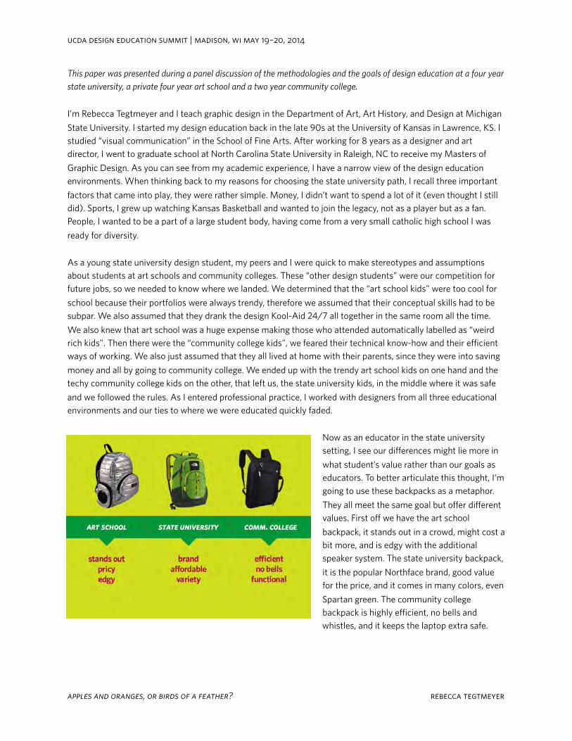
This paper was presented during a panel discussion of the methodologies and the goals of design education at a four year state university, a private four year art school and a two year community college.
I’m Rebecca Tegtmeyer and I teach graphic design in the Department of Art, Art History, and Design at Michigan State University. I started my design education back in the late 90s at the University of Kansas in Lawrence, KS. I studied “visual communication” in the School of Fine Arts. After working for 8 years as a designer and art director, I went to graduate school at North Carolina State University in Raleigh, NC to receive my Masters of Graphic Design. As you can see from my academic experience, I have a narrow view of the design education environments. When thinking back to my reasons for choosing the state university path, I recall three important factors that came into play, they were rather simple. Money, I didn’t want to spend a lot of it (even thought I still did). Sports, I grew up watching Kansas Basketball and wanted to join the legacy, not as a player but as a fan. People, I wanted to be a part of a large student body, having come from a very small catholic high school I was ready for diversity.
As a young state university design student, my peers and I were quick to make stereotypes and assumptions about students at art schools and community colleges. These “other design students” were our competition for future jobs, so we needed to know where we landed. We determined that the “art school kids” were too cool for school because their portfolios were always trendy, therefore we assumed that their conceptual skills had to be subpar. We also assumed that they drank the design Kool-Aid 24/7 all together in the same room all the time. We also knew that art school was a huge expense making those who attended automatically labelled as “weird rich kids”. Then there were the “community college kids”, we feared their technical know-how and their efficient ways of working. We also just assumed that they all lived at home with their parents, since they were into saving money and all by going to community college. We ended up with the trendy art school kids on one hand and the techy community college kids on the other, that left us, the state university kids, in the middle where it was safe and we followed the rules. As I entered professional practice, I worked with designers from all three educational environments and our ties to where we were educated quickly faded.
Now as an educator in the state university setting, I see our differences might lie more in what student’s value rather than our goals as educators. To better articulate this thought, I’m going to use these backpacks as a metaphor. They all meet the same goal but offer different values. First off we have the art school backpack, it stands out in a crowd, might cost a bit more, and is edgy with the additional speaker system. The state university backpack, it is the popular Northface brand, good value for the price, and it comes in many colors, even Spartan green. The community college backpack is highly efficient, no bells and whistles, and it keeps the laptop extra safe.
ucda design education summit | madison, wi may 19–20, 2014
apples and oranges, or birds of a feather? rebecca tegtmeyer
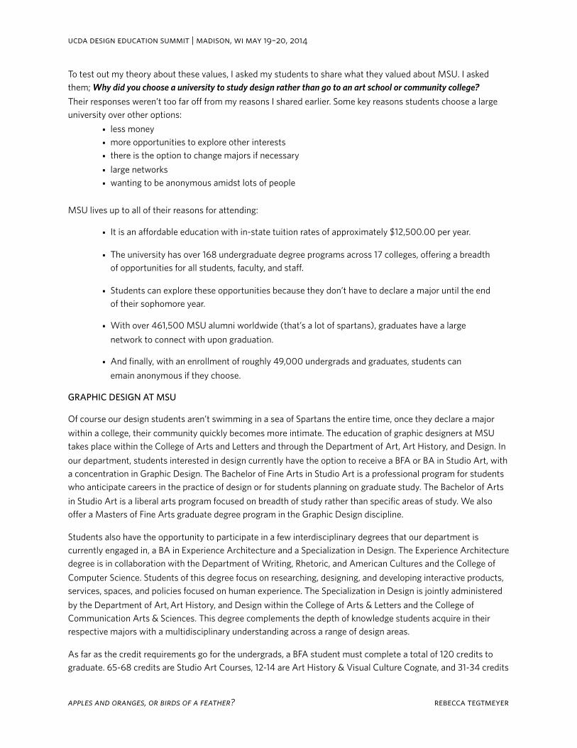
To test out my theory about these values, I asked my students to share what they valued about MSU. I asked them; Why did you choose a university to study design rather than go to an art school or community college?Their responses weren’t too far off from my reasons I shared earlier. Some key reasons students choose a large university over other options:
• less money• more opportunities to explore other interests• there is the option to change majors if necessary
• large networks• wanting to be anonymous amidst lots of people
MSU lives up to all of their reasons for attending:
• It is an affordable education with in-state tuition rates of approximately $12,500.00 per year.
• The university has over 168 undergraduate degree programs across 17 colleges, offering a breadth of opportunities for all students, faculty, and staff.
• Students can explore these opportunities because they don’t have to declare a major until the end of their sophomore year.
• With over 461,500 MSU alumni worldwide (that’s a lot of spartans), graduates have a large network to connect with upon graduation.
• And finally, with an enrollment of roughly 49,000 undergrads and graduates, students can emain anonymous if they choose.
GRAPHIC DESIGN AT MSU
Of course our design students aren’t swimming in a sea of Spartans the entire time, once they declare a major within a college, their community quickly becomes more intimate. The education of graphic designers at MSU takes place within the College of Arts and Letters and through the Department of Art, Art History, and Design. In our department, students interested in design currently have the option to receive a BFA or BA in Studio Art, with a concentration in Graphic Design. The Bachelor of Fine Arts in Studio Art is a professional program for students who anticipate careers in the practice of design or for students planning on graduate study. The Bachelor of Arts in Studio Art is a liberal arts program focused on breadth of study rather than specific areas of study. We also offer a Masters of Fine Arts graduate degree program in the Graphic Design discipline.
Students also have the opportunity to participate in a few interdisciplinary degrees that our department is currently engaged in, a BA in Experience Architecture and a Specialization in Design. The Experience Architecture degree is in collaboration with the Department of Writing, Rhetoric, and American Cultures and the College of Computer Science. Students of this degree focus on researching, designing, and developing interactive products, services, spaces, and policies focused on human experience. The Specialization in Design is jointly administered by the Department of Art, Art History, and Design within the College of Arts & Letters and the College of Communication Arts & Sciences. This degree complements the depth of knowledge students acquire in their respective majors with a multidisciplinary understanding across a range of design areas.
As far as the credit requirements go for the undergrads, a BFA student must complete a total of 120 credits to graduate. 65-68 credits are Studio Art Courses, 12-14 are Art History & Visual Culture Cognate, and 31-34 credits
ucda design education summit | madison, wi may 19–20, 2014
apples and oranges, or birds of a feather? rebecca tegtmeyer
are from courses in general education with requirements in Integrated Arts and Humanities, Biological and Physical Science, Social, Behavioral and Economic Science, and Math. A BA student also requires a total of 120 credits but only 36-40 of those credits must be Studio Art Courses.
Once a student declares a Studio Art major, they begin with a year of foundational coursework. These courses are required for all Studio Art Majors. Courses in Drawing, Color & Design, and Three-dimensional form introduce them to the basic principles of creative creation and exploration. After the completion of these courses, Graphic Design students take an Introduction to Typography course and a Graphic Design 1 course which serve as prerequisites for Graphic Design 2.
When students complete these three core graphic design courses they are able to take a number of topic-focused courses such as: 3D Design, Typography 2, Corporate Imagery, Time and Motion Design, and Interactive Web Design, as well as engage in professional client-based projects through internship opportunities and Design Center, the student studio course. Towards the end of their education, all graphic design students take a Senior Seminar and Professional Practice course that aids in portfolio preparation and the execution of an exhibit for BFA majors only. A History of Graphic Design course is offered once a year and fulfills credit requirements in Art History. Outside of the course curriculum, several students participate in our active AIGA Student Group and attend lectures that demonstrate the wide scope of the profession, as renowned designers are brought in as part of the annual Visiting Artist & Scholar lecture series.
The majority of the studio courses are scheduled for two days a week for 2 hours and 50 minutes for each class period, the cap for each course is twenty-one students. Currently we have four tenure-system faculty with two more joining us in the fall and sometimes up to four adjuncts a semester to support these courses as we have 2/3 of the studio art majors in the department concentrating in Graphic Design.
MSU DESIGN STUDENTS
Our students are eager to learn and want to do it the right way, making experimentation something that as a professor, I have to work really hard at to get them to do. I heard someone explain it once that because many of them come from a family of Spartans and blue-collar families, they are coming from cultures that don’t naturally take-risks, they like to play it safe. Most of them are Michigan-natives and have a lot of pride and loyalty for MSU. However, this pride and loyalty gets in the way almost every other fall weekend as the tailgating traditions take priority over doing any homework. As an educator, I have had to learn how to best plan for this in the scheduling of projects. Another factor that distracts them from homework is that many of our students work full-time and live with several roommates. These are all valuable obstacles, it just takes them some time to learn good time management skills. Several of our design students started in another major or transferred from community college to build on their skills, it is nice to get students at this stage because they have already gone through the “I’m not sure what I want to do” phase of their education. Upon graduation, they are quick to jump on the job hunt. Many stay in the state of Michigan or find their way to Chicago many have ventured into great careers in New York and LA.
ucda design education summit | madison, wi may 19–20, 2014
apples and oranges, or birds of a feather? rebecca tegtmeyer
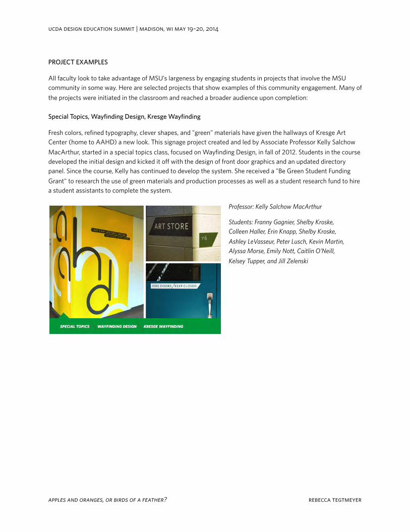
PROJECT EXAMPLES
All faculty look to take advantage of MSU’s largeness by engaging students in projects that involve the MSU community in some way. Here are selected projects that show examples of this community engagement. Many of the projects were initiated in the classroom and reached a broader audience upon completion:
Special Topics, Wayfinding Design, Kresge Wayfinding
Fresh colors, refined typography, clever shapes, and "green" materials have given the hallways of Kresge Art Center (home to AAHD) a new look. This signage project created and led by Associate Professor Kelly Salchow MacArthur, started in a special topics class, focused on Wayfinding Design, in fall of 2012. Students in the course developed the initial design and kicked it off with the design of front door graphics and an updated directory panel. Since the course, Kelly has continued to develop the system. She received a "Be Green Student Funding Grant" to research the use of green materials and production processes as well as a student research fund to hire a student assistants to complete the system.
Professor: Kelly Salchow MacArthur
Students: Franny Gagnier, Shelby Kroske, Colleen Haller, Erin Knapp, Shelby Kroske,
Ashley LeVasseur, Peter Lusch, Kevin Martin, Alyssa Morse, Emily Nott, Caitlin O'Neill,
Kelsey Tupper, and Jill Zelenski
ucda design education summit | madison, wi may 19–20, 2014
apples and oranges, or birds of a feather? rebecca tegtmeyer
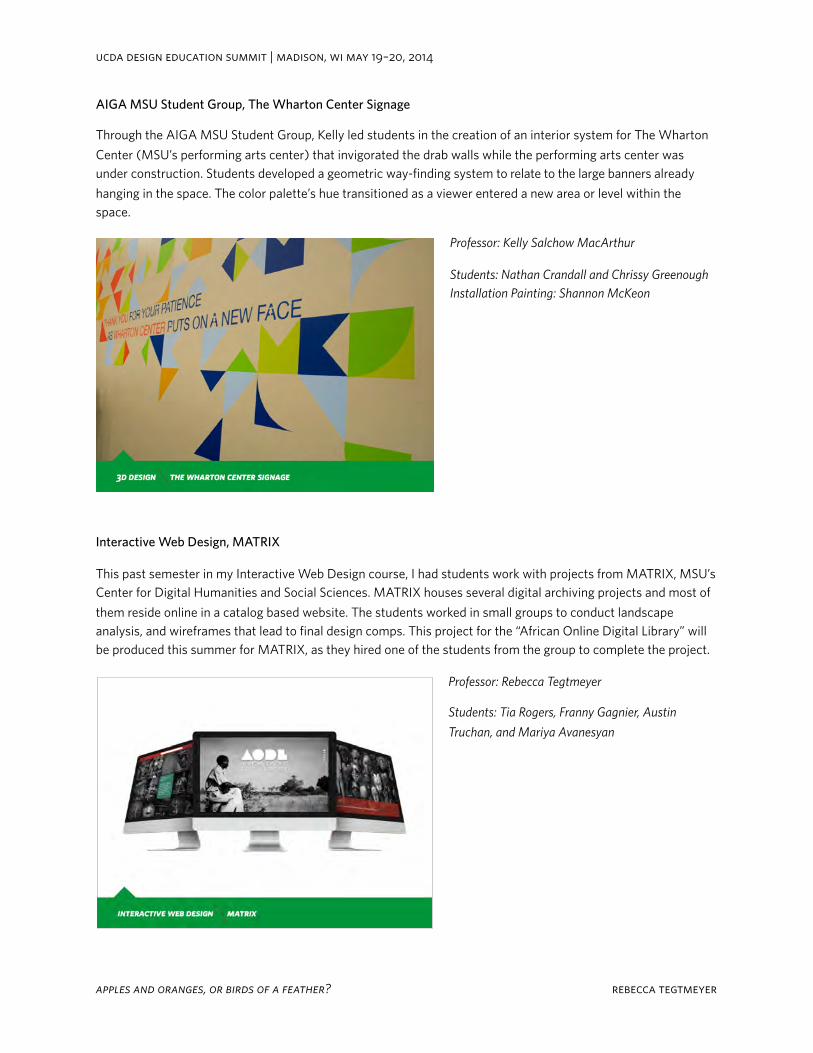
AIGA MSU Student Group, The Wharton Center Signage
Through the AIGA MSU Student Group, Kelly led students in the creation of an interior system for The Wharton Center (MSU’s performing arts center) that invigorated the drab walls while the performing arts center was under construction. Students developed a geometric way-finding system to relate to the large banners already hanging in the space. The color palette’s hue transitioned as a viewer entered a new area or level within the space.
Professor: Kelly Salchow MacArthur
Students: Nathan Crandall and Chrissy GreenoughInstallation Painting: Shannon McKeon
Interactive Web Design, MATRIX
This past semester in my Interactive Web Design course, I had students work with projects from MATRIX, MSU’s Center for Digital Humanities and Social Sciences. MATRIX houses several digital archiving projects and most of them reside online in a catalog based website. The students worked in small groups to conduct landscape analysis, and wireframes that lead to final design comps. This project for the “African Online Digital Library” will be produced this summer for MATRIX, as they hired one of the students from the group to complete the project.
Professor: Rebecca Tegtmeyer
Students: Tia Rogers, Franny Gagnier, Austin
Truchan, and Mariya Avanesyan
ucda design education summit | madison, wi may 19–20, 2014
apples and oranges, or birds of a feather? rebecca tegtmeyer
AIGA MSU Student Group, UURAF
As part of the AIGA MSU Student Group, active students engage in a project for University Research. Each year UR puts on a large undergraduate research forum titled UURAF (University Undergraduate Research and Arts Forum). The student group designs the program cover and supporting promotion materials for the event.
Professor: Rebecca Tegtmeyer
Students: Jill Zelenski, Sofija Dutcher,
Brean Pavlinak
AIGA MSU Student Group, UURAF
Today over 600 students from all 14 undergraduate colleges at MSU participate in UURAF. The event has become one of the largest undergraduate research forums in the country.
Graphic Design Students at the UURAF 2014
ucda design education summit | madison, wi may 19–20, 2014
apples and oranges, or birds of a feather? rebecca tegtmeyer
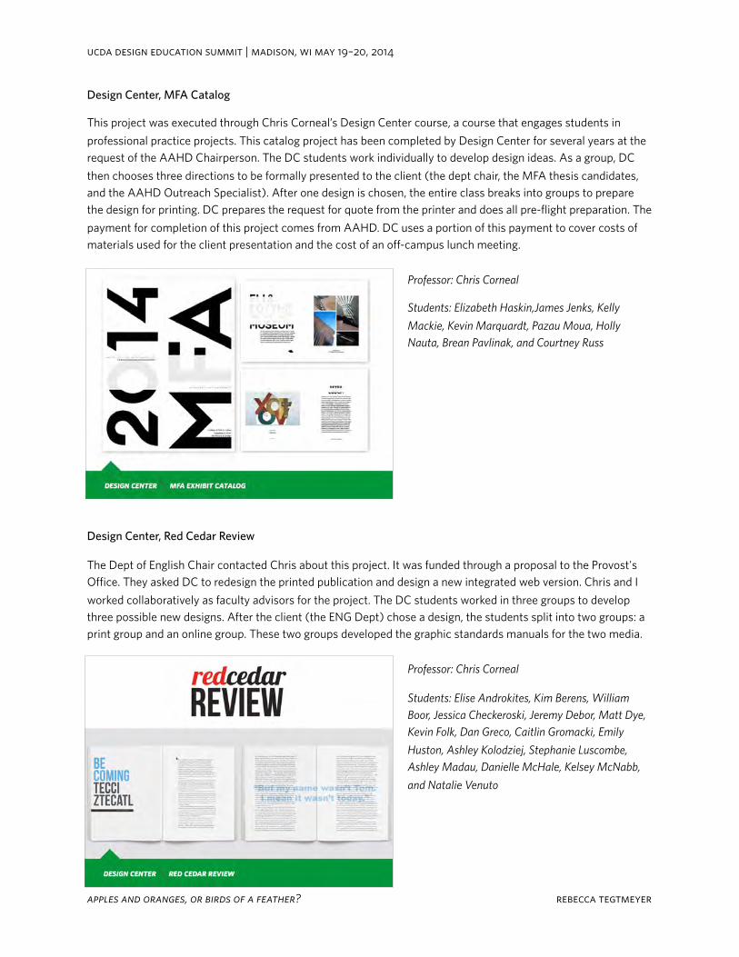
Design Center, MFA Catalog
This project was executed through Chris Corneal’s Design Center course, a course that engages students in professional practice projects. This catalog project has been completed by Design Center for several years at the request of the AAHD Chairperson. The DC students work individually to develop design ideas. As a group, DC then chooses three directions to be formally presented to the client (the dept chair, the MFA thesis candidates, and the AAHD Outreach Specialist). After one design is chosen, the entire class breaks into groups to prepare the design for printing. DC prepares the request for quote from the printer and does all pre-flight preparation. The payment for completion of this project comes from AAHD. DC uses a portion of this payment to cover costs of materials used for the client presentation and the cost of an off-campus lunch meeting.
Professor: Chris Corneal
Students: Elizabeth Haskin,James Jenks, Kelly
Mackie, Kevin Marquardt, Pazau Moua, Holly Nauta, Brean Pavlinak, and Courtney Russ
Design Center, Red Cedar Review
The Dept of English Chair contacted Chris about this project. It was funded through a proposal to the Provost's Office. They asked DC to redesign the printed publication and design a new integrated web version. Chris and I worked collaboratively as faculty advisors for the project. The DC students worked in three groups to develop three possible new designs. After the client (the ENG Dept) chose a design, the students split into two groups: a print group and an online group. These two groups developed the graphic standards manuals for the two media.
Professor: Chris Corneal
Students: Elise Androkites, Kim Berens, William Boor, Jessica Checkeroski, Jeremy Debor, Matt Dye, Kevin Folk, Dan Greco, Caitlin Gromacki, Emily
Huston, Ashley Kolodziej, Stephanie Luscombe, Ashley Madau, Danielle McHale, Kelsey McNabb,
and Natalie Venuto
ucda design education summit | madison, wi may 19–20, 2014
apples and oranges, or birds of a feather? rebecca tegtmeyer
36 | Tenth Annual UCDA Design Education Summit
Teaching Digital Design in the Flipped Classroom
Ann LemonKutztown University
13.2
Abstract“Students need their teachers present to answer questions or to provide help if they get stuck on an assignment; they don’t need their teachers present to listen to a lecture or review content.”
- Bergmann and Sams. Flip Your Classroom: Reach Every Student in Every Class Every Day, 2012. Hawker Bronlow.
The “flipped classroom” is gaining currency as an appropriate class structure for the digital age, to successfully integrate in-class learning with online tools. The flipped classroom model enables students to train with leading edge video tutorial software, conventional or e-textbooks, and/or online classroom tools such as Desire 2 Learn, Blackboard, and the like, out of class. Students master the basics of rote learning such as tools, definitions, and functions of the software online, and proceed at their own pace. Classroom time can then be devoted to hands-on learning, assessments, additional reinforcement of the software tools, and one-on-one troubleshooting as students complete design assignments.
Beginning graphic design students (first year students) in our program have 2 semesters of a software-focused class to familiarize them with the digital tools of the profession, which today include Adobe Photoshop, Illustrator and InDesign. Getting up-and-running in these programs is critical, but students enter the program with a wide range of knowledge – some are beginners, some have fairly advanced levels of expertise in (usually one) program, but may be completely new to others. The flipped model achieves both self-paced learning of software and face-to-face support from faculty, which is still rated as very important to collage students.
Presentation will include: curriculum plan, e-book tie ins, video tutorial, student projects, classroom process, research data.
Tenth Annual UCDA Design Education Summit | 37
AbstractGraphic design students often have access to image- oriented studio electives within schools of art and design, taught by experts in photography, illustration, and painting. What is distinct about a core image- making course for graphic designers? This question addresses the fundamentals of graphic design, possibly in opposition to what is implicitly claimed as such in many discipline- spanning foundation courses. This paper outlines two iterations of the author’s image- making course in two graphic design programs, both at public research universities, with special emphasis on the method employed in its development. The conception of image making embodied in the course is rooted in the author’s research on the cognitive function of imagery. Considering imagery in terms of the cognitive processing of its readers is an inherently user- centered approach, which distinguishes the coursework as design pedagogy. Critique methods reinforce the emphasis on goal- oriented interpretation and are critical to the integrity of the course. Assignments are classified here according to designations of exercise, project, and investigation, largely based on contextuality. Exercises isolate some fundamental aspect of graphic design without overwhelming beginning students with undue complexity, though over- simplification is a danger. Many exercises fail to present the requisite complexity for truly guiding student engagement. Projects are more context- rich and are reasonably close to analogs in design practice, or are more authentic to design practice. Investigations extend beyond an individual project and into systems. Specific assignments will be presented through student work.
To Teach Image by Its Function: Structuring Image Making for Graphic Design Students According to Cognitive Outcomes
Matthew PetersonUniversity of Illinois at
Urbana-Champaign
13.3
Graphic design students often have access to image-oriented studio electives within
schools of art and design, taught by experts in photography, illustration, and paint-
ing. What is distinct about a core image-making course for graphic designers? Design
emphasizes the relationship between media and users. While design instructors certainly
address the designer’s relationship to media in development, this is ultimately to serve
user experience. Thus a design-specific image course should frame images in terms of the
readers who interpret them, or construct knowledge with them. Graphic design being an
established profession also suggests baseline coverage of methods and challenges reflec-
tive of practice.
The author has developed two introductory (sophomore-level) studio courses on
image making in graphic design programs at major universities, separated in develop-
ment by six years. These courses represent different philosophical positions for engaging
in graphic design fundamentals. The 2008 course seeks to isolate fundamentals, while the
2014 course embeds them in rich experiences.
In Understanding by Design (1998), Grant Wiggins and Jay McTighe advocate for a curric-
ulum development method of backward design. Backward design dictates that outcomes
are determined holistically before individual assignments are developed to fulfill them.
This prescription appears straightforward, but is likely practiced far less frequently than
TO TEACH IMAGE BY ITS FUNCTION: STRUCTURING IMAGE MAKING FOR
GRAPHIC DESIGN STUDENTS ACCORDING TO COGNITIVE OUTCOMES
Matthew Peterson, PhD
University of Illinois at Urbana-Champaign
1
faculty would claim. The author employed a course development methodology for the
2008 image-making course, which qualifies as backward design. Two factors were used as
structuring devices: (a) proficiencies or production methods, which anticipate common
aspects of professional practice, and (b) performative image function, which focuses
attention on users and interpretation. The latter is a product of the author’s research,
and must be summarized before the course development methodology can be reported.
Performative image function details the ways in which images can model reader
cognition. Any time an image involves a reader in more than simply automatic recogni-
tion processes (e.g., identifying a certain shape as a tree), one or more image functions
are in operation. Ultimately, the performative image function typology should describe
any possible image, often times within the context of complex layout (in relation to text
and/or other imagery). To date, the twelve identified image functions are:
1. Decorative: imagery that does not reward any inspection and merely
distracts from any otherwise meaningful visual discourse;
non-functional, non-performative (does not involve the reader), and
non-cognitive.
2. Reiterative: imagery that is relevant to its context but contributes
nothing to the visual discourse; non-performative and non-cognitive.
3. Affective: imagery that elicits an emotional, gut reaction; performative
but by definition non-cognitive. (The remaining functions are all perfor-
mative and cognitive.)
4. Exploratory: imagery that the reader must navigate. Exploratory imagery
is always complex and presents the reader with a parallel system, where
there is no correct reading order.
5. Constitutive: imagery that describes some entity or concept through
elements that the reader must combine into a complete model. Constitu-
tive imagery is often also exploratory, and vice versa.
6. Narrative: imagery with which the reader constructs a sense of time. As
such, there is a proper reading order (narrative imagery is a serial
system), though the arrangement need not be unilinear. The sense of time
can be suggested through the provision of evidence, the repetition of
forms, or through other more exotic means. Video, despite being an
inherently time-based medium, only rarely qualifies as narrative
imagery, as the viewer is passive in the reception of its linear temporal
structure. (Image function details reader activity, and interprets any
form according to it.)
2
PETERSON / TO TEACH IMAGE BY ITS FUNCTION
7. Metaphorical: imagery that selectively maps characteristics of one thing
onto another, often but not always through juxtaposition or visual
similarity. Simpler mapping can be considered visual analogy, while the
most complex mapping becomes allegory.
8. Computational: imagery that promotes active comparisons by the reader.
Computational imagery can be both quantitative (especially in diagrams)
and qualitative (e.g., morphological comparisons).
9. Associative: a partial presentation of imagery that is completed by the
reader.
10. Linguistic: imagery that, if recognized as such, can be translated directly
into language. Linguistic imagery has been used to communicate with
illiterate “readers.”
11. Reflexive: imagery that somehow calls attention to its material means of
existence.
12. Problematic: imagery that at least initially appears confused, and
involves the reader in a visual problem solving process. Here there is
heavy reader involvement, though it might not be consummated by any
“successful” understanding.
In each case image function emphasizes the reader’s probabilistic involvement (that
is, how a reasonable number of readers, but certainly not all, will perform). Media is
analyzed only in relation to that involvement. As such, image function was determined
to be a systematic way to analyze imagery that would focus students’ attention on user
experience.
The other structuring device for the 2008 image-making course, proficiencies or
production methods, was a way to define graphic design practice while students were
still impressionable. It is the author’s experience that sophomores in graphic design (or
students in the first year of core graphic design coursework at a given institution) incor-
porate their experiences into their own personal models of graphic design. If web design,
for instance, is withheld until the junior year, students are far less likely to apply their
typographic skills to that endeavor. A problem of transfer is created that can be avoided by
introducing students to web design in the context of an introductory typography course,
for instance. There is virtue in ensuring that the formative year of core graphic design
instruction is broad in its scope.
To that end, a list of proficiencies and production methods was generated, both point-
ing to practice and reacting to perceived oversights in the existing curriculum. This list
included:
3
PETERSON / TO TEACH IMAGE BY ITS FUNCTION
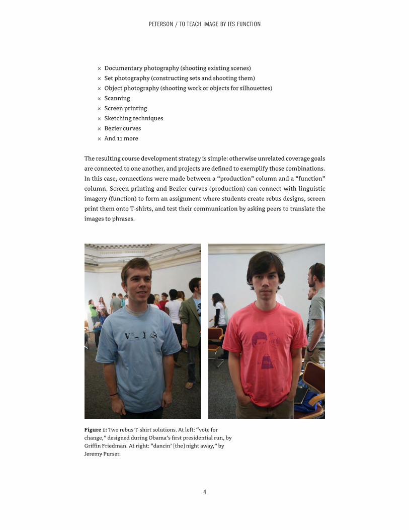
× Documentary photography (shooting existing scenes)
× Set photography (constructing sets and shooting them)
× Object photography (shooting work or objects for silhouettes)
× Scanning
× Screen printing
× Sketching techniques
× Bezier curves
× And 11 more
The resulting course development strategy is simple: otherwise unrelated coverage goals
are connected to one another, and projects are defined to exemplify those combinations.
In this case, connections were made between a “production” column and a “function”
column. Screen printing and Bezier curves (production) can connect with linguistic
imagery (function) to form an assignment where students create rebus designs, screen
print them onto T-shirts, and test their communication by asking peers to translate the
images to phrases.
4
PETERSON / TO TEACH IMAGE BY ITS FUNCTION
Figure 1: Two rebus T-shirt solutions. At left: “vote for change,” designed during Obama’s first presidential run, by Griffin Friedman. At right: “dancin’ [the] night away,” by Jeremy Purser.
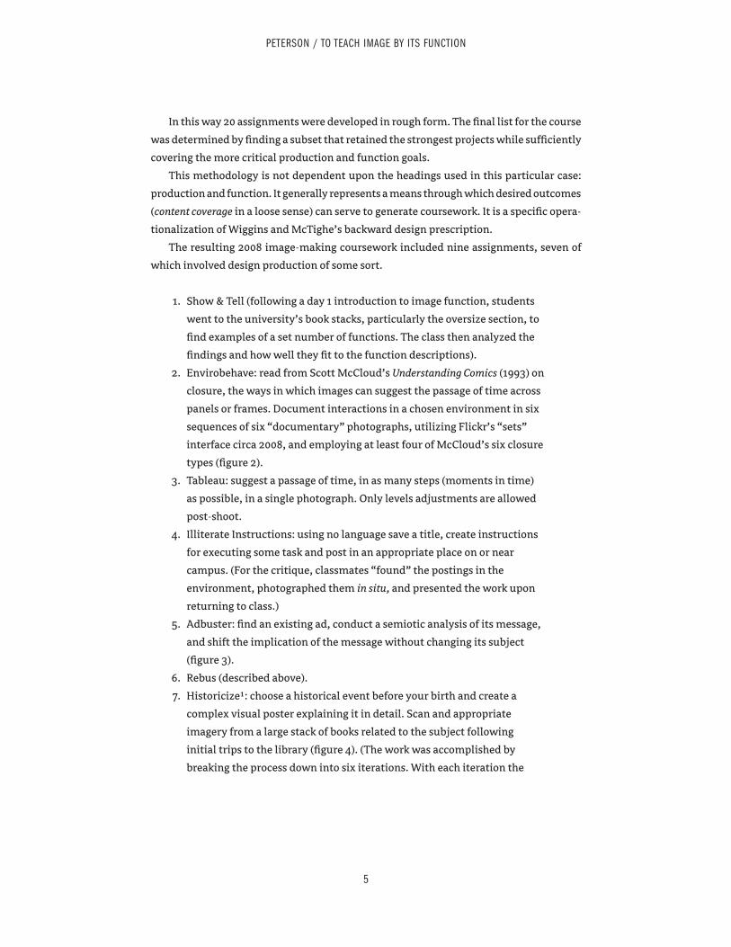
In this way 20 assignments were developed in rough form. The final list for the course
was determined by finding a subset that retained the strongest projects while sufficiently
covering the more critical production and function goals.
This methodology is not dependent upon the headings used in this particular case:
production and function. It generally represents a means through which desired outcomes
(content coverage in a loose sense) can serve to generate coursework. It is a specific opera-
tionalization of Wiggins and McTighe’s backward design prescription.
The resulting 2008 image-making coursework included nine assignments, seven of
which involved design production of some sort.
1. Show & Tell (following a day 1 introduction to image function, students
went to the university’s book stacks, particularly the oversize section, to
find examples of a set number of functions. The class then analyzed the
findings and how well they fit to the function descriptions).
2. Envirobehave: read from Scott McCloud’s Understanding Comics (1993) on
closure, the ways in which images can suggest the passage of time across
panels or frames. Document interactions in a chosen environment in six
sequences of six “documentary” photographs, utilizing Flickr’s “sets”
interface circa 2008, and employing at least four of McCloud’s six closure
types (figure 2).
3. Tableau: suggest a passage of time, in as many steps (moments in time)
as possible, in a single photograph. Only levels adjustments are allowed
post-shoot.
4. Illiterate Instructions: using no language save a title, create instructions
for executing some task and post in an appropriate place on or near
campus. (For the critique, classmates “found” the postings in the
environment, photographed them in situ, and presented the work upon
returning to class.)
5. Adbuster: find an existing ad, conduct a semiotic analysis of its message,
and shift the implication of the message without changing its subject
(figure 3).
6. Rebus (described above).
7. Historicize1: choose a historical event before your birth and create a
complex visual poster explaining it in detail. Scan and appropriate
imagery from a large stack of books related to the subject following
initial trips to the library (figure 4). (The work was accomplished by
breaking the process down into six iterations. With each iteration the
5
PETERSON / TO TEACH IMAGE BY ITS FUNCTION
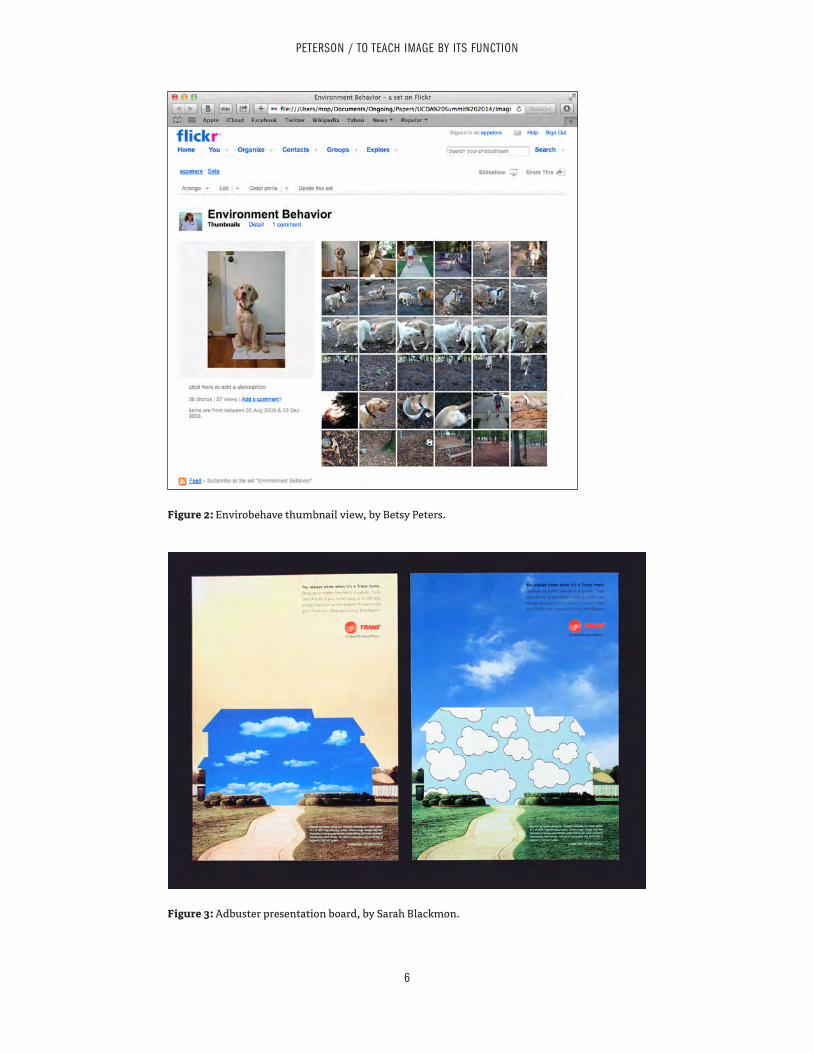
6
PETERSON / TO TEACH IMAGE BY ITS FUNCTION
Figure 2: Envirobehave thumbnail view, by Betsy Peters.
Figure 3: Adbuster presentation board, by Sarah Blackmon.
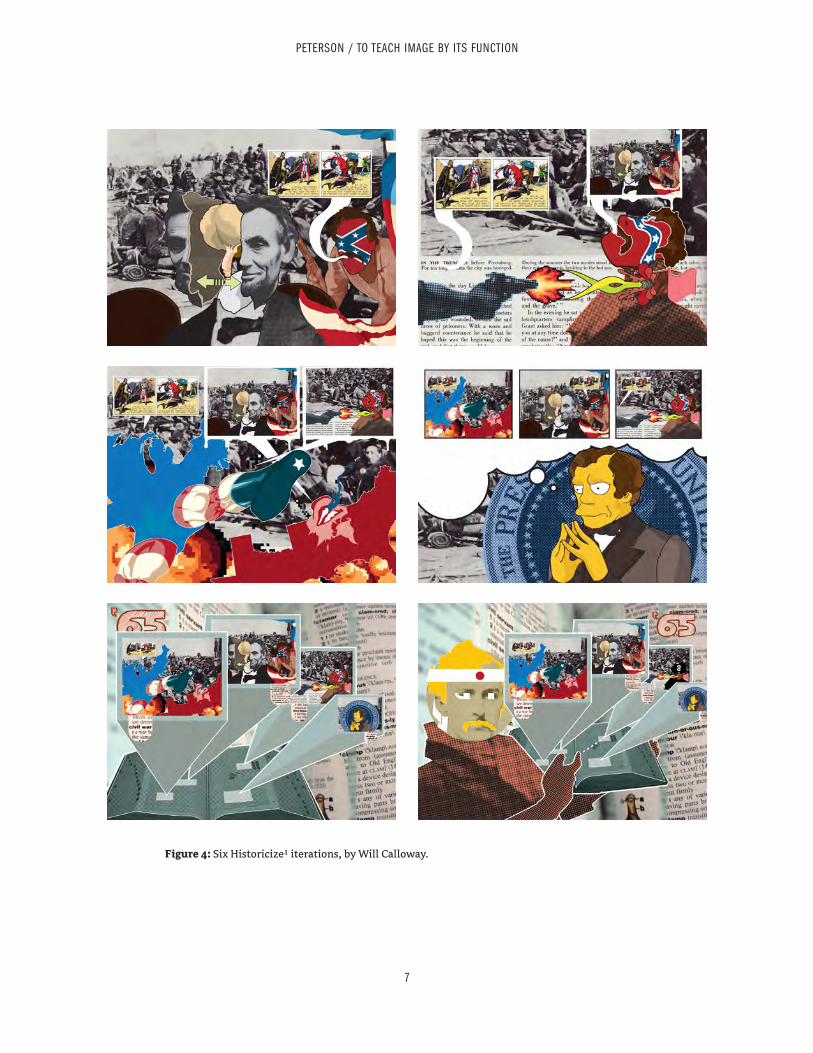
7
PETERSON / TO TEACH IMAGE BY ITS FUNCTION
Figure 4: Six Historicize1 iterations, by Will Calloway.
poster needed to be complete. Subsequent iterations would layer new
information into the poster, and existing material had to be modified to
accommodate the new. Iterations included cause, effect, minority report
[an alternate perspective], and three others.)
8. It Lives!: utilizing the altered imagery from Historicize1, create a
stop-motion video documenting the historical event.
9. Portfolio Workshop (documenting work in class).
While the 2008 image-making course asked students to manipulate reader interpretation
through various image functions and covered a range of proficiencies and production
methods, its products were especially impractical. Each assignment qualifies as an exer-
cise. An exercise is brief, inauthentic (to professional practice), and context-free. It is an
attempt to address design fundamentals by isolating them.
A project, on the other hand, is complex, contextual, and in some significant way
authentic to professional practice. This does not mean that a project needs to simulate
practice, or that doing so is even desirable, but rather that a project serves as a relative
analog to professional work or some significant aspect thereof.
Assignments can also be investigations, when they collect projects in a system, utilize
research, or otherwise go deeper than projects allow.
While Historicize1 is deeper than the typical exercise, with its heavy revisions and
complexity, it has little connection to purpose, so critical to design. A relatively simple
change to the exercise transforms it into a project: it becomes an educational poster
for middle school or high school classrooms, with the inclusion of text consequently
encouraged (figures 5, 6 and 7). The new assignment, Historicize2 (included in the 2014
image-making course), becomes a far more productive artifact for classroom discussion,
where critique is informed by a clear understanding of utility. It forces the students to
manage complexity.
The three-iteration sequence in Figure 7 demonstrates the impact of the exer-
cise-to-project conversion on critique and development. The first pictured iteration (at
left) is basic in terms of its content, which includes a title, ten illustrations with dates,
a minimal timeline, a marginal moon, and a single paragraph. For the 2008 version of
the assignment, the critique would stop at internal relationships of layout. For this 2014
version, where the poster is an educational resource, it is clear that the iteration is too
information-poor to adequately serve that purpose (which came out in the critique).
Furthermore, those internal relationships of layout become easier to discuss when the
work is clearly goal-oriented.
8
PETERSON / TO TEACH IMAGE BY ITS FUNCTION
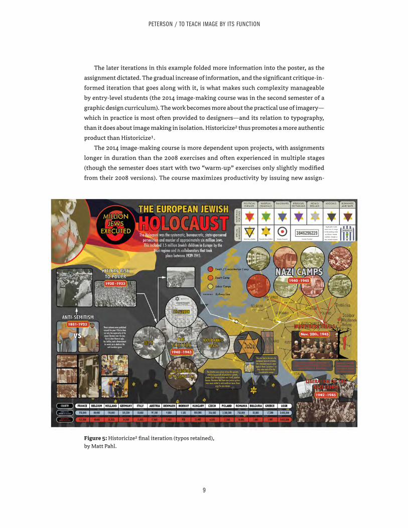
The later iterations in this example folded more information into the poster, as the
assignment dictated. The gradual increase of information, and the significant critique-in-
formed iteration that goes along with it, is what makes such complexity manageable
by entry-level students (the 2014 image-making course was in the second semester of a
graphic design curriculum). The work becomes more about the practical use of imagery—
which in practice is most often provided to designers—and its relation to typography,
than it does about image making in isolation. Historicize2 thus promotes a more authentic
product than Historicize1.
The 2014 image-making course is more dependent upon projects, with assignments
longer in duration than the 2008 exercises and often experienced in multiple stages
(though the semester does start with two “warm-up” exercises only slightly modified
from their 2008 versions). The course maximizes productivity by issuing new assign-
9
PETERSON / TO TEACH IMAGE BY ITS FUNCTION
Figure 5: Historicize2 final iteration (typos retained), by Matt Pahl.
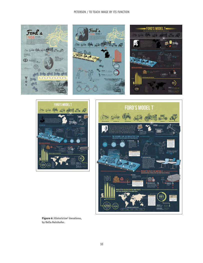
10
PETERSON / TO TEACH IMAGE BY ITS FUNCTION
Figure 6: Historicize2 iterations, by Bella Reinhofer.
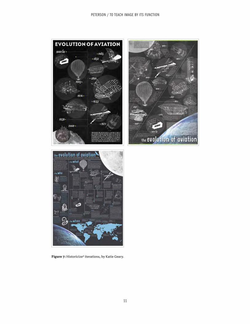
11
PETERSON / TO TEACH IMAGE BY ITS FUNCTION
Figure 7: Historicize2 iterations, by Katie Geary.
ments in the same period as final critiques, such that every day includes a deliverable.
All assignments afford enough time for critique-driven revision. The 2014 coursework
includes six assignments, the final four of which qualify as projects, and some arguably
as investigations.
1. Illiterate Instructions (similar to 2008 version).
2. Tableau (the 2014 version is a slight modification that stresses the
construction of a mystery and includes a more prominent typographic
message, which is not allowed to “give away” the mystery itself, but
rather frame it).
3. Historicize2 (described above).
4. Station Identification: invent a new viable TV station and produce three
2–15 second bumpers (interstitial sequences amidst programming)—an
identity bumper (identifying the station itself), a show bumper, and a
programming bumper (listing the next few programs with air times). The
suite of bumpers needs to form a coherent system of identity, while each
bumper must also have unique aspects to maintain interest (Figures 8
and 9). (A workshop was conducted on day 1 of the assignment, where
students brought in light sources, objects, and cropped graphics, and
explored filming techniques. These in-class studies demonstrated that
compelling form can be generated without intimate software knowledge,
and served as a form-making backup plan for any students who had
difficulty learning video software.)
5. Non-Gallery Guide: select a local space or set of spaces and treat it like an
exhibition, with a gallery guide (brochure) that leads a reader through
points of interest. The guide should provide information on the points of
interest. (Small groups conducted the critique by traveling to the local
“exhibition spaces” [a park, a building, a set of college bars, etc.] with
guides in hand, returning to report to the full class.)
6. False Titles: invent a new viable magazine and design three covers and
a contents page corresponding to one of the covers (Figure 10). (As with
all other projects, students had to develop alternative ideas before
selecting and developing one. Early image creation for the covers was
guided by an assigned image function.)
12
PETERSON / TO TEACH IMAGE BY ITS FUNCTION
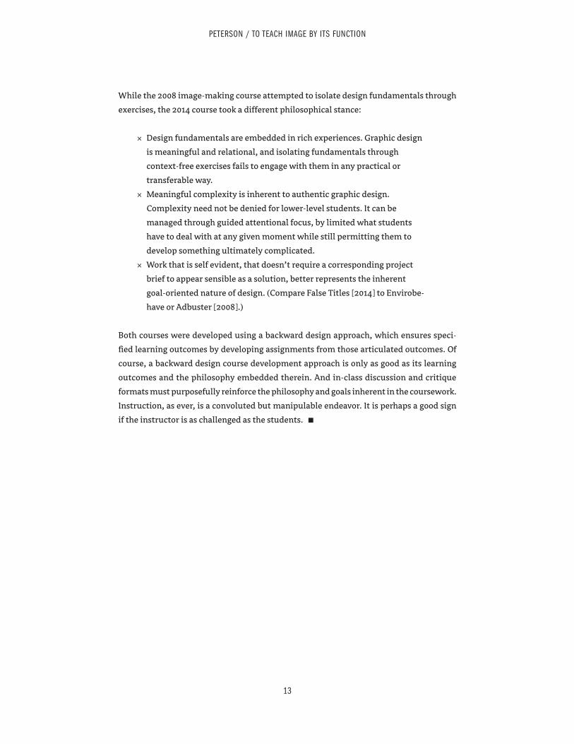
While the 2008 image-making course attempted to isolate design fundamentals through
exercises, the 2014 course took a different philosophical stance:
× Design fundamentals are embedded in rich experiences. Graphic design
is meaningful and relational, and isolating fundamentals through
context-free exercises fails to engage with them in any practical or
transferable way.
× Meaningful complexity is inherent to authentic graphic design.
Complexity need not be denied for lower-level students. It can be
managed through guided attentional focus, by limited what students
have to deal with at any given moment while still permitting them to
develop something ultimately complicated.
× Work that is self evident, that doesn’t require a corresponding project
brief to appear sensible as a solution, better represents the inherent
goal-oriented nature of design. (Compare False Titles [2014] to Envirobe-
have or Adbuster [2008].)
Both courses were developed using a backward design approach, which ensures speci-
fied learning outcomes by developing assignments from those articulated outcomes. Of
course, a backward design course development approach is only as good as its learning
outcomes and the philosophy embedded therein. And in-class discussion and critique
formats must purposefully reinforce the philosophy and goals inherent in the coursework.
Instruction, as ever, is a convoluted but manipulable endeavor. It is perhaps a good sign
if the instructor is as challenged as the students. ▪
13
PETERSON / TO TEACH IMAGE BY ITS FUNCTION
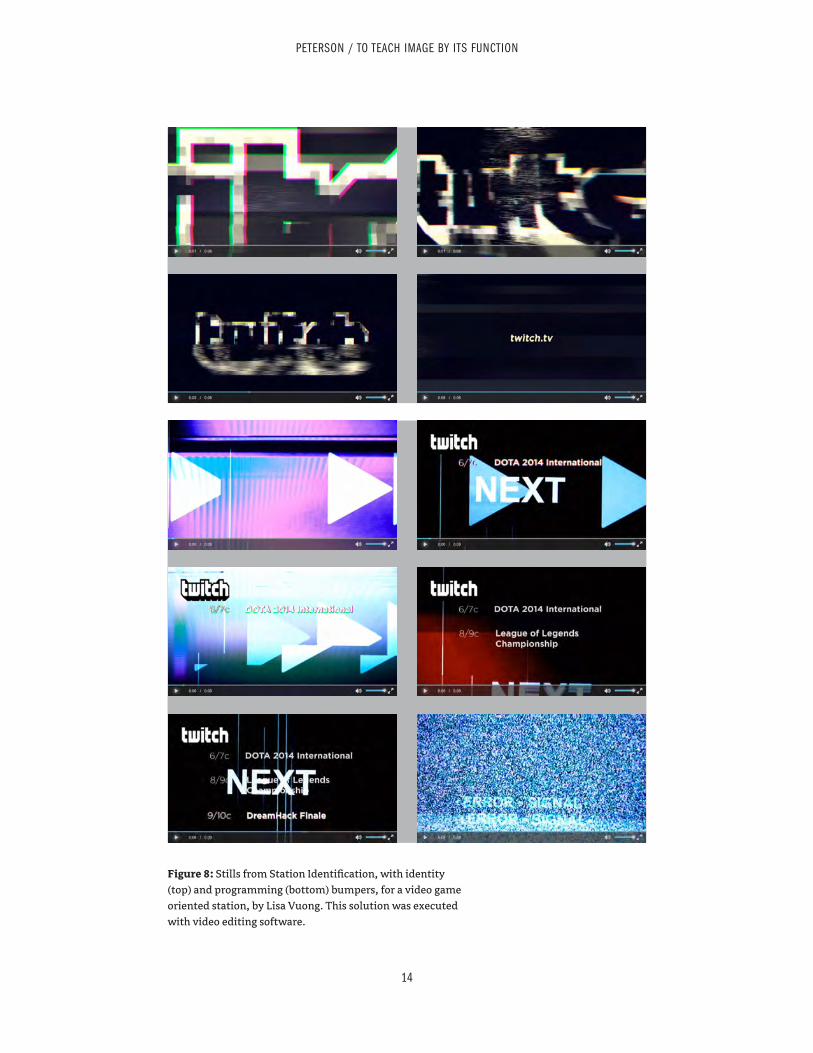
14
PETERSON / TO TEACH IMAGE BY ITS FUNCTION
Figure 8: Stills from Station Identification, with identity (top) and programming (bottom) bumpers, for a video game oriented station, by Lisa Vuong. This solution was executed with video editing software.
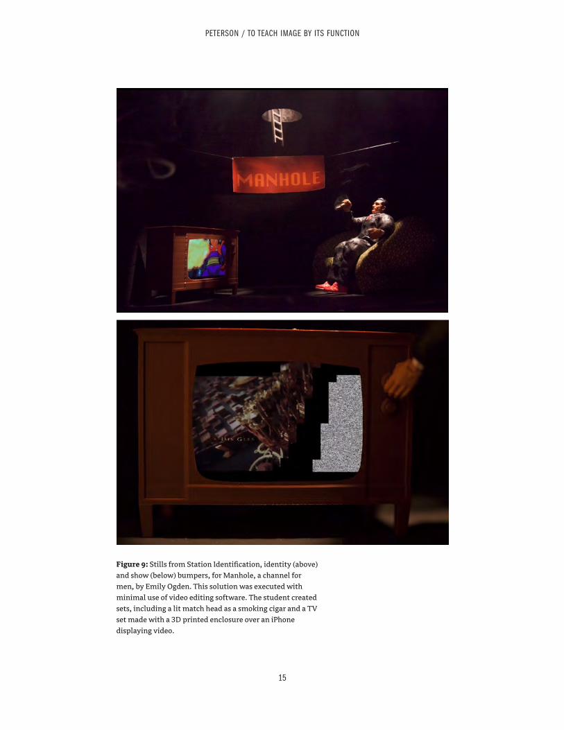
15
PETERSON / TO TEACH IMAGE BY ITS FUNCTION
Figure 9: Stills from Station Identification, identity (above) and show (below) bumpers, for Manhole, a channel for men, by Emily Ogden. This solution was executed with minimal use of video editing software. The student created sets, including a lit match head as a smoking cigar and a TV set made with a 3D printed enclosure over an iPhone displaying video.
16
PETERSON / TO TEACH IMAGE BY ITS FUNCTION
Figure 10: Magazine covers and corresponding contents page, by Lisa Vuong.
38 | Tenth Annual UCDA Design Education Summit
Sound Connections in Design Education
Jessica BarnessKent State University
14.1
Abstract As design programs shift gears and offer courses in interaction and motion design, an ingredient begins to appear in student work. It is not visual, but it is always temporal and sometimes social. A foreign yet oddly familiar medium, it transforms the way a designer speaks to an audience, and plays a role in shaping interactive contexts.
Sound is an integral part of everyday life and a critical component in designed digital experiences. Historically, sound informed the design of communication and has been the subject of creative work, beginning with Morse code and typography (“what language looks like”) and moving into music industry print collateral and data visualization. However, sound effects, voiceovers and music — among other things — have been creeping into our areas of expertise since the 1990s. As we continue to design for holistic human experiences, there is opportunity to take ownership of sound in relationship to our research, education and practice.
Digital audio and typography have commonalities; both are embodiments of physical sound that invite expression and meaning making. Audio technologies are readily available for classroom use, yet students are challenged to make decisions on creating, selecting and remixing sound in relation to their visual and conceptual content. Previous design research in this area is limited, and suggests that sound exists at the edges of our knowledge base. We are using sound unlike any other discipline. How do we approach the design process with something that can’t be seen, and what might this awareness bring to professional practice?This paper presents connections between design’s historical relationship to sound, existing work and future possibilities. Examples of recent student work accompany descriptions of the author’s pedagogical approach to sound in interaction and motion design classes. This investigation calls for further inquiry on how sound can be contextualized within design education.
Tenth Annual UCDA Design Education Summit | 39
AbstractTo say that the video/motion narrative is an established form of communication on the web is to state the obvious, as evidenced in viral videos on YouTube and Facebook. We can safely state that understanding how to design effective motion work is an important part of an undergraduate design student’s education.
Over the last decade, the presenter has included the interpretation of poetry into course content within undergraduate graphic design programs courses, and it is his belief that the process of translating poetry into motion design fosters critical thinking and analysis and more “experimental” solutions to graphic design projects. With the interpretation of poetry, principles of graphic design in motion are explored: hierarchy of typography and messaging, sequential relationships between image and text, filmic devices such as pacing, foreshadowing, and sound design.
Effective, engaging poetry can condense and crystalize experience into sharp focus. Poetry can take many forms: an “old school” sonnet, free verse, rhymed and unrhymed stanzas, prose or narrative poetry, along with more contemporary experimental forms. Due to this inherent breadth of style and content, the form of poetry allows significant room for interpretation as a design problem for graphic design students.
The presenter has a background in designing motion/web work for nonprofit organizations, and has had several original poems juried into national and international poetry-film competitions. He has worked with established poets and has written and designed his own work.
This paper/presentation summarizes pedagogical approaches to teaching motion and interactive design principles through case studies of student-designed poetry in motion.
Teaching Motion and Interactive Design Principles through Poetry in Motion: Case Studies
Dave RichardsonEastern Illinois University
14.2
Teaching Motion and Interactive Design Principles through Poetry in Motion: Case Studies
Dave Richardson / Eastern Illinois University / [email protected] Design Education Summit 2014
Note: This is a summary of the key points concerning the potential for teaching motion and interactive design
principles through poetry-in-motion projects in undergraduate graphic design classes. A few sample screenshots
of students’ interactive sites, videos, and animations are supplied, with commentary, to give a flavor of the pre-
sentation. However, the author acknowledges the limited nature of the static page when representing “interac-
tivity” and “poetry in motion” and case studies. Three of the six case studies are represented here.
The Possibilities for InterpretationAt its heart, poetry is a distillation of emotion and content; at its best, it’s full of interpretation and
meaning, both specific and universal at the same time. Poetry can condense far-reaching questions of life into a single, clear moment bristling on the page or screen; or a poem can frame a particular place and time — a certain quality of light, a certain exchange or encounter with the unknown — and ask us, the reader, to see a larger picture, to reflect upon ideas beyond our usual day-to-day considerations.
At its best, poetry broads our viewpoints, shows us the world in a new light.This is precisely why, from time to time, I slip poetry into the interactive and motion design courses
I teach: the possibilities for interpretation, both in form and content, that poetry can provide. At three different universities, at different levels of undergraduate education, I have asked students to interpret poetry into interactive and motion space; and by doing so, students have had to consider design princi-ples that govern these digital spaces.
Too often, it seems, we graphic design educators are asking our students to conceive, create, and build websites and motion design projects that are too centered on “real world” portfolio pieces. True, in portfolio interviews, many (if not most) reviewers ask that students show work that is reflective of “real life” projects, such as a website for a restaurant or a small business, or a motion ad for a start-up. These projects have a definite place in a student’s portfolio, and, to the point, the bulk of a student’s portfolio should address these real-world issues. A design student who has not spent considerable time thinking about these “real world” graphic design problems of messages aligning with content, and meaning dictating form, is spending too much time in the abstraction of theory.
Yet the possibilities for interpretation; the possibilities for visual, artistic invention latent in the best poetry — this is the primary reason that poetry can work so well for the content and subject of an undergraduate graphic design project in interactive and motion design.
There are real possibilities.
5 Practical Reasons Poetry Works Well1) Poetry is digestible. It is an accessible form for students to work with, and within poetry there is
considerable variation, from the rhymed meters of Shakespeare, to the light-heartedness of Billy Col-lins, to the free-form “poetry jams” on Youtube. I’ve never had a student who could not find some kind of poetry (or similar spoken word narrative) to connect with.
2) Cadence, pauses, rhythm, pacing, the movement of the language on the poet’s tongue: the performance of the written word is central to the meaning of poetry. Because of this inherent perfor-mative quality of poetry, the delivery of the content contains much of the meaning and therefore holds an important key to the interpretation in graphic space. Also, this delivery — the how of the recitation — can be altered by the student to augment or redefine the content of the poem, if the student choses to record his/her own reading. The sound of words — and how long or short the pauses are between the sounds — matters tremendously. Sound is intimately connected to meaning.
3) Poetry can be divided easily into “sequences” which can be realized in interactive space. When considering the design of more contemporary web sites, students must give thought to the main pages and the sub-pages within those main categories; that is, the content of a site must be analyzed, orga-nized, and designed so that there is clarity. The same can be true of poetry. Whether a poem is quite long or a quick read, the nature of poetic structure allows for this “compartmentalization” of the con-tent, so that a viewer can move through the poem and interact with the words or content, much the same as one might with a more traditional, contemporary site. Poetry has structural possibilities for interactivity.
4) In terms of interactive design, clear navigation and surprising elements of interactivity can often be combined to maximum effect. Because many poems by their nature seem to ask to be inter-preted, the digital interactive space itself can be interpreted, too, by the student, as a reflection of this; and in this way a mixing of clear, easy-to-understand navigational elements (buttons moving the viewer from one stanza to the next, or one section to the next) and unexpected elements that reveal themselves at surprising times (i.e, with the hover of a mouse over an image, perhaps; or the hover of a mouse over a hidden target that relates to a specific word or phrase) — poetry is a form that often allows for and invites these two alternative design strategies to co-exist: clarity and surprise; the obvious and the hid-den; the clear and the mysterious.
And 5) The intrepretation of poetry can broaden the style and content of a graphic designer’s port-folio, revealing his or her more “artistic,” inventive (or perhaps more ambiguous) side. This is not to say that graphic design projects are not artistic or inventive enough for students. They certainly can be and often are great visual challenges. However, after years of teaching graphic design, I feel that some-times graphic design projects are defined in such a way that the parameters themselves err on the side of “clarity,” or toward a modernist view of communication. Sometimes the investigation of ambiquity, mystery, and uncertainty takes the back seat in graphic design.
A properly chosen poem can say to a student, “Interpret me. Paint my portrait. What do you see?”
Case StudiesThe following are three examples of student projects that relate to the interpretration of poetry, or
the spoken word in narrative or poetic form, into interactive/motion design space. These three projects are representative. I could have chosen a dozen projects to showcase.
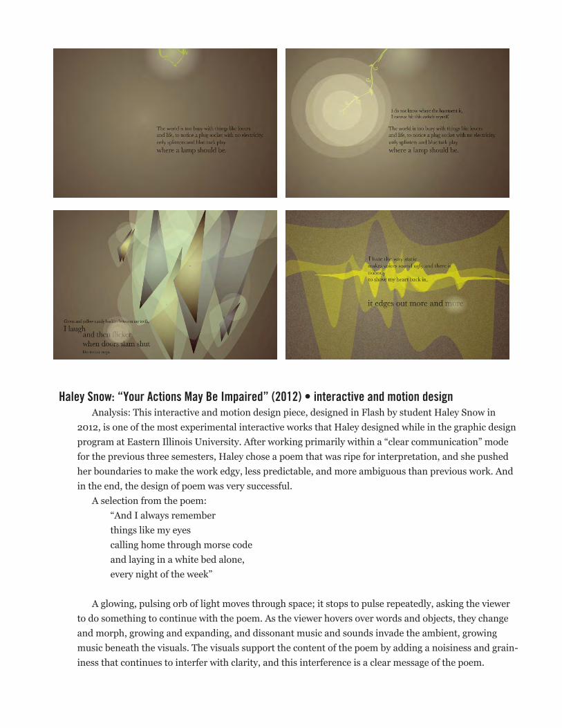
Haley Snow: “Your Actions May Be Impaired” (2012) • interactive and motion designAnalysis: This interactive and motion design piece, designed in Flash by student Haley Snow in
2012, is one of the most experimental interactive works that Haley designed while in the graphic design program at Eastern Illinois University. After working primarily within a “clear communication” mode for the previous three semesters, Haley chose a poem that was ripe for interpretation, and she pushed her boundaries to make the work edgy, less predictable, and more ambiguous than previous work. And in the end, the design of poem was very successful.
A selection from the poem: “And I always remember things like my eyes calling home through morse code and laying in a white bed alone, every night of the week”
A glowing, pulsing orb of light moves through space; it stops to pulse repeatedly, asking the viewer to do something to continue with the poem. As the viewer hovers over words and objects, they change and morph, growing and expanding, and dissonant music and sounds invade the ambient, growing music beneath the visuals. The visuals support the content of the poem by adding a noisiness and grain-iness that continues to interfer with clarity, and this interference is a clear message of the poem.
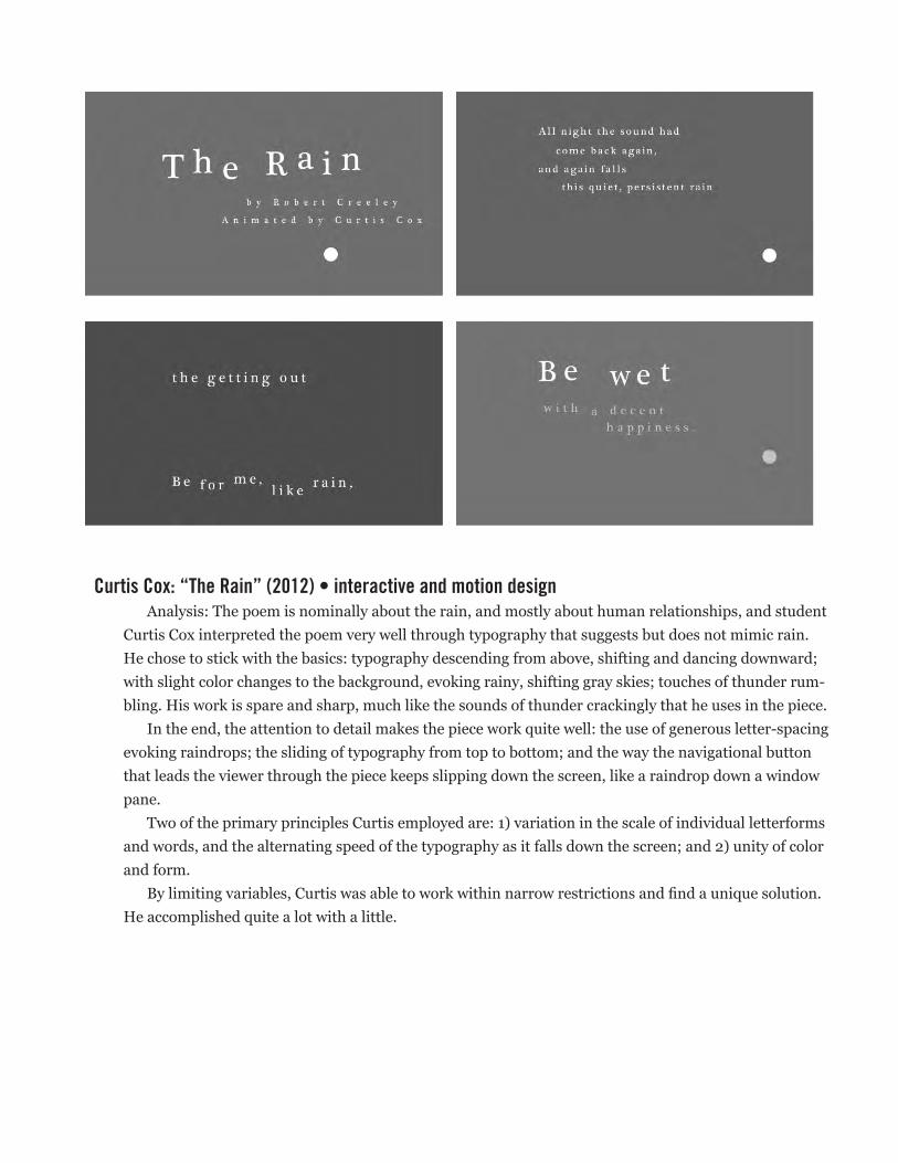
Curtis Cox: “The Rain” (2012) • interactive and motion designAnalysis: The poem is nominally about the rain, and mostly about human relationships, and student
Curtis Cox interpreted the poem very well through typography that suggests but does not mimic rain. He chose to stick with the basics: typography descending from above, shifting and dancing downward; with slight color changes to the background, evoking rainy, shifting gray skies; touches of thunder rum-bling. His work is spare and sharp, much like the sounds of thunder crackingly that he uses in the piece.
In the end, the attention to detail makes the piece work quite well: the use of generous letter-spacing evoking raindrops; the sliding of typography from top to bottom; and the way the navigational button that leads the viewer through the piece keeps slipping down the screen, like a raindrop down a window pane.
Two of the primary principles Curtis employed are: 1) variation in the scale of individual letterforms and words, and the alternating speed of the typography as it falls down the screen; and 2) unity of color and form.
By limiting variables, Curtis was able to work within narrow restrictions and find a unique solution. He accomplished quite a lot with a little.
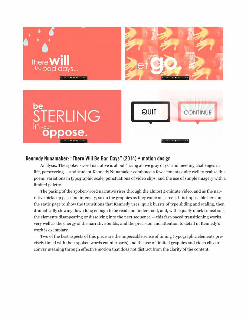
Kennedy Nunamaker: “There Will Be Bad Days” (2014) • motion designAnalysis: The spoken-word narrative is about “rising above gray days” and meeting challenges in
life, persevering — and student Kennedy Nunamaker combined a few elements quite well to realize this poem: variations in typographic scale, punctuations of video clips, and the use of simple imagery with a limited palette.
The pacing of the spoken-word narrative rises through the almost 2-minute video, and as the nar-rative picks up pace and intensity, so do the graphics as they come on screen. It is impossible here on the static page to show the transitions that Kennedy uses: quick bursts of type sliding and scaling, then dramatically slowing down long enough to be read and understood, and, with equally quick transitions, the elements disappearing or dissolving into the next sequence — this fast-paced transitioning works very well as the energy of the narrative builds, and the precision and attention to detail in Kennedy’s work is exemplary.
Two of the best aspects of this piece are the impeccable sense of timing (typographic elements pre-cisely timed with their spoken words counterparts) and the use of limited graphics and video clips to convey meaning through effective motion that does not distract from the clarity of the content.
40 | Tenth Annual UCDA Design Education Summit
Polyhedralness as Multiple Narratives
Moon Jung JangUniversity of Georgia
14.3
AbstractCreating narrative with multiple levels of information has been crucial in visual communication and design education because multiple levels of information can change the ways of experiencing stories and of building visual forms. This study focuses on the relationship between multiple narratives and polyhedralness as a visual concept. In this study, polyhedralness is defined as the formal quality of being a solid and changeable figure with multiple facets. It aims to investigate polyhedral forms to convey multiple levels of information and how polyhedralness generates the relationship between sequences and pages. This study explores the uses of fundamental physical attributes such as shape, color, size, and arrangement in polyhedral forms and how they contribute to enhancing stories with multiple directions.
This approach to create multiple narratives in polyhedral forms was first developed in a studio course; the methodology was built in stages. In the first stage, students took a journey in daily life to collect a wide array of visual and aural information, such as sounds, dialogues, road signs, and objects. The second stage involved interpretive analysis and classification of the information. Finally, based on their analysis and classification, the students created signs, such as representational, symbolic, and indexical signs, and arranged them in a visual system. The function of the visual system is to render the stories through the use of polyhedral forms. The design outcomes resulted in various modes of polyhedralness, such as flexagon, pyramid, hexahedron, dodecahedron, and transformable 3D forms, all articulating visual structures of multiple narratives. This study was designed to contribute to visual literacy and the development of narrative design practices.
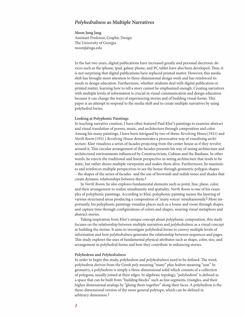
1
Polyhedralness as Multiple Narratives
Moon Jung JangAssistant Professor, Graphic DesignThe University of [email protected]
In the last two years, digital publications have increased greatly and personal electronic de-vices such as the iphone, ipad, galaxy phone, and PC tablet have also been developed. Thus, it is not surprising that digital publications have replaced printed matter. However, this media shift has brought more attention to three-dimensional design work and has reinforced its needs in design education. Furthermore, whether students deal with digital publication or printed matter, learning how to tell a story cannot be emphasized enough. Creating narratives with multiple levels of information is crucial in visual communication and design education because it can change the ways of experiencing stories and of building visual forms. This paper is an attempt to respond to the media shift and to create multiple narratives by using polyhedral forms.
Looking at Polyphonic PaintingsIn teaching narrative creation, I have often featured Paul Kleé ’s paintings to examine abstract and visual translation of poems, music, and architecture through composition and color. Among his many paintings, I have been intrigued by two of them: Revolving House (1921) and North Room (1932.) Revolving House demonstrates a provocative way of visualizing archi-tecture. Kleé visualizes a series of facades projecting from the center house as if they revolve around it. This circular arrangement of the facades presents his way of seeing architecture and architectural environments influenced by Constructivism, Cubism and the Bauhaus. In other words, he rejects the traditional and linear perspective in seeing architecture that tends to be static, but rather shows multiple viewpoints and makes them alive. Furthermore, he maximiz-es and reinforces multiple perspectives to see the house through geometric polygon shapes – the shapes of the series of facades- and the use of brownish and redish tones and shades that create dynamic relationships between them.1
In North Room, he also explores fundamental elements such as point, line, plane, color, and their arrangement to realize simultaneity and spatiality. North Room is one of his exam-ples of polyphonic paintings. According to Kleé, polyphonic painting means the layering of various structured areas producing a composition of ‘many voices’ simultaneously.2 More im-portantly, his polyphonic paintings visualize places such as a house and room through shapes and capture time through configurations of colors and shapes, weaving visual metaphors and abstract stories.
Taking inspiration from Kleé ’s unique concept about polyphonic composition, this study focuses on the relationship between multiple narratives and polyhedralness as a visual concept in building the stories. It aims to investigate polyhedral forms to convey multiple levels of information and how polyhedralness generates the relationship between sequences and pages. This study explores the uses of fundamental physical attributes such as shape, color, size, and arrangement in polyhedral forms and how they contribute to enhancing stories.
Polyhedron and PolyhedralnessIn order to begin this study, polyhedron and polyhedralness need to be defined. The word, polyhedron derives from the Greek poly meaning “many” plus hedron meaning “seat.” In geometry, a polyhedron is simply a three-dimensional solid which consists of a collection of polygons, usually joined at their edges. In algebraic topology, “polyhedron” is defined as a space that can be built from “building blocks” such as line segments, triangles, and their higher dimensional analogs by “gluing them together” along their faces. A polyhedron is the three-dimensional version of the more general polytope, which can be defined in arbitrary dimension.3
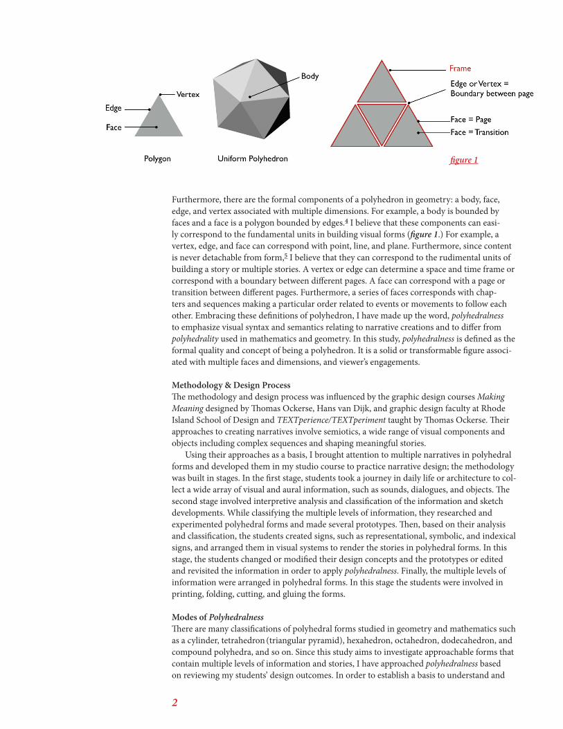
2
Furthermore, there are the formal components of a polyhedron in geometry: a body, face, edge, and vertex associated with multiple dimensions. For example, a body is bounded by faces and a face is a polygon bounded by edges.4 I believe that these components can easi-ly correspond to the fundamental units in building visual forms (figure 1.) For example, a vertex, edge, and face can correspond with point, line, and plane. Furthermore, since content is never detachable from form,5 I believe that they can correspond to the rudimental units of building a story or multiple stories. A vertex or edge can determine a space and time frame or correspond with a boundary between different pages. A face can correspond with a page or transition between different pages. Furthermore, a series of faces corresponds with chap-ters and sequences making a particular order related to events or movements to follow each other. Embracing these definitions of polyhedron, I have made up the word, polyhedralness to emphasize visual syntax and semantics relating to narrative creations and to differ from polyhedrality used in mathematics and geometry. In this study, polyhedralness is defined as the formal quality and concept of being a polyhedron. It is a solid or transformable figure associ-ated with multiple faces and dimensions, and viewer’s engagements.
Methodology & Design ProcessThe methodology and design process was influenced by the graphic design courses Making Meaning designed by Thomas Ockerse, Hans van Dijk, and graphic design faculty at Rhode Island School of Design and TEXTperience/TEXTperiment taught by Thomas Ockerse. Their approaches to creating narratives involve semiotics, a wide range of visual components and objects including complex sequences and shaping meaningful stories.
Using their approaches as a basis, I brought attention to multiple narratives in polyhedral forms and developed them in my studio course to practice narrative design; the methodology was built in stages. In the first stage, students took a journey in daily life or architecture to col-lect a wide array of visual and aural information, such as sounds, dialogues, and objects. The second stage involved interpretive analysis and classification of the information and sketch developments. While classifying the multiple levels of information, they researched and experimented polyhedral forms and made several prototypes. Then, based on their analysis and classification, the students created signs, such as representational, symbolic, and indexical signs, and arranged them in visual systems to render the stories in polyhedral forms. In this stage, the students changed or modified their design concepts and the prototypes or edited and revisited the information in order to apply polyhedralness. Finally, the multiple levels of information were arranged in polyhedral forms. In this stage the students were involved in printing, folding, cutting, and gluing the forms.
Modes of PolyhedralnessThere are many classifications of polyhedral forms studied in geometry and mathematics such as a cylinder, tetrahedron (triangular pyramid), hexahedron, octahedron, dodecahedron, and compound polyhedra, and so on. Since this study aims to investigate approachable forms that contain multiple levels of information and stories, I have approached polyhedralness based on reviewing my students’ design outcomes. In order to establish a basis to understand and
figure 1
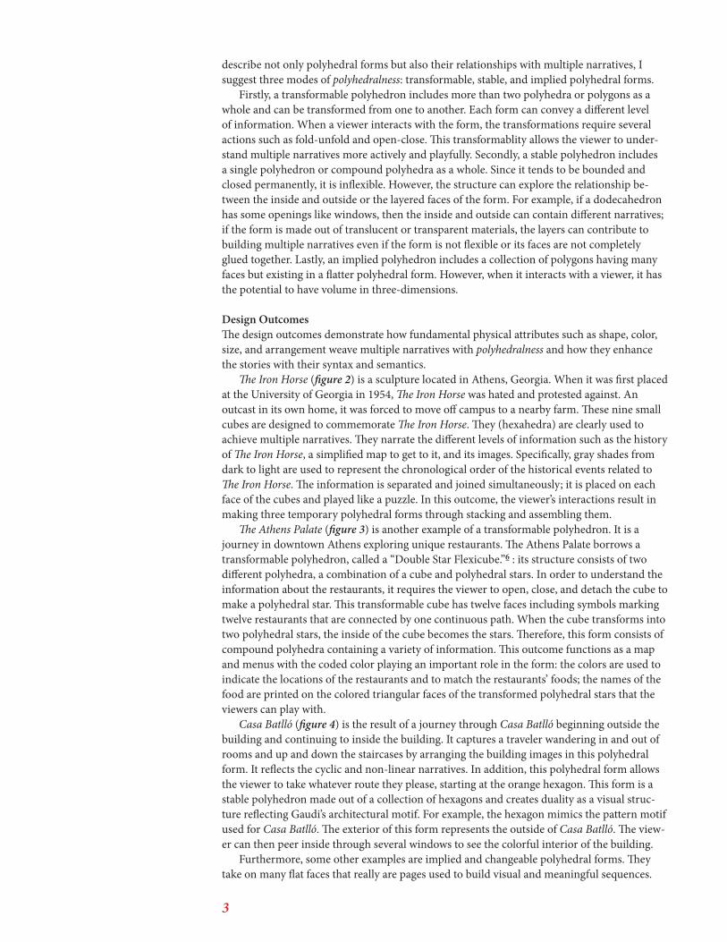
3
describe not only polyhedral forms but also their relationships with multiple narratives, I suggest three modes of polyhedralness: transformable, stable, and implied polyhedral forms.
Firstly, a transformable polyhedron includes more than two polyhedra or polygons as a whole and can be transformed from one to another. Each form can convey a different level of information. When a viewer interacts with the form, the transformations require several actions such as fold-unfold and open-close. This transformablity allows the viewer to under-stand multiple narratives more actively and playfully. Secondly, a stable polyhedron includes a single polyhedron or compound polyhedra as a whole. Since it tends to be bounded and closed permanently, it is inflexible. However, the structure can explore the relationship be-tween the inside and outside or the layered faces of the form. For example, if a dodecahedron has some openings like windows, then the inside and outside can contain different narratives; if the form is made out of translucent or transparent materials, the layers can contribute to building multiple narratives even if the form is not flexible or its faces are not completely glued together. Lastly, an implied polyhedron includes a collection of polygons having many faces but existing in a flatter polyhedral form. However, when it interacts with a viewer, it has the potential to have volume in three-dimensions.
Design OutcomesThe design outcomes demonstrate how fundamental physical attributes such as shape, color, size, and arrangement weave multiple narratives with polyhedralness and how they enhance the stories with their syntax and semantics.
The Iron Horse (figure 2) is a sculpture located in Athens, Georgia. When it was first placed at the University of Georgia in 1954, The Iron Horse was hated and protested against. An outcast in its own home, it was forced to move off campus to a nearby farm. These nine small cubes are designed to commemorate The Iron Horse. They (hexahedra) are clearly used to achieve multiple narratives. They narrate the different levels of information such as the history of The Iron Horse, a simplified map to get to it, and its images. Specifically, gray shades from dark to light are used to represent the chronological order of the historical events related to The Iron Horse. The information is separated and joined simultaneously; it is placed on each face of the cubes and played like a puzzle. In this outcome, the viewer’s interactions result in making three temporary polyhedral forms through stacking and assembling them.
The Athens Palate (figure 3) is another example of a transformable polyhedron. It is a journey in downtown Athens exploring unique restaurants. The Athens Palate borrows a transformable polyhedron, called a “Double Star Flexicube.”6 : its structure consists of two different polyhedra, a combination of a cube and polyhedral stars. In order to understand the information about the restaurants, it requires the viewer to open, close, and detach the cube to make a polyhedral star. This transformable cube has twelve faces including symbols marking twelve restaurants that are connected by one continuous path. When the cube transforms into two polyhedral stars, the inside of the cube becomes the stars. Therefore, this form consists of compound polyhedra containing a variety of information. This outcome functions as a map and menus with the coded color playing an important role in the form: the colors are used to indicate the locations of the restaurants and to match the restaurants’ foods; the names of the food are printed on the colored triangular faces of the transformed polyhedral stars that the viewers can play with.
Casa Batlló (figure 4) is the result of a journey through Casa Batlló beginning outside the building and continuing to inside the building. It captures a traveler wandering in and out of rooms and up and down the staircases by arranging the building images in this polyhedral form. It reflects the cyclic and non-linear narratives. In addition, this polyhedral form allows the viewer to take whatever route they please, starting at the orange hexagon. This form is a stable polyhedron made out of a collection of hexagons and creates duality as a visual struc-ture reflecting Gaudi’s architectural motif. For example, the hexagon mimics the pattern motif used for Casa Batlló. The exterior of this form represents the outside of Casa Batlló. The view-er can then peer inside through several windows to see the colorful interior of the building.
Furthermore, some other examples are implied and changeable polyhedral forms. They take on many flat faces that really are pages used to build visual and meaningful sequences.
4
Faces Found in Sandy Creek Park (figure 5) contains a journey beginning in the beach parking lot and ending at the entrance to Cook’s Trail in the park. In the journey, hidden faces are discovered in nature along the path and provide the viewer with a source for landmarks. Therefore, this form functions as a map describing and conveying face images, impressions, and directions for walking. Although this form follows a traditional book form, it is also a transformable and implied polyhedron. If the viewer fully opens the form, the front and back covers are held together through magnets that are embedded inside the covers. In addition, the viewer can unfold part of its pages where the multiple photos of sky and grass are hidden; the photos of the sky and grass are placed on the top and bottom of this form which corre-sponds with their position in nature. This is an example to show how the arrangement can convey meaningful spatiality.
Walk Boulevard (figure 6) includes multiple kinds of information, such as sounds, feelings, and sights a traveler might find and experience on a walk. Interestingly, in the middle of the book structure, there is a cut-out window making it a rectangular form and articulating an unending path. In addition, it contains translucent layers to configure images taken from the street and to visualize their spatial relationships with time. Also, the pages including images of street texture can be folded and unfolded making each image independent. Flipping the pages creates nonlinear relationships between images; color is used to classify the information as well. For example, in this design, the black text represents things that are heard and seen; the white text represents the designer’s thoughts and feelings. Although this form is flatter than other polyhedra, it creates an implied polyhedral form. As a result, the form achieves multiple narratives by playing with translucency and simultaneity.
A Closer Look: Architectural Ornamentation in Downtown Athens (figure 7) is another example of implied polyhedral forms. One of the interesting things about this design is that the form resembles a map of downtown Athens and uses its grid to arrange photos of down-town architecture. Specifically, the bounded pages become a block, an area on the streets, and each page features a building; these close-up images of the buildings are placed in their real locations on the map and emphasize the designer’s interest and perspective in the architecture. Each photo includes a red dot indicating the location of the building. Thus, the images inform the viewer of building locations and the architectural ornamentations that adorn the corners, windows, and entrances.
ConclusionThe design outcomes resulted in using hexahedra, dodecahedra, and transformable polyhe-dra, all articulating visual structures of multiple narratives. Polyhedralness allowed my stu-dents to explore interesting visual concepts such as simultaneity, spatiality in depth, duality, translucency, and interactivity between information and narratives. The students created their stories defined by the fundamental physical attributes of type, image, shape, color, size, and their arrangement. In the outcomes, the ways to use color range from representation-al to abstract including coded and symbolic colors. The ways to configure photos and text range from practical to expressive. The arrangement and color use are the most effective and powerful ways to convey different levels of information and to build visual and meaningful sequences. In addition, there are more unexpected and interchangeable reactions between the visual elements and information, making the narratives rhythmic and dynamic. Specifically, since polyhedralness tends to narrate the non-linear and less controlled sequences, it embraces multiple directions and orientations. Therefore, some of the forms not only contain multiple narratives that the students designed, but they also suggest new stories that were not planned by the students.
Polyhedralness allows the viewers to configure and reconfigure narratives and their mean-ings with their own perspectives. In addition, polyhedralness requires the viewer to actively engage in and interpret narratives. In other words, although the outcomes I examined in this paper might not offer immediate or direct communication, they could be inspirational objects to stimulate experimental form and content. Although this study aimed to investigate and understand polyhedral forms, there needs further investigation to examine the relationships between polyhedralness and materials, color, and texture in depth and how they represent
5
and enhance multiple narratives. Those further studies would allow us more constructive approaches to illuminate and interpret polyhedralness and to teach narrative design with experimental visual forms. Pedagogically, visualizing multiple narratives was meaningful for my students and me to understand that design is a highly rational and intuitive process.7 In their design processes, the students learned the importance of observing the trivial when they translated the multiple levels of information into a visual form. Specifically, when they classified their gathered information, they understood better their interests or the places they chose to explore. I hope that this study can contribute to visual literacy and the development of narrative design practices.
Student WorkFigure 2. The Iron Horse by Allison WeissFigure 3. The Athens Palate by Javad Khadivi Figure 4. Casa Batlló by Hannah ElliotFigure 5. Faces Found in Sandy Creek Park by Sarah HeslepFigure 6. Walk Boulevard by Blake HelmanFigure 7. A Closer Look: Architectural Ornamen-tation in Downtown Athens by Lily Feinberg
Works Cited1. Description about Revolving House, http://www.paulklee.net/revolving-house.jsp and Museo Thyssen-Bornemisza, Museo Thyssen-Bornemisza: Madrid, 2012. p.46
2. Hajo Düchting. Paul Klee: Painting Music, Munich- Berlin-London-New York: Prestel, 2008. p.35, p.48, pp.65-71
3. Eric Weisstein, Polyhedron, Wolfram Math-World, 1994-2014 and http://mathworld.wolfram.com/Polyhedron.html
4. George W.Hart, Virtual Polyhedra; The Ency-clopedia of Plyhedra, 1996. http://georgehart.com/virtual-polyhedra/vp.html. and http://en.wikipe-dia.org/wiki/Polyhedron
5. Donis A.Dondis. A Primer of Visual Literacy, The MIT Press: Cambridge, Massachusetts, 1974. p.104
6. Naoki Yoshimoto. Yoshimoto invented Magical Cube in 1971. http://www1.ttcn.ne.jp/a-nishi/y_cube/z_y_cube.html ; Dave Brill created a PDF instruction of Double Star Flexicube in 1989 which is an orgami interpretation of Yoshimoto’s Cube. http://www.brilliantorigami.com/dsf.pdf
7. Michael Rock and 2x4. Multiple Signature, Rizzoli International Publications, Inc: New York, 2013. P.13
Text and Image ReferencesHajo Düchting. Paul Klee: Painting Music, Mu-nich- Berlin-London-New York: Prestel, 2008.
Henry Jenkins. ‘Game Design as Narrative Architecture’, First person: new media as story, performance, and game ed. Wardrip-Fruin and Pat Harrian, The MIT Press: Cambridge, Massachu-setts, 2004. pp. 118-9
Paul Kleé. ‘Revolving House’, Museo Thyssen-Bor-nemisza , Museo Thyssen-Bornemisza: Madrid, 2012. p.46 and Hajo Düchting. Paul Klee: Painting Music. Munich- Berlin-London-New York: Prestel, 2008. p.70
Aaron Marcus. An Introduction to the the Visual Syntax of Concrete Poetry, Visible Language VIII4, The MIT Press: Cambridge, Massachusetts, 1974. pp. 334-5
Thomas Ockerse, Rhode Island School of Design and authors. Spirals ’91, Graphic Design Depart-ment, Rhode Island School of Design: Providence, Rhode Island, 1991
Edward R. Tufte. Envisioning Information, Graph-ics Press: Connecticut, 1990
Edward R. Tufte. Visual Explanations, Graphics Press: Connecticut, 1997
Peter Storkerson. Antinomies of Semiotics in Graphic Design, Visible Language 44.1, Rhode Is-land School of Design: Providence, Rhode Island, 2010. pp. 5-37
Jan V. White. Editing by Design, Allworth Press: New York, 2003
6
figure 4
figure 2 figure 3
Polyhedralness as Multiple Narratives
7
figure 5
figure 6
figure 7
Polyhedralness as Multiple Narratives
Tenth Annual UCDA Design Education Summit | 41
AbstractCO LAB is our collective research on Collaborative Design. CO LAB aims to define a shift in contemporary practice away from monoliths and isolated process by profiling a range of practitioners and methods. Collaboration among designers is not new, however we believe that the means and techniques of working together are evolving, that smaller interdisciplinary teams are increasingly popular, and that the study of Collaborative Design is both severely overlooked and relies on outdated concepts.
Within design education, we propose increases in peer education, team-teaching, quick-hit visiting artist workshops, open-source tools, tech-focused MOOC’s, interdisciplinary conferences, student-run design studios, open environments, broad-based projects, and collaborative course structures. Design programs are encouraging cross-over enrollment, not just within the arts, but including engineers, hackers, musicians, and liberal arts disciplines. Facilities with malleable computer labs, modular spaces, and open-ended areas for group work all encourage a relaxed communal area with an excuse for forced physical student- interactions. As a result, employers are requesting collaboratively capable designers that can work well with others. We believe design education is incomplete without effectively integrating these various collaborative dynamics into every level of a design curriculum. Humanistic inquiry on how to design a collaboration will provide practical structures and communications theory that can be useful to students, faculty, and professionals alike.
Sandboxing is a major area of our CO LAB research that focuses on collaborative environments.
What are play stations and how does the design of physical spaces influence collaboration in the design classroom? It’s tempting to consider Play as a concept in relation to design environments as purely the search for the collaborative cure-all, Fun. As if, dissecting the environments of design collaboratives will help us understand how the walls influence the people and lead to a mythical kernel where the Playground produces Smiles, elegant Interactions, and which births immaculate Works. But Play isn’t intrinsically about having fun, even though play is often fun. Play is about designing environments that foster collaborative interactions and spark ideas, which enable fringe thinking.
It’s easy to forget how to play. Designers who feel tied only to production may not remember what it’s like to make something in a highly collaborative environment, enjoying company and the process of invention. Playing is how designers work to test new ideas about their treatment of content and form. Specifically, how are different environments and atmospheres designed to facilitate fruitful and playful investigation (and production). Sandboxing explores successful collaborative environments and atmospheres to distilla set of recurring motifs.
Sandboxing: Collaborative Environmentsfrom CO LAB: A Collaborative Design Survey
Elizabeth HerrmannUniversity of South Florida
St. Petersburg - ras+e
Ryan ShelleyBowling Green State
University - ras+e
15.1
Sandboxing: Collaborative Environments in Design Education ras+ e | 1
Sandboxing: Collaborative Environments in Design Education
by Elizabeth Herrmann & Ryan Shelley ( ras+e)
After three hours of open studio time, my senior thesis students slowly trickled out of the classroom. I had spoken to a handful of them, reviewing research and project endeavors. The majority of the students were happy to have the time to work without interruption—earbuds went in, and a sea of black-rimmed eyeglasses reflected a cool white backlit glare. Some students scattered into the lounge to work more comfortably with laptops in laps.
“Can I email you about my project later?” She asks this on her way out.“Well, can we just talk now? What’s up?” Said me.
She explained that she wanted to share some things she had been working on in class and when I asked her why it would be better to have this discussion via email rather than in person, she said that she didn’t know, but that it was just easier for her to email it to me. I told her that she could, but if that was the case, then she probably should have been taking online courses instead, since she found physical edification obnoxious. She then told me that online classes were a joke and left, waving happily with errant flip-top mittens, and resuming a half-complete text message on her iPhone. Another student yelled after her, “Text me laters!”
A few factors could be at play here. (1) The act of writing an email in fact helps this student practice composing thesis thoughts with an audience in mind, (2) She actually doesn’t have anything new to share and is buying time by performing like a good student, (3) Emailing is a more comfortable form of communication that removes the sense of immediate responsibility and the time constraints of physical interaction, (4) She prefers her online identity to her physical one, (5) Discussions via email are more real or normal and I’m being abnormal by talking to her directly, or (6) She’s lazy or anxious and wants to leave immediately.
This scenario, where people sign off with plans to continue a conversation online, but then never or maybe sometimes do follow up, happens all the time, and has become our culture’s newest version of goodbye. But it’s not goodbye—it’s I’m Away and it’s, “You’re all still gonna be there if I need you, right?” A continuous conversation is known as a perma-sation and we have become immune to noticing them. The idea of co-presence is about being physically separated but connected through technology. As a new generation of designers grow up with constant connectivity and heavily rely on technology to mediate their interactions, what impact does this have on humans’ ability relate to each other overall? Says famed media critic, Marshall McLuhan, “When people live in an environment of such circuitry and feedback, carrying much greater quantities of information than any previous
Sandboxing: Collaborative Environments in Design Education ras+ e | 2
social scene, they develop something akin to what medical men call ‘referred pain.’ The impulse to get ‘turned on’ is a simple Pavlovian reflex felt by human beings in an environment of electric information. Such an environment is itself a phenomenon of self-amputation. Every new technological innovation is a literal amputation of ourselves in order that it may be amplified and manipulated for social power and action.”
Environmental considerations are integral to design collaboration, however sandboxing appeals to more than just a couple of Eames ottomans and wet bar, or multi-purpose furniture and a set of principles. We overview reasons why present-day design students do not collaborate, discuss concepts that promote collaboration, and then look more in depth at examples of sandboxing in order to extrapolate trends in collaborative environments. By linking collaboration to presentness to interactivity to physical environments to design culture to collegiate design programs, educators can argue for their role in facilitating collaborative environments within higher education.
Quick Sand: Why Design Students Are Not CollaboratingAcknowledging the reality of college administration, state mandated policies for universities, stubborn “old-school” art world procedures, and everything else that art and design educators battle on a day-to-day basis, it’s no surprise when faculty eventually give in to the hopeless concession that building the ideal play station isn’t possible unless the stars align and Wayne Enterprises makes a donation. But hope springs: Building 20.
1. State of the FartOne concrete slab supported three floors and five wings constructed from a hodgepodge of large wooden posts, masonite, gypsum wallboard, with tar paper for the cherry on top. Microwave radar was invented here. The building is the most famously inventive facility in American higher education. Architects, shudder.
Building 20, the MIT eyesore in Cambridge, Massachusetts, was hastily constructed in 1943 as a makeshift Rad Lab, staging hundreds of scientists specifically solicited to develop a device to identify distant German bombers during WWII. Given the harried circumstances at the time, people were considerably unconcerned about sporting a fashionable workspace. The result was a shoddy wooden structure that, to everyone’s surprise, ended up lasting fifty-five years longer than expected, and by the time of its demise, Building 20 had earned a reputation as a magical incubator. After it was finally torn down, about a quarter of all the physicists in America had worked in the space at some point, and nine of them won Nobel Prizes. How could a ramshackle shed loom so large?
Sandboxing: Collaborative Environments in Design Education ras+ e | 3
Nobody cared about Building 20, the building. It was cheap, expendable, under-designed, and temporary. The resident intellectuals felt at liberty to openly abuse the space and adapt it to their own research needs. Students and educators rerouted electrical wiring, suspended heavy machinery, and even installed anechoic chambers for testing sound quality. Jerrold Zacharias removed two floors in his lab to make room for a three-story atomic clock. The results were unpredictable and incessantly evolving. Building 20 provided the perfect collision of space for experimenting on pretty much anything.
The shed was infused with intellectual diversity. Physicists, linguists, teaching centers, model railroad club enthusiasts, computer hackers, sound system developers, piano repairers, analog circuit designers, writers, electronics technicians, high-speed photography and video game developers, biological engineers, anthropologists, philosophers, and the ROTC populated the grab bag. Urban Theorist Jane Jacobs refers to this as knowledge spillovers: an exchange of ideas among individuals placed together. Says Jacobs, “The proximity of firms from different industries affect how well knowledge travels among firms to facilitate innovation and growth.” In other words, reducing the physical constraints of an environment staging an interdisciplinary group encourages cross-pollination of ideas, resulting in invention.
Amar Bose accidentally built the country’s first hi-fi speakers when distracted by the Acoustics Lab down the hall. Morris Halle, incidentally interacting with Noam and Carol Chomsky, co-innovated syntax and phonology in two miserable office spaces. Even a homeless botanist squatting in a storeroom didn’t feel out of place.
This type of interaction was partly spurred by the horizontal configuration of the space and a very poor signage system. Rooms were not organized by subject or purpose and chance encounters were normal. Unmovable equipment accumulated and residents constantly adapted and repurposed space. This kind of unintentional remixing impacted by the environment is unlikely to occur in the hyper-specific designs, hierarchies, and organization of modern academic buildings.
The point is, in order to initiate our argument in favor of physical sandboxing in design education, we should first address the elephants in the room: budgets and policies. When these constraints are treated less as assumed absolutes, then design educators can reevaluate common sandboxing expectations like poorly planned, state of the art, computer labs that breed student isolation or an assumed march toward online-dependent programs.
2. $yndicated $choolingMany colleges and universities have adopted structures that include online classes, online course management, webinars, TED texts, and some “hedonistic” professors even participate in offering MOOCs (Massive Open Online Courses), as free alternatives to similar university classes. The reality is that operating a campus is costly and when the average Administrator to Faculty ratio is 1:1, cutting costs by automating tasks and hiring as many disposable adjuncts as possible creates an unsustainable practice in the long run—especially when the popular sentiment among students is that they’d rather chill at home in their jammies while cramming Euclidean geometry at their own pace. This was all convenient and therefore inevitable. It’s fair to ask if the physical classroom
Sandboxing: Collaborative Environments in Design Education ras+ e | 4
contributes enough to warrant the cost. Even assuming that the in-person experience contributes something specific and important, how much is that worth?
The question is flawed because education is not a business. Neil Postman argued that reducing education to job training is the last gasp of an education system, but surely a clear sign of failure is when upper administrations hire budget consultants to “maximize profits and reduce expenditures.” Such is the case when the Chicago Sun Times fired all of their photographers and told reporters to invest in a smart phone equipped with an Instagram app instead. Education and Business do not share the same objectives.
MOOCs claim to “democratize education” and the ideal is humble. But raising the floor almost always lowers the ceiling. The current degree structure has plenty of value if the degrees are earned by doing more than job training. And in a school that is exclusively focused on job training, the same free market logic of outsourcing and lowest common denominator will hold sway: Lower quality but lots of it and convenience without presentness.
The schoolhouse was an invention of the printing press, argues McLuhan. Television—then the internet—seemed to eliminate the necessity of physically present teachers, like the TV as babysitter. With the death of print coupled to a faculty generally seen to be less interested in grounding their research in contemporary political issues, college programs have become less distinguishable from mass consumer culture. So again, “What do schools have left to justify their price tag?”
Schools have yet to fully address the resulting mindset. Raised in a climate of instantaneous gratification, students expect the convenience of online courses, even from their physical meetings. In War and Peace in the Global Village, Marshall McLuhan writes, “The children in Watts (Calif.) were quite right in asking, ‘Why should we go to school only to interrupt our education?’ Television is not a credit course in anything, but it very definitely has the marks of a natural environment in which the child forages and finds his way as much as any Indian ever did in the out-of-doors.” But school is broader than syndicated material, despite being conveniently reduced, packaged, and spoon-fed as a sizable set of online technical tutorials. Our point is that we need to make design education do more than barebones workforce preparation in a self-serving manner—education is not deer hunting in a “managed forest” with pre-stocked neon-glow animals, or choosing a Whopper over a Double Stacker at a Burger King drive-through, getting in-and-out with the most bang for your buck. In the article, Can New Technologies Revitalize Old Teaching Methods? by Pamela Mendels, the president of Lehigh University, Gregory C. Farrington, comments, “We’ve become a bit monopolistic, a bit complacent. We’ve put too little of our energy into focusing on the challenge of how we create the most effective learning environment at the undergraduate level. We know how we want to teach. We too seldom discuss how do students best learn.” Furthermore, Tamar Lewin writes in Instruction for Masses Knocks Down Campus Walls, “The current, more technically focused MOOCs are highly automated, with computer-graded assignments and exams…The Stanford MOOCs, for example, included virtual office hours and online discussion forums where students could ask and answer questions—and vote on which were important enough to filter up the professor.” Post-curiosity-launch-craze, MOOCs are failing. But even so, MOOCs are shifting our definition of quality in the marketplace. Says Michael Horn and Clayton Christensen in Beyond the Buzz, Where Are MOOCs Really Going, “In the current university system, for example, most faculty are rewarded for the quality of their research—not for the quality of their teaching. But MOOCs don’t have quality teaching either. Students are one in a million.” Can design schools offer a learning experience where interaction with faculty and peers is valuable, fun, engaging,
Sandboxing: Collaborative Environments in Design Education ras+ e | 5
personal, and unique? How Design University may boost technical and entrepreneurial skills, but people, and more specifically, personal investment in students are school’s most valuable asset, so what’s left once all faculty are stripped to prerecorded lo-res videos, an email address, and don’t actually teach? With graphic design education as informal and self-serving as it is, perhaps its time to revisit the importance of the human aspect in what we do.
When it comes to comparing the models of college classrooms, makerspaces, and online courses, student complaints about various limitations have merit. Like an uninspiring classroom packed with detached classmates, Blackboard, Canvas, Moodle, or really any education-specific blog tool, fail to elevate the experience and content. Napster was successful because students wanted free music so they actively joined the group. Mac Rumors attracts people who need answers to questions and hackers who are happy to give them. Reddit and Twitter provide an even more personalized RSS but with the ability for subscribers to contribute and comment. ratemyprofessor.com allows students to collectively vent/accrue searchable resentment. YouTube and Vimeo knock out hours of college boredom. But virtual classroom hackerspaces regularly fail because the space isn’t an environment where students actually work, let alone want to be in. Custom blogs aren’t relevant because writing for the web is extremely hit-or-miss and blogs aren’t where everybody else is logged in and contributing. Many virtual classrooms are stiff and classroomy and provide little beyond convenience. With the possible exception of students exclusively interested in programming, art and design students do not produce work or gain sandboxing inspiration in this format. At most, virtual classrooms list assignments, announcements, schedules, and resources; valuable housekeeping tools but little instruction, critique, and other key elements of actually learning design. And contacting peers by email and texting is more customized, accessible, and helpful for developing consensus and arranging collaboration outside of class.
Whereas physical makerspaces assist and accompany collaborative work, customized virtual classroom hackerspaces can feel like just another (required) thing to join and maintain. This isn’t to say professors using Facebook to conduct school groups are absolute answers either, as distractions and unrelated material compromise thinkspace—not withstanding stolen student work repurposed for advertisements. As it stands, virtual classrooms readily lack student-run initiative because of their coerced participation, condensed lifespan, unappealing mechanics, and redundant purposes that overlap with their preexisting social media site networks.
Onward: The truth is, saving traditional classroom structures in a broken education system is uninteresting. What we are interested in is a new system designed from the ground up, to radically position thinkers and makers through an iron-sharpening-iron response to reality. We are interested in interdisciplinary and collaborative forms of education and their facilitating sandboxes. Enough with the medieval lecture halls and annoying classroom blogs. Enough with trying to force relevance by nosing coursework into social media until it is indistinguishable from the other noise. Abort the workforce cog molds in design school. As that model exhausts itself, there will be room again for experiments like Black Mountain. The Bauhaus. Discussion and interaction. A physical sandbox in a physical playground with very present peers and live, engaging faculty. Design education needs to be more human and less about state of the art convenience.
Sandboxing: Collaborative Environments in Design Education ras+ e | 6
Concrete: Edifices That Promote Collaborative Design Edification In this section we expand the hows and whys of sandboxing beyond mere physicality, and discus its link to collaboration in graphic design education.
1. URL v. IRL: Physical ContactSpace defines interaction. At a restaurant, a poorly designed kitchen may lead to chaos and uncoordinated food preparation between chefs and sous chefs and delays in serving for waiters. Stop lights prevent traffic collisions. Facebook’s interface mediates conversation. And within an art/design school, a collaboratively designed environment encourages conversation, sharing knowledge, and forced connections which can lead to unexpected innovation and creativity. In other words, there are two major considerations to scholastic sandboxing: (1) Intending student interactions, and (2) Designing an interactive space.
Physical contact in school matters. The telephone allows us to hear voices and email instantaneously transmits ideas, but in-person communication is not just about the clear, efficient delivery of information. In fact, sometimes it’s not clear or efficient at all. Meeting up with peers and professors has the added benefit of being obligated and responsible for one another, whereas digital workplaces struggle to establish group solidarity and empathy. Every interaction is a reinforcement, from professors adopting an invested interest in seeing their students succeed to students wanting to uphold the quality of their degree by setting a standard for peers to matriculate with impressive portfolios. Students keep each other alert after long production runs and professors stay after hours to help students solve messy design challenges. For further evidence, the students who stick with MOOCs until the end usually participate in study groups that physically meet. According to Laura Pappano in the New York Times article The Year of the MOOC,
“Some students are also ill prepared for the university-level work. And few stick with it. ‘Signing up for a class is a lightweight process,’ says Dr. Ng. It might take just five minutes, assuming you spend two devising a stylish user name. Ray Schroeder, director of the Center for Online Learning, Research and Service at the University of Illinois, Springfield, says three things matter most in online learning: quality of material covered, engagement of the teacher and interaction among students.”
Sandboxing: Collaborative Environments in Design Education ras+ e | 7
Brian Shuster concurs in the Wired article, Virtual Reality and Learning: The Newest Landscape for Higher Education,
“At some point in their learning, every student needs personal help that interactive workbooks and textbooks alone cannot provide. Relying solely on asynchronous communication with a faceless professor stifles the kind of momentum that a classroom setting promotes…Classrooms and lectures allow students to engage with their professors, teaching assistants and with each other. Students have the ability to raise their hand to get clarification in the moment, when it is most useful, rather than having to send an email and await a reply. Students can be broken up into work-groups for projects; and potentially most important of all, students can turn to other students and ask them questions, make study-groups and form friendships and rivalries that provide emotional motivation for pushing themselves to learn more and succeed. The highest quality education must be social and interactive, and although online learning provides a degree of that via a website, the practicality of the real world instant feedback and social dynamics are missing.”
2. Collaborative-Minded Schoolhouses: Makerspaces /Hackerspaces + Montessori Method Creating interdisciplinary spaces and situations through the use of collaborative-thinking faculty will become a vital aspect of physically present design education. Collaborative or not, design work done in physical proximity to peers is measurably stronger than when students work alone. Modern communication technologies do not provide the same physical playground experience where items can be toyed with in real time, though some programs are starting to provide this. Real space still provides engagement helpful for production, making the Studio an essential part of programs. Think school supply warehouse as playground as safety net for invention. Collaborative design studio environments can be anything from welcoming/resourceful, versatile/indestructible, comfortable/edgy, and physical/virtual. We contend that the physical structure of the building (or wireframe of the site), accessibility of materials (relevant programs are nearby and their gear is easily obtainable), and the layout of collegiate design studios and art buildings all play a major role in shaping a program and encouraging collaboration.
Studios and making spaces should encourage interaction and workflow. Unsurprisingly, most computer labs are set up to allocate sacred individual workspace but including group space is often less considered. Are screen monitors in the way of seeing the projector, the professor, and other students? Is there a communal lounge? Where are the printers, presses, darkrooms, wood shop, libraries, cutting stations, coffee shops, snack machines, music, and bathrooms? Does traffic flow make sense or could it be manipulated to increase interaction, especially across disciplines? Is the teacher’s station located as a hub, or as a sidebar? Are computers provided or do students have to bring their own? Are the chairs ergonomic or squeaky and annoying? Does the space inspire students to take pride in its upkeep and their education? Or do students only stay for the exact length of their chore/class while spending the whole time wishing they were home? These questions of environmental “stickiness” impact the setup/usability of classrooms, programs, and entire schools.
Sandboxing: Collaborative Environments in Design Education ras+ e | 8
According to Douglas R. Burrows in Acclaimed Instructor Uses Magic to Motivate Other Teachers,
“‘One of the things we emphasize is that the classroom should be a learning environment,’ Mr. Escalante said. To that end, he creates a team atmosphere among his students by playing a booming rock-and-roll song with a pounding drumbeat as warmup music, using remote-controlled toys in demonstrations, and stopping students at the door with math questions, which they must answer correctly before being permitted in the classroom.”
The main advantage of a studio lab is that it becomes the Quad for designers. Students studying animation mingle with those pursuing information design, and that’s how designers learn to steal software tricks and puppetry ideas from one another. Chances are, someone else in the room knows how to do something another student is having trouble doing. Or yet, a senior working on kinetic typography graphic for their thesis will intrigue the curiosity of a freshmen student or even a music major who then goes on to make a music video. Pedagogical reformers like Johann Heinrich Pestalozzi, Jean Piaget, and Maria Montessori have stressed the importance that play, curiosity, and physical environments are the best way for students to learn. Joshua Davis notes in How a Radical New Teaching Method Could Unleash a Generation of Geniuses that, “Einstein spent a year at a Pestalozzi-inspired school in the mid-1890s, and he later credited it with giving him the freedom to begin his first thought experiments on the theory of relativity. Google founders Larry Page and Sergey Brin similarly claim that their Montessori schooling imbued them with a spirit of independence and creativity.” As a collaborative teaching team, we have turned our classes into more open-ended spaces to experiment, collaborate, ask/answer questions live, and play.
“Great Groups often have a decidedly adolescent side. At Black Mountain, the art students particularly seemed to have great fun devising ways to puncture the pretensions of their stern mentor, Josef Albers. Almost inevitably, one of the matiere studies put before the master was composed of campus cow dung. In another famous incident in the late ’40s, a number of the school’s most talented young artists, including Kenneth Noland and Joseph Fiore, began meeting after classes in Stan Hebel’s room and applying whatever was left on their palettes to a large canvas hung on his wall. After a year, according to participant Jerrold Levy, their collaborative canvas looked ‘like something between a Motherwell and a de Kooning.’ As Duberman recounts, the young men signed the painting ‘Anonymous Blotch’ and hung it in the dining room.”—Organizing Genius by Warren Bennis and Patricia Ward Biederman
A makerspace or hackerspace is a public facility that provides the equipment, room, and freedom to work, share work, and share materials, space, and gear. Equipment and facilities can mean anything from a machine shop to a linked server. Universities that realize the overlapping potential between college departments, disciplines, and the local community are encouraging students to cross-pollinate within open-access cross-departmental facilities, programs, and projects. This means that graphic designers can mingle with industrial designers, engineers, hackers, philosophers, anthropologists, etc. Often, makerspaces are shared and operated by both college students, faculty, and local craftsmen, as colleges are finding support from the surrounding community and are partnering with ambitious artists and experienced craftsmen to build workshops where anybody can sign up for the price of a gym membership, meet, and quickly get to making. Gathering funds, volunteers, and space are the biggest prohibitors to kickstarting and maintaining a non-profit makerspace. However, with overwhelming support from the community, passionate makerspace members usually step up to keep the initiative alive and running.
Sandboxing: Collaborative Environments in Design Education ras+ e | 9
Kevin Makice writes about “a brightly colored house on the west side of downtown Bloomington, Indiana, [where] people are gutting stuffed bears, animating clay, and turning floor vents into fishing holes. What’s more, those responsible want to bring these activities to your town, too. The Collaboration Room is an artist-run space that gives people of all ages a chance to participate in collaborative art-making experiences.” Founder, Matthew Searle, maintains the mixed-use living space and also facilitates projects and provides workshops. Says Searle, “The Collaboration Room is shaped by the people who participate. If we meet a book artist, we’ll ask to collaborate on a publication, or build a book-making series around her talents. Same is true for a kid, a horticulturalist, a mechanic. We can build creative programming with anyone or anything if given the opportunity.” Exposure to a variety of tools, production techniques, people, and perspectives is a platform to exchange best practices and inspire new ideas.
Some spaces are more specifically themed. Baltimore Print Studios is a public-access letterpress and silkscreen printshop started by MICA husband-wife faculty-team Kyle Van Horn and Kim Bently. Initiated by the prompt to expand upon MICA’s Dolphin Press, and to develop the crossover of Kyle’s printing and Kim’s graphic design backgrounds, Baltimore Print Studios brings affordable self-serve printing access to Baltimoreans, and especially for graduated alums living in the city without realistic opportunities to print from their apartments and wishing they still had access to MICA facilities.
A virtual hackerspace is a network of users that are able to share and work on projects together. Corey Doctorow writes about four hacktivist teenage students uprising against an out-of-control, hyper-reactive American government in the novel, Little Brother. After a terrorist attack on the San Francisco Oakland Bay Bridge and BART system, the Department of Homeland Security kicks into overdrive to “protect” citizens, but in fact attacks basic civil liberties. Marcus Yallow, tech whiz-kid, works with his peers to repurpose the Xnet, an interactive game console that runs on a network that packets and distributes data so that origins are untraceable. Like the hacktivist group, Anonymous, Marcus is able to collaborate with classmates via the Xnet to prank/outsmart the DHS and save himself and his friends and put an end to the chaos. Similarly, Shawn Fanning, a nineteen-year-old software-engineering student attending Northeastern University, created Napster with his uncle John and peer Sean Parker (who later became the first Facebook president). In 1999, Shawn realized that he already knew everything his professors were teaching him. He dropped out of college to devote his undivided attention to launching the user-friendly peer-to-peer music sharing site. Napster was the fastest growing, free online community to date, aggregating a fan base of tens of millions of users in less than two years, and reaching 80 million at its peak. By 2000, as the pile of lawsuits by slighted parties managed to shut down Napster without impacting peer-to-peer sharing at large, the entire music industry’s business model grudgingly began to adapt, all because of a “successful” student-run hackerspace responding to the accessibility, usability, and intrigue behind a shared interest and shared network. Little Brother and Napster are great examples of how student-run virtual hackerspaces can offer a productive virtual environment that promotes creative collaboration and interaction instead of isolation. The site hackerspace.org provides a global directory of community-operated workshops where people can work together.
Sandboxing: Collaborative Environments in Design Education ras+ e | 10
3. The Perfect CollisionWhen Family Guy returned to FOX after a multi-year cancellation, one reviewer described the show for the masses who were not part of the preexisting initiated as the “search for the perfect gag.” Similarly, design school is the search for the perfect collision. While administrators still encourage portfolio reviewers to admit students with last names like Fivecoat and Han, intellectual and cultural diversity based on actual living experiences, and even non-existent arts backgrounds, are finally being realized. Delusional confidence may not even be an impediment. By this we mean that a group of students who do not know the boundaries of Insert Area of Study Here will inadvertently work harder, experiment, and do the impossible. A diverse student body accepts novelists into graphic design programs, painters into programming programs, and musicians into printmaking programs. The perfect collision values a decentralized, wide-ranging group.
Within NYU’s Tisch School of the Arts, Red Burns, Godmother of Silicon Alley, founded the Interactive Telecommunications Program. Burns’ ideology is not to select the tech-savviest, most successful, business entrepreneurs. Instead, she takes pride in admitting an extremely diverse group of students, many with little technological experience, whom she thinks will play well with one another. Says Burns, “Welcome loners, cellists, and poets.” The resulting student dynamics shifts from class to class. Former ITP student Margaret Stewart writes in the Wired Article, Let’s Stop Focusing on Shiny Gadgets and Start Using Tech to Empower People,
“Red wasn’t that interested in technology per se; she saw it as something you needed to get to the real work: improving people’s lives, making them feel more connected, bringing delight in big and small ways, and empowering them to affect change. ‘I’m not going to teach you any software programs. Software changes. Technology changes. You are here to learn how to learn.’…It wasn’t a coincidence that Red created ITP inside NYU’s Tisch School of the Arts rather than the computer science department; she wanted the program to be filled with dreamers, inventors, artists, and change-makers…There’s a certain shorthand of understanding that takes place whenever ITP alums encounter each other…We may not know exactly what background or hard skills each brings to the table, but we know we are likely dealing with an open, curious spirit; a great collaborator; and someone who is human-centered in the way he or she approaches problem solving.”
Selected from Red Burns’ Opening Remarks to New Students, What I want you to know:
+ That you play. That you are spontaneous. That you collaborate.+ That human beings are ambiguous, uncertain, and imperfect.+ That there is a complex connection between social and technological trends. It is virtually impossible to unravel
except by hindsight.+ That organizations are really systems of cooperative activities and their coordination requires something intangible and personal that is largely a matter of relationships.+ That you create opportunities to improvise.+ That you don’t see the world as a market, but rather a place that people live in—you are designing for people,
not machines.
Sandboxing: Collaborative Environments in Design Education ras+ e | 11
4. Collaborative Curricula: Program Crossover + Interdisciplinary CourseworkOne of the most notable attributes of graphic designers is that over the course of working with multiple clients on a variety of projects, they learn something about everything. This comes from working with a range of content, but also a range of materials and practitioners. Designers are problem solvers; this requires designers to be particularly content-savy and medium-spry. Because design is an umbrella discipline, it is not tied to specific forms, tools, or genres.
The Graduate Communications Design MS/MFA program at Pratt Institute conducts a class called Transformaction Design. Cycling content and professors each year, designated design faculty pair with colleagues from another field, such as architecture or philosophy, to develop a unique hybrid class with crossover curriculum. At Northeastern University, the Engineering and Animation students collaborate on character development and animated shorts by skill-sharing 3D printing/model-making and Maya. Graphic Design MFA students at MICA explore writing as a design process with authors Elizabeth Evitts-Dickenson, David Barringer, and Ellen Lupton. At Parsons New School for Design, an academic division called The School of Art, Media, and Technology aims for students to “explore areas of study and to learn how programs actively relate and converse with one another within Parsons’ unique multiple-school structure—and with the wider New School network.” Furthermore, the school prepares students by emphasizing the overlap between “art and design disciplines, expanding these fields beyond their traditional boundaries through interdisciplinary collaboration and exchange.” RIT’s School of Photographic and Imaging Arts also encourages innovation in artistic uses of technology. Increasingly, liberal arts and fine arts schools are encouraging faculty to explore interdepartmental relations. The fine arts have always crossed art and writing with new media and graphic design tools, going as far back as the illuminated book of hours to the more recent and iconic Barbara Kruger. However graphic designers (and design schools) are increasingly warming up to fading the barriers between art, design, and technology. The Artists play in design mediums, the Designers play in artistic mediums—as media doesn’t define careers, and capitalized Titles dissolve, schools are cashing in through projects, courses, and interdisciplinary faculty. It makes sense that design students encounter curricular crossover sooner than later, enabling them to deploy a range of tools in their upper level projects. According to James R. Davis in the article, Interdisciplinary Courses and Team Teaching, “In interdisciplinary courses, the faculty team members take on the chore of integrating their various perspectives and resolving their differences. In the ideal team-taught course, the faculty have successfully met the challenges of ‘connecting learning’ and the students have a chance to see the relationships that they don’t get to see in other courses. This is one of the great pay-offs for inventing a new subject.”
Sandboxing: Collaborative Environments in Design Education ras+ e | 12
5. Choose Your Shared Adventure: Discovering People Via Dual /Open Enrollment + Exchange ProgramsThe American educational system was successfully packaged as a Choose Your Own Adventure book, with its requisite programs, divisions, and administrators reaching over-saturation in the 90’s. At Moravian College in Bethlehem, PA they even call their open-ended exploration-facilitating track The Add-Venture Program (author ras is an alum). This Liberal Arts ideal in which young intellectuals gain coerced exposure to a range of disciplines and viewpoints, a trial-and-error means of finding an area that captures their long-term interest, is easily adapted into a less coerced opportunity to put those pieces together in engaging and meaningful ways.
However, we argue that college should be about more than just self(centered)discovery. Acquiring an interdisciplinary toolkit of skills, mediums, and resources should involve other people, and there are many other people. Discovering how performance art might open up intervention concepts for graphic designers, not to mention understanding the psychological results of beautiful persuasion, coheres as a personal blend of brain elements that, while fantastic in terms of assimilating, can become the hallmark of a new Power to the Person backbone to American Education. Beyond self-centering students, the ability to mesh and collaborate, to combine from a pool of disparate elements, demands a highly personal viewpoint which can then be manifested vividly in tandem with others. According to Robert Henri in the 1914 New York Times article, New Methods of Teaching Art to Children: Art at Home and Abroad,
“Dr. Haney more appropriately traces the origin of his scheme to the question asked by the children in Peter Pan, ‘Are we in the story?’ Essential to the success of telling a story to a great audience of children, he says, is this sense of collaboration. The children must understand that without it the story will stop, that they are counted upon to keep it going, to supply words, answer questions and ask them, act out bits of drama, in a word, they must work with the teacher, who has ceased to be obtrusively a teacher and has become for a given time and definite purpose a comrade…that is, be truly in sympathy with them; must share for the time their point of view, think with them and not of them.”
Active curricular participation at any age level is important to craft the narrative, and Henri’s portrait indicates that this is latent to all individuals as youth. Engaged and unexpected conversational interaction can drive story and drive experience. Thus, these curveballs generated live are integrated into the individual’s thought chains. Many of our best students are often voluntary non-design majors, marked by a willing engagement with open-ended processes. There is a certain humility required of process-driven work and participating in classes outside of a comfort zone often demands a willingness to learn by doing, something non-majors understand going in. Regardless of a student’s reasons for enrolling in a design class or how tangential their interest in design is to their major, non-design students generally carry fewer assumptions about tools, time, and resources, and most importantly they are looking to connect the new knowledge to their pre-existing abilities. Outsider knowledge and openness toward interdisciplinary skill-sets are fantastic opportunities for collaborative design.
Sandboxing: Collaborative Environments in Design Education ras+ e | 13
Good comedians are often good writers able to connect storytelling craft to audiences through the grafting of shared experience to unexpected outsider insight. Good designers require a similar talent for bringing something unexpected to an audience assuming the everyday, bridging clients or content to viewers. This intellectual approach to design and its process requires repurposing, juxtaposition, metaphor, and a cultural critic’s Tower of Perspective.
International exchange students amongst reciprocating classmates benefit from exposure to cultural differences in aesthetics and pedagogy. American design schools are based upon more in-class contact-time for starters, and incorporating students from abroad opens up critiques and collaborative coursework to include first-hand cultural and sensibility sharing that benefits all parties both deliberately and through osmosis.
In light of economic considerations, open enrollment not only encourages intellectual diversity and collaboration but finances it as well. Keeping enrollment numbers high in liberal arts schools for niche alternative process classes like darkroom photography and traditional printmaking can be tough if limited to a handful of majors only. Instead of shutting down entire art/design majors, schools need to proactively accept and monetize non-major elective-enrollment in a way that capitalizes on the ensuing diversity.
6. Curiosity is Good Teachers have long argued that learning/remembering primarily happens via unexpected, unguided, peer-to-peer interactions. For most students, knowledge isn’t a precious, anticipated commodity, but something that happens as a result of the collision between free people, free time, open space, and curiosity-fuel. “Hey, how’d you make that?” Or, “Did you know if you rub the non-sticky side of Scotch tape on your pant legs, it removes the static and then doesn’t suck up the paper?”
Joshua Davis talks about free range intellectual curiosity in the Wired article, How a Radical New Teaching Method Could Unleash a Generation of Geniuses, profiling Sugata Mitra who experimented with allowing children access to computers and the web sans any formalized educational structure other than a monitor for safety and encouragement. Mitra’s ongoing efforts found that separating “students” by age and hiring “teachers” was unnecessary, that children can and will teach themselves and each other, driven and equipped only by curiosity and access. Davis also reports on the depth of student-led learning and collaboration in the absence of a regimented school structure, citing studies in which students solved problems by distilling inventive solutions and more of them when they were not taught how to use the given tools.
While this may read as a plea for interdisciplinary and collaborative education structures or flexible faculty, the very context of the educational system is also called into question. Minimally, design instructors need be able to separate ego from teaching practice, which often translates into tightly controlled art directing of student projects to achieve Student Learning Outcomes, as well as justifying employment. Looser course structures can be challenging to design educators, however in light of the evidence that unguided curiosity can lead to higher caliber, collaborative-based learning, faculty should embrace their role as facilitators more than gatekeepers.
Sandboxing: Collaborative Environments in Design Education ras+ e | 14
7. Peer Posses + Connected CoursesProof that people encourage collegiate accomplishment, the Posse Foundation helps students who do not meet standard admittance criteria in order to achieve acceptance and success in highly ranked academic institutions. By training disadvantaged youth that display leadership skills within a community setting emphasizing peer accountability, Posse places students consistently and accurately, and their students habitually perform well in college. In fact, the Posse Dynamic Assessment Process is statistically more competitive and far more comprehensive than Harvard’s admission procedure. Posse accepts participants based on criteria that cannot be measured easily with tests and technology; among other skills like resourcefulness, communication, leadership, and problem-solving, Posse considers the ability to collaborate and thrive in a group setting the best indicator of collegiate success and sets up small communities of their students for support within colleges.
In the article Beyond SATs, Finding Success in Numbers, New York Times Journalist Tina Rosenberg recounts the story of Sheyenne Brown, an underprivileged and overworked high school student who benefitted from Posse:
“Brown went to work at McDonald’s, putting in between 20 and 48 hours a week for $5.15 per hour. Her combined SAT score was 1080. She did not seem destined to attend an elite college. But in her senior year, at least one of her teachers nominated her to be a Posse Scholar…The posse was key. ‘It’s so easy to get lost. I couldn’t imagine going to college without a group of people I already knew. I don’t think I would have made it.’ They were all studying different things, she said. They didn’t do homework together, but they held each other accountable for doing it. ‘If you needed somebody to get you out of bed and get you to the library, Antoinette’—a Posse member—‘would get you to the library.’ The Posse members, she said, held each other up to the standard they had set: ‘how are you doing in class, how you behaved socially and whether you were supporting people you agreed to support.’ Brown graduated in 2009, cum laude. Conscious of her good fortune and eager to give back, she joined Teach for America and taught 6th grade social studies at a KIPP charter school in Newark. Now she is in graduate school at Columbia, studying theater. Of Brown’s posse of 11, one man didn’t graduate—he’s in the Navy. Of the others, one worked after graduation at the United States embassy in Egypt. One is at MTV. One in AmeriCorps, one in the Peace Corps, one in Buenos Aires running a bar-restaurant.
Posse works, in part because it addresses the stereotype threat. For example, Asian students who are reminded that they are good in math will attempt to maintain that standard, paying special attention to prepping for math tests and thus performing well. Female students who are reminded of their gender will do worse. According to Rosenberg, black adult students who were given a test directly after Barack Obama’s Democratic nomination speech did significantly better than on other occasions. People who are either positively or negatively reminded of their social status respond and perform accordingly. The Posse program works to mitigate the stereotype threat by creating a new community to generate support, overriding external “threats.”
Linked and connected courses are another way to band students together. Linked courses comprise of a ±20 student-cohort that enroll in the same classes and schedule, thus navigate college collaboratively and supportively. Often a small graphic design program with limited elective-leeway will naturally force students to enroll in all of
Sandboxing: Collaborative Environments in Design Education ras+ e | 15
the same core classes that are only scheduled at one time during the academic year. Linked courses encourage students to buy in to the familial help of peers, and you cannot choose your family. Connected courses are contemporaneously scheduled classes that enable professors to collaborate on curricula, merging students at strategic points during the semester in order to explore the interdisciplinary overlap of professorship and class topics.
Following 35 years of teaching astronomy at Columbia University, rockstar Professor David Helfand famously declined tenure arguing that senior professors need to consistently prove active, relevant research. Helfand left Columbia and started Quest, a small, nonprofit, liberal arts college in Canada where he is now president. What makes Quest, and Helfand’s vision-become-actualized-school, so legendary is that he literally took everything wrong with higher education today, did the opposite, and built a school where students, (1) Want to learn, and (2) Understand how to be students. Not surprisingly, at the root of everything, is collaboration. For starters, Quest has no departments, which according to Helfand in the eponymous article David Helfand’s New Quest by Tamar Lewin, “Departments are the source of much evil in universities. They waste enormous amounts of time and emotional energy by arguing about space and faculty lines and resources, while walling off disciplines from innovative approaches to knowledge and restricting students and faculty alike to narrow, often outmoded paths of inquiry.”
Quest goes by a block system, which means that students only enroll in one course at a time for the duration of one month (20 blocks in two years). Humans, Quest believes, can go further and deeper into a question when they tackle one at a time. This enables students to deeply invest themselves, focusing on subjects at a high level of undivided attention benefitting themselves and increasing the gamut of what they bring to the (big round) classroom table. Faculty tackle curricula as deep thinking, implementing more hands-on material, encouraging travel, and requiring interdisciplinary collaboration between faculty and within courses. The block system also bands classes of 20 students together. According to Helfand,
“We had one math block where the tutor—we don’t call them professors—was teaching spherical trigonometry. Each student got a little Lucite sphere, and we’d see them walking around with their spheres, sitting in the dining hall at lunch and in the classroom at 9 p.m., still working with their spheres. These are not math majors, just students taking a math foundation course. Their tutor showed them a proof of a theorem published in the 1800s, repeated in textbooks ever since, and they found a logical flaw in the theorem that no one had noticed before. That’s how deeply they engaged with the subject.”
At the culmination of a block, faculty not only distribute grades, but indicate if the students are contributing to the group.
8. Unschooling TogetherStudents are revolting: If college means buying expensive degrees that will take 30 years to pay back, professors more interested in their research than in teaching students, administrators building one brand new facility after another, 4+ years of semi-studying antiquated material, and partying peers, it’s no wonder many students are asking, “What’s the point?”
Sandboxing: Collaborative Environments in Design Education ras+ e | 16
Unschooler, Dale J. Stephens, quit college after a few moths, founded the organization UnCollege, and wrote Hacking Your Education: Ditch the Lectures, Save Tens of Thousands, and Learn More Than Your Peers Ever Will. Stephens explains in the interview Why Go to College at All by Holly Epstein Ojalvo that college is “largely a homogenous bubble.” Says Stephens, “You might end up limiting yourself if you only socialize with people on your dorm floor and in your classes. Campus demographics might be diverse, but people are still there for the same reason.” Unschooling, however, allows people from very different backgrounds to unexpectedly meet. An education based on serendipity and self-motivation is more intellectually satisfying and lucrative.
But Stephens also warns that the hardest part to uschooling is getting started and that it helps to keep “accountability buddies.” He suggests that sharing goals with an unschooling cohort ensures that goals are met within the first 30 days. Groups and pairs of unschoolers are becoming increasingly popular, especially within fields related to technology and design, fueled by readily available DIY and open source education. Cities like Baltimore, Portland, Philadelphia, and Detroit are especially welcoming of blossoming artists and startups. Driven, dedicated, hungry, a reflexive community dependent on others facing the same challenges, unschoolers collaborate toward an alternative to traditional college education.
9. Contemporary Practice + CultureGraphic Design students especially are encouraged, sometimes indirectly, to work individually with an emphasis on refining typography and technical skills. From assignments that strengthen formal skill sets by rote practice to open-ended self-guided curricula, collaboration as a preparatory design skill is seldom, or only coincidentally, taught. Which begs asking, if job prep is so important, then why haven’t design programs better prepared students for working collaboratively in a range of contexts, while developing requisite theoretical and cultural thinking?
Neil Postman argued that technology encourages individuality, which manifests in students’ resistance toward collaborative projects. By putting each student behind a computer, their attention and energy are dominated exclusively by a personal world with little connection or engagement with the other worlds in the room. Whereas conversation and dialogue once led students toward answers and unexpected solutions, a homogenous and static system of universal truth trumps any prompted experimentation. In such worlds and methods of working, the messiness of human discourse and prodding is seen as inconvenient, tangential to the me-ness created by the computer. Despite the potential for unique combinations of talent and perspective afforded by college courses, the consumerist approach to education trickles into expectations that students have bought the right to not be subject to anyone’s interests but their own. Design in a vacuum is not an accurate reflection of design reality. We agree, that Typography 1 is probably not the best time to implement collaborative work, but neither is introducing it for the first time at an internship.
Because of the McMEGA Client as Design Standard, BFA programs have been slow to reflect the diverse Indie Design of Now, but things are quivering slightly. Schools still advertise their faculty based on a list of clients, as if that indicates anything at all about the program, courses, the nature of the professor, or anything about the work. It’s the equivalent of listing the number of papers an art history professor has written without mentioning
Sandboxing: Collaborative Environments in Design Education ras+ e | 17
what they were about, their publication record, or their public reception. Listing clients does not even convey medium information about a designer, whereas art history faculty usually have their lines of inquiry—their content—advertised. But as schools launch open-ended spaces for collaboration between designers, for encouraging startups and interdisciplinary work that often extends beyond assignments, the value of Indie Design may be starting to grow within academia. Perhaps the still unconquered bastion of industry control is the prevalent internship model which downplays the role of Indie collaboration and voice-heavy, open-ended production in favor of slaving as support posse for Pop Stars. In fact, we had the impetus to write this book while team-teaching at a university, whose Co-Op policy mandated that students worked part-time design internships while attending school for credit. Employers do not teach collaboration; in an internship, students learn to work with colleagues through fire baptism. Many of the employers who reported back to us complained how their interns were spry formalists, able to adopt the studio’s motives and style, however they didn’t know how to play well with others or evolve ideas as a group. This is sometimes compounded by the fact that many design students intern at non-design firms, and are often the only in-house designer. Non-design employers don’t understand the design process, and especially collaborative practices for the arts. After speaking with a few of the students it was clear that they were lacking go-team spirit, but it was also clear that the agencies were not really interested in the students, and acted as if they were doing everyone a favor. Certainly some internships provide truly meaningful experiences, but overall demand either pure production skills that do little to add to the student’s knowledge base, or require an invested collaborative nature that students have avoided. With the possible exception of Interactive Design, foundations classes in general are for learning the base-level rules and mechanics, as well as introducing context via history, traditions, and theory. But there should be room for collaboration and process to also be explored as fundamental skills. Inevitably, some students will slack if a peer is there to pick it up, but contemporary making is driven by creative commons concepts: sharing files, building upon ideas, and remixing images. Students, in our experience, often gravitate toward exploring ideas with others as natural extension of the online communities they take for granted, provided they are prodded to do so. Courses, projects, and classrooms can be built to expand on these devices already at play. We have found that implementing Design Classroom as Design Studio and Indie Start Up projects while students are in school has proven way more effective and innovative while still building necessary professional and collaborative skills.
10. Design Classroom as Design StudioDesign programs that have integrated some form of student-run design studio benefit students by offering the Essential Real World experience in the form of projects that are carried out by a student body acting as a fully functioning team, while eliminating the downsides of requiring an internship. One common solution involves students working on projects for primarily school clients organized with upper level student leadership, paid under the Federal Work Study Program, and with faculty advisement to intercede on their behalf when necessary.
ras+e experiments regularly with assigning a single, semesterly-long, intensively collaborative project whereby students are forced to organize themselves and their timeline and manage “too many chefs in the kitchen,” all while still protected by the safety-net of school. This challenges students to acquire collaborative/managerial processes out of necessity as the professor becomes more of an advisor-as-needed. Unexpectedly, we have
Sandboxing: Collaborative Environments in Design Education ras+ e | 18
found that students who don’t normally speak up in traditional, individually focused classes often take on vocal roles or leadership positions as “outgoing” is less valuable than “vision.” Given the opportunity, participants learn about maximizing human resources (including the faculty member who abdicates the throne, shifting energy toward providing context), establishing interpersonal relations, leveraging collective responsibility, and vocalizing thoughts regarding accountability. The general trajectory first-time students partaking in a Design Classroom as Design Studio semester looks something like this:
Week 1: Collaborative Curiosity = Excitement + Planning
Week 2: Clash of Visions = Reality Check + Bickering
Week 3: Unashamed Temperament = Heated + Re-Evaluation
Week 4-10: Coerced Collaboration = Groove Found + Production
Week 11-13: New Ad Hoc Collaboratives = Mild Panic Sets In + Finalizing
Week 14-15: Moment of Truth = Dedicated students morph into feral leprechauns and roam the art building desperately in search of hot coffee and a pot of PVA glue.
Extrapolating Trends in Collaborative EnvironmentsProfiles of some collaborative environments, grouped by overlapping traits, give insight into ways to support and grow interdisciplinary collaboration. There is no magic list of points for increasing collaboration by environment: put tables on 45 degree angles, install large ceiling fans on a grid, and water designers biweekly; but looking for commonalities can prompt adjustments to educational design environments, as well as argue for the environment’s relevance overall.
Bell Labs + Infinite Loop + Letter Together + Yahoo! + EyebeamAccording to Google chairman Eric Schmidt, modern society generates more information in a single day than all of civilization created before 2003.
Sandboxing: Collaborative Environments in Design Education ras+ e | 19
Whiz kid Mervin Kelly from the mining town of Gallatin, Missouri missed the technological buzz of the Industrial Revolution, not to mention the hyper-accessible, hyper-connected, hyper-collaborative Information Age of the future. Over time, Kelly absorbed new ideas regarding radioactivity, x-rays, and quantum theory, and inventions like the incandescent light bulb (Thomas Edison), induction electric motor (Nikola Tesla), Model T Ford assembly line (Henry Ford), telephone (Bell and Watson), and radio (Marconi and Tesla). Culture was evolving, highlighted by the World Fairs which began shifting emphasis away from novel technologies to a showcase of socially-conscious ideas.
Fast Company magazine’s editor, Jon Gertner writes in The Idea Factory: Bell Labs and the Great Age of American Innovation, that while his peers invested in mechanical skill, Kelly gravitated towards the intellectual, a person who was able to explain how and why the machine worked. Both influenced and influencer of technological advances, Kelly became a master at fostering innovation through collaboration during his chairmanship of Bell Labs from 1925 to 1959. Under Kelly’s leadership, patents were received for the first transistor (the building block of digital communication), silicon solar cell, laser light, communications satellite, cellular telephone, fiber optic cable, and computer programing languages Unix and C. How did he orchestrate it all? Part of the answer included encouraging interdisciplinary collaboration through the work environment and atmosphere at Bell Labs.
First, Kelly believed in an “institute of creative technology” and this informed every decision from the architecture of the facilities to the type of people he hired and where to put them. Bell Labs’ headquarters was the Black Box, designed by Eero Saarinen and dubbed “The Biggest Mirror Ever.” The layout of the buildings allowed Mr. Kelly to introduce and enforce the policy of physical contact through forced proximity. Imagine a never-ending hallway with a literal open-door policy. Gertner describes the interdisciplinary interactions that occurred as “a physicist on his way to lunch…was like a magnet rolling past iron filings.”
Another iteration of the Forced Encounters approach is Apple’s Infinite Loop headquarters: a Philip K. Dickian saucer-doughnut landed in the middle of Cupertino, California. The architecture is inspired by the infinite loop programming principle, which lists a sequence of instructions for the computer that continue endlessly. The floor plan of this ideologically eponymous building is similar to that employed by Bell Labs’ vanishing point hallways, and encouraging forced encounters between people.
Letter Together is an indie typography workshop run by designers Jessica Hische and Erik Marinovich at their San Francisco studio, Title Case. It’s a great example of where forced connections and physical proximity work on a smaller scale. Hische invites twelve random participants across 1-day or 2-day intensive period to collaborate on generating a refined, vectored alphabet by the end of the weekend. Dynamo doughnuts, coffee, fancy sandwiches, and beer appease new acquaintances and keep typographic spirits lively.
A second facet of Bell Lab’s success was Kelly’s orchestration of a diverse group of researchers in opposition to the prevailing trend of assembling homogeneous, yessir think-tankers. Groupthink, even under the IDEO form of Alex Osborn’s Brainstorming, can eliminate aggressive outlier concepts by the peer pressure of critical mass, or worse, diminish personal responsibility in innovation. At Bell Labs, discussions were intentionally less top-down and favored dialogue over consultation. A positive result of this interdisciplinary collaborative dynamic was smarter decisions of joint authorship.
Sandboxing: Collaborative Environments in Design Education ras+ e | 20
A third factor was Mr. Kelly’s belief in intellectual freedom as crucial to innovation, and he successfully managed to keep creativity separate from business, even if it meant spending lots of money on ideas that did not produce results for two years, or ever. By way of comparison, Facebook cofounder Mark Zuckerberg outlines one of Facebook’s mottos as, “Move fast and break things.” Bell Labs on the other hand, followed a methodically collaborative code of deliberate open-endedness.
Taking cues from her former job at Google, Marissa Mayer began resuscitation of the flailing Yahoo! immediately after becoming Chief Executive in July, 2012. Yahoo! had formerly been operating under the “Work From Home” 2.0 policy, and found out isolation was not, in fact, working. Yahoo! struggled to maintain a relevant and consistent internet presence. So in May of 2013, under Mayer’s direction, Yahoo! switched things up and began renting four floors in the old New York Times building near Times Square. Now, five-hundred Yahoo! employees physically work amongst colleagues from Tumblr Inc., in addition to independent technology-based firms 10gen and Citysearch.
John Sullivan, a professor of management at San Francisco State University and the overseer of a human resources advisory firm endorsed Mayer’s push for collaboration as a means toward innovation. In The New York Times article, Yahoo Orders Home Workers Back to the Office by Claire Cain Miller and Catherine Rampell, Sullivan claims, “Studies show that people who work at home are significantly more productive but less innovative. If you want innovation, then you need interaction. If you want productivity, then you want people working from home.” For graphic designers, production is important, but innovation is more so.
One such example is Eyebeam, a smaller, non-profit, indie warehouse that invites broad and diverse innovators, artists, designers, technologists, historians, writers, and anyone in between to conceive new media and advance culture through forced encounters, physical proximity, and open-ended production outcomes. Since their opening in 1997, Eyebeam has conducted hundreds of fellowships, residencies, educational programs, workshops, marathons, performances, exhibitions, and lectures. Their mission is to develop “an art and technology center that provides a fertile context and state-of-the-art tools for digital research and experimentation. It is a lively incubator of creativity and thought, where artists and technologists actively engage with culture, addressing the issues and concerns of our time. Eyebeam challenges convention, celebrates the hack, educates the next generation, encourages collaboration, freely offers its contributions to the community, and invites the public to share in a spirit of openness: open source, open content and open distribution.” For example, annual Data Visualization marathons hijack a couple hundred graduate MFA students nationally for a weekend-long collaboratively competitive workshop to best visualize temporaneously-significant data. In the process of making information more humanistic, impactful, and meaningful, design students mingle in a frenzy of brainstorming and production with an imminent deadline.
Taken together these examples indicate several helpful traits in constructing collaborative environments and atmospheres:
(1) Forced encounters between disciplines and practitioners(2) Physical proximity of colleagues(3) Open-ended production outcomes and deadlines
Sandboxing: Collaborative Environments in Design Education ras+ e | 21
The Copycat + Barcode Room + PAS House + Chinese University Library + Toormix AtelierMentioned earlier, Building 20 is a prime example of a collaborative space based upon environmental liberties. Similar in repurpose-ability, the Copycat in Baltimore, MD was a Victorian-styled industrial factory warehouse originally built by the Crown Cork & Seal Co. in 1897. Today, the massive brick building houses hundreds of creative residents in an open-layout, living/working, shared space. According to Alex Wein, former Photo student from MICA and Copycat resident, “The concrete floors are scarred with seismic cracks and residual artifacts of industry clutter hallways. Freight elevators squeal past each floor and radiator pipes rattle to heat the 165,000 square foot building. The residents of this building continue to build upon an enigma of creativity and innovation that this landmark building possesses.”
Stemming from the salvaged, happy accident spaces are intentionally-malleable studio spaces intended to serve multiple functions or diverse people. The Barcode Room is a customizable studio apartment space designed by Alex Knezo and Akinori Hamada of Studio_01. Moveable walls simultaneously function as furniture and storage space and adapt to the occasion. Similarly, designer Gil Le Bon Delapointe fashioned the model PAS House in La Gaite Museum, Paris combining skateboard half-pipe with living room. And Netherlands-based architects MAKS teamed with local Pang Architects to construct a 150m-long table (equipped with varying heights and widths) for Hong Kong’s Chinese University Library to cater students’ preferences in studying and interaction.
The Toormix Atelier in Barcelona, Spain is a versatile annex of Ferran Mitjans’ and Oriol Armengou’s design studio. According to Toormix, the “new research space is located outside the studio, at the street, and has been designed specifically to stimulate and develop new ways of working, and to help creative, formal and thinking research. It is a space made to search for new processes, the place to do experimental, interdisciplinary and innovative work, as well as workshops, creative meetings with clients, self initiated projects, creative workshops, and exhibitions.” Our requisite Sandbox conclusion:
(4) Environmental liberties through spacial and structural malleability
Wikipedia + Salons + CompanyJimmy Wales became disenfranchised with Bomis, the dot-com company best known for starting Nupedia, in 2001, and finally quit his CEO position in 2004, leaving Nupedia to his co-founders, Tim Shell and Michael Davis. Nupedia was the predecessor to Wikipedia (co-founded by Wales with Larry Singer), however instead of using wikis, which allowed users to modify content in collaboration with others, Nupedia solicited experts to write subject-specific articles that were then peer-reviewed, making it comparable to traditional encyclopedias like Microsoft Encarta or Encyclopedia Britanica. Nupedia failed because the search for experts and its seven-step peer-review process proved tedious. By the end of its first year in 2001, Nupedia had 12 finalized articles while Wikipedia had 20,000.
Sandboxing: Collaborative Environments in Design Education ras+ e | 22
Wikipedia is our generation’s most successful intellectually diverse and intellectually collaborative online consensus. From contributors who minimally set up specific Wikipedia pages, to those who take a stab at filling them out, and editors who fix faulty information, (according to Clay Shirky) the vetting process for accurate, up-to-date information has surprisingly proven to be as equally veritable as traditional, non-open-sourced encyclopedias. The Internet (as sandbox) is one of few participatory entertainment outlets, and a facilitator of them, in which people are provided with the opportunity to do something collaboratively productive with their leisure time. Popular sandboxes like Wikipedia, Reddit, Twitter, Google Circles, and Linux solicit large-scale intellectual investment without any financial compensation. Why drives participation? Intellectual curiosity? Collaborative camaraderie? An abundance of free time? We believe that the Wikipedia collaborative is driven by three major components: (1) Frustration with the longstanding 1-way media (i.e. television) dominance due to infrastructure and technological limitations, (2) The need for people to feel wanted and linked to a larger community with perhaps a dash of attention-seeking behavior (3) The unbinding of Otaku.
Comparably, salons and coffeehouses were the non-technical-otaku, historical counterparts to Wikipedia and other tech-facilitated collaboration. In the spirit of this topic and given debate around the purpose and etiquette of salons, we find it fitting to condense and discuss Wikipedia’s entry for salon:
A salon is a gathering of people under the roof of an inspiring host, held partly to amuse one another and partly to refine the taste and increase the knowledge of the participants through conversation. These gatherings often consciously followed Horace’s definition of the aims of poetry, “either to please or to educate” (“aut delectare aut prodesse est”). Salons, commonly associated with French literary and philosophical movements of the 17th and 18th centuries, were carried on until quite recently in urban settings…
One important place for the exchange of ideas was the salon…Before the end of the 17th century, these gatherings were frequently held in the bedroom (treated as a more private form of drawing room): a lady, reclining on her bed, would receive close friends who would sit on chairs or stools drawn around…
The content and form of the salon to some extent defines the character and historical importance of the salon. Contemporary literature about the salons is dominated by idealistic notions of politesse, civilité and honnêteté, but whether the salons lived up to these standards is matter of debate. Older texts on the salons tend to paint an idealistic picture of the salons, where reasoned debate takes precedence and salons are egalitarian spheres of polite conversation. Today, however, this view is rarely considered an adequate analysis of the salon. Dena Goodman claims that rather than being leisure based or “schools of civilité” salons were instead at “the very heart of the philosophic community” and thus integral to the process of Enlightenment. In short, Goodman argues, the 17th and 18th century saw the emergence of the academic, Enlightenment salons, which came out of the aristocratic “schools of civilité.” Politeness, argues Goodman, took second-place to academic discussion…The period in which salons were dominant has been labeled the “age of conversation.”
…The integral role that women played within salons, as salonnières, began to receive greater—and more serious—study in latter parts of the 20th century, with the emergence of a distinctly feminist
Sandboxing: Collaborative Environments in Design Education ras+ e | 23
historiography. The salons, according to Carolyn Lougee, were distinguished by “the very visible identification of women with salons,” and the fact that they played a positive public role in French society. General texts on the Enlightenment, such as Daniel Roche’s France in the Enlightenment tend to agree that women were dominant within the salons, but that their influence did not extend far outside of such venues…
Wealthy members of the aristocracy have always drawn to their court poets, writers and artists, usually with the lure of patronage, an aspect that sets the court apart from the salon. Another feature that distinguished the salon from the court was its absence of social hierarchy and its mixing of different social ranks and orders. In the 17th and 18th centuries, “salon[s] encouraged socializing between the sexes [and] brought nobles and bourgeois together.” Salons helped facilitate the breaking down of social barriers which made the development of the enlightenment salon possible. In the 18th century, under the guidance of Madame Geoffrin, Mlle de Lespinasse, and Madame Necker, the salon was transformed into an institution of Enlightenment. The enlightenment salon brought together Parisian society, the progressive philosophers who were producing the Encyclopédie, the Bluestockings and other intellectuals to discuss a variety of topics.
For contrast, Max Barry satirizes collective intellect via common corporate environments in his novel, Company. Unlike the beautiful mosh-pit of intellectuals at Building 20 or 17th/18th century salons, Barry’s corporate building is overtly hierarchical (and immaculate). The floors of the high-rise office are ranked by importance, so employees can literally work their way up to the top. Level 1: the top-most floor, is for CEO’s, Level 2: Senior Management, Level 3: Human Resources, all the way down to Level 19: The Call Center, and Level 20: The Lobby. The intentional result of the rules and division of labor is that none of the employees can explain what the Company actually does at all. As our workforce slides towards automation and away from physical labor, we are seeing an economic shift in intellectual prowess where collective consciousness is becoming increasingly more valuable (and attractive) than wealth or fitness.
Steve Rogers: Big man in a suit of armor. Take that off, what are you?Tony Stark: Genius, billionaire, playboy, philanthropist.
We believe that the days of unthinking corporate cogs are over and collaborative cognitive surplus aren’t exclusively for the educational entertainment of the upper echelons of society.
(5) Intellectual diversity
Sandboxing: Collaborative Environments in Design Education ras+ e | 24
Googleplex + JWT + HUB Collective + Silver Factory + Coffitivity + Writers’ Rooms + Third Man Records + Appetite Engineers + Winterhouse Studio + Yale CEID + MIT Media Lab + SMFA + Sweedish Free School Organization VittraIt’s tempting to consider Play as a concept in relation to design environments as purely the search for the collaborative cure-all, Fun. As if, dissecting the environments of design collaboratives will help us understand how the walls influence the people and lead to a mythical kernel where the Playground produces Smiles, elegant Interactions, and which births immaculate Works. Sometimes games are employed, such as rockstar David Carson’s circumvention of lacking a formalized design education by refusing to recycle formal design jabs and hooks from piece to piece. But Play isn’t intrinsically about having fun, even though play is often fun. Play is about designing environments that foster collaborative interactions and spark ideas, which enable fringe thinking.
It’s easy to forget how to play. Designers who feel tied only to production may not remember what it’s like to make something in a highly collaborative environment, enjoying company and the process of invention. Specifically, how are different environments and atmospheres designed to facilitate fruitful and playful investigation (and production). Spacial malleability encourages collaborative design atmospheres.
Jeff Megall: Sony has a futuristic sci-fi movie they’re looking to make.Nick Naylor: Cigarettes in space?Jeff Megall: It’s the final frontier, Nick.Nick Naylor: But wouldn’t they blow up in an all oxygen environment?Jeff Megall: Probably. But it’s an easy fix. One line of dialogue. ‘Thank God we invented the...you know, whatever device.’
Collaboration functions best when the participants are free to try the unusual and the imaginative, playing with concepts to create a world. Grounding the narrative in the design world, compare the large-format brainstorming canonized at IDEO with the intrinsic differences of a small collaborative. Instead of outlier concepts getting swarmed under or held back altogether, all concepts are accepted outliers. Extreme concepts fit in, though they may be reigned in eventually, but it’s hard to go the other way, taking boring ideas and jazzing them up. Thus, the Play Element, not only in the early stages where the sandbox is a blank canvas of latent exploration, but even once a direction is chosen, should allow designers to freely evolve formal and conceptual considerations. The goals and confluence of circumstances with playing in a sandbox are so utterly straightforward to kids: obviously the mountain needs to be built so that that Micro Machines can roll through them…
Googleplex has a big, red, multi-person (collaborative) slide. Google’s Workplace as Playground concept provides spaces for interactions, planned and unplanned, as well as distractions for thinkspace. Hundreds of niche environments populate the two million square foot complex. Everything from graffiti-ridden subway cars to Stanley
Sandboxing: Collaborative Environments in Design Education ras+ e | 25
Kubric space pods, row boats equipped with a comforter, and hammocks surrounded by palm trees—besides the playground, free food and back rubs—create a collaborative atmosphere in which employees want to work and spend much of their free time on campus. Pixar employs a similar environment, including Razor scooters for transit, creating easy, fast, fun physical proximity in a large facility. Similar concepts can translate to a smaller scale, including HUB Collective in Portland with an emphasis on the process of shared meals as an environmental facilitator. HUB features a playful design team and a studio that includes a kitchen where preparing meals, baking, and brewing coffee is an integral part of “tossing around what-ifs” when working with clients and colleagues.
For a contrasting example, tin foil wallpaper, silver paint, and silver balloons drifting along the ceiling, was all it took to create a collaborative play atmosphere on a smaller scale and budget for New York’s most famous Pop artist. Salvaged from the street, a red couch became a popular crash spot for Andy Warhol’s guests. Billy Name “designed” The Silver Factory, the hippest hangout spot in New York. Everyone from Mick Jagger and Salvador Dalí to Truman Capote and Allen Ginsberg congregated there. “Warhol Superstars” labored day and night preparing screens, running prints, photographing the assembly line, and producing films. The non-stop glam party, frenetic, interdisciplinary interactions and collaborations mixed with focused-production made The Silver Era (1962–1984) Warhol’s most productive period.
Excuses and Distractions are an integral part of playful design collaboration, and in scenes from The Factory to Googleplex, provide logical reasons for interaction wandering thoughts through such prompts as games, toys, and inventive transit. A relaxed, distracted state is less self-censoring, allowing for more extreme ideation, whether alone (shower) or in dialogue (meals). Many designers entertain several collaborative projects simultaneously, allowing the projects to conceptually bounce around and distract from each other. This enables cross-pollination and helps alleviate Designer’s Block. Research regarding ambient noise levels indicate that the hum of a coffee shop boosts creativity, creating a sweet spot of passively distracting noise in which the mind is able to wander without losing focus. Inspired by multiple examples in which successful groups of designers and creatives worked out of coffee shops, the research fed into the site, Coffitivity, which pipes in coffee shop noises through an internet radio stream. Likewise, Writers’ Rooms for TV and film are often known for using banter and live conversation as production-oriented play. Many video artists turned to smoking as a means to burn time while waiting for footage to render, which is why many spur-of-the-moment ideas came about idling artists smoking outside in courtyards, informally collaborating, while shooting the moon.
At one point juggling multiple, highly successful bands, a recording studio, darkroom, side projects, and raising a child, Jack White epitomizes the need for playful, interdisciplinary collaboration manifest by environment. White has exceeded his official duties as Ambassador of Record Store Day, becoming a farther reaching unofficial ambassador for Analog Art as a whole. Despite his widely regarded status as a contemporary musical innovator, White is an eccentric purist, famously recording and hand-cutting tracks together himself. The White Stripes brought a certain amount of fame and security within the rock pantheon, but it is his ongoing efforts to promote independent music, analog making, in-person collaboration, and unexpected musical experiences that have made him the king of the vinyl resurgence. As Record Store Day takes on a cultural footprint that rivals its Comic Book Day inspiration, it is impossible to separate the event and the excitement it generates within the music community from Third Man Records as its focal point.
Sandboxing: Collaborative Environments in Design Education ras+ e | 26
The label was founded by White in 2001 and its first physical home in Nashville was erected in 2009. Beyond serving White’s interests in independent facilities for recording and distributing his own work, the Third Man studio/store/venue/office space functions as a physical anchor for the music community. Multiple bands call Third Man home, but White has also earned a reputation as a collaborator, regularly inviting musicians from the area to play and record with him beyond the four successful bands he has running (The White Stripes [now dormant], The Raconteurs, The Dead Weather featuring The Kills’ Alison Mossheart, and the all-male and all-female bands that alternatively back up his solo projects). Third Man also exists in perpetual pop-up form as a van that is a regular feature at music festivals. A vinyl enthusiast and major voice in the medium’s resurgence, White heads multiple experiments with the form, many of which only appear for Record Store Day and in the members-only object mailings called the Third Man Vault. These include playing with the colors of the vinyl, multiple speeds utilized in single records, and hiding tracks under the labels. The Third Man facility itself features a range of unique toys produced or refurbished specifically for them, including a portable player. Visitors can purchase tokens to operate a range of vintage and custom machines in the Third Man Novelties Lounge: a video jukebox Scorpitone with a stash of Third Man recordings, a Mold-a-Rama that spits out wax renderings of White’s guitar, a photo booth, and a Voice-o-Graph that records audio onto a vinyl disc. The recording booth was opened as part of White’s stint as Record Store Day Ambassador in 2013, and White produced the World’s Fastest Record for the 2014 event, recording a new Jack White single and distributing the vinyl album in front of Third Man in under 4 hours. A showman’s sense of play, coupled with an aggressive belief in the communal and collaborative facets of music, pervades Jack White’s ventures, nowhere more obvious than the Third Man Records’ public space.
Equally playfully passionate about his sandbox, graphic designer Martin Venezky also has a sort of FAB LAB factory. Appetite Engineers is highly production-oriented and relies on a massive quantity of available elements (kipple) to physically play with because Venezky often designs physically through collaging techniques. By having a wealth of materials, influences, and gear on hand, he and his studio minions can engage in a collaborative sandbox where minds on break or at play have room to build on the fringes, often in direct response to available materials and environmental variables.
Books being the wordy equivalent of gear, Ellen Lupton and Abbott Miller converted a duckpin bowling alley into a personal library in their Baltimore home studio. Jessica Helfand’s and the late William Drenttel’s Winterhouse Studio in Connecticut features loaded floor to ceiling book shelves as well.
As discussed previously, the idea of interdisciplinary warehouse playgrounds very much applies to schools that correlate larger-scaled projects, parallel-development, interdisciplinary human resources, and shared play-space/equipment. The Yale Center for Engineering Innovation and Design (CEID) is a physical Co-Lab space open to all disciplines, undergraduate and graduate students, faculty, mentors and specialists with the collective goal to address meaningful problems that advance humanity via freethinking minds. Since 1985, the MIT Media Lab is another similar antidisciplinary “magical incubator” of eclectic thinking and innovation housing multiple research groups and hundreds of simultaneous projects all operating under a playground with a $45 million annual budget. Art and design schools like SMFA, Parsons, and MICA also understand the relationships between sharing labs and students across departments and even neighboring schools.
Sandboxing: Collaborative Environments in Design Education ras+ e | 27
As it applies to schools with younger students, the Danish architecture firm Rosan Bosch Ltd designed a school for the Swedish Free School Organization Vittra where the main goal was to create a space where children wanted to be. Five different learning spaces were developed to cater to varying student learning types: The Cave (private), The Lab (experimental), The Camp Fire (group), The Watering Hole (encounters and impulses), and The Showoff (stage). By placing these areas adjacently, all students still encounter each other informally and in group activities.
From these many examples, we can draw a few more sandboxing conclusions:
(6) Play Element(7) Distraction or Excuse Element(8) Interdisciplinarity(9) The accessibility of gear, tools, supplies
The Bauhaus + Cranbrook Academy of Art + UnderConsideration + Bleu Acier + Emigre Schools, university art and design programs in particular, are a sandbox microcosm that represent an epic range of variables and considerations, many already discussed. Programs seek to prioritize the accessibility of gear, tools, and supplies as noted in the last section, partly driven by competition with other institutions, partly due to the benefits of multiple disciplines within the school, and primarily due to industry demands. Schools are in a unique position to provide the Freedom to Fail as a main sandboxing principle of collaborative learning, though businesses like Bell Labs (discussed above) also thrive from following a similar approach.
While the Bauhaus model has influenced many schools and programs, we will focus on its relation to sandbox environments of design programs. Speaking generally, the Bauhaus was one of the first modern design schools and it remains the graphic design industry’s prototypical model for design education. It lasted in the time between the World Wars from 1919 to 1933 and moved from Weimar to Dessau and finally ended up in a WWII-ridden Berlin. Founded by architect Walter Gropius, the school was originally inspired by the Arts and Crafts movement in Belgium. The Bauhaus resulted from a merger of the Grand Ducal School of Arts & Crafts and the Weimar Academy of Fine Art. As a result, the Bauhaus supported the idea of creating a total work of art, or gestalt. Arts and Craftsman William Morris (somewhat unsuccessfully) advocated this idea of combining art and life fifty years before the Bauhaus in an attempt to break arrogance-barriers between fine artists and craftsman and to bring high quality design to all socioeconomic classes. The only hiccup was, Morris’ well-designed everyday goods were too expensive for everyday life. To which Headmaster Gropius stated that the goal of the Bauhaus was to unify art, craft, and technology on an affordable budget and that the students would be trained as applied fine artists working in the industry. The Bauhaus offered everything from architecture, graphic design, photography, printmaking, industrial design, textile art, painting, pottery, sculpture, and theater. This interdisciplinary program and the accessibility of the diverse practitioners, gear, and ideas are key to the Bauhaus model.
Sandboxing: Collaborative Environments in Design Education ras+ e | 28
Exploring relationships across a range of mediums, concepts, theory, and history carries a guarantee of some failure, but it also leads to finding new directions. This does not preclude competition, especially when tied to camaraderie. There are three main reasons why the Bauhaus’ was a successful sandbox. (1) The school had copious facilities stacked with professors actively conducting their own research amongst their students, providing inspiration and a sense of “we’re all in this experiment.” (2) Barriers between disciplines were actively lowered. (3) An interdisciplinary curriculum + curious and enthusiastic wandering bodies = peer-to-peer education. In this sense, the Bauhaus deliberately did many of the things Building 20 did incidentally. With Bauhaus faculty fleeing to the States following WWII, Black Mountain College in Asheville, NC directly inherited professors and mission, creating scenes like former Bauhaus legend Josef Albers on one side of the desk and interactive design/mail art frontman Ray Johnson on the other.
Tamar Lewin interviewed former Columbia professor, Dr. David Helfand, about his experiments with the predominant education model in the States:
“Four or five years ago, I went to talk to the fourth graders at the Dalton School about the universe. They were transfixed, waving two hands in the air, saying, ‘I have a question!’ At the end, some of them had to be dragged out by their shirt collars for their next class…I took the bus back to Columbia, to the core science course I’d created, where we were going to be talking about a neuroscience article. The students were there, on time, prepared, but their expression was, ‘In two hours, this class will be over.’…I looked at them and said, ‘Why aren’t you more like fourth graders?’ It was a rhetorical question. One said, ‘Fourth graders are curious and university freshmen by and large aren’t.’ One said, ‘There’s so much to learn, and it’s all on Google anyway.’ Another said, ‘This is a seminar. Asking questions could be a sign of weakness. You can only ask questions in big lectures where you’re anonymous.’ The last person said, ‘You have to understand, I’m paying for a degree, not an education.’”
Because of the amount of money students spend on college discourages intellectual curiosity, the expectations they have of themselves and the sense of responsibility they bear for the outcome of their own work and growth declines. Meanwhile, the spoon-fed, grade-entitled responsibility they perceive on the part of enabling parents and school increases.
Another oft copied design school platform is Cranbrook Academy of Art in Bloomfield Hills, MI: A graduate art school influenced by interdisciplinary Bauhaus formats. Designers, architects, ceramicists, fabric designers, metalsmiths, painters, photographers, printmakers, and sculptors cross-pollinate on pretty much everything. At Cranbrook, students primarily evolve their work through critique as opposed to coursework; there are no “classes.” The informal structure also encourages open-ended experimentation, accepting that not everything will work. From 1971 through 1995, Katherine and Michael McCoy co-chaired the 2D and 3D MFA Design programs respectively and revamped the Cranbrook agenda with more theory, experimentation, collaboration, and a de-emphasis on deadlines, papers, and finals. Faculty function as Artists in Residence, working alongside the students. It’s true that the design work generated at Cranbrook aligns more with Big Ideas and design as fine art instead of perceived industry photocopying, but this environment equips work that actively defines the design profession. The validity of its experimental status has been cemented through the work of many contemporary rockstars, including Andrew Blauvelt, Ed Fella, Nancy Skolos, Meredith Davis, and Martin Venezky. A suite of gorgeous architecture
Sandboxing: Collaborative Environments in Design Education ras+ e | 29
creates a protected hive of making-based research set amongst a bombed-out Detroit. With ample studio space, beautiful grounds, a renowned museum, practicing faculty, and access to diverse mediums, gear, and perspectives, Cranbrook’s inspiring environment encourages collaborative investigation and communication as both a means and an ends.
A few notable safety zones outside of schools may also elaborate our ideas on what else can happen in schools. By combing living spaces with studio environments, as with Bryony Gomez-Palacio’s and Armin Vit’s UnderConsideration, Zuzana Licko’s and Rudy VanderLans Emigre, and Erika Greenberg-Schneider’s and Dominique Labauvie’s Bleu Acier, watching a hockey game and eating dinner from a favorite couch while collaborating on a blog, type sample book, or exhibition is possible. Eliminating the stress of commuting, finding baby sitters, managing multiple spaces, dressing professionally, let alone additional finances like rent, eating out, or coffee, is an added benefit to merging studio design work and life. Students who are able to live on campus or near by, are generally able to motivate and invest themselves more thoroughly in their work and peers via the comfort of consolidating various life components.
(10) Safety zone and freedom to fail(11) Inspiration and motivation
Brooklyn = 3rd Ward + Silent Barn + Flux Factory + BHQFU + FAT + GRLIn light of an increasingly young, poor, and frustrated class of students giving up on degrees, loans, and higher education in America, the addition of alternative paths into the design industry is inevitable. Prosumer artists and designers, privy to multiple skill-savvy trades, quality equipment, craftsmanship, and voice-heavy outlets, are building entire communities networked together into affordable educational opportunities in their own image. Several robust examples stem from the frenzied activities of the Brooklyn community: Eyebeam (moving into the area from Chelsea), Silent Barn, Flux Factory, F.A.T., Graffiti Research Lab, The Bruce High Quality Foundation University, Fowler Arts Collective, Cheryl, Odyssey Works, tART, Animus, and even the Brooklyn Brewery make up part of wide range of indie collaborative endeavors.
3rd Ward, now defunct due to over-zealous expansion, was a unique artist collective/home/makerspace/school founded in 2005 by collaborative SMFA graduates Jason Goodman and Jeremy Lovitt. To kickstart 3rd Ward, Goodman and Lovitt threw large “Burning Man-style” parties, festivals, literary fairs, pig-roasts, and sold their most valuable possessions. Because of their invested standing in the community, local supply stores donated/discounted equipment allowing them to offer hundreds of classes to students at an affordable price. 3rd Ward took off—investors led to partnering endeavors like Artists Wanted, Makerbot, Lie-Nielson Toolworks, GroundedNYC.com, and even plans to expand into Philadelphia. Regardless of the premature demise of their uber-school, Goodman and Lovitt demonstrated a valuable sandboxing characteristic which is reliance on your community at
Sandboxing: Collaborative Environments in Design Education ras+ e | 30
large. Indie initiatives are primarily characterized by a collaborative interdependence, which means forming lasting relationships with locals, banding with other indie philanthropists, and taking care of one another.
The Silent Barn is another eccentrically fun and expanding makerspace/school/residency in Brooklyn comprised of over sixty all-in-one artist “chefs” who help co-direct and manage the space. Silent Barn is sponsored by a local makerspace, the Flux Factory, in addition to donations and a residency program that helps subsidize all operational costs. Silent Barn includes artist studios, a theater company, a used art supply store, event spaces, factory, barber shops, record store, apartments, gallery spaces, and classrooms. According to the chefs, Silent Barn “acts as an experimental sandbox for a wide variety of social and interactive projects.” Their guiding tenant is to encourage “a level of accessibility to art that can be life-changing to an all-ages community.”
The Flux Factory is an informal artist collective with the mission to support financially struggling artists via an alternative gallery scene. Providing studios to 30+ artists, exhibition opportunities to 150+ artists, and hosting 50+ events, workshops, lectures, and film-screenings a year, Flux Factory functions as an experimental, multi-disciplinary organization balancing the needs of “participating individuals, the collective as a whole, and [the] surrounding community.”
Formed as an almost spiteful antidote to formalized MFA programs’ subversion of pure artistic inquiry through punishing debt and an emphasis on “career goals,” the Bruce High Quality Foundation University forged its way as a non-traditional school run by young, rising artists. Their mission is hip and inspiring: “BHQFU is a learning experiment. It’s an experiment in the sense that we are trying out ways to learn from each other, we’re evaluating the results as we go, and we’re refining our approach. We don’t expect to develop the perfect method. But we do intend to continually perfect our method. BHQFU is free. It’s not just that we don’t charge tuition. The fact that our classes are free of charge is simply a necessary tactic toward a greater strategy of freedom. We believe that greater artistic freedom is the result of the active pursuit of crisis—of bringing ideas to the breaking point—through the cultivation of difference. We invite you to come be different with us. We invite you to meet some new people and some new ideas, and to try on some new ways of being. If you don’t think you have anything to offer, you’re wrong. And if you don’t think you have anything to gain, you’re wronger.”
Free Art & Technology (F.A.T.) is an open-source tech lab dedicated to enriching and spreading the public domain via pop culture remixing, entrepreneurship, and a copyleft business model. F.A.T. was founded and directed by the impish, badass collaborative team Evan Roth and James Powderly and expanded to an 18-person collaborative spread across three continents working together via the web. Roth and Powderly met during a two-year stint at Eyebeam OpenLab. Participants of F.A.T. contribute photography, programs, commentary, pranks, cool ideas, etc. Intellectual Property Donor slips, Graffiti Markup Language (GML), Pirate 2 Pirate, Pirates of the Amazon, Joy Dick, Knitted Compubody, FuckFlicker, China Chanel, Brooklyn Go Hard, Fuck 3D, Internet Famous, and Graffiti Research Lab are a sampling of projects from F.A.T. Graffiti Reseach Lab is an art group dedicated to open source technologies for urban communication. GRL’s goal is to “technologically empower individuals to creatively alter and reclaim their surroundings from commercial and corporate culture. GRL agents are currently working in the lab and in the field to develop and test a range of experimental technologies for the state-of-the-art graffiti writer.” Perhaps the best known GRL project is the Prix Ars Electronica Golden Nica winning EyeWriter, a modified version of their projected graffiti tool that responds to eye movements allowing paralyzed artists to draw. Evan Roth and
Sandboxing: Collaborative Environments in Design Education ras+ e | 31
James Powderly of F.A.T. are partners with Steve Lambert and his Anti-Advertising Agency, The Yes Men, Eyebeam, Parsons, Steven Duncombe and the Center for Artistic Activism, and the Beautiful Trouble Team.
(12) Relationship with local community(13) Indie philanthropists band together
Vignelli Associates + Gilbert & George + Gorillaz + White Stripes + Odyssey Works
“Nothing could ever quite prepare you for your first visit to Massimo Vignelli’s office on Manhattan’s far west side…The last stop on the fourteenth floor was different. White doors in a mammoth frame would swing wide to admit you to a reception area that had no models under glass, no drawings on the wall. Instead, a featureless, utterly uniform gray floor and white, white walls. A spray of apple blossoms in a cylindrical vase on a round steel table. Nearly a block away, four matching chairs. And, directly before you, a cruciform metal enclosure into which, somehow, a receptionist had been inserted. There were many potential clients who at this moment would realize that Vignelli Associates was not for them. They would make their visit as short as politely possible. But there were always a few who stepped over that threshold and felt as if they were home at last. They would linger over every detail in their tour of the 15,000-square-foot space: the Donald Judd-like cubic wooden workstations, the block-long wall of corrugated galvanized steel, the cubic volume of the intimate library, the James Bond effect of the pyramid-shaped skylight that could be silently closed with the touch on an invisible button. If you were there to see Massimo, your tour would end in his office. Sitting before the giant steel plate that served as his desk, with walls clad in beeswax-rubbed lead panels to your right and a staggering view of the Empire State Building to your left, your gaze would come to rest, inevitably, on the only things on the table: a single black mechanical pencil resting upon a stack of blank, white paper. I worked for Missimo Vignelli for ten years. Like everyone else in the office, I had my own copy of that pencil, even down to the mandatory thick 6B lead. Massimo wouldn’t have had it any other way. Unlike many designers, he didn’t mind being imitated. On the contrary, he prided himself on creating solutions that could be replicated, systems that were so foolproof that anyone could do them. I sometimes suspected that he had a secret (or not so secret) desire to design everything in the world. Since that was impossible even for a man of his substantial energy, he decided instead to enlist an army of disciples to design the world in his own image…I picked up the pencil to leave a note and the familiarity of the sensation shocked me: I had switched to easier to find (and easier to lose) cheap black pens a long time ago. And when I looked at what I had written, I noticed something funny about the handwriting. It looked just like Massimo’s.”—Seventy-nine Short Essays on Design by Michael Bierut
Designers typically maintain the precise identity of their studios—everything from the style of the work, to the studio environment, and the interactions between colleagues in relation to tools and expectations. Michael Bierut illustrates the tightly controlled experience of a visit to Vignelli Associates, opening a window to the experience
Sandboxing: Collaborative Environments in Design Education ras+ e | 32
of the studio’s designers and clients. People can be the environment. Not all design studios are as formalized as Vignelli Associates, however every studio has a personal imprint defined by the designers themselves more than the arrangement of computers, IKEA furniture, or the books on a coffee table. Studios and design teams have been described as cult-like, luring followers and creating believers, often following a prescribed script to ensure quality control, process cohesion, and message projection. Such is the case with Vignelli Associates, 2x4, IDEO, Appetite Engineers, Sagmeister & Walsh, and Best Made.
Smaller collaborative artist teams often mirror this control, including Gilbert & George, The Art Guys, The Yes Men, or musicians like The White Stripes, The Gorillaz, Deadmau5, and Tally Hall. Gilbert and George always appear together and wearing highly formal attire. The Gorillaz originally identified themselves as four fictitious, animated members: 2D, Murdoc Niccals, Noodle, and Russel Hobbs, while the (human) band members Damon Albarn and Jamie Hewlett continued existing careers via Blur and Tank Girl. They were recognized by Guinness as the Most Successful Virtual Band.
For a guitar god, The White Stripes’ brain-engine Jack White has an extremely graphic sense of color theory as identity. The famously eccentric frontman was first offered a label signing while he and Meg White were earning their stripes in Detroit’s hardscrabble melting pot of indie rock. They were easily identifiable onstage by their exclusive palette of red and white and their album design was to follow suit until the label tried to put a green emblem on it, prompting Jack White to walk away from their hard-won breakthrough opportunity altogether. When Third Man Records was built in Nashville, White ensured that all surfaces, including vehicles and items sold in the shop, adhered strictly to a pop yellow and black scheme. Even solo projects are color coded with two separate bands, one all-male and another all-female, drenched in blue and Sinatra-cool. White’s forceful use of color is an inherent part of his sense of identity, a vital element of demarcating collaboration and interaction.
Lives are unpacked and art is inverted in Odyssey Works’ productions. Whereas most artwork is created intimately and broadcast to a quantity of viewers, Odyssey studies and dissects an individual, then using many volunteers, invades and alters the life of their subject, crafting a form of group performance for a solo audience. For all the lip service artists give to excavating the humanity of life, the research and actions of many people aimed at a single person allow for extremely specific and deeply emotional interaction, a human resonance with the subject only possible through the vast investment of time and energy. It is human-centered interaction design at an absurdist and absurdly effective level.
(14) People are the environment(15) Designing Interactions
Sandboxing: Collaborative Environments in Design Education ras+ e | 33
ConclusionArguing that environment impacts collaboration, even specific forms of collaboration, can read as absurdly obvious, despite data and studies only supporting the hypothesis in piecemeal form. Natural light is good in classrooms, proximity of colleagues improves the quality of collaborative endeavors; these observations seem self-obvious making the data feel predetermined. But when justifying significant business expenditures or determining the merits of modifying art buildings to academic administrators who are not entirely sure why art is a collegiate inquiry to begin with, it is nice to have some statistics on the wall. Nevertheless, it is a liquid argument best made by examples of positive environmental impact on collaboration, even though conclusions mined may be best utilized in a case-by-case application.
Shifting from the theoretical abstract to the example abstract, consider Batman. Earth’s most unusual detective is a fixture within the highly collaborative comics industry. While the singular vision of one practitioner, most notably the beautiful troubling work of Charles Burns, can give voice to a complete work, the more common method of production involves at least a team of an artist and writer. Atop many lists of important Batman comics are some combination of Arkham Asylum: A Serious House on Serious Earth by Grant Morrison with artwork by digital photocollage master Dave McKean, Batman: The Dark Knight Returns from Frank Miller with his aggressive positive/negative interplay suiting an un-retiring veteran hero, Batman: Year One with stripped down art from David Mazzucchelli and Frank Miller exclusively on writing duties, and famed Watchmen writer Alan Moore’s Batman: The Killing Joke featuring Brian Bolland’s crazed portrayal of a fracturing Joker.
In these rockstar-laden interpretations of Batman, the varied mechanisms for driving story manifest along lines articulated by Chronicle writer Max Landis. In a rant recorded and uploaded as a response to Zach Snyder’s Man of Steel, Landis gives examples of The Italian Job and Reservoir Dogs as representative of Plot Driving Story and Character Driving Story respectively. Landis then criticizes Man of Steel for relying on plot conniptions to generate on-screen flash at the expense of character-driven decisions that were in keeping with what makes Superman interesting and unique.
These highly regarded Batman comics are considered important stories in the ongoing story. Landis’ lens of driving the story by narrative or character is interesting but seems incomplete when examining the multiple perspectives and techniques these writers and artists employed. Focusing on McKean’s schizoid freneticism of the Arkham Asylum madhouse, a comic that does not even contain the character’s name in the title, the emphasis has less to do with Dialogue or Action and other traditional elements of Plot or Character driven stories, but rather on atmosphere, mood, and environment. The Asylum is a character, a point no Middle School English teacher would deny. It is a perfect vehicle for Morrison’s study of Insanity, but little actually happens. The Good Guy and Bad Guy are both insane, and their fraying hold on anything tangible is felt, not read. Environment Drives Story, even if it might be considered character. Each of the other noted graphic novels fall across the continuum between plot and character, with The Killing Joke aggressively utilizing written and environmental atmosphere. Our design point is thus that shifting the narrative of design education to include emphasis on collaborative and interdisciplinary skills requires a different sort of craft. Environment can push students along this new story they build for themselves.
42 | Tenth Annual UCDA Design Education Summit
Walk Home: Adding place based design projects and workshops to an undergraduate design education.
Jason DilworthState University of
New York at Fredonia
15.2
AbstractToo often, design inspiration is found only in classrooms, coffee shops, and cubicles. Yet effective design requires an understanding of audience and place that comes best through experience. Designers need to leave the comfortable confines of our studios and turn critical eyes towards the people we serve and the environment our work exists in. However, mobile technology and social networks keep us rooted in the digital world, distancing us from our communities and the biosphere and making the consequences of our actions abstract.
With this paper I will present three case studies—“Landscape and Environment History,” “Designers and Forests,” “We Made This While Walking”— from my practice that have helped students and professionals reconnect with place and the physical world. The projects that will be presented have, as a goal, sought to upend the traditional narrative of “human versus nature.” Each project has given the participants the chance to explore and refine their design methodologies through interdisciplinary research. The paper will provide directions on how best to add place based design curriculum into undergraduate graphic design education. It will offer feedback on creating and implementing similar projects in different areas and regions.
Tenth Annual UCDA Design Education Summit | 43
AbstractZoneA/Zone1: Reflection/Resilience was a 13 week classroom investigation into community based resiliency efforts and awareness in NYC one year after Superstorm Sandy. Our initiative asked how might communication designers enable individuals and/or communities along the coastline of New York City to adapt and become more resilient in face of climate change?
Using the NYC Special Initiative for Rebuilding and Resiliency (SIRR) Report as a departure point, we engaged with the five most affected communities in NYC through cultural probes and interventions, addressing each area’s unique relationship to the city’s waterfront and much- needed resiliency efforts.
With an emphasis on a human-centered, holistic, and empathic approach, our teams applied Design Thinking methodologies to social issues aiming to transform behaviors of individuals and communities in desirable, sustainable ways, while creating meaningful experiences and interactions that promote disaster preparedness.
ZoneA/Zone1: Reflection/Resilience
David FriscoPratt Institute
Andrew SheaPratt Institute
Rachna BatraPratt Institute
Kristen MyersPratt Institute
15.3
44 | Tenth Annual UCDA Design Education Summit
Intercultural by Design: Exploring Virtually Mediated Cross-Cultural Relations Between Middle Eastern and Western Design Students
Denielle EmansVirginia Commonwealth
University Qatar
Kelly Murdoch-KittRochester Institute of
Technology
16.1
AbstractAs twenty-first century design professionals engage in an expanding communications landscape, prowess in international systems and marketplaces is more necessary than ever before. Designers must not only understand how to connect with widespread audiences in visual terms, but employ a range of communication skills to collaborate practically with international partners. To this end, design educators must learn to develop and lead successful intercultural projects and exchanges for students entering into a globally connected and diverse profession. Teaching students to approach problems by using collaborative and interpersonal skills provides them with durable assets to better understand international audiences, colleagues, and perspectives.
Cross-cultural collaborative opportunities provide a chance for design students to begin a dialogue, collectively demystifying topics such as clothing and physical appearance, family relationships, local cuisine, and cultural traditions. Framed by contemporary scholarship in psychology and culture, these types of interactions provide students with the multicultural sensitivity needed to navigate the professional global landscape.
This paper introduces the rationale, methods and design-related outcomes from an ongoing series of virtual cross-cultural collaborations, with the goal to motivate educators to develop positive collaborations between students situated in seemingly disparate cultural contexts. The research involves design students, studying in Western and Middle Eastern universities, with no previous experience in cross-cultural design. Course methodology invites cross-cultural teams to work together across distance and time zones, understand a range of audiences, give and receive critical feedback, exchange projects, and respond with culturally sensitive design solutions to pertinent global topics, such as sustainability. Students research each other’s local culture, exchange imagery, develop an understanding of international perspectives through their partners, and use virtual technologies to arrive at collaborative design solutions. The course methodology and outcomes exemplify the power of creative collaboration in building positive cross-cultural experiences and competencies that extend beyond the classroom.
Tenth Annual UCDA Design Education Summit | 45
AbstractShould designers know how to program? Is computer programming necessary in the future of graphic design, advertising, and illustration? Is web design programming? Is web design knowledge enough? Should design students learn to program? The most marketable graduates in the next few years will be those who have a strong grasp of both design and programming. The “interactive” field has grown beyond web design and development, and cutting edge agencies are looking for graduates to build interactive installations, digital environments, immersive mobile apps, and more. And the best students to lead these projects are designers, not engineers. This presentation examines the future of the digital design field from the perspective of an educator with both a Computer Science and Graphic Design background. Topics to be discussed are the interactive field today, the future of this emerging medium, tools, software, and techniques to teach our students to prepare them for a rapidly changing work force.
Should Design Students Learn to Program?
Josh MillerKutztown University
16.2
46 | Tenth Annual UCDA Design Education Summit
Polish Poster Collection and Undergraduate Student Research Opportunities
Mark WillieDrexel University
16.3
AbstractMy paper will explore undergraduate research opportunities I’ve directed using examples from an extensive collection of 20th-century Polish Posters. Poland has a rich and proud tradition in the arts including literature, film, theater, opera, and the visual arts. Poland has also endured one of the most tragic experiences of political history in the 20th century with the German occupation during World War II and as a satellite state of Soviet Eastern Europe from 1945 to 1989.
Polish poster art and design, emerging after WW II and particularly during the Cold War era, marked a creative explosion with a significant impact on the history of 20th century graphic design and beyond. The artists and designers who belonged to the Polish School of poster design were not only immensely talented artists and designers, but also engaged with the politically and socially charged atmosphere of the Soviet occupation of Poland after World War II. The allusions and metaphors in many of these posters, (film, theater, opera, circus, music) often made implicit statements on the totalitarian state, sly and ironic, and passed through the official state censors, enjoying a colorful public life on the streets of Warsaw, Krakow and other cities across Poland.
This significant collection is one of the largest surveys of Soviet-era Polish posters in an institution in the US. My paper will present examples of undergraduate research using this important collection. The presentation’s centerpiece will be a comprehensive student project and exhibition on “Brecht in Poland: Poster Designs for the Threepenny Opera.”
This project may serve as an example of how graphic design students can conduct original research at the undergraduate level using resources available from University collections.
Drexel University’s Polish Poster Collection and Graphic Design Undergraduate
Student Research Opportunities
!Background:
In 2007, Drexel University’s Westphal College of Media Arts and Design acquired a
significant collection of posters by Polish designers and artists from Professor Frank Fox
(Haverford College professor of History and collector? need more info). This collection
contains around 2,000 posters and range in date from the 1930’s through the 1990’s. The
majority of posters in the collection are from the 1960s through the 1980s, mostly from
the Communist occupied era Poland.
!In 2009 the University acquired the Kenneth F. Lewalski Polish Posters Collection.
(about 200 posters, mainly circus and jazz themes, and also mainly from Communist era
Poland). Kenneth Lewalski was an authority on Polish history and taught for many years
at Rhode Island College. Many of the posters were bought or obtained during his research
trips to Poland.
!Included in both collections are numerous Solidarity movement posters from the 1980’s,
WWII and anti-Nazi posters, Polish anti-American posters from the 1950s, posters of
American western movies re-interpreted by Polish artists, jazz posters, circus posters and
of course the bulk of the collection: theater, opera, film, music.
!
Polish poster art and design, emerging after WW II and particularly during the Cold War
era, marked a creative explosion with a significant impact on the history of 20th century
graphic design and beyond. The artists and designers who belonged to the Polish School
of poster design were not only immensely talented artists and designers, but were also
engaged with the politically and socially charged atmosphere of the Soviet occupation of
Poland after World War II. The Soviet governments deemed poster design an effective
means of promoting socialist propaganda and therefore financially supported it. However,
it controlled artistic expression by censoring avant-garde or revolutionary styles and
symbols. Despite potential consequences, the artists became spokespeople of a
dissatisfied nation. The allusions and metaphors in many of these posters, (film, theater,
opera, circus, music) often made implicit statements on the totalitarian state, sly and
ironic, and passed through the official state censors, enjoying a colorful public life on the
streets of Warsaw, Krakow, Lodz and other cities across Poland.
!Drexel Undergraduate Graphic Design Program:
Within the context of the Polish poster collections and our undergraduate students’
research with the collections, it is important to understand the program they are enrolled
in. Drexel University’s undergraduate Graphic Design Program is a rigorous 4 year
intensive immersion in graphic design theory and practicum. Our students are on a
quarter system, which means they are in classes all year, with the exception of their
freshman summer and the six-month co-op experience. The typical freshman class is
around 60 students, which breaks down to 4 sections of 15 students. They graduate with a
Bachelor of Sciences degree and are highly sought after for job placement in the field.
!!!!!The STAR Program Freshman experience:
!The STAR (Students Tackling Advanced Research) Scholars Program allows first-year
students to participate in faculty-mentored research, scholarship, or creative work during
the summer after their freshman year. STAR Scholars work full-time during the summer
term while living on campus and earning a stipend. The STAR Scholars Program
provides an opportunity for students to get to know faculty, explore a major area of
research, and gain practical skills and valuable research experience.
!Engagement with the collections:
Since 2009, STAR students have been assigned to conduct research with the Polish poster
collections every summer for their freshmen year in the program. The initial task was
daunting: organizing, documenting and categorizing the posters in two distinct
collections ( as specified by the donors). That included photographing each poster,
organizing them by artist, by theme, and by date and compiling a searchable database that
eventually would lead to a website via ArtStor for access for scholarly research within
and beyond the University. STAR students also did research into the lives of the various
poster artists, their biographies and affiliations which became a part of the database.
Some of the artists and designers are well documented and represented in many
collections, and many are living and working today. And there are many of these artists
that have passed away and left estates that could be contacted and yet others that were
difficult to track down and had very little information to work from.
!The STAR students also did research (and the research is ongoing) into the cultural,
political and aesthetic significance of the posters. These collections represent a time
capsule of an era of high political and social change and economic hardship that still
resonates geopolitically across Western Europe, Eastern Europe, the former Soviet
satellite nations as well as the United States. Most of the posters in the Collections were
conceived and produced at the height of the Cold War (1960s through 1980s), ending
with the fall of Communism in Eastern Europe and where the ongoing standoff between
the West and the Soviet empire was dictating politics and economics throughout the
world. Economic and political deprivation were very real in Poland and other Eastern
European Communist bloc countries in this era.
!Within this context, STAR students not only have a chance to research the artistic and
design impact of the Polish posters and their artists and makers, but also the political
environment from which they sprang. So much of the messages in these cultural posters
are perhaps subliminal and understood by its audiences as wry commentary on the
totalitarian state, the state of mind of a deprived populace, political activism, and the
hope for a future democracy. They also reflect the enormous pride in the cultural and
civic identity of the Polish people.
!For our undergraduates these collections form the centerpiece for study and research:
from the arts, art history, world history and politics, literature and culture and the
understanding of all the influences that put them in a contemporary context. The
opportunity to do investigation and to hone the basic skills of research is a rewarding one
and will serve the students involved as they make their way through our program.
!Other engagement with the collections:
In 2009, I invited colleague Andrea Marks from Oregon State University as a scholar-in-
residence at Drexel to give a talk and screening of her then just completed film “Freedom
on the Fence” (with Glenn Holsten), a wonderful documentary of Polish poster art and
design and profiles of many of the Polish School of poster artists. It is a loving homage to
the artists and their work, and of course their cultural and political significance. The
screening was in conjunction with a first survey exhibit from the collections in the
Pearlstein Gallery, then in Nesbitt Hall. The exhibit posters were culled from the
collections ONLY because STAR Freshmen were able to provide a searchable database
(though still at that time incomplete) of what was housed there.
!
In 2010, British art historian and professor Jeremy Aysnley from the Royal Academy of
Art in London was invited as a scholar-in-residence at Drexel University to talk about his
own scholarly research. Working with STAR students’ research he was able to curate an
overview of the collections for an exhibition at Drexel that highlighted various themes
from cultural to political from his point of view.
!In 2013, Drexel University opened an exhibition of highlights from the various
collections housed in the University: including the main University collection of art and
antiquities, the historic costume collection, the collections of the Academy of Natural
Sciences, the Medical College of Drexel, the Sigma Sound Studio audio collection, and
the Polish poster collections. A catalog was then produced to highlight all of Drexel’
University’s eclectic collections.
!The Polish poster collections have also informed undergraduate graphic design students’
course work. Kristen Beck, Drexel ‘13, designed a book on Rafal Olbinski, Polish poster
artist for her Senior Book Design project. Taylor Nicholson designed a pop-up interactive
book on Polish posters for her Senior thesis project in Spring 2013.
!Past and Current engagement with the Polish poster collections:
Case Study #1
Brecht in Poland: Designer and writer Kristen Beck.
!
The exhibition “Brecht in Poland 1979-1990: Poster Designs for the Threepenny
Opera,” is the result of a two-term independent study research project by junior graphic
design student Kristen Beck.
!In the Fall 2011, Kristen approached Dr. David Raizmann, Art History professor at
Drexel, with the idea of pursuing a research topic utilizing the Polish poster collections
and its database. They agreed upon Bertold Brecht’s Threepenny Opera in Poland (our
collection includes six posters promoting the musical designed by various Polish poster
artists) and offered an interesting subject. The topic proved to be quite rich, so much so
that David and Kristen extended the independent study to two terms in order to pursue
several areas of inquiry. These included relating the design of each poster to the text of
the play and to the history of poster design more generally, investigating the role of the
theatre in Polish culture, and attempting to understand the meaning of the posters against
the background of Soviet occupation. The research paper piqued the interest of me and
other graphic design faculty, and we suggested mounting an exhibition based upon
Kristen’s project, translating the paper into didactic texts and comparative material to
communicate her research and thesis to a broader audience. Kristen designed and curated
the exhibit space completely on her own and it was on display for a month, including a
well-attended opening reception.
This small exhibit demonstrated the value of the Polish poster collections as a research
resource to all of our students, to Westphal College, to Drexel University, and to the
wider public: the graphic design community, those interested in Polish history,
geopolitics, culture and the visual arts.
!Case Study #2
“Beyond the Big Top: The Art of the Polish Circus Poster”
Exhibit and research by Courtney Sabo, Drexel ‘15
“Lions, tigers and clowns – oh my!
Beginning in the 1960s, the Polish State Entertainment Agency commissioned poster
artists to create promotional pieces for the circus (which translates to “cyrk”), an import
from the Soviet Union. When the circus first toured in the 1950s, Warsaw’s Jan
Mlodozeniec (1929-2000) and Wroclaw’s Jerzy Czerniawski (1947-present) were two of
many artists who took the opportunity to cover the streets with their illustrative designs
that sometimes sent subliminal political messages to the public.”
!This is another important example of continuing scholarly research with the Polish poster
collections at the undergraduate level for graphic design students in our program.
!Moving Forward
The ongoing research and work of the STAR students has enabled Drexel’s Polish poster
collections to be available as an online data resource via ArtStor. The students worked
with Drexel’s Hagerty Library for over 6 years, and through much complicated legal
resolution, were able to make these collections accessible to students and scholars for
research.
!The cataloging and documentation of the collections by our students encourages the
possibility of loaning out posters (thematically or otherwise) for exhibitions in other
institutions. This will assume funding sources through grants. institional and University
support.
!In addition to these outreach initiatives, the College is currently in negotiations with an
author and publisher interested in producing a scholarly survey of one aspect of Polish
poster art, and taken mostly from the Drexel collections.
!The Frank Fox and Kenneth F. Lewalski Collections of Polish Posters at Drexel
University provide a rich and unique opportunity for undergraduate research in art and
design history, social and cultural history, and political history, all intertwined within the
context of these amazing collections and the time capsule it represents. I look forward to
more engagement with students as we continue to study, catalog and research these
amazing visual artifacts.
!!!!
Tenth Annual UCDA Design Education Summit | 47
An Update on the Vertical Studio Implementation at the University of Illinois
Matthew PetersonUniversity of Illinois at
Urbana-Champaign
Brad ToberUniversity of Illinois at
Urbana-Champaign
17
AbstractThe vertical studio creates a shared experience for students at different levels within a given curriculum. It promises certain benefits while presenting significant challenges. The authors presented a pilot test of the vertical studio at the 2013 UCDA Design Education Summit, documented in the conference proceedings (Tober & Peterson, 2013). This earlier paper should be consulted for further detail on the pilot study and the impetus for the development of the vertical studio model.
In summary, the vertical studio seeks to maximize the benefits of peer-based learning. It begins with an acknowledgment that one of the major aspects of a design education is the development of a community of peers with which one shares work and life experiences. The vertical studio promotes a larger community—breaking through the standard segregation of levels—and thereby increases opportunities for learning in ways that are not directly controlled by faculty. Larger class sizes become a virtue. More expe- rienced students are positioned to model best practices by example, without having to directly co-teach less experienced students. Team-based project components provide better collaborative training when team members’ experiences aren’t all equivalent to one another. The incorporation of non-majors holds promise for further increasing the range of work, broadening what is essentially the major engine of learning in this model: work product.
REVIEW
The vertical studio creates a shared experience for students at different levels within a
given curriculum. It promises certain benefits while presenting significant challenges.
The authors presented a pilot test of the vertical studio at the 2013 UCDA Design Educa-
tion Summit, documented in the conference proceedings (Tober & Peterson, 2013). This
earlier paper should be consulted for further detail on the pilot study and the impetus for
the development of the vertical studio model.
In summary, the vertical studio seeks to maximize the benefits of peer-based learn-
ing. It begins with an acknowledgment that one of the major aspects of a design educa-
tion is the development of a community of peers with which one shares work and life
experiences. The vertical studio promotes a larger community—breaking through the
standard segregation of levels—and thereby increases opportunities for learning in ways
that are not directly controlled by faculty. Larger class sizes become a virtue. More expe-
rienced students are positioned to model best practices by example, without having to
directly co-teach less experienced students. Team-based project components provide
better collaborative training when team members’ experiences aren’t all equivalent to
one another. The incorporation of non-majors holds promise for further increasing the
Matthew Peterson, PhD [email protected]
Brad Tober [email protected]
University of Illinois at Urbana-Champaign
AN UPDATE ON THE VERTICAL STUDIO IMPLEMENTATION AT
THE UNIVERSITY OF ILLINOIS
1
range of work, broadening what is essentially the major engine of learning in this model:
work product.
REPORT
A fall 2013 institutionalization of the vertical studio followed the pilot test outlined in
the 2013 UCDA Design Education Summit proceedings. This was presented at Connecting
Dots, a 2014 AIGA Design Educators Conference, and is documented in the conference
proceedings (Peterson & Tober, 2014). The core vertical studio included 90 participating
students, split into 3 vertically balanced sections. One of the sections included non-majors.
The tentative incorporation of the vertical studio into the core curriculum coincided
with the acquisition of new and dedicated studio spaces for the program. Previously
the program held 3 dedicated studios, one apiece for sophomores, juniors, and seniors.
Consistent with the ethos of the vertical studio, the Graphic Design faculty wanted to
promote mixing across levels, especially in off hours. To that end two larger spaces were
secured, and graduating classes (seniors, etc.) were no longer segregated. These improved
facilities were an easier argument to administration with the vertical studio: there was
the promise of both a larger average class size (impractical in the smaller rooms) and the
inclusion of non-majors.
Beyond securing larger class rooms, the increased class size of vertical studio meant
fewer instructors were required to teach the program’s 90+ students in the incorporated
core classes. The Graphic Design program was able to utilize these saved faculty assign-
ments to expand the core curriculum. This is the most beneficial and immediate result of
the institutionalization of the vertical studio.
The three instructors—including the authors—each prepared coursework for a third
of the semester and rotated through the sections, teaching the same project three times.
Each section of students thus received projects in a unique order.
The instructors did not coordinate their coursework aside from ensuring that there
was no significant overlap of coverage. The vertical studio is meant to provide a range
of experience, after all. Instructor K. T. Meaney invited scientists into her class and
students studied the behaviors of different animal species in a local natural prairie park
(one species per student). They documented these behaviors in image making studies,
selecting production techniques from a supplied list to ensure extensive engagement
and variety. These studies, which culminated in posters and patterns, were collected into
binders and served as the source material for individually defined outcomes: each student
proposed fictional promotional or informational materials for the park.
2
PETERSON & TOBER / UPDATE ON THE VERTICAL STUDIO IMPLEMENTATION
Meaney’s structured image making explorations served as an equalizing entry point
for the students. The sophomores were guided in their studies and only had to focus on
imagery that was descriptive of behavior at first. Once they were faced with typography
and layout, they had imagery in hand. Instructor Matthew Peterson utilized a similar
approach.
Peterson’s major project involved complex information design. Students watched
Errol Morris’ documentary The Thin Blue Line, which covers a crime in great detail (the
murder of a police officer at a routine traffic stop), largely through re-enactments based on
conflicting eyewitness testimony. Students were organized into teams, selected a possible
thread or theme within the film (while ignoring the rest), and supplemented information
from the film with research. The film itself became an information source: the project
was not ultimately about the The Thin Blue Line. Teams of six conducted shared mapping
exercises, devising basic schematics for organizing their negotiated information. Indi-
viduals subsequently produced informational posters based on those schematics, but
through iteration many of the solutions became differentiated to the point that somebody
unfamiliar with the development would have difficulty identifying team membership.
The first stage of poster development was image making. Students had to create
descriptive imagery through constructed sets, made “graphic” by virtue of photograph-
ing the set as the base of the poster. This was an entry point that was truly accessible to
sophomores, while also serving as a novel prompt to seniors (few of whom had worked in
this manner). In the first iteration, sophomores were not permitted to use any typography.
They had to construct a space and visualize characters, evidence, or concepts therein.
Seniors had to produce complete viable posters in the first iteration, with a base “layer”
equivalent to what the sophomores produced, and with all typography incorporated digi-
tally. The sophomores thus saw how the more advanced seniors incorporated typography
into their work before attempting the same. Reflecting Meaney’s project design, they also
had compelling images established before the task was complicated with typography. (In
the first iteration, juniors chose whether or not to incorporate typography.)
Throughout the process, even when individuals were designing their own posters,
teams served as the primary feedback mechanism. Since team members shared content
that they all understood intimately (more so than the instructor or students in other
teams), they were able to address each other’s work without extensive explanations. They
also sat together in each class session, making them aware of each other’s process.
Tober’s project tasked students with producing a sixteen episode web series (with
each episode 15 seconds long) using Instagram. This project emphasized process over
product, as the scale and media-based technical limitations imposed by the assignment
were to be negotiated through detailed narrative planning and plot development, struc-
3
PETERSON & TOBER / UPDATE ON THE VERTICAL STUDIO IMPLEMENTATION
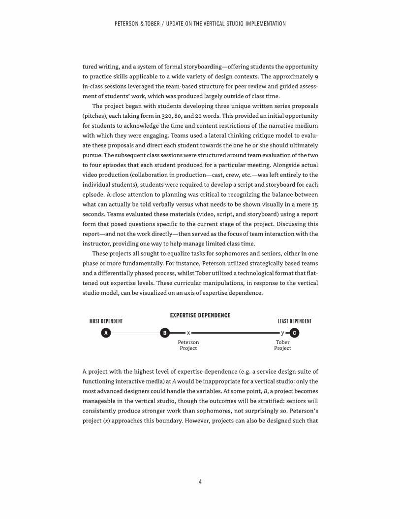
tured writing, and a system of formal storyboarding—offering students the opportunity
to practice skills applicable to a wide variety of design contexts. The approximately 9
in-class sessions leveraged the team-based structure for peer review and guided assess-
ment of students’ work, which was produced largely outside of class time.
The project began with students developing three unique written series proposals
(pitches), each taking form in 320, 80, and 20 words. This provided an initial opportunity
for students to acknowledge the time and content restrictions of the narrative medium
with which they were engaging. Teams used a lateral thinking critique model to evalu-
ate these proposals and direct each student towards the one he or she should ultimately
pursue. The subsequent class sessions were structured around team evaluation of the two
to four episodes that each student produced for a particular meeting. Alongside actual
video production (collaboration in production—cast, crew, etc.—was left entirely to the
individual students), students were required to develop a script and storyboard for each
episode. A close attention to planning was critical to recognizing the balance between
what can actually be told verbally versus what needs to be shown visually in a mere 15
seconds. Teams evaluated these materials (video, script, and storyboard) using a report
form that posed questions specific to the current stage of the project. Discussing this
report—and not the work directly—then served as the focus of team interaction with the
instructor, providing one way to help manage limited class time.
These projects all sought to equalize tasks for sophomores and seniors, either in one
phase or more fundamentally. For instance, Peterson utilized strategically based teams
and a differentially phased process, whilst Tober utilized a technological format that flat-
tened out expertise levels. These curricular manipulations, in response to the vertical
studio model, can be visualized on an axis of expertise dependence.
A project with the highest level of expertise dependence (e.g. a service design suite of
functioning interactive media) at A would be inappropriate for a vertical studio: only the
most advanced designers could handle the variables. At some point, B, a project becomes
manageable in the vertical studio, though the outcomes will be stratified: seniors will
consistently produce stronger work than sophomores, not surprisingly so. Peterson’s
project (x) approaches this boundary. However, projects can also be designed such that
4
PETERSON & TOBER / UPDATE ON THE VERTICAL STUDIO IMPLEMENTATION
A B
EXPERTISE DEPENDENCEMOST DEPENDENT
Peterson Project
Tober Project
LEAST DEPENDENT
Cx y
seniors are not much more qualified than sophomores, at C. Tober’s project (y) is near
this extreme. Minor manipulations can move projects along this axis. If Tober’s project
required typographically based animations, it would shift left.
Projects that are less expertise-dependent are likely targeting fundamental aspects
of design. For instance, Tober’s project is more about the process than the physical
outcome, in terms of how class activities are framed. A major learning outcome in this
example is related to process itself, which ideally students will apply to future work. Low
expertise-dependent projects run the risk of alienating seniors. A major challenge for the
instructor is in framing the class activities so that students understand their applicability.
Projects that are more expertise-dependent are likely more applied (though not to the
point of simulating professional practice). Work must be structured so that sophomores
need not manipulate too many variables at any given time, but still succeed in producing
integrated work in the end. High expertise-dependent projects run the risk of alienating
sophomores. A major challenge for the instructor is rendering outcomes attainable for
less experienced students through a variegated process. The question becomes: how far
can a project shift towards B and still work for mixed-level students?
The authors believe that both low and high expertise-dependent projects are valuable
in a vertical studio. In fact, it may be advisable to ensure that projects in any given year
vary along the expertise dependence axis. A particular sophomore may find a high exper-
tise-dependent project overwhelming and discouraging, despite the best efforts of the
instructor. Such a student can still feel supported in the vertical studio if another project
is low in expertise dependence.
CONCLUSIONS
The Graphic Design faculty at the University of Illinois determined that the only way to
test the efficacy of the vertical studio was to implement it for at least three years, so that
one full graduating class would progress through it, participating in each of the sopho-
more, junior, and senior years. Some of the early conclusions the authors have made from
the experience thus far are particular to their situation and are not necessarily inherent
to the vertical studio concept:
× Teaching the same project 3 times in one semester was tedious for
faculty. The second vertical studio implementation (in the fall of 2014) is
being split into a total of 4 sections. Each instructor will teach in only two
5
PETERSON & TOBER / UPDATE ON THE VERTICAL STUDIO IMPLEMENTATION
of the sections, with one half of the students executing different projects
than the other half.
× This solution also addresses a reconsideration of ideal class size for the
vertical studio. The first year targeted classes of roughly 35 students. The
second year will decrease class size to 25–30 students.
× There are growing pains. Seniors, who were aware of the different
experience of those ahead of them, proved resistant to the vertical studio
model. The authors received their lowest course evaluations to date. It
appeared that sophomores were not critical of the format. It remains to
be seen if they will remain receptive to the vertical studio as they
progress through the curriculum.
× The non-majors provided no measurable benefit. For non-majors, the
vertical studio was an elective, and enough of them dropped the course
that there was no critical mass of non-majors. It is suspected that this is
largely a response to the Graphic Design program’s strict attendance
policy, which appears to conflict with the conception of electives held by
non-majors in the School of Art and Design.
Other conclusions, which were no particular surprise to the authors, are definitional of
the vertical studio:
× Social learning occurs through observation, imitation, and modeling
(Ormrod, 2011). The vertical studio provides the raw material for social
learning: a richer social group of individuals in a shared experience. The
more there is to observe, imitate, and model, the more learning opportu-
nities will present themselves.
× Projects should utilize teams to train the students in collaborative
practice and provide an immediate environment conducive to
peer-based learning.
× Flat group work, where classmates create one product without any
differentiation of responsibilities, is not representative of team-based
practice, and is thus not desirable. Teams should do what teams do best
(research, strategy, critique, etc.) and individuals should remain respon-
sible for their own outcomes.
× Seniors model best (or better-than-sophomore) practices, and project
design should render the progression of expert student work visible to
novice students. If seeing senior performance makes sophomores more
6
PETERSON & TOBER / UPDATE ON THE VERTICAL STUDIO IMPLEMENTATION
advanced, then the benefits should amplify over sustained offering of the
vertical studio. (A sophomore group that observes seniors becomes a
more advanced group of seniors, whom a subsequent sophomore group
learns even more from, etc.)
The authors have found that the challenges of the vertical studio encourage pedagogical
innovation, and increase faculty dialogue. The institutionalized vertical studio is thus
a productive problem. The expertise dependence axis is one initial finding of the verti-
cal studio, a way to classify and understand projects that emerged out of the struggle of
accommodating the vertical model in project design. The vertical studio, in all its diffi-
culties, may prove to be a kind of blast furnace for pedagogical considerations that are
generally applicable to design education, in either vertical or “horizontal” situations.
WORKS CITED
Ormrod, J. E. Human Learning. Upper Saddle River, NJ: Pearson, 2011.
Peterson, M., & Tober, B. “Institutionalizing the Vertical Studio: Curriculum, Pedagogy,
and the Logistics of Core Classes with Mixed-Level Students.” In Proceedings of AIGA
Connecting Dots Conference. University of Cincinnati, Cincinnati, OH: AIGA, 2014.
Tober, B., & Peterson, M. “One-on-One with iPads in a ‘Vertical’ Graphic Design Studio
Course.” In Proceedings of the 2013 University and College Designers Association Design
Education Summit. Smyrna, TN: University And College Designers Association, 2013.
7
PETERSON & TOBER / UPDATE ON THE VERTICAL STUDIO IMPLEMENTATION
Tenth Annual UCDA Design Education Summit | 47
PosterWe are a faculty collective dedicated to creating opportunities to tackle real world challenges through community partnerships that explore human-centered methodologies to transform behavior. Our poster is two-fold:
1. Showcase the work of the initiative. Share methodologies investigating howmight communication designers do the following:
Enact behavioral change:
Framework: ‘Triggers’ is an investigation in which students identified habit loops,prototyped and tested solutions, tracked and measured behavioral change.Response: ‘CallYo’Mamma’ is a journal for creating more meaningful relationshipswith long-distance mothers.
Engage and activate participation on social issues:
Framework: ‘Form,Content,Context’ is a public intervention in which students engagein weekly iterations on site: 1.formally alter a space 2.craft a message 3.provide ameans for interaction.Response: ‘InvisibleInNYC’ installations map homelessness and activate participationvia a guerrilla campaign directed at local officials.
Enable resiliency:
Framework: ‘Broadway1000Steps’ considers how design might inspire residents tothink of the city as a living ecosystem. Students conducted site analysis and visualethnography to arrive at prototypes.Response: ‘UncoverManahatta’ is a scavenger hunt game using Lenape mythology tocurate a historical experience of the city and educate participants about the changingcoastline of Lower Manhattan.
Framework: An investigation into enabling resiliency in the face of climate change,‘ZoneA’ asked student teams to conduct research in the five most vulnerable NYCcommunities.Response: ‘CollectiveToolbox’ is a tool-lending library based in a post-Sandy StatenIsland community.
(Continued on next page)
Transform/Action
Jean BrennanPratt Institute
David FriscoPratt Institute
Andrew SheaPratt Institute
1
48 | Tenth Annual UCDA Design Education Summit
2. Invite conversation from colleagues regarding methodologies and structures forteaching transformation design.
Provide a participatory form inviting input from colleagues regarding best practices.Completed forms displayed for the duration of the conference.
Distribute an ‘InvisibleInNYC’ toolkit so that conference attendees may participate inthe action. The toolkit will describe the assignment structure and methodologies sothat educators interested in social impact design can experiment with the frameworkin the classroom.
Tenth Annual UCDA Design Education Summit | 49
PosterWe propose a poster to diagram and discuss our half- semester system of senior course work in particular our unique collection of course topics featured under our Senior Workshop component. These are niche topic courses open to all seniors regardless of their area/s of concentration that flesh out their senior experience. Our program has four distinct areas of concentration: graphic design, advertising design, interactive design and illustration. Although seniors must complete one concentration area it is not unusual that they complete the requirements in multiple areas. Workshops are intense 7/8 week courses with an enormous amount of information and work packed into a very tight time frame. Finished work is expected to be portfolio ready.
We will visually present logic of our system. With many of our seniors placed in half-semester full-time internships in their senior year our department developed a system of half -semester seminars to complete concentration areas. To flesh out their senior experience half- semester workshops were developed to increase the student’s diversification of skills, to expose students to specialized areas in design, to cross pollinate interest areas and to develop competency in their knowledge base increasing employment opportunities. Senior Workshops include Poster Design, Design For The Greeting Card and Gift Industry, Package Design, Restaurant Graphics, Motion Graphics, Typeface Design, Art of Humor, and Emerging Media.
Workshops prepare students in all disciplines of Communication Design to cultivate marketable skills and develop directed portfolio work for these specialized areas in Communication Design. These courses give students opportunities to apply design, illustration and interactive skills in a variety of specialized areas in visual design and illustration. We will illustrate the variety of experience by showcasing many student examples of work completed in these courses.
So Many Topics So Little Time: An Overview of Half Semester Senior Seminars and Workshops
Elaine CunferKutztown University
2

50 | Tenth Annual UCDA Design Education Summit
A Study Comparing Table-based and List-based Smartphone Interface Usability
Patrick FinleyOklahoma State University
PosterSmartphone devices have provided designers and developers a new platform in which to expand the way people communicate and access information through the Internet while being mobile. Mobility has made smartphones a desirable technology, bringing with a set of limitations of screen size and usability. As smartphones continue to play an increasing role in our everyday life, usability must be addressed to match the users’ needs and desires. The goal of this study was to conduct usability studies by evaluating the effectiveness of the two most commonly used mobile website interfaces. Based on literature review, it was recommended to test table and list-based interfaces as they are the two most commonly used and efficient smartphone interface layouts. In order to evaluate the effectiveness of both table and list-based interfaces, a usability study was employed. The methodology for this study was broken into two phases: prototype development and usability studies. The first phase applied analyzed data collected from a study of current education websites and recommendations from the reviewed literature to develop two interface prototypes used for testing. During the second phase, a usability study was employed to analyze the effectiveness and ineffectiveness of the two interfaces including an entrance demographic questionnaire, task scenarios for both interfaces, an exit questionnaire, and tools used for analyzing statistical data. The analysis evaluating the users’ performance for each interface was based on quantitative and qualitative data. The quantitative data was broken into three criteria of time-per- task, click- path-analysis and errors-per-task. Each criterion measured the mean difference, confidence interval, p-value and correlation. The qualitative data was collected through responses from the entrance and exit surveys. Results of the study, in
regards to usability, found the table interface to be more effective than the list interface.
4
Tenth Annual UCDA Design Education Summit | 51
PosterThis poster presents why graphic design students need drawing skills in the digital age—to help insure their success.
The role of sketching in graphic design varies depending on if students are creating page layouts, corporate identities, illustrations, product concepts, Websites or other designs.
Categories are established that I have found to be instrumental as the basics for student success. General discussion could evolve around additional areas other instructors would add as necessary for insuring student success in graphic design.
1. Digital tools vs. Sketching Skills• Digital tools are approximations, not replacement• Sketching is fundamental to getting the best results with the least effort• True and false freedom of digital tools• Balancing between two different worlds (virtual and real)
2. Benefits of Sketching Skills• Quick concept development• Fundamental composition or layout from scratch• More visual explorations• Refining visual solutions
3. Types of Sketches• Thumbnail sketches• Information sketches• Presentation sketches• Technical sketches
4. How to improve sketching skills for graphic design projects• Sketch, sketch, and sketch• Use of objects and photos for reference• Practices on silhouette drawings• Practices on 3D objects drawings
As a tool or skill, sketching has its role in the graphic design process. That role will vary depending on the end-product being created, the size and scope of the project, the individual student’s style, experience, and workflow.
The essence of why students sketch ideas as designers is seeded in effectively communicating those ideas to potential/future clients. Sketching is designer’s language of communication.
Should Graphic Design Students Need to Know How to Draw? The Role of Sketching in a Graphic Design Classroom
Jong-Yoon KimPlymouth State University
5
52 | Tenth Annual UCDA Design Education Summit
Sustainable Design Education: Defining Our Relationship with Nature
Venancio A. Luz IIIViterbo University
PosterThe graphic design discipline has been undergoing a dramatic transformation in its response to expanding environmental, economic and societal pressures that threaten our planet. As the profession continues to craft the messages and artifacts that influence public opinion, it is an imperative that it increasingly expands its influence on the flow of materials and energy throughout the various stages of the materials economy.
Graphic design curricula at the undergraduate level must undergo a paradigm shift that focuses beyond form and meaning. It must progressively reflect values of the sustainability movement in order to adequately prepare and develop students for the complex design challenges of this era. In addition, it must consider how the current economy impacts the employment prospects and career opportunities of the next generation of designers. As such, sustainability must be an integral component of design education in teaching and mentoring students to engage in sustainable practices in order to maintain their own relevancy in society, as well as, to create opportunities for critical leadership roles.
Consequently, I have engaged visual communication majors by authoring and teaching a course dedicated to learning about sustainable design, as well as mentoring students via an undergraduate summer research program. By teaching, collaborating and directing students to critical texts regarding sustainable graphic design, their level of awareness of the effects the graphic arts industry has on society and the environment expanded their consciousness of their own potential to influence processes and impact social change. By examining various production and explorying ways for implementing them, they were able to realize how they can influence issues relating to deforestation, species extinction, global warming, fresh warm consumption and pollution. As a result of these experiences, students not only became more effective designers, but more responsible stewards of their environment as well.
6
Tenth Annual UCDA Design Education Summit | 53
Poster Every year the senior graphic design class takes on a project based on issues that can potentially change attitudes, behaviors, or systems. This year the university-wide theme of Unraveling Inequality was narrowed to the problems of global health for children. The students were assigned the Records for Life competition, sponsored by the Bill & Melinda Gates Foundation. The international competition called for the creation of a prototype of child health records for global use.
Health-care cards hold great value in third-world countries, but they often lack adequate space to express the information, are easily damaged and are designed in an unclear way for parents to understand. To improve these vital information systems, the designs were judged on clarity, adaptability, perceived value and durability. The design criteria was very specific, calling for both physical and digital solutions.
The students were guided through the following steps, an adaptation of the IDEO design process focusing on the user: research, empathy, ideation, design, feedback and re-design. They researched over one hundred existing immunization records from all over the globe, and then analyzed and assessed the features. To assist in the process, faculty enlisted the help of community experts: a philanthropist leading a global initiative in malaria prevention, the founder of the Lamu Center for Preventative Health in Lamu, Kenya, and a supervisor of immunizations for the local Health Department. They offered not only their knowledge, but their personal stories about their experiences in global health. Through this storytelling, the experts convinced the students that they could help save lives with well-designed records. The records shown were in the top 40 of over 300 entries. One student commented, “Design really can, and does, make a difference, and this is one of many projects that attests to that.”
Records for Life
Sherri McElroyIllinois Wesleyan University
7
54 | Tenth Annual UCDA Design Education Summit
The Complexity of Being Human and What it Means for Creativity
Deb ShmerlerThe University of Tennessee
PosterAs educators, we have come to realize that the better we know ourselves, the better we are as Designers and Artists. This knowledge grounds our creative confidence. Not only do we become more acutely aware of our personal creative process, but by learning about ourselves, we also learn what connects us and separates us from others. Eventually, these realizations about fear, trust, happiness, behavioral patterns, control and power help us empathize with others so we can develop solutions to problems that have lasting effects on our audience or users, not to mention our planet and ourselves. Tony Schwartz reminds us that: “the failure to connect behavior to its inevitable consequences shows up in our lives everyday” Which beckons the question: “Is the life you’re leading worth the price you’re paying to live it?” So, what type of design process do we want to frame for ourselves that will be sustaining and fulfilling? What type of process embraces the multidimensional nature of Design? I read once that if you want to understand change, study things that have been around for a long time. So my search for a sustainable design process led me to Eastern Psychology and the integrative philosophy of the chakra system. In her book Anatomy of the Spirit, Carolyn Myss, PH.D. tells us that “learning the language of the human energy system is a means of self-understanding”. I believe studying the language of the human energy system is also a means to explain and ground the creative process with an eye towards problem-finding and problem-solving. This poster will diagram the relationships between the chakra system and the design process. This is important because to become better designers, we must know what we are making and why we are making these things. More importantly, this diagram visually explains how all people have the potential to be creative.
8
Tenth Annual UCDA Design Education Summit | 55
Poster One challenge of academia is using research interests to inspire teaching in the classroom that will also engage the students. For the past several years I have used my love and investigation of character-based illustration and design to teach undergraduate students about graphic design and illustration. This research was used to develop an undergraduate course devoted entirely to the subject. The class has been offered several times and received positive student feedback and results. Using a visual language that students are already excited about makes them more interested to develop their own unique work. In the Spring of 2014, I will start a new research project that relates to another personal interest, basketball.
This project will investigate the rich visual culture of basketball. It is my goal to interview the illustrators, artists, and designers that produce these works and inquire about the methods and problems that come from working in this specific area of pop culture. I will curate an online blog that documents my findings. In my design and illustration classes I have already begun to assign basketball related projects such as developing branding for Nike and creating a new visual identity for our universities’ basketball teams.
Using my research over the next academic year, I will develop a new art studio course to be taught in summer 2015 that will use the subject of basketball to attract and educate students about many facets of visual communications including graphic design, illustration, and advertising. Projects will be developed to create innovative design and illustration artifacts for the basketball industry.
This poster will present my initial research for the project including examples of student work, creative professional case studies, and the development of an online resource to educate students and inspire professionals.
The Art and Design of Basketball
Marius ValdesUniversity of South
Carolina
9
56 | Tenth Annual UCDA Design Education Summit
Poster As part of my ongoing visual healthcare communication investigations, I forged a partnership with a new client, Neighborhood Family Practice (NFP), for my Socially Responsible Design course last fall. This service project proposal did not include the typical array of design projects such as rebranding, website and brochure design but instead focused extensively on design research, deliverables and measurable results on an unframed problem presented by the client. While student background diversity was expected to be beneficial to the project, what I didn’t foresee was that fewer students in the course was actually going to be an asset. Three out of five were international students. One student wasn’t a designer but a healthcare informatics major, an interesting twist in the typical design studio. All five students were in their first semester in our graduate program. This paper outlines a one- year journey with five students who learned to apply research, overcome unexpected obstacles and find ways to work together to communicate and share their individual research results to solve a complex, multi- pronged problem. In this project, roadblocks presented students with opportunities to create new frameworks to find solutions. The paper will specifically focus on unexpected obstacles that occur in research and how improvisation played a role in dealing with those roadblocks. As a result, students worked through the problems that led to 6 interwoven solutions. I will discuss all stages of the project including research, testing, deliverables and assessment for a healthcare clinic that sees 14,000 patients a year. Additionally, I will demonstrate how each roadblock served as a stepping- stone to finding one unified solution that produced measurable results in a local community.
Designing a Greener City: Enhancing Undergraduate Research Endeavors and Creative Activities. (EURECA)
JennyYucusMidwestern State
University
Melody CamposMidwestern State
University
Royce BrockMidwestern State
University
10
Tenth Annual UCDA Design Education Summit | 57
Poster For the cost of a textbook, students can acquire their own web hosting that acts as a tool that engages them in new forms of practical learning and professional experiences. It gives them access to it anytime and anyplace; allows him or her to display their work outside of the confines of a controlled student server; becomes a venue to promote themselves as a capable and proficient intern or employee for future experiences while in school and upon graduation. In my experience as a professor, I have always struggled with the process of having a class turn in their interactive work. From my observations in the classroom, those students who seemed to excel were those who had their own “little piece of the web.” Through their experience of creating and managing their own web space, they seemed to be more confident in their skill set and had a desire to do more. After watching those students through out that semester, I realized that it might not be such a bad idea to incorporate that into the classroom experience. By supplying educators with my research on low cost web hosting and an outline of proposed projects and ways to engage students using easy to learn software and other Internet technologies, they can implement this practice into their programs and begin to reap the benefits and open the doors to their students and better facilitate their success upon graduation.
Student Acquired Web Hosting: A Classroom Tool for Success
Michael ClaytonUniversity of the
Incarnate Word
11
58 | Tenth Annual UCDA Design Education Summit
Design for Social Change Project 2012
Doris PalmerosUniversity of the
Incarnate Word
Poster Project BriefThe mission of the Diplomás collaborative is to increase post-secondary education credentials and to improve earning potential for Hispanics in San Antonio. The goal of our Design Team was to create a successful logo & tagline to communicate the message of “education” & the potential for “more”/ “mas”. We also aimed to create poster, stationary, info graphics to help promote the idea that a better future was within reach through education and skill development. The message was “People with a college degree make approximately 84% more than those without.”
ProcessStudents were introduced to collaborative work through working for a non-profit client in a course titled “Design Team” at the Art Institute of San Antonio. A full identity system was created and presented to a non-profit organization in need of a new identity. Creative phases included initial meetings with client to understand and research objective and strategy. Final comps and PowerPoint were presented to the client committee. Challenges in the project included the bilingual component of the name and the diverse target audience
EffectivenessDiplomás is a small collaborative of the bigger SA2020 initiative in San Antonio Texas. SA2020 is a movement started in 2010 to nurture civic participation and achieve a collective vision with specific goals by the year 2020. These goals involve “causes” in arts and culture, civic engagement, downtown development, education, sustainability, and transportation. The Diplomas project was a success, and the Design Team students were ultimately honored by the mayor of San Antonio, Julian Castro, and by the higher education community, in a public unveiling of the new identity design for the Diplomás program.
12
Tenth Annual UCDA Design Education Summit | 59
Case Study: Rebranding–a voice that speaks for many: a faculty union.
Jane MilkieNorthern Michigan
University
Poster Poster presentation will feature visual branding and marketing strategies in support of a faculty union facing the future of right to work policies. The poster will feature ongoing work that aims to re-brand the benefits of belonging to a union dedicated to academic freedom, shared governance, and collective bargaining. Graphic design can be utilized to represent an organizations presence and value to members– in this instance serving to inform and unify the bargaining chapter. Unions in right to work states face a 40% drop in dues paying members weakening the funds for payment of national dues, for litigation, and for general operation. In academe there may be tiers of instructional hire: full-time tenure track, full-time term, part-time contingent, adjunct, graduate student teaching assistants, as well as multiple levels of faculty terminal degree’s depending upon what programs the institution offers. In the current economic times administration’s reduction of benefits in both health and retirement, as well as stagnant wage increases, effect the working conditions of faculty including those who teach in graphic design programs. A declining demographic of college-aged students as well as educational models for on-line learning, MOOCs, and funding for programs based on outcomes assessment further change availability of tenure-track faculty lines. The success of any academic program depends upon the students enrolled, the faculty, and the institutional infrastructure. It is faculty who determine curriculum. A stable and strong faculty makes for the best possible learning outcomes.
13

60 | Tenth Annual UCDA Design Education Summit