Quantitative Data Analysis Using SPSS
146
QUANTITATIVE DATA ANALYSIS USING SPSS AN INTRODUCTION FOR HEALTH AND SOCIAL SCIENCE Pete Greasley Greasley QUANTITATIVE DATA ANALYSIS USING SPSS
-
Upload
khangminh22 -
Category
Documents
-
view
5 -
download
0
Transcript of Quantitative Data Analysis Using SPSS

This accessible book is essential reading for those looking for a short and simple guide to basic data analysis. Written for the complete beginner, the bookis the ideal companion when undertaking quantitative data analysis for the firsttime using SPSS.
The book uses a simple example of quantitative data analysis that would be typical to the health field to take you through the process of data analysis stepby step. The example used is a doctor who conducts a questionnaire survey of30 patients to assess a specific service. The data from these questionnaires isgiven to you for analysis, and the book leads you through the process requiredto analyse this data.
Handy screenshots illustrate each step of the process so you can try out theanalysis for yourself, and apply it to your own research with ease.
Topics covered include:
Questionnaires and how to analyse themCoding the data for SPSS, setting up an SPSS database and entering the dataDescriptive statistics and illustrating the data using graphsCross-tabulation and the Chi-square statisticCorrelation: examining relationships between interval dataExamining differences between two sets of scoresReporting the results and presenting the data
Quantitative Data Analysis Using SPSS is the ideal text for any students inhealth and social sciences with little or no experience of quantitative data analysis and statistics.
Pete Greasley is a lecturer at the School of Health Studies, University of Bradford, UK.
Cover design: Mike Stones
QUANTITATIVE DATA ANALYSIS USING SPSSAN INTRODUCTIONFOR HEALTH AND SOCIAL SCIENCE
Pete Greasley
Greasley
QUANTITATIVE DATA ANALYSIS USING SPSSAN INTRODUCTION FOR HEALTH AND SOCIAL SCIENCE
QUANTITATIVE DATA AN
ALYSIS USING SPSS

Quantitative Data AnalysisUsing SPSS


Quantitative DataAnalysis Using SPSSAn Introduction for Health &Social Science
Pete Greasley

Open University PressMcGraw-Hill EducationMcGraw-Hill HouseShoppenhangers RoadMaidenheadBerkshireEnglandSL6 2QL
email: [email protected] wide web: www.openup.co.uk
and Two Penn Plaza, New York, NY 10121-2289, USA
First published 2008
Copyright © Pete Greasley 2008
All rights reserved. Except for the quotation of short passages for the purpose ofcriticism and review, no part of this publication may be reproduced, stored in aretrieval system, or transmitted, in any form or by any means, electronic,mechanical, photocopying, recording or otherwise, without the prior writtenpermission of the publisher or a licence from the Copyright Licensing AgencyLimited. Details of such licences (for reprographic reproduction) may be obtainedfrom the Copyright Licensing Agency Ltd of Saffron House, 6–10 Kirby Street,London EC1N 8TS.
A catalogue record of this book is available from the British Library
ISBN-10: 0 335 22305 2 (pb) 0 335 22306 0 (hb)ISBN-13: 978 0335 22305 3 (pb) 978 0335 22306 0 (hb)
Library of Congress Cataloging-in-Publication DataCIP data applied for
Typeset by RefineCatch Limited, Bungay, SuffolkPrinted in the UK by Bell and Bain Ltd, Glasgow

Contents
Introduction 1
1 A questionnaire and what to do with it: types of data andrelevant analyses 51.1 The questionnaire 51.2 What types of analyses can we perform on this questionnaire? 7
1.2.1 Descriptive statistics 71.2.2 Relationships and differences in the data 13
1.3 Summary 161.4 Exercises 171.5 Notes 18
2 Coding the data for SPSS, setting up an SPSS database andentering the data 192.1 The dataset 192.2 Coding the data for SPSS 202.3 Setting up an SPSS database 21
2.3.1 Defining the variables 222.3.2 Adding value labels 25
2.4 Entering the data 272.5 Exercises 282.6 Notes 31
3 Descriptive statistics: frequencies, measures of centraltendency and illustrating the data using graphs 333.1 Frequencies 333.2 Measures of central tendency for interval variables 383.3 Using graphs to visually illustrate the data 41
3.3.1 Bar charts 413.3.2 Histograms 453.3.3 Editing a chart 463.3.4 Boxplots 503.3.5 Copying charts and tables into a Microsoft Word
document 523.3.6 Navigating the Output Viewer 56
3.4 Summary 573.5 Ending the SPSS session 583.6 Exercises 583.7 Notes 60
4 Cross-tabulation and the chi-square statistic 614.1 Introduction 614.2 Cross-tabulating data in the questionnaire 614.3 The chi-square statistical test 63

4.4 Levels of statistical significance 674.5 Re-coding interval variables into categorical variables 694.6 Summary 734.7 Exercises 734.8 Notes 75
5 Correlation: examining relationships between interval data 775.1 Introduction 775.2 Examining correlations in the questionnaire 77
5.2.1 Producing a scatterplot in SPSS 785.2.2 The strength of a correlation 805.2.3 The coefficient of determination 82
5.3 Summary 835.4 Exercises 845.5 Notes 85
6 Examining differences between two sets of scores 866.1 Introduction 866.2 Comparing satisfaction ratings for the two counsellors 88
6.2.1 Independent or related samples? 886.2.2 Parametric or non-parametric test? 88
6.3 Comparing the number of sessions for each counsellor 956.4 Summary 1006.5 Exercises 1016.6 Notes 102
7 Reporting the results and presenting the data 1037.1 Introduction 1037.2 Structuring the report 1037.3 How not to present data 107
Concluding remarks 109Answers to the quiz and exercises 110Glossary 130References 133Index 135
vi Quantitative Data Analysis Using SPSS

Introduction
I remember reading somewhere that for every mathematical formula, includedin a book, the sales would be reduced by half. So guess what, there are noformulas, equations or mathematical calculations in this book. This is apractical introduction to quantitative data analysis using the most widelyavailable statistical software – SPSS (Statistical Package for the Social Sciences).The aim is to get students and professionals past that first hurdle of dealingwith quantitative data analysis and statistics.
The book is based upon a simple scenario: a local doctor has conducted a briefpatient satisfaction questionnaire about the counselling service offered at hishealth centre. The doctor, having no knowledge of quantitative data analysis,sends the data from 30 questionnaires to you, the researcher, for analysis.
The book begins by exploring the types of data that are produced from thisquestionnaire and the types of analysis that may be conducted on the data.The subsequent chapters explain how to enter the data into SPSS and conductthe various types of analyses in a very simple step-by-step format, just as aresearcher might proceed in practice.
Each of the chapters should take about an hour to complete the analysis andexercises. So, in principle, the basic essentials of quantitative data analysisand SPSS may be mastered in a matter of just six hours of independent study.The chapters are listed below with a brief synopsis of their content.
• Chapter 1 A questionnaire and what to do with it: types of data and relevantanalyses. The aim of this chapter is to familiarize yourself with thequestionnaire and the types of analyses that may be conducted on thedata.
• Chapter 2 Coding the data for SPSS, setting up an SPSS database and enteringdata. In this chapter you will learn how to code the data for SPSS, set up anSPSS database and enter the data from 30 questionnaires.
• Chapter 3 Descriptive statistics: frequencies, measures of central tendency andvisually illustrating data using graphs. In this chapter you will use SPSS toproduce some basic descriptive statistics from the data: frequencies for cat-egorical data and measures of central tendency (the mean, median andmode) for interval level data. You will also learn how to produce and editcharts to illustrate the data analysis, and to copy your work into a MicrosoftWord file.
• Chapter 4 Cross-tabulation and the chi-square statistic. In this chapter youwill learn about cross-tabulation for categorical data, a statistical test (chi-square) to examine associations between variables, and the concept of stat-istical significance. You will also learn how to re-code interval data intocategories.
• Chapter 5 Correlation: examining relationships between interval data. In this

chapter you will learn about scatterplots and correlation to examine thedirection and strength of relationships between variables.
• Chapter 6 Examining differences between two sets of scores. In this chapteryou will learn about tests which tell us if there is a statistically significantdifference between two sets of scores. In so doing you will learn aboutindependent and dependent variables, parametric and non-parametricdata, and independent and related samples.
There is also a final concluding chapter which provides advice on how tostructure the report of a quantitative study and how not to present data.
The approach
Quantitative data analysis and statistics is often a frightening hurdle for manystudents in the health and social sciences, so my primary concern has beento make the book as simple and accessible as possible. This quest for simplicitystarts with the fact that the student has only one dataset to familiarizethemselves with – and that dataset itself is very simple: a patient satisfactionquestionnaire consisting of just five questions.
The questionnaire is, however, designed to yield a range of statistical analysesand should hopefully illustrate the potentially complex levels of analyses thatcan arise from just a few questions. This will also act as a warning to studentswho embark upon research projects involving complex designs without fullyappreciating how they will actually analyse the data. My advice to studentswho are new to research is always to ‘keep it simple’ and, where possible, todesign the study according to the statistics they understand.
I have taken a pragmatic approach to quantitative data analysis which meansthat I have focused on the practicalities of doing the analyses rather thanruminating on the theoretical underpinnings of statistical principles. Andsince actually doing the analyses requires knowledge of appropriate statisticalsoftware, I have chosen to illustrate this using the most widely availableand comprehensive statistical package in universities: SPSS. Thus, by the endof this book you should not only be able to select the appropriate statisticaltest for the data, you should also be able to conduct the analysis and producethe results using SPSS.
The scope of the book
I have set a distinct limit to the level of analysis which I think is appropriatefor an introductory text. This limit is the analyses of two variables – known asbi-variate analyses. In my experience of teaching health and social sciencestudents, most of whom are new to quantitative data analysis and statistics,this is sufficient for an introduction.
Also, I did not want to scare people off with a more imposing tome coveringthings like logistic regression and factorial ANOVA. There are many other bookswhich include these more advanced statistics, some of which are listed in thereferences. This book is designed to get people started with quantitative data
2 Quantitative Data Analysis Using SPSS

analysis using SPSS; as such it may provide a platform for readers to consultthese texts with more confidence.
The audience: health and social sciences
As an introduction to quantitative data analysis, this book should be relevantto undergraduates, postgraduates or diploma level students undertaking afirst course in quantitative research methods. I have used these materials toteach students from a variety of backgrounds including health, social sciencesand management.
It may be particularly relevant for students and professionals in health andsocial care, partly due to the subject matter (a patient satisfaction question-naire about counselling) and the examples used throughout the text, butalso due to the design of the materials. Many students and professionals inhealth and social care are studying part-time or by distance learning, or per-haps undertaking short courses in research methods. This means that theiropportunities for attendance are often limited and courses need to be designedto cater for this mode of study, for example, attendance for one or two days at atime.
It is with these students in mind that these materials should also be suitablefor independent study. After the introductory chapter outlining the types ofdata and analyses, the book continues with step-by-step instructions for con-ducting the analysis using SPSS. Furthermore, the practical approach shouldsuit professionals who may wish to develop their own proposals and conducttheir own research but have limited time to delve into the theoretical details ofstatistical principles.
In health studies the emphasis on evidence-based practice has reinforcedthe need for professionals to not only understand and critically appraise theresearch evidence but also to conduct research in their own areas of practice.This book should provide professionals with a basic knowledge of theprinciples of quantitative research along with the means to actually design andconduct the analysis of data using SPSS.
For lecturers
This book is an organized course divided into six chapters/sessions whichmay be delivered as a combination of lectures and practical sessions on SPSS.I have delivered this course in three ways:
1 First, as a series of five weekly lectures and practical sessions (two–threehours) for the first half of a postgraduate module on quantitative andqualitative data analysis.
The first session primarily consists of a lecture introducing the question-naire, the dataset and relevant analyses (Chapter 1) before moving on toenter the data (Chapter 2). Thereafter, each of the remaining four sessionsconsists of an introductory lecture discussing the analysis in subsequentchapters (descriptive statistics and graphs, cross-tabulation and chi-square,
Introduction 3

correlation, examining differences in two sets of scores) before movingonto SPSS to conduct the analyses and exercises in each chapter. In the finalsession I also include discussion of writing up the results and reportingmore generally (Chapter 7).
For a full module of 10–11 sessions this book could either be supple-mented by additional materials covering more advanced analyses (e.g.,ANOVA and regression analysis) or students could design (and conduct)their own study (in groups) based upon the analyses covered in the book.
2 A one/two day course for a postgraduate module on Research Methods. Thisstarts with formal lecture introducing the questionnaire, the dataset andrelevant analyses (Chapter 1), and then students (in pairs) work throughthe materials at their own pace, continuing with independent study. Thepractical sessions may be interspersed with brief lectures reviewing thetypes of analyses.
3 A half-day workshop on SPSS. Again, this begins with a brief introductionto the questionnaire, the dataset and types of analyses, with guided instruc-tion on specific exercises from each of the chapters. Though it has to be saidthat a half day is not really sufficient time to cover the materials (in myview, and according to the student evaluations!) This is especially the casefor students with little prior knowledge of statistics.
Where an assignment has been set for the course, students have been askedto produce a report for the doctor who requested the analysis. This requiresstudents to write a structured report in which the ‘most relevant analyses’ arepresented along with some discussion of the results, critical reflections on thesurvey and recommendations for further research.
Getting a copy of SPSS
SPSS, as noted above, is the most widely used software for the statisticalanalysis of quantitative data. It is available for use at most universities wherestaff and students can usually purchase their own copy on cd for £10–£20. Thelicence, which expires at the end of each year, can be renewed by contactingthe supplier at the university who will provide the necessary ‘authorization’code.
Acknowledgements
Thanks to all the students who have endured evolving versions of this text, tothe publishing people for coping with the numerous figures and screenshots,and to Wendy Calvert (proof-reader extraordinaire).
4 Quantitative Data Analysis Using SPSS

A questionnaire and what todo with it: types of data andrelevant analyses
The aim of this chapter is to familiarize yourself with the questionnaireand the types of analyses that may be conducted on the data before we goonto SPSS. By the end of the chapter you should be familiar with: types of dataand levels of measurement; frequencies and cross-tabulation; measures ofcentral tendency; normal and skewed distributions of data; correlation andscatterplots; independent and dependent variables.
1.1 The questionnaire
A local general practice (family practice or health centre for those outside theUK) has been offering a counselling service to patients for over a year now. Thedoctor at the practice refers patients to a counsellor if they are suffering frommild to moderate mental health issues, like anxiety or depression.1
The doctor decided that he wanted to evaluate the service by gathering someinformation about the patients referred for counselling and their satisfactionwith the service. So, he designed a brief questionnaire and sent it to everypatient who attended for counselling over the year. The doctor had referred30 patients to the service and was delighted to find that all 30 returned thequestionnaire.
But then he realized he had a bit of a problem – he did not know how to analysethe data! That is when he thought of you. So, with a polite accompanying letterappealing for help, he sends you the 30 completed questionnaires for analysis.A copy of the questionnaire is provided in Figure 1.1.
The first thing you notice is that he has collected some basic demographic dataabout the gender and age of the patients. Then you see that he has askedwhether they saw the male or female counsellor – that might be interesting interms of satisfaction ratings: perhaps one received higher ratings than theother? He has also collected information about the number of counsellingsessions conducted for each patient because, he tells you in the letter, the coun-sellors are supposed to offer ‘brief therapy’ averaging six sessions. Are they bothabiding by this? Finally, you see that patients were asked to rate their satisfac-tion with the service on a seven point scale. Will the ratings depend on the sexor age of the patient? Perhaps they would be related to the number of counsel-ling sessions or, as noted above, which particular counsellor the patient saw.
Well, you think, that is not too bad – at least it is simple. But what sorts ofanalysis can you do on this questionnaire? (See Box 1.1 for a brief discussionof some questionnaire design issues.)
1

Box 1.1 Questionnaires: some design issues
While this is not the place for a full discussion of questionnaire design issues, there aresome cardinal rules that should be briefly noted.
First, make sure the questions are clear, brief and unambiguous. In particular avoid‘double questions’, for example: ‘Was the room in which the counselling took placequiet and comfortable? Well, it was comfortable but there was a lot of noise from thenext room . . .’
Second, make sure that the questionnaire is easy to complete by using ‘closedquestions’ with check boxes providing the relevant options that respondents can simplytick. So, you should avoid questions like: ‘Q79: Please list all the times you felt anxious,where you were, who you were with, and what you’d had to eat the night before’.
The more you think through the options before, the less work there will be later whenit comes round to analysing the data. As Robson (2002: 245) points out: ‘The desire touse open-ended questions appears to be almost universal in novice survey researchers,but is usually extinguished with experience . . .’ Piloting the questionnaire, which isimportant to check how respondents may interpret the questions, can also providesuggestions for closed alternatives.
There are some occasions, however, when ‘open questions’ are necessary to provideuseful information. For example, the question about level of satisfaction with theservice may have benefited from a comments box to allow patients to expand on issuesrelating to satisfaction. An alternative strategy may have been to use more scales tomeasure different dimensions of satisfaction (for example, relating to the counsellor, theroom in which counselling was conducted, the referral procedure, etc.)
Another issue is the design of the scale used to measure satisfaction. The doctor mighthave used a more typical Likert-type format where the respondent indicates the extentto which they agree or disagree with a statement:
Figure 1.1 Counselling service: patient satisfaction questionnaire
6 Quantitative Data Analysis Using SPSS

I was satisfied with the service:
Notice that there are only five options here (and they are labelled). The format you usewill depend on the context and the level of sensitivity you require, which may result in aseven or nine point scale. Also notice that whatever the length of the scale, there is anoption for a ‘neutral’ or ‘undecided’ response.
In the counselling questionnaire you may also notice that the question asking for theage of patients may have provided a list of age groupings, for example, 20–9, 30–9.Although categories can make the questionnaire easier to complete, and moreanonymous (some people may not like to specify their age because it may help toidentify them), my advice would be to gather the precise ages where possible becauseyou can convert them into any categories you want later; the same principle applies tonumber of counselling sessions.
A full discussion of questionnaire design issues would require a chapter unto itself.For further reading Robson (2002) provides a relatively succinct chapter with guidanceon design and other issues.
1.2 What types of analyses can we perform on this questionnaire?
1.2.1 Descriptive statistics
Descriptive statistics provide summary information about data, for example,the number of patients who are male or female, or the average age of patients.There are three distinct types of data that are important for statistical analysis:
Types of data (or levels of measurement)
1 Interval or Ratio: This is data which takes the form of a scale in which thenumbers go from low to high in equal intervals. Height and weight areobvious examples. In our data this applies to age, number of counsellingsessions and patient satisfaction ratings.
2 Ordinal: This is data that can be put into an ordered sequence. For example,the rank order of runners in a race – 1st, 2nd, 3rd, etc. Notice that this givesno information on how much quicker 1st was than 2nd or 2nd was than3rd. So, in a race, the winner may have completed the course in 20 seconds,the runner-up in 21 seconds, but third place may have taken 30 seconds.Whereas there is only one second difference between 1st and 2nd, there arenine seconds difference between second and third. Do we have any of thistype of data in our sample? No we do not (though see Box 1.2 for furtherdiscussion).
3 Categorical or nominal: This is data that represents different categories,rather than a scale. In our data this applies to: sex (male or female) andcounsellor (John or Jane). So, if we were assigning numbers to these cat-egories, as we will be doing, they do not have any order as they would have
Stronglydisagree
Disagree Undecided Agree Stronglyagree
� � � � �
A questionnaire and what to do with it 7

in a scale: if we were to code male as 1 and female as 2, this does not implyany order to the numbers – it is just an arbitrary assignment of numbersto categories.
Making a distinction between these levels of measurement is importantbecause the type of analysis we can perform on the data from the questionnairedepends on the type of data – as illustrated in Table 1.1.
We will now examine each of these in turn.
Box 1.2 Types of data & levels of measurement
Whereas this brief review is really all we need to know for our questionnaire data,there is in fact a lot more to say about types of data and levels of measurement. Forexample, although I have grouped interval and ratio data together, as many textbooksdo (e.g., Bryman and Cramer 2001: 57), there is much debate about the differencesbetween true interval data and that provided in rating scales.
In our questionnaire, age and counselling sessions are ratio data because there is a truezero point and we know that someone who is 40 years is twice as old as someone whois 20 years; similarly, we know that 12 counselling sessions is four times as many asthree; we know the ratio of scores. The problem with interval data is that, while theintervals may be equal we cannot be sure that the ratio of scores is equal. For example,if we were measuring anxiety on a scale of 0–100, should we maintain that a personwho scored 80 had twice as much anxiety as a person who scored 40? (Howell1997: 6.)
This issue could be raised about our satisfaction ratings: can we really be sure that apatient who circles 6 is twice as satisfied as a person who circles 3, or three times assatisfied as a person who circles 2? It is for this reason that some analysts would treatthis as ordinal data – like the rank order of runners in a race – 1st, 2nd, 3rd, etc.described above. But clearly, our satisfaction rating scale is more than ordinal, and sincethe numerical intervals in the scale are presented as equal (assuming equal intervalsbetween the numbers) we might say they ‘approximate’ interval data.
For those who wish to delve further into this debate about whether rating scalesshould be treated as ordinal or interval data see Howell (1997) or the recent articles inMedical Education by Jamieson (2004) and Pell (2005).
Descriptive statistics for categorical data
Frequencies. Probably the first thing a researcher would do with the data fromour questionnaire is to ‘run some frequencies’. This simply means that wewould look at the numbers and percentages for our categorical questions,
Table 1.1 Type of data and appropriate descriptive statistics
Type of data Descriptive statistics
Categorical data: Frequencies, cross-tabulation.Interval/ratio data: Measures of central tendency: mean, median, mode.
8 Quantitative Data Analysis Using SPSS

which we might hereafter refer to as ‘variables’ (because the data may varyaccording to the patient answering the question: male/female, old/young, sat-isfied or not satisfied etc.)
• How many males/females were referred for counselling? Are they similarproportions? Were there more males or females?
• How many patients were seen by John and how many were seen by Jane?Did they both see a similar number of patients?
Cross-tabulation. The next step might be to cross-tabulate this data to gainmore specific information about the relationship between these two variables.For example, imagine that we had collected this information for 200 patientsand, from our frequencies analysis on each variable, we found the followingresults:
While these tables tell us that 50 per cent of patients were male, and that eachcounsellor saw 50 per cent of patients, they do not inform us about the relation-ship between the two variables: were the male and female patients equallydistributed across the two counsellors or, at the other extreme, did all thefemale patients see Jane and all the male patients see John? In order to find thisout we need to cross-tabulate the data. It might produce the following table:
In this example we can see that there were 100 male and 100 female patients(row totals). We can also see that the counsellors saw an equal number ofpatients: 100 saw John and 100 saw Jane (column totals). However, this cross-tabulation table also shows us that patients were not equally distributedacross the two counsellors: whereas 80 per cent of males saw John, 80 per centof females saw Jane. If the patients were randomly distributed to each of the
Table 1.2 Sex of patients
Number Percent
Male 100 50%Female 100 50%Total 200 100%
Table 1.3 Counsellor seen by patients
Number Percent
John 100 50%Jane 100 50%Total 200 100%
Table 1.4 Cross-tabulation of gender and counsellor
John Jane Total
Male 80 20 100Female 20 80 100Total 100 100 200
A questionnaire and what to do with it 9

counsellors you would expect a similar proportion seeing each of thecounsellors. So in this hypothetical example it would appear that there issome preference for male patients to see a male counsellor, and for femalesto see a female counsellor.
This might be important information for the doctor. For example, if one ofthe counsellors was intending to leave and the doctor needed to employanother counsellor, this might suggest is it necessary to ensure a male and afemale counsellor are available to cater for patient preferences.
Descriptive statistics for interval data: Measures of central tendency
Having ‘run frequencies’ and cross-tabulated our categorical variables, wewould next turn to the other variables that contain interval data: age, numberof counselling sessions and satisfaction ratings. If we wanted to producesummary information about these items it would be more useful to providemeasures of central tendency: means, medians or modes.
The Mean. The arithmetic mean is the most common measure of centraltendency. It is simply the sum of the scores divided by the number of scores.So, to calculate the mean in the following example, we simply divide the sumof the ages by the number of patients: 355/11 = 32. Thus, the mean age of thepatients is 32 years.
The Median. The median is another common measure of central tendency. It isthe midpoint of an ordered distribution of scores. Thus, if we order the age ofpatients from lowest to highest it looks like this:
The median is simply the middle number, in this case 31.
If you have an even number of cases – with no singular middle number thenyou just take the midpoint between those two numbers:
You then simply calculate the midpoint between these two central values:(28+31)/2 = 29.5
The Mode. The mode, which is generally of less use, is simply the mostfrequently occurring value. In our age example above that would be 23 – since
Table 1.5 Calculating the mean age
Patient: 1 2 3 4 5 6 7 8 9 10 11 SumAge: 46 23 34 25 28 31 23 40 36 45 24 355
Table 1.6 Finding the median age
Patient: 1 2 3 4 5 6 7 8 9 10 11Age: 23 23 24 25 28 31 34 36 40 45 46
Table 1.7 Finding the median age in an even number of cases
Patient: 1 2 3 4 5 6 7 8 9 10Age: 23 23 24 25 28 31 34 46 40 45
10 Quantitative Data Analysis Using SPSS
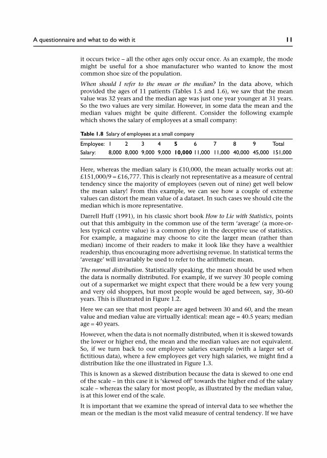
it occurs twice – all the other ages only occur once. As an example, the modemight be useful for a shoe manufacturer who wanted to know the mostcommon shoe size of the population.
When should I refer to the mean or the median? In the data above, whichprovided the ages of 11 patients (Tables 1.5 and 1.6), we saw that the meanvalue was 32 years and the median age was just one year younger at 31 years.So the two values are very similar. However, in some data the mean and themedian values might be quite different. Consider the following examplewhich shows the salary of employees at a small company:
Here, whereas the median salary is £10,000, the mean actually works out at:£151,000/9 = £16,777. This is clearly not representative as a measure of centraltendency since the majority of employees (seven out of nine) get well belowthe mean salary! From this example, we can see how a couple of extremevalues can distort the mean value of a dataset. In such cases we should cite themedian which is more representative.
Darrell Huff (1991), in his classic short book How to Lie with Statistics, pointsout that this ambiguity in the common use of the term ‘average’ (a more-or-less typical centre value) is a common ploy in the deceptive use of statistics.For example, a magazine may choose to cite the larger mean (rather thanmedian) income of their readers to make it look like they have a wealthierreadership, thus encouraging more advertising revenue. In statistical terms the‘average’ will invariably be used to refer to the arithmetic mean.
The normal distribution. Statistically speaking, the mean should be used whenthe data is normally distributed. For example, if we survey 30 people comingout of a supermarket we might expect that there would be a few very youngand very old shoppers, but most people would be aged between, say, 30–60years. This is illustrated in Figure 1.2.
Here we can see that most people are aged between 30 and 60, and the meanvalue and median value are virtually identical: mean age = 40.5 years; medianage = 40 years.
However, when the data is not normally distributed, when it is skewed towardsthe lower or higher end, the mean and the median values are not equivalent.So, if we turn back to our employee salaries example (with a larger set offictitious data), where a few employees get very high salaries, we might find adistribution like the one illustrated in Figure 1.3.
This is known as a skewed distribution because the data is skewed to one endof the scale – in this case it is ‘skewed off’ towards the higher end of the salaryscale – whereas the salary for most people, as illustrated by the median value,is at this lower end of the scale.
It is important that we examine the spread of interval data to see whether themean or the median is the most valid measure of central tendency. If we have
Table 1.8 Salary of employees at a small company
Employee: 1 2 3 4 5 6 7 8 9 TotalSalary: 8,000 8,000 9,000 9,000 10,000 11,000 11,000 40,000 45,000 151,000
A questionnaire and what to do with it 11

data that is markedly skewed, then the mean value may not be a reliable meas-ure. We shall see later that a ‘normal’ or skewed distribution can also dictatewhich statistical test we should use to analyse the data.
Section summary
We have thus far considered the various ways of describing the data from thedoctor’s questionnaire. We have seen that categorical data may be describedusing frequencies and cross-tabulation, and that interval data may bedescribed using measures of central tendency: the mean, median and mode.We have also seen that the validity of citing the mean or the median dependson the distribution of the data. Where it is normally distributed the mean canbe used, but when data is extremely skewed to one end of the scale, the medianmay be a more reliable measure of central tendency.
How might we apply this to our counselling data? Well, we might want tosummarize our interval data to answer the following questions:
• What was the mean age of patients seen for counselling?• What was the mean number of sessions?• Were most patients satisfied with the service? What was the mean score?
Figure 1.2 Supermarket shoppers: age normally distributed
12 Quantitative Data Analysis Using SPSS

Notice that I have referred to mean values in the above questions. The mostappropriate measure of central tendency should of course be used – the meanor the median – and this will depend on the spread of the data. It is notunusual to find that both are cited to demonstrate the reliability of the mean –or otherwise.
1.2.2 Relationships and differences in the data
There are two further types of analyses that we might conduct on intervaldata:
• Examine the relationship between variables.• Examine differences between two sets of scores.
Examining relationships between variables with interval data: correlation
We have already looked at the relationship between items with categorical datausing cross-tabulation. For variables with interval data – such as age – we canuse another technique known as correlation.
Figure 1.3 Employee salaries: skewed distribution
A questionnaire and what to do with it 13

A correlation illustrates the direction and strength of a relationship betweentwo variables. For example, we might expect that height and shoe size arerelated – that taller people have larger feet.
Figure 1.4 shows a scatterplot of height and shoe size for 30 people, where wecan see that, as height increases, so does shoe size. This is known as a positivecorrelation: the more tightly the plot forms a line rising from left to right, thestronger the correlation.
A negative correlation is the opposite: high scores on one variable are linkedwith low scores on another. For example, we might find a negative correlationbetween IQ scores and the number of hours spent each week watching realityTV shows, as illustrated in Figure 5.1 (hypothetical data).
From this scatterplot we can discern a line descending from left to right in theopposite direction to the height and shoe size plot.
Finally, we would probably not expect to find an association between IQ andshoe size, as illustrated in Figure 1.6, where there is no discernible correlationbetween the two variables.2
In Chapter 5 we will look at how to produce these scatterplots in SPSS.
How might we apply this to our counselling data? Well, first of all we need toidentify two interval variables that might be correlated. We have threeto choose from: age, number of counselling sessions and satisfaction ratings.
So, as one example, we might want to see if patients’ satisfaction ratingsare linked to the number of appointments they had. Perhaps the more
Figure 1.4 Positive correlation between height and shoe size
14 Quantitative Data Analysis Using SPSS

appointments they had the more satisfied they were? Or maybe this is wrong:perhaps more appointments are linked to more unresolved problems and thusless satisfaction?
Figure 1.5 Negative correlation between IQ and interest in reality TV shows
Figure 1.6 Scatterplot for IQ and shoe size
A questionnaire and what to do with it 15

Examining the differences in scores within variables
Finally, we should also be interested in examining any differences in scoreswithin a particular variable. For example, we might wish to calculate the meansatisfaction ratings achieved for John compared to those for Jane. If we were todo this it is useful to categorize variables into two kinds: independent variablesand dependent variables. So, if we think that level of satisfaction depends onwhich counsellor the patient saw, we would have the following independentand dependent variables:
• Independent variable: counsellor (John or Jane).• Dependent variable: satisfaction rating.
Thus we are examining whether patients satisfaction ratings are dependent onthe counsellor they saw. For example, if each counsellor saw five patients, thenwe would calculate the mean score for John and the mean score for Jane andconsider the difference, as illustrated in Table 1.9.
In Chapter 6 we will use a statistic that tells us whether or not any difference inthe two mean scores is statistically significant, which basically means that it wasunlikely to have occurred by chance.
Summary
That is the end of this first chapter in which you have learned about:
• Different types of data and levels of measurement (categorical, ordinal andinterval data).
• Frequencies and cross-tabulation.• Measures of central tendency – mean, median and mode.• Appropriate use of the mean or the median value depending on the
distribution of the data – is it normally distributed or skewed to one end ofthe scale?
• Using scatterplots to see if interval data is correlated.• Categorizing variables into independent variables and dependent variables
to examine differences between two sets of scores.
Having familiarized ourselves with the dataset and the types of analysis wemay conduct on it, we now need to enter the data into SPSS. That is, after youhave completed the exercises . . .
Table 1.9 Comparing mean satisfactionratings for John and Jane (hypothetical data)
John Jane
2 53 44 72 63 5
Sum 14 27Mean 2.8 5.4
16 Quantitative Data Analysis Using SPSS

1.4 Exercises
Exercise 1.1 Types of data
Would the following variables yield interval or nominal/categorical data?
(a) ethnic background;(b) student assignment marks;(c) level of education;(d) patient satisfaction ratings on a 1–7 scale.
Exercise 1.2 Measures of central tendency
Which do you imagine would be the most representative measure of centraltendency for the following data?
(a) number of days taken by students at a University to return overdue librarybooks;
(b) IQ scores for a random sample of the population;(c) number of patients cured of migraine in a year by an acupuncturist;(d) number of counselling sessions attended by patients.
Exercise 1.3 Correlation
What sort of correlation would you expect to see from the following variables?
(a) fuel bills and temperature;(b) ice-cream sales and temperature;(c) number of counselling sessions and gender.
Exercise 1.4 Independent and dependent variables
Identify the independent and dependent variables in the following researchquestions:
(a) Does alcohol affect a person’s ability to calculate mathematical problems?(b) Is acupuncture better than physiotherapy in treating back pain?
Exercise 1.5 What type of analysis?
What type of analysis would you perform to examine the following?
(a) relationship between gender and preference for a cat or dog as a pet;(b) relationship between time spent on an assignment and percentage
mark;(c) relationship between gender and patient satisfaction ratings.
You will find answers to the exercises at the end of the book.
A questionnaire and what to do with it 17

1.5 Notes
1 Mental health issues are the third most common reason for consulting ageneral practitioner (GP), after respiratory disorders and cardiovasculardisorders. A quarter of routine GP consultations relate to people with amental health problem, most commonly depression and anxiety. It hasbeen estimated that over half the general practices in England (51%)provide counselling services for patients (for further details and referencessee Greasley and Small 2005a).
2 While we might not expect to find a correlation between IQ and shoe sizein a random sample of 30 people, there may be some samples for which wemight find a correlation, for example, relating to age differences.
18 Quantitative Data Analysis Using SPSS

Coding the data for SPSS,setting up an SPSS databaseand entering the data
In this chapter you will learn how to code the data for SPSS, set up an SPSSdatabase and enter the data.
2.1 The dataset
The data from the 30 questionnaires is provided in Table 2.1. Each rowprovides data for that particular patient: their sex and age, the counsellorthey saw, how many sessions they attended, and their satisfaction rating forthe counselling.
Table 2.1 Data from the counselling satisfaction questionnaire
Patient Sex Age Counsellor Sessions Satisfaction
1 male 21 John 8 52 male 22 John 8 43 male 25 John 9 74 female 36 Jane 6 25 male 41 Jane 4 16 female 28 Jane 5 37 male 26 John 12 58 female 38 Jane 7 39 male 35 John 10 5
10 male 24 John 11 611 female 41 Jane 6 412 female 34 Jane 9 513 male 32 John 9 414 female 38 Jane 5 115 male 33 John 12 516 female 42 Jane 7 517 male 31 John 5 418 male 33 John 8 619 female 40 John 8 620 female 47 Jane 9 721 female 27 Jane 6 422 male 44 Jane 6 323 female 43 John 3 524 female 33 Jane 7 325 female 45 John 10 226 male 36 Jane 7 527 female 49 John 8 428 female 39 Jane 6 429 male 35 Jane 7 430 female 38 Jane 3 2
2

2.2 Coding the data for SPSS
We now need to enter our data from Table 2.1 into SPSS. This will enable usto conduct all the analyses discussed in the previous chapter – frequencies,cross-tabulation, measures of central tendency (mean, median, mode), corre-lations, graphs, etc., at the click of a button (well, a few buttons in some cases).
But before we can enter the data into SPSS we need to give our variables namesand code the data – because all data in SPSS should be entered as numbers.The simplest way to illustrate this is through the codebook I have produced forthe data in Figure 2.1.
The first column provides the variable name that we will use for SPSS. In thesecond column I have written some coding instructions. Since all our dataneeds to be entered as numbers, this means that data which is not collectedas numbers, like male/female, needs to be converted into numbers. Forexample, in our codebook, we have assigned the number 1 for male, and 2for female.1
In practice, for a questionnaire with only five questions and only two codedvariables, the idea of producing a codebook is a little excessive. But for largerquestionnaires it can be a very useful reference point. Alternatively, anotherstrategy is to simply add any codes for categorical variables on a copy of thequestionnaire so that you have a record of the codes.
Figure 2.1 An SPSS codebook for the data in Table 2.1
20 Quantitative Data Analysis Using SPSS

Now that we have decided upon our variable names and codes for categoricaldata, as illustrated in Figure 2.1, we can set up the SPSS database.
2.3 Setting up an SPSS database
When you open SPSS you should be faced with the following screen:
Screenshot 2.1
Click Type in data and then click OK. This opens a blank spreadsheet.
The SPSS data screen
The screen below is known as the Data View. This is where you will enter thedata. But not yet – there’s a little more reading to do.
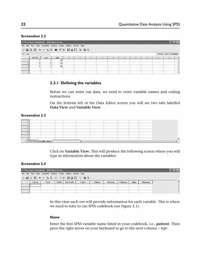
Each row will contain the data for one patient. So, in the example on the nextpage, we have data for 3 patients:
• Patient 1 is a male (coded 1), aged 24.• Patient 2 is a female (coded 2), aged 25.• Patient 3 is male, aged 26.
Coding, setting up and entering data on SPSS 21
Screenshot 2.2
2.3.1 Defining the variables
Before we can enter our data, we need to enter variable names and codinginstructions.
On the bottom left of the Data Editor screen you will see two tabs labelledData View and Variable View.
Screenshot 2.3
Click on Variable View. This will produce the following screen where you willtype in information about the variables:
Screenshot 2.4
In this view each row will provide information for each variable. This is wherewe need to refer to our SPSS codebook (see Figure 2.1).
Name
Enter the first SPSS variable name listed in your codebook, i.e., patient. Thenpress the right arrow on your keyboard to go to the next column – type.
22 Quantitative Data Analysis Using SPSS

Box 2.1 SPSS rules for naming variables
SPSS has a number of rules for naming variables:
• The length of the name cannot exceed 64 characters. Though, clearly, you should keep thevariable name as short and succinct as possible, as we have done for the counsellingquestionnaire.
• The name must begin with a letter. The remaining characters can be any letter, any digit, afull stop or the symbols @, #, _ or $.
• Variable names cannot contain spaces or end with a full stop.• Each variable name must be unique: duplication is not allowed.• Reserved keywords cannot be used as variable names. Reserved keywords are: ALL, AND,
BY, EQ, GE, GT, LE, LT, NE, NOT, OR, TO, WITH.• Variable names can be defined with any mixture of upper and lower case characters.
Type: what type of data is it?
Once you have entered a variable name the default value for Type will appearautomatically as numeric. All of our variables will be numeric because wewill be coding any words – such as male and female – as numbers (i.e., 1 formale and 2 for female). So you can move on to the next column – Width(see Box 2.2 for occasions when you really have to enter words).
Box 2.2 Entering words into SPSS
There are certain occasions when you might want to enter words into SPSS. Forexample, if the data forms part of a database where you need to retain the names ofindividuals. Or it may be that you are copying data into SPSS, from an Excel spreadsheet,for example, which includes words. If you do not tell SPSS to expect words it may notrecognize them (your column of words from Excel may not appear).
As an example, if we wanted to enter the words ‘male’ and ‘female’ (instead ofnumbers) we would need to click in the cell and a shaded square with three dots willappear. Click on this and a list of options will appear:
Screenshot 2.5
Coding, setting up and entering data on SPSS 23

In SPSS words are known as string variables. So, we would click on String and then OKand this cell would say String, rather than Numeric. Notice also that SPSS providesoptions to enter dates or currency data.
Width: how many numbers will you be entering?
SPSS defaults to eight characters. The most we will need is two – for our age andsession data (e.g., 24 years, 12 sessions). There is no need to change this. Youwould increase it if you were entering very large numbers, for example,184,333,333.24 (i.e., 11 numbers/characters).
Decimals
SPSS defaults to two decimal places. Since our data does not require decimalplaces we can simply click in the Decimals cell and click the up or downarrows (which appear to the right of the cell) to adjust decimal places neededfor that particular variable.
For datasets with many variables that do not have decimal places it may beworthwhile changing the default setting to 0 decimal places. You can do thisby clicking on Edit from the menu at the top of the screen and then choosingOptions. Next, click the Data tab and change the decimal place value to 0 inDisplay format for new numeric variables.
Label
The Label column allows you to provide a longer description of your variable,which will be shown in the output produced by SPSS. You do not need to putanything here for ‘patient’, or the other variables, since the names are self-explanatory.2
Values
Values are numbers assigned to categories for nominal variables, for example,where male = 1 and female = 2. Since your first variable (patient) has no‘values’, you do not need to put anything here.
Missing
Sometimes it is useful to assign specific values to indicate different reasons formissing data. However, SPSS recognizes any blank cell as missing data and
Screenshot 2.6
24 Quantitative Data Analysis Using SPSS
excludes it from any calculations, so if you intend to leave the cell blank thereis no need to enter values for missing data. And we have no missing dataanyway.3
Columns
You can change the column width to reduce the space it takes on the screen.But you need to allow enough space for variable names, so the default of eightis usually OK.
Align
This is usually set at Right, which is OK.
Measure
The default measure is Scale, but you can change this to Ordinal or Nominalby clicking in the cell and then on the down arrow on the right of the cell. Wehave scale data and nominal data:
Since our first variable is simply listing the patient/questionnaire number weshould change this to ‘nominal’ because the numbers are simply assigned tothe patients (they have no meaning as a scale).
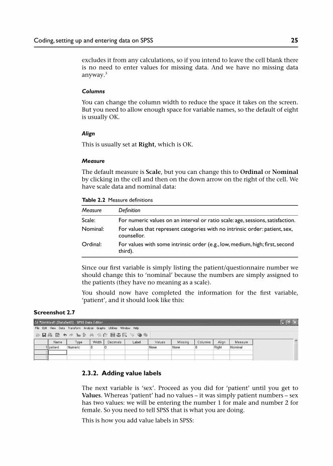
You should now have completed the information for the first variable,‘patient’, and it should look like this:
Screenshot 2.7
2.3.2. Adding value labels
The next variable is ‘sex’. Proceed as you did for ‘patient’ until you get toValues. Whereas ‘patient’ had no values – it was simply patient numbers – sexhas two values: we will be entering the number 1 for male and number 2 forfemale. So you need to tell SPSS that is what you are doing.
This is how you add value labels in SPSS:
Table 2.2 Measure definitions
Measure Definition
Scale: For numeric values on an interval or ratio scale: age, sessions, satisfaction.Nominal: For values that represent categories with no intrinsic order: patient, sex,
counsellor.Ordinal: For values with some intrinsic order (e.g., low, medium, high; first, second
third).
Coding, setting up and entering data on SPSS 25

1 Click in the Values cell and then on the button with 3 dots on the right sideof the cell. This opens the Value Label box.
2 Click in the box marked Value. Type in 1.3 Click in the box marked Value Label. Type in male.4 Click on Add. You will then see in the summary box: 1=male.5 Repeat this procedure for females (Value = 2; Value Label: female; Add).
Screenshot 2.8
6 Then click OK. This information is now stored in your SPSS database. Theonly other thing to change is Measure (to Nominal) and your databaseshould look like this:
Screenshot 2.9
7 You should now be able to complete the information for the remainingvariables, ensuring that you enter the value labels for ‘counsellor’ (1 = John;2 = Jane).
When you have done this your database should look like this:
Screenshot 2.10
26 Quantitative Data Analysis Using SPSS

You have now defined your variables and can proceed to enter the data.
2.4 Entering the data
Click the Data View tab (bottom left of screen) and this will switch you fromVariable View to Data View. Notice that the columns are now headed withyour variable names.
Screenshot 2.11
You can now enter the data for the 30 patients. Simply click in the top left-hand cell (patient 1) and enter 1. Then move to the next cell (press the rightarrow on your keyboard) and enter the data for each patient according to thedata in Table 2.1. This should result in the following data:
Screenshot 2.12
Coding, setting up and entering data on SPSS 27

Once you have entered the data make sure you save the file.4
We are now ready to begin the analyses. That is, after you have done thefollowing exercises.
2.5 Exercises
Exercise 2.1 Viewing value labels
In order to check that you have entered the data correctly you might wish todisplay your value labels so that the SPSS dataset looks exactly like the datain Table 2.1. You can view the value labels by clicking View, then click ValueLabels:
Screenshot 2.13
Your value labels for sex and counsellor are now displayed:
28 Quantitative Data Analysis Using SPSS

Screenshot 2.14
Exercise 2.2 Sorting the data
Sometimes it is useful to re-order the data, for example, if you wanted tovisually examine all the male cases together.5 To do this:
1 From the menu at the top of the screen, click Data, then click Sort Cases.
Screenshot 2.15
Coding, setting up and entering data on SPSS 29

2 Click on the variable sex, then click the arrow (to the left of the Sort by box)to move it into the Sort by box:
3 You can now click OK to sort your dataset by the sex of the patient:
4 Your dataset is now re-ordered with all the male patients at the top (seeScreenshot 2.18).
Note: If you are working in SPSS v15 an Output Viewer screen will appearlogging the fact that you have conducted a procedure in SPSS. Close this byclicking the cross in the orange box to the top right of the Output Viewerscreen. When it asks if you want to save this, click no.
Screenshot 2.16
Screenshot 2.17
30 Quantitative Data Analysis Using SPSS

Screenshot 2.18
5 To get the data back into its original order, go back to Data/Sort Cases.Double-click (left mouse button) on Patient to sort the data back into itsoriginal order. (And note that we would not have been able to do this if wehad not numbered each patient/questionnaire.)
You can actually sort by as many variables as you want – at the same time. Forexample, you could sort the data by sex of patients and age by putting bothvariables in the Sort by box, but really, I think we need to get on with theanalysis.
Notes
1 This is an arbitrary assignment of the numbers 1 and 2, and is not meant inany way to reflect the order of importance of the male and female genders.I point this out because one student did raise this issue (in class) and it wasdebated for some time. . .
2 You might make use of the Label facility if you had a long questionnaireand you decided to label your variables q1, q2, q3, etc. In the Label columnyou would provide a description of each particular question. For example,if we took this approach for the counselling questionnaire, the label for q4
Coding, setting up and entering data on SPSS 31

would be ‘number of counselling sessions’ – and this label would appear inthe output rather than ‘q4’ to help us identify the particular question. Thisapproach used to be more common in older versions of SPSS when we werelimited to eight characters in the variable column, so truncated (barelyidentifiable) names often needed to be entered.
3 As an example, we might want to differentiate missing data due to a patientrefusing to answer a sensitive question, and missing data due to a questionnot being applicable to a patient. In such cases we would need to click inthe Missing cell whereupon a button with three dots will appear to theright of the cell; a dialogue box then appears where you can enter a valuefor the missing data. The value you enter should be out of the range ofvalues that may occur as part of the data: 99 is a commonly used value todefine missing data – though if your variable may legitimately include thatvalue (potentially ‘age’ in our dataset) you should choose a more remotenumber (999).
4 And make sure you know where you have saved it! There have been a fewoccasions when students have saved the data file on the university networkbut were unable to locate it for the next session. Also, if you are working ona university or college computer you should also be aware that some com-puters are programmed to ‘log out’ after a specified period if they are notbeing used; if you leave the computer without saving the file, the data maynot be there when you return . . .
5 Sorting the data can be useful for a number of reasons. I recently found ituseful for a questionnaire where I needed to edit the dataset according tothe month patients were referred to a service. Sorting the cases accordingto month of referral made this much easier.
32 Quantitative Data Analysis Using SPSS

Descriptive statistics:frequencies, measures ofcentral tendency andillustrating the data usinggraphs
In this chapter you will use SPSS to produce some basic descriptive statisticsfrom the data: frequencies for categorical data and measures of central ten-dency for interval level data. You will also learn how to produce and edit chartsto illustrate the data analysis, and how to copy your work into a MicrosoftWord file.
3.1 Frequencies
We noted in Chapter 1 that the first thing a researcher would do with this datais to ‘run some frequencies’. This simply means that we want to look at thefrequencies of our categorical data:
• How many male/female patients are there?• How many patients were treated by each of the counsellors John and Jane?
This will provide us with an initial overview of our sample, or ‘population’.
So let us start with our first categorical variable – sex.
Running frequencies in SPSS
1 From the menu at the top of the screen click Analyze, then DescriptiveStatistics then Frequencies.
3

Screenshot 3.1
2 Choose the variable sex by clicking with your mouse.3 Once sex is highlighted move it across into the variables box by clicking the
arrow. Alternatively you could just double-click it once it is highlighted.
Screenshot 3.2
34 Quantitative Data Analysis Using SPSS

4 Now click OK.
A new SPSS window should now appear. This is called the Output Viewer,as shown next. The results of all analyses performed by SPSS will appear inthis viewer – which can be saved separately as a file.Note: You may need to maximize this screen by clicking the maximizebutton (top right of screen – middle icon to the left of the x).
Screenshot 3.3
This has produced the frequencies analysis for the variable sex in the form ofan SPSS ‘pivot table’. The first column has the labels male and female in it:if you had not entered value labels, instead of male there would be a 1,and instead of female there would be a 2. The second column tells us thatthere are 30 cases: 14 are male and 16 are female. The third column providespercentages.
The fourth column – Valid Percent – calculates percentage ignoring any missingvalues. Since there are no missing values here, valid per cent is the same asactual per cent. But in the hypothetical example on the next page, I haveremoved data for ten cases.
Descriptive statistics 35

Screenshot 3.4
When we have missing data the values for per cent and valid per cent are differ-ent. This is because the per cent column calculates percentages for all the data –including missing data. So, in the output above, we have ten males, tenfemales and ten missing data – each of which constitutes 33.3 per cent of thetotal data – 30 cases.
Valid per cent, however, ignores the missing data (ten cases) and has calculatedpercentage based on a total of 20 cases. Thus, 20/10 = 50%. If you have missingdata this is the percentage figure you should cite.
Note that you now have two SPSS windows in operation:
• SPSS Data Editor (with data and variable views).• Output Viewer.
36 Quantitative Data Analysis Using SPSS

You can switch between the two by clicking the tabs at the bottom of yourscreen.
Now try running frequencies for the other categorical variable – counsellor –to see how many patients they each treated.
Go to the menu at the top of the screen and click Analyze then DescriptiveStatistics then Frequencies. You should then remove the variable sex from thefrequencies analysis box by double-clicking it with the left mouse button. Youcan now run frequencies for counsellor, which should result in the followingoutput:
Screenshot 3.5
Descriptive statistics 37

Screenshot 3.6
You can in fact run Frequencies for more than one variable at a time bymoving them all into the Variables box, as shown below:
Screenshot 3.7
3.2 Measures of central tendency for interval variables
Having examined frequencies for our categorical data, we now need toexamine our variables containing interval data: age, number of sessions andsatisfaction with the service.
Our aim here is to obtain basic, descriptive information about these variables.For example, we should want to know the age range of patients attendingfor counselling and the mean (or median) age of our sample. This is basicinformation that the doctor would want to know about the ‘population’attending for counselling. So, the information we are seeking is:
38 Quantitative Data Analysis Using SPSS

1 What is the mean/median:
• age of patients;• number of sessions;• satisfaction rating.
2 What is the range of values – from lowest to highest – for:
• age of patients;• number of sessions;• satisfaction ratings.
We can obtain this information by running Frequencies for age, sessionsand satisfaction.
Running frequencies for measures of central tendency
1 From the menu at the top of the screen click Analyze, then DescriptiveStatistics, then Frequencies (remove any existing variables from previousanalyses by double-clicking them to return them to the list).
2 Double-click (left mouse button) the variables age, sessions and satisfac-tion to move them into the Variables box.
3 Click Statistics and click in the boxes next to mean, median, mode, andminimum and maximum. Then click Continue.
Screenshot 3.8
4 De-select Display Frequency Tables (otherwise you will get a table listingevery age).
Descriptive statistics 39

Screenshot 3.9
5 Click OK, and this should produce the output table below:
This table provides us with information about the mean, median and mode,and the lowest and highest values (range of scores) for our three variables.
Focusing on the variable ‘age’, we can see that mean age was 35.2 years and themedian age was 35.5 years. Since these values for the mean and the medianare very similar this tells us that our data is not skewed towards one end of thescale (as we discussed in detail in Chapter 1). We can also see that ages rangedfrom 21 years to 49 years.
The modal age (most common actual age) is also provided (33 years), but notethat SPSS tells us that ‘multiple modes exist’ and that this is the smallest value.The most commonly occurring age is not, of course, very useful for our dataanalysis.
The modal value may, however, be of more interest for the other two variables.So while we know that the mean number of sessions is 7, it may also be inter-esting to know that the modal number of sessions was actually 6 if the doctor
Table 3.1 SPSS descriptive statistics
40 Quantitative Data Analysis Using SPSS

or counselling service is recommending that most patients should be limitedto 6 sessions. Similarly, although we know that the mean satisfaction rating isa relatively neutral 4, it may be useful to know that the modal rating is also 4.The mean value of 4 could have come from data that was an average of verylow and very high ratings – indicating that patients were divided in theirperceptions of the service; a modal rating of 4 suggests that this is not the case(though note of course that SPSS tells us that multiple modes exist).
So, in our report to the doctor, from the analyses we have so far conducted, wecan inform him about:
• The frequencies or number of patients seen by each of the counsellors, andtheir gender.
• The mean/median age, number of sessions and satisfaction rating, alongwith the range of values for each of these variables.
This information would be an important first step in presenting the results ofour analysis to the doctor.
3.3 Using graphs to visually illustrate the data
This information may also be graphically illustrated using bar charts, histo-grams and boxplots.
3.3.1 Bar charts
Bar charts present a graphical display of categorical data, for example, com-paring the mean number of sessions provided by each counsellor.
Producing a bar chart comparing the mean number of sessions provided by eachcounsellor
1 From the menu at the top of the screen click Graphs, then Chart Builder (adialogue box may appear asking if you have set the correct measurementlevels for each variable and included value labels for categorical variables).Since you have done both (you have, haven’t you . . . ), put a tick next toDo not show this dialogue again and click OK).
2 You should then be faced with the following screen:
Descriptive statistics 41

Screenshot 3.10
3 In the Gallery of charts, Bar should be highlighted showing a range ofbar charts (simple, clustered, stacked). Since we want to produce a simplebar chart, click (left mouse button) on the first Bar Chart (top left) and dragit into the Preview area above. A bar chart will now appear in the previewarea with two boxes asking for the Y-axis and the X-axis.
42 Quantitative Data Analysis Using SPSS

Screenshot 3.11
4 Drag counsellor from the Variables list into the X-axis and then dragsessions into the Y-axis.
Descriptive statistics 43

Screenshot 3.12
5 Click OK and this will produce the following bar chart in the outputviewer:
Figure 3.1 Bar chart illustrating mean number of sessions conducted by each counsellor
44 Quantitative Data Analysis Using SPSS

From the bar chart we can see that Jane has kept to the guidelines of pro-viding an average of six sessions of ‘brief therapy’ compared to John whohas been providing an average of over eight sessions.
3.3.2 Histograms
Histograms are similar to bar charts but are designed to represent data along acontinuum. The age of patients is a good example.
Using SPSS to produce a histogram for age
1 From the menu at the top of the screen click Graphs, then Chart Builder.2 Select Histogram from the Gallery of Charts to reveal the range of charts
available.3 Drag the first histogram (top left) into the preview area.4 From the variables list drag age into the X-axis.
Screenshot 3.13
5 Click OK and this should produce the following histogram in the outputviewer:
Descriptive statistics 45
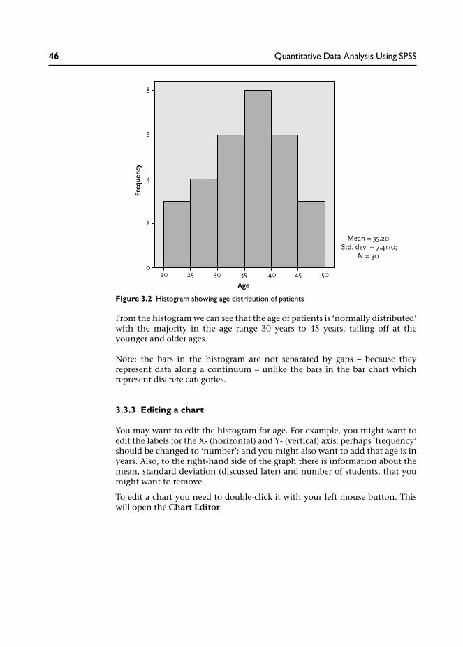
From the histogram we can see that the age of patients is ‘normally distributed’with the majority in the age range 30 years to 45 years, tailing off at theyounger and older ages.
Note: the bars in the histogram are not separated by gaps – because theyrepresent data along a continuum – unlike the bars in the bar chart whichrepresent discrete categories.
3.3.3 Editing a chart
You may want to edit the histogram for age. For example, you might want toedit the labels for the X- (horizontal) and Y- (vertical) axis: perhaps ‘frequency’should be changed to ‘number’; and you might also want to add that age is inyears. Also, to the right-hand side of the graph there is information about themean, standard deviation (discussed later) and number of students, that youmight want to remove.
To edit a chart you need to double-click it with your left mouse button. Thiswill open the Chart Editor.
Figure 3.2 Histogram showing age distribution of patients
46 Quantitative Data Analysis Using SPSS

Screenshot 3.14
There are various changes you can make once the Chart Editor is open, andreally you need to find out by trial and error – mainly by highlighting thebits you want to change by clicking or double-clicking with the left mousebutton.
For example, in order to delete the information on the right of the chart,I clicked the left mouse button once over this information, then I clickedthe right mouse button to produce the menu shown in Screenshot 3.15. I thenmoved down to Delete to remove this information. (A ‘Properties’ box appearsin SPSS v15 informing you that the chart will be resized when elements areadded or removed – uncheck the box next to ‘Resize elements . . .’ and clickApply then Close if you want the graph to remain the same size (or leave itticked if your prefer a wider graph).
Descriptive statistics 47

Screenshot 3.15
To edit the labels ‘age’ and ‘frequency’ click on them once with the left mousebutton to highlight them, and then click again (left mouse button) to producea flashing cursor; you can then re-write your own labels in the text box.
48 Quantitative Data Analysis Using SPSS

Screenshot 3.16
Finally, I produced the following version of the histogram – having editedthe labels and removed the data to the right of the chart. Presentation is veryimportant for reports, so attention to details like this, rather than just accept-ing what is produced by SPSS, can make a significant difference to the qualityof a report.
Descriptive statistics 49
There are numerous changes you can make by clicking and double-clicking onthe bits of the chart you are interesting in changing and you should simply trythem out yourself.
3.3.4 Boxplots
Another useful way to illustrate the spread of the data is to use boxplots.
Using SPSS to produce boxplots for age and gender
1 From the menu at the top of the screen click Graphs, then Chart Builder.2 Select Boxplot from the Gallery of Charts to reveal the range of boxplot
charts available.3 Drag the first boxplot (simple boxplot) into the preview area.4 From the variables list drag age into the Y-axis and sex into the X-axis.5 Click OK.
This should produce the following output: two boxplots illustrating the distri-bution of age for male and females in the sample.
Figure 3.3 Edited histogram showing age distribution of patients
50 Quantitative Data Analysis Using SPSS

These boxplots illustrate the spread of the data:
• the shaded box contains the middle 50 per cent of values;• the line inside the box depicts the median value (not the mean);• the T-bar lines above and below the box reach to the highest and lowest
values.
So, from these boxplots comparing the ages of our males and females, we cansee that the median age of females is higher and, overall, the age ranges arehigher. The spread of ages, indicated by the size of the shaded boxes and thelength of the T-bars, is roughly similar for both groups.
Figure 3.5 provides a detailed description of the information provided in box-plots. Notice the added inclusion of ‘outliers’ and ‘extreme cases’ which oftenoccur in large datasets. For example, if 29 patients attended for between fourand eight counselling sessions and one attended for 12 sessions this might beconsidered an ‘outlier’ or, more severely, an ‘extreme value’ because it deviatesfrom the norm.
These cases deserve special attention since they may skew any measures ofcentral tendency. For example, a couple of extremely high ages would haveincreased the mean value, leaving the median the same. Outliers and extremecases may also, of course, simply indicate an error in data entry which oftenoccurs in large datasets.
Figure 3.4 Boxplots illustrating age distribution of male and female patients
Descriptive statistics 51

3.3.5 Copying charts and tables into a Microsoft Word document
If you are producing a report of your data analysis it will often be useful tocopy the output from SPSS into a Microsoft Word document.
For charts, like the boxplot above, you should first double-click the object toopen the Chart Editor. Then, from the menu at the top of the screen click Editand Copy Chart.
Figure 3.5 Understanding boxplots
52 Quantitative Data Analysis Using SPSS

Screenshot 3.17
You can then paste the chart into a Microsoft Word document (obviously, youwill first need to open a Word document).1
You can copy tables from the SPSS output file into a Word file by highlightingthe table (click left mouse button over Table), then click the right mousebutton on Copy Objects, and paste into the Word document.
Descriptive statistics 53

Screenshot 3.18
In the example above I chose the option Copy Objects rather than Copy. Ifyou copy the table as an object you will not be able to edit the table when it isin the Microsoft Word document:
Screenshot 3.19
If you do want to edit a table you should choose Copy:
54 Quantitative Data Analysis Using SPSS

Screenshot 3.20
When you paste it into a Microsoft Word document you will then be able toedit the table. For example, you might want to remove the last two columnssince they do not provide useful information on this occasion. To do this,highlight the last two columns and click the right mouse button:
Descriptive statistics 55

Screenshot 3.21
When you press Delete Columns you will be left with a table that has no irrele-vant information, which may confuse the reader:
3.3.6 Navigating the Output Viewer
You will now have amassed a considerable number of analyses in your OutputViewer. Sometimes it is useful to tidy up at this stage, perhaps removing anyoutput analyses that you no longer need. To do this click in the left-hand panelisting the output to remove any analyses that you do not want to keep.
Table 3.2 The edited table
56 Quantitative Data Analysis Using SPSS

Screenshot 3.22
3.4 Summary
In this chapter you have learnt:
• How to produce frequencies for categorical data.• When you should refer to the ‘valid per cent’ rather than overall per cent,
i.e., when there is missing data.• How to produce measures of central tendency (means, medians and
modes), and minimum and maximum values, for interval data.• How to produce bar charts, histograms and boxplots to visually illustrate
the data.• How to copy your SPSS output into a Microsoft Word document.• How to navigate the SPSS Output Viewer.
You now have the skills to enter data into SPSS, code it, and produce basicdescriptive statistics for categorical and interval data.
Descriptive statistics 57

3.5 Ending the SPSS session
When you want to close SPSS simply go to File/Exit. You will then beprompted to ‘save contents of the Output Viewer’. This allows you to save thetables and graphs in your output to a separate file. You will then be promptedto save the data file.
While it is very important to save the data file, it may be less important to savethe output file with your tables and graphs. For example, you may be happywith a print out of your analyses, or you may have copied the relevant tablesand charts into a Microsoft Word document. As long as you have saved thedata file, it may be relatively simple to run the analyses again – depending onhow much you have done of course.
3.6 Exercises
Exercise 3.1
You have already produced a histogram for the variable age. Now producehistograms illustrating the distribution of sessions and satisfaction ratings.What sort of distribution do they display? Is the data ‘normally distributed’?
Exercise 3.2
Produce boxplots comparing satisfaction ratings according to the gender ofpatients. What do you conclude from the results in terms of: (a) the spreadof the data for males compared to females; (b) the relative satisfaction ratingsof males compared to females?
Are you happy with the chart or do you need to use Chart Editor?
Exercise 3.3
There is a facility in SPSS that allows you to change the way your data andoutputs, (such as charts and tables) are displayed. One particularly relevantoption enables you to change the way tables are displayed in SPSS output.For example, if you are intending to submit your report for publication in ajournal you may actually need to change the way your tables are displayed inaccordance with the journal guidelines.
In order to change the settings for tables, click on Edit from the menu at thetop of the screen and then choose Options. You should then be presented withthe following table on your screen:
58 Quantitative Data Analysis Using SPSS

Screenshot 3.23
If you click on the Pivot Tables tab you can choose the format of your tables.Clicking on the Table look provides a preview or sample of how the tableswill look. The three tables below are provided as examples:
You might want to choose smallfont.tlo to save paper when printing outresults of many analyses.
Table 3.3 System default table: sex
Table 3.4 Smallfont.tlo: paper-saving table (sex)
Descriptive statistics 59

Many journals use APA (American Psychological Association) style which doesnot use vertical lines. So, if you want to import a table from SPSS into a file youare submitting to a journal, you might use one of the academic formats as inTable 3.5.
Note: You have to change the style before you run the analyses.
3.7 Notes
1 Alternatively, you can simply use the right mouse button to copy the chartstraight from the output viewer without going into Chart Editor. However,I find that this leaves a larger frame around the chart taking up more spacein the Microsoft Word document. Try it and see for yourself.
Table 3.5 academic style table (sex)
60 Quantitative Data Analysis Using SPSS

Cross-tabulation and thechi-square statistic
In this chapter you will learn about cross-tabulation for categorical data, astatistical test (chi-square) to examine associations between variables and theconcept of statistical significance. You will also learn how to re-code intervaldata into categories.
4.1 Introduction
Cross-tabulation is one of the most frequently used methods of analysis forquestionnaire data. It enables us to examine the relationship between cat-egorical variables in greater detail than simple frequencies for individualvariables. In this chapter we will see how to do this in SPSS and also apply astatistical analysis associated with cross-tabulation – known as chi-square(pronounced ‘kye square’).
4.2 Cross-tabulating data in the questionnaire
In our counselling satisfaction questionnaire we have only two categoricalvariables: sex of the patient (male or female), and counsellor (John or Jane).When we ran frequencies for these two variables in the previous chapter weobtained the following results:
Table 4.1 Number of male and female patients
Table 4.2 Number of patients seen by each counsellor
4

From these frequency tables we could see that the number of male and femalepatients was quite evenly distributed (14 male, 16 female) and that thecounsellors each saw a similar number of patients (John saw 14, Jane saw 16).
But what about the relationship between these two variables? That is, did eachof the counsellors see a similar number of male and female patients or werethey quite different proportions? To find out we need to run a cross-tabulationin SPSS.
Running cross-tabulations in SPSS
1 From the menu at the top of the screen click Analyze then DescriptiveStatistics then Crosstabs.
2 Move the variable sex into the rows box and counsellor into the columnsbox.
3 Click the Cells button. In this box the observed counts should already beticked (this simply provides the observed frequencies). You should also clickRow percentages – since we want to know the percentages of males andfemales who were treated by each counsellor.
Screenshot 4.1
62 Quantitative Data Analysis Using SPSS

4 Click Continue to close this box, and then click OK to run the analysis.
This should produce the following table in your output viewer.
From this table we can see the numbers and relative percentages of males andfemales who were treated by each counsellor. In particular, we can see thatwhile the majority (71%) of male patients saw John, the majority of femalepatients (75%) saw Jane. Clearly then, the proportion of male/female patientswere not equally distributed across the two counsellors: the female counsellortended to see female patients, and the male counsellor tended to see malepatients. This might suggest a preference among patients to see a same-sexcounsellor to discuss their problems. We noted in the overview from Chapter 1that this might be important information for the doctor and should beincluded in any report, since this might suggest it is necessary to ensure a maleand a female counsellor are available to cater for patient preferences.1
4.3 The chi-square statistical test
We have seen, then, that the sex of patients was not equally distributed acrossthe counsellors. But we might ask was this a chance result? If we startedthe service again and the patients were randomly assigned to the counsellorsmight we have found a similar result? Perhaps even the opposite – with mostmale patients seeing the female counsellor. More likely of course, by chance,we would expect them to be distributed quite evenly across the sexes. Thequestion is: how much of an unequal distribution across the sexes does therehave to be for us to conclude that there was a significant bias for male patientsto see a male counsellor and vice versa? Or, to put it another way: how much ofan unequal distribution across the sexes does there have to be for us to reject thepossibility that this has occurred by chance? This is where a statistical test comesin handy.
Chi-square (represented as χ2) applies a statistical test to cross-tabulation bycomparing the actual observed frequencies in each cell of tables with expectedfrequencies. Expected frequencies are those we would expect if data is‘randomly distributed’.
Table 4.3 Cross-tabulation of sex and counsellor
Cross-tabulation and the chi-square statistic 63

It may help at this point to think of the four cells in the cross-tabulationtable as buckets. Now imagine a lottery machine designed to pump balls intoeach of the buckets through four pipes – one leading into each bucket. If thedistribution of balls by the lottery machine is truly random, then we wouldexpect a similar number of balls in each bucket. Thus, if the lottery machinewas set up to distribute 200 balls we would expect roughly 50 balls in each ofthe four buckets.
So, using the hypothetical data in Table 4.4 we can see that there is no dif-ference across male/female patients and counsellor. The actual observedcounts match the expected counts.2
In Table 4.5 we have the opposite scenario: all the males saw John, whereas allthe females saw Jane. Notice that the expected frequencies remain the same – 50in each cell. The divergence from expected frequencies would strongly suggestthat there is a relationship between sex of the patient and the counsellor theysaw: we have 50 more male patients than expected seeing John (and 50 less thanexpected seeing Jane); and 50 more female patients than expected seeing Jane(and 50 less than expected seeing John).
Table 4.4 Group/counsellor cross-tabulation with no difference across males/females(hypothetical data)
Table 4.5 Group/counsellor cross-tabulation with a large difference across males/females(hypothetical data)
64 Quantitative Data Analysis Using SPSS

What the chi-square statistic does is to calculate the odds of this distributionhappening by chance.
Let us run chi-square on our counselling data and see what happens.
Running chi-square in SPSS
1 From the menu at the top of the screen click: Analyze then DescriptiveStatistics then Crosstabs.
2 Move the variable sex into the rows box and counsellor into the columnsbox.
3 Click the Cells button. Ensure that observed and expected counts are ticked,and row percentages (since we want to know the percentages of males andfemales who saw each counsellor).
Screenshot 4.2
4 Click Continue to close this box.5 Click on the Statistics tab and put a tick in the chi-square box.
Cross-tabulation and the chi-square statistic 65

Screenshot 4.3
6 Click Continue then click OK to run the analysis.
The SPSS output viewer should produce the cross-tabulation table and a tablelisting the chi-square and related tests.
Note: SPSS can produce some scary output tables listing all kinds of statisticswith obscure and complicated names which may or may not be relevant toyour analysis. The chi-square test table is a mild example. The trick is to knowwhat you are looking for, as will be illustrated.
Table 4.6 Cross-tabulation of sex and counsellor with expected counts
66 Quantitative Data Analysis Using SPSS

The first thing to note is the footnote (b) which tells us that ‘0 cells haveexpected count less that 5’. This is an important assumption of chi-square.If you are intending to cross-tabulate data and use the chi-square statistic,you should always try to ensure that you have a large enough sample size tomaintain sufficient values in the cells.3
The values we are interested in are along the top Pearson chi-square row. ThePearson chi-square value is 6.467, with a significance or probability (p) value of.011. This means that, according to the chi-square calculation, the probabilityof this distribution of values occurring by chance is less than .01 – or 1 in 100,so probability (p) = .01. We would accept these odds as statistically significantand conclude that there is a relationship between the sex of patients and thecounsellor they saw: male patients were more likely to see the male counsellorand female patients were more likely to see the female counsellor.4
So, in your report to the doctor you would first point out that cross-tabulationbetween the sex of patients and counsellors showed that a greater proportiontended to see the same sex counsellor: 71 per cent of male patients sawJohn; 75 per cent of female patients saw Jane. But then you would also add thatthe chi-square statistic showed this to be statistically significant: χ2 = 6.467,p = .011. You would then go on to comment on this result, for example,possible explanations.
4.4 Levels of statistical significance
In discussing the outcomes of the chi-square analysis we have introduced animportant concept – that of statistical significance. There is a convention inresearch that we may accept a 5 per cent (written as 0.05 which is 5 in 100, or1 in 20) probability of accepting that there is a significant difference if it weretrue that there was really no difference (a false positive).
In actual fact, the chi-square test has calculated that the odds are 1 in 100 (.01)that this distribution of scores in the four cells could occur by chance.Looking at it another way, if you had a random lottery machine distributingballs into the four cells this result might occur one time in 100 trials using30 balls.
Table 4.7 Chi-square tests table
Cross-tabulation and the chi-square statistic 67

We should, of course, adjust our acceptable level of statistical significanceaccording to the context. For example, we might not want to accept a 1 in 20(0.05) chance that an experimental drug with harmful side effects really has nopower to reduce pain: ‘Well, according to our trials, there’s a 1/20 probabilitythat it doesn’t actually reduce pain, and the positive results we found werepurely down to chance.’ In this case we might well want to increase our level ofsignificance to 1 in 100 (0.01) – at least!
The problem being that we have to strike a balance. The lower you set yourcriteria for significance, the more likely you are to conclude with a falsepositive – concluding that there is a significant difference when there is not inreality – in our counselling example, arguing for a male and female counsellorto cater for patient preferences when further research with a larger samplewould show that there really is not a preference for same-sex counsellor. Butconversely, if you set your threshold for significance too high, you are morelikely to conclude with a false negative – saying there is no difference whenthere actually is. In statistics books these are known as Type I (false-positive)and Type II (false-negative) errors.
This also raises the issue of ‘power’ and ‘effect size’. Imagine two experiments.The first aims to test the effects of a drug on humans which is known to behighly noxious through laboratory and animal experiments. What size samplewould you need? Well, if we expect that the effect is going to be particularlydistinctive – vomiting, convulsions, etc., then we would hope not very many.Hopefully, after say five people taking the drug and another five taking aplacebo, we would have some pretty strong data comparing the two conditions.
But imagine a second experiment which is using a questionnaire to measurelevels of anxiety before and after counselling. The researchers think thatcounselling will reduce the levels of anxiety for most patients, but possibly notby that much, and for some patients levels of anxiety may rise as they confronttheir issues. So the effect that we were expecting is not particularly distinctivein this case – and therefore we would need a much larger sample to avoidconcluding with a false negative. This is the basis of ‘power calculations’where, basically, the smaller the effect size, the larger the sample size needed.
Unfortunately then, there is no simple answer to the question, ‘How large asample do I need?’ since it depends on the particular research you are conduct-ing, the outcome measures you are using and the size of the effect you mightbe expecting.5 As a general rule of thumb, you should be aiming for as large asample as possible (to detect differences if they do exist), but not continuingthe recruitment beyond that which is required to determine any effects you areinvestigating. Otherwise you will be wasting your time and your patients’ timewhich, furthermore, may be regarded as unethical particularly where theremay be adverse effects – as in the example of testing a noxious drug.
In practice, there are often limitations in terms of time, resources and theavailable sample. For example, if there are only 30 referrals to a counsellingservice during the year, and you need to evaluate the service after a year, thenthat is your sample. Alternatively, if this is deemed to be too small a sample foryour purposes (to provide meaningful results) then you would have to extendthe recruitment period until you achieved a larger sample. Now let us move onto something simpler and more enjoyable – re-coding the data.
68 Quantitative Data Analysis Using SPSS

4.5 Re-coding interval variables into categorical variables
In our data we have only two categorical variables that we could cross-tabulate:sex of patients and counsellors (and we’ve done that). Sometimes, however, itis useful to transform interval variables into categories so that they can becross-tabulated with existing categorical variables. As we will see in the follow-ing exercise, and the exercises at the end of this chapter, grouping interval datainto categories can reveal interesting comparisons that would not otherwise beapparent.
For example, we might wish to cross-tabulate sex and age of patients.Obviously we are unable to do this because the age data is not in categories –we would end up with as many categories as there are ages! What we could do,however, is to put the ages into categories, say 20–9, 30–9, 40–9, andthen cross-tabulate the age categories with sex of patients. In SPSS we do this byre-coding variables.
Re-coding age into categories
1 From the menu at the top of the screen click Transform then Recode intodifferent variables. This should produce the dialogue box shown. (Note: Ifwe had chosen ‘Into same variables’ our re-coding would over-write theexisting data; not a good choice!)
2 Next put the variable age into the Input Variable box (the title of this boxchanges to Numeric Variable after you put age into it).
3 Under Output Variable on the right side of the box type in a name for thenew age variable you will be creating. I have used agecats to stand for agecategories, and added a fuller description below in the Label box: agecategories.
4 Click Change and this will then appear in the Numeric Variable/OutputVariable box.
Screenshot 4.4
Cross-tabulation and the chi-square statistic 69

5 Click Old and New Values to open the recode dialogue box.6 Click in the circle next to Range to enter age categories. In our data, age
ranges from 21 to 49, so we will use the following categories: 20–9, 30–9,40–9.
7 First enter 20, then 29 (as shown below), then in the New Value box typein 1. You have assigned the number 1 to the age category 20–9.
Screenshot 4.5
8 Now click Add and this will be entered into the Old–New variable boxbelow.
9 Continue until you have assigned numbers to all the age categories, asillustrated next:
70 Quantitative Data Analysis Using SPSS
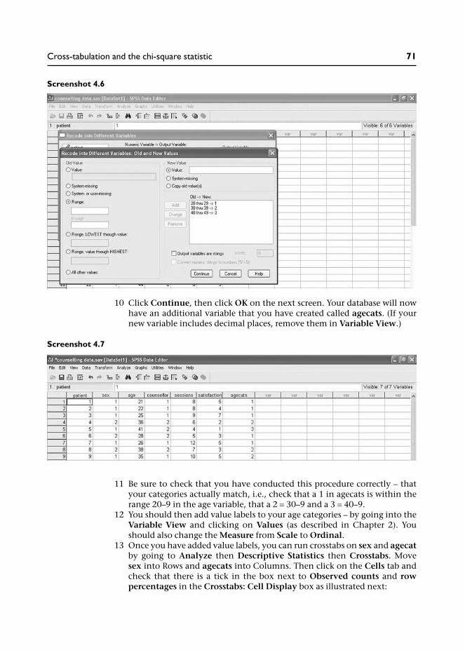
Screenshot 4.6
10 Click Continue, then click OK on the next screen. Your database will nowhave an additional variable that you have created called agecats. (If yournew variable includes decimal places, remove them in Variable View.)
Screenshot 4.7
11 Be sure to check that you have conducted this procedure correctly – thatyour categories actually match, i.e., check that a 1 in agecats is within therange 20–9 in the age variable, that a 2 = 30–9 and a 3 = 40–9.
12 You should then add value labels to your age categories – by going into theVariable View and clicking on Values (as described in Chapter 2). Youshould also change the Measure from Scale to Ordinal.
13 Once you have added value labels, you can run crosstabs on sex and agecatby going to Analyze then Descriptive Statistics then Crosstabs. Movesex into Rows and agecats into Columns. Then click on the Cells tab andcheck that there is a tick in the box next to Observed counts and rowpercentages in the Crosstabs: Cell Display box as illustrated next:
Cross-tabulation and the chi-square statistic 71

Screenshot 4.8
14 Click Continue, then OK.
This should produce the following table:
Although the numbers in each category are small, we might note that themales tended to be younger than the females. While there were similar per-centages in the 30–9 age range, there were differences in the younger and olderage categories: 36 per cent of males were in their 20s compared to only 12.5per cent of females; 44 per cent of females were in their 40s compared to only14 per cent of males.
Transforming data like age into categories can sometimes provide interestinginformation that would not be otherwise apparent. For example, a simplecomparison of the mean age of male and female patients reveals that the meanage of males was 31 years and the mean age of females was 39 years. But allthis tells us is that, on average, females were older. By transforming ageinto categories and cross-tabulating with sex we can actually see where thesedifferences lie in terms of specific age groups.
Table 4.8 Cross-tabulation of sex with age categories
72 Quantitative Data Analysis Using SPSS

There is just one more thing to note: because we have created three categoriesof age the numbers are even fewer in the six cells. Many students go on toreport the chi-square statistic for this analysis. However, the numbers really aretoo small to produce a reliable chi-square, as you would see from the chi-squaretests table, which cautions that ‘4 cells (67%) have expected count less than 5’.In such cases we can only report the cross-tabulation percentages showing thistrend, and perhaps recommend a larger sample for statistical analysis.
4.6 Summary
In this chapter you have learnt about:
• How to cross-tabulate categorical data in SPSS.• How to produce the chi-square statistical test.• The concept of statistical significance, levels of significance, Type I (false
positive) and Type II errors (false-negative) errors, and issues relating topower and ‘effect size’.
• How to re-code interval variables into categorical variables.
4.7 Exercises
Exercise 4.1 Re-code counselling sessions into categories
Re-code the data for number of counselling sessions into three equal groupsrepresenting ‘low’, ‘medium’ and ‘high’ attendance and first cross-tabulatewith ‘counsellor’ then with ‘sex’. What do these cross-tabulations show?
Exercise 4.2 Re-code satisfaction ratings into categories
Re-code the data for satisfaction ratings into categories representing‘positive’, ‘negative’ and ‘neutral’ ratings. Cross-tabulate this new variablewith ‘counsellor’ then ‘sex’. What is the best way to categorize satisfactionratings into these categories? What do these cross-tabulations show?
Exercise 4.3 Can you do a chi-square with just this data?
Imagine that the doctor had managed to do some of his own analysis andcame to you for some specific advice. He has actually counted up the numberof patients who came to see John and Jane and noticed that the majority ofmales saw John and the majority of females saw Jane. He shows you this in thefollowing table:
Cross-tabulation and the chi-square statistic 73

And while the doctor is quite pleased with this table, he wants to know ifthere is a statistic you can do on this data.
‘Sure there is,’ you say, ‘it’s called chi-square’.‘That’s great you’re so knowledgeable,’ replies the doctor, ‘can you put thesefigures into your computer and tell me what the chi-square statistic says?’
Well, can you?
Now you might be thinking, as I did for years, that you would need to enter allthe raw data for the 30 patients into SPSS to do a chi-square. Well you would bewrong! Here is how you do it:
1 Open a new file and in Variable View create variables for ‘sex’ and ‘counsel-lor’; these should be ‘string variables’. Then create a third variable (numeric)for the observed frequencies.
You should then enter the data from the above table using a row for eachcombination of the two categories; then for each combination you enterthe frequencies as illustrated below:
Screenshot 4.9
2 Now, and here is the clever bit, we need to tell SPSS that the numbers in thefrequencies column represent the total number of observations for thatcombination of categories (they are not just values for another variable). Todo this you have to go to Data / Weight Cases, then select Weight cases by,and move frequencies into the Frequency Variable box:
Table 4.9 Number of patients who have seen each counsellor
74 Quantitative Data Analysis Using SPSS

Screenshot 4.10
3 When you have done this, click OK and you can run your chi-square test asdescribed earlier in this chapter. It is so much easier than entering all theraw data.
4.8 Notes
1 This information might also be relevant for any further analysis. Forexample, if we found that one counsellor received higher satisfactionratings than the other, it could be that females are more generous in theirratings than males. It could even be that same-sex patients and counsellorsworked best – achieving the highest satisfaction ratings. It is factors likethese that need to be investigated in quantitative data analysis.
2 Expected frequencies for each cell are calculated by multiplying rowtotal by column total and dividing by the grand total. So, the expectedfrequency for the top right cell in Table 4.4 (50) is arrived at through thefollowing calculation: (100 × 100)/200 = 50. The same values apply to allthe cells in this table of course.
3 What is a large enough sample size? Well, for this chi-square our sample of30 was just enough given the distribution of the male and female patients.One source recommends a sample of at least 50 (Watson et al. 2006), butthe point is that you need to maintain sufficient numbers in each ofthe cells, so the sample needs to be fairly evenly distributed across thecategories.
4 Some authors recommend citing the more conservative continuity correc-tion (second line down in the table) for 2×2 tables like this one (i.e. two rowcategories – male/female, and two column categories – John/Jane), but Pett(1997: 163) and Howell (1997: 149) advise against citing this value.Some authors also suggest that where expected frequencies are less than 5in 2×2 tables, we can cite the more conservative Fisher’s Exact Test (fourthline down in the table) instead of the Pearson chi-square value (Pett 1997;Kinnear and Gray 2004). However, Howell (1997: 152) points out that thechi-square is robust to violations from small sample sizes and is unlikely toproduce false positive results (i.e., concluding a significant difference whenthere is not one). Indeed, the problem with small sample sizes is that theyare more likely to have insufficient numbers (or ‘power’) to show a signifi-cant difference.
Cross-tabulation and the chi-square statistic 75

5 There are techniques (and some computer programs) to determine samplesizes that rely on estimates of effect from previous similar research usingsimilar outcome measures. The idea being that if we know the size of theeffect to expect from previous studies then we can calculate the size ofthe sample needed to ensure a sufficient sample size to detect significantdifferences if they exist. This is beyond the scope of this book but for arelatively simple estimate of sample sizes needed, Cohen (1988) includessome tables which enable you to estimate sample size depending on thesize of the effect you want to detect. ‘The size of the effect you want todetect’ requires a decision on your part as to what constitutes a meaningfuldifference. For example, if you are evaluating the effect of a counsellingservice on patients mental health, then you need to decide what wouldconstitute a meaningful improvement in mental health on your outcomemeasure. If the scale goes from 1–100, where 100 represents optimummental well-being, what do you consider is a minimally important clinicaldifference on the scale to signal real improvement in mental health? If youagree that it is a rise of ten points on the scale then that is the size of theeffect you are looking to detect.
76 Quantitative Data Analysis Using SPSS
Correlation: examiningrelationships betweeninterval data
In this chapter you will learn about scatterplots and correlation to examinethe direction and strength of relationships between variables.
5.1 Introduction
In Chapter 1 we briefly discussed the possibility of conducting correlationanalysis on our data. We saw that correlation describes the direction andstrength of a relationship between two interval variables (e.g., height and shoesize) and that the direction can be positive or negative:
• Positive correlation: an increase in values for one variable is associatedwith an increase in values for the other variable, for example, as heightincreases so does shoe size.
• Negative correlation: an increase in values for one variable is associatedwith a decrease in values on another variable, for example, as temperaturereduces the use of electricity for heating increases.
In order to demonstrate this, scatterplots were used to graphically illustratethe relationship between values for two variables. For example, Figure 1.4(repeated in Figure 5.1 on the next page) showed quite a strong positivecorrelation between height and shoe size – the strength being determined byhow tightly the plot forms a line rising from left to right.
5.2 Examining correlations in the questionnaire
Turning to our questionnaire, we first need to identify two interval variablesthat might be correlated. We have three to choose from:
• age of patients;• number of sessions;• satisfaction ratings.
Looking at these three variables, the obvious choice for correlation is numberof sessions and satisfaction ratings since we might assume that the moreappointments a patient had, the more satisfied they would be with thecounselling. But, as was suggested in Chapter 1, perhaps it does not work likethis – maybe more appointments are linked to more unresolved problems andthus less satisfaction? Well, let us have a look at the data and see.
5

5.2.1 Producing a scatterplot in SPSS
The first thing we should do is produce a scatterplot of the data.
1 From the menu click on Graphs, then Chart Builder.2 Select Scatter/Dot from the Gallery to show the range of graphs available
and then drag the first ‘simple scatter’ graph into the preview area.3 Drag satisfaction into the Y-axis box and sessions into the X-axis box – as
illustrated on the next page:
Figure 5.1 Scatterplot for height and shoe size
78 Quantitative Data Analysis Using SPSS

Screenshot 5.1
4 Click OK.This should produce the output displayed in the scatterplot below (see Figure5.2):
Figure 5.2 Scatterplot of sessions and satisfaction ratings
Correlation 79

Note: In SPSS v15 you may need to use Chart Editor to change the Y-Axis scalein order to provide a 5% lower margin for the lower values: double-click on theY-Axis and in the Properties box change Lower margin (%) from 0 to 5.
From the scatterplot we can immediately discern a pattern rising from left toright suggesting that the two variables are positively correlated: patients whoattended for more counselling sessions reported higher levels of satisfaction.
5.2.2 The strength of a correlation
Now while it is important to produce scatterplots like this to see if twovariables look like they are correlated, this is only half the story. The next stepis to apply a statistical test to this data to determine the strength of thiscorrelation and whether or not it is statistically significant (unlikely to haveoccurred by chance).
The strength of a correlation is indicated on a scale ranging from −1 to +1 asillustrated in Table 5.1:
As a general guideline, a value ranging from 0.1 to 0.4 would be classed asa weak correlation, and anything above 0.5 would be regarded as a strongcorrelation (Cohen, 1988). A value approaching zero indicates the absence ofany relationship between two variables, in other words no correlation.
You would only find a perfect positive correlation (+1) where there is a one-to-one incremental relationship between the two variables, for example, numberof cinema tickets sold and customers in audience (assuming no one hassneaked in without buying a ticket of course). Obviously this level of corre-lation (perfect correlation) is unlikely in health and social research.
So, the next question is how do we obtain this value for the strength of acorrelation from SPSS? Well, for our two variables with interval data – counsel-ling sessions and satisfaction ratings, the appropriate measure of correlation isthe Pearson product-moment correlation coefficient.1 Though see Box 5.1 for akey assumption in using the Pearson correlation test.
Box 5.1 Non-linear relationship between variable
A scatterplot is important not only to see if there looks to be a relationship betweentwo variables but also what type of relationship. The Pearson product-moment correl-ation coefficient is a measure of linear (straight line) relationships between twovariables so would not be appropriate for measuring the strength of a relationshipthat takes a different form. Figure 5.3 below provides an example of a non-linear –curvilinear – relationship.
Table 5.1 The strength of a correlation
Negative correlation Positive correlation
−1 −.9 −.8 −.7 −.6 −.5 −.4 −.3 −.2 −.1 0 .1 .2 .3 .4 .5 .6 .7 .8 .9 +1Strong negative Weak positive Weak positive Strong positive
80 Quantitative Data Analysis Using SPSS

When I ask students in class what this graph might represent, a number of interestingoptions are suggested. One mature student suggested, somewhat morosely, that itcould represent number of years married and level of happiness . . .
Running the Pearson correlation
1 From the menu at the top of the screen click: Analyze / Correlate / Bivariate(bi meaning two and variate meaning variable).
2 Move sessions and satisfaction into the variables box.3 Ensure that the Pearson box is ticked.
Screenshot 5.2
4 Click OK.
Figure 5.3 Scatterplot showing a curvilinear relationship
Correlation 81

This should produce the following output table showing that the Pearsoncorrelation between sessions and satisfaction is 0.53. So we have quite astrong positive correlation. The information below this in the row labelledSig. (2-tailed) tells us that the correlation is statistically significant at the0.003 level. It is therefore unlikely to have occurred by chance (the conceptof statistical significance was discussed in Chapter 4).2
When you write-up the results of this analysis in a report you should referto the value for the strength of the Pearson correlation coefficient as ‘r’, asillustrated below:
We can therefore conclude that there is a strong positive correlationbetween the two variables (r = .53, p = .003), with a greater number ofsessions being associated with a higher satisfaction rating.
5.2.3 The coefficient of determination
But what does this ‘strong correlation’ of 0.53 actually mean in terms of ‘pre-dicting’ one value from another? In other words, to what extent can we saythat patient satisfaction ratings are related to the number of counsellingsessions?
There is a simple calculation we can perform to answer this question. It isreferred to as the coefficient of determination (r2), and provides a measure ofthe degree to which one variable ‘predicts’ the other by simply squaringthe correlation value. You can then simply multiply this by 100 to give apercentage value.
For example, if you conducted a correlation between monthly salary andannual salary this should yield a perfect positive correlation, in other words,r = 1.0. If you square this figure (1 × 1 = 1) and multiply by 100 this shows 100per cent predictability: if you know monthly salary you can accurately predictannual salary.
So, turning back to our counselling data, first, we square our value of 0.53 toget the value of 0.28, and then we multiply this by 100 to arrive at the per-centage value of 28 per cent. So in fact, our ‘strong correlation’ of 0.5 actually
Table 5.2 Pearson correlations between sessions and satisfaction
82 Quantitative Data Analysis Using SPSS
means that only 28 per cent of the variance in satisfaction ratings is related tocounselling sessions. We should therefore conclude that satisfaction ratingsare related to the number of counselling sessions but this only accounts for28 per cent of the variance; there are other factors involved. See Box 5.2 for areal world example of correlation and the use of this coefficient of determin-ation value.
Box 5.2 Correlation and the coefficient of determination:a real world example
I was recently involved in a research project evaluating the provision of welfareadvice in 30 general practices (family practices or health centres for those outside theUK). Welfare advice workers attended at the general practices for one morning orafternoon each week to help patients referred to them (by the doctor or nurses) forassistance with things like claiming welfare benefits (e.g., disability allowances).
After two years we found that the number of referrals to the advice workers variedquite significantly across the 30 practices, ranging from 16 to 234 (mean: 80; median: 69).This meant that at some practices demand for welfare advice was outstripping supplywhile at others the advice worker was not being used to their full capacity.
Anecdotally, it was suggested that this disparity in the number of referrals across thepractices was due to varying levels of engagement with the service: some practiceswere pleased to host the extra service for their patients, and therefore made referrals,but others were not, so failed to refer.
However, another reason was suggested by one of the practice managers: perhaps thisvariation in the number of referrals simply reflects the patient list size of the practices?We then found out that patient list size of the 30 practices ranged from 1768 to 7102and that there was indeed a positive correlation between list size and number ofreferrals: r = .75, p = .005. However, using the coefficient of determination calculationwe can see that patient list size only accounted for 56 per cent of the variance inreferrals across the practices, so other factors like engagement with the service stillneeded to be explored.
The coefficient of determination value also draws our attention to an impor-tant issue in interpreting and comparing correlation values: a correlation of0.8 is not twice as strong as a correlation of 0.4. Thus if we calculate the co-efficient of determination values we find that a correlation of 0.4 indicatesthat 16 per cent of the variance in one variable is accounted for by the othervariable, but a correlation of 0.8 indicates that 64 per cent of the variance inone variable is accounted for by the other.
5.3 Summary
In this chapter you have learnt how to:
• Examine relationships between two interval variables to see if they arepositively or negatively correlated.
Correlation 83

• Produce scatterplots to graphically illustrate the relationship between twovariables.
• Conduct the Pearson product-moment correlation to examine the statisticalstrength and direction of a linear correlation.
• Interpret the strength of a correlation using the coefficient of determination.
In the following exercises you will also learn about:
• The importance of sample sizes in correlation and obtaining statisticallysignificant results.
• How outliers can have a significant influence on correlation statistics.• The importance of distinguishing between correlation and cause.
5.4 Exercises
Exercise 5.1 Produce scatterplots and correlations for the otherinterval variables
Conduct correlations for (a) age and number of sessions; and (b) age andsatisfaction with the service. Remember to produce a scatterplot for the databefore running the Pearson correlation. What do the results show in termsof (a) the strength and direction of any correlations; and (b) the statisticalsignificance of the results?
Exercise 5.2 The importance of sample sizes in correlation
Sample sizes can have a profound effect on statistical significance. Try runningthe Pearson correlation between age and number of sessions again, but this timewith double the number of cases for each of these variables.
Highlight the 30 cases for age, right-click the mouse button and copy, thenmove your cursor to the end of the data column for age (row 31) and paste inthe data you have copied. So you have the same data but double the numberof cases. Next, follow the same procedure for sessions. Then run the Pearsoncorrelation on the 60 cases for age and sessions.
Exercise 5.3 The importance of ‘outliers’ in correlation
There is another reason why you should always produce a scatterplot ofthe data if you are looking for correlations: to identify outliers – any datapoints that are out on their own away from the main cluster. These can have asignificant influence on any correlation statistics.
Have a look at the scatterplot for age and satisfaction again (you should haveproduced it for Exercise 5.1b). Are there any outliers? Imagine trying to drawan oval, fat cigar shape around the dots in the scatterplot to discern a negativecorrelation – is there one dot in particular that falls outside your oval shape? Ifso, identify the case number, remove it from your dataset (values for age andsatisfaction), and run the Pearson correlation again.
84 Quantitative Data Analysis Using SPSS

Exercise 5.4 Explain the following correlations3
(a) It is reported that there is a strong positive correlation between ice creamsales and crime rates. Do we therefore conclude that ice cream causescrime?
(b) It is reported that there is a positive correlation between number ofcounselling sessions and level of psychological well-being? Can we there-fore conclude that counselling works and more counselling works better?
(c) Consumption of milk is positively correlated to cancer. So does drinkingmilk cause cancer?
(d) Studies have found a negative correlation between smoking andAlzheimer’s dementia: the risk of getting Alzheimer’s dementia reduceswith increased smoking of cigarettes. Would you therefore recommendthat people start smoking or increase the number they smoke to preventthe onset of Alzheimer’s dementia?
5.5 Notes
1 The other options are to use Kendall’s tau or Spearman’s test for corre-lations with ordinal level data.
2 And if you are wondering why it says ‘2-tailed’, this will be explained in thenext chapter.
3 Exercise 5.4(b) is taken from Watson et al. (2006). Exercises (c) and (d) aretaken from Coolidge (2006).
Correlation 85

Examining differencesbetween two sets of scores
In this chapter you will learn about tests which tell us if there is a statisticallysignificant difference between two sets of scores. In so doing you will learnabout independent and dependent variables, parametric and non-parametricdata, and independent and related samples.
6.1 Introduction
In this chapter we will look at statistical tests which tell us if there is a signifi-cant difference between two sets of scores. For example, this could be scores onan aptitude test comparing a sample of males and females, or scores before andafter some intervention, e.g., mental health scores before and after a course oftherapy for a sample of patients.
So, what differences between two sets of scores might we examine in ourcounselling questionnaire? In order to think about this it is useful to categorizevariables into two kinds: independent variables and dependent variables (asdiscussed in Chapter 1). For example, we might think that satisfaction with theservice is dependent on which counsellor the patient saw, in which case wewould have the following independent and dependent variables:
• Independent variable: counsellor (John or Jane).• Dependent variable: satisfaction rating.
In the counselling questionnaire there are in fact only two possible inde-pendent variables – the categorical variables counsellor and sex, and each hasthree possible dependent variables, as listed below:
1 Independent variable: counsellor (John or Jane):
• dependent variable: satisfaction ratings;• dependent variable: number of sessions;• dependent variable: age of patients.
2 Independent variable: sex (male or female):
• dependent variable: satisfaction ratings;• dependent variable: number of sessions;• dependent variable: age of patients.
Box 6:1 provides further discussion of independent and dependent variables inthe context of experimental studies.
6

Having identified our independent and dependent variables, the nextquestion is which differences do we wish to examine? And the answer to thatis, which do we think are the most relevant? In my opinion we should start bycomparing satisfaction ratings for the two counsellors, and then the numberof sessions provided by each of the counsellors, since these might providethe most relevant information for the doctor who has commissioned thisanalysis.
Box 6.1 Experiments, variables and hypothesis testing
The concept of independent and dependent variables is really more relevant toexperiments where the investigator manipulates the independent variable to see theeffect on the dependent variable. Indeed the independent variable is sometimesreferred to as the treatment variable. For example, the investigator might manipulate thetype of treatment offered to patients (randomly assigning patients to a particulartreatment) and measure the outcomes. Type of treatment would be the independentvariable (e.g., physiotherapy compared to acupuncture) and the outcome (e.g., level ofback pain) would be the dependent variable. Alternatively, the investigator mightmanipulate the level of treatment, for example the dosage of a drug, and compare theoutcomes dependent on the dosage administered.
In such circumstances we may formulate an experimental hypothesis which makes aprediction about the relationship between the independent and dependent variables,for example:
Hypothesis: acupuncture will lead to greater reductions in the level of back pain thanphysiotherapy.
And having proposed an experimental hypothesis we should also formulate what isreferred to as a ‘null hypothesis’ stating the absence of a relationship between theindependent variable and the dependent variable, for example:
Null Hypothesis: there will be no difference between acupuncture and physiotherapy onthe level of back pain experienced by patients.
The results of our experiment will enable us to either retain or reject the nullhypothesis. So, if we find that acupuncture did indeed lead to greater reductions inthe level of pain we conclude that the null hypothesis was rejected. If there was nodifference, then we conclude that the null hypothesis was not rejected.
Confounding variables
Another factor we need to take into account is the potential role of extraneous orconfounding variables. These are variables other than the independent variable thatmay have affected the outcomes on the dependent variable. For example, if we foundthat acupuncture was better than physiotherapy in reducing back pain there might beother factors that have contributed to this outcome: perhaps the acupuncturist hadmore sessions with patients; perhaps the patients who saw the acupuncturist wereyounger with less chronic problems that were more amenable to treatment, etc.Issues such as these highlight the importance of controlling the conditions in the designof experiments, in this hypothetical example, at least ensuring the same amount ofsessions and a comparable sample of patients.
Examining differences between two sets of scores 87

6.2 Comparing satisfaction ratings for the two counsellors
In order to compare the satisfaction ratings for the two counsellors we firstneed to choose the appropriate statistical test. Statistical tests comparingscores between two samples (in our study, satisfaction ratings for John vssatisfaction ratings for Jane) fall into two categories depending on the typeof data we have. Figure 6.1 illustrates the decision process for choosing theappropriate statistical test.
6.2.1 Independent or related samples?
The first thing we need to know is whether our data comes from twoindependent samples or two related samples. Related samples are thosewhere the same people provide two sets of scores. For example, in our data thedoctor might have asked patients to complete a mental health questionnairemeasuring their levels of anxiety before and after counselling; the idea being tosee if the counselling has any effect on the scores – hopefully reducing levels ofanxiety/depression.1
It should be apparent then, that our data comparing patient satisfactionratings for the two counsellors is not related. Rather, the satisfaction ratingsfor each counsellor will come from two independent groups of people: thosepatients who saw John and those who saw Jane.
6.2.2 Parametric or non-parametric test?
Having followed the arrow in Figure 6.1 to independent samples we now need todecide whether to use a test for parametric or non-parametric data.
Parametric tests assume certain characteristics (parameters) of the populationfrom which the sample is drawn. In general, parametric tests should only beused when the following conditions apply:
Figure 6.1 Choosing the appropriate statistical test for differences between two samples
88 Quantitative Data Analysis Using SPSS

1 Level of measurement is interval or ratio (more than ordinal).2 The scores approximate a normal distribution.3 The variance (spread of scores) within both groups is relatively similar
(homogeneity of variance).
Non-parametric tests do not depend on these assumptions. Wherever possibleyou should choose the parametric test because it is more powerful. This meansthat it is more sensitive than the non-parametric test in discerning significantdifferences in two scores.2
So, we know that our data is from independent samples, and we also know thatit is interval (satisfaction ratings), what we next need to find out is whetheror not the data is normally distributed. The simplest way to do this is byproducing histograms to see if the data looks like it approximates a normaldistribution.
Producing histograms to check for normal distributions
1 From the menu at the top of the screen click on Graphs then ChartBuilder.
2 Select Histogram from the Gallery and drag the first (Simple) Histograminto the preview area.
3 Drag the variable satisfaction to the X-axis.4 Click Groups/Point ID and put a tick in the Rows panel ID checkbox.5 This will produce a Panel box to the right of the preview area. Drag the
variable counsellor into the Panel box.6 Finally, to the right of your screen in the Element Properties section, place
a tick in the box next to Display normal curve and then click Apply.7 Click OK.
Examining differences between two sets of scores 89

Screenshot 6.1
This should produce the two histograms below with lines showing that thedata is relatively normally distributed, with most of the scores in the middle,tailing off at either end.
90 Quantitative Data Analysis Using SPSS

Now, many researchers will be quite happy to visually examine the data fromhistograms to see that the data approximates a normal distribution and leave itat that. Remember, it just needs to approximate a normal distribution becausethe test is robust to ‘moderate departures’. But, as Field (2005) points out, thiscan be quite subjective and open to abuse (‘Well, it looked normal to me’). So,for a more objective measure of whether a distribution is normal we may referto two further tests: Kolmogorov-Smirnov and Shapiro-Wilk. If the results ofthese tests are statistically significant then this suggests that the distributiondeviates significantly from a normal distribution.
Producing a test of normality
1 From the menu at the top of the screen click on Analyze then Descriptivesthen Explore.
2 Move satisfaction into the Dependent list and counsellor into the Factorlist.
3 Under Display ensure that there is only a tick next to Plots.4 Click on the Plots tab to open the plots dialogue box.5 Under Boxplots click None, and remove any ticks under Descriptive. Place
a tick in Normality plots with tests. Under Spread vs Level tick none.6 Click Continue, then OK.
Figure 6.2 Histograms showing satisfaction ratings for each counsellor
Examining differences between two sets of scores 91

Screenshot 6.2
This will produce an output table of the tests of normality along with anumber of graphs. We will focus on the statistics in the table: sinceneither of these tests includes any significant results (0.05 or less in the sig.columns) this confirms our observations from the histograms, in otherwords, that our data is sufficiently normally distributed.
So, having (thoroughly) checked that the data is normally distributed, we areable to follow the arrow in Figure 6.1 to the (parametric) independent samplest-test.
Running an independent samples t-test
1 From the menu at the top of the screen click Analyze then Compare Meansthen Independent samples t-test.
2 Move satisfaction into Test Variable.3 Move counsellor into Grouping Variable.4 Click Define Groups (since your Grouping Variable is counsellor, you need
to specify a numerical value for each, in other words, 1 for John, 2 for Jane).5 Enter the value 1 (for John) in Group 1 and value 2 (for Jane) in Group 2.
Table 6.1 Tests of normality
92 Quantitative Data Analysis Using SPSS
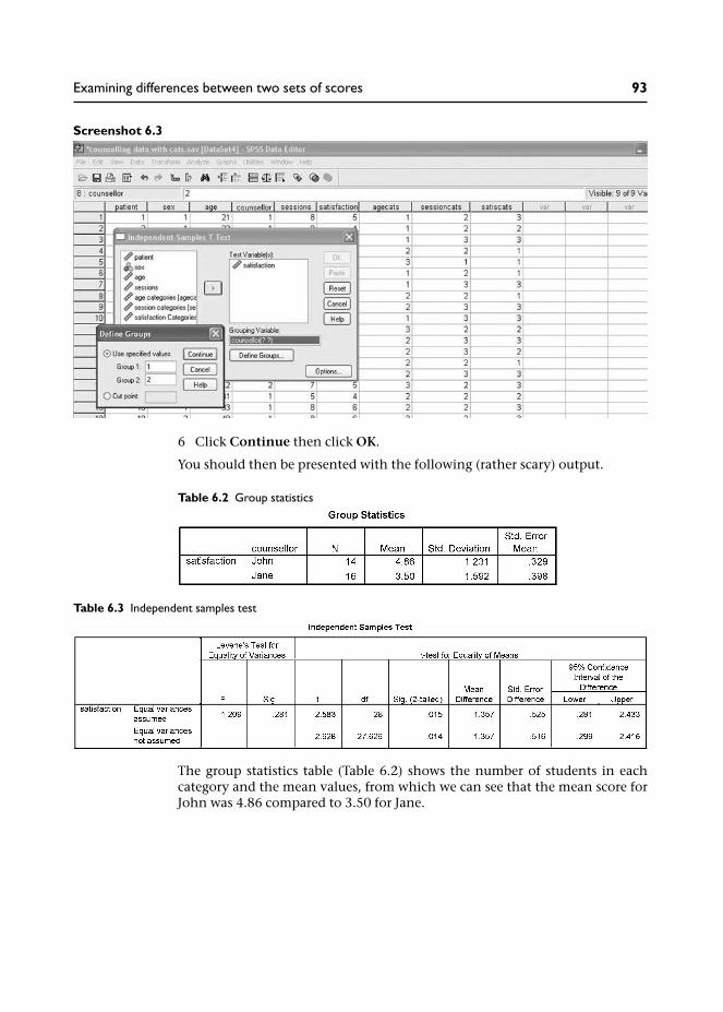
Screenshot 6.3
6 Click Continue then click OK.
You should then be presented with the following (rather scary) output.
The group statistics table (Table 6.2) shows the number of students in eachcategory and the mean values, from which we can see that the mean score forJohn was 4.86 compared to 3.50 for Jane.
Table 6.2 Group statistics
Table 6.3 Independent samples test
Examining differences between two sets of scores 93

The table also provides us with the standard deviation of the scores for eachgroup. This is the average deviation from the mean for each group of scores –providing a measure of the spread of the scores. Notice that the standarddeviation of satisfaction ratings for Jane is slightly larger than those for John.This is graphically displayed in the boxplots (below) where we can see thatthe spread of scores is slightly greater in the ratings for Jane.
So we can see that the satisfaction ratings were higher for patients who went tosee John, but is this a statistically significant difference?
The independent samples test output table (Table 6.3), first provides Levene’stest for equality of variances. Recall that ‘homogeneity of variance’ was one ofthe assumptions required for using a parametric test – so this is checking thatthe variance (spread of scores) within both groups of scores (ratings for Johnand Jane) is relatively similar. Since the value for this test is not significant(0.281 is larger than our significance level of 0.05), this means we have notviolated this assumption and we can proceed by examining the first line of thistable – equal variances assumed (violation would mean citing the slightlymore conservative bottom line of the table). The column headed Sig.(2-tailed) tells us if the difference in the two means is statistically significant(the difference in the two means (1.357) being provided in the next column).Since this value is 0.015, and therefore a smaller value than our conventionalsignificance level of 0.05, we may conclude that there was a significant differ-ence in scores from the two groups. We might write this up in a report thus:
An independent samples t-test was used to examine differences in satisfac-tion ratings for each of the counsellors. The results showed that ratings forJohn were higher (M = 4.86; SD = 1.23) than those for Jane (M = 3.5; SD =1.59); t = 2.58, p = .015.
Figure 6.3 Boxplots comparing satisfaction ratings for John and Jane
94 Quantitative Data Analysis Using SPSS

Box 6.2 One-tailed and two-tailed tests
In statistics we can select 1-tailed and 2-tailed significance levels. A ‘2-tailed’ significancelevel relates to a non-directional hypothesis. So, in this particular example our hypoth-esis (prediction) might have been: there will be a difference in satisfaction ratings for thetwo counsellors. It is ‘2-tailed’ because we are not specifying whether the ratings forJane will be higher or those for John – just that there will be a difference (either way).This is in contrast to a ‘1-tailed’ significance level where the direction of the outcomehas been specified, for example: satisfaction ratings for Jane will be higher than those forJohn. In general the 2-tailed significance level is cited since you can rarely be certainof the outcome, despite any predictions.
Confidence intervals
The final column provides the 95 per cent confidence interval of the difference.The confidence intervals in this table provide a range of values, from 0.28 to2.43. Essentially, this means that on 95 per cent of occasions, were oursampling repeated, it would be expected that the differences would lie withinthese parameters.
So, although the mean difference for our data was 1.36, the confidence inter-vals suggest that, if we repeated this data collection 100 times, we wouldexpect to find a difference in satisfaction ratings for John and Jane between0.28 and 2.43 on 95 per cent of occasions. Hence, we are 95 per cent confidentthat the difference would lie between 0.28 and 2.43.
These parameters can be instructive. Notice that the lowest value is 0.28. Thismeans that we can only be confident that the difference in the ratings for thetwo counsellors is at least 0.28, which is not much. We may conclude that ourrelatively small sample has suggested a quite small significant difference, but alarger sample of students would be needed to increase our confidence in theactual size of the difference in scores.
6.3 Comparing the number of sessions for each counsellor
The next difference we decided to examine is the number of counselling ses-sions conducted by each counsellor. Is one offering more sessions than theother? Perhaps this could help to explain why one received higher satisfactionratings?
As with the previous analysis, we first need to decide on the appropriate stat-istical test. Referring back to Figure 6.1 we know that we are dealing with twoindependent samples of data, so our next task is to find out if we should usea parametric or a non-parametric test. Repeat the procedure for producinghistograms to check for a normal distribution:
1 From the menu at the top of the screen click on Graphs then ChartBuilder.
2 Select Histogram from the Gallery and drag the first Histogram into thepreview area.
Examining differences between two sets of scores 95

3 Drag sessions to the X-axis.4 Click Groups/Point ID and put a tick in the Rows panel Variable
checkbox.5 Drag the variable counsellor into the Panel box.6 In the Element Properties section to the right of your screen, place a tick in
the box next to Display normal curve.7 Click Apply and then click OK.
This should produce the following histograms (I have altered the scale (andincrements) in Chart Editor to match the maximum number of sessions whichwas 12):
Now, although the ‘normal curve’ in these two histograms suggests that thedata is normally distributed we can see that the actual data for John’s sessionsdoes appear to skew off towards the lower number of sessions. This illustrateshow graphs, such as these, can be deceptive. Hence, if we modify the X-axisusing Chart Editor to only include the actual range of sessions (1–12) we get aslightly different picture.
Figure 6.4 Histograms showing number of sessions for each counsellor
96 Quantitative Data Analysis Using SPSS

From Figure 6.5 we can see that whereas the histogram for Jane approximatesa normal distribution, the histogram for John’s sessions suggests that thedata is skewed towards the lower end. Thus we have a prime candidate forconfirmation using the tests of normality statistics described above:
1 From the menu at the top of the screen click on Analyze then Descriptivesthen Explore.
2 Move sessions into the Dependent list and counsellor into the Factor list.3 Under Display ensure that there is only a tick next to Plots.4 Click on the Plots tab to open the plots dialogue box.5 Under Boxplots click None, and remove any ticks under Descriptive. Place
a tick in Normality plots with tests. Under Spread vs Level tick none.6 Click Continue, then OK.
And, indeed, when we do produce the Tests of Normality we find that theKolmogorov-Smirnov test is actually significant (0.014) suggesting that thedistribution is significantly deviating from a normal distribution.
This being the case, it might therefore be more appropriate to usethe test for non-parametric data which, as illustrated in Figure 6.1, is theMann-Whitney test.
Figure 6.5 Scaled histograms showing number of sessions for each counsellor
Table 6.4 Tests of normality
Examining differences between two sets of scores 97

Running the Mann-Whitney U test
1 From the menu at the top of the screen click Analyze then NonparametricTests then 2 Independent Samples.
Screenshot 6.4
2 Move sessions into Test Variable.3 Move counsellor into Grouping Variable.4 Click Define Groups (since your Grouping Variable is counsellor, you need
to specify the codes for the two groups, as we did for the t-test).5 Enter the value 1 (for John) in Group 1 and value 2 (for Jane) in Group 2.6 Click Continue.7 Click the Exact tab to open the Exact tests dialogue box and click on the
button next to Exact (the Exact test is more appropriate for smallersamples). Click Continue.
Screenshot 6.5
98 Quantitative Data Analysis Using SPSS

8 Ensure the Mann-Whitney U test is selected (it should be).9 Click OK.
This should produce the following output:
The first table provides information about how the satisfaction ratings wereranked. The procedure for calculating the Mann-Whitney U statistic involvesranking all the scores from both groups in order of magnitude and thencalculating the mean rank for each of the two groups. So, for John we can seethat the mean ranking for his session is 20.61, but for Jane it is much lower at11.03.
In the second table, the two values we are interested in are the Mann-WhitneyU (40.5) and the Exact Significance level (Exact sig. (2-tailed) ) which isp = 0.002. Since the probability (p value) of this result occurring by chanceis lower than our conventional significance level of 0.05, we conclude thatthere is a significant difference in the number of sessions conducted by the twocounsellors.
We would write-up the results of this analysis, first, by referring to the mediannumber of counselling sessions conducted by the two counsellors – becausethe median, as we learned in Chapter 1, is more appropriate where the data isnot normally distributed.3 We would then proceed to cite the relevant statisticsfrom the Mann-Whitney U Test. For example:
When the number of sessions conducted by the two counsellors wasexamined it was found that the median number of sessions conducted byJohn was 8.5 compared to 6.0 for Jane. The Mann-Whitney Test found thisdifference to be statistically significant: U = 40.5, p = .002.
Table 6.5 Mann-Whitney U test ranks
Table 6.6 Mann-Whitney U test statistics
Examining differences between two sets of scores 99

This result might then be related to the higher satisfaction ratings for John,in other words, perhaps the higher satisfaction ratings related to the greaternumber of sessions he conducted with his patients?
Box 6.3 Comparing two sets of scores from related samples
In our counselling data we have used the relevant tests to compare two sets of scoresfrom independent samples: the independent samples t-test for parametric data and theMann-Whitney test for non-parametric data. But imagine if the doctor had also pro-vided us with data from all the patients recording levels of anxiety before counsellingand after counselling. For example, the doctor might have asked patients to rate theirlevels of anxiety (on an interval scale from 1–100) before the first session of counsellingand then three months later. Since the data before and after counselling comes from thesame people, we would have two sets of scores from related samples.
If the data satisfies the conditions for a parametric test then you should conduct thepaired-samples t-test (as was indicated in Figure 6.1) by going to the menu at the topof the screen and clicking Analyze / Compare Means / Paired-Samples T Test.Then you need to highlight both variables and move them into the Paired Variablesbox and click OK to run the test.
Screenshot 6.6
If the data does not satisfy the conditions for a parametric test then you shouldconduct the Wilcoxon test by going to the menu at the top of the screen and clicking:Analyze / Nonparametric Tests / 2 Related Samples. And then, as you have doneabove, highlight both variables and move them into the Test Pair(s) List. Ensurethere is a tick next to Wilcoxon and click OK to run the test.
6.4 Summary
In this chapter you have learnt about:
• Independent and dependent variables.• Hypothesis testing (experimental and null hypotheses) and the importance
of considering confounding variables.• How to select the appropriate statistical test for comparing differences
between two sets of scores.
100 Quantitative Data Analysis Using SPSS

• The difference between independent samples and related samples, andbetween parametric and non-parametric data.
• How to produce histograms to check for normal distributions andstatistical ‘tests of normality’.
• How to produce an Independent samples t-test and interpret the results(including confidence intervals).
• How to produce the Mann-Whitney U test for non-parametric data.
In the following exercises you will also learn:
• How to compute a new variable from existing variables.
6.5 Exercises
Exercise 6.1 Checking for other significant differences
In this chapter we have concentrated on the differences in satisfaction ratingsand number of sessions for the two counsellors. You may now wish to see ifthere were any significant differences in:
(a) the age of patients seen by the two counsellors;(b) satisfaction ratings from male and female patients;(c) the number of sessions conducted for male and female patients;(d) the age of the male and female patients.
Remember to check the distribution of the data in order to run theappropriate analysis (i.e., parametric t-test or non-parametric Mann-WhitneyU test).
Exercise 6.2 Create a new variable to analyse same-sex satisfactionratings
In Chapter 4, cross-tabulation revealed that the majority of male patients(71%) saw John, while the majority of female patients (75%) saw Jane. Wenoted that this might be important information for the doctor, since thismight suggest it is necessary to ensure a male and a female counsellor areavailable to cater for patient preferences, that is, preference for same-sexpatient and counsellor.
Now, the curious among you might go on to wonder if this has any bearing onthe counselling relationship, for example: were satisfaction ratings higherfor same-sex patient–counsellor sessions compared to different-sex patient–counsellor sessions?
So how would you investigate this? Here is a clue: you will first need to createa new variable (using Transform/Compute) which records whether thepatient saw a counsellor of the same sex or not. Then you can use this newvariable as an independent (grouping) variable to compare the mean satisfac-tion ratings between the two groups.
Examining differences between two sets of scores 101

6.6 Notes
1 Less commonly, related samples might be people who have been matchedor paired on relevant criteria. And SPSS actually uses the term ‘pairedsamples’ for t-tests, rather than ‘related samples’. Other terms for relatedsamples include ‘repeated measures’ and ‘dependent samples’.
2 While it is important to orientate towards these assumptions, studieshave shown that parametric tests are actually quite robust to ‘moderatedepartures’ from these conditions (Howell 1997; Bryman and Cramer2001).
3 You can obtain the median values by going to: Analyze then CompareMeans then Means. In the Means box put sessions in the Dependent Listand counsellor in the Independent List. Next, click on Options whereyou will see a list of statistics available; select median and move it to theCell Statistics box, click Continue, then OK.
102 Quantitative Data Analysis Using SPSS

Reporting the results andpresenting the data
In this final chapter we will look at how to structure the report of a quantitativestudy and how not to present data.
7.1 Introduction
Congratulations, you have done the easy bit – analysing the data – now comesthe difficult part: writing-up the results.
Overall, the key criteria for good scientific writing are accuracy, clarity andstructure, but you should also try to make it an interesting story, rather thana ‘dry’ listing of statistics and outcomes. In order to achieve clarity, youmight imagine that you have been commissioned to produce the report for aprofessional who knows very little about the subject or research methods –in this case the doctor who has asked you to analyse the data. As regardsstructuring the report, fortunately, there are established guidelines on how toorganize the results of a research study.
7.2 Structuring the report
A quantitative research report should generally include the following sections:
1 Abstract.2 Introduction.3 Methods.4 Results.5 Discussion.6 Conclusion.7 Appendices.8 References.
The abstract
An abstract is a brief, concise summary of a study, usually limited to 200–300words. It is usually the last part of the report to be written (since you need toknow what you have said in order to provide the summary), and shouldinclude the following information:
• brief background to the research;• purpose/aims of the study;• methods used and the sample;• brief conclusions outlining the importance of the study.
7

The role of the abstract is to give the reader sufficient information about thestudy, the essential details, to enable them to decide if they wish to readthe full report.
The introduction
The introduction should provide a background to the research, specify theissue that is being addressed and review relevant previous research. For studiesrelating to health and social care, relevant policy documents are often cited tosituate the study in the wider health and social context, with some indicationof the extent of the problem. This approach is illustrated in the (ratherexcellent) example provided in Box 7.1.
The introduction may then close by outlining the aims and objectives of thestudy (research questions, hypotheses) if these have not been dealt with in aseparate section.
Box 7.1 Introductions in health and social care: positioning the issuein a social context
This example is taken from Peter Greasley and Neil Small (2005a), evaluating a primarycare counseling service: outcomes and issues, Primary Health Care Research andDevelopment, 6: 125–31.
Introduction
Mental health issues are the third most common reason for consulting a generalpractitioner (GP), after respiratory disorders and cardiovascular disorders(Department of Health, 1991; Hemmings, 2000). A quarter of routine GP consul-tations relate to people with a mental health problem, most commonly depressionand anxiety. It has been estimated that each year, one in 15 women and one in 30men will be affected by depression, and every GP will see between 60 and 100people with depression (Department of Health, 1999). A survey of 325 GPs con-ducted by the Mental Health After Care Association in 1999 found that 30% of theirtime, roughly 1.5 days a week, is spent working on patients’ mental health problems,particularly relating to anxiety and depression (Davidson, 2000). The direct costs oftreating depression in the UK in the early 1990s was estimated to be around £400million a year and the indirect costs, including mortality costs and lost productivitywas £3000 million (Kendrick, 2002).
Standard two of the National Service Framework for mental health (Department ofHealth, 1999) states that: ‘Any service user who contacts their primary health careteam with a common mental health problem should: 1) have their mental healthneeds identified and assessed; 2) be offered effective treatments, including referralto specialist services for further assessment, treatment and care if they require it’(p. 28). To achieve this, primary care groups/trusts (PCG/Ts) should ‘develop theresources within each practice to assess mental health needs’ (p. 35).
104 Quantitative Data Analysis Using SPSS

During the past 20 years counselling as a specific undertaking has been introducedinto primary care, and the last decade has seen a rapid expansion . . .
The introduction then leads onto a review of studies reporting evaluations of counsel-ing services in primary care and the evaluation reported in this study.
Methods
The key to the methods section is clarity and specificity, such that a readercould replicate the method and procedure of your study from the informationyou provide in the report. So we are talking about a very detailed accountwhich should cover:
1 Study design: What is the overall methodology or design of the study? Forexample, is it an experiment (with independent and dependent variables), aquestionnaire study, a qualitative study consisting of a series of interviewsor focus groups, etc.?
2 The participants: What is the sampling frame (target sample, e.g., all patientswho attend for counselling during one year at a general practice), samplingmethod (random, quota, all) and sample size? This may need to includedemographic information (age, sex, ethnic background, etc.).
3 The materials: What materials were used in the study to conduct theresearch and collect data? For example, details of a questionnaire or otheroutcome measures may be provided in an appendix. If you are using astandardized outcome measure, for example, to measure health and qualityof life, you should also provide details of its relevance to your particularstudy including details of reported reliability and validity (reliability refersto the consistency of the measure over time or with different samples;validity refers to the extent to which it measures what it is supposed to bemeasuring, e.g., levels of anxiety or depression).
4 The procedure: How was the study actually conducted? For example, if thestudy involved a questionnaire, how was it distributed to participants? Wasit posted to participants who completed it then returned it, or was it com-pleted in the presence of the researcher? (Studies have shown that the wayin which a questionnaire is administered – self-completion, interview, etc. –can influence the responses (Lyons et al. 1999) ). Remember, the readershould be able to replicate your procedure based on the details you providein the report.
Results
The results should be presented as simply and clearly as possible. Make use ofgraphs and tables that help to present and explain the results. Where descrip-tive and inferential statistics are used to analyse the data, you should:
Reporting the results and presenting the data 105

• name the statistic used;• report the statistical significance of the results obtained;• indicate that all necessary assumptions were met (e.g., that data were nor-
mally distributed if using a t-test).
It is also important for the report to have a logical structure. A good way todo this is to pose research questions or hypotheses which are then eitherconfirmed or not by the data. You can then add words and phrases like‘surprisingly’, ‘as expected’ or ‘as predicted’ when presenting the results ofanalysis. This makes the text more interesting than simply listing a reamof analyses; it turns the report into a story with twists and turns.
Graphs, figures and tables should be comprehensible without reference back tothe text, so they should be clearly numbered and headed, and fully labelledwith all units of measurement. They should only be included where they serveto enhance understanding of the results. Within the text you should leadthe reader through the table or figure drawing attention to the relevant data.The reader should not turn the page and suddenly be confronted with a figurefloating in the air: introduce the figure in the text and then explain it.
If you detect a note of frustration here, you would be correct. It comes frommarking numerous assignments where these guidelines have been ignored;I have included some examples of charts from past assignments in the finalsection of this chapter which serve to illustrate how not to present data.
Discussion
The discussion section should provide an interpretation and explanation ofthe results which should be related to any research questions or hypotheses.It should also include critical reflections on the study (e.g., design of thequestionnaire, relevance of outcome measures, limitations for generalizingdue to small sample sizes).
Conclusion
The conclusion should include general implications of the study and sugges-tions or recommendations for further research.
Appendices
These should include any instruments used – such as the questionnaire.
References
A full list of references should be included (written in the appropriate academicstyle). This shows that you have consulted the relevant literature and acknow-ledged the sources of your work. It also enables the reader to consult the workyou have cited if they wish.
106 Quantitative Data Analysis Using SPSS

7.3 How not to present data
Here are some examples of how not to present data. They are actual examplestaken from assignments presented by students from previous years of teachingquantitative data analysis. The dataset involved analysing information from agroup of students, including their age, height and whether they were full-timeor part-time students.
Exhibit A
What’s wrong with this?
Well, first, it is very deceptive. If the purpose of including a chart is to provide avisual representation of the results which accurately reflects the data at aglance, then this chart is not the finest of examples.
It shows the number of full-time and part-time students on a course. If we wereto just glance at the two bars it would appear that there are at least three timesas many full-time students as there are part-time. But if you look at the Y-axis,you will see that there are actually only twice as many: six part-time and 12full-time. The problem here is that the Y-axis starts at four.
The second problem is that the increments rise at intervals of 0.5. Is it possibleto have half a student? The Y-axis should have been changed in the ChartEditor.
And, third, although the graph is numbered below (GRAPH 1), there is no title,for example, ‘Graph 1: Number of students who are full-time and part-time’.
GRAPH 1
Reporting the results and presenting the data 107

Exhibit B
What’s wrong with this?
There are many things wrong with this chart:
1 The chart is not numbered – neither is there a title.2 The Y-axis (height) has no label of the actual measurements (centimetres).3 The Y-axis starts at 150cms. Is case 14 really four times as tall as case 6?4 The height should be ordered from lowest to highest.
But more generally, was it really necessary to produce a graph of each indi-vidual’s height anyway?
Exhibit C
108 Quantitative Data Analysis Using SPSS
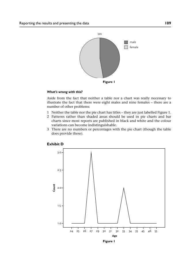
What’s wrong with this?
Aside from the fact that neither a table nor a chart was really necessary toillustrate the fact that there were eight males and nine females – there are anumber of other problems:
1 Neither the table nor the pie chart has titles – they are just labelled Figure 1.2 Patterns rather than shaded areas should be used in pie charts and bar
charts since most reports are published in black and white and the colourvariations can become indistinguishable.
3 There are no numbers or percentages with the pie chart (though the tabledoes provide these).
Exhibit D
Figure 1
Figure 1
Reporting the results and presenting the data 109

What’s wrong with this?
Well, first, a line graph is inappropriate because it suggests continuous datarather than distinct age categories. It should be a bar chart.
Second, for some reason the Y-axis is at 0.5 intervals – there are no half-people!
And, third, the chart has no title – just ‘Figure 1’.
Exhibit E
Full-Part-time status
This bar graph illustrates the frequency distribution of full-part-time status
N=1 (6%) respondents work/study part-time
N=16 (94%) respondents work/study full-time.
What’s wrong with this?
Aside from the questionable value of graphically representing this data, look atthe scale . . . What does it represent?!
110 Quantitative Data Analysis Using SPSS
Concluding remarks
My primary aim in writing this book has been to provide a relatively simpleand accessible introduction to quantitative data analysis. It is for this reasonthat I have taken a pragmatic approach which skips much of the theoreticalunderpinnings of statistics in favour of practically conducting the analysis.For those students who will be taking their studies further, I would stronglyrecommend complementing this practical book with further reading aroundthe principles of statistical analysis. A little knowledge of statistics can be a‘dangerous’ thing, and this practical introduction to quantitative data analysishas merely scraped the surface in terms of the underlying principles.
I have one final word of warning. Many students design research studies with-out properly thinking through how they will analyse the data (I’ve done itmyself of course – and paid the price). My advice to students is always to keepthe design of your research study as simple as possible, and to stick to what youknow: that is, design the study around the tests you know how to use. If youcannot do that then at least make sure you understand the test and theanalyses that you are considering by consulting the relevant text books. Donot make the analyses an after-thought: design your study in haste, repent atleisure . . .
But the good thing of course, is that having worked through this book younow have the ability to understand and conduct what are probably the mostcommonly used statistics in health and social studies. Have fun . . .

Answers to the quizand exercises
Chapter 1
Exercise 1.1 Types of data
Would the following variables yield interval or nominal/categorical data?
(a) ethnic background;(b) student assignment marks;(c) level of education;(d) patient satisfaction ratings on a 1–7 scale.
Answers
(a) This would be nominal/categorical data since any numbers you assignedto the categories are arbitrary codes, e.g., Black–Caribbean (1); Black–African (2); Indian (3); etc.
(b) Student assignment marks, provided as percentages, are interval sincethey represent equal intervals on a 1–100 per cent scale.
(c) Levels of education would normally be considered as ordinal since theyrepresent different levels of education on a scale, e.g., Diploma (1); Degree(2); Masters (3); MPhil (4); PhD (5). If you were to assign numbers to eachof these categories, as I have done here, they would be more than arbitrarycodes with the implication that (2) is a higher level of academic achieve-ment than (1), and so on.
(d) Patient satisfaction ratings on a 1–7 scale may be regarded as interval datasince the scale is presented in equal intervals (though strictly speaking,we should say that the rating scale is at least ordinal and approximatesinterval data).
Exercise 1.2 Measures of central tendency
Which do you imagine would be the most representative measure of centraltendency for the following data?
(a) number of days for students to return overdue library books;(b) IQ scores for a random sample of the population;(c) number of patients cured of migraine in a year by an acupuncturist;(d) number of counselling sessions attended by patients.
Answers
(a) Probably median – because most students will return overdue books
within a few days – but some may not return them for weeks, months oryears!
(b) This should be the mean since IQ scores should be normally distributedaround a standardized mean of 100.
(c) None – this is categorical data! You would simply count the frequencies.(d) Depends if the number of sessions were normally distributed (mean) or
distinctly skewed by a few patients (median).
Exercise 1.3 Correlation
What sort of correlation would you expect to see from the following variables?
(a) fuel bills and temperature;(b) ice cream sales and temperature;(c) number of counselling sessions and gender.
Answers
(a) Negative: the cost of fuel bills increases as temperature reduces (and viceversa).1
(b) Positive: as temperature increases so does consumption of ice cream.(c) None! This data would not be appropriate for correlation because we
do not have two interval variables. Rather, we would be comparing themean number of counselling sessions undertaken by males with thoseundertaken by females.
Exercise 1.4 Independent and dependent variables
Identify the independent and dependent variables in the following researchquestions:
(a) Does alcohol affect a person’s ability to calculate mathematical problems?(b) Is acupuncture better than physiotherapy in treating back pain?
Answers
(a) The independent variable (IV) is whether the person has taken alcohol ornot. The experimenter might test this hypothesis by administeringincreasing amounts of alcohol: one bottle of whisky; two bottles ofwhisky; etc. The dependent variable (DV) is performance on the mathstest.
(b) IV = treatment type (acupuncture or physiotherapy); DV = level of backpain.
Exercise 1.5 What type of analysis?
What type of analysis would you perform to examine the following?
(a) relationship between gender and preference for a cat or dog as a pet;
Answers to the quiz and exercises 113

(b) relationship between time spent on an assignment and percentagemark;
(c) relationship between gender and patient satisfaction ratings.
Answers
(a) Since we have two nominal/categorical variables we should use cross-tabulation.
(b) Since we have two interval variables we should use correlation to see iftime and marks are positively or negatively related.
(c) Since we have a categorical variable (gender) and an interval variable(ratings) we should use a test to compare the mean ratings of men andwomen.
Chapter 3
Exercise 3.1
You have already produced a histogram for the variable age. Now producehistograms illustrating the distribution of sessions and satisfactionratings. What sort of distribution do they display? Is the data ‘normallydistributed’?
Answers
Figure X3.1a Histogram for number of sessions
114 Quantitative Data Analysis Using SPSS

Both histograms show a relatively normal distribution with the majority ofscores in the middle generally tailing off at either end of the scale.
Exercise 3.2
Produce boxplots comparing satisfaction ratings according to the gender ofpatients. What do you conclude from the results in terms of: (a) the spread ofthe data for males compared to females; (b) the relative satisfaction ratingsof males compared to females?
Figure X3.1b Histogram for satisfaction ratings
Answers to the quiz and exercises 115

Answers
From the boxplots above the first point we should note is that male patientswere more satisfied with the counselling: they generally provide higher satis-faction ratings with a median rating of 5 compared to 4 for the female patients.On the 7 point rating scale, this would suggest that male patients weregenerally satisfied with the counselling service whereas for female patients thiscannot be concluded. The larger spread of satisfaction ratings across femalepatients suggests a greater degree of ambivalence in the ratings, with somepatients satisfied, but others not satisfied.
The fact that there are two outliers for the male satisfaction ratings reflectsthe relatively high degree of clustering for the majority of ratings (as illustratedby the middle 50 per cent of ratings in the boxplot).2
Incidentally, does your boxplot chart look like this one? I made a number ofchanges to the default chart by double-clicking on the Y-axis and making somealterations to the scale:
• I changed the minimum value to 1 (it was 0) – because the satisfaction scaleactually goes from 1 to 7.
• I changed the major increment to 1 (it was 2) so we can see every value ofthe satisfaction scale.
• I increased the lower margin from 0 per cent to 5 per cent (to provide a gapbetween the 1 on the Y-axis and the X-axis).
Presentation is important, as noted earlier.
Figure X3.2 Boxplots comparing satisfaction ratings for males and females
116 Quantitative Data Analysis Using SPSS

Chapter 4
Exercise 4.1 Recoding counselling sessions into categories
Recode the data for number of counselling sessions into three equal groupsrepresenting ‘low’, ‘medium’ and ‘high’ attendance, and first cross-tabulatewith ‘counsellor’ then with ‘sex’. What do these cross-tabulations show?
Answers
The first thing we need to know is the range of counselling sessions. Fromsection 2 in Chapter 3 we know that the number of counselling sessionsranged from 3 to 12 (running a simple frequencies analysis will confirm this).So we should divide the sessions into the following three categories:
1 Low: 1–4 sessions.2 Medium: 5–8 sessions.3 High: 9–12 sessions.
Now that we know our categories we can re-code counselling sessions in SPSSusing Transform / Recode into Different Variables and then cross-tabulatecounsellor with our new variable.
From this cross-tabulation we can see that John tended to hold a larger numberof sessions: 50 per cent of his patients attended for between 9–12 sessions com-pared to only 12 per cent of Jane’s patients, the majority of whom (75 per cent)attended for between 5–8 sessions.
This would be useful information for our doctor who might be interested toknow why half of John’s patients were offered well above the recommendedsix sessions while Jane appears to be abiding by the recommendations.While there may be valid reasons for the extra number of sessions provided byJohn, the concern for the doctor may lie in resource implications: if John isspending too much time with his patients, the waiting time for referrals maygo up.
You should then have gone on to cross-tabulate sessions with sex, resulting inthe following table:
Table X4.1b Counsellor / session categories cross-tabulation
Answers to the quiz and exercises 117

Here we can see that the main difference is again in the 9–12 category: 43per cent of males attended for 9–12 sessions compared to only 19 per cent ofthe females. But of course, this may simply reflect the fact that the majority ofmale patients saw John. Or perhaps the fact that they are male patients hassome bearing on the larger number of sessions needed? Whatever reasonsthere are for these results, if the doctor has the information clearly provided byyou, he can then explore the reasons in discussion with the two counsellors.
Notes on conducting this exercise:
1 Did you include values labels as I have done – labelling the new categories1–4, 5–8, 9–12? Students often fail to add these values labels, which arenecessary to know what the categories represent. Alternatively, you mighthave labelled the categories ‘low’, ‘medium’ and ‘high’ – but these labels aremore ambiguous than providing the actual ranges of each category.
2 Did you include row percentages? Although the numbers are low ineach category you should include percentages, and they should be rowpercentages: some students include column percentages which are notappropriate since we want to know the relative number of sessions providedby each of the counsellors.
Exercise 4.2 Re-code satisfaction ratings into categories
Re-code the data for satisfaction ratings into categories representing‘positive’, ‘negative’ and ‘neutral’ ratings. Cross-tabulate this new variablewith ‘counsellor’ then ‘sex’. What is the best way to categorize satisfactionratings into these categories? What do these cross-tabulations show?
Answers
There have been a number of occasions in the past when I have found it usefulto re-code scales like this into simpler categories for ease of interpretation. Thefirst thing that we should note is that our satisfaction scale goes from 1–7:
Not at all satisfied 1 2 3 4 5 6 7 Very satisfied
Now, imagine if you were neither satisfied nor dissatisfied with the counsel-ling, what number would you circle? Hopefully, if you are thinking the same as
Table X4.1c Sex/session categories cross-tabulation
118 Quantitative Data Analysis Using SPSS

me, you would circle the number 4 because it lies in the dead centre of thescale – with three numbers to either side of it. So, if we accept that the number4 can represent a ‘neutral’ attitude towards the counselling, then the numberseither side of it should represent a ‘negative’ attitude or a ‘positive’ attitude.Hence, if I was completing this rating scale I would circle the number 3 if I wasmildly dissatisfied or the number 5 if I was mildly satisfied.
On this basis we can re-code the values as follows:
1 Negative (not satisfied): 1–3.2 Neutral (neither satisfied nor dissatisfied): 4.3 Positive (satisfied): 5–7.
When you have re-coded the satisfaction rating into these categories (Trans-form / Recode into Different Variables) and cross-tabulated with counsellor,your table should look like this:
The main thing about interpreting these cross-tabulation tables is to look forthe key differences – and they are pretty clear in this table. First, the majority ofpatients who saw John (64%) were satisfied, compared to only a quarter (25%)of Jane’s patients. Second, 50% of Jane’s patients were not satisfied, comparedto only 7% of John’s patients.
Although we cannot be certain as to the reasons for these levels of satisfaction,we should go on to consider other aspects of the data analysis that maythrow some light on these results. For example, perhaps John received highersatisfaction ratings because he provided more sessions for his patients? InChapter 6 we look at a test to examine this hypothesis.
We should then go on to cross-tabulate our satisfaction categories with thesex of the patients, and produce the following table:
Table X4.2b Counsellor/satisfaction categories cross-tabulation
Answers to the quiz and exercises 119

This cross-tabulation shows that the majority (57%) of male patients weresatisfied compared to less than a third (31%) of female patients. Furthermore,only 14 per cent of male patients were dissatisfied, compared to 44 per cent offemale patients.
But of course, the problem with this cross-tabulation is that it is confoundedby the fact that most male patients saw John (and had more sessions). Perhapsat this point we need to be careful not to confuse the doctor with too manytables. . . .
Notes on conducting this exercise:
1 Aside from the importance of including row percentages, notice that I haveincluded descriptive value labels (‘not satisfied’, etc.) rather than the actualratings (1–3). This contradicts my advice in the previous exercise! However,on this occasion I felt that these descriptive labels were more informativethan the numbers, but I would ensure that the ratings they represent, andthe rationale for the re-coding was made clear in the report to the doctorso that he has all the information to decide for himself if this is a usefulanalysis of the data.
2 Some people may have a problem with this re-coding of the satisfactionscale since we cannot be certain that patients were responding in the waywe have categorized the data. If you do decide to re-code data in this wayyou should present a clear rationale justifying your actions. Interestingly,many students who have completed this exercise choose to re-code the datainto the following categories:
• 1–2: negative (not satisfied).• 3–5: neutral (neither satisfied nor dissatisfied).• 6–7: positive (satisfied).
While this might be preferable in terms of distinguishing those patientswho were truly satisfied from those who were not, the problem I havewith this is the rationale for what the numbers 3–5 represent: can 3 really beput in the same category as 5?
Table X4.2c Sex/satisfaction categories cross-tabulation
120 Quantitative Data Analysis Using SPSS

Chapter 5
Exercise 5.1
Conduct correlations for (a) age and number of sessions; and (b) age and satis-faction with the service. Remember to produce a scatterplot for the data beforerunning the Pearson correlation. What do the results show in terms of (a) thestrength and direction of any correlations; and (b) the statistical significance ofthe results?
Answers
From the scatterplot we can see that there appears to be a slight negativerelationship between age and the number of sessions. This is supported by thePearson product moment correlation coefficient which found a slight negativecorrelation, although this was not statistically significant: r = −.28, p = .127.
Figure X5.1a Correlations for age and number of sessions
Table X5.1a Correlations for age and number of sessions
Answers to the quiz and exercises 121

From the scatterplot we can see that there appears to be a slight negativecorrelation between age and level of satisfaction. This is supported by thePearson product moment correlation coefficient which found a slight negativerelationship, but this was not statistically significant: r = −.23, p = .214.
Note: In SPSS v15 you may need to use Chart Editor to change the Y-axis scalein order to provide a 5 per cent lower margin for the lower values.
Exercise 5.2 The importance of sample sizes in correlation
Sample sizes can have a profound effect on statistical significance. Try runningthe Pearson correlation between age and number of sessions again, but this timewith double the number of cases for each of these variables.
Highlight the 30 cases for age, right-click the mouse button and copy, thenmove your cursor to the end of the data column for age (row 31) and paste
Figure X5.1b Correlations for age and satisfaction with the service
Table X5.1b Correlations for age and satisfaction with the service
122 Quantitative Data Analysis Using SPSS

in the data you have copied. So you have the same data but double the numberof cases. Next, follow the same procedure for sessions. Then run the Pearsoncorrelation on the 60 cases for ages and sessions.
Answers
When you run the Pearson correlation for these 60 cases for age and number ofsessions this should produce the following output table:
Although the level of correlation remains the same as before (in exercise5.1(a) ) when there were only 30 cases, the result is now statistically significant:r = −.285, p = 0.028.
This is because obtaining statistical significance is to some extent dependenton sample size: larger samples are more likely to produce statistically signifi-cant results than smaller samples. This is particularly the case in correlationstatistics where you might find that two variables from a small sample (e.g.,less than 20) are strongly correlated – but the result is not statistically signifi-cant. Conversely, with a very large sample, it is possible to obtain significantresults for very weak correlations. As Bryman and Cramer (2001: 176) pointout, if you have approximately 500 cases, r only needs to be 0.088 to be signifi-cant at the 0.05 level, but with only 18 cases r will need to be at least 0.468.
It is of course one thing to find a statistically significant result, and another tofind a meaningful result. This is relevant to our correlation between age andnumber of sessions for two reasons: (1) a correlation of −.285 suggests (if yousquare it) that 8.1 per cent of the variance in sessions is accounted for by age.Well, that is not much! It may be significant but it is not very meaningful; (2)even if the result did suggest that younger patients attended for more sessions,so what? This information could have some relevance, in certain circum-stances, but the reason for conducting any analyses, and certainly if you areincluding them in a final report, needs to be justified, otherwise it becomes alist of meaningless analyses for the sake of it.
Table X5.2 Correlations
Answers to the quiz and exercises 123

Exercise 5.3 The importance of ‘outliers’ in correlation
There is another reason why you should always produce a scatterplot of thedata if you are looking for correlations: to identify outliers – any data pointsthat are out on their own away from the main cluster. These can have a signifi-cant influence on any correlation statistics.
Have a look at the scatterplot for age and satisfaction again (you should haveproduced it for Exercise 5.1b). Are there any outliers? Imagine trying to drawan oval, fat cigar shape around the dots in the scatterplot to discern a negativecorrelation – is there one dot in particular that falls outside your oval shape? Ifso, identify the case number, remove it from your dataset (values for age andsatisfaction), and run the Pearson correlation again.
Answers
I have reproduced the graph below with my oval, fat cigar shape superimposedto indicate a more discernible negative correlation, and the possible ‘outlier’(top right):
The next step is to identify the outlier in our SPSS database. We can see thatthis is one of only two cases indicating a satisfaction rating of 7, and the age isabout 47. Looking through the dataset we can identify this as case 20. Removethe values 7 (satisfaction rating) and 47 (age) for this case and run the Pearsoncorrelation again. This should produce the output table below where we cansee that the strength of the negative correlation is now −.377 (previously−.234) and is actually significant: p = .044.
Figure X5.3a Scatterplot for age and satisfaction
124 Quantitative Data Analysis Using SPSS
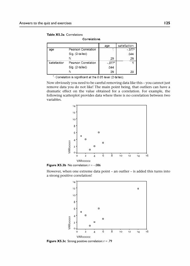
Now obviously you need to be careful removing data like this – you cannot justremove data you do not like! The main point being, that outliers can have adramatic effect on the value obtained for a correlation. For example, thefollowing scatterplot provides data where there is no correlation between twovariables.
However, when one extreme data point – an outlier – is added this turns intoa strong positive correlation!
Table X5.3a Correlations
Figure X5.3b No correlation: r = −.086
Figure X5.3c Strong positive correlation: r = .79
Answers to the quiz and exercises 125
The moral is thus: always check your data for outliers (e.g., using boxplots) andalways produce a scatterplot to visually examine the data before conducting acorrelation statistical analysis.
Exercise 5.4 Explain the following correlations
(a) It is reported that there is a strong positive correlation between ice creamsales and crime rates. Do we therefore conclude that ice cream causescrime?
(b) It is reported that there is a positive correlation between number ofcounselling sessions and level of psychological well-being? Can we there-fore conclude that counselling works and more counselling works better?
(c) Consumption of milk is positively correlated to cancer. So does drinkingmilk cause cancer?
(d) Studies have found a negative correlation between smoking andAlzheimer’s dementia: the risk of getting Alzheimer’s dementia reduceswith increased smoking of cigarettes. Would you therefore recommendthat people start smoking or increase the number they smoke to preventthe onset of Alzheimer’s dementia?
Answers
(a) Well, unless there is something in the ice cream, it has probably got some-thing to do with the temperature: more people are out when it is warmand sunny, more people are drinking, etc.
(b) Well, that may be the case but can we really be certain the improvement isdue to the counselling? Perhaps there are other events in the patients’lives that have led to an improvement in well-being, or perhaps improve-ments reflect ‘normal’ readjustment over time after a particular trauma.Imagine the opposite scernario: you measure psychological well-being fora sample of patients before and after counselling and find that it deterior-ates. To make matters worse, you then find a negative correlation betweenthe amount of counselling and psychological well-being. Would you thenconclude that counselling makes people worse and that the more theyhave the worse they are?
(c) Another explanation might be that the greater level of consumption ofmilk is in wealthier countries, where people live longer and thereforebecome more susceptible to cancer.
(d) First, these studies were funded by the tobacco industry and the suggestedimplication was that smoking (or nicotine) may prevent the onset ofAlzheimer’s dementia. The problem is that Alzheimer’s dementia is adisease of older people: 50 per cent of people older than 90 years arediagnosed with Alzheimer’s. The findings may simply reflect the fact thatheavy smokers do not live long enough to get Alzheimer’s because they dieyounger of smoking-related diseases.
126 Quantitative Data Analysis Using SPSS

Chapter 6
Exercise 6.1 Checking for other significant differences
In this chapter we have concentrated on the differences in satisfaction ratingsand number of sessions for the two counsellors. You may now wish to see ifthere are any significant differences in:
(a) the age of patients seen by the two counsellors;(b) satisfaction ratings from male and female patients;(c) the number of sessions conducted for male and female patients;(d) the age of the male and female patients.
Remember to check the distribution of the data in order to run the appro-priate analysis (i.e., parametric t-test or non-parametric Mann-WhitneyU test).
Answers
For each of these exercises I found the parametric t-test to be appropriate, theresults of which were as follows:
(a) The age of patients seen by the two counsellors:• mean age of patients seen by John = 32.8 years;• mean age of patients seen by Jane = 37.3 years;• t-test results: t = −1.725, p = .096. Not significant.
(b) Satisfaction ratings from male and female patients:• mean satisfaction rating for males: 4.57;• mean satisfaction rating for females: 3.75;• t-test results: t = 1.457, p = .156. Not significant.
(c) The number of sessions conducted for male and female patients:• mean number of sessions for male patients: 8.29;• mean number of sessions for female patients: 6.56;• t-test results: t = 2.13, p = .042.Thus, we can conclude that male patients attended for more sessions thanfemales. However, is this because male patients for some reason requiremore sessions or because more patients saw John who tended to providemore sessions . . .?
(d) The age of the male and female patients:• mean age of male patients: 31.3 years;• mean age of female patients: 38.6 years;• t-test results: t = −3.075, p = .005.Thus, we can conclude that female patients were generally older thanmale patients. However, what bearing this might have on anything isunclear – not all significant differences are meaningful differences . . .
Exercise 6.2 Create a new variable to analyse same-sex satisfactionratings
In Chapter 4, cross-tabulation revealed that the majority of male patients(71%) saw John, while the majority of female patients (75%) saw Jane. We
Answers to the quiz and exercises 127

noted that this might be important information for the doctor, since thismight suggest it is necessary to ensure a male and a female counsellor areavailable to cater for patient preferences, that is, preference for same-sexpatient and counsellor.
Now, the curious among you might go on to wonder if this has any bearing onthe counselling relationship, for example: were satisfaction ratings higherfor same-sex patient–counsellor sessions compared to different-sex patient–counsellor sessions?
So how would you investigate this? Here is a clue: you will first need to createa new variable (using Transform/Compute) which records whether thepatient saw a counsellor of the same sex or not. Then you can use this newvariable as an independent (grouping) variable to compare the mean satisfac-tion ratings between the two groups.
Answers
1 From the menu at the top of the screen go to Transform/ComputeVariable.
2 In the Target Variable box enter a name for the new variable you are goingto create. I have chosen the name ‘samesex’.
3 In the box Numeric Expression write in the rule you will need for the newvariable to record whether the patient saw a counsellor of the same sex ornot.
In our data a male patient is coded as 1 and the male counsellor (John) isalso coded as 1. Similarly, a female patient and the female counsellor (Jane)are both coded as 2. So, we need to select those cases where the number inthe sex variable is the same as the number in the counsellor variable. Thiswill tell us that we had a male patient and a male counsellor or a femalepatient and a female counsellor.
4 There are various ways to compute this, but the simplest is to enter: sex =counsellor in the Numeric Expression box.3 This will create a new variable(samesex) showing those cases where the values were the same (and there-fore also not the same) across the variables sex and counsellor.
128 Quantitative Data Analysis Using SPSS

Screenshot X6.2a
5 Click OK and your new variable (samesex) will appear in the Data View(I have removed decimal places):
Screenshot X6.2b
Having checked a few cases to see that this rule actually did what you wantedit to do, you can then compare satisfaction ratings for same-sex and differentsex patient–counsellor.
(You might also realize at this point that it would have been simpler to do thiswithout the Transform/Compute facility; that is, by simply creating the newvariable and inserting a 1 where you can see that the counsellor and patientwere of the same sex and a zero where they were not!)
Below I have conducted an independent t-test on the two groups, which showsno significant differences, but really the numbers are too small in the differentsex patient counsellor group to conduct any significant analyses (just eightpatients compared to 22 in the same-sex patient–counsellor group).
Answers to the quiz and exercises 129

I have included this mainly as an academic exercise to illustrate the use ofthe Transform/Compute facility, since there have been a few occasions whenstudents have needed to compute new values in their own data.
For example, the SF-36 Health Survey questionnaire (Ware et al. 2000) consistsof 36 questions measuring various dimensions of health status such as:
1 Physical functioning (ten questions).2 Mental health (five questions).3 Energy/vitality (four questions).
When analysing scales such as this you would need to use the Transform/Compute facility to compute a new variable providing a mean score forthe questions representing each dimension. So, in the example below I haveused Transform/Compute to calculate the mean score from five mental healthquestions (mh1, mh2, etc.) which will then be produced in a new variablecalled ‘mhmean’.
Table X6.2b Independent samples test
Table X6.2b Independent samples test
130 Quantitative Data Analysis Using SPSS

Screenshot X6.2c
Notes
1 Of course, pedantic students will note, as they frequently do in my lectures,that if you are living in a country with a warm climate – then you may havea positive correlation: fuel bills may rise for air conditioning as temperaturerises.
2 The two outliers identified in the boxplots are merely the lowest andhighest scores on the seven point rating scale. In this respect the term‘outlier’ may be deceptive with relatively restricted scales, and it should beremembered that boxplots are merely visual guides to the data (Howell1997) that may, or may not, be instructive in checking the data.
3 Other ways to do this include: (1) using the not equal sign (~=) to selectthose cases where the numbers were not the same (different sex patient–counsellor); (2) writing out the rule in full: sex = 1 and counsellor = 1 or sex= 2 and counsellor = 2; (3) writing the rule: sex + counsellor = 3.
Answers to the quiz and exercises 131

Glossary
ANOVA Analysis of variance (ANalysis Of VAriance) – a statistical techniquenormally used to examine differences between three or more samples/groupmeans (compared to, for example, the T-test which examines differences forjust two samples/group means).
categorical data This is data that represents different categories, rather than ascale, e.g., sex of patients, ethnic background.
chi-square A statistical test primarily associated with cross-tabulation to testfor the ‘independence’ or ‘association’ between two categorical variables.
confidence intervals Where a mean difference in two samples is observed, 95per cent confidence intervals provide lower and upper values around this meandifference with a 95 per cent probability that the true difference lies withinthese parameters.
confounding variables Essentially this refers to factors other than thoseunder investigation that may have influenced outcomes of an experiment.More formally, these are variables other than the ‘treatment’ or ‘independent’variable that may have affected the outcomes on the dependent variable.Sometimes referred to as extraneous variables, i.e., variables which mayhave influenced the outcomes but were not (or could not be) controlled by theexperimenter.
continuous variable A variable measured on interval or ratio scales.
control group A separate sample used to compare outcomes with a samplesubjected to an experimental treatment. For example, in a medical experimentthe control group may be left untreated or given a placebo pill to compareoutcomes with those receiving the treatment.
correlation A correlation assesses the relationship between two continuousvariables to see if values on one variable vary in relation to the other, e.g.,height and weight.
cross-tabulation Where two or more variables are presented in a table tocompare relative frequencies across categories.
dependent variable A variable, the outcome of which is predicted to bedependent on allocation to the treatment or independent variable; for example,level of back pain (dependent variable) will depend on the type of treatmenta patient was allocated to by the researcher (e.g., physiotherapy oracupuncture).
descriptive statistics Descriptive statistics provide summary informationabout data, for example, describing the sample in terms of age, gender andother characteristics. Measures of central tendency may be used along withgraphs and other means of describing data.
extraneous variables See confounding variables.

frequencies The number of times a particular value is represented in a sample,e.g., the number of males and number of females.
hypothesis A prediction that is being tested.
independent samples t-test A statistical test used to determine whether themean scores from two independent samples (e.g., males/females) differsignificantly.
independent variable A term normally used in experimental design whichrefers to the variable manipulated by the researcher, e.g., assignment ofpatients to treatment A or treatment B. It is sometimes referred to as the treat-ment variable.
interval data This is data which takes the form of a scale in which thenumbers go from low to high in equal intervals.
Mann-Whitney test A non-parametric statistical test to determine differencesin two independent samples.
mean The arithmetic mean is the most common measure of central tendencyand is produced by calculating the sum of the values and then dividing by thenumber of values.
measures of central tendency Measures of central tendency are used toprovide the typical or average values for a sample of data, e.g., the mean ageof the sample. The mean, median or mode may be used depending on thedistribution of the data.
median A measure of central tendency which is the midpoint of an ordereddistribution of values.
mode A measure of central tendency referring to the most frequentlyoccurring value in a set of scores.
nominal data This is another term for categorical data, whereby discretecategories may be nominated a numerical code, e.g., code male as 1 and femaleas 2.
non-parametric test A statistical test which does not depend on the assump-tions (parameters) required by parametric tests, e.g., normal distribution ofdata.
normal distribution A frequency distribution where the majority of valuesare in the middle of the range, tailing off at either end of the scale producing asymmetrical bell shaped curve.
null hypothesis This is the hypothesis that is proposed to be nullified orrefuted, e.g., there will be no difference between the two samples.
one-tailed test A test where the hypothesis predicts an effect in one direction,e.g., predicting that levels of anxiety will reduce as a result of counselling (com-pared to a 2-tailed test which abstains from making a directional prediction,i.e., that counselling will have an effect on levels of anxiety - but we cannot becertain if this will lead to a reduction or increase in levels of anxiety).
ordinal data This is data that can be put into an ordered sequence. Forexample, the rank order of runners in a race – 1st, 2nd, 3rd.
outliers Data which lies outside the majority of scores.
parametric statistics Statistical tests that assume certain parameters of thedata, e.g., a normal distribution.
Glossary 133

power This relates to the power of a statistical test to detect a statisticallysignificant effect/difference if there really is one. The power of a statistical testto detect a difference may depend on sample size (the larger the better) and thesize of the effect/difference that is being investigated.
probability This refers to the likelihood of an event occurring by chance. Ifthe event cannot happen the probability is zero; if the event is certain tohappen the probability is one.
p value This refers to the probability of the outcomes occurring by chance,expressed numerically as ranging from zero to one. The convention is toaccept a p value of 0.05 or less as being statistically significant, which trans-lates to a probability of 1 in 20 of the results occurring by chance.
ratio scale A scale where points are separated by equal intervals with a truezero, e.g., height, weight, age, length.
regression analysis Regression analysis assesses the relationship betweenone or more dependent variables and independent variables in order to finda line that best predicts the relationship between the two. It is then possibleto estimate values of a dependent variable from values of an independentvariable.
related samples t-test A statistical test used to determine whether the meanscores from two related samples differ significantly.
repeated measures design Where two or more measures are taken fromthe same sample (in contrast to independent subjects design), e.g., levels ofanxiety before and after counselling for a sample of patients.
standard deviation A measure of the amount of deviation from the mean in asample of scores.
statistical significance An observation that is unlikely to have occurred bychance at a specified level of probability.
t-test A statistical technique for examining differences in means between twosamples.
two-tailed test A test where the hypothesis does not specify a direction forthe effect (non-directional), e.g., the treatment will have an effect but wecannot be certain if this will lead to an increase or decrease in patient ratings.
type I error Essentially, accepting a statistical difference/effect when therereally is not one (like a false-positive). In more formal terms it refers to arejection of the null hypothesis (no difference) when it is in fact true.
type II error Essentially, accepting the absence of a statistical difference oreffect when there really is one (like a false-negative). In more formal terms,failing to reject the null hypothesis (no difference) when it should be rejected.
Wilcoxon test A non-parametric statistical test to determine differences intwo related samples.
134 Quantitative Data Analysis Using SPSS

References
Argyrous, G. (2005) Statistics for Research: With a Guide to SPSS. London: Sage.Bowling, A. (1997) Research Methods in Health. Buckingham: Open University Press.Bryman, A. and Cramer, D. (2001) Quantitative Data Analysis with SPSS Release 10 for Windows.
London: Routledge.Cohen, J. (1988) Statistical Power Analysis for the Behavioural Sciences. Hillsdale, NJ: Erlbaum.Coolidge, F. L. (2006) Statistics: A Gentle Introduction. London: Sage.Davidson, L. (2000) Meeting the challenges of the new NHS for counselling in primary care: a
service manager perspective. British Journal of Guidance and Counselling 28, 191–202.Department of Health (1991) The health of the nation white paper: point prevalence of mental
disorders in the adult population (England), Section C. London: Her Majesty’s StationeryOffice.
Department of Health (1999) A national service framework for mental health. London: Her Maj-esty’s Stationery Office.
Einspruch, E. L. (2005) An Introductory Guide to SPSS for Windows. London: Sage.Field, A. (2005) Discovering Statistics Using SPSS. London: Sage.Gravetter, F. J. and Wallnau, L. B. (2002) Essentials of Statistics for the Behavioral Sciences.
Belmont, CA: Wadsworth.Greasley, P. and Small, N. (2005a) Evaluating a primary care counselling service: outcomes and
issues, Primary Health Care Research & Development, 6: 125–36.Greasley, P. and Small, N. (2005b) Providing welfare advice in general practice: Referrals, issues
and outcomes, Health and Social Care in the Community, 13: 249–58.Hemmings, A. (2000) Counselling in primary care: a review of the practice evidence. British
Journal of Guidance and Counselling 28, 233–52.Howell, D. (1997) Statistical Methods for Psychology. London: Duxbury Press.Huff, D. (1991) How to Lie with Statistics. London: Penguin.Jamieson, S. (2004) Likert scales: how to (ab)use them. Medical Education, 38: 1212–8.Kendrick, T. (2002) Depression. In Marshall, M.(Ed) Quality indicators for general practice. Lon-
don: Royal Society of Medicine Press, 28–37.Kinnear, P. and Gray, C. (2004) SPSS 12 Made Simple. Hove: Psychology Press.Lyons, R.A., Wareham, K. and Lucas, M., Price, D., Williams, J. and Hutchings, H. (1999) SF-36
scores vary by method of administration: implications for study design, Journal of PublicHealth Medicine, 21: 41–5.
Pallant, J. (2001) SPSS Survival Manual. Buckingham: Open University Press.Pell, G. (2005) Use and misuse of Likert scales. Medical Education, 39: 970.Pett, M. (1997) Nonparametric statistics for health care research, London: Sage.Robson, C. (1973) Experiment, Design and Statistics in Psychology. London: Penguin.Robson, C. (2002) Real World Research. Oxford: Blackwell.Ware, J. E., Kosinski, M. and Dewey, J. E. (2000) Version 2 of the SF-36 Health Survey. Lincoln,
RI: Quality Metric Inc.Watson, R., Atkinson, I. and Egerton, P. (2006) Successful Statistics for Nursing & Healthcare.
Hampshire: Palgrave Macmillan.Wood, M. (2003) Making Sense of Statistics: A Non-Mathematical Approach. Hampshire: Palgrave
Macmillan.


Index
Bar charts, 41Boxplots, 50–52, 94
Categorical data, 7Chart builder (in SPSS), 41Chart editor (in SPSS), 46Chi square, 61, 63–67, 73
Chi square statistical test, 63Expected frequencies, 63–64Observed frequencies, 63Running chi square in SPSS,
65–67Codebook (for SPSS), 20Coefficient of determination, 82–3Compute (in SPSS), 101Confidence intervals, 95Confounding variables, 87Continuity correction (chi
square), 75Copy objects (in SPSS), 53Correlation, 13, 14, 77–85
Coefficient of determination, 83Curvilinear relationship, 80Non-linear relationship, 80Pearson correlation coefficient r,
82Pearson correlation test, 80Running Pearson correlation in
SPSS, 81–2Strength of a correlation, 80
Counselling services (and generalpractices), 18, 104
Cross-tabulation, 9, 61, 71Running cross-tabulation in
SPSS, 62
Data view (in SPSS), 21Define Groups (in SPSS), 92, 98Dependent variables, 16, 86Descriptive statistics, 7
Procedure for runningdescriptive statistics in SPSS,39
Effect size (in statistical tests), 65Exact test (in Mann-Whitney), 98
Excel, 23Expected frequencies, 63–64
Calculation of expectedfrequencies, 75 (note 3)
Experiments, 87Explore (SPSS procedure), 97Extraneous variables, 87Extreme values (in Boxplots), 51
False-negative,See Type II error
False-positive,See Type I error
Fisher’s Exact Test, 75Frequencies, 8
Running frequencies in SPSS, 33
Graphs, 41Presenting in reports,
107–10See also Chart builder, Bar
Charts, Histograms, BoxplotsGrouping variable (in SPSS), 92, 98
Histograms, 45To check for normal
distributions, 89, 95Homogeneity of variance, 89, 94Hypothesis testing, 87
Independent samples, 88Independent samples t-test, 88
Running in SPSS, 92Independent variables, 16, 86–7
See also treatment variable, 87Interval data, 7, 8
Kendall’s tau (correlation statistic),85
Kolmogorov-Smirnov test (fornormal distribution), 91–2, 97
Levels of measurement, 7, 8Levene’s test for equality of
variances, 94Likert scale, 6
Mann-Whitney test, 88, 98Running Mann-Whitney test in
SPSS, 98Mean, 10
Obtaining from SPSS, 39Mean rank (in Mann-Whitney
test), 99Meaningful differences (in
outcome measures), 76Measures of central tendency, 10
Obtaining from SPSS, 39See also mean, median, mode
Median, 10Obtaining from SPSS, 39
Mental health (and generalpractice consultations), 18,104
Microsoft Word, 52Inserting SPSS output into
Microsoft Word, 52–6Missing data, 24Mode, 10
Obtaining from SPSS, 39
Nominal data, 7Non-parametric data, 88Normal distribution, 11, 89
Using histograms to check for,89, 95
Null hypothesis, 87
One-tailed test, 95Ordinal data, 7, 8Outliers
In Boxplots, 51In correlation, 84
Output viewer (in SPSS), 34
Paired samples t-test (in SPSS),100
See also related samples t-test, 88Parametric data, 88Pivot tables (in SPSS), 59Power (of statistical tests), 68, 89Probability, 67–8P (probability) value, 67–8
QuestionnairesDesign issues, 6And mode of completion,
105
Ratio data, 7Re-coding data (in SPSS), 69
See also Transforming dataRelated samples, 88
See also paired samples t-test,100
Related samples t-test, 88
Sample size, 67–68, 75In correlation, 84
Scatterplot, 14Producing in SPSS, 78
SF-36 Health Survey, 130Shapiro-Wilk test (for normal
distribution), 91–2, 97
Skewed distribution, 13Sorting data (in SPSS), 29Spearman test (for correlation),
85Standard deviation, 94Statistical significance,
67–68Statistical tests
And probability, 63Choosing appropriate
test for differencesin two set of scores,88
String variables (in SPSS), 24
Tests of normality (normaldistribution of data), 97
See also Kolmogorov-Smirnov test, Shapiro-Wilktest
Transforming data (in SPSS),69–72, 101
See also Recoding data,Compute
Treatment variable, 87Two-tailed test, 95Type I error, 68Type II error, 68
Valid percent, 35And missing data, 36
Value labels (in SPSS), 25Viewing in SPSS, 28
Variable view (in SPSS), 22Variables, 9
Weight Cases (in SPSS), 74Welfare advice, 83Wilcoxon test, 88
Running in SPSS, 100
138 Quantitative Data Analysis Using SPSS

This accessible book is essential reading for those looking for a short and simple guide to basic data analysis. Written for the complete beginner, the bookis the ideal companion when undertaking quantitative data analysis for the firsttime using SPSS.
The book uses a simple example of quantitative data analysis that would be typical to the health field to take you through the process of data analysis stepby step. The example used is a doctor who conducts a questionnaire survey of30 patients to assess a specific service. The data from these questionnaires isgiven to you for analysis, and the book leads you through the process requiredto analyse this data.
Handy screenshots illustrate each step of the process so you can try out theanalysis for yourself, and apply it to your own research with ease.
Topics covered include:
Questionnaires and how to analyse themCoding the data for SPSS, setting up an SPSS database and entering the dataDescriptive statistics and illustrating the data using graphsCross-tabulation and the Chi-square statisticCorrelation: examining relationships between interval dataExamining differences between two sets of scoresReporting the results and presenting the data
Quantitative Data Analysis Using SPSS is the ideal text for any students inhealth and social sciences with little or no experience of quantitative data analysis and statistics.
Pete Greasley is a lecturer at the School of Health Studies, University of Bradford, UK.
Cover design: Mike Stones
QUANTITATIVE DATA ANALYSIS USING SPSSAN INTRODUCTIONFOR HEALTH AND SOCIAL SCIENCE
Pete Greasley
Greasley
QUANTITATIVE DATA ANALYSIS USING SPSSAN INTRODUCTION FOR HEALTH AND SOCIAL SCIENCE
QUANTITATIVE DATA AN
ALYSIS USING SPSS