Predicting Genetic Interactions in Caenorhabditis elegans ...
204
Predicting Genetic Interactions in Caenorhabditis elegans using Machine Learning by Patrycja Vasilyev Missiuro B.S., M.S. Electrical Engineering and Computer Science, Massachusetts Institute of Technology, 2001 Submitted to the Department of Electrical Engineering and Computer Science in partial fulfillment of the requirements for the degree of Doctor of Philosophy at the MASSACHUSETTS INSTITUTE OF TECHNOLOGY February 2010 Massachusetts Institute of Technology 2010. All rights reserved. Author .............................................................. Department of Electrical Engineering and Computer Science December 18, 2009 Certified by .......................................................... Tommi S. Jaakkola Professor of Electrical Engineering and Computer Science Thesis Supervisor Certified by .......................................................... Hui Ge Research Fellow at the Whitehead Institute Thesis Supervisor Accepted by ......................................................... Terry P. Orlando Chairman, Department Committee on Graduate Students
-
Upload
khangminh22 -
Category
Documents
-
view
1 -
download
0
Transcript of Predicting Genetic Interactions in Caenorhabditis elegans ...

Predicting Genetic Interactions in Caenorhabditis
elegans using Machine Learning
by
Patrycja Vasilyev Missiuro
B.S., M.S. Electrical Engineering and Computer Science,Massachusetts Institute of Technology, 2001
Submitted to the Department of Electrical Engineering and Computer
Sciencein partial fulfillment of the requirements for the degree of
Doctor of Philosophy
at the
MASSACHUSETTS INSTITUTE OF TECHNOLOGY
February 2010
� Massachusetts Institute of Technology 2010. All rights reserved.
Author . . . . . . . . . . . . . . . . . . . . . . . . . . . . . . . . . . . . . . . . . . . . . . . . . . . . . . . . . . . . . .Department of Electrical Engineering and Computer Science
December 18, 2009
Certified by. . . . . . . . . . . . . . . . . . . . . . . . . . . . . . . . . . . . . . . . . . . . . . . . . . . . . . . . . .Tommi S. Jaakkola
Professor of Electrical Engineering and Computer ScienceThesis Supervisor
Certified by. . . . . . . . . . . . . . . . . . . . . . . . . . . . . . . . . . . . . . . . . . . . . . . . . . . . . . . . . .Hui Ge
Research Fellow at the Whitehead Institute
Thesis Supervisor
Accepted by . . . . . . . . . . . . . . . . . . . . . . . . . . . . . . . . . . . . . . . . . . . . . . . . . . . . . . . . .Terry P. Orlando
Chairman, Department Committee on Graduate Students

2

Predicting Genetic Interactions in Caenorhabditis elegans using
Machine Learning
by
Patrycja Vasilyev Missiuro
Submitted to the Department of Electrical Engineering and Computer Scienceon December 18, 2009, in partial fulfillment of the
requirements for the degree ofDoctor of Philosophy
Abstract
The presented work develops a set of machine learning and other computationaltechniques to investigate and predict gene properties across a variety of biologicaldatasets. In particular, our main goal is the discovery of genetic interactions basedon sparse and incomplete information. In our development, we use gene data fromtwo model organisms, Caenorhabditis elegans and Saccharomyces cerevisiae.
Our first method, information flow, uses circuit theory to evaluate the importanceof a protein in an interactome. We find that proteins with high i-flow scores mediateinformation exchange between functional modules. We also show that increasing in-formation flow scores strongly correlate with the likelihood of observing lethality orpleiotropy as well as observing genetic interactions. Our metric significantly outper-forms other established network metrics such as degree or betweenness.
Next, we show how Bayesian sets can be applied to gain intuition as to whichdatasets are the most relevant for predicting genetic interactions. In order to directlyapply this method to microarray data, we extend Bayesian sets to handle continuousvariables. Using Bayesian sets, we show that genetically interacting genes tend toshare phenotypes but are not necessarily co-localized. Additionally, they have similardevelopment and aging temporal expression profiles.
One of the major difficulties in dealing with biological data is the problem ofincomplete datasets. We describe a novel application of collaborative filtering (CF) inorder to predict missing values in the biological datasets. We adapt the factorization-based and the neighborhood-aware CF [13] to deal with a mixture of continuous anddiscrete entries. We use collaborative filtering to input missing values, assess howmuch information relevant to genetic interactions is present, and, finally, to predictgenetic interactions. We also show how CF can reduce input dimensionality.
Our last development is the application of Support Vector Machines (SVM), anadapted machine learning classification method, to predicting genetic interactions.We find that SVM with nonlinear radial basis function (RBF) kernel has greaterpredictive power over CF. Its performance, however, greatly benefits from using CFto fill in missing entries in the input data. We show that SVM performance further
3
improves if we constrain the group of genes to a specific functional category.Throughout this thesis, we emphasize the features of the studied datasets and
explain our findings from a biological perspective. In this respect, we hope that thiswork possesses an independent biological significance. The final step would be toconfirm our predictions experimentally. This would allow us to gain new insightsinto C. elegans biology: specific genes orchestrating developmental and regulatorypathways, response to stress, etc.
Thesis Supervisor: Tommi S. JaakkolaTitle: Professor of Electrical Engineering and Computer Science
Thesis Supervisor: Hui GeTitle: Research Fellow at the Whitehead Institute
4

Acknowledgments
Research is a challenging and time-consuming effort and the final written product is
only a small snapshot of the total work done. In my opinion, the greatest benefit
of completing this PhD thesis is that it taught me how to think and gave me the
mental preparedness for doing future research work. Not that I did not have doubts
in the process... I succeeded thanks to the guidance of my academic mentors and the
enormous support of my family and friends.
First and foremost, I want to thank my advisors for their support throughout
development of this thesis. Doctor Hui Ge is an incredibly insightful thinker and
has always kept my focus on the big picture and provided me with biological insight
and knowledge which I, as a computer scientist, lack. Professor Tommi Jaakkola
has provided me with his invaluable input on the computational methods. He has
led me numerous times to very insightful observations and conclusions that I would
have never reached alone, and provided suggestions as to possible research directions.
Professor Manolis Kellis has always been enthusiastic to give me his feedback; he
has been a friend and a mentor throughout my undergraduate and graduate years.
Finally, I would like to thank Professor Richard Young, who as a biologist, was looking
at my work from a different angle than merely computational.
I want to thank my incredible husband, Dmitry Vasilyev, for his enormous emo-
tional support, love, and calmness that kept me going. Had it not been for him, I am
convinced I would not be writing this today. Thanks to my mom, dad, siblings: Julia
Aurelia, Justynian and Ewaryst, aunts and uncles, for rooting for me. Special thanks
to Sasha and Andrew for their words of child wisdom. I want to thank my friends:
Ewa, Irina, Jennifer, Julie, Tim, Monika, Kesheng, Brian, Alex, Matt, Brittany, Ben,
David, Tom, Alec, Olivier, Nikita and many others who have made me laugh and
allowed me to relax and some of whom were willing to travel with me thousands of
miles across this beautiful country. While the first four ladies stayed awake while
proofreading my thesis, several others stayed awake while hearing my practice talk.
Finally, I want to give myself a pat on the back for being able to complete this
5

PhD thesis while renovating a multi-family fixer-upper and being a landlord.
I dedicate this thesis to my dear parents - Wiesl̷awa and Wl̷odzimierz who both
made great sacrifices for me and my siblings to come to this country. My father has
always encouraged me to learn new things and seek new hobbies as he is still doing
today. My mom has shown incredible strength, energy and dedication and has always
been my role model.
6

Contents
1 Introduction 27
1.1 Motivation & Objectives . . . . . . . . . . . . . . . . . . . . . . . . . 27
1.2 What are genetic interactions? . . . . . . . . . . . . . . . . . . . . . . 28
1.3 Prior research on genetic interactions and biological networks . . . . . 30
1.3.1 Hypothesized properties of genetically interacting pairs . . . . 30
1.3.2 Current computational approaches to identify genetic interactions 32
1.4 Thesis summary . . . . . . . . . . . . . . . . . . . . . . . . . . . . . . 34
2 Biology Background 37
2.1 Caenorhabditis elegans as a model organism . . . . . . . . . . . . . . 37
2.2 Saccharomyces cerevisiae as a model organism . . . . . . . . . . . . . 42
2.3 High-throughput datasets . . . . . . . . . . . . . . . . . . . . . . . . 43
2.3.1 DNA Microarrays . . . . . . . . . . . . . . . . . . . . . . . . . 43
2.3.2 Spatial expression patterns . . . . . . . . . . . . . . . . . . . 46
2.3.3 Phenotypes . . . . . . . . . . . . . . . . . . . . . . . . . . . . 47
2.3.4 Protein interaction networks . . . . . . . . . . . . . . . . . . . 49
2.3.5 microRNAs . . . . . . . . . . . . . . . . . . . . . . . . . . . . 50
2.3.6 Kinase families . . . . . . . . . . . . . . . . . . . . . . . . . . 51
2.3.7 Phosphatase families . . . . . . . . . . . . . . . . . . . . . . . 52
2.3.8 Known genetic interactions . . . . . . . . . . . . . . . . . . . . 53
2.4 Mitogen-activated protein kinase pathway, MAPK . . . . . . . . . . . 54
7

3 Information flow method 57
3.1 Motivation . . . . . . . . . . . . . . . . . . . . . . . . . . . . . . . . . 57
3.2 Relevant network algorithms and metrics . . . . . . . . . . . . . . . . 60
3.2.1 Degree . . . . . . . . . . . . . . . . . . . . . . . . . . . . . . . 60
3.2.2 Betweenness . . . . . . . . . . . . . . . . . . . . . . . . . . . . 61
3.3 The information flow model . . . . . . . . . . . . . . . . . . . . . . . 62
3.3.1 The Iflow algorithm . . . . . . . . . . . . . . . . . . . . . . . . 62
3.3.2 Partition of interactome into modules algorithm . . . . . . . . 65
3.4 Experimental results and conclusions . . . . . . . . . . . . . . . . . . 66
3.4.1 Information flow model considers interaction confidence scores
and all possible paths in protein networks . . . . . . . . . . . 66
3.4.2 Information flow is a strong predictor of essentiality and pleiotropy 69
3.4.3 Proteins of high information flow and low betweenness show a
high likelihood for being essential or pleiotropic . . . . . . . . 71
3.4.4 The ranks of information flow scores are more consistent than
betweenness when a large amount of low-confidence data is added 77
3.4.5 Information flow analysis of a muscle interactome network re-
veals genes important for muscle function in C. elegans . . . . 79
3.4.6 Information flow discovers crucial proteins in signaling networks 83
3.5 Materials . . . . . . . . . . . . . . . . . . . . . . . . . . . . . . . . . 85
3.5.1 Data sources . . . . . . . . . . . . . . . . . . . . . . . . . . . . 85
3.5.2 RNA interference . . . . . . . . . . . . . . . . . . . . . . . . . 86
3.6 Discussion . . . . . . . . . . . . . . . . . . . . . . . . . . . . . . . . . 86
4 Finding groupings among genes with Bayesian Sets 91
4.1 Introduction to Bayesian sets . . . . . . . . . . . . . . . . . . . . . . 92
4.1.1 Method description . . . . . . . . . . . . . . . . . . . . . . . . 93
4.1.2 Binary data model . . . . . . . . . . . . . . . . . . . . . . . . 95
4.1.3 Using binary Bayesian sets to group genes based on their local-
ization and phenotypes . . . . . . . . . . . . . . . . . . . . . . 96
8

4.2 Extensions to Bayesian sets for continuous data . . . . . . . . . . . . 101
4.2.1 Bayesian sets model for continuous data - variant 1 . . . . . . 101
4.2.2 Bayesian sets model for continuous data - variant 2 . . . . . . 106
4.2.3 Experiments using continuous data models . . . . . . . . . . . 109
4.3 Discussion . . . . . . . . . . . . . . . . . . . . . . . . . . . . . . . . . 119
5 Collaborative Filtering approach to predict genetic interactions and
other biological data 123
5.1 Motivation . . . . . . . . . . . . . . . . . . . . . . . . . . . . . . . . . 123
5.2 Introduction to collaborative filtering . . . . . . . . . . . . . . . . . . 124
5.3 Factorization-based approach to collaborative filtering . . . . . . . . 126
5.3.1 Baseline framework for factorization-based CF . . . . . . . . . 128
5.3.2 Weighting of the residual . . . . . . . . . . . . . . . . . . . . . 131
5.3.3 Neighborhood-aware factorization . . . . . . . . . . . . . . . . 131
5.4 Investigating the effects of various parameters . . . . . . . . . . . . . 133
5.4.1 Similarity metrics . . . . . . . . . . . . . . . . . . . . . . . . . 133
5.4.2 Shrinkage . . . . . . . . . . . . . . . . . . . . . . . . . . . . . 136
5.4.3 Evaluating residual for binary data . . . . . . . . . . . . . . . 137
5.4.4 Weighting parameters and thresholding . . . . . . . . . . . . . 139
5.5 Applying collaborative filtering to gene data . . . . . . . . . . . . . . 141
5.5.1 Predicting continuous and discrete values with CF . . . . . . . 141
5.5.2 Predicting genetic interactions with CF . . . . . . . . . . . . . 144
5.5.3 Reducing data to relevant factors based on the ROC cross val-
idation results . . . . . . . . . . . . . . . . . . . . . . . . . . . 146
5.6 Discussion . . . . . . . . . . . . . . . . . . . . . . . . . . . . . . . . . 150
6 Predicting genetic interactions with SVM 153
6.1 Motivation . . . . . . . . . . . . . . . . . . . . . . . . . . . . . . . . . 153
6.2 Overview of Support Vector Machines . . . . . . . . . . . . . . . . . . 154
6.2.1 Optimal separating hyperplane . . . . . . . . . . . . . . . . . 154
6.2.2 Kernel-based SVM . . . . . . . . . . . . . . . . . . . . . . . . 156
9

6.2.3 Properties of the SVM algorithm . . . . . . . . . . . . . . . . 158
6.3 Classifying genetically interacting pairs with SVM . . . . . . . . . . . 159
6.3.1 Filling missing values with CF . . . . . . . . . . . . . . . . . . 159
6.3.2 Combining single and pairwise features . . . . . . . . . . . . . 161
6.3.3 Training data . . . . . . . . . . . . . . . . . . . . . . . . . . . 161
6.4 Results . . . . . . . . . . . . . . . . . . . . . . . . . . . . . . . . . . . 162
6.4.1 Predicting genetic interactions . . . . . . . . . . . . . . . . . . 164
6.4.2 Predicting genetic interactions for kinases in MAPK pathway 166
6.5 Analysis of performance with increasingly sparse data . . . . . . . . . 167
6.6 Discussion . . . . . . . . . . . . . . . . . . . . . . . . . . . . . . . . . 168
7 Conclusions 171
A Miscellaneous concepts 175
A.1 Statistics . . . . . . . . . . . . . . . . . . . . . . . . . . . . . . . . . . 175
A.1.1 Pearson correlation coefficient . . . . . . . . . . . . . . . . . . 175
A.2 Probability . . . . . . . . . . . . . . . . . . . . . . . . . . . . . . . . 176
A.2.1 Bernoulli distribution and its conjugate prior . . . . . . . . . . 176
A.2.2 Normal distribution and its conjugate prior . . . . . . . . . . . 176
A.3 Network algorithms and metrics . . . . . . . . . . . . . . . . . . . . . 177
A.3.1 Shortest path . . . . . . . . . . . . . . . . . . . . . . . . . . . 178
A.3.2 Clustering coefficient . . . . . . . . . . . . . . . . . . . . . . . 179
A.3.3 Mutual clustering coefficient . . . . . . . . . . . . . . . . . . . 180
A.4 Machine learning . . . . . . . . . . . . . . . . . . . . . . . . . . . . . 181
B Information Flow - Supplementary Materials 185
B.1 Showing differences between information flow and betweenness with
toy networks . . . . . . . . . . . . . . . . . . . . . . . . . . . . . . . 185
B.2 Discovering protein modules . . . . . . . . . . . . . . . . . . . . . . . 187
B.3 Supplementary tables information . . . . . . . . . . . . . . . . . . . 189
10

List of Figures
1-1 Potential mechanisms behind synthetic lethal interaction (image from
[30]). . . . . . . . . . . . . . . . . . . . . . . . . . . . . . . . . . . . . 29
2-1 Anatomy of an adult hermaphrodite. A. DIC image of an adult hermaphrodite,
left lateral side. Scale bar 0.1 mm. B. Schematic drawing of anatomical
structures, left lateral side (image from [141]) . . . . . . . . . . . . . 38
2-2 Anatomy of an adult male. A. Anatomical structures, left lateral side.
B. DIC image of an adult, left lateral side. Scale bar 0.1 mm. C. The
unilobed distal gonad. D. The adult male tail, ventral view. Arrow
points to cloaca, arrowhead marks the fan. Rays 1-9 are labeled with
asterisks on the left side. E. L3 tail, bottom, is starting to bulge (image
from [141]) . . . . . . . . . . . . . . . . . . . . . . . . . . . . . . . . . 39
2-3 Life cycle of C. elegans at 22∘C. 0 min is fertilization. Numbers in blue
along the arrows indicate the length of time the animal spends at a
certain stage. First cleavage occurs at about 40 min. postfertilization.
Eggs are laid outside at about 150 min. postfertilization and during
the gastrula stage. The length of the animal at each stage is marked
next to the stage name in micrometers (image from [141]). . . . . . . 40
11

2-4 The three main arms of the mitogen-activated protein kinase (MAPK)
pathway, ERK (extracellular signal-regulated kinase), JNK (c-Jun N-
terminal kinase) and p38 are shown. They mediate immune cell func-
tional responses to stimuli through multiple receptors such as chemoat-
tractant receptors, Toll-like receptors and cytokine receptors. The
three-tiered kinase dynamic cascade leads to activated MAPKs enter-
ing the nucleus and triggering immediate early gene and transcription
factor activation for cellular responses such as cytokine production,
apoptosis and migration. Red arrows indicate feedback or crosstalk
within the MAPK pathway (image from [59]). . . . . . . . . . . . . . 56
3-1 Node 𝑣 can represent a protein in a protein network. In this example,
degree of node 𝑣 is 4 since it’s connected to 4 other proteins. . . . . . 61
3-2 Example of betweenness computation between nodes 𝑖 and 𝑗. Different
nodes on the path between 𝑖 and 𝑗 score different amounts depending
on the number of shortest paths passing through them. Here, node 𝑎
has a betweenness score of 13since it is on 1 of the 3 shortest paths,
while node 𝑏 scores 23since it is on 2 out of 3 paths. . . . . . . . . . . 62
3-3 Kirchhoff’s current law . . . . . . . . . . . . . . . . . . . . . . . . . . 63
3-4 Circuit representation of an interactome network. We model an in-
teractome network as an electrical circuit, where a node represents a
protein and a resistor represents an interaction. The resistance value
of a resistor is inversely proportional to the confidence score of the
corresponding interaction. . . . . . . . . . . . . . . . . . . . . . . . . 67
12

3-5 Scatter plots of ranks of information flow versus betweenness (Panel
A) or degree (Panel B) in a S. cerevisiae interactome network and
in a C. elegans interactome network (Panel C and Panel D). Overall,
ranks of information flow and betweenness are correlated, but a given
betweenness usually corresponds to a wide range of information flow
scores. Ranks of information flow and degree are less correlated. Low
degree can correspond to low, medium or high information flow, but
high degree usually corresponds to high information flow. . . . . . . . 69
3-6 Correlation between information flow scores and loss-of-function phe-
notypes. The higher a proteins information flow score is, the higher
the probability of observing lethality (Panel A) or pleiotropy (Panel B)
when the protein is deleted from S. cerevisiae. This trend is observed
for C. elegans as well (Panel C and Panel D). The correlation is not as
strong for betweenness and loss-of function phenotypes. The PCCs for
information flow scores and phenotypes are 0.84, 0.60, 0.95, and 0.85 in
Panels A-D, respectively. In contrast, the PCCs for betweenness and
phenotypes are −0.02, −0.31, 0.67, and 0.49 in Panels A-D, respectively. 71
3-7 Correlation between degree and loss-of-function phenotypes. The higher
a proteins degree is, the higher the probability of observing lethality
(Panel C) or pleiotropy (Panel D) when the protein is deleted from C.
elegans. However, this trend is not observed for S. cerevisiae (Panel A
and Panel B). The PCCs for degrees and phenotypes are 0.31, −0.53,0.96, and 0.97 in Panels A-D, respectively. . . . . . . . . . . . . . . . 72
13
3-8 Correlation between information flow scores and loss-of-function phe-
notypes among proteins of low betweenness. Even among those pro-
teins that rank in the lower 30% in terms of betweenness, a proteins
information flow score is still a good indicator for the probability of
observing lethality (Panel A) or pleiotropy (Panel B) when the protein
is deleted from S. cerevisiae. This trend is observed for C. elegans as
well (Panel C and Panel D). The PCCs for information flow scores and
phenotypes are 0.89, 0.79, 0.69, and 0.65 in Panels A-D, respectively. 74
3-9 Correlation between information flow scores and loss-of-function phe-
notypes among proteins of low or medium degrees. Even among pro-
teins of low or medium degrees, a proteins information flow score is still
a good indicator for the probability of observing lethality (Panel A) or
pleiotropy (Panel B) when the protein is deleted from S. cerevisiae.
This trend is observed for C. elegans as well (Panel C and Panel D).
The correlation is not as strong for betweenness and loss-of function
phenotypes. The PCCs for information flow scores and phenotypes are
0.80, 0.86, 0.84, and 0.80 in Panels A-D, respectively. In contrast, the
PCCs for betweenness and phenotypes among low- or medium-degree
proteins are 0.61, 0.037, 0.32, and 0.49 in Panels A-D, respectively. . 75
3-10 Examples of proteins showing high information flow but low between-
ness in the C. elegans interactome network. The interactions in the C.
elegans interactome do not have numerical confidence scores, and the
discrepancy between information flow scores and betweenness is likely
to be due to topological features such as the existence of alternative
paths. KLC-1 (Panel A) and TAG-246 (Panel B) are two worm pro-
teins that have only 4 interactions, and neither of them scores high
in betweenness. However, KLC-1 rank the highest 37% and TAG-246
rank in the highest 26% in terms of the information flow scores. The
two proteins both correspond to lethal phenotypes upon loss-of-function. 76
14

3-11 Scatter plots for ranks of information flow scores in different versions of
yeast interactome networks (Panel A and C) and for ranks of between-
ness in different versions of yeast interactome networks (Panel B and
D). The Y-axis represents the rank of information flow scores (Panel
A and C) or the rank of betweenness (Panel B and D) in a yeast inter-
actome that includes high-confidence interactions only (socio-affinity
scores of 4.5 or higher). In Panel A and Panel B, the X-axis represents
the rank of information flow scores or the rank of betweenness in a
yeast interactome that includes interactions at lower confidence levels
(socio-affinity scores of 3.5 or higher). The PCCs for the ranks of infor-
mation flow scores (Panel A) and the ranks of betweenness (Panel B)
are 0.83 and 0.71, respectively. In Panel C and Panel D, the X-axis rep-
resents the rank of information flow scores or the rank of betweenness in
a yeast interactome that includes interactions at still lower confidence
levels (socio-affinity scores of 2.5 or higher). The PCCs for the ranks of
information flow scores (Panel C) and the ranks of betweenness (Panel
D) are 0.54 and 0.38, respectively. . . . . . . . . . . . . . . . . . . . . 78
3-12 Muscle-enriched genes identified by semi-supervised analysis. Each row
represents a gene and each column represents a tissue or cell type. The
normalized values of gene expression are represented in a color scale.
Genes are sorted by probability scores (𝑃𝑖) which indicate expression
enrichment in muscle as compared to other tissues. Altogether 310
muscle enriched genes (𝑃𝑖 ≥ 0.5) were identified. In this plot, the 310
muscle enriched genes, 155 randomly selected genes, and 155 genes with
the lowest 𝑃𝑖 are shown. The list of genes can be found in Appendix B.3
- Table S9 . . . . . . . . . . . . . . . . . . . . . . . . . . . . . . . . . 80
15

3-13 An interactome network for muscle-enriched genes. We identified direct
interacting partners for the muscle-enriched genes from the C. elegans
interactome dataset. We required that an interacting partner must be
expressed in muscle cells according to the SAGE dataset. The muscle-
enriched genes and their interacting partners form a network. The
blue nodes represent the top 20 genes with the highest information
flow scores given that the information flow score is calculated just in
the muscle network and that the weight of an interaction is defined as
the product of the probability scores of the two interacting genes. The
green nodes represent the top 20 genes in the muscle network with the
highest information flow scores given that the information flow score
is calculated in the entire C. elegans interactome network and that the
interactions are unweighted. Some genes (red nodes) rank in the top
20 under both conditions. . . . . . . . . . . . . . . . . . . . . . . . . 81
3-14 An interactome network can be partitioned into subnetworks by re-
cursively removing proteins of high information flow scores. Panel (A)
shows our procedure for network partition, and Panel (B) shows a toy
example. . . . . . . . . . . . . . . . . . . . . . . . . . . . . . . . . . . 88
4-1 The Bayesian score compares the hypotheses that the data was gener-
ated by one of two distributions. x is a vector of features (a row in a
gene table) representing a given item e.g. gene. . . . . . . . . . . . . 94
16

4-2 ROC curves showing the similarity among spatial localization of genes
genetically interacting with the same partner. 11 graphs correspond to
10 signaling and 1 DNA-damage response genes used as a background
for determining their genetic partners. A fraction of genetic partners
were used as a seed for a cluster and the remaining genes were scored
on how similar they are to the genes in the cluster and then checked
whether they genetically interact with the same partner gene. The
number of positives ranges from 27 to 80 (median 52) and negatives
from 143 to 282 (median 238). . . . . . . . . . . . . . . . . . . . . . . 98
4-3 ROC curves showing the similarity among phenotypes resulting from
knocking down genes genetically interacting with the same partner. 11
graphs correspond to 10 signaling and 1 DNA-damage response genes
used as a background for determining their genetic partners. A fraction
of genetic partners were used as a seed for a cluster and the remaining
genes were scored on how similar they are to the genes in the cluster and
then checked whether they genetically interact with the same partner
gene. The number of positives ranges from 45 to 174 (median 97) and
negatives from 186 to 467 (median 374). . . . . . . . . . . . . . . . . 100
4-4 Two alternative hierarchical probability models proposed for mod-
eling continuous data. (a) Each experimental condition is modeled
by a Gaussian: 𝑁(𝑥;𝜇, 𝜎2) with the conjugate normal-scaled-inverse-
gamma prior on 𝜇 and 𝜎2 (joint distribution) (b) Each experimental
condition is modeled by a Gaussian: 𝑁(𝑥;𝜇, 𝜎2) with the conjugate
normal-inverse-gamma prior on 𝜎2, and Gaussian distribution for 𝜇 . 102
17

4-5 Distribution of Bayesian set scores depends on the model. (a) Model
variant 1: Distribution of scores based on a query set consisting of two
samples (blue) shows the maximum score shifted away from the mean
of the two query points; however, it is also away from the mean of the
background distribution. (b) Model variant 2: Mean and variance are
not coupled together, allowing the Bayesian score to maximize at the
mean of the query set distribution. . . . . . . . . . . . . . . . . . . . 105
4-6 ROC curves showing the similarity of microarray profiles of germline
genes that genetically interacting with the same partner (using Bayesian
sets variant 2 algorithm from Section 4.2.2). 11 graphs correspond to
10 signaling and 1 DNA-damage response genes used as a background
for determining their genetic partners. A fraction of genetic partners
were used as the input query and the remaining genes were scored on
how similar they are to query genes and then checked whether they ge-
netically interact with the same partner gene as the query genes. The
number of positives ranged from 20 to 64 (median 31) and negatives
from 81 to 226 (median 185). . . . . . . . . . . . . . . . . . . . . . . 110
4-7 (a) ROC based on microarray timecourse during embryonic and lar-
val stages for genetic interactors of bar-1, 𝐴𝑟𝑒𝑎𝑅𝑂𝐶 = 0.62, sample
count:50(+), 201(−). (b) Genetic interactors of bar-1 constrained to
those which are germline-intrinsic, 𝐴𝑟𝑒𝑎𝑅𝑂𝐶 = 0.78, sample count:6(+), 13(−).(c) Genetic interactors of bar-1 constrained to those which are enriched
in sperm or oocyte, 𝐴𝑟𝑒𝑎𝑅𝑂𝐶 = 0.93, , sample count:5(+), 20(−). (a)-(c) used Bayesian sets variant 2. (d) Genetic interactors of bar-1 con-
strained to those which are enriched in sperm or oocyte using variant
2, 𝐴𝑟𝑒𝑎𝑅𝑂𝐶 = 0.82, sample count:5(+), 20(−). . . . . . . . . . . . . . 113
18

4-8 Bayesian sets algorithm variant 1 applied to group genetic interactors
of glp-1 based on their (a) microarray aging data, 𝐴𝑟𝑒𝑎𝑅𝑂𝐶 = 0.67,
sample count:66(+), 208(−), (b) microarray aging and heatstress data,
𝐴𝑟𝑒𝑎𝑅𝑂𝐶 = 0.70, sample count:51(+), 169(−), (c) microarray aging
and heatstress datasets, considering only sperm- or oocyte-enriched
genes, 𝐴𝑟𝑒𝑎𝑅𝑂𝐶 = 0.75, sample count:15(+), 38(−), (d) microarray ag-
ing/heatstress datasets considering only germline-intrinsic genes, 𝐴𝑟𝑒𝑎𝑅𝑂𝐶 =
0.90, sample count:8(+), 13(−). . . . . . . . . . . . . . . . . . . . . . 116
4-9 (a) glp-1 genetic interactors grouped by their hypoxia microarray re-
sponse, 𝐴𝑟𝑒𝑎𝑅𝑂𝐶 = 0.53, sample count:63(+), 218(−), (b) with ad-
ditional constraint of being an oocyte-enriched genes, 𝐴𝑟𝑒𝑎𝑅𝑂𝐶 = 1,
sample count:6(+), 4(−). . . . . . . . . . . . . . . . . . . . . . . . . . 117
4-10 (a)ROC showing the results of running Bayesian sets variant 2 on ge-
netic interactors of let-23 described by their microarray profiles during
oxidative stress (hypoxia), 𝐴𝑟𝑒𝑎𝑅𝑂𝐶 = 0.6, sample count:82(+), 500(−)(b) Constraining the genes in (a) to only those that are annotated as
germline-intrinsic, 𝐴𝑟𝑒𝑎𝑅𝑂𝐶 = 0.8, sample count:8(+), 29(−). . . . . 119
5-1 Plots of cosine similarity scores versus Pearson correlation scores for
pairs of experiments (each experiment is profiled across genes) of the
following types: (a) 25 phenotypes are compared to themselves, 11 ge-
netic interaction experiments, 38 localization, 135 microarray; (b) 11
genetic interaction experiments are compared to themselves, pheno-
types, spatial localization, and microarray. . . . . . . . . . . . . . . . 134
19

5-2 Examples of ROC curves for predicting phenotypes using residual vari-
ants 1,2,3. (a) ROC curve for predicting “dumpy” phenotype based on
the remaining datasets results in areas under ROC of 0.83, 0.80, and
0.83, for residual variants 1-3, respectively. (b) ROC curve for predict-
ing “sterile progeny” phenotype based on all the other datasets results
in areas under ROC of 0.87, 0.81, and 0.86, for residual variants 1-3,
respectively. . . . . . . . . . . . . . . . . . . . . . . . . . . . . . . . . 139
5-3 Plots of predicted versus actual microarray values based on all other
datasets using collaborative filtering; 7 randomly selected experiments
out of 135 are shown (color corresponds to values for a single experi-
ment) with 30 genes predicted per experiment. The legend shows the
resulting correlation between the actual and predicted values (a) Re-
sults from running factorization-based method of CF (b) Neighborhood-
based CF results for the same set of 7 experiments (same color reserved
for each experiment). . . . . . . . . . . . . . . . . . . . . . . . . . . . 142
5-4 Plots of predicted versus actual microarray values based on other mi-
croarray datasets using collaborative filtering; 7 randomly selected ex-
periments out of 135 are shown (color corresponds to values for a sin-
gle experiment) with 30 genes predicted per experiment. The legend
shows the resulting correlation between the actual and predicted val-
ues (a) Results from running factorization-based method of CF (b)
Neighborhood-based CF results for the same set of 7 experiments (same
color reserved for each experiment). . . . . . . . . . . . . . . . . . . . 143
20

5-5 ROC curves illustrate the performance of collaborative filtering for
predicting phenotypes based on combined array of other datasets. We
selected 12 phenotypes out of 25 at random. For cross validation, 15
positive and 15 negative samples were withheld and predicted based
on the remaining data. The results shown here are using factorization-
based and neighborhood-based CF. The areas under the ROC varies
from 0.55 to 0.90 for factorization-based estimate (mean 0.72) and from
0.35 to 0.98 for neighborhood based estimate (mean 0.66). . . . . . . 145
5-6 ROC curves illustrate the performance of collaborative filtering for pre-
dicting genetic interactions based on combined array of other datasets.
Each of the 11 graphs shows the results of predicting genetic partners
for one of the mutant genes used as a background. For cross validation,
15 positive and 15 negative samples were withheld and predicted based
on the remaining data. The results shown here are using the global
factorization-based estimate. The area under the ROC varies from 0.65
for let-23 to 0.96 for let-756 with a mean area under the ROC of 0.81. 147
5-7 ROC curves illustrate the performance of collaborative filtering for
predicting genetic interactions based only on the phenotypic data con-
sisting of 25 experiments. Each of the 11 graphs shows the results
of predicting genetic partners for one of the mutant genes used as a
background. For cross validation, 15 positive and 15 negative samples
were withheld and predicted based on the remaining data. The results
shown here were obtained with factorization-based CF. The area under
the ROC varies from 0.56 for sem-5 to 0.94 for let-756 with a mean
area under the ROC of 0.73. . . . . . . . . . . . . . . . . . . . . . . . 148
21

5-8 The average area under the ROC curve for predicting genetic interac-
tors of 11 mutant genes versus factorization order. The dashed lines
correspond to a choice of factor order that would be sufficient to de-
scribe the data. For factorization-based CF, 𝑓 = 14 with average area
under ROC of 0.77. For neighborhood-based CF, 𝑓 = 6 with average
area under ROC of 0.68. . . . . . . . . . . . . . . . . . . . . . . . . . 149
5-9 Conceptual image of how CF can assess how useful a given dataset 𝑛
is for predicting dataset 𝑑 by running the CF prediction for entries in
𝑑 with one input dataset 𝑛 at a time. . . . . . . . . . . . . . . . . . . 151
6-1 Maximum margin linear classifier with an offset parameter along with
the support vectors (circled); image from [57]. . . . . . . . . . . . . . 155
6-2 ROC curve for predicting genetic interactions using SVM with RBF
kernel of width 0.3. The average area under the ROC curve is 0.92
for 𝐷, 0.86 for 𝑃𝑓=14, 0.83 for entries filled in with zeros and 0.82 for
entries filled with means. The fraction of correctly classified pairs is
0.85, 0.80, 0.74, and 0.73, respectively . . . . . . . . . . . . . . . . . . 165
6-3 ROC curve for predicting genetic interactions involving kinases in MAPK
pathway using SVM. The fraction of correctly classified pairs for 𝐷 and
𝑃𝑓=14 is 0.93 and 0.90, respectively . . . . . . . . . . . . . . . . . . . 166
6-4 The plots compare how well SVM performs when data is increasingly
sparse (from 40% of data missing to 98% of data missing). Prior to
classification, the missing values are filled with either collaborative
filtering, zeros, or means. . . . . . . . . . . . . . . . . . . . . . . . . . 168
A-1 MCC coefficient for nodes 𝑣 and 𝑤 weights in on the number of the
mutual neighbors between these two nodes. . . . . . . . . . . . . . . . 180
B-1 From left: Toy Network 1, Toy Network 2. . . . . . . . . . . . . . . . 186
22

B-2 Graph showing the fraction of subnetworks that we found are enriched
with GO annotations given specific minimum and maximum subnet-
work size thresholds. . . . . . . . . . . . . . . . . . . . . . . . . . . . 188
23

24

List of Tables
3.1 Genes in the S. cerevisiae interactome that rank the highest 30% by
information flow and rank the lowest 30% by betweenness. . . . . . . 73
3.2 Genes showing significant difference of information flow in the muscle
interactome network and in the entire interactome network. The nor-
mal motility of the rrf-3 strain is 99 ± 8 thrashes per minute. Genes
with * show significantly lower motility rates upon RNAi treatment
compared to the rrf-3 strain . . . . . . . . . . . . . . . . . . . . . . . 84
4.1 Genes in C. elegans enriched in sperm and oocyte grouped based on
microarray profiles and that genetically interact with bar-1 (all 5 listed) 114
4.2 glp-1 interacting germline-intrinsic genes in C. elegans successfully group
by their aging and heatstress microarray profiles, 4 of 8 shown. . . . . 115
4.3 glp-1 interacting oocyte genes in C. elegans successfully group by their
microarray profiles monitoring their response to oxydative stress (hy-
poxia), all 6 shown. . . . . . . . . . . . . . . . . . . . . . . . . . . . . 118
6.1 Comparing cross validation performance with different SVM kernels
(using full input matrix𝐷 with missing entries estimated by 𝑃𝑓=14𝑄𝑇𝑓=14).163
6.2 Comparing cross validation performance with different SVM kernels
(using 𝑃𝑓=14 as input feature matrix describing genes). . . . . . . . . 163
B.1 Fraction of modules enriched in GO annotations for a given pair of
min/max thresholds. . . . . . . . . . . . . . . . . . . . . . . . . . . . 189
25

26

Chapter 1
Introduction
D. Vasilyev (when asked about 𝐻∞ norm): Girls, are you ready for a journey?
- 6.336 office hours, 2003, unpublished
1.1 Motivation & Objectives
Our research objective is the development of computational methods to predict prop-
erties of genes based on other types of biological data. Being able to predict gene
properties and experiment outcomes computationally can save large amounts of time
and money associated with performing laboratory work. We adapt and extend ex-
isting new machine learning algorithms, develop new network metrics, and apply
statistical techniques to extract biologically relevant features from various types of
high-throughput experimental data. We are particularly interested in identifying gene
pairs that genetically interact. Genetic interaction is a broad term referring to a re-
lationship between two genes where a simultaneous mutation in both results in an
observable joint effect on an organism. This effect is significantly more pronounced
or altogether different from individual mutations in either gene.
We focus our research on the genes and pathways involved in the organism’s de-
velopment and other core cellular processes. For example, kinases involved in MAPK
pathways regulate various cellular activities including gene expression, differentiation,
mitosis, cell survival and apoptosis. Mutations in developmental genes are known
27

to be responsible for a large percentage of cancers, e.g. MAPK kinase cascade is
relevant to Hodgkins disease. There are several reasons why we expect genetic in-
teractions to occur more frequently within such processes. First, genes involved in
development and survival tend to be very important to viability of an organism yet
knockouts of a large portion of these genes do not result in observable phenotypes.
The event of lacking phenotypes in the face of a genetic mutation is called genetic
robustness. We speculate, based on known developmental pathways (e.g. vulval path-
way in Caenorhabditis elegans), that this might be due to the fact that biologically
important genes are buffered by other functionally overlapping genes or alternative
pathways. We hypothesize that such pairs or groups of genes act in a synergistic
manner during development (a category of genetic interactions, see Section 1.2) and
only deletion of both results in a detectable defect. By identifying pairs of genes
that genetically interact, we can provide new information about their function and
identify new components of developmental pathways or new pathways altogether.
Developmental pathways and genes tend to be more conserved than average, and we
can expect to find orthologous relationships in seemingly very different organisms.
Therefore, by discovering genetic interactions, we can get better functional maps of
various organisms. The majority of our computational analysis has been performed
on Caenorhabditis elegans since this model species is relatively well-covered by high-
throughput datasets.
1.2 What are genetic interactions?
Genetic interaction between two genes is present when two mutations have a combined
effect which is not exhibited by either mutation alone. It is a powerful method for
establishing which genes are functionally linked [66, 74, 30, 81]. Genetic interactions
are thought to underlie buffering and directly contribute to genetic robustness of an
organism [49, 44]. For example, perturbation of a single gene may be buffered by
functionally overlapping genes or alternative pathways, as shown in Figure 1-1. In
the first scenario, a mutation in both genes would cause lethality. Finding such pairs
28
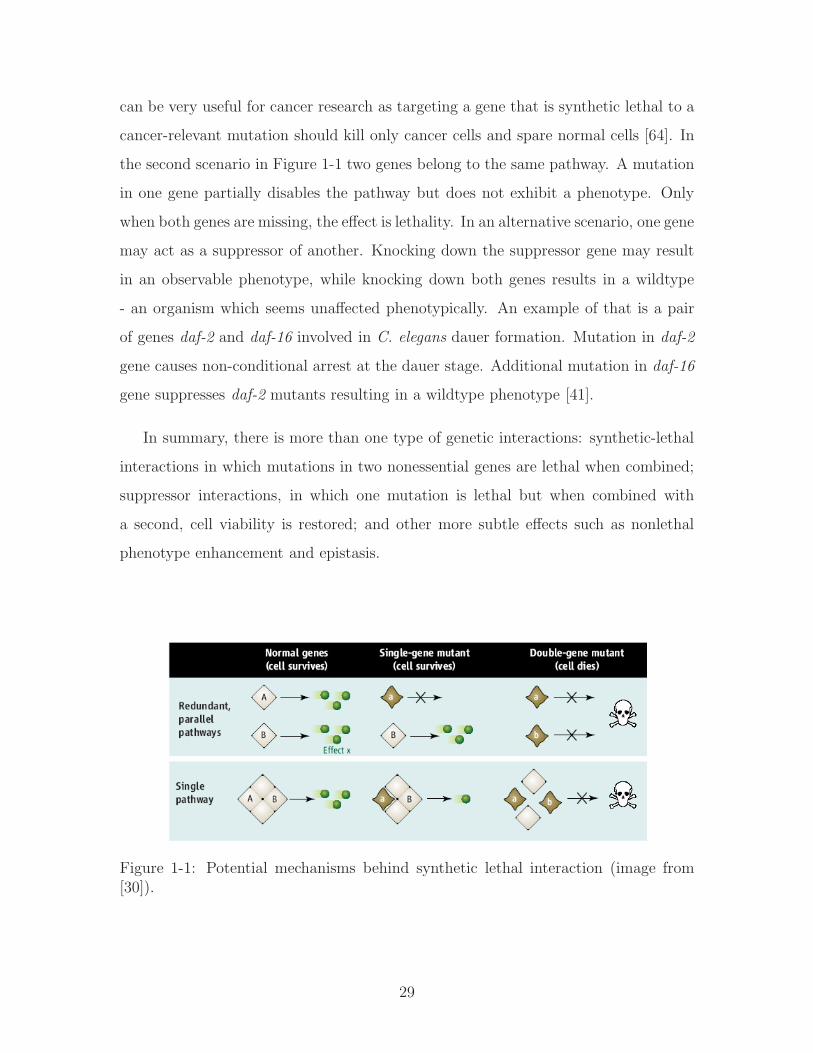
can be very useful for cancer research as targeting a gene that is synthetic lethal to a
cancer-relevant mutation should kill only cancer cells and spare normal cells [64]. In
the second scenario in Figure 1-1 two genes belong to the same pathway. A mutation
in one gene partially disables the pathway but does not exhibit a phenotype. Only
when both genes are missing, the effect is lethality. In an alternative scenario, one gene
may act as a suppressor of another. Knocking down the suppressor gene may result
in an observable phenotype, while knocking down both genes results in a wildtype
- an organism which seems unaffected phenotypically. An example of that is a pair
of genes daf-2 and daf-16 involved in C. elegans dauer formation. Mutation in daf-2
gene causes non-conditional arrest at the dauer stage. Additional mutation in daf-16
gene suppresses daf-2 mutants resulting in a wildtype phenotype [41].
In summary, there is more than one type of genetic interactions: synthetic-lethal
interactions in which mutations in two nonessential genes are lethal when combined;
suppressor interactions, in which one mutation is lethal but when combined with
a second, cell viability is restored; and other more subtle effects such as nonlethal
phenotype enhancement and epistasis.
Figure 1-1: Potential mechanisms behind synthetic lethal interaction (image from[30]).
29

1.3 Prior research on genetic interactions and bi-
ological networks
Knowledge of the network of genetic interactions could guide us in discovery of new
regulatory and transcriptional mechanisms. It can help us identify functions of pre-
viously uncharacterized genes. It can point us to the more subtle pathways. For
example, a synergistic effect of a pair of genes may indicate that they form two alter-
native branches of a pathway or act in parallel pathways.
The number of possible gene pair combinations to be tested for genetic interac-
tions is very large, in the order of 1.8∗108 (assuming approximately 19,000 genes in C.
elegans). Despite the progress in high-throughput techniques, it would be impossible
to systematically test all pairs of genetic interactions. Based on the current estimates,
genetic interactions are a very small fraction (less than half a percent [74]) of all pair-
wise combinations of genes. Thus, some attempts have been made to computationally
predict likely candidate pairs which may interact [127, 139, 66, 153, 98, 24, 70]. Com-
putational prediction relies on trying to infer how informative are different gene/pair
characteristics for in-silico detection of interactions.
1.3.1 Hypothesized properties of genetically interacting pairs
In an attempt to predict new genetic interactions, several papers in recent years have
analyzed properties of known interacting genes. Most of the hypotheses regarding
genetic interactions are based on statistical properties of gene data in three model
organisms: S. cerevisiae, C. elegans, and D. melanogaster, primarily because these
species are among the best studied with the largest amount of high-throughput data
available and the largest, albeit still relatively small, number of genetic interactions
discovered experimentally.
Lehner et al. [74] performed a statistical network analysis of C. elegans interac-
tome and concluded that genes acting as hubs (having many interacting partners) are
more likely to engage in genetic interactions. They coined the term ’modifier’ gene
30

to describe a genetic hub and ’specifier’ gene for its less connected genetic partner.
By combining the protein-protein interaction data with phenotypic data, they found
that the ’modifier’ hub gene frequently enhances the phenotype of the ’specifier’ low
degree gene. Thus, they hypothesize that testing the hub genes and their interacting
partners can be more effective than selecting pairs of genes at random. Similarly,
Davierwala et al.’s [23] analysis of the essential genes in yeast showed that they are
more likely to be involved in genetic interactions than nonessential genes, especially
with genes which share similar Gene Ontology annotations. Ozier et al. [99] also
showed that pairs of physically linked genes, where one or both exhibit high degree of
physical interactions, are substantially more likely to genetically interact than a pair
of low physical-interaction degree genes.
Tong et al. [127] found that genetic interactors in yeast tend to share similar phe-
notypes, subcellular location, and are often part of the same protein complex. More-
over, they found that network motifs built of interactions can be used for predicting
new ones. Network analysis approach to discover patterns of genetic interactions has
also been pursued in yeast by Bader et al. [5], who found that genetically interacting
genes tend to be in a closer proximity in protein-protein network than a random pair
of genes, and that a combination of physically and genetically interconnected proteins
forms functional complexes.
It is interesting to note that there are claims of differences between yeast and
C. elegans genetic interaction networks. In yeast, Kelley and Ideker [66] found that
genetic interactions are significantly more enriched between genes belonging to dif-
ferent pathways (3.5 times more likely) rather than between those within the same
pathway. That is, they are more likely to belong to redundant or complementary pro-
cesses than to partake in the same process. In C. elegans Lehner et al. [73] claim the
opposite. They state that within-pathway interactions are twice as likely to happen
than between-pathway interactions. It is difficult to establish at this point whether
the difference is due to system-level biological differences between the organisms or
the methods that have been used to discover genetic interactions known to date.
Another question that naturally arises from studying backed-up genes, is whether
31
homology studies of gene sequences could pinpoint genetic interactors. Several studies
have been done to identify such classes of duplicated genes [126, 132], and we now
know that only a small portion (less than 2%) of known synthetic lethal pairs encode
homologous proteins.
1.3.2 Current computational approaches to identify genetic
interactions
In the previous section we discussed several gene pair properties that have been linked
to genetic interactions. As of now, all of the above characteristics can be classified as
’weak’ predictors of genetic interactions. Current computational approaches attempt
to combine results from multiple ’weak’ indicators to predict genetic interactions.
They can be grouped into three broad categories:
1. Using local network properties in physical and genetic protein networks to pre-
dict new interactions.
2. Integrating different kinds of genomic datasets to predict new genetic interac-
tions.
3. Using interactions from various species to predict interactions in related species.
Predicting genetic interactions with network structures
To predict genetic interactions, Tong et al. [127] explored the ’small world’ property
of genetic interaction networks in yeast. They discovered that if two genes share
a genetic interaction with a common partner, they are likely to interact with one
another. In ∼ 20% of cases the neighbors of a query gene could also interact with
each other in comparison to less than 1% of random gene pairs.
As mentioned previously, Lehner et al. [74] concluded that high degree genes and
their partners are more likely candidates for genetic interactions than a randomly
selected pair. Subsequently, they used their finding to predict and test for more
interactions.
32

Predicting genetic interactions by integrating different types of genomic
data
Different types of genomic data have been shown to be weak indicators of genetic
interactions (see Section 1.3.1) but their predictive power can increase if combined
together. Wong et al. [139] used decision trees to integrate protein localization, mRNA
expression, physical interaction, known function and network topology data in order
to predict synthetic lethal or sick interactions in yeast. Cross validation tests showed
that while using a single source of evidence resulted in a slight improvement in per-
formance over random, combining several evidence sources led to significantly better
specificity/sensitivity. They tested a subset of their predictions and found that 49
out of 318 could be verified as opposed to 2 they would expect by chance.
Bayesian integration has been another popular approach used to integrate different
types of functional data. Using this approach, genetic interactions have been predicted
for approximately 10% of C. elegans genes, using information on expression patterns,
phenotypes, functional annotations, microarray coexpression, and protein interactions
[58, 69, 129, 153, 121].
Predicting genetic interactions using orthology
Genetic interactions identified in one species can be experimentally tested in second
species if the genes participating are orthologues in both genomes. Tischler et al.
[126] took more than 1000 synthetic lethal interactions in yeast and tested their
orthologues in C. elegans. They found that only a very small subset (less than 1%) is
conserved. This is in contrast to mutations in single genes where more than 60% of
essential genes in yeast have essential orthologues in C. elegans [65]. It leads to the
following theory: for synthetic lethal interactions, it matters whether the organism
is unicellular or multicellular. However, even a weak indicator such as genetic pair
orthology can be useful in future studies, if combined with other features.
Despite the progress in computational methods tackling genetic interaction pre-
diction, the incompleteness and sparsity of available data along with a lack of decisive
33

features, provide for a challenging problem.
1.4 Thesis summary
In this thesis, we present machine learning and other computational approaches we
developed and/or adapted to biological data with a goal of predicting genetic interac-
tions in C. elegans. In this Chapter, we described genetic interactions and the current
approaches aimed at predicting them computationally. The remainder of the thesis
is structured as follows:
� Chapter 2 describes the relevant biological background, starting with an overview
of the two model organisms studied: Caenorhabditis elegans and Saccharomyces
cerevisiae. Next, we describe the experimental datasets and features extracted
from these datasets, both of which are inputs to our learning algorithms in
the subsequent chapters. Finally, we conclude with an overview of a MAPK
pathway that we use in our computational work later.
� Chapter 3 introduces a graph-based metric of information flow, which we devel-
oped to analyze the importance of a protein in an interactome. We show that
the information flow metric is a strong predictor of essentiality and pleiotropy
and that it outperforms the established metrics such as betweenness and degree.
We further test the performance of the information flow metric in the presence
of noise in the data. We also show how information flow can detect important
genes in signaling networks with directionality or in networks constrained to
specific tissues.
� In Chapter 4, we adapt the Bayesian sets method [37] to biological data in
order to evaluate the relevance of experimental datasets to predicting genetic
interactions. We extend Bayesian sets to enable us to analyze continuous data.
Among other conclusions, we assess that while genetically interacting genes do
not seem to co-localize, they tend to share similar phenotypes and be up- or
down-regulated together during development or aging.
34

� Chapter 5 describes novel use of collaborative filtering (CF) to predict genetic
interactions and other experimental data such as phenotypes or microarray
expression profiles. We adapt a global factorization-based CF approach and a
local neighborhood-based CF approach [13] to handle a mixture of discrete and
continuous entries. We use CF to fill in missing values, evaluate how relevant
given data is to genetic interactions and to predict genetic interactions.
� Our last contribution is predicting genetic interactions with Support Vector
Machines [130, 57] as described in Chapter 6. We show that SVM outperforms
CF at predicting genetic interactions, and discuss the role of the radial basis
function (RBF) kernel. We further show that the performance improves if we
narrow down genes to specific functional categories. Finally, we discuss the
importance of collaborative filtering which fills in the missing values in the input
feature matrix, a necessary condition for successful classification with SVM.
� We summarize and briefly discuss our contributions in Chapter 7.
35

36

Chapter 2
Biology Background
Dad: I tell everyone at work that you work at the White House.
Patrycja: It’s not “White House” dad, it’s “Whitehead”!
Dad, absentmindedly: Right, right, I keep confusing this, sorry.
- Poland, 2007, unpublished
This Chapter introduces relevant biological concepts. First, the Chapter cov-
ers some of the biological properties of the organisms studied, more specifically
Caenorhabditis elegans and Saccharomyces cerevisiae, in order to elucidate what kinds
of data we can expect to have for analysis as well as what types of questions we can
explore. Next, we describe the individual datasets in more detail, and briefly discuss
the types of information we plan to extract from each of these datasets.
2.1 Caenorhabditis elegans as a model organism
Caenorhabditis elegans [53] is a small nematode (worm) that lives in the soil across
most of the temperate regions of the world. Since it requires only humid environment,
ambient temperature, oxygen, and bacteria as food, it is very cheap and easy to
maintain in the lab. C. elegans are grown on agar plates or in a liquid culture
with E. coli as a food source. The adults are on average 1mm long and require
a microscope for handling. C. elegans exhibit no smell and are transparent. The
worm life cycle, from an egg to an adult producing more eggs, takes 3.5 days at 20
degrees Celsius. There are two sexes, male and hermaphrodite which differ in both
37

appearance and in frequency. A hermaphrodite produces both sperm and oocytes
and can reproduce by self-fertilization (see Figure 2-1). A male produces only sperm
thus it must mate to produce offspring (see Figure 2-2). X0 males arise spontaneously
in XX hermaphrodite populations by means of X chromosome nondisjunction at a
frequency of approximately 0.1%. Hermaphrodite lays about 300 eggs during its
reproductive life. If it mates with a male, it can produce as many as 1000 eggs with a
ratio of 1:1 of male and hermaphrodite cross progeny. Additionally, it would produce
hermaphrodites by selfing.
Figure 2-1: Anatomy of an adult hermaphrodite. A. DIC image of an adulthermaphrodite, left lateral side. Scale bar 0.1 mm. B. Schematic drawing of anatom-ical structures, left lateral side (image from [141])
The life cycle of C. elegans is comprised of the embryonic stage, four larval stages
(L1-L4) and adulthood, see Figure 2-3. After the larval stage is over, the worm be-
comes fertile in 4 days. Its total lifespan is approximately 2-3 weeks. The life cycle
of a worm starts when mature oocytes pass through the spermatheca and become
fertilized either by sperm from a hermaphrodite or a male. Within 30 minutes after
fertilization, the zygote develops a shell and a membrane making the embryo imper-
meable to most solutes and able to survive outside the uterus. The eggs are laid at
gastrulation, at about 3 hours after fertilization. Embryogenesis consists of 2 phases:
1) cell proliferation and organogenesis, and 2) morphogenesis. During the prolifera-
38
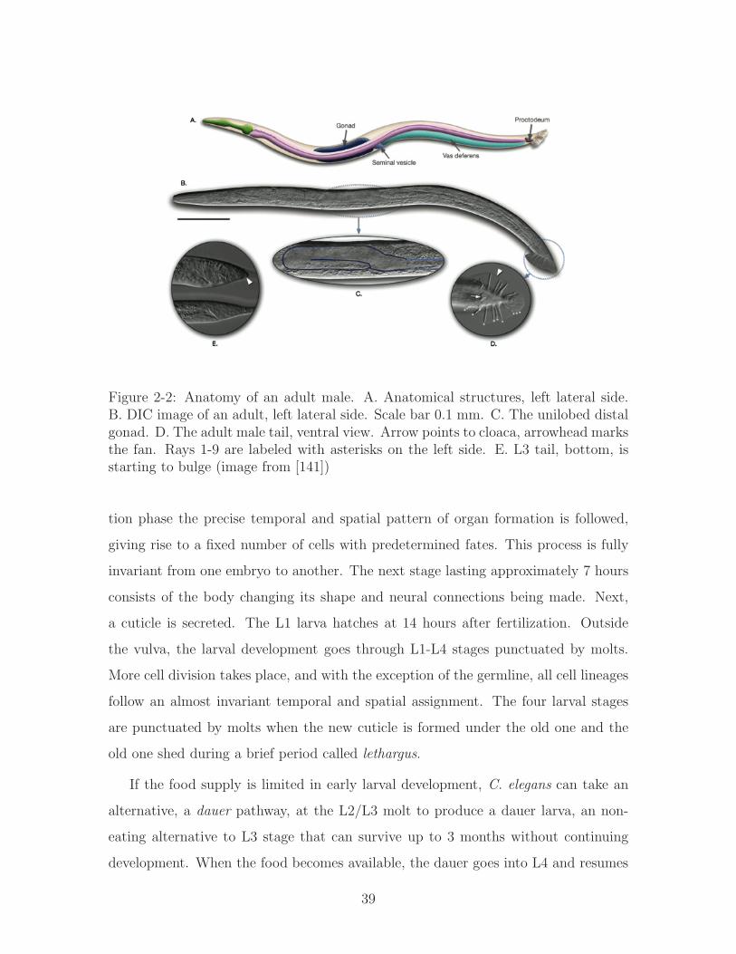
Figure 2-2: Anatomy of an adult male. A. Anatomical structures, left lateral side.B. DIC image of an adult, left lateral side. Scale bar 0.1 mm. C. The unilobed distalgonad. D. The adult male tail, ventral view. Arrow points to cloaca, arrowhead marksthe fan. Rays 1-9 are labeled with asterisks on the left side. E. L3 tail, bottom, isstarting to bulge (image from [141])
tion phase the precise temporal and spatial pattern of organ formation is followed,
giving rise to a fixed number of cells with predetermined fates. This process is fully
invariant from one embryo to another. The next stage lasting approximately 7 hours
consists of the body changing its shape and neural connections being made. Next,
a cuticle is secreted. The L1 larva hatches at 14 hours after fertilization. Outside
the vulva, the larval development goes through L1-L4 stages punctuated by molts.
More cell division takes place, and with the exception of the germline, all cell lineages
follow an almost invariant temporal and spatial assignment. The four larval stages
are punctuated by molts when the new cuticle is formed under the old one and the
old one shed during a brief period called lethargus.
If the food supply is limited in early larval development, C. elegans can take an
alternative, a dauer pathway, at the L2/L3 molt to produce a dauer larva, an non-
eating alternative to L3 stage that can survive up to 3 months without continuing
development. When the food becomes available, the dauer goes into L4 and resumes
39

normal development.
Figure 2-3: Life cycle of C. elegans at 22∘C. 0 min is fertilization. Numbers in bluealong the arrows indicate the length of time the animal spends at a certain stage.First cleavage occurs at about 40 min. postfertilization. Eggs are laid outside atabout 150 min. postfertilization and during the gastrula stage. The length of theanimal at each stage is marked next to the stage name in micrometers (image from[141]).
C. elegans is the first multicellular organism to have its genome sequenced (1998)[21].
It is a relatively simple organism, both anatomically and genetically. A complete cell
lineage of C. elegans has been mapped and we know that, on the cellular level, each
individual develops in an almost identical fashion. The adult hermaphrodite has 959
somatic cells and the adult male has 1031. The genome of C. elegans consists of
108 nucleotide pairs encoding for approximately 19, 000 genes. Genes are arranged
on six haploid chromosomes. The haploid set includes five autosomes (A) and a sex
chromosome (X), all roughly equal in size. Hermaphrodites are diploid for all six
chromosomes (XX), while males are diploid for the autosomes but have only one X
chromosome (XO) [140]. The C. elegans genome proves that many biological mech-
anisms are conserved across the animal kingdom, and as new vertebrate genes are
cloned, frequently one can find a direct C. elegans homologue.
40

The basic anatomy of C. elegans includes a mouth, pharynx, intestine, gonad,
and collagenous cuticle. Males have a single-lobed gonad and a tail specialized for
mating. Hermaphrodites have two ovaries, oviducts, spermatheca, and a single uterus.
The body plan consists of two concentric tubes separated by a fluid-filled space, the
pseudocoelom. Extracellular collagenous cuticle, secreted by hypodermis, covers the
outer tube [140]. Body muscles responsible for movement are arranged in four stripes
along the length of the animal. The outer tube also consists of the nervous system,
gonad, coelomocytes, and excretory/secretory system. The inner tube is composed
of a pharynx, pharyngeal nervous and muscular systems and an intestine. Most of
the neurons are around the pharynx, along the ventral midline and in the tail. C.
elegans moves either forward or backward in a sinusoidal wave using its longitudal
body muscles.
Eating and reproduction are the primary focus of C. elegans life. The pharynx
grinds and pumps food into the intestine. The intestinal cells line the lumen which
connects to the anus positioned near the tail. The hermaphrodite reproductive system
consists of functionally independent anterior and posterior arms. Each arm consists of
an ovary, vulva, a more proximal oviduct, and a spermatheca connected to a common
uterus. The adult uterus contains fertilized eggs and embryos in the early stages of
development. To lay eggs, the hermaphrodite contracts its vulval muscles. The male
gonad is a single organ. Meiotic cells in progressively later stages of spermatogen-
esis are distributed along the gonad and the seminal vesicle. Male-specific neurons,
muscles, and hypodermal structures are required for mating.
C. elegans is a popular model organism for high-throughput studies due to its
advantages, in summary:
1. A fully sequenced genome.
2. Cell lineages have been fully mapped and shown to be invariant.
3. Easy of maintenance in the lab, requires only bacteria and ambient temperature
for growth.
4. Multicellular organism with a rapid life cycle of 2-3 weeks,
41

5. Mutant strains can be stored for long periods of time at low temperatures.
6. Self-fertilizes or can be crossed with mutant males.
7. Transparent and odorless, thus easy to handle and spot mutations using the
microscope.
8. Receptive to many forms of mutagenesis using chemical mutagens; RNAi via
injection, feeding, or soaking is quite effective.
9. Many pathways and genes have orthologous in other species including humans.
2.2 Saccharomyces cerevisiae as a model organism
Saccharomyces cerevisiae is one of the most intensively studied eukaryotic model
organisms in molecular and cell biology. It is a species of budding yeast, reproducing
by a division process known as budding. S. cerevisiae cells are round to ovoid, 510
micrometers in diameter.
S. cerevisiae is popular for studying the cell cycle because it is easy to culture, but,
as a eukaryote, it shares the complex internal cell structure of plants and animals. S.
cerevisiae was the first eukaryotic genome to be completely sequenced. The genome
is composed of about 13 ∗ 106 base pairs and 6,275 genes, compactly organized on 16
chromosomes. It is estimated that yeast shares about 23% of its genome with that of
humans.
There are two forms in which yeast cells can survive and grow, haploid and diploid.
The haploid cells undergo a simple life cycle of mitosis and growth, and under con-
ditions of high stress will generally simply die. The diploid cells (the preferential
’form’ of yeast) similarly undergo a simple life cycle of mitosis and growth, but under
conditions of stress can undergo sporulation, entering meiosis and producing a variety
of haploid spores, which can go on to mate (conjugate), reforming the diploid. Yeast
has two mating types, 𝑎 and 𝛼, which show primitive aspects of sex differentiation,
and are hence of great interest.
42

S. cerevisiae is a widely used model organism in science, and, is, therefore, one
of the most studied. S. cerevisiae has obtained this important position because of
its established use in industry (e.g. beer, bread and wine fermentation, ethanol
production). Additionally, yeasts are comparatively similar in structure to human
cells, both being eukaryotic, in contrast to the prokaryotes (bacteria and archaea).
Many proteins important in human biology were first discovered by studying their
homologs in yeast; these proteins include cell cycle proteins, signaling proteins, and
protein-processing enzymes. The highly annotated yeast genome [146] makes for an
important tool for developing basic knowledge about the function and organization of
eukaryotic cell genetics and physiology. S. cerevisiae is also covered by vast amounts
of other high-throughput data such as micro arrays, protein interaction networks,
signaling networks, knockout experiments etc, making it suitable as a source of addi-
tional data. We utilize S. cerevisiae data to confirm traits that link properties of genes
in interactive and phenotypes as well as provide more complete signaling networks
for analysis.
2.3 High-throughput datasets
C. elegans has been studied extensively since its introduction in 1974 by Sydney Bren-
ner [19]. Since the species are well-adapted and easy to handle in high-throughput
studies, multiple datasets are available covering large portions of or an entire worm
genome. Similarly, compared with other species, S. cerevisiae is covered by vast
amounts of high-throughput data. In the following sections, we list the categories of
experimental data available along with a brief description about each. Within each
category, we provide specific information about the datasets relevant to our compu-
tational work in the latter chapters.
2.3.1 DNA Microarrays
DNA microarrays are used to quantitatively measure levels of mRNA expression in a
collection of cells which can be specific tissues or an entire organism. Microarrays can
43

be used to identify genes involved in embryogenesis or development by taking genome
expression level ’snapshots’ at different timepoints. Microarrays can be also used to
study mutations or diseases (e.g. cancer) by comparing gene levels in wildtype versus
mutant strains.
We are interested in the nature of gene interactions during the species’ life cycle
including embryogenesis, development, adult life and aging. We are also interested in
genes involved in the stress response or abnormal function e.g. cancer. Therefore we
use data on gene expression levels present across time in either wildtype or mutant
strains. This allows us to elucidate the functional relationships between gene pairs:
potential suppressors, enhancers etc. We use a compendium of microarray datasets
from the worm as listed below:
1. mRNA expression levels of 8890 genes in a wildtype C. elegans strain across 10
timepoints from the first to the fourth hour of embryonic development [9].
2. mRNA expression levels of 8890 genes in a mex-3 mutant C. elegans strain with
skn-3 (RNAi) across 10 timepoints from the first to the fourth hour of embryonic
development [9].
3. mRNA expression levels of 8890 genes in a pie-1 mutant C. elegans strain across
10 timepoints from the first to the fourth hour of embryonic development [9].
4. DNA microarray data covering 17,871 genes (94% of the C. elegans genome) in
a wildtype worm, representing relative levels of gene expression during devel-
opment, from eggs through adulthood, 7 timepoints [62].
5. DNA microarrays containing 11,917 genes in a wildtype population of worms.
The worms were synchronized in the L3 larval stage and then RNA was prepared
every 2 hours from the 32nd to the 44th hour after hatching for a total of 7
timepoints. This age range spans the entire time from the initial specification
of vulval fates to the completion of the vulval lineages (study of vulval cell
specification from [110]).
44

6. DNA microarrays containing 11,917 genes in a let-60 mutant population of
worms. The worms were synchronized in the L3 larval stage and then RNA was
prepared every 2 hours from the 32nd to the 44th hour after hatching resulting
in a total of 7 timepoints (study of vulval cell specification from [110]).
7. DNA microarrays containing 11,917 genes in a let-23 mutant population of
worms. The worms were synchronized in the L3 larval stage and then RNA
was prepared every 2 hours from the 32nd to the 44th hour after hatching for
a total of 7 timepoints (study of vulval cell specification from [110]).
8. In this study of aging and longevity in C. elegans, RNA was isolated from age-
synchronized cultures of 17,871 worms at 6 timepoints during their lifespan,
starting at the first day of adult life (3 days after fertilization) to an age of
16-19 days at which 90% of the population was dead [79].
9. mRNA expression levels of 18,455 C. elegans genes were measured at 7 time-
points during normal adult aging using synchronized populations at 0 hours
(young-age adult) to 144 hours (middle-age adult) [84].
10. mRNA expression levels of 18,455 C. elegans genes were measured at 7 time-
points in heatstress conditions using synchronized populations at 0 hours (young-
age adult) which were cultured at 25∘C, then switched to 30∘C and sampled
over a 12 hour time period [84].
11. DNA microarrays containing 11,990 C. elegans genes were hybridized across 29
total timepoints covering the developmental timecourse among 4 different worm
cultures. A mixed stage population of wildtype worms were grown at 20∘C, and
mutant worms were grown at 15∘C in liquid culture (glp-4) or on peptone plates
(fem-1 and fem-3) [107].
12. DNA microarrays containing probes for 17,817 C. elegans genes were hybridized
for synchronized populations of wildtype worms under normal conditions (3
timepoints) and under oxidative stress conditions (hypoxia) for synchronized
mutants hif-1 (3 timepoints) and vhl-1 (3 timepoints) [116].
45
13. DNA microarrays containing probes for 17,088 C. elegans genes in synchronized
dauer stage worms were examined for gene changes during the transition from
dauer into normal development. The worms were fed at 0 hour and then ob-
served over a 12 hour period after feeding. They were harvested approximately
every 1 hour for a total of 11 timepoints [134].
14. DNA microarrays containing 17,088 C. elegans genes in synchronized starved
L1 stage. Worms were fed at timepoint 0 and subsequently harvested at approx-
imately 1 hour intervals for over 12 hours after feeding (11 timepoints) [134].
2.3.2 Spatial expression patterns
Spatial expression patterns describe where protein products of genes are localized
within an organism. This gives us information about the presence or enrichment of
proteins in specific types of cells or tissues, e.g. muscle, intestine, neuronal, pharynx.
The spatial datasets we use have been obtained using a variety of different methods:
1. Promoter GFP::fusion data - promoters targeting genes of interest are fused
with green fluorescent protein (GFP). GFP staining is used to visually localize
genes in specific tissues. The output from this method is generally qualitative as
it is done by visually screening the organism and indicating where fluorescence
is present. The GFP construct needs to be done separately for each individual
gene; thus the method’s throughput is low. To date, only a fraction of the C.
elegans genome has been screened. Relevant data we plan to use is a GFP::fusion
dataset which covers 1571 genes across 46 spatial locations in larval and adult
tissues [125].
2. Serial Analysis of Gene Expression (SAGE) data - SAGE is a technique used to
obtain a quantitative snapshot of the mRNA population in a sample of interest.
The traditional SAGE approach is based on a principle that a short sequence
tag (10-14 base pairs) contains sufficient information to uniquely identify a
transcript, provided that that the tag is obtained from a unique position within
46
each transcript. First, mRNAs are isolated from a sample (e.g. specific tissue)
of interest. Then a short (10-14 base pairs) sequence chunk is extracted from
each mRNA and these chunks are all linked together to form a long chain.
Resulting chains are amplified via a polymerase chain reaction (PCR). Next,
they are sequenced and each tag is matched to its corresponding gene. The
quantity of tags observed provides information about the expression level of the
corresponding gene. We have SAGE data covering more than 14,000 C. elegans
genes across 12 specific tissues [86].
3. Spatial data from Wormbase is based on multiple data sources and covers 3394
genes in 38 spatial locations in adult tissues [145].
2.3.3 Phenotypes
A phenotype consists of an organism’s observable properties such as its morphology,
development, or behavior. Phenotypic differences between wildtype and mutant ani-
mals can be used to link genes to their function in an organism. Various mutagenic
treatments have been shown to effectively induce gene mutations in C. elegans. If a
single gene knockout is successful and the species viable, the resulting mutant strains
are preserved using hermaphrodite libraries. However, keeping mutant strains is te-
dious and expensive, and another method to knock down genes has become popular:
RNA interference (RNAi).
RNAi is a process of post-transcriptional gene silencing by which double stranded
RNA (dsRNA) causes sequence-specific degradation of homogolous mRNA sequences.
dsRNA of a desired knock-out gene is introduced into a cell in an attempt to suppress
the expression of that gene.
Double mutants created by genetic crossing of different strains are very hard to
obtain. Single gene mutant strains are expensive, difficult to control for experimen-
tally, and they are primarily hermaphrodites. Males are needed for double mutant
crosses. Double RNAi is not nearly as robust as single RNAi and frequently unde-
sired off-target effects occur. The most successful approach for double mutant is to
47

use RNAi to knock down one gene on a mutant animal that is already missing the
other gene and then to repeat the procedure swapping the gene mutant and the RNAi
knockout gene to check for phenotype consistency.
The process of phenotypic screening is still far from being considered high-throughput,
as a majority of phenotypes have to be assessed on a case by case basis. Some at-
tempts have been made to use computers for automatic tracking and extraction of
features [36]. This approach should not only speed up the process but also make it
less subjective.
Below, we list a number of phenotypic datasets relevant to our thesis work:
1. Gathered data for 2217 C. elegans genes whose knockout results in lethality
along with a collection of 2236 genes based on genome-wide RNAi screens whose
knockdown results in one or more observable nonlethal phenotypes among the
30 listed [65, 118].
2. Merged phenotypic data for C. elegans fromWormbase [144], which incorporates
observations from multiple genome-wide RNAi experiments. There are a total
of 25 unique phenotypes among 4895 genes.
3. This dataset includes 655 genes, which express one or more of 44 early embryonic
phenotypes. The screening for phenotypes was done during the first two rounds
of cell division only and double stranded RNA was designed for 19,075 C. elegans
genes. Most of the genes expressing phenotypes at this stage result in the
embryonic lethal phenotype later on [120].
4. RNA interference was performed on 98% of 766 C. elegans genes enriched in the
ovary and 47 phenotypes were identified [101], mostly focusing on reproductive
viability and function, e.g. sterile, vulvaless etc.
5. cDNAs corresponding to approximately 10,000 genes (representing half of the
predicted genes) were used for systematic RNAi analysis, resulting in phenotypic
profiles for 2168 C. elegans genes across 30 categories [80].
48
6. Yeast phenotypic data from Dudley et al. [28] consists of 4622 S. cerevisiae
genes monitored for defects under 21 stress conditions.
2.3.4 Protein interaction networks
Protein interactions are a basis of many biological processes within an organism. Sig-
nal transduction, protein complexes, chaperoning and protein modification all involve
protein interactions. Many methods, both in vivo and in vitro, have been attempted
to determine whether a pair of proteins interact. While the low throughput methods
are less prone to false outcomes, they are highly inefficient. The high-throughput
methods tend to be the opposite. Despite the shortcomings, such data allows us to
link properties of network components. For example, we can link protein nodes in a
network to their biological significance, identify subnetworks of nodes that may act
together etc.
We analyze both C. elegans [143] and S. cerevisiae interactomes [34]. Yeast protein
network data cannot be directly used to infer C. elegans genetic interactions, but we
use it to corroborate relationships between properties of genes in an interactome and
their phenotypes in Chapter 3. Far more interactions have been discovered in the
yeast interactome. Therefore, it offers us a better global picture of a protein network.
The majority of the interaction data comes from yeast two-hybrid (Y2H) or Tandem
Affinity Purification (TAP) experiments coupled with mass spectroscopy [133].
The currently available interactome data is as follows:
1. C. elegans interactome (WI7) has 3849 proteins involved in 6352 interactions
[143] (this interactome was subsequently replaced by WI8).
2. C. elegans interactome (WI8) has 4607 proteins involved in 7850 interactions
[143].
3. The yeast interactome has 1516 proteins, which are involved in more than 39,000
interactions weighted with “socio-affinity scores” [34] based on how likely they
are to associate with one another.
49
Furthermore, we use these protein networks to extract additional features that
characterize pairs of genes using existing and newly developed network metrics. There
are 11 additional features that describe genes or gene pairs based on the following
metrics: degree, betweenness, mutual clustering coefficient, clustering coefficient, in-
formation flow, shortest distance in interactome (see Appendix A.3 and Chapter 3 for
detailed description of these features), as well as a metric related to motif discovery
in interactomes [78].
2.3.5 microRNAs
microRNAs (miRNA) are small single-stranded RNA molecules of 21-23 nucleotides
each that regulate gene expression. miRNAs are called non-coding RNAs because
they are not translated into proteins. The genes encoding miRNAs are much longer
than the processed mature miRNA molecule. miRNAs are first transcribed from DNA
as long primary transcripts with a cap and a poly-A tail. Next, they are processed in
the nucleus to shorter 70-nucleotide stem-loop structures known as pre-miRNA. These
pre-miRNAs are then processed to mature miRNAs in the cytoplasm by interaction
with the endonuclease Dicer, which also initiates the formation of the RNA-induced
silencing complex (RISC). This complex is responsible for the gene silencing observed
due to miRNA expression and RNA interference. Mature miRNA molecules are
partially complementary to one or more messenger RNA (mRNA) molecules.
The main function of miRNA is to downregulate gene expression [3, 4, 94]. miR-
NAs are known to be involved in control of gene expression during many diverse
events including development, metabolism, cell fate and cell death. miRNAs have
first been discovered in C. elegans in 1993 [71]. Since then, miRNA-like mechanisms
have been found in both plants and animals. Even bacteria have genes whose ef-
fects bear similarity to miRNAs because of base pairing silencing. In plants, similar
RNA species are termed short-interfering RNAs (siRNAs) and are used to prevent
the transcription of viral RNA [47].
As of now, approximately 110 miRNAs have been discovered in C. elegans. Many
of them target key developmental regulators for repression. Approximately one third
50

of the C. elegans miRNAs are differentially expressed during development indicating
a major role for miRNAs in C. elegans development [131].
Due to its short sequence and transient function, miRNA presence is difficult to
discover and study. Experts predict the total number of miRNAs in C. elegans to be
several hundred [131], a large number of which remains to be found. Since miRNA
can target multiple genes for suppression, we use known miRNAs to extract potential
gene targets. We subsequently use the target genes as a feature in predicting genetic
interactions. We hope to find functional links between genes which share similar
miRNA suppressor profiles. Our dataset has been obtained via TargetScan software
[76, 75, 42] version 4.1. The dataset includes 59 miRNAs conserved across multiple
species and their 3108 predicted target genes. Another 11 miRNAs have not been
found to be conserved; however, they are also functional and their addition to the
miRNA pool increases the number of potential target genes to 9045.
2.3.6 Kinase families
A protein kinase is a kinase enzyme that modifies other proteins by chemically adding
phosphate groups to them via a process called phosphorylation. Phosphorylation
usually results in a functional change of the target protein by changing its enzyme
activity, cellular location, or association with other proteins. The worm genome
contains over 500 protein kinase genes, thus they constitute approximately 2.5% of
all the genes. Up to 30% of all proteins may be modified by kinase activity, as
kinases regulate the majority of cellular pathways, especially those involved in signal
transduction.
There are multiple types of kinases, including:
� Serine/threonine protein kinases (STK) which phosphorylate the OH group of
serine or threonine. Their activity can be regulated by specific events (e.g. DNA
damage) as well as numerous chemical signals. One very important group of
protein kinases are the MAP kinases described in more detail in Section 2.4.
Among the important MAPK subgroups are the kinases of the ERK subfamily,
51

typically activated by mitogenic signals, and the stress-activated protein kinases
JNK and p38. Two major factors influence activity of MAP kinases: a) signals
that activate transmembrane receptors (either natural ligands, or crosslinking
agents) and proteins associated with them (mutations that simulate the active
state), b) signals that inactivate the phosphatases that restrict a given MAP
kinase. It is not surprising then, that STK expression is altered in many types
of cancer and the inhibition of STK kinases is the target of new anti-metastatic
cancer drugs [138].
� Tyrosine-specific protein kinases phosphorylate tyrosine amino acid residues,
and like serine/threonine-specific kinases are used in signal transduction. They
act primarily as growth factor receptors and in downstream signaling from
growth factors [52], for example:
– platelet-derived growth factor receptor,
– epidermal growth factor receptor (EGFR),
– insulin receptor and insulin-like growth factor 1 receptor,
– stem cell factor (SCF) receptor.
We hypothesize that kinases play an important role in the regulation of many
proteins and, therefore, are good candidates for genetic interactors. We have collected
518 kinase genes with additional annotations classifying them as part of one of 19
kinase groups and 102 kinase families [102, 17, 82, 83]. We use this information as
features for our prediction algorithms.
2.3.7 Phosphatase families
A phosphatase is an enzyme that removes a phosphate group from its substrate.
This action is directly opposite to that of a kinase. The removal of a phosphate
group may activate or de-activate an enzyme (e.g. kinase signaling pathways) or
enable a protein-protein interaction to occur. Therefore, phosphatases are integral
to many signal transduction pathways. It should be noted that phosphate addition
52
and removal do not necessarily correspond to enzyme activation or inhibition, and
that several enzymes have separate phosphorylation sites for activating or inhibiting
functional regulation. Phosphates are important in signal transduction because they
regulate the proteins to which they are attached. To reverse the regulatory effect,
the phosphate is removed. This occurs on its own by hydrolysis, or is mediated by
protein phosphatases.
Similarly to kinases, phosphatases are implicated in many signaling pathways
which leads us to believe that genes belonging to the same phosphatase families or
groups may be functionally linked. We use data for 207 phosphatases along with the
data relevant to their membership in specific phosphatase groups (out of 7) or families
(out of 41), as features for our genetic interaction predictions algorithms [102, 17, 82,
83].
2.3.8 Known genetic interactions
A small portion of genetic interactions has been found via classical experiments.
Also, Lehner et al. [74] attempted a more high-throughput approach by systematically
testing approximately 65,000 gene pairs in a synthetic phenotype screen. Regardless,
this number represents only a tiny fraction of possible combinations. They found
that fewer than 0.5% of tested gene pairs fall into a category of genetic interactors.
It would be desirable to increase the experimental yield by focusing the search on the
genes that are likely candidates for genetic interactors. Although the available genetic
interaction data contains only a few thousand identified interactions, we plan to use
the set of genetic interactions as our positive training set and mine it for potential
individual or pairwise features to help us identify new candidates.
Our C. elegans dataset consists of 2018 unique pairs of genetically interacting genes
mined from Wormbase [142]. Wormbase’s source consists of high confidence pairs
cured from literature focused studies as well as those found via higher throughput
experiments.
Another genetic interactions dataset for C. elegans comes from Peter Roy’s lab
[20]. This dataset covers interactions between 11 query mutants in conserved signal
53
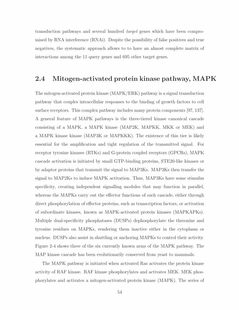
transduction pathways and several hundred target genes which have been compro-
mised by RNA interference (RNAi). Despite the possibility of false positives and true
negatives, the systematic approach allows to to have an almost complete matrix of
interactions among the 11 query genes and 695 other target genes.
2.4 Mitogen-activated protein kinase pathway, MAPK
The mitogen-activated protein kinase (MAPK/ERK) pathway is a signal transduction
pathway that couples intracellular responses to the binding of growth factors to cell
surface receptors. This complex pathway includes many protein components [97, 137].
A general feature of MAPK pathways is the three-tiered kinase canonical cascade
consisting of a MAPK, a MAPK kinase (MAP2K, MAPKK, MKK or MEK) and
a MAPK kinase kinase (MAP3K or MAPKKK). The existence of this tier is likely
essential for the amplification and tight regulation of the transmitted signal. For
receptor tyrosine kinases (RTKs) and G-protein coupled receptors (GPCRs), MAPK
cascade activation is initiated by small GTP-binding proteins, STE20-like kinases or
by adaptor proteins that transmit the signal to MAP3Ks. MAP3Ks then transfer the
signal to MAP2Ks to induce MAPK activation. Thus, MAP3Ks have some stimulus
specificity, creating independent signalling modules that may function in parallel,
whereas the MAPKs carry out the effector functions of each cascade, either through
direct phosphorylation of effector proteins, such as transcription factors, or activation
of subordinate kinases, known as MAPK-activated protein kinases (MAPKAPKs).
Multiple dual-specificity phosphatases (DUSPs) dephosphorylate the threonine and
tyrosine residues on MAPKs, rendering them inactive either in the cytoplasm or
nucleus. DUSPs also assist in shuttling or anchoring MAPKs to control their activity.
Figure 2-4 shows three of the six currently known arms of the MAPK pathway. The
MAP kinase cascade has been evolutionarily conserved from yeast to mammals.
The MAPK pathway is initiated when activated Ras activates the protein kinase
activity of RAF kinase. RAF kinase phosphorylates and activates MEK. MEK phos-
phorylates and activates a mitogen-activated protein kinase (MAPK). The series of
54

kinases from RAF to MEK to MAPK is an example of a protein kinase cascade. RAF,
MEK and MAPK are all serine/threonine-selective protein kinases that respond to
extracellular stimuli (mitogens) and regulate various cellular activities such as gene
expression, mitosis, differentiation, proliferation, and cell survival/apoptosis [100].
Such series of kinases provide for feedback regulation and signal amplification.
It is important to note that MAPKs are involved in the action of most nonnuclear
oncogenes. The kinase cascade is relevant to many cancers [56, 85, 152], for example
Hodgkin’s disease. MAPKs are involved in cell response to growth factors such as
BDNF or nerve growth factor.
To date, six distinct groups of MAPKs have been characterized:
1. Extracellular signal-regulated kinases (ERK1, ERK2). The ERK1/2 (also known
as classical MAP kinases) signaling pathway is preferentially activated in re-
sponse to growth factors and tumor promoters such as phorbol ester. This
pathway regulates cell proliferation and cell differentiation.
2. C-Jun N-terminal kinases (JNKs), (MAPK8-10) also known as stress-activated
protein kinases (SAPKs).
3. p38 isoforms. (MAPK11-14) Both JNK and p38 signaling pathways are re-
sponsive to stress stimuli, such as cytokines, ultraviolet irradiation, heat shock,
osmotic shock, and are involved in cell differentiation and apoptosis.
4. ERK5 (MAPK7). This kinase has been recently discovered, is activated both
by growth factors and by stress stimuli, and participates in cell proliferation.
5. ERK3/4. ERK3 (MAPK6) and ERK4 (MAPK4) are structurally related atyp-
ical MAPKs possessing SEG motifs in the activation loop and displaying major
differences only in the C-terminal extension. ERK3 and ERK4 are primarily
cytoplasmic proteins which bind, translocate and activate MK5 (PRAK, MAP-
KAP5). ERK3 is unstable, unlike ERK4 which is relatively stable.
6. ERK7/8 (MAPK15) This is the newest member of MAPKs and behaves like
typical MAPKs. It possesses a long C terminus similar to ERK3/4.
55

Figure 2-4: The three main arms of the mitogen-activated protein kinase (MAPK)pathway, ERK (extracellular signal-regulated kinase), JNK (c-Jun N-terminal kinase)and p38 are shown. They mediate immune cell functional responses to stimuli throughmultiple receptors such as chemoattractant receptors, Toll-like receptors and cytokinereceptors. The three-tiered kinase dynamic cascade leads to activated MAPKs enter-ing the nucleus and triggering immediate early gene and transcription factor activa-tion for cellular responses such as cytokine production, apoptosis and migration. Redarrows indicate feedback or crosstalk within the MAPK pathway (image from [59]).
56
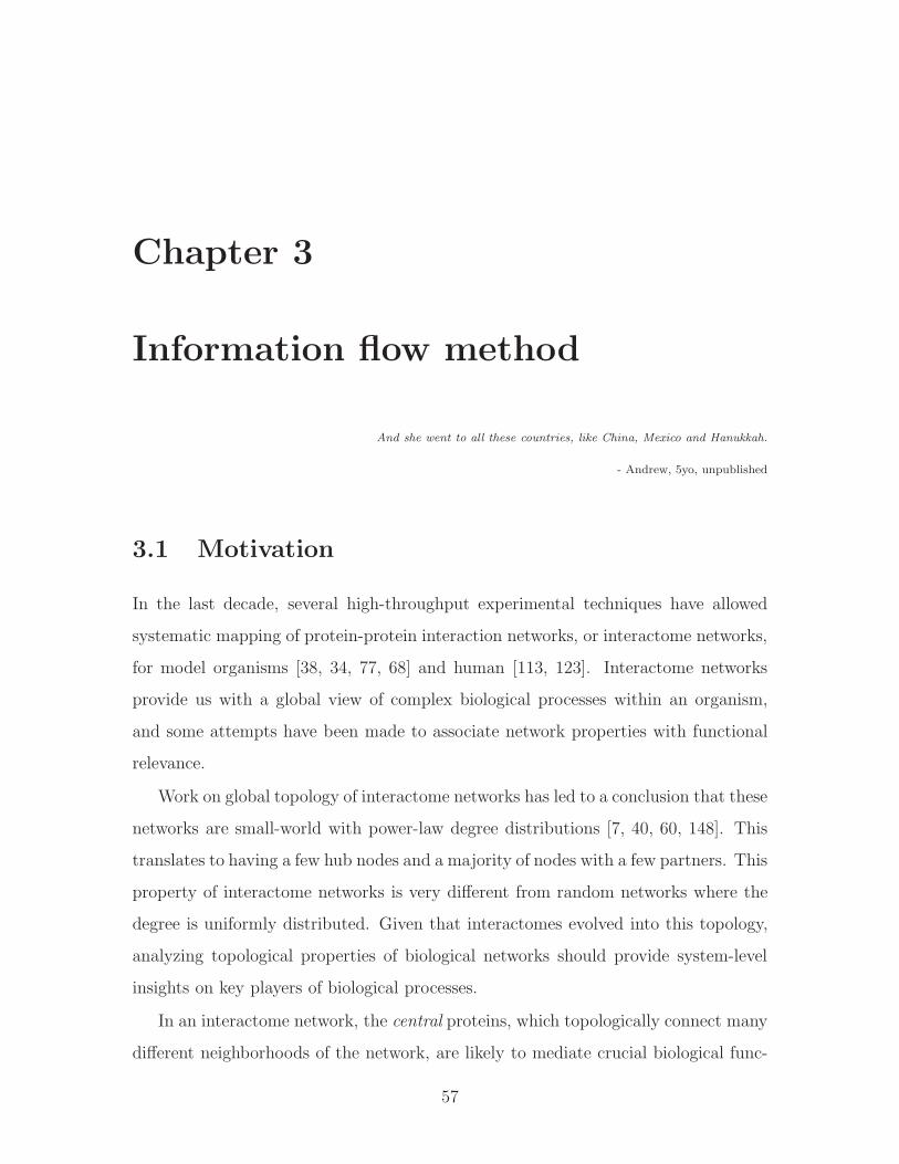
Chapter 3
Information flow method
And she went to all these countries, like China, Mexico and Hanukkah.
- Andrew, 5yo, unpublished
3.1 Motivation
In the last decade, several high-throughput experimental techniques have allowed
systematic mapping of protein-protein interaction networks, or interactome networks,
for model organisms [38, 34, 77, 68] and human [113, 123]. Interactome networks
provide us with a global view of complex biological processes within an organism,
and some attempts have been made to associate network properties with functional
relevance.
Work on global topology of interactome networks has led to a conclusion that these
networks are small-world with power-law degree distributions [7, 40, 60, 148]. This
translates to having a few hub nodes and a majority of nodes with a few partners. This
property of interactome networks is very different from random networks where the
degree is uniformly distributed. Given that interactomes evolved into this topology,
analyzing topological properties of biological networks should provide system-level
insights on key players of biological processes.
In an interactome network, the central proteins, which topologically connect many
different neighborhoods of the network, are likely to mediate crucial biological func-
57

tions. It has been shown that genes acting as hubs (having many partners) are more
likely to engage in genetic interactions (Lehner et al. [74]). This suggests that testing
the pairwise mutation of a hub gene with the remaining genes in the genome should
allow us to find more genetic interactions than if we were to proceed at random. A
“hub” is the most straightforward way of quantifying the centrality of a protein in
a network. It is done simply by examining the proteins degree (described in more
detail in Section 3.2.1), e.g. the number of binding partners. Perturbations of high-
degree proteins (hubs) are more likely to result in lethality than mutations in other
proteins [46, 60]. On the same note, Davierwala et al. [23] analyzed essential genes in
yeast and showed that they are more likely to be involved in genetic interactions than
nonessential genes, especially if they share Gene Ontology annotations. Ozier et al.
[99] also showed that pairs of physically linked genes, where one or both exhibit high
degree of physical interactions, are substantially more likely to genetically interact
than a pair of low physical-interaction degree genes.
However, degree only measures a proteins local connectivity and does not con-
sider the proteins position relative to other proteins except for the direct binding
partners of the given protein. A metric to estimate global centrality is betweenness
as described in Section 3.2.2. Betweenness determines the centrality of a protein in
an interactome network based on the total number of shortest paths going through
the given protein [33, 39]. A node partaking in a large fraction of all shortest paths
has high betweenness. Such nodes have been termed bottlenecks [149] as they are
not necessarily high degree (as are the hub nodes), yet they have a large amount
of information traffic. The bottlenecks, like the hubs, are more likely to be essential
than randomly sampled proteins in interactomes [46, 63]. Recent evidence shows that
high betweenness is correlated with pleiotropy [154], and bottlenecks tend to mediate
crosstalks between functional modules [149]. Although to our knowledge, no studies
have been done to link betweenness with genetic interactions, we hypothesize that
proteins of high betweenness would have a higher tendency to be involved in genetic
interactions than random. Thus we could use both of these metrics as features in
predicting potential genetic interactions.
58

Both degree and betweenness are graph metrics that are not specifically tailored
to describe biological networks. Degree measures a proteins local connectivity and
does not consider the proteins position in the network globally. Betweenness is a
better measure for centrality in that it takes into account paths through the whole
network, but it still has the disadvantage of only considering the shortest paths and
ignoring alternative pathways of protein interactions. More importantly, interactome
networks can be error-prone and some interactions in the same network are not as
reliable as others. Many studies have been conducted to categorize interaction data
into different confidence levels [5, 34, 87]. Neither degree nor betweenness takes the
confidence levels of interactions into consideration. To provide a better solution for
identifying central proteins, we developed an information flow model of interactome
networks that we describe in more detail in Section 3.3. We took the approach of
modeling networks as electrical circuits, which had been presented in previous net-
work analyses [27, 93, 124]. Construing the propagation of biological signals as flow
of electrical current, our method identified proteins central to the transmission of in-
formation throughout the network. Unlike the previous methods which characterized
only the topological features of proteins, our approach incorporated the confidence
scores of protein-protein interactions and automatically considers all possible paths
in a network when evaluating the importance of proteins. We compared the infor-
mation flow score to betweenness, and found that the information flow score in the
entire interactome network is a stronger predictor of loss-of-function lethality and
pleiotropy, and better tolerates the addition of large amounts of error-prone data.
We hypothesize that information flow can serve as a useful feature for predicting
genetic interactions.
For a multi-cellular organism, not all interactions have the same propensity to
occur in every tissue. However, the current network metrics usually treat interactome
networks as a whole, disregarding the possibility that some interactions may not occur
at all in certain types of tissues. To address this, we developed a framework for
studying tissue-specific networks using the information flow model. We constructed
an interactome network for muscle enriched genes in C. elegans, and showed that
59
genes of high information flow in the muscle interactome network but not in the
entire interactome network are likely to play important roles in muscle function.
In the next section, we describe in more detail the metrics of degree and between-
ness. Next, we introduce the information flow model and the relevant details of the
algorithm. We analyze and compare the information flow to the other metrics used
to assess centrality of a node in a network. Finally, we show how information flow
is closely linked with phenotypic properties such as essentiality and pleiotropy, and
combined with other network metrics can further reveal properties of genes.
3.2 Relevant network algorithms and metrics
3.2.1 Degree
Degree of a node (or a vertex) in a network describes the number of edges directly
connecting the node with its immediate neighbors. The degree is a positive integer
with a minimum value of 0 if the node is not connected to anything. In recent years, as
more high-throughput data became available, protein networks have been analyzed
with respect to their degree distribution [60]. Their findings indicate that, much
like the social networks, protein interaction networks are characterized by scale-free
distribution. Scale-free refers to the fact that the majority of nodes have a very few
neighbors (interacting proteins) and there are only a few nodes with a high degree of
connectivity (hubs). As a result of this finding, Watts and Strogatz [136] were able
to describe interactomes as being small-world where the networks are highly clustered
thus the average path length is relatively short.
Degree as a property of a protein node describes its local interaction map with
the neighbors as shown in Figure 3-1. In this setting, high degree has been associated
with the likelihood that a given gene is essential [60]. In this chapter, we use degree
as one of the features of a single gene to predict phenotypes. In the later chapters,
we use degree as a feature for a gene to predict whether it genetically interacts. We
also expand on that and use degree to describe a pair of genes via linear combination
60
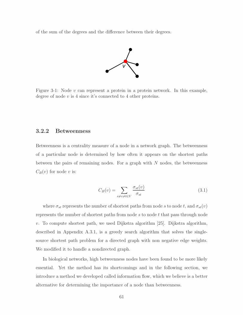
of the sum of the degrees and the difference between their degrees.
v
Figure 3-1: Node 𝑣 can represent a protein in a protein network. In this example,degree of node 𝑣 is 4 since it’s connected to 4 other proteins.
3.2.2 Betweenness
Betweenness is a centrality measure of a node in a network graph. The betweenness
of a particular node is determined by how often it appears on the shortest paths
between the pairs of remaining nodes. For a graph with 𝑁 nodes, the betweenness
𝐶𝐵(𝑣) for node 𝑣 is:
𝐶𝐵(𝑣) =∑
𝑠 ∕=𝑣 ∕=𝑡∈𝑉
𝜎𝑠𝑡(𝑣)
𝜎𝑠𝑡(3.1)
where 𝜎𝑠𝑡 represents the number of shortest paths from node 𝑠 to node 𝑡, and 𝜎𝑠𝑡(𝑣)
represents the number of shortest paths from node 𝑠 to node 𝑡 that pass through node
𝑣. To compute shortest path, we used Dijkstra algorithm [25]. Dijkstra algorithm,
described in Appendix A.3.1, is a greedy search algorithm that solves the single-
source shortest path problem for a directed graph with non negative edge weights.
We modified it to handle a nondirected graph.
In biological networks, high betweenness nodes have been found to be more likely
essential. Yet the method has its shortcomings and in the following section, we
introduce a method we developed called information flow, which we believe is a better
alternative for determining the importance of a node than betweenness.
61

j
1/3
12/3
i
ab
Figure 3-2: Example of betweenness computation between nodes 𝑖 and 𝑗. Differentnodes on the path between 𝑖 and 𝑗 score different amounts depending on the numberof shortest paths passing through them. Here, node 𝑎 has a betweenness score of 1
3
since it is on 1 of the 3 shortest paths, while node 𝑏 scores 23since it is on 2 out of 3
paths.
3.3 The information flow model
We model an interactome network as a resistor network, where proteins are repre-
sented as nodes and interactions are represented as resistors. The conductance of each
resistor is directly proportional to the confidence score of the corresponding interac-
tion. In cases where the confidence levels of interactions are not known, we assume
that all resistors have unit conductance.
3.3.1 The Iflow algorithm
In order to estimate the importance of node 𝑘 in conducting electrical current in a
network of 𝑁 nodes, we connect node 𝑖 to a unit current source and node 𝑗 to the
ground, and we compute how much current flows through node 𝑘 using Kirchhoff’s
laws (see Figure 3-3). We define the information flow score of node k as the sum
of current through node k among all pair-wise combinations of source and ground
nodes. Since exchanging the source node and the ground node does not lead to
different current distributions, we perform the calculation of information flow scores
only for cases where 𝑖 > 𝑗. The total number of pairwise combinations of nodes (𝑖, 𝑗),
such that 𝑖 ∕= 𝑘, 𝑗 ∕= 𝑘 and 𝑖 > 𝑗 is (𝑁 − 1)(𝑁 − 2)/2. The information flow through
node 𝑘 is
62

𝐼𝑘 =1
(𝑁 − 1)(𝑁 − 2)
∑𝑖>𝑗
(∑𝑚
∣𝐼 𝑖𝑗𝑘𝑚∣) (3.2)
where 𝐼 𝑖𝑗𝑘𝑚 is the current between the nodes 𝑘 and 𝑚 for a sink-source node com-
bination (𝑖, 𝑗), and∑
𝑚 ∣𝐼 𝑖𝑗𝑘𝑚∣ is the sum over all resistors connected to node 𝑘.
Isi
j
k
Rki
I1I3
I2p
The unit current source, Is, is connected to the node i, the ground node is j, and the node of interest is k.The currents through the node k are I1, I2, and I3. Due to the conservation of the current, the total sum of the node currents is zero:
I1 + I2 + I3 =0By the total flow through the node k, we denotethe sum of all positive currents into the node. Due to the conservation of the current it is exactly half of the absolute sum of all currents:
Itotalk = (|I1| + |I2| + |I3|)/2
Figure 3-3: Kirchhoff’s current law
For a given pair of source node and ground node, the standard way of computing
resistor currents of a circuit is using nodal analysis and solving the resulting system
of (𝑁 − 1) linear equations for node voltages. For each node 𝑚 that is not a ground
node, we have the following equation:
∑𝑙
𝑣𝑙 − 𝑣𝑚𝑅𝑚𝑙
+ 𝐼𝑚 = 0 (3.3)
where 𝑣𝑙 is a voltage at node 𝑙, and the sum is over all nodes directly connected to
node 𝑚. When node 𝑚 is a source node, 𝐼𝑚 in Equation 3.3 equals 𝐼𝑠. Node voltages
can be computed by solving the following linear system of equations:
Gv = J (3.4)
where G is a symmetric (𝑁 − 1) by (𝑁 − 1) conductance matrix, v is a vector of
unknown node voltages and J is a vector of currents to every node. The matrix G
can be calculated using the following algorithms.
Algorithm 1: Assembly of the nodal matrix
63

1. Initialize an 𝑁 by 𝑁 matrix G∗ to zero.
2. For every resistor in the circuit:
a Insert the off-diagonal element 𝑔𝑖𝑗 = 𝑔𝑗𝑖 =−1𝑅𝑖𝑗
, where 𝑖 and 𝑗 are the end
terminals of the resistor;
b Add the value 1𝑅𝑖𝑗
to both diagonal values 𝑔𝑖𝑖 and 𝑔𝑗𝑗.
3. Remove the row and column of G∗ corresponding to the ground node (since its
voltage is zero).
The right-hand-side of Equation 3.4 is a vector of currents, which is zero except for
the source node 𝑖 which has a unit value. The most time consuming part of solving
Equation 3.4 is LU decomposition of matrix G. Since G remains the same if the
ground node is fixed, we can reuse matrices L and U while iterating over all source
nodes. Therefore, we need only 𝑁 LU decompositions of G.
Below we outline the resulting algorithm for calculating information flow of a given
circuit.
Algorithm 2: Calculation of information flow
1. Assemble the 𝑁 by 𝑁 matrix G∗ by following steps 1 and 2 of Algorithm 1.
2. Initialize the absolute sum of currents for each node to be the zero vector 𝐼∑.
3. Iterate over the ground node 𝑗 = 1 . . . 𝑁 :
a Get matrix G by removing the row and column 𝑗 of G∗ (Step 3 of Algo-
rithm 1);
b Compute the LU decomposition of matrix G:
G = LU, (3.5)
where L is lower-diagonal matrix and U is upper-diagonal;
c Iterate over the source node 𝑖 = (𝑗 + 1) . . .𝑁 :
64

1) Set the right-hand-side vector J to have all zeros except the unit 𝑖𝑡ℎ
entry;
2) Solve for node voltages v using matrices L and U:
v = U−1(L−1J) (3.6)
3) Compute the absolute sum of all currents for each node and add them
to the entries of I∑.
4. Using Equation 3.3, compute the information flow for each node.
The Matlab implementation of the information flow algorithm, along with the
information flow scores for proteins in the yeast interactome network and proteins
in the worm interactome network, can be downloaded at http://jura.wi.mit.edu/
ge/information_flow_plos/ [88].
3.3.2 Partition of interactome into modules algorithm
Our information flow model identifies central proteins in interactome networks. The
proteins of high information flow scores are likely to act as connecting points of func-
tional modules. To test this hypothesis, we designed an algorithm to recursively
remove the highest flow proteins and extract smaller subnetworks from a large inter-
actome network component. In the algorithm described below, a core module refers
to a subnetwork composed of 15 to 50 proteins.
Algorithm 3: Recursive node removal
1. Initialize:
∙ G to the set of all proteins sorted from highest to lowest information flow
score;
∙ C, the protein connectivity matrix, with a 1 for each protein-protein in-
teraction and 0s for no interaction,
65

∙ core module size limits, 𝑠𝑚𝑖𝑛 = 15 and 𝑠𝑚𝑎𝑥 = 50,
∙ nodes to be removed from G at a given iteration,Gremove to an empty set,
∙ core module set, M, to an empty set.
2. Iterate while G is not empty:
∙ Given G and C, extract a list of protein modules, S.
∙ Iterate over the set of modules S, 𝑖 = 1 . . . 𝑠𝑖𝑧𝑒(S):
∘ If number of genes in S(𝑖), 𝑠𝑖𝑧𝑒(S(𝑖)) <= 𝑠𝑚𝑎𝑥
If 𝑠𝑖𝑧𝑒(S(𝑖)) ≥ 𝑠𝑚𝑖𝑛, (modules smaller than 𝑠𝑚𝑖𝑛 are ignored)
Append S(𝑖) to M
Add genes in S(𝑖) to Gremove
∙ Remove nodes present in Gremove from G.
∙ Reset Gremove to an empty set.
∙ Remove next highest flow protein(s) from G.
3. Output is the set of core modules, M.
3.4 Experimental results and conclusions
3.4.1 Information flow model considers interaction confidence
scores and all possible paths in protein networks
We model an interactome network as an electrical circuit, where interactions are
represented as resistors and proteins as interconnecting nodes (Figure 3-4). In the
circuit, the value of resistance for each resistor is inversely proportional to the con-
fidence score of the interaction. According to Kirchhoff’s circuit laws, the current
entering any node is equal to the current leaving that node. By applying a current
source to one node and grounding another, we determined the exact amount of cur-
rent flowing through each node in the network (see Section 3.5). We iterated over
66
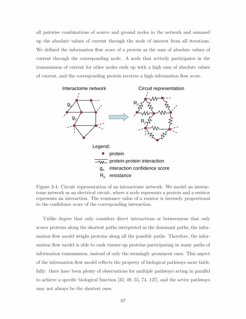
all pairwise combinations of source and ground nodes in the network and summed
up the absolute values of current through the node of interest from all iterations.
We defined the information flow score of a protein as the sum of absolute values of
current through the corresponding node. A node that actively participates in the
transmission of current for other nodes ends up with a high sum of absolute values
of current, and the corresponding protein receives a high information flow score.
Interactome network
R1
R2
Circuit representation
g1
g2
Legend:proteinprotein-protein interactioninteraction confidence scoregn
Rn resistance
Figure 3-4: Circuit representation of an interactome network. We model an interac-tome network as an electrical circuit, where a node represents a protein and a resistorrepresents an interaction. The resistance value of a resistor is inversely proportionalto the confidence score of the corresponding interaction.
Unlike degree that only considers direct interactions or betweenness that only
scores proteins along the shortest paths interpreted as the dominant paths, the infor-
mation flow model weighs proteins along all the possible paths. Therefore, the infor-
mation flow model is able to rank runner-up proteins participating in many paths of
information transmission, instead of only the seemingly prominent ones. This aspect
of the information flow model reflects the property of biological pathways more faith-
fully: there have been plenty of observations for multiple pathways acting in parallel
to achieve a specific biological function [32, 49, 55, 74, 127], and the active pathways
may not always be the shortest ones.
67

We applied the information flow model to two publicly available interactome net-
works: a S. cerevisiae interactome consisting of 1516 proteins involved in 39, 099
interactions [34] and a C. elegans interactome consisting of 4607 proteins involved
in 7850 interactions [45, 77, 119] (see Section 3.5). Every interaction in the yeast
interactome is accompanied by a socio-affinity index, which quantifies the tendency
for a pair of proteins to identify each other when one of the pair is tagged and to co-
purify when a third protein is tagged [34]. A high socio-affinity index indicates a high
confidence level for an interaction. We used all the interactions with socio-affinity
indices of 2 or higher. The worm interactome does not have numerical scores for the
interactions, so we regarded all of the interactions for worms equally. Using these two
interactomes, we were able to evaluate the information flow model under situations
where interactions are treated equally or interactions have different confidence scores.
Similarly to degree and betweenness, information flow scores of proteins in the yeast
or worm interactome network did not follow a Gaussian distribution, so we converted
information flow scores into ranks and percentiles to reflect their relative values in an
interactome network.
Although the information flow score is a very different network metric from be-
tweenness or degree, there might be relationships between the information flow score
and these two topological metrics. We obtained scatter plots for the ranks of in-
formation flow scores versus the ranks of betweenness or degree for both the yeast
interactome and the worm interactome (Figure 3-5). Although the information flow
score and betweenness are correlated, a given betweenness rank usually corresponds
to a wide range of information flow ranks, and vice versa (Figure 3-5A and 3-5C).
The information flow score and degree are less correlated (Figure 3-5B and 3-5D).
Low degree does not necessarily imply low information flow score, although very high
degree often implies high information flow score.
68
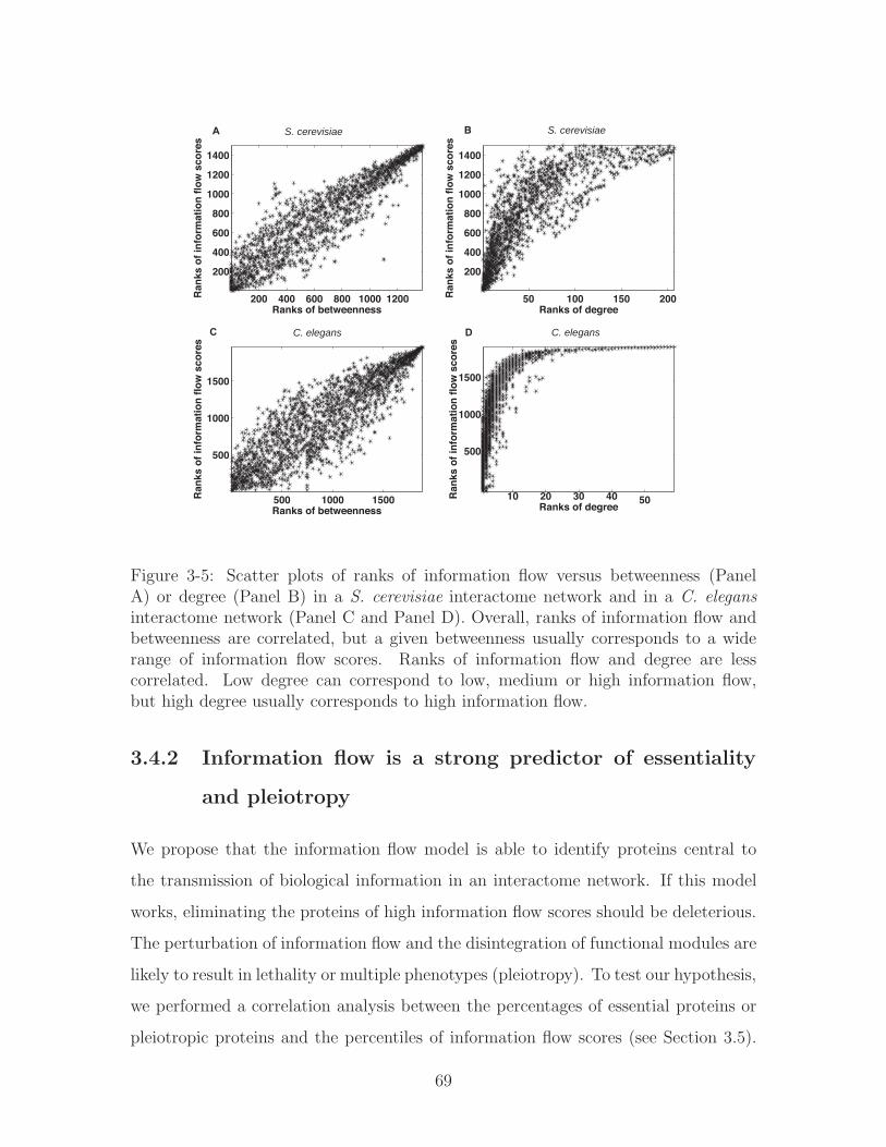
200 400 600 800 1000 1200
200
400
600
800
1000
1200
1400
Ranks of betweenness
Ran
ks o
f in
form
atio
n f
low
sco
res
A S. cerevisiae
50 100 150 200
200
400
600
800
1000
1200
1400
Ranks of degree
Ran
ks o
f in
form
atio
n f
low
sco
res
B S. cerevisiae
500 1000 1500
500
1000
1500
Ranks of betweenness
Ran
ks o
f in
form
atio
n f
low
sco
res
C C. elegans
10 20 30 40 50
500
1000
1500
Ranks of degree
Ran
ks o
f in
form
atio
n f
low
sco
res
D C. elegans
Figure 3-5: Scatter plots of ranks of information flow versus betweenness (PanelA) or degree (Panel B) in a S. cerevisiae interactome network and in a C. elegansinteractome network (Panel C and Panel D). Overall, ranks of information flow andbetweenness are correlated, but a given betweenness usually corresponds to a widerange of information flow scores. Ranks of information flow and degree are lesscorrelated. Low degree can correspond to low, medium or high information flow,but high degree usually corresponds to high information flow.
3.4.2 Information flow is a strong predictor of essentiality
and pleiotropy
We propose that the information flow model is able to identify proteins central to
the transmission of biological information in an interactome network. If this model
works, eliminating the proteins of high information flow scores should be deleterious.
The perturbation of information flow and the disintegration of functional modules are
likely to result in lethality or multiple phenotypes (pleiotropy). To test our hypothesis,
we performed a correlation analysis between the percentages of essential proteins or
pleiotropic proteins and the percentiles of information flow scores (see Section 3.5).
69

For each bin containing proteins within a certain range of information flow scores (in
percentiles), we calculated the percentage of proteins whose loss-of-function strains
exhibit lethality and the percentage of proteins whose loss-of-function strains exhibit
two or more phenotypes. We observed a strong increasing trend for the percentage
of essential proteins and the percentage of pleiotropic proteins when information
flow scores increase (Figure 3-6). For S. cerevisiae, the Pearson correlation coefficient
(PCC) between the percentages of essential proteins and the percentiles of information
flow scores is 0.84, and the PCC between the percentages of pleiotropic proteins and
the percentiles of information flow scores is 0.60. For C. elegans, the PCC between
the percentages of essential proteins and the percentiles of information flow scores is
0.95, and the PCC between the percentages of pleiotropic proteins and the percentiles
of information flow scores is 0.85 as well.
In contrast, betweenness is a poorer predictor for both essentiality and pleiotropy.
For S. cerevisiae, the PCC between the percentages of essential proteins and the per-
centiles of betweenness is −0.02, and the PCC between the percentages of pleiotropic
proteins and the percentiles of betweenness is −0.31. For C. elegans, the PCC be-
tween the percentages of essential proteins and the percentiles of betweenness is 0.67,
and the PCC between the percentages of pleiotropic proteins and the percentiles of
betweenness is 0.49.
To determine the statistical significance of the correlation, we generated random-
ized datasets by shuffling genes among the percentile ranges while keeping the num-
ber of genes in each range fixed. Next we obtained the percentage of essential or
pleiotropic genes for each range and performed correlation analysis for each random-
ized dataset. We found that the correlation between essentiality or pleiotropy and
information flow scores is generally stronger in the actual datasets than in the random-
ized datasets (𝑃−𝑣𝑎𝑙𝑢𝑒 = 0.0059 and 𝑃−𝑣𝑎𝑙𝑢𝑒 = 0.055 for essentiality and pleiotropy
in S. cerevisiae, respectively; 𝑃 − 𝑣𝑎𝑙𝑢𝑒 = 0.00054 and 𝑃 − 𝑣𝑎𝑙𝑢𝑒 = 0.0047 for es-
sentiality and pleiotropy in C. elegans, respectively), while the correlation between
essentiality or pleiotropy and betweenness is not significant (𝑃−𝑣𝑎𝑙𝑢𝑒 > 0.05). Infor-
mation flow outperforms degree in terms of correlation with essentiality or pleiotropy
70

<50% 50 70%70 80%80 90%90 95% >95%0
10
20
30
40
50
60
% Ranges of centrality scores
% L
eth
alit
y
S. cerevisiae
Information flowBetweenness
<50% 50 70%70 80%80 90%90 95% >95%0
5
10
15
% Ranges of centrality scores
% P
leio
tro
py
S. cerevisiae
Information flowBetweenness
<50% 50 70%70 80%80 90%90 95% >95%0
10
20
30
40
50
% Ranges of centrality scores
% L
eth
alit
y
C. elegans
Information flowBetweenness
<50% 50 70%70 80%80 90%90 95% >95%0
10
20
30
40
50
% Ranges of centrality scores
% P
leio
tro
py
C. elegans
Information flowBetweenness
A B
C D
Figure 3-6: Correlation between information flow scores and loss-of-function pheno-types. The higher a proteins information flow score is, the higher the probabilityof observing lethality (Panel A) or pleiotropy (Panel B) when the protein is deletedfrom S. cerevisiae. This trend is observed for C. elegans as well (Panel C and PanelD). The correlation is not as strong for betweenness and loss-of function phenotypes.The PCCs for information flow scores and phenotypes are 0.84, 0.60, 0.95, and 0.85in Panels A-D, respectively. In contrast, the PCCs for betweenness and phenotypesare −0.02, −0.31, 0.67, and 0.49 in Panels A-D, respectively.
in S. cerevisiae (Figure 3-7). In the C. elegans interactome where the interactions
are unweighted, degree is still a strong indicator of essentiality and pleiotropy (see
Figure 3-7).
3.4.3 Proteins of high information flow and low betweenness
show a high likelihood for being essential or pleiotropic
Proteins with similar betweenness in an interactome can differ significantly in terms
of information flow scores (Figure 3-5). We investigated whether the information
flow score is well correlated with essentiality and pleiotropy among proteins that
71

<50% 50−70%70−80%80−90%90−95% >95%0
10
20
30
40
50
60
% Ranges of degree
% L
etha
lity
(A) S. cerevisiae
<50% 50−70%70−80%80−90%90−95% >95%0
5
10
15
% Ranges of degree
% P
leio
trop
y
(B) S. cerevisiae
<35% 35−65%65−80%80−90%90−95% >95%0
10
20
30
40
50
60
% Ranges of degree
% L
etha
lity
(C) C. elegans
<35% 35−65%65−80%80−90%90−95% >95%0
10
20
30
40
50
% Ranges of degree%
Ple
iotr
opy
(D) C. elegans
Figure 3-7: Correlation between degree and loss-of-function phenotypes. The highera proteins degree is, the higher the probability of observing lethality (Panel C) orpleiotropy (Panel D) when the protein is deleted from C. elegans. However, thistrend is not observed for S. cerevisiae (Panel A and Panel B). The PCCs for degreesand phenotypes are 0.31, −0.53, 0.96, and 0.97 in Panels A-D, respectively.
rank low in terms of betweenness. We identified 449 proteins that rank the lowest
30% in the yeast interactome and 672 proteins that rank the lowest 30% in the
worm interactome. We found that the correlation between the information flow score
and essentiality or pleiotropy holds for these two groups of proteins (Figure 3-8).
For example, we found ten yeast proteins that are among the highest 30% of all
proteins in terms of information flow but are among the lowest 30% of all proteins
in terms of betweenness. Out of these 10 proteins, 8 correspond to lethal phenotypes
when deleted, and the other 2 correspond to multiple other phenotypes when deleted
(Table 3.4.3)). In contrast, we found three yeast proteins that are among the highest
30% of all proteins in terms of betweenness but are among the lowest 30% of all
proteins in terms of information flow, and none of them are essential or pleiotropic.
Similarly, we found that the information flow model is predictive of essentiality or
pleiotropy among medium- or low-degree proteins as well (Figure 3-9).
72
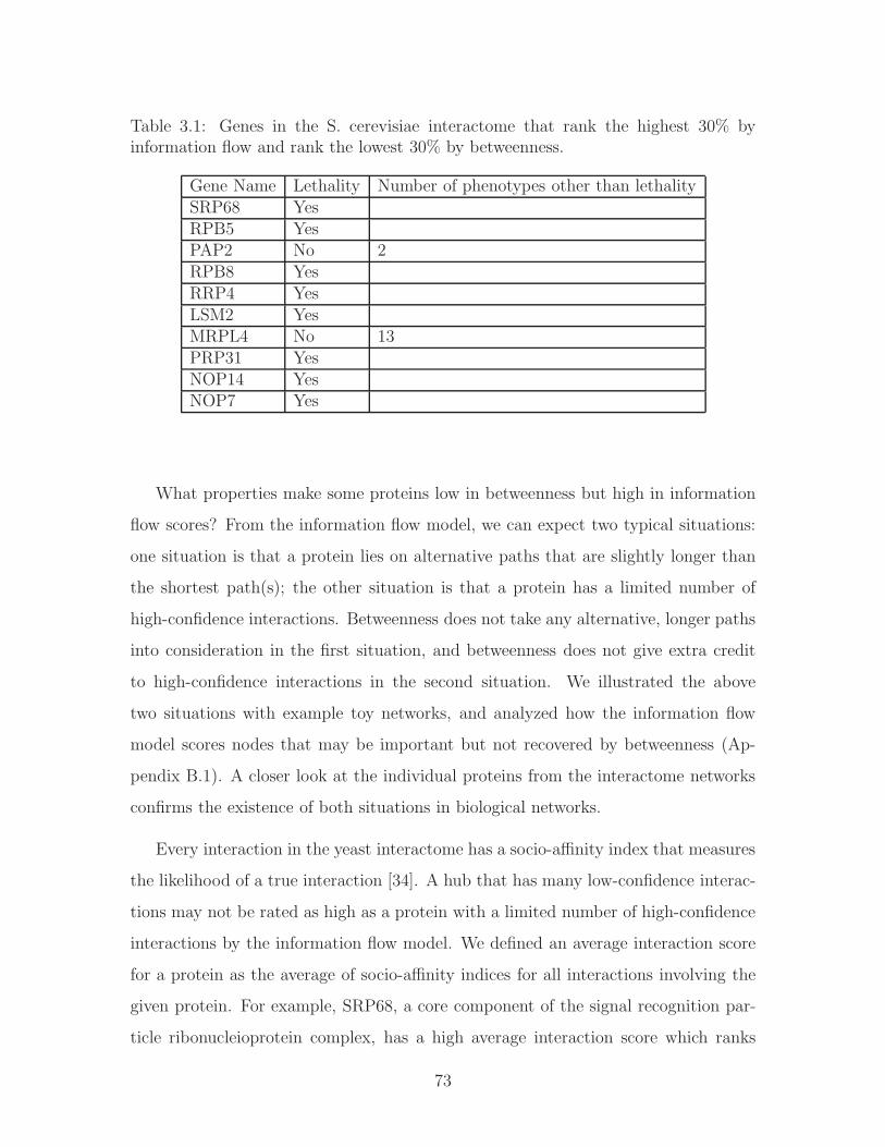
Table 3.1: Genes in the S. cerevisiae interactome that rank the highest 30% byinformation flow and rank the lowest 30% by betweenness.
Gene Name Lethality Number of phenotypes other than lethalitySRP68 YesRPB5 YesPAP2 No 2RPB8 YesRRP4 YesLSM2 YesMRPL4 No 13PRP31 YesNOP14 YesNOP7 Yes
What properties make some proteins low in betweenness but high in information
flow scores? From the information flow model, we can expect two typical situations:
one situation is that a protein lies on alternative paths that are slightly longer than
the shortest path(s); the other situation is that a protein has a limited number of
high-confidence interactions. Betweenness does not take any alternative, longer paths
into consideration in the first situation, and betweenness does not give extra credit
to high-confidence interactions in the second situation. We illustrated the above
two situations with example toy networks, and analyzed how the information flow
model scores nodes that may be important but not recovered by betweenness (Ap-
pendix B.1). A closer look at the individual proteins from the interactome networks
confirms the existence of both situations in biological networks.
Every interaction in the yeast interactome has a socio-affinity index that measures
the likelihood of a true interaction [34]. A hub that has many low-confidence interac-
tions may not be rated as high as a protein with a limited number of high-confidence
interactions by the information flow model. We defined an average interaction score
for a protein as the average of socio-affinity indices for all interactions involving the
given protein. For example, SRP68, a core component of the signal recognition par-
ticle ribonucleioprotein complex, has a high average interaction score which ranks
73
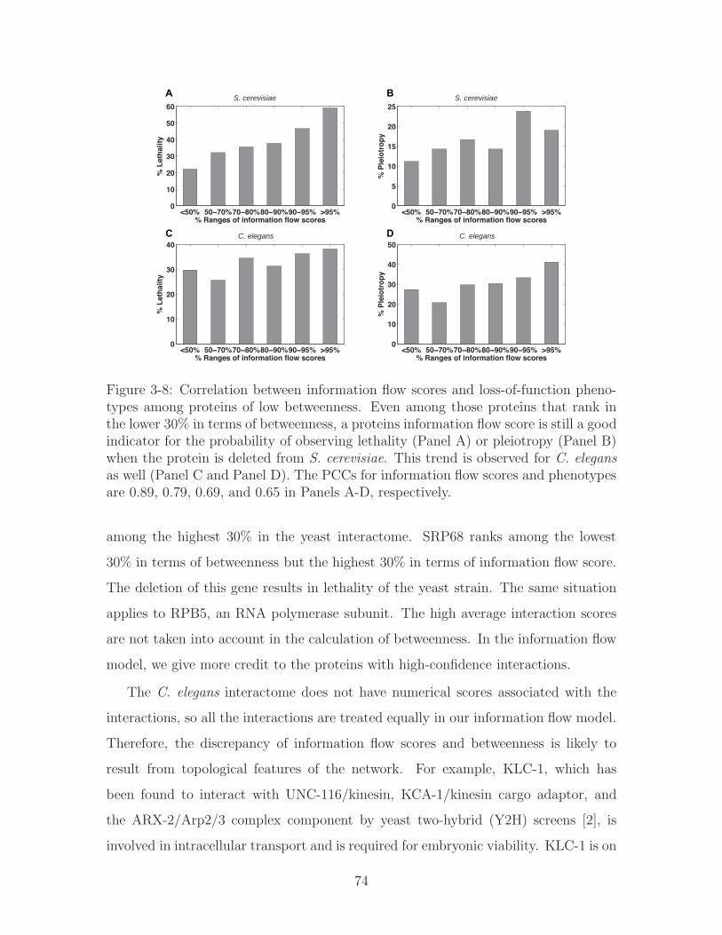
<50% 50 70%70 80%80 90%90 95% >95%0
10
20
30
40
50
60
% Ranges of information flow scores
% L
eth
alit
y
S. cerevisiae
<50% 50 70%70 80%80 90%90 95% >95%0
5
10
15
20
25
% Ranges of information flow scores
% P
leio
tro
py
S. cerevisiae
<50% 50 70%70 80%80 90%90 95% >95%0
10
20
30
40
% Ranges of information flow scores
% L
eth
alit
y
C. elegans
<50% 50 70%70 80%80 90%90 95% >95%0
10
20
30
40
50
% Ranges of information flow scores
% P
leio
tro
py
C. elegans
A B
C D
Figure 3-8: Correlation between information flow scores and loss-of-function pheno-types among proteins of low betweenness. Even among those proteins that rank inthe lower 30% in terms of betweenness, a proteins information flow score is still a goodindicator for the probability of observing lethality (Panel A) or pleiotropy (Panel B)when the protein is deleted from S. cerevisiae. This trend is observed for C. elegansas well (Panel C and Panel D). The PCCs for information flow scores and phenotypesare 0.89, 0.79, 0.69, and 0.65 in Panels A-D, respectively.
among the highest 30% in the yeast interactome. SRP68 ranks among the lowest
30% in terms of betweenness but the highest 30% in terms of information flow score.
The deletion of this gene results in lethality of the yeast strain. The same situation
applies to RPB5, an RNA polymerase subunit. The high average interaction scores
are not taken into account in the calculation of betweenness. In the information flow
model, we give more credit to the proteins with high-confidence interactions.
The C. elegans interactome does not have numerical scores associated with the
interactions, so all the interactions are treated equally in our information flow model.
Therefore, the discrepancy of information flow scores and betweenness is likely to
result from topological features of the network. For example, KLC-1, which has
been found to interact with UNC-116/kinesin, KCA-1/kinesin cargo adaptor, and
the ARX-2/Arp2/3 complex component by yeast two-hybrid (Y2H) screens [2], is
involved in intracellular transport and is required for embryonic viability. KLC-1 is on
74

<50% 50−70%70−80%80−90%90−95% >95%0
10
20
30
40
50
% Ranges of centrality scores
% L
eth
alit
y
(A) S. cerevisiae
Information flowBetweenness
<50% 50−70%70−80%80−90%90−95% >95%0
5
10
15
20
% Ranges of centrality scores
% P
leio
tro
py
(B) S. cerevisiae
Information flowBetweenness
<50% 50−70%70−80%80−90%90−95% >95%0
10
20
30
40
50
% Ranges of centrality scores
% L
eth
alit
y
(C) C. elegans
Information flowBetweenness
<50% 50−70%70−80%80−90%90−95% >95%0
10
20
30
40
50
% Ranges of centrality scores
% P
leio
tro
py
(D) C. elegans
Information flowBetweenness
Figure 3-9: Correlation between information flow scores and loss-of-function pheno-types among proteins of low or medium degrees. Even among proteins of low ormedium degrees, a proteins information flow score is still a good indicator for theprobability of observing lethality (Panel A) or pleiotropy (Panel B) when the proteinis deleted from S. cerevisiae. This trend is observed for C. elegans as well (Panel Cand Panel D). The correlation is not as strong for betweenness and loss-of functionphenotypes. The PCCs for information flow scores and phenotypes are 0.80, 0.86,0.84, and 0.80 in Panels A-D, respectively. In contrast, the PCCs for betweennessand phenotypes among low- or medium-degree proteins are 0.61, 0.037, 0.32, and 0.49in Panels A-D, respectively.
a topologically central position (Figure 3-10A) but scores low in terms of betweenness.
Another example is TAG-246, an ortholog of mammalian SWI/SNF-related matrix-
associated actin-dependent regulator of chromatin subfamily D (SMARCD). TAG-
246 is required for LIN-3/EGF signaling in C. elegans vulva development. Just like
KLC-1, TAG-246 only has 4 interactions. The loss-of-function of TAG-246 results
in lethality as well as several post-embryonic phenotypes, such as protruding vulva
and sterile progeny. Figure 3-10B shows that there are many parallel paths around
TAG-246, so TAG-246 does not always lie on the shortest path, thus scoring low
in betweenness. Although KLC-1 and TAG-246 are neither high-degree nor high-
betweenness, the information flow model ranks them in the top 37% and top 26%,
respectively, because it considers all possible paths in the network.
75
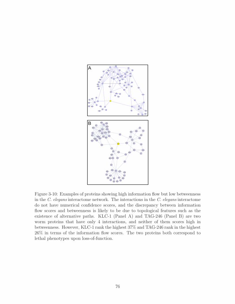
A
B
Figure 3-10: Examples of proteins showing high information flow but low betweennessin the C. elegans interactome network. The interactions in the C. elegans interactomedo not have numerical confidence scores, and the discrepancy between informationflow scores and betweenness is likely to be due to topological features such as theexistence of alternative paths. KLC-1 (Panel A) and TAG-246 (Panel B) are twoworm proteins that have only 4 interactions, and neither of them scores high inbetweenness. However, KLC-1 rank the highest 37% and TAG-246 rank in the highest26% in terms of the information flow scores. The two proteins both correspond tolethal phenotypes upon loss-of-function.
76

Taken together, the information flow model is effective in identifying proteins
that are central in interactome networks. Even in cases where betweenness ranks
are relatively low, the information score serves as a strong predictor for essential or
pleiotropic proteins.
3.4.4 The ranks of information flow scores are more consis-
tent than betweenness when a large amount of low-
confidence data is added
As more high-throughput datasets become available, new interactions are added into
the networks. High-throughput experiments are error-prone and false positives can
be problematic [87]. To address the data-quality issue, there have been many studies
attempting to estimate the probability of a true interaction between a pair of proteins
instead of weighing all interactions equally [5]. However, previous network metrics
such as betweenness do not take the likelihood of interactions into account. By
incorporating the confidence scores of interactions into resistor values, the information
flow model is able to more accurately simulate information propagation throughout
the network.
In order to analyze how well the information flow model tolerates the addition
of a large amount of noisy data, we simulated a growing yeast interactome network
by adding low-confidence interactions. Higher socio-affinity indices indicate higher
confidence of interactions. In total, there are 9, 290 interactions with socio-affinity
indices of 4.5 or higher, or 17, 159 interactions with socio-affinity indices of 3.5 or
higher, or 39, 099 interactions with socio-affinity indices of 2 or higher. We rank
both information flow scores and betweenness for all the proteins in each of the
three versions of the interactome. We showed that ranks of information flow scores
were more consistent than that of betweenness when low-confidence interactions were
added to the interactome (Figure 3-11). The consistency of information flow ranks
suggests that the information flow model is not only effective but also robust in the
case of noise in the data.
77
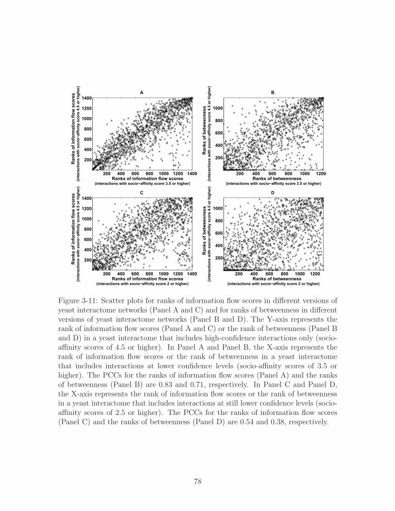
200 400 600 800 1000 1200 1400
200
400
600
800
1000
1200
1400A
Ranks of information flow scores(interactions with socio−affinity score 3.5 or higher)
Ran
ks o
f inf
orm
atio
n flo
w s
core
s(in
tera
ctio
ns w
ith s
ocio−a
ffini
ty s
core
4.5
or h
ighe
r)
200 400 600 800 1000 1200
200
400
600
800
1000
B
Ranks of betweenness(interactions with socio−affinity score 3.5 or higher)
Ran
ks o
f bet
wee
nnes
s(in
tera
ctio
ns w
ith s
ocio−a
ffini
ty s
core
4.5
or h
ighe
r)
200 400 600 800 1000 1200 1400
200
400
600
800
1000
1200
1400C
Ranks of information flow scores(interactions with socio−affinity score 2 or higher)
Ran
ks o
f inf
orm
atio
n flo
w s
core
s(in
tera
ctio
ns w
ith s
ocio−a
ffini
ty s
core
4.5
or h
ighe
r)
200 400 600 800 1000 1200
200
400
600
800
1000
D
Ranks of betweenness(interactions with socio−affinity score 2 or higher)
Ran
ks o
f bet
wee
nnes
s(in
tera
ctio
ns w
ith s
ocio−a
ffini
ty s
core
4.5
or h
ighe
r)
Figure 3-11: Scatter plots for ranks of information flow scores in different versions ofyeast interactome networks (Panel A and C) and for ranks of betweenness in differentversions of yeast interactome networks (Panel B and D). The Y-axis represents therank of information flow scores (Panel A and C) or the rank of betweenness (Panel Band D) in a yeast interactome that includes high-confidence interactions only (socio-affinity scores of 4.5 or higher). In Panel A and Panel B, the X-axis represents therank of information flow scores or the rank of betweenness in a yeast interactomethat includes interactions at lower confidence levels (socio-affinity scores of 3.5 orhigher). The PCCs for the ranks of information flow scores (Panel A) and the ranksof betweenness (Panel B) are 0.83 and 0.71, respectively. In Panel C and Panel D,the X-axis represents the rank of information flow scores or the rank of betweennessin a yeast interactome that includes interactions at still lower confidence levels (socio-affinity scores of 2.5 or higher). The PCCs for the ranks of information flow scores(Panel C) and the ranks of betweenness (Panel D) are 0.54 and 0.38, respectively.
78

3.4.5 Information flow analysis of a muscle interactome net-
work reveals genes important for muscle function in C.
elegans
In multi-cellular organisms such as C. elegans, a pair of proteins may only interact
in certain tissues or cell types. Therefore, the architecture of interactome networks
may vary according to tissue or cell types [29]. We hypothesize that proteins of high
information flow in a given tissue play crucial roles for the normal function of that
tissue.
We tested our hypothesis in an interactome network for muscle-enriched genes.
From a SAGE (Serial Analysis of Gene Expression) dataset of 12 C. elegans tissues
[86], we identified muscle-enriched genes using a semi-supervised learning method
[105]. The semi-supervised learning analysis combines the benefits of unsupervised
clustering and supervised classification. In other words, both the distribution of data
points and prior biological knowledge can be utilized to identify genes enriched in
a particular tissue. We manually curated the biomedical literature and found 25
genes known to show enriched expression in muscle cells and 165 genes known not to
be expressed in muscle cells (Appendix B.3- Table S2). These two groups of genes
served as positive and negative training data, respectively. For each gene expressed in
muscle, the semi-supervised learning procedure gave a probability score (𝑃𝑖(𝑚𝑢𝑠𝑐𝑙𝑒))
ranging from 0 to 1 to indicate the genes expression enrichment in muscle as compared
to other tissues (Appendix B.3 - Table S3). We defined genes scoring 0.5 or higher
(𝑃𝑖 > 0.5) as muscle-enriched genes and identified 310 such genes (Figure 3-12).
Among the muscle-enriched genes identified by us, promoter::GFP reporter strains
are available for 52 of them, and 31 of them (60%) show clear expression patterns
in body wall muscle (Appendix B.3 - Table S4), not including those that might be
expressed in other types of muscle. In addition, 260 (84%) of muscle-enriched genes
contain cis-regulatory modules that indicate expression in muscle in their promoter
sequences [151] (Appendix B.3 - Table S5).
From the interactome dataset, we identified direct interacting partners of the
79
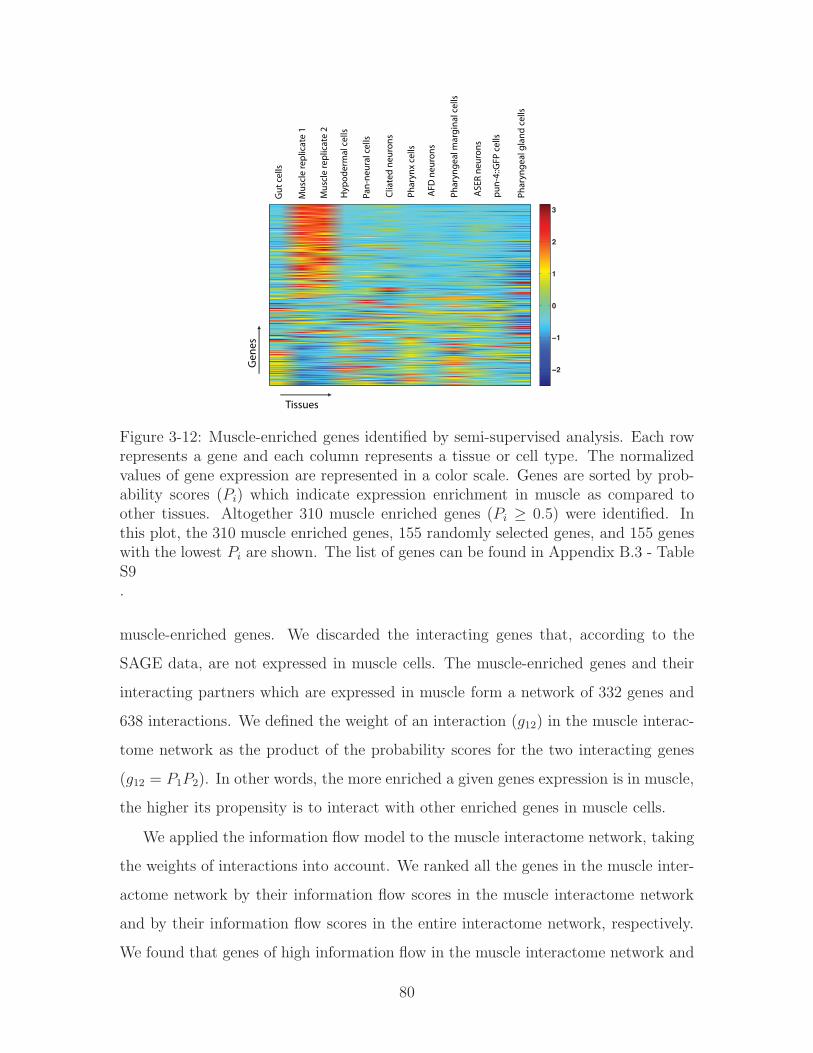
−2
−1
0
1
2
3
Gut
cel
ls
Mus
cle
repl
icat
e 1
Mus
cle
repl
icat
e 2
Hyp
oder
mal
cel
ls
Pan-
neur
al c
ells
Clia
ted
neur
ons
Phar
ynx
cells
AFD
neu
rons
Phar
ynge
al m
argi
nal c
ells
ASE
R ne
uron
s
pun-
4::G
FP c
ells
Phar
ynge
al g
land
cel
ls
Tissues
Gen
es
Figure 3-12: Muscle-enriched genes identified by semi-supervised analysis. Each rowrepresents a gene and each column represents a tissue or cell type. The normalizedvalues of gene expression are represented in a color scale. Genes are sorted by prob-ability scores (𝑃𝑖) which indicate expression enrichment in muscle as compared toother tissues. Altogether 310 muscle enriched genes (𝑃𝑖 ≥ 0.5) were identified. Inthis plot, the 310 muscle enriched genes, 155 randomly selected genes, and 155 geneswith the lowest 𝑃𝑖 are shown. The list of genes can be found in Appendix B.3 - TableS9.
muscle-enriched genes. We discarded the interacting genes that, according to the
SAGE data, are not expressed in muscle cells. The muscle-enriched genes and their
interacting partners which are expressed in muscle form a network of 332 genes and
638 interactions. We defined the weight of an interaction (𝑔12) in the muscle interac-
tome network as the product of the probability scores for the two interacting genes
(𝑔12 = 𝑃1𝑃2). In other words, the more enriched a given genes expression is in muscle,
the higher its propensity is to interact with other enriched genes in muscle cells.
We applied the information flow model to the muscle interactome network, taking
the weights of interactions into account. We ranked all the genes in the muscle inter-
actome network by their information flow scores in the muscle interactome network
and by their information flow scores in the entire interactome network, respectively.
We found that genes of high information flow in the muscle interactome network and
80

genes of high information flow in the entire network did not completely overlap (Fig-
ure 3-13). In other words, some genes rank high in both the muscle network and the
entire network, while others rank high in the muscle network but not in the entire
network. We first examined genes ranking high in both networks. We identified the
top 35 genes based on the sum of their ranks from both networks and found that 40%
of them correspond to loss-of-function lethality, which implies that they are essential
for the organism development. We then hypothesized that the genes ranking high in
the muscle network but not in the entire network play crucial roles in muscle function,
though they may not be essential for the whole organism.
Figure 3-13: An interactome network for muscle-enriched genes. We identified directinteracting partners for the muscle-enriched genes from the C. elegans interactomedataset. We required that an interacting partner must be expressed in muscle cellsaccording to the SAGE dataset. The muscle-enriched genes and their interactingpartners form a network. The blue nodes represent the top 20 genes with the highestinformation flow scores given that the information flow score is calculated just in themuscle network and that the weight of an interaction is defined as the product of theprobability scores of the two interacting genes. The green nodes represent the top20 genes in the muscle network with the highest information flow scores given thatthe information flow score is calculated in the entire C. elegans interactome networkand that the interactions are unweighted. Some genes (red nodes) rank in the top 20under both conditions.
We obtained the percentiles of genes in terms of information flow scores in the
81
muscle network and the percentiles of genes in the entire network, calculated the
differences between these two percentiles, and ranked the genes by the differences.
A C. elegans homolog of human paxillin, tag-327, shows the largest percentile differ-
ence (Table 3.4.5). This gene is suspected to be part of the worm muscle attachment
complex [135]. A homozygous gene knockout of tag-327 resulted in uncoordinated an-
imals arrested at the L1 developmental stage, displaying mild disorganization of the
myofilament lattice in their muscle cells [135]. The gene showing the second largest
percentile difference is dys-1, which ranks top 15% in terms of information flow scores
in the muscle network and 71% in the entire network. dys-1 encodes an orthologue of
the human DMD [34], which when mutated leads to Duchenne muscular dystrophy,
a severe recessive x-linked form of muscular dystrophy that is characterized by rapid
progression of muscle degeneration. The gene showing the third largest percentile
difference is lev-11, which ranks in the top 21% in terms of information flow scores in
the muscle network and 78% in the entire network. lev-11 encodes an orthologue of
the human TROPOMYOSIN 1 [89] (http://www.wormbook.org), which when mu-
tated leads to familial hypertrophic cardiomyopathy, a genetic disorder caused by the
thickening of heart muscle. The gene showing the fourth largest percentile difference
is deb-1, which encodes a muscle attachment protein found in dense bodies, and is
required for attaching actin thin filaments to the basal sarcolemma [89]. Out of the
top 35 genes that show the largest differences, RNAi feeding strains are available for
25 genes from a library [112]. We performed feeding RNAi experiments using the rrf-3
strain, an RNAi-sensitive strain, and found that the perturbation of 6 genes (24%)
cause motility defect (Table 3.4.5). In contrast, RNAi experiments of only 1 out of 16
genes (6%) that rank the lowest in terms of percentile differences revealed any motil-
ity defect (Table 3.4.5). As a general reference, in a genome-wide RNAi screen using
the rrf-3 strain [118], RNAi experiments of 4.1% of all tested genes showed paralyzed
or uncoordinated phenotypes. Even among the muscle-enriched genes identified by
the semi-supervised learning method, only 9% of the genes correspond to a paralyzed
or uncoordinated phenotype. The analysis result supports our hypothesis that genes
of high information flow specifically in the muscle network play important roles in
82
normal muscle function.
It is plausible that the genes showing higher information flow scores in the muscle
network than the entire network can also be distinguished by conventional methods
such as betweenness. To clarify this, we obtained the percentiles of genes in terms of
betweenness in the muscle network and that of genes in the entire network, and ranked
the genes by the differences between the two percentiles (Appendix B.3 - Table S6).
The top genes identified by differences in information flow do not necessarily rank high
by the differences in betweenness (Table 3.4.5 and Table S6 in Appendix B.3). For
example, tag-327, dys-1, lev-11, and deb-1, the top four genes identified by differences
in information flow, only rank No. 20, 23, 58, and 59 by differences in betweenness,
respectively. This is due to the fact that the information flow model considers the
confidence of interactions derived from co-expression while betweenness does not.
Similarly, if we rank genes by the probability of expression in muscle, 𝑃𝑖(𝑚𝑢𝑠𝑐𝑙𝑒), as
derived from the semi-supervised learning method, tag-327, dys-1, lev-11, and deb-1
rank only at No. 149, 269, 97, and 124, respectively. The relevance in muscle function
of these genes has been reported in the literature [89, 128, 135], suggesting that the
information flow method does identify biologically relevant candidate genes that can
be distinguished using neither the gene expression data nor a graph metric such as
betweenness.
3.4.6 Information flow discovers crucial proteins in signaling
networks
To evaluate the performance of information flow in signaling networks, we applied
information flow model to yeast signaling network. We combined a phosphorylation
dataset for S. cerevisiae which contained kinases and their target proteins [103] with
various sources of Y2H data [122]. Specifically, we searched for Y2H interactions
between the target proteins in the phosphorylation dataset. As a result, we obtained
a set of 77 kinases involved in 1008 phosphorylation events with 312 target proteins
interconnected by 503 Y2H interactions. Each kinase phosphorylates one or more
83

Table 3.2: Genes showing significant difference of information flow in the muscleinteractome network and in the entire interactome network. The normal motility ofthe rrf-3 strain is 99± 8 thrashes per minute. Genes with * show significantly lowermotility rates upon RNAi treatment compared to the rrf-3 strain
Gene name % in the entire interactome network
% in the muscle interactome network
%difference
Motility rate of RNAi-treated worms (thrashes per minute) (mean s.d.)
tag-327 73 14 59 Maternal sterility, unable to score dys-1 72 14 58 103 19lev-11 77 21 56 20 14*deb-1 69 14 55 Maternal sterility, unable to score F37B4.7 72 21 51 95 30dsh-1 64 13 51 104 22F41C3.5 66 17 49 105 18tag-163 58 9 49 108 10tol-1 68 25 43 93 26D2063.1 52 10 42 104 22Y11D7A.12 45 6 39 113 9bath-40 67 29 38 100 11cey-1 68 32 36 106 13lec-2 59 25 34 111 19Y62E10A.13 77 45 32 93 10unc-87 34 3 31 16 18*unc-15 35 4 31 12 8*Y39A1A.3 42 11 31 99 14gpd-3 36 5 31 65 26*gly-4 70 40 30 102 5tag-208 48 18 30 103 11uvt-5 63 33 30 39 30*unc-51 74 45 29 4 9*tag-210 78 49 29 98 10R07G3.8 73 45 28 93 12sec-23 51 100 -49 102 11klc-2 11 63 -52 48 47*pqn-28 47 100 -53 110 9M05D6.2 11 63 -52 105 13hpl-2 45 100 -55 110 8F14E5.2 44 100 -56 Maternal sterility, unable to score unc-84 43 100 -57 104 11lap-1 40 100 -60 104 6F11D5.1 39 100 -61 111 12ttm-1 36 100 -64 105 13emb-30 30 100 -70 100 12F31E3.2 30 100 -70 115 8tag-205 16 100 -84 97 15T18D3.7 15 100 -85 111 7lrx-1 12 100 -88 114 12sta-1 12 100 -88 114 9
84

of the 312 proteins in the Y2H network. In order to retain the directionality of
phosphorylation in the information flow model, we compute the information flow
separately for each kinase. First, we use directed edges to link the kinase to its
phosphorylation targets in Y2H network. Next, we set the kinase to be a source and
sequentially set the remaining 312 proteins to be sinks as we compute the information
flow. Before we move on to the next kinase, we remove the previous kinase along with
its phosphorylation edges. The total information flow score for each of the 312 proteins
in the Y2H network is obtained by summing the absolute values of information flow
from 77 kinase-specific networks.
We examined the top 30% versus the bottom 30% of genes ranked by the infor-
mation flow score. We found a significant increase in the percentage of pleiotropic
genes in the former group (17.0%) as compared to the latter (5.3%) (Appendix B.3 -
Table S8) (𝑃 − 𝑣𝑎𝑙𝑢𝑒 = 0.01), though the percentages of essential genes are similar
for the two groups. This analysis suggests that the information flow model is useful
for discovering crucial proteins in signaling networks, as well as in networks of protein
complexes.
3.5 Materials
3.5.1 Data sources
All of the data used in our study comes from openly available databases and published
high-throughput datasets. We obtained a list of essential genes for S. cerevisiae from
the Saccharomyces Genome Database (http://www.yeastgenome.org) and a list of
essential genes for C. elegans embryos from the WormBase (http://www.wormbase.
org). We downloaded phenotypic data of S. cerevisiae deletion strains under various
conditions [28] and C. elegans post-embryonic phenotypes from genome-wide RNAi
screens [65, 118]. We also downloaded interaction datasets for S. cerevisiae [34, 103,
122] and C. elegans [45, 74, 77].
85

3.5.2 RNA interference
We performed RNA interference (RNAi) experiments by feeding L4 worms, following
protocols from the WormBook [1] (http://www.wormbook.org). The bacteria strains
for feeding RNAi experiments were from an RNAi library [112] that is commercially
available.
3.6 Discussion
Information flow algorithm simulates interactome networks as large electrical cir-
cuits of interconnecting junctions (proteins) and resistors (interactions). Our model
identifies candidate proteins that make significant contributions to the transfer of
biological information between various modules. Compared to degree and between-
ness, our model has two major advantages: first, it incorporates the confidence scores
of protein-protein interactions; second, it considers all possible paths of information
transfer. When a protein that mediates information exchange between modules is
knocked down, the disintegration of multiple modules is very likely to result in lethal-
ity. Even if the organism is still viable, pleiotropy may be observed because multiple
phenotypes imply the breakdown of multiple modules. In support of our model, we
find that the information flow score of a protein is well correlated with the likelihood
of observing lethality or pleiotropy when the protein is eliminated. Even among pro-
teins of low or medium betweenness, the information flow model is predictive of a
proteins essentiality or pleiotropy. Compared to betweenness, the information flow
model is not only more effective but also more robust in face of a large amount of
low-confidence data.
The information flow model identifies central proteins in interactome networks,
and these proteins are likely to connect different functional modules. We developed
an algorithm that decomposes interactome networks into subnetworks by removing
proteins of high information flow in a recursive manner (Figure 3-14) (see Section 3.5).
Starting from the largest network component, we removed the protein with the high-
est information flow score. If the proteins remained connected in a single network, we
86

removed the protein with the next highest information flow score one-at-a-time, until
the network fell into multiple pieces upon the protein removal. We then counted the
number of proteins in each of the subnetworks. If a subnetwork contained between
15 and 50 proteins, we examined whether any Gene Ontology (GO) term was en-
riched among proteins in the subnetwork [10, 16]. If a subnetwork contained over 50
proteins, we repeated the procedure of removing high information flow proteins from
the subnetwork. Overall, we obtained 37 subnetworks, and all but two of them were
enriched with proteins from certain GO categories (Appendix B.3 - Table S7). We
investigated the effects of varying the minimum and maximum size of subnetworks
(Appendix B.2). The selected range of 15 to 50 proteins was based on the number of
recovered subnetworks as well as the overall GO enrichment scores. If we increased
the minimum subnetwork size to 20 proteins, the number of subnetworks shrank to
24, all of which were functionally enriched. However, in order to recover the addi-
tional 11 GO enriched subnetworks for a total of 35, we decided to keep the lower
threshold at 15 proteins. The fact that the majority of subnetworks are functionally
enriched provides additional evidence that proteins with high information flow score
interconnect different modules.
It was previously observed in a yeast interactome network that date hubs, which
connect different modules, are more likely to participate in genetic interactions than
randomly sampled proteins, because elimination of date hubs may make the organism
more sensitive to any further genetic perturbations [48]. We tested whether proteins
of high information flow and proteins of high betweenness show the same property
in the C. elegans interactome. We found that genes that rank the highest 30% in
terms of information flow or betweenness are more likely to participate in genetic
interactions than randomly selected genes (𝑃 − 𝑣𝑎𝑙𝑢𝑒 = 1.16𝑥10−10 and 𝑃 − 𝑣𝑎𝑙𝑢𝑒 =1.16𝑥10−10, respectively). This is not particularly surprising because many proteins
of high information flow or high betweenness are hubs in the network.
Another possible feature of between-module proteins is related to the expression
dynamics of these proteins and their interacting partners. In general, interacting
proteins are likely to share similar expression profiles [35]. Date hubs in yeast inter-
87

a networkcomponent
remove the node with the highest
does the network remain connected?
remove the node with the next highest
yes no
count the number of nodes in each subnetwork
for each subnetwork, is the number of nodes <=50?
yes no
if the subnetwork has15 or more nodes, examine what GO annotation is enriched in this set of nodes
use the subnetworkas a starting point
A
Protein Infoflow
A 1000
: 998
: 800
: 700
A
Sort from highestto lowest
Gene Ontology enrichment ?
Split interactome into subnetworks
A B
Figure 3-14: An interactome network can be partitioned into subnetworks by re-cursively removing proteins of high information flow scores. Panel (A) shows ourprocedure for network partition, and Panel (B) shows a toy example.
actome networks have been found to be less correlated with their binding partners
in terms of expression dynamics than party hubs which function within a functional
module [48]. Proteins of high betweenness in yeast interactome networks have also
been reported to show the lack of expression correlation with their binding partners
[149]. On the other hand, it has been argued in another study that the lack of cor-
relation is dependent on the datasets examined [8]. We investigated the correlation
of expression profiles [9, 67] for proteins of high information flow or proteins of high
betweenness with their interacting partners in the C. elegans interactome. We did
not find proteins of high information flow or proteins of high betweenness behaving
differently from other proteins in terms of expression correlation with their interact-
ing partners (data not shown). Thus the expression correlation between topologically
central proteins and their binding partners may be worth further investigations.
The transmission of biological signals is directional while at present interactome
networks often reflect the formation of protein complexes [34] and do not contain
directionality. We explored whether the information flow model is also applicable
88

to signaling networks with directionality. We generated a signaling network for S.
cerevisiae by integrating phosphorylation events [103] and Y2H interactions (see Sec-
tion 3.4.6). In this directional signaling network, we found a significant increase in
the percentage of pleiotropic genes among the top 30% ranked by information flow
versus the bottom 30% although the fraction of essential genes was similar. The
lack of correlation with lethality may reflect the fact that fewer proteins in signaling
networks participate in housekeeping functions, which are often mediated by multi-
protein molecular machines.
In the future, with more information integrated into interactome networks, we
should be able to improve on the performance of information flow model. In addition,
we may be able to build different interactome networks depending on the time in
specie’s development or the spatial location. We still have very limited understanding
of how biological information flows through cellular networks and, most likely, it does
not flow exactly as the electrical current flow does. As more knowledge is accumulated,
we should be able to modify the information flow model according to the design
principles of cellular network and highlight the dynamic nature of cellular networks.
We hypothesize that genes scoring high in information flow perform diverse func-
tions and participate in numerous pathways. These genes are likely candidates for
genetic interactors. In Chapter 6 we use information flow as a feature for predicting
genetic interactions along with other network metrics described in Section 3.2 and
Appendix A.3 including degree, betweenness, shortest path, etc.
89

90

Chapter 4
Finding groupings among genes
with Bayesian Sets
Dmitry: I know a lot more about pop-culture now,
for example, yesterday I read an article about Tyler Wood.
Patrycja: Who?
Dmitry:Tyler Wood, you know, the famous golfer.
- D. Vasilyev, physicist, unpublished
The presence of a genetic interaction between two genes signifies possible func-
tional linkage between them. The nature of this link is often unknown as the as-
sessment comes from an observed knockdown phenotype. If the phenotype, when
two genes are disrupted, is greater or different from phenotypes due to individual
knockdowns, two genes are hypothesized to be involved in the same or redundant
processes. We would like to determine whether there are any other similarities shared
by genetically interacting genes and subsequently, use this information to predict new
genetic interactions.
To assess similarities, we can look at the properties of these genes in different types
of biological data such as phenotypes, spatial localization, protein binding properties
etc. Some of this data may contain information while some may not. We could merge
all the data together and rely on the computational method to extract any relevant
relationships, however, it would not give us much biological insight, as to what kinds
of mechanisms are present or when. Therefore, we first try to evaluate whether a
91

given data for a gene contains any information that matters for predicting genetic
interactions.
In this chapter, we present a method of Bayesian sets originally introduced by
Ghahramani and Heller ([37, 117]). We use Bayesian sets to determine whether genes
which all interact with the same genetic partner (although not necessarily with each
other) share other similarities e. g. phenotypes, spatial location, microarray profiles
etc. In the first section, we present the background including the general method
of Bayesian sets followed by derivation of the Bayesian score for binary data [37].
Next, we follow with Bayesian sets analysis performed on a set of known genetic
interactors for a given gene using phenotypic or spatial features to describe them.
Our objective is to determine how many of these genetically interacting genes can
be recovered if a subset is given as a “cluster seed.” We subsequently extend the
Bayesian sets method to handle continuous data. We derive score equations for two
different continuous data models and show results of using either for datasets such as
temporal and conditional microarray gene expression profiles. Finally, we summarize
our findings and conclude as to which datasets are the most relevant and useful for
genetic interaction prediction.
4.1 Introduction to Bayesian sets
Bayesian sets method as introduced by Ghahramani and Heller [37] is a method of
statistical inference of how likely items belong to a certain cluster defined by a few
given cluster members. The query set consists of a few items assumed to form a
cluster seed. The algorithm uses a model based concept of a cluster and ranks other
items using a score computed with a Bayesian inference approach. The score in the
Bayesian sets algorithm is a statistical test of parameter independence. It indicates
whether the query set distribution is described by the same parameters as a given
item or not. A score for a given item is a ratio of probability that the item belongs
to the cluster containing the query items versus the probability that the item belongs
to the background distribution. If the data can be represented with an exponential
92

family model with conjugate priors, the marginal probability is a function of sufficient
statistics.
One way to look at this problem is that the query items are assumed to form a
single cluster. The Bayesian sets algorithm ranks the remaining items as to how likely
they belong to that cluster. Because of the fact that the seed elements of the cluster
are known, the method is not completely unsupervised as it may be in a classical
clustering problem. Bayesian sets method depends on getting hints or constraints
based on what the initial membership of the cluster is to determine which other
members could join the cluster. Secondly, Bayesian sets allows us to test whether there
is really any useful information shared among the cluster members. This is exactly
what we would like to determine - whether a subset of genetically interacting genes
with features derived from a given dataset enables us to retrieve other genetically
interacting genes.
4.1.1 Method description
Let 𝐷 define a set of items (genes), where each gene is represented as a feature vector
x ∈ 𝐷. Among the items in 𝐷, we are also given a subset 𝐷𝑐 of genes which form
a cluster. Our goal is to rank every element of 𝐷 based on how likely each element
would fit into a set which is defined by 𝐷𝑐. In the Bayesian sets method we use a cost
function, which is proportional to the conditional probability 𝑝(x∣𝐷𝑐) of observing
𝑥 given parameters inferred from 𝐷𝑐. However, since the presence of some items is
naturally more probable than others due to the background distribution of items in
𝐷, the conditional probability is scaled by 𝑝(x), the probability of observing x at
random.
Intuitively, the Bayesian score compares two hypotheses. One hypothesis is that
the data was generated from the distribution of the entire world, the second hypothesis
is that the data was generated from the distribution of the query set, as shown in
Figure 4-1. 𝑃 (𝑥𝑖) and 𝑃 (𝑥𝑖∣𝐷) represent the background and query set distributions
for a given feature, i. e. experimental condition, respectively. The Bayesian score
estimate of how likely a given item x belongs to 𝐷𝑐 is written as:
93

P(xi|D)
P(xi)P
roba
bilit
y
xi
Figure 4-1: The Bayesian score compares the hypotheses that the data was gener-ated by one of two distributions. x is a vector of features (a row in a gene table)representing a given item e.g. gene.
𝑠𝑐𝑜𝑟𝑒(x) =𝑝(x∣𝐷𝑐)
𝑝(x)(4.1)
In order to proceed with evaluation of the score, an underlying distributions for
features should be hypothesized. In their 2005 paper, Ghahramani and Heller [37] de-
rived the exact formulas to apply Bayesian sets for binary data, assuming a Bernoulli
distribution. The first step to computing the score using Bayes’ rule is to re-write
Equation 4.1 using Bayes’ rule as follows:
𝑠𝑐𝑜𝑟𝑒(x) =𝑝(x, 𝐷𝑐)
𝑝(x)𝑝(𝐷𝑐)(4.2)
In the following section we describe the binary data model [37], then show some re-
sults based on our implementation. We used the binary data model to analyze group-
ings among genetically interacting genes described by their phenotypic and spatial
profiles.
94

4.1.2 Binary data model
For binary data, we assume that each item (gene) x𝑖 ∈ 𝐷𝑐 is a binary vector x𝑖 =
(𝑥𝑖1, ⋅ ⋅ ⋅ , 𝑥𝑖𝑗) where 𝑥𝑖𝑗 ∈ {0, 1}, and each element of x𝑖 is described by an independent
Bernoulli distribution, resulting in the following probability model:
𝑝(xi∣𝜃) =𝐽∏
𝑗=1
𝜃𝑥𝑖𝑗
𝑗 (1− 𝜃𝑗)1−𝑥𝑖𝑗 , (4.3)
where 𝜃𝑗 is an unknown distribution parameter of the j-th feature. The conjugate
prior is the term to describe the probability distribution of the parameters of the
data distribution. In the case of Bernoulli distribution, the conjugate prior is the
Beta distribution:
𝑝(𝜃∣𝛼, 𝛽) =𝐽∏
𝑗=1
Γ(𝛼𝑗 + 𝛽𝑗)
Γ(𝛼𝑗)Γ(𝛽𝑗)𝜃𝛼𝑗−1𝑗 (1− 𝜃𝑗)𝛽𝑗−1, (4.4)
where 𝛼 and 𝛽 are hyperparameters. It can be shown [37] that for a query 𝐷𝑐 = x𝑖
consisting of 𝑁 vectors:
𝑝(𝐷𝑐∣𝛼, 𝛽) =∏𝑗
Γ(𝛼𝑗 + 𝛽𝑗)
Γ(𝛼𝑗)Γ(𝛽𝑗)
Γ(�̃�𝑗)Γ(𝛽𝑗)
Γ(�̃�𝑗 + 𝛽𝑗)(4.5)
where �̃�𝑗 = 𝛼𝑗+∑𝑁
𝑖=1 𝑥𝑖𝑗 and 𝛽𝑗 = 𝛽𝑗+𝑁−∑𝑁
𝑖=1 𝑥𝑖𝑗 . For an item x = (𝑥⋅1 . . . 𝑥⋅𝐽),
the score can be simplified as follows:
𝑠𝑐𝑜𝑟𝑒(x) =𝑝(x∣𝐷𝑐, 𝛼, 𝛽)
𝑝(x∣𝛼, 𝛽) =∏𝑗
𝛼𝑗 + 𝛽𝑗𝛼𝑗 + 𝛽𝑗 +𝑁
( �̃�𝑗
𝛼𝑗
)𝑥�̇�(𝛽𝑗𝛽𝑗
)1−𝑥�̇�
(4.6)
The log of the score is a linear function of features of x:
log(𝑠𝑐𝑜𝑟𝑒(x)) = 𝑐+∑𝑗
𝑞𝑗𝑥�̇� (4.7)
where 𝑐 =∑
𝑗 log(𝛼𝑗 + 𝛽𝑗)− log(𝛼𝑗 + 𝛽𝑗 +𝑁) + log 𝛽𝑗 − log 𝛽𝑗 and 𝑞𝑗 = log �̃�𝑗 −log𝛼𝑗 − log 𝛽𝑗
If the entire dataset𝐷 is represented by matrixX with 𝐽 columns, we can compute
95

the vector s of log scores for all points using a single matrix vector multiplication
s = 𝑐+Xq (4.8)
We have tried the above algorithm on a phenotypic and spatial localization data,
which satisfy the model requirements of being binary. We used our implementation
to determine whether genes characterized by either of these datasets and genetically
interacting with the same partner, cluster together. We describe the setup below.
4.1.3 Using binary Bayesian sets to group genes based on
their localization and phenotypes
Materials
� Binary datasets
The binary data model described above applies to datasets that contain binary
features. We used a spatial dataset from Wormbase [145] which merged results
from multiple GFP::fusion experiments as described in more detail in 2.3.2.
The spatial dataset describes which genes localize to which tissues.
RNAi or mutant phenotypes in C. elegans also tend to be binary data, as de-
scribed in 2.3.3. We used a merged collection of phenotypes from Wormbase
[144] which incorporates observations from multiple genome-wide RNAi exper-
iments, including these from Kamath or Simmer labs [65, 118]. Both lethal and
nonlethal phenotypes are included.
� Set of genetic interactors for a given gene
We used the genetic interaction matrix for 11 gene mutants, mutant set, and
their interacting partners from Dr Peter Roy’s laboratory [20] as described in
2.3.8. Ten of these genes belong to one of six signaling pathways specific to
metazoans, including the insulin, epidermal growth factor (EGF), fibroblast
growth factor (FGF), Wingless (Wnt), Notch, and transforming growth factor
96

beta (TGF-𝛽) pathways. The 11th gene, clk-2, is a member of DNA-damage
response (DDR) pathway and is claimed not to be involved in the signal trans-
duction.
Results for spatial and phenotype data
The goal of our study is to determine whether genes that genetically interact with the
same partner group together as a Bayesian set. To test this hypothesis, we formed a
query set out of several genes that genetically interact with the same partner gene.
Partner gene is one of 11 genes used as a mutant background in Byrne study [20].
We described each gene by a feature vector based on its spatial or phenotypic profile
(Section 4.1.3). We ranked the remaining genes based on their resulting Bayesian
sets scores, and then checked whether the genes with high scores tend to be genetic
interactors. The resulting receiver operating characteristic (ROC) curve gives us an
idea as to how much information a given dataset holds that might be relevant to
predicting a genetic interaction.
Figure 4-2 shows the result of running the Bayesian sets algorithm to find group-
ings among genes that genetically interact with the same partner. Each ROC curve
corresponds to a set of genetic interactors for a given partner gene and their similarity
to each other with respect to which tissues they localize. The positive set are the
genes that have been experimentally found to genetically interact with one of the mu-
tant genes, the negative set are those annotated as non-interacting in the same study.
The ROC curves presented in this Chapter are obtained in the following way. First,
we randomly select a quarter subset of genetic interactors of a given gene and form a
seed set. The remaining genes are scored based on their similarity with the seed set
and ranked based on their Bayesian scores. The process is repeated with a new ran-
dom seed set. The displayed ROC is the average across 25 iterations. The area under
the ROC curve varies between 0.64 for C07H6.6 (clk-2) to 0.74 for C54D1.6 (bar-1).
The number of positives ranges from 27 to 80 (median 52) and negatives from 143 to
282 (median 238). As described in Section 4.1.3, the genes in the mutant set belong
to various signaling pathways (with the exception of clk-2 gene which is a part of the
97
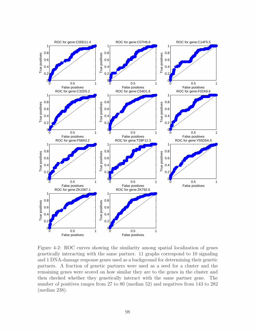
0 0.5 10
0.2
0.4
0.6
0.8
1
False positives
True
pos
itive
sROC for gene:C05D11.4
0 0.5 10
0.2
0.4
0.6
0.8
1
False positives
True
pos
itive
s
ROC for gene:C07H6.6
0 0.5 10
0.2
0.4
0.6
0.8
1
False positives
True
pos
itive
s
ROC for gene:C14F5.5
0 0.5 10
0.2
0.4
0.6
0.8
1
False positives
True
pos
itive
s
ROC for gene:C32D5.2
0 0.5 10
0.2
0.4
0.6
0.8
1
False positives
True
pos
itive
s
ROC for gene:C54D1.6
0 0.5 10
0.2
0.4
0.6
0.8
1
False positives
True
pos
itive
s
ROC for gene:F02A9.6
0 0.5 10
0.2
0.4
0.6
0.8
1
False positives
True
pos
itive
s
ROC for gene:F58A3.2
0 0.5 10
0.2
0.4
0.6
0.8
1
False positives
True
pos
itive
s
ROC for gene:T28F12.3
0 0.5 10
0.2
0.4
0.6
0.8
1
False positives
True
pos
itive
s
ROC for gene:Y55D5A.5
0 0.5 10
0.2
0.4
0.6
0.8
1
False positives
True
pos
itive
s
ROC for gene:ZK1067.1
0 0.5 10
0.2
0.4
0.6
0.8
1
False positives
True
pos
itive
s
ROC for gene:ZK792.6
Figure 4-2: ROC curves showing the similarity among spatial localization of genesgenetically interacting with the same partner. 11 graphs correspond to 10 signalingand 1 DNA-damage response genes used as a background for determining their geneticpartners. A fraction of genetic partners were used as a seed for a cluster and theremaining genes were scored on how similar they are to the genes in the cluster andthen checked whether they genetically interact with the same partner gene. Thenumber of positives ranges from 27 to 80 (median 52) and negatives from 143 to 282(median 238).
98

DNA-damage response pathway). We have looked at the spatial patterns of bar-1
and its genetically interacting partner genes and found that they are more likely to
be expressed in vulva, oocyte and gonad versus the genes that were not genetically
interacting (1.5 to 5 times more likely). Scores based on the presence in these partic-
ular tissues heavily contribute to the overall Bayesian score for bar-1 genetic partner
genes. The knockdown phenotype data of bar-1 supports this finding with ’egg laying
defective’,’protruding vulva’, ’exploded through vulva’ listed in Wormbase [144] and
supported by multiple experiments.
Figure 4-3 shows the same type of analysis performed, however this time pheno-
typic profile is used as gene’s feature vector. The area under the ROC curve is larger
than in the case of spatial profiles, varying from 0.71 to 0.84. Here, the number of
positives ranges from 45 to 174 (median 97) and negatives from 186 to 467 (median
374). More detailed analysis of the enrichment of partners of one of the genes, sma-6
(C32D5.2), shows that they share phenotypic traits with sma-6. sma-6 encodes a pro-
tein kinase orthologous to type I TGF-𝛽 receptors and is required for regulating body
length and for proper development of the male tail. Phenotypes resulting from RNAi
of sma-6 are ’small’, ’dumpy’ and ’reduced growth.’ The genetic partners of sma-6
also share traits such as ’dumpy’ and ’thin’. In addition, their individual knockdown
frequently leads to adult or embryonic lethality. The above phenotypes turn out to
significantly contribute to the overall score obtained by the Bayesian sets analysis.
If we further constrain the genetic partners of sma-6 to only kinases, the ROC
curve improves even further to 100% true positives (the data consists of 7 positive
samples and 35 negative samples). This improvement is true for most of the 11 genes
considered in the genetic study, with an average area under the ROC curve of 0.84.
This makes sense, as 10 of 11 genes analyzed are involved in 1 of 6 signaling pathways
specific to metazoans. Protein kinases are heavily implicated in signaling pathways,
where they transmit signals and control various complex processes. Among the pro-
tein kinases found to interact with sma-6 are let-502 and mpk-1. Let-502 encodes
a Rho-binding Serine/Threonine-specific kinase and is required for early embryonic
cleavages as well as body elongation. RNAi phenotypes for let-502 include ’slow
99

0 0.5 10
0.5
1
False positives
Tru
e po
sitiv
es
ROC for gene:C05D11.4
0 0.5 10
0.5
1
False positives
Tru
e po
sitiv
es
ROC for gene:C07H6.6
0 0.5 10
0.5
1
False positives
Tru
e po
sitiv
es
ROC for gene:C14F5.5
0 0.5 10
0.5
1
False positives
Tru
e po
sitiv
es
ROC for gene:C32D5.2
0 0.5 10
0.5
1
False positives
Tru
e po
sitiv
es
ROC for gene:C54D1.6
0 0.5 10
0.5
1
False positives
Tru
e po
sitiv
es
ROC for gene:F02A9.6
0 0.5 10
0.5
1
False positives
Tru
e po
sitiv
es
ROC for gene:F58A3.2
0 0.5 10
0.5
1
False positives
Tru
e po
sitiv
es
ROC for gene:T28F12.3
0 0.5 10
0.5
1
False positives
Tru
e po
sitiv
es
ROC for gene:Y55D5A.5
0 0.5 10
0.5
1
False positives
Tru
e po
sitiv
es
ROC for gene:ZK1067.1
0 0.5 10
0.5
1
False positives
Tru
e po
sitiv
es
ROC for gene:ZK792.6
Figure 4-3: ROC curves showing the similarity among phenotypes resulting fromknocking down genes genetically interacting with the same partner. 11 graphs cor-respond to 10 signaling and 1 DNA-damage response genes used as a backgroundfor determining their genetic partners. A fraction of genetic partners were used asa seed for a cluster and the remaining genes were scored on how similar they are tothe genes in the cluster and then checked whether they genetically interact with thesame partner gene. The number of positives ranges from 45 to 174 (median 97) andnegatives from 186 to 467 (median 374).
100

growth’, ’dumpy’ and ’arrested development’ - similarly to sma-6. Mpk-1 encodes a
mitogen-activated protein (MAP) kinase that acts in the vulval precursor cells as well
as affects morphology of the male spicules. We mentioned previously that sma-6 is
also required for the proper development of the male tail.
Limiting the interactors to only kinases did not improve the results of the spatial
analysis. We tried several other functional annotation groupings on the genetically
interacting genes as well with no success, often due to the resulting data sparsity.
In summary, both spatial and phenotypic ROC rise above 0.5 threshold; thus we
can conclude that information relevant to genetic interactions is present within both
datasets. The phenotypes contain more information than the spatial data about
possible genetic partners of a given gene. Moreover, if additional constraints are
added to characterize the interacting genes better, the results can improve further
e.g. limit the genetic partners to kinases.
4.2 Extensions to Bayesian sets for continuous data
Ghahramani and Heller [37] derived the score based on the binary data assumption.
However, the Bayesian sets algorithm can be generalized to include other probability
distributions. Below we extended this algorithm to be able to handle continuous
data, such as the data from microarray experiments. We tried two different models
to characterize the data, shown as hidden Markov dependencies graphs in Figure 4-4.
4.2.1 Bayesian sets model for continuous data - variant 1
Let’s model the distribution of each experiment (feature values) as a Gaussian with
mean 𝜇 and variance 𝜎2 as in Figure 4-4 (a), while assuming that individual experi-
ments (features) are independent of each other. Thus the model for the distribution
of a given column in expression matrix can be written as 𝑁(x;𝜇, 𝜎2).
The prior for the parameters Θ = {𝜇, 𝜎2} of the Gaussian profile model is the
conjugate normal inverse scaled gamma distribution:
101

, , ,
, 2
x
(a)
,
2
x
: N(0, o)where o
(b)
Figure 4-4: Two alternative hierarchical probability models proposed for model-ing continuous data. (a) Each experimental condition is modeled by a Gaussian:𝑁(𝑥;𝜇, 𝜎2) with the conjugate normal-scaled-inverse-gamma prior on 𝜇 and 𝜎2 (jointdistribution) (b) Each experimental condition is modeled by a Gaussian: 𝑁(𝑥;𝜇, 𝜎2)with the conjugate normal-inverse-gamma prior on 𝜎2, and Gaussian distribution for𝜇
𝐼𝐺(𝜇, 𝜎2∣𝛼, 𝛽, 𝜆, 𝜈) =√𝜇
𝜎√2𝜋
𝛽𝛼
Γ(𝛼)
( 1
𝜎2
)𝛼+1
𝑒−2𝛽+𝜈(𝜇−𝜆)2
2𝜎2 (4.9)
We derive the expression for a single experiment below. Given our independence
assumption, the expression for score based on multiple experiments is a product
of the individual scores from each experiment. Given the vector of gene values x
corresponding to set of genes under a single experimental condition, we can write
𝑝(x) as
𝑝(x) =
∫𝑝(𝑥∣𝜃)𝑝(𝜃)𝑑𝜃 (4.10)
where
𝑝(𝜃) = 𝐼𝐺(𝜇, 𝜎2;𝛼, 𝛽, 𝜆, 𝜈) (4.11)
and
𝑝(𝑥∣𝜃) = 𝑁(𝑥;𝜇, 𝜎2) (4.12)
The expression for 𝑝(x) can be written as follows:
102

𝑝(x) =
∫1
𝜎√2𝜋𝑒−
(𝑥−𝜇)2
2𝜎2
√𝜈
𝜎√2𝜋
𝛽𝛼
Γ(𝛼)
( 1
𝜎2
)𝛼+1
𝑒−2𝛽+𝜈(𝜇−𝜆)2
2𝜎2 𝑑𝜎2𝑑𝜇 (4.13)
Collecting the terms, we can rewrite this expression as follows:
𝑝(x) =
√𝜈𝛽𝛼
Γ(𝛼)
1
2𝜋
∫1
𝜎
( 1
𝜎2
)𝛼+1+1/2
𝑒−(𝑥−𝜇)2+2𝛽+𝜈(𝜇−𝜆)2
2𝜎2 𝑑𝜎2𝑑𝜇 (4.14)
The resulting expression for 𝑝(x) is:
𝑝(x) =
√𝜈𝛽𝛼
Γ(𝛼)
1√2𝜋
𝛾(�̃�)
𝛽�̃�√𝜈, (4.15)
where �̃� = 𝛼 + 1,𝛽 = 𝛽 + 𝜈(𝑥−𝜆)2
2(𝜈+1).
Since our score is essentially a relative measure, we can disregard constant factors
which do not depend on x:
𝑝(x) ∝ 1
𝛽�̃�(4.16)
Using the same marginalization rule, we compute 𝑝(x∣𝐷𝑐):
𝑝(x∣𝐷𝑐) =
∫𝑝(x∣𝜃)𝑝(𝜃∣𝐷𝑐)𝑑𝜃 =
∫𝑝(x∣𝜃)𝑝(𝐷𝑐∣𝜃)𝑝(𝜃)
𝑝(𝐷𝑐)𝑑𝜃 (4.17)
We can take the 𝑝(𝐷𝑐) term out of the integral since it does not depend on 𝜃.
Moreover, since it is not dependent on x we can omit it as it will not change the
relative score rankings of x. We rewrite the expression as:
𝑝(x∣𝐷𝑐) ∝∫𝑝(x∣𝜃)
𝑁∏𝑖=1
𝑝(𝑥𝑖∣𝜃)𝑝(𝜃)𝑑𝜃 (4.18)
𝑝(x∣𝐷𝑐) ∝∫𝑒−
(𝑥−𝜇)2
2𝜎2
𝜎√2𝜋
𝑁∏𝑖=1
1
𝜎√2𝜋𝑒−
(𝑥𝑖−𝜇)2
2𝜎2
√𝜈
𝜎√2𝜋
𝛽𝛼
Γ(𝛼)
( 1
𝜎2
)𝛼+1
𝑒−2𝛽+𝜈(𝜇−𝜆)2
2𝜎2 𝑑𝜎2𝑑𝜇
(4.19)
103

𝑝(x∣𝐷𝑐) ∝ 1
(2𝜋)𝑁+1
2
√𝜈𝛽𝛼
Γ(𝛼)
∫1√2𝜋
1
𝜎
( 1
𝜎2
)𝛼+1+𝑁+12
. . .
𝑒−(1+𝜈+𝑁)𝜇2+(2𝑥+2𝜈𝑥+2
∑𝑁𝑖=1 𝑥𝑖)𝜇+𝑥2+𝜈𝜆2+
∑𝑁𝑖=1 𝑥2𝑖 +2𝛽
2𝜎2 𝑑𝜎2𝑑𝜇
We omit other terms not dependent on x and are left with:
𝑝(x∣𝐷𝑐) ∝∫
1√2𝜋
1
𝜎
( 1
𝜎2
)𝛼+1+𝑁+12𝑒−
(1+𝜈+𝑁)𝜇2+
(2𝑥+2𝜈𝑥+2
∑𝑁𝑖=1 𝑥𝑖
)𝜇+𝑥2+𝜈𝜆2+
∑𝑁𝑖=1 𝑥2𝑖 +2𝛽
2𝜎2 𝑑𝜎2𝑑𝜇
(4.20)
The resulting expression for 𝑝(x∣𝐷𝑐) can be simplified as follows:
𝑝(x∣𝐷𝑐) ∝ 1
𝛽�̃�, (4.21)
where �̃� = 𝛼 + 𝑁+12
,𝛽 =𝑥2+𝜈𝜆2+
∑𝑁𝑖=1 𝑥
2𝑖+2𝛽
2− (𝑥+𝜈𝜆+
∑𝑁𝑖=1 𝑥𝑖)
2
2(𝜈+𝑁+1).
The log score is:
log 𝑠𝑐𝑜𝑟𝑒(x) = log(𝑝(x∣𝐷𝑐))− log(𝑝(x)) (4.22)
and substituting in the terms, we get
log(𝑠𝑐𝑜𝑟𝑒(x)) = 𝐶 + (𝛼+1
2) log
(𝛽 +
𝜈(𝑥− 𝜆)22(1 + 𝜈)
)+ . . .
−(𝛼+
𝑁 + 1
2
)log
(𝑥2 + 𝜈𝜆2 +∑𝑁𝑖=1 𝑥
2𝑖 + 2𝛽
2− (𝑥+ 𝜈𝜆+
∑𝑁𝑖=1 𝑥𝑖)
2
2(𝜈 +𝑁 + 1)
)
where 𝐶 stands for the constant terms. In the following sections we show the
results of the performance of this scoring model for continuous data in order to de-
termine whether genetically interacting described by a given dataset genes group
together.
104

−3 −2 −1 0 1 2 3 4 5−2
−1.5
−1
−0.5
0
0.5
1
x
Bay
esia
n sc
ores
Query pointsRemaining points with score on y−axisBackground distribution
(a)
−3 −2 −1 0 1 2 3 4 5−2
−1.5
−1
−0.5
0
0.5
x
Bay
esia
n sc
ores
Query pointsRemaining points with score on y−axisBackground distribution
(b)
Figure 4-5: Distribution of Bayesian set scores depends on the model. (a) Modelvariant 1: Distribution of scores based on a query set consisting of two samples (blue)shows the maximum score shifted away from the mean of the two query points;however, it is also away from the mean of the background distribution. (b) Modelvariant 2: Mean and variance are not coupled together, allowing the Bayesian scoreto maximize at the mean of the query set distribution.
Model deficiency of variant 1 - synthetic example
If we test the performance of the algorithm on a synthetic data with a query set
𝐷𝑐 consisting of 2 points, we can see that the maximum value of the score is not
at the mean between the two points but rather past it, away from the mean of the
background distribution (see Figure 4-5(a)). This is because the “tail” values of
the effective Gaussian defined by 𝐷𝑐 are bigger than the “tail” of the background
distribution. The intuition behind the score not having a maximum right at the
mean of 𝐷𝑐 is that if the datapoints we score are probabilistically closer to the mean
of the query distribution than the mean of the background distribution, they are more
likely to belong to the query distribution. In this model, the cluster is defined as a
deviation from the overall mean, the further the better. In an alternative model we
present next, we isolate a particular range of values per feature since the distribution
of experimental data result may “cluster” around that feature. The resulting score
maximizes right at the mean of the query input points, 𝐷𝑐. We achieve this by
decoupling the mean and variance in their probability model as shown in Figure 4-
5(b). The following section presents the alternative model.
105

4.2.2 Bayesian sets model for continuous data - variant 2
The basic setup for variant 2 of Bayesian sets model is identical to variant 1. Again,
we assume that each experiment can be modeled by a Gaussian with mean 𝜇 and
variance 𝜎2 as in Figure 4-4 (b), and the individual experiments are independent
of each other. 𝑁(x;𝜇, 𝜎2) models the distribution of x, which is a vector of values
corresponding to outcomes of a given experiment for a set of genes.
Unlike in variant 1, in variant 2 we decouple the mean and variance in order
for our resulting score to center around the mean of the distribution of the values
in the query set. The mean, 𝜇, has Gaussian distribution 𝑁(𝜇; 0, 𝜎𝑜) with mean 0
and variance 𝜎𝑜, which is assumed to be a large number effectively spreading the
distribution uniformly across. The conjugate prior for the variance, 𝜎2, is an inverse-
gamma distribution with parameters 𝛼, 𝛽:
𝐼𝐺(𝜎2;𝛼, 𝛽) =𝛽𝛼
𝛾(𝛼)
( 1
𝜎
)𝛼+1
𝑒−𝛽𝜎 (4.23)
For simplicity, as we did before, we focus on a single experiment (feature) at a
time. Given our independence assumption, the total score based on multiple exper-
iments is a product of the individual scores from each experiment. Given all values
corresponding to set of genes under a single experimental condition, we can express
probability of any such value x as
𝑝(x) =
∫𝑝(x∣𝜃)𝑝(𝜃)𝑑𝜃 (4.24)
where 𝜃 is a vector with components (𝜇, 𝜎2), and integration limits are (−∞,∞) by
𝜇 and (0,∞) by 𝜎2.
The component probability distributions can be written as:
𝑝(𝜃) = 𝑁(𝜇; 0, 𝜎2𝑜)𝐼𝐺(𝜎2;𝛼, 𝛽) (4.25)
and
𝑝(x∣𝜃) = 𝑁(x;𝜇, 𝜎2) (4.26)
106

The expression for 𝑝(x) can be written as follows:
𝑝(x) =
∫1
𝜎√2𝜋𝑒−
(𝑥−𝜇)2
2𝜎21
𝜎𝑜√2𝜋𝑒− 𝜇2
2𝜎2𝑜𝛽𝛼
Γ(𝛼)
( 1
𝜎2
)𝛼+1
𝑒−𝛽
𝜎2 𝑑𝜎2𝑑𝜇 (4.27)
If we assume that the variance of the mean, 𝜎2𝑜 , is large, 𝜎2𝑜 → ∞, then we can
approximate the term containing 𝜎𝑜, 𝑒− 𝜇2
2𝜎2𝑜 as 1, which simplifies the equation to:
𝑝(x) =
∫1
𝜎√2𝜋𝑒−
(𝑥−𝜇)2
2𝜎21
𝜎𝑜√2𝜋
𝛽𝛼
Γ(𝛼)
( 1
𝜎2
)𝛼+1
𝑒−𝛽
𝜎2 𝑑𝜎2𝑑𝜇 (4.28)
Next, we can rewrite it as:
𝑝(x) =1
𝜎𝑜√2𝜋
∫1
𝜎√2𝜋𝑒−
2𝛽+(𝑥−𝜇)2
2𝜎2𝛽𝛼
Γ(𝛼)(1
𝜎2)𝛼+1𝑑𝜎2𝑑𝜇 (4.29)
and match individual terms with 𝛼, 𝛽, 𝜆, 𝜈 variables in the probability density
function for inverse gamma distribution as shown in 4.30.
𝑓(𝜇, 𝜎2∣𝛼, 𝛽, 𝜆, 𝜈) =√𝜈
𝜎√2𝜋
𝛽𝛼
Γ(𝛼)
( 1
𝜎2
)𝛼+1
𝑒−2𝛽+𝜈(𝜇−𝜆)2
2𝜎2 (4.30)
For �̃� = 𝑥, �̃� = 𝛼, 𝛽 = 𝛽, 𝜈 = 1, the integral integrates to 1 and we get:
𝑝(x) =1
𝜎𝑜√2𝜋
(4.31)
We note that the above expression for 𝑝(x) is not dependent on x thus it will not
play a role in the final score rankings. We can therefore omit the denominator in the
final score expression.
Next, we evaluate 𝑝(x∣𝐷𝑐):
𝑝(x∣𝐷𝑐) =
∫𝑝(x∣𝜃)𝑝(𝜃∣𝐷𝑐)𝑑𝜃 =
∫𝑝(x∣𝜃)𝑝(𝐷𝑐∣𝜃)𝑝(𝜃)
𝑝(𝐷𝑐)𝑑𝜃 (4.32)
As before, we can take the 𝑝(𝐷𝑐) term out of the integral since it does not depend
on 𝜃. We compute it separately. We treat all 𝑁 points in our example set 𝐷𝑐 as
independent, therefore:
107

𝑝(x∣𝐷𝑐) =1
𝑝(𝐷𝑐)
∫𝑝(x∣𝜃)
( 𝑁∏𝑖=1
𝑝(𝑥𝑖∣𝜃))𝑝(𝜃)𝑑𝜃 (4.33)
which is
𝑝(x∣𝐷𝑐) =1
𝑝(𝐷𝑐)
1
(2𝜋)𝑁/2+1
𝛽𝛼
Γ(𝛼)𝜎𝑜
∫ ∫1
𝜎𝑁+1
( 1
𝜎2
)𝛼+1
𝑒−(𝑥−𝜇)2+
∑𝑖(𝑥𝑖−𝜇)2+2𝛽
2𝜎2 𝑑𝜎2𝑑𝜇
(4.34)
Defining �̃� = 𝛼 + 𝑁2, 𝜈 = 𝑁 + 1, �̃� =
𝑥+∑𝑁
𝑖=1 𝑥𝑖
𝑁+1, 𝛽 = − (𝑥+
∑𝑖 𝑥𝑖)2
2(𝑁+1)+ 𝛽 +
𝑥2+∑
𝑖 𝑥2𝑖
2,
the resulting expression for 𝑝(x∣𝐷𝑐) is:
𝑝(x∣𝐷𝑐) =1
𝑝(𝐷𝑐)
1
(2𝜋)𝑁/2+1
𝛽𝛼
Γ(𝛼)𝜎𝑜
√2𝜋√
𝑁 + 1
Γ(𝛼+𝑁/2)(𝛽 +
𝑥2+∑
𝑖 𝑥2𝑖
2− (𝑥+
∑𝑖 𝑥𝑖)2
2(𝑁+1)
)𝛼+𝑁/2(4.35)
Finally, we evaluate 𝑝(𝐷𝑐):
𝑝(𝐷𝑐) =
∫ 𝑁∏𝑖=1
𝑝(𝑥𝑖∣𝜃)𝑝(𝜃)𝑑𝜃 (4.36)
𝑝(𝐷𝑐) =
∫ 𝑁∏𝑖=1
1
𝜎√2𝜋𝑒−
(𝑥𝑖−𝜇)2
2𝜎21
𝜎𝑜√2𝜋𝑒− 𝜇2
2𝜎2𝑜𝛽𝛼
Γ(𝛼)
( 1
𝜎2
)𝛼+1
𝑒−𝛽
𝜎2 𝑑𝜎2𝑑𝜇 (4.37)
𝑝(𝐷𝑐) =1
(2𝜋)𝑁/2
𝛽𝛼
Γ(𝛼)𝜎𝑜
∫1
𝜎𝑁√2𝜋
( 1
𝜎2
)𝛼+1+(𝑁−1)/2
𝑒−∑
𝑖(𝑥𝑖−𝜇)2+2𝛽
2𝜎2 𝑑𝜎2𝑑𝜇 (4.38)
Again, we can use the inverse gamma probability distribution in 4.30 with the
following parameters:
�̃� = 𝛼 + 𝑁−12
, 𝜈 = 𝑁 , �̃� =∑𝑁
𝑖=1 𝑥𝑖
𝑁, 𝛽 = − (
∑𝑖 𝑥𝑖)
2
2𝑁+ 𝛽 +
∑𝑖 𝑥
2𝑖
2
𝑝(𝐷𝑐) =1
(2𝜋)𝑁/2
𝛽𝛼
Γ(𝛼)𝜎𝑜
1√𝑁
Γ(𝛼 + (𝑁 − 1)/2)(𝛽 +
∑𝑖 𝑥
2𝑖
2− (
∑𝑖 𝑥𝑖)2
2𝑁
)𝛼+(𝑁−1)/2(4.39)
108

As we have already discussed, we can omit any constant multipliers in the score,
which do not depend on x, which includes 𝑃 (𝐷𝑐), as we can see from Equation 4.39.
The final log score expression can be separated into items dependent on x and 𝐶
which represents items not dependent on x:
log(𝑠𝑐𝑜𝑟𝑒) = 𝐶 −(𝛼 +
𝑁
2
)log
(𝛽 +
𝑥2 +∑
𝑖 𝑥2𝑖
2− (𝑥+
∑𝑖 𝑥𝑖)
2
2(𝑁 + 1)
)+ . . .
+(𝛼 +
𝑁 − 1
2
)log
(𝛽 +
∑𝑖 𝑥
2𝑖
2− (
∑𝑖 𝑥𝑖)
2
2𝑁
)
We illustrate the distribution of the score for variant 2 on a synthetic data de-
scribed in Section 4.2.1, with a query set consisting of 2 points. The maximum value
of the score falls right at the mean between the query points (see Figure 4-5)(b). As
we have discussed before, variant 2 is better suited for situations when we need to
isolate a particular range of values per feature.
In the following sections we show the results of using one or both of the above
scoring models for continuous data, such as data coming from microarray experiments
measuring RNA expression across time or at various experimental conditions.
4.2.3 Experiments using continuous data models
Grouping genes based on their microarray profiles
With two alternative models allowing us to group genes described by continuous
data, we applied Bayesian sets to features from microarray experiments (microarray
experiments are described in Section 2.3.1). We investigated 10 different datasets,
ranging from a time course of a wildtype C. elegans strain under normal conditions [9,
62, 110, 134] to experimental data focusing on genes under different stress conditions
(hypoxia, heatstress) [84, 116], genes involved in development of specific lineages of
tissues e. g. germline [107] or genes believed to play a role in specific pathways (e.
g. aging, longevity [79, 84]).
As in Section 4.1.3, we used genetic interaction data from Byrne et al. [20], and
109
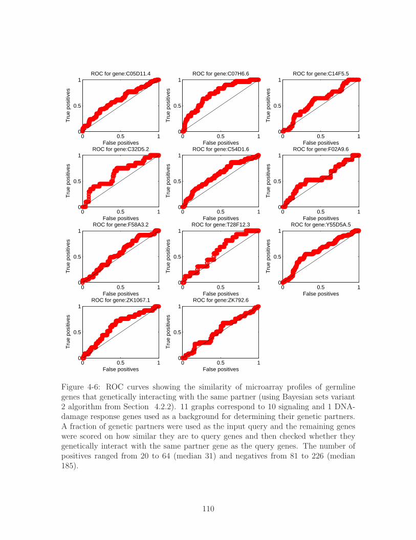
0 0.5 10
0.5
1
False positives
True
pos
itive
sROC for gene:C05D11.4
0 0.5 10
0.5
1
False positives
True
pos
itive
s
ROC for gene:C07H6.6
0 0.5 10
0.5
1
False positives
True
pos
itive
s
ROC for gene:C14F5.5
0 0.5 10
0.5
1
False positives
True
pos
itive
s
ROC for gene:C32D5.2
0 0.5 10
0.5
1
False positives
True
pos
itive
s
ROC for gene:C54D1.6
0 0.5 10
0.5
1
False positives
True
pos
itive
s
ROC for gene:F02A9.6
0 0.5 10
0.5
1
False positives
True
pos
itive
s
ROC for gene:F58A3.2
0 0.5 10
0.5
1
False positives
True
pos
itive
s
ROC for gene:T28F12.3
0 0.5 10
0.5
1
False positives
True
pos
itive
s
ROC for gene:Y55D5A.5
0 0.5 10
0.5
1
False positives
True
pos
itive
s
ROC for gene:ZK1067.1
0 0.5 10
0.5
1
False positives
True
pos
itive
s
ROC for gene:ZK792.6
Figure 4-6: ROC curves showing the similarity of microarray profiles of germlinegenes that genetically interacting with the same partner (using Bayesian sets variant2 algorithm from Section 4.2.2). 11 graphs correspond to 10 signaling and 1 DNA-damage response genes used as a background for determining their genetic partners.A fraction of genetic partners were used as the input query and the remaining geneswere scored on how similar they are to query genes and then checked whether theygenetically interact with the same partner gene as the query genes. The number ofpositives ranged from 20 to 64 (median 31) and negatives from 81 to 226 (median185).
110

tested whether genes that share the same interacting partner, group together. We
first compared genes based on their timecourse profiles alone and found the ROC
performance quite poor indicating little shared information. For the 10 datasets
considered, the area under the ROC varied from 0.54 to 0.59 for the Bayesian sets
method variant 1 and from 0.55 to 0.61 for the Bayesian sets method variant 2.
Overall, variant 2 did slightly better than variant 1, which leads us to believe that the
distribution of a feature from microarray experiments tends to occupy a particular
range of values. Figure 4-6 shows one example of ROC curves obtained directly
from the data using Bayesian sets variant 2 (variant 1 performance was worse with
𝐴𝑟𝑒𝑎𝑅𝑂𝐶 = 0.58 vs 0.61 for variant 2 for this dataset). The microarray data used is
from a paper focused on finding germline genes from Prof. Stuart Kim’s laboratory
at Stanford [107]. The microarray experiments cover 11, 917 C. elegans genes during
early embryonic and larval stages in both Wildtype worm and several mutants for
genes known to be essential for germline expression. After comparing the performance
of variant 1 and 2, we chose variant 2 for almost all subsequent analyses of similarity
among genes based on microarray data features.
The ROC curves obtained did show that there is some information that is shared
among the genetic partners. Our hypothesis was that if we further elucidate on the
characteristics of genes that are to belong to a single set, we would find more similari-
ties. We decided to use the additional annotations as discovered by Valerie Reinke et
al. [107] to further classify genes studied as either sperm-enriched, oocyte-enriched,
or germline-intrinsic. The sperm-enriched group contains an unusually large num-
ber of protein kinases and phosphatases known to be important in many signaling
pathways. The oocyte-enriched group includes components of embryonic signaling
pathways. We hypothesized that these features would improve the clustering perfor-
mance since the genetic interaction dataset focuses on genes participating in signaling
pathways as well. Finally, the germline-intrinsic group are the genes expressed in cell
lineages making only sperm or only oocytes. Germline-intrinsic group contains a
family of piwi-related genes that are important for stem cell proliferation. Narrowing
the Bayesian sets grouping to only consider genes within germline-intrinsic category
111

turned out to improve the predictive performance.
We limited the group of genetic interactors of each of the 11 genes in the mutant
set from Byrne et al. [20] to only those which belong to one or more of the categories of
germline genes: oocyte, sperm, and germline-intrinsic. Our motivation was that the
11 genes considered by Byrne et al. [20] have all but one been implicated in signaling
and developmental pathways. We found that the resulting ROCs have drastically
improved for several of the mutant genes,bar-1 being among them.
Case study 1: bar-1
bar-1 encodes a 𝛽-catenin ortholog that transduces a Wingless signal [31]. bar-1 reg-
ulates fat production or storage and metabolism. During C. elegans development,
BAR-1 functions as a transcriptional coactivator whose activity is required for Q-
neuroblast migration, P12 cell fate specification, and P3.p through P8.p vulval cell
fate specification at two different stages of development. In specifying vulval cell fates,
bar-1 interacts with Wnt and MAPK signaling pathways to regulate proper expression
of the LIN-39 homeodomain transcription factor. bar-1 mutant phenotypes include
various vulval defects, egg laying defects, slow growth etc. The initial Bayesian group-
ing of genetic interactors of bar-1 based on their microarray profiles from embryonic
and larval stages, resulted in ROC with a mean area of 0.62 as shown in Figure 4-
7(a). When we considered only these genes which were found to be germline-intrinsic,
the number of genes considered decreased to 19, and the area under ROC increased
to 0.78 (Figure 4-7(b)). Finally, when we considered genes that were either sperm
or oocyte enriched, the performance improved further to 𝐴𝑟𝑒𝑎𝑅𝑂𝐶 = 0.93 (Figure 4-
7(c)). It is important to note that some of the experimental false positives for genetic
interactors may not be false after all, which could further improve the ROC curve.
Table 4.2.3 lists some of these genetic interactors of bar-1 that are also enriched in
sperm and oocyte and which were grouped together with Bayesian sets method. We
can see that the genes share much similarity both in terms of phenotypic profiles
which are related to germline and the pace of development (source: Wormbase.org
[144]).
112
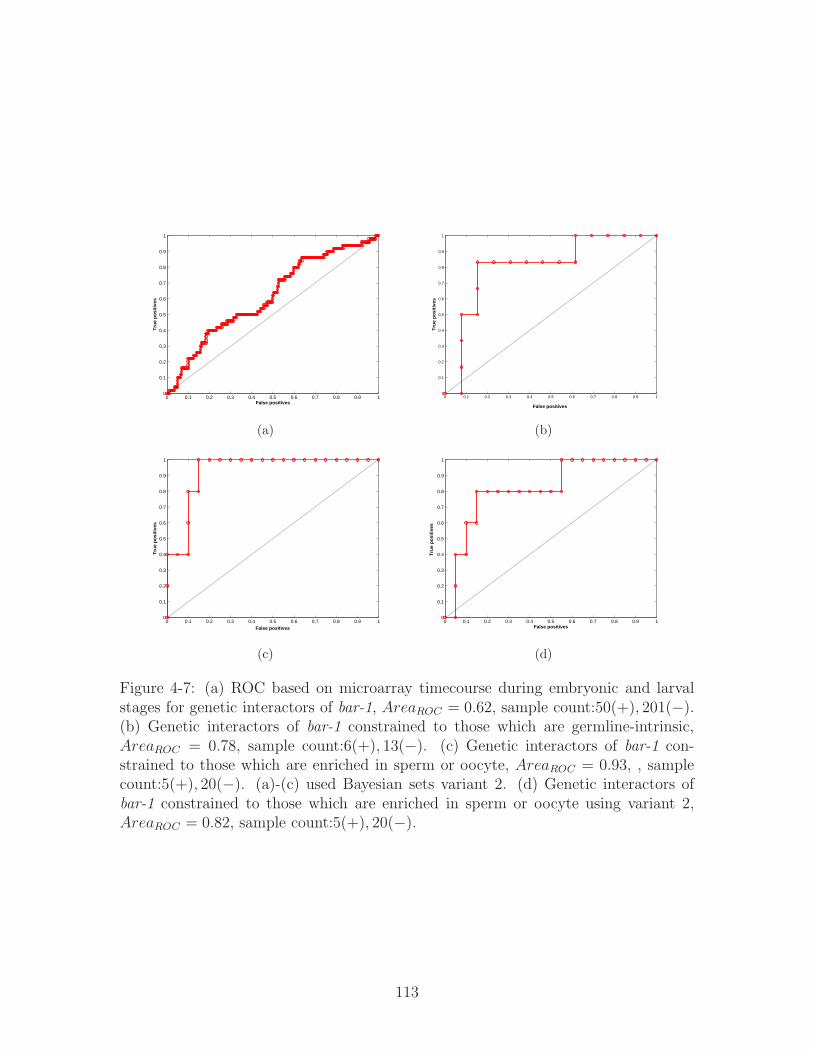
0 0.1 0.2 0.3 0.4 0.5 0.6 0.7 0.8 0.9 10
0.1
0.2
0.3
0.4
0.5
0.6
0.7
0.8
0.9
1
False positives
Tru
e p
osi
tive
s
(a)
0 0.1 0.2 0.3 0.4 0.5 0.6 0.7 0.8 0.9 10
0.1
0.2
0.3
0.4
0.5
0.6
0.7
0.8
0.9
1
False positives
Tru
e p
osi
tive
s(b)
0 0.1 0.2 0.3 0.4 0.5 0.6 0.7 0.8 0.9 10
0.1
0.2
0.3
0.4
0.5
0.6
0.7
0.8
0.9
1
False positives
Tru
e p
osi
tive
s
(c)
0 0.1 0.2 0.3 0.4 0.5 0.6 0.7 0.8 0.9 10
0.1
0.2
0.3
0.4
0.5
0.6
0.7
0.8
0.9
1
False positives
Tru
e p
osi
tive
s
(d)
Figure 4-7: (a) ROC based on microarray timecourse during embryonic and larvalstages for genetic interactors of bar-1, 𝐴𝑟𝑒𝑎𝑅𝑂𝐶 = 0.62, sample count:50(+), 201(−).(b) Genetic interactors of bar-1 constrained to those which are germline-intrinsic,𝐴𝑟𝑒𝑎𝑅𝑂𝐶 = 0.78, sample count:6(+), 13(−). (c) Genetic interactors of bar-1 con-strained to those which are enriched in sperm or oocyte, 𝐴𝑟𝑒𝑎𝑅𝑂𝐶 = 0.93, , samplecount:5(+), 20(−). (a)-(c) used Bayesian sets variant 2. (d) Genetic interactors ofbar-1 constrained to those which are enriched in sperm or oocyte using variant 2,𝐴𝑟𝑒𝑎𝑅𝑂𝐶 = 0.82, sample count:5(+), 20(−).
113

Table 4.1: Genes in C. elegans enriched in sperm and oocyte grouped based onmicroarray profiles and that genetically interact with bar-1 (all 5 listed)
Gene Name Relevant Phenotypes/Pathways DescriptionC27F2.4 slow growth, sterility protein carboxyl methylasehda-1 sterility, multivulva, rays missing histone deacetylase 1,
required for gonadogenesisand vulval development
snfc-5 sterile, protruding vulva, chromatin remodeling,egg-laying variant asymmetric cell division of the T-cells
dpy-27 sterile, egg laying variant, represses X-linked gene expression duringX-linked expression enhanced hermaphrodite dosage compensation
ZK546.14 receptor mediated endocytosis, uncharacterized conserved proteindefective, slow growth
We could not further constraint the groupings to only sperm or only oocyte as the
number of resulting genes within the set was too small (fewer than 4 positives). The
above results were obtained using variant 2 of Bayesian Sets (Section 4.2.2) performs
better than variant 1 for this dataset. Figure 4-7(d) shows ROC resulting from using
Bayesian sets variant 1 to evaluate similarity among genetically interacting genes with
bar-1, that are sperm- and oocyte-enriched, where 𝐴𝑟𝑒𝑎𝑅𝑂𝐶 = 0.82. This suggests
that the distribution of features in this microarray dataset clusters within a specific
range of values per feature as modeled with variant 2 and simply scoring based on a
distance from overall mean is not optimal (variant 1).
Case study 2: glp-1
glp-1 is among signaling genes from Byrne et al. [20] we selected to investigate fur-
ther because of its apparent function in germline cell fate specification. glp-1 stands
for abnormal germline proliferation which led us to believe that constraining its ge-
netic interactors to germline genes would enable us to find groupings of genes sharing
similar microarray profile features. Moreover, glp-1 encodes an N-glycosylated trans-
membrane protein that is one of two C. elegans Notch receptors participating in the
Notch pathway. GLP-1 activity is required for cell fate specification in germline and
114
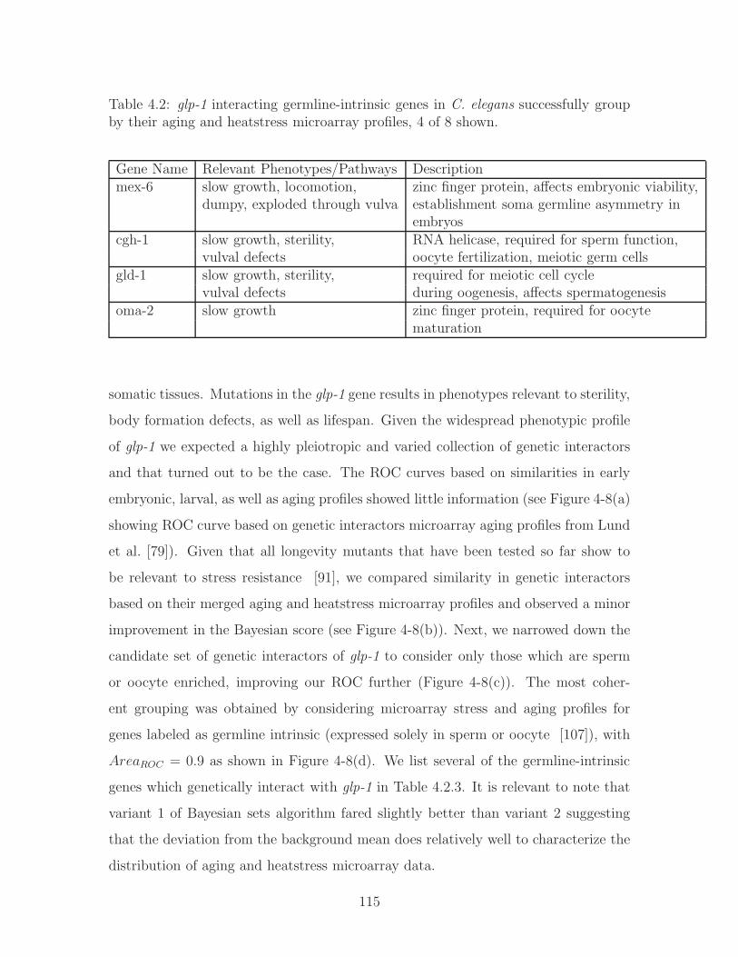
Table 4.2: glp-1 interacting germline-intrinsic genes in C. elegans successfully groupby their aging and heatstress microarray profiles, 4 of 8 shown.
Gene Name Relevant Phenotypes/Pathways Descriptionmex-6 slow growth, locomotion, zinc finger protein, affects embryonic viability,
dumpy, exploded through vulva establishment soma germline asymmetry inembryos
cgh-1 slow growth, sterility, RNA helicase, required for sperm function,vulval defects oocyte fertilization, meiotic germ cells
gld-1 slow growth, sterility, required for meiotic cell cyclevulval defects during oogenesis, affects spermatogenesis
oma-2 slow growth zinc finger protein, required for oocytematuration
somatic tissues. Mutations in the glp-1 gene results in phenotypes relevant to sterility,
body formation defects, as well as lifespan. Given the widespread phenotypic profile
of glp-1 we expected a highly pleiotropic and varied collection of genetic interactors
and that turned out to be the case. The ROC curves based on similarities in early
embryonic, larval, as well as aging profiles showed little information (see Figure 4-8(a)
showing ROC curve based on genetic interactors microarray aging profiles from Lund
et al. [79]). Given that all longevity mutants that have been tested so far show to
be relevant to stress resistance [91], we compared similarity in genetic interactors
based on their merged aging and heatstress microarray profiles and observed a minor
improvement in the Bayesian score (see Figure 4-8(b)). Next, we narrowed down the
candidate set of genetic interactors of glp-1 to consider only those which are sperm
or oocyte enriched, improving our ROC further (Figure 4-8(c)). The most coher-
ent grouping was obtained by considering microarray stress and aging profiles for
genes labeled as germline intrinsic (expressed solely in sperm or oocyte [107]), with
𝐴𝑟𝑒𝑎𝑅𝑂𝐶 = 0.9 as shown in Figure 4-8(d). We list several of the germline-intrinsic
genes which genetically interact with glp-1 in Table 4.2.3. It is relevant to note that
variant 1 of Bayesian sets algorithm fared slightly better than variant 2 suggesting
that the deviation from the background mean does relatively well to characterize the
distribution of aging and heatstress microarray data.
115
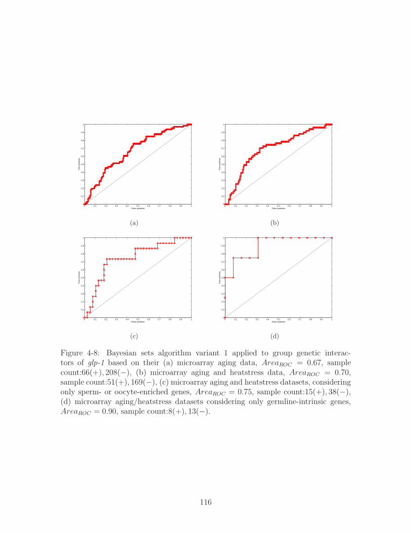
0 0.1 0.2 0.3 0.4 0.5 0.6 0.7 0.8 0.9 10
0.1
0.2
0.3
0.4
0.5
0.6
0.7
0.8
0.9
1
False positives
Tru
e po
sitiv
es
(a)
0 0.1 0.2 0.3 0.4 0.5 0.6 0.7 0.8 0.9 10
0.1
0.2
0.3
0.4
0.5
0.6
0.7
0.8
0.9
1
False positives
Tru
e po
sitiv
es
(b)
0 0.1 0.2 0.3 0.4 0.5 0.6 0.7 0.8 0.9 10
0.1
0.2
0.3
0.4
0.5
0.6
0.7
0.8
0.9
1
False positives
Tru
e po
sitiv
es
(c)
0 0.1 0.2 0.3 0.4 0.5 0.6 0.7 0.8 0.9 10
0.1
0.2
0.3
0.4
0.5
0.6
0.7
0.8
0.9
1
False positives
Tru
e po
sitiv
es
(d)
Figure 4-8: Bayesian sets algorithm variant 1 applied to group genetic interac-tors of glp-1 based on their (a) microarray aging data, 𝐴𝑟𝑒𝑎𝑅𝑂𝐶 = 0.67, samplecount:66(+), 208(−), (b) microarray aging and heatstress data, 𝐴𝑟𝑒𝑎𝑅𝑂𝐶 = 0.70,sample count:51(+), 169(−), (c) microarray aging and heatstress datasets, consideringonly sperm- or oocyte-enriched genes, 𝐴𝑟𝑒𝑎𝑅𝑂𝐶 = 0.75, sample count:15(+), 38(−),(d) microarray aging/heatstress datasets considering only germline-intrinsic genes,𝐴𝑟𝑒𝑎𝑅𝑂𝐶 = 0.90, sample count:8(+), 13(−).
116
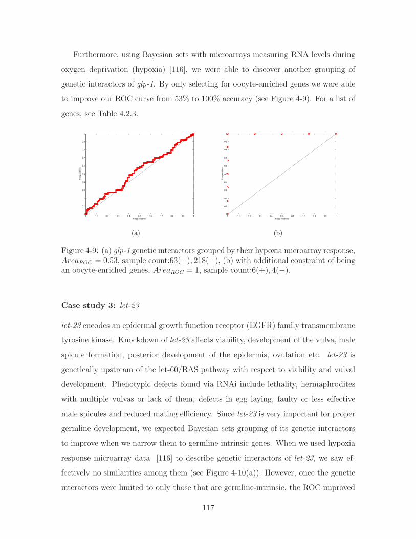
Furthermore, using Bayesian sets with microarrays measuring RNA levels during
oxygen deprivation (hypoxia) [116], we were able to discover another grouping of
genetic interactors of glp-1. By only selecting for oocyte-enriched genes we were able
to improve our ROC curve from 53% to 100% accuracy (see Figure 4-9). For a list of
genes, see Table 4.2.3.
0 0.1 0.2 0.3 0.4 0.5 0.6 0.7 0.8 0.9 10
0.1
0.2
0.3
0.4
0.5
0.6
0.7
0.8
0.9
1
False positives
Tru
e po
sitiv
es
(a)
0 0.1 0.2 0.3 0.4 0.5 0.6 0.7 0.8 0.9 10
0.1
0.2
0.3
0.4
0.5
0.6
0.7
0.8
0.9
1
False positives
Tru
e po
sitiv
es
(b)
Figure 4-9: (a) glp-1 genetic interactors grouped by their hypoxia microarray response,𝐴𝑟𝑒𝑎𝑅𝑂𝐶 = 0.53, sample count:63(+), 218(−), (b) with additional constraint of beingan oocyte-enriched genes, 𝐴𝑟𝑒𝑎𝑅𝑂𝐶 = 1, sample count:6(+), 4(−).
Case study 3: let-23
let-23 encodes an epidermal growth function receptor (EGFR) family transmembrane
tyrosine kinase. Knockdown of let-23 affects viability, development of the vulva, male
spicule formation, posterior development of the epidermis, ovulation etc. let-23 is
genetically upstream of the let-60/RAS pathway with respect to viability and vulval
development. Phenotypic defects found via RNAi include lethality, hermaphrodites
with multiple vulvas or lack of them, defects in egg laying, faulty or less effective
male spicules and reduced mating efficiency. Since let-23 is very important for proper
germline development, we expected Bayesian sets grouping of its genetic interactors
to improve when we narrow them to germline-intrinsic genes. When we used hypoxia
response microarray data [116] to describe genetic interactors of let-23, we saw ef-
fectively no similarities among them (see Figure 4-10(a)). However, once the genetic
interactors were limited to only those that are germline-intrinsic, the ROC improved
117
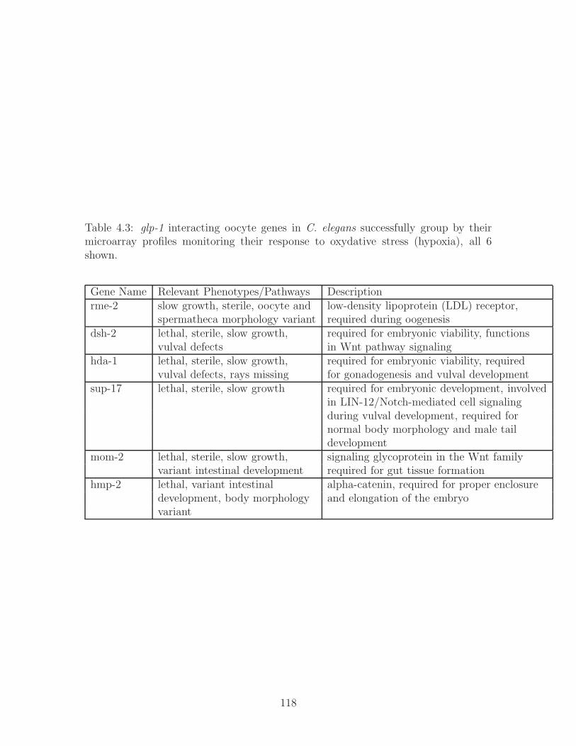
Table 4.3: glp-1 interacting oocyte genes in C. elegans successfully group by theirmicroarray profiles monitoring their response to oxydative stress (hypoxia), all 6shown.
Gene Name Relevant Phenotypes/Pathways Descriptionrme-2 slow growth, sterile, oocyte and low-density lipoprotein (LDL) receptor,
spermatheca morphology variant required during oogenesisdsh-2 lethal, sterile, slow growth, required for embryonic viability, functions
vulval defects in Wnt pathway signalinghda-1 lethal, sterile, slow growth, required for embryonic viability, required
vulval defects, rays missing for gonadogenesis and vulval developmentsup-17 lethal, sterile, slow growth required for embryonic development, involved
in LIN-12/Notch-mediated cell signalingduring vulval development, required fornormal body morphology and male taildevelopment
mom-2 lethal, sterile, slow growth, signaling glycoprotein in the Wnt familyvariant intestinal development required for gut tissue formation
hmp-2 lethal, variant intestinal alpha-catenin, required for proper enclosuredevelopment, body morphology and elongation of the embryovariant
118

significantly (see Figure 4-10). Further look at the genes within this set, shows that
their functional and phenotypic profiles are very similar to one another, and they are
temporally and spatially co-localized.
0 0.1 0.2 0.3 0.4 0.5 0.6 0.7 0.8 0.9 10
0.1
0.2
0.3
0.4
0.5
0.6
0.7
0.8
0.9
1
False positives
Tru
e po
sitiv
es
(a)
0 0.1 0.2 0.3 0.4 0.5 0.6 0.7 0.8 0.9 10
0.1
0.2
0.3
0.4
0.5
0.6
0.7
0.8
0.9
1
False positives
Tru
e po
sitiv
es
(b)
Figure 4-10: (a)ROC showing the results of running Bayesian sets variant 2 on geneticinteractors of let-23 described by their microarray profiles during oxidative stress(hypoxia), 𝐴𝑟𝑒𝑎𝑅𝑂𝐶 = 0.6, sample count:82(+), 500(−) (b) Constraining the genesin (a) to only those that are annotated as germline-intrinsic, 𝐴𝑟𝑒𝑎𝑅𝑂𝐶 = 0.8, samplecount:8(+), 29(−).
4.3 Discussion
In this Chapter, we used Bayesian sets method to determine whether different types
of data contain information relevant to genetic interactions. From the biological
perspective - we have found that phenotypic profiles of genetic partners of a given gene
tend to group together. However, there is little evidence that genetic partners are co-
localized. Similarly, without additional characteristics such as cell lineage, microarray
profiles of genetically interacting genes have very little in common. However, when
additional functional information was used to constrain the list of genes, microarray
profiles allowed groupings of genes based on a shared genetic partner gene.
The analysis we performed was limited to properties of individual genes. It is
natural to try to expand the similarity analysis to pairwise properties since genetic
interaction is a pairwise property. Therefore, we tried to find groupings of genes based
on their pairwise properties from merged protein interactome network for C. elegans,
119
WI8, as described in 2.3.4. It is possible that some of the pairwise properties, e.g.
direct physical interaction link, shared neighbors, would corroborate the fact that two
genes genetically interact. However, the data was too sparse to perform the Bayesian
sets analysis.
In our analysis, we focused on a single dataset at a time, in an effort to determine
which datasets are useful for predicting genetic interactions. However, the Bayesian
sets setup can easily handle mixing different types of features, e. g. binary and
continuous features such as phenotypes and microarray data. Since the Bayesian
log-score is a sum of individual contributions from each experiment, the continuous
and binary data scores can be combined as a sum, subject to their relative scaling
parameters.
The Bayesian sets algorithm used in this thesis is based on the work by Ghahra-
mani and Heller [37]. They derived a general framework, followed by exact formu-
lation that can be used to group binary data. We implemented their binary model
and applied it to find sets among genes described by experimental data consisting of
1s and 0s such as phenotypic and spatial profiles. Next, we derived two alternative
models intended for continuous data. During data analysis, we used ROC to assess
performance and selected either one of the two variants to analyze different datasets.
If the underlying feature can be simply described as a deviation from the overall
mean, Bayesian sets variant 1 performs better. However, this was not the case for
most microarray datasets we considered, and variant 2 generally did better. Using
the Bayesian sets algorithm, we were able to rank datasets based on how effective
they are in predicting genetic interactions.
Bayesian sets algorithm’s strength is the fact that it is based on a solid statistical
model derived from the underlying data distribution. However, this may also be a
drawback, since an appropriate model for the data distribution needs to be selected.
Thus the algorithm is sensitive to the choice of prior distribution. Moreover, it does
not take into account relationships among features. On the positive side, it allows us
to determine exactly which features contribute more or less to the final score, giving
us information as to which biological experiments are the most relevant. Finally, the
120

algorithm has certainly shortcomings in the way it deals with missing data. If a given
gene is missing a value for an experiment, the resulting contribution to the overall
log score is 0, since Bayesian sets simply omits the experiment. The contribution
from genes that do have data present for that experiment is by default nonzero,
even if they are not part of the cluster, and it is assumed that the contribution for
genes that partake in the cluster is simply larger. Thus, lack of data can adversely
(and not necessarily correctly) affect the relative ranking of a given gene. This is an
important drawback, especially if we are dealing with sparse data where features are
often missing. In the following Chapter we address this problem with an approach
called collaborative filtering. While collaborative filtering is a method of choice for
dealing with sparse datasets when making product recommendations (e. g. movie,
books), we believe that this is the first time it is applied to biological data.
121

122
Chapter 5
Collaborative Filtering approach to
predict genetic interactions and
other biological data
Watching Max and Rubie, a cartoon about sibling rabbits.
Andrew: Max is not listening to his mommie.
Mommie: She’s not his mommie; Rubie is Max’s sister!
Andrew: No, you know how I know she’s his mommie?
Mommie: How?
Andrew: She has a long skirt! Sisters wear short skirts.
- Missiuro family, Andrew - 5yo, unpublished
5.1 Motivation
In the previous Chapter, we have shown how Bayesian sets can be used to assess
how much information a given dataset contains. Moreover, using Bayesian scores
to compare vectors of genes in a “seed” set versus the background, we could rank
genes based on how likely they belong to the given “seed” set. This approach works
quite well as long as the data is not sparse (i.e. has a lot of missing values) which
is frequently the case with biological data. In the latter case, the relative ranking
of genes may no longer be accurate (see Section 4.3 for a more detailed discussion).
In this Chapter, we present the method of collaborative filtering (CF). We use CF
123

to evaluate how much information different datasets contain, and to represent the
large input datasets matrix by a much smaller matrix estimate. Furthermore, we use
collaborative filtering to remedy the problem of missing data. Collaborative filtering
is a relatively new family of learning algorithms designed to deal with sparse datasets.
It has been widely used as a method to provide product (e.g. movie) recommendations
to users. To our knowledge, it has never been applied to biological problems.
We begin this chapter with an introduction to collaborative filtering method along
with its typical applications. Next, we describe a factorization-based approach to
collaborative filtering that we will use. Subsequently, we describe the weighting and
neighborhood-based adaptations of the method to improve prediction accuracy.
Working with biological data presents some unique challenges that were not present
in any previous applications of CF. We address these by appropriately normalizing
and scaling the data. We also adapt the method to deal with a mixture of continuous
and discrete data. We demonstrate how we use collaborative filtering to fill in miss-
ing entries in microarray datasets, phenotypic profiles, as well as to predict genetic
interactions.
5.2 Introduction to collaborative filtering
Originally, collaborative filtering algorithms were developed for recommender systems
in e-commerce. The idea is to use known preferences of many users to predict what
other products or topics a given user may like. The prediction is based on his/her
similarity to others in known preferences [109, 115, 18, 50]. The original goal was to
automate the process of ”word-of-mouth” by which people recommend products or
services to one another. With a large number of options, e.g. titles of movies, it is
practically not feasible to provide sufficient number of experts that advise about movie
options. By switching from an individual to a group method of recommendations, the
problem becomes manageable. The objective of collaborative filtering is to determine
an average opinion for the group of users most similar to the one seeking advice.
A collaborative filtering (CF) problem generally includes the following:
124

Problem : Large number of users’ opinions (preferences) on a given set of topics (e.g.
movies) is being represented as a large sparse matrix of user-topic rankings.
Method :
1. Using certain similarity measures, a subgroup of people is selected who are
the most similar to the person seeking advice.
2. A weighted average of the preferences is computed. Note that there are
many ways to determine weights - for example, it can be based on how
many topics have been found to be similarly ranked with the user seeking
advice.
3. The result is used to recommend options on which the user looking for
advice has no opinion yet.
One of the features of collaborative filtering is the fact that one does not need
to know what a given feature represents in order for it to compare items to one
another. Of course, nothing prevents the recommender system from using the content
information if that is available e.g. user’s particular affinity for a certain genre of
movies, a particular actor or a director. The latter can formally be added as another
feature (column) in the ranking matrix and treated similarly to other features.
Among typical similarity metrics are Pearson correlation coefficient (see Appendix
A.1.1), vector distance or dot products. If the similarity metric has found people
with similar preferences, chances are that the popular items within this group will be
appreciated by the user seeking advice. It is not surprising that collaborative filtering
is now a method of choice for recommending books, music, movies, services or just
about any products.
Remarkably, the similarity can be assessed both for users as well as items in order
to improve prediction power. That is, certain items may be similar to others with
respect to their rankings among the same users e.g. users who score “Star Wars” high
might also give “Star Trek” a high score.
In addition, collaborative filtering can handle a matrix of values for prediction
that is very sparse (missing a lot of values). This makes it a very powerful and
125

flexible technique compared to other prediction methods (e.g. Bayesian, decision
trees). However, its accuracy is dependent on existence of some preference data. To
be reliable, the recommendation system needs each user to fill out at least some of
his/her preferences. The system is only effective when there is a ’reasonable’ amount
of data collected, thus users which have no preference recorded cannot expect effective
recommendations. In 2006, a company called Netflix announced “Netflix Challenge,”
and provided one of the most diverse and complete datasets for collaborative filtering
up to date [92]. As a result, many new collaborative filtering approaches have been
suggested, vastly expanding this research direction.
In Section 5.3, we present collaborative filtering method developed by Bell et al.
[13], which consists of two parts:
1. Factorization-based approach based on using expectation maximization (EM)
for Principal Component Analysis (PCA) but designed to handle sparse matri-
ces.
2. Neighborhood-aware (neighborhood-based) factorization which introduces neigh-
borhood awareness to the factorization-based approach.
We use this method to fill in missing biological data, including predicting genetic
interactions among genes. Since biological data is a mixture of binary and contin-
uous non-negative features, we have to adapt the method to integrate all of these
features together. We will describe other modifications to the CF method including
introduction of weights, varying similarity metrics, shrinkage parameters and exper-
imenting with residuals. Finally, we discuss some normalization steps we applied to
the biological datasets in order to increase the effectiveness of our prediction methods.
5.3 Factorization-based approach to collaborative
filtering
In this Section, we assume that a (sparse) data matrix 𝐷 of size 𝑚× 𝑛 is given. The
rows in 𝐷 correspond to genes, the columns correspond to experiments. Similarly to
126
[13], we reserve the special indexing letters to distinguish between genes and exper-
iments: for genes we use 𝑔, 𝑢, for experiments 𝑖, 𝑗. All known entries (𝑔, 𝑖) of 𝐷 are
denoted by the set 𝒦 = {(𝑔, 𝑖)∣𝑑𝑔,𝑖 is known }.Factorization-based approach is described on a high level by Roweis et al. [111]
as an EM approach to PCA. This method can be applied directly to the sparse set
(’sparse’ meaning containing a small set of known values and a large set of unknown
values) of known experimental results for genes. The usual way to compute PCA
of a matrix 𝐷 is based on its associated covariance matrix. However, [111] instead
computes rank-𝑓 matrices 𝑃 and 𝑄 as to minimize the Frobenius norm of (𝐷−𝑃𝑄𝑇 ),
where 𝑃𝑄𝑇 is the factorization-derived estimate of 𝐷. The process happens in two
repeated steps in which either 𝑃 or 𝑄 is being treated as fixed, while the other is
determined as the least squares solution minimizing the residual error, ∣∣𝐷−𝑃𝑄𝑇 ∣∣𝐹 ,that is, we iterate over the following two steps until convergence:
𝑃 = 𝐷𝑄(𝑄𝑇𝑄)−1 (5.1)
𝑄𝑇 = (𝑃 𝑇𝑃 )−1𝑃 𝑇𝐷. (5.2)
The process of recomputing the residual is repeated until the solution no longer
improves (the minimum is obtained).
The standard approach by Roweis et al. [111] uses imputation of values into 𝐷 as
part of the iterative process. In [14], the approach is modified to avoid imputation
of values. The rationale for avoiding imputation is two-fold: first, since the matrices
are very sparse, the added data will inevitably compromise (overwhelm) the known
data; secondly, in large datasets filling in the values might not be feasible because of
memory constraints.
The optimal value for 𝑓 (approximation order), the rank of matrices 𝑃 and 𝑄,
needs to be estimated as well. If we avoid imputation, the number of known entries
is small, and overfitting becomes an issue. To alleviate the overfitting problem, [13]
introduces shrinkage to gradually decrease the magnitude of subsequently computed
factors. Before each new factor (new column in 𝑃 and 𝑄) is computed, the residual
127

entries are multiplied by shrinkage parameters, which are determined empirically. By
applying shrinkage, each additional factor has a much lesser effect on the residual
than the previous factors. In [13] this multiplier is constructed to depend on two
parameters: 𝑓 , which is the number of computed factors up to this point, and 𝑛𝑔𝑖,
which is the minimum between the number of experiments with results for gene 𝑔
and the number of genes having information in experiment 𝑖. In our implementation,
we add weights to further adapt the shrinkage parameter. For example, when we
predict binary data, there may be many more 0s than 1s (category imbalance). As a
remedy, we weight the predictions of 1s more heavily than 0s by shrinking the residual
corresponding to 0.
5.3.1 Baseline framework for factorization-based CF
We continue assuming that the data matrix 𝐷 of size 𝑚× 𝑛 is given, along with the
set 𝒦 of known values 𝑑𝑔𝑖, (𝑔, 𝑖) ∈ 𝒦.The factorization-based framework is trying to find matrices 𝑃,𝑄 of size 𝑚 × 𝑓
and 𝑓 × 𝑛, where 𝑓 ≪ 𝑚,𝑛, such that the error
∑(𝑔,𝑖)∈𝒦
(𝑑𝑔𝑖 −𝑓∑
𝑗=1
𝑝𝑔𝑗𝑞𝑖𝑗)2 (5.3)
is minimized, where we denote 𝑓 as rank of factorization. We note that the expression
in Equation 5.3 is similar to Frobenius norm of the residual matrix
𝑅 = 𝐷 − 𝑃𝑄𝑇 , (5.4)
restricted to the known values of𝐷. Since 𝑓 is generally a relatively small number, the
product 𝑃𝑄𝑇 can be treated as the most compact (“simple”) rank-𝑓 approximation
of known observations in 𝐷.
One can view columns of the matrix 𝑄 as “experimental data of typical genes”,
and this way each gene is approximated by a linear combination of these “typical
genes.”
128

The above described least-squares problem is nonlinear, because both entries in 𝑃
and 𝑄 are unknown. However, if one treats either 𝑃 or 𝑄 as fixed, this problem rep-
resents a linear least-squares estimation. This way, the simplest iterative algorithm,
which can approximate 𝑃 and 𝑄 is to iteratively solve for one of them (for example,
𝑄), then use the obtained approximation to update 𝑃 , then repeat until convergence.
We use the above described iterative approach in an incremental setting by the
rank 𝑓 . This is done partially because of the need to estimate an adequate value of 𝑓
after which the approximation error no longer decreases. In addition, we use special
measures to avoid overfitting by using shrinkage, a multiplier which depends on 𝑓 ,
to ensure that higher-order updates are always less in magnitude than lower-order
updates. This way, we represent the approximation of 𝐷 as:
𝐷 ≈ 𝑃𝑄𝑇 = 𝑝1𝑞𝑇1 + 𝑝2𝑞
𝑇2 + 𝑝3𝑞
𝑇3 ..., (5.5)
where each subsequent rank-1 update represents a smaller correction to the previous
approximation.
Let’s now consider the problem of updating the rank-1 estimate 𝑝𝑓 (𝑓 -th column
of the matrix 𝑃 ) assuming fixed value of 𝑞𝑓 . From Equation 5.3 and assuming rank-
(𝑓 − 1) residual 𝑅 in Equation 5.4, we have:
minimize∑
(𝑔,𝑖)∈𝒦(𝑟𝑔𝑖 − 𝑝𝑔𝑓𝑞𝑖𝑓 )2. (5.6)
This linear least squares problem can be solved by each column of the residual result-
ing in the following update of the values of 𝑃 :
𝑝𝑔𝑓 =
∑𝑖:(𝑔,𝑖)∈𝒦 𝑟𝑔𝑖𝑞𝑖𝑓∑𝑖:(𝑔,𝑖)∈𝒦 𝑞
2𝑖𝑓
. (5.7)
The update of the 𝑓 -th column 𝑞𝑓 , given 𝑝𝑓 is analogous.
As it can be seen from Equation 5.7, the update is a linear function of the residual.
In the proposed algorithm we scale (shrink) the residual entries depending how much is
known about the corresponding experiments and genes, and depending on the value
129

of 𝑓 . The resulting algorithm for computing the next rank-1 update is presented
below. It is called iteratively for 𝑓 = 1, 2, . . . until the needed accuracy is reached.
Algorithm compute next factor
Inputs: Data matrix 𝐷, matrix 𝑀 (mask) which contains “1” where there are
known values and “0” otherwise, rank-(𝑓 − 1) factors 𝑃 and 𝑄.
Outputs: rank-𝑓 factors 𝑃 and 𝑄 with added columns 𝑝𝑓 and 𝑞𝑓 .
Function steps:
1. Compute the residual matrix 𝑅𝑎𝑐𝑡𝑢𝑎𝑙 = 𝐷 − 𝑃𝑄𝑇 .
2. Compute shrinkage matrix 𝑆, 𝑚×𝑛 which is used to shrink the residual 𝑅𝑎𝑐𝑡𝑢𝑎𝑙.
An entry in the 𝑆 matrix corresponding to gene 𝑔 experiment 𝑖, is computed as
𝑠𝑔𝑖 =𝑛𝑔𝑖
𝑛𝑔𝑖+𝛼𝑓, where 𝑛𝑔𝑖 corresponds to the minimum support for entry 𝑔𝑖 in 𝐷,
that is the minimum between the number of known items in row 𝑔 and column
𝑖, and 𝛼 = 25.
3. Compute shrunk residual, 𝑅 = 𝑅𝑎𝑐𝑡𝑢𝑎𝑙 ⋅ 𝑆.
4. Initialize error 𝑒𝑎𝑓𝑡𝑒𝑟 as the absolute mean squared error between the data matrix
𝐷 and its 𝑃𝑄𝑇 estimate.
5. Iterate over the values of columns 𝑝𝑓 and 𝑞𝑓 , until no further improvement in
the error, i.e𝑒𝑎𝑓𝑡𝑒𝑟𝑒𝑏𝑒𝑓𝑜𝑟𝑒
> 1− 𝜖
� 𝑒𝑏𝑒𝑓𝑜𝑟𝑒 ← 𝑒𝑎𝑓𝑡𝑒𝑟.
� Update the values of the column 𝑝𝑓 :
𝑝𝑓 = ((𝑅 ⋅𝑀)𝑞𝑓 )÷ (𝑀(𝑞𝑓 ⋅ 𝑞𝑓 )) (5.8)
� Update the values of the column 𝑞𝑓 :
𝑞𝑓 = (𝑝𝑇𝑓 (𝑅 ⋅𝑀))÷ ((𝑝𝑇𝑓 ⋅ 𝑝𝑇𝑓 )𝑀) (5.9)
� Compute the 𝑒𝑎𝑓𝑡𝑒𝑟 = ∥𝑀 ⋅ (𝑅𝑎𝑐𝑡𝑢𝑎𝑙 − 𝑝𝑓𝑞𝑇𝑓 )∥𝐹 .
130

6. Once the loop is exited, a new column 𝑝𝑓 and 𝑞𝑓 are added to the corresponding
factor matrices.
In the above algorithm, ⋅ refers to the element-by-element (Hadamard) matrix
multiplication, and ÷ refers to the element-by-element matrix division. One can see
that the update in Equation 5.8 is a vectorized form of Equation 5.7.
The heuristic associated with the shrinkage parameters is properly described in
[13].
5.3.2 Weighting of the residual
We have already pointed out that the entries of the residual can be weighted in the
updated formulas of Equation 5.7. Importantly, any extra information about the
measurement errors associated with the data in 𝐷 can be incorporated in (5.8, 5.9)
by introducing a matrix of weights 𝑊 where for every entry (𝑔, 𝑖) ∈ 𝒦 a nonnegative
value 𝑤𝑔𝑖 reflects the confidence level in the corresponding value 𝑑𝑔𝑖. In this case the
objective function of our least-squares minimization problem becomes
∑(𝑔,𝑖)∈𝒦
𝑤𝑔𝑖(𝑑𝑔𝑖 −𝑓∑
𝑗=1
𝑝𝑔𝑗𝑞𝑖𝑗)2. (5.10)
In this case the rank-1 update at each iteration of the algorithm can be computed from
the weighted linear least squares associated with the single column (for 𝑝𝑓 updates)
or row (for 𝑞𝑓 updates) of the residual:
𝑝𝑔𝑓 =
∑𝑖:(𝑔,𝑖)∈𝒦 𝑤𝑔𝑖𝑟𝑔𝑖𝑞𝑖𝑓∑𝑖:(𝑔,𝑖)∈𝒦 𝑤𝑔𝑖𝑞2𝑖𝑓
. (5.11)
5.3.3 Neighborhood-aware factorization
We recall from Section 5.3.1 that factorization-based approach predicts all the values
for a given gene 𝑔 by multiplying 𝑝𝑔 by the matrix 𝑄𝑇 . Its objective is to minimize,
up to shrinkage, the squared error associated with gene 𝑔:
131

∑(𝑔,𝑖)∈𝒦
(𝑑𝑔𝑗 − 𝑝𝑇𝑔 𝑞𝑗)2 (5.12)
Unlike the factorization-based approach that describes gene 𝑔 as a fixed linear
combination of the 𝑓 “typical” factors, neighborhood-aware factorization attempts to
be more flexible. Rather than predicting all the entries (features from experiments)
for all the genes together, it focuses on any additional information which may be
specific to a particular experiment - whether we can further adapt 𝑝𝑔 to a given
experiment 𝑖, 𝑝𝑖𝑔. Our estimation quality may improve with a more selective linear
combination that would change as a function of the experiment 𝑖 for a given gene 𝑔.
In this approach, we try to weight the squared error to consider these experiments
that are more similar to 𝑖, as shown in the error function [13]:
∑(𝑔,𝑖)∈𝒦
𝑠𝑖𝑗(𝑑𝑔𝑗 − 𝑝𝑇𝑔 𝑞𝑗)2 (5.13)
Therefore the main difference between the global factorization and the neighborhood-
adapted factorization is the incorporation of similarity matrix into the residual, which
emphasizes experiments which are the most similar to experiment 𝑖, since these may
most accurately predict 𝑖. We consider different similarity metrics in Section 5.4.1.
The neighborhood-aware factorization approach assumes that the matrix 𝑄 has
already been obtained, for example by running the baseline factorization algorithm.
This way, in order to estimate the value 𝑑𝑔𝑖, as we did before, we incrementally con-
struct the entries 𝑝𝑔1, 𝑝𝑔2, . . . , 𝑝𝑔𝑓 where each subsequent term has smaller magnitude
by using a shrunk residual. The resulting update on the 𝑙-th step is the following [13]:
𝑝𝑔𝑙 =
∑(𝑔,𝑗)∈𝒦 𝑠𝑖𝑗𝑟𝑔𝑗𝑞𝑗𝑙∑(𝑔,𝑗)∈𝒦 𝑠𝑖𝑗𝑞
2𝑗𝑙
, (5.14)
where 𝑟𝑔𝑗 is a shrunk residual entry 𝑑𝑔𝑗−∑𝑙−1
𝑘=1 𝑝𝑔𝑘𝑞𝑗𝑘. We obtain significant improve-
ment by using the neighborhood-aware algorithm compared to the baseline factoriza-
tion algorithm.
As one may suggest, there is a possibility to use similarity measure not only
132

between experiments, but also between genes, which leads to similar derivations with
respect to the corresponding single row in the matrix 𝑄 and assuming the matrix 𝑃
being fixed. In our experience, this led to only marginal, if any, improvements in the
predictive power of the method.
5.4 Investigating the effects of various parameters
5.4.1 Similarity metrics
The success of collaborative filtering prediction is heavily dependent on finding genes
or experiments that can be matched closely to the gene or experiment we would like
to predict values for. In order to determine which genes/experiments are the most
similar, one needs to select an appropriate similarity metric. We investigated multiple
similarity metrics including Pearson correlation, cosine similarity, inverse Euclidean
distance etc. In Figure 5-1, we show how cosine similarity metric relates to Pear-
son correlation metric when comparing different types of experiments to one another
across genes that are present in each experiment. The x-axis represents correlation
between a pair of experiments, vi and vj, profiled across genes. The y-axis shows
the cosine similarity value for the same pair of experiments. In our comparison of
profiles, we only considered positive values of similarity (greater than 0). In Figure 5-
1(a) we compare 25 phenotypic experiments to themselves, 11 genetic interactions
experiments, 38 spatial localization experiments, and 135 microarray experiments
(for detailed description of these datasets, see Section 2.3), while in Figure 5-1(b)
we compare 11 genetic interaction experiments to themselves, phenotypic, spatial,
and microarray experiments. In the cases when the resulting points are on the diag-
onal, the two metrics perform similarly. We investigated the wider range of cosine
similarity scores for pairwise comparisons of phenotypes vs microarray data (red ’*’
Figure 5-1(a)). We found that cosine similarity is sensitive to relative offset of data
from the mean and the horizontal bands in (a) correspond to such offsets. These un-
desirable effects are also visible in Figure 5-1(b). One way to remove these effects is
133

to recenter the data at 0. We have tested the performance of the neighborhood-based
algorithm using either of the two metrics and the correlation metric tends to perform
slightly better and more consistently than cosine similarity. The neighborhood-based
collaborative filtering algorithm uses similarity to assess which genes or experiments
belong to the “neighborhood” of a given gene or experiment, respectively. In the
subsequent experimental results sections, we use distance metric based on Pearson
correlation to assess similarity.
0 0.1 0.2 0.3 0.4 0.5 0.6 0.7 0.8 0.9 10
0.1
0.2
0.3
0.4
0.5
0.6
0.7
0.8
0.9
1
correlation score
cosi
ne
sim
ilari
ty s
core
with phenotypeswith GIswith spatial datawith microarray
(a)
0 0.1 0.2 0.3 0.4 0.5 0.6 0.7 0.8 0.9 10
0.1
0.2
0.3
0.4
0.5
0.6
0.7
0.8
0.9
1
correlation score
cosi
ne
sim
ilari
ty s
core
with phenotypeswith GIswith spatial datawith microarray
(b)
Figure 5-1: Plots of cosine similarity scores versus Pearson correlation scores for pairsof experiments (each experiment is profiled across genes) of the following types: (a)25 phenotypes are compared to themselves, 11 genetic interaction experiments, 38localization, 135 microarray; (b) 11 genetic interaction experiments are compared tothemselves, phenotypes, spatial localization, and microarray.
We also experimented with scaling the similarity metric in a variety of ways. As
we mentioned previously, Pearson correlation ranges from −1 to 1. Used as a distance
metric, it needs to be positive. Adding a constant 1 would result in all positive values,
however, if correlation was originally 0, it would result in falsely associating unrelated
“items” (genes/experiments). Therefore, instead of adding a constant, we threshold
and set all the negative values to 0. Next, we experimented with narrowing the list of
potential candidate similar items by raising the similarity metric to a higher power e.g.
𝑐𝑜𝑟𝑟(𝑣𝑖, 𝑣𝑗)2, . . . , 𝑐𝑜𝑟𝑟(𝑣𝑗, 𝑣𝑗)
5. This manipulation did not improve the performance of
the neighborhood-based method consistently and we decided to keep the correlation
metric in the first order.
134
In the next section, we describe shrinkage parameters that we subsequently use
together with similarity to compute how similar any two experiments (or genes) are
to one another.
Shrinkage when computing similarities
When predicting an unknown data in the matrix which pertains to a particular gene/-
experiment combination, we need to select the most similar genes/experiments in
order to make a prediction. Let’s consider the case when we are trying to assess
similarity among experiments (columns). Given that some of the data is missing and
the number of known entries we can compare may vary, we need to scale the simi-
larity measure by the “support” of a given element, which we denote by 𝑚𝑖𝑗 . The
support in our case is the number of genes that have results in both columns 𝑖 and
𝑗. The actual scaling factor is𝑚𝑖𝑗
𝑚𝑖𝑗+𝛽where 𝛽 is a fixed hyperparameter which we
tune based on cross validation. Below we summarize steps for computing similarity
between experiments. We have implemented a similar setup for genes.
Function shrink similarity matrix cols:
� Input: Data matrix 𝐷; 𝑖𝑐𝑜𝑙 - indexes of columns (experiments) that corre-
spond to value(s) to be predicted (can be more than 1 if doing it for multiple
experiments at once).
� Output: Shrunk similarity matrix, 𝑆, which is square and describes the
similarity among the experiments. Columns corresponding to indexes of exper-
iments, 𝑖𝑐𝑜𝑙, contain similarity measures between the given experiment and the
remaining experiments. Currently similarity is measured via Pearson correlation
coefficient. Similarity measure has been modified to observe the effects of vary-
ing the distance metric e.g. tried inverse euclidean distance, (1+ 𝑝𝑐𝑐)2, . . . , (1+
𝑝𝑐𝑐)5, etc. Entries in 𝑆 are presently computed as following:
� Function steps:
135

1. Compute Pearson correlation between column 𝑖 from 𝑖𝑐𝑜𝑙 and 𝑗 in 𝐷, and
set it to 𝑆𝑖𝑗.
2. Do not let the similarity take on negative values, so if 𝑆𝑖𝑗 < 0, 𝑆𝑖𝑗 = 0.
3. Scale it by the support, 𝑚𝑖𝑗 , that counts how many genes have known val-
ues in both the particular 𝑖 and experiment 𝑗, to obtain 𝑆𝑖𝑗 =𝑚𝑖𝑗𝑚𝑎𝑥(𝑐𝑜𝑟𝑟𝑖𝑗 ,0)
𝑚𝑖𝑗+𝛽,
where 𝛽 = 25 and 𝑐𝑜𝑟𝑟𝑖𝑗 is the Pearson correlation between columns 𝑖 and
𝑗.
5.4.2 Shrinkage
In the previous section we discussed using shrinkage when comparing how similar are
two columns (experiments) to one another. Sometimes the amount of data available
varies widely, perhaps by orders of magnitude depending on the experiments/genes
considered. The idea behind “shrinkage” is to impose a penalty for those parameters
that have less data associated with them. In this section, we describe “shrinkage” as
it is used to reduce the magnitude of the residual as we compute subsequent factors
during factorization. The shrinkage applied to the residual reduces its magnitude
according to two elements. The first element is the number of already computed
factors, 𝑓 . As we compute more factors, the objective is to explain smaller variations
of the data. In other words, their effect on the magnitude of the residual should
decrease. The second element of shrinkage is the “support” behind the entry we
would like to predict which we denote by 𝑛𝑖𝑗 . The support is the minimum between
the number of experiments gene 𝑖 participated in and the number of genes that were
covered in a given experiment 𝑗. As the support grows and more data is available,
we have more information regarding the involved gene and experiment, and we can
use more factors to explain them. The shrinkage of the residual can be summarized
algorithmically as follows:
𝑟𝑒𝑠𝑖𝑗 ← 𝑛𝑖𝑗𝑟𝑒𝑠𝑖𝑗𝑛𝑖𝑗 + 𝛼𝑓
(5.15)
where 𝑟𝑒𝑠𝑖𝑗 indicates the residual for entry (𝑖, 𝑗), 𝑛𝑖𝑗 is the support, and 𝑓 is the
136

number of already computed factors.
We compared the performance of standard regularization approach which does not
employ shrinkage parameters to our factorization-based approach which uses shrink-
age. We find that the algorithm using shrinkage has more predictive power.
5.4.3 Evaluating residual for binary data
The residual relates to how we linearize the loss function at the current estimate. For
example, in the case of a squared loss the residual is the difference between the actual
and predicted value. In previous applications of the factorization method (described
in Section 5.3), the entries were movie ratings, integers ranging from 0 to 𝑁 . The
residual was computed by taking the difference between the actual value and the
current estimate. In our setup, the entries to be predicted are either continuous or
binary data. To compute the residual for continuous data, such as microarray profiles,
we can subtract the predicted value from the actual value to determine how far off we
are and pass it on to the next factor, as in the original setup. However, the majority of
the predictions concern binary data such as phenotypes, spatial expression patterns,
presence/lack of interaction. While the residual should estimate how close we are
to predicting either 1 or 0, we need to address subtle differences. For example, let’s
suppose that the actual value of a given entry is 1. At a given factorization step
we predict the value to be 0.7 - while it is neither 0 nor 1, it is certainly closer to
1 than 0. We could decide that there is no need to improve on this prediction thus
set the residual to 0. Alternatively, we would like to further improve it and set the
residual equal to the difference between the actual and predicted value, 𝑟𝑒𝑠 = 0.3.
However, taking the difference may not always be the right approach. Suppose that
our prediction is 2, thus we are pretty confident it is closer to 1 rather than 0. The
difference between the two entities is 1, yet intuitively it would not make sense to
“improve” the answer by bringing it closer to 1 as 2 indicates we are already very
confident in this answer. Thus we may want to set the residual to 0. An alternative
approach is that once the value has been predicted correctly, we can altogether ignore
its residual from that point onward when calculating subsequent factors. In summary,
137

the formula for the residual is not necessarily a simple difference between the actual
and the predicted value. Below, we list several variants of residuals we experimented
with for binary data:
� Variant 1 - the residual is set to 0 if either: the estimate is greater than 1 when
the actual value is 1, or the estimate is less than 0 when the actual value is
0. As we proceed with subsequent factors, we further regularize the residual
towards 0.
� Variant 2 - the residual is set to 0 if either: the estimate is greater than 0.5
when the actual value is 1, or the estimate is less than 0.5 when the actual
value is 0. In this variant, the residual is regularized towards 0 as soon as the
“decision boundary” of 0.5 is passed.
� Variant 3 - the residual for a given entry is no longer considered when computing
subsequent factors if either: the estimate is greater than 1 when the actual value
is 1, or the estimate is less than 0 when the actual value is 0. This variant’s
conditions are similar to 1, however, by removing the correctly predicted entries
from the subsequent computation of the residual, this variant avoids overfitting
and favors simpler models.
We have experimented with predicting phenotypes sourced from Wormbase based
on the remaining datasets including over 130 microarray experiments, approximately
90 spatial localization experiments, as well as other features based on protein in-
teraction experiments, miRNA binding data etc (data is described in detail in Sec-
tion 2.3). Figure 5-2 shows 2 examples of ROC curves obtained for 2 out of 25
phenotypes. We used the factorization-based collaborative filtering approach along
with the neighborhood-aware factorization focusing on similarity among the experi-
ments (columns). For each phenotype and residual variant, we selected 15 positive
and 15 negative samples which we withheld from the data and subsequently cross val-
idated using the ROC curves. We have found that the residual variant had minimal
impact on the result, with variants 1 and 3 performing equally well, and variant 2
138
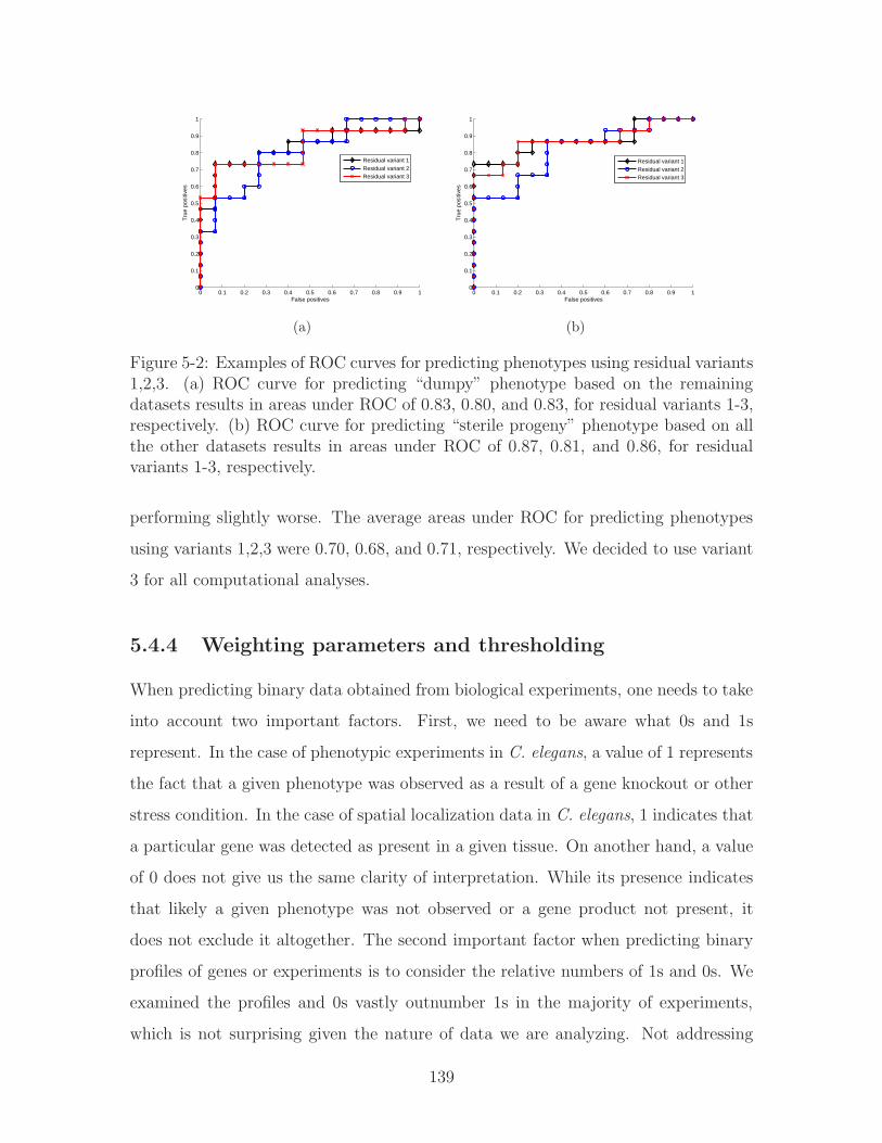
0 0.1 0.2 0.3 0.4 0.5 0.6 0.7 0.8 0.9 10
0.1
0.2
0.3
0.4
0.5
0.6
0.7
0.8
0.9
1
False positives
Tru
e po
sitiv
es
Residual variant 1Residual variant 2Residual variant 3
(a)
0 0.1 0.2 0.3 0.4 0.5 0.6 0.7 0.8 0.9 10
0.1
0.2
0.3
0.4
0.5
0.6
0.7
0.8
0.9
1
False positives
Tru
e po
sitiv
es
Residual variant 1Residual variant 2Residual variant 3
(b)
Figure 5-2: Examples of ROC curves for predicting phenotypes using residual variants1,2,3. (a) ROC curve for predicting “dumpy” phenotype based on the remainingdatasets results in areas under ROC of 0.83, 0.80, and 0.83, for residual variants 1-3,respectively. (b) ROC curve for predicting “sterile progeny” phenotype based on allthe other datasets results in areas under ROC of 0.87, 0.81, and 0.86, for residualvariants 1-3, respectively.
performing slightly worse. The average areas under ROC for predicting phenotypes
using variants 1,2,3 were 0.70, 0.68, and 0.71, respectively. We decided to use variant
3 for all computational analyses.
5.4.4 Weighting parameters and thresholding
When predicting binary data obtained from biological experiments, one needs to take
into account two important factors. First, we need to be aware what 0s and 1s
represent. In the case of phenotypic experiments in C. elegans, a value of 1 represents
the fact that a given phenotype was observed as a result of a gene knockout or other
stress condition. In the case of spatial localization data in C. elegans, 1 indicates that
a particular gene was detected as present in a given tissue. On another hand, a value
of 0 does not give us the same clarity of interpretation. While its presence indicates
that likely a given phenotype was not observed or a gene product not present, it
does not exclude it altogether. The second important factor when predicting binary
profiles of genes or experiments is to consider the relative numbers of 1s and 0s. We
examined the profiles and 0s vastly outnumber 1s in the majority of experiments,
which is not surprising given the nature of data we are analyzing. Not addressing
139

this issue may lead to a seemingly good predictor which in fact only predicts 0s for
all entries.
To address the issues of both confidence and relative frequency, we decided to
introduce weights to the computation of our error and residual. The effect of weights
is incorporated into the least squares factorization equation which minimizes the
residual error between the factor-based estimate of the data and the actual value (see
Equation 5.16). In the error measure, each element of the residual error matrix 𝑅 is
multiplied by the corresponding weight in 𝑊 , the matrix of weights. This way, the
resulting weighted least squares error is:
𝐸𝑟𝑟𝑜𝑟(𝑃,𝑄) =∑
(𝑔,𝑖)∈𝒦(𝑤𝑔𝑖(𝑟𝑔𝑖 − 𝑝𝑇𝑔 𝑞𝑖))2 → min (5.16)
where 𝑃 and 𝑄 are unknown rank-𝑓 matrices whose product is the (weighted)
best rank-𝑓 estimate to 𝑅. After incorporating weights into the equation, the update
equations corresponding to individual entries in 𝑃 and 𝑄 are:
𝑃𝑔𝑓 ←∑
𝑖:(𝑔,𝑖)∈𝒦 𝑤𝑔𝑖𝑟𝑒𝑠𝑔𝑖𝑄𝑖𝑓∑𝑖:(𝑔,𝑖)∈𝐾 𝑤𝑔𝑖𝑄2
𝑖𝑓
(5.17)
𝑄𝑖𝑓 ←∑
𝑔:(𝑔,𝑖)∈𝒦 𝑤𝑔𝑖𝑟𝑒𝑠𝑔𝑖𝑃𝑔𝑓∑𝑔:(𝑔,𝑖)∈𝐾 𝑤𝑔𝑖𝑃
2𝑔𝑓
(5.18)
where 𝑓 is the index of the current factor being solved, 𝑤𝑔𝑖 corresponds to in-
dividual entry in 𝑊 . We weight each 0 and 1 based on their relative ratios to one
another in each experiment (a column in the original data matrix). Our motivation
for selecting a given experiment rather than a dataset, is because each experiment
represents a unique condition. An experiment is independent of others as its control
conditions are different. We have analyzed the resulting predictions for 1s and 0s as
a result of introducing weights. As expected, the number of correctly predicted 1s
increases at a cost of making errors on 0s.
Another relevant variable when evaluating the performance of this method is the
selection of an appropriate threshold when classifying entries as either 1 or 0. Thresh-
olding effect is automatically handled by the ROC curve which ranks genes relative
140

to one another. The optimal threshold corresponds to the point on the ROC which is
closest to its top-left corner (100% true positives, 0% false positives). This threshold
is not necessarily 0.5 for binary data and is affected by the introduction of additional
parameters such as weights. However, the ROC automatically takes that into account
as it simply reflects how adequate is the relative ranking.
5.5 Applying collaborative filtering to gene data
In this section, we describe the application of collaborative filtering to gene data. More
specifically, we use both global factorization and neighborhood-aware factorization to
fill in missing values in microarray data, phenotypic profiles, and spatial expression
pattern data based on shared information among both the genes and the experiments.
Finally we try to predict genetic interactions using the features from all available
datasets.
5.5.1 Predicting continuous and discrete values with CF
We test the performance of collaborative filtering algorithm when applied to both
continuous and discrete binary biological data. We apply both the factorization-
based algorithm for CF along with the neighborhood-aware CF approach based on
similarity among experiments.
Predicting microarray data
For continuous data such as microarray expression profiles, we withhold 30 random
values per experiment and then predict them one experiment at a time. There are
a total of 135 microarray experiments based on 10 different studies focused on C.
elegans development, aging, heatstress, hypoxia responses etc (datasets are described
in Section 2.3). For input data, we first use all of the available experimental data (see
Section 2.3) and then compare it with results of using only microarray data as input
to see how much information is contained within the microarray data versus other
datasets such as spatial or phenotypic data.
141
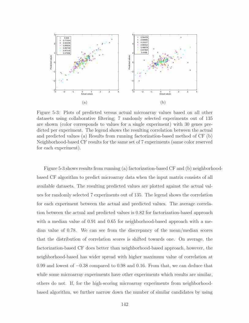
−3 −2 −1 0 1 2 3 4−3
−2
−1
0
1
2
3
Actual values
Pre
dict
ed v
alue
s
0.9260.773240.923390.895260.957490.972150.47536
(a)
−3 −2 −1 0 1 2 3 4−6
−4
−2
0
2
4
6
Actual values
Pre
dict
ed v
alue
s
0.564780.848950.242270.683120.988780.97352 0.4498
(b)
Figure 5-3: Plots of predicted versus actual microarray values based on all otherdatasets using collaborative filtering; 7 randomly selected experiments out of 135are shown (color corresponds to values for a single experiment) with 30 genes pre-dicted per experiment. The legend shows the resulting correlation between the actualand predicted values (a) Results from running factorization-based method of CF (b)Neighborhood-based CF results for the same set of 7 experiments (same color reservedfor each experiment).
Figure 5-3 shows results from running (a) factorization-based CF and (b) neighborhood-
based CF algorithm to predict microarray data when the input matrix consists of all
available datasets. The resulting predicted values are plotted against the actual val-
ues for randomly selected 7 experiments out of 135. The legend shows the correlation
for each experiment between the actual and predicted values. The average correla-
tion between the actual and predicted values is 0.82 for factorization-based approach
with a median value of 0.91 and 0.65 for neighborhood-based approach with a me-
dian value of 0.78. We can see from the discrepancy of the mean/median scores
that the distribution of correlation scores is shifted towards one. On average, the
factorization-based CF does better than neighborhood-based approach, however, the
neighborhood-based has wider spread with higher maximum value of correlation at
0.99 and lowest of −0.38 compared to 0.98 and 0.16. From that, we can deduce that
while some microarray experiments have other experiments which results are similar,
others do not. If, for the high-scoring microarray experiments from neighborhood-
based algorithm, we further narrow down the number of similar candidates by using
142
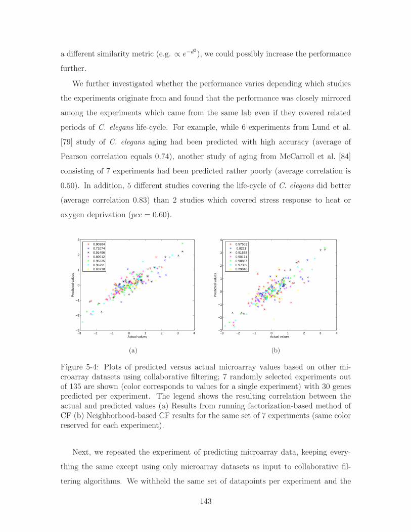
a different similarity metric (e.g. ∝ 𝑒−𝑑2), we could possibly increase the performance
further.
We further investigated whether the performance varies depending which studies
the experiments originate from and found that the performance was closely mirrored
among the experiments which came from the same lab even if they covered related
periods of C. elegans life-cycle. For example, while 6 experiments from Lund et al.
[79] study of C. elegans aging had been predicted with high accuracy (average of
Pearson correlation equals 0.74), another study of aging from McCarroll et al. [84]
consisting of 7 experiments had been predicted rather poorly (average correlation is
0.50). In addition, 5 different studies covering the life-cycle of C. elegans did better
(average correlation 0.83) than 2 studies which covered stress response to heat or
oxygen deprivation (𝑝𝑐𝑐 = 0.60).
−3 −2 −1 0 1 2 3 4−3
−2
−1
0
1
2
3
Actual values
Pre
dict
ed v
alue
s
0.903840.710740.914960.890120.953350.967910.63718
(a)
−3 −2 −1 0 1 2 3 4−3
−2
−1
0
1
2
3
4
Actual values
Pre
dict
ed v
alue
s
0.57502 0.82210.915380.901710.988670.973890.29846
(b)
Figure 5-4: Plots of predicted versus actual microarray values based on other mi-croarray datasets using collaborative filtering; 7 randomly selected experiments outof 135 are shown (color corresponds to values for a single experiment) with 30 genespredicted per experiment. The legend shows the resulting correlation between theactual and predicted values (a) Results from running factorization-based method ofCF (b) Neighborhood-based CF results for the same set of 7 experiments (same colorreserved for each experiment).
Next, we repeated the experiment of predicting microarray data, keeping every-
thing the same except using only microarray datasets as input to collaborative fil-
tering algorithms. We withheld the same set of datapoints per experiment and the
143

ROC curves in Figure 5-4 show same 7 experiments predicted with factorization-
based and neighborhood-based CF algorithms. For factorization-based approach, the
mean correlation among 135 experiments is 0.80 (median equals 0.88) and for the
neighborhood-based approach the mean is 0.70 (median is 0.88). The top scorers
for the neighborhood-based algorithm are experiments covering the early develop-
ment and aging [79] in C. elegans. The performance of global factorization-based
approach degrades when only microarray data is used, while the neighborhood based
approach fares better in many, however not all cases (compare Figures 5-3(b) and
5-4(b)). In conclusion, while microarray data is the primary source of information for
other microarray studies, other datasets can provide additional information for some
of the genes.
Predicting phenotypes
To evaluate the performance of the factorization-based and neighborhood-based CF
approaches when dealing with binary data, we ran the algorithms to predict 25 differ-
ent experimental phenotypes from Wormbase (see Section 2.3 for data description)
based on a combined matrix of other gene features. Figure 5-5 shows ROC plots for 12
randomly selected phenotypes. For each phenotype, we picked 15 positive and 15 neg-
ative samples to withhold. The factorization-based algorithm did better on average
with mean ROC area 0.72 versus 0.66 for neighborhood-based CF (neighborhood-
based approach compared similar experiments). However, the neighborhood-based
algorithm performed better at predicting some phenotypes e.g. “dumpy” and “ster-
ile progeny” in Figure 5-5 suggesting that there is a set of experiments with similar
profiles.
5.5.2 Predicting genetic interactions with CF
In the previous sections we applied collaborative filtering to predict microarray profile
values and phenotypes. We follow the same approach to predict genetic interactions.
We use the genetic interaction matrix for 11 gene mutants, mutant set, and their in-
144

0 0.5 10
0.5
1
False positives
Tru
e po
sitiv
es
Phenotype:clear
0 0.5 10
0.5
1
False positives
Tru
e po
sitiv
es
Phenotype:cuticle morphology abnormal
0 0.5 10
0.5
1
False positives
Tru
e po
sitiv
es
Phenotype:dumpy
0 0.5 10
0.5
1
False positives
Tru
e po
sitiv
es
Phenotype:exploded through vulva
0 0.5 10
0.5
1
False positives
Tru
e po
sitiv
es
Phenotype:growth abnormal
0 0.5 10
0.5
1
False positives
Tru
e po
sitiv
es
Phenotype:larval lethal
0 0.5 10
0.5
1
False positives
Tru
e po
sitiv
es
Phenotype:long
0 0.5 10
0.5
1
False positives
Tru
e po
sitiv
es
Phenotype:morphology abnormal
0 0.5 10
0.5
1
False positives
Tru
e po
sitiv
es
Phenotype:paralyzed
0 0.5 10
0.5
1
False positives
Tru
e po
sitiv
es
Phenotype:small
0 0.5 10
0.5
1
False positives
Tru
e po
sitiv
es
Phenotype:sterile progeny
0 0.5 10
0.5
1
False positives
Tru
e po
sitiv
es
Phenotype:vulva development abnormal
Factorization−based CFNeighborhood−based CF
Figure 5-5: ROC curves illustrate the performance of collaborative filtering for pre-dicting phenotypes based on combined array of other datasets. We selected 12 pheno-types out of 25 at random. For cross validation, 15 positive and 15 negative sampleswere withheld and predicted based on the remaining data. The results shown hereare using factorization-based and neighborhood-based CF. The areas under the ROCvaries from 0.55 to 0.90 for factorization-based estimate (mean 0.72) and from 0.35to 0.98 for neighborhood based estimate (mean 0.66).
145

teracting partners from Dr Peter Roy’s laboratory [20] as described in Section 2.3.8;
this dataset has been analyzed with Bayesian sets in Chapter 4. By using an in-
teraction matrix we have enough information to assess our performance via cross
validation. For cross validation, we iterate over genetic interactors of each of the 11
gene mutants one at a time: we withhold 15 positive and 15 negative samples per
column corresponding to a given mutant gene’s genetic interactions with its genetic
partners. We then predict the withheld data using global factorization-based as well
as the neighborhood based collaborative filtering.
Figure 5-6 shows the results of using factorization-based collaborative filtering for
predicting genetic interactors of a given gene. The input is comprised of all datasets
including microarray, spatial, phenotypes, miRNA interactors etc. We find that the
factorization-based CF method generally performed better than the neighborhood-
based CF (neighborhood being similar experiments); mean area under the ROC for
factorization-based CF is 0.81 versus 0.67 for neighborhood-based CF. Next, we re-
peated the process of predicting genetic interactors but with only phenotypic data
consisting of 25 experiments as inputs to the CF algorithms. Since in Chapter 4
we found that phenotypes have information relevant to genetic interactors, we would
expect them to be able to predict some genetic interactions. Indeed, we find that the
factorization-based and neighborhood-based CF estimates based solely on phenotypes
result in the average area under ROC of 0.73 and 0.70, respectively (see Figure 5-7).
This confirms that phenotypes contain substantial amounts of information relevant
to genetic interactions.
5.5.3 Reducing data to relevant factors based on the ROC
cross validation results
The collaborative filtering method presented here estimates the matrix of gene values
using a product of factor matrices 𝑃 and 𝑄. The number of factors used can be
decided based on the overall prediction performance, for example evaluating ROC
curves. Therefore gene data can be approximated by factor matrices of order sub-
146

0 0.5 10
0.5
1
False positives
Tru
e po
sitiv
esROC for gene:let−756
0 0.5 10
0.5
1
False positives
Tru
e po
sitiv
es
ROC for gene:clk−2
0 0.5 10
0.5
1
False positives
Tru
e po
sitiv
es
ROC for gene:sem−5
0 0.5 10
0.5
1
False positives
Tru
e po
sitiv
es
ROC for gene:sma−6
0 0.5 10
0.5
1
False positives
Tru
e po
sitiv
es
ROC for gene:bar−1
0 0.5 10
0.5
1
False positives
Tru
e po
sitiv
es
ROC for gene:glp−1
0 0.5 10
0.5
1
False positives
Tru
e po
sitiv
es
ROC for gene:egl−15
0 0.5 10
0.5
1
False positives
Tru
e po
sitiv
es
ROC for gene:sos−1
0 0.5 10
0.5
1
False positives
Tru
e po
sitiv
es
ROC for gene:daf−2
0 0.5 10
0.5
1
False positives
Tru
e po
sitiv
es
ROC for gene:let−23
0 0.5 10
0.5
1
False positives
Tru
e po
sitiv
es
ROC for gene:let−60
Figure 5-6: ROC curves illustrate the performance of collaborative filtering for pre-dicting genetic interactions based on combined array of other datasets. Each of the11 graphs shows the results of predicting genetic partners for one of the mutant genesused as a background. For cross validation, 15 positive and 15 negative samples werewithheld and predicted based on the remaining data. The results shown here areusing the global factorization-based estimate. The area under the ROC varies from0.65 for let-23 to 0.96 for let-756 with a mean area under the ROC of 0.81.
147

0 0.5 10
0.5
1
False positives
Tru
e po
sitiv
es
ROC for gene:let−756
0 0.5 10
0.5
1
False positives
Tru
e po
sitiv
es
ROC for gene:clk−2
0 0.5 10
0.5
1
False positives
Tru
e po
sitiv
es
ROC for gene:sem−5
0 0.5 10
0.5
1
False positives
Tru
e po
sitiv
es
ROC for gene:sma−6
0 0.5 10
0.5
1
False positives
Tru
e po
sitiv
es
ROC for gene:bar−1
0 0.5 10
0.5
1
False positives
Tru
e po
sitiv
es
ROC for gene:glp−1
0 0.5 10
0.5
1
False positives
Tru
e po
sitiv
es
ROC for gene:egl−15
0 0.5 10
0.5
1
False positives
Tru
e po
sitiv
es
ROC for gene:sos−1
0 0.5 10
0.5
1
False positives
Tru
e po
sitiv
es
ROC for gene:daf−2
0 0.5 10
0.5
1
False positives
Tru
e po
sitiv
es
ROC for gene:let−23
0 0.5 10
0.5
1
False positives
Tru
e po
sitiv
es
ROC for gene:let−60
Figure 5-7: ROC curves illustrate the performance of collaborative filtering for pre-dicting genetic interactions based only on the phenotypic data consisting of 25 ex-periments. Each of the 11 graphs shows the results of predicting genetic partners forone of the mutant genes used as a background. For cross validation, 15 positive and15 negative samples were withheld and predicted based on the remaining data. Theresults shown here were obtained with factorization-based CF. The area under theROC varies from 0.56 for sem-5 to 0.94 for let-756 with a mean area under the ROCof 0.73.
148

stantially smaller than the original data, thus reducing complexity. We ran the
factorization-based and neighborhood-based CF estimates for predicting genetic in-
teractors of 11 C. elegans mutant genes [20] and looked at the average area under
their ROC curves for each order of factorization, 𝑓 , up until 𝑓 = 29. At each iter-
ation, we selected at random 15 genes that genetically interact with a given mutant
gene and 15 that do not. Figure 5-8 shows average area under the ROC curve for
predicting genetic interactors of each of 11 mutant genes using all available data as
input. As we can see from the plot, the factorization-based CF method performs
substantially better than the neighborhood-based CF (area under ROC reaches 0.81
when 𝑓 = 29 versus 0.68, respectively). The lack of improvement in performance of
the neighborhood-based method may be due to the fact that many experiments are
at approximately the same level of similarity. The neighborhood-based method is
unable to distinguish these, even with additional factors.
5 10 15 20 25 300
0.1
0.2
0.3
0.4
0.5
0.6
0.7
0.8
0.9
1
Factorization order, f
Ave
rage
Are
a un
der
RO
C
Factorization−based CFNeighborhood−based CF
Figure 5-8: The average area under the ROC curve for predicting genetic interactorsof 11 mutant genes versus factorization order. The dashed lines correspond to a choiceof factor order that would be sufficient to describe the data. For factorization-basedCF, 𝑓 = 14 with average area under ROC of 0.77. For neighborhood-based CF, 𝑓 = 6with average area under ROC of 0.68.
149

Figure 5-8 can be used to decide which factor order is sufficient to describe the
input datasets. We can reduce our input data describing individual genes to a matrix
𝑃 which will described genes as a combination of 𝑓 “typical genes”. We will use
this more compact representation of the individual gene features to merge them with
pairwise features in the next chapter.
5.6 Discussion
In this Chapter, we introduced a novel approach of collaborative filtering for gene
data that allows us to predict missing values as well as reduce data dimensionality
to the more relevant features. Unlike Bayesian sets method covered in Chapter 4,
collaborative filtering deals with missing values by estimating them rather than ig-
noring their impact altogether. This is highly desirable as ignoring missing values can
adversely affect the results as we discussed in Section 4.3. One of the weaker points of
the CF approach is that it relies on ad-hoc shrinkage and tuning parameters. The CF
approach used here does not have a solid statistical model backing it. Moreover, es-
pecially in the case of global factorization method, it is rather difficult to extrapolate
which datasets have been the most relevant to the data we are predicting.
We tried two variants of collaborative filtering: a global factorization-based method
and a local neighborhood-based method. We applied these to continuous and discrete
data to predict entries in microarray, phenotype and genetic interactions datasets.
Our cross-validation results indicate support of our hypothesis that different datasets
are linked together. We were able to predict both continuous microarray and discrete
phenotype and genetic interaction data with relatively high accuracy.
Moreover, we showed how we can use collaborative filtering to assess how much
relevant information to queried entries is contained within different types of data (see
Figure 5-9). Subsequently we used CF to significantly reduce data dimensionality.
This is particularly useful since it enables us to shrink large quantity of data to a
much smaller set of relevant gene features. This lower dimensionality data describing
individual genes can be easily merged with pairwise features. The results from Sec-
150
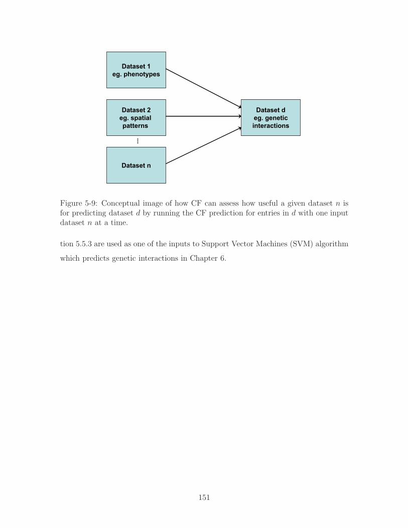
Dataset 1eg. phenotypes
Dataset 2eg. spatial patterns
Dataset n
Dataset deg. geneticinteractions
Figure 5-9: Conceptual image of how CF can assess how useful a given dataset 𝑛 isfor predicting dataset 𝑑 by running the CF prediction for entries in 𝑑 with one inputdataset 𝑛 at a time.
tion 5.5.3 are used as one of the inputs to Support Vector Machines (SVM) algorithm
which predicts genetic interactions in Chapter 6.
151

152

Chapter 6
Predicting genetic interactions
with SVM
Patrycja: I just don’t understand why you need 10 hours of sleep per night vs 7 like I do.
Dmitry: Well... a more complex mind needs more time to rebuild and refuel.
- from unpublished
6.1 Motivation
Presence of a genetic interaction between two genes indicates a possible functional
linkage between them. Given that the incidence of genetic interactions has been
estimated at less than half a percent [74], our objective all along has been to compu-
tationally predict potential candidate pairs in order to increase the odds of detecting
them experimentally. In Chapter 4, we have shown that genetic interactions are
linked to phenotypic, spatial and other features of genes, and in Chapter 5, we used
collaborative filtering to predict genetic interactions based on feature similarity among
individual genes. While collaborative filtering allows us to work with sparse data with
missing values, it has limitations as to what kinds of relationships it can detect among
genes. More specifically, it is limited to detecting only linear types of feature similar-
ity. In this chapter, we expand beyond linear functions to detect genetic interactions
and use Support Vector Machines (SVM) [130, 57] to predict genetic interactions.
153
Unlike collaborative filtering, however, SVM cannot deal with missing values. We use
CF to fill in the missing entries in the input data matrix for SVM. In addition, we use
CF to approximate the input matrix and compare the performance of SVM on these
two input variants. Individual gene features or CF-reduced form of gene features
are merged with pairwise gene features and used as an input to SVM. We show the
results of using different kernels including linear, polynomial of degrees two through
five, and a radial basis function (RBF). By using a nonlinear kernel function such as
a radial basis kernel, we are able to predict genetic interactions without restricting
ourselves to only linear classification functions.
In the next section, we briefly describe the general framework of Support Vector
Machines (SVMs). Next, we elucidate in more detail our experimental setup, includ-
ing preprocessing the input data and how we merge individual and pairwise features
together. Finally, we show results of running SVMs to predict genetic interactions in
C. elegans both on a global scale as well as focusing on kinase families of genes from
MAPK pathway.
6.2 Overview of Support Vector Machines
This Chapter is mostly concerned with the kernel-based Support Vector Machines for
classification. Below we briefly describe this method, however the reader is referred
to [114, 57] for an in-depth assessment.
6.2.1 Optimal separating hyperplane
Let’s consider the problem of separating the set of training vectors belonging to two
separate classes:
𝒟 = {(𝑥𝑖, 𝑦𝑖)∣𝑥𝑖 ∈ ℝ𝑛, 𝑦𝑖 ∈ {−1, 1}}, 𝑖 = 1, . . . , 𝑙. (6.1)
154
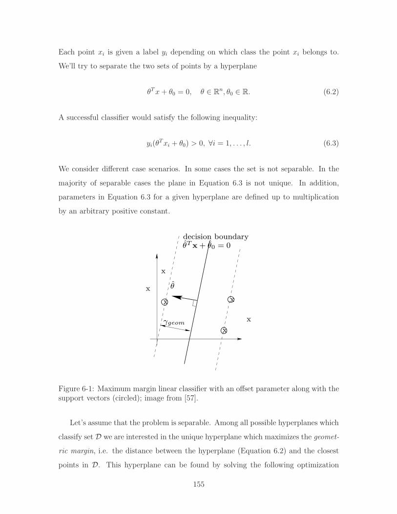
Each point 𝑥𝑖 is given a label 𝑦𝑖 depending on which class the point 𝑥𝑖 belongs to.
We’ll try to separate the two sets of points by a hyperplane
𝜃𝑇𝑥+ 𝜃0 = 0, 𝜃 ∈ ℝ𝑛, 𝜃0 ∈ ℝ. (6.2)
A successful classifier would satisfy the following inequality:
𝑦𝑖(𝜃𝑇𝑥𝑖 + 𝜃0) > 0, ∀𝑖 = 1, . . . , 𝑙. (6.3)
We consider different case scenarios. In some cases the set is not separable. In the
majority of separable cases the plane in Equation 6.3 is not unique. In addition,
parameters in Equation 6.3 for a given hyperplane are defined up to multiplication
by an arbitrary positive constant.
θ̂
x
x
x
x
x
θ̂T x + θ̂0 = 0decision boundary
γgeom
x
Figure 6-1: Maximum margin linear classifier with an offset parameter along with thesupport vectors (circled); image from [57].
Let’s assume that the problem is separable. Among all possible hyperplanes which
classify set 𝒟 we are interested in the unique hyperplane which maximizes the geomet-
ric margin, i.e. the distance between the hyperplane (Equation 6.2) and the closest
points in 𝒟. This hyperplane can be found by solving the following optimization
155

problem [57]:
minimize1
2∥𝜃∥2, subject to 𝑦𝑖(𝜃
𝑇𝑥𝑖 + 𝜃0) ≥ 1, ∀𝑖 = 1, . . . , 𝑙. (6.4)
The optimization problem in Equation 6.4 is known as a quadratic programming
problem, and the solution to Equation 6.4, if exists, is unique. A remarkable property
of this problem is that the number of active inequality constraints is usually less than
𝑙. This way the solution is fully determined by the corresponding set of 𝑥𝑖 which
are termed support vectors. These vectors lie on the margin which equals to ∥𝜃∥ (seeFigure 6-1).
In a more general case, which allows the set 𝒟 to be non-separable, the following
quadratic optimization problem is being solved:
minimize 12∥𝜃∥2 + 𝐶∑𝑙
𝑖=1 𝜉𝑖,
subject to 𝑦𝑖(𝜃𝑇𝑥𝑖 + 𝜃0) ≥ 1− 𝜉𝑖 and 𝜉𝑖 ≥ 0, ∀𝑖 = 1, . . . , 𝑙.
. (6.5)
Here, the slack variables 𝜉𝑖 are zero if the margin is not violated for the corre-
sponding 𝑥𝑖. The parameter 𝐶 governs the trade-off between the maximization of
the margin and margin violations by training points. As a result, the description
(Equation 6.5) for finite 𝐶 can lead to margin violations (training points which lie
inside the margin) even in the separable case, at an expense of maximizing the margin
itself. Bigger 𝐶 will lead to penalizing such margin violations.
6.2.2 Kernel-based SVM
The above described linear classification algorithm by itself has limited applicability.
A more powerful algorithm, which is appropriate where linear boundary is inadequate
for classification, utilizes a nonlinear mapping of the points in the set 𝒟 into a certain
high-dimensional feature space. In this feature space, the optimization equivalent to
Equation 6.5 is being solved, which is then being mapped back to the original space.
The whole computation and classifier evaluation is being done in the original space
by operating with kernels.
156

By the kernel function we assume an inner product in the feature space via a
certain nonlinear map Φ:
𝐾(𝑧, 𝑧) = (Φ(𝑧),Φ(𝑧)). (6.6)
The choice of the kernel determines the nonlinear mapping. For example, the family
of polynomial kernels
𝐾(𝑧, 𝑧) = (1 + 𝑧𝑇 𝑧)𝑝 (6.7)
corresponds to the nonlinear mapping
Φ(𝑧) = [𝑧1, . . . , 𝑧𝑛, 𝑧21 , 𝑧1𝑧2, 𝑧1𝑧3, . . . , 𝑧
2𝑛, . . . 𝑧
𝑝𝑛]
𝑇 (6.8)
and a standard dot product in this Euclidean space. Another popular kernel is a
radial basis kernel
𝐾(𝑧, 𝑧) = 𝑒𝑥𝑝(− ∥𝑧 − 𝑧∥
2
2𝜎2
). (6.9)
The feature space corresponding to this kernel is a certain infinite-dimensional family
of continuous functions. There are numerous types of other kernels which can be used
as well [43].
In order to derive the resulting optimization problem using kernels, let’s derive
the dual optimization problem for the feature space. The Lagrangian function of
Equation 6.5 is
𝐿(𝜃, 𝜃0, 𝛼, 𝜉, 𝛽) =1
2∥𝜃∥2 + 𝐶
𝑙∑𝑖=1
𝜉𝑖 −𝑙∑
𝑖=1
𝛼𝑖(𝑦𝑖(𝜃𝑇𝑥𝑖 + 𝜃0)− 1 + 𝜉𝑖)−
𝑙∑𝑖=1
𝛽𝑖𝜉𝑖. (6.10)
Here the variables 𝛼𝑖 ≥ 0 and 𝛽𝑖 ≥ 0 are Lagrange multipliers. The corresponding
dual problem can be obtained by minimizing the Lagrangian (Equation 6.10) with
respect to original (primal) variables 𝜃, 𝜃0, 𝜉, then performing a maximization of the
Lagrangian with respect to 𝛼, 𝛽 subject to 𝛼𝑖 ≥ 0, 𝛽𝑖 ≥ 0, ∀𝑖 = 1 . . . 𝑙. This way, the
157

dual problem is
maximize − 12
∑𝑙𝑖,𝑗=1 𝛼𝑖𝛼𝑗𝑦𝑖𝑦𝑗(𝑥𝑖, 𝑥𝑗) +
∑𝑙𝑘=1 𝛼𝑘,
subject to 0 ≤ 𝛼𝑖 ≤ 𝐶, 𝑖 = 1, . . . , 𝑙, and∑𝑙
𝑗=1 𝛼𝑗𝑦𝑗 = 0. (6.11)
Similarly to the primal problem, the dual also represents a quadratic problem. We
are searching for a linear classifier in the feature space defined by the kernel function.
Remarkably, in order to solve the dual problem one needs only values of the inner
products (𝑥𝑖, 𝑥𝑗) which are the values of the kernel function 𝐾(𝑧𝑖, 𝑧𝑗). It can be shown
that the classifier function can also be evaluated only by calculating kernels:
𝑓(𝑧) = sign( ∑
𝑖∈𝑆𝑉𝛼𝑖𝑦𝑖𝐾(𝑥𝑖, 𝑥) + 𝜃0
), (6.12)
where the offset parameter 𝜃0 can be obtained by taking any support vector 𝑘 for
which the margin is not violated (i.e. training sample for which 0 < 𝛼𝑘 < 𝐶), for
which the following holds:
𝑦𝑘(
𝑙∑𝑖=1
𝑦𝑖𝛼𝑖𝐾(𝑥𝑖, 𝑥𝑗) + 𝜃0)− 1 = 0, (6.13)
and therefore
𝜃0 = 𝑦𝑘 −𝑙∑
𝑖=1
𝑦𝑖𝛼𝑖𝐾(𝑥𝑖, 𝑥𝑗). (6.14)
6.2.3 Properties of the SVM algorithm
As a machine learning algorithm, the SVM has the following advantages:
� Can exploit nonlinear dependencies between different gene features.
� Is fairly robust with respect to the noise in the dataset (values of vectors 𝑥𝑖 but
not the labels 𝑦𝑖).
The drawbacks of the SVM method are:
� Cannot handle missing values.
158

� Relatively sensitive to mislabeling of the training dataset (wrong labels 𝑦𝑖).
� Requires solving a quadratic programming optimization problem which can be
costly for data with high dimensionality.
6.3 Classifying genetically interacting pairs with
SVM
We use SVM classifier to learn from the features of known genetically interacting
pairs in order to predict which other pairs genetically interact. Our training data
consists of two sets of feature vectors, each set labeled as either positive or negative
corresponding to a presence or a lack of genetic interaction, respectively. Each feature
vector characterizes a pair of genes rather than a single gene. The features are mapped
into a highly-dimensional space and SVM during training constructs a separating
hyperplane that maximizes the margin between the features of genetically interacting
and non-genetically interacting pairs. When using a linear kernel, SVM finds a linear
maximum margin classifier given the training data. However, if we select a polynomial
or a radial basis function kernel, we are no longer constrained to linear classification.
While the separating hyperplane is linear in the high-dimensional space, it is no longer
a linear function in the original space.
6.3.1 Filling missing values with CF
By employing SVM, we can expand our classification to nonlinear functions of the
data. The drawback of SVM is that it requires complete data and that it can be
relatively costly to run, given that it solves a quadratic optimization function. Here,
collaborative filtering can remedy the former issue that frequently arises when dealing
with classifying biological data. We show in Chapter 5 that we can fill in the missing
data thus eliminating the problem of missing entries. In Section 5.5.3 we assess the
performance of the collaborative filtering at predicting genetic interactions and show
the resulting average area under the ROC curve as factorization order, 𝑓 , increases
159
from 1 to 30. From Figure 5-8, we deduce that for factorization-based collaborative
filtering method, additional factors past 𝑓 = 14 have only marginal effects on the
overall performance at a cost of higher complexity. Therefore, to fill in the missing
entries in 𝐷, we evaluate 𝑃𝑄𝑇 , each of order 𝑓 = 14 and obtain an estimate matrix
which is the same size as 𝐷. We use the corresponding entries in the estimate matrix
to fill in the missing values in 𝐷 remedying the issue of missing values.
We also experiment with an alternative to 𝐷 that results in a much smaller input
matrix. One can recall that 𝑃 represents genes in the 𝑃𝑄𝑇 approximation of the input
feature matrix 𝐷. Each row in either 𝐷 or 𝑃 characterizes a single gene. A gene in
matrix 𝑃 is described by its membership in “typical gene profiles” from 𝑄. While
the original data input matrix 𝐷 is large and sparse (348 experiments) with many
features that may be irrelevant to classifying genetic interactions, 𝑃 is significantly
smaller. In the subsequent sections, we compare the prediction performance when
𝑃 is used to describe genes instead of 𝐷. Based on the ROC performance of global
factorization-based method at factor order, 𝑓 = 14, each individual gene in 𝑃𝑓=14 is
described via a vector �⃗� consisting of 14 features.
In addition to data characterizing individual genes, we have a set of 13 features
characterizing gene pairs. Unlike the majority of features obtained from biological
experiments, most pairwise features are derived from computational analyses of pairs
in either protein interactome or functional groupings e.g. kinase and phosphatase
families. These pairwise features include shortest hop distance between two genes
in protein interactome, mutual clustering coefficient, presence of a direct physical
interaction, sharing 1, 2 or more neighbors in interactome, participation in network
motifs, belonging to the same family of kinases or phosphatases etc (see Section 2.3
and Appendix A.3 for a more detailed description of some of these metrics). CF
predictions of genetic interactions are not included as features. Each pairwise feature
vector characterizing genes 𝑖 and 𝑗, can be written as �⃗�𝑖𝑗 where �⃗�𝑖𝑗 ≡ �⃗�𝑗𝑖.Similarly to the individual gene features, in order to use the pairwise features as
an input to SVM, there cannot be any missing values. Theoretically, the missing
entries can be imputed via CF. Instead of inferring properties of single genes, we
160

would infer properties of gene pairs. In practice, the matrix listing pairwise features
is too sparse to extract sufficient information to perform CF factorization on it. As
more data becomes available, this should change. As a workaround, we replaced the
missing entries with zeros, rationalizing that a zero effectively passes no information
to the classifier.
6.3.2 Combining single and pairwise features
A feature vector, 𝑣𝑖𝑗 describing a pair of genes, (�⃗�𝑖, �⃗�𝑗) consists of merged individual
and pairwise features of both 𝑖 and 𝑗. For each pair of genes, two feature vectors, 𝑣𝑖𝑗
and 𝑣𝑗𝑖, are assembled to reflect symmetry. This condition on input tells the SVM
classification function to consider genetic interaction between gene 𝑖 and 𝑗 equivalently
to 𝑗 and 𝑖, (�⃗�𝑖, �⃗�𝑗) ≡ (�⃗�𝑗 , �⃗�𝑖)1. The assembled feature vectors for gene pair 𝑖, 𝑗 for
training and testing with SVM are
�⃗�𝑖𝑗 = [�⃗�𝑖 �⃗�𝑗 �⃗�𝑖𝑗 ] (6.15)
�⃗�𝑗𝑖 = [�⃗�𝑗 �⃗�𝑖 �⃗�𝑖𝑗]. (6.16)
6.3.3 Training data
The label data characterizes each pair of genes as either genetically interacting or
not. The positive training data consists of known 2018 unique pairs of genetically
interacting genes in C. elegans obtained from Wormbase [143] and described in more
detail in Section 2.3.8. These include high confidence pairs extracted from literature
and based on low-throughput experiments as well as those found via repeated high-
throughput experiments [74]. Since the negative training data was unavailable, we
1Despite this symmetry in the input to the SVM classification algorithm, the resulting clas-sifier may not be symmetric. For the latter to be the case, the corresponding unknowns 𝛼𝑖 inthe quadratic problem (6.11) should be enforced to be equal, i.e. an extra set of equality con-straints should be added to the optimization. In addition, the kernel should be invariant withrespect to permutations of vector components, (i.e 𝐾([𝑥1, 𝑥2, 𝑥3, . . . , 𝑥𝑁 ]
𝑇 , [𝑦1, 𝑦2, 𝑦3, . . . , 𝑦𝑁 ]𝑇 ) ≡
𝐾([𝑥2, 𝑥1, 𝑥3, . . . , 𝑥𝑁 ]𝑇 , [𝑦2, 𝑦1, 𝑦3, . . . , 𝑦𝑁 ]
𝑇 ) and any other possible permutations). The last require-ment is satisfied for both RBF and polynomial kernels.
161

have randomly selected unlabeled gene pairs to serve as negative examples. While
this approach is not optimal, our justification lies in the fact that the frequency of
genetic interactions is very rare and has been estimated at less than half a percent
[74]. Thus, although it is likely that some of our negative training data is mislabeled,
it should be a small fraction of the total (fewer than 1 in 200 pairs). We curated
multiple sets of random negative examples to be used for training and testing with
SVM.
6.4 Results
We tested the performance of the SVM algorithm at predicting genetic interactions
using SVM Toolbox for Matlab [43]. We experimented with three kernel types: linear,
polynomial and radial basis function (RBF). We found that the RBF kernel performs
better overall than the linear or polynomial kernels based on the cross validation
results. We compared the kernel variants as follows. For each kernel type, we selected
250 random positive and 250 random negative training samples resulting in a total of
1000 feature vectors; note that each sample corresponds to a single gene pair and each
gene pair is described by two vectors (see Section 6.3.2). Next, we filled in the missing
values in the training set: for the single-gene features we have used CF algorithm as
described in Section 6.3.1. We experimented with two variants on the input: using
matrix 𝐷 to represent genes or matrix 𝑃 estimate of genes, where 𝑓 = 14. For the
pairwise features, we did not employ CF but rather filled all unknown entries with
zeros (see Section 6.3.1). Next, we trained the SVM classifier using the training set
while finding the optimal set of hyperparameters for a given kernel, e.g. optimal
order for the polynomial kernel or optimal width for the RBF kernel. We tested each
classifier using a random set of 400 positive and 400 negative samples (gene pairs)
that were not included in the training set (this way, they did not participate neither
in CF step or in the SVM classification step). We repeated the process 10 times. The
average cross validation performance when using 𝐷 for gene features is summarized in
Table 6.4. We can see that the RBF kernel fared better than the polynomial kernels
162

Table 6.1: Comparing cross validation performance with different SVM kernels (usingfull input matrix 𝐷 with missing entries estimated by 𝑃𝑓=14𝑄
𝑇𝑓=14).
Kernel Kernel parameter Fraction correct±𝜎𝑓 𝐴𝑣𝑔𝑎𝑟𝑒𝑎𝑢𝑛𝑑𝑒𝑟𝑅𝑂𝐶 ± 𝜎𝑎Linear N/A 0.82± 0.017 0.89± 0.012Polynomial Order, 𝑝 = 2 0.80± 0.020 0.87± 0.013Polynomial Order, 𝑝 = 3 0.77± 0.022 0.83± 0.021Polynomial Order, 𝑝 = 4 0.78± 0.020 0.83± 0.017Polynomial Order, 𝑝 = 5 0.76± 0.021 0.81± 0.024RBF 𝜎𝑘𝑒𝑟𝑛𝑒𝑙 = 0.11 0.85± 0.020 0.92± 0.023
Table 6.2: Comparing cross validation performance with different SVM kernels (using𝑃𝑓=14 as input feature matrix describing genes).
Kernel Kernel parameter Fraction correct±𝜎𝑓 𝐴𝑣𝑔𝑎𝑟𝑒𝑎𝑢𝑛𝑑𝑒𝑟𝑅𝑂𝐶 ± 𝜎𝑎Linear N/A 0.76± 0.017 0.81± 0.015Polynomial Order, 𝑝 = 2 0.76± 0.016 0.83± 0.014Polynomial Order, 𝑝 = 3 0.77± 0.020 0.83± 0.015Polynomial Order, 𝑝 = 4 0.78± 0.018 0.83± 0.017Polynomial Order, 𝑝 = 5 0.78± 0.019 0.83± 0.016RBF 𝜎𝑘𝑒𝑟𝑛𝑒𝑙 = 0.3 0.80± 0.018 0.86± 0.019
with the correct classification rate of 85%. The polynomial kernels’ performance
degraded with order, suggesting a problem with overfitting the data.
We repeated the same experiment, this time replacing 𝐷 feature matrix with
𝑃𝑓=14. This input matrix is significantly smaller, since instead of 348 columns we
have 14. The overall dimensionality of the problem decreases, but since the size of
the kernel matrix is based on the number of genes, the computational time is not
significantly reduced. However, if sufficient memory is not available, the reduced size
of the matrix is beneficial. Each feature vector for a gene pair consists of twice the
number of individual features plus pairwise feature therefore we reduce the number
of columns from 348 ∗ 2 + 13 = 709 to 41.
The results of running SVM on 𝑃𝑓=14 input variant are shown in Table 6.4. We
can see that the overall performance somewhat degrades, particularly for the linear
kernel. This is expected, since 𝑃 contains a limited number of the most pronounced
163

gene features. Furthermore, by using 𝑃𝑄 factorization we are effectively picking
dominant subspaces where most genes align thus forcing them into specific regions of
the space thus limiting the scope of their representation. The polynomial kernels fare
similarly in either case, suggesting that by reducing the number of features, we have
prevented overfitting. Again, the RBF kernel performs best with a classification rate
or 0.80.
In Chapter 3 we determined that phenotypes contained information relevant to
genetic interactions (an average area under the ROC was 0.73, see Section 5.5.2). To
evaluate how much phenotypic data contributes to the correct classification rate with
SVM, we used phenotypes alone as gene feature. The missing entries were filled in
via CF, and SVM with an RBF kernel was used to classify pairs as either genetically
interacting or not. The process was repeated 10 times and the results averaged. The
average classification performance was 77% correct with a mean area under the ROC
of 82%, suggesting that while phenotypes are contibuting significantly to the score,
other data is also relevant.
Due to the sparsity of the pairwise data, we were unable to directly evaluate the
contribution of the pairwise features. Instead, we ran the prediction algorithm with
only individual gene features as inputs. The resulting performance was only slightly
worse than the performance with pairwise features in place; on average, 84.2% of
genetic interactions were classified correctly versus 85.0% when the pairwise data was
included (see Table 6.4), suggesting that the pairwise features contribution is rather
minimal. Given the sparsity of the data, this is not surprising.
6.4.1 Predicting genetic interactions
As we discussed in the previous section, the optimal performance in predicting genetic
interactions was obtained with the RBF kernel. In Figure 6-2, we show the resulting
ROC curves for either variant on the input describing individual genes, 𝐷 and 𝑃𝑓=14.
As mentioned previously, we used cross validation to test our performance. At each
run, we selected 250 random positive and 250 negative training points corresponding
to genetically interacting and non-interacting gene pairs, respectively. This resulted
164

in 1000 feature vectors (2 per gene pair). We trained the SVM classifier with an
optimal RBF kernel width, 𝜎𝑘𝑒𝑟𝑛𝑒𝑙 = 0.1 for input 𝐷 and 𝜎𝑘𝑒𝑟𝑛𝑒𝑙 = 0.3 for input
𝑃𝑓=14, and cross validated using 400 random genetically interacting and 400 random
non-interacting gene pairs. We repeated this process 10 times. The average area
under the ROC is 0.92 and 0.86, for 𝐷 and 𝑃𝑓=14, respectively. The average error for
𝐷 is 15% with 85% of pairs correctly classified; for 𝑃𝑓=14 the error is 20% with 80%
of pairs correctly classified.
We examined whether imputing in the values with CF helped in classifying genetic
interactions. We filled in the missing values with zeros and with means. The means
were obtained by taking the average value of known entries in each column. The
results show that the performance of SVM suffered. The area under the ROC is 0.84
and 0.83 for filling in the missing entries with zeros and means, respectively. The
average error when entries are filled with 0s and subsequently classified with SVM is
26% and when entries are filled in with means it is 27% (see Figure 6-2).
0 0.1 0.2 0.3 0.4 0.5 0.6 0.7 0.8 0.9 10
0.1
0.2
0.3
0.4
0.5
0.6
0.7
0.8
0.9
1
False positives
Tru
e po
sitiv
es
Using D for gene featuresUsing P
14 for gene features
Missing entries filled with 0sMissing entries filled with means
Figure 6-2: ROC curve for predicting genetic interactions using SVM with RBF kernelof width 0.3. The average area under the ROC curve is 0.92 for 𝐷, 0.86 for 𝑃𝑓=14,0.83 for entries filled in with zeros and 0.82 for entries filled with means. The fractionof correctly classified pairs is 0.85, 0.80, 0.74, and 0.73, respectively
165

6.4.2 Predicting genetic interactions for kinases in MAPK
pathway
In the previous section, we predicted genetic interactions among genes in C. elegans
based on their microarray profiles, spatial, phenotypic etc features. It would be
desirable to try to predict genetic interactions among genes that are known to closely
relate, for example, belong to the same pathway or perform similar function in related
pathways. Unfortunately, the sparseness of known genetic interaction data makes it
difficult to find enough training examples for many smaller pathways. We decided
to try to predict genetic interactions involving kinases in mitogen-activated protein
kinase (MAPK) pathway, given the large number of genes currently implicated in this
pathway (see Section 2.4 for a more detailed description of MAPK pathway).
0 0.1 0.2 0.3 0.4 0.5 0.6 0.7 0.8 0.9 10
0.1
0.2
0.3
0.4
0.5
0.6
0.7
0.8
0.9
1
False positives
Tru
e po
sitiv
es
Using D for gene featuresUsing P
f=14 for gene features
Figure 6-3: ROC curve for predicting genetic interactions involving kinases in MAPKpathway using SVM. The fraction of correctly classified pairs for 𝐷 and 𝑃𝑓=14 is 0.93and 0.90, respectively
As an input matrix to SVM with RBF kernel, we used both variants on the input
individual gene features: the full matrix 𝐷 or 𝑃𝑓=14 to represent kinases in question.
We had a total of 399 genetic interactions involving kinases, of which 200 were used
as positive training samples. As previously, our negative training set of 100 samples
was generated randomly among gene pairs that have not been annotated as genetic
166

interactors. Our testing set consisted of the remaining interactions (199) for positives
and the same number for negatives. We ran the experiment 4 times. The performance
noticeably increased since we considered genes in the same pathway/functional cate-
gory. The percentage of correctly classified genetically interacting pairs was 93% for
𝐷 input and 90% for 𝑃𝑓=14 input. The results are shown in Figure 6-3.
6.5 Analysis of performance with increasingly sparse
data
We analyzed how the sparsity of the data affects the relative performance of collabo-
rative filtering. We varied the fraction of missing values by removing them randomly
from the input data matrix until we achieved the desired level of sparsity. The initial
input data had 40% of its entries missing. We randomly removed entries to achieve
50%, 70%, 90%, 95%, 98% sparsity. Next, we either used CF to fill in the missing
values or filled them in with zeros or means. To test whether the inputed data has
an effect on the classification results, we predicted genetic interactions using SVM
with RBF kernel of width 0.3 performing cross validation 5 times for each variant.
We repeated the process of randomly removing entries in the input matrix 12 times
and followed that by classification of genetic interactions using SVM. The average
classification results when varying sparsity levels and imputing method are shown in
Figure 6-4. We were unable to obtain results for CF when the sparsity increased to
above 0.9 (90% data missing) as SVM failed to converge.
From Figure 6-4, we see that CF performance is decreasing with increasing spar-
sity, and it does so more rapidly than the performance of filling in the missing entries
with zeros. We hypothesize that the increased data sparsity removes relevant trends
in the data that CF explores. In the case of 90% of missing data, most genes are
characterized by a single entry and similarly, most experiments are characterized by a
single entry. CF attempts to fill in the data but has insufficient amount of signal and
effectively inputs random entries into the matrix. It is not surprising that inputting
167
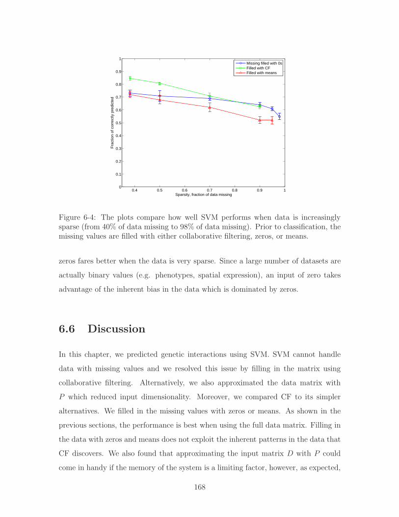
0.4 0.5 0.6 0.7 0.8 0.9 10
0.1
0.2
0.3
0.4
0.5
0.6
0.7
0.8
0.9
1
Fra
ctio
n of
cor
rect
ly p
redi
cted
Sparsity, fraction of data missing
Missing filled with 0sFilled with CFFilled with means
Figure 6-4: The plots compare how well SVM performs when data is increasinglysparse (from 40% of data missing to 98% of data missing). Prior to classification, themissing values are filled with either collaborative filtering, zeros, or means.
zeros fares better when the data is very sparse. Since a large number of datasets are
actually binary values (e.g. phenotypes, spatial expression), an input of zero takes
advantage of the inherent bias in the data which is dominated by zeros.
6.6 Discussion
In this chapter, we predicted genetic interactions using SVM. SVM cannot handle
data with missing values and we resolved this issue by filling in the matrix using
collaborative filtering. Alternatively, we also approximated the data matrix with
𝑃 which reduced input dimensionality. Moreover, we compared CF to its simpler
alternatives. We filled in the missing values with zeros or means. As shown in the
previous sections, the performance is best when using the full data matrix. Filling in
the data with zeros and means does not exploit the inherent patterns in the data that
CF discovers. We also found that approximating the input matrix 𝐷 with 𝑃 could
come in handy if the memory of the system is a limiting factor, however, as expected,
168
it does not fare as well as the full input matrix.
We experimented with removing additional entries from the input data matrix to
make it increasingly sparse. We found that CF performance decreases with increasing
data sparsity. When examining the data, we found that when 98% of entries are miss-
ing, most genes are described by a mere 1 or 2 entries. Same is true for experiments.
This makes it difficult to extract “typical genes” or “typical experiments.” This, we
hypothesize, makes it likely that collaborative filtering fails to find any similar trends
in the data and instead averages the signal. It treats a single entry as sufficient to
assess similarity. As a result, we observe degrading performance (Figure 6-4). As
we mentioned before, inputing zeros when sparsity is high fares better, since it takes
advantage of the bias toward having zeros in the binary data. One way to address
this issue could be to introduce weighting when making predictions. The effect of CF
can be scaled by the “support” for a given gene, that is the number of known entries
available. Next, it would be combined with the alternative method of inputting zeros.
In our case, we are operating in the region of 40% sparsity in which using CF instead
of inputting zeros results in a substantially better classification performance.
Overall, the performance of SVM at predicting interactions is better than collab-
orative filtering (see Section 5.5.2). We hypothesize that this is due to the fact that
SVM can classify based on nonlinear functions using rigorous margin maximization
unlike the collaborative filtering approach we used. However, there are margin-based
CF approaches which could be investigated further [108]. Using an RBF kernel re-
sulted in the best performance, better than when we used a linear kernel. Moreover,
we showed that the performance improves when we narrow the group of tested genes
to those which belong to the same pathway and functional group e.g. kinases in
MAPK. As more biological data becomes available, we can hopefully leverage this to
predict with more accuracy for specific pathways.
Our results are merely computational and the true test of predictive accuracy still
needs to be performed in a biology laboratory. Moreover, the genes we considered
constituted for approximately 50% of the genome as the remainder had insufficient
data to perform similarity analysis with CF and missing value imputation. We are
169

confident, however, that as more data becomes available, the prediction accuracy can
only improve.
170

Chapter 7
Conclusions
Be good!
- Ray Paradis, Classical High School math teacher
In this thesis, we have presented computational approaches to predicting outcomes
of biological experiments including genetic interactions. By assembling biological
experimental data as features to describe genes, we were able to associate features
from very different and seemingly unrelated biological datasets.
We developed a novel metric of information flow, which simulates protein in-
teractome as an electrical circuit where proteins are represented as interconnecting
junctions and interactions between them as resistors. We used electrical current to
model the communication exchange between the proteins in this network in order to
quantify the importance of each protein on a system level of an entire interactome. We
found that proteins of high information flow mediate information exchange between
biologically functional modules. In support of our model, recursive decomposition of
the network based on removal proteins with highest information flow scores resulted
in functionally enriched subnetworks of genes. Additionally, we found that the infor-
mation flow score of a protein in both C. elegans and S. cerevisiae is well correlated
with the likelihood of observing lethality or pleiotropy when the protein is knocked
down. Up until now, the most frequently used metrics to assess the importance of
proteins in a network have been betweenness and degree. Both have shown to corre-
late significantly worse, if at all, with either lethality or pleiotropy. Degree is a local
171

metric of connectivity based on the number of immediate partners. Betweenness is
dependent on finding only the shortest paths when evaluating the score of a protein
node, and its score can change drastically when edges are added or removed. More-
over, it relies on all graph edges being equally weighted. Information flow proved to
be more consistent than betweenness when large amounts of noise were present in the
interactome. We also investigated how well information flow performs in the presence
of directional edges characteristic to signaling networks. We found that high infor-
mation flow genes (top 30%) tend to be pleiotropic, yet not necessarily lethal. We
hypothesized that fewer proteins in signaling networks tend to participate in house-
keeping functions, which are often mediated by multi-protein molecular machines.
Finally, we found that the high scoring information flow proteins are more likely to
participate in genetic interactions that those randomly sampled. Consequently, we
used information flow as a feature characterizing genes in our predictions of genetic
interactions.
Using Bayesian sets method we assessed how much information relevant to genetic
interactions is present in a given dataset. This allowed us to gain some intuition with
respect to possible mechanisms, their timing and location, that may be the most
informative for discovering interactions. We grouped genes using Bayesian sets based
on their binary features from phenotype or spatial localization datasets and found
that while genetic partners of a given gene tend to share phenotypes, there is little
evidence that they are co-localized. Since the Bayesian sets method was derived for
binary data only [37], in order to assess how useful is microarray data, we extended
it to handle continuous data. We derived score equations for two alternative data
models to handle biological data.
The strength of the Bayesian sets algorithm is that it is based on a solid statistical
model based on the underlying data distribution. However, it is also a drawback since
it depends on selecting an appropriate model and is sensitive to one’s choice of prior
distributions. Bayesian sets allows us to know exactly which features are the most
useful since each feature contributes individually to the overall score. However, its
big shortcoming is the fact that it is not applicable to datasets with missing values.
172

To address the issue of missing data, we employed collaborative filtering [13].
As far as we know, our application of collaborative filtering to biological data es-
timation is novel. We applied both global factorization-based method and a local
neighborhood-based method from [13] and were able to predict entries in microar-
rays, phenotypes, as well as genetic interactions with relatively high accuracy. Ad-
ditionally, we used collaborative filtering to assess how much information relevant to
queried entries is contained within different datasets.
As a powerful nonlinear classification method, we explored Support Vector Ma-
chines (SVM). As an input to the SVM classifier we combined individual and pairwise
gene features. Since SVM requires that the input matrix is not sparse, the missing
data was filled in via collaborative filtering. Moreover, as an alternative represen-
tation of individual gene features, we used CF factor matrix 𝑃 to describe genes,
achieving significant reduction in input dimensionality. Using the original feature
matrix versus the factorized estimate of genes, 𝑃 , to represent genes resulted in bet-
ter performance, as expected. Overall, our cross validation results suggest that SVM
with an RBF kernel is more effective at predicting genetic interactions than CF.
The predictive accuracy increases further as we narrow down the genes to a specific
functional category, e.g. kinases.
Scientists can hopefully benefit from this work, provided that the “in-silico” pre-
dictions are validated in a biology lab. Being able to computationally predict genetic
interactions before undertaking laboratory experiments would save enormous time for
scientists and further speed up the scientific discovery process. Once experimentally
confirmed, our predictions of genetic interactions would allow us to gain new insights
into C. elegans biology. We hope to find new genes participating in developmental
and other regulatory pathways, system-level insights into genetic abnormalities, how
genes collaborate in orchestrating stress response, etc. For example, we expect to find
synergistic relationships among genes involved in development. Since these genes tend
to be linked to various forms of cancer, we can propose directions in medical research
to test combinations of drugs, each targeting a specific protein. We may discover
interesting suppression relationships between genes. Genetic suppression is useful for
173

investigation into gene therapy, where a harmful mutation in one gene can be allevi-
ated by an additional mutation. A single genetic interaction can link seemingly very
different processes, and on the biological system level, it is more informative than
knowing that two genes physically interact. Once we have a more complete set of
genetic and physical interactions, we may be able to take a system-level approach for
predicting how genes affect an organism.
174

Appendix A
Miscellaneous concepts
Andrew, listening to The Little Prince: Mommie, this book is science fiction.
An elephant can’t fit inside a boa constrictor!
- Andrew, 5yo, unpublished
A.1 Statistics
A.1.1 Pearson correlation coefficient
Pearson correlation is a number between −1 and 1 that measures the degree of asso-
ciation between two random variables, 𝑋 and 𝑌 . A positive value for the correlation
implies a positive association, high values 𝑋 are associated with high values in 𝑌 and
similarly for the low values. A negative value for the correlation implies an inverse
association where high value of one variable implies low value of another. The formula
for correlation coefficient 𝜌𝑋,𝑌 between two random variables 𝑋 and 𝑌 with means
𝜇𝑋 and 𝜇𝑌 and standard deviations 𝜎𝑋 and 𝜎𝑌 is defined as:
𝜌𝑋,𝑌 =𝑐𝑜𝑣(𝑋, 𝑌 )
𝜎𝑋𝜎𝑌=𝐸((𝑋 − 𝜇𝑋)(𝑌 − 𝜇𝑌 ))
𝜎𝑋𝜎𝑌(A.1)
Several useful properties can be deduced from the above formula. Since the values
are normalized by the standard deviation, Pearson correlation is scale independent.
It is also independent of the relative ordering of values. That is, if 𝑋 and 𝑌 are
175

timecourse representation, Pearson correlation is the same regardless whether we
process timepoint 𝑡1 before or after 𝑡2.
In biology, Pearson correlation coefficient is often used to analyze relationships
between genes based on their expression profiles. These profiles can come from many
different sources e.g. microarray timecourse data which represents the concentration
of mRNA of specific genes at a given time. They can also come from comparing genes
present in specific tissues at various conditions (e.g. presence of cancer versus not).
Similarly, we can compare the conditions to one another across genes, e.g. cancer of
one type to another type of cancer to see where they are associated with the same
genes.
A.2 Probability
A.2.1 Bernoulli distribution and its conjugate prior
Bernoulli distribution is a discrete probability distribution, with only 2 possible out-
comes, 0 or 1. Value 1 happens with success probability 𝜃 and value 0 with failure
probability (1− 𝜃). So if 𝑥 is a random variable with this distribution, we have:
𝑓(𝑥; 𝜃) = 𝜃𝑥(1− 𝜃)1−𝑥 (A.2)
The conjugate prior of the Bernoulli distribution is the Beta distribution:
𝑝(𝑝∣𝛼, 𝛽) = Γ(𝛼 + 𝛽)
Γ(𝛼)Γ(𝛽)𝜃𝛼−1(1− 𝜃)𝛽−1 (A.3)
A.2.2 Normal distribution and its conjugate prior
Normal distribution (Gaussian distribution) is a continuous probability distribution
that describes data which tends to cluster around some average value.
176
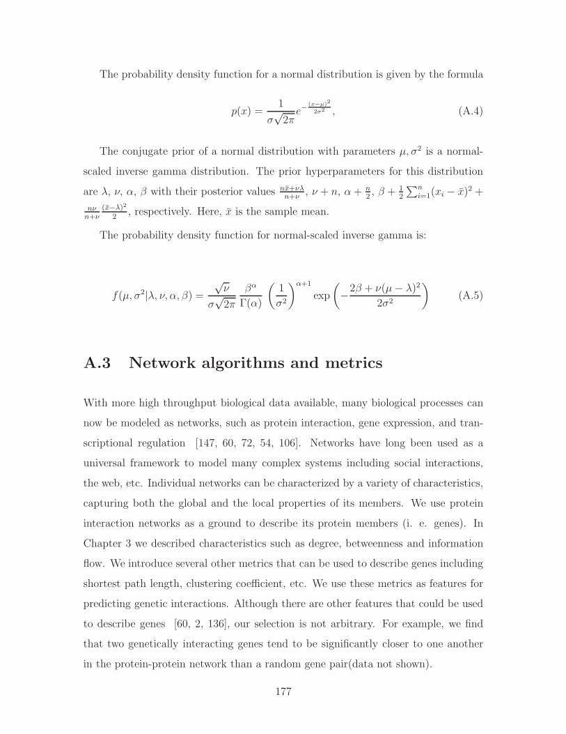
The probability density function for a normal distribution is given by the formula
𝑝(𝑥) =1
𝜎√2𝜋𝑒−
(𝑥−𝜇)2
2𝜎2 , (A.4)
The conjugate prior of a normal distribution with parameters 𝜇, 𝜎2 is a normal-
scaled inverse gamma distribution. The prior hyperparameters for this distribution
are 𝜆, 𝜈, 𝛼, 𝛽 with their posterior values 𝑛�̄�+𝜈𝜆𝑛+𝜈
, 𝜈 + 𝑛, 𝛼 + 𝑛2, 𝛽 + 1
2
∑𝑛𝑖=1(𝑥𝑖 − �̄�)2 +
𝑛𝜈𝑛+𝜈
(�̄�−𝜆)2
2, respectively. Here, �̄� is the sample mean.
The probability density function for normal-scaled inverse gamma is:
𝑓(𝜇, 𝜎2∣𝜆, 𝜈, 𝛼, 𝛽) =√𝜈
𝜎√2𝜋
𝛽𝛼
Γ(𝛼)
(1
𝜎2
)𝛼+1
exp
(−2𝛽 + 𝜈(𝜇− 𝜆)2
2𝜎2
)(A.5)
A.3 Network algorithms and metrics
With more high throughput biological data available, many biological processes can
now be modeled as networks, such as protein interaction, gene expression, and tran-
scriptional regulation [147, 60, 72, 54, 106]. Networks have long been used as a
universal framework to model many complex systems including social interactions,
the web, etc. Individual networks can be characterized by a variety of characteristics,
capturing both the global and the local properties of its members. We use protein
interaction networks as a ground to describe its protein members (i. e. genes). In
Chapter 3 we described characteristics such as degree, betweenness and information
flow. We introduce several other metrics that can be used to describe genes including
shortest path length, clustering coefficient, etc. We use these metrics as features for
predicting genetic interactions. Although there are other features that could be used
to describe genes [60, 2, 136], our selection is not arbitrary. For example, we find
that two genetically interacting genes tend to be significantly closer to one another
in the protein-protein network than a random gene pair(data not shown).
177

A.3.1 Shortest path
In a given network, a shortest path between two nodes (or vertices), 𝑣1 and 𝑣2 is one
such that the sum of the weights of its constituent edges is minimized. Intuitively,
it is the quickest way to get from node 𝑣1 to 𝑣2, and if the graph is undirected, vice
versa. Although there is a number of algorithms aimed at solving this problem, given
the particular characteristics of biological networks we studied, namely the protein
interactome networks, we used Dijkstra algorithm [25]. Our choice was due to the
fact that our network edges were all positive, moreover, we did not have a good
heuristic to approximate how far the two nodes are that would be required for 𝐴∗search algorithm.
Here is a summary of the Dijkstra algorithm:
It should be noted that distance between nodes can also be referred to as weight.
1. Create a distance list, a previous vertex list, a visited list, and a current vertex.
2. All the values in the distance list are set to infinity except the starting vertex
which is set to zero.
3. All values in visited list are set to false.
4. All values in the previous vertex list are set to a special value signifying that
they are undefined, such as null.
5. Current vertex is set as the starting vertex.
6. Mark the current vertex as visited.
7. Update distance (from starting vertex) and previous lists based on those vertices
which can be immediately reached from the current vertex.
8. Update the current vertex to the unvisited vertex that can be reached by the
shortest path from the starting vertex.
9. Repeat (from step 6) until all nodes are visited.
178

The shortest distance is a useful metric for computational analysis of biological
networks for several reasons. It can be used as a feature for prediction of genetic
interaction, as we find that the proteins that genetically interact are closer together
than a random pair of proteins in interactome. Secondly, it is used as an intermediate
step in computation of other metrics such as betweenness which depends on knowing
all the shortest paths on its score.
A.3.2 Clustering coefficient
Clustering coefficient is a property of a node in a network. Duncan J. Watts and
Steven Strogatz introduced the measure in 1998 [136] to determine whether a graph
is a small-world network. Clustering coefficient is an indication of how well the
neighborhood of the particular node is connected to one another, that is how close it
is to be a clique (a complete graph). The neighborhood of a node is all the nodes that
are immediately connected to it not including the node itself. If the neighborhood is
fully connected, the clustering coefficient is 1; if it is close to 0, there are hardly any
connections in the neighborhood.
The clustering coefficient 𝐶𝑖 for a node (vertex) 𝑣𝑖 is the ratio of number of connec-
tions in the neighborhood of 𝑣𝑖 and the number of connections if that neighborhood
was fully connected. It is important to note that the clustering coefficient for di-
rected versus undirected graphs differs by a factor of 2, where the undirected graph
of 𝑛 nodes has 𝑛(𝑛− 1)2 possible connections while the directed graph has 𝑛(𝑛− 1)
connections. Thus, the clustering coefficient for a directed graph is:
𝐶𝑖 =∣{𝑒𝑗𝑘}∣𝑘𝑖(𝑘𝑖 − 1)
, (A.6)
Similarly, the clustering coefficient for an undirected graph is:
𝐶𝑖 =2∣𝑒𝑗𝑘∣
𝑘𝑖(𝑘𝑖 − 1)(A.7)
179

A.3.3 Mutual clustering coefficient
Biological networks are “small-world” networks which are scale-free with power-law
distribution of degree of network nodes [61]. “Small-world” indicates that there are a
few nodes with high number of connections to other nodes and many nodes that have
very few connections. The high clustering coefficients in a “small-world” network
indicate that neighbors of a given vertex are more likely to have edges between them
than would be expected in a random graph. Such edges between neighbors of a vertex
form triangles cornered at that vertex. The preponderance of triangles in a small-
world network means that an edge is likely to be a side of more triangles than would
be expected in a random graph. Therefore, for an edge vw between vertices 𝑣 and
𝑤, a neighbor of vertex 𝑣 is more likely to have an edge to 𝑤 if the edge is from a
small-world graph than if it is from a random graph. Such “mutual neighbors” of the
two endpoints serve to corroborate the edge.
v
w
Figure A-1: MCC coefficient for nodes 𝑣 and 𝑤 weights in on the number of themutual neighbors between these two nodes.
Goldberg and Roth [40] defined mutual clustering coefficient, 𝐶𝑣𝑤, for a pair of
vertices 𝑣 and 𝑤 to give a measure of such corroboration. The measure is indepen-
dent of the existence of an edge between 𝑣 and 𝑤, so experimental evidence about
an interaction between two proteins does not influence the assessment of the neigh-
borhood of the two proteins. This measure can be applied not only to edges (where
vertex pairs are connected) but also to any pair of vertices. The coefficient is based
180

on the hypergeometric distribution among the neighbors of a pair 𝑣𝑤 (as shown in
Figure A-1) and the formulation is as follows,
𝐶𝑣𝑤 = − log
𝑚𝑖𝑛(∣𝑁(𝑣)∣,∣𝑁(𝑤)∣)∑𝑘=∣𝑁(𝑣)∩𝑁(𝑤)∣
(∣𝑁(𝑣)∣𝑘
)(𝑇𝑜𝑡𝑎𝑙−∣𝑁(𝑣)∣∣𝑁(𝑤)∣−𝑘
)(𝑇𝑜𝑡𝑎𝑙∣𝑁(𝑤)∣
) (A.8)
where 𝑁(𝑥) represents the neighborhood of a vertex 𝑥, and Total represents the
total number of proteins in the organism. The summation in the hypergeometric
coefficient can be interpreted as a 𝑝-value, the probability of obtaining a number
of mutual neighbors between vertices 𝑣 and 𝑤 at or above the observed number by
chance, under the null hypothesis that the neighborhoods are independent, and given
both the neighborhood sizes of the two vertices and the total number of proteins in
the organism. The hypergeometric coefficient is then defined to be the negative log
of this 𝑝-value.
A.4 Machine learning
Naive Bayes
A naive Bayes classifier is used to describe a simple probabilistic classifier which
uses Bayes’ theorem. In the naive Bayesian setting the assumption is that all the
attributes used to classify a given example are independent given the example class.
This means that the presence or the absence of a particular attribute is unrelated to
the presence or absence of any other attribute. This assumption is often somewhat
violated in practice, however, despite that naive Bayesian learning is remarkably
effective in practice [26, 150]. One advantage of the naive Bayes classifier is that it
requires a small amount of the training data to estimate the parameters necessary for
classification - only means and variances of the variables need to be estimated. As
a consequence, because of the independence assumption, only the variance variables
for each class need to be computed.
We formulate naive Bayes probabilistic model as a problem of predicting a discrete
class C from attributes with discrete values 𝐴1 through 𝐴𝑘. Given an example with
181

observed attribute values 𝑎1 through 𝑎𝑘, the optimal prediction is class value 𝑐 such
that 𝑃𝑟(𝐶 = 𝑐∣𝐴1 = 𝑎1 ∧ . . . ∧ 𝐴𝑘 = 𝑎𝑘) is maximal. By Bayes rule this probability
equals:
𝑃𝑟(𝐴1 = 𝑎1 ∧ . . . ∧ 𝐴𝑘 = 𝑎𝑘∣𝐶 = 𝑐)
𝑃𝑟(𝐴1 = 𝑎1 ∧ . . . ∧ 𝐴𝑘 = 𝑎𝑘)𝑃𝑟(𝐶 = 𝑐) (A.9)
The background probability 𝑃𝑟(𝐶 = 𝑐) can be estimated from training data easily.
The example probability 𝑃𝑟(𝐴1 = 𝑎1∧ . . .∧𝐴𝑘 = 𝑎𝑘) is irrelevant for decision-making
since it is the same for each class value 𝑐. Learning is therefore reduced to the problem
of estimating 𝑃𝑟(𝐴1 = 𝑎1∧ . . .∧𝐴𝑘 = 𝑎𝑘∣𝐶 = 𝑐) from training examples. Using Bayes
rule again, this class-conditional probability can be written as
𝑃𝑟(𝐴1 = 𝑎1∣𝐴2 = 𝑎2 ∧ . . . ∧ 𝐴𝑘 = 𝑎𝑘, 𝐶 = 𝑐) ⋅ 𝑃𝑟(𝐴2 = 𝑎2 ∧ . . . ∧ 𝐴𝑘 = 𝑎𝑘∣𝐶 = 𝑐).
(A.10)
The second factor can be written similarly and so on. If we assume that each 𝐴𝑖
is independent of each 𝐴𝑗 , given C, we can write
𝑃𝑟(𝐴1 = 𝑎1∣𝐴2 = 𝑎2 ∧ . . . ∧𝐴𝑘 = 𝑎𝑘, 𝐶 = 𝑐) = 𝑃𝑟(𝐴1 = 𝑎1∣𝐶 = 𝑐) (A.11)
and similarly for 𝐴2 through 𝐴𝑘. Then
𝑃𝑟(𝐴1 = 𝑎1∣𝐴2 = 𝑎2 ∧ . . . ∧ 𝐴𝑘 = 𝑎𝑘, 𝐶 = 𝑐) =
𝑃𝑟(𝐴1 = 𝑎1∣𝐶 = 𝑐)𝑃𝑟(𝐴2 = 𝑎2∣𝐶 = 𝑐) . . . 𝑃 𝑟(𝐴𝑘 = 𝑎𝑘∣𝐶 = 𝑐).
In this form, each factor can be estimated from simple counts of the training data:
𝑃𝑟(𝐴𝑗 = 𝑎𝑗∣𝐶 = 𝑐) =𝑐𝑜𝑢𝑛𝑡(𝐴𝑗 = 𝑎𝑗 ∧ 𝐶 = 𝑐)
𝑐𝑜𝑢𝑛𝑡(𝐶 = 𝑐). (A.12)
Equation A.12 gives “maximum likelihood” estimate which are the parameter
values that maximize the probability of the training examples. Not surprisingly,
parameter estimation for naive Bayes models is often done by the method of “maxi-
182

mum likelihood.” In other words, one can work with the naive Bayes model without
believing in Bayesian probability or using any Bayesian methods.
183

184
Appendix B
Information Flow - Supplementary
Materials
Sasha: What’s a boyfriend?
Andrew: It’s a man who loves you, but not your Daddy.
- Sasha, 4yo, Andrew, 5yo, unpublished
B.1 Showing differences between information flow
and betweenness with toy networks
In order to better illustrate the properties of information flow which are not exhibited
by betweenness, we analyze two toy examples of possible network topologies using
either of the two methods.
Toy Network 1: In Toy Network 1 in Figure B-1 all edges (interactions) connecting
nodes (proteins) are equally weighted. There are 4 possible pathways between nodes
A and B, the shortest one running through node I, the longest through nodes I-F-
G-H. Therefore nodes A and B can communicate through multiple pathways. If we
use betweenness to find nodes important for A and B to communicate, we can only
recover node I, as it is along the shortest path between A and B, A-I-B. All the
remaining nodes - C, D, E, F, G, H score 0 in betweenness.
185

Figure B-1: From left: Toy Network 1, Toy Network 2.
Unlike betweenness, information flow method considers all possible communica-
tion routes between nodes A and B and recovers all participating nodes scoring their
importance relative to the length (confidence level) of a given pathway:
𝐶 = 0.24
𝐷 = 0.16
𝐸 = 0.16
𝐹 = 0.12
𝐺 = 0.12
𝐻 = 0.12
𝐼 = 1
Note that, since node I participates in all the possible pathways between A and
B, it receives a score of 1.
Toy Network 2: Toy Network 2 in Figure B-1 consists of two alternative pathways
differing by the confidence levels of interactions between the participating nodes. The
186

thicker edges between nodes C, D and D, E indicate higher interaction confidence,
𝑤1, lets assume it to be 2 times the confidence of the remaining edges, 𝑤2, therefore
𝑤1 = 2𝑤2.
If we use betweenness to find participating nodes in the paths between A and B
and weight the edges, we find that we can only recover the shortest path through D
(we can assume that the distance measure is inversely proportional to the confidence
score w). Node F receives a betweenness score of 0. Alternatively, if we decide to
weight all the paths equally in order for betweenness to recover the path through F,
we are not accounting for the confidence scores and both pathways are treated as
equally likely.
If we use information flow, we can recover both pathways between A and B and
weight the nodes along them proportionally to the overall path confidence:
𝐶 = 1
𝐷 =2
3
𝐸 = 1
𝐹 =1
3
In summary, the above examples illustrate how information flow can find proteins
participating in all alternative pathways interconnecting a protein pair. It does so by
taking into consideration both the number of proteins along these paths as well as
the confidence scores. Such properties are not exhibited by betweenness.
B.2 Discovering protein modules
We executed the module extraction routines while varying the maximum and the
minimum number of proteins allowed in a single subnetwork in order to determine
the best size range. We varied the maximum size to be 25, 50, 75, 100 proteins and the
minimum size to be 10, 15, 20, 25 proteins. Next, we evaluated GO enrichment among
187

the subnetworks within each size limit combination for a total of 15 combinations (we
omitted < 𝑚𝑖𝑛𝑖𝑚𝑢𝑚 = 25, 𝑚𝑎𝑥𝑖𝑚𝑢𝑚 = 25 > combination). Figure B-2 shows the
fraction of subnetworks found to be enriched with GO annotations for each minimum
and maximum size of subnetworks.
10 15 20 250
0.1
0.2
0.3
0.4
0.5
0.6
0.7
0.8
0.9
1
Minimum subnetwork size
Frac
tion
of s
ubne
twor
ks e
nric
hed
with
GO
ann
otat
ions
Maximum subnetwork size 25Maximum subnetwork size 50Maximum subnetwork size 75Maximum subnetwork size 100
Figure B-2: Graph showing the fraction of subnetworks that we found are enrichedwith GO annotations given specific minimum and maximum subnetwork size thresh-olds.
Each line corresponds to a specific maximum subnetwork size (25, 50, 75, 100).
The minimum size criteria are satisfied by retaining only the subnetworks whose size
is larger or equal to a specific minimum threshold (10, 15, 20, 25).
We can see from the plot that varying the maximum size (corresponding to a single
line on the plot) has little effect on the enrichment score. However, as we increase the
minimum size requirement, many of the smaller subnetworks are excluded, and the
larger remaining subnetworks are more likely to contain groups of proteins sharing
functional categories. The majority of the individual subnetworks obtained by varying
the upper and lower thresholds are very similar with respect to the genes they contain
and therefore GO enrichment.
Each entry in Table B.2 lists the number of subnetworks enriched with GO anno-
tations divided by the total number of subnetworks within each Min-Max threshold
combination. Each column in the table corresponds to a line in the above plot. For ex-
ample, the selected threshold combination, 15-50, results in 37 subnetworks of which
188

Table B.1: Fraction of modules enriched in GO annotations for a given pair of min/-max thresholds.
Maximum # proteins in a subnetwork25 50 75 100
Min. # proteins in a subnetwork
10 48/63 45/56 44/54 42/5215 34/37 35/37 34/35 32/3320 14/14 24/24 22/22 21/2125 N/A 15/15 15/15 14/14
35 are enriched in GO categories.
We selected the 15-50 range for a more detailed analysis as described in the main
text because we wanted to keep the overall GO enrichment high while still retaining
most of the GO enriched subnetworks. Alternatively, we could have increased the
minimum size of the network to be 20 proteins, which would have resulted in all of 24
subnetworks being enriched with GO. However, we would have lost 11 GO enriched
modules as compared to 15-50 range.
B.3 Supplementary tables information
Due to their large size Tables S1-S9 which are relevant to information flow have
been omitted and are instead available online at: http://jura.wi.mit.edu/ge/
information_flow_plos/.
189

190

Bibliography
[1] Julie Ahringer. Reverse genetics. Wormbook, The C elegans Research Commu-nity, 2006.
[2] Reka Zsuzsanna Albert. Statistical mechanics of complex networks. PhD thesis,Notre Dame, IN, USA, 2001. Director-Barabasi, Albert-Laszlo.
[3] V. Ambros. A hierarchy of regulatory genes controls a larva-to-adult develop-mental switch in c. elegans. Cell, 57(1):49–57, Apr 1989.
[4] Victor Ambros. Microrna pathways in flies and worms: growth, death, fat,stress, and timing. Cell, 113(6):673–676, Jun 2003.
[5] J. S. Bader, A. Chaudhuri, J. M. Rothberg, and J. Chant. Gaining confidencein high-throughput protein interaction networks. Nat Biotechnol, 22(1):78–85,January 2004.
[6] Mukesh Bansal, Vincenzo Belcastro, Alberto Ambesi-Impiombato, and Diegodi Bernardo. How to infer gene networks from expression profiles. Mol SystBiol, 3:78, 2007.
[7] Albert-Laszlo Barabasi and Zoltan N Oltvai. Network biology: understandingthe cell’s functional organization. Nat Rev Genet, 5(2):101–113, Feb 2004.
[8] Nizar N Batada, Teresa Reguly, Ashton Breitkreutz, Lorrie Boucher, Bobby-JoeBreitkreutz, Laurence D Hurst, and Mike Tyers. Stratus not altocumulus: anew view of the yeast protein interaction network. PLoS Biol, 4(10):e317, Oct2006.
[9] L.R. Baugh, A.A. Hill, J.M. Claggett, K. Hill-Harfe, J.C. Wen, D.K. Slonim,E.L. Brown, and C.P. Hunter. The homeodomain protein pal-1 specifies alineage-specific regulatory network in the c. elegans embryo. Development,132(8):1843–54, 2005.
[10] Tim Beissbarth and Terence P Speed. Gostat: find statistically overrepresentedgene ontologies within a group of genes. Bioinformatics, 20(9):1464–1465, Jun2004.
191
[11] R Bell, Y Koren, and C Volinsky. Chasing 1,000,000: How we won the netflixprogress prize. ASA Statistical and Computing Graphics Newsletter, 18:4–12,2007.
[12] R. M. Bell and Y. Koren. Scalable collaborative filtering with jointly derivedneighborhood interpolation weights. In Data Mining, 2007. ICDM 2007. Sev-enth IEEE International Conference on, pages 43–52, 2007.
[13] Robert Bell, Yehuda Koren, and Chris Volinsky. Modeling relationships atmultiple scales to improve accuracy of large recommender systems. Proceedingsof the 13th ACM SIGKDD international conferenceon Knowledge discovery anddata mining, pages 95–104, 2007.
[14] Robert M. Bell and Yehuda Koren. Improved neighborhood-based collaborativefiltering. 2008.
[15] Robert M. Bell, Yehuda Koren, and Chris Volinsky. The bellkor solution to thenetflix prize. 2008.
[16] Gabriel F Berriz, Oliver D King, Barbara Bryant, Chris Sander, and Frederick PRoth. Characterizing gene sets with funcassociate. Bioinformatics, 19(18):2502–2504, Dec 2003.
[17] J. Bingham, G. D. Plowman, and S. Sudarsanam. Informatics issues in large-scale sequence analysis: elucidating the protein kinases of c. elegans. J CellBiochem, 80(2):181–186, Oct 2000.
[18] John S. Breese, David Heckerman, and Carl Kadie. Empirical analysis of pre-dictive algorithms for collaborative filtering. pages 43–52.
[19] S. Brenner. The genetics of caenorhabditis elegans. Genetics, 77:71–94, 1974.
[20] Alexandra Byrne, Matthew Weirauch, Victoria Wong, Martina Koeva, ScottDixon, Joshua Stuart, and Peter Roy. A global analysis of genetic interactionsin caenorhabditis elegans. J Biol, 6(3):8, Sep 2007.
[21] C.elegans Sequencing Consortium. Genome sequence of the nematode c. ele-gans: a platform for investigating biology. Science, 282:20122018, 1998.
[22] Qinghua Cui, Yun Ma, Maria Jaramillo, Hamza Bari, Arif Awan, Song Yang,Simo Zhang, Lixue Liu, Meng Lu, Maureen O’Connor-McCourt, Enrico OPurisima, and Edwin Wang. A map of human cancer signaling. Mol SystBiol, 3:152, 2007.
[23] Armaity P. Davierwala, Jennifer Haynes, Zhijian Li, Renee L. Brost, Mark D.Robinson, Lisa Yu, Sanie Mnaimneh, Huiming Ding, Hongwei Zhu, Yiqun Chen,Xin Cheng, Grant W. Brown, Charles Boone, Brenda J. Andrews, and Timo-thy R. Hughes. The synthetic genetic interaction spectrum of essential genes.Nat Genet, 37(10):1147–1152, October 2005.
192

[24] David Deutscher, Isaac Meilijson, Martin Kupiec, and Eytan Ruppin. Multipleknockout analysis of genetic robustness in the yeast metabolic network. NatureGenetics, 38(9):993–998, August 2006.
[25] EW Dijkstra. A note on two problems in connexion with graphs. NumerischeMathematik, 1:269–271, 1959.
[26] Pedro Domingos and Michael J. Pazzani. On the Optimality of the SimpleBayesian Classifier under Zero-One Loss, volume 29. 1997.
[27] Snell JL Doyle, PG. Random walks and electric networks. 1984.
[28] Aime Marie Dudley, Daniel Maarten Janse, Amos Tanay, Ron Shamir, andGeorge McDonald Church. A global view of pleiotropy and phenotypicallyderived gene function in yeast. Mol Syst Biol, 1:2005.0001, 2005.
[29] Denis Dupuy, Nicolas Bertin, Csar A Hidalgo, Kavitha Venkatesan, Domena Tu,David Lee, Jennifer Rosenberg, Nenad Svrzikapa, Aurlie Blanc, Alain Carnec,Anne-Ruxandra Carvunis, Rock Pulak, Jane Shingles, John Reece-Hoyes, Re-becca Hunt-Newbury, Ryan Viveiros, William A Mohler, Murat Tasan, Fred-erick P Roth, Christian Le Peuch, Ian A Hope, Robert Johnsen, Donald GMoerman, Albert-Lszl Barabsi, David Baillie, and Marc Vidal. Genome-scaleanalysis of in vivo spatiotemporal promoter activity in caenorhabditis elegans.Nat Biotechnol, 25(6):663–668, Jun 2007.
[30] Sean R. Eddy. Total information awareness for worm genetics. Science,311(5766):1381–1382, 2006.
[31] D. M. Eisenmann, J. N. Maloof, J. S. Simske, C. Kenyon, and S. K. Kim.The beta-catenin homolog bar-1 and let-60 ras coordinately regulate the hoxgene lin-39 during caenorhabditis elegans vulval development. Development,125(18):3667–3680, Sep 1998.
[32] D. S. Fay and M. Han. The synthetic multivulval genes of c. elegans: functionalredundancy, ras-antagonism, and cell fate determination. Genesis, 26(4):279–284, Apr 2000.
[33] LC Freeman. A set of measures of centrality based on betweenness. Sociometry,40:35–41, 1977.
[34] A.-C. Gavin, P. Aloy, P. Grandi, R. Krause, M. Boesche, M. Marzioch, C. Rau,L. J. Jensen, S. Bastuck, B. Dumpelfeld, A. Edelmann, M.-A. Heurtier, V. Hoff-man, C. Hoefert, K. Klein, M. Hudak, A.-M. Michon, M. Schelder, M. Schirle,M. Remor, T. Rudi, S. Hooper, A. Bauer, T. Bouwmeester, G. Casari,G. Drewes, G. Neubauer, J.M. Rick, B. Kuster, P. Bork, R. B. Russell, andG. Superti-Furga. Proteome survey reveals modularity of the yeast cell machin-ery. Nature, 440:631–636, March 2006.
193
[35] Hui Ge, Albertha J MWalhout, and Marc Vidal. Integrating ’omic’ information:a bridge between genomics and systems biology. Trends Genet, 19(10):551–560,Oct 2003.
[36] Wei Geng, Pamela Cosman, Charles C Berry, Zhaoyang Feng, and William RSchafer. Automatic tracking, feature extraction and classification of c elegansphenotypes. IEEE Trans Biomed Eng, 51(10):1811–1820, Oct 2004.
[37] Zoubin Ghahramani and Katherine A. Heller. Bayesian sets. 2005.
[38] L. Giot, J. S. Bader, C. Brouwer, A. Chaudhuri, B. Kuang, Y. Li, Y. L. Hao,C. E. Ooi, B. Godwin, E. Vitols, G. Vijayadamodar, P. Pochart, H. Machineni,M. Welsh, Y. Kong, B. Zerhusen, R. Malcolm, Z. Varrone, A. Collis, M. Minto,S. Burgess, L. McDaniel, E. Stimpson, F. Spriggs, J. Williams, K. Neurath,N. Ioime, M. Agee, E. Voss, K. Furtak, R. Renzulli, N. Aanensen, S. Carrolla,E. Bickelhaupt, Y. Lazovatsky, A. DaSilva, J. Zhong, C. A. Stanyon, R. L.Finley, K. P. White, M. Braverman, T. Jarvie, S. Gold, M. Leach, J. Knight,R. A. Shimkets, M. P. McKenna, J. Chant, and J. M. Rothberg. A proteininteraction map of drosophila melanogaster. Science, 302(5651):1727–1736, Dec2003.
[39] M. Girvan and M. E J Newman. Community structure in social and biologicalnetworks. Proc Natl Acad Sci U S A, 99(12):7821–7826, Jun 2002.
[40] Debra S Goldberg and Frederick P Roth. Assessing experimentally derivedinteractions in a small world. Proc Natl Acad Sci U S A, 100(8):4372–4376,Apr 2003.
[41] Shoshanna Gottlieb and Gary Ruvkun. Daf-2, daf-16 and daf-23: Geneticallyinteracting genes controlling dauer formation in caenorhabditis elegans. Genet-ics, 137(1):107–120, 1994 May.
[42] Andrew Grimson, Kyle Kai-How Farh, Wendy K Johnston, Philip Garrett-Engele, Lee P Lim, and David P Bartel. Microrna targeting specificity inmammals: determinants beyond seed pairing. Mol Cell, 27(1):91–105, Jul 2007.
[43] Steve R. Gunn. Support vector machines for classification and regression. Tech-nical report, Faculty of Engineering, Science and Mathematics School of Elec-tronics and Computer Science, May 1998.
[44] Kristin C Gunsalus. A caenorhabditis elegans genetic-interaction map wigglesinto view. J Biol, 7(3):8, 2008.
[45] Kristin C. Gunsalus, Hui Ge, Aaron J. Schetter, Debra S. Goldberg, Jing-Dong J. Han, Tong Hao, Gabriel F. Berriz, Nicolas Bertin, Jerry Huang, Ling-Shiang Chuang, Ning Li, Ramamurthy Mani, Anthony A. Hyman, Birte Snnich-sen, Christophe J. Echeverri, Frederick P. Roth, Marc Vidal, and Fabio Piano.Predictive models of molecular machines involved in caenorhabditis elegansearly embryogenesis. Nature, 436(7052):861–865, 2005.
194
[46] Matthew W Hahn and Andrew D Kern. Comparative genomics of centralityand essentiality in three eukaryotic protein-interaction networks. Mol Biol Evol,22(4):803–806, Apr 2005.
[47] A. J. Hamilton and D. C. Baulcombe. A species of small antisense rna inposttranscriptional gene silencing in plants. Science, 286(5441):950–952, Oct1999.
[48] Jing-Dong J Han, Nicolas Bertin, Tong Hao, Debra S Goldberg, Gabriel FBerriz, Lan V Zhang, Denis Dupuy, Albertha J M Walhout, Michael E Cusick,Frederick P Roth, and Marc Vidal. Evidence for dynamically organized modu-larity in the yeast protein-protein interaction network. Nature, 430(6995):88–93,Jul 2004.
[49] J. L. Hartman, B. Garvik, and L. Hartwell. Principles for the buffering ofgenetic variation. Science, 291(5506):1001–1004, February 2001.
[50] Jonathan L. Herlocker, Joseph A. Konstan, Al Borchers, and John Riedl. Analgorithmic framework for performing collaborative filtering. In SIGIR ’99: Pro-ceedings of the 22nd annual international ACM SIGIR conference on Researchand development in information retrieval, pages 230–237, New York, NY, USA,1999. ACM Press.
[51] J. Herrero, R. Daz-Uriarte, and J. Dopazo. Gene expression data preprocessing.Bioinformatics, 19(5):655–656, Mar 2003.
[52] Shigeki Higashiyama, Hidehiko Iwabuki, Chie Morimoto, Miki Hieda, HirofumiInoue, and Natsuki Matsushita. Membrane-anchored growth factors, the epider-mal growth factor family: beyond receptor ligands. Cancer Sci, 99(2):214–220,Feb 2008.
[53] Ian A. Hope. C. Elegans: A Practical Approach. Oxford University Press, 1999.
[54] Christine E Horak, Nicholas M Luscombe, Jiang Qian, Paul Bertone, Stacy Pic-cirrillo, Mark Gerstein, and Michael Snyder. Complex transcriptional circuitryat the g1/s transition in saccharomyces cerevisiae. Genes Dev, 16(23):3017–3033, Dec 2002.
[55] H. R. Horvitz and P. W. Sternberg. Multiple intercellular signalling sys-tems control the development of the caenorhabditis elegans vulva. Nature,351(6327):535–541, Jun 1991.
[56] R. Hoshino, Y. Chatani, T. Yamori, T. Tsuruo, H. Oka, O. Yoshida, Y. Shi-mada, S. Ari-i, H. Wada, J. Fujimoto, and M. Kohno. Constitutive activationof the 41-/43-kda mitogen-activated protein kinase signaling pathway in humantumors. Oncogene, 18(3):813–822, Jan 1999.
[57] Tommi S. Jaakkola. The support vector machine. 6.867 Fall 2006, lecture 3,September 2006.
195
[58] R Jansen, H Yu, D Greenbaum, Y Kluger, NJ Krogan, S Chung, A Emili,M Snyder, JF Greenblatt, and M Gerstein. A bayesian networks ap-proach for predicting protein-protein interactions from genomic data. Science,302(5644):449–53, 2003 Oct 17.
[59] Kate L Jeffrey, Montserrat Camps, Christian Rommel, and Charles R Mackay.Targeting dual-specificity phosphatases: manipulating map kinase signallingand immune responses. Nat Rev Drug Discov, 6(5):391–403, May 2007.
[60] H. Jeong, S. P. Mason, A. L. Barabsi, and Z. N. Oltvai. Lethality and centralityin protein networks. Nature, 411(6833):41–42, May 2001.
[61] H. Jeong, B. Tombor, R. Albert, Z. N. Oltvai, and A. L. Barabsi. The large-scaleorganization of metabolic networks. Nature, 407(6804):651–654, Oct 2000.
[62] M. Jiang, J. Ryu, M. Kiraly, K. Duke, V. Reinke, and S. K. Kim. Genome-wide analysis of developmental and sex-regulated gene expression profiles incaenorhabditis elegans. Proc Natl Acad Sci U S A, 98(1):218–223, Jan 2001.
[63] Maliackal Poulo Joy, Amy Brock, Donald E Ingber, and Sui Huang. High-betweenness proteins in the yeast protein interaction network. J BiomedBiotechnol, 2005(2):96–103, Jun 2005.
[64] William G Kaelin. The concept of synthetic lethality in the context of anticancertherapy. Nat Rev Cancer, 5(9):689–698, Sep 2005.
[65] R.S. Kamath, A.G. Fraser, Y. Dong, G. Poulin, R. Durbin, M. Gotta,A. Kanapin, N. Le Bot, S. Moreno, M. Sohrmann, D. Welchman, P. Zipperlen,and J. Ahringer. Systematic functional analysis of the caenorhabditis elegansgenome using rnai. Nature, 421(6920):231–237, 2003.
[66] Ryan Kelley and Trey Ideker. Systematic interpretation of genetic interactionsusing protein networks. Nature Biotechnology, 23(5):561–566, May 2005.
[67] Stuart K. Kim, Jim Lund, Moni Kiraly, Kyle Duke, Min Jiang, Joshua M.Stuart, Andreas Eizinger, Brian N. Wylie, and George S. Davidson. A geneexpression map for caenorhabditis elegans. Science, 293(5537):2087–2092, 2001.
[68] Nevan J Krogan, Gerard Cagney, Haiyuan Yu, Gouqing Zhong, Xinghua Guo,Alexandr Ignatchenko, Joyce Li, Shuye Pu, Nira Datta, Aaron P Tikuisis,Thanuja Punna, Jos M Peregrn-Alvarez, Michael Shales, Xin Zhang, MichaelDavey, Mark D Robinson, Alberto Paccanaro, James E Bray, Anthony She-ung, Bryan Beattie, Dawn P Richards, Veronica Canadien, Atanas Lalev,Frank Mena, Peter Wong, Andrei Starostine, Myra M Canete, James Vlasblom,Samuel Wu, Chris Orsi, Sean R Collins, Shamanta Chandran, Robin Haw, Jen-nifer J Rilstone, Kiran Gandi, Natalie J Thompson, Gabe Musso, Peter St Onge,Shaun Ghanny, Mandy H Y Lam, Gareth Butland, Amin M Altaf-Ul, ShigehikoKanaya, Ali Shilatifard, Erin O’Shea, Jonathan S Weissman, C. James Ingles,
196

Timothy R Hughes, John Parkinson, Mark Gerstein, Shoshana J Wodak, An-drew Emili, and Jack F Greenblatt. Global landscape of protein complexes inthe yeast saccharomyces cerevisiae. Nature, 440(7084):637–643, Mar 2006.
[69] Insuk Lee, Shailesh V. Date, Alex T. Adai, and Edward M. Marcotte. A prob-abilistic functional network of yeast genes. Science, 306:1555–1558, 2004.
[70] Phil H. Lee and Doheon Lee. Modularized learning of genetic interaction net-works from biological annotations and mrna expression data. Bioinformatics,21(11):2739–2747, June 2005.
[71] R. C. Lee, R. L. Feinbaum, and V. Ambros. The c. elegans heterochronicgene lin-4 encodes small rnas with antisense complementarity to lin-14. Cell,75(5):843–854, Dec 1993.
[72] Tong Ihn Lee, Nicola J Rinaldi, Franois Robert, Duncan T Odom, Ziv Bar-Joseph, Georg K Gerber, Nancy M Hannett, Christopher T Harbison, Craig MThompson, Itamar Simon, Julia Zeitlinger, Ezra G Jennings, Heather L Murray,D. Benjamin Gordon, Bing Ren, John J Wyrick, Jean-Bosco Tagne, Thomas LVolkert, Ernest Fraenkel, David K Gifford, and Richard A Young. Transcrip-tional regulatory networks in saccharomyces cerevisiae. Science, 298(5594):799–804, Oct 2002.
[73] Ben Lehner. Modelling genotypephenotype relationships and human diseasewith genetic interaction networks. The Company of Biologists, 210:1559–1566,2007.
[74] Ben Lehner, Catriona Crombie, Julia Tischler, Angelo Fortunato, and An-drew G. Fraser. Systematic mapping of genetic interactions in caenorhabdi-tis elegans identifies common modifiers of diverse signaling pathways. NatureGenetics, 38(8):896–903, July 2006.
[75] Benjamin P Lewis, Christopher B Burge, and David P Bartel. Conserved seedpairing, often flanked by adenosines, indicates that thousands of human genesare microrna targets. Cell, 120(1):15–20, Jan 2005.
[76] Benjamin P Lewis, I hung Shih, Matthew W Jones-Rhoades, David P Bartel,and Christopher B Burge. Prediction of mammalian microrna targets. Cell,115(7):787–798, Dec 2003.
[77] Siming Li, Christopher M Armstrong, Nicolas Bertin, Hui Ge, Stuart Milstein,Mike Boxem, Pierre-Olivier Vidalain, Jing-Dong J Han, Alban Chesneau, TongHao, Debra S Goldberg, Ning Li, Monica Martinez, Jean-Franois Rual, PhilippeLamesch, Lai Xu, Muneesh Tewari, Sharyl L Wong, Lan V Zhang, Gabriel FBerriz, Laurent Jacotot, Philippe Vaglio, Jrme Reboul, Tomoko Hirozane-Kishikawa, Qianru Li, Harrison W Gabel, Ahmed Elewa, Bridget Baumgart-ner, Debra J Rose, Haiyuan Yu, Stephanie Bosak, Reynaldo Sequerra, AndrewFraser, Susan E Mango, William M Saxton, Susan Strome, Sander Van Den
197

Heuvel, Fabio Piano, Jean Vandenhaute, Claude Sardet, Mark Gerstein, LynnDoucette-Stamm, Kristin C Gunsalus, J. Wade Harper, Michael E Cusick, Fred-erick P Roth, David E Hill, and Marc Vidal. A map of the interactome networkof the metazoan c. elegans. Science, 303(5657):540–543, Jan 2004.
[78] Kesheng Liu, Sira Sriwasdi, Sira Sriwasdi, Thomas Martinez, Pengyu Hong,and Hui Ge. Predicting genetic interactions based on patterns of genetic andphysical interactome networks (poster abstract). In Joint RECOME SatelliteConference on Regulatory Genomics, Systems Biology, DREAM3, 2008.
[79] James Lund, Patricia Tedesco, Kyle Duke, John Wang, Stuart K Kim, andThomas E Johnson. Transcriptional profile of aging in c. elegans. Curr Biol,12(18):1566–1573, Sep 2002.
[80] I. Maeda, Y. Kohara, M. Yamamoto, and A. Sugimoto. Large-scale analysisof gene function in caenorhabditis elegans by high-throughput rnai. Curr Biol,11(3):171–176, Feb 2001.
[81] Ramamurthy Mani, Robert P St Onge, John L Hartman, Guri Giaever, andFrederick P Roth. Defining genetic interaction. Proc Natl Acad Sci U S A,105(9):3461–3466, Mar 2008.
[82] G. Manning. Genomic overview of protein kinases. WormBook, ed. The C.elegans Research Community, doi/10.1895/wormbook.1.60.1, 2005.
[83] Gerard Manning. C. elegans protein kinases.
[84] Steven A McCarroll, Coleen T Murphy, Sige Zou, Scott D Pletcher, Chen-Shan Chin, Yuh Nung Jan, Cynthia Kenyon, Cornelia I Bargmann, and HaoLi. Comparing genomic expression patterns across species identifies sharedtranscriptional profile in aging. Nat Genet, 36(2):197–204, Feb 2004.
[85] James A McCubrey, Linda S Steelman, William H Chappell, Stephen LAbrams, Ellis W T Wong, Fumin Chang, Brian Lehmann, David M Terrian,Michele Milella, Agostino Tafuri, Franca Stivala, Massimo Libra, Jorg Basecke,Camilla Evangelisti, Alberto M Martelli, and Richard A Franklin. Roles ofthe raf/mek/erk pathway in cell growth, malignant transformation and drugresistance. Biochim Biophys Acta, 1773(8):1263–1284, Aug 2007.
[86] SJ McKay, R Johnsen, J Khattra, J Asano, DL Baillie, S Chan, N Dube,L Fang, B Goszczynski, E Ha, E Halfnight, R Hollebakken, P Huang, K Hung,V Jensen, SJ Jones, H Kai, D Li, A Mah, M Marra, J McGhee, R Newbury,A Pouzyrev, DL Riddle, E Sonnhammer, H Tian, D Tu, JR Tyson, G Vatcher,A Warner, K Wong, Z Zhao, and DG. Moerman. Gene expression profiling ofcells, tissues, and developmental stages of the nematode c. elegans. Cold SpringHarbor Symposia on Quantitative Biology, 68(1):159–170, 2003.
198

[87] Christian von Mering, Roland Krause, Berend Snel, Michael Cornell, Stephen GOliver, Stanley Fields, and Peer Bork. Comparative assessment of large-scaledata sets of protein-protein interactions. Nature, 417(6887):399–403, May 2002.
[88] Patrycja Vasilyev Missiuro, Kesheng Liu, Lihua Zou, Brian C Ross, GuoyanZhao, Jun S Liu, and Hui Ge. Information flow analysis of interactome networks.PLoS Comput Biol, 5(4):e1000350, Apr 2009.
[89] Williams BD Moerman DG. WormBook, chapter Sarcomere assembly in C.elegans muscle: The C elegans Research. 2006.
[90] David Montaner, Joaqun Trraga, Jaime Huerta-Cepas, Jordi Burguet, Juan MVaquerizas, Luca Conde, Pablo Minguez, Javier Vera, Sach Mukherjee, JoanValls, Miguel A G Pujana, Eva Alloza, Javier Herrero, Ftima Al-Shahrour, andJoaqun Dopazo. Next station in microarray data analysis: Gepas. Nucleic AcidsRes, 34(Web Server issue):W486–W491, Jul 2006.
[91] Manuel J Munoz. Longevity and heat stress regulation in caenorhabditis ele-gans. Mech Ageing Dev, 124(1):43–48, Jan 2003.
[92] Netflix. Netflix prize, 2006.
[93] MEJ Newman. A measure of betweenness centrality based on random walks.Social Networks, 27:39–54, 2005.
[94] Cydney B Nielsen, Noam Shomron, Rickard Sandberg, Eran Hornstein, JacobKitzman, and Christopher B Burge. Determinants of targeting by endogenousand exogenous micrornas and sirnas. RNA, 13(11):1894–1910, Nov 2007.
[95] Ellen A A Nollen, Susana M Garcia, Gijs van Haaften, Soojin Kim, AlejandroChavez, Richard I Morimoto, and Ronald H A Plasterk. Genome-wide rnainterference screen identifies previously undescribed regulators of polyglutamineaggregation. Proc Natl Acad Sci U S A, 101(17):6403–6408, Apr 2004.
[96] Siew Loon Ooi, Xuewen Pan, Brian D Peyser, Ping Ye, Pamela B Meluh,Daniel S Yuan, Rafael A Irizarry, Joel S Bader, Forrest A Spencer, and Jef DBoeke. Global synthetic-lethality analysis and yeast functional profiling. TrendsGenet, 22(1):56–63, Jan 2006.
[97] Richard J Orton, Oliver E Sturm, Vladislav Vyshemirsky, Muffy Calder,David R Gilbert, and Walter Kolch. Computational modelling of the receptor-tyrosine-kinase-activated mapk pathway. Biochem J, 392(Pt 2):249–261, Dec2005.
[98] Hiraku Oshima and Takashi Odagaki. Storage capacity and retrieval time ofsmall-world neural networks. Phys Rev E Stat Nonlin Soft Matter Phys, 76(3Pt 2):036114, Sep 2007.
199

[99] O. Ozier, N. Amin, and T. Ideker. Global architecture of genetic interactionson the protein network. Nat Biotechnol, 21(5):490–491, May 2003.
[100] G. Pearson, F. Robinson, T. Beers Gibson, B. E. Xu, M. Karandikar,K. Berman, and M. H. Cobb. Mitogen-activated protein (map) kinase path-ways: regulation and physiological functions. Endocr Rev, 22(2):153–183, Apr2001.
[101] Fabio Piano, Aaron J Schetter, Diane G Morton, Kristin C Gunsalus, ValerieReinke, Stuart K Kim, and Kenneth J Kemphues. Gene clustering based on rnaiphenotypes of ovary-enriched genes in c. elegans. Curr Biol, 12(22):1959–1964,Nov 2002.
[102] G. D. Plowman, S. Sudarsanam, J. Bingham, D. Whyte, and T. Hunter. Theprotein kinases of caenorhabditis elegans: a model for signal transduction inmulticellular organisms. Proc Natl Acad Sci U S A, 96(24):13603–13610, Nov1999.
[103] Jason Ptacek, Geeta Devgan, Gregory Michaud, Heng Zhu, Xiaowei Zhu,Joseph Fasolo, Hong Guo, Ghil Jona, Ashton Breitkreutz, Richelle Sopko,Rhonda R McCartney, Martin C Schmidt, Najma Rachidi, Soo-Jung Lee,Angie S Mah, Lihao Meng, Michael J R Stark, David F Stern, Claudio De Vir-gilio, Mike Tyers, Brenda Andrews, Mark Gerstein, Barry Schweitzer, Paul FPredki, and Michael Snyder. Global analysis of protein phosphorylation inyeast. Nature, 438(7068):679–684, Dec 2005.
[104] Yan Qi, Yasir Suhail, Yu-Yi Lin, Jef D. Boeke, and Joel S. Bader. Findingfriends and enemies in an enemies-only network: A graph diffusion kernel forpredicting novel genetic interactions and co-complex membership from yeastgenetic interactions. Genome Research, 18(12):1991–2004, December 2008.
[105] Yuan Qi, Patrycja E. Missiuro, Ashish Kapoor, Craig P. Hunter, Tommi S.Jaakkola, David K. Gifford, and Hui Ge. Semi-supervised analysis of geneexpression profiles for lineage-specific development in the caenorhabditis elegansembryo. Bioinformatics, 22(14):e417–e423, 2006.
[106] J. Qian, M. Dolled-Filhart, J. Lin, H. Yu, and M. Gerstein. Beyond synex-pression relationships: local clustering of time-shifted and inverted gene ex-pression profiles identifies new, biologically relevant interactions. J Mol Biol,314(5):1053–1066, Dec 2001.
[107] V. Reinke, H. E. Smith, J. Nance, J. Wang, C. Van Doren, R. Begley, S. J.Jones, E. B. Davis, S. Scherer, S. Ward, and S. K. Kim. A global profile ofgermline gene expression in c. elegans. Mol Cell, 6(3):605–616, Sep 2000.
[108] Jasson D. M. Rennie and Nathan Srebro. Fast maximum margin matrix fac-torization for collaborative prediction. In ICML ’05: Proceedings of the 22nd
200

international conference on Machine learning, pages 713–719, New York, NY,USA, 2005. ACM.
[109] P. Resnick, N. Iacovou, M. Suchak, P. Bergstorm, and J. Riedl. Grouplens: Anopen architecture for collaborative filtering of netnews. In Proceedings of ACM1994 Conference on Computer Supported Cooperative Work, pages 175–186,Chapel Hill, North Carolina, 1994. ACM.
[110] Batrice Romagnolo, Min Jiang, Moni Kiraly, Carrie Breton, Rebecca Begley,John Wang, James Lund, and Stuart K Kim. Downstream targets of let-60 rasin caenorhabditis elegans. Dev Biol, 247(1):127–136, Jul 2002.
[111] Sam Roweis. Em algorithms for PCA and SPCA. In Michael I. Jordan,Michael J. Kearns, and Sara A. Solla, editors, Advances in Neural Informa-tion Processing Systems, volume 10. The MIT Press, 1998.
[112] Jean-Franois Rual, Julian Ceron, John Koreth, Tong Hao, Anne-Sophie Nicot,Tomoko Hirozane-Kishikawa, Jean Vandenhaute, Stuart H Orkin, David E Hill,Sander van den Heuvel, and Marc Vidal. Toward improving caenorhabditiselegans phenome mapping with an orfeome-based rnai library. Genome Res,14(10B):2162–2168, Oct 2004.
[113] Jean-Franois Rual, Kavitha Venkatesan, Tong Hao, Tomoko Hirozane-Kishikawa, Amlie Dricot, Ning Li, Gabriel F Berriz, Francis D Gibbons, MatijaDreze, Nono Ayivi-Guedehoussou, Niels Klitgord, Christophe Simon, MikeBoxem, Stuart Milstein, Jennifer Rosenberg, Debra S Goldberg, Lan V Zhang,Sharyl L Wong, Giovanni Franklin, Siming Li, Joanna S Albala, Janghoo Lim,Carlene Fraughton, Estelle Llamosas, Sebiha Cevik, Camille Bex, PhilippeLamesch, Robert S Sikorski, Jean Vandenhaute, Huda Y Zoghbi, Alex Smolyar,Stephanie Bosak, Reynaldo Sequerra, Lynn Doucette-Stamm, Michael E Cu-sick, David E Hill, Frederick P Roth, and Marc Vidal. Towards a proteome-scalemap of the human protein-protein interaction network. Nature, 437(7062):1173–1178, Oct 2005.
[114] Bernhard Scholkopf, Christopher J.C. Burges, and Alexander J. Smola. Ad-vances in Kernel Methods - Support Vector Learning. The MIT Press, 1999.
[115] Upendra Shardanand and Pattie Maes. Social information filtering: Algorithmsfor automating word of mouth.
[116] Chuan Shen, Daniel Nettleton, Min Jiang, Stuart K Kim, and Jo Anne Powell-Coffman. Roles of the hif-1 hypoxia-inducible factor during hypoxia responsein caenorhabditis elegans. J Biol Chem, 280(21):20580–20588, May 2005.
[117] Ricardo Silva, Katherine A. Heller, and Zoubin Ghahramani. Analogical rea-soning with relational bayesian sets. 2007.
201

[118] Femke Simmer, Celine Moorman, Alexander M. van der Linden, Ewart Kuijk,Peter V.E. van den Berghe, Ravi S. Kamath, Andrew G. Fraser, Julie Ahringer,and Ronald H. A. Plasterk. Genome-wide rnai of c. elegans using the hyper-sensitive rrf-3 strain reveals novel gene functions. PLoS Biology, 1:77–84, 2003.
[119] Carvunis A-R Tasan M Lemmens I Simonis N, Rual J-F. High-quality high-throughput mapping of the cenorhabditis elegans interactome. submitted, 2008.
[120] B. Sonnichsen, L. B. Koski, A. Walsh, P. Marschall, B. Neumann, M. Brehm,A-M. Alleaume, J. Artelt, P. Bettencourt, E. Cassin, M. Hewitson, C. Holz,M. Khan, S. Lazik, C. Martin, B. Nitzsche, M. Ruer, J. Stamford, M. Winzi,R. Heinkel, M. Rder, J. Finell, H. Hntsch, S. J M Jones, M. Jones, F. Piano,K. C. Gunsalus, K. Oegema, P. Gnczy, A. Coulson, A. A. Hyman, and C. J.Echeverri. Full-genome rnai profiling of early embryogenesis in caenorhabditiselegans. Nature, 434(7032):462–469, Mar 2005.
[121] Balaji S. Srinivasan, Antal F. Novak, Jason A. Flannick, Serafim Batzoglou, andHarley H. McAdams. Integrated protein interaction networks for 11 microbes.In RECOMB, pages 1–14, 2006.
[122] Chris Stark, Bobby-Joe Breitkreutz, Teresa Reguly, Lorrie Boucher, AshtonBreitkreutz, and Mike Tyers. Biogrid: a general repository for interactiondatasets. Nucleic Acids Res, 34(Database issue):D535–D539, Jan 2006.
[123] Ulrich Stelzl, Uwe Worm, Maciej Lalowski, Christian Haenig, Felix H Brembeck,Heike Goehler, Martin Stroedicke, Martina Zenkner, Anke Schoenherr, SusanneKoeppen, Jan Timm, Sascha Mintzlaff, Claudia Abraham, Nicole Bock, SilviaKietzmann, Astrid Goedde, Engin Toksz, Anja Droege, Sylvia Krobitsch, Bern-hard Korn, Walter Birchmeier, Hans Lehrach, and Erich E Wanker. A humanprotein-protein interaction network: a resource for annotating the proteome.Cell, 122(6):957–968, Sep 2005.
[124] Silpa Suthram, Andreas Beyer, Richard MKarp, Yonina Eldar, and Trey Ideker.eqed: an efficient method for interpreting eqtl associations using protein net-works. Mol Syst Biol, 4:162, 2008.
[125] Baillie Lab The Genome BC C. elegans Gene Expression Consortium.Gfp::promoter spatial expression.
[126] Julia Tischler, Ben Lehner, Nansheng Chen, and Andrew G. Fraser. Combina-torial rna interference in c. elegans reveals that redundancy between gene du-plicates can be maintained for more than 80 million years of evolution. GenomeBiology, 7:R69+, August 2006.
[127] Amy H. Y. Tong, Guillaume Lesage, Gary D. Bader, Huiming Ding, HongXu, Xiaofeng Xin, James Young, Gabriel F. Berriz, Renee L. Brost, MichaelChang, Yiqun Chen, Xin Cheng, Gordon Chua, Helena Friesen, Debra S.Goldberg, Jennifer Haynes, Christine Humphries, Grace He, Shamiza Hussein,
202
Lizhu Ke, Nevan Krogan, Zhijian Li, Joshua N. Levinson, Hong Lu, PatriceMenard, Christella Munyana, Ainslie B. Parsons, Owen Ryan, Raffi Tonikian,Tania Roberts, Anne-Marie Sdicu, Jesse Shapiro, Bilal Sheikh, Bernhard Suter,Sharyl L. Wong, Lan V. Zhang, Hongwei Zhu, Christopher G. Burd, SeanMunro, Chris Sander, Jasper Rine, Jack Greenblatt, Matthias Peter, AnthonyBretscher, Graham Bell, Frederick P. Roth, Grant W. Brown, Brenda Andrews,Howard Bussey, and Charles Boone. Global mapping of the yeast genetic inter-action network. Science, 303(5659):808–813, February 2004.
[128] Paula R Towers, Pascal Lescure, Dilair Baban, Julie A Malek, Jose Duarte,Emma Jones, Kay E Davies, Laurent Sgalat, and David B Sattelle. Geneexpression profiling studies on caenorhabditis elegans dystrophin mutants dys-1(cx-35) and dys-1(cx18). Genomics, 88(5):642–649, Nov 2006.
[129] O. G. Troyanskaya, K. Dolinski, A. B. Owen, R. B. Altman, and D. Bot-stein. A bayesian framework for combining heterogeneous data sources for genefunction prediction (in saccharomyces cerevisiae). Proc Natl Acad Sci U S A,100(14):8348–8353, July 2003.
[130] Vladimir N. Vapnik. The Nature of Statistical Learning Theory. Springer, 2000.
[131] Monica C Vella and Frank J Slack. C. elegans micrornas. WormBook, pages1–9, 2005.
[132] A. Wagner. Distributed robustness versus redundancy as causes of mutationalrobustness. BioEssays, 27:176188, 2005.
[133] A. J. Walhout and M. Vidal. Protein interaction maps for model organisms.Nat Rev Mol Cell Biol, 2(1):55–62, Jan 2001.
[134] John Wang and Stuart K Kim. Global analysis of dauer gene expression incaenorhabditis elegans. Development, 130(8):1621–1634, Apr 2003.
[135] Qadota H Benian GM Moerman D Warner A, Meissner B. The c. eleganspaxillin homolog and its role in body wall muscle. International C elegansMeeting., 2007.
[136] D. J. Watts and S. H. Strogatz. Collective dynamics of ’small-world’ networks.Nature, 393(6684):440–442, Jun 1998.
[137] Wikipedia. Mapk/erk pathway, August 2009.
[138] Wikipedia. Serine/threonine-specific protein kinase, August 2009.
[139] S. L. Wong, L. V. Zhang, A. H. Tong, Z. Li, D. S. Goldberg, O. D. King,G. Lesage, M. Vidal, B. Andrews, H. Bussey, C. Boone, and F. P. Roth. Com-bining biological networks to predict genetic interactions. Proc Natl Acad SciU S A, 101(44):15682–15687, November 2004.
203

[140] William B. Wood. The Nematode Caenorhabditis Elegans. CSHL Press, 1988.
[141] Wormatlas.org. Introduction to c. elegans anatomy.
[142] Wormbase. Genetic interactions in c. elegans.
[143] Wormbase. Protein-protein interactome.
[144] Wormbase. Rnai phenotypes.
[145] Wormbase. Spatial expression patterns.
[146] Yeastgenome.org. Saccharomyces genome database, August 2009.
[147] Haiyuan Yu and Mark Gerstein. Genomic analysis of the hierarchical structureof regulatory networks. Proc Natl Acad Sci U S A, 103(40):14724–14731, Oct2006.
[148] Haiyuan Yu, Dov Greenbaum, Hao Xin Lu, Xiaowei Zhu, and Mark Ger-stein. Genomic analysis of essentiality within protein networks. Trends Genet,20(6):227–231, Jun 2004.
[149] Haiyuan Yu, Philip M Kim, Emmett Sprecher, Valery Trifonov, and Mark Ger-stein. The importance of bottlenecks in protein networks: correlation with geneessentiality and expression dynamics. PLoS Comput Biol, 3(4):e59, Apr 2007.
[150] Harry Zhang. The optimality of naive bayes. In Valerie Barr and ZdravkoMarkov, editors, FLAIRS Conference. AAAI Press, 2004.
[151] Guoyan Zhao, Lawrence A Schriefer, and Gary D Stormo. Identification ofmuscle-specific regulatory modules in caenorhabditis elegans. Genome Res,17(3):348–357, Mar 2007.
[152] Bei Zheng, Paolo Fiumara, Yang V Li, Georgios Georgakis, Virginia Snell,Mamoun Younes, Jean Nicolas Vauthey, Antonino Carbone, and Anas Younes.Mek/erk pathway is aberrantly active in hodgkin disease: a signaling pathwayshared by cd30, cd40, and rank that regulates cell proliferation and survival.Blood, 102(3):1019–1027, Aug 2003.
[153] Weiwei Zhong and Paul W. Sternberg. Genome-wide prediction of c. elegansgenetic interactions. Science, 311(5766):1481–1484, March 2006.
[154] Lihua Zou, Sira Sriswasdi, Brian Ross, Patrycja V Missiuro, Jun Liu, and HuiGe. Systematic analysis of pleiotropy in c. elegans early embryogenesis. PLoSComput Biol, 4(2):e1000003, Feb 2008.
204