Improving the understanding of statistical charts with in situ ...
133
by Verena Kuhr Improving the understanding of statistical charts with in situ simulation Master’s Thesis at the Media Computing Group Prof. Dr. Jan Borchers Computer Science Department RWTH Aachen University Thesis advisor: Prof. Dr. Jan Borchers Second examiner: Prof.Dr.Ulrik Schroeder Registration date: 22.01.2015 Submission date: 31.03.2015
-
Upload
khangminh22 -
Category
Documents
-
view
2 -
download
0
Transcript of Improving the understanding of statistical charts with in situ ...
byVerena Kuhr
Improving the understanding of
statistical charts with in situ simulation
Master’s Thesis at theMedia Computing GroupProf. Dr. Jan BorchersComputer Science DepartmentRWTH Aachen University
Thesis advisor:Prof. Dr. Jan Borchers
Second examiner:Prof.Dr.Ulrik Schroeder
Registration date: 22.01.2015Submission date: 31.03.2015


iii
I hereby declare that I have created this work completely onmy own and used no other sources or tools than the oneslisted, and that I have marked any citations accordingly.
Hiermit versichere ich, dass ich die vorliegende Arbeitselbstandig verfasst und keine anderen als die angegebe-nen Quellen und Hilfsmittel benutzt sowie Zitate kenntlichgemacht habe.
Aachen,March 2015Verena Kuhr

v
Contents
Abstract xvii
Uberblick xix
Acknowledgements xxi
1 Introduction 1
2 Related work 7
2.1 Uncertainty visualization and interpretation 8
2.1.1 Static visualizations . . . . . . . . . . 9
2.1.2 Interactive visualizations . . . . . . . 12
2.2 Existing techniques augmenting data visual-ization . . . . . . . . . . . . . . . . . . . . . . 19
2.2.1 Design principles for a static visual-ization . . . . . . . . . . . . . . . . . . 19
Layering and separation . . . . . . . . 19
Overlays . . . . . . . . . . . . . . . . . 21
Small multiples . . . . . . . . . . . . . 21
vi Contents
Graphical integrity . . . . . . . . . . . 23
2.2.2 Design principles for an interactivevisualization . . . . . . . . . . . . . . . 24
Manipulation loop . . . . . . . . . . . 25
Exploration and navigation loop . . . 26
Problem-solving loop . . . . . . . . . 28
Implications . . . . . . . . . . . . . . . 29
2.3 Graphical data extraction . . . . . . . . . . . 30
2.3.1 Interactive data extraction . . . . . . . 31
2.3.2 Automatic data extraction . . . . . . . 32
2.3.3 Crowdsourced data extraction . . . . 35
2.4 How to evaluate a system with visualization 37
2.4.1 Data and view specification . . . . . . 38
2.4.2 View manipulation . . . . . . . . . . . 39
2.4.3 Process and provenance . . . . . . . . 40
2.5 Design space of the interaction with uncer-tain data visualizations . . . . . . . . . . . . . 42
3 System design - SimCIs 45
3.1 Interaction walk-through and design rationale 45
3.1.1 Interact with CI chart . . . . . . . . . . 46
3.1.2 Interact with alternate explanationfrom simulated data . . . . . . . . . . 47
Contents vii
3.1.3 Interactive refinement by selectinginformation from the text . . . . . . . 49
3.2 Visualization of problem cases . . . . . . . . . 50
3.2.1 Possible input chart types . . . . . . . 50
3.2.2 Possible distributions . . . . . . . . . 51
3.2.3 Local outlier factor . . . . . . . . . . . 54
3.2.4 Pie chart representation with mini-mum/ maximum probability distri-bution . . . . . . . . . . . . . . . . . . 55
3.2.5 CI of difference and the overlap rule . 57
3.3 Design iterations . . . . . . . . . . . . . . . . 59
3.3.1 Paper prototype . . . . . . . . . . . . . 59
3.3.2 Software prototype . . . . . . . . . . . 61
First Keynote prototype . . . . . . . . 61
Second Keynote prototype . . . . . . . 63
3.3.3 Web-based prototype . . . . . . . . . . 63
First web-based prototype . . . . . . . 63
Second web-based prototype . . . . . 65
3.3.4 Iteration in design . . . . . . . . . . . 66
4 Evaluation 71
4.1 Research question . . . . . . . . . . . . . . . . 72
4.2 Design and procedure . . . . . . . . . . . . . 72
4.2.1 Experiment data analysis question . . 73
viii Contents
4.2.2 Experiment design . . . . . . . . . . . 74
4.2.3 Stimuli . . . . . . . . . . . . . . . . . . 74
4.2.4 Procedure . . . . . . . . . . . . . . . . 76
4.3 Participants . . . . . . . . . . . . . . . . . . . 76
4.4 Results . . . . . . . . . . . . . . . . . . . . . . 77
4.4.1 Question 1 - Significant difference . . 78
4.4.2 Question 2 - Proportion to be maxi-mum distribution . . . . . . . . . . . . 79
4.4.3 Question 3 - Compare to a benchmark 80
4.4.4 Qualitative results . . . . . . . . . . . 82
4.4.5 Limitation . . . . . . . . . . . . . . . . 84
4.4.6 Final changes . . . . . . . . . . . . . . 84
5 Summary and future work 87
5.1 Summary and contributions . . . . . . . . . . 87
5.2 Future work . . . . . . . . . . . . . . . . . . . 88
5.2.1 Improving the system to meet all goals 89
5.2.2 Improvements of the UI . . . . . . . . 89
5.2.3 Further user studies . . . . . . . . . . 90
A Mathematics behind the system 91
A.1 Calculation from different input charts to95% CI . . . . . . . . . . . . . . . . . . . . . . 91
Contents ix
A.1.1 Transformation from the underlyingdata to SD . . . . . . . . . . . . . . . . 91
A.1.2 Transformation from SD to SE . . . . 92
A.1.3 Transformation from SE to 95% CI . . 92
A.2 Calculation of the local outlier factor . . . . . 92
A.3 Calculating the CI of difference . . . . . . . . 93
B Code fragments in R 95
B.1 Generate the local outlier factor . . . . . . . . 95
B.2 Bootstrapping to generate probability piecharts . . . . . . . . . . . . . . . . . . . . . . . 96
C Additional information of the user study 99
Bibliography 105
Index 109

xi
List of Figures
1.1 Two 95% CIs, A and B with a mean (M), andthe interval. . . . . . . . . . . . . . . . . . . . 2
2.1 Bar bias . . . . . . . . . . . . . . . . . . . . . 8
2.2 Different uncertainty visualizations . . . . . 10
2.3 Modified box plot . . . . . . . . . . . . . . . 11
2.4 Annotation tasks . . . . . . . . . . . . . . . . 15
2.5 Annotation tasks (2) . . . . . . . . . . . . . . 16
2.6 Transmogrification . . . . . . . . . . . . . . . 18
2.7 Layering and separation . . . . . . . . . . . . 20
2.8 Graphical overlays . . . . . . . . . . . . . . . 20
2.9 Small multiples . . . . . . . . . . . . . . . . . 22
2.10 Multiple windows technique . . . . . . . . . 27
2.11 Rapid interaction technique . . . . . . . . . . 27
2.12 WebPlotDigitizer . . . . . . . . . . . . . . . . 31
2.13 Chart image and text classification (Savvaet al. [2011]). . . . . . . . . . . . . . . . . . . . 33
xii List of Figures
2.14 ReVision - Original and redesigned charts . . 34
2.15 Crowdsourced linking between text andchart highlighting . . . . . . . . . . . . . . . . 36
2.16 ReVision - Three stages of extraction . . . . . 36
3.1 Overview of the interaction UI of SimCIs . . 46
3.2 Effect of different distributions . . . . . . . . 52
3.3 Different distributions . . . . . . . . . . . . . 53
3.4 Chart showing a distribution with an outlier(left) and a normal distribution (right). . . . . 54
3.5 Pie charts representing probabilities . . . . . 56
3.6 The CI of difference is represented with aseparate y-axis and because the chart resultsfrom independent data, the overlap in shown. 58
3.7 Paper prototype . . . . . . . . . . . . . . . . . 60
3.8 First Keynote prototype illustrating thetransformation from SD to SE to CI chart. . . 62
3.9 First Keynote prototype illustrating thetransformation from scatter plot to a pie chart. 62
3.10 First Keynote prototype illustrating the gen-eration of small multiples. . . . . . . . . . . . 62
3.11 First Keynote prototype illustrating thetransformation from scatter plot to histogram. 63
3.12 Second Keynote prototype . . . . . . . . . . . 64
3.13 First web-based prototype - Overall appear-ance . . . . . . . . . . . . . . . . . . . . . . . . 64
3.14 First web-based prototype - Interaction . . . 65
List of Figures xiii
3.15 Second web-based prototype - Overall ap-pearance . . . . . . . . . . . . . . . . . . . . . 66
3.16 Second web-based prototype: Interactive re-finement (left) and CI of difference (right). . . 67
3.17 Second web-based prototype: Pie chartsfor probability distribution (left) and bench-mark comparison (right). . . . . . . . . . . . . 67
4.1 User study - Four different charts . . . . . . . 74
4.2 User study results - Question 1 . . . . . . . . 78
4.3 User study results - Question 2 . . . . . . . . 79
4.4 User study results - Question 3 . . . . . . . . 81
C.1 User study - Text and questions from 1st chart 100
C.2 User study - Text and questions from 2nd chart101
C.3 User study - Text and questions from 3rd chart102
C.4 User Study - Text and questions from 4th chart103

xv
List of Tables
2.1 Design space of the interaction with uncer-tain data visualizations. . . . . . . . . . . . . 43
3.1 Changes during iterations. . . . . . . . . . . . 68
4.1 Tasks from Amar et al. [2005] (A) and Fer-reira et al. [2014] (F). Bold ones will be usedfor this experiment. . . . . . . . . . . . . . . . 73
4.2 Final changes of the design. . . . . . . . . . . 85

xvii
Abstract
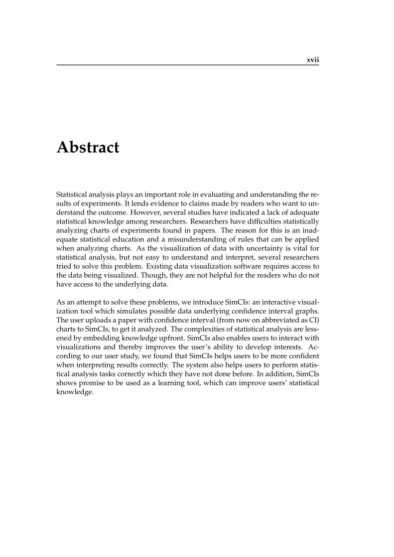
Statistical analysis plays an important role in evaluating and understanding the re-sults of experiments. It lends evidence to claims made by readers who want to un-derstand the outcome. However, several studies have indicated a lack of adequatestatistical knowledge among researchers. Researchers have difficulties statisticallyanalyzing charts of experiments found in papers. The reason for this is an inad-equate statistical education and a misunderstanding of rules that can be appliedwhen analyzing charts. As the visualization of data with uncertainty is vital forstatistical analysis, but not easy to understand and interpret, several researcherstried to solve this problem. Existing data visualization software requires access tothe data being visualized. Though, they are not helpful for the readers who do nothave access to the underlying data.
As an attempt to solve these problems, we introduce SimCIs: an interactive visual-ization tool which simulates possible data underlying confidence interval graphs.The user uploads a paper with confidence interval (from now on abbreviated as CI)charts to SimCIs, to get it analyzed. The complexities of statistical analysis are less-ened by embedding knowledge upfront. SimCIs also enables users to interact withvisualizations and thereby improves the user’s ability to develop interests. Ac-cording to our user study, we found that SimCIs helps users to be more confidentwhen interpreting results correctly. The system also helps users to perform statis-tical analysis tasks correctly which they have not done before. In addition, SimCIsshows promise to be used as a learning tool, which can improve users’ statisticalknowledge.

xviii Abstract
xix
Uberblick
Statistische Analyse spielt eine wichtige Rolle beim Verstehen und Auswertender Ergebnisse von Experimenten. Sie verleiht den Aussagen von LesernGlaubwurdigkeit, die das Ergebnis verstehen wollen. Allerdings haben mehrereStudien gezeigt, dass viele Forscher keine adequate statistische Kenntnisse vor-weisen konnen. Forscher haben Schwierigkeiten statistische Graphiken von Ex-perimenten in Artikeln zu analysieren. Der Grund dafur ist eine unzulanglicheAusbildung in Statistik und ein Missverstandnis von Regeln, die angewendet wer-den konnen um Graphiken zu analysieren. Da die Visualisierung von Daten mitUnbestimmtheit fur die statistische Analyse wichtig, aber nicht leicht zu verste-hen und zu interpretieren ist, haben mehrere Forscher versucht, dieses Problem zulosen. Vorhandene Datenvisualisierungssoftware verlangt Zugang zu den Daten,die visualisiert werden. Diese Programme sind jedoch nicht nutzlich fur die Leser,die keinen Zugang zu den zu Grunde liegenden Daten haben.
Um diese Probleme zu beheben, fuhren wir eine neue Software mit Namen Sim-CIs ein: Ein interaktives Visualisierungswerkzeug, dass mogliche Daten simuliert,die den Konfidenzintervallen der Graphiken zugrunde liegen. Der Benutzer ladteinen Artikel mit Graphiken der Konfidenzintervalle in SimCIs rein, um dieseanalysieren zu lassen. Die Prinzipien der statistischen Analyse werden durch Vi-sualisierungen verdeutlicht und somit verstandlich gemacht. SimCIs ermoglichtes den Benutzern ebenfalls mit Visualisierungen zu interagieren, wodurch sie in-teressierter sind die Analyse zu verstehen. Mithilfe einer Benutzerstudie konntenwir zeigen, dass SimCIs Benutzern hilft uberzeugter in ihrer Antwort zu sein,wenn ihre Ergebnisse richtig sind. Das System hilft Benutzern ebenfalls statis-tische Analyseaufgaben richtig durchzufuhren, die sie vorher nicht durchgefuhrthaben. Außerdem ist es vielversprechend SimCIs als ein Lernwerkzeug zu ver-wendet, welches die statistischen Kenntnisse von Benutzern verbessern kann.


xxi
Acknowledgements
First and foremost, I would like to thank my supervisor Chat Wacharamanothamfor his valuable guidance and competent advice throughout this thesis.
I would also like to thank all people at the Media Computing Group and all peoplewho participated in my study for giving me valuable feedback.
Furthermore, I would like to thank Prof. Dr. Jan Borchers, my thesis advisor, andProf. Dr. Ulrik Schroeder, my second examiner, for their support.
Finally, special thank goes to my family for supporting me during the course of thisthesis.
Thank you!
Verena Kuhr

1
Chapter 1
Introduction
Visualisations are a helpful and powerful way to analyse Visualisation ofuncertainty is apowerful way toanalyse data.
data (Olston and Mackinlay [2002]). In these visualizations,it is important to show the presence, nature, and degree ofuncertainty to the user. According to BIPM et al. [2008], un-certainty is defined as doubt and uncertainty of measure-ment means the doubt about the validity of the results ofa measurement. A common method to show uncertaintyis to use error bars. They convey the degree of statisticaluncertainty. This visualisation of uncertainty is importantbecause otherwise, the data could be misinterpreted andthere is a high possibility that this leads to inaccurate con-clusions. It can be as important for judgment as the actualmean values and error rates of different groups (Correll andGleicher [2014]).
A common way to interpret uncertainty is to do it with the Use confidenceintervals to visualizeuncertainty.
null hypothesis significance testing, called NHST (Cum-ming and Finch [2005]). However, many who want a re-form of statistical practices advocate a change from NHSTto CIs. CIs are one way to visualize means with error barsand therefore to visualize uncertainty. According APA Pub-lication Manual, CIs are in general the best reporting strat-egy. These figures can convey an overall pattern of resultsat a quick glance.
According to Cumming and Finch [2001], there are four Four reasons usingCIs.main reasons for using CIs.
2 1 Introduction
A BDe
pend
ent V
ariab
le0
60
120
100
80
40
20
Independent Variable
MB
wA
wB
wA
AM
wB
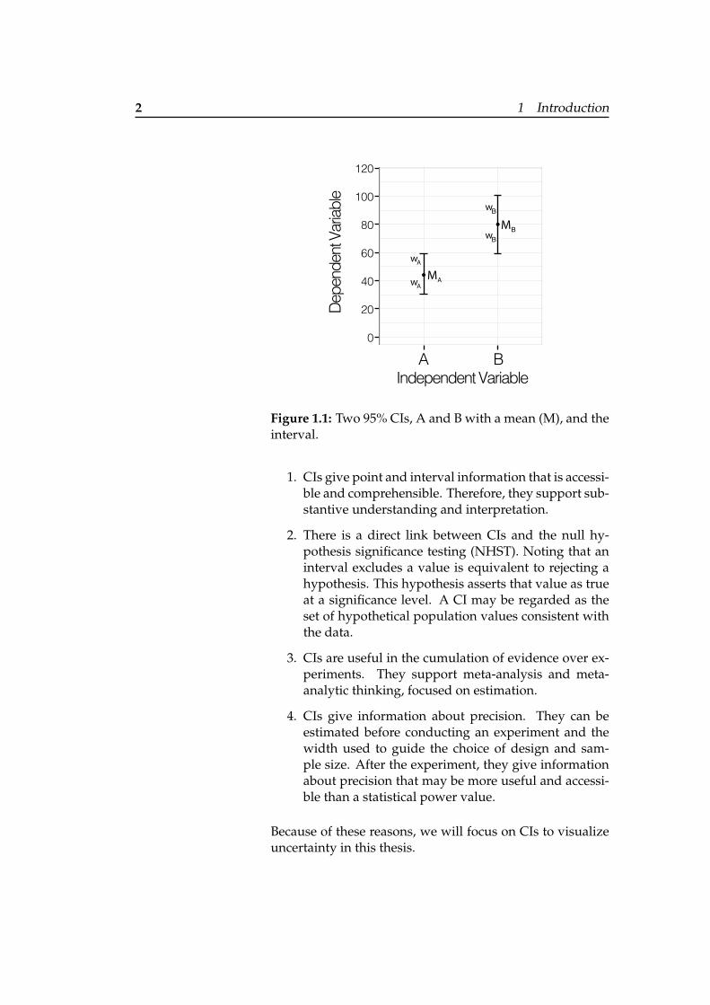
Figure 1.1: Two 95% CIs, A and B with a mean (M), and theinterval.
1. CIs give point and interval information that is accessi-ble and comprehensible. Therefore, they support sub-stantive understanding and interpretation.
2. There is a direct link between CIs and the null hy-pothesis significance testing (NHST). Noting that aninterval excludes a value is equivalent to rejecting ahypothesis. This hypothesis asserts that value as trueat a significance level. A CI may be regarded as theset of hypothetical population values consistent withthe data.
3. CIs are useful in the cumulation of evidence over ex-periments. They support meta-analysis and meta-analytic thinking, focused on estimation.
4. CIs give information about precision. They can beestimated before conducting an experiment and thewidth used to guide the choice of design and sam-ple size. After the experiment, they give informationabout precision that may be more useful and accessi-ble than a statistical power value.
Because of these reasons, we will focus on CIs to visualizeuncertainty in this thesis.
3
A CI, as it can be seen in figure 1.1, is visualized by a mean CIs are an estimatedrange of values witha given highprobability ofcovering the truepopulation value.
(M) and an interval with an upper limit and a lower limitcentered on the mean (Cumming and Finch [2005]). Eachhalf of the interval from the mean to the limit is labeled withw. The mean is the point estimate of the population mean.The interval estimate indicates the precision, or likely accu-racy, of the point estimate. There are different confidencelevels of CIs. The 95% CI is the standard confidence level,chosen for the most studies. As the CI can be described asan estimated range of values of a study with a given highprobability of covering the true population value, it is es-sential to be careful with this statement. This carefulnessis important whenever probability is mentioned in connec-tion with a CI. Because the probability statement about theupper and lower limit varies from sample to sample, itwould be incorrect to state that one interval, derived fromspecific samples, has a probability of .95 of including thepopulation mean µ. This would suggest that µ varies, butµ is fixed, although unknown. According to Cox and Hink-ley [1979], a 95% CI can be expressed in terms of samples,where a repeated procedure on multiple samples could re-sult in a CI that would encompass the true population pa-rameter 95% of the time. This CI would differ for each sam-ple.
There are only a few steps necessary to get a CI chart visu- The CI is (LL, UL).alization from the data. The sample mean M is the mean ofall data values of the distribution. The interval can be cal-culated by extending a distance w on each side of M. ”w”is called the margin of error. The detailed calculations canbe seen in appendix A.1 “Calculation from different inputcharts to 95% CI”. The lower limit (from now on abbrevi-ated as LL) is calculated by subtracting w from M and theupper limit (from now on abbreviated as UL) is calculatedby adding w to M. Therefore the CI is often mentioned tobe (LL, UL).
Although using CIs to represent uncertainty has many ad- CIs have twodifficulties to workon.
vantages, there are two main difficulties. Many researchershave important misconceptions about CIs. Belia et al.[2005] made a user study with authors of journals. The re-sults showed that these people had problems in interpret-ing whether CIs are statistically significant or not. They also
4 1 Introduction
had problems to distinguish between standard error bars,which do not include a critical value and CIs (see A.1 “Cal-culation from different input charts to 95% CI” for moreinfos). These results indicate that there is a need of bettergraphical conventions to display interval estimates and tosignal more clearly how intervals may be used for interpre-tations. This result already exposes the second difficulty,that there are only a few accepted guidelines as how CIsshould be represented or discussed.
Because there are still problems of misconceptions aboutThis thesis will focuson a web-based
solution to improveuncertainty
understanding.
CIs, it is important to have a system that helps understand-ing and interpreting statistical charts. We try to accomplishthat by implementing a system, which helps the user togive accurate answers, being confident with their answers,and learning about the general principles of how to inter-act with CI charts. In this system, it shall be possible for theuser to simply upload the corresponding paper with thechart. Then, the user can see different simulated distribu-tions of the CI and interact with different visualizations. Asdesigning visualizations to support decision-making andperform debiasing is not trivial, we will focus on the usecases first, before continuing with the next chapter whererelated work is studied. Which user groups will benefitfrom this tool and which purposes it will accomplish, areexplained in the following.
Students as well as researchers have to read a lot of papersThe system shallhelp students and
researchers tounderstand a chart in
a paper.
when they are writing a thesis for example. Therefore, itis important for them to understand the charts. We can as-sume that researchers already have statistical knowledge.The statistical knowledge is not that clear for students. Ac-cording to this article1, students from Germany learn de-scriptive statistics, probability calculations, and have basicknowledge in judgment statistics. Students in the UnitedStates are able to read bar charts and data tables to analyzedata in minimum2. According to these information, the sys-tem should be usable for people with various knowledge ofstatistics to understand CI charts or specific problems with
1http://stochastik-in-der-schule.de/sisonline/jahrgang26-2006/heft3/2006-3 kaun.pdf
2http://www.prb.org/Publications/Lesson-Plans/WorldPopulationDataSheet.aspx
5
the chart correctly. Therefore, it could also be used as a toolto teach statistics. Teachers could use the system to pointout special tasks to do with a specific chart. This could helpto deal with the difficulties, mentioned above. Principlesthat help designing such a system are explained in the sec-ond half of 2 “Related work”.
Another possibility would be to use the system to syntax The system shallhelp students andresearchers syntaxchecking their owncharts to make thembetterunderstandable.
check a chart. This can become interesting for researchersand students who made a study and conducted a chart. Asthese people might already have a deeper statistical knowl-edge the focus of the usage of the system is shifted for thistask. Now, the system must not help to understand a chartbut can used to check whether all important aspects are vi-sualized in the chart and given in the text.
In the next chapter, we will go into detail which previouswork already explored the visualization of uncertainty anddiscuss different visualization tools to improve the under-standing and interpretation of statistical charts. Several de-sign principles are given on which the design of this thesis’system, called SimCIs, will be based on. The third chap-ter 3 “System design - SimCIs” will explain the interactionsteps, which are possible with the system, how everythingis visualized, and how the final design resulted from sev-eral iterations. The following chapter 4 “Evaluation” willevaluate the system to see whether it really helps the userto understand and interpret CI charts. A summary is givenat the end in chapter 5 “Summary and future work”, whichis followed by possible implementations for the future.

7
Chapter 2
Related work
In this chapter, we will discuss literature concerning how The main focus ofthis thesis stays onthe visualization, itsinteractivity and waysto evaluate suchsystems.
uncertainty is visualized. In the first section, we will focuson static and interactive ways to visualize uncertainty. Theexemplary systems for static and interactive visualizationdescribed in there are base on general design principles.These principles and existing techniques to augment datavisualization are named in section two. Before these visu-alizations of uncertainty can be used, the system needs tohave the underlying data of the chart. According the usecases which are given in the introduction, the extraction ofthe data directly out of the chart will be necessary for mythesis. There already exist many systems with interactive,automatic, and crowd sourced data extractions. Therefore,these ways will only be described shortly in section three.The main focus of this thesis stays on the visualization, itsinteractivity and ways to evaluate such systems. To be ableto identify and to generate systems which visualize uncer-tainty in a way that users can understand it correctly, weprovide a taxonomy for evaluating visualizations in the lastsection. Summarizing, a design space shows which areas ininteractive visualizations needs further investigation.
8 2 Related work
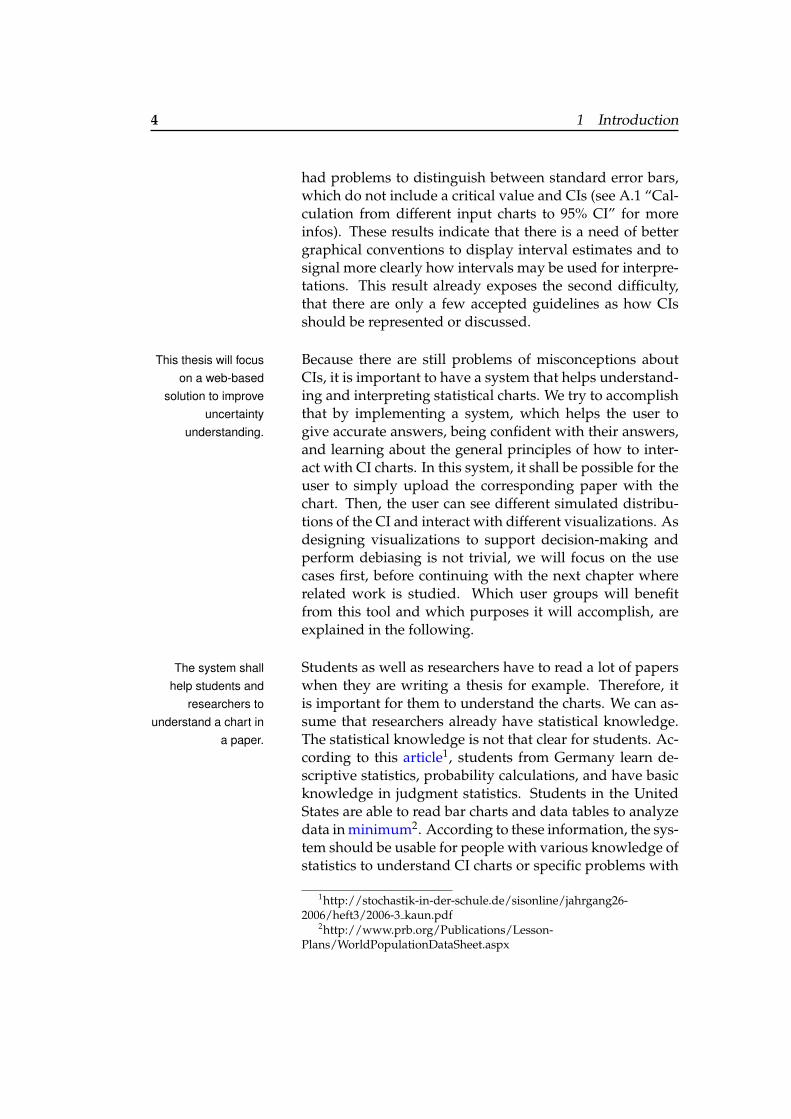
1 a b 2 a b
Figure 2.1: Possible test points for (a) a rising graph and for(b) a falling graph with bars centered at zero (adapted fromNewman and Scholl [2012]). 2 shows additional error bars,where the test points are located (a) outside the margin oferror and (b) inside the margin of error.
2.1 Uncertainty visualization and inter-pretation
When analyzing uncertain, noisy, or incomplete data, mea-Visualization of theuncertainty to helpunderstanding thedata itself can be
static and interactive.
surement error and confidence intervals are as importantas the actual mean values (Correll and Gleicher [2014]). Vi-sualization of the uncertainty can help to understand thedata itself and therefore also to interpret it. There are twocommon ways when visualizing uncertainty in confidenceintervals. The first section will describe how uncertain datacan be presented in a static way. The second section willshow previous work which focus on interactive visualiza-tions and animation of the data. These ways can help theviewer to directly read answers to tasks off of the chart (Fer-reira et al. [2014]). It should help to read the charts correctlyand understand the meaning of the underlying data. How-ever, there are also limitations in previous work which willbe outlined and addressed in this chapter to build the baseof the design of SimCIs. The main part of the system andthe interaction design will then be explained in chapter 3“System design - SimCIs”.
2.1 Uncertainty visualization and interpretation 9
2.1.1 Static visualizations
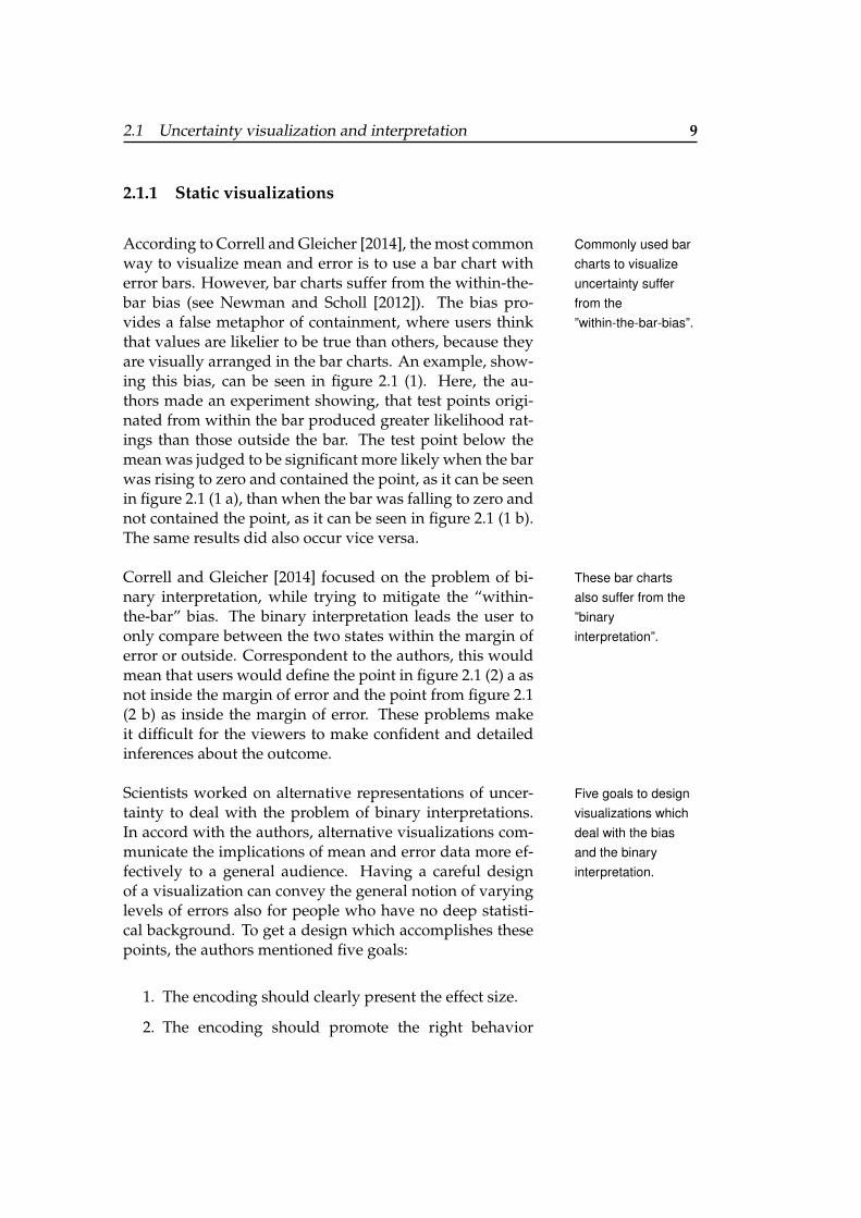
According to Correll and Gleicher [2014], the most common Commonly used barcharts to visualizeuncertainty sufferfrom the”within-the-bar-bias”.
way to visualize mean and error is to use a bar chart witherror bars. However, bar charts suffer from the within-the-bar bias (see Newman and Scholl [2012]). The bias pro-vides a false metaphor of containment, where users thinkthat values are likelier to be true than others, because theyare visually arranged in the bar charts. An example, show-ing this bias, can be seen in figure 2.1 (1). Here, the au-thors made an experiment showing, that test points origi-nated from within the bar produced greater likelihood rat-ings than those outside the bar. The test point below themean was judged to be significant more likely when the barwas rising to zero and contained the point, as it can be seenin figure 2.1 (1 a), than when the bar was falling to zero andnot contained the point, as it can be seen in figure 2.1 (1 b).The same results did also occur vice versa.
Correll and Gleicher [2014] focused on the problem of bi- These bar chartsalso suffer from the”binaryinterpretation”.
nary interpretation, while trying to mitigate the “within-the-bar” bias. The binary interpretation leads the user toonly compare between the two states within the margin oferror or outside. Correspondent to the authors, this wouldmean that users would define the point in figure 2.1 (2) a asnot inside the margin of error and the point from figure 2.1(2 b) as inside the margin of error. These problems makeit difficult for the viewers to make confident and detailedinferences about the outcome.
Scientists worked on alternative representations of uncer- Five goals to designvisualizations whichdeal with the biasand the binaryinterpretation.
tainty to deal with the problem of binary interpretations.In accord with the authors, alternative visualizations com-municate the implications of mean and error data more ef-fectively to a general audience. Having a careful designof a visualization can convey the general notion of varyinglevels of errors also for people who have no deep statisti-cal background. To get a design which accomplishes thesepoints, the authors mentioned five goals:
1. The encoding should clearly present the effect size.
2. The encoding should promote the right behavior
10 2 Related work
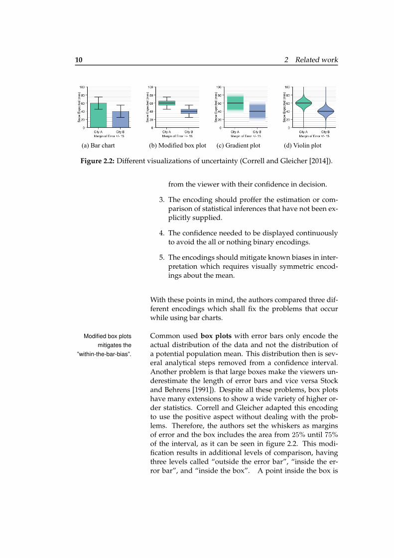
(a) Bar chart (b) Modified box plot (c) Gradient plot (d) Violin plot
Figure 2.2: Different visualizations of uncertainty (Correll and Gleicher [2014]).
from the viewer with their confidence in decision.
3. The encoding should proffer the estimation or com-parison of statistical inferences that have not been ex-plicitly supplied.
4. The confidence needed to be displayed continuouslyto avoid the all or nothing binary encodings.
5. The encodings should mitigate known biases in inter-pretation which requires visually symmetric encod-ings about the mean.
With these points in mind, the authors compared three dif-ferent encodings which shall fix the problems that occurwhile using bar charts.
Common used box plots with error bars only encode theModified box plotsmitigates the
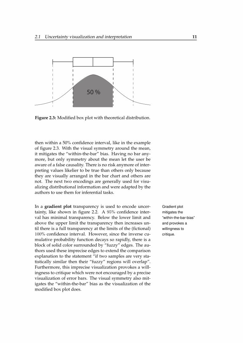
”within-the-bar-bias”.actual distribution of the data and not the distribution ofa potential population mean. This distribution then is sev-eral analytical steps removed from a confidence interval.Another problem is that large boxes make the viewers un-derestimate the length of error bars and vice versa Stockand Behrens [1991]). Despite all these problems, box plotshave many extensions to show a wide variety of higher or-der statistics. Correll and Gleicher adapted this encodingto use the positive aspect without dealing with the prob-lems. Therefore, the authors set the whiskers as marginsof error and the box includes the area from 25% until 75%of the interval, as it can be seen in figure 2.2. This modi-fication results in additional levels of comparison, havingthree levels called “outside the error bar”, “inside the er-ror bar”, and “inside the box”. A point inside the box is
2.1 Uncertainty visualization and interpretation 11
50 %
Figure 2.3: Modified box plot with theoretical distribution.
then within a 50% confidence interval, like in the exampleof figure 2.3. With the visual symmetry around the mean,it mitigates the “within-the-bar” bias. Having no bar any-more, but only symmetry about the mean let the user beaware of a false causality. There is no risk anymore of inter-preting values likelier to be true than others only becausethey are visually arranged in the bar chart and others arenot. The next two encodings are generally used for visu-alizing distributional information and were adapted by theauthors to use them for inferential tasks.
In a gradient plot transparency is used to encode uncer- Gradient plotmitigates the”within-the-bar-bias”and provokes awillingness tocritique.
tainty, like shown in figure 2.2. A 95% confidence inter-val has minimal transparency. Below the lower limit andabove the upper limit the transparency then increases un-til there is a full transparency at the limits of the (fictional)100% confidence interval. However, since the inverse cu-mulative probability function decays so rapidly, there is ablock of solid color surrounded by “fuzzy” edges. The au-thors used these imprecise edges to extend the comparisonexplanation to the statement “if two samples are very sta-tistically similar then their “fuzzy” regions will overlap”.Furthermore, this imprecise visualization provokes a will-ingness to critique which were not encouraged by a precisevisualization of error bars. The visual symmetry also mit-igates the “within-the-bar” bias as the visualization of themodified box plot does.
12 2 Related work
For the violin plot, width is used to encode uncertaintyViolin plot mitigatesthe
”within-the-bar-bias”and let users read
the chart moreprecisely.
(see figure 2.2). Near to the mean, the width is the widest.The width then decreases exponentially with increasingdistance to the mean, which visualises the values that be-come less likely. This results in a smooth, violin-like shapewith interior glyphs. Width as a positional encoding of dis-tributional data has a higher precision according the visualchannel than color. This benefits in viewer estimation tasks.Furthermore, it encourages the accordance of comparisonof values beyond the discrete within/ outside the marginof error judgments. This strong, high fidelity visual encod-ing let the user read the chart more precisely. As the othertwo encodings also did, the visual symmetry mitigates thewithin-the-bar bias.
All of these alternate encodings have low costs and benefitGradient plot andviolin plot should be
preferred whenvisualizing
uncertainty.
in performance advantages to a general audience. The ex-periments from Correll and Gleicher emphasize this state-ment. Furthermore, visual encodings that overcome thetwo problems, like the gradient and the violin plot, shouldbe preferred to use instead of bar charts. However, the ex-periment did not state which encoding is the best replace-ment. The cultural costs could also be high, because theviewers might prefer suboptimal, but known encodings.Furthermore, the experiment did not conduct decision-making tasks or a bigger set of encodings like outliers, re-gression, or multi-way comparisons.
In 3.2.2 “Possible distributions”, we will use violin plots toshow skewed data of a CI. This design decision is discussedin chapter 3 “System design - SimCIs”.
2.1.2 Interactive visualizations
As teaching and learning statistics becomes a bigger fieldin elementary, secondary, and postsecondary education ac-cording to Mills, there is a considerable interest to employeffective instructional methods (see Rohatgi [2015a]). Toteach these concepts, researchers in general recommendcomputer simulation methods. However, according to theauthor, only very little empirical research is done in this
2.1 Uncertainty visualization and interpretation 13
field to support this recommendation.
In 2003 and in 2007, researchers like Hsu [2003] and Effectiveness ofcomputer-assistedstatistics instructionin learning statisticsis given by providinga meaningfulaverage performanceadvantage.
Schenker [2007] already found out through meta-analyses,that computer-based tools can be effective in statistics in-struction. In 2011, Sosa et alconducted a study in whichthey went further, by focusing on aspects of computerbased tools that are most closely associated with learningand achievement outcomes (Sosa et al. [2011]). They extendprevious work by giving attention to additional attributes,such as different technology types, student engagement,student control over the learning process, and the natureof feedback. These attributes were tested in 45 experimen-tal studies. The results showed, that they account for dif-ferences in effectiveness of computer-assisted statistics in-struction by providing a meaningful average performanceadvantage. Further analysis suggested that the effect islarger when having more time for the instructions, grad-uated students who perform the tasks, and an embeddedassessment. However in general, regardless of the fea-tures, computer-assisted instructions yields larger effectsthan non-computer-assisted instructions. According to theauthors, research to the role of interactivity, engagement,and feedback getting more important as educators continuework on improving the efficacy of technology-based statis-tics instruction.
Cumming [2012] worked on a solution which focuses on Simulation isbeneficial whenlearning aboutuncertainty.
the interactivity and feedback of computer-assisted statis-tics instruction. This includes some Excel spreadsheet asexploratory software for confidence intervals and his book“Understanding The New Statistics” to understand and seepossible ways how to interpret uncertainty. Here, severalsimulations show how data points are arranged to a specificnormal distributed CI, what p value means, and comparestwo CIs for example. The user also can only start, pauseand stop the simulation. All these simulations show sam-ples which are generated randomly, or which are based onnumbers inserted by the user at the beginning, like sam-ple size, mean, or standard deviation. According to hischanges, the CI is redrawn and simulation is shown. Thesesimulations are provided in 6 Excel spreadsheets with 47sheets in total to communicate the full meaning of confi-
14 2 Related work
dence intervals. To fully understand how to interact withthese sheets and to get all its information it is necessary toread the book. There are a few spreadsheets from Cum-ming, where the user can insert the underlying data of suchcharts. However, it does not provide the possibility to in-sert a chart. All in all, his work suggests a benefit of usingsimulation to learn about CIs. In my work, I will go fur-ther by making it convenient to create simulations withinthe context of reading a paper.
Ferreira et al. [2014] compared five interactive visualiza-Ferreira et al.created a systemwith 5 task based
annotations tounderstand and
interpret uncertainty.
tions to understand and interpret uncertainty in bar chartsdirectly. Here, the user has to add the underlying data intothe system to get it visualized. These different visualiza-tions of uncertainty, which will be explained later on withfigure 2.4 and figure 2.5, shall help the user to read the an-swers of tasks directly from the chart. The authors chosethese tasks to be bar comparison, identification of the prob-ability that a bar represents the minimum and maximum,comparison to a constant, comparison to a range, and iden-tification of items within rankings. At first, the authors setseveral design goals based on former literature which canbe used as guidelines for creating visual annotations:They created
guidelines forcreating visual
annotations. 1. The visualization should be easy to interpret by onlyadding minimal additional visual complexity.
2. Consistency across tasks is necessary for the user to beable to change between tasks without losing contexton the dataset.
3. Spatial stability across sample size shall be com-prised, by changing the visualization proportional tothe size of the change of the data. This can be doneby smoothly animating between visualizations at twosuccessive time intervals.
4. Minimize the visual noise, by displaying some infor-mation in one chart type and other information in adifferent visual representation. According to the au-thors, having no such additional complexity wouldcause more confusion and therefore is important toadd.
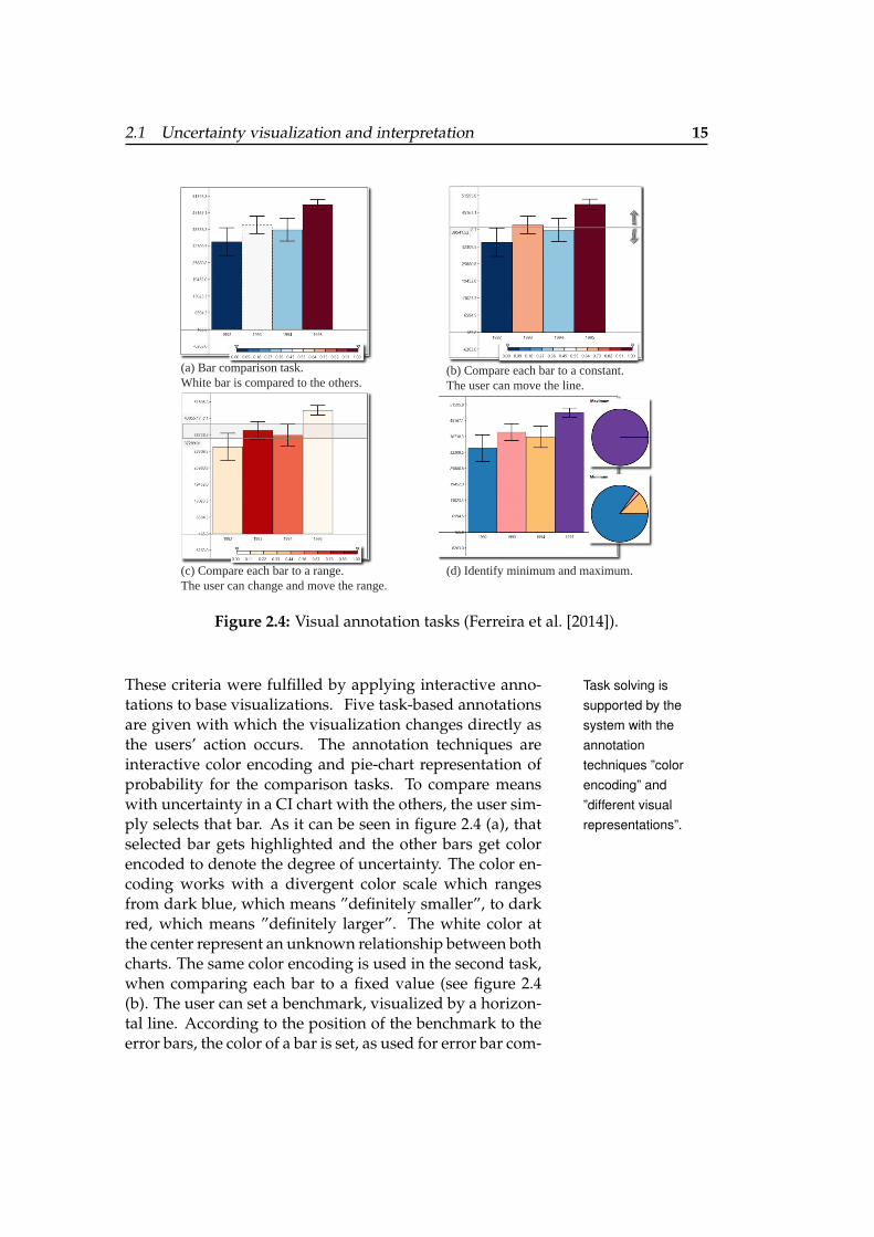
2.1 Uncertainty visualization and interpretation 15
(a) Bar comparison task. White bar is compared to the others.
(b) Compare each bar to a constant. The user can move the line.
(c) Compare each bar to a range.The user can change and move the range.
(d) Identify minimum and maximum.
Figure 2.4: Visual annotation tasks (Ferreira et al. [2014]).
These criteria were fulfilled by applying interactive anno- Task solving issupported by thesystem with theannotationtechniques ”colorencoding” and”different visualrepresentations”.
tations to base visualizations. Five task-based annotationsare given with which the visualization changes directly asthe users’ action occurs. The annotation techniques areinteractive color encoding and pie-chart representation ofprobability for the comparison tasks. To compare meanswith uncertainty in a CI chart with the others, the user sim-ply selects that bar. As it can be seen in figure 2.4 (a), thatselected bar gets highlighted and the other bars get colorencoded to denote the degree of uncertainty. The color en-coding works with a divergent color scale which rangesfrom dark blue, which means ”definitely smaller”, to darkred, which means ”definitely larger”. The white color atthe center represent an unknown relationship between bothcharts. The same color encoding is used in the second task,when comparing each bar to a fixed value (see figure 2.4(b). The user can set a benchmark, visualized by a horizon-tal line. According to the position of the benchmark to theerror bars, the color of a bar is set, as used for error bar com-
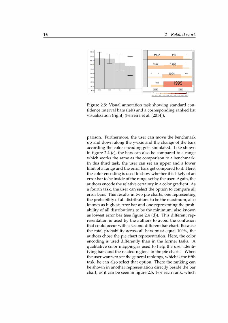
16 2 Related work
Figure 2.5: Visual annotation task showing standard con-fidence interval bars (left) and a corresponding ranked listvisualization (right) (Ferreira et al. [2014]).
parison. Furthermore, the user can move the benchmarkup and down along the y-axis and the change of the barsaccording the color encoding gets simulated. Like shownin figure 2.4 (c), the bars can also be compared to a rangewhich works the same as the comparison to a benchmark.In this third task, the user can set an upper and a lowerlimit of a range and the error bars get compared to it. Here,the color encoding is used to show whether it is likely of anerror bar to be inside of the range set by the user. Again, theauthors encode the relative certainty in a color gradient. Asa fourth task, the user can select the option to compare allerror bars. This results in two pie charts, one representingthe probability of all distributions to be the maximum, alsoknown as highest error bar and one representing the prob-ability of all distributions to be the minimum, also knownas lowest error bar (see figure 2.4 (d)). This different rep-resentation is used by the authors to avoid the confusionthat could occur with a second different bar chart. Becausethe total probability across all bars must equal 100%, theauthors chose the pie chart representation. Here, the colorencoding is used differently than in the former tasks. Aqualitative color mapping is used to help the user identi-fying bars and the related regions in the pie charts. Whenthe user wants to see the general rankings, which is the fifthtask, he can also select that option. There the ranking canbe shown in another representation directly beside the barchart, as it can be seen in figure 2.5. For each rank, which
2.1 Uncertainty visualization and interpretation 17
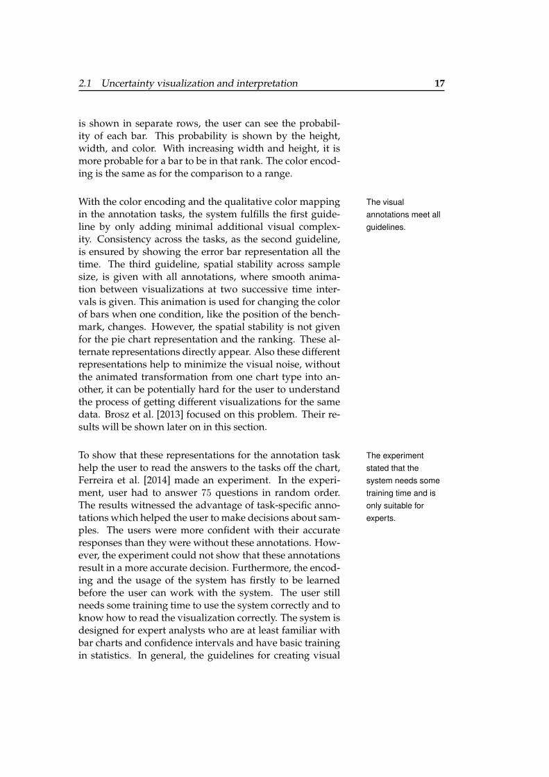
is shown in separate rows, the user can see the probabil-ity of each bar. This probability is shown by the height,width, and color. With increasing width and height, it ismore probable for a bar to be in that rank. The color encod-ing is the same as for the comparison to a range.
With the color encoding and the qualitative color mapping The visualannotations meet allguidelines.
in the annotation tasks, the system fulfills the first guide-line by only adding minimal additional visual complex-ity. Consistency across the tasks, as the second guideline,is ensured by showing the error bar representation all thetime. The third guideline, spatial stability across samplesize, is given with all annotations, where smooth anima-tion between visualizations at two successive time inter-vals is given. This animation is used for changing the colorof bars when one condition, like the position of the bench-mark, changes. However, the spatial stability is not givenfor the pie chart representation and the ranking. These al-ternate representations directly appear. Also these differentrepresentations help to minimize the visual noise, withoutthe animated transformation from one chart type into an-other, it can be potentially hard for the user to understandthe process of getting different visualizations for the samedata. Brosz et al. [2013] focused on this problem. Their re-sults will be shown later on in this section.
To show that these representations for the annotation task The experimentstated that thesystem needs sometraining time and isonly suitable forexperts.
help the user to read the answers to the tasks off the chart,Ferreira et al. [2014] made an experiment. In the experi-ment, user had to answer 75 questions in random order.The results witnessed the advantage of task-specific anno-tations which helped the user to make decisions about sam-ples. The users were more confident with their accurateresponses than they were without these annotations. How-ever, the experiment could not show that these annotationsresult in a more accurate decision. Furthermore, the encod-ing and the usage of the system has firstly to be learnedbefore the user can work with the system. The user stillneeds some training time to use the system correctly and toknow how to read the visualization correctly. The system isdesigned for expert analysts who are at least familiar withbar charts and confidence intervals and have basic trainingin statistics. In general, the guidelines for creating visual
18 2 Related work
Figure 2.6: Transmogrification from a bar chart to a piechart (Brosz et al. [2013]).
annotations, special and defined annotation tasks, and theirannotation techniques result in a system, that helps the userin being more confident with their decisions. Therefore, Ialso based my concept for creating visual annotations onthese guidelines, set special annotation tasks and used dif-ferent visual representations that shall help the user to un-derstand the CI chart. More information of this process inprovided in chapter 3.1 “Interaction walk-through and de-sign rationale” and 3.2 “Visualization of problem cases”.
In general, according to Brosz et al. [2013], data visual-Users are moreconfident with their
decision when usingthe system.
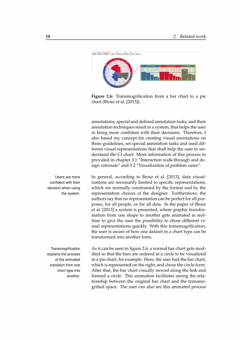
izations are necessarily limited to specific representations,which are normally constrained by the format and by therepresentation choices of the designer. Furthermore, theauthors say that no representation can be perfect for all pur-poses, for all people, or for all data. In the paper of Broszet al. [2013] a system is presented, where graphic transfor-mation from one shape to another gets animated in real-time to give the user the possibility to chose different vi-sual representations quickly. With this transmogrification,the user is aware of how one dataset in a chart type can betransformed into another form.
As it can be seen in figure 2.6, a normal bar chart gets mod-Transmogrificationexplains the process
of the animatedtransition from one
chart type intoanother.
ified so that the bars are ordered in a circle to be visualizedin a pie chart, for example. Here, the user had the bar chart,which is represented on the right, and chose the circle form.After that, the bar chart visually moved along the link andformed a circle. This animation facilitates seeing the rela-tionship between the original bar chart and the transmo-grified space. The user can also see this animated process
2.2 Existing techniques augmenting data visualization 19
again in his desired speed by dragging a slider that appearsat the bottom of the interface. With this system the user cansketch, transform, and compare visualizations from one ormultiple sources.
All these static and interactive visualization examples baseon general design principles. They will be discussed in thenext section.
2.2 Existing techniques augmenting datavisualization
Several techniques help augmenting visualization. Accord-ing to the visualization type, different design principles canbe applied. In the following, we will distinguish betweenthe design principles of static and interactive visualization.Each principle will get assigned a number to refer to theprinciples later on in chapter 3 “System design - SimCIs”when discussing the design of the system.
2.2.1 Design principles for a static visualization
Edward Tufte worked on the topic augmenting visual in-formation to show the data. Therefore, he made severalguidelines which will be discussed in this section. Theseguidelines can be used when designing systems.
Layering and separation
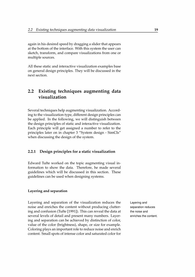
Layering and separation of the visualization reduces the Layering andseparation reducesthe noise andenriches the content.
noise and enriches the content without producing clutter-ing and confusion (Tufte [1991]). This can reveal the data atseveral levels of detail and present many numbers. Layer-ing and separation can be achieved by distinction of color,value of the color (brightness), shape, or size for example.Coloring plays an important role to reduce noise and enrichcontent. Small spots of intense color and saturated color for
20 2 Related work
(a) No separation and layering with (b) Correct separation and layering. failure to communicate information.
Figure 2.7: Layering and separation (Tufte [1991]).
(a)
(b)
(c)
(d)
(e)
(f)
(g)
(h)
Reference Structures Highlights Redundant Encodings Summary Statistics
Figure 2.8: Possible types of overlays (Kong and Agrawala [2012]).
carrying information help to highlight important parts andset connections between the different layers. As it can beseen in figure 2.7 (a), having a same visual level with equalvalues, equal texture, equal color, and nearly equal shaperesults in an undifferentiated, unlayered surface with jum-bled up, blurry, incoherent, chaotic, and unintentional op-tical art. Information cannot be communicated. In figure2.7 (b) more detail than the perfect jumble is shown, havingseparated and layered information.
2.2 Existing techniques augmenting data visualization 21
Overlays
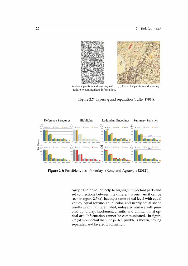
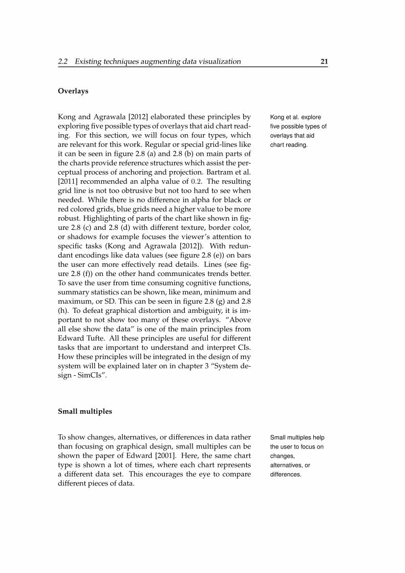
Kong and Agrawala [2012] elaborated these principles by Kong et al. explorefive possible types ofoverlays that aidchart reading.
exploring five possible types of overlays that aid chart read-ing. For this section, we will focus on four types, whichare relevant for this work. Regular or special grid-lines likeit can be seen in figure 2.8 (a) and 2.8 (b) on main parts ofthe charts provide reference structures which assist the per-ceptual process of anchoring and projection. Bartram et al.[2011] recommended an alpha value of 0.2. The resultinggrid line is not too obtrusive but not too hard to see whenneeded. While there is no difference in alpha for black orred colored grids, blue grids need a higher value to be morerobust. Highlighting of parts of the chart like shown in fig-ure 2.8 (c) and 2.8 (d) with different texture, border color,or shadows for example focuses the viewer’s attention tospecific tasks (Kong and Agrawala [2012]). With redun-dant encodings like data values (see figure 2.8 (e)) on barsthe user can more effectively read details. Lines (see fig-ure 2.8 (f)) on the other hand communicates trends better.To save the user from time consuming cognitive functions,summary statistics can be shown, like mean, minimum andmaximum, or SD. This can be seen in figure 2.8 (g) and 2.8(h). To defeat graphical distortion and ambiguity, it is im-portant to not show too many of these overlays. “Aboveall else show the data” is one of the main principles fromEdward Tufte. All these principles are useful for differenttasks that are important to understand and interpret CIs.How these principles will be integrated in the design of mysystem will be explained later on in chapter 3 “System de-sign - SimCIs”.
Small multiples
To show changes, alternatives, or differences in data rather Small multiples helpthe user to focus onchanges,alternatives, ordifferences.
than focusing on graphical design, small multiples can beshown the paper of Edward [2001]. Here, the same charttype is shown a lot of times, where each chart representsa different data set. This encourages the eye to comparedifferent pieces of data.
22 2 Related work
(a) Filter split on visible (x-axis) attribute mpg. (b) Mapping split on visualisation type.
(c) Small multiple createn based on visual analystics parameters: number of desired clusters, cluster method, clustering distance metric and finally a split on the cluster themselves.
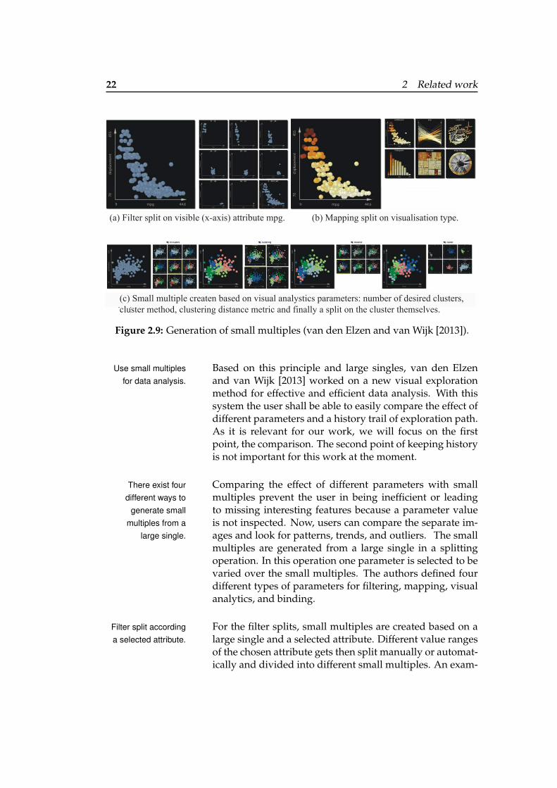
Figure 2.9: Generation of small multiples (van den Elzen and van Wijk [2013]).
Based on this principle and large singles, van den ElzenUse small multiplesfor data analysis. and van Wijk [2013] worked on a new visual exploration
method for effective and efficient data analysis. With thissystem the user shall be able to easily compare the effect ofdifferent parameters and a history trail of exploration path.As it is relevant for our work, we will focus on the firstpoint, the comparison. The second point of keeping historyis not important for this work at the moment.
Comparing the effect of different parameters with smallThere exist fourdifferent ways to
generate smallmultiples from a
large single.
multiples prevent the user in being inefficient or leadingto missing interesting features because a parameter valueis not inspected. Now, users can compare the separate im-ages and look for patterns, trends, and outliers. The smallmultiples are generated from a large single in a splittingoperation. In this operation one parameter is selected to bevaried over the small multiples. The authors defined fourdifferent types of parameters for filtering, mapping, visualanalytics, and binding.
For the filter splits, small multiples are created based on aFilter split accordinga selected attribute. large single and a selected attribute. Different value ranges
of the chosen attribute gets then split manually or automat-ically and divided into different small multiples. An exam-
2.2 Existing techniques augmenting data visualization 23
ple scenario can be seen in figure 2.9 (a), where the x-axisis chosen as attribute. Each small multiple show the datavalues in a different x-axis range.
In general the mapping split is used to create small multi- Mapping split createssmall multiples foreach visualizationtype in general.
ples for each visualization type, as it can be seen in figure2.9 (b). Here, the user has the possibility to explore what vi-sualization type is best for their problem and effortless trydifferent visualization types, or even all at once. However,visual mappings have a variety of parameters like axes,color, and size. These parameters can also result in a gen-eration of alternatives shown as small multiples. The map-ping split will also be used for this thesis’ system design,to show different distribution types of a given CI. How thisis implemented will be shown in chapter 3.1 “Interactionwalk-through and design rationale” and 3.2 “Visualizationof problem cases”.
The visual analytics method, where the small multiples are Visual analyticsmethod enhancesexplorationexperience usingcluster parameters.
based on visual analytics parameters, shall enhance the ex-ploration experience. The user has to fulfill several stepsone after another in which he firstly sees a number of de-sired clusters. This can be seen in figure 2.9 (c) on the left.After he chose one cluster, different clustering methods areshown. After that the clustering distance metric is shown insmall multiples and at the end a split on the clusters them-selves occur.
In binding, advanced split operations are also possible on Binding enhancesmultiple split.small multiples, which then is called multiple split. As this
is not relevant for this thesis, we will not discuss this furthermore in detail.
Graphical integrity
In general, it must be visually clear that the graphical de- Graphical designmust serve a clearpurpose.
sign serves a clear purpose and induce the viewer to thinkabout the substance rather than about the design Edward[2001]. To encourage that the graphical display is closelyintegrated, not only the statistical description of the datasetbut also the verbal descriptions of the dataset are impor-
24 2 Related work
tant. This can help to avoid distorting what the data haveto say.
Tufte derived six main principles resulted from graphicalintegrity. The following ones from ”The Visual Display ofQuantitative Information” (p.77) are relevant for this thesis:
1. ”The representation of numbers, as physically mea-sured on the surface of the graphic itself, should bedirectly proportional to the numerical quantities rep-resented.”
2. ”Clear, detailed, and thorough labeling graphical dis-tortion and ambiguity.”
3. ”Show data variation, not design variation.”
4. ”The number of information-carrying (variable) di-mensions depicted should not exceed the number ofdimensions in the data.”
5. ”Graphics must not quote data out of context.”
How these aspects get integrated in my system will beshown in chapter 3 “System design - SimCIs”.
2.2.2 Design principles for an interactive visualiza-tion
As simulation is an important aspect to teach and learnstatistics (see section 2.1.2 “Interactive visualizations”), itis necessary to have design principles of the way visual-izations can change because of users input. According toWare [2004], a good visualization is characterized by find-ing more detailed data about anything that seems impor-tant. This means, that each object shall be capable of dis-playing more information as needed, disappearing whennot needed, and accepting user commands to help with thethinking process. Such an interactive visualization is a pro-cess that is made up of a number of interlocking feedbackloops that can be categorized into three broad classes.
2.2 Existing techniques augmenting data visualization 25
Manipulation loop
The lowest level of feedback loops is called the manipula- Three laws areimportant to describecontrol loops: Choicereaction time, hoverqueries, andvigilance.
tion loop. We have a massively parallel processing of vi-sual scene into elements of form, opponent colors, and ele-ments of texture and motion. Here, objects are selected andmoved using basic skills of eye-hand coordination. Delaytakes an important role as it can disturb the performanceof higher level tasks when only a fraction of a second ofdelay occurred in the interaction cycle. Colin Ware listedeight laws that describe low level control loops. The im-portant laws which are relevant to this thesis are shown inthe following. Choice reaction time can be modeled witha simple rule called Hick-Hyman law where the reactiontime is based on the number of choices C.
Reaction T ime = a+ b ∗ log(C)
log(C) represents the amount of information processed by ahuman operator, expressed in bits of information and a andb are empirically determined constants. Another importantfactor is the speed-accuracy trade-off, where time alwayssuffer from the accuracy and vice versa. Hover queriesprovide extra information of the object. Normally this isdone with a delay. When hovering over queries with nodelay, dragging over a set of objects can rapidly reveal thedata contents and allowing an interactive query rate of sev-eral per second. The detection of infrequently appearingtargets can get very hard, because people perform poorlyon vigilance tasks. There are several techniques to im-prove the performance. Reminders at frequent intervals,can help when there are several different targets that haveto be detected. Another way is to make the target percep-tually different or distinct from irrelevant information withcolor, motion, or texture distinction.
These concepts are applied in the system SimCIs, whichwill be explained later on in chapter 3.1 “Interaction walk-through and design rationale” when talking about interac-tive refinement. The hovering technique will be used todisplay more information when hovering over the chart orthe small multiples. To provide vigilance during the wholeprocess in the thesis’ system, outlier visualization is pro-vided. The speed-accuracy trade-off will get important in
26 2 Related work
chapter 4 “Evaluation”, when comparing the results fromthe user study.
Exploration and navigation loop
The intermediate level of feedback loops is called explo-The law ”focus,context, and scale”
solves thefocus-context
problem using fourdifferent techniques.
ration and navigation loop. In this level, five laws helpthe analysts to find their way in large visual data spaceand to try better understanding or perceiving a problem.Locomotion and viewpoint control, as well as frames ofreferences and map orientations shall help to navigate ina 3D environment that shall reflect navigation in the realworld. Therefore, the first three laws are not relevant here.The fourth law is focus, context, and scale. During the ex-ploration process, the user will face the focus-context prob-lem, where he has to find a detail in a larger context. Inthis thesis, the context is provided by the uncertainty chartand the focus is represented by the small multiples, whichshow different distributions. This will be explained in de-tail in chapter 3.1 “Interaction walk-through and design ra-tionale”. In general, same interactive techniques can be ap-plied to solve the focus-context problem. These four differ-ent visualization techniques are distortion, rapid zooming,elision, and multiple windows.
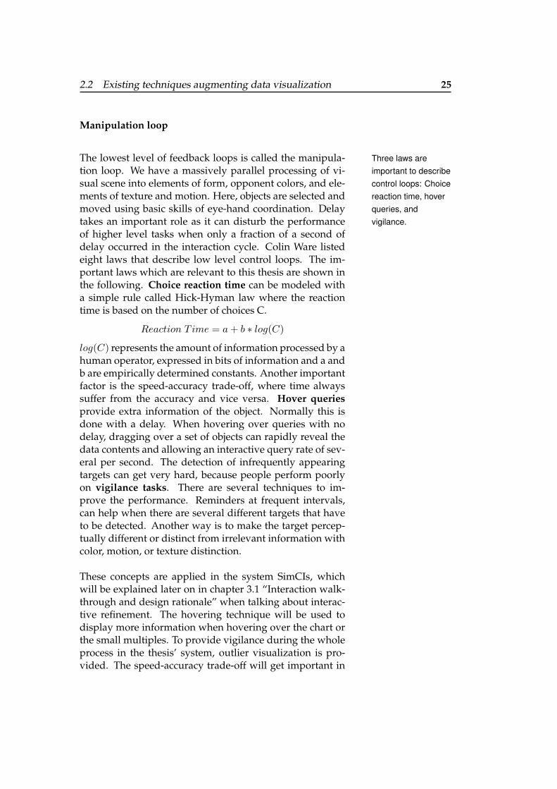
The technique, called multiple windows, is interestingMultiple windowshaving one overviewwindow and several
detailed windowswhich are connected
via links.
for this thesis, as it comprises one window showing anoverview and several others showing expanded details (seefigure 2.10). As this technique is very similar to the smallmultiples idea, explained in section 2.2.1 “Design principlesfor a static visualization”, this technique will be used in thethesis’ system SimCIs. How it is implemented will be ex-plained later on in chapter 3.1 “Interaction walk-throughand design rationale” and 3.2 “Visualization of problemcases”. This technique solves the problem of visually dis-connected windows from the overview window. Lines areadded that connect the boundaries of the detailed windowwith the boundaries of the overview window. This tech-nique is better than the other techniques, because it is nondistorting and shows focus and context simultaneously.
2.2 Existing techniques augmenting data visualization 27
Figure 2.10: Multiple windows technique on spiral calen-dar. Information in one window is linked to its contextwithin another by a connecting transparent overlay (Ware[2004]).
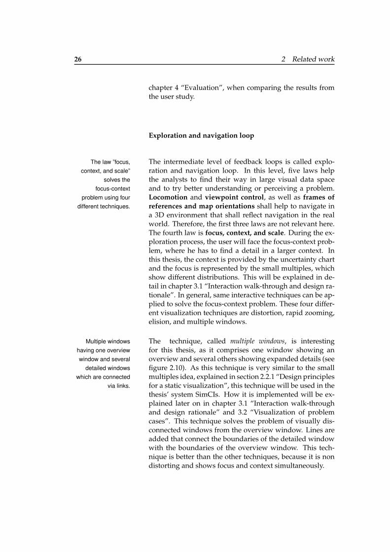
(a) Dynamic query sliders (b) Brushing objects
Figure 2.11: Rapid interaction techniques to have a fluidmapping between the data and its visual representation(Ware [2004]).
28 2 Related work
The fifth law in the exploration and navigation loop is theRapid interactionwith data enabled
with dynamic queriesinterface and
brushing.
rapid interaction with data. It is important to have a fluidand dynamic mapping between the data and its visual rep-resentation. With the principle of transparency, the user isable to apply intellect directly to the task so that the tool it-self seems to disappear. To achieve this sense of control, theresponsiveness of the computer system is the key psycho-logical variable. This interactive data mapping is the pro-cess of adjusting the function that maps the data variablesto the display variables. There exists several techniques todisplay this interactive data. Ware [2004] mentioned twomainly used techniques. With the dynamic queries interface,the range of data values that are visible and mapped to thedisplay variable are limited, when the data set is very largeand complex. This results in data range sliders which iso-late and visualize a subset of the data when adjusted, likeshown in figure 2.11 (a). With brushing, subsets of data ele-ments can get highlighted interactively in a complex repre-sentation. Figure 2.11 (b) shows a parallel-coordinate plot,where each data dimension is represented by a vertical line.The user can interactively select a set of objects by draggingthe cursor across them. They then get highlighted by usinga different color representation. When having a data objectwhich appears in several views, selecting it in one view willalso highlight it in the other views. This also enables visuallinking of components of an object.
In this thesis a form of brushing will be used. When theuser highlights information of the chart in the text, differentrepresentation (small multiples) that fits to this informationgets highlighted. More information and the realization willbe given in chapter 3.1 “Interaction walk-through and de-sign rationale”.
Problem-solving loop
In the highest level of feedback loops, called problem-In five levels,requirements are
formulated andseparated into parts
to finally solve thetask.
solving loop, the analysts form hypotheses about data andrefine them through an augmented visualization process.Here, thinking can be augmented by visual queries on vi-sualizations of data. This level is segmented into five lev-
2.2 Existing techniques augmenting data visualization 29
els. In the highest and initial level, called problem solv-ing strategy, a problem context and its provisional stepsfor solving it are settled up. This includes the formulationof a set of requirements. As the system of this thesis shallalso be usable by non-experts in statistics, which might nothave the knowledge of which requirements are important,these steps are taken over by the system itself. More de-tails are given in chapter 3.1.3 “Interactive refinement byselecting information from the text”. The next level, calledvisual query construction, focuses on the formulation ofparts of the problem to afford a visual solution. This caninclude to read the data values out of the graph. Therefore,the graphical data extraction is an important part duringthis process. Different ways of graphical data instructionswill be explained in the following section 2.3 “Graphicaldata extraction”. The pattern-finding loop starts with thesearch for elementary visual patterns important to the task.Two or three simple solutions or one complex solution canbe stored in the visual working memory. One solution mustbe retained while alternate solutions are found. This can besupported by the system when giving the user the possibil-ity to highlight a potential solution. We will use that for theinteraction design, which is described in chapter 3.1 “Inter-action walk-through and design rationale”. The last twolevels, the eye movement control loop and the intrasac-cadic image-scanning loop are not relevant for this thesis.
Implications
According to (Ware [2004], the model with its three levelspresented above has three main implications for data dis-play systems:
1. To allow the user to use the advantages of the pattern-finding capabilities of the middle stage of visual pro-cessing, the data should be represented in a way sothat informative patterns are easy to perceive.
2. To help the user think about the problem and not theinterface, the cognitive impact of the interface shouldbe minimized.
30 2 Related work
3. For low-cost, rapid information seeking, the interfaceshould be optimized.
There exist a lot of visual query patterns with respect toThe complexity ofvisual query patternsresult from the expert
level of the systemusers.
graph examination. For example, trend estimation, corre-lation identification, outlier detection and characterization,or identification of structural patterns. To perform a vi-sual query rapidly and with a low error rate, the queryshould consist of a simple pattern that can be held in theworking memory. For expert users, the query patterns canhave greater complexity. However also for experts, somepatterns are easier to understand than others because ofthe laws of pre-attentive processing and elementary patternperception. When a system designer starts with the visual-ization of the system, he has to be aware of the expertnessof the people who will use the system at the end. In gen-eral, he has to use simple informative patterns to representdata (implication 1) so that the users can use the advantageof pattern-finding capabilities. When he designs the sys-tem for experts, the patterns can get more complex. Thisuser awareness combined with the complexity of patternsof the interface is also important so that the user can focuson the problem instead of the interface (implication 2) andto ensure rapid information seeking (implication 3).
These basic rules are important to have in mind when con-structing a system with interactive visualizations. All userswill try to manipulate objects, explore the data space, andsolve a task in a way, similar to the rules explained above.The implications, based on these steps give initial consider-ations which design decisions are necessary to do. To sup-port the user in understanding and interpreting the visu-alization, the system should support these three levels offeedback loops.
2.3 Graphical data extraction
As we could see in section 2.1.2 “Interactive visualiza-tions”, there already exist several ways to understand andinterpret CIs based on detailed underlying data. However,
2.3 Graphical data extraction 31
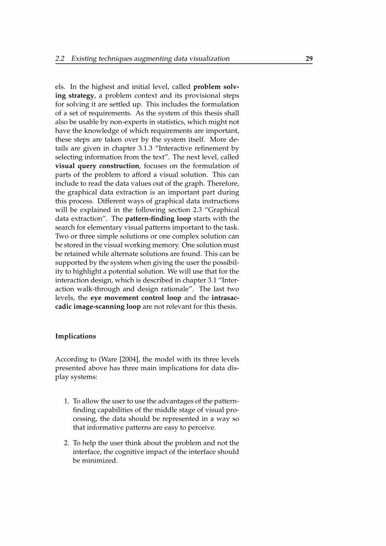
Figure 2.12: WebPlotDigitizer to interactively extract un-derlying data and set additional data points (Rohatgi[2015b]).
it is often hard and time-consuming to get this data, as wealready discussed. Often, referencing text in the paper in-cludes relevant facts which are not directly seen in the chart(see paper of Choudhury et al. [2013]). Therefore, graphicaldata extraction of the CI chart to get important data val-ues is a relevant part for my work. This will be the base tolabel the graph with its main values and to simulate datawhich then both helps to understand and interpret CIs. Asthere already exist several systems that automatically ex-tract data out of the chart and the text, this topic will be outof the scope of this thesis. However in the following, threegeneral ways extracting data from general graphics will beexplained.
2.3.1 Interactive data extraction
One way to get the underlying data out of a chart is the Systems likeWebPlotDigitizerhelp users tointeractively extractthe underlying data.
combination of user interaction and computation. One ex-emplary system is WebPlotDigitizer (see Rohatgi [2015b])shown in figure 2.12. Here the user can upload the chartin a web browser and simply redraw the graph by draw-ing the x- and y-axis and labeling them with the accordingvalues and numbers. With automatic curve extraction al-gorithms, rapid extraction of a large number of data points.
32 2 Related work
The user can also add data points by clicking in the chart.These data points can also be rearranged by the user. As ananalysis task, the user can choose between getting an an-gle or a distance between two points. Therefore, he has toselect two points for the distance and three points for anangle. Then, the system calculates the distance or the an-gle according the previously set axis. This technique fordata extraction is very important for more complex chartslike stacked or grouped bar charts, where marks, axes, anddata values cannot yet extracted automatically. However,the users action can vary greatly from chart type to charttype. Therefore, it is easier and more time consuming touse automatic data extraction whenever possible.
As we have seen in this section, interactive data extractionand analysis is already combined with partly integrated au-tomatic data extraction. How automatic data extraction canlook like will be explained with some exemplary systems inthe next section.
2.3.2 Automatic data extraction
The paper of Savva et al. [2011] presents a system, calledSystems likeReVision extract the
underlying data toredesign different
chart types.
ReVision, that automatically redesigns visualizations of agiven bitmap image for an improved graphical perception.At first, the chart type is identified by computer vision andmachine learning techniques. The steps explained in thefollowing are visualized in figure 2.13.
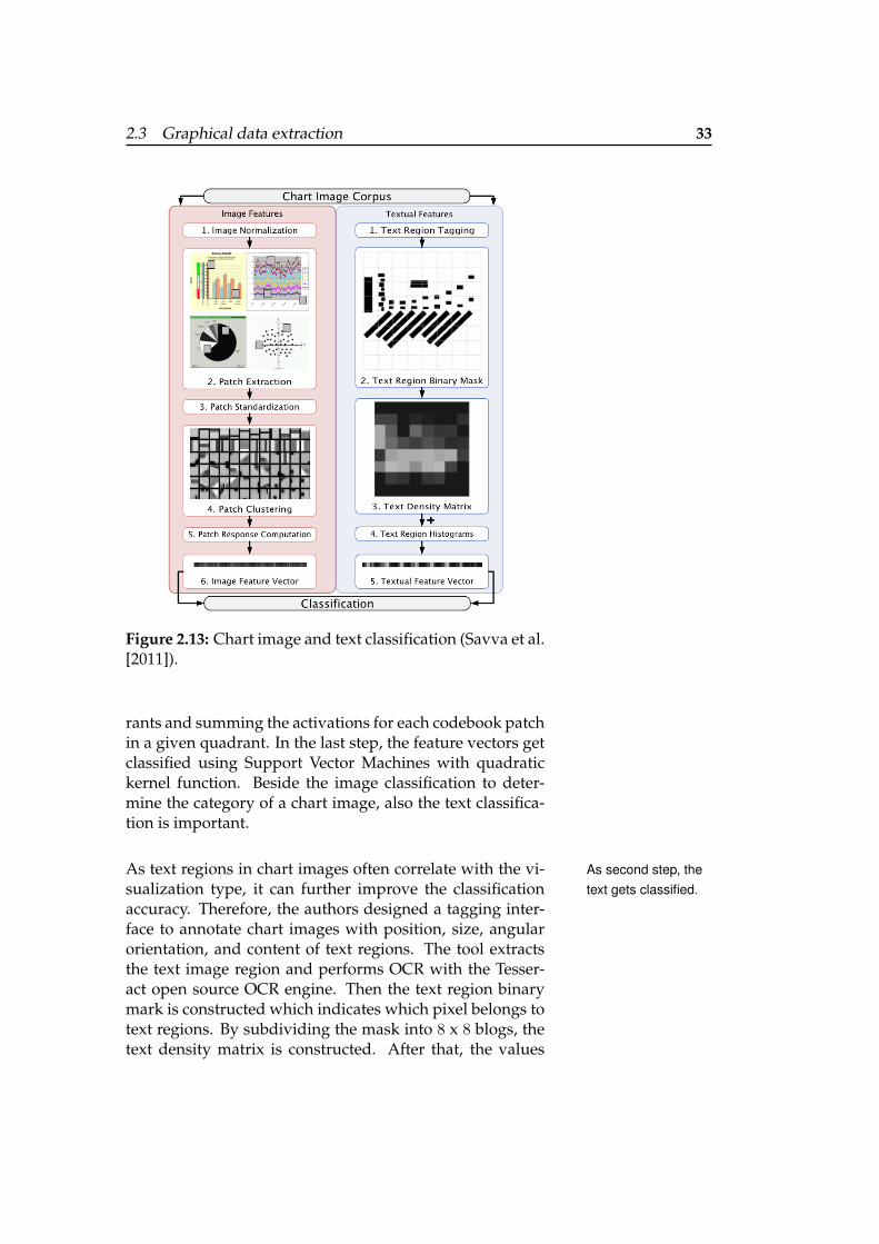
The image classification process is divided into seven steps.As first step, theimage is classified. In the first step, the image gets normalized. At next,
square patches get extracted and patch standardization isapplied. Path clustering then results in centroid patches,that correspond to the most frequently occurring patchtypes, called codebook patches. They capture frequentlyoccurring graphical marks like lines, points, corners, arcs,and gradients. In the patch response computation, for eachextracted patch the nearest codebook patch is determinedby Euclidean distance. Then the feature vector formula-tion starts, where the dimensions of the codebook patch re-sponse map get reduced by dividing the image into quad-
2.3 Graphical data extraction 33
Figure 2.13: Chart image and text classification (Savva et al.[2011]).
rants and summing the activations for each codebook patchin a given quadrant. In the last step, the feature vectors getclassified using Support Vector Machines with quadratickernel function. Beside the image classification to deter-mine the category of a chart image, also the text classifica-tion is important.
As text regions in chart images often correlate with the vi- As second step, thetext gets classified.sualization type, it can further improve the classification
accuracy. Therefore, the authors designed a tagging inter-face to annotate chart images with position, size, angularorientation, and content of text regions. The tool extractsthe text image region and performs OCR with the Tesser-act open source OCR engine. Then the text region binarymark is constructed which indicates which pixel belongs totext regions. By subdividing the mask into 8 x 8 blogs, thetext density matrix is constructed. After that, the values
34 2 Related work
Figure 2.14: ReVision system with two input charts and their redesigned charts(Savva et al. [2011]).
get linearized and normalized 10-bin histograms of the dis-tributions of text region length, width, center position andpairwise orientation and distance between text region cen-ters get computed. These histograms then get concatenatedwith the text density vectors to create a final textual featurevector.
With these steps, the chart gets 96% accurately classified96% classificationaccuracy. across area graphs, bar graphs, curve plots, maps, pareto
charts, radar plots, scatter plots, tables, and venn diagrams.Afters these steps of classification, the graphical marks getextracted to infer the underlying data.
In the data extraction phase, the geometry of the extractedThe data extractionphase results in a
table with an ID anda data tuple and the
redesignedvisualizations
appear.
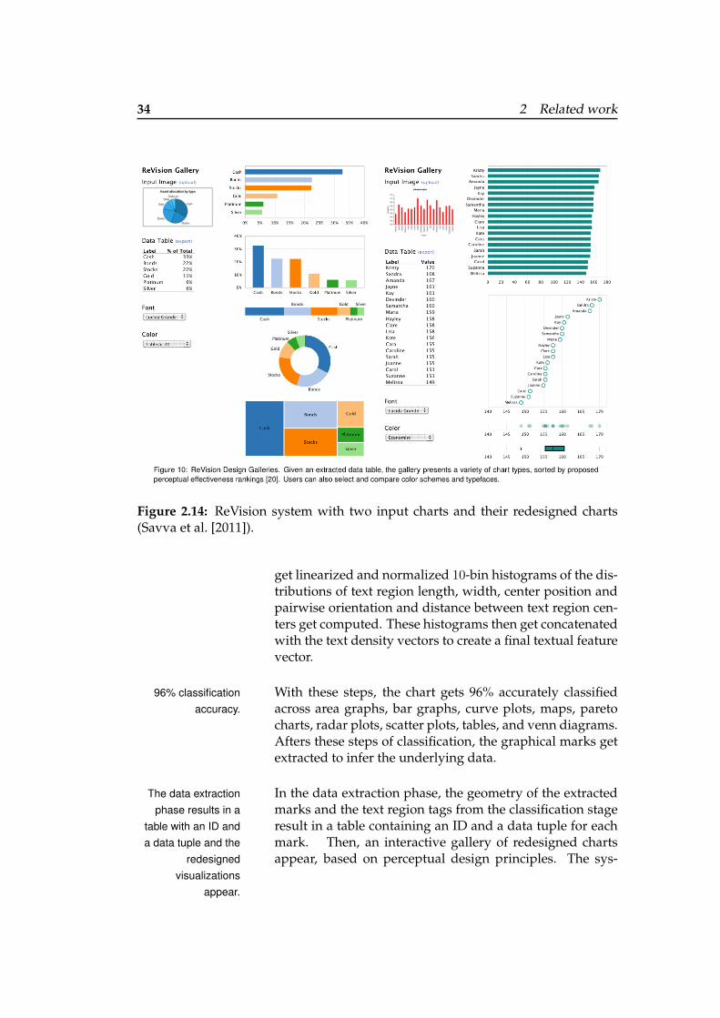
marks and the text region tags from the classification stageresult in a table containing an ID and a data tuple for eachmark. Then, an interactive gallery of redesigned chartsappear, based on perceptual design principles. The sys-
2.3 Graphical data extraction 35
tem chooses different visualizations depending on the in-put chart type and extracted data. For pie charts (see figure2.14, left), among others bar charts are generated to to sup-port part-to-part comparison. With bar charts as input (seefigure 2.14, right), the system generates a sorted bar chartand a labeled dot plot to support comparison of individualvalues, and small dot and box plots to enable assessmentof the overall distribution. According to the authors, thisinterface helps the users to view alternative chart designsand to retarget content to different visual styles. The usercan change mark types, colors, or fonts.
As the different visualizations help the user to get different The user getsdifferent insight withdifferentvisualizations.
insight, these visualization types will also be included inthe system of this thesis. How this will be implemented inthe system will be explained in detail in chapter 3 “Systemdesign - SimCIs”.
In Choudhury et al. [2013], not only the charts but also the Other systems alsoextract the text in thepaper automatically.
text in the paper belonging to that chart can be extracted.With a Java based PDF processing library PDFBox, text andraster images together with their IDs get extracted fromPDF files. Vector graphics cannot be extracted with this sys-tem. After that, line classification in the text is used to findthe caption based on the ID and to extract the caption. Fig-ures and caption are matched by extracting the figure num-ber beneath the image and searching for that in text. Sev-eral researchers worked on automatic data extraction likeGao et al. [2012], or the authors of datathief1.
2.3.3 Crowdsourced data extraction
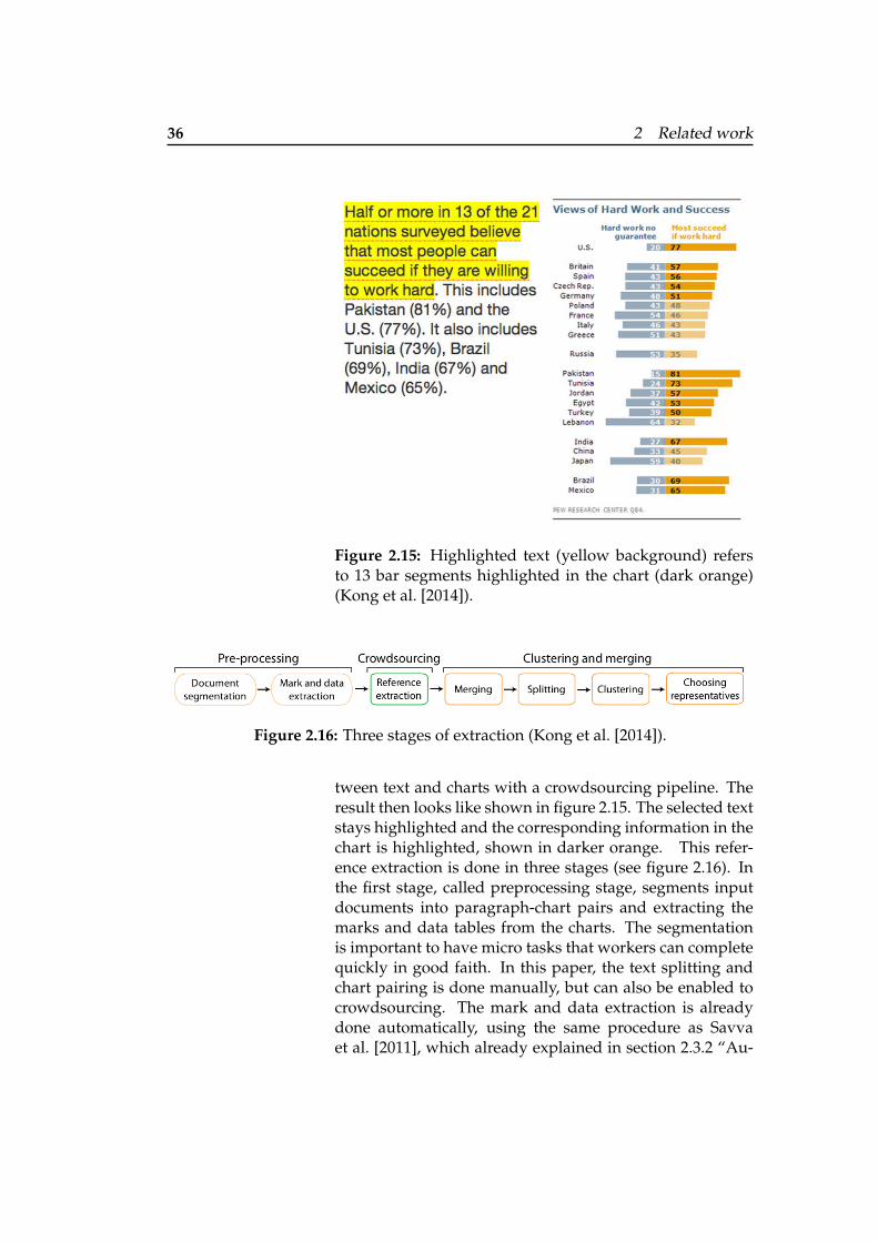
Another possibility to extract data is to provide crowd- Users highlight textand correspondingparts in the chart gethighlighted due tocrowdsourcedlinking.
sourcing when selecting parts of the text to highlight cor-responding parts of the chart. Linking a chart to its corre-sponding text can be helpful because there might be addi-tional information in the text which help to further under-stand the graph. The linking helps the user to better un-derstand the relation between the text and the chart. Konget al. [2014] provide a mechanism to extract references be-
1 http://www.datathief.org
36 2 Related work
Figure 2.15: Highlighted text (yellow background) refersto 13 bar segments highlighted in the chart (dark orange)(Kong et al. [2014]).
Figure 2.16: Three stages of extraction (Kong et al. [2014]).
tween text and charts with a crowdsourcing pipeline. Theresult then looks like shown in figure 2.15. The selected textstays highlighted and the corresponding information in thechart is highlighted, shown in darker orange. This refer-ence extraction is done in three stages (see figure 2.16). Inthe first stage, called preprocessing stage, segments inputdocuments into paragraph-chart pairs and extracting themarks and data tables from the charts. The segmentationis important to have micro tasks that workers can completequickly in good faith. In this paper, the text splitting andchart pairing is done manually, but can also be enabled tocrowdsourcing. The mark and data extraction is alreadydone automatically, using the same procedure as Savvaet al. [2011], which already explained in section 2.3.2 “Au-
2.4 How to evaluate a system with visualization 37
tomatic data extraction”. When the user now highlights apart of the text, the reference is extracted via crowdsourcing(stage 2) and the according part in the chart gets marked(stage 3). This idea of extracting references between textand charts, which results in highlighting of a chart whenthe user selects parts of the text, is also a relevant part formy thesis. I will adapt this idea by filtering a set of differentcharts (small multiples) according the text that is selectedby the user. As text can provide additional information fora chart, it can nail down different possible visualizationsof a problem which helps the user to understand the chart.How this will affect my thesis in detail will be discussed inchapter 3.1.3 “Interactive refinement by selecting informa-tion from the text”.
As seen in these works, automatic and semi-automatic dataextraction from charts are already explored in the litera-ture. Therefore, this thesis focuses on the interaction withthe chart in order to understand a specific uncertain chartand assumes that the data will be extracted automatically.
2.4 How to evaluate a system with visual-ization
Heer and Shneiderman [2012] made a taxonomy of inter- Checklist for creatingvisualizations ofuncertainty.
active dynamics for visual analysis which can be used tocompare and to detect missing features of the system thatsupport basic tasks. It can be used as checklist of items toconsider when creating a new analysis tool for developers.The points which are relevant for the visualization of un-certainty are:
1. Visualization
2. Filter
3. Select
4. Navigation
5. Coordinated Views
6. Organized visualization
38 2 Related work
7. Recording
8. Annotate
9. Share results
10. Guiding
The taxonomy can be divided in three main parts. Theseparts will be explained in the following, by naming the im-portant aspects which is needed in each system. Further-more, examples are given of how a realization could looklike. As these concepts are one of the main parts for the de-sign of my system, it will be explained in detail when talk-ing about the design process in chapter 3 “System design -SimCIs”.
2.4.1 Data and view specification
When the user shall be able to explore large data sets withvaried data types, a flexible visual analysis tool must pro-vide controls for the user to specify the data and views ofinterest. These controls important for visualizations of un-certainty comprise visualization and filtering.
When visualize (heuristic 1) data by choosing visual en-Visualize to choosewhich data can be
shown.codings, the user can actively choose which data can beshown and how. Therefore, the user shall have the possi-bility in a program to choose between multiple charts typesand their data variables, like the size and color or visualizedmarks. For this thesis, a system will be designed which al-lows the user to see the data in different chart types, like inpie charts for the probability distribution as it was alreadydone by Ferreira et al. [2014].
To focus on relevant items, the user shall be able to filterFilter to focus.(heuristic 2) out data. The user has the possibility to shifthis focus among different data subsets by using radio boxesor checkboxes for categorical and ordinal data. Anotherway is to filter with sliders, which is also possible with tem-poral data. The system from this thesis will give the userthe possibility to filter out small multiples by highlightingadditional information in the text of the paper.
2.4 How to evaluate a system with visualization 39
2.4.2 View manipulation
The user should be able to manipulate the view, like se-lecting, navigating, coordinating, or organizing, in order tounderstand and interpret the visualized data.
The user shall be able to select (heuristic 3) items in order to Select to highlight,filter, or manipulate.highlight, filter, or manipulate them. This can be done with
mouse hovering, mouse click, or region selections. Ferreiraet al. [2014] used the selection to highlight bars accordinga special benchmark or range. This thesis focuses on hov-ering over the small multiples in order to manipulate thelarge single.
Navigation (heuristic 4) is necessary to examine high-level Navigate to examinehigh-level patternsand low-level detail.
patterns and low-level detail. One common pattern hereis the idea to firstly show an overview, then zoom and fil-ter and at last show details-on-demand. Different kinds ofnavigation are already explained and the implementationin the thesis’ system is given in section 2.2.2 “Explorationand navigation loop” when talking about focus, contextand scale. Here it is also shown that overview and detailscan be shown simultaneously.
Coordinated views (heuristic 5) are beneficial for linked, Coordinated views tosee data fromdifferentperspectives.
multi-dimensional exploration. This helps to see data fromdifferent perspectives. To compare several view, the smallmultiples approach from Edward Tufte is generally used aswell as in this thesis’ system. Here, several visualizations inthe same type and with the same measures and scales areplaced in spatial proximity.
When having multiple views and workspaces, the collec- Organize views forindividual use.tions of visualizations have to be organized (heuristic 6) in
a way. In general all windows shall be able to be opened,closed, maximized and to lay out different components bythe user. Having a large display, all information can be seenat once, which should result in a way so that the controlpanel with sliders, check boxes, radio buttons, and a searchbox could be on the far right. With a details-on-demandwindow and annotation box at the bottom. Typical sys-tems allows analysts to add single views, more advanced
40 2 Related work
systems allow analysts to use an automated support wheremultiple windows are opened and closed in a group. Theseviews are then automatically resized and set in spatial prox-imity. This thesis’ system provides some kind of automaticvisualization organization of different distributions visual-ized in small multiples. How this is implemented can beseen in section 3.2 “Visualization of problem cases”.
2.4.3 Process and provenance
The process of iterative data exploration and interpreta-tion is an important part in visual analysis and consists ofrecording, annotating, sharing, and guiding.
Recording (heuristic 7) the actions and insights helps to re-Record to refine andreview history. view and refine the history of work. At a minimum, this
interaction history shall provide basic undo and redo sup-port. Here, low-level input like mouse and keyboard eventsare easy to capture, while high-level semantic actions be-come more valuable. The representation of these histori-cal analytic actions can include chronological timeline-likeviews as well as sequential comic-strip-like views. Thesequential views show the steps taken in visual analysis.With the visual history, several interactions are possible.Prior analysis states can be revisited and incomplete explo-rations can be resumed. For this thesis, the system providessimple undo support when filtering the small multiples.
When the user is able to annotate (heuristic 8) patterns,Annotate todocument individual
observations.outliers, and views of interest, he can document his obser-vations, questions, and hypotheses. One possibility is toallow textual annotations of states within the visual his-tory. In more expressive annotations, direct interactionswith the view can be done, like the selection techniques thatare discussed earlier in section 2.4.2 “View manipulation”.Freeform graphical annotations can be used to highlightparts of a charts, by using circles or arrows. They allowhigh degree of expression, but they have no explicit connec-tion to its underlying data. Because they are not data aware,they can become meaningless when using filtering or sort-ing operations. Annotations can be made data aware when
2.4 How to evaluate a system with visualization 41
realizing them with selections. This also enables the ana-lyst to search for all comments or visualizations that referto that data item. Furthermore, these annotations are ma-chine readable, which makes it possible to export selecteddata and to identify data subsets of high interest. In the pa-per of Kong and Agrawala [2012] , the techniques for textor free hand annotations to allow the user to create arrowsand other reference marks are discussed. However, sys-tems which already focus on visualizing uncertainty, likethe ones from Ferreira et al. [2014] or Cumming [2012], donot support annotation techniques. As this thesis’ systemwill also not support this technique, this is an importantaspect for future work.
Recording and annotation helps the user to share (heuristic Share to collaboratework or support aprocess.
9) his results and insights easily with colleagues, to collab-orate the work of multiple groups, or to support a process.At minimum, it should be possible to export views or datasubsets. It is also important to export the settings of the con-trol panels, so that others can see the same visualization.There are two main possibilities to collaborate the visual-ization. One of it is sharing via application bookmarking.The system should be able to model and export its inter-nal state. This enables the user to take up the explorationwhere the former collaborator left of. This is also useful forthe collaborators as it provides a common ground for dis-cussion. The other way to share the visualization is to pub-lish it. With this possibility, visualization dashboards canbe shared as interactive web pages with a subset of func-tionalities for some follow-up analysis. It is also importantto have in mind which context of use is given for sharingwhen designing the system. Are the collaborators workingsynchronously or asynchronously? And are they co-locatedor distributed?
Guiding (heuristic 10) is important for experts to create Guide to createreusable work flowsand get allinformation thesystem provides.
reusable work flows, which can be used by less knowl-edgeable team members. Non experts can use a systemdirectly when having special guiding support which helpsthem to see all information the system provides. Accord-ing the authors, more research is needed to identify theseeffective visual-analytics processes. However, there are dif-ferent forms of narrative visualizations where interactive
42 2 Related work
graphics are structured to tell stories of the data. A step bystep manual through a linear narrative visualization guidesthe user with the help of supporting text and annotations.At a story’s conclusion, interactive control should be pro-vided for further exploration. These narrative structurescommunicate key observations from the data and providea tacit tutorial of available interactions by animating eachcomponent along with the story. When the user has al-ready seen demonstrations of the interactive controls, thesystem opens up for free form exploration. This demon-strated how guided analytics can be used to disseminatedata-driven stories to a general audience.
2.5 Design space of the interaction withuncertain data visualizations
The visualization of spread, combined with existing tech-niques to augmenting data visualization, and the taxonomyof interactive dynamics for visual analysis result in the fol-lowing design space in table 2.1 “Design space of the in-teraction with uncertain data visualizations.”. This designspace for interactive visualizations sums this chapter upand shows us the open aspects which need further inves-tigation.
2Symbols:�: Cumming [2012] �: Ferreira et al. [2014] ◦: Thesis’ system
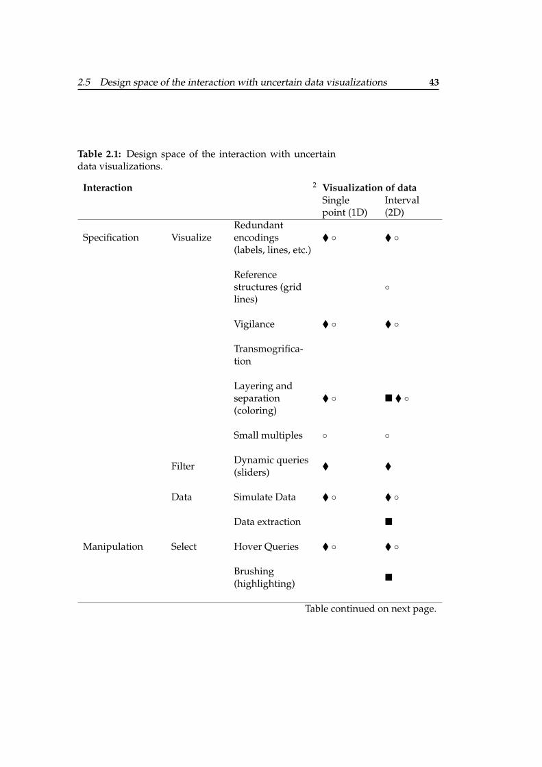
2.5 Design space of the interaction with uncertain data visualizations 43
Table 2.1: Design space of the interaction with uncertaindata visualizations.
Interaction 2 Visualization of dataSinglepoint (1D)
Interval(2D)
Specification VisualizeRedundantencodings(labels, lines, etc.)
� ◦ � ◦
Referencestructures (gridlines)
◦
Vigilance � ◦ � ◦
Transmogrifica-tion
Layering andseparation(coloring)
� ◦ � � ◦
Small multiples ◦ ◦
FilterDynamic queries(sliders)
� �
Data Simulate Data � ◦ � ◦
Data extraction �
Manipulation Select Hover Queries � ◦ � ◦
Brushing(highlighting)
�
Table continued on next page.
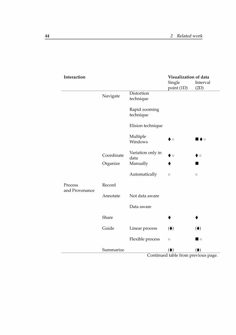
44 2 Related work
Interaction Visualization of dataSinglepoint (1D)
Interval(2D)
NavigateDistortiontechnique
Rapid zoomingtechnique
Elision technique
MultipleWindows
� ◦ � � ◦
CoordinateVariation only indata
� ◦ � ◦
Organize Manually � �
Automatically ◦ ◦
Process Recordand Provenance
Annotate Not data aware
Data aware
Share � �
Guide Linear process (�) (�)
Flexible process ◦ � ◦
Summarize (�) (�)Continued table from previous page.
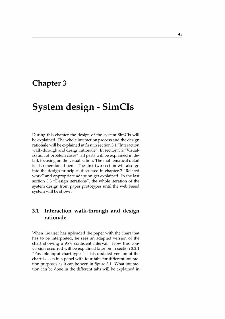
45
Chapter 3
System design - SimCIs
During this chapter the design of the system SimCIs willbe explained. The whole interaction process and the designrationale will be explained at first in section 3.1 “Interactionwalk-through and design rationale”. In section 3.2 “Visual-ization of problem cases”, all parts will be explained in de-tail, focusing on the visualization. The mathematical detailis also mentioned here. The first two section will also gointo the design principles discussed in chapter 2 “Relatedwork” and appropriate adaption get explained. In the lastsection 3.3 “Design iterations”, the whole iteration of thesystem design from paper prototypes until the web basedsystem will be shown.
3.1 Interaction walk-through and designrationale
When the user has uploaded the paper with the chart thathas to be interpreted, he sees an adapted version of thechart showing a 95% confident interval. How this con-version occurred will be explained later on in section 3.2.1“Possible input chart types”. This updated version of thechart is seen in a panel with four tabs for different interac-tion purposes as it can be seen in figure 3.1. What interac-tion can be done in the different tabs will be explained in
46 3 System design - SimCIs
(b) CI of difference (c) Pie charts (d) Benchmark
(a) Interactive refinement
Figure 3.1: Overview of the interaction UI of SimCIs.
the following.
3.1.1 Interact with CI chart
In the first tab (see figure 3.1 (a)), the user is able to switchDifferent interactionpurposes with thechart in four tabs.
between original chart and converted chart to see whatchanged. Therefore, a button is given which shows theoriginal chart as long as the mouse is hovering over thebutton. This prevents the user from interacting with the
3.1 Interaction walk-through and design rationale 47
original chart what shall not be possible. Furthermore,the hovering enables a faster switch which helps the usereasier compare the changes from one to the other chart.There are two types of overlays, mentioned in 2.2.1 “Over-lays”, which are used here and in the other interactive tabs.When hovering over the chart, redundant encodings aregiven in form of labels showing the mean, upper limit,and lower limit of the error bars. These hover queries (see2.2.2 “Manipulation loop”) showing extra information ofthe chart helps the user to more effectively read details.When switching to the next tab (see figure 3.1 (b)), an addi-tional CI of difference is shown in the chart. Which infor-mation is visualized here will be explained later in section3.2.5 “CI of difference and the overlap rule”. The third tab(see figure 3.1 (c)) shows two pie charts for each distribu-tion with the probability for each bar in the chart to be themaximum and minimum distribution. The last tab (see fig-ure 3.1 (d)) shows a benchmark, which the user can dragvertically along the chart to see how likely it is that the CIsmeet the benchmark. The benchmark can be used as refer-ence structure in a special grid line form, because the valueis shown all the time. They assist the perceptual processof anchoring and projection. From the 95% CI chart, smallmultiples get created, which are directly below the chart ineach tab.
3.1.2 Interact with alternate explanation from sim-ulated data
The problem of the CI chart is, that the user does not know Small multiples showpossible distributionsof the CIs.
on which data points this chart is based on. As the useronly uploads the paper, no underlying data is given. How-ever, the distribution of the results can influence the mes-sage, a CI chart conveys. Small multiples, as already shownin chapter 2.2.1 “Small multiples”, are there to show dif-ferences, changes, or alternatives. In this thesis, they willbe used to show how distributions could look like whichwill result in the CIs represented in the chart. The differ-ent possible distributions get simulated with R1. The es-sential code rnbinom(N,mean, .5) calculates the Negative
1 http://www.r-project.org
48 3 System design - SimCIs
Binomial. The Negative Binomial as well as the Binomialcounts the samples. However we chose the Negative Bi-nomial, which counts failures until a fixed number of suc-cesses. As the Binomial would only count a fixed numberof trials, we will always have the same number of successeswith the Negative Binomial.
The small multiples, the large single, and the paper areHover to seeadditional information
of the distribution.visible all the time, which is comparable to the multiplewindows exploration technique (see 2.2.2 “Exploration andnavigation loop”). The user can see the context all the timein form of the paper and the large single representation onall paper pages represented as overlays. On the same time,he is able to focus on different distributions which are rep-resented in the small multiples. With the navigation taps inthe interaction panel (see figure 3.1), the user can also fo-cus on each interaction purpose, while having the contextof the chart and different possible distributions. When theuser inspects the small multiples and hovers over them, abigger version of them will appear as overlay at the place ofthe large single. Again, this technique called hover queries,mentioned in section 2.2.2 “Manipulation loop”, helps theuser to get additional information. The user can see thesmall multiple in larger form with additional textual infor-mation of the distribution. In the third tab, when hover-ing over the small multiples, also pie charts representingthe probability of this distribution in the chart to representthe maximum or the minimum error bar are shown. Thisconcept was already provided in 2.1.2 “Interactive visual-izations” by Ferreira et al. [2014] for CI charts in general.Here, as there is no underlying data to base on, the proba-bility pie charts are represented for each possible distribu-tion. Which distributions are shown, how they are ordered,and how the pie charts result will be explained in section3.2 “Visualization of problem cases”. However, the focusget shifted to the interactive refinement of the small multi-ples at first.
3.1 Interaction walk-through and design rationale 49
3.1.3 Interactive refinement by selecting informa-tion from the text
As several small multiples with different possible distribu- Reduce number ofsmall multiples byadding additionalinformation from thetext.
tions are represented, the user shall be able to reduce thenumber of small multiples by adding additional informa-tion from the text of the paper. This mapping process canbe compared to the mapping technique explained in 2.2.1“Small multiples”. The user can see three different high-lighting tasks. The tasks are highlighting the sample sizefrom all error bars, check text for outliers, and check textaccording the distribution of all error bars. The user can se-lect the sample size in the text and press a button to applythis information. The text stays highlighted, the informa-tion appears next to the task, and the small multiples get ac-tualized. For the other tasks the user can press different ra-dio buttons. For the outlier task he can check whether thereexist outliers, whether there are no outliers, or whether thisinformation is unknown. In the distribution task, the usercan select whether the data points are mentioned to be nor-mally distributed or skewed. The default is set to unknown,as it is done for the outlier task. According to these in-formation, possible distribution get sorted out when theirvisualization does not fit to the known information any-more. When some small multiples gets sorted out, the othersmall multiples automatically get reorganized so that thereis no empty space between them. Therefore heuristic 6 (see2.4.2 “View manipulation”), the organization of views, isapplied in this system. The mapping of information in thetext with the chart reduces the number of small multiplesand therefore helps the user to get a more accurate insightof the possible distribution of the chart. Furthermore, thesetasks help the user with the problem-solving strategy andprovides possible solutions for the pattern finding loop inform of the reduced number of small multiples (see section2.2.2 “Problem-solving loop”). As the reduced number ofdifferent distributions highlights possible data, this wholeprocess can also be seen as a form of brushing from section2.2.2 “Exploration and navigation loop”. It is also possiblefor the user to undo each of these steps. This might becomenecessary when the user highlighted wrong information orwhen he wants to see all different distributions again. As
50 3 System design - SimCIs
these steps might take more time than simply checking thechart in the paper, the user can get more accurate insightsof this chart. This called speed-accuracy trade-off (see sec-tion 2.2.2 “Manipulation loop”, choice reaction time) willbe tested later on in chapter 4 “Evaluation”.
After this section described how the user used the systemand the design rationale, the following section will now fo-cus on the visualization of all parts. The order in which thevisualizations are explained is based on the order of inter-action steps shown above.
3.2 Visualization of problem cases
As Hao et al. [2005] mentioned, the position and size of dis-plays show how important it is for the user. Top left dis-plays are of higher importance as well as bigger sized dis-plays. This information was included in the design of thesystem so that the user can focus on understanding and in-terpreting the chart. Therefore, the context in form of thepanel with the 95% CI chart and small multiples with dif-ferent possible distributions is shown in the top left corner,as it should grab the users attention from the beginning on.The paper is shown in the middle but more in the back-ground.
3.2.1 Possible input chart types
As we already discussed in the introduction, there existsOriginal charts canhave SD, SE, or CIs
in general.different ways to present uncertainty. The common inter-val based ways are standard deviation (SD), standard er-ror bars (SE), and confidence intervals (CI). Because con-fidence intervals are the best way to represent uncertaintyCumming [2012], the user shall be able to insert any type.This chart then gets transformed to a CI chart, if it is notalready one, before next steps of reverse engineering are re-alized. How the transformation is calculated is providedin appendix A.1 “Calculation from different input charts to
3.2 Visualization of problem cases 51
95% CI”. The CI chart is then drawn with R2.
Former prototypes showed the whole process of transfor- Switching betweenoriginal chart and95% CI chart to showthe difference.
mation (see section 3.3.1 “Paper prototype”). However, thefinal design only provide a comparison of original chartand 95% CI chart which is similar to the Magic Lenses con-cept to keep it simple and comprehensible for the user. Theconcept called Magic Lenses (see Bier et al. [1993]) providesa detail and context technique which enables the user to seethe details in changes, while being aware of the context ofchart interpretation. Like looking through a lens, a differ-ence is provided between the original and the CI chart. Asthe CI chart is drawn with R, both charts can have differentstyles, like text font, background color, etc. But the maindifference between the charts will be the interval length ofthe error bars.After having the final CI chart, the next step is to show pos-sible distributions in a scatter plot like chart.
3.2.2 Possible distributions
In general, it is assumed that a CI is normally distributed Data of CI charts canbe normallydistributed, skewed,and can haveoutliers.
Cumming and Finch [2001]. However, as CIs often presentdata that results from experiments, there can also be otherkinds of distribution. There can exists outliers, or the distri-bution is non central which means that the data is skewedin one direction. These possible distributions can affectthe way the chart can be interpreted. An example of howthe distribution can affect the interpretation is given in fig-ure 3.2. A user could assume that there is no big differencebetween the CIs when looking at the normal distributionshown in figure 3.2 (a). However, when the user can seethe skewed data with outliers like in figure 3.2 (b), he mightthink about the influence of outliers and skewness in gen-eral for a distribution. Because of a few outliers, the mostdata points are on different positions.
Now, it is visually clearer that there is a significant differ- These differentdistributions result inthe same CI.
ence between the CIs. However, all different kinds of distri-bution result in the same confidence interval with the same
2 http://www.r-project.org
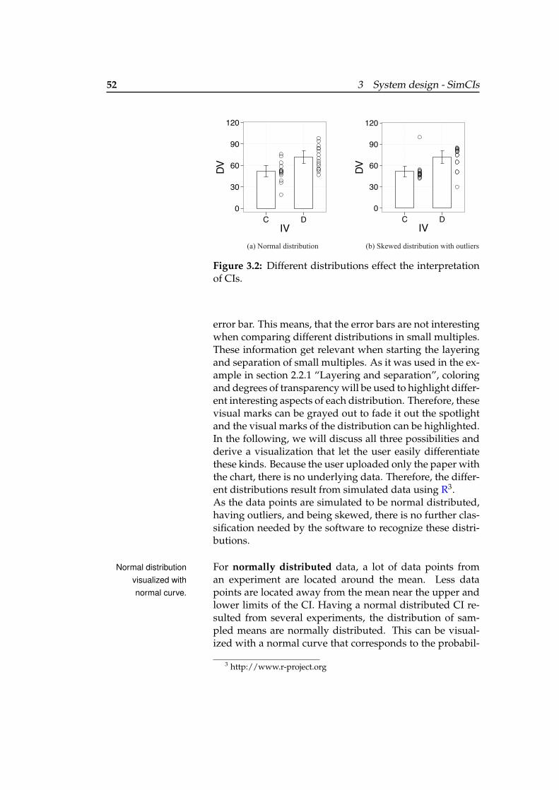
52 3 System design - SimCIs
0
30
60
90
120
C DIV
DV
0
30
60
90
120
C DIV
DV
(a) Normal distribution (b) Skewed distribution with outliers
Figure 3.2: Different distributions effect the interpretationof CIs.
error bar. This means, that the error bars are not interestingwhen comparing different distributions in small multiples.These information get relevant when starting the layeringand separation of small multiples. As it was used in the ex-ample in section 2.2.1 “Layering and separation”, coloringand degrees of transparency will be used to highlight differ-ent interesting aspects of each distribution. Therefore, thesevisual marks can be grayed out to fade it out the spotlightand the visual marks of the distribution can be highlighted.In the following, we will discuss all three possibilities andderive a visualization that let the user easily differentiatethese kinds. Because the user uploaded only the paper withthe chart, there is no underlying data. Therefore, the differ-ent distributions result from simulated data using R3.As the data points are simulated to be normal distributed,having outliers, and being skewed, there is no further clas-sification needed by the software to recognize these distri-butions.
For normally distributed data, a lot of data points fromNormal distributionvisualized withnormal curve.
an experiment are located around the mean. Less datapoints are located away from the mean near the upper andlower limits of the CI. Having a normal distributed CI re-sulted from several experiments, the distribution of sam-pled means are normally distributed. This can be visual-ized with a normal curve that corresponds to the probabil-
3 http://www.r-project.org
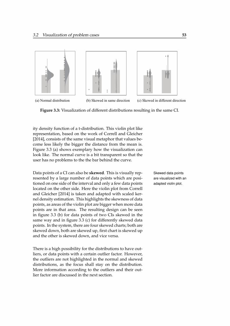
3.2 Visualization of problem cases 53
(a) Normal distribution (b) Skewed in same direction (c) Skewed in different direction
Figure 3.3: Visualization of different distributions resulting in the same CI.
ity density function of a t-distribution. This violin plot likerepresentation, based on the work of Correll and Gleicher[2014], consists of the same visual metaphor that values be-come less likely the bigger the distance from the mean is.Figure 3.3 (a) shows exemplary how the visualization canlook like. The normal curve is a bit transparent so that theuser has no problems to the the bar behind the curve.
Data points of a CI can also be skewed. This is visually rep- Skewed data pointsare visualized with anadapted violin plot.
resented by a large number of data points which are posi-tioned on one side of the interval and only a few data pointslocated on the other side. Here the violin plot from Correlland Gleicher [2014] is taken and adapted with scaled ker-nel density estimation. This highlights the skewness of datapoints, as areas of the violin plot are bigger when more datapoints are in that area. The resulting design can be seenin figure 3.3 (b) for data points of two CIs skewed in thesame way and in figure 3.3 (c) for differently skewed datapoints. In the system, there are four skewed charts; both areskewed down, both are skewed up, first chart is skewed upand the other is skewed down, and vice versa.
There is a high possibility for the distributions to have out-liers, or data points with a certain outlier factor. However,the outliers are not highlighted in the normal and skeweddistributions, as the focus shall stay on the distribution.More information according to the outliers and their out-lier factor are discussed in the next section.
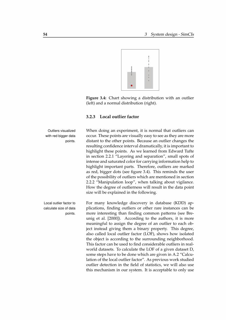
54 3 System design - SimCIs
Figure 3.4: Chart showing a distribution with an outlier(left) and a normal distribution (right).
3.2.3 Local outlier factor
When doing an experiment, it is normal that outliers canOutliers visualizedwith red bigger data
points.occur. These points are visually easy to see as they are moredistant to the other points. Because an outlier changes theresulting confidence interval dramatically, it is important tohighlight these points. As we learned from Edward Tuftein section 2.2.1 “Layering and separation”, small spots ofintense and saturated color for carrying information help tohighlight important parts. Therefore, outliers are markedas red, bigger dots (see figure 3.4). This reminds the userof the possibility of outliers which are mentioned in section2.2.2 “Manipulation loop”, when talking about vigilance.How the degree of outlierness will result in the data pointsize will be explained in the following.
For many knowledge discovery in database (KDD) ap-Local outlier factor tocalculate size of data
points.plications, finding outliers or other rare instances can bemore interesting than finding common patterns (see Bre-unig et al. [2000]). According to the authors, it is moremeaningful to assign the degree of an outlier to each ob-ject instead giving them a binary property. This degree,also called local outlier factor (LOF), shows how isolatedthe object is according to the surrounding neighborhood.This factor can be used to find considerable outliers in real-world datasets. To calculate the LOF of a given dataset D,some steps have to be done which are given in A.2 “Calcu-lation of the local outlier factor”. As previous work studiedoutlier detection in the field of statistics, we will also usethis mechanism in our system. It is acceptable to only use
3.2 Visualization of problem cases 55
these basic steps to calculate the local outlier factor, becausefor CIs, the data points only differ in y-coordinates, what isa relatively simple setup. However, this approach is neces-sary to use, because the sample size can get very high.Because outliers have bigger impact on the resulting CIthan a data point near to the mean, this point should behighlighted by having a bigger size. Using the outlier fac-tor to resize the data points in a scatter plot however needsadditional work. According to Kriegel et al. [2011], the sim-plest way to translate an outlier score S to a normalizedscale is to apply a linear transformation. With this transla-tion, the minimum occurring score of a dataset is mappedto 0 and the maximum occurring score to 1. The resultingformula looks as follows:Normlinear
S (p) := (S(p)− Smin)/(Smax − Smin).Here, this normalized score is then multiplied with theoriginal size of the data point and added to that formervalue. The corresponding R code is shown in appendix B.1“Generate the local outlier factor”.
The normal distribution, the skewed distributions and adistribution with an outlier result in the small multiplesthat are ordered horizontally below the large single. As itis assumed that the data of a CI is distributed normally ingeneral, it is positioned at first.
3.2.4 Pie chart representation with minimum/ max-imum probability distribution
The pie charts shall help the users to see the probability of Bootstrap tore-sample simulateddistributions and getprobability pie charts.
each confidence interval in a chart to be the minimum andmaximum error bar. Using the bootstrap technique, the CIsget resampled 10000 times. Therefore, the number of repe-titions is the same as for the resampling method from Fer-reira et al. [2014]. Each time it is checked which mean isbigger and which is smaller than the other. At the end, thecomparison is taken to make one pie chart for the maxi-mum probability and one for the minimum probability. Theunderlying code is provided in appendix B.2 “Bootstrap-ping to generate probability pie charts”.These two pie charts get calculated for all different distribu-
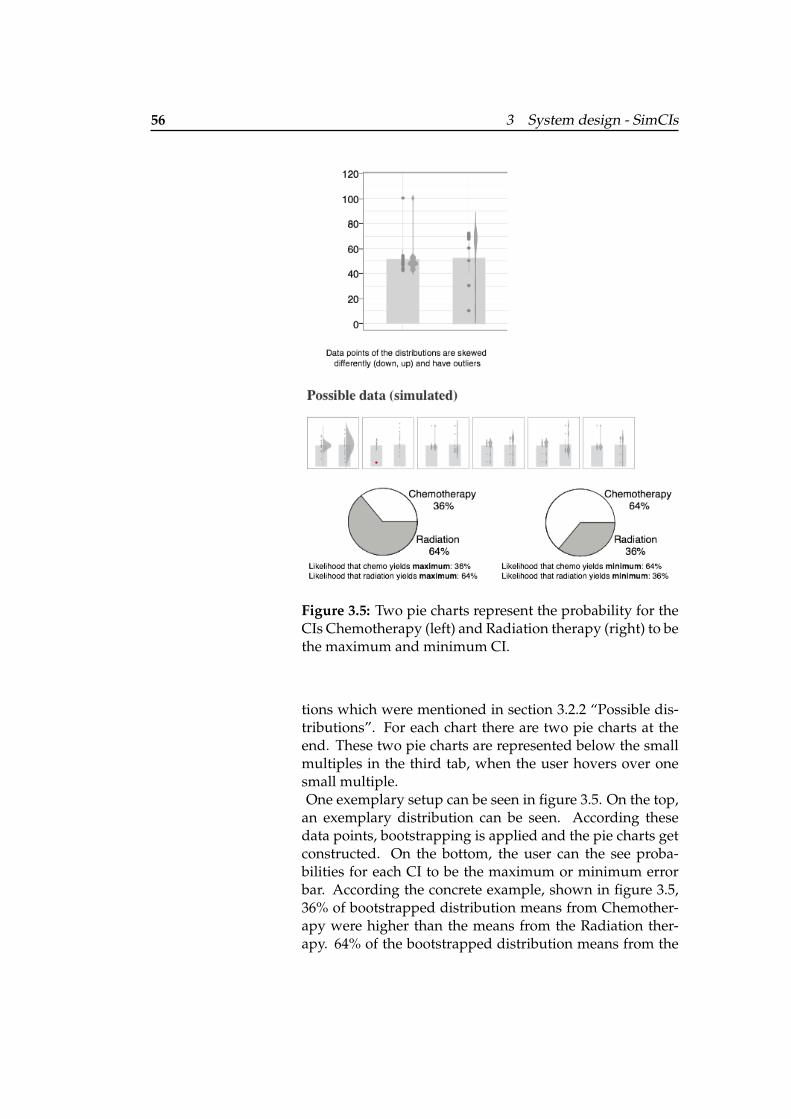
56 3 System design - SimCIs
Figure 3.5: Two pie charts represent the probability for theCIs Chemotherapy (left) and Radiation therapy (right) to bethe maximum and minimum CI.
tions which were mentioned in section 3.2.2 “Possible dis-tributions”. For each chart there are two pie charts at theend. These two pie charts are represented below the smallmultiples in the third tab, when the user hovers over onesmall multiple.One exemplary setup can be seen in figure 3.5. On the top,
an exemplary distribution can be seen. According thesedata points, bootstrapping is applied and the pie charts getconstructed. On the bottom, the user can the see proba-bilities for each CI to be the maximum or minimum errorbar. According the concrete example, shown in figure 3.5,36% of bootstrapped distribution means from Chemother-apy were higher than the means from the Radiation ther-apy. 64% of the bootstrapped distribution means from the
3.2 Visualization of problem cases 57
Radiation therapy were higher than the means from theChemotherapy. Therefore, it is more probable that the Ra-diation therapy will yield the maximum.
3.2.5 CI of difference and the overlap rule
This section focuses on the direct comparison of the two CI of difference isshown whichindicates whether thedifference betweentwo CIs is significantdifferent or not.
CIs, independent from different possible distributions. ACI of difference is provided and an overlap is shown forindependent data in the second tab. When calculating theCI of difference between two CIs, it is important to knowwhether the data came from two independent groups orfrom one group doing a pre- and a posttest. Whether thedata is paired or independent is given in the paper in gen-eral. More information about the concrete calculation canbe found in appendix A.3 “Calculating the CI of differ-ence”. For independent data, the CI of difference is alwayslarger than each of the original intervals, as the samplingerror in the difference is a compounding of sample errorfrom each of the two independent means (see Cummingand Finch [2005]). For paired data, the CI of difference isalways smaller than each of the original intervals, as themargin of error is based on the SE of the differences, whichreflects a high correlation. As the CI of difference is alwayslower than the original CI, based on the y-axis, it gets a sep-arate scale. When the CI of difference meets 0 on the y-axis,the general assumption is, that the difference is not signif-icant. The more distance between the CI of difference andthe null value, the the more significant is the difference be-tween both CIs.
When having CIs from independent groups, the overlap For independentdata, the overlap rulecan be applied. Theproportion overlap isvisualized.
rule can also be applied to see whether the difference issignificant or not. Therefore, this information is providedadditionally to the CI of difference for independent data.For the software only a few calculation steps are necessaryto get the proportional overlap. At first, the average mar-gin of error has to be calculated. It is the sum of the marginof errors from the original CIs divided by two. Then, theoverlap is calculated by subtracting the lowest upper limitfrom the highest lower limit. To get the proportion over-
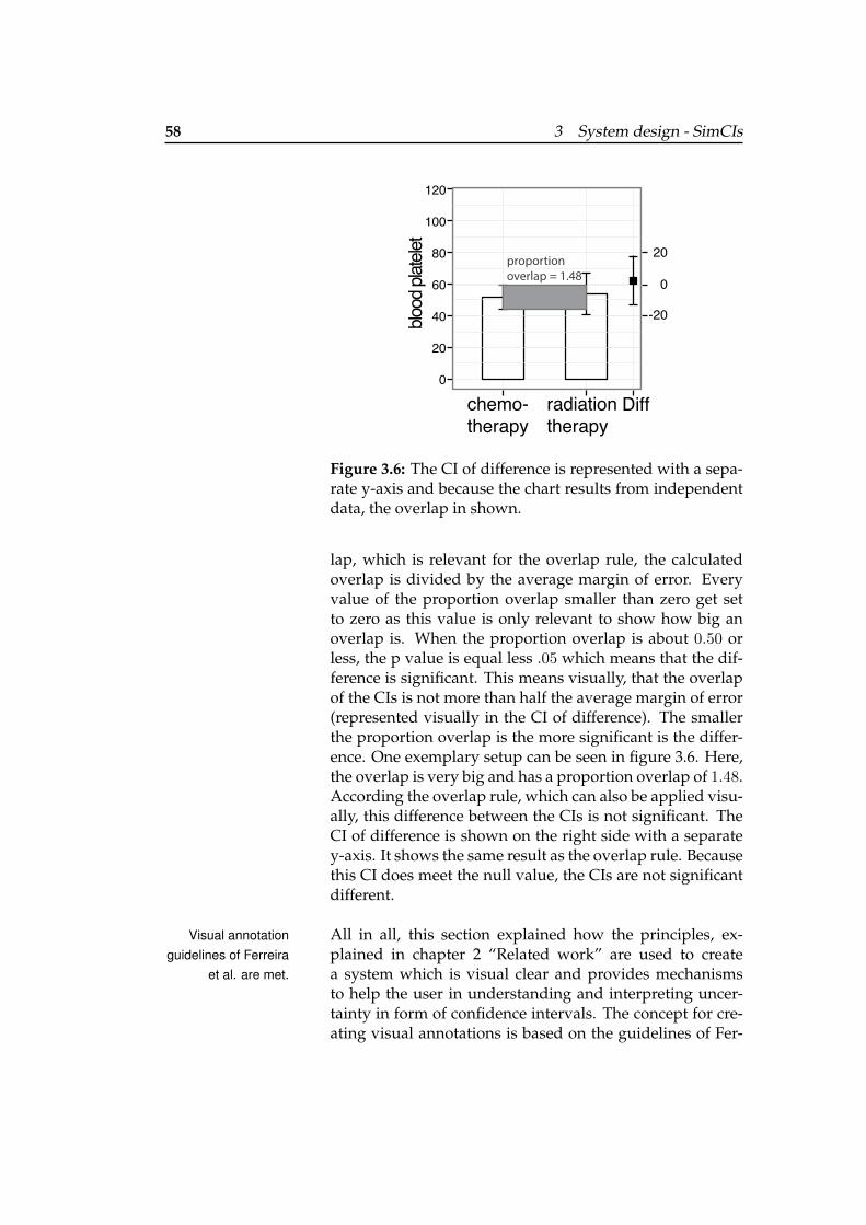
58 3 System design - SimCIs
Diff
0
chemo- therapy
radiation therapy
blood
plate
let
20
-20
proportion overlap = 1.48
0
60
120
100
80
40
20
Figure 3.6: The CI of difference is represented with a sepa-rate y-axis and because the chart results from independentdata, the overlap in shown.
lap, which is relevant for the overlap rule, the calculatedoverlap is divided by the average margin of error. Everyvalue of the proportion overlap smaller than zero get setto zero as this value is only relevant to show how big anoverlap is. When the proportion overlap is about 0.50 orless, the p value is equal less .05 which means that the dif-ference is significant. This means visually, that the overlapof the CIs is not more than half the average margin of error(represented visually in the CI of difference). The smallerthe proportion overlap is the more significant is the differ-ence. One exemplary setup can be seen in figure 3.6. Here,the overlap is very big and has a proportion overlap of 1.48.According the overlap rule, which can also be applied visu-ally, this difference between the CIs is not significant. TheCI of difference is shown on the right side with a separatey-axis. It shows the same result as the overlap rule. Becausethis CI does meet the null value, the CIs are not significantdifferent.
All in all, this section explained how the principles, ex-Visual annotationguidelines of Ferreira
et al. are met.plained in chapter 2 “Related work” are used to createa system which is visual clear and provides mechanismsto help the user in understanding and interpreting uncer-tainty in form of confidence intervals. The concept for cre-ating visual annotations is based on the guidelines of Fer-
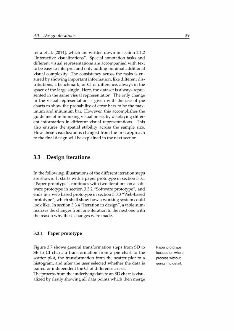
3.3 Design iterations 59
reira et al. [2014], which are written down in section 2.1.2“Interactive visualizations”. Special annotation tasks anddifferent visual representations are accompanied with textto be easy to interpret and only adding minimal additionalvisual complexity. The consistency across the tasks is en-sured by showing important information, like different dis-tributions, a benchmark, or CI of difference, always in thespace of the large single. Here, the dataset is always repre-sented in the same visual representation. The only changein the visual representation is given with the use of piecharts to show the probability of error bars to be the max-imum and minimum bar. However, this accomplishes theguideline of minimizing visual noise, by displaying differ-ent information in different visual representations. Thisalso ensures the spatial stability across the sample size.How these visualizations changed from the first approachto the final design will be explained in the next section.
3.3 Design iterations
In the following, illustrations of the different iteration stepsare shown. It starts with a paper prototype in section 3.3.1“Paper prototype”, continues with two iterations on a soft-ware prototype in section 3.3.2 “Software prototype”, andends in a web based prototype in section 3.3.3 “Web-basedprototype”, which shall show how a working system couldlook like. In section 3.3.4 “Iteration in design”, a table sum-marizes the changes from one iteration to the next one withthe reason why these changes were made.
3.3.1 Paper prototype
Figure 3.7 shows general transformation steps from SD to Paper prototypefocused on wholeprocess withoutgoing into detail.
SE to CI chart, a transformation from a pie chart to thescatter plot, the transformation from the scatter plot to ahistogram, and after the user selected whether the data ispaired or independent the CI of difference arises.The process from the underlying data to an SD chart is visu-alized by firstly showing all data points which then merge
60 3 System design - SimCIs
Figu
re3.
7:Pa
per
Prot
otyp
e.
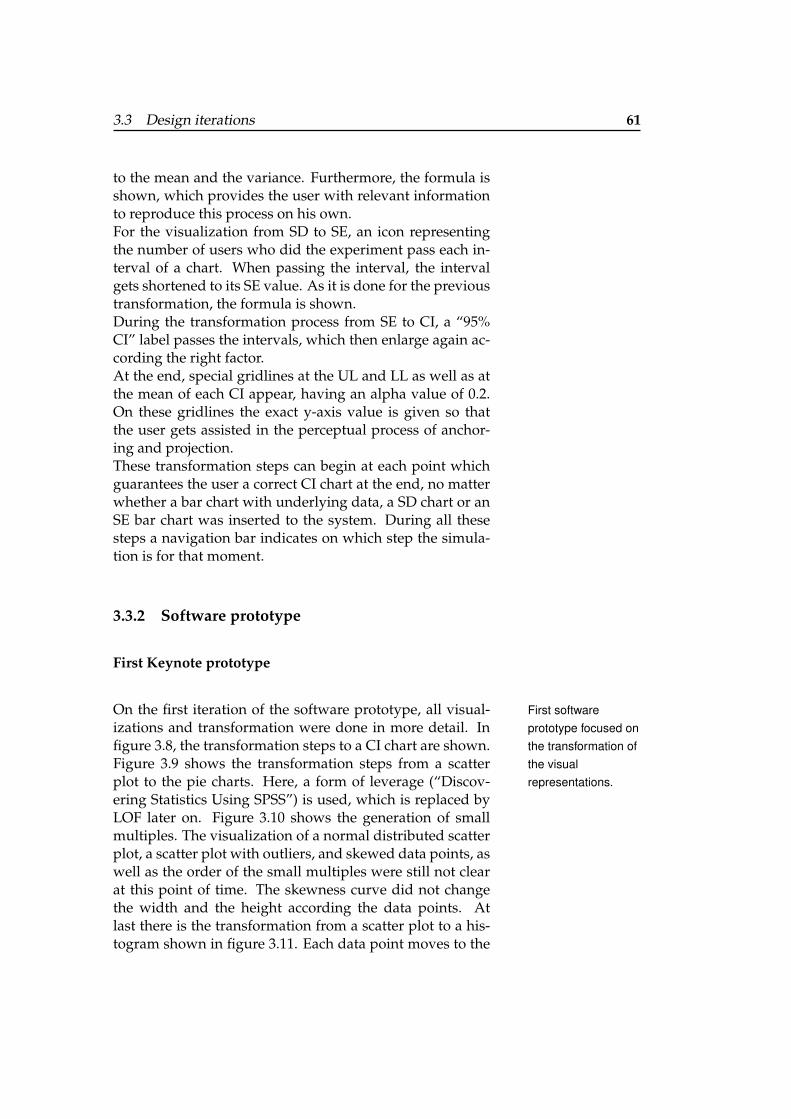
3.3 Design iterations 61
to the mean and the variance. Furthermore, the formula isshown, which provides the user with relevant informationto reproduce this process on his own.For the visualization from SD to SE, an icon representingthe number of users who did the experiment pass each in-terval of a chart. When passing the interval, the intervalgets shortened to its SE value. As it is done for the previoustransformation, the formula is shown.During the transformation process from SE to CI, a “95%CI” label passes the intervals, which then enlarge again ac-cording the right factor.At the end, special gridlines at the UL and LL as well as atthe mean of each CI appear, having an alpha value of 0.2.On these gridlines the exact y-axis value is given so thatthe user gets assisted in the perceptual process of anchor-ing and projection.These transformation steps can begin at each point whichguarantees the user a correct CI chart at the end, no matterwhether a bar chart with underlying data, a SD chart or anSE bar chart was inserted to the system. During all thesesteps a navigation bar indicates on which step the simula-tion is for that moment.
3.3.2 Software prototype
First Keynote prototype
On the first iteration of the software prototype, all visual- First softwareprototype focused onthe transformation ofthe visualrepresentations.
izations and transformation were done in more detail. Infigure 3.8, the transformation steps to a CI chart are shown.Figure 3.9 shows the transformation steps from a scatterplot to the pie charts. Here, a form of leverage (“Discov-ering Statistics Using SPSS”) is used, which is replaced byLOF later on. Figure 3.10 shows the generation of smallmultiples. The visualization of a normal distributed scatterplot, a scatter plot with outliers, and skewed data points, aswell as the order of the small multiples were still not clearat this point of time. The skewness curve did not changethe width and the height according the data points. Atlast there is the transformation from a scatter plot to a his-togram shown in figure 3.11. Each data point moves to the
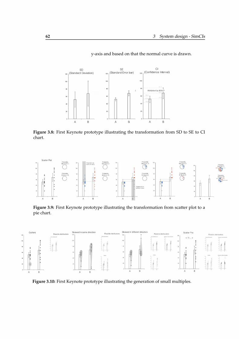
62 3 System design - SimCIs
y-axis and based on that the normal curve is drawn.
Figure 3.8: First Keynote prototype illustrating the transformation from SD to SE to CIchart.
Figure 3.9: First Keynote prototype illustrating the transformation from scatter plot to apie chart.
Figure 3.10: First Keynote prototype illustrating the generation of small multiples.
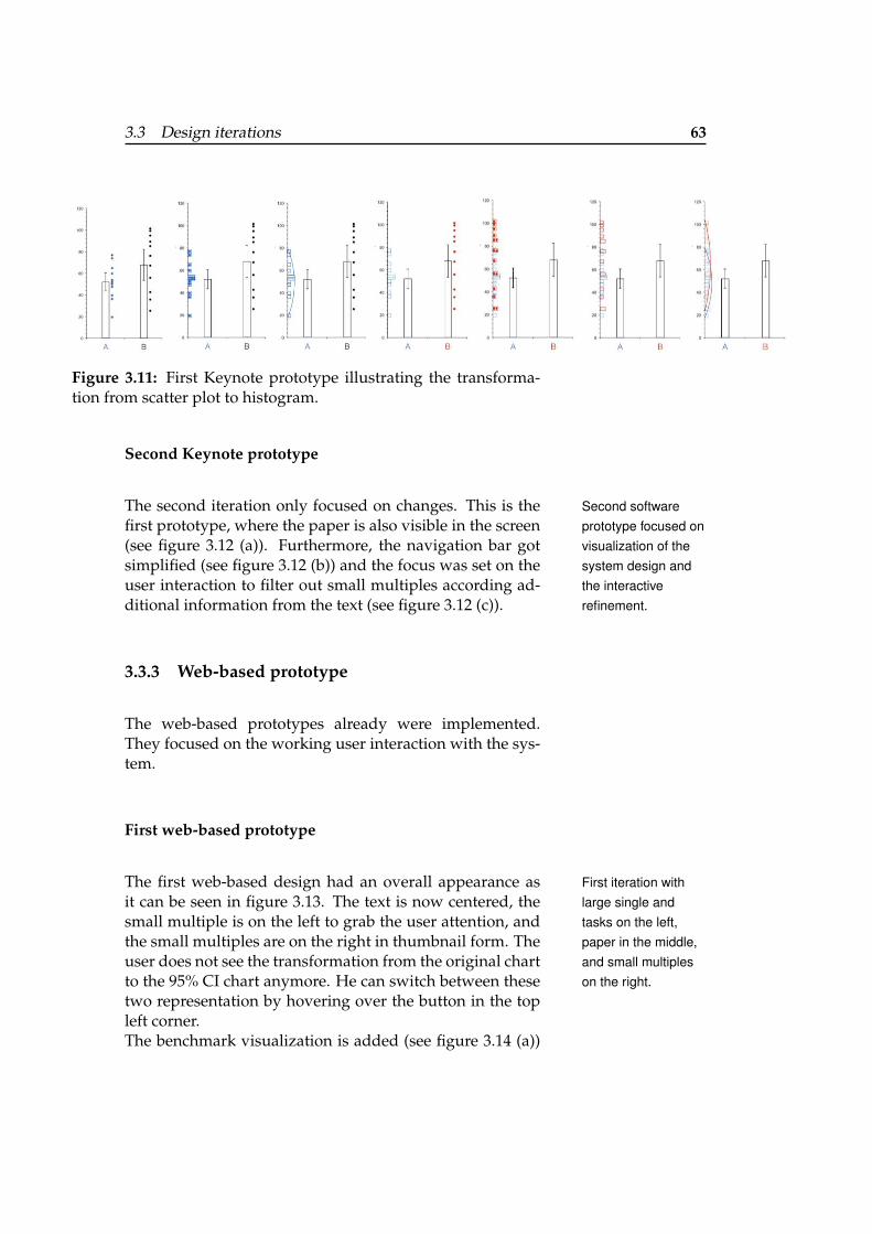
3.3 Design iterations 63
Figure 3.11: First Keynote prototype illustrating the transforma-tion from scatter plot to histogram.
Second Keynote prototype
The second iteration only focused on changes. This is the Second softwareprototype focused onvisualization of thesystem design andthe interactiverefinement.
first prototype, where the paper is also visible in the screen(see figure 3.12 (a)). Furthermore, the navigation bar gotsimplified (see figure 3.12 (b)) and the focus was set on theuser interaction to filter out small multiples according ad-ditional information from the text (see figure 3.12 (c)).
3.3.3 Web-based prototype
The web-based prototypes already were implemented.They focused on the working user interaction with the sys-tem.
First web-based prototype
The first web-based design had an overall appearance as First iteration withlarge single andtasks on the left,paper in the middle,and small multipleson the right.
it can be seen in figure 3.13. The text is now centered, thesmall multiple is on the left to grab the user attention, andthe small multiples are on the right in thumbnail form. Theuser does not see the transformation from the original chartto the 95% CI chart anymore. He can switch between thesetwo representation by hovering over the button in the topleft corner.The benchmark visualization is added (see figure 3.14 (a))
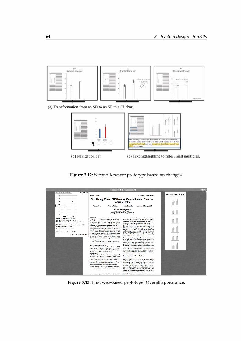
64 3 System design - SimCIs
(a) Transformation from an SD to an SE to a CI chart.
(b) Navigation bar. (c) Text highlighting to filter small multiples.
Figure 3.12: Second Keynote prototype based on changes.
Figure 3.13: First web-based prototype: Overall appearance.
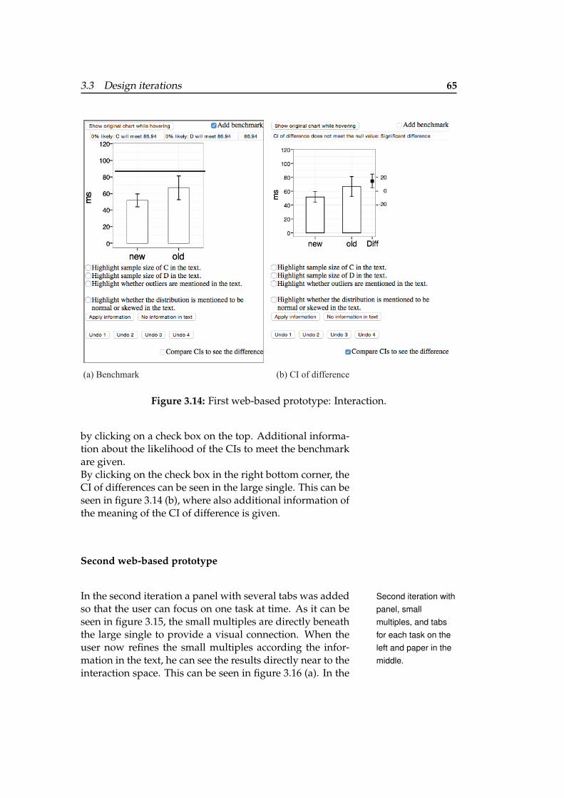
3.3 Design iterations 65
(a) Benchmark (b) CI of difference
Figure 3.14: First web-based prototype: Interaction.
by clicking on a check box on the top. Additional informa-tion about the likelihood of the CIs to meet the benchmarkare given.By clicking on the check box in the right bottom corner, theCI of differences can be seen in the large single. This can beseen in figure 3.14 (b), where also additional information ofthe meaning of the CI of difference is given.
Second web-based prototype
In the second iteration a panel with several tabs was added Second iteration withpanel, smallmultiples, and tabsfor each task on theleft and paper in themiddle.
so that the user can focus on one task at time. As it can beseen in figure 3.15, the small multiples are directly beneaththe large single to provide a visual connection. When theuser now refines the small multiples according the infor-mation in the text, he can see the results directly near to theinteraction space. This can be seen in figure 3.16 (a). In the
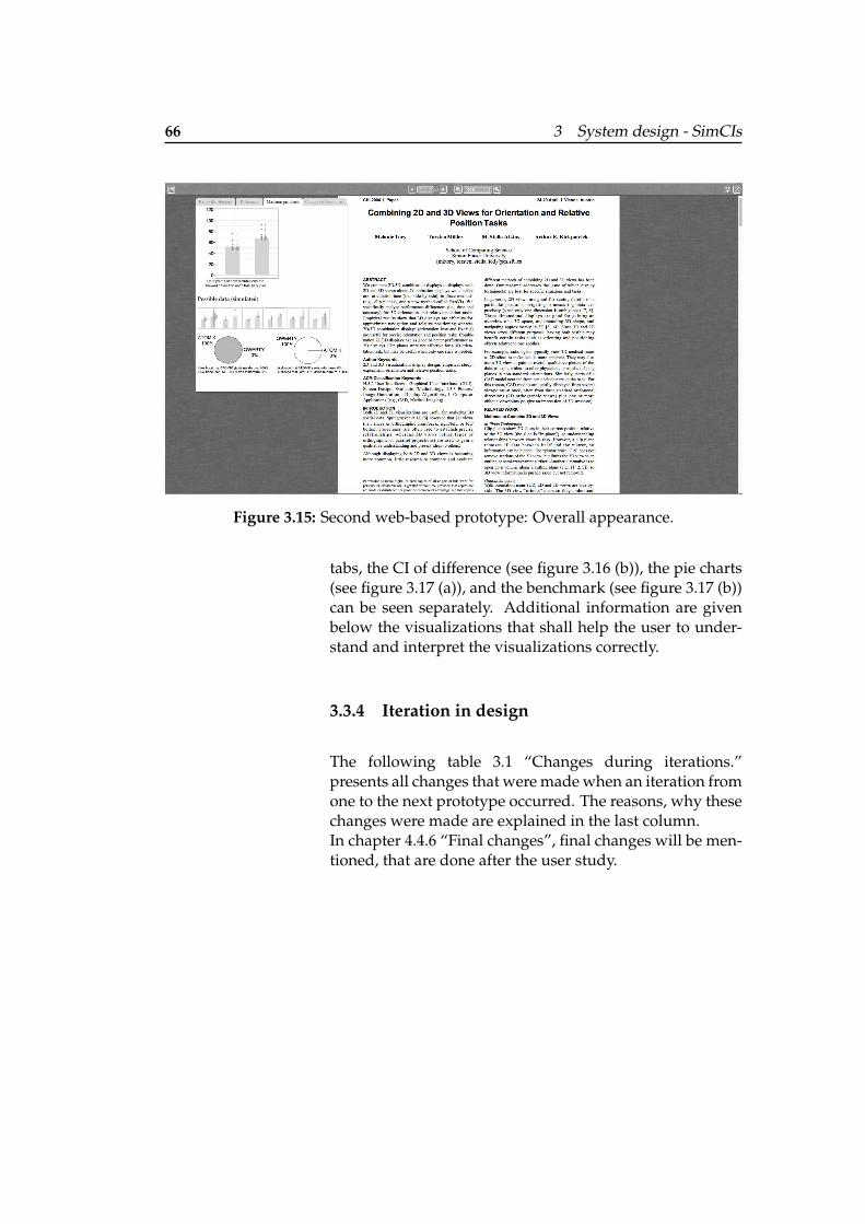
66 3 System design - SimCIs
Figure 3.15: Second web-based prototype: Overall appearance.
tabs, the CI of difference (see figure 3.16 (b)), the pie charts(see figure 3.17 (a)), and the benchmark (see figure 3.17 (b))can be seen separately. Additional information are givenbelow the visualizations that shall help the user to under-stand and interpret the visualizations correctly.
3.3.4 Iteration in design
The following table 3.1 “Changes during iterations.”presents all changes that were made when an iteration fromone to the next prototype occurred. The reasons, why thesechanges were made are explained in the last column.In chapter 4.4.6 “Final changes”, final changes will be men-tioned, that are done after the user study.
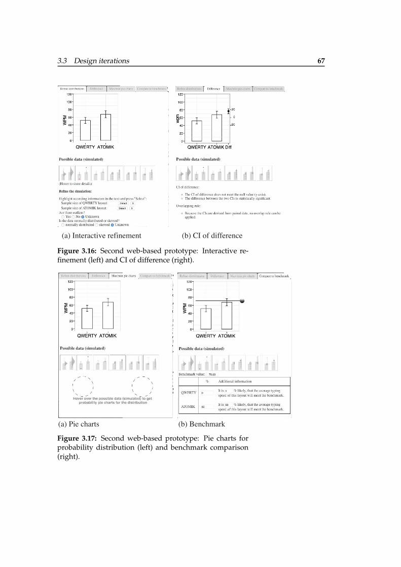
3.3 Design iterations 67
(a) Interactive refinement (b) CI of difference
Figure 3.16: Second web-based prototype: Interactive re-finement (left) and CI of difference (right).
(a) Pie charts (b) Benchmark
Figure 3.17: Second web-based prototype: Pie charts forprobability distribution (left) and benchmark comparison(right).
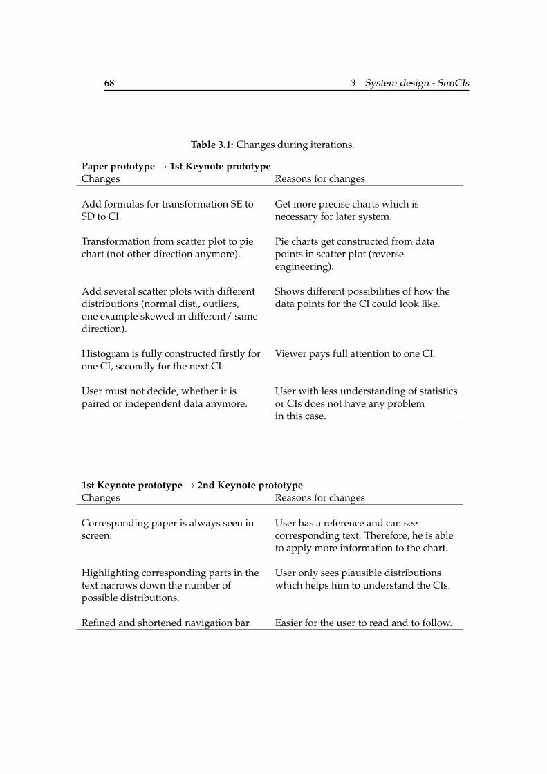
68 3 System design - SimCIs
Table 3.1: Changes during iterations.
Paper prototype→ 1st Keynote prototypeChanges Reasons for changes
Add formulas for transformation SE toSD to CI.
Get more precise charts which isnecessary for later system.
Transformation from scatter plot to piechart (not other direction anymore).
Pie charts get constructed from datapoints in scatter plot (reverseengineering).
Add several scatter plots with differentdistributions (normal dist., outliers,
Shows different possibilities of how thedata points for the CI could look like.
one example skewed in different/ samedirection).
Histogram is fully constructed firstly for Viewer pays full attention to one CI.one CI, secondly for the next CI.
User must not decide, whether it ispaired or independent data anymore.
User with less understanding of statisticsor CIs does not have any problemin this case.
1st Keynote prototype→ 2nd Keynote prototypeChanges Reasons for changes
Corresponding paper is always seen inscreen.
User has a reference and can seecorresponding text. Therefore, he is ableto apply more information to the chart.
Highlighting corresponding parts in thetext narrows down the number of
User only sees plausible distributionswhich helps him to understand the CIs.
possible distributions.
Refined and shortened navigation bar. Easier for the user to read and to follow.
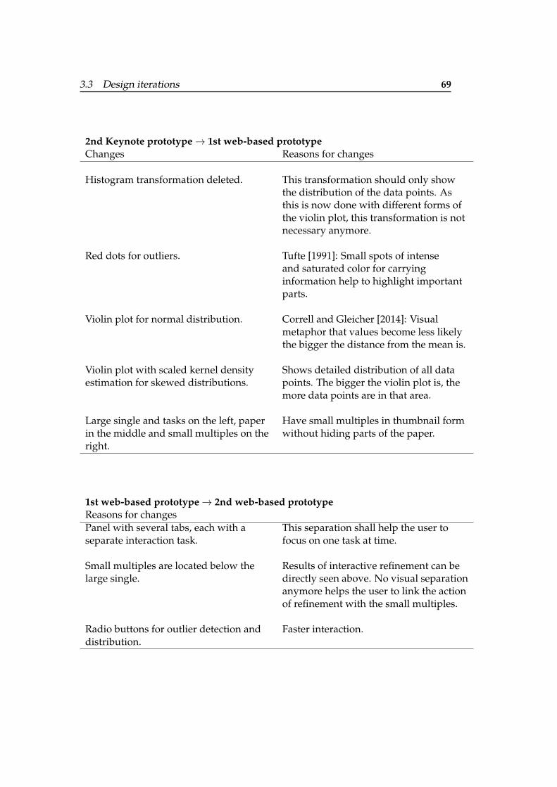
3.3 Design iterations 69
2nd Keynote prototype→ 1st web-based prototypeChanges Reasons for changes
Histogram transformation deleted. This transformation should only showthe distribution of the data points. Asthis is now done with different forms ofthe violin plot, this transformation is notnecessary anymore.
Red dots for outliers. Tufte [1991]: Small spots of intenseand saturated color for carryinginformation help to highlight importantparts.
Violin plot for normal distribution. Correll and Gleicher [2014]: Visualmetaphor that values become less likelythe bigger the distance from the mean is.
Violin plot with scaled kernel densityestimation for skewed distributions.
Shows detailed distribution of all datapoints. The bigger the violin plot is, themore data points are in that area.
Large single and tasks on the left, paperin the middle and small multiples on the
Have small multiples in thumbnail formwithout hiding parts of the paper.
right.
1st web-based prototype→ 2nd web-based prototypeReasons for changesPanel with several tabs, each with aseparate interaction task.
This separation shall help the user tofocus on one task at time.
Small multiples are located below thelarge single.
Results of interactive refinement can bedirectly seen above. No visual separationanymore helps the user to link the actionof refinement with the small multiples.
Radio buttons for outlier detection and Faster interaction.distribution.

71
Chapter 4
Evaluation
In the last chapter, the interaction, the visualization, as wellas several iterations were explained. Now, the system willbe evaluated to see whether it is really an improvementin understanding and interpreting statistical charts, com-pared to the interpretation, the user would make whenreading the paper with the chart. In section 4.1 “Researchquestion”, the focus will be on the concrete research ques-tions, that will be answered with this evaluation. Thewhole experiment design and procedure will be explainedin the subsequent section 4.2 “Design and procedure”. Atfirst, the tasks will be named that the user will do duringthe study. Then, the experimental design with dependentand independent variables will be described before enter-ing the procedure of the whole experiment. The next sec-tion 4.3 “Participants”, shortly goes into detail, which peo-ple participated in the study. The last section shows the re-sults of the user study. The research questions are answeredand quantitative results are mentioned. At the end, a finaltable is given with final changes. The problems which re-sulted in the study are given as well as an explanation whythe final changes will solve these problems.
72 4 Evaluation
4.1 Research question
As discussed in chapter 1 “Introduction”, CIs are hard tounderstand and to interpret; even for experts. As the sys-tem SimCIs shall improve the understanding and interpre-tation of statistical charts with in situ simulation the follow-ing research questions arise:
Does the interactive visualization of SimCIs help the user...
1. ... reaching the right decision?
2. ... feeling confident in his decision?
3. ... learning how to interpret CIs?
To answer the first research question, the answers of the par-ticipants will be compared with the correct solution. Thisresults in a test score which are given in percent. 0% meansthat the answer for this data analysis question is incorrectand 100% means that the answer is correct. This score isneeded for some data analysis questions which do not havea binary answering scheme. This will be explained in moredetail in section 4.2.1 “Experiment data analysis question”.
The second research question will be rated with a confidencescore ranging from 0 (not confident) to 5 (very confident).This shall indicate whether the chosen simulations and vi-sualizations really helped the user to understand the an-swer and being confident or not.
The third research question can be answered with the quan-titative results as well as compared test scores and confi-dence scores. Here, the procedure of the experiment is im-portant. More information will be given in section 4.2.4“Procedure”.
4.2 Design and procedure
In this section, the whole process of the design will be ex-plained, which yield to results that answer the research
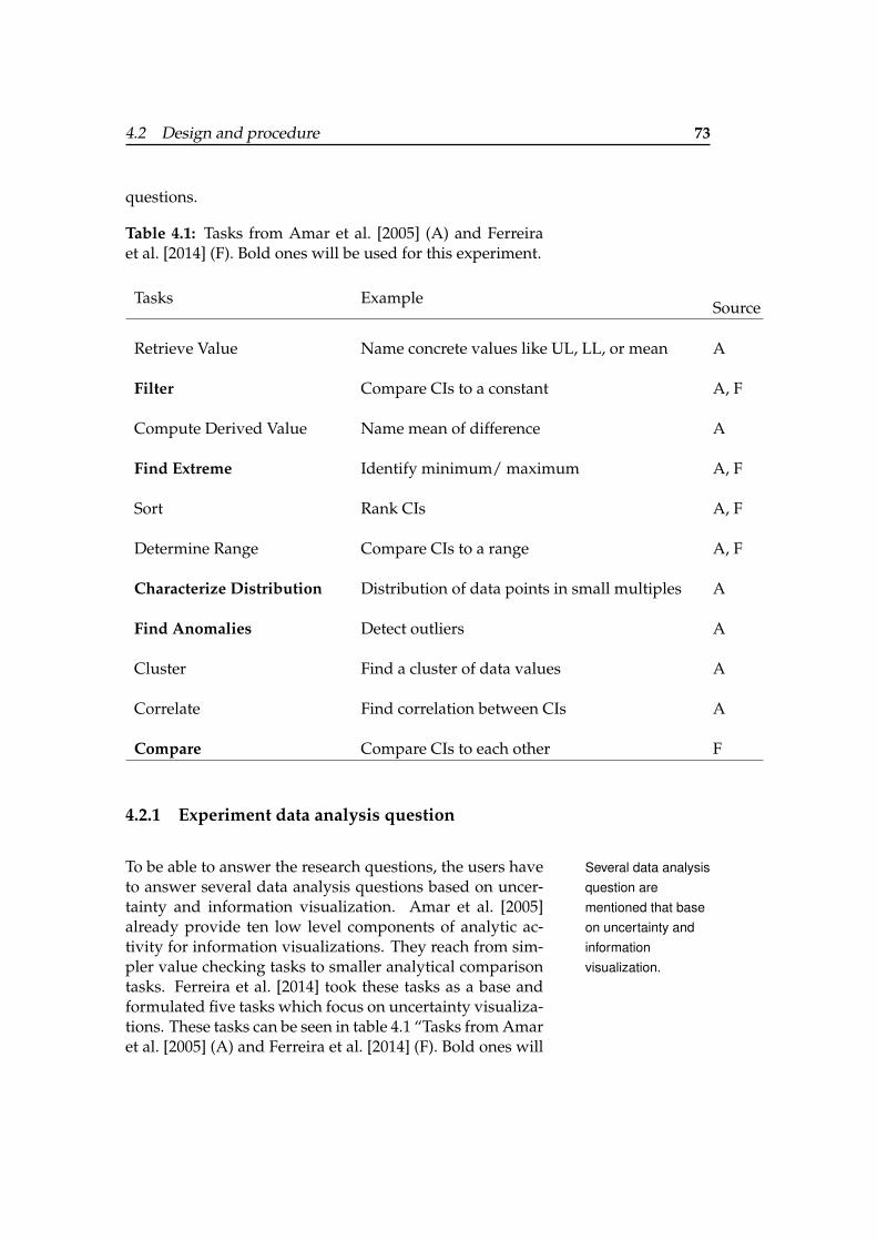
4.2 Design and procedure 73
questions.
Table 4.1: Tasks from Amar et al. [2005] (A) and Ferreiraet al. [2014] (F). Bold ones will be used for this experiment.
Tasks ExampleSource
Retrieve Value Name concrete values like UL, LL, or mean A
Filter Compare CIs to a constant A, F
Compute Derived Value Name mean of difference A
Find Extreme Identify minimum/ maximum A, F
Sort Rank CIs A, F
Determine Range Compare CIs to a range A, F
Characterize Distribution Distribution of data points in small multiples A
Find Anomalies Detect outliers A
Cluster Find a cluster of data values A
Correlate Find correlation between CIs A
Compare Compare CIs to each other F
4.2.1 Experiment data analysis question
To be able to answer the research questions, the users have Several data analysisquestion arementioned that baseon uncertainty andinformationvisualization.
to answer several data analysis questions based on uncer-tainty and information visualization. Amar et al. [2005]already provide ten low level components of analytic ac-tivity for information visualizations. They reach from sim-pler value checking tasks to smaller analytical comparisontasks. Ferreira et al. [2014] took these tasks as a base andformulated five tasks which focus on uncertainty visualiza-tions. These tasks can be seen in table 4.1 “Tasks from Amaret al. [2005] (A) and Ferreira et al. [2014] (F). Bold ones will
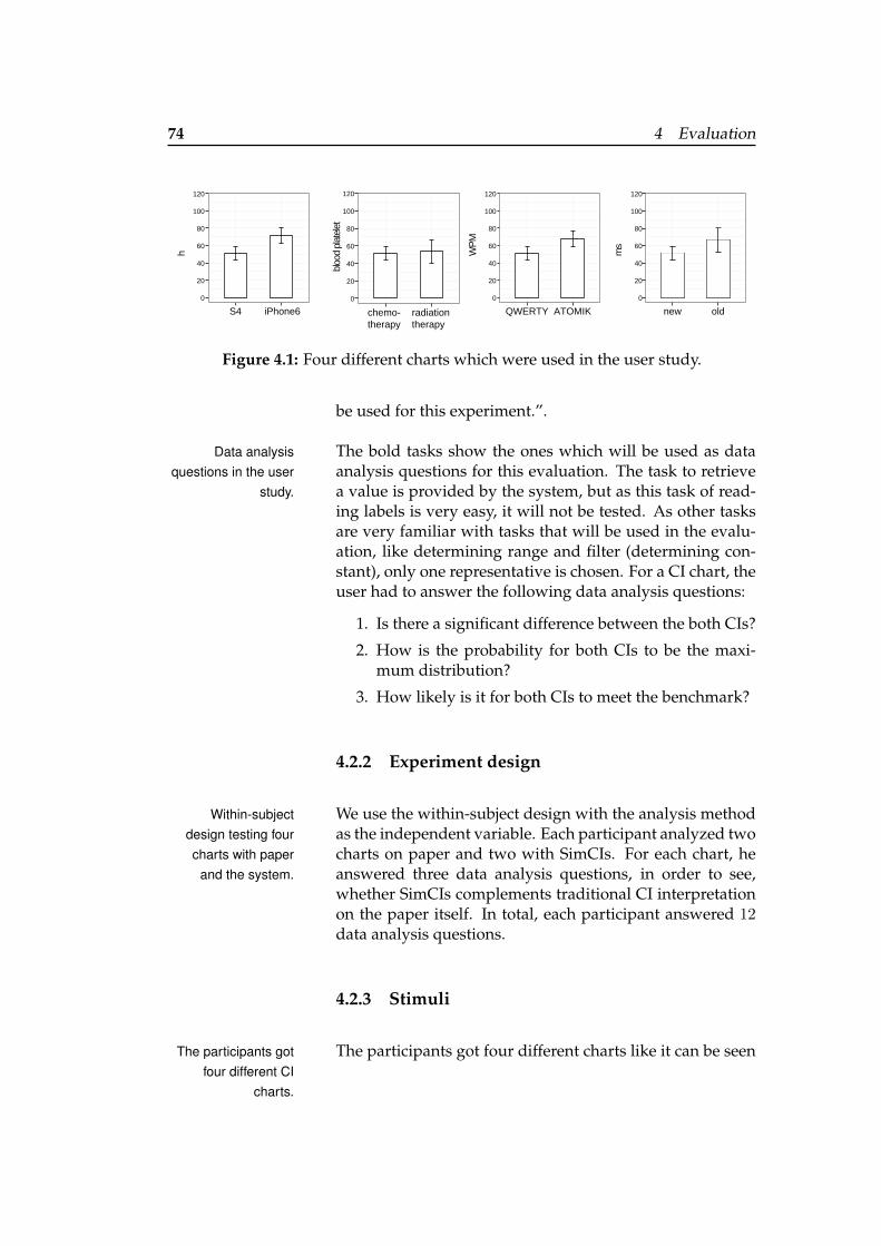
74 4 Evaluation
0
60
120
new old
ms
100
80
40
20
0
60
120
S4 iPhone6
h
100
80
40
20
QWERTY ATOMIK
WP
M
0
60
120
100
80
40
20
bloo
d pl
atel
et
chemo- therapy
radiation therapy
0
60
120
100
80
40
20
Figure 4.1: Four different charts which were used in the user study.
be used for this experiment.”.
The bold tasks show the ones which will be used as dataData analysisquestions in the user
study.analysis questions for this evaluation. The task to retrievea value is provided by the system, but as this task of read-ing labels is very easy, it will not be tested. As other tasksare very familiar with tasks that will be used in the evalu-ation, like determining range and filter (determining con-stant), only one representative is chosen. For a CI chart, theuser had to answer the following data analysis questions:
1. Is there a significant difference between the both CIs?
2. How is the probability for both CIs to be the maxi-mum distribution?
3. How likely is it for both CIs to meet the benchmark?
4.2.2 Experiment design
We use the within-subject design with the analysis methodWithin-subjectdesign testing fourcharts with paper
and the system.
as the independent variable. Each participant analyzed twocharts on paper and two with SimCIs. For each chart, heanswered three data analysis questions, in order to see,whether SimCIs complements traditional CI interpretationon the paper itself. In total, each participant answered 12data analysis questions.
4.2.3 Stimuli
The participants got four different charts like it can be seenThe participants gotfour different CI
charts.
4.2 Design and procedure 75
in figure 4.1. This figure shows the order in which the par-ticipants saw the charts. The leftmost chart shows a posi-tive gab between the intervals, the next has an overlap ofthe smaller CI, the third one has an overlap of less thanthe half of the smallest MOE, and the last one has an over-lap of more than half of the smallest MOE. The first twocharts were derived from independent data and the othertwo charts from paired data. In general, there are two diffi-culty levels in the data analysis questions which arise fromthe chart representation. A paper was changed accordingto these four different charts with its textual information toprovide comparable papers with the same difficulty level.The according text, which the users got with these chartsare given in appendix C “Additional information of theuser study”.
After the participant answered the question of influencing Firstly, CI charts fromindependent data aretested using thepaper and then thesystem.
CI factors, he got a paper with the chart and several dataanalysis questions to answer (see final data analysis ques-tions in C “Additional information of the user study”). Foreach answer, the user should also rate how confident hewas with his answer. This should help to see how wellhe already understands CIs and how well he can inter-pret the uncertainty. After he finished answering these dataanalysis questions with the paper, he got a new chart andsimilar data analysis questions which he should solve us-ing the system SimCIs. As he had to do with the paper,he answered similar data analysis questions and rate theconfidence. This should help to see whether the user feelsmore confident using the system and whether the user feelsmore confident when giving correct answers. These firsttwo charts showed CIs, which are raised from independentdata. They are simpler, as overlapping rules can be appliedto rate the difference between the CIs in a chart for example.
After the participant used the system the first time, he was Then, CI charts frompaired data aretested using thesystem and then thepaper.
asked again which factors influence CIs. This shall helpto see whether the different small multiples, and the tasksduring the interactive refinement are understood from theparticipant and therefore in his mind, also when not inter-acting with the system. The next chart, which should alsobe analyzed using the system again, showed CIs arose frompaired data. As the user could also read from the system,
76 4 Evaluation
the overlapping rules cannot be applied here and the userhas to focus on the CI of difference instead. Again, he hadto answer the same kind of questions and rate his confi-dence. The fourth chart showing two CIs based on paireddata was only in paper form. Answering these data analy-sis questions and the rating the confidence can give insightsof what the user learned from the system and whether hecould apply it.
4.2.4 Procedure
After the user signed a consent form, he was asked whichThe participants hadto answer general
questions at thebeginning and at the
end of the study.
factors influence CIs. This should give a first impressionof the basic statistical knowledge of CIs. Then the partic-ipants answered all data analysis questions using the pa-per or the system. The order of the charts with their dataanalysis questions stayed the same and therefore, the samecharts were used for paper analysis and the same for soft-ware analysis. This was only possible, because all chartshad comparable difficulty levels. At the end, the partici-pants had to fill out a short questionnaire to check their sta-tistical knowledge. This questionnaire was given at the endto prevent the user from taking these information when an-swering the question which factors influence CIs and whenanswering the data analysis questions of the first chart, onlywith the help of the paper. I refined this procedure by pi-lot studies with three participants. In the user study, eachsession took 45 minutes on average.
4.3 Participants
The participants were students between the age of 22 andNine users between22 and 26
participated in thestudy.
36. The mean age was 27. Nine users in total participatedon the study. All of them were students in computer sci-ence and machine engineering. Only 50% of the partici-pants took basic statistic curses, or curses which includedstatistics.
All participants did not work with statistical charts that of-The participants didnot work with
statistics regularly.
4.4 Results 77
ten. They only created 2 charts and interpreted 7 charts onaverage during the last six month. None of them workedwith skewed data and they only interpreted 6 CIs on av-erage and created 0 of them. They also only interpreted 8bar charts and created 1 on average. These results indicate,that the participants are not that into statistics topics andtherefore do not count as experts. This was the user groupI expected to use my system in oder to see whether it alsohelps people with little statistical knowledge and people,who are not that used to interpret these kind of uncertaintycharts.
4.4 Results
At first, 100% of the participants read the text before check- All participants readthe text first and thenexplored the system.
ing the data analysis questions. Using the system, theyfirstly explored all tabs, hovered over the small multipledistributions and over the chart, and checked the interac-tions possible in each tab. After that, they started answer-ing the questions.
The participants needed 45 minutes for the whole proce- In general, theparticipants spendmore time on thedata analysisquestions whenusing the system.
dure. 36 minutes of that time was spend on the chart dataanalysis questions. In general, it took them less time to in-terpret the charts using the paper (14 minutes) than usingthe system (22 minutes). As the user needed time to in-spect the system the first time, it took them 15 minutes onaverage to answer these data analysis questions. When theparticipants interpreted the third chart with the system, ittook them only 6 minutes on average, which is the sameresult as for the last data analysis question with the paper.Whether the time changed something on the accuracy ofthe answers or the confidence with their answers will beexplained in the following.
Overall, the participants got a test score of 83.2% using the Using the systemresults in 11.8%higher test score and0.9 higher confidencelevel.
paper and 93.3% using the system. The confidence answer-ing the data analysis questions was 3.2 using the paper and4.1 using the system. These numbers range from 1 (not con-fident) to 5 (very confident) as they were asked to answerin a Likert scale. Concrete values of the test scores and the
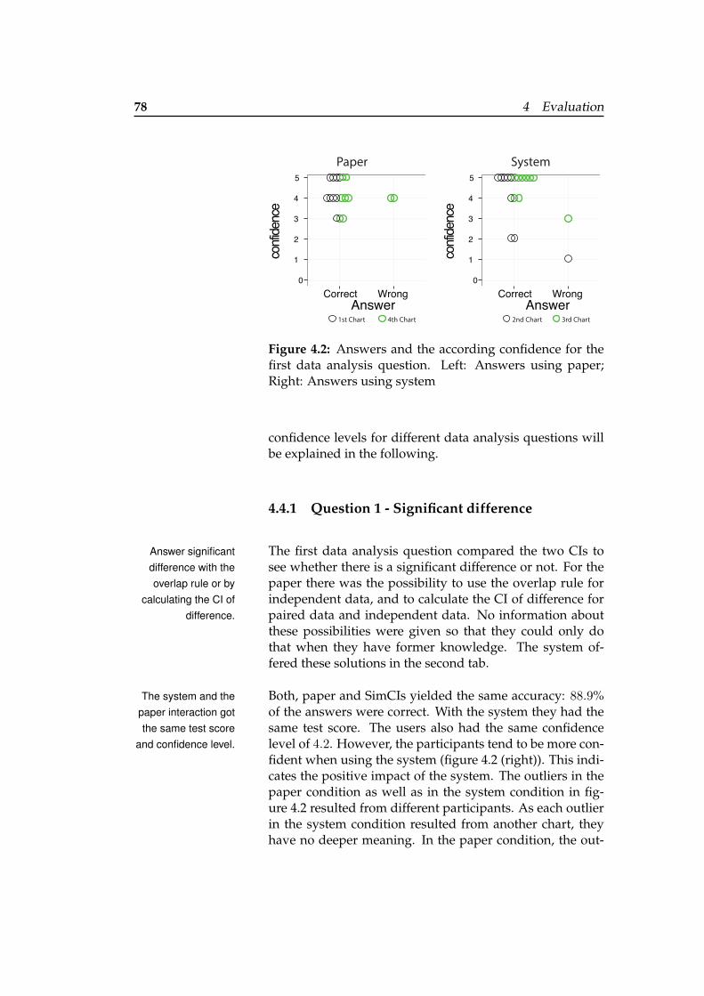
78 4 Evaluation
Correct WrongAnswer
confi
denc
e0
3
5
4
2
1
Paper
Correct WrongAnswer
confi
denc
e
0
3
5
4
2
1
System
1st Chart 4th Chart 2nd Chart 3rd Chart
Figure 4.2: Answers and the according confidence for thefirst data analysis question. Left: Answers using paper;Right: Answers using system
confidence levels for different data analysis questions willbe explained in the following.
4.4.1 Question 1 - Significant difference
The first data analysis question compared the two CIs toAnswer significantdifference with theoverlap rule or by
calculating the CI ofdifference.
see whether there is a significant difference or not. For thepaper there was the possibility to use the overlap rule forindependent data, and to calculate the CI of difference forpaired data and independent data. No information aboutthese possibilities were given so that they could only dothat when they have former knowledge. The system of-fered these solutions in the second tab.
Both, paper and SimCIs yielded the same accuracy: 88.9%The system and thepaper interaction gotthe same test score
and confidence level.
of the answers were correct. With the system they had thesame test score. The users also had the same confidencelevel of 4.2. However, the participants tend to be more con-fident when using the system (figure 4.2 (right)). This indi-cates the positive impact of the system. The outliers in thepaper condition as well as in the system condition in fig-ure 4.2 resulted from different participants. As each outlierin the system condition resulted from another chart, theyhave no deeper meaning. In the paper condition, the out-
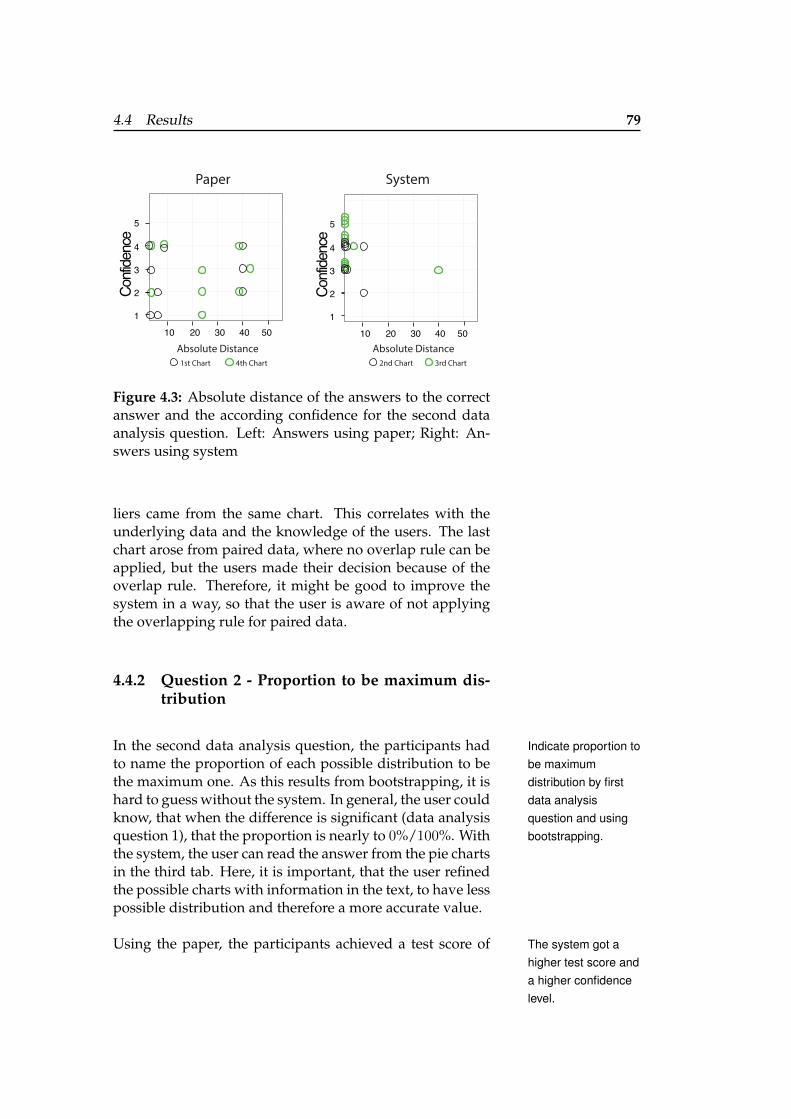
4.4 Results 79
3
5
4
2
1
30 50402010Absolute Distance Absolute Distance
3
5
4
2
1
30 50402010
Paper System
Confi
denc
e
Confi
denc
e
1st Chart 4th Chart 2nd Chart 3rd Chart
Figure 4.3: Absolute distance of the answers to the correctanswer and the according confidence for the second dataanalysis question. Left: Answers using paper; Right: An-swers using system
liers came from the same chart. This correlates with theunderlying data and the knowledge of the users. The lastchart arose from paired data, where no overlap rule can beapplied, but the users made their decision because of theoverlap rule. Therefore, it might be good to improve thesystem in a way, so that the user is aware of not applyingthe overlapping rule for paired data.
4.4.2 Question 2 - Proportion to be maximum dis-tribution
In the second data analysis question, the participants had Indicate proportion tobe maximumdistribution by firstdata analysisquestion and usingbootstrapping.
to name the proportion of each possible distribution to bethe maximum one. As this results from bootstrapping, it ishard to guess without the system. In general, the user couldknow, that when the difference is significant (data analysisquestion 1), that the proportion is nearly to 0%/100%. Withthe system, the user can read the answer from the pie chartsin the third tab. Here, it is important, that the user refinedthe possible charts with information in the text, to have lesspossible distribution and therefore a more accurate value.
Using the paper, the participants achieved a test score of The system got ahigher test score anda higher confidencelevel.
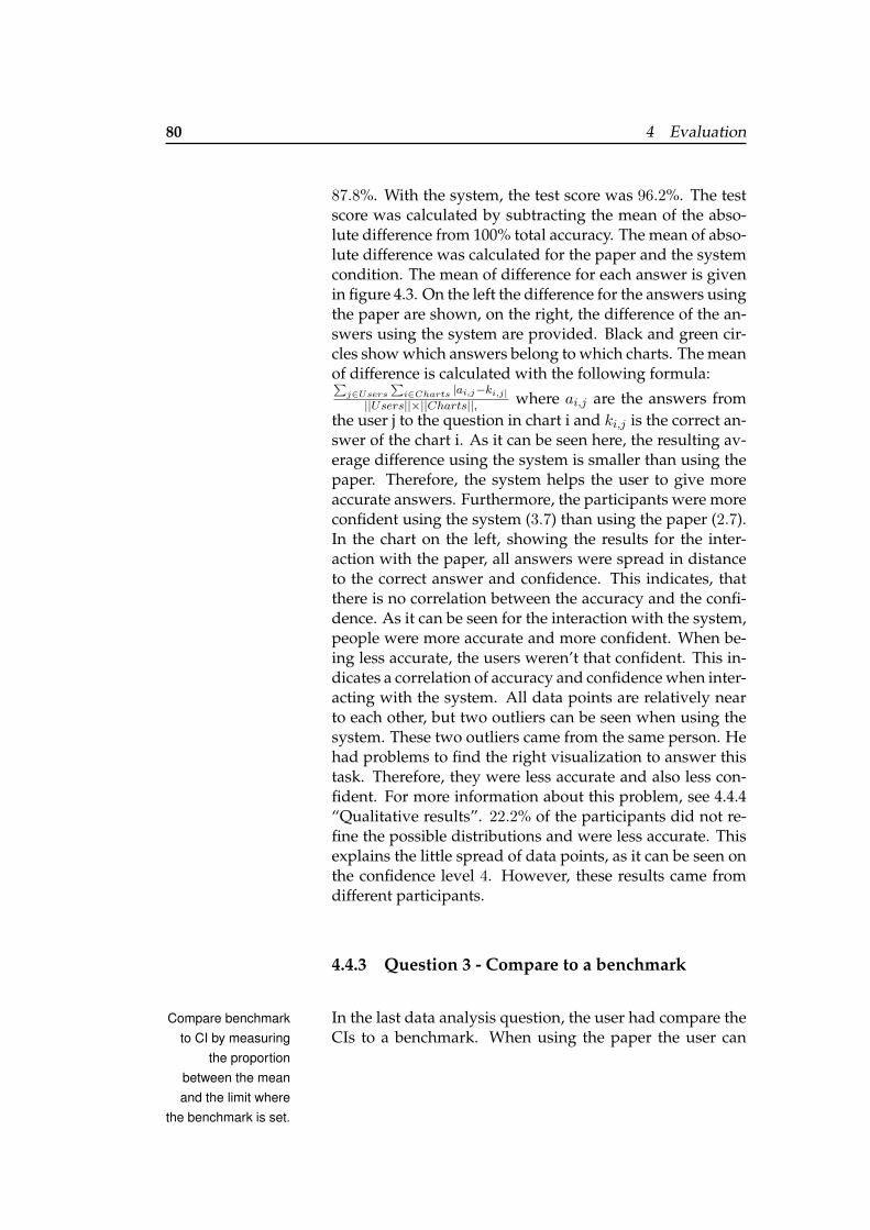
80 4 Evaluation
87.8%. With the system, the test score was 96.2%. The testscore was calculated by subtracting the mean of the abso-lute difference from 100% total accuracy. The mean of abso-lute difference was calculated for the paper and the systemcondition. The mean of difference for each answer is givenin figure 4.3. On the left the difference for the answers usingthe paper are shown, on the right, the difference of the an-swers using the system are provided. Black and green cir-cles show which answers belong to which charts. The meanof difference is calculated with the following formula:∑
j∈Users∑i∈Charts |ai,j−ki,j|
||Users||×||Charts||, where ai,j are the answers fromthe user j to the question in chart i and ki,j is the correct an-swer of the chart i. As it can be seen here, the resulting av-erage difference using the system is smaller than using thepaper. Therefore, the system helps the user to give moreaccurate answers. Furthermore, the participants were moreconfident using the system (3.7) than using the paper (2.7).In the chart on the left, showing the results for the inter-action with the paper, all answers were spread in distanceto the correct answer and confidence. This indicates, thatthere is no correlation between the accuracy and the confi-dence. As it can be seen for the interaction with the system,people were more accurate and more confident. When be-ing less accurate, the users weren’t that confident. This in-dicates a correlation of accuracy and confidence when inter-acting with the system. All data points are relatively nearto each other, but two outliers can be seen when using thesystem. These two outliers came from the same person. Hehad problems to find the right visualization to answer thistask. Therefore, they were less accurate and also less con-fident. For more information about this problem, see 4.4.4“Qualitative results”. 22.2% of the participants did not re-fine the possible distributions and were less accurate. Thisexplains the little spread of data points, as it can be seen onthe confidence level 4. However, these results came fromdifferent participants.
4.4.3 Question 3 - Compare to a benchmark
In the last data analysis question, the user had compare theCompare benchmarkto CI by measuring
the proportionbetween the meanand the limit where
the benchmark is set.
CIs to a benchmark. When using the paper the user can
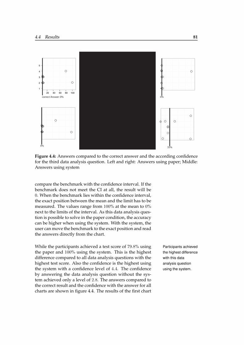
4.4 Results 81
3
5
4
2
1
60 100804020correct Answer: 0%
0%
74%
66%
0% 0%
72% 35%
with SimCIs
Figure 4.4: Answers compared to the correct answer and the according confidencefor the third data analysis question. Left and right: Answers using paper; Middle:Answers using system
compare the benchmark with the confidence interval. If thebenchmark does not meet the CI at all, the result will be0. When the benchmark lies within the confidence interval,the exact position between the mean and the limit has to bemeasured. The values range from 100% at the mean to 0%next to the limits of the interval. As this data analysis ques-tion is possible to solve in the paper condition, the accuracycan be higher when using the system. With the system, theuser can move the benchmark to the exact position and readthe answers directly from the chart.
While the participants achieved a test score of 79.8% using Participants achievedthe highest differencewith this dataanalysis questionusing the system.
the paper and 100% using the system. This is the highestdifference compared to all data analysis questions with thehighest test score. Also the confidence is the highest usingthe system with a confidence level of 4.4. The confidenceby answering the data analysis question without the sys-tem achieved only a level of 2.8. The answers compared tothe correct result and the confidence with the answer for allcharts are shown in figure 4.4. The results of the first chart
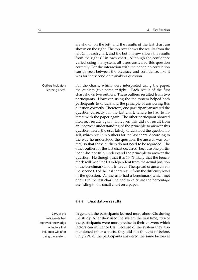
82 4 Evaluation
are shown on the left, and the results of the last chart areshown on the right. The top row shows the results from theleft CI in each chart, and the bottom row shows the resultsfrom the right CI in each chart. Although the confidencevaried using the system, all users answered this questioncorrectly. For the interaction with the paper, no correlationcan be seen between the accuracy and confidence, like itwas for the second data analysis question.
For the charts, which were interpreted using the paper,Outliers indicate alearning effect. the outliers give some insight. Each result of the first
chart shows two outliers. These outliers resulted from twoparticipants. However, using the the system helped bothparticipants to understand the principle of answering thisquestion correctly. Therefore, one participant answered thequestion correctly for the last chart, where he had to in-teract with the paper again. The other participant showedincorrect results again. However, this did not result froman incorrect understanding of the principle to answer thisquestion. Here, the user falsely understood the question it-self, which result in outliers for the last chart. According tothe way he understood the question, the answer was cor-rect, so that these outliers do not need to be regarded. Theother outlier for the last chart occurred, because one partic-ipant did not fully understand the principle to answer thequestion. He thought that it is 100% likely that the bench-mark will meet the CI independent from the actual positionof the benchmark in the interval. The spread of answers forthe second CI of the last chart result from the difficulty levelof the question. As the user had a benchmark which metone CI in the last chart, he had to calculate the percentageaccording to the small chart on a paper.
4.4.4 Qualitative results
In general, the participants learned more about CIs during78% of theparticipants had
improved knowledgeof factors that
influence CIs afterusing the system.
the study. After they used the system the first time, 78% ofthe participants were more precise in their answers whichfactors can influence CIs. Because of the system they alsomentioned other aspects, they did not thought of before.Only 22% of the participants answered the same factors at
4.4 Results 83
the beginning and at the end. These participants had al-ready a deeper knowledge in statistics and therefore gavemore precise answers. As the answers of all participantswere differently at the beginning and ranged from ”vari-ance” to ”population”, 100% of the participants mentioneddifferent ways how the distribution could look like after us-ing the system. They named outliers, normal distributionsand skewness. When they hadn’t mentioned the impact ofsample size at the beginning, they did it after answering thesystem data analysis questions.
During the refinement tasks, the participants tried to select Difficulties appearedduring the texthighlighting ininteractiverefinement andanswering of thesecond data analysisquestion.
the sample size once and highlight them both by clickingon both buttons one after another. This didn’t work, as theselection got removed after the text part was highlighted.Therefore, this part could get further improvement. An-other difficulty in the interaction with the system was tointeract with the pie charts. When the users first read thesecond data analysis question, where they have to give theproportion of both conditions to be the maximum distribu-tion, they weren’t sure how to answer the question. Firstly,most of the participants tried to answer the question withthe benchmark tab. Therefore they moved the benchmark,to get probable values. As this did not work for them theyneeded some time to find the correct visualization. 77.8%of the participants used the pie charts after some time ofsearching. However, one participants did not connect thistab to the data analysis question. After the study he an-swered, that he did not thought of getting concrete valuesfor all of the data analysis questions and that he thoughtto give that information from the context of the given in-formation in the other tab. These participants could notconnect the information given in that tab with the question.They were not that confident with their answer, which in-dicates that the system supports less confidence when theanswer is wrong. Though, this pie chart representationshould need further investigation. How this could be doneis explained in 5.2 “Future work”.
All in all, the users had fun during the interaction with the The participants likedto work with thesystem and woulduse it again.
system. They were more encouraged to understand eachdata analysis question and give an accurate answer. Wheninteracting with the paper after using the system, 100% of
84 4 Evaluation
the participants mentioned that they would like to have thesystem again to be more accurate in answering the dataanalysis questions.
4.4.5 Limitation
The biggest limitation in this user study is the small num-Only a small numberof users participated
in the study.ber of participants. As statistics are hard to understandand seem to be difficulty for most people, it was hard tomotivate users to participate in the study. As this limitednumber of participants was clear after scheduling the study,there was also the need of a fixed setup in experiment de-sign (see 4.2.2 “Experiment design”). Therefore, the orderof paper and system interaction, the order of the charts, andthe order of the questions were fixed. This should help toget comparable results also with a small number of partici-pants. However, this results in no counterbalancing.
Another limitation could be found in the way how thePotential bias withthe questions of
statistical knowledge.statistical knowledge of the participants was questioned.According to the information of the questions, the usersdid not worked with a lot of statistical charts and only afew participants took basic statistical courses. Therefore, itcould be assumed that there is only little statistical knowl-edge. However, some participants showed deeper knowl-edge when interacting with the charts, as they could ex-plain their answers with the knowledge of the overlap rule.This indicates, that there should have been more questionsabout the statistical knowledge.
As the participants had this deeper knowledge, the dataData analysisquestion might be
too easy.analysis questions might have been too easy. Especially thefirst data analysis question achieved high accuracy resultsby the paper interaction. There was no improvement in ac-curacy for this analysis question using the system.
4.4.6 Final changes
According to the notes the user made, the following tableof problems and changes is created (see table 4.2 “Final
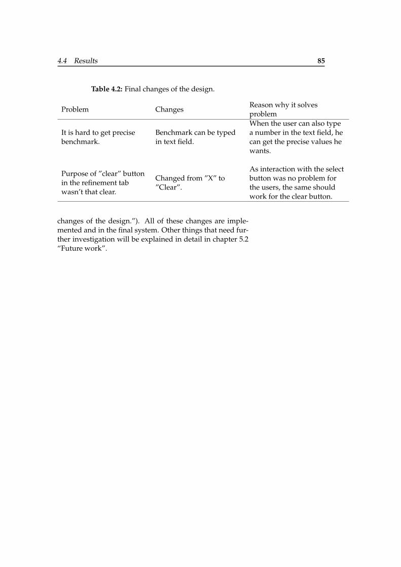
4.4 Results 85
Table 4.2: Final changes of the design.
Problem ChangesReason why it solvesproblem
It is hard to get precisebenchmark.
Benchmark can be typedin text field.
When the user can also typea number in the text field, hecan get the precise values hewants.
Purpose of ”clear” buttonin the refinement tabwasn’t that clear.
Changed from ”X” to”Clear”.
As interaction with the selectbutton was no problem forthe users, the same shouldwork for the clear button.
changes of the design.”). All of these changes are imple-mented and in the final system. Other things that need fur-ther investigation will be explained in detail in chapter 5.2“Future work”.

87
Chapter 5
Summary and futurework
In the last chapters, SimCIs was designed based on theknowledge and insights from previous work. To evaluatethe systems impact on understanding and interpreting CIs,we made a user study with nine participants. The next twosections will summarize the findings while evaluating thesystem as well as open tasks that could be done as futurework.
5.1 Summary and contributions
In this thesis, we wanted to develop a system, which im- Whether SimCIsimproves theunderstanding andinterpretation ofstatistical charts wastested.
proves the understanding and interpretation of statisticalcharts with in situ simulation. Therefore, the system goalwas to help the user in being more accurate and confidentin their interpretation and therefore in their answers to an-alytic data questions. To be confident in their answers, thesystem should help the users to understand the principlesof interpretation and therefore learn more about statisticalanalysis. Data points are simulated and different interac-tive visualizations were applied to accomplish these goals.To investigate whether the system meets these points, wemade an experiment.
88 5 Summary and future work
As the results indicated, people were more confident withUsers were moreaccurate and moreconfident using the
system.
correct answers when using the system than only having apaper to analyze the CI chart. Therefore, the first two goals(accuracy and confidence) are met. For the first data analy-sis question, checking whether CIs are significant different,there was no higher accuracy using the system. In general,the users gave correct answers when interacting with thepaper as well as interacting with the system. However, hav-ing a more complex analytic question like the second dataanalysis question, where the user has to get the propor-tion of both CIs to be the maximum distribution, shows thegreat impact of the system. Here, the users were more accu-rate using the system and even more confident. When an-swering this data analysis question only having the paper,the users answered more inaccurate and there was no cor-relation between the accuracy and their confidence. Simi-lar results can be seen for the third data analysis question,when comparing CIs to a benchmark. As the users were100% accurate using the system and their confidence washigher, the accuracy as well as the confidence was moremixed when answering the question only with the paper.For this question, a learning effect could be seen. Therefore,the system also tends to teach some principles for statisti-cal analysis. However, as this result was only shown for thethird question, we only partly accomplished that goal.
As they all learned more about the meaning of CIs andand had fun using the system, the users would like touse the system again, when having to analyze CI charts.However, there were some aspects of the system, whichcould have been better implemented. During the evalua-tion, points arose, which could be added to the system forgreater impact. Furthermore, the evaluation had some lim-itation which could be addressed in future work. Thesethings and more aspects for future work will be explainedin the following.
5.2 Future work
According to the results of the study and the user com-ments, there are three domains where future work could
5.2 Future work 89
be interesting.
5.2.1 Improving the system to meet all goals
As the evaluation of the system indicated, there is further Methods liketransmogrificationcould improve thethird goal.
improvement necessary to meet all goals (to help the userin being more accurate and confident in their interpretationand therefore in their answers and to learn the principles ofstatistical analysis). Especially the third goal, learning theprinciples of statistical analysis to know how to interpretCIs, needs further investigation. One possibility would beto make UI improvements, as it will discussed in the nextsection. However, also different methods could be addedto help improving that goal. For example, transmogrifica-tion (see 2.1.2 “Interactive visualizations”) could be addedin all visualizations. This could help to understand howone visualization results from another one and therefore, itis especially interesting for the pie chart representation.
5.2.2 Improvements of the UI
As it was easy for the users to understand the principle of Bullet points provideideas of UIimprovements.
comparing the CI to a benchmark, the other data analysisquestions were more difficult for them. The following bul-let points will give a short insight of which changes canhelp to improve the UI:
• Textual refinement
– Add sliders to set the sample size. This helps theuser to understand the impact of the sample sizefor the CIs.
• CI of difference
– Information button could show the formula tocalculate the CI of difference and therefore im-prove the understanding of statistical analysis.
90 5 Summary and future work
• Proportion of CIs in pie charts
– Information button provides information aboutbootstrapping. Understanding this principlecould help the user with the second and thirdgoal.
– Change naming of the tab and the explanationtext so that the user connects this visualizationwith the second task.
One thing that wasn’t integrated in the system at all was toAdd possibility toannotate and
downloadvisualizations.
provide techniques for textual or free hand annotations. Asmentioned in section 2.4.3 “Process and provenance”, theseannotations allow the user to create arrows and other ref-erence marks. When the user could then download all vi-sualizations with the according annotations, he could sharethese results with others to discuss it or revise his findingswhen looking at it again after some time.
5.2.3 Further user studies
Future studies could check, whether the improvements inFurther studies totest changes in UI
and compare SimCIswith other systems.
the UI helps to accomplish the goals. Furthermore, the ef-fect of SimCIs could be compared against other existingsoftware, which helps to interpret CIs. Here, one groupcould test SimCIs and another group could test a software,like the one conducted by Ferreira et al. [2014]. After theeach group used one system, it could be checked which sys-tem leads to more accurate results and confidence in theiranswers. It would also be interesting to see which system iseasier to use and help to understand statistical analysis ingeneral. Testing the system against a statistical book, likethe one from Cumming [2012], could also give insights thatcould improve the understanding of principles of statisticalanalysis.

91
Appendix A
Mathematics behind thesystem
This appendix shows the underlying calculations of thesystem in detail.
A.1 Calculation from different inputcharts to 95% CI
In the following sections the calculations from the underly-ing data to an SD, to an SE, to the final 95% CI are shown.These steps are also necessary, when calculating the 95% CIfrom data in general.
A.1.1 Transformation from the underlying data toSD
When having the underlying data, an SD can easily be cal-culated. The mean can be calculated with the following for-mula:mean =
∑( datavaluessamplesize)
The variance can be calculated with the formulavariance =
∑(datavalues−mean)2(samplesize−1) .
92 A Mathematics behind the system
The square root of the variance then results in the standarddeviation. When only having a bar chart, this deviationcould be added to get a SD chart.
A.1.2 Transformation from SD to SE
The next step is the transformation from an SD chart to anSE chart. To get this chart, the sample size has to be appliedto the SD interval with the following formula:SE = SD√
samplesize
The sample size is given in the underlying data, or, if theunderlying data is not available, can be provided in the pa-per. However, this means that the sample size must be pro-vided. Otherwise this transformation is not possible.
A.1.3 Transformation from SE to 95% CI
As the last step there is the transformation from SE to CIchart. Therefore, the SE value has to be multiplied with thecritical value of t. For 95% CI, which is the normally usedCI, and for a sample size equal or larger 10, this criticalvalue is 1.96. This results in the following formula:CI =1.96×SE
A.2 Calculation of the local outlier factor
The following steps have to be done to get the outlier factorof each data point in a distribution.
1. Calculate distances d(p, o) between each two objects pand o in D.
2. Set k-distance of object p.The positive integer k is defined as the distance be-tween p and an object o in D such that:for at least k objects o′D/{p} it holds that d(p, o′) ≤
A.3 Calculating the CI of difference 93
d(p, o)for at most k−1 objects o′D/{p} it holds that d(p, o′) <d(p, o)
3. Calculate distance k − dist(p) from p to kth nearestneighbor.
4. Get k-distance neighborhood of object p.Here, Nk(p) contains all objects which are in a k-distance of p such that
Nk(p) = {q ∈ D/{p}|d(p, q) ≤ k − dist(p)}
5. Calculate reachability distance reach − distk(p, o) ofan object p with respect to o with
reach− distk(p, o) = max{k − dist(o), d(p, o)}
6. Calculate local reachability density of an object pwith
lrdMinPts(p) =|NMinPts(p)|∑
σ∈NMinPts(p)reach−distMinPts(p,o)
,
where MinPts specifies a minimum number of objectsand is a parameter to define the density
7. Calculate local outlier factor of an object p:
LOFMinPts(p) =∑
σ∈NMinPts(p)( lrdMinPts(o)|NMinPts(p)|
=∑
σ∈NMinPts(p)(lrdk(o) ×
∑σ∈NMinPts(p)
(reach −distk(o, p))
A.3 Calculating the CI of difference
When calculating the CI of difference it is important toknow whether the underlying data is paired or indepen-dent (see Cumming and Finch [2005]). As paired data re-sults from one user group who does a pre- and posttestfor example, independent data arises from two differentgroups doing the same experiment with one or several dif-ferent conditions to compare them later on.For independent and paired data, the mean Md is calcu-lated by subtracting the second mean from the first mean.The margin of error MOE is calculated differently.For independent data, MOED is calculated by using thesample sizes N1 and N2 of both CIs as well as the samples
94 A Mathematics behind the system
s1 and s2 as an estimate of the population:MOED = t.95(N1 +N2 − 2)× s× (1N1) + (1N2), where s : ((N1 − 1)× s21 + (N2 − 1)× s22)(N1 +N2 − 2)The value of t.95 depends on the degree of freedom and canbe read from a table like in this link1. The CI of difference islarger than either of the original intervals, because the sam-pling error in the difference is a compounding of samplingerror from each of the independent means. It results in thefollowing formula for the interval estimate of the differencebetween the population means (B-A):Md −MOED,Md +MOEDFor paired data, the MOEd is calculated based on the SE ofthe differences. This means that the MOE of difference canbe calculated as it is described for CIs from independentdata, but have to be divided through 1.96 at the end.
1 http://www.sjsu.edu/faculty/gerstman/StatPrimer/t-table.pdf
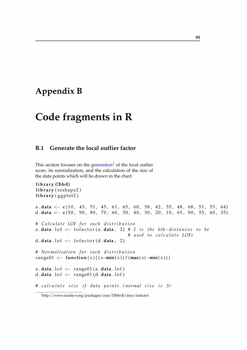
95
Appendix B
Code fragments in R
B.1 Generate the local outlier factor
This section focuses on the generation1 of the local outlierscore, its normalization, and the calculation of the size ofthe data points which will be drawn in the chart.
l i b r a r y (DMwR)l i b r a r y ( reshape2 )l i b r a r y ( ggplot2 )
a . data <− c ( 1 0 , 43 , 51 , 45 , 61 , 65 , 60 , 58 , 42 , 55 , 48 , 68 , 51 , 53 , 64)d . data <− c ( 5 0 , 90 , 80 , 70 , 60 , 50 , 40 , 30 , 20 , 10 , 65 , 90 , 55 , 60 , 35)
# C a l c u l a t e LOF f o r e a c h d i s t r i b u t i o na . data . l o f <− l o f a c t o r ( a . data , 2 ) # 2 i s t h e kth−d i s t a n c e s t o be
# used t o c a l c u l a t e LOFsd . data . l o f <− l o f a c t o r ( d . data , 2 )
# N o r m a l i s a t i o n f o r e a c h d i s t r i b u t i o nrange01 <− function ( x ) { ( x−min ( x ) ) / (max ( x)−min ( x ) ) }
a . data . l o f <− range01 ( a . data . l o f )d . data . l o f <− range01 ( d . data . l o f )
# c a l c u l a t e s i z e i f d a t a p o i n t s ( normal s i z e i s 3 )
1http://www.inside-r.org/packages/cran/DMwR/docs/lofactor
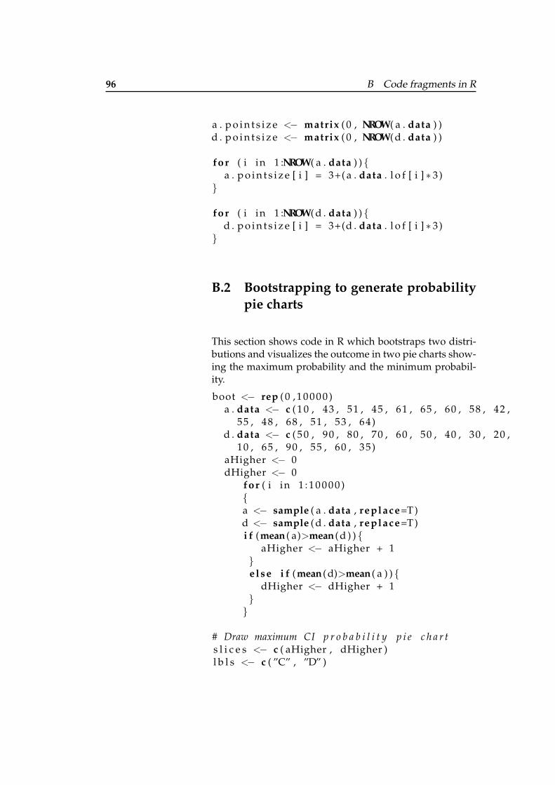
96 B Code fragments in R
a . p o i n t s i z e <− matrix ( 0 , NROW( a . data ) )d . p o i n t s i z e <− matrix ( 0 , NROW( d . data ) )
for ( i in 1 :NROW( a . data ) ) {a . p o i n t s i z e [ i ] = 3+( a . data . l o f [ i ] ∗ 3)
}
for ( i in 1 :NROW( d . data ) ) {d . p o i n t s i z e [ i ] = 3+(d . data . l o f [ i ] ∗ 3)
}
B.2 Bootstrapping to generate probabilitypie charts
This section shows code in R which bootstraps two distri-butions and visualizes the outcome in two pie charts show-ing the maximum probability and the minimum probabil-ity.
boot <− rep ( 0 , 1 0 0 0 0 )a . data <− c ( 1 0 , 43 , 51 , 45 , 61 , 65 , 60 , 58 , 42 ,
55 , 48 , 68 , 51 , 53 , 64)d . data <− c ( 5 0 , 90 , 80 , 70 , 60 , 50 , 40 , 30 , 20 ,
10 , 65 , 90 , 55 , 60 , 35)aHigher <− 0dHigher <− 0
for ( i in 1 : 1 0 0 0 0 ){a <− sample ( a . data , replace=T )d <− sample ( d . data , replace=T )i f (mean ( a)>mean ( d ) ) {
aHigher <− aHigher + 1}e lse i f (mean ( d)>mean ( a ) ) {
dHigher <− dHigher + 1}}
# Draw maximum CI p r o b a b i l i t y p i e c h a r ts l i c e s <− c ( aHigher , dHigher )l b l s <− c ( ”C” , ”D” )
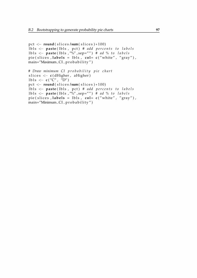
B.2 Bootstrapping to generate probability pie charts 97
pct <− round ( s l i c e s / sum( s l i c e s ) ∗ 100)l b l s <− paste ( l b l s , pct ) # add p e r c e n t s t o l a b e l sl b l s <− paste ( l b l s , ”%” , sep=”” ) # ad % t o l a b e l spie ( s l i c e s , l ab el s = l b l s , col= c ( ” white ” , ” gray ” ) ,main=”Maximum CI p r o b a b i l i t y ” )
# Draw minimum CI p r o b a b i l i t y p i e c h a r ts l i c e s <− c ( dHigher , aHigher )l b l s <− c ( ”C” , ”D” )pct <− round ( s l i c e s / sum( s l i c e s ) ∗ 100)l b l s <− paste ( l b l s , pct ) # add p e r c e n t s t o l a b e l sl b l s <− paste ( l b l s , ”%” , sep=”” ) # ad % t o l a b e l spie ( s l i c e s , l ab el s = l b l s , col= c ( ” white ” , ” gray ” ) ,main=”Minimum CI p r o b a b i l i t y ” )

99
Appendix C
Additional informationof the user study
The following figures show the information provided in thepaper for each chart as well as the final questions. On theleft of each figure, the chart is shown, in the middle the cor-responding text, and on the right the specific questions forall charts. Figure C.1, figure C.2, figure C.3, and figure C.4are shown in the order as they were given to the partici-pants.
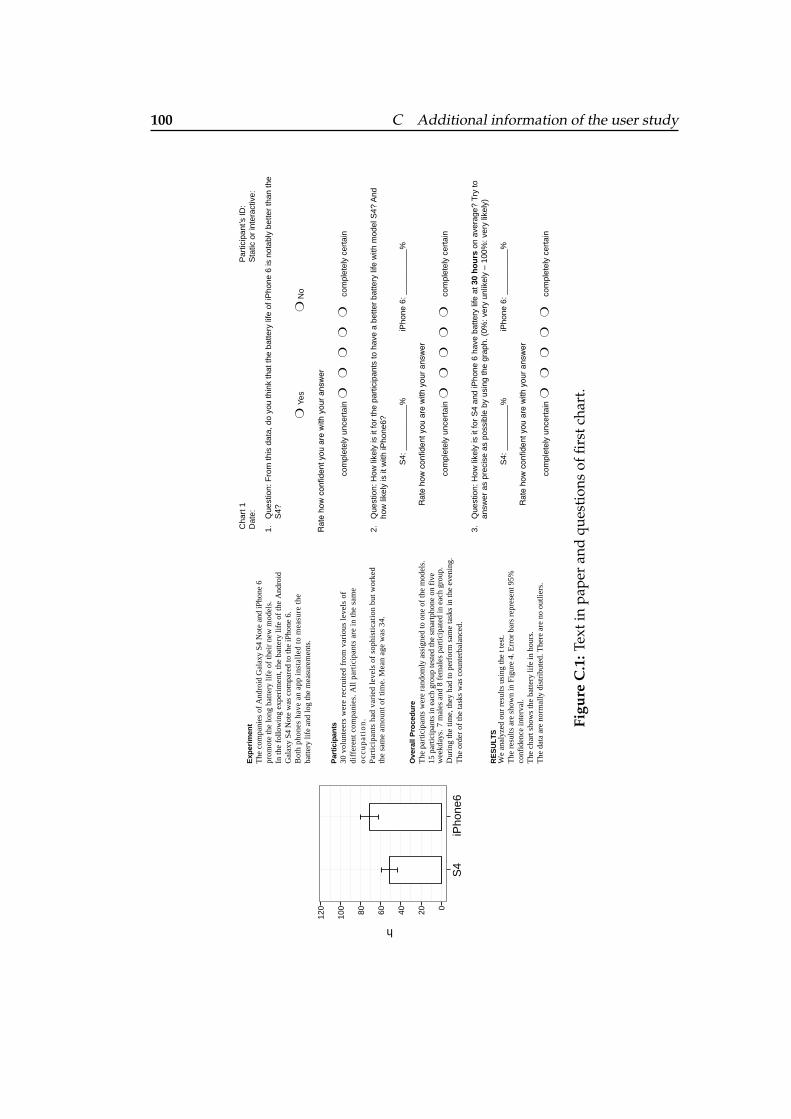
100 C Additional information of the user study
Exp
erim
ent
The
com
pani
es o
f A
ndro
id G
alax
y S4
Not
e an
d iP
hone
6
prom
ote
the
long
bat
tery
life
of
thei
r ne
w m
odel
s.
In th
e fo
llow
ing
expe
rim
ent,
the
batt
ery
life
of
the
And
roid
G
alax
y S4
Not
e w
as c
ompa
red
to th
e iP
hone
6.
Bot
h ph
ones
hav
e an
app
ins
tall
ed t
o m
easu
re t
heba
ttery
life
and
log
the
mea
sure
men
ts.
Par
tici
pan
ts30
vol
unte
ers
wer
e re
crui
ted
from
var
ious
lev
els
of
diff
eren
t co
mpa
nies
. All
par
tici
pant
s ar
e in
the
sam
e
occ
up
atio
n.
Ove
rall
Pro
ced
ure
The
par
ticip
ants
wer
e ra
ndom
ly a
ssig
ned
to o
ne o
f th
e m
odel
s.15
par
ticip
ants
in e
ach
grou
p te
sted
the
smar
tpho
ne o
n fi
ve
RE
SU
LTS
Par
tici
pant
s ha
d va
ried
lev
els
of s
ophi
stic
atio
n bu
t w
orke
dth
e sa
me
amou
nt o
f ti
me.
Mea
n ag
e w
as 3
4.
Dur
ing
the
time,
they
had
to p
erfo
rm s
ame
task
s in
the
even
ing.
wee
kday
s.
The
ord
er o
f th
e ta
sks
was
cou
nter
bala
nced
.
We
anal
yzed
our
res
ults
usi
ng th
e t t
est.
conf
iden
ce in
terv
al.
The
cha
rt s
how
s th
e ba
ttery
life
in h
ours
.T
he d
ata
are
norm
ally
dis
trib
uted
. The
re a
re n
o ou
tlier
s.
7 m
ales
and
8 f
emal
es p
artic
ipat
ed in
eac
h gr
oup.
The
res
ults
are
sho
wn
in F
igur
e 4.
Err
or b
ars
repr
esen
t 95%
060120
S4
iPho
ne6
h
100 80 40 20
1.Q
uest
ion:
Fro
m th
is d
ata,
do
you
thin
k th
at th
e ba
ttery
life
of i
Pho
ne 6
is n
otab
ly b
ette
r th
an th
e S
4?
Yes
No
Rat
e ho
w c
onfid
ent y
ou a
re w
ith y
our a
nsw
er
com
plet
ely
unce
rtai
n
com
plet
ely
cert
ain
2.Q
uest
ion:
How
like
ly is
it fo
r th
e pa
rtic
ipan
ts to
hav
e a
bette
r ba
ttery
life
with
mod
el S
4? A
nd
how
like
ly is
it w
ith iP
hone
6?
S4:
___
____
___%
iPho
ne 6
: ___
____
___%
Rat
e ho
w c
onfid
ent y
ou a
re w
ith y
our a
nsw
er
com
plet
ely
unce
rtai
n
com
plet
ely
cert
ain
3.Q
uest
ion:
How
like
ly is
it fo
r S
4 an
d iP
hone
6 h
ave
batte
ry li
fe a
t 30
ho
urs
on
aver
age?
Try
to
answ
er a
s pr
ecis
e as
pos
sibl
e by
usi
ng th
e gr
aph.
(0%
: ver
y un
likel
y –
100%
: ver
y lik
ely)
S4:
___
____
___%
iPho
ne 6
: ___
____
___%
Rat
e ho
w c
onfid
ent y
ou a
re w
ith y
our a
nsw
er
com
plet
ely
unce
rtai
n
com
plet
ely
cert
ain
:DI s’tnapicitra
P1 trah
C:evitcaretni ro citat
S:eta
D
Figu
reC
.1:T
exti
npa
per
and
ques
tion
sof
first
char
t.
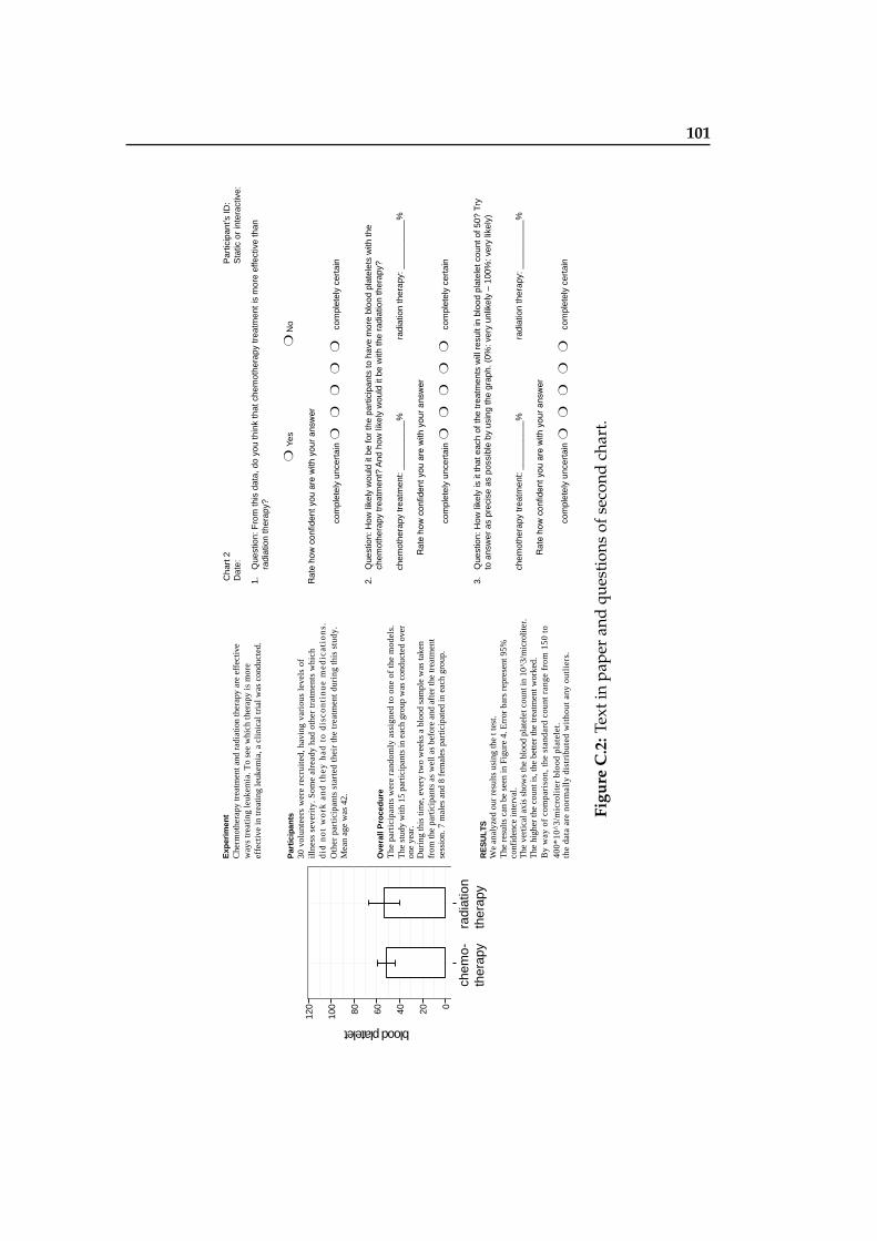
101
Exp
erim
ent
Che
rmot
hera
py tr
eatm
ent a
nd r
adia
tion
ther
apy
are
effe
ctiv
e w
ays
trea
ting
leuk
emia
. To
see
whi
ch th
erap
y is
mor
e ef
fect
ive
in tr
eatin
g le
ukem
ia, a
clin
ical
tria
l was
con
duct
ed.
Par
tici
pan
ts30
vol
unte
ers
wer
e re
crui
ted,
hav
ing
vari
ous
leve
ls o
f il
lnes
s se
veri
ty. S
ome
alre
ady
had
othe
r tr
atm
ents
whi
chd
id n
ot
wo
rk a
nd
th
ey h
ad t
o d
isco
nti
nu
e m
edic
atio
ns.
.
Mea
n ag
e w
as 4
2.
Ove
rall
Pro
ced
ure
The
stu
dy w
ith 1
5 pa
rtic
ipan
ts in
eac
h gr
oup
was
con
duct
ed o
ver
7
mal
es a
nd 8
fem
ales
par
ticip
ated
in e
ach
grou
p.
RE
SU
LTS
Oth
er p
arti
cipa
nts
star
ted
thei
r th
e tr
eatm
ent
duri
ng t
his
stud
y.
The
par
tici
pant
s w
ere
rand
omly
ass
igne
d to
one
of
the
mod
els.
one
year
. D
urin
g th
is ti
me,
eve
ry tw
o w
eeks
a b
lood
sam
ple
was
take
n fr
om th
e pa
rtic
ipan
ts a
s w
ell a
s be
fore
and
aft
er th
e tr
eatm
ent
sess
ion.
By
way
of
com
pari
son,
the
sta
ndar
d co
unt
rang
e fr
om 1
50 t
o40
0*10
^3/m
icro
lite
r bl
ood
plat
elet
. th
e da
ta a
re n
orm
ally
dis
trib
uted
wit
hout
any
out
lier
s.
We
anal
yzed
our
res
ults
usi
ng th
e t t
est.
conf
iden
ce in
terv
al.
The
ver
tical
axi
s sh
ows
the
bloo
d pl
atel
et c
ount
in 1
0^3/
mic
rolit
er.
The
hig
her
the
coun
t is,
the
bette
r th
e tr
eatm
ent w
orke
d.
The
res
ults
can
be
seen
in F
igur
e 4.
Err
or b
ars
repr
esen
t 95%
1.Q
uest
ion:
Fro
m th
is d
ata,
do
you
thin
k th
at c
hem
othe
rapy
trea
tmen
t is
mor
e ef
fect
ive
than
ra
diat
ion
ther
apy?
Yes
No
Rat
e ho
w c
onfid
ent y
ou a
re w
ith y
our a
nsw
er
com
plet
ely
unce
rtai
n
com
plet
ely
cert
ain
2.Q
uest
ion:
How
like
ly w
ould
it b
e fo
r th
e pa
rtic
ipan
ts to
hav
e m
ore
bloo
d pl
atel
ets
with
the
chem
othe
rapy
trea
tmen
t? A
nd h
ow li
kely
wou
ld it
be
with
the
radi
atio
n th
erap
y?
chem
othe
rapy
trea
tmen
t: __
____
____
%ra
diat
ion
ther
apy:
___
____
___%
Rat
e ho
w c
onfid
ent y
ou a
re w
ith y
our a
nsw
er
com
plet
ely
unce
rtai
n
com
plet
ely
cert
ain
3.Q
uest
ion:
How
like
ly is
it th
at e
ach
of th
e tr
eatm
ents
will
res
ult i
n bl
ood
plat
elet
cou
nt o
f 50?
Try
to
ans
wer
as
prec
ise
as p
ossi
ble
by u
sing
the
grap
h. (
0%: v
ery
unlik
ely
– 10
0%: v
ery
likel
y)
chem
othe
rapy
trea
tmen
t: __
____
____
%ra
diat
ion
ther
apy:
___
____
___%
Rat
e ho
w c
onfid
ent y
ou a
re w
ith y
our a
nsw
er
com
plet
ely
unce
rtai
n
com
plet
ely
cert
ain
:DI s’tnapicitra
P2 trah
C:evitcaretni ro citat
S:eta
D
chem
o-
ther
apy
radi
atio
n th
erap
y
blood platelet
060120
100 80 40 20
Figu
reC
.2:T
exti
npa
per
and
ques
tion
sof
seco
ndch
art.
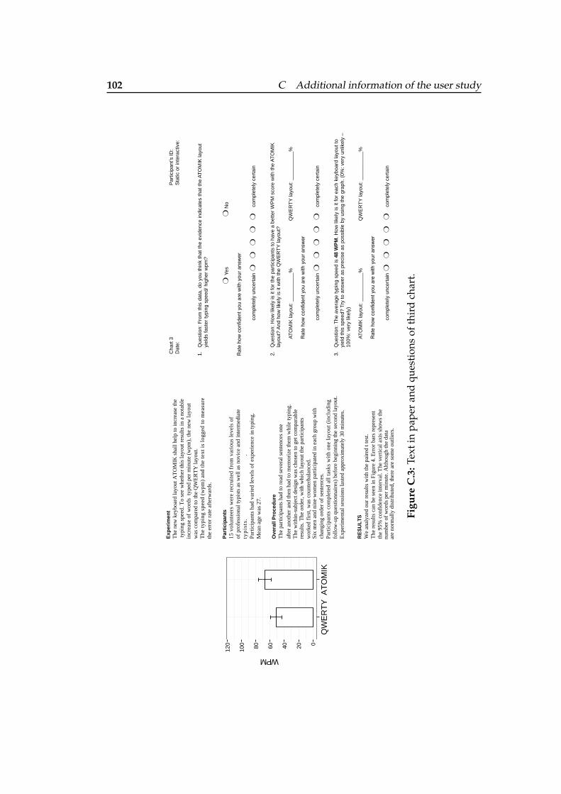
102 C Additional information of the user study
Exp
erim
ent
The
new
key
boar
d la
yout
AT
OM
IK s
hall
help
to in
crea
se th
e ty
ping
spe
ed. T
o se
e w
heth
er th
is la
yout
res
ults
in a
not
able
in
crea
se o
f w
ords
typ
ed p
er m
inut
e (w
pm),
the
new
layo
ut
was
com
pare
d to
the
QW
ER
TY
layo
ut.
The
typ
ing
spee
d (w
pm)
and
the
text
is
logg
ed t
o m
easu
reth
e er
ror
rate
aft
erw
ards
.
Par
tici
pan
ts15
vol
unte
ers
wer
e re
crui
ted
from
var
ious
lev
els
of
ty
pis
ts.
.P
arti
cipa
nts
had
vari
ed l
evel
s of
exp
erie
nce
in
typi
ng.
Mea
n ag
e w
as 2
7.
Ove
rall
Pro
ced
ure
The
par
ticip
ants
had
to r
ead
seve
ral s
ente
nces
one
chan
ging
ord
er o
f se
nten
ces.
Par
tici
pant
s co
mpl
eted
all
tas
ks w
ith
one
layo
ut (i
ncl u
ding
foll
ow-u
p qu
esti
onna
ires
) be
fore
beg
inni
ng th
e se
cond
layo
ut.
E
xper
imen
tal s
essi
ons
last
ed a
ppro
xim
atel
y 30
min
utes
.
RE
SU
LTS
of p
rofe
ssio
nal t
ypis
ts a
s w
ell a
s no
vice
and
inte
rmed
iate
Six
men
and
nin
e w
omen
par
ticip
ated
in e
ach
grou
p w
ith
We
anal
yzed
our
res
ults
with
the
pair
ed t
test
.T
he r
esul
ts c
an b
e se
en in
Fig
ure
4. E
rror
bar
s re
pres
ent
num
ber
of w
ords
per
min
ute.
Alth
ough
the
data
are
norm
ally
dis
trib
uted
, the
re a
re s
ome
outli
ers.
The
with
in-s
ubje
ct d
esig
n w
as c
hose
n to
get
com
para
ble
resu
lts. T
he o
rder
, with
whi
ch la
yout
the
part
icip
ants
wor
ked
firs
t, w
as c
ount
erba
lanc
ed.
afte
r an
othe
r an
d th
en h
ad to
mem
oriz
e th
em w
hile
typi
ng.
the
95%
con
fide
nce
inte
rval
. The
ver
tical
axi
s sh
ows
the
QW
ER
TY
AT
OM
IK
WPM
060120
100 80 40 20
1.Q
uest
ion:
Fro
m th
is d
ata,
do
you
thin
k th
at th
e ev
iden
ce in
dica
tes
that
the
AT
OM
IK la
yout
yi
elds
fast
er ty
ping
spe
ed/ h
ighe
r w
pm?
Yes
No
Rat
e ho
w c
onfid
ent y
ou a
re w
ith y
our a
nsw
er
com
plet
ely
unce
rtai
n
com
plet
ely
cert
ain
2.Q
uest
ion:
How
like
ly is
it fo
r th
e pa
rtic
ipan
ts to
hav
e a
bette
r W
PM
sco
re w
ith th
e A
TO
MIK
la
yout
? A
nd h
ow li
kely
is it
with
the
QW
ER
TY
layo
ut?
AT
OM
IK la
yout
: ___
____
___%
QW
ER
TY
layo
ut: _
____
____
_%
Rat
e ho
w c
onfid
ent y
ou a
re w
ith y
our a
nsw
er
com
plet
ely
unce
rtai
n
com
plet
ely
cert
ain
3.Q
uest
ion:
The
ave
rage
typi
ng s
peed
is 4
8 W
PM
. How
like
ly is
it fo
r ea
ch k
eybo
ard
layo
ut to
yi
eld
this
spe
ed?
Try
to a
nsw
er a
s pr
ecis
e as
pos
sibl
e by
usi
ng th
e gr
aph.
(0%
: ver
y un
likel
y –
100%
: ver
y lik
ely)
AT
OM
IK la
yout
: ___
____
___%
QW
ER
TY
layo
ut: _
____
____
_%
Rat
e ho
w c
onfid
ent y
ou a
re w
ith y
our a
nsw
er
com
plet
ely
unce
rtai
n
com
plet
ely
cert
ain
:DI s’tnapicitra
P3 trah
C:evitcaretni ro citat
S:eta
D
Figu
reC
.3:T
exti
npa
per
and
ques
tion
sof
thir
dch
art.
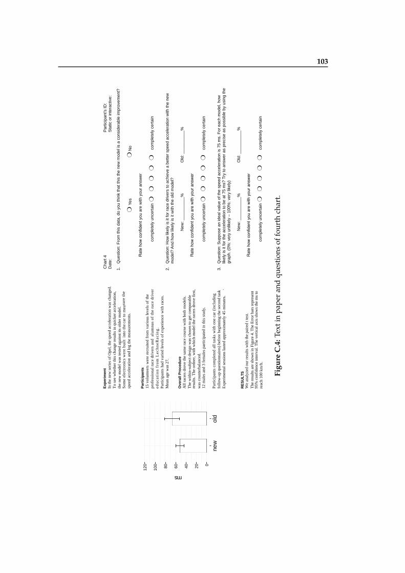
103
Exp
erim
ent
In th
e ne
w s
erie
s of
Ope
l, th
e sp
eed
acce
lera
tion
was
cha
nged
.T
o se
e w
heth
er th
is c
hang
e re
sult
s in
qui
cker
acc
eler
atio
n,
the
new
mod
el w
as te
sted
aga
inst
its
olde
r m
odel
.S
ome
elec
tron
ics
wer
e bu
ilt
into
the
car
to m
easu
re t
hesp
eed
acce
lera
tion
and
log
the
mea
sure
men
ts.
Par
tici
pan
ts15
vol
unte
ers
wer
e re
crui
ted
from
var
ious
lev
els
of t
hepr
ofes
sion
al r
ace
driv
ers
and
alu
mnu
s of
the
rac
e dr
iver
edu
cati
on
fro
m L
ech
neR
acin
g.
Par
tici
pant
s ha
d va
ried
lev
els
of e
xper
ienc
e w
ith
race
s.M
ean
age
was
27.
Ove
rall
Pro
ced
ure
The
with
in-s
ubje
ct d
esig
n w
as c
hose
n to
get
com
para
ble
Par
tici
pant
s co
mpl
eted
all
tas
ks w
ith
one
car
(inc
ludi
ngfo
llow
-up
ques
tion
nair
es)
befo
re b
egin
ning
the
seco
nd ta
sk.
Exp
erim
enta
l ses
sion
s la
sted
app
roxi
mat
ely
45 m
inut
es.
RE
SU
LTS
All
race
rs d
rove
the
sam
e ra
ce c
ours
e w
ith b
oth
mod
els.
resu
lts. T
he o
rdne
r, w
ith w
hich
mod
el th
e ra
cers
dro
ve f
irst
,w
as c
ount
erba
lanc
ed.
12 m
ales
and
3 f
emal
es p
artic
ipat
ed in
this
stu
dy.
We
anal
yzed
our
res
ults
with
the
pair
ed t
test
.
95%
con
fide
nce
inte
rval
. The
ver
tical
axi
s sh
ows
the
ms
to
reac
h 10
0 km
/h.
The
res
ults
are
sho
wn
in F
igur
e 4.
The
Err
or b
ars
repr
esen
t
060120
new
old
ms
100 80 40 20
1.Q
uest
ion:
Fro
m th
is d
ata,
do
you
thin
k th
at th
is th
e ne
w m
odel
is a
con
side
rabl
e im
prov
emen
t?
Yes
No
Rat
e ho
w c
onfid
ent y
ou a
re w
ith y
our
answ
er
com
plet
ely
unce
rtai
n
com
plet
ely
cert
ain
2.Q
uest
ion:
How
like
ly is
it fo
r ra
ce d
river
s to
ach
ieve
a b
ette
r sp
eed
acce
lera
tion
with
the
new
m
odel
? A
nd h
ow li
kely
is it
with
the
old
mod
el?
New
: ___
____
___%
Old
: ___
____
___%
Rat
e ho
w c
onfid
ent y
ou a
re w
ith y
our a
nsw
er
com
plet
ely
unce
rtai
n
com
plet
ely
cert
ain
3.Q
uest
ion:
Sup
pose
an
idea
l val
ue o
f the
spe
ed a
ccel
erat
ion
is 7
5 m
s. F
or e
ach
mod
el, h
ow
likel
y is
it fo
r th
e ac
cele
ratio
n to
be
at 7
5 m
s? T
ry to
ans
wer
as
prec
ise
as p
ossi
ble
by u
sing
the
grap
h. (
0%: v
ery
unlik
ely
– 10
0%: v
ery
likel
y)
New
: ___
____
___%
Old
: ___
____
___%
Rat
e ho
w c
onfid
ent y
ou a
re w
ith y
our a
nsw
er
com
plet
ely
unce
rtai
n
com
plet
ely
cert
ain
:DI s’tnapicitra
P4 trah
C:evitcaretni ro citat
S:eta
D
Figu
reC
.4:T
exti
npa
per
and
ques
tion
sof
four
thch
art.

105
Bibliography
R. Amar, J. Eagan, and J. Stasko. Low-level components ofanalytic activity in information visualization. In Informa-tion Visualization, 2005. INFOVIS 2005. IEEE Symposiumon, pages 111–117, Oct 2005. doi: 10.1109/INFVIS.2005.1532136.
L. Bartram, B. Cheung, and M.C. Stone. The effect ofcolour and transparency on the perception of overlaidgrids. Visualization and Computer Graphics, IEEE Transac-tions on, 17(12):1942–1948, Dec 2011. ISSN 1077-2626. doi:10.1109/TVCG.2011.242.
Sarah Belia, Fiona Fidler, Jennifer Williams, and GeoffCumming. Researchers misunderstand confidence inter-vals and standard error bars. Psychological methods, 10(4):389, 2005.
Eric A Bier, Maureen C Stone, Ken Pier, William Buxton,and Tony D DeRose. Toolglass and magic lenses: the see-through interface. In Proceedings of the 20th annual confer-ence on Computer graphics and interactive techniques, pages73–80. ACM, 1993.
IEC BIPM, ILAC IFCC, and IUPAC ISO. Iupap and oiml2008. Evaluation of Measurement Data—Guide to the Ex-pression of Uncertainty in Measurement, 2008.
Markus M Breunig, Hans-Peter Kriegel, Raymond T Ng,and Jorg Sander. Lof: identifying density-based local out-liers. In ACM sigmod record, volume 29, pages 93–104.ACM, 2000.
John Brosz, Miguel A. Nacenta, Richard Pusch, SheelaghCarpendale, and Christophe Hurter. Transmogrifica-
106 Bibliography
tion: Causal manipulation of visualizations. In Proceed-ings of the 26th Annual ACM Symposium on User Inter-face Software and Technology, UIST ’13, pages 97–106, NewYork, NY, USA, 2013. ACM. ISBN 978-1-4503-2268-3.doi: 10.1145/2501988.2502046. URL http://doi.acm.org/10.1145/2501988.2502046.
Sagnik Ray Choudhury, Prasenjit Mitra, Andi Kirk, SilviaSzep, Donald Pellegrino, Sue Jones, and C Lee Giles. Fig-ure metadata extraction from digital documents. In Doc-ument Analysis and Recognition (ICDAR), 2013 12th Inter-national Conference on, pages 135–139. IEEE, 2013.
M. Correll and M. Gleicher. Error bars considered harmful:Exploring alternate encodings for mean and error. Visu-alization and Computer Graphics, IEEE Transactions on, 20(12):2142–2151, Dec 2014. ISSN 1077-2626. doi: 10.1109/TVCG.2014.2346298.
David Roxbee Cox and David Victor Hinkley. Theoreticalstatistics. CRC Press, 1979.
Geoff Cumming. Understanding the new statistics: Effect sizes,confidence intervals, and meta-analysis. Routledge, 2012.
Geoff Cumming and Sue Finch. A primer on the under-standing, use, and calculation of confidence intervals thatare based on central and noncentral distributions. Educa-tional and Psychological Measurement, 61(4):532–574, 2001.
Geoff Cumming and Sue Finch. Inference by eye: confi-dence intervals and how to read pictures of data. Ameri-can Psychologist, 60(2):170, 2005.
Tufte Edward. The visual display of quantitative informa-tion. Graphics Press, Cheshire, USA,, 4(5):6, 2001.
Nivan Ferreira, Danyel Fisher, and Arnd Christian Konig.Sample-oriented task-driven visualizations: Allowingusers to make better, more confident decisions. In Pro-ceedings of the SIGCHI Conference on Human Factors inComputing Systems, CHI ’14, pages 571–580, New York,NY, USA, 2014. ACM. ISBN 978-1-4503-2473-1. doi: 10.1145/2556288.2557131. URL http://doi.acm.org/10.1145/2556288.2557131.

Bibliography 107
Jinglun Gao, Yin Zhou, and Kenneth E Barner. View: Vi-sual information extraction widget for improving chartimages accessibility. In Image Processing (ICIP), 2012 19thIEEE International Conference on, pages 2865–2868. IEEE,2012.
M.C. Hao, U. Dayal, D.A Keim, and T. Schreck. Importance-driven visualization layouts for large time series data. InInformation Visualization, 2005. INFOVIS 2005. IEEE Sym-posium on, pages 203–210, Oct 2005. doi: 10.1109/INFVIS.2005.1532148.
Jeffrey Heer and Ben Shneiderman. Interactive dynamicsfor visual analysis. Queue, 10(2):30, 2012.
Y. Hsu. The effectiveness of computer-assisted instructionin statistics education: A meta-analysis. Doctoral disserta-tion, 2003.
N. Kong and M. Agrawala. Graphical overlays: Using lay-ered elements to aid chart reading. Visualization and Com-puter Graphics, IEEE Transactions on, 18(12):2631–2638,Dec 2012. ISSN 1077-2626. doi: 10.1109/TVCG.2012.229.
Nicholas Kong, Marti A Hearst, and Maneesh Agrawala.Extracting references between text and charts via crowd-sourcing. In Proceedings of the 32nd annual ACM conferenceon Human factors in computing systems, pages 31–40. ACM,2014.
Hans-Peter Kriegel, Peer Kroger, Erich Schubert, andArthur Zimek. Interpreting and unifying outlier scores.2011.
GeorgeE. Newman and BrianJ. Scholl. Bar graphsdepicting averages are perceptually misinterpreted:The within-the-bar bias. Psychonomic Bulletin & Re-view, 19(4), 2012. ISSN 1069-9384. doi: 10.3758/s13423-012-0247-5. URL http://dx.doi.org/10.3758/s13423-012-0247-5.
Chris Olston and Jock Mackinlay. Visualizing data withbounded uncertainty. In Information Visualization, 2002.INFOVIS 2002. IEEE Symposium on, pages 37–40. IEEE,2002.
108 Bibliography
Ankit Rohatgi. Webplotdigitizer. Journal of Statistics Educa-tion, 10(1):1–20, 2015a.
Ankit Rohatgi. Webplotdigitizer v 3.6. URLhttp://arohatgi.info/WebPlotDigitizer, 2015b.
Manolis Savva, Nicholas Kong, Arti Chhajta, Li Fei-Fei,Maneesh Agrawala, and Jeffrey Heer. Revision: Auto-mated classification, analysis and redesign of chart im-ages. In Proceedings of the 24th annual ACM symposiumon User interface software and technology, pages 393–402.ACM, 2011.
J.D. Schenker. The effectiveness of technology use in statis-tics instruction in higher education: A meta-analysis us-ing hierarchical linear modeling. Doctoral dissertation,2007.
Giovanni W. Sosa, Dale E. Berger, Amanda T. Saw, andJustin C. Mary. Effectiveness of computer-assisted in-struction in statistics: A meta-analysis. Review of Ed-ucational Research, 81(1):97–128, 2011. doi: 10.3102/0034654310378174. URL http://rer.sagepub.com/content/81/1/97.abstract.
William A. Stock and John T. Behrens. Box, line, andmidgap plots: Effects of display characteristics on the ac-curacy and bias of estimates of whisker length. Journalof Educational and Behavioral Statistics, 16(1):1–20, 1991.doi: 10.3102/10769986016001001. URL http://jeb.sagepub.com/content/16/1/1.abstract.
Edward R. Tufte. ENVISIONING INFORMATION., vol-ume 68. John Wiley & Sons, Ltd, 1991.
Stef van den Elzen and Jarke J. van Wijk. Small Multiples,Large Singles: A New Approach for Visual Data Explo-ration. Computer Graphics Forum, 32(3):191–200, 2013. doi:10.1111/cgf.12106. URL http://diglib.eg.org/EG/CGF/volume32/issue3/v32i3pp191-200.pdf.
Colin Ware. Information visualisation. Perception for Design,2004.
109
Index
abbrv, see abbreviationautomatic data extraction, 32
binary interpretation, 9box plot, 10
CI of difference, 57crowdsourced data extraction, 35
data analysis questions, 74design space, 42distribution, 51, 52
evaluation, 71–85experiment design, 74experiment procedure, 76experiment results, 77exploration and navigation loop, 26
future work, 88–90
gradient plot, 11graphical integrity, 23graphical overlays, 21
input chart types, 50interactive data extraction, 31iteration, 66
layering and separation, 19limitations, 84LOF, 54
manipulation loop, 25multiple windows, 26
outliers, 54
paper prototype, 59pie chart, 55
110 Index
problem solving loop, 28
rapid interaction, 26research questions, 72
simulated data, 47small multiples, 21software prototype, 61software prototype (1st), 61software prototype (2nd), 63
textual refinement, 49transmogrification, 18
uncertainty, 1, 8
violin plot, 11
web-based prototype, 63web-based prototype (1st), 63web-based prototype (2nd), 65within-the-bar-bias, 9

Typeset March 30, 2015