Cisco 300 Series Managed Switches Administration Guide 1.4 ...
Upload
khangminh22Category
view
0download
0
© Copyright 2021 Agiloft Inc. All Rights Reserved. HELP-31Mar2021
1.4 — Charts and Reports
CONTENTS
Reporting
1.3 Chart Collections . . . . . . . . . . . . . . . . . . . . . . . . . . . . . . . . . . . . . . . . . . . . . . . . . . . 341.2.4 Custom Summary Reports . . . . . . . . . . . . . . . . . . . . . . . . . . . . . . . . . . . . . . . 271.2.3 Excel Reports . . . . . . . . . . . . . . . . . . . . . . . . . . . . . . . . . . . . . . . . . . . . . . . . . . 191.2.2 HTML and Text Reports . . . . . . . . . . . . . . . . . . . . . . . . . . . . . . . . . . . . . . . . . 181.2.1 Graphical Charts . . . . . . . . . . . . . . . . . . . . . . . . . . . . . . . . . . . . . . . . . . . . . . . 15
1.2 Report Output Types . . . . . . . . . . . . . . . . . . . . . . . . . . . . . . . . . . . . . . . . . . . . . . . . 151.1 Create and Edit Charts and Reports . . . . . . . . . . . . . . . . . . . . . . . . . . . . . . . . . . . 4
1. Reporting . . . . . . . . . . . . . . . . . . . . . . . . . . . . . . . . . . . . . . . . . . . . . . . . . . . . . . . . . . . . . . 3
3© 2021 Agiloft Inc.
A report is a summary of table information presented in graphical, HTML, text, or Excel format. A saved instance of a chart or report can include multiple formats, and charts and reports can be combined into dashboards and chart collections to give users information at a glance and provide a launch point for daily tasks. Reports are useful for managing and monitoring work, tracking data and business trends, and representing information visually or succinctly.
Charts and reports apply user permissions, so they can be shared across the organization without granting unintentional access to sensitive information. They can be scheduled for automatic distribution to individual users and teams, and users can also run them interactively as needed according to their permissions. You can also distribute charts and reports by email, or write them to the hard drive for viewing in a web browser or other program. Charts and reports that are written to the hard drive can be viewed without needing to log in to Agiloft or actively run the report in the system. For more information about these topics, refer to the Permissions and Security and Schedule topics in Create and Edit Charts and Reports.
has dozens of charts and reports already configured that provide visual snapshots of many aspects of Agiloftbusiness. For a list of reports available for a table, expand the table name in the navigation menu and click Charts/Reports. The list also includes any charts and reports you create.
Refer to these topics for more information about reporting:
Create and Edit Charts and Reports: This page includes information about predefined reports; details about how permissions function in reporting; and tips about each tab available in the Charts/Reports wizard. Use this page to learn more about how to create and modify charts and reports, and how they work in your system.Report Output Types: Each chart or report has an output type that determines what it shows and how it works. Usually, your reporting needs determine the output type you choose. For example, if you need a single report to show data from multiple tables, and you don't want to use , you must use Dashboardseither or . To show data from a single table, Custom Summary Reports Excel Reports Graphical Charts are a good solution, and commonly used both as standalone charts in individual tables and in Chart
on a dashboard. show data from a single table in a text-based, non-Widgets HTML and Text Reportsgraphical report.
Reporting
Create and Edit Charts and Reports
4© 2021 Agiloft Inc.
This article details the options available in the Charts/Reports wizard, as well as some example predefined reports and an explanation of reporting permissions. Reports and charts are created using the same wizard so you can develop them in parallel, or quickly create charts from existing reports and vice versa. The Report Type determines the format used to present the information, and some report types have separate articles covering their unique configuration in more detail.
Before configuring your own charts and reports for the first time, explore the predefined reports automatically configured in Agiloft and learn more about how permissions work with reporting.
comes with dozens of built-in charts and reports that you can use to visually represent business data, Agiloftand to familiarize yourself with reporting capabilities.Agiloft
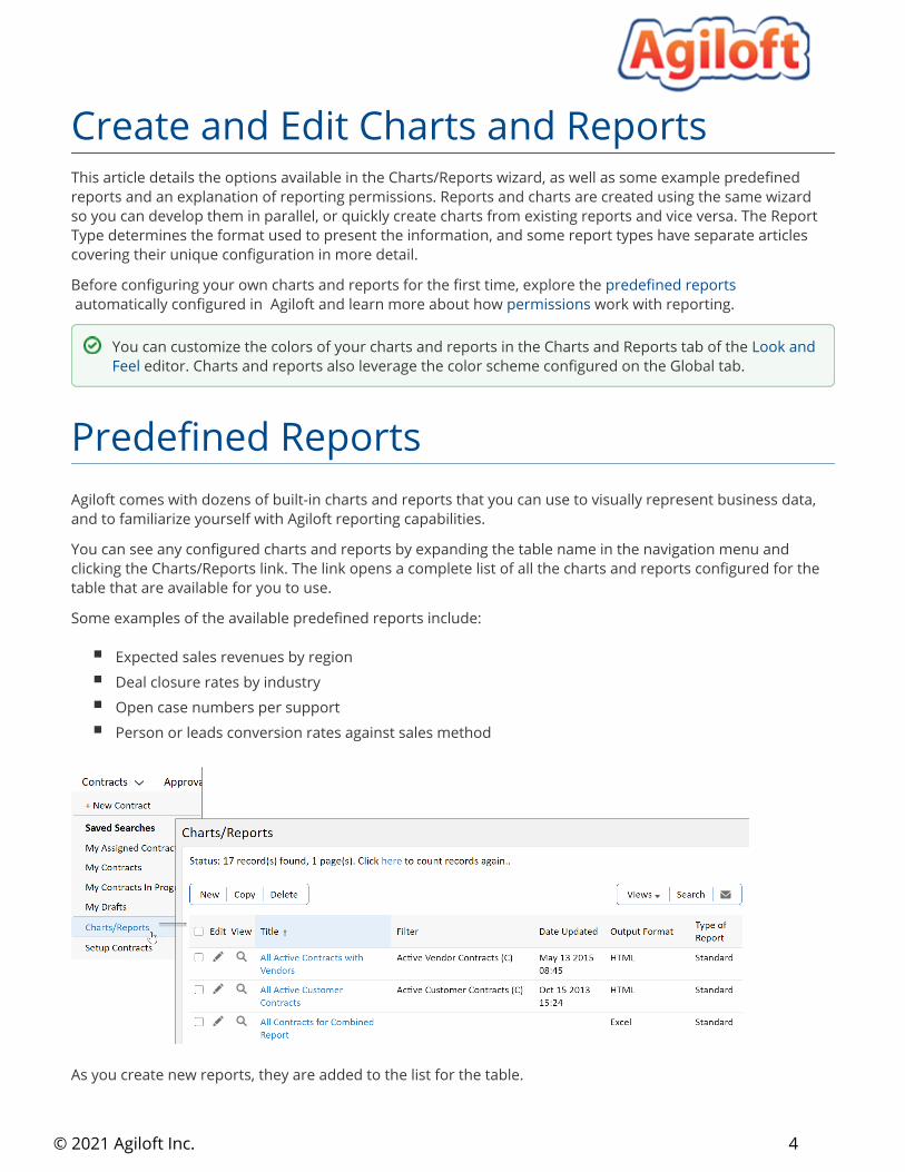
You can see any configured charts and reports by expanding the table name in the navigation menu and clicking the Charts/Reports link. The link opens a complete list of all the charts and reports configured for the table that are available for you to use.
Some examples of the available predefined reports include:
Expected sales revenues by regionDeal closure rates by industryOpen case numbers per supportPerson or leads conversion rates against sales method
As you create new reports, they are added to the list for the table.
Create and Edit Charts and Reports
You can customize the colors of your charts and reports in the Charts and Reports tab of the Look and editor. Charts and reports also leverage the color scheme configured on the Global tab.Feel
Predefined Reports
5© 2021 Agiloft Inc.
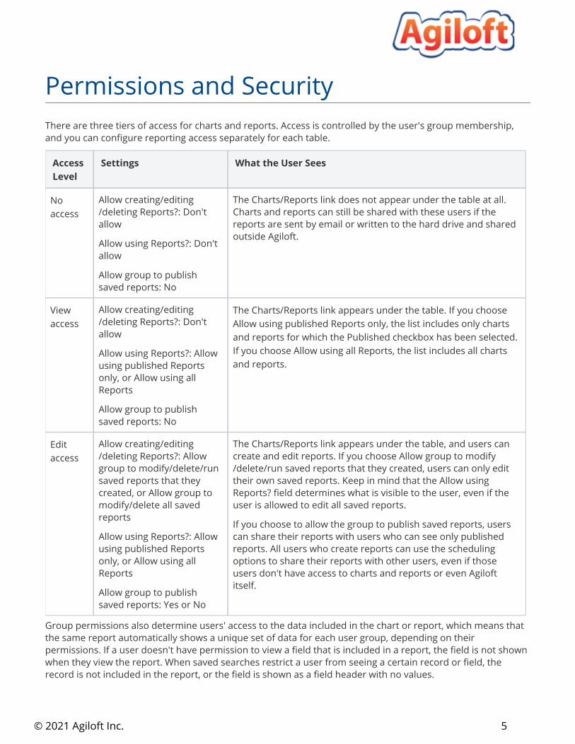
There are three tiers of access for charts and reports. Access is controlled by the user's group membership, and you can configure reporting access separately for each table.
Access Level
Settings What the User Sees
No access
Allow creating/editing/deleting Reports?: Don't allow
Allow using Reports?: Don't allow
Allow group to publish saved reports: No
The Charts/Reports link does not appear under the table at all. Charts and reports can still be shared with these users if the reports are sent by email or written to the hard drive and shared outside .Agiloft
View access
Allow creating/editing/deleting Reports?: Don't allow
Allow using Reports?: Allow using published Reports only, or Allow using all Reports
Allow group to publish saved reports: No
The Charts/Reports link appears under the table. If you choose Allow using published Reports only, the list includes only charts and reports for which the Published checkbox has been selected. If you choose Allow using all Reports, the list includes all charts and reports.
Edit access
Allow creating/editing/deleting Reports?: Allow group to modify/delete/run saved reports that they created, or Allow group to modify/delete all saved reports
Allow using Reports?: Allow using published Reports only, or Allow using all Reports
Allow group to publish saved reports: Yes or No
The Charts/Reports link appears under the table, and users can create and edit reports. If you choose Allow group to modify/delete/run saved reports that they created, users can only edit their own saved reports. Keep in mind that the Allow using Reports? field determines what is visible to the user, even if the user is allowed to edit all saved reports.
If you choose to allow the group to publish saved reports, users can share their reports with users who can see only published reports. All users who create reports can use the scheduling options to share their reports with other users, even if those users don't have access to charts and reports or even Agiloftitself.
Group permissions also determine users' access to the data included in the chart or report, which means that the same report automatically shows a unique set of data for each user group, depending on their permissions. If a user doesn't have permission to view a field that is included in a report, the field is not shown when they view the report. When saved searches restrict a user from seeing a certain record or field, the record is not included in the report, or the field is shown as a field header with no values.
Permissions and Security
6© 2021 Agiloft Inc.
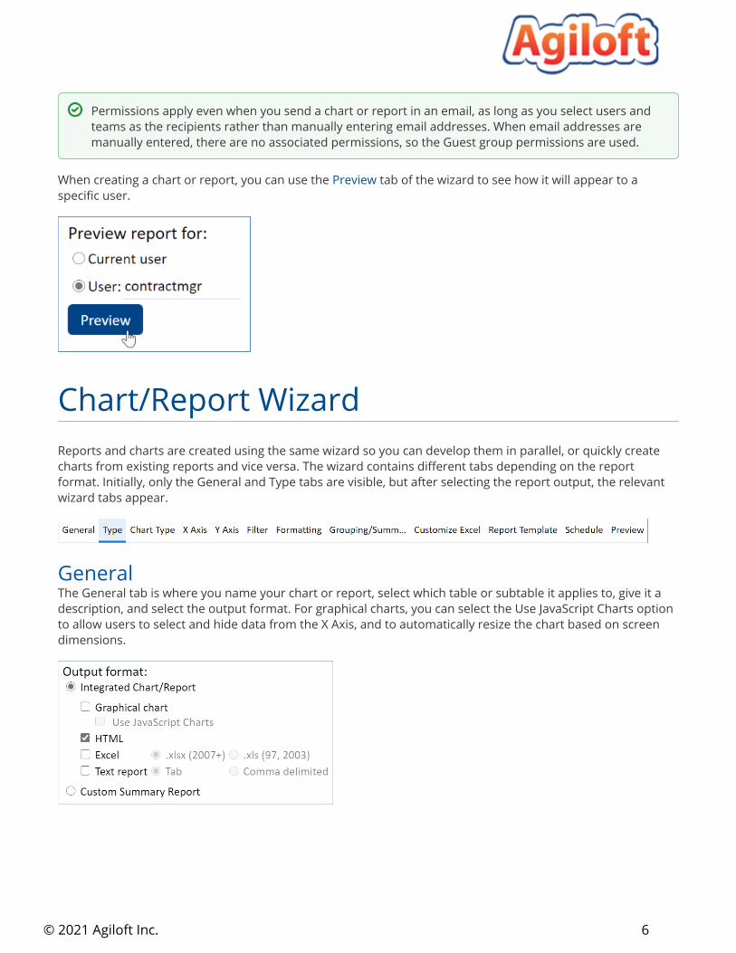
When creating a chart or report, you can use the tab of the wizard to see how it will appear to a Previewspecific user.
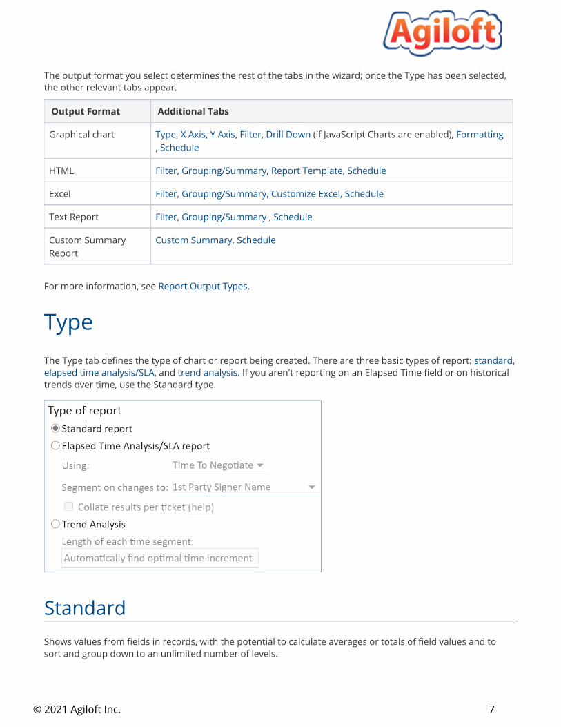
Reports and charts are created using the same wizard so you can develop them in parallel, or quickly create charts from existing reports and vice versa. The wizard contains different tabs depending on the report format. Initially, only the General and Type tabs are visible, but after selecting the report output, the relevant wizard tabs appear.
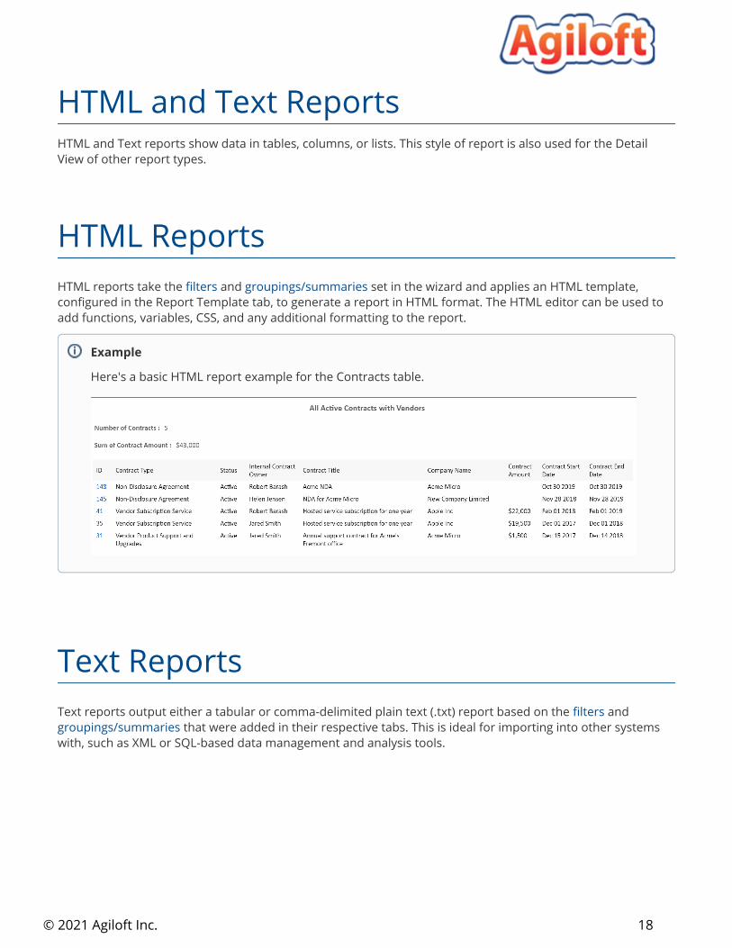
GeneralThe General tab is where you name your chart or report, select which table or subtable it applies to, give it a description, and select the output format. For graphical charts, you can select the Use JavaScript Charts option to allow users to select and hide data from the X Axis, and to automatically resize the chart based on screen dimensions.
Permissions apply even when you send a chart or report in an email, as long as you select users and teams as the recipients rather than manually entering email addresses. When email addresses are manually entered, there are no associated permissions, so the Guest group permissions are used.
Chart/Report Wizard
7© 2021 Agiloft Inc.
Graphical chart Type, , , (if JavaScript Charts are enabled), X Axis, Y Axis Filter Drill Down Formatting, Schedule
HTML Filter, , Grouping/Summary Report Template, Schedule
Excel Filter, , Grouping/Summary Customize Excel, Schedule
Text Report Filter, , Grouping/Summary Schedule
Custom Summary Report
Custom Summary, Schedule
For more information, see .Report Output Types
The Type tab defines the type of chart or report being created. There are three basic types of report: , standard, and . If you aren't reporting on an Elapsed Time field or on historical elapsed time analysis/SLA trend analysis
trends over time, use the Standard type.
StandardShows values from fields in records, with the potential to calculate averages or totals of field values and to sort and group down to an unlimited number of levels.
Elapsed Time Analysis/SLA
Type
The output format you select determines the rest of the tabs in the wizard; once the Type has been selected, the other relevant tabs appear.
Output Format Additional Tabs
8© 2021 Agiloft Inc.
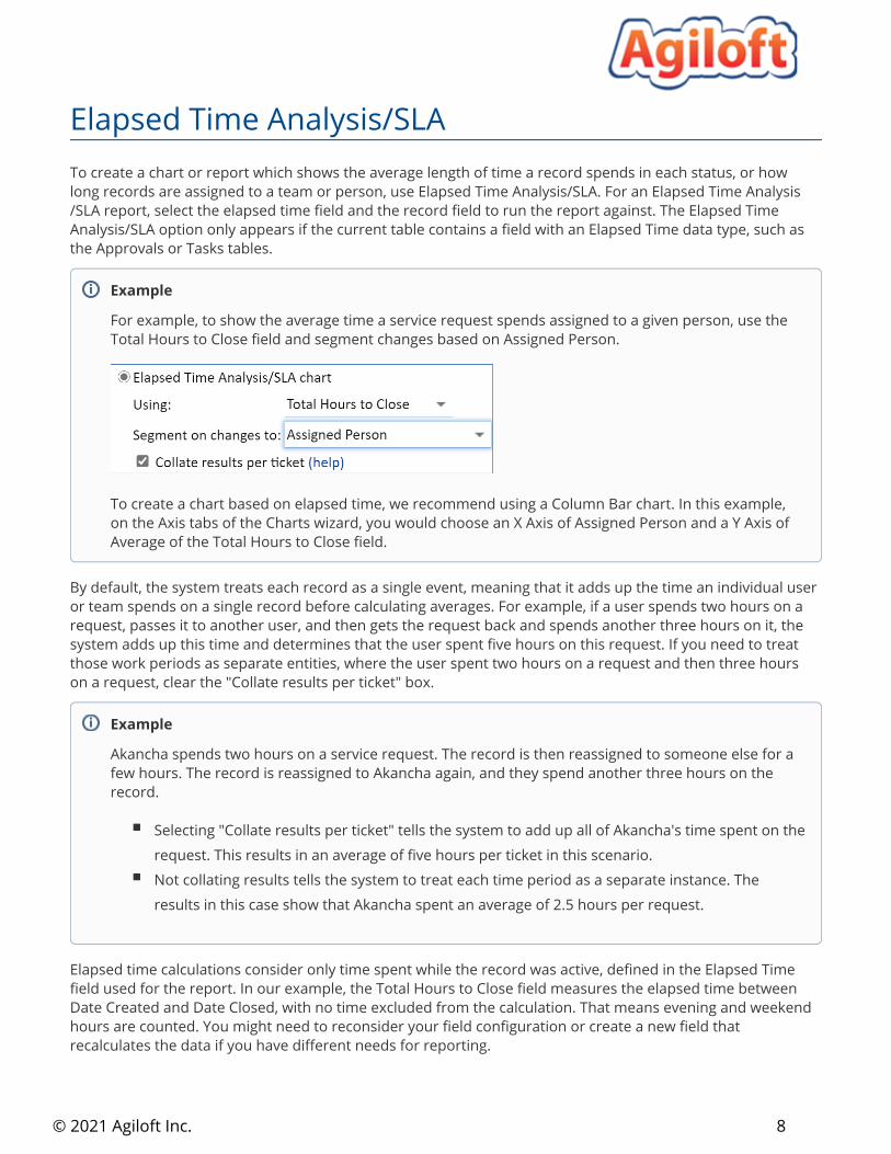
Elapsed Time Analysis/SLA To create a chart or report which shows the average length of time a record spends in each status, or how long records are assigned to a team or person, use Elapsed Time Analysis/SLA. For an Elapsed Time Analysis/SLA report, select the elapsed time field and the record field to run the report against. The Elapsed Time Analysis/SLA option only appears if the current table contains a field with an Elapsed Time data type, such as the Approvals or Tasks tables.
By default, the system treats each record as a single event, meaning that it adds up the time an individual user or team spends on a single record before calculating averages. For example, if a user spends two hours on a request, passes it to another user, and then gets the request back and spends another three hours on it, the system adds up this time and determines that the user spent five hours on this request. If you need to treat those work periods as separate entities, where the user spent two hours on a request and then three hours on a request, clear the "Collate results per ticket" box.
Elapsed time calculations consider only time spent while the record was active, defined in the Elapsed Time field used for the report. In our example, the Total Hours to Close field measures the elapsed time between Date Created and Date Closed, with no time excluded from the calculation. That means evening and weekend hours are counted. You might need to reconsider your field configuration or create a new field that recalculates the data if you have different needs for reporting.
Example
For example, to show the average time a service request spends assigned to a given person, use the Total Hours to Close field and segment changes based on Assigned Person.
To create a chart based on elapsed time, we recommend using a Column Bar chart. In this example, on the Axis tabs of the Charts wizard, you would choose an X Axis of Assigned Person and a Y Axis of Average of the Total Hours to Close field.
Example
Akancha spends two hours on a service request. The record is then reassigned to someone else for a few hours. The record is reassigned to Akancha again, and they spend another three hours on the record.
Selecting "Collate results per ticket" tells the system to add up all of Akancha's time spent on the request. This results in an average of five hours per ticket in this scenario.Not collating results tells the system to treat each time period as a separate instance. The results in this case show that Akancha spent an average of 2.5 hours per request.
9© 2021 Agiloft Inc.
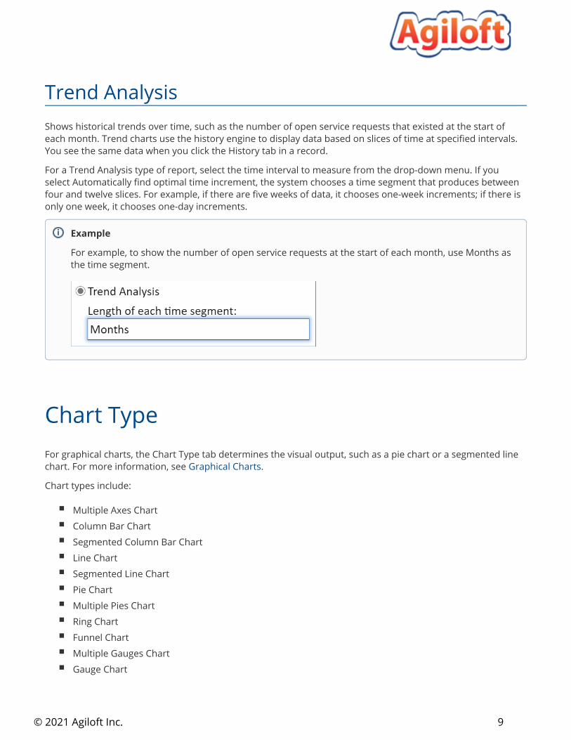
Trend AnalysisShows historical trends over time, such as the number of open service requests that existed at the start of each month. Trend charts use the history engine to display data based on slices of time at specified intervals. You see the same data when you click the History tab in a record.
For a Trend Analysis type of report, select the time interval to measure from the drop-down menu. If you select Automatically find optimal time increment, the system chooses a time segment that produces between four and twelve slices. For example, if there are five weeks of data, it chooses one-week increments; if there is only one week, it chooses one-day increments.
For graphical charts, the Chart Type tab determines the visual output, such as a pie chart or a segmented line chart. For more information, see .Graphical Charts
Chart types include:
Multiple Axes ChartColumn Bar ChartSegmented Column Bar ChartLine ChartSegmented Line ChartPie ChartMultiple Pies ChartRing ChartFunnel ChartMultiple Gauges ChartGauge Chart
Example
For example, to show the number of open service requests at the start of each month, use Months as the time segment.
Chart Type
10© 2021 Agiloft Inc.
For graphical charts, these tabs control what is shown on the X (horizontal) and Y (vertical) axes of the report. The X axis determines the first level of grouping if there is an associated report, and the Y axis determines the second level.
The options include the field to report on and the sorting and ordering options for data grouping. X Axis
The options include the options to segment the X axis by, whether to use a custom label, and whether Y Axisto display the segments by number or as a percentage of the total in that segment.
There are four ways to segment the vertical axis:
By the number of records in the tableAs a function of a selected field - for example, the Maximum of Field A recordsAs a computation between two fields - for example, the Average obtained by adding Field A to Field BAs a formula
X and Y Axis
Example
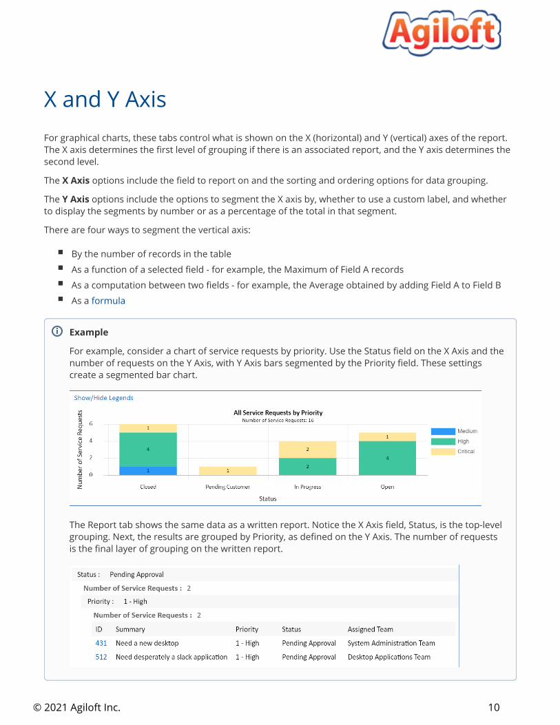
For example, consider a chart of service requests by priority. Use the Status field on the X Axis and the number of requests on the Y Axis, with Y Axis bars segmented by the Priority field. These settings create a segmented bar chart.
The Report tab shows the same data as a written report. Notice the X Axis field, Status, is the top-level grouping. Next, the results are grouped by Priority, as defined on the Y Axis. The number of requests is the final layer of grouping on the written report.
11© 2021 Agiloft Inc.
You can filter the records included in reports by a date range for record creation or modification, and by more complex custom criteria using a saved search.
Date ranges can be either of two options:
A relative time range - for example, the date of the earliest record from a month ago, until todayAn absolute date range - for example, 20 January 2015 - 15 March 2017
After you select the range, you must select the field to base the date range on. For absolute date periods, you can choose to use the History field instead. Finally, choose which records to display from the date range selected.
You can also apply a filter to the report, and select whether the report should display current saved searchdata, or historic data that was in place at the time when the filter criteria were met.
You can add drill-down features to JavaScript charts so that if the user clicks on a segment of the chart, a new chart opens with details about that segment. You can add multiple drill-down layers to break the data down further. Click to create a drill-down and then define the title of the resulting drill-down chart; the field you Add want to use on the X Axis of the drill-down chart; and the sorting and order of the groups.
Filter
You can use saved searches with run-time filters to minimize the number of charts and reports you need to create and maintain. For instance, suppose you do consulting projects for a number of companies and want to send reports specific to each customer covering different ranges of time. In this case, you can use a single report which is filtered by a run-time saved search with a run-time filter for the start and end dates and a run-time filter for the company name.
Drill Down
recently and how many have lingered with that team.assigned to contracts in that status, you might want to see how many of those contracts were created assigned team so you can identify potential bottlenecks. Then, after you drill down to the teams For example, when reviewing the number of contracts in each status, it might be useful to see the
12© 2021 Agiloft Inc.
For graphical charts, use this tab to configure the chart's appearance, including:
Three dimensional effectsWhether to display numeric valuesLegendsTitlesGeneration datesChart size
The Grouping/Summary tab controls how the information in the report is grouped, which view will be used to display it, and the summary information to include.
Formatting
Grouping/Summary
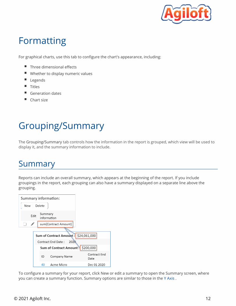
SummaryReports can include an overall summary, which appears at the beginning of the report. If you include groupings in the report, each grouping can also have a summary displayed on a separate line above the grouping.
To configure a summary for your report, click New or edit a summary to open the Summary screen, where you can create a summary function. Summary options are similar to those in the Y Axis .
13© 2021 Agiloft Inc.
1.
2.
3.
GroupingYou can sort report data into groups to make large reports more readable, identify patterns and trends, and more. For example, you might want to group the records based on their Priority and calculate the average cost for each Priority set in the grouping summary. This data can also be included with the summary information for the whole report.
To configure a grouping:
Click New or edit a grouping to open the Grouping Chart Data wizard. Here you can create custom groupings, similarly to those for the X Axis.In the Grouping tab, define a field to group the data by and optionally create a summary to display on top of the grouping, and select whether to add a page break before each new group.In the Sorting tab, define the order to sort the grouped data by, and whether to show the results in ascending or descending order.
Excel reports can be customized by creating an Excel template in your knowledgebase. Customization can include elements like pivot tables and custom charts. For more information, see .Excel Reports
The Report Template tab contains an HTML editor, where you can customize . Use the WYSIWYG HTML reportseditor or edit the source HTML to control the appearance, colors, and formatting of HTML reports.
When creating a custom summary report, this tab is titled Custom Summary. See Custom Summary Reportsfor more guidance on using this tab.
Customize Excel
You can use formulas to show knowledgebase data in your Excel report. Click Formula Help on the Customize Excel tab to see an overview of all the formulas you can use.
Report Template (or Custom Summary)
14© 2021 Agiloft Inc.
On the Schedule tab, you can set a schedule for when the system automatically runs and distributes the report. Reports and charts can be run at a specified frequency and time and distributed by email or written to a file folder on the server, if you have access to it. You can use these distribution methods to:
Send charts and reports to users or external parties who don't have to view charts and reports accessin your systemShare charts and reports outside of by writing a chart to a location on the server and then Agilofthosting it on your own websiteRun charts and reports a single time for multiple users, minimizing the resources required to generate and share the dataKeep teams on the same page by sending all team members the same charts and reports generated at the same time, and making sure the charts and reports are sent at regular intervals
Schedule
Schedule reports carefully to avoid overloading the system during peak hours. Complex charts can be resource intensive, particularly when thousands of records are found and must be collated. Due to the high potential server workload of reports, access to them should be restricted to experienced users, such as managers and administrators. They should be scheduled to run daily or weekly, during off hours when possible. Use the global variable to control the minimum number of minutes that can be Report Frequencyused in the "Every __ minutes" option.
Permissions apply even when you send a chart or report in an email, as long as you select users and teams as the recipients rather than manually entering email addresses, or if the manually entered address matches an existing user. When email addresses that do not match an existing person record are manually entered, there are no associated permissions, so the Guest group permissions are used.
If you want to use Guest group permissions for an email address that does match a person record, you can use sub-addressing to do so. For instance, if you want to use Guest permissions to send a report to [email protected], but the address is tied to a user with additional permissions, you can send the report to [email protected]. Since the addresses no longer match, Guest permissions are used. Note however that MS Exchange (and therefore MS Outlook) will not accept sub-addressed inbound mail.
Use the Preview tab to test your configuration and make sure it looks and works the way you want it to. You can test it with the current user or specify another user to make sure the report shows appropriate data for users with different permissions. The Preview tab is a powerful tool when working with reports, especially when creating a new one from scratch. Make sure to test your report thoroughly before you distribute it to other users.
Preview
15© 2021 Agiloft Inc.
The report output type determines the format of the report and where data can be pulled from. Only , , and can include data from more than one table in the Dashboards Custom Summary Reports Excel Reports
same report.
You can create a report for a single table in any of the available output types:
Graphical ChartsHTML and Text ReportsExcel ReportsCustom Summary Reports
These pages provide details about the configuration that is specific to that output type. For information about the other settings available in the wizard, see .Create and Edit Charts and Reports
Report Output Types
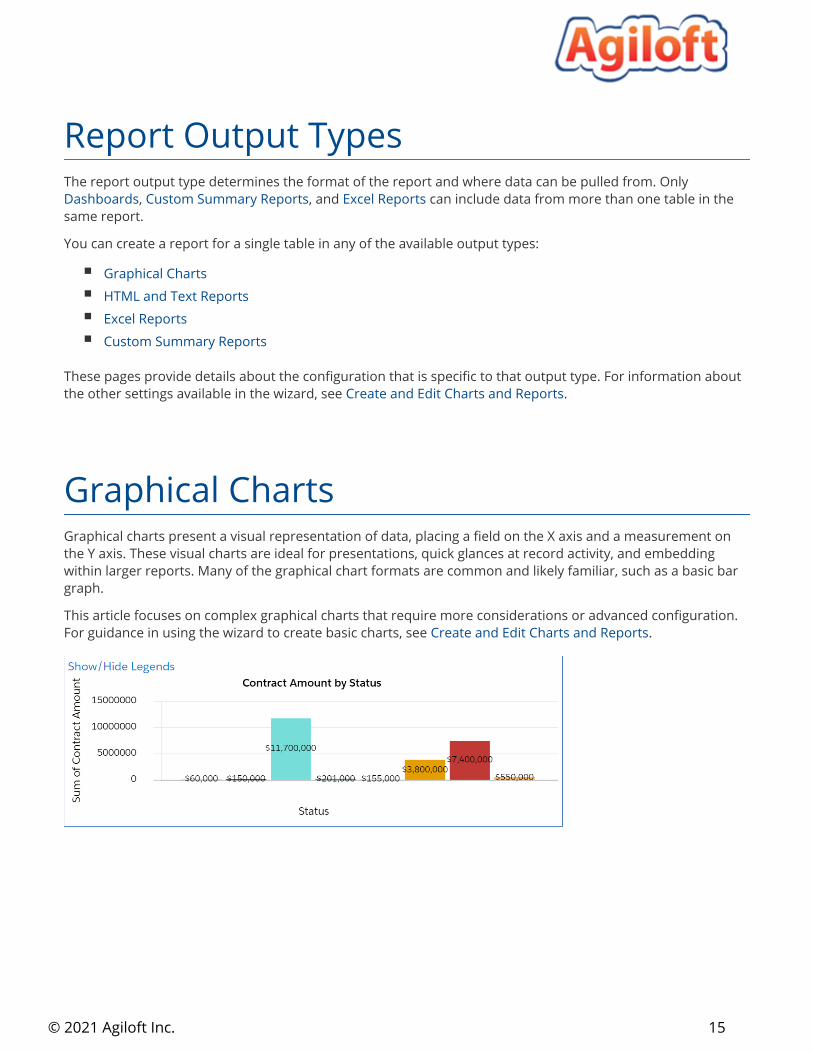
Graphical charts present a visual representation of data, placing a field on the X axis and a measurement on the Y axis. These visual charts are ideal for presentations, quick glances at record activity, and embedding within larger reports. Many of the graphical chart formats are common and likely familiar, such as a basic bar graph.
This article focuses on complex graphical charts that require more considerations or advanced configuration. For guidance in using the wizard to create basic charts, see .Create and Edit Charts and Reports
Graphical Charts
© 2021 Agiloft Inc.
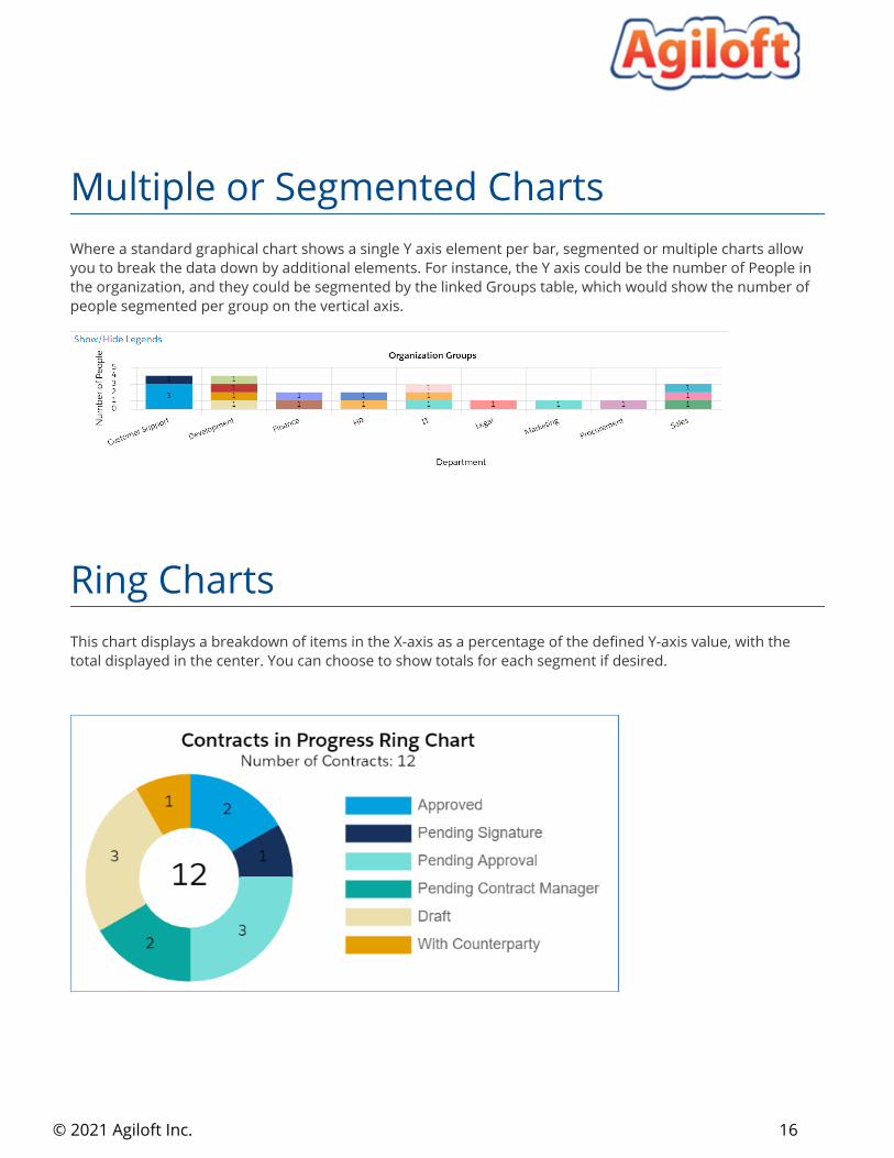
Where a standard graphical chart shows a single Y axis element per bar, segmented or multiple charts allow you to break the data down by additional elements. For instance, the Y axis could be the number of People in the organization, and they could be segmented by the linked Groups table, which would show the number of people segmented per group on the vertical axis.
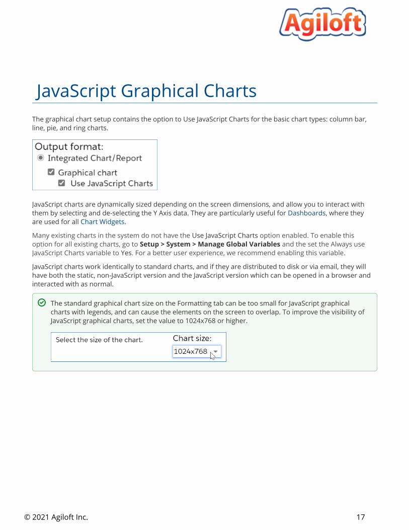
This chart displays a breakdown of items in the X-axis as a percentage of the defined Y-axis value, with the total displayed in the center. You can choose to show totals for each segment if desired.
Multiple or Segmented Charts
Ring Charts
16
© 2021 Agiloft Inc.
The graphical chart setup contains the option to Use JavaScript Charts for the basic chart types: column bar, line, pie, and ring charts.
JavaScript charts are dynamically sized depending on the screen dimensions, and allow you to interact with them by selecting and de-selecting the Y Axis data. They are particularly useful for , where they Dashboardsare used for all .Chart Widgets
Many existing charts in the system do not have the Use JavaScript Charts option enabled. To enable this option for all existing charts, go to Setup > System > Manage Global Variables and the set the Always use
YesJavaScript Charts variable to . For a better user experience, we recommend enabling this variable.
JavaScript charts work identically to standard charts, and if they are distributed to disk or via email, they will have both the static, non-JavaScript version and the JavaScript version which can be opened in a browser and interacted with as normal.
JavaScript Graphical Charts
The standard graphical chart size on the Formatting tab can be too small for JavaScript graphical charts with legends, and can cause the elements on the screen to overlap. To improve the visibility of JavaScript graphical charts, set the value to 1024x768 or higher.
HTML and Text Reports 17
© 2021 Agiloft Inc.
HTML and Text reports show data in tables, columns, or lists. This style of report is also used for the Detail View of other report types.
HTML reports take the and set in the wizard and applies an HTML template, filters groupings/summariesconfigured in the Report Template tab, to generate a report in HTML format. The HTML editor can be used to add functions, variables, CSS, and any additional formatting to the report.
Text reports output either a tabular or comma-delimited plain text (.txt) report based on the and filters that were added in their respective tabs. This is ideal for importing into other systems groupings/summaries
with, such as XML or SQL-based data management and analysis tools.
HTML and Text Reports
HTML Reports
Example
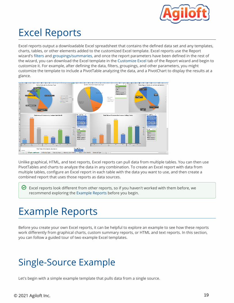
Here's a basic HTML report example for the Contracts table.
Text Reports
Excel Reports 18
© 2021 Agiloft Inc.
Excel reports output a downloadable Excel spreadsheet that contains the defined data set and any templates, charts, tables, or other elements added to the customized Excel template. Excel reports use the Report wizard's and , and once the report parameters have been defined in the rest of filters groupings/summariesthe wizard, you can download the Excel template in the tab of the Report wizard and begin to Customize Excelcustomize it. For example, after defining the data, filters, groupings, and other parameters, you might customize the template to include a PivotTable analyzing the data, and a PivotChart to display the results at a glance.
Unlike graphical, HTML, and text reports, Excel reports can pull data from multiple tables. You can then use PivotTables and charts to analyze the data in any combination. To create an Excel report with data from multiple tables, configure an Excel report in each table with the data you want to use, and then create a combined report that uses those reports as data sources.
Before you create your own Excel reports, it can be helpful to explore an example to see how these reports work differently from graphical charts, custom summary reports, or HTML and text reports. In this section, you can follow a guided tour of two example Excel templates.
Let's begin with a simple example template that pulls data from a single source.
Excel Reports
Excel reports look different from other reports, so if you haven't worked with them before, we recommend exploring the before you begin.Example Reports
Example Reports
Single-Source Example
19

© 2021 Agiloft Inc.
1. 2.
3.
4.
1. 2.
3.
4.
Download , extract the Excel file, and open it.Contracts Excel Dashboard.zipExplore the contents of the Sample Dashboard worksheet. This worksheet arranges all the configured charts onto one screen to function as a dashboard.Click through the next worksheets, which each contain one of the charts shown on the Sample Dashboard worksheet. In this example, each chart is placed with its corresponding PivotTable on its own worksheet, and duplicated on the Dashboard worksheet. Keeping PivotTables separated can help prevent problems and make maintenance easier.Open the last worksheet, titled Data. This worksheet contains the data pulled by the report and placed into the Excel file. The columns are determined by the report's defined view, and the records included are determined by the report parameters. The charts and PivotTables we explored in steps 2 and 3 refer to this worksheet, so it's important to preserve the layout and format of the Data worksheet. For example, if someone updated the view for this report and removed the Contract Start Date, several of the charts would break.
To create a similar single-source Excel report, complete the steps in the and the Create a Basic Excel Report sections.Customize the Excel Template
Now, let's explore a more complex example that pulls data from four sources.
Download , extract the Excel file, and open it.Combined Dashboard.zipExplore the contents of the Dashboard worksheet. This worksheet arranges several charts onto one screen to function as a dashboard.Open the next worksheet, Pivot Tables. This example places all the PivotTables onto a single worksheet. These tables are used to create the charts on the Dashboard worksheet. When the template includes several automatically-created Data worksheets, you might find it helpful to concentrate your PivotTables onto a single shared worksheet to make the file easier to navigate.Click through the last four worksheets, titled Data1, Data2, Data3, and Data4. Each worksheet contains the data pulled by one of the specified source reports. Each worksheet has its own set of columns defined by the view of the source report, and the records included are determined by the source report parameters. The charts and PivotTables we explored in steps 2 and 3 refer to these worksheets, so it's important to preserve the layout and format of the Data worksheet, and not to change the order of the source reports after you've configured the Excel template.
To create a similar multi-source Excel report, create a for each source table. Then, create a basic Excel report using the basic reports you created, and finally complete the steps to combined report Customize the Excel
.Template
Multi-Source Example
Create a Basic Excel Report 20
© 2021 Agiloft Inc.
1.
2.
3.
4.
5.
In general, report parameters depend heavily on your specific reporting needs. When you set up an Excel report, there are additional considerations for certain parameters.
The view you choose for an Excel report determines how the report data is imported and formatted into the Data worksheet of the final file. All your template customization will rely on the column arrangement of the Data worksheet, so it is important to configure the view correctly the first time you set up the report, to avoid accidentally breaking the report.
Before you begin, determine the purpose of this view. Specifically, decide whether the view will be used outside of Excel reporting, and whether the view will be used for just this report or for multiple Excel reports.
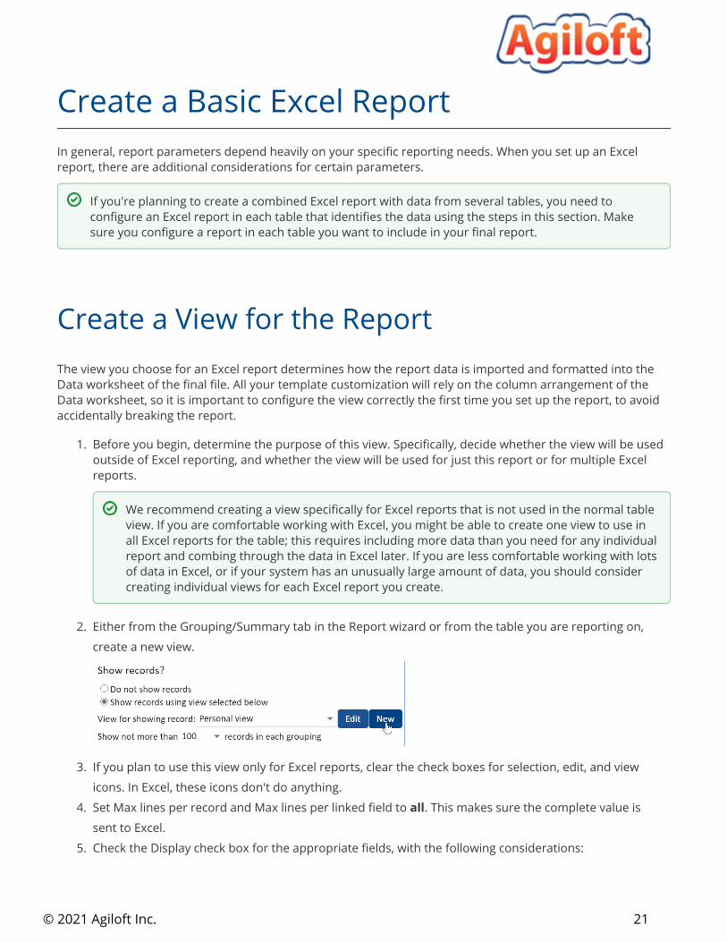
Either from the Grouping/Summary tab in the Report wizard or from the table you are reporting on, create a new view.
If you plan to use this view only for Excel reports, clear the check boxes for selection, edit, and view icons. In Excel, these icons don't do anything.Set Max lines per record and Max lines per linked field to . This makes sure the complete value is allsent to Excel.Check the Display check box for the appropriate fields, with the following considerations:
Create a Basic Excel Report
If you're planning to create a combined Excel report with data from several tables, you need to configure an Excel report in each table that identifies the data using the steps in this section. Make sure you configure a report in each table you want to include in your final report.
Create a View for the Report
We recommend creating a view specifically for Excel reports that is not used in the normal table view. If you are comfortable working with Excel, you might be able to create one view to use in all Excel reports for the table; this requires including more data than you need for any individual report and combing through the data in Excel later. If you are less comfortable working with lots of data in Excel, or if your system has an unusually large amount of data, you should consider creating individual views for each Excel report you create.
21
© 2021 Agiloft Inc.
5.
6.
7.
8.
9.
10. 11.
If you aren't sure whether you need a field, it's better to include it. You can always ignore the data in Excel, but it's difficult to add fields to the view after you create an Excel report.If you plan to use this view for other Excel reports, select every field you might need in any of those reports. If you don't select a field, your Excel reports will not receive any data for that field.Always include the ID field and, if possible, a second field with unique values, such as the summary field.
Go to the Order/Colors tab and configure the field order. This corresponds to the order of the columns in the Excel data worksheet. We recommend putting the ID field and other important fields on the left, just like you do for regular views.If you plan to use this view outside of Excel, configure row coloring or notification icons as desired. If you plan to use this view only for Excel reports, you can configure row coloring directly in Excel later.Go to the General tab and name the view. Include "DO NOT EDIT" in the name to help prevent users from accidentally editing the view and breaking the report. If you plan to use this view only for Excel reports or only for a specific Excel report, mention that in the name as well.Set the Maximum View Width to a high value, such as 900 characters. You can adjust the column width in Excel later.Set the Records Per Page to the highest value available.Go to the Apply tab and make the view visible to every group that needs to view or edit the Excel report.
With your view ready to go, set up your Excel report as desired, with the following options:
If you're using this report to create a combined report, on the General tab, make sure the report title mentions the table name. For example, you might name your report "Service Requests Data for Combined Dashboard".On the Filter tab, leave the saved search set to None. Results can be filtered using a PivotTable in Excel, so usually a saved search filter isn't necessary.On the Grouping/Summary tab, select the view you created and set a high value in Show not more than X records in each grouping, such as 100,000. This determines how many records are sent to Excel.If you aren't using this report to create a combined report, when you reach the Customize Excel tab, click Create/Download New Excel File and proceed to the section. If Customize the Excel Templateyou're using this report to create a combined report, you can skip the customized template.
Set Up the Report
22
© 2021 Agiloft Inc.
1. 2. 3.
4. 5. 6.
7.
8. 9.
10.
If you're creating a combined Excel report with data from many tables, the first step is creating individual Excel reports in each table you'll use as a data source. For example, if your combined report includes data from the Service Requests, Incidents, Problems, and Change Requests tables, you need to create an Excel report in each of those tables to identify the data set you want to use. For more guidance on creating usable Excel reports, refer to the section.Excel Report Parameters
After you create all the necessary source reports, your next step is creating a combined report that pulls from the other reports you created.
In the left pane, expand the Home section and click .Summary/combined reportsClick .NewGive your report a title and description. Make sure the description lists the tables you're using to provide source data.Select the Excel output format.Go to the Select Reports tab and click .NewIn the Combined Report wizard, select the table and then select the Excel report you created. Click
.FinishRepeat step 6 for each table and Excel report you want to include. Each one you select will create a separate Data worksheet in the Excel file.
Go to the Customize Excel tab.Click Create/Download New Excel File and proceed to the section.Customize the Excel TemplateWhen you finish your Excel template, configure the Schedule and Apply tabs as needed. For details, see
.Create and Edit Charts and Reports
After you configure the first set of report parameters, you need to create a template the system will use to generate your Excel reports. When a report is generated, your template is replicated exactly with the exception of the Data worksheet. The Data worksheet is replaced with new data from the system, pulled in using the parameters and view you configured. The rest of your template is automatically refreshed so the new data is applied.
Combined Reports
The reports are sent to the Excel template in the same order they're listed here. If you want to change the order, click and drag to move the reports.
Customize the Excel Template
This section includes tips for working in Excel, but some functionality might be slightly different depending on the version of Excel you are using. For additional help working with Excel, or for information about more advanced Excel features, refer to .Microsoft Office support
23
© 2021 Agiloft Inc.
1.
2.
3.
4. 5. 6. 7. 8.
1.
2.
3.
In the Customize Excel tab, click Create/Download New Excel File to download the report with the current parameters.If necessary, customize the column width and text wrapping on the Data worksheets to make them readable.
Do not rename Data, Data1, Data2, or similarly named worksheets. The system uses these Important: worksheet names to generate the report correctly.Add any necessary customization to create your report.
Create new worksheets for your tables, charts, and dashboards as neededCreate PivotTables and PivotCharts on the new worksheetsSet the design and colors appropriatelyArrange charts and tables to make the report easy to use
Save the file.Click Choose File and select the Excel report.Click Upload Customized Excel File.Test the report thoroughly and make adjustments as needed.When the report is next run according to the schedule, the system will take the run-time data and apply it to the new Excel report template.
This approach provides a high level of customization using advanced Excel features such as , which pivot tablesallow you to segregate a lot of different data into easy views for granular analysis. In this case, simply Agiloftprovides the report data, and the template handles all of the presentation and formatting requirements. This requires the person building the template to have familiarity with advanced Excel functions.
If you haven't worked with Excel in the past, you can use this section to learn how to make a basic Excel report using your data. Note that this section assumes you have already completed the steps in to determine Agiloftyour report parameters and specify what data to pull from the system.
Note that the steps refer to the Data worksheet, but if you are working on a combined report, you will have multiple Data worksheets that the steps apply to.
In the Customize Excel tab, click Create/Download New Excel File to download the report with the current parameters.On the Data worksheet, see how your report looks. The Data worksheet is overwritten each time the report is run, so we won't spend much time on customization here, but you can adjust the column width and turn Wrap Text on or off. For example, if your Data worksheet includes a working notes field with lots of text, you might want to turn Wrap Text on for that column to make the text readable, or turn Wrap Text off and make the column narrow if you don't intend for anyone to read the text in those fields.
Detailed Excel Customization Example
24

© 2021 Agiloft Inc.
3. 4. 5. 6.
1.
2.
3. 4.
5. 6. 7.
8. 9.
1.
2.
When you're satisfied with your Data worksheet formatting, go to > .Insert PivotTableMake sure the New Worksheet option is selected and click .OKTo keep our report tidy, double-click the Sheet1 worksheet at the bottom and rename it PivotTables.Review the PivotTable Fields list and drag some fields into the rows, columns, and values boxes. You can use the drop-down arrow to see additional analysis options for the field, and you can create nested fields by dragging additional fields on top of fields you already added. Experiment with the options until you are satisfied with your table.
Now that you've created a table, you can create slicers. Slicers make it easy to filter the data without changing the configuration of the PivotTable. Later, we'll put the slicers on the dashboard next to the corresponding PivotChart, so we can use our dashboard without looking at the PivotTable at all.
Select a cell inside the PivotTable and go to > . Slicers make it easy to filter data Analyze Insert Slicerdirectly in the PivotChart we will create from the table, without having to filter the data out of the report entirely or having to narrow your report parameters too closely. For example, you might want to be able to see the number of tickets for a specific team; with a slicer, you can switch between different teams easily, without removing any data from your report.If you added a field to the Filters box, select that field for your filter. Otherwise, choose a field such as Assigned Team or Department.Click .OKWith the slicer selected, open the Options ribbon and select a color for this filter. Use the same color for the same type of filter consistently in your report so that your report is easier to read. For example, if you set a Priority slicer to dark blue, you should use the same color for Priority slicers in other tables, and not use dark blue for any other slicers.Right-click inside the PivotTable and click .PivotTable OptionsGive the table a clear, descriptive name to differentiate it from other PivotTables you might create later.Clear the "Autofit column widths on update" check box. This prevents the column widths from changing unexpectedly when you run the report.Click .OKNow that the PivotTable is set up, select a cell in the table and open the Design ribbon. Explore the options to change the presentation of the table. For example, change the Report Layout to Tabular Form and see what changes. Play around with these settings to find the best design for your report.
With the PivotTable finalized, it's time to create a chart and build our dashboard.
Go to > . Select one of the simple charts, such as a basic bar or line graph, and click Analyze PivotChart.OK
If you've never created a PivotTable before, start by dragging the ID field into the Values box. Click the drop-down arrow in the box and select Value Field Settings, then change the selection from Sum to and click . Now, drag another field, such as Status or Priority, into the Count OKRows box. Finally, drag a third field, such as Assigned Team or Department, into the Filters box. This will give you a basic table to use for this exercise.
25
© 2021 Agiloft Inc.
2.
3. 4. 5. 6.
1. 2. 3.
4.
5.
1. 2. 3.
We want to show our chart on a dashboard, not the PivotTable worksheet. Right-click the worksheet farthest on the left and click . Click to add a worksheet, double-click the new worksheet, and Insert OK rename it Dashboard.Go back to the PivotTables worksheet. Right-click the chart and click .CutGo back to the Dashboard worksheet and the chart.Paste Cut the slicer from the PivotTables worksheet and it on the Dashboard worksheet.PasteArrange the chart and the slicer together on the page.
The dashboard is starting to come together. Now, clean up the look of the chart:
Right-click the field buttons in the upper-left corner and click .Hide All Field Buttons on ChartOpen the Design ribbon and select a default chart design.Right-click a data point on the chart and click . Open the paint bucket tab, expand Format Data Seriesthe Fill options, and select the Vary colors by point check box.Open the Design ribbon and click Add Chart Element to add or remove any chart element as needed. For example, if the axis labels and the legend show the same information, you could change the Legend element to None.Adjust the format of the chart as needed by right-clicking the element you want to change and opening the options for that element.
Finally, clean up the dashboard:
Select a cell outside the chart and slicer.Open the View ribbon and clear the Gridlines check box.Open the Home ribbon and use the paint bucket tool to fill in the background with a contrasting color, like dark gray.
Now, you have a basic Excel report with a dashboard and a worksheet for PivotTables. You can add new tables and charts to your report using the same steps as above.
If you add more than one PivotTable in the same worksheet, place the tables in a row horizontally rather than stacking them vertically. If you run the report and a lot of data is found, the tables might become much longer than you expected, and if they are placed in a column, upper tables will overwrite lower tables and break them.
Custom Summary Reports 26
© 2021 Agiloft Inc.
1.
Summary reports allow you to use data from multiple tables in an HTML report format. These reports are built with defined by users. You need to create each variable in a summary report, which makes table variablesthem a bit more time-consuming to set up than a standard chart or report.
Like standard reports, summary reports can be scheduled to run at predetermined intervals, and can be emailed or saved to a hard drive. Summary reports cannot include an attached chart.
Custom summary reports require a lot of pieces, so it is important to have a plan before you begin. Specifically, before you start to create your report, you should know:
What pieces of data you want to include on the reportWhich tables contain the data you needHow and when you want to distribute the report
It is also helpful to plan the layout and design for the report before you actually create it. Note that you will need to create your design in a WYSIWYG editor, or to code your design directly in HTML.
Now that you know what pieces of data you need for your report, you need to define them as variables in the system so you can reference them in your report. It can be helpful to keep track of each variable you create by checking them off on your plan.
For detailed information about creating table variables, see .Table Variables
You can create a custom summary report for an individual table or for multiple tables.
Create a custom summary report for:
Custom Summary Reports
If you need to report on data from multiple tables at once, but you aren't sure what format you need, consider or instead. They don't require you to create your own variables, Dashboards Excel Reportsand you can add visual, graphical representations of data without needing to code them manually in HTML. Note that you do need to create table variables if you want to use a Numeric Results dashboard widget.
Plan the Report
Create Table Variables
Create a Custom Summary Report
27
© 2021 Agiloft Inc.
1.
2. 3. 4. 5.
6.
7.
An individual table: Expand the table you want to report on and click . Click Charts/Reports New to create a new report.Multiple tables: Under Home, go to reports. Open the drop-down Summary/combined New menu and choose the option for one of the tables you plan to report on.
On the General tab, select the output format.Custom Summary ReportComplete the rest of the fields on the General tab.Click .NextSelect the editor you want to use:
HTML: This editor is a WYSIWYG editor with a formatting toolbar.Source HTML: This editor is a plain-text HTML editor that accepts more complex code, but requires knowledge of HTML.
In the editor, create the template for your report. To add the table variables you created, click Formula , locate the table variable, and click the variable name hyperlink. This adds the variable name in the Help
editor where your cursor is.When you're finished editing, complete the Scheduling tab for your report, see your finished report on the Preview tab, and click .Finish
Make sure to test your report and the table variables included in it. You might need to adjust the report formatting and variables before you distribute the report.
Because custom summary reports support HTML, there are a lot of possibilities for creative and complex formatting. Let's look at some examples.
You can create a simple, functional custom summary report in the WYSIWYG editor that shows all the information you need.
Use Cases
Create a Basic Custom Summary Report
28
© 2021 Agiloft Inc.
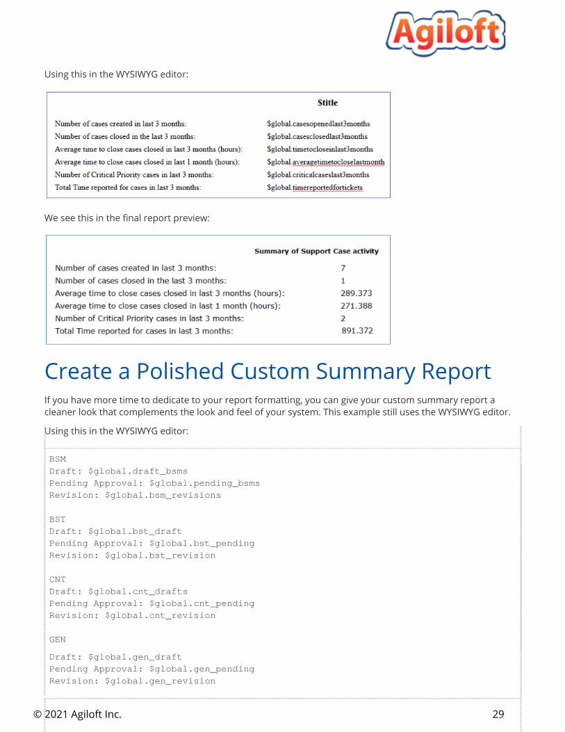
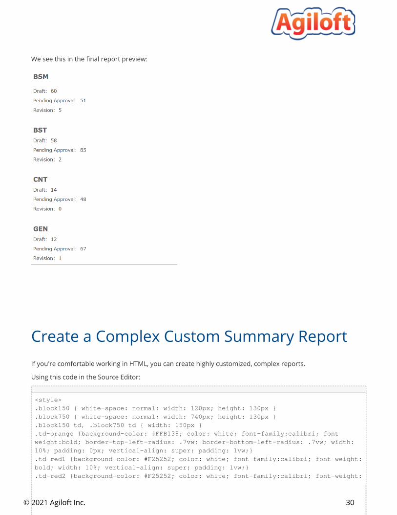
We see this in the final report preview:
If you have more time to dedicate to your report formatting, you can give your custom summary report a cleaner look that complements the look and feel of your system. This example still uses the WYSIWYG editor.
Using this in the WYSIWYG editor:
BSMDraft: $global.draft_bsmsPending Approval: $global.pending_bsmsRevision: $global.bsm_revisions
BSTDraft: $global.bst_draftPending Approval: $global.bst_pendingRevision: $global.bst_revision
CNTDraft: $global.cnt_draftsPending Approval: $global.cnt_pendingRevision: $global.cnt_revision
GEN
Create a Polished Custom Summary Report
Using this in the WYSIWYG editor:
Draft: $global.gen_draftPending Approval: $global.gen_pendingRevision: $global.gen_revision
29
© 2021 Agiloft Inc.
We see this in the final report preview:
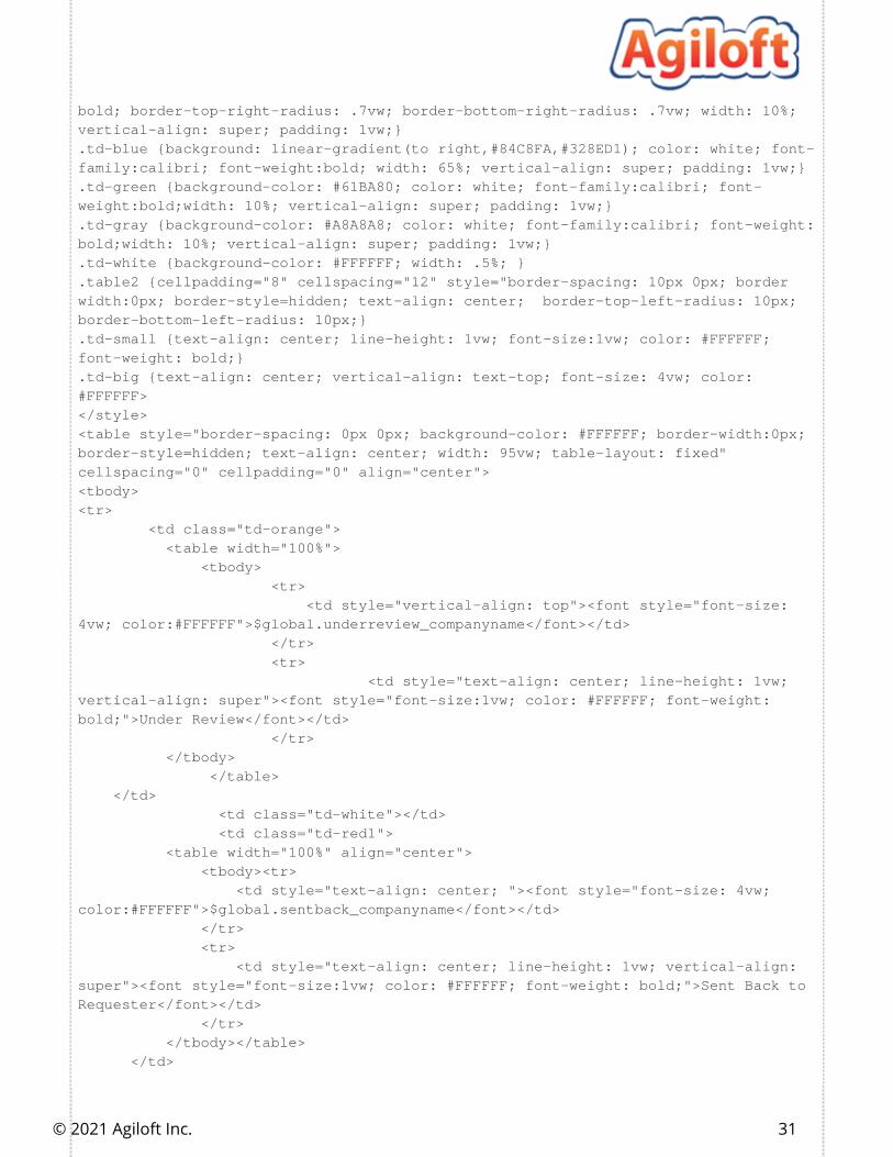
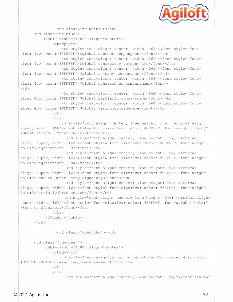
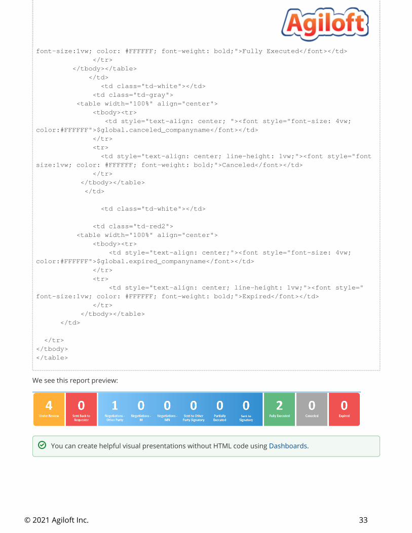
If you're comfortable working in HTML, you can create highly customized, complex reports.
Using this code in the Source Editor:
<style>.block150 { white-space: normal; width: 120px; height: 130px }.block750 { white-space: normal; width: 740px; height: 130px }.block150 td, .block750 td { width: 150px }.td-orange {background-color: #FFB138; color: white; font-family:calibri; fontweight:bold; border-top-left-radius: .7vw; border-bottom-left-radius: .7vw; width: 10%; padding: 0px; vertical-align: super; padding: 1vw;}.td-red1 {background-color: #F25252; color: white; font-family:calibri; font-weight:bold; width: 10%; vertical-align: super; padding: 1vw;}.td-red2 {background-color: #F25252; color: white; font-family:calibri; font-weight:
Create a Complex Custom Summary Report
30
© 2021 Agiloft Inc.
bold; border-top-right-radius: .7vw; border-bottom-right-radius: .7vw; width: 10%; vertical-align: super; padding: 1vw;}.td-blue {background: linear-gradient(to right,#84C8FA,#328ED1); color: white; font-family:calibri; font-weight:bold; width: 65%; vertical-align: super; padding: 1vw;}.td-green {background-color: #61BA80; color: white; font-family:calibri; font-weight:bold;width: 10%; vertical-align: super; padding: 1vw;}.td-gray {background-color: #A8A8A8; color: white; font-family:calibri; font-weight:bold;width: 10%; vertical-align: super; padding: 1vw;}.td-white {background-color: #FFFFFF; width: .5%; }.table2 {cellpadding="8" cellspacing="12" style="border-spacing: 10px 0px; borderwidth:0px; border-style=hidden; text-align: center; border-top-left-radius: 10px; border-bottom-left-radius: 10px;}.td-small {text-align: center; line-height: 1vw; font-size:1vw; color: #FFFFFF; font-weight: bold;}.td-big {text-align: center; vertical-align: text-top; font-size: 4vw; color:#FFFFFF></style><table style="border-spacing: 0px 0px; background-color: #FFFFFF; border-width:0px; border-style=hidden; text-align: center; width: 95vw; table-layout: fixed" cellspacing="0" cellpadding="0" align="center"><tbody><tr> <td class="td-orange"> <table width="100%"> <tbody> <tr> <td style="vertical-align: top"><font style="font-size: 4vw; color:#FFFFFF">$global.underreview_companyname</font></td> </tr> <tr> <td style="text-align: center; line-height: 1vw; vertical-align: super"><font style="font-size:1vw; color: #FFFFFF; font-weight: bold;">Under Review</font></td> </tr> </tbody> </table> </td> <td class="td-white"></td> <td class="td-red1"> <table width="100%" align="center"> <tbody><tr> <td style="text-align: center; "><font style="font-size: 4vw; color:#FFFFFF">$global.sentback_companyname</font></td> </tr> <tr> <td style="text-align: center; line-height: 1vw; vertical-align: super"><font style="font-size:1vw; color: #FFFFFF; font-weight: bold;">Sent Back to Requester</font></td> </tr> </tbody></table> </td>
31
© 2021 Agiloft Inc.
<td class="td-white"></td> <td class="td-blue"> <table width="100%" align="center"> <tbody><tr>
<td style="text-align: center; width: 16%"><font style="fontsize: 4vw; color:#FFFFFF">$global.sentout_companyname</font></td> <td style="text-align: center; width: 16%"><font style="font-size: 4vw; color:#FFFFFF">$global.otherparty_companyname</font></td> <td style="text-align: center; width: 16%"><font style="font-size: 4vw; color:#FFFFFF">$global.company_companyname</font></td> <td style="text-align: center; width: 16%"><font style="font-size: 4vw; color:#FFFFFF">$global.othersigner_companyname</font></td> <td style="text-align: center; width: 16%"><font style="font-size: 4vw; color:#FFFFFF">$global.partially_companyname</font></td> <td style="text-align: center; width: 16%"><font style="font-size: 4vw; color:#FFFFFF">$global.wesign_companyname</font></td> </tr> <tr> <td style="text-align: center; line-height: 1vw; vertical-align: super; width: 16%"><font style="font-size:1vw; color: #FFFFFF; font-weight: bold;">Negotiations - Other Party</font></td>
<td style="text-align: center; line-height: 1vw; verticalalign: super; width: 16%"><font style="font-size:1vw; color: #FFFFFF; font-weight: bold;">Negotiations - M</font></td>
<td style="text-align: center; line-height: 1vw; verticalalign: super; width: 16%"><font style="font-size:1vw; color: #FFFFFF; font-weight: bold;">Negotiations - MN</font></td>
<td style="text-align: center; line-height: 1vw; verticalalign: super; width: 16%"><font style="font-size:1vw; color: #FFFFFF; font-weight: bold;">Sent to Other Party Signatory</font></td>
<td style="text-align: center; line-height: 1vw; verticalalign: super; width: 16%"><font style="font-size:1vw; color: #FFFFFF; font-weight: bold;">Partially<br>Executed</font></td> <td style="text-align: center; line-height: 1vw; vertical-align: super; width: 16%"><font style="font-size:1vw; color: #FFFFFF; font-weight: bold;">Sent to Signatory</font></td> </tr> </tbody></table> </td> <td class="td-white"></td> <td class="td-green"> <table width="100%" align="center"> <tbody><tr> <td style="text-align:center"><font style="font-size: 4vw; color:#FFFFFF">$global.executed_companyname</font></td> </tr> <tr> <td style="text-align: center; line-height: 1vw;"><font style="
32
© 2021 Agiloft Inc.
font-size:1vw; color: #FFFFFF; font-weight: bold;">Fully Executed</font></td> </tr> </tbody></table> </td> <td class="td-white"></td> <td class="td-gray"> <table width="100%" align="center"> <tbody><tr> <td style="text-align: center; "><font style="font-size: 4vw; color:#FFFFFF">$global.canceled_companyname</font></td> </tr> <tr>
<td style="text-align: center; line-height: 1vw;"><font style="fontsize:1vw; color: #FFFFFF; font-weight: bold;">Canceled</font></td> </tr> </tbody></table> </td> <td class="td-white"></td> <td class="td-red2"> <table width="100%" align="center"> <tbody><tr> <td style="text-align: center;"><font style="font-size: 4vw; color:#FFFFFF">$global.expired_companyname</font></td> </tr> <tr> <td style="text-align: center; line-height: 1vw;"><font style="font-size:1vw; color: #FFFFFF; font-weight: bold;">Expired</font></td> </tr> </tbody></table> </td> </tr></tbody></table>
We see this report preview:
You can create helpful visual presentations without HTML code using .Dashboards
Chart Collections 33
© 2021 Agiloft Inc.
1. 2.
3.
A chart collection is a collection of charts and summary reports from any table that are run and displayed together on a single screen. Chart collections can include charts and summary reports from one or more tables, and even blocks of custom HTML. They can be automatically distributed via email in the same way as reports. Chart collections are a convenient way of displaying related charts and reports in a single place.
You can access Chart Collections by . With the nav bar, add the Chart Collections Using the Navigation Menuitem to one of your configured groupings. With the left pane, expand the Home section to see the Chart Collections option.
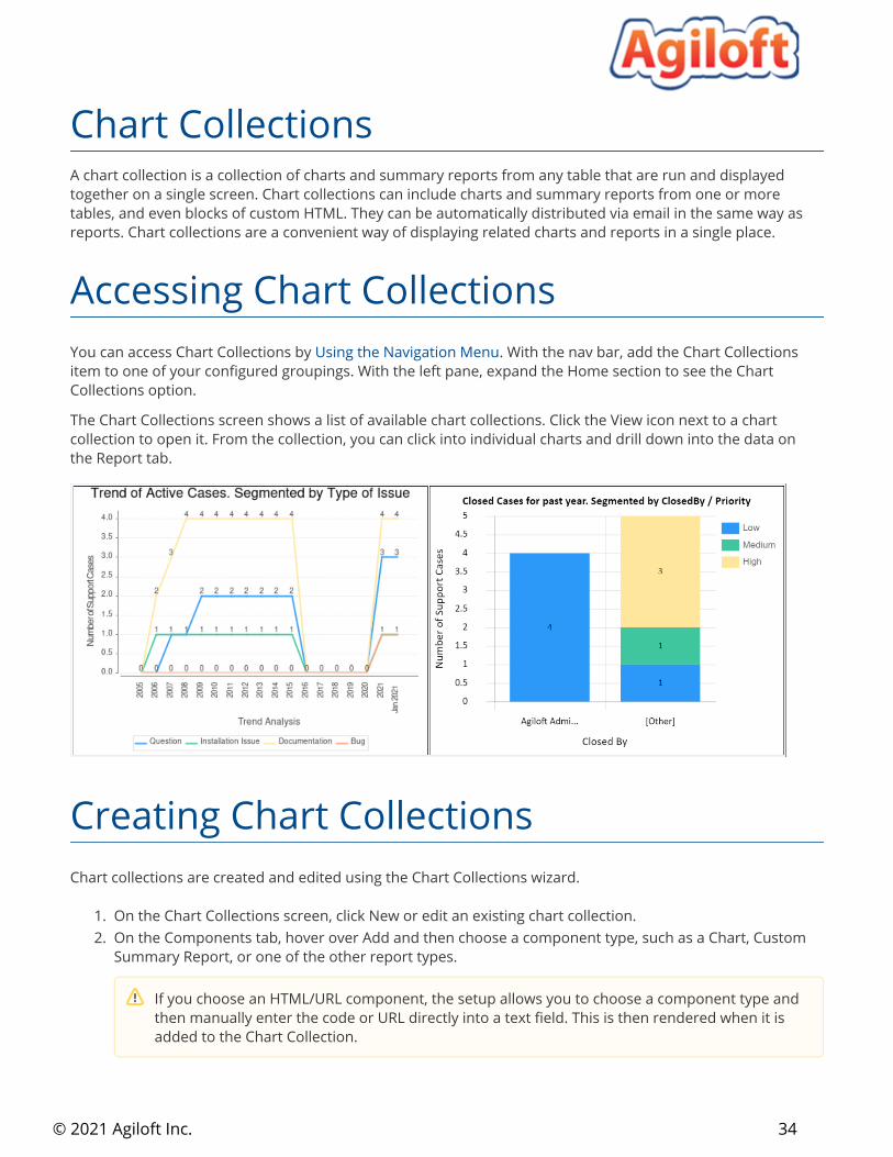
The Chart Collections screen shows a list of available chart collections. Click the View icon next to a chart collection to open it. From the collection, you can click into individual charts and drill down into the data on the Report tab.
Chart collections are created and edited using the Chart Collections wizard.
On the Chart Collections screen, click New or edit an existing chart collection.On the Components tab, hover over Add and then choose a component type, such as a Chart, Custom Summary Report, or one of the other report types.
Chart Collections
Accessing Chart Collections
Creating Chart Collections
If you choose an HTML/URL component, the setup allows you to choose a component type and then manually enter the code or URL directly into a text field. This is then rendered when it is added to the Chart Collection.
34
© 2021 Agiloft Inc.
3.
4.
5.
6.
7. 8.
9.
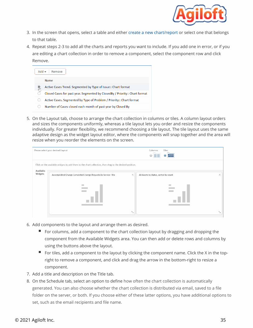
In the screen that opens, select a table and either or select one that belongs create a new chart/reportto that table. Repeat steps 2-3 to add all the charts and reports you want to include. If you add one in error, or if you are editing a chart collection in order to remove a component, select the component row and click Remove.
On the Layout tab, choose to arrange the chart collection in columns or tiles. A column layout orders and sizes the components uniformly, whereas a tile layout lets you order and resize the components individually. For greater flexibility, we recommend choosing a tile layout. The tile layout uses the same adaptive design as the widget layout editor, where the components will snap together and the area will resize when you reorder the elements on the screen.
Add components to the layout and arrange them as desired.For columns, add a component to the chart collection layout by dragging and dropping the component from the Available Widgets area. You can then add or delete rows and columns by using the buttons above the layout. For tiles, add a component to the layout by clicking the component name. Click the X in the top-right to remove a component, and click and drag the arrow in the bottom-right to resize a component.
Add a title and description on the Title tab.On the Schedule tab, select an option to define how often the chart collection is automatically generated. You can also choose whether the chart collection is distributed via email, saved to a file folder on the server, or both. If you choose either of these latter options, you have additional options to set, such as the email recipients and file name.
35
© 2021 Agiloft Inc.
9.
10.
On the Options tab, you can choose who can access the chart collection; whether to include HTML, text, and Excel reports with the collection; whether to show the report in a new window; and the default size.Click Finish to save your chart collection.
For more information, see .Reporting
36
Copyright © 2022 FDOKUMEN