Graphics as a Form of Communication
44
Graphics as a Form of Communication Thesis by Hana Louie In Partial Fulfillment of the Requirements for the Advanced Diploma of Business (Public Relations) Royal Melbourne Institute of Technology 2013 (Submitted October 16, 2013)
Transcript of Graphics as a Form of Communication
Graphics as a Form of Communication
Thesis by
Hana Louie
In Partial Fulfillment of the Requirements
for the Advanced Diploma of
Business (Public Relations)
Royal Melbourne Institute of Technology
2013
(Submitted October 16, 2013)

1
Acknowledgement
I would like to express the greatest appreciation to all participants in my thesis
research, whose kindness and support helped me finish “Graphics as a Form
of Communication” beautifully. I would especially like to thank the 34
respondents to my research survey, and also Christina Wan and Kevin Chan,
who shared their knowledge of graphic communication, and had so much
patience to assist in my research studies.
In addition, the sincerest gratitude to my lecturer and tutor Alain Grossbard,
who supported me with patience, motivation and immense knowledge, and
who also introduced me to this fascinating world of communications. I also
thank my mentor, Kenneth Shee, who advised me to use the typeface
Helvetica1 in this thesis for good luck and whose passion for typography
design has been the biggest inspiration for me to enjoy the writing of this
thesis.
1 Helvetica is a widely used sans-serif typeface developed in 1957 that has great clarity, no intrinsic meaning in its form, and could be used on a wide variety of signage.

Table of Contents
Acknowledgement ......................................................................................... 1
Abstract ........................................................................................................... 3
Introduction .................................................................................................... 4
Literature Review ........................................................................................... 5 Review 1 .................................................................................................................. 5 Review 2 .................................................................................................................. 6 Review 3 .................................................................................................................. 7 Review 4 .................................................................................................................. 8 Review 5 .................................................................................................................. 9
Methodology ................................................................................................. 10
Results .......................................................................................................... 11 Findings – Primary Research ............................................................................. 11
Survey analysis .................................................................................................. 11 Individual interviews ........................................................................................... 21 Interview analysis summary ............................................................................... 22
Findings Analysis ................................................................................................ 23 Primary Data vs. Literature Review .................................................................... 24
Discussion .................................................................................................... 25 The History of Graphic Communication ............................................................ 25 The Influence of Graphic Communication ........................................................ 27 The Dimensions of Graphic Communication .................................................... 29 The Attitude Towards Graphic Communication ............................................... 32 Limitations of Study ............................................................................................ 32
Conclusion .................................................................................................... 33
References .................................................................................................... 34
Appendices ..................................................................................................... ii
3
Abstract
In order to have a better understanding of graphics as a form of
communication in the modern day, the researcher investigated graphic
communication through primary research, literature reviews and
documentaries. Primary research included surveys, were done via online
surveying tool Survey Monkey and creditable individuals were interviewed.
From the research results it is evident that graphic communication is generally
accepted into our daily lives, and is commonly used to express personal
statements nowadays.

4
Introduction
“Graphic communication is a mark of membership, it’s a badge that says we
are a part of the modern society.”
– Neville Brody, New York Graphic Designer 2
Graphic communication, as the name suggests, is communication using
graphic components. These components include images such as drawings
and photographs, symbols, statistical graphs etc.
Graphic communication, from road signs to advertisements, is widely used in
our daily lives. For the very same reason, however, it is underestimated and
often overlooked by society.
“Graphics as a Form of Communication” reflects the researcher’s interest to
investigate a series of questions as the following:
-‐ What is the modern history of graphic communication?
-‐ How do graphics influence communication?
-‐ How do people communicate through graphics?
-‐ When do people use graphics communication?
-‐ What are the benefits of using graphic communication?
-‐ What are people’s attitudes towards graphic communication?
This research serves the purpose of understanding graphic communication in
the modern day.
2 Quote from Helvetica 2007, Documentary Film, Gary Hustwit, Swiss Dots Ltd, Switzerland.

5
Literature Review
Review 1 Edited by Michael Bierut, William Drenttel, and Steven Heller 2002. Looking Closer Four: Critical Writings on Graphic Design. First Edition. New York: Allworth Press
This book is a collection of articles by 50 professionals who specialize in
visual communication. It primarily focuses on the history of graphic
communication and how to implement critical writings into graphics to
communication information effectively.
The book is divided into five sections. Starting off with the modern history of
visual communication using graphics, the writers discuss the evolution of
visual communication from different industry’s perspectives including
advertising, business, journalism etc. The writers then talk about critical
writings in graphics, how this strengthens communication and connection. In
the final sections, the writers discuss how graphics influence communication
and talk about ethics, misleading and humanity (i.e. the difference between
“tasteless” and “tasteful” designs). The last five articles of this book discuss
people’s attitude towards visual communication including a graphic designer’s
and a receiver’s point of view.
In relation to my minor thesis, this book explains how graphics influence
communication, the history of visual communication using graphics and also
briefly talks about people’s attitude towards visual communication using
graphics. Although the articles are all personal opinions and knowledge on
visual communication, with 50 writers contributing to the book, I think the
editors have chosen a well-round range of opinions making the book not
prejudicial but instead give the reader opinions from different professions and
perspectives.

6
Review 2 Smiciklas, Mark 2012. The Power of Infographics: Using pictures to
communicate and connect with you audiences. First Edition. US: PEARSON EDUCATION, INC
This book gives an overview of the use of info-graphics (“information
graphics”). The author primarily talks about the business use of info-graphics
and focuses on basic concepts and definitions in a textbook style.
The content is divided into four sections with eleven chapters in total. The
author starts with defining info-graphics and why it is commonly used in the
business industry. In the second and third section, the author talks about
basic concepts and explains to the reader in depth with examples of mostly
graphs and diagrams taken from company publications and websites. There
are also research on how demographics influence the connection between
info-graphics and the receiver, giving solid explanation on how businesses
choose colours, fonts etc. to create the best info-graphic to communicate their
message. The author finishes the book by discussing info-graphics as an
internal and external communication tool and also gives the reader a list of
further reading suggestions.
In relation to my minor thesis, this book brings answers to why, when and how
do people use graphics as a form of communication. There are also detail
explanations on the benefits of using graphics as a form of communication.
The author is an experienced marketing strategist and is president of a
leading marketing and communication agency. Being a regular contributor to
digital and social media marketing, I think his research and opinions are
reliable and useful.

7
Review 3 Stoklossa, Uwe. Edited by Thomas Rempen 2007. ADVERTISING: New
Techniques for Visual Deduction. Second Edition. London: Thames & Hudson Ltd
This book details techniques in visual communication from an advertising
perspective. It also focuses on how graphics brings success to a company.
There are twelve chapters in this book, each representing a technique in
visual communication, for example, compositions, outlines, from eyes to
brains, etc. To discuss these techniques in depth, the author used over 200
images to explain each component in detail. These images are from
advertisements, logos, packaging etc. The author also briefly talks about the
evolution of techniques in graphic design and how the evolution influences
communication in different generations.
In relation to my minor thesis, this book provides thorough research on how
and when people communicate with graphics. The author also suggests a list
of further reading and companies that are great at using graphic
communication. I think it is great reference book with a wide range of
resources to support my research.

8
Review 4 Jason Landow, Josh Ritchie, Ross Crooks 2012. INFOGRAPHICS: The
Power of Visual Storytelling. First Edition. New Jersey: John Wiley & Sons, Inc.
This book highlight why people use info-graphics (“information graphics”) to
communicate information. The authors focus primarily on the implementation
of graphics to improve a business’ communication, and what makes a good
info-graphic.
There are ten chapters including six essential reading chapters about the
importance and efficacy of info-graphics, and the remaining four pick-and-
choose chapters are based on personal interests and relevance. In the first
chapter, the authors briefly talk about the history of info-graphics, why
companies started to implement graphics into their external communication
methods. Throughout the chapters, the authors gives us research examples
of graphics, formats, colours, patterns etc. and explains each component in
detail as to why they are suitable for different companies and messages.
Lastly in the final chapters, there are examples of best info-graphic designs
and the authors express their opinions on the future of info-graphics.
In relation to my minor thesis, this book answers as to why people use
graphics as a form of communication and what are the benefits of using
graphics as a form of communication. The authors suggest that graphics can
seek attention from people and are easy to make a lasting impression. The
three authors of this book are cofounders of a leading creative agency,
Column Five, specializing in info-graphic design and social PR. Therefore I
think their opinions are reliable and very useful.

9
Review 5 Poynor, Rick 1998. DESIGN WITHOUT BOUNDARIES: Visual
Communication in Transition. First edition. London: Booth-Clibborn Editions
This book focuses on the history of visual communication and collects articles
on visual communication written over the last ten years.
The author starts with using the first section to outline the evolution of graphic
communication and critical histories of visual communication. He also quotes
experts’ articles to support his research on the history of visual
communication. The next four sections are articles and graphic examples of
notable graphic design pieces of all times that are used to communicate
information or a message. The writer also discusses the comparison between
old media and new media techniques used to communicate effectively using
graphics. The final chapter talks about crossovers of graphics and objects,
i.e. visual communication using 3D objects.
In relation to my minor thesis, this book gives a more in depth explanation of
the history of visual communication and also has a more detailed research on
how people communicate through graphics. The author is a well-known
international reviewer of graphic communication and also a visiting professor
about art communication. His expertise in graphic communication gives me a
very reliable source of information.

10
Methodology Research methodology includes data collection of a ten-question survey and
one-on-one interviews to investigate graphic communication, specifically
towards the following research questions:
-‐ When do people use graphics as a form of communication?
-‐ Why do people use graphics as a form of communication?
-‐ What are people’s attitudes towards this form of communication?
Critical to this research investigation was the fair distribution of respondents
with and without a professional graphics-related background. The intention
was to ensure respondents had different demographic characteristics.
A ten-question survey was designed to understand the respondent’s opinions
and attitude towards graphic communication. An open survey was launched
via online surveying website, Survey Monkey. The survey sample was made
up of 34 respondents with all responses suitable for research purposes. 50%
of respondents were ensured to have a professional graphics-related
background and 50% were not.
Two interviews were conducted to have an in depth understanding of people’s
attitude towards graphic communication. Subjects were asked the exact
questions as the ten-question survey and were asked to elaborate more on
their experiences and opinions. The first subject was a psychology student in
university and the second subject was a fine arts alumnus, currently an
employee at Melbourne City Arts Centre.
Other relevant resources
Two documentary films Helvetica 2007 and Objectified 2009, both directed by
Gary Hustwit were researched to enrich the researcher’s knowledge on
graphic communication to investigate the following research questions:
-‐ What is the modern history of graphic communication?
-‐ How do graphics influence communication?

11
Results
Findings – Primary Research
Survey analysis
1) Which category below includes your age?
Answer Choices Responses
17 or younger 0
18-20 22
21-29 8
30-39 2
40-49 2
50+ 0
Total 34 Table 1
Figure 2
Participants in the survey study were aged 18 to 49, with 64% being between
18 and 22 years old.
0
22
8
2
2
0
0 5 10 15 20 25
17 or younger
18-‐20
21-‐29
30-‐39
40-‐49
50+
Which category below includes your age?

12
2) Have you ever studied any graphics related subjects/courses before? (Graphics design, engineering graphics, mathematical data
etc.)
Answer Choices Responses
Yes 50% 17
No, but I am considering to do so 9% 3
No 41% 14
Total 34 Table 2
Figure 3
Out of the 34 participants, 50% have had studied graphics-related subjects
and courses, for example graphics design, engineering, science etc.
This question is for reference that the findings in this survey are evenly
distributed between individuals with a professional graphics related
background and those who have not.
Yes 50%
No, but I am considering to do
so 9%
No 41%
Have you ever studied any graphics related subjects/courses before?

13
3) Have you ever used graphics to communicate?
Answer Choices Responses
Yes 76% 26
No, but I am interested in doing so 9% 3
No 15% 5
Total 34 Table 3
Figure 4
Participants were asked if they have ever used graphics to communicate,
76% responded yes, 15% said they have never and 9% expressed they were
interested in doing so.
This indicates that most people have used graphics to communicate, and it
can be considered a common communication method.
Yes 76%
No, but I am interested in doing so 9%
No 15%
Have you ever used graphics to communicate?

14
4) When do you think graphics are most often used as a form of communication? (May choose up to 3 answers)
Answer Choices Responses
Advertisements and promotions 82% 28
Teaching aids 29% 10
Presentations and reports 38% 13
Signs (e.g. Road signs, directions
etc.)
68% 23
Social media and blogs 47% 16 Table 4
Figure 5
Participants were asked when they thought graphics are most used as a form
of communications, each person were able to choose 3 out of 5 choices. 28
out of 34 people (82%) said advertising and promotions and 23 out of 34
people (68%) said signs, for example road signs, directions etc. 16 out of 34
people (47%) said social media and blogs, 13 out of 34 people (38%) said
presentations and reports, and lastly 10 out of 34 people (29%) said teaching
aids. Percentages do not add up to 100% because respondents could have
three choices.
28
10
13
23
16
0 5 10 15 20 25 30
Advertisements and promotions
Teaching aids
Presentations and reports
Signs (e.g. Road signs, directions etc.)
Social media and blogs
When do you think graphics are most often used as a form of communication?

15
5) What kind of graphics do you think are most used in communication?
Answer Choices Responses
Charts and tables 21% 7
Realistic drawings 3% 1
Cartoon illustrations 12% 4
Symbols 35% 12
Photographs 29% 10
Total 34 Table 5
Figure 6
When asked what kind of graphics were most used as a form of
communication, 12 out of 34 (35%) chose symbols and 10 out of 34 (29%)
chose photographs, 7 out of 34 (21%) chose charts and tables, 4 out of 34
(12%) chose cartoon illustrations and 1 person (3%) chose realistic drawings.
7
1
4
12
10
0 2 4 6 8 10 12 14
Charts and tables
Realistic drawings
Cartoon illustrations
Symbols
Photographs
What kind of graphics do you think are most used in communication?

16
6) Which industry do you think uses graphics to communicate most?
Answer Choices Responses
Business 21% 7
Education 3% 1
Advertising 65% 22
Engineering 12% 4
Government 0% 0
Total 34 Table 6
Figure 7
Subjects were asked which industry used graphic communication most, the
majority (22 out of 34 people, 65%) chose the advertising industry, 7 people
(21%) chose business, 4 people (12%) chose engineering and 1 person (3%)
chose education.
7
1
22
4
0
0 5 10 15 20 25
Business
Education
Advertising
Engineering
Government
Which industry do you think uses graphics to communicate most?

17
7) Why do you think graphics are used as a form of communication? (May choose up to 3 answers)
Answer Choices Responses
Attention getting 59% 20
Clearly defines someone or something 29% 8
Simplify information 65% 22
No language barriers 53% 18
Easy to remember 41% 14 Table 7
Figure 8
Subjects were asked why they thought graphics were used as a form of
communication, each person were able to choose 3 out of 5 choices. The
majority (22 out of 34, 65%) chose to simplify information, 20 out of 34 (59%)
chose attention getting, 18 out of 34 (53%) chose no language barriers, 14 out
of 34 (41%) chose easy to remember and lastly 10 out of 34 (29%) chose it
clearly defines something or someone.
20
8
22
18
14
0 5 10 15 20 25
Attention getting
Clearly deSines someone or something
Simplify information
No language barriers
Easy to remember
Why do you think graphics are used as a form of communication?

18
8) Which element below do you think is the most important when communicating with graphics?
Answer Choices Responses
Colour 12% 4
Symbols 9% 3
Typography 0% 0
Layout 44% 15
Message 35% 12
Total 34 Table 8
Figure 9
When asked which element were the most important in graphic
communication, 15 out of 34 (44%) chose the graphic’s layout, 12 out of 34
(35%) chose the message, 4 out of 34 (12%) chose colour and 3 out of 34
(9%) chose symbols.
4
3
0
15
12
0 2 4 6 8 10 12 14 16
Colour
Symbols
Typography
Layout
Message
Which element below do you think is the most important when communicating with graphics?
19
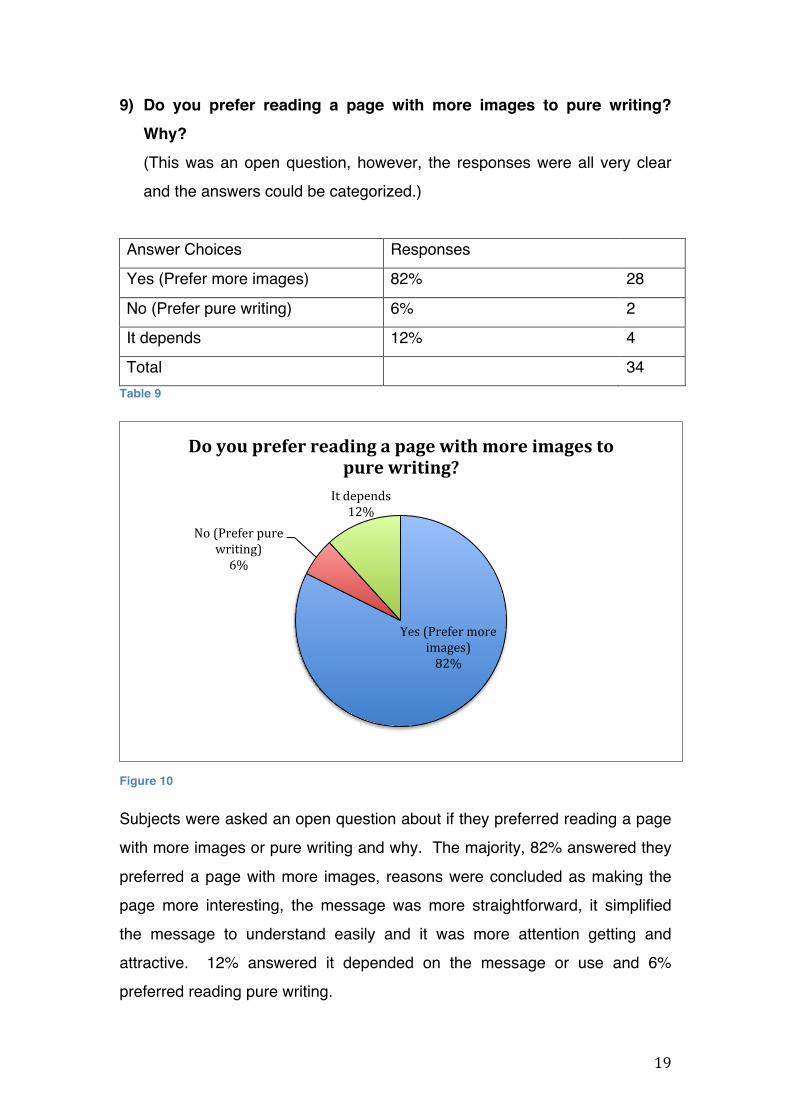
9) Do you prefer reading a page with more images to pure writing? Why?
(This was an open question, however, the responses were all very clear
and the answers could be categorized.)
Answer Choices Responses
Yes (Prefer more images) 82% 28
No (Prefer pure writing) 6% 2
It depends 12% 4
Total 34 Table 9
Figure 10
Subjects were asked an open question about if they preferred reading a page
with more images or pure writing and why. The majority, 82% answered they
preferred a page with more images, reasons were concluded as making the
page more interesting, the message was more straightforward, it simplified
the message to understand easily and it was more attention getting and
attractive. 12% answered it depended on the message or use and 6%
preferred reading pure writing.
Yes (Prefer more images) 82%
No (Prefer pure writing) 6%
It depends 12%
Do you prefer reading a page with more images to pure writing?

20
10) Overall, do you think it is effective to use graphics as a form of communication?
Answer Choices Responses
Yes 91% 31
No 9% 0
Not sure 0% 3
Total 34 Table 10
Figure 11
Lastly, subjects were asked it they thought graphics were an effective form of
communication. 91% answered yes and the remaining 9% were not sure. No
one thought it was not an effective form of communication.
91%
0% 9%
Overall, do you think it is effective to use graphics as a form of communication?
Yes No Not sure

21
Individual interviews
Subject 1 was a 19 year-old psychology student studying at Melbourne
University. The subject was asked the exact same questions as the survey
participants.
The subject had worked with a lot of scientific graphs and images at school
and uses symbols to communicate daily. Subject expressed that education
and advertising most commonly used graphics to communicate in daily lives.
For example using teaching aids at schools and seeing advertisements
everywhere, every day. The subject thought chart, numbers and symbols
were the most used form of graphic communication. When asked which
industry used graphics to communicate most, the subject once again
expressed that the education industry used graphics to communicate most
because teaching aids were always used to present graphs and data. The
subject considered graphic teaching aids as another method of learning, it is
more convenient and a way to present ideas. The subject also thought
science subjects would be the most beneficial to use graphics to teach, it is
easy to read and there are no language barriers. When asked what element
was the most important when communicating with graphics, the subject
thought the message was the most important. When asked if the subject
preferred reading a page with more images or pure writing, the subject chose
both images and writing used together because it is the best way to clearly
present an idea or communicate a message. Overall, the subject thought
graphics was an effective form of communication because it has no language
barriers and could be used internationally.
Subject 2 was a 54 year-old fine arts alumni at Australia National University,
also currently working at Melbourne Art Centre.
Having studied fine arts at university, the subject had mostly used graphics to
communicate via printmaking to express ideas in the past. On a more daily
basis, the subject would use symbols to communicate instead of writing. The

22
subject thought road signs; billboards and teaching aids were mostly used as
a form of graphic communication. The subject thought symbols and charts
were most used in graphic communication because there are no language
barriers, easy to understand and easy to get the message across. This also
led the subject to thinking the engineering industry mostly used graphics to
communicate, especially at building sites and road works. When asked which
element was the most important in graphics communication, the subject
thought colour was the most important because it catches attention most
easily. Symbols were also very important because it is easy to understand.
When asked whether the subject preferred reading a page with more images
or pure writing, the subject said it depended on whether it was serious reading
or light reading. If it were serious writing like a novel, the subject would prefer
pure writing, if it were light reading like a magazine, the subject would prefer
some images on the page. Overall, the subject thought graphics is an
effective form of communication because it is necessary in daily lives and
artists also use graphics a very bold approach to express ideas.
Interview analysis summary
In comparison, subject 1 had an insight of graphic communications more
based on statistical graphics where subject 2 discussed it on a design and
daily life level. However, both subjects thought graphic communication were
mainly used to express ideas in the modern day. Reasons can be
summarized as it is readable, understandable, and does not have language
barriers. Subject 2 also mentioned graphic communication as attention
getting, hence largely used in the advertising industry, where subject 1 also
mentioning it as attention getting, but for educational and presentation
purposes. Unlike the majority of the survey respondents, both subject 1 and 2
did not think graphics could not be used solely as a communication tool, but
rather with words together as a better form of communication.

23
Findings Analysis
The researcher successfully used the primary data results to answer the
following research questions:
1) When do people use graphics as a form of communication?
This study indicated most people immediately thought graphics are mainly
for advertising and signal purposes. However, graphics is actually a vital
part in science and engineering as well. Most science data are presented
in graphs and charts, and if you think about biology or medical subjects,
graphics are very commonly used to illustrate body parts etc. In
engineering, symbols and signs are often created to aid drivers, create
instructions and directions in our daily lives.
2) What are the benefits of using graphics as a form of communication?
Graphics are can simplify information, easily catch attention and also has
no language barriers to communicate. This could be seen in signs and
symbols used internationally, for example, toilet signs, road signs, and
transportation signs used in public places. Instead of writing directions in
multiple languages (if even), people from different countries can interpret
just one sign or symbol; even children would be able to understand the
message easily. Graphics are also attention getting, for example a
“STOP” sign on the road or a “Wet Floor” sign would catch people’s
attention to avoid danger or trouble.
3) What are people’s attitudes towards this form of communication?
Most people are positive about graphic communication, they think graphics
is an effective form of communication and they prefer reading pages with
more graphs or images. This is because graphics are interesting and
attractive, making the reader more willing to spend time understanding the
message.

24
Primary Data vs. Literature Review
In literature review #3, the author suggests graphic communication is very
attention getting and important because there are no language barriers for
advertising purposes. It is effective to communicate internationally and get
messages across.
(Reference:
Stoklossa, Uwe. Edited by Thomas Rempen 2007. ADVERTISING: New Techniques for Visual Deduction. Second Edition.
London: Thames & Hudson Ltd)
In literature review #4, the author also suggests that graphics can seek
attention and make a long-lasting impression, therefore makes an effective
form of communication. The author thinks that colour and the message
should be designed carefully to suit different industries, companies and
messages.
(Reference:
Jason Landow, Josh Ritchie, Ross Crooks 2012. INFOGRAPHICS: The
Power of Visual Storytelling. First Edition.
New Jersey: John Wiley & Sons, Inc.)
In literature review #2, the author suggests graphic communication is very
beneficial in communicating information in education and social media.
Colour and the message should be tailored carefully because it is a vital part
of communicating with graphics effectively.
(Reference:
Smiciklas, Mark 2012. The Power of Infographics: Using pictures to
communicate and connect with you audiences. First Edition. US: PEARSON EDUCATION, INC)

25
Discussion This chapter is discussed in five sections. Serving the purpose of presenting
the researcher’s findings and perspective of graphics as a form of
communication.
The History of Graphic Communication Graphic communication can be sourced back as far as 300,000 years ago,
when cavemen would paint on the walls of their cave to tell stories and record
important things. However, graphic communication really became commonly
used and acknowledged during the 1950’s. This was because the 1950’s
were an interesting period in the development of graphic design. In that post-
war period, after the horror and cataclysm of the Second World War, there
was a real feeling of idealism3 among designers, that design is part of the
need to grasp reality, to reconstruct a society, and to be more democratic.
This is the period when the early experiments of Modernism started to
rationalize. Designers felt a need to rationalize visual components that can be
implied to all kinds of contemporary information, for example sign systems
and corporate identities, and present those visual expressions of the modern
world to the public in an intelligible and readable way.
“It was simple, neutral and clear.” – Michael Bierut , graphic designer 4
Around 1965, graphic communication has become a lot more prominent, that
corporates would hire corporate identity consultants with piles of old
brochures from the last 10 years to “restore” them with modern design. It was
embracing a new era of graphic communication. At the time, graphic
communication was seemingly more assessable, transparent and
accountable, which are components what corporates and governments are 3 In ordinary use, idealism generally suggests the priority of ideals, principles, values, and goals over concrete realities. Idealists are understood to represent the world as it might or should be. In the arts, similarly, idealism affirms imagination and attempts to realize a mental conception of beauty, a standard of perfection, in opposition to aesthetic naturalism and realism. – Oxford Dictionary 4 Quote from Helvetica 2007, Documentary Film, Gary Hustwit, Swiss Dots Ltd, Switzerland.

26
supposed to be like today. The organisation did not actually have to be that
way, but they can look that way. They wanted to look clean, official and
efficient, and this is still a golden rule in graphic communication nowadays.
By the 70’s, graphic communication seemed to be conformity and repetitive.
It became routine and needed a change. The society needed to embrace
graphic communication that was fresh, alive and inspiring.
“I got fairly disappointed with modernism in general. It simply became boring.
I needed to get out of my box.” – Stefan Sagmeister, album cover designer 5
In post-modern period, which was around the 80’s, designers wanted to get
away from the orderly, clean smooth surfaces of design. Numerous projects
came out in all sorts of directions, funny or serious. The style told stories of
its making and about its process in a direct and engaging way. It also reflects
the society where people were more aware of personally identity. Designers
wanted to express their subjectivity, their own feelings about the world. They
had something to say through graphic communication, through the design
choices they make. At the same time, this change caused controversy. It
was new, expressive, subjective and irrational.
“It was like barbarians came through the gate and took over the castle.” – Rick
Poynor, writer on design, typography and visual culture 3
Designers were experimenting, and people were upset. There were rules in
visual communication that the society wanted; they wanted to be inside the
box. However, to designers, it was a creation of a new generation of graphic
communication. It was exciting and emotional.
“"Life of a designer is a life of fight. Fight against the averageness." –
Massimo Vignelli, graphic designer 6 5 Quote from Helvetica 2007, Documentary Film, Gary Hustwit, Swiss Dots Ltd, Switzerland.

27
The Influence of Graphic Communication
Graphics gives communication colour, it is a mood and atmosphere to the
reader. It is a communication tool, where messages about the world and what
we should aspire to, reaches us. Designers and even readers invest so much
of our daily surroundings in graphic communication. It invites a fully open
interpretation but could also have merely one association attached to it and
send one message. It is versatile and applicable for so many industries. A
clothing store could use graphic communication and look cheeky and
attractive; while a corporate could use it and look official and serious.
“The way something is presented, will define the way you react to it.” – Neville
Brody, graphic designer 4
You can send the same message presented in different forms of graphic
communication, and the emotional response will be very different. The choice
of visual aid, for example statistical graphs, images, symbols etc. is the prime
weapon in graphic communication. The way the message is dressed defines
the target audience’s reaction. Every person is prompted in subliminal ways,
the feeling they have when they see a particular choice of visual components
on the packaging would give you a “that’s my kind of product” feeling despite
the actual utility of the product. That, is the biggest influence graphics have
on communication.
“Don’t confuse legibility with communication.” – David Carson, typography and
graphic designer 4
A message that is readable does not mean it communicates the right thing.
Even if a message is easy to understand and catchy, readers may be
receiving a completely different message. Communication requires more
6 Quote from Helvetica 2007, Documentary Film, Gary Hustwit, Swiss Dots Ltd, Switzerland.

28
involvement of the reader. On the other hand, if a very important message is
set in a boring, non-descriptive way, then the message can be lost.
Therefore, visual aids add depth and description to a message, truly
communicating with the audience. Graphic design should not be informing
people about something, but make people want to know more about it and
think about it.
“There’s a very thin line between simple, clean and powerful; and simple,
clean and boring.” – David Carson, typography and graphic designer 7
7 Quote from Helvetica 2007, Documentary Film, Gary Hustwit, Swiss Dots Ltd, Switzerland.

29
The Dimensions of Graphic Communication
Graphic communication has a lot of approaches in the modern society. One
of those phases or approaches is communicating in a formal relationship. It is
logical and makes sense, for example a corporate logo, or statistics. The
second way to look at it is the symbolism. There are rituals around you that
make up the cultural symbolism of particular things, for example knives and
forks represent eating or food, glasses represents reading, roses represent
eternity and beauty etc. It gives guidance to designers of how the object
should look or be.
“Like a music composer, designers need to create harmony, something
sensual.” – Erwan Bouroullec, industrial designer 8
Graphic communication is actually everywhere. The best examples are often
things that people don’t think were designed at all. All objects we use are a
form of graphic communication, it was designed, there is a story embedded in
everything, it was meant to communicate to us whether to prompt us to use it
or simply conveying a message. A toilet sign, a Post-it note, a tissue, is
something we take for granted that people don’t think of it as being designed
or communicating. In fact, from the moment you wake up, everything that fills
your world, is visually communicating to you. Your coffee mug is asking you
to fill it up; the front page of the newspaper is calling you to buy it; the road
sign is telling you to take the next exit off the freeway.
“Every object tells a story, if you know how to read it.” – Henry Ford 6
Graphic communication illustrates a message. It could have personality. It
has spirit and becomes your own medium. It is like a broad palette of paint to
express all kinds of things. A lot people think graphic communication can be
studied from books. It is actually a very natural gesture; you see it day to day. 8 Quote from Objectified 2009, Documentary Film, Gary Hustwit, Swiss Dots Ltd, Switzerland.

30
“I would say it’s almost in our blood, like a mother tongue.” – Erwin Brinkers,
graphic and typography designer 9
Graphics are a balance in communication. If you have problems getting
through a train station or finding a bathroom, all those problems are being
contained or might even not exist with the help of graphic communication. It
is something you usually do not notice, but would need it very much if it were
not there. It is amazing how it has advanced in such stages in our daily lives.
“Graphic communication, intentional or not, speaks to people who looked at
it.” – Andrew Blauvelt, design curator
A lot of nationality and personality can be put into graphic communication,
more than anything you can do with words. When you own something, you
like to personalize it, even if you are just adding a sticker on it. Graphic
communication is, in the end, personal. For example in a company, when
they speak about the relationship between them and their target audience,
they are making a statement about themselves. They try to change other’s
perception, telling the public the crucial things about the company and who
they are.
“Graphic communication is something that distinguishes you.” – Rob Walker –
Author & Columnist at New York Times Magazine 10
Designers need to understand what people need, perhaps even better than
they do. A central goal in design is to create an appropriate environment
where people feel good. A designer’s job is about the future. They predict
what is going to happen, not what has already happened. Good graphic
9 Quote from Helvetica 2007, Documentary Film, Gary Hustwit, Swiss Dots Ltd, Switzerland.
10 Quote from Objectified 2009, Documentary Film, Gary Hustwit, Swiss Dots Ltd, Switzerland.

31
communication stimulates the audience’s imagination; a silent connection is
established. Graphic communication needs to be plugged into human
behavior.
“My first stereo gave me the impression of being self-contained. The
message was very strong and simple. It was very human but it was also a
leap into the future. It’s all about wanting new things, ultimately.” – Karim
Rashid – designer 11
Graphic communication should let the audience imagine and project
themselves into another space; let them imagine how it would be to live their
lives in a different way. It is a very bold approach to send a message.
“Visual communication is like a showroom at Ikea. You imagine.” – Naoto
Fukasawa, designer. 9
11 Quote from Objectified 2009, Documentary Film, Gary Hustwit, Swiss Dots Ltd, Switzerland.

32
The Attitude Towards Graphic Communication
Although designers work with a lot of different companies in a lot of different
fields, their common interest is in understanding people and what their needs
are. A good design should be innovative, honest and aesthetic. People are
usually positive about a graphic communication when they have a very clear
sense of the people that designed it and made it. The audience is often more
willing to pay attention to a message if it “looks” interesting and
understandable.
“The closer you come to it, the more you see it, and the more you appreciate
it when it’s terrific.” – Manuel Krebs, graphic designer 12
Limitations of Study
The research suffered from the quality of the composition of the sample.
There were limited demographic characteristics, most significantly, the range
of age groups of respondents. This could have affected the outcome of the
perception of graphic communication due to the generation difference.
The literatures and documentaries reviewed were more visual art and design
based, due to the limited resources, which may have narrowed down the
history and dimensions of graphic communication. The graphic
communication experts referenced from the literature reviewed and
documentaries may also have given a sole insight of graphic communication
from a visual art and designer perspective, and less from the scientific and
mathematical perspective.
12 Quote from Objectified 2009, Documentary Film, Gary Hustwit, Swiss Dots Ltd, Switzerland.

33
Conclusion
This research study conclusively provides evidence that many more people in
the society accept graphic communication nowadays. People understand it,
and they are starting to see graphic communication has an expression of their
own identity. The society is starting to care about graphic communication in a
way they care about the clothing they wear, getting a haircut or decorating an
apartment, as an expression of whom they are. Although time is always
changing, the trend is accepting the idea of identity being expressed through
graphic communication. It is developing everyday and has become part of
our daily lives. Graphic communication is not anymore promoting or
presenting ideas but also giving society an identity. Graphics as form of
communication, truly reflects a personal narrative, and tells a story to the
audience.
“The classic case of this [identity expression] in graphic communication is, the
social networking programs, such as blogs. Where you can customize your
profile, the background, put pictures in and change the typeface to anything.
And those choices, those decisions you make, become expressions of who
you are.” – Rick Poynor, writer on design, typography and visual culture 13
13 Quote from Objectified 2009, Documentary Film, Gary Hustwit, Swiss Dots Ltd, Switzerland.

34
References
i. Edited by Michael Bierut, William Drenttel, and Steven Heller 2002.
Looking Closer Four: Critical Writings on Graphic Design. First Edition.
New York: Allworth Press
ii. Smiciklas, Mark 2012. The Power of Infographics: Using pictures to
communicate and connect with you audiences. First Edition.
US: PEARSON EDUCATION, INC
iii. Stoklossa, Uwe. Edited by Thomas Rempen 2007. ADVERTISING:
New Techniques for Visual Deduction. Second Edition.
London: Thames & Hudson Ltd
iv. Jason Landow, Josh Ritchie, Ross Crooks 2012. INFOGRAPHICS:
The Power of Visual Storytelling. First Edition.
New Jersey: John Wiley & Sons, Inc.
v. Poynor, Rick 1998. DESIGN WITHOUT BOUNDARIES: Visual
Communication in Transition. First edition.
London: Booth-Clibborn Editions
vi. Helvetica 2007, Documentary Film, Gary Hustwit, Swiss Dots Ltd,
Switzerland.
vii. Objectified 2009, Documentary Film, Gary Hustwit, Swiss Dots Ltd,
Switzerland.

ii
Appendices i. Questionnaire
1. Which category below includes your age?
-‐ 17 or younger
-‐ 18-20
-‐ 21-29
-‐ 30-39
-‐ 40-49
-‐ 50+
2. Have you ever studied any graphics related subjects/courses before?
(Graphics design, engineering graphics, mathematical data etc.)
-‐ Yes
-‐ No, but I am considering to do so
-‐ No
3. Have you ever used graphics to communicate?
-‐ Yes
-‐ No but I’m interested in doing so
-‐ No
4. When do you think graphics are most often used as a form of
communication? (May choose up to 3)
-‐ Advertisements and promotions
-‐ Teaching aids
-‐ Presentations and reports
-‐ Signs (e.g. Road signs, directions etc.)
-‐ Social media and blogs

iii
5. What kind of graphics do you think are most used in communication?
-‐ Charts and tables
-‐ Realistic drawings
-‐ Cartoon illustrations
-‐ Symbols
-‐ Photographs
6. Which industry do you think uses graphics to communicate most?
-‐ Business
-‐ Education
-‐ Advertising
-‐ Engineering
-‐ Government
7. Why do you think graphics are used as a form of communication? (May
choose up to 3)
-‐ Attention getting
-‐ Clearly defines someone or something
-‐ Simplify information
-‐ No language barriers
-‐ Easy to remember
8. Which element below do you think is the most important when
communicating with graphics?
-‐ Colour
-‐ Symbols
-‐ Typography
-‐ Layout
-‐ Labels or text

iv
9. Do you prefer reading a page with more images to pure writing? Why?
10. Overall, do you think it is effective to use graphics as a form of
communication?
-‐ Yes
-‐ No
-‐ I’m not sure

v
ii. Interviews transcripts
1. Name: Kevin Chan
Occupation: Bachelor of Arts (Psychology) student at Melbourne
University
Interview:
Q: How old are you?
A: I’m 19.
Q: Have you ever studied any graphics related subjects/courses before?
A: Yes. Studying psychology means tones of graphs and images. One of my
subjects, critical thinking, also deals with a lot data.
Q: So mostly graphs and data, like mathematical and scientific graphics?
A: Yes.
Q: Have you ever used graphics to communicate? Anything other than
graphs and data?
A: Maybe labels? Some kind of icons?
Q: Icons as in symbols?
A: Yes
Q: When do you think graphics are most often used as a form of
communication? A: Education and also advertisements.
Q: Any examples?
A: Graphs used for teaching, or some data you learn at school. I think that
kind of graphics is what I see most in daily life. I mean in education and
advertisements.

vi
Q: What kind of graphics do you think are most used in communication?
A: Charts, numbers, symbols.
Q: Which industry do you think uses graphics to communicate most?
A: Still education.
Q: Any examples? Like why do you think so?
A: Because there a lot of materials for teaching, and also work from students
that are data. So I think they use graphics most.
Q: Why do think that is? Do you think there are any benefits in using graphics
in education?
A: I consider it as another method of learning. Instead of words, you can
learn with graphics. Maybe it’s more convenient, or another way to present
your ideas.
Q: Are there any particular subjects you think are best to teach with graphics?
A: Of course, maths and some kind of science subjects like physics, chemistry
or medical.
Q: Why do you think graphics are used as a form of communication?
A: It’s easier to read, no language boundaries. That’s the most important
reason.
Q: Which element below do you think is the most important when
communicating with graphics?
A: How the data is presented, how clear the message is. You would use
different kind of graphics to present a different message. For example, in
statistics, you would use a histogram or a pie chart for different types of data,
depending on what you want to emphasize on. If it were an icon of a
company, you would use a graphic that represents the important elements of
that company. And that is, I consider the most important element when
communicating with graphics - the message.

vii
Q: Do you prefer reading a page with more images to pure writing? A: I would choose both. Sometimes, only graphics could not show the
meaning of the message, or people can’t remember what was so special
about that graphic. If there were some kind of words, like a company name,
or a label under the graph, or words under a road sign, that would show the
message more clearly.
Q: So you think it is best to use them together, not separately.
A: Yes.
Q: Overall, do you think it is effective to use graphics as a form of
communication? A: Yes, it is.
Q: Why?
A: As I said before, it is simple, no language boundaries. For example, a
company brand, you could use graphics to present to the world without
necessarily a language issue.

viii
2. Name: Christina Wan
Occupation: Employee at Melbourne Art Centre, Bachelor of Fine Arts
alumni at Australia National University
Interview:
Q: How old are you?
A: I’m 54 years old.
Q: Have you ever studied any graphics related subjects/courses
before? A: Yes, I have. I studied fine arts in university.
Q: Have you ever used graphics to communicate?
A: Yes. Especially when I used to do printmaking.
Q: Anything else? Daily life-wise?
A: Yes, sometimes when I don’t bother to write, I’ll make up some symbols or
arrows to indicate what I’m trying to say.
Q: When do you think graphics are most often used as a form of
communication? A: I think road signs, billboard advertisements, charts at school like teaching
aids.
Q: What kind of graphics do you think are most used in communication? A: I suppose symbols, especially road signs because it is an international-
used thing. And maybe tables and charts for meetings that are easy to
understand and get the message across.

ix
Q: Which industry do you think uses graphics to communicate most? A: I suppose engineering if you think of all the road signs. For example,
“DANGER”, “DON’T COME NEAR”, “HIGH VOLTAGE”, etc. Especially at
building sites, they need to use signs to catch attention very quickly.
Q: Why do you think graphics are used as a form of communication? A: It’s simple to get the message; it’s attention getting and no language
barriers. Because you understand signs straight away when you are
travelling, or international driving. I think no language barriers are very
important. And kids would probably understand graphics right away better
than words.
Q: Which element below do you think is the most important when
communicating with graphics?
A: I would say colour, because first of all you have to catch attention. A lot of
people use yellow or bright colours. And symbols, very easy symbols to
understand, for example you know “no right turn” or “ no parking” straight
away.
Q: Do you prefer reading a page with more images to pure writing?
A: Not really. When you are reading, you want to “read”. But graphics or
symbols are another form of communication. I suppose writing and images
are quite different.
Q: So you think it can’t really be compared?
A: That’s right, it depends on the situation. Graphics are probably for
meetings or for easy understanding. They are for very different purposes. I
would say if I were looking for serious reading, like a “To Kill a Mockingbird”
book, I would prefer pure writing so I wouldn’t be distracted. If it were for light
reading, maybe more images wouldn’t hurt.

x
Q: Overall, do you think it is effective to use graphics as a form of communication?
A: Yes, I think so. Sometimes it’s necessary. A lot of artists also use
graphics to put out their ideas obviously. It’s a very bold approach.