GIS TSA Chapter 1
40
Chapter 1 Mapping where things are The simplest form of analysis is to show features on a map and let the viewer do the analysis in the mind’s eye. It falls on the cartographer to use various colors and symbols, and to group the data in a logical manner so that the viewer can clearly see the information being highlighted. More complex methods involve categorizing the data, and designing symbology for each category.
-
Upload
khangminh22 -
Category
Documents
-
view
5 -
download
0
Transcript of GIS TSA Chapter 1

Chapter 1
Mapping where things are
The simplest form of analysis is to show features on a map and let the viewer do the analysis in the mind’s eye. It falls on the cartographer to use various colors and symbols, and to group the data in a logical manner so that the viewer can clearly see the information being highlighted. More complex methods involve categorizing the data, and designing symbology for each category.

Chapter 1 Mapping where things are2
Tutorial 1-1
Working with categories
OBJECTIVES
Work with unique value categoriesDetermine a display strategyGroup category displaysAdd a legendSet legend parametersUse visual analysis to see geographic patterns
The most basic of maps simply show where things are without complicated analysis. These can be very useful and enhanced by symbolizing different categories. By symbolizing categories you can show both location and some characteristics of the features.
Preparation:
This tutorial uses core ArcGIS functionality.
Read through page 29 in Andy Mitchell’s The ESRI Guide to GIS Analysis, Volume 1 (ESRI Press 1999).

Mapping where things are Chapter 1 3
1-11-21-3
IntroductionIn the realm of geographic analysis, the first and most simple type is visual analysis — just view it. You can display data on a map with various colors and symbology that will enable the viewer to begin to see geographic patterns. But deciding what aspects of the map features to highlight can take some thought.
It may be as important to map where things are not located as it is to map where they are. Visual analysis allows you to see the groupings of features, as well as areas where features are not grouped. All this takes place in the viewer’s mind, since visual analysis doesn’t quantify the results. In other words, display the data with good cartographic principles and the viewer will determine what, if any, geographic patterns might exist. Viewers aren’t explicitly given an answer, but they can determine one on their own.
You can aid in the process by determining the best way to display the data, but that will depend on the audience. If the audience is unfamiliar with the type of data being shown, or the area of interest on the map, more reference information about the data may need to be included. You may also want to simplify the way the data is represented or use a subset of the data to make the information more easily understood by a novice audience. Conversely, you may make the data very detailed and specific if the audience is technically savvy and familiar with the data.
In making the map, you will decide what features to display and how to symbolize them. Sometimes just simply showing where features are using the same symbol will be enough. For example, seeing where all the stores are in an area might give you an idea of where the shop-ping district is. All you really want to know is where stores are, and not concern yourself with the type of store.
A more complex method of displaying the data is by using categories, or symbolizing each feature by an attribute value in the data. This also requires a more complex dataset. Your dataset will need a field into which you will store a value describing the feature’s type or cat-egory. A dataset of store locations may also have a field storing the type of store represented: clothing, convenience, auto repair, supermarket, fast food, etc.
For other instances, you may want to see only a subset of the data. These may still be shown with a single symbol, but show only one value of a field. It might be fine to see where all crimes are occurring, but the auto-theft task force may only want to see the places where cars have been stolen. The additional data will just confuse the map and possibly obscure a geographic pattern.
When making the map, you can use this “type” or “category” field to assign a different symbol to each value. Perhaps you can symbolize clothing stores with a picture of a clothes hanger, or a supermarket with a picture of a shopping cart. This still doesn’t involve any geographic pro-cessing of the data; we’re merely showing the feature’s location and symbolizing it by a type. The analysis is still taking place in the viewer’s mind.

Chapter 1 Mapping where things are4
Scenario
You are the GIS manager for a city of 60,000 in Texas, and the city planner is asking for a map showing zoning. The target audience is the city council, and each member is very famil-iar with the zoning categories and the types of projects that may be built in each area. Council members will frequently refer to this map to see in which zoning category a proposed project may fall, and what effect that project may have on adjacent property. For example, a proposed concrete mixing plant would only be allowed in an industrial district, and would adversely affect residential property if it were allowed to be adjacent.
Since you will have a technically savvy audience, you can use a lot of categories and not worry about the map being too confusing or hard to read. The city planner asks you to use colors that correspond to a standard convention used for zoning. Later, you’ll work with setting categories and symbology.
Data
The first layer is a zoning dataset, with a polygon representing every zoning case ever heard by the city council. An existing field carries a code representing the zoning category assigned to each area. This was already set as the “value field” to define the symbology, so you will only deal with how the categories are shown. This data was created by the city, and a list of the zoning codes and what they mean, called a data dictionary, is provided later in the chap-ter. You also may find similar datasets from other sources with zoning classifications, and it is important to get their data dictionaries as well.

Mapping where things are Chapter 1 5
1-11-21-3
Start ArcMap and open a map document1 From the Windows taskbar, click Start, All Programs, ArcGIS, ArcMap.
Depending on how ArcGIS and ArcMap have been installed, or which Windows operating system you are using, there may be a slightly different navigation menu from which to open ArcMap. You may also have an ArcMap icon on your desktop, which, when double-clicked, will start ArcMap.
2 In the resulting ArcMap window, click the An existing map radio button and click OK.

Chapter 1 Mapping where things are6
3 Browse to the drive on which the tutorial data has been installed (e.g., C:\ESRIPress\GISAnalysis \Maps), click Tutorial 1-1.mxd and click Open.
The data shown is zoning categories, each colored differently. The city planner, for whom you are doing this work, uses this map to visually determine the zoning classification of property.
Mapping where things are Chapter 1 7
1-11-21-3
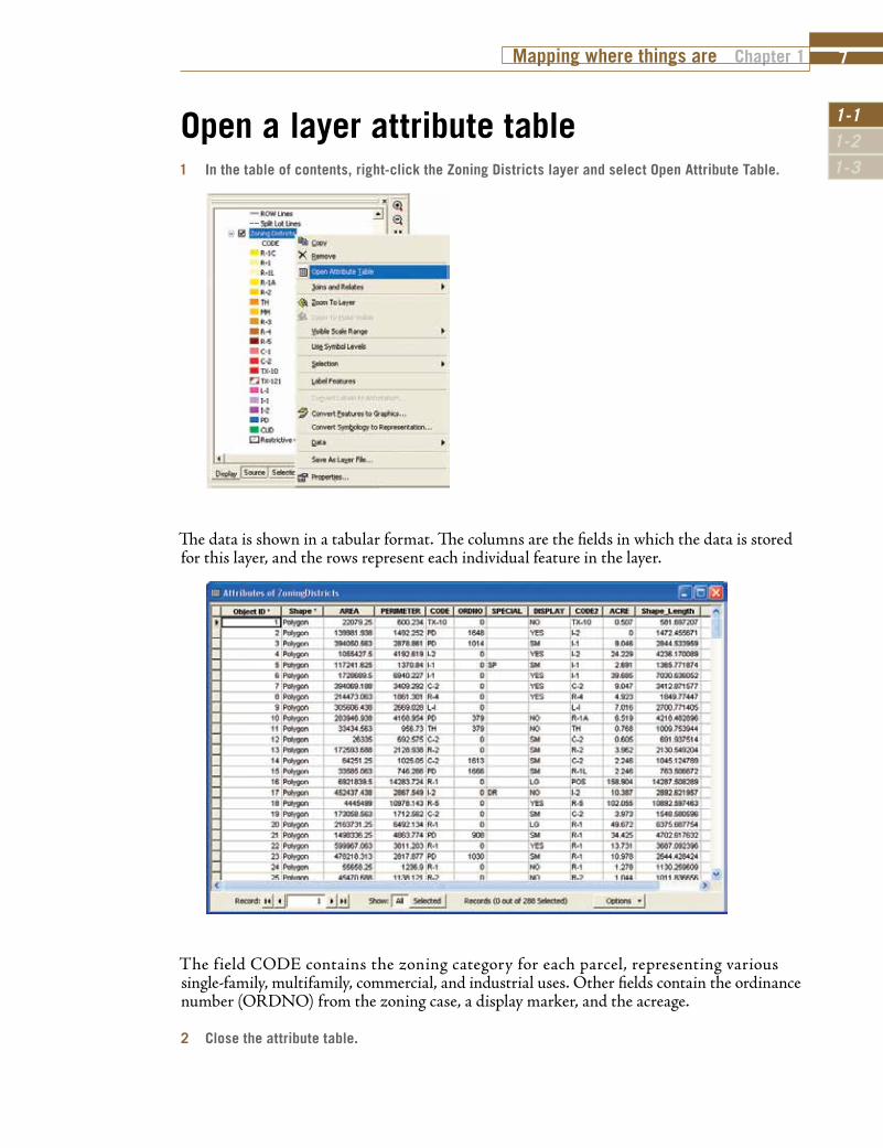
Open a layer attribute table1 In the table of contents, right-click the Zoning Districts layer and select Open Attribute Table.
The data is shown in a tabular format. The columns are the fields in which the data is stored for this layer, and the rows represent each individual feature in the layer.
The field CODE contains the zoning category for each parcel, representing various single-family, multifamily, commercial, and industrial uses. Other fields contain the ordinance number (ORDNO) from the zoning case, a display marker, and the acreage.
2 Close the attribute table.

Chapter 1 Mapping where things are8
Change a category labelThe layer came with the code values displayed for each category. While this may be fine for someone who works with these codes every day and recognizes the underlying meaning, someone not familiar with them will want a more descriptive label. These can be changed in the symbol properties of the layer.
1 In the table of contents, right-click the Zoning Districts layer and click Properties.
2 Click the Symbology tab.
Note that the Categories selection is set to Unique values, and the Value Field is set to CODE. This means that every unique value of the field CODE will be represented in the legend.
To a city planner or someone experienced with zoning districts, these codes would tell the whole story. But for the layperson, they can be difficult to interpret. You will change them to match the simplified list provided by the city planner.

Mapping where things are Chapter 1 9
1-11-21-3
3 Click the R-1C entry under the Label column and type in a new description: Single Family Custom Dwellings.
4 Click OK to close the dialog box.
The text you typed in the Label column is what will be shown in the legend.
Change all the labels to match the list below. Note: You can change the width of the column headers Value and Label by dragging the vertical dividers over to reveal the entire category description.
R-1 .................Single Family Detached Dwellings R-1L ...............Single Family Limited Dwellings R-1A ..............Single Family Attached Dwellings R-1C ...............Single Family Custom Dwellings R-2 ................Duplex Dwellings TH ..................Townhouses MH ................Mobile Homes R-3 ................Multi-Family Dwellings 16 Units/Acre R-4 ................Multi-Family Dwellings 20 Units/Acre R-5 ................Multi-Family Dwellings 25 Units/Acre C-1 .................Neighborhood Business District C-2 ................Community Business District TX-10 .............Texas Highway 10 Business District TX-121 ...........Texas Highway 121 Business District L-I ..................Limited Industrial District I-1 ..................Light Industrial District I-2 ..................Heavy Industrial District PD .................Planned Development CUD ...............Community Unit Development
When all the descriptions are entered, click Apply, but do not close the Layer Properties dialog box.

Chapter 1 Mapping where things are10
All of the descriptions are in, but they are not in the order that the city planner would like. These can be moved in the list to appear in the same order as the list above.
5 Highlight the value R-1A, then click the up arrow to move it above R-1C in the list.
6 Click OK to close the Layer Properties dialog box.
Once you have moved the values into the correct order, your table of contents should look like this:
This zoning layer is used a lot in city maps, so it would be a good idea to save all this work to be used again in the future. This can be done by creating a layer file (layer file names end in
“.lyr”). A layer file will save all the symbology setting for a layer, but does not save any of the data. This is useful when a dataset such as zoning needs to be symbolized in several different ways to match different audiences, but you would not want to save the dataset several times.

Mapping where things are Chapter 1 11
1-11-21-3
This would lead to a problem in updating the data if you had to make updates in several files and worry about keeping them all current. With a layer file, you maintain one dataset along with several ways that the dataset can be symbolized.
7 Right-click the Zoning Districts layer and select Save As Layer File. Save the file as DetailedZoning.lyr in your \GISAnalysis\MyExercises folder.
The next time you want to use the zoning data, don’t add the feature class or shapefile; add the layer file and the data will be added already symbolized.

Chapter 1 Mapping where things are12
Add a legend to your map layoutNow that you’ve set everything just right, you can add a legend to the map layout. In fact, even if everything is not exactly how you like, or if the city planner changes his mind later, any changes you make to the table of contents will automatically be reflected in the legend.
1 On the Main Menu toolbar, click Insert, then click Legend.
2 In the Legend Wizard, highlight the Lot Boundaries layer in the Legend Items column, and click the “<” button.
This will remove the Lot Boundaries layer from the legend.

Mapping where things are Chapter 1 13
1-11-21-3
3 Set the number of columns in the legend to 2 and click Next.
4 Change the Legend Title to City of Oleander. Click the color drop-down menu and change the font color to Lapis Lazuli. Click Next.

Chapter 1 Mapping where things are14
5 Click in the Background color box and select Grey 10% from the drop-down menu. Click Next. Complete the legend with the remaining default values by clicking Next and Finish.
The legend is complete and has been added to the map. However, it’s a little bit too large and not in the right place. You will use the Select Elements tool to resize and move it.
When a graphic element is selected, cyan boxes appear at the corners of the element. By clicking these with the Select Elements tool, the element can be altered. On your map, there is a spe-cific spot for the legend, so you are going to place it with page coordinates and a set frame size in the legend’s properties dialog box.
6 With the Select Elements tool active, right-click the legend and select Properties. Click the Size and Position tab.
7 Enter the new X and Y values for the Position and the new Width and Height values for Size as shown in the graphic below, then click Apply and OK.

Mapping where things are Chapter 1 15
1-11-21-3
Your completed map should look like the one below. This type of map, showing “where things are,” allows viewers to do the recognition and analysis of items in their own mind’s eye. You aren’t identifying every feature on the map; you are only giving users a color reference they can use to identify features. Likewise, you aren’t pointing out any spatial relationships between the data, but letting viewers perform some visual analysis to draw their own conclusions.
8 Save your map document as \GISAnalysis\MyExercises\Tutorial 1-1.mxd. If you are not continuing on to the exercise, exit ArcMap.

Chapter 1 Mapping where things are16
Exercise 1-1 The first tutorial showed how to use categories to help the map viewer determine the zoning for a piece of property. The user looks at the property on the map, notes the color, then matches that color in the legend to determine the associated zoning code. You also helped the viewer better understand zoning codes by providing a text translation of the otherwise cryptic values.
In this exercise, you will repeat the process using land-use codes, which show how property is currently being used as opposed to zoning codes, which show the future use of land. These are also somewhat cryptic, so you will change the labels to reflect a textual description. You will also add the legend to the map layout, then resize and move the legend to an appropriate place on the map.
• Continue with the map document you created in this tutorial, or open Tutorial 1-1.mxd from the \GISAnalysis\Maps folder.
• Turn off the Zoning Districts layer.• Add the layer file LandUseCodes.lyr from the \GISAnalysis\Data folder. • Change the labels for the Land Use values to match the ones below:
A1 ..................Single Family Detached A2 ..................Mobile Homes A3 ..................Condominiums A4 ..................Townhomes A5 ..................Single Family Detached Limited AFAC ..............Airport Facilities APR ................Airport Private Land AROW ............Airport ROW B1 ..................Multi-Family B2 ..................Duplex B3 ..................Triplex B4 ..................Quadruplex B5 ..................High Density Multi-Family CITY ...............City Property CITYV .............Vacant City Property CITYW ............City Water Utilities Property CRH ...............Church ESMT .............Easement F1 ..................Commercial F2 .................. Industrial GOV ...............Government (State or Federal) POS ................Public Open Space PRK ................Park PROW ............Private Right Of Way ROW...............Right Of Way SCH ...............School UNK ...............Unclassified UTIL ...............Utilities VAC ................Vacant
• Make any necessary changes to the legend for it to display all the values. • Create a layer file for the new symbology.• Save the results as \GISAnalysis\MyExercises\Exercise 1-1.mxd.

Mapping where things are Chapter 1 17
1-11-21-3
What to turn inIf you are working in a classroom setting with an instructor, you may be required to submit the maps you created in Tutorial 1-1.
Turn in a printed map or screen capture image of the following:
Tutorial 1-1.mxd
Exercise 1-1.mxd
Tutorial 1-1 reviewYou determined that your audience was very familiar with the data being used and decided to make a detailed map of zoning and land use. Next, you checked the attribute table to see which field might contain zoning or land-use data. Since this existed, you were able to use it to set the symbology.
The codes were rather cryptic, even for your expert audience, so you changed the display labels in the symbology tab to have both the code and a text description of each category. This will help remind the viewer what each code represents.
Finally, you added a legend to the map to display the zoning or land-use codes and make the map more complete.
Study questions 1. Select a piece of property on the map. Can you determine the adjacent zoning category? 2. The city council has been asked to approve a dry-cleaning plant in the Highway 10 business
district, but members want to make sure that it is adjacent to other commercial uses and not residential. Can you find a place where this district has residential zoning adjacent to it? How about commercial zoning adjacent to it?

Chapter 1 Mapping where things are18
Other examplesEach street in a centerline feature class may have a field with a code representing its status in the thoroughfare plan. You could symbolize the streets with different line thicknesses according to the codes: thick line for Freeways, medium line for Major Collectors, and thin line for Residential Streets. A quick look at the map would let you determine a fast route based on the amount of traffic a street is designed to handle. You may also do this with speed limit and get a similar result.
A forester may symbolize harvestable tree stands by their age. A darker symbol might be stands ready for harvesting, while a lighter color may be immature trees. A quick view of the map may show where to concentrate logging efforts to minimize the movement of equipment and impact on surrounding areas.
A dataset of all the counties in the United States may have a field representing the political leaning of each county, whether they are Democrats, Republicans, Green Party, Independents, and so on. A candidate for national office may symbolize the map according to these categories to determine friendly areas for fundraising, and unfriendly areas for political conversions.
In the previous tutorial, you worked with all the values of a given category field. These were very specific codes that the experts use, but sometimes either for clarity or the ease of use in an analysis project, you want to display only some of the categories.

Mapping where things are Chapter 1 19
1-11-21-3
Preparation:
This tutorial uses core ArcGIS functionality.
Read pages 30–36 in The ESRI Guide to GIS Analysis, Volume 1.
Tutorial 1-2
Controlling which values are displayed
OBJECTIVES
Group similar categories in a legend Hide categories
Add custom categories

Chapter 1 Mapping where things are20
IntroductionIn the previous exercise, your audience was a technically savvy group that was very familiar with the data. Displaying a long list of zoning or land-use codes was appropriate for them because it allowed them to do the detailed visual analysis required. This isn’t always the case, and quite often it may be necessary to simplify the display of the data to fit the audience.
There are two ways to accomplish data simplification. One is to use one of the generalization tools that will physically change, or dissolve, the data to a simpler structure by removing ver-tices in lines and polygons. This creates a copy of the data in a more simplified form, but also adds to your data-maintenance chores. Any edits of the data will need to be made on both datasets, or perhaps you can delete the simplified data, do your edits, and create the simplified dataset again.
Another method is to control the simplification of the data in the way it is displayed. By grouping values together, you can create the same look as a dissolved dataset without creat-ing a copy of your dataset. This method works well for visual analysis since all analysis takes place in the viewer’s mind based on what they see. For more complex analysis types that aim to quantify the results, the dissolve methods are preferred because additional processing may be done to the dissolved dataset that cannot be done to the entire dataset.
Scenario
The maps you made in the first part of this tutorial were a big success with the city council and the city planner. These have caught the eye of the development director, who will be trav-eling to a developers conference to promote the city. He would like to show the zoning map to potential developers, but would like the data simplified to something easier to grasp in a quick overview of the map. Developers will quickly scan the map looking for the type of zoning favorable to their business, and only if they see what they like will they stop to talk details. You need to produce the zoning map again, but this time using general categories.
Data
You are going to use the same datasets as in Tutorial 1-1. One change has been made in how the data is symbolized. In the previous tutorial, you used a code that included two special zoning districts that are an “a la carte”-style zoning. This zoning style allows developers to define housing density and other special features of their projects to create a custom zoning category prior to obtaining city council approval. For this tutorial, you will use the “translated zoning,” which will generalize the specialzoning districts into the closest categorical zoning classification. This is stored in the field CODE2.

Mapping where things are Chapter 1 21
1-11-21-3
Change category labels1 In ArcMap, open Tutorial 1-2.mxd from the location at which the tutorial data has been installed
(e.g., C:\ESRIPress\GISAnalysis\Maps).
The map looks similar to the one you finished in the last exercise.
Now you will revise the map for the development director and group all the zoning codes into four categories: Single Family Residential, Multi-Family Residential, Commercial, and Industrial. By doing this, you will make the map suitable for a general audience that can get a quick overview of the city’s zoning at a glance without detailed study. Rather than doing this with a dissolve function, you will change the symbology of the layer to match the grouping. It is important to note that you are not changing the underlying data in any way, only changing how it is symbolized.

Chapter 1 Mapping where things are22
2 In the table of contents, right-click the Zoning Districts layer and click Properties.
3 Click the Symbology tab.
As before, all of the values of the field CODE are displayed and symbolized. You want to create a simple category called “Single Family”. This will include these codes: R-1C, R-1, R-1L, R-1A, R-2, TH, and MH.
4 Click R-1C, then hold the Shift key and click MH. All of the single-family zoning categories shown above will be highlighted. Right-click anywhere on the highlighted categories and click Group Values.
All of the selected values will now be shown with a single symbol. The label becomes all the labels of the grouped values strung together, which is not desirable. Next, you will change that to a simple description.

Mapping where things are Chapter 1 23
1-11-21-3
5 Click the label for the grouped values and type Single Family Residential.
6 Click Apply and OK to close the dialog box.
By default, the color of the first value in the group is used for the combined values. Since single-family residential is typically shown in yellow, you can leave this alone.
When you are done, the table of contents should look like this:
7 Create a layer file of the new symbology. Right-click the Zoning Districts layer, select Save As Layer File. Save it in the \MyExercises folder and call it Grouped Zoning.lyr.
The legend reflects the changes, but looks a little strange. You set the legend to have two columns when there were lots of values to show, but the simplified legend doesn’t require two columns.
As you did with the Single Family Residential, create group symbols for the following code values:
Group R-3, R-4, and R-5, and change the label to Multi-Family Residential.
Group C-1, C-2, TX-10, and TX-121, and change the label to Commercial.
Group L-I, I-1, and I-2, and change the label to Industrial.

Chapter 1 Mapping where things are24
Modify the legend1 In the layout, right-click the legend and click Properties.
2 Go to the Items tab and change the number of columns to 1, then click OK.
The legend will display the grouped symbology along with your updated labels in a single column. This should be simple enough for the novice audience to understand.
3 Take a look at the map, which now looks very different from the more detailed version earlier. If you want to zoom into the layout so you can see the legend better, use the Zoom In button on the Layout toolbar. Use the Zoom Whole Page button on the Layout toolbar to return the map to the original view.
4 Save your map document as \GISAnalysis\MyExercises\Tutorial 1-2.mxd. If you are not continuing on to the exercise, exit ArcMap.

Mapping where things are Chapter 1 25
1-11-21-3
Exercise 1-2 The previous exercise demonstrated how to simplify the look of your map by grouping symbol values.
In this exercise, you will repeat the process using land-use codes. These are also somewhat cryptic, so you will change the labels to reflect a textual description. You will also add the legend to the map layout, resize, and locate the legend in an appropriate place on the map.
• Continue with the map document you created in this tutorial, or open Tutorial 1-2.mxd from the \GISAnalysis\Maps folder.
• Turn off the Zoning Districts layer• Add the layer file LandUseCodes.lyr from the \GISAnalysis\Data folder.• Group some of the land-use values together and update the labels to match the definitions below.
For values that are not adjacent to each other in the list, select the first one and hold the control key (Ctrl) down while selecting the others.
A1, A2, A3, A4, A5 ................ Single Family Residential B1, B2, B3, B4, B5 ................ Multi-Family Residential F1 ......................................... Commercial ESMT, F2, UNK, UTIL ............ Industrial POS, PRK .............................. Parks CITY, CITYV, CITYW, GOV ...... Government AROW, PROW, ROW .............. Right of Way AFAC, APR ............................ D/FW International Airport CRH ...................................... Church SCH ...................................... School VAC ....................................... Vacant
• Make any necessary changes to the legend for it to display all the values.• Create a layer file from the new symbology.• Save the results as \GISAnalysis\MyExercises\Exercise 1-2.mxd.
What to turn in If you are working in a classroom setting with an instructor, you may be required to submit the maps you created in Tutorial 1-2.
Turn in a printed map or screen capture image of the following:
Tutorial 1-2.mxd
Exercise 1-2.mxd

Chapter 1 Mapping where things are26
Tutorial 1-2 reviewThis time, your intended audience was not familiar with all the nuances of zoning and land use, so you simplified the display of the map. You could have simplified the data, if more analysis steps were required. However, since you are only doing visual analysis, grouping the symbology will produce the required map without altering the data.
The simplified legend looks cleaner and clearer than the more complex legend, and you had to change how that was displayed. A simple legend with five values was suitable for your audience.
Study questions1. Take a look at the map and count how many different zoning categories you can identify. How
complex a question could you answer with this level of data?2. A developer is looking for a commercial corridor in which to locate a business. Can you get a
general idea of where the developer should start looking? 3. The city council is reviewing an ordinance to require special fencing between light-industrial
and heavy-industrial zones. Is this map suitable for that purpose? Why or why not?
Other examplesPolice department data may include up to eight categories of burglaries. While this is great for a detailed study, the map produced for the general public might group all of these into one category.
The Dallas Area Rapid Transit produces detailed maps for each bus route, but when producing a systemwide map, it groups all bus routes into one symbol. Similarly, it groups all train routes into one symbol, and all light rail lines into one symbol. This simplified map reads very well on a regional scale, although it may only answer general questions and not guide you to a specific bus or train.
Mapping where things are Chapter 1 27
1-11-21-3
Legends are the key to how the person creating a map wants the viewer to interpret it. Sometimes all the data is shown in a complex form, and sometimes the data is simplified but still shows the entire dataset. It may also be necessary to display only a subset of the data in order to have the map convey the desired message.
Preparation:
This tutorial uses core ArcGIS functionality.
Tutorial 1-3
Limiting values to display
OBJECTIVES
Add only specific values to the legendWork with legend properties Work with definition queries

Chapter 1 Mapping where things are28
IntroductionYou’ve seen how to group a number of values together to simplify the way data is displayed on a map, but there may be other times when groups of values do not need to be shown at all. In other words, you may want to remove some of the values from ever showing on the map. Perhaps you want to show only auto-related crime and disregard all other types of crime, or maybe show only major roads and not show local and residential streets. In this tutorial, you will look at ways of restricting which data is symbolized on your maps.
Scenario
The city planner has looked at the maps you produced earlier and was quite impressed. Now he has another idea for more maps that you could do. He wants you to take the zoning map, but only display the single-family zoning categories to produce an inventory of residential zoning. This means that you need to remove all other types of zoning from the map and display only the requested values.
Data
You are going to use the same datasets as in Tutorial 1-1, but this time the datasets will not have a symbology schema already set. You will need to set the symbology value field to CODE and manually define what values to show.

Mapping where things are Chapter 1 29
1-11-21-3
Set symbol values 1 In ArcMap, open Tutorial 1-3.mxd from the \GISAnalysis\Maps folder.
This time, the map has no symbology set. You’ll need to set up controls that will display only the data meeting the request that’s been made.
The residential zoning inventory requires that you only display the following values:
R-1, R-1A, R-1L, R-2, TH, MH
These represent the single-family zoning types. The first method you are going to use will be to add only these values to the symbology editor.
2 In the table of contents, right-click the Zoning Districts layer and click Properties.
3 Click the Symbology tab. In the Show box, click Categories, and then click Unique values.
You need to set the Value Field to the attribute field that contains the zoning classifications. You know from the previous tutorial that it is the CODE field.

Chapter 1 Mapping where things are30
4 Click the Value Field drop-down list and choose CODE.
5 Click the Add Values button.
Note: the Add All Values button will add each unique occurrence of the Value Field to the legend, while the Add Values button will allow you to select specific field values.
6 From the pick list, highlight the desired single-family residential codes (listed on previous page). Hold the Control key to select multiple values. If you don’t see a value, click the Complete List button to refresh the list. When you have the right codes selected, click OK.

Mapping where things are Chapter 1 31
1-11-21-3
The symbology editor will now show only the selected values. If you missed one, click Add Values again and select it.
7 As in the previous tutorials, change the labels to contain a description of the zoning categories. (Refer to the following image for the label names.) Also, uncheck the <all other values> option to prevent the unselected values from being displayed.
Next, you will want to deal with the color choices.
Chapter 1 Mapping where things are32
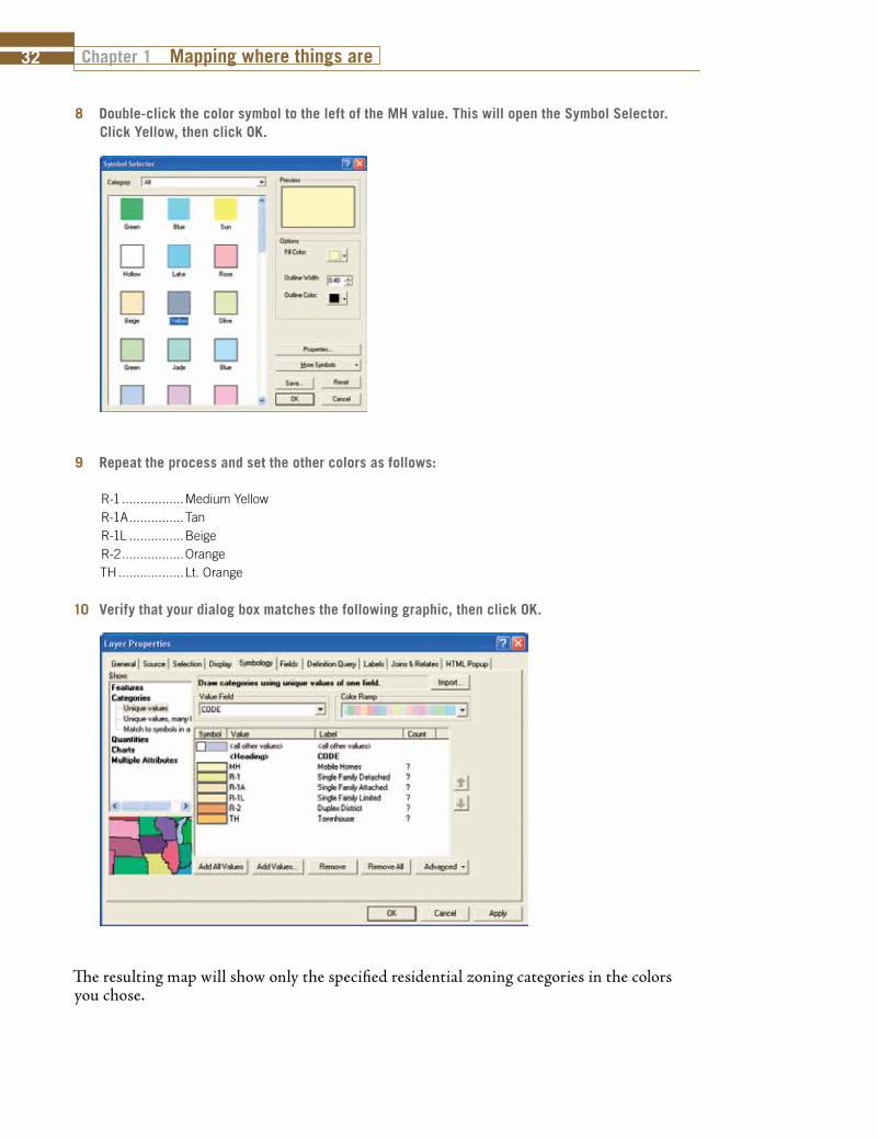
8 Double-click the color symbol to the left of the MH value. This will open the Symbol Selector. Click Yellow, then click OK.
9 Repeat the process and set the other colors as follows:
R-1 .................Medium YellowR-1A ...............TanR-1L ...............BeigeR-2 .................OrangeTH ..................Lt. Orange
10 Verify that your dialog box matches the following graphic, then click OK.
The resulting map will show only the specified residential zoning categories in the colors you chose.

Mapping where things are Chapter 1 33
1-11-21-3
11 Create a layer file of the new symbology. Right-click the Zoning Districts layer, select Save As Layer File. Save it in the \MyExercises folder and call it ResidentialZoning.lyr.
You were able to display only the categories the city planner wanted and learned a little about legends in the process.
But there is one problem with this method. The city planner may want you to do some calculations or analysis against the data and your numbers would reflect the entire dataset, not just the displayed items. Values that are not displayed are still in the database and will still be used in calculations. Take a look at the attribute table to get an idea of the problem.
Add a single-column legend to this map displaying the values you selected and symbolized. There are two things that will be different from legends you have worked with in previous tutorials:
1. The legend background will be clear. Open the legend Properties, go to the Frame tab and set the background to 10% gray.
2. The edge of the legend box will be right along the text and graphics of the legend. To make a little space there, set the background GAP for X: and Y: to 4 points.
There are many legend parameters that are user-definable. Browse the legend properties box and experiment with a few.

Chapter 1 Mapping where things are34
Examine the attribute table 1 In the table of contents, right-click the Zoning Districts layer and click Open Attribute Table.
The attribute table is displayed and you can see that the CODE column contains values that you did not want shown on the map.
2 Close the Zoning Districts attribute table when you are finished examining it.
You need a way to temporarily ignore all values except the single-family residential codes. An easy way to do this is with a definition query. Build a query to select only the values you want and ArcMap will ignore all the other values. It is important to note that the values will not be deleted, only ignored. Removing the definition query will restore all of the dataset values.

Mapping where things are Chapter 1 35
1-11-21-3
Build a definition query 1 In the table of contents, right-click the Zoning Districts layer and click Properties.
2 In the Layer Properties dialog box, click the Definition Query tab and click Query Builder.
You will build a query defining the values you wish to see in your map. The format for the query statement will use simple structured query language (SQL) statements composed of
“field name, operator, value.” You can connect statements together with AND or OR to select multiple values. When you use AND, it means that the statements on both sides of the oper-ator must be true for a feature to be selected. If you use OR, it means that the statements on either side of the operator can be true for the feature to be selected. Let’s say that you wanted only the values of R-1 and R-2. Would the following equation be correct?
CODE = ‘R-1’ AND CODE = ‘R-2’
In order for a feature to be selected, both of these statements would have to be true. Since a single feature cannot be both R-1 and R-2, no features would be selected. Now try the same statement with OR, where either of the statements can be true for a feature to be selected.
CODE = ‘R-1’ OR CODE = ‘R-2’
A feature with a value of R-1 would be selected, because at least one of the statements is true, and the same with features containing the value R-2. A feature with a value of I-1 would not be selected because neither of the statements is true.
Your definition query will need to use OR as a connector and select the following values for the field CODE:
R-1, R-1A, R-1L, R-2, TH, MH
So the definition query you will build will look like this:
[CODE] = ‘R-1’ OR [CODE] = ‘R-1A’ OR [CODE] = ‘R-1L’ OR [CODE] = ‘R-2’ OR [CODE] = ‘TH’ OR [CODE] = ‘MH’
Chapter 1 Mapping where things are36
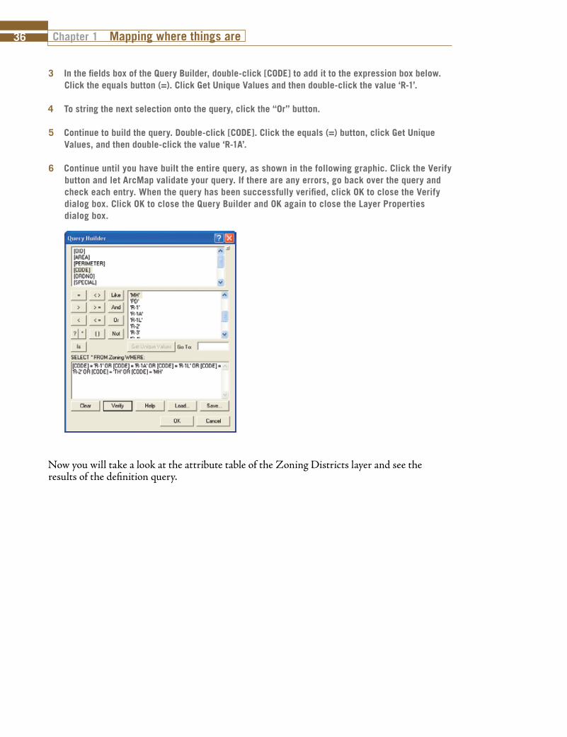
3 In the fields box of the Query Builder, double-click [CODE] to add it to the expression box below. Click the equals button (=). Click Get Unique Values and then double-click the value ‘R-1’.
4 To string the next selection onto the query, click the “Or” button.
5 Continue to build the query. Double-click [CODE]. Click the equals (=) button, click Get Unique Values, and then double-click the value ‘R-1A’.
6 Continue until you have built the entire query, as shown in the following graphic. Click the Verify button and let ArcMap validate your query. If there are any errors, go back over the query and check each entry. When the query has been successfully verified, click OK to close the Verify dialog box. Click OK to close the Query Builder and OK again to close the Layer Properties dialog box.
Now you will take a look at the attribute table of the Zoning Districts layer and see the results of the definition query.

Mapping where things are Chapter 1 37
1-11-21-3
Examine the attribute table again1 In the table of contents, right-click the Zoning Districts layer and click Open Attribute Table.
Notice now that in the CODE column, all the values are among the list you specified. Remember that the definition query did not delete any data. The values not selected by the definition query are only ignored. The process can be reversed simply by removing the definition query.
2 Close the attribute table and save your map document as \GISAnalysis\MyExercises\Tutorial 1-3.mxd. If you are not continuing on to the exercise, close ArcMap.

Chapter 1 Mapping where things are38
Exercise 1-3The previous exercise demonstrated how to add only certain field values to your symbology editor, and how to build a definition query to restrict the dataset you are working with.
In this exercise, you will repeat the process using land-use codes. Add only the values necessary and build a definition query to restrict the dataset to the given list.
• Continue with the map document you created in this tutorial, or open Tutorial 1-3.mxd from the \GISAnalysis\Maps folder.
• Turn off the Zoning Districts layer.• Add the dataset LandUse.lyr from the \GISAnalysis\Data folder. Turn on the layer.• In the symbology editor, set the Value field to UseCode and add only the following values. Change
the labels to the correct description.
A1 ..................Single Family Detached A2 ..................Mobile Homes A3 ..................Condominiums A4 ..................Townhomes A5 ..................Single Family Detached Limited
• Create a layer file of the new symbology.• Set a definition query to restrict the dataset to only the specified values. • Add a legend and make any necessary changes to the legend for it to display all the desired values.• Save the results as \GISAnalysis\MyExercises\Exercise 1-3.mxd.
What to turn inIf you are working in a classroom setting with an instructor, you may be required to submit the maps you created in Tutorial 1-3.
Turn in a printed map or screen capture image of the following:
Tutorial 1-3.mxd
Exercise 1-3.mxd

Mapping where things are Chapter 1 39
1-11-21-3
Tutorial 1-3 review The city planner gave you the additional task of restricting the dataset to only a specific set of values. You were able to control the display on the map by adding only the values on the list to the symbology editor, and consequently the legend.
A problem with that method is that if you later do any summations or calculations, these will be performed on the entire dataset. One way to solve this is by using a definition query. You built a query to select only those features of interest. Always remember that a definition query does not delete data, but merely causes it to be ignored until the definition query is removed.
The format of a query statement is field name, operator, value.
You can string these statements together with AND or OR.
Using AND means that both statements must be true to select a feature. Using OR means that either statement can be true to select a feature.
Study questions 1. What additional properties does the legend have? 2. What query would select the zoning values of I-1 and I-2?3. What query would select the zoning value of R-1 and an acreage greater than 50?
Other examples It is very common to want to work with a subset of your data without having to make a copy.
A city may have within its boundaries many private water wells categorized by which aquifer they tap. You may want to restrict your data to just a single aquifer to calculate the water removal rate from that water source.
The public works department is responsible for repaving the asphalt and concrete streets in the city. You may want to restrict your data to show only the asphalt streets to give a total linear mileage of streets paved with this material.
You may have a dataset of all fire department responses in a month and want to do some analysis on only the arsons. A definition query on the field containing a code for the cause of the fire would accomplish this.