
Development of Corridor Performance Benchmarking ...
174
Development of Corridor Performance Benchmarking Dashboards SJ Rabe orcid.org/0000-0002-0229-2663 Dissertation submitted in fulfilment of the requirements for the degree Master of Engineering in Computer and Electronic Engineering at the North-West University Supervisor: Prof AJ Hoffman Examination November 2018 Student number: 22820302
-
Upload
khangminh22 -
Category
Documents
-
view
0 -
download
0
Transcript of Development of Corridor Performance Benchmarking ...

Development of Corridor Performance Benchmarking Dashboards
SJ Rabe
orcid.org/0000-0002-0229-2663
Dissertation submitted in fulfilment of the requirements for the degree Master of Engineering in Computer and Electronic
Engineering at the North-West University
Supervisor: Prof AJ Hoffman
Examination November 2018
Student number: 22820302
NWUUser
Cross-Out
NWUUser
Inserted Text
Graduation: May 2020
NWUUser
Cross-Out
NWUUser
Inserted Text
accepted
i
TABLE OF CONTENTS
1 INTRODUCTION ................................................................................................ 1
1.1 Chapter Overview ............................................................................................... 1
1.2 Background ........................................................................................................ 1
1.2.1 Key Fundamentals .............................................................................................................. 1
1.2.2 Current Problems ................................................................................................................ 4
1.2.3 Potential Causes ................................................................................................................. 4
1.3 Research Proposal ............................................................................................. 6
1.3.1 Problem Statement ............................................................................................................. 6
1.3.2 Research Scope ................................................................................................................. 6
1.4 Research Objectives........................................................................................... 7
1.4.1 Primary Objectives .............................................................................................................. 7
1.4.2 Secondary Objectives ......................................................................................................... 7
1.5 Research Motivation ........................................................................................... 7
1.6 Research Methodology ....................................................................................... 7
1.7 Beneficiaries of Research ................................................................................... 8
1.8 Dissertation Layout ............................................................................................. 9
1.9 Chapter Summary ............................................................................................ 10
2 LITERATURE STUDY ...................................................................................... 11
2.1 Chapter Overview ............................................................................................. 11
2.2 Overview of Trade Corridors ............................................................................. 11
2.3 Project Overview .............................................................................................. 11
ii
2.4 Key Trade Corridor Players and Requirements ................................................. 13
2.4.1 Cargo Owners ................................................................................................................... 13
2.4.2 Clearing and Forwarding Agents ...................................................................................... 14
2.4.3 Shipping Lines .................................................................................................................. 15
2.4.4 Ports .................................................................................................................................. 16
2.4.5 Border Posts ..................................................................................................................... 16
2.4.6 Inland Transportation ........................................................................................................ 17
2.4.7 Public sector ..................................................................................................................... 19
2.4.8 General public ................................................................................................................... 20
2.4.9 Future Considerations ...................................................................................................... 21
2.5 Data Analysis Techniques ................................................................................ 21
2.5.1 Operational Flow Graphs .................................................................................................. 22
2.5.2 Relating data to operations ............................................................................................... 22
2.5.3 Measurement calculation .................................................................................................. 23
2.5.4 Measurement presentation ............................................................................................... 25
2.6 Trends and Events in Technology..................................................................... 25
2.6.1 Cloud Computing Adoption ............................................................................................... 25
2.6.2 Open Source ..................................................................................................................... 26
2.6.3 Big Data and IoT ............................................................................................................... 26
2.6.4 RFID .................................................................................................................................. 27
2.6.5 The Digital Divide .............................................................................................................. 28
2.7 Corridor Performance Benchmarking Dashboard Requirements ...................... 29
2.7.1 Detailed Dashboard Requirements ................................................................................... 29
2.8 Technology Survey Methodology ...................................................................... 30
iii
2.9 Cloud Providers ................................................................................................ 31
2.9.1 Potential Cloud Providers ................................................................................................. 31
2.9.2 Services Comparison ........................................................................................................ 32
2.9.3 Regional Availability .......................................................................................................... 33
2.9.4 Cost Comparison .............................................................................................................. 34
2.9.5 Conclusion ........................................................................................................................ 34
2.10 Development Languages and Tools ................................................................. 35
2.10.1 Potential Solutions ............................................................................................................ 35
2.10.2 Comparisons ..................................................................................................................... 35
2.10.3 Conclusion ........................................................................................................................ 39
2.11 Data Storage .................................................................................................... 40
2.11.1 Possible solutions ............................................................................................................. 40
2.11.2 Cost Comparison .............................................................................................................. 41
2.11.3 Technical Comparisons .................................................................................................... 41
2.11.4 Conclusion ........................................................................................................................ 42
2.12 Communication ................................................................................................. 43
2.12.1 Possible solutions ............................................................................................................. 43
2.12.2 Conclusion ........................................................................................................................ 44
2.13 Infrastructure .................................................................................................... 45
2.14 Commercial Business Intelligence Software ..................................................... 49
2.14.1 Possible Solutions............................................................................................................. 49
2.14.2 Feature Comparison ......................................................................................................... 49
2.14.3 Cost Comparison .............................................................................................................. 53
2.14.4 Conclusion ........................................................................................................................ 55
iv
2.14.5 Possible Solutions............................................................................................................. 56
2.14.6 Conclusion ........................................................................................................................ 56
2.15 Map Provider Services ...................................................................................... 57
2.15.1 Possible Solutions............................................................................................................. 57
2.15.2 Conclusion ........................................................................................................................ 57
2.16 PDF Rendering Libraries .................................................................................. 58
2.16.1 Possible Solutions............................................................................................................. 58
2.16.2 Conclusion ........................................................................................................................ 59
2.17 Future Considerations ...................................................................................... 60
2.17.1 IoT and RFID Integrations ................................................................................................ 60
2.18 Chapter Summary ............................................................................................ 62
3 CORRIDOR PERFORMANCE DASHBOARD IMPLEMENTATION ................. 63
3.1 Design Approach .............................................................................................. 63
3.1.1 Domain-Driven Design ...................................................................................................... 63
3.1.2 Detailed Domain Model .................................................................................................... 65
3.2 Design and Implementation .............................................................................. 69
3.2.1 Overview ........................................................................................................................... 69
3.2.2 Design Advantages ........................................................................................................... 69
3.2.3 Design Disadvantages ...................................................................................................... 70
3.2.4 Alternatives ....................................................................................................................... 70
3.2.5 Data API ............................................................................................................................ 71
3.2.5.1 Overview .......................................................................................................... 71
3.2.5.2 Provisioned Cloud Infrastructure ....................................................................... 71
v
3.2.5.3 Application Hosting Solution ............................................................................. 72
3.2.5.4 Business Logic ................................................................................................. 73
3.2.5.5 Public Interfaces ............................................................................................... 76
3.2.6 Web Application ................................................................................................................ 82
3.2.6.1 Project Template .............................................................................................. 82
3.2.6.2 Dashboard Design Overview ............................................................................ 85
3.2.6.3 Application Framework ..................................................................................... 85
3.2.6.4 Component Based Design. ............................................................................... 86
3.2.6.5 Stateful Components ........................................................................................ 88
3.2.6.6 Component Approach Drawbacks .................................................................... 88
3.2.6.7 State Containers ............................................................................................... 89
3.2.6.8 Project Layout................................................................................................... 89
3.2.6.9 User Interface ................................................................................................... 91
3.2.6.10 Visualisation Support ........................................................................................ 92
3.2.6.11 Interactive GIS Map Support ............................................................................. 94
3.2.6.12 PDF Rendering Support ................................................................................... 96
3.2.6.13 Software Features ............................................................................................ 98
3.2.7 Authentication and Authorization .................................................................................... 100
3.2.7.1 Encrypted Communication .............................................................................. 100
3.2.8 Testing ............................................................................................................................ 104
3.2.8.1 Testing Frameworks ....................................................................................... 104
3.2.8.2 Testing Demonstration .................................................................................... 104
3.2.8.3 Code Coverage .............................................................................................. 105
vi
3.2.9 Operations and Maintenance .......................................................................................... 106
3.3 Chapter Summary .......................................................................................... 108
4 CORRIDOR PERFORMANCE DASHBOARD EVALUATION ....................... 109
4.1 Overview ........................................................................................................ 109
4.2 Reliability ........................................................................................................ 109
4.2.1 Fault Detection ................................................................................................................ 109
4.2.2 110
4.2.3 Fault Recovery ................................................................................................................ 110
4.2.4 Fault Prevention .............................................................................................................. 110
4.3 Security .......................................................................................................... 111
4.3.1 Threat Detection ............................................................................................................. 111
4.3.2 Threat Resistance ........................................................................................................... 112
4.3.3 Threat Reaction .............................................................................................................. 112
4.4 Modifiability ..................................................................................................... 113
4.4.1 Modular Design ............................................................................................................... 113
4.4.2 Uniform Implementation .................................................................................................. 114
4.4.3 Reduced Coupling .......................................................................................................... 115
4.5 Portability ........................................................................................................ 116
4.5.1 Cross-platform Design .................................................................................................... 116
4.5.2 Responsive User Interface ............................................................................................. 117
4.6 Functionality ................................................................................................... 117
4.6.1 Visualisation .................................................................................................................... 117
4.6.2 Reporting ........................................................................................................................ 118
vii
4.7 Variability ........................................................................................................ 118
4.7.1 Cloud Configuration ........................................................................................................ 119
4.7.2 Software Configuration ................................................................................................... 119
4.8 Subsetability ................................................................................................... 120
4.8.1 Component Independence ............................................................................................. 120
4.8.2 Service independence .................................................................................................... 121
4.9 Conceptual Integrity ........................................................................................ 121
4.9.1 Open Standards .............................................................................................................. 122
4.10 Overall User Experience ................................................................................. 122
4.10.1 Single Page Application .................................................................................................. 122
4.10.2 Minimalistic Design ......................................................................................................... 124
4.10.3 Usage Context ................................................................................................................ 124
4.11 Performance ................................................................................................... 125
4.11.1 Load Testing ................................................................................................................... 125
4.11.2 Resource Scaling ............................................................................................................ 127
4.12 Chapter Summary .......................................................................................... 127
5 CONCLUSIONS AND RECOMMENDATIONS ............................................... 129
5.1 Development Concerns of a Performance Benchmarking Dashboard ............ 129
5.1.1 Data Availability .............................................................................................................. 129
5.1.2 Data Quality .................................................................................................................... 129
5.1.3 Clear Responsibilities ..................................................................................................... 130
5.1.4 Iterative Development ..................................................................................................... 130
5.2 Software Design Considerations ..................................................................... 130
viii
5.2.1 Domain-Driven Design .................................................................................................... 130
5.2.2 Task Responsibility ......................................................................................................... 131
5.3 Cloud Infrastructure Benefits .......................................................................... 131
5.3.1 Reduced Cost ................................................................................................................. 131
5.3.2 Automation ...................................................................................................................... 131
5.3.3 Open-Source ................................................................................................................... 132
5.4 Future Work .................................................................................................... 132
BIBLIOGRAPHY ................................................................................................................... 133
ANNEXURE A: OPEN-SOURCE TOOLS AND TECHNOLOGIES ....................................... 144
ANNEXURE B: COMPATIBILITY TESTING ......................................................................... 157
ix
LIST OF TABLES
Table 2-1: Global Public Cloud Provider Market Share, 2017-2018 (Millions USD) ................. 31
Table 2-2: Top 10 most popular database engines in November 2019 .................................... 40
Table 2-3: Cost comparison of potential database solutions .................................................... 41
Table 2-4: Technical comparison of potential database solutions ............................................ 42
Table 2-5: Chart features of notable business intelligence products ........................................ 50
Table 2-6: GIS features of notable business intelligence products ........................................... 50
Table 2-7: Access and reporting features of notable business intelligence products ................ 52
Table 2-8: Cost comparison of notable business intelligence products .................................... 53
Table 2-9: Annual cost of notable business intelligence products ............................................ 55
Table 5-1: List of npm modules used in the project. ............................................................... 144
i
LIST OF FIGURES
Figure 2-1: Geographical map of Dar es Salaam Corridor. ...................................................... 12
Figure 2-2: Flow diagram illustrating a simplified vertical supply chain. ................................... 22
Figure 2-3: Flow diagram illustrating the relationship between data and operations. ............... 23
Figure 2-4: Flow diagram illustrating the relationship between data and measurements. ......... 24
Figure 2-5: Screenshot illustrating a service comparison of the top cloud providers ................ 32
Figure 2-6: Screenshot of the October 2018 TIOBE Index ....................................................... 35
Figure 2-7: Screenshot of the October 2018 PYPL Index ........................................................ 36
Figure 2-8: Screenshot of most used languages according to Stack Overflow Survey ............. 37
Figure 2-9: Screenshot of most used web frameworks according to Stack Overflow Survey ... 38
Figure 2-10: Screenshot of most used frameworks according to Stack Overflow Survey ......... 38
Figure 2-11: Linux Foundation survey respondents using Node.js in some capacity. .............. 39
Figure 2-12: Screenshot of a GraphQL query and result. ........................................................ 44
Figure 2-13: Screenshot of the Compute Engine dashboard. .................................................. 46
Figure 2-14: Screenshot illustrating an app.yaml file. .............................................................. 47
Figure 2-15: Screenshot illustrating a dispatch.yaml file. ......................................................... 47
Figure 2-16: Screenshot of the Google App Engine URL specification. ................................... 48
Figure 2-17: Example of a Leaflet map from the website. ........................................................ 58
Figure 2-18: Screenshot of PDF render example from the pdfmake website ........................... 60
Figure 2-19: Photo of a Picollo GPS tracking system with RFID temperature sensors ............. 61
Figure 3-1: Simplified Diagram of the Domain Model ............................................................... 64
Figure 3-2: Diagram illustrating a more detailed domain model ............................................... 66
ii
Figure 3-3: Diagram showing the main components within the data API. ................................ 71
Figure 3-4: Screenshot of a routing example in the express documentation. ........................... 73
Figure 3-5: Diagram illustrating the purpose of ORM software. ................................................ 73
Figure 3-6: Screenshot of a Sequelize object definition. .......................................................... 75
Figure 3-7: Screenshot of the database table created by Sequelize. ....................................... 76
Figure 3-8: Screenshot of the swagger editing tool .................................................................. 77
Figure 3-9: Screenshot of swagger endpoint implementation in Node.js server. ...................... 78
Figure 3-10: Screenshot of the GraphiQL tool interface with an example query ...................... 80
Figure 3-11: Screenshot of the web application project structure ............................................. 82
Figure 3-12: Screenshot of the template browser in Visual Studio ........................................... 84
Figure 3-13: Diagram showing the main components of the web application ........................... 85
Figure 3-14: Screenshot of a ReactJS component .................................................................. 86
Figure 3-15: Diagram illustrating complex nesting. .................................................................. 87
Figure 3-16: Diagram illustrating the application component structure ..................................... 89
Figure 3-17: Screenshot of an example GraphQL query file. ................................................... 90
Figure 3-18: Screenshot showing an example where Axios was used. .................................... 91
Figure 3-19: Screenshot from Semantic UI React documentation of button colours. ............... 92
Figure 3-20: Screenshot of a placeholder bar chart definition. ................................................. 92
Figure 3-21: Screenshot of visualisations in web application. .................................................. 93
Figure 3-22: Screenshot of customised visualisations in web application. ............................... 93
Figure 3-23: Screenshot of a saved chart opened in Windows 10. .......................................... 94
Figure 3-24: Screenshot from performance dashboard of the truck profile............................... 95
Figure 3-25: Screenshot from early prototype testing visualisation in Leaflet. .......................... 95
iii
Figure 3-26: Screenshot of PDF report rendering page in web application. ............................. 96
Figure 3-27: Screenshot of PDF document with an embedded chart. ...................................... 97
Figure 3-28: Screenshot of PDF document in Adobe Acrobat Reader DC. .............................. 97
Figure 3-29: Screenshot of the performance dashboard home page ....................................... 99
Figure 3-30: Screenshot of web application Profile page showing notifications. .................... 100
Figure 3-31: Screenshot showing the use of HTTPS in the performance dashboard ............. 101
Figure 3-32: Screenshot of vulnerability test results from pentest-tools.com .......................... 101
Figure 3-33: Screenshot of Google Cloud Platform security scan results. ............................. 102
Figure 3-34: Screenshot of web application cookies. ............................................................. 103
Figure 3-35: Screenshot of test results in the command line terminal. ................................... 105
Figure 3-36: Screenshot of code coverage report generated by jest. ..................................... 106
Figure 3-37: Screenshot from the Cloud SQL database management page. ......................... 107
Figure 3-38: Screenshot from Gmail of an automated notification. ........................................ 107
Figure 4-1: Screenshot of monitoring tools in a cloud environment. ....................................... 109
Figure 4-2: Screenshot showing traffic splitting in the cloud environment. ............................. 110
Figure 4-3: Screenshot showing error logs in the cloud environment. .................................... 111
Figure 4-4: Screenshot showing error notifications in the cloud environment. ........................ 113
Figure 4-5: Screenshot showing results after running a lint script. ......................................... 114
Figure 4-6: Screenshot showing an example of reduced coupling. ........................................ 115
Figure 4-7: Screenshot of the performance dashboard in a mobile aspect ratio. ................... 116
Figure 4-8: Screenshot of the data API aap.yaml file ............................................................. 118
Figure 4-9: Screenshot of the data API config file. ................................................................. 119
Figure 4-10: Screenshot from the performance dashboard busy loading. .............................. 121
iv
Figure 4-11: Screenshot of an English language file in the web application. .......................... 122
Figure 4-12: Screenshot of the performance dashboard and auditing tool. ............................ 123
Figure 4-13: Screenshot of the performance dashboard for a limited user. ............................ 124
Figure 4-14: Screenshot from Loadium results for the web application. ................................. 125
Figure 4-15: Screenshot of the GCP dashboard during the load test. .................................... 126
Figure 5-1: Screenshot of the performance dashboard in Opera. .......................................... 157
Figure 5-2: Screenshot of the performance dashboard in Google Chrome. ........................... 157
Figure 5-3: Screenshot of the performance dashboard in Mozilla Firefox. ............................. 158
Figure 5-4: Screenshot of the performance dashboard in Microsoft Edge. ............................ 158
Figure 5-5: Screenshot of the performance dashboard in Apple Safari. ................................. 159
Figure 5-6: Screenshot of the performance dashboard in Microsoft Internet Explorer ............ 159
1
1 INTRODUCTION
1.1 Chapter Overview
Trade corridors can be defined as a culture of trade agreements and treaties, statutes,
delegated legislation and customs that govern and guide trading relationships [1]. Trade
corridors are in essence a large group of entities that work together to transport and deliver
goods across a large geographical area which can involve multiple countries and companies in
the process.
Small logistics operations are mostly understood well and can be managed efficiently. As
operations grow to the size of trade corridors, understanding and management of the entire
corridor can become daunting very quickly. In this chapter, the goal is to define the motivations
behind the development of corridor performance benchmarking dashboards.
1.2 Background
To create a system that can effectively aid people in managing a logistics operation the
fundamental components of logistics needs to be understood. Logistics deals with the
management of the flow of goods or materials from the point of production to the point of
consumption and in some cases even to the point of disposal. Logistics is, in itself, a system. It
is a network of related activities with the goal of managing the orderly flow of material and
personnel within logistics channels [2].
1.2.1 Key Fundamentals
The two factors that determine if a company prospers are customer satisfaction and growth [3].
Essentially this means that companies should keep their customers satisfied and aim to grow at
a reasonable pace.
In this research, the focus is primarily on customer satisfaction and eliminating overhead costs
since these aspects are heavily influenced by the logistics operations of a company. By
improving each of the components of customer satisfaction, the cost of logistics operations can
be reduced. The concept of customer satisfaction can be summarised in 8 components:
Product: The majority of products need to be packaged properly for efficient transportation
as well as inventory and warehousing. Ensuring that products are delivered in a way that
facilitates customers to use it easily is a key factor in customer satisfaction.
2
Logistics: Choosing the correct transportation channels and diminishing distances between
production and consumption in one of the largest factors to consider and can result in
significant cost-savings regarding local and global transportation.
Quantity: The right quantity involves balancing the amount of inventory held with the cost of
holding that inventory including capital tied up in inventory, variable storage costs and
obsolescence. A lack of inventory would lead to lower customer satisfaction, whereas too
much inventory could lead to unnecessary storage expenses.
Quality: Product quality is one of the largest factors when it comes to customer satisfaction
since it is often used to compare similar products. Despite the importance of quality, it is
frequently sacrificed to compensate for problems that can occur such as delays, defects,
degeneration or downfalls.
Location: Customers are willing to pay more for a product that is located close to them than
travelling to pay less. This behaviour especially takes place when customers want to save
time and transportation cost. Configuring an optimal distribution network to position products
as close to as possible to customers is a key component of customer satisfaction.
Time: Ensuring a product is available on the market at the right time is important to increase
sales. If a product is sold when there is no need for it, there is no spending power or the
product cannot be used due to seasonal reasons the attempt to generate sales will fail.
Customer: Customer desires and behaviours are dynamic and product sales need to be
able to adapt. Instantaneous data analysis is important to understanding and forecasting
demand-oscillations and intensive collaboration with suppliers can aid their preparations to
alleviate potential shortages or overproduction.
Cost: It has never been easier to acquire high-quality products inexpensively than now since
products are offered globally. If products are equal or identical, the deciding factor is
typically cost. Lowering cost has a direct impact on the profit from every product sold since it
is related to all business activities.
3
All of these components within customer satisfaction are dynamic. The rate at which
components change varies greatly, but they do change over time. The goal is to try and
optimise these components and maximise customer satisfaction as a result.
This research is focused on logistics and cost since those aspects are relevant to the
transportation and distribution of most physical goods. Improvements in those aspects of
customer satisfaction would be a benefit to most companies and consumers.
The key fundamental activities in a logistics operation include [2]:
1. Customer Service
2. Demand Forecasting / Planning
3. Inventory Management
4. Logistics Communications
5. Materials Handling
6. Order Processing
7. Packaging
8. Parts and Service Support
9. Plant and Warehouse Site Selection
10. Procurement
11. Return Goods Handling
12. Reverse Logistics
13. Traffic and Transportation
14. Warehousing and Storage
From this list it should be clear that even within a simple logistics operation there are multiple
disciplines involved that have vastly different challenges and requirements. In many operations
not all of these activities are handled by the same entity, but instead by separate entities that
specialise in one or multiple of these activities. Each of these entities interacts with each other
but can have different operational and technology solutions. Competing entities that specialise
in the same activities could also be using different technology solutions.
The goal of a corridor performance benchmarking dashboard is to gather information from all
these different disciplines and quantify their performance so that improvements or setbacks can
be measured. The corridor performance benchmarking dashboard aims to provide a more
holistic view of the entire logistics process so that each player involved in the activities is more
aware of how they are impacted and how their actions impact the system as a whole.
4
1.2.2 Current Problems
The systems approach states that all functions or activities need to be understood regarding
how they affect and are affected by other elements and activities with which they interact [2]. If
activities are considered in isolation how those activities affect (or are affected by) other
activities cannot be fully understood. In the context of logistics, this means that each entity
needs to understand its role within the larger system and be able to play that role optimally.
They should also understand the roles of other entities within the system and how their
operations are affected by (or affects) the operations of other entities.
Currently, corridor entities invest more of their effort in optimising their operations and less in
their interactions with the operations of other entities they engage with within the industry. The
result is that inefficiencies manifest within the interactions between entities and not within the
operations of entities themselves.
A simple example would be the interaction between cargo transporters and a border post.
Transporter vehicles typically depart to the border post without notice and expect to be serviced
upon arrival. The border post has no insight into the amount of traffic it can expect, and as a
result, cannot be certain the operations will be able to accommodate the expected traffic. The
result of this exchange is that the border post ends up trying to accommodate traffic increases
beyond the capacity it can handle and the transporter vehicles experience unforeseen delays. If
the border post is able coordinate with transporters to ensure the number of vehicles at the
border post at any given time does not exceed the operational capacity then both parties benefit
as a result.
The purpose of a corridor performance dashboard is to highlight these inefficiencies by
collecting data from all relevant entities along the corridor. Once the inefficient areas are
identified, and their impact can be quantified, possible solutions can be developed to streamline
the interactions between entities along the entire logistics corridor.
1.2.3 Potential Causes
Performance benchmarking based on dashboards is not a new concept and has been used in
different industries for decades at this point. It is however rare to find a performance
benchmarking dashboard for an entire industry. Before attempting to develop such a solution, it
needs to be understood why these types of solutions do not already exist.
The first potential cause that could prohibit the creation of a corridor performance dashboard is
a lack of data. If data is not being collected at a granular enough level that would enable the
5
creation of a dashboard, then extracting measurements for a performance dashboard would not
be possible. As the world continues to migrate to digital solutions the concern of insufficient data
should diminish over time. With companies progressing toward paperless operations, more data
is becoming available for developing better metrics and benchmarking solutions. Solutions such
as RFID technology can aid in collecting data that could otherwise not be collected.
Another potential cause that could explain the lack of corridor performance dashboards is that
data is being collected at a sufficient level of detail, but entities choose not to share it or are
unable to share it. Coordinating every entity across an entire corridor is a significant challenge
as it requires all of them to provide data to a centralised system. Some entities likely cannot
supply data in an electronic form or via an electronic data interchange. Convincing all the
entities along a corridor that there is value in participating during the development of a
dashboard of this scale would require a large amount of negotiating. Since there is typically no
entity that has control over the entire corridor, finding funding for such a project is another likely
reason that these types of solutions are not common. The most likely entity that would be
interested in funding such a project would be a governmental entity since they would enjoy the
oversight over their entire portion of the corridor as well as in neighbouring countries.
Each year a large number of surveys are completed to try and better understand the desires
and needs of the logistics industry. Two of these surveys which are relevant to this study are the
State of Logistics Survey as well as the Third Party Logistics results and findings. The first
survey monitors the economic efficiency of the South African logistics industry and is published
yearly [4]. According to the study, the Logistics Performance Index (LPI) of South Africa is
ranked 20th out of 160 countries. Despite South Africa performing well the performance of
corridors in and around the country perform worse since the efficiency of a corridor relies on all
the countries involved.
The second survey is an international survey that tries to understand the needs and challenges
of Third-party logistics providers. Most third-party logistics providers operate at an international
level since production and distribution is typically spread across multiple countries and
continents. In the survey participants are asked which capabilities they want from IT systems.
The capabilities 3PL’s desire most from IT systems are [5]:
Transport management systems for planning.
Electronic data interchanges (EDI).
Visibility of orders, shipments, inventory, etc.
Warehouse and distribution centre management.
Transportation management systems for scheduling
6
Web portals for booking, order tracking, etc.
The capabilities on this list seem to validate the idea that an adequate amount of data is not
being captured since there is a desire to capture operational data related to planning and
scheduling. It also seems to validate the lack of data sharing capabilities since 68% of
respondents requested EDI's.
If data is collected at an acceptable level of detail and made available by entities across the
corridor, another potential cause could be that there is no motivation to invest in analysing such
large datasets. Given the amount of effort involved in integrating and transforming data sets
from all entities in the corridor, there would need to be substantial benefits from implementing a
corridor performance dashboard. To provide benefits to data providers, metrics that they
consider valuable would need to be determined and presented in a way they can understand
and use effectively. Knowing what to measure is just as important as the act of measuring. If the
metrics currently considered to be the appropriate measurements are incorrect or incomplete,
the development of a dashboard might not seem like a sound investment to data providers.
1.3 Research Proposal
1.3.1 Problem Statement
Investigate the current needs of performance benchmarking dashboard software for transport
corridors. Design, implement and evaluate a proof of concept solution to satisfy the needs of
corridor stakeholders.
1.3.2 Research Scope
The goal of this research is to investigate and understand the needs that should be addressed
with a corridor performance benchmarking dashboard. Next, investigate the relevant software
solution landscape within South Africa as well as internationally and determine any major trends
within the industry.
Define key requirements and outcomes that a corridor performance benchmarking dashboard
needs to satisfy. Design and implement a proof of concept corridor performance benchmarking
dashboard solution by incorporating modern software best practices commonly found in the
software industry today.
7
1.4 Research Objectives
1.4.1 Primary Objectives
The main objective of this research is to better understand the requirements of a corridor
performance benchmarking dashboard. Once the requirements are understood, the architecture
of the system needs to be designed and a proof of concept corridor performance benchmarking
dashboard needs to be implemented for industry partners involved with the project. Additional
changes or iterations that could improve the design need to be defined based on the experience
gained from implementing a performance dashboard solution for industry partners.
1.4.2 Secondary Objectives
Discuss the method of analysis used to produce results and present key findings if the industry
partner is comfortable with sharing the results.
1.5 Research Motivation
Currently, players in the logistics industry understand and perform their roles fairly well, but do
not perform as well within the context of the entire corridor. To further improve corridor
performance, solutions require coordination between multiple entities to streamline their
interactions with each other. A higher level of coordination requires their systems, data and
operations to align and work similarly to a single owner supply chain. Convincing entities
throughout the entire corridor that there is potential value to be gained from a higher level of
cooperation is just as important as facilitating the coordination with technical solutions.
The primary motivation for this research is to understand how to design and implement corridor
performance dashboards. Developing ways to define, extract and present better metrics that
entities in the corridor find useful for operations and root-cause analysis is another goal that
motivates this research. By providing more comprehensive and useful solutions, we hope to
help entities along the corridor to quantify inefficiencies related to time and money and motivate
them to pursue further improvements in their operations and the corridor as a whole.
1.6 Research Methodology
Throughout the research, a combination of qualitative and quantitative methodologies is used.
Due to the lack of objective, quantified measurements the needs of entities along the corridors
are based on qualitative, subjective perceptions. By combining a large number of entity
perceptions across the corridor as well as recommendations from industry experts, we hope to
understand the underlying requirements of a corridor performance dashboard better.

8
The development of a corridor performance dashboard will provide quantified measurements
which are expected to encourage more accurate corridor management. These quantitative
results are to be used as a baseline for performance within the corridor to compare to future
values and measure performance changes.
Software requirements will be determined from corridor entity needs and architecture of the
system will be designed according to the engineering process. Possible software services and
solutions are identified, aggregated and compared to a set of defined requirements in a
technology survey in order to measure the viability of each solution. Other quantitative aspects
include determining the technical requirements of a potential solution to each problem, such as
the required performance of the solution and ensuring each solution could scale to support the
data collection and processing requirements.
An appropriate software development lifecycle model will be used to implement a proof of
concept system which is tested according to documented industry standards as well as
standards provided by the Institute of Electrical and Electronics Engineers (IEEE).
1.7 Beneficiaries of Research
By developing a corridor performance dashboard, we aim to provide objective measurements
for all entities along the corridor. The first beneficiary of corridor performance dashboards is
road transporters. Visibility of operations at ports, border posts and customs office would enable
transporters to actively evaluate routes between locations and assist in selecting the most
optimal routes to use.
Cargo owners and freight agents benefit from a corridor performance dashboard by having
visibility across the entire corridor, allowing them to monitor the status of goods better and
account for any problems occurring before goods are affected. Suppliers can better coordinate
with clients if they have visibility over product demands to ensure supply more closely meets
demands.
Public sector entities such as ports, border posts, customs offices and weighbridges also benefit
from a corridor performance dashboard. By having visibility over the corridor, facilities can
monitor the amount of traffic they receive and better prepare for any fluctuations since logistical
operations tend to be seasonal with increased demand during holiday periods. Monitoring the
historical performance of different facilities would allow the public sector to compare the
performance of similar facilities. These historical measurements should help determine if there
are potential for improvements among any of the facilities.

9
Given how uncommon corridor performance dashboards are there could be other beneficiaries
that gain from having visibility over the entire corridor. By implementing a proof of concept
dashboard additional benefits and beneficiaries might become apparent which are difficult to
conceive of without practical implementation.
1.8 Dissertation Layout
This first chapter describes the motivations and methodologies of this research. This chapter
also considers potential reasons why corridor performance dashboards are not common across
all corridors.
Chapter two describes trade corridors in more detail to provide a background to the problem this
research aims to explore. This chapter defines requirements for a proof of concept corridor
performance dashboard as determined through collaboration with industry partners and by
reviewing industry expert consultations done prior to the project. The analysis techniques used
to extract key performance indicators from the data are discussed. A technology survey is done
to compare different solutions and determine viable options for the project.
Chapter three addresses the design of the dashboard software to meet the requirements
documented in chapter two, while taking into account the availability of suitable technology of
investigated in the literature study.
In chapter four the different evaluations are described and applied to the proof of concept
system to ensure that it can satisfy requirements. Chapter four helps identify any short-term
issues in the design that might lead to the dashboard not performing as required. This chapter
helps to define a roadmap for further improvements to the system over time. This chapter also
discusses the overall user experience considerations made to make the complexity of the data
and results easier to understand.
Chapter five discusses the conclusions and recommendations from developing a corridor
performance dashboard solution.
10
1.9 Chapter Summary
In recent years companies have been investing in business intelligence and incorporating data
collection and utilisation into management practices. The result of this is IT systems that provide
large amounts of data both in volume and variety. Companies developed proprietary reporting
tools to better understand the state of operations with less effort and time investment. All of
these advancements in data utilisation have allowed companies to improve their operations
continuously.
In the logistics industry there is, however, a limit to the efficiency a company can achieve in
isolation. Since a large portion of their operations is dependent on other entities in the logistics
value chain, inefficiencies often exist in the interactions between entities. These inefficiencies
are difficult to quantify since different value chain entities have different levels of visibility and
data capture capabilities.
Corridor performance dashboards aim to provide corridors and their stakeholders with a means
to quantify current and historical corridor performance and perform root-cause analysis. This
study documents the process used in designing and implementing a corridor performance
dashboard prototype.
11
2 LITERATURE STUDY
2.1 Chapter Overview
This chapter describes how trade corridors are structured and the numerous players involved in
making trade corridors function. The key stakeholders of trade corridors are discussed next and
an overview is provided of the project upon which this dissertation is based. The methods that
will be used to calculate performance indicators for the dashboard are briefly summarised.
These analysis methods provide a generalised solution to generating measurements and more
specific details will depend on industry demands and cooperation.
Recent trends and events within the software industry are also briefly discussed including cloud
computing, open source software, big data and internet-of-things (IoT). The potential uses of
RFID technologies and the benefits it could provide within a trade corridor are also discussed.
Finally we briefly discuss the differences in the ways users from developed and developing
countries access the internet and how this impacts the development of software solutions for
developing countries.
2.2 Overview of Trade Corridors
Landlocked countries are countries with very little or no shoreline which results in these
countries having inherent trading disadvantages. The majority of the freight in the world is
transported between nations via ships. Landlocked countries are therefore dependent on their
neighbouring countries with ports (referred to as transit neighbours) to handle their international
freight [6]. Trade corridors define overland routes where agreements are in place between
landlocked countries and their coastal neighbours to transport their cargo to and from ports.
This relationship between countries can introduce many issues such as infrastructure
provisioning and maintenance, compensation, cross-border driver travel and insurance [6].
2.3 Project Overview
This study is based on a project in collaboration with the Ministry of Works, Transport and
Communication of The United Republic of Tanzania which involves the acquisition and
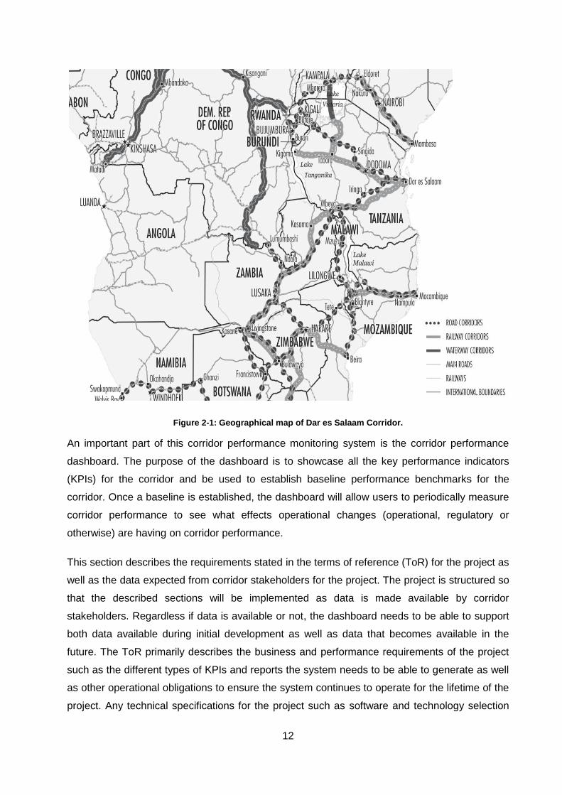
customisation of a corridor performance monitoring system. Figure 2-1 shows a zoomed-in
section of the image presented in [7]. The corridor consists of road and rail modes of transport.
Road and trail modes branch from the port into a northbound section and a southbound section.
Trips with the Dar es Salaam port as an origin are considered import (or inbound) trips. Trips
with the Dar es Salaam port as the destination are considered export (or outbound) trips.
12
Figure 2-1: Geographical map of Dar es Salaam Corridor.
An important part of this corridor performance monitoring system is the corridor performance
dashboard. The purpose of the dashboard is to showcase all the key performance indicators
(KPIs) for the corridor and be used to establish baseline performance benchmarks for the
corridor. Once a baseline is established, the dashboard will allow users to periodically measure
corridor performance to see what effects operational changes (operational, regulatory or
otherwise) are having on corridor performance.
This section describes the requirements stated in the terms of reference (ToR) for the project as
well as the data expected from corridor stakeholders for the project. The project is structured so
that the described sections will be implemented as data is made available by corridor
stakeholders. Regardless if data is available or not, the dashboard needs to be able to support
both data available during initial development as well as data that becomes available in the
future. The ToR primarily describes the business and performance requirements of the project
such as the different types of KPIs and reports the system needs to be able to generate as well
as other operational obligations to ensure the system continues to operate for the lifetime of the
project. Any technical specifications for the project such as software and technology selection
13
for achieving the business requirements are the responsibility of the various software
development partners involved in the project.
2.4 Key Trade Corridor Players and Requirements
Trade corridors consist of several stakeholders that each plays a role in the overall logistics
operation. These include both governmental agencies and private sector companies. In some
cases, different roles might be performed by the same company. The roles played by the most
prominent stakeholders are described in the sections below.
2.4.1 Cargo Owners
Cargo owners are the main clients of the entire trade corridor. They manufacture or acquire the
goods being transported along the corridor. Cargo owners employ the services of other players
along the corridor by outsourcing their logistics operations and by interacting with governmental
players such as customs to ensure the business they conduct is within the law. Some cargo
owners might handle the transportation of goods themselves (referred to as a first-party logistics
model or 1PL), but it has become a common practice throughout the industry to use a second
party logistics model (2PL) or a third party logistics model (3PL). In a 2PL configuration, the
cargo owner contracts an asset carrier to execute transportation or logistics tasks [8]. In a 3PL
configuration, the management of subcontracting the transport and storage of goods is
outsourced to a third party. This party negotiates and manages the supply chain on behalf of the
cargo owner.
The main motivation for the creation of a corridor monitoring system is to attract more cargo
owners to the trade corridor. The primary requirement for cargo owners from the corridor
performance dashboard is to be able to receive reports with regards to how the corridor is
performing. The reports expected from this project can be divided into five main categories:
Time-Related Reports: These reports primarily describe how long specific operations take
along the corridor as well as the duration to cover the entire corridor. The reports also
describe delays that occur in the corridor such as the wait times of ships, trucks and trains at
specific steps in supply chains.
Cost-Related Reports: Cost reports primarily describe the financial expenses associated
with the corridor. The reports describe the cost of transportation services such as road
transporters and shipping lines as well as charges of facilities along the corridor such as
ports and border posts.
14
Security and Safety Reports: The goal of security and safety reports is to identify any high-
risk locations along the corridor where crime or other incidents occur. These reports are
closely related to cost but describe unintended expenses or damages as opposed to the
operating expenses described in cost-related reports.
Infrastructure Reports: These reports describe the condition of corridor infrastructures such
as roads and railways. This information could be important to some cargo owners when
considering different solutions to their logistics problems.
Miscellaneous Reports: Any reports that could not be classified in one of the previous
sections are classified as miscellaneous.
2.4.2 Clearing and Forwarding Agents
Clearing and forwarding agents (CFAs) allow manufacturers to outsource the majority of their
logistics operation to a party with the expertise of creating and managing complex logistics
operations. The roles of clearing and forwarding agents include [9]:
Perform customs procedures on behalf of the manufacturer.
Ensure that all procedures are compliant with current legislation.
Facilitate the movement and storage of cargo locally and internationally.
Manage licences and insurance of goods.
By outsourcing the management of the logistics value chain, a manufacturer can focus on
product production and rely on their third-party logistics partner (most commonly a CFA) to get
product shipments to customers and retailers reliably and cost-effectively. The corridor
performance monitoring system needs to be able to capture information from participating
clearing and forwarding agents in the four countries involved in the project. The data that needs
to be captured from clearing and forwarding agents where possible includes:
Name, size and packaging for the cargo.
Details about the cargo owner.
Origin and destination information.
Details regarding transportation methods.
Schedule of the goods such as arrival and release times.
Summary of any delays that the cargo experienced.
15
Details regarding cost, including import and export duties paid.
The data described above will be used to contribute to the reports available on the system.
Since clearing and forwarding agents typically run the supply chain on behalf of the cargo
owner, the majority of the reports intended for cargo owners will be used by clearing and
forwarding agents as well. Time-related reports are available to primarily monitor the
performance of ports and border posts since those are the areas where clearing and forwarding
agents are the most involved. Clearing and forwarding agents will be expected to submit cost
estimates for various scenarios which will be refined into anonymised industry benchmarks.
These types of industry benchmarks will be available as part of the cost related reports.
Security and Infrastructure reports are primarily aimed at the facilities that provide the data but
might be useful for clearing and forwarding agents if they want to compare the current supply
chain with possible alternatives. The data supplied by clearing and forwarding agents are
incorporated into miscellaneous reports such as reports related to the total amount of cargo that
passed through the corridor. Miscellaneous reports are mostly intended for agencies involved
with monitoring the corridor with the goal of increasing utilisation, but these reports might
provide value to clearing and forwarding agents not apparent during design.
2.4.3 Shipping Lines
Shipping lines are large international corporations that transport cargo along supply chains
spanning multiple continents. Due to the size of shipping lines and the role they play the rest of
the supply chain is typically dependent on their schedule and performance. Due to the nature of
how ships operate any delays a ship experiences immediately impacts the supply chain. Cargo
can only be loaded and unloaded at a port which means there are limited methods available to
mitigate ship delays while the ship is at sea. Solutions to this problem typically involve excessive
cargo surplus kept as a buffer if a delay occurs [6]. The corridor monitoring system needs to
capture these delays and monitor their frequency and effect on the corridor. Data required from
shipping lines include:
Summary of the anchorage process including operation times and causes of delays.
Summary of the ship berthing process including operation times and causes of delays.
Details regarding cargo such as name, size, origin, destination and owner.
Clearing and forwarding agent or shipper details.
Cost estimations for different cargo types between different locations.
16
This data will be used in time-related performance measurements for port operations such as
the anonymised anchorage and berth durations of ships at different ports. This data will also be
used to determine industry-wide averages regarding ocean and port charges.
2.4.4 Ports
If shipping lines are responsible for facilitating the majority of international cargo transport, then
ports play a key role in transferring cargo from land-based transport solutions to freighter ships
and vice versa. Monitoring and improving performance around ports can potentially provide
industry-wide benefits. The majority of the data required from ports are similar to the data
required from shipping lines. By collecting data from both parties, the corridor performance
monitoring system could validate delays and highlight any inconsistencies between the data
sets. Data required from ports include:
Dates and durations of maritime operations including anchorage and berth times.
Dates and durations of port operations including cargo discharge and loading times.
Dates and durations of customs operations including cargo details and release times.
Other cargo details such as CFA details, owner details, origins and destinations.
Cost-related information including port charges for different countries.
Security-related information such as port crime records.
The data described above will be used in the same time-related reports described for shipping
lines and will provide an additional perspective on operations. This data will also be compared
with rail and road transporter data to determine the turnaround times of vehicles (trucks and
trains) at ports. By consolidating port operational data and transporter data, the behaviour of
vehicle operators should become more apparent. Determining if vehicle operators spend more
time at ports than operations require is one example of a measurement that is only possible by
combining these data sets. Other uses of the data from ports include the comparison of cost
and security for different ports.
2.4.5 Border Posts
In the case of landlocked countries, the majority of goods being imported by land will need to
cross country borders at some point. Border posts are specific locations on the borders between
countries where the majority of traffic travels between the two countries. Similar to ports, border
posts create a high concentration of cargo that needs to flow through a small number of
facilities. In the context of African trade corridors, the border posts are notorious for long and
unpredictable delays which complicate the optimisation of supply chains [6].
17
Research has shown that long delays are not a major concern for the industry since long delays
only result in a longer duration supply chain overall and do not impact the frequency at which
cargo can be delivered [10]. Improving the predictability of delays would have a much larger
impact on supply chains. Predictable delays allow for just-in-time supply chains with minimal
buffers of extra cargo to combat unpredictability.
In the case of the Dar es Salaam corridor, large amounts of traffic at border posts come from
the neighbouring countries using the Dar es Salaam port for imports and exports. The concern
regarding these border posts is whether the current infrastructure is sufficient to handle all the
traffic if run efficiently or if additional infrastructure is required. To answer this question the
operations of border posts need to be monitored and the data used to look for inefficiencies.
The data required from border posts include:
Cargo-related details such as the name, volume, value, permits, origin, destination and
owner.
Border post operational information such as date and time of submissions and releases.
Cargo cost-related information such as duties, taxes, fees, charges and tariffs collected.
Details about involved parties such as the CFA, vehicle and driver.
Reasons for cargo delays including suspensions, rejections and amendments.
General information about procedures such as pre-clearance, appeals, bonds and penalties.
This data will be used to generate reports regarding time vehicles and cargo spends at different
border posts. Reports regarding the costs at different border posts will also be generated from
this data set. These reports are more intended to help the management of facilities improve
their operations than to provide insight for cargo owners since border posts are often a
mandatory step for supply chains on the trade corridor with few or no alternatives.
2.4.6 Inland Transportation
Inland Transportation is the most expensive and time-consuming component in the trade
corridor. Shipping lines are also a form of transportation but are excluded from this section since
they operate outside the trade corridor. The transportation section of the project focuses mainly
on road vehicles and their drivers as well as trains and their operators.
Railways throughout Africa has seen significantly less utilisation when compared to road
transportation and is almost exclusively used to transport heavy unrefined minerals which in the
case of Tanzania are natural resources such as cement and timber [11]. In contrast, the majority
of containerised goods are transported using the road network.
18
One of the key challenges in the road transport industry is infrastructure. Since the late 1990’s
the main trunk roads that connect major cities have been improved which have resulted in
significant road transport improvements. Detailed information is required from road transporters,
truck drivers and railway companies to benchmark and monitor the performance of transport
sections of the trade corridor. Data required from railway companies include:
Operational information such as transit times, departure times and arrival times.
Geographical information such as routes, departure locations and arrival locations.
Cargo-related details such as the name, volume, value, origin, destination and owner.
Cost-related information such as quotations for transporting different kinds of goods.
Third party details such as involved clearing and forwarding agents.
Rail transport has historically proven to be a very dependable and predictable method of
transport but requires large quantities of cargo to be cost-effective. Rail transport has been
trending downwards in Tanzania since the early 2000s, and as a result, the majority of goods
have shifted to road transport [11]. Since road transport has become such a critical component
of African trade corridors, data collection efforts for road transport are included in this project.
The data requested from road transport operators include:
Operational information such as transit times, departure times, arrival times and turnaround
times.
Geographical information such as routes, departure locations and arrival locations.
Cargo-related details such as the name, volume, value, origin, destination and owner.
Cost-related information such as quotations for transporting different kinds of goods.
Third-party details such as involved clearing and forwarding agents.
Trip-related information such as the duration spent at cities, weighbridges, border posts,
police stops and roadblocks.
The project also includes the provisioning and deployment of 100 mobile devices that can
communicate road trip information to the main monitoring system remotely via GSM technology.
These devices will be used by truck drivers to record their journeys in an attempt to better
document what is happening along the corridor. The data expected to be collected from these
devices include:
The specific route within the trade corridor a driver travelled on.
19
Cities, weighbridges, police roadblocks, border posts that the driver visited while on the
route specified above.
Reasons for delays at any of the places mentioned above.
Capturing more detailed information regarding the cause of delays will provide additional insight
into how these delays can be mitigated in the future. By combining driver reported data with
data made available by road transport operators, a far more complete picture of the trade
corridor could be constructed.
2.4.7 Public sector
Public sector entities are primarily concerned with regulation and law enforcement. These
entities are also the primary cause of delays since their work of inspecting corridor users is
disruptive. The data collected from these entities will be used to determine if the practices
currently in place are excessive, appropriate or lacking. The first entity that can provide details
regarding the infrastructure of the trade corridor is the road authorities since they are
responsible for managing the road infrastructure. Data requested from road authorities include:
The status and classification of infrastructure along the corridor including roads, bridges and
underpasses.
Infrastructure maintenance and implementation schedules for the corridor.
Disaster recovery, risk management and risk mitigation procedures for the corridor.
Any additional information about infrastructure reliability.
The next public sector entity from which information will be requested is the traffic police. Traffic
police ensure compliance of vehicles on the road and will provide the following information:
Accident reports with details about the truck, driver, company, cargo, location, time and
cause of the accident if possible.
Traffic offence reports that include the same details as accident reports.
Records about crimes being committed along the corridor.
Information regarding road accessibility such as restrictions on certain roads at certain times
of day for trucks.
Any additional information related to the safety and security of roads such as a security
strategy for road safety.
Another key public sector entity from which data is collected is customs. The role of customs
within the trade corridor is to monitor cargo travelling across country borders. Customs decides
20
if cargo is allowed to cross country border based on the declared good and if necessary and
inspection of the cargo for any incorrectly declared or illegal contents. The information provided
by customs will primarily consist of historical declarations handled at every customs office.
These declarations contain information about:
Details related to the declaration such as the clearance plan, customs regime, orgin country,
destination country and customs offices used.
Details about how each declaration was processed as it passed through the customs
process including any verification, inspections, amendments and other steps involved.
The last public sector entity that data will be requested from is weighbridges. Weighbridges
work alongside traffic police to ensure that trucks comply with axle weight regulations. Collecting
data regarding how compliant vehicles are at different weighbridges will help officials determine
locations that need additional policing. By focusing primarily on the worst performing locations,
the largest improvement should be possible without excessive resource spending across all the
weighbridges. The data that will be requested from weighbridges includes:
Operational details about the weighbridge such as the name and locations of stations,
charges at each station and the weighing capabilities of each station.
Scale calibration records to verify that the scales are providing accurate results.
Records of trucks that have been weighed including axle configuration and other truck
details as well as cargo details.
The data described above is not strictly needed to measure the performance of the corridor
since the results of these operations will be reflected in time and cost measurements of
transporter data. This data does, however, provide much-needed detail about the causes of
delays and additional costs that would be invaluable in root-cause analysis. Empirical
measurements of what has happened and is currently happening are only really useful if the
causes of those measurements can be determined and verified. The data from this section will
help to identify those causes.
2.4.8 General public
The trade corridor can be viewed as a complex system and the corridor monitoring system as
the feedback mechanism that informs the management of this complex system. Introducing
excessive delays on a specific route could cause general traffic to divert to different routes and
impact the performance of those routes indirectly. This complex system involves the general
21
public to some degree and feedback from the general public also needs to be incorporated.
Data to be collected from the general public includes:
Complaints related to entities along the corridor including transporters, police officers,
customs officers, immigration officers or any other entity within the corridor.
Feedback and recommendations on the corridor monitoring system to ensure that the
metrics being monitored are correct and valuable.
Social media can also be used as a tool to engage with the general public and in doing so get
more feedback. Some of the requirements described for social media in the corridor monitoring
system include:
Increasing the awareness, conversions and loyalty of the public and partners.
Advertising and content sharing targeted at specific demographics.
Engaging with partners and transferring that engagement to the website.
The feedback received from the public will primarily be used to aid in the management and
development of the corridor monitoring system.
2.4.9 Future Considerations
The corridor monitoring system requires that potential future technologies that might be
introduced into the trade corridor be considered during the design. The likely technologies
specified to be supported in the foreseeable future include:
GIS Software
CCTY solutions
Improved data collection solutions, such as RFID.
2.5 Data Analysis Techniques
The majority of the analysis for this project is done within the main corridor monitoring system.
The dashboard only performs very basic aggregation and statistical calculations depending on
the required metrics. This section briefly describes the process used within the main monitoring
system to produce individual results.
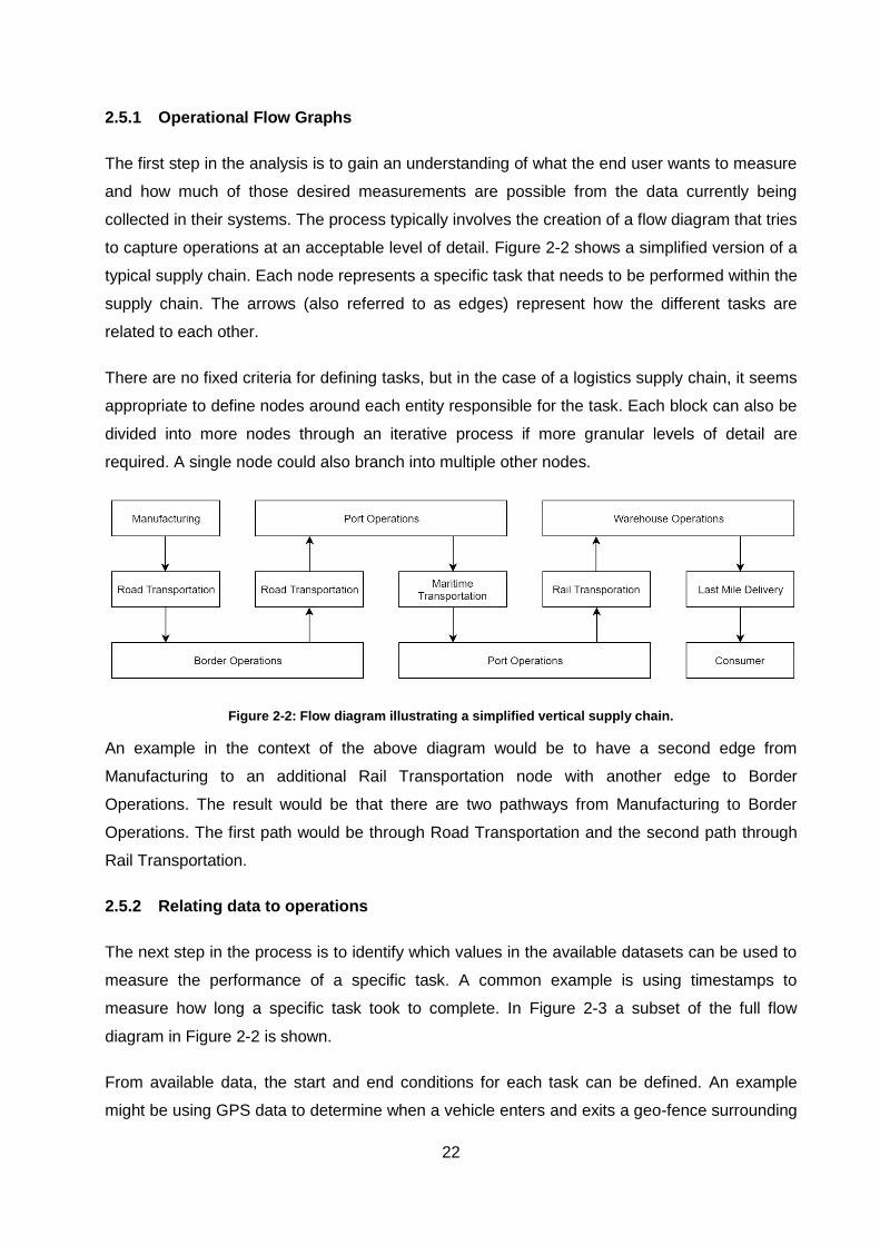
22
2.5.1 Operational Flow Graphs
The first step in the analysis is to gain an understanding of what the end user wants to measure
and how much of those desired measurements are possible from the data currently being
collected in their systems. The process typically involves the creation of a flow diagram that tries
to capture operations at an acceptable level of detail. Figure 2-2 shows a simplified version of a
typical supply chain. Each node represents a specific task that needs to be performed within the
supply chain. The arrows (also referred to as edges) represent how the different tasks are
related to each other.
There are no fixed criteria for defining tasks, but in the case of a logistics supply chain, it seems
appropriate to define nodes around each entity responsible for the task. Each block can also be
divided into more nodes through an iterative process if more granular levels of detail are
required. A single node could also branch into multiple other nodes.
Figure 2-2: Flow diagram illustrating a simplified vertical supply chain.
An example in the context of the above diagram would be to have a second edge from
Manufacturing to an additional Rail Transportation node with another edge to Border
Operations. The result would be that there are two pathways from Manufacturing to Border
Operations. The first path would be through Road Transportation and the second path through
Rail Transportation.
2.5.2 Relating data to operations
The next step in the process is to identify which values in the available datasets can be used to
measure the performance of a specific task. A common example is using timestamps to
measure how long a specific task took to complete. In Figure 2-3 a subset of the full flow
diagram in Figure 2-2 is shown.
From available data, the start and end conditions for each task can be defined. An example
might be using GPS data to determine when a vehicle enters and exits a geo-fence surrounding
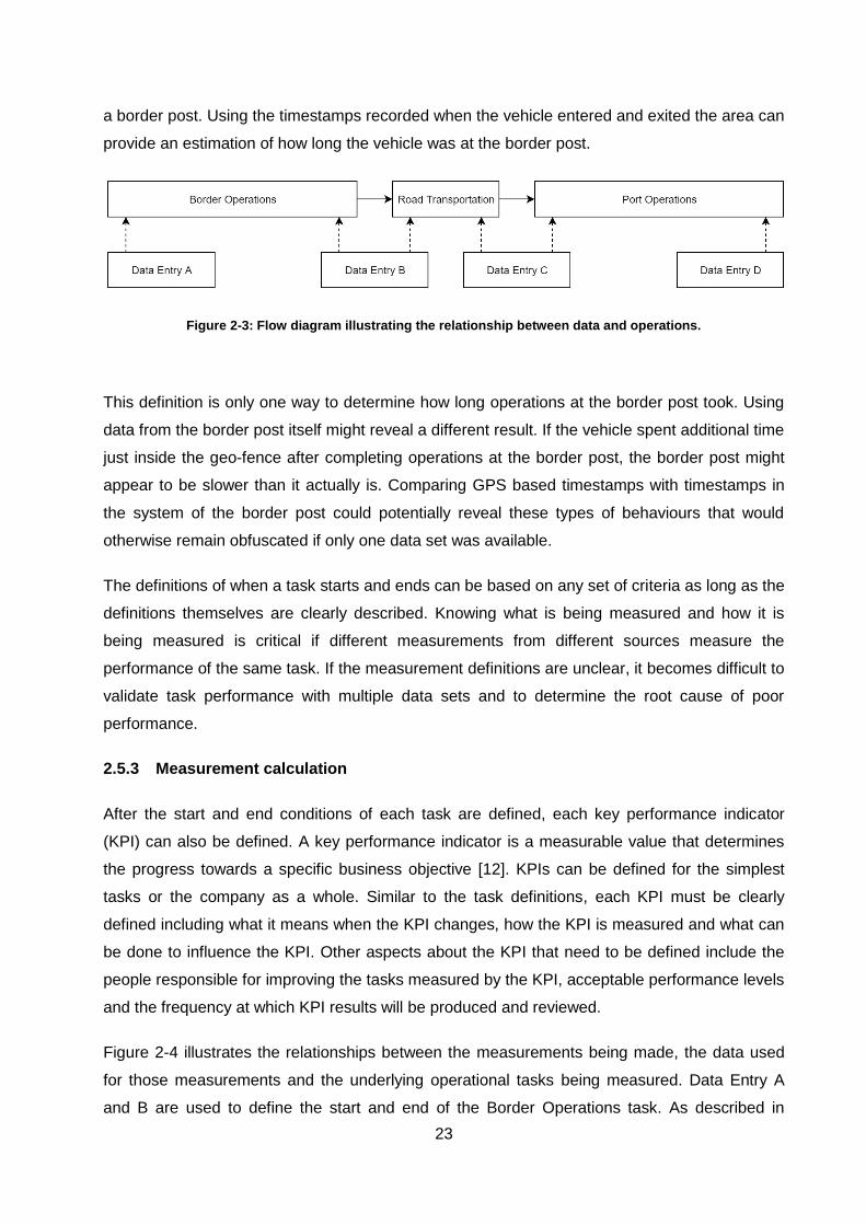
23
a border post. Using the timestamps recorded when the vehicle entered and exited the area can
provide an estimation of how long the vehicle was at the border post.
Figure 2-3: Flow diagram illustrating the relationship between data and operations.
This definition is only one way to determine how long operations at the border post took. Using
data from the border post itself might reveal a different result. If the vehicle spent additional time
just inside the geo-fence after completing operations at the border post, the border post might
appear to be slower than it actually is. Comparing GPS based timestamps with timestamps in
the system of the border post could potentially reveal these types of behaviours that would
otherwise remain obfuscated if only one data set was available.
The definitions of when a task starts and ends can be based on any set of criteria as long as the
definitions themselves are clearly described. Knowing what is being measured and how it is
being measured is critical if different measurements from different sources measure the
performance of the same task. If the measurement definitions are unclear, it becomes difficult to
validate task performance with multiple data sets and to determine the root cause of poor
performance.
2.5.3 Measurement calculation
After the start and end conditions of each task are defined, each key performance indicator
(KPI) can also be defined. A key performance indicator is a measurable value that determines
the progress towards a specific business objective [12]. KPIs can be defined for the simplest
tasks or the company as a whole. Similar to the task definitions, each KPI must be clearly
defined including what it means when the KPI changes, how the KPI is measured and what can
be done to influence the KPI. Other aspects about the KPI that need to be defined include the
people responsible for improving the tasks measured by the KPI, acceptable performance levels
and the frequency at which KPI results will be produced and reviewed.
Figure 2-4 illustrates the relationships between the measurements being made, the data used
for those measurements and the underlying operational tasks being measured. Data Entry A
and B are used to define the start and end of the Border Operations task. As described in
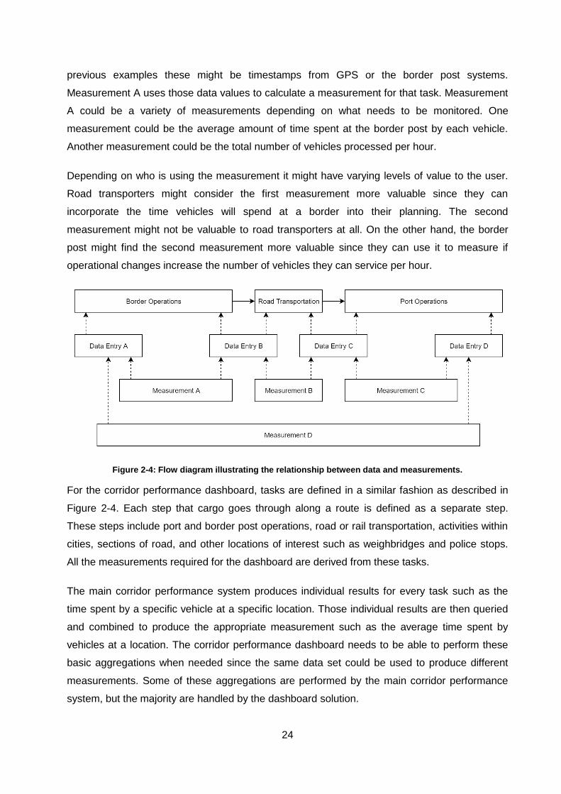
24
previous examples these might be timestamps from GPS or the border post systems.
Measurement A uses those data values to calculate a measurement for that task. Measurement
A could be a variety of measurements depending on what needs to be monitored. One
measurement could be the average amount of time spent at the border post by each vehicle.
Another measurement could be the total number of vehicles processed per hour.
Depending on who is using the measurement it might have varying levels of value to the user.
Road transporters might consider the first measurement more valuable since they can
incorporate the time vehicles will spend at a border into their planning. The second
measurement might not be valuable to road transporters at all. On the other hand, the border
post might find the second measurement more valuable since they can use it to measure if
operational changes increase the number of vehicles they can service per hour.
Figure 2-4: Flow diagram illustrating the relationship between data and measurements.
For the corridor performance dashboard, tasks are defined in a similar fashion as described in
Figure 2-4. Each step that cargo goes through along a route is defined as a separate step.
These steps include port and border post operations, road or rail transportation, activities within
cities, sections of road, and other locations of interest such as weighbridges and police stops.
All the measurements required for the dashboard are derived from these tasks.
The main corridor performance system produces individual results for every task such as the
time spent by a specific vehicle at a specific location. Those individual results are then queried
and combined to produce the appropriate measurement such as the average time spent by
vehicles at a location. The corridor performance dashboard needs to be able to perform these
basic aggregations when needed since the same data set could be used to produce different
measurements. Some of these aggregations are performed by the main corridor performance
system, but the majority are handled by the dashboard solution.
25
2.5.4 Measurement presentation
Presenting data is the primary purpose of the corridor performance dashboard. The
requirements in the TOR do not specifically dictate how performance measurements should be
presented to users in this project. Through various discussions with stakeholders, it was
decided that the dashboard should be able to support some of the most commonly used
visualisation methods. These visualisation options include:
Result Tables
Line charts
Bar charts
Pie charts
Box plots
Histograms
Geographical Maps
These visualisation requirements are most likely going to change and be iteratively refined as
users provide feedback. The chosen visualisation solution needs to be flexible enough to
change how a data set is visualised with minimal effort.
2.6 Trends and Events in Technology
2.6.1 Cloud Computing Adoption
Cloud-based systems have seen major adoption in developed nations since cloud providers first
started offering services around 2002. Researchers from a cloud industry research team
surveyed 786 technical professionals and noted that 94% of respondents use cloud solutions
[13]. Developing countries, however, have seen slower adoption rates compared to the
developed world. According to a report by the United Nations some of the key barriers
contributing to slow cloud adoption include [14]:
Availability and quality of cloud-related infrastructure.
Cost considerations.
Inadequate legal and regulatory frameworks to address data protection and privacy.
Despite these challenges the main benefits cloud solutions could offer are [14]:
Cost savings.
Flexible access to facilities on demand.
26
Improved system management, reliability and IT security
Although these benefits are not guaranteed by simply moving operations to the cloud, they have
motivated enterprise and small to medium businesses in developing countries to explore the
possibilities of using cloud-based solutions. One of the requirements for this corridor
performance dashboard is to use cloud-based solutions for the implementation.
2.6.2 Open Source
In recent years a key trend in the software industry has been the adoption of open source
software. An annual survey of 950 enterprise companies 68% of respondents indicated an
increase in the use of open source software [15]. Some of the largest companies in the software
industry have also made notable acquisitions of open source technologies and providers in
recent years. Google acquired Android Inc. in July of 2005 for an estimated $50 million or more
[16]. On June 4th 2018 Microsoft announced its intent to acquire GitHub, the largest platform for
sharing and collaborating on open source software, for $7.5 billion [17]. On October 28th 2018
IBM and Red Hat announced that IBM would acquire Red Hat, the largest open source hybrid
and private cloud provider in the world [18]. These acquisitions have shown that traditional
enterprise software providers have seen value in open source technologies and solutions.
Open source software should be evaluated alongside traditional enterprise offerings to
determine if these technologies and software would be viable solutions in the development of a
corridor monitoring solution.
2.6.3 Big Data and IoT
As new computing solutions are invented, more aspects of daily life and business are impacted
by these inventions. Over the last few decades, the reliance on computer systems and the
internet has penetrated nearly every business and become a core component of many modern
business models. In the coming years, the use of technology will likely continue to grow and
introduce new computer devices to address new challenges. Logistics organisations such as
DHL actively monitor these trends and have produced reports detailing their predictions of
future logistics operations. In a 2015 report the authors identified a concept called the internet of
everything (IoE) which is comprised of four main components [19]:
Data: Interconnected data sources.
Things: Devices connected to the internet and each other.
People: More relevant and valuable connections between people.
Process: Ensuring that each person or device has access to data when needed.
27
Based on this report the prediction is that more devices will produce more data which will
provide management and employees with a more comprehensive view of the supply chain.
Increased visibility would allow people to make better decisions and react faster to operational
demands. The report also identifies some key areas where internet of things (IoT) solutions can
likely be introduced to enhance operations. These potential areas for improvement include [19]:
Fleet management: Optimizing the use of transport assets is one of the key areas that
logistics operations can improve.
Resource and energy monitoring: IoT could be used to monitor resources as well including
electricity, water, fuel and natural gas.
Connected production: By introducing IoT into the production environment each system can
be monitored to ensure that it is operating as intended.
Equipment and employee monitoring: Connecting equipment and employees through IoT
could increase safety conditions.
Security: Additional monitoring of facilities and assets can help to identify weaknesses in
security and allow authorities to respond quicker.
Connected customers: Better methods for collecting more information and feedback from
customers.
All of these potential benefits that IoT can provide will produce new sets of data to integrate and
analyse. The introduction of more data would allow for a more detailed breakdown of operations
and as a result, produce more accurate measurements of the supply chain. Being able to
accommodate new types of data sets and measurements with minimal effort needs to be a key
consideration in the design of the corridor performance dashboard.
2.6.4 RFID
One technology that has the potential to improve the visibility of corridor operations greatly is
RFID technology. RFID technologies would allow stakeholders in trade corridors to gather data
on the level of material flow. Some potential benefits identified by the VDC Research Group
include [20]:
Asset Tracking, management and utilisation optimisation.
Traceability Improvements.
Supply chain and inventory visibility improvements.
28
Manufacturing and work-in-progress tracking improvements.
Multi-Application support with a single tag.
Each of the stakeholders previously discussed could see potential benefits from incorporating
RFID solutions into trade corridors. Cargo owners would benefit from all the points mentioned
as the increased visibility would allow them to monitor the entire supply chain in more detail.
Deploying RFID solutions at ports and border posts would allow all the cargo stored and
processed at the facilities to be tracked in real-time. Tracking individual vehicles or cargo
containers as they pass through ports and border posts can help with insights into the
optimisation of operations. RFID could also provide a security benefit as there are RFID tags
that function as locks which can indicate when a container was opened when it should not have
been opened.
Shipping lines already have very sophisticated solutions for optimally managing cargo on the
ships themselves. Adding RFID solutions to the containers would allow shipping lines to
coordinate better with ports and share relevant information as physical cargo moves between
ships and the ports themselves.
Incorporating RFID technologies on all the cargo and cargo containers would allow customs and
clearing agents to declare and verify the contents of cargo and cargo containers in much more
detail than is currently being done. By combining RFID solutions with existing data sources such
as GPS position and condition sensing solutions, Smart Logistics Zones can be created. Smart
Logistics Zones are areas where technical solutions are used for the identification, localisation
and condition monitoring of different object levels in logistics and production processes [21].
The introduction of RFID solutions into the corridor would provide additional data sources which
could ultimately be used in a corridor performance dashboard. Additional sources of data
provide a more comprehensive and complete measurement of corridor performance.
2.6.5 The Digital Divide
As developed nations continue to develop technology, there is a growing concern that
developing nations and poor communities are being left behind. The world continues to use
computers and automation to solve problems, and computer literacy is becoming a requirement
in most work disciplines. Since the focus of this study is developing corridor performance
dashboards in and around Africa, it is important to consider the amount of interaction people
have with computers and mobile devices in the community. According to the International
Telecommunication Union (ITU), approximately 18% of households in Africa have internet
29
access. In South Africa specifically, an estimated 52.96% of households have internet access.
Only an estimated 24.39% of households have a computer which means that mobile is primarily
driving internet adoption [22].
2.7 Corridor Performance Benchmarking Dashboard Requirements
2.7.1 Detailed Dashboard Requirements
The project as a whole involves various companies and government agencies that will be
providing data and developing a combined software solution. The project is divided into the
following subcomponents:
Public Feedback System
Truck Driver e-Diary System
E-Marketplace System
Corridor Performance Dashboard System
The public feedback, truck driver e-diary and e-marketplace systems consist of existing software
solutions or are being developed by other software development partners involved with the
project.
This dissertation focuses on the design and implementation of the corridor performance
dashboard website that will present the finalised performance metrics to clients. These
responsibilities include:
Provisioning the required infrastructure needed for hosting the website.
Deploying the software onto the provisioned infrastructure.
Implementing the dashboard software by using commercial off the shelf (COTS) software
solutions, adapting existing solutions or developing new software if required.
Since the majority of the analysis is being performed by other partners of the project focus of the
dashboard is to present the results to users in an appropriate way. The specific requirements of
the dashboard are:
The dashboard needs to be web-based to cater to as many users as possible without
requiring the installation of the software onto devices.
Access to results needs to be controlled to ensure that only signed in users can view private
results. Public results need to be viewable by the general public.
30
Allow registered users to log into the dashboard using an email and password. Ensure that
this authentication process is done securely according to acceptable industry standards.
The results that need to be presented to users will be provided through systems developed
by other partners of the project. The dashboard needs to be able to integrate with those
systems and retrieve results based on what the user wants to see.
Communication between the dashboard and other systems need to be secure according to
acceptable industry standards.
The dashboard should be able to visually present results in the form of a table, line chart,
bar chart, pie chart, box plot or histogram where appropriate. The dashboard should also be
able to include GIS elements such as overlaying results onto Geographical maps.
Visualisations are to be implemented based on feedback from clients and the availability of
data from industry providers.
The dashboard should allow users to save the visualisations mentioned above for use
outside the dashboard environment.
The dashboard should provide reports in the form of PDF documents which can be
downloaded. The dashboard should be able to include the visualisations mentioned above
into the reports where appropriate. Reports are to be implemented based on feedback from
the client and the availability of data from industry partners.
2.8 Technology Survey Methodology
The goal of the technology survey is to identify and evaluate the different technologies and
software that can be used to implement a system that will satisfy the requirements of the
project. The software and technology industry has grown so rapidly in the last decade that fully
evaluating all the possible options and configurations that could be used to implement a corridor
dashboard system and selecting the most optimal solution would not be practical.
Instead, the methodology for this technology survey is to identify a selection of the most
commonly used solutions within the industry. These solutions are then compared against each
other and evaluated against a defined set of requirements. Potential solutions are eliminated
based on findings that show a specific solution would not satisfy the defined requirements.
Out of the remaining viable solutions, a preferred solution is determined based on the expertise
of the developers involved in the project. This final selection is completely subjective and will
depend entirely on the developers involved and the details of this specific project. Any of the
identified viable solutions, as well as other less known solutions that were not evaluated, could
also be considered alternatives to developing a corridor performance dashboard solution.
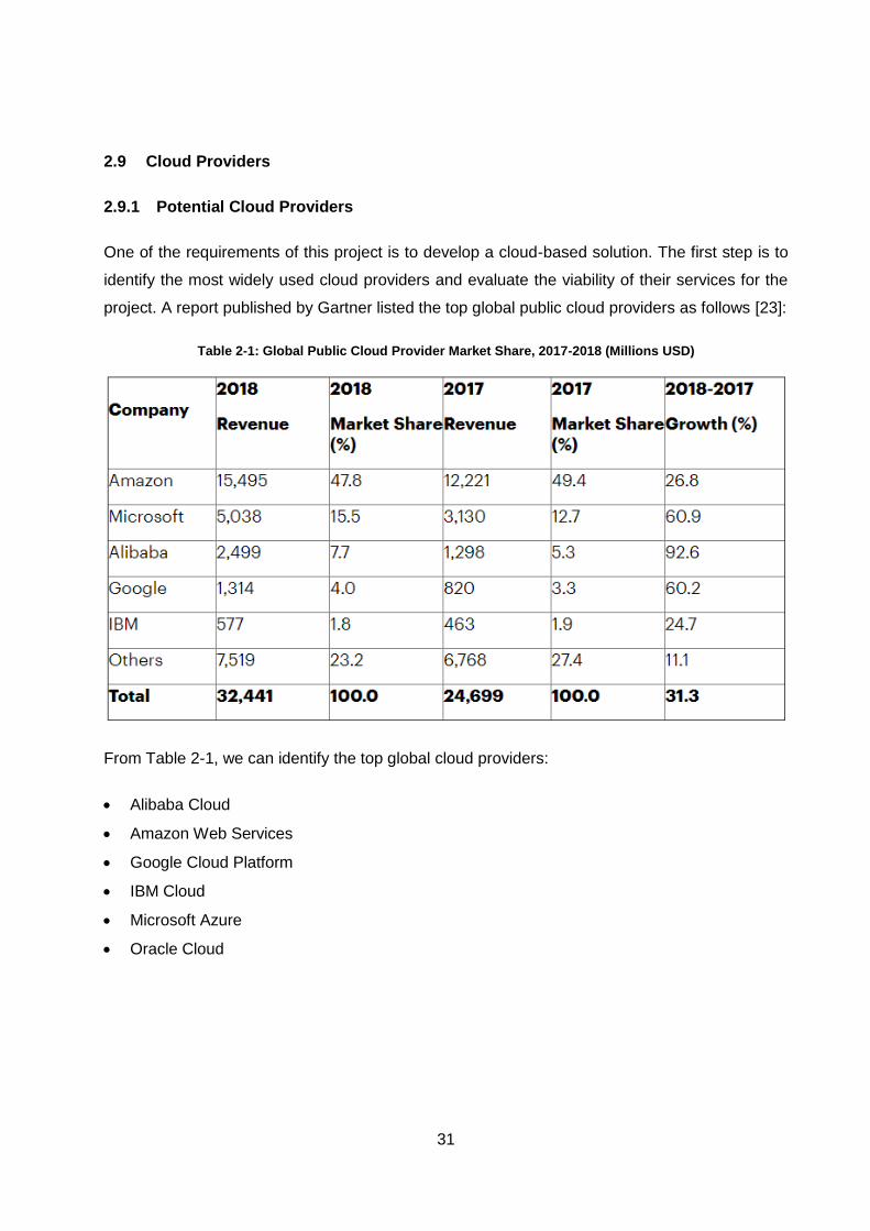
31
2.9 Cloud Providers
2.9.1 Potential Cloud Providers
One of the requirements of this project is to develop a cloud-based solution. The first step is to
identify the most widely used cloud providers and evaluate the viability of their services for the
project. A report published by Gartner listed the top global public cloud providers as follows [23]:
Table 2-1: Global Public Cloud Provider Market Share, 2017-2018 (Millions USD)
From Table 2-1, we can identify the top global cloud providers:
Alibaba Cloud
Amazon Web Services
Google Cloud Platform
IBM Cloud
Microsoft Azure
Oracle Cloud
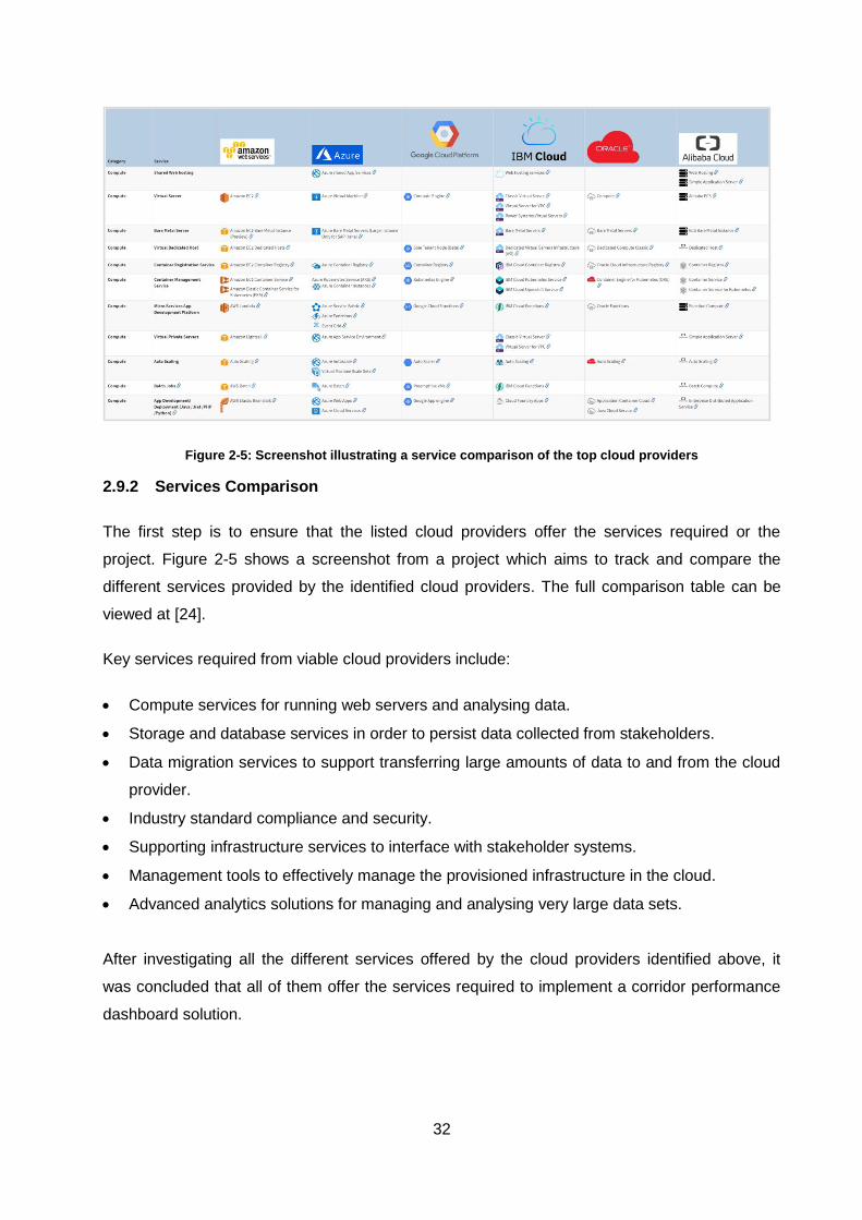
32
Figure 2-5: Screenshot illustrating a service comparison of the top cloud providers
2.9.2 Services Comparison
The first step is to ensure that the listed cloud providers offer the services required or the
project. Figure 2-5 shows a screenshot from a project which aims to track and compare the
different services provided by the identified cloud providers. The full comparison table can be
viewed at [24].
Key services required from viable cloud providers include:
Compute services for running web servers and analysing data.
Storage and database services in order to persist data collected from stakeholders.
Data migration services to support transferring large amounts of data to and from the cloud
provider.
Industry standard compliance and security.
Supporting infrastructure services to interface with stakeholder systems.
Management tools to effectively manage the provisioned infrastructure in the cloud.
Advanced analytics solutions for managing and analysing very large data sets.
After investigating all the different services offered by the cloud providers identified above, it
was concluded that all of them offer the services required to implement a corridor performance
dashboard solution.
33
Another key requirement of the project is guaranteed service delivery by the cloud provider to
ensure the system is always online. The service level agreements for each of the cloud
providers are available at:
Alibaba Cloud [25].
Amazon Web Services [26].
Google Cloud Platform [27].
IBM Cloud [28].
Microsoft Azure [29].
Oracle Cloud [30].
All of the cloud providers listed above offer at least 99.9% availability for standard services and
99.99% availability for high availability services. All the cloud providers offer service level
agreements which exceed the minimum requirements as specified for this project.
2.9.3 Regional Availability
Another key consideration for cloud providers is the geographical locations in which they have
data centres. Each of the cloud providers does not offer all their services at every data centre
location. The data centre locations for each of the potential cloud providers are available at:
Alibaba Cloud [31].
Amazon Web Services [32].
Google Cloud Platform [33].
IBM Cloud [34].
Microsoft Azure [35].
Oracle Cloud [36].
Very few of the large international cloud providers have data centres on the African continent.
Microsoft has announced that they plan to deliver their services from data centres in
Johannesburg and Cape Town [37]. AWS also recently announced their plans to open an AWS
Region in Cape Town in 2020 [38]. A report by the United Nations details that a key contributor
to the lack of data centres in the African Continent is the lack of sufficient infrastructure [14].
After considering all the available regions and the services offered in each one the suggested
cloud providers are Amazon Web Services, Google Cloud Platform and Microsoft Azure as they
provide the largest subset of their services in every region.
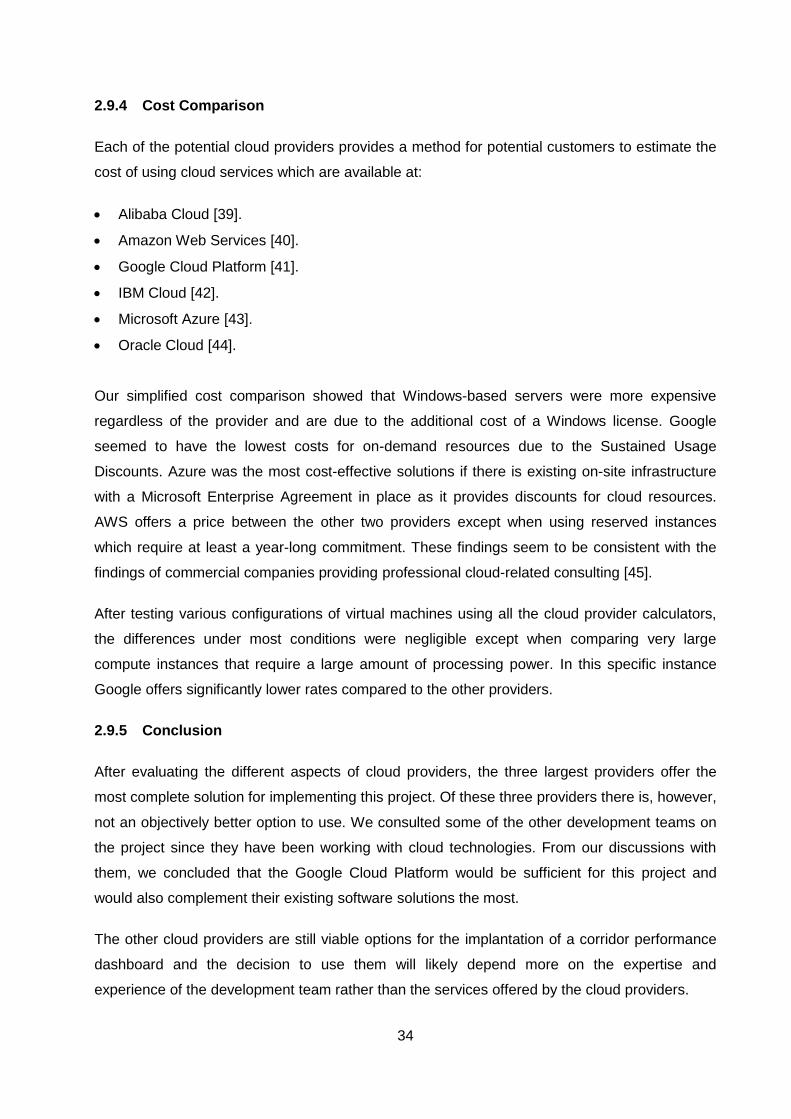
34
2.9.4 Cost Comparison
Each of the potential cloud providers provides a method for potential customers to estimate the
cost of using cloud services which are available at:
Alibaba Cloud [39].
Amazon Web Services [40].
Google Cloud Platform [41].
IBM Cloud [42].
Microsoft Azure [43].
Oracle Cloud [44].
Our simplified cost comparison showed that Windows-based servers were more expensive
regardless of the provider and are due to the additional cost of a Windows license. Google
seemed to have the lowest costs for on-demand resources due to the Sustained Usage
Discounts. Azure was the most cost-effective solutions if there is existing on-site infrastructure
with a Microsoft Enterprise Agreement in place as it provides discounts for cloud resources.
AWS offers a price between the other two providers except when using reserved instances
which require at least a year-long commitment. These findings seem to be consistent with the
findings of commercial companies providing professional cloud-related consulting [45].
After testing various configurations of virtual machines using all the cloud provider calculators,
the differences under most conditions were negligible except when comparing very large
compute instances that require a large amount of processing power. In this specific instance
Google offers significantly lower rates compared to the other providers.
2.9.5 Conclusion
After evaluating the different aspects of cloud providers, the three largest providers offer the
most complete solution for implementing this project. Of these three providers there is, however,
not an objectively better option to use. We consulted some of the other development teams on
the project since they have been working with cloud technologies. From our discussions with
them, we concluded that the Google Cloud Platform would be sufficient for this project and
would also complement their existing software solutions the most.
The other cloud providers are still viable options for the implantation of a corridor performance
dashboard and the decision to use them will likely depend more on the expertise and
experience of the development team rather than the services offered by the cloud providers.
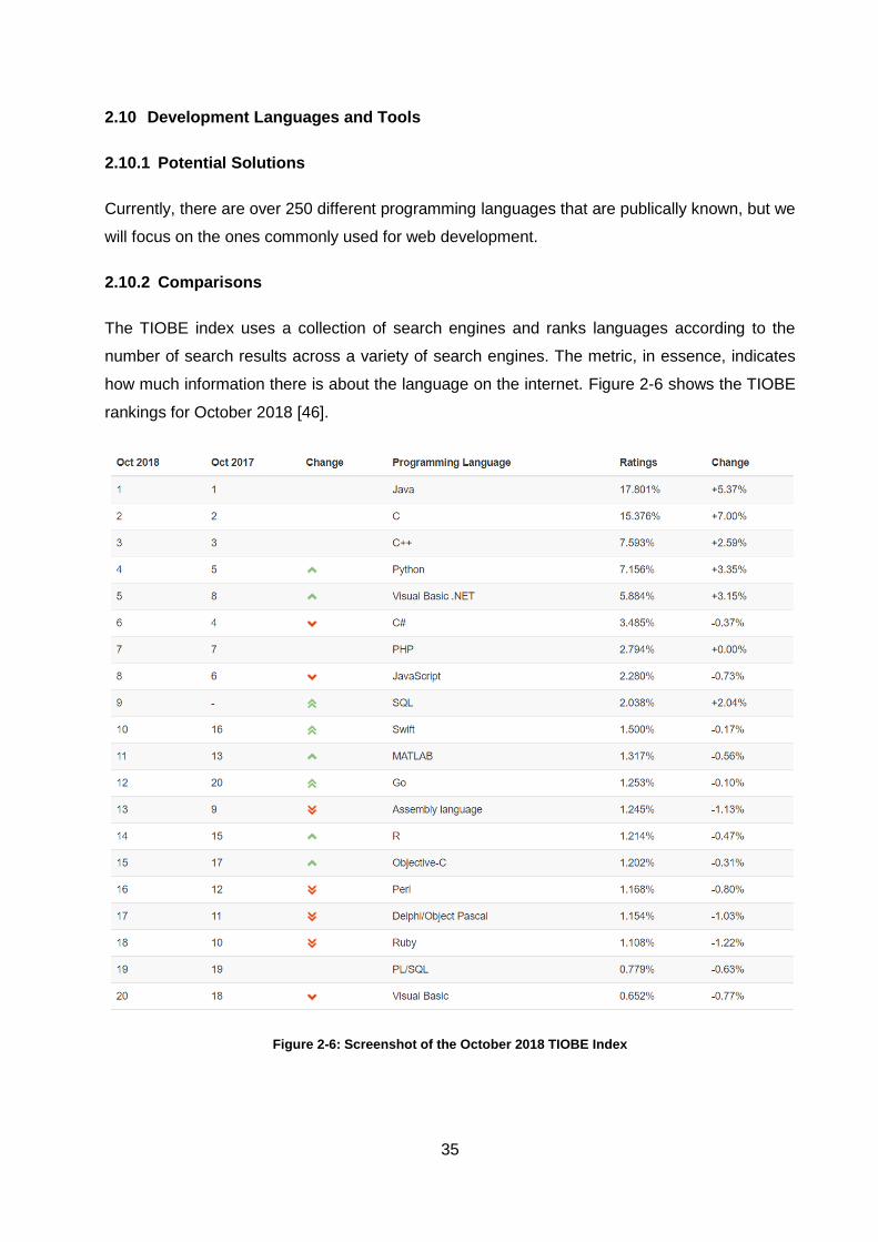
35
2.10 Development Languages and Tools
2.10.1 Potential Solutions
Currently, there are over 250 different programming languages that are publically known, but we
will focus on the ones commonly used for web development.
2.10.2 Comparisons
The TIOBE index uses a collection of search engines and ranks languages according to the
number of search results across a variety of search engines. The metric, in essence, indicates
how much information there is about the language on the internet. Figure 2-6 shows the TIOBE
rankings for October 2018 [46].
Figure 2-6: Screenshot of the October 2018 TIOBE Index
36
Figure 2-7: Screenshot of the October 2018 PYPL Index
Another measurement of language popularity is the Popularity of Programming Language
(PYPL) index. This index is calculated by comparing Google trends data for the language and
the keyword “tutorial”. The goal of this index is to quantify what people are searching for as
opposed to what is available. Figure 2-7 shows the PYPL index rankings for October 2018 [47].

37
If we only consider the languages that are consistently highly ranked and have solutions for
developing web-based systems, we can compile the following list of potential languages:
C#
PHP
Python
JavaScript
Java
Go
C/C++
Ruby
Visual Basic .Net
Another way to compare languages is to see what the rest of the industry uses for developing
solutions. According to the annual Stack Overflow developer survey, the most commonly used
with the results shown in Figure 2-8 [48]. JavaScript has been the most used technology for
seven years in a row according to all of the previous annual surveys.
Figure 2-8: Screenshot of most used languages according to Stack Overflow Survey
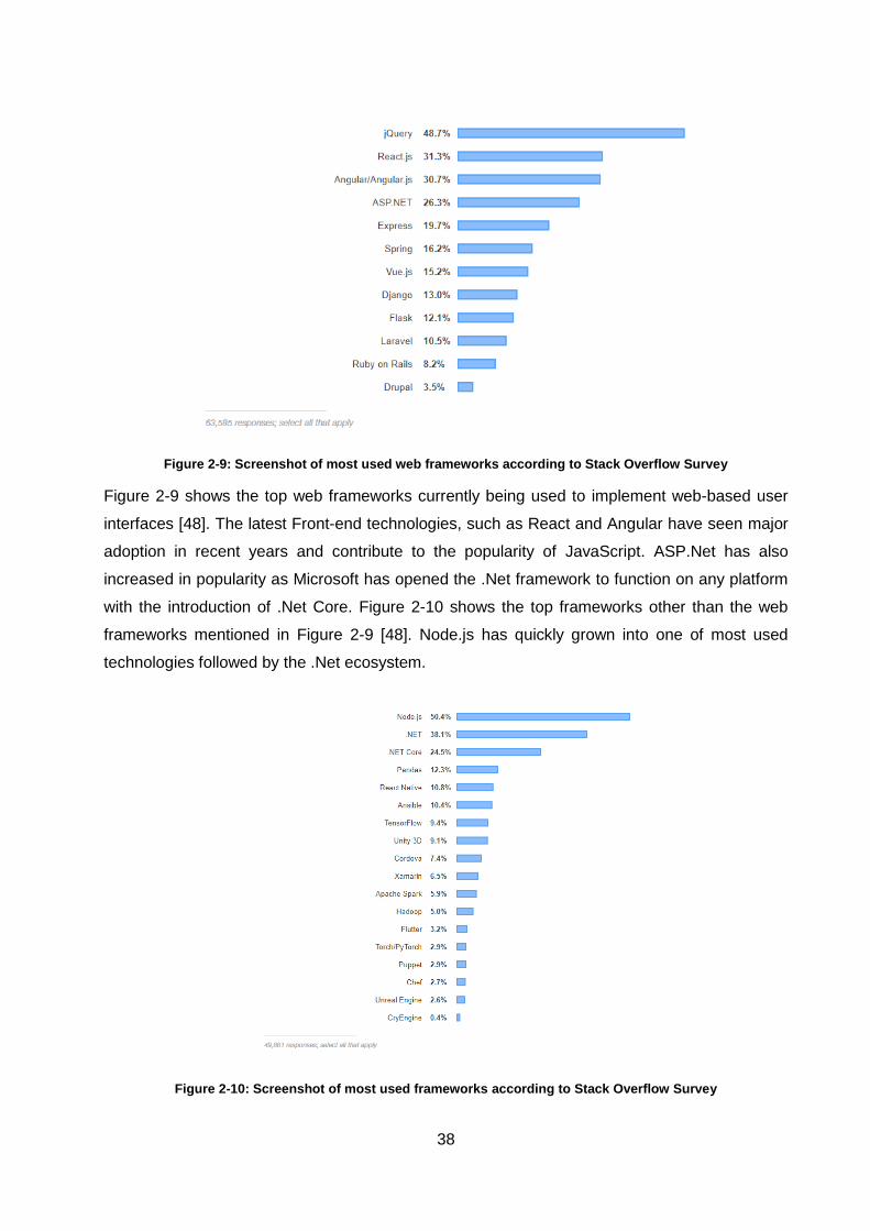
38
Figure 2-9: Screenshot of most used web frameworks according to Stack Overflow Survey
Figure 2-9 shows the top web frameworks currently being used to implement web-based user
interfaces [48]. The latest Front-end technologies, such as React and Angular have seen major
adoption in recent years and contribute to the popularity of JavaScript. ASP.Net has also
increased in popularity as Microsoft has opened the .Net framework to function on any platform
with the introduction of .Net Core. Figure 2-10 shows the top frameworks other than the web
frameworks mentioned in Figure 2-9 [48]. Node.js has quickly grown into one of most used
technologies followed by the .Net ecosystem.
Figure 2-10: Screenshot of most used frameworks according to Stack Overflow Survey
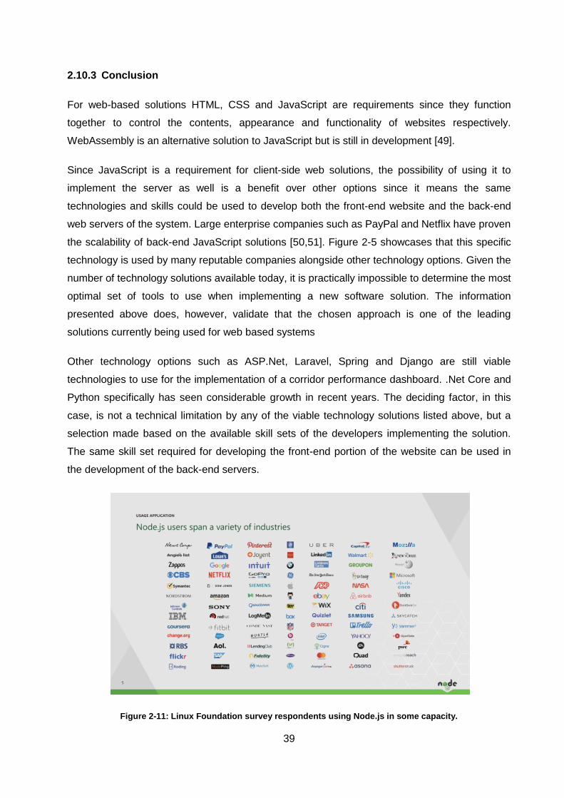
39
2.10.3 Conclusion
For web-based solutions HTML, CSS and JavaScript are requirements since they function
together to control the contents, appearance and functionality of websites respectively.
WebAssembly is an alternative solution to JavaScript but is still in development [49].
Since JavaScript is a requirement for client-side web solutions, the possibility of using it to
implement the server as well is a benefit over other options since it means the same
technologies and skills could be used to develop both the front-end website and the back-end
web servers of the system. Large enterprise companies such as PayPal and Netflix have proven
the scalability of back-end JavaScript solutions [50,51]. Figure 2-5 showcases that this specific
technology is used by many reputable companies alongside other technology options. Given the
number of technology solutions available today, it is practically impossible to determine the most
optimal set of tools to use when implementing a new software solution. The information
presented above does, however, validate that the chosen approach is one of the leading
solutions currently being used for web based systems
Other technology options such as ASP.Net, Laravel, Spring and Django are still viable
technologies to use for the implementation of a corridor performance dashboard. .Net Core and
Python specifically has seen considerable growth in recent years. The deciding factor, in this
case, is not a technical limitation by any of the viable technology solutions listed above, but a
selection made based on the available skill sets of the developers implementing the solution.
The same skill set required for developing the front-end portion of the website can be used in
the development of the back-end servers.
Figure 2-11: Linux Foundation survey respondents using Node.js in some capacity.
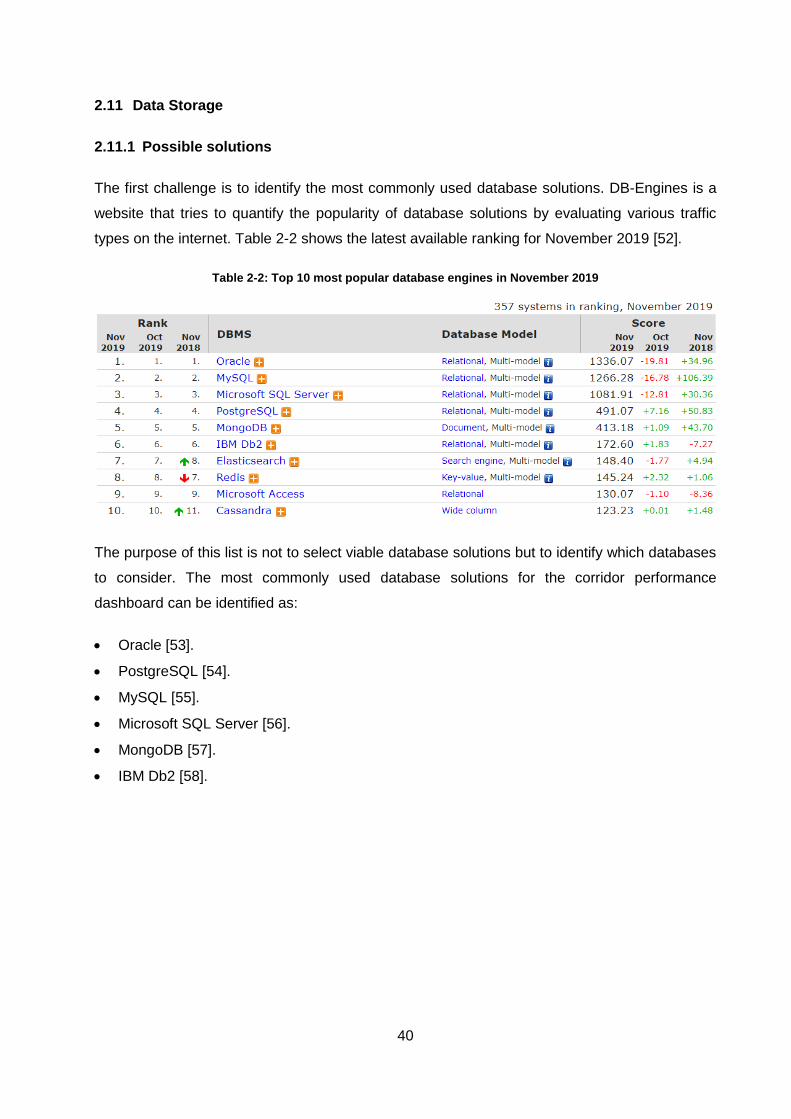
40
2.11 Data Storage
2.11.1 Possible solutions
The first challenge is to identify the most commonly used database solutions. DB-Engines is a
website that tries to quantify the popularity of database solutions by evaluating various traffic
types on the internet. Table 2-2 shows the latest available ranking for November 2019 [52].
Table 2-2: Top 10 most popular database engines in November 2019
The purpose of this list is not to select viable database solutions but to identify which databases
to consider. The most commonly used database solutions for the corridor performance
dashboard can be identified as:
Oracle [53].
PostgreSQL [54].
MySQL [55].
Microsoft SQL Server [56].
MongoDB [57].
IBM Db2 [58].
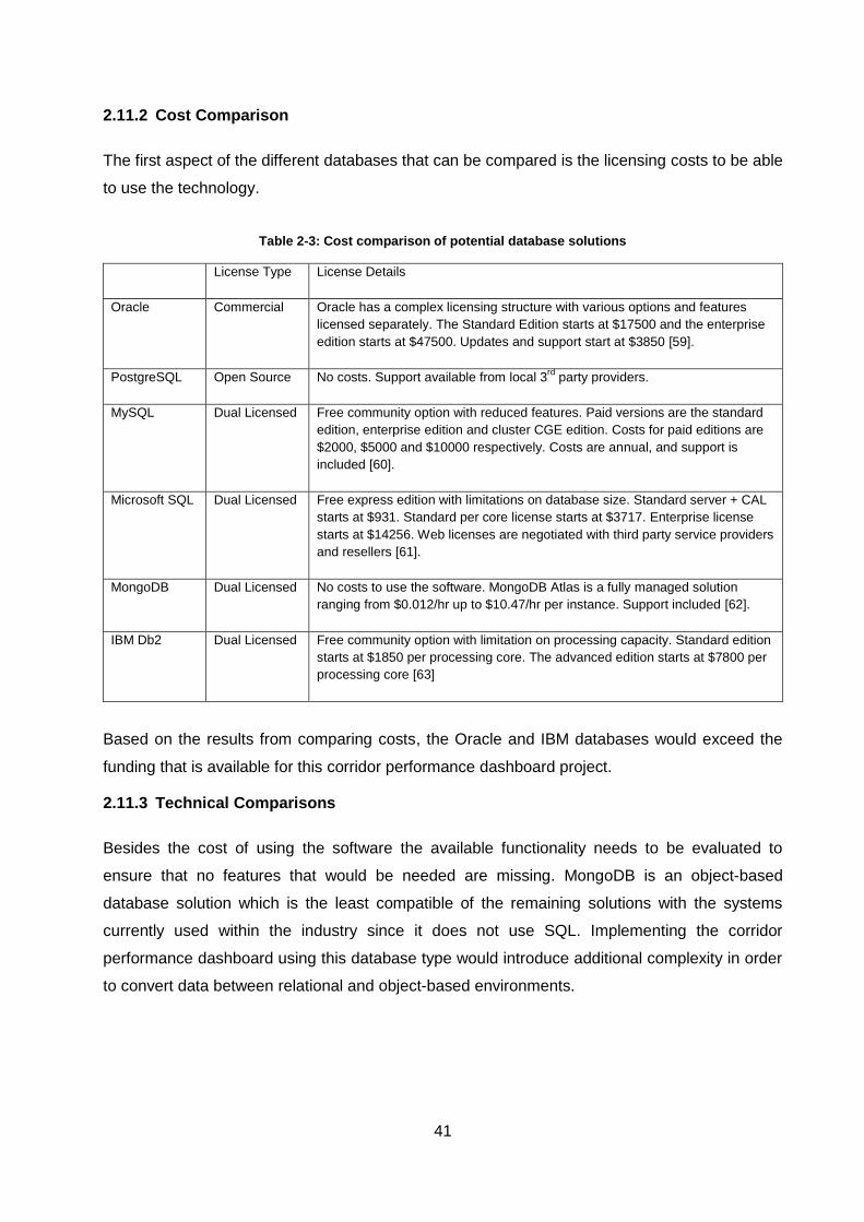
41
2.11.2 Cost Comparison
The first aspect of the different databases that can be compared is the licensing costs to be able
to use the technology.
Table 2-3: Cost comparison of potential database solutions
License Type License Details
Oracle Commercial Oracle has a complex licensing structure with various options and features
licensed separately. The Standard Edition starts at $17500 and the enterprise
edition starts at $47500. Updates and support start at $3850 [59].
PostgreSQL Open Source No costs. Support available from local 3rd
party providers.
MySQL Dual Licensed Free community option with reduced features. Paid versions are the standard
edition, enterprise edition and cluster CGE edition. Costs for paid editions are
$2000, $5000 and $10000 respectively. Costs are annual, and support is
included [60].
Microsoft SQL Dual Licensed Free express edition with limitations on database size. Standard server + CAL
starts at $931. Standard per core license starts at $3717. Enterprise license
starts at $14256. Web licenses are negotiated with third party service providers
and resellers [61].
MongoDB Dual Licensed No costs to use the software. MongoDB Atlas is a fully managed solution
ranging from $0.012/hr up to $10.47/hr per instance. Support included [62].
IBM Db2 Dual Licensed Free community option with limitation on processing capacity. Standard edition
starts at $1850 per processing core. The advanced edition starts at $7800 per
processing core [63]
Based on the results from comparing costs, the Oracle and IBM databases would exceed the
funding that is available for this corridor performance dashboard project.
2.11.3 Technical Comparisons
Besides the cost of using the software the available functionality needs to be evaluated to
ensure that no features that would be needed are missing. MongoDB is an object-based
database solution which is the least compatible of the remaining solutions with the systems
currently used within the industry since it does not use SQL. Implementing the corridor
performance dashboard using this database type would introduce additional complexity in order
to convert data between relational and object-based environments.
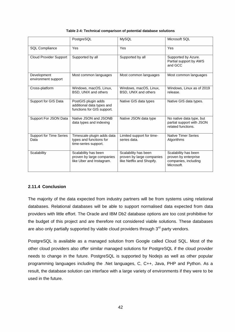
42
Table 2-4: Technical comparison of potential database solutions
PostgreSQL MySQL Microsoft SQL
SQL Compliance Yes Yes Yes
Cloud Provider Support Supported by all
Supported by all Supported by Azure. Partial support by AWS and GCC
Development environment support
Most common languages Most common languages Most common languages
Cross-platform Windows, macOS, Linux, BSD, UNIX and others
Windows, macOS, Linux, BSD, UNIX and others
Windows, Linux as of 2019 release.
Support for GIS Data PostGIS plugin adds additional data types and functions for GIS support.
Native GIS data types Native GIS data types.
Support For JSON Data Native JSON and JSONB data types and indexing
Native JSON data type No native data type, but partial support with JSON related functions.
Support for Time Series Data
Timescale plugin adds data types and functions for time-series support.
Limited support for time-series data.
Native Timer Series Algorithms
Scalability Scalability has been proven by large companies like Uber and Instagram.
Scalability has been proven by large companies like Netflix and Shopify.
Scalability has been proven by enterprise companies, including Microsoft.
2.11.4 Conclusion
The majority of the data expected from industry partners will be from systems using relational
databases. Relational databases will be able to support normalised data expected from data
providers with little effort. The Oracle and IBM Db2 database options are too cost prohibitive for
the budget of this project and are therefore not considered viable solutions. These databases
are also only partially supported by viable cloud providers through 3rd party vendors.
PostgreSQL is available as a managed solution from Google called Cloud SQL. Most of the
other cloud providers also offer similar managed solutions for PostgreSQL if the cloud provider
needs to change in the future. PostgreSQL is supported by Nodejs as well as other popular
programming languages including the .Net languages, C, C++, Java, PHP and Python. As a
result, the database solution can interface with a large variety of environments if they were to be
used in the future.
43
PostgresSQL is open-source which means there are no additional license fees associated with
the database. Commercial support for PostgreSQL is available from Google as well as from
third-party companies if specialised support is required. PostgreSQL is compatible with most
common operating system environments including Windows, Unix, OS X, Linux, FreeBSD and
many others. If the underlying operating system of the infrastructure needs to be changed the
choice to use PostgreSQL is unlikely to limit the alternative operating systems.
Some of the largest software companies have shown that PostgreSQL can function at scale,
including Uber during their infancy [64]. Other companies include the UK weather service which
switched from Oracle to PostgreSQL [65] and Instagram, an image-based social media platform
with over 1 billion users acquired by Facebook [66]. PostgreSQL also has an extension system
that allows additional functionality to be added to the base solution. Among these extensions is
the PostGIS extension used for GIS-related data types such as geographical points, lines and
polygons. PostgreSQL also has native support for JSON data types which provides additional
flexibility on top of the existing relational database functionality.
Both the other database alternatives are still viable solutions. The combination of low cost and
the better support of JSON, GIS and Time Series data makes PostgreSQL the suggested
solution for this specific solution.
2.12 Communication
2.12.1 Possible solutions
Since the corridor performance dashboard is going to be a web-based application, we will be
using HTTP to communicate between web browsers and the performance dashboard. HTTP will
allow standard web-based activities such as loading the resources to render the website as well
as sending requests to fetch or change data located on the server. Commonly used messaging
protocols that make use of HTTP include:
SOAP
REST
GraphQL
XML-RPC
JSON-RPC
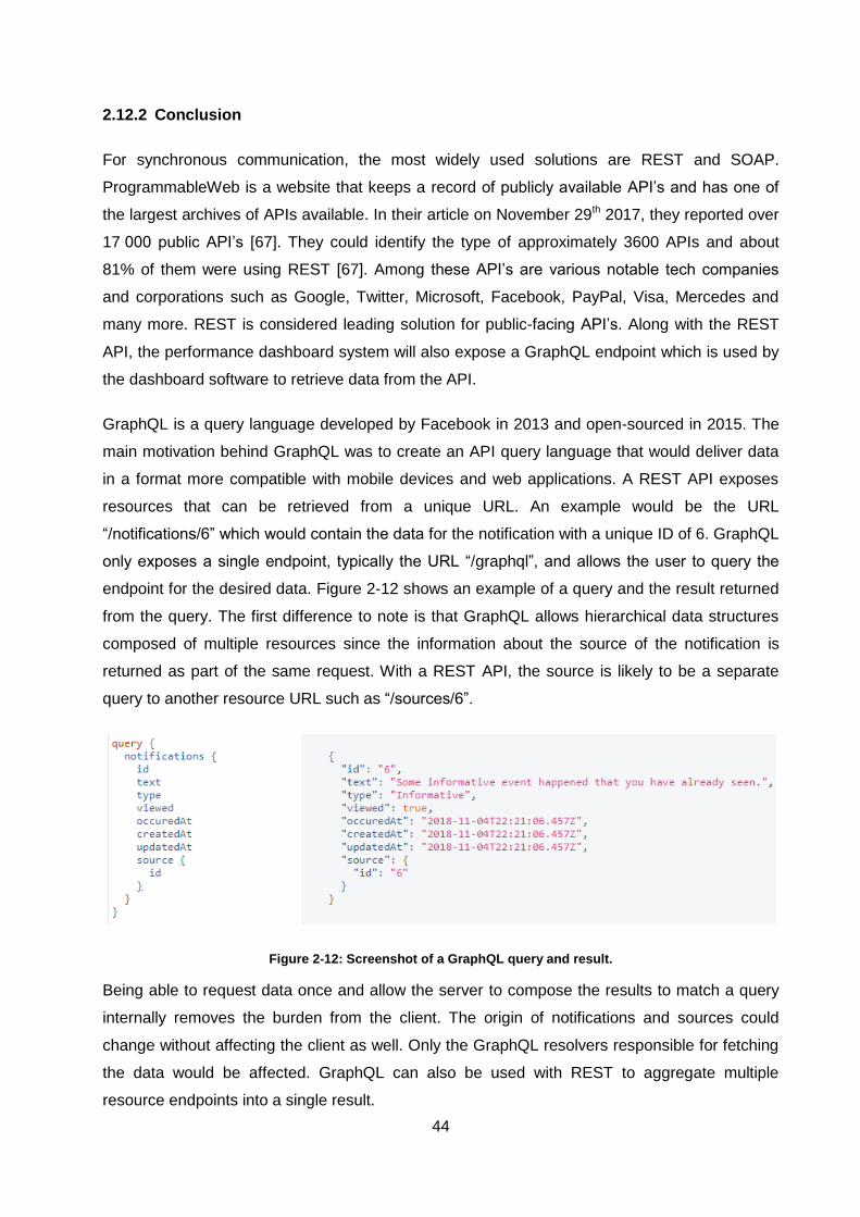
44
2.12.2 Conclusion
For synchronous communication, the most widely used solutions are REST and SOAP.
ProgrammableWeb is a website that keeps a record of publicly available API’s and has one of
the largest archives of APIs available. In their article on November 29th 2017, they reported over
17 000 public API’s [67]. They could identify the type of approximately 3600 APIs and about
81% of them were using REST [67]. Among these API’s are various notable tech companies
and corporations such as Google, Twitter, Microsoft, Facebook, PayPal, Visa, Mercedes and
many more. REST is considered leading solution for public-facing API’s. Along with the REST
API, the performance dashboard system will also expose a GraphQL endpoint which is used by
the dashboard software to retrieve data from the API.
GraphQL is a query language developed by Facebook in 2013 and open-sourced in 2015. The
main motivation behind GraphQL was to create an API query language that would deliver data
in a format more compatible with mobile devices and web applications. A REST API exposes
resources that can be retrieved from a unique URL. An example would be the URL
“/notifications/6” which would contain the data for the notification with a unique ID of 6. GraphQL
only exposes a single endpoint, typically the URL “/graphql”, and allows the user to query the
endpoint for the desired data. Figure 2-12 shows an example of a query and the result returned
from the query. The first difference to note is that GraphQL allows hierarchical data structures
composed of multiple resources since the information about the source of the notification is
returned as part of the same request. With a REST API, the source is likely to be a separate
query to another resource URL such as “/sources/6”.
Figure 2-12: Screenshot of a GraphQL query and result.
Being able to request data once and allow the server to compose the results to match a query
internally removes the burden from the client. The origin of notifications and sources could
change without affecting the client as well. Only the GraphQL resolvers responsible for fetching
the data would be affected. GraphQL can also be used with REST to aggregate multiple
resource endpoints into a single result.
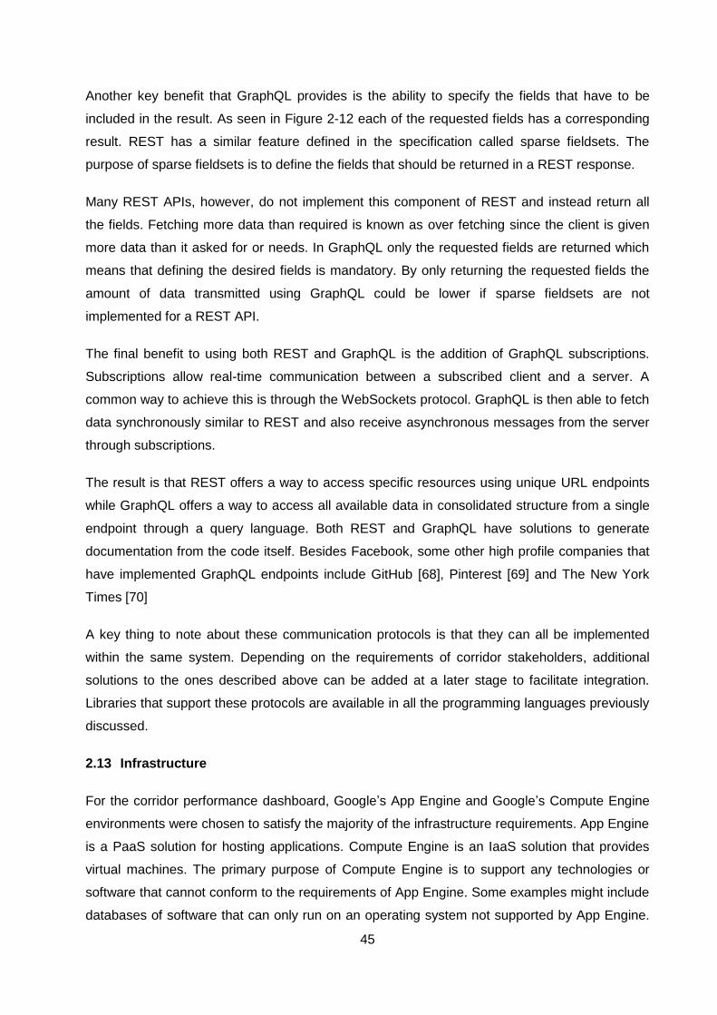
45
Another key benefit that GraphQL provides is the ability to specify the fields that have to be
included in the result. As seen in Figure 2-12 each of the requested fields has a corresponding
result. REST has a similar feature defined in the specification called sparse fieldsets. The
purpose of sparse fieldsets is to define the fields that should be returned in a REST response.
Many REST APIs, however, do not implement this component of REST and instead return all
the fields. Fetching more data than required is known as over fetching since the client is given
more data than it asked for or needs. In GraphQL only the requested fields are returned which
means that defining the desired fields is mandatory. By only returning the requested fields the
amount of data transmitted using GraphQL could be lower if sparse fieldsets are not
implemented for a REST API.
The final benefit to using both REST and GraphQL is the addition of GraphQL subscriptions.
Subscriptions allow real-time communication between a subscribed client and a server. A
common way to achieve this is through the WebSockets protocol. GraphQL is then able to fetch
data synchronously similar to REST and also receive asynchronous messages from the server
through subscriptions.
The result is that REST offers a way to access specific resources using unique URL endpoints
while GraphQL offers a way to access all available data in consolidated structure from a single
endpoint through a query language. Both REST and GraphQL have solutions to generate
documentation from the code itself. Besides Facebook, some other high profile companies that
have implemented GraphQL endpoints include GitHub [68], Pinterest [69] and The New York
Times [70]
A key thing to note about these communication protocols is that they can all be implemented
within the same system. Depending on the requirements of corridor stakeholders, additional
solutions to the ones described above can be added at a later stage to facilitate integration.
Libraries that support these protocols are available in all the programming languages previously
discussed.
2.13 Infrastructure
For the corridor performance dashboard, Google’s App Engine and Google’s Compute Engine
environments were chosen to satisfy the majority of the infrastructure requirements. App Engine
is a PaaS solution for hosting applications. Compute Engine is an IaaS solution that provides
virtual machines. The primary purpose of Compute Engine is to support any technologies or
software that cannot conform to the requirements of App Engine. Some examples might include
databases of software that can only run on an operating system not supported by App Engine.
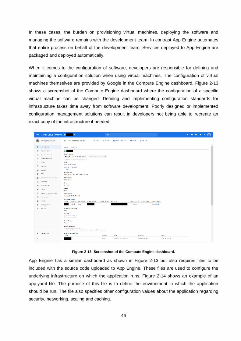
46
In these cases, the burden on provisioning virtual machines, deploying the software and
managing the software remains with the development team. In contrast App Engine automates
that entire process on behalf of the development team. Services deployed to App Engine are
packaged and deployed automatically.
When it comes to the configuration of software, developers are responsible for defining and
maintaining a configuration solution when using virtual machines. The configuration of virtual
machines themselves are provided by Google in the Compute Engine dashboard. Figure 2-13
shows a screenshot of the Compute Engine dashboard where the configuration of a specific
virtual machine can be changed. Defining and implementing configuration standards for
infrastructure takes time away from software development. Poorly designed or implemented
configuration management solutions can result in developers not being able to recreate an
exact copy of the infrastructure if needed.
Figure 2-13: Screenshot of the Compute Engine dashboard.
App Engine has a similar dashboard as shown in Figure 2-13 but also requires files to be
included with the source code uploaded to App Engine. These files are used to configure the
underlying infrastructure on which the application runs. Figure 2-14 shows an example of an
app.yaml file. The purpose of this file is to define the environment in which the application
should be run. The file also specifies other configuration values about the application regarding
security, networking, scaling and caching.
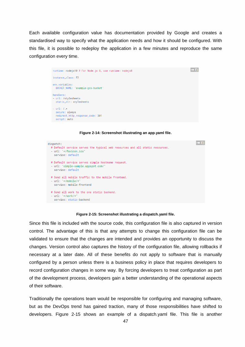
47
Each available configuration value has documentation provided by Google and creates a
standardised way to specify what the application needs and how it should be configured. With
this file, it is possible to redeploy the application in a few minutes and reproduce the same
configuration every time.
Figure 2-14: Screenshot illustrating an app.yaml file.
Figure 2-15: Screenshot illustrating a dispatch.yaml file.
Since this file is included with the source code, this configuration file is also captured in version
control. The advantage of this is that any attempts to change this configuration file can be
validated to ensure that the changes are intended and provides an opportunity to discuss the
changes. Version control also captures the history of the configuration file, allowing rollbacks if
necessary at a later date. All of these benefits do not apply to software that is manually
configured by a person unless there is a business policy in place that requires developers to
record configuration changes in some way. By forcing developers to treat configuration as part
of the development process, developers gain a better understanding of the operational aspects
of their software.
Traditionally the operations team would be responsible for configuring and managing software,
but as the DevOps trend has gained traction, many of those responsibilities have shifted to
developers. Figure 2-15 shows an example of a dispatch.yaml file. This file is another
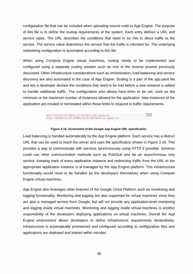
48
configuration file that can be included when uploading source code to App Engine. The purpose
of this file is to define the routing requirements of the system. Each entry defines a URL and
service value. The URL describes the conditions that need to be met to direct traffic to the
service. The service value determines the service that the traffic is intended for. The underlying
networking configuration is automated according to this file.
When using Compute Engine virtual machines, routing needs to be implemented and
configured using a separate routing solution such as one of the reverse proxies previously
discussed. Other infrastructure considerations such as orchestration, load balancing and service
discovery are also automated in the case of App Engine. Scaling is a part of the app.yaml file
and lets a developer declare the conditions that need to be met before a new instance is added
to handle additional traffic. The configuration also allows hard limits to be set, such as the
minimum or the maximum number of instances allowed for the application. New instances of the
application are created or terminated within these limits to respond to traffic requirements.
Figure 2-16: Screenshot of the Google App Engine URL specification.
Load balancing is handled automatically by the App Engine platform. Each service has a distinct
URL that can be used to reach the server and uses the specification shown in Figure 2-16. This
provides a way to communicate with services synchronously using HTTP if possible. Services
could use other communication methods such as Pub/Sub and be an asynchronous only
service. Keeping track of every application instance and redirecting traffic from the URL to the
appropriate application instance is al managed by the App Engine platform. This infrastructure
functionality would need to be handled by the developers themselves when using Compute
Engine virtual machines.
App Engine also leverages other features of the Google Cloud Platform such as monitoring and
logging functionality. Monitoring and logging are also supported for virtual machines since they
are also a managed service from Google, but will not provide any application-level monitoring
and logging inside virtual machines. Monitoring and logging inside virtual machines is another
responsibility of the developers deploying applications on virtual machines. Overall the App
Engine environment allows developers to define infrastructure requirements declaratively.
Infrastructure is automatically provisioned and configured according to configuration files and
applications are deployed and started within minutes.
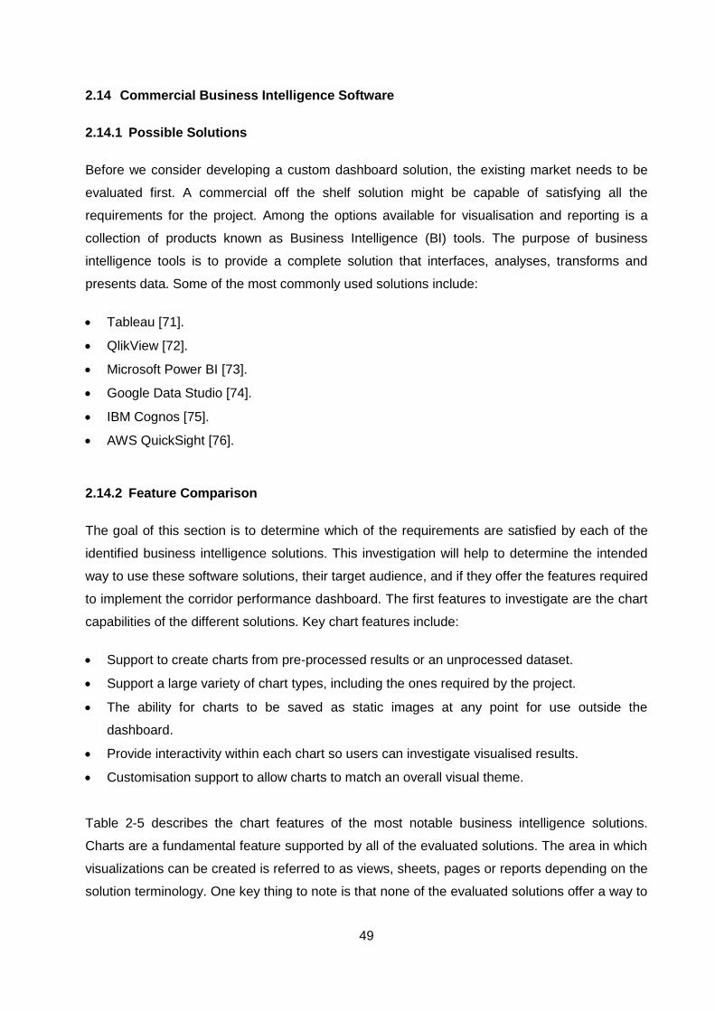
49
2.14 Commercial Business Intelligence Software
2.14.1 Possible Solutions
Before we consider developing a custom dashboard solution, the existing market needs to be
evaluated first. A commercial off the shelf solution might be capable of satisfying all the
requirements for the project. Among the options available for visualisation and reporting is a
collection of products known as Business Intelligence (BI) tools. The purpose of business
intelligence tools is to provide a complete solution that interfaces, analyses, transforms and
presents data. Some of the most commonly used solutions include:
Tableau [71].
QlikView [72].
Microsoft Power BI [73].
Google Data Studio [74].
IBM Cognos [75].
AWS QuickSight [76].
2.14.2 Feature Comparison
The goal of this section is to determine which of the requirements are satisfied by each of the
identified business intelligence solutions. This investigation will help to determine the intended
way to use these software solutions, their target audience, and if they offer the features required
to implement the corridor performance dashboard. The first features to investigate are the chart
capabilities of the different solutions. Key chart features include:
Support to create charts from pre-processed results or an unprocessed dataset.
Support a large variety of chart types, including the ones required by the project.
The ability for charts to be saved as static images at any point for use outside the
dashboard.
Provide interactivity within each chart so users can investigate visualised results.
Customisation support to allow charts to match an overall visual theme.
Table 2-5 describes the chart features of the most notable business intelligence solutions.
Charts are a fundamental feature supported by all of the evaluated solutions. The area in which
visualizations can be created is referred to as views, sheets, pages or reports depending on the
solution terminology. One key thing to note is that none of the evaluated solutions offer a way to
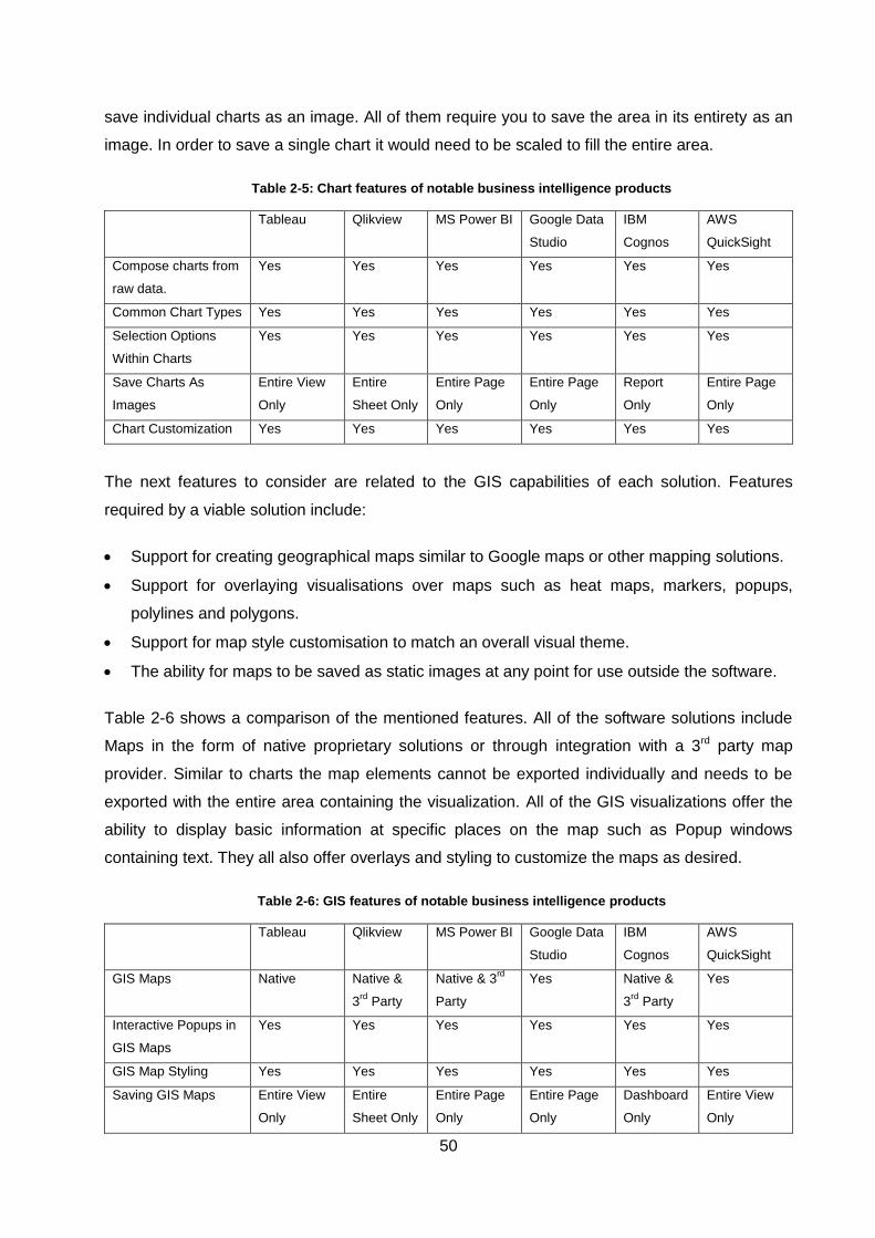
50
save individual charts as an image. All of them require you to save the area in its entirety as an
image. In order to save a single chart it would need to be scaled to fill the entire area.
Table 2-5: Chart features of notable business intelligence products
Tableau Qlikview MS Power BI Google Data
Studio
IBM
Cognos
AWS
QuickSight
Compose charts from
raw data.
Yes Yes Yes Yes Yes Yes
Common Chart Types Yes Yes Yes Yes Yes Yes
Selection Options
Within Charts
Yes Yes Yes Yes Yes Yes
Save Charts As
Images
Entire View
Only
Entire
Sheet Only
Entire Page
Only
Entire Page
Only
Report
Only
Entire Page
Only
Chart Customization Yes Yes Yes Yes Yes Yes
The next features to consider are related to the GIS capabilities of each solution. Features
required by a viable solution include:
Support for creating geographical maps similar to Google maps or other mapping solutions.
Support for overlaying visualisations over maps such as heat maps, markers, popups,
polylines and polygons.
Support for map style customisation to match an overall visual theme.
The ability for maps to be saved as static images at any point for use outside the software.
Table 2-6 shows a comparison of the mentioned features. All of the software solutions include
Maps in the form of native proprietary solutions or through integration with a 3rd party map
provider. Similar to charts the map elements cannot be exported individually and needs to be
exported with the entire area containing the visualization. All of the GIS visualizations offer the
ability to display basic information at specific places on the map such as Popup windows
containing text. They all also offer overlays and styling to customize the maps as desired.
Table 2-6: GIS features of notable business intelligence products
Tableau Qlikview MS Power BI Google Data
Studio
IBM
Cognos
AWS
QuickSight
GIS Maps Native Native &
3rd
Party
Native & 3rd
Party
Yes Native &
3rd
Party
Yes
Interactive Popups in
GIS Maps
Yes Yes Yes Yes Yes Yes
GIS Map Styling Yes Yes Yes Yes Yes Yes
Saving GIS Maps Entire View
Only
Entire
Sheet Only
Entire Page
Only
Entire Page
Only
Dashboard
Only
Entire View
Only
51
Embedding Charts
into Maps
No No No No No No
The final GIS feature that was not present in any of the solutions was the ability to embed
complex elements into the map. An example would be to include an image, chart, table, video
or any other interactive element into the map as a popup. Figure 3-25 shows and example of a
popup that includes a table, chart and button in a popup. When the location is selected on the
map the popup is shown and is fully interactive.
The final required features are related to reporting capabilities and giving individuals or groups
of people access to dashboards or reports. The features include:
Ability to embed charts and other forms of data into geographical maps, allowing users to
select map locations and see data associated with that location.
Authorisation and sharing capabilities that would allow control over which groups of users or
individuals have access to specific visualisations and performance metrics.
Sharing and social media integrations that allow visualisations or other performance metrics
to be shared among users or with the general public.
Provide a way to create reports in PDF format which is managed by the same sharing
control.
Allow PDF contents such as fonts and colour to be customised to fit an overall visual theme.
Allow visualisations such as maps and charts to be embedded into reports.
Table 2-7 compares the different access and reporting features of the leading solutions. All of
the solutions offer methods to control what users or groups of users can access. If the software
is managed by the provider, each user needs to register an account with the respective
companies. All the solutions except for Google Data Studio have enterprise versions that can be
hosted separately from the provider. Google Data Studio is heavily integrated with the Google
ecosystem so solution outside the cloud is available.
In terms of reporting each of the solutions offer exporting capabilities to PDF format. Similar to
charts and maps only the entire page or collection of pages can be exported as a series of A4
pages ready for printing. Reports in every solution adopt the style of the pages included in them.
This makes it convenient to author documents that would be suitable for printing or sharing as a
PDF, but limits dashboard layouts. Interactive dashboard layouts that might not be compatible
with a print friendly layout would need to be created separately as a version not suited for
exporting.
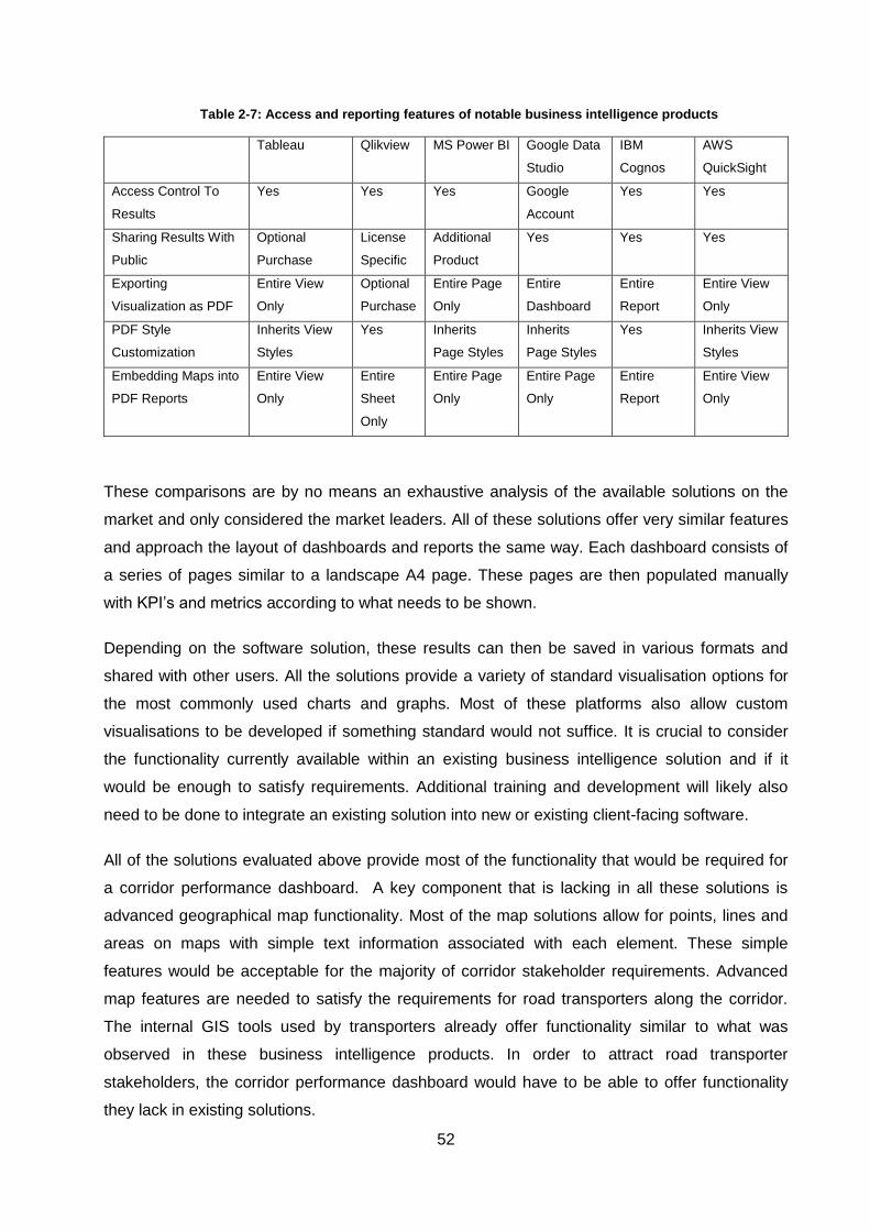
52
Table 2-7: Access and reporting features of notable business intelligence products
Tableau Qlikview MS Power BI Google Data
Studio
IBM
Cognos
AWS
QuickSight
Access Control To
Results
Yes Yes Yes Google
Account
Yes Yes
Sharing Results With
Public
Optional
Purchase
License
Specific
Additional
Product
Yes Yes Yes
Exporting
Visualization as PDF
Entire View
Only
Optional
Purchase
Entire Page
Only
Entire
Dashboard
Entire
Report
Entire View
Only
PDF Style
Customization
Inherits View
Styles
Yes Inherits
Page Styles
Inherits
Page Styles
Yes Inherits View
Styles
Embedding Maps into
PDF Reports
Entire View
Only
Entire
Sheet
Only
Entire Page
Only
Entire Page
Only
Entire
Report
Entire View
Only
These comparisons are by no means an exhaustive analysis of the available solutions on the
market and only considered the market leaders. All of these solutions offer very similar features
and approach the layout of dashboards and reports the same way. Each dashboard consists of
a series of pages similar to a landscape A4 page. These pages are then populated manually
with KPI’s and metrics according to what needs to be shown.
Depending on the software solution, these results can then be saved in various formats and
shared with other users. All the solutions provide a variety of standard visualisation options for
the most commonly used charts and graphs. Most of these platforms also allow custom
visualisations to be developed if something standard would not suffice. It is crucial to consider
the functionality currently available within an existing business intelligence solution and if it
would be enough to satisfy requirements. Additional training and development will likely also
need to be done to integrate an existing solution into new or existing client-facing software.
All of the solutions evaluated above provide most of the functionality that would be required for
a corridor performance dashboard. A key component that is lacking in all these solutions is
advanced geographical map functionality. Most of the map solutions allow for points, lines and
areas on maps with simple text information associated with each element. These simple
features would be acceptable for the majority of corridor stakeholder requirements. Advanced
map features are needed to satisfy the requirements for road transporters along the corridor.
The internal GIS tools used by transporters already offer functionality similar to what was
observed in these business intelligence products. In order to attract road transporter
stakeholders, the corridor performance dashboard would have to be able to offer functionality
they lack in existing solutions.
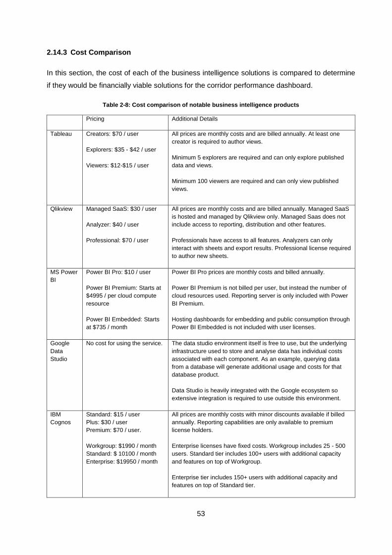
53
2.14.3 Cost Comparison
In this section, the cost of each of the business intelligence solutions is compared to determine
if they would be financially viable solutions for the corridor performance dashboard.
Table 2-8: Cost comparison of notable business intelligence products
Pricing Additional Details
Tableau Creators: $70 / user
Explorers: $35 - $42 / user
Viewers: $12-$15 / user
All prices are monthly costs and are billed annually. At least one
creator is required to author views.
Minimum 5 explorers are required and can only explore published
data and views.
Minimum 100 viewers are required and can only view published
views.
Qlikview Managed SaaS: $30 / user
Analyzer: $40 / user
Professional: $70 / user
All prices are monthly costs and are billed annually. Managed SaaS
is hosted and managed by Qlikview only. Managed Saas does not
include access to reporting, distribution and other features.
Professionals have access to all features. Analyzers can only
interact with sheets and export results. Professional license required
to author new sheets.
MS Power
BI
Power BI Pro: $10 / user
Power BI Premium: Starts at
$4995 / per cloud compute
resource
Power BI Embedded: Starts
at $735 / month
Power BI Pro prices are monthly costs and billed annually.
Power BI Premium is not billed per user, but instead the number of
cloud resources used. Reporting server is only included with Power
BI Premium.
Hosting dashboards for embedding and public consumption through
Power BI Embedded is not included with user licenses.
Data
Studio
No cost for using the service. The data studio environment itself is free to use, but the underlying
infrastructure used to store and analyse data has individual costs
associated with each component. As an example, querying data
from a database will generate additional usage and costs for that
database product.
Data Studio is heavily integrated with the Google ecosystem so
extensive integration is required to use outside this environment.
IBM
Cognos
Standard: $15 / user
Plus: $30 / user
Premium: $70 / user.
Workgroup: $1990 / month
Standard: $ 10100 / month
Enterprise: $19950 / month
All prices are monthly costs with minor discounts available if billed
annually. Reporting capabilities are only available to premium
license holders.
Enterprise licenses have fixed costs. Workgroup includes 25 - 500
users. Standard tier includes 100+ users with additional capacity
and features on top of Workgroup.
Enterprise tier includes 150+ users with additional capacity and
features on top of Standard tier.
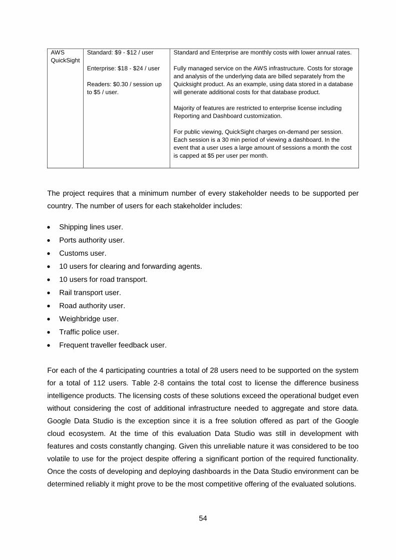
54
AWS
QuickSight
Standard: $9 - $12 / user
Enterprise: $18 - $24 / user
Readers: $0.30 / session up
to $5 / user.
Standard and Enterprise are monthly costs with lower annual rates.
Fully managed service on the AWS infrastructure. Costs for storage
and analysis of the underlying data are billed separately from the
Quicksight product. As an example, using data stored in a database
will generate additional costs for that database product.
Majority of features are restricted to enterprise license including
Reporting and Dashboard customization.
For public viewing, QuickSight charges on-demand per session.
Each session is a 30 min period of viewing a dashboard. In the
event that a user uses a large amount of sessions a month the cost
is capped at $5 per user per month.
The project requires that a minimum number of every stakeholder needs to be supported per
country. The number of users for each stakeholder includes:
Shipping lines user.
Ports authority user.
Customs user.
10 users for clearing and forwarding agents.
10 users for road transport.
Rail transport user.
Road authority user.
Weighbridge user.
Traffic police user.
Frequent traveller feedback user.
For each of the 4 participating countries a total of 28 users need to be supported on the system
for a total of 112 users. Table 2-8 contains the total cost to license the difference business
intelligence products. The licensing costs of these solutions exceed the operational budget even
without considering the cost of additional infrastructure needed to aggregate and store data.
Google Data Studio is the exception since it is a free solution offered as part of the Google
cloud ecosystem. At the time of this evaluation Data Studio was still in development with
features and costs constantly changing. Given this unreliable nature it was considered to be too
volatile to use for the project despite offering a significant portion of the required functionality.
Once the costs of developing and deploying dashboards in the Data Studio environment can be
determined reliably it might prove to be the most competitive offering of the evaluated solutions.
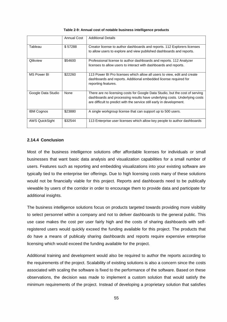
55
Table 2-9: Annual cost of notable business intelligence products
Annual Cost Additional Details
Tableau $ 57288 Creator license to author dashboards and reports. 112 Explorers licenses
to allow users to explore and view published dashboards and reports.
Qlikview $54600 Professional license to author dashboards and reports. 112 Analyzer
licenses to allow users to interact with dashboards and reports.
MS Power BI $22260 113 Power BI Pro licenses which allow all users to view, edit and create
dashboards and reports. Additional embedded license required for
reporting features.
Google Data Studio None There are no licensing costs for Google Data Studio, but the cost of serving
dashboards and processing results have underlying costs. Underlying costs
are difficult to predict with the service still early in development.
IBM Cognos $23880 A single workgroup license that can support up to 500 users.
AWS QuickSight $32544 113 Enterprise user licenses which allow key people to author dashboards
2.14.4 Conclusion
Most of the business intelligence solutions offer affordable licenses for individuals or small
businesses that want basic data analysis and visualization capabilities for a small number of
users. Features such as reporting and embedding visualizations into your existing software are
typically tied to the enterprise tier offerings. Due to high licensing costs many of these solutions
would not be financially viable for this project. Reports and dashboards need to be publically
viewable by users of the corridor in order to encourage them to provide data and participate for
additional insights.
The business intelligence solutions focus on products targeted towards providing more visibility
to select personnel within a company and not to deliver dashboards to the general public. This
use case makes the cost per user fairly high and the costs of sharing dashboards with self-
registered users would quickly exceed the funding available for this project. The products that
do have a means of publicaly sharing dashboards and reports require expensive enterprise
licensing which would exceed the funding available for the project.
Additional training and development would also be required to author the reports according to
the requirements of the project. Scalability of existing solutions is also a concern since the costs
associated with scaling the software is fixed to the performance of the software. Based on these
observations, the decision was made to implement a custom solution that would satisfy the
minimum requirements of the project. Instead of developing a proprietary solution that satisfies
56
the requirements, an alternative is to combine open-source technologies and commercial
services to develop a solution rapidly.Visualisation Libraries
2.14.5 Possible Solutions
Since the corridor performance dashboard is a web-based system, a JavaScript library will need
to be used to produce visualisations. Some of the visualisation libraries available include:
D3js [77].
Chartjs[78].
Echarts [79].
Highcharts [80].
Vega [81].
Fusion Charts [82].
2.14.6 Conclusion
The identified visualisation solutions contain a mix of commercial and open source options. The
two commercial solutions considered are Highcharts and Fusion Charts. Highcharts starts at
$510 for a single developer license [83]. The cost becomes considerably higher at $4340 for ten
developers using the software. Fusion Charts starts at $497 for a single developer and scales
up to $2497 for 10 developers or $9947 for 50 developers or more [84]. These two options are
not viable as they exceed the available funding for the project.
After considering the available features of the open source solutions, all of the solutions offer
functionality that would address the visualisation requirements of the project. ECharts is
however in the process of joining the Apache foundation, a non-profit software organisation that
supports and maintains some of the world’s most widely used open-source software solutions.
ECharts has standards that are being enforced that will ensure the community has sufficient
support in the form of communication methods and documentation. The other open source
alternatives are not partnered with a similar type of organisation and are being managed by
independent software developers. Due to this partnership ECharts is expected to be supported
and maintained well for the foreseeable future which is not a certainty for the other alternatives.
Based on this advantage ECharts is suggested as the visualisation solution for the corridor
performance dashboard.
57
2.15 Map Provider Services
2.15.1 Possible Solutions
Alongside visualising charts, a solution to creating geographical maps is also required.
Providing context in the form of geographical maps could help with understanding trade
corridors better. Being able to compare similar locations or routes throughout the corridor from a
high-level view can allow for observations that would otherwise require an extensive
investigation of the data. An example might be to overlay a heat map over a geographical map
to quickly identify problem areas. Commonly used web map services and libraries include:
Leaflet [85].
OpenLayers [86].
Google Maps [87].
Bing Maps [88].
MapQuest[89].
MapBox [90].
2.15.2 Conclusion
The most widely used map service for simple navigation tasks is the Google Maps service. For
complicated visualisations, there are, however, alternative solutions. A recent publication
comparing Google Maps and its competitor MapBox points out that Mapbox offers the same
services for less after the price changes Google made to their offerings in 2019 [91]. MapQuest
is a reseller of the services MapBox offers and targets smaller applications and solutions. Bing
Maps primarily offer mapping solutions to enterprise clients since their services start at $4500
for annual subscriptions which exceeds the budget of this project.
Another aspect to consider is that Google prevents the use of third-party solutions to render
maps in their licensing. This means that if Google Maps is used to implement the solution the
entire solution needs to revolve around the Google Maps libraries. This exclusivity raises some
vendor lock-in concerns.
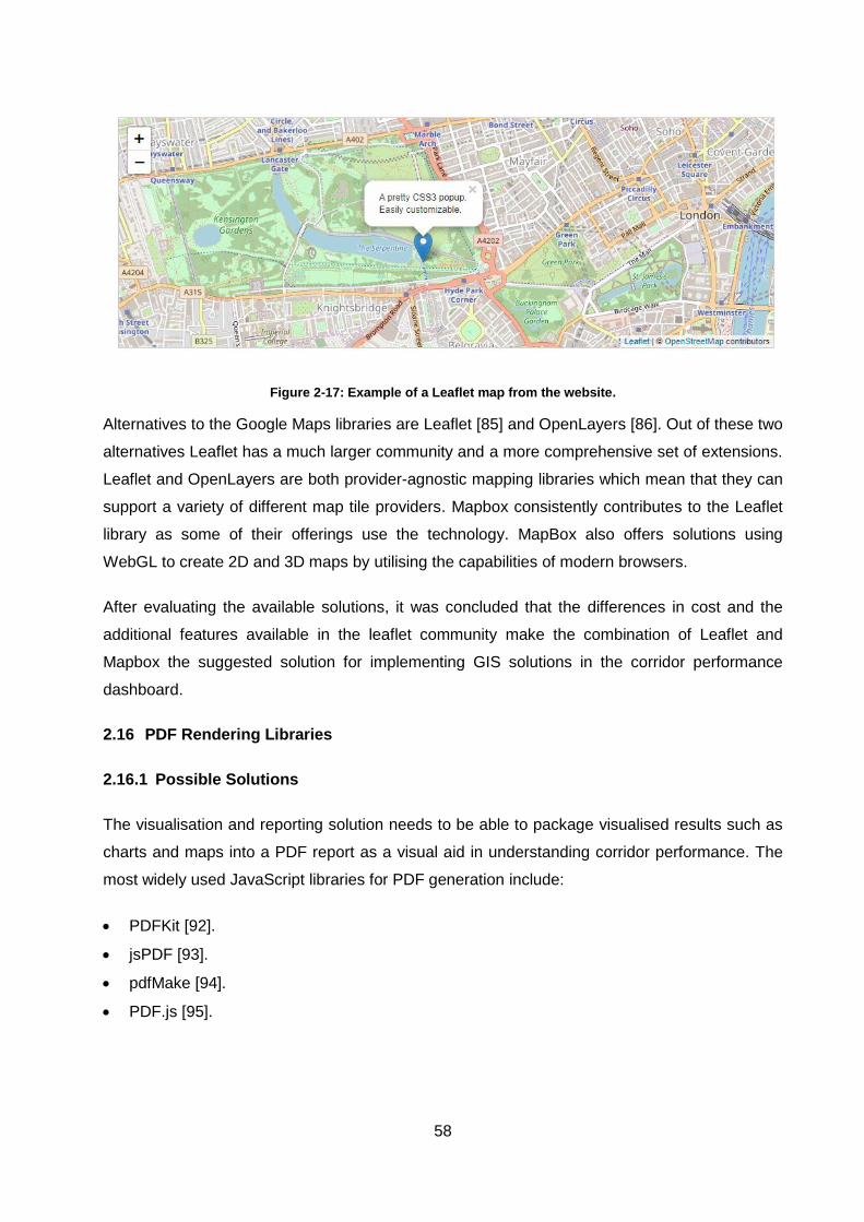
58
Figure 2-17: Example of a Leaflet map from the website.
Alternatives to the Google Maps libraries are Leaflet [85] and OpenLayers [86]. Out of these two
alternatives Leaflet has a much larger community and a more comprehensive set of extensions.
Leaflet and OpenLayers are both provider-agnostic mapping libraries which mean that they can
support a variety of different map tile providers. Mapbox consistently contributes to the Leaflet
library as some of their offerings use the technology. MapBox also offers solutions using
WebGL to create 2D and 3D maps by utilising the capabilities of modern browsers.
After evaluating the available solutions, it was concluded that the differences in cost and the
additional features available in the leaflet community make the combination of Leaflet and
Mapbox the suggested solution for implementing GIS solutions in the corridor performance
dashboard.
2.16 PDF Rendering Libraries
2.16.1 Possible Solutions
The visualisation and reporting solution needs to be able to package visualised results such as
charts and maps into a PDF report as a visual aid in understanding corridor performance. The
most widely used JavaScript libraries for PDF generation include:
PDFKit [92].
jsPDF [93].
pdfMake [94].
PDF.js [95].
59
2.16.2 Conclusion
The final component needed to satisfy all requirements is a solution to generate PDF
documents. The standard for PDF files was registered by Adobe on August 1st 2008 as ISO
standard 32000-1 and is known as PDF 1.7 [96]. This standard is freely available for download
and implementation. PDF 2.0 is the next iteration of the standard and is registered as ISO
standard 32000-2 [97]. Since the format of PDF documents are standardised and available,
support could be implemented using a proprietary solution, commercial service or open-source
libraries.
All of the PDF libraries considered are open source and freely available to incorporate into
software solutions. jsPDF does, however, require a commercial agreement in order gain access
to the latest plugins and fixes. The pdfmake library is a declarative library similar to how ECharts
is declarative for visualisations. pdfMake is also an abstraction of the PDFKit solution which
means they are the same solution abstracted at different levels. PDF.js is the final of the four
identified solutions and the most feature-complete since Mozilla maintains it.
All of the libraries can produce PDFs that comply with the PDF standard mentioned before.
Based on the activity of the communities maintaining these solutions, pdfmake and PDF.js are
suggested as the solutions used to generate reports for the corridor dashboard solution. PDF.js
provides better compatibility with modern browsers as it is backed by a leading browser
developer while pdfmake provides better support for legacy browsers.
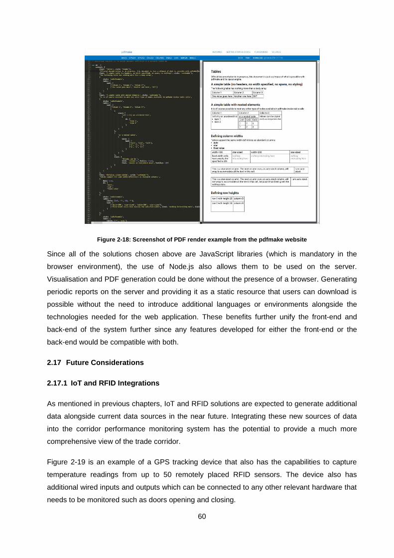
60
Figure 2-18: Screenshot of PDF render example from the pdfmake website
Since all of the solutions chosen above are JavaScript libraries (which is mandatory in the
browser environment), the use of Node.js also allows them to be used on the server.
Visualisation and PDF generation could be done without the presence of a browser. Generating
periodic reports on the server and providing it as a static resource that users can download is
possible without the need to introduce additional languages or environments alongside the
technologies needed for the web application. These benefits further unify the front-end and
back-end of the system further since any features developed for either the front-end or the
back-end would be compatible with both.
2.17 Future Considerations
2.17.1 IoT and RFID Integrations
As mentioned in previous chapters, IoT and RFID solutions are expected to generate additional
data alongside current data sources in the near future. Integrating these new sources of data
into the corridor performance monitoring system has the potential to provide a much more
comprehensive view of the trade corridor.
Figure 2-19 is an example of a GPS tracking device that also has the capabilities to capture
temperature readings from up to 50 remotely placed RFID sensors. The device also has
additional wired inputs and outputs which can be connected to any other relevant hardware that
needs to be monitored such as doors opening and closing.
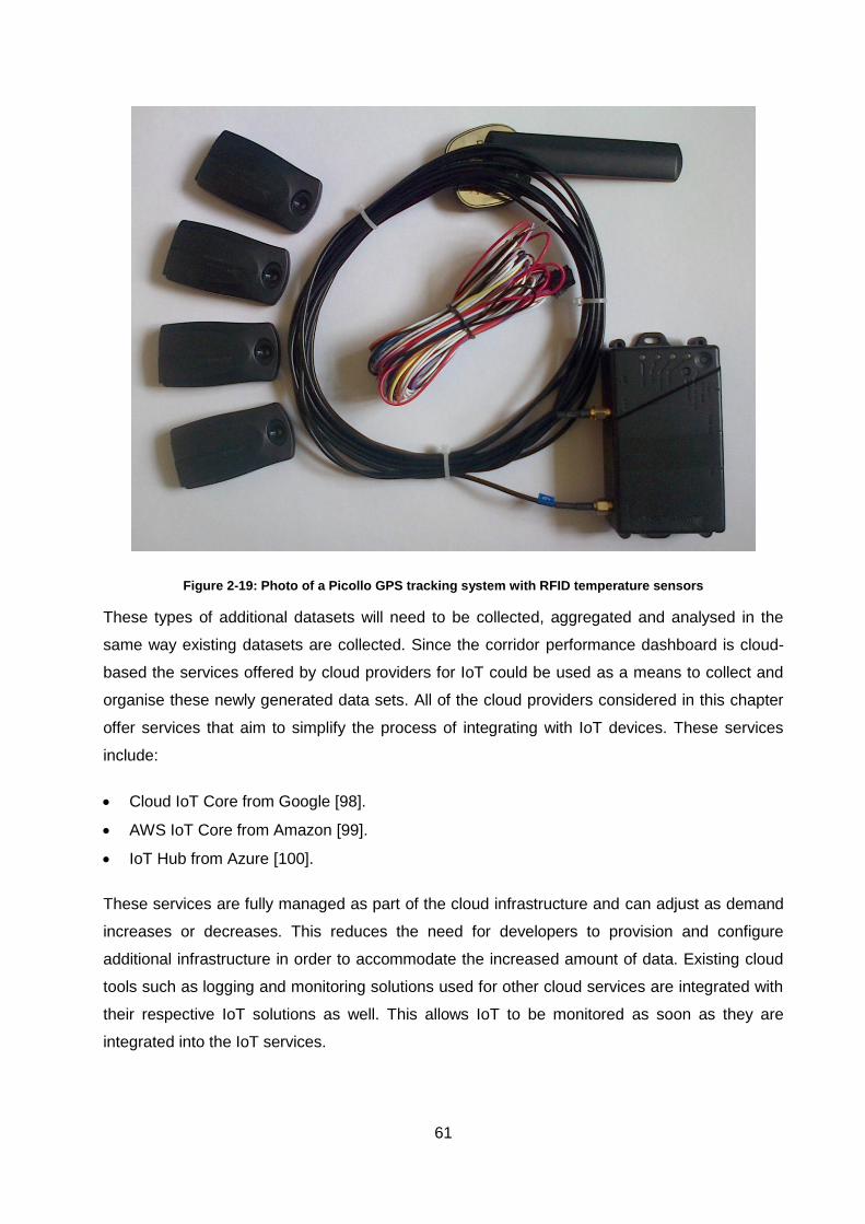
61
Figure 2-19: Photo of a Picollo GPS tracking system with RFID temperature sensors
These types of additional datasets will need to be collected, aggregated and analysed in the
same way existing datasets are collected. Since the corridor performance dashboard is cloud-
based the services offered by cloud providers for IoT could be used as a means to collect and
organise these newly generated data sets. All of the cloud providers considered in this chapter
offer services that aim to simplify the process of integrating with IoT devices. These services
include:
Cloud IoT Core from Google [98].
AWS IoT Core from Amazon [99].
IoT Hub from Azure [100].
These services are fully managed as part of the cloud infrastructure and can adjust as demand
increases or decreases. This reduces the need for developers to provision and configure
additional infrastructure in order to accommodate the increased amount of data. Existing cloud
tools such as logging and monitoring solutions used for other cloud services are integrated with
their respective IoT solutions as well. This allows IoT to be monitored as soon as they are
integrated into the IoT services.
62
2.18 Chapter Summary
The corridor performance monitoring system aims to align the operations of all the entities along
the corridor by creating a set of measurements relevant to everyone. The performance
dashboard solution needs to organise and present the results calculated by the overall
monitoring system in a way that allows every entity along the corridor to view results relevant to
their operations. The performance dashboard also needs to present results in an interactive way
that allows users to explore and discover new insights. Results also need to be presented in a
fixed report format which would allow a set of measurements to be monitored and compared
over time.
Over the last two decades, the introduction of the internet has completely changed the
operations of businesses and the technologies used in software systems. Online web-based
software has become a key component of business operations. The internet has also exposed
companies to larger audiences than ever before. The largest companies around the world have
developed new techniques and technologies to accommodate this new global audience. The
experience and solutions developed by these companies can be leveraged to satisfy the
requirements of a corridor performance dashboard. In this chapter, the different components of
the web-based solution have been evaluated based on literature, surveys and comparisons
available from industry. Solutions for every component have been suggested based on
publically available information.
Determining which solutions to use does not only depend on the technical aspects of each
component but also on the cost, compatibility and the expertise available to support each
solution. It is impractical to consider every possible solution available in the world today and
attempt to arrive at the optimal solution. Instead a solution that is considered acceptable needs
to be derived based on information that is available at the time.
The data analysis approach used within the main corridor performance system has been
successfully used in previous projects to determine and calculate performance measurements.
The process of capturing the operational flow and defining measurements around operations is
still a manual process. Incorporating this process into the corridor monitoring system is a
potential feature that could be introduced in the future. The corridor performance dashboard
needs to be designed with these potential features in mind to ensure that they can be
accommodated with minimal effort.
One of these potential features is the introduction of new data capturing techniques. IoT and
other data capturing solutions such as RFID can potentially increase the types and volume of
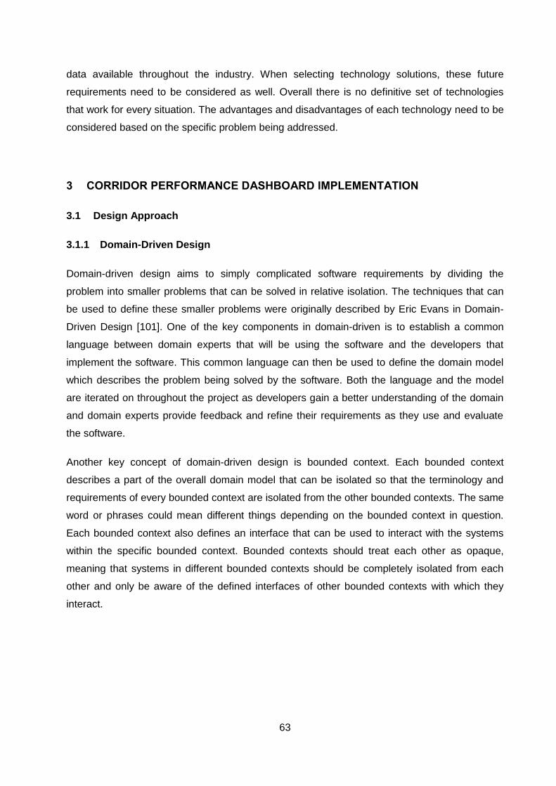
63
data available throughout the industry. When selecting technology solutions, these future
requirements need to be considered as well. Overall there is no definitive set of technologies
that work for every situation. The advantages and disadvantages of each technology need to be
considered based on the specific problem being addressed.
3 CORRIDOR PERFORMANCE DASHBOARD IMPLEMENTATION
3.1 Design Approach
3.1.1 Domain-Driven Design
Domain-driven design aims to simply complicated software requirements by dividing the
problem into smaller problems that can be solved in relative isolation. The techniques that can
be used to define these smaller problems were originally described by Eric Evans in Domain-
Driven Design [101]. One of the key components in domain-driven is to establish a common
language between domain experts that will be using the software and the developers that
implement the software. This common language can then be used to define the domain model
which describes the problem being solved by the software. Both the language and the model
are iterated on throughout the project as developers gain a better understanding of the domain
and domain experts provide feedback and refine their requirements as they use and evaluate
the software.
Another key concept of domain-driven design is bounded context. Each bounded context
describes a part of the overall domain model that can be isolated so that the terminology and
requirements of every bounded context are isolated from the other bounded contexts. The same
word or phrases could mean different things depending on the bounded context in question.
Each bounded context also defines an interface that can be used to interact with the systems
within the specific bounded context. Bounded contexts should treat each other as opaque,
meaning that systems in different bounded contexts should be completely isolated from each
other and only be aware of the defined interfaces of other bounded contexts with which they
interact.
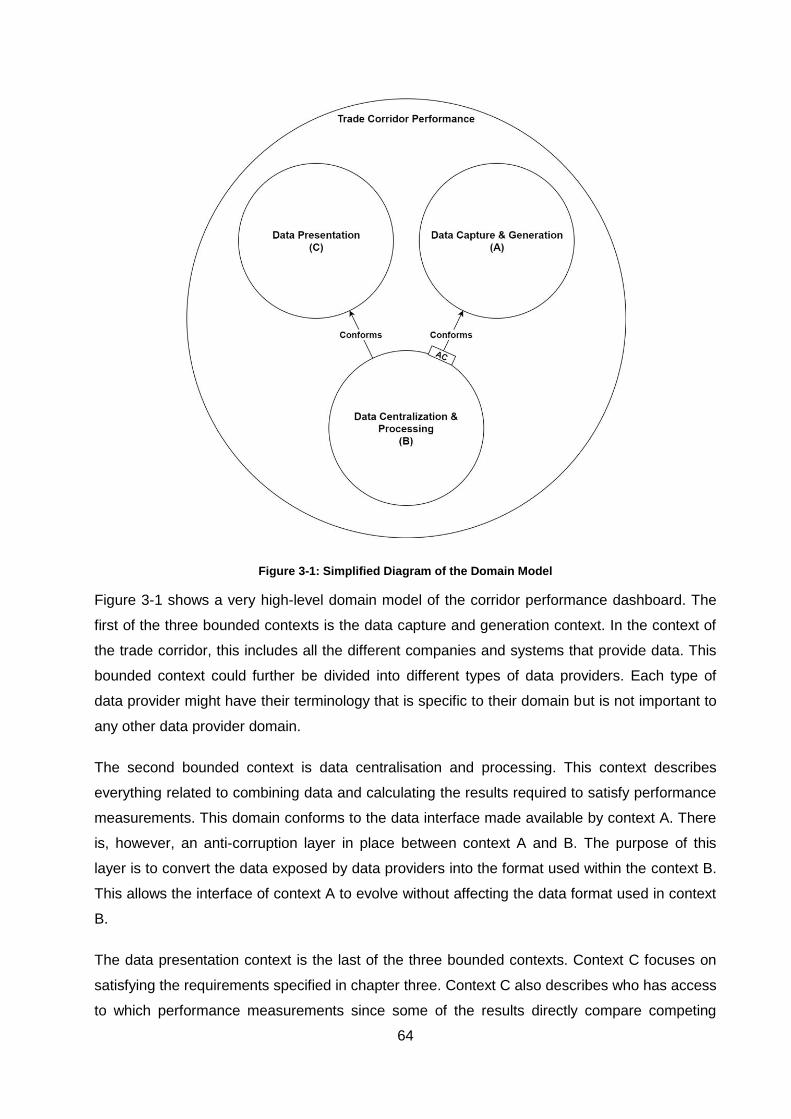
64
Figure 3-1: Simplified Diagram of the Domain Model
Figure 3-1 shows a very high-level domain model of the corridor performance dashboard. The
first of the three bounded contexts is the data capture and generation context. In the context of
the trade corridor, this includes all the different companies and systems that provide data. This
bounded context could further be divided into different types of data providers. Each type of
data provider might have their terminology that is specific to their domain but is not important to
any other data provider domain.
The second bounded context is data centralisation and processing. This context describes
everything related to combining data and calculating the results required to satisfy performance
measurements. This domain conforms to the data interface made available by context A. There
is, however, an anti-corruption layer in place between context A and B. The purpose of this
layer is to convert the data exposed by data providers into the format used within the context B.
This allows the interface of context A to evolve without affecting the data format used in context
B.
The data presentation context is the last of the three bounded contexts. Context C focuses on
satisfying the requirements specified in chapter three. Context C also describes who has access
to which performance measurements since some of the results directly compare competing
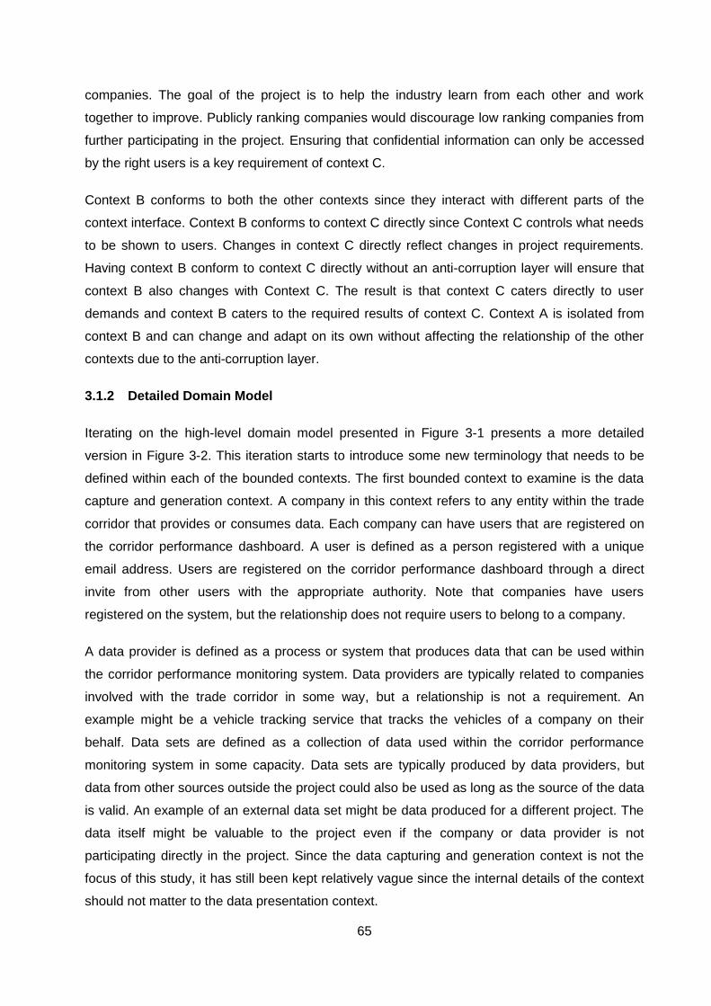
65
companies. The goal of the project is to help the industry learn from each other and work
together to improve. Publicly ranking companies would discourage low ranking companies from
further participating in the project. Ensuring that confidential information can only be accessed
by the right users is a key requirement of context C.
Context B conforms to both the other contexts since they interact with different parts of the
context interface. Context B conforms to context C directly since Context C controls what needs
to be shown to users. Changes in context C directly reflect changes in project requirements.
Having context B conform to context C directly without an anti-corruption layer will ensure that
context B also changes with Context C. The result is that context C caters directly to user
demands and context B caters to the required results of context C. Context A is isolated from
context B and can change and adapt on its own without affecting the relationship of the other
contexts due to the anti-corruption layer.
3.1.2 Detailed Domain Model
Iterating on the high-level domain model presented in Figure 3-1 presents a more detailed
version in Figure 3-2. This iteration starts to introduce some new terminology that needs to be
defined within each of the bounded contexts. The first bounded context to examine is the data
capture and generation context. A company in this context refers to any entity within the trade
corridor that provides or consumes data. Each company can have users that are registered on
the corridor performance dashboard. A user is defined as a person registered with a unique
email address. Users are registered on the corridor performance dashboard through a direct
invite from other users with the appropriate authority. Note that companies have users
registered on the system, but the relationship does not require users to belong to a company.
A data provider is defined as a process or system that produces data that can be used within
the corridor performance monitoring system. Data providers are typically related to companies
involved with the trade corridor in some way, but a relationship is not a requirement. An
example might be a vehicle tracking service that tracks the vehicles of a company on their
behalf. Data sets are defined as a collection of data used within the corridor performance
monitoring system in some capacity. Data sets are typically produced by data providers, but
data from other sources outside the project could also be used as long as the source of the data
is valid. An example of an external data set might be data produced for a different project. The
data itself might be valuable to the project even if the company or data provider is not
participating directly in the project. Since the data capturing and generation context is not the
focus of this study, it has still been kept relatively vague since the internal details of the context
should not matter to the data presentation context.
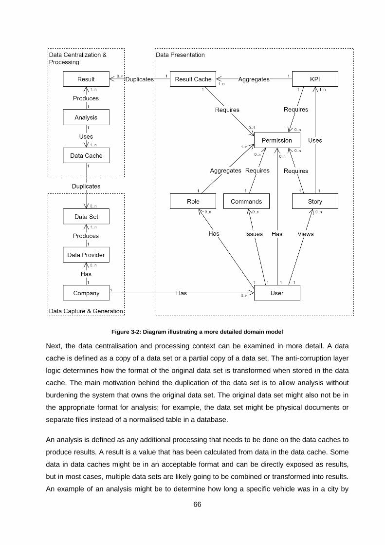
66
Figure 3-2: Diagram illustrating a more detailed domain model
Next, the data centralisation and processing context can be examined in more detail. A data
cache is defined as a copy of a data set or a partial copy of a data set. The anti-corruption layer
logic determines how the format of the original data set is transformed when stored in the data
cache. The main motivation behind the duplication of the data set is to allow analysis without
burdening the system that owns the original data set. The original data set might also not be in
the appropriate format for analysis; for example, the data set might be physical documents or
separate files instead of a normalised table in a database.
An analysis is defined as any additional processing that needs to be done on the data caches to
produce results. A result is a value that has been calculated from data in the data cache. Some
data in data caches might be in an acceptable format and can be directly exposed as results,
but in most cases, multiple data sets are likely going to be combined or transformed into results.
An example of an analysis might be to determine how long a specific vehicle was in a city by
67
checking a GPS data set to determine when the vehicle enters and exits the city. A result that
contains the duration of the vehicle in the city can be produced in the required format. This
additional processing on the data cache reduces the total amount of data significantly by
removing any unnecessary detail not required in the result.
In the example above, all detail regarding the movement of the vehicle is sacrificed and
simplified to a single value. If a GPS location for the vehicle is recorded every five minutes, the
vehicle will record 288 locations daily. Regardless of how many days the vehicle stays in the
city, the final summary will always produce a single result. The data sent by the vehicle tracking
device might also include other telemetry data that might be useful for other results but can be
ignored for the result described above. This reduction in complexity without losing the desired
information allows the performance dashboard system to offer near real-time queries from
results. The internal details of the data centralisation and processing context are also kept
simple since it is not the focus of this study.
The data presentation bounded context is the main focus of the corridor performance
dashboard. The definition of a user was explained in the context of companies since companies
are likely to be the main source of registered users. An important component of the corridor
dashboard is security and to ensure security a permission system is used. A permission is
defined as a unique value within the system that gives the owner of the value the consent to
access a specific resource or issue a specific command within the system. To view any results,
a user must have the correct permissions as required by the results. If a result does not require
any permissions, then anyone can view the results.
Roles are defined as collections of permissions and allow multiple permissions to be assigned
to users without the need to manage them individually. Commands are defined actions that
users can perform within the system, typically to alter how the system is configured. An example
of a command is to change the permissions associated with a role or to assign a role to a
different user. The result cache performs the same role as the data cache did in the previous
context. Results are duplicated over from the previous context to separate the two systems from
each other. This duplication allows the analysis to run continuously without impacting the
performance or availability of the corridor performance dashboard.
Results can have either one permission or no permissions. If a result has no permissions, it
means that value can be used in any calculation since the owner does not restrict access. This
is not likely to be the case since most of the data providers will want control over who has
access to their data. Performance measurements can then be calculated by including or
excluding permissions which would include or exclude subsets of data from the calculation with
68
that permission assigned. An example would be to have all the data for a vehicle from a road
transporter share the same permission. The permission might be
“[ProviderType]_[TransporterID]_[VehicleID]” to ensure that the permission is unique. A number
of these permissions could then be combined into a specific role to represent the data for a fleet
of vehicles from the transporter. Performance measurements can be calculated using either all
the permissions together or the role that contains all the permissions. In the context of a
relational database, this would require the value in the permission column to match one of the
permissions in the collection described above. For industry-wide calculations, the permissions
associated with results can be ignored since industry-wide calculations do not identify any
individual vehicle or data provider.
A Key Performance Indicators (KPI) is a measurable outcome which is calculated by evaluating
or combining a set of results. An example of a KPI might be the average duration a vehicle
spends in a city. This value is determined by isolating all the results for that specific vehicle and
calculating the average. Access to KPIs is handled similarly to results. A user can be given
access to a specific KPI by assigning the appropriate permission or role to the user. This does
not give the user access to individual results, but only to the calculated KPI. KPIs can be
presented in various formats and visualisations depending on which format conveys the
message the best.
Stories are defined as collections of related KPIs that try to convey a collective message. The
stories determined for the corridor performance dashboard include profiles, dashboards and
reports. Profiles are collections of KPIs about a specific entity such as a place, vehicle or
person. Profiles provide users with the ability to monitor the performance of individual entities.
Dashboards are collections of KPIs that allow the performance of similar entities to be
compared such as comparing the performance of vehicle across a variety of different KPIs.
Dashboards also provide KPIs that indicate the performance of all similar entities across the
industry. Reports are a combination of the two stories described above with each report
providing KPIs in a print-friendly PDF document.
Similar to results and KPIs, a user needs to have the appropriate permissions to gain access to
a specific story. Unlike the relationship between KPIs and results, having access to a story also
implicitly grants access to all the KPIs included in the story. The reasoning behind this is that
each KPI is still distinguishable within the story and can be viewed separately. This is not true in
the case of KPIs and results. Each result cannot always be distinguished when the result can be
viewed. Some examples include the minimum, maximum, average or median of a set of results.
There are certain KPIs that will make the results distinguishable, for example, a line chart that
shows the value of every result. By choosing to present the KPI as a line chart, access is
69
implicitly given to the underlying results. The KPIs included in a story are always distinguishable
which allows the assumption that access to the story implies access to the KPI to be made. For
KPIs and results, the same assumption cannot be made, and the principle of least privilege is
applied to prevent unintended access to results.
Overall the domain model describes the general problem that the performance dashboard aims
to solve without restricting the solution specifically to logistics trade corridors or technologies.
3.2 Design and Implementation
3.2.1 Overview
The corridor performance dashboard consists of the web application component and the data
API component. These two components are separated into two applications that each
addresses a different concern. The data API is responsible for controlling access to data and
satisfying any requests for data. The web application is responsible for navigating all the
available data and organising it in a way that users of the application can understand. This
approach of separating the system into separate applications to deal with different concerns has
advantages and disadvantages.
3.2.2 Design Advantages
The first advantage of this approach is that the data API can serve multiple presentation clients
and third-party systems and is not just tailored to the web application [102]. If a mobile
application needs to be created in the future, it can reuse data from the same API and organise
the data into an appropriate format for mobile. The second advantage of this approach is that
each of the applications can grow and evolve independently [102]. The data API can expose
more data over time and clients have the option to incorporate it or not.
Clients can also change on their own as long as they conform to the data API. The web client
can change how data is presented without affecting the development or availability of the data
API. Another advantage is that the two applications can scale independently. If the API is
serving multiple clients, it can introduce extra instances to accommodate the additional traffic
[102]. The web application can run a smaller number of separate instances for the traffic using
the web application. If the two applications were combined, the web application would need to
scale with the API to accommodate the traffic of the API.
70
3.2.3 Design Disadvantages
There are, however, drawbacks to using two applications instead of combining them. The first
drawback is an increase in complexity since the two applications need to run independently and
coordinate their efforts [102]. Each application also has independent dependencies and
development pipelines which increases the overall development complexity. The web
application also requires additional logic to react appropriately when the API is not available. In
a single application, this additional logic is not required. Another drawback is that the API
becomes less flexible if it potentially needs to serve multiple clients since changes to the API
need to be compatible with all clients. If the back-end is only subservient to the requirements of
the web front-end, the potential impact of changes to other clients is not a concern. Multiple
applications also increase the attack surface of the system which presents more possibilities for
malicious actions. The concerns surrounding security could, therefore, require additional
attention.
3.2.4 Alternatives
In the case of the corridor performance dashboard, the flexibility offered by using two
applications outweighed the drawbacks. A separated data API opens up the possibility of
allowing third-party integrations and clients for other platforms (e.g. mobile and desktop) without
impacting the web application.
Depending on the requirements of different projects, other design approaches could also be
considered when the advantages listed above would not benefit the project or the
disadvantages would outweigh the benefits. A common approach is to develop everything as a
single application solution. In this case more appropriate web frameworks might be:
ASP.Net [103].
Spring [104].
Django [105].
Laravel [106].
Ruby on Rails [107].
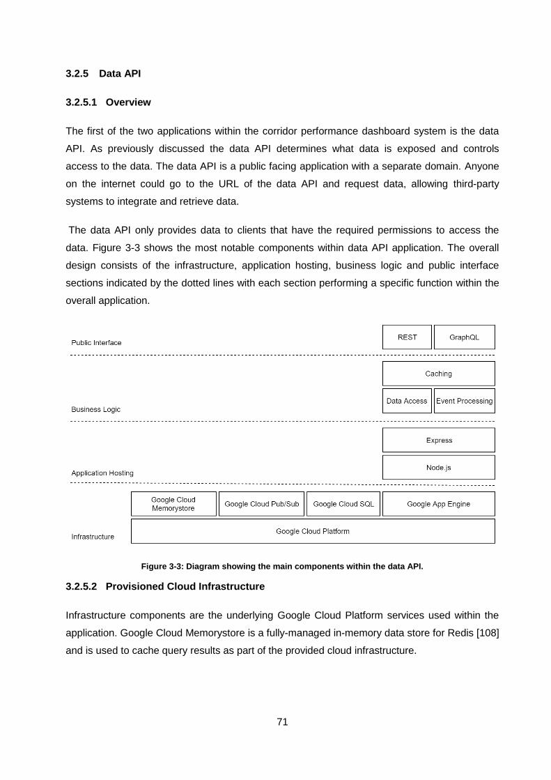
71
3.2.5 Data API
3.2.5.1 Overview
The first of the two applications within the corridor performance dashboard system is the data
API. As previously discussed the data API determines what data is exposed and controls
access to the data. The data API is a public facing application with a separate domain. Anyone
on the internet could go to the URL of the data API and request data, allowing third-party
systems to integrate and retrieve data.
The data API only provides data to clients that have the required permissions to access the
data. Figure 3-3 shows the most notable components within data API application. The overall
design consists of the infrastructure, application hosting, business logic and public interface
sections indicated by the dotted lines with each section performing a specific function within the
overall application.
Figure 3-3: Diagram showing the main components within the data API.
3.2.5.2 Provisioned Cloud Infrastructure
Infrastructure components are the underlying Google Cloud Platform services used within the
application. Google Cloud Memorystore is a fully-managed in-memory data store for Redis [108]
and is used to cache query results as part of the provided cloud infrastructure.
72
Google Cloud Pub/Sub is a messaging solution that allows different applications to publish
messages to a queue system and retrieve messages from queues. The purpose of the event
processing component is to manage all the logic related to asynchronous communication. Event
processing listens for events from the analysis solution and stores the results in the database.
By using an asynchronous communication channel the corridor dashboard system and the
analysis systems can be operational at different times and still communicate results to each
other. Results are queued within Pub/Sub by the analysis solution and remain in the queue until
they are retrieved by the dashboard system.
Google Cloud SQL is a managed database solution capable of running either MySQL, Microsoft
SQL or PostgreSQL databases. The internal configuration and structure of the database are
managed by the development team. The hosting and maintenance of the hardware on which
the database is running are maintained by Google. The development team can also to specify
the hardware on which the database should run, configure automated backups and configure
replication to other data centres for higher availability and failover in the event that one
database instance goes down. Transferring some of the provisioning and operational burdens to
Google allows the development team to focus more on developing software.
These infrastructure solutions are not unique to Google as a cloud provider. The other cloud
providers evaluated in the previous chapter have comparable services. If a different cloud
provider were to be used the same infrastructure could still be achieved using the equivalent
services they offer.
3.2.5.3 Application Hosting Solution
Express is a web application framework that provides a structured approach to developing and
organising a Node.js web application. Express offers various templating engines to generate
and serve HTML pages with dynamic values within the page. Express also offers routing based
on the URL requested and the HTTP method used which is a standardised feature of most web
server solutions.
As described in previous sections, there are alternative web frameworks similar to express for
other programming environments that could serve the same purpose. Express is used as it fits
the skill set of developers working on the project and is the most widely used solution in this
ecosystem for web-based solutions [48].
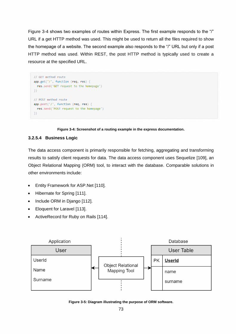
73
Figure 3-4 shows two examples of routes within Express. The first example responds to the “/”
URL if a get HTTP method was used. This might be used to return all the files required to show
the homepage of a website. The second example also responds to the “/” URL but only if a post
HTTP method was used. Within REST, the post HTTP method is typically used to create a
resource at the specified URL.
Figure 3-4: Screenshot of a routing example in the express documentation.
3.2.5.4 Business Logic
The data access component is primarily responsible for fetching, aggregating and transforming
results to satisfy client requests for data. The data access component uses Sequelize [109], an
Object Relational Mapping (ORM) tool, to interact with the database. Comparable solutions in
other environments include:
Entity Framework for ASP.Net [110].
Hibernate for Spring [111].
Include ORM in Django [112].
Eloquent for Laravel [113].
ActiveRecord for Ruby on Rails [114].
Figure 3-5: Diagram illustrating the purpose of ORM software.
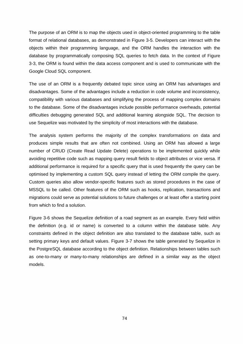
74
The purpose of an ORM is to map the objects used in object-oriented programming to the table
format of relational databases, as demonstrated in Figure 3-5. Developers can interact with the
objects within their programming language, and the ORM handles the interaction with the
database by programmatically composing SQL queries to fetch data. In the context of Figure
3-3, the ORM is found within the data access component and is used to communicate with the
Google Cloud SQL component.
The use of an ORM is a frequently debated topic since using an ORM has advantages and
disadvantages. Some of the advantages include a reduction in code volume and inconsistency,
compatibility with various databases and simplifying the process of mapping complex domains
to the database. Some of the disadvantages include possible performance overheads, potential
difficulties debugging generated SQL and additional learning alongside SQL. The decision to
use Sequelize was motivated by the simplicity of most interactions with the database.
The analysis system performs the majority of the complex transformations on data and
produces simple results that are often not combined. Using an ORM has allowed a large
number of CRUD (Create Read Update Delete) operations to be implemented quickly while
avoiding repetitive code such as mapping query result fields to object attributes or vice versa. If
additional performance is required for a specific query that is used frequently the query can be
optimised by implementing a custom SQL query instead of letting the ORM compile the query.
Custom queries also allow vendor-specific features such as stored procedures in the case of
MSSQL to be called. Other features of the ORM such as hooks, replication, transactions and
migrations could serve as potential solutions to future challenges or at least offer a starting point
from which to find a solution.
Figure 3-6 shows the Sequelize definition of a road segment as an example. Every field within
the definition (e.g. id or name) is converted to a column within the database table. Any
constraints defined in the object definition are also translated to the database table, such as
setting primary keys and default values. Figure 3-7 shows the table generated by Sequelize in
the PostgreSQL database according to the object definition. Relationships between tables such
as one-to-many or many-to-many relationships are defined in a similar way as the object
models.
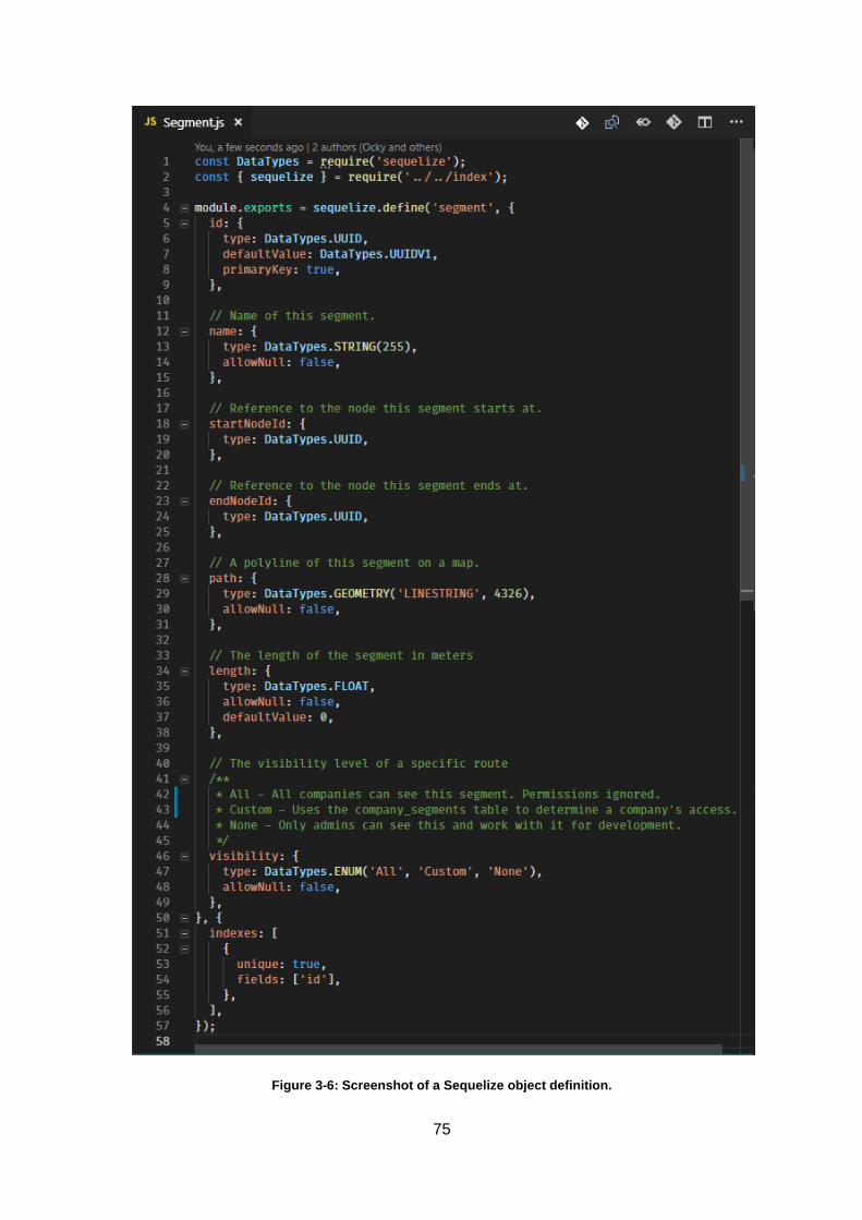
75
Figure 3-6: Screenshot of a Sequelize object definition.
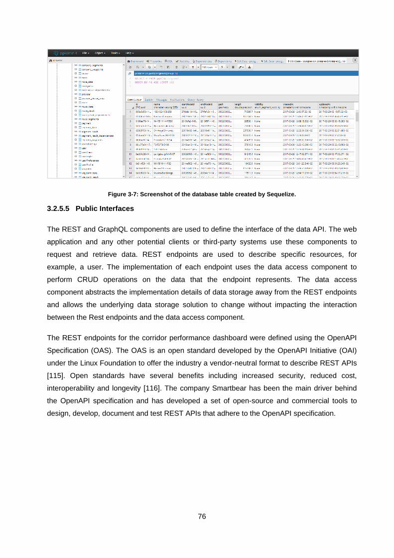
76
Figure 3-7: Screenshot of the database table created by Sequelize.
3.2.5.5 Public Interfaces
The REST and GraphQL components are used to define the interface of the data API. The web
application and any other potential clients or third-party systems use these components to
request and retrieve data. REST endpoints are used to describe specific resources, for
example, a user. The implementation of each endpoint uses the data access component to
perform CRUD operations on the data that the endpoint represents. The data access
component abstracts the implementation details of data storage away from the REST endpoints
and allows the underlying data storage solution to change without impacting the interaction
between the Rest endpoints and the data access component.
The REST endpoints for the corridor performance dashboard were defined using the OpenAPI
Specification (OAS). The OAS is an open standard developed by the OpenAPI Initiative (OAI)
under the Linux Foundation to offer the industry a vendor-neutral format to describe REST APIs
[115]. Open standards have several benefits including increased security, reduced cost,
interoperability and longevity [116]. The company Smartbear has been the main driver behind
the OpenAPI specification and has developed a set of open-source and commercial tools to
design, develop, document and test REST APIs that adhere to the OpenAPI specification.
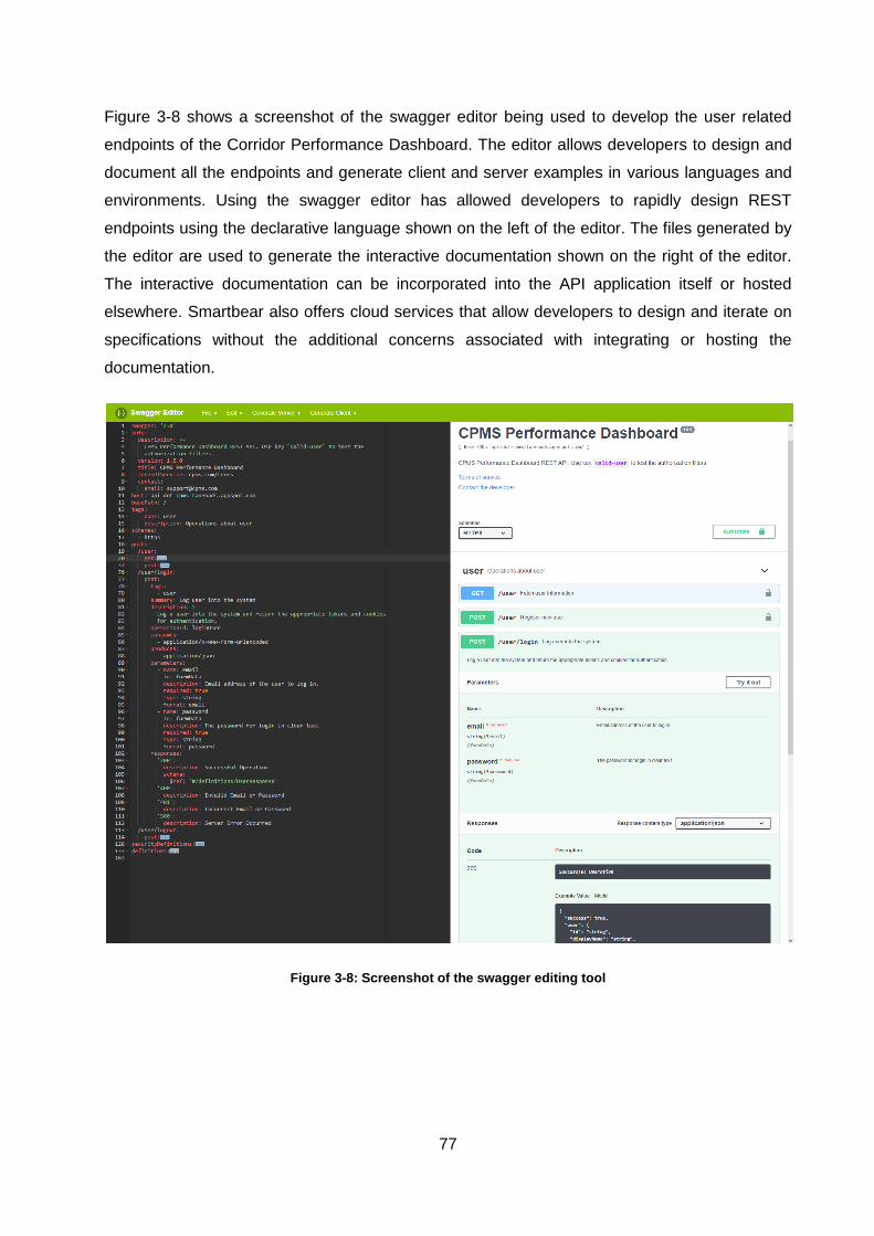
77
Figure 3-8 shows a screenshot of the swagger editor being used to develop the user related
endpoints of the Corridor Performance Dashboard. The editor allows developers to design and
document all the endpoints and generate client and server examples in various languages and
environments. Using the swagger editor has allowed developers to rapidly design REST
endpoints using the declarative language shown on the left of the editor. The files generated by
the editor are used to generate the interactive documentation shown on the right of the editor.
The interactive documentation can be incorporated into the API application itself or hosted
elsewhere. Smartbear also offers cloud services that allow developers to design and iterate on
specifications without the additional concerns associated with integrating or hosting the
documentation.
Figure 3-8: Screenshot of the swagger editing tool
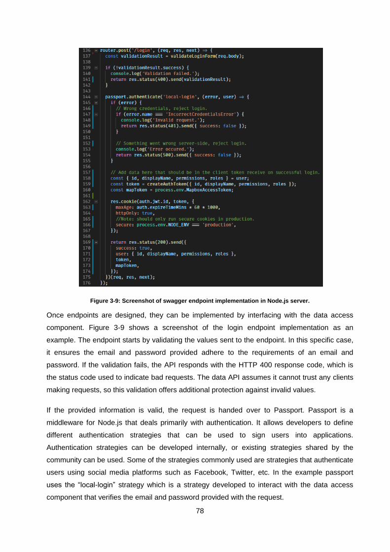
78
Figure 3-9: Screenshot of swagger endpoint implementation in Node.js server.
Once endpoints are designed, they can be implemented by interfacing with the data access
component. Figure 3-9 shows a screenshot of the login endpoint implementation as an
example. The endpoint starts by validating the values sent to the endpoint. In this specific case,
it ensures the email and password provided adhere to the requirements of an email and
password. If the validation fails, the API responds with the HTTP 400 response code, which is
the status code used to indicate bad requests. The data API assumes it cannot trust any clients
making requests, so this validation offers additional protection against invalid values.
If the provided information is valid, the request is handed over to Passport. Passport is a
middleware for Node.js that deals primarily with authentication. It allows developers to define
different authentication strategies that can be used to sign users into applications.
Authentication strategies can be developed internally, or existing strategies shared by the
community can be used. Some of the strategies commonly used are strategies that authenticate
users using social media platforms such as Facebook, Twitter, etc. In the example passport
uses the “local-login” strategy which is a strategy developed to interact with the data access
component that verifies the email and password provided with the request.
79
If the credentials provided do not match the credentials stored within the database, the API
responds with the HTTP 401 response code, which is the status code used to indicate
unauthorised requests. If something went wrong that is not directly related to the login process
(e.g. database is unavailable) the API responds with HTTP 500 which is the code used to
indicate internal server errors. This informs the client that something went wrong within the
server and that the failure was not necessarily caused by the client request. If no errors occur
the information requested by the user is transformed into the appropriate formats such as
encrypted tokens, cookies and raw text. Finally, the server returns all the data with an HTTP
200 status code which indicates that the request was successfully handled.
By using multiple HTTP status codes the client and server can have a more comprehensive
interaction which allows the client to react better to the responses it receives. An example might
be to have the client retry the request again when it receives an HTTP 500 response. If the
client receives the HTTP 500 code three times in a row, it can assume that the API is inoperable
and can inform the user that the service is not currently available. If all the failure conditions in
the example returned the HTTP 400 status code, the client could not understand why the
request failed. The user would be expected to try and log in again regardless of the failure
which could create the impression that the user is doing something wrong when in fact the API
is the source of the issue. The general development cycle of a REST endpoint includes [102]:
Determining the resource the endpoint will expose.
Defining the structure and fields of the response under ideal circumstances.
Defining inputs and their effects on the response of the endpoint.
Determining any possible exceptions that could occur and the appropriate HTTP response
codes to describe them.
Implementation of the endpoint definition in the swagger editor.
Integration of the new endpoint definition into the existing data API solution.
Implementation of the endpoint in code.
Testing the endpoint and ensuring the response is correct (including all the exceptions).
Run software that automatically generates updated interactive documentation once the
endpoint implementation is finalised.
Implementation of all the REST endpoints is an ongoing effort since there are still legal and
technical negotiations in progress with data providers. As new data resources and results are
provided by the analysis system the endpoints to access those results will be implemented
accordingly. Long-term the use of design and documentation technologies such as swagger will
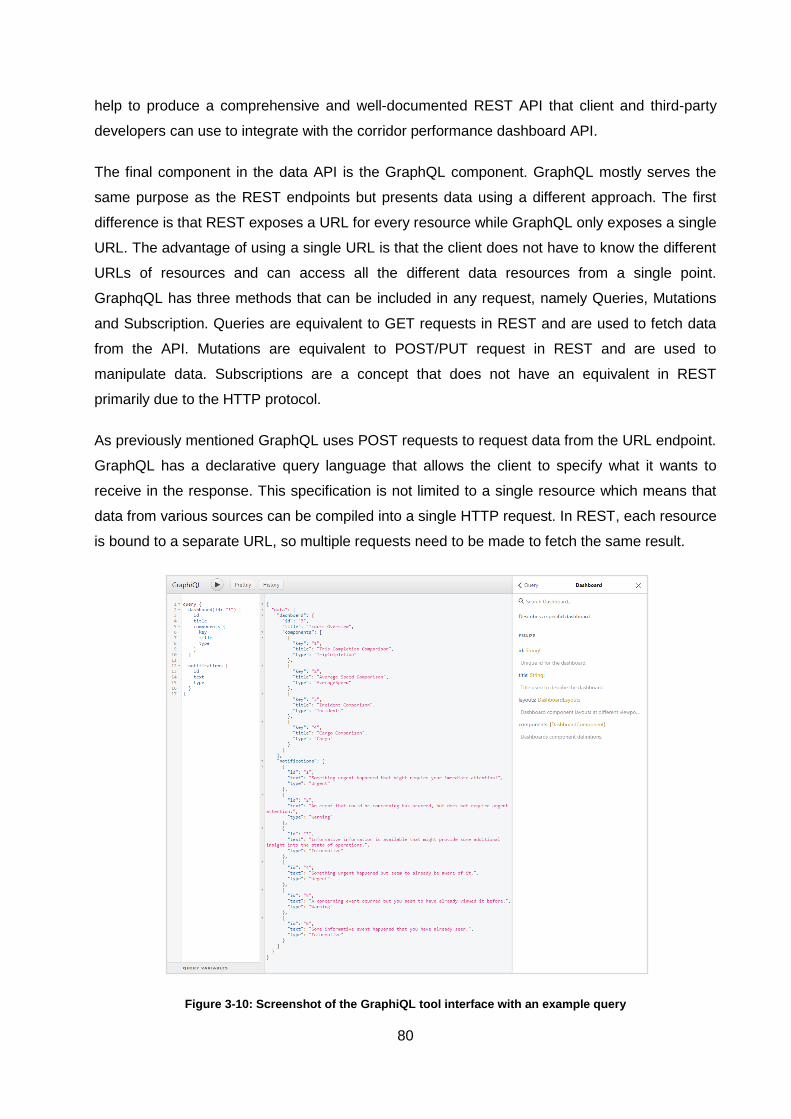
80
help to produce a comprehensive and well-documented REST API that client and third-party
developers can use to integrate with the corridor performance dashboard API.
The final component in the data API is the GraphQL component. GraphQL mostly serves the
same purpose as the REST endpoints but presents data using a different approach. The first
difference is that REST exposes a URL for every resource while GraphQL only exposes a single
URL. The advantage of using a single URL is that the client does not have to know the different
URLs of resources and can access all the different data resources from a single point.
GraphqQL has three methods that can be included in any request, namely Queries, Mutations
and Subscription. Queries are equivalent to GET requests in REST and are used to fetch data
from the API. Mutations are equivalent to POST/PUT request in REST and are used to
manipulate data. Subscriptions are a concept that does not have an equivalent in REST
primarily due to the HTTP protocol.
As previously mentioned GraphQL uses POST requests to request data from the URL endpoint.
GraphQL has a declarative query language that allows the client to specify what it wants to
receive in the response. This specification is not limited to a single resource which means that
data from various sources can be compiled into a single HTTP request. In REST, each resource
is bound to a separate URL, so multiple requests need to be made to fetch the same result.
Figure 3-10: Screenshot of the GraphiQL tool interface with an example query
81
Figure 3-10 shows a screenshot of the GraphiQL tool, an interface used to explore and query
GraphQL APIs. In the leftmost column is the request sent to the GraphQL API. The request
contains the query method which is used to request data. The query method contains the
dashboard and notification fields each of which contains their own set of fields. The middle
column shows the response that is returned when the request is made to the API. Note that the
response contains the data for both the dashboard and notifications. The rightmost column
contains interactive documentation for the API. The documentation lists all the different fields for
every defined type. Currently, it is showing the values available to request for a dashboard.
Note that the documentation describes a “layouts field” which is not used in the query and as a
result is not present in the response either.
One key downside in GraphQL is the lack of network-level caching. In REST APIs each URL is
unique and returns a unique result. Caching can be handled by a load balancer or reverse proxy
at the network layer without requiring changes in the application. In the case of GraphQL, the
application needs to handle caching since the contents of requests sent to the same URL may
be different every time. There are open-source libraries that deal with this problem such as the
dataloader library by Facebook which batches and caches repeating requests to data sources
[117].
Overall the data API provides an interface using the widely accepted REST format in order to be
compatible with the majority of systems throughout the industry. The data API also offers
GraphQL as an additional solution for client and third-party developers interested in using more
recent API technologies. Appendix A contains a full list of the libraries used within the data API
as well as a brief description of what every library does and where to find it. The list describes
all the notable libraries as well as the less notable libraries that enhance the development
experience by abstracting away repetitive code or automating tedious tasks.
It is important to note that interfaces such as the REST and GraphQL are not limited to the
development environment used for this project. Libraries that incorporate this functionality into a
software solution can be found for all major web framework solutions. Other communication
solutions previously discussed such as SOAP or JSON-RPC can also be added to the available
interfaces alongside those described in this section if that functionality was required to integrate
with a corridor stakeholder.
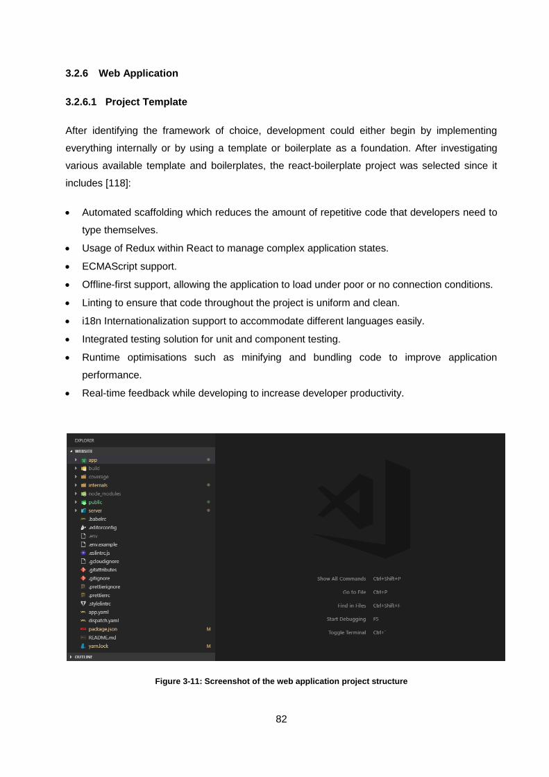
82
3.2.6 Web Application
3.2.6.1 Project Template
After identifying the framework of choice, development could either begin by implementing
everything internally or by using a template or boilerplate as a foundation. After investigating
various available template and boilerplates, the react-boilerplate project was selected since it
includes [118]:
Automated scaffolding which reduces the amount of repetitive code that developers need to
type themselves.
Usage of Redux within React to manage complex application states.
ECMAScript support.
Offline-first support, allowing the application to load under poor or no connection conditions.
Linting to ensure that code throughout the project is uniform and clean.
i18n Internationalization support to accommodate different languages easily.
Integrated testing solution for unit and component testing.
Runtime optimisations such as minifying and bundling code to improve application
performance.
Real-time feedback while developing to increase developer productivity.
Figure 3-11: Screenshot of the web application project structure
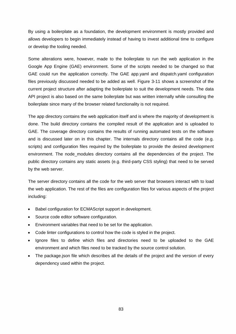
83
By using a boilerplate as a foundation, the development environment is mostly provided and
allows developers to begin immediately instead of having to invest additional time to configure
or develop the tooling needed.
Some alterations were, however, made to the boilerplate to run the web application in the
Google App Engine (GAE) environment. Some of the scripts needed to be changed so that
GAE could run the application correctly. The GAE app.yaml and dispatch.yaml configuration
files previously discussed needed to be added as well. Figure 3-11 shows a screenshot of the
current project structure after adapting the boilerplate to suit the development needs. The data
API project is also based on the same boilerplate but was written internally while consulting the
boilerplate since many of the browser related functionality is not required.
The app directory contains the web application itself and is where the majority of development is
done. The build directory contains the compiled result of the application and is uploaded to
GAE. The coverage directory contains the results of running automated tests on the software
and is discussed later on in this chapter. The internals directory contains all the code (e.g.
scripts) and configuration files required by the boilerplate to provide the desired development
environment. The node_modules directory contains all the dependencies of the project. The
public directory contains any static assets (e.g. third-party CSS styling) that need to be served
by the web server.
The server directory contains all the code for the web server that browsers interact with to load
the web application. The rest of the files are configuration files for various aspects of the project
including:
Babel configuration for ECMAScript support in development.
Source code editor software configuration.
Environment variables that need to be set for the application.
Code linter configurations to control how the code is styled in the project.
Ignore files to define which files and directories need to be uploaded to the GAE
environment and which files need to be tracked by the source control solution.
The package.json file which describes all the details of the project and the version of every
dependency used within the project.
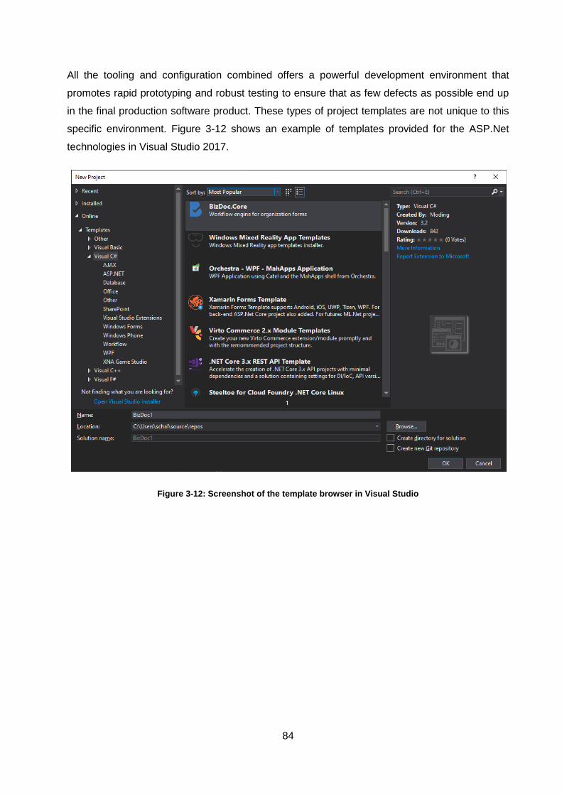
84
All the tooling and configuration combined offers a powerful development environment that
promotes rapid prototyping and robust testing to ensure that as few defects as possible end up
in the final production software product. These types of project templates are not unique to this
specific environment. Figure 3-12 shows an example of templates provided for the ASP.Net
technologies in Visual Studio 2017.
Figure 3-12: Screenshot of the template browser in Visual Studio
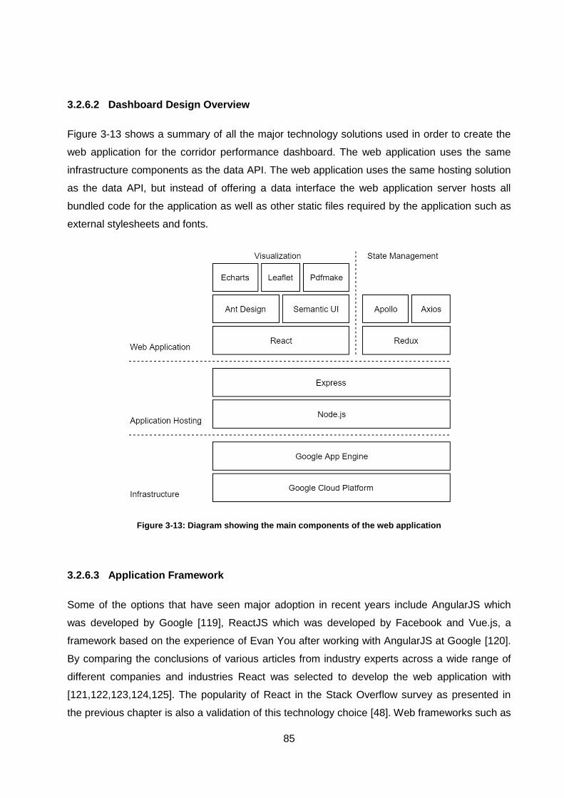
85
3.2.6.2 Dashboard Design Overview
Figure 3-13 shows a summary of all the major technology solutions used in order to create the
web application for the corridor performance dashboard. The web application uses the same
infrastructure components as the data API. The web application uses the same hosting solution
as the data API, but instead of offering a data interface the web application server hosts all
bundled code for the application as well as other static files required by the application such as
external stylesheets and fonts.
Figure 3-13: Diagram showing the main components of the web application
3.2.6.3 Application Framework
Some of the options that have seen major adoption in recent years include AngularJS which
was developed by Google [119], ReactJS which was developed by Facebook and Vue.js, a
framework based on the experience of Evan You after working with AngularJS at Google [120].
By comparing the conclusions of various articles from industry experts across a wide range of
different companies and industries React was selected to develop the web application with
[121,122,123,124,125]. The popularity of React in the Stack Overflow survey as presented in
the previous chapter is also a validation of this technology choice [48]. Web frameworks such as
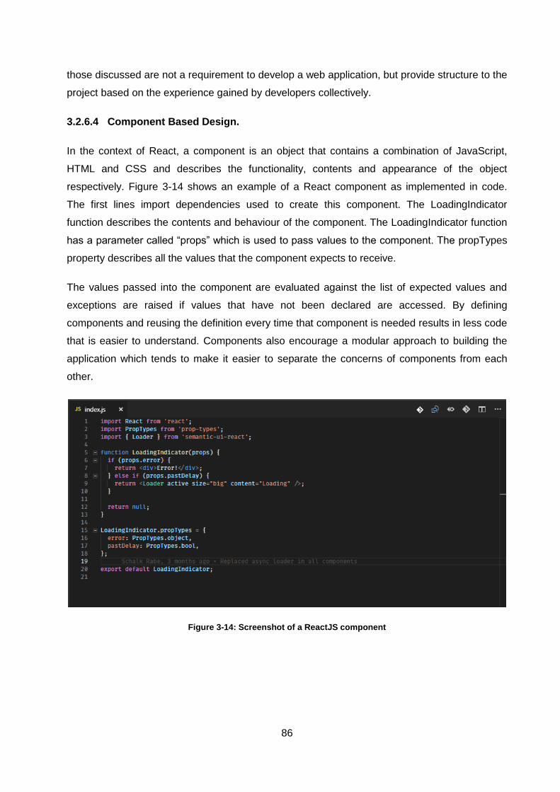
86
those discussed are not a requirement to develop a web application, but provide structure to the
project based on the experience gained by developers collectively.
3.2.6.4 Component Based Design.
In the context of React, a component is an object that contains a combination of JavaScript,
HTML and CSS and describes the functionality, contents and appearance of the object
respectively. Figure 3-14 shows an example of a React component as implemented in code.
The first lines import dependencies used to create this component. The LoadingIndicator
function describes the contents and behaviour of the component. The LoadingIndicator function
has a parameter called “props” which is used to pass values to the component. The propTypes
property describes all the values that the component expects to receive.
The values passed into the component are evaluated against the list of expected values and
exceptions are raised if values that have not been declared are accessed. By defining
components and reusing the definition every time that component is needed results in less code
that is easier to understand. Components also encourage a modular approach to building the
application which tends to make it easier to separate the concerns of components from each
other.
Figure 3-14: Screenshot of a ReactJS component
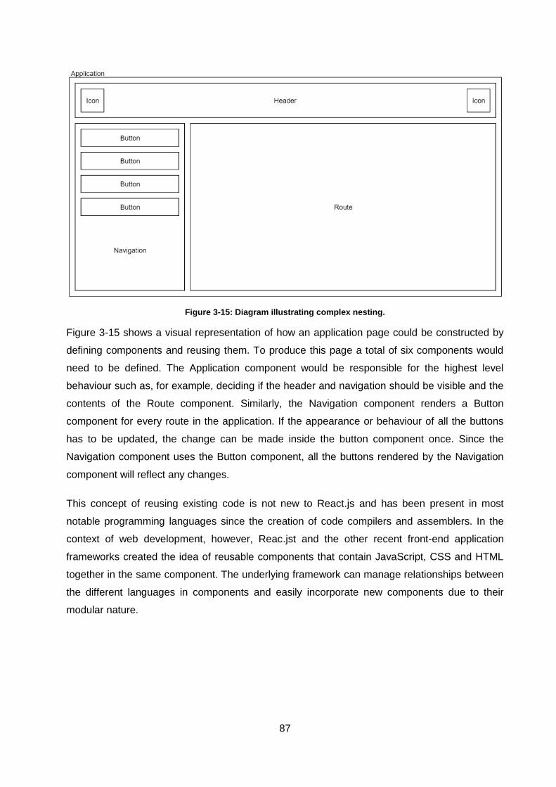
87
Figure 3-15: Diagram illustrating complex nesting.
Figure 3-15 shows a visual representation of how an application page could be constructed by
defining components and reusing them. To produce this page a total of six components would
need to be defined. The Application component would be responsible for the highest level
behaviour such as, for example, deciding if the header and navigation should be visible and the
contents of the Route component. Similarly, the Navigation component renders a Button
component for every route in the application. If the appearance or behaviour of all the buttons
has to be updated, the change can be made inside the button component once. Since the
Navigation component uses the Button component, all the buttons rendered by the Navigation
component will reflect any changes.
This concept of reusing existing code is not new to React.js and has been present in most
notable programming languages since the creation of code compilers and assemblers. In the
context of web development, however, Reac.jst and the other recent front-end application
frameworks created the idea of reusable components that contain JavaScript, CSS and HTML
together in the same component. The underlying framework can manage relationships between
the different languages in components and easily incorporate new components due to their
modular nature.
88
3.2.6.5 Stateful Components
The LoadingIndicator example used before is known as a stateless function. Stateless functions
do not store any values internally and will always produce the same result for the same inputs.
Stateless functions are similar to simple math functions with defined inputs and outputs. This
makes the behaviour of the component very easy to reason about. Stateful components, on the
other hand, store values internally in a property known as “state”. The state of a stateful
component can change due to the behaviour of the component or can be changed by external
components.
State is typically grouped and centralised to as few components as possible and then shared
with stateless components by passing the relevant values down as properties. These
components that govern state are often referred to as high-order components or container
components. A typical use case for these components is to fetch data from another system and
then pass the results down to stateless components to render the desired output.
3.2.6.6 Component Approach Drawbacks
As with most decisions in software development, there are drawbacks to this compositional
approach of developing applications. One drawback that was observed during the development
of the corridor performance dashboard was that reusing a component too much can have
negative effects as well. As a component is incorporated into more sections of the application,
the effect of changing that component grows. This can result in hesitation to evolve that
component since the effects of changes might be spread across the entire application. This
same problem has been observed before in monolithic applications where developers were
rarely able to change parts of the software that is heavily depended upon since no single person
knows all the ramifications of the change. In the case of React, a good practice is to use
stateless components as much as possible for visual elements. If a change causes a visual
flaw, it is more likely to be noticed than a logical flaw that might not be apparent while using the
software.
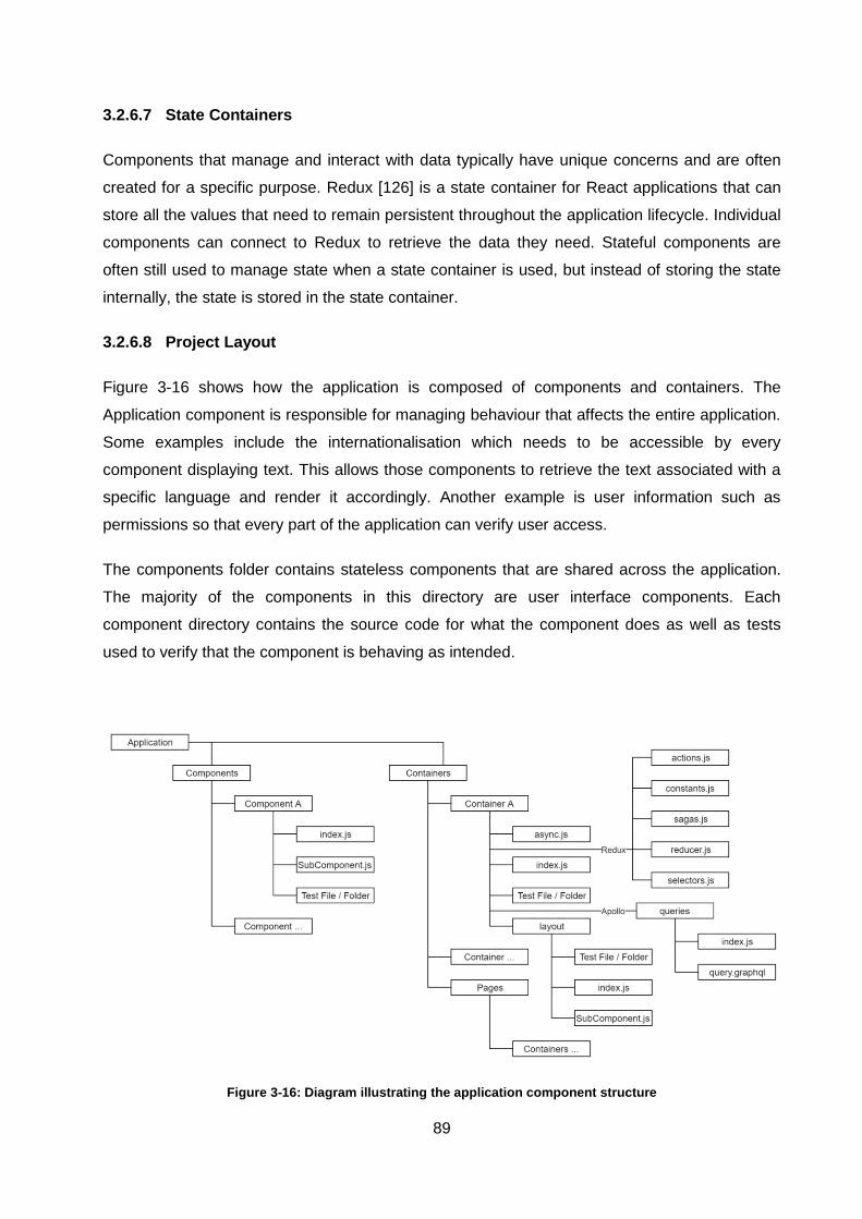
89
3.2.6.7 State Containers
Components that manage and interact with data typically have unique concerns and are often
created for a specific purpose. Redux [126] is a state container for React applications that can
store all the values that need to remain persistent throughout the application lifecycle. Individual
components can connect to Redux to retrieve the data they need. Stateful components are
often still used to manage state when a state container is used, but instead of storing the state
internally, the state is stored in the state container.
3.2.6.8 Project Layout
Figure 3-16 shows how the application is composed of components and containers. The
Application component is responsible for managing behaviour that affects the entire application.
Some examples include the internationalisation which needs to be accessible by every
component displaying text. This allows those components to retrieve the text associated with a
specific language and render it accordingly. Another example is user information such as
permissions so that every part of the application can verify user access.
The components folder contains stateless components that are shared across the application.
The majority of the components in this directory are user interface components. Each
component directory contains the source code for what the component does as well as tests
used to verify that the component is behaving as intended.
Figure 3-16: Diagram illustrating the application component structure
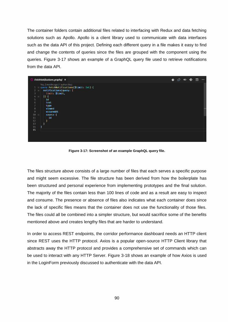
90
The container folders contain additional files related to interfacing with Redux and data fetching
solutions such as Apollo. Apollo is a client library used to communicate with data interfaces
such as the data API of this project. Defining each different query in a file makes it easy to find
and change the contents of queries since the files are grouped with the component using the
queries. Figure 3-17 shows an example of a GraphQL query file used to retrieve notifications
from the data API.
Figure 3-17: Screenshot of an example GraphQL query file.
The files structure above consists of a large number of files that each serves a specific purpose
and might seem excessive. The file structure has been derived from how the boilerplate has
been structured and personal experience from implementing prototypes and the final solution.
The majority of the files contain less than 100 lines of code and as a result are easy to inspect
and consume. The presence or absence of files also indicates what each container does since
the lack of specific files means that the container does not use the functionality of those files.
The files could all be combined into a simpler structure, but would sacrifice some of the benefits
mentioned above and creates lengthy files that are harder to understand.
In order to access REST endpoints, the corridor performance dashboard needs an HTTP client
since REST uses the HTTP protocol. Axios is a popular open-source HTTP Client library that
abstracts away the HTTP protocol and provides a comprehensive set of commands which can
be used to interact with any HTTP Server. Figure 3-18 shows an example of how Axios is used
in the LoginForm previously discussed to authenticate with the data API.
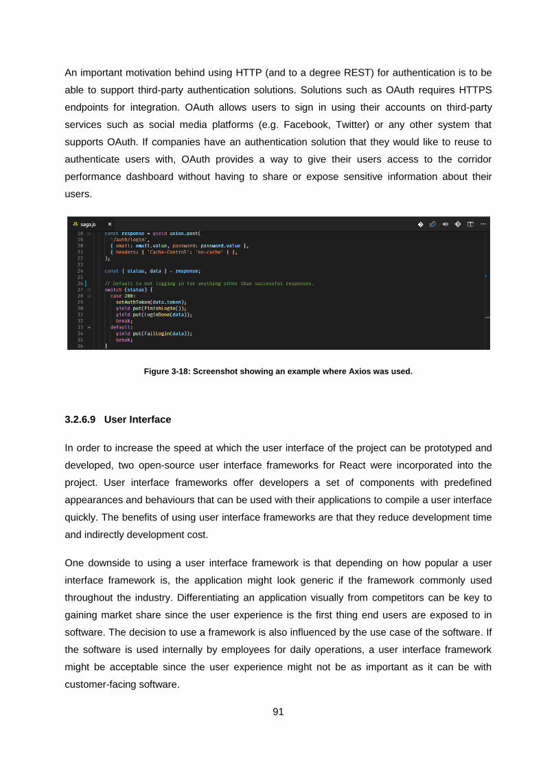
91
An important motivation behind using HTTP (and to a degree REST) for authentication is to be
able to support third-party authentication solutions. Solutions such as OAuth requires HTTPS
endpoints for integration. OAuth allows users to sign in using their accounts on third-party
services such as social media platforms (e.g. Facebook, Twitter) or any other system that
supports OAuth. If companies have an authentication solution that they would like to reuse to
authenticate users with, OAuth provides a way to give their users access to the corridor
performance dashboard without having to share or expose sensitive information about their
users.
Figure 3-18: Screenshot showing an example where Axios was used.
3.2.6.9 User Interface
In order to increase the speed at which the user interface of the project can be prototyped and
developed, two open-source user interface frameworks for React were incorporated into the
project. User interface frameworks offer developers a set of components with predefined
appearances and behaviours that can be used with their applications to compile a user interface
quickly. The benefits of using user interface frameworks are that they reduce development time
and indirectly development cost.
One downside to using a user interface framework is that depending on how popular a user
interface framework is, the application might look generic if the framework commonly used
throughout the industry. Differentiating an application visually from competitors can be key to
gaining market share since the user experience is the first thing end users are exposed to in
software. The decision to use a framework is also influenced by the use case of the software. If
the software is used internally by employees for daily operations, a user interface framework
might be acceptable since the user experience might not be as important as it can be with
customer-facing software.
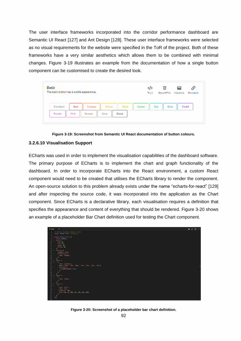
92
The user interface frameworks incorporated into the corridor performance dashboard are
Semantic UI React [127] and Ant Design [128]. These user interface frameworks were selected
as no visual requirements for the website were specified in the ToR of the project. Both of these
frameworks have a very similar aesthetics which allows them to be combined with minimal
changes. Figure 3-19 illustrates an example from the documentation of how a single button
component can be customised to create the desired look.
Figure 3-19: Screenshot from Semantic UI React documentation of button colours.
3.2.6.10 Visualisation Support
ECharts was used in order to implement the visualisation capabilities of the dashboard software.
The primary purpose of ECharts is to implement the chart and graph functionality of the
dashboard. In order to incorporate ECharts into the React environment, a custom React
component would need to be created that utilises the ECharts library to render the component.
An open-source solution to this problem already exists under the name “echarts-for-react” [129]
and after inspecting the source code, it was incorporated into the application as the Chart
component. Since ECharts is a declarative library, each visualisation requires a definition that
specifies the appearance and content of everything that should be rendered. Figure 3-20 shows
an example of a placeholder Bar Chart definition used for testing the Chart component.
Figure 3-20: Screenshot of a placeholder bar chart definition.
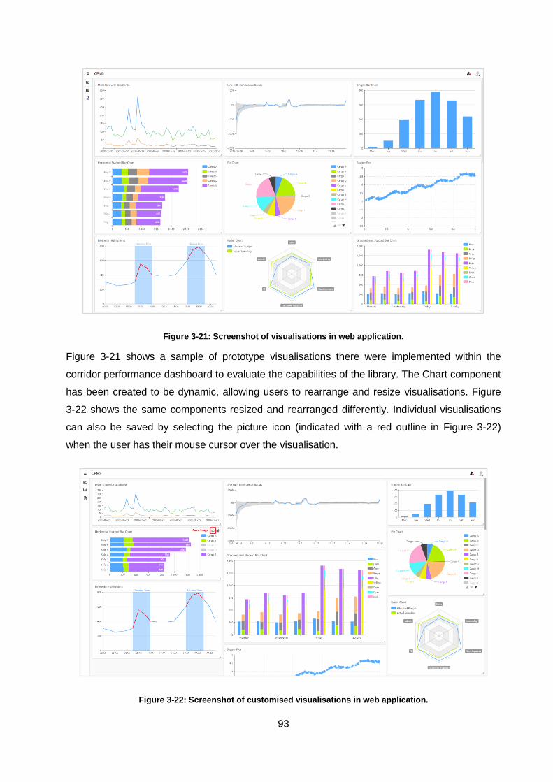
93
Figure 3-21: Screenshot of visualisations in web application.
Figure 3-21 shows a sample of prototype visualisations there were implemented within the
corridor performance dashboard to evaluate the capabilities of the library. The Chart component
has been created to be dynamic, allowing users to rearrange and resize visualisations. Figure
3-22 shows the same components resized and rearranged differently. Individual visualisations
can also be saved by selecting the picture icon (indicated with a red outline in Figure 3-22)
when the user has their mouse cursor over the visualisation.
Figure 3-22: Screenshot of customised visualisations in web application.
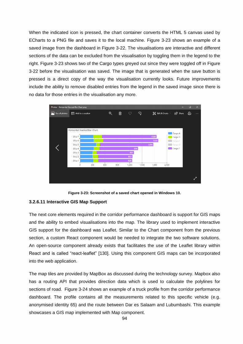
94
When the indicated icon is pressed, the chart container converts the HTML 5 canvas used by
ECharts to a PNG file and saves it to the local machine. Figure 3-23 shows an example of a
saved image from the dashboard in Figure 3-22. The visualisations are interactive and different
sections of the data can be excluded from the visualisation by toggling them in the legend to the
right. Figure 3-23 shows two of the Cargo types greyed out since they were toggled off in Figure
3-22 before the visualisation was saved. The image that is generated when the save button is
pressed is a direct copy of the way the visualisation currently looks. Future improvements
include the ability to remove disabled entries from the legend in the saved image since there is
no data for those entries in the visualisation any more.
Figure 3-23: Screenshot of a saved chart opened in Windows 10.
3.2.6.11 Interactive GIS Map Support
The next core elements required in the corridor performance dashboard is support for GIS maps
and the ability to embed visualisations into the map. The library used to implement interactive
GIS support for the dashboard was Leaflet. Similar to the Chart component from the previous
section, a custom React component would be needed to integrate the two software solutions.
An open-source component already exists that facilitates the use of the Leaflet library within
React and is called “react-leaflet” [130]. Using this component GIS maps can be incorporated
into the web application.
The map tiles are provided by MapBox as discussed during the technology survey. Mapbox also
has a routing API that provides direction data which is used to calculate the polylines for
sections of road. Figure 3-24 shows an example of a truck profile from the corridor performance
dashboard. The profile contains all the measurements related to this specific vehicle (e.g.
anonymised identity 65) and the route between Dar es Salaam and Lubumbashi. This example
showcases a GIS map implemented with Map component.
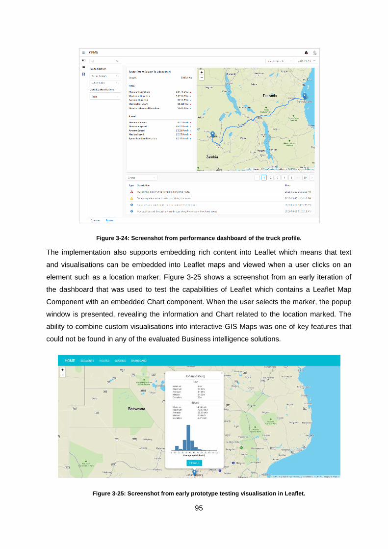
95
Figure 3-24: Screenshot from performance dashboard of the truck profile.
The implementation also supports embedding rich content into Leaflet which means that text
and visualisations can be embedded into Leaflet maps and viewed when a user clicks on an
element such as a location marker. Figure 3-25 shows a screenshot from an early iteration of
the dashboard that was used to test the capabilities of Leaflet which contains a Leaflet Map
Component with an embedded Chart component. When the user selects the marker, the popup
window is presented, revealing the information and Chart related to the location marked. The
ability to combine custom visualisations into interactive GIS Maps was one of key features that
could not be found in any of the evaluated Business intelligence solutions.
Figure 3-25: Screenshot from early prototype testing visualisation in Leaflet.

96
3.2.6.12 PDF Rendering Support
In order to add the ability to render PDF documents within the corridor performance dashboard,
the Pdfmake and PDF.js libraries were used. Pdfmake is used to generate PDF documents
according to the provided inputs. PDF.js is used to render and display the documents created
by pdfmake in the browser.These libraries are some of the most widely used PDF solutions
since they are maintained by the creators of the Firefox browser [131]. Similar to the previous
sections, each of these libraries were integrated as custom React components.
Rendering PDF document starts with collecting user inputs. The user inputs are used to
determine which sections of the PDF document should be included in the rendered result. After
a user has provided the required inputs for the report, they can get a preview of the report by
pressing the search button. Figure 3-26 shows an example of a PDF file being previewed.
Previews allow users to inspect the document before downloading it to ensure that everything
they want in the document is included and correct.
When a user renders a PDF report, the container responsible for PDFs evaluates the inputs,
fetches the correct data and adapts the document declaration that describes the PDF
dynamically to include the correct information. The modified declaration is passed to pdfmake
which renders the declaration into a PDF document. The rendered PDF document is passed
from pdfmake to PDF.js and rendered within the user interface. If the user selects download
then the browser downloads the PDF file directly from pdfmake.
Figure 3-26: Screenshot of PDF report rendering page in web application.
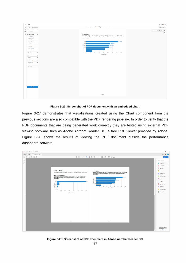
97
Figure 3-27: Screenshot of PDF document with an embedded chart.
Figure 3-27 demonstrates that visualisations created using the Chart component from the
previous sections are also compatible with the PDF rendering pipeline. In order to verify that the
PDF documents that are being generated work correctly they are tested using external PDF
viewing software such as Adobe Acrobat Reader DC, a free PDF viewer provided by Adobe.
Figure 3-28 shows the results of viewing the PDF document outside the performance
dashboard software
Figure 3-28: Screenshot of PDF document in Adobe Acrobat Reader DC.
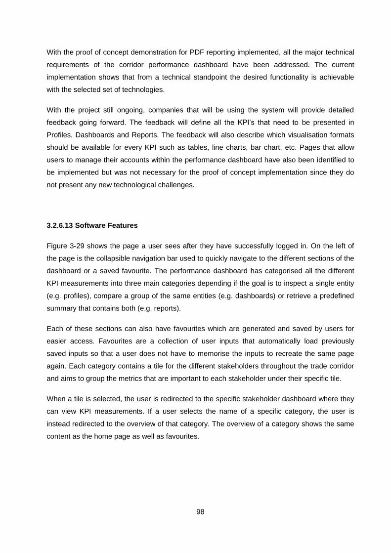
98
With the proof of concept demonstration for PDF reporting implemented, all the major technical
requirements of the corridor performance dashboard have been addressed. The current
implementation shows that from a technical standpoint the desired functionality is achievable
with the selected set of technologies.
With the project still ongoing, companies that will be using the system will provide detailed
feedback going forward. The feedback will define all the KPI’s that need to be presented in
Profiles, Dashboards and Reports. The feedback will also describe which visualisation formats
should be available for every KPI such as tables, line charts, bar chart, etc. Pages that allow
users to manage their accounts within the performance dashboard have also been identified to
be implemented but was not necessary for the proof of concept implementation since they do
not present any new technological challenges.
3.2.6.13 Software Features
Figure 3-29 shows the page a user sees after they have successfully logged in. On the left of
the page is the collapsible navigation bar used to quickly navigate to the different sections of the
dashboard or a saved favourite. The performance dashboard has categorised all the different
KPI measurements into three main categories depending if the goal is to inspect a single entity
(e.g. profiles), compare a group of the same entities (e.g. dashboards) or retrieve a predefined
summary that contains both (e.g. reports).
Each of these sections can also have favourites which are generated and saved by users for
easier access. Favourites are a collection of user inputs that automatically load previously
saved inputs so that a user does not have to memorise the inputs to recreate the same page
again. Each category contains a tile for the different stakeholders throughout the trade corridor
and aims to group the metrics that are important to each stakeholder under their specific tile.
When a tile is selected, the user is redirected to the specific stakeholder dashboard where they
can view KPI measurements. If a user selects the name of a specific category, the user is
instead redirected to the overview of that category. The overview of a category shows the same
content as the home page as well as favourites.
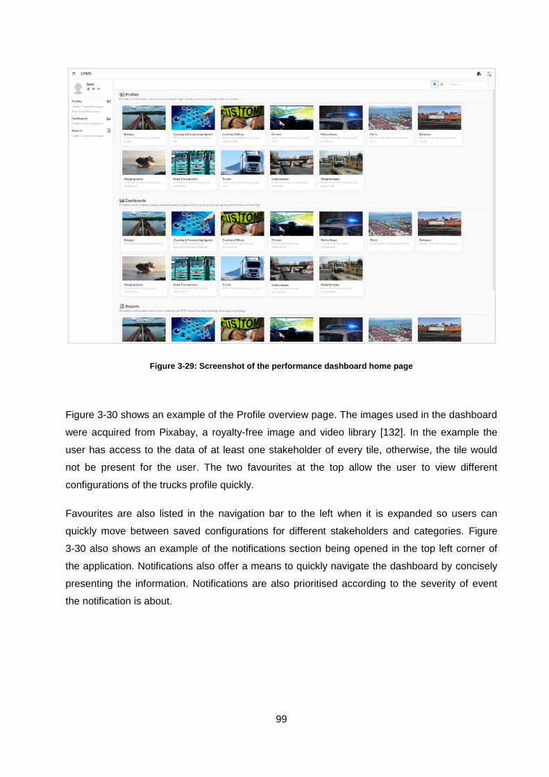
99
Figure 3-29: Screenshot of the performance dashboard home page
Figure 3-30 shows an example of the Profile overview page. The images used in the dashboard
were acquired from Pixabay, a royalty-free image and video library [132]. In the example the
user has access to the data of at least one stakeholder of every tile, otherwise, the tile would
not be present for the user. The two favourites at the top allow the user to view different
configurations of the trucks profile quickly.
Favourites are also listed in the navigation bar to the left when it is expanded so users can
quickly move between saved configurations for different stakeholders and categories. Figure
3-30 also shows an example of the notifications section being opened in the top left corner of
the application. Notifications also offer a means to quickly navigate the dashboard by concisely
presenting the information. Notifications are also prioritised according to the severity of event
the notification is about.
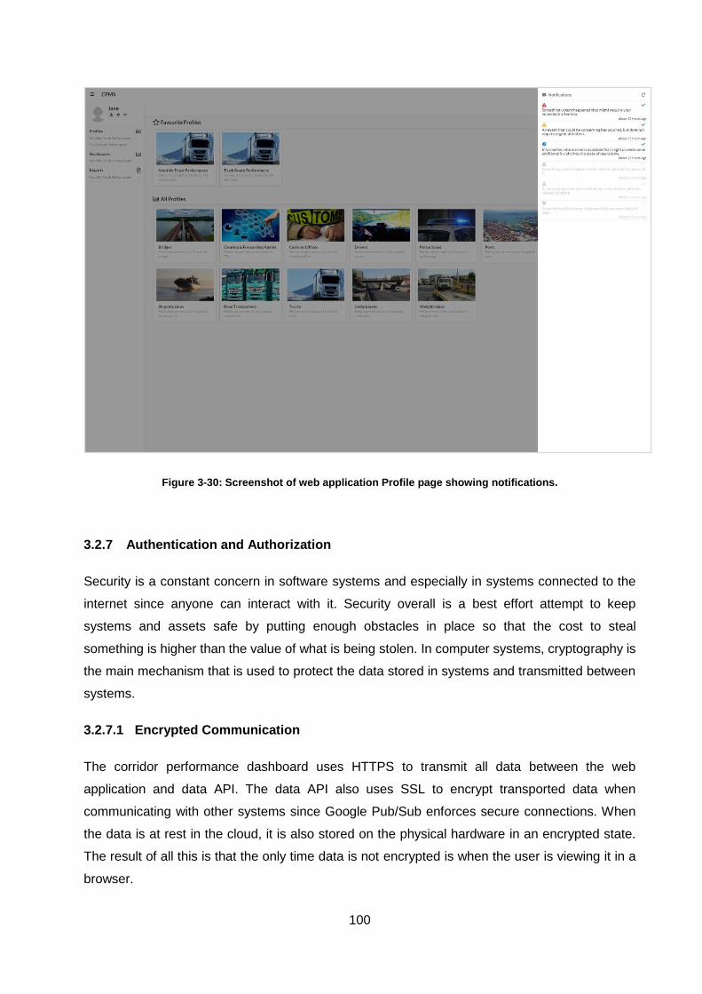
100
Figure 3-30: Screenshot of web application Profile page showing notifications.
3.2.7 Authentication and Authorization
Security is a constant concern in software systems and especially in systems connected to the
internet since anyone can interact with it. Security overall is a best effort attempt to keep
systems and assets safe by putting enough obstacles in place so that the cost to steal
something is higher than the value of what is being stolen. In computer systems, cryptography is
the main mechanism that is used to protect the data stored in systems and transmitted between
systems.
3.2.7.1 Encrypted Communication
The corridor performance dashboard uses HTTPS to transmit all data between the web
application and data API. The data API also uses SSL to encrypt transported data when
communicating with other systems since Google Pub/Sub enforces secure connections. When
the data is at rest in the cloud, it is also stored on the physical hardware in an encrypted state.
The result of all this is that the only time data is not encrypted is when the user is viewing it in a
browser.
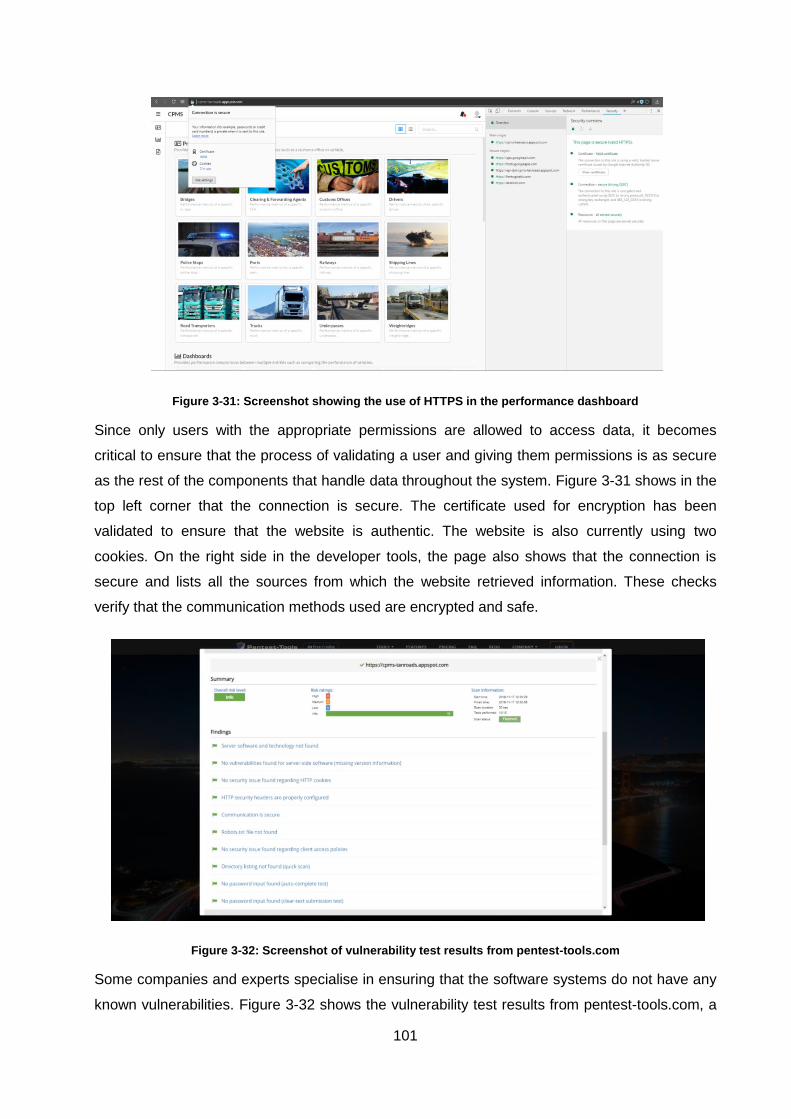
101
Figure 3-31: Screenshot showing the use of HTTPS in the performance dashboard
Since only users with the appropriate permissions are allowed to access data, it becomes
critical to ensure that the process of validating a user and giving them permissions is as secure
as the rest of the components that handle data throughout the system. Figure 3-31 shows in the
top left corner that the connection is secure. The certificate used for encryption has been
validated to ensure that the website is authentic. The website is also currently using two
cookies. On the right side in the developer tools, the page also shows that the connection is
secure and lists all the sources from which the website retrieved information. These checks
verify that the communication methods used are encrypted and safe.
Figure 3-32: Screenshot of vulnerability test results from pentest-tools.com
Some companies and experts specialise in ensuring that the software systems do not have any
known vulnerabilities. Figure 3-32 shows the vulnerability test results from pentest-tools.com, a

102
company that offers website vulnerability scanning services. The results indicate that none of
the vulnerabilities that were tested for was found in the corridor performance dashboard. Since
multiple companies offer these types of services, the results from different companies can be
used to validate each other. Figure 3-33 shows the results of the security scan functionality
offered within the Google Cloud platform, indicating that it did not find any obvious
vulnerabilities with the web application.
It should, however, be noted that vulnerabilities could still exist within a software system. New
security threats are frequently discovered and addressed. It is important for developers to keep
the software used to implement solutions with as up to date as possible. This will lower the risk
of a system being compromised as it should receive fixes to vulnerabilities with updates.
Figure 3-33: Screenshot of Google Cloud Platform security scan results.
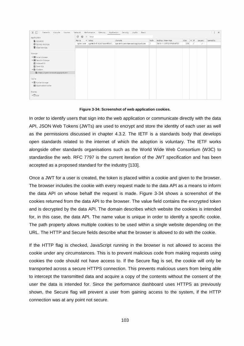
103
Figure 3-34: Screenshot of web application cookies.
In order to identify users that sign into the web application or communicate directly with the data
API, JSON Web Tokens (JWTs) are used to encrypt and store the identity of each user as well
as the permissions discussed in chapter 4.3.2. The IETF is a standards body that develops
open standards related to the internet of which the adoption is voluntary. The IETF works
alongside other standards organisations such as the World Wide Web Consortium (W3C) to
standardise the web. RFC 7797 is the current iteration of the JWT specification and has been
accepted as a proposed standard for the industry [133].
Once a JWT for a user is created, the token is placed within a cookie and given to the browser.
The browser includes the cookie with every request made to the data API as a means to inform
the data API on whose behalf the request is made. Figure 3-34 shows a screenshot of the
cookies returned from the data API to the browser. The value field contains the encrypted token
and is decrypted by the data API. The domain describes which website the cookies is intended
for, in this case, the data API. The name value is unique in order to identify a specific cookie.
The path property allows multiple cookies to be used within a single website depending on the
URL. The HTTP and Secure fields describe what the browser is allowed to do with the cookie.
If the HTTP flag is checked, JavaScript running in the browser is not allowed to access the
cookie under any circumstances. This is to prevent malicious code from making requests using
cookies the code should not have access to. If the Secure flag is set, the cookie will only be
transported across a secure HTTPS connection. This prevents malicious users from being able
to intercept the transmitted data and acquire a copy of the contents without the consent of the
user the data is intended for. Since the performance dashboard uses HTTPS as previously
shown, the Secure flag will prevent a user from gaining access to the system, if the HTTP
connection was at any point not secure.

104
3.2.8 Testing
3.2.8.1 Testing Frameworks
For the corridor performance dashboard, testing is done as a mix of automated testing and
manual testing. Automated tests are used when the logic for the test itself is simple and can be
reasoned about quickly. For the corridor performance dashboard, testing is done using enzyme
[134] and jest [135]. There are over ten different options to choose from for testing JavaScript
alone. The two libraries were chosen mainly for their compatibility with React since Facebook
also developed jest along with React.
3.2.8.2 Testing Demonstration
Figure 3-35 shows the results after running the test script within the command console. Each
green checkmark is a test that was completed. Failed tests show which components and tests
within each component failed as well as the reason for the failure. In the first of the failed tests
shown at the bottom of the image, the test expected a value of 2 to be returned. Automated
tests allow developers to innovate faster by catching any mistakes developers make when
changing or refactoring code. Tests can, however, also slow down developers if the tests are
too hard to define and implement.
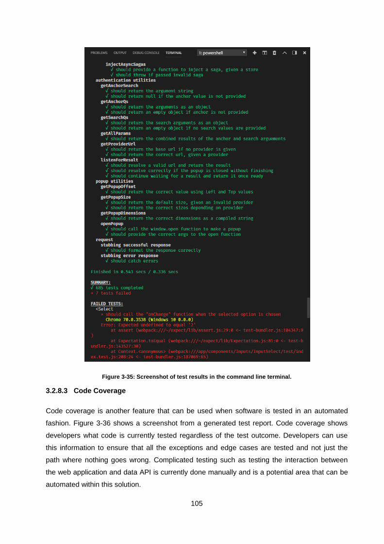
105
Figure 3-35: Screenshot of test results in the command line terminal.
3.2.8.3 Code Coverage
Code coverage is another feature that can be used when software is tested in an automated
fashion. Figure 3-36 shows a screenshot from a generated test report. Code coverage shows
developers what code is currently tested regardless of the test outcome. Developers can use
this information to ensure that all the exceptions and edge cases are tested and not just the
path where nothing goes wrong. Complicated testing such as testing the interaction between
the web application and data API is currently done manually and is a potential area that can be
automated within this solution.
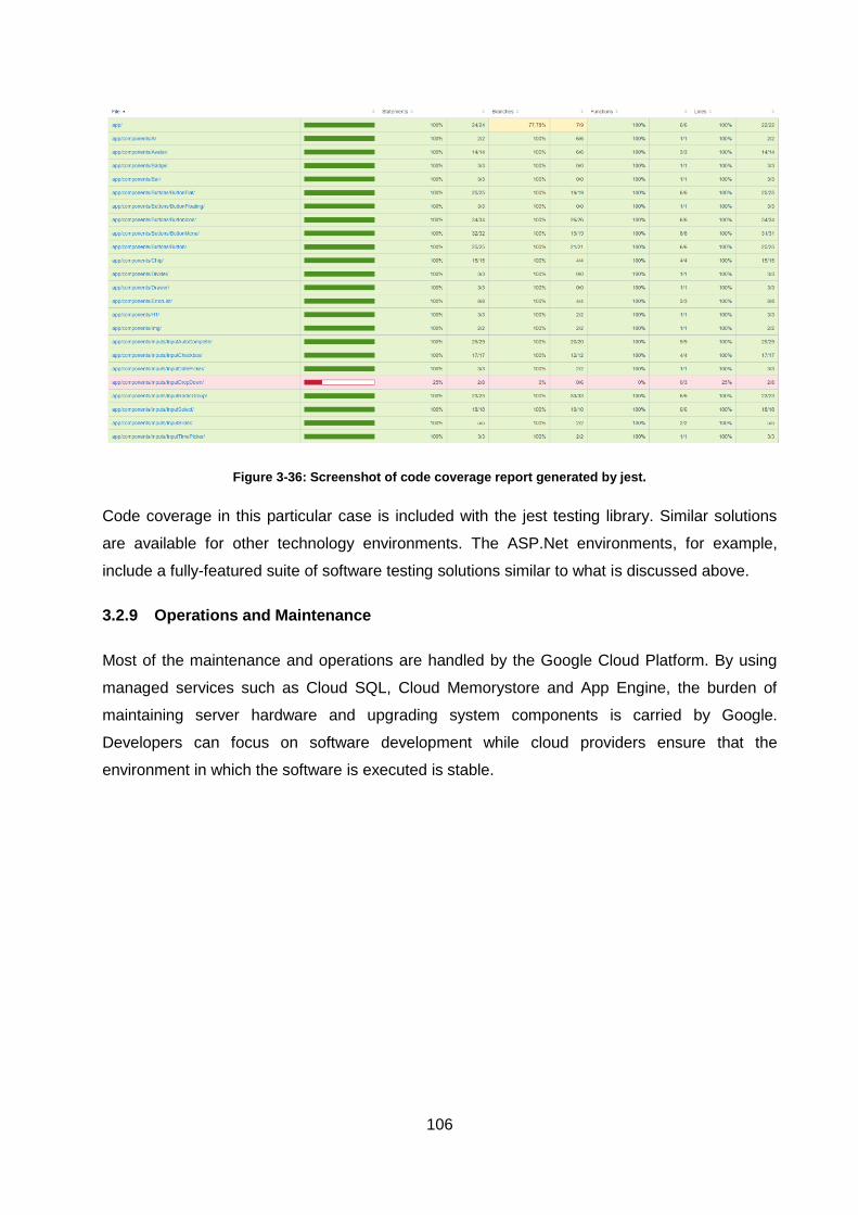
106
Figure 3-36: Screenshot of code coverage report generated by jest.
Code coverage in this particular case is included with the jest testing library. Similar solutions
are available for other technology environments. The ASP.Net environments, for example,
include a fully-featured suite of software testing solutions similar to what is discussed above.
3.2.9 Operations and Maintenance
Most of the maintenance and operations are handled by the Google Cloud Platform. By using
managed services such as Cloud SQL, Cloud Memorystore and App Engine, the burden of
maintaining server hardware and upgrading system components is carried by Google.
Developers can focus on software development while cloud providers ensure that the
environment in which the software is executed is stable.
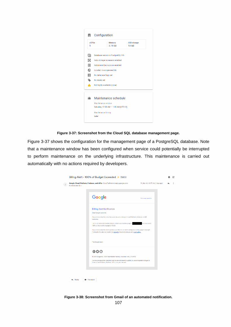
107
Figure 3-37: Screenshot from the Cloud SQL database management page.
Figure 3-37 shows the configuration for the management page of a PostgreSQL database. Note
that a maintenance window has been configured when service could potentially be interrupted
to perform maintenance on the underlying infrastructure. This maintenance is carried out
automatically with no actions required by developers.
Figure 3-38: Screenshot from Gmail of an automated notification.
108
The Google Cloud platform also allows automated messages about resource usage to be
configured. Instead of having to monitor system components actively, developers can be
informed when something requires their attention. Traditionally these types of systems would
have to be bought or developed internally and deployed along with the software being
developed. All the major cloud platforms provide these types of monitoring tools free of charge
since their software development teams benefit from them as well.
3.3 Chapter Summary
Modern software development has evolved significantly over the last decade with the adoption
of cloud computing. Software developers and engineers need to be versed in various tools and
environments in order to deliver higher quality software solutions at a faster rate. Open-source
has allowed technologies and tools to evolve at a rapid pace since the developers of various
companies from different commercial domains are all contributing to the same tools.
The use cases of websites have evolved significantly from the initial purpose of displaying static
text. Today, use cases range from the original static content page to fully interactive
applications that resemble native applications within the browser. New tools and technologies
have been created to accommodate these advanced use cases. The corridor performance
dashboard is implemented using technologies such as React to create an experience similar to
native applications with the accessibility of the web. The technical requirements of the corridor
performance dashboard have been addressed but the exact KPI’s need to be defined and
implemented based on the data made available by data providers.
Open-source libraries have allowed small development teams to rapidly prototype and
implement software that would have otherwise taken a large number of people a long time to
develop internally. The security of public facing systems on the internet is constantly being
improved as vulnerabilities are discovered across the industry. Implementing industry-standard
security practices can greatly increase the security of systems. Utilising third-party vulnerability
detection services can verify that sufficient security has been put in place.
Software development tools have continued to evolve and support new technologies and
development methodologies. The combination of cloud migration, continuous integration,
continuous deployment and DevOps has resulted in more automation within the development
pipeline in the pursuit of lower costs, more scalable and reliable systems and faster product
development.
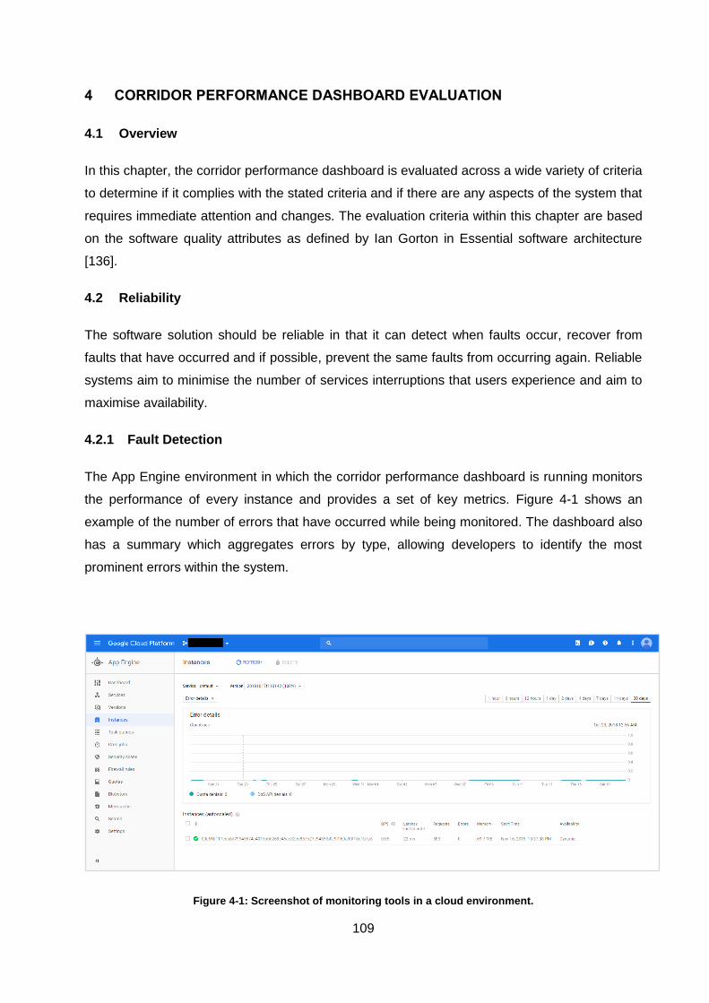
109
4 CORRIDOR PERFORMANCE DASHBOARD EVALUATION
4.1 Overview
In this chapter, the corridor performance dashboard is evaluated across a wide variety of criteria
to determine if it complies with the stated criteria and if there are any aspects of the system that
requires immediate attention and changes. The evaluation criteria within this chapter are based
on the software quality attributes as defined by Ian Gorton in Essential software architecture
[136].
4.2 Reliability
The software solution should be reliable in that it can detect when faults occur, recover from
faults that have occurred and if possible, prevent the same faults from occurring again. Reliable
systems aim to minimise the number of services interruptions that users experience and aim to
maximise availability.
4.2.1 Fault Detection
The App Engine environment in which the corridor performance dashboard is running monitors
the performance of every instance and provides a set of key metrics. Figure 4-1 shows an
example of the number of errors that have occurred while being monitored. The dashboard also
has a summary which aggregates errors by type, allowing developers to identify the most
prominent errors within the system.
Figure 4-1: Screenshot of monitoring tools in a cloud environment.
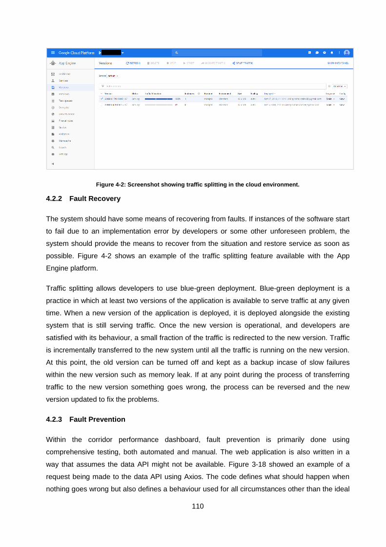
110
Figure 4-2: Screenshot showing traffic splitting in the cloud environment.
4.2.2 Fault Recovery
The system should have some means of recovering from faults. If instances of the software start
to fail due to an implementation error by developers or some other unforeseen problem, the
system should provide the means to recover from the situation and restore service as soon as
possible. Figure 4-2 shows an example of the traffic splitting feature available with the App
Engine platform.
Traffic splitting allows developers to use blue-green deployment. Blue-green deployment is a
practice in which at least two versions of the application is available to serve traffic at any given
time. When a new version of the application is deployed, it is deployed alongside the existing
system that is still serving traffic. Once the new version is operational, and developers are
satisfied with its behaviour, a small fraction of the traffic is redirected to the new version. Traffic
is incrementally transferred to the new system until all the traffic is running on the new version.
At this point, the old version can be turned off and kept as a backup incase of slow failures
within the new version such as memory leak. If at any point during the process of transferring
traffic to the new version something goes wrong, the process can be reversed and the new
version updated to fix the problems.
4.2.3 Fault Prevention
Within the corridor performance dashboard, fault prevention is primarily done using
comprehensive testing, both automated and manual. The web application is also written in a
way that assumes the data API might not be available. Figure 3-18 showed an example of a
request being made to the data API using Axios. The code defines what should happen when
nothing goes wrong but also defines a behaviour used for all circumstances other than the ideal
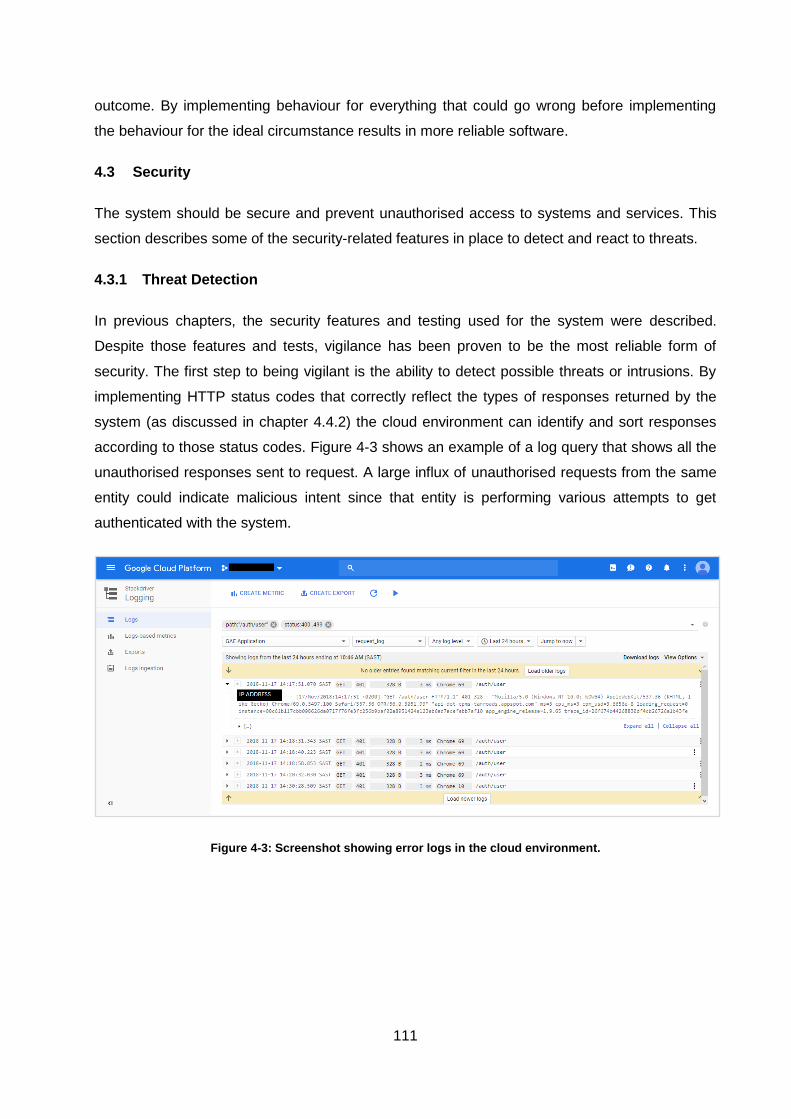
111
outcome. By implementing behaviour for everything that could go wrong before implementing
the behaviour for the ideal circumstance results in more reliable software.
4.3 Security
The system should be secure and prevent unauthorised access to systems and services. This
section describes some of the security-related features in place to detect and react to threats.
4.3.1 Threat Detection
In previous chapters, the security features and testing used for the system were described.
Despite those features and tests, vigilance has been proven to be the most reliable form of
security. The first step to being vigilant is the ability to detect possible threats or intrusions. By
implementing HTTP status codes that correctly reflect the types of responses returned by the
system (as discussed in chapter 4.4.2) the cloud environment can identify and sort responses
according to those status codes. Figure 4-3 shows an example of a log query that shows all the
unauthorised responses sent to request. A large influx of unauthorised requests from the same
entity could indicate malicious intent since that entity is performing various attempts to get
authenticated with the system.
Figure 4-3: Screenshot showing error logs in the cloud environment.
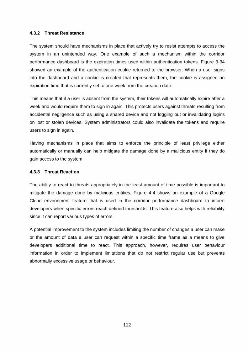
112
4.3.2 Threat Resistance
The system should have mechanisms in place that actively try to resist attempts to access the
system in an unintended way. One example of such a mechanism within the corridor
performance dashboard is the expiration times used within authentication tokens. Figure 3-34
showed an example of the authentication cookie returned to the browser. When a user signs
into the dashboard and a cookie is created that represents them, the cookie is assigned an
expiration time that is currently set to one week from the creation date.
This means that if a user is absent from the system, their tokens will automatically expire after a
week and would require them to sign in again. This protects users against threats resulting from
accidental negligence such as using a shared device and not logging out or invalidating logins
on lost or stolen devices. System administrators could also invalidate the tokens and require
users to sign in again.
Having mechanisms in place that aims to enforce the principle of least privilege either
automatically or manually can help mitigate the damage done by a malicious entity if they do
gain access to the system.
4.3.3 Threat Reaction
The ability to react to threats appropriately in the least amount of time possible is important to
mitigate the damage done by malicious entities. Figure 4-4 shows an example of a Google
Cloud environment feature that is used in the corridor performance dashboard to inform
developers when specific errors reach defined thresholds. This feature also helps with reliability
since it can report various types of errors.
A potential improvement to the system includes limiting the number of changes a user can make
or the amount of data a user can request within a specific time frame as a means to give
developers additional time to react. This approach, however, requires user behaviour
information in order to implement limitations that do not restrict regular use but prevents
abnormally excessive usage or behaviour.
113
Figure 4-4: Screenshot showing error notifications in the cloud environment.
4.4 Modifiability
Changes to the system should be quick and cost-effective. This section discusses the systems
and practices in place that allow developers to change functionality without being concerned
that those changes will introduce faults into the software.
4.4.1 Modular Design
The technologies used in the corridor performance dashboard such as React encourages code
to be structured as components and containers. The file structure described in Figure 3-16
isolates every component and container into their respective directories. Stateless components
should never interact with code outside their own. Containers nested within the pages section of
the container's directory can interact with containers outside the pages directory since they deal
with cross-cutting concerns. Containers in the pages directory should, however, not interact with
each other since they should encapsulate a single responsibility which in this case is a single
page.
If these principles are adhered to, pages will be completely independent and can be changed
without being concerned that different pages affect the code of one another. Containers also
have their layouts separated which further separates the functionality from the appearance. This
makes it possible to duplicate a component to a different project and keep the functionality
unchanged but change the appearance easily. By defining clear boundaries around each
responsibility from the system level (e.g. data provider, analytics system, performance
dashboard), application level (e.g. data API and web application) down to the container level
with clear interfaces between boundaries simplifies the system at every level.
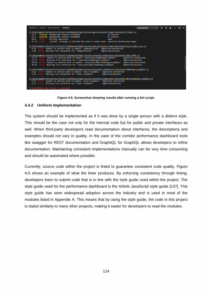
114
Figure 4-5: Screenshot showing results after running a lint script.
4.4.2 Uniform Implementation
The system should be implemented as if it was done by a single person with a distinct style.
This should be the case not only for the internal code but for public and private interfaces as
well. When third-party developers read documentation about interfaces, the descriptions and
examples should not vary in quality. In the case of the corridor performance dashboard tools
like swagger for REST documentation and GraphiQL for GraphQL allows developers to refine
documentation. Maintaining consistent implementations manually can be very time consuming
and should be automated where possible.
Currently, source code within the project is linted to guarantee consistent code quality. Figure
4-5 shows an example of what the linter produces. By enforcing consistency through linting,
developers learn to submit code that is in line with the style guide used within the project. The
style guide used for the performance dashboard is the Airbnb JavaScript style guide [137]. This
style guide has seen widespread adoption across the industry and is used in most of the
modules listed in Appendix A. This means that by using the style guide, the code in this project
is styled similarly to many other projects, making it easier for developers to read the modules.
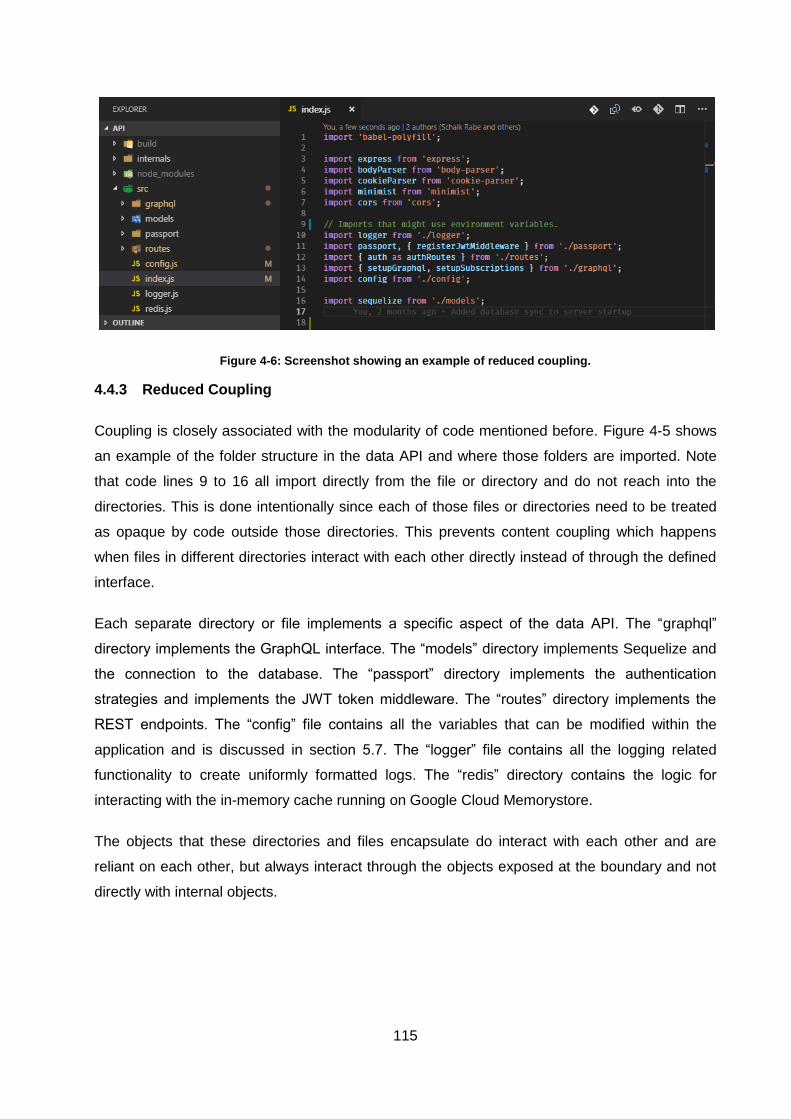
115
Figure 4-6: Screenshot showing an example of reduced coupling.
4.4.3 Reduced Coupling
Coupling is closely associated with the modularity of code mentioned before. Figure 4-5 shows
an example of the folder structure in the data API and where those folders are imported. Note
that code lines 9 to 16 all import directly from the file or directory and do not reach into the
directories. This is done intentionally since each of those files or directories need to be treated
as opaque by code outside those directories. This prevents content coupling which happens
when files in different directories interact with each other directly instead of through the defined
interface.
Each separate directory or file implements a specific aspect of the data API. The “graphql”
directory implements the GraphQL interface. The “models” directory implements Sequelize and
the connection to the database. The “passport” directory implements the authentication
strategies and implements the JWT token middleware. The “routes” directory implements the
REST endpoints. The “config” file contains all the variables that can be modified within the
application and is discussed in section 5.7. The “logger” file contains all the logging related
functionality to create uniformly formatted logs. The “redis” directory contains the logic for
interacting with the in-memory cache running on Google Cloud Memorystore.
The objects that these directories and files encapsulate do interact with each other and are
reliant on each other, but always interact through the objects exposed at the boundary and not
directly with internal objects.
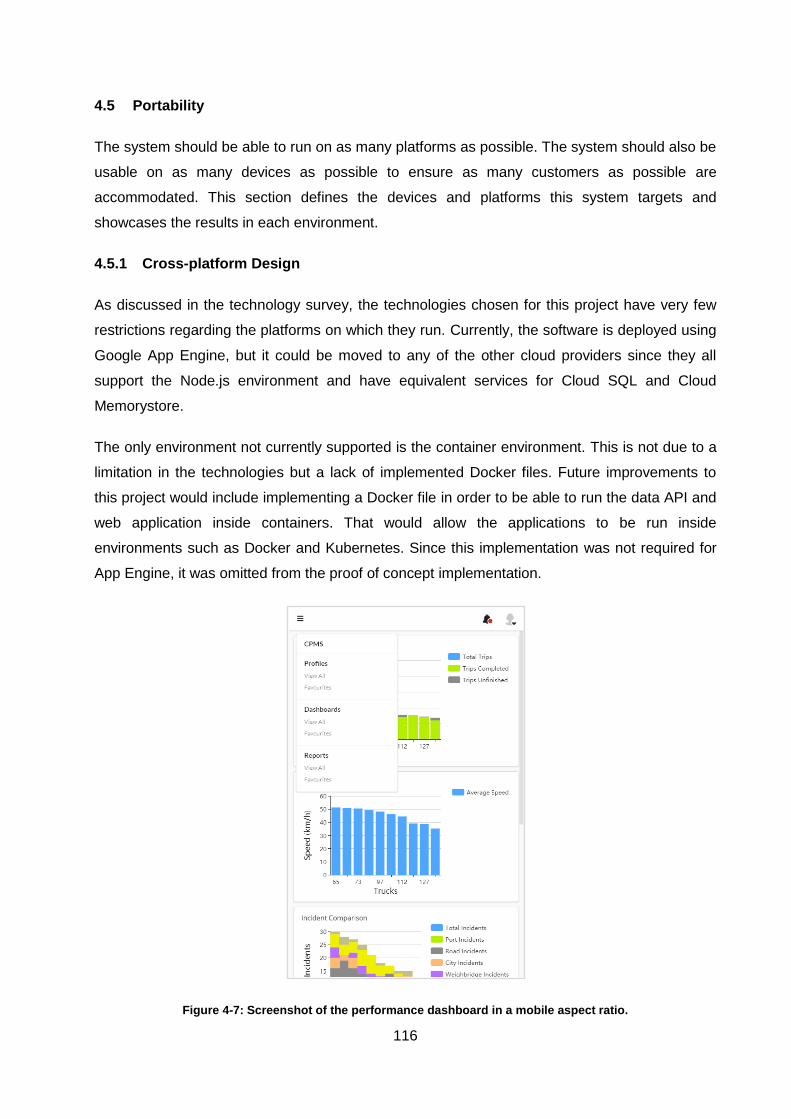
116
4.5 Portability
The system should be able to run on as many platforms as possible. The system should also be
usable on as many devices as possible to ensure as many customers as possible are
accommodated. This section defines the devices and platforms this system targets and
showcases the results in each environment.
4.5.1 Cross-platform Design
As discussed in the technology survey, the technologies chosen for this project have very few
restrictions regarding the platforms on which they run. Currently, the software is deployed using
Google App Engine, but it could be moved to any of the other cloud providers since they all
support the Node.js environment and have equivalent services for Cloud SQL and Cloud
Memorystore.
The only environment not currently supported is the container environment. This is not due to a
limitation in the technologies but a lack of implemented Docker files. Future improvements to
this project would include implementing a Docker file in order to be able to run the data API and
web application inside containers. That would allow the applications to be run inside
environments such as Docker and Kubernetes. Since this implementation was not required for
App Engine, it was omitted from the proof of concept implementation.
Figure 4-7: Screenshot of the performance dashboard in a mobile aspect ratio.
117
4.5.2 Responsive User Interface
The user interface for the corridor performance dashboard has been implemented to be
responsive which means that it works on devices of all sizes. Implementation is focused on the
best user experience for desktop and tablets first since the majority of the users are expected to
use those devices, but mobile is supported as a long vertical strip with a custom drop down
menu as shown in Figure 4-7.
The performance dashboard is currently tested in the five browsers including:
Opera Version 56.0.3051.99
Microsoft Edge Version 42.17134.0
Google Chrome Version 70.0.3538.102
Mozilla Firefox Version 62.0.2
Apple Safari Version 11.1.1
Microsoft Internet Explorer 11.407.17134
Additional devices and platforms can be evaluated if users request support for a specific device
or platform. Supporting additional devices and platforms requires an initial investment as well as
an ongoing effort to ensure the software remains compatible as the device or platform continues
to update.
4.6 Functionality
The system should be able to perform the intended work in a satisfactory amount of time. This
section demonstrates how the system satisfies each of the main technical requirements of the
project.
4.6.1 Visualisation
One of the key requirements for the project was to be able to visualise data in various forms
including tables, line charts, bar charts, pie charts and potentially more customised solutions
depending on the feedback given by the client.
The integration of the ECharts library into the application has provided a means for creating
visualisations shown in Figure 3-21. More custom visualisations can be made using the
extension system. Since ECharts was originally developed with the goal of being performant,
the library is capable of visualising far more data than the current requirements of the project.
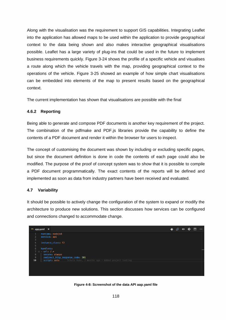
118
Along with the visualisation was the requirement to support GIS capabilities. Integrating Leaflet
into the application has allowed maps to be used within the application to provide geographical
context to the data being shown and also makes interactive geographical visualisations
possible. Leaflet has a large variety of plug-ins that could be used in the future to implement
business requirements quickly. Figure 3-24 shows the profile of a specific vehicle and visualises
a route along which the vehicle travels with the map, providing geographical context to the
operations of the vehicle. Figure 3-25 showed an example of how simple chart visualisations
can be embedded into elements of the map to present results based on the geographical
context.
The current implementation has shown that visualisations are possible with the final
4.6.2 Reporting
Being able to generate and compose PDF documents is another key requirement of the project.
The combination of the pdfmake and PDF.js libraries provide the capability to define the
contents of a PDF document and render it within the browser for users to inspect.
The concept of customising the document was shown by including or excluding specific pages,
but since the document definition is done in code the contents of each page could also be
modified. The purpose of the proof of concept system was to show that it is possible to compile
a PDF document programmatically. The exact contents of the reports will be defined and
implemented as soon as data from industry partners have been received and evaluated.
4.7 Variability
It should be possible to actively change the configuration of the system to expand or modify the
architecture to produce new solutions. This section discusses how services can be configured
and connections changed to accommodate change.
Figure 4-8: Screenshot of the data API aap.yaml file
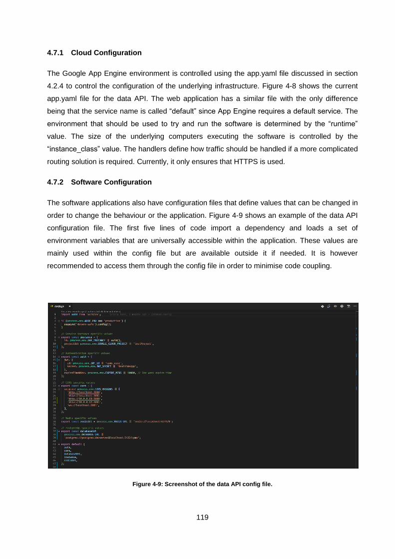
119
4.7.1 Cloud Configuration
The Google App Engine environment is controlled using the app.yaml file discussed in section
4.2.4 to control the configuration of the underlying infrastructure. Figure 4-8 shows the current
app.yaml file for the data API. The web application has a similar file with the only difference
being that the service name is called “default” since App Engine requires a default service. The
environment that should be used to try and run the software is determined by the “runtime”
value. The size of the underlying computers executing the software is controlled by the
“instance_class” value. The handlers define how traffic should be handled if a more complicated
routing solution is required. Currently, it only ensures that HTTPS is used.
4.7.2 Software Configuration
The software applications also have configuration files that define values that can be changed in
order to change the behaviour or the application. Figure 4-9 shows an example of the data API
configuration file. The first five lines of code import a dependency and loads a set of
environment variables that are universally accessible within the application. These values are
mainly used within the config file but are available outside it if needed. It is however
recommended to access them through the config file in order to minimise code coupling.
Figure 4-9: Screenshot of the data API config file.
120
Code lines 8 to 11 accesses values provided by the Google App Engine environment in order to
access the managed service provided by Google. If the values are not available, default values
are assigned. Lines 14 to 20 access values related to the security of the application. The JWT id
value matches the value used as the name of the cookie in Figure 3-34. The secret is used
during the encryption process of the token. If the encryption secret is changed, all the tokens
that were generated with the previous secret are no longer valid. This allows system
administrators to invalidate all existing tokens if there was at any point a need to do so.
Lines 23 to 31 define the allowed domains for Cross-Origin Resource Sharing (CORS) which
allows software applications running on different domains to share resources. In the case of the
corridor performance dashboard, the web application is on a different domain as the data API.
Since resource sharing between domains is not allowed by default for security reasons, CORS
needs to be explicitly configured.
Line 34 configures the address of the Redis instance to be used which in this case resides in
Cloud Memorystore. Lines 37 to 39 configures the address of the database which in this case
resides in Cloud SQL. These values allow the data API to connect to other databases or Redis
instances if for example a database migration has been done. The configuration can be
adjusted without changing the source code.
4.8 Subsetability
The system needs to remain functional if only a subset of the system is operational. In the
pursuit of maximum availability, the operational parts of the system should continue to remain
operational regardless of the state of other parts.
4.8.1 Component Independence
Each component/container within the dashboard is able to perform anything it needs to do
independently of the others. Figure 4-10 shows the truck profile screen previously depicted in
Figure 3-24 as it is still busy loading. The component on the left next to the map has finished
loading data. The bottom component has also finished retrieving events. The map, however, is
still in the process of receiving map tiles from Mapbox. The response for the waypoint locations
has been received, but the response that describes the route has not. Each of the three main
components is able to fail independently without affecting the other components. The map in
this case also receives data from different sources which might fail on their own. One could
argue that in the case of the map it might be a requirement that all the sources load otherwise it
might provide a bad user experience if no map tiles or route is shown.
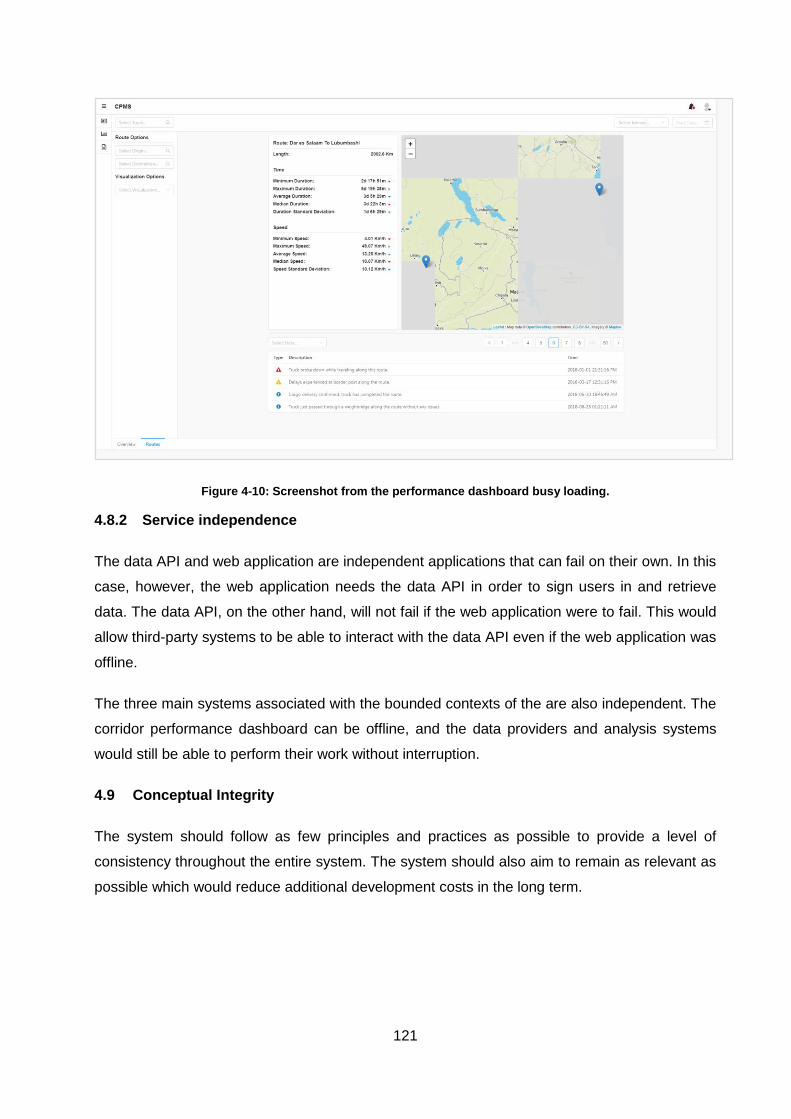
121
Figure 4-10: Screenshot from the performance dashboard busy loading.
4.8.2 Service independence
The data API and web application are independent applications that can fail on their own. In this
case, however, the web application needs the data API in order to sign users in and retrieve
data. The data API, on the other hand, will not fail if the web application were to fail. This would
allow third-party systems to be able to interact with the data API even if the web application was
offline.
The three main systems associated with the bounded contexts of the are also independent. The
corridor performance dashboard can be offline, and the data providers and analysis systems
would still be able to perform their work without interruption.
4.9 Conceptual Integrity
The system should follow as few principles and practices as possible to provide a level of
consistency throughout the entire system. The system should also aim to remain as relevant as
possible which would reduce additional development costs in the long term.
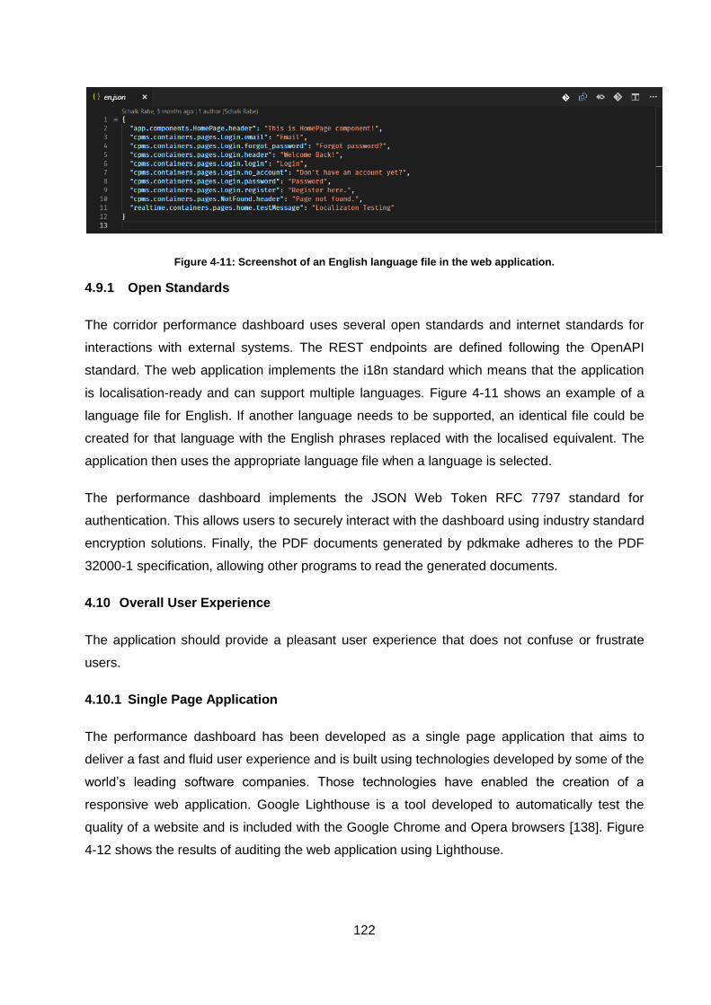
122
Figure 4-11: Screenshot of an English language file in the web application.
4.9.1 Open Standards
The corridor performance dashboard uses several open standards and internet standards for
interactions with external systems. The REST endpoints are defined following the OpenAPI
standard. The web application implements the i18n standard which means that the application
is localisation-ready and can support multiple languages. Figure 4-11 shows an example of a
language file for English. If another language needs to be supported, an identical file could be
created for that language with the English phrases replaced with the localised equivalent. The
application then uses the appropriate language file when a language is selected.
The performance dashboard implements the JSON Web Token RFC 7797 standard for
authentication. This allows users to securely interact with the dashboard using industry standard
encryption solutions. Finally, the PDF documents generated by pdkmake adheres to the PDF
32000-1 specification, allowing other programs to read the generated documents.
4.10 Overall User Experience
The application should provide a pleasant user experience that does not confuse or frustrate
users.
4.10.1 Single Page Application
The performance dashboard has been developed as a single page application that aims to
deliver a fast and fluid user experience and is built using technologies developed by some of the
world’s leading software companies. Those technologies have enabled the creation of a
responsive web application. Google Lighthouse is a tool developed to automatically test the
quality of a website and is included with the Google Chrome and Opera browsers [138]. Figure
4-12 shows the results of auditing the web application using Lighthouse.
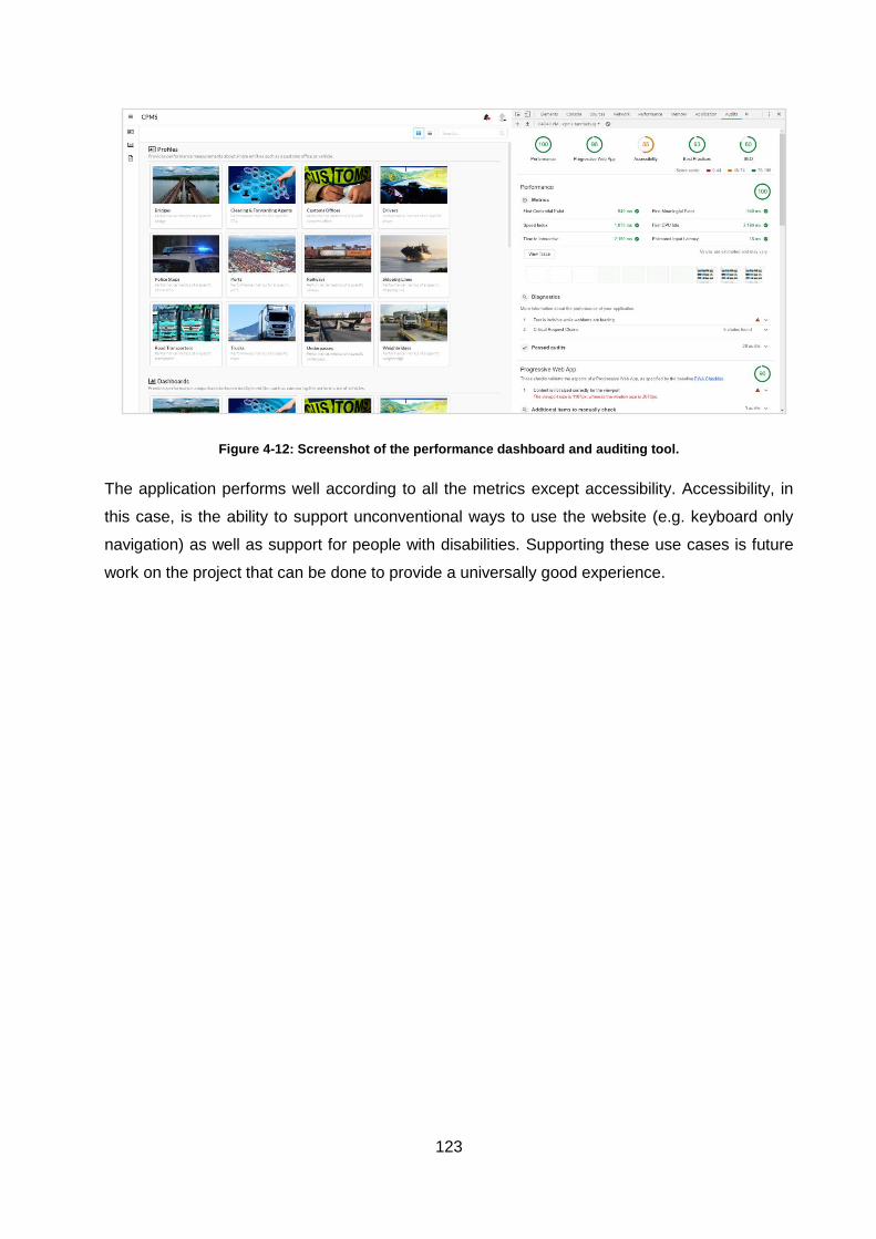
123
Figure 4-12: Screenshot of the performance dashboard and auditing tool.
The application performs well according to all the metrics except accessibility. Accessibility, in
this case, is the ability to support unconventional ways to use the website (e.g. keyboard only
navigation) as well as support for people with disabilities. Supporting these use cases is future
work on the project that can be done to provide a universally good experience.
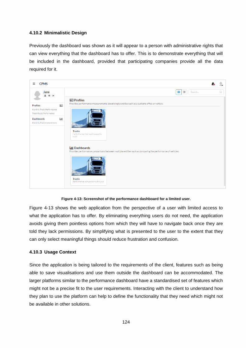
124
4.10.2 Minimalistic Design
Previously the dashboard was shown as it will appear to a person with administrative rights that
can view everything that the dashboard has to offer. This is to demonstrate everything that will
be included in the dashboard, provided that participating companies provide all the data
required for it.
Figure 4-13: Screenshot of the performance dashboard for a limited user.
Figure 4-13 shows the web application from the perspective of a user with limited access to
what the application has to offer. By eliminating everything users do not need, the application
avoids giving them pointless options from which they will have to navigate back once they are
told they lack permissions. By simplifying what is presented to the user to the extent that they
can only select meaningful things should reduce frustration and confusion.
4.10.3 Usage Context
Since the application is being tailored to the requirements of the client, features such as being
able to save visualisations and use them outside the dashboard can be accommodated. The
larger platforms similar to the performance dashboard have a standardised set of features which
might not be a precise fit to the user requirements. Interacting with the client to understand how
they plan to use the platform can help to define the functionality that they need which might not
be available in other solutions.
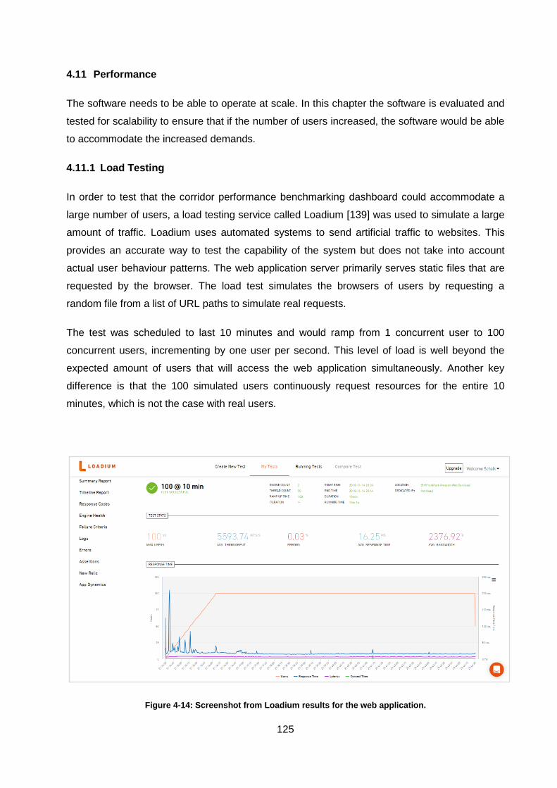
125
4.11 Performance
The software needs to be able to operate at scale. In this chapter the software is evaluated and
tested for scalability to ensure that if the number of users increased, the software would be able
to accommodate the increased demands.
4.11.1 Load Testing
In order to test that the corridor performance benchmarking dashboard could accommodate a
large number of users, a load testing service called Loadium [139] was used to simulate a large
amount of traffic. Loadium uses automated systems to send artificial traffic to websites. This
provides an accurate way to test the capability of the system but does not take into account
actual user behaviour patterns. The web application server primarily serves static files that are
requested by the browser. The load test simulates the browsers of users by requesting a
random file from a list of URL paths to simulate real requests.
The test was scheduled to last 10 minutes and would ramp from 1 concurrent user to 100
concurrent users, incrementing by one user per second. This level of load is well beyond the
expected amount of users that will access the web application simultaneously. Another key
difference is that the 100 simulated users continuously request resources for the entire 10
minutes, which is not the case with real users.
Figure 4-14: Screenshot from Loadium results for the web application.
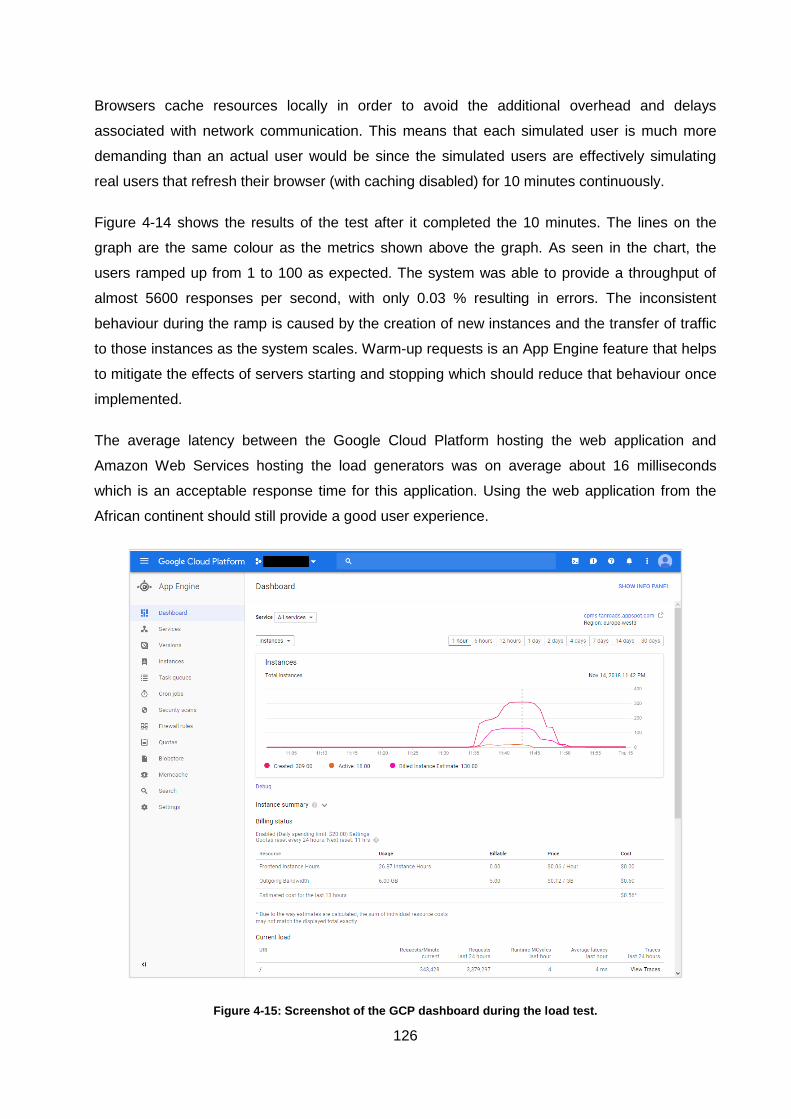
126
Browsers cache resources locally in order to avoid the additional overhead and delays
associated with network communication. This means that each simulated user is much more
demanding than an actual user would be since the simulated users are effectively simulating
real users that refresh their browser (with caching disabled) for 10 minutes continuously.
Figure 4-14 shows the results of the test after it completed the 10 minutes. The lines on the
graph are the same colour as the metrics shown above the graph. As seen in the chart, the
users ramped up from 1 to 100 as expected. The system was able to provide a throughput of
almost 5600 responses per second, with only 0.03 % resulting in errors. The inconsistent
behaviour during the ramp is caused by the creation of new instances and the transfer of traffic
to those instances as the system scales. Warm-up requests is an App Engine feature that helps
to mitigate the effects of servers starting and stopping which should reduce that behaviour once
implemented.
The average latency between the Google Cloud Platform hosting the web application and
Amazon Web Services hosting the load generators was on average about 16 milliseconds
which is an acceptable response time for this application. Using the web application from the
African continent should still provide a good user experience.
Figure 4-15: Screenshot of the GCP dashboard during the load test.
127
4.11.2 Resource Scaling
App Engine can scale the system automatically based on the resource utilisation of the existing
application instances. Figure 4-15 shows how the number of instances changed over time as
the load on the system increased. As expected, both graphs start at about the same time, and
the instance count also declines as expected immediately after the test is over in order to
reduce costs.
The high number of created instances is due to the scheduler observing high response times
from starting instances and creating additional instances as a response. This should be
significantly lower once warm-up requests have been implemented. “Active instances” is the
real measurement of running applications instances which peaked at 18 instances. Depending
on the instance size that is being created, the instance is billed in multiples of F1 instances. An
F2 instance is equivalent to 2 F1 instances, resulting in 2 billed instances. In the case of this
load test, the excessive creation of instances inflated the billed instances.
Overall, the system can scale to loads far greater than what is initially expected from the web
application. Implementing warm-up requests will help to utilise App Engine resources better and
reduce costs. For the foreseeable future, however, one or two instances will be enough to
satisfy expected demands which will likely not exceed 1-2 % of the calculated average
throughput.
4.12 Chapter Summary
The performance benchmarking dashboard has systems in place that will detect faults and
notify developers to take preventative actions. These detection measures help to improve
system reliability and avoid downtime when serving users. The components of the system each
offer a set of configurable values that can be used to change aspects of the system when
needed. The data API, for example, offers ways to reconfigure the connections to different data
storage instances.
The web application, on the other hand, allows the URL for the data API to be changed. These
variables allow developers to quickly substitute or upgrade components when needed, reducing
downtime and increasing availability and reliability. Components within the corridor performance
system can also be created to function independently, further improving reliability by allowing
subsets of the system to function normally, despite other components in the system being
offline. The component-based model of the technologies used to create the dashboard allows
rapid changes to existing components and the introduction of new components from external
libraries.
128
The performance benchmarking dashboard has the functionality to visualise key performance
indicators (KPIs) in a large number of ways, including charts and geographical maps. Reports
can be created in the form of PDF documents and can incorporate visualisations into the
reports. The performance benchmarking dashboard is compatible with the six most commonly
used web browsers and is also compatible with desktop, tablet and mobile screens. The
performance benchmarking dashboard offers a fast and simple user experience and aims to
avoid the confusion and frustration caused by complicated software.
The performance benchmarking dashboard is implemented using open standards and internet
standards commonly used throughout the industry. Incorporating these standards into the
system increases interoperability and system longevity. These standards also offer solutions to
security problems found throughout the industry to improve the level of protection offered to
users of the corridor performance dashboard.
The performance benchmarking dashboard can scale automatically to accommodate additional
load. Additional development effort is required to optimise the interaction between the
performance benchmarking dashboard and the Scheduler inside the App Engine Environment.
Improving this aspect of the system will result in better resource utilisation and lower operational
costs.
129
5 CONCLUSIONS AND RECOMMENDATIONS
5.1 Development Concerns of a Performance Benchmarking Dashboard
5.1.1 Data Availability
The first step to developing a corridor performance benchmarking dashboard was to understand
the trade corridor. There are similarities to how corridors function, but the key thing to
understand about each corridor is the nuanced problems each corridor might have.
Understanding the corridor will help to point the discussion towards the areas that need the
most attention. To define KPIs that will add value to the trade corridor, the corridor needs to be
understood. If the KPI’s do not offer significant value to stakeholders along the trade corridor,
the implementation of a performance benchmarking dashboard will not be considered a high
priority by stakeholders.
The next step was to investigate or inquire about the operations of stakeholders to understand
where data was being generated and how it was being stored. Evaluating the current condition
of data collection and storage within the trade corridor is an important step as it will determine
how much effort is needed in order to start centralising data. Accommodating a paper-based
operation is a lot more challenging than integration with an existing API. Ideally, the collection of
data should not disrupt the existing operations of data providers. Collecting data without
disrupting operations is easier if the data collection processes and systems are automated.
More sophisticated monitoring and data capturing systems will typically also provide an interface
from which data can be extracted. On the other hand, in less sophisticated operations (e.g.
paper-based solutions) disruptions are almost unavoidable since a person will likely need to get
involved in the data capturing process. Convincing stakeholders to implement data collection
practices that could potentially disrupt their operations can prove to be challenging.
5.1.2 Data Quality
Once data is being collected from the corridor, it is important to assess the quality of the data.
High-quality data contains more detail than might be necessary in order to calculate the current
KPI values. Timestamps in the data that are formatted to a frequently used standard is a
possible indicator that the data is of high quality. High-quality data should not contain
ambiguous values or values that are hard to interpret. An example of values that are hard to
parse is user-generated text. Digital systems will often prevent users from submitting free text
since it is hard to store in a normalised way and difficult to analyse.
130
Companies with more sophisticated systems likely do not generate ambiguous data sets since
they would also need to manage that data internally. Unsophisticated paper-based operations
will likely produce a large amount of user-generated text as operators fill out various forms on
paper. Determining if there is anything valuable to extract from user-generated text ahead of
time will determine how complicated the analysis and aggregation of the data will be.
5.1.3 Clear Responsibilities
When negotiations started with various stakeholders along the trade corridor, it was important to
define the responsibilities of the every stakeholder clearly. Ensuring that there are no
misunderstandings about the role that each stakeholder plays in the trade corridor was crucial
to extracting data from stakeholders. When negotiating responsibilities, some compromises
were most likely made in order to accommodate some of the stakeholders. An example might
be to implement a web portal on behalf of paper-based operations in order to be able to collect
their data.
5.1.4 Iterative Development
As the corridor performance benchmarking dashboard was being developed, it was important to
evaluate the design and requirements of the system constantly. It is important to ensure that the
defined KPIs still add value to the operations of stakeholders as the project unfolds. If the KPIs
are never updated to remain relevant to stakeholders, they might start to lose interest in the
project. Using development methodologies and technologies that allow developers to receive
frequent feedback from stakeholders can be an effective way of keeping them involved
throughout the development process and ensuring that their requirements are taken into
consideration constantly.
5.2 Software Design Considerations
5.2.1 Domain-Driven Design
Deconstructing a complex set of software requirements can be challenging, but methodologies
that simplify the process have existed for many years. Traditionally domain-driven design was
applied to large monolithic systems in order to structure the system in a maintainable way. As
the industry has moved to distributed systems, the techniques used in domain-driven design
can also be used to decompose complex requirements into a collection of smaller systems that
function as a larger system. In this study, the domain model for a specific corridor performance
benchmarking dashboard is defined and decomposed into several independent systems that
each have their own set of responsibilities within the larger system
131
5.2.2 Task Responsibility
The responsibilities of services within the corridor performance benchmarking dashboard were
defined around the different roles present in the overall system. The first role was identified as
services that supply data. The second role was identified as systems that transform data and
produce a more condensed version of the data. The final role was the presentation of data
which is the responsibility of the corridor performance benchmarking dashboard. By determining
the responsibilities of each system according to its relationship to the data, the same systems
can be used regardless of the industry.
5.3 Cloud Infrastructure Benefits
5.3.1 Reduced Cost
The idea of centralisation has been repeated countless times throughout history and almost
always leads to reduced costs of some sort, be it financial or effort. Factories centralise the
manufacturing of goods. Banks centralise monetary transactions and storage. Cloud providers
centralise computing power and information storage. By implementing a self-service system for
provisioning processing power and storage space, cloud providers have greatly reduced the
cost of creating and maintaining IT systems.
Since cloud platforms are the products of cloud providers, the platforms themselves also evolve
in order to remain competitive. This means that the infrastructure improves over time at the
expense of the cloud provider and not the cloud users. IT systems can, therefore, improve in
terms of efficiency or cost without platform users investing additional resources which indirectly
saves development resources as well.
5.3.2 Automation
Managed platforms such as Google App Engine greatly simplify the complexities associated
with scaling IT systems. The cloud environment can change and accommodate the needs of
developers almost immediately. The infrastructure can scale automatically without the need to
go through complex and time-consuming upgrade procedures. Features such as disaster
recovery, loss prevention and global replication are made simple thanks to cloud technologies.
Implementing an equivalent on-site solution would require extensive time and resources to
implement and would likely exceed the cost of cloud-based solutions.
132
5.3.3 Open-Source
The popularity and benefits of open-source software have become apparent in recent years.
The reach of open-source is even more apparent when cloud solutions are involved since so
many of the technologies surrounding cloud platforms are open-sourced in order to drive
adoption and gain market share. Developers need to invest in understanding the ecosystems
that surround cloud platforms and how they can take advantage of them to produce higher
quality software in less time and for a lower cost.
5.4 Future Work
With the technical aspects in place to accommodate stakeholder requirements, the
implementation of all the performance measurements can start as feedback is received.
Improved utilisation of the Google App Engine environment needs to be investigated to ensure
that no additional costs are being generated due to the platform being used incorrectly.
Performance testing on the data API will need to be done once it starts to accept data from the
analytics system. Currently, there is a very small data set available that is not representative of
the expected amount of results. Load tests similar to those done on the web application will
have to be performed to ensure that the database can provide results within acceptable
response times. These load tests will help to determine if database replication needs to be
implemented to support the amount of data.
The management components of the web application need to be implemented and tested.
These components will allow users to manage their accounts and in the case of system
administrators the accounts of others. If additional login solutions besides the use of emails and
passwords are desired they would also have to be implemented. Finally, accessibility
improvements need to be done on the web application to ensure that the user interface is
pleasant to use for all users.

133
BIBLIOGRAPHY
[1] Continental 1. (2018, June) Trade Corridors. [Online]. http://continental1.org/trade-corridors
[2] D. M. Lambert, J. R. Stock, and L. M. Ellram, "The Role of Logistics in the Economy and
Organization," in Fundamentals of Logistics Management.: McGraw-Hill Higher Education,
1998, ch. 1, pp. 7-21.
[3] D. M. Lambert, J. R. Stock, and L. M. Ellram, "The Role of Logistics in the Economy and
Organization," in Fundamentals of Logistics Management, McGraw-Hill Higher Education,
Ed., 1998, ch. 2, pp. 40-41.
[4] J. Havenga, Z. Simson, D. King, A. de Bod, and M. Braun. (2018, July) Logistics
Barometer. [Online].
https://www.sun.ac.za/english/faculty/economy/logistics/Pages/logisticsbarometer.aspx
[5] C. J. Langley. (2018, June) Third-Party Logistics Study. [Online].
http://www.3plstudy.com/3plabout.php
[6] J. Arvis, G. Smith, and R. Carruthers, "Landlocked Developing Countries and Trade
Corridors: An Overview," in Connecting Landlocked Developing Countries to Markets:
Trade COrridors in the 21st Century.: World Bank, 2011, ch. 1, pp. 1-11.
[7] J. Arvis, G. Smith, and R. Carruthers, "Maps of LLDCs and Transit Corridors, by Region,"
in Connecting Landlocked Developing Countries to Markets: Trade COrridors in the 21st
Century.: World Bank, 2011.
[8] Embassy Freight. (2018, October) Second Party Logistic Model. [Online].
https://www.logisticsglossary.com/term/2pl/
[9] GWT Import & Export Specialists. (2018, October) Role Of Clearing & Forwarding Agents
In Sea Cargo. [Online]. https://gwtimpex.co.uk/role-of-clearing-forwarding-agents-in-sea-cargo/
[10] J. Arvis, G. Smith, and R. Carruthers, "Unreliability of LLDC Corridors Carries a High
Cost," in Connecting Landlocked Developing Countries to Markets: Trade Corridors in the
21st Century.: World Bank, 2011, ch. 2, pp. 21-24.
[11] C. M. Melhuish, "Tanzania Transport Sector Review," African Development Bank Group,
134
2013.
[12] Klipfolio. (2018, October) What is a KPI? Definition, Best-Practices, and Examples.
[Online]. https://www.klipfolio.com/resources/articles/what-is-a-key-performance-indicator
[13] Rightscale cloud industry research team. (2019, November) Cloud Computing Trends:
2019 State of the Cloud Survey. [Online]. https://www.flexera.com/blog/cloud/2019/02/cloud-
computing-trends-2019-state-of-the-cloud-survey/
[14] United Nations. (2019, November) Information Economy Report 2013: The Cloud
Economy and Developing Countries. [Online].
https://unctad.org/en/PublicationsLibrary/ier2013_en.pdf
[15] Red Hat, Inc. (2019, November) Enterprise Open Source Report 2019. [Online].
https://www.redhat.com/en/enterprise-open-source-report/2019
[16] F. Manjoo. (2018, July) A Murky Road Ahead for Android, Despite Market Dominance -
The New York Times. [Online]. https://www.nytimes.com/2015/05/28/technology/personaltech/a-
murky-road-ahead-for-android-despite-market-dominance.html
[17] D. Bass and E. Newcomer. (2018, July) Buying GitHub Would Take Microsoft Back To It's
Roots - Bloomberg. [Online]. https://www.bloomberg.com/news/articles/2018-06-03/microsoft-is-
said-to-have-agreed-to-acquire-coding-site-github
[18] Red Hat, Inc. (2019, November) IBM To Acquire Red Hat, Completely Changing the Cloud
Landscape and Becoming the World's #1 Hybrid Cloud Provider. [Online].
https://www.redhat.com/en/about/press-releases/ibm-acquire-red-hat-completely-changing-cloud-
landscape-and-becoming-worlds-1-hybrid-cloud-provider
[19] J. Macaulay, L. Buckalew, and G. Chung, "Internet of Things in Logistics," DHL Trend
Research, 2015.
[20] VDC Research LOWRY. (2019, November) Are You Realizing the Full Benefits of RFID?
[Online]. https://marketing.lowrysolutions.com/acton/attachment/7009/f-00a3/1/-/-/-/-/Full-Benefits-
of-RFID-VDC-Research-LOWRY.pdf
[21] M. Kirch, O. Poenicke, and K. Richter. (2019, November) RFID in Logistics and Production
- Applications, Research and Visions for Smart Logistics Zones. [Online].
https://www.researchgate.net/publication/314274484_RFID_in_Logistics_and_Production_-
135
Applications_Research_and_Visions_for_Smart_Logistics_Zones
[22] International Telecommunications Union. (2018, June) ICT Facts and Figures 2017.
[Online]. https://www.itu.int/en/ITU-D/Statistics/Documents/facts/ICTFactsFigures2017.pdf
[23] Gartner, Inc. (2019, November) Market Share Analysis: Iaas and IUS, Worldwide, 2018.
[Online]. https://www.gartner.com/en/newsroom/press-releases/2019-07-29-gartner-says-
worldwide-iaas-public-cloud-services-market-grew-31point3-percent-in-2018
[24] F. Ilyas. (2019, November) A detailed comparison and mapping between various cloud
services. [Online]. http://comparecloud.in
[25] Alibaba Cloud. (2019, November) Alibaba Cloud Product SLA. [Online].
https://www.alibabacloud.com/help/faq-list/42389.htm
[26] AWS. (2019, November) AWS Service Level Agreements. [Online].
https://aws.amazon.com/legal/service-level-agreements/
[27] Google. (2019, November) Google Cloud Platform Service Level Agreements. [Online].
https://cloud.google.com/terms/sla/
[28] IBM. (2019, November) IBM Cloud Service Level Agreements. [Online].
https://cloud.ibm.com/docs/overview?topic=overview-slas
[29] Microsoft. (2019, Novemeber) Microsift Azure Service Level Agreements. [Online].
https://azure.microsoft.com/en-us/support/legal/sla/
[30] Oracle. (2019, November) Oracle Cloud Infrastructure Service Level Agreement. [Online].
https://www.oracle.com/cloud/iaas/sla.html
[31] Alibaba Cloud. (2019, November) Alibaba Cloud Global Locations. [Online].
https://www.alibabacloud.com/global-locations
[32] AWS. (2019, November) AWS Global Infrastructures Regions. [Online].
https://aws.amazon.com/about-aws/global-infrastructure/regions_az/
[33] Google. (2019, November) Google Cloud Regions and Zones. [Online].
https://cloud.google.com/compute/docs/regions-zones/
136
[34] IBM Cloud. (2019, November) IBM Cloud Locations. [Online].
https://cloud.ibm.com/docs/containers?topic=containers-regions-and-zones
[35] Microsoft. (2019, November) Microsoft Azure Regions. [Online].
https://azure.microsoft.com/en-us/global-infrastructure/regions/
[36] Oracle. (2019, November) Oracle Cloud Regions and Availability Domains. [Online].
https://docs.cloud.oracle.com/iaas/Content/General/Concepts/regions.htm
[37] S. Guthrie. (2018, October) Microsoft to deliver Microsoft Cloud from data centres in Africa
- The Official Microsoft Blog. [Online]. https://blogs.microsoft.com/blog/2017/05/18/microsoft-
deliver-microsoft-cloud-datacenters-africa/
[38] J. Barr. (2018, October) In The Works - AWS Region in South Africa | AWS News Blog.
[Online]. https://aws.amazon.com/blogs/aws/in-the-works-aws-region-in-south-africa/
[39] Alibaba Clound. (2019, November) Alibaba Cloud Price Calculator. [Online].
https://www.alibabacloud.com/pricing-calculator#/manifest
[40] AWS. (2018, October) Amazon Web Services Simple Monthly Calculator. [Online].
https://calculator.s3.amazonaws.com/index.html
[41] Google. (2018, October) Google Cloud Platform Pricing Calculator. [Online].
https://cloud.google.com/products/calculator/
[42] IBM. (2019, November) IBM Cloud Cost Estimator. [Online]. https://cloud.ibm.com/estimator
[43] Microsoft. (2018, October) Pricing Calculator | Microsoft Azure. [Online].
https://azure.microsoft.com/en-us/pricing/calculator/
[44] Oracle. (2019, November) Cloud Cost Estimator. [Online]. https://www.oracle.com/cloud/cost-
estimator.html
[45] K. Weins. (2018, October) AWS vs Azure vs Google Cloud Pricing: Compute Instances.
[Online]. https://www.rightscale.com/blog/cloud-cost-analysis/aws-vs-azure-vs-google-cloud-
pricing-compute-instances
[46] TIOBE. (2018, October) TIOBE Index. [Online]. https://www.tiobe.com/tiobe-index/
137
[47] P. Carbonnelle. (2018, October) PYPL PopularitY of Programming Language index.
[Online]. http://pypl.github.io/PYPL.html
[48] Stack Overflow. (2019, November) Stack Overflow Developer Survey Results. [Online].
https://insights.stackoverflow.com/survey/2019#most-popular-technologies
[49] WebAssembly. (2019, November) WebAssembly Roadmap. [Online].
https://webassembly.org/roadmap/
[50] J. Harrel. (2018, October) Node.js At PayPal | PayPal Engineering Blog. [Online].
https://www.paypal-engineering.com/2013/11/22/node-js-at-paypal/
[51] K. Oliver. (2018, October) How Node.js Powers the Many User Interfaces of Netflix - The
New Stack. [Online]. https://thenewstack.io/netflix-uses-node-js-power-user-interface/
[52] solid IT. (2019, Novmeber) Db-Engines Ranking - popularity ranking of database
management systems. [Online]. https://db-engines.com/en/ranking
[53] Oracle. (2019, November) What is Oracle Database. [Online].
https://www.oracletutorial.com/getting-started/what-is-oracle-database/
[54] PostgreSQL Global Development Group. (2019, November) About PostgreSQL. [Online].
https://www.postgresql.org/about/
[55] Oracle Corporation. (2019, November) What is MySQL? [Online].
https://dev.mysql.com/doc/refman/8.0/en/what-is-mysql.html
[56] Microsoft. (2019, November) Microsoft SQL Server 2019. [Online].
https://www.microsoft.com/en-us/sql-server/sql-server-2019
[57] MongoDB Inc. (2019, November) Introduction to MongoDB. [Online].
https://docs.mongodb.com/manual/introduction/
[58] IBM. (2019, November) IBM Db2 Data Management Software. [Online].
https://www.ibm.com/za-en/analytics/db2
[59] Oracle. (2019, November) Oracle Technology Global Price List. [Online].
https://www.oracle.com/assets/technology-price-list-070617.pdf
138
[60] Oracle. (2019, November) MySQL Editions. [Online]. https://www.mysql.com/products/
[61] Micorosft. (2019, November) SQL Server Pricing and Licensing. [Online].
https://www.microsoft.com/en-us/sql-server/sql-server-2017-pricing
[62] MongoDB Inc. (2019, November) Mongo Atlas Pricing on AWS, Azure and GCP. [Online].
https://www.mongodb.com/cloud/atlas/pricing
[63] IBM. (2019, November) IBM Db2 Database Pricing. [Online].
https://www.ibm.com/products/db2-database/pricing
[64] T. Russell. (2018, October) Project Mezzanine: The Great Migration | Uber Engineering.
[Online]. http://eng.uber.com/mezzanine-migration/
[65] 2ndQuadrant. (2018, October) Met Office 2ndQuadrant Case Study | 2ndQuadrant.
[Online]. https://www.2ndquadrant.com/en/about/case-studies/met-office-2ndquadrant-case-study/
[66] Instagram Engineering. (2018, October) Under the Hood: Instagram in 2015 - Instagram
engineering. [Online]. https://instagram-engineering.com/under-the-hood-instagram-in-2015-
8e8aff5ab7c2
[67] W. Santos. (2018, October) Which API Types and Architectural Styles are Most Used? |
ProgrammableWeb. [Online]. https://www.programmableweb.com/news/which-api-types-and-
architectural-styles-are-most-used/research/2017/11/26
[68] Github Engineering. (2018, October) The GitHub GraphQL API | Github Engineering.
[Online]. https://githubengineering.com/the-github-graphql-api/
[69] Pinterest Engineering. (2018, October) Driving user growth with performance
improvements - Pinterest Engineering - Medium. [Online].
https://medium.com/@Pinterest_Engineering/driving-user-growth-with-performance-improvements-
cfc50dafadd7
[70] S. Taylor. (2018, October) React, Realy and GraphQL: Under the Hoot of the Times
Website Redesign. [Online]. https://open.nytimes.com/react-relay-and-graphql-under-the-hood-
of-the-times-website-redesign-22fb62ea9764
[71] Tableau Software. (2019, November) About Tableau: Helping people see and understand
data. [Online]. https://www.tableau.com/about
139
[72] QlikTech International. (2019, November) The platform for the Next Generation of BI.
[Online]. https://www.qlik.com/us/products/why-qlik-is-different?ga-link=HP_WhyQlik_US
[73] Microsoft. (2019, November) Why Power BI - Features and Benefits. [Online].
https://powerbi.microsoft.com/en-us/why-power-bi/
[74] Google. (2019, November) Dashboarding & Data Visualization Tools. [Online].
https://marketingplatform.google.com/about/data-studio/
[75] IBM. (2019, November) Cognos Analytics. [Online]. https://www.ibm.com/za-
en/products/cognos-analytics
[76] AWS. (2019, November) Amazon QuickSight. [Online]. https://aws.amazon.com/quicksight/
[77] M. Bostock. (2019, November) D3.js - Data-DriverDocuments. [Online]. https://d3js.org
[78] Chart.js Contributors. (2019, November) Open source HTML 5 Charts for your website.
[Online]. https://www.chartjs.org
[79] Apache Software Foundation. (2019, November) Apache Echarts (incubating). [Online].
https://echarts.apache.org/en/index.html
[80] Highcharts. (2019, November) Interactive JavaScript charts for your website. [Online].
https://www.highcharts.com
[81] University of Washington Iteractive Data Lab. (2019, November) About the Vega Project.
[Online]. https://vega.github.io/vega/about/
[82] InfoSoft Global Private Limited. (2019, November) JavaScript charts for web & mobile.
[Online]. https://www.fusioncharts.com
[83] Highcharts. (2019, November) Highcharts JS Licenses. [Online].
https://shop.highsoft.com/highcharts/
[84] InfoSoft Global Private Limited. (2019, November) Pricing and plans. [Online].
https://www.fusioncharts.com/buy
[85] V. Agafonkin. (2019, November) Leaflet - a JavaScript library for interactive maps.
[Online]. https://leafletjs.com
140
[86] OpenLayers Contributors. (2019, November) A high-performance, feature-packed library
for all your mapping needs. [Online]. https://openlayers.org
[87] Google. (2019, November) Google Maps Pricing and Plans. [Online].
https://cloud.google.com/maps-platform/pricing/
[88] Microsoft. (2019, November) Business Maps Licensing. [Online].
https://www.microsoft.com/en-us/maps/licensing/options
[89] Mapquest Inc. (2019, November) Mapquest Developer Network Pricing & Plans. [Online].
https://developer.mapquest.com/plans
[90] Mapbox. (2019, November) Mapbox Pricing. [Online]. https://www.mapbox.com/pricing/
[91] A. Osypenko. (2019, November) Mapbox vs Google Maps: Choosing a Map for Your App.
[Online]. https://madappgang.com/blog/mapbox-vs-google-maps-choosing-a-map-for-your-app
[92] D. Govett. (2019, November) A JavaScript PDF generation library for Node and the
browser. [Online]. https://pdfkit.org
[93] Parallax Agency Ltd. (2019, November) jsPDF - HTML5 PDF Generator. [Online].
https://parall.ax/products/jspdf
[94] pdfmake Conributors. (2019, November) Client/server side PDF printing in pure
JavaScript. [Online]. http://pdfmake.org/#/
[95] Mozilla. (2019, November) A general-purpose, web standards-based platform for parsing
and rendering PDFs. [Online]. https://mozilla.github.io/pdf.js/
[96] PDF Association. (2018, October) ISO 32000-1 (PDF 1.7) - PDF Association. [Online].
https://www.pdfa.org/publication/iso-32000-1-pdf-1-7/
[97] PDF Association. (2018, Octiber) ISO 32000-2 (PDF 2.0) - PDF Association. [Online].
https://www.pdfa.org/publication/iso-32000-2-pdf-2-0/
[98] Google. (2019, November) Google Cloud IoT - Fully Managed IoT services. [Online].
https://cloud.google.com/solutions/iot/
[99] AWS. (2019, November) AWS IoT Core Overview. [Online]. https://aws.amazon.com/iot-core/
141
[100] Microsoft. (2019, November) Azure IoT Hub. [Online]. https://azure.microsoft.com/en-
us/services/iot-hub/
[101] E. Evans, Domain-Driven Design: Tackling Complexity in the Heart of Software.: Addison
Wesley, 2003.
[102] H. Subramanian and P. Raj, Hands-On RESTful API Design Patterns and Best Practices,
Safis Editing, Ed. Birmingham, UK: Packt Publishing, 2019.
[103] Microsoft. (2019, November) What is ASP.Net. [Online].
https://dotnet.microsoft.com/learn/aspnet/what-is-aspnet
[104] Pivotal Software, Inc. (2019, November) Introduction to Spring Framework. [Online].
https://docs.spring.io/spring/docs/3.0.x/spring-framework-reference/html/overview.html
[105] Django Software Foundation. (2019, November) Getting started with Django. [Online].
https://www.djangoproject.com/start/
[106] Laravel LLC. (2019, November) Laravel Introduction. [Online].
https://laravel.com/docs/4.2/introduction
[107] Rails. (2019, November) Getting Started with Rails. [Online].
https://guides.rubyonrails.org/getting_started.html
[108] Google. (2018, October) MemoryStore | Google Cloud. [Online].
https://cloud.google.com/memorystore/
[109] 2014-present Sequelize contributors. (2018, October) Manual | Sequelize | The node.js
ORM for PostgreSQL, MySQL, SQLite and MSSQL. [Online]. http://docs.sequelizejs.com
[110] Microsoft. (2019, November) Entity Framework. [Online]. https://docs.microsoft.com/en-us/ef/
[111] Red Hat. (2019, November) Hibernate ORM - Your relational data. Objectively. [Online].
https://hibernate.org/orm/
[112] Django Software Foundation. (2019, November) Models and Databases. [Online].
https://docs.djangoproject.com/en/2.2/topics/db/
[113] Laravel LLC. (2019, November) Eloquent: Getting Started. [Online].
142
https://laravel.com/docs/5.8/eloquent
[114] Rails. (2019, November) Active Record Basics. [Online].
https://guides.rubyonrails.org/active_record_basics.html
[115] OpenAPI Initiative. (2018, October) About - OpenAPI Initiatie. [Online].
https://www.openapis.org/about
[116] K. Sandoval. (2018, October) Building With Open Standards Will Result in IT Longevity |
Nordic APIs. [Online]. https://nordicapis.com/building-with-open-standards-will-result-in-it-
longevity/
[117] Facebook. (2018, October) facebook/dataloader. [Online].
https://github.com/facebook/dataloader
[118] M. Stoiber. (2018, October) React.js Boilerplate. [Online]. https://www.reactboilerplate.com
[119] M. Huszárik. (2018, October) AngularJS to Angular - history & tips to get started |
@RisingStack. [Online]. https://blog.risingstack.com/angularjs-to-angular-history-and-tips-to-get-
started/
[120] V. Cromwell. (2018, October) Between the Wires interview with Evan You. | Between the
Wires. [Online].
https://web.archive.org/web/20170603052649/https://betweenthewires.org/2016/11/03/evan-you/
[121] A. Kumar. (2018, October) React vs. Angular vs. Vue.js: A Complete Comparison Guide.
[Online]. https://dzone.com/articles/react-vs-angular-vs-vuejs-a-complete-comparison-gu
[122] M. Butusov. (2018, October) ReactJS vs Angular5 vs Vue.js - What to choose in 2018?
[Online]. https://blog.techmagic.co/reactjs-vs-angular5-vs-vue-js-what-to-choose-in-2018/
[123] J. Ganai. (2018, October) Angular vs. React vs. Vue: A 2018 comparison. [Online].
https://www.linkedin.com/pulse/angular-vs-react-vue-2018-comparison-javed-ganai/
[124] Cuelogic Insights. (2018, October) Angular vs. React vs. Vue: A 2018 Comparison
(Updated). [Online]. https://www.cuelogic.com/blog/angular-vs-react-vs-vue-a-2018-comparison
[125] C. Upton. (2018, October) React vs Angular vs Vue 2018 | Dev6. [Online].
https://www.dev6.com/React_vs_Angular_vs_Vue_2018
143
[126] D. Abramov and A. Clark. (2018, October) Read Me - Redux. [Online]. https://redux.js.org/
[127] TechnologyAdvice. (2018, October) Introduction - Semantic UI React. [Online].
https://react.semantic-ui.com
[128] Alipay.com. (2018, October) Introduction - Ant Design. [Online].
https://ant.design/docs/spec/introduce
[129] hustcc. (2018, October) hustcc/echarts-for-react. [Online]. https://github.com/hustcc/echarts-
for-react/blob/master/LICENSE
[130] P. Le Cam. (2018, October) PaulLeCam/react-leaflet. [Online].
https://github.com/PaulLeCam/react-leaflet
[131] Mozilla. (2018, October) PDF.js. [Online]. https://mozilla.github.io/pdf.js/
[132] Pixabay. (2018, October) Stunning Free Images Pixabay. [Online]. https://pixabay.com/en/
[133] IETF. (2018, October) JSON Web Signature (JWS) Unencoded Payload Option. [Online].
https://datatracker.ietf.org/doc/rfc7797/
[134] Airbnb, Inc. (2018, October) Introduction Enzyme. [Online]. https://airbnb.io/enzyme/
[135] Facebook, Inc. (2018, October) Jest Delightful JavaScript Testing. [Online]. https://jestjs.io
[136] I. Gorton, "Software Quality Attributes," in Essential Software Architecture.: Springer,
2006, ch. 3, pp. 23-41.
[137] Airbnb. (2018, October) airbnb/javascript JavaScript Style Guide. [Online].
https://github.com/airbnb/javascript
[138] Google. (2018, October) Lighthouse | Tools for Web Developers | Google Developers.
[Online]. https://developers.google.com/web/tools/lighthouse/
[139] Loadium. (2018, October) Loadium - Jmeter Based performance Testing Tool. [Online].
https://loadium.com
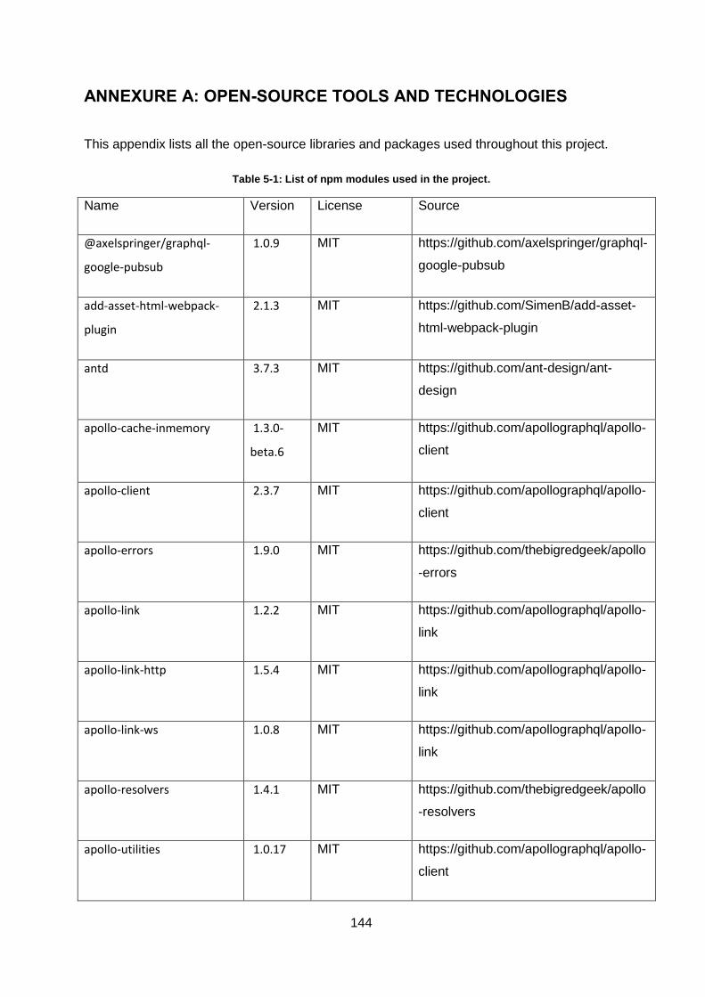
144
ANNEXURE A: OPEN-SOURCE TOOLS AND TECHNOLOGIES
This appendix lists all the open-source libraries and packages used throughout this project.
Table 5-1: List of npm modules used in the project.
Name Version License Source
@axelspringer/graphql-
google-pubsub
1.0.9 MIT https://github.com/axelspringer/graphql-
google-pubsub
add-asset-html-webpack-
plugin
2.1.3 MIT https://github.com/SimenB/add-asset-
html-webpack-plugin
antd 3.7.3 MIT https://github.com/ant-design/ant-
design
apollo-cache-inmemory 1.3.0-
beta.6
MIT https://github.com/apollographql/apollo-
client
apollo-client 2.3.7 MIT https://github.com/apollographql/apollo-
client
apollo-errors 1.9.0 MIT https://github.com/thebigredgeek/apollo
-errors
apollo-link 1.2.2 MIT https://github.com/apollographql/apollo-
link
apollo-link-http 1.5.4 MIT https://github.com/apollographql/apollo-
link
apollo-link-ws 1.0.8 MIT https://github.com/apollographql/apollo-
link
apollo-resolvers 1.4.1 MIT https://github.com/thebigredgeek/apollo
-resolvers
apollo-utilities 1.0.17 MIT https://github.com/apollographql/apollo-
client
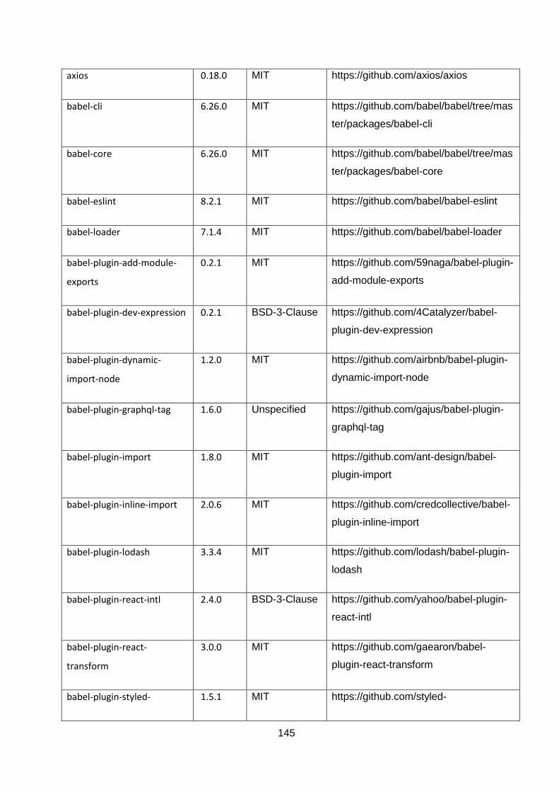
145
axios 0.18.0 MIT https://github.com/axios/axios
babel-cli 6.26.0 MIT https://github.com/babel/babel/tree/mas
ter/packages/babel-cli
babel-core 6.26.0 MIT https://github.com/babel/babel/tree/mas
ter/packages/babel-core
babel-eslint 8.2.1 MIT https://github.com/babel/babel-eslint
babel-loader 7.1.4 MIT https://github.com/babel/babel-loader
babel-plugin-add-module-
exports
0.2.1 MIT https://github.com/59naga/babel-plugin-
add-module-exports
babel-plugin-dev-expression 0.2.1 BSD-3-Clause https://github.com/4Catalyzer/babel-
plugin-dev-expression
babel-plugin-dynamic-
import-node
1.2.0 MIT https://github.com/airbnb/babel-plugin-
dynamic-import-node
babel-plugin-graphql-tag 1.6.0 Unspecified https://github.com/gajus/babel-plugin-
graphql-tag
babel-plugin-import 1.8.0 MIT https://github.com/ant-design/babel-
plugin-import
babel-plugin-inline-import 2.0.6 MIT https://github.com/credcollective/babel-
plugin-inline-import
babel-plugin-lodash 3.3.4 MIT https://github.com/lodash/babel-plugin-
lodash
babel-plugin-react-intl 2.4.0 BSD-3-Clause https://github.com/yahoo/babel-plugin-
react-intl
babel-plugin-react-
transform
3.0.0 MIT https://github.com/gaearon/babel-
plugin-react-transform
babel-plugin-styled- 1.5.1 MIT https://github.com/styled-
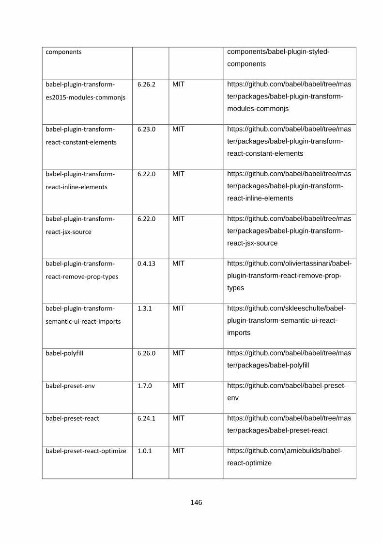
146
components components/babel-plugin-styled-
components
babel-plugin-transform-
es2015-modules-commonjs
6.26.2 MIT https://github.com/babel/babel/tree/mas
ter/packages/babel-plugin-transform-
modules-commonjs
babel-plugin-transform-
react-constant-elements
6.23.0 MIT https://github.com/babel/babel/tree/mas
ter/packages/babel-plugin-transform-
react-constant-elements
babel-plugin-transform-
react-inline-elements
6.22.0 MIT https://github.com/babel/babel/tree/mas
ter/packages/babel-plugin-transform-
react-inline-elements
babel-plugin-transform-
react-jsx-source
6.22.0 MIT https://github.com/babel/babel/tree/mas
ter/packages/babel-plugin-transform-
react-jsx-source
babel-plugin-transform-
react-remove-prop-types
0.4.13 MIT https://github.com/oliviertassinari/babel-
plugin-transform-react-remove-prop-
types
babel-plugin-transform-
semantic-ui-react-imports
1.3.1 MIT https://github.com/skleeschulte/babel-
plugin-transform-semantic-ui-react-
imports
babel-polyfill 6.26.0 MIT https://github.com/babel/babel/tree/mas
ter/packages/babel-polyfill
babel-preset-env 1.7.0 MIT https://github.com/babel/babel-preset-
env
babel-preset-react 6.24.1 MIT https://github.com/babel/babel/tree/mas
ter/packages/babel-preset-react
babel-preset-react-optimize 1.0.1 MIT https://github.com/jamiebuilds/babel-
react-optimize
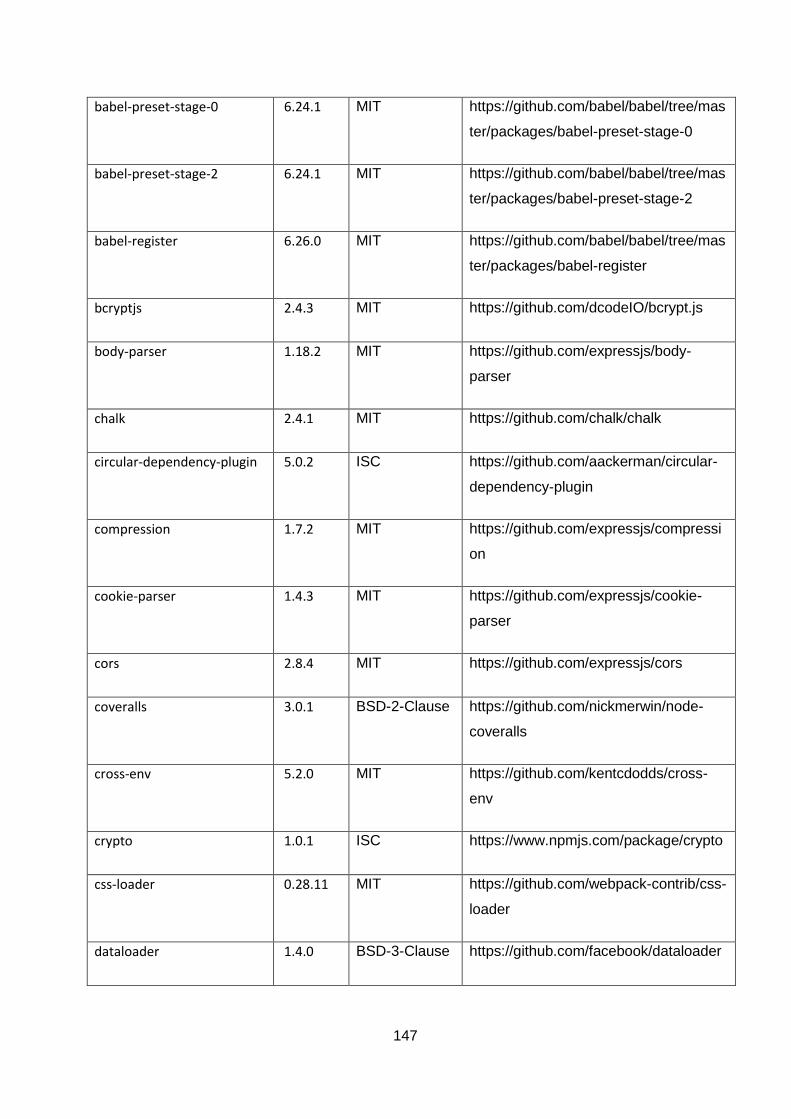
147
babel-preset-stage-0 6.24.1 MIT https://github.com/babel/babel/tree/mas
ter/packages/babel-preset-stage-0
babel-preset-stage-2 6.24.1 MIT https://github.com/babel/babel/tree/mas
ter/packages/babel-preset-stage-2
babel-register 6.26.0 MIT https://github.com/babel/babel/tree/mas
ter/packages/babel-register
bcryptjs 2.4.3 MIT https://github.com/dcodeIO/bcrypt.js
body-parser 1.18.2 MIT https://github.com/expressjs/body-
parser
chalk 2.4.1 MIT https://github.com/chalk/chalk
circular-dependency-plugin 5.0.2 ISC https://github.com/aackerman/circular-
dependency-plugin
compression 1.7.2 MIT https://github.com/expressjs/compressi
on
cookie-parser 1.4.3 MIT https://github.com/expressjs/cookie-
parser
cors 2.8.4 MIT https://github.com/expressjs/cors
coveralls 3.0.1 BSD-2-Clause https://github.com/nickmerwin/node-
coveralls
cross-env 5.2.0 MIT https://github.com/kentcdodds/cross-
env
crypto 1.0.1 ISC https://www.npmjs.com/package/crypto
css-loader 0.28.11 MIT https://github.com/webpack-contrib/css-
loader
dataloader 1.4.0 BSD-3-Clause https://github.com/facebook/dataloader
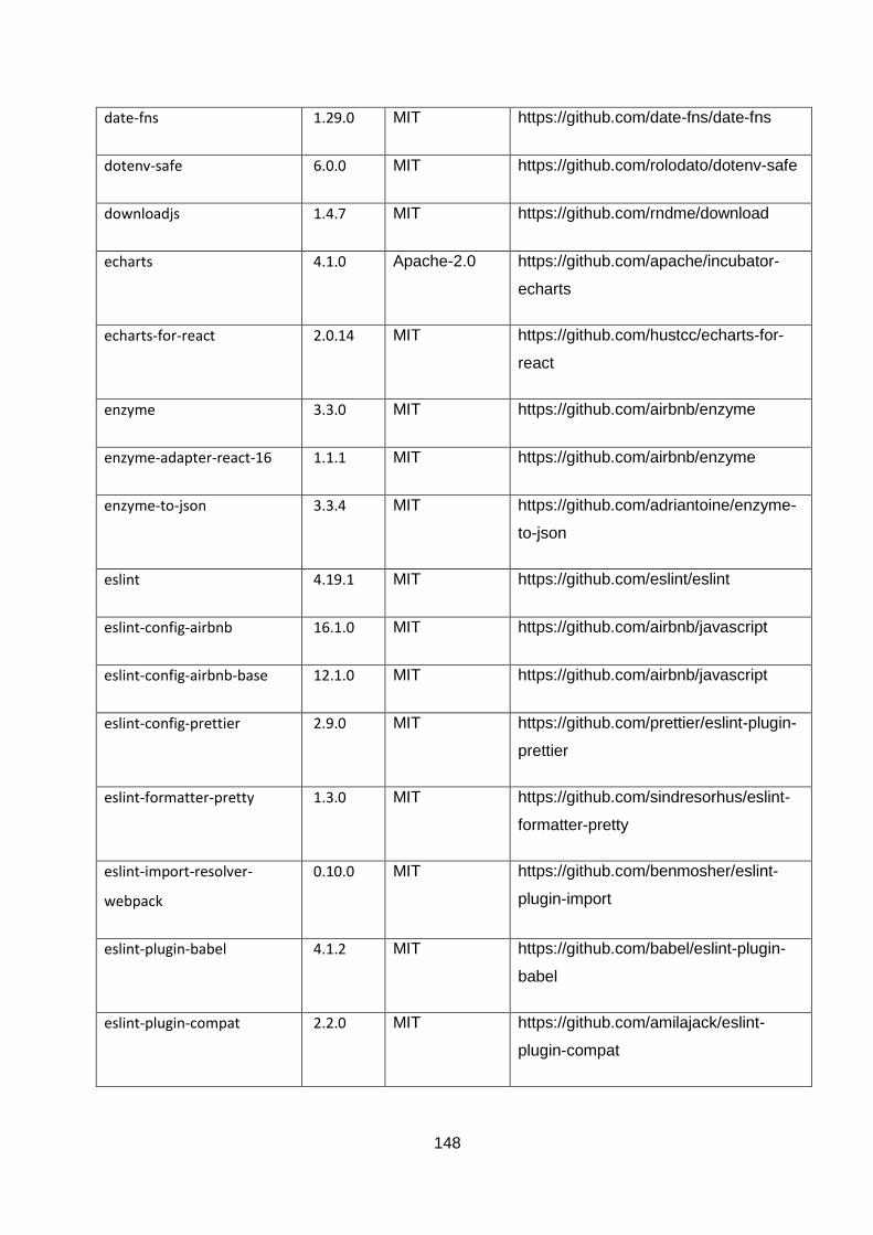
148
date-fns 1.29.0 MIT https://github.com/date-fns/date-fns
dotenv-safe 6.0.0 MIT https://github.com/rolodato/dotenv-safe
downloadjs 1.4.7 MIT https://github.com/rndme/download
echarts 4.1.0 Apache-2.0 https://github.com/apache/incubator-
echarts
echarts-for-react 2.0.14 MIT https://github.com/hustcc/echarts-for-
react
enzyme 3.3.0 MIT https://github.com/airbnb/enzyme
enzyme-adapter-react-16 1.1.1 MIT https://github.com/airbnb/enzyme
enzyme-to-json 3.3.4 MIT https://github.com/adriantoine/enzyme-
to-json
eslint 4.19.1 MIT https://github.com/eslint/eslint
eslint-config-airbnb 16.1.0 MIT https://github.com/airbnb/javascript
eslint-config-airbnb-base 12.1.0 MIT https://github.com/airbnb/javascript
eslint-config-prettier 2.9.0 MIT https://github.com/prettier/eslint-plugin-
prettier
eslint-formatter-pretty 1.3.0 MIT https://github.com/sindresorhus/eslint-
formatter-pretty
eslint-import-resolver-
webpack
0.10.0 MIT https://github.com/benmosher/eslint-
plugin-import
eslint-plugin-babel 4.1.2 MIT https://github.com/babel/eslint-plugin-
babel
eslint-plugin-compat 2.2.0 MIT https://github.com/amilajack/eslint-
plugin-compat
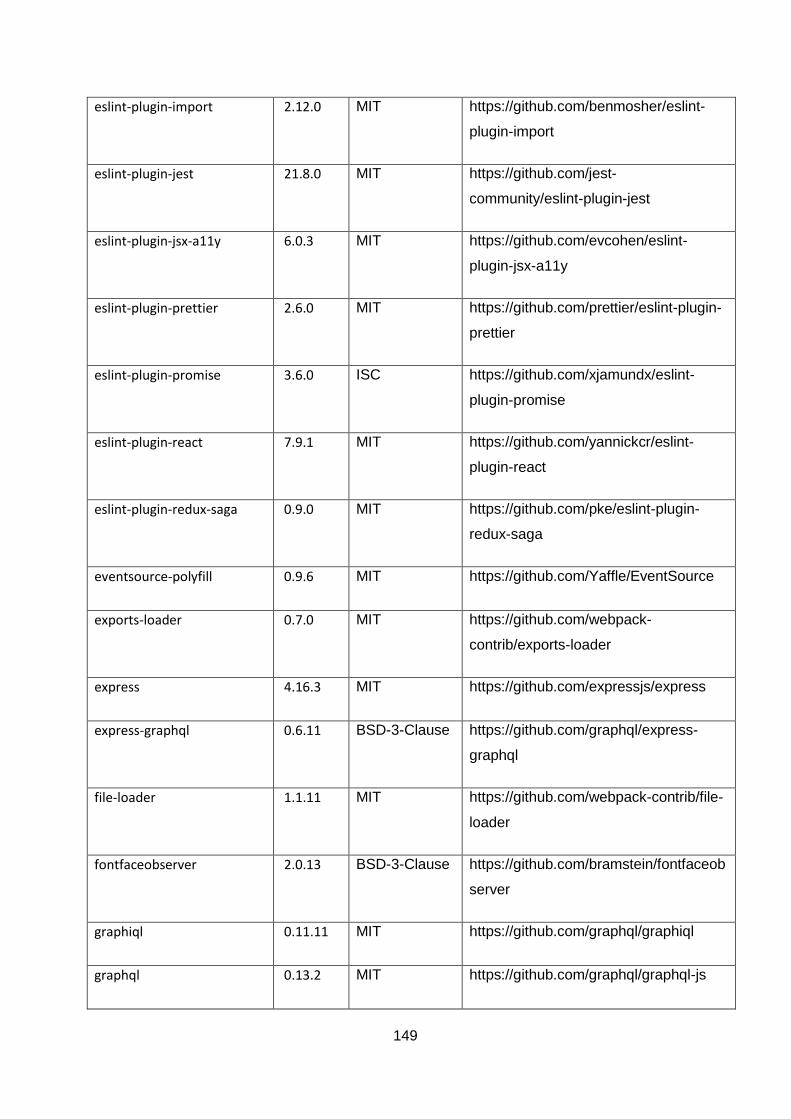
149
eslint-plugin-import 2.12.0 MIT https://github.com/benmosher/eslint-
plugin-import
eslint-plugin-jest 21.8.0 MIT https://github.com/jest-
community/eslint-plugin-jest
eslint-plugin-jsx-a11y 6.0.3 MIT https://github.com/evcohen/eslint-
plugin-jsx-a11y
eslint-plugin-prettier 2.6.0 MIT https://github.com/prettier/eslint-plugin-
prettier
eslint-plugin-promise 3.6.0 ISC https://github.com/xjamundx/eslint-
plugin-promise
eslint-plugin-react 7.9.1 MIT https://github.com/yannickcr/eslint-
plugin-react
eslint-plugin-redux-saga 0.9.0 MIT https://github.com/pke/eslint-plugin-
redux-saga
eventsource-polyfill 0.9.6 MIT https://github.com/Yaffle/EventSource
exports-loader 0.7.0 MIT https://github.com/webpack-
contrib/exports-loader
express 4.16.3 MIT https://github.com/expressjs/express
express-graphql 0.6.11 BSD-3-Clause https://github.com/graphql/express-
graphql
file-loader 1.1.11 MIT https://github.com/webpack-contrib/file-
loader
fontfaceobserver 2.0.13 BSD-3-Clause https://github.com/bramstein/fontfaceob
server
graphiql 0.11.11 MIT https://github.com/graphql/graphiql
graphql 0.13.2 MIT https://github.com/graphql/graphql-js
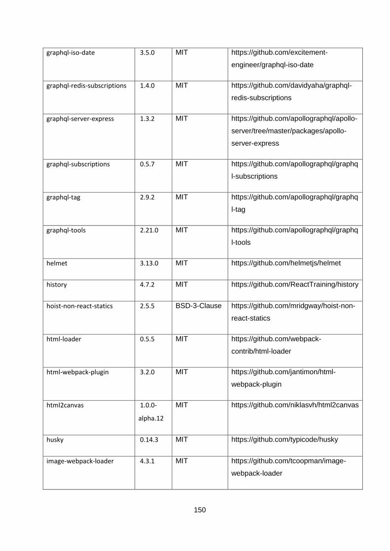
150
graphql-iso-date 3.5.0 MIT https://github.com/excitement-
engineer/graphql-iso-date
graphql-redis-subscriptions 1.4.0 MIT https://github.com/davidyaha/graphql-
redis-subscriptions
graphql-server-express 1.3.2 MIT https://github.com/apollographql/apollo-
server/tree/master/packages/apollo-
server-express
graphql-subscriptions 0.5.7 MIT https://github.com/apollographql/graphq
l-subscriptions
graphql-tag 2.9.2 MIT https://github.com/apollographql/graphq
l-tag
graphql-tools 2.21.0 MIT https://github.com/apollographql/graphq
l-tools
helmet 3.13.0 MIT https://github.com/helmetjs/helmet
history 4.7.2 MIT https://github.com/ReactTraining/history
hoist-non-react-statics 2.5.5 BSD-3-Clause https://github.com/mridgway/hoist-non-
react-statics
html-loader 0.5.5 MIT https://github.com/webpack-
contrib/html-loader
html-webpack-plugin 3.2.0 MIT https://github.com/jantimon/html-
webpack-plugin
html2canvas 1.0.0-
alpha.12
MIT https://github.com/niklasvh/html2canvas
husky 0.14.3 MIT https://github.com/typicode/husky
image-webpack-loader 4.3.1 MIT https://github.com/tcoopman/image-
webpack-loader
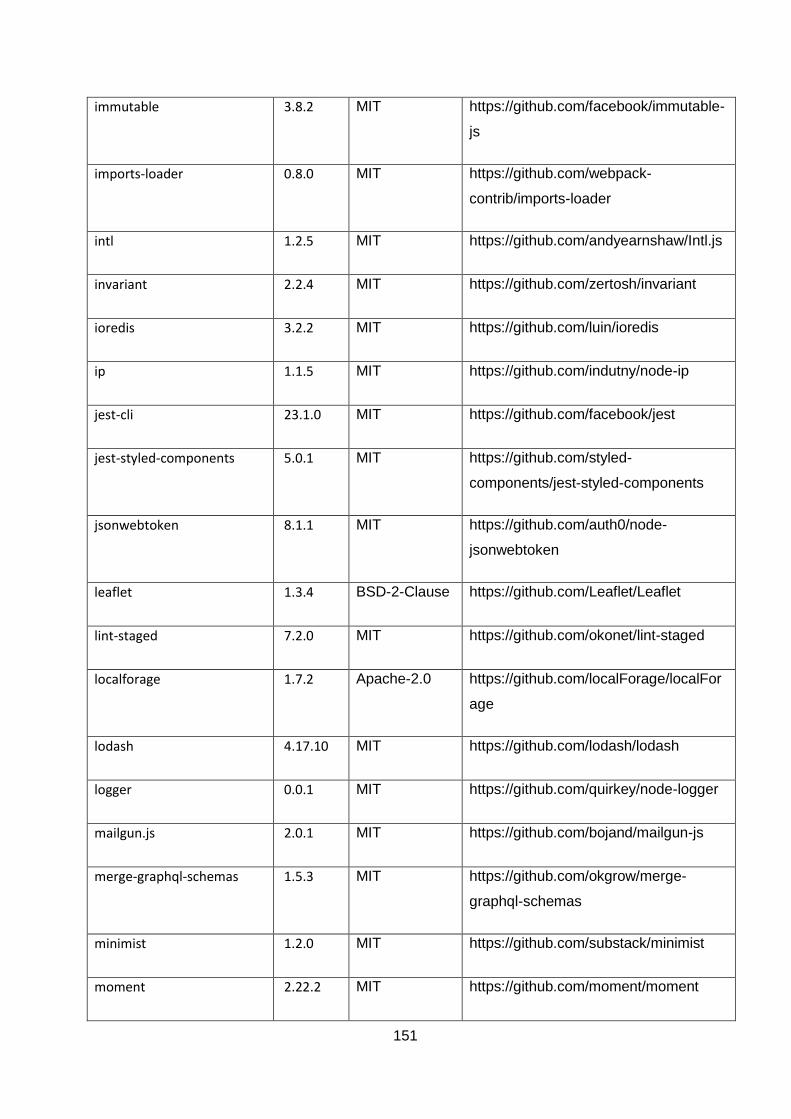
151
immutable 3.8.2 MIT https://github.com/facebook/immutable-
js
imports-loader 0.8.0 MIT https://github.com/webpack-
contrib/imports-loader
intl 1.2.5 MIT https://github.com/andyearnshaw/Intl.js
invariant 2.2.4 MIT https://github.com/zertosh/invariant
ioredis 3.2.2 MIT https://github.com/luin/ioredis
ip 1.1.5 MIT https://github.com/indutny/node-ip
jest-cli 23.1.0 MIT https://github.com/facebook/jest
jest-styled-components 5.0.1 MIT https://github.com/styled-
components/jest-styled-components
jsonwebtoken 8.1.1 MIT https://github.com/auth0/node-
jsonwebtoken
leaflet 1.3.4 BSD-2-Clause https://github.com/Leaflet/Leaflet
lint-staged 7.2.0 MIT https://github.com/okonet/lint-staged
localforage 1.7.2 Apache-2.0 https://github.com/localForage/localFor
age
lodash 4.17.10 MIT https://github.com/lodash/lodash
logger 0.0.1 MIT https://github.com/quirkey/node-logger
mailgun.js 2.0.1 MIT https://github.com/bojand/mailgun-js
merge-graphql-schemas 1.5.3 MIT https://github.com/okgrow/merge-
graphql-schemas
minimist 1.2.0 MIT https://github.com/substack/minimist
moment 2.22.2 MIT https://github.com/moment/moment

152
node-plop 0.15.0 MIT https://github.com/amwmedia/node-
plop
nodemon 1.14.12 MIT https://github.com/remy/nodemon
null-loader 0.1.1 MIT https://github.com/webpack-contrib/null-
loader
offline-plugin 5.0.5 MIT https://github.com/NekR/offline-plugin
otplib 10.0.1 MIT https://github.com/yeojz/otplib
passport 0.4.0 MIT https://github.com/jaredhanson/passpor
t
passport-jwt 4.0.0 MIT https://github.com/themikenicholson/pa
ssport-jwt
passport-local 1.0.0 MIT https://github.com/jaredhanson/passpor
t-local
pdfmake 0.1.38 MIT https://github.com/bpampuch/pdfmake
pg 7.4.3 MIT https://github.com/brianc/node-postgres
plop 2.0.0 MIT https://github.com/amwmedia/plop
pre-commit 1.2.2 MIT https://github.com/observing/pre-
commit
prettier 1.13.5 MIT https://github.com/prettier/prettier
prop-types 15.6.1 MIT https://github.com/facebook/prop-types
query-string 5.1.1 MIT https://github.com/sindresorhus/query-
string
react 16.4.1 MIT https://github.com/facebook/react
react-apollo 2.1.9 MIT https://github.com/apollographql/react-
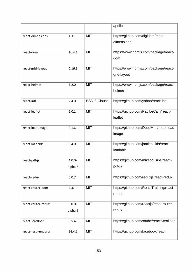
153
apollo
react-dimensions 1.3.1 MIT https://github.com/digidem/react-
dimensions
react-dom 16.4.1 MIT https://www.npmjs.com/package/react-
dom
react-grid-layout 0.16.6 MIT https://www.npmjs.com/package/react-
grid-layout
react-helmet 5.2.0 MIT https://www.npmjs.com/package/react-
helmet
react-intl 2.4.0 BSD-3-Clause https://github.com/yahoo/react-intl
react-leaflet 2.0.1 MIT https://github.com/PaulLeCam/react-
leaflet
react-load-image 0.1.6 MIT https://github.com/DeedMob/react-load-
image
react-loadable 5.4.0 MIT https://github.com/jamiebuilds/react-
loadable
react-pdf-js 4.0.0-
alpha.6
MIT https://github.com/mikecousins/react-
pdf-js
react-redux 5.0.7 MIT https://github.com/reduxjs/react-redux
react-router-dom 4.3.1 MIT https://github.com/ReactTraining/react-
router
react-router-redux 5.0.0-
alpha.9
MIT https://github.com/reactjs/react-router-
redux
react-scrollbar 0.5.4 MIT https://github.com/souhe/reactScrollbar
react-test-renderer 16.4.1 MIT https://github.com/facebook/react
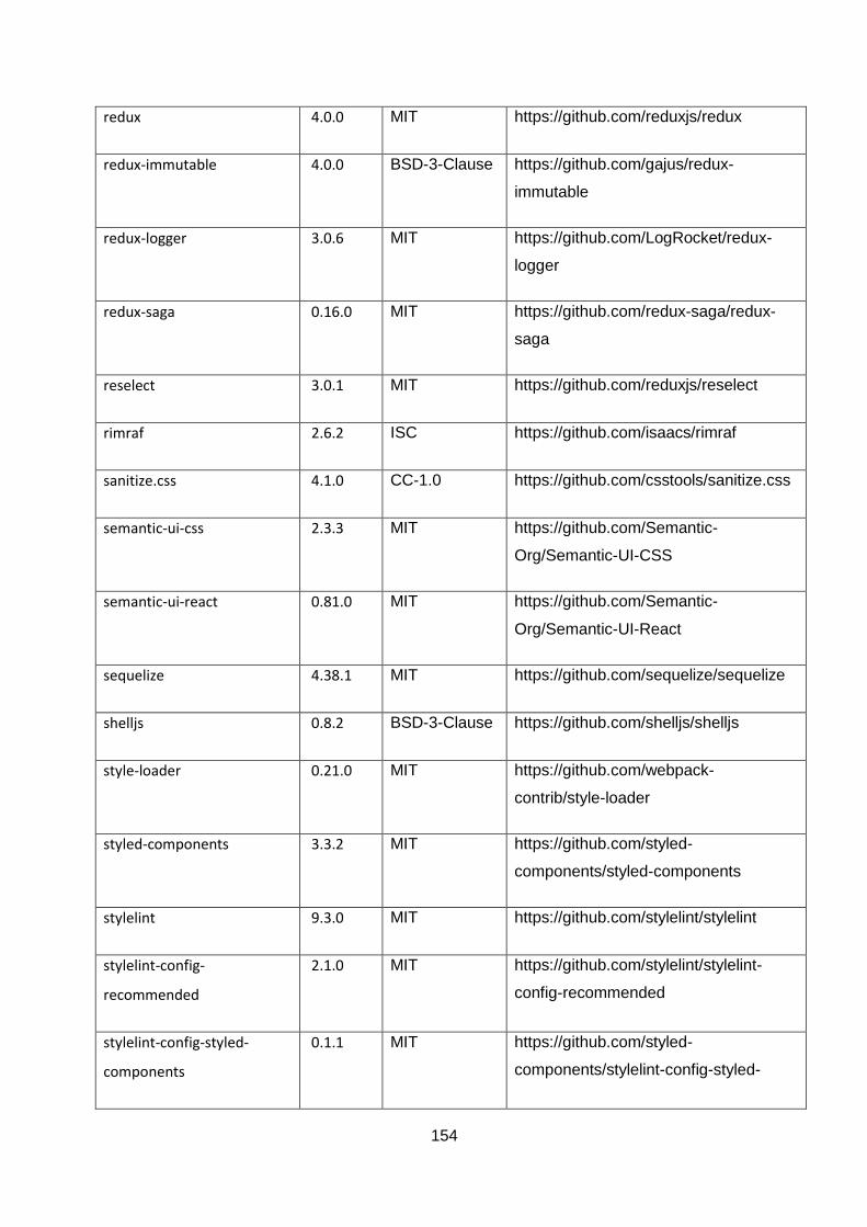
154
redux 4.0.0 MIT https://github.com/reduxjs/redux
redux-immutable 4.0.0 BSD-3-Clause https://github.com/gajus/redux-
immutable
redux-logger 3.0.6 MIT https://github.com/LogRocket/redux-
logger
redux-saga 0.16.0 MIT https://github.com/redux-saga/redux-
saga
reselect 3.0.1 MIT https://github.com/reduxjs/reselect
rimraf 2.6.2 ISC https://github.com/isaacs/rimraf
sanitize.css 4.1.0 CC-1.0 https://github.com/csstools/sanitize.css
semantic-ui-css 2.3.3 MIT https://github.com/Semantic-
Org/Semantic-UI-CSS
semantic-ui-react 0.81.0 MIT https://github.com/Semantic-
Org/Semantic-UI-React
sequelize 4.38.1 MIT https://github.com/sequelize/sequelize
shelljs 0.8.2 BSD-3-Clause https://github.com/shelljs/shelljs
style-loader 0.21.0 MIT https://github.com/webpack-
contrib/style-loader
styled-components 3.3.2 MIT https://github.com/styled-
components/styled-components
stylelint 9.3.0 MIT https://github.com/stylelint/stylelint
stylelint-config-
recommended
2.1.0 MIT https://github.com/stylelint/stylelint-
config-recommended
stylelint-config-styled-
components
0.1.1 MIT https://github.com/styled-
components/stylelint-config-styled-
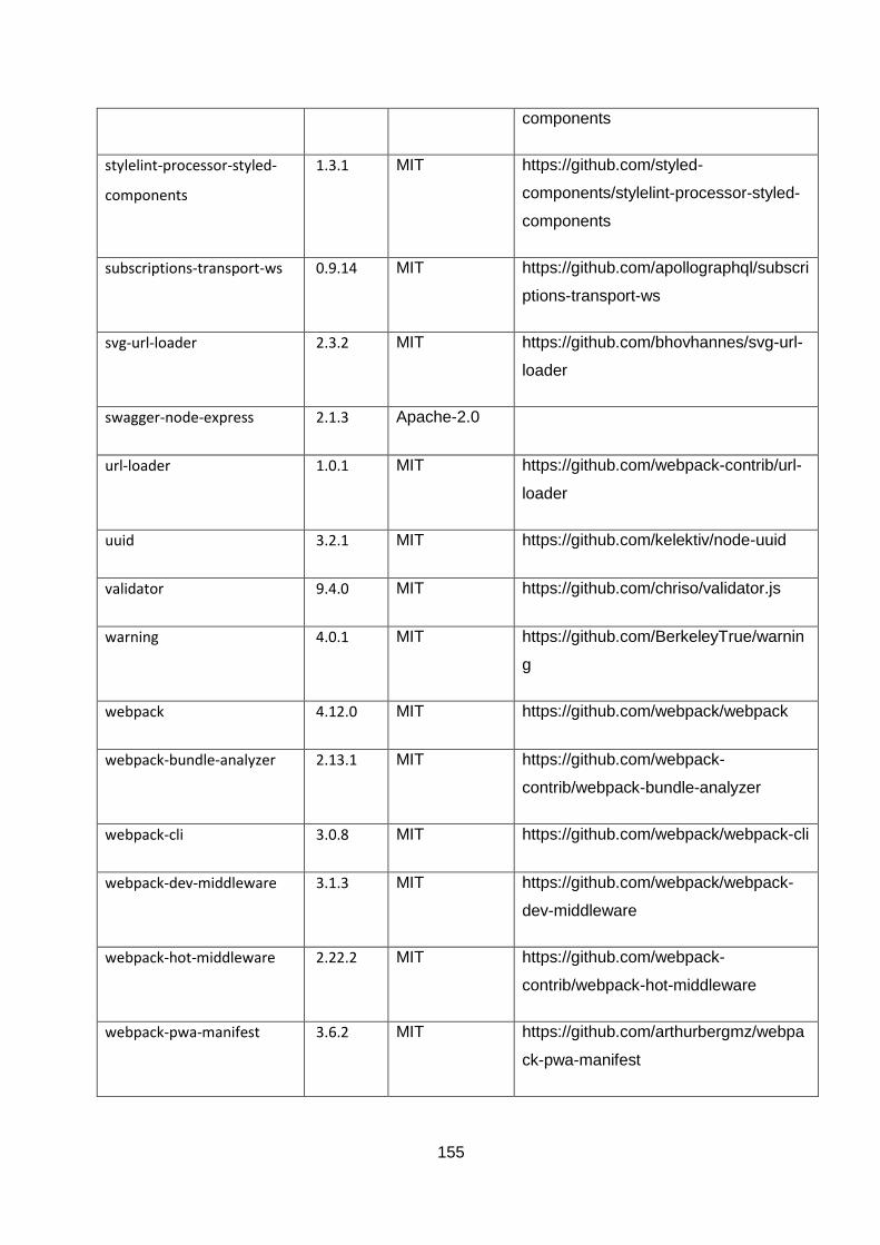
155
components
stylelint-processor-styled-
components
1.3.1 MIT https://github.com/styled-
components/stylelint-processor-styled-
components
subscriptions-transport-ws 0.9.14 MIT https://github.com/apollographql/subscri
ptions-transport-ws
svg-url-loader 2.3.2 MIT https://github.com/bhovhannes/svg-url-
loader
swagger-node-express 2.1.3 Apache-2.0
url-loader 1.0.1 MIT https://github.com/webpack-contrib/url-
loader
uuid 3.2.1 MIT https://github.com/kelektiv/node-uuid
validator 9.4.0 MIT https://github.com/chriso/validator.js
warning 4.0.1 MIT https://github.com/BerkeleyTrue/warnin
g
webpack 4.12.0 MIT https://github.com/webpack/webpack
webpack-bundle-analyzer 2.13.1 MIT https://github.com/webpack-
contrib/webpack-bundle-analyzer
webpack-cli 3.0.8 MIT https://github.com/webpack/webpack-cli
webpack-dev-middleware 3.1.3 MIT https://github.com/webpack/webpack-
dev-middleware
webpack-hot-middleware 2.22.2 MIT https://github.com/webpack-
contrib/webpack-hot-middleware
webpack-pwa-manifest 3.6.2 MIT https://github.com/arthurbergmz/webpa
ck-pwa-manifest

156
whatwg-fetch 2.0.4 MIT https://github.com/github/fetch
winston 3.0.0-rc1 MIT https://github.com/winstonjs/winston
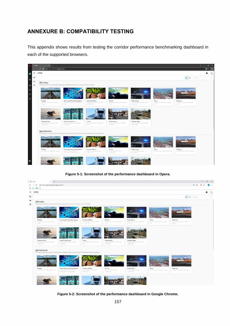
157
ANNEXURE B: COMPATIBILITY TESTING
This appendix shows results from testing the corridor performance benchmarking dashboard in
each of the supported browsers.
Figure 5-1: Screenshot of the performance dashboard in Opera.
Figure 5-2: Screenshot of the performance dashboard in Google Chrome.
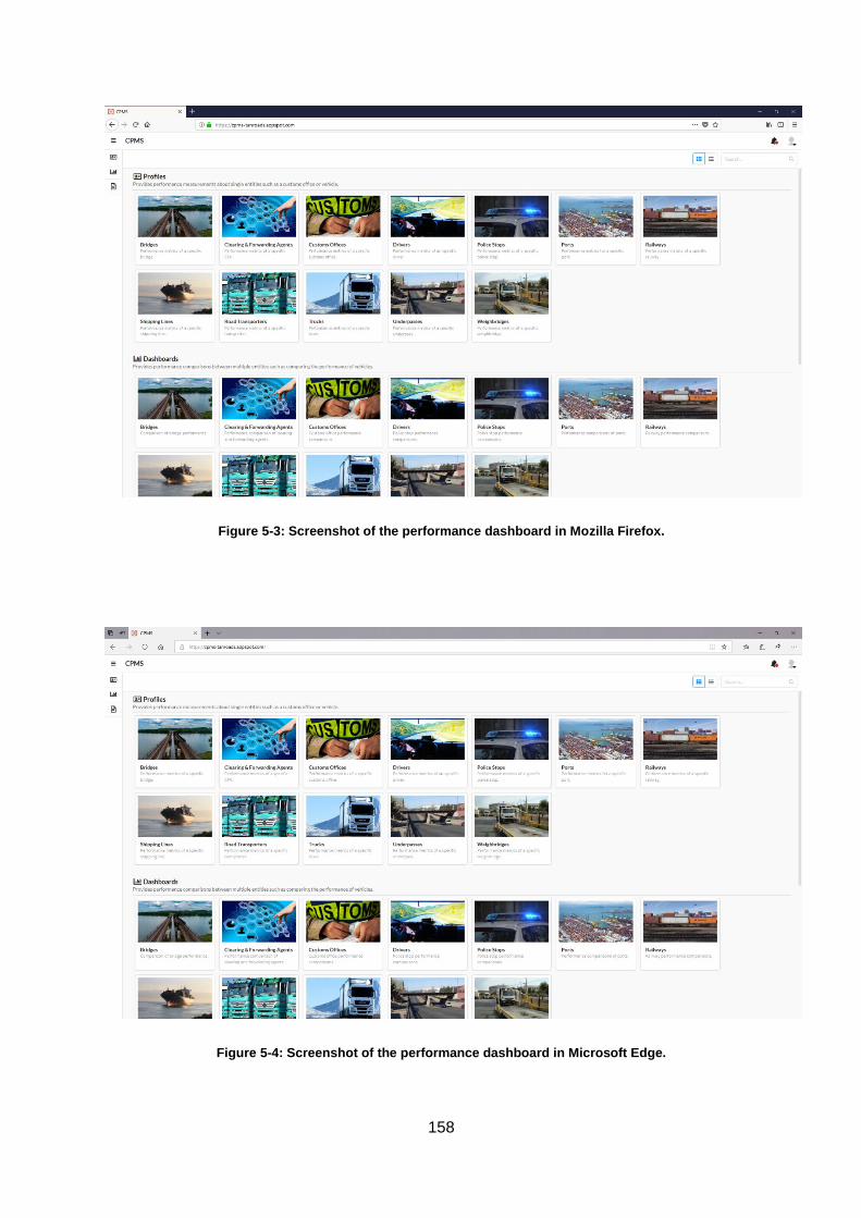
158
Figure 5-3: Screenshot of the performance dashboard in Mozilla Firefox.
Figure 5-4: Screenshot of the performance dashboard in Microsoft Edge.
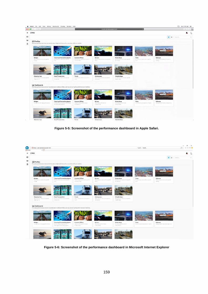
159
Figure 5-5: Screenshot of the performance dashboard in Apple Safari.
Figure 5-6: Screenshot of the performance dashboard in Microsoft Internet Explorer

160