Performance Measurement and Benchmarking Report
377
2011 Performance Measurement and Benchmarking Report CITY MANAGER’S OFFICE MARCH 2013 NUMBER (000’S) COST ($) RATE (PER CAPITA) VOLUME (M 3 ) DISTANCE (KM) FREQUENCY (%) AREA (HECTARES) TIME (MIN:SEC)
-
Upload
khangminh22 -
Category
Documents
-
view
4 -
download
0
Transcript of Performance Measurement and Benchmarking Report

2011 Performance Measurement and Benchmarking Report
C I T Y M A N AG E R ’ S O FF I C E
M A RC H 201 3
NUMBER (000’S)
COST ($)
RATE (PER CAPITA)
VOLUME (M3)
DISTANCE (KM)
FREQUENCY (%)
AREA (HECTARES)
TIME (MIN:SEC)


2011 Performance Measurement and Benchmarking Report
TABLE OF CONTENTS
Section Page Reference
Introduction 1
Context
How much and what types of taxes did an Ontario family pay in 2012? 2 How much tax did each order of government receive from the average Ontario family in 2012? 2
How did the City of Toronto spend its 8.9 percent share of taxes paid by the average Toronto family in 2012? 2-3
What's New in this Year's Report? 4
Summary of Toronto’s Performance Results 4 Internal Comparison of Toronto’s 2011 vs. 2010 results
Service/activity level indicator trends Performance measurement result trends
5
6-7 Comparing Toronto’s 2011 results externally to other Canadian municipalities
Service/activity level indicators (quartile results) Performance measurement results (quartile results)
8 9-10
Continuous Improvement Initiatives – What Actions are Toronto’s Service Areas Taking to Further Improve Operations and Performance
Initiatives to improve customer service 11-12 Efficiency improvement initiatives 12-13 Initiatives to improve effectiveness 13-15 Initiatives to improve the quality of life of Torontonians 15
Other Methods of Assessing Toronto’s Progress Toronto’s award-winning initiatives 16 The City Manager's Awards for Toronto Public Service Excellence 16 Other indicator reports 17 Toronto in international rankings and reports 17-21 Global City Indicators 22-23
Guide to the Summaries of Toronto’s Performance Measurement Results Toronto’s performance measurement framework for service delivery 24 Comparing Toronto’s results internally over time 25 Comparing Toronto’s results externally to other Canadian municipalities 26-27 How to interpret charts throughout this report 28-29 Basis of costing used in this report 30
2011 Performance Measurement and Benchmarking Report
TABLE OF CONTENTS - CONTINUED Section Page
Reference
Consolidated Summary of Toronto’s Results by Service Area 33 -75
Detailed Results, Charts and Initiatives by Service Area
1. Accounts Payable Services 78 - 82
2. Building Services 84 - 94
3. Bylaw Enforcement Services 96 - 101
4. Children’s Services 102 - 111
5. Clerk's Services 112 - 122
6. Court Services 124 - 131
7. Cultural Services 132 - 137
8. Emergency Medical Services 138 - 150
9. Fire Services 152 - 163
10. Fleet Services 164 - 170
11. General Revenue Services 172 - 176
12. Governance and Corporate Management 178 - 181
13. Hostel Services 182 - 189
14. Information and Technology Services 190 - 197
15. Investment Management Services 198 - 202
16. Legal Services 204 - 207
17. Library Services 208 - 216
18. Long-Term Care Services 218 - 225
19. Parking Services 226 - 231
20. Parks Services 232 - 240
21. Payroll Services 242 - 247
22. Planning Services 248 - 255
23. Police Services 256 - 270
24. Purchasing Services 272 - 279
25. Road Services 280 - 291
26. Social Assistance Services 292 - 303
27. Social Housing Services 304 - 310
28. Solid Waste Management Services 312 - 320
29. Sports and Recreation Services 322 - 335
30. Taxation Services 336 - 342
31. Transit Services 344 - 352
32. Wastewater Services 354 - 362
33. Water Services 364 - 373
2011 Performance Measurement and Benchmarking Report
1
Introduction Presently, there are two key reports issued by the City Manager's Office that are used to report on Toronto's progress: This annual report on Toronto's Performance Measurement and Benchmarking results,
based on 2011 results of Toronto and comparative municipalities. It should be noted that the annual data collection process for the information published in this report is a result of a joint effort with other OMBI municipalities. Therefore, the 2012 data and results will not be available until mid-2013.
More timely information provided on a quarterly basis through the Management Information Dashboard that provides the most current information available for Toronto on economic, social and divisional indicators. The most recent report for 2012 Quarter 4 is available at http://www.toronto.ca/legdocs/mmis/2013/ex/bgrd/backgroundfile-56578.pdf, and includes data on:
o Key economic indicators such as office and industrial vacancy rates, unemployment rates, bankruptcies, retail sales, exports, home sales, and average home prices.
o Broader social indicators such as food bank usage and mortgages in arrears. o Revenue sources such as TTC user fees, building fees and the Land Transfer Tax. o Monthly or quarterly data for a number of measures and indicators also found in this
benchmarking report such as: Development indicators like the number of planning applications and
construction values of building permits issued. Social indicators such as shelter use, social assistance caseloads, and the
size of waiting lists for subsidized childcare and social housing units. Recreation program and library use as well as transit ridership. Crime rates.
Toronto is unique among Canadian municipalities because of its size and role as Ontario's and Canada's economic engine and centre of Ontario's business, culture, entertainment, sporting and provincial and international governance activities. Therefore, the most accurate comparison for Toronto is to examine its own year-over-year performance and longer term historical trends. Toronto's 2011 Performance Measurement and Benchmarking report provides service/activity level indicators and performance measurement results in 33 of the City’s service areas and includes up to eleven years of historical data, colour-coded summaries of results, and supporting charts to describe those trends. Web links have been included where similar neighbourhood-based data are available through Wellbeing Toronto to complement the city-wide information in this report. This report also provides an external perspective, using colour-coded summaries to rank Toronto’s 2011 results by quartile in comparison to the other 15 municipalities that comprise the Ontario Municipal CAOs' Benchmarking Initiative (OMBI), which now includes the Cities of Calgary and Winnipeg. It builds on the October 2012 report entitled OMBI 2011 Performance Benchmarking Report by focussing on Toronto's results. All of Toronto’s service areas continue to look for opportunities to improve operations and performance. Many of these improvement efforts completed in 2012 or planned for 2013 are summarized on pages 11 to 15, and can also be found at the end of each service section.

2011 Performance Measurement and Benchmarking Report
2
Context
For context on Toronto’s service delivery performance from the perspective of an average Toronto family, it is important to consider:
How much and what different types of taxes an average Toronto family pays over the course of a year;
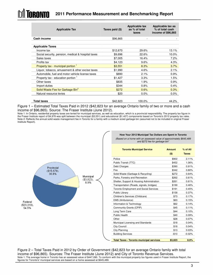
What order of government these taxes are paid to and in what proportions; How the City of Toronto uses its share of these tax dollars received; and How other orders of government use their share of tax dollars. How much and what types of taxes did an Ontario family pay in 2012? Families pay taxes throughout the year in many different forms. Some taxes, such as income tax, Employment Insurance and Canada Pension Plan premiums, are deducted directly from gross salaries. Consumption-based taxes such as the HST (Harmonized Sales Tax) are paid at the point of purchase. HST amounts to 13 percent of the item's purchase price, while other sales taxes such as gasoline, liquor and tobacco taxes are embedded in the purchase price and are not always evident. Property tax is based on a percentage of the assessed value of land and buildings. Approximately 71 percent of the property tax bill is used for municipal purposes, while the remainder is used for educational purposes. Property tax is highly visible and is the only form of tax where taxpayers receive a bill. Figure 1 on the next page provides a summary, based on the work of the Fraser Institute, of the types and amounts of all forms of taxes paid to all three orders of government by an average Ontario family of two or more. Their 2012 estimates are based on a family income of $96,865. It is estimated that the average family will pay approximately $42,823 in all forms of taxes to all orders of government. How much tax did each level of government receive from the average Ontario family? As illustrated in Figure 2 on the next page, the estimated $42,823 in all forms of taxes paid by the average Ontario family in 2012, is split as follows:
Federal government - $23,319 or 54.5 percent. Provincial government - $15,679 or 36.6 percent. City of Toronto - $3,823 or 8.9 percent, which includes the municipal portion of property
taxes and the solid waste fee for a medium-sized bin. How does the Toronto government spend its 8.9 percent share of taxes paid by the average Toronto family?
Figure 2 also illustrates how the City of Toronto government spends its 8.9 percent share of all taxes, or $3,823, to deliver the wide the range of municipal services provided to Torontonians
that are vital to their daily lives. This report provides performance measurement and benchmarking results for 33 of the major services the City of Toronto provides with its 8.9 percent share of the total tax dollar, as well as information on key improvement initiatives intended to improve the efficiency and effectiveness of operations.
2011 Performance Measurement and Benchmarking Report
3
Figure 1 – Estimated Total Taxes Paid in 2012 ($42,823 for an average Ontario family of two or more and a cash income of $96,865). Source: The Fraser Institute (June 2012). Note 1: In Ontario, residential property taxes are levied for municipal services, as well as education, which is a provincial responsibility. The property tax figure in the Fraser Institute report of $4,978 was split between the municipal ($3,551) and educational ($1,427) components based on Toronto's 2012 property tax rates. Note 2: Reflects the annual solid waste management fee in Toronto for a family with a medium sized garbage bin (assumed not to be included in original Fraser Institute Report).
Figure 2 – Total Taxes Paid in 2012 by Order of Government ($42,823 for an average Ontario family with total income of $96,865). Sources: The Fraser Institute (June 2012) and City of Toronto Revenue Services. Note 1: The average home in Toronto has an assessed value of $447,090. To conform with the municipal property tax figures used in Fraser Institute Report, the figures for Toronto's' municipal services are based on a home assessed at $645,489.
Applicable Tax Taxes paid ($) Applicable tax as % of total
taxes
Applicable tax as % of total cash
income of $96,865
Cash income $96,865 - -
Applicable Taxes
Income tax $12,670 29.6% 13.1%
Social security, pension, medical & hospital taxes $9,696 22.6% 10.0%
Sales taxes $7,005 16.4% 7.2%
Profits tax $4,123 9.6% 4.3%
Property tax - municipal portion 1 $3,551 8.3% 3.7%
Liquor, tobacco, amusement & other excise taxes $1,990 4.6% 2.1%
Automobile, fuel and motor vehicle license taxes $890 2.1% 0.9%
Property tax - education portion 1 $1,427 3.3% 1.5%
Other taxes $835 1.9% 0.9%
Import duties $344 0.8% 0.4%
Solid Waste Fee for Garbage Bin2 $272 0.6% 0.3%
Natural resource levies $20 0.0% 0.0%
Total taxes $42,823 100.0% 44.2%
How Your 2012 Municipal Tax Dollars are Spent in Toronto
(Based on a home with an assessed value of approximately $645,489 and $272 fee for garbage bin
1
Toronto Municipal Service
Amount
($)
% of All
Taxes
Police $902 2.11%
Public Transit (TTC) $452 1.06%
Debt Charges $390 0.91%
Fire $342 0.80%
Solid Waste (Garbage & Recycling) $272 0.64%
Parks, Forestry and Recreation $262 0.61%
Shelter, Support & Housing Administration $261 0.61%
Transportation (Roads, signals, bridges) $199 0.46%
Toronto Employment and Social Services $191 0.45%
Public Library $158 0.37%
Children's Services (Childcare) $73 0.17%
EMS (Ambulance) $63 0.15%
Information & Technology $62 0.14%
Community Grants (CPIP) $45 0.11%
Long Term Care $44 0.10%
Public Health $40 0.09%
Other $28 0.07%
Municipal Licensing and Standards $18 0.04%
City Council $18 0.04%
City Planning $13 0.03%
Building Services -$10 -0.02%
Total Taxes - Toronto municipal services $3,823 8.9%

2011 Performance Measurement and Benchmarking Report
4
What's New in this Year's Report? This 2011 report differs from previous years through the addition of:
Five more service areas: o City Clerk's Office o Court Services o Fleet Services o Payroll Services o Purchasing Services
More community impact and quality measures such as: o The percentage Child Care Centres that are meeting quality standards. o The frequency that Toronto beaches are posted as unsafe to swim (Wastewater
Services). o The percentage of patients with cardiac arrest that have their pulse return upon
arrival at the hospital (EMS). More customer service and quality measures Web links where similar neighbourhood-based data are available through Wellbeing
Toronto (http://map.toronto.ca/wellbeing/) to complement the city-wide information in this report.
The introduction of total cost measures in a number of service areas, which are comprised of operating costs plus amortization (depreciation) of capital assets.
Timelines to assist readers by illustrating the time components of an emergency 911 call for Fire Services and Emergency Medical Services.
Summary of Toronto’s results
The 33 municipal services included in this report each have a colour coded summary of results at the front of their respective sections, and are referenced to charts and detailed narratives for approximately 230 indicators and measures. A guide to assist in interpreting these colour-coded summaries of results and supporting charts can be found on pages 24 to 30.
A consolidated colour-coded summary of Toronto’s results for each indicator/measure drawn from each of the respective service areas can be found on pages 33 to 75 of this report. Highlights of Toronto's overall results are described on the following pages.

2011 Performance Measurement and Benchmarking Report
5
Internal Comparison – How have Toronto’s service/activity levels changed in 2011 compared to 2010? Of the 46 service/activity level indicators included this report, levels in Toronto in 2011 increased or were maintained (stable) for 78 percent of the indicators in relation to 2010, as shown in Figure 3.
Figure 3 – Toronto's internal trends in service/activity levels 2011 vs. 2010 (46 indicators).
Examples of some of the areas in which Toronto’s 2011 service levels or levels of activity increased were: There was an increased amount spent on or invested in childcare per child aged 12 and
under. The number of emergency shelter beds increased. Library holdings increased by approximately 116,000 items. There was a 9.7 percent increase in the number of development applications received by
City Planning. An additional 7.7 hectares of maintained parkland was provided with the expansion of
some existing parks. Off-street parking was expanded by 376 by spaces.
2011 Performance Measurement and Benchmarking Report
6
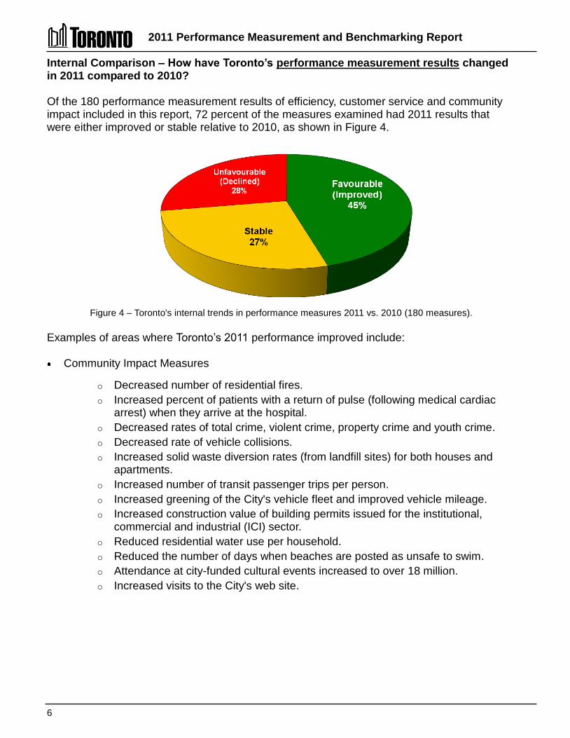
Internal Comparison – How have Toronto’s performance measurement results changed in 2011 compared to 2010? Of the 180 performance measurement results of efficiency, customer service and community impact included in this report, 72 percent of the measures examined had 2011 results that were either improved or stable relative to 2010, as shown in Figure 4.
Figure 4 – Toronto's internal trends in performance measures 2011 vs. 2010 (180 measures).
Examples of areas where Toronto’s 2011 performance improved include: Community Impact Measures
o Decreased number of residential fires. o Increased percent of patients with a return of pulse (following medical cardiac
arrest) when they arrive at the hospital. o Decreased rates of total crime, violent crime, property crime and youth crime. o Decreased rate of vehicle collisions. o Increased solid waste diversion rates (from landfill sites) for both houses and
apartments. o Increased number of transit passenger trips per person. o Increased greening of the City's vehicle fleet and improved vehicle mileage. o Increased construction value of building permits issued for the institutional,
commercial and industrial (ICI) sector. o Reduced residential water use per household. o Reduced the number of days when beaches are posted as unsafe to swim. o Attendance at city-funded cultural events increased to over 18 million. o Increased visits to the City's web site.
2011 Performance Measurement and Benchmarking Report
7
Customer Service and Quality Measures:
o Maintained a 96 percent rate in 2011 and 2012 for completing service requests from the public within the published service standard.
o Reduced the time it takes to resolve/close a bylaw complaint. o Increased utilization rate of pre-authorized payment plans for property tax. o Reduced time to issue a purchase order. o Increased percentage of invoices paid within 30 days. o Increased average borrowing/circulation for each item in the Library's circulating
collection. o Continuing high satisfaction levels of residents in long-term care homes. o The percentage of child care centres that met or exceeded Toronto's Operating
Criteria for quality remained high at approximately 93 percent.
Efficiency measures:
Decreased operating costs to: Process a development application. Enforce the Building Code per $1,000 of construction value. Process an accounts payable invoice. Process a payroll cheque or direct deposit decreased. Administer a social assistance case. Administer a social housing unit. Divert (recycle) a tonne of waste. Dispose a tonne of waste. Provide a transit passenger trip.
Increased utilization (passenger trips per vehicle hour) of transit vehicles. Improved collection of property tax arrears.
Examples of areas where the internal trends in Toronto’s performance measurement results between 2010 and 2011 were unfavourable include: Increased number of fire related injuries and fatalities (although the longer term trend is
downwards). Reduction in the pavement condition rating for roads (although still the best of the single-
tier municipalities) and a large reduction in bridge and culvert condition rating, which includes the elevated portion of the Gardiner Expressway.
Increased rates of watermain breaks and sewer back-ups. Increased proportion (1.3 percent) of wastewater estimated to have bypassed full treatment
during storm events. Increases in a number of cost per unit of service measures.
2011 Performance Measurement and Benchmarking Report
8
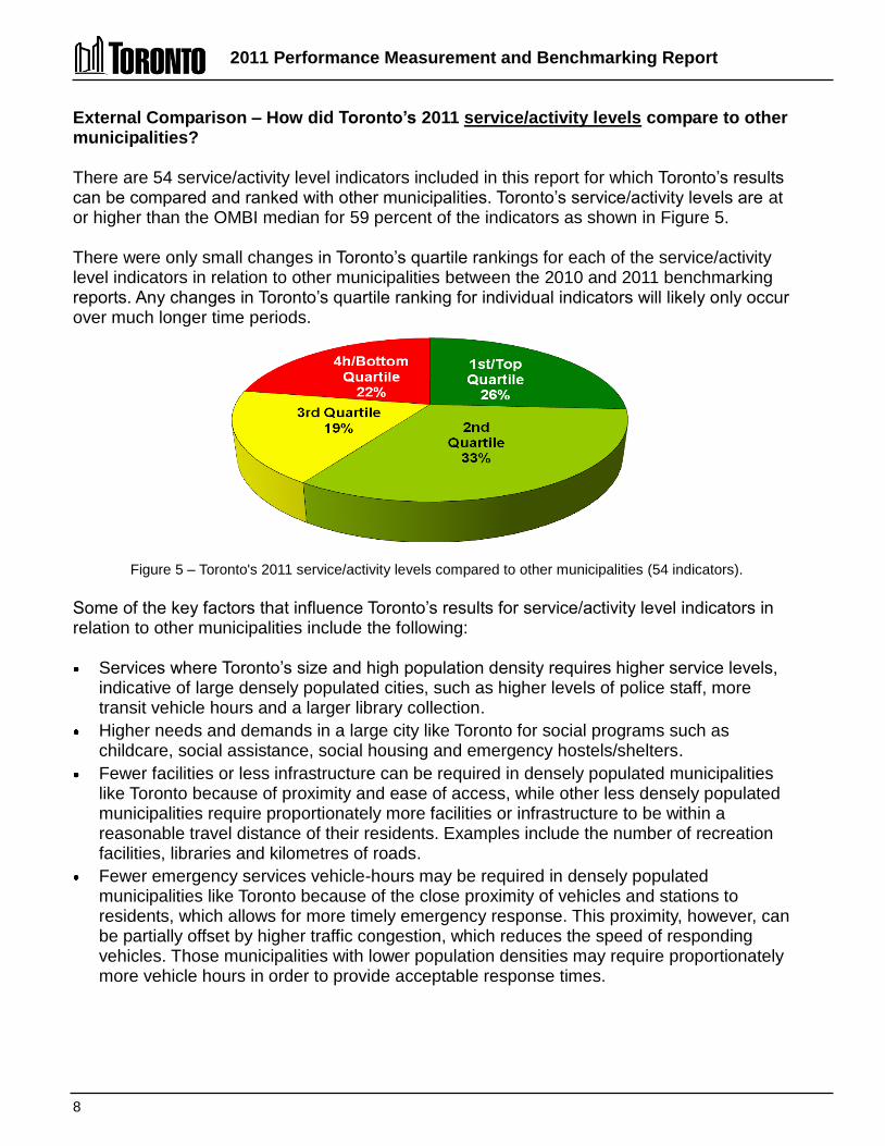
External Comparison – How did Toronto’s 2011 service/activity levels compare to other municipalities? There are 54 service/activity level indicators included in this report for which Toronto’s results can be compared and ranked with other municipalities. Toronto’s service/activity levels are at or higher than the OMBI median for 59 percent of the indicators as shown in Figure 5. There were only small changes in Toronto’s quartile rankings for each of the service/activity level indicators in relation to other municipalities between the 2010 and 2011 benchmarking reports. Any changes in Toronto’s quartile ranking for individual indicators will likely only occur over much longer time periods.
Figure 5 – Toronto's 2011 service/activity levels compared to other municipalities (54 indicators).
Some of the key factors that influence Toronto’s results for service/activity level indicators in relation to other municipalities include the following: Services where Toronto’s size and high population density requires higher service levels,
indicative of large densely populated cities, such as higher levels of police staff, more transit vehicle hours and a larger library collection.
Higher needs and demands in a large city like Toronto for social programs such as childcare, social assistance, social housing and emergency hostels/shelters.
Fewer facilities or less infrastructure can be required in densely populated municipalities like Toronto because of proximity and ease of access, while other less densely populated municipalities require proportionately more facilities or infrastructure to be within a reasonable travel distance of their residents. Examples include the number of recreation facilities, libraries and kilometres of roads.
Fewer emergency services vehicle-hours may be required in densely populated municipalities like Toronto because of the close proximity of vehicles and stations to residents, which allows for more timely emergency response. This proximity, however, can be partially offset by higher traffic congestion, which reduces the speed of responding vehicles. Those municipalities with lower population densities may require proportionately more vehicle hours in order to provide acceptable response times.

2011 Performance Measurement and Benchmarking Report
9
External Comparison – How did Toronto’s 2011 performance measurement results compare to other municipalities? There are 147 measures of efficiency, customer service and community impact in this report where Toronto’s results can be compared and ranked with other municipalities. Toronto’s results are higher than the OMBI median for 50 percent of the measures, as shown in Figure 6. There was very little change in Toronto’s quartile ranking for each of the performance measures in relation to other municipalities between the 2010 and 2011 benchmarking reports. Changes in Toronto’s quartile ranking for individual measures are more likely to occur over a five year period or longer.
Figure 6 – Toronto's 2011 performance measurement results compared to other municipalities (147 measures).
Areas where Toronto has the top/best result of the OMBI municipalities include: Highest proportion of patients with cardiac arrest that have their pulse return upon arrival at
the hospital. Lowest amount of reactive (unplanned) vehicle maintenance as a percentage of all vehicle
maintenance. Highest percentage of roads with a pavement rated of good to very good among single-tier
municipalities. Highest solid waste diversion rate for houses. Highest number of conventional transit trips per person. Highest percentage of maintained parkland in relation to geographic area. Highest ratio of Industrial, Commercial and Institutional construction activity relative to
residential construction. Other examples where Toronto's performance is better than the OMBI median include: Lower cost of governance and corporate management. High levels of library use per capita. Lower proportion of property tax arrears. Lower total crime, and property crime rates and the third lowest youth crime rate.
2011 Performance Measurement and Benchmarking Report
10
Lower rates of fires as well as fire-related related injuries and fatalities, and a shorter/quicker response time.
EMS cost per patient transported is at the median. The second best utilization rate of transit vehicles (trips per vehicle hour) and the third
lowest operating cost to provide a passenger trip. Toronto’s performance measurement results fall below the OMBI median in a number of areas. Key factors that influence or contribute to some of these lower rankings include: Social programs measures that Toronto has little control over, such as longer waiting lists
for social housing or subsidized childcare. Measures impacted by Toronto’s high population density and urban form including higher
rates of violent crime, more traffic congestion, a higher vehicle collision rate and higher solid waste disposal costs that arise from not having a local landfill site.
Results impacted by the advanced age of Toronto's infrastructure, such as the highest rates of watermain breaks and sewer backups, and higher costs for wastewater collection and treatment and water distribution.
Areas of higher costs that in some part can be related to higher levels of effectiveness such as the highest costs for paved roads (with the highest pavement quality), or the highest cost of solid waste diversion (with the highest diversion rate for houses).
There are also a number of areas where Toronto's results in relation to other municipalities can be improved such as: Reducing the time it takes to close bylaw complaint files – continuing efforts since 2009
have been taken to improve these results. Increasing participation rates in recreation programs – in 2012 the recreation service plan
was approved by Council and Priority Centre expansion is planned in 2013. Reducing EMS offload delays at hospitals – the Hospital Offload Delay Nurse Program
continues and there are ongoing negotiations with Toronto hospitals to improve their offload times.
Reducing the time period that clients receive social assistance – through initiatives such as job fairs for residents with potential employers, providing basic education classes and encouraging more visits to employment centres.
Improving solid waste diversion rates in apartments through completing the roll-out of Source-Separated Organics (SSO) "green bin" collection in multi-residential, non-residential, schools and City buildings and expansion of the materials recycled, such as mattresses and rigid plastics that were added in 2012.
Reducing the number of watermain breaks and sewer back-up through watermain and sewer replacement and infrastructure rehabilitation projects.
Stabilizing or reducing Toronto's cost per unit of service provided in a number of service areas.
2011 Performance Measurement and Benchmarking Report
11
Continuous Improvement Initiatives - What Actions are Toronto’s Service Areas Taking to Further Improve Operations and Performance? Each of the service area sections in this report includes a listing of some of the initiatives completed in 2012 or planned in 2013 that have improved or could further improve the efficiency and effectiveness of Toronto’s operations. Highlights of the initiatives described in the various service areas have been grouped into themes. Initiatives to improve customer service Completed in 2012: Electronic and On-Line Services:
o 311 is now able to receive service requests through mobile applications. (311 and I&T)
o Increased and enhanced online services and integration with 311. (Children's Services)
o Continued the rollout of e-alerts, internet trip planner and next vehicle arrival notification. (Transit)
o Enhanced public access to planning process information through the on-line Application Information Centre including first phase of electronic service delivery by accepting digital/electronic (CD/DVD) submission of applications. (Planning)
o Developed a notification process to inform customers of high water consumption following the installation of a new automated water meter. (Taxation)
o Launched a new insurance claim intake process to accelerate the start of claims investigations by three Divisions. (Water, Transportation and Forestry)
o Signed agreement to implement the Presto Farecard, which will modernize the TTC's payment system and improve convenience for customers. (Transit)
o Installed 203 Paywave contactless credit card readers at 30 locations. (Parking) Improved Processes:
o Implemented a new process whereby persons receiving tickets can elect to meet with prosecutors either in person or by telephone, which is anticipated to reduce the number of trials and associated costs. (Courts)
o Through a Customer Service Tracker, investigated and resolved 286 complaints and handled other service request calls from clients of the shelter system and members of the community. (Hostels)
o Implemented a new common front counter at Metro Hall to provided shared customer service. (Children's Services and Social Assistance Services)
o Instituted several channels for customer feedback such as town hall meetings, meet-the-manager, and a permanent customer service panel. (Transit)
o Continued implementation of the City's Water Meter Replacement and Automated Meter Reading Program. (Water)

2011 Performance Measurement and Benchmarking Report
12
Planned for 2013: Electronic and On-Line Services:
o Develop and implement electronic services for building permits such as ePlans, email submissions, ePortal and digitalization. (Building)
o Enhance customer service with on-line request and payment options for booking wedding chambers, ordering Archival photos and files and making FOI requests. (Clerk's)
o Introduce more self-service options online and in Library branches. o Introduce electronic billings for property taxes using Canada Post's E-post
service. (Tax) o Expansion of debit and credit card acceptance at all 95 collector booths. (Transit)
Improved Processes: o Develop a plan to migrate tier one (basic enquiry) POA Courts calls to the 311
program. (Courts) o Install additional Changeable Message Signs on the Gardiner Expressway to
provide motorists with real-time traffic conditions and upcoming road work or events. (Roads)
o Enhance the cleaning frequency of public washrooms to 13 times per day on weekdays and 4 times per day on weekends. (Transit)
o Complete the Web Revitalization project to better organize and increase access and utilization of information. (I&T)
o Review municipal parking signage and wayfinding (navigation) standards (Parking)
Efficiency improvement initiatives Completed in 2012: Energy Use and Vehicle Utilization
o Secured a fuel contract, through a fuel hedging program, that will provide a five-to-ten percent discount over market price for gasoline and diesel fuel. (Fleet)
o Reduced the number of maintenance garage locations from 13 to nine to increase efficiency, with a further reduction to seven locations planned for 2013. (Fleet)
o Completed various energy optimization initiatives to reduce the overall cost of energy and to reduce Toronto Water's carbon footprint. (Water and Wastewater)
Staff utilization o Eliminated more than 300 TTC positions as part of a corporate reorganization
resulting in an annual savings of $16 million. (Transit) o Continued development of a new paramedic shift schedule to better match staffing
with emergency call demand to help reduce overtime and associated costs. (EMS) o Transportation Services reduced their in lost time injuries by 63 percent from 2011
levels. (Roads) o Increased the use of mobile technology and automation to support field work.
(Roads)

2011 Performance Measurement and Benchmarking Report
13
Other o Reduced benefit plan administration fees through the joint tender (City of Toronto,
Toronto Police Services and the TTC), resulting in significant savings. o Implemented electronic pay advices and T4s using Employee Self Serve (ESS) for
non-union employees and Elected Officials. (Payroll) o Introduced the first ongoing electronic benefits cards for social assistance recipients
in Canada through implementation of the first phase of the City of Toronto benefit card. (Social Assistance)
o Instituted a new system for late payment charges that reduced the collection time for accounts receivable. (General Revenues)
Planned for 2013: Receive first 27 articulated buses (total order of 153) that, once the full order is received,
will achieve annual operating savings of $9 million. (Transit) Promote "Eco-Driving" to reduce fuel consumption and greenhouse gas emissions. (Fleet) Continue to identify opportunities to optimize police officer's time in court, including the use
of new scheduling technology to reduce costs. (Court Services) Realize cost efficiencies in the provision of medical benefits through bulk purchasing,
tendering and establishing a schedule for orthotics. (Social Assistance) Implement the three-way match process for the payment of invoices for all divisions by mid-
2013 to realize additional efficiencies. (Accounts Payable) Initiatives to improve effectiveness Completed in 2012: Safety
o Improved the processing of emergency calls through the use of new decision-support software, which allows dispatchers to more accurately anticipate, monitor and assign the correct paramedic resources throughout the city. (EMS)
o Improved Hospital Offload Delay through the Dedicated Offload Nurse Program, as well as ongoing negotiations with Toronto hospitals and site-specific reporting to improve their offload times. (EMS)
o Coordinated and expanded the Public Access Defibrillator with almost defibrillators (distributed and installed at workplaces and facilities in Toronto). (EMS)
o Completed the "Alarmed for Life" campaign, a community-based proactive smoke alarm education program reaching more than 40,000 homes. (Fire)
o Continued the public education campaign "Project Zero", for which fire inspectors go door-to-door in communities to ensure there are working smoke alarms on every storey and at least one carbon monoxide alarm in every home visited. (Fire)
o Project Summer Safety – this seven-week initiative, rolled out in July in response to several violent gang-related crimes, aimed to improve safety in communities and increase positive engagement between officers and members of the public. Officers were redeployed to high-priority neighbourhoods and proved to be very successful in reducing crime and victimization during the term of the program. (Police)
2011 Performance Measurement and Benchmarking Report
14
Vulnerable Communities: o Continued to expand the ability to serve individuals who are frequently unable to
secure long term care and service through other providers (e.g., significant dementia, behavioural response issues, more complex care, specialized care and service). (Long-Term Care)
o Expanded the services of Central Intake, a call centre that coordinates access to vacant shelter beds and provides eviction prevention services. (Hostels)
o Developed 13 employment plans in conjunction with key City initiatives (e.g., transportation expansion, the PanAm Games Athletes Village, etc.) to provide employment opportunities for unemployed city residents. (Social Assistance)
o Worked with 200 employers to identify and provide job opportunities to social assistance recipients and other unemployed city residents.(Social Assistance)
o Sponsored and conducted 39 job fairs that connected 11,500 residents with potential employers. (Social Assistance)
o Converted the Welcome Policy to a fee based subsidy to improve resident access. (Sports & Recreation)
Processes o Initiated the Utility Cut Permit Pilot Program, which resulted in improved
management and tracking of utility cuts made by external companies. (Roads) o Added mixed rigid plastics such as "clamshell" containers, clear fruit and vegetables
containers, etc. and expanded the collection of mattresses to the City's Recycling Program. (Solid Waste)
o Refined and began implementation of improved standards for Sports Field Maintenance. (Parks)
o Provided training in management and administration, governance and asset management to social housing providers to strengthen their capacity to deliver and maintain their social housing communities. (Social Housing)
Open Government o Awards for Competitive Calls and now posted on the City's web site, allowing
vendors to view this information. (Purchasing) o Implemented a new Councillor Expense Tracking System and launched a Councillor
Expense Dashboard to provide status of their office budgets. (Clerk's & Accounting) o Expanded subscription based e-mail notification for updates of Council Committee
meeting agendas and decisions. (Clerk's) o Enhanced public access with the implementation of Public WiFi in City Hall meeting
rooms and launched the Speaker Monitor to allow the public to track where they stand in the speakers’ list at committee meetings. (Clerk's)
o Increased public access to City information through Open Data initiatives with 19 datasets disclosed in Q3 2012.
Planned for 2013: Toronto Police Service will continue the Toronto Anti-Violence Intervention Strategy
(TAVIS), including the placement of dedicated School Resource Officers in various high schools. Other provincial grants allow for increased officers' presence in communities, as well as the engagement of and developing relationships with citizens and other stakeholders. (Police)

2011 Performance Measurement and Benchmarking Report
15
Implement the new model of care where Advanced Life Support (ALS) paramedic crews are targeted to respond more consistently to "ALS-appropriate" calls based on the Medical Priority Dispatch System (MPDS). (EMS)
Continue development of the Radio Communication Infrastructure Replacement project, shared by the three emergency services (EMS, Fire Services and Police Services), with expected completion anticipated in 2014.
Complete roll-out of Source Separated Organics (SSO) collection in multi-residential, non-residential, schools and City buildings and complete the procurement for the roll-out of the "next generation" green bin. (Solid Waste)
Expand access to online learning tools and in-branch programs to support job seekers and entrepreneurs. (Libraries).
Move forward with Priority Centre Expansion as approved by Council, confirming additional locations based on new criteria for designation and application of updated Census data. (Sports and Recreation)
Initiatives to improve the quality of life of Torontonians Completed in 2012: Transportation planning and analysis in support of numerous transportation and transit
projects, including: Downtown Rapid Transit Expansion Study, PATH Master Plan Transportation Tomorrow Survey, Union Station - Pedestrian Modeling, and Travel Demand Forecasting. (Planning)
Removed 4,557 trees, injected over 4,000 trees with TreeAzin™ and replaced 2,600 trees to fight the Emerald Ash Borer. (Parks)
Designed and constructed various bicycle infrastructure. (Transportation) Opened two new child care centres through established Capital Partnership Agreements. Completed the Regent Park Aquatic Centre. (Sports & Recreation) Completed a culvert management system review as part of the Environmental Risk
Assessment Initiative. (Roads) Completed four large Wet Weather Flow Master Plan Environmental Assessment (EA)
studies and basement flooding studies to investigate the causes of basement and surface flooding and reduce the risk of future flooding in 15 basement flooding areas. (Wastewater)
Panned for 2013: Modify program to remediate properties impacted by marijuana grow operations. (Building) Development of a multi-year plan for retrofitting and achieving the Greening Guidelines for
Surface Parking Lots at all Toronto Parking Authority lots. (Parking) Continue to process development applications that contribute to the health, growth and tax
base of the City. Major applications include Pan Am Games Sports Centres (aquatic and track), TCHC Lawrence Heights Development, Humber River Regional Hospital & Forensic Centre, Downsview Park Implementation, Danforth Triangle and Pan Am Games Athletes' Village, Mimico 20/20 etc. (Planning)
Complete the Downtown Toronto Transportation Study, which will include recommendations to reduce congestion and improve traffic operations. (Roads)

2011 Performance Measurement and Benchmarking Report
16
Other Methods of Assessing Toronto’s Progress
Toronto’s award-winning initiatives
Throughout 2012, Toronto's initiatives received numerous awards from external organizations, which can be found at Awards by City Division. Examples of these awards are noted below.
The Federation of Canadian Municipalities (FCM) Sustainable Communities Awards – The City of Toronto and the Toronto Transit Commission were recognized in the transportation category for Creating a Better Victoria Park Terminal.
The City's "Welcome to Toronto...We've Been Expecting You" hospitality excellence program won an Economic Developers Council of Ontario (EDCO) award in the Product Development - Workforce Development category. The EDCO awards are presented to Ontario organizations that have developed leading edge, innovative marketing programs or implemented new initiatives to foster economic growth.
Toronto Public Health was awarded the prestigious Baby-Friendly Initiative designation, which is a worldwide program of the World Health Organization and UNICEF. In Canada, the designation is awarded to hospitals and community health services that put policies in place to protect, promote and support breastfeeding. These practices strengthen mother-baby and family relationships for all babies, not only those who are breastfed.
The City of Toronto was also recognized as a world class innovator that is changing the face of public service in Canada through its Toronto Urban Fellows program. The City of Toronto was a finalist for the Institute of Public Administration of Canada's (IPAC) Award for Innovative Management (sponsored by IBM), which distinguishes government organizations that have shown exceptional innovations that address the wide variety of issues facing society.
The City Manager's Awards for Toronto Public Service Excellence
In addition to various external awards the City Manager's Office also recognizes divisional and cross-corporate initiatives. In 2012, the City Manager's Awards were presented to five initiatives, including:
Driving Continuous Service Improvement, Toronto Employment and Social Service's customer service initiative.
Open Data submitted by the Information & Technology Division and City Clerk's Office. Investing in Families, by Employment and Social Services in collaboration with Public
Health and Parks, Forestry and Recreation, won in the Cross-Corporate category. City Clerk's Office Election Accessibility Plan won in the Human Rights, Equity and
Diversity category. LBGT Diversity Initiative from Long-Term Care Homes & Services won in the Human
Rights, Equity and Diversity category.
For more information about current and past City Manager's Awards for Public Service Excellence, please visit the City's website.
2011 Performance Measurement and Benchmarking Report
17
Other indicator reports
This report focuses on performance measurement results in specific service areas. It is by no means the only type of reporting conducted by Toronto in this area. Links to other indicator reports issued by the City of Toronto or in association with the City, are noted below:
Management Information Dashboard (Quarterly) http://www.toronto.ca/progress/mgtdashboard.htm
Wellbeing Toronto (Neighbourhood Indicators) http://map.toronto.ca/wellbeing/ Economic Indicators: http://www.toronto.ca/business_publications/indicators.htm Toronto Community Health Profiles: http://www.torontohealthprofiles.ca/ Children’s Report Card: http://www.toronto.ca/reportcardonchildren Federation of Canadian Municipalities: http://www.fcm.ca/home/resources/reports.htm Vital Signs (Toronto Community Foundation): http://www.tcf.ca/torontos-vital-signs
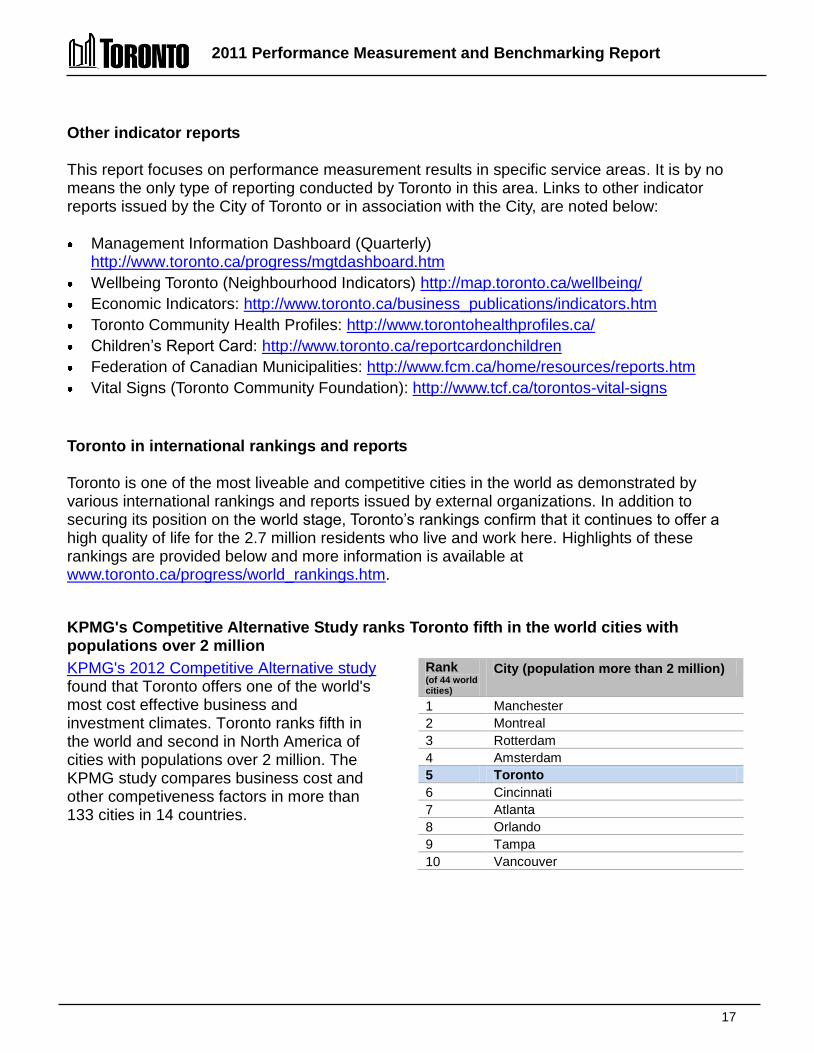
Toronto in international rankings and reports
Toronto is one of the most liveable and competitive cities in the world as demonstrated by various international rankings and reports issued by external organizations. In addition to securing its position on the world stage, Toronto’s rankings confirm that it continues to offer a high quality of life for the 2.7 million residents who live and work here. Highlights of these rankings are provided below and more information is available at www.toronto.ca/progress/world_rankings.htm.
KPMG's Competitive Alternative Study ranks Toronto fifth in the world cities with populations over 2 million KPMG's 2012 Competitive Alternative study found that Toronto offers one of the world's most cost effective business and investment climates. Toronto ranks fifth in the world and second in North America of cities with populations over 2 million. The KPMG study compares business cost and other competiveness factors in more than 133 cities in 14 countries.
Rank (of 44 world cities)
City (population more than 2 million)
1 Manchester 2 Montreal 3 Rotterdam 4 Amsterdam 5 Toronto 6 Cincinnati 7 Atlanta 8 Orlando 9 Tampa 10 Vancouver
2011 Performance Measurement and Benchmarking Report
18
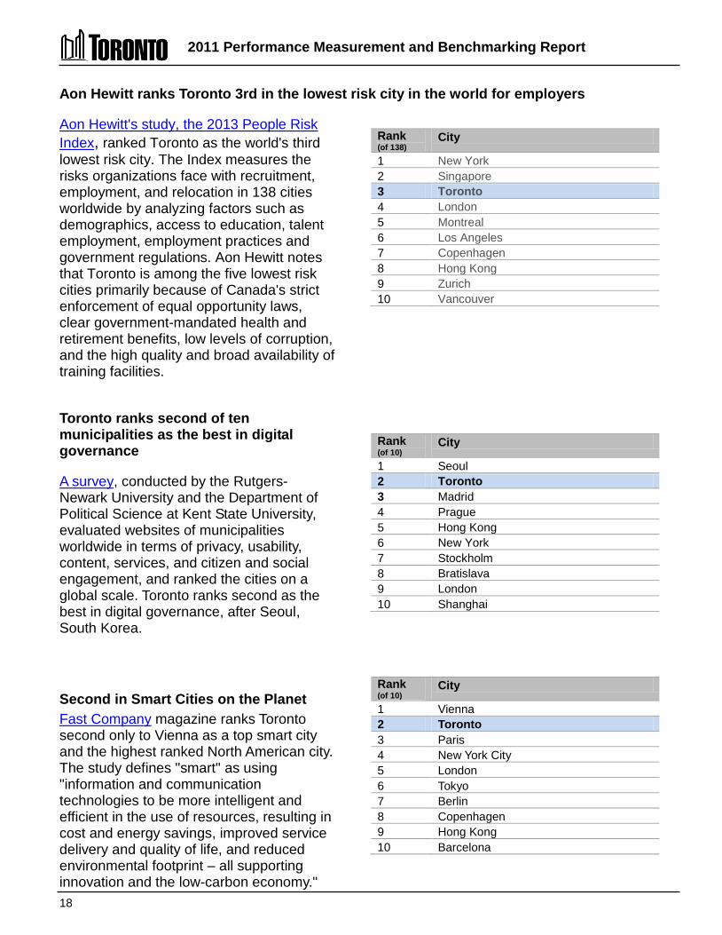
Aon Hewitt ranks Toronto 3rd in the lowest risk city in the world for employers
Aon Hewitt's study, the 2013 People Risk Index, ranked Toronto as the world's third lowest risk city. The Index measures the risks organizations face with recruitment, employment, and relocation in 138 cities worldwide by analyzing factors such as demographics, access to education, talent employment, employment practices and government regulations. Aon Hewitt notes that Toronto is among the five lowest risk cities primarily because of Canada's strict enforcement of equal opportunity laws, clear government-mandated health and retirement benefits, low levels of corruption, and the high quality and broad availability of training facilities.
Rank (of 138)
City
1 New York 2 Singapore 3 Toronto 4 London 5 Montreal 6 Los Angeles 7 Copenhagen 8 Hong Kong 9 Zurich 10 Vancouver
Toronto ranks second of ten municipalities as the best in digital governance
A survey, conducted by the Rutgers-Newark University and the Department of Political Science at Kent State University, evaluated websites of municipalities worldwide in terms of privacy, usability, content, services, and citizen and social engagement, and ranked the cities on a global scale. Toronto ranks second as the best in digital governance, after Seoul, South Korea.
Rank (of 10)
City
1 Seoul 2 Toronto 3 Madrid 4 Prague 5 Hong Kong 6 New York 7 Stockholm 8 Bratislava 9 London 10 Shanghai
Second in Smart Cities on the Planet Fast Company magazine ranks Toronto second only to Vienna as a top smart city and the highest ranked North American city. The study defines "smart" as using "information and communication technologies to be more intelligent and efficient in the use of resources, resulting in cost and energy savings, improved service delivery and quality of life, and reduced environmental footprint – all supporting innovation and the low-carbon economy."
Rank (of 10)
City
1 Vienna 2 Toronto 3 Paris 4 New York City 5 London 6 Tokyo 7 Berlin 8 Copenhagen 9 Hong Kong 10 Barcelona

2011 Performance Measurement and Benchmarking Report
19
Fifth on the Toronto Board of Trade's scorecard on prosperity
Toronto ranked as the fifth most prosperous city in the Toronto Board of Trade's 2012 report among 24 international urban regions across an array of indicators, behind Paris, San Francisco, London and Calgary. Toronto excelled in the Labour Attractiveness category, benefiting from a highly diverse population base, strong and consistent population growth, a low homicide rate and an affordable cost of living.
Rank (of 24)
City
1 Paris 2 San Francisco 3 London 4 Calgary 5 Toronto 6 Seattle 7 Boston 8 Oslo 9 Madrid 10 Barcelona
Toronto continues to be world's fourth most liveable city
Toronto is ranked fourth for the third time after only Melbourne, Vienna and Vancouver in the Economist Intelligence Unit's 2012 Liveability Ranking Report of 140 world cities. Cities are ranked on political and social stability, healthcare, culture and environment, education and infrastructure.
Rank (of 140)
City
1 Melbourne 2 Vienna 3 Vancouver 4 Toronto 5 Adelaide 6 Calgary 7 Sydney 8 Helsinki 9 Perth 10 Auckland
Cities of Opportunity: third overall
The fifth annual Cities of Opportunity, a report from Price Waterhouse Coopers and the Partnership for New York City, is a quantitative and qualitative look at 2012's emerging picture of city life in 27 world cities of finance, commerce and culture in various categories. In this study, Toronto was ranked third overall, after New York and London. Toronto fared particularly well in the categories of intellectual capital and innovation, transportation and infrastructure, and health, safety and security.
Rank (of 27)
City
1 New York 2 London 3 Toronto 4 Paris 5 Stockholm 6 San Francisco 7 Singapore 8 Hong Kong 9 Chicago 10 Tokyo

2011 Performance Measurement and Benchmarking Report
20
Fifteenth in Mercer worldwide Quality of Living survey
The 2012 Mercer Quality of Living survey again ranked Toronto 15 out of 221 cities worldwide. Canadian cities dominated the 2012 rankings in the Americas. The annual survey evaluates cities based on various measures relating to quality of living, such as political, social, economic and environmental factors, safety, public services and transportation, and recreation.
Toronto in tenth place in survey of world finance centres
In the March 2012 Global Financial Centres Index (GFCI) 10, Toronto ranked tenth in the world and the fourth most likely to become more significant as a financial centre in the next few years. The GFCI is updated every six months and provides profiles, ratings and rankings for 77 world financial centres.
Toronto twelfth in Global Economic Power Index
The Global Economic Power Index, developed by the Martin Prosperity Institute, ranks the 25 most economically powerful cities in the world. The index rated cities for economic output, global economic power score, financial centre score and innovation.
Toronto ninth overall: USA and Canada Green City Index
The USA and Canada Green City Index analyzes the environmental sustainability of 27 major metropolitan areas in both countries conducted by the Economist Intelligence Unit for Siemens AG. The index scored 27 American and Canadian cities in nine categories: CO2, energy, land use, buildings, transport, water, waste, air and environmental governance.
Toronto is Canada's most sustainable large city
In the 2011 Corporate Knights Sustainable Cities survey. Toronto was ranked Canada's most sustainable large city. The survey studied 28 indicators of sustainability in five categories — ecological integrity, economic security, infrastructure and built environment, governance and empowerment and social well-being. Seventeen Canadian cities were surveyed.
Toronto in the top 10 American Cities of the Future
In its first American Cities of the Future 2011/12 report, FDI Intelligence (a division of the Financial Times) awarded Toronto an overall city of the future ranking (#4) of major North and South American cities, as well as seven top 10 rankings including economic potential (#3), infrastructure (#5) and quality of life (#8). FDI Intelligence provides industry leading insight into globalization that allow organizations such as investment promotion agencies, companies, services providers and academic institutions to make informed decisions about foreign direct investment and associated activities.
2011 Performance Measurement and Benchmarking Report
21
Five Toronto-based Canadian banks ranked among the top 25 safest banks
The Global Finance Magazine April 2012 edition showed five Toronto-based Canadian banks ranked among the top 25 safest banks in the world. A story in the January 2012 edition of the Global Finance Magazine indicates Toronto's 320,000 jobs in financial services will increase by 100,000 banking jobs by 2020. Toronto is on track to become one of the largest global banking centres, overtaking London in the number of banking jobs by 2017 according to Moody's Analytics.
Toronto placed eighth among the top 25 cities in the world to launch a successful new tech company
According to Startup Genome, a research company that collects data about entrepreneurial ecosystems, in 2012 Toronto placed eighth among the top 20 cities in the world as an entrepreneurial environment to launch a successful new tech company.
2011 Performance Measurement and Benchmarking Report
22
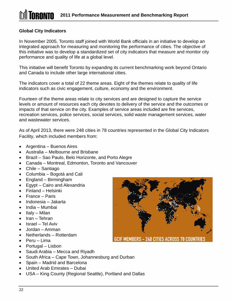
Global City Indicators
In November 2005, Toronto staff joined with World Bank officials in an initiative to develop an integrated approach for measuring and monitoring the performance of cities. The objective of this initiative was to develop a standardized set of city indicators that measure and monitor city performance and quality of life at a global level. This initiative will benefit Toronto by expanding its current benchmarking work beyond Ontario and Canada to include other large international cities. The indicators cover a total of 22 theme areas. Eight of the themes relate to quality of life indicators such as civic engagement, culture, economy and the environment. Fourteen of the theme areas relate to city services and are designed to capture the service levels or amount of resources each city devotes to delivery of the service and the outcomes or impacts of that service on the city. Examples of service areas included are fire services, recreation services, police services, social services, solid waste management services, water and wastewater services. As of April 2013, there were 248 cities in 78 countries represented in the Global City Indicators Facility, which included members from:
Argentina – Buenos Aires Australia – Melbourne and Brisbane Brazil – Sao Paulo, Belo Horizonte, and Porto Alegre Canada – Montreal, Edmonton, Toronto and Vancouver Chile – Santiago Columbia – Bogotá and Cali England – Birmingham Egypt – Cairo and Alexandria Finland – Helsinki France – Paris Indonesia – Jakarta India – Mumbai Italy – Milan Iran – Tehran Israel – Tel Aviv Jordan – Amman Netherlands – Rotterdam Peru – Lima Portugal – Lisbon Saudi Arabia – Mecca and Riyadh South Africa – Cape Town, Johannesburg and Durban Spain – Madrid and Barcelona United Arab Emirates – Dubai USA – King County (Regional Seattle), Portland and Dallas

2011 Performance Measurement and Benchmarking Report
23
Toronto is seen as a leader in this initiative, proactively providing measures and indicators to benchmark service delivery and quality of life. The ability to compare and benchmark internationally and to establish and share better practices through the available networks can be invaluable. Toronto has provided a full data set, and in 2013 the GCIF will be encouraging its city members to agree to have their data publicly reportable, so that Toronto will be able to compare its results to these other international cities and include this information in future reports. This will provide a valuable additional source of information to assess how well Toronto is doing from both a service delivery and quality of life perspective.
For further information on Global Cities Indicators Facility, please visit http://www.cityindicators.org/.
For additional information on the City of Toronto’s progress please visit our website www.toronto.ca/progress.
CONTACT: Lorne Turner Manager, Performance Management City Manager’s Office Phone: (416) 397-0533 Fax: (416) 392-1827 E-mail:[email protected]
Ilja Green Senior Performance Management Advisor City Manager’s Office Phone: (416) 397-4106 Fax: (416) 392-1827 E-mail: [email protected]
Kurtis Elton Research Associate City Manager’s Office Phone: (416) 392-8305 Fax: (416) 392-1827 E-mail: [email protected]
2011 Performance Measurement and Benchmarking Report
24
Guide to Toronto’s Performance Measurement Results Summaries Toronto’s Performance measurement framework for service delivery The City of Toronto’s performance measurement framework for service delivery is similar to that used by other OMBI municipalities and includes the following four categories of indicators and measures:
1. Service/Activity Level Indicators – provide an indication of service/activity levels by reflecting the amount of resources approved by City Council or the volumes of service delivered to residents. For the purposes of comparing to other municipalities and to reflect Toronto's population growth over time, results are often expressed on a common basis, such as the number of units of service provided per 100,000 population.
Performance Measures
2. Efficiency measures – express the resources used in relation to the number of units of service provided or delivered. These measures are typically expressed in terms of cost per unit of service.
3. Customer Service measures – express the quality of service delivered relative to service standards or the customer’s needs and expectations.
4. Community Impact measures – express the outcome, impact or benefit the City program has on the communities they serve in relation to the intended purpose or societal outcomes expected. These measures often tie to the program or service mission statements.
City staff are responsible for the efficient delivery of services with the highest customer service and/or positive impact on the community as possible, with the financial resources and associated service levels and/or standards approved by Council. Balancing the optimal combination of efficiency and customer service or community impact is an ongoing challenge. Too much focus on efficiency in isolation may have an adverse impact on customer service or community impact, and vice versa. It is also difficult to separate the portion of community impact measures or outcomes that are related to City programs from external factors, such as the efforts or responsibilities of other orders of government or the private sector. Using this performance measurement framework, Toronto’s results are examined from an internal perspective reviewing trends over a period of years and from an external perspective in relation to the results of other Ontario and Canadian municipalities.

2011 Performance Measurement and Benchmarking Report
25
Comparing Toronto's Internal Trends
To aid the comparison and review of Toronto’s 2011 vs. 2010 results, Figure 7 describes the conditions under which a colour code and descriptor is assigned to the service/activity level indicator or performance measures included in this report. Using this colour scheme, summaries describing Toronto's internal trends—along with a page reference to more detailed charts/graphs and explanations—are provided at the beginning of each of the 33 service area sections, and in a consolidated summary of results for all service areas on pages 32 to 75.
Indicator of
increased service or activity levels
or
favourable performance
Service/Activity Levels Indicators – Toronto’s service levels (the amount of resources devoted to the service), or the volume of activity delivered to residents, has increased over the time period. This is based on the general assumption for most services that increasing service levels are the favoured or desired goal. For some services, increased levels of activity may not be a desired societal goal (e.g., social programs or emergency services), but still indicate increased consumption of resources required to provide the service
Efficiency, Customer Service or Community Impact Measures – Toronto’s result has improved over the time period or was the best possible result.
Service or activity levels are stable
or
performance is stable
Service/Activity Level Indicators – Toronto’s service/activity levels have been maintained or are stable over the period.
Efficiency, Customer Service or Community Impact Measures – Toronto’s result has remained stable over the period.
Indicator of decreased service or
activity levels
or
unfavourable performance
Service/Activity Level Indicators – Toronto’s service levels (the amount of resources devoted to the service), or the volume of activity delivered to residents, has decreased over the time period. This is based on the general assumption for most services that increasing service levels are the favoured or desired goal. For some services, decreased levels of activity may be a desired societal goal (e.g., social programs or emergency services), but still indicate decreased consumption of resources required to provide the service.
Efficiency, Customer Service or Community Impact Measures – Toronto’s result has declined over the time period.
Figure 7 – colour codes for Toronto's internal trends.
2011 Performance Measurement and Benchmarking Report
26
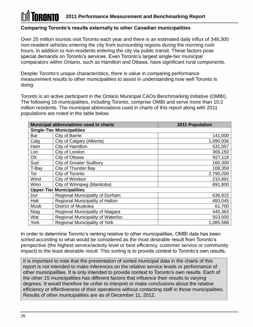
Comparing Toronto’s results externally to other Canadian municipalities Over 25 million tourists visit Toronto each year and there is an estimated daily influx of 348,300 non-resident vehicles entering the city from surrounding regions during the morning rush hours, in addition to non-residents entering the city via public transit. These factors pose special demands on Toronto’s services. Even Toronto’s largest single-tier municipal comparators within Ontario, such as Hamilton and Ottawa, have significant rural components. Despite Toronto's unique characteristics, there is value in comparing performance measurement results to other municipalities to assist in understanding how well Toronto is doing. Toronto is an active participant in the Ontario Municipal CAOs Benchmarking Initiative (OMBI). The following 16 municipalities, including Toronto, comprise OMBI and serve more than 10.2 million residents. The municipal abbreviations used in charts of this report along with 2011 populations are noted in the table below.
Municipal abbreviations used in charts 2011 Population Single-Tier Municipalities Bar City of Barrie 141,000 Calg City of Calgary (Alberta) 1,090,936 Ham City of Hamilton 531,057 Lon City of London 366,150 Ott City of Ottawa 927,118 Sud City of Greater Sudbury 160,300 T-Bay City of Thunder Bay 108,359 Tor City of Toronto 2,790,200 Wind City of Windsor 210,891 Winn City of Winnipeg (Manitoba) 691,800 Upper-Tier Municipalities Dur Regional Municipality of Durham 636,915 Halt Regional Municipality of Halton 493,045 Musk District of Muskoka 61,700 Niag Regional Municipality of Niagara 445,363 Wat Regional Municipality of Waterloo 553,000 York Regional Municipality of York 1,085,588
In order to determine Toronto’s ranking relative to other municipalities, OMBI data has been sorted according to what would be considered as the most desirable result from Toronto’s perspective (the highest service/activity level or best efficiency, customer service or community impact) to the least desirable result. This sorting is to provide context to Toronto’s own results.
It is important to note that the presentation of sorted municipal data in the charts of this report is not intended to make inferences on the relative service levels or performance of other municipalities. It is only intended to provide context to Toronto’s own results. Each of the other 15 municipalities has different factors that influence their results to varying degrees. It would therefore be unfair to interpret or make conclusions about the relative efficiency or effectiveness of their operations without contacting staff in those municipalities. Results of other municipalities are as of December 11, 2012.
2011 Performance Measurement and Benchmarking Report
27
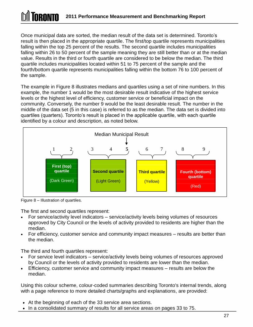
Once municipal data are sorted, the median result of the data set is determined. Toronto’s result is then placed in the appropriate quartile. The first/top quartile represents municipalities falling within the top 25 percent of the results. The second quartile includes municipalities falling within 26 to 50 percent of the sample meaning they are still better than or at the median value. Results in the third or fourth quartile are considered to be below the median. The third quartile includes municipalities located within 51 to 75 percent of the sample and the fourth/bottom quartile represents municipalities falling within the bottom 76 to 100 percent of the sample. The example in Figure 8 illustrates medians and quartiles using a set of nine numbers. In this example, the number 1 would be the most desirable result indicative of the highest service levels or the highest level of efficiency, customer service or beneficial impact on the community. Conversely, the number 9 would be the least desirable result. The number in the middle of the data set (5 in this case) is referred to as the median. The data set is divided into quartiles (quarters). Toronto’s result is placed in the applicable quartile, with each quartile identified by a colour and description, as noted below.
Figure 8 – Illustration of quartiles. The first and second quartiles represent: For service/activity level indicators – service/activity levels being volumes of resources
approved by City Council or the levels of activity provided to residents are higher than the median.
For efficiency, customer service and community impact measures – results are better than the median.
The third and fourth quartiles represent: For service level indicators – service/activity levels being volumes of resources approved
by Council or the levels of activity provided to residents are lower than the median. Efficiency, customer service and community impact measures – results are below the
median. Using this colour scheme, colour-coded summaries describing Toronto's internal trends, along with a page reference to more detailed charts/graphs and explanations, are provided:
At the beginning of each of the 33 service area sections. In a consolidated summary of results for all service areas on pages 33 to 75.
1 2 3 4 5 6 7 8 9
First (top) quartile
(Dark Green)
Second quartile
(Light Green)
Third quartile
(Yellow)
Fourth (bottom) quartile
(Red)
Median Municipal Result

2011 Performance Measurement and Benchmarking Report
28
How to interpret Toronto’s performance measurement result summaries Each of the 33 service areas in this report includes a summary of Toronto’s internal and external performance measurement results at the beginning of their respective sections. There is also a consolidated summary by service area on pages 33 to 75. Figure 9 below, provides an illustration of these summaries. Figure 9 – Guide to interpreting section summaries.

2011 Performance Measurement and Benchmarking Report
29
How to interpret charts of Toronto’s internal results Figure 10 illustrates how charts on Toronto’s internal short and longer term trends are presented in each service section.
2003 2004 2005 2006 2007 2008 2009 2010 2011
# of widgets 2 4 8 9 10 11 11 12 13
0
2
4
6
8
10
12
14
Figure 10 – Guide to interpreting graphs showing Toronto's short- and long-term internals trends. How to interpret charts comparing Toronto’s result to other municipalities Figure 11 illustrates how charts in each service section comparing Toronto’s 2011 results to other municipalities are presented.
Lond T-Bay Tor Niag York Ott Sud Durh Wat Winn Calg Halt Wind Musk Ham
Cost per Unit $120 $130 $130 $140 $140 $140 $150 $160 $160 $165 $170 $180 $180 $190 $200
$0
$20
$40
$60
$80
$100
$120
$140
$160
$180
$200 Median $160
Figure 11 – Guide to interpreting graphs comparing Toronto's 2011 results to other municipalities.
Median Line and Value
Unit of Measure
Municipal results sorted from most favourable or desirable result (left) to the least favourable or desirable result (right), in order to determine Toronto’s ranking. Toronto’s result is highlighted with the appropriate colour indicating the quartile in which Toronto's result falls.
Municipal Result (includes 2009 PSAB changes for costing measures)
Municipality
Technical Name of the Measure
Toronto result
Year data collected
Unit of Measure
Technical name of the measure
Question to be answered by result
How many units of service are provided in Toronto?
Chart 1.1 (City of Toronto) Number of units provides (Service Level)
Chart 2.1 (OMBI 2011) Cost per unit (Efficiency)
How much does it cost in Toronto compared to other municipalities?
Colour describes 2011 vs. 2010 trend
Question to be answered by results
2011 Performance Measurement and Benchmarking Report
30
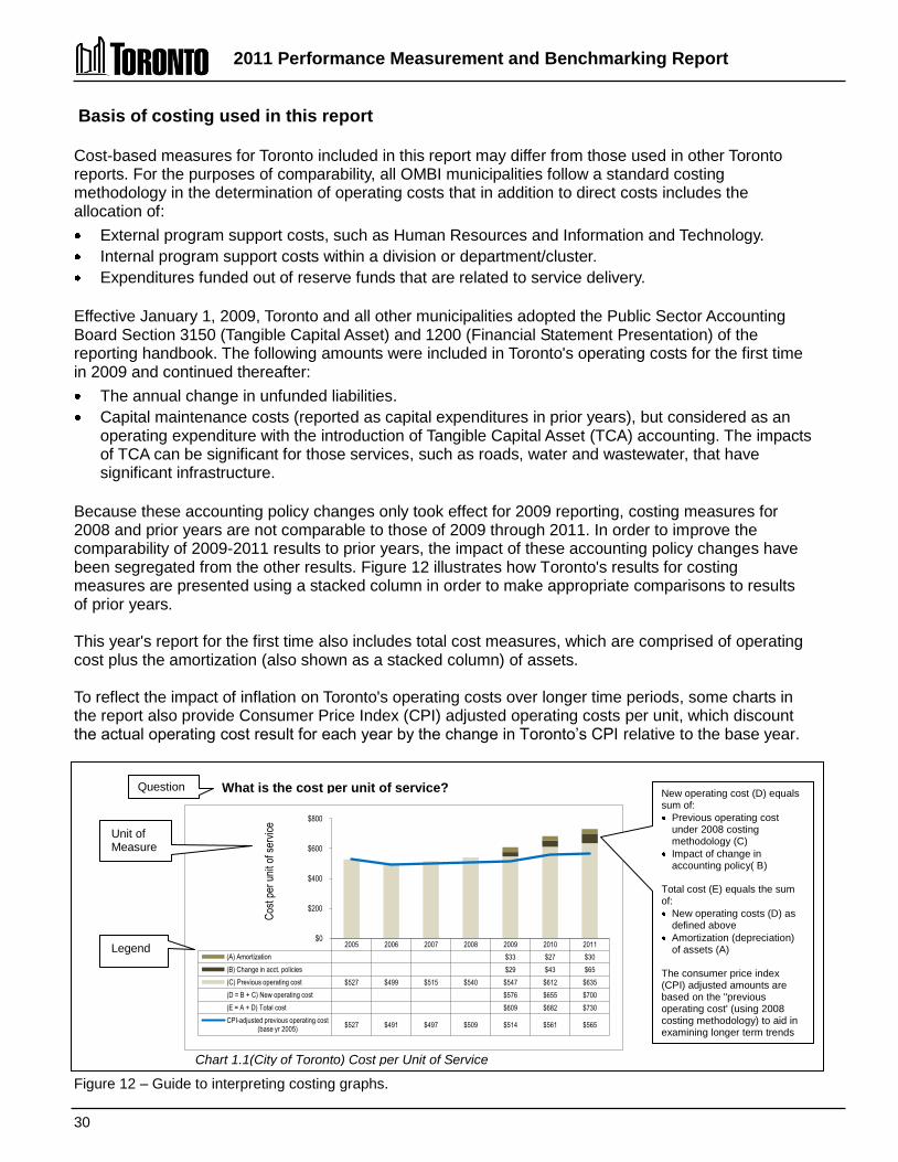
Chart 1.1(City of Toronto) Cost per Unit of Service (Efficiency)
Basis of costing used in this report Cost-based measures for Toronto included in this report may differ from those used in other Toronto reports. For the purposes of comparability, all OMBI municipalities follow a standard costing methodology in the determination of operating costs that in addition to direct costs includes the allocation of: External program support costs, such as Human Resources and Information and Technology. Internal program support costs within a division or department/cluster. Expenditures funded out of reserve funds that are related to service delivery.
Effective January 1, 2009, Toronto and all other municipalities adopted the Public Sector Accounting Board Section 3150 (Tangible Capital Asset) and 1200 (Financial Statement Presentation) of the reporting handbook. The following amounts were included in Toronto's operating costs for the first time in 2009 and continued thereafter: The annual change in unfunded liabilities. Capital maintenance costs (reported as capital expenditures in prior years), but considered as an
operating expenditure with the introduction of Tangible Capital Asset (TCA) accounting. The impacts of TCA can be significant for those services, such as roads, water and wastewater, that have significant infrastructure.
Because these accounting policy changes only took effect for 2009 reporting, costing measures for 2008 and prior years are not comparable to those of 2009 through 2011. In order to improve the comparability of 2009-2011 results to prior years, the impact of these accounting policy changes have been segregated from the other results. Figure 12 illustrates how Toronto's results for costing measures are presented using a stacked column in order to make appropriate comparisons to results of prior years. This year's report for the first time also includes total cost measures, which are comprised of operating cost plus the amortization (also shown as a stacked column) of assets. To reflect the impact of inflation on Toronto's operating costs over longer time periods, some charts in the report also provide Consumer Price Index (CPI) adjusted operating costs per unit, which discount the actual operating cost result for each year by the change in Toronto’s CPI relative to the base year.
2005 2006 2007 2008 2009 2010 2011
(A) Amortization $33 $27 $30
(B) Change in acct. policies $29 $43 $65
(C) Previous operating cost $527 $499 $515 $540 $547 $612 $635
(D = B + C) New operating cost $576 $655 $700
(E = A + D) Total cost $609 $682 $730
CPI-adjusted previous operating cost (base yr 2005)
$527 $491 $497 $509 $514 $561 $565
$0
$200
$400
$600
$800
Cos
t per
uni
t of s
ervi
ce
Figure 12 – Guide to interpreting costing graphs.
Legend
New operating cost (D) equals sum of: Previous operating cost under 2008 costing methodology (C)
Impact of change in accounting policy( B)
Total cost (E) equals the sum of: New operating costs (D) as defined above
Amortization (depreciation) of assets (A)
The consumer price index (CPI) adjusted amounts are based on the "previous operating cost' (using 2008 costing methodology) to aid in examining longer term trends
What is the cost per unit of service?
Unit of Measure
Question
CCoonnssoolliiddaatteedd SSuummmmaarryy ooff TToorroonnttoo’’ss RReessuullttss bbyy SSeerrvviiccee AArreeaa

Consolidated Summary of Toronto's Results by Service Area 2011 Performance Measurement And Benchmarking Report
33
Question Indicator/Measure Internal Comparison
of Toronto’s 2011 vs. 2010 Results
External Comparison to Other Municipalities
(OMBI) By Quartile for 2011
Chart & Page
Ref.
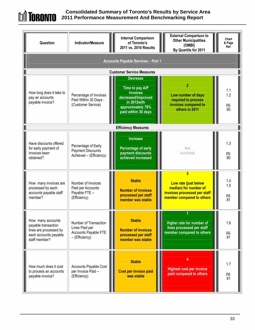
Accounts Payable Services – Part 1
Customer Service Measures
How long does it take to pay an accounts payable invoice?
Percentage of Invoices Paid Within 30 Days -(Customer Service)
Decrease
Time to pay A/P invoices
decreased/improved in 2012with
approximately 78% paid within 30 days
2
Low number of days required to process
invoices compared to others in 2011
1.1 1.2
pg. 80
Efficiency Measures
Have discounts offered for early payment of invoices been obtained?
Percentage of Early Payment Discounts Achieved – (Efficiency)
Increase
Percentage of early payment discounts achieved increased
Not Available
1.3
pg. 80
How many invoices are processed by each accounts payable staff member?
Number of Invoices Paid per Accounts Payable FTE – (Efficiency)
Stable
Number of invoices processed per staff member was stable
3
Low rate (just below median) for number of
invoices processed per staff member compared to others
1.4 1.5
pg. 81
How many accounts payable transaction lines are processed by each accounts payable staff member?
Number of Transaction Lines Paid per Accounts Payable FTE – (Efficiency)
Stable
Number of invoices processed per staff member was stable
1
Higher rate for number of lines processed per staff
member compared to others
1.6
pg. 81
How much does it cost to process an accounts payable invoice?
Accounts Payable Cost per Invoice Paid – (Efficiency)
Stable
Cost per invoice paid
was stable
4
Highest cost per invoice paid compared to others
1.7
pg. 81
Consolidated Summary of Toronto's Results by Service Area 2011 Performance Measurement And Benchmarking Report
34
Question Indicator/Measure Internal Comparison
of Toronto’s 2011 vs. 2010 Results
External Comparison to Other Municipalities
(OMBI) By Quartile for 2011
Chart & Page
Ref.
Building Services – Part 2
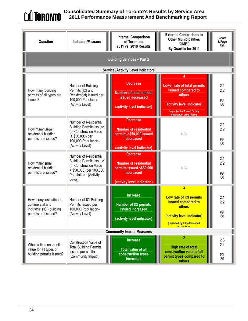
Service /Activity Level Indicators
How many building permits of all types are issued?
Number of Building Permits (ICI and Residential) Issued per 100,000 Population – (Activity Level)
Decrease
Number of total permits issued decreased
(activity level indicator)
4
Lower rate of total permits issued compared to
others
(activity level indicator)
(impacted by Toronto's fully developed urban form)
2.1 2.2
pg. 88
How many large residential building permits are issued?
Number of Residential Building Permits Issued (of Construction Value ≥ $50,000) per 100,000 Population– (Activity Level)
Decrease
Number of residential permits >$50,000 issued
decreased
(activity level indicator)
N/A
2.1 2.2
pg. 88
How many small residential building permits are issued?
Number of Residential Building Permits Issued (of Construction Value < $50,000) per 100,000 Population– (Activity Level)
Decrease
Number of residential permits issued <$50,000
decreased
(activity level indicator )
N/A
2.1 2.2
pg. 88
How many institutional, commercial and industrial (ICI) building permits are issued?
Number of ICI Building Permits Issued per 100,000 Population– (Activity Level)
Increase
Number of ICI permits issued increased
(activity level indicator)
3
Low rate of ICI permits issued compared to
others
(activity level indicator)
(impacted by fully developed urban form)
2.1 2.2
pg. 88
Community Impact Measures
What is the construction value for all types of building permits issued?
Construction Value of Total Building Permits Issued per capita – (Community Impact)
Increase
Total value of all construction types
increased
2
High rate of total construction value of all
permit types compared to others
2.3 2.4
pg. 89
Consolidated Summary of Toronto's Results by Service Area 2011 Performance Measurement And Benchmarking Report
35
Question Indicator/Measure Internal Comparison
of Toronto’s 2011 vs. 2010 Results
External Comparison to Other Municipalities
(OMBI) By Quartile for 2011
Chart & Page
Ref.
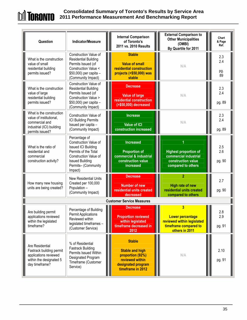
What is the construction value of small residential building permits issued?
Construction Value of Residential Building Permits Issued (of Construction Value < $50,000) per capita – (Community Impact)
Stable
Value of small residential construction projects (<$50,000) was
stable
N/A
2.3 2.4
pg. 89
What is the construction value of large residential building permits issued?
Construction Value of Residential Building Permits Issued (of Construction Value > $50,000) per capita – (Community Impact)
Decrease
Value of large residential construction
(>$50,000) decreased
N/A
2.3 2.4
pg. 89
What is the construction value of institutional, commercial and industrial (ICI) building permits issued?
Construction Value of ICI Building Permits Issued per capita – (Community Impact)
Increase
Value of ICI construction increased
N/A
2.3 2.4
pg. 89
What is the ratio of residential and commercial construction activity?
Percentage of Construction Value of Issued ICI Building Permits of the Total Construction Value of Issued Building Permits– (Community Impact)
Increased
Proportion of commercial & industrial
construction value increased
1
Highest proportion of commercial industrial
construction value compared to others
2.5 2.6
pg. 90
How many new housing units are being created?
New Residential Units Created per 100,000 Population – (Community Impact)
Decrease
Number of new residential units created
decreased
2
High rate of new residential units created
compared to others
2.7
pg. 90
Customer Service Measures
Are building permit applications reviewed within the legislated timeframe?
Percentage of Building Permit Applications Reviewed within legislated timeframes – (Customer Service)
Decrease
Proportion reviewed within legislated
timeframe decreased in 2012
3
Lower percentage reviewed within legislated
timeframe compared to others in 2011
2.8 2.9
pg. 91
Are Residential Fastrack building permit applications reviewed within the designated 5 day timeframe?
% of Residential Fastrack Building Permits Issued Within Designated Program Timeframe (Customer Service)
Stable
Stable and high
proportion (92%) reviewed within
designated program timeframe in 2012
N/A 2.10
pg. 91
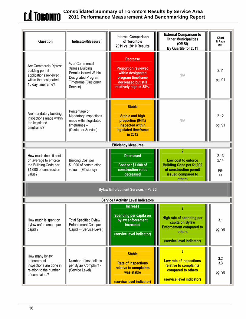
Consolidated Summary of Toronto's Results by Service Area 2011 Performance Measurement And Benchmarking Report
36
Question Indicator/Measure Internal Comparison
of Toronto’s 2011 vs. 2010 Results
External Comparison to Other Municipalities
(OMBI) By Quartile for 2011
Chart & Page
Ref.
Are Commercial Xpress building permit applications reviewed within the designated 10 day timeframe?
% of Commercial Xpress Building Permits Issued Within Designated Program Timeframe (Customer Service)
Decrease
Proportion reviewed
within designated program timeframe decreased but still
relatively high at 88%.
N/A 2.11
pg. 91
Are mandatory building inspections made within the legislated timeframe?
Percentage of Mandatory Inspections made within legislated timeframes – (Customer Service)
Stable
Stable and high
proportion (94%) inspected within
legislated timeframe in 2012
N/A 2.12
pg. 91
Efficiency Measures
How much does it cost on average to enforce the Building Code per $1,000 of construction value?
Building Cost per $1,000 of construction value – (Efficiency)
Decreased
Cost per $1,000 of construction value
decreased
2
Low cost to enforce Building Code per $1,000
of construction permit issued compared to
others
2.13 2.14
pg. 92
Bylaw Enforcement Services – Part 3
Service / Activity Level Indicators
How much is spent on bylaw enforcement per capita?
Total Specified Bylaw Enforcement Cost per Capita - (Service Level)
Increase
Spending per capita on bylaw enforcement
increased
(service level indicator)
2
High rate of spending per capita on Bylaw
Enforcement compared to others
(service level indicator)
3.1
pg. 98
How many bylaw enforcement inspections are done in relation to the number of complaints?
Number of Inspections per Bylaw Complaint - (Service Level)
Stable
Rate of inspections
relative to complaints was stable
(service level indicator)
3
Low rate of inspections relative to complaints compared to others
(service level indicator)
3.2 3.3
pg. 98

Consolidated Summary of Toronto's Results by Service Area 2011 Performance Measurement And Benchmarking Report
37
Question Indicator/Measure Internal Comparison
of Toronto’s 2011 vs. 2010 Results
External Comparison to Other Municipalities
(OMBI) By Quartile for 2011
Chart & Page
Ref.
Community Impact Measures
How many bylaw complaints do residents make?
Number of Specified Bylaw Complaints per 100,000 Population -(Community Impact)
Increase
Number of complaints received increased
2
Rate of complaints received at median compared to others
3.4 3.5
pg. 99
What per cent of residents voluntarily comply after a bylaw infraction?
Percentage of Voluntary Compliance to Bylaw Infractions - (Community Impact)
Increase
Rate of voluntary
compliance increased to very high/good rates
2
Rate of voluntary compliance is just under the median compared to
others
3.6 3.7
pg. 99
Customer Service Measures
How long does it take to resolve a yard maintenance bylaw complaint?
Average Time (Days) to Resolve/Close Yard Maintenance Bylaw Complaints – (Customer Service)
Decrease
Time to resolve yard maintenance complaint
decreased
4
Longest time to resolve yard maintenance
complaint compared to others
3.8 3.9
pg. 100
How long does it take to resolve a property standards bylaw complaint?
Average Time (Days) to Resolve/Close Property Standards Bylaw Complaints – (Customer Service)
Decrease
Time to resolve property standard
complaint decreased
3
Long time to resolve property standards
complaint compared to others
3.10
pg. 100
Children's Services – Part 4
Service Level Indicators
How much is spent or invested in childcare per child (aged 12 and under)?
Operating Investment/Expenditure per 1,000 Children (12 & under) - (Service Level)
Increase
Operating
Investment/expenditures per child increased
(service level indicator)
1
Highest rate/level of operating investment/
expenditures on children compared to others
(service level indicator)
4.1 4.2
pg. 105
Customer Service Quality Measures
How is the quality of childcare provided in Toronto?
Percent of Child Care Centres Meeting Toronto's Operating Criteria in Every Section – (Quality)
High quality results in system of 635 Centres
N/A 4.3
pg. 106

Consolidated Summary of Toronto's Results by Service Area 2011 Performance Measurement And Benchmarking Report
38
Question Indicator/Measure Internal Comparison
of Toronto’s 2011 vs. 2010 Results
External Comparison to Other Municipalities
(OMBI) By Quartile for 2011
Chart & Page
Ref.
Community Impact Measures
How many regulated childcare spaces are available?
Regulated Child Care Spaces in Municipality per 1,000 Children (12 & under)– (Community Impact)
Increase
Number of regulated spaces increased
3
Low rate of regulated spaces (just below
median) compared to others
4.4 4.5
pg. 107
How many subsidized childcare spaces are available?
Fee Subsidy Child Care Spaces per 1,000 LICO Children – (Community Impact)
Stable
Number of subsidized spaces was stable
3
Low rate of subsidized spaces (just below
median) compared to others
4.6 4.7
pg. 108
What percentage of children under 12 years old are considered low income children?
Percentage of Children in the Municipality (12 and under) that are LICO Children -– (Community Impact)
Increase
Proportion of low income children
increased to 34 per cent
4
Highest proportion of low income children
compared to others
4.7
pg. 108
How large is the waiting list for a subsidized child care space?
Size of Waiting List for a Subsidized Child Care Space as a % of All Subsidized Spaces – (Community Impact)
Increase
Size of wait list for a subsidized space
increased
4
Larger waiting list for a subsidized child care
space compared to others
4.8 4.9
pg. 108
Efficiency Measures
How much does it cost per year, to provide an average child care space?
Annual Child Care Service Cost per Normalized Child Care Space – (Efficiency)
Increase
Increase in cost per subsidized space
4
Higher cost per subsidized space
compared to others
4.10 4.11
pg. 109
Clerks Services – Part 5
Service/Activity Level Indicators
How many hours do Council and Committees meet in the City of Toronto
Number of meeting hours – all bodies supported by the City Clerk (Activity Level Indicator)
Increase
Meeting hours increased
(activity level indicator)
N/A 5.1
pg. 115
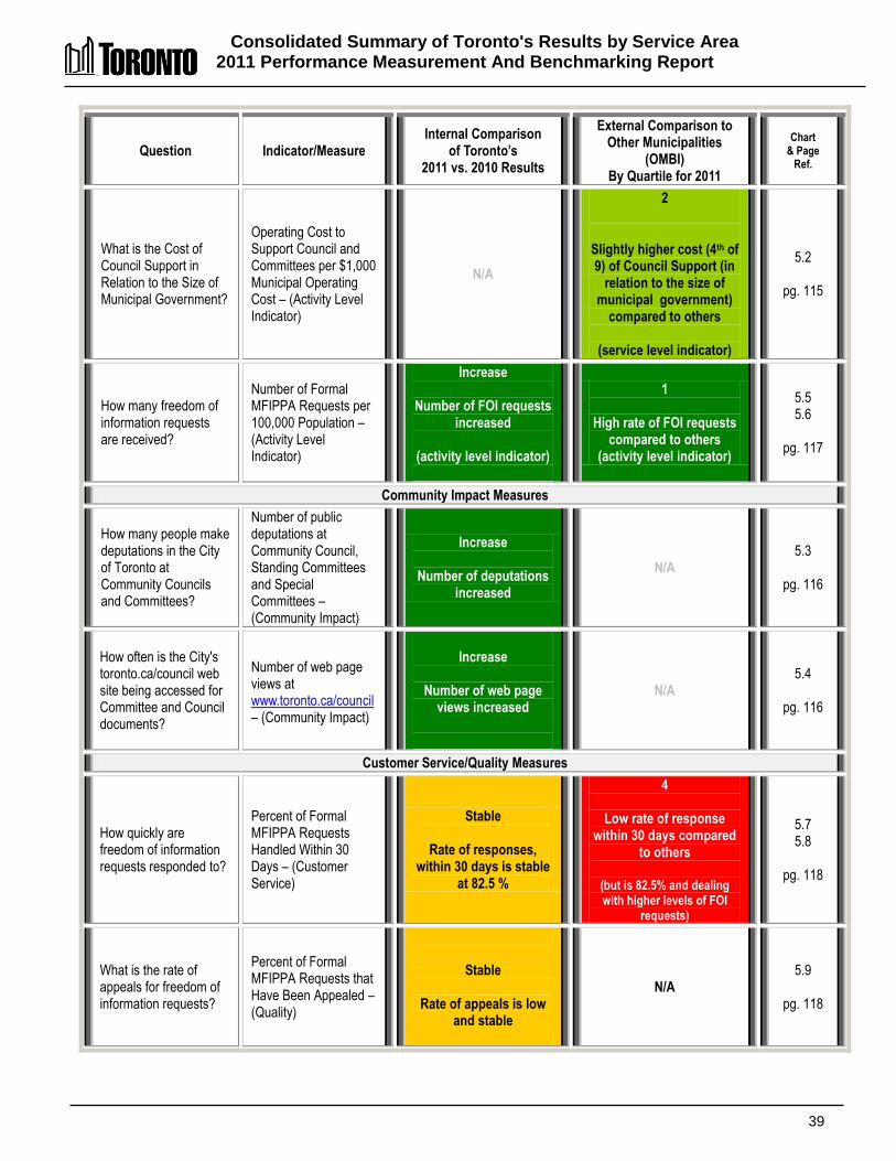
Consolidated Summary of Toronto's Results by Service Area 2011 Performance Measurement And Benchmarking Report
39
Question Indicator/Measure Internal Comparison
of Toronto’s 2011 vs. 2010 Results
External Comparison to Other Municipalities
(OMBI) By Quartile for 2011
Chart & Page
Ref.
What is the Cost of Council Support in Relation to the Size of Municipal Government?
Operating Cost to Support Council and Committees per $1,000 Municipal Operating Cost – (Activity Level Indicator)
N/A
2
Slightly higher cost (4th of 9) of Council Support (in
relation to the size of municipal government)
compared to others
(service level indicator)
5.2
pg. 115
How many freedom of information requests are received?
Number of Formal MFIPPA Requests per 100,000 Population – (Activity Level Indicator)
Increase
Number of FOI requests increased
(activity level indicator)
1
High rate of FOI requests compared to others
(activity level indicator)
5.5 5.6
pg. 117
Community Impact Measures
How many people make deputations in the City of Toronto at Community Councils and Committees?
Number of public deputations at Community Council, Standing Committees and Special Committees – (Community Impact)
Increase
Number of deputations increased
N/A 5.3
pg. 116
How often is the City's toronto.ca/council web site being accessed for Committee and Council documents?
Number of web page views at www.toronto.ca/council – (Community Impact)
Increase
Number of web page
views increased
N/A 5.4
pg. 116
Customer Service/Quality Measures
How quickly are freedom of information requests responded to?
Percent of Formal MFIPPA Requests Handled Within 30 Days – (Customer Service)
Stable
Rate of responses, within 30 days is stable
at 82.5 %
4
Low rate of response within 30 days compared
to others
(but is 82.5% and dealing with higher levels of FOI
requests)
5.7 5.8
pg. 118
What is the rate of appeals for freedom of information requests?
Percent of Formal MFIPPA Requests that Have Been Appealed – (Quality)
Stable
Rate of appeals is low and stable
N/A 5.9
pg. 118
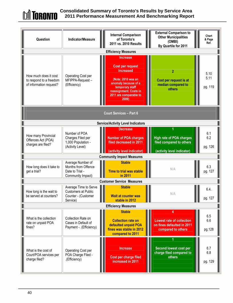
Consolidated Summary of Toronto's Results by Service Area 2011 Performance Measurement And Benchmarking Report
40
Question Indicator/Measure Internal Comparison
of Toronto’s 2011 vs. 2010 Results
External Comparison to Other Municipalities
(OMBI) By Quartile for 2011
Chart & Page
Ref.
Efficiency Measures
How much does it cost to respond to a freedom of information request?
Operating Cost per MFIPPA-Request – (Efficiency)
Increase
Cost per request increased
(Note: 2010 was an
anomaly because of a temporary staff
reassignment. Costs in 2011 are comparable to
2009)
2
Cost per request is at median compared to
others
5.10 5.11
pg. 119
Court Services – Part 6
Service/Activity Level Indicators
How many Provincial Offences Act (POA) charges are filed?
Number of POA Charges Filed per 1,000 Population - (Activity Level)
Decrease
Number of POA charges filed decreased in 2011
(activity level indicator)
1
High rate of POA charges filed compared to others
(activity level indicator)
6.1 6.2
pg. 126
Community Impact Measures
How long does it take to get a trial?
Average Number of Months from Offence Date to Trial -Community Impact)
Stable
Time to trial was stable in 2011
N/A 6.3
pg. 127
Customer Service Measures
How long is the wait to be served at counters?
Average Time to Serve Customers at Public Counter - (Customer Service)
Stable
Wait at counter was stable in 2012
N/A 6.4.
pg. 127
Efficiency Measures
What is the collection rate on unpaid POA fines?
Collection Rate on Cases in Default of Payment -. (Efficiency)
Stable
Collection rate on defaulted unpaid POA
fines was stable in 2012 compared to 2011
4
Lowest rate of collection on fines defaulted in 2011
compared to others
6.5 6.6
pg.128
What is the cost of Court/POA services per charge filed?
Operating Cost per POA Charge Filed -.(Efficiency)
Increase
Cost per charge filed increased in 2011
1
Second lowest cost per charge filed compared to
others
6.7 6.8
pg. 129
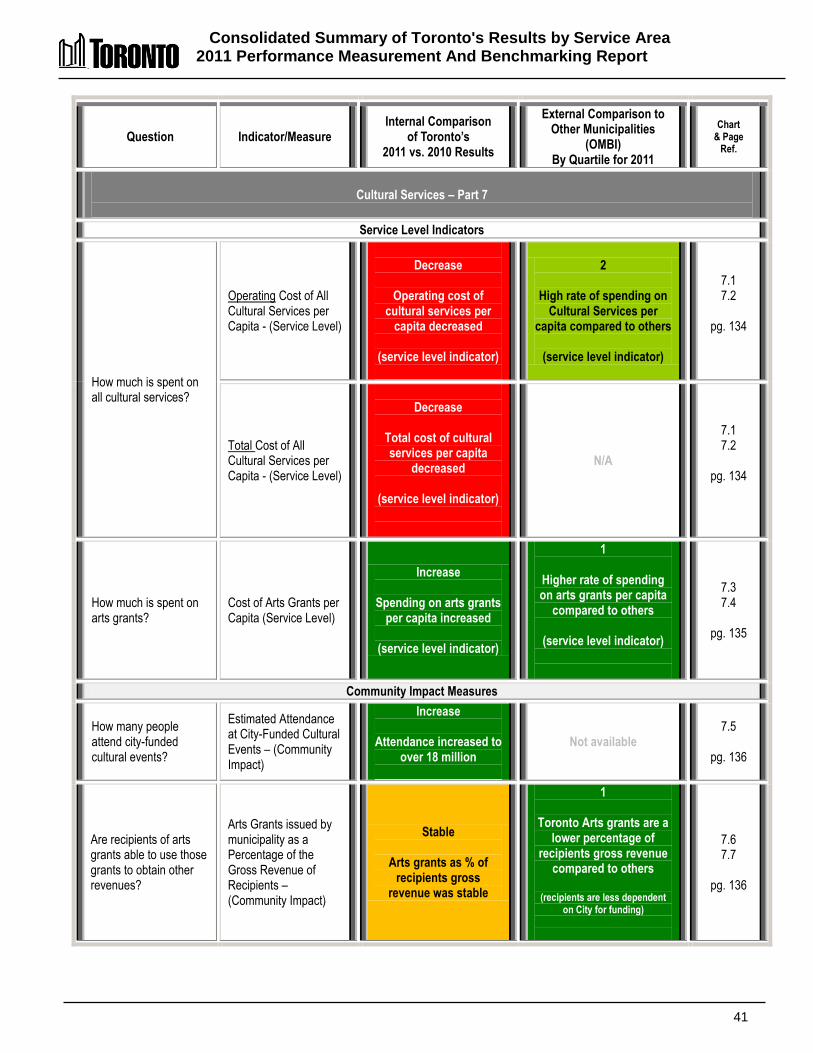
Consolidated Summary of Toronto's Results by Service Area 2011 Performance Measurement And Benchmarking Report
41
Question Indicator/Measure Internal Comparison
of Toronto’s 2011 vs. 2010 Results
External Comparison to Other Municipalities
(OMBI) By Quartile for 2011
Chart & Page
Ref.
Cultural Services – Part 7
Service Level Indicators
How much is spent on all cultural services?
Operating Cost of All Cultural Services per Capita - (Service Level)
Decrease
Operating cost of
cultural services per capita decreased
(service level indicator)
2
High rate of spending on Cultural Services per
capita compared to others
(service level indicator)
7.1 7.2
pg. 134
Total Cost of All Cultural Services per Capita - (Service Level)
Decrease
Total cost of cultural services per capita
decreased
(service level indicator)
N/A
7.1 7.2
pg. 134
How much is spent on arts grants?
Cost of Arts Grants per Capita (Service Level)
Increase
Spending on arts grants per capita increased
(service level indicator)
1
Higher rate of spending on arts grants per capita
compared to others
(service level indicator)
7.3 7.4
pg. 135
Community Impact Measures
How many people attend city-funded cultural events?
Estimated Attendance at City-Funded Cultural Events – (Community Impact)
Increase
Attendance increased to over 18 million
Not available 7.5
pg. 136
Are recipients of arts grants able to use those grants to obtain other revenues?
Arts Grants issued by municipality as a Percentage of the Gross Revenue of Recipients – (Community Impact)
Stable
Arts grants as % of recipients gross
revenue was stable
1
Toronto Arts grants are a lower percentage of
recipients gross revenue compared to others
(recipients are less dependent
on City for funding)
7.6 7.7
pg. 136
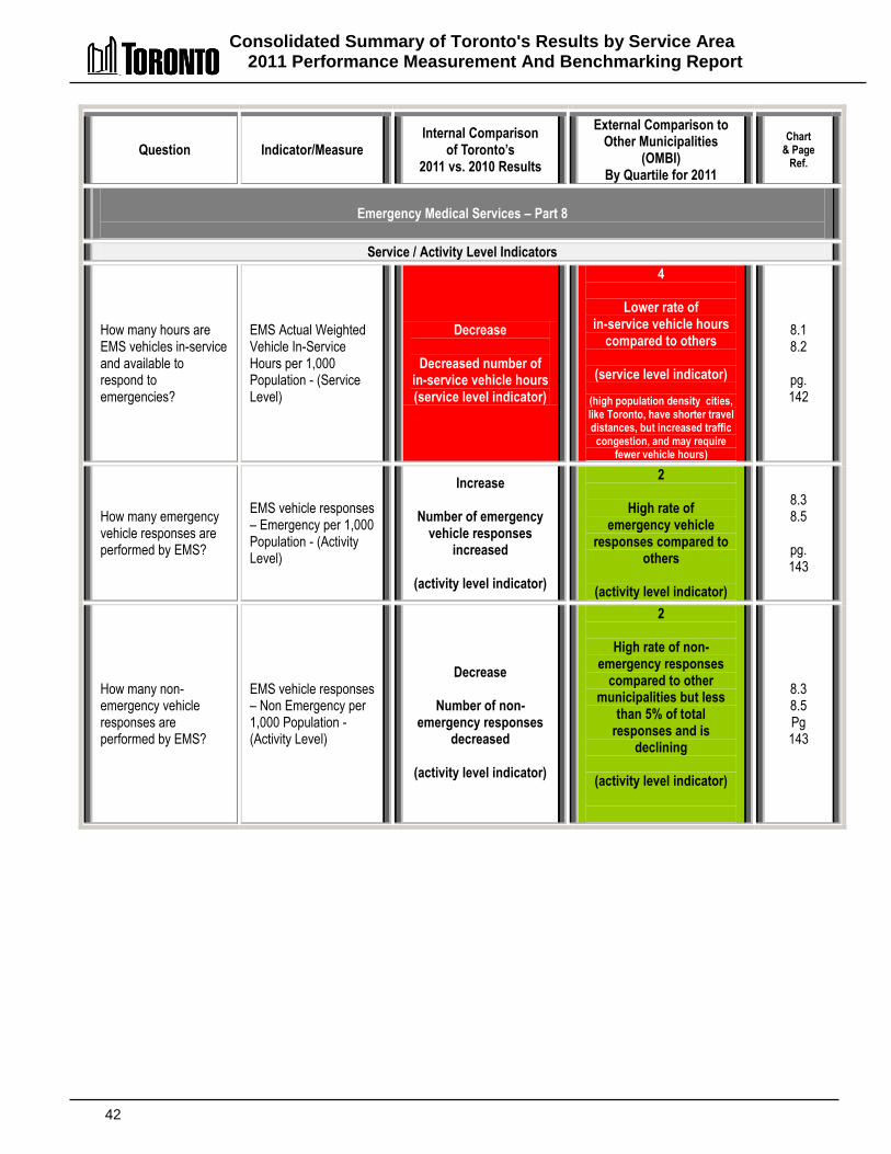
Consolidated Summary of Toronto's Results by Service Area 2011 Performance Measurement And Benchmarking Report
42
Question Indicator/Measure Internal Comparison
of Toronto’s 2011 vs. 2010 Results
External Comparison to Other Municipalities
(OMBI) By Quartile for 2011
Chart & Page
Ref.
Emergency Medical Services – Part 8
Service / Activity Level Indicators
How many hours are EMS vehicles in-service and available to respond to emergencies?
EMS Actual Weighted Vehicle In-Service Hours per 1,000 Population - (Service Level)
Decrease
Decreased number of in-service vehicle hours (service level indicator)
4
Lower rate of in-service vehicle hours
compared to others
(service level indicator)
(high population density cities, like Toronto, have shorter travel distances, but increased traffic
congestion, and may require fewer vehicle hours)
8.1 8.2
pg. 142
How many emergency vehicle responses are performed by EMS?
EMS vehicle responses – Emergency per 1,000 Population - (Activity Level)
Increase
Number of emergency vehicle responses
increased
(activity level indicator)
2
High rate of emergency vehicle
responses compared to others
(activity level indicator)
8.3 8.5
pg. 143
How many non-emergency vehicle responses are performed by EMS?
EMS vehicle responses – Non Emergency per 1,000 Population - (Activity Level)
Decrease
Number of non-emergency responses
decreased
(activity level indicator)
2
High rate of non-emergency responses
compared to other municipalities but less
than 5% of total responses and is
declining
(activity level indicator)
8.3 8.5 Pg 143
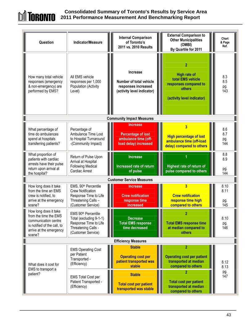
Consolidated Summary of Toronto's Results by Service Area 2011 Performance Measurement And Benchmarking Report
43
Question Indicator/Measure Internal Comparison
of Toronto’s 2011 vs. 2010 Results
External Comparison to Other Municipalities
(OMBI) By Quartile for 2011
Chart & Page
Ref.
How many total vehicle responses (emergency & non-emergency) are performed by EMS?
All EMS vehicle responses per 1,000 Population (Activity Level)
Increase
Number of total vehicle responses increased
(activity level indicator)
2
High rate of total EMS vehicle
responses compared to others
(activity level indicator)
8.3 8.5 pg. 143
Community Impact Measures
What percentage of time do ambulances spend at hospitals transferring patients?
Percentage of Ambulance Time Lost to Hospital Turnaround -(Community Impact)
Increase
Percentage of lost ambulance time (off-load delay) increased
3
High percentage of lost ambulance time (off-load
delay) compared to others
8.6 8.7 pg. 144
What proportion of patients with cardiac arrests have their pulse return upon arrival at the hospital?
Return of Pulse Upon Arrival at Hospital Following Medical Cardiac Arrest
Increase
Increased rate of return of pulse
1
Highest rate of return of pulse compared to others
8.8 8.9
pg. 144
Customer Service Measures
How long does it take from the time an EMS crew is notified, to arrive at the emergency scene?
EMS, 90th Percentile Crew Notification Response Time to Life Threatening Calls – (Customer Service)
Increase
Crew notification response time
increased
3
Crew notification response time high compared to others
8.10 8.11
pg. 145
How long does it take from the time the EMS communication centre is notified of the call, to arrive at the emergency scene?
EMS 90th Percentile Total (excluding 9-1-1) Response Time to Life Threatening Calls - (Customer Service)
Decrease Total EMS response
time decreased
2
Total EMS response time at median compared to
others
8.10 pg. 146
Efficiency Measures
What does it cost for EMS to transport a patient?
EMS Operating Cost per Patient Transported - (Efficiency)
Stable
Operating cost per patient transported was
stable
2
Operating cost per patient transported at median
compared to others 8.12 8.13 pg. 147 EMS Total Cost per
Patient Transported -(Efficiency)
Stable
Total cost per patient transported was stable
2
Total cost per patient transported at median
compared to others
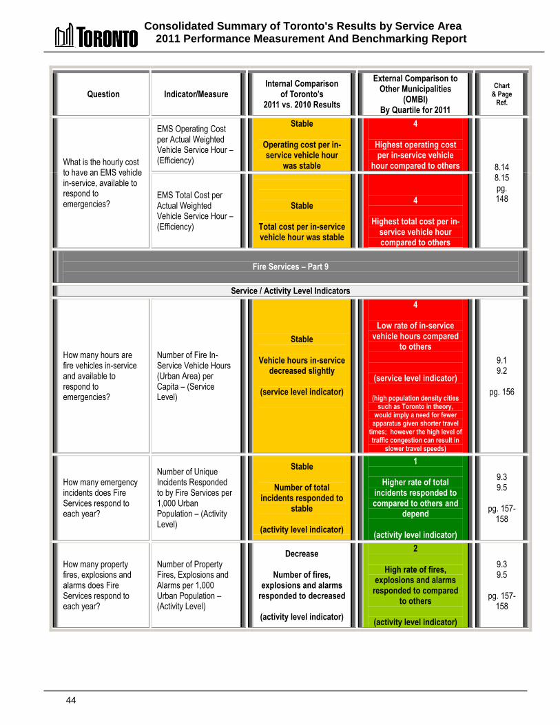
Consolidated Summary of Toronto's Results by Service Area 2011 Performance Measurement And Benchmarking Report
44
Question Indicator/Measure Internal Comparison
of Toronto’s 2011 vs. 2010 Results
External Comparison to Other Municipalities
(OMBI) By Quartile for 2011
Chart & Page
Ref.
What is the hourly cost to have an EMS vehicle in-service, available to respond to emergencies?
EMS Operating Cost per Actual Weighted Vehicle Service Hour – (Efficiency)
Stable
Operating cost per in-service vehicle hour
was stable
4
Highest operating cost per in-service vehicle
hour compared to others 8.14 8.15 pg. 148 EMS Total Cost per
Actual Weighted Vehicle Service Hour – (Efficiency)
Stable
Total cost per in-service vehicle hour was stable
4
Highest total cost per in-service vehicle hour compared to others
Fire Services – Part 9
Service / Activity Level Indicators
How many hours are fire vehicles in-service and available to respond to emergencies?
Number of Fire In-Service Vehicle Hours (Urban Area) per Capita – (Service Level)
Stable
Vehicle hours in-service decreased slightly
(service level indicator)
4
Low rate of in-service vehicle hours compared
to others
(service level indicator)
(high population density cities such as Toronto in theory,
would imply a need for fewer apparatus given shorter travel
times; however the high level of traffic congestion can result in
slower travel speeds)
9.1 9.2
pg. 156
How many emergency incidents does Fire Services respond to each year?
Number of Unique Incidents Responded to by Fire Services per 1,000 Urban Population – (Activity Level)
Stable
Number of total incidents responded to
stable
(activity level indicator)
1
Higher rate of total incidents responded to compared to others and
depend
(activity level indicator)
9.3 9.5
pg. 157-
158
How many property fires, explosions and alarms does Fire Services respond to each year?
Number of Property Fires, Explosions and Alarms per 1,000 Urban Population – (Activity Level)
Decrease
Number of fires, explosions and alarms
responded to decreased
(activity level indicator)
2
High rate of fires, explosions and alarms
responded to compared to others
(activity level indicator)
9.3 9.5
pg. 157-
158
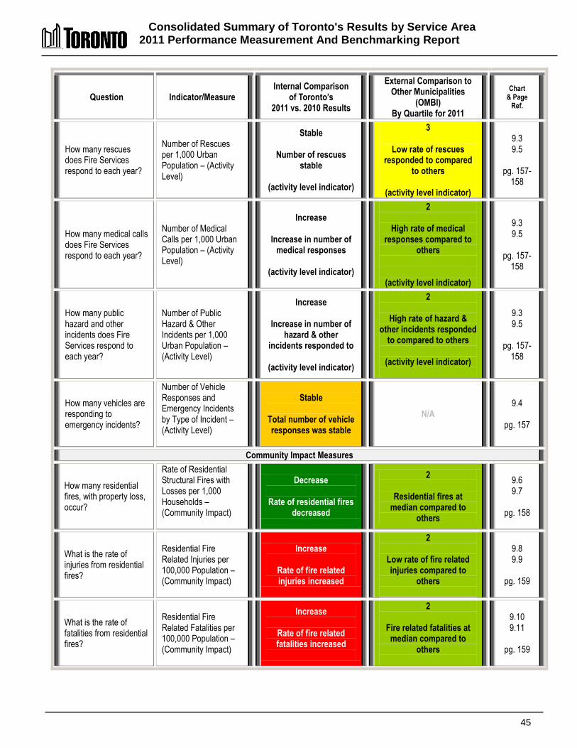
Consolidated Summary of Toronto's Results by Service Area 2011 Performance Measurement And Benchmarking Report
45
Question Indicator/Measure Internal Comparison
of Toronto’s 2011 vs. 2010 Results
External Comparison to Other Municipalities
(OMBI) By Quartile for 2011
Chart & Page
Ref.
How many rescues does Fire Services respond to each year?
Number of Rescues per 1,000 Urban Population – (Activity Level)
Stable
Number of rescues stable
(activity level indicator)
3
Low rate of rescues responded to compared
to others
(activity level indicator)
9.3 9.5
pg. 157-
158
How many medical calls does Fire Services respond to each year?
Number of Medical Calls per 1,000 Urban Population – (Activity Level)
Increase
Increase in number of medical responses
(activity level indicator)
2
High rate of medical responses compared to
others
(activity level indicator)
9.3 9.5
pg. 157-
158
How many public hazard and other incidents does Fire Services respond to each year?
Number of Public Hazard & Other Incidents per 1,000 Urban Population – (Activity Level)
Increase
Increase in number of hazard & other
incidents responded to
(activity level indicator)
2
High rate of hazard & other incidents responded
to compared to others
(activity level indicator)
9.3 9.5
pg. 157-
158
How many vehicles are responding to emergency incidents?
Number of Vehicle Responses and Emergency Incidents by Type of Incident – (Activity Level)
Stable
Total number of vehicle responses was stable
N/A 9.4
pg. 157
Community Impact Measures
How many residential fires, with property loss, occur?
Rate of Residential Structural Fires with Losses per 1,000 Households – (Community Impact)
Decrease
Rate of residential fires decreased
2
Residential fires at median compared to
others
9.6 9.7
pg. 158
What is the rate of injuries from residential fires?
Residential Fire Related Injuries per 100,000 Population – (Community Impact)
Increase
Rate of fire related injuries increased
2
Low rate of fire related injuries compared to
others
9.8 9.9
pg. 159
What is the rate of fatalities from residential fires?
Residential Fire Related Fatalities per 100,000 Population – (Community Impact)
Increase
Rate of fire related fatalities increased
2
Fire related fatalities at median compared to
others
9.10 9.11
pg. 159

Consolidated Summary of Toronto's Results by Service Area 2011 Performance Measurement And Benchmarking Report
46
Question Indicator/Measure Internal Comparison
of Toronto’s 2011 vs. 2010 Results
External Comparison to Other Municipalities
(OMBI) By Quartile for 2011
Chart & Page
Ref.
Customer Service Measures
How long does it take (response time) for Fire Services to arrive at the scene of emergency?
Actual – 90th Percentile Station Notification Response Time for Fire Services in Urban Component of Municipality – (Customer Service)
Increase
Station notification response time
increased
2
Station notification response time is at
median compared to others
9.12 9.13
pg. 160
Actual – 90th Percentile Total Fire Services Response Time – excludes 911 time (Customer Service)
Stable
Total Fire Services response time was
stable
N/A 9.12
pg. 160
Efficiency Measures
What does it cost per hour, to have a front-line fire vehicle available to respond to emergencies?
Fire Operating Cost per In-Service Vehicle Hour – (Efficiency)
Stable
Operating cost per in-service vehicle hour
was stable
(excludes impact of change in accounting policy)
4
Highest cost per in-service vehicle hour compared to others
9.14 9.15
pg. 161
What does it cost per hour, to have a front-line fire vehicle available to respond to emergencies?
Fire Total Cost per In-Service Vehicle Hour – (Efficiency)
Stable
Total cost per in-service vehicle hour was stable
(excludes impact of change in
accounting policy)
4
Highest total cost per in-service vehicle hour compared to others
9.14 9.15
pg. 161
Fleet Services – Part 10
Community Impact Measures
How many of Toronto's fleet are green vehicles?
Number of Green Vehicles – (Community Impact)
Increase
Number of green vehicles increased
N/A
10.1
pg. 166
What mileage are Toronto's fleet vehicles getting?
Litres of Fuel Consumed per 100 Km - (Community Impact)
Increase
Vehicle mileage increased/improved
4
Lower vehicle mileage than others
(due to densely populated and congested urban form)
10.2 10.3
pg 166
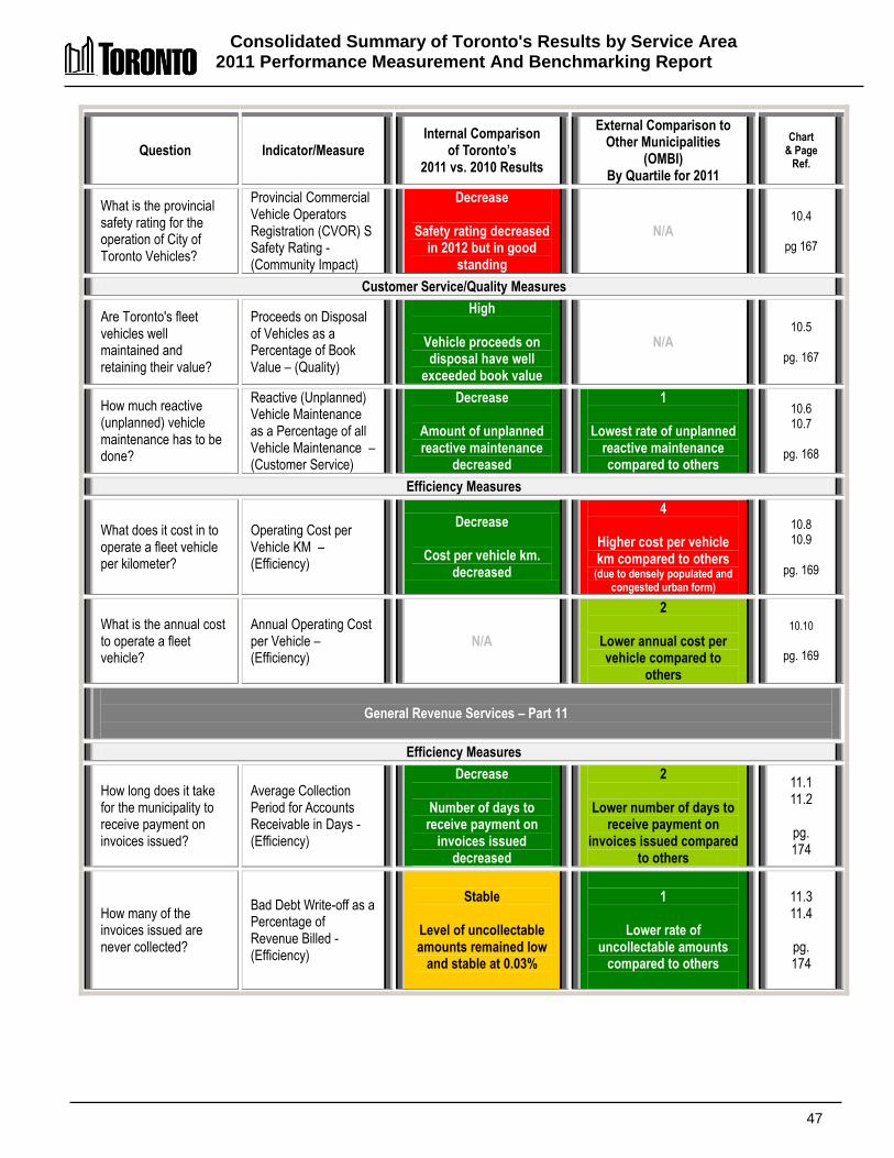
Consolidated Summary of Toronto's Results by Service Area 2011 Performance Measurement And Benchmarking Report
47
Question Indicator/Measure Internal Comparison
of Toronto’s 2011 vs. 2010 Results
External Comparison to Other Municipalities
(OMBI) By Quartile for 2011
Chart & Page
Ref.
What is the provincial safety rating for the operation of City of Toronto Vehicles?
Provincial Commercial Vehicle Operators Registration (CVOR) S Safety Rating - (Community Impact)
Decrease
Safety rating decreased in 2012 but in good
standing
N/A 10.4
pg 167
Customer Service/Quality Measures
Are Toronto's fleet vehicles well maintained and retaining their value?
Proceeds on Disposal of Vehicles as a Percentage of Book Value – (Quality)
High
Vehicle proceeds on disposal have well
exceeded book value
N/A 10.5
pg. 167
How much reactive (unplanned) vehicle maintenance has to be done?
Reactive (Unplanned) Vehicle Maintenance as a Percentage of all Vehicle Maintenance – (Customer Service)
Decrease
Amount of unplanned reactive maintenance
decreased
1
Lowest rate of unplanned reactive maintenance compared to others
10.6 10.7
pg. 168
Efficiency Measures
What does it cost in to operate a fleet vehicle per kilometer?
Operating Cost per Vehicle KM – (Efficiency)
Decrease
Cost per vehicle km. decreased
4
Higher cost per vehicle km compared to others
(due to densely populated and congested urban form)
10.8 10.9
pg. 169
What is the annual cost to operate a fleet vehicle?
Annual Operating Cost per Vehicle – (Efficiency)
N/A
2
Lower annual cost per vehicle compared to
others
10.10
pg. 169
General Revenue Services – Part 11
Efficiency Measures
How long does it take for the municipality to receive payment on invoices issued?
Average Collection Period for Accounts Receivable in Days - (Efficiency)
Decrease
Number of days to receive payment on
invoices issued decreased
2
Lower number of days to receive payment on
invoices issued compared to others
11.1 11.2
pg. 174
How many of the invoices issued are never collected?
Bad Debt Write-off as a Percentage of Revenue Billed - (Efficiency)
Stable
Level of uncollectable amounts remained low
and stable at 0.03%
1
Lower rate of uncollectable amounts
compared to others
11.3 11.4
pg. 174

Consolidated Summary of Toronto's Results by Service Area 2011 Performance Measurement And Benchmarking Report
48
Question Indicator/Measure Internal Comparison
of Toronto’s 2011 vs. 2010 Results
External Comparison to Other Municipalities
(OMBI) By Quartile for 2011
Chart & Page
Ref.
How much does it cost to bill and collect an accounts receivable invoice?
Cost of the Accounts Receivable Function per Invoice Issued- (Efficiency)
Increase
Cost per invoice increased
4
Higher cost per invoice compared to others
11.5 11.6
pg. 175
How much does it cost to bill and collect $1,000 of billings?
Cost of the Accounts Receivable Function per $1,000 of billings (Efficiency)
Increased
Cost per $1,000 of billings increased
1
Low cost per $1,000 of billings compared to
others
11.7 11.8 pg. 175
Governance and Corporate Management
Efficiency Measures
How large is the governance and corporate management structure?
Governance and Corporate Management Operating Costs as a % of All Operating Costs – (Efficiency)
Decrease
Operating cost of governance and
corporate management decreased
1
Low operating cost of governance and corporate management of single-tier
municipalities
12.1 12.3
pg. 180
Governance and Corporate Management Total Costs as a % of Total Costs – (Efficiency)
Decrease
Total cost of governance and
corporate management decreased
1
Low total cost of governance and corporate management of single-tier
municipalities
12.2 12.4
pg. 180
Hostel Services – Part 13
Service Level Indicators
How many emergency shelter beds are there?
Average Nightly Number Emergency Shelter Beds Available per 100,000 Population – (Service Level)
Increase
Number of shelter beds increased in 2011
(service level indicator)
1
Highest rate/number of shelter beds
(service level indicator)
13.1 13.2
pg. 184
Community Impact Measures
What is the average length of stay for singles and families in emergency shelters?
Average Length of Stay per Admission to Emergency Shelters for Singles & Families – (Community Impact)
Stable
Average length of stay was stable
4
Longer length of average stay singles and families
(related to more transitional
beds, which have longer stays)
13.3 13.4
pg. 185

Consolidated Summary of Toronto's Results by Service Area 2011 Performance Measurement And Benchmarking Report
49
Question Indicator/Measure Internal Comparison
of Toronto’s 2011 vs. 2010 Results
External Comparison to Other Municipalities
(OMBI) By Quartile for 2011
Chart & Page
Ref.
What is the average length of stay for singles in emergency shelters?
Average Length of Stay per Admission to Emergency Shelters for Singles - (Community Impact)
Decrease
Average length of stay for singles decreased
N/A 13.3
pg. 185
What is the average length of stay for families in emergency shelters?
Average Length of Stay per Admission to Emergency Shelters for Families - (Community Impact)
Increase
Average length of stay for families increased
N/A 13.3
pg. 185
Customer Service Measures
What is the emergency shelter bed occupancy rate?
Average Nightly Bed Occupancy Rate of Emergency Shelters – (Customer Service)
Stable
Occupancy rate of shelter beds was stable
2
Higher occupancy rate of shelter beds
13.5 13.6
pg. 186
Efficiency Measures
What does it cost per night to provide a shelter bed?
Hostels Operating Cost per Emergency Shelter Bed Night - (Efficiency)
Increase
Operating cost per shelter bed night
increased
3
High gross cost per shelter bed night
(related to greater % of city operated
beds)
13.7 13.8
pg. 187
Information and Technology Services – Part 14
Service/Activity Level Indicators
What is the cost/investment in information and technology services in relation to the services supported?
Operating and Capital Cost in Information and Technology Services as a Percentage of Municipal Operating and Capital Expenditures (service level indicator)
Increase
Cost/investment in I&T
services increased
(service level indicator)
2
High rate of investment in I&T services compared to
others
(service level indicator)
14.1 14.2
pg. 193
How much is spent on information and technology services for each staff member supported?
Operating and Capital Costs for Information and Technology Services per Staff Supported with Active I&T Account (service level indicator)
Increase
I&T cost per municipal staff member supported
increased
(service level indicator)
2
High rate of I&T investment per municipal staff member supported,
compared to others
(service level indicator)
14.3 14.4
pg. 194
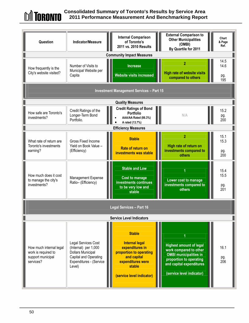
Consolidated Summary of Toronto's Results by Service Area 2011 Performance Measurement And Benchmarking Report
50
Question Indicator/Measure Internal Comparison
of Toronto’s 2011 vs. 2010 Results
External Comparison to Other Municipalities
(OMBI) By Quartile for 2011
Chart & Page
Ref.
Community Impact Measures
How frequently is the City's website visited?
Number of Visits to Municipal Website per Capita
Increase
Website visits increased
2
High rate of website visits compared to others
14.5 14.6
pg. 195
Investment Management Services – Part 15
Quality Measures
How safe are Toronto's investments?
Credit Ratings of the Longer-Term Bond Portfolio.
Credit Ratings of Bond Portfolio
AAA/AA Rated (86.3%)
A rated (13.7%)
N/A 15.2 pg. 200
Efficiency Measures
What rate of return are Toronto's investments earning?
Gross Fixed Income Yield on Book Value – (Efficiency)
Stable
Rate of return on
investments was stable
2
High rate of return on investments compared to
others
15.1 15.3
pg. 200
How much does it cost to manage the city's investments?
Management Expense Ratio– (Efficiency)
Stable and Low
Cost to manage
investments continues to be very low and
stable
1
Lower cost to manage investments compared to
others
15.4 15.5
pg. 201
Legal Services – Part 16
Service Level Indicators
How much internal legal work is required to support municipal services?
Legal Services Cost (Internal) per 1,000 Dollars Municipal Capital and Operating Expenditures - (Service Level)
Stable
Internal legal expenditures in
proportion to operating and capital
expenditures were stable
(service level indicator)
1
Highest amount of legal work compared to other OMBI municipalities in proportion to operating
and capital expenditures
(service level indicator)
16.1
pg. 206
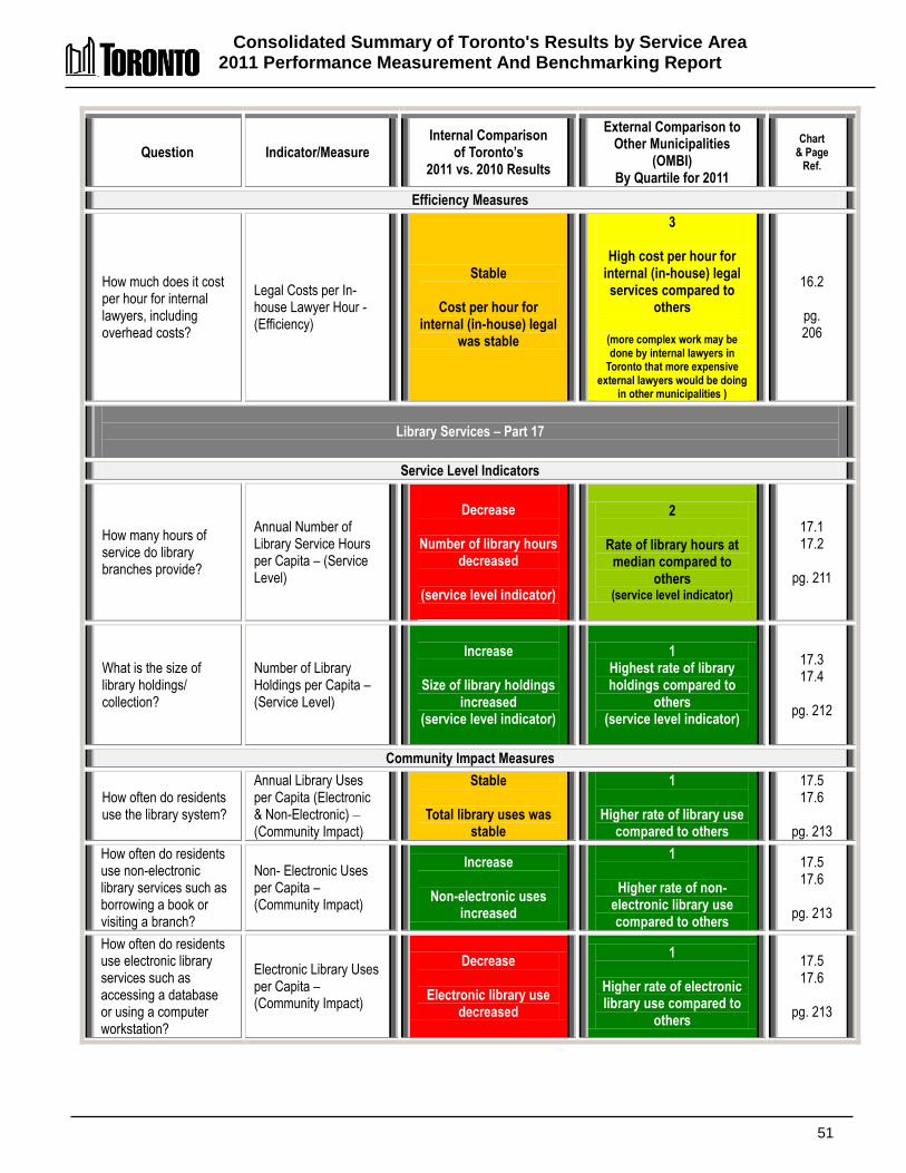
Consolidated Summary of Toronto's Results by Service Area 2011 Performance Measurement And Benchmarking Report
51
Question Indicator/Measure Internal Comparison
of Toronto’s 2011 vs. 2010 Results
External Comparison to Other Municipalities
(OMBI) By Quartile for 2011
Chart & Page
Ref.
Efficiency Measures
How much does it cost per hour for internal lawyers, including overhead costs?
Legal Costs per In-house Lawyer Hour - (Efficiency)
Stable
Cost per hour for internal (in-house) legal
was stable
3
High cost per hour for internal (in-house) legal services compared to
others
(more complex work may be done by internal lawyers in
Toronto that more expensive external lawyers would be doing
in other municipalities )
16.2
pg. 206
Library Services – Part 17
Service Level Indicators
How many hours of service do library branches provide?
Annual Number of Library Service Hours per Capita – (Service Level)
Decrease
Number of library hours
decreased
(service level indicator)
2
Rate of library hours at median compared to
others (service level indicator)
17.1 17.2
pg. 211
What is the size of library holdings/ collection?
Number of Library Holdings per Capita – (Service Level)
Increase
Size of library holdings
increased (service level indicator)
1 Highest rate of library holdings compared to
others (service level indicator)
17.3 17.4
pg. 212
Community Impact Measures
How often do residents use the library system?
Annual Library Uses per Capita (Electronic & Non-Electronic) –
(Community Impact)
Stable
Total library uses was stable
1
Higher rate of library use compared to others
17.5 17.6
pg. 213
How often do residents use non-electronic library services such as borrowing a book or visiting a branch?
Non- Electronic Uses per Capita – (Community Impact)
Increase
Non-electronic uses increased
1
Higher rate of non-electronic library use compared to others
17.5 17.6
pg. 213
How often do residents use electronic library services such as accessing a database or using a computer workstation?
Electronic Library Uses per Capita – (Community Impact)
Decrease
Electronic library use decreased
1
Higher rate of electronic library use compared to
others
17.5 17.6
pg. 213

Consolidated Summary of Toronto's Results by Service Area 2011 Performance Measurement And Benchmarking Report
52
Question Indicator/Measure Internal Comparison
of Toronto’s 2011 vs. 2010 Results
External Comparison to Other Municipalities
(OMBI) By Quartile for 2011
Chart & Page
Ref.
Customer Service Measures
How often are items borrowed from the circulating collection?
Average Number of Times in Year Circulating Items are Borrowed /Turnover – (Customer Service)
Increase
Turnover rate of
circulating materials increased
1
High turnover rate of circulating materials compared to others
17.7 17.8
pg. 214
Efficiency Measures
What does it cost for each library use?
Operating Cost per Use – (Efficiency)
Increase
Operating cost per library use increased
(primarily related to one- time costs for voluntary separation program)
3
Higher operating cost per library use compared to
others
17.9 17.10
pg. 215
Total Cost per Use – (Efficiency)
Increase
Total cost per library use increased
(primarily related to one- time costs for voluntary separation program)
3
Higher total cost per library use compared to
others
17.9 17.10
pg. 215
Long-Term Care Services – Part 18
Service Level Indicators
How many municipally operated long-term care beds are there?
Number of Municipal LTC Beds– (Service Level)
Stable
Unchanged number of long- term care beds
(service level indicator)
N/A 18.1
pg. 220
Community Impact Measures
What proportion of all long-term care beds does the City operate?
Municipally Operated LTC Beds as percentage of all LTC Beds in the Municipality – (Community Impact)
Stable
Toronto’s municipal
share of all long-term care beds
has remained stable
2
Toronto’s municipal share of all long-term care beds is at median compared to
others
18.2
pg. 220
What is the supply of long-term care beds relative to the elderly population?
Percentage of LTC Community Need Satisfied (beds as a % of population >75 years of age) - (Community Impact)
Stable
Number of long-term care beds unchanged
relative to elderly population
3
Lower percentage of long-term care beds relative to
elderly population compared to others
18.3 18.4
pg. 221
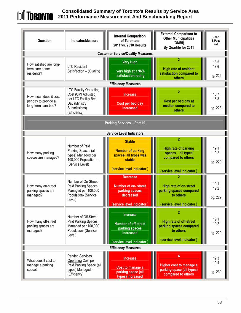
Consolidated Summary of Toronto's Results by Service Area 2011 Performance Measurement And Benchmarking Report
53
Question Indicator/Measure Internal Comparison
of Toronto’s 2011 vs. 2010 Results
External Comparison to Other Municipalities
(OMBI) By Quartile for 2011
Chart & Page
Ref.
Customer Service/Quality Measures
How satisfied are long-term care home residents?
LTC Resident Satisfaction – (Quality)
Very High
very high at a 96% satisfaction rating
2
High rate of resident satisfaction compared to
others
18.5 18.6
pg. 222
Efficiency Measures
How much does it cost per day to provide a long-term care bed?
LTC Facility Operating Cost (CMI Adjusted) per LTC Facility Bed Day (Ministry Submissions) (Efficiency)
Increase
Cost per bed day increased
2
Cost per bed day at median compared to
others
18.7 18.8
pg. 223
Parking Services – Part 19
Service Level Indicators
How many parking spaces are managed?
Number of Paid Parking Spaces (all types) Managed per 100,000 Population – (Service Level)
Stable
Number of parking spaces- all types was
stable
(service level indicator )
2
High rate of parking spaces – all types
compared to others
(service level indicator )
19.1 19.2
pg. 229
How many on-street parking spaces are managed?
Number of On-Street Paid Parking Spaces Managed per 100,000 Population- (Service Level)
Decrease
Number of on- street parking spaces
decreased
(service level indicator )
2
High rate of on-street parking spaces compared
to others
(service level indicator )
19.1 19.2
pg. 229
How many off-street parking spaces are managed?
Number of Off-Street Paid Parking Spaces Managed per 100,000 Population- (Service Level)
Increase
Number of off street
parking spaces increased
(service level indicator )
2
High rate of off-street parking spaces compared
to others
(service level indicator )
19.1 19.2
pg. 229
Efficiency Measures
What does it cost to manage a parking space?
Parking Services Operating Cost per Paid Parking Space (all types) Managed – (Efficiency)
Increase
Cost to manage a parking space (all types) increased
4
Higher cost to manage a parking space (all types)
compared to others
19.3 19.4
pg. 230
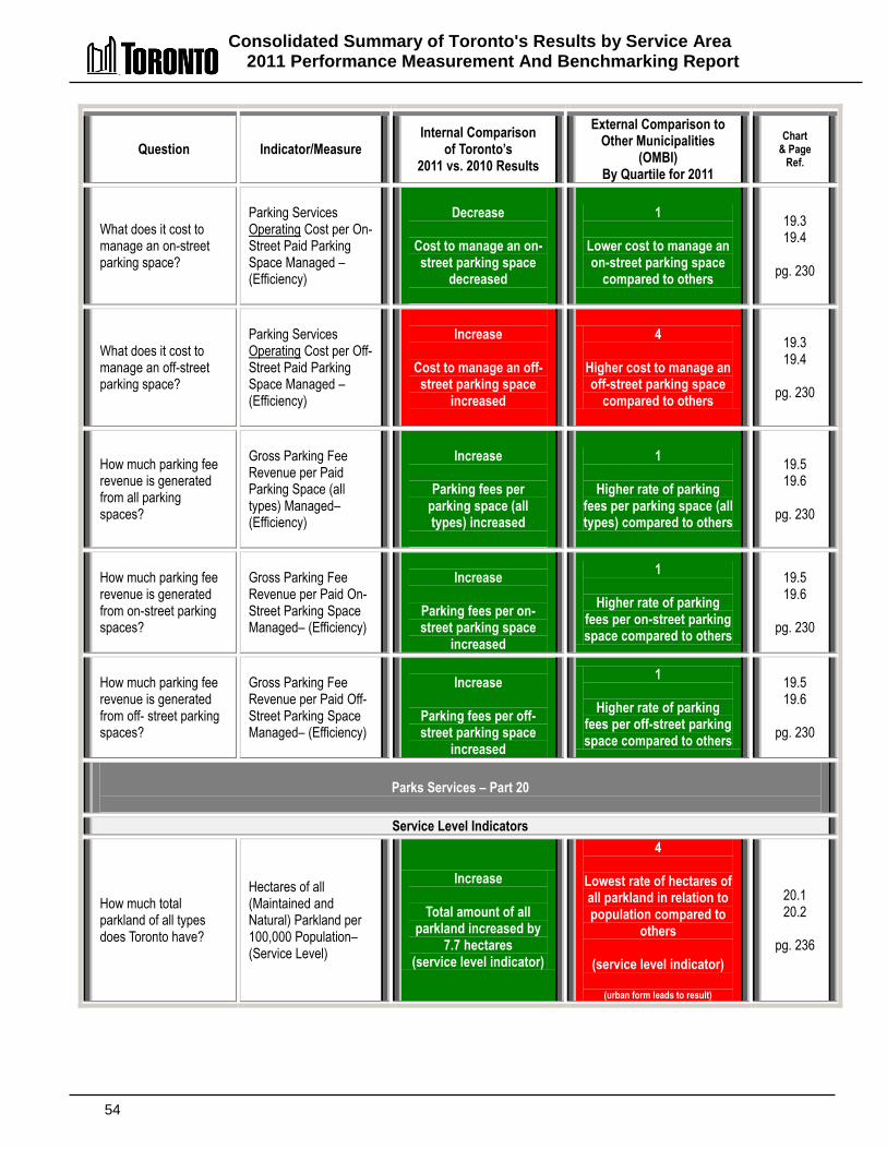
Consolidated Summary of Toronto's Results by Service Area 2011 Performance Measurement And Benchmarking Report
54
Question Indicator/Measure Internal Comparison
of Toronto’s 2011 vs. 2010 Results
External Comparison to Other Municipalities
(OMBI) By Quartile for 2011
Chart & Page
Ref.
What does it cost to manage an on-street parking space?
Parking Services Operating Cost per On-Street Paid Parking Space Managed – (Efficiency)
Decrease
Cost to manage an on-street parking space
decreased
1
Lower cost to manage an on-street parking space
compared to others
19.3 19.4
pg. 230
What does it cost to manage an off-street parking space?
Parking Services Operating Cost per Off-Street Paid Parking Space Managed – (Efficiency)
Increase
Cost to manage an off-
street parking space increased
4
Higher cost to manage an off-street parking space
compared to others
19.3 19.4
pg. 230
How much parking fee revenue is generated from all parking spaces?
Gross Parking Fee Revenue per Paid Parking Space (all types) Managed– (Efficiency)
Increase
Parking fees per
parking space (all types) increased
1
Higher rate of parking fees per parking space (all types) compared to others
19.5 19.6
pg. 230
How much parking fee revenue is generated from on-street parking spaces?
Gross Parking Fee Revenue per Paid On-Street Parking Space Managed– (Efficiency)
Increase
Parking fees per on-street parking space
increased
1
Higher rate of parking fees per on-street parking space compared to others
19.5 19.6
pg. 230
How much parking fee revenue is generated from off- street parking spaces?
Gross Parking Fee Revenue per Paid Off-Street Parking Space Managed– (Efficiency)
Increase
Parking fees per off-street parking space
increased
1
Higher rate of parking fees per off-street parking space compared to others
19.5 19.6
pg. 230
Parks Services – Part 20
Service Level Indicators
How much total parkland of all types does Toronto have?
Hectares of all (Maintained and Natural) Parkland per 100,000 Population– (Service Level)
Increase
Total amount of all parkland increased by
7.7 hectares (service level indicator)
4
Lowest rate of hectares of all parkland in relation to population compared to
others
(service level indicator)
(urban form leads to result)
20.1 20.2
pg. 236
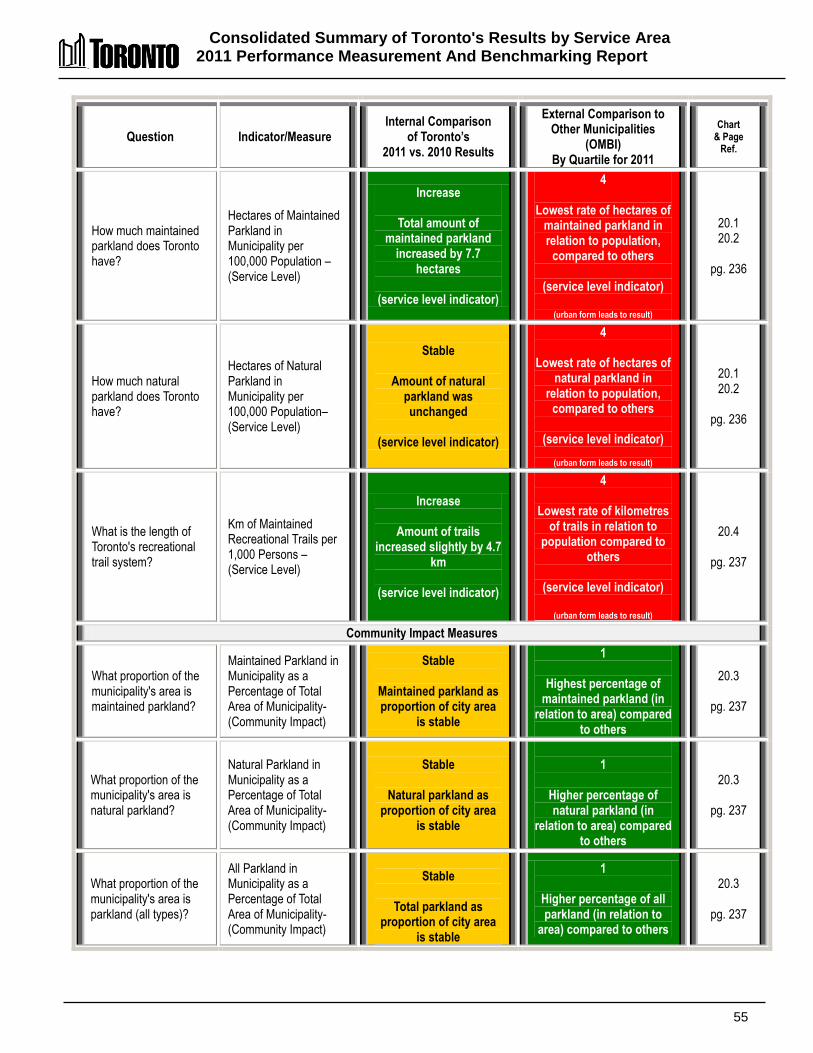
Consolidated Summary of Toronto's Results by Service Area 2011 Performance Measurement And Benchmarking Report
55
Question Indicator/Measure Internal Comparison
of Toronto’s 2011 vs. 2010 Results
External Comparison to Other Municipalities
(OMBI) By Quartile for 2011
Chart & Page
Ref.
How much maintained parkland does Toronto have?
Hectares of Maintained Parkland in Municipality per 100,000 Population – (Service Level)
Increase
Total amount of maintained parkland
increased by 7.7 hectares
(service level indicator)
4
Lowest rate of hectares of maintained parkland in relation to population,
compared to others
(service level indicator)
(urban form leads to result)
20.1 20.2
pg. 236
How much natural parkland does Toronto have?
Hectares of Natural Parkland in Municipality per 100,000 Population– (Service Level)
Stable
Amount of natural parkland was unchanged
(service level indicator)
4
Lowest rate of hectares of natural parkland in
relation to population, compared to others
(service level indicator)
(urban form leads to result)
20.1 20.2
pg. 236
What is the length of Toronto's recreational trail system?
Km of Maintained Recreational Trails per 1,000 Persons – (Service Level)
Increase
Amount of trails increased slightly by 4.7
km
(service level indicator)
4
Lowest rate of kilometres of trails in relation to
population compared to others
(service level indicator)
(urban form leads to result)
20.4
pg. 237
Community Impact Measures
What proportion of the municipality's area is maintained parkland?
Maintained Parkland in Municipality as a Percentage of Total Area of Municipality- (Community Impact)
Stable
Maintained parkland as proportion of city area
is stable
1
Highest percentage of maintained parkland (in
relation to area) compared to others
20.3
pg. 237
What proportion of the municipality's area is natural parkland?
Natural Parkland in Municipality as a Percentage of Total Area of Municipality- (Community Impact)
Stable
Natural parkland as proportion of city area
is stable
1
Higher percentage of natural parkland (in
relation to area) compared to others
20.3
pg. 237
What proportion of the municipality's area is parkland (all types)?
All Parkland in Municipality as a Percentage of Total Area of Municipality- (Community Impact)
Stable
Total parkland as
proportion of city area is stable
1
Higher percentage of all parkland (in relation to
area) compared to others
20.3
pg. 237
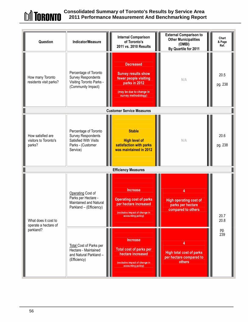
Consolidated Summary of Toronto's Results by Service Area 2011 Performance Measurement And Benchmarking Report
56
Question Indicator/Measure Internal Comparison
of Toronto’s 2011 vs. 2010 Results
External Comparison to Other Municipalities
(OMBI) By Quartile for 2011
Chart & Page
Ref.
How many Toronto residents visit parks?
Percentage of Toronto Survey Respondents Visiting Toronto Parks - (Community Impact)
Decreased
Survey results show fewer people visiting
parks in 2012
(may be due to change in survey methodology)
N/A 20.5
pg. 238
Customer Service Measures
How satisfied are visitors to Toronto's parks?
Percentage of Toronto Survey Respondents Satisfied With Visits Parks - (Customer Service)
Stable
High level of satisfaction with parks was maintained in 2012
N/A 20.6
pg. 238
Efficiency Measures
What does it cost to operate a hectare of parkland?
Operating Cost of Parks per Hectare - Maintained and Natural Parkland – (Efficiency)
Increase
Operating cost of parks per hectare increased
(excludes impact of change in
accounting policy)
4
High operating cost of parks per hectare
compared to others
20.7 20.8
pg. 239
Total Cost of Parks per Hectare - Maintained and Natural Parkland – (Efficiency)
Increase
Total cost of parks per hectare increased
(excludes impact of change in
accounting policy)
4
High total cost of parks per hectare compared to
others
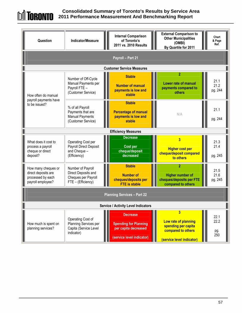
Consolidated Summary of Toronto's Results by Service Area 2011 Performance Measurement And Benchmarking Report
57
Question Indicator/Measure Internal Comparison
of Toronto’s 2011 vs. 2010 Results
External Comparison to Other Municipalities
(OMBI) By Quartile for 2011
Chart & Page
Ref.
Payroll – Part 21
Customer Service Measures
How often do manual payroll payments have to be issued?
Number of Off-Cycle Manual Payments per Payroll FTE – (Customer Service)
Stable
Number of manual payments is low and
stable
2
Lower rate of manual payments compared to
others
21.1 21.2
pg. 244
% of all Payroll Payments that are Manual Payments (Customer Service)
Stable
Percentage of manual payments is low and
stable
N/A 21.1
pg. 244
Efficiency Measures
What does it cost to process a payroll cheque or direct deposit?
Operating Cost per Payroll Direct Deposit and Cheque – (Efficiency)
Decrease
Cost per cheque/deposit
decreased
3
Higher cost per cheque/deposit compared
to others
21.3 21.4
pg. 245
How many cheques or direct deposits are processed by each payroll employee?
Number of Payroll Direct Deposits and Cheques per Payroll FTE – (Efficiency)
Stable
Number of cheques/deposits per
FTE is stable
2
Higher number of cheques/deposits per FTE
compared to others
21.5 21.6
pg. 245
Planning Services – Part 22
Service / Activity Level Indicators
How much is spent on planning services?
Operating Cost of Planning Services per Capita (Service Level indicator)
Decrease
Spending for Planning per capita decreased
(service level indicator)
3
Low rate of planning spending per capita compared to others
(service level indicator)
22.1 22.2
pg. 250
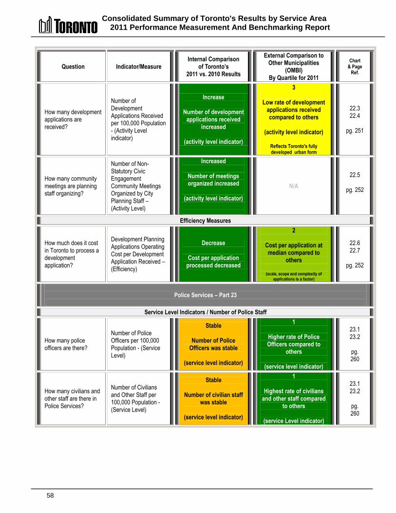
Consolidated Summary of Toronto's Results by Service Area 2011 Performance Measurement And Benchmarking Report
58
Question Indicator/Measure Internal Comparison
of Toronto’s 2011 vs. 2010 Results
External Comparison to Other Municipalities
(OMBI) By Quartile for 2011
Chart & Page
Ref.
How many development applications are received?
Number of Development Applications Received per 100,000 Population - (Activity Level indicator)
Increase
Number of development applications received
increased
(activity level indicator)
3
Low rate of development applications received compared to others
(activity level indicator)
Reflects Toronto's fully developed urban form
22.3 22.4
pg. 251
How many community meetings are planning staff organizing?
Number of Non-Statutory Civic Engagement Community Meetings Organized by City Planning Staff – (Activity Level)
Increased
Number of meetings organized increased
(activity level indicator)
N/A
22.5
pg. 252
Efficiency Measures
How much does it cost in Toronto to process a development application?
Development Planning Applications Operating Cost per Development Application Received – (Efficiency)
Decrease
Cost per application processed decreased
2
Cost per application at median compared to
others
(scale, scope and complexity of applications is a factor)
22.6 22.7
pg. 252
Police Services – Part 23
Service Level Indicators / Number of Police Staff
How many police officers are there?
Number of Police Officers per 100,000 Population - (Service Level)
Stable
Number of Police Officers was stable
(service level indicator)
1
Higher rate of Police Officers compared to
others
(service level indicator)
23.1 23.2
pg. 260
How many civilians and other staff are there in Police Services?
Number of Civilians and Other Staff per 100,000 Population - (Service Level)
Stable
Number of civilian staff was stable
(service level indicator)
1
Highest rate of civilians and other staff compared
to others
(service Level indicator)
23.1 23.2
pg. 260
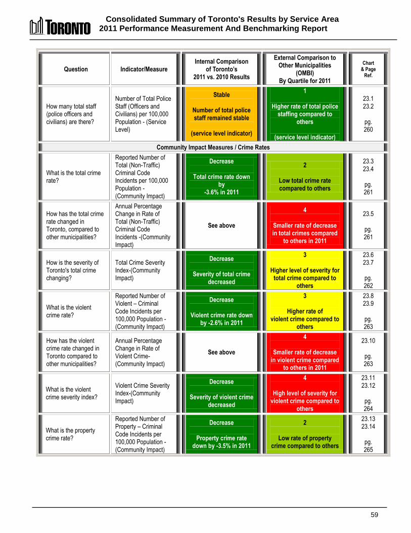
Consolidated Summary of Toronto's Results by Service Area 2011 Performance Measurement And Benchmarking Report
59
Question Indicator/Measure Internal Comparison
of Toronto’s 2011 vs. 2010 Results
External Comparison to Other Municipalities
(OMBI) By Quartile for 2011
Chart & Page
Ref.
How many total staff (police officers and civilians) are there?
Number of Total Police Staff (Officers and Civilians) per 100,000 Population - (Service Level)
Stable
Number of total police staff remained stable
(service level indicator)
1
Higher rate of total police staffing compared to
others
(service level indicator)
23.1 23.2
pg. 260
Community Impact Measures / Crime Rates
What is the total crime rate?
Reported Number of Total (Non-Traffic) Criminal Code Incidents per 100,000 Population -(Community Impact)
Decrease
Total crime rate down by
-3.6% in 2011
2
Low total crime rate compared to others
23.3 23.4
pg. 261
How has the total crime rate changed in Toronto, compared to other municipalities?
Annual Percentage Change in Rate of Total (Non-Traffic) Criminal Code Incidents -(Community Impact)
See above
4
Smaller rate of decrease in total crimes compared
to others in 2011
23.5
pg. 261
How is the severity of Toronto's total crime changing?
Total Crime Severity Index-(Community Impact)
Decrease
Severity of total crime decreased
3
Higher level of severity for total crime compared to
others
23.6 23.7
pg. 262
What is the violent crime rate?
Reported Number of Violent – Criminal Code Incidents per 100,000 Population -(Community Impact)
Decrease
Violent crime rate down by -2.6% in 2011
3
Higher rate of violent crime compared to
others
23.8 23.9
pg. 263
How has the violent crime rate changed in Toronto compared to other municipalities?
Annual Percentage Change in Rate of Violent Crime-(Community Impact)
See above
4
Smaller rate of decrease in violent crime compared
to others in 2011
23.10
pg. 263
What is the violent crime severity index?
Violent Crime Severity Index-(Community Impact)
Decrease
Severity of violent crime decreased
4
High level of severity for violent crime compared to
others
23.11 23.12
pg. 264
What is the property crime rate?
Reported Number of Property – Criminal Code Incidents per 100,000 Population -(Community Impact)
Decrease
Property crime rate down by -3.5% in 2011
2
Low rate of property crime compared to others
23.13 23.14
pg. 265

Consolidated Summary of Toronto's Results by Service Area 2011 Performance Measurement And Benchmarking Report
60
Question Indicator/Measure Internal Comparison
of Toronto’s 2011 vs. 2010 Results
External Comparison to Other Municipalities
(OMBI) By Quartile for 2011
Chart & Page
Ref.
How has the property crime rate changed in Toronto compared to other municipalities?
Annual Percentage Change in Rate of Property Crime -(Community Impact)
See above
4
Smaller rate of 2011 decrease in property
crime compared to others
23.15
pg. 265
What is the youth crime rate?
Number of Youths Cleared by Charge or Cleared Otherwise, per 100,000 Youth Population -(Community Impact)
Decrease
Youth crime decreased by -10.4% in 2011
1
Lower rate of youth crime compared to
others
23.16 23.17
pg. 266
How has the youth crime rate changed in Toronto compared to other municipalities?
Annual Percentage Change in Rate of Youths Cleared by Charge or Cleared Otherwise per 100,000 Youth Population -(Community Impact)
See above
2
Rate of 2011 decrease in youth crime at median
compared to others
23.18
pg. 266
Customer Service Measures - Clearance Rates
What percentage of the total crimes committed are solved/cleared?
Clearance Rate - Total (Non-Traffic) Criminal Code Incidents – (Customer Service)
Decrease
Clearance rate for total
crime decreased
4
Low clearance rate for total crime compared to
others
23.19 23.20
pg. 267
What percentage of the violent crimes committed are solved/cleared?
Clearance Rate - Violent Crime – (Customer Service)
Decrease
Clearance rate for violent crime decreased
4
Lowest clearance rate for violent crime compared to
others
23.21 23.22
pg. 267
Efficiency Measures
What is the workload of Criminal Code incidents for each police officer?
Number of Criminal Code Incidents (Non-Traffic) per Police Officer – (Efficiency)
Decrease
Number of Criminal Code incidents/
workload per officer decreased
4
Lower rate of Criminal Code incidents/ workload per officer compared to
others
23.23 23.24
pg. 268

Consolidated Summary of Toronto's Results by Service Area 2011 Performance Measurement And Benchmarking Report
61
Question Indicator/Measure Internal Comparison
of Toronto’s 2011 vs. 2010 Results
External Comparison to Other Municipalities
(OMBI) By Quartile for 2011
Chart & Page
Ref.
Purchasing – Part 24
Community Impact Measures
How much are the savings realized from the Purchasing Tender process?
Benefit (% savings) of Tendering Process – (Community Impact)
Stable
Percentage savings from Tender process
were stable
1
Highest percentage savings from Tender process compared to
others
24.1 24.2
pg. 275
How many bids are received for each purchasing call document?
Average Number of Bids Received per Purchasing Call Document – (Community Impact)
Stable
Average number of bids received per call
document was stable
3
Low average number of bids received per call,
compared to others
24.3 pg. 275
Customer Service Measures
How long does the purchasing call process take in Toronto before a purchase order is issued?
Average Time For Call Preparation And Approval – (Customer Service)
Increased
Time for prep and
approval increased in 2012
N/A 24.4 pg. 276
Average time for Call – (Customer Service)
Stable
Time for Call was stable
in 2012
N/A
24.4 pg. 276
Average time for divisions to evaluate bids/proposals – (Customer Service)
Decreased
Evaluation time
decreased in 2012
N/A
24.4 pg. 276
Average time from receipt of recommendation to award to issuance of Purchase Order– (Customer Service)
Decreased
Award to P.O. issuance time decreased in 2012
N/A
24.4 pg. 276
Total purchasing cycle/process time – (Customer Service)
Decreased
Total cycle/process time
decreased in 2012
N/A
24.4 pg. 276
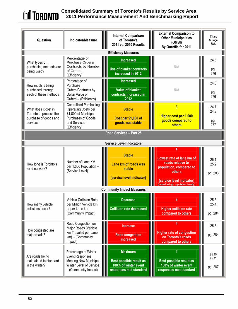
Consolidated Summary of Toronto's Results by Service Area 2011 Performance Measurement And Benchmarking Report
62
Question Indicator/Measure Internal Comparison
of Toronto’s 2011 vs. 2010 Results
External Comparison to Other Municipalities
(OMBI) By Quartile for 2011
Chart & Page
Ref.
Efficiency Measures
What types of purchasing methods are being used?
Percentage of Purchase Orders/ Contracts by Number of Orders – (Efficiency)
Increased
Use of blanket contracts increased in 2012
N/A
24.5
pg. 276
How much is being purchased through each of these methods
Percentage of Purchase Orders/Contracts by Dollar Value of Orders)– (Efficiency)
Increased
Value of blanket contracts increased in
2012
N/A
24.6
pg. 276
What does it cost in Toronto to process the purchase of goods and services
Centralized Purchasing Operating Costs per $1,000 of Municipal Purchases of Goods and Services – (Efficiency)
Stable
Cost per $1,000 of goods was stable
3
Higher cost per 1,000 goods compared to
others
24.7 24.8
pg. 277
Road Services – Part 25
Service Level Indicators
How long is Toronto's road network?
Number of Lane KM per 1,000 Population – (Service Level)
Stable
Lane km of roads was stable
(service level indicator)
4
Lowest rate of lane km of roads relative to
population, compared to others
(service level indicator)
(related to high population density)
25.1 25.2
pg. 283
Community Impact Measures
How many vehicle collisions occur?
Vehicle Collision Rate per Million Vehicle km or per Lane km – (Community Impact)
Decrease
Collision rate decreased
4
Higher collision rate compared to others
25.3 25.4
pg. 284
How congested are major roads?
Road Congestion on Major Roads (Vehicle km Traveled per Lane km) – (Community Impact)
Increase
Road congestion increased
4
Higher rate of congestion on Toronto’s roads compared to others
25.5
pg. 284
Are roads being maintained to standard in the winter?
Percentage of Winter Event Responses Meeting New Municipal Winter Level of Service – (Community Impact)
Maximum
Best possible result as 100% of winter event
responses met standard
1
Best possible result as 100% of winter event
responses met standard
25.10 25.11
pg. 287
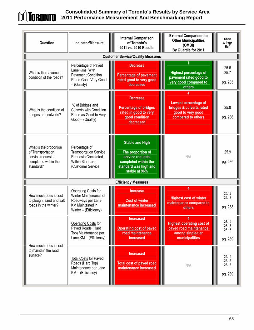
Consolidated Summary of Toronto's Results by Service Area 2011 Performance Measurement And Benchmarking Report
63
Question Indicator/Measure Internal Comparison
of Toronto’s 2011 vs. 2010 Results
External Comparison to Other Municipalities
(OMBI) By Quartile for 2011
Chart & Page
Ref.
Customer Service/Quality Measures
What is the pavement condition of the roads?
Percentage of Paved Lane Kms. With Pavement Condition Rated Good/Very Good – (Quality)
Decrease
Percentage of pavement rated good to very good
decreased
1
Highest percentage of pavement rated good to very good compared to
others
25.6 25.7
pg. 285
What is the condition of bridges and culverts?
% of Bridges and Culverts with Condition Rated as Good to Very Good – (Quality)
Decrease
Percentage of bridges rated in good to very
good condition decreased
4
Lowest percentage of bridges & culverts rated
good to very good compared to others
25.8
pg. 286
What is the proportion of Transportation service requests completed within the standard?
Percentage of Transportation Service Requests Completed Within Standard – (Customer Service
Stable and High
The proportion of service requests
completed within the standard was high and
stable at 96%
N/A 25.9
pg. 286
Efficiency Measures
How much does it cost to plough, sand and salt roads in the winter?
Operating Costs for Winter Maintenance of Roadways per Lane KM Maintained in Winter – (Efficiency)
Increase
Cost of winter maintenance increased
4
Highest cost of winter maintenance compared to
others
25.12 25.13
pg. 288
How much does it cost to maintain the road surface?
Operating Costs for Paved Roads (Hard Top) Maintenance per Lane KM – (Efficiency)
Increased
Operating cost of paved road maintenance
increased
4 Highest operating cost of paved road maintenance
among single-tier municipalities
25.14 25.15 25.16
pg. 289
Total Costs for Paved Roads (Hard Top) Maintenance per Lane KM – (Efficiency)
Increased
Total cost of paved road maintenance increased
N/A
25.14 25.15 25.16
pg. 289
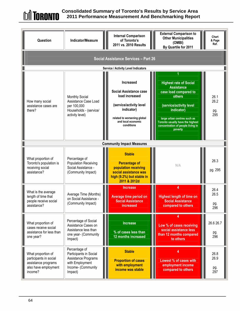
Consolidated Summary of Toronto's Results by Service Area 2011 Performance Measurement And Benchmarking Report
64
Question Indicator/Measure Internal Comparison
of Toronto’s 2011 vs. 2010 Results
External Comparison to Other Municipalities
(OMBI) By Quartile for 2011
Chart & Page
Ref.
Social Assistance Services – Part 26
Service / Activity Level Indicators
How many social assistance cases are there?
Monthly Social Assistance Case Load per 100,000 Households - (service/ activity level)
Increased
Social Assistance case load increased
(service/activity level
indicator)
related to worsening global and local economic
conditions
1
Highest rate of Social Assistance
case load compared to others
(service/activity level
indicator)
large urban centres such as Toronto usually have the highest concentration of people living in
poverty
26.1 26.2
pg. 295
Community Impact Measures
What proportion of Toronto's population is receiving social assistance?
Percentage of Population Receiving Social Assistance - (Community Impact)
Stable
Percentage of
population receiving social assistance was
high (9.2%) but stable in 2011 & 2012d
N/A 26.3
pg. 295
What is the average length of time that people receive social assistance?
Average Time (Months) on Social Assistance - (Community Impact)
Increase
Average time period on Social Assistance
increased
4
Highest length of time on Social Assistance
compared to others
26.4 26.5
pg. 296
What proportion of cases receive social assistance for less than one year?
Percentage of Social Assistance Cases on Assistance less than one year- (Community Impact)
Increase
% of cases less than 12 months increased
4
Low % of cases receiving social assistance less
than 12 months compared to others
26.6 26.7
pg. 296
What proportion of participants in social assistance programs also have employment income?
Percentage of Participants in Social Assistance Programs with Employment Income- (Community Impact)
Stable
Proportion of cases with employment
income was stable
4
Lowest % of cases with employment income compared to others
26.8 26.9
pg. 297
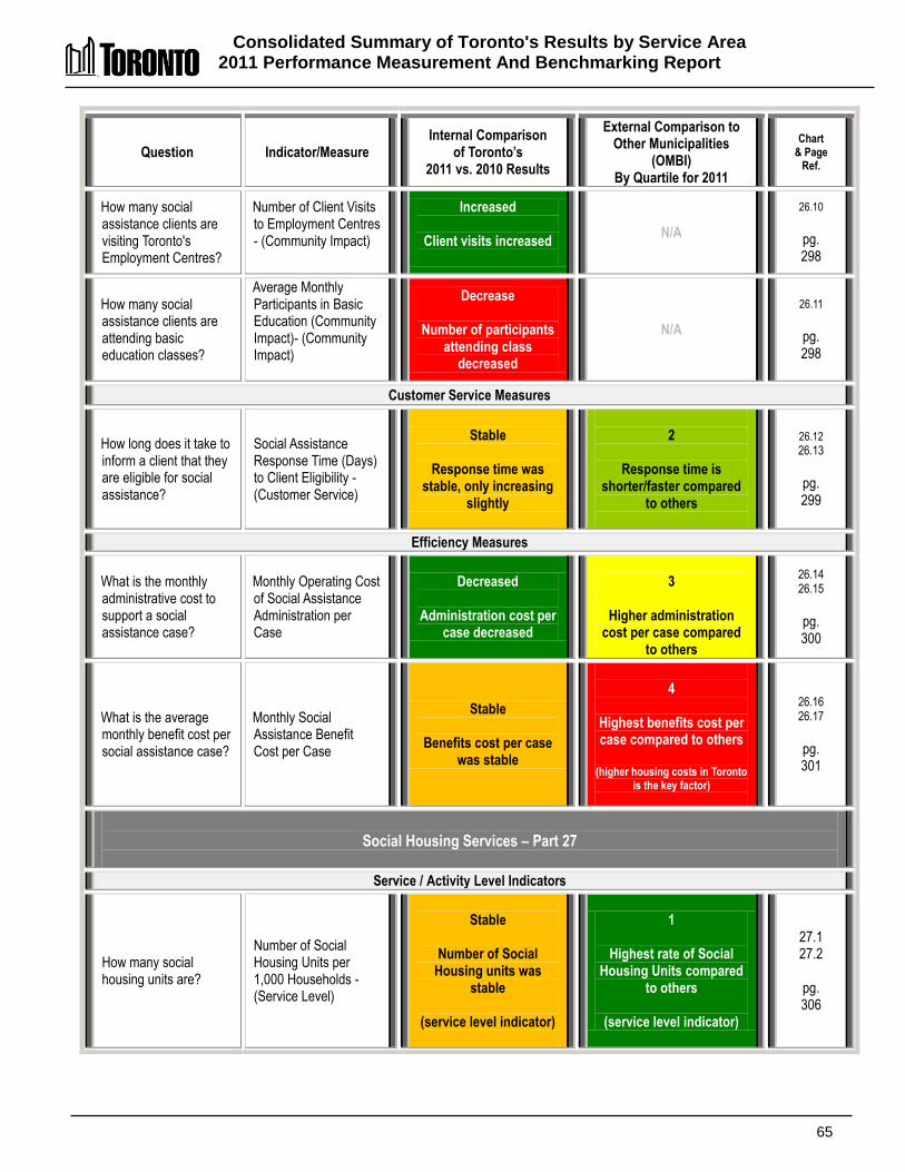
Consolidated Summary of Toronto's Results by Service Area 2011 Performance Measurement And Benchmarking Report
65
Question Indicator/Measure Internal Comparison
of Toronto’s 2011 vs. 2010 Results
External Comparison to Other Municipalities
(OMBI) By Quartile for 2011
Chart & Page
Ref.
How many social assistance clients are visiting Toronto's Employment Centres?
Number of Client Visits to Employment Centres - (Community Impact)
Increased
Client visits increased
N/A
26.10
pg. 298
How many social assistance clients are attending basic education classes?
Average Monthly Participants in Basic Education (Community Impact)- (Community Impact)
Decrease
Number of participants attending class
decreased
N/A
26.11
pg. 298
Customer Service Measures
How long does it take to inform a client that they are eligible for social assistance?
Social Assistance Response Time (Days) to Client Eligibility - (Customer Service)
Stable
Response time was stable, only increasing
slightly
2
Response time is shorter/faster compared
to others
26.12
26.13
pg. 299
Efficiency Measures
What is the monthly administrative cost to support a social assistance case?
Monthly Operating Cost of Social Assistance Administration per Case
Decreased
Administration cost per case decreased
3
Higher administration cost per case compared
to others
26.14 26.15
pg. 300
What is the average monthly benefit cost per social assistance case?
Monthly Social Assistance Benefit Cost per Case
Stable
Benefits cost per case was stable
4
Highest benefits cost per case compared to others
(higher housing costs in Toronto
is the key factor)
26.16 26.17
pg. 301
Social Housing Services – Part 27
Service / Activity Level Indicators
How many social housing units are?
Number of Social Housing Units per 1,000 Households - (Service Level)
Stable
Number of Social
Housing units was stable
(service level indicator)
1
Highest rate of Social Housing Units compared
to others
(service level indicator)
27.1 27.2
pg. 306

Consolidated Summary of Toronto's Results by Service Area 2011 Performance Measurement And Benchmarking Report
66
Question Indicator/Measure Internal Comparison
of Toronto’s 2011 vs. 2010 Results
External Comparison to Other Municipalities
(OMBI) By Quartile for 2011
Chart & Page
Ref.
Community Impact Measures
How much of a wait is there for a social housing unit?
Percentage of Social Housing Waiting List Placed Annually -(Service Level)
Stable
Percentage of waiting list placed was low but
stable
4
Lower percentage of waiting list placed
compared to others
(demand for units exeeds supply)
27.3 27.4
pg. 307
Efficiency Measures
What is the administration cost of social housing?
Social Housing Administration Operating Cost per Social Housing Unit- (Efficiency)
Decrease
Administrative operating cost per unit
decreased
1
Lower administration operating cost per unit
compared to others
27.5 27.7
pg. 308
What is the annual cost of direct funding (subsidy) paid to social housing providers?
Social Housing Subsidy Costs per Social Housing Unit - (Efficiency)
Decrease
Subsidy cost per unit
decreased
(one time funding in 2010 from senior orders of
government)
4
Higher subsidy cost per unit compared to others
27.5 27.6
pg. 308
Solid Waste Management Services – Part 28
Community Impact Measures
How much solid waste is recycled/diverted away from landfill sites?
Percentage of Solid Waste Diverted - Residential (Community Impact)
Increase
Overall diversion rate increased
2
Overall diversion rate at median compared to
others (impacted by significance of
apartments in Toronto)
28.1 28.2
pg. 315
How much waste from houses is recycled/ diverted away from landfill sites?
Percentage of Waste Diverted – Single Unit homes/houses (Curbside) – (Community Impact)
Increase
Diversion rate for single
unit houses/homes (curbside) increased
1
Highest diversion rate for houses compared to
others
28.1 28.3
pg. 315
How much waste from apartments is recycled/ diverted away from landfill sites?
Percentage of Waste Diverted – Multi-Residential – (Community Impact)
Increase
Multi-residential diversion rate increased
2
High multi-residential diversion rate compared
to others
28.1 28.4
pg. 315
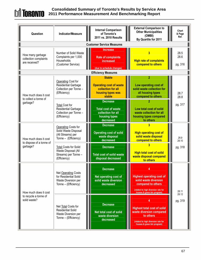
Consolidated Summary of Toronto's Results by Service Area 2011 Performance Measurement And Benchmarking Report
67
Question Indicator/Measure Internal Comparison
of Toronto’s 2011 vs. 2010 Results
External Comparison to Other Municipalities
(OMBI) By Quartile for 2011
Chart & Page
Ref.
Customer Service Measures
How many garbage collection complaints are received?
Number of Solid Waste Complaints per 1,000 Households (Customer Service)
Increase
Rate of complaints increased
(due to schedule changes)
3
High rate of complaints compared to others
28.5 28.6
pg. 316
Efficiency Measures
How much does it cost to collect a tonne of garbage?
Operating Cost for Residential Garbage Collection per Tonne –(Efficiency)
Stable
Operating cost of waste collection for all
housing types was stable
2
Low operating cost of solid waste collection for
all housing types compared to others
28.7 28.8
pg. 317 Total Cost for
Residential Garbage Collection per Tonne –(Efficiency)
Decrease
Total cost of waste collection for all housing types
decreased
2
Low total cost of solid waste collection for all
housing types compared to others
How much does it cost to dispose of a tonne of garbage?
Operating Costs for Solid Waste Disposal (All Streams) per Tonne – (Efficiency)
Decrease
Operating cost of solid waste disposal
decreased
3
High operating cost of solid waste disposal compared to others
28.9 28.10
pg. 318 Total Costs for Solid Waste Disposal (All Streams) per Tonne – (Efficiency)
Decrease
Total cost of solid waste disposal decreased
3
High total cost of solid waste disposal compared
to others
How much does it cost to recycle a tonne of solid waste?
Net Operating Costs for Residential Solid Waste Diversion per Tonne – (Efficiency)
Decrease
Net operating cost of solid waste diversion
decreased
4
Highest operating cost of solid waste diversion compared to others
(related to high diversion rate for
houses & green bin program) 28.11 28.12
pg. 319
Net Total Costs for Residential Solid Waste Diversion per Tonne – (Efficiency)
Decrease
Net total cost of solid waste diversion
decreased
4
Highest total cost of solid waste diversion compared
to others
(related to high diversion rate for houses & green bin program)
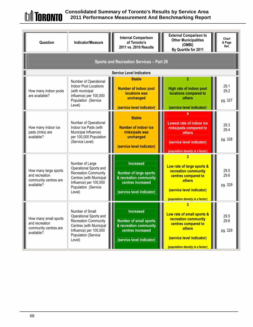
Consolidated Summary of Toronto's Results by Service Area 2011 Performance Measurement And Benchmarking Report
68
Question Indicator/Measure Internal Comparison
of Toronto’s 2011 vs. 2010 Results
External Comparison to Other Municipalities
(OMBI) By Quartile for 2011
Chart & Page
Ref.
Sports and Recreation Services – Part 29
Service Level Indicators
How many indoor pools are available?
Number of Operational Indoor Pool Locations (with municipal influence) per 100,000 Population (Service Level)
Stable
Number of indoor pool locations was
unchanged
(service level indicator)
2
High rate of indoor pool locations compared to
others
(service level indicator)
29.1 29.2
pg. 327
How many indoor ice pads (rinks) are available?
Number of Operational Indoor Ice Pads (with Municipal Influence) per 100,000 Population (Service Level)
Stable
Number of indoor ice rinks/pads was
unchanged
(service level indicator)
4
Lowest rate of indoor ice rinks/pads compared to
others
(service level indicator)
(population density is a factor)
29.3 29.4
pg. 328
How many large sports and recreation community centres are available?
Number of Large Operational Sports and Recreation Community Centres (with Municipal Influence) per 100,000 Population (Service Level)
Increased
Number of large sports & recreation community
centres increased
(service level indicator)
3
Low rate of large sports & recreation community centres compared to
others
(service level indicator)
(population density is a factor)
29.5 29.6
pg. 329
How many small sports and recreation community centres are available?
Number of Small Operational Sports and Recreation Community Centres (with Municipal Influence) per 100,000 Population (Service Level)
Increased
Number of small sports & recreation community
centres increased
(service level indicator)
3
Low rate of small sports & recreation community centres compared to
others
(service level indicator)
(population density is a factor)
29.5 29.6
pg. 329
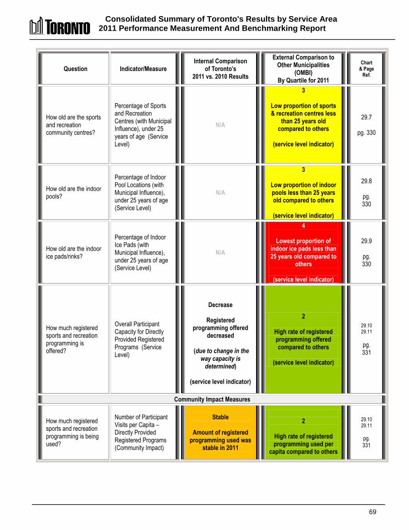
Consolidated Summary of Toronto's Results by Service Area 2011 Performance Measurement And Benchmarking Report
69
Question Indicator/Measure Internal Comparison
of Toronto’s 2011 vs. 2010 Results
External Comparison to Other Municipalities
(OMBI) By Quartile for 2011
Chart & Page
Ref.
How old are the sports and recreation community centres?
Percentage of Sports and Recreation Centres (with Municipal Influence), under 25 years of age (Service Level)
N/A
3
Low proportion of sports & recreation centres less
than 25 years old compared to others
(service level indicator)
29.7
pg. 330
How old are the indoor pools?
Percentage of Indoor Pool Locations (with Municipal Influence), under 25 years of age (Service Level)
N/A
3
Low proportion of indoor pools less than 25 years old compared to others
(service level indicator)
29.8
pg. 330
How old are the indoor ice pads/rinks?
Percentage of Indoor Ice Pads (with Municipal Influence), under 25 years of age (Service Level)
N/A
4
Lowest proportion of indoor ice pads less than 25 years old compared to
others
(service level indicator)
29.9
pg. 330
How much registered sports and recreation programming is offered?
Overall Participant Capacity for Directly Provided Registered Programs (Service Level)
Decrease
Registered programming offered
decreased
(due to change in the way capacity is
determined)
(service level indicator)
2
High rate of registered programming offered compared to others
(service level indicator)
29.10 29.11
pg. 331
Community Impact Measures
How much registered sports and recreation programming is being used?
Number of Participant Visits per Capita – Directly Provided Registered Programs (Community Impact)
Stable
Amount of registered
programming used was stable in 2011
2
High rate of registered programming used per
capita compared to others
29.10 29.11
pg. 331
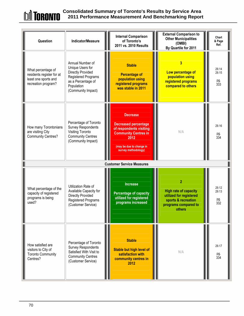
Consolidated Summary of Toronto's Results by Service Area 2011 Performance Measurement And Benchmarking Report
70
Question Indicator/Measure Internal Comparison
of Toronto’s 2011 vs. 2010 Results
External Comparison to Other Municipalities
(OMBI) By Quartile for 2011
Chart & Page
Ref.
What percentage of residents register for at least one sports and recreation program?
Annual Number of Unique Users for Directly Provided Registered Programs as a Percentage of Population (Community Impact)
Stable
Percentage of population using
registered programs was stable in 2011
3
Low percentage of population using
registered programs compared to others
29.14 29.15
pg. 333
How many Torontonians are visiting City Community Centres?
Percentage of Toronto Survey Respondents Visiting Toronto Community Centres (Community Impact)
Decrease
Decreased percentage of respondents visiting Community Centres in
2012
(may be due to change in survey methodology)
N/A
29.16
pg. 334
Customer Service Measures
What percentage of the capacity of registered programs is being used?
Utilization Rate of Available Capacity for Directly Provided Registered Programs (Customer Service)
Increase
Percentage of capacity utilized for registered programs increased
2
High rate of capacity utilized for registered sports & recreation
programs compared to others
29.12 29.13
pg. 332
How satisfied are visitors to City of Toronto Community Centres?
Percentage of Toronto Survey Respondents Satisfied With Visit to Community Centres (Customer Service)
Stable
Stable but high level of satisfaction with
community centres in 2012
N/A
29.17
pg. 334
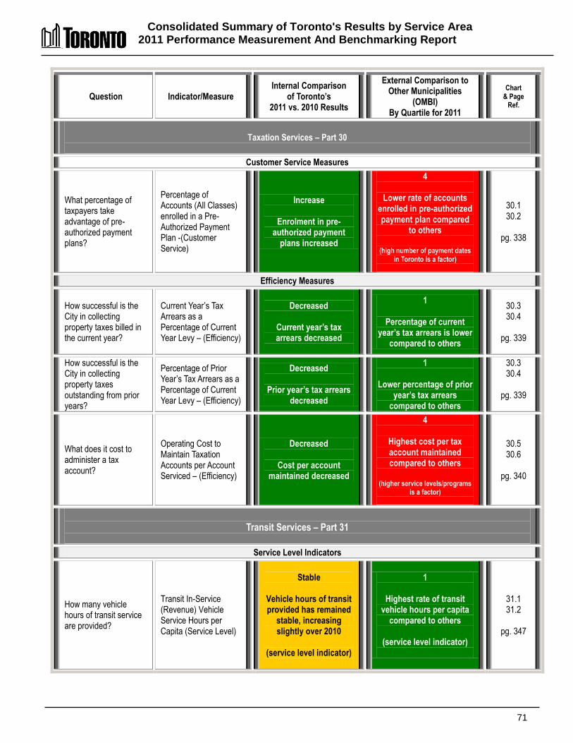
Consolidated Summary of Toronto's Results by Service Area 2011 Performance Measurement And Benchmarking Report
71
Question Indicator/Measure Internal Comparison
of Toronto’s 2011 vs. 2010 Results
External Comparison to Other Municipalities
(OMBI) By Quartile for 2011
Chart & Page
Ref.
Taxation Services – Part 30
Customer Service Measures
What percentage of taxpayers take advantage of pre-authorized payment plans?
Percentage of Accounts (All Classes) enrolled in a Pre-Authorized Payment Plan -(Customer Service)
Increase
Enrolment in pre-authorized payment
plans increased
4
Lower rate of accounts enrolled in pre-authorized payment plan compared
to others
(high number of payment dates in Toronto is a factor)
30.1 30.2
pg. 338
Efficiency Measures
How successful is the City in collecting property taxes billed in the current year?
Current Year’s Tax Arrears as a Percentage of Current Year Levy – (Efficiency)
Decreased
Current year’s tax arrears decreased
1
Percentage of current year’s tax arrears is lower
compared to others
30.3 30.4
pg. 339
How successful is the City in collecting property taxes outstanding from prior years?
Percentage of Prior Year’s Tax Arrears as a Percentage of Current Year Levy – (Efficiency)
Decreased
Prior year’s tax arrears decreased
1
Lower percentage of prior year’s tax arrears
compared to others
30.3 30.4
pg. 339
What does it cost to administer a tax account?
Operating Cost to Maintain Taxation Accounts per Account Serviced – (Efficiency)
Decreased
Cost per account maintained decreased
4
Highest cost per tax account maintained compared to others
(higher service levels/programs
is a factor)
30.5 30.6
pg. 340
Transit Services – Part 31
Service Level Indicators
How many vehicle hours of transit service are provided?
Transit In-Service (Revenue) Vehicle Service Hours per Capita (Service Level)
Stable
Vehicle hours of transit provided has remained
stable, increasing slightly over 2010
(service level indicator)
1
Highest rate of transit vehicle hours per capita
compared to others
(service level indicator)
31.1 31.2
pg. 347
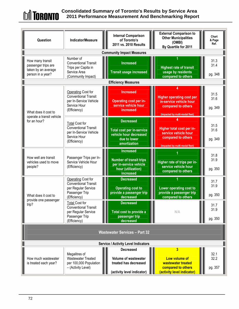
Consolidated Summary of Toronto's Results by Service Area 2011 Performance Measurement And Benchmarking Report
72
Question Indicator/Measure Internal Comparison
of Toronto’s 2011 vs. 2010 Results
External Comparison to Other Municipalities
(OMBI) By Quartile for 2011
Chart & Page
Ref.
Community Impact Measures
How many transit passenger trips are taken by an average person in a year?
Number of Conventional Transit Trips per Capita in Service Area (Community Impact)
Increased
Transit usage increased
1
Highest rate of transit usage by residents compared to others
31.3 31.4
pg. 348
Efficiency Measures
What does it cost to operate a transit vehicle for an hour?
Operating Cost for Conventional Transit per In-Service Vehicle Service Hour (Efficiency)
Increased
Operating cost per in-service vehicle hour
increased
4
Higher operating cost per in-service vehicle hour
compared to others
(impacted by multi-modal fleet)
31.5 31.6
pg. 349
Total Cost for Conventional Transit per In-Service Vehicle Service Hour (Efficiency)
Decreased
Total cost per in-service vehicle hour decreased
due to lower amortization
4
Higher total cost per in-service vehicle hour compared to others
(impacted by multi-modal fleet)
31.5 31.6
pg. 349
How well are transit vehicles used to move people?
Passenger Trips per In-Service Vehicle Hour (Efficiency)
Increased
Number of transit trips per in-service vehicle
hour (utilization) increased
1
Higher rate of trips per in-service vehicle hour compared to others
31.8 31.9
pg. 350
What does it cost to provide one passenger trip?
Operating Cost for Conventional Transit per Regular Service Passenger Trip (Efficiency)
Decreased
Operating cost to provide a passenger trip
decreased
1
Lower operating cost to provide a passenger trip
compared to others
31.7 31.9
pg. 350
Total Cost for Conventional Transit per Regular Service Passenger Trip (Efficiency)
Decreased
Total cost to provide a passenger trip
decreased
N/A
31.7 31.9
pg. 350
Wastewater Services – Part 32
Service / Activity Level Indicators
How much wastewater is treated each year?
Megalitres of Wastewater Treated per 100,000 Population – (Activity Level)
Decreased
Volume of wastewater treated has decreased
(activity level indicator)
3
Low volume of wastewater treated compared to others
(activity level indicator)
32.1 32.2
pg. 357
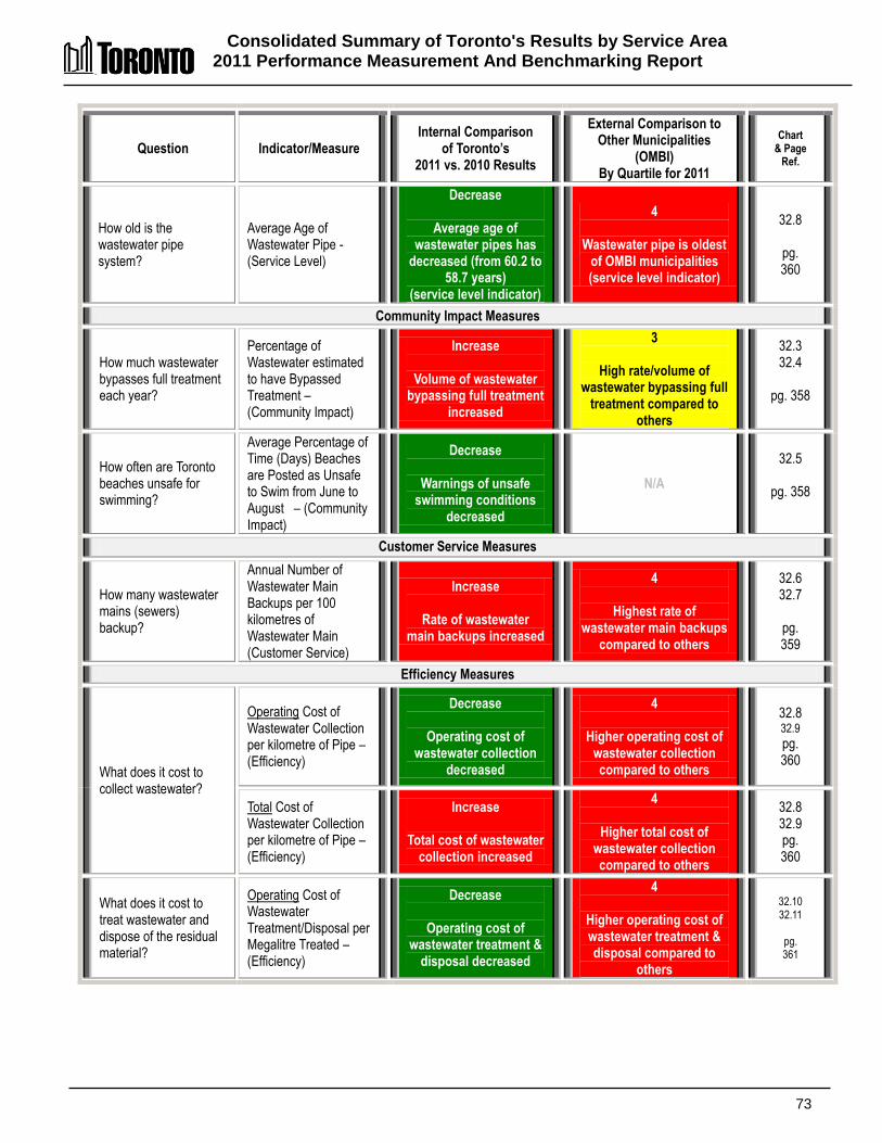
Consolidated Summary of Toronto's Results by Service Area 2011 Performance Measurement And Benchmarking Report
73
Question Indicator/Measure Internal Comparison
of Toronto’s 2011 vs. 2010 Results
External Comparison to Other Municipalities
(OMBI) By Quartile for 2011
Chart & Page
Ref.
How old is the wastewater pipe system?
Average Age of Wastewater Pipe -(Service Level)
Decrease
Average age of wastewater pipes has
decreased (from 60.2 to 58.7 years)
(service level indicator)
4
Wastewater pipe is oldest of OMBI municipalities (service level indicator)
32.8
pg. 360
Community Impact Measures
How much wastewater bypasses full treatment each year?
Percentage of Wastewater estimated to have Bypassed Treatment – (Community Impact)
Increase
Volume of wastewater bypassing full treatment
increased
3
High rate/volume of wastewater bypassing full
treatment compared to others
32.3 32.4
pg. 358
How often are Toronto beaches unsafe for swimming?
Average Percentage of Time (Days) Beaches are Posted as Unsafe to Swim from June to August – (Community Impact)
Decrease
Warnings of unsafe swimming conditions
decreased
N/A
32.5
pg. 358
Customer Service Measures
How many wastewater mains (sewers) backup?
Annual Number of Wastewater Main Backups per 100 kilometres of Wastewater Main (Customer Service)
Increase
Rate of wastewater main backups increased
4
Highest rate of wastewater main backups
compared to others
32.6 32.7
pg. 359
Efficiency Measures
What does it cost to collect wastewater?
Operating Cost of Wastewater Collection per kilometre of Pipe – (Efficiency)
Decrease
Operating cost of wastewater collection
decreased
4
Higher operating cost of wastewater collection compared to others
32.8 32.9
pg. 360
Total Cost of Wastewater Collection per kilometre of Pipe – (Efficiency)
Increase
Total cost of wastewater collection increased
4
Higher total cost of wastewater collection compared to others
32.8 32.9 pg. 360
What does it cost to treat wastewater and dispose of the residual material?
Operating Cost of Wastewater Treatment/Disposal per Megalitre Treated – (Efficiency)
Decrease
Operating cost of wastewater treatment &
disposal decreased
4
Higher operating cost of wastewater treatment & disposal compared to
others
32.10 32.11
pg. 361

Consolidated Summary of Toronto's Results by Service Area 2011 Performance Measurement And Benchmarking Report
74
Question Indicator/Measure Internal Comparison
of Toronto’s 2011 vs. 2010 Results
External Comparison to Other Municipalities
(OMBI) By Quartile for 2011
Chart & Page
Ref.
Total Cost of Wastewater Treatment/Disposal per Megalitre Treated – (Efficiency)
Decrease
Total cost of wastewater treatment & disposal
decreased
2
Low total cost of wastewater treatment & disposal compared to
others
(lower amortization)
32.10 32.11
pg. 361
Water Services – Part 33
Service/Activity Level Indicators
How much drinking water is treated each year?
Megalitres of Water Treated per 100,000 Population – (activity Level)
Decrease
Volume of water treated decreased
(activity level indicator)
2
Rate/volume of water treated slightly higher
than median (activity level indicator)
33.1 3.2
pg. 367
How old are the water distribution pipes?
Average Age of Water Pipe - (Service Level)
Stable
Average age of water pipe is stable at 57.4
years
(service level indicator)
4
Oldest average age of pipes of OMBI municipalities
(service level indicator)
33.8
pg. 370
Community Impact Measures
How much drinking water does the average household use?
Residential Water Use (Megalitres) per Household – (Community Impact)
Decrease
Amount of water used per household
decreased
2
Low rate of water usage per household compared
to others
33.3 33.4
pg. 368
Customer Service/Quality Measures
Is the quality of drinking water in compliance with provincial standards?
% of Water Quality Tests in Compliance with Provincial Drinking Water Standards - (Customer Service/Quality)
Favourable
Percentage of tests in compliance has remained high at 99.77% in 2010
3
Lower rate than other municipalities but still
very high at 99.77%
33.5 33.6
pg. 369
Were there any boil water advisories?
Number of Household Days with Boil Water Advisories – (Customer Service/Quality)
Favourable
Zero boil water advisories
1
Zero boil water advisories
How many watermain breaks are there?
Number of Water Main Breaks per 100 KM of Water Distribution Pipe – (Customer Service)
Increase
Number of watermain breaks increased
4
Highest rate of water main breaks compared to
others
33.7 33.8
pg. 370
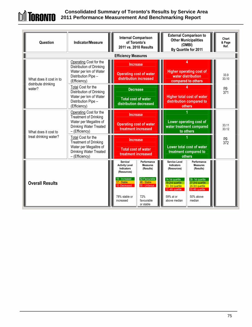
Consolidated Summary of Toronto's Results by Service Area 2011 Performance Measurement And Benchmarking Report
75
Question Indicator/Measure Internal Comparison
of Toronto’s 2011 vs. 2010 Results
External Comparison to Other Municipalities
(OMBI) By Quartile for 2011
Chart & Page
Ref.
Efficiency Measures
What does it cost in to distribute drinking water?
Operating Cost for the Distribution of Drinking Water per km of Water Distribution Pipe – (Efficiency)
Increase
Operating cost of water distribution increased
4
Higher operating cost of water distribution
compared to others
33.9 33.10
pg. 371
Total Cost for the Distribution of Drinking Water per km of Water Distribution Pipe – (Efficiency)
Decrease
Total cost of water distribution decreased
4
Higher total cost of water distribution compared to
others
What does it cost to treat drinking water?
Operating Cost for the Treatment of Drinking Water per Megalitre of Drinking Water Treated – (Efficiency)
Increase
Operating cost of water treatment increased
1
Lower operating cost of water treatment compared
to others
33.11 33.12
pg. 372
Total Cost for the Treatment of Drinking Water per Megalitre of Drinking Water Treated – (Efficiency)
Increase
Total cost of water treatment increased
1
Lower total cost of water treatment compared to
others
Overall Results
Service/ Activity Level
Indicators (Resources)
19 - Increased 17 - Stable 10 -Decreased
78% stable or increased
Performance Measures (Results)
82-Favourable 48 - Stable 50 - Unfavour.
72% favourable or stable
Service Level Indicators
(Resources)
14-1st quartile 18-2nd quartile 10- 3rd quartile 12 -4th quartile
59% at or above median
Performance Measures (Results)
36- 1st quartile 37-2nd quartile 24-3rd quartile 50-4th quartile
50% above median

76
77
DDeettaaiilleedd RReessuullttss,, CChhaarrttss aanndd IInniittiiaattiivveess bbyy SSeerrvviiccee AArreeaa
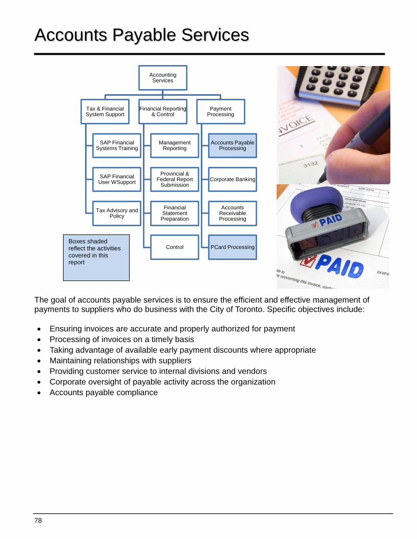
78
Accounting Services
Tax & Financial System Support
SAP Financial Systems Training
SAP Financial User WSupport
Tax Advisory and Policy
Financial Reporting & Control
Management Reporting
Provincial & Federal Report
Submission
Financial Statement
Preparation
Control
Payment Processing
Accounts Payable Processing
Corporate Banking
Accounts Receivable Processing
PCard Processing
AAccccoouunnttss PPaayyaabbllee SSeerrvviicceess
The goal of accounts payable services is to ensure the efficient and effective management of payments to suppliers who do business with the City of Toronto. Specific objectives include: • Ensuring invoices are accurate and properly authorized for payment • Processing of invoices on a timely basis • Taking advantage of available early payment discounts where appropriate • Maintaining relationships with suppliers • Providing customer service to internal divisions and vendors • Corporate oversight of payable activity across the organization • Accounts payable compliance
Boxes shaded reflect the activities covered in this report
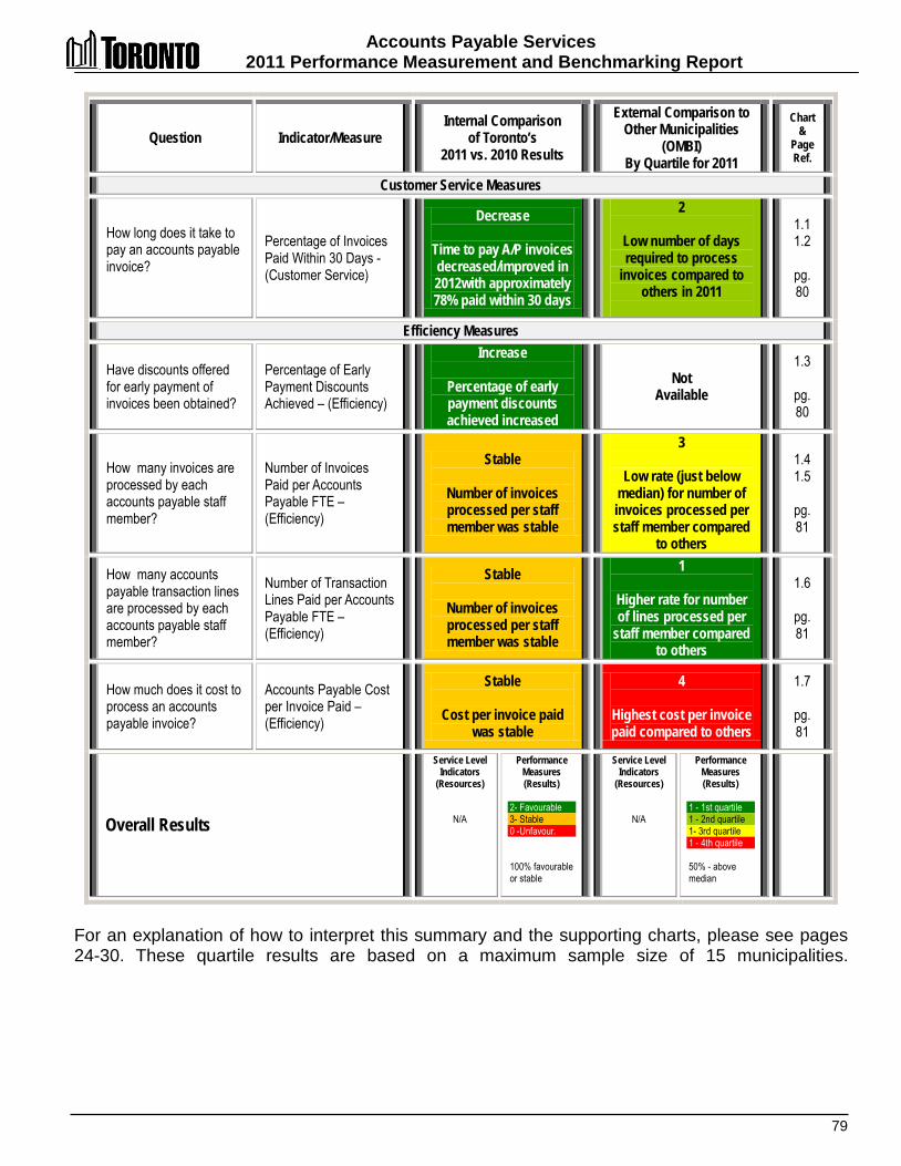
Accounts Payable Services 2011 Performance Measurement and Benchmarking Report
79
Question Indicator/Measure Internal Comparison
of Toronto’s 2011 vs. 2010 Results
External Comparison to Other Municipalities
(OMBI) By Quartile for 2011
Chart &
Page Ref.
Customer Service Measures
How long does it take to pay an accounts payable invoice?
Percentage of Invoices Paid Within 30 Days -(Customer Service)
Decrease
Time to pay A/P invoices decreased/improved in 2012with approximately 78% paid within 30 days
2
Low number of days required to process
invoices compared to others in 2011
1.1 1.2
pg. 80
Efficiency Measures
Have discounts offered for early payment of invoices been obtained?
Percentage of Early Payment Discounts Achieved – (Efficiency)
Increase
Percentage of early payment discounts achieved increased
Not Available
1.3
pg. 80
How many invoices are processed by each accounts payable staff member?
Number of Invoices Paid per Accounts Payable FTE – (Efficiency)
Stable
Number of invoices processed per staff member was stable
3
Low rate (just below median) for number of invoices processed per staff member compared
to others
1.4 1.5
pg. 81
How many accounts payable transaction lines are processed by each accounts payable staff member?
Number of Transaction Lines Paid per Accounts Payable FTE – (Efficiency)
Stable
Number of invoices processed per staff member was stable
1
Higher rate for number of lines processed per
staff member compared to others
1.6
pg. 81
How much does it cost to process an accounts payable invoice?
Accounts Payable Cost per Invoice Paid – (Efficiency)
Stable
Cost per invoice paid was stable
4
Highest cost per invoice paid compared to others
1.7
pg. 81
Overall Results
Service Level Indicators
(Resources)
N/A
Performance Measures (Results)
2- Favourable 3- Stable 0 -Unfavour. 100% favourable or stable
Service Level Indicators
(Resources)
N/A
Performance Measures (Results)
1 - 1st quartile 1 - 2nd quartile 1- 3rd quartile 1 - 4th quartile 50% - above median
For an explanation of how to interpret this summary and the supporting charts, please see pages 24-30. These quartile results are based on a maximum sample size of 15 municipalities.
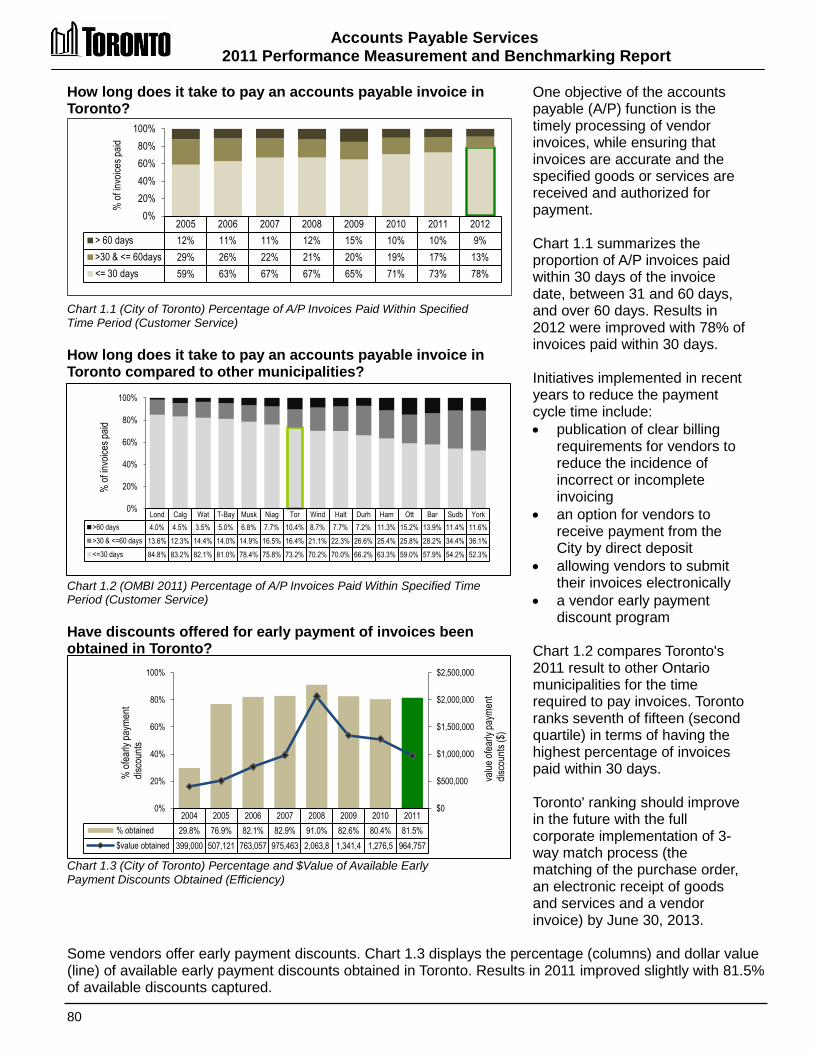
Accounts Payable Services 2011 Performance Measurement and Benchmarking Report
80
2005 2006 2007 2008 2009 2010 2011 2012 > 60 days 12% 11% 11% 12% 15% 10% 10% 9% >30 & <= 60days 29% 26% 22% 21% 20% 19% 17% 13% <= 30 days 59% 63% 67% 67% 65% 71% 73% 78%
0% 20% 40% 60% 80%
100% %
of in
voice
s paid
How long does it take to pay an accounts payable invoice in Toronto? Chart 1.1 (City of Toronto) Percentage of A/P Invoices Paid Within Specified Time Period (Customer Service) How long does it take to pay an accounts payable invoice in Toronto compared to other municipalities? Chart 1.2 (OMBI 2011) Percentage of A/P Invoices Paid Within Specified Time Period (Customer Service) Have discounts offered for early payment of invoices been obtained in Toronto? Chart 1.3 (City of Toronto) Percentage and $Value of Available Early Payment Discounts Obtained (Efficiency)
One objective of the accounts payable (A/P) function is the timely processing of vendor invoices, while ensuring that invoices are accurate and the specified goods or services are received and authorized for payment. Chart 1.1 summarizes the proportion of A/P invoices paid within 30 days of the invoice date, between 31 and 60 days, and over 60 days. Results in 2012 were improved with 78% of invoices paid within 30 days. Initiatives implemented in recent years to reduce the payment cycle time include: • publication of clear billing
requirements for vendors to reduce the incidence of incorrect or incomplete invoicing
• an option for vendors to receive payment from the City by direct deposit
• allowing vendors to submit their invoices electronically
• a vendor early payment discount program
Chart 1.2 compares Toronto's 2011 result to other Ontario municipalities for the time required to pay invoices. Toronto ranks seventh of fifteen (second quartile) in terms of having the highest percentage of invoices paid within 30 days. Toronto' ranking should improve in the future with the full corporate implementation of 3-way match process (the matching of the purchase order, an electronic receipt of goods and services and a vendor invoice) by June 30, 2013.
Some vendors offer early payment discounts. Chart 1.3 displays the percentage (columns) and dollar value (line) of available early payment discounts obtained in Toronto. Results in 2011 improved slightly with 81.5% of available discounts captured.
Lond Calg Wat T-Bay Musk Niag Tor Wind Halt Durh Ham Ott Bar Sudb York >60 days 4.0% 4.5% 3.5% 5.0% 6.8% 7.7% 10.4% 8.7% 7.7% 7.2% 11.3% 15.2% 13.9% 11.4% 11.6% >30 & <=60 days 13.6% 12.3% 14.4% 14.0% 14.9% 16.5% 16.4% 21.1% 22.3% 26.6% 25.4% 25.8% 28.2% 34.4% 36.1% <=30 days 84.8% 83.2% 82.1% 81.0% 78.4% 75.8% 73.2% 70.2% 70.0% 66.2% 63.3% 59.0% 57.9% 54.2% 52.3%
0%
20%
40%
60%
80%
100%
% of
invo
ices p
aid
2004 2005 2006 2007 2008 2009 2010 2011 % obtained 29.8% 76.9% 82.1% 82.9% 91.0% 82.6% 80.4% 81.5% $value obtained 399,000 507,121 763,057 975,463 2,063,8 1,341,4 1,276,5 964,757
$0
$500,000
$1,000,000
$1,500,000
$2,000,000
$2,500,000
0%
20%
40%
60%
80%
100%
% of
early
paym
ent
disco
unts
value
ofea
rly pa
ymen
t dis
coun
ts ($
)

Accounts Payable Services 2011 Performance Measurement and Benchmarking Report
81
2005 2006 2007 2008 2009 2010 2011 Total # of invoices 507,095 504,694 505,051 497,630 516,736 559,586 526,643 # invoices per A/P staff 10,789 10,738 10,746 10,588 10,546 11,420 11,325
0
3,000
6,000
9,000
12,000
York Wat Halt Ham T-Bay Niag Ott Lond Tor Calg Sud Bar Durh Wind Musk #invoices 22,014 18,696 16,843 14,924 14,293 13,516 11,582 11,515 11,325 11,183 10,868 10,103 9,672 8,694 7,767
0
5,000
10,000
15,000
20,000
25,000
Median 11,515
Wat York Niag T-Bay Lond Ham Halt Sud Bar Durh Ott Wind Musk Calg Tor $cost $3.53 $4.01 $4.32 $4.79 $5.36 $5.84 $5.99 $6.16 $7.14 $7.21 $7.31 $7.70 $7.79 $8.49 $10.18
$0
$2
$4
$6
$8
$10
$12
Median $6.16
Wat Tor Niag York Halt T-Bay Bar Musk Calg Ham Durh Ott Lond Sudb Wind # transaction
lines 63,011 40,943 39,794 35,476 35,427 27,920 26,444 25,289 24,381 24,028 22,682 20,736 18,277 17,575 14,302
0 10,000 20,000 30,000 40,000 50,000 60,000 70,000
Median 25,289
How many invoices are processed by each of Toronto Accounts Payable staff member? Chart 1.4 (City of Toronto) Number of Invoices Processed per A/P Staff Member (Efficiency) How many invoices are processed by each Toronto accounts payable staff member compared to other municipalities? Chart 1.5 (OMBI 2011) Number of Invoices Processed per A/P Staff Member (Efficiency) How many transaction lines are processed by each Toronto accounts payable staff member compared to other municipalities? Chart 1.6 (OMBI 2011) Number of Transaction Lines Processed per A/P Staff Member (Efficiency) How much does it cost Toronto to process an accounts payable invoice compared to other municipalities? Chart 1.7 (OMBI 2011) Accounts Payable Cost per Invoice Paid (Efficiency)
In 2011, Toronto's A/P staff processed approximately 527,000 invoices, with over 1.9 million transaction lines. Chart 1.4 provides Toronto's total number and rate of A/P invoices paid per A/P staff member, and 2011 results were stable in relation to 2010. Chart 1.5 compares Toronto's 2011 result to other municipalities for the number of A/P invoices processed per staff member. Toronto ranks ninth of fifteen (third quartile just below median) in terms of having the highest number of A/P invoices processed per staff member. If the number of transaction lines processed per A/P staff member is considered (Chart 1.6), Toronto ranks second of fifteen (first quartile) in terms of the highest number of lines processed Chart 1.7 compares Toronto’s 2011 cost (including indirect costs) per A/P invoice paid, to other municipalities. Toronto ranks fifteen of fifteen (fourth quartile) in terms of having the lowest cost per invoice paid Toronto's higher costs are likely the result of having a more centralized accounts payable process (less of the A/P process is done in operating divisions) than in other municipalities, The combination of Charts 1.5 and 1.6 also shows Toronto invoices paid have more transactions lines, which could possibly be an indication of greater complexity. Toronto's 2011 cost of $10.18, per invoice paid (includes program support costs and other allocations) was stable in relation to the 2010 cost of $10.24.

Accounts Payable Services 2011 Performance Measurement and Benchmarking Report
82
2012 Achievements and 2013 Planned Initiatives The following initiatives are intended to further improve the efficiency and effectiveness of Accounts Payable Services: 2012 Initiatives Completed/Achievements • Captured approximately $1 million in vendor discounts ($8 million since 2004). • Improved the efficiency of petty cash with the creation of Electronic Payment Submission, which
enabled City Divisions to submit petty cash requisitions through an interface for replenishment. • Implemented the electronic retention of vendor invoices resulting in a decrease in filing and storage. • Reviewed the PCard administration process to streamline and improve efficiency. • Updated the Accounts Payable website to reflect changes to policies and procedures. • Mandated the conversion to 3-way match process for nine City Divisions.
2013 Initiatives Planned • Implement 3 way match process to all divisions by mid-2013 for the payment of invoices (which is
the matching of the purchase order, an electronic receipt of goods and services and a vendor invoice) to realize additional efficiencies and move towards industry best practices.
• Explore a potential vendor portal for electronic invoice submission. • Explore the possibility of EDI for large volume low dollar value vendor invoices. • Implement dynamic discounting (for early payment). • Implement electronic submission of transaction log forms in the PCard Program. • Implement on line application process for PCard with integrated PCard database of users. • Execute Purchase Order Module Pilot Project for PCard Program. Factors Influencing Results of Municipalities The results of each municipality found in the charts included in this report are influenced to varying degrees by factors such as: • Organizational form - centralized vs. De-centralized invoice approval process, as well as the number of
different office locations. • Credit card purchases - some invoices are system generated (credit cards), which reduces the number
of invoices to process. • Payment policy – the timeline for paying invoices may vary according to different local policies.

83
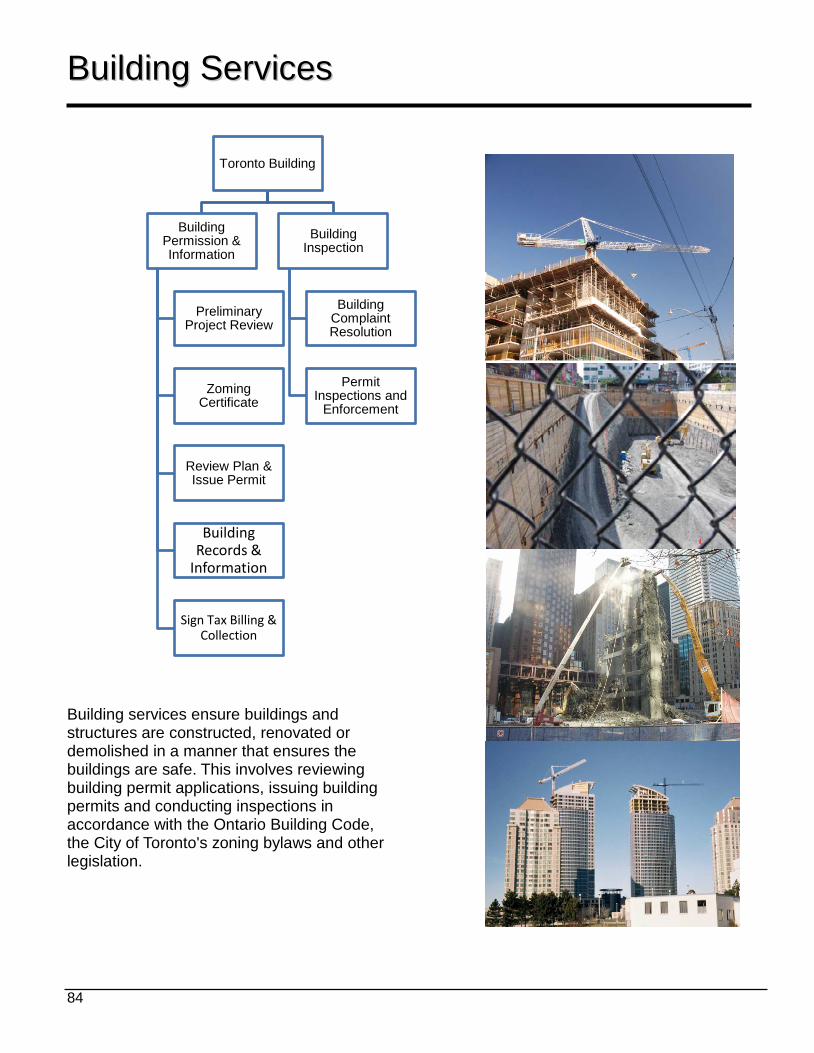
84
Toronto Building
Building Permission & Information
Preliminary Project Review
Zoming Certificate
Review Plan & Issue Permit
Building Records &
Information
Sign Tax Billing & Collection
Building Inspection
Building Complaint Resolution
Permit Inspections and
Enforcement
BBuuiillddiinngg SSeerrvviicceess Building services ensure buildings and structures are constructed, renovated or demolished in a manner that ensures the buildings are safe. This involves reviewing building permit applications, issuing building permits and conducting inspections in accordance with the Ontario Building Code, the City of Toronto's zoning bylaws and other legislation.
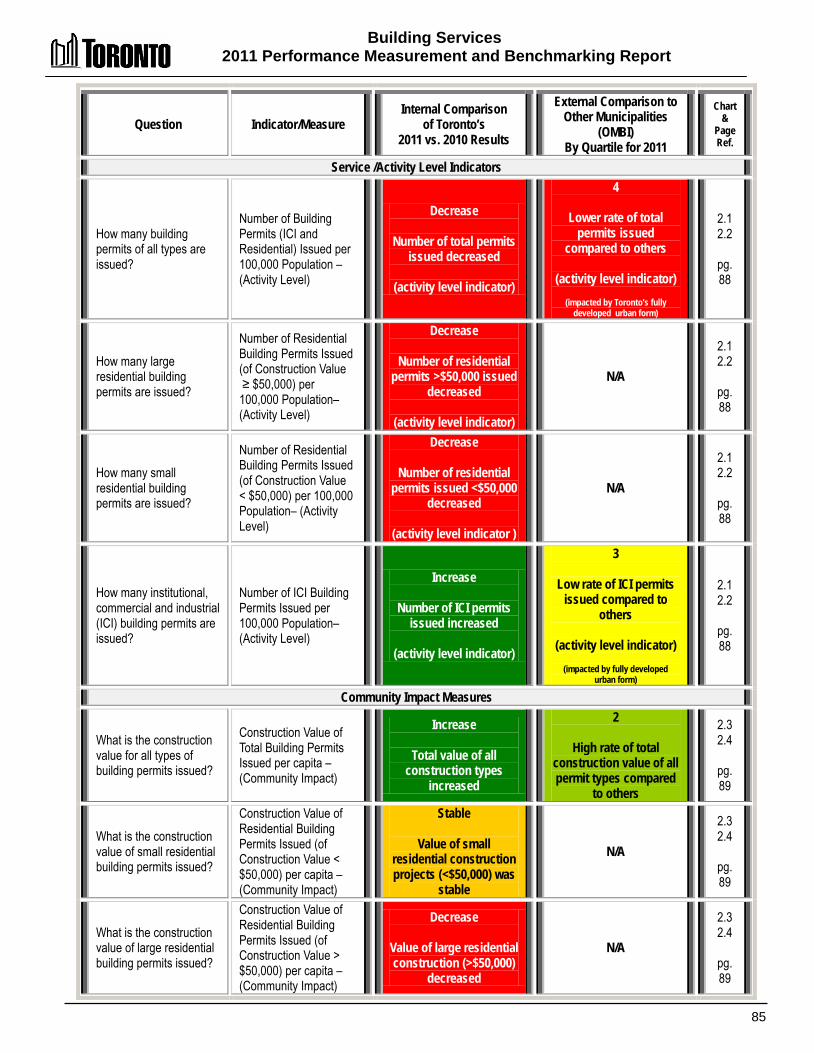
Building Services 2011 Performance Measurement and Benchmarking Report
85
Question Indicator/Measure Internal Comparison
of Toronto’s 2011 vs. 2010 Results
External Comparison to Other Municipalities
(OMBI) By Quartile for 2011
Chart &
Page Ref.
Service /Activity Level Indicators
How many building permits of all types are issued?
Number of Building Permits (ICI and Residential) Issued per 100,000 Population – (Activity Level)
Decrease
Number of total permits issued decreased
(activity level indicator)
4
Lower rate of total permits issued
compared to others
(activity level indicator)
(impacted by Toronto's fully developed urban form)
2.1 2.2
pg. 88
How many large residential building permits are issued?
Number of Residential Building Permits Issued (of Construction Value ≥ $50,000) per 100,000 Population– (Activity Level)
Decrease
Number of residential permits >$50,000 issued
decreased
(activity level indicator)
N/A
2.1 2.2
pg. 88
How many small residential building permits are issued?
Number of Residential Building Permits Issued (of Construction Value < $50,000) per 100,000 Population– (Activity Level)
Decrease
Number of residential permits issued <$50,000
decreased
(activity level indicator )
N/A
2.1 2.2
pg. 88
How many institutional, commercial and industrial (ICI) building permits are issued?
Number of ICI Building Permits Issued per 100,000 Population– (Activity Level)
Increase
Number of ICI permits issued increased
(activity level indicator)
3
Low rate of ICI permits issued compared to
others
(activity level indicator)
(impacted by fully developed urban form)
2.1 2.2
pg. 88
Community Impact Measures
What is the construction value for all types of building permits issued?
Construction Value of Total Building Permits Issued per capita – (Community Impact)
Increase
Total value of all construction types
increased
2
High rate of total construction value of all permit types compared
to others
2.3 2.4
pg. 89
What is the construction value of small residential building permits issued?
Construction Value of Residential Building Permits Issued (of Construction Value < $50,000) per capita – (Community Impact)
Stable
Value of small residential construction projects (<$50,000) was
stable
N/A
2.3 2.4
pg. 89
What is the construction value of large residential building permits issued?
Construction Value of Residential Building Permits Issued (of Construction Value > $50,000) per capita – (Community Impact)
Decrease
Value of large residential construction (>$50,000)
decreased
N/A
2.3 2.4
pg. 89
Building Services 2011 Performance Measurement And Benchmarking Report
86
Question Indicator/Measure Internal Comparison
of Toronto’s 2011 vs. 2010 Results
External Comparison to Other Municipalities
(OMBI) By Quartile for 2011
Chart &
Page Ref.
What is the construction value of institutional, commercial and industrial (ICI) building permits issued?
Construction Value of ICI Building Permits Issued per capita – (Community Impact)
Increase
Value of ICI construction increased
N/A
2.3 2.4
pg. 89
What is the ratio of residential and commercial construction activity?
Percentage of Construction Value of Issued ICI Building Permits of the Total Construction Value of Issued Building Permits– (Community Impact)
Increased
Proportion of commercial & industrial
construction value increased
1
Highest proportion of commercial industrial
construction value compared to others
2.5 2.6
pg. 90
How many new housing units are being created?
New Residential Units Created per 100,000 Population – (Community Impact)
Decrease
Number of new residential units created
decreased
2
High rate of new residential units created
compared to others
2.7
pg. 90
Customer Service Measures
Are building permit applications reviewed within the legislated timeframe?
Percentage of Building Permit Applications Reviewed within legislated timeframes – (Customer Service)
Decrease
Proportion reviewed within legislated
timeframe decreased in 2012
3
Lower percentage reviewed within
legislated timeframe compared to others in
2011
2.8 2.9
pg. 91
Are Residential Fastrack building permit applications reviewed within the designated 5 day timeframe?
% of Residential Fastrack Building Permits Issued Within Designated Program Timeframe (Customer Service)
Stable
Stable and high
proportion (92%) reviewed within
designated program timeframe in 2012
N/A 2.10
pg. 91
Are Commercial Xpress building permit applications reviewed within the designated 10 day timeframe?
% of Commercial Xpress Building Permits Issued Within Designated Program Timeframe (Customer Service)
Decrease
Proportion reviewed
within designated program timeframe decreased but still
relatively high at 88%.
N/A 2.11
pg. 91

Building Services 2011 Performance Measurement and Benchmarking Report
87
Question Indicator/Measure Internal Comparison
of Toronto’s 2011 vs. 2010 Results
External Comparison to Other Municipalities
(OMBI) By Quartile for 2011
Chart &
Page Ref.
Are mandatory building inspections made within the legislated timeframe?
Percentage of Mandatory Inspections made within legislated timeframes – (Customer Service)
Stable
Stable and high
proportion (94%) inspected within
legislated timeframe in 2012
N/A 2.12
pg. 91
Efficiency Measures
How much does it cost on average to enforce the Building Code per $1,000 of construction value?
Building Cost per $1,000 of construction value – (Efficiency)
Decreased
Cost per $1,000 of construction value
decreased
2
Low cost to enforce Building Code per
$1,000 of construction permit issued compared
to others
2.13 2.14 pg. 92
Overall Results
Activity Level Indicators
(Resources) 1 - Increased 0 - Stable 3 - Decreased 25% stable or increased
Performance Measures (Results)
4 - Favourable 3 - Stable 4 - Unfavour. 64% favourable or stable
Activity Level Indicators
(Resources)
0 - 1st quartile 0 - 2nd quartile 1 - 3rd quartile 1 - 4th quartile 0% above median
Performance Measures (Results)
1 - 1st quartile 3- 2nd quartile 1 - 3rd quartile 0 - 4th quartile 80% above median
For an explanation of how to interpret this summary and the supporting charts, please see pages 24-30. These quartile results are based on a maximum sample size of nine municipalities.
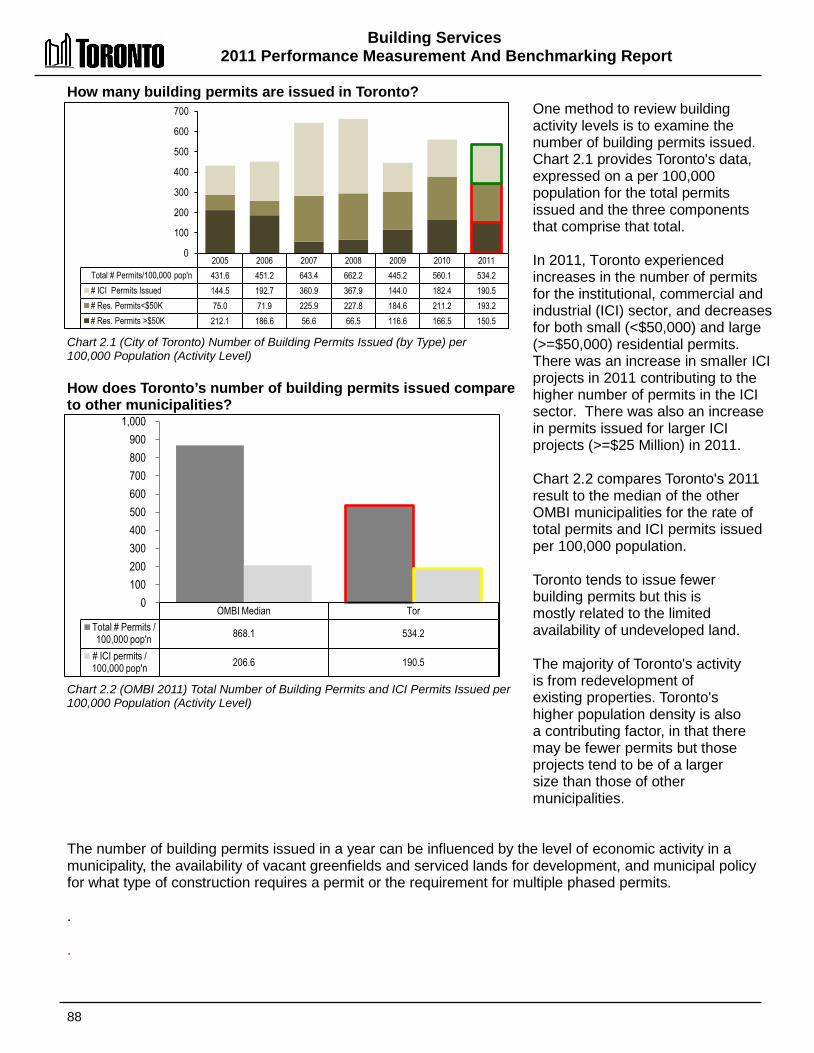
Building Services 2011 Performance Measurement And Benchmarking Report
88
How many building permits are issued in Toronto? Chart 2.1 (City of Toronto) Number of Building Permits Issued (by Type) per 100,000 Population (Activity Level) How does Toronto’s number of building permits issued compare to other municipalities? Chart 2.2 (OMBI 2011) Total Number of Building Permits and ICI Permits Issued per 100,000 Population (Activity Level)
One method to review building activity levels is to examine the number of building permits issued. Chart 2.1 provides Toronto's data, expressed on a per 100,000 population for the total permits issued and the three components that comprise that total. In 2011, Toronto experienced increases in the number of permits for the institutional, commercial and industrial (ICI) sector, and decreases for both small (<$50,000) and large (>=$50,000) residential permits. There was an increase in smaller ICI projects in 2011 contributing to the higher number of permits in the ICI sector. There was also an increase in permits issued for larger ICI projects (>=$25 Million) in 2011. Chart 2.2 compares Toronto's 2011 result to the median of the other OMBI municipalities for the rate of total permits and ICI permits issued per 100,000 population. Toronto tends to issue fewer building permits but this is mostly related to the limited availability of undeveloped land. The majority of Toronto's activity is from redevelopment of existing properties. Toronto's higher population density is also a contributing factor, in that there may be fewer permits but those projects tend to be of a larger size than those of other municipalities.
The number of building permits issued in a year can be influenced by the level of economic activity in a municipality, the availability of vacant greenfields and serviced lands for development, and municipal policy for what type of construction requires a permit or the requirement for multiple phased permits. . .
2005 2006 2007 2008 2009 2010 2011 Total # Permits/100,000 pop'n 431.6 451.2 643.4 662.2 445.2 560.1 534.2 # ICI Permits Issued 144.5 192.7 360.9 367.9 144.0 182.4 190.5 # Res. Permits<$50K 75.0 71.9 225.9 227.8 184.6 211.2 193.2 # Res. Permits >$50K 212.1 186.6 56.6 66.5 116.6 166.5 150.5
0
100
200
300
400
500
600
700
OMBI Median Tor Total # Permits / 100,000 pop'n 868.1 534.2
# ICI permits / 100,000 pop'n 206.6 190.5
0 100 200 300 400 500 600 700 800 900
1,000
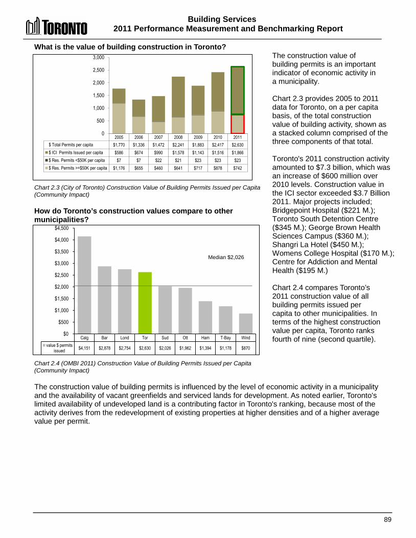
Building Services 2011 Performance Measurement and Benchmarking Report
89
What is the value of building construction in Toronto? Chart 2.3 (City of Toronto) Construction Value of Building Permits Issued per Capita (Community Impact) How do Toronto’s construction values compare to other municipalities? Chart 2.4 (OMBI 2011) Construction Value of Building Permits Issued per Capita (Community Impact)
The construction value of building permits is an important indicator of economic activity in a municipality. Chart 2.3 provides 2005 to 2011 data for Toronto, on a per capita basis, of the total construction value of building activity, shown as a stacked column comprised of the three components of that total. Toronto's 2011 construction activity amounted to $7.3 billion, which was an increase of $600 million over 2010 levels. Construction value in the ICI sector exceeded $3.7 Billion 2011. Major projects included; Bridgepoint Hospital ($221 M.); Toronto South Detention Centre ($345 M.); George Brown Health Sciences Campus ($360 M.); Shangri La Hotel ($450 M.); Womens College Hospital ($170 M.); Centre for Addiction and Mental Health ($195 M.) Chart 2.4 compares Toronto’s 2011 construction value of all building permits issued per capita to other municipalities. In terms of the highest construction value per capita, Toronto ranks fourth of nine (second quartile).
The construction value of building permits is influenced by the level of economic activity in a municipality and the availability of vacant greenfields and serviced lands for development. As noted earlier, Toronto's limited availability of undeveloped land is a contributing factor in Toronto's ranking, because most of the activity derives from the redevelopment of existing properties at higher densities and of a higher average value per permit.
2005 2006 2007 2008 2009 2010 2011 $ Total Permits per capita $1,770 $1,336 $1,472 $2,241 $1,883 $2,417 $2,630 $ ICI Permits Issued per capita $586 $674 $990 $1,578 $1,143 $1,516 $1,866 $ Res. Permits <$50K per capita $7 $7 $22 $21 $23 $23 $23 $ Res. Permits >=$50K per capita $1,176 $655 $460 $641 $717 $878 $742
0
500
1,000
1,500
2,000
2,500
3,000
Calg Bar Lond Tor Sud Ott Ham T-Bay Wind value $ permits
issued $4,151 $2,878 $2,754 $2,630 $2,026 $1,962 $1,394 $1,178 $870
$0
$500
$1,000
$1,500
$2,000
$2,500
$3,000
$3,500
$4,000
$4,500
Median $2,026
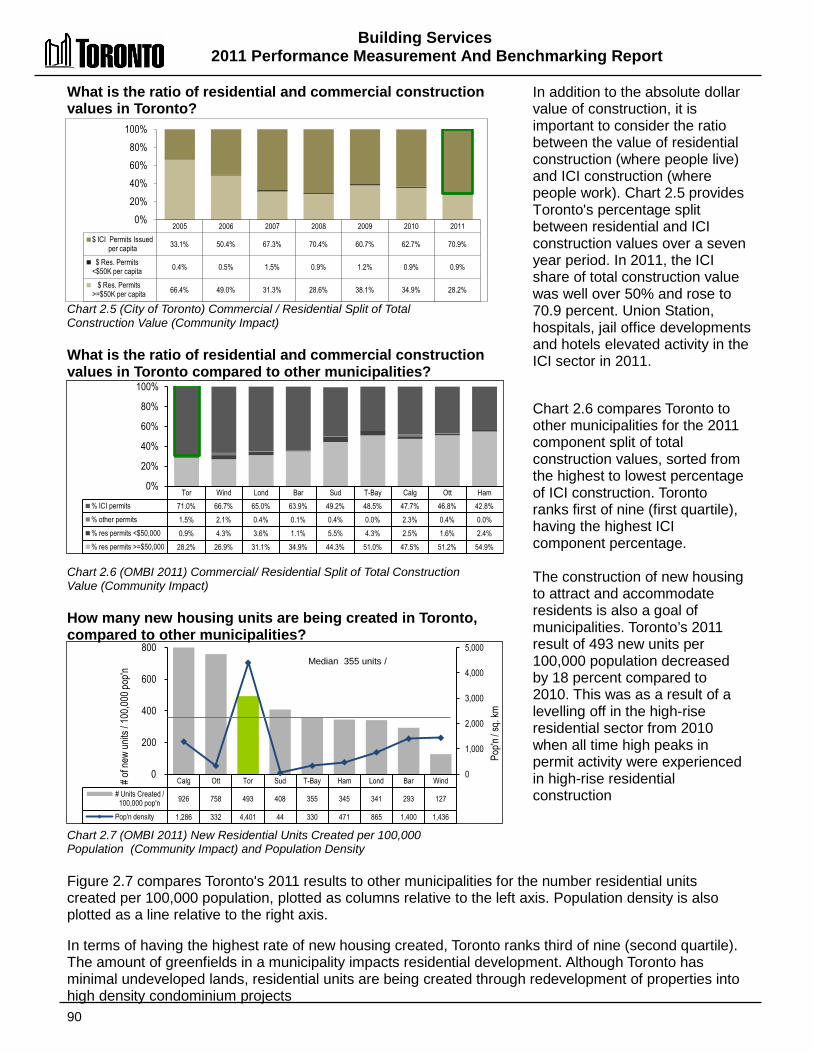
Building Services 2011 Performance Measurement And Benchmarking Report
90
Calg Ott Tor Sud T-Bay Ham Lond Bar Wind # Units Created /
100,000 pop'n 926 758 493 408 355 345 341 293 127
Pop'n density 1,286 332 4,401 44 330 471 865 1,400 1,436
0
1,000
2,000
3,000
4,000
5,000
0
200
400
600
800
Pop'n
/ sq.
km
# of n
ew un
its / 1
00,00
0 pop
'n
Median 355 units /
What is the ratio of residential and commercial construction values in Toronto? Chart 2.5 (City of Toronto) Commercial / Residential Split of Total Construction Value (Community Impact) What is the ratio of residential and commercial construction values in Toronto compared to other municipalities? Chart 2.6 (OMBI 2011) Commercial/ Residential Split of Total Construction Value (Community Impact) How many new housing units are being created in Toronto, compared to other municipalities? Chart 2.7 (OMBI 2011) New Residential Units Created per 100,000 Population (Community Impact) and Population Density
In addition to the absolute dollar value of construction, it is important to consider the ratio between the value of residential construction (where people live) and ICI construction (where people work). Chart 2.5 provides Toronto's percentage split between residential and ICI construction values over a seven year period. In 2011, the ICI share of total construction value was well over 50% and rose to 70.9 percent. Union Station, hospitals, jail office developments and hotels elevated activity in the ICI sector in 2011. Chart 2.6 compares Toronto to other municipalities for the 2011 component split of total construction values, sorted from the highest to lowest percentage of ICI construction. Toronto ranks first of nine (first quartile), having the highest ICI component percentage. The construction of new housing to attract and accommodate residents is also a goal of municipalities. Toronto’s 2011 result of 493 new units per 100,000 population decreased by 18 percent compared to 2010. This was as a result of a levelling off in the high-rise residential sector from 2010 when all time high peaks in permit activity were experienced in high-rise residential construction
Figure 2.7 compares Toronto's 2011 results to other municipalities for the number residential units created per 100,000 population, plotted as columns relative to the left axis. Population density is also plotted as a line relative to the right axis. In terms of having the highest rate of new housing created, Toronto ranks third of nine (second quartile). The amount of greenfields in a municipality impacts residential development. Although Toronto has minimal undeveloped lands, residential units are being created through redevelopment of properties into high density condominium projects
Tor Wind Lond Bar Sud T-Bay Calg Ott Ham % ICI permits 71.0% 66.7% 65.0% 63.9% 49.2% 48.5% 47.7% 46.8% 42.8% % other permits 1.5% 2.1% 0.4% 0.1% 0.4% 0.0% 2.3% 0.4% 0.0% % res permits <$50,000 0.9% 4.3% 3.6% 1.1% 5.5% 4.3% 2.5% 1.6% 2.4% % res permits >=$50,000 28.2% 26.9% 31.1% 34.9% 44.3% 51.0% 47.5% 51.2% 54.9%
0%
20%
40%
60%
80%
100%
2005 2006 2007 2008 2009 2010 2011 $ ICI Permits Issued
per capita 33.1% 50.4% 67.3% 70.4% 60.7% 62.7% 70.9%
$ Res. Permits <$50K per capita 0.4% 0.5% 1.5% 0.9% 1.2% 0.9% 0.9%
$ Res. Permits >=$50K per capita 66.4% 49.0% 31.3% 28.6% 38.1% 34.9% 28.2%
0% 20% 40% 60% 80%
100%

Building Services 2011 Performance Measurement and Benchmarking Report
91
What was the median number of days building permit applications were reviewed in Toronto in 2012 relative to the legislated timeframe? Chart 2.8 (City of Toronto) 2012 results for Median Number of Days Building Permits are Processed Relative to the Legislated Timeframes Are building permit applications in Toronto reviewed within the legislated timeframe? Chart 2.9 (City of Toronto) % of Building Permits Processed Within Legislated Timeframes (Customer Service) Are Residential Fastrack building permit applications in Toronto, reviewed within the designated 5 day timeframe? Chart 2.10 (City of Toronto) % of Residential Fastrack Building Permits Issued Within Designated Program Timeframe (Customer Service) Are Commercial Xpress building permit applications in Toronto, reviewed within the designated 5 day timeframe?
Chart 2.11 (City of Toronto) % of Commercial Xpress Building Permits Issued Within Designated Program Timeframe (Customer Service)
Are mandatory building inspections in Toronto made within the legislated timeframe? Chart 2.12 (City of Toronto) % of Mandatory Inspections Conducted Within Legislated Timeframes (Customer Service)
The legislated timeframes for review of completed applications (for compliance with the Building Code), and issuance of permits (if Code criteria are met) are noted in Chart 2.8 along with Toronto's 2012 results for the median time to review applications. Toronto's results were either at or better than the legislated timeframe. Chart 2.9 shows Toronto's results over time for the percentage of applications reviewed within these standards. Results for 2012 were down slightly due to high volumes and staff vacancies. Toronto's 2011 result of 82% was below the OMBI median of 93.6%. Chart 2.10 shows Toronto's results under the Residential Fastrack service. This service, for certain types of home renovation projects, allows customers to submit completed applications at counters in district offices. The goal is to issue a permit while customers wait, but in certain circumstances, it may take up to 5 business days to complete the review. Results for 2012 show slight reduction due to high volumes of permit activity in the ICI sector and staff vacancies. Chart 2.11 shows Toronto's results for building permit review and issuance under the Commercial Xpress service, an enhanced Building Permit service for certain types of projects with a goal of reviewing eligible applications within 10 working days. Results for 2012 show slight reduction due to high volume of permit activity for large projects in the ICI sector and staff vacancies. Chart 2.12 reflects results for mandatory inspections required for projects to proceed, which are to be completed within two days of receiving the request. Results in 2012 remained stable and high at 94%.
2006 Actual
2007 Actual
2008 Actual
2009 Actual
2010 Actual
2011 Actual
2012 Actual
2013 Target
% of building permits issued within
legislated timeframes 78% 77% 80% 81% 82% 82% 77% 85%
0%
25%
50%
75%
100%
2006 Actual
2007 Actual
2008 Actuals
2009 Actual
2010 Actual
2011 Actual
2012 Actual
2013 Target
% conducted within legislated timeframes 90% 90% 94% 94% 93% 94% 94% 95%
0% 25% 50% 75%
100%
2006 Actual
2007 Actual
2008 Actuals
2009 Actual
2010 Actual
2011 Actual
2012 Actual
% conducted within legislated timeframes 98% 99% 98% 98% 97% 97% 92%
0% 25% 50% 75%
100%
2006 Actual
2007 Actual
2008 Actuals
2009 Actual
2010 Actual
2011 Actual
2012 Actual
% conducted within legislated timeframes 92% 94% 96% 96% 95% 94% 88%
0% 25% 50% 75%
100%
Category 1: Houses 10 Days
Category 2: Small Buildings 15 Days
Category 3: Large Buildings 20 Days
Category 4: Complex Buildings 30 Days
Median number of days to Issue Permit 10 15 11 19 Legislated Time Frames 10 15 20 30
0 10 20 30 40
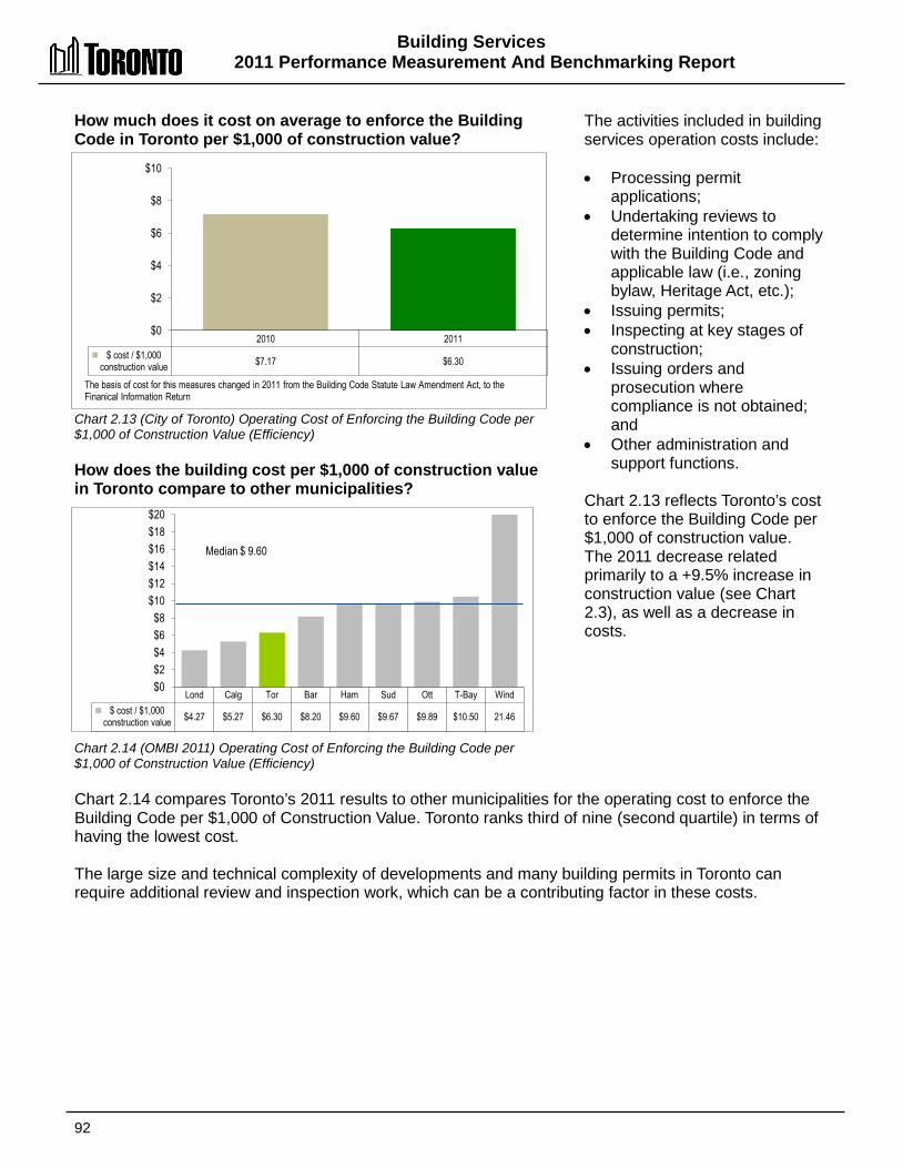
Building Services 2011 Performance Measurement And Benchmarking Report
92
How much does it cost on average to enforce the Building Code in Toronto per $1,000 of construction value?
Chart 2.13 (City of Toronto) Operating Cost of Enforcing the Building Code per $1,000 of Construction Value (Efficiency) How does the building cost per $1,000 of construction value in Toronto compare to other municipalities? Chart 2.14 (OMBI 2011) Operating Cost of Enforcing the Building Code per $1,000 of Construction Value (Efficiency)
The activities included in building services operation costs include: • Processing permit
applications; • Undertaking reviews to
determine intention to comply with the Building Code and applicable law (i.e., zoning bylaw, Heritage Act, etc.);
• Issuing permits; • Inspecting at key stages of
construction; • Issuing orders and
prosecution where compliance is not obtained; and
• Other administration and support functions.
Chart 2.13 reflects Toronto’s cost to enforce the Building Code per $1,000 of construction value. The 2011 decrease related primarily to a +9.5% increase in construction value (see Chart 2.3), as well as a decrease in costs.
Chart 2.14 compares Toronto’s 2011 results to other municipalities for the operating cost to enforce the Building Code per $1,000 of Construction Value. Toronto ranks third of nine (second quartile) in terms of having the lowest cost. The large size and technical complexity of developments and many building permits in Toronto can require additional review and inspection work, which can be a contributing factor in these costs.
2010 2011 $ cost / $1,000
construction value $7.17 $6.30
$0
$2
$4
$6
$8
$10
The basis of cost for this measures changed in 2011 from the Building Code Statute Law Amendment Act, to the Finanical Information Return
Lond Calg Tor Bar Ham Sud Ott T-Bay Wind $ cost / $1,000
construction value $4.27 $5.27 $6.30 $8.20 $9.60 $9.67 $9.89 $10.50 21.46
$0 $2 $4 $6 $8
$10 $12 $14 $16 $18 $20
Median $ 9.60

Building Services 2011 Performance Measurement And Benchmarking Report
93
2012 Achievements and 2013 Planned Initiatives The following initiatives have or are expected to further improve the efficiency and effectiveness of Building Services in Toronto: 2012 Initiatives Completed/Achievements • Processed a high volume of permit applications with a modest increase in response times and
maintained the rate of responding to inspection requests within the legislated time frames, despite sustained high volume and carry-over projects.
• Maintained the rate of responding to requests for inspections at 94%. • Maintained a 99% response rate for Freedom of Information (FOI) requests for building
information and property records. • Completed various stages of implementing electronic delivery of services through:
o Markup (ePlan Review) – deployment of module for electronic processing of large drawings and email submission of plans
o Digitization – digitization of Toronto Building records pilot project nearing completion o Web Portal – decision on approach to providing online service delivery channel
• Undertook a review and implemented new by-law changes, including: o Site Plan o Green Roofs o Parkland Dedication
2013 Initiatives Planned • Implement next edition of the Building Code and amendments to the Construction and
Demolition By-law. • Develop and implement the Electronic Customer Service initiative such as ePlans, email
submissions, ePortal, and digitalization. • Implement By-law changes to the Zoning By-law, Sign By-law and, Green Roof By-law. • Implement legislated requalification requirements and provide a continuous learning environment
and support for qualification of technical staff. • Influence and respond effectively to new legislation and legislative amendments that affect
development in the City. • Modify program to remediate properties impacted by marijuana grow operations. • Improve average response times to meet legislated time frames for Building Inspections and
Building Permission and Information: o Process complete applications in 10 days for houses, 15 days for small buildings, 20
days for large buildings and 30 days for complex buildings 85% of the time; o Complete mandatory inspections within 2 days of receiving the request 95% of the time;
and o Complete emergency inspections within 1 day 100% of the time, and work without
permits plus zoning and other inspections will be completed within 2 days and 5 days respectively, 95% of the time.
• Maintain public access to building records by responding to requests for records within 30 days 99% of the time.
Building Services 2011 Performance Measurement And Benchmarking Report
94
Factors Influencing Results of Municipalities The results of each municipality found in the charts included in this report are influenced to varying degrees by factors such as: • Permit requirements: municipal policy for what type of construction requires a permit and the
phasing of permits (one for the foundation, one for plumbing, one for the structure, etc.) • Complexity: size and technical complexity of permit applications and construction work requiring
varying amounts of review/inspection times, e.g. costs associated with reviewing and inspecting tract housing (new suburbs) tend to be lower than costs associated with infill projects, custom homes, renovations and larger buildings
• Established service standards: some municipalities have opted to deliver enhanced services such as targeting a higher turn-around time for reviews and thus issuance of certain categories of permits
• Geographic size: can lead to more travel time and fewer inspections per day resulting in higher costs per permit

95
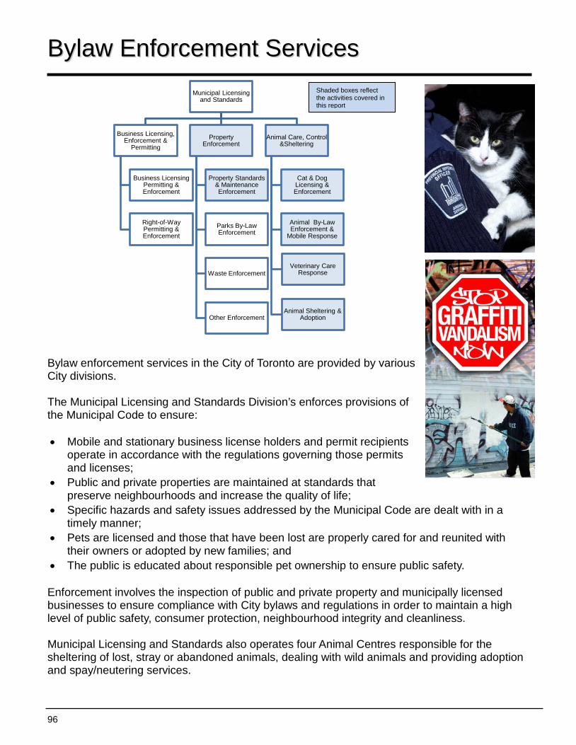
96
Municipal Licensing and Standards
Business Licensing, Enforcement &
Permitting
Business Licensing Permitting & Enforcement
Right-of-Way Permitting & Enforcement
Property Enforcement
Property Standards & Maintenance Enforcement
Parks By-Law Enforcement
Waste Enforcement
Other Enforcement
Animal Care, Control &Sheltering
Cat & Dog Licensing & Enforcement
Animal By-Law Enforcement &
Mobile Response
Animal Sheltering & Adoption
Veterinary Care Response
BByyllaaww EEnnffoorrcceemmeenntt SSeerrvviicceess Bylaw enforcement services in the City of Toronto are provided by various City divisions. The Municipal Licensing and Standards Division’s enforces provisions of the Municipal Code to ensure: • Mobile and stationary business license holders and permit recipients
operate in accordance with the regulations governing those permits and licenses;
• Public and private properties are maintained at standards that preserve neighbourhoods and increase the quality of life;
• Specific hazards and safety issues addressed by the Municipal Code are dealt with in a timely manner;
• Pets are licensed and those that have been lost are properly cared for and reunited with their owners or adopted by new families; and
• The public is educated about responsible pet ownership to ensure public safety. Enforcement involves the inspection of public and private property and municipally licensed businesses to ensure compliance with City bylaws and regulations in order to maintain a high level of public safety, consumer protection, neighbourhood integrity and cleanliness. Municipal Licensing and Standards also operates four Animal Centres responsible for the sheltering of lost, stray or abandoned animals, dealing with wild animals and providing adoption and spay/neutering services.
Shaded boxes reflect the activities covered in this report
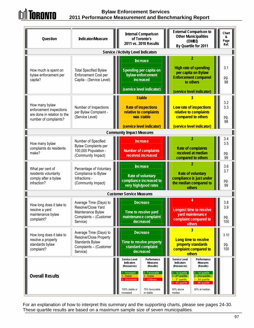
Bylaw Enforcement Services 2011 Performance Measurement and Benchmarking Report
97
Question Indicator/Measure Internal Comparison
of Toronto’s 2011 vs. 2010 Results
External Comparison to Other Municipalities
(OMBI) By Quartile for 2011
Chart &
Page Ref.
Service / Activity Level Indicators
How much is spent on bylaw enforcement per capita?
Total Specified Bylaw Enforcement Cost per Capita - (Service Level)
Increase
Spending per capita on bylaw enforcement
increased
(service level indicator)
2
High rate of spending per capita on Bylaw
Enforcement compared to others
(service level indicator)
3.1
pg. 98
How many bylaw enforcement inspections are done in relation to the number of complaints?
Number of Inspections per Bylaw Complaint - (Service Level)
Stable
Rate of inspections relative to complaints
was stable
(service level indicator)
3
Low rate of inspections relative to complaints compared to others
(service level indicator)
3.2 3.3
pg. 98
Community Impact Measures
How many bylaw complaints do residents make?
Number of Specified Bylaw Complaints per 100,000 Population -(Community Impact)
Increase
Number of complaints received increased
2
Rate of complaints received at median compared to others
3.4 3.5
pg. 99
What per cent of residents voluntarily comply after a bylaw infraction?
Percentage of Voluntary Compliance to Bylaw Infractions - (Community Impact)
Increase
Rate of voluntary compliance increased to
very high/good rates
2
Rate of voluntary compliance is just under the median compared to
others
3.6 3.7
pg. 99
Customer Service Measures
How long does it take to resolve a yard maintenance bylaw complaint?
Average Time (Days) to Resolve/Close Yard Maintenance Bylaw Complaints – (Customer Service)
Decrease
Time to resolve yard maintenance complaint
decreased
4
Longest time to resolve yard maintenance
complaint compared to others
3.8 3.9
pg. 100
How long does it take to resolve a property standards bylaw complaint?
Average Time (Days) to Resolve/Close Property Standards Bylaw Complaints – (Customer Service)
Decrease
Time to resolve property standard complaint
decreased
3
Long time to resolve property standards
complaint compared to others
3.10
pg. 100
Overall Results
Service Level Indicators
(Resources) 1 - Increased 1 - Stable 0 - Decreased 100% stable or increased
Performance Measures (Results)
3 - Favourable 0 - Stable 1 - Unfavour. 75% favourable or stable
Service Level Indicators
(Resources)
0 - 1st quartile 1 - 2nd quartile 1 - 3rd quartile 0 - 4th quartile 50% above median
Performance Measures (Results)
0 - 1st quartile 2 - 2nd quartile 1 - 3rd quartile 1 - 4th quartile 50% at median
For an explanation of how to interpret this summary and the supporting charts, please see pages 24-30. These quartile results are based on a maximum sample size of seven municipalities.
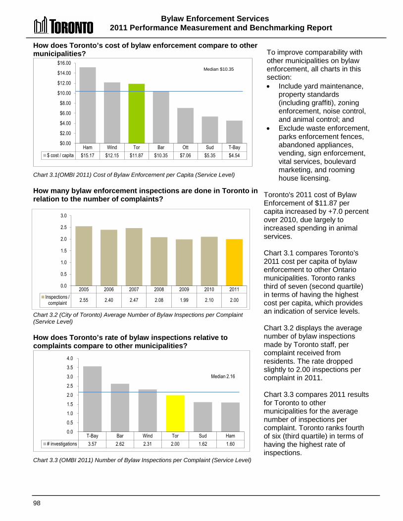
Bylaw Enforcement Services 2011 Performance Measurement and Benchmarking Report
98
Ham Wind Tor Bar Ott Sud T-Bay $ cost / capita $15.17 $12.15 $11.87 $10.35 $7.06 $5.35 $4.54
$0.00
$2.00
$4.00
$6.00
$8.00
$10.00
$12.00
$14.00
$16.00 Median $10.35
T-Bay Bar Wind Tor Sud Ham # investigations 3.57 2.62 2.31 2.00 1.62 1.60
0.0 0.5 1.0 1.5 2.0 2.5 3.0 3.5 4.0
Median 2.16
How does Toronto’s cost of bylaw enforcement compare to other municipalities? Chart 3.1(OMBI 2011) Cost of Bylaw Enforcement per Capita (Service Level) How many bylaw enforcement inspections are done in Toronto in relation to the number of complaints? Chart 3.2 (City of Toronto) Average Number of Bylaw Inspections per Complaint (Service Level) How does Toronto’s rate of bylaw inspections relative to complaints compare to other municipalities? Chart 3.3 (OMBI 2011) Number of Bylaw Inspections per Complaint (Service Level)
To improve comparability with other municipalities on bylaw enforcement, all charts in this section: • Include yard maintenance,
property standards (including graffiti), zoning enforcement, noise control, and animal control; and
• Exclude waste enforcement, parks enforcement fences, abandoned appliances, vending, sign enforcement, vital services, boulevard marketing, and rooming house licensing.
Toronto's 2011 cost of Bylaw Enforcement of $11.87 per capita increased by +7.0 percent over 2010, due largely to increased spending in animal services. Chart 3.1 compares Toronto’s 2011 cost per capita of bylaw enforcement to other Ontario municipalities. Toronto ranks third of seven (second quartile) in terms of having the highest cost per capita, which provides an indication of service levels. Chart 3.2 displays the average number of bylaw inspections made by Toronto staff, per complaint received from residents. The rate dropped slightly to 2.00 inspections per complaint in 2011. Chart 3.3 compares 2011 results for Toronto to other municipalities for the average number of inspections per complaint. Toronto ranks fourth of six (third quartile) in terms of having the highest rate of inspections.
2005 2006 2007 2008 2009 2010 2011 Inspections /
complaint 2.55 2.40 2.47 2.08 1.99 2.10 2.00
0.0
0.5
1.0
1.5
2.0
2.5
3.0
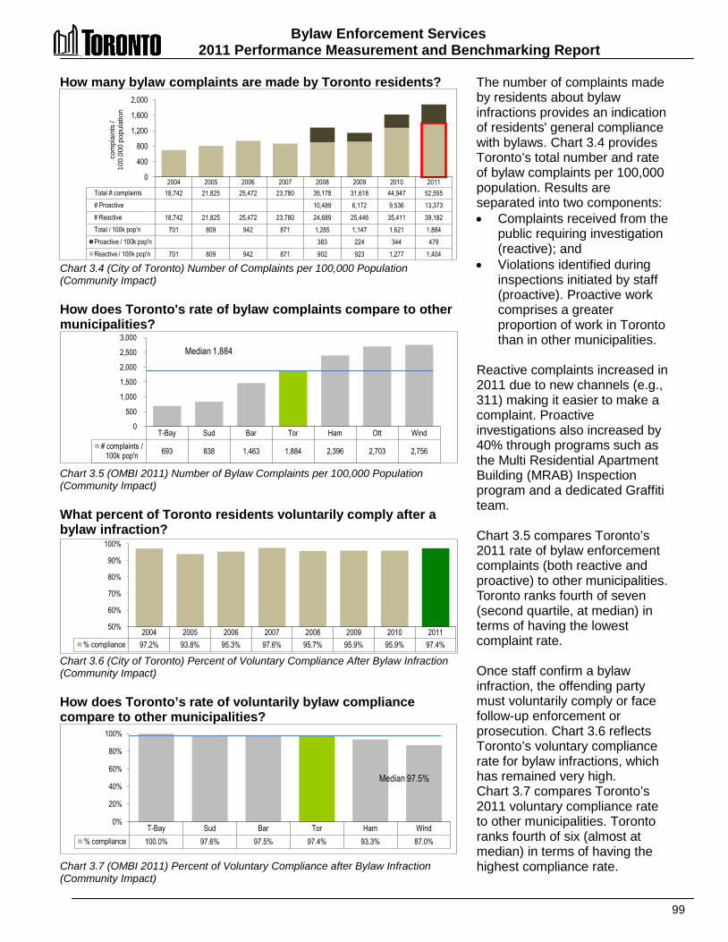
Bylaw Enforcement Services 2011 Performance Measurement and Benchmarking Report
99
T-Bay Sud Bar Tor Ham Ott Wind # complaints /
100k pop'n 693 838 1,463 1,884 2,396 2,703 2,756
0
500
1,000
1,500
2,000
2,500
3,000 Median 1,884
T-Bay Sud Bar Tor Ham Wind % compliance 100.0% 97.6% 97.5% 97.4% 93.3% 87.0%
0%
20%
40%
60%
80%
100%
Median 97.5%
How many bylaw complaints are made by Toronto residents? Chart 3.4 (City of Toronto) Number of Complaints per 100,000 Population (Community Impact) How does Toronto's rate of bylaw complaints compare to other municipalities? Chart 3.5 (OMBI 2011) Number of Bylaw Complaints per 100,000 Population (Community Impact) What percent of Toronto residents voluntarily comply after a bylaw infraction? Chart 3.6 (City of Toronto) Percent of Voluntary Compliance After Bylaw Infraction (Community Impact) How does Toronto’s rate of voluntarily bylaw compliance compare to other municipalities? Chart 3.7 (OMBI 2011) Percent of Voluntary Compliance after Bylaw Infraction (Community Impact)
The number of complaints made by residents about bylaw infractions provides an indication of residents' general compliance with bylaws. Chart 3.4 provides Toronto’s total number and rate of bylaw complaints per 100,000 population. Results are separated into two components: • Complaints received from the
public requiring investigation (reactive); and
• Violations identified during inspections initiated by staff (proactive). Proactive work comprises a greater proportion of work in Toronto than in other municipalities.
Reactive complaints increased in 2011 due to new channels (e.g., 311) making it easier to make a complaint. Proactive investigations also increased by 40% through programs such as the Multi Residential Apartment Building (MRAB) Inspection program and a dedicated Graffiti team. Chart 3.5 compares Toronto’s 2011 rate of bylaw enforcement complaints (both reactive and proactive) to other municipalities. Toronto ranks fourth of seven (second quartile, at median) in terms of having the lowest complaint rate. Once staff confirm a bylaw infraction, the offending party must voluntarily comply or face follow-up enforcement or prosecution. Chart 3.6 reflects Toronto’s voluntary compliance rate for bylaw infractions, which has remained very high. Chart 3.7 compares Toronto’s 2011 voluntary compliance rate to other municipalities. Toronto ranks fourth of six (almost at median) in terms of having the highest compliance rate.
2004 2005 2006 2007 2008 2009 2010 2011 Total # complaints 18,742 21,825 25,472 23,780 35,178 31,618 44,947 52,555 # Proactive 10,489 6,172 9,536 13,373 # Reactive 18,742 21,825 25,472 23,780 24,689 25,446 35,411 39,182 Total / 100k pop'n 701 809 942 871 1,285 1,147 1,621 1,884 Proactive / 100k pop'n 383 224 344 479 Reactive / 100k pop'n 701 809 942 871 902 923 1,277 1,404
0
400
800
1,200
1,600
2,000 co
mpl
aint
s /
100,
000
popu
latio
n
2004 2005 2006 2007 2008 2009 2010 2011 % compliance 97.2% 93.8% 95.3% 97.6% 95.7% 95.9% 95.9% 97.4%
50%
60%
70%
80%
90%
100%
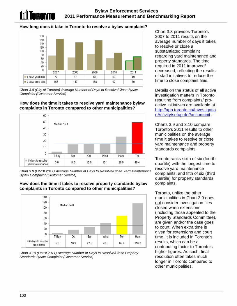
Bylaw Enforcement Services 2011 Performance Measurement and Benchmarking Report
100
T-Bay Bar Ott Wind Ham Tor # days to resolve yard maintenance 3.0 14.5 15.0 15.1 26.9 49.4
0
10
20
30
40
50
60
Median 15.1
T-Bay Ott Bar Wind Tor Ham # days to resolve
prop stnds 5.0 16.9 27.5 42.0 69.7 116.3
0 20 40 60 80
100 120 140
Median 34.8
How long does it take in Toronto to resolve a bylaw complaint? Chart 3.8 (City of Toronto) Average Number of Days to Resolve/Close Bylaw Complaint (Customer Service) How does the time it takes to resolve yard maintenance bylaw complaints in Toronto compared to other municipalities? Chart 3.9 (OMBI 2011) Average Number of Days to Resolve/Close Yard Maintenance Bylaw Complaint (Customer Service) How does the time it takes to resolve property standards bylaw complaints in Toronto compared to other municipalities? Chart 3.10 (OMBI 2011) Average Number of Days to Resolve/Close Property Standards Bylaw Complaint (Customer Service)
Chart 3.8 provides Toronto's 2007 to 2011 results on the average number of days it takes to resolve or close a substantiated complaint regarding yard maintenance and property standards. The time required in 2011 improved/ decreased, reflecting the results of staff initiatives to reduce the time to close complaint files. Details on the status of all active investigation matters in Toronto resulting from complaints/ pro-active initiatives are available at http://app.toronto.ca/InvestigationActivity/setup.do?action=init. . Charts 3.9 and 3.10 compare Toronto’s 2011 results to other municipalities on the average time it takes to resolve or close yard maintenance and property standards complaints. Toronto ranks sixth of six (fourth quartile) with the longest time to resolve yard maintenance complaints, and fifth of six (third quartile) for property standards complaints. Toronto, unlike the other municipalities in Chart 3.9 does not consider investigation files closed when extensions (including those appealed to the Property Standards Committee), are given and/or the case goes to court. When extra time is given for extensions and court time, it is included in Toronto's results, which can be a contributing factor to Toronto's higher figures. As such, final resolution often takes much longer in Toronto compared to other municipalities.
2007 2008 2009 2010 2011 # days yard mtn 77 67 86 63 49 # days prop stds 166 147 158 92 70
0 20 40 60 80
100 120 140 160 180
Bylaw Enforcement Services 2011 Performance Measurement and Benchmarking Report
101
2012 Achievements and 2013 Planned Initiatives The following initiatives are intended to further improve the efficiency and effectiveness of the City of Toronto Municipal Licensing and Standards Division’s Bylaw enforcement program: 2012 Initiatives Completed/Achievements: • Continued audits of apartment buildings and complexes through the MRAB Program with additional
efficiencies and a revised building selection process. • Continued strategy for collaborative enforcement action with other Divisions and external agencies • Sterilized 89 feral cats and 178 owned cats (total 267 cats) to June 8, 2012. • Successful collaboration / partnership model with various cat interest groups across the city.
Collaboration enhanced in 2012 to add a recovery space for feral cats after surgery. • Participated in successful negotiations with the College of Veterinarians of Ontario for set up of MASH
or mobile spay/neuter clinics (in planning stages).
2013 Planned Initiatives • Review alternate response opportunities. • Organizational review to balance workloads and bolster accountability. • Develop a comprehensive suite of performance measures. • Review business processes to identify efficiencies. • Review of the Multi Residential Apartment Building (MRAB) Audit and Enforcement Program. Factors Influencing Results of Municipalities The results of each municipality found in the charts included in this report are influenced to varying degrees by factors such as: • Service standards set by each municipality’s Council • Geographic size and population density of the municipality • Monitoring and compliance tracking - type and quality of systems used to track complaints, inspections,
and related data • Inspection policies - extent and complexity of inspections or other responses carried out by each
municipality. Differences in inspection policies from municipality to municipality make it more challenging to make a direct comparison
• Response capability - nature of the complaint and resources available to respond affecting the timeliness of the response
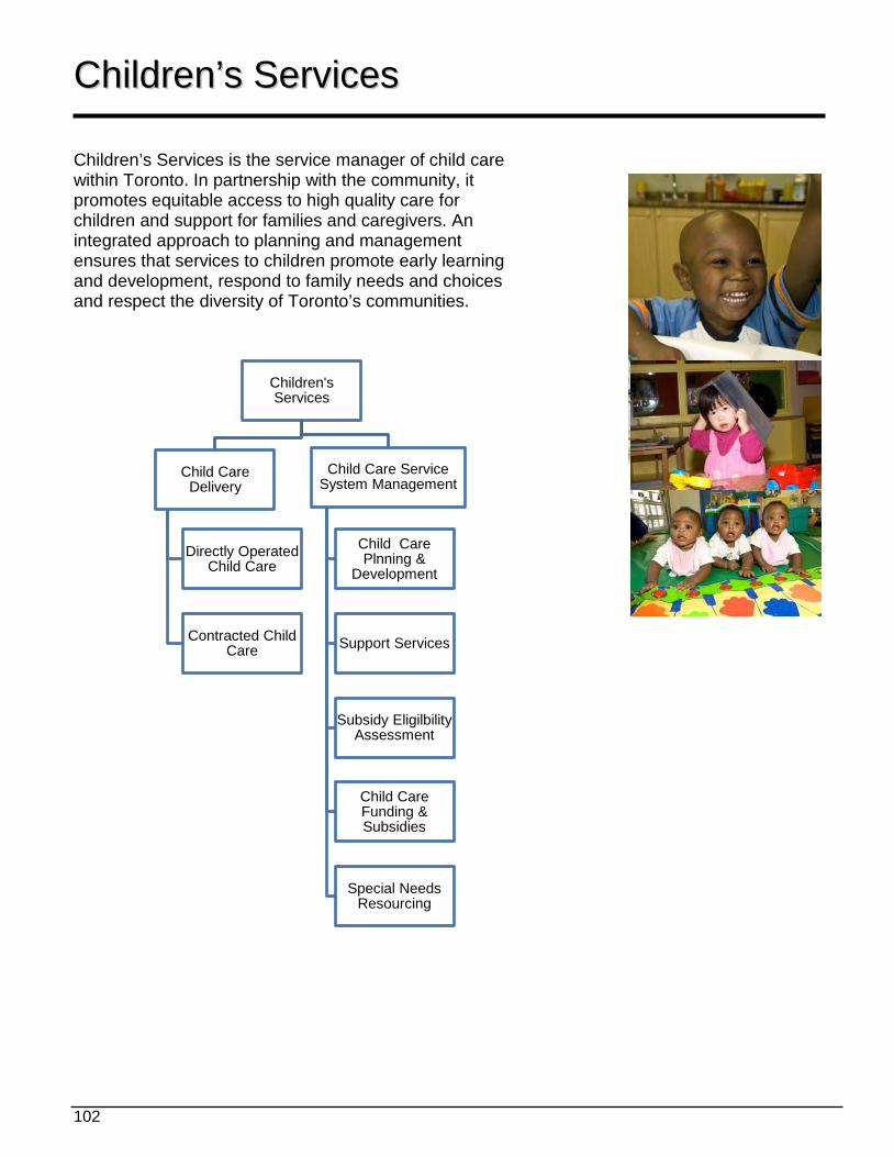
102
CChhiillddrreenn’’ss SSeerrvviicceess Children’s Services is the service manager of child care within Toronto. In partnership with the community, it promotes equitable access to high quality care for children and support for families and caregivers. An integrated approach to planning and management ensures that services to children promote early learning and development, respond to family needs and choices and respect the diversity of Toronto’s communities. Children's
Services
Child Care Delivery
Directly Operated Child Care
Contracted Child Care
Child Care Service System Management
Child Care Plnning &
Development
Support Services
Subsidy Eligilbility Assessment
Child Care Funding & Subsidies
Special Needs Resourcing
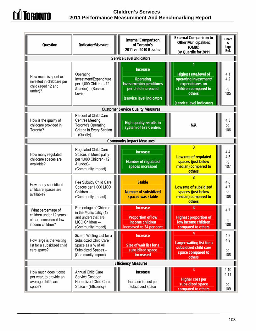
Children’s Services 2011 Performance Measurement And Benchmarking Report
103
Question Indicator/Measure Internal Comparison
of Toronto’s 2011 vs. 2010 Results
External Comparison to Other Municipalities
(OMBI) By Quartile for 2011
Chart &
Page Ref.
Service Level Indicators
How much is spent or invested in childcare per child (aged 12 and under)?
Operating Investment/Expenditure per 1,000 Children (12 & under) - (Service Level)
Increase
Operating Investment/expenditures
per child increased
(service level indicator)
1
Highest rate/level of operating investment/
expenditures on children compared to
others
(service level indicator)
4.1 4.2
pg. 105
Customer Service Quality Measures
How is the quality of childcare provided in Toronto?
Percent of Child Care Centres Meeting Toronto's Operating Criteria in Every Section – (Quality)
High quality results in system of 635 Centres N/A
4.3 pg. 106
Community Impact Measures
How many regulated childcare spaces are available?
Regulated Child Care Spaces in Municipality per 1,000 Children (12 & under)– (Community Impact)
Increase
Number of regulated spaces increased
3
Low rate of regulated spaces (just below
median) compared to others
4.4 4.5 pg. 107
How many subsidized childcare spaces are available?
Fee Subsidy Child Care Spaces per 1,000 LICO Children – (Community Impact)
Stable
Number of subsidized spaces was stable
3
Low rate of subsidized spaces (just below
median) compared to others
4.6 4.7 pg. 108
What percentage of children under 12 years old are considered low income children?
Percentage of Children in the Municipality (12 and under) that are LICO Children -– (Community Impact)
Increase
Proportion of low income children
increased to 34 per cent
4
Highest proportion of low income children compared to others
4.7
pg. 108
How large is the waiting list for a subsidized child care space?
Size of Waiting List for a Subsidized Child Care Space as a % of All Subsidized Spaces – (Community Impact)
Increase
Size of wait list for a subsidized space
increased
4
Larger waiting list for a subsidized child care space compared to
others
4.8 4.9
pg. 108
Efficiency Measures
How much does it cost per year, to provide an average child care space?
Annual Child Care Service Cost per Normalized Child Care Space – (Efficiency)
Increase
Increase in cost per subsidized space
4
Higher cost per subsidized space
compared to others
4.10 4.11
pg. 109
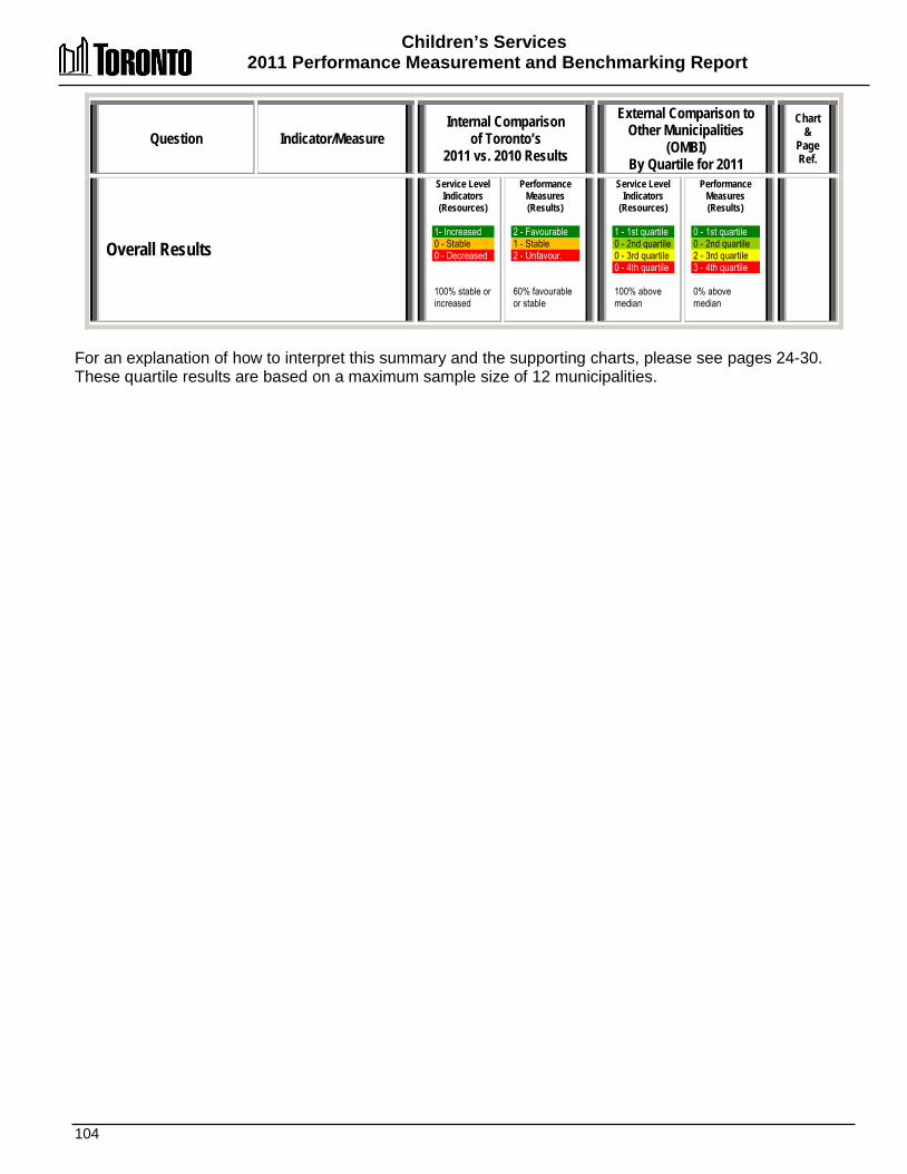
Children’s Services 2011 Performance Measurement and Benchmarking Report
104
Question Indicator/Measure Internal Comparison
of Toronto’s 2011 vs. 2010 Results
External Comparison to Other Municipalities
(OMBI) By Quartile for 2011
Chart &
Page Ref.
Overall Results
Service Level Indicators
(Resources) 1- Increased 0 - Stable 0 - Decreased 100% stable or increased
Performance Measures (Results)
2 - Favourable 1 - Stable 2 - Unfavour. 60% favourable or stable
Service Level Indicators
(Resources)
1 - 1st quartile 0 - 2nd quartile 0 - 3rd quartile 0 - 4th quartile 100% above median
Performance Measures (Results)
0 - 1st quartile 0 - 2nd quartile 2 - 3rd quartile 3 - 4th quartile 0% above median
For an explanation of how to interpret this summary and the supporting charts, please see pages 24-30. These quartile results are based on a maximum sample size of 12 municipalities.
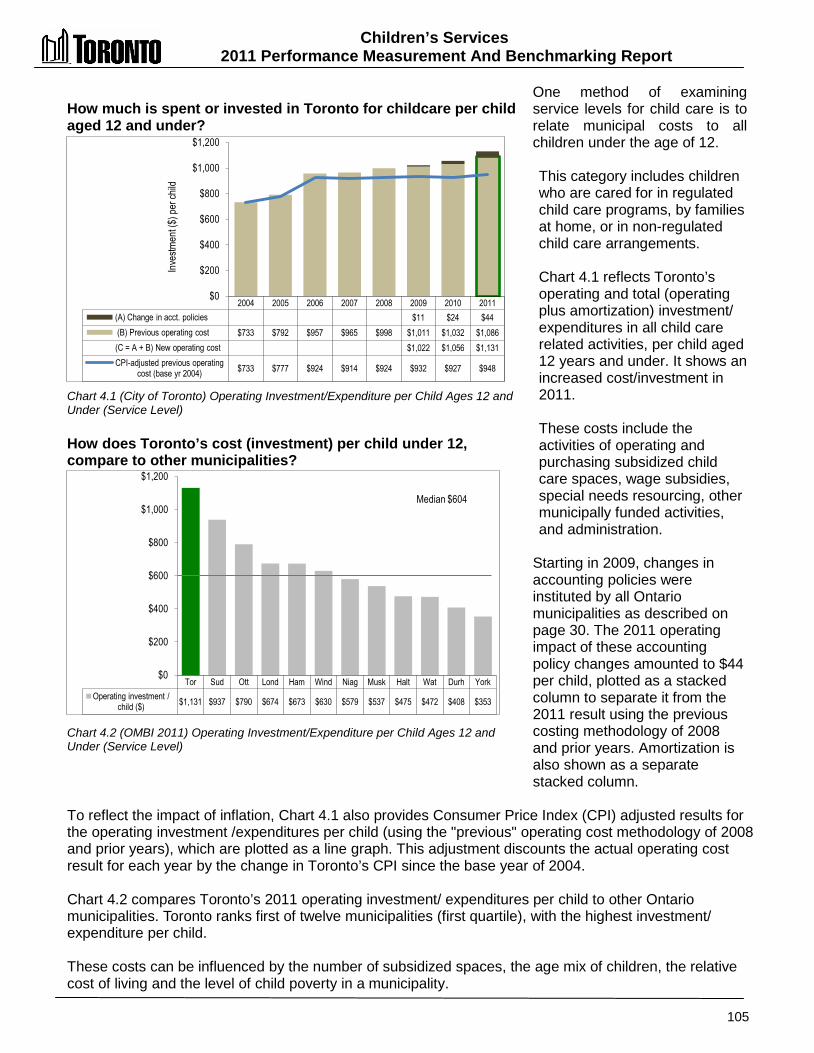
Children’s Services 2011 Performance Measurement And Benchmarking Report
105
How much is spent or invested in Toronto for childcare per child aged 12 and under? Chart 4.1 (City of Toronto) Operating Investment/Expenditure per Child Ages 12 and Under (Service Level) How does Toronto’s cost (investment) per child under 12, compare to other municipalities? Chart 4.2 (OMBI 2011) Operating Investment/Expenditure per Child Ages 12 and Under (Service Level)
One method of examining service levels for child care is to relate municipal costs to all children under the age of 12. This category includes children who are cared for in regulated child care programs, by families at home, or in non-regulated child care arrangements. Chart 4.1 reflects Toronto’s operating and total (operating plus amortization) investment/ expenditures in all child care related activities, per child aged 12 years and under. It shows an increased cost/investment in 2011. These costs include the activities of operating and purchasing subsidized child care spaces, wage subsidies, special needs resourcing, other municipally funded activities, and administration.
Starting in 2009, changes in accounting policies were instituted by all Ontario municipalities as described on page 30. The 2011 operating impact of these accounting policy changes amounted to $44 per child, plotted as a stacked column to separate it from the 2011 result using the previous costing methodology of 2008 and prior years. Amortization is also shown as a separate stacked column.
To reflect the impact of inflation, Chart 4.1 also provides Consumer Price Index (CPI) adjusted results for the operating investment /expenditures per child (using the "previous" operating cost methodology of 2008 and prior years), which are plotted as a line graph. This adjustment discounts the actual operating cost result for each year by the change in Toronto’s CPI since the base year of 2004. Chart 4.2 compares Toronto’s 2011 operating investment/ expenditures per child to other Ontario municipalities. Toronto ranks first of twelve municipalities (first quartile), with the highest investment/ expenditure per child. These costs can be influenced by the number of subsidized spaces, the age mix of children, the relative cost of living and the level of child poverty in a municipality.
2004 2005 2006 2007 2008 2009 2010 2011 (A) Change in acct. policies $11 $24 $44 (B) Previous operating cost $733 $792 $957 $965 $998 $1,011 $1,032 $1,086 (C = A + B) New operating cost $1,022 $1,056 $1,131 CPI-adjusted previous operating
cost (base yr 2004)
$733 $777 $924 $914 $924 $932 $927 $948
$0
$200
$400
$600
$800
$1,000
$1,200
Inves
tmen
t ($) p
er ch
ild
Tor Sud Ott Lond Ham Wind Niag Musk Halt Wat Durh York Operating investment /
child ($) $1,131 $937 $790 $674 $673 $630 $579 $537 $475 $472 $408 $353
$0
$200
$400
$600
$800
$1,000
$1,200
Median $604

Children’s Services 2011 Performance Measurement and Benchmarking Report
106
How is the quality of care in Toronto's child care centres? Chart 4.3 (City of Toronto) Percent of Child Care Centres Meeting Toronto's Operating Criteria in Every Section (Quality)
Every child and society in general benefits from a quality early learning and care experience. A parent expects that a licensed child care centre will deliver a high quality program that allows children opportunities for play, socialization, exploration and developmentally appropriate learning in a safe and nurturing environment.
In Toronto, all child care centres with a service contract for fee subsidy (with the City) are assessed by the City for quality standards.This assessment rates a child care centre's activities, learning, health, safety, adult/child interactions and nutrition by comparing them to the standards laid out in the Toronto Operating Criteria1
, which is a tool used to evaluate the City's expectations of quality for child care programs.
This criteria and standards are categorized as follows:
• By age group o Structure of the day o Physical environment o Learning o Physical needs o Health and safety o Interactions o Activities and experiences planned (pre-school and school age) o Learning (pre-school and school age)
• Overall for the Centre o Nutrition o Playground o Administration o Financial management o Working together
To conduct these assessments, a Children's Services Quality Assurance Analyst makes unannounced visits throughout the year to all child care centres that have a service contract with the City for fee subsidy).Those ratings for each of these 635 centres are then posted on the Children's Services Website, which provides results for the current year under each of the criteria noted above, along with comparisons to the previous year and the average of all centres. Chart 4.3 above provides 2010 and 2011 results for the percentage of these child care centres that have met or exceeded Toronto's Operating Criteria in every area noted above and results are very high. This measure is currently being revised based on the results obtained since its implementation. A more efficient assessment model has been developed and is in the process of being validated. This new tool will be the only validated tool to assess quality in child care in Canada. The new model will create a new baseline for monitoring the average quality of improvement.
1 http://www.toronto.ca/children/quality_description.htm
2010 2011 % meeting criteria 95.70% 92.25%
0% 10% 20% 30% 40% 50% 60% 70% 80% 90%
100%
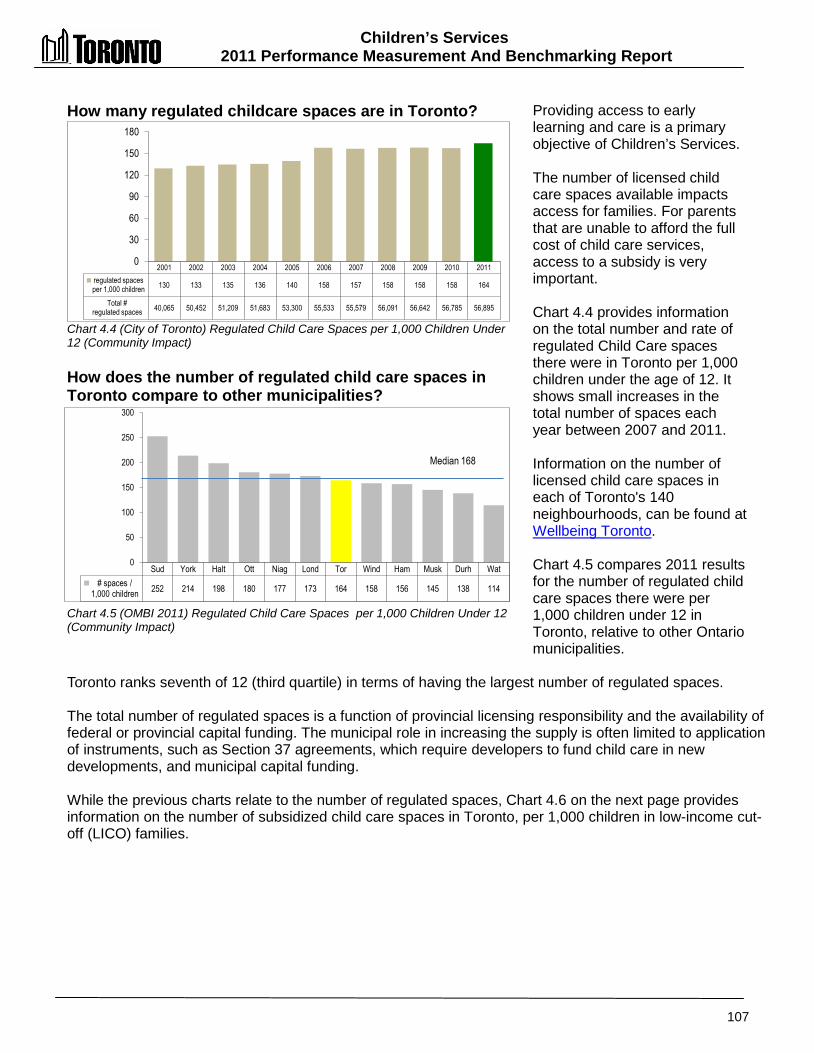
Children’s Services 2011 Performance Measurement And Benchmarking Report
107
How many regulated childcare spaces are in Toronto? Chart 4.4 (City of Toronto) Regulated Child Care Spaces per 1,000 Children Under 12 (Community Impact) How does the number of regulated child care spaces in Toronto compare to other municipalities? Chart 4.5 (OMBI 2011) Regulated Child Care Spaces per 1,000 Children Under 12 (Community Impact)
Providing access to early learning and care is a primary objective of Children’s Services. The number of licensed child care spaces available impacts access for families. For parents that are unable to afford the full cost of child care services, access to a subsidy is very important. Chart 4.4 provides information on the total number and rate of regulated Child Care spaces there were in Toronto per 1,000 children under the age of 12. It shows small increases in the total number of spaces each year between 2007 and 2011. Information on the number of licensed child care spaces in each of Toronto's 140 neighbourhoods, can be found at Wellbeing Toronto. Chart 4.5 compares 2011 results for the number of regulated child care spaces there were per 1,000 children under 12 in Toronto, relative to other Ontario municipalities.
Toronto ranks seventh of 12 (third quartile) in terms of having the largest number of regulated spaces. The total number of regulated spaces is a function of provincial licensing responsibility and the availability of federal or provincial capital funding. The municipal role in increasing the supply is often limited to application of instruments, such as Section 37 agreements, which require developers to fund child care in new developments, and municipal capital funding. While the previous charts relate to the number of regulated spaces, Chart 4.6 on the next page provides information on the number of subsidized child care spaces in Toronto, per 1,000 children in low-income cut-off (LICO) families.
2001 2002 2003 2004 2005 2006 2007 2008 2009 2010 2011 regulated spaces per 1,000 children 130 133 135 136 140 158 157 158 158 158 164
Total # regulated spaces 40,065 50,452 51,209 51,683 53,300 55,533 55,579 56,091 56,642 56,785 56,895
0
30
60
90
120
150
180
Sud York Halt Ott Niag Lond Tor Wind Ham Musk Durh Wat # spaces /
1,000 children 252 214 198 180 177 173 164 158 156 145 138 114
0
50
100
150
200
250
300
Median 168
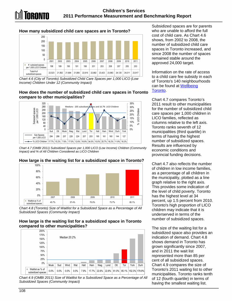
Children’s Services 2011 Performance Measurement and Benchmarking Report
108
How many subsidized child care spaces are in Toronto? Chart 4.6 (City of Toronto) Subsidized Child Care Spaces per 1,000 LICO (Low Income) Children Under 12 (Community Impact) How does the number of subsidized child care spaces in Toronto compare to other municipalities? Chart 4.7 (OMBI 2011) Subsidized Spaces per 1,000 LICO (Low Income) Children (Community Impact) and % of All Children Considered as LICO Children How large is the waiting list for a subsidized space in Toronto? Chart 4.8 (Toronto) Size of Waitlist for a Subsidized Space as a Percentage of All Subsidized Spaces (Community Impact) How large is the waiting list for a subsidized space in Toronto compared to other municipalities? Chart 4.9 (OMBI 2011) Size of Waitlist for a Subsidized Space as a Percentage of All Subsidized Spaces (Community Impact)
Subsidized spaces are for parents who are unable to afford the full cost of child care. As Chart 4.6 shows, from 2002 to 2008, the number of subsidized child care spaces in Toronto increased, and since 2008 the number of spaces remained stable around the approved 24,000 target. Information on the rate of access to a child care fee subsidy in each of Toronto's 140 neighbourhoods can be found at Wellbeing Toronto. Chart 4.7 compares Toronto’s 2011 result to other municipalities for the number of subsidized child care spaces per 1,000 children in LICO families, reflected as columns relative to the left axis. Toronto ranks seventh of 12 municipalities (third quartile) in terms of having the highest number of subsidized spaces. Results are influenced by economic conditions and provincial funding decisions. Chart 4.7 also reflects the number of children in low income families, as a percentage of all children in the municipality, plotted as a line graph relative to the right axis. This provides some indication of the level of child poverty. Toronto has the highest level at 34 percent, up 1.5 percent from 2010. Toronto's high proportion of LICO children may indicate that it is underserved in terms of the number of subsidized spaces. The size of the waiting list for a subsidized space also provides an indication of demand. Chart 4.8 shows demand in Toronto has grown significantly since 2007, and in 2011 the wait list represented more than 85 per cent of all subsidized spaces. Chart 4.9 compares the size of Toronto's 2011 waiting list to other municipalities. Toronto ranks tenth of 12 (fourth quartile) in terms of having the smallest waiting list.
2001 2002 2003 2004 2005 2006 2007 2008 2009 2010 2011 # subsized spaces
per 1,000 LICO Children 198 189 190 191 198 201 203 208 207 205 203
Total # of subsidized spaces 22,523 21,562 21,664 21,806 22,616 22,882 23,423 23,983 24,120 24,011 23,917
0 50
100 150 200 250
Sud Ott Musk Niag Wat Lond Tor Halt Ham Wind Durh York Sub Spaces
per 1,000 LICO 294 288 257 228 224 207 203 195 161 160 144 127
% LICO Children 17.7% 15.2% 7.6% 17.0% 12.6% 19.9% 34.0% 10.0% 25.7% 18.2% 11.9% 16.3%
0% 5% 10% 15% 20% 25% 30% 35%
0 40 80
120 160 200 240 280 320
Medians - 205 subsidized spaces and 16.7% LICO Children
Subs
ized s
pace
s pe
r 1,00
0 LIC
O
% L
ICO
Child
ren
Musk Sud Wind Wat Halt Ham Niag Lond Ott Tor York Durh Waitlist as % of
subsidized spaces 0.0% 0.0% 0.0% 0.0% 7.9% 17.7% 22.6% 22.8% 61.0% 85.1% 152.3% 179.9%
0% 25% 50% 75%
100% 125% 150% 175% 200%
Median 20.2%
2007 2008 2009 2010 2011 Waitlist as % of
subsidized spaces 45.7% 57.4% 70.0% 73.7% 85.1%
0%
20%
40%
60%
80%
100%
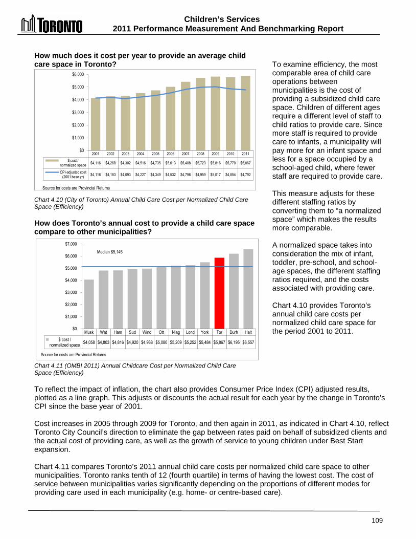
Children’s Services 2011 Performance Measurement And Benchmarking Report
109
How much does it cost per year to provide an average child care space in Toronto? Chart 4.10 (City of Toronto) Annual Child Care Cost per Normalized Child Care Space (Efficiency) How does Toronto’s annual cost to provide a child care space compare to other municipalities? Chart 4.11 (OMBI 2011) Annual Childcare Cost per Normalized Child Care Space (Efficiency)
To examine efficiency, the most comparable area of child care operations between municipalities is the cost of providing a subsidized child care space. Children of different ages require a different level of staff to child ratios to provide care. Since more staff is required to provide care to infants, a municipality will pay more for an infant space and less for a space occupied by a school-aged child, where fewer staff are required to provide care. This measure adjusts for these different staffing ratios by converting them to “a normalized space” which makes the results more comparable. A normalized space takes into consideration the mix of infant, toddler, pre-school, and school-age spaces, the different staffing ratios required, and the costs associated with providing care. Chart 4.10 provides Toronto’s annual child care costs per normalized child care space for the period 2001 to 2011.
To reflect the impact of inflation, the chart also provides Consumer Price Index (CPI) adjusted results, plotted as a line graph. This adjusts or discounts the actual result for each year by the change in Toronto’s CPI since the base year of 2001. Cost increases in 2005 through 2009 for Toronto, and then again in 2011, as indicated in Chart 4.10, reflect Toronto City Council’s direction to eliminate the gap between rates paid on behalf of subsidized clients and the actual cost of providing care, as well as the growth of service to young children under Best Start expansion. Chart 4.11 compares Toronto’s 2011 annual child care costs per normalized child care space to other municipalities. Toronto ranks tenth of 12 (fourth quartile) in terms of having the lowest cost. The cost of service between municipalities varies significantly depending on the proportions of different modes for providing care used in each municipality (e.g. home- or centre-based care).
2001 2002 2003 2004 2005 2006 2007 2008 2009 2010 2011 $ cost /
normalized space $4,116 $4,268 $4,302 $4,516 $4,735 $5,013 $5,408 $5,723 $5,816 $5,770 $5,867
CPI-adjusted cost (2001 base yr) $4,116 $4,183 $4,093 $4,227 $4,349 $4,532 $4,796 $4,959 $5,017 $4,854 $4,792
$0
$1,000
$2,000
$3,000
$4,000
$5,000
$6,000
Source for costs are Provincial Returns
Musk Wat Ham Sud Wind Ott Niag Lond York Tor Durh Halt $ cost /
normalized space $4,058 $4,803 $4,816 $4,920 $4,968 $5,080 $5,209 $5,252 $5,484 $5,867 $6,195 $6,557
$0
$1,000
$2,000
$3,000
$4,000
$5,000
$6,000
$7,000
Source for costs are Provincial Returns
Median $5,145

Children’s Services 2011 Performance Measurement and Benchmarking Report
110
2012 Achievements and 2013 Planned Initiatives The following initiatives are expected to further improve the efficiency and effectiveness of Children’s Services: 2012 Initiatives Completed/Achievements • Supported Toronto Children's Service – Ontario Ministry of Education staff table to address
ongoing fiscal pressures and impacts of the Province of Ontario's new Early Learning Program (ELP) on Toronto's child care system, and participated in working group to revise provincial funding formula.
• Launched grants programs with new provincial funding to begin to expedite child care modernization.
• Developed a capital investment strategy that considers the incremental impact of ELP and advances equity.
• Completed Divisional Business Strategy and Information Management and IT Strategy. • Opened new child care centres through established Capital Partnership Agreements -
Chester Le, Thorncliffe. • Completed development and alignment of Middle Childhood Strategy with Recreation
Service Plan. • Municipal Child Care Services Strategy and Transition Plan completed and approved by
Council in July 2012. • Continued to reduce lost-time hours in Municipal Child Care Services. • Increased and enhanced online services and integration with 311. • Advanced an integrated continuum of services for children and family through sites of
practice. • Community Integration Leader in a Community Action Research on Service Integration and
Aboriginal Child and Family Services project. • Implemented a new counter with Toronto Employment and Social Services for shared
customer service. • Launched new Toronto Child and Family Network. • Supported Service Efficiency Study. • Responded to recommendations arising from Ombudsman Report. 2013 Initiatives Planned • Implement Modernization Agenda with the Province • Implement the Municipal Child Care Services strategic plan
o Transition to younger children o Focus on high-need areas

Children’s Services 2011 Performance Measurement And Benchmarking Report
111
Factors Influencing the Results of Municipalities The results of each municipality included in this report can be influenced to varying degrees by factors such as: • varying levels of child poverty in municipalities results in differing needs for subsidized child
care • cost to provide child care can be impacted by economic variables such as the cost of living
in the municipality and the income levels of its residents • rates for child care spaces other than those directly operated by a municipality are set in
service agreements between the municipality and the child care service providers; and these rates can be influenced by the level of funding available, local wage conditions, pay equity legislation, municipal policies and business practices
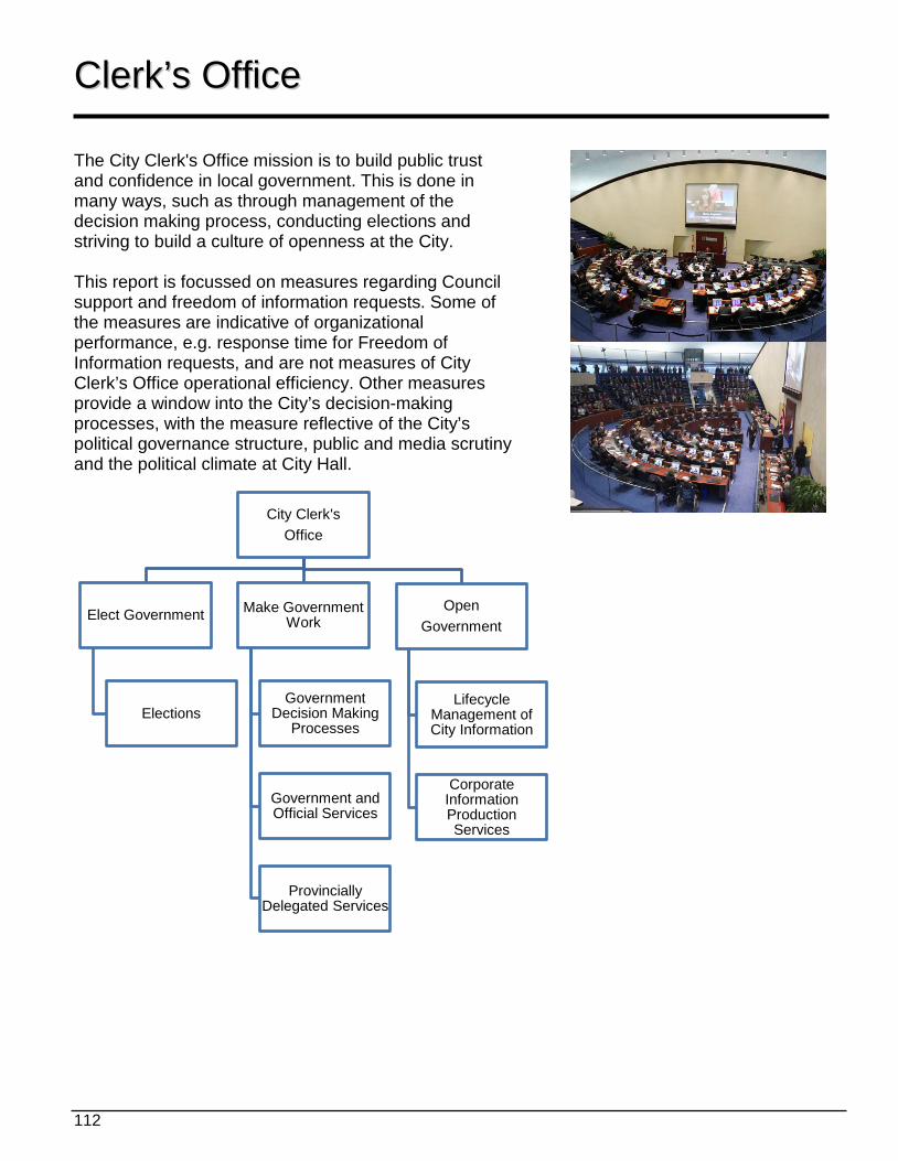
112
CClleerrkk’’ss OOffffiiccee The City Clerk's Office mission is to build public trust and confidence in local government. This is done in many ways, such as through management of the decision making process, conducting elections and striving to build a culture of openness at the City. This report is focussed on measures regarding Council support and freedom of information requests. Some of the measures are indicative of organizational performance, e.g. response time for Freedom of Information requests, and are not measures of City Clerk’s Office operational efficiency. Other measures provide a window into the City’s decision-making processes, with the measure reflective of the City’s political governance structure, public and media scrutiny and the political climate at City Hall.
City Clerk's Office
Elect Government
Elections
Make Government Work
Government Decision Making
Processes
Government and Official Services
Provincially Delegated Services
Open Government
Lifecycle Management of City Information
Corporate Information Production Services
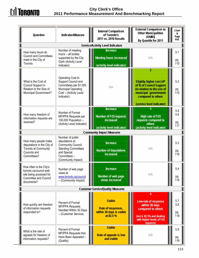
City Clerk's Office 2011 Performance Measurement And Benchmarking Report
113
Question Indicator/Measure Internal Comparison
of Toronto’s 2011 vs. 2010 Results
External Comparison to Other Municipalities
(OMBI) By Quartile for 2011
Chart &
Page Ref.
Service/Activity Level Indicators
How many hours do Council and Committees meet in the City of Toronto
Number of meeting hours – all bodies supported by the City Clerk (Activity Level Indicator)
Increase
Meeting hours increased
(activity level indicator)
N/A 5.1
pg. 115
What is the Cost of Council Support in Relation to the Size of Municipal Government?
Operating Cost to Support Council and Committees per $1,000 Municipal Operating Cost – (Activity Level Indicator)
N/A
2
Slightly higher cost (4th of 9) of Council Support (in relation to the size of municipal government)
compared to others
(service level indicator)
5.2
pg. 115
How many freedom of information requests are received?
Number of Formal MFIPPA Requests per 100,000 Population – (Activity Level Indicator)
Increase
Number of FOI requests increased
(activity level indicator)
1
High rate of FOI requests compared to
others (activity level indicator)
5.5 5.6
pg. 117
Community Impact Measures
How many people make deputations in the City of Toronto at Community Councils and Committees?
Number of public deputations at Community Council, Standing Committees and Special Committees – (Community Impact)
Increase
Number of deputations increased
N/A 5.3
pg. 116
How often is the City's toronto.ca/council web site being accessed for Committee and Council documents?
Number of web page views at www.toronto.ca/council – (Community Impact)
Increase
Number of web page views increased
N/A 5.4
pg. 116
Customer Service/Quality Measures
How quickly are freedom of information requests responded to?
Percent of Formal MFIPPA Requests Handled Within 30 Days – (Customer Service)
Stable
Rate of responses, within 30 days is stable
at 82.5 %
4
Low rate of response within 30 days
compared to others
(but is 82.5% and dealing with higher levels of FOI
requests)
5.7 5.8
pg. 118
What is the rate of appeals for freedom of information requests?
Percent of Formal MFIPPA Requests that Have Been Appealed – (Quality)
Stable
Rate of appeals is low and stable
N/A 5.9
pg. 118

City Clerk's Office 2011 Performance Measurement and Benchmarking Report
114
Question Indicator/Measure Internal Comparison
of Toronto’s 2011 vs. 2010 Results
External Comparison to Other Municipalities
(OMBI) By Quartile for 2011
Chart &
Page Ref.
Efficiency Measures
How much does it cost to respond to a freedom of information request?
Operating Cost per MFIPPA-Request – (Efficiency)
Increase
Cost per request increased
(Note: 2010 was an
anomaly because of a temporary staff
reassignment. Costs in 2011 are comparable to
2009)
2
Cost per request is at median compared to
others
5.10 5.11
pg. 119
Overall Results
Service Level Indicators
(Resources) 2- Increased 0 - Stable 0 - Decreased 100% stable or increased
Performance Measures (Results)
2 - Favourable 2 - Stable 1 - Unfavour. 80% favourable or stable
Service Level Indicators
(Resources)
1 - 1st quartile 1 - 2nd quartile 0 - 3rd quartile 0 - 4th quartile 100% above median
Performance Measures (Results)
0 - 1st quartile 1 - 2nd quartile 0 - 3rd quartile 1 - 4th quartile 50% above median
For an explanation of how to interpret this summary and the supporting charts, please see pages 24-30. These quartile results are based on a maximum sample size of 14 municipalities.
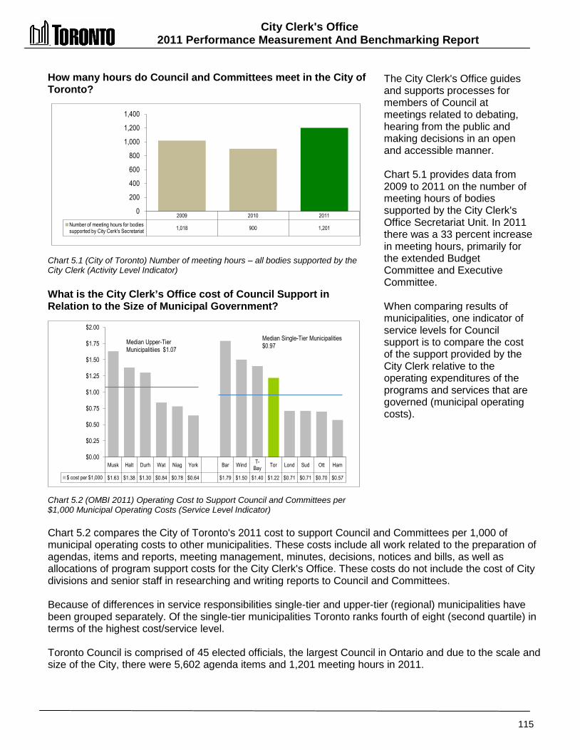
City Clerk's Office 2011 Performance Measurement And Benchmarking Report
115
Musk Halt Durh Wat Niag York Bar Wind T-Bay Tor Lond Sud Ott Ham
$ cost per $1,000 $1.63 $1.38 $1.30 $0.84 $0.78 $0.64 $1.79 $1.50 $1.40 $1.22 $0.71 $0.71 $0.70 $0.57
$0.00
$0.25
$0.50
$0.75
$1.00
$1.25
$1.50
$1.75
$2.00 Median Single-Tier Municipalities $0.97 Median Upper-Tier
Municipalitiies $1.07
How many hours do Council and Committees meet in the City of Toronto? Chart 5.1 (City of Toronto) Number of meeting hours – all bodies supported by the City Clerk (Activity Level Indicator) What is the City Clerk’s Office cost of Council Support in Relation to the Size of Municipal Government? Chart 5.2 (OMBI 2011) Operating Cost to Support Council and Committees per $1,000 Municipal Operating Costs (Service Level Indicator)
The City Clerk's Office guides and supports processes for members of Council at meetings related to debating, hearing from the public and making decisions in an open and accessible manner. Chart 5.1 provides data from 2009 to 2011 on the number of meeting hours of bodies supported by the City Clerk's Office Secretariat Unit. In 2011 there was a 33 percent increase in meeting hours, primarily for the extended Budget Committee and Executive Committee. When comparing results of municipalities, one indicator of service levels for Council support is to compare the cost of the support provided by the City Clerk relative to the operating expenditures of the programs and services that are governed (municipal operating costs).
Chart 5.2 compares the City of Toronto's 2011 cost to support Council and Committees per 1,000 of municipal operating costs to other municipalities. These costs include all work related to the preparation of agendas, items and reports, meeting management, minutes, decisions, notices and bills, as well as allocations of program support costs for the City Clerk's Office. These costs do not include the cost of City divisions and senior staff in researching and writing reports to Council and Committees. Because of differences in service responsibilities single-tier and upper-tier (regional) municipalities have been grouped separately. Of the single-tier municipalities Toronto ranks fourth of eight (second quartile) in terms of the highest cost/service level. Toronto Council is comprised of 45 elected officials, the largest Council in Ontario and due to the scale and size of the City, there were 5,602 agenda items and 1,201 meeting hours in 2011.
2009 2010 2011 Number of meeting hours for bodies supported by City Cerk's Secretariat 1,018 900 1,201
0
200
400
600
800
1,000
1,200
1,400
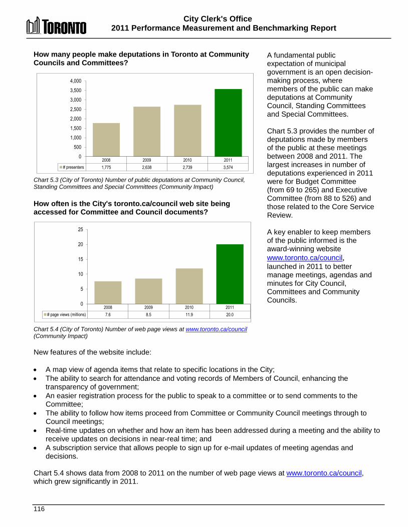
City Clerk's Office 2011 Performance Measurement and Benchmarking Report
116
How many people make deputations in Toronto at Community Councils and Committees? Chart 5.3 (City of Toronto) Number of public deputations at Community Council, Standing Committees and Special Committees (Community Impact) How often is the City's toronto.ca/council web site being accessed for Committee and Council documents? Chart 5.4 (City of Toronto) Number of web page views at www.toronto.ca/council (Community Impact)
A fundamental public expectation of municipal government is an open decision-making process, where members of the public can make deputations at Community Council, Standing Committees and Special Committees. Chart 5.3 provides the number of deputations made by members of the public at these meetings between 2008 and 2011. The largest increases in number of deputations experienced in 2011 were for Budget Committee (from 69 to 265) and Executive Committee (from 88 to 526) and those related to the Core Service Review. A key enabler to keep members of the public informed is the award-winning website www.toronto.ca/council, launched in 2011 to better manage meetings, agendas and minutes for City Council, Committees and Community Councils.
New features of the website include: • A map view of agenda items that relate to specific locations in the City; • The ability to search for attendance and voting records of Members of Council, enhancing the
transparency of government; • An easier registration process for the public to speak to a committee or to send comments to the
Committee; • The ability to follow how items proceed from Committee or Community Council meetings through to
Council meetings; • Real-time updates on whether and how an item has been addressed during a meeting and the ability to
receive updates on decisions in near-real time; and • A subscription service that allows people to sign up for e-mail updates of meeting agendas and
decisions. Chart 5.4 shows data from 2008 to 2011 on the number of web page views at www.toronto.ca/council, which grew significantly in 2011.
2008 2009 2010 2011 # presenters 1,775 2,638 2,739 3,574
0
500
1,000
1,500
2,000
2,500
3,000
3,500
4,000
2008 2009 2010 2011 # page views (millions) 7.6 8.5 11.9 20.0
0
5
10
15
20
25
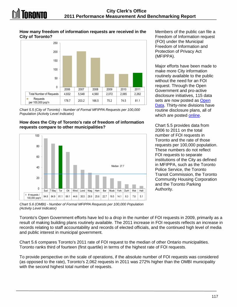
City Clerk's Office 2011 Performance Measurement And Benchmarking Report
117
Sud T-Bay Tor Ott Wind Lond Niag Ham Bar Musk York Durh Wat Halt # requests /
100,000 pop'n 94.8 84.9 81.1 69.1 44.6 35.5 29.9 25.6 22.7 19.5 14.1 8.3 7.8 5.1
0
20
40
60
80
100
Median 27.7
How many freedom of information requests are received in the City of Toronto? Chart 5.5 (City of Toronto) - Number of Formal MFIPPA Requests per 100,000 Population (Activity Level Indicator) How does the City of Toronto’s rate of freedom of information requests compare to other municipalities? Chart 5.6 (OMBI) - Number of Formal MFIPPA Requests per 100,000 Population (Activity Level Indicator)
Members of the public can file a Freedom of Information request (FOI) under the Municipal Freedom of Information and Protection of Privacy Act (MFIPPA). Major efforts have been made to make more City information routinely available to the public without the need for an FOI request. Through the Open Government and pro-active disclosure initiatives, 115 data sets are now posted as Open Data. Thirty-nine divisions have routine disclosure plans, all of which are posted online. Chart 5.5 provides data from 2006 to 2011 on the total number of FOI requests in Toronto and the rate of those requests per 100,000 population. These numbers do not reflect FOI requests to separate institutions of the City as defined in MFIPPA, such as the Toronto Police Service, the Toronto Transit Commission, the Toronto Community Housing Corporation and the Toronto Parking Authority.
Toronto's Open Government efforts have led to a drop in the number of FOI requests in 2009, primarily as a result of making building plans routinely available. The 2011 increase in FOI requests reflects an increase in records relating to staff accountability and records of elected officials, and the continued high level of media and public interest in municipal government. Chart 5.6 compares Toronto's 2011 rate of FOI request to the median of other Ontario municipalities. Toronto ranks third of fourteen (first quartile) in terms of the highest rate of FOI requests. To provide perspective on the scale of operations, if the absolute number of FOI requests was considered (as opposed to the rate), Toronto's 2,062 requests in 2011 was 272% higher than the OMBI municipality with the second highest total number of requests.
2006 2007 2008 2009 2010 2011 Total Number of Requests
4,832 5,548 4,560 2,072 2,065 2,262
Requests per 100,000 pop'n 178.7 203.2 166.5 75.2 74.5 81.1
0
50
100
150
200
250

City Clerk's Office 2011 Performance Measurement and Benchmarking Report
118
Bar T-Bay Wat Niag Durh York Wind Sud Musk Lond Halt Ott Tor Ham % within 30 days 100.0% 100.0% 97.7% 97.0% 96.2% 94.8% 92.6% 92.1% 91.7% 90.0% 88.0% 84.1% 82.5% 62.5%
rate of requests per 100,000 pop'n 22.7 84.9 7.8 29.9 8.3 14.1 44.6 94.8 19.5 35.5 5.1 69.1 81.1 29.7
0 10 20 30 40 50 60 70 80 90 100
0%
20%
40%
60%
80%
100%
# of
FO
I req
uest
s pe
r 10
0,00
0 po
pula
tion
% F
OI r
espo
nese
s
with
in 3
0 da
ys
Median response rate 92.4%
How quickly are freedom of information requests responded to in the City of Toronto? Chart 5.7 (City of Toronto) Percent of Formal MFIPPA Requests Handled Within 30 Days (Customer Service) How does the City of Toronto’s rate of freedom of information requests compare to other municipalities? Chart 5.8 (OMBI 2011) Percent of Formal MFIPPA Requests Handled Within 30 Days (Customer Service) What is the rate of appeals in Toronto for freedom of information requests? Chart 5.9 (City of Toronto) Percent of Formal MFIPPA Requests that Have Been Appealed (Quality)
Chart 5.7 provides the rate at which the City of Toronto has been able to comply with the 30-day standard to reply to FOI requests. Results were stable in 2011 at 82.5 percent. This measure is reflective of the combined efforts of the City Clerk’s Office who process the requests and City divisions that provide the information in response to the requests. Chart 5.8 compares Toronto's 2011 rate of compliance, to other municipalities which are plotted as columns relative to the left axis. One of the factors that influences the timeliness of responses is the volume of FOI requests received. The rate of these FOI request per 100,000 population (from Chart 5.6) has been plotted as a line relative to the right axis. Toronto ranks thirteenth of fourteen (fourth quartile) in terms of having the highest rate of responses within 30 days at 82.5 percent, in part because Toronto has the third highest rate of FOI requests (Chart 5.6). Complexity of FOI requests in Toronto may also be a factor in this ranking. FOI requests are trending to involve multiple City divisions and be more complex. As an indication of that level of complexity, the 2011 FOI requests required the review of approximately 218,000 pages of information.
The Corporate Information Management Services unit within the City Clerk's Office is responsible for managing compliance with MFIPPA. Decisions made by the City Clerk on access to information are subject to appeal to an independent review by the Ontario Information and Privacy Commissioner. Chart 5.9 provides 2009 to 2011 data for Toronto on the rate of appeals made to the Ontario Information and Privacy Commissioner. Results have been stable and in 2011 were below 2 percent, a figure which provides an indication of a high degree of satisfaction with how the City has responded to FOI requests.
2006 2007 2008 2009 2010 2011 % within 30 days 86.1% 85.5% 86.6% 77.5% 83.3% 82.5%
0%
20%
40%
60%
80%
100%
2009 2010 2011 % rate of appeals 3.2% 1.4% 1.8%
0%
1%
2%
3%
4%
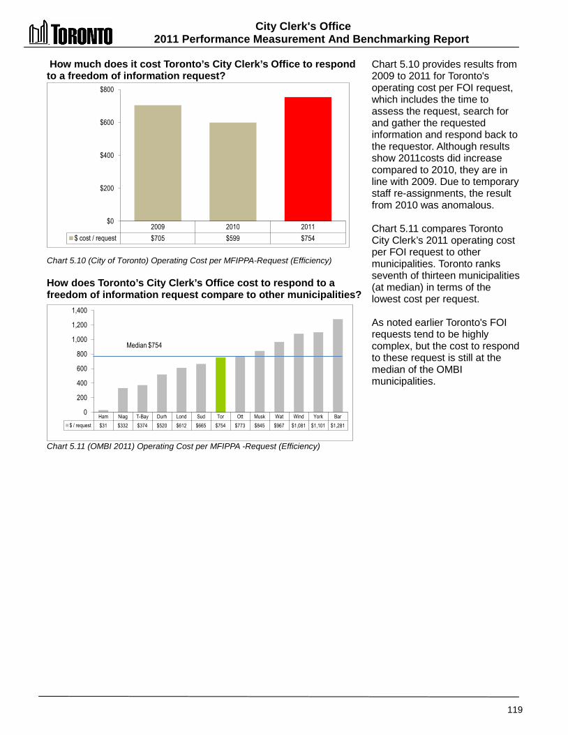
City Clerk's Office 2011 Performance Measurement And Benchmarking Report
119
Ham Niag T-Bay Durh Lond Sud Tor Ott Musk Wat Wind York Bar $ / request $31 $332 $374 $520 $612 $665 $754 $773 $845 $967 $1,081 $1,101 $1,281
0
200
400
600
800
1,000
1,200
1,400
Median $754
How much does it cost Toronto’s City Clerk’s Office to respond to a freedom of information request? Chart 5.10 (City of Toronto) Operating Cost per MFIPPA-Request (Efficiency) How does Toronto’s City Clerk’s Office cost to respond to a freedom of information request compare to other municipalities? Chart 5.11 (OMBI 2011) Operating Cost per MFIPPA -Request (Efficiency)
Chart 5.10 provides results from 2009 to 2011 for Toronto's operating cost per FOI request, which includes the time to assess the request, search for and gather the requested information and respond back to the requestor. Although results show 2011costs did increase compared to 2010, they are in line with 2009. Due to temporary staff re-assignments, the result from 2010 was anomalous. Chart 5.11 compares Toronto City Clerk’s 2011 operating cost per FOI request to other municipalities. Toronto ranks seventh of thirteen municipalities (at median) in terms of the lowest cost per request. As noted earlier Toronto's FOI requests tend to be highly complex, but the cost to respond to these request is still at the median of the OMBI municipalities.
2009 2010 2011 $ cost / request
$705 $599 $754
$0
$200
$400
$600
$800

City Clerk's Office 2011 Performance Measurement and Benchmarking Report
120
2012 Achievements and 2013 Planned Initiatives The following initiatives have improved or are expected to further improve the efficiency and effectiveness of the City Clerk's Office: 2012 Initiatives Completed/Achievements • Received two City Manager Public Service Excellence Awards, with the Elections
Accessibility Plan recognized in the Access, Equity and Human Rights Category, and Open Data Initiative recognized in the Cross-Corporate Project Category.
• Strengthened democracy and demonstrated Toronto’s election readiness by successfully conducted By-Elections for the Toronto District School Board (February 2012) and the Toronto Catholic School Board (December 2012).
• Supported Council decision making of 58 bodies with 394 meetings, 6,045 agenda items and a total of 1,149 meeting hours, including support to three new bodies: Graffiti By-law Panel, PGM sub-committee on Establishment of a Local Appeal Body and the Holiday Shopping Sub-Committee.
• Coordinated appointments of citizens and members of Council to committees and special purpose bodies, including the Council member mid-term appointments to Committees, Agencies and Advisory Bodies, and 20 appointments of citizens to City boards, including the Toronto Transit Commission.
• Expanded subscription based e-mail notification for updates of Council Committee meeting agendas and decisions resulting in increased public access to information on decision making while reducing paper consumption of traditional agendas. Subscription doubled in 2012(4,580 in January to 9,758 in December)
• Enhanced public access with the implemented Public WiFi in meeting rooms at City Hall and launch of the Speaker Monitor to allow the public to track where they stand in the speakers’ list at committee meetings.
• Implemented a new Councillor Expense Tracking System with Accounting Services Division to enhance efficiency and accuracy in expense processing, with the petty cash module being used as the model and rolled out corporately to all City divisions to achieve broad efficiencies across the City.
• Improved service to Councillors and enhanced their fiscal accountability ability with the Councillor Expense Dashboard, allowing Councillors to track their expenses within 48 hours of submission of expenses payment requests, without relying on monthly expense reports. Dashboard expanded to include expenses from the Council General Expense Budget to reflect Council’s decision in July 2012.
• Enhanced efficiency of councillor office operations with the roll-out of a Councillor Technology Pilot Project to test various mobile computing platforms with a pilot group of 15 Councillors -- Phase 1 pilot initiated with deployment of iPad tablets. Phase 2 involved Blackberry Playbook.
• Maintained and enhanced Toronto’s reputation locally, nationally and internationally with support to 329 events and preparation of 5,086 ceremonial documents. Organized and supported major civic events including the Pan Am Games launch, the visit of their Royal Highnesses The Prince of Wales and the Duchess of Cornwall, the War of 1812 Celebration, D-Day Ceremony, the Book Awards, and the Remembrance Day Ceremonies.
City Clerk's Office 2011 Performance Measurement And Benchmarking Report
121
• Continued to build a corporate Open Government and Information Management culture with increased access to information - 19 data sets disclosed in Q3 2012 and implementation of corporate information management policies, such as the Information Management Accountability Policy.
• Launched City's new insurance claim intake process in response to the Ombudsman's investigation. Streamlined the intake process and enabled accelerated start of claims investigations by three Divisions that receive 90 percent of claims (Water, Transportation and Forestry).
• Implemented a new multilingual translation service through contracted vendor to meet the City's multilingual communications needs amongst various divisions.
2013 Initiatives Planned • Development of detailed elections project plans to ensure readiness to administer an open,
fair and accessible election in 2014. New initiatives include the development of My Campaign portal for candidates and Am I on the Voters’ List web page for the public to verify their status on the voters’ list and improve the quality of the list.
• Review options for improving public notice accessibility including new user friendly formats and on-line posting of all statutory notices.
• Modernize polling process including reviewing on-line e-polling options. • Continue to make transition to “digital first” to improve the accessibility and timely release of
official Council/committee documents. • Work with AV staff to review and upgrade Council chamber digitization capability. • Develop Information Management Privacy Framework to guide the City on staff
responsibilities in protecting individual privacy when collecting personal information. • Advance concept of ‘Open Government By Design’ in the City -- building a foundation of
open government into policies, systems, business processes, programs and service delivery, including due consideration to:
o Privacy impact assessment o Access to information and proactive disclosure o Open data o Staff accountability
• Enhance customer service with on-line booking and payment options for booking the City’s wedding chambers (except City Hall), on-line order and payment for Archival photos and files, as well as on-line request and payment for FOI requests.
• Integration of Councillor Expense Tracking System and Councillor expense posting to facilitate continuous update and posting of Councillor expenses.
• Implement the Information Production workflow system which will automate divisional request and tracking for all design, print, copying and mail jobs.
• Review and update City Clerk’s Office web-facing applications to ensure compliance with new AODA integrated communications standard.

City Clerk's Office 2011 Performance Measurement and Benchmarking Report
122
Factors Influencing the Results of Municipalities The results of each municipality included in this report can be influenced to varying degrees by factors such as: • The size of Council support
o Complexity: the type of meeting and scope of subject matter discussed. o Council authority: the amount of delegated decision-making i.e. standing committee vs.
Committee as a whole. o Size: the number of Councillors and structure, i.e. number of standing committees and
advisory bodies. o Political climate: whether reports are discussed in detail and the number of recorded
votes. o Government structure: upper-tier or single-tier. o Organizational form: centralized vs. decentralized, i.e. with departments responsible for
certain tasks, e.g. agenda preparation. o Processes & systems: consent agenda or not; type of meeting; turn-around time for
preparation of agenda/minutes and the degree of automation; how long debates are allowed; degree of citizen participation; administrative structure – who generates the reports, i.e. a few Commissioners vs. a large number of department heads.
• Freedom of Information Requests
o Citizen engagement: degree of interaction with citizens and the amount of citizen trust/distrust of the organization.
o Contentious issues: whether there are prevailing major issues in the municipality (e.g. major construction projects, road widening, bids for international events, etc.).
o Nature of requests: media / special interest groups / individuals / businesses. o Organization: the size, administrative structure and culture of the organization; the
amount of training provided to municipal staff who handle requests. o Practices & policies: responsiveness of the organization to requests; number of routine
disclosure policies.

123

124
CCoouurrtt SSeerrvviicceess Court Services, through 30 courtrooms in four locations across the City, provides administrative and courtroom support services to the public and a range of stakeholders that use the Provincial Offences Court and to those using the Toronto Licensing Tribunal. These include:
• Provincial Offences Court and Licensing Tribunal Dispute Resolution – allows individuals to have allegations, including charges, reviewed in a fair manner by an independent person.
• Default Fine Collection Management – supports individuals to comply with court orders, ensuring steps are taken to collect fines, and provides the public with assurance that laws are effective and fines are a meaningful deterrent when laws are broken.
• Court Case Management – records and tracks breaches of law by individuals in support of maintaining safe communities.
Offences under the Provincial Offences Act (POA) are minor (non-criminal) offences that include, but are not limited to:
• Speeding, careless driving, or not wearing your seat belt – Highway Traffic Act.
• Failing to surrender your insurance card or possessing a false or invalid insurance card – Compulsory Automobile Insurance Act.
• Being intoxicated in a public place or selling alcohol to a minor – Liquor License Act.
• Entering prohibited premises or failing to leave premises after being directed to do so – Trespass to Property Act.
• Violations of the Occupational Health and Safety Act and environmental legislation.
• Noise, taxi and animal care by-laws – City by-laws.
Court Services
Provincial Offences and Licensing
Tribunal Dispute Resolutom
Default Fine Collection
Management
Court Case Management

Court Services 2011 Performance Measurement And Benchmarking Report
125
Question Indicator/Measure Internal Comparison
of Toronto’s 2011 vs. 2010 Results
External Comparison to Other Municipalities
(OMBI) By Quartile for 2011
Chart &
Page Ref.
Service/Activity Level Indicators
How many Provincial Offences Act (POA) charges are filed?
Number of POA Charges Filed per 1,000 Population - (Activity Level)
Decrease
Number of POA charges filed decreased in 2011
(activity level indicator)
1
High rate of POA charges filed compared
to others
(activity level indicator)
6.1 6.2
pg. 126
Community Impact Measures
How long does it take to get a trial?
Average Number of Months from Offence Date to Trial -Community Impact)
Stable
Time to trial was stable in 2011
N/A 6.3 pg. 127
Customer Service Measures
How long is the wait to be served at counters?
Average Time to Serve Customers at Public Counter - (Customer Service)
Stable
Wait at counter was stable in 2012
N/A 6.4.
pg. 127
Efficiency Measures
What is the collection rate on unpaid POA fines?
Collection Rate on Cases in Default of Payment -. (Efficiency)
Stable
Collection rate on defaulted unpaid POA
fines was stable in 2012 compared to 2011
4
Lowest rate of collection on fines defaulted in
2011 compared to others
6.5 6.6
pg. 128
What is the cost of Court/POA services per charge filed?
Operating Cost per POA Charge Filed -.(Efficiency)
Increase
Cost per charge filed increased in 2011
1
Second lowest cost per charge filed compared
to others
6.7 6.8
pg. 129
Overall Results
Service Level Indicators
(Resources) 0- Increased 0 - Stable 1 - Decreased 100% stable or increased
Performance Measures (Results)
0 - Favourable 3 - Stable 1 - Unfavour. 75% favourable or stable
Service Level Indicators
(Resources)
1 - 1st quartile 0 - 2nd quartile 0 - 3rd quartile 0 - 4th quartile 100% above median
Performance Measures (Results)
1 - 1st quartile 0 - 2nd quartile 0- 3rd quartile 1 - 4th quartile 50% above median
For an explanation of how to interpret this summary and the supporting charts, please see pages 24-30. These quartile results are based on a maximum sample size of 13 municipalities.
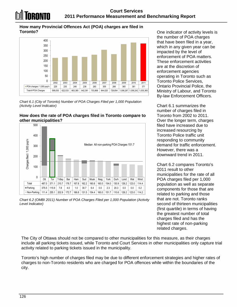
Court Services 2011 Performance Measurement and Benchmarking Report
126
How many Provincial Offences Act (POA) charges are filed in Toronto? Chart 6.1 (City of Toronto) Number of POA Charges Filed per 1,000 Population (Activity Level Indicator) How does the rate of POA charges filed in Toronto compare to other municipalities? Chart 6.2 (OMBI 2011) Number of POA Charges Filed per 1,000 Population (Activity Level Indicator)
One indicator of activity levels is the number of POA charges that have been filed in a year, which in any given year can be impacted by the level of enforcement of POA matters. These enforcement activities are at the discretion of enforcement agencies operating in Toronto such as Toronto Police Services, Ontario Provincial Police, the Ministry of Labour, and Toronto By-law Enforcement Officers. Chart 6.1 summarizes the number of charges filed in Toronto from 2002 to 2011. Over the longer term, charges filed have increased due to increased resourcing by Toronto Police traffic unit responding to community demand for traffic enforcement. However, there was a downward trend in 2011. Chart 6.2 compares Toronto's 2011 result to other municipalities for the rate of all POA charges filed per 1,000 population as well as separate components for those that are related to parking and those that are not. Toronto ranks second of thirteen municipalities (first quartile) in terms of having the greatest number of total charges filed and has the highest rate of non-parking related charges.
The City of Ottawa should not be compared to other municipalities for this measure, as their charges include all parking tickets issued, while Toronto and Court Services in other municipalities only capture trial activity related to parking tickets issued in the municipality. Toronto’s high number of charges filed may be due to different enforcement strategies and higher rates of charges to non-Toronto residents who are charged for POA offences while within the boundaries of the city.
Ott Tor T-Bay Bar Ham Sud Musk Niag York Durh Lond Wat Wind Total 487.0 371.1 210.7 176.7 167.8 162.2 160.8 160.0 154.0 130.9 126.2 123.0 114.4 Parking 375.5 115.9 7.8 4.0 1.0 30.7 6.4 0.0 2.3 20.3 0.0 0.0 0.2 Non-Parking 111.4 255.1 202.9 172.7 166.8 131.5 154.4 160.0 151.7 110.6 126.2 123.0 114.2
0
100
200
300
400
500
Median All non-parking POA Charges 151.7
Char
ges f
iled /
1,00
0 pop
'n
2002 2003 2004 2005 2006 2007 2008 2009 2010 2011 POA charges / 1,000 pop'n 229 235 248 238 260 309 266 365 381 371 Total # POA Charges 599,055 622,533 663,385 642,391 703,868 844,020 728,854 1,006,267 1,056,242 1,035,365
0 50
100 150 200 250 300 350 400
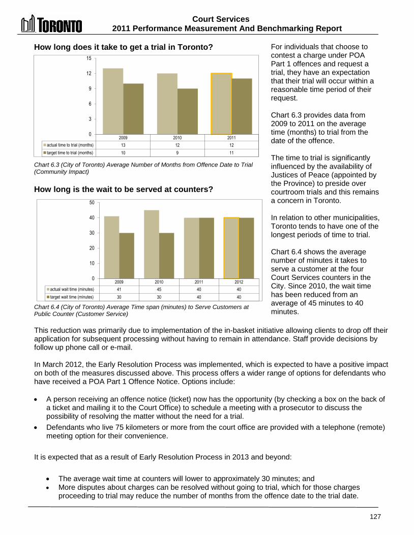
Court Services 2011 Performance Measurement And Benchmarking Report
127
How long does it take to get a trial in Toronto? Chart 6.3 (City of Toronto) Average Number of Months from Offence Date to Trial (Community Impact) How long is the wait to be served at counters? Chart 6.4 (City of Toronto) Average Time span (minutes) to Serve Customers at Public Counter (Customer Service)
For individuals that choose to contest a charge under POA Part 1 offences and request a trial, they have an expectation that their trial will occur within a reasonable time period of their request. Chart 6.3 provides data from 2009 to 2011 on the average time (months) to trial from the date of the offence. The time to trial is significantly influenced by the availability of Justices of Peace (appointed by the Province) to preside over courtroom trials and this remains a concern in Toronto. In relation to other municipalities, Toronto tends to have one of the longest periods of time to trial. Chart 6.4 shows the average number of minutes it takes to serve a customer at the four Court Services counters in the City. Since 2010, the wait time has been reduced from an average of 45 minutes to 40 minutes.
This reduction was primarily due to implementation of the in-basket initiative allowing clients to drop off their application for subsequent processing without having to remain in attendance. Staff provide decisions by follow up phone call or e-mail. In March 2012, the Early Resolution Process was implemented, which is expected to have a positive impact on both of the measures discussed above. This process offers a wider range of options for defendants who have received a POA Part 1 Offence Notice. Options include: • A person receiving an offence notice (ticket) now has the opportunity (by checking a box on the back of
a ticket and mailing it to the Court Office) to schedule a meeting with a prosecutor to discuss the possibility of resolving the matter without the need for a trial.
• Defendants who live 75 kilometers or more from the court office are provided with a telephone (remote) meeting option for their convenience.
It is expected that as a result of Early Resolution Process in 2013 and beyond:
• The average wait time at counters will lower to approximately 30 minutes; and • More disputes about charges can be resolved without going to trial, which for those charges
proceeding to trial may reduce the number of months from the offence date to the trial date.
2009 2010 2011 actual time to trial (months) 13 12 12 target time to trial (months) 10 9 11
0
3
6
9
12
15
2009 2010 2011 2012 actual wait time (minutes) 41 45 40 40 target wait time (minutes) 30 30 40 40
0
10
20
30
40
50

Court Services 2011 Performance Measurement and Benchmarking Report
128
What is the collection rate in Toronto on unpaid POA fines?
Chart 6.5 (City of Toronto) Collection Rate on Cases in Default of Payment (Efficiency) How does Toronto's collection rate on unpaid POA fines compare to other municipalities? Chart 6.6 (OMBI 2011) Rate on Cases in Default of Payment (Efficiency)
One aspect of service efficiency to examine is the collection rate on defaulted cases where the recipient of the ticket had not paid the fine by the specified date (i.e., the ticket is in default). Chart 6.5 shows the proportion of defaulted tickets that are collected in a given year, with the collection process continuing over a multi-year period. An example of the multi-year effort would be fines defaulted in 2006. Only 32.6 percent of them were collected in 2006, but through continuing efforts over the next six years, approximately 55.3 percent of these amounts had been collected by the end of 2012. The property tax roll sanction is one collection method being used with $3.2 million recovered between its introduction in 2010 to the end of 2012. Chart 6.6 compares Toronto to other municipalities for the 2011 collection rate for POA fines that went into default in 2011. Toronto ranks last of ten municipalities (fourth quartile) in terms of having the highest collection rate based on a twelve month view.
Fines defaulting near the end of a year that are paid in the following year are not be captured in this measure. As shown in Chart 6.5 above, since collection efforts continue over a multi-year period, results should be examined over the longer term. Using common data on defaulted fines has also been problematic across the Province. Collection efforts vary based on the type of charge and size of fine and success largely depends on having effective collection sanctions available. The City continues to work with the Province with the objective of increasing sanctions to achieve higher compliance levels. Draft legislation towards this goal was tabled in the Provincial legislature on March 20, 2013. Wherever possible, defaulted fines are being added to the property tax rolls to be collected with property taxes.
Collected by end of
2005
Collected by end of
2006
Collected by end of
2007
Collected by end of
2008
Collected by end of
2009
Collected by end of
2010
Collected by end of
2011
Collected by end of
2012 Defaulted in 2006 0% 32.6% 47.0% 50.3% 52.1% 53.5% 54.5% 55.3% Defaulted in 2007 0% 33.0% 45.6% 48.7% 50.4% 51.6% 52.6% Defaulted in 2008 0% 32.7% 44.0% 47.1% 48.9% 50.1% Defaulted in 2009 0% 27.8% 43.3% 46.5% 48.3% Defaulted in 2010 0% 30.2% 42.7% 45.5% Defaulted in 2011 0% 29.9% 40.6% Defaulted in 2012 0% 30.1%
0%
10%
20%
30%
40%
50%
60%
Wind Sud Bar Durh Wat Niag York Musk Ham Tor % collected 60.1% 59.3% 51.9% 51.5% 49.4% 47.6% 47.0% 42.2% 40.4% 29.9%
0%
20%
40%
60%
80%
Median 48.5%
The number previously reported for Toronto in the OMBI joint report has been revised from 26.9%
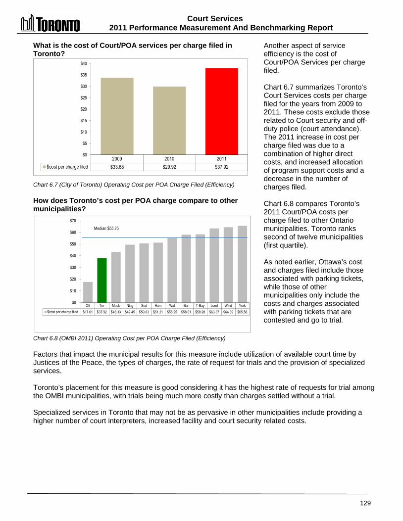
Court Services 2011 Performance Measurement And Benchmarking Report
129
What is the cost of Court/POA services per charge filed in Toronto? Chart 6.7 (City of Toronto) Operating Cost per POA Charge Filed (Efficiency) How does Toronto’s cost per POA charge compare to other municipalities? Chart 6.8 (OMBI 2011) Operating Cost per POA Charge Filed (Efficiency)
Another aspect of service efficiency is the cost of Court/POA Services per charge filed. Chart 6.7 summarizes Toronto’s Court Services costs per charge filed for the years from 2009 to 2011. These costs exclude those related to Court security and off-duty police (court attendance). The 2011 increase in cost per charge filed was due to a combination of higher direct costs, and increased allocation of program support costs and a decrease in the number of charges filed. Chart 6.8 compares Toronto’s 2011 Court/POA costs per charge filed to other Ontario municipalities. Toronto ranks second of twelve municipalities (first quartile). As noted earlier, Ottawa’s cost and charges filed include those associated with parking tickets, while those of other municipalities only include the costs and charges associated with parking tickets that are contested and go to trial.
Factors that impact the municipal results for this measure include utilization of available court time by Justices of the Peace, the types of charges, the rate of request for trials and the provision of specialized services. Toronto’s placement for this measure is good considering it has the highest rate of requests for trial among the OMBI municipalities, with trials being much more costly than charges settled without a trial. Specialized services in Toronto that may not be as pervasive in other municipalities include providing a higher number of court interpreters, increased facility and court security related costs.
2009 2010 2011 $cost per charge filed $33.68 $29.92 $37.92
$0
$5
$10
$15
$20
$25
$30
$35
$40
Ott Tor Musk Niag Sud Ham Wat Bar T-Bay Lond Wind York $cost per charge filed $17.61 $37.92 $43.33 $49.45 $50.63 $51.21 $55.25 $58.01 $58.28 $63.37 $64.39 $65.58
$0
$10
$20
$30
$40
$50
$60
$70
Median $55.25

Court Services 2011 Performance Measurement and Benchmarking Report
130
2012 Achievements and 2013 Planned Initiatives The following initiatives have improved or are expected to further improve the efficiency and effectiveness of Court Services: 2012 Initiatives Completed/Achievements • Implemented the Early Resolution Initiative.
o Following extensive discussion with Ministry of Attorney General staff and various stakeholders, the Province passed the Good Government Act, which includes several amendments to the Provincial Offences Act. This should assist in streamlining court operations over the next couple of years providing better access to the public through the introduction of electronic and other processes to conduct a variety of transactions.
o Implemented the Early Resolution process in March 2012 allowing persons that receive tickets to elect to meet with prosecutors either in person or by telephone to discuss the possible reduction of the charge. This initiative is anticipated to reduce the number of trials and associated costs including off-duty police attendance expenses and other related courtroom costs.
• Continued to pursue payment of unpaid fines through the property tax roll sanction and through Court Services' Collection Officers.
o As of the end of 2012, $3.2 million has been recorded as revenue collected by using the property tax roll sanction since its introduction in 2010. (As of the end of 2012, $5.9 million has been recorded as revenue collected from newly defaulted accounts by the Program's Collection Officers.
• Served approximately 70,000 individuals at Court Services' public counters and in trial courts each month and answered over 8,500 phone calls and 1,500 email enquiries per month.
2013 Initiatives Planned • Work with 311 to develop a plan to migrate tier one (basic enquiry) calls to the 311 program
to provide the public with greater access to general program information. • Continue to work with Toronto Police Services to identify opportunities to optimize officer's
time in court, including the use of new scheduling technology to reduce costs.
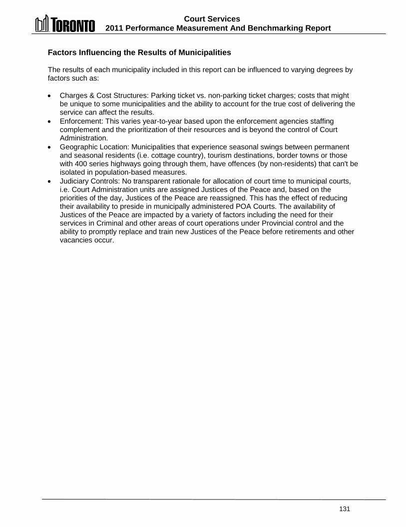
Court Services 2011 Performance Measurement And Benchmarking Report
131
Factors Influencing the Results of Municipalities The results of each municipality included in this report can be influenced to varying degrees by factors such as: • Charges & Cost Structures: Parking ticket vs. non-parking ticket charges; costs that might
be unique to some municipalities and the ability to account for the true cost of delivering the service can affect the results.
• Enforcement: This varies year-to-year based upon the enforcement agencies staffing complement and the prioritization of their resources and is beyond the control of Court Administration.
• Geographic Location: Municipalities that experience seasonal swings between permanent and seasonal residents (i.e. cottage country), tourism destinations, border towns or those with 400 series highways going through them, have offences (by non-residents) that can't be isolated in population-based measures.
• Judiciary Controls: No transparent rationale for allocation of court time to municipal courts, i.e. Court Administration units are assigned Justices of the Peace and, based on the priorities of the day, Justices of the Peace are reassigned. This has the effect of reducing their availability to preside in municipally administered POA Courts. The availability of Justices of the Peace are impacted by a variety of factors including the need for their services in Criminal and other areas of court operations under Provincial control and the ability to promptly replace and train new Justices of the Peace before retirements and other vacancies occur.

132
CCuullttuurraall SSeerrvviicceess
The goals of Cultural Services are: • To nurture, preserve and promote arts, heritage and culture in
order to strengthen and sustain dynamic cultural vitality and quality of life; and
• To provide arts, heritage and culture programs and events to the community, in order to enhance the City's cultural, economic and social vitality.
The data included in this report go beyond the activities provided by the City of Toronto’s Cultural Services Unit to include all City of Toronto investments in the culture and creative sector. Those investments include:
• Operation and administration of 21 museums historic sites, and performing and visual arts centres;
• Grants to ten major cultural organizations (including festivals), 676 Toronto Arts Council operating grant recipients, and one-time grant recipients;
• Encouraging public art projects in both private and public developments;
• Assisting a wide range of community arts organizations in accessing and sharing municipal services and facilities;
• Operation of three major theatres – the Sony Centre, the St. Lawrence Centre and the Toronto Centre for the Arts; and
• Planning and production of special events such as Nuit Blanche and Winterlicious.
.
Cultural Services
Arts Programming
Heritage Programming
Cultural Development
Events Programming Cultural Grants

Cultural Services 2011 Performance Measurement and Benchmarking Report
133
Question Indicator/Measure Internal Comparison
of Toronto’s 2011 vs. 2010 Results
External Comparison to Other Municipalities
(OMBI) By Quartile for 2011
Chart &
Page Ref.
Service Level Indicators
How much is spent on all cultural services?
Operating Cost of All Cultural Services per Capita - (Service Level)
Decrease
Operating cost of cultural services per
capita decreased
(service level indicator)
2
High rate of spending on Cultural Services per capita compared to
others
(service level indicator)
7.1 7.2
pg. 134
Total Cost of All Cultural Services per Capita - (Service Level)
Decrease
Total cost of cultural services per capita
decreased
(service level indicator)
N/A
7.1 7.2
pg. 134
How much is spent on arts grants?
Cost of Arts Grants per Capita (Service Level)
Increase
Spending on arts grants per capita increased
(service level indicator)
1
Higher rate of spending on arts grants per capita
compared to others
(service level indicator)
7.3 7.4
pg. 135
Community Impact Measures
How many people attend city-funded cultural events?
Estimated Attendance at City-Funded Cultural Events – (Community Impact)
Increase
Attendance increased to over 18 million
Not available 7.5
pg. 136
Are recipients of arts grants able to use those grants to obtain other revenues?
Arts Grants issued by municipality as a Percentage of the Gross Revenue of Recipients – (Community Impact)
Stable
Arts grants as % of recipients gross
revenue was stable
1
Toronto Arts grants are a lower percentage of
recipients gross revenue compared to
others
(recipients are less dependent on City for funding)
7.6 7.7
pg. 136
Overall Results
Service Level Indicators
(Resources) 1 - Increased 0- Stable 2- Decreased 33.3% increased or stable
Performance Measures (Results)
1 - Favourable 1 - Stable 0 - Unfavour. 100% favourable or stable
Service Level Indicators
(Resources)
1 - 1st quartile 1 - 2nd quartile 0 - 3rd quartile 0 - 4th quartile 100% above median
Performance Measures (Results)
1 - 1st quartile 0 - 2nd quartile 0 - 3rd quartile 0 - 4th quartile 100% above median
For an explanation of how to interpret this summary and the supporting charts, please see pages 24-30. These quartile results are based on a maximum sample size of nine municipalities.
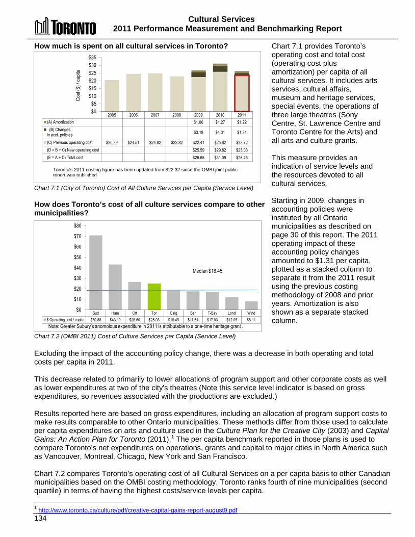
Cultural Services 2011 Performance Measurement and Benchmarking Report
134
How much is spent on all cultural services in Toronto? Chart 7.1 (City of Toronto) Cost of All Culture Services per Capita (Service Level) How does Toronto’s cost of all culture services compare to other municipalities? Chart 7.2 (OMBI 2011) Cost of Culture Services per Capita (Service Level)
Chart 7.1 provides Toronto’s operating cost and total cost (operating cost plus amortization) per capita of all cultural services. It includes arts services, cultural affairs, museum and heritage services, special events, the operations of three large theatres (Sony Centre, St. Lawrence Centre and Toronto Centre for the Arts) and all arts and culture grants. This measure provides an indication of service levels and the resources devoted to all cultural services. Starting in 2009, changes in accounting policies were instituted by all Ontario municipalities as described on page 30 of this report. The 2011 operating impact of these accounting policy changes amounted to $1.31 per capita, plotted as a stacked column to separate it from the 2011 result using the previous costing methodology of 2008 and prior years. Amortization is also shown as a separate stacked column.
Excluding the impact of the accounting policy change, there was a decrease in both operating and total costs per capita in 2011. This decrease related to primarily to lower allocations of program support and other corporate costs as well as lower expenditures at two of the city's theatres (Note this service level indicator is based on gross expenditures, so revenues associated with the productions are excluded.) Results reported here are based on gross expenditures, including an allocation of program support costs to make results comparable to other Ontario municipalities. These methods differ from those used to calculate per capita expenditures on arts and culture used in the Culture Plan for the Creative City (2003) and Capital Gains: An Action Plan for Toronto (2011).1
The per capita benchmark reported in those plans is used to compare Toronto’s net expenditures on operations, grants and capital to major cities in North America such as Vancouver, Montreal, Chicago, New York and San Francisco.
Chart 7.2 compares Toronto’s operating cost of all Cultural Services on a per capita basis to other Canadian municipalities based on the OMBI costing methodology. Toronto ranks fourth of nine municipalities (second quartile) in terms of having the highest costs/service levels per capita. 1 http://www.toronto.ca/culture/pdf/creative-capital-gains-report-august9.pdf
Sud Ham Ott Tor Calg Bar T-Bay Lond Wind $ Operating cost / capita $70.88 $43.19 $26.60 $25.03 $18.45 $17.61 $17.03 $12.05 $8.11
$0
$10
$20
$30
$40
$50
$60
$70
$80
Median $18.45
Note: Greater Subury's anomolous expenditure in 2011 is attributable to a one-time heritage grant .
2005 2006 2007 2008 2009 2010 2011 (A) Amortization $1.06 $1.27 $1.22
(B) Changes in acct. policies $3.18 $4.01 $1.31
(C) Previous operating cost $20.39 $24.51 $24.82 $22.82 $22.41 $25.82 $23.72 (D = B + C) New operating cost $25.59 $29.82 $25.03 (E = A + D) Total cost $26.65 $31.09 $26.25
$0 $5
$10 $15 $20 $25 $30 $35
Cost
($) /
capit
a
Toronto's 2011 costing figure has been updated from $22.32 since the OMBI joint public report was published
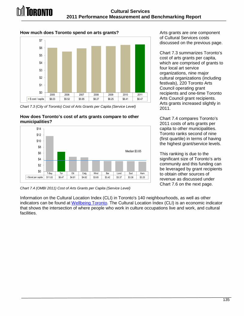
Cultural Services 2011 Performance Measurement and Benchmarking Report
135
How much does Toronto spend on arts grants? Chart 7.3 (City of Toronto) Cost of Arts Grants per Capita (Service Level) How does Toronto’s cost of arts grants compare to other municipalities? Chart 7.4 (OMBI 2011) Cost of Arts Grants per Capita (Service Level)
Arts grants are one component of Cultural Services costs discussed on the previous page. Chart 7.3 summarizes Toronto’s cost of arts grants per capita, which are comprised of grants to four local art service organizations, nine major cultural organizations (including festivals), 220 Toronto Arts Council operating grant recipients and one-time Toronto Arts Council grant recipients. Arts grants increased slightly in 2011. Chart 7.4 compares Toronto’s 2011 costs of arts grants per capita to other municipalities. Toronto ranks second of nine (first quartile) in terms of having the highest grant/service levels. This ranking is due to the significant size of Toronto’s arts community and this funding can be leveraged by grant recipients to obtain other sources of revenue as discussed under Chart 7.6 on the next page.
Information on the Cultural Location Index (CLI) in Toronto's 140 neighbourhoods, as well as other indicators can be found at Wellbeing Toronto. The Cultural Location Index (CLI) is an economic indicator that shows the intersection of where people who work in culture occupations live and work, and cultural facilities.
T-Bay Tor Ott Calg Wind Bar Lond Sud Ham $cost per capita $11.63 $6.47 $4.81 $4.62 $3.65 $3.42 $3.37 $3.36 $3.20
$0
$2
$4
$6
$8
$10
$12
$14
Median $3.65
2005 2006 2007 2008 2009 2010 2011 $ cost / capita $6.03 $5.52 $5.95 $6.27 $6.25 $6.41 $6.47
$0
$1
$2
$3
$4
$5
$6
$7
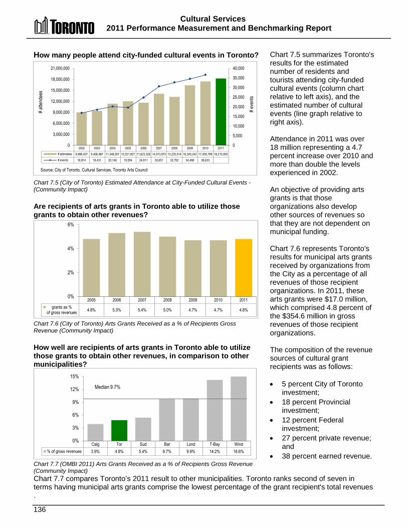
Cultural Services 2011 Performance Measurement and Benchmarking Report
136
How many people attend city-funded cultural events in Toronto?
Chart 7.5 (City of Toronto) Estimated Attendance at City-Funded Cultural Events - (Community Impact) Are recipients of arts grants in Toronto able to utilize those grants to obtain other revenues? Chart 7.6 (City of Toronto) Arts Grants Received as a % of Recipients Gross Revenue (Community Impact) How well are recipients of arts grants in Toronto able to utilize those grants to obtain other revenues, in comparison to other municipalities? Chart 7.7 (OMBI 2011) Arts Grants Received as a % of Recipients Gross Revenue (Community Impact)
Chart 7.5 summarizes Toronto's results for the estimated number of residents and tourists attending city-funded cultural events (column chart relative to left axis), and the estimated number of cultural events (line graph relative to right axis). Attendance in 2011 was over 18 million representing a 4.7 percent increase over 2010 and more than double the levels experienced in 2002. An objective of providing arts grants is that those organizations also develop other sources of revenues so that they are not dependent on municipal funding. Chart 7.6 represents Toronto's results for municipal arts grants received by organizations from the City as a percentage of all revenues of those recipient organizations. In 2011, these arts grants were $17.0 million, which comprised 4.8 percent of the $354.6 million in gross revenues of those recipient organizations. The composition of the revenue sources of cultural grant recipients was as follows: • 5 percent City of Toronto
investment; • 18 percent Provincial
investment; • 12 percent Federal
investment; • 27 percent private revenue;
and • 38 percent earned revenue.
Chart 7.7 compares Toronto’s 2011 result to other municipalities. Toronto ranks second of seven in terms having municipal arts grants comprise the lowest percentage of the grant recipient's total revenues.
Calg Tor Sud Bar Lond T-Bay Wind % of gross revenues 3.9% 4.8% 5.4% 9.7% 9.9% 14.2% 16.6%
0%
3%
6%
9%
12%
15%
Median 9.7%
2005 2006 2007 2008 2009 2010 2011 grants as %
of gross revenues 4.8% 5.3% 5.4% 5.0% 4.7% 4.7% 4.8%
0%
2%
4%
6%
2002 2003 2004 2005 2006 2007 2008 2009 2010 2011 # attendees 8,988,407 9,406,987 11,348,057 12,021,827 11,623,328 14,073,870 13,225,514 16,345,242 17,400,769 18,210,000
# events 16,814 18,431 20,146 19,554 24,811 30,651 32,702 34,498 36,633
0
5,000
10,000
15,000
20,000
25,000
30,000
35,000
40,000
0
3,000,000
6,000,000
9,000,000
12,000,000
15,000,000
18,000,000
21,000,000
# eve
nts
# atte
ndee
s
Source: City of Toronto, Cultural Services, Toronto Arts Council
Cultural Services
2011 Performance Measurement and Benchmarking Report
137
2012 Achievements or 2013 Planned Initiatives The following initiatives have and are expected to further improve the efficiency and effectiveness of Cultural Services in Toronto: 2012 Initiatives Completed/Achievements: • Implemented first of three-year 1812 Bicentennial program. • Supported youth development initiatives at Scarborough Museum (national youth diversity
program) and by expanding Live Arts and Arts Lab. • Delivered 20 partnership community arts programs targeting underserved populations. • Leveraged City funding to raise $80,000 for these initiatives from sponsors and partners. • Increased direct revenues generated from Summerlicious and Winterlicious Programs by
$125,000. Factors Influencing Results of Municipalities The results of each municipality found in the charts included in this report are influenced to varying degrees by factors such as: • Program mix – each municipality funds a different set of programs in terms of historical sites,
arts grants, cultural events and other cultural services • Financial support - arts grants per capita can be influenced by the size of the funding
envelope and the size of the arts community • Planning and integration– whether a municipality has adopted a cultural policy or plan may
affect the way in which programs and services are delivered, how annual data is collected and the amount of funding invested in the community
• Non residents – cultural activities can be a key strategy for municipalities in attracting tourists but those tourists are not considered in per-capita based measures

138
EEmmeerrggeennccyy MMeeddiiccaall SSeerrvviicceess Emergency Medical Services (EMS) provides Paramedic - based health services, responding in particular to medical emergencies and to special needs of vulnerable communities through mobile health care. The major services provided are:
Emergency & Preventative Care Services EMS provides emergency and preventative care services to the people of Toronto through activities such as: • Pre-hospital emergency medical care, which includes support,
instruction, care, treatment and transport provided from the moment the request for emergency care is initiated until the patient's care is transferred to the receiving health care provider. Major activities include:
o response to emergency 911 calls within the designated response time standards
o pre-hospital emergency medical care for the treatment of residents involved in both community emergencies as well as mass casualty incidents
o patient transport to appropriate facilities o medical support to other emergency services
• EMS is often the first health-care provider to identify a need for services by the City's at-risk patient population – the elderly, chronically ill and economically disadvantaged - who call 911 frequently. Community paramedicine helps paramedics to focus on illness and injury prevention, the management of a patient's medical condition, mobility, or performing activities of daily living – issues that may not be apparent to family, friends, or the public.
• Community Referrals by EMS (CREMS) allows the paramedic to make a referral (a simple phone call) to the Community Care Access Centre (CCAC) on behalf of the patient. These referrals provide much needed services for patients and are an effective and proven mitigation tool for future 911 calls from these patients. For many patients, having the paramedic offer a CCAC referral is the first step to connecting them with much needed help and reducing their reliance on the 911 system. This support includes:
o Referrals made by CCAC for nursing services, personal support, occupational therapy, physiotherapy, social work and many other much needed services.
o A follow-up visit by the paramedic to help with complex medical patient referrals and assistance connecting with other allied services/agencies.
• Inter-facility patient transport, which includes emergency patient transfers. The continuing reduction in non-emergency responses reflects Toronto EMS’s focus on confining non-emergency service to only medically-essential transport services such as cancer and dialysis patients requiring paramedic care during their transport.
Emergency Medical Services
Emergency & Preventative Care
Pre-Hospital Emergency Care
Inter-Facility Patient Transport
Community Medicine
EMS System Access and
Preliminary Care

139
EEmmeerrggeennccyy MMeeddiiccaall SSeerrvviicceess EMS System Access and Preliminary Care Services The Central Ambulance Communications Centre (CACC), is the initial access point to City of Toronto’s emergency health services system for victims of illness or injury, and is in operation 24 hours a day, 365 days a year. The Toronto EMS Communications Centre is the second largest municipally run Emergency Medical Dispatch centre in the world to achieve the internationally recognized Centre of Excellence accreditation along with other key leaders in the industry like the London Ambulance Service, (UK) and Emergency Medical Care Inc. (Province of Nova Scotia). Niagara EMS is the only other Ontario Communications centre to have achieved this prestigious recognition of quality and excellence in Emergency Medical Dispatch. These ambulance communication services allow for: • immediate response to 911 requests for service • immediate medical care provided to callers over the phone • effective resource management and deployment .

Emergency Medical Services 2011 Performance Measurement and Benchmarking Report
140
Question Indicator/Measure Internal Comparison
of Toronto’s 2011 vs. 2010 Results
External Comparison to Other Municipalities
(OMBI) By Quartile for 2011
Chart &
Page Ref.
Service / Activity Level Indicators
How many hours are EMS vehicles in-service and available to respond to emergencies?
EMS Actual Weighted Vehicle In-Service Hours per 1,000 Population - (Service Level)
Decrease
Decreased number of in-service vehicle hours (service level indicator)
4
Lower rate of in-service vehicle hours
compared to others
(service level indicator)
(high population density cities, like Toronto, have
shorter travel distances, but increased traffic congestion,
and may require fewer vehicle hours)
8.1 8.2
pg. 142
How many emergency vehicle responses are performed by EMS?
EMS vehicle responses – Emergency per 1,000 Population - (Activity Level)
Increase
Number of emergency vehicle responses
increased
(activity level indicator)
2
High rate of emergency vehicle
responses compared to others
(activity level indicator)
8.3 8.5
pg. 143
How many non-emergency vehicle responses are performed by EMS?
EMS vehicle responses – Non Emergency per 1,000 Population - (Activity Level)
Decrease
Number of non-emergency responses
decreased
(activity level indicator)
2
High rate of non-emergency responses
compared to other municipalities but less
than 5% of total responses and is
declining
(activity level indicator)
8.3 8.5 Pg 143
How many total vehicle responses (emergency & non-emergency) are performed by EMS?
All EMS vehicle responses per 1,000 Population (Activity Level)
Increase
Number of total vehicle
responses increased (activity level indicator)
2
High rate of total EMS vehicle
responses compared to others
(activity level indicator)
8.3 8.5 pg. 143
Community Impact Measures
What percentage of time do ambulances spend at hospitals transferring patients?
Percentage of Ambulance Time Lost to Hospital Turnaround -(Community Impact)
Increase
Percentage of lost ambulance time (off-load delay) increased
3
High percentage of lost ambulance time (off-
load delay) compared to others
8.6 8.7 pg. 144
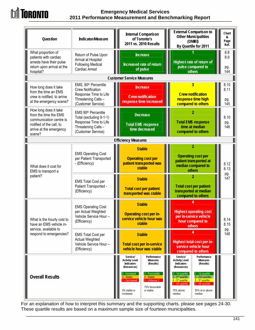
Emergency Medical Services 2011 Performance Measurement and Benchmarking Report
141
Question Indicator/Measure Internal Comparison
of Toronto’s 2011 vs. 2010 Results
External Comparison to Other Municipalities
(OMBI) By Quartile for 2011
Chart &
Page Ref.
What proportion of patients with cardiac arrests have their pulse return upon arrival at the hospital?
Return of Pulse Upon Arrival at Hospital Following Medical Cardiac Arrest
Increase
Increased rate of return of pulse
1
Highest rate of return of pulse compared to
others
8.8 8.9
pg. 144
Customer Service Measures
How long does it take from the time an EMS crew is notified, to arrive at the emergency scene?
EMS, 90th Percentile Crew Notification Response Time to Life Threatening Calls – (Customer Service)
Increase
Crew notification response time increased
3
Crew notification response time high compared to others
8.10 8.11
pg. 145
How long does it take from the time the EMS communication centre is notified of the call, to arrive at the emergency scene?
EMS 90th Percentile Total (excluding 9-1-1) Response Time to Life Threatening Calls - (Customer Service)
Decrease
Total EMS response time decreased
2
Total EMS response time at median
compared to others
8.10 pg. 146
Efficiency Measures
What does it cost for EMS to transport a patient?
EMS Operating Cost per Patient Transported - (Efficiency)
Stable
Operating cost per patient transported was
stable
2
Operating cost per patient transported at median compared to
others 8.12 8.13 pg. 147
EMS Total Cost per Patient Transported -(Efficiency)
Stable
Total cost per patient transported was stable
2
Total cost per patient transported at median
compared to others
What is the hourly cost to have an EMS vehicle in-service, available to respond to emergencies?
EMS Operating Cost per Actual Weighted Vehicle Service Hour – (Efficiency)
Stable
Operating cost per in-service vehicle hour was
stable
4
Highest operating cost per in-service vehicle
hour compared to others
8.14 8.15 pg. 148 EMS Total Cost per
Actual Weighted Vehicle Service Hour – (Efficiency)
Stable
Total cost per in-service vehicle hour was stable
4
Highest total cost per in-service vehicle hour compared to others
Overall Results
Service/ Activity Level
Indicators (Resources)
0 - Increased 0 - Stable 1 - Decreased. 0% stable or increased
Performance Measures (Results)
2 - Favourable 4 - Stable 2 - Unfavour.2 75% favourable or stable
Service/ Activity Level
Indicators (Resources)
0 - 1st quartile 3 - 2nd quartile 0 - 3rd quartile 1 - 4th quartile 75% above median
Performance Measures (Results)
1 - 1st quartile 3 - 2nd quartile 2 - 3rd quartile 2 - 4th quartile 50% at or above median
For an explanation of how to interpret this summary and the supporting charts, please see pages 24-30. These quartile results are based on a maximum sample size of fourteen municipalities.
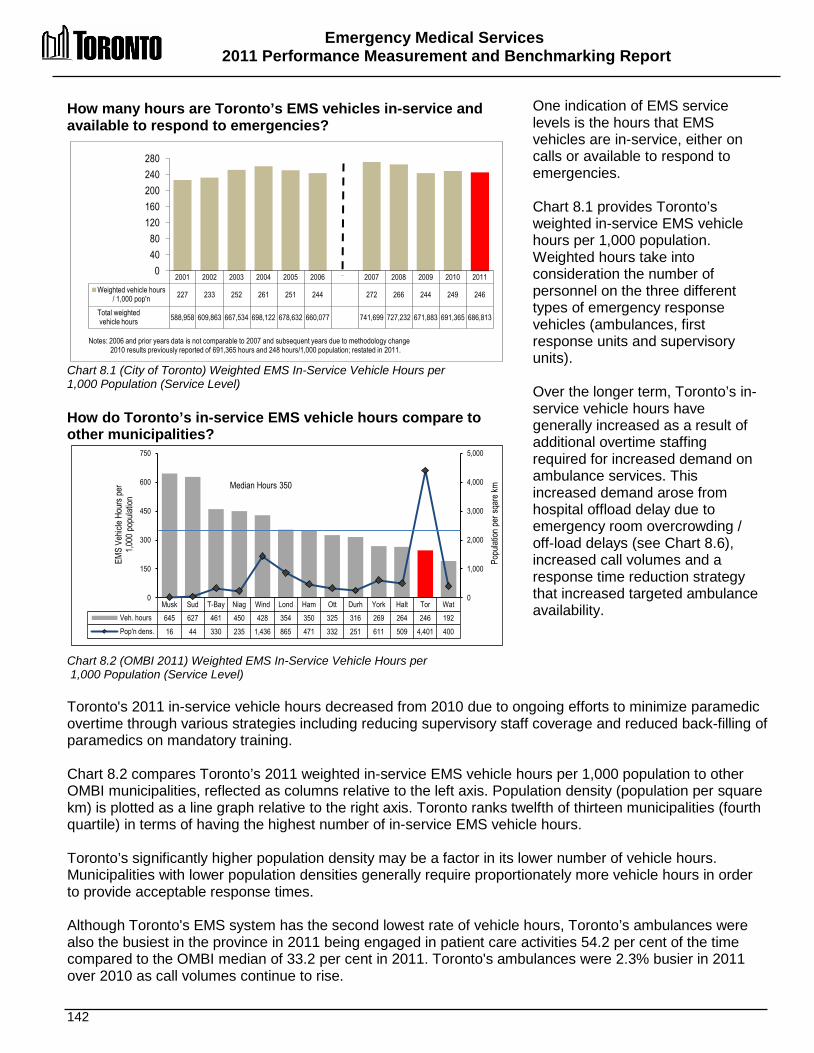
Emergency Medical Services 2011 Performance Measurement and Benchmarking Report
142
How many hours are Toronto’s EMS vehicles in-service and available to respond to emergencies? Chart 8.1 (City of Toronto) Weighted EMS In-Service Vehicle Hours per 1,000 Population (Service Level) How do Toronto’s in-service EMS vehicle hours compare to other municipalities? Chart 8.2 (OMBI 2011) Weighted EMS In-Service Vehicle Hours per 1,000 Population (Service Level)
One indication of EMS service levels is the hours that EMS vehicles are in-service, either on calls or available to respond to emergencies.
Chart 8.1 provides Toronto’s weighted in-service EMS vehicle hours per 1,000 population. Weighted hours take into consideration the number of personnel on the three different types of emergency response vehicles (ambulances, first response units and supervisory units). Over the longer term, Toronto’s in-service vehicle hours have generally increased as a result of additional overtime staffing required for increased demand on ambulance services. This increased demand arose from hospital offload delay due to emergency room overcrowding / off-load delays (see Chart 8.6), increased call volumes and a response time reduction strategy that increased targeted ambulance availability.
Toronto's 2011 in-service vehicle hours decreased from 2010 due to ongoing efforts to minimize paramedic overtime through various strategies including reducing supervisory staff coverage and reduced back-filling of paramedics on mandatory training. Chart 8.2 compares Toronto’s 2011 weighted in-service EMS vehicle hours per 1,000 population to other OMBI municipalities, reflected as columns relative to the left axis. Population density (population per square km) is plotted as a line graph relative to the right axis. Toronto ranks twelfth of thirteen municipalities (fourth quartile) in terms of having the highest number of in-service EMS vehicle hours. Toronto’s significantly higher population density may be a factor in its lower number of vehicle hours. Municipalities with lower population densities generally require proportionately more vehicle hours in order to provide acceptable response times. Although Toronto's EMS system has the second lowest rate of vehicle hours, Toronto’s ambulances were also the busiest in the province in 2011 being engaged in patient care activities 54.2 per cent of the time compared to the OMBI median of 33.2 per cent in 2011. Toronto's ambulances were 2.3% busier in 2011 over 2010 as call volumes continue to rise.
2001 2002 2003 2004 2005 2006 2007 2008 2009 2010 2011 Weighted vehicle hours
/ 1,000 pop'n 227 233 252 261 251 244 272 266 244 249 246
Total weighted vehicle hours 588,958 609,863 667,534 698,122 678,632 660,077 741,699 727,232 671,883 691,365 686,813
0 40 80
120 160 200 240 280
Notes: 2006 and prior years data is not comparable to 2007 and subsequent years due to methodology change 2010 results previously reported of 691,365 hours and 248 hours/1,000 population; restated in 2011.
Musk Sud T-Bay Niag Wind Lond Ham Ott Durh York Halt Tor Wat Veh. hours 645 627 461 450 428 354 350 325 316 269 264 246 192 Pop'n dens. 16 44 330 235 1,436 865 471 332 251 611 509 4,401 400
0
1,000
2,000
3,000
4,000
5,000
0
150
300
450
600
750
Popu
lation
per
sqar
e km
EMS
Vehic
le Ho
urs p
er
1,000
pop
ulatio
n
Median Hours 350
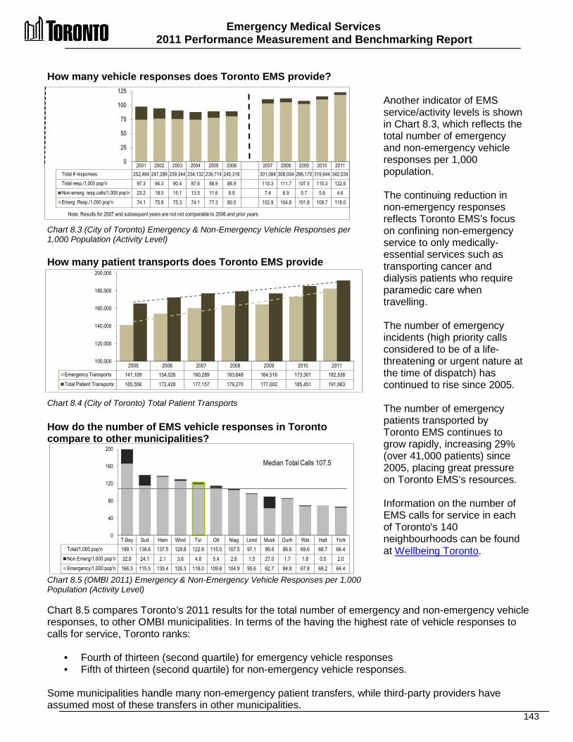
Emergency Medical Services 2011 Performance Measurement and Benchmarking Report
143
How many vehicle responses does Toronto EMS provide? Chart 8.3 (City of Toronto) Emergency & Non-Emergency Vehicle Responses per 1,000 Population (Activity Level) How many patient transports does Toronto EMS provide Chart 8.4 (City of Toronto) Total Patient Transports How do the number of EMS vehicle responses in Toronto compare to other municipalities?
Another indicator of EMS service/activity levels is shown in Chart 8.3, which reflects the total number of emergency and non-emergency vehicle responses per 1,000 population. The continuing reduction in non-emergency responses reflects Toronto EMS’s focus on confining non-emergency service to only medically-essential services such as transporting cancer and dialysis patients who require paramedic care when travelling. The number of emergency incidents (high priority calls considered to be of a life-threatening or urgent nature at the time of dispatch) has continued to rise since 2005. The number of emergency patients transported by Toronto EMS continues to grow rapidly, increasing 29% (over 41,000 patients) since 2005, placing great pressure on Toronto EMS’s resources. Information on the number of EMS calls for service in each of Toronto's 140 neighbourhoods can be found at Wellbeing Toronto.
Chart 8.5 (OMBI 2011) Emergency & Non-Emergency Vehicle Responses per 1,000 Population (Activity Level)
Chart 8.5 compares Toronto’s 2011 results for the total number of emergency and non-emergency vehicle responses, to other OMBI municipalities. In terms of the having the highest rate of vehicle responses to calls for service, Toronto ranks:
• Fourth of thirteen (second quartile) for emergency vehicle responses • Fifth of thirteen (second quartile) for non-emergency vehicle responses.
Some municipalities handle many non-emergency patient transfers, while third-party providers have assumed most of these transfers in other municipalities.
2001 2002 2003 2004 2005 2006 2007 2008 2009 2010 2011 Total # responses 252,484 247,289 239,344 234,132 239,714 240,318 301,084 306,004 296,170 319,644 342,034 Total resp./1,000 pop'n 97.3 94.3 90.4 87.6 88.9 88.9 110.3 111.7 107.5 115.3 122.6 Non-emerg. resp.calls/1,000 pop'n 23.2 18.5 15.1 13.5 11.6 8.9 7.4 6.9 5.7 5.6 4.6 Emerg. Resp./1,000 pop'n 74.1 75.8 75.3 74.1 77.3 80.0 102.9 104.8 101.8 109.7 118.0
0
25
50
75
100
125
Note: Results for 2007 and subsequent years are not not comparable to 2006 and prior years.
T-Bay Sud Ham Wind Tor Ott Niag Lond Musk Durh Wat Halt York Total/1,000 pop'n 199.1 139.6 137.5 129.8 122.6 115.0 107.5 97.1 89.8 86.6 69.6 68.7 66.4 Non Emerg/1,000 pop'n 32.8 24.1 2.1 3.6 4.6 5.4 2.6 1.5 27.0 1.7 1.8 0.5 2.0 Emergency/1,000 pop'n 166.3 115.5 135.4 126.3 118.0 109.6 104.9 95.6 62.7 84.8 67.8 68.2 64.4
0
40
80
120
160
200
Median Total Calls 107.5
2005 2006 2007 2008 2009 2010 2011 Emergency Transports 141,109 154,026 160,289 163,648 164,516 173,301 182,538 Total Patient Transports 165,556 172,428 177,157 179,270 177,002 185,451 191,663
100,000
120,000
140,000
160,000
180,000
200,000

Emergency Medical Services 2011 Performance Measurement and Benchmarking Report
144
What percentage of time do ambulances in Toronto spend at hospitals transferring patients? Chart 8.6 (City of Toronto) Hours of Ambulance Time Lost to Hospital Turnaround (Community Impact) How does Toronto ambulance time spent at hospitals compare to other municipalities? Chart 8.7 (OMBI 2011) Percentage of Ambulance Time Lost to Hospital Turnaround (Community Impact)
The ambulance turnaround time required to transfer an EMS patient from the care of EMS paramedics to the care of hospital staff is important because it can have a significant impact on service. This turnaround time includes the time it takes to transfer the patient, complete patient care documentation, and delays in transfer of care due to shortages of hospital resources (commonly referred to as off-load delay). Off-load delays result in less time that paramedics are available “on the road” to respond to other emergency calls. When turnaround time becomes too onerous, EMS may be pressured to add resources in order to maintain sufficient units available to respond to calls and to keep the response times (as seen in Charts 6.8 and 6.9) at acceptable levels. Chart 8.6 shows Toronto’s data for the total and percentage of ambulance hours involved in the turnaround activities noted above. Off-load delays at hospitals account for much of this time.
In mid-2008, Toronto implemented the Hospital Offload Delay Nurse Program, which provided extra nursing shifts in seven hospital emergency rooms to speed up offloading of Toronto EMS patients. In 2010, the program was expanded to 14 hospitals and automated data sharing linkages were established with 11 of these hospitals. The program has contributed to improved/shortened wait times from an average of 70 minutes in 2008 to 48.5 minutes in 2010 and 2011. The program, which is fully funded by the Province, is expected to improve EMS response time to life threatening calls and reduce overtime costs. Figure 6.7 compares Toronto’s 2011 result for ambulance turnaround time to other OMBI municipalities. Toronto ranks ninth of thirteen (third quartile) in terms of having the shortest ambulance turnaround time. While the Hospital Offload Delay Nurse Program has relieved some pressure on EMS resources, offload delay remains a significant pressure that contributes to EMS' use of overtime in order to maintain service levels.
2006 2007 2008 2009 2010 2011 # of hours lost 146,551 165,510 154,814 128,466 129,485 132,567 % of hours lost 24.5% 24.8% 23.8% 21.1% 20.8% 21.4%
0
30,000
60,000
90,000
120,000
150,000
180,000
Note: 2010 result previously reported of 20.9% was restated.
Musk Sud Niag Halt Durh Lond Wind York Tor Wat T-Bay Ott Ham % hours lost 1.4% 12.2% 12.6% 13.4% 16.7% 17.0% 18.7% 19.3% 21.4% 22.3% 24.5% 25.0% 27.3%
0%
5%
10%
15%
20%
25%
30%
Median 18.7%
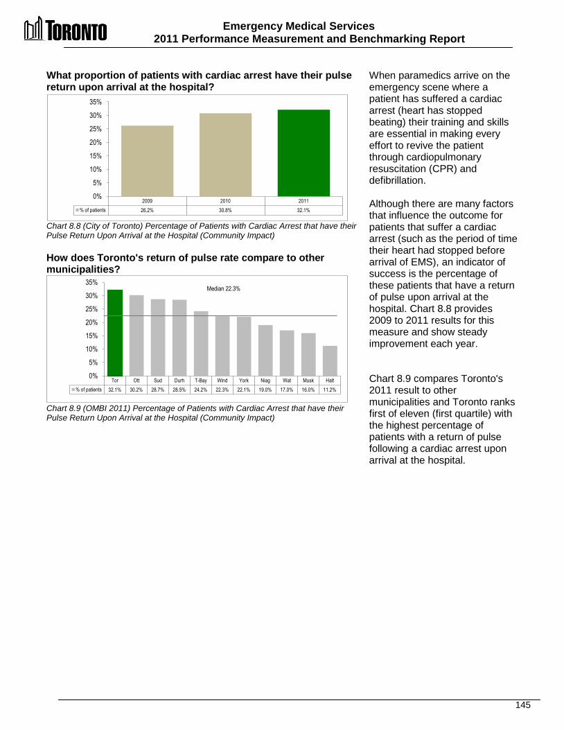
Emergency Medical Services 2011 Performance Measurement and Benchmarking Report
145
2009 2010 2011 % of patients 26.2% 30.8% 32.1%
0%
5%
10%
15%
20%
25%
30%
35%
Tor Ott Sud Durh T-Bay Wind York Niag Wat Musk Halt % of patients 32.1% 30.2% 28.7% 28.5% 24.2% 22.3% 22.1% 19.0% 17.0% 16.0% 11.2%
0%
5%
10%
15%
20%
25%
30%
35% Median 22.3%
What proportion of patients with cardiac arrest have their pulse return upon arrival at the hospital? Chart 8.8 (City of Toronto) Percentage of Patients with Cardiac Arrest that have their Pulse Return Upon Arrival at the Hospital (Community Impact) How does Toronto's return of pulse rate compare to other municipalities? Chart 8.9 (OMBI 2011) Percentage of Patients with Cardiac Arrest that have their Pulse Return Upon Arrival at the Hospital (Community Impact)
When paramedics arrive on the emergency scene where a patient has suffered a cardiac arrest (heart has stopped beating) their training and skills are essential in making every effort to revive the patient through cardiopulmonary resuscitation (CPR) and defibrillation. Although there are many factors that influence the outcome for patients that suffer a cardiac arrest (such as the period of time their heart had stopped before arrival of EMS), an indicator of success is the percentage of these patients that have a return of pulse upon arrival at the hospital. Chart 8.8 provides 2009 to 2011 results for this measure and show steady improvement each year. Chart 8.9 compares Toronto's 2011 result to other municipalities and Toronto ranks first of eleven (first quartile) with the highest percentage of patients with a return of pulse following a cardiac arrest upon arrival at the hospital.
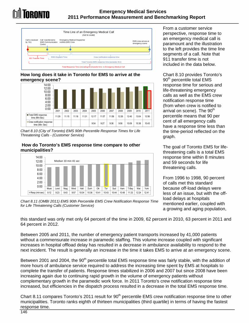
Emergency Medical Services 2011 Performance Measurement and Benchmarking Report
146
2001 2002 2003 2004 2005 2006 2007 2008 2009 2010 2011 Total EMS response
time (Min:Sec) 11:29 11:15 11:18 11:31 12:17 11:57 11:58 12:26 12:40 13:04 12:56
Crew notification response time (Min: Sec) 9:54 9:27 9:36 9:56 10:09 10:38 10:43
0:00 2:00 4:00 6:00 8:00
10:00 12:00 14:00
Musk Lond Niag Wind Halt Durh Ott Tor Sud Ham T-Bay Wat York Resp (min:sec) 9:12 9:23 9:43 9:57 10:04 10:36 10:41 10:43 10:44 10:48 11:33 12:24 12:41
0:00 2:00 4:00 6:00 8:00
10:00 12:00 14:00
Median 10 min 41 sec
How long does it take in Toronto for EMS to arrive at the emergency scene? Chart 8.10 (City of Toronto) EMS 90th Percentile Response Times for Life Threatening Calls - (Customer Service) How do Toronto’s EMS response time compare to other municipalities? Chart 8.11 (OMBI 2011) EMS 90th Percentile EMS Crew Notification Response Time for Life Threatening Calls (Customer Service)
From a customer service perspective, response time to an emergency medical call is paramount and the illustration to the left provides the time line segments of a call. Note that 911 transfer time is not included in the data below. Chart 8.10 provides Toronto’s 90th percentile total EMS response time for serious and life-threatening emergency calls as well as the EMS crew notification response time (from when crew is notified to arrival on scene). The 90th percentile means that 90 per cent of all emergency calls have a response time less than the time-period reflected on the graph. The goal of Toronto EMS for life-threatening calls is a total EMS response time within 8 minutes and 59 seconds for life threatening calls. From 1996 to 1998, 90 percent of calls met this standard because off-load delays were less of an issue, but with the off-load delays at hospitals mentioned earlier, coupled with a growing and aging population,
this standard was only met only 64 percent of the time in 2009, 62 percent in 2010, 63 percent in 2011 and 64 percent in 2012. Between 2005 and 2011, the number of emergency patient transports increased by 41,000 patients without a commensurate increase in paramedic staffing. This volume increase coupled with significant increases in hospital offload delay has resulted in a decrease in ambulance availability to respond to the next incident. The result is generally an increase in the time it takes EMS to arrive at an emergency scene. Between 2001 and 2004, the 90th percentile total EMS response time was fairly stable, with the addition of more hours of ambulance service required to address the increasing time spent by EMS at hospitals to complete the transfer of patients. Response times stabilized in 2006 and 2007 but since 2008 have been increasing again due to continuing rapid growth in the volume of emergency patients without complementary growth in the paramedic work force. In 2011 Toronto's crew notification response time increased, but efficiencies in the dispatch process resulted in a decrease in the total EMS response time. Chart 8.11 compares Toronto’s 2011 result for 90th percentile EMS crew notification response time to other municipalities. Toronto ranks eighth of thirteen municipalities (third quartile) in terms of having the fastest response time.
Crew notification response time
Call is received by 911
Time Line of an Emergency Medical Call (not to scale)
Call transferred to EMS Communication Centre
Emergency Medical Dispatcher notifies EMS Crew EMS crew arrives at
emergency scene
911 Transfer Time
Total Toronto EMS response time (excludes 911)
EMS Dispatch Time
Total Response Time (including 911)transfer time to Emergency Medical Call
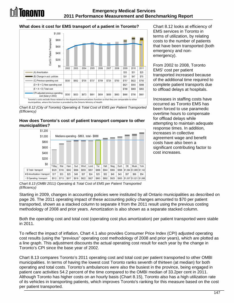
Emergency Medical Services 2011 Performance Measurement and Benchmarking Report
147
What does it cost for EMS transport of a patient in Toronto? Chart 8.12 (City of Toronto) Operating & Total Cost of EMS per Patient Transported (Efficiency) How does Toronto’s cost of patient transport compare to other municipalities? Chart 8.13 (OMBI 2011) Operating & Total Cost of EMS per Patient Transported (Efficiency)
Chart 8.12 looks at efficiency of EMS services in Toronto in terms of utilization, by relating costs to the number of patients that have been transported (both emergency and non-emergency). From 2002 to 2008, Toronto EMS' cost per patient transported increased because of the additional time required to complete patient transports due to offload delays at hospitals. Increases in staffing costs have occurred as Toronto EMS has been forced to use paramedic overtime hours to compensate for offload delays while attempting to maintain adequate response times. In addition, increases in collective agreement wage and benefit costs have also been a significant contributing factor to cost increases.
Starting in 2009, changes in accounting policies were instituted by all Ontario municipalities as described on page 26. The 2011 operating impact of these accounting policy changes amounted to $70 per patient transported, shown as a stacked column to separate it from the 2011 result using the previous costing methodology of 2008 and prior years. Amortization is also shown as a separate stacked column. Both the operating cost and total cost (operating cost plus amortization) per patient transported were stable in 2011. To reflect the impact of inflation, Chart 4.1 also provides Consumer Price Index (CPI) adjusted operating cost results (using the "previous" operating cost methodology of 2008 and prior years), which are plotted as a line graph. This adjustment discounts the actual operating cost result for each year by the change in Toronto’s CPI since the base year of 2002. Chart 8.13 compares Toronto’s 2011 operating cost and total cost per patient transported to other OMBI municipalities. In terms of having the lowest cost Toronto ranks seventh of thirteen (at median) for both operating and total costs. Toronto’s ambulances were also the busiest in the province, being engaged in patient care activities 54.2 percent of the time compared to the OMBI median of 33.2per cent in 2011. Although Toronto has higher costs on an hourly basis (Chart 8.15), Toronto also has a high utilization rate of its vehicles in transporting patients, which improves Toronto's ranking for this measure based on the cost per patient transported.
2002 2003 2004 2005 2006 2007 2008 2009 2010 2011 (A) Amortization $33 $31 $25 (B) Change in acct. policies $31 $47 $70 (C) Previous operating cost $530 $652 $705 $737 $709 $725 $750 $757 $822 $793 (D = B + C) New operating cost $821 $900 $888 (E = A + D) Total cost $788 $869 $863 CPI-adjusted previous operating
cost (base yr 2002) $530 $633 $673 $691 $654 $656 $663 $666 $706 $661
$0
$200
$400
$600
$800
$1,000
Toronto's costs exclude those related to the dispatch/communications function so that they are comparable to other municipalities, where this function is provided by the Ontario Ministry of Health
Cost
$ / P
atien
t Tra
nspo
rted
T-Bay Wat Ham Sud Wind Lond Tor Halt Niag Durh Ott Musk York $ Total / transport $529 $745 $842 $866 $859 $851 $888 $944 $965 $998 $1,064 $1,089 $1,142 $ Amortization / transport $17 $33 $25 $49 $37 $24 $25 $52 $40 $43 $57 $68 $54 $ Operating / transport $512 $713 $817 $818 $822 $827 $863 $892 $925 $955 $1,007 $1,021 $1,088
$0
$200
$400
$600
$800
$1,000
$1,200 Medians operating - $863, total - $888
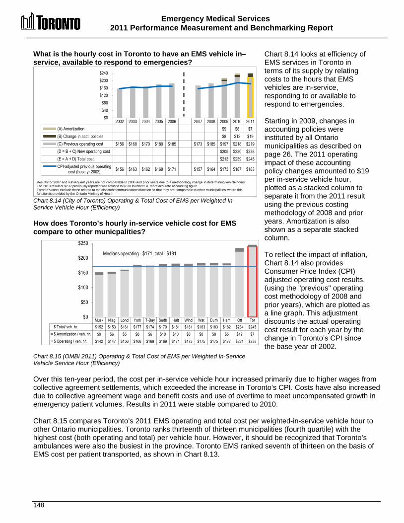
Emergency Medical Services 2011 Performance Measurement and Benchmarking Report
148
What is the hourly cost in Toronto to have an EMS vehicle in–service, available to respond to emergencies? Chart 8.14 (City of Toronto) Operating & Total Cost of EMS per Weighted In-Service Vehicle Hour (Efficiency) How does Toronto’s hourly in-service vehicle cost for EMS compare to other municpalities? Chart 8.15 (OMBI 2011) Operating & Total Cost of EMS per Weighted In-Service Vehicle Service Hour (Efficiency)
Chart 8.14 looks at efficiency of EMS services in Toronto in terms of its supply by relating costs to the hours that EMS vehicles are in-service, responding to or available to respond to emergencies. Starting in 2009, changes in accounting policies were instituted by all Ontario municipalities as described on page 26. The 2011 operating impact of these accounting policy changes amounted to $19 per in-service vehicle hour, plotted as a stacked column to separate it from the 2011 result using the previous costing methodology of 2008 and prior years. Amortization is also shown as a separate stacked column. To reflect the impact of inflation, Chart 8.14 also provides Consumer Price Index (CPI) adjusted operating cost results, (using the "previous" operating cost methodology of 2008 and prior years), which are plotted as a line graph. This adjustment discounts the actual operating cost result for each year by the change in Toronto’s CPI since the base year of 2002.
Over this ten-year period, the cost per in-service vehicle hour increased primarily due to higher wages from collective agreement settlements, which exceeded the increase in Toronto’s CPI. Costs have also increased due to collective agreement wage and benefit costs and use of overtime to meet uncompensated growth in emergency patient volumes. Results in 2011 were stable compared to 2010. Chart 8.15 compares Toronto’s 2011 EMS operating and total cost per weighted-in-service vehicle hour to other Ontario municipalities. Toronto ranks thirteenth of thirteen municipalities (fourth quartile) with the highest cost (both operating and total) per vehicle hour. However, it should be recognized that Toronto’s ambulances were also the busiest in the province. Toronto EMS ranked seventh of thirteen on the basis of EMS cost per patient transported, as shown in Chart 8.13.
2002 2003 2004 2005 2006 2007 2008 2009 2010 2011 (A) Amortization $9 $8 $7 (B) Change in acct. policies $8 $12 $19 (C) Previous operating cost $156 $168 $170 $180 $185 $173 $185 $197 $218 $219 (D = B + C) New operating cost $205 $230 $238 (E = A + D) Total cost $213 $239 $245 CPI-adjusted previous operating
cost (base yr 2002) $156 $163 $162 $169 $171 $157 $164 $173 $187 $183
$0 $40 $80
$120 $160 $200 $240
Results for 2007 and subsequent years are not comparable to 2006 and prior years due to a methodology change in determining vehicle hours The 2010 result of $232 previously reported was revised to $230 to reflect a more accurate accounting figure. Toronto's costs exclude those related to the dispatch/communications function so that they are comparable to other municipalities, where this function is provided by the Ontario Ministry of Health
Musk Niag Lond York T-Bay Sudb Halt Wind Wat Durh Ham Ott Tor $ Total/ veh. hr. $152 $153 $161 $177 $174 $179 $181 $181 $183 $183 $182 $234 $245 $ Amortization / veh. hr. $9 $6 $5 $8 $6 $10 $10 $8 $8 $8 $5 $12 $7 $ Operating / veh. hr. $142 $147 $156 $168 $169 $169 $171 $173 $175 $175 $177 $221 $238
$0
$50
$100
$150
$200
$250
Medians operating - $171, total - $181
Emergency Medical Services 2011 Performance Measurement and Benchmarking Report
149
2012 Achievements and 2013 Planned Initiatives The following initiatives improved or are intended to further improve the efficiency and effectiveness of Toronto EMS. 2012 Initiatives Completed/Achievements
• Participated in a complete Service and Organizational study. • Improved and measurable decreases in Hospital Offload Delay through the Dedicated
Offload Nurse Program, ongoing negotiations with Toronto hospitals and site-specific reporting to improve their offload times and negotiated with the province to expand and continue the Dedicated Offload Nurse Program in 2013.
• Improved efficiency through more targeted response of Advanced Life Support (ALS) paramedic crews and dispatch software. This ensures that medical skills of ALS crews are more closely and consistently matched to patient needs.
• Continued to develop a new paramedic shift schedule to be implemented by early 2013. This new shift schedule is designed to better match staffing with emergency call demand, help reduce overtime, as well as offer staff a variety of shift schedules. Interim scheduling changes were made to realign weekend and weekday staffing to better coincide with emergency call demand. This has contributed to a reduction in overtime, including end-of-shift overtime and meal break costs.
• Continued to coordinate and expanded the Public Access Defibrillator Program to save lives by facilitating bystander medical interventions. Almost 200 Automatic External Defibrillators (AEDs) were distributed and installed at workplaces and facilities throughout the City of Toronto.
• Continued to improve the Central Ambulance Communications Centre's processing of emergency calls through the use of new decision-support software, which allows dispatchers to more accurately anticipate, monitor and assign the correct paramedic resources throughout the city.
• Developed and evaluated a Patient Safety Advocate function within the Communications Centre to mitigate possible service delays. This role focuses on real-time response performance through the identification of emerging delays and immediate action to minimize any delay in overall service delivery.
• Continued to use the Community Referral process by paramedics to re-direct specific patient groups to appropriate out-of-hospital medical care, thereby minimizing or eliminating their reliance on 911 and the hospital system.
• Employed call diversion and mitigation strategies to address steadily increasing emergency call demand and ambulance transports:
o Continuation of the Community Referral by EMS (CREMS) program to direct specific patient groups to appropriate out-of-hospital medical care
o Trial of a clinical advisor in the CACC to better address and route non-life threatening calls
2013 Initiatives Planned • Successfully implemented paramedic scheduling changes in January 2013 to better balance
workloads and realign staffing to emergency call demand, which will help to reduce overtime costs, including end-of-shift overtime and meal break costs.
• Implement the new model of care where Advanced Life Support (ALS) paramedic crews are targeted to respond more consistently to “ALS-appropriate” calls based on the Medical Priority Dispatch System (MPDS) software.
Emergency Medical Services 2011 Performance Measurement and Benchmarking Report
150
• Continue to negotiate terms and conditions with Local 416 for part-time paramedics to better match staffing to call demand.
• Continue to develop and implement improved computer-aided dispatch technology in the dispatch centre (i.e., the Central Ambulance Communications Centre) to facilitate the deployment of ambulances to improve response time performance, and investigate innovative call diversion and mitigation strategies to improve ambulance availability.
• Continue development of the Radio Communication Infrastructure Replacement project, shared by the three emergency services (EMS, Fire Services and Police Services), with expected completion anticipated in 2014
• Continue the Hospital Offload Delay Nurse Program and maintain ongoing negotiations with Toronto hospitals to improve their offload times
• Continue to focus on clinical excellence and improved patient outcomes through various initiatives i.e., STEMI Cardiac Care program to reduce pre-hospital heart attack mortality; enhanced stroke and trauma care; continuation of Safe City program (i.e., public access defibrillation) that will allow EMS to meet response time standards for sudden cardiac arrest as mandated by the MOHLTC
• Continue working with the MOHLTC to improve patient access to healthcare e.g., Telehealth.
Factors Influencing the Results of Municipalities The results of each municipality included in this report can be influenced to varying degrees by factors such as: • Geographic coverage and population density: in high-density cities, congestion can make
navigating roads more difficult, resulting in significant delays. In contrast, rural areas can have large under-populated areas, making it challenging to provide cost-effective and timely emergency coverage.
• Local demographics: an older, more vulnerable or economically disadvantaged population can increase the demand for service, as can seasonal visitors and the inflow of workers from other communities during the day.
• Level of certification: the mix of advanced care vs. primary care paramedics and their differing wage rates can impact costs, as well as the status of multi-year collective bargaining agreements.
• Specialized services: tactical teams, multi-patient transport units, and bike and marine teams are increasingly being provided by the larger municipalities to better address urban population demands, which can affect costs.
• Off-load delays in hospitals: results can be impacted by a combination of factors, such as bed occupancy rates, the level of activity in hospital emergency departments and the efficiency of admission procedures.
• Increases in emergency calls due to an expanding and aging population.

151

152
Fire Services
Disaster Response and Event Support
Emergency Planning
Mechanical Maintenance
Heavy Urban Search & Rescue
Chemical, Biological, Radiological, Nuclear
and Explosives Response
All Hazards Emergency Response
Fire Safety Education
Risk Watch
Campaign Based Fire Protection
Fire Prevention and Enforcement
Fire Code Enforcement
Development Review
Communications & Communications
Support
Professional Development
& Training
FFiirree SSeerrvviicceess The goal of Fire Services is to protect life and property with the five primary activities being: • Fire prevention, inspection and enforcement – providing
building inspection and enforcement of fire bylaws as well as building plan examination services.
• Fire safety education – providing public education in matters relating to fire prevention and emergency preparation for individuals, community groups and schools.
• All hazards emergency response – providing fire suppression services, as well as first response to medical emergencies, hazardous materials response, road accident response, and response to other disasters and emergencies as required.
• Disaster response and event support - providing heavy urban search & rescue (HUSAR) and chemical, biological, radiological and explosives response, locally, provincially, nationally and, internationally.
• Critical support to all hazards emergency incident response and disaster response events provided by Emergency Planning, Mechanical Maintenance, Communications/Communications systems and Professional Development and Training business units.

Fire Services 2011 Performance Measurement And Benchmarking Report
153
Question Indicator/Measure Internal Comparison
of Toronto’s 2011 vs. 2010 Results
External Comparison to Other Municipalities
(OMBI) By Quartile for 2011
Chart &
Page Ref.
Service / Activity Level Indicators
How many hours are fire vehicles in-service and available to respond to emergencies?
Number of Fire In-Service Vehicle Hours (Urban Area) per Capita – (Service Level)
Stable
Vehicle hours in-service decreased slightly
(service level indicator)
4
Low rate of in-service vehicle hours compared
to others
(service level indicator)
(high population density cities such as Toronto in theory,
would imply a need for fewer apparatus given shorter travel times; however the high level of traffic congestion can result
in slower travel speeds)
9.1 9.2
pg. 156
How many emergency incidents does Fire Services respond to each year?
Number of Unique Incidents Responded to by Fire Services per 1,000 Urban Population – (Activity Level)
Stable
Number of total incidents responded to
stable
(activity level indicator)
1
Higher rate of total incidents responded to compared to others and
depend
(activity level indicator)
9.3 9.5
pg.
157-158
How many property fires, explosions and alarms does Fire Services respond to each year?
Number of Property Fires, Explosions and Alarms per 1,000 Urban Population – (Activity Level)
Decrease
Number of fires, explosions and alarms
responded to decreased
(activity level indicator)
2
High rate of fires, explosions and alarms
responded to compared to others
(activity level indicator)
9.3 9.5
pg.
157-158
How many rescues does Fire Services respond to each year?
Number of Rescues per 1,000 Urban Population – (Activity Level)
Stable
Number of rescues stable
(activity level indicator)
3
Low rate of rescues responded to compared
to others
(activity level indicator)
9.3 9.5
pg.
157-158
How many medical calls does Fire Services respond to each year?
Number of Medical Calls per 1,000 Urban Population – (Activity Level)
Increase
Increase in number of medical responses
(activity level indicator)
2
High rate of medical responses compared to
others
(activity level indicator)
9.3 9.5
pg.
157-158
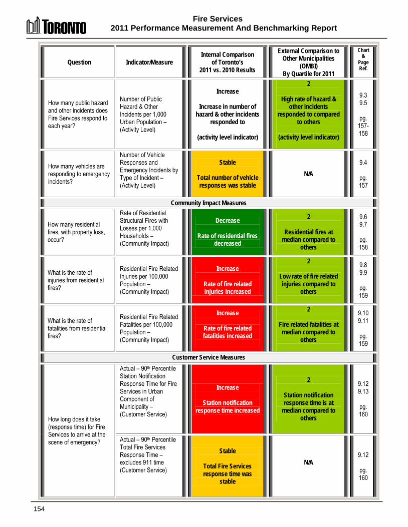
Fire Services 2011 Performance Measurement And Benchmarking Report
154
Question Indicator/Measure Internal Comparison
of Toronto’s 2011 vs. 2010 Results
External Comparison to Other Municipalities
(OMBI) By Quartile for 2011
Chart &
Page Ref.
How many public hazard and other incidents does Fire Services respond to each year?
Number of Public Hazard & Other Incidents per 1,000 Urban Population – (Activity Level)
Increase
Increase in number of hazard & other incidents
responded to
(activity level indicator)
2
High rate of hazard & other incidents
responded to compared to others
(activity level indicator)
9.3 9.5
pg.
157-158
How many vehicles are responding to emergency incidents?
Number of Vehicle Responses and Emergency Incidents by Type of Incident – (Activity Level)
Stable
Total number of vehicle responses was stable
N/A 9.4
pg. 157
Community Impact Measures
How many residential fires, with property loss, occur?
Rate of Residential Structural Fires with Losses per 1,000 Households – (Community Impact)
Decrease
Rate of residential fires decreased
2
Residential fires at median compared to
others
9.6 9.7
pg. 158
What is the rate of injuries from residential fires?
Residential Fire Related Injuries per 100,000 Population – (Community Impact)
Increase
Rate of fire related injuries increased
2
Low rate of fire related injuries compared to
others
9.8 9.9
pg. 159
What is the rate of fatalities from residential fires?
Residential Fire Related Fatalities per 100,000 Population – (Community Impact)
Increase
Rate of fire related fatalities increased
2
Fire related fatalities at median compared to
others
9.10 9.11
pg. 159
Customer Service Measures
How long does it take (response time) for Fire Services to arrive at the scene of emergency?
Actual – 90th Percentile Station Notification Response Time for Fire Services in Urban Component of Municipality – (Customer Service)
Increase
Station notification response time increased
2
Station notification response time is at
median compared to others
9.12 9.13
pg. 160
Actual – 90th Percentile Total Fire Services Response Time – excludes 911 time (Customer Service)
Stable
Total Fire Services response time was
stable
N/A
9.12
pg. 160

Fire Services 2011 Performance Measurement And Benchmarking Report
155
Question Indicator/Measure Internal Comparison
of Toronto’s 2011 vs. 2010 Results
External Comparison to Other Municipalities
(OMBI) By Quartile for 2011
Chart &
Page Ref.
Efficiency Measures
What does it cost per hour, to have a front-line fire vehicle available to respond to emergencies?
Fire Operating Cost per In-Service Vehicle Hour – (Efficiency)
Stable
Operating cost per in-service vehicle hour was
stable
(excludes impact of change in accounting policy)
4
Highest cost per in-service vehicle hour compared to others
9.14 9.15
pg. 161
What does it cost per hour, to have a front-line fire vehicle available to respond to emergencies?
Fire Total Cost per In-Service Vehicle Hour – (Efficiency)
Stable
Total cost per in-service vehicle hour was stable
(excludes impact of change in
accounting policy)
4
Highest total cost per in-service vehicle hour compared to others
9.14 9.15
pg. 161
Overall Results
Service/ Activity Level
Indicators (Resources)
0 - Increased 3 - Stable 0– Decreased 100% stable
Performance Measures (Results)
1 - Favourable 3 - Stable 3 - Unfavourable 57% favourable or stable
Service/ Activity Level
Indicators (Resources)
1 - 1st quartile 3 - 2nd quartile 1 - 3rd quartile 1 - 4th quartile 67% above median
Performance Measures (Results)
0 - 1st quartile 4- 2nd quartile 0 - 3rd quartile 2 - 4th quartile 67% at or above median
For an explanation of how to interpret this summary and the supporting charts, please see pages 24-30. These quartile results are based on a maximum sample size of nine municipalities.

Fire Services 2011 Performance Measurement And Benchmarking Report
156
2004 2005 2006 2007 2008 2009 2010 2011 vehicle hours per capita 0.48 0.47 0.47 0.46 0.46 0.46 0.46 0.45 total vehicle hours 1,278,485 1,275,768 1,275,086 1,262,298 1,255,500 1,268,663 1,263,767 1,246,417
0.0
0.1
0.2
0.3
0.4
0.5
T-Bay Ott Wind Calg Sud Lond Ham Tor Bar Vehicle hours
per capita 1.29 0.66 0.66 0.63 0.55 0.53 0.52 0.45 0.45
Population density 330 332 1,436 1,286 44 865 471 4,401 1,400
0
1,000
2,000
3,000
4,000
5,000
0.0
0.2
0.4
0.6
0.8
1.0
1.2
1.4
Urba
n Den
sity-
pop'n
per s
q. km
Fire V
ehicl
e Hou
rs pe
r Cap
ita
Median Hours 0.55
How many hours are Toronto’s fire vehicles in-service and available to respond to emergencies? Chart 9.1 (City of Toronto) Number of Staffed Fire In-Service Vehicle Hours per Capita (Service Level) How do Toronto’s in-service fire vehicle hours, compare to other municipalities? Chart 9.2 (OMBI 2011) Number of Staffed In-Service Fire Vehicle Hours (in Urban Areas) per Capita (Service Level) & Urban Population Density
As an indicator of service levels, Chart 9.1 provides Toronto’s results for both the total number and rate of in-service vehicle hours per capita. Total in service hours decreased slightly by -1.4% in 2011. In-service vehicle hours includes hours responding to, or available to respond to, emergencies. The hours when vehicles are removed from service for mechanical repairs or insufficient staffing are excluded. The key front-line fire vehicles included in this measure are pumpers, aerials, water tankers and rescue units Chart 9.2 compares Toronto’s 2011 in-service vehicle hours per capita (shown as bars relative to the left axis) to the urban areas of other municipalities. In terms of the highest number of in-service fire vehicle hours per capita, Toronto ranked 8th of 9 (4th quartile) . The most significant factor in Toronto's lower ranking is its significantly higher population density, plotted on the line graph relative to the right axis of Chart 9.2.
In densely populated municipalities such as Toronto, proportionately fewer fire stations and vehicle hours may be required to serve a given area because of proximity to residents and businesses, however increasing traffic congestion and its impact on response times must also be considered. Less densely populated areas may require more fire vehicles and stations in order to provide desired response times. Toronto’s urban form, with a growing number of high rise buildings also requires different response capabilities and equipment.
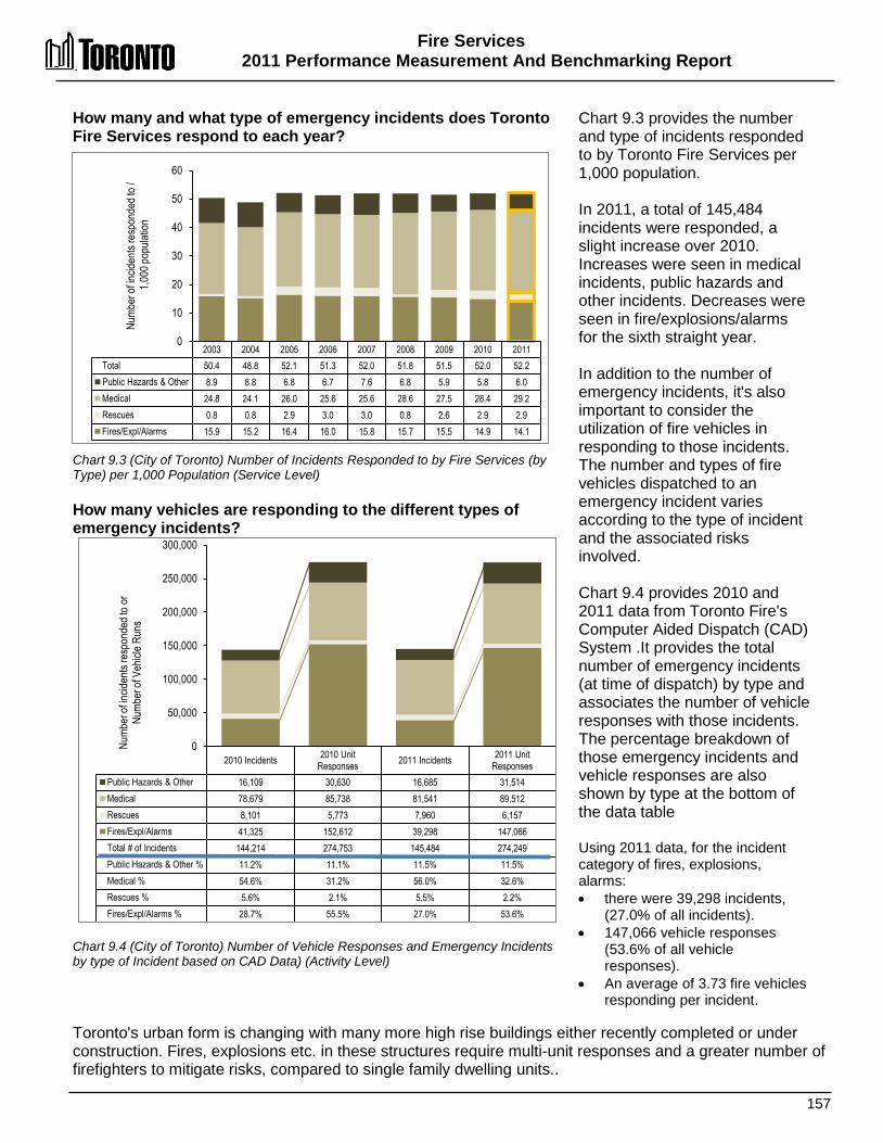
Fire Services 2011 Performance Measurement And Benchmarking Report
157
How many and what type of emergency incidents does Toronto Fire Services respond to each year? Chart 9.3 (City of Toronto) Number of Incidents Responded to by Fire Services (by Type) per 1,000 Population (Service Level) How many vehicles are responding to the different types of emergency incidents? Chart 9.4 (City of Toronto) Number of Vehicle Responses and Emergency Incidents by type of Incident based on CAD Data) (Activity Level)
Chart 9.3 provides the number and type of incidents responded to by Toronto Fire Services per 1,000 population. In 2011, a total of 145,484 incidents were responded, a slight increase over 2010. Increases were seen in medical incidents, public hazards and other incidents. Decreases were seen in fire/explosions/alarms for the sixth straight year. In addition to the number of emergency incidents, it's also important to consider the utilization of fire vehicles in responding to those incidents. The number and types of fire vehicles dispatched to an emergency incident varies according to the type of incident and the associated risks involved. Chart 9.4 provides 2010 and 2011 data from Toronto Fire's Computer Aided Dispatch (CAD) System .It provides the total number of emergency incidents (at time of dispatch) by type and associates the number of vehicle responses with those incidents. The percentage breakdown of those emergency incidents and vehicle responses are also shown by type at the bottom of the data table Using 2011 data, for the incident category of fires, explosions, alarms: • there were 39,298 incidents,
(27.0% of all incidents). • 147,066 vehicle responses
(53.6% of all vehicle responses).
• An average of 3.73 fire vehicles responding per incident.
Toronto's urban form is changing with many more high rise buildings either recently completed or under construction. Fires, explosions etc. in these structures require multi-unit responses and a greater number of firefighters to mitigate risks, compared to single family dwelling units..
2003 2004 2005 2006 2007 2008 2009 2010 2011 Total 50.4 48.8 52.1 51.3 52.0 51.8 51.5 52.0 52.2 Public Hazards & Other 8.9 8.8 6.8 6.7 7.6 6.8 5.9 5.8 6.0 Medical 24.8 24.1 26.0 25.6 25.6 28.6 27.5 28.4 29.2 Rescues 0.8 0.8 2.9 3.0 3.0 0.8 2.6 2.9 2.9 Fires/Expl/Alarms 15.9 15.2 16.4 16.0 15.8 15.7 15.5 14.9 14.1
0
10
20
30
40
50
60
Numb
er of
incid
ents
resp
onde
d to /
1,0
00 po
pulat
ion
2010 Incidents 2010 Unit Responses 2011 Incidents 2011 Unit
Responses Public Hazards & Other 16,109 30,630 16,685 31,514 Medical 78,679 85,738 81,541 89,512 Rescues 8,101 5,773 7,960 6,157 Fires/Expl/Alarms 41,325 152,612 39,298 147,066 Total # of Incidents 144,214 274,753 145,484 274,249 Public Hazards & Other % 11.2% 11.1% 11.5% 11.5% Medical % 54.6% 31.2% 56.0% 32.6% Rescues % 5.6% 2.1% 5.5% 2.2% Fires/Expl/Alarms % 28.7% 55.5% 27.0% 53.6%
0
50,000
100,000
150,000
200,000
250,000
300,000
Numb
er of
incid
ents
resp
onde
d to o
r Nu
mber
of V
ehicl
e Run
s
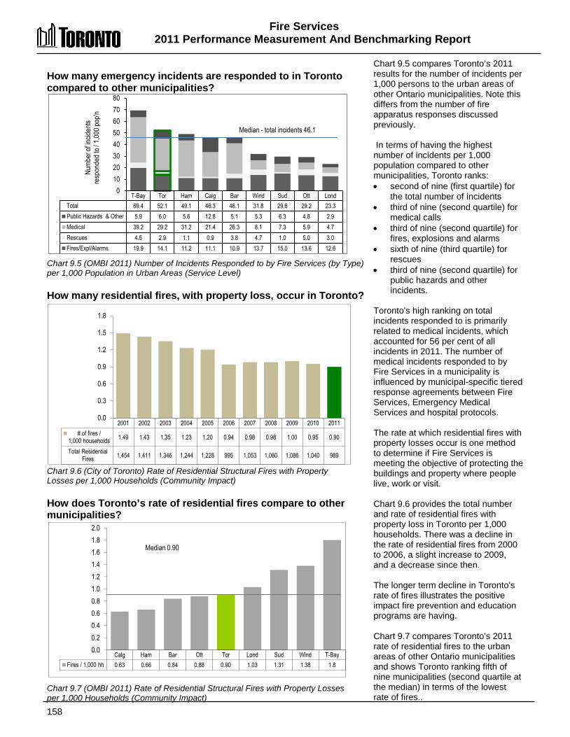
Fire Services 2011 Performance Measurement And Benchmarking Report
158
2001 2002 2003 2004 2005 2006 2007 2008 2009 2010 2011 # of fires /
1,000 households 1.49 1.43 1.35 1.23 1.20 0.94 0.98 0.98 1.00 0.95 0.90
Total Residential Fires 1,454 1,411 1,346 1,244 1,228 995 1,053 1,060 1,086 1,040 989
0.0
0.3
0.6
0.9
1.2
1.5
1.8
Calg Ham Bar Ott Tor Lond Sud Wind T-Bay Fires / 1,000 hh 0.63 0.66 0.84 0.88 0.90 1.03 1.31 1.38 1.8
0.0 0.2 0.4 0.6 0.8 1.0 1.2 1.4 1.6 1.8 2.0
Median 0.90
How many emergency incidents are responded to in Toronto compared to other municipalities? Chart 9.5 (OMBI 2011) Number of Incidents Responded to by Fire Services (by Type) per 1,000 Population in Urban Areas (Service Level) How many residential fires, with property loss, occur in Toronto? Chart 9.6 (City of Toronto) Rate of Residential Structural Fires with Property Losses per 1,000 Households (Community Impact) How does Toronto’s rate of residential fires compare to other municipalities? Chart 9.7 (OMBI 2011) Rate of Residential Structural Fires with Property Losses per 1,000 Households (Community Impact)
Chart 9.5 compares Toronto’s 2011 results for the number of incidents per 1,000 persons to the urban areas of other Ontario municipalities. Note this differs from the number of fire apparatus responses discussed previously. In terms of having the highest number of incidents per 1,000 population compared to other municipalities, Toronto ranks: • second of nine (first quartile) for
the total number of incidents • third of nine (second quartile) for
medical calls • third of nine (second quartile) for
fires, explosions and alarms • sixth of nine (third quartile) for
rescues • third of nine (second quartile) for
public hazards and other incidents.
Toronto's high ranking on total incidents responded to is primarily related to medical incidents, which accounted for 56 per cent of all incidents in 2011. The number of medical incidents responded to by Fire Services in a municipality is influenced by municipal-specific tiered response agreements between Fire Services, Emergency Medical Services and hospital protocols. The rate at which residential fires with property losses occur is one method to determine if Fire Services is meeting the objective of protecting the buildings and property where people live, work or visit. Chart 9.6 provides the total number and rate of residential fires with property loss in Toronto per 1,000 households. There was a decline in the rate of residential fires from 2000 to 2006, a slight increase to 2009, and a decrease since then. The longer term decline in Toronto's rate of fires illustrates the positive impact fire prevention and education programs are having. Chart 9.7 compares Toronto's 2011 rate of residential fires to the urban areas of other Ontario municipalities and shows Toronto ranking fifth of nine municipalities (second quartile at the median) in terms of the lowest rate of fires..
T-Bay Tor Ham Calg Bar Wind Sud Ott Lond Total 69.4 52.1 49.1 46.3 46.1 31.8 29.6 29.2 23.3 Public Hazards & Other 5.9 6.0 5.6 12.8 5.1 5.3 6.3 4.8 2.9 Medical 39.2 29.2 31.2 21.4 26.3 8.1 7.3 5.9 4.7 Rescues 4.5 2.9 1.1 0.9 3.8 4.7 1.0 5.0 3.0 Fires/Expl/Alarms 19.9 14.1 11.2 11.1 10.9 13.7 15.0 13.6 12.6
0 10 20 30 40 50 60 70 80
Median - total incidents 46.1
Numb
er of
incid
ents
resp
onde
d to /
1,00
0 pop
'n

Fire Services 2011 Performance Measurement And Benchmarking Report
159
2001 2002 2003 2004 2005 2006 2007 2008 2009 2010 2011 Fire injuries per 100,000 pop'n 7.94 7.44 7.26 6.44 4.82 3.03 4.47 2.26 2.43 1.98 2.90
Total fire injuries 206 195 192 172 130 82 122 62 67 55 81
0 2 4 6 8
10
Calg Ott Tor Bar Sud Ham Lond T-Bay Wind Fire injuries per 100,000 pop'n 1.74 2.8 2.9 4.26 4.37 6.97 10.1 11.99 16.12
0 3 6 9
12 15 18
Median 4.37
Lond Calg Ham Ott Tor Sud Bar T-Bay Wind Fatalities per
100,000 pop'n 0 0.18 0.19 0.43 0.61 0.62 0.71 1.85 1.9
0.0
0.5
1.0
1.5
2.0 Median 0.61
2001 2002 2003 2004 2005 2006 2007 2008 2009 2010 2011 # of fire fatalities
per 100,000 pop'n 0.73 0.73 0.94 0.45 0.48 0.37 0.59 0.47 0.73 0.58 0.61
Total fatalities 19 19 25 12 13 10 16 13 20 15 17
0.0 0.2 0.4 0.6 0.8 1.0
What is the rate of injuries from residential fires in Toronto? Chart 9.8 (City of Toronto) Rate of Residential Fire Related Injuries per 100,000 Persons (Community Impact) How does Toronto’s rate of injuries from residential fires, compare to other municipalities? Chart 9.9 (OMBI 2011) Rate of Residential Fire Related Injuries per 100,000 Persons (Community Impact) What is the rate of fatalities from residential fires in Toronto? Chart 9.10 (City of Toronto) Rate of Residential Fire Related Fatalities per 100,000 Persons (Community Impact) How does Toronto’s rate of fatalities from residential fires compare to other municipalities? Chart 9.11 (OMBI 2011) Rate of Residential Fire Fatalities per 100,000 Population (Community Impact)
Another objective of Fire Services is to protect the safety of residents when fires occur. Chart 9.8 provides the total number and rate of residential fire related injuries in Toronto per 100,000 persons. It indicates a longer term decreasing trend, although 2011 shows an increase.
Chart 9.9 compares Toronto’s 2011 rate of residential fire related injuries per 100,000 population to other Ontario municipalities. Toronto ranks third of nine municipalities (second quartile) in terms of the lowest rate of injuries. Chart 9.10 provides the total number and rate of residential fire related fatalities in Toronto per 100,000. The unusual spike in fire fatalities in 2003 was as a result of a gas explosion that claimed seven lives. Results in 2011 showed a small increase in the number of fatalities from 2010. Chart 9.11 compares Toronto’s 2011 rate of residential fire related fatalities to other Ontario municipalities. Toronto ranks fifth of nine municipalities (second quartile at median) in terms of the lowest rate of fatalities. Toronto is undertaking a number of initiatives to reduce the number of fire-related injuries and fatalities, some of which are described in the 2012 and 2013 initiatives described at the end of this section. Information on the number of fire/alarm incidents in each of Toronto's 140 neighbourhoods as well as other indicators can be found at Wellbeing Toronto.
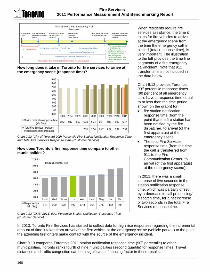
Fire Services 2011 Performance Measurement And Benchmarking Report
160
2003 2004 2005 2006 2007 2008 2009 2010 2011 Station notification response time
(Min:Sec) 6:42 6:42 6:50 6:26 6:34 6:31 6:40 6:42 6:47
Total Fire Services (excludes 911) response time (Min:Sec) 7:31 7:34 7:47 7:37 7:37 7:39
0:00 1:00 2:00 3:00 4:00 5:00 6:00 7:00 8:00 9:00
How long does it take in Toronto for fire services to arrive at the emergency scene (response time)? Chart 9.12 (City of Toronto) 90th Percentile Fire Station Notification Response Time and Total Fire Services Response Time (Customer Service) How does Toronto’s fire response time compare to other municipalities? Chart 9.13 (OMBI 2011) 90th Percentile Station Notification Response Time (Customer Service)
When residents require fire services assistance, the time it takes for fire vehicles to arrive at the emergency scene from the time the emergency call is placed (total response time), is very important. The illustration to the left provides the time line segments of a fire emergency call/incident. Note that 911 transfer time is not included in the data below. Chart 9.12 provides Toronto’s 90th percentile response times (90 per cent of all emergency calls have a response time equal to or less than the time period shown on the graph) for: • fire station notification
response time (from the point that the fire station has been notified by the fire dispatcher, to arrival (of the first apparatus) at the emergency scene.
• The total Fire Services response time (from the time the call is transferred from 911 to the Fire Communication Center, to arrival (of the first apparatus) at the emergency scene).
In 2011, there was a small increase of five seconds in the station notification response time, which was partially offset by a decrease in call processing/ dispatch time, for a net increase of two seconds in the total Fire Services response time.
In 2013, Toronto Fire Services has started to collect data for high rise responses regarding the incremental amount of time it takes from arrival of the first vehicle at the emergency scene (vehicle parked) to the point the attending firefighters make contact with the source of the emergency incident. Chart 9.13 compares Toronto’s 2011 station notification response time (90th percentile) to other municipalities. Toronto ranks fourth of nine municipalities (second quartile) for response times. Travel distances and traffic congestion can be a significant influencing factor in these results.
Fire Apparatus Travel Time
Call is received by 911
Time Line of a Fire Emergency Call (not to scale)
Call transferred to Fire Communications Centre
Fire Communications Centre notifies Fire Station(s)
Firefighter contact with source of emergency incident*
911 Transfer Time
Total Fire Services Response Time (excludes 911)
Fire Call Processing Time
Total Response Time (including 911 transfer time) to Fire Emergency Call
Turnout Time
Fire Vehicle(s) Respond/ Leave Station
First fire vehicle arrives at emergency scene
*The incremental amount of time it takes for firefighters to make contact with the source of the emergency incident after arriving at the dispatched address. TFS began collecting this data in 2013.
Station Notification Response Time
Lond Wind T-Bay Tor Winn Ham Calg Bar Sud Response time
(Min: Sec) 6:13 6:29 6:32 6:47 6:49 6:56 7:15 8:54 9:11
0:00
2:00
4:00
6:00
8:00
10:00
12:00 Median 6:49 (Min: Sec)
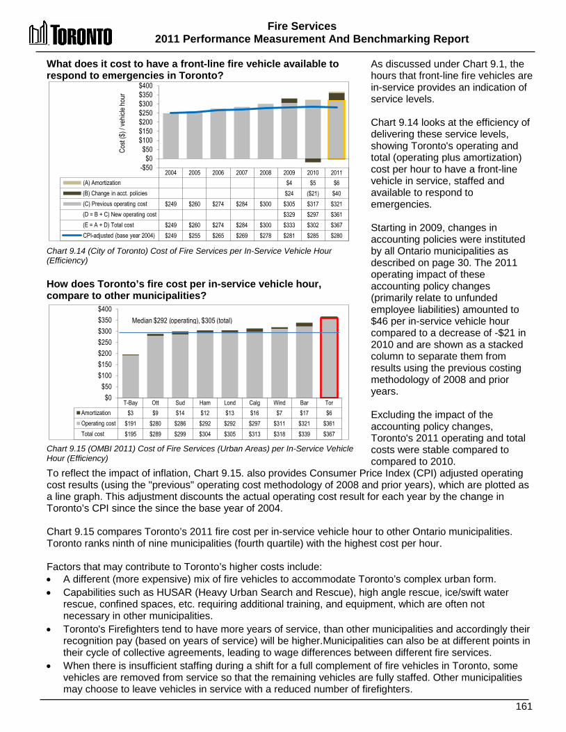
Fire Services 2011 Performance Measurement And Benchmarking Report
161
T-Bay Ott Sud Ham Lond Calg Wind Bar Tor Amortization $3 $9 $14 $12 $13 $16 $7 $17 $6 Operating cost $191 $280 $286 $292 $292 $297 $311 $321 $361 Total cost $195 $289 $299 $304 $305 $313 $318 $339 $367
$0 $50
$100 $150 $200 $250 $300 $350 $400
Median $292 (operating), $305 (total)
2004 2005 2006 2007 2008 2009 2010 2011 (A) Amortization $4 $5 $6 (B) Change in acct. policies $24 ($21) $40 (C) Previous operating cost $249 $260 $274 $284 $300 $305 $317 $321 (D = B + C) New operating cost $329 $297 $361 (E = A + D) Total cost $249 $260 $274 $284 $300 $333 $302 $367 CPI-adjusted (base year 2004) $249 $255 $265 $269 $278 $281 $285 $280
-$50 $0
$50 $100 $150 $200 $250 $300 $350 $400
Cost
($) /
vehic
le ho
ur
What does it cost to have a front-line fire vehicle available to respond to emergencies in Toronto? Chart 9.14 (City of Toronto) Cost of Fire Services per In-Service Vehicle Hour (Efficiency) How does Toronto’s fire cost per in-service vehicle hour, compare to other municipalities? Chart 9.15 (OMBI 2011) Cost of Fire Services (Urban Areas) per In-Service Vehicle Hour (Efficiency)
As discussed under Chart 9.1, the hours that front-line fire vehicles are in-service provides an indication of service levels. Chart 9.14 looks at the efficiency of delivering these service levels, showing Toronto's operating and total (operating plus amortization) cost per hour to have a front-line vehicle in service, staffed and available to respond to emergencies. Starting in 2009, changes in accounting policies were instituted by all Ontario municipalities as described on page 30. The 2011 operating impact of these accounting policy changes (primarily relate to unfunded employee liabilities) amounted to $46 per in-service vehicle hour compared to a decrease of -$21 in 2010 and are shown as a stacked column to separate them from results using the previous costing methodology of 2008 and prior years. Excluding the impact of the accounting policy changes, Toronto's 2011 operating and total costs were stable compared to compared to 2010.
To reflect the impact of inflation, Chart 9.15. also provides Consumer Price Index (CPI) adjusted operating cost results (using the "previous" operating cost methodology of 2008 and prior years), which are plotted as a line graph. This adjustment discounts the actual operating cost result for each year by the change in Toronto’s CPI since the since the base year of 2004. Chart 9.15 compares Toronto’s 2011 fire cost per in-service vehicle hour to other Ontario municipalities. Toronto ranks ninth of nine municipalities (fourth quartile) with the highest cost per hour. Factors that may contribute to Toronto’s higher costs include: • A different (more expensive) mix of fire vehicles to accommodate Toronto’s complex urban form. • Capabilities such as HUSAR (Heavy Urban Search and Rescue), high angle rescue, ice/swift water
rescue, confined spaces, etc. requiring additional training, and equipment, which are often not necessary in other municipalities.
• Toronto's Firefighters tend to have more years of service, than other municipalities and accordingly their recognition pay (based on years of service) will be higher.Municipalities can also be at different points in their cycle of collective agreements, leading to wage differences between different fire services.
• When there is insufficient staffing during a shift for a full complement of fire vehicles in Toronto, some vehicles are removed from service so that the remaining vehicles are fully staffed. Other municipalities may choose to leave vehicles in service with a reduced number of firefighters.

Fire Services 2011 Performance Measurement And Benchmarking Report
162
2012 Achievements and 2013 Planned Initiatives The following initiatives have improved or are expected to further improve the efficiency and effectiveness of Fire Services in Toronto: 2012 Initiatives Completed/Achievements
• Completed the annual “Alarmed for Life” campaign, a community-based proactive smoke alarm education program. A new system was developed to better track the program's outreach. In 2012, the program reached more than 40,000 homes.
• Held the sixth annual Safety Awareness Week in June of 2011. The campaign focuses on keeping families safe from predictable and preventable injuries during summer months.
• Continued the public education campaign "Project Zero" in partnership with Enbridge Gas, aimed at reducing residential fire deaths to zero. For Project Zero, fire inspectors go door-to-door in communities to ensure that there are working smoke alarms on every storey and at least one carbon monoxide alarm in every home visited. Homeowners are provided with information to help keep their homes and families safe.
• Placed eight fire trucks into service. • Trained 80 new fire fighters. Four mechanical staff were also hired in 2012, along with one
communications staff member and ten fire prevention inspectors. • Tested response times across four platoons from all 82 fire stations in order to benchmark
performance and set goals for future improvements. • Completed the following projects:
o Rehabilitation of Exhibition Place Fire (Stn #346) project that funded the conversion of a temporary facility to a full time fire hall.
o Payroll Time Scheduling System Upgrade project lion that replaced Fire's existing time entry system.
o Emergency Phone System Upgrade project, in conjunction with Toronto Police. o Fire/EMS Administration Staff Consolidation project for office renovations due to the
consolidation of Fire/EMS administration staff. o Purchased of an Air Compressor Trailer. o Training Simulators project for the rehabilitation of the East Tower burn house simulator
that required concrete restoration and installation of additional metal burn cells. 2013 Planned Initiatives
• Replace 8 to 10 emergency response vehicles. • Respond to approximately 110,000 emergency incidents resulting in approximately 255,000
vehicle runs. • Respond to 35,000 fire alarms and more than 10,000 fires. • Respond to 50,000 medical emergencies and 11,300 vehicle incidents and rescues. • Train and equip HUSAR (Heavy Urban Search and Rescue) and CBRN (Chemical, Biological,
Radiological and Nuclear) teams to be ready to respond to major disasters, benefiting from synergies derived from international cooperation and training activities.
• Inspect 60,000 new, existing and rehabilitated buildings. • Host 1,000 public education forums to promote fire safety. • Complete the construction of the new fire station at Eglinton and Midland, and continue the
construction of two other fire stations. • Purchase self-contained breathing apparatus and HUSAR equipment. • Begin the annual capital maintenance of the East & West Burn-houses training simulators • Implement new software to aid in the deployment of fire apparatuses.
Fire Services 2011 Performance Measurement And Benchmarking Report
163
Factors Influencing the Results of Municipalities The results of each municipality included in this report can be influenced to varying degrees by factors such as:
• The age and densification of housing stock • The nature or extent of fire risks, such as the type of building construction or occupancy
(apartment dwellings versus single family homes) • Differences in population densities • Geography and topography • Transportation routes, traffic congestion and travel distances • Socio-demographics • The extent of fire prevention and education efforts, enforcement of the fire code and the
presence of working smoke alarms • Staffing levels on fire apparatus/vehicles
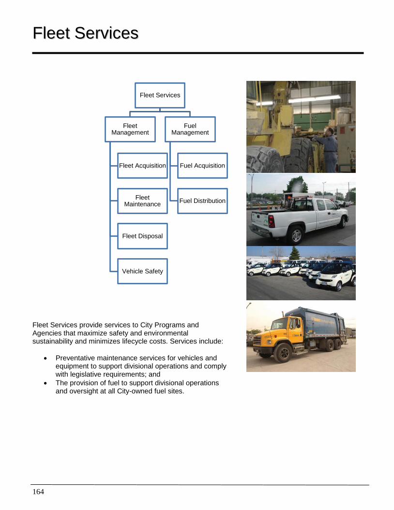
164
FFlleeeett SSeerrvviicceess
Fleet Services provide services to City Programs and Agencies that maximize safety and environmental sustainability and minimizes lifecycle costs. Services include:
• Preventative maintenance services for vehicles and equipment to support divisional operations and comply with legislative requirements; and
• The provision of fuel to support divisional operations and oversight at all City-owned fuel sites.
Fleet Services
Fleet Management
Fleet Acquisition
Fleet Maintenance
Fleet Disposal
Vehicle Safety
Fuel Management
Fuel Acquisition
Fuel Distribution
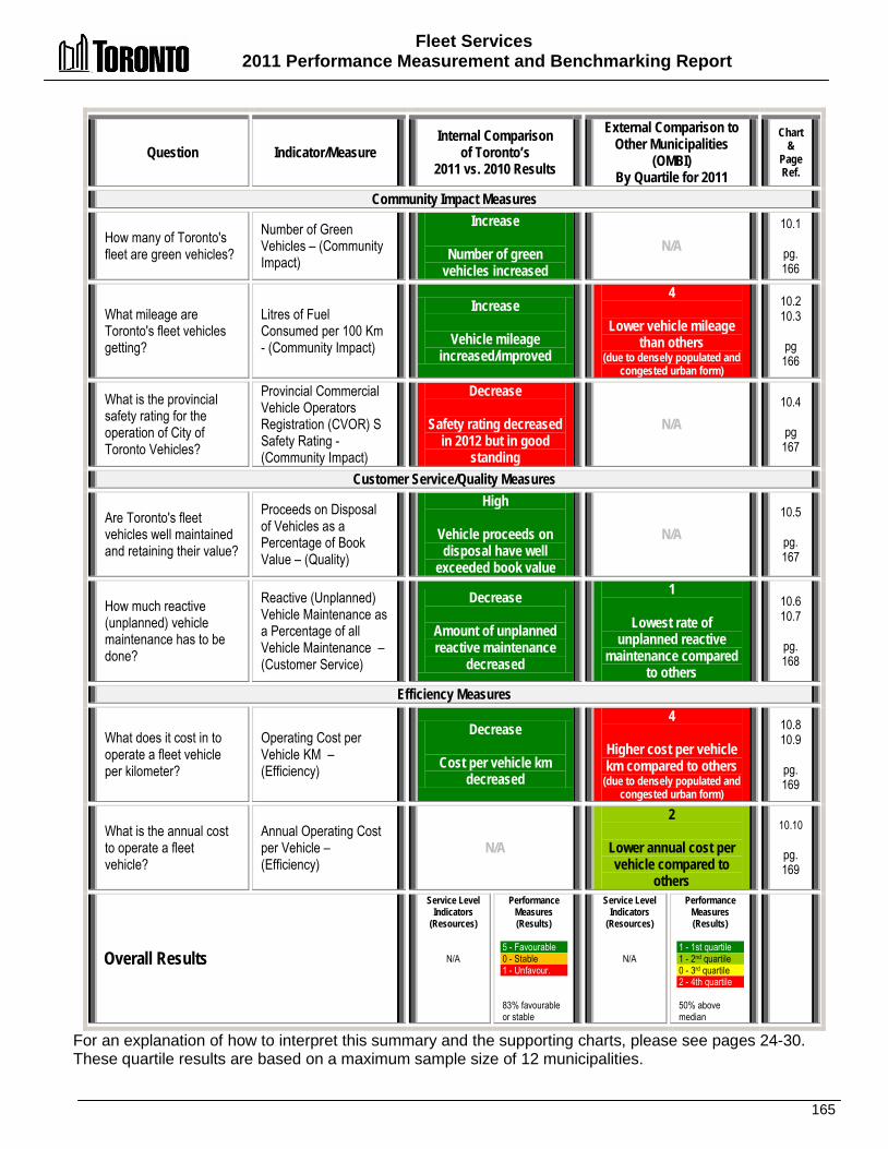
Fleet Services 2011 Performance Measurement and Benchmarking Report
165
Question Indicator/Measure Internal Comparison
of Toronto’s 2011 vs. 2010 Results
External Comparison to Other Municipalities
(OMBI) By Quartile for 2011
Chart &
Page Ref.
Community Impact Measures
How many of Toronto's fleet are green vehicles?
Number of Green Vehicles – (Community Impact)
Increase
Number of green vehicles increased
N/A 10.1
pg. 166
What mileage are Toronto's fleet vehicles getting?
Litres of Fuel Consumed per 100 Km - (Community Impact)
Increase
Vehicle mileage increased/improved
4
Lower vehicle mileage than others
(due to densely populated and congested urban form)
10.2 10.3
pg
166
What is the provincial safety rating for the operation of City of Toronto Vehicles?
Provincial Commercial Vehicle Operators Registration (CVOR) S Safety Rating - (Community Impact)
Decrease
Safety rating decreased in 2012 but in good
standing
N/A 10.4
pg
167
Customer Service/Quality Measures
Are Toronto's fleet vehicles well maintained and retaining their value?
Proceeds on Disposal of Vehicles as a Percentage of Book Value – (Quality)
High
Vehicle proceeds on disposal have well
exceeded book value
N/A 10.5
pg. 167
How much reactive (unplanned) vehicle maintenance has to be done?
Reactive (Unplanned) Vehicle Maintenance as a Percentage of all Vehicle Maintenance – (Customer Service)
Decrease
Amount of unplanned reactive maintenance
decreased
1
Lowest rate of unplanned reactive
maintenance compared to others
10.6 10.7
pg. 168
Efficiency Measures
What does it cost in to operate a fleet vehicle per kilometer?
Operating Cost per Vehicle KM – (Efficiency)
Decrease
Cost per vehicle km decreased
4
Higher cost per vehicle km compared to others
(due to densely populated and congested urban form)
10.8 10.9
pg. 169
What is the annual cost to operate a fleet vehicle?
Annual Operating Cost per Vehicle – (Efficiency)
N/A
2
Lower annual cost per vehicle compared to
others
10.10
pg. 169
Overall Results
Service Level Indicators
(Resources)
N/A
Performance Measures (Results)
5 - Favourable 0 - Stable 1 - Unfavour. 83% favourable or stable
Service Level Indicators
(Resources)
N/A
Performance Measures (Results)
1 - 1st quartile 1 - 2nd quartile 0 - 3rd quartile 2 - 4th quartile 50% above median
For an explanation of how to interpret this summary and the supporting charts, please see pages 24-30. These quartile results are based on a maximum sample size of 12 municipalities.
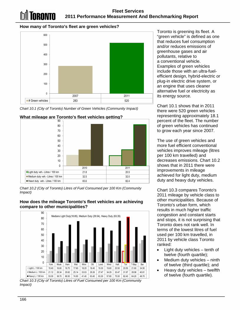
Fleet Services 2011 Performance Measurement And Benchmarking Report
166
2007 2011 # Green vehicles 283 520
0
100
200
300
400
500
600
How many of Toronto's fleet are green vehicles? Chart 10.1 (City of Toronto) Number of Green Vehicles (Community Impact) What mileage are Toronto's fleet vehicles getting? Chart 10.2 (City of Toronto) Litres of Fuel Consumed per 100 Km (Community Impact) How does the mileage Toronto's fleet vehicles are achieving compare to other municipalities? Chart 10.3 (City of Toronto) Litres of Fuel Consumed per 100 Km (Community Impact)
Toronto is greening its fleet. A “green vehicle” is defined as one that reduces fuel consumption and/or reduces emissions of greenhouse gases and air pollutants, relative to a conventional vehicle. Examples of green vehicles include those with an ultra-fuel-efficient design, hybrid-electric or plug-in electric drive system, or an engine that uses cleaner alternative fuel or electricity as its energy source. Chart 10.1 shows that in 2011 there were 520 green vehicles representing approximately 18.1 percent of the fleet. The number of green vehicles has continued to grow each year since 2007. The use of green vehicles and more fuel efficient conventional vehicles improves mileage (litres per 100 km travelled) and decreases emissions. Chart 10.2 shows that in 2011 there were improvements in mileage achieved for light duty, medium duty and heavy duty vehicles. Chart 10.3 compares Toronto's 2011 mileage by vehicle class to other municipalities. Because of Toronto's urban form, which results in much higher traffic congestion and constant starts and stops, it is not surprising that Toronto does not rank well. In terms of the lowest litres of fuel used per 100 km travelled, in 2011 by vehicle class Toronto ranked: • Light duty vehicles – tenth of
twelve (fourth quartile); • Medium duty vehicles – ninth
of twelve (third quartile); and • Heavy duty vehicles – twelfth
of twelve (fourth quartile).
2010 2011 Light duty veh.- Litres / 100 km 21.8 20.5 Medium duty veh.- Litres / 100 km 32.5 32.0 Heavt duty veh.- Litres / 100 km 83.6 82.4
0 10 20 30 40 50 60 70 80 90
York Musk Ham Wat Winn Ott Lond Wind Halt Tor T-Bay Bar Light L / 100 km 15.40 16.60 16.70 17.60 18.20 18.40 19.30 19.60 20.50 20.50 21.60 34.50 Medium L / 100 km 21.12 28.34 29.82 25.14 33.03 29.26 27.47 34.29 30.47 31.97 28.98 40.81 Heavy L / 100 km 53.00 38.70 68.50 74.90 41.40 63.40 63.30 57.80 75.50 82.40 64.20 48.70
0
10
20
30
40
50
60
70
80
90 Medians Light Duty(18.85), Medium Duty (29.54), Heavy Duty (63.35)
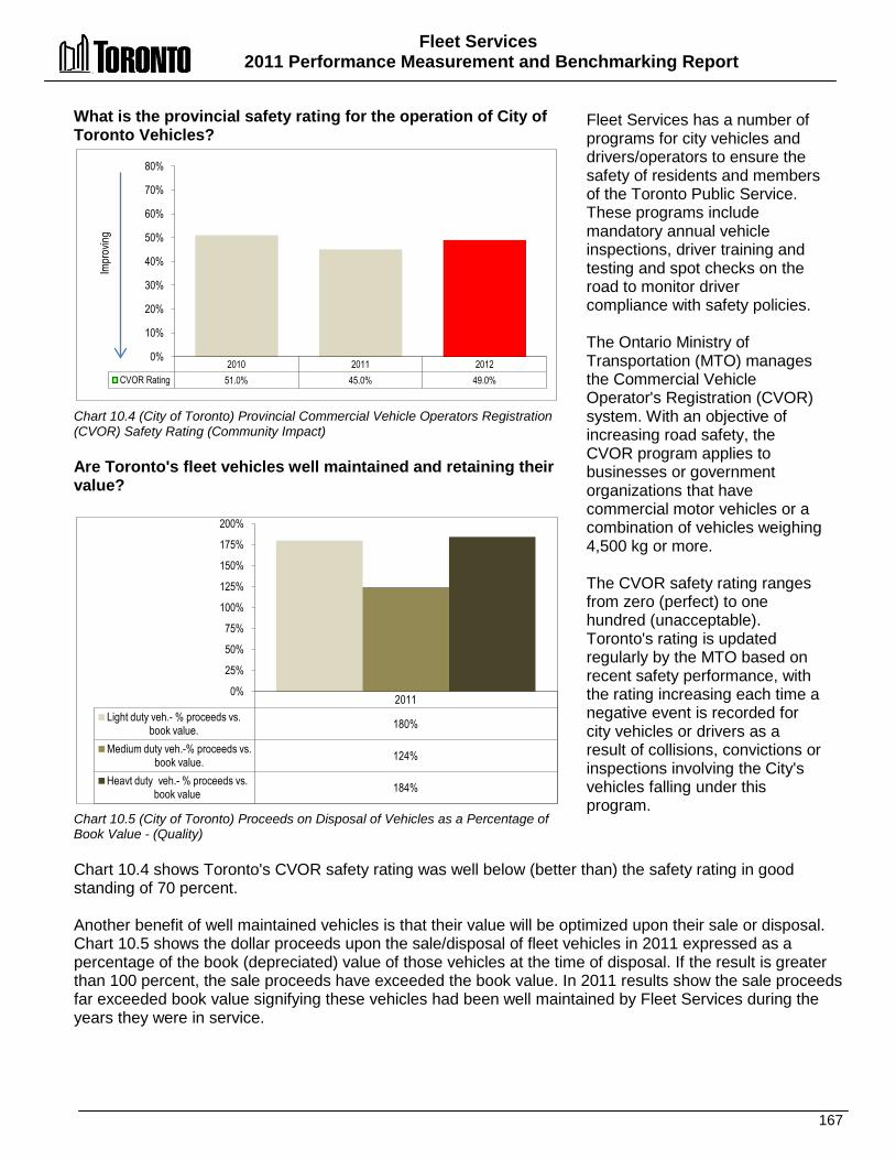
Fleet Services 2011 Performance Measurement and Benchmarking Report
167
What is the provincial safety rating for the operation of City of Toronto Vehicles? Chart 10.4 (City of Toronto) Provincial Commercial Vehicle Operators Registration (CVOR) Safety Rating (Community Impact) Are Toronto's fleet vehicles well maintained and retaining their value? Chart 10.5 (City of Toronto) Proceeds on Disposal of Vehicles as a Percentage of Book Value - (Quality)
Fleet Services has a number of programs for city vehicles and drivers/operators to ensure the safety of residents and members of the Toronto Public Service. These programs include mandatory annual vehicle inspections, driver training and testing and spot checks on the road to monitor driver compliance with safety policies. The Ontario Ministry of Transportation (MTO) manages the Commercial Vehicle Operator's Registration (CVOR) system. With an objective of increasing road safety, the CVOR program applies to businesses or government organizations that have commercial motor vehicles or a combination of vehicles weighing 4,500 kg or more. The CVOR safety rating ranges from zero (perfect) to one hundred (unacceptable). Toronto's rating is updated regularly by the MTO based on recent safety performance, with the rating increasing each time a negative event is recorded for city vehicles or drivers as a result of collisions, convictions or inspections involving the City's vehicles falling under this program.
Chart 10.4 shows Toronto's CVOR safety rating was well below (better than) the safety rating in good standing of 70 percent. Another benefit of well maintained vehicles is that their value will be optimized upon their sale or disposal. Chart 10.5 shows the dollar proceeds upon the sale/disposal of fleet vehicles in 2011 expressed as a percentage of the book (depreciated) value of those vehicles at the time of disposal. If the result is greater than 100 percent, the sale proceeds have exceeded the book value. In 2011 results show the sale proceeds far exceeded book value signifying these vehicles had been well maintained by Fleet Services during the years they were in service.
2010 2011 2012 CVOR Rating 51.0% 45.0% 49.0%
0%
10%
20%
30%
40%
50%
60%
70%
80%
Impr
oving
2011 Light duty veh.- % proceeds vs.
book value. 180%
Medium duty veh.-% proceeds vs. book value. 124%
Heavt duty veh.- % proceeds vs. book value 184%
0%
25%
50%
75%
100%
125%
150%
175%
200%

Fleet Services 2011 Performance Measurement And Benchmarking Report
168
How much reactive (unplanned) vehicle maintenance has to be done in Toronto? Chart 10.6 (City of Toronto) Reactive (Unplanned) Vehicle Maintenance as a Percentage of all Vehicle Maintenance (Customer Service) How does the amount of reactive (unplanned) vehicle maintenance in Toronto compare to other municipalities? Chart 10.7 (OMBI 2011) Reactive (Unplanned) Vehicle Maintenance as a Percentage of all Vehicle Maintenance (Customer Service)
Ideally, a vehicle that has been serviced during its useful life through a preventative maintenance program should have a minimal amount of unplanned maintenance or vehicle breakdowns, which both reduces the productivity of staff utilizing these vehicles and increases maintenance costs. Chart 10.6 provides Toronto's results for the percentage of unplanned reactive vehicle maintenance as a percentage of all vehicle maintenance labour hours. In 2011 this meant that of all of the hours that mechanics worked doing both reactive (unplanned) and preventative (planned) vehicle maintenance, 40.5 percent of these hours related to reactive unplanned maintenance. This represented an improvement over the 2010 result of 43.1 percent. Chart 10.7 compares Toronto's 2011 result to other municipalities. Toronto ranks first of ten (first quartile) with the lowest/best rate of unplanned reactive vehicle maintenance.
2009 2010 2011 Ratio (%) of Reactive to Preventative
Maintenance 36.9% 43.1% 40.5%
0% 5%
10% 15% 20% 25% 30% 35% 40% 45% 50%
Tor Lond Ott Bar Ham Wat Halt Winn York Wind Ratio (%) of Reactive to Preventative
Maintenance 40.5% 41.1% 48.6% 63.5% 67.5% 76.9% 78.6% 80.9% 88.3% 88.6%
0% 10% 20% 30% 40% 50% 60% 70% 80% 90%
100%
Median 72.2%
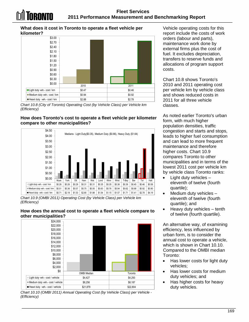
Fleet Services 2011 Performance Measurement and Benchmarking Report
169
What does it cost in Toronto to operate a fleet vehicle per kilometer? Chart 10.8 (City of Toronto) Operating Cost (by Vehicle Class) per Vehicle km (Efficiency) How does Toronto's cost to operate a fleet vehicle per kilometer compare to other municipalities? Chart 10.9 (OMBI 2011) Operating Cost (by Vehicle Class) per Vehicle km (Efficiency) How does the annual cost to operate a fleet vehicle compare to other municipalities? Chart 10.10 (OMBI 2011) Annual Operating Cost (by Vehicle Class) per Vehicle - (Efficiency)
Vehicle operating costs for this report include the costs of work orders (labour and parts), maintenance work done by external firms plus the cost of fuel. It excludes depreciation, transfers to reserve funds and allocations of program support costs. Chart 10.8 shows Toronto's 2010 and 2011 operating cost per vehicle km by vehicle class and shows reduced costs in 2011 for all three vehicle classes. As noted earlier Toronto's urban form, with much higher population densities, traffic congestion and starts and stops, leads to higher fuel consumption and can lead to more frequent maintenance and therefore higher costs. Chart 10.9 compares Toronto to other municipalities and in terms of the lowest 2011 cost per vehicle km by vehicle class Toronto ranks: • Light duty vehicles –
eleventh of twelve (fourth quartile);
• Medium duty vehicles – eleventh of twelve (fourth quartile); and
• Heavy duty vehicles – tenth of twelve (fourth quartile).
An alternative way, of examining efficiency, less influenced by urban form, is to consider the annual cost to operate a vehicle, which is shown in Chart 10.10. Compared to the OMBI median Toronto: • Has lower costs for light duty
vehicles; • Has lower costs for medium
duty vehicles; and • Has higher costs for heavy
duty vehicles.
2010 2011 Light duty veh.- cost / km $0.47 $0.46 Medium duty veh.- cost / km $0.94 $0.92 Heavt duty veh.- cost / km $2.88 $2.78
$0.00 $0.30 $0.60 $0.90 $1.20 $1.50 $1.80 $2.10 $2.40 $2.70 $3.00
Musk York Ott Ham Wat Lond Winn Wind T-Bay Bar Tor Halt Light duty veh.- cost / km $0.26 $0.26 $0.29 $0.31 $0.31 $0.35 $0.35 $0.36 $0.39 $0.45 $0.46 $0.58 Medium duty veh.- cost / km $0.51 $0.36 $0.57 $0.75 $0.55 $0.63 $0.76 $0.94 $0.62 $0.68 $0.92 $0.90 Heavt duty veh.- cost / km $0.71 $2.18 $1.53 $2.80 $1.88 $1.54 $1.15 $1.57 $1.71 $1.41 $2.78 $4.19
$0.00 $0.50 $1.00 $1.50 $2.00 $2.50 $3.00 $3.50 $4.00 $4.50
Medians- Light Duty($0.35), Medium Duty ($0.66), Heavy Duty ($1.64)
OMBI Median Toronto Light duty veh.- cost / vehicle $4,427 $4,293 Medium duty veh.- cost / vehicle $8,256 $8,187 Heavt duty veh.- cost / vehicle $21,879 $22,804
$0 $2,000 $4,000 $6,000 $8,000
$10,000 $12,000 $14,000 $16,000 $18,000 $20,000 $22,000 $24,000
Fleet Services 2011 Performance Measurement and Benchmarking Report
170
2012 Achievements and 2013 Planned Initiatives The following initiatives have improved or are expected to further improve the efficiency and effectiveness of the Fleet Services: 2012 Initiatives Completed/Achievements • Reduced the number of maintenance garage locations from 13 to 9 to minimize costs and
increase efficiency. • Completed implementation of outsourcing management of the parts warehouse, to reduce
costs and turnaround time for parts acquisition. • Increased the utilization and efficiency of fuel sites by closing four fuel sites and commenced
fuelling of Toronto District School Board vehicles. • Upgraded two fuel sites with above-ground fuel storage tanks, reducing the risk of soil
contamination. • Implemented the Fuel Hedging Program to mitigate the impacts of fluctuating market fuel
prices and reduce fuel costs, and secured a fuel contract that will provide a 5%-10% discount over the market price for gasoline and diesel fuel.
• Provided fleet safety training, testing and certification to 10,000 employees / job applicants who are required to operate City vehicles and equipment, and ensured compliance with various Provincial legislation, and City policies and guidelines.
2013 Initiatives Planned • Assume responsibility for maintaining Transfer and Disposal vehicles from the Solid Waste
Management Division and for the fleet management of the Toronto Community Housing Corporation vehicles.
• Minimize costs and increase Fleet efficiency by reducing the number of maintenance garage locations from 9 to 7.
• Work closely with client Divisions to reduce the size of their fleet inventory, ensuring that all vehicles on hand are required and fully utilized.
• Provide leadership in the advancement of the City green fleet and environmental goals related to fleet utilization.
• Promote "Eco-Driving" to reduce fuel consumption and greenhouse gas emissions. • Continue working closely with client divisions to maintain or improve the Commercial Vehicle
Operators Registration (CVOR) safety rating in good standing, with a performance level of 70% or less of the total overall CVOR threshold.
Factors Influencing the Results of Municipalities The results of each municipality included in this report can be influenced to varying degrees by factors such as:
• Fleet Mix - The average age of each municipality’s fleet, the mix of vehicles in each fleet category, and the number of hours they are in use.
• Urban Form - The urban form of a municipality (congested city streets vs. highway use) will impact the number of kilometres travelled and the level of wear and tear (example constant acceleration and braking) can influence the amount of maintenance required and associated costs.

171
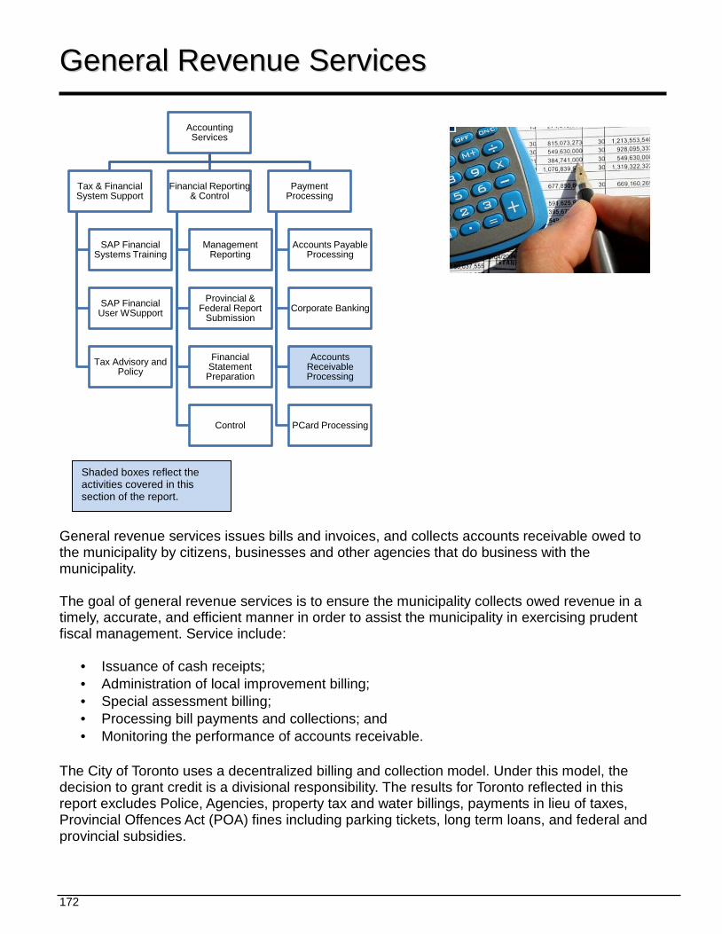
172
Accounting Services
Tax & Financial System Support
SAP Financial Systems Training
SAP Financial User WSupport
Tax Advisory and Policy
Financial Reporting & Control
Management Reporting
Provincial & Federal Report
Submission
Financial Statement
Preparation
Control
Payment Processing
Accounts Payable Processing
Corporate Banking
Accounts Receivable Processing
PCard Processing
GGeenneerraall RReevveennuuee SSeerrvviicceess
General revenue services issues bills and invoices, and collects accounts receivable owed to the municipality by citizens, businesses and other agencies that do business with the municipality. The goal of general revenue services is to ensure the municipality collects owed revenue in a timely, accurate, and efficient manner in order to assist the municipality in exercising prudent fiscal management. Service include:
• Issuance of cash receipts; • Administration of local improvement billing; • Special assessment billing; • Processing bill payments and collections; and • Monitoring the performance of accounts receivable.
The City of Toronto uses a decentralized billing and collection model. Under this model, the decision to grant credit is a divisional responsibility. The results for Toronto reflected in this report excludes Police, Agencies, property tax and water billings, payments in lieu of taxes, Provincial Offences Act (POA) fines including parking tickets, long term loans, and federal and provincial subsidies.
Shaded boxes reflect the activities covered in this section of the report.
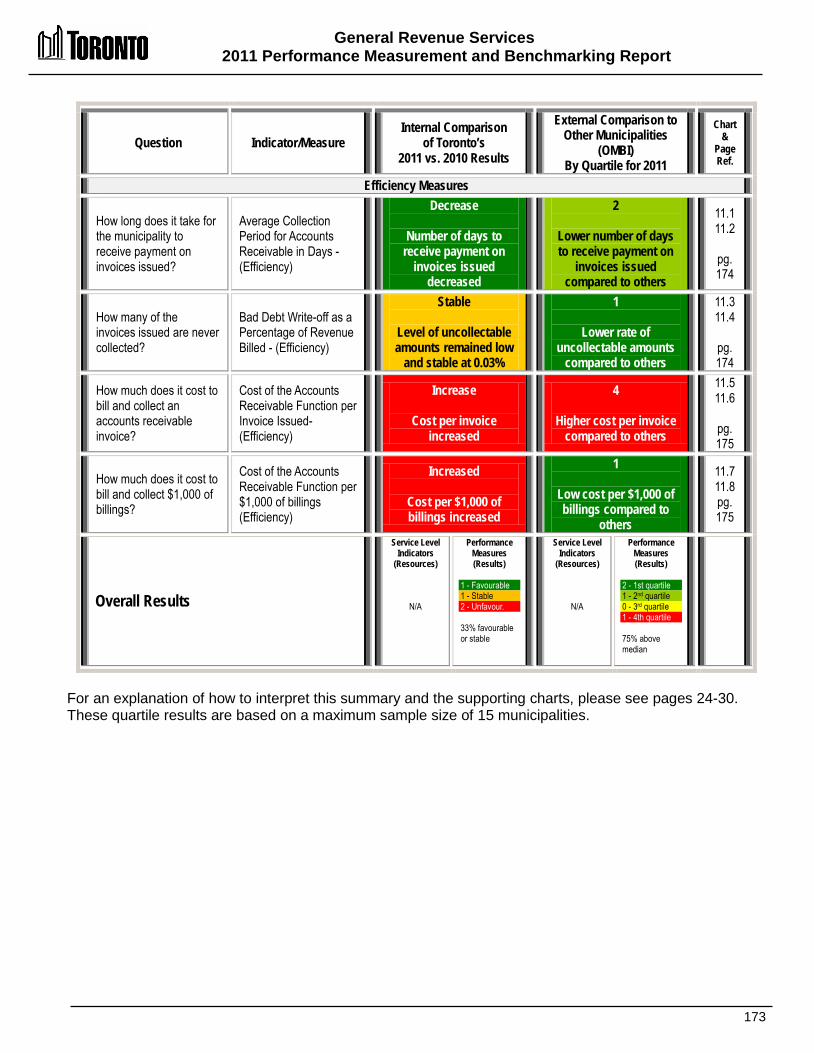
General Revenue Services 2011 Performance Measurement and Benchmarking Report
173
Question Indicator/Measure Internal Comparison
of Toronto’s 2011 vs. 2010 Results
External Comparison to Other Municipalities
(OMBI) By Quartile for 2011
Chart &
Page Ref.
Efficiency Measures
How long does it take for the municipality to receive payment on invoices issued?
Average Collection Period for Accounts Receivable in Days - (Efficiency)
Decrease
Number of days to receive payment on
invoices issued decreased
2
Lower number of days to receive payment on
invoices issued compared to others
11.1 11.2
pg. 174
How many of the invoices issued are never collected?
Bad Debt Write-off as a Percentage of Revenue Billed - (Efficiency)
Stable
Level of uncollectable amounts remained low
and stable at 0.03%
1
Lower rate of uncollectable amounts
compared to others
11.3 11.4
pg. 174
How much does it cost to bill and collect an accounts receivable invoice?
Cost of the Accounts Receivable Function per Invoice Issued- (Efficiency)
Increase
Cost per invoice increased
4
Higher cost per invoice compared to others
11.5 11.6
pg. 175
How much does it cost to bill and collect $1,000 of billings?
Cost of the Accounts Receivable Function per $1,000 of billings (Efficiency)
Increased
Cost per $1,000 of billings increased
1
Low cost per $1,000 of billings compared to
others
11.7 11.8 pg. 175
Overall Results
Service Level Indicators
(Resources)
N/A
Performance Measures (Results)
1 - Favourable 1 - Stable 2 - Unfavour. 33% favourable or stable
Service Level Indicators
(Resources)
N/A
Performance Measures (Results)
2 - 1st quartile 1 - 2nd quartile 0 - 3rd quartile 1 - 4th quartile 75% above median
For an explanation of how to interpret this summary and the supporting charts, please see pages 24-30. These quartile results are based on a maximum sample size of 15 municipalities.
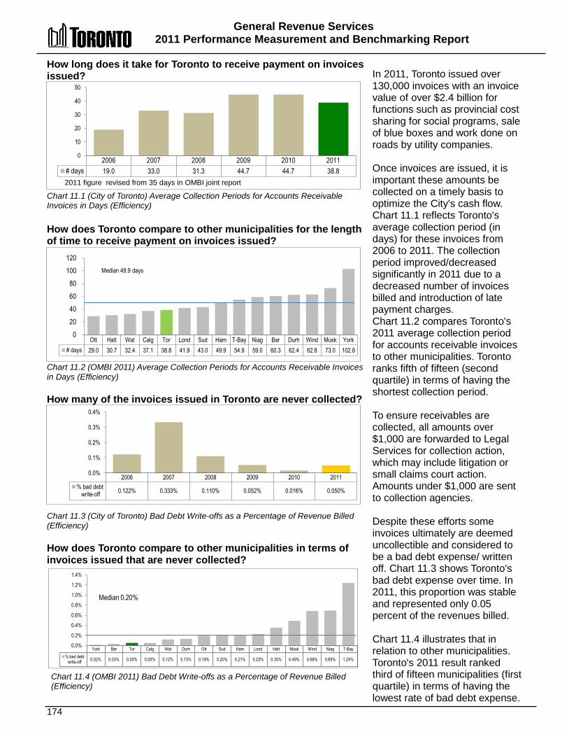
General Revenue Services 2011 Performance Measurement and Benchmarking Report
174
Ott Halt Wat Calg Tor Lond Sud Ham T-Bay Niag Bar Durh Wind Musk York # days 29.0 30.7 32.4 37.1 38.8 41.9 43.0 49.9 54.9 59.0 60.3 62.4 62.8 73.0 102.8
0 20 40 60 80
100 120
Median 49.9 days
York Bar Tor Calg Wat Durh Ott Sud Ham Lond Halt Musk Wind Niag T-Bay % bad debt
write-off 0.02% 0.03% 0.05% 0.05% 0.12% 0.13% 0.19% 0.20% 0.21% 0.23% 0.35% 0.49% 0.68% 0.69% 1.24%
0.0%
0.2%
0.4%
0.6%
0.8%
1.0%
1.2%
1.4%
Median 0.20%
How long does it take for Toronto to receive payment on invoices issued? Chart 11.1 (City of Toronto) Average Collection Periods for Accounts Receivable Invoices in Days (Efficiency) How does Toronto compare to other municipalities for the length of time to receive payment on invoices issued? Chart 11.2 (OMBI 2011) Average Collection Periods for Accounts Receivable Invoices in Days (Efficiency) How many of the invoices issued in Toronto are never collected?
Chart 11.3 (City of Toronto) Bad Debt Write-offs as a Percentage of Revenue Billed (Efficiency) How does Toronto compare to other municipalities in terms of invoices issued that are never collected? Chart 11.4 (OMBI 2011) Bad Debt Write-offs as a Percentage of Revenue Billed (Efficiency)
In 2011, Toronto issued over 130,000 invoices with an invoice value of over $2.4 billion for functions such as provincial cost sharing for social programs, sale of blue boxes and work done on roads by utility companies. Once invoices are issued, it is important these amounts be collected on a timely basis to optimize the City's cash flow. Chart 11.1 reflects Toronto's average collection period (in days) for these invoices from 2006 to 2011. The collection period improved/decreased significantly in 2011 due to a decreased number of invoices billed and introduction of late payment charges. Chart 11.2 compares Toronto's 2011 average collection period for accounts receivable invoices to other municipalities. Toronto ranks fifth of fifteen (second quartile) in terms of having the shortest collection period.
To ensure receivables are collected, all amounts over $1,000 are forwarded to Legal Services for collection action, which may include litigation or small claims court action. Amounts under $1,000 are sent to collection agencies. Despite these efforts some invoices ultimately are deemed uncollectible and considered to be a bad debt expense/ written off. Chart 11.3 shows Toronto's bad debt expense over time. In 2011, this proportion was stable and represented only 0.05 percent of the revenues billed. Chart 11.4 illustrates that in relation to other municipalities. Toronto's 2011 result ranked third of fifteen municipalities (first quartile) in terms of having the lowest rate of bad debt expense.
2006 2007 2008 2009 2010 2011 # days 19.0 33.0 31.3 44.7 44.7 38.8
0
10
20
30
40
50
2011 figure revised from 35 days in OMBI joint report
2006 2007 2008 2009 2010 2011 % bad debt
write-off 0.122% 0.333% 0.110% 0.052% 0.016% 0.050%
0.0%
0.1%
0.2%
0.3%
0.4%
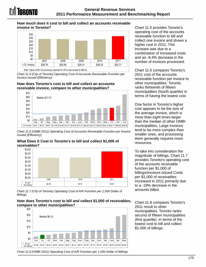
General Revenue Services 2011 Performance Measurement and Benchmarking Report
175
Calg Ott Niag T-Bay Ham Wat Sud Lond Halt Wind Durh Musk Tor Bar York $ / invoice $4.01 $5.76 $9.91 $11.09 $12.56 $13.77 $15.56 $17.21 $20.83 $27.47 $30.83 $32.12 $32.71 $38.06 $66.96
$0 $10 $20 $30 $40 $50 $60 $70
Median $17.21
York Tor Ott Wind Wat Niag Calg Ham T-Bay Sud Durh Halt Lond Bar Musk $ cost /
$1k billings $1.96 $3.27 $3.34 $4.04 $4.30 $4.67 $5.13 $6.10 $7.08 $7.19 $7.36 $7.92 $8.79 $19.04 $20.27
$0
$5
$10
$15
$20
$25
Median $6.10
2009 2010 2011 $ cost /
$1k billings $2.49 $2.51 $3.27
$0.00 $0.50 $1.00 $1.50 $2.00 $2.50 $3.00 $3.50
How much does it cost to bill and collect an accounts receivable invoice in Toronto? Chart 11.5 (City of Toronto) Operating Cost of Accounts Receivable Function per Invoice Issued (Efficiency)
How does Toronto's cost to bill and collect an accounts receivable invoice, compare to other municipalities? Chart 11.6 (OMBI 2011) Operating Cost of Accounts Receivable Function per Invoice Issued (Efficiency)
What Does it Cost in Toronto's to bill and collect $1,000 of receivables? Chart 11.7 (City of Toronto) Operating Cost of A/R Function per 1,000 Dollar of Billings
How does Toronto's cost to bill and collect $1,000 of receivables, compare to other municipalities? Chart 11.8 (OMBI 2011) Operating Cost of A/R Function per 1,000 Dollar of Billings
Chart 11.5 provides Toronto's operating cost of the accounts receivable function to bill and collect one invoice and shows a higher cost in 2011. This increase was due to a combination of increased costs and an -8.4% decrease in the number of invoices processed. Chart 11.6 compares Toronto's 2011 cost of the accounts receivable function per invoice to other municipalities. Toronto ranks thirteenth of fifteen municipalities (fourth quartile) in terms of having the lowest cost. One factor in Toronto's higher cost appears to be the size of the average invoice, which is more than eight times larger than the median of other OMBI municipalities. Large invoices tend to be more complex than smaller ones, and processing them generally requires more resources. To take into consideration the magnitude of billings, Chart 11.7 provides Toronto's operating cost of the accounts receivable function per $1,000 of billings/invoices issued Costs per $1,000 of receivables increased in 2011 primarily due to a -19% decrease in the amounts billed. Chart 11.8 compares Toronto's 2011 result to other municipalities. Toronto ranks second of fifteen municipalities (first quartile). In terms of the lowest cost to bill and collect $1,000 of billings.
2007 2008 2009 2010 2011 $ / invoice $28.79 $28.58 $26.31 $28.33 $32.71
$0 $5
$10 $15 $20 $25 $30 $35
Note: Figure of $21.30 previously reported for 2010 was revised to $28.33.
2010 Performance Measurement and Benchmarking Report
176
2012 Achievements or 2013 Planned Initiatives The following initiatives are intended to further improve the efficiency and effectiveness of Toronto's General Revenue Services:
2012 Initiatives Completed/Achievements • Re-engineered business processes. • Instituted a new system for late payment charges. • Revised policies and procedures.
2013 Initiatives Planned • Complete review of the management of all City wide receivables as part of the City's
ongoing shared service review. • Review and update, where appropriate, accounts receivable policies, procedures and
controls. • Review invoicing and collection processes. • Implement on-line payments through banking institutions. • Initiated an online payment project. Factors Influencing Results of Municipalities The results of each municipality found in the charts included in this report are influenced to varying degrees by factors such as: • Level of government and types of services: single-tier vs. two-tier and the specific services
each one offers will affect the results. • Systems/processes: the type and quality of systems used to capture Accounts Receivable
including uploads and automated billing. • Municipal policy: collection practices and payment terms.

177
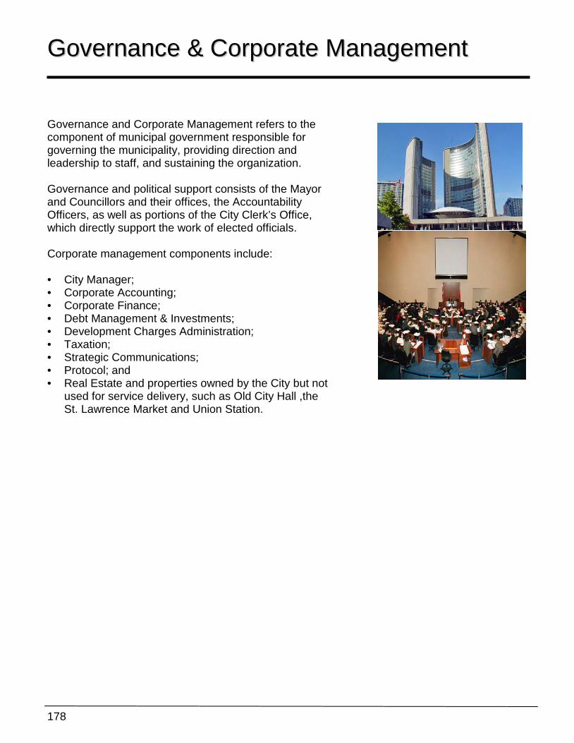
178
GGoovveerrnnaannccee && CCoorrppoorraattee MMaannaaggeemmeenntt
Governance and Corporate Management refers to the component of municipal government responsible for governing the municipality, providing direction and leadership to staff, and sustaining the organization. Governance and political support consists of the Mayor and Councillors and their offices, the Accountability Officers, as well as portions of the City Clerk’s Office, which directly support the work of elected officials. Corporate management components include: • City Manager; • Corporate Accounting; • Corporate Finance; • Debt Management & Investments; • Development Charges Administration; • Taxation; • Strategic Communications; • Protocol; and • Real Estate and properties owned by the City but not
used for service delivery, such as Old City Hall ,the St. Lawrence Market and Union Station.

Governance and Corporate Management 2011 Performance Measurement and Benchmarking Report
179
Question Indicator/Measure Internal Comparison
of Toronto’s 2011 vs. 2010 Results
External Comparison to Other Municipalities
(OMBI) By Quartile for 2011
Chart &
Page Ref.
Efficiency Measures
How large is the governance and corporate management structure?
Governance and Corporate Management Operating Costs as a % of All Operating Costs – (Efficiency)
Decrease
Operating cost of governance and
corporate management decreased
1
Low operating cost of governance and
corporate management of single-tier
municipalities
12.1 12.3
pg. 180
Governance and Corporate Management Total Costs as a % of Total Costs – (Efficiency)
Decrease
Total cost of governance and
corporate management decreased
1
Low total cost of governance and
corporate management of single-tier
municipalities
12.2 12.4
pg. 180
Overall Results
Service Level Indicators
(Resources)
N/A
Performance Measures (Results)
2 - Favourable 0 - Stable 0 - Unfavour. 100% favourable or stable
Service Level Indicators
(Resources)
N/A
Performance Measures (Results)
2 - 1st quartile 0 - 2nd quartile 0 - 3rd quartile 0 - 4th quartile 100% above median
For an explanation of how to interpret this summary and the supporting charts, please see pages 24-30. These quartile results are based on a maximum sample size of nine single-tier municipalities.
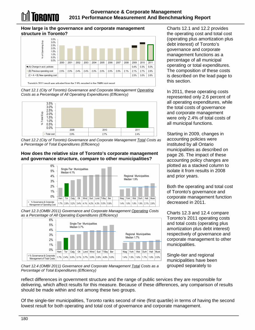
Governance & Corporate Management 2011 Performance Measurement And Benchmarking Report
180
How large is the governance and corporate management structure in Toronto? Chart 12.1 (City of Toronto) Governance and Corporate Management Operating Costs as a Percentage of All Operating Expenditures (Efficiency) Chart 12.2 (City of Toronto) Governance and Corporate Management Total Costs as a Percentage of Total Expenditures (Efficiency) How does the relative size of Toronto’s corporate management and governance structure, compare to other municipalities? Chart 12.3 (OMBI 2011) Governance and Corporate Management Operating Costs as a Percentage of All Operating Expenditures (Efficiency) Chart 12.4 (OMBI 2011) Governance and Corporate Management Total Costs as a Percentage of Total Expenditures (Efficiency)
Charts 12.1 and 12.2 provides the operating cost and total cost (operating plus amortization plus debt interest) of Toronto’s governance and corporate management functions as a percentage of all municipal operating or total expenditures. The composition of these costs is described on the lead page to this section. In 2011, these operating costs represented only 2.6 percent of all operating expenditures, while the total costs of governance and corporate management were only 2.4% of total costs of all municipal functions. Starting in 2009, changes in accounting policies were instituted by all Ontario municipalities as described on page 26. The impact of these accounting policy changes are plotted as a stacked column to isolate it from results in 2008 and prior years. Both the operating and total cost of Toronto's governance and corporate management function decreased in 2011. Charts 12.3 and 12.4 compare Toronto’s 2011 operating costs and total costs (operating plus amortization plus debt interest) respectively of governance and corporate management to other municipalities. Single-tier and regional municipalities have been grouped separately to
reflect differences in government structure and the range of public services they are responsible for delivering, which affect results for this measure. Because of these differences, any comparison of results should be made within and not among these two groups. Of the single-tier municipalities, Toronto ranks second of nine (first quartile) in terms of having the second lowest result for both operating and total cost of governance and corporate management.
Ham Tor Calg Ott Wind Sud Lond T-Bay Bar Niag York Wat Durh Halt Musk % Governance & Corporate
Management of Operating Cost 1.7% 2.6% 3.2% 3.4% 4.1% 4.2% 4.3% 5.5% 5.8% 1.4% 1.6% 1.8% 1.9% 2.1% 2.6%
0% 1% 2% 3% 4% 5% 6%
Single-Tier Municipalities Median 4.1%
Regional Municipalities Median 1.9%
2000 2001 2002 2003 2004 2005 2006 2007 2008 2009 2010 2011 (A) Change in acct. policies 0.4% 0.3% 0.0% (B) Previous operating cost 2.5% 2.0% 2.4% 2.4% 2.0% 2.0% 2.0% 2.0% 2.1% 2.1% 2.7% 2.6% (C = A + B) New operating cost 2.5% 3.0% 2.6%
0.0% 0.5% 1.0% 1.5% 2.0% 2.5% 3.0% 3.5%
% o
f Ope
ratin
g E
xp.
2009 2010 2011 Total cost 2.9% 2.7% 2.4%
0.0% 0.5% 1.0% 1.5% 2.0% 2.5% 3.0% 3.5%
% T
otal
Exp
.
Ham Tor Calg Ott Lond Wind Sud T-Bay Bar Niag York Wat Durh Halt Musk % Governance & Corporate Management of Total Costs 1.7% 2.4% 3.0% 3.1% 3.7% 3.9% 3.9% 4.8% 5.0% 1.4% 1.5% 1.6% 1.7% 1.8% 2.0%
0% 1% 2% 3% 4% 5% 6%
Single-Tier Municipalities Median 3.7%
Regional Municipalities Median 1.7%
Toronto's 2011 result was adjusted from the 2.9% reported in the OMBI joint report
Governance and Corporate Management 2011 Performance Measurement and Benchmarking Report
181
Factors Influencing the Results of Municipalities The results of each municipality included in this report can be influenced to varying degrees by factors such as: • The level of municipal government (single-tier vs. regional municipalities), which partially
determines differences in service responsibilities; • The extent of real estate holdings of the municipality that are not used in direct service
delivery; and • The size of municipal Council.
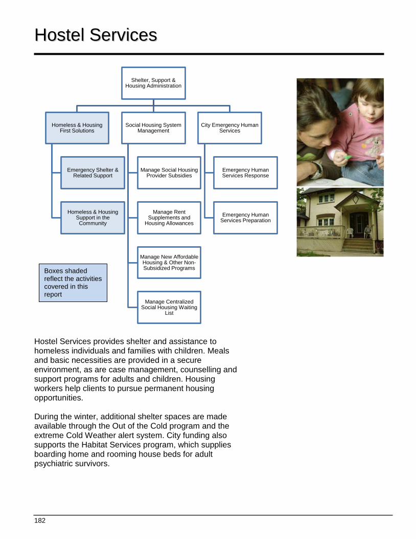
182
Shelter, Support & Housing Administration
Homeless & Housing First Solutions
Emergency Shelter & Related Support
Homeless & Housing Support in the Community
Social Housing System Management
Manage Social Housing Provider Subsidies
Manage Rent Supplements and
Housing Allowances
Manage New Affordable Housing & Other Non-Subsidized Programs
Manage Centralized Social Housing Waiting
List
City Emergency Human Services
Emergency Human Services Response
Emergency Human Services Preparation
HHoosstteell SSeerrvviicceess
Hostel Services provides shelter and assistance to homeless individuals and families with children. Meals and basic necessities are provided in a secure environment, as are case management, counselling and support programs for adults and children. Housing workers help clients to pursue permanent housing opportunities. During the winter, additional shelter spaces are made available through the Out of the Cold program and the extreme Cold Weather alert system. City funding also supports the Habitat Services program, which supplies boarding home and rooming house beds for adult psychiatric survivors.
Boxes shaded reflect the activities covered in this report
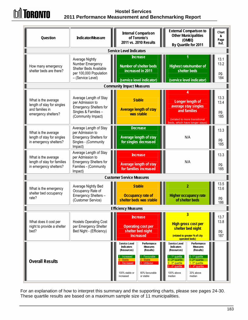
Hostel Services 2011 Performance Measurement and Benchmarking Report
183
Question Indicator/Measure Internal Comparison
of Toronto’s 2011 vs. 2010 Results
External Comparison to Other Municipalities
(OMBI) By Quartile for 2011
Chart &
Page Ref.
Service Level Indicators
How many emergency shelter beds are there?
Average Nightly Number Emergency Shelter Beds Available per 100,000 Population – (Service Level)
Increase
Number of shelter beds increased in 2011
(service level indicator)
1
Highest rate/number of shelter beds
(service level indicator)
13.1 13.2
pg. 184
Community Impact Measures
What is the average length of stay for singles and families in emergency shelters?
Average Length of Stay per Admission to Emergency Shelters for Singles & Families – (Community Impact)
Stable
Average length of stay was stable
4
Longer length of average stay singles
and families
(related to more transitional beds, which have longer stays)
13.3 13.4
pg. 185
What is the average length of stay for singles in emergency shelters?
Average Length of Stay per Admission to Emergency Shelters for Singles - (Community Impact)
Decrease
Average length of stay for singles decreased
N/A 13.3
pg. 185
What is the average length of stay for families in emergency shelters?
Average Length of Stay per Admission to Emergency Shelters for Families - (Community Impact)
Increase
Average length of stay for families increased
N/A 13.3
pg. 185
Customer Service Measures
What is the emergency shelter bed occupancy rate?
Average Nightly Bed Occupancy Rate of Emergency Shelters – (Customer Service)
Stable
Occupancy rate of shelter beds was stable
2
Higher occupancy rate of shelter beds
13.5 13.6
pg. 186
Efficiency Measures
What does it cost per night to provide a shelter bed?
Hostels Operating Cost per Emergency Shelter Bed Night - (Efficiency)
Increase
Operating cost per shelter bed night
increased
3
High gross cost per shelter bed night
(related to greater % of city
operated beds)
13.7 13.8
pg. 187
Overall Results
Service Level Indicators
(Resources) 1 - Increased 0 - Stable 0 - Decreased 100% stable or increased
Performance Measures (Results)
1 - Favourable 2 - Stable 2 - Unfavour. 60% favourable or stable
Service Level Indicators
(Resources)
1 - 1st quartile 0 - 2nd quartile 0 - 3rd quartile 0 - 4th quartile 100% above median
Performance Measures (Results)
0- 1st quartile 1- 2nd quartile 1- 3rd quartile 1 - 4th quartile 33% above median
For an explanation of how to interpret this summary and the supporting charts, please see pages 24-30. These quartile results are based on a maximum sample size of 11 municipalities.
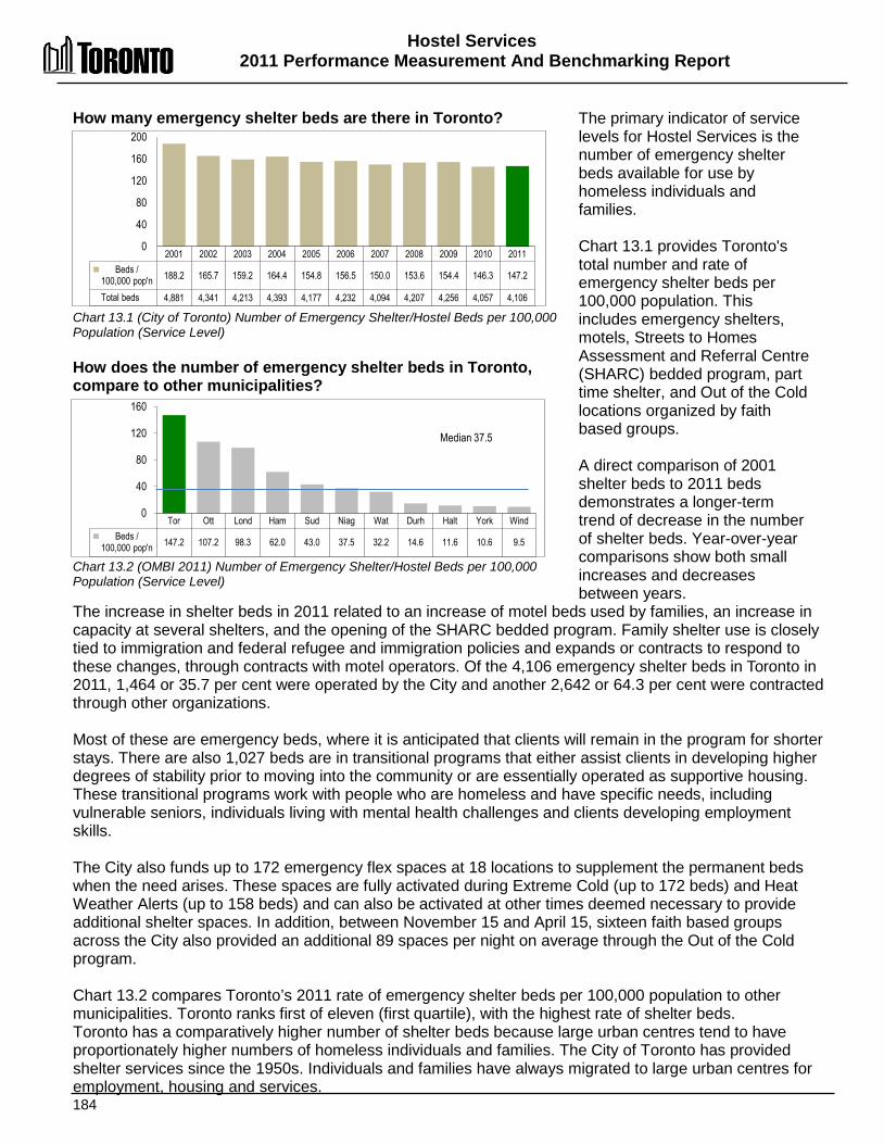
Hostel Services 2011 Performance Measurement And Benchmarking Report
184
Tor Ott Lond Ham Sud Niag Wat Durh Halt York Wind Beds /
100,000 pop'n 147.2 107.2 98.3 62.0 43.0 37.5 32.2 14.6 11.6 10.6 9.5
0
40
80
120
160
Median 37.5
How many emergency shelter beds are there in Toronto? Chart 13.1 (City of Toronto) Number of Emergency Shelter/Hostel Beds per 100,000 Population (Service Level) How does the number of emergency shelter beds in Toronto, compare to other municipalities? Chart 13.2 (OMBI 2011) Number of Emergency Shelter/Hostel Beds per 100,000 Population (Service Level)
The primary indicator of service levels for Hostel Services is the number of emergency shelter beds available for use by homeless individuals and families. Chart 13.1 provides Toronto's total number and rate of emergency shelter beds per 100,000 population. This includes emergency shelters, motels, Streets to Homes Assessment and Referral Centre (SHARC) bedded program, part time shelter, and Out of the Cold locations organized by faith based groups. A direct comparison of 2001 shelter beds to 2011 beds demonstrates a longer-term trend of decrease in the number of shelter beds. Year-over-year comparisons show both small increases and decreases between years.
The increase in shelter beds in 2011 related to an increase of motel beds used by families, an increase in capacity at several shelters, and the opening of the SHARC bedded program. Family shelter use is closely tied to immigration and federal refugee and immigration policies and expands or contracts to respond to these changes, through contracts with motel operators. Of the 4,106 emergency shelter beds in Toronto in 2011, 1,464 or 35.7 per cent were operated by the City and another 2,642 or 64.3 per cent were contracted through other organizations. Most of these are emergency beds, where it is anticipated that clients will remain in the program for shorter stays. There are also 1,027 beds are in transitional programs that either assist clients in developing higher degrees of stability prior to moving into the community or are essentially operated as supportive housing. These transitional programs work with people who are homeless and have specific needs, including vulnerable seniors, individuals living with mental health challenges and clients developing employment skills. The City also funds up to 172 emergency flex spaces at 18 locations to supplement the permanent beds when the need arises. These spaces are fully activated during Extreme Cold (up to 172 beds) and Heat Weather Alerts (up to 158 beds) and can also be activated at other times deemed necessary to provide additional shelter spaces. In addition, between November 15 and April 15, sixteen faith based groups across the City also provided an additional 89 spaces per night on average through the Out of the Cold program. Chart 13.2 compares Toronto’s 2011 rate of emergency shelter beds per 100,000 population to other municipalities. Toronto ranks first of eleven (first quartile), with the highest rate of shelter beds. Toronto has a comparatively higher number of shelter beds because large urban centres tend to have proportionately higher numbers of homeless individuals and families. The City of Toronto has provided shelter services since the 1950s. Individuals and families have always migrated to large urban centres for employment, housing and services.
2001 2002 2003 2004 2005 2006 2007 2008 2009 2010 2011 Beds /
100,000 pop'n 188.2 165.7 159.2 164.4 154.8 156.5 150.0 153.6 154.4 146.3 147.2
Total beds 4,881 4,341 4,213 4,393 4,177 4,232 4,094 4,207 4,256 4,057 4,106
0
40
80
120
160
200
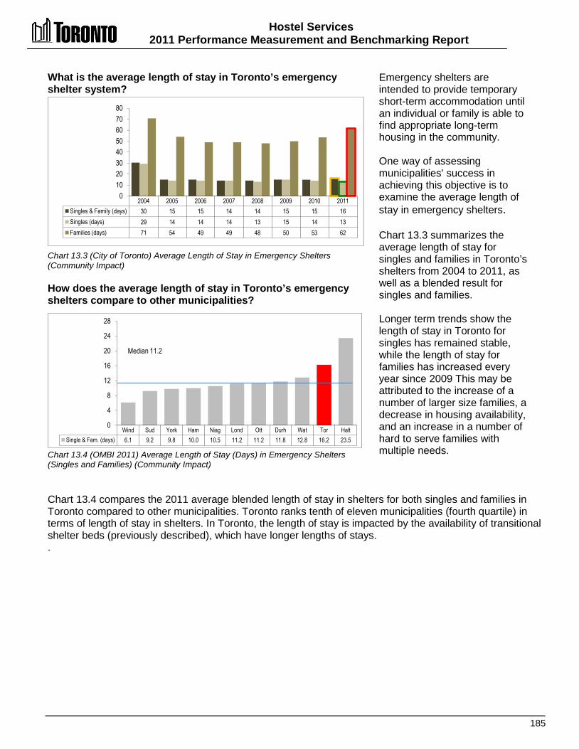
Hostel Services 2011 Performance Measurement and Benchmarking Report
185
Wind Sud York Ham Niag Lond Ott Durh Wat Tor Halt Single & Fam. (days) 6.1 9.2 9.8 10.0 10.5 11.2 11.2 11.8 12.8 16.2 23.5
0
4
8
12
16
20
24
28
Median 11.2
What is the average length of stay in Toronto’s emergency shelter system? Chart 13.3 (City of Toronto) Average Length of Stay in Emergency Shelters (Community Impact) How does the average length of stay in Toronto’s emergency shelters compare to other municipalities? Chart 13.4 (OMBI 2011) Average Length of Stay (Days) in Emergency Shelters (Singles and Families) (Community Impact)
Emergency shelters are intended to provide temporary short-term accommodation until an individual or family is able to find appropriate long-term housing in the community. One way of assessing municipalities' success in achieving this objective is to examine the average length of stay in emergency shelters. Chart 13.3 summarizes the average length of stay for singles and families in Toronto’s shelters from 2004 to 2011, as well as a blended result for singles and families. Longer term trends show the length of stay in Toronto for singles has remained stable, while the length of stay for families has increased every year since 2009 This may be attributed to the increase of a number of larger size families, a decrease in housing availability, and an increase in a number of hard to serve families with multiple needs.
Chart 13.4 compares the 2011 average blended length of stay in shelters for both singles and families in Toronto compared to other municipalities. Toronto ranks tenth of eleven municipalities (fourth quartile) in terms of length of stay in shelters. In Toronto, the length of stay is impacted by the availability of transitional shelter beds (previously described), which have longer lengths of stays. .
2004 2005 2006 2007 2008 2009 2010 2011 Singles & Family (days) 30 15 15 14 14 15 15 16 Singles (days) 29 14 14 14 13 15 14 13 Families (days) 71 54 49 49 48 50 53 62
0 10 20 30 40 50 60 70 80

Hostel Services 2011 Performance Measurement And Benchmarking Report
186
Ott Wat Ham Tor Durh Lond Halt York Niag Wind Sud % occupancy 135.2% 99.9% 96.5% 91.4% 87.7% 86.7% 78.1% 72.4% 72.1% 69.9% 67.3%
0% 20% 40% 60% 80%
100% 120% 140% 160%
Median 86.7%
What is the occupancy rate of Toronto's emergency shelter beds? Chart 13.5 (City of Toronto) Average Nightly Occupancy Rate of Emergency Shelter Beds (Customer Service) How does the occupancy rate for Toronto's emergency shelter beds, compare to other municipalities? Chart 13.6 (OMBI 2011) Average Nightly Occupancy Rate of Emergency Shelter Beds (Customer Service)
A challenge for municipalities is to match the supply of shelter beds to the changing demand (or need) for emergency shelters. Matching supply to demand ensures that beds are available when required, but that valuable resources are not tied up when these beds are unused. One way of examining a municipality’s success in this area is to look at the occupancy rate of Toronto's emergency shelter beds, as shown in Chart 13.5. Occupancy rates from 2001 through 2011 have remained fairly stable, generally ranging between 91 and 94 per cent.
The City’s shelter statistics from 2011 show that there were beds available in the system every night and additional emergency spaces were available for activation. The family, single men and youth sectors showed a lower occupancy of permanent beds than 91% shelter system average. The average occupancy in the women and co-ed sectors tended to be higher than system average of 91%. . Chart 13.6 compares Toronto's 2011 occupancy rate of emergency shelter beds to other Ontario municipalities. Toronto ranks fourth of eleven municipalities (second quartile) in terms of having the highest occupancy rate. The City of Toronto family shelter system fluctuates due to external factors. Federal immigration policies and international geopolitical circumstances can lead to both increases and decreases in family shelter occupancy.
2001 2002 2003 2004 2005 2006 2007 2008 2009 2010 2011 % occupancy 93% 93% 93% 90% 91% 91% 91% 92% 94% 91% 91%
0%
20%
40%
60%
80%
100%
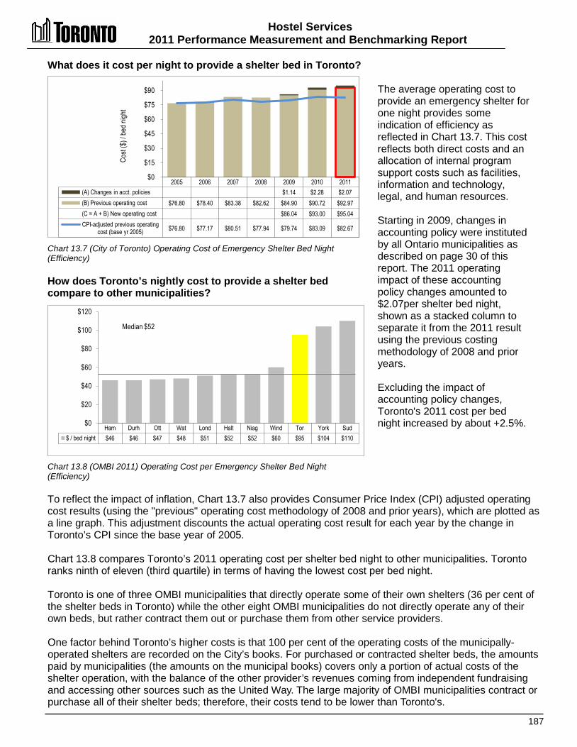
Hostel Services 2011 Performance Measurement and Benchmarking Report
187
Ham Durh Ott Wat Lond Halt Niag Wind Tor York Sud $ / bed night $46 $46 $47 $48 $51 $52 $52 $60 $95 $104 $110
$0
$20
$40
$60
$80
$100
$120
Median $52
What does it cost per night to provide a shelter bed in Toronto? Chart 13.7 (City of Toronto) Operating Cost of Emergency Shelter Bed Night (Efficiency) How does Toronto’s nightly cost to provide a shelter bed compare to other municipalities? Chart 13.8 (OMBI 2011) Operating Cost per Emergency Shelter Bed Night (Efficiency)
The average operating cost to provide an emergency shelter for one night provides some indication of efficiency as reflected in Chart 13.7. This cost reflects both direct costs and an allocation of internal program support costs such as facilities, information and technology, legal, and human resources. Starting in 2009, changes in accounting policy were instituted by all Ontario municipalities as described on page 30 of this report. The 2011 operating impact of these accounting policy changes amounted to $2.07per shelter bed night, shown as a stacked column to separate it from the 2011 result using the previous costing methodology of 2008 and prior years. Excluding the impact of accounting policy changes, Toronto's 2011 cost per bed night increased by about +2.5%.
To reflect the impact of inflation, Chart 13.7 also provides Consumer Price Index (CPI) adjusted operating cost results (using the "previous" operating cost methodology of 2008 and prior years), which are plotted as a line graph. This adjustment discounts the actual operating cost result for each year by the change in Toronto’s CPI since the base year of 2005. Chart 13.8 compares Toronto’s 2011 operating cost per shelter bed night to other municipalities. Toronto ranks ninth of eleven (third quartile) in terms of having the lowest cost per bed night. Toronto is one of three OMBI municipalities that directly operate some of their own shelters (36 per cent of the shelter beds in Toronto) while the other eight OMBI municipalities do not directly operate any of their own beds, but rather contract them out or purchase them from other service providers. One factor behind Toronto’s higher costs is that 100 per cent of the operating costs of the municipally-operated shelters are recorded on the City’s books. For purchased or contracted shelter beds, the amounts paid by municipalities (the amounts on the municipal books) covers only a portion of actual costs of the shelter operation, with the balance of the other provider’s revenues coming from independent fundraising and accessing other sources such as the United Way. The large majority of OMBI municipalities contract or purchase all of their shelter beds; therefore, their costs tend to be lower than Toronto's.
2005 2006 2007 2008 2009 2010 2011 (A) Changes in acct. policies $1.14 $2.28 $2.07 (B) Previous operating cost $76.80 $78.40 $83.38 $82.62 $84.90 $90.72 $92.97 (C = A + B) New operating cost $86.04 $93.00 $95.04 CPI-adjusted previous operating
cost (base yr 2005)
$76.80 $77.17 $80.51 $77.94 $79.74 $83.09 $82.67
$0
$15
$30
$45
$60
$75
$90
Cost
($) /
bed n
ight
Hostel Services 2011 Performance Measurement And Benchmarking Report
188
2012 Achievements or 2013 Planned Initiatives The following achievements and initiatives have and will help to improve the effectiveness of Toronto’s Hostel Services operations. 2012 Initiatives Completed/Achievements: • Provided emergency accommodation to an average of 3,700 men, women, children and
youth 365 nights of the year, including providing a safe place to sleep, food, and counselling, housing support and referrals, as required.
• Provided 1.4 million bed nights to homeless men, women, children and youth. • Implemented enhancements to the data reporting module of the Shelter Management
Information System. • Continued to provide Housing Follow-up Support to the Short Term Rent Supplement
Program, a provincial rent supplement program that housed 460 shelter residents. • Provided street respite to hundreds of people, while making 6,000 referrals to emergency
and transitional shelters through the operation at the Streets to Homes Assessment and Referral Centre.
• Expanded the services of Central Intake, a call centre that coordinates access to vacant beds in the shelter system and provides eviction prevention services. to provide services to single and youth. Central Intake received 42,703 phone calls for services and bed requests
• Through Customer Service Tracker, investigated and resolved 286 complaints and handled other service request calls from clients of the shelter system and members of the community.
2013 Initiatives Planned: • As per 2013 budget projection provide on average 3,741 beds per night in emergency
shelters (365 days a year) to homeless individuals, including the provision of meals, counselling, housing support and referrals per night. It is expected that the occupancy rate will be higher than projected.
• Continue capital investment in the state of good repair of city owned shelters. • Fully implement the Toronto Transitional Housing Allowance Program (Initiatives in
Affordable Housing Program), a provincial rent supplement program. • In the fall of 2013, following consultation with service providers, service users and other
community stakeholders, submit a Service Plan for Council's consideration that supports consolidation and transformation of existing City managed homelessness and housing related programs into an integrated, outcome-focused housing stability service system.
o The objective of the Service Plan will be to shift the focus of services from reactive, emergency responses to homelessness towards services that focus on prevention, diversion and rapid re-housing. In the emergency shelter system, this means building on the progress to date in providing services that help people who are homeless move directly into housing from the street and emergency shelters, and focusing the shelter system on its original role of providing temporary emergency assistance.

Hostel Services 2011 Performance Measurement and Benchmarking Report
189
Factors Influencing the Results of Municipalities The results of each municipality included in this report can be influenced to varying degrees by factors such as: • Condition - chronic vs. newly or episodic homelessness, natural disasters and weather
related events. • Communicable diseases, agency or funder policies, and community capacities for providing
sufficient housing, income and support for residents who are experiencing or at risk of homelessness.
• Municipal policies: average lengths of stay are shortened when municipal policies limit funding to a set time period.
• Supply of and demand for beds: number of emergency shelter beds available in a community may vary by season, by climate, and by bed type (single vs. family).
• Availability of housing: including transitional and supportive housing in the community, and supplementary support services.
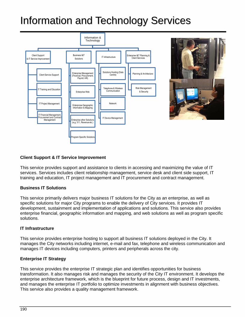
190
Information & Technology
Business I&T Solutions
Enterprise Management (Financial, Procurement,
Payroll, HR)
Enterprise Web
Enterprose Geographic Information & Mapping
Enterprise other Solutions (e.g. 311, Revenue etc.)
Program Specific Solutions
IT Infrastructure
Solutions Hosting (Data Centre)
Telephone & Wireless Communication
Network
IT Device Management
Enterprise I&T Planning & Client Services
Planning & Architecture
Risk Management & Security
Client Support & IT Service Improvement
Client Service Support
IT Training and Education
IT Project Management
IT Financial Management, Procurement and Contract
Management
IInnffoorrmmaattiioonn aanndd TTeecchhnnoollooggyy SSeerrvviicceess
Client Support & IT Service Improvement This service provides support and assistance to clients in accessing and maximizing the value of IT services. Services includes client relationship management, service desk and client side support, IT training and education, IT project management and IT procurement and contract management. Business IT Solutions This service primarily delivers major business IT solutions for the City as an enterprise, as well as specific solutions for major City programs to enable the delivery of City services. It provides IT development, sustainment and implementation of applications and solutions. This service also provides enterprise financial, geographic information and mapping, and web solutions as well as program specific solutions. IT Infrastructure This service provides enterprise hosting to support all business IT solutions deployed in the City. It manages the City networks including internet, e-mail and fax, telephone and wireless communication and manages IT devices including computers, printers and peripherals across the city. Enterprise IT Strategy This service provides the enterprise IT strategic plan and identifies opportunities for business transformation. It also manages risk and manages the security of the City IT environment. It develops the enterprise architecture framework, which is the blueprint for future process, design and IT investments, and manages the enterprise IT portfolio to optimize investments in alignment with business objectives. This service also provides a quality management framework.
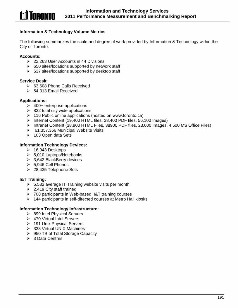
Information and Technology Services 2011 Performance Measurement and Benchmarking Report
191
Information & Technology Volume Metrics The following summarizes the scale and degree of work provided by Information & Technology within the City of Toronto. Accounts: 22,263 User Accounts in 44 Divisions 650 sites/locations supported by network staff 537 sites/locations supported by desktop staff
Service Desk: 63,608 Phone Calls Received 54,313 Email Received
Applications: 400+ enterprise applications 832 total city wide applications 116 Public online applications (hosted on www.toronto.ca) Internet Content (19,400 HTML files, 38,400 PDF files, 56,100 Images) Intranet Content (38,900 HTML Files, 38900 PDF files, 23,000 Images, 4,500 MS Office Files) 61,357,366 Municipal Website Visits 103 Open data Sets
Information Technology Devices: 16,943 Desktops 5,010 Laptops/Notebooks 3,642 BlackBerry devices 5,946 Cell Phones 28,435 Telephone Sets
I&T Training: 5,582 average IT Training website visits per month 2,419 City staff trained 708 participants in Web-based I&T training courses 144 participants in self-directed courses at Metro Hall kiosks
Information Technology Infrastructure: 899 Intel Physical Servers 470 Virtual Intel Servers 191 Unix Physical Servers 338 Virtual UNIX Machines 950 TB of Total Storage Capacity 3 Data Centres
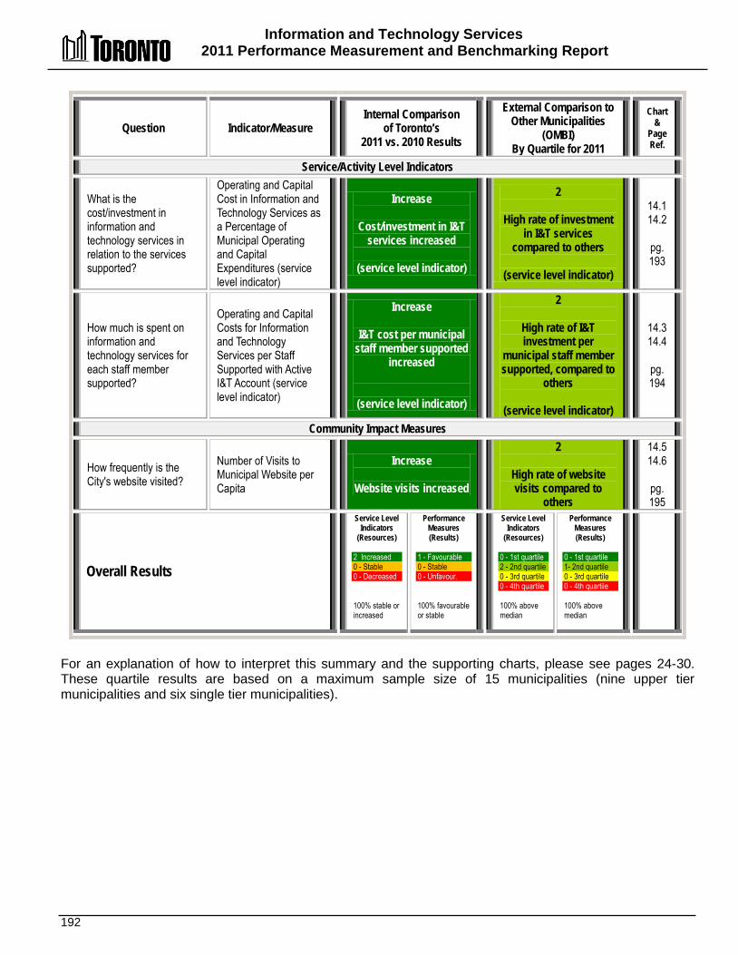
Information and Technology Services 2011 Performance Measurement and Benchmarking Report
192
Question Indicator/Measure Internal Comparison
of Toronto’s 2011 vs. 2010 Results
External Comparison to Other Municipalities
(OMBI) By Quartile for 2011
Chart &
Page Ref.
Service/Activity Level Indicators
What is the cost/investment in information and technology services in relation to the services supported?
Operating and Capital Cost in Information and Technology Services as a Percentage of Municipal Operating and Capital Expenditures (service level indicator)
Increase
Cost/investment in I&T services increased
(service level indicator)
2
High rate of investment in I&T services
compared to others
(service level indicator)
14.1 14.2
pg. 193
How much is spent on information and technology services for each staff member supported?
Operating and Capital Costs for Information and Technology Services per Staff Supported with Active I&T Account (service level indicator)
Increase
I&T cost per municipal staff member supported
increased
(service level indicator)
2
High rate of I&T investment per
municipal staff member supported, compared to
others
(service level indicator)
14.3 14.4
pg. 194
Community Impact Measures
How frequently is the City's website visited?
Number of Visits to Municipal Website per Capita
Increase
Website visits increased
2
High rate of website visits compared to
others
14.514.6
pg. 195
Overall Results
Service Level Indicators
(Resources) 2 Increased 0 - Stable 0 - Decreased 100% stable or increased
Performance Measures (Results)
1 - Favourable 0 - Stable 0 - Unfavour. 100% favourable or stable
Service Level Indicators
(Resources)
0 - 1st quartile 2 - 2nd quartile 0 - 3rd quartile 0 - 4th quartile 100% above median
Performance Measures (Results)
0 - 1st quartile 1- 2nd quartile 0 - 3rd quartile 0 - 4th quartile 100% above median
For an explanation of how to interpret this summary and the supporting charts, please see pages 24-30. These quartile results are based on a maximum sample size of 15 municipalities (nine upper tier municipalities and six single tier municipalities).
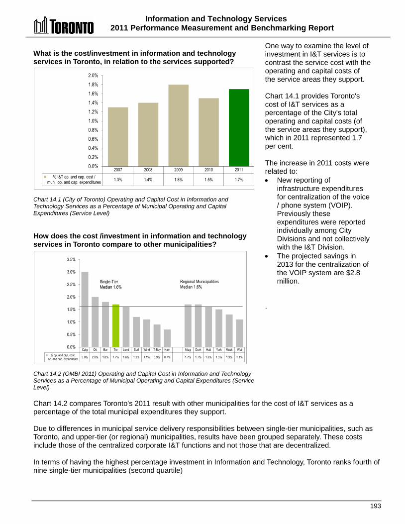
Information and Technology Services 2011 Performance Measurement and Benchmarking Report
193
What is the cost/investment in information and technology services in Toronto, in relation to the services supported? Chart 14.1 (City of Toronto) Operating and Capital Cost in Information and Technology Services as a Percentage of Municipal Operating and Capital Expenditures (Service Level) How does the cost /investment in information and technology services in Toronto compare to other municipalities? Chart 14.2 (OMBI 2011) Operating and Capital Cost in Information and Technology Services as a Percentage of Municipal Operating and Capital Expenditures (Service Level)
One way to examine the level of investment in I&T services is to contrast the service cost with the operating and capital costs of the service areas they support. Chart 14.1 provides Toronto's cost of I&T services as a percentage of the City's total operating and capital costs (of the service areas they support), which in 2011 represented 1.7 per cent. The increase in 2011 costs were related to: • New reporting of
infrastructure expenditures for centralization of the voice / phone system (VOIP). Previously these expenditures were reported individually among City Divisions and not collectively with the I&T Division.
• The projected savings in 2013 for the centralization of the VOIP system are $2.8 million.
.
Chart 14.2 compares Toronto's 2011 result with other municipalities for the cost of I&T services as a percentage of the total municipal expenditures they support. Due to differences in municipal service delivery responsibilities between single-tier municipalities, such as Toronto, and upper-tier (or regional) municipalities, results have been grouped separately. These costs include those of the centralized corporate I&T functions and not those that are decentralized. In terms of having the highest percentage investment in Information and Technology, Toronto ranks fourth of nine single-tier municipalities (second quartile)
2007 2008 2009 2010 2011 % I&T op. and cap. cost /
muni. op. and cap. expenditures 1.3% 1.4% 1.8% 1.5% 1.7%
0.0% 0.2% 0.4% 0.6% 0.8% 1.0% 1.2% 1.4% 1.6% 1.8% 2.0%
Calg Ott Bar Tor Lond Sud Wind T-Bay Ham Niag Durh Halt York Musk Wat % op. and cap. cost/
op. and cap. expenditure 3.0% 2.0% 1.8% 1.7% 1.6% 1.2% 1.1% 0.9% 0.7% 1.7% 1.7% 1.6% 1.5% 1.3% 1.1%
0.0%
0.5%
1.0%
1.5%
2.0%
2.5%
3.0%
3.5%
Single-Tier Median 1.6%
Regional Municipalities Median 1.6%
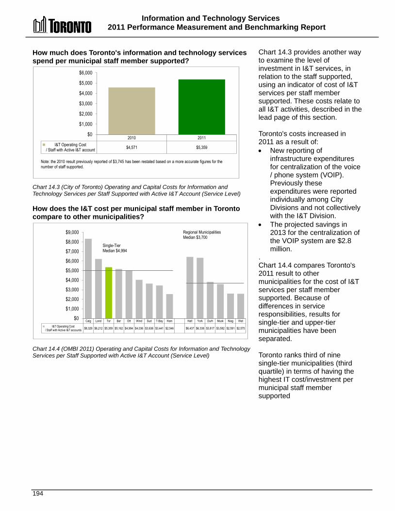
Information and Technology Services 2011 Performance Measurement and Benchmarking Report
194
How much does Toronto's information and technology services spend per municipal staff member supported? Chart 14.3 (City of Toronto) Operating and Capital Costs for Information and Technology Services per Staff Supported with Active I&T Account (Service Level) How does the I&T cost per municipal staff member in Toronto compare to other municipalities? Chart 14.4 (OMBI 2011) Operating and Capital Costs for Information and Technology Services per Staff Supported with Active I&T Account (Service Level)
Chart 14.3 provides another way to examine the level of investment in I&T services, in relation to the staff supported, using an indicator of cost of I&T services per staff member supported. These costs relate to all I&T activities, described in the lead page of this section. Toronto's costs increased in 2011 as a result of: • New reporting of
infrastructure expenditures for centralization of the voice / phone system (VOIP). Previously these expenditures were reported individually among City Divisions and not collectively with the I&T Division.
• The projected savings in 2013 for the centralization of the VOIP system are $2.8 million.
. Chart 14.4 compares Toronto's 2011 result to other municipalities for the cost of I&T services per staff member supported. Because of differences in service responsibilities, results for single-tier and upper-tier municipalities have been separated. Toronto ranks third of nine single-tier municipalities (third quartile) in terms of having the highest IT cost/investment per municipal staff member supported
2010 2011 I&T Operating Cost
/ Staff with Active I&T account $4,571 $5,359
$0
$1,000
$2,000
$3,000
$4,000
$5,000
$6,000
Note: the 2010 result previously reported of $3,745 has been restated based on a more accurate figures for the number of staff supported.
Calg Lond Tor Bar Ott Wind Sud T-Bay Ham Halt York Durh Musk Niag Wat I&T Operating Cost
/ Staff with Active I&T accounts $8,329 $6,212 $5,359 $5,162 $4,994 $4,036 $3,636 $3,441 $2,546 $6,437 $6,338 $3,817 $3,582 $2,591 $2,575
$0
$1,000
$2,000
$3,000
$4,000
$5,000
$6,000
$7,000
$8,000
$9,000 Regional Municipalities Median $3,700
Single-Tier Median $4,994
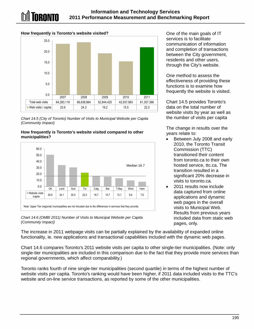
Information and Technology Services 2011 Performance Measurement and Benchmarking Report
195
How frequently is Toronto's website visited? Chart 14.5 (City of Toronto) Number of Visits to Municipal Website per Capita (Community Impact) How frequently is Toronto's website visited compared to other municipalities? Chart 14.6 (OMBI 2011) Number of Visits to Municipal Website per Capita (Community Impact)
One of the main goals of IT services is to facilitate communication of information and completion of transactions between the City government, residents and other users, through the City's website. One method to assess the effectiveness of providing these functions is to examine how frequently the website is visited. Chart 14.5 provides Toronto's data on the total number of website visits by year as well as the number of visits per capita The change in results over the years relate to: • Between July 2008 and early
2010, the Toronto Transit Commission (TTC) transitioned their content from toronto.ca to their own hosted service, ttc.ca. The transition resulted in a significant 20% decrease in visits to toronto.ca.
• 2011 results now include data captured from online applications and dynamic web pages in the overall visits to Municipal Web. Results from previous years included data from static web pages, only.
The increase in 2011 webpage visits can be partially explained by the availability of expanded online functionality, ie. new applications and transactional capabilities included with the dynamic web pages. Chart 14.6 compares Toronto's 2011 website visits per capita to other single-tier municipalities. (Note: only single-tier municipalities are included in this comparison due to the fact that they provide more services than regional governments, which affect comparability.) Toronto ranks fourth of nine single-tier municipalities (second quartile) in terms of the highest number of website visits per capita. Toronto's ranking would have been higher, if 2011 data included visits to the TTC's website and on-line service transactions, as reported by some of the other municipalities.
2007 2008 2009 2010 2011 Total web visits 64,283,119 66,638,864 52,844,425 42,937,963 61,357,366 Web visits / capita 23.6 24.3 19.2 15.5 22.0
0.0
5.0
10.0
15.0
20.0
25.0
Ott Lond Sud Tor Calg Bar T-Bay Wind Ham Website visits
/capita 50.6 34.1 30.5 22.0 16.7 15.7 13.1 9.6 7.6
0.0
10.0
20.0
30.0
40.0
50.0
60.0
Note: Upper Tier (regional) municipalities are not inlcuded due to the differences in services that they provide.
Median 16.7

Information and Technology Services 2011 Performance Measurement and Benchmarking Report
196
2012 Achievements and 2013 Planned Initiatives The following initiatives improve the efficiency and effectiveness of services through the use of Information and Technology solutions across Toronto: 2012 Initiatives Completed/Achievements • Enhanced the capability of the Fibre network and converted phone lines to Voice over Internet phones.
These initiatives increased the effectiveness of communication protocols and transmission technologies to deliver voice / data communications and multi-media sessions, resulting in enhanced functionality and greater savings.
• Implemented Municipal Licence Standards for the Toronto Business Portal to streamline processes, improve quality and reduce cycle time.
• Completed the Central Property Database / One Address Repository, to integrate all property based information systems, databases and other repositories across City divisions providing greater accessibility to information.
• Numerous system upgrades to both Internal and Public facing Information Systems that will sustain state of good repair information and technology services across Toronto.
• Enabled 311 to receive service requests through mobile applications, facilitating the means and use of technology by the public to communicate with 311 providers.
• Implemented Toronto Maintenance management information system enhancements to accommodate 311 service requests and open service accessibility to other City divisions.
• Implemented the Electronic Markup project for Toronto Building to allow the electronic submission and exchange of drawings with the public resulting in user friendly, time sensitive and cost effective services.
• Deployed an Employee Self-Serve pay stub electronic distribution system for non-union employees to optimize the use of primary resources and enhance cost savings.
• Enhanced the Project Tracking Portal for large/complex infrastructure projects to improve the planning, prioritization and scheduling of project resources.
• Implemented a secure City Services Benefit card that allows electronic payment by Social Services clients. The Benefits card introduced by Social Services improves customer service and business processes, reducing the risk of fraud, while enhancing program integrity and audit controls.
• Three new systems were developed and launched by Toronto Public Health to support accessibility of information to the public by delivering data and health related information for the ChemTRAC health systems program in any format.
• The City implemented an Information System for Vaccine Preventable Diseases, allowing nurses greater accessibility to time sensitive information during inspections.
2013 Initiatives Planned • Implement a Disaster Recovery Program to enhance business continuity assurances. • Ongoing replacement and refreshment of IT assets based on lifecycle management sustainment for
hardware, software, servers, storage, and desktop computers. • Launch a Quality Assurance Tools Implementation project to establish testing infrastructure that will
increase confidence levels in system applications leading to greater quality, sustainability and integration of technology, people and processes.
• Develop an Electronic Documents and Records Management System (EDRMS) to increase efficiencies by providing a common infrastructure to support initiatives that rely heavily on digital information.

Information and Technology Services 2011 Performance Measurement and Benchmarking Report
197
• Introduce a Consolidated Data Centre study to manage storage requirements, prepare Request For Proposals, and interface with design architects more efficiently and effectively. The project will optimize data centre functionality while ensuring proper disaster recovery and business continuity capabilities.
• Complete the SAP Landscape Upgrade project to support a common infrastructure for multiple platforms including FPARS, Property Tax and Water Billing, Employee Self Serve Portal, Payroll Modernization & Infrastructure and the Time and Attendance Scheduling Efficiency projects.
• Complete the Web Revitalization project to advance strategic planning, deployment and implementation of the City's website revitalization vision. Web revitalization will allow for the efficient use of common component architecture and transfer control of content to businesses resulting in more relevant and timely information.
• Develop Enterprise Application Integration component to link applications within a single organization in order to simplify and automate business processes, while at the same time avoiding sweeping changes to the existing applications or data structures.
• Implement a Business Intelligence Data Warehouse Strategy project to enhance the City's capacity to address increased demand for business reports on operational, financial and historic data.
• Launch the Enterprise Information Management project to enhance policy, communications, training and technology solutions required to manage electronic information and to support better information for decision making.
• Rollout Enterprise Project Management (EPM) solution to deliver tools and processes to better manage and report on IT projects, leading to improved visibility on the status of projects and increased project delivery success.
Influencing Factors Each municipality’s results are influenced to varying degrees by a number of factors, including: • Order of government: due to the nature of service delivery obligations, results may vary among upper
tier and single-tier municipalities. • Organizational form: the extent to which IT services are centralized, decentralized or contracted to third
parties in each municipality can influence reported results. • Unique conditions: each municipality exercises flexibility in how it chooses to deploy technology to meet
its own unique needs. • IT Services: the types of IT services provided may vary from one municipality to another (e.g. does IT
deliver all/some telecommunications services, geospatial information services, etc.

198
IInnvveessttmmeenntt MMaannaaggeemmeenntt SSeerrvviicceess Investment management services are provided in Toronto by the Capital Markets section of the Corporate Finance division, which is responsible for the internal investment management of several City investment portfolios. In accordance with a Toronto City Council-approved directive, City funds are managed in a manner that seeks to provide the highest investment return consistent with the maximum security of principal, while meeting the City's cash requirements and conforming to all legislation governing investment of the City's funds.
Shaded boxes reflect the activities covered in this report.

Investment Management Services 2011 Performance Measurement and Benchmarking Report
199
Question Indicator/Measure Internal Comparison
of Toronto’s 2011 vs. 2010 Results
External Comparison to Other Municipalities
(OMBI) By Quartile for 2011
Chart &
Page Ref.
Quality Measures
How safe are Toronto's investments?
Credit Ratings of the Longer-Term Bond Portfolio.
Credit Ratings of Bond Portfolio
• AAA/AA Rated (86.3%) • A rated (13.7%)
N/A 15.2 pg. 200
Efficiency Measures
What rate of return are Toronto's investments earning?
Gross Fixed Income Yield on Book Value – (Efficiency)
Stable
Rate of return on investments was stable
2
High rate of return on investments compared
to others
15.1 15.3
pg. 200
How much does it cost to manage the city's investments?
Management Expense Ratio– (Efficiency)
Stable and Low
Cost to manage investments continues
to be very low and stable
1
Lower cost to manage investments compared
to others
15.415.5
pg. 201
Overall Results
Service Level Indicators
(Resources)
N/A
Performance Measures (Results)
1 - Favourable 1 - Stable 0 - Unfavour. 100% favourable or stable
Service Level Indicators
(Resources)
N/A
Performance Measures (Results)
1 - 1st quartile 1 - 2nd quartile 0 - 3rd quartile 0 - 4th quartile 100% above median
For an explanation of how to interpret this summary and the supporting charts, please see pages 24-30. These quartile results are based on a maximum sample size of 15 municipalities.
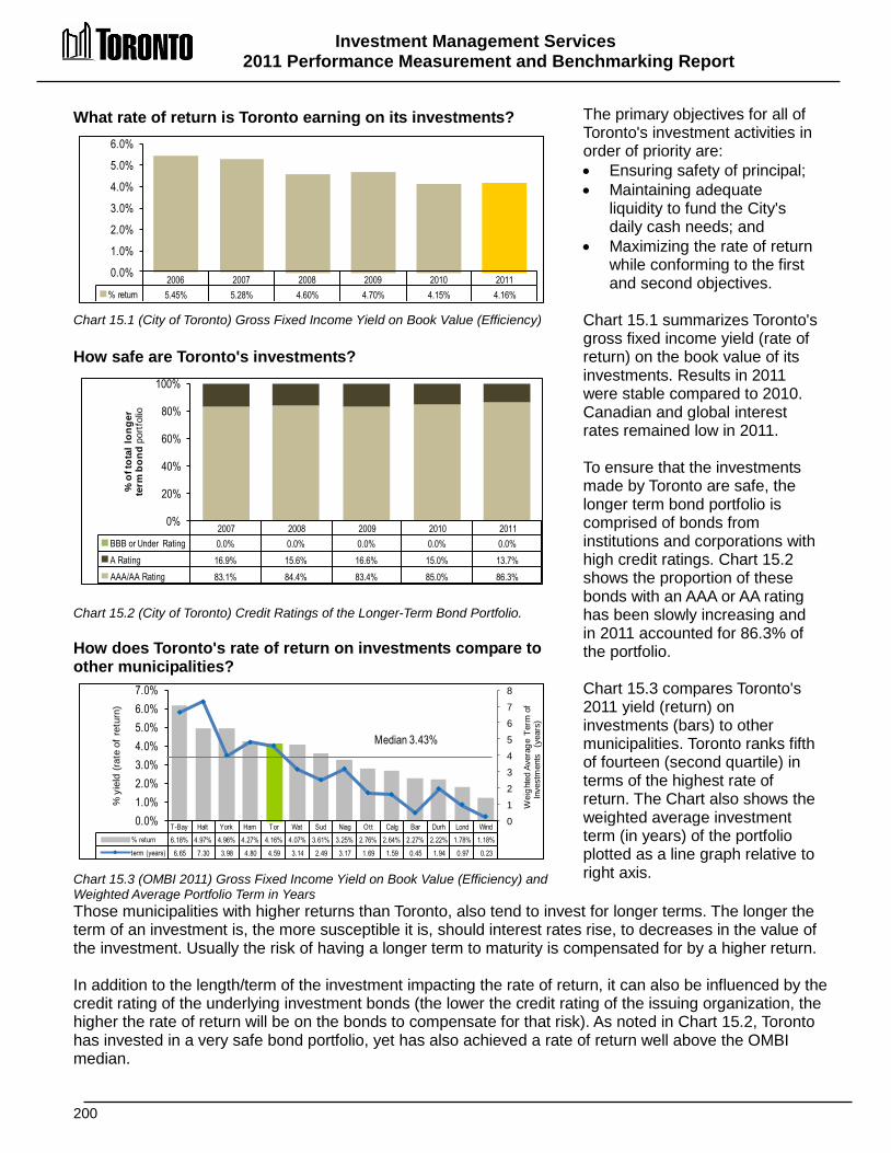
Investment Management Services 2011 Performance Measurement and Benchmarking Report
200
T-Bay Halt York Ham Tor Wat Sud Niag Ott Calg Bar Durh Lond Wind% return 6.18% 4.97% 4.96% 4.27% 4.16% 4.07% 3.61% 3.25% 2.76% 2.64% 2.27% 2.22% 1.78% 1.18%term (years) 6.65 7.30 3.98 4.80 4.59 3.14 2.49 3.17 1.69 1.59 0.45 1.94 0.97 0.23
012345678
0.0%1.0%2.0%3.0%4.0%5.0%6.0%7.0%
Wei
ghte
d Av
erag
e Te
rm o
f In
vest
men
ts
(yea
rs)
% y
ield
(ra
te o
f re
turn
)
Median 3.43%
What rate of return is Toronto earning on its investments? Chart 15.1 (City of Toronto) Gross Fixed Income Yield on Book Value (Efficiency) How safe are Toronto's investments? Chart 15.2 (City of Toronto) Credit Ratings of the Longer-Term Bond Portfolio. How does Toronto's rate of return on investments compare to other municipalities? Chart 15.3 (OMBI 2011) Gross Fixed Income Yield on Book Value (Efficiency) and Weighted Average Portfolio Term in Years
The primary objectives for all of Toronto's investment activities in order of priority are: • Ensuring safety of principal; • Maintaining adequate
liquidity to fund the City's daily cash needs; and
• Maximizing the rate of return while conforming to the first and second objectives.
Chart 15.1 summarizes Toronto's gross fixed income yield (rate of return) on the book value of its investments. Results in 2011 were stable compared to 2010. Canadian and global interest rates remained low in 2011. To ensure that the investments made by Toronto are safe, the longer term bond portfolio is comprised of bonds from institutions and corporations with high credit ratings. Chart 15.2 shows the proportion of these bonds with an AAA or AA rating has been slowly increasing and in 2011 accounted for 86.3% of the portfolio. Chart 15.3 compares Toronto's 2011 yield (return) on investments (bars) to other municipalities. Toronto ranks fifth of fourteen (second quartile) in terms of the highest rate of return. The Chart also shows the weighted average investment term (in years) of the portfolio plotted as a line graph relative to right axis.
Those municipalities with higher returns than Toronto, also tend to invest for longer terms. The longer the term of an investment is, the more susceptible it is, should interest rates rise, to decreases in the value of the investment. Usually the risk of having a longer term to maturity is compensated for by a higher return. In addition to the length/term of the investment impacting the rate of return, it can also be influenced by the credit rating of the underlying investment bonds (the lower the credit rating of the issuing organization, the higher the rate of return will be on the bonds to compensate for that risk). As noted in Chart 15.2, Toronto has invested in a very safe bond portfolio, yet has also achieved a rate of return well above the OMBI median.
2006 2007 2008 2009 2010 2011% return 5.45% 5.28% 4.60% 4.70% 4.15% 4.16%
0.0%
1.0%
2.0%
3.0%
4.0%
5.0%
6.0%
2007 2008 2009 2010 2011BBB or Under Rating 0.0% 0.0% 0.0% 0.0% 0.0%A Rating 16.9% 15.6% 16.6% 15.0% 13.7%AAA/AA Rating 83.1% 84.4% 83.4% 85.0% 86.3%
0%
20%
40%
60%
80%
100%
% o
f tot
al lo
nger
te
rm b
ond
port
folio
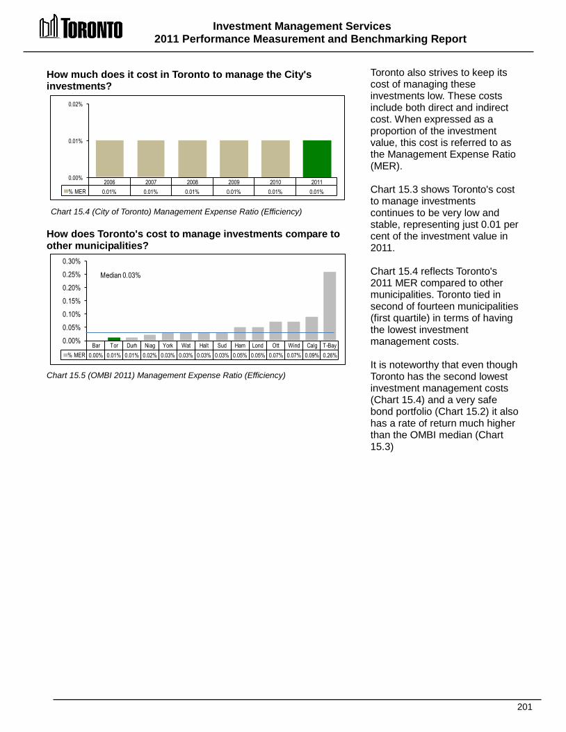
Investment Management Services 2011 Performance Measurement and Benchmarking Report
201
Bar Tor Durh Niag York Wat Halt Sud Ham Lond Ott Wind Calg T-Bay% MER 0.00% 0.01% 0.01% 0.02% 0.03% 0.03% 0.03% 0.03% 0.05% 0.05% 0.07% 0.07% 0.09% 0.26%
0.00%0.05%0.10%0.15%0.20%0.25%0.30%
Median 0.03%
How much does it cost in Toronto to manage the City's investments? Chart 15.4 (City of Toronto) Management Expense Ratio (Efficiency)
How does Toronto's cost to manage investments compare to other municipalities? Chart 15.5 (OMBI 2011) Management Expense Ratio (Efficiency)
Toronto also strives to keep its cost of managing these investments low. These costs include both direct and indirect cost. When expressed as a proportion of the investment value, this cost is referred to as the Management Expense Ratio (MER). Chart 15.3 shows Toronto's cost to manage investments continues to be very low and stable, representing just 0.01 per cent of the investment value in 2011. Chart 15.4 reflects Toronto's 2011 MER compared to other municipalities. Toronto tied in second of fourteen municipalities (first quartile) in terms of having the lowest investment management costs. It is noteworthy that even though Toronto has the second lowest investment management costs (Chart 15.4) and a very safe bond portfolio (Chart 15.2) it also has a rate of return much higher than the OMBI median (Chart 15.3)
2006 2007 2008 2009 2010 2011% MER 0.01% 0.01% 0.01% 0.01% 0.01% 0.01%
0.00%
0.01%
0.02%

Investment Management Services 2011 Performance Measurement and Benchmarking Report
202
Factors Influencing Results of Municipalities The results of each municipality found in the charts included in this report are influenced to varying degrees by factors such as: • Asset mix (different types of investments); • Availability of investment products; • Amount of funds being invested; • Cash inflows and outflows (is new cash being added or is the portfolio shrinking as a result
of cash being withdrawn?); • Type of investment management (in-house vs. the use of external managers and brokers); • Strategies employed (active vs. passive investment); and • Duration (term) of the investment portfolio.

203

204
Legal Services
Prosecution Civil Litigation Solicitor
LLeeggaall SSeerrvviicceess The goal of Legal Services is to provide responsive and cost-effective legal support to Toronto City Council and its local boards and staff on governance, strategic initiatives, legislative compliance, risk management and operational issues. Legal Services do their best to ensure that actions undertaken by the municipality comply with applicable laws and have the desired legal effect. Some specific objectives include: • Meeting the needs of council, division heads and staff for timely,
accurate and effective legal advice; • Protecting, advocating for, and advancing the legal interests of
the municipality and the general public interest; • Providing cost-effective representation of the municipality before
the courts and boards/tribunals; • Preparing, negotiating and reviewing contracts and agreements to protect the municipality’s
interests; and • Overseeing the delivery of services under the Provincial Offences Act consisting of
administrative, prosecutorial and court support functions. Toronto's Legal Services division is comprised of more than 100 practicing lawyers, more than 15 law clerks, 11 conveyance staff and more than 30 prosecutions staff, providing services to Council, its local boards and staff in the following areas: • Municipal Law – providing legal advice and opinions on issues relating to governance,
service delivery, operations and corporate initiatives, including contract negotiations and drafting agreements.
• Real Estate Law – providing assistance and advice on a wide range of diverse and sophisticated real estate transactions dealing with the City’s property interests.
• Planning and Development Law – providing advice on the use and development of land and policy related matters, including matters relating to the Ontario Municipal Board and the Alcohol and Gaming Commission.
• Employment Law – providing advice and assistance in matters related to employment law and dealing with issues arising from collective agreements between the City and its unions. Includes dealings with the Ontario Labour Relations Board, Workplace Safety and Insurance Appeals Tribunal and the Ontario Human Rights Tribunal.
• Litigation – representing and defending in litigious matters at all levels of courts and administrative tribunals.
• Prosecutions – prosecuting of a wide range of offences committed under City bylaws and provincial statutes.

Legal Services 2011 Performance Measurement and Benchmarking Report
205
Question Indicator/Measure Internal Comparison
of Toronto’s 2011 vs. 2010 Results
External Comparison to Other Municipalities
(OMBI) By Quartile for 2011
Chart &
Page Ref.
Service Level Indicators
How much internal legal work is required to support municipal services?
Legal Services Cost (Internal) per 1,000 Dollars Municipal Capital and Operating Expenditures - (Service Level)
Stable
Internal legal expenditures in
proportion to operating and capital expenditures
were stable
(service level indicator)
1
Highest amount of legal work compared to other OMBI municipalities in proportion to operating
and capital expenditures
(service level indicator)
16.1
pg. 206
Efficiency Measures
How much does it cost per hour for internal lawyers, including overhead costs?
Legal Costs per In-house Lawyer Hour - (Efficiency)
Stable
Cost per hour for internal (in-house) legal
was stable
3
High cost per hour for internal (in-house) legal services compared to
others
(more complex work may be done by internal lawyers in
Toronto that more expensive external lawyers would be
doing in other municipalities )
16.2
pg. 206
Overall Results
Service Level Indicators
(Resources) 0 - Increased 1 - Stable 0 - Decreased 100% stable or increased
Performance Measures (Results)
0 - Favourable 1 - Stable 0 - Unfavour. 100% favourable or stable
Service Level Indicators
(Resources)
1 - 1st quartile 0 - 2nd quartile 0 - 3rd quartile 0 - 4th quartile 100% above median
Performance Measures (Results)
0 - 1st quartile 0 - 2nd quartile 1 - 3rd quartile 0 - 4th quartile 0% above median
For an explanation of how to interpret this summary and the supporting charts, please see pages 24-30 These quartile results are based on a maximum sample size of 13 municipalities.

Legal Services 2011 Performance Measurement and Benchmarking Report
206
Tor Halt York Ham Wind Sud Durh Lond Bar Ott T-Bay Wat Niag $cost $4.25 $2.80 $2.77 $2.50 $2.09 $1.88 $1.75 $1.70 $1.64 $1.63 $1.14 $1.07 $0.97
$0.00 $0.50 $1.00 $1.50 $2.00 $2.50 $3.00 $3.50 $4.00 $4.50
Median $1.75
Wat Niag Sud Ott Ham Lond Durh Wind Tor T-Bay Halt Bar York $cost $106 $115 $115 $117 $121 $124 $125 $129 $150 $152 $152 $160 $169
$0
$50
$100
$150
$200
$250 Median $125
How much legal work done by internal staff is required to support municipal services? Chart 16.1(OMBI 2011) Internal Legal Services Operating Cost per 1,000 Dollars Municipal Capital and Operating Expenses (Service Level) How much does it cost per hour for internal lawyers, including overhead costs? Chart 16.2 (OMBI 2011) Legal Operating Costs per In-House Lawyer Hour (Efficiency)
One way of comparing the volume of legal services (service levels) provided is to relate internal legal expenditures to the operating and capital expenditures of the municipal services they support. In 2011, Toronto spent $4.25 per $1,000 of municipal operating and capital expenditures of the services they support. This was basically unchanged from $4.21 in 2010. Figures exclude decentralized legal costs incurred directly by divisions. Chart 16.1 compares Toronto 2011 result for this measure to other municipalities. Toronto ranks first of thirteen (first quartile) in terms of having the highest expenditure/service level. Note these costs exclude those of external lawyers retained directly by Toronto's divisions.
Toronto's high ranking is likely due to the facts that: • Toronto's urban environment leads to a greater complexity of files, greater volumes and higher dollar
values; • Many municipalities do not undertake new initiatives until Toronto has done it and withstood legal
challenges; and • Other municipalities may be placing greater reliance on external legal services that are not captured in
this measure. Chart 16.2 compares Toronto's 2011 cost per hour for internal (in-house) lawyers to other Ontario municipalities. This cost includes all overhead and legal staff supporting lawyers. Toronto's ranks ninth of thirteen (third quartile) in terms of having the lowest cost per hour. ON a year-over-year basis, Toronto's legal services costs per lawyer hour of $150 in 2011 was down slightly from $152 in 2010. There are a number of factors that lead to Toronto's higher costs per hour in relation to others: • Toronto has a greater proportion of costs for paralegal staff (included in the measure) and although their
time is not considered as "lawyer hours", their work such as preparing standard form agreements is less costly compared to other municipalities where that work is done by lawyers.
• Toronto provides full in-house legal services for matters that are often complex. Outside legal counsel are only used in extremely specialized matters. External legal expertise is much more expensive. Similar legal matters dealt with by in-house lawyers in Toronto may be handled in another municipality by an external lawyer at a higher cost.
Legal Services 2011 Performance Measurement and Benchmarking Report
207
2012 Achievements or 2013 Planned Initiatives The following achievements and initiatives have and will help to improve the effectiveness of Toronto’s Legal Services operations. 2012 Accomplishments • Provided strategic legal advice regarding the 2015 Pan-Am Games. • Implemented an Early Resolution Process (First Attendance) under Bill 212 in Provincial
Offences Act Courts. • Provided strategic legal advice respecting the Revised Harmonized Zoning By-law. • Represented the City's interests at the Court of Appeal on Third Party Sign Tax appeal. • Finalized the Toronto Port Authority Master Agreement and land transaction relating to the
pedestrian tunnel. • Completed and closed the sale transaction of the Corus site. • Provided strategic legal advice respecting the Review of the Taxicab industry. • Provided strategic legal advice respecting Collective Bargaining with expiry of Collective
Agreements at the end of 2011. • Provided strategic legal advice respecting the Core Service Review. • Represented City's interests in challenge of Pavement Degradation Fee.
Factors Influencing Results of Municipalities The results of each municipality found in the charts included in this report are influenced to varying degrees by factors such as: • Organizational form - determines whether all legal costs are controlled centrally by Legal
Services as well as the mix of external vs. in-house lawyer hours. • Staffing model - the ratio of paralegal and administrative staff to lawyers affects the cost per
lawyer hour, as only lawyer hours are reflected in the cost per hour calculations. • Litigation costs - the nature and volume of legal claims (including civil claims, human rights
matters, contractual disputes, by-law challenges, and applications for Judicial review), drive legal costs.
• Council philosophy - cost benefit of settling claims at different stages. • Municipal services - different services can demand varying levels of legal support. • Client initiatives - new initiatives (i.e. re-organization or restructuring, bylaw amendments ,
introduction of new bylaws, official plan review, major infrastructure projects) often generate a considerable amount of legal work and may impact both internal and external legal hours as well as cost per hour.
• Reimbursement of legal fees to municipal staff and Council members – staff and Council members may be reimbursed for legal costs incurred to retain external lawyers when they are not represented by in-house lawyers.
• The rates of pay for lawyers in municipalities.

208
Toronto Public Library
Administration
Governance & Board Support
Finance
Human
Resources
Library Facility Access
Study & Community
Access
Room Booking
Facilities Maintenance &
Support
Library Collection Use
Borrowing and In-Library Use
E-Services & Digitization
Information Services
Collection, Development &
Maintenance
Programs & Outreach
Literacy
Instructional & Informational
Cultural
& Literary
Volunteer & Service Development &
Customer Engagement
LLiibbrraarryy SSeerrvviicceess Public libraries provide services for residents of all ages and backgrounds in a welcoming and supportive environment. Libraries promote literacy, address residents’ educational and recreational needs and enhance their quality of life. Libraries are important hubs that strengthen community connections and diversity. Libraries also support and promote reading skills. Public libraries provide responsive collections, services and programs that proactively address diverse and changing community needs. Partnerships enhance and extend the library’s reach, remove barriers and engage residents in services. In an information society, access to the internet and technology is essential to meaningful participation in daily life. Public libraries have an important role in addressing the digital divide that is residents’ lack of access to technology or the skills to use it effectively. The digital divide relates to education, income and age. Libraries address this divide by providing internet and computer access, wireless access and user education. For some residents, the public library is their main access, while for others it augments access available at home, work or school. Increasingly, collections, programs and services are offered online, enhancing accessibility and engaging new library users.
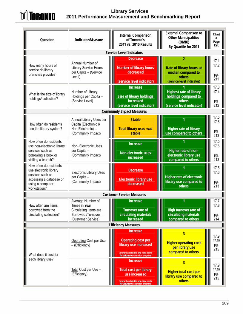
Library Services 2011 Performance Measurement and Benchmarking Report
209
Question Indicator/Measure Internal Comparison
of Toronto’s 2011 vs. 2010 Results
External Comparison to Other Municipalities
(OMBI) By Quartile for 2011
Chart &
Page Ref.
Service Level Indicators
How many hours of service do library branches provide?
Annual Number of Library Service Hours per Capita – (Service Level)
Decrease
Number of library hours decreased
(service level indicator)
2
Rate of library hours at median compared to
others (service level indicator)
17.1 17.2
pg. 211
What is the size of library holdings/ collection?
Number of Library Holdings per Capita – (Service Level)
Increase
Size of library holdings increased
(service level indicator)
1 Highest rate of library holdings compared to
others (service level indicator)
17.3 17.4
pg. 212
Community Impact Measures
How often do residents use the library system?
Annual Library Uses per Capita (Electronic & Non-Electronic) – (Community Impact)
Stable
Total library uses was stable
1
Higher rate of library use compared to others
17.5 17.6
pg. 213
How often do residents use non-electronic library services such as borrowing a book or visiting a branch?
Non- Electronic Uses per Capita – (Community Impact)
Increase
Non-electronic uses increased
1
Higher rate of non-electronic library use compared to others
17.5 17.6
pg. 213
How often do residents use electronic library services such as accessing a database or using a computer workstation?
Electronic Library Uses per Capita – (Community Impact)
Decrease
Electronic library use decreased
1
Higher rate of electronic library use compared to
others
17.5 17.6
pg. 213
Customer Service Measures
How often are items borrowed from the circulating collection?
Average Number of Times in Year Circulating Items are Borrowed /Turnover – (Customer Service)
Increase
Turnover rate of circulating materials
increased
1
High turnover rate of circulating materials compared to others
17.7 17.8
pg. 214
Efficiency Measures
What does it cost for each library use?
Operating Cost per Use – (Efficiency)
Increase
Operating cost per library use increased
(primarily related to one- time costs for voluntary separation program)
3
Higher operating cost per library use
compared to others
17.9 17.10 pg. 215
Total Cost per Use – (Efficiency)
Increase
Total cost per library use increased
(primarily related to one- time costs for voluntary separation program)
3
Higher total cost per library use compared to
others
17.9 17.10 pg. 215

Library Services 2011 Performance Measurement and Benchmarking Report
210
Question Indicator/Measure Internal Comparison
of Toronto’s 2011 vs. 2010 Results
External Comparison to Other Municipalities
(OMBI) By Quartile for 2011
Chart &
Page Ref.
Overall Results
Service Level Indicators
(Resources) 1 - Increased 0 - Stable 1 -Decreased 50% stable or increased
Performance Measures (Results)
2 - Favourable 1 - Stable 3 - Unfavour. 50% favourable or stable
Service Level Indicators
(Resources)
1 - 1st quartile 1 - 2nd quartile 0 - 3rd quartile 0 - 4th quartile 100% above median
Performance Measures (Results)
4 - 1st quartile 0 - 2nd quartile 2 - 3rd quartile 0 - 4th quartile 67% above median
For an explanation of how to interpret this summary and the supporting charts, please see pages 24-30. These quartile results are based on a maximum sample size of 10 municipalities.
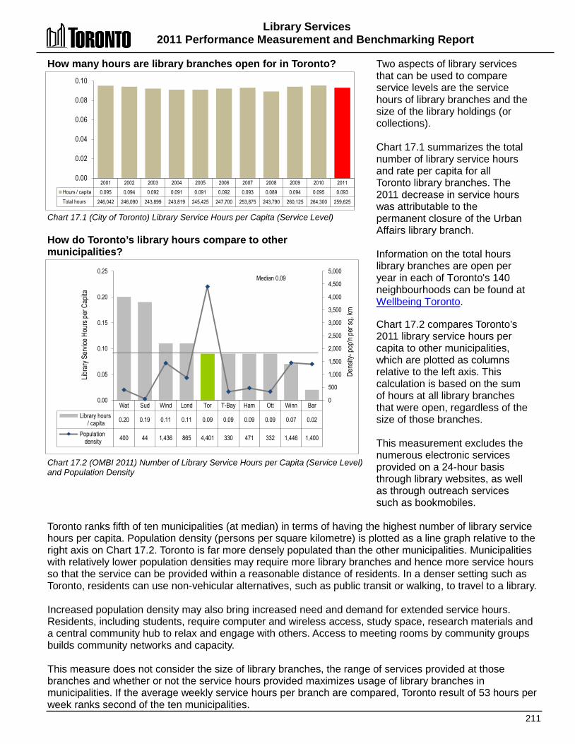
Library Services 2011 Performance Measurement and Benchmarking Report
211
2001 2002 2003 2004 2005 2006 2007 2008 2009 2010 2011 Hours / capita 0.095 0.094 0.092 0.091 0.091 0.092 0.093 0.089 0.094 0.095 0.093 Total hours 246,042 246,090 243,899 243,819 245,425 247,700 253,875 243,790 260,125 264,300 259,625
0.00
0.02
0.04
0.06
0.08
0.10
Wat Sud Wind Lond Tor T-Bay Ham Ott Winn Bar Library hours
/ capita 0.20 0.19 0.11 0.11 0.09 0.09 0.09 0.09 0.07 0.02
Population density 400 44 1,436 865 4,401 330 471 332 1,446 1,400
0
500
1,000
1,500
2,000
2,500
3,000
3,500
4,000
4,500
5,000
0.00
0.05
0.10
0.15
0.20
0.25
Dens
ity- p
op'n
per s
q. km
Libra
ry Se
rvice
Hou
rs pe
r Cap
ita
Median 0.09
How many hours are library branches open for in Toronto? Chart 17.1 (City of Toronto) Library Service Hours per Capita (Service Level) How do Toronto’s library hours compare to other municipalities? Chart 17.2 (OMBI 2011) Number of Library Service Hours per Capita (Service Level) and Population Density
Two aspects of library services that can be used to compare service levels are the service hours of library branches and the size of the library holdings (or collections). Chart 17.1 summarizes the total number of library service hours and rate per capita for all Toronto library branches. The 2011 decrease in service hours was attributable to the permanent closure of the Urban Affairs library branch. Information on the total hours library branches are open per year in each of Toronto's 140 neighbourhoods can be found at Wellbeing Toronto. Chart 17.2 compares Toronto’s 2011 library service hours per capita to other municipalities, which are plotted as columns relative to the left axis. This calculation is based on the sum of hours at all library branches that were open, regardless of the size of those branches. This measurement excludes the numerous electronic services provided on a 24-hour basis through library websites, as well as through outreach services such as bookmobiles.
Toronto ranks fifth of ten municipalities (at median) in terms of having the highest number of library service hours per capita. Population density (persons per square kilometre) is plotted as a line graph relative to the right axis on Chart 17.2. Toronto is far more densely populated than the other municipalities. Municipalities with relatively lower population densities may require more library branches and hence more service hours so that the service can be provided within a reasonable distance of residents. In a denser setting such as Toronto, residents can use non-vehicular alternatives, such as public transit or walking, to travel to a library. Increased population density may also bring increased need and demand for extended service hours. Residents, including students, require computer and wireless access, study space, research materials and a central community hub to relax and engage with others. Access to meeting rooms by community groups builds community networks and capacity. This measure does not consider the size of library branches, the range of services provided at those branches and whether or not the service hours provided maximizes usage of library branches in municipalities. If the average weekly service hours per branch are compared, Toronto result of 53 hours per week ranks second of the ten municipalities.

Library Services 2011 Performance Measurement and Benchmarking Report
212
2001 2002 2003 2004 2005 2006 2007 2008 2009 2010 2011 Holdings / capita 4.09 4.04 4.01 3.98 3.98 3.98 3.95 4.03 4.04 3.97 3.99 Total holdings (000s) 10,606 10,581 10,606 10,637 10,750 10,766 10,792 11,025 11,124 11,013 11,129
0.00
1.00
2.00
3.00
4.00
5.00
Wat Tor Wind Sud T-Bay Bar Ott Lond Ham Winn Holdings / capita 4.03 3.99 3.57 3.22 3.14 2.87 2.54 2.39 2.27 2.12
0.00
1.00
2.00
3.00
4.00
5.00
Median 3.01
What is the size of Toronto’s library holdings/ collection? Chart 17.3 (City of Toronto) Library Holdings per Capita (Service Level) How does Toronto’s library holdings/collection compare in size to other municipalities? Chart 17.4 (OMBI 2011) Number of Library Holdings Per Capita (Service Level)
Another indication of service levels is the size of the library holdings or collection per capita, which consists of both print and electronic media. Print media include: • Reference collections; • Circulating/ borrowing
collections; and • Periodicals. Electronic and audiovisual media include: • DVDs and CDs; • Electronic databases and
downloadable materials, including eBooks; and
• Audio books. Chart 17.3 provides information on Toronto’s total (over 11 million items) and rate of library holdings per capita. In 2011, library holdings increased by approximately 116,000 including the shift to more electronic content, including eBooks and the de-accessioning of dated formats such as audio books on cassette.
Chart 17.4 compares Toronto's 2011 number of library holdings per capita to other municipalities. Toronto ranks second of ten municipalities (first quartile) in terms of having the highest number of library holdings Toronto’s high ranking reflects the library’s responsiveness to the diverse population and the comprehensiveness of the library’s collections. Toronto offers extensive research and reference collections including special, historical and archival materials, ESL and literacy collections, electronic collections and recreational collections. To enhance accessibility, materials are offered for all ages in a range of reading levels, in over forty languages and in a variety of accessible formats, such as large print, and electronic formats including audio and eBooks.
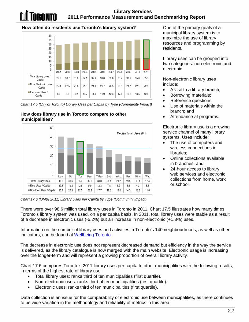
Library Services 2011 Performance Measurement and Benchmarking Report
213
2001 2002 2003 2004 2005 2006 2007 2008 2009 2010 2011 Total Library Uses /
Capita 29.0 30.7 31.0 32.1 32.9 33.6 32.8 33.2 33.9 35.6 35.3
Non- Electronic Uses / Capita 22.1 22.5 21.8 21.8 21.9 21.7 20.5 20.5 21.7 22.1 22.5
Electronic Uses / Capita 6.9 8.3 9.2 10.2 11.0 11.9 12.3 12.7 12.2 13.5 12.8
0 5
10 15 20 25 30 35 40
Lond Ott Tor Ham T-Bay Sud Wind Bar Winn Wat Total Library Uses 40.6 39.6 35.3 32.2 30.0 26.1 21.7 19.8 18.1 17.4 Elec. Uses / Capita 17.5 19.2 12.8 9.0 12.3 7.8 8.7 5.5 4.3 5.6 Non-Elec. Uses / Capita 23.1 20.3 22.5 23.2 17.7 18.3 13.0 14.3 13.8 11.8
0
10
20
30
40
50 Median Total Uses 28.1
How often do residents use Toronto's library system? Chart 17.5 (City of Toronto) Library Uses per Capita by Type (Community Impact) How does library use in Toronto compare to other municipalities? Chart 17.6 (OMBI 2011) Library Uses per Capita by Type (Community Impact)
One of the primary goals of a municipal library system is to maximize the use of library resources and programming by residents. Library uses can be grouped into two categories: non-electronic and electronic. Non-electronic library uses include: • A visit to a library branch; • Borrowing materials; • Reference questions; • Use of materials within the
branch; and • Attendance at programs. Electronic library use is a growing service channel of many library systems. Uses include: • The use of computers and
wireless connections in libraries;
• Online collections available in branches; and
• 24-hour access to library web services and electronic collections from home, work or school.
There were over 98.6 million total library uses in Toronto in 2011. Chart 17.5 illustrates how many times Toronto’s library system was used, on a per capita basis. In 2011, total library uses were stable as a result of a decrease in electronic uses (-5.2%) but an increase in non-electronic (+1.8%) uses. Information on the number of library uses and activities in Toronto's 140 neighbourhoods, as well as other indicators, can be found at Wellbeing Toronto. The decrease in electronic use does not represent decreased demand but efficiency in the way the service is delivered, as the library catalogue is now merged with the main website. Electronic usage is increasing over the longer-term and will represent a growing proportion of overall library activity. Chart 17.6 compares Toronto’s 2011 library uses per capita to other municipalities with the following results, in terms of the highest rate of library use:
• Total library uses: ranks third of ten municipalities (first quartile). • Non-electronic uses: ranks third of ten municipalities (first quartile). • Electronic uses: ranks third of ten municipalities (first quartile).
Data collection is an issue for the comparability of electronic use between municipalities, as there continues to be wide variation in the methodology and reliability of metrics in this area.
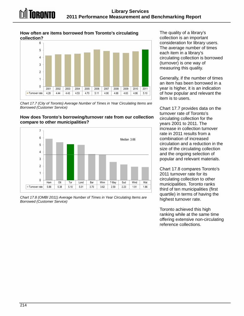
Library Services 2011 Performance Measurement and Benchmarking Report
214
2001 2002 2003 2004 2005 2006 2007 2008 2009 2010 2011 Turnover rate 4.28 4.44 4.43 4.53 4.70 5.11 4.90 4.68 4.63 4.86 5.10
0
1
2
3
4
5
6
Ham Ott Tor Lond Bar Winn T-Bay Sud Wind Wat Turnover rate 5.88 5.38 5.10 5.01 3.70 3.62 2.59 2.23 1.91 1.86
0
1
2
3
4
5
6
7
Median 3.66
How often are items borrowed from Toronto’s circulating collection? Chart 17.7 (City of Toronto) Average Number of Times in Year Circulating Items are Borrowed (Customer Service) How does Toronto’s borrowing/turnover rate from our collection compare to other municipalities? Chart 17.8 (OMBI 2011) Average Number of Times in Year Circulating Items are Borrowed (Customer Service)
The quality of a library’s collection is an important consideration for library users. The average number of times each item in a library’s circulating collection is borrowed (turnover) is one way of measuring this quality. Generally, if the number of times an item has been borrowed in a year is higher, it is an indication of how popular and relevant the item is to users. Chart 17.7 provides data on the turnover rate of Toronto’s circulating collection for the years 2001 to 2011. The increase in collection turnover rate in 2011 results from a combination of increased circulation and a reduction in the size of the circulating collection and the ongoing selection of popular and relevant materials. Chart 17.8 compares Toronto’s 2011 turnover rate for its circulating collection to other municipalities. Toronto ranks third of ten municipalities (first quartile) in terms of having the highest turnover rate. Toronto achieved this high ranking while at the same time offering extensive non-circulating reference collections.

Library Services 2011 Performance Measurement and Benchmarking Report
215
2001 2002 2003 2004 2005 2006 2007 2008 2009 2010 2011 (A) Amortization $0.28 $0.27 $0.29 (B) Change in acct. policies -$0.15 $0.01 $0.01 (C) Previous operating cost $1.60 $1.60 $1.62 $1.75 $1.73 $1.76 $1.83 $1.95 $1.89 $1.70 $1.80 (D = B + C) New operating cost $1.74 $1.71 $1.81 (E = A + D) Total cost $2.02 $1.98 $2.10
CPI-adjusted previous operating cost (base yr 2001) $1.60 $1.57 $1.54 $1.64 $1.59 $1.59 $1.62 $1.69 $1.63 $1.43 $1.47
$0.00
$0.41
$0.82
$1.23
$1.64
$2.05
$2.46
Cost
($) /
Libr
ary U
se
Lond Ott Ham Bar Sud T-Bay Wind Tor Winn Wat (A) Amortization $0.24 $0.02 $0.28 $0.29 $0.33 $0.19 $0.34 $0.29 $0.08 $0.22 (B) Operating cost $1.27 $1.39 $1.44 $1.67 $1.69 $1.75 $1.79 $1.81 $2.06 $2.16 (C = A + B) Total cost $1.51 $1.41 $1.72 $1.96 $2.02 $1.94 $2.13 $2.10 $2.14 $2.38
$0.00
$0.50
$1.00
$1.50
$2.00
$2.50 Medians $1.72 (operating), $1.99 (total)
Cost
($) /
Libr
ary U
se
What does it cost in Toronto for each library use?
Chart 17.9 (City of Toronto) Cost per Library Use (Efficiency) How does Toronto’s cost per library use compare to other municipalities? Chart 17.10 (OMBI 2011) Library Cost per Use (Efficiency)
The cost of library services in relation to the number of library uses can be used to assess the efficiency of library systems. Chart 17.9 provides Toronto’s operating cost and total cost (operating cost plus amortization, excluding interest) per library use. Starting in 2009, changes in accounting policies were instituted by all Ontario municipalities as described on page 30. The 2011 operating impact of these accounting policy changes was $0.01 per library use, shown as a stacked column to separate it from the 2011 result using the previous costing methodology of 2008 and prior years. Amortization is also shown as a separate stacked column. To reflect the impact of inflation, Chart 17.9 also provides Consumer Price Index (CPI) adjusted operating cost results (using the "previous" operating cost methodology of 2008 and prior years), which are plotted as a line graph. This adjustment discounts the actual operating cost result for each year by the change in Toronto’s CPI since the base year of 2001.
Both Toronto's operating cost and total cost per use increased in 2011, but the majority of the increase was related to one-time costs of $7.2 million attributed to the Voluntary Separation Program (VSP) used to reduce the size of the library workforce. The impact of the one-time VSP costs amounted to $0.07 per library use and if it was excluded:
• Toronto's operating cost per use would have increased from $1.71 in 2010 to $1.74 in 2011 ($1.81with one-time VSP costs); and
• Toronto's total cost (operating plus amortization) per use would have increased from $1.98 in 2010 to $2.03 in 2011 ($2.10 with one-time VSP costs).
Chart 17.10 compares Toronto’s 2011 operating and total cost per library use to other municipalities. In terms of the lowest cost per library use, Toronto ranks:
• Eighth of ten (third quartile) for operating cost per use (sixth of ten if Toronto's VSP cost were excluded); and • Seventh of ten (third quartile) for total cost per use (seventh of ten if Toronto's VSP cost were excluded).
Toronto continues to experience increases in service demand. Municipalities that have a higher proportion of electronic use in relation to total library uses (see Chart 17.6) will tend to have a lower cost per library use.
Library Services 2011 Performance Measurement and Benchmarking Report
216
2012 Achievements and 2013 Planned Initiatives The following initiatives have improved or are intended to improve the efficiency and effectiveness of Toronto’s Library operations. 2012 Initiatives Completed/Achievements • Maintained library material circulation at over 32 million items. • Maintained library open hours at 249,239 annually (2012 actual open hours reduced due to labour
disruption). • Maintained library visits at 19.0 million. • Implemented efficiency measures and automated business processes related to circulation and
materials handling while maintaining services. • Developed a new strategic plan for 2012-2015 in consultation with stakeholders, partners and
residents, to understand residents’ needs and to build and maintain effective partnerships to support service delivery.
• Expanded virtual library services as an efficient delivery channel for the enhanced use of social media.
2013 Initiatives Planned Major areas of focus in 2013 include: • Improving access to e-content through a number of strategies. • Promoting literacy activities and services and providing a range of accessible literacy programs. • Expanding access to online learning tools and in-branch programs to support job seekers and
entrepreneurs. • Introducing more self-service options online and in Library branches. • A continued focus on excellence in customer service while improving the efficiency of operations
and the introduction of new revenue streams. • Enhancing support for children in the middle years (6-12) and engagement with partners to
advance the City’s Middle Years Strategy. Influencing Factors Each municipality’s results are influenced to varying degrees by a number of factors including: • Access: number and size of branches and hours of operation mean municipalities with lower
population densities may require more library branches and more service hours to provide residents services within a reasonable distance.
• Collections: size and mix, as well as number of languages supported. • Programs: range of public programs. • Library use: mix, variety and depth of library uses and the varying amount of staff resources
required to support those uses. • Web services: availability and degree of investment. • Demographics: socio-economic and cultural make-up of the population served.

217

218
Long-Term Care Homes & Services
Long-Term Care Homes
Community-Based Long-Term Care
Homemaking
Adult Day Program
Supportive Housing Services
LLoonngg--TTeerrmm CCaarree SSeerrvviicceess Long-Term Care Homes and Services (LTCHS) provides a variety of long-term health care services to residents in the City's long-term care homes and to vulnerable individuals who reside in the community. The scope of these services includes:
• Long-term care homes providing permanent, convalescent and short-stay admissions. There are 2,641 approved beds at sites across the City, all offering dementia care, Gentlecare™, physiotherapy, occupational therapy, dental care, optometry, complementary care, art and music therapy, community outreach including volunteer programs, and spiritual and religious care.
• Ensuring vulnerable populations, especially frail seniors, receive care whenever possible at home while aiming to improve and/or maintain functional independence and quality of life. These community-based programs include the Adult Day Program, Homemakers and Nurses Services, and Supportive Housing Services.
LTCHS is committed to delivering exemplary care and service to residents and clients, to build capacity through high-performing teams and strong partnerships and to improve operational and system-wide performance. Care and services are designed to respond to emerging community needs and serve vulnerable populations, enhancing leadership through innovation and research toward improved quality of care and life.
LTCHS provides compassionate care and comforting support that values the strengths, needs and desires of those it serves, upholding resident/client rights and respecting diversity. To meet the needs of residents and improve access to care, special language and cultural services are offered at select homes, including Armenian, Cantonese, Estonian, French, German, Ismali, Japanese, Jewish, Korean, Mandarin, Russian and Tamil. Behavioural supports, young adult care and lesbian, gay, bi and transgendered (LGBT) supports are also provided at all homes. LTCHS believes that the creation of an effective continuum of care is best built and maintained through strong partnerships with other health care organizations and community partners. Formal and informal partnerships, collaborations, connections and service alliances include all faith and cultural groups; schools and places of higher learning; disease and advocacy groups; media and government; arts organizations and service clubs. LTCHS has a coordinated approach to communication which includes offering comprehensive information to support informed decision-making for clients and their families, stakeholder newsletters, staff and volunteer training alongside input, feedback and expertise offered from the community led divisional program Advisory Committee, Home Advisory Committees and an Inter-Home Advisory Committee and the home Resident Council and Family Councils. Funding responsibilities for long-term care services are shared by the Ministry of Health and Long-Term Care (MOHLTC), the residents of the homes (or the clients of the community programs) and the City of Toronto, with rates set by the provincial government. Long-term care home residents with limited income are eligible for a subsidy to reduce the fee they pay. Although community clients may pay a small fee, the approach for rates varies with each community program. The MOHLTC regulates and inspects all of Ontario's long-term care homes on a regular basis. In addition, LTCHS is accredited by Accreditation Canada, demonstrating that they meet the national standards for safety and quality of care.
Shaded box reflects the activity covered in this section of the report.
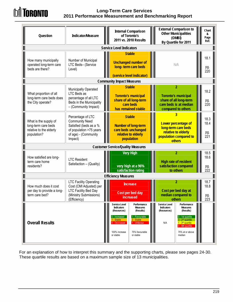
Long-Term Care Services 2011 Performance Measurement and Benchmarking Report
219
Question Indicator/Measure Internal Comparison
of Toronto’s 2011 vs. 2010 Results
External Comparison to Other Municipalities
(OMBI) By Quartile for 2011
Chart &
Page Ref.
Service Level Indicators
How many municipally operated long-term care beds are there?
Number of Municipal LTC Beds– (Service Level)
Stable
Unchanged number of long- term care beds
(service level indicator)
N/A 18.1
pg. 220
Community Impact Measures
What proportion of all long-term care beds does the City operate?
Municipally Operated LTC Beds as percentage of all LTC Beds in the Municipality – (Community Impact)
Stable
Toronto’s municipal share of all long-term
care beds has remained stable
2
Toronto’s municipal share of all long-term
care beds is at median compared to others
18.2
pg. 220
What is the supply of long-term care beds relative to the elderly population?
Percentage of LTC Community Need Satisfied (beds as a % of population >75 years of age) - (Community Impact)
Stable
Number of long-term care beds unchanged
relative to elderly population
3
Lower percentage of long-term care beds
relative to elderly population compared to
others
18.3 18.4
pg. 221
Customer Service/Quality Measures
How satisfied are long-term care home residents?
LTC Resident Satisfaction – (Quality)
Very High
very high at a 96% satisfaction rating
2
High rate of resident satisfaction compared
to others
18.5 18.6
pg. 222
Efficiency Measures
How much does it cost per day to provide a long-term care bed?
LTC Facility Operating Cost (CMI Adjusted) per LTC Facility Bed Day (Ministry Submissions) (Efficiency)
Increase
Cost per bed day increased
2
Cost per bed day at median compared to
others
18.7 18.8
pg. 223
Overall Results
Service Level Indicators
(Resources) 0 - Increased 1 - Stable 0 - Decreased 100% increase or stable
Performance Measures (Results)
1 - Favourable 2 - Stable 1 - Unfavour. 75% favourable or stable
Service Level Indicators
(Resources)
N/A
Performance Measures (Results)
0 - 1st quartile 3 - 2nd quartile 1 - 3rd quartile 0 - 4th quartile 75% at or above median
For an explanation of how to interpret this summary and the supporting charts, please see pages 24-30. These quartile results are based on a maximum sample size of 13 municipalities.
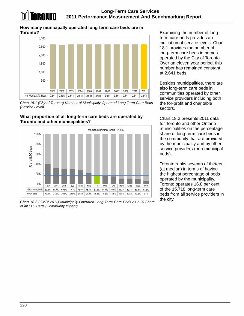
Long-Term Care Services 2011 Performance Measurement And Benchmarking Report
220
T-Bay Musk Durh Sud Niag Halt Tor Wind Ott Ham Lond Wat York Non-munic beds 59.6% 68.7% 69.5% 70.1% 72.5% 78.1% 83.2% 84.4% 85.0% 89.2% 89.4% 89.8% 93.6% Mun beds 40.4% 31.3% 30.5% 29.9% 27.5% 21.9% 16.8% 15.6% 15.0% 10.8% 10.6% 10.2% 6.4%
0%
20%
40%
60%
80%
100% Median Municipal Beds 16.8%
% of
all L
TC be
ds
How many municipally operated long-term care beds are in Toronto? Chart 18.1 (City of Toronto) Number of Municipally Operated Long Term Care Beds (Service Level) What proportion of all long-term care beds are operated by Toronto and other municipalities? Chart 18.2 (OMBI 2011) Municipally Operated Long Term Care Beds as a % Share of all LTC Beds (Community Impact)
Examining the number of long- term care beds provides an indication of service levels. Chart 18.1 provides the number of long-term care beds in homes operated by the City of Toronto. Over an eleven year period, this number has remained constant at 2,641 beds. Besides municipalities, there are also long-term care beds in communities operated by other service providers including both the for-profit and charitable sectors. Chart 18.2 presents 2011 data for Toronto and other Ontario municipalities on the percentage share of long-term care beds in the community that are provided by the municipality and by other service providers (non-municipal beds). Toronto ranks seventh of thirteen (at median) in terms of having the highest percentage of beds operated by the municipality. Toronto operates 16.8 per cent of the 15,718 long-term care beds from all service providers in the city.
2001 2002 2003 2004 2005 2006 2007 2008 2009 2010 2011 # Munic. LTC Beds 2,641 2,605 2,641 2,641 2,641 2,641 2,641 2,641 2,641 2,641 2,641
0
500
1,000
1,500
2,000
2,500
3,000
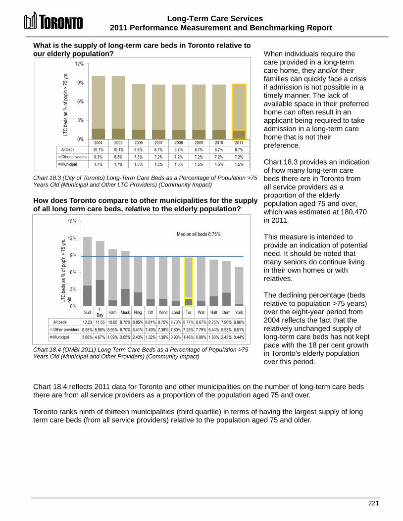
Long-Term Care Services 2011 Performance Measurement and Benchmarking Report
221
2004 2005 2006 2007 2008 2009 2010 2011 All beds 10.1% 10.1% 8.8% 8.7% 8.7% 8.7% 8.7% 8.7% Other providers 8.3% 8.3% 7.3% 7.2% 7.2% 7.2% 7.2% 7.2% Municipal 1.7% 1.7% 1.5% 1.5% 1.5% 1.5% 1.5% 1.5%
0%
3%
6%
9%
12% LT
C be
ds as
% of
pop'n
> 75
yrs.
What is the supply of long-term care beds in Toronto relative to our elderly population? Chart 18.3 (City of Toronto) Long-Term Care Beds as a Percentage of Population >75 Years Old (Municipal and Other LTC Providers) (Community Impact) How does Toronto compare to other municipalities for the supply of all long term care beds, relative to the elderly population? Chart 18.4 (OMBI 2011) Long Term Care Beds as a Percentage of Population >75 Years Old (Municipal and Other Providers) (Community Impact)
When individuals require the care provided in a long-term care home, they and/or their families can quickly face a crisis if admission is not possible in a timely manner. The lack of available space in their preferred home can often result in an applicant being required to take admission in a long-term care home that is not their preference. Chart 18.3 provides an indication of how many long-term care beds there are in Toronto from all service providers as a proportion of the elderly population aged 75 and over, which was estimated at 180,470 in 2011. This measure is intended to provide an indication of potential need. It should be noted that many seniors do continue living in their own homes or with relatives. The declining percentage (beds relative to population >75 years) over the eight-year period from 2004 reflects the fact that the relatively unchanged supply of long-term care beds has not kept pace with the 18 per cent growth in Toronto’s elderly population over this period.
Chart 18.4 reflects 2011 data for Toronto and other municipalities on the number of long-term care beds there are from all service providers as a proportion of the population aged 75 and over. Toronto ranks ninth of thirteen municipalities (third quartile) in terms of having the largest supply of long term care beds (from all service providers) relative to the population aged 75 and older.
Sud T-Bay Ham Musk Niag Ott Wind Lond Tor Wat Halt Durh York
All beds 12.23 11.55 10.05 9.75% 8.85% 8.81% 8.75% 8.73% 8.71% 8.67% 8.25% 7.96% 6.96% Other providers 8.58% 6.88% 8.96% 6.70% 6.41% 7.49% 7.38% 7.80% 7.25% 7.79% 6.44% 5.53% 6.51% Municipal 3.66% 4.67% 1.09% 3.05% 2.43% 1.32% 1.36% 0.93% 1.46% 0.88% 1.80% 2.43% 0.44%
0%
3%
6%
9%
12%
15%
Median all beds 8.75%
LTC
beds
as %
of po
p'n >
75 yr
s. old
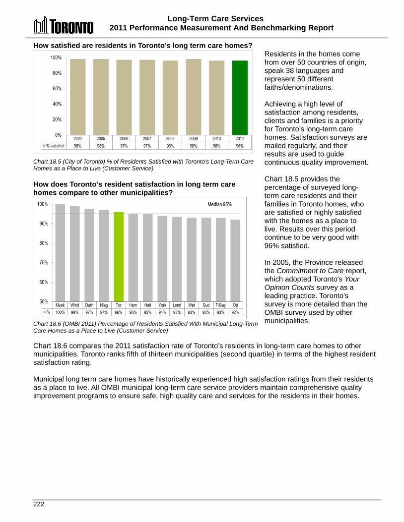
Long-Term Care Services 2011 Performance Measurement And Benchmarking Report
222
2004 2005 2006 2007 2008 2009 2010 2011 % satisfied 98% 98% 97% 97% 96% 98% 96% 96%
0%
20%
40%
60%
80%
100%
How satisfied are residents in Toronto’s long term care homes? Chart 18.5 (City of Toronto) % of Residents Satisfied with Toronto's Long-Term Care Homes as a Place to Live (Customer Service) How does Toronto’s resident satisfaction in long term care homes compare to other municipalities? Chart 18.6 (OMBI 2011) Percentage of Residents Satisfied With Municipal Long-Term Care Homes as a Place to Live (Customer Service)
Residents in the homes come from over 50 countries of origin, speak 38 languages and represent 50 different faiths/denominations. Achieving a high level of satisfaction among residents, clients and families is a priority for Toronto’s long-term care homes. Satisfaction surveys are mailed regularly, and their results are used to guide continuous quality improvement. Chart 18.5 provides the percentage of surveyed long-term care residents and their families in Toronto homes, who are satisfied or highly satisfied with the homes as a place to live. Results over this period continue to be very good with 96% satisfied. In 2005, the Province released the Commitment to Care report, which adopted Toronto's Your Opinion Counts survey as a leading practice. Toronto's survey is more detailed than the OMBI survey used by other municipalities.
Chart 18.6 compares the 2011 satisfaction rate of Toronto’s residents in long-term care homes to other municipalities. Toronto ranks fifth of thirteen municipalities (second quartile) in terms of the highest resident satisfaction rating. Municipal long term care homes have historically experienced high satisfaction ratings from their residents as a place to live. All OMBI municipal long-term care service providers maintain comprehensive quality improvement programs to ensure safe, high quality care and services for the residents in their homes.
Musk Wind Durh Niag Tor Ham Halt York Lond Wat Sud T-Bay Ott % 100% 99% 97% 97% 96% 95% 95% 94% 93% 93% 93% 93% 92%
50%
60%
70%
80%
90%
100% Median 95%
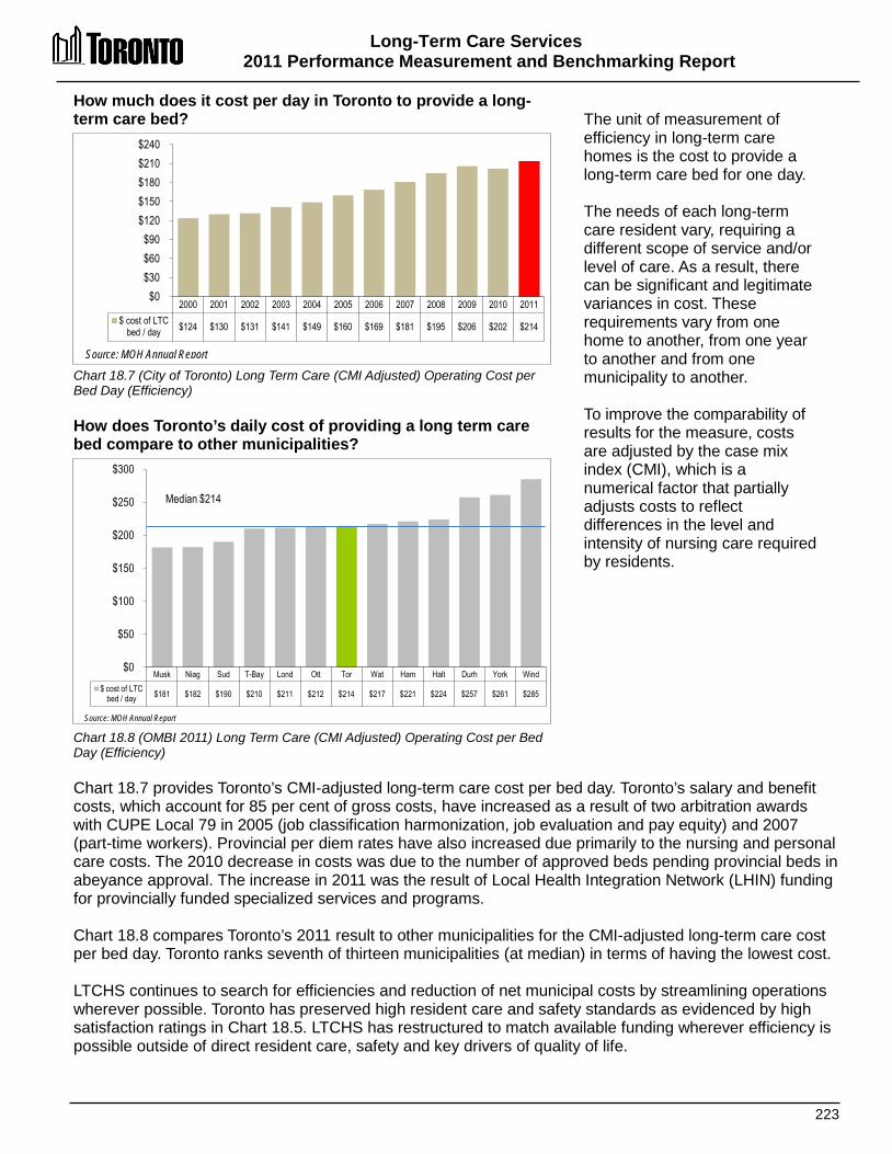
Long-Term Care Services 2011 Performance Measurement and Benchmarking Report
223
2000 2001 2002 2003 2004 2005 2006 2007 2008 2009 2010 2011 $ cost of LTC
bed / day $124 $130 $131 $141 $149 $160 $169 $181 $195 $206 $202 $214
$0 $30 $60 $90
$120 $150 $180 $210 $240
Source: MOH Annual Report
How much does it cost per day in Toronto to provide a long-term care bed? Chart 18.7 (City of Toronto) Long Term Care (CMI Adjusted) Operating Cost per Bed Day (Efficiency) How does Toronto’s daily cost of providing a long term care bed compare to other municipalities? Chart 18.8 (OMBI 2011) Long Term Care (CMI Adjusted) Operating Cost per Bed Day (Efficiency)
The unit of measurement of efficiency in long-term care homes is the cost to provide a long-term care bed for one day. The needs of each long-term care resident vary, requiring a different scope of service and/or level of care. As a result, there can be significant and legitimate variances in cost. These requirements vary from one home to another, from one year to another and from one municipality to another. To improve the comparability of results for the measure, costs are adjusted by the case mix index (CMI), which is a numerical factor that partially adjusts costs to reflect differences in the level and intensity of nursing care required by residents.
Chart 18.7 provides Toronto’s CMI-adjusted long-term care cost per bed day. Toronto’s salary and benefit costs, which account for 85 per cent of gross costs, have increased as a result of two arbitration awards with CUPE Local 79 in 2005 (job classification harmonization, job evaluation and pay equity) and 2007 (part-time workers). Provincial per diem rates have also increased due primarily to the nursing and personal care costs. The 2010 decrease in costs was due to the number of approved beds pending provincial beds in abeyance approval. The increase in 2011 was the result of Local Health Integration Network (LHIN) funding for provincially funded specialized services and programs. Chart 18.8 compares Toronto’s 2011 result to other municipalities for the CMI-adjusted long-term care cost per bed day. Toronto ranks seventh of thirteen municipalities (at median) in terms of having the lowest cost. LTCHS continues to search for efficiencies and reduction of net municipal costs by streamlining operations wherever possible. Toronto has preserved high resident care and safety standards as evidenced by high satisfaction ratings in Chart 18.5. LTCHS has restructured to match available funding wherever efficiency is possible outside of direct resident care, safety and key drivers of quality of life.
Musk Niag Sud T-Bay Lond Ott Tor Wat Ham Halt Durh York Wind $ cost of LTC
bed / day $181 $182 $190 $210 $211 $212 $214 $217 $221 $224 $257 $261 $285
$0
$50
$100
$150
$200
$250
$300
Source: MOH Annual Report
Median $214
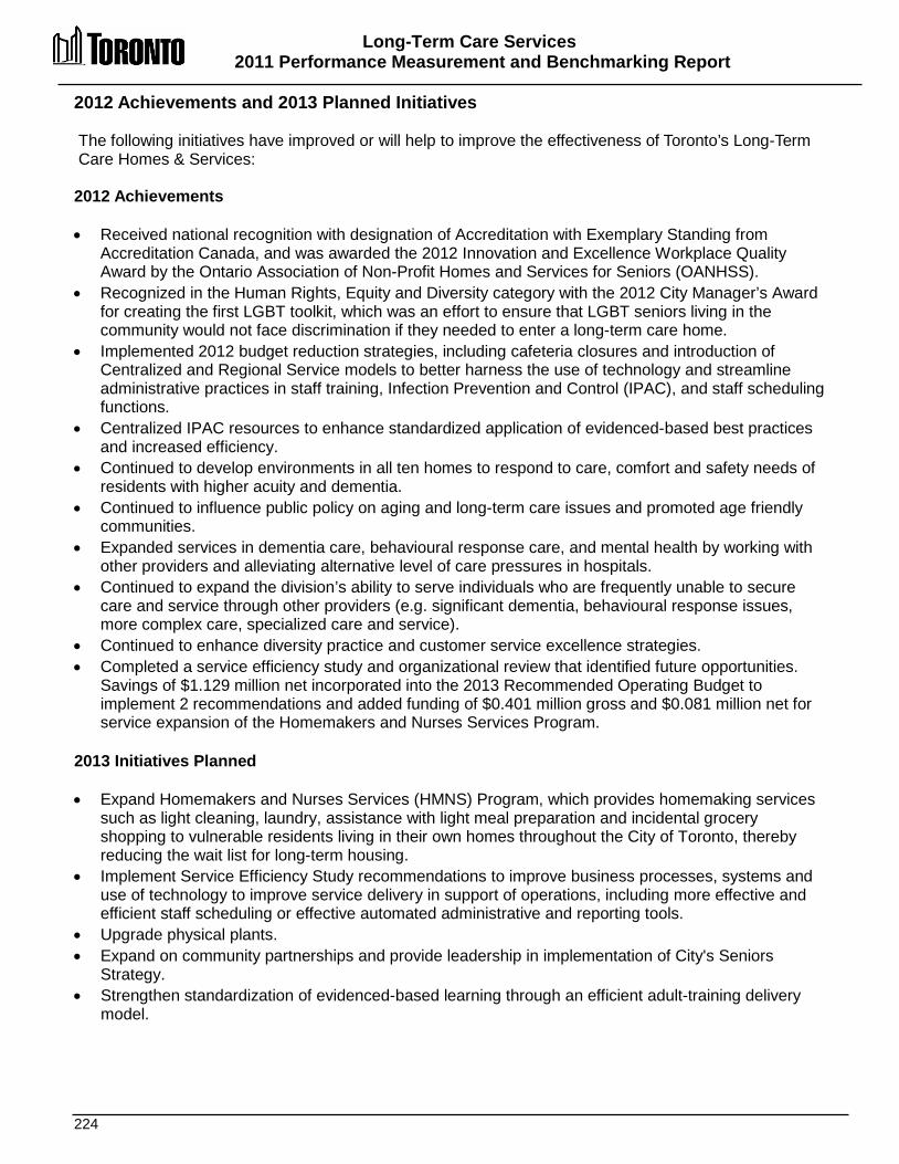
Long-Term Care Services 2011 Performance Measurement and Benchmarking Report
224
2012 Achievements and 2013 Planned Initiatives The following initiatives have improved or will help to improve the effectiveness of Toronto’s Long-Term Care Homes & Services: 2012 Achievements • Received national recognition with designation of Accreditation with Exemplary Standing from
Accreditation Canada, and was awarded the 2012 Innovation and Excellence Workplace Quality Award by the Ontario Association of Non-Profit Homes and Services for Seniors (OANHSS).
• Recognized in the Human Rights, Equity and Diversity category with the 2012 City Manager’s Award for creating the first LGBT toolkit, which was an effort to ensure that LGBT seniors living in the community would not face discrimination if they needed to enter a long-term care home.
• Implemented 2012 budget reduction strategies, including cafeteria closures and introduction of Centralized and Regional Service models to better harness the use of technology and streamline administrative practices in staff training, Infection Prevention and Control (IPAC), and staff scheduling functions.
• Centralized IPAC resources to enhance standardized application of evidenced-based best practices and increased efficiency.
• Continued to develop environments in all ten homes to respond to care, comfort and safety needs of residents with higher acuity and dementia.
• Continued to influence public policy on aging and long-term care issues and promoted age friendly communities.
• Expanded services in dementia care, behavioural response care, and mental health by working with other providers and alleviating alternative level of care pressures in hospitals.
• Continued to expand the division’s ability to serve individuals who are frequently unable to secure care and service through other providers (e.g. significant dementia, behavioural response issues, more complex care, specialized care and service).
• Continued to enhance diversity practice and customer service excellence strategies. • Completed a service efficiency study and organizational review that identified future opportunities.
Savings of $1.129 million net incorporated into the 2013 Recommended Operating Budget to implement 2 recommendations and added funding of $0.401 million gross and $0.081 million net for service expansion of the Homemakers and Nurses Services Program.
2013 Initiatives Planned • Expand Homemakers and Nurses Services (HMNS) Program, which provides homemaking services
such as light cleaning, laundry, assistance with light meal preparation and incidental grocery shopping to vulnerable residents living in their own homes throughout the City of Toronto, thereby reducing the wait list for long-term housing.
• Implement Service Efficiency Study recommendations to improve business processes, systems and use of technology to improve service delivery in support of operations, including more effective and efficient staff scheduling or effective automated administrative and reporting tools.
• Upgrade physical plants. • Expand on community partnerships and provide leadership in implementation of City's Seniors
Strategy. • Strengthen standardization of evidenced-based learning through an efficient adult-training delivery
model.

Long-Term Care Services 2011 Performance Measurement and Benchmarking Report
225
Factors Influencing the Results of Municipalities The results of each municipality included in this report can be influenced to varying degrees by factors such as: • Staff mix: ratio of registered and non-registered staff varies amongst municipalities, resulting in a
higher cost structure for registered staff. • Support and type of programming provided as determined by Toronto City Council. • Role of LHINs: establishing the mix of health services for a given community. • Demographics: age of the population and specific needs of the client. • Uncontrollable price variables: pay equity legislation and wage arbitration, availability of appropriate
skilled workers. • Other providers: charitable and private sector participation in the long-term care business.
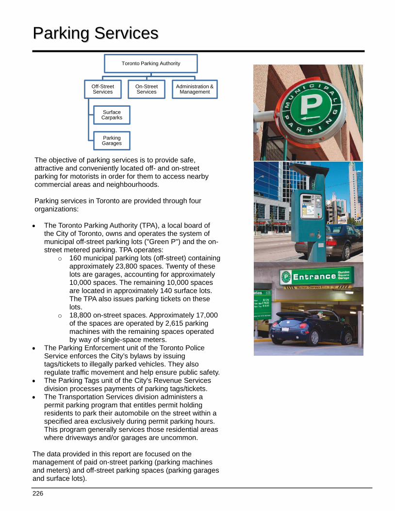
226
Toronto Parking Authority
Off-Street Services
Surface Carparks
Parking Garages
On-Street Services
Administration & Management
PPaarrkkiinngg SSeerrvviicceess The objective of parking services is to provide safe, attractive and conveniently located off- and on-street parking for motorists in order for them to access nearby commercial areas and neighbourhoods. Parking services in Toronto are provided through four organizations: • The Toronto Parking Authority (TPA), a local board of
the City of Toronto, owns and operates the system of municipal off-street parking lots ("Green P") and the on-street metered parking. TPA operates:
o 160 municipal parking lots (off-street) containing approximately 23,800 spaces. Twenty of these lots are garages, accounting for approximately 10,000 spaces. The remaining 10,000 spaces are located in approximately 140 surface lots. The TPA also issues parking tickets on these lots.
o 18,800 on-street spaces. Approximately 17,000 of the spaces are operated by 2,615 parking machines with the remaining spaces operated by way of single-space meters.
• The Parking Enforcement unit of the Toronto Police Service enforces the City’s bylaws by issuing tags/tickets to illegally parked vehicles. They also regulate traffic movement and help ensure public safety.
• The Parking Tags unit of the City's Revenue Services division processes payments of parking tags/tickets.
• The Transportation Services division administers a permit parking program that entitles permit holding residents to park their automobile on the street within a specified area exclusively during permit parking hours. This program generally services those residential areas where driveways and/or garages are uncommon.
The data provided in this report are focused on the management of paid on-street parking (parking machines and meters) and off-street parking spaces (parking garages and surface lots).
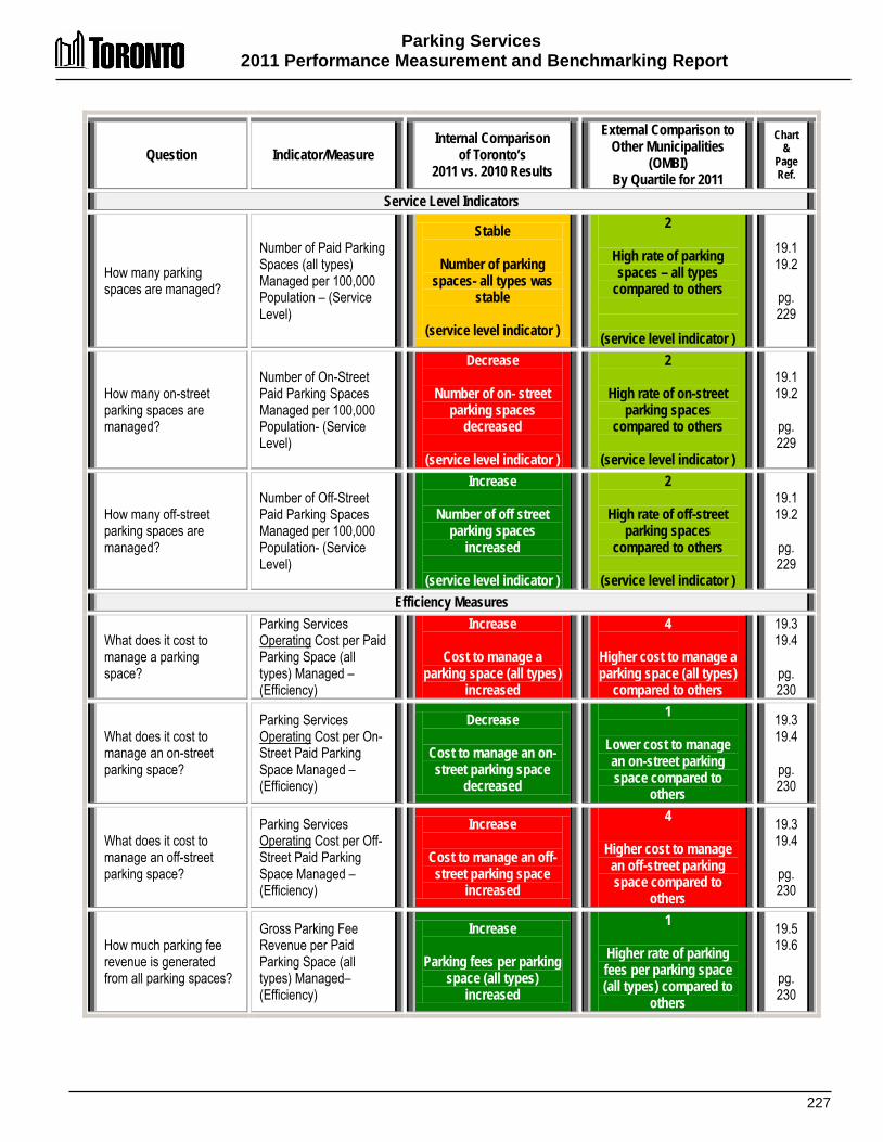
Parking Services 2011 Performance Measurement and Benchmarking Report
227
Question Indicator/Measure Internal Comparison
of Toronto’s 2011 vs. 2010 Results
External Comparison to Other Municipalities
(OMBI) By Quartile for 2011
Chart &
Page Ref.
Service Level Indicators
How many parking spaces are managed?
Number of Paid Parking Spaces (all types) Managed per 100,000 Population – (Service Level)
Stable
Number of parking spaces- all types was
stable
(service level indicator )
2
High rate of parking spaces – all types
compared to others
(service level indicator )
19.1 19.2
pg. 229
How many on-street parking spaces are managed?
Number of On-Street Paid Parking Spaces Managed per 100,000 Population- (Service Level)
Decrease
Number of on- street parking spaces
decreased
(service level indicator )
2
High rate of on-street parking spaces
compared to others
(service level indicator )
19.1 19.2
pg. 229
How many off-street parking spaces are managed?
Number of Off-Street Paid Parking Spaces Managed per 100,000 Population- (Service Level)
Increase
Number of off street parking spaces
increased
(service level indicator )
2
High rate of off-street parking spaces
compared to others
(service level indicator )
19.1 19.2
pg. 229
Efficiency Measures
What does it cost to manage a parking space?
Parking Services Operating Cost per Paid Parking Space (all types) Managed – (Efficiency)
Increase
Cost to manage a parking space (all types)
increased
4
Higher cost to manage a parking space (all types)
compared to others
19.3 19.4
pg. 230
What does it cost to manage an on-street parking space?
Parking Services Operating Cost per On-Street Paid Parking Space Managed – (Efficiency)
Decrease
Cost to manage an on-street parking space
decreased
1
Lower cost to manage an on-street parking space compared to
others
19.3 19.4
pg. 230
What does it cost to manage an off-street parking space?
Parking Services Operating Cost per Off-Street Paid Parking Space Managed – (Efficiency)
Increase
Cost to manage an off-street parking space
increased
4
Higher cost to manage an off-street parking space compared to
others
19.3 19.4
pg. 230
How much parking fee revenue is generated from all parking spaces?
Gross Parking Fee Revenue per Paid Parking Space (all types) Managed– (Efficiency)
Increase
Parking fees per parking space (all types)
increased
1
Higher rate of parking fees per parking space (all types) compared to
others
19.5 19.6
pg. 230
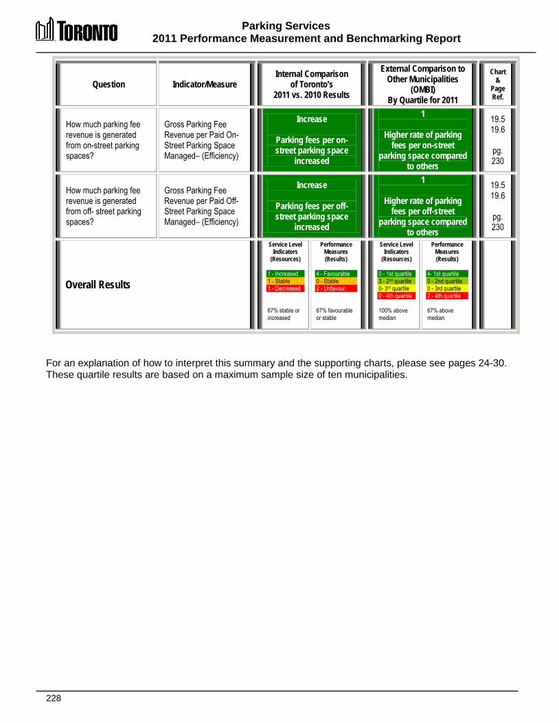
Parking Services 2011 Performance Measurement and Benchmarking Report
228
Question Indicator/Measure Internal Comparison
of Toronto’s 2011 vs. 2010 Results
External Comparison to Other Municipalities
(OMBI) By Quartile for 2011
Chart &
Page Ref.
How much parking fee revenue is generated from on-street parking spaces?
Gross Parking Fee Revenue per Paid On-Street Parking Space Managed– (Efficiency)
Increase
Parking fees per on-street parking space
increased
1
Higher rate of parking fees per on-street
parking space compared to others
19.5 19.6
pg. 230
How much parking fee revenue is generated from off- street parking spaces?
Gross Parking Fee Revenue per Paid Off-Street Parking Space Managed– (Efficiency)
Increase
Parking fees per off-street parking space
increased
1
Higher rate of parking fees per off-street
parking space compared to others
19.5 19.6
pg. 230
Overall Results
Service Level Indicators
(Resources) 1 - Increased 1 - Stable 1 - Decreased 67% stable or increased
Performance Measures (Results)
4 - Favourable 0 - Stable 2 - Unfavour. 67% favourable or stable
Service Level Indicators
(Resources)
0 - 1st quartile 3 - 2nd quartile 0- 3rd quartile 0 - 4th quartile 100% above median
Performance Measures (Results)
4- 1st quartile 0 - 2nd quartile 0 - 3rd quartile 2 - 4th quartile 67% above median
For an explanation of how to interpret this summary and the supporting charts, please see pages 24-30. These quartile results are based on a maximum sample size of ten municipalities.

Parking Services 2011 Performance Measurement and Benchmarking Report
229
2005 2006 2007 2008 2009 2010 2011 total spaces 38,826 39,218 39,617 39,790 40,298 42,694 42,892 on-street spaces 18,836 18,839 18,605 18,583 18,622 18,833 18,655 off-street spaces 19,990 20,379 21,012 21,207 21,676 23,861 24,237 total spaces / 100k pop'n 1,439 1,450 1,451 1,453 1,462 1,540 1,537 on-street spaces / 100k pop'n 698 697 681 679 676 679 669 off-street spaces / 100k pop'n 741 754 770 774 787 861 869
0
300
600
900
1200
1500
1800
T-Bay Wind Bar Tor Ham Calg Sud Lond Winn Ott Total 2,895 2,108 1,602 1,537 1,342 1,331 1,250 819 789 728 Off-Street 1,833 1,414 936 869 839 746 945 391 249 304 On-Street 1,062 693 666 669 504 586 304 429 540 425
0
500
1,000
1,500
2,000
2,500
3,000
3,500
Median total spaces / 100k pop'n 1,337
Spac
es / 1
00,00
0 po
p'n
How many paid parking spaces does Toronto have? Chart 19.1 (City of Toronto) Number of Paid Parking Spaces Managed per 100,000 Population (Service Level) How does the number of paid parking spaces in Toronto compare to other municipalities? Chart 19.2 (OMBI 2011) Number of Paid Parking Spaces Managed per 100,000 Population (Service Level)
Chart 19.1 provides Toronto's total number and rate per 100,000 population of on-street parking (parking machines and meters) and off-street parking spaces (parking garages and surface lots). In 2011, the supply of on-street parking spaces decreases, while off-street parking spaces increased. Chart 19.2 compares Toronto's 2011 results to other municipalities for the number of paid parking spaces managed per 100,000 population. In terms of having the highest number of parking spaces, Toronto ranks: • fourth of ten (second
quartile) for total spaces; • third of ten (second quartile)
for on-street spaces; and • fifth of ten (second quartile)
for off-street spaces.
Toronto’s high population density and the availability of public transit, which translates to less car use (especially in the downtown core), contribute to these rankings.
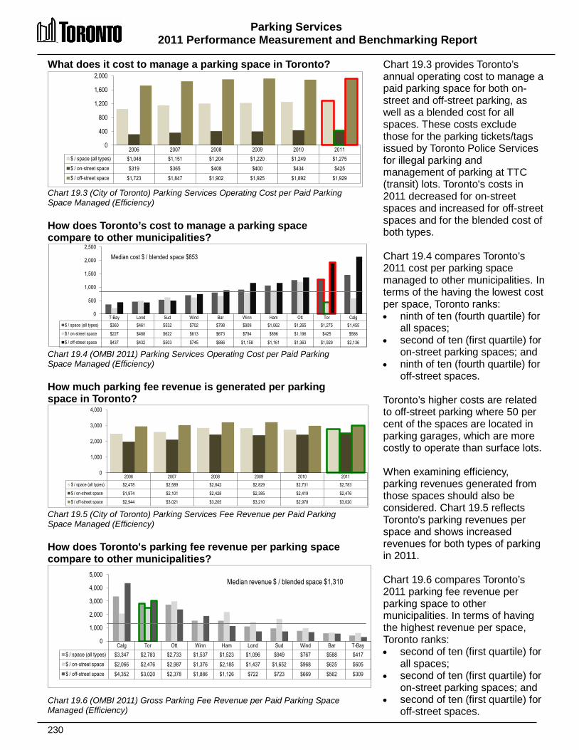
Parking Services 2011 Performance Measurement and Benchmarking Report
230
What does it cost to manage a parking space in Toronto? Chart 19.3 (City of Toronto) Parking Services Operating Cost per Paid Parking Space Managed (Efficiency) How does Toronto’s cost to manage a parking space compare to other municipalities? Chart 19.4 (OMBI 2011) Parking Services Operating Cost per Paid Parking Space Managed (Efficiency) How much parking fee revenue is generated per parking space in Toronto? Chart 19.5 (City of Toronto) Parking Services Fee Revenue per Paid Parking Space Managed (Efficiency) How does Toronto's parking fee revenue per parking space compare to other municipalities?
Chart 19.6 (OMBI 2011) Gross Parking Fee Revenue per Paid Parking Space Managed (Efficiency)
Chart 19.3 provides Toronto’s annual operating cost to manage a paid parking space for both on-street and off-street parking, as well as a blended cost for all spaces. These costs exclude those for the parking tickets/tags issued by Toronto Police Services for illegal parking and management of parking at TTC (transit) lots. Toronto's costs in 2011 decreased for on-street spaces and increased for off-street spaces and for the blended cost of both types. Chart 19.4 compares Toronto’s 2011 cost per parking space managed to other municipalities. In terms of the having the lowest cost per space, Toronto ranks: • ninth of ten (fourth quartile) for
all spaces; • second of ten (first quartile) for
on-street parking spaces; and • ninth of ten (fourth quartile) for
off-street spaces. Toronto’s higher costs are related to off-street parking where 50 per cent of the spaces are located in parking garages, which are more costly to operate than surface lots. When examining efficiency, parking revenues generated from those spaces should also be considered. Chart 19.5 reflects Toronto's parking revenues per space and shows increased revenues for both types of parking in 2011. Chart 19.6 compares Toronto’s 2011 parking fee revenue per parking space to other municipalities. In terms of having the highest revenue per space, Toronto ranks: • second of ten (first quartile) for
all spaces; • second of ten (first quartile) for
on-street parking spaces; and • second of ten (first quartile) for
off-street spaces.
2006 2007 2008 2009 2010 2011 $ / space (all types) $1,048 $1,151 $1,204 $1,220 $1,249 $1,275 $ / on-street space $319 $365 $408 $400 $434 $425 $ / off-street space $1,723 $1,847 $1,902 $1,925 $1,892 $1,929
0
400
800
1,200
1,600
2,000
T-Bay Lond Sud Wind Bar Winn Ham Ott Tor Calg $ / space (all types) $360 $461 $532 $702 $798 $909 $1,062 $1,265 $1,275 $1,455
$ / on-street space $227 $488 $622 $613 $673 $794 $896 $1,196 $425 $586
$ / off-street space $437 $432 $503 $745 $886 $1,158 $1,161 $1,363 $1,929 $2,136
0
500
1,000
1,500
2,000
2,500
Median cost $ / blended space $853
Calg Tor Ott Winn Ham Lond Sud Wind Bar T-Bay $ / space (all types) $3,347 $2,783 $2,733 $1,537 $1,523 $1,096 $949 $767 $588 $417 $ / on-street space $2,066 $2,476 $2,987 $1,376 $2,185 $1,437 $1,652 $968 $625 $605 $ / off-street space $4,352 $3,020 $2,378 $1,886 $1,126 $722 $723 $669 $562 $309
0
1,000
2,000
3,000
4,000
5,000 Median revenue $ / blended space $1,310
2006 2007 2008 2009 2010 2011 $ / space (all types) $2,478 $2,589 $2,842 $2,829 $2,731 $2,783
$ / on-street space $1,974 $2,101 $2,428 $2,385 $2,419 $2,476
$ / off-street space $2,944 $3,021 $3,205 $3,210 $2,978 $3,020
0
1,000
2,000
3,000
4,000
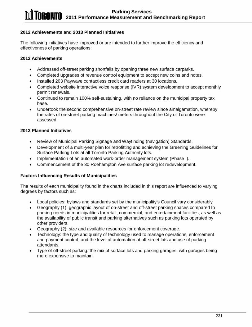
Parking Services 2011 Performance Measurement and Benchmarking Report
231
2012 Achievements and 2013 Planned Initiatives The following initiatives have improved or are intended to further improve the efficiency and effectiveness of parking operations: 2012 Achievements
• Addressed off-street parking shortfalls by opening three new surface carparks. • Completed upgrades of revenue control equipment to accept new coins and notes. • Installed 203 Paywave contactless credit card readers at 30 locations. • Completed website interactive voice response (IVR) system development to accept monthly
permit renewals. • Continued to remain 100% self-sustaining, with no reliance on the municipal property tax
base. • Undertook the second comprehensive on-street rate review since amalgamation, whereby
the rates of on-street parking machines/ meters throughout the City of Toronto were assessed.
2013 Planned Initiatives
• Review of Municipal Parking Signage and Wayfinding (navigation) Standards. • Development of a multi-year plan for retrofitting and achieving the Greening Guidelines for
Surface Parking Lots at all Toronto Parking Authority lots. • Implementation of an automated work-order management system (Phase I). • Commencement of the 30 Roehampton Ave surface parking lot redevelopment.
Factors Influencing Results of Municipalities The results of each municipality found in the charts included in this report are influenced to varying degrees by factors such as:
• Local policies: bylaws and standards set by the municipality’s Council vary considerably. • Geography (1): geographic layout of on-street and off-street parking spaces compared to
parking needs in municipalities for retail, commercial, and entertainment facilities, as well as the availability of public transit and parking alternatives such as parking lots operated by other providers.
• Geography (2): size and available resources for enforcement coverage. • Technology: the type and quality of technology used to manage operations, enforcement
and payment control, and the level of automation at off-street lots and use of parking attendants.
• Type of off-street parking: the mix of surface lots and parking garages, with garages being more expensive to maintain.

232
PPaarrkkss SSeerrvviicceess Parks Services include the provision of parkland for residents and visitors of all ages to enjoy nature and green, open space. Ravines, naturalized areas, watercourses and woodlots are maintained and managed by the Parks and Urban Forestry branches of the Parks, Forestry and Recreation Division (including many on behalf of the Toronto Regional Conservation Authority). There are parkettes, as well as neighbourhood, regional, destination parks that attract citizens from across the Greater Toronto Area. Many of the parks include amenities such as benches, drinking fountains, grassy areas, flower and shrub beds, trails and pathways and trees for the passive enjoyment of everyone. Other features can include greenhouses, conservatories, formal gardens, allotment gardens, animal displays and butterfly habitat. Active pursuits including baseball, cricket, football, soccer, jogging and walking are available in many of the larger parks. Outdoor swimming and skating are provided in every district of the City. There are many resident demands for permits for sport fields, diamonds and stadiums, and parkland for organized play, special events for community celebrations and wedding photographs. Waste reduction and diversion, waterfront development, restoration and naturalization are all examples of initiatives that factor into the costs of providing parks services in Toronto. Toronto provides a wide range of park maintenance activities, which reflect the diverse character of its Parks Services. These activities include grass, athletic field, pathway, park washroom, playground and winter amenity maintenance. For the purposes of this section, the costs of golf courses, ski hills marinas and the provision and maintenance of street trees (trees on the road allowance) are not included in order to be more comparable with results from other municipalities.
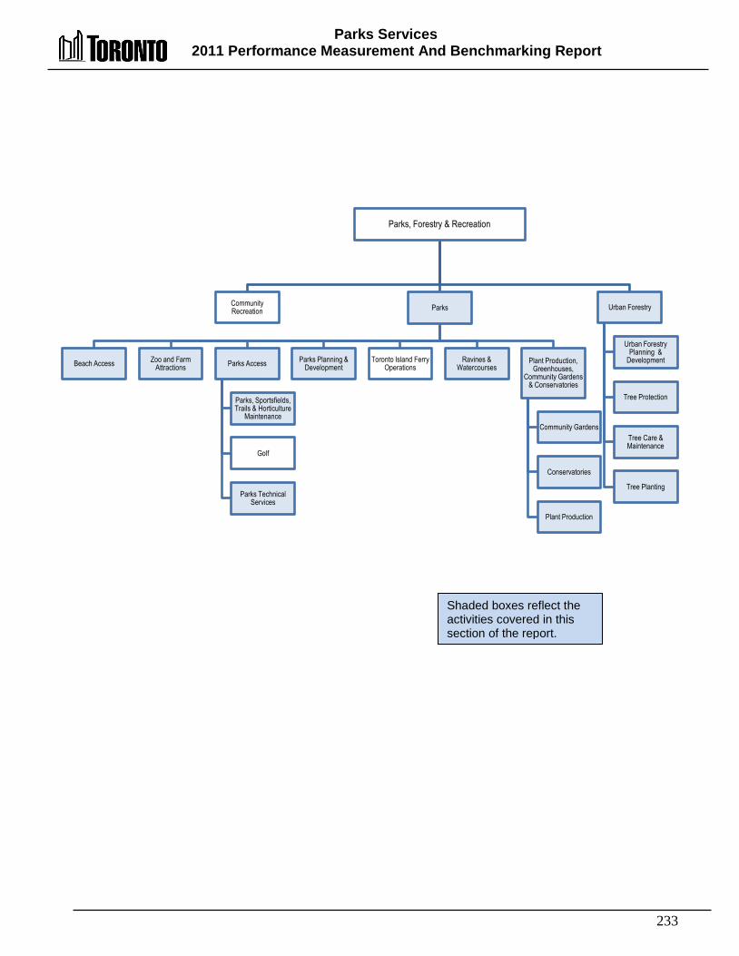
Parks Services 2011 Performance Measurement And Benchmarking Report
233
Parks, Forestry & Recreation
Community Recreation Parks
Beach Access Zoo and Farm Attractions Parks Access
Parks, Sportsfields, Trails & Horticulture
Maintenance
Golf
Parks Technical Services
Parks Planning & Development
Toronto Island Ferry Operations
Ravines & Watercourses
Plant Production, Greenhouses,
Community Gardens & Conservatories
Community Gardens
Conservatories
Plant Production
Urban Forestry
Urban Forestry Planning &
Development
Tree Protection
Tree Care & Maintenance
Tree Planting
Shaded boxes reflect the activities covered in this section of the report.
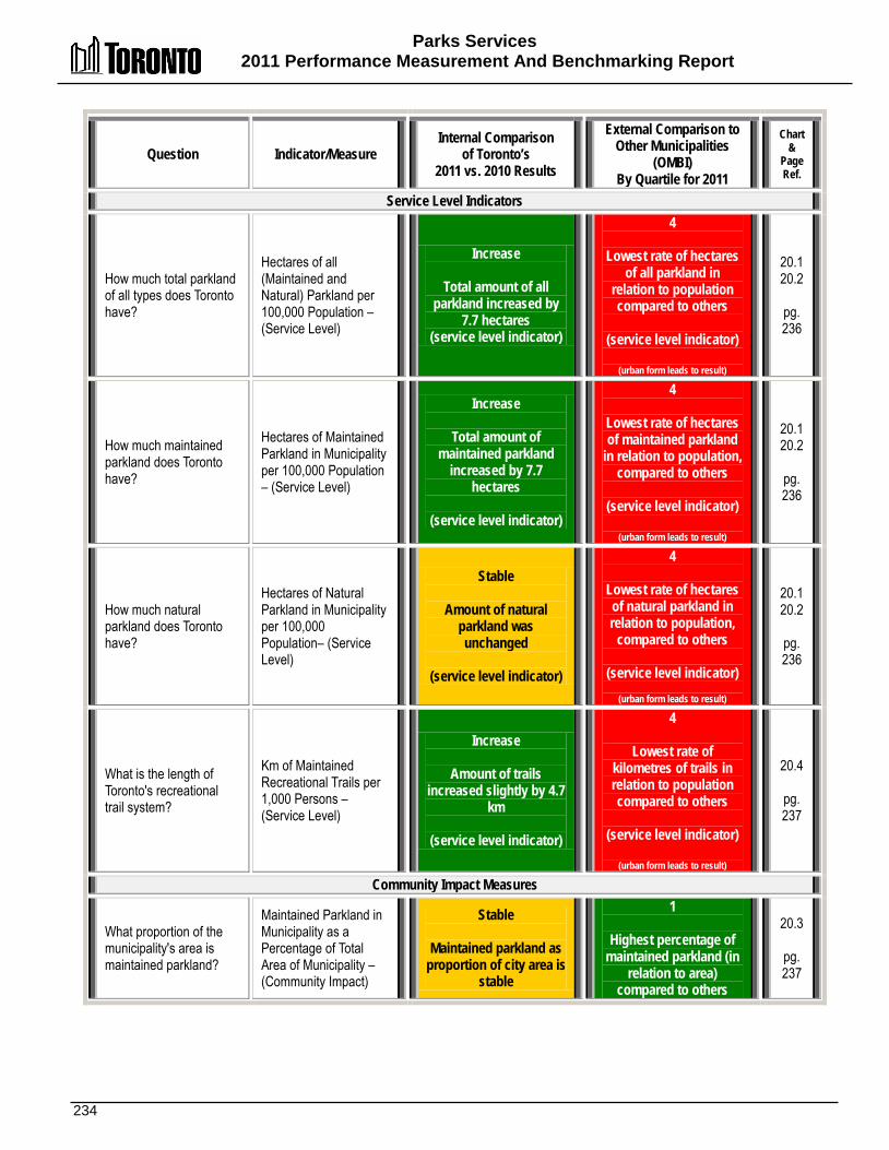
Parks Services 2011 Performance Measurement And Benchmarking Report
234
Question Indicator/Measure Internal Comparison
of Toronto’s 2011 vs. 2010 Results
External Comparison to Other Municipalities
(OMBI) By Quartile for 2011
Chart &
Page Ref.
Service Level Indicators
How much total parkland of all types does Toronto have?
Hectares of all (Maintained and Natural) Parkland per 100,000 Population – (Service Level)
Increase
Total amount of all parkland increased by
7.7 hectares (service level indicator)
4
Lowest rate of hectares of all parkland in
relation to population compared to others
(service level indicator)
(urban form leads to result)
20.1 20.2
pg. 236
How much maintained parkland does Toronto have?
Hectares of Maintained Parkland in Municipality per 100,000 Population – (Service Level)
Increase
Total amount of maintained parkland
increased by 7.7 hectares
(service level indicator)
4
Lowest rate of hectares of maintained parkland
in relation to population, compared to others
(service level indicator)
(urban form leads to result)
20.1 20.2
pg. 236
How much natural parkland does Toronto have?
Hectares of Natural Parkland in Municipality per 100,000 Population– (Service Level)
Stable
Amount of natural parkland was unchanged
(service level indicator)
4
Lowest rate of hectares of natural parkland in relation to population,
compared to others
(service level indicator)
(urban form leads to result)
20.1 20.2
pg. 236
What is the length of Toronto's recreational trail system?
Km of Maintained Recreational Trails per 1,000 Persons – (Service Level)
Increase
Amount of trails increased slightly by 4.7
km
(service level indicator)
4
Lowest rate of kilometres of trails in relation to population compared to others
(service level indicator)
(urban form leads to result)
20.4
pg. 237
Community Impact Measures
What proportion of the municipality's area is maintained parkland?
Maintained Parkland in Municipality as a Percentage of Total Area of Municipality – (Community Impact)
Stable
Maintained parkland as proportion of city area is
stable
1
Highest percentage of maintained parkland (in
relation to area) compared to others
20.3
pg. 237
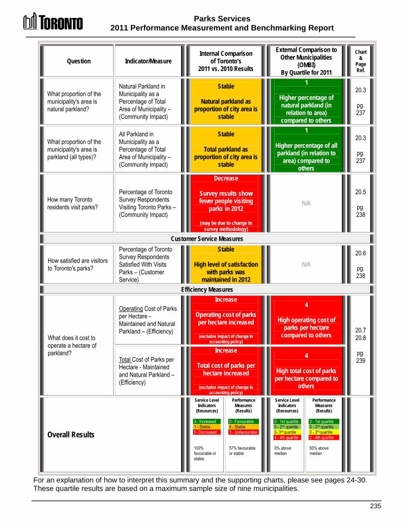
Parks Services 2011 Performance Measurement and Benchmarking Report
235
Question Indicator/Measure Internal Comparison
of Toronto’s 2011 vs. 2010 Results
External Comparison to Other Municipalities
(OMBI) By Quartile for 2011
Chart &
Page Ref.
What proportion of the municipality's area is natural parkland?
Natural Parkland in Municipality as a Percentage of Total Area of Municipality – (Community Impact)
Stable
Natural parkland as proportion of city area is
stable
1
Higher percentage of natural parkland (in
relation to area) compared to others
20.3
pg. 237
What proportion of the municipality's area is parkland (all types)?
All Parkland in Municipality as a Percentage of Total Area of Municipality – (Community Impact)
Stable
Total parkland as proportion of city area is
stable
1
Higher percentage of all parkland (in relation to
area) compared to others
20.3
pg. 237
How many Toronto residents visit parks?
Percentage of Toronto Survey Respondents Visiting Toronto Parks – (Community Impact)
Decrease
Survey results show fewer people visiting
parks in 2012
(may be due to change in survey methodology)
N/A 20.5
pg. 238
Customer Service Measures
How satisfied are visitors to Toronto's parks?
Percentage of Toronto Survey Respondents Satisfied With Visits Parks – (Customer Service)
Stable
High level of satisfaction with parks was
maintained in 2012
N/A 20.6
pg. 238
Efficiency Measures
What does it cost to operate a hectare of parkland?
Operating Cost of Parks per Hectare - Maintained and Natural Parkland – (Efficiency)
Increase
Operating cost of parks per hectare increased
(excludes impact of change in
accounting policy)
4
High operating cost of parks per hectare
compared to others 20.7 20.8
pg. 239 Total Cost of Parks per
Hectare - Maintained and Natural Parkland – (Efficiency)
Increase
Total cost of parks per hectare increased
(excludes impact of change in
accounting policy)
4
High total cost of parks per hectare compared to
others
Overall Results
Service Level Indicators
(Resources) 3 - Increased 1 - Stable 0- Decreased 100% favourable or stable
Performance Measures (Results)
0 - Favourable. 4 - Stable 3 - Unfavourable 57% favourable or stable
Service Level Indicators
(Resources)
0 - 1st quartile 0 - 2nd quartile 0- 3rd quartile 4 - 4th quartile 0% above median
Performance Measures (Results)
3 - 1st quartile 0 - 2nd quartile 0 - 3rd quartile 2 - 4th quartile 60% above median
For an explanation of how to interpret this summary and the supporting charts, please see pages 24-30. These quartile results are based on a maximum sample size of nine municipalities.

Parks Services 2011 Performance Measurement And Benchmarking Report
236
How much parkland is there in Toronto? Chart 20.1 (City of Toronto) Natural and Maintained Parkland per 100,000 Population (Service Level) How do the hectares of parkland in Toronto compare to other municipalities? Chart 20.2 (OMBI 2011) Hectares of Parkland per 100,000 Population and Population Density (Service Level)
The number of hectares of parkland in a municipality is one way of examining service levels. Parkland includes: • Maintained parkland (such
as sports fields, recreational trails, picnic areas, and playgrounds); and
• Natural parkland (such as ravines, watercourses, and woodlots), which is an integral component of a municipality's green space.
Parks can vary in size and can include a variety of features such as sports fields, baseball diamonds, flower and shrub beds, fountains, playgrounds, woodlots, paved areas and benches. Chart 20.1 provides the total hectares of parkland in Toronto as well as the components of maintained and natural parkland, expressed on a per 100,000 population basis. The area of parkland in Toronto has remained fairly stable over this period and is reflective of Toronto’s fully developed urban form. The additional 7.7 hectares of maintained parkland in 2011 related to expanding the size of some existing parks.
Chart 20.2 compares Toronto's 2011 results to other municipalities for the hectares of parkland per 100,000 population, which are reflected as bars relative to the left axis. In terms of having the highest amount of parkland, Toronto ranks: • Ninth of nine (fourth quartile) for maintained parkland; • Ninth of nine (fourth quartile) for natural parkland; and • Ninth of nine (fourth quartile) for all parkland. Population density (population per square kilometre) is plotted as a line graph relative to the right axis in Chart 20.2 and is a significant factor in these results. Toronto is more densely populated than other OMBI municipalities. In the developed urban core area of municipalities, it is more difficult to establish new parks in terms of both the availability and land costs. Information on the amount of green space and tree canopy cover in each of Toronto's 140 neighbourhoods can be found at Wellbeing Toronto.
2003 2004 2005 2006 2007 2008 2009 2010 2011 Total Hectares 8,010 8,010 8,035 8,035 8,042 8,045 8,047 8,058 8,066 Total Parkland per 100k pop'n 302.7 299.7 297.8 297.1 294.6 293.8 292.0 290.6 289.1 Natural Parkland per 100k pop'n 139.3 137.9 136.6 136.3 135 134.6 133.8 132.9 132.1 Maintained parkland per 100k pop'n 163.4 161.8 161.2 160.8 159.6 159.2 158.3 157.7 157.0
0
50
100
150
200
250
300
Sud T-Bay Bar Lond Ham Wind Winn Ott Tor
Natural parkland 1,562 1,602 705 396 167 203 154 153 132 Maintained parkland 859 278 254 275 322 251 288 238 157 Total parkland 2,421 1,880 959 671 489 454 442 391 289 Population density 44 330 1,400 865 471 1,436 1,446 332 4,401
0 500 1,000 1,500 2,000 2,500 3,000 3,500 4,000 4,500 5,000
0
500
1,000
1,500
2,000
2,500
3,000 po
p'n / s
q. km
. (de
nsity
)
hecta
res o
f par
kland
/ 10
0,000
pop'n
Median total parkland 489 hectares

Parks Services 2011 Performance Measurement and Benchmarking Report
237
How does the proportion of the Toronto’s geographic area that is parkland compare to other municipalities? Chart 20.3 (OMBI 2011) Hectares of Parkland as a percentage of Municipal Geographic Area (Community Impact) How do the kilometres of recreational trails in Toronto compare to other municipalities? Chart 20.4 (OMBI 2011) Kilometres of Recreation Trails per 1,000 Population (Service Level) & Population Density
While the previous charts relate the amount of parkland to population they do not consider urban form. It is also important to examine what proportion of a municipality’s total geographic area is parkland, which provides some indication of the public’s proximity to, and the availability of, parkland for active and passive use. From an environmental perspective parkland helps control air pollution, returns oxygen to the atmosphere, helps cool the city (shade), controls stormwater runoff, provides habitat for wildlife, and aids biodiversity. Chart 20.3 compares Toronto's 2011 results to other municipalities for the hectares of parkland expressed as a percentage of total geographic area. Toronto's 2011 percentages were unchanged from 2010. In terms of having the highest proportion of parkland relative to geographic area, Toronto ranks: • First of nine (first quartile) for
maintained parkland; • Second of nine (first quartile)
for natural parkland; and • Second of nine (first quartile)
for all parkland.
The urban and rural mix of municipalities and geographic features such as lakes and rocky areas can influence these results The length of trail systems in municipalities is another service level indicator. Chart 20.4 shows 2011 information for Toronto and other municipalities on the number of kilometres of all maintained recreational trails per 1,000 population, which are plotted as columns relative to the left axis. These trails have signage and are mapped, and they can be either owned or leased by the municipality. They support a range of non-motorized recreational uses such as walking, hiking, bicycling and riding/equestrian as well as motorized uses such as snowmobiling. The measure excludes the length of bicycle lanes on streets. Toronto ties with Hamilton and ranks ninth of nine (fourth quartile) with the smallest length of trails per 1,000 persons. The primary factor behind this ranking is Toronto’s densely populated urban form, which makes it more difficult to establish new trails. Population density (persons per square kilometre) in each municipality is plotted as a line graph relative to the left axis and shows Toronto’s density is much higher than other municipalities. Toronto's trail system in 2011 amounted to a total length of 248.8 km, an increase of 4.7 km over 2010.
Bar Tor Wind Winn T-Bay Lond Ham Ott Sud Total parkland % 13.0% 12.7% 6.5% 6.4% 6.2% 5.8% 2.3% 1.3% 1.1% Natural parkland % 9.6% 5.8% 2.9% 2.2% 5.3% 3.4% 0.8% 0.5% 0.7% Maintained parkland % 3.4% 6.9% 3.6% 4.2% 0.9% 2.4% 1.5% 0.8% 0.4%
0%
3%
6%
9%
12%
15%
Median total parkland 6.2%
Sud Lond Wind T-Bay Winn Bar Ott Ham Tor Km of trails per 1,000 pop'n 1.05 0.55 0.5 0.48 0.39 0.36 0.25 0.09 0.09 Population Density 44 865 1,436 330 1,446 1,400 332 471 4,401
0
500
1,000
1,500
2,000
2,500
3,000
3,500
4,000
4,500
5,000
0.0
0.2
0.4
0.6
0.8
1.0
1.2
pop'n
/ sq.
km (d
ensit
y)
km. o
f trail
s /
1,000
pop'n
Median 0.39 km
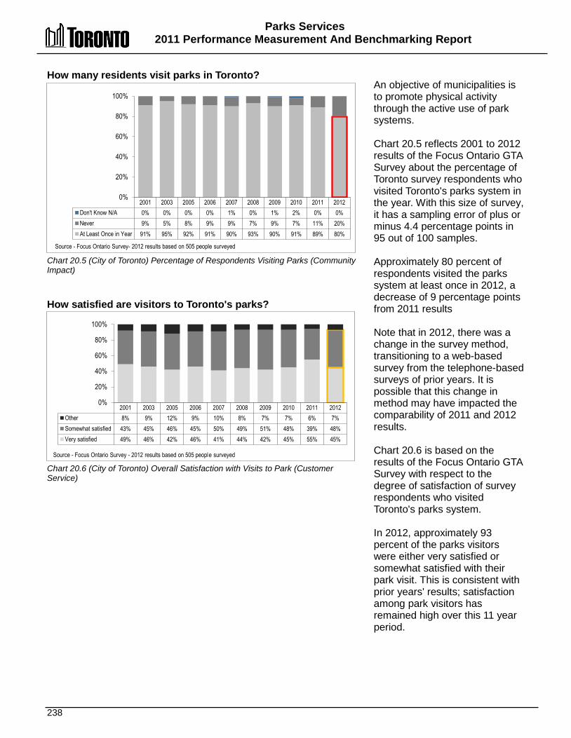
Parks Services 2011 Performance Measurement And Benchmarking Report
238
2001 2003 2005 2006 2007 2008 2009 2010 2011 2012 Don't Know N/A 0% 0% 0% 0% 1% 0% 1% 2% 0% 0% Never 9% 5% 8% 9% 9% 7% 9% 7% 11% 20% At Least Once in Year 91% 95% 92% 91% 90% 93% 90% 91% 89% 80%
0%
20%
40%
60%
80%
100%
Source - Focus Ontario Survey- 2012 results based on 505 people surveyed
2001 2003 2005 2006 2007 2008 2009 2010 2011 2012 Other 8% 9% 12% 9% 10% 8% 7% 7% 6% 7% Somewhat satisfied 43% 45% 46% 45% 50% 49% 51% 48% 39% 48% Very satisfied 49% 46% 42% 46% 41% 44% 42% 45% 55% 45%
0%
20%
40%
60%
80%
100%
Source - Focus Ontario Survey - 2012 results based on 505 people surveyed
How many residents visit parks in Toronto? Chart 20.5 (City of Toronto) Percentage of Respondents Visiting Parks (Community Impact) How satisfied are visitors to Toronto's parks? Chart 20.6 (City of Toronto) Overall Satisfaction with Visits to Park (Customer Service)
An objective of municipalities is to promote physical activity through the active use of park systems. Chart 20.5 reflects 2001 to 2012 results of the Focus Ontario GTA Survey about the percentage of Toronto survey respondents who visited Toronto's parks system in the year. With this size of survey, it has a sampling error of plus or minus 4.4 percentage points in 95 out of 100 samples. Approximately 80 percent of respondents visited the parks system at least once in 2012, a decrease of 9 percentage points from 2011 results Note that in 2012, there was a change in the survey method, transitioning to a web-based survey from the telephone-based surveys of prior years. It is possible that this change in method may have impacted the comparability of 2011 and 2012 results. Chart 20.6 is based on the results of the Focus Ontario GTA Survey with respect to the degree of satisfaction of survey respondents who visited Toronto's parks system. In 2012, approximately 93 percent of the parks visitors were either very satisfied or somewhat satisfied with their park visit. This is consistent with prior years' results; satisfaction among park visitors has remained high over this 11 year period.
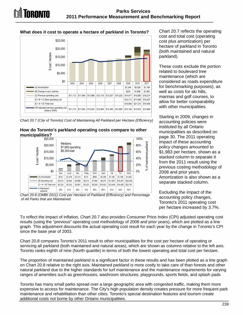
Parks Services 2011 Performance Measurement and Benchmarking Report
239
2003 2004 2005 2006 2007 2008 2009 2010 2011 (A) Amortization $1,244 $3,526 $1,199 (B) Change in acct. policies $235 $1,996 $1,983 (C) Previous operating cost $11,712 $11,846 $13,989 $12,718 $13,357 $14,220 $14,477 $15,690 $16,274 (D = B + C) New operating cost
$14,712 $17,686 $18,257
(E = A + D) Total cost
$15,956 $21,212 $19,456 CPI-adjusted previous operating cost
(base yr 2003) $11,712 $11,654 $13,504 $12,084 $12,450 $12,950 $13,126 $13,872 $13,969
$0
$5,000
$10,000
$15,000
$20,000
$25,000
$ cos
t / he
ctare
Sud Lond Bar T-Bay Winn Ham Ott Tor Wind (A) Amortization $310 $1,479 $1,213 $110 $690 $2,346 $1,185 $1,199 $1,853 (B) Operating cost $2,014 $3,844 $4,668 $5,213 $7,665 $8,275 $11,861 $18,257 $20,308 (C = A + B) Total cost $2,324 $5,323 $5,881 $5,323 $8,355 $10,621 $13,046 $19,456 $22,161 % Maintained
parkland 35% 41% 26% 15% 65% 66% 61% 54% 55%
0%
20%
40%
60%
80%
100%
$0
$5,000
$10,000
$15,000
$20,000
$25,000
$ cos
t / he
ctare
% of
main
taine
d par
kland
Medians: $7,665 operating $8,355 total
What does it cost to operate a hectare of parkland in Toronto? Chart 20.7 (City of Toronto) Cost of Maintaining All Parkland per Hectare (Efficiency) How do Toronto’s parkland operating costs compare to other municipalities? Chart 20.8 (OMBI 2011) Cost per Hectare of Parkland (Efficiency) and Percentage of All Parks that are Maintained
Chart 20.7 reflects the operating cost and total cost (operating cost plus amortization) per hectare of parkland in Toronto (both maintained and natural parkland). These costs exclude the portion related to boulevard tree maintenance (which are considered as roads expenditure for benchmarking purposes), as well as costs for ski hills, marinas and golf courses, to allow for better comparability with other municipalities. Starting in 2009, changes in accounting policies were instituted by all Ontario municipalities as described on page 30. The 2011 operating impact of these accounting policy changes amounted to $1,983 per hectare, shown as a stacked column to separate it from the 2011 result using the previous costing methodology of 2008 and prior years. Amortization is also shown as a separate stacked column. Excluding the impact of the accounting policy changes, Toronto's 2011 operating cost per hectare increased by 3.7%.
To reflect the impact of inflation, Chart 20.7 also provides Consumer Price Index (CPI) adjusted operating cost results (using the "previous" operating cost methodology of 2008 and prior years), which are plotted as a line graph. This adjustment discounts the actual operating cost result for each year by the change in Toronto’s CPI since the base year of 2003. Chart 20.8 compares Toronto's 2011 result to other municipalities for the cost per hectare of operating or servicing all parkland (both maintained and natural areas), which are shown as columns relative to the left axis. Toronto ranks eighth of nine (fourth quartile) in terms of both the lowest operating and total cost per hectare. The proportion of maintained parkland is a significant factor in these results and has been plotted as a line graph on Chart 20.8 relative to the right axis. Maintained parkland is more costly to take care of than forests and other natural parkland due to the higher standards for turf maintenance and the maintenance requirements for varying ranges of amenities such as greenhouses, washroom structures, playgrounds, sports fields, and splash pads Toronto has many small parks spread over a large geographic area with congested traffic, making them more expensive to access for maintenance. The City's high population density creates pressure for more frequent park maintenance and rehabilitation than other cities. Toronto's special destination features and tourism create additional costs not borne by other Ontario municipalities.
Parks Services 2011 Performance Measurement And Benchmarking Report
240
2012 Achievements and 2013 Planned Initiatives The following initiatives have improved or will help to further improve the effectiveness of Toronto’s parks services: 2012 Initiatives Completed/Achievements • Refined and began implementation of improved standards for Sports Field Maintenance. • Reviewed Golf Course operations with Auditor General. • Continued to work on the State of Good Repair Backlog for Parks Forestry & Recreation
infrastructure. • Evaluated animal operations, efficiencies and governance models (e.g., Riverdale Farm, High Park
Zoo and Far Enough Farm). • Proceeded with Emerald Ash Borer success management plan to minimize impact on Toronto's
Urban Forest Canopy. • Opened two Waterfront Parks (Don River Park, Port Union Park – Phase 2). 2013 Initiatives Planned • Present Parks Plan to Committee/Council in Spring 2013. • Establish a Ferry Replacement Reserve Fund. • Implement Sports Field Turf Management Strategy. • Maintain Urban Forestry Service Plan. • Integrate PFR Sign Shop with Transportation Services. • Continue with Regent Park Redevelopment. Factors Influencing the Results of Municipalities The results of each municipality can be influenced to varying degrees by factors such as: • Service delivery: differences in service standards established by municipal councils (e.g., types of
amenities maintained, frequency of grass cutting). • Geographic location: varying topography affects the mix of natural and maintained hectares of
parkland in each municipality as well as the number of parks and size of average park. • Environmental factors: soil composition, weather patterns, etc. • Population density: higher densities may mean more intense usage and require different types of
maintenance strategies (e.g., irrigation, artificial turf, sport field and pathway lighting). More intense use of natural parkland can also necessitate more maintenance.
• Changing demographics and community use: increased demand for large social gatherings and various other sports.

241

242
PPaayyrroollll SSeerrvviicceess
The objective of Payroll Services is to ensure that employees are paid accurately and on time with the correct withholding and deduction amounts and to remit those withholdings and deductions within specified timeframes.
Pension Payroll & Employee Benefits
Payroll
Payroll Admistration
3rd Party Payroll Payments and
Compliance
Payroll Management Reporting
Employee & Retiree Benefit and OMERS
Pension Compensation
Employee Benefit & OMERS Pension Administration
3rd Party Payroll Payments and
Compliance
Benefit & OMERS Pension Management
Reporting
Non- OMERS Pension Plans
City Sponsored Pension Administration
Pension Deduction & 3rd Party Compliance
Pension Reporting
Shaded boxes reflect the activities covered in this section of the report.

Payroll Services 2011 Performance Measurement and Benchmarking Report
243
Question Indicator/Measure Internal Comparison
of Toronto’s 2011 vs. 2010 Results
External Comparison to Other Municipalities
(OMBI) By Quartile for 2011
Chart &
Page Ref.
Customer Service Measures
How often do manual payroll payments have to be issued?
Number of Off-Cycle Manual Payments per Payroll FTE – (Customer Service)
Stable
Number of manual payments is low and
stable
2
Lower rate of manual payments compared to
others
21.1 21.2 pg
244
% of all Payroll Payments that are Manual Payments –(Customer Service)
Stable
Percentage of manual payments is low and
stable
N/A 21.1
pg.244
Efficiency Measures
What does it cost to process a payroll cheque or direct deposit?
Operating Cost per Payroll Direct Deposit and Cheque – (Efficiency)
Decrease
Cost per cheque/deposit decreased
3
Higher cost per cheque/deposit
compared to others
21.3 21.4
pg
245
How many cheques or direct deposits are processed by each payroll employee?
Number of Payroll Direct Deposits and Cheques per Payroll FTE – (Efficiency)
Stable
Number of cheques/deposits per
FTE is stable
2
Higher number of cheques/deposits per
FTE compared to others
21.5 21.6 pg. 245
Overall Results
Service Level Indicators
(Resources)
N/A
Performance Measures (Results)
1 - Favourable 3 - Stable 0 - Unfavour. 100% favourable or stable
Service Level Indicators
(Resources)
N/A
Performance Measures (Results)
0 - 1st quartile 2 - 2nd quartile 1 - 3rd quartile 0 - 4th quartile 67% above median
For an explanation of how to interpret this summary and the supporting charts, please see pages 24-30. These quartile results are based on a maximum sample size of 15 municipalities.
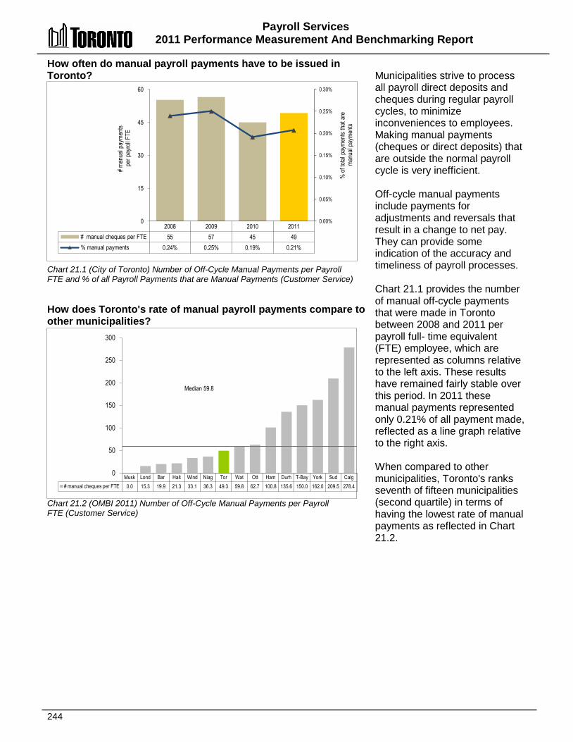
Payroll Services 2011 Performance Measurement And Benchmarking Report
244
2008 2009 2010 2011 # manual cheques per FTE 55 57 45 49 % manual payments 0.24% 0.25% 0.19% 0.21%
0.00%
0.05%
0.10%
0.15%
0.20%
0.25%
0.30%
0
15
30
45
60
% of
total
pay
ments
that
are
man
ual p
ayme
nts
# man
ual p
ayme
nts
per p
ayro
ll FTE
How often do manual payroll payments have to be issued in Toronto? Chart 21.1 (City of Toronto) Number of Off-Cycle Manual Payments per Payroll FTE and % of all Payroll Payments that are Manual Payments (Customer Service) How does Toronto's rate of manual payroll payments compare to other municipalities? Chart 21.2 (OMBI 2011) Number of Off-Cycle Manual Payments per Payroll FTE (Customer Service)
Municipalities strive to process all payroll direct deposits and cheques during regular payroll cycles, to minimize inconveniences to employees. Making manual payments (cheques or direct deposits) that are outside the normal payroll cycle is very inefficient. Off-cycle manual payments include payments for adjustments and reversals that result in a change to net pay. They can provide some indication of the accuracy and timeliness of payroll processes. Chart 21.1 provides the number of manual off-cycle payments that were made in Toronto between 2008 and 2011 per payroll full- time equivalent (FTE) employee, which are represented as columns relative to the left axis. These results have remained fairly stable over this period. In 2011 these manual payments represented only 0.21% of all payment made, reflected as a line graph relative to the right axis. When compared to other municipalities, Toronto's ranks seventh of fifteen municipalities (second quartile) in terms of having the lowest rate of manual payments as reflected in Chart 21.2.
Musk Lond Bar Halt Wind Niag Tor Wat Ott Ham Durh T-Bay York Sud Calg # manual cheques per FTE 0.0 15.3 19.9 21.3 33.1 36.3 49.3 59.8 62.7 100.8 135.6 150.0 162.0 209.5 278.4
0
50
100
150
200
250
300
Median 59.8
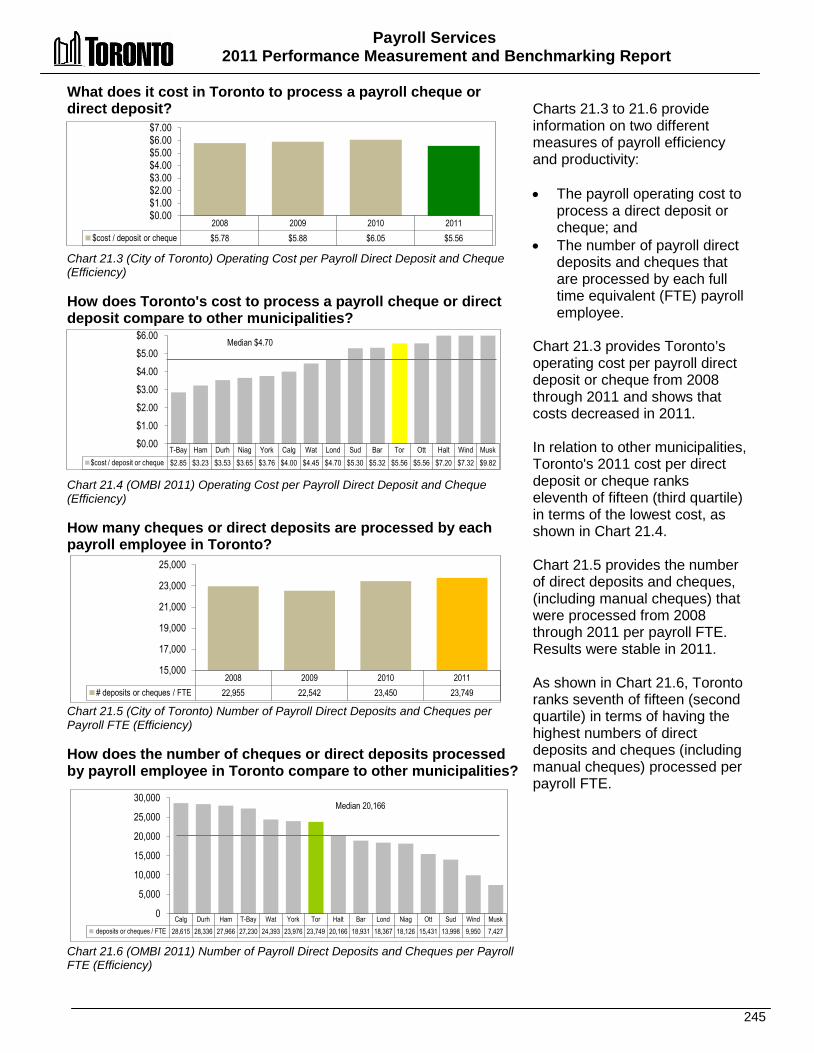
Payroll Services 2011 Performance Measurement and Benchmarking Report
245
What does it cost in Toronto to process a payroll cheque or direct deposit? Chart 21.3 (City of Toronto) Operating Cost per Payroll Direct Deposit and Cheque (Efficiency) How does Toronto's cost to process a payroll cheque or direct deposit compare to other municipalities? Chart 21.4 (OMBI 2011) Operating Cost per Payroll Direct Deposit and Cheque (Efficiency) How many cheques or direct deposits are processed by each payroll employee in Toronto? Chart 21.5 (City of Toronto) Number of Payroll Direct Deposits and Cheques per Payroll FTE (Efficiency) How does the number of cheques or direct deposits processed by payroll employee in Toronto compare to other municipalities? Chart 21.6 (OMBI 2011) Number of Payroll Direct Deposits and Cheques per Payroll FTE (Efficiency)
Charts 21.3 to 21.6 provide information on two different measures of payroll efficiency and productivity: • The payroll operating cost to
process a direct deposit or cheque; and
• The number of payroll direct deposits and cheques that are processed by each full time equivalent (FTE) payroll employee.
Chart 21.3 provides Toronto’s operating cost per payroll direct deposit or cheque from 2008 through 2011 and shows that costs decreased in 2011. In relation to other municipalities, Toronto's 2011 cost per direct deposit or cheque ranks eleventh of fifteen (third quartile) in terms of the lowest cost, as shown in Chart 21.4. Chart 21.5 provides the number of direct deposits and cheques, (including manual cheques) that were processed from 2008 through 2011 per payroll FTE. Results were stable in 2011. As shown in Chart 21.6, Toronto ranks seventh of fifteen (second quartile) in terms of having the highest numbers of direct deposits and cheques (including manual cheques) processed per payroll FTE.
T-Bay Ham Durh Niag York Calg Wat Lond Sud Bar Tor Ott Halt Wind Musk $cost / deposit or cheque $2.85 $3.23 $3.53 $3.65 $3.76 $4.00 $4.45 $4.70 $5.30 $5.32 $5.56 $5.56 $7.20 $7.32 $9.82
$0.00 $1.00 $2.00 $3.00 $4.00 $5.00 $6.00
Median $4.70
2008 2009 2010 2011 $cost / deposit or cheque $5.78 $5.88 $6.05 $5.56
$0.00 $1.00 $2.00 $3.00 $4.00 $5.00 $6.00 $7.00
2008 2009 2010 2011 # deposits or cheques / FTE 22,955 22,542 23,450 23,749
15,000
17,000
19,000
21,000
23,000
25,000
Calg Durh Ham T-Bay Wat York Tor Halt Bar Lond Niag Ott Sud Wind Musk deposits or cheques / FTE 28,615 28,336 27,966 27,230 24,393 23,976 23,749 20,166 18,931 18,367 18,126 15,431 13,998 9,950 7,427
0
5,000
10,000
15,000
20,000
25,000
30,000 Median 20,166
Payroll Services 2011 Performance Measurement and Benchmarking Report
246
2012 Achievements and 2013 Planned Initiatives The following initiatives have improved or are expected to further improve the efficiency and effectiveness of the Payroll, Pension and Employee Benefits Division: 2012 Initiatives Completed/Achievements Payroll: • Implemented electronic pay advices and T4s using Employee Self Serve (ESS) for non-
union employees and Elected Officials. • Resolved the Employer Compliance Audit through settlement with the Canada Revenue
Agency (CRA), where the CRA agreed to waive the 2008 and 2009 tax years. Completed the Employee Reimbursement Program for the 2010 tax year reassessments.
• Calculated, reported and presented all monetary costs and savings during negotiations with TCEU Local 416 and CUPE Local 79.
• Implemented all provisions of the new collective agreements for TCEU Local 416 and CUPE Local 79
Employee Benefits: • Negotiated changes to the Benefits Plans resulting in approximately $6 million in savings to
the active benefit plans and over $50 million in reduction to post-retirement liabilities. • Implemented changes to Illness & Injury Plans and salaries. • Developed, reported and received approval to change the benefit plans for non-union
employees, accountability officers and members of council, resulting in a savings of $1 million.
2013 Initiatives Planned • Provide a dedicated team to begin work on the implementation of technical and business
process transformation changes to modernize the delivery of payroll services through Employee Self Service/Manager Self Service and roll-out to unionized employees.
• Implement critical state of good repair upgrades to SAP, through the replacement of the existing custom time entry program with SAP standard Cross Application Time Sheet (CATS) system, to ensure the ongoing sustainable and accountable payroll operations.
• Provide a dedicated team to begin implementation of an enterprise-wide scheduling and attendance solution to allow for integration with SAP; to be rolled out to Parks, Forestry & Recreation (PF&R) and Emergency Medical Services (EMS).
• Implement changes arising from the program/service efficiency review of Pension, Payroll and Employee Benefits programs and services.
Payroll Services 2011 Performance Measurement and Benchmarking Report
247
Factors Influencing the Results of Municipalities The results of each municipality included in this report can be influenced to varying degrees by factors such as: • Organizational form: centralized versus de-centralized nature of time and data entry. Costs
related to time and data entry have been excluded for comparability. Any costs associated with benefits administration and employee master data maintenance/administration have been excluded from these results and included in those of Human Resources for benchmarking purposes.
• Policy and practices: provision of this service in-house vs. contracted and differences in payroll structure and responsibilities.
• Processes: differences in the number of pay periods (e.g., weekly versus bi-weekly, requirements for multiple pay schedules for various groups within the organization).
• Staffing mix: salary vs. hourly rate and/or part-time vs. full time employees and the associated level of support required.
• Number of union contracts: the number of unions, contract settlements resulting in retroactive payments, complexity of the collective bargaining agreement terms and corporate policies may be a factor in the creation of replacement cheques and demand for service.

248
City Planning
Development Review, Decision & Implementation
Committee of Adjustment
Community Planning
Heritage Review
Civic & Community
Improvements
Heritage Inventory & Incentives
Community Improvements
City Building & Policy
Development
Plans
Policy, Strategies & Guidelines
Surveys, Monitoring & Forecasting
Waterfront Renewal
PPllaannnniinngg SSeerrvviicceess In Toronto, the City Planning Division helps to guide the way the city looks and grows. City Planning works with the community and other City divisions to set goals and policies for development, while keeping important social, economic and environmental concerns in mind. Planning involves: • Community Planning – offers advice to Council on development
projects after consulting with members of the public and City Divisions, and after reviewing and analyzing all parts of a development project.
• Policy and Research – develops planning policy based on extensive research on land use, housing, community services and the environment. Also administers and promotes heritage preservation projects and programs.
• Urban Design – promotes high quality design for Toronto's streets, parks and open spaces. It guides how buildings are located, organized and shaped on a particular piece of land.
• Transportation Planning – deals with transit improvements, discouraging automobile dependence and encouraging alternative forms of transportation such as walking, cycling and transit.
• Zoning Bylaw and Environmental Planning – creates and maintains a comprehensive zoning bylaw for the City, and formulates and implements environmental policy from the perspective of City Planning.

Planning Services 2011 Performance Measurement and Benchmarking Report
249
Question Indicator/Measure Internal Comparison
of Toronto’s 2011 vs. 2010 Results
External Comparison to Other Municipalities
(OMBI) By Quartile for 2011
Chart &
Page Ref.
Service / Activity Level Indicators
How much is spent on planning services?
Operating Cost of Planning Services per Capita (Service Level indicator)
Decrease
Spending for Planning per capita decreased
(service level indicator)
3
Low rate of planning spending per capita compared to others
(service level indicator)
22.1 22.2
pg. 250
How many development applications are received?
Number of Development Applications Received per 100,000 Population - (Activity Level indicator)
Increase
Number of development applications received
increased
(activity level indicator)
3
Low rate of development applications received compared to others
(activity level indicator)
Reflects Toronto's fully developed urban form
22.3 22.4
pg. 251
How many community meetings are planning staff organizing?
Number of Non-Statutory Civic Engagement Community Meetings Organized by City Planning Staff – (Activity Level)
Increased
Number of meetings organized increased
(activity level indicator)
N/A
22.5
pg. 252
Efficiency Measures
How much does it cost in Toronto to process a development application?
Development Planning Applications Operating Cost per Development Application Received – (Efficiency)
Decrease
Cost per application processed decreased
2
Cost per application at median compared to
others
(scale, scope and complexity of applications is a factor)
22.6 22.7
pg. 252
Overall Results
Service/ Activity Level
Indicators (Resources)
2 – Increase 0 - Stable 1 - Decrease 75% stable or increased
Performance Measures (Results)
1 - Favourable 0 - Stable 0 - Unfavour. 100% favourable or stable
Service/ Activity Level
Indicators (Resources)
0 - 1st quartile 0 - 2nd quartile 2 - 3rd quartile 0 - 4th quartile 0% above median
Performance Measures (Results)
0 - 1st quartile 1 - 2nd quartile 0 - 3rd quartile 0 - 4th quartile 100% at or above median
For an explanation of how to interpret this summary and the supporting charts, please see pages 24-30. These quartile results are based on a maximum sample size of 15 municipalities.
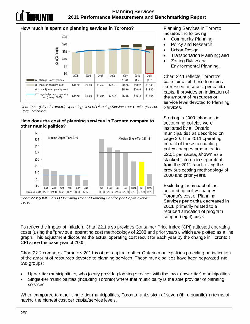
Planning Services 2011 Performance Measurement and Benchmarking Report
250
Halt Musk Wat York Durh Niag Ott T-Bay Sud Bar Wind Tor Ham Cost $ / capita $12.65 $11.44 $8.21 $8.11 $8.00 $4.64 $35.60 $29.06 $27.44 $25.19 $18.61 $18.49 $8.76
$0
$5
$10
$15
$20
$25
$30
$35
$40 Median Upper-Tier $8.16 Median Single-Tier $25.19
How much is spent on planning services in Toronto? Chart 22.1 (City of Toronto) Operating Cost of Planning Services per Capita (Service Level Indicator) How does the cost of planning services in Toronto compare to other municipalities? Chart 22.2 (OMBI 2011) Operating Cost of Planning Service per Capita (Service Level)
Planning Services in Toronto includes the following: • Community Planning; • Policy and Research; • Urban Design; • Transportation Planning; and • Zoning Bylaw and
Environmental Planning. Chart 22.1 reflects Toronto's costs for all of these functions expressed on a cost per capita basis. It provides an indication of the amount of resources or service level devoted to Planning Services. Starting in 2009, changes in accounting policies were instituted by all Ontario municipalities as described on page 30. The 2011 operating impact of these accounting policy changes amounted to $2.01 per capita, shown as a stacked column to separate it from the 2011 result using the previous costing methodology of 2008 and prior years. Excluding the impact of the accounting policy changes, Toronto's cost of Planning Services per capita decreased in 2011, primarily related to a reduced allocation of program support (legal) costs.
To reflect the impact of inflation, Chart 22.1 also provides Consumer Price Index (CPI) adjusted operating costs (using the "previous" operating cost methodology of 2008 and prior years), which are plotted as a line graph. This adjustment discounts the actual operating cost result for each year by the change in Toronto’s CPI since the base year of 2005. Chart 22.2 compares Toronto's 2011 cost per capita to other Ontario municipalities providing an indication of the amount of resources devoted to planning services. These municipalities have been separated into two groups: • Upper-tier municipalities, who jointly provide planning services with the local (lower-tier) municipalities. • Single-tier municipalities (including Toronto) where that municipality is the sole provider of planning
services. When compared to other single-tier municipalities, Toronto ranks sixth of seven (third quartile) in terms of having the highest cost per capita/service levels.
2005 2006 2007 2008 2009 2010 2011 (A) Change in acct. policies $1.43 $1.98 $2.01 (B) Previous operating cost $14.50 $15.94 $16.52 $17.23 $18.16 $18.07 $16.48 (C = A + B) New operating cost $19.59 $20.05 $18.49 CPI-adjusted previous operating
cost (base yr 2005) $14.50 $15.69 $15.95 $16.26 $17.06 $16.55 $14.65
$0
$5
$10
$15
$20
$25
Cost(
$) / c
apita
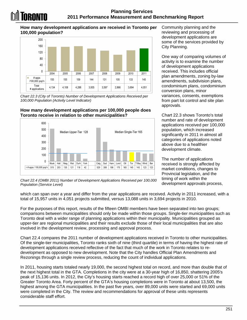
Planning Services 2011 Performance Measurement and Benchmarking Report
251
Musk Halt Niag Wat Durh York Calg Sud Ham Lond Ott Tor T-Bay Wind Bar # apps / 100,000 pop'n 515 203 135 121 118 42 529 308 188 170 165 145 143 123 123
0
100
200
300
400
500
600
Median Upper-Tier 128 Median Single-Tier 165
How many development applications are received in Toronto per 100,000 population? Chart 22.3 (City of Toronto) Number of Development Applications Received per 100,000 Population (Activity Level Indicator) How many development applications per 100,000 people does Toronto receive in relation to other municipalities? Chart 22.4 (OMBI 2011) Number of Development Applications Received per 100,000 Population (Service Level)
Community planning and the reviewing and processing of development applications are some of the services provided by City Planning. One way of comparing volumes of activity is to examine the number of development applications received. This includes official plan amendments, zoning by-law amendments, subdivision plans, condominium plans, condominium conversion plans, minor variances, consents, exemptions from part lot control and site plan approvals. Chart 22.3 shows Toronto's total number and rate of development applications received per 100,000 population, which increased significantly in 2011 in almost all categories of applications noted above due to a healthier development climate. The number of applications received is strongly affected by market conditions, changes to Provincial legislation, and the timing of work within the development approvals process,
which can span over a year and differ from the year applications are received. Activity in 2011 increased, with a total of 15,957 units in 4,051 projects submitted, versus 13,088 units in 3,694 projects in 2010. For the purposes of this report, results of the fifteen OMBI members have been separated into two groups; comparisons between municipalities should only be made within those groups. Single-tier municipalities such as Toronto deal with a wider range of planning applications within their municipality. Municipalities grouped as upper-tier are regional municipalities and their results exclude those of their local municipalities that are also involved in the development review, processing and approval process. Chart 22.4 compares the 2011 number of development applications received in Toronto to other municipalities. Of the single-tier municipalities, Toronto ranks sixth of nine (third quartile) in terms of having the highest rate of development applications received reflective of the fact that much of the work in Toronto relates to re-development as opposed to new development. Note that the City handles Official Plan Amendments and Rezonings through a single review process, reducing the count of individual applications. In 2011, housing starts totaled nearly 19,000, the second highest total on record, and more than double that of the next highest total in the GTA. Completions in the city were at a 30-year high of 16,850, shattering 2005's peak of 15,136 units. In 2012, the City’s housing starts reached a record high of over 25,000 or 51% of the Greater Toronto Area. Forty percent of the GTA’s housing completions were in Toronto at about 13,500, the highest among the GTA municipalities. In the past five years, over 89,000 units were started and 69,000 units were completed in the City. The review and recommendations for approval of these units represents considerable staff effort.
2004 2005 2006 2007 2008 2009 2010 2011 # apps
/100,000 pop'n 155 155 159 144 131 105 133 145
Total # applications 4,134 4,108 4,288 3,935 3,597 2,866 3,694 4,051
0
40
80
120
160
200
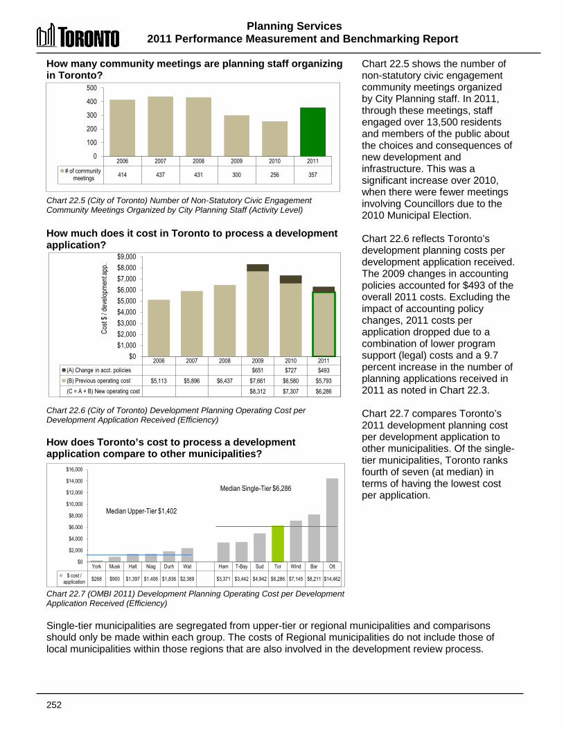
Planning Services 2011 Performance Measurement and Benchmarking Report
252
York Musk Halt Niag Durh Wat Ham T-Bay Sud Tor Wind Bar Ott $ cost /
application $268 $900 $1,397 $1,406 $1,836 $2,389 $3,371 $3,442 $4,942 $6,286 $7,145 $8,211 $14,462
$0
$2,000
$4,000
$6,000
$8,000
$10,000
$12,000
$14,000
$16,000
Median Upper-Tier $1,402
Median Single-Tier $6,286
How many community meetings are planning staff organizing in Toronto? Chart 22.5 (City of Toronto) Number of Non-Statutory Civic Engagement Community Meetings Organized by City Planning Staff (Activity Level) How much does it cost in Toronto to process a development application? Chart 22.6 (City of Toronto) Development Planning Operating Cost per Development Application Received (Efficiency) How does Toronto’s cost to process a development application compare to other municipalities? Chart 22.7 (OMBI 2011) Development Planning Operating Cost per Development Application Received (Efficiency)
Chart 22.5 shows the number of non-statutory civic engagement community meetings organized by City Planning staff. In 2011, through these meetings, staff engaged over 13,500 residents and members of the public about the choices and consequences of new development and infrastructure. This was a significant increase over 2010, when there were fewer meetings involving Councillors due to the 2010 Municipal Election. Chart 22.6 reflects Toronto’s development planning costs per development application received. The 2009 changes in accounting policies accounted for $493 of the overall 2011 costs. Excluding the impact of accounting policy changes, 2011 costs per application dropped due to a combination of lower program support (legal) costs and a 9.7 percent increase in the number of planning applications received in 2011 as noted in Chart 22.3. Chart 22.7 compares Toronto’s 2011 development planning cost per development application to other municipalities. Of the single-tier municipalities, Toronto ranks fourth of seven (at median) in terms of having the lowest cost per application.
Single-tier municipalities are segregated from upper-tier or regional municipalities and comparisons should only be made within each group. The costs of Regional municipalities do not include those of local municipalities within those regions that are also involved in the development review process.
2006 2007 2008 2009 2010 2011 (A) Change in acct. policies $651 $727 $493 (B) Previous operating cost $5,113 $5,896 $6,437 $7,661 $6,580 $5,793 (C = A + B) New operating cost $8,312 $7,307 $6,286
$0 $1,000 $2,000 $3,000 $4,000 $5,000 $6,000 $7,000 $8,000 $9,000
Cost
$ / d
evelo
pmen
t app
.
2006 2007 2008 2009 2010 2011 # of community
meetings 414 437 431 300 256 357
0
100
200
300
400
500
Planning Services 2011 Performance Measurement and Benchmarking Report
253
The measure of cost per development application, discussed on the previous page, does not take into consideration the scale, scope and complexity of development applications. Many of Toronto’s applications are for re-development projects, which tend to be complex, requiring additional staff time and costs to ensure the applications meet all requirements. Another limitation of this measure is that it relates application intake to costs in that calendar year, but the actual work to process the applications may continue long after the year of application intake. Those applications may require costs required for area studies, policy development, urban design and community outreach. Consequently, the pace of application submission can vary significantly from one year to the next, leading to dramatic changes in the result for this measure, but not necessarily reflecting Planning’s workload. A three- or five-year moving average would provide a more relevant perspective. 2012 Achievements and 2013 Planned Initiatives The following initiatives have improved or are intended to further improve the efficiency and effectiveness of Toronto’s Planning Services: 2012 Achievements • Adopted a new city-wide Site Plan Control By-law replacing the existing site plan by-laws of
the six former municipalities. • Implemented new Development Review Fees to move towards full cost recovery in
accordance with the City's recently adopted User Fee Policy. The new fees reflect the full costs for all City Programs involved in the processing of development applications.
• Improved business practices including a new Draft Plan of Condominium Approval process to streamline review steps and reduce timelines.
• Continued to enhance public access to planning process information through the Program's on-line Application Information Centre including implementing first phase of electronic service delivery by accepting digital/electronic (CD/DVD) submission of applications.
• Completed Stage 1 of the Official Plan and Municipal Comprehensive Reviews, and initiation of Stage 2 including consultation on draft Heritage policies and Employment Areas policies.
• Engaged over 13,500 members of the public about the choices and consequences of new development, area studies and environmental assessments in Toronto, including over 350 neighbourhood workshops and community consultations.
• Case management of planning approvals of large projects including: Concord Adex –Sheppard Avenue East, East Bayfront Bayside development, Don Mills Centre, Humber River Regional Hospital, Alexandra Park redevelopment and Toronto York Spadina Subway Extension.
• Conducted area-based policy studies and Secondary Plans, Avenue Studies, community liaison and input into city-wide policy studies including: Port Lands Accelerative Initiative, Lawrence Allen Secondary Plan, Kingston Road Revitalization Study implementation Plan, Highland Creek Village Area Study and Downsview Secondary Plan Review.
• Reviewed applications for alterations to Heritage Buildings for a growing inventory, including major heritage applications: e.g. Casey House Hospice, University of Toronto Faculty of Law, Deer Park United Church, John Street Roundhouse, Old City Hall and Massey Hall.
• Undertook heritage work as part of related-planning studies for Yonge Street, Mimico 20/20, Eglinton Avenue and University of Toronto Master Plan.
Planning Services 2011 Performance Measurement and Benchmarking Report
254
• Completed 2012 Annual Employment Survey, and analyzed and published 2011 Employment Survey, and Living in the Downtown and Centres Survey.
• Engaged in transportation planning and analysis in support of numerous transportation and transit projects, including: Downtown Rapid Transit Expansion Study, PATH Master Plan Transportation Tomorrow Survey, Union Station - Pedestrian Modeling, Travel Demand Forecasting, and Markham By-pass Morningside Avenue Connection – Environmental Assessment addendum.
• Undertook/developed key Urban Design initiatives, including: Scarborough Centre Public Space and Streetscape Master Plan, Etobicoke Centre Streetscape Pan, Avenues and Mid- Rise Buildings Study Review and Humber River Regional Hospital Campus Master Plan.
2013 Planned Initiatives • Continue to process development applications that contribute to the health, growth and tax
base of the City. Major applications include Pan Am Games Sports Centres (aquatic and track), TCHC Lawrence Heights Development, Humber River Regional Hospital & Forensic Centre, Downsview Park Implementation, Danforth Triangle and Pan Am Games Athletes' Village, Mimico 20/20 etc.
• Develop, implement and/or support key corporate priorities, including: o Transportation Initiatives o Federal Park Designation for Rouge Park o Pan Am Games
• Implement legislative changes under the Planning Act, Ontario Heritage Act and the City of Toronto Act.
• Respond to emerging policy changes, such as provincial policy statements, etc. • Finalize the Zoning By-law Project. • Continue the Official Plan Review (Planning Act). • Continue the Municipal Comprehensive Review (Growth Plan). • Undertake significant transportation and transit initiatives including: Travel Demand
Forecasting, Air-Rail Link, Downtown Transportation Operations Study, Waterfront Transit, Eglinton-Scarborough Crosstown Planning Study in support of the Eglinton- Scarborough Crosstown LRT implementation, and support implementation of Toronto York Spadina Subway Extension, etc.
• Undertake major revitalization initiatives/ studies including: Queen's Quay Revitalization, Port Lands Acceleration Initiative, Etobicoke Centre Build Toronto sites, Weston Station Local Area Study, Mt. Dennis Mobility Hub, Humber Bay Shores Precinct Plan and Scadding Court, etc.
• Undertake significant growth studies including: Bathurst Street Study, Agincourt Secondary Plan Review, McCowan Precinct Plan, University of Toronto Master Plan, Highland Creek Village Implementation, Dufferin Street/401 'Avenue' Study, etc.
• Respond to increasing demand for local area studies, including heritage conservation districts
• Deliver policy innovation and alignment to facilitate city building • Support community engagement in and access to the planning of the City; e.g. enhanced
web capabilities, etc. • Offer the 2013 Biennial Toronto Urban Design Awards.
Planning Services 2011 Performance Measurement and Benchmarking Report
255
Factors Influencing Results of Municipalities The results of each municipality found in the charts included in this report are influenced to varying degrees by factors such as: • Application variables: type, mix, and complexity (in terms of scope and magnitude) of
applications received. • Government form: level of municipal governance (i.e., single-tier vs. upper- or two-tier) will
impact the review process. Some applications may require dual review while other applications may only require single-tier review as upper-tier governments do not process some types of applications.
• Organizational structure: differences among the municipalities can affect the process of reviewing applications by departments outside of planning (e.g., infrastructure).
• Public consultation: cost to process a given application can be affected by Council’s decisions regarding the opportunities for public participation in the planning process.
• Growth management: activities impact workloads and costs of service.
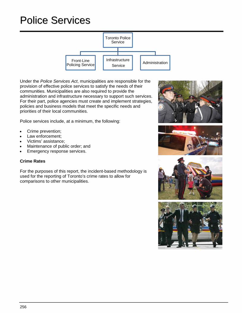
256
Toronto Police Service
Front-Line Policing Service
Infrastructure Service
Administration
PPoolliiccee SSeerrvviicceess Under the Police Services Act, municipalities are responsible for the provision of effective police services to satisfy the needs of their communities. Municipalities are also required to provide the administration and infrastructure necessary to support such services. For their part, police agencies must create and implement strategies, policies and business models that meet the specific needs and priorities of their local communities. Police services include, at a minimum, the following: • Crime prevention; • Law enforcement; • Victims’ assistance; • Maintenance of public order; and • Emergency response services. Crime Rates For the purposes of this report, the incident-based methodology is used for the reporting of Toronto’s crime rates to allow for comparisons to other municipalities.
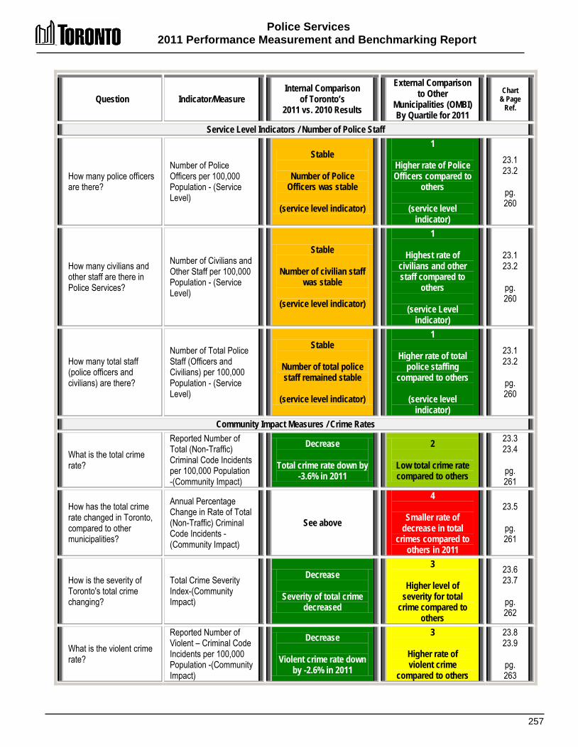
Police Services 2011 Performance Measurement and Benchmarking Report
257
Question Indicator/Measure Internal Comparison
of Toronto’s 2011 vs. 2010 Results
External Comparison to Other
Municipalities (OMBI) By Quartile for 2011
Chart & Page
Ref.
Service Level Indicators / Number of Police Staff
How many police officers are there?
Number of Police Officers per 100,000 Population - (Service Level)
Stable
Number of Police Officers was stable
(service level indicator)
1
Higher rate of Police Officers compared to
others
(service level indicator)
23.1 23.2
pg. 260
How many civilians and other staff are there in Police Services?
Number of Civilians and Other Staff per 100,000 Population - (Service Level)
Stable
Number of civilian staff was stable
(service level indicator)
1
Highest rate of civilians and other staff compared to
others
(service Level indicator)
23.1 23.2
pg. 260
How many total staff (police officers and civilians) are there?
Number of Total Police Staff (Officers and Civilians) per 100,000 Population - (Service Level)
Stable
Number of total police staff remained stable
(service level indicator)
1
Higher rate of total police staffing
compared to others
(service level indicator)
23.1 23.2
pg. 260
Community Impact Measures / Crime Rates
What is the total crime rate?
Reported Number of Total (Non-Traffic) Criminal Code Incidents per 100,000 Population -(Community Impact)
Decrease
Total crime rate down by -3.6% in 2011
2
Low total crime rate compared to others
23.3 23.4
pg. 261
How has the total crime rate changed in Toronto, compared to other municipalities?
Annual Percentage Change in Rate of Total (Non-Traffic) Criminal Code Incidents -(Community Impact)
See above
4
Smaller rate of decrease in total
crimes compared to others in 2011
23.5
pg. 261
How is the severity of Toronto's total crime changing?
Total Crime Severity Index-(Community Impact)
Decrease
Severity of total crime decreased
3
Higher level of severity for total
crime compared to others
23.6 23.7
pg. 262
What is the violent crime rate?
Reported Number of Violent – Criminal Code Incidents per 100,000 Population -(Community Impact)
Decrease
Violent crime rate down by -2.6% in 2011
3
Higher rate of violent crime
compared to others
23.8 23.9
pg. 263
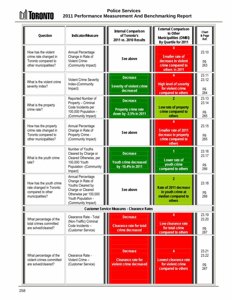
Police Services 2011 Performance Measurement And Benchmarking Report
258
Question Indicator/Measure Internal Comparison
of Toronto’s 2011 vs. 2010 Results
External Comparison to Other
Municipalities (OMBI) By Quartile for 2011
Chart & Page
Ref.
How has the violent crime rate changed in Toronto compared to other municipalities?
Annual Percentage Change in Rate of Violent Crime-(Community Impact)
See above
4
Smaller rate of decrease in violent crime compared to
others in 2011
23.10
pg. 263
What is the violent crime severity index?
Violent Crime Severity Index-(Community Impact)
Decrease
Severity of violent crime decreased
4
High level of severity for violent crime
compared to others
23.11 23.12
pg. 264
What is the property crime rate?
Reported Number of Property – Criminal Code Incidents per 100,000 Population -(Community Impact)
Decrease
Property crime rate down by -3.5% in 2011
2
Low rate of property crime compared to
others
23.13 23.14
pg. 265
How has the property crime rate changed in Toronto compared to other municipalities?
Annual Percentage Change in Rate of Property Crime -(Community Impact)
See above
4
Smaller rate of 2011 decrease in property crime compared to
others
23.15
pg. 265
What is the youth crime rate?
Number of Youths Cleared by Charge or Cleared Otherwise, per 100,000 Youth Population -(Community Impact)
Decrease
Youth crime decreased by -10.4% in 2011
1
Lower rate of youth crime
compared to others
23.16 23.17
pg. 266
How has the youth crime rate changed in Toronto compared to other municipalities?
Annual Percentage Change in Rate of Youths Cleared by Charge or Cleared Otherwise per 100,000 Youth Population -(Community Impact)
See above
2
Rate of 2011 decrease in youth crime at
median compared to others
23.18
pg. 266
Customer Service Measures - Clearance Rates
What percentage of the total crimes committed are solved/cleared?
Clearance Rate - Total (Non-Traffic) Criminal Code Incidents – (Customer Service)
Decrease
Clearance rate for total crime decreased
4
Low clearance rate for total crime
compared to others
23.19 23.20
pg. 267
What percentage of the violent crimes committed are solved/cleared?
Clearance Rate - Violent Crime – (Customer Service)
Decrease
Clearance rate for violent crime decreased
4
Lowest clearance rate for violent crime
compared to others
23.21 23.22
pg. 267

Police Services 2011 Performance Measurement and Benchmarking Report
259
Question Indicator/Measure Internal Comparison
of Toronto’s 2011 vs. 2010 Results
External Comparison to Other
Municipalities (OMBI) By Quartile for 2011
Chart & Page
Ref.
Efficiency Measures
What is the workload of Criminal Code incidents for each police officer?
Number of Criminal Code Incidents (Non-Traffic) per Police Officer – (Efficiency)
Decrease
Number of Criminal Code incidents/
workload per officer decreased
4
Lower rate of Criminal Code incidents/
workload per officer compared to others
23.23 23.24
pg. 268
Overall Results
Service Level Indicators
(Resources) 0 - Increased 3 - Stable 0 - Decreased 100% stable or increased
Performance Measures (Results)
6- Favourable 0- Stable 3 -Unfavour. 67% favourable or stable
Service Level Indicators
(Resources)
3 - 1st quartile 0 - 2nd quartile 0 - 3rd quartile 0 - 4th quartile 100% above median
Performance Measures (Results)
1- 1st quartile 3 - 2nd quartile 2- 3rd quartile 7- 4th quartile 29% above median
For an explanation of how to interpret this summary and the supporting charts, please see pages 24-30. These quartile results are based on a maximum sample size of 14 municipalities.

Police Services 2011 Performance Measurement And Benchmarking Report
260
2002 2003 2004 2005 2006 2007 2008 2009 2010 2011 Total Police Staff 7,268 7,299 7,314 7,373 7,580 7,713 7,730 7,830 7,877 7,888 All Police Staff / 100K pop'n 277.6 276.1 273.9 273.4 278.2 282.5 282.3 284.1 284.1 282.7 Civilians / 100K pop'n 77.3 77.3 77.3 77.0 76.3 81.0 81.4 82.0 81.8 81.7 Officers / 100K pop'n 200.3 198.8 196.7 196.4 201.9 201.5 200.9 202.1 202.3 201.0
0
50
100
150
200
250
300
How many police staff are there in Toronto? Chart 23.1 (City of Toronto) Police Staffing per 100,000 Population (Service Level) How do Toronto’s police staffing levels compare to other municipalities? Chart 23.2 (OMBI 2011) Police Staffing Levels per 100,000 Population & Population Density (Service Level)
The primary method of comparing service levels for police services within a municipality over time and between municipalities is to examine the number of staff.
Chart 23.1 provides Toronto's total number of staff and the rate of officers, civilians and all police staff per 100,000 population. Over the longer term the number of officers has been increasing for initiatives such as anti-gang, provincial courts, and safer communities.
In 2011, there was a slight increase in total police staff, but that rate of increase was below the growth rate of the population leading to a slight decline in numbers on a per capita basis.
Chart 23.2 compares Toronto’s 2011 budgeted number of police officers and civilian staff per 100,000 persons to other municipalities, plotted as columns relative to the left axis. Population density has also been plotted as a line graph relative to the right axis.
In terms of having the highest police staffing levels, Toronto ranks: • Second of thirteen (first quartile) for total police staff; • Second of thirteen (first quartile) for officers; and • First of thirteen (first quartile) for civilians and other staff.
Toronto's high staffing levels are attributed to it being an international city requiring specialized services and elevated levels that may not be available or necessary in other municipalities. Examples include the Emergency Task Force, Public Order Unit, Emergency Measures, intelligence units targeting terrorist groups, providing security for visiting dignitaries, targeting hate crime, Sex Crime Unit, Fugitive Squad, Mounted Unit, Marine Unit and the Forensic Identification Unit. The additional commuters, visitors and businesses requiring police services are not taken into account in the population-based measures shown in the charts above. Influxes into the city generally require more officers and may increase crime rates per capita. In general, for all the comparisons made between the municipal police services, it is important to remember that differences in size of commuter/tourist populations, commercial sectors, geography, scale of police operations and the priorities of the individual police services will affect municipal police services measures and indicators.
Wind Tor T-Bay Bar Sud Niag Lond Ott Ham Durh Halt Wat York
Civilians & Oth. 73.0 81.7 77.7 70.9 72.4 71.6 59.3 65.3 51.8 51.8 57.4 52.6 48.8 Officers 224.3 201 191.3 167.4 164.7 158.1 161.7 146.9 150.1 136.8 127.4 130.9 134.6 Total Staff 297.3 282.7 269.0 238.3 237.1 229.7 220.9 212.2 201.8 188.6 184.8 183.5 183.4 Pop'n density 1,435. 4,400. 330.10 1,400. 44.20 234.90 864.80 332.20 470.90 251.10 508.70 400.10 611.30
0
500
1,000
1,500
2,000
2,500
3,000
3,500
4,000
4,500
5,000
0
50
100
150
200
250
300
Popu
lation
per s
quar
e km
(den
sity)
Polic
e staf
fing
per 1
00.00
0 pop
ulatio
n
Median 220.9 staff (Officers & Civilians)
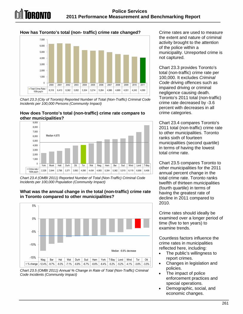
Police Services 2011 Performance Measurement and Benchmarking Report
261
Niag Bar Hal Wat Durh Sud Ham York T-Bay Lond Wind Tor Ott % change -12.4% -9.7% -9.3% -7.1% -6.8% -6.7% -6.6% -6.4% -5.2% -5.2% -4.1% -3.6% -3.5%
-15%
-10%
-5%
0%
5%
Median -6.6% decrease
How has Toronto’s total (non- traffic) crime rate changed? Chart 23.3 (City of Toronto) Reported Number of Total (Non-Traffic) Criminal Code Incidents per 100,000 Persons (Community Impact) How does Toronto’s total (non-traffic) crime rate compare to other municipalities? Chart 23.4 (OMBI 2011) Reported Number of Total (Non-Traffic) Criminal Code Incidents per 100,000 Population (Community Impact) What was the annual change in the total (non-traffic) crime rate in Toronto compared to other municipalities? Chart 23.5 (OMBI 2011) Annual % Change in Rate of Total (Non-Traffic) Criminal Code Incidents (Community Impact)
Crime rates are used to measure the extent and nature of criminal activity brought to the attention of the police within a municipality. Unreported crime is not captured. Chart 23.3 provides Toronto’s total (non-traffic) crime rate per 100,000. It excludes Criminal Code driving offences such as impaired driving or criminal negligence causing death. Toronto’s 2011 total (non-traffic) crime rate decreased by -3.6 percent with decreases in all crime categories. Chart 23.4 compares Toronto's 2011 total (non-traffic) crime rate to other municipalities. Toronto ranks sixth of fourteen municipalities (second quartile) in terms of having the lowest total crime rate. Chart 23.5 compares Toronto to other municipalities for the 2011 annual percent change in the total crime rate. Toronto ranks twelfth of thirteen municipalities (fourth quartile) in terms of having the greatest rate of decline in 2011 compared to 2010. Crime rates should ideally be examined over a longer period of time (five to ten years) to examine trends. Countless factors influence the crime rates in municipalities reflected here, including: • The public’s willingness to
report crimes. • Changes in legislation and
policies. • The impact of police
enforcement practices and special operations.
• Demographic, social, and economic changes.
2000 2001 2002 2003 2004 2005 2006 2007 2008 2009 2010 2011 Total Crime Rate /
100k pop'n 6,318 6,410 6,362 5,952 5,304 5,214 5,264 4,986 4,669 4,551 4,243 4,090
0
1,000
2,000
3,000
4,000
5,000
6,000
7,000
York Musk Halt Durh Ott Tor Wat Niag Ham Bar Sud Wind Lond T-Bay Crime rate / 100k pop'n 2,328 2,644 2,788 3,371 3,950 4,090 4,434 4,905 5,304 5,362 5,515 6,119 6,906 8,408
0
1,000
2,000
3,000
4,000
5,000
6,000
7,000
8,000
9,000
Median 4,670

Police Services 2011 Performance Measurement And Benchmarking Report
262
How is the severity of Toronto's total crime changing? Chart 23.6 (City of Toronto) Total Crime Severity Index How does the severity of total crime in Toronto compare to other municipalities? Chart 23.7 (OMBI 2011) Total Crime Severity Index .
The crime severity index is included in this report for both total crime and violent crime. The crime severity index differs from traditional crime rate methods by taking into account not only the change in volume of a particular crime, but the seriousness of that crime in relation to other crimes. Conversely, traditional crime rates are simply a count of all criminal incidents reported to the police in relation to the local population. Chart 23.6 identifies Toronto's total crime severity index from 2001 to 2011 and shows a consistent improving trend, including the decrease seen in 2011. Chart 23.7 compares Toronto's 2011 total crime severity index to other municipalities. Toronto ranks eighth of thirteen (third quartile) in terms of having the lowest total crime severity index.
2001 2002 2003 2004 2005 2006 2007 2008 2009 2010 2011 Total Crime
Severity Index 97.2 96.3 95.5 85.3 89.2 92.1 87.2 81.8 79.3 74.0 70.9
0
20
40
60
80
100
120
Halt York Durh Ott Bar Wat Niag Tor Ham Sud Wind Lond T-Bay Total Crime
Severity Index 33.6 39.4 47.5 57.9 61.0 62.6 69.5 70.9 76.1 78.9 80.1 91.4 108.8
0
20
40
60
80
100
120
Median 69.8
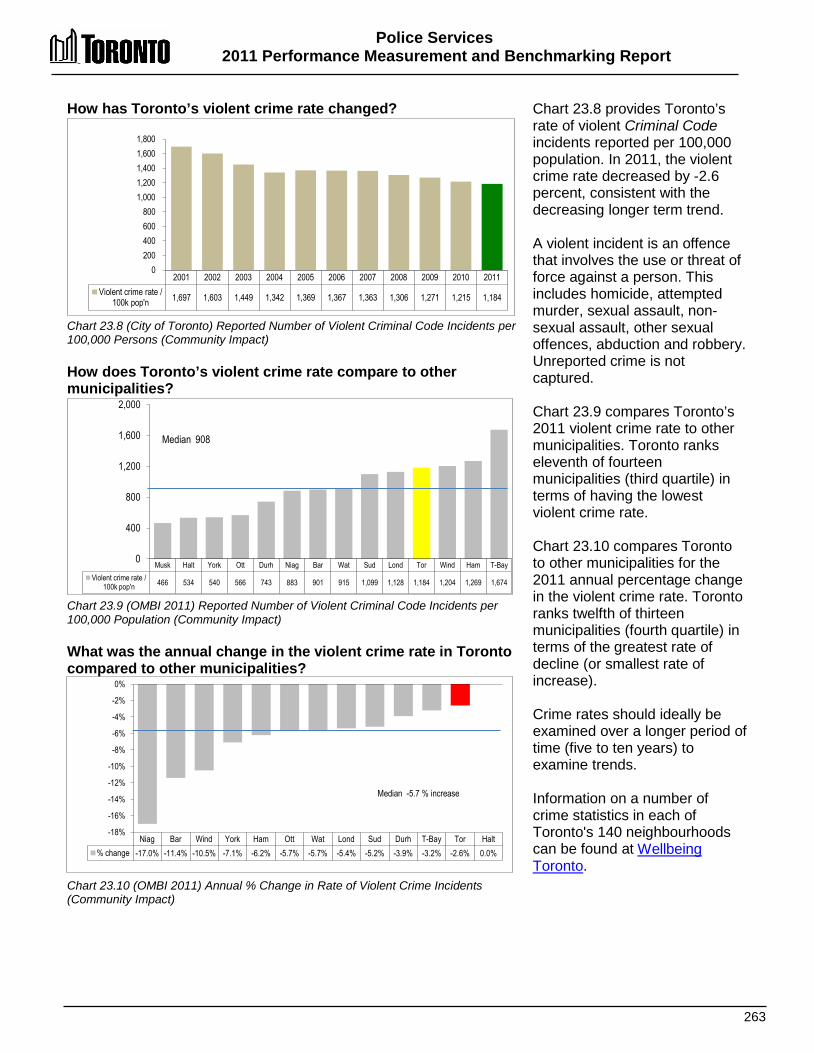
Police Services 2011 Performance Measurement and Benchmarking Report
263
2001 2002 2003 2004 2005 2006 2007 2008 2009 2010 2011 Violent crime rate /
100k pop'n 1,697 1,603 1,449 1,342 1,369 1,367 1,363 1,306 1,271 1,215 1,184
0 200 400 600 800
1,000 1,200 1,400 1,600 1,800
Musk Halt York Ott Durh Niag Bar Wat Sud Lond Tor Wind Ham T-Bay Violent crime rate /
100k pop'n 466 534 540 566 743 883 901 915 1,099 1,128 1,184 1,204 1,269 1,674
0
400
800
1,200
1,600
2,000
Median 908
Niag Bar Wind York Ham Ott Wat Lond Sud Durh T-Bay Tor Halt % change -17.0% -11.4% -10.5% -7.1% -6.2% -5.7% -5.7% -5.4% -5.2% -3.9% -3.2% -2.6% 0.0%
-18%
-16%
-14%
-12%
-10%
-8%
-6%
-4%
-2%
0%
Median -5.7 % increase
How has Toronto’s violent crime rate changed? Chart 23.8 (City of Toronto) Reported Number of Violent Criminal Code Incidents per 100,000 Persons (Community Impact) How does Toronto’s violent crime rate compare to other municipalities? Chart 23.9 (OMBI 2011) Reported Number of Violent Criminal Code Incidents per 100,000 Population (Community Impact) What was the annual change in the violent crime rate in Toronto compared to other municipalities? Chart 23.10 (OMBI 2011) Annual % Change in Rate of Violent Crime Incidents (Community Impact)
Chart 23.8 provides Toronto’s rate of violent Criminal Code incidents reported per 100,000 population. In 2011, the violent crime rate decreased by -2.6 percent, consistent with the decreasing longer term trend. A violent incident is an offence that involves the use or threat of force against a person. This includes homicide, attempted murder, sexual assault, non-sexual assault, other sexual offences, abduction and robbery. Unreported crime is not captured. Chart 23.9 compares Toronto’s 2011 violent crime rate to other municipalities. Toronto ranks eleventh of fourteen municipalities (third quartile) in terms of having the lowest violent crime rate. Chart 23.10 compares Toronto to other municipalities for the 2011 annual percentage change in the violent crime rate. Toronto ranks twelfth of thirteen municipalities (fourth quartile) in terms of the greatest rate of decline (or smallest rate of increase). Crime rates should ideally be examined over a longer period of time (five to ten years) to examine trends. Information on a number of crime statistics in each of Toronto's 140 neighbourhoods can be found at Wellbeing Toronto.
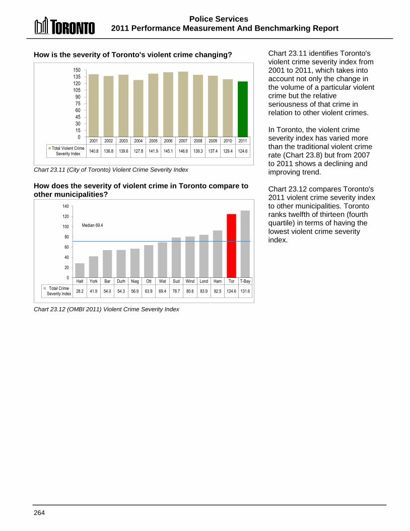
Police Services 2011 Performance Measurement And Benchmarking Report
264
How is the severity of Toronto's violent crime changing? Chart 23.11 (City of Toronto) Violent Crime Severity Index How does the severity of violent crime in Toronto compare to other municipalities? ? Chart 23.12 (OMBI 2011) Violent Crime Severity Index
Chart 23.11 identifies Toronto's violent crime severity index from 2001 to 2011, which takes into account not only the change in the volume of a particular violent crime but the relative seriousness of that crime in relation to other violent crimes. In Toronto, the violent crime severity index has varied more than the traditional violent crime rate (Chart 23.8) but from 2007 to 2011 shows a declining and improving trend. Chart 23.12 compares Toronto's 2011 violent crime severity index to other municipalities. Toronto ranks twelfth of thirteen (fourth quartile) in terms of having the lowest violent crime severity index.
2001 2002 2003 2004 2005 2006 2007 2008 2009 2010 2011 Total Violent Crime
Severity Index 140.8 136.8 139.6 127.8 141.9 145.1 146.6 139.3 137.4 129.4 124.6
0 15 30 45 60 75 90
105 120 135 150
Halt York Bar Durh Niag Ott Wat Sud Wind Lond Ham Tor T-Bay Total Crime
Severity Index 28.2 41.9 54.0 54.3 56.9 63.9 69.4 78.7 80.6 83.9 92.5 124.6 131.6
0
20
40
60
80
100
120
140
Median 69.4
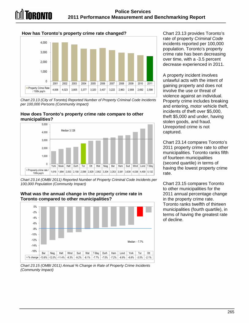
Police Services 2011 Performance Measurement and Benchmarking Report
265
2001 2002 2003 2004 2005 2006 2007 2008 2009 2010 2011 Property Crime Rate
/ 100k pop'n 4,006 4,023 3,805 3,377 3,320 3,437 3,222 2,963 2,908 2,692 2,598
0
1,000
2,000
3,000
4,000
York Musk Halt Durh Tor Ott Wat Niag Bar Ham Sud Wind Lond T-Bay Propoerty crime rate /
100k pop'n 1,616 1,894 2,053 2,158 2,598 2,929 2,952 3,304 3,353 3,581 3,638 4,038 4,459 5,132
0
1,000
2,000
3,000
4,000
5,000
Median 3,128
Bar Niag Halt Wind Sud Wat T-Bay Durh Ham Lond York Tor Ott % change -13.6% -12.0% -11.4% -9.3% -9.2% -8.1% -7.7% -7.5% -7.2% -6.9% -6.6% -3.5% -2.1%
-16%
-14%
-12%
-10%
-8%
-6%
-4%
-2%
0%
Median - 7.7%
How has Toronto’s property crime rate changed? Chart 23.13 (City of Toronto) Reported Number of Property Criminal Code Incidents per 100,000 Persons (Community Impact) How does Toronto’s property crime rate compare to other municipalities? Chart 23.14 (OMBI 2011) Reported Number of Property Criminal Code Incidents per 100,000 Population (Community Impact) What was the annual change in the property crime rate in Toronto compared to other municipalities? Chart 23.15 (OMBI 2011) Annual % Change in Rate of Property Crime Incidents (Community Impact)
Chart 23.13 provides Toronto’s rate of property Criminal Code incidents reported per 100,000 population. Toronto’s property crime rate has been decreasing over time, with a -3.5 percent decrease experienced in 2011.
A property incident involves unlawful acts with the intent of gaining property and does not involve the use or threat of violence against an individual. Property crime includes breaking and entering, motor vehicle theft, incidents of theft over $5,000, theft $5,000 and under, having stolen goods, and fraud. Unreported crime is not captured. Chart 23.14 compares Toronto’s 2011 property crime rate to other municipalities. Toronto ranks fifth of fourteen municipalities (second quartile) in terms of having the lowest property crime rate. Chart 23.15 compares Toronto to other municipalities for the 2011 annual percentage change in the property crime rate. Toronto ranks twelfth of thirteen municipalities (fourth quartile), in terms of having the greatest rate of decline.
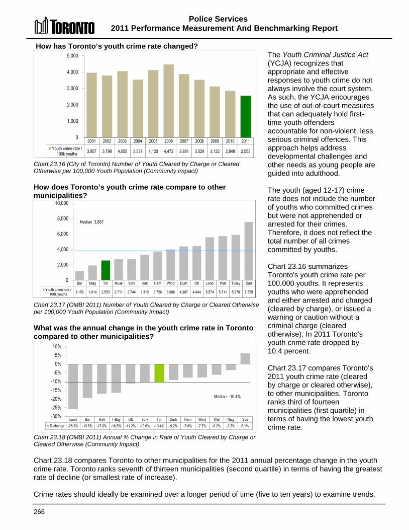
Police Services 2011 Performance Measurement And Benchmarking Report
266
2001 2002 2003 2004 2005 2006 2007 2008 2009 2010 2011 Youth crime rate /
100k youths 3,957 3,798 4,055 3,537 4,120 4,472 3,881 3,529 3,122 2,848 2,553
0
1,000
2,000
3,000
4,000
5,000
Bar Niag Tor Musk York Halt Ham Wind Durh Ott Lond Wat T-Bay Sud Youth crime rate /
100k youths 1,156 1,914 2,553 2,711 2,744 3,312 3,726 3,988 4,387 4,444 5,574 5,711 5,878 7,559
0
2,000
4,000
6,000
8,000
10,000
Median 3,857
Lond Bar Halt T-Bay Ott York Tor Durh Ham Wind Wat Niag Sud % change -25.8% -19.5% -17.0% -16.5% -11.2% -10.6% -10.4% -9.2% -7.8% -7.7% -6.2% -3.5% 6.1%
-30% -25% -20% -15% -10%
-5% 0% 5%
10%
Median -10.4%
How has Toronto’s youth crime rate changed? Chart 23.16 (City of Toronto) Number of Youth Cleared by Charge or Cleared Otherwise per 100,000 Youth Population (Community Impact) How does Toronto’s youth crime rate compare to other municipalities? Chart 23.17 (OMBI 2011) Number of Youth Cleared by Charge or Cleared Otherwise per 100,000 Youth Population (Community Impact) What was the annual change in the youth crime rate in Toronto compared to other municipalities? Chart 23.18 (OMBI 2011) Annual % Change in Rate of Youth Cleared by Charge or Cleared Otherwise (Community Impact)
The Youth Criminal Justice Act (YCJA) recognizes that appropriate and effective responses to youth crime do not always involve the court system. As such, the YCJA encourages the use of out-of-court measures that can adequately hold first-time youth offenders accountable for non-violent, less serious criminal offences. This approach helps address developmental challenges and other needs as young people are guided into adulthood. The youth (aged 12-17) crime rate does not include the number of youths who committed crimes but were not apprehended or arrested for their crimes. Therefore, it does not reflect the total number of all crimes committed by youths. Chart 23.16 summarizes Toronto's youth crime rate per 100,000 youths. It represents youths who were apprehended and either arrested and charged (cleared by charge), or issued a warning or caution without a criminal charge (cleared otherwise). In 2011 Toronto's youth crime rate dropped by -10.4 percent. Chart 23.17 compares Toronto’s 2011 youth crime rate (cleared by charge or cleared otherwise), to other municipalities. Toronto ranks third of fourteen municipalities (first quartile) in terms of having the lowest youth crime rate.
Chart 23.18 compares Toronto to other municipalities for the 2011 annual percentage change in the youth crime rate. Toronto ranks seventh of thirteen municipalities (second quartile) in terms of having the greatest rate of decline (or smallest rate of increase). Crime rates should ideally be examined over a longer period of time (five to ten years) to examine trends.
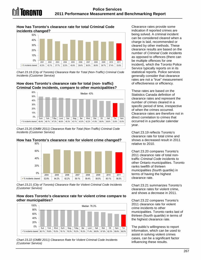
Police Services 2011 Performance Measurement and Benchmarking Report
267
2004 2005 2006 2007 2008 2009 2010 2011 % incidents cleared 52.8% 64.2% 62.2% 59.1% 59.4% 58.5% 60.1% 56.5%
0%
20%
40%
60%
80%
Sud York Wind Durh Niag T-Bay Bar Lond Halt Wat Ott Ham Tor % incidents cleared 80.1% 79.6% 79.3% 79.1% 78.3% 76.3% 76.3% 71.4% 69.9% 67.9% 62.3% 59.6% 56.5%
0% 20% 40% 60% 80%
100% Median 76.3%
How has Toronto’s clearance rate for total Criminal Code incidents changed? Chart 23.19 (City of Toronto) Clearance Rate for Total (Non-Traffic) Criminal Code Incidents (Customer Service) How does Toronto’s clearance rate for total (non- traffic) Criminal Code incidents, compare to other municipalities? Chart 23.20 (OMBI 2011) Clearance Rate for Total (Non-Traffic) Criminal Code Incidents (Customer Service) How has Toronto’s clearance rate for violent crime changed? Chart 23.21 (City of Toronto) Clearance Rate for Violent Criminal Code Incidents (Customer Service) How does Toronto’s clearance rate for violent crime compare to other municipalities? Chart 23.22 (OMBI 2011) Clearance Rate for Violent Criminal Code Incidents (Customer Service)
Clearance rates provide some indication if reported crimes are being solved. A criminal incident can be considered cleared when a charge is laid, recommended or cleared by other methods. These clearance results are based on the number of Criminal Code incidents as opposed to offences (there can be multiple offences for one incident), which the Toronto Police Service typically reports on in its statistical reports. Police services generally consider that clearance rates are not a "true" measurement of effectiveness or efficiency. These rates are based on the Statistics Canada definition of clearance rates and represent the number of crimes cleared in a specific period of time, irrespective of when the crimes occurred. Clearance rates are therefore not in direct correlation to crimes that occurred in a particular calendar year. Chart 23.19 reflects Toronto’s clearance rate for total crime and shows a decreased result in 2011 relative to 2010. Chart 23.20 compares Toronto's 2011 clearance rate of total non-traffic Criminal Code incidents to other Ontario municipalities. Toronto ranks twelfth of thirteen municipalities (fourth quartile) in terms of having the highest clearance rate. Chart 23.21 summarizes Toronto’s clearance rates for violent crime, and shows a decrease in 2011. Chart 23.22 compares Toronto's 2011 clearance rate for violent crime incidents to other municipalities. Toronto ranks last of thirteen (fourth quartile) in terms of the highest clearance rate. The public's willingness to report information, which can be used to assist in solving violent crimes cases, can be a significant factor influencing these results.
2001 2002 2003 2004 2005 2006 2007 2008 2009 2010 2011 % incidents cleared 42.5% 42.1% 37.7% 32.5% 40.6% 39.6% 36.5% 38.8% 36.7% 37.4% 33.6%
0%
10%
20%
30%
40%
50%
Durh York T-Bay Lond Sud Niag Bar Wind Wat Ott Halt Tor Ham % incidents cleared 49.4% 48.1% 47.3% 46.6% 45.3% 43.1% 43.0% 42.2% 41.8% 38.9% 38.6% 33.6% 33.5%
0%
10%
20%
30%
40%
50%
60% Median 43%
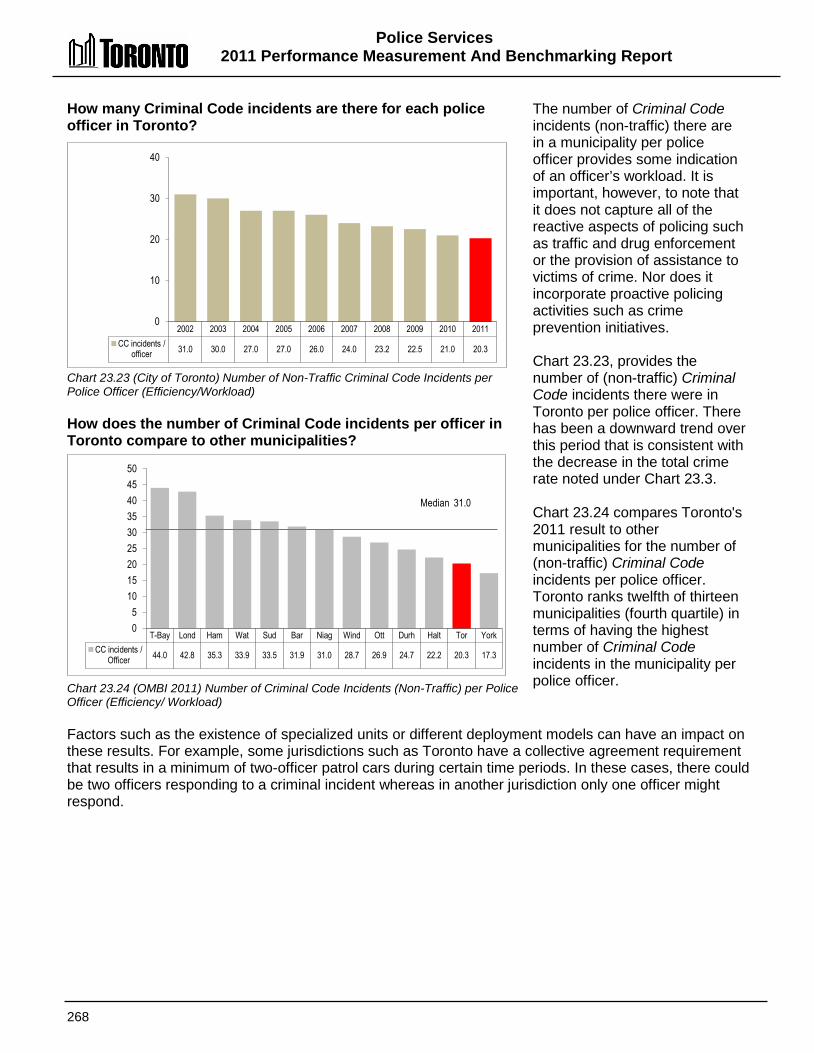
Police Services 2011 Performance Measurement And Benchmarking Report
268
How many Criminal Code incidents are there for each police officer in Toronto? Chart 23.23 (City of Toronto) Number of Non-Traffic Criminal Code Incidents per Police Officer (Efficiency/Workload) How does the number of Criminal Code incidents per officer in Toronto compare to other municipalities? Chart 23.24 (OMBI 2011) Number of Criminal Code Incidents (Non-Traffic) per Police Officer (Efficiency/ Workload)
The number of Criminal Code incidents (non-traffic) there are in a municipality per police officer provides some indication of an officer’s workload. It is important, however, to note that it does not capture all of the reactive aspects of policing such as traffic and drug enforcement or the provision of assistance to victims of crime. Nor does it incorporate proactive policing activities such as crime prevention initiatives. Chart 23.23, provides the number of (non-traffic) Criminal Code incidents there were in Toronto per police officer. There has been a downward trend over this period that is consistent with the decrease in the total crime rate noted under Chart 23.3. Chart 23.24 compares Toronto's 2011 result to other municipalities for the number of (non-traffic) Criminal Code incidents per police officer. Toronto ranks twelfth of thirteen municipalities (fourth quartile) in terms of having the highest number of Criminal Code incidents in the municipality per police officer.
Factors such as the existence of specialized units or different deployment models can have an impact on these results. For example, some jurisdictions such as Toronto have a collective agreement requirement that results in a minimum of two-officer patrol cars during certain time periods. In these cases, there could be two officers responding to a criminal incident whereas in another jurisdiction only one officer might respond.
2002 2003 2004 2005 2006 2007 2008 2009 2010 2011 CC incidents /
officer 31.0 30.0 27.0 27.0 26.0 24.0 23.2 22.5 21.0 20.3
0
10
20
30
40
T-Bay Lond Ham Wat Sud Bar Niag Wind Ott Durh Halt Tor York CC incidents /
Officer 44.0 42.8 35.3 33.9 33.5 31.9 31.0 28.7 26.9 24.7 22.2 20.3 17.3
0 5
10 15 20 25 30 35 40 45 50
Median 31.0
Police Services 2011 Performance Measurement and Benchmarking Report
269
2012 Achievements and 2013 Planned Initiatives/Objectives The following initiatives have improved or are intended to further improve the efficiency and effectiveness of Toronto's police service. 2012 Initiatives Completed/Achievements
• Prisoner Management – after a review, some functions that court officers performed were eliminated, which allowed them to be redeployed to the divisions to fulfil prisoner management functions. This in turn has allowed the Service to redeploy police officers to the front-line.
• Computer hardware reduction initiative – the Service was able to reduce this inventory by approximately 10%, saving replacement and maintenance costs.
• Project Summer Safety – this seven-week initiative, rolled out at the end of July in response to several violent gang-related crimes in the City, aimed to improve safety in our communities and increase positive engagement between officers and members of the public. To assist in accomplishing this goal, the Service redeployed officers to high-priority neighbourhoods and backfilled the officers through the use of compulsory overtime. The initiative allowed the Service to deploy up to 329 officers in communities at various points in time, and proved to be very successful in reducing crime and victimization during the term of the program.
• Crime mapping tool – a tool to monitor and track sex crimes and offenders was recognized with the Pitney Bowes Software People’s Choice Meridian Award.
• Personnel-related on-line services – the Human Resources self-serve portal has gone live. Pay advices and T4s, for example, are now provided online, significantly reducing the costs associated with printing and delivering paper copies.
2013 Objectives
• Efficiency and effectiveness reviews are continuing as part of the Chief’s Internal Organizational Review (CIOR), which commenced in early 2012. These reviews are intended to identify and implement initiatives that will allow the Service to provide sustainable, efficient, effective and economical services by:
o Reviewing the organizational structure; o Determining the appropriate uniform strength required; o Reviewing services provided; and o Reviewing the possibility of civilianizing positions.
• Technology is also being explored to enable more efficient and cost-effective services with less reliance on human resources. The technological initiatives being explored will require some level of up-front investment, and in some cases, new or modified legislation.
• Provincial funding has been leveraged to ensure the Service is able to continue the Toronto Anti-Violence Intervention Strategy (TAVIS), including the placement of dedicated School Resource Officers in various high schools. Other provincial grants have also subsidized our ability to increase officers' presence in communities, as well as the engagement of and developing relationships with citizens and other stakeholders.

Police Services 2011 Performance Measurement And Benchmarking Report
270
Factors Influencing the Results of Municipalities The results of each municipality can be influenced to varying degrees by factors such as: • Non-residents: daily inflow and outflow of commuters and tourists, attendees at cultural,
entertainment and sporting events or seasonal residents (e.g. post-secondary students) who require police services and are not captured in population-based measures.
• Size of business/commercial and industrial sectors: these sectors require police services but are not factored into population-based measures
• Specialized facilities: airports, casinos, etc. that can require additional policing. • Public support: public’s willingness to report crimes and to provide information that assists
police services in the solving of crimes. • Demographic trends: social and economic changes in the population.

271

272
PPuurrcchhaassiinngg SSeerrvviicceess
The objective of Purchasing Services is to provide value in support of public programs and service delivery through the application of open, fair, equitable and accessible procurement processes and practices.
Shaded boxes reflect the activities covered in this section of the report.
Purchasing & Materials Management
Purchasing Materials Management Stores & Distribution
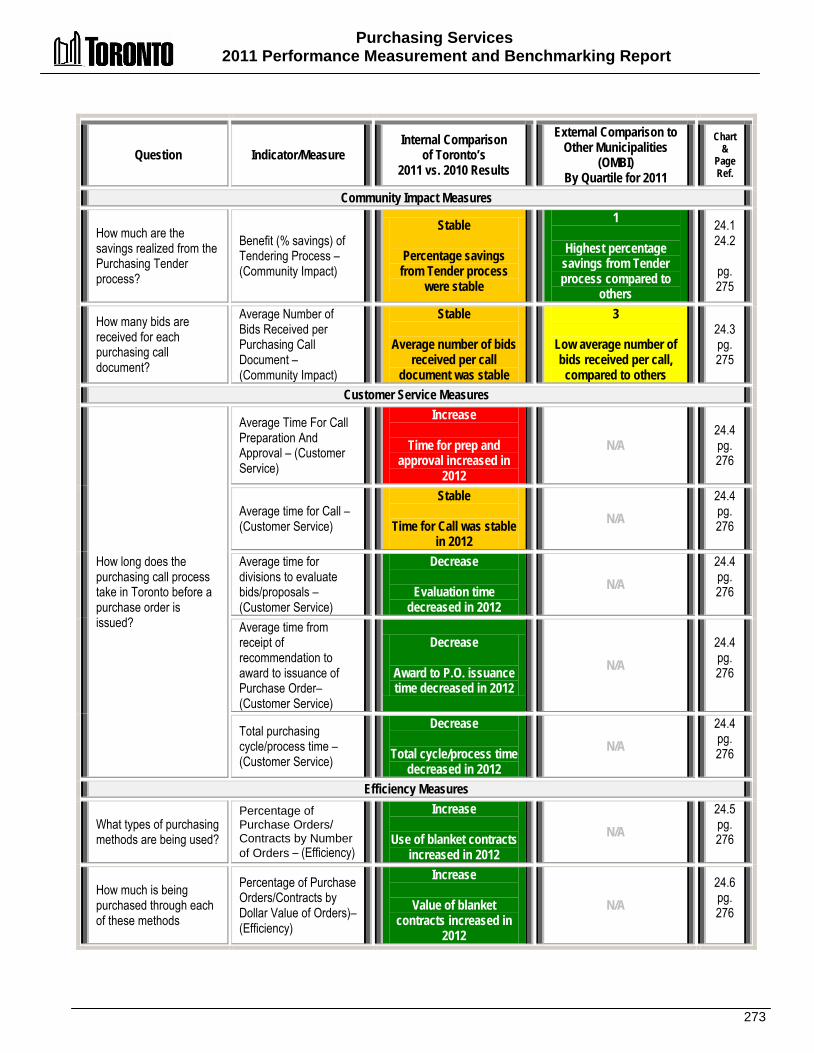
Purchasing Services 2011 Performance Measurement and Benchmarking Report
273
Question Indicator/Measure Internal Comparison
of Toronto’s 2011 vs. 2010 Results
External Comparison to Other Municipalities
(OMBI) By Quartile for 2011
Chart &
Page Ref.
Community Impact Measures
How much are the savings realized from the Purchasing Tender process?
Benefit (% savings) of Tendering Process – (Community Impact)
Stable
Percentage savings from Tender process
were stable
1
Highest percentage savings from Tender process compared to
others
24.1 24.2
pg. 275
How many bids are received for each purchasing call document?
Average Number of Bids Received per Purchasing Call Document – (Community Impact)
Stable
Average number of bids received per call
document was stable
3
Low average number of bids received per call,
compared to others
24.3 pg. 275
Customer Service Measures
How long does the purchasing call process take in Toronto before a purchase order is issued?
Average Time For Call Preparation And Approval – (Customer Service)
Increase
Time for prep and approval increased in
2012
N/A 24.4 pg. 276
Average time for Call – (Customer Service)
Stable
Time for Call was stable in 2012
N/A 24.4 pg. 276
Average time for divisions to evaluate bids/proposals – (Customer Service)
Decrease
Evaluation time decreased in 2012
N/A 24.4 pg. 276
Average time from receipt of recommendation to award to issuance of Purchase Order– (Customer Service)
Decrease
Award to P.O. issuance time decreased in 2012
N/A 24.4 pg. 276
Total purchasing cycle/process time – (Customer Service)
Decrease
Total cycle/process time decreased in 2012
N/A 24.4 pg. 276
Efficiency Measures
What types of purchasing methods are being used?
Percentage of Purchase Orders/ Contracts by Number of Orders – (Efficiency)
Increase
Use of blanket contracts increased in 2012
N/A 24.5 pg. 276
How much is being purchased through each of these methods
Percentage of Purchase Orders/Contracts by Dollar Value of Orders)– (Efficiency)
Increase
Value of blanket contracts increased in
2012
N/A 24.6 pg. 276
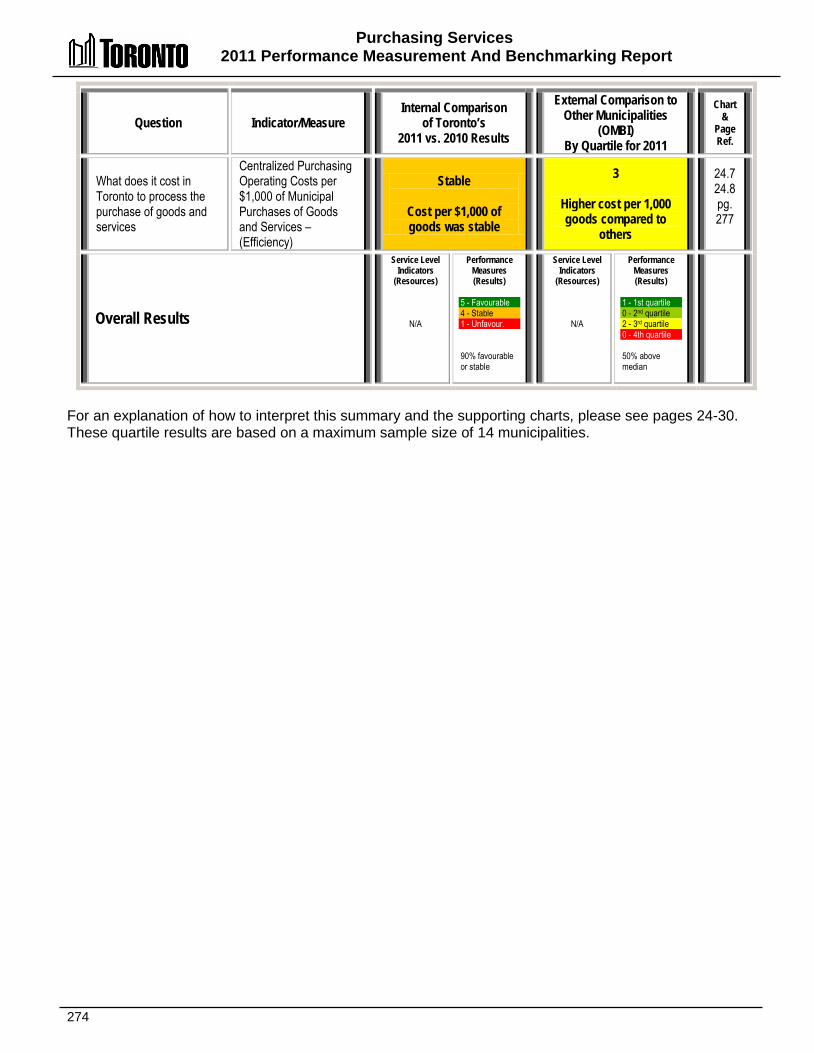
Purchasing Services 2011 Performance Measurement And Benchmarking Report
274
Question Indicator/Measure Internal Comparison
of Toronto’s 2011 vs. 2010 Results
External Comparison to Other Municipalities
(OMBI) By Quartile for 2011
Chart &
Page Ref.
What does it cost in Toronto to process the purchase of goods and services
Centralized Purchasing Operating Costs per $1,000 of Municipal Purchases of Goods and Services – (Efficiency)
Stable
Cost per $1,000 of goods was stable
3
Higher cost per 1,000 goods compared to
others
24.7 24.8 pg. 277
Overall Results
Service Level Indicators
(Resources)
N/A
Performance Measures (Results)
5 - Favourable 4 - Stable 1 - Unfavour. 90% favourable or stable
Service Level Indicators
(Resources)
N/A
Performance Measures (Results)
1 - 1st quartile 0 - 2nd quartile 2 - 3rd quartile 0 - 4th quartile 50% above median
For an explanation of how to interpret this summary and the supporting charts, please see pages 24-30. These quartile results are based on a maximum sample size of 14 municipalities.
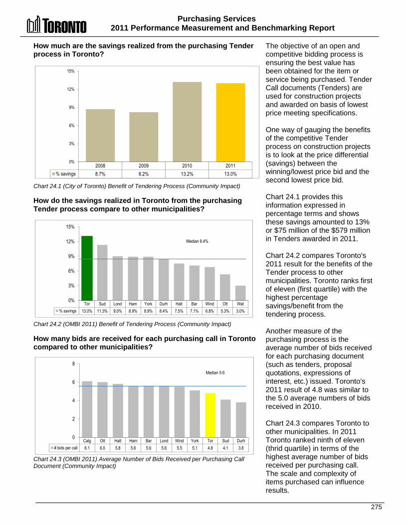
Purchasing Services 2011 Performance Measurement and Benchmarking Report
275
2008 2009 2010 2011 % savings 8.7% 8.2% 13.2% 13.0%
0%
3%
6%
9%
12%
15%
How much are the savings realized from the purchasing Tender process in Toronto? Chart 24.1 (City of Toronto) Benefit of Tendering Process (Community Impact) How do the savings realized in Toronto from the purchasing Tender process compare to other municipalities? Chart 24.2 (OMBI 2011) Benefit of Tendering Process (Community Impact) How many bids are received for each purchasing call in Toronto compared to other municipalities? Chart 24.3 (OMBI 2011) Average Number of Bids Received per Purchasing Call Document (Community Impact)
The objective of an open and competitive bidding process is ensuring the best value has been obtained for the item or service being purchased. Tender Call documents (Tenders) are used for construction projects and awarded on basis of lowest price meeting specifications. One way of gauging the benefits of the competitive Tender process on construction projects is to look at the price differential (savings) between the winning/lowest price bid and the second lowest price bid. Chart 24.1 provides this information expressed in percentage terms and shows these savings amounted to 13% or $75 million of the $579 million in Tenders awarded in 2011. Chart 24.2 compares Toronto's 2011 result for the benefits of the Tender process to other municipalities. Toronto ranks first of eleven (first quartile) with the highest percentage savings/benefit from the tendering process. Another measure of the purchasing process is the average number of bids received for each purchasing document (such as tenders, proposal quotations, expressions of interest, etc.) issued. Toronto's 2011 result of 4.8 was similar to the 5.0 average numbers of bids received in 2010. Chart 24.3 compares Toronto to other municipalities. In 2011 Toronto ranked ninth of eleven (thrid quartile) in terms of the highest average number of bids received per purchasing call. The scale and complexity of items purchased can influence results.
Tor Sud Lond Ham York Durh Halt Bar Wind Ott Wat % savings 13.0% 11.3% 9.0% 8.9% 8.9% 8.4% 7.5% 7.1% 6.8% 5.3% 3.0%
0%
3%
6%
9%
12%
15%
Median 8.4%
Calg Ott Halt Ham Bar Lond Wind York Tor Sud Durh # bids per call 6.1 6.0 5.8 5.6 5.6 5.6 5.5 5.1 4.8 4.1 3.8
0
2
4
6
8 Median 5.6
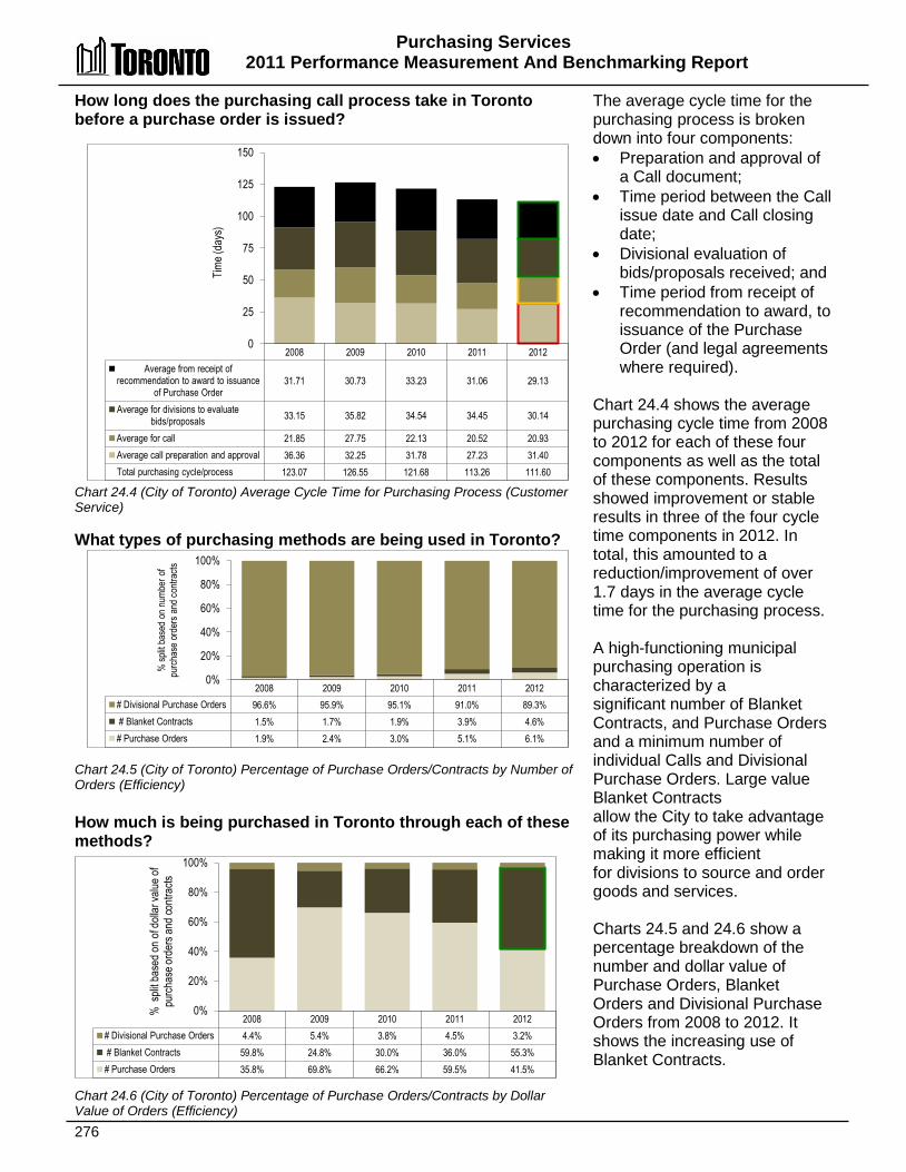
Purchasing Services 2011 Performance Measurement And Benchmarking Report
276
How long does the purchasing call process take in Toronto before a purchase order is issued? Chart 24.4 (City of Toronto) Average Cycle Time for Purchasing Process (Customer Service) What types of purchasing methods are being used in Toronto? Chart 24.5 (City of Toronto) Percentage of Purchase Orders/Contracts by Number of Orders (Efficiency) How much is being purchased in Toronto through each of these methods?
The average cycle time for the purchasing process is broken down into four components: • Preparation and approval of
a Call document; • Time period between the Call
issue date and Call closing date;
• Divisional evaluation of bids/proposals received; and
• Time period from receipt of recommendation to award, to issuance of the Purchase Order (and legal agreements where required).
Chart 24.4 shows the average purchasing cycle time from 2008 to 2012 for each of these four components as well as the total of these components. Results showed improvement or stable results in three of the four cycle time components in 2012. In total, this amounted to a reduction/improvement of over 1.7 days in the average cycle time for the purchasing process. A high-functioning municipal purchasing operation is characterized by a significant number of Blanket Contracts, and Purchase Orders and a minimum number of individual Calls and Divisional Purchase Orders. Large value Blanket Contracts allow the City to take advantage of its purchasing power while making it more efficient for divisions to source and order goods and services. Charts 24.5 and 24.6 show a percentage breakdown of the number and dollar value of Purchase Orders, Blanket Orders and Divisional Purchase Orders from 2008 to 2012. It shows the increasing use of Blanket Contracts.
Chart 24.6 (City of Toronto) Percentage of Purchase Orders/Contracts by Dollar Value of Orders (Efficiency)
2008 2009 2010 2011 2012 Average from receipt of
recommendation to award to issuance of Purchase Order
31.71 30.73 33.23 31.06 29.13
Average for divisions to evaluate bids/proposals 33.15 35.82 34.54 34.45 30.14
Average for call 21.85 27.75 22.13 20.52 20.93 Average call preparation and approval 36.36 32.25 31.78 27.23 31.40 Total purchasing cycle/process 123.07 126.55 121.68 113.26 111.60
0
25
50
75
100
125
150
Time (
days
)
2008 2009 2010 2011 2012 # Divisional Purchase Orders 96.6% 95.9% 95.1% 91.0% 89.3% # Blanket Contracts 1.5% 1.7% 1.9% 3.9% 4.6% # Purchase Orders 1.9% 2.4% 3.0% 5.1% 6.1%
0%
20%
40%
60%
80%
100%
% sp
lit ba
sed
on nu
mber
of
purch
ase
orde
rs an
d con
tracts
2008 2009 2010 2011 2012 # Divisional Purchase Orders 4.4% 5.4% 3.8% 4.5% 3.2% # Blanket Contracts 59.8% 24.8% 30.0% 36.0% 55.3% # Purchase Orders 35.8% 69.8% 66.2% 59.5% 41.5%
0%
20%
40%
60%
80%
100%
% s
plit b
ased
on o
f doll
ar va
lue of
pu
rchas
e ord
ers a
nd co
ntrac
ts
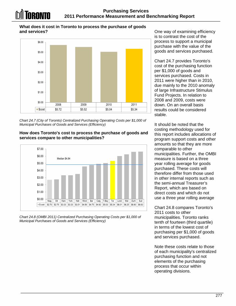
Purchasing Services 2011 Performance Measurement and Benchmarking Report
277
2008 2009 2010 2011 $cost $5.72 $5.52 $5.04 $5.34
$0.00
$1.00
$2.00
$3.00
$4.00
$5.00
$6.00
What does it cost in Toronto to process the purchase of goods and services? Chart 24.7 (City of Toronto) Centralized Purchasing Operating Costs per $1,000 of Municipal Purchases of Goods and Services (Efficiency) How does Toronto's cost to process the purchase of goods and services compare to other municipalities? Chart 24.8 (OMBI 2011) Centralized Purchasing Operating Costs per $1,000 of Municipal Purchases of Goods and Services (Efficiency)
One way of examining efficiency is to contrast the cost of the process to support a municipal purchase with the value of the goods and services purchased. Chart 24.7 provides Toronto's cost of the purchasing function per $1,000 of goods and services purchased. Costs in 2011 were higher than in 2010, due mainly to the 2010 anomaly of large Infrastructure Stimulus Fund Projects. In relation to 2008 and 2009, costs were down. On an overall basis results could be considered stable. It should be noted that the costing methodology used for this report includes allocations of program support costs and other amounts so that they are more comparable to other municipalities. Further, the OMBI measure is based on a three year rolling average for goods purchased. These costs will therefore differ from those used in other internal reports such as the semi-annual Treasurer’s Report, which are based on direct costs and which do not use a three year rolling average Chart 24.8 compares Toronto's 2011 costs to other municipalities. Toronto ranks tenth of fourteen (third quartile) in terms of the lowest cost of purchasing per $1,000 of goods and services purchased. Note these costs relate to those of each municipality's centralized purchasing function and not elements of the purchasing process that occur within operating divisions.
Niag Ott Ham York Halt Wind Bar Calg T-Bay Tor Lond Wat Durh Sud $ cost $2.70 $2.75 $3.33 $3.33 $3.51 $4.56 $4.75 $4.92 $5.03 $5.34 $6.01 $6.25 $6.60 $6.63
$0.00
$1.00
$2.00
$3.00
$4.00
$5.00
$6.00
$7.00
Median $4.84
Purchasing Services 2011 Performance Measurement and Benchmarking Report
278
2012 Achievements and 2013 Planned Initiatives The following initiatives have improved or are expected to further improve the efficiency and effectiveness of the Payroll, Purchasing and Materials Management Division (PMMD): 2012 Initiatives Completed/Achievements • Expanded PMMD website services to include the posting of Awards for Competitive Calls,
which allows vendors to view information on awarded Calls. • Commenced a Toronto Water (TW) District Operations rationalization project in May 2012 to
consolidate four TW warehouses to two. • Maintained and increased utilization of the Volume Rebate Program initiated in 2008. This
program provides the City with revenues based on a percentage on the total volume of purchases on calls where the supplier is expected to be a distributor of various manufacturers goods/parts. In 2012, PMMD received $154,861.75 through the Volume Rebate. Since the inception of this program to the end of 2012, rebates in the amount of $365,513.43 have been received by the City of Toronto.
• Continued to work with Divisions to amalgamate requirements for goods and services to reduce the number of Calls being issued. This has a positive impact on the number of Calls per buyer and allows them to spend more time on improving the quality of the Call documents.
• Continued to examine ways to reduce the cycle times in the purchasing process such as increasing the use of RFQ, RFP and Tender templates to reduce preparation time. Also developed and implemented training courses to aid Divisions in the preparation and evaluation of replies to Call documents.
• Worked with representatives of each cluster to proactively review Departmental Purchase Order (DPO) activity to identify opportunities to use Blanket Contracts to consolidate requirements for commonly used goods and services, and reduce the use of DPOs.
2013 Initiatives Planned • Continue to enhance the City's purchasing process by the continued investigation of
eprocurement opportunities and implement recommended solutions resulting from the planning and scoping initiative.
• Participate in the Shared Services Study as identified in the 2011 KPMG Core Service Review to consider consolidating purchasing with ABC's to obtain greater purchasing power. PMMD to assess the potential for providing a shared service delivery across City divisions and agencies for common services and functions, with the objective of reducing costs, increasing service efficiency and effectiveness, and improving customer service.
• Conduct a review of the Purchasing By-law and Council approved policies to identify improvements to be recommended to Council.
Purchasing Services 2011 Performance Measurement and Benchmarking Report
279
Factors Influencing the Results of Municipalities The results of each municipality included in this report can be influenced to varying degrees by factors such as: • Organizational form: single tier municipalities provide a broader range of municipal services
than regional municipalities, which impacts the type and mix of goods and services that are purchased. Larger municipal agencies and corporations may have their own purchasing division and do not use a centralized purchasing function (which is the focus of this report).
• Policies and practices: approval process and dollar thresholds/limits for purchases in municipalities may differ, which can impact the time spent on the procurement process and which departments/divisions can conduct processes or a portion of the process. Extent to which municipalities have authorized the use of P-cards, blanket orders, multi-year tenders/contracts etc. can impact the efficiency of the purchasing process.
• Economic conditions and timing of purchases: changing economic conditions can impact year-over-year comparisons. The number of bids received and costs of goods and services received. Seasonal fluctuations in prices and the timing of purchases.
• Location and specialized services: the location of a municipality can impact/limit the number of bids as well as the degree of specialized expertise required from contractors or service providers.
• Provincial/Federal Programs: grant programs may impact the level of spending in any given year.
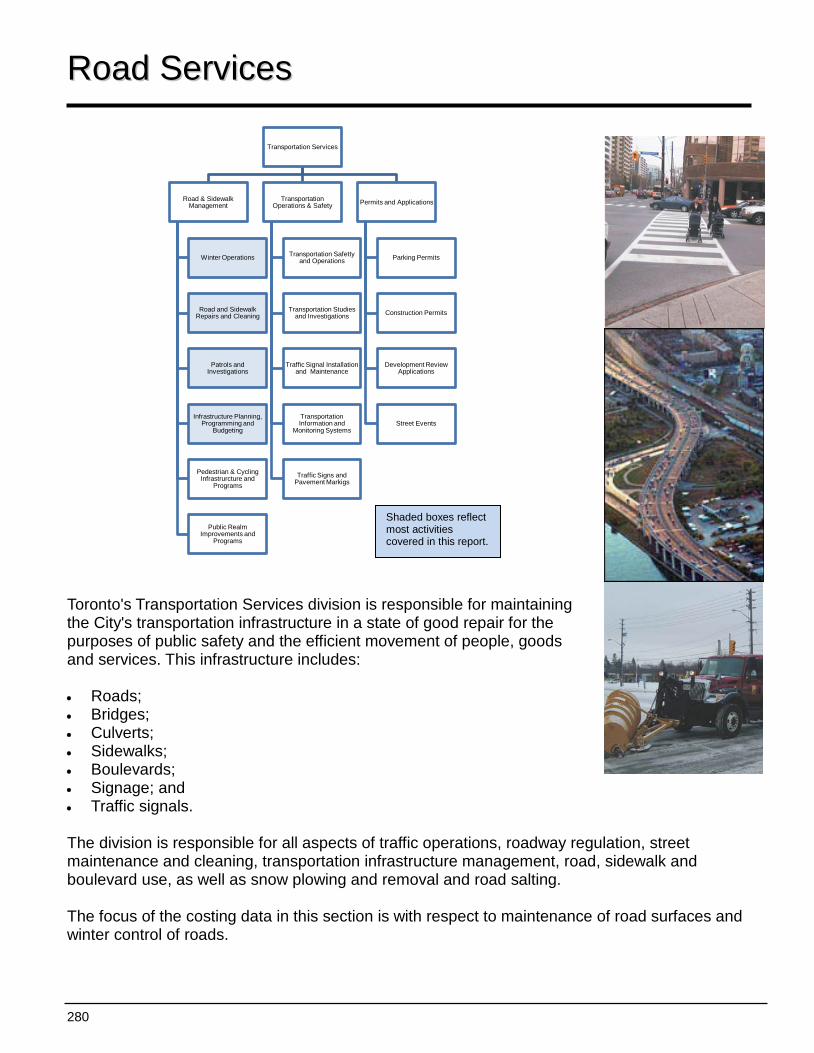
280
Transportation Services
Road & Sidewalk Management
Winter Operations
Road and Sidewalk Repairs and Cleaning
Patrols and Investigations
Infrastructure Planning, Programming and
Budgeting
Pedestrian & Cycling Infrastrurcture and
Programs
Public Realm Improvements and
Programs
Transportation Operations & Safety
Transportation Safetty and Operations
Transportation Studies and Investigations
Traffic Signal Installation and Maintenance
Transportation Information and
Monitoring Systems
Traffic Signs and Pavement Markigs
Permits and Applications
Parking Permits
Construction Permits
Development Review Applications
Street Events
RRooaadd SSeerrvviicceess Toronto's Transportation Services division is responsible for maintaining the City's transportation infrastructure in a state of good repair for the purposes of public safety and the efficient movement of people, goods and services. This infrastructure includes: • Roads; • Bridges; • Culverts; • Sidewalks; • Boulevards; • Signage; and • Traffic signals. The division is responsible for all aspects of traffic operations, roadway regulation, street maintenance and cleaning, transportation infrastructure management, road, sidewalk and boulevard use, as well as snow plowing and removal and road salting. The focus of the costing data in this section is with respect to maintenance of road surfaces and winter control of roads.
Shaded boxes reflect most activities covered in this report.
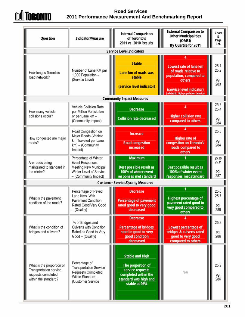
Road Services 2011 Performance Measurement And Benchmarking Report
281
Question Indicator/Measure Internal Comparison
of Toronto’s 2011 vs. 2010 Results
External Comparison to Other Municipalities
(OMBI) By Quartile for 2011
Chart &
Page Ref.
Service Level Indicators
How long is Toronto's road network?
Number of Lane KM per 1,000 Population – (Service Level)
Stable
Lane km of roads was stable
(service level indicator)
4
Lowest rate of lane km of roads relative to
population, compared to others
(service level indicator)
(related to high population density)
25.1 25.2
pg. 283
Community Impact Measures
How many vehicle collisions occur?
Vehicle Collision Rate per Million Vehicle km or per Lane km – (Community Impact)
Decrease
Collision rate decreased
4
Higher collision rate compared to others
25.3 25.4
pg. 284
How congested are major roads?
Road Congestion on Major Roads (Vehicle km Traveled per Lane km) – (Community Impact)
Increase
Road congestion increased
4
Higher rate of congestion on Toronto’s
roads compared to others
25.5
pg. 284
Are roads being maintained to standard in the winter?
Percentage of Winter Event Responses Meeting New Municipal Winter Level of Service – (Community Impact)
Maximum
Best possible result as 100% of winter event
responses met standard
1
Best possible result as 100% of winter event
responses met standard
25.10 25.11
pg. 287
Customer Service/Quality Measures
What is the pavement condition of the roads?
Percentage of Paved Lane Kms. With Pavement Condition Rated Good/Very Good – (Quality)
Decrease
Percentage of pavement rated good to very good
decreased
1
Highest percentage of pavement rated good to very good compared to
others
25.6 25.7
pg. 285
What is the condition of bridges and culverts?
% of Bridges and Culverts with Condition Rated as Good to Very Good – (Quality)
Decrease
Percentage of bridges rated in good to very
good condition decreased
4
Lowest percentage of bridges & culverts rated
good to very good compared to others
25.8
pg. 286
What is the proportion of Transportation service requests completed within the standard?
Percentage of Transportation Service Requests Completed Within Standard – (Customer Service
Stable and High
The proportion of service requests
completed within the standard was high and
stable at 96%
N/A 25.9
pg. 286
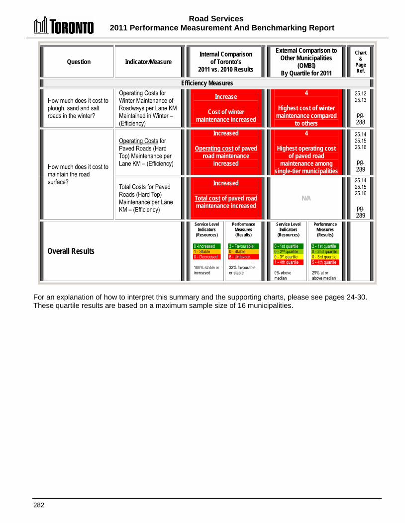
Road Services 2011 Performance Measurement And Benchmarking Report
282
Question Indicator/Measure Internal Comparison
of Toronto’s 2011 vs. 2010 Results
External Comparison to Other Municipalities
(OMBI) By Quartile for 2011
Chart &
Page Ref.
Efficiency Measures
How much does it cost to plough, sand and salt roads in the winter?
Operating Costs for Winter Maintenance of Roadways per Lane KM Maintained in Winter – (Efficiency)
Increase
Cost of winter maintenance increased
4
Highest cost of winter maintenance compared
to others
25.12 25.13
pg. 288
How much does it cost to maintain the road surface?
Operating Costs for Paved Roads (Hard Top) Maintenance per Lane KM – (Efficiency)
Increased
Operating cost of paved road maintenance
increased
4
Highest operating cost of paved road
maintenance among single-tier municipalities
25.14 25.15 25.16
pg. 289
Total Costs for Paved Roads (Hard Top) Maintenance per Lane KM – (Efficiency)
Increased
Total cost of paved road maintenance increased
N/A
25.14 25.15 25.16
pg. 289
Overall Results
Service Level Indicators
(Resources) 0 -Increased 1 - Stable 0 - Decreased. 100% stable or increased
Performance Measures (Results)
3 - Favourable 0 - Stable 6 - Unfavour. 33% favourable or stable
Service Level Indicators
(Resources) 0 - 1st quartile 0 - 2nd quartile 0 - 3rd quartile 1 - 4th quartile 0% above median
Performance Measures (Results)
2 - 1st quartile 0 - 2nd quartile 0 - 3rd quartile 5 - 4th quartile 29% at or above median
For an explanation of how to interpret this summary and the supporting charts, please see pages 24-30. These quartile results are based on a maximum sample size of 16 municipalities.
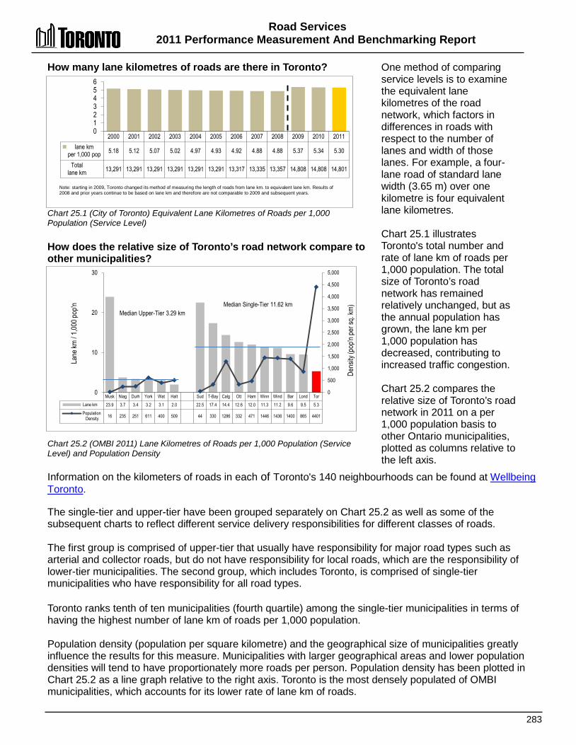
Road Services 2011 Performance Measurement And Benchmarking Report
283
2000 2001 2002 2003 2004 2005 2006 2007 2008 2009 2010 2011 lane km
per 1,000 pop 5.18 5.12 5.07 5.02 4.97 4.93 4.92 4.88 4.88 5.37 5.34 5.30
Total lane km 13,291 13,291 13,291 13,291 13,291 13,291 13,317 13,335 13,357 14,808 14,808 14,801
0 1 2 3 4 5 6
Musk Niag Durh York Wat Halt Sud T-Bay Calg Ott Ham Winn Wind Bar Lond Tor Lane km 23.9 3.7 3.4 3.2 3.1 2.0 22.5 17.4 14.4 12.6 12.0 11.3 11.2 9.6 9.5 5.3
Population Density 16 235 251 611 400 509 44 330 1286 332 471 1446 1436 1400 865 4401
0
500
1,000
1,500
2,000
2,500
3,000
3,500
4,000
4,500
5,000
0
10
20
30
Lane
km / 1
,000 p
op'n Median Single-Tier 11.62 km
Median Upper-Tier 3.29 km
Dens
ity (p
op'n
per s
q. km
)
How many lane kilometres of roads are there in Toronto? Chart 25.1 (City of Toronto) Equivalent Lane Kilometres of Roads per 1,000 Population (Service Level) How does the relative size of Toronto’s road network compare to other municipalities? Chart 25.2 (OMBI 2011) Lane Kilometres of Roads per 1,000 Population (Service Level) and Population Density
One method of comparing service levels is to examine the equivalent lane kilometres of the road network, which factors in differences in roads with respect to the number of lanes and width of those lanes. For example, a four-lane road of standard lane width (3.65 m) over one kilometre is four equivalent lane kilometres. Chart 25.1 illustrates Toronto's total number and rate of lane km of roads per 1,000 population. The total size of Toronto’s road network has remained relatively unchanged, but as the annual population has grown, the lane km per 1,000 population has decreased, contributing to increased traffic congestion. Chart 25.2 compares the relative size of Toronto’s road network in 2011 on a per 1,000 population basis to other Ontario municipalities, plotted as columns relative to the left axis.
Information on the kilometers of roads in each of Toronto's 140 neighbourhoods can be found at Wellbeing Toronto. The single-tier and upper-tier have been grouped separately on Chart 25.2 as well as some of the subsequent charts to reflect different service delivery responsibilities for different classes of roads. The first group is comprised of upper-tier that usually have responsibility for major road types such as arterial and collector roads, but do not have responsibility for local roads, which are the responsibility of lower-tier municipalities. The second group, which includes Toronto, is comprised of single-tier municipalities who have responsibility for all road types. Toronto ranks tenth of ten municipalities (fourth quartile) among the single-tier municipalities in terms of having the highest number of lane km of roads per 1,000 population. Population density (population per square kilometre) and the geographical size of municipalities greatly influence the results for this measure. Municipalities with larger geographical areas and lower population densities will tend to have proportionately more roads per person. Population density has been plotted in Chart 25.2 as a line graph relative to the right axis. Toronto is the most densely populated of OMBI municipalities, which accounts for its lower rate of lane km of roads.
Note: starting in 2009, Toronto changed its method of measuring the length of roads from lane km. to equivalent lane km. Results of 2008 and prior years continue to be based on lane km and therefore are not comparable to 2009 and subsequent years.

Road Services 2011 Performance Measurement And Benchmarking Report
284
2000 2001 2002 2003 2004 2005 2006 2007 2008 2009 2010 2011 Collision Rate per Lane km 5.47 5.51 5.43 4.14 3.52 3.91 3.27 3.70 3.72 3.39 3.46 3.37
Total # collisions 72,631 73,174 72,100 55,083 46,767 52,008 43,528 49,322 49,717 50,263 51,327 49,901
0.00 1.00 2.00 3.00 4.00 5.00 6.00
2003 and subsequent years collisions exclude those on laneways and on unknown and private property (approx 0.3 per lane km ). Starting in 2009 results are based on equivalent lane km. Results of 2008 and prior years continue to be based on lane km. and therefore are not comparable to 2009 and subsequent years.
Niag Halt Musk Durh York Wat Ham Bar Wind Sud Winn T-Bay Ott Lond Tor Calg coll/ mill. Veh. km 1.15 1.24 1.44 1.58 1.64 2.44 0.93 1.31 1.58 1.92 2.05 2.33 2.50 3.02 3.18 3.90
0.00 0.50 1.00 1.50 2.00 2.50 3.00 3.50 4.00 4.50
Median Upper-Tier 1.51 Median Single-Tier 2.19
Musk Calg Bar T-Bay Niag Sud Ott Durh Wat Ham York Winn Halt Wind Tor Lond km travelled /
lane km (000s) 575 1,170 1,171 1,334 1,346 1,400 1,419 1,469 1,483 1,669 1,841 1,843 1,871 2,035 2,203 2,365
0
500
1,000
1,500
2,000
2,500
Median 1,476,000
What is the rate of vehicle collisions in Toronto? Chart 25.3 (City of Toronto) Number of Vehicle Collisions per Lane km. of Roads (Community Impact) How does the vehicle collision rate in Toronto compare to other municipalities? Chart 25.4 (OMBI 2011) Vehicle Collision Rate/Collisions per Million Vehicle km (Community Impact) How congested are Toronto’s major roads compared to other municipalities? Chart 25.5 (OMBI 2011) Congestion Vehicle km (000s) Traveled per Lane km on Major Roads (Community Impact)
A major objective for municipalities is for road networks to provide a high level of safety for vehicles, occupants, cyclists and pedestrians that use them.
Chart 25.3 reflects Toronto's total number of collisions and the rate of vehicle collisions per equivalent lane kilometre of road. Results indicate that there has been a general decline in collisions over the longer term. The number of collisions decreased by -2.8 percent in 2011 and the number of injuries associated with these collisions involving drivers, passengers, pedestrians and cyclists decreased by -16.6 percent. Information on the number of collisions on collector and local roads in each of Toronto's 140 neighbourhoods can be found at Wellbeing Toronto. Chart 25.4 summarizes information on the 2011 annual rate of vehicle collisions per million vehicle kilometres traveled in Toronto and other municipalities. On the basis of the lowest collision rate, Toronto ranks ninth of ten single-tier municipalities (fourth quartile). Traffic congestion, discussed below, is likely a factor in Toronto's higher rate of collisions, given that Toronto roads are the second most congested of the OMBI municipalities.
Chart 25.5 compares the 2011 level of congestion on Toronto's main roads to other municipalities. It shows the number of times (in thousands) a vehicle travels over each lane kilometre of road. In terms of having the least congested roads, Toronto ranks fifteenth of sixteen municipalities (fourth quartile), meaning Toronto roads are heavily congested. Toronto congestion rate also increased by +5.6% in 2011. The number of vehicles on the roads can be affected by population density, the type of roads (e.g. arterial, collector or local roads, and in some cases, expressways) and average commute distances. Information on the average 24-hour traffic volumes on collector roads in each of Toronto's 140 neighbourhoods can be found at Wellbeing Toronto.

Road Services 2011 Performance Measurement And Benchmarking Report
285
2000 2001 2002 2003 2004 2005 2006 2007 2008 2009 2010 2011 % Roads Rated
Good to Very Good 77.3% 78.3% 78.1% 80.9% 82.1% 89.2% 89.2% 89.6% 87.6% 90.0% 91.7% 84.7%
0%
20%
40%
60%
80%
100%
York Halt Niag Wat Musk Durh Tor Calg Ott Bar Ham Winn T-Bay Lond Sud Wind % Roads rated
Good to Very Good 83.4% 68.6% 63.9% 51.6% 41.4% 40.9% 84.7% 82.3% 76.1% 67.6% 61.4% 58.8% 55.0% 52.7% 51.3% 50.2%
0% 10% 20% 30% 40% 50% 60% 70% 80% 90% Median Upper-Tier 57.8% Median Single-Tier 60.1%
What is the pavement condition of Toronto’s roads? Chart 25.6 (City of Toronto) % of Lane Km. of Roads With Pavement Condition Rated as Good to Very Good (Quality) How does the pavement condition of Toronto’s roads compare to other municipalities? Chart 25.7(OMBI 2011) % of Lane Km. of Roads With Pavement Condition Rated as Good to Very Good (Quality)
The state of repair of the City's infrastructure is extremely important in delivering effective services. Chart 25.6 summarizes the pavement condition of Toronto’s roads, providing the percentage of the road system where the pavement quality is rated as good to very good. Over the longer term there has been an improvement in pavement condition because of Toronto’s asset management programs and strategies to maintain roads in a good state of repair. Toronto's result dipped in 2011 after updated condition assessment information was compiled. The decrease is also reflective of aging road infrastructure that requires more investment. Chart 25.7 compares Toronto's 2011 percentage of roads rated in good to very good condition to other municipalities. Upper- and single-tier municipalities are grouped separately because of differences in the road types they have responsibility for maintaining. Toronto ranks first of ten upper-tier municipalities (first quartile) in terms of having the best pavement condition of its roads.
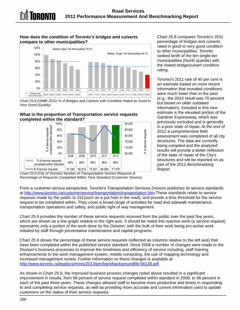
Road Services 2011 Performance Measurement And Benchmarking Report
286
Halt York Durh Musk Wat Niag Lond Sud T-Bay Ott Bar Calg Ham Winn Wind Tor % Bridges rated
Good to Very Good 99.2% 86.9% 82.8% 74.6% 66.5% 55.8% 78.5% 77.3% 75.0% 69.0% 68.0% 61.4% 61.1% 54.9% 49.5% 40.0%
0%
20%
40%
60%
80%
100%
120% Median Upper Tier Municipalities 78.7% Median Single Tier Municipalities 64.7%
2008 2009 2010 2011 2012 % of service requests
completed within standard 68% 89% 96% 96% 96%
# of service requests 81,546 80,818 75,361 88,598 77,479
65,000
70,000
75,000
80,000
85,000
90,000
0%
20%
40%
60%
80%
100%
% of
servi
ce re
ques
ts co
mplet
ed w
ithin
stand
ard
# of
servi
ce re
ques
ts
How does the condition of Toronto’s bridges and culverts compare to other municipalities? Chart 25.8 (OMBI 2011) % of Bridges and Culverts with Condition Rated as Good to Very Good (Quality) What is the proportion of Transportation service requests completed within the standard? Chart 25.9 (City of Toronto) Number of Transportation Service Requests & Percentage of Requests Completed Within Time Standard (Customer Service)
Chart 25.8 compares Toronto's 2011 percentage of bridges and culverts rated in good to very good condition to other municipalities. Toronto ranked tenth of the ten single-tier municipalities (fourth quartile) with the lowest bridge/culvert condition rating. Toronto's 2011 rate of 40 per cent is an estimate based on more recent information that revealed conditions were much lower than in the past (e.g., the 2010 result was 70 percent but based on older outdated information). Included in this new estimate is the elevated portion of the Gardiner Expressway, which was previously excluded and is generally in a poor state of repair. At the end of 2012 a comprehensive field assessment was completed of all city structures. The data are currently being compiled and the analyzed results will provide a better reflection of the state of repair of the City's structures and will be reported on as part of the 2012 Benchmarking Report.
From a customer service perspective, Toronto's Transportation Services Division publishes its service standards at http://www.toronto.ca/customerservice/transportation/transportation.htm.These standards relate to service requests made by the public to 311(such as a pot hole in the road), and provide a time threshold for the service request to be completed within. They cover a broad range of activities for road and sidewalk maintenance, transportation operations and safety, and public right of way management. Chart 25.9 provides the number of these service requests received from the public over the past five years, which are shown as a line graph relative to the right axis. It should be noted this reactive work (a service request) represents only a portion of the work done by the Division, with the bulk of their work being pro-active work initiated by staff through preventative maintenance and capital programs. Chart 25.9 shows the percentage of these service requests (reflected as columns relative to the left axis) that have been completed within the published service standard. Since 2008 a number of changes were made to the Division's business processes to improve the timeliness and efficiency of service including, staff training, enhancements to the work management system, mobile computing, the use of mapping technology and increased management review. Further information on these changes is available at http://www.toronto.ca/legdocs/mmis/2013/gm/bgrd/backgroundfile-56138.pdf. As shown in Chart 25.9, the improved business process changes noted above resulted in a significant improvement in results, from 68 percent of service request completed within standard in 2008, to 96 percent in each of the past three years. These changes allowed staff to become more productive and timely in responding to and completing service requests, as well as providing more accurate and current information used to update customers on the status of their service requests.
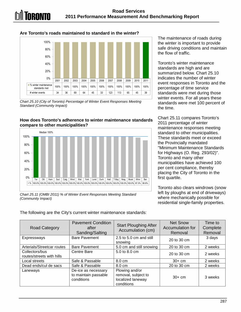
Road Services 2011 Performance Measurement And Benchmarking Report
287
2001 2002 2003 2004 2005 2006 2007 2008 2009 2010 2011 % winter maintenance
standards met 100% 100% 100% 100% 100% 100% 100% 100% 100% 100% 100%
# winter events 34 36 69 64 45 33 123 113 65 45 39
0%
20%
40%
60%
80%
100%
Tor Ott Ham Sud Calg Wind Wat York Lond Durh Halt T-Bay Niag Musk Winn Bar % 100.0% 100.0% 100.0% 100.0% 100.0% 100.0% 100.0% 100.0% 100.0% 100.0% 100.0% 100.0% 100.0% 100.0% 97.3% 90.6%
0%
20%
40%
60%
80%
100% Median 100%
Are Toronto’s roads maintained to standard in the winter? Chart 25.10 (City of Toronto) Percentage of Winter Event Responses Meeting Standard (Community Impact) How does Toronto’s adherence to winter maintenance standards compare to other municipalities? Chart 25.11 (OMBI 2011) % of Winter Event Responses Meeting Standard (Community Impact)
The maintenance of roads during the winter is important to provide safe driving conditions and maintain the flow of traffic. Toronto’s winter maintenance standards are high and are summarized below. Chart 25.10 indicates the number of winter event responses in Toronto and the percentage of time service standards were met during those winter events. For all years these standards were met 100 percent of the time. Chart 25.11 compares Toronto’s 2011 percentage of winter maintenance responses meeting standard to other municipalities. These standards meet or exceed the Provincially mandated "Minimum Maintenance Standards for Highways (O. Reg. 293/02)". Toronto and many other municipalities have achieved 100 per cent compliance, thereby placing the City of Toronto in the first quartile. Toronto also clears windrows (snow left by ploughs at end of driveways) where mechanically possible for residential single-family properties.
The following are the City's current winter maintenance standards:
Road Category Pavement Condition
after Sanding/Salting
Start Ploughing After Accumulation (cm)
Net Snow Accumulation for
Removal
Time to Complete Removal
Expressways Bare Pavement 2.5 to 5.0 cm and still snowing 20 to 30 cm 3 days
Arterials/Streetcar routes Bare Pavement 5.0 cm and still snowing 20 to 30 cm 2 weeks Collectors/bus routes/streets with hills
Centre Bare 5.0 to 8.0 cm 20 to 30 cm 2 weeks
Local streets Safe & Passable 8.0 cm 30+ cm 2 weeks Dead ends/cul de sacs Safe & Passable 8.0 cm 20 to 30 cm 2 weeks Laneways De-ice as necessary
to maintain passable conditions
Plowing and/or removal, subject to localized laneway conditions
30+ cm 3 weeks
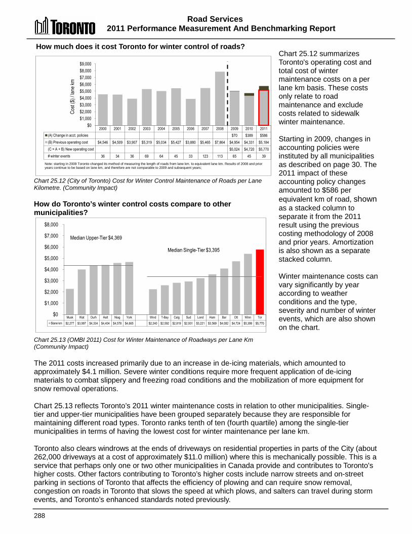
Road Services 2011 Performance Measurement And Benchmarking Report
288
2000 2001 2002 2003 2004 2005 2006 2007 2008 2009 2010 2011 (A) Change in acct. policies $70 $389 $586 (B) Previous operating cost $4,546 $4,509 $3,907 $5,319 $5,034 $5,427 $3,880 $5,465 $7,864 $4,954 $4,331 $5,184 (C = A + B) New operating cost $5,024 $4,720 $5,770 # winter events 36 34 36 69 64 45 33 123 113 65 45 39
$0 $1,000 $2,000 $3,000 $4,000 $5,000 $6,000 $7,000 $8,000 $9,000
Cost
($) /
lane
km
Musk Wat Durh Halt Niag York Wind T-Bay Calg Sud Lond Ham Bar Ott Winn Tor $lane km $2,277 $3,997 $4,334 $4,404 $4,578 $4,665 $2,240 $2,592 $2,819 $2,931 $3,221 $3,569 $4,082 $4,724 $5,399 $5,770
$0
$1,000
$2,000
$3,000
$4,000
$5,000
$6,000
$7,000
$8,000
Median Upper-Tier $4,369
Median Single-Tier $3,395
How much does it cost Toronto for winter control of roads? Chart 25.12 (City of Toronto) Cost for Winter Control Maintenance of Roads per Lane Kilometre. (Community Impact) How do Toronto’s winter control costs compare to other municipalities? Chart 25.13 (OMBI 2011) Cost for Winter Maintenance of Roadways per Lane Km (Community Impact)
Chart 25.12 summarizes Toronto's operating cost and total cost of winter maintenance costs on a per lane km basis. These costs only relate to road maintenance and exclude costs related to sidewalk winter maintenance. Starting in 2009, changes in accounting policies were instituted by all municipalities as described on page 30. The 2011 impact of these accounting policy changes amounted to $586 per equivalent km of road, shown as a stacked column to separate it from the 2011 result using the previous costing methodology of 2008 and prior years. Amortization is also shown as a separate stacked column. Winter maintenance costs can vary significantly by year according to weather conditions and the type, severity and number of winter events, which are also shown on the chart.
The 2011 costs increased primarily due to an increase in de-icing materials, which amounted to approximately $4.1 million. Severe winter conditions require more frequent application of de-icing materials to combat slippery and freezing road conditions and the mobilization of more equipment for snow removal operations. Chart 25.13 reflects Toronto’s 2011 winter maintenance costs in relation to other municipalities. Single-tier and upper-tier municipalities have been grouped separately because they are responsible for maintaining different road types. Toronto ranks tenth of ten (fourth quartile) among the single-tier municipalities in terms of having the lowest cost for winter maintenance per lane km. Toronto also clears windrows at the ends of driveways on residential properties in parts of the City (about 262,000 driveways at a cost of approximately $11.0 million) where this is mechanically possible. This is a service that perhaps only one or two other municipalities in Canada provide and contributes to Toronto's higher costs. Other factors contributing to Toronto’s higher costs include narrow streets and on-street parking in sections of Toronto that affects the efficiency of plowing and can require snow removal, congestion on roads in Toronto that slows the speed at which plows, and salters can travel during storm events, and Toronto’s enhanced standards noted previously.
Note: starting in 2009 Toronto changed its method of measuring the length of roads from lane km. to equivalent lane km. Results of 2008 and prior years continue to be based on lane km. and therefore are not comparable to 2009 and subsequent years;

Road Services 2011 Performance Measurement And Benchmarking Report
289
2000 2001 2002 2003 2004 2005 2006 2007 2008 2009 2010 2011 (A) Amortization $5,653 $5,076 $5,226 (B) Changes in acct. policies $2,854 $1,909 $2,025 (C) Previous Operating Cost $3,880 $5,107 $4,497 $3,917 $4,114 $4,254 $4,968 $5,689 $5,252 $4,891 $5,081 $6,140 (D = B + C) New Operating Cost $7,745 $6,990 $8,165 (E = A+D) Total Operating Cost $13,398 $12,066 $13,391
$0
$3,000
$6,000
$9,000
$12,000
$15,000
Cost
($) /
Equ
ivalen
t La
ne km
Note: starting in 2009 Toronto changed its method of measuring the length of roads from lane km. to equivalent lane km. Results of 2008 and prior years continue to be based on lane km. and therefore are not comparable to 2009 and subsequent years.
Niag Musk Durh Wat York Halt Ott Wind T-Bay Ham Calg Winn Sud Bar Lond Tor $ lane km $1,068 $1,492 $1,953 $2,025 $4,465 $12,79 $1,612 $1,625 $1,894 $2,053 $2,121 $3,161 $3,355 $4,848 $5,067 $8,165
% good/very good 64% 41% 41% 52% 83% 69% 76% 50% 55% 61% 82% 59% 51% 68% 53% 85%
30%
40%
50%
60%
70%
80%
90%
$0
$2,000
$4,000
$6,000
$8,000
$10,000
$12,000
$14,000
% of
road
s with
pave
ment
rated
go
od to
very
good
$cos
t / lan
e kil
ometr
e
Median Upper-Tier $1,989 Median Single-Tier $2,641
2000 2001 2002 2003 2004 2005 2006 2007 2008 2009 2010 2011 Op.Cost-excluding acct policy change and utility cuts for
roads per lane kilometre $3,226 $3,613 $3,306 $3,268 $3,168 $3,532 $4,053 $3,720 $4,058 $3,442 $3,678 $4,328
$0
$1,000
$2,000
$3,000
$4,000
$5,000
Note: starting in 2010 Toronto changed its method of measuring the length of rods from lane km. to equivalent lane km.. Results of 2008 and prior years continue to be based on lane km. and therefore are not comparable to 2009 and subsequent years.
How much does it cost to maintain Toronto's road surfaces? Chart 25.14 (City of Toronto) Operating and Total Cost of Paved Roads per Lane Kilometre (Efficiency) Chart 25.15 (City of Toronto) Operating Cost of Paved Roads per Lane Kilometre Excluding Impact of Utility Cuts and Accounting Policy Changes (Efficiency) How does Toronto’s cost of maintaining road surfaces compare to other municipalities? Chart 25.16 (OMBI 2011) Operating Costs for Paved (Hard Top) Roads per Lane km (Efficiency) and Percentage of Roads Rated Good to Very Good (Community Impact)
Chart 25.14 provides Toronto’s operating costs and total cost (operating cost plus amortization) per lane kilometre for maintaining paved roads (i.e. patching, surface repairs, utility cut repairs, sweeping, etc.). Starting in 2009, changes in accounting policies were instituted by all municipalities as described on page 30. The impact of these accounting policy changes in 2011 amounted to an increase of $2,025 per lane km shown as a stacked column to separate it from the 2011 result using the previous costing methodology of 2008 and prior years. Amortization is also shown as a separate stacked column. In 2011 there was an increase of $6 million ($26.82 million total) in the cost of permanently restoring pavement utility cuts after installation and replacement of utility conduits, which can vary significantly by year, but is recovered from the utility companies Chart 25.15 excludes both the impact of the utility cuts described above and the impact of the accounting policy changes. On this basis, operating costs still increased in 2011 through a combination of increased direct costs,
expenditures out of reserve funds and increased allocations of program support costs. Chart 25.16 compares Toronto’s operating cost for paved roads per lane km to other municipalities, and are plotted as columns relative to the left axis. It should be noted that these figures do not include amortization of capital. Toronto ranks tenth of ten (fourth quartile) among single-tier municipalities. The percentage of roads where the pavement quality has been rated as good to very good is also plotted, as a line graph relative to the right axis, to provide additional context. While Toronto has the highest costs, it also the highest pavement quality rating as discussed under Chart 25.7.
Road Services 2011 Performance Measurement And Benchmarking Report
290
Other factors contributing to Toronto's higher costs on Chart 25.16 include:
• Traffic congestion and the amount of work done by utility companies on Toronto roads is significant, thereby accelerating road deterioration rates and requiring more frequent road maintenance at an additional cost.
• Costs incurred for the permanent restoration of utility cuts, although recovered from the utility companies, increases Toronto’s gross costs; these activities are more common in Toronto than in other municipalities; and
• When road maintenance work is required in Toronto, expensive traffic management protocols, such as night work, are followed to ensure motorists are not adversely affected during the period of road maintenance/repair.
2012 Achievements and 2013 Planned Initiatives The following achievements and initiatives have improved or are expected to further improve the efficiency and effectiveness of transportation and road operations in Toronto: 2012 Initiatives Completed/Achievements
• Received the Dr. Sheela Basrur Health and Safety Award for the third time in the four years since its inception for the remarkable reduction in lost time injuries by 63% from 2011.
• Increased the use of mobile technology and automation to support field work. • Initiated the Utility Cut Permit Pilot Program, which resulted in improved management and
tracking of utility cuts made by external companies. • Collaborated with Insurance & Risk Management to streamline the process for insurance
claims and ensure timely response to urgent or serious claims. • Undertook a review of current in-house services and identified opportunities for contracting
of street sweeping, winter maintenance, road repair and grass cutting. • Completed a culvert management system review as part of the Environmental Risk
Assessment Initiative. • Successfully designed and constructed various bicycle infrastructure. • Continued implementation of the Toronto Walking Strategy with the construction of 4,977
metres of sidewalk. • Accelerated and completed the divisional program for preventative chipping of loose
concrete from the Gardiner Expressway overhead structure to ensure public safety and established a protocol for communication and immediate response to future reports of falling concrete.
2013 Initiatives Planned
• Update the Snow Disposal Strategy to develop a plan for ensuring an adequate capacity to accommodate a major snow removal effort through the retention and acquisition of snow storage sites and the approval to operate snow melters.
• Develop an Intelligent Transportation System Strategic Plan that will guide decision-making for the next two to three years.
• Install additional Changeable Message Signs on the Gardiner Expressway, which will provide motorists with real-time traffic conditions, upcoming road work or events on the Expressway.
• Complete the Downtown Toronto Transportation Study, which will include recommendations to reduce congestion and improve traffic operations in the downtown core.
• Continue the implementation of the Toronto Walking Strategy.
Road Services 2011 Performance Measurement And Benchmarking Report
291
Factors Influencing the Results of Municipalities The results of each municipality included in this report can be influenced to varying degrees by factors such as: • The mix of roads being maintained (e.g. arterial, collector, local roads and laneways). • Winter conditions. • Preventive maintenance practices (timing, frequency, amounts, and type of preventive
maintenance strategies). • The condition of roads at the time that responsibility for them was assumed from the
province. • Traffic volumes, the degree of congestion and the composition of vehicles that use the road
system (cars, trucks, transit vehicles). • The extent of utility cut repairs. • Differing service standards between municipalities for accumulation of snow and ice, before
sanding, salting, plowing and snow removal operations commence and the time period before completion.
• Differences in standby charges to allow for timely response to winter events. • Variations in weather conditions between municipalities (high snowfall, winter conditions). • The number of winter event vehicle hours required for storm events which is an indication of
the degree of effort involved to combat these events.

292
Toronto Employment and Social Services
Employment Services
Develop and deliver City employment services
Develop and implement employment plans to
support City, Sectoral, Commercial and Neighbourhood
Redevelopment Initiatives
Design, Manage and Deliver Skills Training,
Employment Preparation,Work
Experience and Job Search Programs
Provide Individualized Employment
CaseManagement
Financial Services
Manage Initial Eligibility Determination for
Financial Assistance
Provide IndividualizedFinancial
Assistance Eligibility and Case Management
Deliver and Administer Social Assistance Financial Benefits
Deliver and Administer Employment Assistance
Financial Benefits
Social Supports
Administer Applications for a range of City Social SupportPrograms
Administer Funds to help the Elderly and Disabled
Purchase Critical Medical Supplies
SSoocciiaall AAssssiissttaannccee SSeerrvviicceess Toronto's Employment and Social Services provides employment services, financial benefits and social supports— including Ontario Works (OW), a mandatory province-wide program—to underemployed and unemployed residents. Employment services include opportunities for residents to engage in a variety of activities that may lead to jobs or increase their employment prospects. Employment services include job search supports, education and training, paid and unpaid job placements, and access to other programs that enhance job readiness. Financial assistance may include funds to cover food, shelter, clothing and other household items, the cost of prescribed medications, other benefits such as dental services for children, eyeglasses, and medical transportation. It can also include assistance with employment-related expenses and child care costs. Social supports include access or referral to other services like child care, mental health services and housing supports, as well as community and neighbourhood services like recreation programs and libraries.
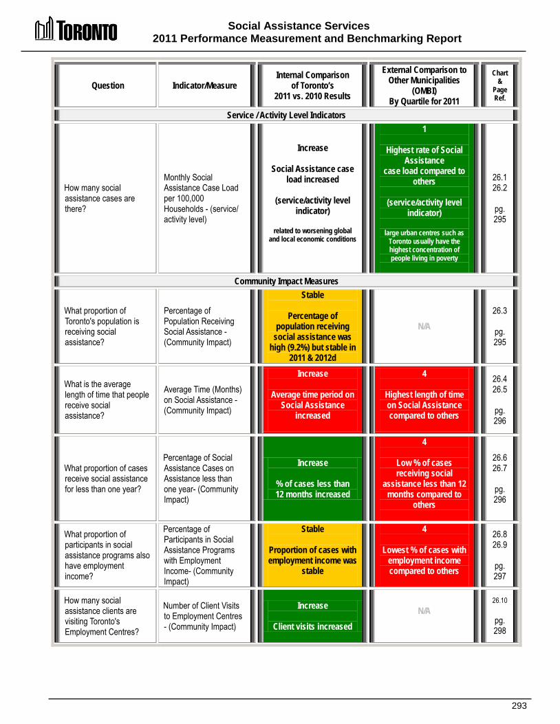
Social Assistance Services 2011 Performance Measurement and Benchmarking Report
293
Question Indicator/Measure Internal Comparison
of Toronto’s 2011 vs. 2010 Results
External Comparison to Other Municipalities
(OMBI) By Quartile for 2011
Chart &
Page Ref.
Service / Activity Level Indicators
How many social assistance cases are there?
Monthly Social Assistance Case Load per 100,000 Households - (service/ activity level)
Increase
Social Assistance case load increased
(service/activity level
indicator)
related to worsening global and local economic conditions
1
Highest rate of Social Assistance
case load compared to others
(service/activity level
indicator)
large urban centres such as Toronto usually have the highest concentration of people living in poverty
26.1 26.2
pg. 295
Community Impact Measures
What proportion of Toronto's population is receiving social assistance?
Percentage of Population Receiving Social Assistance - (Community Impact)
Stable
Percentage of population receiving
social assistance was high (9.2%) but stable in
2011 & 2012d
N/A 26.3
pg. 295
What is the average length of time that people receive social assistance?
Average Time (Months) on Social Assistance - (Community Impact)
Increase
Average time period on Social Assistance
increased
4
Highest length of time on Social Assistance compared to others
26.4 26.5
pg. 296
What proportion of cases receive social assistance for less than one year?
Percentage of Social Assistance Cases on Assistance less than one year- (Community Impact)
Increase
% of cases less than 12 months increased
4
Low % of cases receiving social
assistance less than 12 months compared to
others
26.6 26.7
pg. 296
What proportion of participants in social assistance programs also have employment income?
Percentage of Participants in Social Assistance Programs with Employment Income- (Community Impact)
Stable
Proportion of cases with employment income was
stable
4
Lowest % of cases with employment income compared to others
26.8 26.9
pg. 297
How many social assistance clients are visiting Toronto's Employment Centres?
Number of Client Visits to Employment Centres - (Community Impact)
Increase
Client visits increased N/A
26.10
pg. 298

Social Assistance Services 2011 Performance Measurement And Benchmarking Report
294
Question Indicator/Measure Internal Comparison
of Toronto’s 2011 vs. 2010 Results
External Comparison to Other Municipalities
(OMBI) By Quartile for 2011
Chart &
Page Ref.
How many social assistance clients are attending basic education classes?
Average Monthly Participants in Basic Education (Community Impact)- (Community Impact)
Decrease
Number of participants attending class
decreased
N/A
26.11
pg. 298
Customer Service Measures
How long does it take to inform a client that they are eligible for social assistance?
Social Assistance Response Time (Days) to Client Eligibility - (Customer Service)
Stable
Response time was stable, only increasing
slightly
2
Response time is shorter/faster compared
to others
26.12 26.13
pg. 299
Efficiency Measures
What is the monthly administrative cost to support a social assistance case?
Monthly Operating Cost of Social Assistance Administration per Case
Decrease
Administration cost per case decreased
3
Higher administration cost per case compared
to others
26.14 26.15
pg. 300
What is the average monthly benefit cost per social assistance case?
Monthly Social Assistance Benefit Cost per Case
Stable
Benefits cost per case was stable
4
Highest benefits cost per case compared to
others
(higher housing costs in Toronto is the key factor)
26.16 26.17
pg. 301
Overall Results
Service /Activity Level
Indicators (Resources)
N/A
Performance Measures (Results)
3 - Favourable 4 - Stable 2 - Unfavour. 78% favourable or stable
Service/ Activity Level
Indicators (Resources)
1 - 1st quartile 0 - 2nd quartile 0 - 3rd quartile 0 - 4th quartile 100% above median
Performance Measures (Results)
0 - 1st quartile 1 - 2nd quartile 1 - 3rd quartile 4 - 4th quartile 17% above median
For an explanation of how to interpret this summary and the supporting charts, please see pages 24-30. These quartile results are based on a maximum sample size of 12 municipalities.

Social Assistance Services 2011 Performance Measurement and Benchmarking Report
295
Tor Lond Ham Wind Niag Sud Wat Ott Durh Musk York Halt Caseloads / 100k hh 8,515 6,739 6,676 6,595 5,737 4,690 4,671 4,433 4,218 3,996 1,913 1,251
0 1,000 2,000 3,000 4,000 5,000 6,000 7,000 8,000 9,000
Median 4,680
How many social assistance cases are there in Toronto? Chart 26.1 (City of Toronto) Monthly Social Assistance Case Load per 100,000 Households (Activity Level) How does Toronto social assistance caseload compare to other municipalities? Chart 26.2 (OMBI 2011) Monthly Social Assistance Case Load per 100,000 Households What proportion of Toronto's population is receiving social assistance? Chart 26.3 (City of Toronto) Percentage of Population Receiving Social Assistance (Community Impact)
Municipalities are responsible for delivering Ontario Works (OW) in accordance with provincial regulations and rules.
Chart 26.1 provides Toronto's total number and rate of social assistance cases per 100,000 households. A case can involve either an individual or a family. Total cases increased by +5.7 percent in 2011 with worsening global economic and local employment conditions. This increase carried into the first quarter of 2012 before stabilizing.
Many individuals who lose their jobs are not eligible to receive Employment Insurance (EI) benefits (fewer than 25 percent are eligible) because of the significant numbers of people who work part-time or in contract jobs. For those ineligible to receive EI benefits or who were eligible but have exhausted their EI benefits who need financial assistance, their only recourse is Social Assistance.
In 2012 the individuals and families receiving social assistance in Toronto represented 9.2% of the population (see Chart 26.3), which is high but stable.
Information on the total number of social assistance recipients in each of Toronto's 140 neighbourhoods can be found at Wellbeing Toronto. Chart 26.2 compares Toronto's 2011 rate of social assistance cases to other municipalities and shows Toronto has the highest service/activity level of social services cases among the OMBI municipalities, ranking first of twelve (first quartile). As with other large urban centres, Toronto has a disproportionate number of social assistance recipients in comparison to its surrounding jurisdictions, which is directly related to the proportion of the population that is poor. Approximately 85 percent of Toronto’s caseload consists of the five most financially vulnerable groups in our society: single parents, persons with disabilities who are not eligible for Ontario Disability Support Program (ODSP) benefits, aboriginal persons, recent immigrants, and unemployed or underemployed people over the age of 45.
2001 2002 2003 2004 2005 2006 2007 2008 2009 2010 2011 Total Caseloads 62,751 67,602 66,494 67,124 70,806 73,645 72,859 72,713 81,978 88,422 93,460 Caseloads / 100k hh 6,449 6,856 6,649 6,626 6,901 6,922 6,784 6,720 7,563 8,106 8,515
0 2,000 4,000 6,000 8,000
10,000
2010 2011 2012 % of Population 9.3% 9.1% 9.2%
0%
3%
6%
9%
12%

Social Assistance Services 2011 Performance Measurement And Benchmarking Report
296
2002 2003 2004 2005 2006 2007 2008 2009 2010 2011 # of months 23.8 26.6 22.0 22.3 20.9 20.8 20.6 19.4 19.3 19.9
0 5
10 15 20 25 30
2007 2008 2009 2010 2011 % of cases 47.1% 48.5% 50.0% 42.0% 45.0%
0%
15%
30%
45%
60%
What is the average length of time (months) that people receive social assistance in Toronto? Chart 26.4 (City of Toronto) Average Time (Months) that Individuals or Families Receive Social Assistance (Community Impact) How does the average length of time (months) in Toronto that people receive social assistance compare to other municipalities? Chart 26.5 (OMBI 2011) Average Time (Months) that Individuals or Families Receive Social Assistance (Community Impact) What proportion of cases receive social assistance for less than one year in Toronto? Chart 26.6 (City of Toronto) Percentage of Cases Receiving Social Assistance for Less than 1 Year (Community Impact) How does the proportion of cases in Toronto receive social assistance less than one year compare to other municipalities? Chart 26.7 (OMBI 2011) Percentage of Cases Receiving Social Assistance for Less than 1 Year (Community Impact)
A person eligible to receive social assistance is also entitled to receive employment services and supports. These programs provide opportunities for participants to engage in a variety of activities that can lead to jobs or increase employment prospects, and help them become more self-sufficient. The period of time that people receive social assistance provides one indication of success of employment services. Chart 26.4 provides information on the average number of months that individuals or families in Toronto received social assistance and shows a small increase in 2011. Chart 26.5 compares Toronto's 2011 result to other municipalities and shows that Toronto has the longest/ highest average time period on social assistance, ranking twelfth of twelve municipalities (fourth quartile). The proportion of cases that received social assistance for less than one year provides another perspective on the degree of success. Chart 26.6 shows this percentage increased in 2011, meaning a lower proportion of cases received social assistance for a period greater than one year. Results however can be influenced by a sudden influx of new cases resulting from sharp downturns in the economy, and not necessarily by an increase in cases exiting assistance sooner. Chart 26.7 compares Toronto's 2011 result to other municipalities, with Toronto ranking eleventh of twelve municipalities (fourth quartile) in terms of having the highest proportion of cases receiving social assistance for less than 12 months.
Musk Halt York Niag Wat Sud Durh Ham Lond Ott Wind Tor # of months 9.7 10.6 12.9 13.0 13.1 13.4 14.2 14.8 15.4 16.1 16.6 19.9
0
5
10
15
20
25 Median 13.8 months
Musk Halt Sud York Ott Niag Wat Lond Ham Wind Tor Durh % of cases 68.9% 66.3% 60.8% 60.4% 58.3% 57.8% 57.6% 53.5% 53.0% 49.0% 45.0% 44.2%
0%
20%
40%
60%
80% Median 57.7%
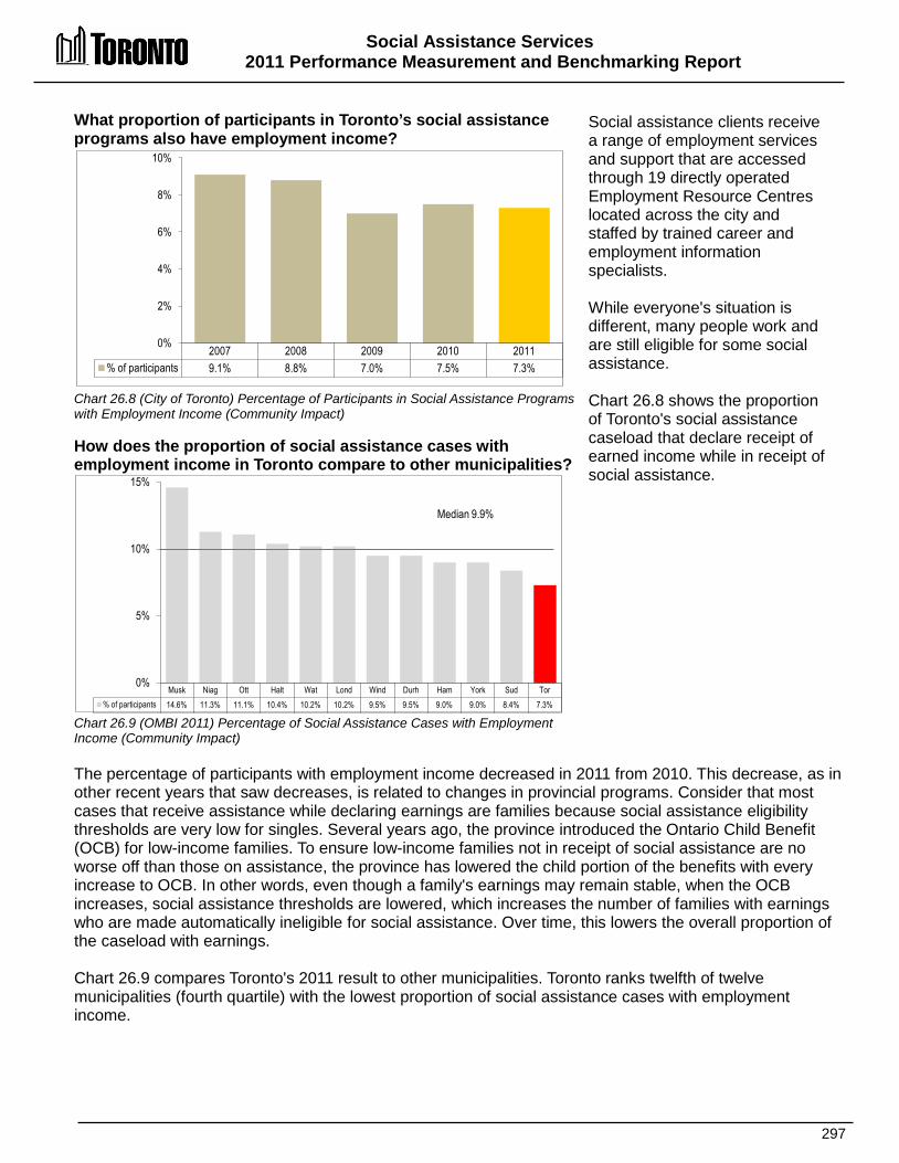
Social Assistance Services 2011 Performance Measurement and Benchmarking Report
297
2007 2008 2009 2010 2011 % of participants 9.1% 8.8% 7.0% 7.5% 7.3%
0%
2%
4%
6%
8%
10%
What proportion of participants in Toronto’s social assistance programs also have employment income? Chart 26.8 (City of Toronto) Percentage of Participants in Social Assistance Programs with Employment Income (Community Impact) How does the proportion of social assistance cases with employment income in Toronto compare to other municipalities? Chart 26.9 (OMBI 2011) Percentage of Social Assistance Cases with Employment Income (Community Impact)
Social assistance clients receive a range of employment services and support that are accessed through 19 directly operated Employment Resource Centres located across the city and staffed by trained career and employment information specialists. While everyone's situation is different, many people work and are still eligible for some social assistance. Chart 26.8 shows the proportion of Toronto's social assistance caseload that declare receipt of earned income while in receipt of social assistance.
The percentage of participants with employment income decreased in 2011 from 2010. This decrease, as in other recent years that saw decreases, is related to changes in provincial programs. Consider that most cases that receive assistance while declaring earnings are families because social assistance eligibility thresholds are very low for singles. Several years ago, the province introduced the Ontario Child Benefit (OCB) for low-income families. To ensure low-income families not in receipt of social assistance are no worse off than those on assistance, the province has lowered the child portion of the benefits with every increase to OCB. In other words, even though a family's earnings may remain stable, when the OCB increases, social assistance thresholds are lowered, which increases the number of families with earnings who are made automatically ineligible for social assistance. Over time, this lowers the overall proportion of the caseload with earnings. Chart 26.9 compares Toronto's 2011 result to other municipalities. Toronto ranks twelfth of twelve municipalities (fourth quartile) with the lowest proportion of social assistance cases with employment income.
Musk Niag Ott Halt Wat Lond Wind Durh Ham York Sud Tor % of participants 14.6% 11.3% 11.1% 10.4% 10.2% 10.2% 9.5% 9.5% 9.0% 9.0% 8.4% 7.3%
0%
5%
10%
15%
Median 9.9%

Social Assistance Services 2011 Performance Measurement And Benchmarking Report
298
How many social assistance clients are visiting Toronto's Employment Centres? Chart 26.10 (City of Toronto) Number of Client Visits to Employment Centres (Community Impact) How many social assistance clients are attending basic education classes? Chart 26.11 (City of Toronto) Average Monthly Participants in Basic Education (Community Impact)
There are a number of ways that Toronto Employment and Social Services (TESS) provide support to individuals looking for employment. These include: • Operating 19 Employment
Centres throughout the City that provide access to tools required to look for work (computers, internet, phones, faxes, etc.) that enable OW and ODSP clients, and other unemployed and under-employed people in the community to look for work on their own, while enabling staff to provide direct face to face assistance to clients who need more help. Chart 26.10 shows the number of client visits to Employment Centres and in 2012 there was an increase to well over 200,000 visits.
• Encouraging clients to upgrade their education (more than 40% of OW clients have not completed high school – a basic precondition for finding sustainable work). Chart 26.11 shows the number of clients that participated in classes to help them complete Grade 12 or equivalencies. There was a small decrease in 2012.
2010 2011 2012 # visits 218,000 194,700 214,100
0
50,000
100,000
150,000
200,000
250,000
2010 2011 2012 # particpants 23,800 24,400 23,100
0
5,000
10,000
15,000
20,000
25,000
30,000

Social Assistance Services 2011 Performance Measurement and Benchmarking Report
299
How long does it take in Toronto to inform a client if they are eligible for social assistance? Chart 26.12 (City of Toronto) Social Assistance Response Time (Days) to Client Eligibility (Customer Service) How does the length of time it takes in Toronto to inform a client if they are eligible for social assistance, compare to other municipalities? Chart 26.13 (OMBI 2011) Social Assistance Response Time (Days) to Client Eligibility (Customer Service)
At any of the City's 19 community-based employment centres, individuals can apply for social assistance. Clients are assessed to determine whether they are in financial need and eligible to receive social assistance and are then subsequently informed of their eligibility. In 2011, Employment and Social Services on average assessed nearly 5,900 individuals and families per month for initial eligibility to receive assistance. Chart 26.12 provides Toronto’s average response time in days, to client eligibility requests, which is the period from the point that clients request assistance, to the time that a decision is rendered. From 2002 to 2006 there was an improving trend with shorter response times, which stabilized between 2006 and 2008. Response times spiked in 2009 with a large caseload increase in 2009 caused by caused by the economic slowdown (see Chart 26.1) but stabilized thereafter.
Chart 26.13 compares Toronto’s 2011 social assistance response time for client eligibility to other municipalities. Toronto ranks fourth of twelve (second quartile) in terms of having the shortest response time.
2002 2003 2004 2005 2006 2007 2008 2009 2010 2011 # days 6.7 5.9 6.4 5.5 4.6 4.8 4.8 7.4 5.2 5.5
0 1 2 3 4 5 6 7 8
Ott Niag Lond Tor Musk Durh Sud Wat York Halt Ham Wind # days 4.9 5.0 5.5 5.5 6.0 6.0 6.5 7.0 7.2 8.2 8.2 10.6
0
3
6
9
12 Median 6.3 days
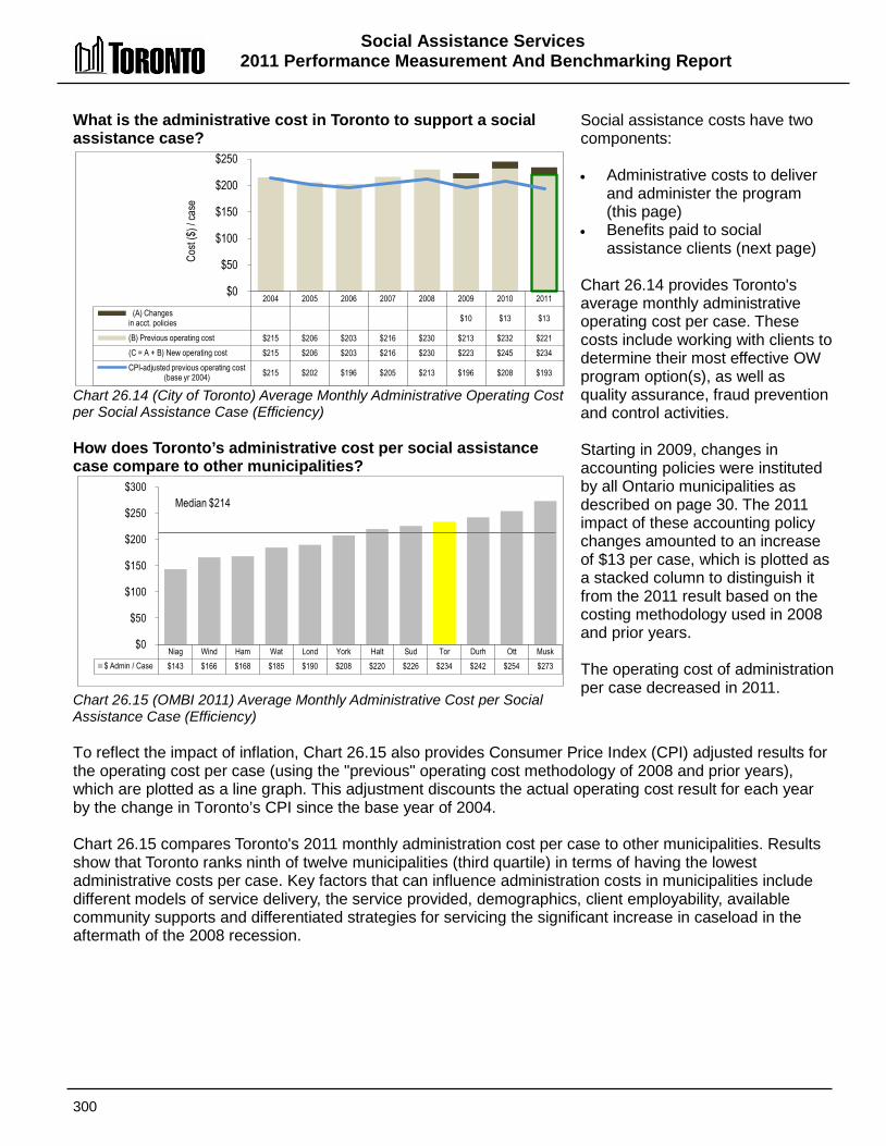
Social Assistance Services 2011 Performance Measurement And Benchmarking Report
300
Niag Wind Ham Wat Lond York Halt Sud Tor Durh Ott Musk $ Admin / Case $143 $166 $168 $185 $190 $208 $220 $226 $234 $242 $254 $273
$0
$50
$100
$150
$200
$250
$300 Median $214
What is the administrative cost in Toronto to support a social assistance case? Chart 26.14 (City of Toronto) Average Monthly Administrative Operating Cost per Social Assistance Case (Efficiency) How does Toronto’s administrative cost per social assistance case compare to other municipalities? Chart 26.15 (OMBI 2011) Average Monthly Administrative Cost per Social Assistance Case (Efficiency)
Social assistance costs have two components: • Administrative costs to deliver
and administer the program (this page)
• Benefits paid to social assistance clients (next page)
Chart 26.14 provides Toronto's average monthly administrative operating cost per case. These costs include working with clients to determine their most effective OW program option(s), as well as quality assurance, fraud prevention and control activities. Starting in 2009, changes in accounting policies were instituted by all Ontario municipalities as described on page 30. The 2011 impact of these accounting policy changes amounted to an increase of $13 per case, which is plotted as a stacked column to distinguish it from the 2011 result based on the costing methodology used in 2008 and prior years. The operating cost of administration per case decreased in 2011.
To reflect the impact of inflation, Chart 26.15 also provides Consumer Price Index (CPI) adjusted results for the operating cost per case (using the "previous" operating cost methodology of 2008 and prior years), which are plotted as a line graph. This adjustment discounts the actual operating cost result for each year by the change in Toronto’s CPI since the base year of 2004. Chart 26.15 compares Toronto's 2011 monthly administration cost per case to other municipalities. Results show that Toronto ranks ninth of twelve municipalities (third quartile) in terms of having the lowest administrative costs per case. Key factors that can influence administration costs in municipalities include different models of service delivery, the service provided, demographics, client employability, available community supports and differentiated strategies for servicing the significant increase in caseload in the aftermath of the 2008 recession.
2004 2005 2006 2007 2008 2009 2010 2011 (A) Changes
in acct. policies $10 $13 $13
(B) Previous operating cost $215 $206 $203 $216 $230 $213 $232 $221 (C = A + B) New operating cost $215 $206 $203 $216 $230 $223 $245 $234 CPI-adjusted previous operating cost
(base yr 2004)
$215 $202 $196 $205 $213 $196 $208 $193
$0
$50
$100
$150
$200
$250
Cost
($) /
case
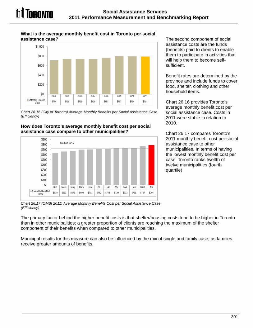
Social Assistance Services 2011 Performance Measurement and Benchmarking Report
301
Sud Musk Niag Durh Lond Ott Halt Wat York Ham Wind Tor $ Monthly Benefits /
Case $630 $663 $675 $699 $703 $712 $718 $729 $733 $739 $767 $791
$0 $100 $200 $300 $400 $500 $600 $700 $800 $900
Median $715
What is the average monthly benefit cost in Toronto per social assistance case? Chart 26.16 (City of Toronto) Average Monthly Benefits per Social Assistance Case (Efficiency) How does Toronto’s average monthly benefit cost per social assistance case compare to other municipalities? Chart 26.17 (OMBI 2011) Average Monthly Benefits Cost per Social Assistance Case (Efficiency)
The second component of social assistance costs are the funds (benefits) paid to clients to enable them to participate in activities that will help them to become self-sufficient. Benefit rates are determined by the province and include funds to cover food, shelter, clothing and other household items. Chart 26.16 provides Toronto's average monthly benefit cost per social assistance case. Costs in 2011 were stable in relation to 2010. Chart 26.17 compares Toronto’s 2011 monthly benefit cost per social assistance case to other municipalities. In terms of having the lowest monthly benefit cost per case, Toronto ranks twelfth of twelve municipalities (fourth quartile)
The primary factor behind the higher benefit costs is that shelter/housing costs tend to be higher in Toronto than in other municipalities; a greater proportion of clients are reaching the maximum of the shelter component of their benefits when compared to other municipalities. Municipal results for this measure can also be influenced by the mix of single and family case, as families receive greater amounts of benefits.
2004 2005 2006 2007 2008 2009 2010 2011 $ Monthly Benefits /
Case $714 $736 $739 $738 $767 $797 $794 $791
$0
$200
$400
$600
$800
$1,000

Social Assistance Services 2011 Performance Measurement And Benchmarking Report
302
2012 Achievements and 2013 Planned Initiatives The following achievements and initiatives have improved or will help to further improve the effectiveness of Toronto’s Employment and Social Services operations: 2012 Initiatives Completed/Achievements • Assisted more than 30,000 social assistance recipients to achieve employment. • Obtained City Council approval for Working as One, A Workforce Development Strategy for
Toronto. • Implemented the first phase of the City of Toronto benefit card, introducing the first ongoing
electronic benefits cards for social assistance recipients in Canada. • Provided employment services, financial benefits and social supports to 1 in 9 residents
(273,000 different Toronto residents) in 2012. • Served an Ontario Works average monthly caseload of 105,000. • Provided services to more than 214,200 residents at Employment Centres across the city to
help improve their employability or obtain jobs. • Handled 162,300 calls through the Application Centre. • Worked with more than 100 agencies across the city through service contracts to deliver
employment and skill training courses. • Developed 13 employment plans in conjunction with key City initiatives to provide
employment opportunities for unemployed city residents. Notably, TESS worked with Metrolinx, the PanAm Games Athletes Village and the TTC along to put in place a planning and delivery process for local hiring.
• Worked with 200 employers to identify and provide job opportunities to social assistance recipients and other unemployed city residents.
• Obtained City Council approval for the implementation of the Lawrence Allan Employment Plan.
• Opened common front counter with Children's Services at Metro Hall. • Sponsored and conducted 39 job fairs that connected 11,500 residents with potential
employers. • Provided 700 social assistance recipients with paid job placements through the Investing in
Neighbourhoods program. • Completed and/or updated 269,000 individualized employment plans with people in receipt
of social assistance. • Managed and/or pursued family support for 24,200 families on Ontario Works (OW). • Assessed 32,500 clients utilizing the career eligibility assessment tool. • Investing in Youth – Assisted more than 1,600 youth cases to find work or supported in
structured programs such as skill training, education upgrading, etc. • Managed Welcome Policy administration for membership of 50,000 families at City
recreation programs. 2013 Planned Initiatives • Manage an average monthly caseload of 108,500. • Work with social assistance recipients and other unemployed City residents to assist 30,000
recipients to find jobs.

Social Assistance Services 2011 Performance Measurement and Benchmarking Report
303
• Provide consultation and support to approximately 214,200 client visits at Employment Centres (EC) across the City, and continue the implementation of an EC model that supports necessary services and supports for unemployed residents.
• Advance the City's Workforce Development Strategy. • Continue to introduce new technologies and approaches to streamlining the delivery and
administration of social assistance benefits building on the implementation of the City Services Benefit Card.
• Enhance access to Ontario Disability Support Program (ODSP) for homeless/vulnerable people, connecting the homeless with ongoing medical support and linking homeless people to other service providers.
• Work with the Province and other stakeholders in the implementation of a new Social Assistance Management System (SAMS).
• Implement the new Housing Stabilization Fund (HSF) to meet the emergency housing needs of Torontonians on social assistance.
• Continue to provide medical benefits to OW, ODSP and Hardship Fund eligible residents at current service levels.
• Realize cost efficiencies in the provision of medical benefits through bulk purchasing, tendering and establishing a schedule for orthotics.
• Further develop integrated case management and service delivery partnerships with Children Services, Economic Development & Culture, Shelter, Support and Housing Administration and other City divisions.
Factors Influencing the Results of Municipalities The results of each municipality included here can be influenced to varying degrees by factors such as: • Employability: significant numbers of clients with one or more barriers to employment,
including health barriers, lack of education and language skills, literacy levels, and lack of Canadian work experience
• Urban form: client access to programs can vary due to geographical, technological, cultural or other limitations
• Economic conditions: differing local labour market conditions and the types of employment available
• Demographics: family size and caseload mix, the availability of interpreters when English is not the first language
• Service delivery: different service delivery models and the services provided, the availability of community supports and where social services offices are located in municipalities in relation to clients

304
Shelter, Support & Housing
Administration
Homeless & Housing First
Solutions
Emergency Shelter & Related Support
Homeless & Housing Support in
the Community
Social Housing System
Management
Manage Social Housing Provider
Subsidies
Manage Rent Supplements and
Housing Allowances
Manage New Affordable Housing
& Other Non-Subsidized Programs
Manage Centralized Social Housing
Waiting List
City Emergency Human Services
Emergency Human Services Response
Emergency Human Services
Preparation
SSoocciiaall HHoouussiinngg SSeerrvviicceess Responsibility for the funding and administration of social housing programs was transferred from the Province of Ontario to Toronto in May 2002. The Social Housing section of the Shelter, Support and Housing Administration Division provides administration and direct funding to all City of Toronto social housing providers, including: • The Toronto Community Housing Corporation (TCHC)
owned by the City of Toronto and governed by a Board of Directors appointed by City Council.
• Community-based non-profit corporations, sometimes associated with churches, seniors’ organizations and ethno-cultural groups.
• Co-operative non-profit projects developed, owned and managed by members of the projects.
• Private rent supplement buildings, in which a private or non-profit landlord sets aside units for households requiring rent-geared-to-income; the City pays the landlord the difference between geared-to-income rent and the market rent for the unit.
• Administration of units developed under an affordable housing program.
All social housing providers are responsible for managing their own properties, providing day-to-day property management and tenant relations services.
Shaded boxes reflect the activities covered in this section of the report.
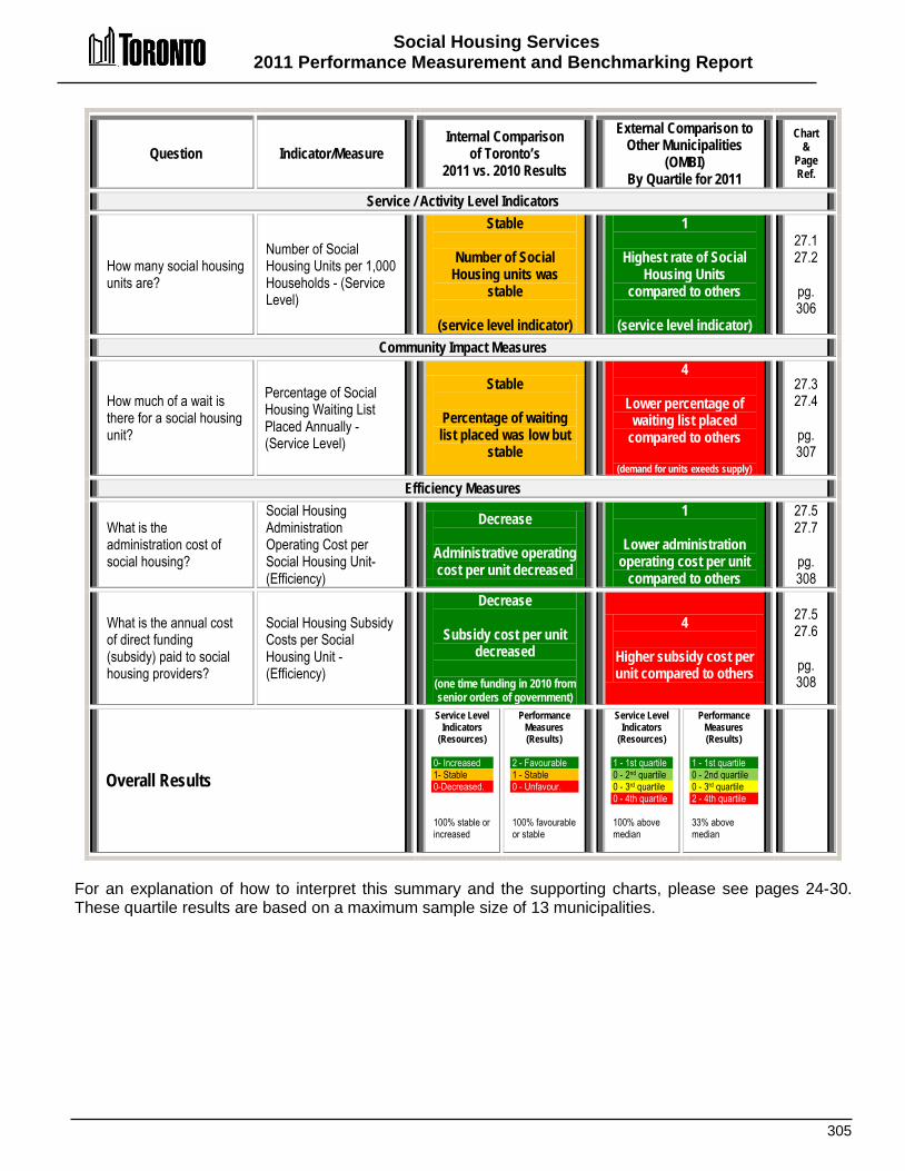
Social Housing Services 2011 Performance Measurement and Benchmarking Report
305
Question Indicator/Measure Internal Comparison
of Toronto’s 2011 vs. 2010 Results
External Comparison to Other Municipalities
(OMBI) By Quartile for 2011
Chart &
Page Ref.
Service / Activity Level Indicators
How many social housing units are?
Number of Social Housing Units per 1,000 Households - (Service Level)
Stable
Number of Social Housing units was
stable
(service level indicator)
1
Highest rate of Social Housing Units
compared to others
(service level indicator)
27.1 27.2
pg. 306
Community Impact Measures
How much of a wait is there for a social housing unit?
Percentage of Social Housing Waiting List Placed Annually -(Service Level)
Stable
Percentage of waiting list placed was low but
stable
4
Lower percentage of waiting list placed
compared to others
(demand for units exeeds supply)
27.3 27.4
pg. 307
Efficiency Measures
What is the administration cost of social housing?
Social Housing Administration Operating Cost per Social Housing Unit- (Efficiency)
Decrease
Administrative operating cost per unit decreased
1
Lower administration operating cost per unit
compared to others
27.5 27.7
pg. 308
What is the annual cost of direct funding (subsidy) paid to social housing providers?
Social Housing Subsidy Costs per Social Housing Unit - (Efficiency)
Decrease
Subsidy cost per unit decreased
(one time funding in 2010 from senior orders of government)
4
Higher subsidy cost per unit compared to others
27.5 27.6
pg. 308
Overall Results
Service Level Indicators
(Resources) 0- Increased 1- Stable 0-Decreased. 100% stable or increased
Performance Measures (Results)
2 - Favourable 1 - Stable 0 - Unfavour. 100% favourable or stable
Service Level Indicators
(Resources)
1 - 1st quartile 0 - 2nd quartile 0 - 3rd quartile 0 - 4th quartile 100% above median
Performance Measures (Results)
1 - 1st quartile 0 - 2nd quartile 0 - 3rd quartile 2 - 4th quartile 33% above median
For an explanation of how to interpret this summary and the supporting charts, please see pages 24-30. These quartile results are based on a maximum sample size of 13 municipalities.

Social Housing Services 2011 Performance Measurement And Benchmarking Report
306
Tor Ham Sud Wind Ott Wat Lond Niag Durh Halt Musk York # of units / 1,000 hh 81.8 66.5 61.0 57.5 57.1 42.7 41.5 39.0 31.0 24.6 23.3 19.8
0
15
30
45
60
75
90
Median 42.1
2003 2004 2005 2006 2007 2008 2009 2010 2011 Social Housing Units
per 1,000 hh 86.8 86.7 87.8 84.6 84.9 84.3 82.7 82.2 81.8
Total # of Social Housing Units 86,811 87,872 90,103 90,027 91,157 91,243 89,640 89,636 89,785
0
15
30
45
60
75
90
How many social housing units are there in Toronto? Chart 27.1 (City of Toronto) Number of Social Housing Units per 1,000 Households (Service Level) How does the number of social housing units in Toronto compare to other municipalities? Chart 27.2 (OMBI 2011) Number of Social Housing Units per 1,000 Households (Service Level)
The number of social housing units in a municipality is the primary indicator of service levels. Chart 27.1 provides information on Toronto's total number and rate of social housing units per 1,000 households. It shows an increasing trend from 2003 to 2005, due to the provincial transfer of units to the city for social housing administration. The 2009 decline in social housing units was due in part to the reclassification of units from social housing to affordable housing and the expiry of federal operating agreements. The City will continue to lose social housing units in its portfolio as federal operating agreements expire and housing projects and units will no longer be subject to program rules and requirements Information on the number of social housing units in each of Toronto's 140 neighbourhoods, can be found at Wellbeing Toronto.
Chart 27.2 compares Toronto’s 2011 result to other municipalities for the number of social housing units per 1,000 households. Toronto ranks first of twelve municipalities (first quartile) with the highest number of social housing units Toronto's large population continues to grow, and many individuals who are drawn to the city require health and social support services. A higher number of social housing units were developed in Toronto to assist the many individuals in need of housing to stabilize their lives, but it has been proven to be difficult to keep up with demand.
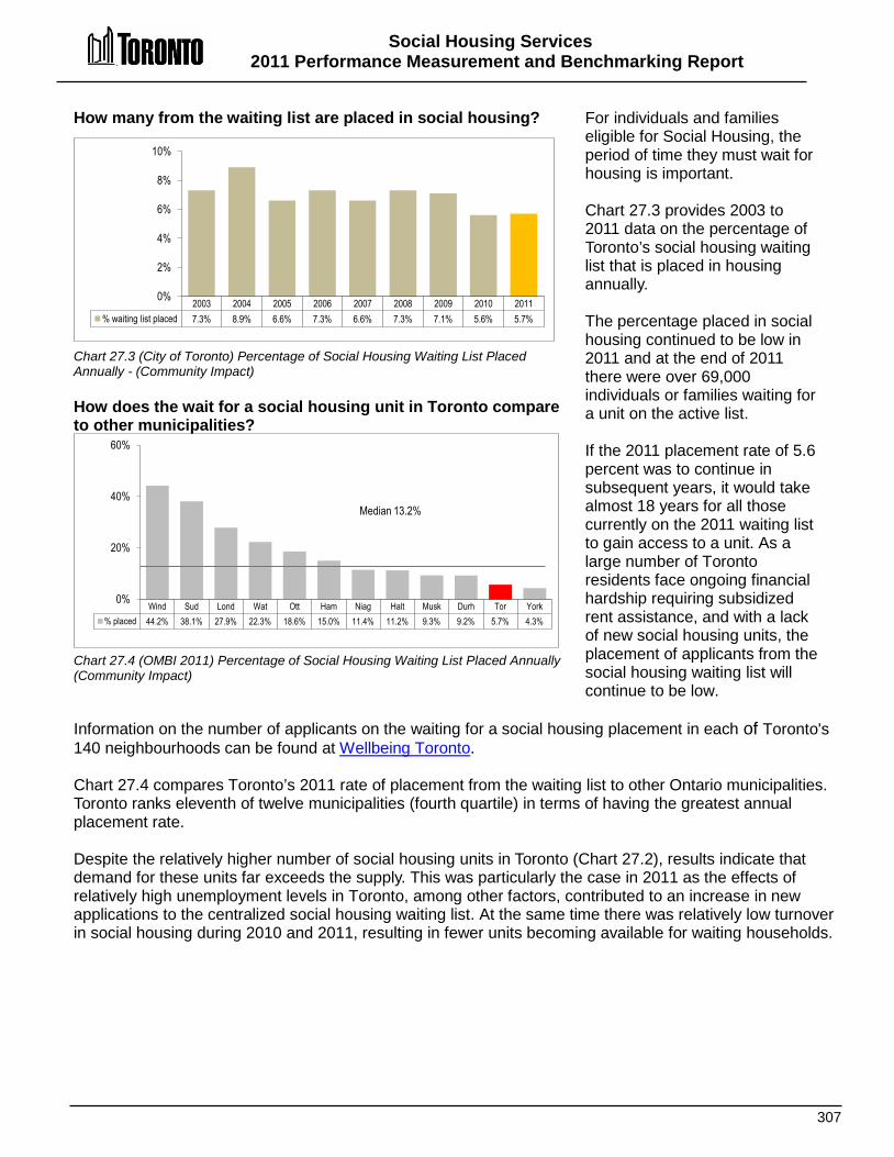
Social Housing Services 2011 Performance Measurement and Benchmarking Report
307
Wind Sud Lond Wat Ott Ham Niag Halt Musk Durh Tor York % placed 44.2% 38.1% 27.9% 22.3% 18.6% 15.0% 11.4% 11.2% 9.3% 9.2% 5.7% 4.3%
0%
20%
40%
60%
Median 13.2%
How many from the waiting list are placed in social housing? Chart 27.3 (City of Toronto) Percentage of Social Housing Waiting List Placed Annually - (Community Impact) How does the wait for a social housing unit in Toronto compare to other municipalities? Chart 27.4 (OMBI 2011) Percentage of Social Housing Waiting List Placed Annually (Community Impact)
For individuals and families eligible for Social Housing, the period of time they must wait for housing is important. Chart 27.3 provides 2003 to 2011 data on the percentage of Toronto’s social housing waiting list that is placed in housing annually. The percentage placed in social housing continued to be low in 2011 and at the end of 2011 there were over 69,000 individuals or families waiting for a unit on the active list. If the 2011 placement rate of 5.6 percent was to continue in subsequent years, it would take almost 18 years for all those currently on the 2011 waiting list to gain access to a unit. As a large number of Toronto residents face ongoing financial hardship requiring subsidized rent assistance, and with a lack of new social housing units, the placement of applicants from the social housing waiting list will continue to be low.
Information on the number of applicants on the waiting for a social housing placement in each of Toronto's 140 neighbourhoods can be found at Wellbeing Toronto. Chart 27.4 compares Toronto’s 2011 rate of placement from the waiting list to other Ontario municipalities. Toronto ranks eleventh of twelve municipalities (fourth quartile) in terms of having the greatest annual placement rate. Despite the relatively higher number of social housing units in Toronto (Chart 27.2), results indicate that demand for these units far exceeds the supply. This was particularly the case in 2011 as the effects of relatively high unemployment levels in Toronto, among other factors, contributed to an increase in new applications to the centralized social housing waiting list. At the same time there was relatively low turnover in social housing during 2010 and 2011, resulting in fewer units becoming available for waiting households.
2003 2004 2005 2006 2007 2008 2009 2010 2011 % waiting list placed 7.3% 8.9% 6.6% 7.3% 6.6% 7.3% 7.1% 5.6% 5.7%
0%
2%
4%
6%
8%
10%
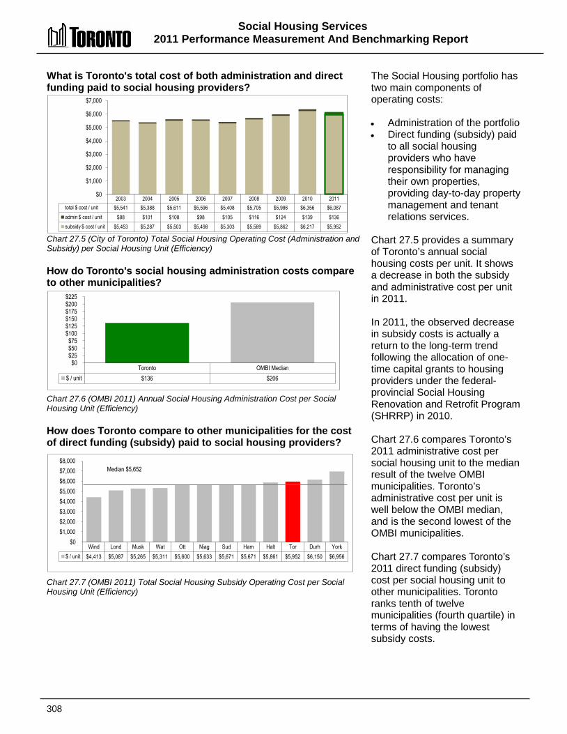
Social Housing Services 2011 Performance Measurement And Benchmarking Report
308
2003 2004 2005 2006 2007 2008 2009 2010 2011 total $ cost / unit $5,541 $5,388 $5,611 $5,596 $5,408 $5,705 $5,986 $6,356 $6,087 admin $ cost / unit $88 $101 $108 $98 $105 $116 $124 $139 $136 subsidy $ cost / unit $5,453 $5,287 $5,503 $5,498 $5,303 $5,589 $5,862 $6,217 $5,952
$0
$1,000
$2,000
$3,000
$4,000
$5,000
$6,000
$7,000
Wind Lond Musk Wat Ott Niag Sud Ham Halt Tor Durh York $ / unit $4,413 $5,087 $5,265 $5,311 $5,600 $5,633 $5,671 $5,671 $5,861 $5,952 $6,150 $6,956
$0 $1,000 $2,000 $3,000 $4,000 $5,000 $6,000 $7,000 $8,000
Median $5,652
Toronto OMBI Median $ / unit $136 $206
$0 $25 $50 $75
$100 $125 $150 $175 $200 $225
What is Toronto's total cost of both administration and direct funding paid to social housing providers? Chart 27.5 (City of Toronto) Total Social Housing Operating Cost (Administration and Subsidy) per Social Housing Unit (Efficiency) How do Toronto's social housing administration costs compare to other municipalities? Chart 27.6 (OMBI 2011) Annual Social Housing Administration Cost per Social Housing Unit (Efficiency) How does Toronto compare to other municipalities for the cost of direct funding (subsidy) paid to social housing providers? Chart 27.7 (OMBI 2011) Total Social Housing Subsidy Operating Cost per Social Housing Unit (Efficiency)
The Social Housing portfolio has two main components of operating costs: • Administration of the portfolio • Direct funding (subsidy) paid
to all social housing providers who have responsibility for managing their own properties, providing day-to-day property management and tenant relations services.
Chart 27.5 provides a summary of Toronto’s annual social housing costs per unit. It shows a decrease in both the subsidy and administrative cost per unit in 2011. In 2011, the observed decrease in subsidy costs is actually a return to the long-term trend following the allocation of one-time capital grants to housing providers under the federal-provincial Social Housing Renovation and Retrofit Program (SHRRP) in 2010. Chart 27.6 compares Toronto’s 2011 administrative cost per social housing unit to the median result of the twelve OMBI municipalities. Toronto’s administrative cost per unit is well below the OMBI median, and is the second lowest of the OMBI municipalities. Chart 27.7 compares Toronto’s 2011 direct funding (subsidy) cost per social housing unit to other municipalities. Toronto ranks tenth of twelve municipalities (fourth quartile) in terms of having the lowest subsidy costs.

Social Housing Services 2011 Performance Measurement and Benchmarking Report
309
Toronto's subsidy costs have been higher than other municipalities in the rest of the province for the following reasons: • Part of the social housing subsidy is a mortgage subsidy, and because the original costs of land and
construction were usually higher in Toronto than elsewhere, the required annual mortgage costs require higher subsidy costs.
• Toronto has a disproportionate amount of old public housing stock that is 100 percent rent geared to income (RGI). Toronto's higher proportion of RGI units in the portfolio as a whole, and the highest level of market rents in the province, means higher RGI subsidy costs. RGI subsidy also increases if tenant income decreases.
• Subsidy funding levels established in the GTA for the former provincial housing providers are different from those of other areas in the province. On average, GTA levels are higher per unit than other large urban areas and also higher per unit than small urban and rural areas.
• Toronto has a much higher level of alternative providers that provide housing to the homeless and people who are hard to house. These providers are funded at a much higher level than other providers.
2012 Achievements and 2013 Planned Initiatives The following initiatives have improved or are expected to further improve the efficiency and effectiveness of Social Housing Services in Toronto:
2012 Initiatives Completed/Achievements • Implemented the Toronto Transitional Housing Allowance Program, under the Investment in
Affordable Housing, a $51 million federal/provincial funded initiative helping address housing affordability issues faced by Toronto households in need.
• Integrated the new Housing Services Act into social housing operations. • Strengthened capital asset management and energy savings initiatives for social housing providers
through the Social Housing Renovation and Retrofit and Renewable Energy Initiative (REI) programs funded by the Federal and Provincial governments.
• Ongoing administration of the $21 million provincial Short-term Rent Support Program (STRSP). • Provided training in management and administration, governance and asset management to social
housing providers, allowing them to strengthen their capacity to deliver and maintain their social housing communities.
2013 Initiatives Planned • Ongoing administration of the Toronto Transitional Housing Allowance Program, funded through the
Investment in Affordable Housing. • Review of the Social Housing Waiting List and related housing access services to improve customer
service. • Continue to administer social housing programs in compliance with the Housing Services Act and
provide support to social housing providers to deliver and maintain their social housing communities. • Continue to monitor and provide support to Social Housing Providers with expiring operating
agreement to ensure the stability of the social housing portfolio and the viability of individual projects. • Manage and evaluate the program impacts resulting from the ongoing decline in federal funding for
social housing in Toronto.

Social Housing Services 2011 Performance Measurement and Benchmarking Report
310
Factors Influencing the Results of Municipalities The results of each municipality included in this report can be influenced to varying degrees by factors such as: • Housing stock: age, condition and supply (both private and municipal), and adequacy of reserve
funds to address capital needs. • Demographic and economic conditions: local market variables such as the loss of local industry,
rapid population growth may affect overall demand; the proportion of priority applicants (such as those qualifying under the provincial Special Priority Policy) applicants may increase the size of the waiting list and/or extend average waiting times for some applicants.
• Waiting list management: maintenance and frequency of updates to applicant records to ensure accuracy and effective use of data (e.g., minimize the time necessary to identify a willing and eligible applicant for a housing offer).
• Portfolio mix: subsidy costs vary dramatically based on the time period and government program under which social housing projects was originally developed.
• Geographic conditions: construction and land costs, maintenance costs associated with inclement weather, rental market availability, utility costs and usage profiles.
• Tenant mix: seniors communities are usually less costly to operate than housing targeted to families and singles.

311

312
Solid Waste Management
Services
City Beautification
Litter Pick-Up
Special Events
Parks Bins
Street Litter Bins
Solid Waste Collection &
Transfer
Residual Waste
Organics (SSO)
Durable Goods
Leaf & Yard Waste
Municipal Hazardous &
Special Waste
Recyclables (SSRM)
Solid Waste Processing &
Transport
Residual Waste
Organics (SSO)
Durable Goods
Leaf & Yard Waste
Municipal Hazardous &
Special Waste
Resale of Recyclables
Residual Management
Green Lane Landfill Site
Perpetual Care
Energy Generation
Solid Waste Education & Enforcement
Promotion & Education
Environment Days
By-Law Enforcement
SSoolliidd WWaassttee MMaannaaggeemmeenntt SSeerrvviicceess The City's Solid Waste Management Services division is responsible for the handling, transfer, and disposal of garbage, as well as the diversion of blue box materials, organics, and yard waste in order to reduce reliance on landfill sites and lessen the impact on the environment. A variety of other programs are also offered and co-ordinated to help citizens and businesses reduce the waste they generate and meet the municipal goal of reducing or diverting the amount of waste disposed in landfill sites. This is achieved through programs such as: • Blue box (bottles, cans, paper, etc.); • Green bin (food waste); • Household hazardous waste; and • Composting initiatives (leaf and yard waste). In Toronto and some other municipalities, commercial customers are also served through waste diversion programs such as food waste collection and the yellow bag program. With the yellow bag program, businesses must buy bags from the municipality to be eligible for waste collection.
Shaded boxes reflect activities covered in this section of the report.

Solid Waste Management Services 2011 Performance Measurement and Benchmarking Report
313
Question Indicator/Measure Internal Comparison
of Toronto’s 2011 vs. 2010 Results
External Comparison to Other Municipalities
(OMBI) By Quartile for 2011
Chart &
Page Ref.
Community Impact Measures
How much solid waste is recycled/diverted away from landfill sites?
Percentage of Solid Waste Diverted - Residential (Community Impact)
Increase
Overall diversion rate increased
2
Overall diversion rate at median compared to
others (impacted by significance of
apartments in Toronto)
28.1 28.2
pg. 315
How much waste from houses is recycled/ diverted away from landfill sites?
Percentage of Waste Diverted – Single Unit homes/houses (Curbside) – (Community Impact)
Increase
Diversion rate for single unit houses/homes
(curbside) increased
1
Highest diversion rate for houses compared to
others
28.1 28.3
pg. 315
How much waste from apartments is recycled/ diverted away from landfill sites?
Percentage of Waste Diverted – Multi-Residential – (Community Impact)
Increase
Multi-residential diversion rate increased
2
High multi-residential diversion rate compared
to others
28.1 28.4
pg. 315
Customer Service Measures
How many garbage collection complaints are received?
Number of Solid Waste Complaints per 1,000 Households (Customer Service)
Increase
Rate of complaints increased
(due to schedule changes)
3
High rate of complaints compared to others
28.5 28.6
pg. 316
Efficiency Measures
How much does it cost to collect a tonne of garbage?
Operating Cost for Residential Garbage Collection per Tonne –(Efficiency)
Stable
Operating cost of waste collection for all
housing types was stable
2
Low operating cost of solid waste collection for all housing types compared to others
28.7 28.8
pg. 317 Total Cost for
Residential Garbage Collection per Tonne –(Efficiency)
Decrease
Total cost of waste collection for all housing types
decreased
2
Low total cost of solid waste collection for all
housing types compared to others
How much does it cost to dispose of a tonne of garbage?
Operating Costs for Solid Waste Disposal (All Streams) per Tonne – (Efficiency)
Decrease
Operating cost of solid waste disposal
decreased
3
High operating cost of solid waste disposal compared to others
28.9 28.10
pg. 318 Total Costs for Solid
Waste Disposal (All Streams) per Tonne – (Efficiency)
Decrease
Total cost of solid waste disposal decreased
3
High total cost of solid waste disposal
compared to others

Solid Waste Management Services 2011 Performance Measurement And Benchmarking Report
314
Question Indicator/Measure Internal Comparison
of Toronto’s 2011 vs. 2010 Results
External Comparison to Other Municipalities
(OMBI) By Quartile for 2011
Chart &
Page Ref.
How much does it cost to recycle a tonne of solid waste?
Net Operating Costs for Residential Solid Waste Diversion per Tonne – (Efficiency)
Decrease
Net operating cost of solid waste diversion
decreased
4
Highest operating cost of solid waste diversion
compared to others
(related to high diversion rate for houses & green bin program)
28.11 28.12
pg. 319 Net Total Costs for
Residential Solid Waste Diversion per Tonne – (Efficiency)
Decrease
Net total cost of solid waste diversion
decreased
4
Highest total cost of solid waste diversion compared to others
(related to high diversion rate for
houses & green bin program)
Overall Results
Service Level Indicators
(Resources)
N/A
.
Performance Measures (Results)
8 - Favourable 1 - Stable 1 - Unfavour. 80% favourable or stable
Service Level Indicators
(Resources)
N/A
Performance Measures (Results)
1 - 1st quartile 4 - 2nd quartile 3 - 3rd quartile 2 - 4th quartile 50% at or above median
For an explanation of how to interpret this summary and the supporting charts, please see pages 24-30. These quartile results are based on a maximum sample size of 15 municipalities.
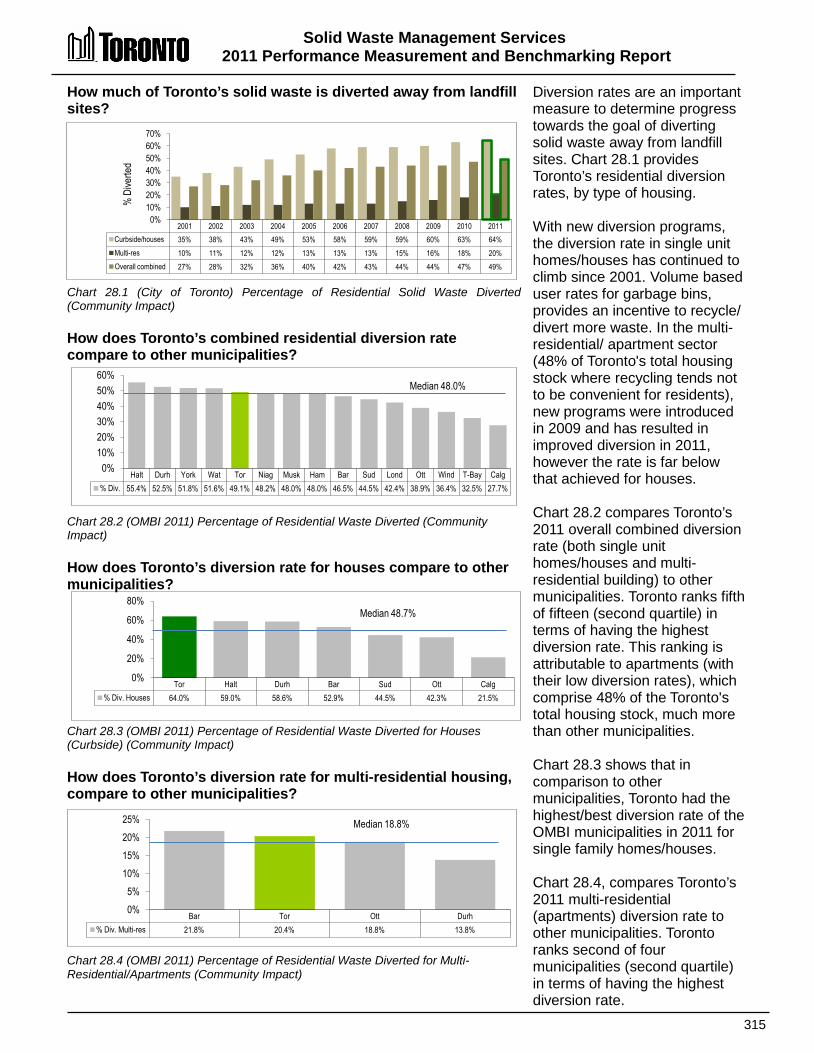
Solid Waste Management Services 2011 Performance Measurement and Benchmarking Report
315
2001 2002 2003 2004 2005 2006 2007 2008 2009 2010 2011 Curbside/houses 35% 38% 43% 49% 53% 58% 59% 59% 60% 63% 64% Multi-res 10% 11% 12% 12% 13% 13% 13% 15% 16% 18% 20% Overall combined 27% 28% 32% 36% 40% 42% 43% 44% 44% 47% 49%
0% 10% 20% 30% 40% 50% 60% 70%
% D
iverte
d
Halt Durh York Wat Tor Niag Musk Ham Bar Sud Lond Ott Wind T-Bay Calg % Div. 55.4% 52.5% 51.8% 51.6% 49.1% 48.2% 48.0% 48.0% 46.5% 44.5% 42.4% 38.9% 36.4% 32.5% 27.7%
0% 10% 20% 30% 40% 50% 60%
Median 48.0%
Bar Tor Ott Durh % Div. Multi-res 21.8% 20.4% 18.8% 13.8%
0% 5%
10% 15% 20% 25% Median 18.8%
Tor Halt Durh Bar Sud Ott Calg % Div. Houses 64.0% 59.0% 58.6% 52.9% 44.5% 42.3% 21.5%
0%
20%
40%
60%
80% Median 48.7%
How much of Toronto’s solid waste is diverted away from landfill sites? Chart 28.1 (City of Toronto) Percentage of Residential Solid Waste Diverted (Community Impact) How does Toronto’s combined residential diversion rate compare to other municipalities? Chart 28.2 (OMBI 2011) Percentage of Residential Waste Diverted (Community Impact) How does Toronto’s diversion rate for houses compare to other municipalities? Chart 28.3 (OMBI 2011) Percentage of Residential Waste Diverted for Houses (Curbside) (Community Impact) How does Toronto’s diversion rate for multi-residential housing, compare to other municipalities? Chart 28.4 (OMBI 2011) Percentage of Residential Waste Diverted for Multi-Residential/Apartments (Community Impact)
Diversion rates are an important measure to determine progress towards the goal of diverting solid waste away from landfill sites. Chart 28.1 provides Toronto’s residential diversion rates, by type of housing. With new diversion programs, the diversion rate in single unit homes/houses has continued to climb since 2001. Volume based user rates for garbage bins, provides an incentive to recycle/ divert more waste. In the multi-residential/ apartment sector (48% of Toronto's total housing stock where recycling tends not to be convenient for residents), new programs were introduced in 2009 and has resulted in improved diversion in 2011, however the rate is far below that achieved for houses. Chart 28.2 compares Toronto’s 2011 overall combined diversion rate (both single unit homes/houses and multi-residential building) to other municipalities. Toronto ranks fifth of fifteen (second quartile) in terms of having the highest diversion rate. This ranking is attributable to apartments (with their low diversion rates), which comprise 48% of the Toronto's total housing stock, much more than other municipalities. Chart 28.3 shows that in comparison to other municipalities, Toronto had the highest/best diversion rate of the OMBI municipalities in 2011 for single family homes/houses. Chart 28.4, compares Toronto’s 2011 multi-residential (apartments) diversion rate to other municipalities. Toronto ranks second of four municipalities (second quartile) in terms of having the highest diversion rate.
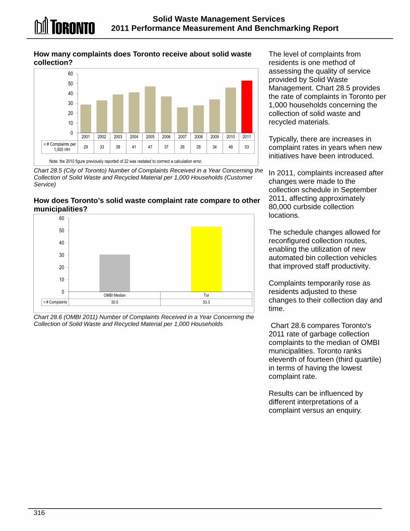
Solid Waste Management Services 2011 Performance Measurement And Benchmarking Report
316
2001 2002 2003 2004 2005 2006 2007 2008 2009 2010 2011 # Complaints per
1,000 HH 29 33 39 41 47 37 26 28 34 46 53
0
10
20
30
40
50
60
Note: the 2010 figure previously reported of 22 was restated to corrrect a calculation error.
OMBI Median Tor # Complaints 30.5 53.3
0
10
20
30
40
50
60
How many complaints does Toronto receive about solid waste collection? Chart 28.5 (City of Toronto) Number of Complaints Received in a Year Concerning the Collection of Solid Waste and Recycled Material per 1,000 Households (Customer Service) How does Toronto’s solid waste complaint rate compare to other municipalities? Chart 28.6 (OMBI 2011) Number of Complaints Received in a Year Concerning the Collection of Solid Waste and Recycled Material per 1,000 Households
The level of complaints from residents is one method of assessing the quality of service provided by Solid Waste Management. Chart 28.5 provides the rate of complaints in Toronto per 1,000 households concerning the collection of solid waste and recycled materials. Typically, there are increases in complaint rates in years when new initiatives have been introduced. In 2011, complaints increased after changes were made to the collection schedule in September 2011, affecting approximately 80,000 curbside collection locations. The schedule changes allowed for reconfigured collection routes, enabling the utilization of new automated bin collection vehicles that improved staff productivity. Complaints temporarily rose as residents adjusted to these changes to their collection day and time. Chart 28.6 compares Toronto's 2011 rate of garbage collection complaints to the median of OMBI municipalities. Toronto ranks eleventh of fourteen (third quartile) in terms of having the lowest complaint rate. Results can be influenced by different interpretations of a complaint versus an enquiry.
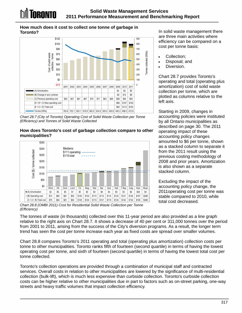
Solid Waste Management Services 2011 Performance Measurement and Benchmarking Report
317
2001 2002 2003 2004 2005 2006 2007 2008 2009 2010 2011 (A) Amortization $4 $5 $5 (B) Change in acct. policies -$2 $12 $6 (C) Previous operating cost $50 $57 $61 $67 $70 $71 $83 $89 $88 $94 $94 (D = B + C) New operating cost $86 $107 $100 (E = A + D) Total cost $90 $112 $105 Tonnes (000s) 783.6 702.1 653.1 619.9 562.0 524.9 505.0 493.8 445.3 496.0 472.6
0
100
200
300
400
500
600
700
800
900
-$15
$0
$15
$30
$45
$60
$75
$90
$105
$120
Cost
of so
lid w
aste
colle
ction
/ to
nne
Tonn
es co
llecte
d (0
00s)
Wind Ott Durh Lond Tor Niag Wat Bar Sud Halt T-Bay Calg Ham Musk (A) Amortization $2 $5 $0 $1 $5 $0 $0 $8 $4 $0 $3 $6 $28 $0 (B) Operating cost $73 $80 $81 $92 $100 $104 $110 $112 $115 $124 $141 $146 $167 $288 (C = A + B) Total cost $75 $84 $81 $93 $105 $104 $110 $121 $119 $124 $144 $152 $195 $288
$0
$50
$100
$150
$200
$250
$300
$350
Medians: $111 operating $115 total
Cost
($) /
tonn
e coll
ected
How much does it cost to collect one tonne of garbage in Toronto? Chart 28.7 (City of Toronto) Operating Cost of Solid Waste Collection per Tonne (Efficiency) and Tonnes of Solid Waste Collected How does Toronto’s cost of garbage collection compare to other municipalities? Chart 28.8 (OMBI 2011) Cost for Residential Solid Waste Collection per Tonne (Efficiency)
In solid waste management there are three main activities where efficiency can be compared on a cost per tonne basis: • Collection; • Disposal; and • Diversion. Chart 28.7 provides Toronto’s operating and total (operating plus amortization) cost of solid waste collection per tonne, which are plotted as columns relative to the left axis. Starting in 2009, changes in accounting policies were instituted by all Ontario municipalities as described on page 30. The 2011 operating impact of these accounting policy changes amounted to $6 per tonne, shown as a stacked column to separate it from the 2011 result using the previous costing methodology of 2008 and prior years. Amortization is also shown as a separate stacked column. Excluding the impact of the accounting policy change, the 2011operating cost per tonne was stable compared to 2010, while total cost decreased.
The tonnes of waste (in thousands) collected over this 11-year period are also provided as a line graph relative to the right axis on Chart 28.7. It shows a decrease of 40 per cent or 311,000 tonnes over the period from 2001 to 2011, arising from the success of the City’s diversion programs. As a result, the longer term trend has seen the cost per tonne increase each year as fixed costs are spread over smaller volumes. Chart 28.8 compares Toronto’s 2011 operating and total (operating plus amortization) collection costs per tonne to other municipalities. Toronto ranks fifth of fourteen (second quartile) in terms of having the lowest operating cost per tonne, and sixth of fourteen (second quartile) in terms of having the lowest total cost per tonne collected. Toronto’s collection operations are provided through a combination of municipal staff and contracted services. Overall costs in relation to other municipalities are lowered by the significance of multi-residential collection (bulk-lift), which is much less expensive than curbside collection. Toronto's curbside collection costs can be higher relative to other municipalities due in part to factors such as on-street parking, one-way streets and heavy traffic volumes that impact collection efficiency.

Solid Waste Management Services 2011 Performance Measurement And Benchmarking Report
318
Ott Lond Calg T-Bay Sud Wat Halt Niag Bar Tor York Wind Durh Musk Ham (A) Amortization $44 $2 $4 $9 $1 $28 $14 $13 $9 $28 $4 $21 $12 $70 $7 (B) Operating cost -$1 $23 $30 $35 $36 $41 $68 $69 $88 $105 $110 $124 $154 $159 $161 (C = A + B) Total cost $43 $25 $34 $44 $37 $68 $82 $82 $97 $133 $114 $145 $166 $229 $168
-$50
$0
$50
$100
$150
$200
$250 Medians: $69 operating $82 total
Cost
($) /
tonn
e disp
osed
How much does it cost Toronto to dispose of one tonne of garbage? Chart 28.9 (City of Toronto) Cost of Solid Waste Disposal per Tonne (Efficiency) and Tonnes of Solid Waste Disposed How does Toronto’s cost of solid waste disposal compare to other municipalities? Chart 28.10 (OMBI 2011) Cost for Solid Waste Disposal per Tonne (Efficiency)
Chart 28.9 summarizes Toronto’s operating and total (operating plus amortization) cost of solid waste disposal per tonne, plotted as columns relative to the left axis. Tonnes disposed (in thousands) are also plotted as a line graph relative to the right axis. Starting in 2009, changes in accounting policies were instituted by all Ontario municipalities as described on page 30. The 2011 operating impact of these accounting policy changes amounted to an increase of $10 per tonne, shown as a stacked column to separate it from the 2011 result using the previous costing methodology of 2008 and prior years. Amortization is also shown as a separate stacked column. From 2002 to 2010 the disposal cost per tonne increased steadily due to: • The closure of the Keele
Valley landfill in 2002. • The higher cost of
transporting waste to Michigan (contract expired in 2010) for disposal.
• Higher fuel surcharges as part of the City's contract with haulers.
In 2007, Toronto acquired the Green Lane Landfill site located 220 km from Toronto. When in 2011 the City, stopped disposing of its waste in Michigan (430 km. from Toronto) and switched to its Green Lane site, reduced costs were realized from a combination of:
• Reducing the travel distance in half: Green Lane (220 km) vs. Michigan (430 km); and • Utilizing larger vehicles to haul the waste, reducing the number of trips required.
Another factor in Toronto's increasing cost trend has been the significant decline in the volume of waste disposed by 71 percent between 2001 and 2011 (almost 1.3 million tonnes) due to enhanced diversion programs and the reduction of commercial waste now handled by other service providers. As a result fixed costs are spread over lower volumes. Chart 28.10 compares Toronto’s 2011 solid waste disposal costs per tonne to other municipalities, with amortization costs per tonne shown as stacked columns. Toronto ranks tenth of fifteen (third quartile) in terms of having the lowest operating cost per tonne of solid waste disposal, and eleventh of fifteen (third quartile) in terms of having the lowest total cost per tonne disposed.
2001 2002 2003 2004 2005 2006 2007 2008 2009 2010 2011 (A) Amortization $14 $10 $28 (B) Change in acct. policies ($16) $8 $10 (C) Previous operating cost $40 $41 $70 $74 $78 $89 $110 $119 $127 $131 $95 (D = B + C) New operating cost $111 $139 $105 (E = A + D) Total cost $125 $149 $133 Tonnes (000s) 1,810 1,656 1,164 984 857 775 670 668 586 560 526
(500)
-
500
1,000
1,500
2,000
-$40 -$20
$0 $20 $40 $60 $80
$100 $120 $140 $160
Tonn
es o
f was
te dis
pose
d (0
00s)
Cost
of so
lid w
aste
disp
osal
/ tonn
e
The 2011 figures have been revised from $173 (new operating cost) and $202 (total cost) reported in the OMBI Joint Report to reflect amended costing.
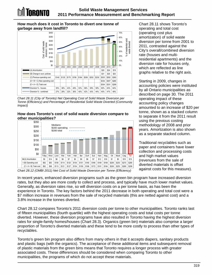
Solid Waste Management Services 2011 Performance Measurement and Benchmarking Report
319
2001 2002 2003 2004 2005 2006 2007 2008 2009 2010 2011 (A) Amortization $20 $24 $19 (B) Change in acct. policies $31 $25 $20 (C) Previous operating cost $140 $135 $170 $156 $184 $206 $202 $230 $303 $282 $260 (D = B + C) New operating cost $334 $307 $280 (E = A + D) Total cost $354 $331 $299 Diversion % - houses 35% 38% 43% 49% 53% 58% 59% 59% 60% 63% 64% Diversion % - combined 27% 28% 32% 36% 40% 42% 43% 44% 45% 47% 49%
0%
10%
20%
30%
40%
50%
60%
70%
$0
$50
$100
$150
$200
$250
$300
$350
$400
% of
resid
entia
l soli
d wa
ste di
verte
d
Cost
of so
lid w
aste
div
ersio
n / to
nne
T-Bay Wind Lond Wat York Halt Bar Durh Sud Ham Niag Ott Musk Calg Tor (A) Amortization $0 $14 $6 $6 $7 $0 $8 $6 $7 $12 $16 $1 $0 $19 $19 (B) Operating cost $92 $83 $106 $114 $120 $154 $151 $160 $166 $169 $168 $208 $253 $270 $280 (C = A + B) Total cost $92 $98 $113 $121 $127 $154 $159 $166 $172 $181 $184 $208 $253 $289 $299
$0 $50
$100 $150 $200 $250 $300 $350
Medians: $160 operating $166 total
How much does it cost in Toronto to divert one tonne of garbage away from landfill? Chart 28.11 (City of Toronto) Net Operating Cost of Solid Waste Diversion per Tonne (Efficiency) and Percentage of Residential Solid Waste Diverted (Community Impact) How does Toronto’s cost of solid waste diversion compare to other municipalities? Chart 28.12 (OMBI 2011) Net Cost of Solid Waste Diversion per Tonne (Efficiency)
Chart 28.11 shows Toronto’s operating and total cost (operating cost plus amortization) of solid waste diversion per tonne from 2001 to 2011, contrasted against the City’s overall/combined diversion rate (houses and multi-residential apartments) and the diversion rate for houses only, which are reflected as line graphs relative to the right axis. Starting in 2009, changes in accounting policies were instituted by all Ontario municipalities as described on page 30. The 2011 operating impact of these accounting policy changes amounted to an increase of $20 per tonne, shown as a stacked column to separate it from the 2011 result using the previous costing methodology of 2008 and prior years. Amortization is also shown as a separate stacked column. Traditional recyclables such as paper and containers have lower collection and processing costs and high market values (revenues from the sale of diverted materials is offset against costs for this measure).
In recent years, enhanced diversion programs such as the green bin program have increased diversion rates, but they also are more costly to collect and process, and typically have much lower market values. Generally, as diversion rates rise, so will diversion costs on a per tonne basis, as has been the experience in Toronto. The key factors behind the 2011 decrease in both operating and total cost were a $7 million increase in revenues from the sale of recycled materials (this are netted against cost) and a 3.8% increase in the tonnes diverted. Chart 28.12 compares Toronto’s 2011 diversion costs per tonne to other municipalities. Toronto ranks last of fifteen municipalities (fourth quartile) with the highest operating costs and total costs per tonne diverted. However, these diversion programs have also resulted in Toronto having the highest diversion rates for single-family homes/houses (Chart 28.3). Organics (green bin) materials also comprise a larger proportion of Toronto's diverted materials and these tend to be more costly to process than other types of recyclables. Toronto’s green bin program also differs from many others in that it accepts diapers, sanitary products and plastic bags (with the organics). The acceptance of these additional items and subsequent removal of plastic materials from the green bins means that Toronto requires a longer process with greater associated costs. These differences should be considered when comparing Toronto to other municipalities, the programs of which do not accept these materials.
Solid Waste Management Services 2011 Performance Measurement And Benchmarking Report
320
2012 Achievements and 2013 Planned Initiatives The following initiatives have improved or are expected to further improve the efficiency and effectiveness of Solid Waste Management Services in Toronto: 2012 Initiatives Completed/Achievements • Increased the residential diversion in 2012 to 50 percent from 49 percent.
o Multi-residential rose to 25 percent from 20 percent. o Single-family residential remained stable at 64 percent.
• Continued providing in-unit recycling containers to increase the recovery of recyclable material in multi-unit residences.
• Expanded the collection of mattresses for recycling. • Included mixed rigid plastics in the City's recycling program that will result in approximately 825
additional diverted tonnes of waste. • Implemented successful contracting out of residential curbside collection in District 2 to achieve an
equal split of 50% in-house and contracted services, with no impact on service levels and standards. • Processed the following tonnages of materials in 2012:
o Source-Separated Organics – 132,000 tonnes; o Single-Stream Recycling – 210,000 tonnes; o Yardwaste – 102,000 tonnes; and o Residual waste sent to landfill – 491,200 tonnes.
2013 Initiatives Planned • Continue to move towards 70% overall waste diversion. • Commission the Disco Source-Separated Organics (SSO) facility that will provide the organic
processing capacity required to meet the needs of customers. • Complete the procurement for the roll-out of the "next generation" green bin. • Complete roll-out of SSO collection in multi-residential, non-residential, schools and City buildings. • Proceed with the study of a Mechanical and Biological Treatment facility at the Green Lane Landfill
Site. • Implement Phase 2 promotion and education campaign for the collection of mixed rigid plastics. Factors Influencing the Results of Municipalities The results of each municipality included in this report can be influenced to varying degrees by factors such as: • governance: single-tier vs. upper-tier vs. mixed municipal systems • program design: based on urban/rural mix of single-family homes, multi-unit residential buildings,
commercial, industrial, seasonal homes and tourists, age of infrastructure, proximity to collection sites, processing sites and sellable markets
• participation: the rate of public participation in recycling activities • service levels: frequency of collection, bag limits, single stream waste collection vs. co-collection
programs, hours of operations and the number and types of materials collected • education: how municipalities promote, manage and enforce their garbage collection, disposal,
recycling and diversion programs and services • disposal method: location of landfill site (local or outside municipality) or use of incineration

321

322
SSppoorrttss && RReeccrreeaattiioonn SSeerrvviicceess Sports and recreation services provide physical and social activities that contribute positively to the well-being of its participants. Municipally managed sports and recreation facilities and programming play a key role in supporting a healthy quality of life for Toronto's residents. Sports and recreation activities are provided at Parks, Forestry and Recreation facilities such as: • Community centres; • Indoor and outdoor swimming pools; • Indoor and outdoor artificial ice rinks; • Community schools; • Sports fields; • Diamonds; • Gymnasia; • Weight Rooms, and • Tennis and Bocce courts. Programming can be provided and managed either directly by municipal staff, or indirectly through other groups, such as community sport and recreation associations that are supported by the municipality through access to facilities, and/or operating grants. The three main types of programming offered are: • Registered programs – where residents register to participate in
structured activities such as swimming lessons, dance or fitness classes or day camps.
• Drop-in programs – where residents participate in unstructured sport and recreation activities such as leisure swimming or skating, fitness centres or gym sports.
• Permitted programs – where residents and/or community organizations obtain permits or short-term rental of sports and recreation facilities such as sports fields, meeting rooms and arenas (e.g., a hockey league renting an ice pad).

Sports & Recreation Services 2011 Performance Measurement and Benchmarking Report
323
Parks, Forestry & Recreation
Community Recreation
Leisure Recreation Programs
Leisure Arts & General Interest
Leisure Skating
Leisure Fitness & Sports
Leisure Ski
Leisure Swim
Community Development
Volunteerism
Youth Outreach
Community Engagement
Special Events
Permitted Activities - Recreation Facilities
Stadiums
Recreation Facilities
Recreational & Facilities Planning & Development
Instructional Recreation Programs
Instructional Arts & General Interest
Instructional Fitness & Sports
Instructional Skating
Afterschool Recreation Care (ARC)
Adapted & Integrated Programs
Camps
Instructional Aquatics
Instructional Skiing
Parks Urban Forestry
Shaded boxes reflect the
activities covered in this section of the report.
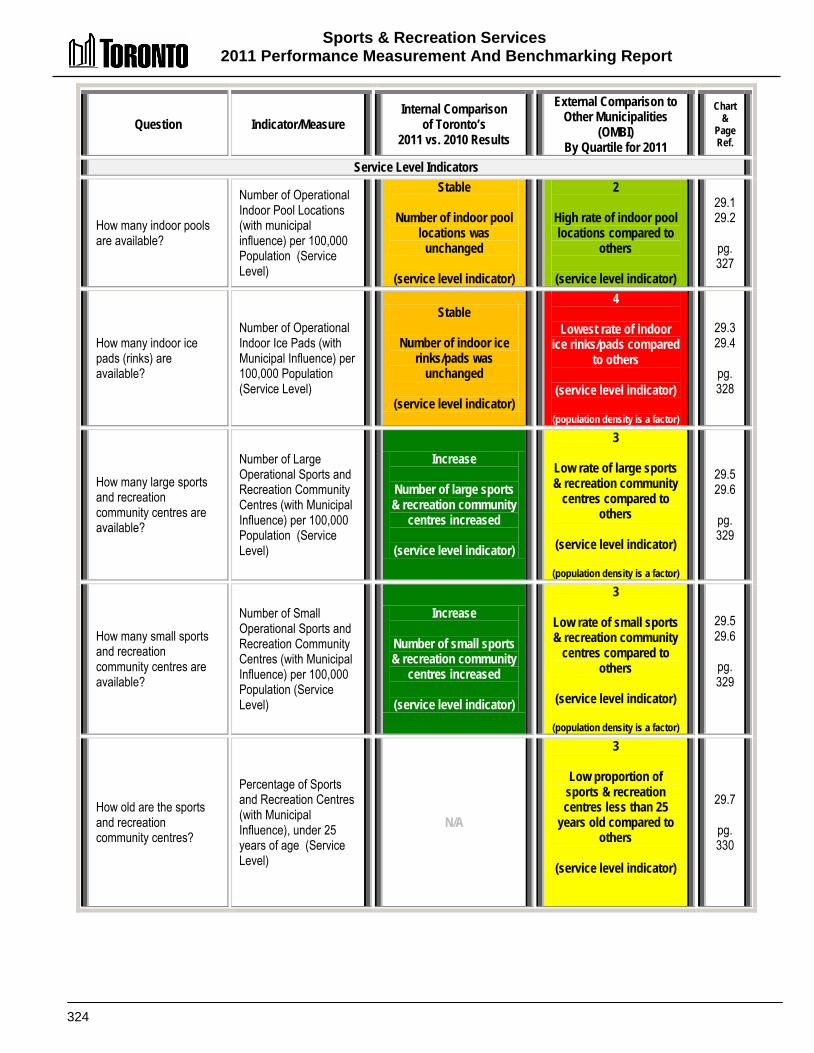
Sports & Recreation Services 2011 Performance Measurement And Benchmarking Report
324
Question Indicator/Measure Internal Comparison
of Toronto’s 2011 vs. 2010 Results
External Comparison to Other Municipalities
(OMBI) By Quartile for 2011
Chart &
Page Ref.
Service Level Indicators
How many indoor pools are available?
Number of Operational Indoor Pool Locations (with municipal influence) per 100,000 Population (Service Level)
Stable
Number of indoor pool locations was
unchanged
(service level indicator)
2
High rate of indoor pool locations compared to
others
(service level indicator)
29.1 29.2
pg. 327
How many indoor ice pads (rinks) are available?
Number of Operational Indoor Ice Pads (with Municipal Influence) per 100,000 Population (Service Level)
Stable
Number of indoor ice rinks/pads was
unchanged
(service level indicator)
4
Lowest rate of indoor ice rinks/pads compared
to others
(service level indicator)
(population density is a factor)
29.3 29.4
pg. 328
How many large sports and recreation community centres are available?
Number of Large Operational Sports and Recreation Community Centres (with Municipal Influence) per 100,000 Population (Service Level)
Increase
Number of large sports & recreation community
centres increased
(service level indicator)
3
Low rate of large sports & recreation community
centres compared to others
(service level indicator)
(population density is a factor)
29.5 29.6
pg. 329
How many small sports and recreation community centres are available?
Number of Small Operational Sports and Recreation Community Centres (with Municipal Influence) per 100,000 Population (Service Level)
Increase
Number of small sports & recreation community
centres increased
(service level indicator)
3
Low rate of small sports & recreation community
centres compared to others
(service level indicator)
(population density is a factor)
29.5 29.6
pg. 329
How old are the sports and recreation community centres?
Percentage of Sports and Recreation Centres (with Municipal Influence), under 25 years of age (Service Level)
N/A
3
Low proportion of sports & recreation centres less than 25
years old compared to others
(service level indicator)
29.7
pg. 330
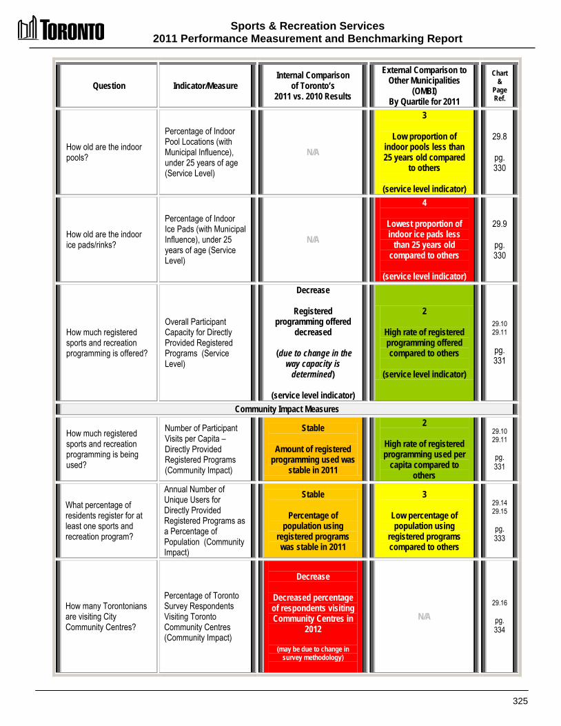
Sports & Recreation Services 2011 Performance Measurement and Benchmarking Report
325
Question Indicator/Measure Internal Comparison
of Toronto’s 2011 vs. 2010 Results
External Comparison to Other Municipalities
(OMBI) By Quartile for 2011
Chart &
Page Ref.
How old are the indoor pools?
Percentage of Indoor Pool Locations (with Municipal Influence), under 25 years of age (Service Level)
N/A
3
Low proportion of indoor pools less than 25 years old compared
to others
(service level indicator)
29.8
pg. 330
How old are the indoor ice pads/rinks?
Percentage of Indoor Ice Pads (with Municipal Influence), under 25 years of age (Service Level)
N/A
4
Lowest proportion of indoor ice pads less
than 25 years old compared to others
(service level indicator)
29.9
pg. 330
How much registered sports and recreation programming is offered?
Overall Participant Capacity for Directly Provided Registered Programs (Service Level)
Decrease
Registered programming offered
decreased
(due to change in the way capacity is
determined)
(service level indicator)
2
High rate of registered programming offered compared to others
(service level indicator)
29.10 29.11
pg. 331
Community Impact Measures
How much registered sports and recreation programming is being used?
Number of Participant Visits per Capita – Directly Provided Registered Programs (Community Impact)
Stable
Amount of registered programming used was
stable in 2011
2
High rate of registered programming used per
capita compared to others
29.10 29.11
pg. 331
What percentage of residents register for at least one sports and recreation program?
Annual Number of Unique Users for Directly Provided Registered Programs as a Percentage of Population (Community Impact)
Stable
Percentage of population using
registered programs was stable in 2011
3
Low percentage of population using
registered programs compared to others
29.14 29.15
pg. 333
How many Torontonians are visiting City Community Centres?
Percentage of Toronto Survey Respondents Visiting Toronto Community Centres (Community Impact)
Decrease
Decreased percentage of respondents visiting Community Centres in
2012
(may be due to change in survey methodology)
N/A 29.16
pg. 334
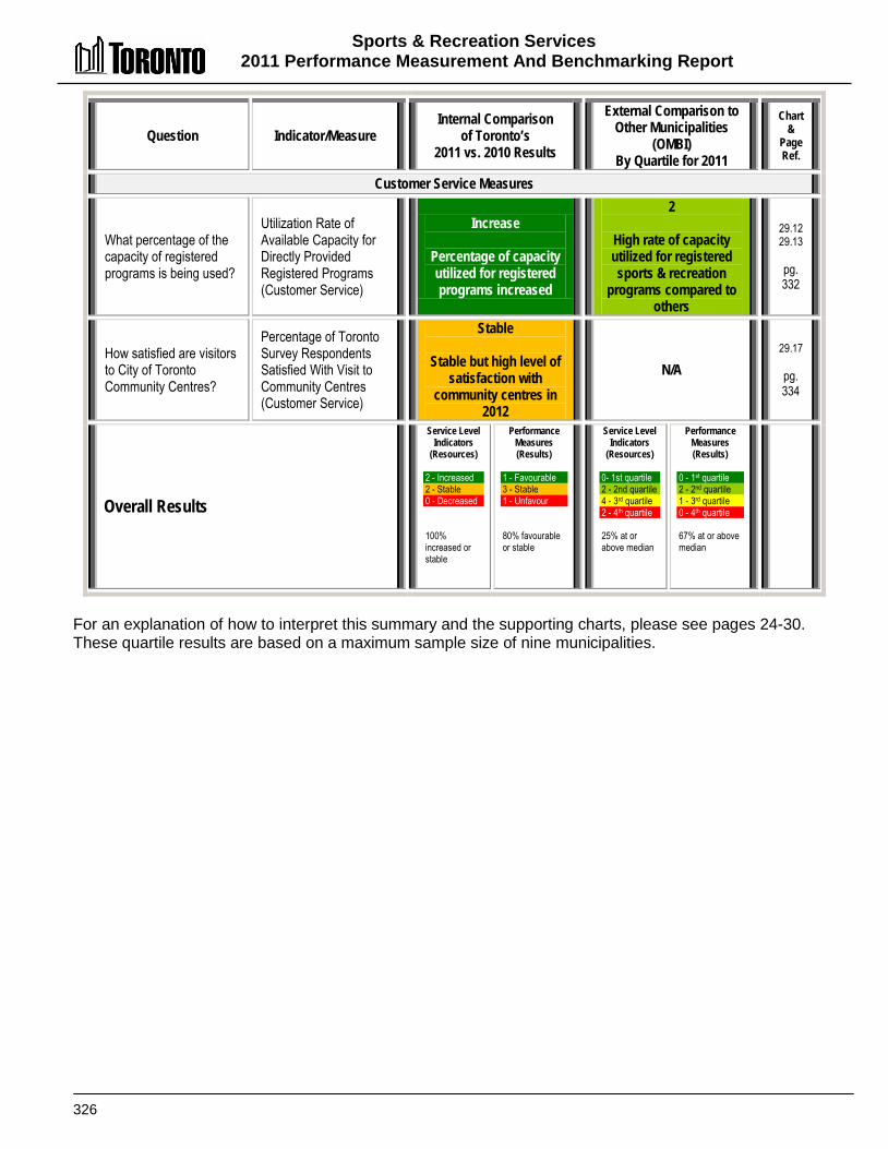
Sports & Recreation Services 2011 Performance Measurement And Benchmarking Report
326
Question Indicator/Measure Internal Comparison
of Toronto’s 2011 vs. 2010 Results
External Comparison to Other Municipalities
(OMBI) By Quartile for 2011
Chart &
Page Ref.
Customer Service Measures
What percentage of the capacity of registered programs is being used?
Utilization Rate of Available Capacity for Directly Provided Registered Programs (Customer Service)
Increase
Percentage of capacity utilized for registered programs increased
2
High rate of capacity utilized for registered sports & recreation
programs compared to others
29.12 29.13
pg. 332
How satisfied are visitors to City of Toronto Community Centres?
Percentage of Toronto Survey Respondents Satisfied With Visit to Community Centres (Customer Service)
Stable
Stable but high level of satisfaction with
community centres in 2012
N/A 29.17
pg. 334
Overall Results
Service Level Indicators
(Resources) 2 - Increased 2 - Stable 0 - Decreased 100% increased or stable
Performance Measures (Results)
1 - Favourable 3 - Stable 1 - Unfavour. 80% favourable or stable
Service Level Indicators
(Resources)
0- 1st quartile 2 - 2nd quartile 4 - 3rd quartile 2 - 4th quartile 25% at or above median
Performance Measures (Results)
0 - 1st quartile 2 - 2nd quartile 1 - 3rd quartile 0 - 4th quartile 67% at or above median
For an explanation of how to interpret this summary and the supporting charts, please see pages 24-30. These quartile results are based on a maximum sample size of nine municipalities.

Sports & Recreation Services 2011 Performance Measurement and Benchmarking Report
327
2001 2002 2003 2004 2005 2006 2007 2008 2009 2010 2011 # pool locations /
100k pop'n 2.93 2.9 2.83 2.84 2.74 2.77 2.75 2.52 2.43 2.42 2.40
Total # pool locations 76 76 75 76 74 75 75 69 67 67 67
0.0
0.5
1.0
1.5
2.0
2.5
3.0
Ham Sud T-Bay Tor Bar Ott Winn Wind Lond # pools /
100k pop'n 3.20 3.12 2.77 2.40 2.00 1.94 1.88 1.42 1.09
Pop'n density 471 44 330 4,401 1,400 332 1,446 1,436 865
0
500
1,000
1,500
2,000
2,500
3,000
3,500
4,000
4,500
5,000
0.0
0.5
1.0
1.5
2.0
2.5
3.0
3.5
4.0
Dens
ity- p
op'n
per s
q. km
Indoo
r Poo
l Loc
ation
s /
100,0
00 po
p'n
Median 2.00
How many indoor pools are there in Toronto? Chart 29.1 (City of Toronto) Number of Indoor Pool Locations per 100,000 Population (Service Level) How does the number of indoor pools in Toronto compare to other municipalities? Chart 29.2 (OMBI 2011) Number of Indoor Pool Locations per 100,000 Population (Service Level) and Population Density
Comparing the number of sports and recreation facilities in municipalities can provide an indication of service levels. Chart 29.1 provides Toronto's total number and rate of owned and/or operated indoor pool locations per 100,000 population. The number of pool locations decreased by two (due to an evaluation of pool usage at School Board locations) in 2009 but has been stable at 67 locations since then. Chart 29.2 compares Toronto's 2011 results to other municipalities for the number of (owned and/or managed) indoor pool locations per 100,000 population, plotted as columns relative to the left axis. Toronto ranks fourth of nine municipalities (second quartile) in terms of providing the highest number of indoor pool locations per 100,000 population.
Population density can be a factor in determining the number of sports and recreation facilities that may be required to meet municipal service needs. Fewer sports and recreation facilities may be required in densely populated areas because of proximity and ease of access, while other less densely populated municipalities may require proportionately more facilities based on a reasonable travel distance for their residents. Population density (residents per square kilometre) is plotted as a line graph relative to the right axis on Chart 29.2, confirming that Toronto is far more densely populated than any other municipality. Toronto ranks higher in its results for the number of indoor pools than it does for other types of recreation infrastructure such as ice pads and sports and recreation community centres (Charts 24.4 and 24.5). In addition, Toronto has 58 city outdoor pool locations that are not included in this report. In comparison, the combined number of outdoor pools for all other reporting municipalities is 52 who serve a combined population of over 3.1 million, yet with much lower population densities than the City of Toronto.
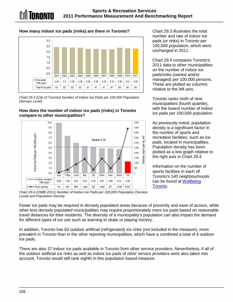
Sports & Recreation Services 2011 Performance Measurement And Benchmarking Report
328
2001 2002 2003 2004 2005 2006 2007 2008 2009 2010 2011 # ice pads / 100k pop'n 2.43 2.4 2.38 2.36 2.26 2.26 2.23 2.23 2.36 2.31 2.29
Total # ice pads 63 63 63 63 61 61 61 61 65 64 64
0.0
0.5
1.0
1.5
2.0
2.5
3.0
Sud T-Bay Lond Bar Ott Winn Ham Wind Tor # indoor ice pads /
100k pop'n 9.98 7.38 6.01 5.33 5.18 4.91 4.90 4.74 2.29
Pop'n density 44 330 865 1,400 332 1,446 471 1,436 4,401
0
500
1,000
1,500
2,000
2,500
3,000
3,500
4,000
4,500
5,000
0.0
1.0
2.0
3.0
4.0
5.0
6.0
7.0
8.0
9.0
10.0
Dens
ity- p
op'n
per s
q. km
Indoo
r Ice P
ads p
er 10
0,000
pop'n
Median 5.18
How many indoor ice pads (rinks) are there in Toronto? Chart 29.3 (City of Toronto) Number of Indoor Ice Pads per 100,000 Population (Service Level) How does the number of indoor ice pads (rinks) in Toronto compare to other municipalities? Chart 29.4 (OMBI 2011) Number of Indoor Ice Pads per 100,000 Population (Service Level) and Population Density
Chart 29.3 illustrates the total number and rate of indoor ice pads (or rinks) in Toronto per 100,000 population, which were unchanged in 2011. Chart 29.4 compares Toronto's 2011 data to other municipalities on the number of indoor ice pads/rinks (owned and/or managed) per 100,000 persons. These are plotted as columns relative to the left axis. Toronto ranks ninth of nine municipalities (fourth quartile), with the lowest number of indoor ice pads per 100,000 population. As previously noted, population density is a significant factor in the number of sports and recreation facilities, such as ice pads, located in municipalities. Population density has been plotted as a line graph relative to the right axis in Chart 29.4. Information on the number of sports facilities in each of Toronto's 140 neighbourhoods can be found at Wellbeing Toronto.
Fewer ice pads may be required in densely populated areas because of proximity and ease of access, while other less densely populated municipalities may require proportionately more ice pads based on reasonable travel distances for their residents. The diversity of a municipality’s population can also impact the demand for different types of ice use such as learning to skate or playing hockey. In addition, Toronto has 63 outdoor artificial (refrigerated) ice rinks (not included in the measure), more prevalent in Toronto than in the other reporting municipalities, which have a combined a total of 8 outdoor ice pads. There are also 37 indoor ice pads available in Toronto from other service providers. Nevertheless, if all of the outdoor artificial ice rinks as well as indoor ice pads of other service providers were also taken into account, Toronto would still rank eighth in this population based measure.

Sports & Recreation Services 2011 Performance Measurement and Benchmarking Report
329
How many sports and recreation community centres exist in Toronto? Chart 29.5 (City of Toronto) Number of Large and Small Sports and Recreation Community Centres per 100,000 Population (Service Level) How does the number of sports and recreation community centres in Toronto compare to other municipalities? Chart 29.6 (OMBI 2011) Number of Large and Small Sports and Recreation Community Centres per 100,000 Population (Service Level) & Population Density
Chart 29.5 provides Toronto's total number and rate (per 100,000 population) of large (more than 10,000 sq. ft) and small (less than 10,000 sq. ft) sports and recreation centres. This measure includes Toronto's own centres as well as others in which it has some control or influence over the programming offered. Toronto uses dedicated and shared space with school boards to provide recreation programming at 29 school sites, as well as a number of satellite locations across the City such as churches, and apartment buildings. In 2011, a new centre (Warden Hilltop Community Centre) was opened and an additional six existing centres were included in the facility listing for the first time that had been previously omitted. Toronto also has ten facilities (not included in these figures) operated as Association of Community Centres, that are volunteer board-run multi-purpose facilities which provide a broad range of community, recreation and social service programs to residents in local communities.
Chart 29.6 compares Toronto's 2011 results to other municipalities for the number of sports and recreation community centres per 100,000 population. These are plotted as columns relative to the left axis. In terms of having the largest number of community centres per 100,000 population, Toronto ranks sixth of nine municipalities (third quartile) for large community centres and seventh of nine municipalities (third quartile) for small community centres. As noted previously, population density is a significant factor in the number of sports and recreation facilities such as community centres located in municipalities. Population density is plotted as a line graph relative to the right axis in Chart 29.6. Toronto is far more densely populated than the other municipalities. It is generally more expensive to operate multiple small community centres than a larger one of an equivalent size. Toronto’s small sport and recreation centres are distributed city-wide. These locations focus their programming on their local communities.
2001 2002 2003 2004 2005 2006 2007 2008 2009 2010 2011 # Small Com. Ctr. 48 50 51 50 49 50 51 51 51 53 58 # Large Com. Ctr. 81 82 82 83 83 83 83 83 83 88 90 # Total Com.Ctr. per 100k pop'n 5.0 5.0 5.0 5.0 4.9 4.9 4.9 4.9 4.9 5.1 5.3 # Small Com. Ctr. per 100k pop'n 1.9 1.9 1.9 1.9 1.8 1.9 1.9 1.9 1.9 1.9 2.1 # Large Com. Ctr. per 100k pop'n 3.1 3.1 3.1 3.1 3.1 3.1 3.0 3.0 3.0 3.2 3.2
0.00
1.00
2.00
3.00
4.00
5.00
6.00
Sud Winn T-Bay Ott Ham Bar Wind Tor Lond
# Large CCs / 100k pop'n 5.0 9.0 1.9 2.5 3.4 5.3 4.3 3.2 2.2 # Small CCs / 100k pop'n 38.1 4.9 12.0 10.4 5.3 1.3 1.4 2.1 2.2 # Total CCs / 100k pop'n 43.0 13.9 13.8 12.8 8.7 6.7 5.7 5.3 4.4 Pop'n Density 44 1,446 330 332 471 1,400 1,436 4,401 865
0
500
1,000
1,500
2,000
2,500
3,000
3,500
4,000
4,500
5,000
0
10
20
30
40
50
60
population per square km. (density)
Numb
er of
comm
unity
centr
es
per 1
00,00
0
Median Total Community Centres 8.7
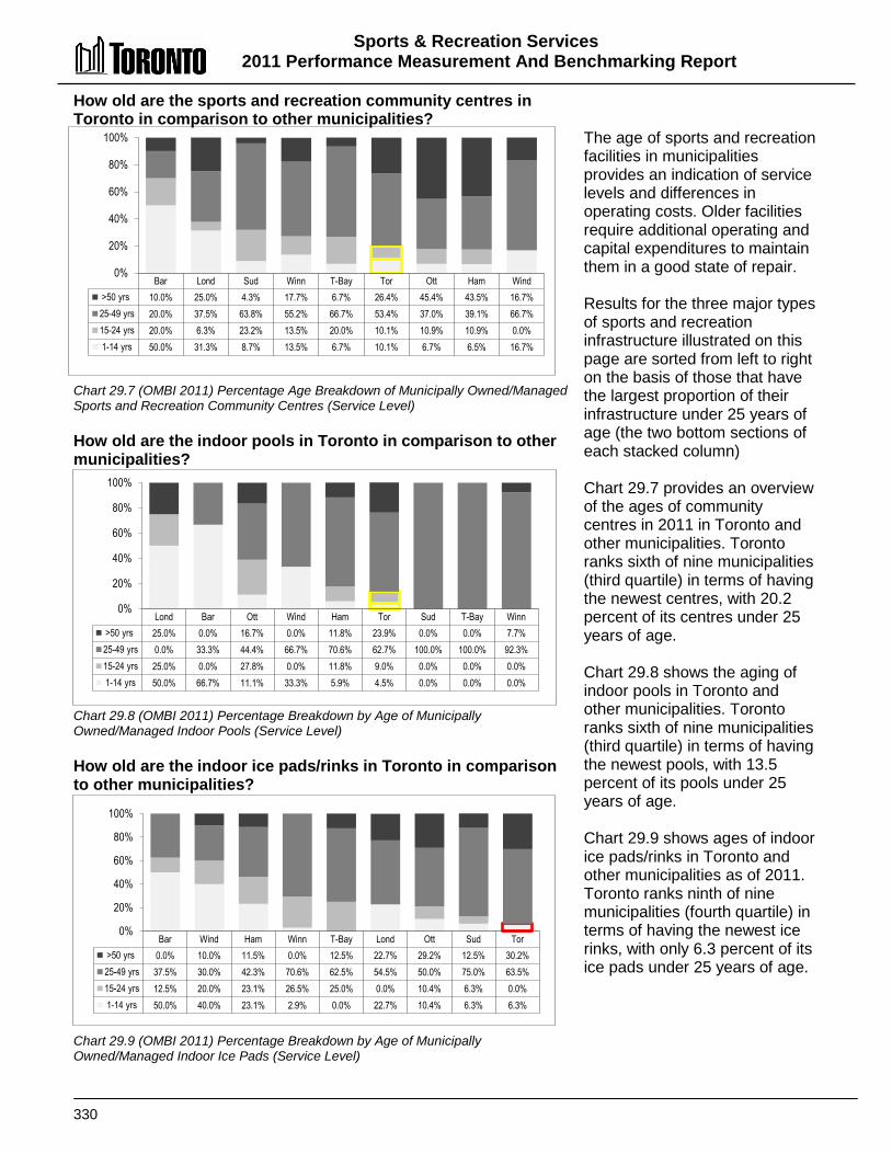
Sports & Recreation Services 2011 Performance Measurement And Benchmarking Report
330
How old are the sports and recreation community centres in Toronto in comparison to other municipalities? Chart 29.7 (OMBI 2011) Percentage Age Breakdown of Municipally Owned/Managed Sports and Recreation Community Centres (Service Level) How old are the indoor pools in Toronto in comparison to other municipalities? Chart 29.8 (OMBI 2011) Percentage Breakdown by Age of Municipally Owned/Managed Indoor Pools (Service Level) How old are the indoor ice pads/rinks in Toronto in comparison to other municipalities? Chart 29.9 (OMBI 2011) Percentage Breakdown by Age of Municipally Owned/Managed Indoor Ice Pads (Service Level)
The age of sports and recreation facilities in municipalities provides an indication of service levels and differences in operating costs. Older facilities require additional operating and capital expenditures to maintain them in a good state of repair. Results for the three major types of sports and recreation infrastructure illustrated on this page are sorted from left to right on the basis of those that have the largest proportion of their infrastructure under 25 years of age (the two bottom sections of each stacked column) Chart 29.7 provides an overview of the ages of community centres in 2011 in Toronto and other municipalities. Toronto ranks sixth of nine municipalities (third quartile) in terms of having the newest centres, with 20.2 percent of its centres under 25 years of age. Chart 29.8 shows the aging of indoor pools in Toronto and other municipalities. Toronto ranks sixth of nine municipalities (third quartile) in terms of having the newest pools, with 13.5 percent of its pools under 25 years of age. Chart 29.9 shows ages of indoor ice pads/rinks in Toronto and other municipalities as of 2011. Toronto ranks ninth of nine municipalities (fourth quartile) in terms of having the newest ice rinks, with only 6.3 percent of its ice pads under 25 years of age.
Bar Lond Sud Winn T-Bay Tor Ott Ham Wind >50 yrs 10.0% 25.0% 4.3% 17.7% 6.7% 26.4% 45.4% 43.5% 16.7% 25-49 yrs 20.0% 37.5% 63.8% 55.2% 66.7% 53.4% 37.0% 39.1% 66.7% 15-24 yrs 20.0% 6.3% 23.2% 13.5% 20.0% 10.1% 10.9% 10.9% 0.0% 1-14 yrs 50.0% 31.3% 8.7% 13.5% 6.7% 10.1% 6.7% 6.5% 16.7%
0%
20%
40%
60%
80%
100%
Lond Bar Ott Wind Ham Tor Sud T-Bay Winn >50 yrs 25.0% 0.0% 16.7% 0.0% 11.8% 23.9% 0.0% 0.0% 7.7% 25-49 yrs 0.0% 33.3% 44.4% 66.7% 70.6% 62.7% 100.0% 100.0% 92.3% 15-24 yrs 25.0% 0.0% 27.8% 0.0% 11.8% 9.0% 0.0% 0.0% 0.0% 1-14 yrs 50.0% 66.7% 11.1% 33.3% 5.9% 4.5% 0.0% 0.0% 0.0%
0%
20%
40%
60%
80%
100%
Bar Wind Ham Winn T-Bay Lond Ott Sud Tor >50 yrs 0.0% 10.0% 11.5% 0.0% 12.5% 22.7% 29.2% 12.5% 30.2% 25-49 yrs 37.5% 30.0% 42.3% 70.6% 62.5% 54.5% 50.0% 75.0% 63.5% 15-24 yrs 12.5% 20.0% 23.1% 26.5% 25.0% 0.0% 10.4% 6.3% 0.0% 1-14 yrs 50.0% 40.0% 23.1% 2.9% 0.0% 22.7% 10.4% 6.3% 6.3%
0%
20%
40%
60%
80%
100%
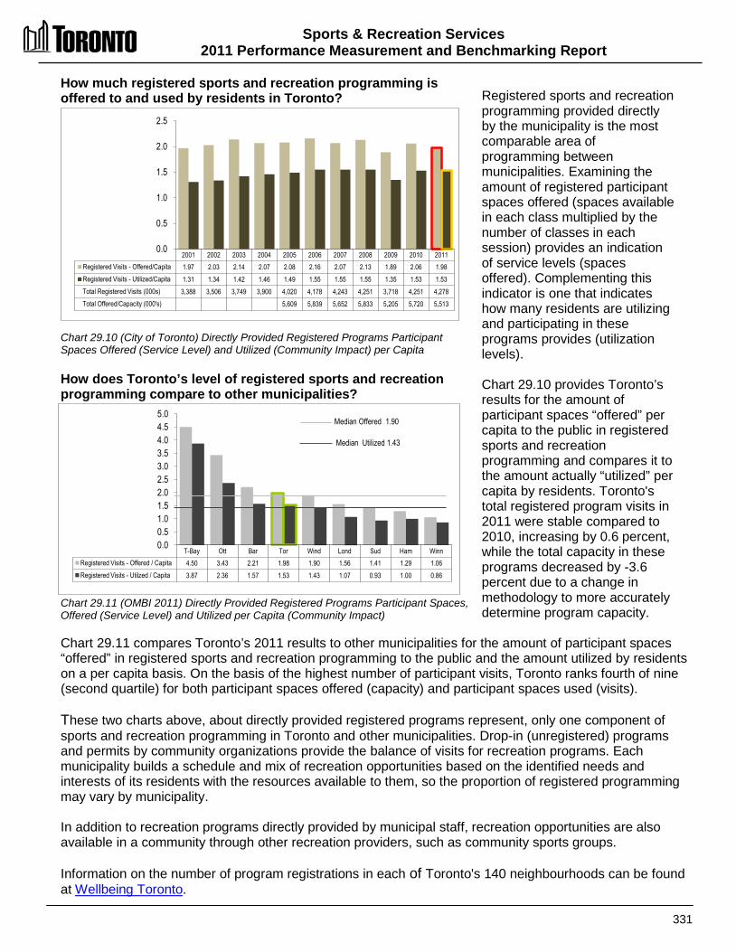
Sports & Recreation Services 2011 Performance Measurement and Benchmarking Report
331
How much registered sports and recreation programming is offered to and used by residents in Toronto? Chart 29.10 (City of Toronto) Directly Provided Registered Programs Participant Spaces Offered (Service Level) and Utilized (Community Impact) per Capita How does Toronto’s level of registered sports and recreation programming compare to other municipalities? Chart 29.11 (OMBI 2011) Directly Provided Registered Programs Participant Spaces, Offered (Service Level) and Utilized per Capita (Community Impact)
Registered sports and recreation programming provided directly by the municipality is the most comparable area of programming between municipalities. Examining the amount of registered participant spaces offered (spaces available in each class multiplied by the number of classes in each session) provides an indication of service levels (spaces offered). Complementing this indicator is one that indicates how many residents are utilizing and participating in these programs provides (utilization levels). Chart 29.10 provides Toronto’s results for the amount of participant spaces “offered” per capita to the public in registered sports and recreation programming and compares it to the amount actually “utilized” per capita by residents. Toronto's total registered program visits in 2011 were stable compared to 2010, increasing by 0.6 percent, while the total capacity in these programs decreased by -3.6 percent due to a change in methodology to more accurately determine program capacity.
Chart 29.11 compares Toronto’s 2011 results to other municipalities for the amount of participant spaces “offered” in registered sports and recreation programming to the public and the amount utilized by residents on a per capita basis. On the basis of the highest number of participant visits, Toronto ranks fourth of nine (second quartile) for both participant spaces offered (capacity) and participant spaces used (visits). These two charts above, about directly provided registered programs represent, only one component of sports and recreation programming in Toronto and other municipalities. Drop-in (unregistered) programs and permits by community organizations provide the balance of visits for recreation programs. Each municipality builds a schedule and mix of recreation opportunities based on the identified needs and interests of its residents with the resources available to them, so the proportion of registered programming may vary by municipality. In addition to recreation programs directly provided by municipal staff, recreation opportunities are also available in a community through other recreation providers, such as community sports groups. Information on the number of program registrations in each of Toronto's 140 neighbourhoods can be found at Wellbeing Toronto.
2001 2002 2003 2004 2005 2006 2007 2008 2009 2010 2011 Registered Visits - Offered/Capita 1.97 2.03 2.14 2.07 2.08 2.16 2.07 2.13 1.89 2.06 1.98 Registered Visits - Utilized/Capita 1.31 1.34 1.42 1.46 1.49 1.55 1.55 1.55 1.35 1.53 1.53 Total Registered Visits (000s) 3,388 3,506 3,749 3,900 4,020 4,178 4,243 4,251 3,718 4,251 4,278 Total Offered/Capacity (000's) 5,609 5,839 5,652 5,833 5,205 5,720 5,513
0.0
0.5
1.0
1.5
2.0
2.5
T-Bay Ott Bar Tor Wind Lond Sud Ham Winn Registered Visits - Offered / Capita 4.50 3.43 2.21 1.98 1.90 1.56 1.41 1.29 1.06 Registered Visits - Utilzed / Capita 3.87 2.36 1.57 1.53 1.43 1.07 0.93 1.00 0.86
0.0 0.5 1.0 1.5 2.0 2.5 3.0 3.5 4.0 4.5 5.0
Median Offered 1.90
Median Utilized 1.43
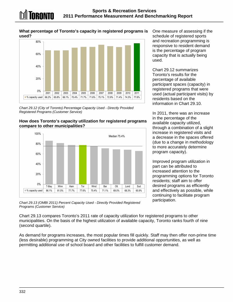
Sports & Recreation Services 2011 Performance Measurement And Benchmarking Report
332
What percentage of Toronto’s capacity in registered programs is used? Chart 29.12 (City of Toronto) Percentage Capacity Used - Directly Provided Registered Programs (Customer Service) How does Toronto’s capacity utilization for registered programs compare to other municipalities? Chart 29.13 (OMBI 2011) Percent Capacity Used - Directly Provided Registered Programs (Customer Service)
One measure of assessing if the schedule of registered sports and recreation programming is responsive to resident demand is the percentage of program capacity that is actually being used. Chart 29.12 summarizes Toronto’s results for the percentage of available participant spaces (capacity) in registered programs that were used (actual participant visits) by residents based on the information in Chart 29.10. In 2011, there was an increase in the percentage of the available capacity utilized, through a combination of a slight increase in registered visits and a decrease in the spaces offered (due to a change in methodology to more accurately determine program capacity). Improved program utilization in part can be attributed to increased attention to the programming options for Toronto residents; staff aim to offer desired programs as efficiently and effectively as possible, while continuing to facilitate program participation.
Chart 29.13 compares Toronto’s 2011 rate of capacity utilization for registered programs to other municipalities. On the basis of the highest utilization of available capacity, Toronto ranks fourth of nine (second quartile). As demand for programs increases, the most popular times fill quickly. Staff may then offer non-prime time (less desirable) programming at City owned facilities to provide additional opportunities, as well as permitting additional use of school board and other facilities to fulfill customer demand.
2001 2002 2003 2004 2005 2006 2007 2008 2009 2010 2011 % capacity used 66.2% 65.8% 66.1% 70.4% 71.7% 71.6% 75.1% 72.9% 71.4% 74.3% 77.6%
0%
20%
40%
60%
80%
T-Bay Winn Ham Tor Wind Bar Ott Lond Sud % capacity used 86.1% 81.5% 77.7% 77.6% 75.4% 71.1% 69.0% 68.3% 65.9%
0%
20%
40%
60%
80%
100% Median 75.4%

Sports & Recreation Services 2011 Performance Measurement and Benchmarking Report
333
What percentage of Toronto’s residents register for at least one sports and recreation program? Chart 29.14 (City of Toronto) Percent of Residents Registering for at Least One Sports & Recreation Program (Community Impact) How does Toronto’s percentage of residents registering for at least one sports and recreation program compare to other municipalities? Chart 29.15 (OMBI 2011) Percent of Residents Registering for at Least One Sports & Recreation Program (Community Impact)
Although it represents only a portion of sports and recreation services, one way to measure the success of municipalities in reaching residents through directly provided registered sports and recreation programs is to examine how many citizens are using the programs. Chart 29.14.depicts the percentage of residents in Toronto who registered for at least one sports and recreation program. Individuals who registered for more than one program are only counted once. Toronto’s 2011 result showed 5.5 percent of the population registered for at least one recreation program, which was unchanged from 2010. Chart 29.15 compares Toronto's 2011 percentage of residents registered in sports and recreation programming to other municipalities. Toronto ranks seventh of nine (third quartile) in terms of having the highest percentage of the population using registered programs.
In Toronto, there are many private and non-profit organizations that offer recreation opportunities that residents may use in lieu of municipally provided programs and services. Directly offered registered programming is the only area of recreation programming in Toronto that records participant and attendance information for individuals. Participation by specific individuals in directly provided drop-in and permitted programs as well as all indirectly provided programming is not recorded in Toronto or by any of the other OMBI partner municipalities and is therefore not available for performance measurement or comparison. Municipal results for this measure can be influenced by the amount, variety and timing of registered programming offered by municipalities.
2001 2002 2003 2004 2005 2006 2007 2008 2009 2010 2011 % residents 6.1% 6.0% 6.0% 6.0% 5.9% 5.9% 5.8% 5.7% 5.0% 5.5% 5.5%
0%
1%
2%
3%
4%
5%
6%
7%
Ott T-Bay Bar Sud Wind Lond Tor Winn Ham % residents 15.5% 14.9% 10.8% 9.6% 8.6% 6.3% 5.5% 5.4% 4.9%
0% 2% 4% 6% 8%
10% 12% 14% 16% 18%
Median 8.6%

Sports & Recreation Services 2011 Performance Measurement And Benchmarking Report
334
How many Torontonians are visiting City Community Centres? Chart 29.16 (City of Toronto) Percentage of Toronto Survey Respondents Visiting City of Toronto Community Centres at Least Once in the Year (Community Impact) How satisfied are visitors to Toronto Community Centres? Chart 29.17 (City of Toronto 2012) Percentage of Toronto Survey Respondents Satisfied With Visit to Community Centres (Customer Service)
An objective of municipalities is to promote community activities and active participation at community centres through registered, drop-in programs or permitted opportunities. Chart 29.16 reflects 2001 to 2012 results of the Focus Ontario GTA Survey. Results show the percentage of Toronto respondents who visited a Community Centres at least once in the year. With this size of survey, it has a sampling error of plus or minus 4.4 percentage points in 95 out of 100 samples. In 2012, approximately 39 percent of those surveyed visited Toronto's Community Centres, a decrease of 9 percent from prior year survey. Note that in 2012, there was a change in the survey method, transitioning to a web-based survey from the telephone-based surveys of prior years. It is possible that this change in method may have impacted the comparability of 2011 and 2012 results.
Chart 29.17 is also based on the Focus Ontario GTA Survey and reflects the degree of satisfaction of respondents who visited Toronto's Community Centres. In 2012, 95 percent of the visitors were satisfied with City of Toronto Community Centres, and satisfaction levels have exceeded 90 percent for each of the past 10 years.
2001 2003 2005 2006 2007 2008 2009 2010 2011 2012 % who visited at least
once / year 54% 63% 59% 60% 58% 56% 52% 58% 48% 39%
0%
20%
40%
60%
80%
Source: Focus Ontario Fall 2012 Surveybased on 505 people surveyed.
2001 2003 2005 2006 2007 2008 2009 2010 2011 2012 Other 7% 9% 9% 9% 8% 7% 9% 8% 7% 5% Somewhat Satisfied 53% 53% 53% 49% 49% 56% 50% 51% 48% 60% Very Satisfied 40% 38% 38% 42% 43% 37% 41% 41% 45% 35%
0% 10% 20% 30% 40% 50% 60% 70% 80% 90%
100%
Source: Focus Ontario Fall 2012 Survey based on 505 people surveyed.
Sports & Recreation Services 2011 Performance Measurement and Benchmarking Report
335
2012 Achievements and 2013 Planned Initiatives The following achievements and initiatives have improved or will help to further improve the effectiveness of Toronto’s Sports and Recreation Services: 2012 Achievements
• The Recreation Service Plan was approved by City Council. • Reviewed Summer Camp operations to improve program utilization with increased
registrations and decreased waitlists. • Converted the Welcome Policy to a fee based subsidy to improve resident access. • Began Workplace Violence Assessments at Community Recreation locations. • Completed the Regent Park Aquatic Centre. • Maintained partnership role in the Investing in Families Initiative by helping low income
families develop recreation plans.
2013 Initiatives Planned • Continue with Accessibility for Ontario Disabilities Act (AODA) compliance. • Initiate a Recreation Facilities Master Plan to inventory assets. • Proceed with development of Future Community Centres (York C.C. and Regent Park C.C.) • Carry on with Leaside Arena expansion and Bloorlea Gym enhancement. • Implement a centralized model for the Youth Outreach Worker program. • Move forward with Priority Centre Expansion as approved by Council, confirming additional
locations based on new criteria for designation and application of updated Census data.
Factors Influencing the Results of Municipalities The results of each municipality included in this report can be influenced to varying degrees by factors such as:
• Recreation facilities: number of facilities, mix of facility types and age of facilities. • Programming: variety of recreation program types offered; number and extent of age groups
with targeted programming; frequency and times of program offerings; class length; and mix of instructional vs. drop-in vs. permitted programming.
• Transportation: access and the number of program locations. • Collective agreements: differences in wage rates and staffing structures. • Socio-economic: needs of different ethnic groups within the community; changes in
legislation, such as the impact of Accessibility for Ontarians with Disabilities Act (AODA) on the cost of providing service.
• Utilization rates: user fees influence the decisions of residents to register and how often; availability of qualified and trained staff can impact program offerings.

336
Revenue Services
Property Tax Billing
Property Tax & Payment in Lieu of
Tax Billing
Property Assessment
Reviews
Rebate & Deferral Programs
Appeals Processing
Apportionements of Property Tax
Utility Billing
Water Billings
Solid Waste Billings
Water Meter Reading Operations
Parking Tickets
Parking Ticket Processing
Tax, Utility & Parking Client
Services
Tax/Utility Account Administration
Revenue Services Counter Operations
Revenue Services Contact Centre
Revenue Accounting and
Collection
Payment Processing &
Collection
Arrears Collections
Revenue Accounting
Municipal Land Transfer Tax
Refund Processing
TTaaxxaattiioonn SSeerrvviicceess Taxation services involve issuing property tax bills, processing payments and collecting outstanding amounts. Property taxes in Ontario consist of:
• A municipal portion that is used to fund services and programs delivered by
the municipality such as emergency services, social programs, roads, culture and recreational programs, libraries, planning and development, and public transit; and
• An education portion that is used to fund education across Ontario. The Municipal Property Assessment Corporation (MPAC), an independent corporation, is responsible for determining the Current Value Assessment (CVA) and tax class for all properties in Ontario. Each year, MPAC delivers an annual assessment roll to each municipality containing assessed values for all properties within the municipality. These assessed values form the basis for levying property taxes within the municipality. Each municipality multiplies the municipal property tax rates established by their Council and the education tax rates established by the province against the assessed values to determine and issue property tax bills to property owners. Property tax rates vary by property class, which include: • Residential customers (including single family dwellings, semi-detached, townhouses, low-
rise apartments and condominiums); • Multi-residential customers (apartment buildings consisting of seven or more rental units); • Commercial and industrial property owners; • Farmland; • Pipelines; and • Managed forests.
Boxes shaded reflect the activities covered in this report
Boxes shaded reflect the activities covered in this report
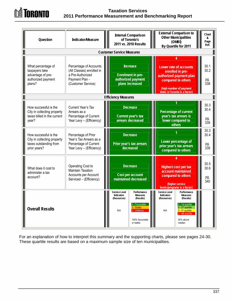
Taxation Services 2011 Performance Measurement and Benchmarking Report
337
Question Indicator/Measure Internal Comparison
of Toronto’s 2011 vs. 2010 Results
External Comparison to Other Municipalities
(OMBI) By Quartile for 2011
Chart &
Page Ref.
Customer Service Measures
What percentage of taxpayers take advantage of pre-authorized payment plans?
Percentage of Accounts (All Classes) enrolled in a Pre-Authorized Payment Plan -(Customer Service)
Increase
Enrolment in pre-authorized payment
plans increased
4
Lower rate of accounts enrolled in pre-
authorized payment plan compared to others
(high number of payment
dates in Toronto is a factor)
30.1 30.2
pg. 338
Efficiency Measures
How successful is the City in collecting property taxes billed in the current year?
Current Year’s Tax Arrears as a Percentage of Current Year Levy – (Efficiency)
Decrease
Current year’s tax arrears decreased
1
Percentage of current year’s tax arrears is lower compared to
others
30.3 30.4
pg. 339
How successful is the City in collecting property taxes outstanding from prior years?
Percentage of Prior Year’s Tax Arrears as a Percentage of Current Year Levy – (Efficiency)
Decrease
Prior year’s tax arrears decreased
1
Lower percentage of prior year’s tax arrears
compared to others
30.3 30.4
pg. 339
What does it cost to administer a tax account?
Operating Cost to Maintain Taxation Accounts per Account Serviced – (Efficiency)
Decrease
Cost per account maintained decreased
4
Highest cost per tax account maintained compared to others
(higher service
levels/programs is a factor)
30.5 30.6
pg. 340
Overall Results
Service Level Indicators
(Resources)
N/A
Performance Measures (Results)
4 - Favourable 0 - Stable 0 - Unfavour. 100% favourable or stable
Service Level Indicators
(Resources)
N/A
Performance Measures (Results)
2 - 1st quartile 0 - 2nd quartile 0 - 3rd quartile 2 - 4th quartile 50% above median
For an explanation of how to interpret this summary and the supporting charts, please see pages 24-30. These quartile results are based on a maximum sample size of ten municipalities.

Taxation Services 2011 Performance Measurement And Benchmarking Report
338
What percentage of Toronto taxpayers take advantage of the pre-authorized payment plan? Chart 30.1 (City of Toronto) Percent of All Tax Accounts Enrolled in Pre-Authorized Payment Plans (Customer Service) How does Toronto’s rate of enrolment in its pre-authorized payment plan compare to other municipalities? Chart 30.2 (OMBI 2011) Percent of All Tax Accounts Enrolled in Pre-Authorized Payment Plans (Customer Service)
Pre-authorized property tax payment programs (PAP) allow taxpayers to have tax installments withdrawn directly from their bank account and paid to the municipality to ensure that tax payments are received in full and on time. This service is convenient for taxpayers and makes it more efficient for municipalities to handle and process tax payments. Chart 30.1 reflects the percentage of Toronto’s tax accounts enrolled in the PAP program and shows a longer term increasing trend. Even though the total number of tax accounts increased by approximately 26,000 in 2011, the proportion of taxpayers taking advantage of the PAP program increased to 27.8 percent.
Figure 25.2 compares Toronto’s 2011 rate of enrolment in a PAP program to other municipalities. Toronto ranks ninth of ten (fourth quartile) in terms of having the highest enrolment rate. Toronto’s lower ranking for this measure may be due to the fact that Toronto has the greatest number of regular payment due dates (six), while other municipalities have from two to four. Experience has shown that the fewer the number of due dates (and the larger the cheques that must be written), the greater the participation in PAP programs where the payee can spread their payments out over a longer period of time. Reducing the number of due dates in Toronto could have the potential to increase PAP enrolment and improve efficiency.
2004 2005 2006 2007 2008 2009 2010 2011 % enrolled 21.9% 25.4% 27.3% 26.0% 28.1% 27.9% 24.3% 27.8%
0%
10%
20%
30%
Calg Winn Ham Sud Bar Ott Wind T-Bay Tor Lond % enrolled 58.1% 53.9% 41.5% 39.3% 35.3% 35.0% 33.8% 31.1% 27.8% 26.9%
0%
10%
20%
30%
40%
50%
60%
70% Median 35.2%

Taxation Services 2011 Performance Measurement and Benchmarking Report
339
How successful is Toronto in collecting property taxes? Chart 30.3 (City of Toronto) Current and Prior Year's Tax Arrears as a Percent of Current Year's Tax Levy (Efficiency) How does Toronto's rate of collecting property taxes compare to other municipalities? Chart 30.4 (OMBI 2011) Current and Prior Year's Tax Arrears as a Percent of Current Year's Tax Levy (Efficiency)
After municipalities issue annual property tax bills, staff follow up on those accounts that have not submitted payments by the specified due dates. One method of evaluating the success of municipalities in collecting property taxes is to examine the rate of tax arrears (taxes receivable or outstanding) as a percentage of the property taxes billed. The objective is to have a low rate of arrears for: • The current year, which for
2011 was the amount of 2011 property taxes outstanding as a percentage of the 2011 taxes billed; and
• Prior years, which for 2011 was the amount of 2010 and prior year’s taxes outstanding as a percentage of the 2011 taxes billed.
Chart 30.3 summarizes Toronto’s rate of current and prior years' tax arrears. In 2011 there was a decrease in both the current year's tax arrears and the prior year's tax arrears, primarily due to improving economic conditions. Figure 25.4 compares Toronto’s 2011 rate of current and prior years' property tax arrears to other municipalities. In terms of the lowest rate of tax arrears, Toronto ranks third of ten (first quartile) for the rate of current year’s tax arrears and second of ten (first quartile) for tax arrears for prior years.
2005 2006 2007 2008 2009 2010 2011 % Current years arrears 2.6% 2.5% 2.3% 2.5% 2.8% 2.6% 2.2% % Prior years arrears 1.1% 1.0% 1.0% 0.9% 1.2% 1.1% 1.0%
0.0% 0.5% 1.0% 1.5% 2.0% 2.5% 3.0%
Calg Tor Lond Winn Ott Sud Bar Ham T-Bay Wind % Current Years Arrears 2.0% 2.2% 2.3% 2.3% 1.7% 2.3% 3.8% 4.2% 2.8% 5.3% % Prior Years Arrears 0.4% 1.0% 1.1% 1.4% 1.4% 2.0% 2.7% 3.5% 3.8% 5.3%
0%
1%
2%
3%
4%
5%
6% Median - current year 2.3% Median - prior year 1.7%
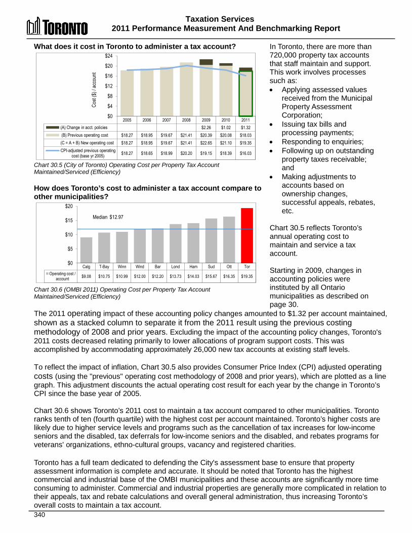
Taxation Services 2011 Performance Measurement And Benchmarking Report
340
What does it cost in Toronto to administer a tax account? Chart 30.5 (City of Toronto) Operating Cost per Property Tax Account Maintained/Serviced (Efficiency) How does Toronto’s cost to administer a tax account compare to other municipalities? Chart 30.6 (OMBI 2011) Operating Cost per Property Tax Account Maintained/Serviced (Efficiency)
In Toronto, there are more than 720,000 property tax accounts that staff maintain and support. This work involves processes such as: • Applying assessed values
received from the Municipal Property Assessment Corporation;
• Issuing tax bills and processing payments;
• Responding to enquiries; • Following up on outstanding
property taxes receivable; and
• Making adjustments to accounts based on ownership changes, successful appeals, rebates, etc.
Chart 30.5 reflects Toronto’s annual operating cost to maintain and service a tax account. Starting in 2009, changes in accounting policies were instituted by all Ontario municipalities as described on page 30.
The 2011 operating impact of these accounting policy changes amounted to $1.32 per account maintained, shown as a stacked column to separate it from the 2011 result using the previous costing methodology of 2008 and prior years. Excluding the impact of the accounting policy changes, Toronto's 2011 costs decreased relating primarily to lower allocations of program support costs. This was accomplished by accommodating approximately 26,000 new tax accounts at existing staff levels. To reflect the impact of inflation, Chart 30.5 also provides Consumer Price Index (CPI) adjusted operating costs (using the "previous" operating cost methodology of 2008 and prior years), which are plotted as a line graph. This adjustment discounts the actual operating cost result for each year by the change in Toronto’s CPI since the base year of 2005. Chart 30.6 shows Toronto’s 2011 cost to maintain a tax account compared to other municipalities. Toronto ranks tenth of ten (fourth quartile) with the highest cost per account maintained. Toronto’s higher costs are likely due to higher service levels and programs such as the cancellation of tax increases for low-income seniors and the disabled, tax deferrals for low-income seniors and the disabled, and rebates programs for veterans' organizations, ethno-cultural groups, vacancy and registered charities.
Toronto has a full team dedicated to defending the City's assessment base to ensure that property assessment information is complete and accurate. It should be noted that Toronto has the highest commercial and industrial base of the OMBI municipalities and these accounts are significantly more time consuming to administer. Commercial and industrial properties are generally more complicated in relation to their appeals, tax and rebate calculations and overall general administration, thus increasing Toronto’s overall costs to maintain a tax account.
2005 2006 2007 2008 2009 2010 2011 (A) Change in acct. policies $2.26 $1.02 $1.32 (B) Previous operating cost $18.27 $18.95 $19.67 $21.41 $20.39 $20.08 $18.03 (C = A + B) New operating cost $18.27 $18.95 $19.67 $21.41 $22.65 $21.10 $19.35 CPI-adjusted previous operating
cost (base yr 2005) $18.27 $18.65 $18.99 $20.20 $19.15 $18.39 $16.03
$0
$4
$8
$12
$16
$20
$24
Cost
($) /
acco
unt
Calg T-Bay Winn Wind Bar Lond Ham Sud Ott Tor Operating cost /
account $9.08 $10.75 $10.99 $12.00 $12.20 $13.73 $14.03 $15.67 $16.35 $19.35
$0
$5
$10
$15
$20
Median $12.97
Taxation Services 2011 Performance Measurement and Benchmarking Report
341
2012 Achievements and 2013 Planned Initiatives The following initiatives have improved or are expected to further improve the efficiency and effectiveness of Toronto's Taxation Services: 2012 Achievements • Continued implementation of the Water Meter Program through the installation or replacement
of new automated water meters across the City, in partnership with Toronto Water. Approximately 6,000 new large water meters and 125,000 small meters were installed in 2012. Since September 2010, Revenue Services has been issuing utility billings based on meter readings transmitted from the newly installed meters.
• Undertook a public notification campaign to build a subscription base for the E-Post electronic billing initiative for property tax bills.
• Developed policies and criteria for amendments to the water billing by-law, which were approved by Council, to provide the authority to adjust water billings in cases of financial hardship or other identified circumstances
• Developed a notification process to inform customers of high water consumption following the installation of a new automated water meter.
• As part of the RSD Customer Service Enhancement Strategy, designed and implemented new functionality in Tax Management and Collections System (TMACS) and Utility Management and Collections System (UMACS) to record and report first call resolutions statistics, escalation process and service request tracking with associated performance measures.
• Implemented new telephone menu options and the ability for customers to leave a voice-mail message when calling a Revenue Services Property Tax/Utility Call Centre.
2013 Planned Initiatives • Bill, collect and administer property tax and utility (water and solid waste) accounts in
accordance with legislation and Council policies, including processing of assessment and tax appeals, property assessment review and initiation of assessment appeals, administration of tax and water relief, rebate and refund programs.
• Administer and process parking ticket revenues, Municipal Land Transfer Tax and other revenues in compliance with legislative requirements and Council policies.
• Improve and enhance customer service delivery in all service areas, including call centre and counter operations, and other customer- facing operations to better meet call demand and the development of additional self-serve options via electronic service delivery.
• Introduce electronic billings for property taxes using Canada Post's E-post service. • In partnership with Toronto Water, continue the implementation of the City's Water Meter
Replacement and Automated Meter Reading Program. • Implement cashiering solutions to integrate Revenue Services applications with existing
corporate databases and financial software at all applicable Revenue Service locations.
Taxation Services 2011 Performance Measurement And Benchmarking Report
342
Factors Influencing the Results of Municipalities
The results of each municipality included in this report can be influenced to varying degrees by factors such as:
• Types of collection procedures: acknowledging the expectations of Council in collection
efforts, and any mandated policies or procedures. • Economic condition: municipal unemployment rate, cost of living, rate of growth in property
assessments, etc. • Variety and level of programs offered to the tax payer: number and complexity of tax rebates,
deferral and/or tax cancellation programs, Business Improvement Area initiatives, etc. • Degree to which tax billing systems are automated: some municipalities develop and maintain
their own systems to calculate and issue billings, some municipalities use provincially-developed systems or external consultants to calculate taxes and still others employ a combination of these approaches.
• Range and number and/or flexibility of payment instalment dates: types of payment options such as pre-authorized payment plans (PAP, where payments are withdrawn electronically), or internet-based payment options and the extent and effectiveness of advertising for these programs.
• Number of payment-in-lieu of tax accounts administered by the municipality: accounts may require specialized or manual bill calculations, or negotiated payments, resulting in higher costs to service a small number of accounts.

343
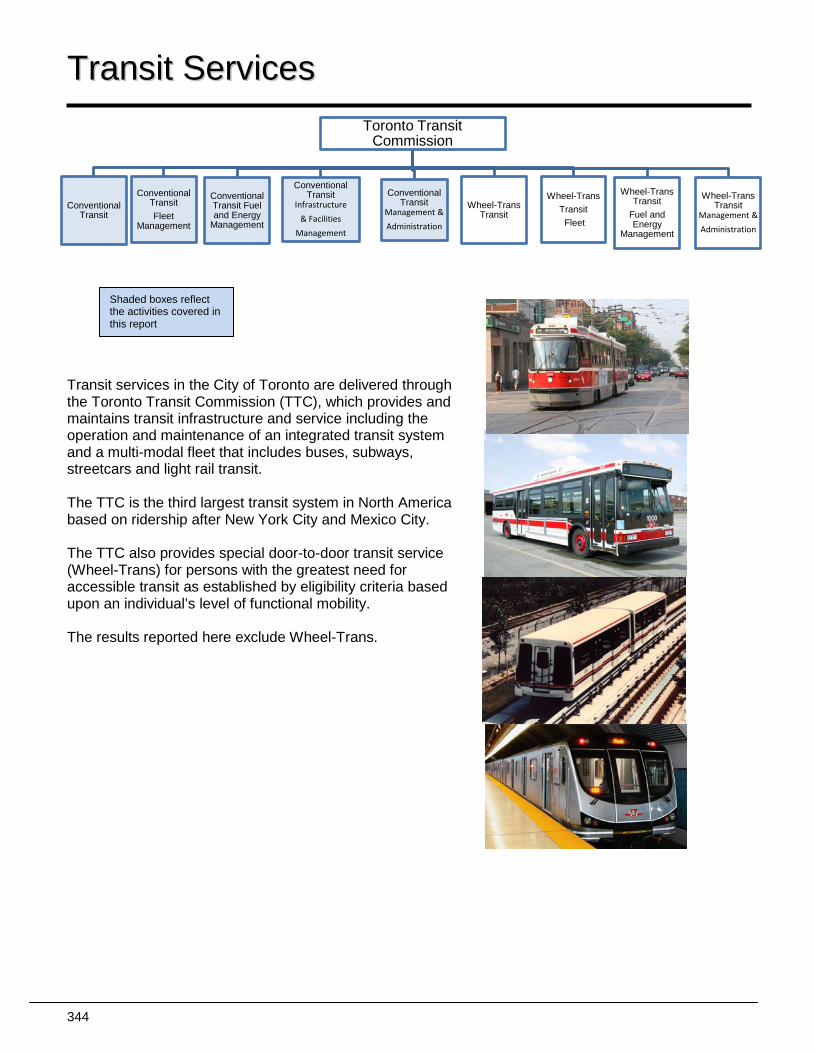
344
Toronto Transit Commission
Conventional Transit
Conventional Transit Fleet
Management
Conventional Transit Fuel and Energy
Management
Conventional Transit
Infrastructure
& Facilities
Management
Conventional Transit
Management &
Administration
Wheel-Trans Transit
Wheel-Trans Transit Fleet
Wheel-Trans Transit
Fuel and Energy
Management
Wheel-Trans Transit
Management &
Administration
TTrraannssiitt SSeerrvviicceess
Transit services in the City of Toronto are delivered through the Toronto Transit Commission (TTC), which provides and maintains transit infrastructure and service including the operation and maintenance of an integrated transit system and a multi-modal fleet that includes buses, subways, streetcars and light rail transit. The TTC is the third largest transit system in North America based on ridership after New York City and Mexico City. The TTC also provides special door-to-door transit service (Wheel-Trans) for persons with the greatest need for accessible transit as established by eligibility criteria based upon an individual’s level of functional mobility. The results reported here exclude Wheel-Trans.
Shaded boxes reflect the activities covered in this report
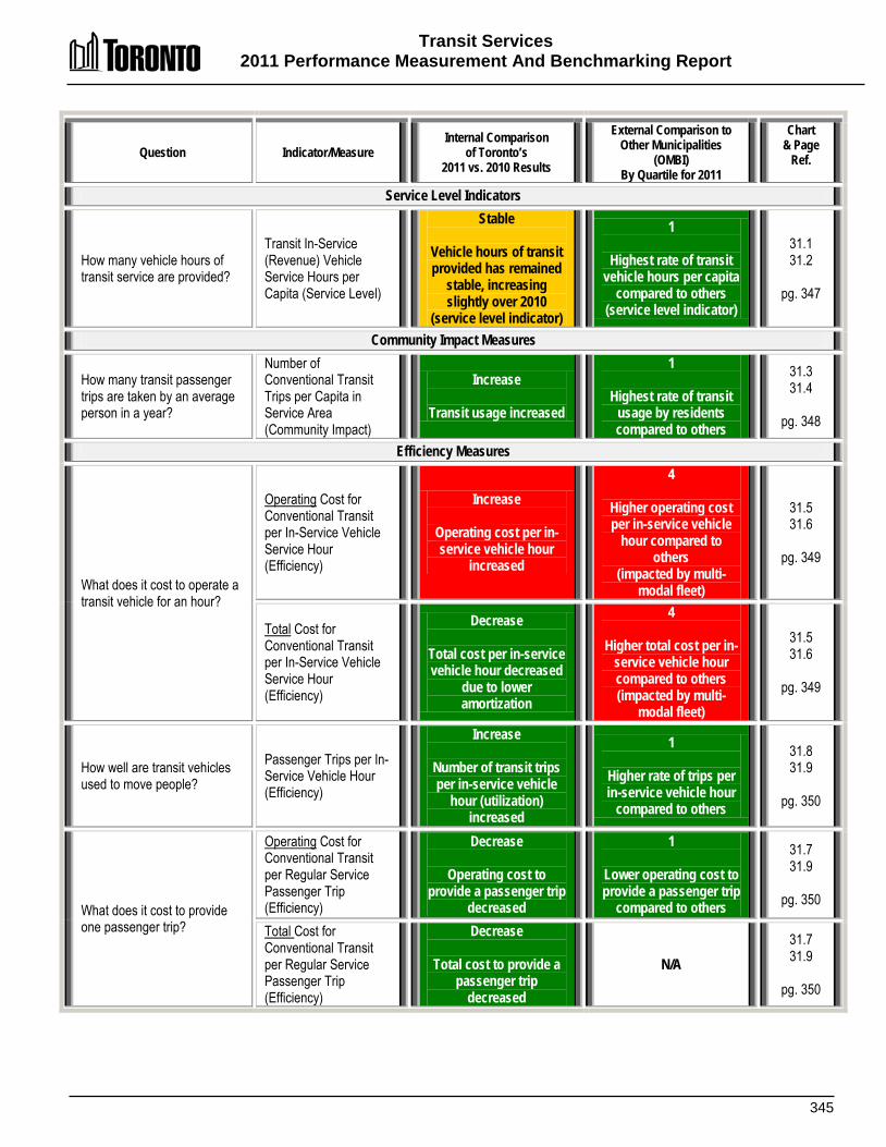
Transit Services 2011 Performance Measurement And Benchmarking Report
345
Question Indicator/Measure Internal Comparison
of Toronto’s 2011 vs. 2010 Results
External Comparison to Other Municipalities
(OMBI) By Quartile for 2011
Chart & Page
Ref.
Service Level Indicators
How many vehicle hours of transit service are provided?
Transit In-Service (Revenue) Vehicle Service Hours per Capita (Service Level)
Stable
Vehicle hours of transit provided has remained
stable, increasing slightly over 2010
(service level indicator)
1
Highest rate of transit vehicle hours per capita
compared to others (service level indicator)
31.1 31.2
pg. 347
Community Impact Measures
How many transit passenger trips are taken by an average person in a year?
Number of Conventional Transit Trips per Capita in Service Area (Community Impact)
Increase
Transit usage increased
1
Highest rate of transit usage by residents compared to others
31.3 31.4
pg. 348
Efficiency Measures
What does it cost to operate a transit vehicle for an hour?
Operating Cost for Conventional Transit per In-Service Vehicle Service Hour (Efficiency)
Increase
Operating cost per in-service vehicle hour
increased
4
Higher operating cost per in-service vehicle
hour compared to others
(impacted by multi-modal fleet)
31.5 31.6
pg. 349
Total Cost for Conventional Transit per In-Service Vehicle Service Hour (Efficiency)
Decrease
Total cost per in-service vehicle hour decreased
due to lower amortization
4
Higher total cost per in-service vehicle hour compared to others (impacted by multi-
modal fleet)
31.5 31.6
pg. 349
How well are transit vehicles used to move people?
Passenger Trips per In-Service Vehicle Hour (Efficiency)
Increase
Number of transit trips per in-service vehicle
hour (utilization) increased
1
Higher rate of trips per in-service vehicle hour
compared to others
31.8 31.9
pg. 350
What does it cost to provide one passenger trip?
Operating Cost for Conventional Transit per Regular Service Passenger Trip (Efficiency)
Decrease
Operating cost to provide a passenger trip
decreased
1
Lower operating cost to provide a passenger trip
compared to others
31.7 31.9
pg. 350
Total Cost for Conventional Transit per Regular Service Passenger Trip (Efficiency)
Decrease
Total cost to provide a passenger trip
decreased
N/A 31.7 31.9
pg. 350
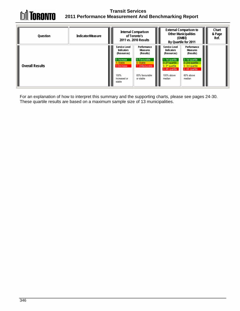
Transit Services 2011 Performance Measurement And Benchmarking Report
346
Question Indicator/Measure Internal Comparison
of Toronto’s 2011 vs. 2010 Results
External Comparison to Other Municipalities
(OMBI) By Quartile for 2011
Chart & Page
Ref.
Overall Results
Service Level Indicators
(Resources) 0- Increase 1- Stable 0-Decrease 100% increased or stable
Performance Measures (Results)
5- Favourable 0- Stable 1 -Unfavourable 83% favourable or stable
Service Level Indicators
(Resources)
1- 1st quartile 0- 2nd quartile 0- 3rd quartile 0- 4th quartile 100% above median
Performance Measures (Results)
3- 1st quartile 0- 2nd quartile 0- 3rd quartile 2- 4th quartile 60% above median
For an explanation of how to interpret this summary and the supporting charts, please see pages 24-30. These quartile results are based on a maximum sample size of 13 municipalities.

Transit Services 2011 Performance Measurement And Benchmarking Report
347
How many vehicles hours of transit service are provided in Toronto? Chart 31.1 (City of Toronto) In-Service (Revenue) Transit Vehicle Hours per Capita (Service Level) How do Toronto’s in- service transit vehicle hours compare to other municipalities? Chart 31.2 (OMBI 2011) In-Service (Revenue) Transit Vehicle Hours per Capita (Service Level) & Population Density
The number of in service transit vehicle hours available in a year for residents to use provides an indication of service levels. It can also influence how often residents use public transit. An in-service vehicle hour refers to any hour a transit vehicle accepts paying passengers. It does not include other activities such as school contracts, charters and cross-boundary service, or vehicle hours devoted to road tests or maintenance activities. Chart 31.1 provides Toronto's total number and rate of in-service vehicle hours per capita. Over the past decade, Toronto’s total in-service transit vehicle hours has grown each year, as has Toronto’s population. In 2011 total in service vehicle hours increased slightly by 72,693 hours (0.8 percent), but as a result of a growing population, results were stable on a per capita basis.
The increase in in-service hours per capita in recent years has been due to: • The Ridership Growth Strategy (RGS), which improved the quality of both peak and offpeak services
between 2004 and 2008. One-hundred additional peak period buses with 100,000 hours of additional peak period service on 64 routes were added.
• An expanded off-peak bus network so that virtually all neighbourhoods in Toronto receive service every 30 minutes or better, all day, every day of the week. This change resulted in 85% of the TTC’s daytime routes operating until 1:00 am, and the addition of approximately 300,000 hours of service on 91 routes.
• Improvements to service frequency made in 2008 and early 2009, to address overcrowding. Chart 31.2 compares Toronto’s 2011 in-service transit vehicle hours per capita with other Ontario municipalities, shown as columns relative to the left axis. Toronto ranks first of 13 municipalities (first quartile), with the highest number of transit vehicle hours per capita. As service levels are primarily set based on observed ridership, the number of trips taken per capita is the largest determinant of the number of in-service hours per capita required to carry passengers (see Chart 31.4 below). Population density (persons per square kilometre) can have a large impact on the number of passengers attracted to the service and therefore the need for, and extent of, transit systems. Population density is plotted as a line graph relative to the right axis in Chart 31.2. Toronto's density is related to the extent of its transit system, with approximately 96 percent of Toronto residents living within 400 metres of at least one stop of the TTC’s multi-modal services.
2001 2002 2003 2004 2005 2006 2007 2008 2009 2010 2011 In-Svc. Veh. Hrs/Capita 3.12 3.12 3.11 3.14 3.12 3.16 3.18 3.26 3.45 3.45 3.46 Total In-svc. Hours (000s) 8,097 8,187 8,238 8,400 8,426 8,554 8,677 8,922 9,516 9,570 9,642
0
1
2
3
4
Tor Ott Calg Winn Ham Lond T-Bay Wind Sud Wat Bar York Durh Veh. Hrs./capita 3.46 2.30 2.17 2.00 1.51 1.49 1.40 1.18 1.15 1.15 1.11 0.95 0.73 Pop'n Density 4,401 332 1,287 1,446 471 865 330 1,436 44 400 1,400 611 251
0 500 1,000 1,500 2,000 2,500 3,000 3,500 4,000 4,500 5,000
0.0
0.5
1.0
1.5
2.0
2.5
3.0
3.5
Dens
ity- p
op'n
per s
q. km
In-se
rvice
vehic
le ho
urs
per c
apita
Median 1.40
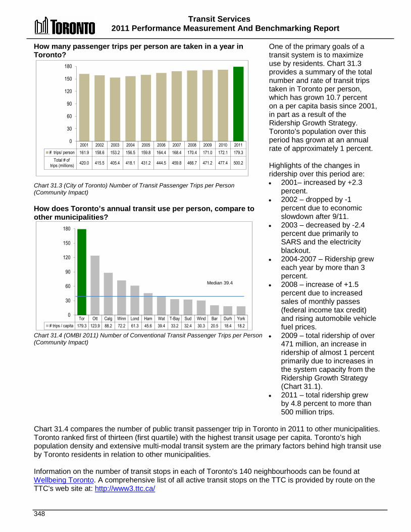
Transit Services 2011 Performance Measurement And Benchmarking Report
348
How many passenger trips per person are taken in a year in Toronto? Chart 31.3 (City of Toronto) Number of Transit Passenger Trips per Person (Community Impact) How does Toronto’s annual transit use per person, compare to other municipalities? Chart 31.4 (OMBI 2011) Number of Conventional Transit Passenger Trips per Person (Community Impact)
One of the primary goals of a transit system is to maximize use by residents. Chart 31.3 provides a summary of the total number and rate of transit trips taken in Toronto per person, which has grown 10.7 percent on a per capita basis since 2001, in part as a result of the Ridership Growth Strategy. Toronto’s population over this period has grown at an annual rate of approximately 1 percent. Highlights of the changes in ridership over this period are: • 2001– increased by +2.3
percent. • 2002 – dropped by -1
percent due to economic slowdown after 9/11.
• 2003 – decreased by -2.4 percent due primarily to SARS and the electricity blackout.
• 2004-2007 – Ridership grew each year by more than 3 percent.
• 2008 – increase of +1.5 percent due to increased sales of monthly passes (federal income tax credit) and rising automobile vehicle fuel prices.
• 2009 – total ridership of over 471 million, an increase in ridership of almost 1 percent primarily due to increases in the system capacity from the Ridership Growth Strategy (Chart 31.1).
• 2011 – total ridership grew by 4.8 percent to more than 500 million trips.
Chart 31.4 compares the number of public transit passenger trip in Toronto in 2011 to other municipalities. Toronto ranked first of thirteen (first quartile) with the highest transit usage per capita. Toronto’s high population density and extensive multi-modal transit system are the primary factors behind high transit use by Toronto residents in relation to other municipalities. Information on the number of transit stops in each of Toronto's 140 neighbourhoods can be found at Wellbeing Toronto. A comprehensive list of all active transit stops on the TTC is provided by route on the TTC's web site at: http://www3.ttc.ca/
2001 2002 2003 2004 2005 2006 2007 2008 2009 2010 2011 # trips/ person 161.9 158.6 153.2 156.5 159.8 164.4 168.4 170.4 171.0 172.1 179.3
Total # of trips (millions) 420.0 415.5 405.4 418.1 431.2 444.5 459.8 466.7 471.2 477.4 500.2
0
30
60
90
120
150
180
Tor Ott Calg Winn Lond Ham Wat T-Bay Sud Wind Bar Durh York # trips / capita 179.3 123.9 88.2 72.2 61.3 45.6 39.4 33.2 32.4 30.3 20.5 18.4 18.2
0
30
60
90
120
150
180
Median 39.4
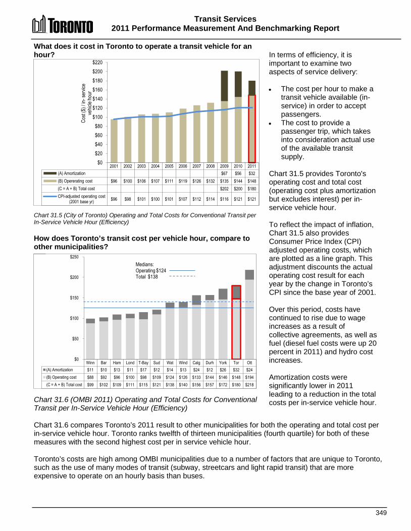
Transit Services 2011 Performance Measurement And Benchmarking Report
349
What does it cost in Toronto to operate a transit vehicle for an hour? Chart 31.5 (City of Toronto) Operating and Total Costs for Conventional Transit per In-Service Vehicle Hour (Efficiency) How does Toronto’s transit cost per vehicle hour, compare to other municipalities? Chart 31.6 (OMBI 2011) Operating and Total Costs for Conventional Transit per In-Service Vehicle Hour (Efficiency)
In terms of efficiency, it is important to examine two aspects of service delivery: • The cost per hour to make a
transit vehicle available (in-service) in order to accept passengers.
• The cost to provide a passenger trip, which takes into consideration actual use of the available transit supply.
Chart 31.5 provides Toronto's operating cost and total cost (operating cost plus amortization but excludes interest) per in-service vehicle hour. To reflect the impact of inflation, Chart 31.5 also provides Consumer Price Index (CPI) adjusted operating costs, which are plotted as a line graph. This adjustment discounts the actual operating cost result for each year by the change in Toronto’s CPI since the base year of 2001. Over this period, costs have continued to rise due to wage increases as a result of collective agreements, as well as fuel (diesel fuel costs were up 20 percent in 2011) and hydro cost increases. Amortization costs were significantly lower in 2011 leading to a reduction in the total costs per in-service vehicle hour.
Chart 31.6 compares Toronto’s 2011 result to other municipalities for both the operating and total cost per in-service vehicle hour. Toronto ranks twelfth of thirteen municipalities (fourth quartile) for both of these measures with the second highest cost per in service vehicle hour. Toronto’s costs are high among OMBI municipalities due to a number of factors that are unique to Toronto, such as the use of many modes of transit (subway, streetcars and light rapid transit) that are more expensive to operate on an hourly basis than buses.
Winn Bar Ham Lond T-Bay Sud Wat Wind Calg Durh York Tor Ott (A) Amortization $11 $10 $13 $11 $17 $12 $14 $13 $24 $12 $26 $32 $24 (B) Operating cost $88 $92 $96 $100 $98 $109 $124 $126 $133 $144 $146 $148 $194 (C = A + B) Total cost $99 $102 $109 $111 $115 $121 $138 $140 $156 $157 $172 $180 $218
$0
$50
$100
$150
$200
$250 Medians: Operating $124 Total $138
2001 2002 2003 2004 2005 2006 2007 2008 2009 2010 2011 (A) Amortization $67 $56 $32 (B) Opererating cost $96 $100 $106 $107 $111 $119 $126 $132 $135 $144 $148 (C = A + B) Total cost $202 $200 $180 CPI-adjusted operating cost
(2001 base yr) $96 $98 $101 $100 $101 $107 $112 $114 $116 $121 $121
$0 $20 $40 $60 $80
$100 $120 $140 $160 $180 $200 $220
Cost
($) /
in- s
ervic
e ve
hicle
hour

Transit Services 2011 Performance Measurement And Benchmarking Report
350
What does it cost to provide one passenger trip? Chart 31.7 (City of Toronto) Operating and Total Cost for Conventional Transit per Regular Service Trip (Efficiency) How well are transit vehicles being utilized to move people? Chart 31.8 (City of Toronto) Passenger Trips per In-Service Vehicle Hour (Efficiency) How do Toronto’s transit costs per passenger trip, compare to other municipalities? Chart 31.9 (OMBI 2011) Operating Cost of Conventional Transit per Passenger Trip and Average Number of Passenger Trips per In-Service Vehicle Hour (Efficiency)
The second aspect of efficiency is from the utilization perspective, where the transit cost to provide a passenger trip is considered. This indicator should not be confused with the cost of purchasing a transit ticket. Chart 31.7 illustrates Toronto’s transit operating cost and total cost (operating cost plus amortization but excludes interest) per passenger trip, which had been steadily increasing over the longer term due to increased wages fuel, electricity and maintenance. In 2011 however, there was a -1.3 percent decrease, as the percentage increase in trips taken exceeded the rate of increase in costs. Total costs also decreased further because a drop in the amount of amortization. To reflect the impact of inflation, Chart 31.7 also provides Consumer Price Index (CPI) adjusted results for operating costs, using 2001 as the base year. The degree of passenger utilization of the transit vehicles, is a primary factor in the cost per passenger trip, as higher usage rates allow fixed and variable costs to be spread over a larger number of riders. Chart 31.8 provides this utilization data for Toronto expressed as the number of passenger trips per vehicle hour. In 2011, Toronto improved its utilization of transit vehicles to 51.9 trips per service
The average number of passengers per hour that a transit vehicle is in service (utilization) is also plotted as a line graph relative to the right axis. Toronto has a very high utilization rate ranking second of thirteen municipalities (first quartile), which is a key factor in Toronto's low cost per transit trip.
Lond Winn Tor Ham Calg Ott Wat Sud T-Bay Wind Bar Durh York
Operating cost $2.37 $2.43 $2.84 $3.19 $3.26 $3.61 $3.62 $3.90 $4.21 $4.90 $4.98 $5.75 $7.62 Trips /
in-service hour 41.1 36.2 51.9 30.2 40.6 53.8 34.2 28.1 23.8 25.8 18.6 25.1 19.2
0
10
20
30
40
50
60
0.00
2.00
4.00
6.00
8.00
10.00
# of p
asse
nger
trips
per
in-se
rvice
vehic
le ho
ur
Cost
per t
rans
it trip
Median $3.62
2001 2002 2003 2004 2005 2006 2007 2008 2009 2010 2011 # trips /
in-service hour 51.9 50.8 49.2 49.8 51.2 52.0 53.0 52.3 49.5 49.9 51.9
0 10 20 30 40 50 60
2001 2002 2003 2004 2005 2006 2007 2008 2009 2010 2011 (A) Amortization $1.34 $1.14 $0.62 (B) Operating cost $1.84 $1.98 $2.15 $2.16 $2.16 $2.28 $2.38 $2.51 $2.73 $2.88 $2.84 (C = A + B) Total cost $4.07 $4.02 $3.46 CPI-adjusted operating cost
(2001 base yr) $1.84 $1.94 $2.05 $2.02 $1.98 $2.06 $2.11 $2.17 $2.36 $2.42 $2.32
$0.00 $0.50 $1.00 $1.50 $2.00 $2.50 $3.00 $3.50 $4.00 $4.50
Cos
t pe
r in-
ser
vice
pa
ssen
ger t
rip
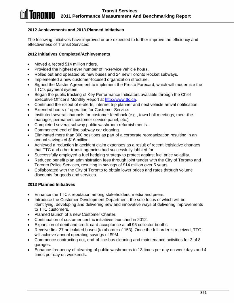
Transit Services 2011 Performance Measurement And Benchmarking Report
351
2012 Achievements and 2013 Planned Initiatives The following initiatives have improved or are expected to further improve the efficiency and effectiveness of Transit Services: 2012 Initiatives Completed/Achievements • Moved a record 514 million riders. • Provided the highest ever number of in-service vehicle hours. • Rolled out and operated 60 new buses and 24 new Toronto Rocket subways. • Implemented a new customer-focused organization structure. • Signed the Master Agreement to implement the Presto Farecard, which will modernize the
TTC's payment system. • Began the public tracking of Key Performance Indicators available through the Chief
Executive Officer’s Monthly Report at http://www.ttc.ca. • Continued the rollout of e-alerts, internet trip planner and next vehicle arrival notification. • Extended hours of operation for Customer Service. • Instituted several channels for customer feedback (e.g., town hall meetings, meet-the-
manager, permanent customer service panel, etc.) • Completed several subway public washroom refurbishments. • Commenced end-of-line subway car cleaning. • Eliminated more than 300 positions as part of a corporate reorganization resulting in an
annual savings of $16 million. • Achieved a reduction in accident claim expenses as a result of recent legislative changes
that TTC and other transit agencies had successfully lobbied for. • Successfully employed a fuel hedging strategy to protect against fuel price volatility. • Reduced benefit plan administration fees through joint tender with the City of Toronto and
Toronto Police Services, resulting in savings of $14 million over 5 years. • Collaborated with the City of Toronto to obtain lower prices and rates through volume
discounts for goods and services. 2013 Planned Initiatives • Enhance the TTC’s reputation among stakeholders, media and peers. • Introduce the Customer Development Department, the sole focus of which will be
identifying, developing and delivering new and innovative ways of delivering improvements to TTC customers.
• Planned launch of a new Customer Charter. • Continuation of customer centric initiatives launched in 2012. • Expansion of debit and credit card acceptance at all 95 collector booths. • Receive first 27 articulated buses (total order of 153). Once the full order is received, TTC
will achieve annual operating savings of $9M. • Commence contracting out, end-of-line bus cleaning and maintenance activities for 2 of 8
garages. • Enhance frequency of cleaning of public washrooms to 13 times per day on weekdays and 4
times per day on weekends.
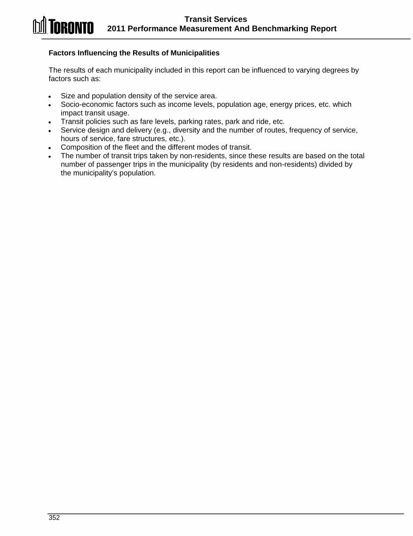
Transit Services 2011 Performance Measurement And Benchmarking Report
352
Factors Influencing the Results of Municipalities The results of each municipality included in this report can be influenced to varying degrees by factors such as: • Size and population density of the service area. • Socio-economic factors such as income levels, population age, energy prices, etc. which
impact transit usage. • Transit policies such as fare levels, parking rates, park and ride, etc. • Service design and delivery (e.g., diversity and the number of routes, frequency of service,
hours of service, fare structures, etc.). • Composition of the fleet and the different modes of transit. • The number of transit trips taken by non-residents, since these results are based on the total
number of passenger trips in the municipality (by residents and non-residents) divided by the municipality’s population.

353

354
WWaasstteewwaatteerr SSeerrvviicceess
Wastewater services encompass the collection of wastewater from residential or ICI (industrial, commercial, and institutional) properties and its treatment in wastewater treatment plants before it is returned to Lake Ontario. It also includes the disposal or use of residual materials. In Toronto, wastewater is collected and treated from more than 4,400 kilometres of sanitary sewers and 1,300 kilometres of combined sewers, which carry both sanitary and stormwater flows. Wastewater is pumped by 82 pumping stations to four wastewater treatment plants where physical and biological treatment processes remove solids, chemicals and pathogens. Toronto’s combined wastewater treatment plants can treat over 1.5 billion litres of wastewater a day. The safe and effective treatment of wastewater is important to a community’s continued health and well-being. Toronto Water must operate under strict regulations and meet or exceed treatment standards set by the Ministry of the Environment to ensure wastewater treatment has a minimal impact on the natural environment. Funding for these services is provided through municipal water rates, which include a sewer surcharge.
Wastewater Collection and
Treatment
Wastewater Collection
Lateral Connections
Wastewater Collection System
Wastewater Treatment
Solids Management
Wastewater Treatment
Plants
Wastewater Pumping Stations
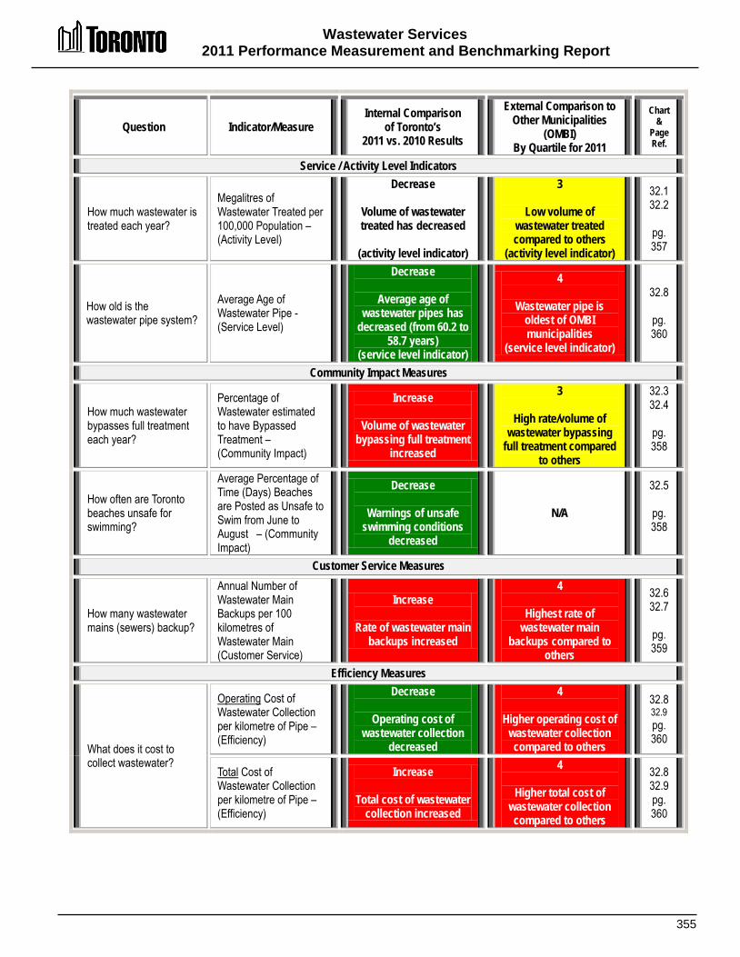
Wastewater Services 2011 Performance Measurement and Benchmarking Report
355
Question Indicator/Measure Internal Comparison
of Toronto’s 2011 vs. 2010 Results
External Comparison to Other Municipalities
(OMBI) By Quartile for 2011
Chart &
Page Ref.
Service / Activity Level Indicators
How much wastewater is treated each year?
Megalitres of Wastewater Treated per 100,000 Population – (Activity Level)
Decrease
Volume of wastewater treated has decreased
(activity level indicator)
3
Low volume of wastewater treated compared to others
(activity level indicator)
32.1 32.2
pg. 357
How old is the wastewater pipe system?
Average Age of Wastewater Pipe -(Service Level)
Decrease
Average age of wastewater pipes has
decreased (from 60.2 to 58.7 years)
(service level indicator)
4
Wastewater pipe is oldest of OMBI municipalities
(service level indicator)
32.8
pg. 360
Community Impact Measures
How much wastewater bypasses full treatment each year?
Percentage of Wastewater estimated to have Bypassed Treatment – (Community Impact)
Increase
Volume of wastewater bypassing full treatment
increased
3
High rate/volume of wastewater bypassing
full treatment compared to others
32.3 32.4
pg. 358
How often are Toronto beaches unsafe for swimming?
Average Percentage of Time (Days) Beaches are Posted as Unsafe to Swim from June to August – (Community Impact)
Decrease
Warnings of unsafe swimming conditions
decreased
N/A
32.5
pg. 358
Customer Service Measures
How many wastewater mains (sewers) backup?
Annual Number of Wastewater Main Backups per 100 kilometres of Wastewater Main (Customer Service)
Increase
Rate of wastewater main backups increased
4
Highest rate of wastewater main
backups compared to others
32.6 32.7
pg. 359
Efficiency Measures
What does it cost to collect wastewater?
Operating Cost of Wastewater Collection per kilometre of Pipe – (Efficiency)
Decrease
Operating cost of wastewater collection
decreased
4
Higher operating cost of wastewater collection compared to others
32.8 32.9 pg. 360
Total Cost of Wastewater Collection per kilometre of Pipe – (Efficiency)
Increase
Total cost of wastewater collection increased
4
Higher total cost of wastewater collection compared to others
32.8 32.9 pg. 360
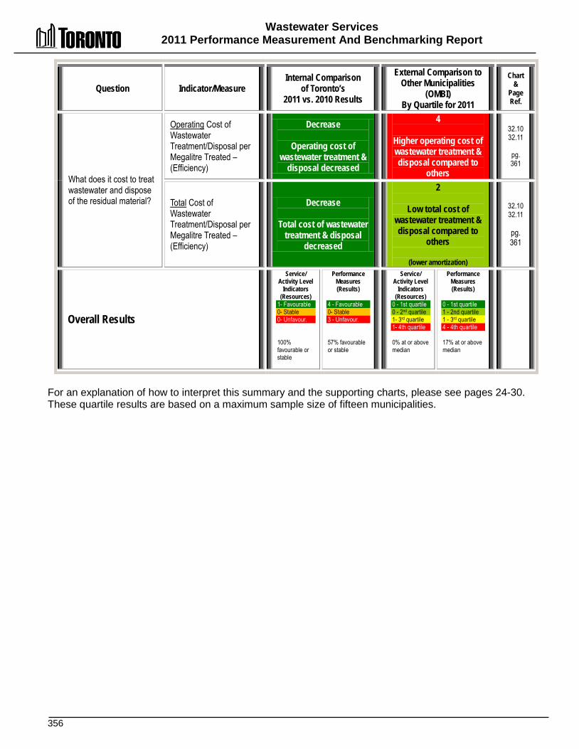
Wastewater Services 2011 Performance Measurement And Benchmarking Report
356
Question Indicator/Measure Internal Comparison
of Toronto’s 2011 vs. 2010 Results
External Comparison to Other Municipalities
(OMBI) By Quartile for 2011
Chart &
Page Ref.
What does it cost to treat wastewater and dispose of the residual material?
Operating Cost of Wastewater Treatment/Disposal per Megalitre Treated – (Efficiency)
Decrease
Operating cost of wastewater treatment &
disposal decreased
4
Higher operating cost of wastewater treatment & disposal compared to
others
32.10 32.11
pg. 361
Total Cost of Wastewater Treatment/Disposal per Megalitre Treated – (Efficiency)
Decrease
Total cost of wastewater treatment & disposal
decreased
2
Low total cost of wastewater treatment & disposal compared to
others
(lower amortization)
32.10 32.11
pg. 361
Overall Results
Service/ Activity Level
Indicators (Resources)
1- Favourable 0- Stable 0- Unfavour. 100% favourable or stable
Performance Measures (Results)
4 - Favourable 0- Stable 3 - Unfavour. 57% favourable or stable
Service/ Activity Level
Indicators (Resources)
0 - 1st quartile 0 - 2nd quartile 1- 3rd quartile 1- 4th quartile 0% at or above median
Performance Measures (Results)
0 - 1st quartile 1 - 2nd quartile 1 - 3rd quartile 4 - 4th quartile 17% at or above median
For an explanation of how to interpret this summary and the supporting charts, please see pages 24-30. These quartile results are based on a maximum sample size of fifteen municipalities.
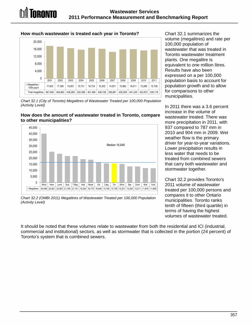
Wastewater Services 2011 Performance Measurement and Benchmarking Report
357
Wind Ham Lond Sud T-Bay Halt Musk Ott Calg Tor Winn Bar Durh Wat York Megalitres 40,066 25,261 23,583 21,760 21,741 19,224 18,770 16,648 15,793 15,738 15,231 13,250 13,211 11,876 11,806
0
5,000
10,000
15,000
20,000
25,000
30,000
35,000
40,000
45,000
Median 16,648
How much wastewater is treated each year in Toronto? Chart 32.1 (City of Toronto) Megalitres of Wastewater Treated per 100,000 Population (Activity Level) How does the amount of wastewater treated in Toronto, compare to other municipalities? Chart 32.2 (OMBI 2011) Megalitres of Wastewater Treated per 100,000 Population (Activity Level)
Chart 32.1 summarizes the volume (megalitres) and rate per 100,000 population of wastewater that was treated in Toronto wastewater treatment plants. One megalitre is equivalent to one million litres. Results have also been expressed on a per 100,000 population basis to account for population growth and to allow for comparisons to other municipalities. In 2011 there was a 3.6 percent increase in the volume of wastewater treated. There was more precipitation in 2011, with 937 compared to 787 mm in 2010 and 904 mm in 2009. Wet weather flow is the primary driver for year-to-year variations. Lower precipitation results in less water that needs to be treated from combined sewers that carry both wastewater and stormwater together. Chart 32.2 provides Toronto's 2011 volume of wastewater treated per 100,000 persons and compares it to other Ontario municipalities. Toronto ranks tenth of fifteen (third quartile) in terms of having the highest volumes of wastewater treated.
It should be noted that these volumes relate to wastewater from both the residential and ICI (industrial, commercial and institutional) sectors, as well as stormwater that is collected in the portion (24 percent) of Toronto’s system that is combined sewers.
2001 2002 2003 2004 2005 2006 2007 2008 2009 2010 2011 Megalitres / 100k pop'n 17,803 17,360 16,561 15,731 16,734 16,202 14,501 15,882 16,011 15,286 15,738
Total megalitres 461,840 454,863 438,269 420,388 451,490 438,108 395,881 435,008 441,230 423,872 439,116
0
4,000
8,000
12,000
16,000
20,000
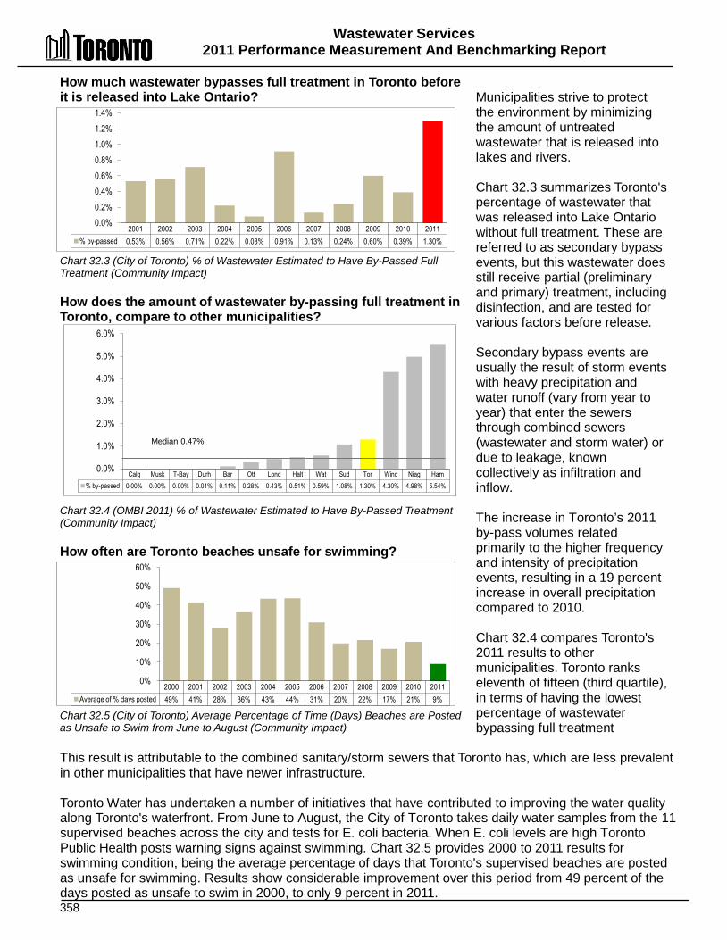
Wastewater Services 2011 Performance Measurement And Benchmarking Report
358
2001 2002 2003 2004 2005 2006 2007 2008 2009 2010 2011 % by-passed 0.53% 0.56% 0.71% 0.22% 0.08% 0.91% 0.13% 0.24% 0.60% 0.39% 1.30%
0.0% 0.2% 0.4% 0.6% 0.8% 1.0% 1.2% 1.4%
2000 2001 2002 2003 2004 2005 2006 2007 2008 2009 2010 2011 Average of % days posted 49% 41% 28% 36% 43% 44% 31% 20% 22% 17% 21% 9%
0%
10%
20%
30%
40%
50%
60%
How much wastewater bypasses full treatment in Toronto before it is released into Lake Ontario? Chart 32.3 (City of Toronto) % of Wastewater Estimated to Have By-Passed Full Treatment (Community Impact) How does the amount of wastewater by-passing full treatment in Toronto, compare to other municipalities? Chart 32.4 (OMBI 2011) % of Wastewater Estimated to Have By-Passed Treatment (Community Impact) How often are Toronto beaches unsafe for swimming? Chart 32.5 (City of Toronto) Average Percentage of Time (Days) Beaches are Posted as Unsafe to Swim from June to August (Community Impact)
Municipalities strive to protect the environment by minimizing the amount of untreated wastewater that is released into lakes and rivers. Chart 32.3 summarizes Toronto's percentage of wastewater that was released into Lake Ontario without full treatment. These are referred to as secondary bypass events, but this wastewater does still receive partial (preliminary and primary) treatment, including disinfection, and are tested for various factors before release. Secondary bypass events are usually the result of storm events with heavy precipitation and water runoff (vary from year to year) that enter the sewers through combined sewers (wastewater and storm water) or due to leakage, known collectively as infiltration and inflow. The increase in Toronto’s 2011 by-pass volumes related primarily to the higher frequency and intensity of precipitation events, resulting in a 19 percent increase in overall precipitation compared to 2010. Chart 32.4 compares Toronto's 2011 results to other municipalities. Toronto ranks eleventh of fifteen (third quartile), in terms of having the lowest percentage of wastewater bypassing full treatment
This result is attributable to the combined sanitary/storm sewers that Toronto has, which are less prevalent in other municipalities that have newer infrastructure. Toronto Water has undertaken a number of initiatives that have contributed to improving the water quality along Toronto's waterfront. From June to August, the City of Toronto takes daily water samples from the 11 supervised beaches across the city and tests for E. coli bacteria. When E. coli levels are high Toronto Public Health posts warning signs against swimming. Chart 32.5 provides 2000 to 2011 results for swimming condition, being the average percentage of days that Toronto's supervised beaches are posted as unsafe for swimming. Results show considerable improvement over this period from 49 percent of the days posted as unsafe to swim in 2000, to only 9 percent in 2011.
Calg Musk T-Bay Durh Bar Ott Lond Halt Wat Sud Tor Wind Niag Ham % by-passed 0.00% 0.00% 0.00% 0.01% 0.11% 0.28% 0.43% 0.51% 0.59% 1.08% 1.30% 4.30% 4.98% 5.54%
0.0%
1.0%
2.0%
3.0%
4.0%
5.0%
6.0%
Median 0.47%
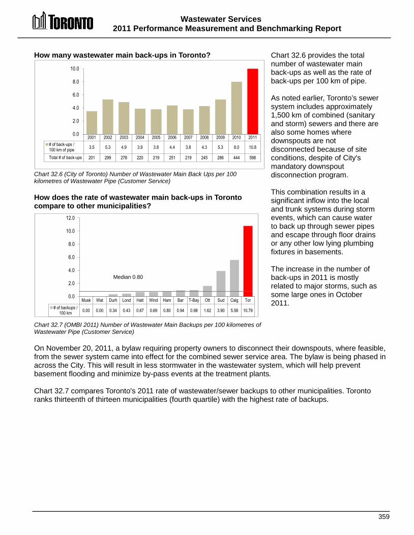
Wastewater Services 2011 Performance Measurement and Benchmarking Report
359
How many wastewater main back-ups in Toronto? Chart 32.6 (City of Toronto) Number of Wastewater Main Back Ups per 100 kilometres of Wastewater Pipe (Customer Service) How does the rate of wastewater main back-ups in Toronto compare to other municipalities? Chart 32.7 (OMBI 2011) Number of Wastewater Main Backups per 100 kilometres of Wastewater Pipe (Customer Service)
Chart 32.6 provides the total number of wastewater main back-ups as well as the rate of back-ups per 100 km of pipe. As noted earlier, Toronto’s sewer system includes approximately 1,500 km of combined (sanitary and storm) sewers and there are also some homes where downspouts are not disconnected because of site conditions, despite of City's mandatory downspout disconnection program. This combination results in a significant inflow into the local and trunk systems during storm events, which can cause water to back up through sewer pipes and escape through floor drains or any other low lying plumbing fixtures in basements. The increase in the number of back-ups in 2011 is mostly related to major storms, such as some large ones in October 2011.
On November 20, 2011, a bylaw requiring property owners to disconnect their downspouts, where feasible, from the sewer system came into effect for the combined sewer service area. The bylaw is being phased in across the City. This will result in less stormwater in the wastewater system, which will help prevent basement flooding and minimize by-pass events at the treatment plants. Chart 32.7 compares Toronto's 2011 rate of wastewater/sewer backups to other municipalities. Toronto ranks thirteenth of thirteen municipalities (fourth quartile) with the highest rate of backups.
2001 2002 2003 2004 2005 2006 2007 2008 2009 2010 2011 # of back-ups / 100 km of pipe 3.5 5.3 4.9 3.9 3.8 4.4 3.8 4.3 5.3 8.0 10.8
Total # of back-ups 201 299 278 220 219 251 219 245 286 444 598
0.0
2.0
4.0
6.0
8.0
10.0
Musk Wat Durh Lond Halt Wind Ham Bar T-Bay Ott Sud Calg Tor # of backups /
100 km 0.00 0.00 0.34 0.43 0.67 0.69 0.80 0.94 0.98 1.62 3.90 5.58 10.79
0.0
2.0
4.0
6.0
8.0
10.0
12.0
Median 0.80

Wastewater Services 2011 Performance Measurement And Benchmarking Report
360
Wind Lond Musk Bar Durh Calg Sud T-Bay Halt Winn Ott Ham Tor Wat Niag York (A) Amortization 3,679 6,673 9,268 6,634 7,188 1,958 4,141 2,926 6,933 5,055 6,482 6,932 7,418 5,010 14,752 25,987
(B) Operating cost 4,494 5,105 6,933 7,141 7,558 7,987 8,423 9,234 9,409 9,942 10,058 17,581 18,041 18,617 50,811 62,144
(C = A + B) Total cost 8,172 11,777 16,202 13,775 14,746 9,946 12,565 12,161 16,342 14,997 16,539 24,513 25,459 23,626 65,563 88,131
Average age of pipe 44.1 40.0 40.0 21.2 20.0 33.0 43.0 55.0 27.2 57.3 28.8 49.3 58.7 18.3
0
10
20
30
40
50
60
70
$0 $10,000 $20,000 $30,000 $40,000 $50,000 $60,000 $70,000 $80,000 $90,000
$100,000
Average age (years) of wastewater pipe
$ cos
t of w
astew
ater c
ollec
tion
pe
r km
of pip
e
Medians: $9,322 operating $15,599 total
What does it cost in Toronto to collect wastewater? Chart 32.8 (City of Toronto) Operating Cost for Wastewater Collection per kilometre. of Collection Pipe (Efficiency) How does the cost of wastewater collection in Toronto, compare to other municipalities? Chart 32.9 (OMBI 2011) Operating Cost for Wastewater Collection per kilometre. of Collection Pipe (Efficiency) and Average Age of Wastewater Pipe (Service Level)
Wastewater collection refers to the process of collecting wastewater from the time it exits residential and ICI properties to the point it arrives at the wastewater treatment plant. Chart 32.8 provides Toronto's operating cost and total cost (operating cost plus amortization) of wastewater collection per kilometre of collection pipe. Starting in 2009, changes in accounting policies were instituted by all Ontario municipalities as described on page 30. The 2011 operating impact of these accounting policy changes amounted to $6,868 per kilometre of pipe (primarily capital maintenance), shown as a stacked column to separate it from the 2011 result using the previous costing methodology of 2008 and prior years. Amortization is also shown as a separate stacked column.
Excluding the impact of the accounting policy changes, Toronto's 2011 operating costs for wastewater collection decreased from 2010, primarily as a result of a change in the allocation of direct costs between and among water and wastewater accounts as part of the new financial planning and analysis project. Chart 32.8 also provides Consumer Price Index (CPI) adjusted operating costs (using the "previous" operating cost methodology of 2008 and prior years), which are plotted as a line graph. This adjustment discounts the actual operating cost result for each year by the change in Toronto’s CPI since the base year of 2001. Chart 32.9 compares Toronto's 2011 cost of wastewater collection per kilometre of pipe to other municipalities, plotted as columns relative to the left axis. Toronto ranks thirteenth of sixteen municipalities (fourth quartile) in terms of having the lowest operating cost, and fourteenth (fourth quartile) for total costs. The average age of the wastewater pipe, plotted on Chart 32.8 as a line graph relative to the right axis, can have a significant impact on costs as noted earlier. Toronto has the oldest underground infrastructure of the OMBI municipalities (the average age of pipes is 59 years) and is a key factor in Toronto’s higher costs.
2001 2002 2003 2004 2005 2006 2007 2008 2009 2010 2011 (A) Amortization $7,275 $7,229 $7,418 (B) Change in acct. policies $8,864 $2,799 $6,868
(C) Previous operating cost $8,292 $8,849 $9,564 $9,723 $10,104 $10,017 $10,204 $9,518 $11,119 $13,017 $11,173 (D = B + C) New operating cost $19,983 $15,816 $18,041 (E = A + D) Total cost $27,258 $23,045 $25,459 CPI-adjusted previous operating cost
(base yr 2001) $8,292 $8,672 $9,100 $9,101 $9,280 $9,056 $9,050 $8,247 $9,592 $10,950 $9,125
$0
$5,000
$10,000
$15,000
$20,000
$25,000
$30,000
$ co
st /
km o
f col
lect
ion
pipe

Wastewater Services 2011 Performance Measurement and Benchmarking Report
361
Ham Ott Wind Lond Calg Sud York Winn T-Bay Halt Durh Niag Tor Wat Bar Musk (A) Amortization $37 $55 $60 $163 $115 $205 $144 $68 $121 $86 $112 $100 $59 $84 $322 $794 (B) Operating cost $172 $178 $245 $246 $283 $306 $338 $352 $355 $374 $385 $387 $389 $399 $616 $1,029 (C = A + B) Total cost $209 $233 $305 $409 $398 $511 $483 $420 $476 $460 $497 $487 $448 $483 $937 $1,823
$0
$400
$800
$1,200
$1,600
$2,000
$ co
st p
er m
egal
itre
Medians: $353 operating $468 total
What does it cost to treat and dispose of wastewater in Toronto? Chart 32.10 (City of Toronto) Operating Cost for Wastewater Treatment and Disposal per Megalitre (Efficiency) How does Toronto’s cost of wastewater treatment and disposal, compare to other municipalities? Chart 32.11 (OMBI 2011) Operating Cost for Wastewater Treatment and Disposal per Megalitre (Efficiency)
Wastewater treatment costs include the operation and maintenance of treatment plants to meet or exceed Ministry of Environment regulations and standards. Treatment costs also include the disposal of biosolids (stabilized sludge). Biosolids are primarily composed of the organic solids that have been removed from wastewater and further processed so that they can, as in the case of the Ashbridges Bay Treatment Plant, be beneficially used for land application purposes. The City's Highland Creek Treatment Plant disposes its biosolids through incineration. Biosolids processes, while environmentally better, are more expensive than incineration. Chart 32.10 summarizes Toronto’s operating cost and total cost (operating cost plus amortization) of treating a megalitre (one million litres) of wastewater.
Starting in 2009, changes in accounting policies were instituted by all Ontario municipalities as described on page 26. The 2011 operating impacts of these accounting policy changes amounted to $71 per megalitre treated shown as a stacked column to separate it from the 2011 result using the previous costing methodology of 2008 and prior years. Amortization is also shown as a separate stacked column. Excluding the impact of the accounting policy change, the 2011 costs per megalitre decreased from a combination of a 3.6% increase in the volume of wastewater treated, and decreased costs from a change in the allocation of direct costs between and among water and wastewater accounts as part of the new financial planning and analysis project.. Chart 32.10 also provides Consumer Price Index (CPI) adjusted operating costs plotted as a line graph. This adjusts the "previous" operating cost (using the "previous" operating cost methodology of 2008 and prior years) for each year by the change in Toronto’s CPI since the base year of 2001. Chart 32.11 compares Toronto’s 2011 cost of wastewater treatment and disposal per megalitre to other municipalities. Toronto ranks thirteenth of sixteen municipalities (fourth quartile) in terms of having the lowest operating costs, and ranks seventh (second quartile) in terms of total costs. One of the key factors that contribute to Toronto’s higher costs is the age of Toronto's wastewater treatment plants—the oldest of which has been in operation since 1929—mean they are more costly to maintain than newer plants in other municipalities. Additionally, the strategies in the City's Biosolids and Residuals Master Plan (BRMP), approved in 2009 for three of the City’s four wastewater treatment plants, contribute to higher costs.
2001 2002 2003 2004 2005 2006 2007 2008 2009 2010 2011 (A) Amortization $65 $61 $59 (B) Change in acct. policies $78 $94 $71
(C) Previous operating cost $204 $200 $231 $236 $251 $285 $365 $320 $326 $341 $318 (D = B + C) New operating cost $404 $435 $389 (E = A + D) Total cost $204 $200 $231 $236 $251 $285 $365 $320 $469 $496 $448 CPI-adjusted
(base yr 2001) $204 $196 $220 $221 $231 $258 $324 $277 $281 $287 $260
$0
$100
$200
$300
$400
$500
$ co
st /
meg
alitr
e
Wastewater Services 2011 Performance Measurement and Benchmarking Report
362
2012 Achievements and 2013 Planned Initiatives
The following initiatives have improved or are expected to further improve the efficiency and effectiveness of Wastewater Services in Toronto:
2012 Achievements • Maintained full compliance with Ministry of Environment inspections for all water treatment facilities. • Completed basement flooding studies to investigate the causes of basement and surface flooding and
make recommendations to reduce the risk of future flooding in 15 basement flooding areas. • Winner of the 2012 Living City Award for Healthy Rivers and Shorelines for design and construction of
the Earl Bales Stormwater Management Facility. • Completed four large Wet Weather Flow Master Plan Environmental Assessment (EA) studies. • Completed the Waterfront Sanitary Service Master Plan Class Environmental Assessment for Portlands
Acceleration Initiative to support the sanitary sewer servicing needs for the redevelopment of this waterfront area.
2013 Planned Initiatives • Health and Safety projects, including building and electrical upgrades at wastewater treatment plants. • State of Good Repair projects, some of the funding for which will be dedicated to sewer replacement
and rehabilitation projects. • Service improvement projects, including biosolids treatment and disposal, wastewater treatment plant
odour control, Basement Flooding Relief Work Plan, elements of the Wet Weather Flow Master Plan, and wastewater treatment plant optimization.
• Growth projects, including initiatives for future wastewater treatment demand. • Complete studies for nine more basement flooding area by the end of 2013. • Basement pipe rehabilitation at the Harris Water Treatment Plant Factors Influencing the Results of Municipalities
The results of each municipality included in this report can be influenced to varying degrees by factors such as: • Composition – variation in wastewater from ICI and residential sectors, relative to total system volumes. • Urban density – proximity of pipes to other utilities increases the cost for infrastructure repair and
replacement. • Age of infrastructure – age and condition of the wastewater treatment and collection and frequency of
maintenance costs. • Treatment plants/processes – number, size, age and complexity of the wastewater treatment plants
operated. • Maintenance policies – frequency of wastewater collection system maintenance activities. • System characteristics – age, condition and type of pipe material. • Weather conditions – negative impacts associated with more severe and frequent extreme weather
events.

363

364
Water Treatment &
Supply
Water Distribution
Service Connections
Water Distribution
System
Water Treatment
Water Pumping Stations
Water Treatment
Plants
Water Transmission
Mains
Water Storage Reservoirs
WWaatteerr SSeerrvviicceess Water services in Toronto refer to the process from the point that source water is pumped from Lake Ontario, to the point that drinking water is delivered to residential, and ICI (industrial, commercial, and institutional) customers. It also includes the provision of water through fire hydrants for fire protection. The two main activities are: • Treatment of over 1 billion litres of source water from Lake
Ontario each day at four water treatment plants to ensure the quality of drinking water meets or exceeds regulatory requirements
• Distribution of drinking water via 470,200 connections to industrial, commercial, institutional and household water users/ customers. In Toronto this is accomplished with 18 water pumping stations, 520 kilometres of trunk watermains, 10 major underground storage reservoirs, four elevated storage tanks, 52,900 valves, and 5,376 kilometres of distribution water mains. If these watermains were laid end-to-end, they would exceed the entire distance from Newfoundland to British Columbia.
Funding for these activities is provided through municipal water rates.
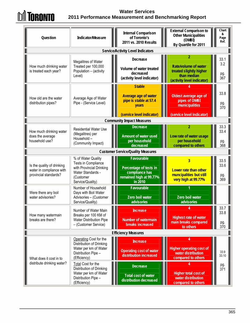
Water Services 2011 Performance Measurement and Benchmarking Report
365
Question Indicator/Measure Internal Comparison
of Toronto’s 2011 vs. 2010 Results
External Comparison to Other Municipalities
(OMBI) By Quartile for 2011
Chart &
Page Ref.
Service/Activity Level Indicators
How much drinking water is treated each year?
Megalitres of Water Treated per 100,000 Population – (activity Level)
Decrease
Volume of water treated decreased
(activity level indicator)
2
Rate/volume of water treated slightly higher
than median (activity level indicator)
33.1 3.2
pg. 367
How old are the water distribution pipes?
Average Age of Water Pipe - (Service Level)
Stable
Average age of water pipe is stable at 57.4
years
(service level indicator)
4
Oldest average age of pipes of OMBI municipalities
(service level indicator)
33.8
pg. 370
Community Impact Measures
How much drinking water does the average household use?
Residential Water Use (Megalitres) per Household – (Community Impact)
Decrease
Amount of water used per household
decreased
2
Low rate of water usage per household
compared to others
33.3 33.4
pg. 368
Customer Service/Quality Measures
Is the quality of drinking water in compliance with provincial standards?
% of Water Quality Tests in Compliance with Provincial Drinking Water Standards - (Customer Service/Quality)
Favourable
Percentage of tests in compliance has
remained high at 99.77% in 2010
3
Lower rate than other muncipalities but still very high at 99.77%
33.5 33.6
pg. 369
Were there any boil water advisories?
Number of Household Days with Boil Water Advisories – (Customer Service/Quality)
Favourable
Zero boil water advisories
1
Zero boil water advisories
How many watermain breaks are there?
Number of Water Main Breaks per 100 KM of Water Distribution Pipe – (Customer Service)
Increase
Number of watermain breaks increased
4
Highest rate of water main breaks compared
to others
33.7 33.8
pg. 370
Efficiency Measures
What does it cost in to distribute drinking water?
Operating Cost for the Distribution of Drinking Water per km of Water Distribution Pipe – (Efficiency)
Increase
Operating cost of water distribution increased
4
Higher operating cost of water distribution
compared to others 33.9
33.10
pg. 371
Total Cost for the Distribution of Drinking Water per km of Water Distribution Pipe – (Efficiency)
Decrease
Total cost of water distribution decreased
4
Higher total cost of water distribution
compared to others

Water Services 2011 Performance Measurement And Benchmarking Report
366
Question Indicator/Measure Internal Comparison
of Toronto’s 2011 vs. 2010 Results
External Comparison to Other Municipalities
(OMBI) By Quartile for 2011
Chart &
Page Ref.
What does it cost to treat drinking water?
Operating Cost for the Treatment of Drinking Water per Megalitre of Drinking Water Treated – (Efficiency)
Increase
Operating cost of water treatment increased
1
Lower operating cost of water treatment
compared to others 33.11 33.12
pg. 372
Total Cost for the Treatment of Drinking Water per Megalitre of Drinking Water Treated – (Efficiency)
Increase
Total cost of water treatment increased
1
Lower total cost of water treatment compared to
others
Overall Results
Service/ Activity Level
Indicators (Resources)
0 - Increased 1 - Stable 0 - decreased 100% stable or increased
Performance Measures (Results)
4 - Favourable 0 - Stable 4 - Unfavour. 50% favourable or stable
Service Level Indicators
(Resources)
0 - 1st quartile 1 - 2nd quartile 0 - 3rd quartile 1 - 4th quartile 50% at or above median
Performance Measures (Results)
3 - 1st quartile 1 - 2nd quartile 1 - 3rd quartile 3 - 4th quartile 50% above median
For an explanation of how to interpret this summary and the supporting charts, please see pages 24-30. These quartile results are based on a maximum sample size of 15 municipalities.
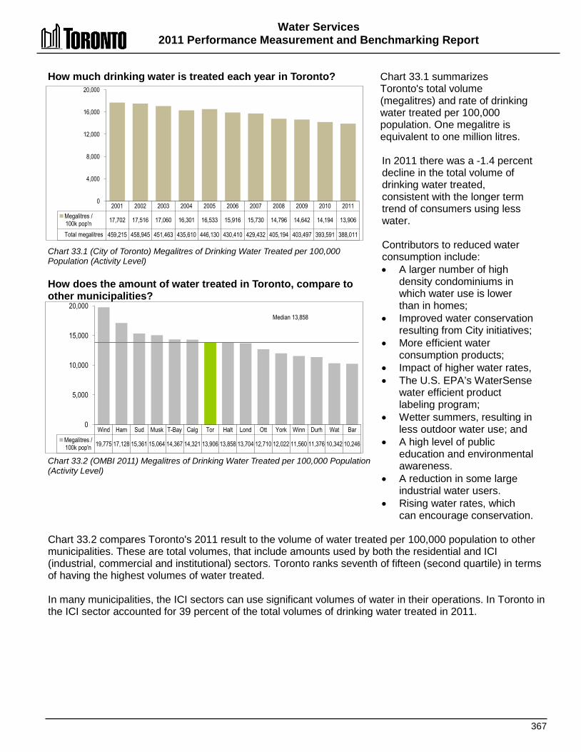
Water Services 2011 Performance Measurement and Benchmarking Report
367
How much drinking water is treated each year in Toronto? Chart 33.1 (City of Toronto) Megalitres of Drinking Water Treated per 100,000 Population (Activity Level) How does the amount of water treated in Toronto, compare to other municipalities? Chart 33.2 (OMBI 2011) Megalitres of Drinking Water Treated per 100,000 Population (Activity Level)
Chart 33.1 summarizes Toronto's total volume (megalitres) and rate of drinking water treated per 100,000 population. One megalitre is equivalent to one million litres. In 2011 there was a -1.4 percent decline in the total volume of drinking water treated, consistent with the longer term trend of consumers using less water. Contributors to reduced water consumption include: • A larger number of high
density condominiums in which water use is lower than in homes;
• Improved water conservation resulting from City initiatives;
• More efficient water consumption products;
• Impact of higher water rates, • The U.S. EPA’s WaterSense
water efficient product labeling program;
• Wetter summers, resulting in less outdoor water use; and
• A high level of public education and environmental awareness.
• A reduction in some large industrial water users.
• Rising water rates, which can encourage conservation.
Chart 33.2 compares Toronto's 2011 result to the volume of water treated per 100,000 population to other municipalities. These are total volumes, that include amounts used by both the residential and ICI (industrial, commercial and institutional) sectors. Toronto ranks seventh of fifteen (second quartile) in terms of having the highest volumes of water treated. In many municipalities, the ICI sectors can use significant volumes of water in their operations. In Toronto in the ICI sector accounted for 39 percent of the total volumes of drinking water treated in 2011.
Wind Ham Sud Musk T-Bay Calg Tor Halt Lond Ott York Winn Durh Wat Bar Megalitres / 100k pop'n 19,775 17,128 15,361 15,064 14,367 14,321 13,906 13,858 13,704 12,710 12,022 11,560 11,376 10,342 10,246
0
5,000
10,000
15,000
20,000 Median 13,858
2001 2002 2003 2004 2005 2006 2007 2008 2009 2010 2011 Megalitres / 100k pop'n 17,702 17,516 17,060 16,301 16,533 15,916 15,730 14,796 14,642 14,194 13,906
Total megalitres 459,215 458,945 451,463 435,610 446,130 430,410 429,432 405,194 403,497 393,591 388,011
0
4,000
8,000
12,000
16,000
20,000
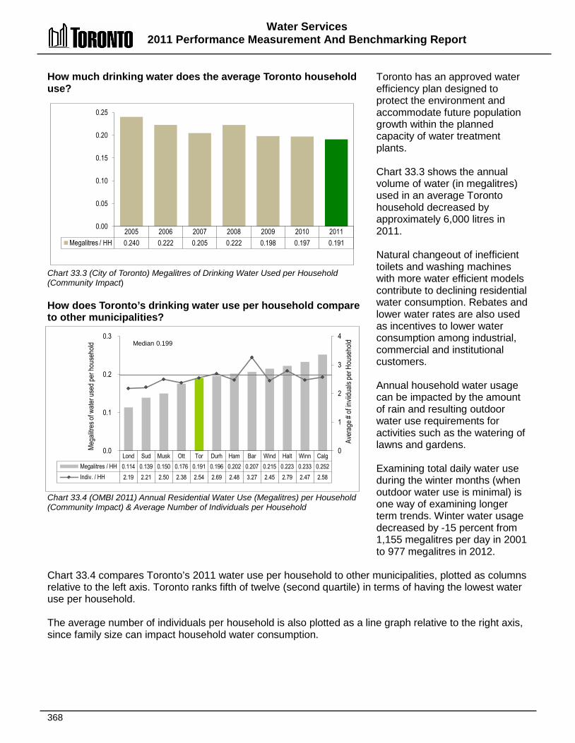
Water Services 2011 Performance Measurement And Benchmarking Report
368
Lond Sud Musk Ott Tor Durh Ham Bar Wind Halt Winn Calg Megalitres / HH 0.114 0.139 0.150 0.176 0.191 0.196 0.202 0.207 0.215 0.223 0.233 0.252 Indiv. / HH 2.19 2.21 2.50 2.38 2.54 2.69 2.48 3.27 2.45 2.79 2.47 2.58
0
1
2
3
4
0.0
0.1
0.2
0.3 Av
erag
e # of
invii
duals
per H
ouse
hold
Mega
litres
of w
ater u
sed p
er ho
useh
old Median 0.199
How much drinking water does the average Toronto household use? Chart 33.3 (City of Toronto) Megalitres of Drinking Water Used per Household (Community Impact) How does Toronto’s drinking water use per household compare to other municipalities? Chart 33.4 (OMBI 2011) Annual Residential Water Use (Megalitres) per Household (Community Impact) & Average Number of Individuals per Household
Toronto has an approved water efficiency plan designed to protect the environment and accommodate future population growth within the planned capacity of water treatment plants. Chart 33.3 shows the annual volume of water (in megalitres) used in an average Toronto household decreased by approximately 6,000 litres in 2011. Natural changeout of inefficient toilets and washing machines with more water efficient models contribute to declining residential water consumption. Rebates and lower water rates are also used as incentives to lower water consumption among industrial, commercial and institutional customers. Annual household water usage can be impacted by the amount of rain and resulting outdoor water use requirements for activities such as the watering of lawns and gardens. Examining total daily water use during the winter months (when outdoor water use is minimal) is one way of examining longer term trends. Winter water usage decreased by -15 percent from 1,155 megalitres per day in 2001 to 977 megalitres in 2012.
Chart 33.4 compares Toronto’s 2011 water use per household to other municipalities, plotted as columns relative to the left axis. Toronto ranks fifth of twelve (second quartile) in terms of having the lowest water use per household. The average number of individuals per household is also plotted as a line graph relative to the right axis, since family size can impact household water consumption.
2005 2006 2007 2008 2009 2010 2011 Megalitres / HH 0.240 0.222 0.205 0.222 0.198 0.197 0.191
0.00
0.05
0.10
0.15
0.20
0.25
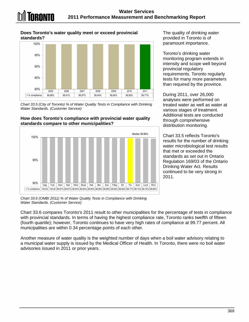
Water Services 2011 Performance Measurement and Benchmarking Report
369
Does Toronto's water quality meet or exceed provincial standards? Chart 33.5 (City of Toronto) % of Water Quality Tests in Compliance with Drinking Water Standards. (Customer Service) How does Toronto's compliance with provincial water quality standards compare to other municipalities? Chart 33.6 (OMBI 2011) % of Water Quality Tests in Compliance with Drinking Water Standards. (Customer Service)
The quality of drinking water provided in Toronto is of paramount importance. Toronto’s drinking water monitoring program extends in intensity and scope well beyond provincial regulatory requirements. Toronto regularly tests for many more parameters than required by the province. During 2011, over 26,000 analyses were performed on treated water as well as water at various stages of treatment. Additional tests are conducted through comprehensive distribution monitoring. Chart 33.5 reflects Toronto's results for the number of drinking water microbiological test results that met or exceeded the standards as set out in Ontario Regulation 169/03 of the Ontario Drinking Water Act. Results continued to be very strong in 2011.
Chart 33.6 compares Toronto's 2011 result to other municipalities for the percentage of tests in compliance with provincial standards. In terms of having the highest compliance rate, Toronto ranks twelfth of fifteen (fourth quartile); however, Toronto continues to have very high rates of compliance at 99.77 percent. All municipalities are within 0.34 percentage points of each other. Another measure of water quality is the weighted number of days when a boil water advisory relating to a municipal water supply is issued by the Medical Officer of Health. In Toronto, there were no boil water advisories issued in 2011 or prior years.
2005 2006 2007 2008 2009 2010 2011 % compliance 99.88% 99.91% 99.87% 99.94% 99.84% 99.80% 99.77%
80%
85%
90%
95%
100%
Calg York Ham Wat Wind Musk Halt Bar Sud T-Bay Ott Tor Durh Lond Winn % compliance 100.00 100.00 99.97% 99.97% 99.93% 99.92% 99.90% 99.89% 99.89% 99.82% 99.82% 99.77% 99.73% 99.72% 99.66%
90%
95%
100% Median 99.89%
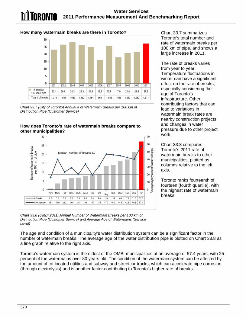
Water Services 2011 Performance Measurement And Benchmarking Report
370
York Musk Halt Calg Durh Lond Bar Ott T-Bay Sud Wind Ham Winn Tor
# Breaks 0.6 3.5 5.8 6.6 6.8 7.6 8.4 9.0 13.4 13.9 16.4 17.1 21.3 27.3 Average age 16.3 40.0 23.2 29.0 20.3 33.8 19.7 31.5 47.0 46.0 44.9 42.6 40.3 57.4
0
10
20
30
40
50
60
70
0
5
10
15
20
25
30
Aver
age a
ge (y
ears)
of w
aterm
ain pi
pe
Numb
er of
wate
rmain
brea
ks
per 1
00 k
m of
pipe Median number of breaks 8.7
How many watermain breaks are there in Toronto? Chart 33.7 (City of Toronto) Annual # of Watermain Breaks per 100 km of Distribution Pipe (Customer Service) How does Toronto’s rate of watermain breaks compare to other municipalities? Chart 33.8 (OMBI 2011) Annual Number of Watermain Breaks per 100 km of Distribution Pipe (Customer Service) and Average Age of Watermains (Service Level)
Chart 33.7 summarizes Toronto's total number and rate of watermain breaks per 100 km of pipe, and shows a large increase in 2011. The rate of breaks varies from year to year. Temperature fluctuations in winter can have a significant effect on the rate of breaks, especially considering the age of Toronto's infrastructure. Other contributing factors that can lead to variations in watermain break rates are nearby construction projects and changes in water pressure due to other project work. Chart 33.8 compares Toronto's 2011 rate of watermain breaks to other municipalities, plotted as columns relative to the left axis. Toronto ranks fourteenth of fourteen (fourth quartile), with the highest rate of watermain breaks.
The age and condition of a municipality’s water distribution system can be a significant factor in the number of watermain breaks. The average age of the water distribution pipe is plotted on Chart 33.8 as a line graph relative to the right axis. Toronto’s watermain system is the oldest of the OMBI municipalities at an average of 57.4 years, with 25 percent of the watermains over 80 years old. The condition of the watermain system can be affected by the amount of co-located utilities and subway and streetcar tracks, which can accelerate pipe corrosion (through electrolysis) and is another factor contributing to Toronto’s higher rate of breaks.
2001 2002 2003 2004 2005 2006 2007 2008 2009 2010 2011 # Breaks /
100 km of pipe 23.1 26.6 28.3 26.3 24.9 16.2 25.8 17.9 20.8 21.6 27.3
Total # of breaks 1,375 1,581 1,683 1,562 1,484 965 1,533 1,065 1,233 1,282 1,611
0
5
10
15
20
25
30

Water Services 2011 Performance Measurement and Benchmarking Report
371
Winn Wind Niag Musk Bar Sud Durh Ham Calg T-Bay Lond Halt Tor Ott York (A) Amortization 3,819 2,402 3,161 6,868 2,436 4,610 6,269 6,117 4,303 4,144 8,449 7,133 3,777 6,673 17,234 (B) Operating cost 7,217 8,917 10,677 7,006 11,816 10,712 9,987 10,520 12,802 13,923 12,255 13,998 18,410 16,486 60,993 (C = A + B) Total cost 11,036 11,319 13,838 13,874 14,252 15,322 16,256 16,637 17,105 18,067 20,703 21,131 22,188 23,159 78,227
$0
$10,000
$20,000
$30,000
$40,000
$50,000
$60,000
$70,000
$80,000
$90,000
Medians: $11,816 operating $16,637 total
2001 2002 2003 2004 2005 2006 2007 2008 2009 2010 2011 (A) Amortization 2,790 3,123 3,777 (B) Change in acct. policies 7,345 5,961 515
(C) Previous operating cost 14,566 14,688 14,693 16,387 15,986 15,000 16,537 17,734 17,377 17,199 17,895 (D = B + C) New operating cost 24,722 23,160 18,410 (E = A + D) Total Cost 27,512 26,283 22,188 CPI-adjusted previous operating
cost (base yr 2001) 14,566 14,394 13,980 15,338 14,683 13,561 14,666 15,366 14,991 14,468 14,614
$0
$5,000
$10,000
$15,000
$20,000
$25,000
$30,000
Cost
($) /
km of
pipe
What does it cost in Toronto to distribute drinking water? Chart 33.9 (City of Toronto) Operating Cost for Drinking Water Distribution per km of Pipe (Efficiency) How does the cost of distributing drinking water in Toronto compare to other municipalities? Chart 33.10 (OMBI 2011) Operating Cost for Drinking Water Distribution per km of Pipe (Efficiency)
Water distribution refers to the process of distributing drinking water from the water treatment plant through the system of watermains to the customer. Chart 33.9 provides Toronto's operating cost and total cost (operating plus amortization) of water distribution, per kilometre of distribution pipe. Starting in 2009, changes in accounting policies were instituted by all Ontario municipalities as described on page 30. The 2011 impact of these accounting policy changes amounted to $515 per km of pipe shown as a stacked column to separate it from the 2011 result using the previous costing methodology of 2008 and prior years. Amortization is also shown as a separate stacked column. There has been a longer term trend of increasing costs in response to ageing infrastructure. In 2011 there was an increase of +4.0 percent in operating costs per km of pipe (excluding the impact of the accounting policy changes), but a decrease in total costs. .
Chart 33.9 also provides Consumer Price Index (CPI) adjusted operating results (using the "previous" operating cost methodology of 2008 and prior years), which are plotted as a line graph. This adjusts the actual result for each year by the change in Toronto’s CPI since the base year of 2001. Chart 33.10 compares Toronto's 2011 cost of water distribution per km of pipe to other municipalities. Toronto ranks thirteenth of fifteen (fourth quartile) for both operating costs and total costs in terms of having the lowest cost. The topography of the Toronto is a factor in our higher costs. Because the city slopes up as it goes north from Lake Ontario, it is necessary to have 12 separate pressure districts at six different levels to provide adequate pressure to all consumers. In some cases, water must be pumped three or four times before it reaches the consumer, which requires a lot of energy and money. Toronto’s high operating costs are also related to the higher rate of watermain breaks (Chart 33.8), and the age of the infrastructure, with 35 percent of the Toronto watermain system being 50 to 80 years old and 25 percent over 80 years old.
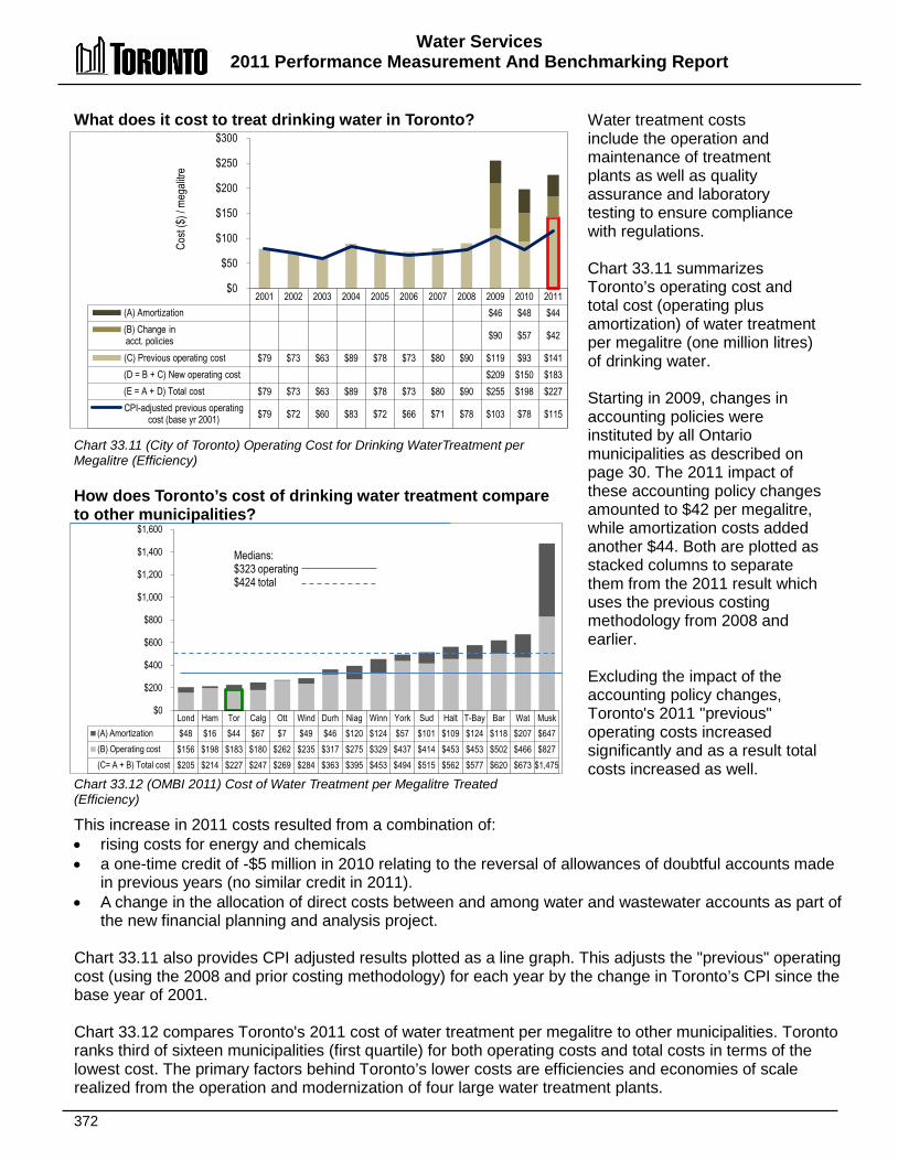
Water Services 2011 Performance Measurement And Benchmarking Report
372
Lond Ham Tor Calg Ott Wind Durh Niag Winn York Sud Halt T-Bay Bar Wat Musk (A) Amortization $48 $16 $44 $67 $7 $49 $46 $120 $124 $57 $101 $109 $124 $118 $207 $647 (B) Operating cost $156 $198 $183 $180 $262 $235 $317 $275 $329 $437 $414 $453 $453 $502 $466 $827 (C= A + B) Total cost $205 $214 $227 $247 $269 $284 $363 $395 $453 $494 $515 $562 $577 $620 $673 $1,475
$0
$200
$400
$600
$800
$1,000
$1,200
$1,400
$1,600
Medians: $323 operating $424 total
What does it cost to treat drinking water in Toronto? Chart 33.11 (City of Toronto) Operating Cost for Drinking WaterTreatment per Megalitre (Efficiency) How does Toronto’s cost of drinking water treatment compare to other municipalities? Chart 33.12 (OMBI 2011) Cost of Water Treatment per Megalitre Treated (Efficiency)
Water treatment costs include the operation and maintenance of treatment plants as well as quality assurance and laboratory testing to ensure compliance with regulations. Chart 33.11 summarizes Toronto’s operating cost and total cost (operating plus amortization) of water treatment per megalitre (one million litres) of drinking water. Starting in 2009, changes in accounting policies were instituted by all Ontario municipalities as described on page 30. The 2011 impact of these accounting policy changes amounted to $42 per megalitre, while amortization costs added another $44. Both are plotted as stacked columns to separate them from the 2011 result which uses the previous costing methodology from 2008 and earlier. Excluding the impact of the accounting policy changes, Toronto's 2011 "previous" operating costs increased significantly and as a result total costs increased as well.
This increase in 2011 costs resulted from a combination of: • rising costs for energy and chemicals • a one-time credit of -$5 million in 2010 relating to the reversal of allowances of doubtful accounts made
in previous years (no similar credit in 2011). • A change in the allocation of direct costs between and among water and wastewater accounts as part of
the new financial planning and analysis project. Chart 33.11 also provides CPI adjusted results plotted as a line graph. This adjusts the "previous" operating cost (using the 2008 and prior costing methodology) for each year by the change in Toronto’s CPI since the base year of 2001. Chart 33.12 compares Toronto's 2011 cost of water treatment per megalitre to other municipalities. Toronto ranks third of sixteen municipalities (first quartile) for both operating costs and total costs in terms of the lowest cost. The primary factors behind Toronto’s lower costs are efficiencies and economies of scale realized from the operation and modernization of four large water treatment plants.
2001 2002 2003 2004 2005 2006 2007 2008 2009 2010 2011 (A) Amortization $46 $48 $44 (B) Change in acct. policies $90 $57 $42
(C) Previous operating cost $79 $73 $63 $89 $78 $73 $80 $90 $119 $93 $141 (D = B + C) New operating cost $209 $150 $183 (E = A + D) Total cost $79 $73 $63 $89 $78 $73 $80 $90 $255 $198 $227 CPI-adjusted previous operating
cost (base yr 2001) $79 $72 $60 $83 $72 $66 $71 $78 $103 $78 $115
$0
$50
$100
$150
$200
$250
$300
Cost
($) /
meg
alitre
Water Services 2011 Performance Measurement and Benchmarking Report
373
2012 Achievements and 2013 Planned Initiatives The following initiatives have improved or are expected to further improve the efficiency and effectiveness of Water Services in Toronto: 2012 Initiatives Completed/Achievements • Maintained full compliance with Ministry of Environment inspections for all water treatment and
distribution facilities. • Completed various Energy Optimization initiatives to reduce the overall cost of energy and to reduce
Toronto Water's carbon footprint. • Completed the detailed design for construction of Corrosion Control Facilities, with implementation
beginning in the fall of 2013. 2013 Initiatives Planned • The District Water Service Repair project which includes Lead Water Service Replacement. • State of Good Repair projects, some of the funding for which will be dedicated to watermain
replacement and infrastructure rehabilitation projects. • Service improvement projects, including Water Metering Program • Growth projects, including initiatives for improving water efficiency, reducing water loss and
expansion projects required for future water supply demand. • Construction of Corrosion Control Facilities. Factors Influencing the Results of Municipalities The results of each municipality included in this report can be influenced to varying degrees by factors such as: • Demand: variation in demand from ICI and residential sectors, relative to total system demand. • Supply: cost is impacted by the water source (ground water or surface water), treatment costs and
the size of the geographic area and water supply/distribution systems serviced. • Treatment plants: number, size and complexity of a municipality’s water treatment plants. • Urban density: proximity of pipes to other utilities affects the cost for infrastructure repair and
replacement. • Age of infrastructure: age and condition of the water distribution pipe, type of water distribution pipe
material and frequency of maintenance activities. • Local water supply requirements: specific municipal water quality requirements may exceed
provincial regulations. • Weather conditions: negative impacts from severe and frequent extreme weather events. • Conservation programs: extent of municipal water conservation programs can impact water
consumption.