
different strategies to obtain antimicrobial biodegradable films ...
Upload
khangminh22Category
view
7download
0
covid19.analytics: An R Package to Obtain, Analyze and Visualize Data fromthe Coronavirus Disease Pandemic
Marcelo Ponce∗
SciNet HPC Consortium, University of Toronto661 University Ave., Suite 1140. Toronto, ON M5G 1M1 - Canada
Amit SandhelBrampton, Ontario. Canada
Abstract
With the emergence of a new pandemic worldwide, a novel strategy to approach it has emerged. Severalinitiatives under the umbrella of “open science” are contributing to tackle this unprecedented situation.In particular, the “R Language and Environment for Statistical Computing” [1, 2] offers an excellent tooland ecosystem for approaches focusing on open science and reproducible results. Hence it is not surprisingthat with the onset of the pandemic, a large number of R packages and resources were made available forresearches working in the pandemic. In this paper, we present an R package that allows users to access andanalyze worldwide data from resources publicly available. We will introduce the covid19.analytics package[3], focusing in its capabilities and presenting a particular study case where we describe how to deploy theCOVID19.ANALYTICS Dashboard Explorer.
Keywords: CoViD19, R package, ...
Contents
1 Introduction 2
2 The covid19.analytics R Package 42.1 Data Accessibility . . . . . . . . . . . . . . . . . . . . . . . . . . . . . . . . . . . . . . . . . . 4
2.1.1 Data retrieval options . . . . . . . . . . . . . . . . . . . . . . . . . . . . . . . . . . . . 52.1.2 Data Structure . . . . . . . . . . . . . . . . . . . . . . . . . . . . . . . . . . . . . . . . 52.1.3 Data Integrity and Consistency . . . . . . . . . . . . . . . . . . . . . . . . . . . . . . . 62.1.4 CoViD19 Genomic Data . . . . . . . . . . . . . . . . . . . . . . . . . . . . . . . . . . . 62.1.5 Data Repositories . . . . . . . . . . . . . . . . . . . . . . . . . . . . . . . . . . . . . . 7
2.2 Analytical & Graphical Indicators Functions . . . . . . . . . . . . . . . . . . . . . . . . . . . . 82.2.1 Details and Specifications of the Analytical & Visualization Functions . . . . . . . . . 102.2.2 Modelling the Evolution of the Virus Spread . . . . . . . . . . . . . . . . . . . . . . . 13
3 Examples and Applications 153.1 Installation . . . . . . . . . . . . . . . . . . . . . . . . . . . . . . . . . . . . . . . . . . . . . . 153.2 Retrieving and Accessing Data . . . . . . . . . . . . . . . . . . . . . . . . . . . . . . . . . . . 153.3 Basic Analysis . . . . . . . . . . . . . . . . . . . . . . . . . . . . . . . . . . . . . . . . . . . . 16
∗Corresponding authorEmail addresses: [email protected] (Marcelo Ponce), [email protected] (Amit Sandhel)
Preprint submitted to Elsevier April 21, 2021
arX
iv:2
009.
0109
1v2
[cs
.CY
] 2
0 A
pr 2
021
3.3.1 Identifying Geographical Locations . . . . . . . . . . . . . . . . . . . . . . . . . . . . . 163.3.2 Reports . . . . . . . . . . . . . . . . . . . . . . . . . . . . . . . . . . . . . . . . . . . . 173.3.3 Totals per Geographical Location . . . . . . . . . . . . . . . . . . . . . . . . . . . . . . 193.3.4 Growth Rate . . . . . . . . . . . . . . . . . . . . . . . . . . . . . . . . . . . . . . . . . 213.3.5 Trends . . . . . . . . . . . . . . . . . . . . . . . . . . . . . . . . . . . . . . . . . . . . . 223.3.6 Interactive Visualization Tools . . . . . . . . . . . . . . . . . . . . . . . . . . . . . . . 24
3.4 Modeling the Virus Spread . . . . . . . . . . . . . . . . . . . . . . . . . . . . . . . . . . . . . 253.5 Working with your own data . . . . . . . . . . . . . . . . . . . . . . . . . . . . . . . . . . . . 293.6 Studying Pandemics Trends . . . . . . . . . . . . . . . . . . . . . . . . . . . . . . . . . . . . . 303.7 Testing and Vaccination . . . . . . . . . . . . . . . . . . . . . . . . . . . . . . . . . . . . . . . 333.8 Genomics . . . . . . . . . . . . . . . . . . . . . . . . . . . . . . . . . . . . . . . . . . . . . . . 36
4 Case Study: The covid19.analytics Dashboard Explorer 414.1 Dashboard’s Front End Implementation . . . . . . . . . . . . . . . . . . . . . . . . . . . . . . 41
4.1.1 Accessing the covid19.analytics Dashboard Explorer . . . . . . . . . . . . . . . . . . . . 414.1.2 Specific Libraries Needed in the Dasbhoard . . . . . . . . . . . . . . . . . . . . . . . . 424.1.3 Dashboard Layout . . . . . . . . . . . . . . . . . . . . . . . . . . . . . . . . . . . . . . 424.1.4 Additional Elements of the Dashboard . . . . . . . . . . . . . . . . . . . . . . . . . . . 46
4.2 Dashboard’s Back End Implementation . . . . . . . . . . . . . . . . . . . . . . . . . . . . . . 474.3 Dashboard’s Server Configuration . . . . . . . . . . . . . . . . . . . . . . . . . . . . . . . . . . 48
4.3.1 Decentralized Systems and Services . . . . . . . . . . . . . . . . . . . . . . . . . . . . . 50
5 Conclusions 50
Appendix A List of Figures, Tables and Listings 55
Appendix B Package Software Engineering Features 57
1. Introduction
In 2019 a novel type of Corona Virus was first reported, originally in the province of Hubei, China.In a time frame of months this new virus was capable of producing a global pandemic of the CoronaVirus Disease (CoViD19), which can end up in a Severe Acute Respiratory Syndrome (SARS-COV-2). Theorigin of the virus is still unclear [4, 5, 6], although some studies based on genetic evidence, suggest thatit is quite unlikely that this virus was human made in a laboratory, but instead points towards cross-species transmission [7, 8]. Although this is not the first time in the human history when humanity facesa pandemic, this pandemic has unique characteristics. For starting the virus is “peculiar” as not all theinfected individuals experience the same symptoms. Some individuals display symptoms that are similarto the ones of a common cold or flu while other individuals experience serious symptoms that can causedeath or hospitalization with different levels of severity, including staying in intensive-care units (ICU) forseveral weeks or even months. A recent medical survey shows that the disease can transcend pulmonarymanifestations affecting several other organs [9]. Studies also suggest that the level of severity of the diseasecan be linked to previous conditions [10], gender [11], or even blood type [12] but the fundamental andunderlying reasons still remain unclear. Some infected individuals are completely asymptomatic, whichmakes them ideal vectors for disseminating the virus. This also makes very difficult to precisely determinethe transmission rate of the disease, and it is argued that in part due to the peculiar characteristics ofthe virus, that some initial estimates were underdetermining the actual value [13]. Elderly are the mostvulnerable to the disease and reported mortality rates vary from 5 to 15% depending on the geographicallocation. In addition to this, the high connectivity of our modern societies, make possible for a virus likethis to widely spread around the world in a relatively short period of time. Moreover the actual way oftransmission is still uncertain, being the most likely explanations to be droplets or airborne [14].
2

What is also unprecedented is the pace at which the scientific community has engaged in fighting thispandemic in different fronts [15]. Technology and scientific knowledge are and will continue playing afundamental role in how humanity is facing this pandemic and helping to reduce the risk of individualsto be exposed or suffer serious illness. Techniques such as DNA/RNA sequencing, computer simulations,models generations and predictions, are nowadays widely accessible and can help in a great manner toevaluate and design the best course of action in a situation like this [16]. Public health organizations arerelying on mathematical and data-driven models (e.g. [17]), to draw policies and protocols in order to try tomitigate the impact on societies by not suffocating their health institutions and resources [18]. Specifically,mathematical models of the evolution of the virus spread, have been used to establish strategies, like socialdistancing, quarantines, self-isolation and staying at home, to reduce the chances of transmission amongindividuals. Usually, vaccination is also another approach that emerges as a possible contention strategy,however this is still not a viable possibility in the case of CoViD19, as there is not vaccine developed yet[19, 20].
Simulations of the spread of virus have also shown that among the most efficient ways to reduce thespread of the virus are [21]: increasing social distancing, which refers to staying apart from individuals sothat the virus can not so easily disperse among individuals; improving hygiene routines, such as properhand washing, use of hand sanitizer, etc. which would eventually reduce the chances of the virus to remaineffective; quarantine or self-isolation, again to reduce unnecessary exposure to other potentially infectedindividuals. Of course these recommendations based on simulations and models can be as accurate anduseful as the simulations are, which ultimately depend on the value of the parameters used to set up theinitial conditions of the models. Moreover these parameters strongly depend on the actual data which can bealso sensitive to many other factors, such as data collection or reporting protocols among others [22]. Hencecounting with accurate, reliable and up-to-date data is critical when trying to understand the conditions forspreading the virus but also for predicting possible outcomes of the epidemic, as well as, designing propercontainment measurements.Similarly, being able to access and process the huge amount of genetic information associated with the virushas proben to shred light into the disease’s path [23, 24].
Encompassing these unprecedented times, another interesting phenomenon has also occurred, in partrelated to a contemporaneous trend in how science can be done by emphasizing transparency, reproducibilityand robustness: an open approach to the methods and the data; usually refer as open science. In particular,this approach has been part for quite sometime of the software developer community in the so-called opensource projects or codes. This way of developing software, offers a lot of advantages in comparison to themore traditional and closed, proprietary approaches. For starting, it allows that any interested party canlook at the actual implementation of the code, criticize, complement or even contribute to the project.It improves transparency, and at the same time, guarantees higher standards due to the public scrutiny;which at the end results in benefiting every one: the developers by increasing their reputation, reach andconsolidating a widely validated product and the users by allowing direct access to the sources and detailsof the implementation. It also helps with reproducibility of results and bugs reports and fixes. Severalapproaches and initiatives are taking the openness concepts and implementing in their platforms. Specificexamples of this have drown the Internet, e.g. the surge of open source powered dashboards [25], open datarepositories, etc.
Another example of this is for instance the number of scientific papers related to CoViD19 publishedsince the beginning of the pandemic [26], the amount of data and tools developed to track the evolution ofpandemic, etc. [27]. As a matter of fact, scientists are now drowning in publications related to the CoViD19[28, 29], and some collaborative and community initiatives are trying to use machine learning techniques tofacilitate identify and digest the most relevant sources for a given topic [30, 31, 32].
The “R Language and Environment for Statistical Computing” [1, 2] is not exception here. Moreover,promoting and based on the open source and open community principles, R has empowered scientists andresearchers since its inception. Not surprisingly then, the R community has contributed to the official CRAN[33] repository already with more than a dozen of packages related to the CoViD19 pandemic since thebeginning of the crisis. In particular, in this paper we will introduce and discuss the covid19.analytics Rpackage [3], which is mainly designed and focus in an open and modular approach to provide researchers quick
3
access to the latest reported worldwide data of the CoViD19 cases, as well as, analytical and visualizationtools to process this data.
This paper is organized as follow: in Sec. 2 we describe the covid19.analytics , in Sec. 3 we present someexamples of data analysis and visualization, in Sec. 4 we describe in detail how to deploy a web dashboardemploying the capabilities of the covid19.analytics package providing full details on the implementationso that this procedure can be repeated and followed by interested users in developing their own dashboards.Finally we summarize some conclusions in Sec. 5.
2. The covid19.analytics R Package
The covid19.analytics R package [3] allows users to obtain live1 worldwide data from the novelCoViD19. It does this by accessing and retrieving the data publicly available and published by severalsources:
• the “COVID-19 Data Repository by the Center for Systems Science and Engineering (CSSE) at JohnsHopkins University” [34] for the worldwide and US data
• Health Canada [35], for Canada specific data
• the city of Toronto for the Toronto data [36]
• Open Data Toronto for Toronto data [37]
The package also provides basic analysis and visualization tools and functions to investigate these datasetsand other ones structured in a similar fashion.
The covid19.analytics package is an open source tool, which its main implementation and API is theR package [3]. In addition to this, the package has a few more adds-on:
• a central GitHUB repository, https://github.com/mponce0/covid19.analytics where the latestdevelopment version and source code of the package are available. Users can also submit tickets forbugs, suggestions or comments using the "issues" tab.
• a rendered version with live examples and documentation also hosted at GitHUB pages, https://mponce0.github.io/covid19.analytics/;
• a dashboard for interactive usage of the package with extended capabilities for users without anycoding expertise, https://covid19analytics.scinet.utoronto.ca. We will discuss the details ofthe implementation in Sec. 4.
• a “backup” data repository hosted at GitHUB, https://github.com/mponce0/covid19analytics.datasets – where replicas of the live datasets are stored for redundancy and robust accesibility sake(see Fig. 1).
2.1. Data AccessibilityOne of the main objectives of the covid19.analytics package is to make the latest data from the
reported cases of the current CoViD19 pandemic promptly available to researchers and the scientific com-munity In what follows we describe the main functionalities from the package regarding data accessibility.
The covid19.data function allows users to obtain realtime data about the CoViD19 reported cases fromthe JHU’s CCSE repository, in the following modalities:
• aggregated data for the latest day, with a great ’granularity’ of geographical regions (ie. cities,provinces, states, countries)
1The data usually is accessible from the repositories with a 24 hours delay.
4

argument descriptionaggregated latest number of cases aggregated by country
Time Series datats-confirmed time series data of confirmed casests-deaths time series data of fatal casests-recovered time series data of recovered casests-ALL all time series data combined
Deprecated data formatsts-dep-confirmed time series data of confirmed cases as originally reported (deprecated)ts-dep-deaths time series data of deaths as originally reported (deprecated)ts-dep-recovered time series data of recovered cases as originally reported (deprecated)
CombinedALL all of the above
Time Series data for specific locationsts-Toronto time series data of confirmed cases for the city of Toronto, ON - Canadats-confirmed-US time series data of confirmed cases for the US detailed per statets-deaths-US time series data of fatal cases for the US detailed per state
Table 1: List of data retrieval functions available in the covid19.analytics package.
• time series data for larger accumulated geographical regions (provinces/countries)
• deprecated : we also include the original data style in which these datasets were reported initially.
The datasets also include information about the different categories (status) "confirmed"/"deaths"/"recovered"of the cases reported daily per country/region/city.
This data-acquisition function, will first attempt to retrieve the data directly from the JHU repositorywith the latest updates. If for what ever reason this fails (eg. problems with the connection) the package willload a preserved “image” of the data which is not the latest one but it will still allow the user to explore thisolder dataset. In this way, the package offers a more robust and resilient approach to the quite dynamicalsituation with respect to data availability and integrity.
The package also provides access to historical pandemics records, as well, as historical time lines forvacination developments and current vaccination records for CoViD-19. Historical pandemic and timelinevaccine development records are obtained from “Visualizing the History of Pandemics” & “The Race to SaveLives: Comparing Vaccine Development Timelines” infographics [38], while up-to-date current vaccinationrecords are obtained from “Our World In Data” CoViD19 data repository [39].
In addition to the data of the reported cases of CoViD19, the covid19.analytics package also providesaccess to genomics data of the virus. The data is obtained from the National Center for BiotechnologyInformation (NCBI) databases [40, 41].
2.1.1. Data retrieval optionsTable 1 shows the functions available in the covid19.analytics package for accessing the reported cases
of the CoViD19 pandemic. The functions can be divided in different categories, depending on what datathey provide access to. For instance, they are distinguished between agreggated and time series data sets.They are also grouped by specific geographical locations, i.e. worldwide, United States of America (US) andthe City of Toronto (Ontario, Canada) data.
2.1.2. Data StructureThe Time Series data is structured in an specific manner with a given set of fields or columns, which
resembles the following format:
"Province.State" | "Country.Region" | "Lat" | "Long" | ... sequence of dates ...
5

One of the modular features this package offers is that if an user has data structured in a data.frameorganized as described above, then most of the functions provided by the covid19.analytics package foranalyzing Time Series data will just work with the user’s defined data. In this way it is possible to addnew data sets to the ones that can be loaded using the repositories predefined in this package and extendthe analysis capabilities to these new datasets.
Sec. 3.5 presents an example of how external or synthetic data has to be structured so that can use thefunction from the covid19.analytics package. It is also recommended to check the compatibility of thesedatasets using the Data Integrity and Consistency Checks functions described in the following section.
2.1.3. Data Integrity and ConsistencyDue to the ongoing and rapid changing situation with the CoViD-19 pandemic, sometimes the reported
data has been detected to change its internal format or even show some anomalies or inconsistencies1.For instance, in some cumulative quantities reported in time series datasets, it has been observed that
these quantities instead of continuously increase sometimes they decrease their values which is somethingthat should not happen2. We refer to this as an inconsistency of “type II” .
Some negative values have been reported as well in the data, which also is not possible or valid; we callthis inconsistency of “type I” .
When this occurs, it happens at the level of the origin of the dataset, in our case, the one obtained fromthe JHU/CCESGIS repository [34]. In order to make the user aware of this, we implemented two consistencyand integrity checking functions:
• consistency.check: this function attempts to determine whether there are consistency issues withinthe data, such as, negative reported value (inconsistency of “type I”) or anomalies in the cumulativequantities of the data (inconsistency of “type II”)
• integrity.check: this determines whether there are integrity issues within the datasets or changesto the structure of the data
Alternatively we provide a data.checks function that will execute the previous described functions onan specified dataset.
Data Integrity. It is highly unlikely that the user would face a situation where the internal structure ofthe data or its actual integrity may be compromised. However if there are any suspicious about this, it ispossible to use the integrity.check function in order to verify this. If anything like this is detected weurge users to contact us about it, e.g. https://github.com/mponce0/covid19.analytics/issues.
Data Consistency. Data consistency issues and/or anomalies in the data have been reported several times3These are claimed, in most of the cases, to be missreported data and usually are just an insignificant numberof the total cases. Having said that, we believe that the user should be aware of these situations and werecommend using the consistency.check function to verify the dataset you will be working with.
Nullifying Spurious Data. In order to deal with the different scenarios arising from incomplete, inconsistentor missreported data, we provide the nullify.data function, which will remove any potential entry in thedata that can be suspected of these incongruencies. In addition ot that, the function accepts an optionalargument stringent=TRUE, which will also prune any incomplete cases (e.g. with NAs present).
2.1.4. CoViD19 Genomic DataSimilarly to the rapid developments and updates in the reported cases of the disease, the sequencing of
the virus is moving almost at equal pace. That’s why the covid19.analytics package provides access togood number of the genomics data currently available.
The covid19.genomic.data function allows users to obtain the CoViD19’s genomics data from NCBI’sdatabases [41]. The type of genomics data accessible from the package is described in Table 2.
1See https://github.com/CSSEGISandData/COVID-19/issues/.2See for instance, https://github.com/CSSEGISandData/COVID-19/issues/2165.3See https://github.com/CSSEGISandData/COVID-19/issues/.
6
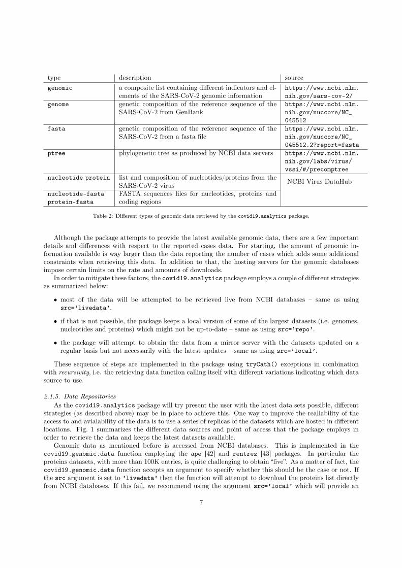
type description sourcegenomic a composite list containing different indicators and el-
ements of the SARS-CoV-2 genomic informationhttps://www.ncbi.nlm.nih.gov/sars-cov-2/
genome genetic composition of the reference sequence of theSARS-CoV-2 from GenBank
https://www.ncbi.nlm.nih.gov/nuccore/NC_045512
fasta genetic composition of the reference sequence of theSARS-CoV-2 from a fasta file
https://www.ncbi.nlm.nih.gov/nuccore/NC_045512.2?report=fasta
ptree phylogenetic tree as produced by NCBI data servers https://www.ncbi.nlm.nih.gov/labs/virus/vssi/#/precomptree
nucleotide protein list and composition of nucleotides/proteins from theSARS-CoV-2 virus NCBI Virus DataHub
nucleotide-fastaprotein-fasta
FASTA sequences files for nucleotides, proteins andcoding regions
Table 2: Different types of genomic data retrieved by the covid19.analytics package.
Although the package attempts to provide the latest available genomic data, there are a few importantdetails and differences with respect to the reported cases data. For starting, the amount of genomic in-formation available is way larger than the data reporting the number of cases which adds some additionalconstraints when retrieving this data. In addition to that, the hosting servers for the genomic databasesimpose certain limits on the rate and amounts of downloads.
In order to mitigate these factors, the covid19.analytics package employs a couple of different strategiesas summarized below:
• most of the data will be attempted to be retrieved live from NCBI databases – same as usingsrc=’livedata’.
• if that is not possible, the package keeps a local version of some of the largest datasets (i.e. genomes,nucleotides and proteins) which might not be up-to-date – same as using src=’repo’.
• the package will attempt to obtain the data from a mirror server with the datasets updated on aregular basis but not necessarily with the latest updates – same as using src=’local’.
These sequence of steps are implemented in the package using tryCath() exceptions in combinationwith recursivity, i.e. the retrieving data function calling itself with different variations indicating which datasource to use.
2.1.5. Data RepositoriesAs the covid19.analytics package will try present the user with the latest data sets possible, different
strategies (as described above) may be in place to achieve this. One way to improve the realiability of theaccess to and avialability of the data is to use a series of replicas of the datasets which are hosted in differentlocations. Fig. 1 summarizes the different data sources and point of access that the package employs inorder to retrieve the data and keeps the latest datasets available.
Genomic data as mentioned before is accessed from NCBI databases. This is implemented in thecovid19.genomic.data function employing the ape [42] and rentrez [43] packages. In particular theproteins datasets, with more than 100K entries, is quite challenging to obtain “live”. As a matter of fact, thecovid19.genomic.data function accepts an argument to specify whether this should be the case or not. Ifthe src argument is set to ’livedata’ then the function will attempt to download the proteins list directlyfrom NCBI databases. If this fail, we recommend using the argument src=’local’ which will provide an
7

covid19.analytics
Local data
Backup repo
GenBank
NCBI
JHU/CCSEGIS
City of Torontogoogle-drive
SARS-CoV-2 Genomic Data
CoViD19 Cases Data
“internal” rsync/git – when a new release is push to CRAN
“internal” scriptssrc=“livedata”
src=“repo”
src=“local”
https://github.com/mponce0/covid19analytics.datasets
Health Canada
Testing & Vaccination DataVisual Capitalist
Pandemics Data
OWID
Figure 1: Schematic of the data acquision flows between the covid19.analytics package and the different sources of data.Dark and solid/dashed lines represent API functions provided by the package accesible to the users. Dotted lines are “internal”mechanisms employed by the package to synchronize and update replicas of the data. Data acquisition from NCBI servers ismostly done utilizing the ape [42] and rentrez [43] packages.
stagered copy of this dataset at the moment in which the package was submitted to the CRAN repository,meaning that is quite likely this dataset won’t be complete and most likely outdated. Additionaly, we offera second replica of the datasets, located at https://github.com/mponce0/covid19analytics.datasetswhere all datasets are updated periodically, this can be accessed using the argument src=’repo’.
2.2. Analytical & Graphical Indicators FunctionsIn addition to the access and retrieval of the data, the covid19.analytics package includes several
functions to perform basic analysis and visualizations. Table 3 shows the list of the main functions in thepackage.
Function Description Main Type of OutputData AcquisitionCoViD-19 Cases
covid19.data obtain live* worldwide data forcovid19 cases, from the JHU’s CCSErepository [34]
return dataframes/list with the col-lected data
covid19.Canada.data obtain live* Canada specific datafor covid19 cases, from the HealthCanada data [35]
return dataframe with the collecteddata
covid19.Toronto.data obtain live* data for covid19 cases inthe city of Toronto, ON Canada, fromthe City of Toronto reports [36] orOpen Data Toronto [37]
return dataframe/list with the col-lected data
covid19.US.data obtain live* US specific data forcovid19 cases, from the JHU’s CCSErepository [34]
return dataframe with the collecteddata
8
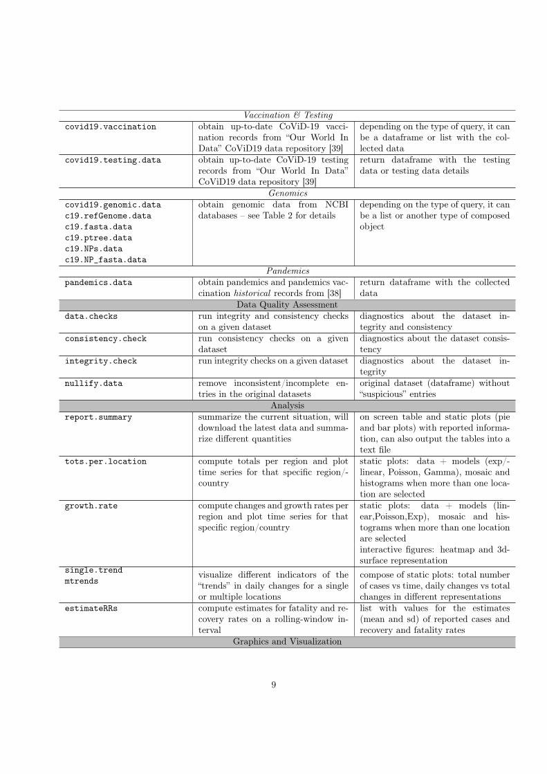
Vaccination & Testingcovid19.vaccination obtain up-to-date CoViD-19 vacci-
nation records from “Our World InData” CoViD19 data repository [39]
depending on the type of query, it canbe a dataframe or list with the col-lected data
covid19.testing.data obtain up-to-date CoViD-19 testingrecords from “Our World In Data”CoViD19 data repository [39]
return dataframe with the testingdata or testing data details
Genomicscovid19.genomic.datac19.refGenome.datac19.fasta.datac19.ptree.datac19.NPs.datac19.NP_fasta.data
obtain genomic data from NCBIdatabases – see Table 2 for details
depending on the type of query, it canbe a list or another type of composedobject
Pandemicspandemics.data obtain pandemics and pandemics vac-
cination historical records from [38]return dataframe with the collecteddata
Data Quality Assessmentdata.checks run integrity and consistency checks
on a given datasetdiagnostics about the dataset in-tegrity and consistency
consistency.check run consistency checks on a givendataset
diagnostics about the dataset consis-tency
integrity.check run integrity checks on a given dataset diagnostics about the dataset in-tegrity
nullify.data remove inconsistent/incomplete en-tries in the original datasets
original dataset (dataframe) without“suspicious” entries
Analysisreport.summary summarize the current situation, will
download the latest data and summa-rize different quantities
on screen table and static plots (pieand bar plots) with reported informa-tion, can also output the tables into atext file
tots.per.location compute totals per region and plottime series for that specific region/-country
static plots: data + models (exp/-linear, Poisson, Gamma), mosaic andhistograms when more than one loca-tion are selected
growth.rate compute changes and growth rates perregion and plot time series for thatspecific region/country
static plots: data + models (lin-ear,Poisson,Exp), mosaic and his-tograms when more than one locationare selectedinteractive figures: heatmap and 3d-surface representation
single.trendmtrends
visualize different indicators of the“trends” in daily changes for a singleor multiple locations
compose of static plots: total numberof cases vs time, daily changes vs totalchanges in different representations
estimateRRs compute estimates for fatality and re-covery rates on a rolling-window in-terval
list with values for the estimates(mean and sd) of reported cases andrecovery and fatality rates
Graphics and Visualization
9

total.plts plots in a static and interactive plottotal number of cases per day, theuser can specify multiple locations orglobal totals
static and interactive plot
itrends generates an interactive plot of dailychanges vs total changes in a log-logplot, for the indicated regions
interactive plot
live.map generates an interactive map display-ing cases around the world
static and interactive plot
Modellinggenerate.SIR.model generates a Susceptible-Infected-
Recovered (SIR) modellist containing the fits for the SIRmodel
plt.SIR.model plot the results from the SIR model static and interactive plotssweep.SIR.models generate multiple SIR models by vary-
ing parameters used to select the ac-tual data
list containing the values parameters,β, γ and R0
Data Explorationcovid19Explorer launches a dashboard interface to
explore the datasets provided bycovid19.analytics package
interactive web-based dashboard
Auxiliary FunctionsgeographicalRegions determines which countries compose a
given continentlist of countries
Table 3: Overview of the main functions of the covid19.analytics package
2.2.1. Details and Specifications of the Analytical & Visualization FunctionsGeographical Locations. An important element in the recorded data as shown in Sec. 2.1.2 is the indicationof the corresponding geographical location. In the reported data, this is mostly given by the Province/Cityand/or Country/Region. In order to facilitate the processing of locations that are located geo-politicallyclose, the covid19.analytics package provides a way to identify regions by indicating the correspondingcontinent’s name where they are located. I.e. "South America", "North America", "Central America","America", "Europe", "Asia" and "Oceania" can be used to process all the countries within each of theseregions.
The geographicalRegions function is the one in charge of determining which countries are part of whatcontinent and will display them when executing geographicalRegions().
In this way, it is possible to specify a particular continent and all the countries in this continent will beprocessed without needing to explicitly specifying all of them.
Reports. As the amount of data available for the recorded cases of CoViD19 can be overwhelming, andin order to get a quick insight on the main statistical indicators, the covid19.analytics package in-cludes the report.summary function, which will generate an overall report summarizing the main statis-tical estimators for the different datasets. It can summarize the "Time Series" data (when indicatingcases.to.process="TS"), the "aggregated" data (cases.to.process="AGG") or both (cases.to.process="ALL").The default will display the top 10 entries in each category, or the number indicated in the Nentries argu-ment, for displaying all the records just set Nentries=0.
The function can also target specific geographical location(s) using the geo.loc argument. When ageographical location is indicated, the report will include an additional "Rel.Perc" column for the confirmedcases indicating the relative percentage among the locations indicated. Similarly the totals displayed at theend of the report will be for the selected locations.
10

In each case ("TS" or/and "AGG") will present tables ordered by the different cases included, i.e.confirmed infected, deaths, recovered and active cases.
The dates when the report is generated and the date of the recorded data will be included at the beginningof each table.
It will also compute the totals, averages or mean values, standard deviations and percentages of variousquantities, i.e.
• it will determine the number of unique locations processed within the dataset
• it will compute the total number of cases per case type
• Percentages – which are computed as follow:
– for the "Confirmed" cases, as the ratio between the corresponding number of cases and the totalnumber of cases, i.e. a sort of "global percentage" indicating the percentage of infected cases withrespect to the rest of the world
– for "Confirmed" cases, when geographical locations are specified, a "Relative percentage" is givenas the ratio of the confirmed cases over the total of the selected locations
– for the other categories, "Deaths"/"Recovered"/"Active", the percentage of a given category iscomputed as the ratio between the number of cases in the corresponding category divided by the"Confirmed" number of cases, i.e. a relative percentage with respect to the number of confirmedinfected cases in the given region
• For "Time Series" data:
– it will show the delta (change or variation) in the last day, daily changes day before that (t− 2),three days ago (t− 3), a week ago (t− 7), two weeks ago (t− 14) and a month ago (t− 30)
– when possible, it will also display the percentage of "Recovered" and "Deaths" with respect tothe "Confirmed" number of cases
– the column "GlobalPerc" is computed as the ratio between the number of cases for a given countryover the total of cases reported
– The "Global Perc. Average (SD: standard deviation)" is computed as the average (standarddeviation) of the number of cases among all the records in the data
– The "Global Perc. Average (SD: standard deviation) in top X" is computed as the average(standard deviation) of the number of cases among the top X records
A typical output of the summary.report for the "Time Series" data, is shown in the example 7 inSec. 3. In addition to this, the function also generates some graphical outputs, including pie and bar chartsrepresenting the top regions in each category; see Fig. 2.
Totals per Location & Growth Rate. It is possible to dive deeper into a particular location by using thetots.per.location and growth.rate functions. These functions are capable of processing different typesof data, as far as these are "Time Series" data. It can either focus in one category (eg. "TS-confirmed","TS-recovered", "TS-deaths",) or all ("TS-all"). When these functions detect different types of categories,each category will be processed separately. Similarly the functions can take multiple locations, ie. just one,several ones or even "all" the locations within the data. The locations can either be countries, regions,provinces or cities. If an specified location includes multiple entries, eg. a country that has several citiesreported, the functions will group them and process all these regions as the location requested.
11

Totals per Location. The tots.per.location function will plot the number of cases as a function of timefor the given locations and type of categories, in two plots: a log-scale scatter one a linear scale bar plotone.
When the function is run with multiple locations or all the locations, the figures will be adjusted todisplay multiple plots in one figure in a mosaic type layout.
Additionally, the function will attempt to generate different fits to match the data:
• an exponential model using a Linear Regression method
• a Poisson model using a General Linear Regression method
• a Gamma model using a General Linear Regression method
The function will plot and add the values of the coefficients for the models to the plots and display asummary of the results in the console. It is also possible to instruct the function to draw a "confidence band"based on a moving average, so that the trend is also displayed including a region of higher confidence basedon the mean value and standard deviation computed considering a time interval set to equally dividing thetotal range of time over 10 equally spaced intervals.
The function will return a list combining the results for the totals for the different locations as a functionof time.
Growth Rate. The growth.rate function allows to compute daily changes and the growth rate defined asthe ratio of the daily changes between two consecutive dates.
The growth.rate function shares all the features of the tots.per.location function as described above,i.e. can process the different types of cases and multiple locations.
The graphical output will display two plots per location:
• a scatter plot with the number of changes between consecutive dates as a function of time, both inlinear scale (left vertical axis) and log-scale (right vertical axis) combined
• a bar plot displaying the growth rate for the particular region as a function of time.
When the function is run with multiple locations or all the locations, the figures will be adjusted todisplay multiple plots in one figure in a mosaic type layout. In addition to that, when there is more thanone location the function will also generate two different styles of heatmaps comparing the changes per dayand growth rate among the different locations (vertical axis) and time (horizontal axis). Furthermore, if theinteractiveFig=TRUE argument is used, then interactive heatmaps and 3d-surface representations will begenerated too.
Some of the arguments in this function, as well as in many of the other functions that generate both staticand interactive visualizations, can be used to indicate the type of output to be generated. Table 4 lists someof these arguments. In particular, the arguments controlling the interactive figures –interactiveFig andinteractive.display– can be used in combination to compose an interactive figure to be captured and usedin another application. For instance, when interactive.display is turned off but interactiveFig=TRUE,the function will return the interactive figure, so that it can be captured and used for later purposes. Thisis the technique employed when capturing the resulting plots in the covid19.analytics Dashboard Exploreras presented in Sec. 4.2.
Finally, the growth.rate function when not returning an interactive figure, will return a list combiningthe results for the "changes per day" and the "growth rate" as a function of time, i.e. when interactiveFigis not specified or set to FALSE (which its default value) or when interactive.display=TRUE.
Trends in Daily Changes. The covid19.analytics package provides three different functions to visualizethe trends in daily changes of reported cases from time series data.
• single.trend, allows to inspect one single location, this could be used with the worldwide data slicedby the corresponding location, the Toronto data or the user’s own data formatted as "Time Series"data.
12

argument effect default valuestaticPlt when active, enables static plots to be displayed in
screenTRUE
interactiveFig when active, enables interactive visualizations features FALSEinteractive.display when active, pushes the interactive figures into a
browserTRUE
When is turned off, but interactiveFig=TRUE, thefunction will return the interactive figure, so that itcan be captured and used for later purposes.
Table 4: List of some of the arguments used in several functions to control the type of graphical output.
• mtrends, is very similar to the single.trend function, but accepts multiple or single locations gener-ating one plot per location requested; it can also process multiple cases for a given location.
• itrends function to generate an interactive plot of the trend in daily changes representing changes innumber of cases vs total number of cases in log-scale using splines techniques to smooth the abruptvariations in the data
The first two functions will generate "static" plots in a compose with different insets:
• the main plot represents daily changes as a function of time
• the inset figures in the top, from left to right:
– total number of cases (in linear and semi-log scales),
– changes in number of cases vs total number of cases
– changes in number of cases vs total number of cases in log-scale
• the second row of insets, represent the "growth rate" (as defined above) and the normalized growthrate defined as the growth rate divided by the maximum growth rate reported for this location
Plotting Totals. The function totals.plt will generate plots of the total number of cases as a function oftime. It can be used for the total data or for a specific or multiple locations. The function can generatestatic plots and/or interactive ones, as well, as linear and/or semi-log plots.
Plotting Cases in the World. The function live.map will display the different cases in each correspond-ing location all around the world in an interactive map of the world. It can be used with time seriesdata or aggregated data, aggregated data offers a much more detailed information about the geographicaldistribution.
2.2.2. Modelling the Evolution of the Virus SpreadThe covid19.analytics package allows users to model the dispersion of the disease by implementing
a simple Susceptible-Infected-Recovered (SIR) model [44, 45]. The model is implemented by a system ofordinary differential equations (ODE), as the one shown by Eq.(1).
dS
dt= −βIS
N
dI
dt=βIS
N− γI
dR
dt= γI
(1)
13

where S represents the number of susceptible individuals to be infected, I the number of infected indi-viduals and R the number of recovered ones at a given moment in time. The coefficients β and γ are theparameters controlling the transition rate from S to I and from I to R respectively; N is the total numberof individuals, i.e. N = S(t) + I(t) +R(t); which should remain constant, i.e.
dN
dt=dS
dt+dI
dt+dR
dt≡ 0 (2)
Eq.(1) can be written in terms of the normalized quantities, s(t) ≡ S(t)/N , i(t) ≡ I(t)/N , and r(t) ≡R(t)/N ; as
ds
dt= −βi(t)s(t)
di
dt= βi(t)s(t)− γi(t)
dr
dt= γi(t)
(3)
Although the ODE SIR model is non-linear, analytical solutions have been found [46]. However theapproach we follow in the package implementation is to solve the ODE system from Eq.(1) numerically.
The function generate.SIR.model implements the SIR model from Eq.(1) using the actual data fromthe reported cases. The function will try to identify data points where the onset of the epidemic beganand consider the following data points to generate proper guesses for the two parameters describing the SIRODE system, i.e. β and γ.
It does this by minimizing the residual sum of squares (RSS) assuming one single explanatory variable,i.e. the sum of the squared differences between the number of infected cases I(t) and the quantity predictedby the model I(t),
RSS(β, γ) =∑t
(I(t)− I(t)
)2(4)
The ODE given by Eq.(1) is solved numerically using the ode function from the deSolve and theminimization is tackled using the optim function from base R.
After the solution for Eq.(1) is found, the function will provide details about the solution, as well as,plot the quantities S(t), I(t), R(t) in a static and interactive plot.
The generate.SIR.model function also estimates the value of the basic reproduction number or basicreproduction ratio, R0, defined as,
R0 =β
γ(5)
which can be considered as a measure of the average expected number of new infections from a singleinfection in a population where all subjects can be susceptible to get infected.
The function also computes and plots on demand, the force of infection, defined as, Finfection = βI(t),which measures the transition rate from the compartment of susceptible individuals to the compartment ofinfectious ones.
For exploring the parameter space of the SIR model, it is possible to produce a series of models byvarying the conditions, i.e. range of dates considered for optimizing the parameters of the SIR equation,which will effectively “sweep” a range for the parameters β, γ and R0. This is implemented in the functionsweep.SIR.models, which takes a range of dates to be used as starting points for the number of cases usedto feed into the generate.SIR.model producing as many models as different ranges of dates are indicated.One could even use this in combination to other resampling or Monte Carlo techniques to estimate statisticalvariability of the parameters from the model.
14
3. Examples and Applications
In this section we will present some basic examples of how to use the main functions from the covid19.analytics pack-age.
3.1. InstallationWe will begin by installing the covid19.analytics package. This can be achieved in two alternative
ways:
1. installing the latest stable version of the package directly from the CRAN repository. This can bedone within an R session using the install.packages function, i.e.
> install.packages("covid19.analytics")
2. installing the development version from the package’s GITHUB repository, https://github.com/mponce0/covid19.analytics using the devtools package [47] and its install_github function. I.e.
# begin by installing devtools if not installed in your system> install.packages("devtools")# install the covid19.analytics packages from the GITHUB repo> devtools::install_github("mponce0/covid19.analytics")
After having installed the covid19.analytics package, for accessing its functions, the package needs tobe loaded using R’s library function, i.e.
> library(covid19.analytics)
The covid19.analytics uses a few additional packages which are installed automatically if they are notpresent in the system. In particular, readxl is used to access the data from the City of Toronto [36], ape isused for pulling the genomics data from NCBI; plotly and htmlwidgets are used to render the interactiveplots and save them in HTML documents, deSolve is used to solve the differential equations modelling thespread of the virus, and gplots, pheatmap are used to generate heatmaps.
3.2. Retrieving and Accessing DataLst. 1 shows how to use the covid19.data function to obtain data in different cases.
# obtain all the records combined for "confirmed", "deaths" and "recovered" cases# for the global (worldwide) *aggregated* datacovid19.data.ALLcases <- covid19.data()
# obtain time series data for global "confirmed" casescovid19.confirmed.cases <- covid19.data("ts-confirmed")
# reads all possible datasets , returning a listcovid19.all.datasets <- covid19.data("ALL")
# reads the latest aggregated data of the global casescovid19.ALL.agg.cases <- covid19.data("aggregated")
# reads time series data for global casualtiescovid19.TS.deaths <- covid19.data("ts -deaths")
# read "Time Series" data for the city of TorontoToronto.TS.data <- covid19.data("ts -Toronto")
# this can be also done using the covid19.Toronto.data() fnTor.TS.data <- covid19.Toronto.data()
15

# or get the original data as reported by the City of TorontoTor.DF.data <- covid19.Toronto.data(data.fmr="ORIG")
# retrieve US time series data of confirmed casesUS.confirmed.cases <- covid19.data("ts-confirmed -US")
# retrieve US time series data of death casesUS.deaths.cases <- covid19.data("ts -deaths -US")
# or both cases combinedUS.cases <- covid19.US.data()
Listing 1: Reading data from reported cases of CoViD19 using the covid19.analytics package.
In general, the reading functions will return data frames. Exceptions to this, are when the functions needto return a more complex output, e.g. when combining "ALL" type of data or when requested to obtainthe original data from the City of Toronto (see details in Table 3). In these cases, the returning object willbe a list containing in each element dataframes corresponding to the particular type of data. In either case,the structure and overall content can be quickly assessed by using R’s str or summary functions.
# reading COVID19 testing datac19.testing.data <- covid19.testing.data()
# reading COVID19 vaccination datac19.vacc.data <- covid19.vaccination ()
Listing 2: Reading testing and vaccination data of CoViD19 using the covid19.analytics package.
# Pandemic historical recordspnds <- pandemics.data(tgt="pandemics")
# Pandemics vaccines development timespnds.vacs <- pandemics.data(tgt="pandemics_vaccines")
Listing 3: Reading historical records from different pandemic using the covid19.analytics package.
# obtain covid19 ’s genomic datacovid19.gen.seq <- covid19.genomic.data()
# display the actual RNA seqcovid19.gen.seq$NC_045512.2
Listing 4: Reading genomic data using the covid19.analytics package.
3.3. Basic Analysis3.3.1. Identifying Geographical Locations
One useful information to look at after loading the datasets, would be to identify which locations/regionshave reported cases. There are at least two main fields that can be used for that, the columns containingthe keywords: ’country’ or ’region’ and ’province’ or ’state’. Lst. 5 show examples of how to achieve thisusing partial matches for column names, e.g. "Country" and "Province".
# read a data setdata <- covid19.data("TS-confirmed")
16

# look at the structure and column namesstr(data)names(data)
# find ’Country ’ columncountry.col <- pmatch("Country",names(data))# slice the countriescountries <- data[,country.col]# list of countriesprint(unique(countries))# sorted table of countries , may include multiple entriesprint(sort(table(countries)))
# find ’Province ’ columnprov.col <- pmatch("Province",names(data))# slice the Provincesprovinces <- data[,prov.col]
# list of provincesprint(unique(provinces))# sorted table of provinces , may include multiple entriesprint(sort(table(provinces)))
Listing 5: Identifying geographical locations in the data sets.
3.3.2. ReportsAn overall view of the current situation at a global or local level can be obtained using the report.summary
function. Lst. 6 shows a few examples of how this function can be used.
# a quick function to overview top cases per region for time series and aggregatedrecords
report.summary ()
# save the tables into a text file named ’covid19 -SummaryReport_CURRENTDATE.txt ’# where *CURRRENTDATE* is the actual datereport.summary(saveReport=TRUE)
# summary report for an specific location with default number of entriesreport.summary(geo.loc="Canada")
# summary report for an specific location with top 5report.summary(Nentries=5, geo.loc="Canada")
# it can combine several locationsreport.summary(Nentries =30, geo.loc=c("Canada","US","Italy","Uruguay","Argentina")
)
Listing 6: Reports generation
A typical output of the report generation tool is presented in Lst. 7.
Listing 7: Typical output of the report.summary function. This particular example was generated usingreport.summary(Nentries=5,graphical.output=TRUE,saveReport=TRUE), which indicates to consider just the top 5 entries,generate a graphical output as shown in Fig. 2 and to save a text file including the report which is the one shown here.
~~~~~~~~~~~~~~~~~~~~~~~~~~~~~~~~~~~~~~~~~~~~~~~~~~~~~~~~~~~~~~~~~~~~~~~~~~~~~~~~--------------------------------------------------------------------------------################################################################################
17

##### TS-CONFIRMED Cases -- Data dated: 2020 -06 -25 :: 2020 -06 -26 13:10:01################################################################################
Number of Countries/Regions reported: 188Number of Cities/Provinces reported: 82Unique number of distinct geographical locations combined: 266
--------------------------------------------------------------------------------Worldwide ts -confirmed Totals: 9609829
--------------------------------------------------------------------------------Country.Region Province.State Totals GlobalPerc LastDayChange t-2 t-3 t-7 t-14 t-30
1 US 2422299 25.21 39972 34836 35189 31527 25396 183662 Brazil 1228114 12.78 39483 42725 39436 54771 25982 205993 Russia 613148 6.38 7105 7165 7413 7971 8961 83384 India 490401 5.10 17296 16922 15968 14516 11458 72935 United Kingdom 307980 3.20 1118 652 921 1346 1541 2013--------------------------------------------------------------------------------
Global Perc. Average: 0.38 (sd: 1.85)Global Perc. Average in top 5 : 10.53 (sd: 8.96)
--------------------------------------------------------------------------------================================================================================~~~~~~~~~~~~~~~~~~~~~~~~~~~~~~~~~~~~~~~~~~~~~~~~~~~~~~~~~~~~~~~~~~~~~~~~~~~~~~~~--------------------------------------------------------------------------------################################################################################
##### TS-DEATHS Cases -- Data dated: 2020 -06 -25 :: 2020 -06 -26 13:10:02################################################################################
Number of Countries/Regions reported: 188Number of Cities/Provinces reported: 82Unique number of distinct geographical locations combined: 266
--------------------------------------------------------------------------------Worldwide ts -deaths Totals: 489312
--------------------------------------------------------------------------------Country.Region Province.State Totals Perc LastDayChange t-2 t-3 t-7 t-14 t-30
1 US 124410 5.14 2425 754 829 692 846 15052 Brazil 54971 4.48 1141 1185 1374 1206 909 10863 United Kingdom 43230 14.04 149 154 280 173 202 4124 Italy 34678 14.47 34 -31 18 47 56 1175 France 29680 15.52 19 9 57 14 28 66----------------------------------------------------------------------------------------------------------------------------------------------------------------================================================================================~~~~~~~~~~~~~~~~~~~~~~~~~~~~~~~~~~~~~~~~~~~~~~~~~~~~~~~~~~~~~~~~~~~~~~~~~~~~~~~~--------------------------------------------------------------------------------################################################################################
##### TS-RECOVERED Cases -- Data dated: 2020 -06 -25 :: 2020 -06 -26 13:10:02################################################################################
Number of Countries/Regions reported: 188Number of Cities/Provinces reported: 68Unique number of distinct geographical locations combined: 253
--------------------------------------------------------------------------------Worldwide ts -recovered Totals: 4838921
--------------------------------------------------------------------------------Country.Region Province.State Totals LastDayChange t-2 t-3 t-7 t-14 t-30
1 Brazil 679524 19055 32506 26227 17051 15158 80542 US 663562 7401 8613 7350 7600 7094 66063 Russia 374557 6335 12375 12000 10442 8213 110794 India 285637 13940 13012 10495 9120 7135 34725 Chile 219327 4234 4523 5173 5050 4914 2625----------------------------------------------------------------------------------------------------------------------------------------------------------------================================================================================~~~~~~~~~~~~~~~~~~~~~~~~~~~~~~~~~~~~~~~~~~~~~~~~~~~~~~~~~~~~~~~~~~~~~~~~~~~~~~~~##################################################################################################################################
##### AGGREGATED Data -- ORDERED BY CONFIRMED Cases -- Data dated: 2020 -06 -26 :: 2020 -06 -26 13:10:03##################################################################################################################################
Number of Countries/Regions reported: 188Number of Cities/Provinces reported: 549Unique number of distinct geographical locations combined: 3781
----------------------------------------------------------------------------------------------------------------------------------Location Confirmed Perc.Confirmed Deaths Perc.Deaths Recovered Perc.Recovered Active Perc.Active
1 Sao Paulo , Brazil 248587 2.59 13759 5.53 49295 19.83 185533 74.642 Moscow , Russia 217791 2.27 3669 1.68 142194 65.29 71928 33.033 Iran 215096 2.24 10130 4.71 175103 81.41 29863 13.884 New York City , New York , US 213699 2.22 22384 10.47 0 0.00 191315 89.535 Metropolitana , Chile 206246 2.15 4206 2.04 0 0.00 202040 97.96==================================================================================================================================##################################################################################################################################
##### AGGREGATED Data -- ORDERED BY DEATHS Cases -- Data dated: 2020 -06 -26 :: 2020 -06 -26 13:10:03##################################################################################################################################
Number of Countries/Regions reported: 188Number of Cities/Provinces reported: 549Unique number of distinct geographical locations combined: 3781
----------------------------------------------------------------------------------------------------------------------------------Location Confirmed Perc.Confirmed Deaths Perc.Deaths Recovered Perc.Recovered Active Perc.Active
1 England , United Kingdom 159696 1.66 38706 24.24 0 0.00 120990 75.762 France 191288 1.99 29680 15.52 71322 37.29 90286 47.203 New York City , New York , US 213699 2.22 22384 10.47 0 0.00 191315 89.534 Lombardia , Italy 93431 0.97 16608 17.78 64831 69.39 11992 12.845 Sao Paulo , Brazil 248587 2.59 13759 5.53 49295 19.83 185533 74.64==================================================================================================================================##################################################################################################################################
##### AGGREGATED Data -- ORDERED BY RECOVERED Cases -- Data dated: 2020 -06 -26 :: 2020 -06 -26 13:10:03##################################################################################################################################
Number of Countries/Regions reported: 188Number of Cities/Provinces reported: 549Unique number of distinct geographical locations combined: 3781
----------------------------------------------------------------------------------------------------------------------------------Location Confirmed Perc.Confirmed Deaths Perc.Deaths Recovered Perc.Recovered Active Perc.Active
1 Recovered , US 0 0.00 0 NaN 663562 Inf -739500 -Inf2 Unknown , Chile 0 0.00 0 NaN 219327 Inf -219327 -Inf3 Iran 215096 2.24 10130 4.71 175103 81.41 29863 13.884 Turkey 193115 2.01 5046 2.61 165706 85.81 22363 11.585 Unknown , Peru 0 0.00 0 NaN 151225 Inf -151225 -Inf==================================================================================================================================##################################################################################################################################
18
##### AGGREGATED Data -- ORDERED BY ACTIVE Cases -- Data dated: 2020 -06 -26 :: 2020 -06 -26 13:10:03##################################################################################################################################
Number of Countries/Regions reported: 188Number of Cities/Provinces reported: 549Unique number of distinct geographical locations combined: 3781
----------------------------------------------------------------------------------------------------------------------------------Location Confirmed Perc.Confirmed Deaths Perc.Deaths Recovered Perc.Recovered Active Perc.Active
1 Metropolitana , Chile 206246 2.15 4206 2.04 0 0.00 202040 97.962 New York City , New York , US 213699 2.22 22384 10.47 0 0.00 191315 89.533 Sao Paulo , Brazil 248587 2.59 13759 5.53 49295 19.83 185533 74.644 Lima , Peru 151225 1.57 4029 2.66 0 0.00 147196 97.345 England , United Kingdom 159696 1.66 38706 24.24 0 0.00 120990 75.76==================================================================================================================================
Confirmed Deaths Recovered ActiveTotals
9609829 489312 4838921 4205658Average
2541.61 129.41 1279.8 1112.31Standard Deviation
13197.35 1071.37 13601.24 15132.39
* Statistical estimators computed considering 3781 independent reported entries
**************************************************************************************************************** OVERALL SUMMARY****************************************************************************************************************
**** Time Series Worldwide TOTS ****ts -confirmed ts -deaths ts-recovered9609829 489312 4838921
5.09% 50.35%**** Time Series Worldwide AVGS ****
ts -confirmed ts -deaths ts-recovered36127.18 1839.52 19126.17
5.09% 52.94%**** Time Series Worldwide SDS ****
ts -confirmed ts -deaths ts-recovered177717.39 9498.41 72771.61
5.34% 40.95%
* Statistical estimators computed considering 266/266/253 independent reported entries per case -type********************************************************************************
A daily generated report is also available from the covid19.analytics documentation site, https://mponce0.github.io/covid19.analytics/.
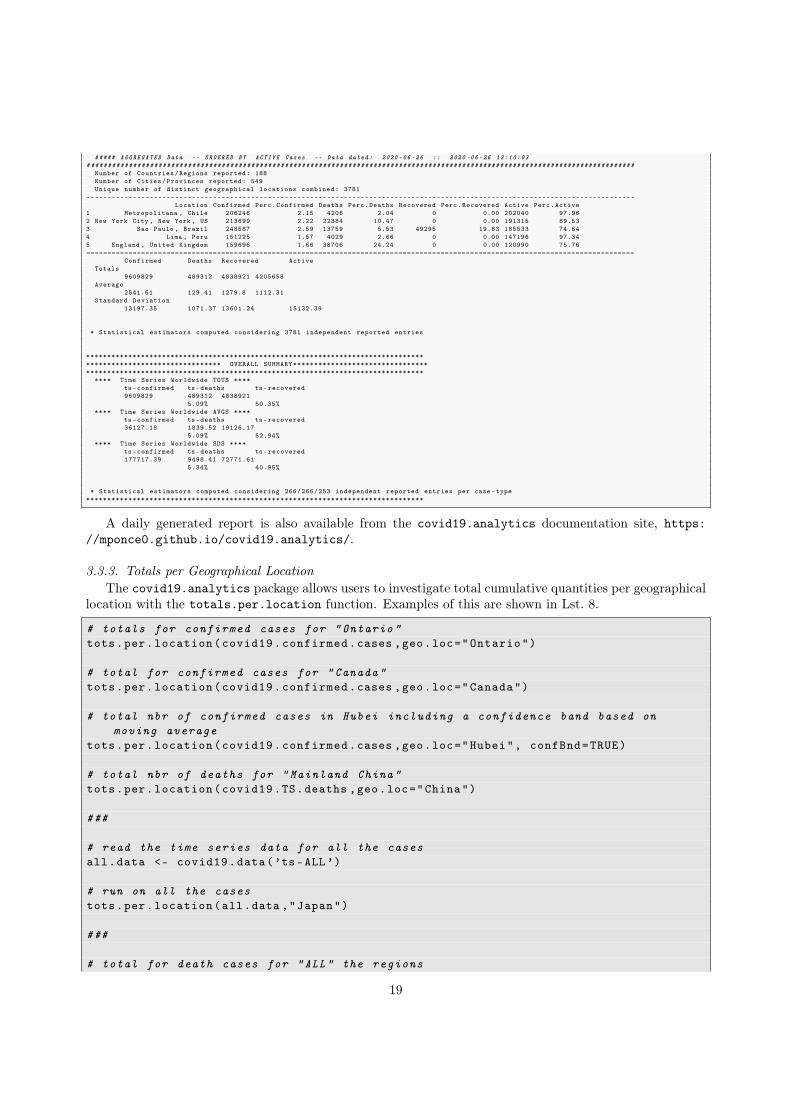
3.3.3. Totals per Geographical LocationThe covid19.analytics package allows users to investigate total cumulative quantities per geographical
location with the totals.per.location function. Examples of this are shown in Lst. 8.
# totals for confirmed cases for "Ontario"tots.per.location(covid19.confirmed.cases ,geo.loc="Ontario")
# total for confirmed cases for "Canada"tots.per.location(covid19.confirmed.cases ,geo.loc="Canada")
# total nbr of confirmed cases in Hubei including a confidence band based onmoving average
tots.per.location(covid19.confirmed.cases ,geo.loc="Hubei", confBnd=TRUE)
# total nbr of deaths for "Mainland China"tots.per.location(covid19.TS.deaths ,geo.loc="China")
###
# read the time series data for all the casesall.data <- covid19.data(’ts-ALL’)
# run on all the casestots.per.location(all.data ,"Japan")
###
# total for death cases for "ALL" the regions
19

US 2422299
Brazil 1228114
Russia 613148
India 490401
United Kingdom 307980
TS−CONFIRMED Cases −− Data dated:
US 2422299
Russia 613148
2020−06−25 :: 2020−06−26 13:10:01
050
0000
1000
000
1500
000
2000
000
US 124410
Brazil 54971
United Kingdom 43230
Italy 34678
France 29680
TS−DEATHS Cases −− Data dated: 2
US 124410
Italy 34678
2020−06−25 :: 2020−06−26 13:10:02
020
000
4000
060
000
8000
010
0000
1200
00
Brazil 679524
US 663562
Russia 374557
India 285637
Chile 219327
TS−RECOVERED Cases −− Data dated:
Brazil 679524
Russia 374557
Chile 219327
2020−06−25 :: 2020−06−26 13:10:02
0e+0
01e
+05
2e+0
53e
+05
4e+0
55e
+05
6e+0
5
Sao Paulo, Brazil 248587
Moscow, Russia 217791
Iran 215096New York City, New York, US
213699
Metropolitana, Chile 206246
AGGREGATED Data −− ORDERED BY CONFIRMED Cases −
Sao Paulo, Brazil 248587
Iran 215096
Metropolitana, Chile 206246
−− Data dated: 2020−06−26 :: 2020−06−26 13:10:03
015
0000
England, United Kingdom 38706France
29680New York City, New York, US
22384Lombardia, Italy 16608
Sao Paulo, Brazil 13759
AGGREGATED Data −− ORDERED BY DEATHS Cases −−
England, United Kingdom 38706
Lombardia, Italy 16608
Data dated: 2020−06−26 :: 2020−06−26 13:10:03
030
000
Recovered, US 663562
Unknown, Chile 219327Iran
175103Turkey 165706
Unknown, Peru 151225
AGGREGATED Data −− ORDERED BY RECOVERED Cases −
Recovered, US 663562
Iran 175103
Turkey 165706
−− Data dated: 2020−06−26 :: 2020−06−26 13:10:03
0e+0
06e
+05
Metropolitana, Chile 202040
New York City, New York, US 191315
Sao Paulo, Brazil 185533 Lima, Peru
147196
England, United Kingdom 120990
AGGREGATED Data −− ORDERED BY ACTIVE Cases −−
Metropolitana, Chile 202040
Lima, Peru 147196
Data dated: 2020−06−26 :: 2020−06−26 13:10:03
015
0000
Figure 2: Graphical output produced by the report.summary function. The top row shows bar plots and pie charts for eachrespective category of reported cases, "confirmed", "deaths" and "recovered" for the top 5 entries for time series data. Thebottom row shows a combined plot for the aggregated data. This graphical output aim to complement the text report generated,as shown in Lst. 7. The plots show the distribution of cases in the corresponding category for the locations list in the topentries, in this case the top 5.
fig:report
20

0 50 100 150
02
46
810
days
nbr.o
f.cas
es (l
og)
exp.model coefs: 0.487 ; 0.079GLM−Poisson model coefs: 6.225 ; 0.03
2020−01−22 2020−02−23 2020−03−26 2020−04−27 2020−05−29
ONTARIO
010
000
2500
0 lm−exp GR = 1.08glm−Poisson GR = 1.03
0 50 100 150
02
46
812
days
nbr.o
f.cas
es (l
og)
exp.model coefs: 1.055 ; 0.084GLM−Poisson model coefs: 7.498 ; 0.029
2020−01−22 2020−02−23 2020−03−26 2020−04−27 2020−05−29
CANADA
0e+0
04e
+04
8e+0
4 lm−exp GR = 1.09glm−Poisson GR = 1.03
0 50 100 150
67
89
10
days
nbr.o
f.cas
es (l
og)
exp.model coefs: 9.825 ; 0.012GLM−Poisson model coefs: 10.6 ; 0.005
GLM−Gamma model coefs: 10.491 ; 0.006
2020−01−22 2020−02−23 2020−03−26 2020−04−27 2020−05−29
HUBEI
020
000
5000
0 lm−exp GR = 1.01glm−Poisson GR = 1
glm−Gamma GR = 1.01
Figure 3: Graphical output produced by the totals.per.location function for the first three examples shown in Lst. 8. Eachfigure shows in the top row the number of cases in log-scale in the vertical axis and the number of days in the horizontal axis.The upper panel also includes the possible fits as described in Sec. 2.2 that the function attempts to perform to the data. Inthe lower panel, the number of cases is presented in linear scale and the horizontal axis shows the actual dates.
tots.per.location(covid19.TS.deaths)
# or justtots.per.location(covid19.data("ts -confirmed"))
Listing 8: Calculation of totals per Country/Region/Province. In addition to the graphical output as shown in Fig. 3, thefunction will provide details of the models fitted to the data.
3.3.4. Growth RateSimilarly, utilizing the growth.rate function is possible to compute the actual growth rate and daily
changes for specific locations, as defined in Sec. 2.2. Lst. 9 includes examples of these.
# read time series data for confirmed casesTS.data <- covid19.data("ts-confirmed")
# compute changes and growth rates per location for all the countriesgrowth.rate(TS.data)
# compute changes and growth rates per location for ’Italy ’growth.rate(TS.data ,geo.loc="Italy")
# compute changes and growth rates per location for ’Italy ’ and ’Germany ’growth.rate(TS.data ,geo.loc=c("Italy","Germany"))
#####
# Combining multiple geographical locations:
# obtain Time Series dataTSconfirmed <- covid19.data("ts -confirmed")
# explore different combinations of regions/cities/countries# when combining different locations , heatmaps will also be generated comparing
the trends among these locationsgrowth.rate(TSconfirmed ,geo.loc=c("Italy","Canada","Ontario","Quebec","Uruguay"))
21
growth.rate(TSconfirmed ,geo.loc=c("Hubei","Italy","Spain","United␣States","Canada","Ontario","Quebec","Uruguay"))
growth.rate(TSconfirmed ,geo.loc=c("Hubei","Italy","Spain","US","Canada","Ontario","Quebec","Uruguay"))
# turn off static plots and activate interactive figuresgrowth.rate(TSconfirmed ,geo.loc=c("Brazil","Canada","Ontario","US"), staticPlt=
FALSE , interactiveFig=TRUE)
# static and interactive figuresgrowth.rate(TSconfirmed ,geo.loc=c("Brazil","Italy","India","US"), staticPlt=TRUE ,
interactiveFig=TRUE)
Listing 9: Calculation of growth rates and daily changes per Country/Region/Province.
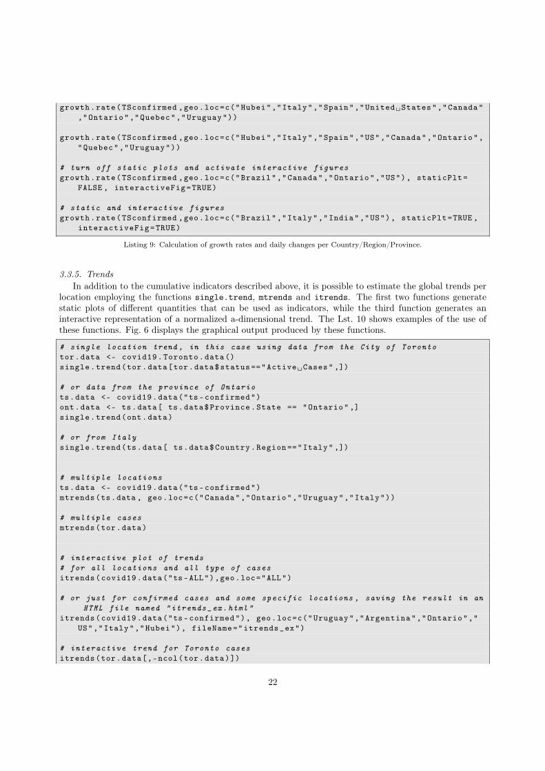
3.3.5. TrendsIn addition to the cumulative indicators described above, it is possible to estimate the global trends per
location employing the functions single.trend, mtrends and itrends. The first two functions generatestatic plots of different quantities that can be used as indicators, while the third function generates aninteractive representation of a normalized a-dimensional trend. The Lst. 10 shows examples of the use ofthese functions. Fig. 6 displays the graphical output produced by these functions.
# single location trend , in this case using data from the City of Torontotor.data <- covid19.Toronto.data()single.trend(tor.data[tor.data$status =="Active␣Cases" ,])
# or data from the province of Ontariots.data <- covid19.data("ts-confirmed")ont.data <- ts.data[ ts.data$Province.State == "Ontario",]single.trend(ont.data)
# or from Italysingle.trend(ts.data[ ts.data$Country.Region =="Italy" ,])
# multiple locationsts.data <- covid19.data("ts-confirmed")mtrends(ts.data , geo.loc=c("Canada","Ontario","Uruguay","Italy"))
# multiple casesmtrends(tor.data)
# interactive plot of trends# for all locations and all type of casesitrends(covid19.data("ts-ALL"),geo.loc="ALL")
# or just for confirmed cases and some specific locations , saving the result in anHTML file named "itrends_ex.html"
itrends(covid19.data("ts-confirmed"), geo.loc=c("Uruguay","Argentina","Ontario","US","Italy","Hubei"), fileName="itrends_ex")
# interactive trend for Toronto casesitrends(tor.data[,-ncol(tor.data)])
22

Feb Mar Apr May Jun Jul
0
time
Nbr
of C
hang
es
BRAZIL
08
BRAZIL
2020−01−24 2020−03−17 2020−05−09 2020−07−01
time
Gro
wth
Rat
e
05
Feb Mar Apr May Jun Jul
0
time
Nbr
of C
hang
es
ITALY
06
ITALY
2020−01−24 2020−03−17 2020−05−09 2020−07−01
time
Gro
wth
Rat
e
04
Feb Mar Apr May Jun Jul
0
time
Nbr
of C
hang
es
INDIA 0
8INDIA
2020−01−24 2020−03−17 2020−05−09 2020−07−01
time
Gro
wth
Rat
e
020
Feb Mar Apr May Jun Jul
0
time
Nbr
of C
hang
es
US
08
US
2020−01−24 2020−03−17 2020−05−09 2020−07−01
time
Gro
wth
Rat
e
012
2020
−06
−19
2020
−07
−03
2020
−06
−29
2020
−06
−24
2020
−03
−09
2020
−01
−30
2020
−02
−18
2020
−02
−14
2020
−02
−08
2020
−01
−29
2020
−01
−25
2020
−02
−01
2020
−02
−21
2020
−02
−23
2020
−02
−28
2020
−03
−04
2020
−03
−15
2020
−03
−13
2020
−03
−25
2020
−03
−21
2020
−03
−27
2020
−04
−27
2020
−05
−04
2020
−05
−10
2020
−05
−09
2020
−04
−17
2020
−04
−24
2020
−04
−03
2020
−04
−05
2020
−04
−02
2020
−04
−21
2020
−04
−26
2020
−05
−28
2020
−06
−05
2020
−06
−09
2020
−06
−04
2020
−06
−13
2020
−05
−14
2020
−06
−01
2020
−06
−14
2020
−05
−26
2020
−05
−19
ITALY
INDIA
BRAZIL
US
Changes per day
−40000 0 40000
Value
020
0
Color Keyand Histogram
Cou
nt
BRAZIL
ITALY
INDIA
US
0
10000
20000
30000
40000
50000
2020
−04
−04
2020
−03
−19
2020
−06
−02
2020
−05
−18
2020
−04
−15
2020
−02
−21
2020
−02
−17
2020
−02
−13
2020
−02
−09
2020
−02
−05
2020
−01
−30
2020
−01
−26
2020
−02
−03
2020
−04
−01
2020
−03
−01
2020
−03
−06
2020
−02
−29
2020
−03
−03
2020
−06
−11
2020
−03
−08
2020
−03
−27
2020
−03
−29
2020
−03
−28
2020
−04
−08
2020
−06
−30
2020
−05
−28
2020
−05
−20
2020
−04
−25
2020
−05
−30
2020
−03
−09
2020
−07
−06
2020
−06
−17
2020
−05
−29
2020
−05
−02
2020
−07
−03
2020
−04
−18
2020
−03
−20
2020
−04
−05
2020
−06
−18
2020
−06
−01
2020
−06
−25
2020
−05
−03
INDIA
US
ITALY
BRAZIL
Growth Rate
−20 0 10
Value
030
0
Color Keyand Histogram
Cou
nt
BRAZIL
ITALY
INDIA
US
0
5
10
15
20
Figure 4: Graphical output produced by the growth.rate function when comparing the situation in "Brazil", "Italy", "India"and the "US". The first figure in the top row, displays the daily changes both in linear (left vertical axis) and log (right verticalaxis) scales as a function of time (first column) –hence the two indicators in the plot–, and growth rate in linear scale (secondcolumn) as a function of time; each row within this specific figure represents each of the different locations. The remainingfigures are heatmaps displayed in two different styles to emphasize different aspects of the daily changes and growth ratescomparing the selected locations – dates are represented in the horizontal direction, locations are placed along the vertical axisand color-coded are the corresponding quantities.
23
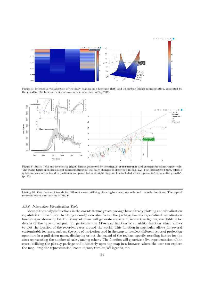
Figure 5: Interactive visualization of the daily changes in a heatmap (left) and 3d-surface (right) representation, generated bythe growth.rate function when activating the interactiveFig=TRUE.
Time (dates)
Daily
Cha
nges
Canada Ontario
Feb Mar Apr May Jun Jul
020
040
060
080
010
0012
0014
00
Feb Apr Jun
010
000
3000
0
Nbr o
f Cas
es
02
46
810
0 10000 30000
040
080
012
00
0 2 4 6 8 10
02
46
810
05
1525
xvar.diff[mask.data]
norm
.gr.r
ate
0.0
0.6
Figure 6: Static (left) and interactive (right) figures generated by the single.trend/mtrends and itrends functions respectively.The static figure includes several representations of the daily changes as described in Sec. 2.2. The interactive figure, offers aquick overview of the trend in particular compared to the straight diagonal line included which represents "exponential growth".(p. 22)
Listing 10: Calculation of trends for different cases, utilizing the single.trend, mtrends and itrends functions. The typicalrepresentations can be seen in Fig. 6.
3.3.6. Interactive Visualization ToolsMost of the analysis functions in the covid19.analytics package have already plotting and visualization
capabilities. In addition to the previously described ones, the package has also specialized visualizationfunctions as shown in Lst.11. Many of them will generate static and interactive figures, see Table 3 fordetails of the type of output. In particular the live.map function is an utility function which allowsto plot the location of the recorded cases around the world. This function in particular allows for severalcustomizable features, such as, the type of projection used in the map or to select different types of projectionoperators in a pull down menu, displaying or not the legend of the regions, specify rescaling factors for thesizes representing the number of cases, among others. The function will generate a live representation of thecases, utilizing the plotly package and ultimately open the map in a browser, where the user can explorethe map, drag the representation, zoom in/out, turn on/off legends, etc.
24
# retrieve time series dataTS.data <- covid19.data("ts-ALL")
# static and interactive plottotals.plt(TS.data)# totals for Ontario and Canada , without displaying totals and one plot per pagetotals.plt(TS.data , c("Canada","Ontario"), with.totals=FALSE ,one.plt.per.page=TRUE
)
# totals for Ontario , Canada , Italy and Uruguay; including global totals with thelinear and semi -log plots arranged one next to the other
totals.plt(TS.data , c("Canada","Ontario","Italy","Uruguay"), with.totals=TRUE ,one.plt.per.page=FALSE)
# totals for all the locations reported on the dataset , interactive plot will besaved as "totals -all.html"
totals.plt(TS.data , "ALL", fileName="totals -all")# retrieve aggregated datadata <- covid19.data("aggregated")
# interactive map of aggregated cases -- with more spatial resolutionlive.map(data)
# orlive.map()
# interactive map of the time series data of the confirmed cases with less spatialresolution , ie. aggregated by country
live.map(covid19.data("ts-confirmed"))
Listing 11: Examples of some of the interactive and visualization capabilities of plotting functions. The typical representationscan be seen in Fig. 7.
3.4. Modeling the Virus SpreadLast but not least, one the novel features added by the covid19.analytics package, is the ability of
model the spread of the virus by incorporating real data. As described in Sec. 2.2, the generate.SIR.modelfunction, implements a simple SIR model employing the data reported from an specified dataset and a par-ticular location. Examples of this are shown in Lst.12. The generate.SIR.model function is complementedwith the plt.SIR.model function which can be used to generate static or interactive figures as shown inFig. 8.
The generate.SIR.model function as described in Sec.2 will attempt to obtain proper values for theparameters β and γ, by inferring the onset of the epidemic using the actual data. This is also listed in theoutput of the function (see Lst.13), and it can be controlled by setting the parameters t0 and t1 or deltaT,which are used to specify the range of dates to be considered for using when determining the values of βand γ. The fatality rate (constant) can also be indicated via the fatality.rate argument, as well, as thetotal population of the region with tot.population.
# read time series data for confirmed casesdata <- covid19.data("ts-confirmed")
# run a SIR model for a given geographical locationgenerate.SIR.model(data ,"Hubei", t0=1,t1=15)generate.SIR.model(data ,"Germany",tot.population =83149300)generate.SIR.model(data ,"Uruguay", tot.population =3500000)
25
Figure 7: Examples of some of the interactive figures generated using the live.map (upper row, for time series and aggregateddata respectively) and totals.plt functions (lower row) representing the total number of cases vs the reported dates for theselected regions. The latter visualization also allows the user to switch between a linear and a log-scale representation via apull-down menu.
26

0 5 10 15 20 25
020
0040
0060
00
Day
Infe
cted
0 5 10 15 20 25
5020
010
0050
00
Day
Infe
cted
Confirmed Cases 2019−nCoV: CANADA
0 20 40 60 80
0e+
002e
+07
Day
Num
ber
of s
ubje
cts
0 20 40 60 80
1e+
011e
+03
1e+
051e
+07
Day
Num
ber
of s
ubje
cts
SusceptibleInfectedRecovered
SIR model 2019−nCoV: CANADA
0 5 10 15 20 25
010
020
030
040
0
Day
Infe
cted
0 5 10 15 20 25
1020
5010
050
0
Day
Infe
cted
Confirmed Cases 2019−nCoV: URUGUAY
0 20 40 60 80
010
0000
025
0000
0
Day
Num
ber
of s
ubje
cts
0 20 40 60 80
1e+
011e
+03
1e+
05
Day
Num
ber
of s
ubje
cts
SusceptibleInfectedRecovered
SIR model 2019−nCoV: URUGUAY
Figure 8: Graphical output of the SIR model produced by the examples from Lst. 12, applied to the cases of Canada (left) andUruguay (right). Each figure contains 4 plots, the upper ones display the actual data for the number of infected individualsfor the region in linear (left) and log-scale (right) as a function of time. The bottom panels, show the solution to the SIRmodel defined in Eq.(1) in linear (left panel) and log-scale (right panel), in conjunction with the data points employed todetermine the transition rates parameters, β and γ, for the model. On the left figure (Canada): dashed lines represent timederivatives, while the purple dash-dotted line represents the force of infection; these additional indicators can be added using theadd.extras=TRUE flag when invoking the generate.SIR.model/plt.SIR.model functions. An interestng observation, is that insome cases the model can clearly trace a quite remarkable trend in accordance to the data, in particularly when an exponentialgrowth is present, while in others not – i.e. when the particular region has somehow manage to –usually the so-called– “flatten(the growth of the) curve”.
generate.SIR.model(data ,"Ontario",tot.population =14570000 , add.extras=TRUE)
# the function will aggregate data for a geographical location , like a countrywith multiple entries
generate.SIR.model(data ,"Canada",tot.population =37590000 , add.extras=TRUE)
#####
# modelling the spread for the whole world , storing the model and generating aninteractive visualization
world.SIR.model <- generate.SIR.model(data ,"ALL", t0=1,t1=15, tot.population =7.8e9, staticPlt=FALSE)
# plotting and visualizing the modelplt.SIR.model(world.SIR.model ,"World",interactiveFig=TRUE ,fileName="world.SIR.
model", add.extras=TRUE)
Listing 12: Examples of SIR model generation using different datasets and locations via the generate.SIR.model function.
################################################################################################################################################################Processing ... CANADA
[1] 0 0 0 0 1 1 2 2 2 4[11] 4 4 4 4 5 5 7 7 7 7[21] 7 7 7 7 7 7 8 8 8 8[31] 9 9 9 10 11 11 13 14 20 24[41] 27 30 33 37 49 54 64 77 79 108[51] 117 193 198 252 415 478 657 800 943 1277[61] 1469 2088 2790 3251 4042 4682 5576 6280 7398 8527
27

[71] 9560 11284 12437 12978 15756 16563 17872 19141 20654 22059[81] 23316 24299 25680 27035 28209 30809 32814 34356 35633 37658[91] 39402 41663 43299 44919 46371 48033 49616 51150 52865 54457
[101] 56343 57926 60504 61957 63215 64694 66201 67674 68918 70091[111] 71264 72419 73568 74781 75959 77206 78332 79411 80493 81575[121] 82742 83947 85151 86106 87119 88090 88989 89976 90909 91681[131] 92479 93288 93960 94641 95269 95947 96475 97178 97779 98241[141] 98720 99159 99595 100043 100404 100763 101087 101491 101877 102314[151] 102762 103078 103418 103767 104087 104463 104629 104878 105193 105830[161] 106097 106288 106643 106962 107185[1] 44[1] 37 49 54 64 77 79 108 117 193 198 252 415 478 657 800
[16] 943 1277 1469 2088 2790 3251 4042 4682 5576 6280 7398------------------------ Parameters used to create model ------------------------
Region: CANADATime interval to consider: t0=44 - t1= ; tfinal =90
t0: 2020 -03 -06 -- t1:Number of days considered for initial guess: 26Fatality rate: 0.02Population of the region: 37590000
--------------------------------------------------------------------------------[1] "ERROR:␣ABNORMAL_TERMINATION_IN_LNSRCH"
beta gamma0.6078298 0.3921703
R0 = 1.54991315147533Max of infecteded: 2706321.58 ( 7.2 %)Max nbr of casualties , assuming 2% fatality rate: 54126.43Max reached at day : 60 ==> 2020 -05 -05
================================================================================
Listing 13: Output from the generate.SIR.model function applied to the time series data of Canada. The output shows theoriginal data points, and the selected ones to be used to determine the transition rate parameters of the model, β and γ fromEq.(1).
Fig.(8), also raises an interesting point regarding the accuracy of the SIR model. We should recall thatthis is the simplest approach one could take in order to model the spread of diseases and usually morerefined and complex models are used to incorporate several factors, such as, vaccination, quarantines, effectsof social clusters, etc. However, in some cases, specially when the spread of the disease appears to have enterthe so-called exponential growth rate, this simple SIR model can capture the main trend of the dispersion(e.g. left plot from Fig.8). While in other cases, when the rate of spread is slower than the freely exponentialdispersion, the model clearly fails in tracking the actual evolution of cases (e.g. right plot from Fig.8).
Finally, Lst. 14 shows an example of the generation of a sequence of values for R0, and actually any of theparameteres (β, γ) describing the SIR model. In this case, the function takes a range of values for the initialdate t0 and generates different date intervals, this allows the function to generate multiple SIR models andreturn the corresponding parameters for each model. The results are then bundle in a "matrix"/"array"object which can be accessed by column for each model or by row for each paramter sets.
# read TimeSeries dataTS.data <- covid19.data("TS-confirmed")
# select a location of interest , eg. France# France has many entries , just pick "France"FR.data <- TS.data[ (TS.data$Country.Region == "France") & (TS.data$Province.State
== "") ,]
# sweep values of R0 based on range of dates to consider for the modelranges <- 15:25deltaT <- 35params_sweep <- sweep.SIR.models(data=FR.data ,geo.loc="France", t0_range=ranges ,
deltaT=deltaT)
# the parameters --beta ,gamma ,R0-- are returned in a "matrix" "array" objectprint(params_sweep)# [,1] [,2] [,3] [,4] [,5] [,6] [,7]# beta 0.5231031 0.5250777 0.5323438 0.5217565 0.5355503 0.5473388 0.559132# gamma 0.4768969 0.4749223 0.4676562 0.4782435 0.4644497 0.4526611 0.440868# R0 1.096889 1.105608 1.138323 1.090985 1.153086 1.209158 1.268253# [,8] [,9] [,10] [,11]# beta 0.5668948 0.5753911 0.5835743 0.592407# gamma 0.4331052 0.4246089 0.4164257 0.407593
28
# R0 1.308908 1.355108 1.401389 1.453428
# obtain the R0 values from the parametersR0s <- unlist(params_sweep["R0" ,])# nbr of infected casesFR.infs <- preProcessingData(FR.data ,"France")
# average per range# define rangeslst.ranges <- lapply(ranges , function(x) x:(x+deltaT))
# compute averagesavg.FR.infs <- lapply(lst.ranges , function(x) mean(FR.infs[x]))
# plotsplot(R0s , type=’b’)# plot vs average number of infected casesplot(avg.FR.infs , R0s , type=’b’)
Listing 14: Example of SIR model generation using different ranges of dates for the initial date, t0, using the sweep.SIR.modelsfunction.
3.5. Working with your own dataAs mentioned before, the functions from the covid19.analytics package also allow users to work with
their own data, when the data is formated in the Time Series strucutre as discussed in Sec.2.1.2. This opensa large range of possibilities for users to import their own data into R and use the functions already definedin the covid19.analytics package. A concrete example of how the data has to be formatted is shown inLst. 15. The example shows how to structure the data in a TS format from “synthetic” data generated fromrandomly sampling different distributions. However this could be actual data from other places or locationsnot accesible from the datasets provided by the package, or some researchers may have access to their ownprivate sets of data too. The example also shows two cases, where the data can include the "status" columnor not, and whether it could be more than one location. As a matter of fact, we left the "Long" and "Lat"fields empty but if one includes the actual coordinates, the maping function live.map can also be used withthese structured data.
# TS data structure:# "Province.State" "Country.Region" "Lat" "Long" dates . . .
# First let ’s create a ’fake ’ locationfake.locn <- c(NA,NA,NA,NA)
# names for these columnsnames(fake.locn) <- c("Province.State","Country.Region","Lat","Long")
# let ’s set the datesdates.vec <- seq(as.Date("2020/1/1"), as.Date("2020/4/09"), "days")
# data.vecX would be the actual values/casesdata.vec1 <- rpois(length(dates.vec),lambda =25)# can also add more casesdata.vec2 <- abs(rnorm(length(dates.vec),mean =135,sd=15))data.vec3 <- abs(rnorm(length(dates.vec),mean=35,sd=5))
# this will names the columns as your datesnames(data.vec1) <- dates.vec
29
names(data.vec2) <- dates.vecnames(data.vec3) <- dates.vec
# merge them into a data frame with multiple entriessynthetic.data <- as.data.frame(rbind(
rbind(c(fake.locn ,data.vec1)),rbind(c(fake.locn ,data.vec2)),rbind(c(fake.locn ,data.vec3))))
# finally set you locn to somethign unqiue , so you can use it in the generate.SIR.model fn
synthetic.data$Country.Region <- "myLocn"
# one could even add "status"synthetic.data$status <- c("confirmed","death","recovered")
# OR just one case per locnsynthetic.data2 <- synthetic.data[,-ncol(synthetic.data)]synthetic.data2$Country.Region <- c("myLocn","myLocn2","myLocn3")
# now we can use this ’synthetic ’ dataset with any of the TS functions# data checksintegrity.check(synthetic.data)consistency.check(synthetic.data)data.checks(synthetic.data)
# quantitative indicatorstots.per.location(synthetic.data)growth.rate(synthetic.data)single.trend(synthetic.data2 [3,])mtrends(synthetic.data)
# SIR modelssynthSIR <- generate.SIR.model(synthetic.data2 ,geo.loc="myLocn")plt.SIR.model(synthSIR , interactiveFig=TRUE)sweep.SIR.models(synthetic.data2 ,geo.loc="MyLocn")
Listing 15: Example of structuring data in a TS format, so that it can be used with any of the TS functions from thecovid19.analytics package.
3.6. Studying Pandemics TrendsThe covid19.analytics provides access to previous historical pandemic records. Lst. 16 and Fig.9,
show an example of how this data can be used to gain insights into past pandemics ocurrences.
# obtain Pandemic historical recordspnds <- pandemics.data(tgt="pandemics")
# obtain Pandemics vaccine development timespnds.vacs <- pandemics.data(tgt="pandemics_vaccines")
###################
# pandemic ’s datesdate.pnd <- as.numeric(substr(pnds$Time.period ,1,4))
30
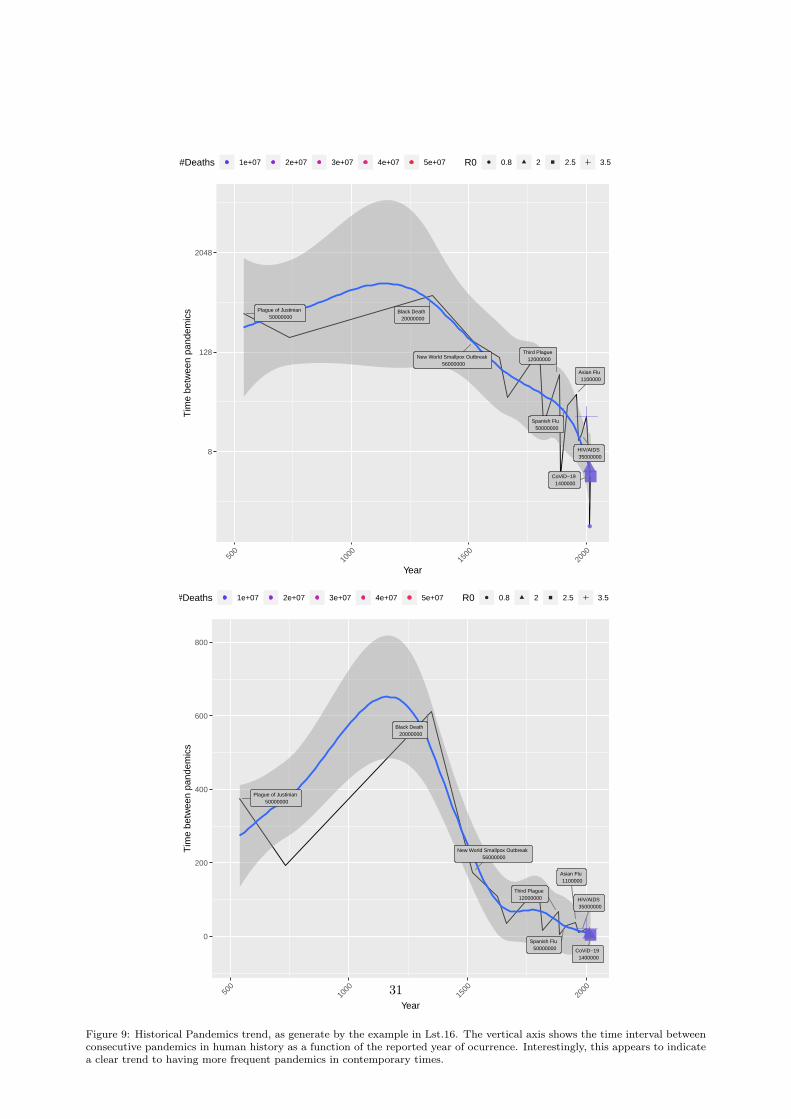
Plague of Justinian 50000000
Black Death 20000000
New World Smallpox Outbreak 56000000
Third Plague 12000000
Spanish Flu 50000000
Asian Flu 1100000
HIV/AIDS 35000000
CoViD−19 1400000
8
128
2048
500
1000
1500
2000
Year
Tim
e be
twee
n pa
ndem
ics
#Deaths 1e+07 2e+07 3e+07 4e+07 5e+07 R0 0.8 2 2.5 3.5
Plague of Justinian 50000000
Black Death 20000000
New World Smallpox Outbreak 56000000
Third Plague 12000000
Spanish Flu 50000000
Asian Flu 1100000
HIV/AIDS 35000000
CoViD−19 1400000
0
200
400
600
800
500
1000
1500
2000
Year
Tim
e be
twee
n pa
ndem
ics
#Deaths 1e+07 2e+07 3e+07 4e+07 5e+07 R0 0.8 2 2.5 3.5
Figure 9: Historical Pandemics trend, as generate by the example in Lst.16. The vertical axis shows the time interval betweenconsecutive pandemics in human history as a function of the reported year of ocurrence. Interestingly, this appears to indicatea clear trend to having more frequent pandemics in contemporary times.
31
# time between pandemicspnd.interval <- y <- (diff(date.pnd))
z <- date.pnd[2: length(date.pnd)]
# remove possible NAsfilter <- !is.na(pnd.interval) & !is.na(z)
w <- pnds$Death.toll[filter] #!is.na(pnd.interval) & !is.na(z)]#w <- as.integer ((w/abs(max(w)-min(w)))*1)
# generate dataframe with date , delta -time , death toll , pandemic ’s name and R0pnd.df <- cbind(as.data.frame(na.omit(cbind(Year=date.pnd ,delta=pnd.interval ,z=z,
Death.toll=w))) ,Name=pnds$Name.of.Pandemic[filter], R0=pnds$R0[filter ])
# R0sRnaught <- as.factor(pnd.df$R0)
#################
# sort by yearpnd.df <- pnds[order(pnds$Year) ,]pnd.df <- cbind(pnd.df,delta=c(NA,diff(pnd.df$Year)))
# get the latest number of deaths for covid19x <- covid19.analytics :: covid19.data()pnd.df$Death.toll[pnd.df$Name=="COVID -19"] <- sum(x$Deaths)
##################
# Visualizations
## using ggplotlibrary(ggplot2)library(ggrepel)
# limits for x-axismin.yr <- 500max.yr <- 2021
# basic plotplt <- ggplot(pnd.df , aes(x=Year ,y=delta)) + geom_line() + geom_smooth () + xlim(
min.yr,max.yr)ggsave("pandemics.pdf",plt)
# tilt text 45 degreesplt0 <- plt + scale_x_continuous(breaks = pnd.df$Year) +
theme(axis.text.x = element_text(angle = 45, hjust = 1)) +xlim(min.yr,max.yr)
ggsave("pandemics0.pdf",plt0)
# Add details about R0 and deaths.toll to plot
32
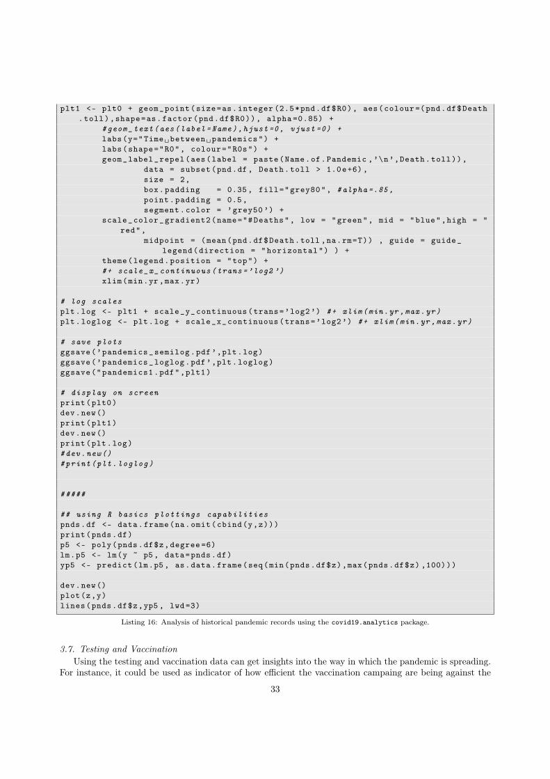
plt1 <- plt0 + geom_point(size=as.integer (2.5*pnd.df$R0), aes(colour =(pnd.df$Death.toll),shape=as.factor(pnd.df$R0)), alpha =0.85) +
#geom_text(aes(label=Name),hjust=0, vjust =0) +labs(y="Time␣between␣pandemics") +labs(shape="R0", colour="R0s") +geom_label_repel(aes(label = paste(Name.of.Pandemic ,’\n’,Death.toll)),
data = subset(pnd.df, Death.toll > 1.0e+6),size = 2,box.padding = 0.35, fill="grey80", #alpha =.85,point.padding = 0.5,segment.color = ’grey50 ’) +
scale_color_gradient2(name="#Deaths", low = "green", mid = "blue",high = "red",
midpoint = (mean(pnd.df$Death.toll ,na.rm=T)) , guide = guide_legend(direction = "horizontal") ) +
theme(legend.position = "top") +#+ scale_x_continuous(trans=’log2 ’)xlim(min.yr,max.yr)
# log scalesplt.log <- plt1 + scale_y_continuous(trans=’log2’) #+ xlim(min.yr,max.yr)plt.loglog <- plt.log + scale_x_continuous(trans=’log2’) #+ xlim(min.yr,max.yr)
# save plotsggsave(’pandemics_semilog.pdf’,plt.log)ggsave(’pandemics_loglog.pdf’,plt.loglog)ggsave("pandemics1.pdf",plt1)
# display on screenprint(plt0)dev.new()print(plt1)dev.new()print(plt.log)#dev.new()#print(plt.loglog)
#####
## using R basics plottings capabilitiespnds.df <- data.frame(na.omit(cbind(y,z)))print(pnds.df)p5 <- poly(pnds.df$z,degree =6)lm.p5 <- lm(y ~ p5, data=pnds.df)yp5 <- predict(lm.p5 , as.data.frame(seq(min(pnds.df$z),max(pnds.df$z) ,100)))
dev.new()plot(z,y)lines(pnds.df$z,yp5 , lwd=3)
Listing 16: Analysis of historical pandemic records using the covid19.analytics package.
3.7. Testing and VaccinationUsing the testing and vaccination data can get insights into the way in which the pandemic is spreading.
For instance, it could be used as indicator of how efficient the vaccination campaing are being against the
33

virus spread. Lst.17 shows the example of a function that visualize the positive testing rate and vaccinationsfor a given country. Examples of the application of this function are shown in Fig. 10. Some interestingobservations can be done by considering the information presented in these plots, for instance, how effectiveare being the vaccinations, are vacciantions changing the rate of contagion, are vaccinations curbing thepandemics, what is the effect of single vaccination vs fully vaccinated individuals, etc.
testVaccCtry <- function(Ctry="Canada"){# fn that process testing/vaccination/and/confirmed cases for a given Ctry# and generates graphical representations to aid their comparison
# read DATA## reading COVID19 testing datac19.testing.data <- covid19.testing.data()
## reading COVID19 vaccination datac19.vacc.data <- covid19.vaccination ()
## reading COVID19 casesc19.cases.data <- covid19.data("ts-confirmed")
# data processing## testing data### select cases for a particular country , given by Ctryfilter.ctry <- grepl(Ctry ,c19.testing.data[,"Entity"])
### select columns: date and (short term) positive ratecols <- c("Date","Short.term.positive.rate")tstDta <- na.omit(c19.testing.data[filter.ctry , cols])names(tstDta) <- cols
### sort by datetstDta <- tstDta[order(tstDta [,1]) ,]
## vaccination data### remove NAsvaccs <- na.omit(c19.vacc.data)### select specific "Ctry"vacc.Ctry <- vaccs[vaccs$location ==Ctry ,]
## confirmed casesconf.Ctry <- c19.cases.data[c19.cases.data$Country.Region ==Ctry ,5:( length(c19.
cases.data) -1)]
##### Graphics #####
# plot daily vaccination per million , for every location#par(mfrow=c(5,5))#tapply(vaccs$daily_vaccinations_per_million ,vaccs$location , plot)#par(mfrow=c(1,1))
###
# mosaic plot combining testing/vaccination and confirmed cases data
34

par(mfrow=c(3,1))par(mar=c(1,5,2,5))
### subplot #1minX <- as.Date(names(conf.Ctry)[1])maxX <- as.Date(names(conf.Ctry)[length(conf.Ctry)])# plot positive testing rate vs dateplot(as.Date(tstDta$Date), tstDta[,2], ’l’, ylab="Positive␣Testing␣Rate", xlim=
c(minX ,maxX))title(Ctry)par(new=TRUE)# add vaccination dataplot(as.Date(vacc.Ctry$date) ,(vacc.Ctry$people_vaccinated),
type=’l’, col=’blue’, xlab=NA , xaxt=’n’, ylab=NA , yaxt=’n’, xlim=c(minX ,maxX))
axis(4,col.axis=’blue’, line=-3.5, las=1, lwd=0)#axis.Date(3, as.Date(vacc.Ctry$date), col.axis=’blue ’)par(new=TRUE)plot(as.Date(tstDta$Date), tstDta[,2], ’l’, ylab=NA ,yaxt=’n’, xlim=c(minX ,maxX)
)#axis.Date(3, as.Date(vacc.Ctry$date), col.axis=’red ’)par(new=TRUE)plot(as.Date(names(conf.Ctry)), as.numeric(conf.Ctry), type=’s’, col=’red’,
ylab=NA,yaxt=’n’)#axis.Date(3, as.Date(vacc.Ctry$date), col.axis=’red ’)#axis.Date(1,as.Date(names(conf.Ctry))) #, at = seq(as.Date(names(conf.
Ctry [1])),as.Date(names(conf.Ctry[length(conf.Ctry)]))) )axis(4,col.axis=’red’)mtext("Confirmed␣cases", 4, line=2, cex=.65, col=’red’)legend("top",c("Pos.Testing␣Rate","Vaccination","Confirmed␣Cases"),col=c(’black
’,’blue’,’red’),lty=c(1,1,1), bty=’n’)rect(as.Date(vacc.Ctry$date)[1],1, as.Date(vacc.Ctry$date)[length(vacc.Ctry$
date) -1], as.numeric(conf.Ctry)[length(conf.Ctry) -1],border=’darkgray ’, lty=4, lwd =1.5)
par(mar=c(1,5,1,5))
### subplot #2# adjust limits to match testing/vaccination ranges ...minX <- max(as.Date(tstDta$Date)[1],as.Date(vacc.Ctry$date)[1])maxX <- min(as.Date(vacc.Ctry$date)[length(vacc.Ctry$date)], as.Date(tstDta$
Date)[length(tstDta$Date)])
plot(as.Date(tstDta$Date), tstDta[,2], ’l’, xlim=c(minX ,maxX), xlab=NA ,ylab="Positive␣Testing␣Rate")
par(new=TRUE)plot(as.Date(names(conf.Ctry)),(as.numeric(conf.Ctry)), xlim=c(minX ,maxX), type
=’l’, col=’red’, xlab=NA ,ylab=NA,yaxt=’n’)axis(4, col.axis="red")mtext("Confirmed␣cases", 4, line = 2, cex=.65, col=’red’)
par(mar=c(2.5,5,1,5))
### subplot 3minY=min(vacc.Ctry$people_vaccinated)
35
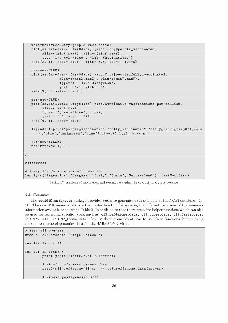
maxY=max(vacc.Ctry$people_vaccinated)plot(as.Date(vacc.Ctry$date) ,(vacc.Ctry$people_vaccinated),
xlim=c(minX ,maxX), ylim=c(minY ,maxY),type=’l’, col=’blue’, ylab="Vaccinations")
axis(2, col.axis=’blue’, line=-3.5, las=1, lwd=0)
par(new=TRUE)plot(as.Date(vacc.Ctry$date),vacc.Ctry$people_fully_vaccinated ,
xlim=c(minX ,maxX), ylim=c(minY ,maxY),type=’l’, col=’darkgreen ’,yaxt = "n", ylab = NA)
axis(2,col.axis=’black ’)
par(new=TRUE)plot(as.Date(vacc.Ctry$date),vacc.Ctry$daily_vaccinations_per_million ,
xlim=c(minX ,maxX),type=’l’, col=’blue’, lty=2,yaxt = "n", ylab = NA)
axis(4, col.axis=’blue’)
legend("top",c("people␣vaccinated","fully␣vaccinated","daily␣vacc.␣per␣M"),col=c(’blue’,’darkgreen ’,’blue’),lty=c(1,1,2), bty=’n’)
par(new=FALSE)par(mfrow=c(1,1))
}
##########
# Apply the fn to a set of countries ...lapply(c("Argentina","Uruguay","Italy","Spain","Switzerland"), testVaccCtry)
Listing 17: Analysis of vaccination and testing data using the covid19.analytics package.
3.8. GenomicsThe covid19.analytics package provides access to genomics data available at the NCBI databases [40,
41]. The covid19.genomic.data is the master function for accesing the different variations of the genomicsinformation available as shown in Table 2. In addition to that there are a few helper functions which can alsobe used for retrieving specific types, such as: c19.refGenome.data, c19.ptree.data, c19.fasta.data,c19.NPs.data, c19.NP_fasta.data. Lst. 18 show examples of how to use these functions for retrievingthe different type of genomics data for the SARS-CoV-2 virus.
# test all sources ...srcs <- c(’livedata ’,’repo’,’local’)
results <- list()
for (sr in srcs) {print(paste("#####␣",sr ,"␣#####"))
# obtain reference genome dataresults [[’refGenome ’]][sr] <- c19.refGenome.data(src=sr)
# obtain phylogenetic tree
36

Figure 10: Plots generated using the function shown in Lst.17 for the cases of Switzerland (left) and Russia (right). Theconsecutive panels in each column display: i) the “positive testing rate”, vaccinations and confirmed number of cases; ii) azoom-in region demarked in the previous plot, into the period since the vaccination started; iii) vaccination records for totalnumber the people vaccinated, fully vaccinated individuals and daily vaccinations per millon.
results [[’tree’]][sr] <- c19.ptree.data(src=sr)
# obtain FASTA sequencesresults [[’fasta’]][sr] <- c19.fasta.data(src=sr)
# combine several typesif (sr != ’livedata ’) {
results [[’genomics ’]][sr] <- c19.genomic.data(src=sr)}
# obtain nucleotides dataresults [[’nucs’]][sr] <- c19.NPs.data(src=sr, DB=’nucleotide ’)if (sr != ’livedata ’) {
results [[’ptns’]][sr] <- c19.NPs.data(src=sr, DB=’protein ’)}
# obtain FASTA sequences for nucleotides and proteinsresults [[’FASTAs ’]][[’nucs’]][sr] <- c19.NP_fasta.data(target=’nucleotide ’
)results [[’FASTAs ’]][[’ptns’]][sr] <- c19.NP_fasta.data(target=’protein ’)
}
#####
gtypes <- c("genome","fasta","tree","nucleotide","protein","nucleotide -fasta","protein -fasta","genomic")
37
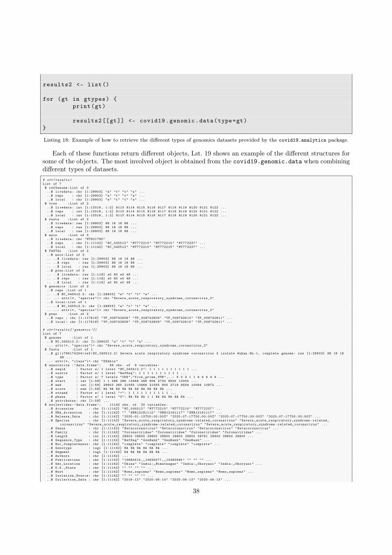
results2 <- list()
for (gt in gtypes) {print(gt)
results2 [[gt]] <- covid19.genomic.data(type=gt)}
Listing 18: Example of how to retrieve the different types of genomics datasets provided by the covid19.analytics package.
Each of these functions return different objects, Lst. 19 shows an example of the different structures forsome of the objects. The most involved object is obtained from the covid19.genomic.data when combiningdifferent types of datasets.# str(results)List of 7$ refGenome:List of 3..$ livedata: chr [1:29903] "a" "t" "t" "a" .....$ repo : chr [1:29903] "a" "t" "t" "a" .....$ local : chr [1:29903] "a" "t" "t" "a" ...
$ tree :List of 3..$ livedata: int [1:13319 , 1:2] 8113 8114 8115 8116 8117 8118 8119 8120 8121 8122 .....$ repo : int [1:13319 , 1:2] 8113 8114 8115 8116 8117 8118 8119 8120 8121 8122 .....$ local : int [1:13319 , 1:2] 8113 8114 8115 8116 8117 8118 8119 8120 8121 8122 ...
$ fasta :List of 3..$ livedata: raw [1:29903] 88 18 18 88 .....$ repo : raw [1:29903] 88 18 18 88 .....$ local : raw [1:29903] 88 18 18 88 ...
$ nucs :List of 3..$ livedata: chr "MT821795"..$ repo : chr [1:11142] "NC_045512" "MT772210" "MT772215" "MT772237" .....$ local : chr [1:11142] "NC_045512" "MT772210" "MT772215" "MT772237" ...
$ FASTAs :List of 2..$ nucs:List of 3.. ..$ livedata: raw [1:29903] 88 18 18 88 ..... ..$ repo : raw [1:29903] 88 18 18 88 ..... ..$ local : raw [1:29903] 88 18 18 88 .....$ ptns:List of 3.. ..$ livedata: raw [1:118] a0 60 e0 48 ..... ..$ repo : raw [1:118] a0 60 e0 48 ..... ..$ local : raw [1:118] a0 60 e0 48 ...
$ genomics :List of 2..$ repo :List of 1.. ..$ NC_045512.2: chr [1:29903] "a" "t" "t" "a" ..... ..- attr(*, "species")= chr "Severe_acute_respiratory_syndrome_coronavirus_2"..$ local:List of 1.. ..$ NC_045512.2: chr [1:29903] "a" "t" "t" "a" ..... ..- attr(*, "species")= chr "Severe_acute_respiratory_syndrome_coronavirus_2"
$ ptns :List of 2..$ repo : chr [1:117619] "YP_009742608" "YP_009742609" "YP_009742610" "YP_009742611" .....$ local: chr [1:117619] "YP_009742608" "YP_009742609" "YP_009742610" "YP_009742611" ...
# str(results[’genomics ’])List of 7$ genome :List of 1..$ NC_045512.2: chr [1:29903] "a" "t" "t" "a" .....- attr(*, "species")= chr "Severe_acute_respiratory_syndrome_coronavirus_2"
$ fasta :List of 1..$ gi |1798174254| ref|NC_045512.2| Severe acute respiratory syndrome coronavirus 2 isolate Wuhan -Hu -1, complete genome: raw [1:29903] 88 18 18
88 .....- attr(*, "class")= chr "DNAbin"
$ annotation :’data.frame’: 59 obs. of 9 variables:..$ seqid : Factor w/ 1 level "NC_045512.2": 1 1 1 1 1 1 1 1 1 1 .....$ source : Factor w/ 1 level "RefSeq": 1 1 1 1 1 1 1 1 1 1 .....$ type : Factor w/ 7 levels "CDS","five_prime_UTR" ,..: 5 2 3 1 1 4 4 4 4 4 .....$ start : int [1:59] 1 1 266 266 13468 266 806 2720 8555 10055 .....$ end : int [1:59] 29903 265 21555 13468 21555 805 2719 8554 10054 10972 .....$ score : num [1:59] NA NA NA NA NA NA NA NA NA NA .....$ strand : Factor w/ 1 level "+": 1 1 1 1 1 1 1 1 1 1 .....$ phase : Factor w/ 1 level "0": NA NA NA 1 1 NA NA NA NA NA .....$ attributes: chr [1:59] ...
$ nucleotides:’data.frame’: 11142 obs. of 20 variables:..$ Accession : chr [1:11142] "NC_045512" "MT772210" "MT772215" "MT772237" .....$ SRA_Accession : chr [1:11142] "" "SRR12181112" "SRR12181117" "SRR12181117" .....$ Release_Date : chr [1:11142] "2020 -01 -13 T00 :00:00Z" "2020 -07 -17 T00 :00:00Z" "2020 -07 -17 T00 :00:00Z" "2020 -07 -17 T00 :00:00Z" .....$ Species : chr [1:11142] "Severe␣acute␣respiratory␣syndrome -related␣coronavirus" "Severe␣acute␣respiratory␣syndrome -related␣
coronavirus" "Severe␣acute␣respiratory␣syndrome -related␣coronavirus" "Severe␣acute␣respiratory␣syndrome -related␣coronavirus" .....$ Genus : chr [1:11142] "Betacoronavirus" "Betacoronavirus" "Betacoronavirus" "Betacoronavirus" .....$ Family : chr [1:11142] "Coronaviridae" "Coronaviridae" "Coronaviridae" "Coronaviridae" .....$ Length : int [1:11142] 29903 29800 29800 29800 29800 29800 29791 29800 29800 29800 .....$ Sequence_Type : chr [1:11142] "RefSeq" "GenBank" "GenBank" "GenBank" .....$ Nuc_Completeness: chr [1:11142] "complete" "complete" "complete" "complete" .....$ Genotype : logi [1:11142] NA NA NA NA NA NA .....$ Segment : logi [1:11142] NA NA NA NA NA NA .....$ Authors : chr [1:11142] .....$ Publications : chr [1:11142] "15680415 ,␣15630477 ,␣10482585" "" "" "" .....$ Geo_Location : chr [1:11142] "China" "India:␣Himatnagar" "India:␣Choryasi" "India:␣Choryasi" .....$ U.S._State : chr [1:11142] "" "" "" "" .....$ Host : chr [1:11142] "Homo␣sapiens" "Homo␣sapiens" "Homo␣sapiens" "Homo␣sapiens" .....$ Isolation_Source: chr [1:11142] "" "" "" "" .....$ Collection_Date : chr [1:11142] "2019 -12" "2020 -06 -14" "2020 -06 -13" "2020 -06 -13" ...
38
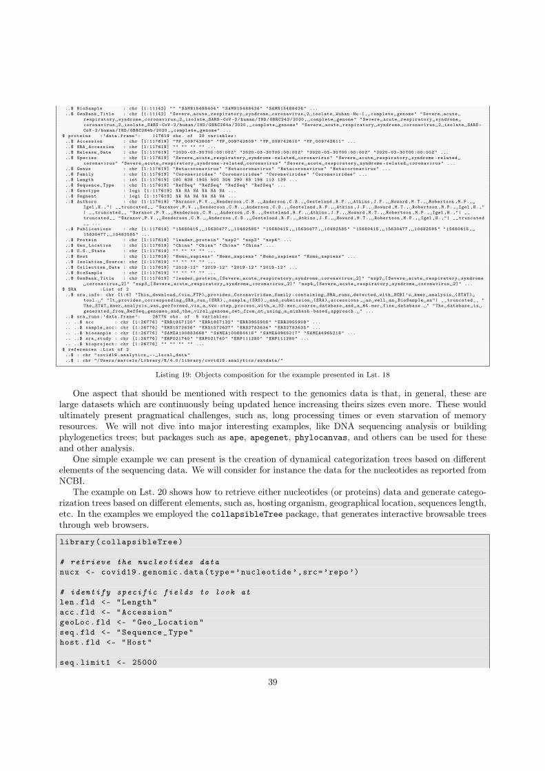
..$ BioSample : chr [1:11142] "" "SAMN15488404" "SAMN15488426" "SAMN15488426" ...
..$ GenBank_Title : chr [1:11142] "Severe␣acute␣respiratory␣syndrome␣coronavirus␣2␣isolate␣Wuhan -Hu -1,␣complete␣genome" "Severe␣acute␣respiratory␣syndrome␣coronavirus␣2␣isolate␣SARS -CoV -2/human/IND/GBRC242/2020,␣complete␣genome" "Severe␣acute␣respiratory␣syndrome␣coronavirus␣2␣isolate␣SARS -CoV -2/human/IND/GBRC264a/2020,␣complete␣genome" "Severe␣acute␣respiratory␣syndrome␣coronavirus␣2␣isolate␣SARS -CoV -2/human/IND/GBRC264b/2020,␣complete␣genome" ...
$ proteins :’data.frame’: 117619 obs. of 20 variables:..$ Accession : chr [1:117619] "YP_009742608" "YP_009742609" "YP_009742610" "YP_009742611" .....$ SRA_Accession : chr [1:117619] "" "" "" "" .....$ Release_Date : chr [1:117619] "2020 -03 -30 T00 :00:00Z" "2020 -03 -30 T00 :00:00Z" "2020 -03 -30 T00 :00:00Z" "2020 -03 -30 T00 :00:00Z" .....$ Species : chr [1:117619] "Severe␣acute␣respiratory␣syndrome -related␣coronavirus" "Severe␣acute␣respiratory␣syndrome -related␣
coronavirus" "Severe␣acute␣respiratory␣syndrome -related␣coronavirus" "Severe␣acute␣respiratory␣syndrome -related␣coronavirus" .....$ Genus : chr [1:117619] "Betacoronavirus" "Betacoronavirus" "Betacoronavirus" "Betacoronavirus" .....$ Family : chr [1:117619] "Coronaviridae" "Coronaviridae" "Coronaviridae" "Coronaviridae" .....$ Length : int [1:117619] 180 638 1945 500 306 290 83 198 113 139 .....$ Sequence_Type : chr [1:117619] "RefSeq" "RefSeq" "RefSeq" "RefSeq" .....$ Genotype : logi [1:117619] NA NA NA NA NA NA .....$ Segment : logi [1:117619] NA NA NA NA NA NA .....$ Authors : chr [1:117619] "Baranov ,P.V.,␣Henderson ,C.M.,␣Anderson ,C.B.,␣Gesteland ,R.F.,␣Atkins ,J.F.,␣Howard ,M.T.,␣Robertson ,M.P.,␣
Igel ,H.,"| __truncated__ "Baranov ,P.V.,␣Henderson ,C.M.,␣Anderson ,C.B.,␣Gesteland ,R.F.,␣Atkins ,J.F.,␣Howard ,M.T.,␣Robertson ,M.P.,␣Igel ,H.,"| __truncated__ "Baranov ,P.V.,␣Henderson ,C.M.,␣Anderson ,C.B.,␣Gesteland ,R.F.,␣Atkins ,J.F.,␣Howard ,M.T.,␣Robertson ,M.P.,␣Igel ,H.,"| __truncated__ "Baranov ,P.V.,␣Henderson ,C.M.,␣Anderson ,C.B.,␣Gesteland ,R.F.,␣Atkins ,J.F.,␣Howard ,M.T.,␣Robertson ,M.P.,␣Igel ,H.,"| __truncated__ ...
..$ Publications : chr [1:117619] "15680415 ,␣15630477 ,␣10482585" "15680415 ,␣15630477 ,␣10482585" "15680415 ,␣15630477 ,␣10482585" "15680415 ,␣15630477 ,␣10482585" ...
..$ Protein : chr [1:117619] "leader␣protein" "nsp2" "nsp3" "nsp4" ...
..$ Geo_Location : chr [1:117619] "China" "China" "China" "China" ...
..$ U.S._State : chr [1:117619] "" "" "" "" ...
..$ Host : chr [1:117619] "Homo␣sapiens" "Homo␣sapiens" "Homo␣sapiens" "Homo␣sapiens" ...
..$ Isolation_Source: chr [1:117619] "" "" "" "" ...
..$ Collection_Date : chr [1:117619] "2019 -12" "2019 -12" "2019 -12" "2019 -12" ...
..$ BioSample : chr [1:117619] "" "" "" "" ...
..$ GenBank_Title : chr [1:117619] "leader␣protein␣[Severe␣acute␣respiratory␣syndrome␣coronavirus␣2]" "nsp2␣[Severe␣acute␣respiratory␣syndrome␣coronavirus␣2]" "nsp3␣[Severe␣acute␣respiratory␣syndrome␣coronavirus␣2]" "nsp4␣[Severe␣acute␣respiratory␣syndrome␣coronavirus␣2]" ...
$ SRA :List of 2..$ sra_info: chr [1:6] "This␣download␣(via␣FTP)␣provides␣Coronaviridae␣family -containing␣SRA␣runs␣detected␣with␣NCBI ’s␣kmer␣analysis␣(STAT)␣
tool.␣" "It␣provides␣corresponding␣SRA␣run␣(SRR),␣sample␣(SRS),␣and␣submission␣(SRA)␣accessions ,␣as␣well␣as␣BioSample␣an"| __truncated__ "The␣STAT␣kmer␣analysis␣was␣performed␣via␣a␣two -step␣process␣with␣a␣32-mer␣coarse␣database␣and␣a␣64-mer␣fine␣database.␣" "The␣database␣is␣generated␣from␣RefSeq␣genomes␣and␣the␣viral␣genome␣set␣from␣nt␣using␣a␣minhash -based␣approach.␣" ...
..$ sra_runs:’data.frame’: 26776 obs. of 5 variables:
.. ..$ acc : chr [1:26776] "ERR1857120" "ERR1857132" "ERR3955908" "ERR3955909" ...
.. ..$ sample_acc: chr [1:26776] "ERS1572626" "ERS1572627" "ERS2783634" "ERS2783635" ...
.. ..$ biosample : chr [1:26776] "SAMEA100883668" "SAMEA100884418" "SAMEA4965217" "SAMEA4965218" ...
.. ..$ sra_study : chr [1:26776] "ERP021740" "ERP021740" "ERP111280" "ERP111280" ...
.. ..$ bioproject: chr [1:26776] "" "" "" "" ...$ references :List of 2..$ : chr "covid19.analytics␣--␣local␣data"..$ : chr "/Users/marcelo/Library/R/4.0/library/covid19.analytics/extdata/"
Listing 19: Objects composition for the example presented in Lst. 18
One aspect that should be mentioned with respect to the genomics data is that, in general, these arelarge datasets which are continuously being updated hence increasing theirs sizes even more. These wouldultimately present pragmatical challenges, such as, long processing times or even starvation of memoryresources. We will not dive into major interesting examples, like DNA sequencing analysis or buildingphylogenetics trees; but packages such as ape, apegenet, phylocanvas, and others can be used for theseand other analysis.
One simple example we can present is the creation of dynamical categorization trees based on differentelements of the sequencing data. We will consider for instance the data for the nucleotides as reported fromNCBI.
The example on Lst. 20 shows how to retrieve either nucleotides (or proteins) data and generate catego-rization trees based on different elements, such as, hosting organism, geographical location, sequences length,etc. In the examples we employed the collapsibleTree package, that generates interactive browsable treesthrough web browsers.
library(collapsibleTree)
# retrieve the nucleotides datanucx <- covid19.genomic.data(type=’nucleotide ’,src=’repo’)
# identify specific fields to look atlen.fld <- "Length"acc.fld <- "Accession"geoLoc.fld <- "Geo_Location"seq.fld <- "Sequence_Type"host.fld <- "Host"
seq.limit1 <- 25000
39
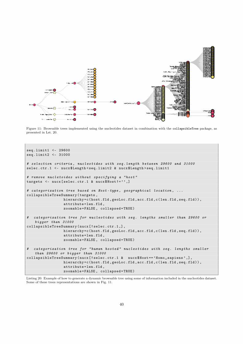
Figure 11: Browsable trees implemented using the nucleotides dataset in combination with the collapsibleTree package, aspresented in Lst. 20.
seq.limit1 <- 29600seq.limit2 <- 31000
# selection criteria , nucleotides with seq.length between 29600 and 31000selec.ctr.1 <- nucx$Length <seq.limit2 & nucx$Length >seq.limit1
# remove nucletoides without specifying a "host"targets <- nucx[selec.ctr.1 & nucx$Host!=’’,]
# categorization tree based on Host -type , geographical location , ...collapsibleTreeSummary(targets ,
hierarchy=c(host.fld ,geoLoc.fld ,acc.fld ,c(len.fld ,seq.fld)),attribute=len.fld ,zoomable=FALSE , collapsed=TRUE)
# categorization tree for nucleotides with seq. lengths smaller than 29600 orbigger than 31000
collapsibleTreeSummary(nucx[!selec.ctr.1,],hierarchy=c(host.fld ,geoLoc.fld ,acc.fld ,c(len.fld ,seq.fld)),attribute=len.fld ,zoomable=FALSE , collapsed=TRUE)
# categorization tree for "human hosted" nucleotides with seq. lengths smallerthan 29600 or bigger than 31000
collapsibleTreeSummary(nucx[!selec.ctr.1 & nucx$Host==’Homo␣sapiens ’,],hierarchy=c(host.fld ,geoLoc.fld ,acc.fld ,c(len.fld ,seq.fld)),attribute=len.fld ,zoomable=FALSE , collapsed=TRUE)
Listing 20: Example of how to generate a dynamic browsable tree using some of information included in the nucleotides dataset.Some of these trees representations are shown in Fig. 11.
40

4. Case Study: The covid19.analytics Dashboard Explorer
In this section we will present and discuss, how the covid19.analytics Dashboard Explorer is imple-mented. The main goal is to provide enough details about how the dashboard is implemented and works,so that users could modify it if/as they seem fit or even develop their own. For doing so, we will focus inthree main points:
• the front end implementation, also know as the user interface, mainly developed using the shinypackage
• the back end implementation, mostly using the covid19.analytics package
• the web server installation and configuration where the dashboard is hosted
4.1. Dashboard’s Front End ImplementationThe covid19.analytics Dashboard Explorer is built using the Shiny package [48] in combination with the
covid19.analytics package. Shiny allows users to build interactive dashboards that can work through aweb interface. The dashboard mimics the covid19.analytics package commands and features but enhancesthe commands as it allows users to use dropdowns and other control widgets to easily input the data ratherthan using a command terminal. In addition the dashboard offers some unique features, such as a PersonalProtective Equipment (PPE) model estimation, based on realistic projections developed by the US Centersfor Disease Control and Prevention (CDC).
The dashboard interface offers several features:1. The dashboard can be run on the cloud/web allowing for multiple users to simultaneously analyze
the data with no special software or hardware requirements. The Shiny package makes the dashboardmobile and tablet compatible as well.
2. It aids researchers to share and discuss analytical findings.3. The dashboard can be run locally or through the web server.4. No programming or software expertise is required which reduces technical barriers to analyzing the
data. Users can interact and analyze the data without any software expertise therefore users can focuson the modeling and analysis. In these times the dashboard can be a monumental tool as it removesbarriers and allows a wider and diverse set of users to have quick access to the data.
5. Interactivity. One feature of Shiny and other graphing packages, such as Plotly, is interactivity, i.e.the ability to interact with the data. This allows one to display and show complex data in a concisemanner and focus on specific points of interest. Interactive options such as zoom, panning and mousehover all help in making the user interaction enjoyable and informative.
6. Fast and easy to compare. One advantage of a dashboard is that users can easily analyze and comparethe data quickly and multiple times. For example users can change the slider or dropdown to selectmultiple countries to see the total daily count effortlessly. This allows the data to be displayed andchanged as users analysis requirements change.
4.1.1. Accessing the covid19.analytics Dashboard ExplorerThe dashboard can be laucnhed locally in a machine with R, either through an interactive R session
or in batch mode using Rscript or R CMD BATCH or through the web server accessing the following URLhttps://covid19analytics.scinet.utoronto.ca.
For running the dashboard locally, the covid19.analytics package has also to be installed. For runningthe dashboard within an R session the package has to be loaded and then it should be invoked using thefollowing sequence of commands,
> library(covid19.analytics)
> covid19Explorer()
41
The batch mode can be executed using an R script containing the commands listed above. When thedashboard is run locally the browser will open a port in the local machine –localhost:port– connection, i.e.http://127.0.0.1. It should be noted, that if the dashboard is launched interactively within an R sessionthe port used is 5481 –http://127.0.0.1:5481–, while if this is done through an R script in batch modethe port used will be different.
4.1.2. Specific Libraries Needed in the DasbhoardTo implement the dashboard and enhance some of the basic functionalities offered, the following libraries
were specifically used in the implementation of the dashboard:
• shiny [48]: The main package that builds the dashboard.
• shinydashboard [49]: This is a package that assists us to build the dashboard with respect to themes,layouts and structure.
• shinycssloaders [50]: This package adds loader animations to shiny outputs such as plots and tableswhen they are loading or (re)-calculating. In general, this are wrappers around base CSS-style loaders.
• plotly [51]: Charting library to generate interactive charts and plots. Although extensively usedin the core functions of the covid19.analytics , we reiterate it here as it is great tool to developinteractive plots.
• DT [52]: A DataTable library to generate interactive table output.
• dplyr [53]: A library that helps to apply functions and operations to data frames. This is importantfor calculations specifically in the PPE calculations.
The R Shiny package makes developing dashboards easy and seamless and removes challenges. Forexample setting the layout of a dashboard typically is challenging as it requires knowledge of frontendtechnologies such as HTML, CSS3 and Bootstrap4 to be able to position elements and change there astheticproperties. Shiny simplifies this problem by using a built in box controller widget which allows developersto easily group elements, tables, charts and widgets together. Many of the CSS properties, such as, widthsor colors are input parameters to the functions of interest. The sidebar feature is simple to implement andthe Shiny package makes it easy to be compatible across multiple devices such as tablets or cellphones. TheShiny package also has built in layout properties such as FluidRow or Columns making it easy to positionelements on a page. The library does have some challenges as well. One challenge faced is theme design.ShinyDashboard does not make it easy to change the whole color theme of the dashboard outside of thewhite or blue theme that is provided by default. The issue is resolved by having the developer write customCSS and change each of the various properties manually.
4.1.3. Dashboard LayoutThe dashboard contains two main components a sidebar and a main body. The sidebar contains a list
of all the menu options. Options which are similar in nature are grouped in a nested format. For examplethe dashboard menu section called "Datasets and Reports", when selected, displays a nested list of furtheroptions the user can choose such as the World Data or Toronto Data. Grouping similar menu optionstogether is important for making the user understand the data. The main body displays the content of apage. The content a main body displays depends on the sidebar and the selected menu option the userselects.
There are three main generic elements needed to develop a dashboard: layouts, control widgets andoutput widgets. The layout options are components needed to layout the features or components on a page.In this dashboard the layout widgets used are the following:
• Box: The boxes are the main building blocks of a dashboard. This allows us to group content together.
42
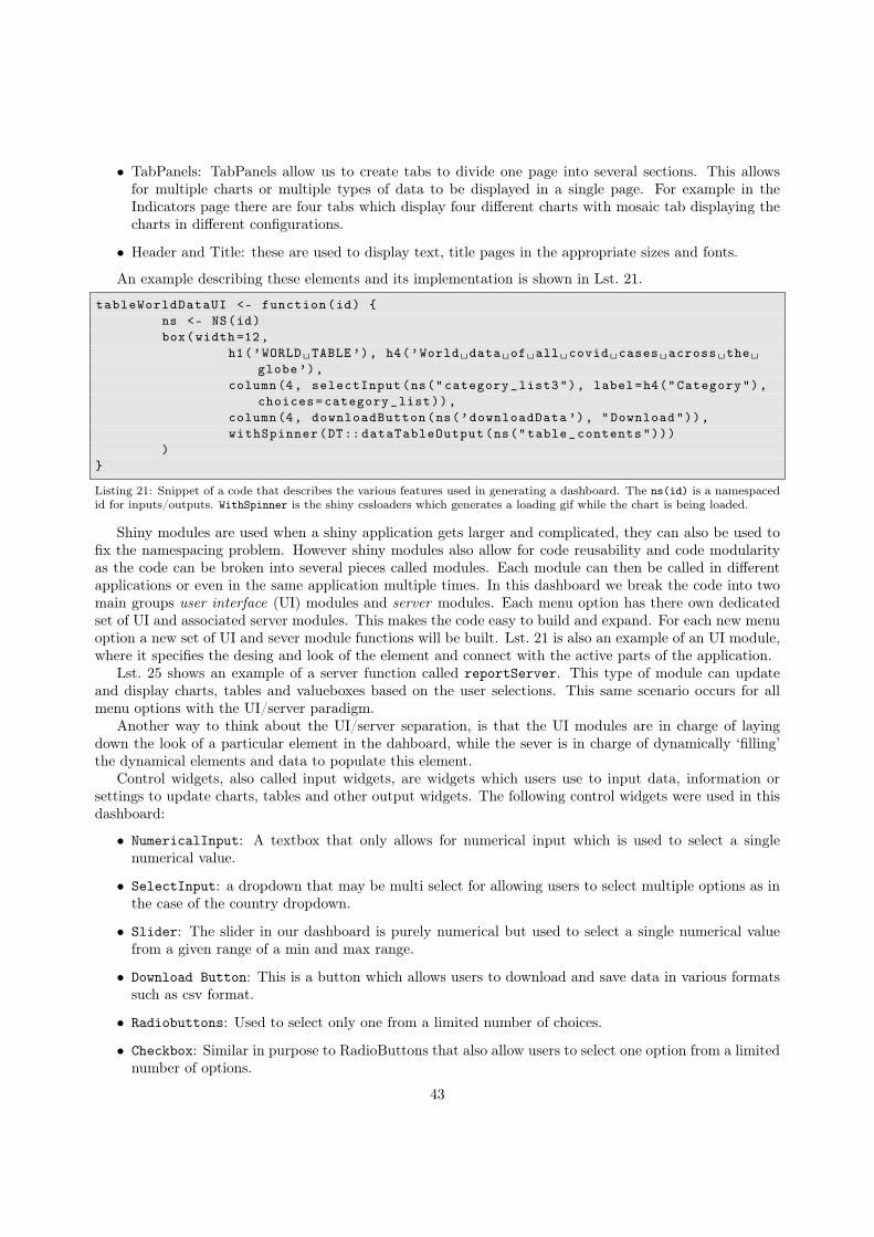
• TabPanels: TabPanels allow us to create tabs to divide one page into several sections. This allowsfor multiple charts or multiple types of data to be displayed in a single page. For example in theIndicators page there are four tabs which display four different charts with mosaic tab displaying thecharts in different configurations.
• Header and Title: these are used to display text, title pages in the appropriate sizes and fonts.
An example describing these elements and its implementation is shown in Lst. 21.
tableWorldDataUI <- function(id) {ns <- NS(id)box(width =12,
h1(’WORLD␣TABLE’), h4(’World␣data␣of␣all␣covid␣cases␣across␣the␣globe’),
column(4, selectInput(ns("category_list3"), label=h4("Category"),choices=category_list)),
column(4, downloadButton(ns(’downloadData ’), "Download")),withSpinner(DT:: dataTableOutput(ns("table_contents")))
)}
Listing 21: Snippet of a code that describes the various features used in generating a dashboard. The ns(id) is a namespacedid for inputs/outputs. WithSpinner is the shiny cssloaders which generates a loading gif while the chart is being loaded.
Shiny modules are used when a shiny application gets larger and complicated, they can also be used tofix the namespacing problem. However shiny modules also allow for code reusability and code modularityas the code can be broken into several pieces called modules. Each module can then be called in differentapplications or even in the same application multiple times. In this dashboard we break the code into twomain groups user interface (UI) modules and server modules. Each menu option has there own dedicatedset of UI and associated server modules. This makes the code easy to build and expand. For each new menuoption a new set of UI and sever module functions will be built. Lst. 21 is also an example of an UI module,where it specifies the desing and look of the element and connect with the active parts of the application.
Lst. 25 shows an example of a server function called reportServer. This type of module can updateand display charts, tables and valueboxes based on the user selections. This same scenario occurs for allmenu options with the UI/server paradigm.
Another way to think about the UI/server separation, is that the UI modules are in charge of layingdown the look of a particular element in the dahboard, while the sever is in charge of dynamically ‘filling’the dynamical elements and data to populate this element.
Control widgets, also called input widgets, are widgets which users use to input data, information orsettings to update charts, tables and other output widgets. The following control widgets were used in thisdashboard:
• NumericalInput: A textbox that only allows for numerical input which is used to select a singlenumerical value.
• SelectInput: a dropdown that may be multi select for allowing users to select multiple options as inthe case of the country dropdown.
• Slider: The slider in our dashboard is purely numerical but used to select a single numerical valuefrom a given range of a min and max range.
• Download Button: This is a button which allows users to download and save data in various formatssuch as csv format.
• Radiobuttons: Used to select only one from a limited number of choices.
• Checkbox: Similar in purpose to RadioButtons that also allow users to select one option from a limitednumber of options.
43
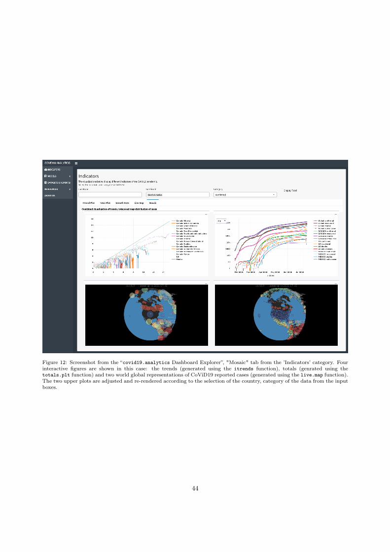
Figure 12: Screenshot from the “covid19.analytics Dashboard Explorer”, "Mosaic" tab from the ’Indicators’ category. Fourinteractive figures are shown in this case: the trends (generated using the itrends function), totals (genrated using thetotals.plt function) and two world global representations of CoViD19 reported cases (generated using the live.map function).The two upper plots are adjusted and re-rendered according to the selection of the country, category of the data from the inputboxes.
44
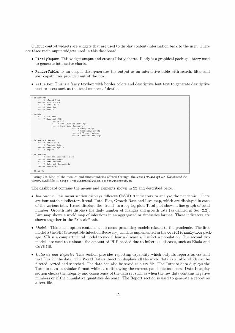
Output control widgets are widgets that are used to display content/information back to the user. Thereare three main ouput widgets used in this dashboard:
• PlotlyOuput: This widget output and creates Plotly charts. Plotly is a graphical package library usedto generate interactive charts.
• RenderTable: Is an output that generates the output as an interactive table with search, filter andsort capabilities provided out of the box.
• ValueBox: This is a fancy textbox with border colors and descriptive font text to generate descriptivetext to users such as the total number of deaths.
* Indicators+----> iTrend Plot+----> Growth Rate+----> Total Plot+----> Live Map+----> Mosaic
* Models+----> SIR Model+----> Hospital PPE
+----> PPE+----> PPE Advanced Settings+----> Burn Rate Analysis
+----> Daily Usage+----> Remaining Supply+----> PPE per Patient+----> Advanced Settings
* Datasets & Repots+----> World Data+----> Toronto Data+----> Data Integrity+----> Report
* References+----> covid19.analytics repo+----> Documentation+----> Data Sources+----> External Dashboards+----> Resources
* About Us
Listing 22: Map of the menues and functionalities offered through the covid19.analytics Dashboard Ex-plorer, available at https://covid19analytics.scinet.utoronto.ca
The dashboard contains the menus and elements shown in 22 and described below:
• Indicators: This menu section displays different CoViD19 indicators to analyze the pandemic. Thereare four notable indicators Itrend, Total Plot, Growth Rate and Live map, which are displayed in eachof the various tabs. Itrend displays the “trend” in a log-log plot, Total plot shows a line graph of totalnumber, Growth rate displays the daily number of changes and growth rate (as defined in Sec. 2.2),Live map shows a world map of infections in an aggregated or timeseries format. These indicators areshown together in the "Mosaic" tab.
• Models: This menu option contains a sub-menu presenting models related to the pandemic. The firstmodel is the SIR (Susceptible Infection Recovery) which is implemented in the covid19.analytics pack-age. SIR is a compartmental model to model how a disease will infect a population. The second twomodels are used to estimate the amount of PPE needed due to infectious diseases, such as Ebola andCoViD19.
• Datasets and Reports: This section provides reporting capability which outputs reports as csv andtext files for the data. The World Data subsection displays all the world data as a table which can befiltered, sorted and searched. The data can also be saved as a csv file. The Toronto data displays theToronto data in tabular format while also displaying the current pandemic numbers. Data Integritysection checks the integrity and consistency of the data set such as when the raw data contains negativenumbers or if the cumulative quantities decrease. The Report section is used to generate a report asa text file.
45
• References: The reference section displays information on the github repo and documentation alongwith an External Dashboards section which contains hyperlinks to other dashboards of interest. Dash-boards of interest are the Vaccine Tracker which tracks the progress of vaccines being tested for covid19,John Hopkins University and the Canada dashboard built by the Dall Lana School of Epidemiologyat the University of Toronto.
• About Us: Contact information and information about the developers.
4.1.4. Additional Elements of the DashboardIn addition to implementing some of the functionalities provided by the covid19.analytics package,
the dashboard also includes a PPE calculator. The hospital PPE is a qualitative model which is designed toanalyze the amount of PPE equipment needed for a single CoViD19 patient over a hospital duration. ThePPE calculation implemented in the covid19.analytics Dashboard Explorer is derived from the CDC’sstudies for infectious diseases, such as Ebola and CoViD19. The rationality is that Ebola and CoViD19 areboth contagious infections and PPE is used to protect staff and patients and prevent transmission for bothof these contagious diseases.
The Hospital PPE calculation estimates and models the amount of PPE a hospital will need duringthe CoViD19 pandemic. There are two analysis methods a user can choose to determine Hospital PPErequirement. The first method to analyze PPE is to determine the amount of PPE needed for a singlehospitalized CoViD19 patient. This first model requires two major component: the size of the healthcareteam needed to take care of a single CoViD19 patient and the amount of PPE equipment used by hospitalstaff per shift over a hosptialization duration. The model is based off the CDC Ebola crisis calculation [54].Alhough Ebola is a different disease compared to CoViD19, there is one major similarity. Both CoViD19and Ebola are diseases which both require PPE for protection of healthcare staff and the infected patient.To compensate the user can change the amount of PPE a healthcare staff uses per shift. That informationcan be adjusted by changing the slider values in the Advanced Setting tab. The calculation is prettystraightforward as it takes the PPE amount used per shift and multiplies it by the number of healthcarestaff and then by the hospitalization duration.
The first model has two tabs. The first tab displays a stacked bar chart displaying the amount of PPEequipment user by each hospital staff over the total hospital duration of a single patient. It breaks eachPPE equipment by stacks. The second tab panel called Advanced settings has a series of sliders for eachhospital staff example nurses where users can use the slider to change the amount of PPE that the hospitalstaff will user per shift.
The second model is a more recent calculation developed by the CDC [55]. The model calculates theburn rate of PPE equipment for hospitals for a one week time period. This model is designed specifically forCovid19. The CDC has created an excel file for hospital staff to input their information and also an androidapp as well which can be utilized.
This model also implemented in our dashboard, is simplified to calculate the PPE for a one week setting.The one week limit was implemented for two reasons, first to limit the amount of input data a user has toenter into the system as too much data can overwhelm and confuse a user; second because the CoViD19pandemic is a highly fluidic situation and for hospital staff to forecast their PPE and resource equipmentsgreater than a one week period may not be accurate.
Note that this model is not accurate if the facilitiy recieves a resupply of PPE. For resupplied PPE starta new calculation. There are four tab panels to the burn rate calculation which displays charts and settings.The first tab Daily Usage displays a multi-line chart displaying the amount of PPE used daily, ∆PPEdaily.The calculation for this is a simple subtraction between two consecutive days, i.e. the second day (j + 1)from the first day (j) as noted in Eq.(6).
∆PPEdaily ≡ (PPEj+1)− PPEj (6)
The tab panel called Remaining Supply shows a multi line chart the number of days the remainingPPE equipment will last in the facility. The duration of how long the PPE equipment can last in a givenfacility, inversely depends on the amount of CoViD19 patients admitted to the hospital. To calculate the
46
remaining PPE one calculates the average amount of PPE used over the one week duration and then dividesthe amount of PPE at the beginning of the day by the average PPE usage, as shown in Eq.(7),
remainingPPE ≡ ∆PPEdaily
〈PPE〉1week(7)
where 〈〉T denotes the time average over a T period of time.The third panel called PPE per patient displays a multi line chart of the burn rate, i.e. the amount of
PPE used per patient per day. Eq.(8) represents the calculation as the remaining PPE supply divided bythe number of CoViD19 patients in the hospital staff during that exact day.
PPE
Patient≡ remainingPPE
Npatient(8)
The fourth tab called Advanced settings is a series of show and hide “accordians” where users can inputthe amount of PPE equpiment they have at the start of each day. There are six collapsed boxes for each PPEequipment type and for CoViD19 patient count. Expanding a box displays seven numericalInput textboxeswhich allows users to input the number of PPE or patient count for each day.
The equations describing the PPE needs, Eqs.(6,7,8) are implemented in the shiny dashboard using thedplyr library. The dplyr library allows users to work with dataframe like objects in a quick and efficientmanner. The three equations are implemented using a single dataframe. The Advanced Setting inputs ofthe Burn Rate Analysis tab are saved into a dataframe. The PPE equations –Eqs.(6-8)– are implementedon the dataframe by creating new columns that are then appended to the existing dataframe. This resultsin the final version of the dataframe as shown in Lst. 23 which is then used to generate the correspondingcharts.d.Name glovediff n95diff maskdiff gownsdiff respdiff gloveremaining1 day1 0 0 0 0 0 6.02 day2 200 25 50 100 20 5.23 day3 300 75 50 20 20 4.04 day4 NA NA NA NA NA NA5 day5 NA NA NA NA NA NA6 day6 NA NA NA NA NA NA7 day7 NA NA NA NA NA NA
n95remaining maskremaining gownremaining respremaining glove_per_patient1 10.0 10 8.333333 15 0.000002 9.5 9 6.666667 14 10.000003 8.0 8 6.333333 13 10.714294 NA NA NA NA NA5 NA NA NA NA NA6 NA NA NA NA NA7 NA NA NA NA NA
n95_per_patient mask_per_patient gown_per_patient resp_per_patient1 0.000000 0.000000 0.0000000 0.00000002 1.250000 2.500000 5.0000000 1.00000003 2.678571 1.785714 0.7142857 0.71428574 NA NA NA NA5 NA NA NA NA6 NA NA NA NA7 NA NA NA NA
Listing 23: Dataframe object employed in the PPE calculation.
4.2. Dashboard’s Back End ImplementationThe back-end implementation of the dashboard is achieved using the functions presented in Sec.2 on the
server module of the dashboard. The main strategy is to use a particular function and connect it with theinput controls to feed the needed arguments into the function and then capture the output of the functionand render it accordingly.
Let’s consider the example of the globe map representation shown in the dashboard which is done usingthe live.map function. Lst. 24 shows how this function connects with the other elements in the dashboard:the input elements are accessed using input$... which in this are used to control the particular optionsfor the displaying the legends or projections based on checkboxes. The output returned from this functionis captured through the renderPlotly({...}) function, that is aimed to take plotly type of plots andintegrate them into the dashboard.
47

#livemap plot charts on the three possible commbinationsoutput$ts_livemap <- output$ts2_livemap <- output$ts3_livemap <- output$ts4_
livemap <- renderPlotly ({legend <- input$sel_legendprojections <- input$sel_projectionlive.map(covid19.data("ts-confirmed"), interactive.display=FALSE , no.
legend=legend , select.projctn=projections)})
Listing 24: Example of how the live.map function is used to render the ineractive figures display on the dashboard.
Another example is the report generation capability using the report.summary function which is shownin Lst. 25. As mentioned before, the input arguments of the function are obtained from the input controls.The output in this case is rendered usign the renderText({...}) function, as the output of the originalfunction is plain text. Notice also that there are two implementations of the report.summary, one is forthe rendering in the screen and the second one is for making the report available to be downloaded whichis handled by the downloadHandler function.
reportServer <- function(input , output , session , result) {output$report_output_default <- renderText ({
#extract the vairables of the inputsnentries <- input$txtbox_Nentriesgeo_loc <- input$geo_loc_select6ts <- input$ddl_TScapture.output(report.summary(graphical.output=FALSE , Nentries=
nentries , geo.loc=geo_loc , cases.to.process=ts))}, sep=’\n’)
report <- reactive ({nentries <- input$txtbox_Nentriesgeo_loc <- input$geo_loc_select6ts <- input$ddl_TSreport <- capture.output(report.summary(graphical.output=FALSE ,
Nentries=nentries , geo.loc=geo_loc , cases.to.process=ts))return (report)
})
output$downloadReport <- downloadHandler(filename = function () {
paste("Report -", Sys.Date(),".txt", sep = "")},content = function(file) {
writeLines(paste(report () ), file)}
)}
Listing 25: Report capabilites implemented in the dashboard using the report.summary function.
4.3. Dashboard’s Server ConfigurationThe final element in the deployment of the dashboard is the actual set up and configuration of the web
server where the application will run. The actual implementation of our web dashboard, accessible throughhttps://covid19analytics.scinet.utoronto.ca, relies on a virtual machine (VM) in a physical serverlocated at SciNet headquarters.
48

We should also notice that there are other forms or ways to "publish" a dashboard, in particular forshiny based-dashboards, the most common way and perhaps straighforward one is to deploy the dashboardon https://www.shinyapps.io. Alternatively one could also implement the dashboard in a cloud-basedsolution, e.g. https://aws.amazon.com/blogs/big-data/running-r-on-aws/. Each approach has itsown advantages and disadvantages, for instance, depending on a third party solution (like the previousmentioned) implies some cost to be paid to or dependency on the provider but will certainly eliminate someof the complexity and special attention one must take when using its own server. On the other hand, aself-deployed server will allow you for full control, in principle cost-effective or cost-controled expense andfull integration with the end application.
In our case, we opted for a self-controlled and configured server as mentioned above. Moreover, it isquite a common practice to deploy (multiple) web services via VMs or “containers”. The VM for our webserver runs on CentOS 7 and has installed R version 4.0 from sources and compiled on the VM.
After that we proceeded to install the shiny server from sources, i.e. https://github.com/rstudio/shiny-server/wiki/Building-Shiny-Server-from-Source.
After the installation of the shiny-server is completed, we proceed by creating a new user in the VM fromwhere the server is going to be run. For security reasons, we recommend to avoid running the server as root.In general, the shiny server can use a user named "shiny". Hence a local account is created for this user, andthen logged as this user, one can proceed with the installation of the required R packages in a local libraryfor this user. All the neeeded packages for running the dashboard and the covid19.analytics packageneed to be installed.
Lst. 26 shows the commands used for creating the shiny user and finalizing the configuration and detailsof the log files.
# Place a shortcut to the shiny -server executable in /usr/binsudo ln -s /usr/local/shiny -server/bin/shiny -server /usr/bin/shiny -server
# Create shiny usersudo useradd -r -m shiny
# Create log , config , and application directoriessudo mkdir -p /var/log/shiny -serversudo mkdir -p /srv/shiny -serversudo mkdir -p /var/lib/shiny -serversudo chown shiny /var/log/shiny -serversudo mkdir -p /etc/shiny -server
Listing 26: List of commands used on the VM to finalize the setup of the shiny user and server. Source: https://github.com/rstudio/shiny-server.
The R script containing the shiny app to be run should be placed in /etc/shiny-server and con-fiurations details about the shiny interface are adjusted in the /etc/shiny-server/shiny-server.conffile.
Permissions for the application file has to match the identity of the user launching the server, in thiscase the shiny user.
At this point if the installation was sucessful and all the pieces were placed properly, when the shiny-servercommand is executed, a shiny hosted app will be accessible from localhost:3838.
Since the shiny server listens on port 3838 in plain http, it is necessary to setup an Apache web server toact as a reverse proxy to receive the connection requests from the Internet on ports 80 and 443, the regularhttp and https ports, and redirect them to port 3838 on the same host (localhost).
For dealing with theApache configuration on port 80, we added the file /etc/httpd/conf.d/rewrite.confas shown in Lst. 27.
RewriteEngine OnRewriteCond %{ REQUEST_SCHEME} =httpRewriteRule ^ https://%{ SERVER_NAME }%{ REQUEST_URI} [QSA ,R=permanent]
49

Listing 27: Modifications to the Apache configurations, specified in the file rewrite.conf. These three lines rewrite anyincoming request from http to https.
For handling the Apache configuration on port 443, we added this file /etc/httpd/conf.d/shiny.conf,as shown in Lst.28.
<VirtualHost _default_:443>SSLEngine on
ProxyPreserveHost OnProxyPass / http://0.0.0.0:3838/app1/ProxyPassReverse / http://0.0.0.0:3838/app1/</VirtualHost >
Listing 28: Content of the shiny.conf file, for the creation of a VirtualHost listening on port 443.
This VirtualHost receives the https requests from the Internet on port 443, establishes the secureconnection, and redirects all input to port 3838 using plain http. All requests to "/" are redirected to"http://0.0.0.0:3838/app1/", where app1 in this case is a subdirectory where a particular shiny app islocated.
There is an additional configuration file, /etc/httpd/conf.d/ssl.conf, which contains the configura-tion for establishing secure connections such as protocols, certificate paths, ciphers, etc.
4.3.1. Decentralized Systems and ServicesThe main tool we use in order to communicate updates between the different elements we use in
the development and mantainance of the covid19.analytics package and dashboard web interface isorchestrated via GIT repositories. In this way, we have in place version control systems but also of-fer decentralized with multiple replicas. Fig. 13 shows an schematic of how our network of reposito-ries and service is connected. The central hub for our package, is located at the GIThub repo htttps://github.com/mponce0/covid19.analytics; we then have (and users can too) our own clones of localcopies of this repo –we usually use this for development and testing–. When a stable and substantial con-tribution to the package is reached, we submit this to the CRAN repository. Similarly, when an update isdone on the dashboard we can synchronize the VM via git pulls and deploy the updates on the server side.
5. Conclusions
In this paper we have presented and discussed the R covid19.analytics package, which is an opensource tool to obtain, analyze and visualize data of the CoViD19 pandemic. The package also incorporatesa dashboard to facilitate the access to its functionalities to less experienced users.
As today, there are a few dozen other packages also in the CRAN repository that allow users to gainaccess to different datasets of the CoViD19 pandemic. In some cases, some packages just provide access todata from specific geographical locations or the approach to the data structure in which the data is presentedis different from the one presented here. Nevertheless, having a variety of packages from which users can tryand probably combine, is an important and crucial element in data analysis. Moreover it has been reporteddifferent cases of data misuse/misinterpretation due to different issues, such as, erroneous metadata ordata formats [56] and in some cases ending in articles’ retractions [57]. Therefore providing additionalfunctionalities to check the integrity and consistency of the data, as our the covid19.analytics packagedoes is paramount. This is specially true in a situation where the unfolding of events and data availabilityis flowing so fast that sometimes is even hard to keep track of all the changes.
Moreover, the covid19.analytics package offers a modular and versatile approach to the data, byallowing users to input their own data for which most of the package functions can be applied when thedata is structured using a time series format as described in this manuscript.
50
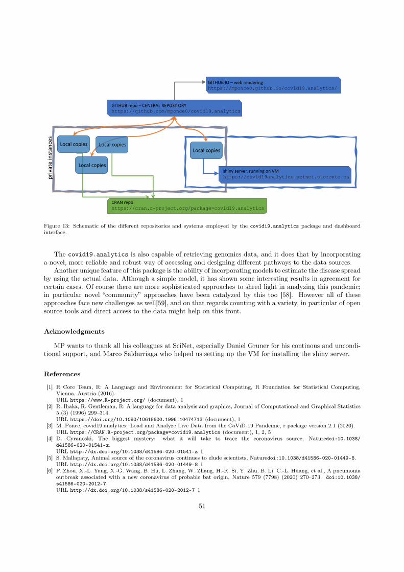
GITHUB repo – CENTRAL REPOSITORYhttps://github.com/mponce0/covid19.analytics
shiny server, running on VMhttps://covid19analytics.scinet.utoronto.ca
Local copies
CRAN repohttps://cran.r-project.org/package=covid19.analytics
Local copiesLocal copies
Local copies
GITHUB IO – web renderinghttps://mponce0.github.io/covid19.analytics/
priv
ate
inst
ance
s
Figure 13: Schematic of the different repositories and systems employed by the covid19.analytics package and dashboardinterface.
The covid19.analytics is also capable of retrieving genomics data, and it does that by incorporatinga novel, more reliable and robust way of accessing and designing different pathways to the data sources.
Another unique feature of this package is the ability of incorporating models to estimate the disease spreadby using the actual data. Although a simple model, it has shown some interesting results in agreement forcertain cases. Of course there are more sophisticated approaches to shred light in analyzing this pandemic;in particular novel “community” approaches have been catalyzed by this too [58]. However all of theseapproaches face new challenges as well[59], and on that regards counting with a variety, in particular of opensource tools and direct access to the data might help on this front.
Acknowledgments
MP wants to thank all his colleagues at SciNet, especially Daniel Gruner for his continous and uncondi-tional support, and Marco Saldarriaga who helped us setting up the VM for installing the shiny server.
References
[1] R Core Team, R: A Language and Environment for Statistical Computing, R Foundation for Statistical Computing,Vienna, Austria (2016).URL https://www.R-project.org/ (document), 1
[2] R. Ihaka, R. Gentleman, R: A language for data analysis and graphics, Journal of Computational and Graphical Statistics5 (3) (1996) 299–314.URL https://doi.org/10.1080/10618600.1996.10474713 (document), 1
[3] M. Ponce, covid19.analytics: Load and Analyze Live Data from the CoViD-19 Pandemic, r package version 2.1 (2020).URL https://CRAN.R-project.org/package=covid19.analytics (document), 1, 2, 5
[4] D. Cyranoski, The biggest mystery: what it will take to trace the coronavirus source, Naturedoi:10.1038/d41586-020-01541-z.URL http://dx.doi.org/10.1038/d41586-020-01541-z 1
[5] S. Mallapaty, Animal source of the coronavirus continues to elude scientists, Naturedoi:10.1038/d41586-020-01449-8.URL http://dx.doi.org/10.1038/d41586-020-01449-8 1
[6] P. Zhou, X.-L. Yang, X.-G. Wang, B. Hu, L. Zhang, W. Zhang, H.-R. Si, Y. Zhu, B. Li, C.-L. Huang, et al., A pneumoniaoutbreak associated with a new coronavirus of probable bat origin, Nature 579 (7798) (2020) 270–273. doi:10.1038/s41586-020-2012-7.URL http://dx.doi.org/10.1038/s41586-020-2012-7 1
51
[7] K. G. Andersen, A. Rambaut, W. I. Lipkin, E. C. Holmes, R. F. Garry, The proximal origin of sars-cov-2, Nature Medicine26 (4) (2020) 450–452. doi:10.1038/s41591-020-0820-9.URL https://doi.org/10.1038/s41591-020-0820-9 1
[8] M. Letko, S. N. Seifert, K. J. Olival, R. K. Plowright, V. J. Munster, Bat-borne virus diversity, spillover and emergence,Nature Reviews Microbiologydoi:10.1038/s41579-020-0394-z.URL https://doi.org/10.1038/s41579-020-0394-z 1
[9] A. Gupta, M. V. Madhavan, K. Sehgal, N. Nair, S. Mahajan, T. S. Sehrawat, B. Bikdeli, N. Ahluwalia, J. C. Ausiello,E. Y. Wan, et al., Extrapulmonary manifestations of covid-19, Nature Medicine 26 (7) (2020) 1017–1032. doi:10.1038/s41591-020-0968-3.URL http://dx.doi.org/10.1038/s41591-020-0968-3 1
[10] E. J. Williamson, A. J. Walker, K. Bhaskaran, S. Bacon, C. Bates, C. E. Morton, H. J. Curtis, A. Mehrkar,D. Evans, P. Inglesby, et al., Opensafely: factors associated with covid-19 death in 17 million patients, Naturedoi:10.1038/s41586-020-2521-4.URL http://dx.doi.org/10.1038/s41586-020-2521-4 1
[11] E. P. Scully, J. Haverfield, R. L. Ursin, C. Tannenbaum, S. L. Klein, Considering how biological sex impacts immuneresponses and covid-19 outcomes, Nature Reviews Immunologydoi:10.1038/s41577-020-0348-8.URL https://doi.org/10.1038/s41577-020-0348-8 1
[12] C. Willyard, Coronavirus blood-clot mystery intensifies, Nature 581 (7808) (2020) 250–250. doi:10.1038/d41586-020-01403-8.URL http://dx.doi.org/10.1038/d41586-020-01403-8 1
[13] J. D. Silverman, N. Hupert, A. D. Washburne, Using influenza surveillance networks to estimate state-specific prevalence ofsars-cov-2 in the united states, Science Translational MedicinearXiv:https://stm.sciencemag.org/content/early/2020/06/22/scitranslmed.abc1126.full.pdf, doi:10.1126/scitranslmed.abc1126.URL https://stm.sciencemag.org/content/early/2020/06/22/scitranslmed.abc1126 1
[14] T. Greenhalgh, J. L. Jimenez, K. A. Prather, Z. Tufekci, D. Fisman, R. Schooley, Ten scientific reasons in support ofairborne transmission of SARS-CoV-2, The Lancetdoi:10.1016/S0140-6736(21)00869-2.URL https://doi.org/10.1016/S0140-6736(21)00869-2 1
[15] C. V. Fry, X. Cai, Y. Zhang, C. S. Wagner, Consolidation in a crisis: Patterns of international collaboration in earlycovid-19 research, PLOS ONE 15 (7) (2020) e0236307. doi:10.1371/journal.pone.0236307.URL http://dx.doi.org/10.1371/journal.pone.0236307 1
[16] D. Singh Chawla, Critiqued coronavirus simulation gets thumbs up from code-checking efforts, Nature 582 (7812) (2020)323–324. doi:10.1038/d41586-020-01685-y.URL http://dx.doi.org/10.1038/d41586-020-01685-y 1
[17] D. Duque, D. Morton, B. Singh, Z. Du, R. Pasco, L. Meyers, Timing social distancing to avert unmanageable covid-19hospital surges, PNAS; Proceedings of the National Academy of Sciencesdoi:10.1073/pnas.2009033117. 1
[18] D. Adam, Special report: The simulations driving the world’s response to covid-19, Nature 580 (7803) (2020) 316–318.doi:10.1038/d41586-020-01003-6.URL http://dx.doi.org/10.1038/d41586-020-01003-6 1
[19] P. J. Hotez, D. B. Corry, M. E. Bottazzi, Covid-19 vaccine design: the janus face of immune enhancement, Nature ReviewsImmunology 20 (6) (2020) 347–348. doi:10.1038/s41577-020-0323-4.URL https://doi.org/10.1038/s41577-020-0323-4 1
[20] S. F. Ahmed, A. A. Quadeer, M. R. McKay, Covidep: a web-based platform for real-time reporting of vaccine targetrecommendations for sars-cov-2, Nature Protocolsdoi:10.1038/s41596-020-0358-9.URL https://doi.org/10.1038/s41596-020-0358-9 1
[21] P. Block, M. Hoffman, I. J. Raabe, J. B. Dowd, C. Rahal, R. Kashyap, M. C. Mills, Social network-based distancingstrategies to flatten the covid-19 curve in a post-lockdown world, Nature Human Behaviour 4 (6) (2020) 588–596. doi:10.1038/s41562-020-0898-6.URL https://doi.org/10.1038/s41562-020-0898-6 1
[22] D. Faranda, I. P. Castillo, O. Hulme, A. Jezequel, J. S. W. Lamb, Y. Sato, E. L. Thompson, Asymptotic estimates of sars-cov-2 infection counts and their sensitivity to stochastic perturbation, Chaos: An Interdisciplinary Journal of NonlinearScience 30 (5) (2020) 051107. arXiv:https://doi.org/10.1063/5.0008834, doi:10.1063/5.0008834.URL https://doi.org/10.1063/5.0008834 1
[23] B. Korber, W. M. Fischer, S. Gnanakaran, H. Yoon, J. Theiler, W. Abfalterer, N. Hengartner, E. E. Giorgi, T. Bhat-tacharya, B. Foley, K. M. Hastie, M. D. Parker, D. G. Partridge, C. M. Evans, T. M. Freeman, T. I. de Silva, A. Angyal,R. L. Brown, L. Carrilero, L. R. Green, D. C. Groves, K. J. Johnson, A. J. Keeley, B. B. Lindsey, P. J. Parsons, M. Raza,S. Rowland-Jones, N. Smith, R. M. Tucker, D. Wang, M. D. Wyles, C. McDanal, L. G. Perez, H. Tang, A. Moon-Walker,S. P. Whelan, C. C. LaBranche, E. O. Saphire, D. C. Montefiori, Tracking changes in sars-cov-2 spike: Evidence thatd614g increases infectivity of the covid-19 virus, Celldoi:10.1016/j.cell.2020.06.043.URL http://www.sciencedirect.com/science/article/pii/S0092867420308205 1
[24] M. F. Boni, P. Lemey, X. Jiang, T. T.-Y. Lam, B. W. Perry, T. A. Castoe, A. Rambaut, D. L. Robertson, Evolutionaryorigins of the sars-cov-2 sarbecovirus lineage responsible for the covid-19 pandemic, Nature Microbiologydoi:10.1038/s41564-020-0771-4.URL http://dx.doi.org/10.1038/s41564-020-0771-4 1
[25] E. Dong, H. Du, L. Gardner, An interactive web-based dashboard to track covid-19 in real time, The Lancet InfectiousDiseases 20 (5) (2020) 533–534. doi:10.1016/S1473-3099(20)30120-1.
52
URL https://doi.org/10.1016/S1473-3099(20)30120-1 1[26] A. Palayew, O. Norgaard, K. Safreed-Harmon, T. H. Andersen, L. N. Rasmussen, J. V. Lazarus, Pandemic publishing
poses a new covid-19 challenge, Nature Human Behaviourdoi:10.1038/s41562-020-0911-0.URL https://doi.org/10.1038/s41562-020-0911-0 1
[27] E. Callaway, Will the pandemic permanently alter scientific publishing?, Nature 582 (7811) (2020) 167–168. doi:10.1038/d41586-020-01520-4.URL http://dx.doi.org/10.1038/d41586-020-01520-4 1
[28] D. Kwon, How swamped preprint servers are blocking bad coronavirus research, Nature 581 (7807) (2020) 130–131.doi:10.1038/d41586-020-01394-6.URL http://dx.doi.org/10.1038/d41586-020-01394-6 1
[29] N. Vabret, R. Samstein, N. Fernandez, M. Merad, A. S. Schanoski, A. Rodriguez, A. Moreira, A. Chan, A. Charap,A. Leader, A. Magen, B. Salomé, C. C. Bozkus, C. Moon, C. Gruber, D. F. Ruan, D. Lozano-Ojalvo, D. Jha, E. Meritt,E. Risson, E. Dalla, E. Humblin, E. Cody, F. Cossarini, G. Lubitz, G. Britton, G. Martinez-Delgado, I. R. Torres,J. Mateus-Tique, J. Redes, J. Tan, J. Shang, J. Kim, J. Grout, J. Chung, J. Catalan, J. Kodysh, J. Noel, K. Lindblad,L. Malle, L. Pia, M. Agrawal, M. Casanova-Acebes, M. Kuksin, M. Suprun, M. Aleynick, M. Roberto, M. Brown, M. Lin,M. Park, M. Spindler, M. Wilk, M. Belabed, M. Saffern, M. Ota, M. Centa, N. Vaninov, P. Hamon, R. Levantovsky,S. Hegde, S. Chen, T. Plitt, T. O’Donnell, V. Pothula, V. Van Der Heide, Z. Mahmood, A. Khamporst, A. Horowitz,B. Brown, D. Homann, D. Bogunovic, E. Grasset, E. Kenigsberg, J. Faith, K. Alexandropoulos, M. Lafaille, N. Bhardwaj,P. Heeger, S. Mehandru, U. Laserson, T. S. I. R. Project, Trainees, Faculty, Advancing scientific knowledge in times ofpandemics, Nature Reviews Immunology 20 (6) (2020) 338–338. doi:10.1038/s41577-020-0319-0.URL https://doi.org/10.1038/s41577-020-0319-0 1
[30] Epidy Health Research Ltd., COVID-19 Risk Factors: literature database & meta-analysis, accessed: 2020-07-21.URL https://corona.epidy.com 1
[31] CoronaWhy, accessed: 2020-06-01 (2020).URL http://coronawhy.org/ 1
[32] V. Tykhonov, A. Polishko, A. Kiulian, M. Komar, CoronaWhy: Building a Distributed, Credible and Scalable Researchand Data Infrastructure for Open Science, SciNLP: Natural Language Processing and Data Mining for Scientific Text,2020. 1
[33] K. Hornik, The comprehensive r archive network, WIREs Computational Statistics 4 (4) (2012) 394–398. arXiv:https://onlinelibrary.wiley.com/doi/pdf/10.1002/wics.1212, doi:https://doi.org/10.1002/wics.1212.URL https://onlinelibrary.wiley.com/doi/abs/10.1002/wics.1212 1
[34] COVID-19 Data Repository by the Center for Systems Science and Engineering (CSSE) at Johns Hopkins University,accessed: 2020-06-01 (2020).URL https://github.com/CSSEGISandData/COVID-19 2, 2.1.3, 3
[35] Health Canada – covid19 cases in Canada, accessed: 2020-10-14 (2020).URL https://health-infobase.canada.ca/src/data/covidLive 2, 3
[36] COVID-19: Status of Cases in Toronto, accessed: 2020-06-01 (2020).URL https://www.toronto.ca/home/covid-19/covid-19-latest-city-of-toronto-news/covid-19-status-of-cases-in-toronto/ 2, 3, 3.1
[37] Open Data Toronto – covid19 cases in the City of Toronto, accessed: 2020-10-14 (2020).URL https://open.toronto.ca/dataset/covid-19-cases-in-toronto/ 2, 3
[38] Visual Capitalist, Visualizing the History of Pandemics & The Race to Save Lives: Comparing Vaccine DevelopmentTimelines, accessed: 2021-01-20 (2020).URL https://www.visualcapitalist.com/history-of-pandemics-deadliest/ 2.1, 3
[39] Our World In Data, Our World In Data – CoVid19 Data Repository, accessed: 2021-01-20 (2020).URL https://github.com/owid/covid-19-data/ 2.1, 3
[40] National Center for Biotechnology Information, accessed: 2020-07-25.URL https://www.ncbi.nlm.nih.gov/search/all/?term=sars-cov-2 2.1, 3.8
[41] NCBI Resource Coordinators, Database resources of the National Center for Biotechnology Information, Nucleic AcidsResearch 46 (D1) (2017) D8–D13. arXiv:https://academic.oup.com/nar/article-pdf/46/D1/D8/23162308/gkx1095.pdf, doi:10.1093/nar/gkx1095.URL https://doi.org/10.1093/nar/gkx1095 2.1, 2.1.4, 3.8
[42] E. Paradis, K. Schliep, ape 5.0: an environment for modern phylogenetics and evolutionary analyses in R, Bioinformatics35 (2019) 526–528. doi:10.1093/bioinformatics/bty633. 2.1.5, 1, Appendix A
[43] D. J. Winter, rentrez: an r package for the ncbi eutils api, The R Journal 9 (2017) 520–526. doi:10.7287/peerj.preprints.3179v2. 2.1.5, 1, Appendix A
[44] W. O. Kermack, A. G. McKendrick, A contribution to the mathematical theory of epidemics, Proceedings of the royalsociety of london. Series A, Containing papers of a mathematical and physical character 115 (772) (1927) 700–721. 2.2.2
[45] D. Smith, L. Moore, et al., The SIR model for spread of disease: the differential equation model,Loci.(originally Convergence.) https://www.maa.org/press/periodicals/loci/joma/the-sir-model-for-spread-of-disease-the-differential-equation-model. 2.2.2
[46] T. Harko, F. S. Lobo, M. Mak, Exact analytical solutions of the Susceptible-Infected-Recovered (SIR) epidemic modeland of the SIR model with equal death and birth rates, Applied Mathematics and Computation 236 (2014) 184 – 194.doi:10.1016/j.amc.2014.03.030.URL http://www.sciencedirect.com/science/article/pii/S009630031400383X 2.2.2
53
[47] H. Wickham, J. Hester, W. Chang, devtools: Tools to Make Developing R Packages Easier, r package version 2.3.0 (2020).URL https://CRAN.R-project.org/package=devtools 2
[48] W. Chang, J. Cheng, J. Allaire, Y. Xie, J. McPherson, shiny: Web Application Framework for R, r package version 1.4.0.2(2020).URL https://CRAN.R-project.org/package=shiny 4.1, 4.1.2
[49] W. Chang, B. Borges Ribeiro, shinydashboard: Create Dashboards with ’Shiny’, r package version 0.7.1 (2018).URL https://CRAN.R-project.org/package=shinydashboard 4.1.2
[50] A. Sali, D. Attali, shinycssloaders: Add CSS Loading Animations to ’shiny’ Outputs, r package version 0.3 (2020).URL https://CRAN.R-project.org/package=shinycssloaders 4.1.2
[51] C. Sievert, Interactive Web-Based Data Visualization with R, plotly, and shiny, Chapman and Hall/CRC, 2020. doi:10.1201/9780429447273.URL https://plotly-r.com 4.1.2
[52] Y. Xie, J. Cheng, X. Tan, DT: A Wrapper of the JavaScript Library ’DataTables’, r package version 0.13 (2020).URL https://CRAN.R-project.org/package=DT 4.1.2
[53] H. Wickham, R. François, L. Henry, K. Müller, dplyr: A Grammar of Data Manipulation, r package version 1.0.0 (2020).URL https://CRAN.R-project.org/package=dplyr 4.1.2
[54] Centers for Disease Control and Prevention, Estimated Personal Protective Equipment (PPE) Needed for HealthcareFacilities, accessed: 2020-07-14 (2020).URL https://www.cdc.gov/vhf/ebola/healthcare-us/ppe/calculator.html 4.1.4
[55] Centers for Disease Control and Prevention, Personal Protective Equipment (PPE) Burn Rate Calculator, accessed: 2020-07-14 (2020).URL https://www.cdc.gov/coronavirus/2019-ncov/hcp/ppe-strategy/burn-calculator.html 4.1.4
[56] H. Ledford, R. Van Noorden, High-profile coronavirus retractions raise concerns about data oversight, Nature 582 (7811)(2020) 160–160. doi:10.1038/d41586-020-01695-w.URL http://dx.doi.org/10.1038/d41586-020-01695-w 5
[57] L. M. Schriml, M. Chuvochina, N. Davies, E. A. Eloe-Fadrosh, R. D. Finn, P. Hugenholtz, C. I. Hunter, B. L. Hurwitz,N. C. Kyrpides, F. Meyer, I. K. Mizrachi, S.-A. Sansone, G. Sutton, S. Tighe, R. Walls, Covid-19 pandemic reveals theperil of ignoring metadata standards, Scientific Data 7 (1) (2020) 188. doi:10.1038/s41597-020-0524-5.URL https://doi.org/10.1038/s41597-020-0524-5 5
[58] M. Luengo-Oroz, K. Hoffmann Pham, J. Bullock, R. Kirkpatrick, A. Luccioni, S. Rubel, C. Wachholz, M. Chakchouk,P. Biggs, T. Nguyen, T. Purnat, B. Mariano, Artificial intelligence cooperation to support the global response to covid-19,Nature Machine Intelligence 2 (6) (2020) 295–297. doi:10.1038/s42256-020-0184-3.URL https://doi.org/10.1038/s42256-020-0184-3 5
[59] Y. Hu, J. Jacob, G. J. M. Parker, D. J. Hawkes, J. R. Hurst, D. Stoyanov, The challenges of deploying artifi-cial intelligence models in a rapidly evolving pandemic, Nature Machine Intelligence 2 (6) (2020) 298–300. doi:10.1038/s42256-020-0185-2.URL https://doi.org/10.1038/s42256-020-0185-2 5
[60] M. Ponce, A. Sandhel, covid19.analytics: An r package to obtain, analyze and visualize data from the corona virus diseasepandemic (2020). arXiv:2009.01091. 5
54
Appendix A. List of Figures, Tables and Listings
List of Tables
1 List of data retrieval functions available in the covid19.analytics package. . . . . . . . . . 52 Different types of genomic data retrieved by the covid19.analytics package. . . . . . . . . . 73 Overview of the main functions of the covid19.analytics package . . . . . . . . . . . . . . . 104 List of some of the arguments used in several functions to control the type of graphical output. 13
List of Figures
1 Schematic of the data acquision flows between the covid19.analytics package and thedifferent sources of data. Dark and solid/dashed lines represent API functions provided bythe package accesible to the users. Dotted lines are “internal” mechanisms employed by thepackage to synchronize and update replicas of the data. Data acquisition from NCBI serversis mostly done utilizing the ape [42] and rentrez [43] packages. (pp. 4, 7) . . . . . . . . . . . 8
2 Graphical output produced by the report.summary function. The top row shows bar plotsand pie charts for each respective category of reported cases, "confirmed", "deaths" and"recovered" for the top 5 entries for time series data. The bottom row shows a combined plotfor the aggregated data. This graphical output aim to complement the text report generated,as shown in Lst. 7. The plots show the distribution of cases in the corresponding category forthe locations list in the top entries, in this case the top 5. . . . . . . . . . . . . . . . . . . . . 20
3 Graphical output produced by the totals.per.location function for the first three examplesshown in Lst. 8. Each figure shows in the top row the number of cases in log-scale in thevertical axis and the number of days in the horizontal axis. The upper panel also includesthe possible fits as described in Sec. 2.2 that the function attempts to perform to the data.In the lower panel, the number of cases is presented in linear scale and the horizontal axisshows the actual dates. . . . . . . . . . . . . . . . . . . . . . . . . . . . . . . . . . . . . . . . 21
4 Graphical output produced by the growth.rate function when comparing the situation in"Brazil", "Italy", "India" and the "US". The first figure in the top row, displays the dailychanges both in linear (left vertical axis) and log (right vertical axis) scales as a function oftime (first column) –hence the two indicators in the plot–, and growth rate in linear scale(second column) as a function of time; each row within this specific figure represents each ofthe different locations. The remaining figures are heatmaps displayed in two different stylesto emphasize different aspects of the daily changes and growth rates comparing the selectedlocations – dates are represented in the horizontal direction, locations are placed along thevertical axis and color-coded are the corresponding quantities. . . . . . . . . . . . . . . . . . 23
5 Interactive visualization of the daily changes in a heatmap (left) and 3d-surface (right) repre-sentation, generated by the growth.rate function when activating the interactiveFig=TRUE.24
6 Static (left) and interactive (right) figures generated by the single.trend/mtrends anditrends functions respectively. The static figure includes several representations of the dailychanges as described in Sec. 2.2. The interactive figure, offers a quick overview of the trendin particular compared to the straight diagonal line included which represents "exponentialgrowth". . . . . . . . . . . . . . . . . . . . . . . . . . . . . . . . . . . . . . . . . . . . . . . . 24
7 Examples of some of the interactive figures generated using the live.map (upper row, fortime series and aggregated data respectively) and totals.plt functions (lower row) repre-senting the total number of cases vs the reported dates for the selected regions. The lattervisualization also allows the user to switch between a linear and a log-scale representation viaa pull-down menu. . . . . . . . . . . . . . . . . . . . . . . . . . . . . . . . . . . . . . . . . . . 26
55
8 Graphical output of the SIR model produced by the examples from Lst. 12, applied to thecases of Canada (left) and Uruguay (right). Each figure contains 4 plots, the upper onesdisplay the actual data for the number of infected individuals for the region in linear (left)and log-scale (right) as a function of time. The bottom panels, show the solution to theSIR model defined in Eq.(1) in linear (left panel) and log-scale (right panel), in conjunctionwith the data points employed to determine the transition rates parameters, β and γ, for themodel. On the left figure (Canada): dashed lines represent time derivatives, while the purpledash-dotted line represents the force of infection; these additional indicators can be addedusing the add.extras=TRUE flag when invoking the generate.SIR.model/plt.SIR.modelfunctions. An interestng observation, is that in some cases the model can clearly trace a quiteremarkable trend in accordance to the data, in particularly when an exponential growth ispresent, while in others not – i.e. when the particular region has somehow manage to –usuallythe so-called– “flatten (the growth of the) curve”. . . . . . . . . . . . . . . . . . . . . . . . . . 27
9 Historical Pandemics trend, as generate by the example in Lst.16. The vertical axis shows thetime interval between consecutive pandemics in human history as a function of the reportedyear of ocurrence. Interestingly, this appears to indicate a clear trend to having more frequentpandemics in contemporary times. . . . . . . . . . . . . . . . . . . . . . . . . . . . . . . . . . 31
10 Plots generated using the function shown in Lst.17 for the cases of Switzerland (left) andRussia (right). The consecutive panels in each column display: i) the “positive testing rate”,vaccinations and confirmed number of cases; ii) a zoom-in region demarked in the previousplot, into the period since the vaccination started; iii) vaccination records for total numberthe people vaccinated, fully vaccinated individuals and daily vaccinations per millon. . . . . . 37
11 Browsable trees implemented using the nucleotides dataset in combination with the collapsibleTreepackage, as presented in Lst. 20. . . . . . . . . . . . . . . . . . . . . . . . . . . . . . . . . . . 40
12 Screenshot from the “covid19.analytics Dashboard Explorer”, "Mosaic" tab from the ’In-dicators’ category. Four interactive figures are shown in this case: the trends (generated usingthe itrends function), totals (genrated using the totals.plt function) and two world globalrepresentations of CoViD19 reported cases (generated using the live.map function). The twoupper plots are adjusted and re-rendered according to the selection of the country, categoryof the data from the input boxes. . . . . . . . . . . . . . . . . . . . . . . . . . . . . . . . . . . 44
13 Schematic of the different repositories and systems employed by the covid19.analytics pack-age and dashboard interface. . . . . . . . . . . . . . . . . . . . . . . . . . . . . . . . . . . . . 51
Listings
1 Reading data from reported cases of CoViD19 using the covid19.analytics package. . . . . 152 Reading testing and vaccination data of CoViD19 using the covid19.analytics package. . . 163 Reading historical records from different pandemic using the covid19.analytics package. . 164 Reading genomic data using the covid19.analytics package. . . . . . . . . . . . . . . . . . 165 Identifying geographical locations in the data sets. . . . . . . . . . . . . . . . . . . . . . . . . 166 Reports generation . . . . . . . . . . . . . . . . . . . . . . . . . . . . . . . . . . . . . . . . . . 177 Typical output of the report.summary function. This particular example was generated us-
ing report.summary(Nentries=5,graphical.output=TRUE,saveReport=TRUE), which indi-cates to consider just the top 5 entries, generate a graphical output as shown in Fig. 2 andto save a text file including the report which is the one shown here. . . . . . . . . . . . . . . . 17
8 Calculation of totals per Country/Region/Province. In addition to the graphical output asshown in Fig. 3, the function will provide details of the models fitted to the data. . . . . . . . 19
9 Calculation of growth rates and daily changes per Country/Region/Province. . . . . . . . . . 2110 Calculation of trends for different cases, utilizing the single.trend, mtrends and itrends
functions. The typical representations can be seen in Fig. 6. . . . . . . . . . . . . . . . . . . . 2211 Examples of some of the interactive and visualization capabilities of plotting functions. The
typical representations can be seen in Fig. 7. . . . . . . . . . . . . . . . . . . . . . . . . . . . 25
56
12 Examples of SIR model generation using different datasets and locations via the generate.SIR.modelfunction. . . . . . . . . . . . . . . . . . . . . . . . . . . . . . . . . . . . . . . . . . . . . . . . . 25
13 Output from the generate.SIR.model function applied to the time series data of Canada.The output shows the original data points, and the selected ones to be used to determine thetransition rate parameters of the model, β and γ from Eq.(1). . . . . . . . . . . . . . . . . . . 27
14 Example of SIR model generation using different ranges of dates for the initial date, t0, usingthe sweep.SIR.models function. . . . . . . . . . . . . . . . . . . . . . . . . . . . . . . . . . . 28
15 Example of structuring data in a TS format, so that it can be used with any of the TSfunctions from the covid19.analytics package. . . . . . . . . . . . . . . . . . . . . . . . . . 29
16 Analysis of historical pandemic records using the covid19.analytics package. . . . . . . . . 3017 Analysis of vaccination and testing data using the covid19.analytics package. . . . . . . . 3418 Example of how to retrieve the different types of genomics datasets provided by the covid19.analytics pack-
age. . . . . . . . . . . . . . . . . . . . . . . . . . . . . . . . . . . . . . . . . . . . . . . . . . . 3619 Objects composition for the example presented in Lst. 18 . . . . . . . . . . . . . . . . . . . . 3820 Example of how to generate a dynamic browsable tree using some of information included in
the nucleotides dataset. Some of these trees representations are shown in Fig. 11. . . . . . . . 3921 Snippet of a code that describes the various features used in generating a dashboard. The
ns(id) is a namespaced id for inputs/outputs. WithSpinner is the shiny cssloaders whichgenerates a loading gif while the chart is being loaded. . . . . . . . . . . . . . . . . . . . . . . 43
22 Map of the menues and functionalities offered through the covid19.analytics DashboardExplorer, available at https://covid19analytics.scinet.utoronto.ca . . . . . . . . . . . 45
23 Dataframe object employed in the PPE calculation. . . . . . . . . . . . . . . . . . . . . . . . 4724 Example of how the live.map function is used to render the ineractive figures display on the
dashboard. . . . . . . . . . . . . . . . . . . . . . . . . . . . . . . . . . . . . . . . . . . . . . . 4825 Report capabilites implemented in the dashboard using the report.summary function. . . . . 4826 List of commands used on the VM to finalize the setup of the shiny user and server. Source:
https://github.com/rstudio/shiny-server. . . . . . . . . . . . . . . . . . . . . . . . . . . 4927 Modifications to the Apache configurations, specified in the file rewrite.conf. These three
lines rewrite any incoming request from http to https. . . . . . . . . . . . . . . . . . . . . . 4928 Content of the shiny.conf file, for the creation of a VirtualHost listening on port 443. . . . . 50
Appendix B. Package Software Engineering Features
1. Version Control: https://github.com/mponce0/covid19.analytics2. Continuous Integration (CI), via TravisCI: https://travis-ci.org/mponce0/covid19.analytics3. Code Coverage, with codecov: https://codecov.io/gh/mponce0/covid19.analytics4. Unit Testing5. Publications:
• CRAN, [3]: https://CRAN.R-project.org/package=covid19.analytics
• Zenodo, https://doi.org/10.5281/zenodo.4640306
• JOSS, [60]: https://doi.org/10.21105/joss.02995
• arXiv, http://arxiv.org/abs/2009.01091
57
Copyright © 2022 FDOKUMEN