Comparative Visualization of Large Tabular Data - JKU ePUB
80
JOHANNES KEPLER UNIVERSITY LINZ Altenberger Str. 69 4040 Linz, Austria www.jku.at DVR 0093696 Author Reem Hourieh, BSc Submission Institute of Computer Graphics Thesis Supervisor Assist.-Prof. Dipl.-Ing. Dr.techn. Marc Streit Assistant Thesis Supervisor - March 2016 Comparative Visualization of Large Tabular Data Master’s Thesis to confer the academic degree of Diplom-Ingenieurin in the Master’s Program Computer Science
-
Upload
khangminh22 -
Category
Documents
-
view
2 -
download
0
Transcript of Comparative Visualization of Large Tabular Data - JKU ePUB

JOHANNES KEPLER
UNIVERSITY LINZ
Altenberger Str. 69
4040 Linz, Austria
www.jku.at
DVR 0093696
Author
Reem Hourieh, BSc
Submission
Institute of Computer
Graphics
Thesis Supervisor
Assist.-Prof. Dipl.-Ing.
Dr.techn. Marc Streit
Assistant Thesis Supervisor
-
March 2016
Comparative
Visualization of
Large Tabular Data
Master’s Thesis
to confer the academic degree of
Diplom-Ingenieurin
in the Master’s Program
Computer Science

Abstract
Tabular data plays a vital role in many different domains, such as accounting, biology,and computer science. The size of tabular data can grow to more than a few thousandrows and columns quickly. Visualizing this data can help users to gain insights aboutthe information contained in the tables. Existing visualization techniques, however, areinadequate to show modification applied to one table compared to other tables, such asstructural changes (i.e., added or removed rows and/or columns), or modification of datavalues in cells. Alternatively, comparing tabular data manually is cumbersome and timeconsuming. Traditional comparison tools can assist users to inspect differences betweentables, however, their results are often hard to interpret or they do not scale to largetables. This thesis proposes a comparison tool that calculates the difference between largehomogeneous tabular data and provides a novel interactive visualization to encode thedifference. A multi-levels of detail solution allows users to effectively compare multipletables and investigate structural and content changes. The comparative visualization toolwas tested using large biomedical data, enabling users to see patterns of changes acrosstables with various timestamps.
Keywords: visualization, comparison, comparative visualization, difference, changes,modification, diff, tables, tabular data

Zusammenfassung
Tabellarische Daten spielen in vielen Domanen, wie Buchhaltung, Biologie und Informatik,eine bedeutende Rolle und konnen in kurzer Zeit auf eine Große von mehreren tausendZeilen und Spalten wachsen. Visualisierung hilft die Daten in einer fur den Betrachterverstandlichen Weise aufzubereiten. Jedoch stoßen auch die aktuell bekannte Visualisie-rungstechniken an ihre Grenzen, wenn es um das Nachvollziehen von Anderungen in derStruktur (z.B. hinzugefugte oder geloschte Zeilen/Spalten) oder Anderungen von Wertenin einzelnen Zellen zwischen zwei oder mehr Tabellen geht. Alternativen wie das manuel-le Vergleichen sind zeitaufwandig und fehleranfallig. Automatisierte Vergleichsprogrammeassistieren zwar den Benutzer, jedoch sind die Ergebnisse haufig schwer zu interpretieren.Diese Masterarbeit prasentiert ein System, welches Anderungen zwischen großen, homoge-nen Tabellen berechnet und diese in einer neuartigen, interaktiven Visualisierung darstellt.Durch einen mehrstufigen Prozess ist der Benutzer in der Lage mehrere Tabellen effektivzu vergleichen und Anderungen an der Struktur und in den Datenwerten zu untersuchen.Das erstellte Visualiserungssystem haben wir mit biomedizinischen Daten getestet und da-mit Benutzer erstmals in die Lage versetzt die Anderungen in Tabellen von verschiedenenZeitpunkten zu erkennen und zu verstehen.
Keywords: Visualisierung, Vergleich, Vergleichsvisualisierung, Unterschiede, Anderun-gen, Modifizierung, diff, Tabelle, Tabellarische Daten
Acknowledgements
I would like to thank the people who suggested the idea for this thesis and supported thedevelopment of it step by step: First, my supervisor Marc Streit for his continuous followup and feedback. Samuel Gratzl for his major part in providing the infrastructure and thebasic components to build on top of them, and Holger Stitz for his advice and discussionabout user interaction and web development. I also thank the Caleydo team for theircomments and feedback on this project, especially Nils Gehlenborg for his constructiveideas and feedback.
This master study was financially supported by my parents and family. I will alwaysappreciate their effort to make this dream come true.
I also would like to appreciate the time Bilal Alsallakh, Nicola Cosgrove, and HolgerStitz took to proof read my thesis and their comments on how to improve it.
Thanks to my friends for making life in Linz such a great experience, especially Holger,Patrick, and Emina. I also owe my friends and relatives outside Austria for their continuousencouragement to achieve my goal.
Finally, I would like to thank the Institute of Computer Graphics for letting me usetheir infrastructure and for treating me as one of the team.
4

Contents
1 Introduction 71.1 Motivation and Background Information . . . . . . . . . . . . . . . . . . . 7
1.1.1 Tabular Data . . . . . . . . . . . . . . . . . . . . . . . . . . . . . . 71.1.2 Data Comparison . . . . . . . . . . . . . . . . . . . . . . . . . . . . 10
1.2 Goals and Contributions . . . . . . . . . . . . . . . . . . . . . . . . . . . . 111.3 Users Tasks . . . . . . . . . . . . . . . . . . . . . . . . . . . . . . . . . . . 121.4 Scope . . . . . . . . . . . . . . . . . . . . . . . . . . . . . . . . . . . . . . 131.5 Outline . . . . . . . . . . . . . . . . . . . . . . . . . . . . . . . . . . . . . . 13
2 Related Work 142.1 Visualization . . . . . . . . . . . . . . . . . . . . . . . . . . . . . . . . . . 14
2.1.1 Visualizing Tabular Data . . . . . . . . . . . . . . . . . . . . . . . . 142.2 Data Comparison . . . . . . . . . . . . . . . . . . . . . . . . . . . . . . . . 16
2.2.1 General Purpose Diff Utilities . . . . . . . . . . . . . . . . . . . . . 162.2.2 Tables Diff Tools . . . . . . . . . . . . . . . . . . . . . . . . . . . . 17
2.3 Visual Comparison . . . . . . . . . . . . . . . . . . . . . . . . . . . . . . . 232.3.1 A Taxonomy Of Comparative Design . . . . . . . . . . . . . . . . . 232.3.2 Further Visual Comparison Approaches . . . . . . . . . . . . . . . . 27
2.4 Comparative Visualization of Tabular Data . . . . . . . . . . . . . . . . . . 282.4.1 Matrices . . . . . . . . . . . . . . . . . . . . . . . . . . . . . . . . . 292.4.2 Parallel Coordinate Layout . . . . . . . . . . . . . . . . . . . . . . . 332.4.3 Non-Tabular Layout . . . . . . . . . . . . . . . . . . . . . . . . . . 35
2.5 Discussion . . . . . . . . . . . . . . . . . . . . . . . . . . . . . . . . . . . . 37
3 Concept 383.1 Difference Calculation . . . . . . . . . . . . . . . . . . . . . . . . . . . . . 38
3.1.1 Diff Table . . . . . . . . . . . . . . . . . . . . . . . . . . . . . . . . 383.1.2 Change Types . . . . . . . . . . . . . . . . . . . . . . . . . . . . . . 393.1.3 Table Dimensions . . . . . . . . . . . . . . . . . . . . . . . . . . . . 403.1.4 Multiple Tables Comparison . . . . . . . . . . . . . . . . . . . . . . 41
3.2 Visual Comparison of Tables . . . . . . . . . . . . . . . . . . . . . . . . . . 433.2.1 Visual Encoding of Difference . . . . . . . . . . . . . . . . . . . . . 433.2.2 Levels of Detail . . . . . . . . . . . . . . . . . . . . . . . . . . . . . 453.2.3 Per Dimension Comparison . . . . . . . . . . . . . . . . . . . . . . 48
Contents 5
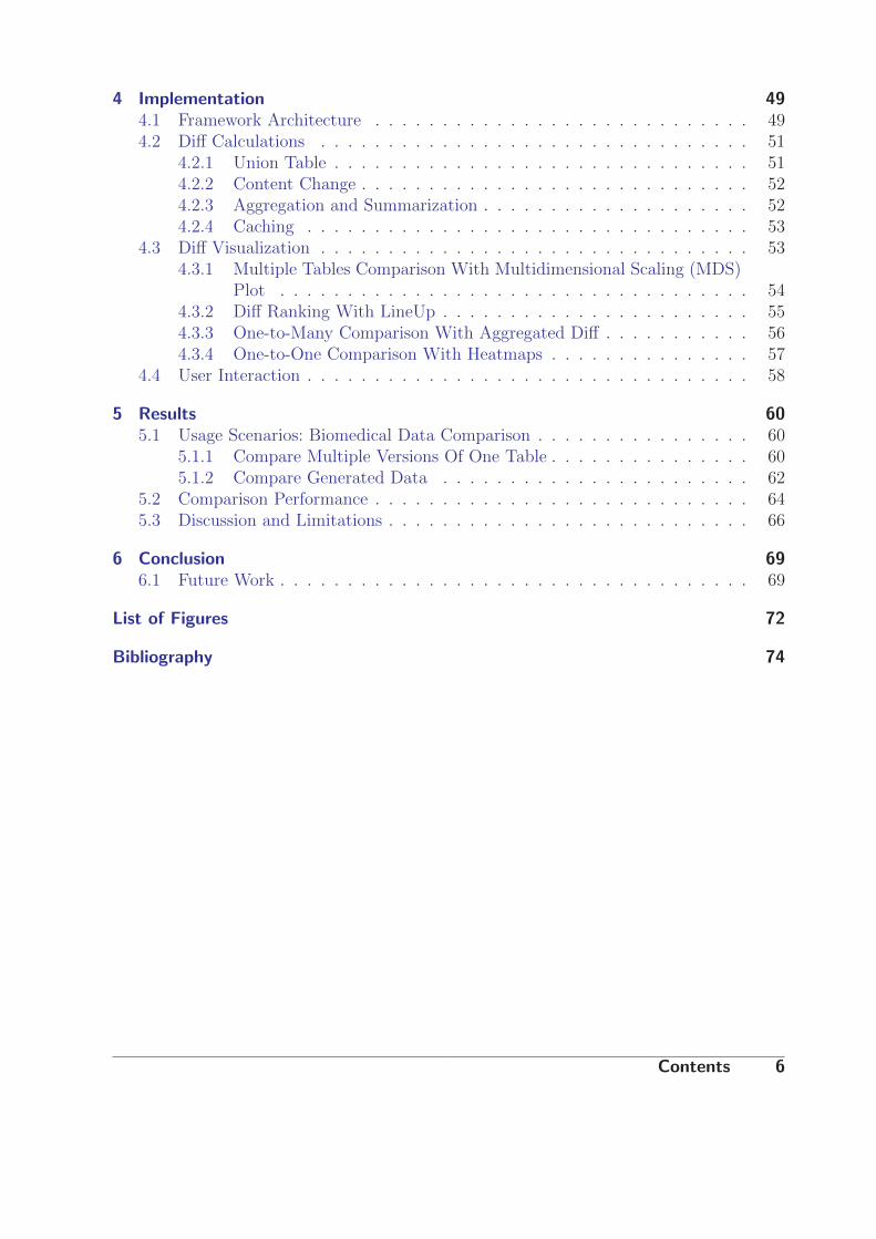
4 Implementation 494.1 Framework Architecture . . . . . . . . . . . . . . . . . . . . . . . . . . . . 494.2 Diff Calculations . . . . . . . . . . . . . . . . . . . . . . . . . . . . . . . . 51
4.2.1 Union Table . . . . . . . . . . . . . . . . . . . . . . . . . . . . . . . 514.2.2 Content Change . . . . . . . . . . . . . . . . . . . . . . . . . . . . . 524.2.3 Aggregation and Summarization . . . . . . . . . . . . . . . . . . . . 524.2.4 Caching . . . . . . . . . . . . . . . . . . . . . . . . . . . . . . . . . 53
4.3 Diff Visualization . . . . . . . . . . . . . . . . . . . . . . . . . . . . . . . . 534.3.1 Multiple Tables Comparison With Multidimensional Scaling (MDS)
Plot . . . . . . . . . . . . . . . . . . . . . . . . . . . . . . . . . . . 544.3.2 Diff Ranking With LineUp . . . . . . . . . . . . . . . . . . . . . . . 554.3.3 One-to-Many Comparison With Aggregated Diff . . . . . . . . . . . 564.3.4 One-to-One Comparison With Heatmaps . . . . . . . . . . . . . . . 57
4.4 User Interaction . . . . . . . . . . . . . . . . . . . . . . . . . . . . . . . . . 58
5 Results 605.1 Usage Scenarios: Biomedical Data Comparison . . . . . . . . . . . . . . . . 60
5.1.1 Compare Multiple Versions Of One Table . . . . . . . . . . . . . . . 605.1.2 Compare Generated Data . . . . . . . . . . . . . . . . . . . . . . . 62
5.2 Comparison Performance . . . . . . . . . . . . . . . . . . . . . . . . . . . . 645.3 Discussion and Limitations . . . . . . . . . . . . . . . . . . . . . . . . . . . 66
6 Conclusion 696.1 Future Work . . . . . . . . . . . . . . . . . . . . . . . . . . . . . . . . . . . 69
List of Figures 72
Bibliography 74
Contents 6

Chapter 1
Introduction
Many application fields require dealing with tabular data of various sizes, such as account-ing spreadsheets, software databases, biological experiments, and medical information.Users need to compare tabular data to identify changes, such as for example, detect-ing modifications in monthly payroll tables or observing differences in multiple biologicalexperiments. Visualization can help users to identify patterns and structure in tabulardatasets, and hence assist users in the comparison task. In this chapter we briefly explainthe motivation for this thesis and we define the users tasks supported in this work.
1.1 Motivation and Background Information
What is tabular data and why do we need visualization solutions to compare such data? Inthe following sections, we introduce the necessary background information to understandthis thesis.
1.1.1 Tabular Data
Tabular data is used in almost every scientific field such as biology, economics, statistics,and computer science. By tabular data we mean any dataset that is composed by rowsand columns similar to the data used in a spreadsheet such as the example shown inFigure 1.1. The intersection of a row and a column identifies a cell. We usually refer to thisdataset arrangement as a table. Munzner [Mun14] presents a similar definition of tablesas one of four major dataset types: tables, networks, fields and geometry. ”Tables havecells indexed by items and attributes.” [Mun14], where rows represent items and columnsrepresent attributes of data.
In tables, each row and column are identified by a unique identifier (ID), whichis similar to a key or an index. Therefore, each cell is identified by a pair of uniquerows and columns identifiers (see Figure 1.2). This type of tables is also known as aflat table [Mun14]. Database Management Systems (DBMS) is one example domain wheretables are usually used. Each row in a database table is identified by a unique identifier
Chapter 1 Introduction 7

Figure 1.1: A sample spreadsheet table representing the Titanic passengers data1. A rowrepresents one passenger and a column represents an attribute, for example,the age of a passenger. The intersection of a row and a column indicates a cellcontaining the value for that pairwise combination.
called a primary key. However, database tables are not the focus of this thesis, althoughour results can be generalized later and applied to database tables.
Rows and columns have an order that might be meaningful to some applications. Forexample, the order plays a major role in statistics and ranking applications. In contrast,the order is not relevant to relational database tables unless an explicit sort operation isapplied. In our work, we consider the order of rows and columns as an important charac-teristic.
Rows and columns also have semantics to represent their real-world meaning. For exam-ple, a column could represent a user name, age, time, grade, or gene expression. Similarly,a row could represent a user, patient, transaction, inventory item, or gene. Additionally, atable may include other meta-data such as the data type of each column, helping the userto interpreting a dataset correctly.
Heterogeneous vs. Homogeneous Tables
The definition of tabular data constrains how data is organized but it does not constrainthe content of the table nor the data types contained. There are two types of tables basedon their content data type. The most commonly used type is a heterogeneous table, whereeach column (or row) can have a different data type, and hence a different semantic as
1Downloaded from http://biostat.mc.vanderbilt.edu/wiki/pub/Main/DataSets/titanic3.xls
on 4.2.2016
Chapter 1 Introduction 8

i,j
Columns
Rows
A cell containing a value
j
Column IDs
iRow IDs
Figure 1.2: The structure of a table with unique identifiers per rows and columns as usedin this work. A cell is identified by a pair of unique identifiers.
shown in Figure 1.3a. The other type is a homogeneous table, in which all columns (or rows)have the same data type and semantic, and hence all cells contain values with the samedata type as illustrated in Figure 1.3b. A matrix can also be treated as a homogeneoustable.
Columns
Rows
Different data types
Data type
int text float cat
Columns
Rows
Same data type
Data type
float float float float
(a) (b)
Figure 1.3: Two examples of tables: (a) A heterogeneous table where each column canhave a different data type. (b) A homogeneous table where the columns havethe same data type (float).
Data types used in columns are commonly either categorical or ordered. Categorical datadoes not typically imply any ordering operations while ordered data can be further subdi-vided into ordinal or quantitative data [Mun14]. In this thesis, we assume that all columns
Chapter 1 Introduction 9

have the same quantitative data type, where both ordering and arithmetic operations canbe applied. Therefore, our focus is on homogeneous tables.
1.1.2 Data Comparison
Comparing multiple data items or multiple datasets is needed due to one of two reasons:
• The data changes over time, which generates new versions as a result of manual orautomated modifications applied on the older versions of the data. An example forthis is comparing a tabular data file in a version control system after modifying it.
• A different version of the data is generated independently. An example for this iscomparing two automatically generated files with each other, where the sources ofthe data are not identical. In this case, the user wants to compare those variousversions to spot the difference or see similarities.
In the case of large textual data this comparison task is not trivial, however for tabular datait gets more challenging as the user has to scan the tables cell by cell to find the change.It can get more complex when the structure of one of the tables changes by adding orremoving rows and/or columns. This change makes it even harder for a user to scan twotables to find the matching cells. This method does not scale when the user compareslarge tables of tens of thousands of rows. There are a few tools available that automatethe task of finding the difference between two tables (see Section 2.2.2). However, thesetools neither scale to compare multiple tables at the same time, nor give a readable reportof the difference between two large tables with many differences, as the comparison resultmight be thousands of lines.
Change Operations in a Table
Tabular datasets can be modified by various operations. We list here the four main oper-ations that we find relevant in our work:
1. Structural operations affecting rows or columns:
• One or more rows are added.
• One or more rows are removed.
• One or more columns are added.
• One or more columns are removed.
2. Content modification operations affecting cell values.
3. Reordering operations affecting the order of rows or columns. For example, rows canbe moved to the end or the beginning of a table by changing their original order andneighbors.
4. Merge operation affecting rows or columns, as in merging one column representing
Chapter 1 Introduction 10

first name with another column representing last name to compose one full namecolumn.
Challenges and Opportunities
We surveyed multiple tools for comparing general and tabular files in Section 2.2, butwe found that those tools are unsatisfactory to compare large tables with minimal cogni-tive effort for the user, and to cover all the change types we mentioned in Section 1.1.2.Therefore, we identify the following three challenges:
• Most of general purpose file comparison tools are inadequate for comparing tables,as is further discussed in Section 2.2.1. For instance, some of those tools consider achange in a cell value as a removal of one row and a subsequent addition of a newrow. Therefore, modifying all values in one column imitates changing all rows in atable instead of indicating that the change is in one column only.
• All the available table comparison tools we studied in Section 2.2.2 are limited tocomparing only two tables at the same time. Moreover, most of those tools are limitedto small tables, comprising a few dozen rows and columns. Finally, most of these toolsdo not detect reordering changes and none of them recognizes merge changes. Sometools are only focused on database table structure (scheme) or data type comparison.For example, when a database table column (attribute) type changes from int to date.
• The surveyed table comparison tools do not provide a visualization of the difference,beyond a textual representation. Some of the tools such as database comparison toolsare instead focused on updating (synchronizing) two versions of tables to becomeidentical.
Visual comparison tools (discussed in Section 2.3) extend the functionality of the auto-mated comparison tools and aid users in comparing multiple data objects more efficientlywith minimum manual and cognitive effort (e.g., visually comparing text files or tables).To our best knowledge there are no general-purpose tabular comparative visualization thatserves the task of comparing multiple large tables simultaneously.
1.2 Goals and Contributions
The aim of this thesis is to provide a visual comparison solution that enables users tocompare multiple tabular datasets and to find different kinds of changes. Our solutionaims to scale with two aspects of the data being compared: (1) The size of comparedtabular datasets up to a few thousand rows and columns. (2) The number of comparedtables at the same time. Additionally, the tabular comparison solution considers both tabledimensions of rows and columns at the same time.
The main contribution is the implementation of the visual comparison tool as an inter-
Chapter 1 Introduction 11

active web-based prototype, that satisfies the scalability requirements and finds multiplechange types such as structural and content changes. To achieve this, we implemented ourown comparison tool to calculate the difference between homogeneous quantitative tables.The solution is part of the Caleydo Framework 2 (see Section 4.1) and can be used tocompare multiple tables, such as biomedical data tables, at multi levels of details (see Sec-tion 5.1). In the next section (Section 1.3) we define the user tasks for such a comparativetool.
1.3 Users Tasks
In this section we outline the significant user tasks deemed necessary upon discussion ofsystem requirements with our partners and experts working on biomedical data analysis.These tasks can also be valid for tabular data from other domains. We refer to each usertask by T X; where X is its number.
T I: Identify the type of changesAs we defined in Section 1.1.2, there are four types of change operations that can beapplied to a table. The user should be able to locate such changes and identify the changetype as one of the following four types:
a. Structural changes when a row or column is either added or removed from a table.
b. Content changes resulting from modifying the value of a cell.
c. Reordering changes when a row or a column is shifted from its original position. Thisdoes not include the shift resulting from the addition or removal of another row orcolumn.
d. Merge changes resulting from a merge operation between multiple rows (or columns)together yielding only one row (or column).
T II: Compare two or multiple tablesWe identify three major levels of comparison as follows:
a. Compare all tables to all other tables (N:N) to get an overview of all available tablesand discover which tables exhibit more similarity with each other compared with theother tables.
b. Compare all tables to a reference table (1:N) to identify the difference between thisparticular table and all other tables.
c. Compare one table to another table (1:1) when we only have two tables, and we areinterested in a one-to-one detailed comparison.
The requirement for subtasks a and b is the ability to quantify the overall similarity ordifference between two tables. For example, the comparison tool informs the user that
2http://caleydo.github.io/
Chapter 1 Introduction 12

table A and table B are 95 % similar (i.e., 5 % different).
T III: Compare tables with regard to a table’s dimensionsThe user needs to achieve row-wise, column-wise and cell-wise table comparison. In allthree cases, the user should be able to choose which level is relevant in addition to thepossibility to include all three levels together in the comparison. This allows the user tofocus on one dimension of the table in the comparison while filtering the others. Therefore,the required tool should be able to distinguish between changes to the rows and to thecolumns.
1.4 Scope
The proposed visual comparison of tables can be applied to both homogeneous and het-erogeneous tables. However, for simplicity we focus our prototype on homogeneous tables.We also confine our tabular dataset to contain unique identifiers for rows and columns.The large tabular datasets that we consider can scale up to tens of thousands of rows andcolumn. However, we do not focus on Big Data aspects, as the techniques we use are notscalable to billions of rows and columns. Finally, the focus of this thesis is on visualizationtechniques that improve the users ability to achieve comparative tasks, rather than thetechniques and algorithms to compute the difference between tabular data and differentdata types.
1.5 Outline
In this thesis, we first discuss some of the relevant related work in the domains of datacomparison and visual comparison in Chapter 2. Afterwards, we explain our approach tosolve the comparative visualization of multiple large tables in Chapter 3. In Chapter 4we explain in more detail our implementation and the framework that we use. Then wepresent our final results using usage scenarios for comparing biomedical tabular data inChapter 5. Finally, in Chapter 6 we conclude this work and discuss the limitations of ourwork and the opportunities to enhance it in future work.
Chapter 1 Introduction 13

Chapter 2
Related Work
This chapter summarizes the work related to our own in four aspects. We first introducethe visualization domain with some common tabular data visualizations. Then, we presenttraditional data comparison tools, regardless of their visualization capabilities, with a focuson tabular data comparison. Next, we introduce the domain of visual comparison and howvisualization facilitates comparing complex datasets, while we summarize visual compari-son categorizations from Gleicher et al. [GAW+11]. Finally, we discuss some visualizationapproaches to compare tabular data in both its forms: homogeneous and heterogeneous.
2.1 Visualization
”Computer-based visualization systems provide visual representations of datasetsdesigned to help people carry out tasks more effectively.” [Mun14]
With the increase of generated data, it is necessary to gain a knowledge from the databoth efficiently and effectively. Visualization presents the data in a way that helps the userextract insights in the data, find interesting facts or patterns, validate computed resultsand make decisions. Visualization systems are appropriate to extend user capabilities tosolve problems.
2.1.1 Visualizing Tabular Data
The appropriate visualization of tabular data reveals patterns in the table leading toa better understanding of the data. Below we list example visualization techniques fortabular data:
Table as spreadsheet is the simplest representation for both homogeneous and hetero-geneous tables as rows and columns such as Microsoft Excel1 or OpenOffice Calc2. Thisrepresentation is easy to interpret and it shows the actual data values of cells as text in
1https://products.office.com/en/excel2https://www.openoffice.org/product/calc.html
Chapter 2 Related Work 14

a grid view as shown in Figure 1.1. Nevertheless, it does not scale to large tables withthousands of rows without the usage of filtering and searching.
(a) Scatter Plot Matrix1
(b) Heatmap2
(c) Parallel Sets3
Figure 2.1: Three possible visualizations of the Titanic passengers dataset: (a) Scatter plotmatrix based on survival, gender and traveling class. (b) Heatmap in the lowerhalf using representative numerical values of the passengers data. (c) Parallelsets based on survival, gender, age and class categories.
1Figure modified from http://orange.biolab.si/docs/latest/widgets/rst/visualize/
scatterplot.html2Figure from http://geophysik.uni-muenchen.de/~krischer/___bla___/Seaborn.docset/
Contents/Resources/Documents/stanford.edu/_mwaskom/software/seaborn/tutorial/
quantitative_linear_models.html3Figure from https://www.jasondavies.com/parallel-sets/
Chapter 2 Related Work 15

Scatter Plot Matrix (SPLOM) is a visualization technique commonly used for heteroge-neous tables, where each table column represents a dimension with a different data type.Each dimension is aligned in a matrix view where every pair of dimensions are representedas a scatter plot visualization as shown in Figure 2.1a. This visualization is helpful to findstructure and pair-wise correlation between multiple dimensions but is difficult to interpretas a table overview. Moreover, SPLOM does not scale to more than dozens of dimensions,as each additional dimension requires one additional row and one additional column in thematrix.
Parallel Coordinate Plots (PCPs) [Ins85] visualize multidimensional data by aligningparallel axes representing every dimension (i.e., column) and then drawing lines represent-ing relationships (i.e., rows) between the axes. Similarly, Parallel Sets [BKH05] are usedfor categorical data as illustrated in Figure 2.1c. The major drawback of both parallelcoordinate plots and parallel sets is that they do not scale in either axes (columns) orconnections (rows) dimension, resulting in visual clutter.
Heatmap [ESBB98] is a tabular visualization that is commonly used for visualizinghomogeneous tables or matrices, where each cell is depicted by a colored rectangle. Thecell value is mapped to a linear color scale, ranging from minimum to maximum valuesas shown in Figure 2.1b. The advantages of heatmaps are that they show patterns inthe data after sorting and clustering, and that they scale to a large number of rows andcolumns by displaying each cell in one pixel. For these reasons we use heatmaps as themain visualization for tables in this work.
2.2 Data Comparison
In this section we present the tools that usually take two files as an input and computethe difference between them based on various algorithms and then return the differenceresult as a textual or simple visual representation. We use the term diff as many othercomparison tools do to refer to the output generated from calculating the difference.
2.2.1 General Purpose Diff Utilities
Data comparison means calculating and displaying the similarities or differences betweendatasets of various types, such as textual files, class instances or database tables. One ofthe pioneer tools in this domain is Unix diff utility3, which is based on the Hunt–McIlroyalgorithm to find the longest common subsequence between files [HM76]. It is mainly usedfor comparing two text files, resulting in a textual representation of the difference knownas diff. An example of diff output is shown in Figure 2.2. An extension of Unix diff utilityis diff3 which compares three files at the same time: one reference (original) file and two
3https://www.gnu.org/software/diffutils/
Chapter 2 Related Work 16

changed ones. However, it does not scale to compare more than three files at the same time.Therefore, in order to do so (Task T II parts a and b), every pair has to be comparedindividually, then the resulting differences can be compared together, which makes thistask challenging.
Figure 2.2: A sample output of Diff Utility tool when comparing two files containingtabular data. All rows are considered removed and new ones are added as thecolumns are different between the two compared tables.
Despite the success of diff utility in comparing textual files, it does not give detailabout the type (Task T I) or the amount of change (quantified difference) when comparingother file types (e.g., binary file comparison results in whether they are identical or not).However, we seek a solution that gives more information about the type, amount andposition of the change.
The original diff utility compares files line by line, which assumes that a line is removedand a new line is added in case of modification in that particular line, instead of findinga content value change (Task T I.b). The extension wdiff covers word comparison insteadof line comparison identifying when a word is removed and a new one added in a line.
In the case of tabular data, the aforementioned tools are not sufficient at detectingchanges applied to columns only as the comparison is made at the line level (Task T III).
2.2.2 Tables Diff Tools
The tools below consider the characteristics of tabular data and provide diff results oncell and/or column levels in addition to row levels.
Chapter 2 Related Work 17

DiffKit
A useful diff tool for comparing tables in different formats, such as Comma SeparatedValues (CSV), Excel Spreadsheet, or Relational Database Management System (RDBMS),is DiffKit4. It compares tables on a cell (field) level in addition to the row level usedin Unix diff utility (Task T III). They support identifying both structural and contentchanges (Task T I parts a and b), in addition to other cross database operations, such asfinding differences between definitions of database objects. However, they do not detectreorder nor merge changes (Task T I parts c and d). DiffKit comparison parameters can beflexibly configured, such as the source file, the target file, the parts to be ignored and thecharacteristics of the resulting diff report, using customizable XML configuration files. Itcompares rows and columns based on keys specified within the data source itself (i.e., oneor multiple columns can be specified as keys, similarly to the first row as keys for columns).Also, an additional meta model can describe the properties of each column. This allowsfor fast comparison operations of large datasets comprising tens of millions of rows, as thecomparison is only applied to corresponding parts in every file.
Figure 2.3: A sample output of DiffKit that summarizes the comparison results per rowsand per columns.
DiffKit is a Java-based open-source software that provides a command-line utility tobe used in scripts or other configuration files (see Figure 2.3). It does not provide anyGraphical User Interface (GUI) and therefore it is not considered as a visual comparisontool. However, we did not visually extend this tool due to technical details in our systemand due to data requirements such as using table identifiers (keys) from separate files.Moreover, some of our datasets are in Hierarchical Data Format (HDF) file format, which
4http://www.diffkit.org/
Chapter 2 Related Work 18
is not supported by DiffKit. After revising its features, we find that this tool is best suitedfor database table comparison.
ExcelCompare
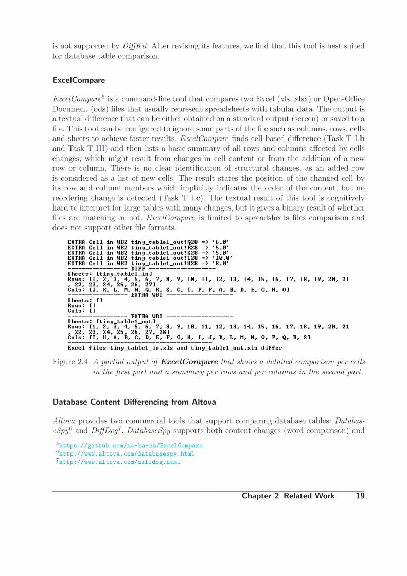
ExcelCompare5 is a command-line tool that compares two Excel (xls, xlsx) or Open-OfficeDocument (ods) files that usually represent spreadsheets with tabular data. The output isa textual difference that can be either obtained on a standard output (screen) or saved to afile. This tool can be configured to ignore some parts of the file such as columns, rows, cellsand sheets to achieve faster results. ExcelCompare finds cell-based difference (Task T I.band Task T III) and then lists a basic summary of all rows and columns affected by cellschanges, which might result from changes in cell content or from the addition of a newrow or column. There is no clear identification of structural changes, as an added rowis considered as a list of new cells. The result states the position of the changed cell byits row and column numbers which implicitly indicates the order of the content, but noreordering change is detected (Task T I.c). The textual result of this tool is cognitivelyhard to interpret for large tables with many changes, but it gives a binary result of whetherfiles are matching or not. ExcelCompare is limited to spreadsheets files comparison anddoes not support other file formats.
Figure 2.4: A partial output of ExcelCompare that shows a detailed comparison per cellsin the first part and a summary per rows and per columns in the second part.
Database Content Differencing from Altova
Altova provides two commercial tools that support comparing database tables: Databas-eSpy6 and DiffDog7. DatabaseSpy supports both content changes (word comparison) and
5https://github.com/na-ka-na/ExcelCompare6http://www.altova.com/databasespy.html7http://www.altova.com/diffdog.html
Chapter 2 Related Work 19

structural changes (also known as schema for database) as in Task T I. This tool displaysstructural database table comparison on column level (Task T III) with simple connectedlines to demonstrate column mapping between tables (see Figure 2.5). It supports auto-matic column mapping based on names, data type or position with manual override incase of conflicts or inaccuracy. It also presents content changes by aligning the columnsfrom each table side-by-side and then highlighting the different cells.
Figure 2.5: Altova DatabaseSpy Database Table Comparison Tool showing contentcomparison per columns with highlighted cells containing changed values ingreen. In the background, links represent structural matches (blue) or differ-ence (black) between table columns. Figure is by courtesy of Altova8.
In addition to comparison, DatabaseSpy can be used to update (synchronize) one of thecompared tables based on differences in the other table per cell or per entire table. In asimilar approach, DiffDog compares individual tables or entire database structures withthe possibility to compare non database files, such as text files and directories. It also hasthe ability to generate diff reports for a variety of file formats, e.g., Unix diff format andXML.
The focus of these two tools is not on visualizing the difference but rather on the patchingfunctionality of updating one table based on the difference in the other, which is a commontask in database systems to keep them synchronized. Both of the tools do not scale forcomparing more than two tables simultaneously (Task T II). Additionally, the side-by-sideapproach with highlighted cells does not scale to large tables whose content does not fitin the viewer’s field of view (see Section 2.3.1).
8http://www.altova.com/databasespy/database-compare-tool.html
Chapter 2 Related Work 20

Daff
Daff 9 (short for ”Data Diff”) is an open-source web-based table comparison tool thatidentifies multiple changes (Task T I), such as structural and reorder changes at bothrow and column levels, in addition to content changes at cell level. Figure 2.6 shows anexample output of Daff where both color encoding and an additional column/row are usedto indicate structural changes. To be able to focus on showing the difference for large tableswhile preserving the overall context and position, the tool shows ”context” rows before andafter the changed row while omitting the other unchanged ones (see Figure 2.6). Reorderchanges are indicated using the ”:” tag in the action column. Changed cell content valuesor changed columns headers are indicated in blue highlighting.
Figure 2.6: Daff table comparison tool showing structural changes on both rows andcolumns. Green and red colors encode addition and removal operations respec-tively. Rows that are neither changed nor near a changed row are omitted forspace efficiency. Figure is taken from the tool’s website10.
This tool effectively compares heterogeneous tables but it does not scale to large tablesof thousands rows and columns. Neither does it support merge operations (Task T I.d) oroperations based on identifiers (see Section 1.1.1). A scalable representation summarizingall changes is not provided.
Other Database Table Comparison Tools
AQT Data Compare11 is a commercial tool that identifies both structural and contentchanges between two database tables (Task T I) with the ability to automatically map
9http://paulfitz.github.io/daff/10http://dataprotocols.org/tabular-diff-format/11http://querytool.com/tourdcomp.html
Chapter 2 Related Work 21
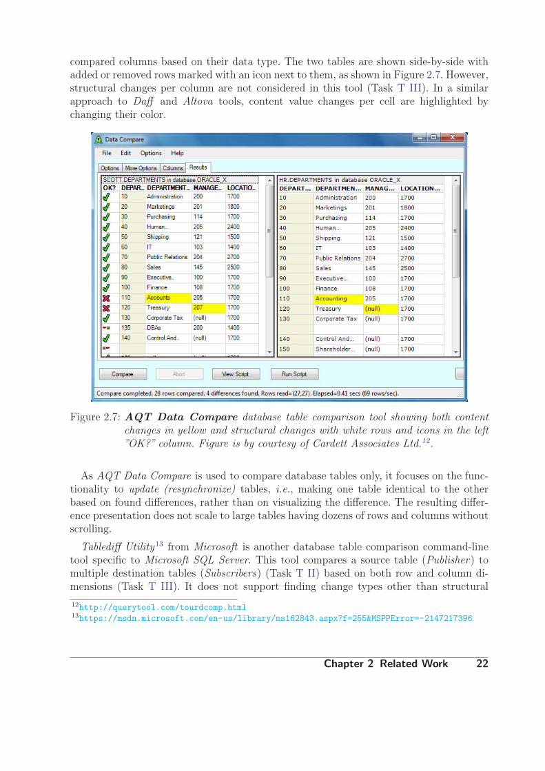
compared columns based on their data type. The two tables are shown side-by-side withadded or removed rows marked with an icon next to them, as shown in Figure 2.7. However,structural changes per column are not considered in this tool (Task T III). In a similarapproach to Daff and Altova tools, content value changes per cell are highlighted bychanging their color.
Figure 2.7: AQT Data Compare database table comparison tool showing both contentchanges in yellow and structural changes with white rows and icons in the left”OK?” column. Figure is by courtesy of Cardett Associates Ltd.12.
As AQT Data Compare is used to compare database tables only, it focuses on the func-tionality to update (resynchronize) tables, i.e., making one table identical to the otherbased on found differences, rather than on visualizing the difference. The resulting differ-ence presentation does not scale to large tables having dozens of rows and columns withoutscrolling.
Tablediff Utility13 from Microsoft is another database table comparison command-linetool specific to Microsoft SQL Server. This tool compares a source table (Publisher) tomultiple destination tables (Subscribers) (Task T II) based on both row and column di-mensions (Task T III). It does not support finding change types other than structural
12http://querytool.com/tourdcomp.html13https://msdn.microsoft.com/en-us/library/ms162843.aspx?f=255&MSPPError=-2147217396
Chapter 2 Related Work 22

changes (Task T I). To perform a fast structure comparison, tablediff Utility comparesonly row counts and column data type (schema).
In summary, there are quite a few tools that compare tabular data whether it is databasespecific or not. DiffKit is the only tool that considers unique identifiers for rows andcolumns in the comparison. Although there are few tools which consider cell contentchanges in the comparison, a change in one cell is always treated the same regardlessof a change in one character or the whole value. No quantification of the difference value isexpressed. Most of the discussed tools do not handle reorder changes and no tool considersmerge change in Task T I. For these reasons we implement our own diff calculation toolthat considers unique identifiers in table structure and the four types of change mentionedin Task T I.
The aforementioned tools produce either a textual diff only or some basic side-by-side presentation with highlighting or marking. These techniques do not scale for visuallycomparing large tables containing thousands of rows and columns. For that reason, a sum-marization technique might be necessary for comparing multiple large tables (Task T II).In the next section we further study methods that aid visual comparison of various datatypes which are essential to find a solution for visually comparing multiple tables.
2.3 Visual Comparison
In this section we present an overview of visualization techniques that facilitate comparisontasks and aid spotting differences between multiple datasets. The comparison task requiresan extension to traditional visualization systems which focus on visualizing individual ob-jects without visualizing the explicit relationship between them. Gleicher et al. [GAW+11]categorize visualization literature related to comparative visualizations. Their general tax-onomy can be applied to various comparative visualizations. This section helps in under-standing the diverse visual comparative designs and assists in designing new techniques tovisualize the difference between various data objects.
2.3.1 A Taxonomy Of Comparative Design
Gleicher et al. [GAW+11] divide the comparison design space into three basic categories,as illustrated in Figure 2.8: Juxtaposition, superposition, and explicit representation (en-coding) of the relationship between compared data objects. These categories can be usedindividually or in combination to create new intermediate categories. In the following sec-tions we briefly explain each category.
Chapter 2 Related Work 23

Figure 2.8: The taxonomy of comparative visualizations presented by Gleicher etal. [GAW+11] with three primary design categories and three intermediate onesas a result of combining two primary categories together. Each dot representsa system they have surveyed, showing the most used designs for each data cat-egory. This Figure is taken from [GAW+11].
Juxtaposition
Juxtaposition designs present each object separately, i.e., next to each other, in eithertime or space. Juxtaposition of multiple visualizations in time can be considered as ani-mation, whereas, multiple juxtaposition in space can be referred to as a small multiplesdesign [Tuf95].
Juxtaposition is easy to implement and can be applied to any visual representation re-gardless of its type. Figure 2.9a shows an example of two charts in juxtaposition alignment.When used properly, juxtaposition can help the viewer see repeated patterns and differ-ence between compared objects. Scaling up juxtaposition to compare multiple objects isachieved by small multiples that visualize a few objects at the same time in a grid view.To guarantee a successful comparison, the compared visualizations should not be complexand should be placed within the eyes direct field of view [Tuf06]. The ordering and thepositioning play a major role in the effectiveness of juxtaposition as it uses the viewer’smemory to hold the multiple items and make connections. Relying on the viewer’s abilityto identify the differences is the main disadvantage of juxtaposition design [GAW+11]. Asdiscussed in Section 2.2.2, using only juxtaposition to compare large tables is not efficientas the user has to scroll and visually match corresponding cells.
Chapter 2 Related Work 24

Figure 2.9: A simple example of Gleicher’s primary categories using chart visualization oftwo time series data (X and Y). (a) Juxtaposition design aligns the charts side-by-side using the same scale range. (b) Superposition design presents two linesthat are visually distinguished by color in the same coordination system. (c)Explicit encoding design provides visual encoding of the relationships betweenthe two series, i.e., plotting the subtraction result line. This Figure is takenfrom [GAW+11].
Superposition
Superposition design presents multiple objects in the same coordinate system, i.e., in thesame space and time, with a slightly different presentation. For example, using two differentcolors as in Figure 2.9b or slightly shifting one of the objects. This design is also knownas an overlay design as the objects overlay each other.
The advantage of superposition over juxtaposition design is that proximity explicitlyencodes similarity. The objects are placed in the same space, which decreases the cognitiveload for the user. However, superposition depends on the viewer’s visual system to recognizethe similarity and differences. Moreover, this design does not scale to more than threeobjects without the need for interaction techniques to clarify the difference [GAW+11].Comparing large tables using pure superposition is not feasible specially when consideringthat the compared tables might have different sizes and ordering.
Explicit Encoding
Explicit encoding design computes the relationships between objects and provides visualencoding of these relationships.
The advantage of this design is that the viewer does not need any effort to make thecomparison or find the difference, as it is already calculated and clearly stated. Neverthe-less, this requires a clear definition of the relationships between the compared objects anda mechanism to explicitly compute them.
The pure explicit encoding visualizes the relationships between objects rather than theobjects themselves. Figure 2.9c shows visualization of only the difference between the
Chapter 2 Related Work 25

two measurements without visualizing the original data values or ranges. This can bean advantage if the goal is to focus only on the relationships. However, this can causedecontextualization, as the viewer loses the context of the original objects, which makesit harder to connect the relationships to the original environment. Consequently, it iscommon to combine explicit encoding with juxtaposition or with superposition to preservethe context as explained later in this section.
Our work focuses mainly on this category as we try to visually encode the differencebetween two tables. The majority of the related work presented are using some sort ofexplicit encoding in addition to juxtaposition and/or superposition.
The three categories can be distinguished by how they encode the correspondencesbetween the compared parts: In juxtaposition, this correspondence is not explicitly en-coded. In superposition, proximity is used to encode correspondence, as close parts areconsidered similar. The explicit encodings use other visual encodings such as explicit linksor color to represent the relationships between similar parts. Gleicher et al. [GAW+11] as-sume that these three categories are the building blocks that all comparisons designs canassemble, whether each category is used alone or in combination with another category.
Combining Multiple Categories
Gleicher et al. [GAW+11] suggest that combining multiple primary comparative designcategories help solve the limitations of using each individual category. Hence, there arethree hybrid comparative design categories as shown in Figure 2.8:
• Juxtaposition with Explicit Encoding: This approach helps eliminate the decontex-tualization issue of using explicit encoding alone, while helping the user see theconnections between multiple parts. An example of this hybrid category is multiplecoordinated views [Rob07], as the data is visualized using different representationsin each view, where selecting a part in one view highlights the corresponding partsin the other coordinated views.
• Superposition with Explicit Encoding: This combination encodes the relationshipsbetween objects by both spatial proximity and explicit connections. Explicit encodingreduces clutter, emphasize the connections, and show various relationships that maynot be clear in superposition design.
• Superposition with Juxtaposition: This combination is not so common as it has thecontradiction of objects in the same space as well as in separate spaces. However, inpractice it can be achieved by doing multiple superpositions then displaying themside-by-side in separate views to compare them.
As we mentioned in Section 2.2, the Unix diff utility shows a textual representation ofthe different lines with the signs plus (+) or minus (-) next to added or removed textuallines respectively. The colors green (for addition) and red (for removal) can be used to
Chapter 2 Related Work 26

emphasize the type of change in many diff tools, e.g., Git Diff 14. Explicitly linking betweentext views clarifies the connection between the compared texts and their location as shownin Figure 2.10. This tool first computes the differences then visualizes them in the samespace with the original files while preserving the context. Additionally, an overview of allthe changes in the file is shown as small bars to the right of the view as in the style offocus + context.
Figure 2.10: Visualizing source code difference using NetBeans IDE15. The changed codeis highlighted with links connecting it to its supposed location in the other file.Green and red areas represent inserted and removed texts respectively. Themodified text is highlighted in blue.
2.3.2 Further Visual Comparison Approaches
There are other techniques that allow visualizing changes and facilitate the comparisontask, such as interaction, analytics and statistical calculations, and animation [GAW+11].
Interaction enhances the visual comparison. Although it is considered as explicit encod-ing in Gleicher’s taxonomy, it plays an important role in visual analysis and helps findingdifferences quicker. Examples of interactions that improve comparison include interactivehighlighting of corresponding parts in multiple coordinated views, brushing and linking,and interactive rearrangement and alignment of objects.
Analytical and statistical tools complement the comparative visualization techniquesby computing the initial comparison between complex objects (such as alignment or dis-tance metrics [GAW+11]), then visualizing the results using other visual designs. Chen et
14https://git-scm.com/docs/git-diff15https://netbeans.org/
Chapter 2 Related Work 27

al. [CWDH09] use Exemplar-based Visualization (EV) to visualize the relationship be-tween many large text corpora. First, they statistically summarize the data and then theyproject it into a 2-dimensional space using an approach similar to Principal ComponentAnalysis (PCA) or multidimensional Scaling (MDS).
Animation means changing display content over time to create an illusion of movement.It requires the use of the viewer’s memory and attention shifts to make the connectionbetween the compared objects, and it can be influenced by the ”change blindness” ef-fect [SL97]. An example of animation is alternation, where the two compared objects arevisualized alternatively in time so that the difference blinks. Another example of animationis animated transformation [WGK10], where a smooth transition between the initial andfinal result is visualized without losing the context. However, the animating transformationtechnique does not scale well when the viewer has to track multiple complex objects at thesame time. A few works used animated transformation to visualize changes, for example,in dynamic networks [BPF14] or in text file history [CDBF10] as shown in Figure 2.11.
Figure 2.11: An example of using animated transformation between two revisions of aWikipedia article to compare them as presented in [CDBF10]. Green and redcolor codings are also used to depict added and removed text respectively.
In this thesis we use both interaction and statistical tools to achieve multiple tablecomparison. As tables are large and can be considered complex objects, we do not useanimation or animated transformation to switch between the compared tables.
2.4 Comparative Visualization of Tabular Data
In the visualization literature there is no work that directly tackles the issue of a generalcomparative visualization of large tabular data. Therefore, we examine in this section threetypes of work that we find related to comparative visualization of tabular data: Matricescomparative visualizations in Section 2.4.1, tabular data comparison in parallel coordinatelayouts in Section 2.4.2, and other comparative visualizations that use tabular data innon-tabular forms in Section 2.4.3.
Chapter 2 Related Work 28

2.4.1 Matrices
Matrices are largely used in network and graph analysis as a symmetric matrix is a simpleway to represent a graph, where the rows and columns represent nodes and cell values rep-resent the connections (edges) between the nodes. Alper et al. [ABHR+13] studied for thefirst time comparing weighted graphs in a superposition design for both node-links andmatrices graph representations (see Figure 2.12) finding that the matrices visualizationoutperformed the node-links one for their chosen tasks. In a similar way to Gleicher’s cate-gorization [GAW+11], Alper et al. [ABHR+13] categorize visualization techniques for com-paring unweighted graphs into three categories: juxtaposed views, superimposed or overlaidviews and animated views.
Figure 2.12: Examples of comparative visualizations for weighted graphs. (a-b) show thegraphs as a node-link diagram with different colors for each graph. (c-f) showthe graphs as a symmetric matrix with glyphs encoding in each cell to representboth original values and differences. Figure is taken from [ABHR+13].
Figure 2.13: Behrisch et al. [BDF+14] work on comparing matrices. (a) showing 100 ma-trices ordered by time stamp (b) showing the meta-matrix that contains anoverview distance values from comparing all the matrices together (c), (d)and (e) showing the possible interactions using semantic zooming to obtainfurther information about the distance calculation.
Behrisch et al. [BDF+14] compare matrices representing networks of various sizes. Theresult is shown in Figure 2.13 as a distance meta-matrix where each cell represents a
Chapter 2 Related Work 29

distance (difference) value between two cells. The resulting visualization supports iden-tification of patterns (or outliers) at different levels of detail using semantic zoomingmechanism. They project each column in a low-dimensional space, using either Princi-pal Component Analysis (PCA) or Metric Multidimensional Scaling (MDS), then theyconnect each matching column by edges. The distance between the nodes (i.e., the lengthof the edge) represents the difference (i.e., the closer the nodes, the more similar thecolumns are). The projection per column is equivalent to one per row as the data is asymmetric matrix. Therefore, distinguishing between rows and columns is not relevant forthis work (Task T III). This work scales to compare many matrices at the same time asthe difference is aggregated and encoded in the meta-matrix (Task T II). However, theprojection view for large matrices gets cluttered due to edge crossing making it hard toread. The only change type that is visualized is content changes (Task T I). Nevertheless,the authors consider the difference in the size of the matrix as a penalty when calculat-ing the distance value. Interaction techniques can be used to exclude some elements indistance calculation and to drill-down to see details of the comparison. This work focuseson symmetric matrices and uses properties specific to them such as eigenvalues which areinvariant to similarity transformations.
Figure 2.14: The main canvas in MatrixWave [ZLD+15] where the user has highlighteda web-page from the first matrix. The sizes of nodes and links represent theaverage volume (i.e., large nodes represent many visits to this page) and thecolor indicates the difference value and sign (direction).
MatrixWave is another matrix comparison work recently proposed by Zhao et al. [ZLD+15].The studied matrices represent graphs of web click stream (event sequence data), hence,
Chapter 2 Related Work 30

the focus is on finding a path between the matrices rather than finding common patterns.As shown in Figure 2.14, the compared matrices are organized in a zig-zag layout to enablepath visualization without duplicating nodes, which might seem confusing at first sight asthe matrices are rotated by 45◦ [ZLD+15]. The change in the structure or size betweenmatrices is represented using a node with a special pattern (Task T I.a). The original datavalue in a cell is encoded using the size of the square glyph inside it, and the differencevalue to the cell in the previous matrix is encoded using a diverging color scheme; purplefor greater value in the first dataset and orange for greater value in the second dataset(Task T I.b). Superposition is used to combine the original data and the explicit encodingof the difference in one visualization.
This technique works well for analyzing event sequence data and, in particular, forfinding paths and relations between timely sequenced data. However, the visualizationdoes not scale to large tables and degenerated tables (i.e., tables with many more rowsthan columns or vice versa) as aligning these tables in a zig-zag way is space inefficient.Moreover, this layout requires ordering changes for rows or columns which may not bedesirable for tables. Although encoding the data inside each cell by a shape (glyph) hasshown to be effective in comparative matrices visualizations [ABHR+13, ZLD+15], it doesnot scale for tables with many cells as it increases the space required for each cell andmakes small differences hard to distinguish.
Figure 2.15: MatrixExplorer [HF06] visualization for analyzing social networks and therelationship between actors. Red and green colors represent the change inneighborhood in a graph which is equivalent to order changes.
MatrixExplorer [HF06] compares social networks that are visualized as matrices as shownin Figure 2.15. In this work, Henry and Fekete used the colors red and green to represent
Chapter 2 Related Work 31

the order changes of rows and columns after user interaction (Task T I.c), i.e., after filteringor selecting a row or column (an actor) to be ignored. The color encoding of cells is usedto encode communities in the network, which is relevant to the goal of that system.
In a similar way to matrix-based comparative visualizations, Polaris [STH02] visualizesa Pivot Table with glyphs inside each cell to represent the value change encoded in thesize of the glyph as in Figure 2.16. The user can then change query parameters to get animmediate visual feedback of the results. This system provides the ability to roll-up toget a complete overview of the data before drilling-down to a more detailed view. Thisvisualization is more effective than spreadsheets with quantitative values as the user canget a quick overview of the data. This approach can be considered as small multiples in atable view to visualize quantitative values, which does not scale to many cells.
Figure 2.16: Polaris [STH02] visualizing a Pivot Table where each cell contains a circle.The color represents the actual cell value and the circle size represents thedifference to the original query.
Song et al. developed DiffMatrix [SLKS12] that uses matrices to express differencesin data rather than comparing matrices. The result is small multiple representation in amatrix-based interactive visualization to compare multiple time series data. Figure 2.17illustrates the three possible difference visual encoding between each two time series in acell in the matrix: diff line as a sparkline that encodes the difference using position wheregreen encodes positive and red encodes negative values, diff area which is similar to diffline but with a filled area between the curve and the base line, and diff heatmap where
Chapter 2 Related Work 32

only a linear color is filled in each cell to represent the overall difference. The diff heatmapproved to be the least cluttered view and the most scalable view that effectively revealedinteresting spots [SLKS12]. In our work we use an approach similar to diff heatmap in orderto encode value changes as each cell is represented using a color scaling that encodes thedifference. The other two encodings (diff line and diff area) are only interesting when wehave many versions with content value changes and we want to see trends of changes overtime. However, this does not scale to tables larger than 50 rows and columns [SLKS12].
Figure 2.17: DiffMatrix visualizing the difference between time series data in small mul-tiples design using three various difference encoding (b,c and d). Figure istaken from [SLKS12].
2.4.2 Parallel Coordinate Layout
A few systems, such as CComViz [ZKG09], Matchmaker [LSP+10], VisBricks [LSS+11]and StratomeX [LSS+12] compare subsets of biomedical data using approaches similar toparallel coordinates or parallel sets. The compared data parts are visualized inside verticalaxes, then aligned side-by-side. Explicit connections are connected between the axes torepresent the relation between data in each axis.
Figure 2.18 shows Matchmaker [LSP+10], which is one primary work of the Caleydovisualization framework [SLK+09, LSKS10], that compares multiple non identical tableswhere each table represents groups of dimensions of an original multidimensional table.This work first divides the dataset into several groups of dimensions which are then individ-ually clustered and visualized as heatmaps. Afterwards, the resulting clustered heatmapsare aligned side-by-side as axes. Matching bands (ribbons) are drawn between similar sub-clusters. Selecting a cluster in one group highlights the ribbons that connect similar rowsamong all the compared groups. Interactivity allows for more detailed analysis of the se-lected ribbons, rows or group of rows. This work can scale to large tables with many rowsin the overview mode while preserving context using orthogonal stretching in the detailmode, i.e., showing captions for the selected row (record) and for the few other rows beforeand after it while hiding the non referenced ones.
Chapter 2 Related Work 33

Figure 2.18: An overview from Matchmaker [LSP+10] that visualizes and compares mul-tidimensional quantitative data representing patients and gene-expressions.Each column is a clustered group of experimental data. The ribbons connectrelated clusters to reveal the position of selected data in each of the comparedgroups.
The goal of Matchmaker is comparing groups of dimensions of one table instead ofcomparing multiple versions of the same table, which demands comparing the whole tablein both row and column dimensions (Task T III). Other related Caleydo projects areVisBricks [LSS+11] and StratomeX [LSS+12]. VisBricks focuses on one heterogeneousdataset while dividing it into homogeneous subsets (Bricks) that are easier to compareon multi-detail levels, whereas, StratomeX compares various clusters (stratifications) oftabular datasets. The connected ribbons indicate the shared patients between subsets.Although VisBricks and StratomeX are effective in comparing and visualizing subsets ofheterogeneous datasets, they do not solve the issues mentioned before with Matchmaker,such as finding column changes. However, the concept of connected ribbons can be efficientin comparing tables in regards to rows reorder and structural changes, but inefficient infinding value changes (Task T I).
Domino [GGL+14] overcomes the limitation of organizing tables horizontally side-by-side by giving additional freedom to align the tabular dataset in a 90◦ angular view wherecomparison can be made between rows and columns, rows and rows, or columns andcolumns when rotating one of the tables in the last two options. We have studied a similarapproach, however it did not scale for comparing many asymmetric large tables where alot of angular space was wasted. Additionally, the rotation requires additional cognitiveload from the user to match the related parts.
Chapter 2 Related Work 34

Comparative visualization of biological sequences has attracted a lot of interest, withmany pieces of work dedicated to support this kind of biological data analysis. For ex-ample, The Artemis Comparison Tool (ACT) [CRB+05] uses parallel sets to comparegenome sequences, where the sequences are aligned horizontally and connected by coloredbands (representing matching regions). The intensity of the color bands is proportionalto the matching percentage, and two colors (red and blue) are used to represent forwardand reverse matches respectively. It allows the comparing multiple sequences by stackingthem and applying pairwise comparison. This scales up to seven pairwise comparisons.COMPAM [LCDK06] is another work that compares genome sequences. It uses a parallelcoordinates approach and no colors. The authors focus on interaction techniques and onthe ability to drill-down to get more detail about the comparison results.
All the aforementioned visualizations use explicit encoding techniques to encode the sim-ilarity or the relationship between various datasets. It can also be combined with juxtapo-sition to show the original data. Using interaction, these techniques give a good overviewof the relationships between datasets. However, there are still limitations of juxtaposi-tion design such as the order and the number of compared items. Moreover, the abilityto effectively compare both rows and columns simultaneously is still not well resolved(Task T III).
2.4.3 Non-Tabular Layout
Below we present comparative visualizations of tabular data in a non-grid alignment. Thetablular data presented in this section are typically multidimensional where each columnrepresents one dimension and can have various data types.
VisDB by Keim and Kriegel [KK94] is a pioneer work on visualizing database queryresults in an interactive exploratory way. They make use of every pixel on the screen andcolor it to represent a dimension similarity or relevance with respect to a specific queryand then sort the resulting pixels in a spiral layout as shown in Figure 2.19. The coloring isdecided based on heuristic distance functions. The resulting visualization with interactivequerying and highlighting techniques helps the user find the most relevant query with themost matched results. This work effectively uses the screen space so that it scales to tensof thousands of data items (Task T II). However, its main goal is database querying andcannot be generalized to other tables where other types of change are relevant, such asstructure or reorder changes (Task T I).
Elmqvist et al. [EST08] compare query results from multivariate data before and after fil-tering using side-by-side starplot visualizations of selected columns in a dataset which theycall DataRoses. Figure 2.20 shows an example view of DataMeadow containing multipleDataRoses. The ratio of relative difference between multiple queries (roses) is visualized asa bar chart called Quantity bar chart or a pie chart called Quantity pie chart. This mainlyapplies to the sizes of the results which we consider as structure changes (Task T I.a).An advantage of this work is that it considers multiple large-scale datasets (up to a few
Chapter 2 Related Work 35

Figure 2.19: VisDB [KK94] comparing multidimensional data by aligning the differentquery results in a spiral layout.
Figure 2.20: DataMeadow [EST08], with DataRoses (starplots) representing multidi-mensional result tables of database queries. The quantity bar charts and thequantity pie chart show the ratios of the overall sizes of compared tables.
hundred thousand data cases [EST08]). It has the possibility to show the union of multi-ple results, the intersection of multiple input dependencies (i.e., tables), and uniquenessof one dependency, which are all considered as types of DataRose. Other advantages aregood interaction and filtering of multidimensional data, which helps the user to find the
Chapter 2 Related Work 36

best query results. However, the number of selected columns (variables) does not scaleas this is one of the limitations of starplots. In our case the number of columns can belarge. Moreover, the number of compared starplots cannot scale up as it is a limitation ofjuxtaposition design.
2.5 Discussion
Finding a solution for comparing large tabular data requires two parts: calculating thedifference between tables and visualizing the difference in an effective and scalable way.As we have studied the available tools that compute the difference between tables fromtext files, spreadsheets and databases, we found that no tool can efficiently calculate thedifference for the datasets we had. This is due to either the lack of file formatting orstructure support or to the inability to load and calculate the difference of large tables.Additionally, no tool supports all the change types mentioned in Task T I. For example,cell content changes are calculated in few tools. However, they are always treated as binarychanges, i.e., the cell is either changed or not. No quantification of the difference is providedby these tools as they treat this change as if an old cell is removed and a new one isadded in the same position regardless of the similarity between the two values. Therefore,we decided to implement our own table comparison tool that fulfills our requirements.On the other hand, the available visualization techniques are usually task specific, as forexample for networks analysis or database querying. The comparison expectations of thosevisualizations do not meet ours (Task T I). Not all available visualizations of tables canhandle large datasets. Additionally, we expect a visualization that scales up to comparemultiple tables at the same time (Task T II). Existing table comparison visualizations lackthe ability to compare the tables in both dimensions of rows and columns at the same time(Task T III). We also noticed that the diff dataset for large tabular data has never beenvisualized before. For all those reasons, we implement a visualization tool that visualizesthe diff between two large tables and allows the user to compare multiple large tables atvarious levels of detail.
Chapter 2 Related Work 37

Chapter 3
Concept
In this chapter, we explain our approach to build a tool that satisfies the requirements foreach task formulated in Section 1.3. We introduce our approach to calculate the differencebetween a pair of tables in Section 3.1 and how we visualize this difference in an interactiveinterface in Section 3.2.
3.1 Difference Calculation
As explained in the related work (Section 2.2), there is no diff tool that calculates thedifference between two tables as we need. Therefore, we implemented our own tool tocalculate the difference based on the identifiers (IDs) of each table. This speeds up theprocess as only matching rows or columns are compared with each other.
3.1.1 Diff Table
The result of a two table comparison is a new diff table that represents the union ofthe compared tables. A union operation generates the union table which contains bothidentical and distinct parts in each table as shown in Figure 3.1d. Further, the union tablehas unique identifiers for both rows (Row IDs) and columns (Column IDs) representingthe union of Row IDs and the union of Column IDs of the compared tables respectively.
The union operation is usually applied on sets where the order of items is not relevant.However, we do not ignore the order of rows and columns in the original tables as we furtherexplain in the implementation Section 4.2.1. The union table is a good presentation of bothtables without repetition of identical parts. If there is no difference between two tables,their union table has the same size as the largest table. This means that the larger theunion table is, the more different two tables are. In Figure 3.1 each circle can be consideredas one table. When we compare two tables A and B, we consider three distinguished partsin the union table: a common part between A and B (i.e., intersection), a part only in Abut not in B (A/B), and a part in B but not in A (B/A). Consequently, if we compare Ato B, the part in A only but not in B is the removed part (see Figure 3.1a). Similarly, the
Chapter 3 Concept 38

part in B but not in A is considered the added part (see Figure 3.1b). This can be appliedto both rows and columns (Task T III) to represent structural and merge changes. Thecommon part between A and B can contain value content changes and reorder changes(see Figure 3.1c). Therefore, every change type we identified in Task T I can be encodedin the union table yielding the diff table.
(a) A not B (b) B not A (c) Intersection (d) Union
Figure 3.1: Venn Diagrams with set theory basics that are used in detecting changes whencomparing tables’ identifiers. This figure is modified from1.
3.1.2 Change Types
Comparing two tables (e.g., Table A vs. Table B) results in identifying one or more ofthe four types of change: structure, content, merge and reorder (Task T I). Figure 3.2illustrates the three types of change that are identified based on IDs that can be eitherRow IDs for row changes or Column IDs for columns. For simplicity, we further describethe concept below using row examples only.
Table A
Table B
Union
Intersec�on
a b c d e
b c e f
+- +- -
b c fa e
+
b c e
Add (+) / Remove (-)
d
(a) Structure
Table A
Table B
Union
Intersec�on
b c e
Merge
b c da e
a d e
Merge / Split
a
b + ca ed
dd
Split
b + c
(b) Merge (c) Reorder
Figure 3.2: The three change types based on IDs. The union represents IDs from both tables,where the changed IDs are marked differently. The intersection represents IDsavailable in both tables.
We find structural changes by comparing the Row IDs of each table then we mark theone we found in the first table (Table A) but not in the second one (Table B) as removed
1https://commons.wikimedia.org/w/index.php?curid=3437020
Chapter 3 Concept 39

rows (e.g., a and d in Figure 3.2a). Interchangeably, the Row IDs found in the secondtable (Table B) but not in the first one (Table A) are marked as added rows in the difftable (e.g., f in Figure 3.2a). Similarly, we find the removed and added columns based onColumn IDs in each table.
Finding content changes requires cell-based search. Since we have unique identifierswe only compare cells with identical pair of IDs in each table (i.e., Row ID and ColumnID). Instead of a binary value indicating whether cells are matching or not, we find aquantitative value representing the difference (distance) between two cells. For example,in case of numeric cells, the difference can be the result of a subtraction operation. In caseof other data types, other distance metrics need to be used.
We handle merge changes on the ID level as well. They can be seen as a combinationof multiple structural changes. We assume that the Row ID of a merged row has somespecial formatting indicating its merge property and its composing rows. Figure 3.2b showsan example of Row ID b+c which is a previous merge of row b with row c. Finding thischange type requires the ability to identify Row IDs with special formatting and analyzeits sub-content. This operation is applicable on columns using Column IDs as well.
We find reorder changes based on the intersection IDs, which represent the commonIDs in both tables. Figure 3.1c shows an example where the intersection IDs have differentorders in each table. Therefore, we indicate a reorder change if the order of these IDs isnot the same in both tables. We consider that the further away a Row ID in one tableis to its equivalent Row ID in the other table, the more different they are, assuming that100% change is when a Row ID is at the beginning of an intersection ID in one tableand at the end in the other one. Using the intersection approach eliminates the issues ofreordering resulting from added or removed rows. This operation also applies to columnsusing Column IDs.
3.1.3 Table Dimensions
We define two dimensions per table namely rows and columns (Task T III). The calculationof difference, explained in Section 3.1.2, can be per one dimension only, as for instance,finding the changes applied to rows only and ignoring the changes applied to columns. It isalso possible to combine both dimensions at the same time to get the full comparison result.In case of one dimension, the structural, merge and reorder changes are only considered forthe selected dimension IDs. Whereas, the content change is always considered using bothRows IDs and Column IDs. However, the final result of content change can be summarizedbased on the selected dimension IDs (e.g., summarizing rows with content changes) asfurther explained in the next section.
Chapter 3 Concept 40
3.1.4 Multiple Tables Comparison
As stated in Task T II the user needs to compare multiple tables at the same time. Inorder to accomplish this we first compare every two tables together and then summarizethe comparison in a way that facilitates the multi-tables comparison. Summarization helpsfinding patterns but it has the limitation that we lose information. To alleviate this prob-lem, we introduce multiple levels of detail. Aggregation is needed to allow for multi-tablecomparison without overwhelming the user with many details.
Difference Aggregation
As we explained in Section 3.1.1, every two-way comparison results in a diff table. Weapply aggregation operations on the diff table to represent the difference in a summarizedway. Therefore, we find a difference ratio (distance) between two tables by calculating theratio of the changed cells to all cells in the diff table, resulting in a quantitative valuebetween 0 and 1, where 0 equals no changes, and 1 means all cells are changed. Thechanges of different types can also be summarized by counting the cells that are effectedby a specific change and normalize that number by the total number of cells in the difftable. Figure 3.3.2 illustrates an example of summarizing one diff table to ratios.
The aggregation can be applied on a coarser level based on one dimension of the tableaddressing Task T III, i.e., to aggregate the diff table per row or per column as shownin Figure 3.3.3 and Figure 3.3.4 respectively. For that we consider the changes for theselected dimension (e.g., row) while ignoring the changes from the other one (e.g., column).The same concept can be applied on subsets of a table as shown in Figures 3.3.6-7 andFigure 3.4. This is achieved by slicing the diff table into multiple other sub-tables andthen aggregating each sub-table separately. In the example shown in Figure 3.3 every tworows are aggregated together and every two columns are aggregated as well, whereas inFigure 3.4 every three rows are aggregated together. This still provides an overview butkeeps a coarse level of detail that indicates position of the changes.
At the most summarized level (overview) the user wants to know how identical tablesare. We identify a reference table to which all other tables get compared to satisfy subtask(1:N) in Task T II. However, to compare multiple tables among each others (N:N) weneed a distance matrix between every possible pair of tables similar to the one shown inFigure 3.5. Every row or column in this matrix represents one of the compared tables andeach cell contains a quantitative value that summarizes the difference between two tables.We fill in the distance matrix based on the overall difference ratio (distance) we definedearlier in this section.
Chapter 3 Concept 41

Figure 3.3: The aggregation of a diff table to ratios for the entire table and for one dimen-sion. For example, the removed ratio (in red) is representing by 0.1 ( i.e., 10%)as 4 cells out of 40 cells in the diff table are removed. The removed ratio is 0per columns as no columns are removed, and 0.1 per rows as one row out of10 rows is removed.
Figure 3.4: Aggregating content changes into bins based on sub-tables. In this example everythree rows are aggregated together to one bin. In case of non-equal division ofrows, the last bin contains the rest.
Chapter 3 Concept 42

Figure 3.5: A sample distance matrix of five compared tables. The matrix is symmetricas the cells values represent summary of the difference regardless of the direc-tion of the comparison. The distance values are between 0 and 1; where 0 meansthere is no difference found and 1 means the compared tables are completelydifferent.
3.2 Visual Comparison of Tables
In this section we introduce our TaCo approach for visually comparing multiple tables.TaCo is an acronym for Table Comparison. We project the table comparison probleminto three independent dimensions, as illustrated in Figure 3.6, where each dimensiontackles one user task from Section 1.3. The first axis contains the four types of changethat we defined in Task T I. How we approach visualizing each type is introduced in detailin Section 3.2.1. The second axis presents the table dimensions that each type of changeaffects as we further explain in Section 3.2.3 to satisfy Task T III. The third axis representsa multi-levels of detail approach to handle the multiple tables comparison in Task T II. Wefurther explain this approach in Section 3.2.2. Any comparison case can be approachedusing these three dimensions depending on the user interest in the change types, tabledimension and level of detail. The resulting system is divided into multiple views. Eachview represents one level of detail and the navigation between them equals drilling downto see a more detailed comparison as shown in Figure 3.8.
3.2.1 Visual Encoding of Difference
In this section we discuss the first axis depicted in Figure 3.6 and we describe the visual-ization approach to encode the change types as mentioned in Task T I. We visualize thecompared tables and the diff table using heatmap visualizations (see Section 2.1.1). Theadvantage of heatmaps is that they scale to large datasets. A diff heatmap visualizes thecommon (union) parts in both compared tables with various visual attributes representingthe possible change types per cell. Figure 3.3.1 shows an example of a diff table with thesame color encoding we use in the diff heatmap.
Visualizing Structural ChangeWe encode the structural changes by color in all diff visualizations including the diffheatmap. Green and red are commonly used in literature to depict addition and removaloperations respectively (see Chapter 2). On one side, people associate green color to
Chapter 3 Concept 43

Change Type
Tab
le D
ime
nsi
on
Structure Content Merge Reorder
Row
Colum
n
Figure 3.6: The three-dimensions that represent our approach to visually compare multipletabular data, consisting of change type, both dimensions of a table, and multi-detail levels. The user can choose one or more types of change and one or bothtable dimensions to consider in the comparison. The resulting difference can bevisualized in one of the levels of details.
a positive value, growth, peace, etc., which makes this color suitable to represent theaddition operation of both rows and columns. On the other side, red is perceived as anegative value and danger, which can be associated with losing information from deletion.Therefore, we use red to present the removal operation in both rows and columns.Figure 3.7a shows the usage of green and red in diff heatmap. To avoid the issue of redand green colors that affects colorblind people, that affects about 7% of male populationin Europe [GS01], we use colorblind safe qualitative colors from Colorbrewer2.
Figure 3.7: The four possible types of change and their visual encoding in a diff heatmap.
Visualizing Content ChangeContent change values are encoded by the color of each cell. Using a uniform color for
2http://colorbrewer2.org/
Chapter 3 Concept 44

all cells with changed values gives the impression of a uniform difference among all cells.However, some cells might have a larger change difference than others. For example, adifference form 10 to 20 is not the same as a difference from 10 to 400. To reflect that weneed to visually encode the calculated quantitative difference. We use a diverging gradi-ent color to illustrate the difference levels. At one side of the color scale blue representspositive value change ranging through white, in the middle of the scale, that repre-sents no changes at all, to brown representing negative value change at the otherside of the scale. Although color is not the best visual variable to indicate quantitativedifferences [Car03, Mun14], using other variables such as size or length are not possible tobe encoded in a visualization of a diff table while satisfying scalability conditions of largetables. Visualizing other change types at the same time next to content change makes itchallenging to find a proper encoding for all changes. Figure 3.7b shows an example diffheatmap with blue cells encoding positive value changes and light brown cells encodingnegative value changes.
Visualizing Merge or Split ChangeWe assume that a row merge operation is a combination of a removal of two or more rowsfrom one table and an addition of one new row in the other table. We refer to the removedrows by split as they are a result of a split operation applied on the merged row if weconsider the comparison in the other direction. Therefore, we encode the split rows bya dark red color and the added merged one by a dark green color. This encoding isapplied to both rows and columns. Figure 3.7c shows an example of visualizing two mergedrows in the diff heatmap. In case of multiple merges we depend on interaction to highlightthe matching merge and split rows/columns.
Visualizing Reorder ChangeUsing more colors to encode reorder would increase the visual clutter and make interpre-tation of color harder, leading to confusion [HW12]. Encoding the order change by arcsconnecting the old position of a row to the new one is another design possibility. However,arcs suffer from crossing and clutter in large diff heatmaps. Using interaction techniquessolves this issue by showing the relevant arcs only when the user wants to see the reorderchange for a specific row/column or set of rows/columns. Figure 3.7d illustrates an exampleof arcs visualizing reorder change in a diff heatmap.
3.2.2 Levels of Detail
To support Task T II, we use multiple levels of detail as illustrated by the second axis inFigure 3.6. This is a common approach in the visualization domain based on Shneiderman’sVisual Information Seeking Mantra [Shn96]:
”Overview first, zoom and filter, then details-on-demand”
We apply this concept in our work as we show in Figure 3.8. In the overview the user cancompare many tables with each other as long as there is a comprehensive representation forthe difference between them. Zooming means either zooming-in and zooming-out or a shift
Chapter 3 Concept 45

of the user cognitive focus from one point in the view to another one [CC05]. The secondmeaning is more relevant to what we suggest in this thesis. Zooming is usually paired withfiltering as it reduces the complexity of the view to emphasize the most interesting parts forthe user. In our approach, we allow the user to choose one interesting table to compare allother tables in a one-to-many comparison. More filtering and drilling down to see the detaildifference analysis is possible. Since the detailed diff table contains much information, itis aggregated in the one-to-many view in a way that preserves the necessary informationto understand the difference between multiple tables. The rule of decomposition [BWK00]points out that showing complex data in one view can be overwhelming to the user, sodividing it in multiple views is recommended once the data and information get largerand more complex in either size or content. Since showing details of many differences atthe same time requires a high cognitive load from the user, we show the most detailedvisualization of the diff table in a one-to-one approach between the two selected tables as”details-on-demand”.
List ofDatasets
MDSLineUp
RankingBar Charts
HistogramsSide-by-Side
Detail Diff
SelectDataset
SelectReference Table
Select MultipleCompared Tables
Select TwoCompared Tables
N:N 1:N 1:M(M<N)
1:1
DetailOverviewLevel of Detail
No. of Tables
Visualization
Action
Figure 3.8: The multiple views we propose to allow the user to compare multiple tables,starting with N tables that are compared among each others in an MDS view,then drilling down to compare one selected reference table to all others, throughthe aggregated view using bar charts and histograms visualizations, and finallyvisualizing only two tables with their diff heatmap in a one-to-one comparison.
Many-to-Many Comparison
We use Multidimensional Scaling (MDS) to visualize the difference between multiple ta-bles. The MDS algorithm positions the items (in our case tables) in an N-dimentional(2-dimentional) space where the distance between two items is proportional to the differ-ence between them. The larger the distance, the more different the items (tables) are. Thedifference values are obtained from the distance matrix we calculate after summarizingevery diff table to ratios (see Figure 3.3.2). The result of the MDS algorithm is usuallyvisualized as a scatter plot. Revealing patterns and groups in the visualization can indicatepatterns of change among multiple tables. The advantage of the MDS scatter plot visual-ization is that it scales to hundreds of items. Therefore, as long as we can calculate diff
Chapter 3 Concept 46

tables between one table and all the others, and then aggregate them, we can visualize thetable as an item in the MDS scatter plot. This visualization is considered as a superposi-tion visual comparison because it depends on the user to estimate the position, and henceevaluate the difference.
One-to-Many Comparison
We propose three visualizations to show the difference between one selected table (wecall a reference table) and multiple other tables: (1) a single stacked bar plot, (2) a 2-dstacked chart, and (3) a stacked bar chart (histograms). The visualizations are ordered froman overview comparison visualization based on the diff ratios, to more detailed differencevisualizations using bar charts per dimension. This allows the user to drill down on demandto see more details about the comparison.
In an introductory overview visualization we show the ratios of the various change types(defined in Task T I) as percentages in a stacked bar plot as shown in Figure 3.3.2.This aids the user in distinguishing between the tables based on the change types butwithout overwhelming her with too many details. Sorting and filtering mechanisms helpthe user in finding the tables with the most (or least) difference. Therefore, we use LineUp,an interactive multi-attribute ranking solution proposed by Gratzl et al. [GLG+13]. Anexample of a LineUp visualization is further discussed in Figure 4.6. The original workcan be used to compare multiple items based on various attributes. In our work we assumethat each item represents the difference of one table compared to the reference table, andthe attributes are the various change types. Additionally, LineUp gives the user the abilityto customize the weight of each change type in the overall ranking. This solution enablesthe user to emphasize one change type over the others, for example, value content changescan be twice as important as the structural ones. LineUp also allows the user to remove orcombine multiple attributes which gives flexibility to steer the comparison. The result ofLineUp gives an overview visualization of the ratios of difference in the entire diff tableusing the same color encoding explained in Section 3.2.1.
The next visualization shows the ratios of the change types per dimension, i.e. forrows only or for columns only. Figure 3.3.5 shows an example of a 2d-ratio visualization,which is more expressive when the changes per columns have a different meaning than theones per rows and combining them is rather ambiguous.
Since a complete detailed diff visualization needs more space, we compress it and projectthe difference into one dimension as shown in Figure 3.3.3 and Figure 3.3.4 for rows andcolumns respectively. The bar chart visualization indicates the changes per one row orcolumn (encoded in the length of each bar). Structure, merge and content changes cannotoccur together in one row or column (see for example rows r1 and r5 in Figure 3.3).Therefore, every bar represents one change type. Howerver, reorder and content changescan occur together. As a result, we use a stacked bar chart to visualize them both usingtwo colors.
Chapter 3 Concept 47

The bar chart visualization does not scale to clearly present every row (or column) ofa large table. To overcome this limitation we use a stacked bar chart as an aggregatedvisualization of the diff table we call diff histogram . For that we aggregate every fewrows or columns (i.e., bars) to become a bin representing multiple changes in a sub-part ofthe table as shown in Figures 3.3.6-7. This technique scales to a very large table, since wecan divide it and obtain the summary of each sub-part individually. Figure 3.4 illustratesanother example of a diff histogram where the quantity of the changes and their positionsin regard to the entire table are visible.
The aforementioned three visualizations are all aggregation of the diff table to make itpossible to align them side-by-side (juxtaposition) to compare them together to achievecomparing the difference between one reference table to many others (Task T II).
One-to-One Comparison
We align the two compared tables visualizations (heatmaps) side-by-side. Encoding thedifference by applying color over the original data causes confusion, especially since someheatmap implementations already use three colors to illustrate the data values in the table.We visualize the difference in a diff heatmap in the middle of the two compared tablesand we keep the original heatmaps unmodified as shown later in Figure 4.8. To reducethe cognitive effort necessary to do the matching we provide highlighting and tooltipinformation based on the user interaction.
3.2.3 Per Dimension Comparison
The third axis in Figure 3.6 means that all the possible visual comparisons should considerboth rows and columns and allow the user to select only one dimension or both of them(which addressed Task T III). As explained in the previous sections, we consider bothdimensions (i.e. rows and columns) separately with the possibility to combine them. Forexample, the diff ratios, the diff bar charts, the diff histograms and the diff heatmapvisualizations all can show the difference for rows only, columns only or both rows andcolumns at the same time.
Chapter 3 Concept 48

Chapter 4
Implementation
In this chapter we introduce our prototype implementation of TaCo as a web-based in-teractive visual tables comparison tool. We first explain the software architecture andframework used in this implementation to load, process, and visualize the tables and theirdifference in Section 4.1. Then we briefly explain the basic techniques and algorithms usedto calculate and visualize the difference in Section 4.2 and Section 4.3 respectively. Finally,in Section 4.4, we present the interaction techniques used in the user interface.
4.1 Framework Architecture
We implemented TaCo using a client-server software model built in the Caleydo WebFramework 1 [GGL+15], which is an open-source visual analysis framework to analyze andvisualize biological data as well as other dataset types. Caleydo Web can load, process,and visualize data of various types, sizes and complexity [GGL+15]. It also integratessome data mining and machine learning algorithms to facilitate data analysis such asclustering. The advantage of this framework is that it can be extended using plugins whichmakes it flexible to support various data types, data storages or formats, algorithms andvisualizations. Plugins can exist either on server side or on client side. Caleydo Web takescare of the necessary dependencies management for each plugin, which facilitates addingnew plugins with minimal changes or dependencies.
We build the client and server parts of TaCo as two Caleydo Web plugins: (1) TaCoserver as a Python2 server plugin using Flask Framework 3, and (2) TaCo web-based clientas a JavaScript (JS)4 client plugin using Data-Driven Documents (D3)5, a JavaScript visu-alization library [BOH11], Hypertext Markup Language(HTML)6, Cascading Style Sheets
1http://caleydo.org/2https://www.python.org/3http://flask.pocoo.org/4https://developer.mozilla.org/en-US/docs/Web/JavaScript5http://d3js.org/6http://www.w3.org/html/
Chapter 4 Implementation 49

(CSS)7, and Bootstrap8 for user interface styling. The client and server exchange datausing a REpresentational State Transfer (REST) interface.
On the server side we use Caleydo Web server to load and access the tabular datasets(mainly tables stored in Comma Separated Values (CSV)9 or Hierarchical Data Format(HDF)10 files) as illustrated in Figure 4.1. This gives us access to the actual data inside thetables and the corresponding row and column identifiers. The processing and comparing ofthe tabular data and identifiers are done in TaCo server (as explained next in Section 4.2).The comparison results are sent in a JavaScript Object Notation (JSON)11 format to theclient side using Flask REST interface.
On the client side, TaCo client extends Caleydo Web by a Diff Table data plugin thatrepresents the results of the tables comparison from the server. This data is then visualizedin TaCo by six various diff visualization plugins shown in Figure 4.1 (see Section 4.3).All the diff visualizations (except for LineUp) were implemented as TaCo visualizationplugins using JavaScript, HTML, D3.js for handling the data and Document Object Model(DOM)12 for drawing. To show the original tables as heatmaps, we used an optimizedcanvas version of Heatmap visualization from Caleydo Web that minimizes the overloadon the client side.
Figure 4.1: The architecture of TaCo showing the plugins and the interactions between thecompononents.
Caleydo Web facilitates managing and mapping identifiers between tables, i.e., when acell with particular Row ID and Column ID is selected in one table, this is reflected incells from other tables with identical identifiers. This provides the basis to build a MultipleCoordinated Views (MCV) system.
7http://www.w3.org/Style/CSS/8http://getbootstrap.com/9https://tools.ietf.org/html/rfc4180
10https://www.hdfgroup.org/11http://www.json.org/12http://www.w3.org/DOM/
Chapter 4 Implementation 50

4.2 Diff Calculations
In this section we explain the most important algorithms and implementation decisions wemade on the server side where we calculate the difference between tables. We used Pythonwith NumPy13 package to manage and process the tables and their identifiers. We do allthe comparison and aggregation operations on the server side as it is more efficient, easier,and faster using Python and it decreases the load on the client side.
4.2.1 Union Table
As we explained in Section 3.1.1, we apply a union operation on the identifiers fromboth compared tables to create a union table where we mark the difference between twotables. When implementing this concept, we had an issue where all the available unionimplementations ignored the order of items (which represent in our case IDs) as a unionoperation is usually applied on sets without order. Sorting the union result alphabetically orbased on further condition introduces the issue of losing the original order of the identifiersas we do not know the original ordering condition of the IDs.
Figure 4.2: The steps to calculate the union of IDs in a quick way while preserving theorder of at least one list. This applies for both Row IDs and Column IDs.
In order to calculate the union table, we calculate the union of Row IDs and ColumnIDs separately and then we match the table content based on the identifiers. Figure 4.2shows an example of the calculation steps of the union operation on IDs : (1) We firstinitialize the union IDs list with the longer ID list (i.e., A). (2) We insert the differentparts from the shorter list (either removed or added IDs based on wether it is a sourceor a destination table) to the union IDs list. (3) This insertion considers the order of theID and its neighboring IDs in the original list, i.e., we search for b in the union IDs list.(4) We insert the added ID g after the neighbor ID b. If the first degree neighbors are
13http://www.numpy.org/
Chapter 4 Implementation 51

not yet in the union list then we consider the next neighbors until a common neighbor isfound, e.g., if b and c are not available in the union list then we search for d. Otherwise,we insert g at the end of the list.
The choice to start with the longest list is to minimize the search for the suitable positionto only the shorter list, and to preserve the order of the longest list as it has the largerimpact. This could also be configured to start always with the source list or the destinationlist regardless of the length. The decision to insert the different IDs based on their neighborsis to preserve the context and the order of rows and columns in the compared tables asmuch as possible. Another possible solution would be to insert all different IDs at the end,which is faster but loses the original position of the different IDs, i.e., rows and columns.
4.2.2 Content Change
As we mentioned in Section 3.1.2, we compare the content of only the common cells inboth tables, i.e., the cells of intersection Row IDs and intersection Column IDs. Afterordering both tables based on the intersection IDs, we use one subtraction operation toobtain a table with the difference values. Then we normalize the resulting table to obtainonly diff values in the range [−1,1]. Ignoring the sign results in values in the range [0,1].However, the sign represents whether a change was a decrease or increase and we considerit as a significant indicator of difference specially in quantitative values.
4.2.3 Aggregation and Summarization
Aggregation is needed to provide efficient comparison results between multiple tables as wediscussed in Section 3.1.4. The three aggregation concepts of diff ratios, diff 2d-ratio, anddiff histogram (bar chart) are implemented on the server side using Python and NumPy.
Diff Histogram
The number of bins in the diff histogram is configurable based on the user’s preference.Based on this number the table is then separated twice: once per row bins and once percolumn bins. The number of rows/column are equally in all bins if possible. Otherwise,the last bin always contains less number of rows/columns as shown in Figure 3.4.
Multidimensional Scaling (MDS)
We use the similarity values calculated from the summarized diff tables to apply the MDSalgorithm in Python (i.e., from the diff ratios). For that we used an available Metric MDSimplementation from Scikit Learn package under Manifold learning methods14. In Metric
14http://scikit-learn.org/stable/modules/manifold.html#multidimensional-scaling
Chapter 4 Implementation 52

MDS the distance between two output points is set to be as close as possible to the inputsimilarity value obtained from the distance matrix (see Figure 3.5). The output is a pairof point coordinates (x, y) where each point represents a table. These coordinates are thensent to the client side to be visualized inside an MDS plot.
4.2.4 Caching
When dealing with large tabular data, storing results from repeated operations saves afew minutes of calculation time. Consequently, we consider caching as an essential part toimprove the performance of our system. In an initial version we tried Python’s solutionspickle15 and shelve16 to store the diff results to quickly reuse it when applying aggre-gation to compare multiple tables. However, these solutions perform only well in storingsmall-sized objects. Therefore, we implemented our own cache to store the results of thecomparison at various levels of detail (see Figure 4.1). The results are saved as JSON filesthat can be either sent directly to the client side or parsed internally on the server forreuse. For instance, when adding a new table to compare it with multiple other tables,only the difference between the new table and the others will be calculated and aggregated,rather than calculating and aggregating the differences between all the other available ta-bles again. The diff table is calculated once and stored in the cache. This allows for flexiblediverse aggregation configurations at any time. The results of the aggregation are cachedas well.
4.3 Diff Visualization
On the client side we use Promises17 to asynchronously handle the requests and responsesto and from the server. We visualize the comparison results obtained from the server in amultiple views tool between which the user can navigate to get the desired level of detail.Figure 4.3 shows the possible views in TaCo that we align horizontally assuming that mosttables are vertically long and a wide display would allow for showing multiple views at thesame time. The user can enlarge one view, split the display between two views, or slideto the next one. A slider in the control bar gives the user the control to slide between theviews using animated transition. Figure 4.4 displays an example of the slider and the fivepossible navigation options grading from the overview view to the detail view. In TaCowe use consistent multiple views where all colors and shapes have the same meaning in allviews [BWK00]. We also consider consistency in state as when one table is selected in oneview, it is highlighted and visible in the next view as well. Further interaction techniquesare available to help the user navigate between views and configure the comparison as weexplain later in Section 4.4.
15https://docs.python.org/2/library/pickle.html16https://docs.python.org/2/library/shelve.html17https://www.promisejs.org/
Chapter 4 Implementation 53

MDS Plot
LineUp
Aggregated View Detail View
Control bar
User Display
Overview Middle Detail
Figure 4.3: The multiple view setup in TaCo where each view shows a distinct visualizationof the difference between tables. The user can slide between the views. The blueborder represents an example of what is shown in case of showing both overviewand middle view at the same time. The control bar is always shown at the top.
Figure 4.4: The navigation slider in the control bar that allows the user to switch smoothlybetween the views: (1) Overview showing MDS Plot and LineUp, (2) Splittingthe display between overview and middle view as shown in Figure 4.3, (3)Aggregated view, (4) Splitting the display between aggregated view and detailview, (5) The current selected position showing detail view only.
4.3.1 Multiple Tables Comparison With Multidimensional Scaling(MDS) Plot
The user can select the tabular datasets to load in the first overview view. Each table isthen represented in the MDS plot as a small square point as depicted in Figure 4.5b. Weobtain the result of the MDS algorithm as coordinates of points in 2-dimensional spaceas explained in Section 4.2.3. The distance between the points represents the differencebetween the tables. We tried other miniature visualizations of the original tables in theMDS plot as shown in Figure 4.5a instead of the small squares. However, that approach
Chapter 4 Implementation 54

neither gives additional readable information to the user nor scale to many tables. Thename, size and version of each point (table) is provided on demand using a tooltip. Oncethe user selects a point (table), it is selected as a reference table and compared to all othertables in the LineUp view, as explained next in Section 4.3.2.
Figure 4.5: Examples of MDS Plots (a) with miniature heatmaps representing each table,and (b) with small squares as we use in our final implementation.
Figure 4.6: An example of LineUp showing the comparison of ”Taco multiple input” tableto 19 other tables. The results are sorted ascendantly by a combination of allchange types.
4.3.2 Diff Ranking With LineUp
LineUp18 is an open-source interactive visualization to explore rankings of items based onmultiple attributes [GLG+13]. The result of LineUp is visualized in a table view where
18http://www.caleydo.org/tools/lineup/
Chapter 4 Implementation 55

each row represents one table and its diff summary to the reference table (Task T II(1:N)), and each column represents one change type: structure, which is split into additionand removal, content, merge and reorder (Task T I). Figure 4.6 shows a LineUp viewwith tables sorted by types of change on the left side and the same tables sorted by onlycontent changes on the right side. The intersection of one row and one column in LineUprepresents the ratio of this change type (in comparison to the reference table). This yieldsa bar chart for each change type. The bars for different change types can be combined to astacked bar chart, where the longest bar represents the most different table. The user cansort the result based on any change type. She can also adjust the width of the columns toincrease or decrease their weight in the comparison. This flexible interactive configurationallows various comparisons between multiple tables. The user can select two or more rows(i.e., tables) from this view to be compared in more detail in the next view, as explainedin Section 4.3.3.
4.3.3 One-to-Many Comparison With Aggregated Diff
In order to compare multiple tables in more detail, the user can see in coarser detail thedifference between a few selected tables in the aggregated view as illustrated in Figure 4.7.In this view we show a heatmap illustrating the reference table (Figure 4.7a) next to threepossible aggregated diff visualizations:
• Columns diff histogram presenting an aggregation of the difference in all columnsinto bc bins. Figure 4.7b shows an example of 10 bins (e).
• Rows diff histogram presenting an aggregation of the difference in all rows into brbin. Figure 4.7c shows an example of 30 bins (f).
• A 2d-ratio chart presenting aggregated ratios of the change types in both rows andcolumns dimension. Figure 4.7d shows an example with three types of changes inboth rows and columns.
We have three possible layouts, depending on the chosen dimensions:
• Aligning the columns diff histograms from multiple tables in a parallel layout ontop of each other (juxtaposition) to allow the user to compare only the changes percolumns (see Figure 5.2).
• Aligning the rows diff histograms from multiple tables in a parallel horizontal side-by-side layout to let the user compare the difference between tables per row changes.
• Aligning both columns diff histograms and rows diff histograms in a 90◦angular shapewith the 2d-ratio in the middle to show changes in both row and column dimensions.Figure 4.7 shows an example of this layout.
Each bin in a diff histogram is represented as a stacked bar where each part representsa type of change. We use the same color encoding explained in Section 3.2.1. When theuser hovers over one bin in a diff histogram, percentages of the change types are shown in
Chapter 4 Implementation 56

Figure 4.7: TaCo middle (aggregated) view showing the possible aggregation visualizationsof multiple diffs. This layout shows both rows and columns changes of 15 ar-tificially generated tables. The numbers of bins per rows (br = 30) and percolumns (bc = 10) can be configured to best represent the dimensions of tablesaccording to the user’s preference.
a tooltip. Selecting one table in this view will enable the next detailed view of one-to-onecomparison that is further explained in Section 4.3.4.
4.3.4 One-to-One Comparison With Heatmaps
The most detailed view shows a comparison of two tables side-by-side as displayed inFigure 4.8. The original two tables are visualized as heatmaps with gray-scale colors toindicate the cell values. The comparison result is visualized as a diff heatmap in the middlebetween the original tables. Structure, content and merge changes are indicated using colorsin the diff heatmap. The user can control the color scale of content changes using a two-handled slider as shown in Figure 4.9. In the current version of TaCo, reorder changesare not implemented in the detail view, as they still need further research to find a spaceefficient solution. Hovering over a cell in diff heatmap shows the corresponding Row ID,Column ID, the original and the normalized change values.
Chapter 4 Implementation 57

Figure 4.8: One-to-one detailed comparison between two tables. The difference is encodedin the middle diff table and visualized as a heatmap using red for removal, greenfor addition, blue to brown for positive to negative value changes respectively.
Figure 4.9: A slider in the control bar allows the user to set the color scale of the contentvalue changes in the diff heatmap. The change values are normalized to [-1,+1].The default color scale ranges from brown over white to blue.
4.4 User Interaction
Interaction is often used to overcome the limitations of too large or too complex datasets. Itlets the user manipulate the current view by applying some queries to select (or deseclect)aspects of the dataset or apply some visual encodings in the display [Mun14]. In thisthesis we allow the user to navigate between multiple views that represent multiple levelsof details. Additionally, the user can select or deselect the desired comparison parametersfrom the user interface to apply on the table comparison and visualization.
Control BarThe header part of TaCo displays a control bar that is visible in all views (see Figure 4.3).The control bar consists of four parts:
• Dimension buttons, which let the user choose whether the comparison is per rows only,
Chapter 4 Implementation 58

per columns only or per both dimensions together (Task T III) (see Figure 4.10a).
• Change type buttons, which let the user choose the types of change to be included inthe comparison (Task T I) (see Figure 4.10b).
• Level of Detail slider, which lets the user navigate through the views according to thedesired detail as shown in Figure 4.4.
• Color slider, that is available only when the detail view is open (see Figure 4.9). Itlets the user control the intensity of the content value changes colors as shown inFigure 5.5.
Figure 4.10: A multi-selection buttons that let the user choose (a) the comparison dimen-sion and (b) the type of changes to be visualized. The user can choose one ormore of each group at the same time.
Another small control bar is visible in the aggregated view only with two parts that letthe user control the level of aggregation:
• The number of bins for columns (bc) in the horizontal columns diff histogram.
• The number of bins for rows (br) in the vertical rows diff histogram.
Figure 4.7e and Figure 4.7f display an example where these two numbers are configureddifferently.
Chapter 4 Implementation 59

Chapter 5
Results
We tested our prototype TaCo using biomedical dataset from The Cancer Genome Atlas(TCGA) Project1. We discussed the tasks defined in Section 1.3 with domain experts toget feedback about possible usage scenarios in the biomedical domain. In this chapter wepresent the features of TaCo with two usage scenarios. We also state the performancetime needed to calculate the differences between the used biomedical data, and we showthe improvement when using caching. Then we discuss our findings when working withcomparison of large tabular data, and we indicate the strength and weakness of our work.
5.1 Usage Scenarios: Biomedical Data Comparison
The data we use in this section is a public biomedical data obtained from TCGA Firehoseprocessing workflow2 containing multiple tables that represent genome data, such as butnot limited to messenger RNA (mRNA), micro RNA (miRNA) and DNA methylation,which affects a type of brain cancer called Glioblastoma Multiforme (GBM)3. All the datawe use is homogeneous tabular data where all cells are numeric. However, rows and columnshave different semantics, e.g., gene expressions in rows and patients in columns. Based onthis data, we defined with our collaborators two reasons for table comparison in Section1.1.2: (1) The tables are temporally related data, and thus one version is a modificationof the version before. (2) Each table can be a result of data generation operations, such asthe output of a process or a pipeline of processes, which leads to rather different tables.Comparing this data in both cases assists the analysts in confirming or rejecting hypothesesthat affect the usage of these tables in other applications.
5.1.1 Compare Multiple Versions Of One Table
Mutation datasets represent tabular data modified at various timestamps. Each table con-sists of about 9500 rows representing genes and about 290 columns representing patients.
1http://cancergenome.nih.gov/2http://gdac.broadinstitute.org/3http://gdac.broadinstitute.org/runs/analyses__latest/reports/cancer/GBM/
Chapter 5 Results 60

Figure 5.1: The overview of TaCo showing a comparison of multiple tables of Mutationdatasets.
Figure 5.2: The display is split between middle view showing only structural changes percolumns among six selected Mutation tables, and detail view showing the com-pared two tables and their diff as heatmaps.
Figure 5.1 shows the first overview in TaCo to compare those tables. (a) The user selectsthe Mutation datasets. (b) MDS plot shows all tables where four distinct tables are shown.The other tables are overlapping with them as they are identical (i.e., their distance is 0).(c) The user selects one table point from the MDS plot and sets it as a reference tableto be compared to all other tables shown in the MDS plot. (d) The ratios of change inLineUp are small (between 3.2% and 5.4%) and they increase over time as the reference
Chapter 5 Results 61
tables is the oldest table among the others. (e-f) In order to emphasize the small ratios inLineUp, (f) the user adjusts the ratios range in LineUp to be maximum 5.5% instead of(e) the default 100%.
The user further compares all tables to the same reference table by selecting all rows inLineUp. The user is mainly interested in structural changes per columns in this datasetas they represent changes in regard to patients. Therefore, she deselects rows from thedimensions buttons and deselects content changes from the change types buttons as shownin Figure 5.2 (a and b respectively). The middle view is enlarged while showing (c) thereference table as a heatmap and (d) all the available tables of this dataset comparedhorizontally using columns diff histograms showing structural changes and their positionsrelative to the entire table. This view shows the same column changes in all tables exceptthe last three tables, which indicates additional removed columns to the right as shownin Figure 5.2d. (e) The user selects the last table to be compared in the detail view. (f)This shows the exact position of the removed column in the selected table. When the userhovers over the column, she gets the Column ID which represents the removed patient inthis scenario.
5.1.2 Compare Generated Data
Results of calculation or analysis operations can be generated in the form of tabular data.The user usually wants to compare various generated results to see the pattern of change.It is important for the user to know the difference in the sizes of the resulting tables (i.e.,structural changes). This gives her an impression of changes in the system configurationthat caused structural changes. Figure 5.3 shows both the overview and middle view inTaCo when performing the following interactions: (a) The user chooses micro RNA datato compare. (b) The MDS plot shows the comparison among all tables. (c) There arefour identical tables overlapping as there is no change between them. (d) The user selectsone table from the MDS plot to compare to all other tables. (e) The summary ratios inLineUp shows high content change ratios for all tables, which is expected as each table isa result of an independent operation. (f) Four of the tables have the same change ratios,which explains the overlapping in MDS plot (c). The user chooses to further compare allthe results by selecting them in LineUp as they are highlighted in (e). (g) The middleview is enlarged and multiple 2d-ratio shapes show all the change ratios for both rowsand columns dimensions at the same time. This view indicates that there are structuralchanges per columns more than structural changes per rows. (h) The user selects the lasttable to see the change patterns and values in detail.
Figure 5.4 shows (a) the user interface split into the middle view and the detailedview after step (h). (c) The diff heatmap between (b,d) the original tables heatmaps showsclear detailed structured changes: Multiple columns are added, few rows are added and fewrows are removed. (e) The content changes are lightly colored representing too small valuechanges except one column with high value changes. (f) To see further patterns the user
Chapter 5 Results 62

Figure 5.3: Overview and middle view of micro RNA tables comparison showing both struc-tural and content changes for rows and columns at the same time.
Figure 5.4: Middle and detail view of micro RNA tables comparison showing both structural
and content changes using color encoding.
Chapter 5 Results 63

controls the color scale using the color slider to the top of the view. Figure 5.5 illustrates thedifference between using (a) the default color scale based on the largest change value and(b) the customized scale with enhanced color for small values. The patterns show identicalchange values along each row, which indicates the same modifications in micro RNA datain every patient. The user chooses another table from the aggregated view to compare inthe detail view (see Figure 5.4g). The resulting diff heatmap shown in Figure 5.6 displayssimilar change patterns to the one compared before. This indicates that such a changepattern is expected for micro RNA data.
(a) Normal Colors. (b) Enhanced Colors.
Figure 5.5: The diff heatmap shown in Figure 5.4 using two different color scaling.
5.2 Comparison Performance
Developing an interactive visualization system for large tabular data is a challenge, sincethere are multiple data items that need to be calculated and visualized in a minimalresponse time. As we analyzed the response time in TaCo, we found that the bottleneckof comparing two tables lies in the execution of difference calculations, including the fourchange types (structure, content, merge and reorder). Therefore, we calculate the differenceon the server side and then send the result to the client side. For instance, the time needed
Chapter 5 Results 64

Figure 5.6: Detail view in TaCo of comparing two micro RNA tables with a diff heatmapthat shows similar content changes in each rows.
Figure 5.7: The time needed to calculate the diff table between two tables with content andstructural changes. Caching the diff results clearly enhance the performance forlarge tables.
to calculate the diff table between a Copy Number table of 24174 rows x 571 columnsand another Copy Number table of 24174 x 563 took 30.27 seconds. Transmission timeof the result to the client was 4.33 seconds. Whereas, the time to draw the diff heatmapwas only 1.5 ms. In the implementation (as illustrated in Figure 4.1) we use caching of
Chapter 5 Results 65

the diff results at multiple stages to eliminate the need to recalculate existing results.Figure 5.7 illustrates the time needed to calculate the diff table between two tables beforeand after using caching on the server side. The size axis represents the size of the largestcompared table by cells (rows x columns), where the size difference is small compared tothe other table (less than 100 cells). The compared tables had both structural and contentchanges at the same time, and both rows and columns were considered in the comparison.The caching service decreased the time required to calculate a detailed diff table by anaverage of 71.4%, which leads to a better user experience. We assume that further timeimprovement can be achieved by caching the results on the client side, which eliminatesthe time required to send the request to the server and download the response. However,further implementation and testing are required to confirm that in future work. All themeasurements are done on a laptop with Intel Core i7-4600U CPU processor with 2.10and GHz 2.70 GHz clock frequency and 8 GB RAM memory.
5.3 Discussion and Limitations
ScalabilityThe goal of this work is to overcome the scalability limitations of other tabular comparisontools we mentioned in Chapter 2. We identify two kinds of scalability:
1. Scalability of the size of tables that we compare and visualize. We use heatmaps tovisualize large tables, since it scales up to show few millions of cells using few pixels.However, the larger the table is, the less information the user can obtain from thevisualized heatmap. To our knowledge there is no better visualization that shows anentire large table more efficiently.
2. Scalability of the number of compared tables at the same time. Therefore, weaggregate and summarize the diff table into multiple granularity presenting multiplelevels of detail, which allow the user to obtain not only an overview of the differencebetween multiple tables but also the ability to sort them in LineUp (see Section 4.3.2)or to observe a more detailed difference in the aggregated view (see Section 4.3.3).
Moreover, we enhanced the computational scalability using caching of results in the serverside and we assume that additional caching on the client side can further enhance theperformance of this work.
PerformanceWe used caching of the diff results on the server side which significantly improved theresponse time as we explained in Section 5.2. While testing our implementation we foundthat the time needed to parse and encode the diff result as a JSON object is higher thanthe time needed to calculate the difference. Therefore, we used an optimized JSON parser4
to save us a few minutes. However, further work can still be done to improve the server
4https://pypi.python.org/pypi/ujson
Chapter 5 Results 66

performance. On the client side, the visualization components that we presented do notrequire load on the client side, except for the diff heatmap. When a large table has a lotof content changes, each changed cell is rendered as a separate DOM element in the diffheatmap, which results in poor client performance. Generating an image of the diff heatmapon the server side then sending it to client side can significantly improve the interactionperformance.
Heterogeneity of TablesThe concept of encoding the difference in a diff table and then aggregating it so we getmultiple levels of details is applicable to comparing homogeneous tables as well as hetero-geneous tables. However, the only limitation is that heatmap visualization is only commonfor matrices or homogeneous tables. Every column in a heterogeneous table can have adistinct data type, and hence should be visualized differently by using distict colors orrange of colors.
Data BrowserThe user may want to see the actual data values in the entire table. However, that is notpossible when the tables grow in size. In our approach, we show the diff values per cell ondemand using a tooltip. Browsing the data itself can be achieved using an external toolwhich is beyond the scope of the thesis.
Visual EncodingUsing gradient color encoding is not easily interpreted as quantitative difference, sincehuman perception is not good at distinguishing between different shades of a color [Car03].However, we only use colors to indicate the existence of a change assuming that furtherinvestigations to see the actual difference is carried on. Another limitation of color usage isthe number of colors that can be simultaneously used to indicate multiple categories (upto seven colors), more colors clutter the screen and make it hard to distinguish betweendifferent categories (i.e., types of change). Moreover, one cell can have multiple changesat the same time, such as reorder and content changes. Therefore, encoding both changesin the cell using colors is not possible, and hence other encodings should be used.
Reorder ChangeWe found that reorder change is a controversial concept that can be interpreted differently.For example, an order of a row can change if another row is added before it, which can affectthe whole table if the added row is at the beginning of the table. We have not consideredthis type of reorder in this work. Additionally, visualizing reorder changes for a large tablewhile combining it with other change types is challenging. Using arcs or connection linesis our initial solution to indicate a difference in the position (order) of a row or a column(see Figure 3.7). However, this solution does not scale to visualize all the reorder changesin a large table. Eventually, visualizing reorder changes is still open for further research.
Comparison Based On IdentifiersAs a requirement of our implementation we assumed that a table has identifiers that areunique for both rows and columns (see Section 1.1.1). This limits our current implementa-tion from comparing any tabular data as the comparison calculations (on the server side)
Chapter 5 Results 67

depends mainly on comparing the unique identifiers for structural, merge and reorderchanges. We also use the identifiers to compare cells for content changes to only identicalcells in the other table, which is faster to allocate the corresponding cells than searchingfor them sequentially. On the other hand, the client side visualization is independent of theserver side calculation methods. Therefore, including other calculation implementations inthe future is feasible with little or no modification in the visualization.
UnderstandabilityWhen users tried TaCo for the first time, they could not easily interpret the aggregated2d-ratio visualization. It also caused confusion for users who assumed that the positionof the colors in this visualization indicates the position of the corresponding change type.A separate encoding of the ratios per rows and per columns, such as the one in LineUp,might be easier to comprehend. Consequentially, a new aggregation of the diff heatmapthat reflects all types of change for both dimensions is still needed.
Chapter 5 Results 68

Chapter 6
Conclusion
Tabular data comparison requires additional requirements to textual data comparison, suchas the need to compare both columns and rows in addition to cell values. In this thesis weaimed to find a comprehensive solution for comparing tabular data starting by calculatingthe difference in the structure and the content of tables to visualizing the difference inaddition to the original tabular data. In order to make the solution applicable to largetables, we aggregate the resulting diff table using stacked bar charts (histograms) to givean overview of the distribution of the difference in a table without the need to completelyvisualize it. We also summarize the entire resulting diff table into multiple ratio values torepresent each possible change type (i.e., addition, removal, content value change, reorderand merge). These ratios are considered as distance metrics when comparing one tableto many other tables (1:N) and when comparing many tables among each other (N:N).The results of these multi-tables comparison are visualized using LineUp and an MDS plotrespectively.
We implemented the proposed solution as an interactive web application with a focuson structural and content changes in both rows and columns using a multi-levels of detailapproach. Moreover, we tested TaCo prototype using large biomedical data and askedprofessionals in this field to assess the system. They provided positive feedback and foundthat this tool assists in comparing multiple tabular data from various timestamps and itsatisfies a need in this domain.
6.1 Future Work
Projecting all tables for a many-to-many comparison in an MDS plot does not considerthe temporal property of those tables, i.e., the difference in their creation or modificationtime. A solution can be achieved using Time Curves as recently proposed by Bach etal. [BSH+16] to project multiple items based on both temporal and similarity aspects.Figure 6.1a shows a Time Curve where the temporal order of items is preserved andvisualized using the length of the link.
The aggregation of the resulting diff table can benefit from better aggregation or abstrac-
Chapter 6 Conclusion 69

(a) Time Curves [BSH+16] (b) Multiscale visualization using datacubes [STH03]
Figure 6.1: Future work can consider using (a) Time Curves to consider temporal aspectsin comparison and (b) data and visualization abstraction to aggregate a largetable into multi-scale visualization.
tion approaches that are easier to interpret. Figure 6.1b shows an aggregation example fromStolte et al. [STH03] who abstract large dataset on both data and visualization levels. Theresulting multi-scale visualization shows a very large table as the user can pan-and-zoomto explore the data on multiple levels of detail. This was effectively applied per dimensionon relational databases and can be applied on other tabular data in future work. Usingsimilar approaches can generate thumbnails to represent a large diff table, then the usercan drill down using semantic zooming to reveal more details about the data.
In the detail view, a zooming functionality can be added to this work to let the user seesmall changes in a large diff heatmap. Additionally, clustering the diff heatmap can facilitatefinding similar changes that are usually distributed in the entire diff heatmap [HW12]. Thiscan be useful in applications where showing the original order of data is not necessary.
Other interactive operations can enhance the current work, as for example, a referenceline between the multiple bar charts (histograms) to indicate the height of one bar in onechart in reference to the other bar charts. Additionally, filtering the compared parts toonly subparts of the tables or to a set of rows and columns can improve the performanceand make the visualizations clearer and more concise.
The following additional operations with regard to the comparison concept may also be
Chapter 6 Conclusion 70

considered as future work but were beyond the scope of this thesis, however discussionswith experts revealed their importance to build a comprehensive table comparison tool:
• A comparison between multiple tables that are temporally ordered by their lastmodification time (tx), i.e., comparing the table from tn to the table from tn−1 ismore interesting operation than comparing the table from tn to the table from t1,since the later shows the accumulated changes since t1. This might conceal the smallchanges in each time step. TaCo provides indirectly a similar functionality thatrequires manual user selections of the reference table and the destination table. Asuitable visualization of this case still needs to be studied.
• Rename operation where a column header (or in our case an identifier) changes butthe data itself is not modified. This operation can be found based on the contentcomparison of the modified columns to decide whether a column is the same butonly a header is modified or it is a new column.
• Distinguish between two types of addition operations: insertion and append rows orcolumns. Insertion adds the new row (or column) in the middle of a table and affectsthe neighboring of the other rows (or columns) as some of them get pushed down.Append adds the new row (or column) at the end of a table so that the other rows(or columns) are not effected.
• Replacement (swap) operation where one row or column is removed and another oneis added in the exact same position, which might be interesting for some applications.
Chapter 6 Conclusion 71

List of Figures
1.1 Sample Table . . . . . . . . . . . . . . . . . . . . . . . . . . . . . . . . . . 8
1.2 Table With IDs . . . . . . . . . . . . . . . . . . . . . . . . . . . . . . . . . 9
1.3 Heterogeneous and Homogeneous Tables . . . . . . . . . . . . . . . . . . . 9
2.1 Tabular Data Visualization . . . . . . . . . . . . . . . . . . . . . . . . . . . 15
2.2 Diff Utility Comparison Output . . . . . . . . . . . . . . . . . . . . . . . . 17
2.3 DiffKit Comparison Output . . . . . . . . . . . . . . . . . . . . . . . . . . 18
2.4 ExcelCompare Comparison Output . . . . . . . . . . . . . . . . . . . . . . 19
2.5 Altova DatabaseSpy Database Table Comparison Tool . . . . . . . . . . . . 20
2.6 Daff Table Comparison Tool . . . . . . . . . . . . . . . . . . . . . . . . . . 21
2.7 AQT Data Compare Database Table Comparison Tool . . . . . . . . . . . 22
2.8 Gleicher’s Taxonomy . . . . . . . . . . . . . . . . . . . . . . . . . . . . . . 24
2.9 Time Series Example of Gleicher’s Taxonomy . . . . . . . . . . . . . . . . 25
2.10 Netbeans IDE Text Diff Output . . . . . . . . . . . . . . . . . . . . . . . . 27
2.11 Animated transformation For Text Diff . . . . . . . . . . . . . . . . . . . . 28
2.12 Alper et al. Weighted Graphs Comparison . . . . . . . . . . . . . . . . . . 29
2.13 Behrisch et al. Matrices Comparison . . . . . . . . . . . . . . . . . . . . . 29
2.14 MatrixWave . . . . . . . . . . . . . . . . . . . . . . . . . . . . . . . . . . . 30
2.15 MatrixExplorer . . . . . . . . . . . . . . . . . . . . . . . . . . . . . . . . . 31
2.16 Polaris Pivot Table With Glyphs . . . . . . . . . . . . . . . . . . . . . . . 32
2.17 DiffMatrix Small Multiples . . . . . . . . . . . . . . . . . . . . . . . . . . . 33
2.18 Matchmaker Comparative Visualization . . . . . . . . . . . . . . . . . . . . 34
2.19 VisDB Database Exploration Visualization . . . . . . . . . . . . . . . . . . 36
2.20 DataMeadow Visual Exploration . . . . . . . . . . . . . . . . . . . . . . . . 36
3.1 Union Concept Using Venn Diagrams . . . . . . . . . . . . . . . . . . . . . 39
LIST OF FIGURES 72

3.2 Example of Structural, Merge and Reorder Changes . . . . . . . . . . . . . 39
3.3 Difference Aggregation . . . . . . . . . . . . . . . . . . . . . . . . . . . . . 42
3.4 Difference Aggregation per Bin . . . . . . . . . . . . . . . . . . . . . . . . 42
3.5 Distance Matrix . . . . . . . . . . . . . . . . . . . . . . . . . . . . . . . . . 43
3.6 Concept Approach Dimensions . . . . . . . . . . . . . . . . . . . . . . . . . 44
3.7 Change Visualizations . . . . . . . . . . . . . . . . . . . . . . . . . . . . . 44
3.8 Navigation between Levels of Detail or Multiple Views . . . . . . . . . . . 46
4.1 TaCo Pipeline/Architecture . . . . . . . . . . . . . . . . . . . . . . . . . . 50
4.2 Union Calculations . . . . . . . . . . . . . . . . . . . . . . . . . . . . . . . 51
4.3 Multiple Views . . . . . . . . . . . . . . . . . . . . . . . . . . . . . . . . . 54
4.4 Detail Slider . . . . . . . . . . . . . . . . . . . . . . . . . . . . . . . . . . . 54
4.5 Multidimensional Scale (MDS) Plot . . . . . . . . . . . . . . . . . . . . . . 55
4.6 Lineup . . . . . . . . . . . . . . . . . . . . . . . . . . . . . . . . . . . . . . 55
4.7 Aggregated View . . . . . . . . . . . . . . . . . . . . . . . . . . . . . . . . 57
4.8 One-to-one Comparison With Heatmaps . . . . . . . . . . . . . . . . . . . 58
4.9 Color Slider . . . . . . . . . . . . . . . . . . . . . . . . . . . . . . . . . . . 58
4.10 Control Bar Buttons . . . . . . . . . . . . . . . . . . . . . . . . . . . . . . 59
5.1 Overview View of Mutation Dataset Comparison . . . . . . . . . . . . . . 61
5.2 Middle and Detail Views of Mutation Dataset Comparison . . . . . . . . . 61
5.3 Overview and Middle View of Micro RNA Data Comparison . . . . . . . . 63
5.4 Middle and Detail View of Micro RNA Data Comparison . . . . . . . . . . 63
5.5 Diff Heatmaps Using Various Color Scaling . . . . . . . . . . . . . . . . . . 64
5.6 Detail View of Micro RNA Tables . . . . . . . . . . . . . . . . . . . . . . . 65
5.7 Performance Enhancement With Cache . . . . . . . . . . . . . . . . . . . . 65
6.1 Future Work Concepts . . . . . . . . . . . . . . . . . . . . . . . . . . . . . 70
LIST OF FIGURES 73

Bibliography
[ABHR+13] Basak Alper, Benjamin Bach, Nathalie Henry Riche, Tobias Isenberg, andJean-Daniel Fekete. Weighted graph comparison techniques for brain connec-tivity analysis. In Proceedings of the SIGCHI Conference on Human Factorsin Computing Systems, CHI ’13, pages 483–492, New York, NY, USA, 2013.ACM.
[BDF+14] Michael Behrisch, James Davey, Fabian Fischer, Olivier Thonnard, TobiasSchreck, Daniel Keim, and Jorn Kohlhammer. Visual Analysis of Sets of Het-erogeneous Matrices Using Projection-Based Distance Functions and Seman-tic Zoom. In Computer Graphics Forum, volume 33, pages 411–420. WileyOnline Library, 2014.
[BKH05] Fabian Bendix, Robert Kosara, and Helwig Hauser. Parallel sets: visual analy-sis of categorical data. In Proceedings of the IEEE Symposium on InformationVisualization (InfoVis ’05), pages 133– 140. IEEE, 2005.
[BOH11] Michael Bostock, Vadim Ogievetsky, and Jeffrey Heer. D3: Data-Driven Docu-ments. IEEE Transactions on Visualization and Computer Graphics (InfoVis’11), 17(12):2301–2309, 2011.
[BPF14] Benjamin Bach, Emmanuel Pietriga, and Jean-Daniel Fekete. GraphDiaries:Animated Transitions andTemporal Navigation for Dynamic Networks. IEEETransactions on Visualization and Computer Graphics, 20(5):740–754, 2014.
[BSH+16] Benjamin Bach, Conglei Shi, Nicolas Heulot, Tara Madhyastha, TomGrabowski, and Pierre Dragicevic. Time curves: Folding time to visualizepatterns of temporal evolution in data. IEEE Transactions on Visualizationand Computer Graphics, 22(1):559–568, 2016.
[BWK00] Michelle Q. Wang Baldonado, Allison Woodruff, and Allan Kuchinsky. Guide-lines for using multiple views in information visualization. In Proceedings ofthe ACM Conference on Advanced Visual Interfaces (AVI ’00), pages 110–119. ACM, 2000.
[Car03] Sheelagh Carpendale. Considering Visual Variables as a Basis for Informa-tion Visualisation. Technical report, University of Calgary, Department ofComputer Science, Calgary, 2003.
[CC05] Brock Craft and Paul Cairns. Beyond Guidelines: What Can We Learn fromthe Visual Information Seeking Mantra? In Proceedings of the International
BIBLIOGRAPHY 74

Conference on Information Visualization (IV ’05), pages 110–118, Washing-ton, DC, USA, 2005. IEEE Computer Society.
[CDBF10] Fanny Chevalier, Pierre Dragicevic, Anastasia Bezerianos, and Jean-DanielFekete. Using text animated transitions to support navigation in documenthistories. In Proceedings of the SIGCHI Conference on Human Factors inComputing Systems, pages 683–692. ACM, 2010.
[CRB+05] Tim J. Carver, Kim M. Rutherford, Matthew Berriman, Marie-Adele Rajan-dream, Barclay G. Barrell, and Julian Parkhill. ACT: the Artemis comparisontool. Bioinformatics, 21(16):3422–3423, 2005.
[CWDH09] Yanhua Chen, Lijun Wang, Ming Dong, and Jing Hua. Exemplar-based visu-alization of large document corpus. IEEE Transactions on Visualization andComputer Graphics, 15(6):1161–1168, 2009.
[ESBB98] Michael B. Eisen, Paul T. Spellman, Patrick O. Brown, and David Botstein.Cluster analysis and display of genome-wide expression patterns. Proceedingsof the National Academy of Sciences USA, 95(25):14863–14868, 1998.
[EST08] Niklas Elmqvist, John Stasko, and Philippas Tsigas. DataMeadow: a visualcanvas for analysis of large-scale multivariate data. Information Visualization,7(1):18–33, 2008.
[GAW+11] Michael Gleicher, Danielle Albers, Rick Walker, Ilir Jusufi, Charles D. Hansen,and Jonathan C. Roberts. Visual comparison for information visualization.Information Visualization, 10(4):289 –309, 2011.
[GGL+14] Samuel Gratzl, Nils Gehlenborg, Alexander Lex, Hanspeter Pfister, and MarcStreit. Domino: Extracting, Comparing, and Manipulating Subsets acrossMultiple Tabular Datasets. IEEE Transactions on Visualization and Com-puter Graphics (InfoVis ’14), 20(12):2023–2032, 2014.
[GGL+15] Samuel Gratzl, Nils Gehlenborg, Alexander Lex, Hendrik Strobelt, ChristianPartl, and Marc Streit. Caleydo Web: An Integrated Visual Analysis Platformfor Biomedical Data. In Poster Compendium of the IEEE Conference onInformation Visualization (InfoVis ’15). IEEE, 2015.
[GLG+13] Samuel Gratzl, Alexander Lex, Nils Gehlenborg, Hanspeter Pfister, and MarcStreit. LineUp: Visual Analysis of Multi-Attribute Rankings. IEEE Trans-actions on Visualization and Computer Graphics (InfoVis ’13), 19(12):2277–2286, 2013.
[GS01] Karl R. Gegenfurtner and Lindsay T. Sharpe. Color vision: from genes toperception. Cambridge University Press, 2001.
[HF06] Nathalie Henry and Jean-Daniel Fekete. MatrixExplorer: a dual-representation system to explore social networks. IEEE Transactions on Vi-sualization and Computer Graphics, 12(5):677–684, 2006.
BIBLIOGRAPHY 75

[HM76] James Wayne Hunt and M. D. MacIlroy. An algorithm for differential filecomparison. Bell Laboratories, 1976.
[HW12] Steve Haroz and David Whitney. How capacity limits of attention influenceinformation visualization effectiveness. IEEE Transactions on Visualizationand Computer Graphics, 18(12):2402–2410, 2012.
[Ins85] Alfred Inselberg. The plane with parallel coordinates. The Visual Computer,1(4):69–91, 1985.
[KK94] Daniel A. Keim and Hans-Peter Kriegel. VisDB: Database Exploration UsingMultidimensional Visualization. IEEE Computer Graphics and Applications,1994.
[LCDK06] DoHoon Lee, Jeong-Hyeon Choi, Mehmet M. Dalkilic, and Sun Kim. COM-PAM :visualization of combining pairwise alignments for multiple genomes.Bioinformatics, 22(2):242–244, 2006.
[LSKS10] Alexander Lex, Marc Streit, Ernst Kruijff, and Dieter Schmalstieg. Caleydo:Design and Evaluation of a Visual Analysis Framework for Gene ExpressionData in its Biological Context. In Proceedings of the IEEE Symposium onPacific Visualization (PacificVis ’10), pages 57–64. IEEE, 2010.
[LSP+10] Alexander Lex, Marc Streit, Christian Partl, Karl Kashofer, and DieterSchmalstieg. Comparative Analysis of Multidimensional, Quantitative Data.IEEE Transactions on Visualization and Computer Graphics (InfoVis ’10),16(6):1027–1035, 2010.
[LSS+11] Alexander Lex, Hans-Jorg Schulz, Marc Streit, Christian Partl, and DieterSchmalstieg. VisBricks: Multiform Visualization of Large, InhomogeneousData. IEEE Transactions on Visualization and Computer Graphics (InfoVis’11), 17(12):2291–2300, 2011.
[LSS+12] Alexander Lex, Marc Streit, Hans-Jorg Schulz, Christian Partl, DieterSchmalstieg, Peter J. Park, and Nils Gehlenborg. StratomeX: Visual Analysisof Large-Scale Heterogeneous Genomics Data for Cancer Subtype Character-ization. Computer Graphics Forum (EuroVis ’12), 31(3):1175–1184, 2012.
[Mun14] Tamara Munzner. Visualization Analysis and Design. CRC Press, Taylor &Francis Group, Boca Raton, 2014.
[Rob07] Jonathan C. Roberts. State of the Art: Coordinated & Multiple Views inExploratory Visualization. In Proceedings of the Conference on Coordinatedand Multiple Views in Exploratory Visualization (CMV ’07), pages 61–71.IEEE, 2007.
[Shn96] Ben Shneiderman. The Eyes Have It: A Task by Data Type Taxonomy forInformation Visualizations. In Proceedings of the IEEE Symposium on VisualLanguages (VL ’96), pages 336–343, 1996.
BIBLIOGRAPHY 76

[SL97] Daniel J. Simons and Daniel T. Levin. Change blindness. Trends in CognitiveSciences, 1(7):261 – 267, 1997.
[SLK+09] Marc Streit, Alexander Lex, Michael Kalkusch, Kurt Zatloukal, and DieterSchmalstieg. Caleydo: Connecting Pathways and Gene Expression. Bioinfor-matics, 25(20):2760–2761, 2009.
[SLKS12] Hyunjoo Song, Bongshin Lee, Bohyoung Kim, and Jinwook Seo. DiffMa-trix: Matrix-based Interactive Visualization for Comparing Temporal Trends.Proceedings of the Eurographics Conference on Visualization (EuroVis ’12) –Short Papers Track, 2012.
[STH02] Chris Stolte, Diane Tang, and Pat Hanrahan. Polaris: a system for query,analysis, and visualization of multidimensional relational databases. IEEETransactions on Visualization and Computer Graphics, 8(1):52–65, 2002.
[STH03] Chris Stolte, Diane Tang, and Pat Hanrahan. Multiscale visualization usingdata cubes. IEEE Transactions on Visualization and Computer Graphics,9(2):176–187, 2003.
[Tuf95] Edward Tufte. Envisioning information. Graphics Press, Cheshire Conn., 5thedition, 1995.
[Tuf06] Edward Tufte. Beautiful evidence. Graphics Press, Cheshire Conn., 2006.
[WGK10] Matthew Ward, Georges Grinstein, and Daniel A. Keim. Interactive Data Vi-sualization: Foundations, Techniques, and Application. A.K. Peters, Natick,MA, USA, 2010.
[ZKG09] Jianping Zhou, Shawn Konecni, and Georges Grinstein. Visually comparingmultiple partitions of data with applications to clustering. In Proceedings ofthe SPIE Conference on Visualization and Data Analysis (VDA ’09), pages72430J–1–12. SPIE, 2009.
[ZLD+15] Jian Zhao, Zhicheng Liu, Mira Dontcheva, Aaron Hertzmann, and Alan Wil-son. MatrixWave: Visual Comparison of Event Sequence Data. In Proceedingsof the 33rd Annual ACM Conference on Human Factors in Computing Sys-tems, pages 259–268. ACM, 2015.
BIBLIOGRAPHY 77

Curriculum vitae
© European Union, 2002-2016 | http://europass.cedefop.europa.eu
PERSONAL INFORMATION Reem Hourieh, BSc
Ziegeleistraße 19, 4020 Linz (Austria)
+43 677 616 050 09
WORK EXPERIENCE
EDUCATION AND TRAINING
PERSONAL STATEMENT A computer scientist looking for a challenging career to create the future technology.
Currently pursuing a Master's degree in Computer Science.
Good experience in IP networks and mobile telecommunication infrastructure.
Excellent background in operating systems, security, software development and database.
01/06/2014–30/09/2014 Student Assistant
Johannes Kepler University Linz, Linz (Austria)
Configure, deploy and manage different services (OpenLDAP, OpenSSH, Apache, Mercurial) and
integrate them with Atlassian products (Jira, FishEye, Crucible) at the System Software Institute.
15/08/2011–15/07/2013 Transport Planning – Core Engineer
Syriatel Mobile Telecom, Damascus (Syria)
Plan and design any modification or expansion in Syriatel’s IP backbone and metro Ethernet networks in Syria.
Monitor networks’ performance and issue corrective plans for any incidents.
Follow up with the operation department to ensure successful services.
Integrate new technologies, while making sure that they are reliable and secure.
01/01/2011–10/08/2011 Systems and Web Developer
AMeSCom, Damascus (Syria)
Develop web applications using Linux, Apache, MySQL, PHP and jQuery.
Compile and upgrade necessary operating system patches for remote network appliances.
01/02/2011–31/05/2011 Teaching Assistant
Damascus University, Damascus (Syria)
Teach Linux Operating System course and provide a practical Linux lab.
01/10/2013–30/04/2016 Master of Computer Science, Pervasive Computing
Johannes Kepler University, Linz (Austria)
Focusing on pervasive computing, big data, machine learning, data analysis and visualization.
Master’s thesis: Large tabular data comparative visualization using Python, JavaScript and D3.js.
Master’s Project: Edge bundling of dynamic directed graphs using JavaScript and D3.js.

© European Union, 2002-2016 | http://europass.cedefop.europa.eu
PERSONAL SKILLS
01/10/2010–01/10/2011 Master of Information Technology Engineering, Systems and Computer Networks
Damascus University, Damascus (Syria)
Completed only the first stage of the Master program with a focus on advanced computer networks.
01/09/2005–01/07/2010 Bachelor of Information Technology Engineering, Systems and Computer Networks
Damascus University, Damascus (Syria)
Finished the 5-year bachelor program with the highest grades. Focusing on network protocols, network design, network management and network security.
Yearly projects: - Wide-Area-Network emulator (2010)
- Remote management for surveillance systems and video streaming (2009)
- Online shopping using web-services (2008)
Mother tongue(s) Arabic
Other language(s) UNDERSTANDING SPEAKING WRITING
Listening Reading Spoken interaction Spoken production
English C1 C1 C1 C1 C1
German B2 B2 B2 B2 B2
Levels: A1 and A2: Basic user - B1 and B2: Independent user - C1 and C2: Proficient user Common European Framework of Reference for Languages
Communication skills Good communication skills and teamwork spirit.
Experience in collaborating with different departments and nationalities.
Organisational / managerial skills Good time and project management skills.
Training and teaching skills.
Analytical thinking and attention to detail.
Technical skills Computer Operating Systems: Linux and Windows.
Software Development: Java and Python.
Web Development: HTML, JavaScript, D3.js, Require.js, Node.js, jQuery, CSS, and PHP.
Scripting Languages: UNIX Shell scripting (Bash).
Software Engineering: Unified Process, UML, MVC.
Network Concepts: TCP/IP, HTTP(S), LAN, WAN, Wireless, Mobile, VLAN, QoS, VPN, MPLS.
Network Configuration: Cisco and Huawei.
Network Routing and Switching: OSPF, BGP, ACL.
Network Services: FTP, SSH, LDAP, DHCP, DNS, SNMP.
Other skills: Information systems security, cloud computing and big data (Hadoop, Hive).
Other certificates: CompTIA Network+ (2009).
Computer skills Excellent command of Office suite and LaTeX.
Experience with code repositories such as Github and Bitbucket.
Sworn Declaration
I hereby declare under oath that the submitted Master’s Thesis has been written solelyby me without any third-party assistance, information other than provided sources oraids have not been used and those used have been fully documented. Sources for literal,paraphrased and cited quotes have been accurately credited.
The submitted document here present is identical to the electronically submitted textdocument.
Linz, March 2016
Eidesstattliche Erklarung
Ich erklare an Eides statt, dass ich die vorliegende Masterarbeit selbststandig und ohnefremde Hilfe verfasst, andere als die angegebenen Quellen und Hilfsmittel nicht benutztbzw. die wortlich oder sinngemaß entnommenen Stellen als solche kenntlich gemacht habe.
Die vorliegende Masterarbeit ist mit dem elektronisch ubermittelten Textdokument iden-tisch.
Linz, Marz 2016
BIBLIOGRAPHY 80