Custom Visualization without Real Programming
222
Custom Visualization without Real Programming Kostas Pantazos Software and Systems IT University Of Copenhagen PhD Thesis
-
Upload
khangminh22 -
Category
Documents
-
view
0 -
download
0
Transcript of Custom Visualization without Real Programming

Custom Visualization without
Real Programming
Kostas Pantazos
Software and Systems
IT University Of Copenhagen
PhD Thesis

To my parents.

Abstract
Information Visualization tools have simplified visualization development.
Some tools help simple users construct standard visualizations; others help
programmers develop custom visualizations. This thesis contributes to the
field of Information Visualization and End-User Development. The first
contribution of the thesis is a taxonomy for Information Visualization de-
velopment tools. Existing taxonomies from the Information Visualization
field are helpful, but none of them can properly categorize visualization
tools from a user development perspective. The categorization of 20 Infor-
mation Visualization tools proves the applicability of this taxonomy, and
the result showed that there are no Drag-and-Drop tools that allow end-user
developers as well as programmers to create custom visualizations.
The second contribution is a new visualization development approach, the
Drag-Drop-Set-View-Interact approach, supported by the visualization tool
called uVis. In order to construct custom visualizations with uVis, end-user
developers and programmers drag and drop controls, set formulas, view im-
mediate results, and interact as end-users without switching workspace.
This approach was possible by extending the uVis formula language with a
development environment – the uVis Studio. The results of this thesis pro-
vide good indications that with a modest amount of training, end-user de-
velopers can construct custom visualizations with the Drag-Drop-Set-View-
Interact approach. The results also indicate that programmers can con-
struct custom visualizations faster with Drag-Drop-Set-View-Interact and
additional proof is provided through the development of two custom visu-
alizations by an experienced user of uVis.
As existing work in Information Visualization has overlooked end-user de-
velopers, and End-User Development has not explored visualization devel-
opment, this thesis provides a starting point for End-User Development of

Information Visualization. The results can be used by the End-User De-
velopment and the Information Visualization community to identify future
avenues of research.

Acknowledgements
The last three years have been an unforgettable experience. Some days
were good and productive, others were stressful and long. However, writing
these acknowledgments makes you feel good. First, you are happy to write
the last part of your thesis. Second, you go back in time to recall great
memories.
First and foremost, I would like to thank my supervisor, Soren Lauesen. He
is a devoted professor advising, encouraging, inspiring all the time. Having
meetings with Soren has always been a pleasure, as these discussions brought
back smiles lost in piles of papers and lines of code. I am grateful and lucky
to work with and learn from him.
Second, I would like to thank the other members of the uVis project: Mo-
hammad A. Kuhail, Soren Lippert, and Shangjin Xu. It has been a pleasure
and great experience working together.
My colleagues in the Software and Systems Department made this long jour-
ney more enjoyable. I have enjoyed every moment of our discussion, collab-
oration and happy hours at the scrollbar. I would also like to thank Prof.
Ben Shneiderman, Dr. Catherine Plaisant, Sureyya Tarkan and the mem-
bers of the Human-Computer Interaction Lab at the University of Maryland
for the great experience.
Many thanks to MyClinic, Symmetric Consulting, Venereal Clinic and all
the usability study participants. Also, many thanks to Mads B. Andresen
and Nikolaj Setness for their contribution to the uVis project.
Words cannot express the gratitude I owe Arisa and my family. Arisa has
been encouraging, inspiring, advising, and supporting me all the time, and
I would not be the person I am today without my family’s support.
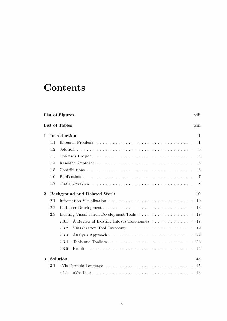
Contents
List of Figures viii
List of Tables xiii
1 Introduction 1
1.1 Research Problems . . . . . . . . . . . . . . . . . . . . . . . . . . . . . . 1
1.2 Solution . . . . . . . . . . . . . . . . . . . . . . . . . . . . . . . . . . . . 3
1.3 The uVis Project . . . . . . . . . . . . . . . . . . . . . . . . . . . . . . . 4
1.4 Research Approach . . . . . . . . . . . . . . . . . . . . . . . . . . . . . . 5
1.5 Contributions . . . . . . . . . . . . . . . . . . . . . . . . . . . . . . . . . 6
1.6 Publications . . . . . . . . . . . . . . . . . . . . . . . . . . . . . . . . . . 7
1.7 Thesis Overview . . . . . . . . . . . . . . . . . . . . . . . . . . . . . . . 8
2 Background and Related Work 10
2.1 Information Visualization . . . . . . . . . . . . . . . . . . . . . . . . . . 10
2.2 End-User Development . . . . . . . . . . . . . . . . . . . . . . . . . . . . 13
2.3 Existing Visualization Development Tools . . . . . . . . . . . . . . . . . 17
2.3.1 A Review of Existing InfoVis Taxonomies . . . . . . . . . . . . . 17
2.3.2 Visualization Tool Taxonomy . . . . . . . . . . . . . . . . . . . . 19
2.3.3 Analysis Approach . . . . . . . . . . . . . . . . . . . . . . . . . . 22
2.3.4 Tools and Toolkits . . . . . . . . . . . . . . . . . . . . . . . . . . 23
2.3.5 Results . . . . . . . . . . . . . . . . . . . . . . . . . . . . . . . . 42
3 Solution 45
3.1 uVis Formula Language . . . . . . . . . . . . . . . . . . . . . . . . . . . 45
3.1.1 uVis Files . . . . . . . . . . . . . . . . . . . . . . . . . . . . . . . 46
v

CONTENTS
3.1.2 Controls . . . . . . . . . . . . . . . . . . . . . . . . . . . . . . . . 46
3.1.3 Properties . . . . . . . . . . . . . . . . . . . . . . . . . . . . . . . 47
3.1.4 Formulas . . . . . . . . . . . . . . . . . . . . . . . . . . . . . . . 47
3.1.5 Visualizations . . . . . . . . . . . . . . . . . . . . . . . . . . . . . 49
3.1.6 Interaction . . . . . . . . . . . . . . . . . . . . . . . . . . . . . . 51
3.1.7 Special uVis Concepts . . . . . . . . . . . . . . . . . . . . . . . . 52
3.2 uVis Studio . . . . . . . . . . . . . . . . . . . . . . . . . . . . . . . . . . 54
3.2.1 Panels . . . . . . . . . . . . . . . . . . . . . . . . . . . . . . . . . 57
3.2.2 Development Approach . . . . . . . . . . . . . . . . . . . . . . . 67
3.2.3 Cognitive Supports . . . . . . . . . . . . . . . . . . . . . . . . . . 68
3.2.4 Performance . . . . . . . . . . . . . . . . . . . . . . . . . . . . . 70
4 The Approach in Practice 72
4.1 The Process Completion Diagram . . . . . . . . . . . . . . . . . . . . . . 72
4.2 Visualizing the Evolution of Technologies . . . . . . . . . . . . . . . . . 79
5 Usability Evaluation 82
5.1 Usability Factors . . . . . . . . . . . . . . . . . . . . . . . . . . . . . . . 82
5.2 Measurement Techniques for Usability . . . . . . . . . . . . . . . . . . . 83
6 Usability Study with Programmers 87
6.1 Procedure, Tasks and Data Analysis . . . . . . . . . . . . . . . . . . . . 87
6.2 Results . . . . . . . . . . . . . . . . . . . . . . . . . . . . . . . . . . . . . 91
6.3 Summary . . . . . . . . . . . . . . . . . . . . . . . . . . . . . . . . . . . 105
7 Usability Study with End-User Developers 111
7.1 Procedure, Tasks and Data Analysis . . . . . . . . . . . . . . . . . . . . 111
7.2 Results . . . . . . . . . . . . . . . . . . . . . . . . . . . . . . . . . . . . . 114
7.3 Summary . . . . . . . . . . . . . . . . . . . . . . . . . . . . . . . . . . . 127
8 Usability Study with Clinicians 133
8.1 Information Visualization in Healthcare . . . . . . . . . . . . . . . . . . 133
8.2 Usability Study . . . . . . . . . . . . . . . . . . . . . . . . . . . . . . . . 136
8.2.1 Procedure, Tasks and Data Analysis . . . . . . . . . . . . . . . . 136
8.2.2 Results . . . . . . . . . . . . . . . . . . . . . . . . . . . . . . . . 140
vi

CONTENTS
8.2.3 Summary . . . . . . . . . . . . . . . . . . . . . . . . . . . . . . . 143
9 Discussion 147
9.1 Visualization Tool Taxonomy . . . . . . . . . . . . . . . . . . . . . . . . 148
9.2 uVis . . . . . . . . . . . . . . . . . . . . . . . . . . . . . . . . . . . . . . 149
9.3 Usability Studies . . . . . . . . . . . . . . . . . . . . . . . . . . . . . . . 150
10 Conclusions and Future Work 155
Appendix A A Custom Visualization with uVis Formulas 159
Appendix B Evaluation with Programmers - Documentation 164
Appendix C Evaluation with End-User Developers - Documentation 181
Appendix D Evaluation with Clinicians - Documentation 188
References 199
vii

List of Figures
2.1 The evolution of user-centered design by Aigner et al.[2]. . . . . . . . . 13
2.2 A scatter plot (top) and its graphical specifications (bottom) created
with APT. Source: [60]. . . . . . . . . . . . . . . . . . . . . . . . . . . . 24
2.3 SAGE’s input and the result. Source: [87]. . . . . . . . . . . . . . . . . 25
2.4 A visualization in SageBook (top), and SageBrush where visualizations
are specified (bottom). Source: [25]. . . . . . . . . . . . . . . . . . . . . 26
2.5 Visualizing financial information with DEVise in a step-by-step approach:
select a schema, select a data stream, define mapping, and define visual
links and cursors. The final output is shown on the right side, together
with the pop-up window that shows details-on-demand. Source: [59]. . 27
2.6 A pie chart created with Processing. Source: [80]. . . . . . . . . . . . . 28
2.7 GeoVISTA Studio: the Main window shows the visual objects and sys-
tem options, the Design window (top) contains visual objects represented
by icons and connected by lines, the Graphical User Interface (right)
shows the visualization specified in the Design window (left), and the
Property Editor (represented by the adapter wizard) used to customize
a visual object. Source: [100]. . . . . . . . . . . . . . . . . . . . . . . . 29
2.8 A parallel coordinated visualization with InfoVis Toolkit. Source: [28]. 30
2.9 A scatter plot created with Piccolo. Source: [9]. . . . . . . . . . . . . . 31
2.10 A multi-view coordination visualization in Improvise and the Controls
editor. Source: [111]) . . . . . . . . . . . . . . . . . . . . . . . . . . . . 32
2.11 An animated radial layout created with Prefuse. Source: [36]. . . . . . 33
2.12 The Job Voyager visualization created with Flare. Source: [30]. . . . . 34
viii

LIST OF FIGURES
2.13 An arc diagram created with Protovis in ProtoViewer. ProtoViewer
consists of three parts: Data (left), Design (middle) and Code Editor
(right). Source: [4]. . . . . . . . . . . . . . . . . . . . . . . . . . . . . . 35
2.14 A calendar view created with D3. Source: http://mbostock.github.com. 36
2.15 A bar chart created with MS Excel. Source: [64]. . . . . . . . . . . . . 37
2.16 A bubble chart created with Tableau. Source: [99]. . . . . . . . . . . . 38
2.17 Several visualizations of the same dataset created with Spotfire. Source:
[97]. . . . . . . . . . . . . . . . . . . . . . . . . . . . . . . . . . . . . . . 39
2.18 Several visualizations of the same dataset created with Omniscope. Source:
[71]. . . . . . . . . . . . . . . . . . . . . . . . . . . . . . . . . . . . . . . 39
2.19 The Designer (left) and the Previewer (right) in Tom Sawyer Presenta-
tion. Source: [103]. . . . . . . . . . . . . . . . . . . . . . . . . . . . . . 40
2.20 A treemap in Code-Playground of Google chart Tools. Source: [32]. . . 41
2.21 A map visualization in Many-Eyes. Source: http://www-958.ibm.com/. 42
3.1 a. Vis-file, b. Vism-file . . . . . . . . . . . . . . . . . . . . . . . . . . . 46
3.2 Visualizations created with uVis: a. Simple Pie Chart, b. Custom Pie
Chart, c. Spiral Graph, d. SparkClouds, e. CircleViews, f. TreeMap, g.
TileMaps. . . . . . . . . . . . . . . . . . . . . . . . . . . . . . . . . . . 50
3.3 uVis Studio v.1: Toolbox, 2. Explorer, 3. Design Panel, 4. Property
Grid, 5. E/R Model, 6. Error List, 7. Modes, and 8. Auto-Completion.
Notice that the selected control is highlighted in dark-blue, and prop-
erties are shown in the Property Grid. In this case, the developer is
specifying the Rows. The developer types the fields after the group by,
but the Auto-Completion does not suggest tblIntake because it is not
used. . . . . . . . . . . . . . . . . . . . . . . . . . . . . . . . . . . . . . . 55
3.4 uVis Studio v.2: 1. Toolbox, 2. Explorer, 3. Design Panel, 4. Property
Grid, 5. E/R Model, 6. Error List, 7. Modes, 8. DataView , 9. Control-
Data Hierarchy, 10. Auto-Completion, 11. Formula suggestions. The
selected control is highlighted in light blue color in the Design Panel
and Control-Data Hierarchy, as the selected property in the Property
Grid. . . . . . . . . . . . . . . . . . . . . . . . . . . . . . . . . . . . . . . 56
ix

LIST OF FIGURES
3.5 The Auto-Completion in action showing suggestions of : 1. table names,
2. relationship names, 3. SQL keywords, 4. field names, 5. control
names, 6. control Properties, 7. event properties, and 8. functions and
control properties. . . . . . . . . . . . . . . . . . . . . . . . . . . . . . . 60
3.6 The first version of the E/R Model (left). The improved version of the
E/R Model (right). . . . . . . . . . . . . . . . . . . . . . . . . . . . . . 61
3.7 The Formula Suggestions in action showing suggestions of: 1. table
names, 2. field names, 3. relationship names when the Rows property of
the parent control is not specified, and 4. relationship names when the
Rows property of the parent control is specified. . . . . . . . . . . . . . 63
3.8 1. A developer attempts to map the field amount to the Top property.
2. A developer tries to map the rows of tblIntake to Top. . . . . . . . 63
3.9 The developer selected the error message in the Error List (left) and the
wrong formula is highlighted in the Property Grid (right). . . . . . . . 64
3.10 1. The Interact-Mode is set to designer mode and the developer has
selected the barIntake control (top). 2. The Interact-Mode is set to
end-user mode and the developer interacts with the timescale and tests
the tool-tip. . . . . . . . . . . . . . . . . . . . . . . . . . . . . . . . . . 65
3.11 The developer uses the Data to: enable the WYBIWYG (1) or disable
it (2). . . . . . . . . . . . . . . . . . . . . . . . . . . . . . . . . . . . . . 65
3.12 1. The DataView. 2. The Control-Data Hierarchy. . . . . . . . . . . . . 66
4.1 The evolution of the Process Completion Diagram (PCD). The final
version visualizes the blood-test process from the medical domain. . . . 73
4.2 Three controls were dragged and dropped. The selected control and
property are colored in light blue. . . . . . . . . . . . . . . . . . . . . . 74
4.3 Creating the plot using two labels and two lines. . . . . . . . . . . . . . 75
4.4 Two rectangles and a triangle to visualize the in-time, the late and the
not-completed tests. . . . . . . . . . . . . . . . . . . . . . . . . . . . . . 76
4.5 Shapes are bound to data and Height and Width are mapped to number
of tests and duration. . . . . . . . . . . . . . . . . . . . . . . . . . . . . 77
4.6 “Interact with the Design Panel” end-user is enabled. The other panels
are disabled. . . . . . . . . . . . . . . . . . . . . . . . . . . . . . . . . . 78
x

LIST OF FIGURES
4.7 The final version of PCD. . . . . . . . . . . . . . . . . . . . . . . . . . . 78
4.8 1. The paper-based visualization that provides an overview of the process
and details for each step of the process. 2. The Multi-Step Process
Visualization (MSProVis) combines three views in a single presentation,
allowing managers to explore process, steps, and actors’ tests rapidly. . 80
4.9 1. The original drawing visualizes 382 technologies. 2. The custom
visualization created with uVis formulas and the Studio. . . . . . . . . 81
6.1 The bar chart and the E/R data model. . . . . . . . . . . . . . . . . . 89
6.2 The LifeLines and the E/R data model. . . . . . . . . . . . . . . . . . . 90
6.3 Initial version of MSProVis. . . . . . . . . . . . . . . . . . . . . . . . . 90
6.4 Participant 1: Problem counts by type (left). Subjective ratings (right). 93
6.5 Participant 2: Problem counts by type (left). Subjective ratings (right). 95
6.6 Participant 3: Problem counts by type (left). Subjective ratings (right). 97
6.7 Participant 4: Problem counts by type (left). Subjective ratings (right). 99
6.8 Participant 5: Problem counts by type (left). Subjective ratings (right). 102
6.9 Participant 6: Problem counts by type (left). Subjective ratings (right). 104
6.10 Participants’ rating for Task 1 and 2 (top). Minimum, Maximum and
Average rating for Task 1 and 2 (bottom). . . . . . . . . . . . . . . . . . 108
7.1 The bar-chart and the E/R data model. . . . . . . . . . . . . . . . . . 112
7.2 The PCD, the simplified PCD used in this study, and the E/R Data
Model. . . . . . . . . . . . . . . . . . . . . . . . . . . . . . . . . . . . . 113
7.3 Participant 1: Problem counts by type (left). Subjective ratings (right). 115
7.4 Participant 2: Problem counts by type (left). Subjective ratings (right). 117
7.5 Participant 3: Problem counts by type (left). Subjective ratings (right). 118
7.6 Participant 4: Problem counts by type (left). Subjective ratings (right). 120
7.7 Participant 5: Problem counts by type (left). Subjective ratings (right). 122
7.8 Participant 6: Problem counts by type (left). Subjective ratings (right). 123
7.9 Participant 7: Problem counts by type (left). Subjective ratings (right). 124
7.10 Participant 8: Problem counts by type (left). Subjective ratings (right). 126
7.11 Participants’ rating for task 1 and 2 (top). Minimum, Maximum and
Average rating for task 1 (bottom-left) and task 2 (bottom-right) . . . 130
xi

LIST OF FIGURES
8.1 Three different EHR systems from the Copenhagen region showing: 1.
the patient’s medicines. 2. the drug records for a patient. 3. the lab-test
results for a patient. . . . . . . . . . . . . . . . . . . . . . . . . . . . . . 134
8.2 1. Current presentation at the clinic, 2. A simple presentation patient
lab-test results, 3. Presenting lab-test results on a time-line. . . . . . . 136
8.3 The LifeLines and the E/R data model. . . . . . . . . . . . . . . . . . . 137
8.4 The PCD, the simplified PCD used in this study, and the E/R Data
Model. . . . . . . . . . . . . . . . . . . . . . . . . . . . . . . . . . . . . 139
8.5 Clinician 1 and 2: Problem counts by type (top). Subjective ratings
(bottom). . . . . . . . . . . . . . . . . . . . . . . . . . . . . . . . . . . . 141
A.1 (a) LifeLines visualization created with uVis. (b) The E/R model. (c)
The formulas for each control, which are stored in a Vis file. . . . . . . 160
xii

List of Tables
2.1 A taxonomy of visualization tools. . . . . . . . . . . . . . . . . . . . . . 20
2.2 20 InfoVis tools mapped according to the taxonomy. Tools from industry
are in bold. Boxes in yellow indicate the problems addressed in this
research. Boxes in gray represent future research directions. . . . . . . . 43
3.1 Performance measures. The first column shows the time spent when
uVis Studio starts, but no visualization is opened. The other columns
shows how the Studio performs when a visualization has: one control,
83 controls, 5,226 controls, and 50,000 controls. . . . . . . . . . . . . . 70
6.1 Usability problems encountered in this study. They are grouped by root
problem, and classified by type. For each problem I show who encoun-
tered it and potential solutions. . . . . . . . . . . . . . . . . . . . . . . 107
7.1 Usability problems recorded in this study. They are grouped by root
problem and classified by type. For each problem I show who encoun-
tered it. . . . . . . . . . . . . . . . . . . . . . . . . . . . . . . . . . . . . 129
8.1 Usability problems encountered in this study. They are grouped by root
problem, and classified by type. For each problem I show who encoun-
tered it. . . . . . . . . . . . . . . . . . . . . . . . . . . . . . . . . . . . . 144
xiii
Chapter 1
Introduction
1.1 Research Problems
Information Visualization (InfoVis) is an important topic in many domains: clinicians
want a complete picture of patient data; project managers need to obtain an overview
and identify the bottlenecks in a project; database analysts look for visualizations that
can locate trends in large databases. Traditionally, visualization development is collabo-
ration between domain experts and professional programmers. Both parties spend time
and resources to iteratively design a good visualization. Usually, there are communica-
tion problems between users and programmers; users have the domain knowledge but
no programming skills, while programmers do not have the domain expertise. Conse-
quently, the process may require time and resources. From a management perspective,
this collaboration can become very expensive.
The ideal solution to this problem would be to allow domain users to construct vi-
sualizations. As a result, the cost will be significantly reduced, and better visualization
will be developed as users know their own demands better. However, this solution is
difficult because few domain users have the required IT skills.
In the last decade, a new research discipline has emerged, called End-User Devel-
opment (EUD). The main goal of this discipline is to empower end-user developers to
create, modify and extend software artifacts, and as a result gain more control over
their applications [56]. This thesis focuses on end-user development of visualizations.
In the thesis, I distinguish three kinds of users:
1

1.1 Research Problems
• Simple users have basic IT skills and can operate IT systems to accomplish basic
tasks, but not programming skills.
• End-user developers are not programmers, but users who “may have little or no
formal training or experience in programming” [72]. These users “have experience
performing relatively sophisticated data organization and manipulation, using
a combination of manual processing and limited amounts of programming or
scripting” [37].
• Programmers have excellent developing skills and are experienced in software
development and databases. They usually work in IT companies that provide
domains with IT applications. Constructing custom visualizations is time con-
suming, but not difficult for programmers.
Rather than investigating InfoVis in itself, this work investigates visualization de-
velopment tools from a user perspective, and more precisely for end-user developers
and programmers.
Several InfoVis tools have been developed to help users with different IT skills
develop visualizations – representations of abstract data that “has no inherent mapping
to space” [20]. Some of them support users with predefined visualizations, and others
with primitive visual objects that can be combined into visualizations. In order to
compare visualization development tools and to what extent the visual mappings are
predefined, I classify visualizations in two types:
• Standard visualizations: predefined visualization templates that combine, cus-
tomize, or extend the templates in limited ways. For example, a bar chart in MS
Excel uses a predefined bar chart template where only a few visual attributes of
the chart (e.g. bar height) are assigned to data.
• Custom visualizations: combine visual objects into a complex visualization or
use predefined visualization templates that can be combined, customized and
extended in many ways. For example, a LifeLines visualization [79] is constructed
by combining bars, triangles, labels, etc. Another example is a bar chart created
with Prefuse. Users of Prefuse can assign all visual attributes of the bar chart to
data attributes.
2

1.2 Solution
Commercial tools [64, 97, 99] allow simple users to create standard visualizations. Other
tools [9, 13, 14, 28, 36], especially from research, focus more on supporting programmers
with libraries to develop custom visualizations. As shown in a recent study [73], more
tools are needed to help end-user developers (called savvy users [37, 73] in the InfoVis
field) develop custom visualizations. Therefore, the main research question is:
Can end-user developers construct custom visualizations?
In addition to the main problem, this thesis also addresses the problem programmers
face in visualization development. Programmers construct custom visualizations in a
programmatic way. They write code in code editors and run the program to view data
and test interactions. Consequently, this process affects their performance. Therefore,
this research also addresses this sub-question:
Can programmers construct custom visualizations faster with the
Drag-Drop-Set-View-Interact approach?
1.2 Solution
To allow end-user developers create custom visualizations, we developed uVis. uVis
combines a simplified programming mechanism (the uVis formula language) with a de-
velopment environment that provides aids to enhance cognitive abilities (uVis Studio).
The uVis formula language resembles a spreadsheet language. Each control (visual
object) attribute has a formula. uVis Studio (or simply the Studio) is the development
environment of uVis. Users of uVis drag-and-drop controls, set control properties using
uVis formulas, view immediate results in the Studio, and interact with the visualization
as an end-user without switching workspace. This development approach is called
Drag-Drop-Set-View-Interact and differs from approaches of existing visualization tools,
because they do not use a drag-and-drop approach.
The goal is to make a general-purpose visualization tool that supports construc-
tion of many types of visualization (e.g. time-oriented, tree, etc.) through property
formulas. This means that visualizations such as LifeLines [79], Fisheye menus [8],
SparkClouds [55], etc., can be constructed by defining formulas for the properties of
controls. As an example, in uVis, the Bederson’s Fisheye menu [8] can be constructed
3

1.3 The uVis Project
using a label for each menu item. The label’s Top, Left and FontSize properties are
formulas that compute distorted positions and sizes.
uVis supports a wide range of visualizations. However, with current version some
custom visualizations may not be possible to implement. As an example, in cases of
animation uVis falls short. Therefore, I would like to remind the readers that uVis is
a general-purpose visualization tool that proves the idea, but still needs more features
and controls.
1.3 The uVis Project
The research presented in this thesis is part of the uVis project started early 2008 in the
Software and Systems Department of the IT University of Copenhagen. Prof. Soren
Lauesen defined the goal and the scope of the project, the requirements and invented
uVis, as described in [53]. uVis was inspired by MS Access, which was popular and
nicely combined user interface and database. However, it was not powerful enough
for custom visualizations. The idea was to allow properties to be powerful formulas
and in that way develop user interfaces and visualizations without real programming.
The design of the solution and the implementation is the joint intellectual work of
Mohammad Amin Kuhail, Soren Lauesen, Kostas Pantazos, and Shangjin Xu (in al-
phabetical sequence). At the beginning, the project focused on developing the uVis
formula language and made a proof of concept that user interfaces and visualizations
can be created with property formulas written in a text editor. The second step of the
project was to develop uVis Studio, the development environment of uVis, and evaluate
the uVis formula language and uVis Studio with end-user developers and programmers.
The contributions of the second step are described in this thesis.
Developing such a tool is a challenging task, as many engineering requirements
should be considered. The requirements of uVis were defined by Soren Lauesen [52]
and include many perspectives: usability, performance, security, simulated time, test-
ing issues, etc. However, the theme of this thesis is not to elaborate on all perspectives.
Rather, the main perspective is usability, aiming at answering the aforementioned re-
search questions.
4

1.4 Research Approach
1.4 Research Approach
The research presented in this thesis does neither investigate existing visualizations,
nor introduce novel ones. Rather, it focuses on the development process of visualiza-
tion applications. The research presented in this thesis can be divided in three parts
conducted in parallel. They are described in this section.
Review of Existing Visualization Development Tools
The purpose of the review was to identify existing related work on InfoVis develop-
ment tools. 20 InfoVis tools (13 from research and seven from industry) were selected
and investigated on how they support users despite their IT skills. As part of this, I
developed a visualization tool taxonomy presented in Chapter 2 in detail.
Development of uVis Studio
Once we proved that it was possible to implement the formula language, I had to
develop the development environment, which would make uVis easily accessible to end-
user developers as well as programmers. The first version of the Studio was usability
tested with programmers who have developed visualizations and user interfaces with
other tools. Their feedback helped us to identify difficult concepts of the uVis formula
language, usability problems with the Studio, and suggestions for improvement. The
results of this usability study are presented in Chapter 6. The second version of uVis
Studio introduced new panels, new features and several improvements. This version
was evaluated with end-user developers. Results are reported in Chapter 7 and 8.
Usability Studies
I conducted three usability studies. The first study was conducted with six program-
mers using the first version of uVis Studio, and aimed at answering the research ques-
tion: “Can programmers construct custom visualizations faster with the Drag-Drop-Set-
View-Interact approach?”. I decided to ask for programmers who are experienced in
developing InfoVis and Human-Computer Interaction applications because they could
compare the development approach applied in uVis with what they had used so far.
Also, they had been using development environments and should be able compare the
features of the Studio versus what they had used before. Using the second version of
5

1.5 Contributions
uVis Studio, I conducted the second study with eight end-user developers and the third
with two clinicians who are end-user developers. These two studies aimed at answering
the research question: “Can end-user developers create custom visualizations?”. The
purpose of the studies was also to identify usability problems in order to improve uVis.
1.5 Contributions
The research contribution of the uVis project is the visualization tool (uVis) that uses
spreadsheet-like formulas (uVis formula language) and has a development environment
(uVis Studio). The contributions of my thesis are:
• A visualization tool taxonomy for InfoVis: Existing taxonomies for InfoVis are
useful in categorizing visualization techniques, identifying suitable visualizations
for different data types, structuring the development of InfoVis, etc., but none of
them can properly categorize visualization tools from a development perspective.
The categorization of 20 InfoVis tools proves the applicability of this taxonomy,
and the result showed that there are no Drag-and-Drop tools to create custom
visualizations for end-user developers as well as programmers.
• A new Drag-and-Drop development approach with uVis, called Drag-Drop-Set-
View-Interact : In order to construct custom visualizations, users of uVis drag
and drop controls, set formulas, view immediate results, and interact as end-
users without switching workspace.
Existing work in InfoVis has overlooked end-user developers. At the same time,
the EUD literature has not investigated the involvement of end-user developers in
visualization development. This work contributes to InfoVis and EUD with a new
approach, which allows end-user developers to construct custom visualizations.
The results of usability studies with end-user developers provides good indications
that with a modest amount of training they can learn and use uVis to construct
custom visualizations.
Related work in InfoVis regarding development tools for custom visualizations
mainly supports programmers with language tools. Direct manipulation, imme-
diate feedback, switching workspace are some of the factors that can affect their
performance in visualization development. This work also contributes with a new
6
1.6 Publications
development approach, which boosts programmers’ performance. The results of a
usability study with programmers who have programmed visualizations and user
interfaces with other tools, indicated that uVis allows programmers develop cus-
tom visualizations faster than other tools. In addition, two custom visualizations
were developed in a few hours with this approach by an experienced user of uVis.
During the PhD study, I made two more contributions:
• De-identifying an Electronic Health Record (EHR) Database - Anonymity, Cor-
rectness and Readability of the Medical Record.
Getting access to real data is difficult in every domain, but in healthcare it be-
comes more complicated due to patient confidentiality. As we needed real data
to create visualizations and test the tool, I collaborated with a Danish EHR ven-
dor and developed an algorithm to de-identify a full EHR database with 437,164
patients [74]. The de-identified database (323,122 patients) is adequate for sup-
porting research, development and training. This is the first published study on
de-identifying Danish health care records.
• Exposing Delays in Multi-Step Processes by Retrospective Analysis.
In 2011, I visited the Human-Computer Interaction Lab at the University of
Maryland to evaluate uVis with programmers. In collaboration with Prof. Ben
Shneiderman, Dr. Catherine Plaisant and Sureyya Tarkan I developed a visual-
ization called the Process Completion Diagram (PCD) that aggregates medical
event-logs into in-time, late and not-completed tests, and visualizes those using
shapes, colors and positions [75]. The interactive Multi-Step Process Visual-
ization (MSProVis) combines a number of PCDs to expose delays in multi-step
processes, and support the comparisons between steps or between actors execut-
ing those steps. MSProVis was constructed with uVis. The formula language
and the integrated development environment allowed us to rapidly create several
visualization prototypes and led us to MSProVis.
1.6 Publications
I am the main author of the following publications:
7

1.7 Thesis Overview
• Pantazos, K., Kuhail, M., Lauesen, S., and Xu, S. uVis Studio: An Integrated
Development Environment for Visualization, In Proc. of Visualization and
Data Analysis, (2013).
• Pantazos, K. and Lauesen, S. Constructing Visualizations with InfoVis
Tools - An Evaluation from a User Perspective, In Proc. of GRAPP/IVAPP
2012, (2012).
• Pantazos, K. Engaging Clinicians in the Visualization Design Process Is
It Possible?, In Proc. Workshop on Visual Analytics in Healthcare (VAHC) in
conjunction with IEEE VisWeek, (2011).
• Pantazos, K., Lauesen, S., and Lippert, S. De-identifying an EHR Database-
Anonymity, Correctness and Readability of the Medical Record. In
Studies In Health Technology And Informatics, (2011).
• Pantazos, K., Shollo, A., Staron, M., Meding, W., Presenting Software Met-
rics Indicators - A Case Study, In Proc. of the 20th International Conference
on Software Product and Process Measurement (MENSURA), (2010)
1.7 Thesis Overview
Chapter 2 - Background and Related Work: This chapter introduces the reader
to the EUD and InfoVis field. Next, the chapter presents visualization development
tools used to categorize 20 InfoVis tools. The results of this study shows the current
state-of-the-art regarding InfoVis development tools and identifies existing problems.
Chapter 3 - Solution: This chapter describes the proposed solution. At the
beginning, the uVis formula language is presented introducing the principles and ex-
plaining how formulas set properties to bind controls to data, map fields to properties
and refer to control properties. Next, the chapter describes the uVis Studio. Two
versions were developed applying iterative development. The differences between these
versions are explained as the Studio is described. After presenting uVis Studio, the de-
velopment approach and cognitive supports of uVis Studio are presented. The chapter
concludes with performance measures.
8

1.7 Thesis Overview
Chapter 4 - The Approach in Practice: This chapter presents uVis in practice
using two real scenarios. The first describes the Process Completion Diagram and
illustrates step by step how a custom visualization can be constructed applying the
Drag-Drop-Set-View-Interact approach with uVis Studio. The second scenario shows
another custom visualization that visualizes the evolution of technologies.
Chapter 5 - Usability Evaluation: This chapter presents usability as an evalu-
ation method selected in this thesis. It describes the factors of usability and how they
are measured. The chapter concludes with the approach applied in the usability studies
presented in this thesis.
Chapter 6 - Usability Study with Programmers: This chapter reports on a
study conducted with six programmers. Next, it presents the tasks, procedures and
results from the study with programmers. At the end, this chapter reports on usability
problems, subjective ratings, and a summary of the results.
Chapter 7 - Usability Study with End-User Developers: This chapter re-
ports on a study conducted with eight end-user developers. After describing the tasks,
procedures and results, the chapter concludes with the usability problems, subjective
ratings, and a summary of the results.
Chapter 8 - Usability Study with Clinicians: This chapter presents a usability
study with two clinicians, who are end-user developers. Initially, the need for better
presentations of clinical data is depicted through three electronic healthcare record
systems from the Copenhagen region. Next, the procedures, tasks and results are
described. This chapter concludes with a list of usability problems, subjective ratings,
and a summary of the results.
Chapter 9 - Discussion: This chapter discusses the results and the limitations
of the research presented in this thesis.
Chapter 10 - Conclusions and Future Work: This chapter presents concluding
remarks and discusses future work.
9

Chapter 2
Background and Related Work
This chapter presents the background and related work focusing on: Information Visu-
alization and End-User Development. First, it presents the Information Visualization
field and then introduces the reader to End-User Development. The chapter concludes
with a review of existing visualization development tools.
2.1 Information Visualization
Information Visualization (InfoVis) is graphical presentation of abstract data; data
that “has no inherent mapping to space” [20]. As an example from the medical area,
abstract data are information stored in the database regarding a patient (e.g. name,
age, treatment date, dose, intake, etc.)
InfoVis attempts to reduce the time and the mental effort users need to analyze
large datasets [20, 96]. The InfoVis field has enabled development of visualization
systems that enhance human cognitive processes by visually presenting abstract data
[20]. Although, the InfoVis field emerged during the 1980’s with the availability of
computers, InfoVis evidence can be tracked long before. Two well-known examples
are Minard’s map and Florence Nightingale’s diagram. The map of Minard (a civil
engineer) was drawn in 1869 to represent the marching of Napoleon’s army towards
Moscow and their retreat [105]. Florence Nightingale’s diagram designed in 1858 shows
the death rates in the hospital of Scutari, and how the rates reduce by the changes
introduced by nurse Florence Nightingale [96]. Both diagrams allow viewers to get
a clear picture of the situation, and derive results without any detailed explanation.
10

2.1 Information Visualization
This corresponds to the primary task of InfoVis: “allow information to be derived from
data” [96].
Several InfoVis applications have been developed to visualize time-oriented data.
LifeLines [79] is an interactive visualization that presents an overview of a patients
medical record. This visualization was the inspiration for LifeLines 2 [110], but it
visualizes a collection of medical records, where users can explore the event-logs for
temporal patterns. LifeFlow [115] provides an overview of event sequences by sum-
marizing all possible sequences and visualizing the temporal space of events within
sequences. Aigner et al. [3] provide an overview of 101 visualizations techniques for
time-oriented data. Among them are Arc Diagrams, Circle View, Circos, Flow Map,
Perspective Wall, TimeTree, etc.
As the work presented in this thesis focuses on how users develop visualizations, I
will not discuss further the work in visualization types (e.g. time-oriented, network,
tree, etc.) or interaction techniques (e.g. such as filtering, zooming, focus+context
etc.). The related work builds upon what a user can achieve with existing development
tools from InfoVis field. As an example, a popular visualization tool from research is
Prefuse [36]. This toolkit can support construction of a wide range of visualizations,
from standard to custom visualization. I will not investigate the possible visualizations,
but who is able to develop visualizations and how they do it with Prefuse. Before I
surveyed the InfoVis development tools (section 2.3), I elaborate on the importance of
engaging users in visualization development reflecting on existing work, followed by an
introduction to the End-User Development field.
Users in Visualization Development
Considering the variety of data and user tasks, it is obvious that new visualizations are
needed. However, developing new visualizations is not an easy task. Several InfoVis
toolkits and tools [9, 14, 28, 30, 36, 64, 71, 97, 99] have been developed to improve vi-
sualization development and provide better presentation of data. Providing good data
visualization is challenging as visualization creators should have a good understanding
of the data, and then properly design representations that allow users to accomplish
tasks effectively and efficiently. This is usually a problem according to Thomas and
Cook [102], who say that: “Most visualization software is developed with incomplete
11

2.1 Information Visualization
information about the data and tasks. New methods are needed for constructing visu-
ally based systems that simplify the development process and result in better targeted
applications.”
To facilitate the visualization development process and ensure that visualizations
provide complete information about the data and tasks, several InfoVis applications
(e.g. [79, 81, 84, 92]) have been developed applying the user-centered method, where
users participated during the entire development process. Norman[70] and Nielsen[68]
describe user-centered design as the early and continuous involvement of end-users
in the design and development process. Considerable work has been conducted by
Slocum et al. [92], Robinson et al. [81], Roth et al. [84], and Koh et al. [49] to define
the activities applied in the user-centered model for the design and implementation
of InfoVis tools. For example, Robinson et al. [81] describe a six-stage user-center
design process (work domain analysis, conceptual development, prototyping, interaction
and usability studies, implementation, and debugging) where users are involved and
provide input in each stage. Using this model [81], Roth et al. [84] present a modified
user-centered design approach, which starts with prototyping, followed by interaction
and usability studies, work domain analysis, conceptual development, implementation
and ends with debugging. Although, the user-centered model helps producing better
visualizations, still it is challenging to bridge the gap of knowledge between end-users
and programmers. This gap can influence communication and create challenges such as:
programmers should understand end-user needs, end-users should gain some knowledge
regarding InfoVis, end-users should be devoted and actively participate in the process,
etc. In their study Koh et al. [49] experienced similar challenges where simple users
where more interested in the tool than on questions about their tasks and data. Also,
when they tried the tool they found it limited compared to the prototypes defined
during the process. The authors [49] suggested that an iterative approach may address
these issues.
Although a user-centered method is a successful approach, researchers envisage ap-
proaches to facilitate visualization development and assure that visualizations provide
complete information about the data and tasks. Aigner et al. [2] discuss how to sup-
port user-centered visual analysis that consists of three factors: the visualization, the
analysis, and the user. Figure 2.1 illustrates how they view the past, the present of
user-centered visual analysis, and suggest that future research should focus on these
12
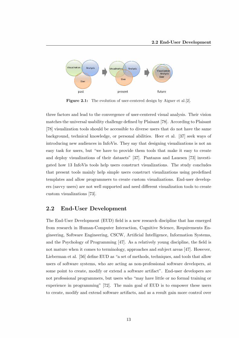
2.2 End-User Development
Figure 2.1: The evolution of user-centered design by Aigner et al.[2].
three factors and lead to the convergence of user-centered visual analysis. Their vision
matches the universal usability challenge defined by Plaisant [78]. According to Plaisant
[78] visualization tools should be accessible to diverse users that do not have the same
background, technical knowledge, or personal abilities. Heer et al. [37] seek ways of
introducing new audiences in InfoVis. They say that designing visualizations is not an
easy task for users, but “we have to provide them tools that make it easy to create
and deploy visualizations of their datasets” [37]. Pantazos and Lauesen [73] investi-
gated how 13 InfoVis tools help users construct visualizations. The study concludes
that present tools mainly help simple users construct visualizations using predefined
templates and allow programmers to create custom visualizations. End-user develop-
ers (savvy users) are not well supported and need different visualization tools to create
custom visualizations [73].
2.2 End-User Development
The End-User Development (EUD) field is a new research discipline that has emerged
from research in Human-Computer Interaction, Cognitive Science, Requirements En-
gineering, Software Engineering, CSCW, Artificial Intelligence, Information Systems,
and the Psychology of Programming [47]. As a relatively young discipline, the field is
not mature when it comes to terminology, approaches and subject areas [47]. However,
Lieberman et al. [56] define EUD as “a set of methods, techniques, and tools that allow
users of software systems, who are acting as non-professional software developers, at
some point to create, modify or extend a software artifact”. End-user developers are
not professional programmers, but users who “may have little or no formal training or
experience in programming” [72]. The main goal of EUD is to empower these users
to create, modify and extend software artifacts, and as a result gain more control over
13

2.2 End-User Development
their applications. In old days there were a few end-user developers, but due to the
increased use of computers, the number of these end-user developers is increasing. In
1995, Boehm et al. [12] estimated that by 2005, there would be 55 million end-user de-
velopers in the United States. In 2005, Scaffidi et al. [88] used and improved Boehm’s
method to estimate that in 2012 there will be 90 million end-user developers. They
predicted that 55 million will be users of spreadsheets or databases. Some end-user
developers are: system administrators, interaction designers, teachers, accountants,
health care workers, managers, etc.
EUD takes a broader perspective and is not limited to programming when it comes
to adjust application to users’ needs [57]. Lieberman et al. [56] defines two types of
end-user activities:
1. Program creation and modification: Activities that allow end-users to create or
modify software artifacts. In this case, the application is called adaptable as it
allows unanticipated changes.
2. Parameterization or customization: allow end-users to parameterize or customize
their applications using the available presentations or interactive mechanisms. In
this case, the application is called adaptive as it can be tailored to end-users needs
in predefined ways.
In order to support program creation and modification, the system should be flex-
ible and expressive enough (e.g. set parameters, compose objects, etc.) [56]. Simple
changes are not difficult, but things become more complicated as programming is in-
volved. MacLean et al. [61] suggested a “gentle slope” to reduce the level of complexity
and support changes on different levels. However, in cases of extensive changes, a pro-
gramming language must be used [61].
EUD also focuses on parameterization or customization. This means customizing,
configuring and tailoring the application, but not direct changes in the source code [48].
Customizing, configuring and tailoring are performed beyond the stage of creating a new
application, and take place after the application is implemented within its environment
of use. Investigating customization, configuration and tailorable systems is beyond the
scope of this work.
14

2.2 End-User Development
Development Techniques
As there is no EUD taxonomy that categorizes development techniques for end-user
developers, several techniques from the psychology of programming are inherited by
EUD researchers. Some of the main techniques are [57]: Scripting Language, Visual
Programming, Spreadsheet and Programming by Example. As this thesis relates to
Spreadsheet and Visual Programming, I elaborate more on these two development tech-
niques. However, the purpose is not to discuss related work on Spreadsheet or Visual
Programming tools, because this thesis only inherits the principles from these fields.
For example, the uVis formula language resembles Spreadsheet formulas. Similarly,
direct manipulation and immediate feedback, features of uVis Studio, are important
factors that resemble Visual Programming.
1. Visual Programming: Employs diagrammatic representations to create appli-
cations through visual components that can be manipulated or to modify existing
ones [17, 18, 93]. As they are perceived to be more natural, visual language re-
searchers claim that end-user developers can benefit from it. Whitley’s review
[113] showed that visual languages can provide better support for some tasks (e.g.
data flow tracking), but it seems that they do not take away the burden for EUD.
Pygmalion, “a two-dimensional, visual programming system implemented on an
interactive computer with graphics display” [93], is one of the first visual pro-
gramming tools. Users of Pygmalion interact with visual entities (icons) in an
interactive editor (the display screen). With Pygmalion, programming consists
of creating a sequence of display frames, the last of which contains the desired
information. Forms/3 [16] is another example of a visual programming tool. To
create a program, a Forms/3 programmer applies direct manipulation to place
cells on forms and specify a formula for each cell. Another tool is Prograph [26].
Prograph targets professional programmers and graphically shows “the main con-
cepts of object oriented programming, classes, attributes and methods and how a
method’s representation defines the semantics of its dataflow, data driven execu-
tion” [26]. Prograph can model parallelism, sequencing, iteration and conditional
constructs. Another tool is Cocoa [94], which allows “programmers” (children)
create games by defining rules. Rules are represented by graphical preconditions
15

2.2 End-User Development
and graphical postconditions. AgentSheets [57] is a simulation-authoring envi-
ronment where end-users construct highly parallel and interactive simulations
using autonomous agents to replace numbers and strings of spreadsheet. Similar
to Cocoa, it supports development of simulation games, but on a web platform.
LabView is developed by National Instruments, Inc. and is one of the most pop-
ular visual programming tools. It allows users to connect (through drawn wires)
different function nodes with a block diagram. The result is a virtual instru-
ment that has a front panel. Labview supports structured programming where
users can develop their own functionalities. This application proved the superi-
ority of visual to textual programming in the instrument field (C was used as the
alternative) [7].
Direct manipulation is an important feature in visual programming. Considerable
work [27] has been done on systems that support direct manipulation. According
to Shneiderman [89] “direct manipulation systems offer the satisfying experience
of operating on visible objects”. As an example, Forms/3 [19] supports program-
ming of graphical objects through direct manipulation of objects instead of spec-
ifying formulas. Hundhausen et al. [40] investigated whether direct manipulation
interfaces can lower the barriers to programming. Their results showed that “the
direct manipulation interface promoted significantly better initial programming
outcomes, positive transfer to the textual interface, and significant differences in
programming processes” [40]. Further, the authors state that direct manipulation
interfaces can introduce non-programmers to traditional textual programming.
Therefore, direct manipulation interfaces should help end-user developers as well.
2. Spreadsheets: Initially developed as a domain-specific tool for accountants,
which has become the most popular tool for end-user developers. The success
can be explained by the fact that spreadsheets use formulas, which are specified
in a free sequence, to process and analyze data. Kelleher and Pausch [46] present
a survey that evaluated programming environments and languages for end-user
developers (novice programmers). Their results showed that simplifying the me-
chanics of programming is a way to engage end-user developers in development
[46]. Spreadsheets does this and it can also explain its popularity among users.
16

2.3 Existing Visualization Development Tools
In addition, the widespread use in industry through commercial tools and the
research [16, 19, 44] has a positive impact on EUD.
These approaches have proven to be successful with a specific group of users [57],
but in many cases, these tools are insufficient and programming is needed. EUD does
not favor any development technique. Rather, according to Reppening and Ioannidou
[57], EUD seeks tools that match the challenges posed by a development process to
users’ skills.
This thesis does not aim at providing a visual programming or a spreadsheet solu-
tion, but rather builds upon the successful principles of them such as formulas, direct
manipulation, immediate feedback, etc. As the EUD community has not investigated
EUD of custom visualizations, the purpose of this thesis is to develop a tool that em-
powers them to create and modify custom visualizations.
2.3 Existing Visualization Development Tools
To get an overview of existing work on visualization development, I surveyed InfoVis
development tools. I investigated how existing tools help users with different IT skills
construct visualizations. As no previous taxonomy from InfoVis and EUD can properly
address this question, a new visualizations tool taxonomy was developed. First, I
present the visualizations tool taxonomy and explain how it differs from other existing
taxonomies. Second, I describe how I selected 20 InfoVis visualization tool, and provide
a brief summary of each tool. Finally, I conclude the chapter with the categorization
of 20 InfoVis tools, which highlights existing problems in EUD of InfoVis.
2.3.1 A Review of Existing InfoVis Taxonomies
The InfoVis community has developed several taxonomies and frameworks. Shneider-
man [90] presented a task by data type taxonomy for InfoVis. This taxonomy classifies
visualization data types (1D Linear, 2D Map, multidimensional, temporal, tree and
network) and identifies the tasks (overview, zoom, filter, details-on-demand, relate,
history and extract) that have to be supported. However, it does not provide insight
on how users construct visualizations using visualization tools.
Chi and Riedl [24] developed a framework that uses operators and interactions in
visualization systems. This framework allows programmers to explore and evaluate
17

2.3 Existing Visualization Development Tools
visualization operators, to identify operators that can be reused and to extend the
systems using them. Also, this framework assists end-users to understand how to use
a tool and analyze their tasks.
Chi [23] proposed taxonomy of visualization techniques that used the data state
reference model. The taxonomy provides an overview of existing visualization tech-
niques and shows that many techniques use similar operating steps. It also allows
programmers to realize how InfoVis techniques are used more generally.
Amar and Stasko [5] presented a knowledge task-based framework that can be
used for design and evaluation of InfoVis. Their framework addresses the analytic
gap in visualizations and attempts to assist complex tasks (e.g. decision-making and
learning). They identified two analytic gaps in present InfoVis tools: Rational Gap
(“representing the gap between perceiving a relationship and expressing confidence in
the correctness and utility of that relationship”) and Worldview Gap (“representing
the gap between what is shown to a user and what actually needs to be shown to draw
a representational conclusion for making a decision”) [5]. Further, they defined tasks
for each gap that can be used in systematic design and heuristic evaluation of InfoVis
systems to reduce the gaps. The purpose of the framework is not to analyze how users
construct visualizations.
A high level taxonomy was presented by Tory and Moller [104]. This taxonomy
categorizes visualization algorithms, and does not focus on data. The classification
uses design models. Design models are assumptions on how algorithms present the
data. These design models are categorized using their discretion or continuousness and
attributes (e.g. time, color) used by the designer of the algorithm. This taxonomy sup-
ports users when they choose visualization techniques that satisfy their requirements,
but does not analyze how users construct them.
Pfitzner et al.[76] took a broader perspective and presented a framework that con-
siders data, task, skill, context, the input and output hardware, the software tools,
and the user interactions and human perceptual abilities. More explicitly, it addresses
five factors: (1) data type and data relationships, (2) task type, (3) interactivity type,
(4) user skill, and (5) context of the InfoVis use. The purpose of this framework is to
structure the development of InfoVis and reduce the gulf of execution and evaluation
users face when they try to solve a problem using a tool.
18

2.3 Existing Visualization Development Tools
Lee et al. [54] describe task taxonomy for graph visualization. They defined a list
of tasks (e.g. filter, sort, cluster, etc.) useful for programmers (designers) and users
(evaluators). Programmers use these tasks to improve their tools, and evaluators utilize
them to compare visualization tools.
Heer et al. [37] investigated how people can be engaged in InfoVis. Their study
does not present a formal taxonomy of users, but they aim at an understanding of user
skills, goals and data.
A recent taxonomy of interactive dynamics for visual analysis was presented by Heer
and Shneiderman [38]. The authors have defined three categories, and four tasks in
each: (1) data and view specification: visualize, filter, sort, and derive; (2) view manip-
ulation: select, navigate, coordinate, and organize; (3) analysis process and provenance:
record, annotate, share, and guide. This taxonomy aims at successful dialogues, and
support users when they evaluate and create visual analysis tools, but it provides little
insight on how users construct visualizations.
2.3.2 Visualization Tool Taxonomy
Although the existing taxonomies and frameworks are helpful in categorizing visualiza-
tion techniques, identifying suitable visualizations for different data types, structuring
the development of InfoVis, etc., none of them can properly categorize visualization
tools from a user perspective and address these questions:
• What IT skills should users have to construct visualizations?
• What types of tool are available for visualization development?
• What types of visualization can users with various IT skills construct with these
tools?
The proposed taxonomy aims at answering the aforementioned questions. The
visualization tool taxonomy consists of three high-level categories: user skills, tool
types and visualization types. Each category is divided into subcategories. Table 2.1
illustrates the taxonomy, and below I describe the categories and the subcategories.
1. Tool types
19

2.3 Existing Visualization Development Tools
Category Subcategory
Tool Types
• Language Tool • Wizard Tool • Drag-and-Drop Tool
User Skills
• Simple User • End-User Developer • Programmer
Visualization Types
• Standard Visualization • Custom Visualization
Table 2.1: A taxonomy of visualization tools.
As there are no visualization tool taxonomies defined in InfoVis or EUD, I
searched for taxonomies from other fields, and more specifically in the Human-
Computer Interaction field. Myers et al. [66] presented a study on how tools
support users when they construct user interfaces. The authors have catego-
rized the ways of constructing user interfaces in seven categories: windows man-
agers, event languages, interactive graphical tools, component systems, scripting
languages, hypertext and object-oriented programming languages. Inspired by
Myers et al. classification and considering that some are almost the same ap-
proach, I decided to categorize the tools in three groups: language tools (include
event languages, scripting languages, hypertext and object-oriented programming
languages), wizard tools (correspond to the windows managers and component
system), and drag-and-drop tools (correspond to the interactive graphical tools).
As this category classifies InfoVis tools, I decided to utilize the reference infor-
mation visualization model described in [20, 24]. The reference model defines
the process in three sub-processes: Data Transformation, Visual Mapping, and
View Transformations. Card et al.[20] say: “The core of the reference model is
the mapping of data table to visual structures”. Therefore, this categorization
focuses on how tools support visual mappings. This is how I define each category.
• Language Tools: users use event, scripting, functional, or programming lan-
guages to construct visualizations. The language is used to specify the visual
objects and map data to visual objects. Prefuse [36], Protovis [13], D3 [14]
are some of the tools of this category.
20

2.3 Existing Visualization Development Tools
• Wizard Tools: users construct visualizations by inputting data in one or
more windows. Users interact in a step-by-step approach with windows to
create visual object and bind them to data. A popular visualization tool is
MS Excel [64].
• Drag-and-Drop Tools: users interact with an interface and apply a drag-
and-drop approach to construct visualizations. Objects are visually created
by drag and drop actions, and the visual mapping is realized through di-
rect visual manipulation or concise specifications. Some of these tools are:
Spotfire [97], Tableau [99] and Omiscope [71].
2. User Skills
Heer et al. [37] classified users based on their skills in three categories: novice,
savvy and expert users. I use this categorization to classify users and their ability
to construct visualizations. These terms may be ambiguous when ones considers
the domain knowledge users have. For example in the medical area, some doctors
may have no IT skills, but they have excellent domain knowledge and are experts
of the domain. In addition, savvy users and end-user developers are the same
group of people, but know with different names in InfoVis and EUD. With respect
to the classification by Heer et al. [37], I decided to use the terms simple user,
end-user developer and programmer.
(a) Simple Users have basic IT skills and can operate IT systems to accom-
plish basic tasks, but not programming. [37]. Some of them are: project
managers, salespersons, nurses, doctors, etc.
(b) End-User Developers are not programmers, but users who “may have little
or no formal training or experience in programming” [72]. These users “have
experience performing relatively sophisticated data organization and manip-
ulation, using a combination of manual processing and limited amounts of
programming or scripting” [37]. Some of them are: doctors specialized in
medical informatics, data analysts experienced with MS Access, researchers
outside the computer science field, but fond of IT, etc.
(c) Programmers have excellent developing skills and are experienced in software
development and databases. They usually work in IT companies that provide
21

2.3 Existing Visualization Development Tools
domains with IT applications. Constructing custom visualizations is time
consuming, but not difficult for programmers. Some of them are: software
engineers, researchers in computer science, etc.
3. Visualization Types
This category considers a high-level distinction of visualization types investigat-
ing the boundaries of existing tools to support users construct visualizations
other than the predefined ones. The purpose of this categorization is not to
explicitly investigate if a tool supports specific visualizations such as hierarchal,
time-oriented, etc. Also, it does provide insights on interaction techniques (e.g.
zooming, focus+context, etc.) Considering to what extent the visual mappings
of a visualization are predefined, I define two visualization types.
• Standard visualizations: predefined visualization templates that combine,
customize, or extend the templates in limited ways. For example, a bar
chart in MS Excel uses a predefined bar chart template where only a few
visual attributes of the chart (e.g. bar height) are assigned to data.
• Custom visualizations: combine visual objects into a complex visualization
or use predefined visualization templates that can be combined, customized
and extended in many ways. For example, a LifeLines visualization [79]
is constructed by combining bars, triangles, labels, etc. Another example
is a bar chart created with Prefuse. Users of Prefuse can assign all visual
attributes of the bar chart to data attributes.
This taxonomy aims at providing an overview of development tools in InfoVis. Pro-
grammers can identify useful approaches and get inspired by existing work; researchers
can use it to identify and pursue new research paths; newcomers in the InfoVis field
can use it as a reference point to identify suitable tools based on their IT skills.
2.3.3 Analysis Approach
I used two popular sources, the ACM Portal and the IEEE website, to find InfoVis
tools and toolkits. I searched for related work by combining these keywords: “informa-
tion visualization”, “tool”, “toolkits”, “graphical user interface”. Initially, I ranked the
22

2.3 Existing Visualization Development Tools
results based on the total number of citations, and then I selected only the most promis-
ing ones by reading the abstracts. Next, I read all the papers and selected the most
appropriate tools and toolkits. They are: APT [60], SAGE [87], SageBook [25], DEVise
[22, 58, 59], GeoVISTA Studio [100], The InfoVis Toolkit [28], Piccolo [9], Improvise
[111], Prefuse [36], Protovis and ProtoViewer [4, 13], and Data-Driven Documents (D3)
[14]. During the process of reviewing the existing literature, I identified two more tools
from research that were relevant to my investigation and decided to include them in
my analysis, because of their popularity and approach. They are: Processing [80] and
Flare [30]. In total, I selected 13 tools from the research area.
As I was reviewing the existing literature, I also found several industry tools that I
decided to use. In addition, I searched the web for consumer InfoVis tools. At the end
I selected seven popular tools: Spotfire [97], Tableau [99], Omniscope [71], MS Excel
[64], Google Chart Tools [32], Tom Sawyer Presentations [103] and Many Eyes [107].
I chose only 20 tools and toolkits and I believe that the selected tools are a good
sample that represents the wide-range of InfoVis tools and toolkits from research and
industry. I did not included in my analysis tools that are similar to the selected ones.
Some of them are: ComVis [63], Dave [109], PRISMA [31], Jazz [10], Visage [85], and
Polaris [98].
The assessment of the tools from academia is based on the published papers, while
the commercial tools were assessed using information from their web pages and using
the trial or full versions available from their websites. Categorizing the tools in distinct
categories it is not without challenges. Many tools span more than one category. When
I was in doubt about a tool I discussed it with other members of the project and decided
based on our judgment.
2.3.4 Tools and Toolkits
In this section I use the aforementioned taxonomy to categorize the selected tools. First,
I present InfoVis tools and toolkits from research, and second, I describe the ones from
industry. Note that the purpose of this categorization is not to analyze and compare
implementation details, but to investigate the way users construct visualizations.
23

2.3 Existing Visualization Development Tools
Figure 2.2: A scatter plot (top) and its graphical specifications (bottom) created with
APT. Source: [60].
APT
APT (A Presentation Tool) [60] is one of the earliest tools that automatically creates
effective graphical presentation of relational data. Presentations are generated in a
linear model where data are extracted, synthesized and then the tool handles the ren-
dering process to create the final output. Programmers use predefined templates (e.g.
bar charts, scatter plots or connected graphs) and write their graphical specifications
(sentences of a graphical language that has exact syntax and semantics), and the tool
creates the graphical presentation. Figure 2.2 shows an example. Programmers, and
probably end-user developers, would be able to specify graphical designs, but still they
cannot create graphical presentations other than the supported ones. The visual map-
ping is defined through APT specifications and automatically handled by the tool.
User Types: End-user developers and programmers.
Tool Types: Language tool.
Visualization Types: Standard visualizations.
24

2.3 Existing Visualization Development Tools
Figure 2.3: SAGE’s input and the result. Source: [87].
SAGE
Early 1990’s, Roth and Mattis [87] presented SAGE, “an intelligent system which as-
sumes presentation responsibilities for other systems by automatically creating graph-
ical displays which presents the results they generate” [87]. This tool uses graphical
techniques to express the application data characteristics and fulfill the presentation
needs. Users query the database, and the result is used by SAGE. Based on the data,
SAGE automatically defines the visual mappings and generates the visualization. After
a presentation is generated, users can adjust the visual mappings of the auto-generated
visualization by setting layout constraints for the data. Figure 2.3 shows an example of
layout constraints and SAGE response. SAGE can be used by programmers and prob-
ably end-user developers, but SAGE provides limited support for constructing custom
visualizations.
User Types: End-user developers and programmers.
Tool Types: Language Tool.
Visualization Types: Standard visualizations.
SageBook
SageBook [25] allows users to sketch, search and customize visualizations. The user cre-
ates a sketch using SageBrush [86], and SageBook searches for suitable data-graphics in
SageBook’s library. The results (one or more data-graphics) are shown in the SageBook
25

2.3 Existing Visualization Development Tools
Figure 2.4: A visualization in SageBook (top), and SageBrush where visualizations are
specified (bottom). Source: [25].
browser. This tool is accessible by all types of users. They can select a data-graphic
and modify it in SageBrush (Figure 2.4), but the visual objects are not bound to data.
Further, SageBook limits users to construct visualizations that match the data-graphic
library.
User Types: Simple users, end-user developers and programmers.
Tool Types: Drag-and-drop Tool.
Visualization Types: Standard Visualizations.
DEVise
DEVise [22, 58, 59] allows users to create visualizations by creating, modifying or
connecting visual objects (components). DEVise maps the data to visual objects and
displays them in a view. At the end, the view uses the data and visual filters to draw the
result in a window. DEVise users use a step-by-step approach to create visualizations:
select an input, choose a file type for the input file, select an existing mapping or
define a new mapping using tcl language expressions [112], select a view to display the
26

2.3 Existing Visualization Development Tools
Figure 2.5: Visualizing financial information with DEVise in a step-by-step approach:
select a schema, select a data stream, define mapping, and define visual links and cursors.
The final output is shown on the right side, together with the pop-up window that shows
details-on-demand. Source: [59].
data, select initial values for the visual filter, and finally select a window to display
the view. Further, users can adjust visualizations. Figure 2.5 presents an example. In
DEVise, users can create visualizations by combining and linking visual objects using
the predefined visual mappings, but it is questionable if simple users can create new
mappings. They have to use the tlc language, which may introduce some challenges
even for end-user developers. The authors says that DEVise is a powerful exploration
framework, “but to appreciate this power fully, one must work with the system or at
least look at several applications in some details” [58].
User Types: Simple users (only standard visualizations), end-user developers and programmers.
Tool Types: Wizard Tool.
Visualization Types: Standard and custom visualizations.
Processing
Processing (Figure 2.6) was developed initially “to teach fundamentals of computer
programming within a visual context” to newcomers, but it has grown into a more
complete tool for constructing images, animations and interactions [80]. Processing
has a development environment similar to a regular one. Programmers specify the
27

2.3 Existing Visualization Development Tools
Figure 2.6: A pie chart created with Processing. Source: [80].
visual mappings by writing code in the code editor. They view the visualization in a
new window after having executed the code. To create a visualization, users have to
know another programming language, Processing. As a result, this tool is used only by
programmers, or non-programmers who pursue a programmer carrier.
User Types: Programmers.
Tool Types: Language tool.
Visualization Types: Standard and custom visualizations.
GeoVISTA Studio
GeoVISTA Studio (Figure 2.7) is a development environment designed to support geo-
scientific data analysis and visualizations [100]. It is built in Java and uses JavaBeans
technology. A visualization in GeoVISTA Studio is composed by connecting visual
objects (implemented as Java beans components). GeoVISTA Studio consists of three
windows: the Main window shows the menus and JavaBeans visual object palette; the
Design window where visual objects are placed and connected; the Graphical User In-
terface (GUI) window shows “live” the output of the used beans. Programmers can
28

2.3 Existing Visualization Development Tools
Figure 2.7: GeoVISTA Studio: the Main window shows the visual objects and system
options, the Design window (top) contains visual objects represented by icons and con-
nected by lines, the Graphical User Interface (right) shows the visualization specified in
the Design window (left), and the Property Editor (represented by the adapter wizard)
used to customize a visual object. Source: [100].
use the Property Editor to customize the appearance and behavior of a visual object.
The application programmers (programmers and probably end-user developers) are the
main users of the Studio, and they follow the following steps to construct an applica-
tion: list the requirements, select the appropriate visual objects from the palette menu
(new visual objects can be developed outside of the Studio and imported), place visual
objects in the Design, link the visual objects to meet the requirements, customize a
visual object using the Property Editor, and test the design in the GUI.
User Types: End-user developers and programmers.
Tool Types: Wizard Tool.
Visualization Types: Standard and custom visualizations.
The InfoVis Toolkit
The InfoVis Toolkit [28] is a Java based visualization toolkit that uses several interactive
components to construct visualizations. This toolkit assists programmers in construct-
ing standard and custom visualizations. They are specified programmatically. Figure
2.8 shows an example. It allows programmers to extend the toolkit with new compo-
29

2.3 Existing Visualization Development Tools
Figure 2.8: A parallel coordinated visualization with InfoVis Toolkit. Source: [28].
nents and to integrate visualization techniques into interactive applications. However,
creating visualizations requires experienced programmers. Consequently, this toolkit is
not appropriate for simple users and end-user developers. The InfoVis toolkit does not
have a specialized development environment, but it can be integrated in a development
environment such as Eclipse. This integration does not support features such as drag-
and-drop, immediate feedback, and so forth.
User Types: Programmers.
Tool Types: Language Tool.
Visualization Types: Standard and custom visualizations.
Piccolo
Piccolo [9] is developed in Java and C#. This toolkit is mainly used for developing
graphical applications with rich user interfaces. Piccolo supports the development of
visualizations indirectly, as it does not support visualization techniques [36]. Neverthe-
less, novel visualizations such as LifeFlow [115] are based on this toolkit. Programmers
can create visualizations in Java or C# and use visualization functionality and com-
ponents, such as zooming, animation and range slider. Figure 2.9 shows an example.
This toolkit can be used only by programmers, and the fact that it does not support
30
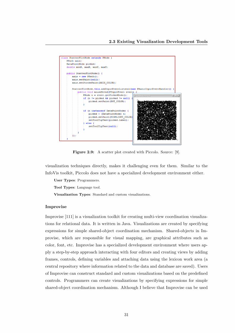
2.3 Existing Visualization Development Tools
Figure 2.9: A scatter plot created with Piccolo. Source: [9].
visualization techniques directly, makes it challenging even for them. Similar to the
InfoVis toolkit, Piccolo does not have a specialized development environment either.
User Types: Programmers.
Tool Types: Language tool.
Visualization Types: Standard and custom visualizations.
Improvise
Improvise [111] is a visualization toolkit for creating multi-view coordination visualiza-
tions for relational data. It is written in Java. Visualizations are created by specifying
expressions for simple shared-object coordination mechanism. Shared-objects in Im-
provise, which are responsible for visual mapping, are graphical attributes such as
color, font, etc. Improvise has a specialized development environment where users ap-
ply a step-by-step approach interacting with four editors and creating views by adding
frames, controls, defining variables and attaching data using the lexicon work area (a
central repository where information related to the data and database are saved). Users
of Improvise can construct standard and custom visualizations based on the predefined
controls. Programmers can create visualizations by specifying expressions for simple
shared-object coordination mechanism. Although I believe that Improvise can be used
31

2.3 Existing Visualization Development Tools
Figure 2.10: A multi-view coordination visualization in Improvise and the Controls
editor. Source: [111])
by end-user developers, this has not been empirically evaluated. Further, this tool is
specialized for coordinated visualizations that use predefined controls. Although it is a
powerful tool, it is not obvious from [111] if Improvise can be extended and adapted to
other than coordinated visualizations. Figure 2.10 shows a screen shot of Improvise.
User Types: End-user developers and programmers.
Tool Types: Wizard tool.
Visualization Types: Standard and custom visualizations.
Prefuse
Prefuse [36] is another toolkit developed in Java. Visualizations in Prefuse are written
in Java, and programmers construct them using a set of fine-grained building blocks
and specifying operators that define the layout and behavior of these blocks. Figure
2.11 shows an example. The purpose of this tool is to facilitate users’ work who are
skilled Java programmers. They can develop standard and custom visualizations pro-
grammatically. This toolkit can be integrated in development environments as the
InfoVis toolkit does, but the integrated development environment provides them with
limited cognitive support as visualizations are defined in the code editor.
32

2.3 Existing Visualization Development Tools
Figure 2.11: An animated radial layout created with Prefuse. Source: [36].
User Types: Programmers
Tool Types: Language Tool
Visualization Types: Standard and custom visualizations
Flare
This visualization toolkit [30] is a successor of Prefuse [36], but is written in Action-
Script. Flare supports programmers with a number of standard and custom visualiza-
tions. To construct visualizations, programmers specify in ActionScript the properties
of the visual objects and sequential commands. Figure 2.12 shows an example. Pro-
grammers can also define new operators and visual objects, but advanced programming
knowledge is required. Flare can be integrated in Adobe Flex IDE and it does not come
with a specialized IDE.
User Types: Programmers.
Tool Types: Language tool.
Visualization Types: Standard and custom visualizations
33

2.3 Existing Visualization Development Tools
Figure 2.12: The Job Voyager visualization created with Flare. Source: [30].
Protovis and ProtoViewer
Protovis [13] is implemented in JavaScript and helps programmers construct visual-
izations using a domain specific language. They can combine primitive visual objects,
called marks, bind them to data, and specify visual properties. Programmers can create
simple and custom visualizations by specifying Protovis specifications. The authors of
Protovis have compared the specifications for a simple pie chart in Protovis, Processing
and Flare, showing that the visualization in Protovis is specified in fewer lines of code
[13]. This shows the simplicity of Protovis language, which has a potential of engaging
end-user developers in visualization development. Although I believe that Protovis can
be used by end-user developers, there is no empirical evidence that proves it.
ProtoViewer [4] extends Protovis with a development environment. The screen
(Figure 2.13) is divided in three parts: Data, Design and Code. Programmers choose
a dataset, select a visualization template and automatically the code is shown in the
Code editor. They execute the code to view the results in the Design. Programmers can
either use predefined visualization templates, and the code is automatically shown in the
Code editor, or start from scratch and write Protovis specifications to specify controls.
Constructing custom visualizations by end-user developers in Protovis becomes even
34

2.3 Existing Visualization Development Tools
Figure 2.13: An arc diagram created with Protovis in ProtoViewer. ProtoViewer consists
of three parts: Data (left), Design (middle) and Code Editor (right). Source: [4].
more realistic by means of its development environment – ProtoViewer. However,
neither Protovis nor ProtoViewer has been evaluated with end-user developers.
User Types: End-user developers and programmers.
Tool Types: Language / Wizard tool.
Visualization Types: Standard and custom visualizations.
Data-Driven Documents: D3
Data-Driven Documents (D3) [14] is a successor of Protovis [13]. Visualizations are
constructed using SVG, HTML 5 and CSS. In D3 the data transformation, the imme-
diate evaluation and the browser’s native representation are handled in more effective
and transparent way than Protovis, which uses more succinct specification for static
presentations [14]. However, these improvements introduce an overhead for users: the
knowledge of SVG, HTML 5 and CSS. D3 is a web-based library and can be integrated
in existing development environments. Still, users have to use the code editor to create
visualizations. This toolkit is suitable for programmers only. Figure 2.14 shows an
example of D3.
User Types: Programmers.
35

2.3 Existing Visualization Development Tools
Figure 2.14: A calendar view created with D3. Source: http://mbostock.github.com.
Tool Types: Language tool.
Visualization Types: Standard and custom visualizations
MS Excel
MS Excel [64] is a spreadsheet program that allows users to analyze and visualize data.
With simple steps, all kind of users can construct visualizations based on predefined
templates (e.g. bar chart, pie chart, etc.) They select a visualization template (e.g. bar-
chart) and specify spreadsheet formulas or use standard widgets to map the data to the
visual object in the worksheet area. Figure 2.15 presents an example. In MS Excel, the
visual mapping is limited and users can set only predefined visual properties. Custom
visualizations cannot be constructed by simple users or end-user developers. Program-
mers can program custom visualizations in Macros (Visual Basic scripts), which can
be integrated into MS Excel.
User Types: Simple users, end-user developers and programmers
Tool Types: Wizard tool
Visualization Types: Standard visualizations
Tableau
Tableau [99] is a commercial visualization tool, a successor of Polaris [98] developed at
Stanford University. Tableau allows users to construct visualizations by dragging and
dropping fields onto axis shelves (vertical and horizontal areas) and using visual speci-
36

2.3 Existing Visualization Development Tools
Figure 2.15: A bar chart created with MS Excel. Source: [64].
fications (Figure 2.16). This tool can be classified as the drag-and-drop tool due to its
drag-and-drop features, but it can be considered as a wizard tool as well. Tableau uses
VizQL [35], an algebraic specification language, to create views based on predefined
templates and bind data to them. Further, it has a powerful interactive development
environment where users can interact, filter, sort data and create interactive dash-
boards. The main users of this tool are simple users. Tableau is a “black box” system.
Programmers do not have access to the kernel of the system and it is not possible to
extend it. Therefore, constructing visualizations other than the supported ones is not
possible.
User Types: Simple users, end-user developers and programmers.
Tool Types: Drag-and-drop / Wizard tool.
Visualization Types: Standard visualizations
Spotfire
Spotfire [97] is another commercial tool for data visualizations. It supports users,
regardless of their IT skills, with a number of visualization techniques. Users, regardless
their IT skills interact with the development environment and construct visualizations
37

2.3 Existing Visualization Development Tools
Figure 2.16: A bubble chart created with Tableau. Source: [99].
based on predefined ones. Once they select the data and choose a visualization template,
the tool automatically generates the visualization. Users can sort, filter and re-arrange
data by simply dragging and dropping fields in the design area. Users can also create
dashboards, by combining different visualizations (e.g. bar chart, scatter plot, etc) in a
single screen (2.17). As in Tableau, users can not create custom visualizations except
for the standard ones.
User Types: Simple users, end-user developers and programmers
Tool Types: Drag-and-drop / Wizard tool
Visualization Types: Standard visualizations
Omniscope
Omniscope [71], shown in Figure 2.18, is in the same category as Tableau and Spotfire,
and shares similar features such as interactive dashboard, drag and drop features, etc.
Although it can be used by all types of users, the main scope of this tool is to sup-
port simple users in constructing standard visualizations, as Spotfire and Tableau do.
Visualizations are constructed based on predefined templates. Custom visualizations
cannot be constructed with this tool. Programmers can not extend the system with
new controls or functionalities, as it is a “black box” system.
User Types: Simple users, end-user developers and programmers
38

2.3 Existing Visualization Development Tools
Figure 2.17: Several visualizations of the same dataset created with Spotfire. Source:
[97].
Figure 2.18: Several visualizations of the same dataset created with Omniscope. Source:
[71].
39

2.3 Existing Visualization Development Tools
Figure 2.19: The Designer (left) and the Previewer (right) in Tom Sawyer Presentation.
Source: [103].
Tool Types: Drag-and-drop / Wizard tool
Visualization Types: Standard visualizations
Tom Sawyer Perspectives
Tom Sawyer Perspectives is a software development kit that supports the construction
of “enterprise-class data visualization and social network analysis applications” [103].
It has a development environment where users use the Designer to specify schema,
data sources, bindings, and filters. They use the Designer to specify rules for the
visual representation of the data, to add context menus and to define custom toolbars,
tool-tips, and graphical viewing and editing behaviors. The results are presented on the
Previewer. Although this tool supports quick development of visualization applications,
constructing custom visualizations is not feasible because users are limited to using
visualization models supported by the tool. As Tableau, Spotfire and Omniscope,
extending this tool is not possible. Figure 2.19 presents a screen shot of the Tom
Sawyer Perspectives.
User Types: Simple users, end-user developers and programmers
Tool Types: Drag-and-drop / Wizard tool
Visualization Types: Standard visualizations
40

2.3 Existing Visualization Development Tools
Figure 2.20: A treemap in Code-Playground of Google chart Tools. Source: [32].
Google Chart Tools
Google Chart Tools [32] is a library written in JavaScript that provides several prede-
fined simple (line chart, scatter chart, etc.) and advanced chart types (Image multi-
color bar chart, Motion Chart Time Formats, etc.) Visualizations can be constructed
by programmers in the web-based development environment named Code Playground,
illustrated in Figure 2.20. In addition, Google Chart Tools has another environment
named Live Chart Playground, to test charts already created in the Code Playground.
In Live Chart Playground, programmers can change some parameters and see how the
visualization changes. These two environments increase the likelihood of attracting
and engaging end-user developers to create visualization in JavaScript. However, pro-
grammers and end-user developers are limited to predefined templates and functions,
because the kernel of the library is not available.
User Types: End-user developers and programmers.
Tool Types: Wizard / Language tool.
Visualization Types: Standard visualizations
Many Eyes
Many Eyes [107], developed at IBM Research Center, is a web-based visualization plat-
form mainly for simple users. In Many Eyes, visualizations are implemented in Java
41

2.3 Existing Visualization Development Tools
Figure 2.21: A map visualization in Many-Eyes. Source: http://www-958.ibm.com/.
Applets. Users construct visualizations in three steps: upload a dataset; choose a visu-
alization template; customize and publish the visualization. Many Eyes automatically
generates and shows the visualization on the screen. Custom visualizations are not
supported. Figure 2.21 presents a screen shot of Many-Eyes.
User Types: Simple users, end-user developers and programmers
Tool Types: Wizard tool
Visualization Types: Standard visualizations
2.3.5 Results
Table 2.2 provides an overview of the results. The table shows that there is a tendency
for researchers to focus on helping programmers to construct custom visualizations.
In contrast, industry targets their products to simple users and helps them create
standard visualizations. Although both communities can benefit from the engagement
of end-user developers in constructing custom visualizations, end-user developers are
neglected and not supported as simple users and programmers are. Further, the results
show that only DEVise, GeoVISTA Studio, Improvise and Protovis/ProtoViewer may
help end-user developers construct custom visualizations. However, to the best of my
knowledge there is no empirical evidence that proves it. Surprisingly, InfoVis tools
and toolkits are usually evaluated through case studies where impressive visualizations
have been developed, and not through usability studies or experiments with potential
42

2.3 Existing Visualization Development Tools
Langua
ge Too
lsWizard To
ols
Drag‐an
d‐drop
Too
lsLangua
ge Too
lsWizard To
ols
Drag‐an
d‐drop
Too
ls
Simple Users
DEVise, M
S Excel , Tab
leau
, Spotfire, Omniscop
eTo
m Saw
yer P
erspectiv
es,
Man
y Eyes
SageBo
ok, Tab
leau
, Spotfire, Omniscop
e,
Tom Saw
yer
Perspe
ctives
End‐User
Develop
ers
APT, SAG
E, Protovis,
Goo
gle Ch
art T
ools
DEVise, ProtoView
er,
Improvise
, Geo
VISTA Stud
io,
MS Excel, Tableau
Spotfire, Omniscop
eTo
m Saw
yer P
erspectiv
esGoo
gle Ch
art T
ools,
Man
y Eyes
SageBo
ok, Tableau,
Spotfire, Omniscop
e,
Tom Saw
yer
Perspe
ctives
Protovis
ProtoV
iewer, Improvise
, DE
Vise, G
eoVISTA Stud
io
Programmers
APT, SAG
E, Protovis,
Prefuse, Piccolo,
Proccesin
g, Flare, D
3,
The InfoVis T
oolkit,
Goo
gle Ch
art T
ools
DEVise, ProtoView
er,
Improvise
, Geo
VISTA Stud
io,
MS Excel, Tableau, Spo
tfire
, Omniscop
e, Tom
Saw
yer
Perspe
ctives
Goo
gle Ch
art T
ools,
Man
y Eyes
SageBo
ok, Tab
leau
, Spotfire, Omniscop
e,
Tom Saw
yer
Perspe
ctives
Protovis, Prefuse,
Piccolo, Proccesing,
Flare, D3, The
InfoVis
Toolkit
ProtoV
iewer, Improvise
, DE
Vise, G
eoVISTA Stud
io
Stan
dard Visua
lizations
Constructin
g Visualizations
Custom
Visua
lizations
Tab
le2.2
:20
Info
Vis
tool
sm
app
edacc
ord
ing
toth
eta
xon
om
y.T
ools
from
ind
ust
ryare
inb
old
.B
oxes
inye
llow
ind
icat
eth
ep
rob
lem
sad
dre
ssed
inth
isre
searc
h.
Box
esin
gra
yre
pre
sent
futu
rere
searc
hd
irec
tions.
43

2.3 Existing Visualization Development Tools
users. This indicates that the InfoVis community has to focus more on evaluation of
the development tools with real users.
The results also show that simple users are supported with interactive development
environments where they can use a step-by-step and/or drag-and-drop approach. These
environments aim at handling the gulf of execution (How do I do something? ) and
evaluation (What happened? ) identified by Norman [70] by allowing simple users to
easily map data to visual objects in standard visualizations and obtain immediate
feedback. The visual mapping of custom visualizations is mainly handled through
code, with the exception of Improvise, GeoVISTA Studio and DEVise, which use a
step-by-step approach.
Mapping InfoVis development tools according to this taxonomy gives research di-
rections that the InfoVis community should investigate. First, end-user developers need
more tools to create custom visualizations. Second, there is a need for drag-and-drop
tools that allow users to create custom visualizations. Creating tools for users with
different IT skills may address the universal usability challenge [78] and facilitate the
process of introducing new audiences to InfoVis.
The research presented in this thesis focuses on EUD of visualizations and addresses
the problem: there are no Drag-and-Drop tools that allow users to create custom visu-
alizations independently of their IT skills . More specifically, this work targets end-user
developers as well as programmers. The following chapter describes the proposed solu-
tion that uses techniques proven successful in other areas, e.g. formulas, drag-and-drop,
etc.
44

Chapter 3
Solution
This chapter describes a drag-and-drop approach for visualization development. The
proposed solution (uVis) consists of:
• The uVis formula language: supports visualization development by combining
visual objects where each property can be a formula. uVis formulas are similar to
spreadsheet formulas and can address relational data, other visual objects, and
dialog data.
• The uVis Studio: a development environment for uVis that consists of several
coordinated panels and features that help end-user developers and programmers
create visualizations with a Drag-Drop-Set-View-Interact approach.
This chapter consists of two sections. The first section describes the uVis formula
language and the second presents uVis Studio. In this chapter, for simplicity, instead of
using the terms end-user developers and/or programmers I refer to them as developers.
3.1 uVis Formula Language
The scope of this section is not to present the uVis formula language in detail, but to
provide knowledge needed to understand how uVis formulas are used to create visu-
alizations and to follow the remaining chapters. A detailed explanations of the uVis
formula language can be found in [53].
45

3.1 uVis Formula Language
Figure 3.1: a. Vis-file, b. Vism-file .
3.1.1 uVis Files
A visualization created with uVis has two kinds of files:
• A visualization file (Vis-file) contains the formulas needed to generate a Windows
form with data visualizations and simple controls. A Vis-file will normally be
generated and edited through uVis Studio, but might also be created and edited
outside uVis Studio. Figure 3.1(a) shows an example of a Vis-file opened in
notepad. A visualization might use several forms. In this case several Vis-files
are used.
• A mapping file (Vism-file) contains information about the database. It lists the
available tables and relationships in the database. A Vism-file is created by a
database expert, or a uVis user who is able to specify the database connection
and table relationships. Figure 3.1(b) shows an excerpt of a Vism-file. Line 5
and 6 specify a one-to-many relationship between two tables: tblPatient and
tblMedorder. The Vism-file also specifies the start-up form and initial develop-
ment modes.
3.1.2 Controls
Developers construct visualizations by placing visual objects on forms and specifying
uVis formulas for their properties. For instance, a bar-chart is created by binding a box
control to data so that the box repeats itself and sets the heights according to data.
Other visualizations are composed from several controls. To visually map controls to
data and compose the visualization, developers specify uVis formulas for the control
properties. uVis provides simple controls (e.g. label, textbox, triangle, box, etc.) but
46

3.1 uVis Formula Language
also advanced ones (e.g. a TimeScale control that can show several periods of time
with different zoom and align other controls accordingly).
3.1.3 Properties
Properties define the appearance and behavior of a control. A property has a formula
that computes the value of the property, or defines it as a constant. Controls have
three kinds of properties.
uVis properties: All controls have common properties such as Top, Left, Width
and Height, and individual properties such as Text, Radius and Angle. A special
property is Rows. Its formula computes a list of rows from a table or joined tables.
uVis generates a control for each row.
Designer Properties: A developer may define a new property, a designer property.
He may for instance write a complex formula in it. Other properties can refer to it.
When the designer property has no formula it can contain a value and serve as a
variable. In this case they have the same role as the dialog or session data in other
programming languages.
Event Properties: Event properties do not have a formula but one or more state-
ments that are performed when the event happens. As an example, the click event
handler for a button may contain Refresh(), a uVis function that calls uVis to check
for changed data and update all controls accordingly. The formula may also contain
assignment statements, which can set designer properties and change database fields.
3.1.4 Formulas
The formula is the most important concept in uVis. To build a visualization you need
controls, but formulas are the ones responsible for “gluing” these controls, defining
their appearance and specifying their behavior. Formulas can refer to controls, control
properties, tables and table fields in the database. In a Vis-file, a control consists of a
block of formulas specified as plain text.
The uVis formula language combines several popular principles from programming
languages, spreadsheets, relational databases and graphical user interfaces. For in-
stance, it inherits the principle of referring to objects using the dot (.) operator as
programming languages do. uVis uses almost the same algorithm that spreadsheets
47

3.1 uVis Formula Language
use to calculate the formulas in the right sequence. However, controls (cells in spread-
sheets) do not exist initially, but are created by formulas at run-time. This requires a
more sophisticated algorithm. Formulas encapsulate complex logic such as SQL queries.
As other tools, uVis has the usual math and string functions.
Access to control properties
A formula can refer to a control property. This is done with the bang operator (!),
which addresses visual control elements. In case the formula refers to a property of the
same control, the name of the property can be used without any prefix.
Width: controlA ! Height (Refer to a property of another control.)
Width: Height (Refer to a property of the same control.)
In principle, uVis could use a dot operator instead of the bang (!) or other operators
described below. However, early in the project we noticed that these operators increased
readability of the formulas. In addition, the operators resolve name ambiguities, for
example between the Height property and a table field called Height.
Binding controls to data
uVis formulas can bind controls to rows of a table or joined tables. uVis controls have
a special property called Rows. Rows specify how to compute a list of rows. uVis will
generate an instance of the control for each row. An example is:
Rows: tableA (tableA is a table in the database.)
In this case, uVis compiles all formulas, collects information about the fields used,
generates an SQL statement using the collected fields, executes it, retrieves the rows
from tableA, and generates an instance of the control for each row. Each instance is
bound to the corresponding row.
Rows formulas can join several tables, and the result is used to generate controls. To
support this, uVis has join operators for one-to-many and many-to-one relationships:
-< (left) join many, =< inner join many, >- (left) join one, and >= inner join one.
uVis does not have join operators for one-to-one and many-to-many relationships. The
one-to-one relationship can be replaced either by one-to-many or many-to-one. Many-
to-many is not supported directly by databases, so uVis has no operator for it. A
many-to-many relationship is normalized by introducing an extra table that has many-
to-one relationships with the other two tables.
48

3.1 uVis Formula Language
The join operators resemble the notation used in an Entity Relationship diagram.
These operators denote the relationship cardinality using the Information Engineering
cardinality style [62]. The join operators are used in the Rows property of a control, for
instance:
Rows: tableA -< tableB
tableA and tableB exist in the database and have a one-to-many relationship.
The database expert has defined this relationship and for simplicity given it the name
tableB (Figure 3.1(b) shows an example). The result of the formulas is: all tableB
rows that relate to tableA. Fields from tableA are added to each row.
With this Rows property, the dot operator can access fields of the tables. For
example, a formula defines the height of a control according to a field.
Height: tableA.fieldA (fieldA exists in this joined tables)
Formulas can also access properties and fields in the list of controls generated by
Rows. Two examples are:
Width: controlA[5]!Height (Refer to Height of the fifth control instance.)
Height: controlA[5].FieldA (Refer to FieldA mapped to the fifth control instance.)
A Rows formula can have an SQL tail with Where, Order By and other SQL parts
in any sequence. Examples are:
Rows: tableA -< tableB order by tableA.FieldA (rows ordered by FieldA)
Rows: tableA -< tableB group by tableA.FieldA (rows grouped by FieldA)
Rows: tableA -< tableB where tableA.FieldA = 1 (rows filtered by FieldA)
Finding a control based on data
Sometimes there is a need to “walk” from a row to a control bound to it. This is done
with the control join operator (-=). It can for instance be is used to align control
instances. A real example is described in Appendix A.
3.1.5 Visualizations
uVis supports development of a wide range of visualizations. As proof of concept,
several visualizations have been developed. Figure 3.2 shows some visualizations created
with uVis formulas. Appendix A explains in detail how a custom visualization is created
with uVis. In theory, uVis formulas could support all types of visualizations, such
as time-oriented, hierarchal, geographical, animations, etc. However, at the current
49

3.1 uVis Formula Language
Figure 3.2: Visualizations created with uVis: a. Simple Pie Chart, b. Custom Pie
Chart, c. Spiral Graph, d. SparkClouds, e. CircleViews, f. TreeMap, g. TileMaps.
stage, it is not possible to construct animations and geographical visualizations. In
order to create these types, some additional visual object types are required. As an
example, geographical visualizations can be constructed by introducing a geographical
map object.
A great deal of research has been conducted in layout algorithms that automatically
arrange visual objects to create novel presentations. TreeMap [11, 42] and Tag Cloud
[41, 45, 65] are two popular layout algorithms. These two layout algorithms calculate
the position and size of the visual objects. The Tag Cloud can easily be defined by
uVis formulas. Figure 3.2(d) shows a SparkClouds [55], a custom visualization that
integrates SparkLines [106] in a Tag Cloud visualization. This visualization is created
with uVis formulas.
However, in other cases (e.g. TreeMap), it is not possible to create the visualiza-
tion with simple formulas. Such a visualization can be provided by a special Layout
property. A developer creates a TreeMap visualization (Figure 3.2(f)) using a box with
these properties:
Box: treeMapBox
Rows: tableA
50

3.1 uVis Formula Language
Layout: TreeMap()
Weight: tableA.FieldA
uVis creates a list of rows and for each row it creates a control instance. When cre-
ating a control instance, uVis checks if the Layout property is set and calls TreeMap.
TreeMap() calculates and sets values of Width, Height, Top and Left according to the
TreeMap algorithm. The Width, Height, Top and Left are read-only for any control
having a Layout property.
3.1.6 Interaction
Interaction is and important aspect of visualizations. Without interactivity users would
not be able to explore data. uVis supports interaction (e.g. details-on-demand, fil-
tering) by means of event properties. The formula for an event property is a list of
statements to be executed when the event occurs. As an example, to implement details-
on-demand, the developer uses two box controls: Box1 and BoxDetails. The developer
defines an event handler property for the Click event in Box1. The event handler tog-
gles the Visible property of BoxDetails. These are the formulas:
Box: Box1
Click: BoxDetails!Visible = Not BoxDetails!Visible, Refresh()
...
Box: BoxDetails
Rows: ...
Visible: Init false
Text: Me.Comments
...
When the end-user clicks Box1, uVis performs the actions (statements) in the click
formula. As a result, the Visible property of BoxDetails is toggled. The statement
Refresh() asks uVis to recompute all formulas and redraw controls where a property
value has changed. As a result the BoxDetails will appear.
The uVis formula language is not mature enough to support complex interaction
such as semantic zooming and focus+context. As an example, the TimeScale con-
trol supports zooming, but this feature is implemented inside the TimeScale control.
Implementing this with formulas is difficult even for experienced uVis users.
51

3.1 uVis Formula Language
3.1.7 Special uVis Concepts
Before I present uVis Studio, I describe some concepts used in the uVis formula lan-
guage.
• Bundle: The Rows property creates a list of rows and creates a control for each
row. These controls are called a bundle. As an example, the Rows formula is set
to tableA, which has 23 rows. uVis evaluates the formula and creates a bundle
of controls.
Box: Box1
Rows: tableA
...
In this case the bundle has 23 controls because there are 23 rows in tableA.
• Index: A control has an index inside the bundle. The first control has index
zero, the second one, and so forth. As an example, Left is set to this formula.
Box: Box1
Left: Index * 20
...
uVis evaluates the Left formula for each control. As a result, the first control
has Left 0, the second 20, the third 40, and so forth.
• Parent: This property creates a control instance for each instance of another
control (the parent). Assume a developer wants to add a label (Label1) that
appears next to each Box1. Instead of specifying the Rows property of the label,
the developers makes Parent refer to Box1. As a result one label (Label1) will
be generated for each Box1.
Label: Label1
Parent: Box1
...
The Parent can also be combined with join operators to define the Rows property
of a control.
Label: Label2
Parent: Box1
Rows: Parent -< tableB
52

3.1 uVis Formula Language
In this case, uVis evaluates the Rows formula for each Parent control (Box1) and
creates a bundle of controls for the parent. The bundle is created according to
the tableB rows reachable from the parent’s row.
• Canvas: By default, a control is attached to the form and scrolls with it. How-
ever, the form may contain canvas controls. If the control has a Canvas property,
it is attached to the Canvas control and scrolls with it. Assume a box control
Box1 is attached to a canvas control Panel1. The Canvas property of Box1 is set
to Panel1, as follows:
Box: Box1
Canvas: Panel1
...
• Me: Refers to the current control and data row bound to this control. Me is
optional unless there is an ambiguous case that uVis cannot resolve. Me can also
be used to refer to a specific control in the current bundle.
Box: Box1
Height: Me.FieldA
Left: Me[2]!Width (Go to the third control in my bundle)
...
• Init: Makes a property value changeable at run-time.
Textbox: txbID
Text: Init abc
...
In this example, the initial values is abc. An end-user can type something in the
textbox and in this way change the value of Text. uVis uses the new value when
evaluating formulas.
• Conditional statements: uVis supports conditional expressions in C# style.
For example, the back color of a bar in the bar chart can depend on Value.
Box: Box1
BackColor: Value<10?"Green":"Red"
...
53

3.2 uVis Studio
3.2 uVis Studio
uVis Studio (or simply the Studio) is the development environment of uVis. uVis
Studio consists of 9 panels (Figure 3.4): the ToolBox, the Explorer, the Property Grid,
the Modes, the Error List, the E/R Model, the Design Panel, the Control-Data Hierarchy
and the DataView. All panels can be arranged by developers; they can resize, dock,
hide, and open them as separate windows.
uVis Studio is written in C#, with a user interface in Windows Presentation Foun-
dation (WPF). Two versions of uVis Studio were developed. Figure 3.3 shows the first
version. Figure 3.4 shows the second version. The differences between the first and the
second version (described later in this section) include two new panels (Control-Data
Hierarchy and DataView), a new feature (Formula Suggestions), and several improve-
ments (e.g. user-interface design, icons, Modes presentation, etc.) .
In the first version (Figure 3.3), the Design Panel shows a custom visualization
inspired by LifeLines [79]. This visualization shows the medicine orders (white boxes
aligned to the timescale) and intakes (colored bars inside the white boxes) for patient
Lise B. Hansen. End-users interact with the timescale to zoom in and out. Further
they select another patient by changing the value in the text box.
In the second version (Figure 3.4), the Design Panel shows a custom visualization
of the evolution of technologies since 1985. The yellow column and row shows the total
number of technologies per category and year respectively. The big black bars show the
total number of technologies. Each box uses color-coding to show if there have been
publications or not. The small bar inside a box illustrates the number of technologies
per year. The first column aggregates the number of technologies for the years’ range
defined in the two text boxes. End-users can change their values and the visualization
updates.
To create these visualizations, developers drag and drop controls from the Toolbox
into the Design Panel, set formulas for control properties in the Property Grid, view
immediate results in the Design Panel after the properties have changed, and interact
as end-users (using Modes) to see how the visualization behaves.
The rest of this chapter describes the panels and features of uVis Studio, and in
some cases it refers back to Figure 3.3 and 3.4. Next, the development approach and
54

3.2 uVis Studio
Fig
ure
3.3
:u
Vis
Stu
dio
v.1
:T
ool
box
,2.
Exp
lore
r,3.
Des
ign
Pan
el,
4.
Pro
per
tyG
rid
,5.
E/R
Mod
el,
6.
Err
or
Lis
t,7.
Mod
es,
and
8.A
uto
-Com
ple
tion
.N
otic
eth
at
the
sele
cted
contr
ol
ish
igh
lighte
din
dark
-blu
e,an
dp
rop
erti
esare
show
n
inth
eP
rope
rty
Gri
d.
Inth
isca
se,
the
dev
elop
eris
spec
ifyin
gth
eRows.
Th
ed
evel
op
erty
pes
the
fiel
ds
aft
erth
egr
ou
p
by,
bu
tth
eA
uto
-Com
ple
tion
does
not
sugges
ttblIntake
bec
au
seit
isn
ot
use
d.
55

3.2 uVis Studio
Fig
ure
3.4
:u
Vis
Stu
dio
v.2
:1.
Tool
box
,2.
Exp
lore
r,3.
Des
ign
Pan
el,
4.
Pro
per
tyG
rid
,5.
E/R
Mod
el,
6.
Err
or
Lis
t,7.
Mod
es,
8.D
ataV
iew
,9.
Con
trol-
Data
Hie
rarc
hy,
10.
Au
to-C
om
ple
tion
,11.
Form
ula
sugges
tion
s.T
he
sele
cted
contr
olis
hig
hli
ghte
din
ligh
tb
lue
colo
rin
the
Des
ign
Pan
elan
dC
on
trol-
Data
Hie
rarc
hy,
as
the
sele
cted
pro
per
tyin
the
Pro
pert
yG
rid.
56

3.2 uVis Studio
the cognitive supports of uVis Studio are presented. The chapter concludes with some
performance measures.
3.2.1 Panels
uVis Studio has nine panels to support the Drag-Drop-Set-View-Interact development
approach. The design of uVis Studio was inspired by existing integrated development
environments such as Visual Studio and Eclipse. Novel features of the Studio were
elicited in the requirements document [52]. As an example, one of the requirements
was that the user of the Studio should continuously obtain immediate feedback during
development.
The Toolbox
The Toolbox (Figure 3.4(1)) contains the control types that uVis supports, such as
label, button, triangle, timescale, etc. A developer drags and drops a control into the
Design Panel and the Studio sets the default property values. The developer may also
select a control and draw it as a rectangle in the Design Panel. Icons for each control
were added in the second version (Figure 3.4(1)) to help developers distinguish them.
The Explorer
A developer creates and opens uVis folders with the Explorer. This panel (Figure
3.4(2)) shows Vis-files and Vism-files. There are two icons on the top of this panel.
The developer clicks on the right icon and uses a wizard to locate the folder where the
Vism-file is stored. The Vism-file is written in advance by a database expert who can
specify the database connection and table relationships. The developer clicks on the
Vism-file and the visualization opens in the Design Panel.
The Design Panel
Visualizations are shown in the Design Panel (Figure 3.4(3)). A developer drags and
drops controls from Toolbox, moves and resizes them. However, it is not possible to move
a control when it has a formula for the position (Left or Top). If the Left property
of a control is bound to a table field, the developer can only change the position by
changing the formula in the Property Grid.
57

3.2 uVis Studio
When the developer drops a control or moves a control into a Canvas control, the
Parent and Canvas property are automatically set to the Canvas control. However,
the developer can change them manually in the Property Grid. When the developer
adds a new control, the control formulas with default values are automatically set.
In the first version (Figure 3.3(3)) the Design Panel was coordinated with the
Property Grid. Whenever the developer selected a control, it became highlighted in
dark blue and the corresponding formulas were shown in the Property Grid. The
second version (Figure 3.4(3)) uses a light blue color for the selected control because
the dark blue is less readable. When a control is selected in the Design Panel, the
control is also selected in the Control-Data Hierarchy and the DataView shows its row
data.
Feature: What-You-Bind-Is-What-You-Get
The Design Panel is a “live” one. It supports direct manipulation and provides con-
tinuous feedback during development. When the developer has changed a formula,
the Design Panel updates immediately. The developer does not need to execute the
program to view controls bound to data. I call this feature What-You-Bind-Is-What-
You-Get. For example, a developer specifies the Rows in the Property Grid to bind a
label to the rows of tableA. This table has 23 rows. uVis creates 23 labels automatically,
and the Design Panel shows them. As another example, the developer maps a field of
a table to the Text property of a label and the field values are immediately shown in
all of them.
The Property Grid
The Property Grid (Figure 3.3(4)) shows the properties for the selected control. By
default, it shows the properties of the form control. A row in the Property Grid consists
of the property-name and the formula. Properties can be sorted alphabetically or shown
in groups to help the developer find them faster. A change in the Property Grid is
immediately reflected in the Design Panel. Also, a change in the Design Panel (e.g.
moving a control) automatically updates the Property Grid. A developer can add and
remove properties by clicking on the + and - button respectively.
58

3.2 uVis Studio
Feature: Auto-Completion
Writing formulas can be challenging, as developers must remember the syntax, and it is
common to misspell words. To help them, the Property Grid has an Auto-Completion
feature that suggests what can follow. The suggestions can be available variables and
functions of the formula language, but also suggestions for tables, table fields and
relationships in the database.
Let us assume that a developer starts typing. The Property Grid sends to uVis
what has been typed and receives information about what can follow. The Auto-
Completion uses this information to create a list of suggestions. Suggestions are grouped
in categories (e.g. property, table, field, etc.), sorted based on the typed letter(s), and
are shown in a pop-up window. Color-coded icons are used for items of the same
category to help distinguish the suggestions.
Figure 3.5 shows eight examples. Let us describe some of them. In the first example,
the developer is typing a formula for the Rows property (light blue). The developer
typed “tbl” and suggestions that start with these letters are shown. In this case, the
Auto-Completion shows four table names (see the E/R Model in Figure 3.3). In the
fourth example, the developer has typed the table name and pressed a dot. The Auto-
Completion shows only the fields of this table. In the seventh example, the developer
added a new property and started typing. A list with control property names, including
the existing designer properties, is shown.
In the second version (Figure 3.4(10)), I improved the algorithm to show more
precise information, and solved bugs found during the first usability study. Descriptive
tool-tips were added for each item in the Auto-Completion. In addition to the color-
coding that denotes the category, I added the category name (in light gray). In this
way, developers can directly see suggestions and their category.
The E/R Model
uVis uses the Vism file to extract table, field and relationship names from the database.
The E/R Model uses this information and visually presents it as an Entity Relation-
ship diagram (E/R) [21]. An entity represents a table in the database and shows the
fields and field types. The connectors represent the relationships using the Information
Engineering cardinality style [62]. Other cardinality styles are developed by Chen [21],
59

3.2 uVis Studio
Figure 3.5: The Auto-Completion in action showing suggestions of : 1. table names,
2. relationship names, 3. SQL keywords, 4. field names, 5. control names, 6. control
Properties, 7. event properties, and 8. functions and control properties.
60

3.2 uVis Studio
Figure 3.6: The first version of the E/R Model (left). The improved version of the E/R
Model (right).
Bachman [6], etc. Choosing the right cardinality is challenging, and the decision can be
debatable. From our personal experience with teaching E/R models, the Information
Engineering cardinality style is the easiest to learn.
Developers can re-arrange the entities with the mouse. As the database may contain
many tables, developers can expand or collapse table fields and detach the E/R Model
panel from the Studio to enlarge it and get a better overview.
Figure 3.6 shows the two versions of the E/R model. In the second version, the
E/R Model is more interactive, useful and readable. First, the developer selects a table
or a field and views the data in the DataView. Second, I renamed the field types
of the database to more comprehensible terms for end-user developers. For example,
VarWChar was replaced by Text. Finally, I changed the layout using more bright colors
to avoid readability issues caused by the contrast.
Feature: Formula Suggestions
In the second version, the E/R Model has a new feature called Formula Suggestions.
This feature aims at helping users specify easier data mapping formulas. A developer
selects a property in the Property Grid, then right-clicks a table name, field name or
relationship line to see formula suggestions in a pop-up window. There are two choices
61

3.2 uVis Studio
for one suggestion. The developer can choose Add to append a suggested formula to the
selected property, or Replace to replace the formula of the selected property with the
suggested formula. As a result, the formula updates, and changes immediately reflect
in the Design Panel.
Figure 3.7(11) shows Formula Suggestions in action. Below I describe a simple
examples:
• A developer wants to set the Text of a label (bound to tblPatient rows) to:
"Patient Name: " & tblPatient.Name
(1) Selects the Text property from the Property Grid.
(2) Types “Patient Name:”.
(3) Right-clicks over ptName field from tblPatient in the E/R Model panel. For-
mula Suggestions (pop-up window) is open.
(4) Selects from the Formula Suggestions “Add: tblPatient.ptName”. The For-
mula Suggestions automatically inserts the “&” operator before tblPatient.ptName.
The algorithm used in the Formula Suggestions provides suggestions that follow the
formula syntax, and automatically adds the correct operator in front of the suggestion.
It also considers the Rows and the Parent of a control. For example, a developer tries
to use a field from a table that is not included in the Rows property. The Formula
Suggestions shows a message notifying the developer that this cannot be performed
(Figure 3.8(1)). The algorithm also checks the type of the formula versus the type of
the property. For example, the developer selects the Top property and attempts to bind
it to a table or a relationship. Again, no suggestions are shown, but a message says
that a table or relationship is only used with the Rows property (Figure 3.8(2)).
The Error List
The Error List shows a list of errors whenever a formula is wrong. Figure 3.9 shows
an example when a developer misspelled the word “left”. The user double clicks on the
error, and the wrong formula in the Property Grid is colored in red. Once the formula
is corrected, the error list updates. In spite of the errors, the visualization is running
all the time.
62

3.2 uVis Studio
Figure 3.7: The Formula Suggestions in action showing suggestions of: 1. table names,
2. field names, 3. relationship names when the Rows property of the parent control is
not specified, and 4. relationship names when the Rows property of the parent control is
specified.
Figure 3.8: 1. A developer attempts to map the field amount to the Top property. 2. A
developer tries to map the rows of tblIntake to Top.
63

3.2 uVis Studio
Figure 3.9: The developer selected the error message in the Error List (left) and the
wrong formula is highlighted in the Property Grid (right).
In the second version, the content of the error messages improved as changes in the
kernel were made. Also, the format of the message changed slightly. I removed some
details that might be confusing for developers (e.g. the position and the line number).
The Modes
In the first version, the Modes used check boxes (Figure 3.3(7)). In the second version
(Figure 3.4(7)), I re-designed the layout of the Modes, as they were not intuitive in
the first usability study. The new presentation uses sliders, color-coding for the se-
lected mode, and has descriptive text and tool-tips. In addition, the Modes panel is
positioned over the Design Panel. These changes attempt to improve understandabil-
ity and visibility of the Modes. This panel shows the Interact-Mode and Data-Mode
(Figure 3.4(7)).
• Interact-Mode: It enables interaction with the Design Panel as an end-user.
Enabling the Interact-Mode through a slider might be considered as the Run but-
ton in traditional development environments. However in these environments, the
developer has to wait for the result, which is shown in a different workspace. In
Figure 3.10(1), the Interact-Mode is disabled, while in Figure 3.10(2) the devel-
oper moved the slider to enable it. In this way, the developer interacts with the
timescale as an end-user.
• Data-Mode: It disables the WYBIWYG feature of the Design Panel. In Figure
3.11(1) the Design Panel shows controls bound to data. In Figure 3.11(2) the
developer moved the slider to disable the WYBIWYG and the Design Panel
shows only one instance. In this case, the screen is similar to the Design Panel
in Visual Studio or Eclipse.
64

3.2 uVis Studio
Figure 3.10: 1. The Interact-Mode is set to designer mode and the developer has
selected the barIntake control (top). 2. The Interact-Mode is set to end-user mode and
the developer interacts with the timescale and tests the tool-tip.
Figure 3.11: The developer uses the Data to: enable the WYBIWYG (1) or disable it
(2).
65

3.2 uVis Studio
Figure 3.12: 1. The DataView. 2. The Control-Data Hierarchy.
The DataView
The DataView (Figure 3.4(8)) was developed in the second version of the Studio and
shows data from the database. This panel is coordinated with the E/R Model. A
developer clicks a table in the E/R Model and the rows are shown. The developer
may also click a field, and the column is brought to focus and highlighted. Next,
the developer may order rows according to it; useful when exploring data. When the
developer clicks a control that is bound to data, then the DataView shows the row-data.
An example is presented in Figure 3.12.
The Control-Data Hierarchy
This panel (Figure 3.4(9)) shows the control and data hierarchy of controls in the
form. It was developed in the second version of uVis Studio in an attempt to im-
prove understandability of the Canvas and Parent concept. The panel displays the
control hierarchy as a tree. Each control is represented by a node and child nodes
denote the nested controls. The data hierarchy is represented by the tree as well, but
additional plain text is used to explain the data source. For example in Figure 3.12
the panMedOrder control resides inside the panPatient control. The plain text shows
which table is used, but for information such as where and group by the developer has
to check the exact formulas in the Property Grid.
When there are many controls, it is important to distinguish controls bound to
data from others. Therefore, the text style is bold if the control or its Parent control
is bound to data. An example is presented in Figure 3.12.
Developers can expand/collapse controls and detach the panel and view it sepa-
rately. Finally, interactions with the panel reflect in the Design Panel, the Property
Grid and the DataView.
66

3.2 uVis Studio
3.2.2 Development Approach
In uVis Studio, visualizations are constructed with the Drag-Drop-Set-View-Interact
approach. Developers drag and drop controls, set control properties using formulas,
immediately view how controls are bound to data, and interact with the visualization as
end-users without switching workspace. Below, I describe the approach and elaborate
on how the Studio attempts to reduce the gulf of execution (how do I do it?) and
evaluation (what happened?).
• Developers drag and drop controls. In uVis Studio, developers need minimal
mental effort to create a control because drag-and-drop is a straight forward
action. It is obviously easier than writing code.
• For each control, developers set control properties through the Property Grid.
The Auto-Completion helps them with suggestions to write the correct formula.
Also, developers view the data model in the E/R model, and bind controls to
data and map fields to properties using the Formula Suggestions.
• Developers immediately view results in the Design Panel, and if needed adjust
control properties again. They do not switch workspace to view what happened
after changing a property. Developers view the mapping of the data to controls in
the Design Panel, observe the properties in the Property Grid, and see the bound
data in the DataView. To further improve the visual feedback, controls bound
to data overlap partly because the Studio automatically set the Left property
to a formula. Developers obtain continuous feedback and realize what happened,
reflect on the formulas and understand how the mapping was done.
• Developers interact with the visualization as end-users without switching workspace.
The Design Panel shows the visualization “live”, and developers can enable the
Interact-Mode to interact as end-users. In this way, developers realize what hap-
pened as they interact.
Tanimoto [101] defined a taxonomy of development environments using the feedback
to developers, known as the “liveness” taxonomy. This taxonomy has four levels of
liveness:
1. Informative: Environments where developers can create, but not run a program.
67

3.2 uVis Studio
2. Informative and significant : Environment where developers can create programs,
and explicitly submit programs to execute.
3. Informative, significant and responsive: Environment where developers create
programs, and any change causes computations without any explicit submission
for execution.
4. Informative, significant, responsive and live: Environment where a program is
“continually active, or potentially so” [101], and developers can edit programs at
run-time; there is no need to stop or restart to view the changes.
Language tools such as Prefuse, Piccolo, InfoVis Toolkit, Flare, etc. can be in-
tegrated in development environments such as Eclipse. However, the development
approach is language-based, where users of these tools write code. At the end, they
execute the code to view the result. In wizard tools such as Improvise and Devise,
users specify step by step a visualization using several windows. At the end, they are
able to view the results. According to the “liveness” taxonomy, these tools fall in the
second level – informative and significant.
uVis Studio falls somewhere between level three and four. The uVis Studio shows
the “live” version of the visualization and developers can create and edit visualizations
without explicitly asking for a compilation. Changes in the Property Grid are reflected
immediately to the visualization when developers press ENTER or change focus.
3.2.3 Cognitive Supports
As Norman [70] says, “the real power come from devising external aids that enhance
cognitive abilities.” uVis Studio resembles a traditional development environment, but
it supports improved external aids – several coordinated panels and novel features.
Coordinated Panels
In uVis Studio, the coordinated panels aim at facilitating development by allowing de-
velopers to view different information simultaneously through different panels. Several
panels are coordinated and changes in one reflect on others. The Design Panel is coor-
dinated with the Property Grid, the Data-View, the Control-Data Hierarchy, and the
Error List. The DataView is also coordinated with the E/R Model. As an example, a
68

3.2 uVis Studio
developer can view the data bound to a control from the DataView, the formulas used
for this control in the Property Grid, and where the control is positioned in the Design
Panel and Control-Data Hierarchy.
Novel Features
uVis Studio has several novel features to enhance the development process: What-You-
Bind-Is-What-You-Get (WYBIWYG), Interact-Mode, Auto-Completion and Formula
Suggestions.
1. What-You-Bind-Is-What-You-Get (WYBIWYG): whenever a formula is
changed the visualization is updated showing real data corresponding to the “live”
version. This feature of the Design Panel allows developers to get immediate feed-
back and view controls bound to data without running the application. WYBI-
WYG enhances the visual mappings, and improves efficiency and correctness dur-
ing development. Also, it may lead to discovery of novel presentations because of
the immediate feedback on the screen.
2. Interact-Mode: changes the way the developer interacts with the Design Panel.
This feature allows the developer to interact with the visualization in the Design
Panel as an end-user or as a designer without switching workspace. As a result,
it removes the step where the developer runs the program and waits for the result
to show in a different workspace.
3. Auto-Completion: as the developer types a formula, a pop-up window in the
Property Grid suggests what can follow. This feature of the Property Grid helps
developers recognize rather than remember the syntax of the formula language,
and write them correctly. Unlike the auto-completion in traditional IDEs, uVis
provides suggestions for tables, table fields and relationships in the database.
4. Formula Suggestion: after selecting a property control in the Property Grid,
the developer clicks on a table or a table field in the E/R Model and a pop-up
window suggests what can be used to set the property. This feature of the E/R
Model helps developers bind controls to data and map fields to properties.
69

3.2 uVis Studio
Time in milliseconds
Open
uVis Studio
Visualization
with
1 control
Visualization
with
83 controls
Visualization
with
5.226 controls
Visualization
with
50.000 controls
Load E/R model 1 25 25 26 26
Load Property Grid 3 48 65 191 1093
Load Design Panel 3 121 242 898 7867
Load Control Hierarchy 1 5 12 16 16
Load Explorer 10 5 4 20 7
Load DataView 1 130 126 126 138
Load Toolbox 185 0 0 0 0
Load Modes 4 0 0 0 0
Load Error List 1 0 0 0 0
Add a control in Design Panel N/A 109 213 827 7352
Delete a control in Design Panel N/A 28 74 547 7547
Auto-Completion response-time on key pressed N/A 18 55 131 240
Switch to Interaction Mode using Modes N/A 6 6 8 8
Enable WYBIWYG using Modes N/A 12 101 543 5198
Disable WYBIWYG using Modes N/A 12 101 104 120
Table 3.1: Performance measures. The first column shows the time spent when uVis
Studio starts, but no visualization is opened. The other columns shows how the Studio
performs when a visualization has: one control, 83 controls, 5,226 controls, and 50,000
controls.
3.2.4 Performance
To evaluate uVis Studio performance from a user perspective, I measured the time uVis
Studio takes to load visualizations with various number of controls, add and delete a
control, switch modes, and the response time of Auto-Completion. I used an MS Access
database that had 4 tables. I used a ThinkPad W510 with a 1.73 GHz Intel Core i7
processor and 4 GB RAM. I executed the same tests five times and show the averages.
Table 3.1 shows how uVis Studio performs when a visualization has: one control, 83
controls, 5,226 controls, and 50,000 controls. The time is measured in milliseconds. As
shown in the table, uVis Studio spends more time to load the Design Panel compared to
other panels. As the number of controls increases, the overall performance of the Studio
is affected especially. This is caused by the uVis kernel which queries the database, and
computes and renders controls. Adding and deleting a control is as fast as refreshing the
screen. The response-time of Auto-Completion and Interact-Mode is neglectable from
a user perspective. When the WYBIWYG is enabled or disabled, there is a difference
in performance because the screen is refreshed. This difference relates to the number
of controls in Design Panel.
70

3.2 uVis Studio
The figures show that the Studio itself responds immediately from a user perspec-
tive, but the kernel takes time to open a form and refresh the screen. The kernel uses
roughly 0.16 ms/control to compute and render a control.
71

Chapter 4
The Approach in Practice
This chapter shows how an experienced user of uVis develops custom visualizations.
The chapter proves that it is possible to create custom visualizations without real
programming using the Drag-Drop-Set-View-Interact approach. However, it does not
prove that real end-user developer s and programmers can do it. This will be subject
of Chapter 6, 7 and 8.
4.1 The Process Completion Diagram
In 2011, I visited the Human-Computer Interaction Lab at the University of Maryland
to evaluate the usability of uVis with programmers. During my stay, I met Sureyya
Tarkan, a PhD student at the lab. Using a drawing tool, Sureyya had designed a novel
representation, called the Process Completion Diagram (PCD) that aggregates event-
logs of medical data into in-time, late and not-completed tests, and visualizes these
using shapes, colors and positions. Although she has advanced programming skills,
Sureyya had no time to implement a running prototype as it would have taken her
approximately two weeks to develop. I was introduced to her work and we started
collaborating. The goal of this collaboration was to create a running prototype based
on her initial design. Sureyya provided me with a printed version of the visualization,
but there were no available data. I created a sample dataset and developed the initial
version of the visualization in five hours using the first version of uVis Studio. After I
implemented the first version, in collaboration with Sureyya, Prof. Ben Shneiderman
72

4.1 The Process Completion Diagram
Figure 4.1: The evolution of the Process Completion Diagram (PCD). The final version
visualizes the blood-test process from the medical domain.
and Dr. Catherine Plaisant, I iteratively improved the design of the initial version.
Figure 4.1 shows the evolution of the PCD from the paper-based to the final version.
Figure 4.1 shows an example from the medical domain, and illustrates how 355 blood
tests are presented using the PCD. It uses a green rectangle, an orange rectangle and
a red triangle to represent the number of in-time, late, and not-completed tests. The
PCD uses different shapes to help distinguish the completed from the not-completed
tests. These three shapes are placed in a time series plot, where the X-axis shows the
test duration and the Y-axis shows the number of tests. Figure 4.1 shows that there are
85 in-time, 186 late, and 84 not-completed blood tests. Classifying tests into in-time
and late is realized using a threshold of lateness. Thresholds are defined by process
managers.
The PCD also shows the minimum, average, and maximum duration for the in-time
and late groups of tests. The in-time durations range from 25 to 141 minutes and the
late durations range from 141 to 243 minutes. The PCD also presents a large amount
of detailed information such as the threshold value, the standard deviation around each
average (a small horizontal mark at the bottom of each rectangle), and the percentages
73

4.1 The Process Completion Diagram
Figure 4.2: Three controls were dragged and dropped. The selected control and property
are colored in light blue.
for in-time, late, and not-completed tests. At the top of the PCD there is a textual list
of the absolute numbers of total completed, which is made up of the in-time and late
tests. The textual list also presents the number of not-completed tests. Small colored
shapes are placed close to each label, to link the texts with the shapes in the plot.
End-users interact with the track-bar to compare performances of different months,
and clicks on shapes to see details on demand.
4.1.1 Constructing the PCD
To construct this visualization, I use a database with one table (tblEvent) that contains
blood-test data. First, I created the Vism-file outside the Studio, then I create a Vis-
file with the Studio. I double-click on the Vism-file and an empty screen is shown in
the Design Panel.
I drag and drop a panel control, which will contain all the other controls, then add
two labels inside it. A selected control is highlighted in light blue color in the Design
Panel and the Control-Data Hierarchy, and its properties are shown in the Property
Grid. I select a property to write a formula. Figure 4.2 shows a screen shot.
I drag and drop four more controls to construct the plot: two lines and two labels.
74

4.1 The Process Completion Diagram
Figure 4.3: Creating the plot using two labels and two lines.
I rename the controls to meaningful names and “glue” them by means of formulas. For
example, the position of lblAxisXTitle is set using these formulas:
Label: lblAxisXTitle
Left: lineAxisX!Right (Refer to the Right of the lineAxisX)
Top: lineAxisX!Top-Height
Likewise, I set the Left and the Top property of lblAxisX, lblAxisY and lblaxisYTitle.
The Auto-Completion feature helps me write the correct formulas by providing sugges-
tions. Figure 4.3 shows part of a screen shot.
Next, I drag and drop two boxes and one triangle. I change the BackColor property
to light green, orange and red for the in-time box (boxOntime), the late box (boxLate)
and the not-completed triangle (triNotCompleted) respectively. Next, I set the Top
and the Left property so that triNotCompleted and boxLate are placed at the right-
top corner of boxLate and boxOntime. Figure 4.4 shows the formulas for boxLate.
In the PCD, the size of the shapes is calculated by aggregating lab-test results from
tblEvent, and grouping them in: in-time, late and not-completed. The height of the
shapes corresponds to the number of tests in the table, and the width of the rectangles
represents the test duration. As the not-completed tests do not have a duration time,
the triangle’s width does not represent duration. In this case I set it to 40 pixels. I bind
controls with the Rows property, and the Auto-Completion and Formula Suggestions
helps me. For example, this is the formula for the boxLate:
75

4.1 The Process Completion Diagram
Figure 4.4: Two rectangles and a triangle to visualize the in-time, the late and the
not-completed tests.
Rows: tblEvent where MonthId = 1 and duration > 100
and isProcessCompleted = 1 group by ProcessId
This formula means: select and group the tests that were completed, had duration
greater than 100 (corresponds to the threshold of lateness) and were performed in
the January. To get the number of tests, the minimum duration and the maximum
duration, I add four new properties for each shape and specify their names and formulas
as follows:
MyCount: count(ProcessId)
MyMaxDuration: max(duration)
MyMinDuration: min(duration)
TotalNumber: lblAxisTitle!Text (contains the total number of tests for January)
This causes uVis to use a bit of math to set the Width and the Height property
of each control, for instance Figure 4.5 shows a screen shot. Note that the DataView
shows the data bound to this control. In the Hierarchy the text of this control becomes
bold to show that it is bound to data, and the additional text tells which table is being
used.
Next, I drag and drop a track bar (TrackBarMonth) and a label (lblMonthName). I
set the Minimum, Maximum and Value of TrackBarMonth to 1, 12, and Init 1 respec-
tively. Setting the Value to Init 1 allows end-users to change it at run-time as they
76

4.1 The Process Completion Diagram
Figure 4.5: Shapes are bound to data and Height and Width are mapped to number of
tests and duration.
interact with TrackBarMonth. I want to refer to the Value of TrackBarMonth. There-
fore, I go to the Rows property of each control that uses the MonthId field in the where
clause, and replace MonthId = 1 with MonthId = TrackBarMonth!Value. Next, I set
the ValueChanged property to this:
ValueChanged: Requery() (Requery() is a uVis function)
This means that every time an end-user interacts with TrackBarMonth, the PCD shows
the data of the selected month. After implementing the interaction I enable the Interact-
Mode to interact as an end-user. In this mode all panels are disabled, except for the
Design Panel and the Modes. Figure 4.6 shows part of a screen shot.
The final version (Figure 4.7) was iteratively created and uses seven types of con-
trols: the panel, the box, the triangle, the label, the line and the track-bar. Above, I
summarized the steps that I followed to create it. However, it is not mandatory to fol-
low this sequence. For example, an end-user developer or a programmer may drag and
drop a box to visualize the in-time tests, bind that to data, and copy and paste it (and
its formulas) to create another box. Next, the end-user developer or the programmer
adjusts the formulas so it represents the late tests.
77

4.1 The Process Completion Diagram
Figure 4.6: “Interact with the Design Panel” end-user is enabled. The other panels are
disabled.
Figure 4.7: The final version of PCD.
78

4.2 Visualizing the Evolution of Technologies
The Multi-Step Process Visualization
I used the PCD visualization to create the Multi-Step Process Visualization (MSPro-
Vis). MSProVis is an interactive visualization composed of three main views: Process
Overview, Steps in Details, and Actors in Details. It allows managers to review and
compare series of PCDs at different levels of detail, allowing comparisons between steps
or between actors executing those steps. This visual approach aims to facilitate retro-
spective analysis of the multi-step process.
The Process Overview and Steps in Details are the most interactive parts. In the
Process Overview, the managers can interact with the slider and view historical data for
different months. Automatically, the Steps in Details and Actors in Details views show
steps and actors’ tests for the selected month. MSProVis calculates initial predefined
thresholds of lateness, and allows managers to adjust those thresholds interactively in
Steps in Details. Threshold changes are also reflected in the Process Overview and Ac-
tors in Details view. Managers can view details-on-demand inside tool-tips by clicking
on shapes. Figure 4.8(1) shows the initial version designed by Sureyya, and Figure
4.8(2) presents the final version of MSProVis constructed with uVis. The initial ver-
sion of MSProVis (Figure 4.8(1)) was developed in approximately five hours. The final
version (Figure 4.8(2)) was iteratively developed, but an experienced uVis user should
be able to rapidly construct it.
4.2 Visualizing the Evolution of Technologies
In 2012, Paolo Tell, a PhD student at the IT University of Copenhagen, had con-
ducted a systematic mapping study investigating the evolution of technologies from
1985. Although, his research focuses on global software engineering and is not related
to information visualization, Paolo drew a custom visualization to present the results
in a journal paper. During the revision of the paper Paolo had to change the drawing
because of the data, and in a meeting we had, he expressed the frustration of having
a drawing rather than a interactive visualization. As he already knew my research,
Paolo asked if I could do something similar using the Studio. We started discussing his
visualization and what the data were. After the meeting, I got a printed version of the
visualization and the dataset.
79

4.2 Visualizing the Evolution of Technologies
Figure 4.8: 1. The paper-based visualization that provides an overview of the process and
details for each step of the process. 2. The Multi-Step Process Visualization (MSProVis)
combines three views in a single presentation, allowing managers to explore process, steps,
and actors’ tests rapidly.
80

4.2 Visualizing the Evolution of Technologies
Figure 4.9: 1. The original drawing visualizes 382 technologies. 2. The custom visual-
ization created with uVis formulas and the Studio.
In this visualization, the boxes in the yellow column and row show the total number
of technologies for each category and year respectively. Using color-coding, the white
boxes show year without publications. The gray boxes denote years with publication.
Inside these boxes there are some small bars. The width of these bars illustrates the
number of technologies. The first column aggregates the number of technologies for the
years’ range defined in the two text boxes. End-users can change these values and the
visualization is updated. The big black bars show the total number of each technology.
As an experienced uVis user, I developed this visualization in five hours. In these five
hours, I had to understand the visualization, the data, and create the solution.
81

Chapter 5
Usability Evaluation
Conducting usability studies is a popular technique to evaluate a tool with users. I
conducted usability studies to evaluate the uVis formula language and the Studio, and
answer the research questions:
1. Can end-user developers construct custom visualizations?
2. Can programmers construct custom visualizations faster with the Drag-Drop-Set-
View-Interact approach?
The collected information will help us to improve uVis, so that it becomes more mature.
Also, the results of the evaluation will serve as a starting point in investigating end-
user development of information visualization. The rest of this chapter explains what
usability consists of, how it can be measured, and the approach used in this thesis.
5.1 Usability Factors
Usability comprises many factors. I used the six factors defined by Lauesen [51]:
• Fit for use: “The system can support the tasks that the user has in real life.”
• Ease of learning: “How easy is the system to learn for various groups of users”
• Task efficiency: “How efficient is it for the frequent user?”
• Ease of remembering: “How easy is it to remember for the occasional user?”
• Subjective satisfaction: “How satisfied is the user with the system?”
82

5.2 Measurement Techniques for Usability
• Understandability: “How easy is it to understand what the system does?”
I primarily measure the ease of learning, subjective satisfaction and understandabil-
ity. Fit for use, task efficiency and ease of remembering were not addressed explicitly
because they are hard to measure during development.
5.2 Measurement Techniques for Usability
Lauesen [51] defines six measurement techniques for usability: task time, problem
counts, keystroke counts, opinion poll, score for understanding and guidelines. From
the six measurement techniques, I used:
1. Problems counts: This measure is best for measuring ease of learning (but pro-
vides good indications for the other usability factors too) by observing users as
they use the system in a think aloud manner. I used Lauesen’s classification [51]
to classify usability problems identified in the studies:
(a) Bug: The system fails to perform correctly.
(b) Missing Functionality: The system cannot support the user’s task.
(c) Task Failure: The user cannot complete the task on his own or he erro-
neously believes that it is completed.
(d) Cumbersome: The user complains that the system is cumbersome.
(e) Medium Problem: The user finds the solution after lengthy attempts.
(f) Minor Problem: The user finds the solution after a few short attempts.
2. Opinion Poll : This technique measures user satisfaction by answering 5-point
Likert scale questions.
3. Score for understanding : This technique measures understandability by asking
questions about how the user believes the system works.
Problem counts and score for understanding are suitable during development. Opin-
ion polls are less suitable, yet the best to measure subjective satisfaction [51]. The other
measurement techniques (task time, keystroke counts and guidelines) require experience
users and a more finished system.
83

5.2 Measurement Techniques for Usability
Problem Counts
Problem counts can be measured in many ways, including: cognitive walkthrough,
heuristic evaluation, and thinking-aloud study.
• Cognitive walkthrough: is the procedure of evaluating a user interface by
walking through the user tasks to identify the necessary functions [51]. According
to Hertzum and Jacobsen [39], this method is appropriate before testing with
users is possible. Also, the authors state that this method should be conducted
with group of evaluators and can provide additional feedback to user testing when
evaluators face problems in recruiting participants [39].
• Heuristic Evaluation: is an approach where usability specialists identify us-
ability problems with a list of heuristic guidelines [51]. Any computer professional
should be able to perform a heuristic evaluation, but “evaluator’s skills and ex-
pertise has a large bearing on the result” [39]. The involvement of usability
specialists can positively affects the effectiveness of this method [67].
• Thinking-aloud study: is a popular method where users are asked to carry
out a task using a system in a think-aloud manner[51]; thinking-aloud and ob-
servations on how a user performs, are used by the evaluator to identify usability
problems. According to Hertzum and Jacobsen [39] there is no clear definition of
this method, either for the procedure. A general practice is to have a facilitator
(who administer the sessions) and an evaluator (records a list of usability prob-
lems), but the usability test can be perform from one who plays the same role
[39]. This method can be used during development and the number of users is
always questionable. Involving the right number of participants is always difficult
to achieve. According to Nielsen and Landauer [69] and Virzini [108] the number
of new usability problems decreases after the fifth study.
I decided to use the think-aloud study because it provides better feedback to de-
velopers and the system was not sufficiently mature and stable to consider other ap-
proaches. Also, the think-aloud approach is considered to be the most important ap-
proach to evaluate user interfaces [68]. During this approach, many suggestions for
improvement may come up [91]. A limitation of the approach is that the measured
time may increase because of verbalization [91]. However, in the usability studies I did
84
5.2 Measurement Techniques for Usability
not plan to measure the time of small task steps (e.g. drag and drop a control, change
the left position). Rather, I planned that each task should be accomplished in a certain
time. The reason that I did not measure time of small steps, was because it requires
users who are experienced with the tool. Measuring it would not provide any valuable
information as all of them were new to the uVis formula language and the Studio. Also,
the tool was a functional prototype, and the results may differ from a finished system.
I conducted all the usability studies, kept notes during the sessions as I was ob-
serving the participant and listening to his/her comments. As it was not possible to
have a facilitator who knew uVis in the study, I decided to use a recording tools in
order to avoid missing information. Whenever, participants were not able to proceed
by themselves, I assisted them and recorded the usability problem as a task failure.
When the system failed, I recorded it as a bug. Minor and medium problems were
identified based on my observations. I recorded as cumbersome all those cases where
the user complained verbally.
The goal of these studies was to evaluate the uVis formula language and the Studio
in order to answer the research questions. I asked participants create a visualization
rather than adjust an existing one, because this would provide more feedback about the
tool. This means, that participants had to accomplish a difficult task as they had to
learn the formula language, how the Studio works, and understand how visualizations
are created with the tool. The first task was to create a simple visualization with
guidelines. In the second task participants were asked to create a custom visualization.
The procedure and documentation are discussed in detail at the beginning of Chapter
6, 7 and 8.
Opinion Polls and Score for Understanding
To measure opinion polls and score for understanding, I used questionnaires and inter-
views. According to Nielsen [68], questionnaires and interviews are not direct usability
evaluation methods because they provide users’ opinions rather than observable facts.
In order to provide additional data on subjective satisfactory, I asked users to
answer a questionnaire after each task. I used a five point Likert scale and asked
questions about the uVis formula language and uVis Studio. The questionnaire was
inspired by the questionnaire for user interaction satisfaction (QUIS) developed by
Shneiderman [91]. Only in the first study did I conduct a semi structured interview.
85

5.2 Measurement Techniques for Usability
A semi-structured interview has predefined questions, but it provides the flexibility of
changing the focus of questions during the interview [82]. Robson [82] says that “biases
are difficult to rule out”. To obtain unbiased data from interviews, the conductor has
to be an experienced interviewer. Although the bias effect is present, interviews have
a potential to provide useful information [82].
86

Chapter 6
Usability Study with
Programmers
This chapter presents a usability study with six programmers. Although, all of them
indicated that they are programmers, none of them are professional programmers who
practice programming on a daily basis. This means that they probably do not have
the skills of a professional programmer, but certainly, they are not end-user developers.
Five of them have developed information visualization applications and one of them user
interfaces. In addition, all of them have used an integrated development environment
at some point in time.
I chose these subjects because they would be able to compare the development
approach and the features of the Studio with what they had used before. In addition,
they could compare the uVis formula language integrated in the uVis Studio with other
development tools. Their feedback helped us identify usability problems, and provide
suggestions for improvement.
6.1 Procedure, Tasks and Data Analysis
No participant had prior knowledge of the uVis formulas or the Studio. Each usability
test was conducted in three hours on average and consisted of four main parts: intro-
duction to uVis, construct a bar chart, construct the LifeLines, and a semi-structured
interview. I conducted the study, kept notes, and recorded the sessions. During the
sessions, I assisted the participant whenever there were misinterpretations, confusions
87

6.1 Procedure, Tasks and Data Analysis
or malfunctions of the system and recorded them as usability problems. Each problem
was classified using the problem classification [51]. For instance, in cases that the sys-
tem failed to perform correctly, I classified this problem as a bug. In other cases where
participants could not complete a step on their own, I recorded this as a task failure.
The documentation used in this study is presented in Appendix B.
Part 1: Introduction to uVis
This part took 30 minutes on average, where the participant was introduced to uVis.
I had predefined a structure of the concepts I was going to explain, and used that as a
guide to present the tool to the participant. I explained how visualizations are created
in uVis, what the uVis formulas are, how to refer to control properties, tables and fields,
etc. Also, I showed the participant the reference card for the uVis formula language.
At the end, I opened the Studio and described it.
Part 2: Construct a Bar Chart
After introducing the tool theoretically, I practically showed to the participant how
to create a bar chart using a simple MS Access database with three tables (Figure
6.1). While, I was creating it I explained what I was doing. After my presentation,
the participant was asked to replicate what I did, and carry out the same task in a
think-aloud manner. I also provided the participant with a reference card that showed
the bar chart and the formulas of each control. Note that I used this simple bar chart to
allow the participant to understand the uVis formulas more easily and become familiar
with the Studio. Once the participant finished constructing the bar chart, I asked some
questions on a 5-point Likert scale.
This session lasted 45 minutes on average. The purpose of this part was to allow
the participant to create the bar chart using the uVis formula language and the Studio.
Part 3: Construct a LifeLines
I showed the participant an already implemented version of the LifeLines that used
data from a MS Access database with 4 tables (Figure 6.2). I explained some advanced
concepts (e.g. the control-join operator “-=” that aligns controls vertically, and the
88

6.1 Procedure, Tasks and Data Analysis
Figure 6.1: The bar chart and the E/R data model.
HPos function of the timescale that aligns controls horizontally, init and Refresh()).
Then, the participant was asked to create the LifeLines, and think-aloud during the
process. I provided the participant with the uVis reference card, a reference card where
the visualization was showed without any formulas, and some hints in the second page.
The hint page showed how to write a complex Rows formula with a Group By, how to
align controls vertically and horizontally, how to convert a String to Integer type,
and how to use the Refresh() function. At the end, the participant was asked to
reply to the same questions as in part 2. This part of the study lasted one hour and
30 minutes on average and aimed at evaluating the uVis formulas and the Studio. In
addition to part 2, the participant used the Interact-Mode to interact as an end-user
with the visualization.
Part 4: Semi-Structured Interview
A 15 minutes semi-structured interview followed, where the participant was asked about
the uVis formulas, the Studio, how different this approach is from what the participant
has used so far, and if the participant believes that end-user developers can use the Stu-
dio to construct visualizations. Also, an early prototype of the MSProVis visualization
(Figure 6.3) was shown, and the participant was asked to estimate the development
time using the Studio and other tools. I applied a semi-structured interview in order
to obtain better insights and identify how the uVis approach could be improved.
89

6.1 Procedure, Tasks and Data Analysis
Figure 6.2: The LifeLines and the E/R data model.
Figure 6.3: Initial version of MSProVis.
90

6.2 Results
Data Analysis
Also in this usability study, I collected qualitative and quantitative data and utilized
a data triangulation approach. More specifically, I obtained data from interviews,
observations (think-aloud approach was used) and questionnaires in each usability test.
During each usability test, I kept notes and recorded the session for later analysis.
After the usability study with six participants, I analyzed the data. First, I collected
all the usability problems, which I recorded during a test. Next, I went through the
recordings and re-confirmed the observed usability problems, but also identified new
usability problems that were not observed during the test. Once I had collected the
usability problems, I used Lauesen’s categorization [51] to classify them. The record-
ings of the interviews were transcribed. Investigating patterns and trends in the tran-
scriptions, I concluded with participants’ comments and suggestions regarding different
aspects of uVis and uVis Studio. While, the questionnaires data were recorded using
Google Docs and the analysis was performed going through the ratings, identifying
outliers and computing the average and standard deviation. To sum up, triangulating
data from different sources and categorizing them into groups, allowed me to analyze
and interpret them as shown below.
6.2 Results
In this section I present the results of this study. For each participant I describe his/her
background, report the number of observed problems categorized by type, subjective
ratings, and participant’s comments about the tool and their answers from the semi-
structured interview. I conclude this chapter with a summary of the results.
Participant 1
Male; 30 years old; working as a PhD student in Computer Science from
2008; has been coding from 1999; has a very good knowledge of E/R
databases; has a good knowledge of MS Excel spreadsheet formulas; has
been working for the last two years with visualizations; has coded visual-
izations from scratch using Python, and has used Prefuse, and D3.
91

6.2 Results
Problem Counts
In this usability test, the participant faced several problems. Two of them were task
failures. The first problem relates to the Parent concept of the uVis formula language
and the second was specifying a complex formula for the Rows property that used a
Group By. There was no problem when the participant wrote a simple formula for
Rows. In total, I observed 19 problems and Figure 6.4 shows the number of problems
of each type. Below, I elaborate on these problems, and at the end of the chapter I
present a summary of the problems observed in the usability study. For simplicity I
will not elaborate in detail for the other participants, as I do here.
• Create a bar chart: The Parent and Canvas properties caused confusion, as the
user assumed they were the same (Problem: Task Failure). Further, specifying
the Rows property was hard, as the Left-Join operator (-<) was not intuitive
to the user (Problem: Medium). However, the participant reflected and used
the E/R model to solve it. The Studio used a top-down approach to position
controls on the form (Problem: Minor). The user was more used to the bottom-up
approach, and found the top-down approach cumbersome. While he was creating
the visualization, he would have liked to see more details in the form (Problem:
Missing Functionality). For example, showing a label over a bar that indicates
the bar was bound to data (tblMedOrder). One of the limitations in the Studio
is that users are not allowed to change the control’s position when the position
is set to a formula (Problem: Missing Functionality). The user understood the
reason, but suggested that the user should decide about that. In some cases the
Auto-Completion did not perform as expected (Problem: Bug). It should not be
removed when the typed word matched the suggestion (Problem: Minor). The
Error-List window was not helpful, as the user found the errors confusing and
would have liked to have more details (Problem: Missing Functionality), or a way
to debug (Problem: Missing Functionality).
• Create a LifeLines: After several attempts, the participant specified the correct
formulas for the Rows (Problem: Medium). The difficulties were caused by the
Parent concept, and the Join-Left operator (-<) . He was not able to specify a
complex formula that joined 3 tables and used a Group By (Problem: Task Fail-
ure). As several controls were used to construct this visualization, the user would
92

6.2 Results
Figure 6.4: Participant 1: Problem counts by type (left). Subjective ratings (right).
have preferred having a control hierarchy window (Problem: Missing Functional-
ity) instead of the combo-box in the Property Grid (Problem: Minor). The error
messages were not helpful to him as they were difficult to understand (Problem:
Cumbersome). Once the system failed to respond, and we had to close and open
the visualization (Problem: Bug). The user found the Modes useful, but as he
commented later he would have liked to see it over the Design Panel (Problem:
Minor). Also, better and more explicit names for the modes would have made
them more understandable (Problem: Minor). At the end, he suggested that
viewing the real data is important (Problem: Missing Functionality). Descriptive
tool-tips could have helped him understand the Studio and its features better
(Problem: Missing Functionality).
Questionnaires
The subjective ratings are presented in Figure 6.4. Looking at them, one may interpret
them as follow: The uVis formula language provides good data binding, but the opera-
tors and the Parent concept are not intuitive enough. Further, the ratings indicate that
the participant liked the immediate feedback of the Design Panel, the Auto-Completion
and the E/R Model. In contrast, Modes and Error List were not appreciated.
Debriefing
After the second task, I asked the participant some questions regarding uVis, the
approach and the MSProVis. From his comments, the participant liked the Studio,
93

6.2 Results
and how he could interact, bind, and view the controls in the Design Panel. Auto-
Completion was helpful, but in some cases failed to suggest correctly. He had used
Prefuse [36] and D3 [14], but he had always transformed the data into a single table.
The participant found it interesting and believes that it is important to allow users to
access tables in a relational database. He added that accessing relational data may be
challenging when it comes to join data from different tables, because of the knowledge
the user should have about E/R databases. The participant said that viewing the E/R
model facilitated his work, but he would have liked to see the real data as well. uVis
operators and keywords such as Parent and Canvas, frustrated him and it took some
effort to understand the concepts clearly.
Regarding the development process in comparison with other tools the participant
has used, he said: “It is a different way of thinking, and may restrict the development
as the visualization is bound to relational data. But, it is cool as well.” Also he said
that “The Studio helps me see and keep the general goal. When I am programming, I
go too deep in detail, and after a couple of hours I loose what I started with.”
At the end, I showed him the initial early version of MSProVis (Figure 6.3), and
asked how much time it would take him to implement it in the Studio versus using
other tools he knows. The participant looked at MSProVis, checked the E/R Model,
and estimated that using other toolkits would take approximately 3 weeks, and from
scratch around 5 weeks. Using the Studio he reported: “Assuming that I have all what
I need, like controls, proper errors, and a stable Studio, I think I would be able to do it
in 6 hours. Also, I need to have some domain knowledge, meaning I should know what
I am visualizing.”
Participant 2
Male; 23 years old; master student in Human Computer Interaction for the
last 6 months; coding for the last 5 years; started using E/R databases
some years ago, but does not have a strong background as he does not
write his own SQLs; has barely used spreadsheet formulas in MS Excel; has
not worked with visualizations, but has done work related to the Human
Computer Interaction (HCI) field; has never coded a visualization.
94

6.2 Results
Figure 6.5: Participant 2: Problem counts by type (left). Subjective ratings (right).
Problem Counts
16 problems were identified with this participant and Figure 6.5 presents the number
of problems of each type. Two task failures were identified. The first relates again
to the complex formula for Rows that uses a Group By. The second one relates to
binding a control to data that are not from the Rows. The participant thought that
the binding was realized, but it was not. No medium problems were observed with this
participant. Six minor problems relate to the operators of the formula language and
the Studio. Four problems were recorded as missing functionalities (e.g. inherit Parent
control properties and set a Group By automatically). One problem was a bug, as the
system failed to delete a control. Three were cumbersome as the participant verbally
commented on those, e.g. difficult to understand the error messages and the use of the
control-join.
Questionnaires
The subjective ratings are shown in Figure 6.5. They indicate that the participant
liked uVis Studio in general. The Design Panel, E/R Model and Error List seems to
be useful panels. In contrast, uVis operators were hard and rated lower than others.
Debriefing
The participant thinks that constructing visualizations using the uVis formulas is feasi-
ble, but prior proper training and useful documentation is required. Also, he said that
“I would have liked simpler examples for explaining the Rows.” As he has been working
with ActionScript, where Parent means Canvas, the participant found it difficult to
95

6.2 Results
understand the differences, saying: “The Parent is not intuitive.” The operators were
not easy to understand, but he said: “Using the operators in 2-3 more cases, it would
be ok for me.”
The participant liked the features of the Studio. His comments on the Studio were:
“I have never seen a Design Panel that provides immediate feedback, that’s good.
Auto-Completion is good as well, but in some cases failed. I like the Interact-Mode,
you don’t need to run and compile, but a better way of showing the Modes is needed.”
The participant thinks that the Studio helps him construct better visualizations, but
more controls are needed where users have more control over them. For example, he
wanted to have rounded corners in a control. Also he suggested that a more attractive
design for the Studio should be considered.
Finally, I showed him the initial version of MSProVis, and asked if he would be
able to construct it with the Studio and his tools, and estimate the time for both. The
participant reflected and replied: “If I have a stable version of the Studio, I have used
the operators a couple of times, I know the data, and know what to visualize, it would
take me about an hour. I cannot estimate how much it would take to build it from
scratch without using a toolkit; I do not know what toolkits exist. But, again I have
never constructed visualizations, so it is hard to give precise estimates.”
Participant 3
Male; 31 years old; working as a PhD student in Computer Science for
the last 7 years; has been coding for the last 12 years; started using E/R
databases since 2009, but does not use it very often; started using spread-
sheet formulas in MS Excel 8 years ago, but does not use them very often;
took only a class on visualization, and has participated in several usabil-
ity studies regarding visualizations; coded a TreeMap for his class using
Piccolo.
Problem Counts
12 problems were identified with this participant and Figure 6.6 presents the number
of problems of each type. Three task failures were identified; the same task failure
problems encountered by participant 1 and 2. No medium problems were observed
with this participant. I observed two minor problems. The first relates to the names
96

6.2 Results
Figure 6.6: Participant 3: Problem counts by type (left). Subjective ratings (right).
of Modes and the second to the Name property in Property Grid. Three problems were
recorded as missing functionalities (e.g. missing the Data-View panel to see the real
data from the database). Three problems were bugs. In one of them, uVis failed
to re-compute the properties properly. I observed one cumbersome problem as the
participant verbally commented on the difficulty to understand the error messages.
Questionnaires
The subjective ratings are presented in Figure 6.6. They indicate that Auto-Completion
and Design Panel were the most appreciated part of the tool. uVis formulas were not
easy to use. Error List and E/R Model were not helpful.
Debriefing
uVis Studio supported only top-down approach to position controls, and the participant
asked for the Bottom property. When I told him that currently the tool does not
support it he said “I do HTML, so Top is fine.” The participant added a new property
and the Auto-Completion helped him find the Font property rapidly. Also, the Auto-
Completion assisted him to write a formula for the Rows property that used the join
operator. His comment was: “I like this, because it shows me only what I can use.”
Looking at the Design Panel, which provided him immediate feedback, he said: “Aha,
this is nice.”
The participant looked at the visualization, and dragged and dropped all controls
he needed. He renamed and positioned them referring to other control properties.
Next, he looked at the E/R model and thought aloud: “Now, I have to figure out
97
6.2 Results
the Rows.” After completing the task the participant said: “I am still having problems
understanding the Rows, but the layout is OK. This may be because of my background.
I do a lot of HTML, but not SQL.”
The participant found the Studio similar to other IDEs, and believed that it helps
him construct faster visualizations because: “I can see the results when I am creating
it.” The Auto-Completion was helpful, especially when he specified the Rows. However,
in a few cases he did not get any suggestions, and suggested that such minor issues
should be corrected. The participant found the WYBIWYG feature of the Design Panel
useful and, as the other participants, he did not disable it. Regarding the Modes, the
participant said: “The Interact-Mode is helpful. The only problem that I have with
the Modes is that I have to figure them out. The naming is not clear.”
The participant compared uVis with Piccolo saying that “I find it very convenient
to directly map from data to the visualization. Piccolo does not have a similar concept,
but it is also a more general toolkit.” He found the tool pretty powerful, as he could
create a subset of the LifeLines in a short time. Furthermore, the participant believes
that “uVis fills comfortably the space in the middle between MS Excel, where you
can create fast simple visualizations, and the other toolkits used for more complex
visualizations. I have noticed from my colleagues, who create visualizations, that first
they come up with the idea what the visualization should look like, and then look for
tools to implement. So, I am curious how this tool will enable that.” According to the
participant, this tool can be used by end-user developers who know SQL and can write
a HTML page.
Regarding the development of the initial version of MSProVis, he said: “I cannot
estimate how much time it would take to develop the visualization from scratch, as I
have never done it. But, using a toolkit it would take me some weeks. While in uVis,
assuming that it is stable, I think I can do it in less than a week. The only problem is
that if something goes wrong, I have to know how to debug or read the errors.”
Participant 4
Female; 22 years old; graduated student in Computer Science; has been
coding for the last 4 years; took a class in E/R databases in Spring 2011;
has basic knowledge of MS Excel spreadsheet, but has not done something
98

6.2 Results
Figure 6.7: Participant 4: Problem counts by type (left). Subjective ratings (right).
complicated; introduced to visualization area in summer 2011; coded a vi-
sualization using ActionScript in Flex, and has used Prefuse.
Problem Counts
14 problems were identified with this participant and Figure 6.7 presents the number
of problems of each type. I observed one task failure when the participant was not
able to specify a complex formula that used a Group By. No medium problems were
observed with this participant. I observed five minor problems. All of them relate to the
Studio (e.g. resize a control). Three problems of them were missing functionalities. For
example, she would have liked to see the hierarchy of the controls. One problem was a
bug as uVis Studio failed to set Parent and Canvas property automatically. I observed
two cumbersome problem as the participant verbally commented on the difficulty to
understand the error messages and keeping track of parent-child relationship.
Questionnaires
The subjective ratings are presented in Figure 6.7. From these ratings, one can see that
the participant better liked the Design Panel, Auto-completion than E/R model and
Error-List. uVis operators, data binding and Modes were also appreciated, but not to
the same degree.
Debriefing
At the end of task 1 the participant said: “I think I got how it works. But, I cannot
keep track of the controls, and especially the Parent. I could not keep the hierarchy
99

6.2 Results
straight for this simple demo, and I definitely could not remember which module used
what data source on top of all that. The interface automatically changes these things
for you, which is great, but when I started to rename components, everything went
out the window. Other than that, it was cool to see the thing I was building as I was
writing the formulas.”
At the end of task 2, she said: “I never turned the data binding off, so I only imagine
that the Data-Mode off would be helpful if you were making templates. Debugging
in general seems pretty difficult, since there are so many references to this or that
component. Again, showing, rather than making the user remember, the parent-child
relationships would help a lot. Also, not being able to move the boxes after I specified
one formula for, say, “left”, was a little clumsy.”
The participant liked the Studio and its feature. She said: “I all the time used the
Design Panel, and it makes a difference with the immediate feedback.” She appreciated
the Interact-Mode, but the naming and the position of the window confused her. Her
comment was: “Modes make sense, but I would position the window over the Design
Panel.”
She thinks that the uVis can assist users in developing visualizations faster, but it
depends also on the type of visualization. The participant had developed a visualization
that use some animations, and said: “For richer static visualizations this tool would
be better, but if you need a dynamic animation, I don’t think so. I don’t know how to
make animations.”
The participant compared the development process she applied when she created
her visualization with JavaScript with the one in the Studio. She could see similarities
and reported that “I incrementally created the visualization adding JavaScript code,
the more code I added the closer I got. The same applies for the Studio. I iteratively
drag and drop controls and set formulas. But, with this tool I do not need to run the
program.”
The participant believes this tool can be used by end-user developers to construct
visualizations, saying: “I think that it would be ok for end-user developers since Auto-
Completion tells you what you could use.”
Finally, I asked her if she could create the initial version of MSProVis using the
Studio. Her comment was: “Yes, I think it will be significantly more difficult than the
previous two as the debugging part is hard.” Also, keeping track of the Parent and the
100

6.2 Results
Rows was not easy for her, commenting that “If I could easily trace back to the Parent
and the Rows, it might have helped me.” Assuming that the Studio is stable, and has
the required functionalities, she could construct the visualization in approximately two
hours, and one hour to make sure that everything worked fine. Finally, she added: “If
I use a toolkit, it will take longer, because you are typing code, and you do not get
immediate feedback. It is easier to debug, but still would be longer, but I am not sure
how much.”
Participant 5
Male; 26 years old; working as a PhD student in Computer Science from
2007, has used E/R databases since 2004; has used spreadsheet formulas
for the last 9 years; has been researching the visualization field since 2008;
first uses Spotfire to construct a visualization, and if it is not possible he
would code it.
Problem Counts
10 problems were identified with this participant and Figure 6.8 presents the number
of problems of each type. I observed one task failure. The participant was not able to
specify a complex formula that used a Group By. One medium problem was observed
with this participant. After several attempts, the participant specified the correct
formulas for the Rows. I observed four minor problems that relate to uVis operators
and the Studio (e.g. names of Modes). One problem was missing functionality, which
relate to missing details in the Design Panel. Two problems were bugs. The first was
caused by the uVis kernel, which did not align controls properly. The second relates
to Auto-Completion, which failed to provide suggestions. I observed one cumbersome
problem as the participant verbally commented on the difficulty to understand the error
messages.
Questionnaires
The subjective ratings are presented in Figure 6.8. The participant seems to like the
Studio panels better than the formula concepts and operators. The Design Panel and
Auto-Completion were appreciated more than others.
101

6.2 Results
Figure 6.8: Participant 5: Problem counts by type (left). Subjective ratings (right).
Debriefing
The participant compared uVis with Spotfire [97] saying that you can create similar
visualization, like the LifeLines, but it will not look as good as in uVis. Also, he added
that in Spotfire you are limited to implement and test interaction technologies and
create custom visualizations.
The Studio reminds him of visual GUI software, and appreciated the WYBIWYG
feature. He said: “It is cool. You don’t have to compile it, or do anything. It makes
the development easier.” However, he added that the feedback could have been better
when it comes to how many controls are generated, hidden, and what is not working.
Once, when he was specifying the formulas for the bar, he removed the value in the
Width property. Automatically, uVis set the width to the default value, but this was
not shown in the property-grid. This confused the participant saying: “Why does it not
tell me that the value is set to default?” The participant also liked the Interact-Mode
and commented: “The Interact-Mode was helpful as well, and I would like a keyboard
shortcut for that.”
The participant thinks the Studio helps in constructing visualizations faster, but not
sure what the limitations in this tool are. His comment was: “definitely it’s better than
writing code, but there may be visualizations that might not be possible to implement,
for example animations.” Regarding the end-user developers, his opinion was that the
Studio can support end-user developers construct visualizations, but it needs better
errors and warnings for the hidden instances. He stated: “Showing errors better and
adding warnings that there are hidden instances, would make it easier.”
102

6.2 Results
Regarding the development of the initial version of MSProVis, the participant said:
“If everything works as it should, I would create it in one hour.” The participant has
good knowledge of Spotfire, and commented: “Spotfire is my de-facto tool. For the
people in the lab I am the expert.” He would create something similar using bar charts
and stack-chart, as the following quote illustrates: “It would be three bar charts, and
another view using the stack chart. But, it would not be the same.” Looking at the
E/R model of the visualization, he commented: “to create a visualization using several
tables in Spotfire, would not be easy. You can setup linking with tables but it becomes
too complicated, and it is not like a relational database. It would not be as flexible as
with the Studio.” Finally, he estimated that coding this visualization, would take him
at least two weeks.
Participant 6
Male, 24 years old; PhD student in Computer Science for the last one and
a half years; has been coding since 2006; started using E/R databases 1
year ago; has been using spreadsheet formulas in MS Excel; worked with
visualization for 3 months while he took a class for his studies; created a
visualization for his class project using JavaScript and D3 [14].
Problem Counts
12 problems were identified with this participant and Figure 6.9 presents the number
of problems of each type. Three task failures were identified; the same task failure
problems encountered by participant 3. One medium problem was observed with this
participant, which relates to specifying a Rows formula. I observed two minor problems.
The first relates to the names of Modes and the second to the top-down approach
of uVis Studio. One problem was recorded as missing functionality. The participant
asked for a debugging feature. I observed a bug when Auto-Completion failed to provide
suggestions. Four cumbersome problems were recorder and they were: refer to a control,
the control-join operator, error messages content, and keeping track of Parent.
Questionnaires
The subjective ratings are presented in Figure 6.9. From these ratings, one can see that
the participant found difficult ot bind control to data. uVis formula concepts were less
103

6.2 Results
Figure 6.9: Participant 6: Problem counts by type (left). Subjective ratings (right).
appreciated than uVis Studio.
Debriefing
The participant has been using Eclipse, but he prefers the Design Panel in uVis Studio.
His comment was: “It is nice to see what I am making.” Regarding the Interact-Mode,
he said that in more complicated cases it would be helpful, but in these small tasks, he
could not really appreciate the feature. He added: “The E/R model helped me a lot
in specifying the Rows, but still I have to think. It is difficult to handle databases for
everyone, especially the joins.”
The Studio can help him make visualizations faster, but for standard ones such as a
bar chart, he would use MS Excel. The participant commented on the D3 tool saying:
“D3 is more for something from scratch, it is different from uVis.”
He believed that end-user developers can use uVis, and he thinks that the syntax is
just a matter of time. Further, he commented: “the challenging part is the database.
So, I think they should know some SQL.”
I asked the participant if he would be able to create the initial version of MSProVis
with uVis Studio. His comment was: “considering that I know what I am visualizing,
and I have the tool working, I think so, but I cannot estimate. Using other tools? I
don’t know if there are any tools that would help me, but for sure I would search the
web first.”
104

6.3 Summary
6.3 Summary
In this study, six programmers, who are not professionals, were asked to use uVis and
create a bar chart and a simplified LifeLines. The results of this study shows that
programmers can use uVis Studio and create faster custom visualizations with the
Drag-Drop-Set-View-Interact approach. From my observations and their comments
uVis Studio support better the development of custom visualizations than other tools
because they interact with visual object and not code, and view immediate results as
they progress.
Participants looked at the initial version of MSProVis and except for participant 6,
they estimated the time it would had taken them to construct the visualization with
the Studio versus other tools. Using other tools, they would have spent 2-3 weeks on
average. While, using a mature version of uVis Studio, their estimations varied from
one hour to less than a week. Although this has to be proven, it still indicates the
perceived power of uVis formulas and the Studio. As some of them also said, some
custom visualizations may not be possible to implement with the current version.
Below, I summarize the usability problems and the subjective ratings from the
questionnaires. I conclude with a summary of my observations on the uVis formula
language and uVis Studio.
Usability Problems
The participants constructed the visualizations and I assisted them whenever they were
not able to complete a step or the system failed. Whenever I had to interfere, I recorded
it as a usability problem and classified it. This version of uVis Studio corresponded to a
functional prototype that failed several times. Although I followed the same procedure
with each participant, some usability problems might have been caused by variations
in my presentation.
I group the usability problems in two categories: those caused by the uVis Formula
Language and those caused by uVis Studio. Table 6.1 shows a summary of the problems
identified in this usability study. 38 different usability problems were identified. Some
problems (e.g. specify a formula that used a Group By for the Rows property) were
encountered by all participants, other problems (13 in total) by one (e.g. resize a con-
trol). Several problems were caused by uVis kernel bugs. For example, after specifying
105

6.3 Summary
the control-join operator the kernel did not compile the formulas correctly and no error
messages were shown in the Error List panel. As a result the participants had to close
and re-open the visualization. Another bug was related with the algorithm that the
Auto-Completion used. Some of the suggestions for improvement, which I implemented
in the second version of the Studio are:
• A new feature that allows users to set properties from the E/R Model.
• A new panel that shows the control and data hierarchy.
• A new panel that shows the row-data from the tables. Also, it shows the data
bound to a control, once the user selects a control.
• Improved user interface.
• Improved presentation and algorithm of the Auto-Completion.
• Improved interaction with the Design Panel.
• Improved presentation of the E/R Model.
• Improved error messages in the Error-List.
• Improved presentation of the Modes.
• Icons for controls in the Toolbox.
• Descriptive tool-tips in the Studio.
Some problems need more investigation to identify a good solution and implement it.
Questionnaires
After each task, participants were asked to fill a questionnaire. Figure 6.10 show the
ratings for task 1 and 2, and the minimum, maximum and average ratings of each
task. Note that in the first questionnaire they were not asked about the Interact-
Mode, because they did not use the feature. Although the sample is small, the average
values confirm my observations and their comments during the usability study and the
interview. The ratings shows that features of the Studio (WYBIWYG, Interact-Mode
and Auto-Completion) were useful to all of them. The uVis formula language was rated
lower as some of them had difficulties understanding it.
106

6.3 Summary
Table 6.1: Usability problems encountered in this study. They are grouped by root
problem, and classified by type. For each problem I show who encountered it and potential
solutions.
107

6.3 Summary
Fig
ure
6.1
0:
Par
tici
pan
ts’
rati
ng
for
Task
1an
d2
(top
).M
inim
um
,M
axim
um
an
dA
vera
ge
rati
ng
for
Task
1an
d2
(bot
tom
).
108

6.3 Summary
uVis Formula Language
Participants could easily specify simple formulas that bind controls to data and map
properties to table fields. In complicated cases, they were more skeptical on how to
specify a formula that uses the special uVis operator (-<). Some of them solved the con-
fusion by referring to the E/R Model and using Auto-Completion. This study showed
that in order to use uVis Studio, users need to have some database knowledge, and
understand SQL concepts such as: joining tables, Group By, etc. All of them appre-
ciated the simplicity of the control-join operator. One of them looked at the operator
and managed to figure out the algorithm. The others were more skeptical and I had to
explain the operator.
Parent refers to another control so that the formulas can use its data row. Canvas
means that the control is attached to the Canvas control and scrolls with it. These were
not easily understood by the participants. Two of the participants suggested that a new
panel that presents the Parent and Canvas hierarchy could improve understandability.
This window would help them distinguish which controls were bound to what data,
and which control contained what controls. Furthermore, improving the functionalities
that automatically sets the Parent and Canvas property may reduce the confusion.
Referring to control properties was easier. They could rapidly write the formulas
using the bang and dot operator. One of them used the dot operator all the time,
while another used only the bang. In both cases, uVis compiled the formulas correctly,
but the participant had not clearly understood the difference. Making uVis correct the
formula to bang or dot, might help.
uVis Studio - Features
What-You-Bind-Is-What-You-Get: All participants found the WYBIWYG fea-
ture of the Design Panel useful. They could drag-drop controls, bind them to data and
get immediate feedback on the screen. From the observations and their comments, I can
say that all participants were looking at the Design Panel while they changed formulas.
Further, they had the possibility to turn this feature off but none of them did. This
confirms that they found it useful. Some of the participants asked for more detailed
information in the Design Panel (e.g. warning the user in case of hidden controls) and
being able to move controls after they had specified a formula for their position.
109

6.3 Summary
Auto-Completion: From the observations and the participant’s comments, the
Auto-Completion assisted them in most of the cases. They appreciated the fact that it
was showing what can follow, and this ensured them that they were writing the correct
formula. The Auto-Completion reduced the cognitive effort participants had to remem-
ber the syntax. However, in some cases the Auto-Completion failed (e.g. no suggestions
after a control function). Further, one participant suggested that introducing tool-tips
on mouse over, could provide them a better explanation of the suggestions.
The Interact-Mode: Participants liked the Interact-Mode feature, although it was
only used in the second task because of the simplicity of task 1. They were confused as
the names (InteractionView and DataView at that time) were misleading. The names
in the Modes should explicitly describe the states. One of them suggested using a slider
rather than a checkbox, to improve understandability. Two of them suggested placing
the Modes over the Design Panel to improve visibility.
uVis Studio - Coordinated Panels
The panels allowed them to view information from different perspectives. Changes in
the Property Grid were immediately reflected in the Design Panel, and viewing the E/R
Model helped them specify the formulas. They could identify the relationships, and
the Auto-Completion confirmed their assumptions. Two participants suggested that
viewing the data in the database, would ensure them that the visualization showed the
correct data. The Error List panel was less helpful than the other panels, because all
participants found some of the errors hard to understand, and asked for better error
messages. However, they appreciated the fact that they could select an error and see the
wrong formula colored in red. In this usability study, the Toolbox contained a number
of controls that allowed them to carry out the tasks. However, they commented that
they might need more controls. Also, one participant suggested that small icons in the
Toolbox would have helped her in locating the controls faster.
110

Chapter 7
Usability Study with End-User
Developers
This chapter presents a usability study with eight end-user developers. No participant
had prior knowledge of the uVis formulas or the Studio. The second version of uVis
Studio was used in this study. The purpose of this usability study was to investigate if
end-user developers can construct custom visualizations with the Drag-Drop-set-View-
Interact approach. In addition, it aimed at identifying usability problems and providing
suggestions for further improvement.
7.1 Procedure, Tasks and Data Analysis
Each usability test was conducted in three hours and consisted of two tasks: construct
a bar-chart following a video and construct the PCD. I conducted the study, kept
notes, and used a recording tool for the sessions. The study was conducted at the IT
University of Copenhagen, using a laptop connected to an external monitor. To avoid
effects that might have been introduced through variations of the oral presentation, I
decided to explain the uVis formula language and the Studio through a video. I used
the same problem classification as in Chapter 6. I assisted the participant whenever
there were misinterpretations, confusions or malfunctions of the system. Whenever I
assisted them, I recorded it as a usability problem. The documentation used in this
study is presented in Appendix C.
111
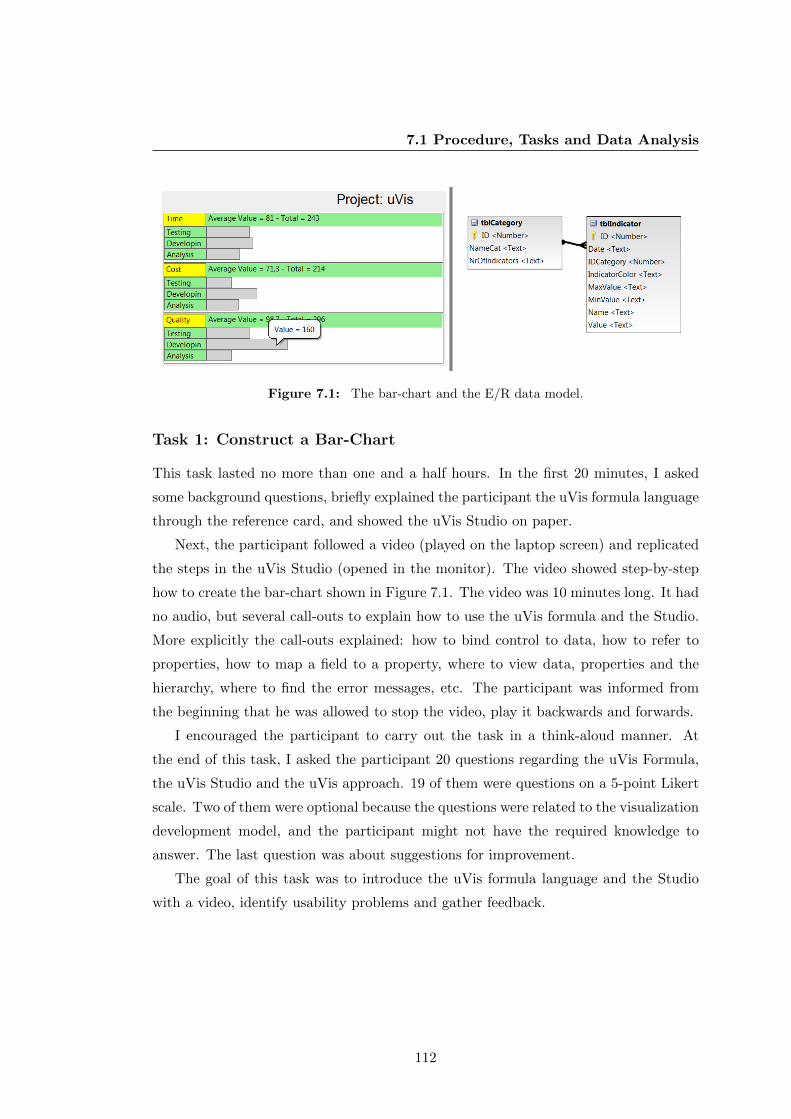
7.1 Procedure, Tasks and Data Analysis
Figure 7.1: The bar-chart and the E/R data model.
Task 1: Construct a Bar-Chart
This task lasted no more than one and a half hours. In the first 20 minutes, I asked
some background questions, briefly explained the participant the uVis formula language
through the reference card, and showed the uVis Studio on paper.
Next, the participant followed a video (played on the laptop screen) and replicated
the steps in the uVis Studio (opened in the monitor). The video showed step-by-step
how to create the bar-chart shown in Figure 7.1. The video was 10 minutes long. It had
no audio, but several call-outs to explain how to use the uVis formula and the Studio.
More explicitly the call-outs explained: how to bind control to data, how to refer to
properties, how to map a field to a property, where to view data, properties and the
hierarchy, where to find the error messages, etc. The participant was informed from
the beginning that he was allowed to stop the video, play it backwards and forwards.
I encouraged the participant to carry out the task in a think-aloud manner. At
the end of this task, I asked the participant 20 questions regarding the uVis Formula,
the uVis Studio and the uVis approach. 19 of them were questions on a 5-point Likert
scale. Two of them were optional because the questions were related to the visualization
development model, and the participant might not have the required knowledge to
answer. The last question was about suggestions for improvement.
The goal of this task was to introduce the uVis formula language and the Studio
with a video, identify usability problems and gather feedback.
112

7.1 Procedure, Tasks and Data Analysis
Figure 7.2: The PCD, the simplified PCD used in this study, and the E/R Data Model.
Task 2: Construct the Process Completion Diagram
I presented the Process Completion Diagram (PCD) using a scenario from the medical
domain and explained how the event-log data are visualized. The participant was asked
to create a simplified PCD. The simplified PCD (Figure 7.2) did not show the horizontal
and vertical lines in the X-axis and the Y-axis, the average and the standard deviation.
However, the steps involved in constructing the simplified PCD are representative ones
(e.g. drag and drop control, refer to a property, bind a control to data, map a field
to a property, view immediate feedback, check errors, try as an end-user, etc.) The
participant would have been able to enrich it with the missing details, but I decided to
use this version due to time constraints. The entire usability test was limited to three
hours. The participant was asked to create the PCD thinking aloud.
The uVis formula language reference card, a reference card where the visualization
was showed without any formulas, and some hints in a second page were given to the
participant. The hint page showed them how to write a complex Rows formula with
a Group By, how to use SQL aggregates (Count(), Max(), Min), how to convert a
String type to Integer type, and described the Requery() function. In addition, I
gave the participant another reference card with the Studio shortcuts. The participant
had one hour and 30 minutes to finish this task. At the end, the participant answered
the same questionnaire as in task 1.
Data Analysis
Also in this usability study, I collected qualitative and quantitative data and utilized
a data triangulation approach. More specifically, I obtained data from interviews,
113

7.2 Results
observations (think-aloud approach was used) and questionnaires in each usability test.
During each usability test, I kept notes and recorded the session for later analysis.
After the usability study with eight participants, I analyzed the data. First, I col-
lected all the usability problems, which I recorded during a test. Next, I went through
the recordings and re-confirmed the observed usability problems, but also identified
new usability problems that were not observed during the test. Once I had collected
the usability problems, I used Lauesen’s categorization [51] to classify them. The
recordings of the interviews were transcribed. Investigating patterns and trends in
the transcriptions, I concluded with participants’ comments and suggestions regard-
ing different aspects of uVis and uVis Studio. While, the questionnaires data were
recorded using Google Docs and the analysis was performed going through the ratings,
identifying outliers and computing the average and standard deviation. To sum up,
triangulating data from different sources and categorizing them into groups, allowed
me to analyze and interpret them as shown below.
7.2 Results
This section presents the results of this study. For each participant I describe his/her
background, report the number of problems categorized by type, subjective ratings,
and summarize participants comments about the tool. I conclude this chapter with a
summary of the results.
Participant 1
Male; 25 years old; holds a bachelor’s degree in Economics and works as a
project economist; has never developed a program by himself, but is able
to read and edit Visual Basic code (last time was four months ago); has
a good knowledge of E/R databases because in his previous work he was
a database analyst, but as he said he is not an expert; has never used a
development environment; used MS Excel spreadsheets a week ago; has
never programmed a visualization, but has created standard visualizations
with MS Excel.
114

7.2 Results
Problem Type No. Task Failure 2 Minor 0 Medium 0 Cumbersome 2 Bug 5 Missing Functionality 2
Question Task 1 Task 2How easy was it to use uVis formulas? 3 2How easy was it to understand uVis properties: Rows, Parent and Canvas. 3 4How easy was it to use uVis operators ( ., !, - 4 3How easy was it to connect controls with data? 2 4How easy was it to use uVis Studio? 3 4How useful was the Auto-Completion in the property grid? 4 5How useful was it to preview the live version of the visualization in the Design Panel? 3 2How useful was it to interact with the Design Panel? 3 5How useful was it to have the Interact-Mode? 3 4How easy was it to use test the application as an end-user? 5 5How useful was it to see the E/R model? 3 2How useful was it to set formulas from the E/R model? 2 2How useful was it to see the Error List window? 5 4Were the errors understandable in the Error List? 4 5How useful was it to see the real row-data in the window Data View? 4 3How useful was it to see the controls in the window Control and Data Hierarchy? 4 4How much the formula language does facilitate visualization development?* 3 4How much the development environment does facilitate visualization development?* 3 5Do you think you could use uVis in your domain and create visualizations? 3 4
Figure 7.3: Participant 1: Problem counts by type (left). Subjective ratings (right).
Problem Counts
The first task was performed in 40 minutes and the second in one hour and 5 minutes.
Figure 7.3 presents the number of problems of each type. In total, 11 problems were
identified with this participant. Two of them were task failures: specifying a Rows
formula that used a Group By and not noticing errors in Error List. No minor and
medium problems were observed with this participant. Five bugs were observed (e.g.
the Rows formula was not evaluated correctly). Two missing functionality were related
with uVis Studio. The first relates to more drag-and-drop actions. The second has to
do with moving a control when a formula is set for Left or Top. Two were cumbersome
problems as the participant verbally commented on those: better error messages and
specifying Top instead of Bottom.
Questionnaires
The subjective ratings are presented in Figure 7.3. These figures indicate that the
participant found difficult the uVis formula language and appreciated better the Stu-
dio. Auto-Completion, interacting with the Design Panel, Error List and testing the
application as an end-user are some of the most rated aspects of uVis. While, other
features were found not less useful (e.g. E/R Model, setting the formulas from E/R
Model, DataView, uVis operators).
115

7.2 Results
Debriefing
At the end of the study he commented: “It will be really easy to create visualizations
with this tool, but users need some IT and database knowledge. It makes sense why
you asked for end-user developers. The formula language seems very dynamic. I would
be able to use it more effectively but I need some practice. This is an easy way to show
data, and MS Excel has some limitations. I had also difficulties with Excel although
they try to make it very user-friendly.”
Participant 2
Female; 26 years old; graduated student in Communication and Informatics;
currently enrolled in the master’s programme “Innovative Communication
Technologies and Entrepreneurship” at the Aalborg University; has never
programmed; worked once with E/R databases during her bachelor’s stud-
ies, six years ago; has used Eclipse 2-3 times, and last time was a month
ago; has used MS Excel spreadsheets, but not extensively; has never pro-
grammed a visualization or created a visualization.
Problem Counts
The participant finished the first task in 50 minutes. The second task was performed in
one hour and 20 minutes. She faced several problems with data binding and referring to
control properties. My conclusion is that the participant had IT skills that correspond
to a simple user and not end-user developer.
Figure 7.4 presents the number of problems of each type. In total, 26 problems
were identified with this participant. 11 problems were task failure; they relate to data
binding, Parent concept and not noticing the errors in the Error List. Two minor
and two medium problems were observed and they relate to uVis formulas. Five bugs
were observed (e.g. the Rows formula was not evaluated correctly). Four were missing
functionality problems related with uVis formulas (e.g. using an SQL aggregate in Rows)
and the Studio (e.g. moving a control when a formula is set for Left or Top). Two
were cumbersome problems as the participant verbally commented on those: better
error messages and specifying Top instead of Bottom.
116

7.2 Results
Problem Type No. Task Failure 11 Minor 2 Medium 2 Cumbersome 2 Bug 5 Missing Functionality 4
Question Task 1 Task 2How easy was it to use uVis formulas? 5 4How easy was it to understand uVis properties: Rows, Parent and Canvas. 4 4How easy was it to use uVis operators ( ., !, - 2 4How easy was it to connect controls with data? 5 4How easy was it to use uVis Studio? 4 4How useful was the Auto-Completion in the property grid? 4 5How useful was it to preview the live version of the visualization in the Design Panel? 4 4How useful was it to interact with the Design Panel? 4 4How useful was it to have the Interact-Mode? 4 5How easy was it to use test the application as an end-user? 4 5How useful was it to see the E/R model? 5 4How useful was it to set formulas from the E/R model? 5 4How useful was it to see the Error List window? 5 5Were the errors understandable in the Error List? 5 4How useful was it to see the real row-data in the window Data View? 4 5How useful was it to see the controls in the window Control and Data Hierarchy? 4 5How much the formula language does facilitate visualization development?* 4 4How much the development environment does facilitate visualization development?* 4 4Do you think you could use uVis in your domain and create visualizations? 5 4
Figure 7.4: Participant 2: Problem counts by type (left). Subjective ratings (right).
Questionnaires
The subjective ratings are presented in Figure 7.4. One can notice that the ratings
show a high level of appreciation, but they do not match participant’s experience as I
continuously helped her. This is also reflected in the below debriefing.
Debriefing
At the end of the usability test, the participant said: “I think I need more practice and
database knowledge. The formulas were not easy to write, but I think the Studio helps
you, especially the Design Panel.”
Participant 3
Female; 32 years old; holds a master’s degree in Communication and Infor-
matics; currently is a PhD student at the Roskilde University investigating
healthcare and IT; has programmed only during some courses in 2005; used
E/R databases during her studies, and briefly in 2010 when she was working
as business developer in a Danish bank; has used Dreamweaver to create
a website in 2005; has good knowledge of MS Excel spreadsheets and used
it 2 days ago; has never programmed a visualization but she has used MS
Excel to create standard ones.
117

7.2 Results
Problem Type No. Task Failure 3 Minor 2 Medium 0 Cumbersome 2 Bug 5 Missing Functionality 3
Question Task 1 Task 2How easy was it to use uVis formulas? 5 4How easy was it to understand uVis properties: Rows, Parent and Canvas. 5 5How easy was it to use uVis operators ( ., !, - 4 4How easy was it to connect controls with data? 5 5How easy was it to use uVis Studio? 4 4How useful was the Auto-Completion in the property grid? 4 4How useful was it to preview the live version of the visualization in the Design Panel? 5 5How useful was it to interact with the Design Panel? 4 5How useful was it to have the Interact-Mode? 4 5How easy was it to use test the application as an end-user? 4 4How useful was it to see the E/R model? 5 5How useful was it to set formulas from the E/R model? 4 4How useful was it to see the Error List window? 2 3Were the errors understandable in the Error List? 4 1How useful was it to see the real row-data in the window Data View? 5 5How useful was it to see the controls in the window Control and Data Hierarchy? 5 4How much the formula language does facilitate visualization development?* 4 4How much the development environment does facilitate visualization development?* 4 4Do you think you could use uVis in your domain and create visualizations? 5 4
Figure 7.5: Participant 3: Problem counts by type (left). Subjective ratings (right).
Problem Counts
The participant completed the first task in 45 minutes. The second task lasted one hour
and 10 minutes. Figure 7.5 presents the number of problems of each type. In total, 15
problems were identified with this participant. Three of them were task failures. One
of them relates to distinguishing the selected control by means of color. Two minor
problems were recorded and they relate to the uVis formulas language. No medium
problems were observed. Five problems were bugs (e.g. the uVis kernel failed to
compute Bottom). Three were missing functionality problems: show always the control
in the Design Panel, move a control when control position is set to formula, and move
only one control instance. Two were cumbersome problems as the participant verbally
commented on those: better error messages and specifying Top instead of Bottom.
Questionnaires
The subjective ratings are presented in Figure 7.5. From the ratings, it seems that the
participant found difficult to understand the error messages and not helpful the Error
List. Connecting to data using uVis operators, Design Panel, Auto-Completion and
Data-View were appreciated more than others (e.g. DataView).
118

7.2 Results
Debriefing
At the end of the usability test, the participant said: “ It was a long time since I worked
with databases. I had to do many things at the same time: recover my knowledge, figure
out the panels and how to use the tool, focus on the video and relate the video to what
I know. To find the right balance of the formula language is probably a delicate matter,
but using the software for the first time was a bit too technical. If I had some more
practice, things would have been better. With the second task it got a bit easier. It
was fun but also challenging.”
Participant 4
Female; 28 years old; holds a master’s degree in Software Engineering and
Management; working as a researcher in a Danish bank; has developed an
MS Access program in 2005, and has edited code during her studies before
2008; has an understanding of E/R databases but has not used a database
since 2008; used Visual Studio but not extensively during her studies; used
MS Excel spreadsheets in 2009; has never programmed a visualization, but
has created standard visualizations with MS Excel.
Problem Counts
The participant completed the first task in 40 minutes. The second task lasted one
hour and 5 minutes. Figure 7.6 presents the number of problems of each type. In
total, 19 problems were identified with this participant. Three problems were task
failures: using a Group By, not noticing the errors in Error List, and specifying a SQL
aggregate. Two minor problems were recorded and they relate to the uVis Studio. No
medium problems were observed. Six problems were bugs. One of the six bugs was
caused by Property Grid. The formula was not updated properly and the participant
had to confirm a change by pressing Enter. Six were missing functionality problems.
The participant would have preferred to set properties from the Control-Data Hierarchy
panel, move controls after setting the position of a control, etc. Two were cumbersome
problems as the participant verbally commented on those: better error messages and
specifying Top instead of Bottom.
119

7.2 Results
Problem Type No. Task Failure 3 Minor 2 Medium 0 Cumbersome 2 Bug 6 Missing Functionality 6
Question Task 1 Task 2How easy was it to use uVis formulas? 4 3How easy was it to understand uVis properties: Rows, Parent and Canvas. 4 3How easy was it to use uVis operators ( ., !, - 5 5How easy was it to connect controls with data? 5 3How easy was it to use uVis Studio? 4 4How useful was the Auto-Completion in the property grid? 5 5How useful was it to preview the live version of the visualization in the Design Panel? 5 5How useful was it to interact with the Design Panel? 5 5How useful was it to have the Interact-Mode? 5 5How easy was it to use test the application as an end-user? 5 5How useful was it to see the E/R model? 5 5How useful was it to set formulas from the E/R model? 5 5How useful was it to see the Error List window? 5 4Were the errors understandable in the Error List? 5 5How useful was it to see the real row-data in the window Data View? 4 5How useful was it to see the controls in the window Control and Data Hierarchy? 5 5How much the formula language does facilitate visualization development?* 4 5How much the development environment does facilitate visualization development?* 5 5Do you think you could use uVis in your domain and create visualizations? 5 5
Figure 7.6: Participant 4: Problem counts by type (left). Subjective ratings (right).
Questionnaires
The subjective ratings are presented in Figure 7.6. The ratings indicate that the par-
ticipant found the Studio better than the formula language. The Design Panel, Auto-
Completion, E/R Model and Control-Data Hierarchy were appreciated more than uVis
operators.
Debriefing
At the end of task 1 the participant commented: “It reminds me of Gemini, a tool
I used in the bank in 2008. I was basically using the toolbox and property grid, but
there were no E/R Model and DataView. This made my work difficult.” After finishing
the second task she added: “the system is easy to use, but you need some practice.
Constructing visualizations is difficult, because you should know the domain data,
have a good knowledge of databases as well. I liked the panels, the drag and drop, and
viewing the changes in the Design Panel. At some point, when I set a wrong formula
for the Rows, the box disappeared, it should always be there. The Auto-Completion
feature was a bit slow in some cases.”
Participant 5
Female; 24 years old; holds a bachelor’s degree in Information Technology;
currently is enrolled in the master’s programme “Game Design” at the IT
120

7.2 Results
University of Copenhagen; has programmed only during some courses, and
she did more editing than programming six months ago; used the SQL server
three years ago during a bachelor course; has used Visual Studio, last time
three years ago; has not used MS Excel spreadsheets since 2009, and at that
time did simple and basic things; has never programmed a visualization but
used SPSS to create standard one.
Problem Counts
The participant finished the first task in 45 minutes. The second task lasted one hour
and 10 minutes. Figure 7.7 presents the number of problems of each type. In total,
21 problems were identified with this participant. Eight of them were task failure:
mapping a field to a property, specifying interactions with refresh(), using a SQL
aggregate, not noticing the error messages, etc. Three minor problems were recorded
and one relates to uVis operators and two to the Studio. One medium problems was
observed, which relates to aligning controls using Index. Five problems were bugs. One
of the them was caused by the uVis kernel, which failed to compute Rows correctly.
Two were missing functionality problems and they relate to the Studio. Two were
cumbersome problems. The participant verbally commented on those. They are: better
error messages and specifying Top instead of Bottom.
Questionnaires
The subjective ratings are presented in Figure 7.7. Overall, the ease of use for uVis
formula language and the Studio were rated the same. Most of the features and panels
of the Studio were rated higher.
Debriefing
At the end she added: “It looks like a program that is nice to use. The suggestions
helped me a lot, but Group By is difficult. I need some more practice with the formulas,
but I like that you can see what you are doing. Also, there are the errors which I did
not notice several time, but they are pretty easy to see what the problem is.”
121

7.2 Results
Problem Type No. Task Failure 8 Minor 3 Medium 1 Cumbersome 2 Bug 5 Missing Functionality 2
Question Task 1 Task 2How easy was it to use uVis formulas? 4 3How easy was it to understand uVis properties: Rows, Parent and Canvas. 5 4How easy was it to use uVis operators ( ., !, - 4 5How easy was it to connect controls with data? 4 4How easy was it to use uVis Studio? 5 3How useful was the Auto-Completion in the property grid? 4 4How useful was it to preview the live version of the visualization in the Design Panel? 5 5How useful was it to interact with the Design Panel? 4 5How useful was it to have the Interact-Mode? 4 5How easy was it to use test the application as an end-user? 5 5How useful was it to see the E/R model? 5 5How useful was it to set formulas from the E/R model? 4 4How useful was it to see the Error List window? 4 4Were the errors understandable in the Error List? 3 3How useful was it to see the real row-data in the window Data View? 5 4How useful was it to see the controls in the window Control and Data Hierarchy? 4 5How much the formula language does facilitate visualization development?* 3 5How much the development environment does facilitate visualization development?* 5 5Do you think you could use uVis in your domain and create visualizations? 5 5
Figure 7.7: Participant 5: Problem counts by type (left). Subjective ratings (right).
Participant 6
Male; 28 years old; PhD student at Copenhagen Business School, investi-
gating the management of social business; graduated student in Information
Technology; programmed during his studies, and last time was five years
ago; used E/R databases for six month in 2007; has used Eclipse and Net-
Beans five years ago; used MS Excel spreadsheets last week; has never
programmed a visualization, but has created standard visualizations with
MS Excel.
Problem Counts
The participant finished the first task in 40 minutes and the second task in one hour
and 10 minutes. Figure 7.8 presents the number of problems of each type. In total, 17
problems were identified with this participant. Five task failures were observed. They
relate to data binding, not noticing error messages and confusing the Text property
with the Name property. Two minor problems were recorded and they relate to the
Studio. No medium problems were observed with this participant. Five problems
were bugs. One of the them was caused by the Property Grid, which failed to correctly
update the name of a designer property. Three were missing functionality problems and
they relate to the Studio. Two were cumbersome problems. The participant verbally
commented on those. They are: better error messages and specifying Top instead of
122

7.2 Results
Problem Type No. Task Failure 5 Minor 2 Medium 0 Cumbersome 2 Bug 5 Missing Functionality 3
Question Task 1 Task 2How easy was it to use uVis formulas? 4 3How easy was it to understand uVis properties: Rows, Parent and Canvas. 3 4How easy was it to use uVis operators ( ., !, - 2 4How easy was it to connect controls with data? 3 3How easy was it to use uVis Studio? 4 4How useful was the Auto-Completion in the property grid? 4 4How useful was it to preview the live version of the visualization in the Design Panel? 4 4How useful was it to interact with the Design Panel? 4 4How useful was it to have the Interact-Mode? 3 4How easy was it to use test the application as an end-user? 3 4How useful was it to see the E/R model? 3 5How useful was it to set formulas from the E/R model? 4 5How useful was it to see the Error List window? 4 3Were the errors understandable in the Error List? 2 4How useful was it to see the real row-data in the window Data View? 2 4How useful was it to see the controls in the window Control and Data Hierarchy? 4 4How much the formula language does facilitate visualization development?* 2 3How much the development environment does facilitate visualization development?* 3 3Do you think you could use uVis in your domain and create visualizations? 4 4
Figure 7.8: Participant 6: Problem counts by type (left). Subjective ratings (right).
Bottom.
Questionnaires
The subjective ratings are presented in Figure 7.8. The E/R Model was the highest
rated by this participant, in contrast to connecting control with data and Error List.
Debriefing
At end the participant commented: ”Binding control to data is not easy, especially
when you have to use a Group By. I would have preferred a switch rather than a slider.
The errors should be more visible and should catch my attention. Error prompts should
be as pop-ups as I never noticed them. It is a nice tool for a researcher, who does not
have a strong technical background, to use and create their desktop dashboard such as
Social Media Control Panels.”
Participant 7
Male; 36 years old; graduated student in telecommunication; last time
created a web page using Joomla two years ago; experimented with E/R
databases for some months in 2010; used Visual Studio two years ago; is
experienced with MS Excel spreadsheets; has never programmed a visual-
ization, but has created standard visualizations with MS Excel.
123

7.2 Results
Problem Type No. Task Failure 3 Minor 2 Medium 0 Cumbersome 2 Bug 5 Missing Functionality 2
Question Task 1 Task 2How easy was it to use uVis formulas? 3 3How easy was it to understand uVis properties: Rows, Parent and Canvas. 3 2How easy was it to use uVis operators ( ., !, - 2 3How easy was it to connect controls with data? 4 3How easy was it to use uVis Studio? 4 3How useful was the Auto-Completion in the property grid? 5 5How useful was it to preview the live version of the visualization in the Design Panel? 4 5How useful was it to interact with the Design Panel? 3 4How useful was it to have the Interact-Mode? 4 4How easy was it to use test the application as an end-user? 5 5How useful was it to see the E/R model? 4 4How useful was it to set formulas from the E/R model? 3 3How useful was it to see the Error List window? 5 3Were the errors understandable in the Error List? 4 4How useful was it to see the real row-data in the window Data View? 5 5How useful was it to see the controls in the window Control and Data Hierarchy? 5 4How much the formula language does facilitate visualization development?* N/A 4How much the development environment does facilitate visualization development?* 3 3Do you think you could use uVis in your domain and create visualizations? 5 5
Figure 7.9: Participant 7: Problem counts by type (left). Subjective ratings (right).
Problem Counts
The participant performed the first task in 50 minutes. The second was performed in
one hour and 10 minutes. Figure 7.9 presents the number of problems of each type.
In total, 14 problems were identified with this participant. Three task failures were
observed. The first two relate to data binding. The third was caused by Error List
because he did not noticed the errors. Two minor problems were recorded. In the first
he tried to refer to a property using the control name, and the second was caused by
the double quotes. No medium problems were observed with this participant. Five
problems were bugs. One of the them was caused by the Auto-Completion feature,
which failed to provide suggestions. Two were missing functionality problems and
they relate to the Studio. Two were cumbersome problems. The participant verbally
commented on those. They are: better error messages and specifying Top instead of
Bottom.
Questionnaires
The subjective ratings are presented in Figure 7.9. The rating can be interpreted as
follow: the participant found uVis formula language difficult to use, and some parts of
the Studio were highly rated (e.g. Auto-Completion, Design Panel, DataView) unlike
others (e.g. E/R Model and Error List).
124

7.2 Results
Debriefing
During the second task, the participant said “I have used Group By many years ago,
but I am not sure if I remember it. Could you explain it?” I gave him an example and
told him how Group By works. This clarified his concerns and helped him write the
correct formulas. At the end he commented: “It is a good thing that it is at run-time,
you do not need to do anything.”
Participant 8
Male; 33 years old; currently studying Information Management at Copen-
hagen Business School, and before has worked as a consultant in marketing;
programmed last time when he was 16 years old; I explained briefly what
an E/R database is because he had never used an E/R databases; no prior
experience with a development environment; used MS Excel spreadsheets
when he was a consultant, but has not practiced it since 2007; has never
programmed a visualization, but has created standard visualizations with
MS Excel and Google Spreadsheets.
Problem Counts
The participant performed the first task in one hour and the second in one hour and
20 minutes. The participant had many difficulties, especially with database concepts.
During the first task I had to teach him some database concepts. Although I observed
from the first task that the participant did not have the required IT skills, I asked
him to carry out the second task as well. I wanted to see how much he could do.
Therefore, from the beginning I told him “Try to do what you can, then I will help
you.” The participant dragged and dropped all controls. He placed them and changed
some properties so they looked similar to what I asked him to do. Then, he said “I’m
not sure how to bind controls to data, that’s why I started with the visual part.”
Together, we wrote the formulas for data binding.
Figure 7.10 presents the number of problems of each type. 20 problems were iden-
tified with this participant. 9 problems were task failure; they relate to data binding,
Parent concept and not noticing the errors in the Error List. No minor problems
were observed with this participant. One medium problem was recorded and had to do
125

7.2 Results
Problem Type No. Task Failure 9 Minor 0 Medium 1 Cumbersome 2 Bug 4 Missing Functionality 4
Question Task 1 Task 2How easy was it to use uVis formulas? 5 4How easy was it to understand uVis properties: Rows, Parent and Canvas. 4 3How easy was it to use uVis operators ( ., !, - 4 5How easy was it to connect controls with data? 5 3How easy was it to use uVis Studio? 4 4How useful was the Auto-Completion in the property grid? 5 5How useful was it to preview the live version of the visualization in the Design Panel? 5 5How useful was it to interact with the Design Panel? 5 4How useful was it to have the Interact-Mode? 5 5How easy was it to use test the application as an end-user? 5 5How useful was it to see the E/R model? 5 5How useful was it to set formulas from the E/R model? 5 4How useful was it to see the Error List window? 5 3Were the errors understandable in the Error List? 4 4How useful was it to see the real row-data in the window Data View? 3 4How useful was it to see the controls in the window Control and Data Hierarchy? 5 4How much the formula language does facilitate visualization development?* 5 5How much the development environment does facilitate visualization development?* 5 5Do you think you could use uVis in your domain and create visualizations? 5 5
Figure 7.10: Participant 8: Problem counts by type (left). Subjective ratings (right).
with the use of index. Four bugs were observed (e.g. the Rows formula was not eval-
uated correctly). Four were missing functionality problems related with uVis formulas
(e.g. using an SQL aggregate in Rows, using a switch similar to iPhone for Modes) and
the Studio (e.g. moving a control when a formula is set for Left or Top). Two were
cumbersome problems as the participant verbally commented on those: better error
messages and specifying Top instead of Bottom.
Questionnaires
The subjective ratings are presented in Figure 7.10. These subjective ratings indicate
that the participant liked Auto-Completion, Design Panel, E/R Model and Interact-
Mode. Parent/Canvas concepts, binding control to data and Error List were less
appreciated. However, these ratings does not match his performance because he was
continuously helped to complete the tasks.
Debriefing
At the end he commented: “I think there is a lot of potential for creating visualizations
of this kind in this way. The interface and manipulation during the process is extremely
well thought out. I managed to get through it as a total novice, therefore if I were to
wish for any improvements it would be to have more drag and drop functionality. Also,
I liked how the errors are highlighted, and the suggestions. The second task is excellent;
it is a more complex task and clearly shows the utility of this tool.”
126

7.3 Summary
7.3 Summary
With proper training and knowledge most of them can probably create custom visual-
izations with Drag-Drop-Set-View-Interact approach in uVis. In spite of the improved
tool, end-user developers faced several problems, particularly with data binding. Based
on observations on the task failures I can say that they did not perform better than
the programmers.
In task 1, participants were asked to create a bar chart following the video. Two
participants (participant 2 and 8) could not understand how the controls were bound
to data, and how to refer to control properties. From my observations, I conclude that
their IT skills correspond more to a simple user than to an end-user developer. The
other participants were better able to understand what the video was showing.
In task 2, participants did not use a video or watch the one used in task 1. During
this task, two participants (2 and 8) had many difficulties in completing the task. I
continuously assisted them to complete the task. With advanced training they might
learn how to create visualizations with uVis. On the other hand, the other participants
performed better. However, none of them were able to finish all the tasks on their own.
I helped them the first time to write a complex formula; the formula that used Group
By and where. After the first time, they could reuse the formulas and adjust them
properly.
I noticed that the video presentation helped users create the bar chart, but in several
cases they were replicating without reasoning. This was reflected in the second task
where they had difficulties specifying a Group By. On the other hand, they had to look
at two screens, and this was cumbersome as they had to keep track of the video, play it
back and forward. Identifying the correct training approach seems to be more difficult
than I expected at the beginning, and some of the usability problems might have been
caused by the selected approach.
Usability Problems
In this study, I identified 43 different usability problems: 12 task failure, two cum-
bersome, two medium, six minor, nine bugs, and 12 missing functionalities. I group
the usability problems in two categories: those caused by the uVis Formula Language
and those caused by uVis Studio. Table 7.1 presents the problems classified and the
127

7.3 Summary
participant who encountered the problem. From this table, one can notice that binding
controls to data is the most difficult part for end-user developers. In addition, the
number of bugs and missing functionalities reflect on the maturity and stability of the
tool. As shown in Table 7.1, 13 problems were unique, and the rest occurred with more
than one participant.
Questionnaires
Figure 7.11 presents the subjective ratings of each participant and summarizes their
ratings of each task where the minimum, the maximum and the average value are
shown. These subjective ratings provide useful insights to identify what should be
improved. Also, they hint at the advantages and disadvantages of this approach. For
example, Auto-Completion, Design Panel, Control-Data Hierarchy, Modes were highly
rated, in comparison to the uVis formula language and the Error List panel.
uVis Formula Language
Binding a control to the rows of a table was understandable, but it was more challenging
in the complex case where they had to use a Group By. Six of them had difficulties
the first time because they could not recall how Group By worked. During the study
most of them reasoned correctly, but they were not sure how to express it using the
formulas. After the first time they could proceed on their own. Providing them with
more examples, simple tutorials or video might improve their performance. Two of
them had not the required knowledge and I had to assist them all the time.
Participants found this less complex than the data binding. Apart from the last
participant, the others could easily refer to properties. Initially, some of them had
difficulties remembering the syntax. With the help of Auto-Completion and by means
of practicing, I observed that they became better.
uVis has several new keywords and operators. Some of them were familiar and
quickly understood, others made them skeptical and confused. For example, some par-
ticipants could not distinguish the difference between the dot and bang operator. The
Parent keyword was not intuitive to some of them, and in several cases I had to explain
the concept. Most of them could guess the left-join operator (-<), but in combination
with the Parent keyword it made the formula non-intuitive. The uVis formula lan-
guage uses these operators to provide simple formulas, but this has disadvantages as
128

7.3 Summary
Table 7.1: Usability problems recorded in this study. They are grouped by root problem
and classified by type. For each problem I show who encountered it.
129

7.3 Summary
Fig
ure
7.1
1:
Par
tici
pan
ts’
rati
ng
for
task
1an
d2
(top
).M
inim
um
,M
axim
um
an
dA
vera
ge
rati
ng
for
task
1(b
ott
om
-
left
)an
dta
sk2
(bot
tom
-rig
ht)
130

7.3 Summary
well. I noticed that they got better at the end of the study, and I believe that with
more examples and practice, language barriers can be overcome.
uVis Studio - Features
WYBIWYG: Participants found the Design Panel useful. Interacting with visual
objects was easy and their comments indicate that the WYBIWYG feature continuously
helped them understand the formulas. They got immediate feedback and could reflect
on the formulas. For example, it helped them observe how a change in the Rows property
affected the visualization. In addition, viewing the result of a mathematical equation
immediately helped them find out the correct equation. However, the participants
suggested several features to improve the Design Panel, such as adding lines when a
control is moved.
Auto-Completion: The Auto-Completion assisted them with correct suggestions.
In a few cases when they misspelled a word and there were no suggestions, they stopped
and checked what they had typed. In other cases, the feature was not suggesting all
possibilities and this bug made some of them skeptical and wondered why there are no
suggestions. Both cases shows that participants were not simply using the feature to
avoid misspellings, but also to confirm that what they were typing followed the syntax.
Formula Suggestions: Participants found this feature helpful. They could easily
bind controls to data and map fields to properties. However, some of them would have
liked to automatically specify a Group By as well.
Interact-Mode: Participants found the Interact-Mode useful. They liked that
they could test the visualization without switching context. In the second task, one of
them dragged and dropped the track-bar and implemented the interaction. After that,
he was continuously testing how the interaction changed the visualization. While the
Data-Mode, which disables the WYBIWYG feature, was only used to test it. Although
to most of them the sliders were understandable, some of them suggested using a switch
as in iPhones.
uVis Studio - Coordinated Panels
uVis Studio provides several coordinated panels. Changes in the Property Grid were
immediately reflected on the Design Panel, the Control-Data Hierarchy, the Error List
and DataView. This allowed them to view the changes from different perspectives and
131
7.3 Summary
better understand the formula language and the visual mapping. Although the error
messages were not visible most of the time, participants liked that the Error List was
coordinated with the Property Grid. They all appreciated that wrong formulas were
colored in red. Supporting them with the E/R Model and DataView was also helpful.
Several times before they wrote a formula, they consulted the E/R Model and viewed
the data in the DataView. After setting a formula, they were able to view the data
bound to the control. I observed several strategies of using these panels. Some of
the participants used mainly Control-Data Hierarchy to navigate through controls and
view their properties in the Property Grid. Others were using the Design Panel.
132

Chapter 8
Usability Study with Clinicians
This chapter presents a usability study with two clinicians. Before, I report on the
study, I discuss InfoVis in healthcare and the importance of empowering clinicians in
visualization development.
8.1 Information Visualization in Healthcare
Healthcare systems create and use a large amount of data and it is a challenge to
present these data. According to Smith “doctors in developed countries seem to be
overwhelmed by the information provided for them. The amount of information is
enormous and disorganized, and it is hard to find the answers to questions that arise in
consultations.” [95]. Based on their experience and knowledge, clinicians need easy and
intuitive presentations that fulfill their needs [43, 77]. Researchers have created efficient
visualizations such as LifeLines [79], Knave II [33], TimeLine [15], CareVis [1], LifeLines
2 [110], LifeFlow [115], etc. Roque et al. [83] compared 6 InfoVis systems (LifeLines
[79], LifeLines 2 [110], KNAVE II [33], CLEF Visual Navigator [34], TimeLine [15],
and AsbruView [50]). These tools allow clinicians to get an overview of the Electronic
Health Record (EHR). Their results showed that these tools were not always designed
with user feedback, and evaluations were not conducted in real clinical environments.
They conclude that a closer collaboration with medical professionals would result in
better systems.
Most EHR systems use mainly text and tabular presentation, and there is a need
for visualizations where clinicians can get better overview. Figure 8.1 shows three EHR
133

8.1 Information Visualization in Healthcare
Figure 8.1: Three different EHR systems from the Copenhagen region showing: 1. the
patient’s medicines. 2. the drug records for a patient. 3. the lab-test results for a patient.
134

8.1 Information Visualization in Healthcare
systems used in the Copenhagen region. In a department of Bispebjerg Hospital, the
EHR system uses a tabular presentation to show medical orders (Figure 8.1.1). From
this screen it is not easy to identify what medicines the patient is taking at the current
time. Another EHR system supports clinics and hospitals with tabular presentations
(Figure 8.1.2). In the Venereal Clinic of Bispebjerg Hospital, clinicians use the VistA
EHR system to record patient’s venereal diseases, also referred to as sexually transmit-
ted infections. Lab-test results are presented using a text-based presentation (Figure
8.1.3). For each patient in the clinic, clinicians have to read a long text to see a simple
result. When clinicians have to view several results, the complexity amplifies.
In the early phase of this research, I collaborated with clinicians of the Venereal
Clinic, and in one of our meetings they said that it is difficult to distinguish if a lab-test
result was negative or positive. In addition, the sensitiveness of this lab-test requires
additional mental effort and they were afraid they missed some results when there were
many of them.
In the plain text (Figure 8.2.1), clinicians identified the three most important vari-
ables (date, result and test name). These values were used to create a simple visualiza-
tion (Figure 8.2.2) with uVis Studio. Further, Figure 8.2.3 shows how these data can
be presented using a timeline. They found these ideas great, and asked if they could
have something similar in their EHR system. Unfortunately, due to time, resource and
database constraints, visualizations were not integrated into their system. This scenario
confirms the need for better presentations and the importance of involving clinicians in
the visualization process. It is difficult to visualize important variables from electronic
health records without medical expertise.
This research aims at minimizing the collaboration with clinicians but empower the
clinicians, whose IT skills correspond to end-user developers, with a tool that allows
them to create effective visualizations.
At Bispebjerg hospital in Copenhagen, another department uses an MS Access
system developed by one of the clinicians. Another clinician has been working as a
surgeon for the last 30 years, and IT is his hobby. He has worked with IT for the last 20
years, and uses MS Excel, MS Access and Visual Basic. He developed an EHR system,
which was used for a couple of years in his department. These two examples prove that
in the healthcare environment there are clinicians with IT skills that correspond to end-
user developers. They have the clinical domain knowledge and with the proper tool
135

8.2 Usability Study
Figure 8.2: 1. Current presentation at the clinic, 2. A simple presentation patient
lab-test results, 3. Presenting lab-test results on a time-line.
they might construct effective visualizations. Further, it will increase the possibility of
developing novel visualizations for clinical data. Last but not least, clinicians without
IT experience can collaborate with IT clinicians to create and adjust visualizations in
the department or hospital.
8.2 Usability Study
I present a usability study with two clinicians who were asked to construct visualizations
with the Drag-Drop-Set-View-Interact approach. As clinicians are hard to recruit for
a usability study and have very low availability, I conducted only two usability tests.
The first test was conducted in four hours and the second in two hours.
This study investigated if clinicians, who have IT skills at the level of an end-user
developer, can construct custom visualizations using the uVis formula language and
the Studio. In addition, the study focused on identifying potential usability issues and
providing suggestions for further improvement.
8.2.1 Procedure, Tasks and Data Analysis
This study was planned to run in four hours and consisted of three parts: introduction,
construct the LifeLines, and construct the Process Completion Diagram.
The first usability test was conducted in two sessions of two hours, four days apart.
In the first session the clinician performed task 1 and 2. In the second session, the
clinician finished task 3. In this usability test, the Studio did not have the Formula
136

8.2 Usability Study
Figure 8.3: The LifeLines and the E/R data model.
Suggestions feature, because at that time it was under development. Due to clinician’s
availability, I had to run the study without this feature.
The second usability test was conducted in one session, lasted only two hours, and
the clinician performed only the first two parts.
I conducted the study, kept notes, and recorded the sessions. During the sessions, I
helped the clinician whenever there was a misinterpretation, confusion or malfunction
of the system. These cases were recorded as usability problems. The documentation
used in this study can be found at Appendix D.
Task 1: Introduction to uVis
This task lasted 30 minutes, where I described the uVis formula language and the
Studio. I explained how visualizations are created, what the uVis formulas are, how to
refer to control properties, to data, etc. I gave the clinician a list of tasks describing
what he was supposed to do. I did not use the video because the time was limited, and
the tasks were similar to the ones described in the video. I showed him the reference
card for the uVis formula language. At the end of this part, I asked the clinician
questions regarding the uVis Formula, the uVis Studio and the uVis approach. I used
the same questionnaire as in Chapter 7.
137

8.2 Usability Study
Task 2: Construct the LifeLines
This task was also performed with a programmer (described in Chapter 6), but the
first version of the Studio was used.
I showed the clinician an already implemented version of the LifeLines that used
data from a MS Access database with 4 tables (Figure 8.3). I explained some advanced
concepts (i.e. the control-join operator “-=” that aligns controls vertically, and the
HPos function of the timescale that aligns controls horizontally). Then, I asked the
clinician to create the LifeLines and think-aloud during the process. I provided the
clinician with the uVis reference card, a reference card where the visualization was
showed without any formulas, and some hints in a second page. The hint page showed
him how to write the complex Rows formula with a Group By, how to align vertically
and horizontally, how to convert a String type to Integer type, and described the
Refresh() function. At the end, the clinician was asked to reply to the questionnaire
again as in task 1. This task was planned to last one and a half hours.
Task 3: Construct the Process Completion Diagram
This was conducted four days after the first session, but only with the first clinician.
This task was performed with an end-user developer, as described in Chapter 7.
I showed him an already implemented version of the Process Completion Diagram
(PCD) that used a MS Access database with two tables (Figure 8.3). I explained how
the event-log data are visualized. The clinician was asked to create a simplified PCD.
The simplified PCD (Figure 8.4) did not show the horizontal and vertical lines in the
X-axis and Y-axis, the average and the standard deviation. However, the steps involved
in constructing the simplified PCD are representative ones (e. g. drag and drop control,
refer to a property, bind a control to data, map a field to a property, get immediate
feedback, check errors, try as end-user, etc.) The clinician would have been able to
enrich it with the missing details, but time did not allow. The clinician was asked to
create the PCD thinking aloud.
The uVis reference card, a reference card where the visualization was showed with-
out any formulas, and some hints in the second page were given to the clinician. The
hint page showed them how to write the complex Rows formula with a Group By,
how to use SQL aggregates (Count(), Max(), Min), how to convert a String type to
138

8.2 Usability Study
Figure 8.4: The PCD, the simplified PCD used in this study, and the E/R Data Model.
Integer type, and described the Requery() function. In addition, I gave the clinician
a reference card with the Studio shortcuts. At the end, the clinician was asked to reply
again to the same questions. This task was planned to last two hours.
The rest of this chapter presents the clinicians’ background, the results from the
study, the usability problems and the subjective ratings from the questionnaires.
Data Analysis
Also in this usability study, I collected qualitative and quantitative data and utilized
a data triangulation approach. More specifically, I obtained data from interviews,
observations (think-aloud approach was used) and questionnaires in each usability test.
During each usability test, I kept notes and recorded the session for later analysis.
After the usability study with two participants, I analyzed the data. First, I col-
lected all the usability problems, which I recorded during a test. Next, I went through
the recordings and re-confirmed the observed usability problems, but also identified
new usability problems that were not observed during the test. Once I had collected
the usability problems, I used Lauesen’s categorization [51] to classify them. The
recordings of the interviews were transcribed. Investigating patterns and trends in
the transcriptions, I concluded with participants’ comments and suggestions regard-
ing different aspects of uVis and uVis Studio. While, the questionnaires data were
recorded using Google Docs and the analysis was performed going through the ratings,
identifying outliers and computing the average and standard deviation. To sum up,
triangulating data from different sources and categorizing them into groups, allowed
me to analyze and interpret them as shown below.
139

8.2 Usability Study
8.2.2 Results
This section presents the results of the study. For each participant I describe his
background, report the number of problems categorized by type, subjective ratings,
and summarize participant’s comments about the tool. I conclude this chapter with a
summary of the results.
Clinician 1
Male; 64 years old; MD Surgeon and part-time PhD Student at the IT-
University of Copenhagen; started working in Health Informatics in 1986;
programmed for two months in 1978; used E/R databases in the period
1994-1995, and during the last month; has never used a development envi-
ronment; regularly used MS Excel formulas since 1996; has designed visu-
alizations using pencil and paper, but has never programmed one.
Problem Counts
The clinician is a member of the uVis project. He started practicing the uVis formula
language a month before, only around one day a week. He had been using a simple
text-editor to write formulas and had never used the Studio.
The first task lasted 15 minutes, the second one and half hours, and the third
task two hours. Figure 8.5 presents the number of problems of each type. In total,
30 problems were identified in this usability test. Eight of them were task failures:
specifying a Rows formula that used a Group By and not noticing errors in Error
List, etc. Four minor problems were recorded (e.g. using double quotes). Six medium
problems were observed with this participant. They relate to data binding, aligning
controls, and uVis operators. Four problems were bugs. One of the them was caused by
the Auto-Completion feature, which failed to provide suggestions after a parenthesis.
Five were missing functionality problems and they relate to uVis formulas (e.g. using
an SQL aggregate in Rows) and the Studio (e.g. more shortcuts and color pallet). Three
were cumbersome problems. The participant verbally commented on those. They are:
better error messages, specifying Top instead of Bottom, and confirming a change with
ENTER.
140
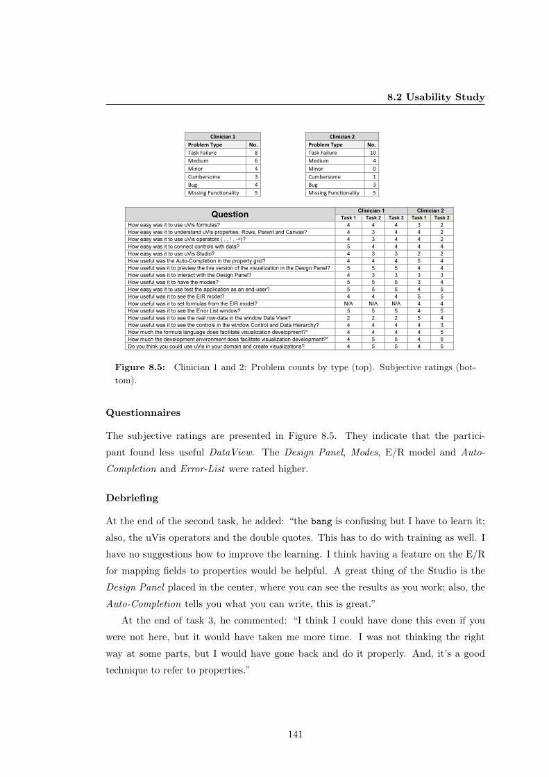
8.2 Usability Study
Clinician 1
Clinician 2
Problem Type No.
Problem Type No.
Task Failure 8
Task Failure 10
Medium 6
Medium 4
Minor 4
Minor 0
Cumbersome 3
Cumbersome 1
Bug 4
Bug 3
Missing Functionality 5
Missing Functionality 5
Question Clinician 1 Clinician 2
Task 1 Task 2 Task 3 Task 1 Task 2
How easy was it to use uVis formulas? 4 4 4 3 2
How easy was it to understand uVis properties: Rows, Parent and Canvas? 4 3 4 4 2
How easy was it to use uVis operators ( . , ! , -<)? 4 3 4 4 2
How easy was it to connect controls with data? 5 4 4 4 4
How easy was it to use uVis Studio? 4 3 3 2 2
How useful was the Auto-Completion in the property grid? 4 4 4 5 4
How useful was it to preview the live version of the visualization in the Design Panel? 5 5 5 4 4
How useful was it to interact with the Design Panel? 4 3 3 3 3
How useful was it to have the modes? 5 5 5 3 4
How easy was it to use test the application as an end-user? 5 5 5 4 5
How useful was it to see the E/R model? 4 4 4 5 5
How useful was it to set formulas from the E/R model? N/A N/A N/A 4 4
How useful was it to see the Error List window? 5 5 5 4 5
How useful was it to see the real row-data in the window Data View? 2 2 2 5 4
How useful was it to see the controls in the window Control and Data Hierarchy? 4 4 4 4 3
How much the formula language does facilitate visualization development?* 4 4 4 4 5
How much the development environment does facilitate visualization development?* 4 5 5 4 5
Do you think you could use uVis in your domain and create visualizations? 4 5 5 4 5
Figure 8.5: Clinician 1 and 2: Problem counts by type (top). Subjective ratings (bot-
tom).
Questionnaires
The subjective ratings are presented in Figure 8.5. They indicate that the partici-
pant found less useful DataView. The Design Panel, Modes, E/R model and Auto-
Completion and Error-List were rated higher.
Debriefing
At the end of the second task, he added: “the bang is confusing but I have to learn it;
also, the uVis operators and the double quotes. This has to do with training as well. I
have no suggestions how to improve the learning. I think having a feature on the E/R
for mapping fields to properties would be helpful. A great thing of the Studio is the
Design Panel placed in the center, where you can see the results as you work; also, the
Auto-Completion tells you what you can write, this is great.”
At the end of task 3, he commented: “I think I could have done this even if you
were not here, but it would have taken me more time. I was not thinking the right
way at some parts, but I would have gone back and do it properly. And, it’s a good
technique to refer to properties.”
141

8.2 Usability Study
Clinician 2
Male; MD Senior Surgeon; 57 years old; started using IT in 1985, and has
used Visual Basic, JavaScript, and PHP; does not program often lately, last
time was 1 month ago when he experimented with HTML 5; Has a good
knowledge of E/R databases, and mostly uses MS Access and MySQL; used
a database a week ago; borrowed Visual Studio from a friend, but never used
it; barely uses MS Excel as he thinks it is too primitive; has created simple
visualizations to show statistics using Google Spreadsheet and MS Excel.
Problem Counts
The clinician had no prior experience with the uVis formula language or the uVis
Studio. This study was conducted in two hours because of his availability.
The first task was performed in 20 minutes and the second in one hour and one and
half hours. Figure 8.5 presents the number of problems of each type. 23 problems were
identified with this participant. 10 of them were task failures. Similar to the end-user
developers, presented in Chapter 7, the clinician faced problems with data binding and
errors were not noticeable to him. No minor problems was recorded with this clinician.
Four medium problems were observed. They relate to aligning controls, uVis operators,
and using the Name property instead of Text. Three problems were bugs. One of the
them was caused by Property Grid, which failed to update the formula in after the
focus was lost. Five were missing functionality problems. One relates to uVis formulas
(e.g. using an SQL aggregate in Rows). The other four has to do with the Studio (e.g.
map field to properties from DataView and hide panels in end-user mode). One was a
cumbersome problems and it relates to better error messages.
Questionnaires
The subjective ratings are presented in Figure 6.4. These figures indicate that the
clinician found difficult the uVis formula language (e.g. the Parent concept and the
uVis operators) and appreciated better the Studio. The E/R model, Auto-Completion
and DataView were rated higher than the Control-Data Hierarchy and Modes.
142

8.2 Usability Study
Debriefing
At the end of task 1, the clinician said: “I use databases because in MS Excel you
cannot use SQL to access the database. This is another way, but I can understand it.
Also, I can understand the properties as I have used them in Visual Basic.”
After the second task, he commented: “It is extremely important that we get some
tools like this. But, I hope it would be for non-programmers as well. At present, users
need to have some programming skills. I would prefer something that does not require
any skills at all. I think there are a few clinicians who can use tools like this. But, it
has to be more user-friendly.” He also said: “the database concepts make it challenging
as most of clinicians are used to Spreadsheets and do not use databases. That’s why
some assistance from the IT department is required.”
8.2.3 Summary
Assuming that clinicians obtain proper training and have IT skills at the level of an
end-user developer, it is possible to engage them in development and allow them to
construct custom visualizations. More practice, proper documentation and a more
mature tool are needed to overcome the learning curve and improve their performance.
Both clinicians believed that uVis is a useful tool and it is possible to use it in their
environments.
Usability Problems
Table 8.1 presents the problems and the clinician who encountered the problem. I
group them in two categories: those caused by the uVis formula language and those
caused by uVis Studio.
36 usability problems were identified in this study. 10 of them were task failures,
but only seven were encountered by both. The other three were medium problems for
the first clinician. This can be explained because the first clinician had some experience
with the uVis formula language. Both clinicians asked for more drag and drop features.
18 problems were unique, where eight of them were missing functionalities. Clinicians
encountered a few bugs as well. Most of them were caused by the Studio, which did
not handle an exception properly.
143

8.2 Usability Study
Area Problem Type Description ClinicianBug Kernel failed to evaluate the Rows formula correctly 1,2
Medium Specifying the Requery() function 2
Medium Referring to a property 1
Medium Concatenating two words 1
Medium The Dot and Bang difference 1,2
Medium Aligning overlapping controls using Index 1,2Medium* ,
Task Failure** Using the ‐= operator 1*, 2**
Medium* ,
Task Failure**Using Hpos() to align controls 1*, 2**
Task Failure** Aligning overlapping controls using Index 1*, 2**
Minor Double quotes in text 1
Minor Using convertion function (Cstr()) 1
Missing Functionality Using the SQL aggregate in the Rows property 1,2
Missing Functionality Asked for SQL Aggregates without specifying group by 1Medium* ,
Task Failure**Binding a control to a table 1*,2**
Task Failure Binding a control to data using group by 1,2
Task Failure Binding the rows of a table to a property 1,2
Task Failure Understanding Parent concept 1,2Task Failure Map a field to a property without specifying the Rows property 1,2
Task Failure Specifying a SQL Aggregate 1,2
Bug Studio did not handle correctly an error 1
Bug Auto ‐ Completion failed to correctly suggest the after a parenthesis 1,2
Bug The formula was not updated correctly when the focus was lost 1,2
Cumbersome Move a control when the position is set to a formula 1
Cumbersome Better error messages 1,2
Cumbersome Using Enter to confirm in some cases 1
Medium Using the Name property instead of the Text property 2
Minor Specifying the Top property instead of Bottom 1
Minor Using colors by name 1
Missing Functionality More drag and drop features 2
Missing Functionality Map fields to properties from DataView 2
Missing Functionality Hide panels in End‐User mode 2
Missing Functionality Automatically generate Group by in the Formula Suggestions 2
Missing Functionality Copying and pasting some of the properties 1
Missing Functionality More shortcuts in the Studio 1
Missing Functionality Color pallet in the Property Grid 1
Task Failure Error messages not visible in the Error List 1,2
uV
is S
tud
iou
Vis
For
mu
la L
ang
uag
e
Table 8.1: Usability problems encountered in this study. They are grouped by root
problem, and classified by type. For each problem I show who encountered it.
144

8.2 Usability Study
Questionnaires
Figure 8.5 presents the subjective ratings of each clinician. They provide hints of
the advantages and disadvantages of the uVis formula language and the Studio. For
example, both clinicians liked the Design Panel, Auto-Completion and Interact-Mode.
DataView was not useful for the first clinician. uVis operators were difficult to use for
the second clinician.
uVis formula language
Clinicians had difficulties to bind controls to data. Both of them were unable to write
the complex formula that joins three tables and uses a Group By. This was difficult
even for programmers, as shown in Chapter 6. However, from their comments I noticed
that they knew what should be shown, but were not sure how to express it with a
formula. The Group By increased the level of complexity, and both clinician asked for
a simple way to specify a Group By. In other cases, they were able to proceed on their
own.
Clinicians easily referred to control properties. At the beginning of the study they
were skeptical regarding the syntax, but as they progressed, referring to control prop-
erties became more intuitive.
Using uVis keywords and operators was challenging for these participants as well.
Although the first clinician had some prior knowledge of formulas, I observed that in
several cases he was confused by the bang and dot operator. The Parent keyword
was obscure to both of them. In one case, the first clinician ignored the Parent, and
joined two tables using tableA -<tableB and a where clause. This shows that he had
not understood the Parent concept correctly. On the other hand, he was able to bind
the controls properly. They could guess what the join-left (-<) denoted using the E/R
model, but using it in practice was difficult. They understood better as they used them
a couple of times.
uVis Studio - Features
WYBIWYG: Clinicians found the Design Panel and the WYBIWYG feature useful.
I had already shown them how to disable the feature, but they did not. Getting
immediate feedback helped them reflect on formulas and adjust them properly.
145

8.2 Usability Study
Auto-Completion: This feature was appreciated and used all the time. At some
point the first clinician commented “I noticed that Auto-completion is not suggesting
anything. This is because I have to set the Rows property.” This case shows that the
clinician was using it not only to avoid misspelling, but also to reflect on what he was
doing.
Formula Suggestions: The first clinician explicitly asked for such a feature. The
second appreciated the fact that it showed formula suggestions, notified him when a
visual mapping was not possible, and allowed him to easily set control properties. He
used the feature to set the complex formula that used a Group By. I noticed that
viewing the E/R model and looking at the suggestion helped his reasoning. However,
there was no suggestion about joining three tables in a single step. Therefore, he had
to use the first suggestion and join two tables, then add the third table. Also, he asked
for suggestions about Group By clauses as well.
Interact-Mode: They liked the Interact-Mode and the fact that they did not have
to switch workspace to test interactions. One of them suggested that the panels in
end-user’s mode should be hidden. On the other hand, the Data-Mode that disables
the WYBIWYG feature was never used.
uVis Studio - Coordinated Panels
I observed that several times they got information from different panels to confirm what
was visualized in the Design Panel. In other cases, it was enough to just look at the
Design Panel. This allowed them to view the changes from different perspectives and
understand the uVis formula language and the visual mapping more easily. I noticed
that the first clinician used the Control-Data Hierarchy extensively, unlike the second
clinician. The second clinician liked the DataView and used it in combination with the
E/R model. The first clinician consulted the E/R model, but the DataView was used
less. Clinicians could barely notice the error messages in the Error List, and I had to
remind them several times to check the Error List. However, they found useful how
they could navigate from an error message in the Error List to the wrong formulas in
the Property Grid.
146

Chapter 9
Discussion
In this thesis, I introduced the Drag-Drop-Set-View-Interact visualization development
approach with uVis. uVis is a visualization tool that allows end-user developers as well
as programmers to construct a wide range of custom visualizations. However, some
custom visualizations may not be supported by uVis, because it needs more features
and controls.
The purpose of this thesis was not to investigate and evaluate whether uVis sup-
ports all kinds of custom visualizations. Rather, the purpose of this thesis was to
investigate and answer the research questions: “Can end-user developers construct
custom visualizations?”, and “Can programmers construct custom visualizations faster
with the Drag-Drop-Set-View-Interact approach?”. In order to answer these questions,
I conducted three usability studies with programmers and end-user developers. The
usability studies with end-user developers provided good indications that they can con-
struct custom visualizations with a modest amount of training. The usability study
with programmers indicated that they can create custom visualizations faster with the
Drag-Drop-Set-View-Interact approach in uVis. In addition, the results of the usability
studies serve as a starting point in investigating end-user development of visualizations,
because to the best of my knowledge there is no previous study that has investigated
end-user development of visualizations.
During this research I developed a visualization tool taxonomy. It provides a high-
level classification of InfoVis development tools investigating how users, despite their
IT skills, develop visualizations. It consists of three dimensions: user skills (simple
users, end-user developers and programmers), visualization types (standard and cus-
147

9.1 Visualization Tool Taxonomy
tom visualizations) and tool types (language, wizard and drag-and-drop tools). The
categorization of 20 InfoVis tools proves the applicability of this taxonomy, and the
results show that users need tools to create custom visualizations with a drag-and-drop
approach. The result of this categorization also shows that the InfoVis and the EUD
community have to focus more on how to engage simple users and end-user developers
in development of custom visualizations. To the best of my knowledge, none of the
selected tools were empirically evaluated with potential users.
The remaining part of this chapter reflects and discusses the limitations of the work
presented in this thesis. I start my discussion with the visualization tool taxonomy, the
uVis and conclude with the usability studies.
9.1 Visualization Tool Taxonomy
The tool visualization taxonomy presented in this thesis was used to categorize 20
InfoVis tools and prove taxonomy’s applicability. I selected only 20 tools instead of
all existing InfoVis tools, due to time constraints. Furthermore, the selected ones are
representatives and many of them have contributed significantly in the InfoVis field
(e.g. Prefuse, Protovis, etc.).
To identify InfoVis tools I searched two popular and comprehensive professional
sources IEEE and ACM. InfoVis tools published in other sources such as Springer,
Elsevier, Sage, etc., were not included. As a result, the findings of this study may
be debatable as there might be other tools published in these sources for end-user
developers. Another limitation of the selection is that we investigated tools published
before 2012.
Categorizing the tools in distinct categories it is not without challenges. Many
tools span more than one category. The decision was based on the published papers,
personal experience with the tools and in few cases where it was not clear I discussed
with my colleagues and decided accordingly. However, neither my colleagues nor I
have the knowledge that authors of these tools have, which would have facilitated the
categorization process, might have avoided issues such as classifying a tool in more than
one dimension, and possible miss-classifications. Furthermore, a task-based evaluation
with end-user developers would have enriched the results, which, however, provides a
first orientation towards what tools might be suitable for visualization development.
148

9.2 uVis
Also, users of this taxonomy should be aware that it does not investigate visualization
techniques. This was out of the scope of the taxonomy, as previous work (see Chi [23])
has presented a taxonomy of visualization techniques using the data state reference
model.
9.2 uVis
uVis has several open issues. One issue is the variety of the supported custom visual-
izations. Although, uVis can support a wide range of visualizations (e.g. time-oriented,
hierarchical, etc.), there are some that are not possible to be implemented. An example
is animation. Furthermore, uVis supports development of existing custom visualizations
easily. However, this does not mean that users of uVis can invent custom visualiza-
tions. This work only focuses on constructing a custom visualization once the idea is
present. Another open issue is related to interaction techniques. More work has to be
done on the uVis formula language part in order to increase the number of interaction
techniques. As an example, implementing focus+context is currently not possible with
uVis formulas. Other open issues are the number of controls and visualization layout
algorithms, platform dependency, etc.
uVis Studio is the development environment for the uVis formula language. uVis
Studio makes the Drag-Drop-Set-View-Interact approach possible. There are practical
issues that affect the implementation of uVis Studio, but they are outside the research
scope of this thesis. Among these are more panels, features, and functionalities that
users expect in modern tools. However, the current implementation of uVis Studio
has several coordinated panels and introduces new features such as WYBIWYG. Fur-
thermore, design choices can be debatable, but the decisions were made based on my
previous experience with other tools, and the requirements [52] set from the beginning.
As mentioned earlier, the purpose of this thesis was not to investigate whether uVis
supports development of all custom visualizations. Rather, it proves the Drag-Drop-
Set-View-Interact approach can allow end-users to construct a wide range of custom
visualizations, and at the same time helps programmers construct them faster than
with other tools.
149

9.3 Usability Studies
9.3 Usability Studies
To address the research questions, I conducted three usability studies. The studies
have limitations in terms of generalizability, reliability and validity. Generalizability
is concerned with whether the findings identified from this studies are applicable in
other cases [82]. Reliability poses the question “will another evaluator obtain the same
results if the test is repeated?”, and validity refers to the results related to the usability
problems the evaluator tested [68]. In this respect, I elaborate on several factors they
may have affected generalizability, reliability and validity.
Evaluation Practices
In this thesis I used usability evaluation. Ideally, I would have liked to run a controlled
experiment evaluation [78] where participants used uVis and existing tools to create
custom visualizations. As a result, I would have been able to compare the Drag-Drop-
Set-View-Interact approach of uVis against other tools. However, this was not feasible
because I do not have the appropriate knowledge to train participants and evaluate the
tools in the same way. Therefore, the study would have been biased. Ideally, another
organization would run this study, but this was out of our control.
Another type of evaluation is case studies in real environments [78]. This type of
evaluation requires a good collaboration with a company. At this time-frame, I did not
had any collaborators that were willing to implement uVis and allow me conduct case
studies.
Most of the existing tools have been evaluated through the functionality supported
and theoretical frameworks. For example, one tool is Improvise [111]. According to
the author’s publications [111] and his PhD thesis, there are no empirical user stud-
ies. Rather, the author presents the proof of concept through various visualizations.
Another example is Protovis [13] that was extended with a development environment
called ProtoViewer [4]. Neither Protovis nor Protoviewer has been evaluated with po-
tential users. To the best of my knowledge, there are no available data from empirical
evaluations of other tools that can be used and compared with the studies of uVis.
150

9.3 Usability Studies
Formative and Summative Evaluation
In the thesis, I reported the results from a formative evaluation. This evaluation pro-
vides useful information during development, but is different from the summative eval-
uation. The summative evaluation is useful when the product is released and to ensure
that usability is adequate and maybe competitive [68].
In the first formative evaluation, participants assessed the uVis formula language
and the uVis Studio. Although, I improved the tool in the second iteration, still
the assessment of the first usability study with programmers could not provide useful
insights for end-user developers. As a result, the findings of the first usability study
do not assure that the new version is appropriate for end-user developers. As an
example, none of the programmers had a problem noticing an error, while all end-
user developers had. This happened because they have different IT skills. Therefore,
conducting a formative evaluation with end-user developers was more appropriate. In
addition, ideally, I would have liked to conduct a summative evaluation as well, where
the overall quality of the tool is assessed. This would have provided more reliable data.
However, this was not feasible in this time frame because the tool was not mature and
stable enough (also indicated by the number of bugs and missing functionality recorded
during the usability). Therefore, a formative investigation was more appropriate at this
stage.
A Functional Prototype
In the usability studies, I used a functional prototype. uVis Studio was iteratively
developed, and the second version considerably changed from the first version in terms
of stability and supported functionalities. The fact that uVis was a functional prototype
means that the results of the studies may change as uVis turns into a working system
in a real environment.
Procedures and Participants
In all three studies, I asked participants to create visualizations from scratch, rather
than adjusting predefined ones. The first and the second study lasted three hours. The
third study was conducted in four and two hours, due to clinicians availability.
151

9.3 Usability Studies
I used several techniques to obtain valid data: verbalization and observations during
the study, which lead to usability problems, a semi-structured interview and question-
naire after each usability test. In the first study, I was explaining the principles of uVis.
This may have affected the study, because of the variations in explanation. As a result,
I decided to use a video in the second study. While in the third, due to time limita-
tions, using a video was not possible. Therefore, I defined and used a list of tasks to
introduce the tool to the clinicians. Identifying the correct training approach seems to
be more difficult than I expected at the beginning, and some of the usability problems
might have been caused by the selected approach. For example, one of the participants
complained that the video went too fast. Also, they had to keep track of the video, and
in some cases they had to go back and forth. After each task, participants answered a
questionnaire. The subjective ratings indicate what participants found useful and diffi-
cult. As an example, WYBIWYG of the Design Panel, E/R Model and Interact-Mode
were rated higher by end-user developers than uVis operators, Parent concept, and
Error List. However, as the number of participants is fairly low, it was not possible to
make any statistical analysis when it comes to the questionnaire ratings.
The first study involved programmers from the Human-Computer Interaction Lab at
the Maryland University. They have experience in programming custom visualizations
and user interfaces. In the second study, when I recruited the participants I explicitly
asked for specific IT skills. However, as the study showed, two of them did not meet
the requirements, although they indicated so initially. For the last study, I was able to
recruit two clinicians with the required IT skills. Unfortunately, it was not possible to
recruit others as clinicians have limited availability.
The number of participants in the first and second study was fairly low. The
third study was restricted to two participants, because recruiting clinicians is very
hard. In the first usability study with programmers, I recorded 38 usability problems:
three task failures, four bugs, five cumbersome, one medium, 15 minor and 10 missing
functionalities. 13 problems were recorded only with one of the participants. Three
problems were task failures, but only one was recorded with all participants. In the
second study with end-user developers, I recorded 43 usability problems: 12 task failure,
two cumbersome, two medium, six minor, nine bugs, and 12 missing functionalities.
Three task failures were related with the uVis Studio and eight with the uVis formula
language. Two task failures were identified only with the participants who had IT
152
9.3 Usability Studies
skills of a simple user. In the third study with two clinicians, I recorded 36 usability
problems. 10 of them were task failures, but only seven were encountered by both.
Nine were missing functionalities and four were bugs. 18 problems were unique, where
eight of them were missing functionalities. The second clinician faced four task failures
that were medium problems for the first clinician. Probably, this occurred because the
first clinician had some knowledge on the uVis formula language. From these figures, I
expect more usability problems with additional participants.
Direct comparison between programmers and end-user developers is not possible.
However, some usability problems were present in each case despite their IT skills.
Some examples are: all participants were not able to write a formula that used a
Group By ; binding a control to data not from the Rows property was a problem for two
programmers and seven end-user developers; the Parent concept was a problem for
three programmers and five end-user developers; some of programmers and end-user
developers asked for more drag-and-drop functionalities.
Task Selection
Selecting appropriate tasks to use in a usability study is a difficult process. According to
Nielsen a task should be “as representative as possible to the uses to which the system
will eventually be put in the field” [68]. In these studies, I decided to ask participants
to create rather than modify an existing visualization. This decision was made because
the system is meant to be primarily used for creating custom visualizations. Also,
the creation process involves modification, as the Drag-Drop-View-Interact approach
builds on incremental actions (drag and drop controls, set formulas, refine them till the
expected result is achieved). This approach highlighted different usability problems
with the formula language and the Studio. However, using another set of tasks might
have highlighted other usability problems. Wilson presents two cases where the wrong
set of tasks caused problems in the final product [114]. To address the issue of selecting
wrong tasks, I discussed with my colleagues and decided to use the selected tasks.
Evaluator Effect
According to Hertzum and Jacobsen [39], the evaluator effect relates to “differences in
evaluators’ problem detection and severity ratings.” The authors [39] state that “the
question is not whether the evaluator effect exists, but why it exists and how it can be
153

9.3 Usability Studies
handled”. The evaluator effect also exists in my usability studies because usability eval-
uation is related with how the evaluator interprets the results [39]. In their study [39],
the results showed that the evaluator effect between two evaluators can scale between
5% to 65%. This is not related to the specific choice of usability evaluation method,
but is related to the number of evaluators involved. Introducing more evaluators can
reduce it, but not avoid it completely [39]. Ideally, I would have liked to involve more
evaluators in my studies, but this was not possible due to limited resources, budget
and the required expertise in uVis. On the other hand, the judgments of evaluators
on the severity of a usability problem is questionable, as “complete agreement among
evaluators is unattainable” [39].
Questionnaires and Interviews
In the usability study with programmers, I asked questions regarding uVis, the ap-
proach, and to estimate the development time of an initial version of MSProVis using
the Studio and other tools. In addition, all participants in these studies answered to
some 5-point Likert scale questions. Overall, the results of the interviews and ques-
tionnaires showed a high level appreciation of participants towards uVis. It should be
noted that these results might have been biased by the conductor. This means that
the participants might have overrated uVis due to my presence. According to Robson,
this is difficult to avoid [82]. Therefore, the readers should interpret the result with
caution.
154

Chapter 10
Conclusions and Future Work
Constructing visualizations is an important task in many domains: healthcare, finan-
cial, logistics, academia, etc. Previous research in InfoVis has focused on helping pro-
grammers construct custom visualizations with powerful toolkits, and allowing simple
users to create standard visualizations. End-user developers (also known as savvy users)
are overlooked. EUD investigates how to empower end-users developers to create, mod-
ify and extend software artifacts and gain control over their applications. Neither the
InfoVis nor EUD literature has investigated whether end-user developers can construct
custom visualizations. Therefore, this thesis addresses the following research question:
“Can end-user developers construct custom visualizations?”. It also investigates the
second research question: “Can programmers construct custom visualizations faster
with the Drag-Drop-Set-View-Interact approach?”
In order to answer the above questions, I conducted a literature review and carried
out usability studies with end-user developers and programmers. I reviewed existing lit-
erature to obtain an overview of existing InfoVis tools and how they support end-users
developers and programmers. As part of this review, I developed a visualization tool
taxonomy. This taxonomy, inspired by existing taxonomies, consists of three dimen-
sions: user skills, tool types and visualization types. The results of this review showed
that there are no Drag-and-Drop tools to create custom visualizations for end-user
developers as well as programmers.
In response, I presented uVis that is based on the Drag-Drop-Set-View-Interact
approach. I extended the uVis formula language with a development environment
(uVis Studio), which made this approach feasible. Instead of writing code and running
155

the application to view the results, end-users and programmers drag and drop controls
in the Design Panel, set uVis formulas for their properties in the Property Grid, view
immediate visual results in the Design Panel, and use Interact-Mode to interact as
end-users with the visualization without switching workspace.
Initially, I made a proof of concept that this approach can be used in practice by
an experienced user of uVis. Two custom visualizations were developed within a few
hours. Further, I conducted a usability study with six programmers who were asked
to create a standard and a custom visualization within three hours. Next, I conducted
a usability study with eight end-user developers and one with two clinicians, who are
end-user developers. These studies aimed at answering the research questions. The
results of the usability studies have been presented in Chapter 6, 8 and 7. This was
followed by a discussion of the results and limitations of this work in Chapter 9.
This thesis provides good indications that end-user developers can construct cus-
tom visualizations using the Drag-Drop-Set-View-Interact with a modest amount of
training. At the same time, it indicates that programmers can construct custom vi-
sualizations faster with the Drag-Drop-Set-View-Interact in uVis. Additional proof is
provided through the development of two custom visualizations by an experienced user
of uVis.
EUD and InfoVis communities should consider this research as a starting point for
end-user development of visualization. Based on the results of this work, I present some
recommendations for researchers and tool developers.
1. As visualizations are all about data, visualization tools should have a WYBIWYG
feature. This feature makes the visual mappings more transparent.
2. The development environment should allow developers to test end-user interaction
without switching workspace. Switching the context from development to run-
time is perceived as a barrier.
3. Auto-Completion is known for its usefulness, but introducing database related
suggestions is a big improvement.
4. Drag and drop functionality is very important to all users, independent of their
IT skills.
5. Usability test visualization development tools with users.
156

6. Constructing custom visualizations with simple visual objects allows high cus-
tomization, but requires additional mental effort from end-user developers. Pro-
viding off-the-shelf controls that can be combined with simple ones should help
end-user developers create custom visualization faster.
Future Work
During this research I have faced many limitations and came upon many ideas that
were not possible to research within the time frame, but can be interesting for the
future. Some of them are very technical and domain specific while others are broader.
I present some of them below.
Improve uVis
During the studies, I observed several navigation patterns through the panels. However,
identifying which panels were used mostly, navigation patterns and trends need further
research. Conducting studies with eye-tracking devices can address these questions
better. Future work will concentrate on investigating and identifying appropriate and
relevant panels to visualization development. Several design choices were inspired by
existing tools, personal experiences, and user feedback. Furthermore, choosing the right
colors, fonts, and icons is a delicate matter and requires more investigation to obtain
the right balance.
The Parent and Canvas were confusing to programmers as well as end-user devel-
opers. Adjusting the formula language so that the Parent is automatically handled by
the kernel, and visible on-demand might help them. Yet, this needs more investigation.
Future work will also focus on error handling. A better way of showing error mes-
sages to end-user developers is needed. A potential solution is using pop-up windows,
but this may affect user satisfaction as pop-up windows may become annoying. Also,
the content of the error messages will be revised.
Finally, future work will focus on enriching uVis with more controls, built-in func-
tions and layout algorithms, and addressing the usability problems.
157

Integrating uVis in Working Environments
This thesis investigated if end-user developers can create custom visualizations. Future
work includes integrating uVis in working environments. This will allow us to conduct
a summative evaluation with real users and tasks. As a result the overall quality of
the tool will be assessed. This integration can investigate how end-user developers
can tailor visualizations constructed with uVis. In addition, requirements perspective
not addressed in this thesis, such as scalability, interoperability, security, etc., can
be evaluated. uVis aims also at extending existing applications with visualizations.
Future work should investigate different limitations (e.g. accessing data from an existing
database, communicating with existing infrastructure) and identify proper solution.
Platform Independence
The current version of uVis uses the .NET Framework. uVis should be developed
for other platforms. The project is currently focusing on how to migrate to the web
and mobile platforms. This research aims at investigating how visualizations can be
created in tablets and touch screen surfaces applying the Drag-Drop-Set-View-Interact
approach. At the same time, this research will focus also on other challenging issues
such as space efficiency, performance issues, touch-screen limitations, etc.
One Environment - Several Toolkits
Previous research has focused on encapsulating several Java based toolkits in a meta-
toolkit called Obvious [29]. Future researchers can apply the same approach, and
investigate how different toolkits can be integrated in a development environment.
This can facilitate visualization development and allow users to choose a toolkit that
takes advantage of the patterns as well as features implemented in each of them.
Simple Users in Development of Custom Visualizations
The InfoVis community has done considerable work to provide visualizations in different
domains. Also, extensive work is conducted to improve user satisfaction. However, more
work has to be done in order to introduce new audiences in development of custom
visualizations. Future research should concentrate on developing new approaches and
tools that allow simple users to construct custom visualization.
158

Appendix A
A Custom Visualization with
uVis Formulas
Figure A.1.a presents a custom visualization, inspired by the LifeLines [79], constructed
with uVis formulas. It shows the medicine orders and medicine intakes for a patient.
Figure A.1 shows also all the controls and their formulas, and the E/R model. In this
data model, a patient may have many medicine orders; a medicine order may have
several intakes and relates to one medicine type. End-users can search for different
patients by changing the patient id in the textbox control and view the medicine orders
and intakes. To create this visualization we use 11 controls: one form, three labels,
two panels, one timescale, one button, one textbox and one bar. In the following
subsections, I focus on the most important concepts, and explain how to bind controls
to data, map fields to properties, align controls, and implement interaction.
Bind controls to data
Using rows from one table
This visualization shows medical data for a single patient. The Rows of panPatient
(Figure A.1.c.6) is this:
Rows: tblPatient where tblPatient.ptId = cint(txtPatient!text)
Notice that a formula refers to a control property using the bang operator(!). Because
ptId in tblPatient is of type Integer, we use the function cint(), which converts a
String to an Integer. The text property in txtPatient (Figure A.1.c.2) is initially 2
(Init 2). As mentioned earlier, Init allows end-users to change a value at run-time.
159

Figure A.1: (a) LifeLines visualization created with uVis. (b) The E/R model. (c) The
formulas for each control, which are stored in a Vis file.
160

This formula is evaluated by uVis and translated into this SQL query:
Select ptId where ptId=2;
As a result, this control is bound to the data row with patient id equals to two.
Using rows from more than one table
To visualize the medicine orders of a patient, the join operator (-<) is used. The
panMedOrder control is bound to data by means of these formulas for the Rows and
Parent properties:
Panel: panMedOrder
Parent: panPatient
Rows: Parent -<tblMedOrder
...
The Parent formula means: make a bundle of controls for each parent control. The
Rows formula means: from the parent row, walk to the related rows of tblMedOrder,
and for each row create a control.
uVis compiles all the formulas, collects fields used (startTime and endTime used
to map the Left and Width property). Then, generates and executes the SQL query,
which corresponds to:
SELECT startTime, endTime
FROM tblPatient LEFT JOIN tblMedOrder
ON tblPatient.ptID = tblMedOrder.ptID
WHERE tblPatient.ptID = 2;
This complex SQL query, a common scenario in data access, highlights the power and
simplicity of uVis. Similar SQL queries may be difficult to write and understand even
by programmers, let alone end-user developers.
In this case, we could have specified the Rows property without using the Parent
keyword, but the formula would have had a where clause:
Bar: panMedOrder
Rows: tblPatient -<tblMedOrder
where tblPatient.ptId= cint(txtPatient!Text)
...
In the same way, the Rows property of barIntake is specified.
161

Map fields to properties
The formula language can map a field to a property, and also use the field’s value in a
conditional statement: For example, the back color of barIntake is defined as follows:
Bar: barIntake
BackColor: tblIntake.amount = 1 ? "lightgreen" : "red"
...
Align controls
To align controls horizontally, formulas use the predefined function of the TimeScale,
HPos(). The HPos() function translates a point in time into the corresponding pixel
position. The Left formula of panMedOrder uses this function to get the pixel position
corresponding to the date-time field startTime. The Width formula uses the endTime
field to calculate the width in pixels.
Panel: panMedOrder
Left: timeScalePatient!HPos(startime)
Width: timeScalePatient!HPos(endtime) - Left
...
The formula language has a control-join (-=) operator that “walks” from a table row
to a control bound to the same row. In this case, this operator defines the top of
panMedOrder controls:
Panel: panMedOrder
Top: Me >- tblMedType -= lblMedTypeName!Top (or Me -= lblMedTypeName!Top)
...
This means: from my medicine order row, walk to the related tblMedType row; from
it walk to the lblMedTypeName bound to the same row; then use its top. In this case,
the >-tblMedType can be omitted because uVis can find the path on its own.
Implement interactions
When an end-user interacts with a control, an event is triggered. To implement a
simple search function, the Text property of txtPatient and the Click property of
btnPatient are specified as follows:
162

Textbox: txtPatient
Text: Init 2
...
Button: btnPatient
Click: Refresh()
...
Let us assume that an end-user changes the text value from 2 to 3, and clicks the
button. The click event is triggered and Refresh() is called. This function asks uVis
to recompute the formulas and check if the SQL has changed. If so it re-queries the
database, and updates the form.
163

Appendix B
Evaluation with Programmers -
Documentation
This appendix presents the documentation used during the first study. At the end it
gives an example of a usability log for one participant.
Introduction to uVis
I explained the uVis principles and syntax to the participant referring to:
Controls
• .Net Controls
• uVis Controls
Properties
• uVis Properties
• Designer Property
• Event Properties
• Special property - Rows
• Special property - Parent
• Special property - Canvas
164

Formula Language
• Dot operator ( . )
• Bang Operator ( ! )
• Join Operators ( -<or >- )
• Control Join Operator (-=)
• Me
• Init
• Index
• Parent
• System
• SQL Keywords
• If-Statement
• String Type
• Date Type
165

Task 1
Create a simple bar chart as shown.
Scanned version of the original.
166

Task 2
You will have to create a simple version of the LifeLines, as shown.
Scanned version of the original.
167

Hint Page
Scanned version of the original.
168

Semi-structured Interview
Scanned version of the original.
169

Questionnaire
After each task the programmer replied to the questionnaire through Google Docs.
Questions used in this usability study.
170

uVis Reference Card
Scanned version of the original.
Scanned version of the original.
171

B.1 Usability Log
B.1 Usability Log
This is the present the usability log for the first participant. The other logs were
recorded in the same way.
172

B.1 Usability Log
Sca
nn
edve
rsio
nof
the
usa
bil
ity
log.
Page
1an
d2.
173

B.1 Usability Log
Sca
nn
edve
rsio
nof
the
usa
bil
ity
log.
Page
3an
d4.
174

B.1 Usability Log
Sca
nn
edve
rsio
nof
the
usa
bil
ity
log.
Page
5an
d6.
175

B.1 Usability Log
Sca
nn
edve
rsio
nof
the
usa
bil
ity
log.
Page
7an
d8.
176

B.1 Usability Log
Sca
nn
edve
rsio
nof
the
usa
bil
ity
log.
Page
9an
d10.
177

B.2 Test Report
B.2 Test Report
This is the present the test report usability for the first participant. The other test
reports were prescribed in the same way.
Background - Participant 1
Male; 30 years old; working as a PhD student in Computer Science from
2008; has been coding from 1999; has a very good knowledge of E/R
databases; has a good knowledge of MS Excel spreadsheet formulas; has
been working for the last two years with visualizations; has coded visual-
izations from scratch using Python, and has used Prefuse, and D3.
Task 1: Results
The Parent and Canvas properties caused some confusion, as the user assumed they
were the same (Problem: Cumbersome). Further, specifying the Rows property was not
easy to understand, as the Left-Join operator (-<) was not very intuitive to the user
(Problem: Medium). On the other hand, he really liked the simplicity of the formulas
where he could refer to properties and data-fields easily. In one case, he could change
the back-color by simply referring to a data field and using the simplified version of
the IF-Else statement, and view the result immediately. In his experience with other
tools, sometimes he found himself wasting too much time trying to implement simple
things by means of digging into the code.
The Studio used a top-down (specifying the Top property) approach for placing
controls on the form (Problem: Minor). The user was more used to the bottom-up
approach, and found the top-down approach a bit cumbersome. Also, while he was
creating the visualization, he would have liked to see more details in the form (Problem:
Missing Functionality). For example, adding a label that indicates the bar was bound
to table tblMedOrder. One of the limitations in the Studio is that users are not allowed
to change the control’s position when the position is set to a formula (Problem: Missing
Functionality). The user understood the reason, but suggested that the user should
decide about that.
The user really appreciated the WYBIWYG feature of the Design Panel and kept
the DataView Mode active. Also, the Auto-Completion was useful, but the user prefers
178

B.2 Test Report
that the suggestion should not be removed when the typed word match the suggestion
(Problem: Minor). Further, in some cases the Auto-Completion did not perform as
expected (Problem: Bug). It was obvious that he found the E/R model useful as he
referred to it while he was setting the Rows, and mapping properties to table fields. The
Error-List window was not very helpful, as the user found the errors a bit confusing
and would have liked to have more details (Problem: Cumbersome), or a way to debug
(Problem: Missing Functionality). However, he appreciated that by double-clicking on
the error, the wrong formula was colored in red in the property-grid.
Task 2: Results
The user faced some difficulties specifying the correct formulas for the Rows (Problem:
Medium). The difficulties were caused by the Parent concept (Problem: Cumbersome),
and the Join-Left operator (-<) (Problem: Medium). I noticed that the user had
difficulties specifying a complex formula that joined 3 tables and used a group by
(Problem: Task Failure).
The E/R Model, and the Auto-Completion assisted him in specifying the correct
formulas. From my observation the Auto-Completion worked not only to suggest, but
also to ensure the user that he was writing the correct formula.
As several controls were used to construct this visualization, the user would have
preferred having a control hierarchy window (Problem: Missing Functionality) instead
of the combo-box in the Property Grid (Problem: Minor).
The user was not able to understand the Control-Join (-=) operator initially, but
after thinking-aloud and assuming how that would have been implemented, he man-
aged to figure out the algorithm. He liked the idea, and found it useful. The error
messages were not very helpful to him as the they were difficult to understand (Prob-
lem: Cumbersome). Once the system failed to respond, and we had to close and open
the visualization (Problem: Bug).
The user unchecked the DataView mode to test the mode. This action caused some
problems in the following steps. He bound controls to data, but did not get any imme-
diate feedback in the Design Panel. The user succeeded in implementing the interaction
in the TimeScale control, and test it by dis-activating the InteractionMode. The user
found the Modes confusing because he would have liked to see it over the Design Panel
(Problem: Minor). Also, better and more explicit names for the modes would have
179

B.2 Test Report
made them more understandable (Problem: Minor). At the end, he suggested that
descriptive tool-tips could have helped him in understanding better the Studio and its
features (Problem: Missing Functionality).
Semi-Structured Interview
The user liked the Studio, and how he could interact, bind, and view the controls in
the Design Panel. Auto-completion was helpful, but in some case failed. He has been
using the frameworks defined in Prefuse and D3, but always he had to pre-process the
data into a single table. He found it very interesting and believes that it is important
to allow users to access tables in relational databases directly. However, accessing
relational data may be challenging when it comes to join data from different tables.
The problem is related with SQL, and the knowledge the user has on E/R databases.
He said that viewing the E/R model facilitated his work, but he would have liked to
see the real data as well. uVis operators and keywords such as Parent and Canvas,
frustrated him and it took some effort to understand clearly the concepts.
Regarding the development process, in comparison to other tools the user has used,
he said: ”It is a different way of thinking, and may restrict it as the visualization is
bound to data. But, it is cool as well”. Also he said that ”The Studio helps me see
and keep the general goal. When I am programming, I go to deep in details, and after
a couple of hours I loose what I started at.”
At the end, I showed him an early version of MSProVis, and asked how much time
would take to him to implement it in the Studio versus using other tools he knows.
The user looked at MSProVis, checked the E/R Model, and estimated that using other
toolkits would take approximately 3 weeks, and from scratch around 5 weeks. Using
the Studio he reported: ”Assuming that I have all what I need, like controls, proper
errors, and a stable Studio, I think I would be able to do it in 6 hours. Also, I have to
have some domain knowledge, meaning I should know what I am visualizing”.
180

Appendix C
Evaluation with End-User
Developers - Documentation
This appendix presents the documentation used during the second study.
Task 1
Scanned version of the original.
181

Task 2: Create the Process Completion Diagram
You will have to create the Process Completion Diagram, as shown:
Scanned version of the original.
182
Hint Page
Scanned version of the original.
183

Structured Interview
Scanned version of the original.
184

Questionnaire
After each task the end-user developers replied to the questionnaire through Google
Docs.
Questions used in this study.
185

uVis Studio and Reference Card
Scanned version of the original
Scanned version of the original.
186
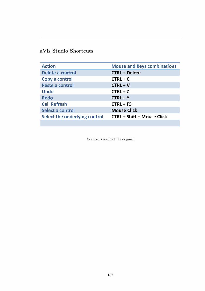
uVis Studio Shortcuts
Scanned version of the original.
187

Appendix D
Evaluation with Clinicians -
Documentation
This appendix presents the documentation used during the second study. At the end
it presents a detailed usability log for one participant.
188

Task 1 - Introduction to uVis
You will create a simple bar chart with the uVis formulas and the Studio. You should
follow the steps described below.
Scanned version of the original.
189
Scanned version of the original.
190

Task 2: Create the Process Completion Diagram
You will have to create the Process Completion Diagram, as shown:
Scanned version of the original.
191

Scanned version of the original.
192

Task 3 - Create the LifeLines
You will have to create the LifeLines, as shown.
Scanned version of the original.
193

Scanned version of the original.
194

Structured Interview
Scanned version of the original.
195

Questionnaire
After each task the clinician replied to the questionnaire through Google Docs.
Questions used in this study.
196

uVis Studio and Reference Card
Scanned version of the original
Scanned version of the original.
197
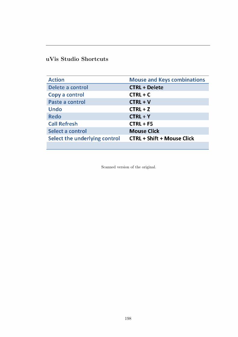
uVis Studio Shortcuts
Scanned version of the original.
198

References
[1] Aigner, W., and Miksch, S. Carevis: Integrated visualization of computerized protocols
and temporal patient data. Artif. Intell. Med. 37, 3 (2006), 203–218. 133
[2] Aigner, W., Miksch, S., Muller, W., Schumann, H., and Tominski, C. Visual methods for
analyzing time-oriented data, Jan. 2008. viii, 12, 13
[3] Aigner, W., Miksch, S., Schumann, H., and Tominski, C. Visualization of Time-Oriented
Data, 1st ed. Springer Publishing Company, Incorporated, 2011. 11
[4] Akasaka, R. Protoviewer: a web-based visual design environment for protovis. In ACM
SIGGRAPH 2011 Posters, SIGGRAPH ’11, ACM (2011), 85:1–85:1. ix, 23, 34, 35, 150
[5] Amar, R., and Stasko, J. A knowledge task-based framework for design and evaluation
of information visualizations. In Proceedings of the IEEE Symposium on Information
Visualization, INFOVIS ’04, IEEE Computer Society (Washington, DC, USA, 2004),
143–150. 18
[6] Bachman, C. W. Data structure diagrams. DataBase (1969), 4–10. 61
[7] Baroth, E., and Hartsough, C. Visual object-oriented programming. Manning Publica-
tions Co., Greenwich, CT, USA, 1995, ch. Visual programming in the real world, 21–42.
16
[8] Bederson, B. B. Fisheye menus. In Proceedings of the 13th annual ACM symposium on
User interface software and technology, UIST ’00, ACM (New York, NY, USA, 2000),
217–225. 3
[9] Bederson, B. B., J., G., and J., M. Toolkit design for interactive structured graphics.
IEEE Trans. Softw. Eng. 30 (2004), 535–546. viii, 3, 11, 23, 30, 31
[10] Bederson, B. B., Meyer, J., and Good, L. Jazz: an extensible zoomable user interface
graphics toolkit in java. In Proceedings of the 13th annual ACM symposium on User
interface software and technology, UIST ’00, ACM (New York, NY, USA, 2000), 171–180.
23
199

REFERENCES
[11] Bederson, B. B., Shneiderman, B., and Wattenberg, M. Ordered and quantum treemaps:
Making effective use of 2d space to display hierarchies. ACM Trans. Graph. 21, 4 (2002),
833–854. 50
[12] Boehm, B., Clark, B., Horowitz, E., Westland, C., Madachy, R., and Selby, R. Cost
models for future software life cycle processes: Cocomo 2.0. In Annals Of Software
Engineering (1995), 57–94. 14
[13] Bostock, M., and Heer, J. Protovis: A graphical toolkit for visualization. Visualization
and Computer Graphics, IEEE Transactions on 15, 6 (nov.-dec. 2009), 1121 –1128. 3,
20, 23, 34, 35, 150
[14] Bostock, M., Ogievetsky, V., and Heer, J. D3 data-driven documents. IEEE Transactions
on Visualization and Computer Graphics 17, 12 (Dec. 2011), 2301–2309. 3, 11, 20, 23,
35, 94, 103
[15] Bui, A., Aberle, D., and Kangarloo, H. Timeline: Visualizing integrated patient records.
Information Technology in Biomedicine, IEEE Transactions on 11, 4 (july 2007), 462
–473. 133
[16] Burnett, M., Atwood, J., Walpole Djang, R., Reichwein, J., Gottfried, H., and Yang,
S. Forms/3: A first-order visual language to explore the boundaries of the spreadsheet
paradigm. J. Funct. Program. 11 (2001), 155–206. 15, 17
[17] Burnett, M. M. Visual programming. Encyclopedia of Electrical and Electronics Engi-
neering (1999). 15
[18] Burnett, M. M., and Baker, M. J. A classification system for visual programming lan-
guages. Tech. rep., Corvallis, OR, USA, 1993. 15
[19] Burnett, M. M., and Gottfried, H. J. Graphical definitions: expanding spreadsheet lan-
guages through direct manipulation and gestures. ACM Trans. Comput.-Hum. Interact.
5, 1 (1998), 1–33. 16, 17
[20] Card, S. K., Mackinlay, J. D., and Shneiderman, B., Eds. Readings in information
visualization: using vision to think. Morgan Kaufmann Publishers Inc., San Francisco,
CA, USA, 1999. 2, 10, 20
[21] Chen, P. P.-S. The entityrelationship modeltoward a unified view of data. ACM Trans.
Database Syst. 1, 1 (1976), 9–36. 59
[22] Cheng, M., Livny, M., and Ramakrishnan, R. Visual analysis of stream data. In Pro-
ceedings of SPIE / The International Society for Optical Engineering, vol. 2410 (1995),
108–119. 23, 26
200

REFERENCES
[23] Chi, E. H. A taxonomy of visualization techniques using the data state reference model.
In Proceedings of the IEEE Symposium on Information Vizualization 2000, INFOVIS ’00,
IEEE Computer Society (Washington, DC, USA, 2000), 69–. 18, 149
[24] Chi, E. H.-h., and Riedl, J. An operator interaction framework for visualization systems.
In Proceedings of the 1998 IEEE Symposium on Information Visualization, INFOVIS ’98,
IEEE Computer Society (Washington, DC, USA, 1998), 63–70. 17, 20
[25] Chuah, M. C., Roth, S. F., and Kerpedjiev, S. Intelligent multimedia information re-
trieval. MIT Press, 1997, ch. Sketching, searching, and customizing visualizations: a
content-based approach to design retrieval, 83–111. viii, 23, 25, 26
[26] Cox, P., Giles, F., and Pietrzykowski, T. Prograph: a step towards liberating program-
ming from textual conditioning. In Visual Languages, 1989., IEEE Workshop on (oct
1989), 150 –156. 15
[27] Cypher, A., Halbert, D. C., Kurlander, D., Lieberman, H., Maulsby, D., Myers, B. A.,
and Turransky, A., Eds. Watch what I do: programming by demonstration. MIT Press,
Cambridge, MA, USA, 1993. 16
[28] Fekete, J.-D. The infovis toolkit. In Proceedings of the IEEE Symposium on Information
Vizualization 2004 (2004), 167 –174. viii, 3, 11, 23, 29, 30
[29] Fekete, J.-D., Hemery, P.-L., Baudel, T., and Wood, J. Obvious: A meta-toolkit to
encapsulate information visualization toolkits — one toolkit to bind them all. In Visual
Analytics Science and Technology (VAST), 2011 IEEE Conference on (oct. 2011), 91
–100. 158
[30] Flare. http://flare.prefuse.org/. Accessed August, 2011. viii, 11, 23, 33, 34
[31] Godinho, P. I. A., Meiguins, B. S., Meiguins, A. S. G., Casseb do Carmo, R. M.,
de Brito Garcia, M., Almeida, L. H., and Lourenco, R. Prisma - a multidimensional
information visualization tool using multiple coordinated views. In Proceedings of the
11th International Conference Information Visualization, IV ’07, IEEE Computer Soci-
ety (2007), 23–32. 23
[32] Google. http://code.google.com/apis/chart/. Accessed October, 2011. ix, 23, 41
[33] Goren-Bar, D., Shahar, Y., Galperin-Aizenberg, M., Boaz, D., and Tahan, G. Knave ii:
the definition and implementation of an intelligent tool for visualization and exploration
of time-oriented clinical data. In Proceedings of the working conference on Advanced visual
interfaces, AVI ’04, ACM (2004), 171–174. 133
[34] Hallett, C. Multi-modal presentation of medical histories. In Proceedings of the 13th
international conference on Intelligent user interfaces, IUI ’08, ACM (2008), 80–89. 133
201

REFERENCES
[35] Hanrahan, P. Vizql: a language for query, analysis and visualization. In Proceedings of
the 2006 ACM SIGMOD international conference on Management of data, SIGMOD ’06,
ACM (2006), 721–721. 37
[36] Heer, J., Card, S. K., and Landay, J. A. prefuse: a toolkit for interactive information
visualization. In Proceedings of the SIGCHI conference on Human factors in computing
systems, CHI ’05, ACM (2005), 421–430. viii, 3, 11, 20, 23, 30, 32, 33, 94
[37] Heer, J., Ham, F., Carpendale, S., Weaver, C., and Isenberg, P. Creation and collabora-
tion: Engaging new audiences for information visualization. In Information Visualization,
A. Kerren, J. Stasko, J.-D. Fekete, and C. North, Eds., vol. 4950 of Lecture Notes in Com-
puter Science. Springer Berlin Heidelberg, 2008, 92–133. 2, 3, 13, 19, 21
[38] Heer, J., and Shneiderman, B. Interactive dynamics for visual analysis. Commun. ACM
55, 4 (Apr. 2012), 45–54. 19
[39] Hertzum, M., and Jacobsen, N. E. The evaluator effect: A chilling fact about usability
evaluation methods. Int. J. Hum. Comput. Interaction 13, 4 (2001), 421–443. 84, 153,
154
[40] Hundhausen, C. D., Farley, S. F., and Brown, J. L. Can direct manipulation lower the
barriers to computer programming and promote transfer of training?: An experimental
study. ACM Trans. Comput.-Hum. Interact. 16, 3 (2009), 13:1–13:40. 16
[41] Jaffe, A., Naaman, M., Tassa, T., and Davis, M. Generating summaries and visualiza-
tion for large collections of geo-referenced photographs. In Proceedings of the 8th ACM
international workshop on Multimedia information retrieval, MIR ’06, ACM (New York,
NY, USA, 2006), 89–98. 50
[42] Johnson, B., and Shneiderman, B. Tree-maps: a space-filling approach to the visual-
ization of hierarchical information structures. In Proceedings of IEEE Conference on
Visualization (1991), 284 –291. 50
[43] Johnson, C. M., Johnson, T. R., and Zhang, J. A user-centered framework for redesigning
health care interfaces. J. of Biomedical Informatics 38, 1 (2005), 75–87. 133
[44] Jones, S. P., Blackwell, A., and Burnett, M. A user-centred approach to functions in
excel. SIGPLAN Not. 38, 9 (Aug. 2003), 165–176. 17
[45] Kaser, O., and Lemire, D. Tag-cloud drawing: Algorithms for cloud visualization.
vol. abs/cs/0703109 (2007). 50
[46] Kelleher, C., and Pausch, R. Lowering the barriers to programming: A taxonomy of
programming environments and languages for novice programmers. ACM Comput. Surv.
37, 2 (June 2005), 83–137. 16
202

REFERENCES
[47] Klann, M., Patern, F., and Wulf, V. Future perspectives in end-user development. In
End User Development, H. Lieberman, F. Patern, and V. Wulf, Eds., vol. 9 of Human-
Computer Interaction Series. Springer Netherlands, 2006, 475–486. 13
[48] Ko, A. J., Abraham, R., Beckwith, L., Blackwell, A., Burnett, M., Erwig, M., Scaffidi,
C., Lawrance, J., Lieberman, H., Myers, B., Rosson, M. B., Rothermel, G., Shaw, M.,
and Wiedenbeck, S. The state of the art in end-user software engineering. ACM Comput.
Surv. 43, 3 (Apr. 2011), 21:1–21:44. 14
[49] Koh, L. C., Slingsby, A., Dykes, J., and Kam, T. S. Developing and applying a user-
centered model for the design and implementation of information visualization tools. 2011
15th International Conference on Information Visualisation (2011), 90–95. 12
[50] Kosara, R., and Miksch, S. Metaphors of movement: a visualization and user interface
for time-oriented, skeletal plans. Artif. Intell. Med. 22, 2 (May 2001), 111–131. 133
[51] Lauesen, S. User Interface Design: A Software Engineering Perspective. Addison-Wesley
Longman Publishing Co., Inc., Boston, MA, USA, 2005. 82, 83, 84, 88, 91, 114, 139
[52] Lauesen, S. Requirements of uVis. Avaliable on demand, 2009. 4, 57, 149
[53] Lauesen, S. Vistool for unified data visualization. IT University Of Copenhagen, www.
itu.dk/people/slauesen/S-EHR/UnifiedDataVisualization.pdf, 2009. 4, 45
[54] Lee, B., Plaisant, C., Parr, C. S., Fekete, J.-D., and Henry, N. Task taxonomy for graph
visualization. In Proceedings of the 2006 AVI workshop on BEyond time and errors: novel
evaluation methods for information visualization, BELIV ’06, ACM (2006), 1–5. 19
[55] Lee, B., Riche, N. H., Karlson, A. K., and Carpendale, S. Sparkclouds: Visualizing trends
in tag clouds. IEEE Transactions on Visualization and Computer Graphics 16, 6 (2010),
1182–1189. 3, 50
[56] Lieberman, H., Patern, F., Klann, M., and Wulf, V. End-user development: An emerging
paradigm. In End User Development, H. Lieberman, F. Patern, and V. Wulf, Eds., vol. 9
of Human-Computer Interaction Series. Springer Netherlands, 2006, 1–8. 1, 13, 14
[57] Lieberman, H., Paterno, F., and Wulf, V. End User Development (Human-Computer
Interaction Series). Springer-Verlag New York, Inc., Secaucus, NJ, USA, 2006. 14, 15,
16, 17
[58] Livny, M., Ramakrishnan, R., Beyer, K., Chen, G., Donjerkovic, D., Lawande, S., Myl-
lymaki, J., and Wenger, K. Devise: integrated querying and visual exploration of large
datasets. In Proceedings of the 1997 ACM SIGMOD international conference on Man-
agement of data, SIGMOD ’97, ACM (1997), 301–312. 23, 26, 27
203

REFERENCES
[59] Livny, M., Ramakrishnan, R., and Myllymaki, J. Visual exploration of large data sets.
In Proceedings of SPIE / The International Society for Optical Engineering (1996). viii,
23, 26, 27
[60] Mackinlay, J. Automating the design of graphical presentations of relational information.
ACM Trans. Graph. 5, 2 (Apr. 1986), 110–141. viii, 23, 24
[61] MacLean, A., Carter, K., Lovstrand, L., and Moran, T. User-tailorable systems: pressing
the issues with buttons. In Proceedings of the SIGCHI Conference on Human Factors in
Computing Systems, CHI ’90, ACM (New York, NY, USA, 1990), 175–182. 14
[62] Martin, J. Information Engineering: Planning and Analysis. Prentice-Hall, Inc., Engle-
wood Cliffs, NJ, USA, 1990. 49, 59
[63] Matkovic, K., Freiler, W., Gracanin, D., and Hauser, H. Comvis: A coordinated multiple
views system for prototyping new visualization technology. In Proceedings of the 2008
12th International Conference Information Visualisation, IV ’08, IEEE Computer Society
(2008), 215–220. 23
[64] Microsoft Excel. http://office.microsoft.com/en-us/excel/. Accessed August,
2011. ix, 3, 11, 21, 23, 36, 37
[65] Milgram, S., and Jodelet, D. Psychological maps of paris. Environmental psychology
(1976), 104–124. 50
[66] Myers, B., Hudson, S. E., and Pausch, R. Past, present, and future of user interface
software tools. ACM Trans. Comput.-Hum. Interact. 7, 1 (Mar. 2000), 3–28. 20
[67] Nielsen, J. Finding usability problems through heuristic evaluation. In Proceedings of
the SIGCHI Conference on Human Factors in Computing Systems, CHI ’92, ACM (New
York, NY, USA, 1992), 373–380. 84
[68] Nielsen, J. Usability Engineering. Morgan Kaufmann Publishers Inc., San Francisco, CA,
USA, 1993. 12, 84, 85, 150, 151, 153
[69] Nielsen, J., and Landauer, T. K. A mathematical model of the finding of usability
problems. In Proceedings of the INTERACT ’93 and CHI ’93 conference on Human
factors in computing systems, CHI ’93, ACM (1993), 206–213. 84
[70] Norman, D. A. The Design of Everyday Things. Doubleday Business, 1990. 12, 44, 68
[71] Omniscope. http://www.visokio.com/. Accessed August, 2011. ix, 11, 21, 23, 38, 39
[72] Pane, J., and Myers, B. More natural programming languages and environments. In
End User Development, H. Lieberman, F. Patern, and V. Wulf, Eds., vol. 9 of Human-
Computer Interaction Series. Springer Netherlands, 2006, 31–50. 2, 13, 21
204

REFERENCES
[73] Pantazos, K., and Lauesen, S. Constructing visualizations with infovis tools - an evalua-
tion from a user perspective. In GRAPP/IVAPP, P. Richard, M. Kraus, R. S. Laramee,
and J. Braz, Eds., SciTePress (2012), 731–736. 3, 13
[74] Pantazos, K., Lauesen, S., and Lippert, S. De-identifying an ehr database - anonymity,
correctness and readability of the medical record. Studies In Health Technology And
Informatics 169 (2011), 862–866. 7
[75] Pantazos, K., Tarkan, S., Plaisant, C., and Shneiderman, B. Promoting timely completion
of multi-step processes - a visual approach to retrospective analysis. Tech. Rep. HCIL-
2012-27, University Of Maryland, Human Computer Interaction Lab, 2012. 7
[76] Pfitzner, D., Hobbs, V., and Powers, D. A unified taxonomic framework for information
visualization. In Proceedings of the Asia-Pacific symposium on Information visualisation
- Volume 24, APVis ’03, Australian Computer Society, Inc. (Darlinghurst, Australia,
Australia, 2003), 57–66. 18
[77] Pieczkiewicz, D. S., Finkelstein, S. M., and Hertz, M. I. Design and evaluation of a web-
based interactive visualization system for lung transplant home monitoring data. AMIA
Annual Symposium proceedings AMIA Symposium AMIA Symposium 2007 , 598–602. 133
[78] Plaisant, C. The challenge of information visualization evaluation. In Proceedings of the
working conference on Advanced visual interfaces, AVI ’04, ACM (2004), 109–116. 13,
44, 150
[79] Plaisant, C., Mushlin, R., Snyder, A., Li, J., Heller, D., Shneiderman, B., and Colorado,
K. P. Lifelines: Using visualization to enhance navigation and analysis of patient records.
In In Proceedings of the 1998 American Medical Informatic Association Annual Fall Sym-
posium (1998), 76–80. 2, 3, 11, 12, 22, 54, 133, 159
[80] Processing. http://www.processing.com/. Accessed August, 2011. viii, 23, 27, 28
[81] Robinson, A. C., Chen, J., Lengerich, E. J., Meyer, H. G., and MacEachren, A. M. Com-
bining usability techniques to design geovisualization tools for epidemiology. Cartography
and Geographic Information Science 32, 4 (2005), 243–255. 12
[82] Robson, C. Real World Research - A Resource for Social Scientists and Practitioner-
Researchers, second ed. Blackwell Publishing, Malden, 2002. 86, 150, 154
[83] Roque, F. S., Slaughter, L., and Tkatsenko, A. A comparison of several key information
visualization systems for secondary use of electronic health record content. In Proceedings
of the NAACL HLT 2010 Second Louhi Workshop on Text and Data Mining of Health
Documents, Louhi ’10, Association for Computational Linguistics (Stroudsburg, PA, USA,
2010), 76–83. 133
205

REFERENCES
[84] Roth, R. E., Ross, K. S., Finch, B. G., Luo, W., and MacEachren, A. M. A user-centered
approach for designing and developing spatiotemporal crime analysis tools. geovistap-
suedu, Norman 1988 (2009). 12
[85] Roth, S. F., Chuah, M. C., Kerpedjiev, S., Kolojejchick, J. A., and Lucas, P. Toward
an information visualization workspace: combining multiple means of expression. Hum.-
Comput. Interact. 12, 1 (Mar. 1997), 131–185. 23
[86] Roth, S. F., Kolojejchick, J., Mattis, J., and Chuah, M. C. Sagetools: an intelligent
environment for sketching, browsing, and customizing data-graphics. In Conference com-
panion on Human factors in computing systems, CHI ’95, ACM (1995), 409–410. 25
[87] Roth, S. F., and Mattis, J. Automating the presentation of information, 1991. viii, 23,
25
[88] Scaffidi, C., Shaw, M., and Myers, B. Estimating the numbers of end users and end
user programmers. In Visual Languages and Human-Centric Computing, 2005 IEEE
Symposium on (2005), 207 – 214. 14
[89] Shneiderman, B. Direct manipulation: A step beyond programming languages. Computer
16, 8 (1983), 57–69. 16
[90] Shneiderman, B. The eyes have it: A task by data type taxonomy for information
visualizations. In Proceedings of the 1996 IEEE Symposium on Visual Languages, VL
’96, IEEE Computer Society (Washington, DC, USA, 1996), 336–. 17
[91] Shneiderman, B., and Plaisant, C. Designing the User Interface: Strategies for Effective
Human-Computer Interaction, 5. ed. Pearson Addison-Wesley, Upper Saddle River, NJ,
2009. 84, 85
[92] Slocum, T. A., Cliburn, D. C., Feddema, J. J., and Miller, J. R. Evaluating the Usability
of a Tool for Visualizing the Uncertainty of the Future Global Water Balance. Cartography
and Geographic Information Science (Oct. 2003), 299–317. 12
[93] Smith, D. C. Pygmalion: a creative programming environment. PhD thesis, Stanford,
CA, USA, 1975. AAI7525608. 15
[94] Smith, D. C., Cypher, A., and Spohrer, J. Kidsim: programming agents without a
programming language. Commun. ACM 37, 7 (July 1994), 54–67. 15
[95] Smith, R. What clinical information do doctors need? BMJ British Medical Journal 313,
7064 (1996), 1062–1068. 133
[96] Spence, R. Information Visualization: Design for Interaction (2nd Edition). Prentice-
Hall, Inc., Upper Saddle River, NJ, USA, 2007. 10, 11
206

REFERENCES
[97] Spotfire. http://spotfire.tibco.com/. Accessed August, 2011. ix, 3, 11, 21, 23, 37,
39, 102
[98] Stolte, C., and Hanrahan, P. Polaris: a system for query, analysis and visualization
of multi-dimensional relational databases. In Information Visualization, 2000. InfoVis
2000. IEEE Symposium on (2000), 5 –14. 23, 36
[99] Tableau. http://www.tableausoftware.com/. Accessed August, 2011. ix, 3, 11, 21, 23,
36, 38
[100] Takatsuka, M., and Gahegan, M. Geovista studio: a codeless visual programming envi-
ronment for geoscientific data analysis and visualization. Comput. Geosci. 28, 10 (Dec.
2002), 1131–1144. viii, 23, 28, 29
[101] Tanimoto, S. L. Viva: A visual language for image processing. J. Vis. Lang. Comput. 1,
2 (June 1990), 127–139. 67, 68
[102] Thomas, J. J., and Cook, K. A. A visual analytics agenda. IEEE Comput. Graph. Appl.
26, 1 (2006), 10–13. 11
[103] Tom Sawyer Perspectives. http://www.tomsawyer.com/products/perspectives/
index.php. Accessed August, 2011. ix, 23, 40
[104] Tory, M., and Moller, T. Rethinking visualization: A high-level taxonomy. In Proceedings
of the IEEE Symposium on Information Visualization, INFOVIS ’04, IEEE Computer
Society (Washington, DC, USA, 2004), 151–158. 18
[105] Tufte, E. R. The visual display of quantitative information. Graphics Press, 1986. 10
[106] Tufte, E. R. Beautiful Evidence. Graphis Pr, 2006. 50
[107] Viegas, F. B., Wattenberg, M., van Ham, F., Kriss, J., and McKeon, M. Manyeyes: a site
for visualization at internet scale. IEEE Transactions on Visualization and Computer
Graphics 13 (2007), 1121–1128. 23, 41
[108] Virzi, R. A. Refining the test phase of usability evaluation: how many subjects is enough?
Hum. Factors 34, 4 (1992), 457–468. 84
[109] Vrachnos, E., and Jimoyiannis, A. Dave: A dynamic algorithm visualization environment
for novice learners. In Proceedings of the 2008 Eighth IEEE International Conference on
Advanced Learning Technologies, ICALT ’08, IEEE Computer Society (Washington, DC,
USA, 2008), 319–323. 23
[110] Wang, T. D., Plaisant, C., Quinn, A. J., Stanchak, R., Murphy, S., and Shneiderman,
B. Aligning temporal data by sentinel events: discovering patterns in electronic health
records. In Proceedings of the twenty-sixth annual SIGCHI conference on Human factors
in computing systems, CHI ’08, ACM (2008), 457–466. 11, 133
207

REFERENCES
[111] Weaver, C. Building highly-coordinated visualizations in improvise. In Proceedings of the
IEEE Symposium on Information Visualization, IEEE Computer Society (2004), 159–166.
viii, 23, 31, 32, 150
[112] Welch, B. B. Practical programming in Tcl and Tk (2nd ed.). Prentice-Hall, Inc., Upper
Saddle River, NJ, USA, 1997. 26
[113] Whitley, K. Visual programming languages and the empirical evidence for and against.
Journal of Visual Languages & Computing 8, 1 (1997), 109 – 142. 15
[114] Wilson, C. Taking usability practitioners to task. Interactions 14, 1 (Jan. 2007), 48–49.
153
[115] Wongsuphasawat, K., Guerra Gomez, J. A., Plaisant, C., Wang, T. D., Taieb-Maimon,
M., and Shneiderman, B. Lifeflow: visualizing an overview of event sequences. In Pro-
ceedings of the 2011 annual conference on Human factors in computing systems, CHI ’11,
ACM (2011), 1747–1756. 11, 30, 133
208