Chapter 2 Descriptive Statistics: Tabular and Graphical Displays
175
2 - 1 Chapter 2 Descriptive Statistics: Tabular and Graphical Displays Learning Objectives 1. Learn how to construct and interpret summarization procedures for qualitative data such as: frequency and relative frequency distributions, bar graphs and pie charts. 2. Learn how to construct and interpret tabular summarization procedures for quantitative data such as: frequency and relative frequency distributions, cumulative frequency and cumulative relative frequency distributions. 3. Learn how to construct a dot plot and a histogram as graphical summaries of quantitative data. 4. Learn how the shape of a data distribution is revealed by a histogram. Learn how to recognize when a data distribution is negatively skewed, symmetric, and positively skewed. 5. Be able to use and interpret the exploratory data analysis technique of a stem-and-leaf display. 6. Learn how to construct and interpret cross tabulations, scatter diagrams, side-by-side and stacked bar charts. 7. Learn best practices for creating effective graphical displays and for choosing the appropriate type of display. © 2018 Cengage. May not be scanned, copied or duplicated, or posted to a publicly accessible website, in whole or in part.
-
Upload
khangminh22 -
Category
Documents
-
view
1 -
download
0
Transcript of Chapter 2 Descriptive Statistics: Tabular and Graphical Displays

2 - 1
Chapter 2 Descriptive Statistics: Tabular and Graphical Displays Learning Objectives 1. Learn how to construct and interpret summarization procedures for qualitative data such as:
frequency and relative frequency distributions, bar graphs and pie charts. 2. Learn how to construct and interpret tabular summarization procedures for quantitative data such as: frequency and relative frequency distributions, cumulative frequency and cumulative relative
frequency distributions. 3. Learn how to construct a dot plot and a histogram as graphical summaries of quantitative data. 4. Learn how the shape of a data distribution is revealed by a histogram. Learn how to recognize when
a data distribution is negatively skewed, symmetric, and positively skewed. 5. Be able to use and interpret the exploratory data analysis technique of a stem-and-leaf display. 6. Learn how to construct and interpret cross tabulations, scatter diagrams, side-by-side and stacked bar
charts. 7. Learn best practices for creating effective graphical displays and for choosing the appropriate type of display.
© 2018 Cengage. May not be scanned, copied or duplicated, or posted to a publicly accessible website, in whole or in part.

Chapter 2
2 - 2
Solutions: 1.
Class Frequency Relative Frequency A 60 60/120 = 0.50 B 24 24/120 = 0.20 C 36 36/120 = 0.30 120 1.00
2. a. 1 – (.22 + .18 + .40) = .20 b. .20(200) = 40 c/d.
Class Frequency Percent Frequency A .22(200) = 44 22 B .18(200) = 36 18 C .40(200) = 80 40 D .20(200) = 40 20
Total 200 100 3. a. 360° x 58/120 = 174° b. 360° x 42/120 = 126° c.
No35.0%
Yes48.3%
No Opinion16.7%
© 2018 Cengage. May not be scanned, copied or duplicated, or posted to a publicly accessible website, in whole or in part.

Descriptive Statistics: Tabular and Graphical Displays
2 - 3
d.
4. a. These data are categorical. b.
Show Frequency % Frequency Jep 10 20 JJ 8 16
OWS 7 14 THM 12 24 WoF 13 26 Total 50 100
c.
0
10
20
30
40
50
60
70
Yes No No Opinion
Freq
uenc
y
Response
0
2
4
6
8
10
12
14
Jep JJ OWS THM WoF
Freq
uenc
y
Syndicated Television Show
© 2018 Cengage. May not be scanned, copied or duplicated, or posted to a publicly accessible website, in whole or in part.

Chapter 2
2 - 4
d. The largest viewing audience is for Wheel of Fortune and the second largest is for Two and a Half Men.
5. a.
b.
Jep20%
JJ16%
OWS14%
THM24%
WoF26%
Syndicated Television Shows
0
2
4
6
8
10
12
14
Brown Johnson Jones Miller Smith Williams
Freq
uenc
y
Name
Common U.S. Last Names
Relative Percent Name Frequency Frequency Frequency
Brown 7 0.14 14% Johnson 10 0.20 20% Jones 7 0.14 14% Miller 6 0.12 12% Smith 12 0.24 24% Williams 8 0.16 16%
Total: 50 1 100%
© 2018 Cengage. May not be scanned, copied or duplicated, or posted to a publicly accessible website, in whole or in part.

Descriptive Statistics: Tabular and Graphical Displays
2 - 5
c.
d. The three most common last names are Smith (24%), Johnson (20%), Williams (16%) 6. a.
Network Relative
Frequency % Frequency ABC 6 24 CBS 9 36 FOX 1 4 NBC 9 36 Total: 25 100
b. For these data, NBC and CBS tie for the number of top-rated shows. Each has 9 (36%) of the top 25.
ABC is third with 6 (24%) and the much younger FOX network has 1(4%).
Brown14%
Johnson20%
Jones14%Miller
12%
Smith24%
Williams16%
Common U.S. Last Names
0123456789
10
ABC CBS FOX NBC
Freq
uenc
y
Network
© 2018 Cengage. May not be scanned, copied or duplicated, or posted to a publicly accessible website, in whole or in part.

Chapter 2
2 - 6
7. a. Rating Frequency Percent Frequency Excellent 20 40 Very Good 23 46 Good 4 8 Fair 1 2 Poor 2 4 50 100
Management should be very pleased with the survey results. 40% + 46% = 86% of the ratings are
very good to excellent. 94% of the ratings are good or better. This does not look to be a Delta flight where significant changes are needed to improve the overall customer satisfaction ratings.
b. While the overall ratings look fine, note that one customer (2%) rated the overall experience with the
flight as Fair and two customers (4%) rated the overall experience with the flight as Poor. It might be insightful for the manager to review explanations from these customers as to how the flight failed to meet expectations. Perhaps, it was an experience with other passengers that Delta could do little to correct or perhaps it was an isolated incident that Delta could take steps to correct in the future.
8. a.
Position Frequency Relative Frequency Pitcher 17 0.309 Catcher 4 0.073 1st Base 5 0.091 2nd Base 4 0.073 3rd Base 2 0.036 Shortstop 5 0.091 Left Field 6 0.109 Center Field 5 0.091 Right Field 7 0.127 55 1.000
b. Pitchers (Almost 31%) c. 3rd Base (3 – 4%) d. Right Field (Almost 13%) e. Infielders (16 or 29.1%) to Outfielders (18 or 32.7%)
05
101520253035404550
Poor Fair Good Very Good Excellent
Perc
ent F
requ
ency
Customer Rating
© 2018 Cengage. May not be scanned, copied or duplicated, or posted to a publicly accessible website, in whole or in part.
Descriptive Statistics: Tabular and Graphical Displays
2 - 7
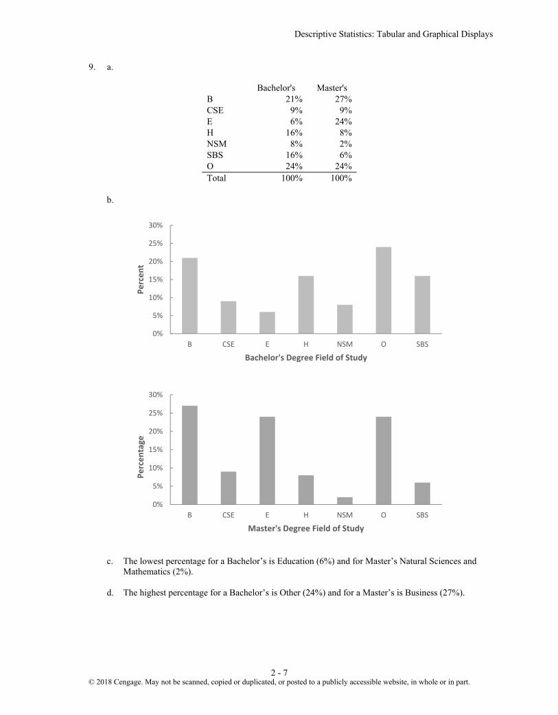
9. a.
Bachelor's Master's B 21% 27% CSE 9% 9% E 6% 24% H 16% 8% NSM 8% 2% SBS 16% 6% O 24% 24% Total 100% 100%
b.
c. The lowest percentage for a Bachelor’s is Education (6%) and for Master’s Natural Sciences and Mathematics (2%).
d. The highest percentage for a Bachelor’s is Other (24%) and for a Master’s is Business (27%).
0%
5%
10%
15%
20%
25%
30%
B CSE E H NSM O SBS
Perc
ent
Bachelor's Degree Field of Study
0%
5%
10%
15%
20%
25%
30%
B CSE E H NSM O SBS
Perc
enta
ge
Master's Degree Field of Study
© 2018 Cengage. May not be scanned, copied or duplicated, or posted to a publicly accessible website, in whole or in part.
Chapter 2
2 - 8
e. Bachelor's Master's Difference B 21% 27% 6% CSE 9% 9% 0% E 6% 24% 18% H 16% 8% -8% NSM 8% 2% -6% SBS 16% 6% -10% O 24% 24% - 0%
Education has the largest increase in percent: 18%
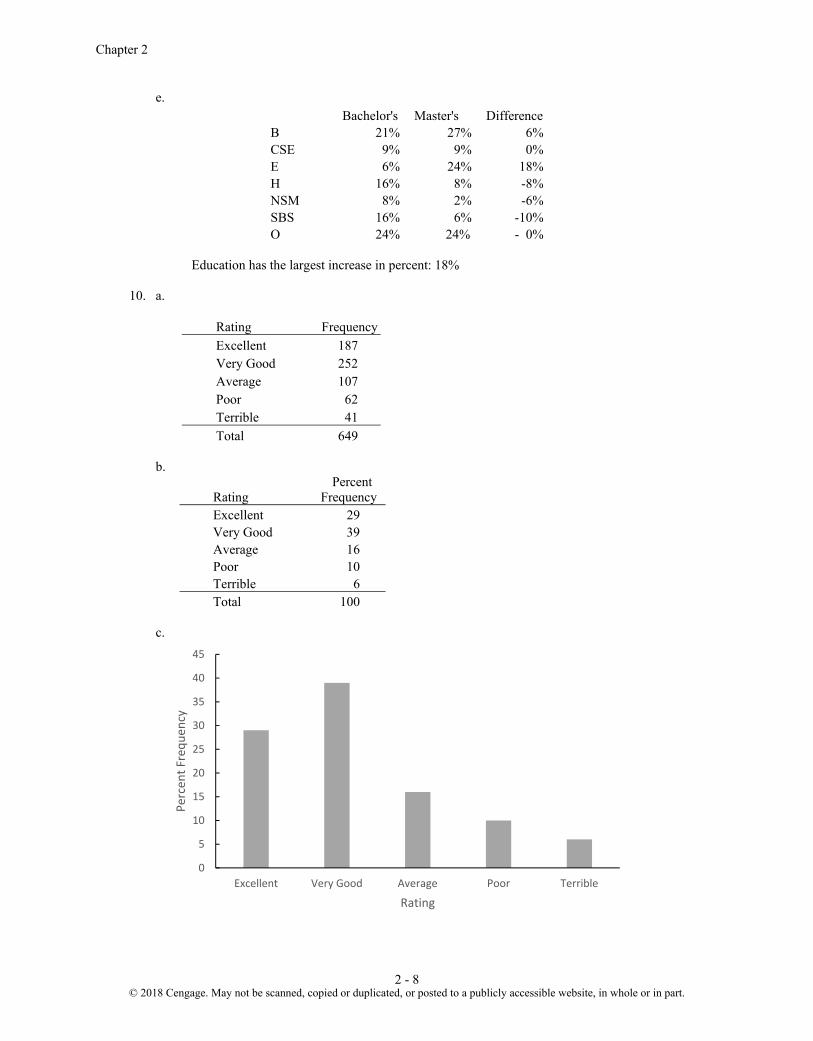
10. a.
Rating Frequency
Excellent 187 Very Good 252 Average 107 Poor 62 Terrible 41 Total 649
b.
Rating Percent
Frequency Excellent 29 Very Good 39 Average 16 Poor 10 Terrible 6 Total 100
c.
0
5
10
15
20
25
30
35
40
45
Excellent Very Good Average Poor Terrible
Perc
ent F
requ
ency
Rating
© 2018 Cengage. May not be scanned, copied or duplicated, or posted to a publicly accessible website, in whole or in part.

Descriptive Statistics: Tabular and Graphical Displays
2 - 9
d. 29% + 39% = 68% of the guests at the Sheraton Anaheim Hotel rated the hotel as Excellent or Very Good. But, 10% + 6% = 16% of the guests rated the hotel as poor or terrible.
e. The percent frequency distribution for Disney’s Grand Californian follows:
Rating Percent
Frequency Excellent 48 Very Good 31 Average 12 Poor 6 Terrible 3 Total 100
48% + 31% = 79% of the guests at the Sheraton Anaheim Hotel rated the hotel as Excellent or Very
Good. And, 6% + 3% = 9% of the guests rated the hotel as poor or terrible. Compared to ratings of other hotels in the same region, both of these hotels received very favorable
ratings. But, in comparing the two hotels, guests at Disney’s Grand Californian provided somewhat better ratings than guests at the Sheraton Anaheim Hotel.
11.
Class Frequency Relative Frequency Percent Frequency 12–14 2 0.050 5.0 15–17 8 0.200 20.0 18–20 11 0.275 27.5 21–23 10 0.250 25.0 24–26 9 0.225 22.5
Total 40 1.000 100.0
12. Class Cumulative Frequency Cumulative Relative Frequency less than or equal to 19 10 .20 less than or equal to 29 24 .48 less than or equal to 39 41 .82 less than or equal to 49 48 .96 less than or equal to 59 50 1.00
© 2018 Cengage. May not be scanned, copied or duplicated, or posted to a publicly accessible website, in whole or in part.

Chapter 2
2 - 10
13.
14. a.
b/c.
Class Frequency Percent Frequency 6.0 – 7.9 4 20 8.0 – 9.9 2 10 10.0 – 11.9 8 40 12.0 – 13.9 3 15 14.0 – 15.9 3 15
20 100 15. Leaf Unit = .1
6 3
7 5 5 7
8 1 3 4 8
9 3 6
10 0 4 5
11 3
0
2
4
6
8
10
12
14
16
18
10-19 20-29 30-39 40-49 50-59
Freq
uenc
y
6.0 8.0 10.0 12.0 14.0 16.0
© 2018 Cengage. May not be scanned, copied or duplicated, or posted to a publicly accessible website, in whole or in part.

Descriptive Statistics: Tabular and Graphical Displays
2 - 11
16. Leaf Unit = 10
11 6
12 0 2
13 0 6 7
14 2 2 7
15 5
16 0 2 8
17 0 2 3
17. a/b.
Waiting Time Frequency Relative Frequency 0 – 4 4 0.20 5 – 9 8 0.40 10 – 14 5 0.25 15 – 19 2 0.10 20 – 24 1 0.05
Totals 20 1.00
c/d.
Waiting Time Cumulative Frequency Cumulative Relative Frequency Less than or equal to 4 4 0.20 Less than or equal to 9 12 0.60 Less than or equal to 14 17 0.85 Less than or equal to 19 19 0.95 Less than or equal to 24 20 1.00
e. 12/20 = 0.60 18. a.
PPG Frequency 10-11.9 1 12-13.9 3 14-15.9 7 16-17.9 19 18-19.9 9 20-21.9 4 22-23.9 2 24-25.9 0 26-27.9 3 28-29.9 2
Total 50
© 2018 Cengage. May not be scanned, copied or duplicated, or posted to a publicly accessible website, in whole or in part.

Chapter 2
2 - 12
b.
PPG Relative
Frequency 10-11.9 0.02 12-13.9 0.06 14-15.9 0.14 16-17.9 0.38 18-19.9 0.18 20-21.9 0.08 22-23.9 0.04 24-25.9 0.00 26-27.9 0.06 28-29.9 0.04
Total 1.00 c.
PPG
Cumulative Percent
Frequency less than 12 2 less than 14 8 less than 16 22 less than 18 60 less than 20 78 less than 22 86 less than 24 90 less than 26 90 less than 28 96 less than 30 100
d.
e. There is skewness to the right. f. (11/50)(100) = 22%
0
2
4
6
8
10
12
14
16
18
20
10-12 12-14 14-16 16-18 18-20 20-22 22-24 24-26 26-28 28-30
Freq
uenc
y
PPG
© 2018 Cengage. May not be scanned, copied or duplicated, or posted to a publicly accessible website, in whole or in part.

Descriptive Statistics: Tabular and Graphical Displays
2 - 13
19. a. The largest number of tons is 236.3 million (South Louisiana). The smallest number of tons is 30.2 million (Port Arthur).
b.
Millions Of Tons Frequency 25-49.9 11 50-74.9 9 75-99.9 2 100-124.9 0 125-149.9 1 150-174.9 0 175-199.9 0 200-224.9 0 225-249.9 2
c.
Most of the top 25 ports handle less than 75 million tons. Only five of the 25 ports handle above 75
million tons.
20. a. Lowest = 12, Highest = 23 b.
Hours in Meetings per Week Frequency
Percent Frequency
11-12 1 4% 13-14 2 8% 15-16 6 24% 17-18 3 12% 19-20 5 20% 21-22 4 16% 23-24 4 16%
25 100%
0
2
4
6
8
10
12
25-49.9 50-74.9 75-99.9 100-124.9 125-149.9 150-174.9 175-199.9 200-224.9 225-249.9
Freq
uenc
y
Millions of Tons Handled
Histogram for 25 Busiest U.S Ports
© 2018 Cengage. May not be scanned, copied or duplicated, or posted to a publicly accessible website, in whole or in part.

Chapter 2
2 - 14
c.
The distribution is slightly skewed to the left.
21. a/b/c/d.
Visitors (millions) Frequency Relative Frequency
Cumulative Frequency
Cumulative Relative Frequency
20-29 18 0.36 18 0.36 30-39 11 0.22 29 0.58 40-49 7 0.14 36 0.72 50-59 2 0.04 38 0.76 60-69 3 0.06 41 0.82 70-79 2 0.04 43 0.86 80-89 2 0.04 45 0.9 90-99 0 0 45 0.9
100-109 0 0 45 0.9 110-119 1 0.02 46 0.92 120-129 1 0.02 47 0.94 130-139 0 0 47 0.94 140-149 0 0 47 0.94 150-159 0 0 47 0.94 160-169 0 0 47 0.94 170-179 0 0 47 0.94 180-189 0 0 47 0.94 190-199 1 0.02 48 0.96 200-209 0 0 48 0.96 210-219 0 0 48 0.96 220-229 2 0.04 50 1.00
Total 50 1.00
0
1
2
3
4
5
6
7
11-12 13-14 15-16 17-18 19-20 21-22 23-24
Fequ
ency
Hours per Week in Meetings
© 2018 Cengage. May not be scanned, copied or duplicated, or posted to a publicly accessible website, in whole or in part.

Descriptive Statistics: Tabular and Graphical Displays
2 - 15
e. The histogram is highly skewed to the right. Note that there are very few websites that have more than 100 million visitors.
f. The website with the most U.S. visitors is youtube.com with 222 million U.S. visitors. 22. a.
0
2
4
6
8
10
12
14
16
18
20
<20
20-2
930
-39
40-4
950
-59
60-6
970
-79
80-8
990
-99
100-
109
110-
119
120-
129
130-
139
140-
149
150-
159
160-
169
170-
179
180-
189
190-
199
200-
209
210-
219
220-
229
230-
239
240-
250
>250
Freq
uenc
y
Visitors (millions)
# U.S.
Locations Frequency Percent
Frequency 0-4999 10 50
5000-9999 3 15 10000-14999 2 10 15000-19999 1 5 20000-24999 0 0
25000-29999 1 5 30000-34999 2 10 35000-39999 1 5
Total: 20 100
© 2018 Cengage. May not be scanned, copied or duplicated, or posted to a publicly accessible website, in whole or in part.

Chapter 2
2 - 16
b.
c. The distribution is skewed to the right. The majority of the franchises in this list have fewer than
20,000 locations (50% + 15% + 15% = 80%). McDonald's, Subway and 7-Eleven have the highest number of locations.
23. a. The highest positive YTD % Change for Japan’s Nikkei index with a YTD % Change of 31.4%. b. A class size of 10 results in 10 classes.
YTD % Change Frequency
-20- -15.1 1
-15- -10.1 1
-10- -5.1 3
-5- -0.1 3
0-4.9 4
5-9.9 5
10-14.9 8
15-19.9 3
20-24.9 1
25–29.9 0
30-34.9 1
0
2
4
6
8
10
12
0 -4999
5000 -9999
10000 -14999
15000 -19999
20000 -24999
25000 -29999
30000 -34999
35000 -39999
Freq
uenc
y
Number of U.S. Locations
© 2018 Cengage. May not be scanned, copied or duplicated, or posted to a publicly accessible website, in whole or in part.

Descriptive Statistics: Tabular and Graphical Displays
2 - 17
c.
The general shape of the distribution is skewed to the left. Twenty two of the 30 indexes have a positive YTD % Change and 13 have a YTD % Change of 10% or more. Eight of the indexes had a negative YTD % Change.
d. A variety of comparisons are possible depending upon when the study is done. 24. Leaf Unit = 1000
Starting Median Salary
4 6 8 5 1 2 3 3 5 6 8 8 6 0 1 1 1 2 2 7 1 2 5
Leaf Unit = 1000 Mid-Career Median Salary
8 0 0 4 9 3 3 5 6 7
10 5 6 6 11 0 1 4 4 4 12 2 3 6
There is a wider spread in the mid-career median salaries than in the starting median salaries. Also, as expected, the mid-career median salaries are higher that the starting median salaries. The mid-career median salaries were mostly in the $93,000 to $114,000 range while the starting median salaries were mostly in the $51,000 to $62,000 range.
0
1
2
3
4
5
6
7
8
9
-20- -15.1
-15- -10.1
-10- -5.1
-5- -0.1
0 - 4.9 5 - 9.9 10 -14.9
15 -19.9
20 -24.9
25 -29.9
30 -34.9
Freq
uenc
y
YTD % Change
© 2018 Cengage. May not be scanned, copied or duplicated, or posted to a publicly accessible website, in whole or in part.

Chapter 2
2 - 18
25. a.
b. The histogram is skewed to the right. c.
4 3 5 6 1 3 7 9 7 1 3 4 5 7 7 9 8 2 4 7 9 0 3 6
10 0 11 3
d. Rotating the stem-and-leaf display counterclockwise onto its side provides a picture of the data that
is similar to the histogram in shown in part (a). Although the stem-and-leaf display may appear to offer the same information as a histogram, it has two primary advantages: the stem-and-leaf display is easier to construct by hand; and the stem-and-leaf display provides more information than the histogram because the stem-and-leaf shows the actual data.
26. a.
2 1 4 2 6 7 3 0 1 1 1 2 3 3 5 6 7 7 4 0 0 3 3 3 3 3 4 4 4 6 6 7 9 5 0 0 0 2 2 5 5 6 7 9 6 1 4 6 6 7 2
b. Most frequent age group: 40-44 with 9 runners
0
1
2
3
4
5
6
7
8
40-49 50-59 60-69 70-79 80-89 90-99 100-109 110-119
Freq
uenc
y
% Increase
© 2018 Cengage. May not be scanned, copied or duplicated, or posted to a publicly accessible website, in whole or in part.

Descriptive Statistics: Tabular and Graphical Displays
2 - 19
c. 43 was the most frequent age with 5 runners 27. a.
y
x
A
B
C
5
11
2
0
2
10
1218
5
13
12
30
Total 1 2
Total
b.
y
x
A
B
C
100.0
84.6
16.7
1
0.0
15.4
83.3
2
100.0
100.0
100.0
Total
c.
y
x
A
B
C
27.8
61.1
11.1
100.0
0.0
16.7
83.3
100.0
1 2
Total
d. Category A values for x are always associated with category 1 values for y. Category B values for x
are usually associated with category 1 values for y. Category C values for x are usually associated with category 2 values for y.
© 2018 Cengage. May not be scanned, copied or duplicated, or posted to a publicly accessible website, in whole or in part.

Chapter 2
2 - 20
28. a. y
20-39 40-59 60-79 80-100 Grand Total 10-29 1 4 5
x 30-49 2 4 6 50-69 1 3 1 5 70-90 4 4 Grand Total 7 3 6 4 20
b.
y 20-39 40-59 60-79 80-100 Grand Total 10-29 20.0 80.0 100
x 30-49 33.3 66.7 100 50-69 20.0 60.0 20.0 100 70-90 100.0 100
c.
y 20-39 40-59 60-79 80-100 10-29 0.0 0.0 16.7 100.0
x 30-49 28.6 0.0 66.7 0.0 50-69 14.3 100.0 16.7 0.0 70-90 57.1 0.0 0.0 0.0 Grand Total 100 100 100 100
d. Higher values of x are associated with lower values of y and vice versa
29. a. Row Percentages Average Speed Make 130-139.9 140-149.9 150-159.9 160-169.9 170-179.9 Total
Buick 100.0 0.0 0.0 0.0 0.0 100 Chevy 18.75 31.25 25.0 18.75 6.25 100 Dodge 0.0 100.0 0.0 0.0 0.0 100 Ford 33.33 16.67 33.33 16.67 0.0 100
b. (4+3+1)/16 = 50% c. Column Percentages
Average Speed Make 130-139.9 140-149.9 150-159.9 160-169.9 170-179.9
Buick 16.67 0.0 0.0 0.0 0.0 Chevy 50.0 62.5 66.67 75.0 100.0 Dodge 0.0 25.0 0.0 0.0 0.0 Ford 33.33 12.5 33.33 25.0 0.0 Total 100 100 100 100 100
d. 3/4 = 75%
© 2018 Cengage. May not be scanned, copied or duplicated, or posted to a publicly accessible website, in whole or in part.

Descriptive Statistics: Tabular and Graphical Displays
2 - 21
30. a. Row Percentages Year Average Speed 1988-1992 1993-1997 1998-2002 2003-2007 2008-2012 Total
130-139.9 16.7 0.0 0.0 33.3 50.0 100 140-149.9 25.0 25.0 12.5 25.0 12.5 100 150-159.9 0.0 50.0 16.7 16.7 16.7 100 160-169.9 50.0 0.0 50.0 0.0 0.0 100 170-179.9 0.0 0.0 100.0 0.0 0.0 100
b. It appears that most of the faster average winning times occur before 2003. This could be due to new
regulations that take into account driver safety, fan safety, the environmental impact, and fuel consumption during races.
31. a. The crosstabulation of condition of the greens by gender is below.
Green Condition Gender Too Fast Fine Total Male 35 65 100 Female 40 60 100
Total 75 125 200 The female golfers have the highest percentage saying the greens are too fast: 40/100 = 40%. Male golfers have 35/100 = 35% saying the greens are too fast. b. Among low handicap golfers, 1/10 = 10% of the women think the greens are too fast and 10/50 =
20% of the men think the greens are too fast. So, for the low handicappers, the men show a higher percentage who think the greens are too fast.
c. Among the higher handicap golfers, 39/90 = 43% of the woman think the greens are too fast and
25/50 = 50% of the men think the greens are too fast. So, for the higher handicap golfers, the men show a higher percentage who think the greens are too fast.
d. This is an example of Simpson's Paradox. At each handicap level a smaller percentage of the women
think the greens are too fast. But, when the crosstabulations are aggregated, the result is reversed and we find a higher percentage of women who think the greens are too fast.
The hidden variable explaining the reversal is handicap level. Fewer people with low handicaps
think the greens are too fast, and there are more men with low handicaps than women. 32. a. Row percentages are shown below.
Region Under
$15,000
$15,000 to
$24,999
$25,000 to
$34,999
$35,000 to
$49,999
$50,000 to
$74,999
$75,000 to
$99,999 $100,000 and over Total
Northeast 12.72 10.45 10.54 13.07 17.22 11.57 24.42 100.00 Midwest 12.40 12.60 11.58 14.27 19.11 12.06 17.97 100.00 South 14.30 12.97 11.55 14.85 17.73 11.04 17.57 100.00 West 11.84 10.73 10.15 13.65 18.44 11.77 23.43 100.00
The percent frequency distributions for each region now appear in each row of the table. For
example, the percent frequency distribution of the West region is as follows:
© 2018 Cengage. May not be scanned, copied or duplicated, or posted to a publicly accessible website, in whole or in part.

Chapter 2
2 - 22
Income Level Percent
Frequency Under $15,000 11.84 $15,000 to $24,999 10.73 $25,000 to $34,999 10.15 $35,000 to $49,999 13.65 $50,000 to $74,999 18.44 $75,000 to $99,999 11.77 $100,000 and over 23.43
Total 100.00
b. West: 18.44 + 11.77 + 23.43 = 53.64% or (4804 + 3066 + 6104) / 26057 = 53.63% South: 17.73 + 11.04 + 17.57 = 46.34% or (7730 + 4813 + 7660) / 43609 = 46.33%
c.
0.00
5.00
10.00
15.00
20.00
25.00
Under$15,000
$15,000 to$24,999
$25,000 to$34,999
$35,000 to$49,999
$50,000 to$74,999
$75,000 to$99,999
$100,000and over
Perc
ent F
requ
ency
Income Level
Northeast
0.00
5.00
10.00
15.00
20.00
25.00
Under$15,000
$15,000 to$24,999
$25,000 to$34,999
$35,000 to$49,999
$50,000 to$74,999
$75,000 to$99,999
$100,000and over
Perc
ent F
requ
ency
Income Level
Midwest
© 2018 Cengage. May not be scanned, copied or duplicated, or posted to a publicly accessible website, in whole or in part.

Descriptive Statistics: Tabular and Graphical Displays
2 - 23
The largest difference appears to be a higher percentage of household incomes of $100,000 and over for the Northeast and West regions.
d. Column percentages are shown below.
Region Under
$15,000
$15,000 to
$24,999
$25,000 to
$34,999
$35,000 to
$49,999
$50,000 to
$74,999
$75,000 to
$99,999 $100,000 and over
Northeast 17.83 16.00 17.41 16.90 17.38 18.35 22.09 Midwest 21.35 23.72 23.50 22.68 23.71 23.49 19.96 South 40.68 40.34 38.75 39.00 36.33 35.53 32.25 West 20.13 19.94 20.34 21.42 22.58 22.63 25.70 Total 100.00 100.00 100.00 100.00 100.00 100.00 100.00
0.00
5.00
10.00
15.00
20.00
25.00
Under$15,000
$15,000 to$24,999
$25,000 to$34,999
$35,000 to$49,999
$50,000 to$74,999
$75,000 to$99,999
$100,000and over
Perc
ent F
requ
ency
Income Level
South
0.00
5.00
10.00
15.00
20.00
25.00
Under$15,000
$15,000 to$24,999
$25,000 to$34,999
$35,000 to$49,999
$50,000 to$74,999
$75,000 to$99,999
$100,000and over
Perc
ent F
requ
ency
Income Level
West
© 2018 Cengage. May not be scanned, copied or duplicated, or posted to a publicly accessible website, in whole or in part.

Chapter 2
2 - 24
Each column is a percent frequency distribution of the region variable for one of the household income categories. For example, for an income level of $35,000 to $49,999 the percent frequency distribution for the region variable is as follows:
Region
Percent Frequency
Northeast 16.90 Midwest 22.68 South 39.00 West 21.42
Total 100.00
e. 32.25% of households with a household income of $100,000 and over are from the South, while 17.57% of households from the South have income of $100,000 and over. These percentages are different because they represent percent frequencies based on different category totals.
33. a.
Brand Value ($ billions) Industry 0-10 10-20 20-30 30-40 40-50 50-60 Total Automotive & Luxury 10 4 1 15 Consumer Packaged Goods 7 5 12 Financial Services 11 3 14 Other 14 10 2 26 Technology 7 4 1 1 2 15
Total 49 26 1 3 1 2 82 b.
Industry Total Automotive & Luxury 15 Consumer Packaged Goods 12 Financial Services 14 Other 26 Technology 15
Total 82 c.
Brand Value ($ billions) Frequency 0-10 49
10-20 26 20-30 1 30-40 3 40-50 1 50-60 2
Total 82
© 2018 Cengage. May not be scanned, copied or duplicated, or posted to a publicly accessible website, in whole or in part.
Descriptive Statistics: Tabular and Graphical Displays
2 - 25
d. The right margin shows the frequency distribution for the fund type variable and the bottom margin shows the frequency distribution for the brand value.
e. Higher brand values are associated with the technology brands. For instance, the crosstabulation
shows that 4 of the 15 technology brands (approximately 27%) had a brand value of $30 billion or higher.
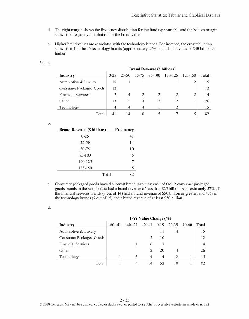
34. a.
Brand Revenue ($ billions) Industry 0-25 25-50 50-75 75-100 100-125 125-150 Total Automotive & Luxury 10 1 1 1 2 15 Consumer Packaged Goods 12 12 Financial Services 2 4 2 2 2 2 14 Other 13 5 3 2 2 1 26 Technology 4 4 4 1 2 15
Total 41 14 10 5 7 5 82 b.
Brand Revenue ($ billions) Frequency 0-25 41
25-50 14 50-75 10
75-100 5 100-125 7 125-150 5
Total 82 c. Consumer packaged goods have the lowest brand revenues; each of the 12 consumer packaged
goods brands in the sample data had a brand revenue of less than $25 billion. Approximately 57% of the financial services brands (8 out of 14) had a brand revenue of $50 billion or greater, and 47% of the technology brands (7 out of 15) had a brand revenue of at least $50 billion.
d.
1-Yr Value Change (%) Industry -60--41 -40--21 -20--1 0-19 20-39 40-60 Total Automotive & Luxury 11 4 15 Consumer Packaged Goods 2 10 12 Financial Services 1 6 7 14 Other 2 20 4 26 Technology 1 3 4 4 2 1 15
Total 1 4 14 52 10 1 82
© 2018 Cengage. May not be scanned, copied or duplicated, or posted to a publicly accessible website, in whole or in part.

Chapter 2
2 - 26
e.
1-Yr Value Change (%) Frequency -60--41 1 -40--21 4 -20--1 14 0-19 52
20-39 10 40-60 1
Total 82 f. The automotive & luxury brands all had a positive 1-year value change (%). The technology brands
had the greatest variability. Financial services were heavily concentrated between -20 and +19 % changes, while consumer goods and other industries were mostly concentrated in 0-19% gains.
35. a.
Hwy MPG Size 15-19 20-24 25-29 30-34 35-39 40-44 Total
Compact 3 4 17 22 5 5 56 Large 2 10 7 3 2 24
Midsize 3 4 30 20 9 3 69 Total 8 18 54 45 16 8 149
b. Midsize and Compact seem to be more fuel efficient than Large. c.
City MPG Drive 10-14 15-19 20-24 25-29 30-34 40-44 Total
A 7 18 3 28 F 17 49 19 2 3 90 R 10 20 1 31
Total 17 55 52 20 2 3 149
d. Higher fuel efficiencies are associated with front wheel drive cars. e.
City MPG Fuel Type 15-19 20-24 25-29 30-34 35-39 40-44 Total
P 8 16 20 12 56 R 2 34 33 16 8 93
Total 8 18 54 45 16 8 149 f. Higher fuel efficiencies are associated with cars that use regular gas.
© 2018 Cengage. May not be scanned, copied or duplicated, or posted to a publicly accessible website, in whole or in part.

Descriptive Statistics: Tabular and Graphical Displays
2 - 27
36. a.
b. There is a negative relationship between x and y; y decreases as x increases. 37. a.
b. As X goes from A to D the frequency for I increases and the frequency of II decreases. 38. a.
y
Yes No
Low 66.667 33.333 100 x Medium 30.000 70.000 100
High 80.000 20.000 100
-40
-24
-8
8
24
40
56
-40 -30 -20 -10 0 10 20 30 40
y
x
0
100
200
300
400
500
600
700
800
900
A B C D
I
II
© 2018 Cengage. May not be scanned, copied or duplicated, or posted to a publicly accessible website, in whole or in part.

Chapter 2
2 - 28
b.
39. a.
b. For midsized cars, lower driving speeds seem to yield higher miles per gallon.
0%10%20%30%40%50%60%70%80%90%
100%
Low Medium Highx
No
Yes
0
5
10
15
20
25
30
35
40
0 10 20 30 40 50 60 70
Fuel
Eff
icie
ncy
(MPG
)
Driving Speed (MPH)
© 2018 Cengage. May not be scanned, copied or duplicated, or posted to a publicly accessible website, in whole or in part.

Descriptive Statistics: Tabular and Graphical Displays
2 - 29
40. a.
b. Colder average low temperature seems to lead to higher amounts of snowfall. c. Two cities have an average snowfall of nearly 100 inches of snowfall: Buffalo, N.Y and Rochester,
NY. Both are located near large lakes in New York. 41. a.
b. The percentage of people with hypertension increases with age.
0
20
40
60
80
100
120
30 40 50 60 70 80
Avg
. Sno
wfa
ll (in
ches
)
Avg. Low Temp
0.00%
10.00%
20.00%
30.00%
40.00%
50.00%
60.00%
70.00%
80.00%
20-34 35-44 45-54 55-64 65-74 75+
% w
ith H
yper
tens
ion
Age
Male
Female
© 2018 Cengage. May not be scanned, copied or duplicated, or posted to a publicly accessible website, in whole or in part.

Chapter 2
2 - 30
c. For ages earlier than 65, the percentage of males with hypertension is higher than that for females. After age 65, the percentage of females with hypertension is higher than that for males.
42. a.
b. After an increase in age 25-34, smartphone ownership decreases as age increases. The percentage of
people with no cell phone increases with age. There is less variation across age groups in the percentage who own other cell phones.
c. Unless a newer device replaces the smartphone, we would expect smartphone ownership would
become less sensitive to age. This would be true because current users will become older and because the device will become to be seen more as a necessity than a luxury.
43. a.
0%10%20%30%40%50%60%70%80%90%
100%
18-24 25-34 35-44 45-54 55-64 65+Age
No Cell Phone
Other Cell Phone
Smartphone
0%
10%
20%
30%
40%
50%
60%
70%
80%
90%
100%
Bend Portland Seattle
Idle
Customers
Reports
Meetings
© 2018 Cengage. May not be scanned, copied or duplicated, or posted to a publicly accessible website, in whole or in part.

Descriptive Statistics: Tabular and Graphical Displays
2 - 31
b.
c. The stacked bar chart seems simpler than the side-by-side bar chart and more easily conveys the differences in store managers’ use of time.
44. a.
0
0.1
0.2
0.3
0.4
0.5
0.6
Bend Portland Seattle
Meetings
Reports
Customers
Idle
0
2
4
6
8
10
12
800-999 1000-1199 1200-1399 1400-1599 1600-1799 1800-1999 2000-2199
Freq
uenc
y
SAT Score
Class Frequency 800-999 1
1000-1199 3 1200-1399 6 1400-1599 10 1600-1799 7 1800-1999 2 2000-2199 1
Total 30
© 2018 Cengage. May not be scanned, copied or duplicated, or posted to a publicly accessible website, in whole or in part.

Chapter 2
2 - 32
b. The distribution if nearly symmetrical. It could be approximated by a bell-shaped curve. c. 10 of 30 or 33% of the scores are between 1400 and 1599. The average SAT score looks to be a
little over 1500. Scores below 800 or above 2200 are unusual.
45. a.
Median Household Income Frequency Percent Frequency 65.0-69.9 1 2% 70.0-74.9 6 12% 75.0-79.9 17 34% 80.0-84.9 6 12% 85.0-89.9 7 14% 90.0-94.9 5 10% 95.0-99.9 4 8% 100.0-104.9 0 0% 105.0-109.9 3 6% 110.0-114.9 1 2%
50 100% b.
c. The distribution is skewed to the right. There is a gap in the $100.0-$104.9 range. The most frequent range for the median household income is $75.0-$79.9 thousand.
d. New Jersey $110.7 thousand e. Idaho $67.1 thousand
0
24
6
810
12
1416
18
Freq
uenc
y
Median Household Income - Two Earners
© 2018 Cengage. May not be scanned, copied or duplicated, or posted to a publicly accessible website, in whole or in part.

Descriptive Statistics: Tabular and Graphical Displays
2 - 33
46. a. Population in Millions Frequency % Frequency
0.0 - 2.4 15 30.0% 2.5-4.9 13 26.0% 5.0-7.4 10 20.0% 7.5-9.9 5 10.0%
10.0-12.4 1 2.0% 12.5-14.9 2 4.0% 15.0-17.4 0 0.0% 17.5-19.9 2 4.0% 20.0-22.4 0 0.0% 22.5-24.9 0 0.0% 25.0-27.4 1 2.0% 27.5-29.9 0 0.0% 30.0-32.4 0 0.0% 32.5-34.9 0 0.0% 35.0-37.4 1 2.0% 37.5-39.9 0 0.0%
b. The distribution is skewed to the right. c. 15 states (30%) have a population less than 2.5 million. Over half of the states have population less
than 5 million (28 states – 56%). Only seven states have a population greater than 10 million (California, Florida, Illinois, New York, Ohio, Pennsylvania and Texas). The largest state is California (37.3 million) and the smallest states are Vermont and Wyoming (600 thousand).
0
2
4
6
8
10
12
14
16
0.0 -2.4
2.5-4.9
5.0-7.4
7.5-9.9
10.0-12.4
12.5-14.9
15.0-17.4
17.5-19.9
20.0-22.4
22.5-24.9
25.0-27.4
27.5-29.9
30.0-32.4
32.5-34.9
35.0-37.4
37.5-39.9
Freq
uenc
y
Population Millions
© 2018 Cengage. May not be scanned, copied or duplicated, or posted to a publicly accessible website, in whole or in part.

Chapter 2
2 - 34
47. a.
b. The majority of the start-up companies in this set have less than $90 million in venture capital. Only
6 of the 50 (12%) have more than $150 million. 48. a.
Industry Frequency % Frequency Bank 26 13% Cable 44 22% Car 42 21% Cell 60 30% Collection 28 14% Total 200 100%
© 2018 Cengage. May not be scanned, copied or duplicated, or posted to a publicly accessible website, in whole or in part.

Descriptive Statistics: Tabular and Graphical Displays
2 - 35
b.
c. The cellular phone providers had the highest number of complaints. d. The percentage frequency distribution shows that the two financial industries (banks and collection
agencies) had about the same number of complaints. Also, new car dealers and cable and satellite television companies also had about the same number of complaints.
49. a.
Beta Frequency Percent Frequency 0.00-0.09 1 3.3% 0.10-0.19 1 3.3% 0.20-0.29 1 3.3% 0.30-0.39 0 0.0% 0.40-0.49 1 3.3% 0.50-0.59 1 3.3% 0.60-0.69 3 10.0% 0.70-0.79 2 6.7% 0.80-0.89 4 13.3% 0.90-.99 4 13.3%
1.00-1.09 0 0.0% 1.10-1.19 3 10.0% 1.20-1.29 5 16.7% 1.30-1.39 2 6.7% 1.40-1.49 0 0.0% 1.50-1.59 0 0.0% 1.60-1.69 0 0.0% 1.70-1.80 1 3.3% 1.80-1.90 1 3.3%
Total 30 100.0%
0%
5%
10%
15%
20%
25%
30%
35%
Bank Cable Car Cell Collection
Perc
ent F
requ
ency
Industry
© 2018 Cengage. May not be scanned, copied or duplicated, or posted to a publicly accessible website, in whole or in part.

Chapter 2
2 - 36
b.
c. The distribution is somewhat skewed to the left. d. The stock with the highest beta is JP Morgan Chase & Company with a beta of 1.84. The stock with
the lowest beta is Verizon Communications Inc. with a beta of .04. 50. a.
Level of Education Percent Frequency High School graduate 32,773/65,644(100) = 49.93 Bachelor's degree 22,131/65,644(100) = 33.71 Master's degree 9003/65,644(100) = 13.71 Doctoral degree 1737/65,644(100) = 2.65
Total 100.00 13.71 + 2.65 = 16.36% of heads of households have a master’s or doctoral degree. b.
Household Income Percent Frequency Under $25,000 13,128/65,644(100) = 20.00 $25,000 to $49,999 15,499/65,644(100) = 23.61 $50,000 to $99,999 20,548/65,644(100) = 31.30 $100,000 and over 16,469/65,644(100) = 25.09
Total 100.00
31.30 + 25.09 = 56.39% of households have an income of $50,000 or more.
0
1
2
3
4
5
6
Freq
uenc
y
Beta
© 2018 Cengage. May not be scanned, copied or duplicated, or posted to a publicly accessible website, in whole or in part.

Descriptive Statistics: Tabular and Graphical Displays
2 - 37
c. Household Income
Level of Education Under
$25,000 $25,000 to
$49,999 $50,000 to
$99,999 $100,000 and
over High School graduate 75.26 64.33 45.95 21.14 Bachelor's degree 18.92 26.87 37.31 47.46 Master's degree 5.22 7.77 14.69 24.86 Doctoral degree 0.60 1.03 2.05 6.53
Total 100.00 100.00 100.00 100.00
There is a large difference between the level of education for households with an income of under $25,000 and households with an income of $100,000 or more. For instance, 75.26% of households with an income of under $25,000 are households in which the head of the household is a high school graduate. But, only 21.14% of households with an income level of $100,000 or more are households in which the head of the household is a high school graduate. It is interesting to note, however, that 45.95% of households with an income of $50,000 to $99,999 are households in which the head of the household his a high school graduate.
51. a. The batting averages for the junior and senior years for each player are as follows: Junior year: Allison Fealey 15/40 = .375 Emily Janson 70/200 = .350 Senior year: Allison Fealey 75/250 = .300 Emily Janson 35/120 = .292 Because Allison Fealey had the higher batting average in both her junior year and senior year,
Allison Fealey should receive the scholarship offer. b. The combined or aggregated two-year crosstabulation is as follows:
Based on this crosstabulation, the batting average for each player is as follows: Combined Junior/Senior Years Allison Fealey 90/290 = .310 Emily Janson 105/320 = .328 Because Emily Janson has the higher batting average over the combined junior and senior years,
Emily Janson should receive the scholarship offer.
Combined 2-Year Batting Outcome A. Fealey E. Jansen Hit 90 105 No Hit 200 215 Total At Bats 290 320
© 2018 Cengage. May not be scanned, copied or duplicated, or posted to a publicly accessible website, in whole or in part.

Chapter 2
2 - 38
c. The recommendations in parts (a) and (b) are not consistent. This is an example of Simpson’s Paradox. It shows that in interpreting the results based upon separate or un-aggregated crosstabulations, the conclusion can be reversed when the crosstabulations are grouped or aggregated. When Simpson’s Paradox is present, the decision maker will have to decide whether the un-aggregated or the aggregated form of the crosstabulation is the most helpful in identifying the desired conclusion. Note: The authors prefer the recommendation to offer the scholarship to Emily Janson because it is based upon the aggregated performance for both players over a larger number of at-bats. But this is a judgment or personal preference decision. Others may prefer the conclusion based on using the un-aggregated approach in part (a).
52 a.
Size of Company Job Growth (%) Small Midsized Large Total
-10-0 4 6 2 12 0-10 18 13 29 60
10-20 7 2 4 13 20-30 3 3 2 8 30-40 0 3 1 4 60-70 0 1 0 1
Total 32 28 38 98
b. Frequency distribution for growth rate.
Job Growth (%) Total -10-0 12 0-10 60
10-20 13 20-30 8 30-40 4 60-70 1
Total 98
Frequency distribution for size of company.
Size Total Small 32 Medium 28 Large 38
Total 98
© 2018 Cengage. May not be scanned, copied or duplicated, or posted to a publicly accessible website, in whole or in part.

Descriptive Statistics: Tabular and Graphical Displays
2 - 39
c. Crosstabulation showing column percentages.
Size of Company Job Growth (%) Small Midsized Large
-10-0 13 21 5 0-10 56 46 76
10-20 22 7 11 20-30 9 11 5 30-40 0 11 3 60-70 0 4 0
Total 100 100 100
d. Crosstabulation showing row percentages.
Size of Company Job Growth (%) Small Midsized Large Total
-10-0 33 50 17 100 0-10 30 22 48 100
10-20 54 15 31 100 20-30 38 38 25 100 30-40 0 75 25 100 60-70 0 100 0 100
e. 12 companies had a negative job growth: 13% were small companies; 21% were midsized companies; and 5% were large companies. So, in terms of avoiding negative job growth, large companies were better off than small and midsized companies. But, although 95% of the large companies had a positive job growth, the growth rate was below 10% for 76% of these companies. In terms of better job growth rates, midsized companies performed better than either small or large companies. For instance, 26% of the midsized companies had a job growth of at least 20% as compared to 9% for small companies and 8% for large companies.
53. a.
Tution & Fees ($)
Year Founded
1-5000
5001- 10000
10001-15000
15001-20000
20001-25000
25001-30000
30001-35000
35001-40000
40001-45000 Total
1600-1649 1 1 1700-1749 2 1 3 1750-1799 4 4 1800-1849 1 3 3 6 8 21 1850-1899 1 2 2 13 14 13 4 49 1900-1949 1 2 3 4 8 18 1950-2000 2 4 1 7
Total 1 0 1 4 9 19 22 30 17 103
© 2018 Cengage. May not be scanned, copied or duplicated, or posted to a publicly accessible website, in whole or in part.

Chapter 2
2 - 40
b.
Tuition & Fees ($)
Year Founded
1-5000
5001- 10000
10001-15000
15001-20000
20001- 25000
25001-30000
30001-35000
35001-40000
40001-45000
Grand Total
1600-1649 100.00 100 1700-1749 66.67 33.33 100 1750-1799 100.00 100 1800-1849 4.76 14.29 14.29 28.57 38.10 100 1850-1899 2.04 4.08 4.08 26.53 28.57 26.53 8.16 100 1900-1949 5.56 11.11 16.67 22.22 44.44 100 1950-2000 28.57 57.14 14.29 100
c. Colleges in this sample founded before 1800 tend to be expensive in terms of tuition. 54. a.
% Graduate Year Founded
35-40
40-45
45-50
50-55
55-60
60-65
65-70
70-75
75-80
80-85
85-90
90-95
95-100
Grand Total
1600-1649 1 1 1700-1749 3 3 1750-1799 1 3 4 1800-1849 1 2 4 2 3 4 3 2 21 1850-1899 1 2 4 3 11 5 9 6 3 4 1 49 1900-1949 1 1 1 1 3 3 2 4 1 1 18 1950-2000 1 1 3 2 7 Grand Total 2 1 3 5 5 7 15 12 13 13 8 9 10 103
b.
c. Older colleges and universities tend to have higher graduation rates.
© 2018 Cengage. May not be scanned, copied or duplicated, or posted to a publicly accessible website, in whole or in part.

Descriptive Statistics: Tabular and Graphical Displays
2 - 41
55. a.
b. Older colleges and universities tend to be more expensive.
56. a.
b. There appears to be a strong positive relationship between Tuition & Fees and % Graduation.
05,000
10,00015,00020,00025,00030,00035,00040,00045,00050,000
1600 1650 1700 1750 1800 1850 1900 1950 2000
Tui
tion
& F
ees (
$)
Year Founded
0.00
20.00
40.00
60.00
80.00
100.00
120.00
0 10,000 20,000 30,000 40,000 50,000
% G
radu
ate
Tuition & Fees ($)
© 2018 Cengage. May not be scanned, copied or duplicated, or posted to a publicly accessible website, in whole or in part.

Chapter 2
2 - 42
57. a.
b.
2008 2011 Internet 86.7% 57.8% Newspaper etc. 13.3% 9.7% Television 0.0% 32.5% Total 100.0% 100.0%
c. The graph is part a is more insightful because is shows the allocation of the budget across media, but
also dramatic increase in the size of the budget.
0.0
20.0
40.0
60.0
80.0
100.0
120.0
140.0
2008 2011
Adv
ertis
ing
Spen
d $
Mill
ions
Year
InternetNewspaper etc.Television
0%
10%
20%
30%
40%
50%
60%
70%
80%
90%
100%
2008 2011
Adv
ertis
ing
Spen
d $M
illio
ns
Year
Television
Newspaper etc.
Internet
© 2018 Cengage. May not be scanned, copied or duplicated, or posted to a publicly accessible website, in whole or in part.

Descriptive Statistics: Tabular and Graphical Displays
2 - 43
58. a.
Zoo attendance appears to be dropping over time. b.
c. General attendance is increasing, but not enough to offset the decrease in member attendance.
School membership appears fairly stable.
320000
325000
330000
335000
340000
345000
350000
355000
2008 2009 2010 2011
Att
enda
nce
Year
0
20,000
40,000
60,000
80,000
100,000
120,000
140,000
160,000
180,000
2008 2009 2010 2011
Att
enda
nce
Year
General
Member
School
© 2018 Cengage. May not be scanned, copied or duplicated, or posted to a publicly accessible website, in whole or in part.


Chapter 2 Descriptive Statistics: Tabular and Graphical Displays
CP - 1 © 2015 Cengage Learning. All Rights Reserved.
May not be scanned, copied or duplicated, or posted to a publicly accessible website, in whole or in part.
Solutions to Case Problems
Chapter 2 Descriptive Statistics: Tabular and Graphical Displays
Case Problem 1: Pelican Stores
1. There were 70 Promotional customers and 30 Regular customers. Because there are 100 observations in the sample, the frequency and percent frequency distribution are the same. Percent frequency distributions for many of the variables are given.
No. of Items Percent Frequency 1 29 2 27 3 10 4 10 5 9 6 7
7 or more 8 Total: 100
Net Sales Percent Frequency 0.00 - 24.99 9
25.00 - 49.99 30 50.00 - 74.99 25 75.00 - 99.99 10
100.00 - 124.99 12 125.00 - 149.99 4 150.00 - 174.99 3 175.00 - 199.99 3
200 or more 4 Total: 100
Method of Payment Percent Frequency American Express 2 Discover 4 MasterCard 14 Proprietary Card 70 Visa 10
Total: 100
Gender Percent Frequency Female 93 Male 7
Total: 100

Chapter 2 Descriptive Statistics: Tabular and Graphical Displays
CP - 2 © 2015 Cengage Learning. All Rights Reserved.
May not be scanned, copied or duplicated, or posted to a publicly accessible website, in whole or in part.
Martial Status Percent Frequency Married 84 Single 16
Total: 100
Age Percent Frequency 20 - 29 10 30 - 39 30 40 - 49 33 50 - 59 16 60 - 69 7 70 - 79 4
Total: 100
These percent frequency distributions provide a profile of Pelican's customers. Many observations are possible, including:
A large majority of the customers use National Clothing’s proprietary credit card. Over half of the customers purchase 1 or 2 items, but a few make numerous purchases. The percent frequency distribution of net sales shows that 61% of the customers spent $50 or
more. Customers are distributed across all adult age groups. The overwhelming majority of customers are female. Most of the customers are married.
2.
3. A crosstabulation of type of customer versus net sales is shown.
Net Sales
Customer 0- 25
25-50
50-75
75-100
100-125
125-175
175-200
200-225
225-250
250-275
275-300
Total
Promotional 7 17 17 8 9 3 2 3 1 2 1 70Regular 2 13 8 2 3 1 1 30Total 9 30 25 10 12 4 3 3 1 2 1 100
From the crosstabulation it appears that net sales are larger for promotional customers.

Chapter 2 Descriptive Statistics: Tabular and Graphical Displays
CP - 3 © 2015 Cengage Learning. All Rights Reserved.
May not be scanned, copied or duplicated, or posted to a publicly accessible website, in whole or in part.
4. A scatter diagram of net Sales vs. age is shown below. A trendline has been fitted to the data. From this, it appears that there is no relationship between net sales and age.
Age is not a factor in determining net sales.
0.00
50.00
100.00
150.00
200.00
250.00
300.00
350.00
0 10 20 30 40 50 60 70 80 90
Net
Sa
les
Age

Chapter 2 Descriptive Statistics: Tabular and Graphical Displays
CP - 4 © 2015 Cengage Learning. All Rights Reserved.
May not be scanned, copied or duplicated, or posted to a publicly accessible website, in whole or in part.
Case Problem 2: The Motion Picture Industry
This case provides the student with the opportunity to use tabular and graphical presentations to analyze data from the motion picture industry. Developing and interpreting frequency distributions, percent frequency distributions and scatter diagrams are emphasized. The interpretations and insights can be quite varied. We illustrate some below.
Frequency Distribution and Percent Frequency Distribution
The choice of the classes for frequency distributions or percent frequency distributions can be expected to vary. The frequency distributions we developed are as follows:
Opening Gross Sales (Millions)
Frequency (or Percentage)
$0 – 9.99 70 10 – 19.99 15 20 – 29.99 8 30 – 39.99 2 40 – 49.99 1 50 – 59.99 1 60 – 69.99 0 70 – 79.99 1 80 – 89.99 0 90 – 99.99 0
100 – 109.99 2 Total 100
Total Gross Sales (Millions)
Frequency (or Percentage)
$0 – 49.99 77 50 – 99.99 16
100 – 149.99 1 150 – 199.99 1 200 – 249.99 3 250 – 299.99 1 300 – 349.99 0 350 – 399.99 1
Total 100
Number of Theaters
Frequency (or Percentage)
0 – 499 51 500 – 999 3
1000 – 1499 6 1500 – 1999 7 2000 – 2499 5 2500 – 2999 6 3000 – 3499 17 3500 – 3999 5
Total 100
Number of Weeks
Frequency (or Percentage)

Chapter 2 Descriptive Statistics: Tabular and Graphical Displays
CP - 5 © 2015 Cengage Learning. All Rights Reserved.
May not be scanned, copied or duplicated, or posted to a publicly accessible website, in whole or in part.
in Top 60 0 – 4 33 5 – 9 28
10 – 14 18 15 – 19 15 20 – 24 5 25 – 29 1
Total 100
Histograms
The following histograms are based on the frequency distributions shown above.
0
10
20
30
40
50
60
70
80
Fre
qu
ency
Opening Weekend Gross Sales (millions)
0
10
20
30
40
50
60
70
80
90
Fre
qu
ency
Total Gross Sales (millions)

Chapter 2 Descriptive Statistics: Tabular and Graphical Displays
CP - 6 © 2015 Cengage Learning. All Rights Reserved.
May not be scanned, copied or duplicated, or posted to a publicly accessible website, in whole or in part.
Interpretation
Opening Weekend Gross Sales. The distribution is skewed to the right. Numerous motion pictures have somewhat low opening weekend gross sales, while a relatively few (7%) have an opening weekend gross sales of $30 million or more. Only 2% had opening weekend gross sales of $100 million or more. 70% of the motion pictures had opening weekend gross sales less than $10 million and 85% of the motion pictures had opening weekend gross sales less than $20 million. Unless there is something unusually attractive about the motion picture, an opening weekend gross sales less than $10 million appears typical.
Total Gross Sales. This distribution is also skewed to the right. Again, the majority of the motion pictures have relatively low total gross sales with 77% less than $50 million and 93% less than $100 million. Highly successful blockbuster motion pictures are rare. Total gross sales over $200 million occurred only 5% of the time and over $300 million occurred only 1% of the time. No motion picture reported $400 million in total gross sales. Unless there is something unusually attractive about the motion picture, a total gross sales less than $50 million appears typical.
0
10
20
30
40
50
60
Fre
qu
ency
Number of Theaters
0
5
10
15
20
25
30
35
0-4 5–9 10–14 15–19 20–24 25–29
Fre
qu
ency
Number of Weeks in the Top 60

Chapter 2 Descriptive Statistics: Tabular and Graphical Displays
CP - 7 © 2015 Cengage Learning. All Rights Reserved.
May not be scanned, copied or duplicated, or posted to a publicly accessible website, in whole or in part.
Number of Theaters. This distribution is skewed to the right, but not so much as sales data distributions. The number of theaters range from less than 500 to almost 4000. 51% of the motion pictures had the smaller market exposure with the number of theaters less than 500. Interestingly enough, 22% of the motion pictures had the widest market exposure, appearing in over 3000 theaters. 3000 to 4000 theaters is typical for a highly promoted motion picture.
Number of Weeks in Top 60. This distribution is skewed to the right, but not as much as the other distributions. In appears that almost all newly released movies initially make it into the top 60, with 67% staying in the top 60 for 5 or more weeks. Even motion pictures with relative low gross sales can appear in the top 60 motion pictures for a month or more. Almost 40% of the motion pictures are in the top 60 for 10 or more weeks, with 6% of the motion pictures in the top 60 for 20 or more weeks.
General Observations. The data show that there are relative few high-end, highly successful motion pictures. The financial rewards are there for the pictures that make the blockbuster level. But the majority of motion pictures will have low opening weekend gross sales and low total gross sales. Motion pictures being shown in less than 1500 theaters and motion pictures less than 10 weeks in the top 60 are common.
Scatter Diagrams
Three scatter diagrams are suggested to show how Total Gross Sales is related to each of the other three variables.
0.00
50.00
100.00
150.00
200.00
250.00
300.00
350.00
400.00
0.00 20.00 40.00 60.00 80.00 100.00 120.00
Opening Weekend Gross Sales
Tot
al G
ross
Sal
es
0.00
50.00
100.00
150.00
200.00
250.00
300.00
350.00
400.00
0 500 1,000 1,500 2,000 2,500 3,000 3,500 4,000 4,500
Number of Theaters
Tot
al G
ross
Sal
es

Chapter 2 Descriptive Statistics: Tabular and Graphical Displays
CP - 8 © 2015 Cengage Learning. All Rights Reserved.
May not be scanned, copied or duplicated, or posted to a publicly accessible website, in whole or in part.
Interpretation
Opening Weekend Gross Sales. The scatter plot of total gross sales and opening weekend gross sales shows a strong positive relationship. Motion pictures with the highest total gross sales were the motion pictures with the highest opening weekend gross sales. How the motion picture does during its opening weekend should be a very good predictor of how the motion picture will do in terms of total gross sales. Note in the scatter diagram that the majority of the motion pictures show a low opening weekend gross sales and a low total gross sales.
Number of Theaters. The scatter plot of the total gross sales and number of theaters also shows a positive relationship. For motion pictures playing in less than 3000 theaters, the total gross sales has a positive relationship with the number of theaters. If the motion picture is shown in more theaters, higher total gross sales are anticipated. For motion pictures playing in more than 3000 theaters, the relationship is not as strong. 3000 to 4000 represents the maximum number of theaters possible. If a motion picture is shown in this many theaters, 15 motion pictures did slightly better in terms of total gross sales. However, the blockbuster motion pictures in this category showed extremely high total gross sales for the number of theaters where the motion picture was shown.
Number of Weeks in Top 60. The scatter plot of the total gross sales and number of weeks in the top 60 shows a positive relationship, but this relationship appears to be the weakest of the three relationships studied. Generally, the more successful, higher gross sales motion pictures are in the top 60 for more weeks. However, this is not always the case. Four of the six motion pictures with the highest total gross sales appeared in the top 60 less than 20 weeks. At the same time, four motion pictures with 20 or more weeks in the top 60 did not have unusually high total gross sales. This suggests that in some cases blockbuster movies with high gross sales may run their course quickly and not have an excessively long run on the top 60 motion picture list. At the same time, perhaps quality motion pictures with a limited audience may not generate the high total gross sales but may still show a run of 20 or more weeks on the top 60 motion picture list. The number of weeks in the top 60 does not appear to the best predictor of total gross sales.
0.00
50.00
100.00
150.00
200.00
250.00
300.00
350.00
400.00
0 5 10 15 20 25 30
Number of Weeks in the Top 60
Tot
al G
ross
Sal
es

Chapter 2 Descriptive Statistics: Tabular and Graphical Displays
CP - 9 © 2015 Cengage Learning. All Rights Reserved.
May not be scanned, copied or duplicated, or posted to a publicly accessible website, in whole or in part.
Case Problem 3: Queen City
This case provides the student with the opportunity to use basic tabular and graphical presentations to describe data from the annual expenditures for the city of Cincinnati, Ohio. The data set is large relative to others in the text. It contains 5,427 records of expenditures. As such, one point of this case is to expose students to a larger data set and help them understand that the pivot tables and charts can be used on a larger data set. In some cases, the student will have to copy, paste, and aggregate data to create the desired tables and charts. Style of presentation may vary by student (for example, vertical versus horizontal bar charts may be used). We illustrate with results and comments below.
Expenditures by Category
The pivot table shows expenditures and percentage of total expenditures by category. The bar chart shows percentage of total expenditures by category (both the table and the bar chart are sorted in descending order). Capital expenditures and payroll account for over 50% of all expenditures. Total expenditures are over $660 million. Debt Service seems somewhat high, as it is over 10% of total expenditures.
Category Total Expenditures % of Total Expenditures
Capital $198,365,854 29.98%
Payroll $145,017,555 21.92%
Debt Service $86,913,978 13.14%
Contractual Services $85,043,249 12.85%
Fringe Benefits $66,053,340 9.98%
Fixed Costs $53,732,177 8.12%
Materials and Supplies $19,934,710 3.01%
Inventory $6,393,394 0.97%
Payables $180,435 0.03%
Grand Total $661,634,693 100.0%
0.00% 5.00% 10.00% 15.00% 20.00% 25.00% 30.00%
Payables
Inventory
Materials and Supplies
Fixed Costs
Fringe Benefits
Contractual Services
Debt Service
Payroll
Capital
% of Total Expenditures
Category

Chapter 2 Descriptive Statistics: Tabular and Graphical Displays
CP - 10 © 2015 Cengage Learning. All Rights Reserved.
May not be scanned, copied or duplicated, or posted to a publicly accessible website, in whole or in part.
Expenditures by Department
The following table and bar chart show the percentages of total expenditures incurred by department. Note that we have combined all departments that individually incurred less than 1% of the total expenditures. There are 119 departments, and 96 each account for less than 1% of the total expenditures. As shown below, only six individual departments incur 5% or more of the total expenditures. These include, Police, Sewers, Transportation Engineering (Engineering). Fire, Sewer Debt Service and Finance/Risk Management. Debt service on sewers as a percentage of total expenditures appears to be very high.
Department % of Total
Expenditures
Department of Police 9.7%
Department of Sewers 8.8%
Transportation and Engineering, (Engineering) 8.7%
Department of Fire 7.2%
Sewers, Debt Service 6.6%
Finance, Risk Management 5.4%
SORTA Operations 3.6%
Water Works, Debt Service 3.2%
Department of water Works 3.1%
Finance, Treasury 2.8%
Economic Development 2.1%
Division of Parking Services 1.9%
Community Development, Housing 1.7%
Enterprise Technology Solutions 1.7%
Public Services, Fleet Services 1.7%
Finance, Accounts & Audits 1.7%
Transportation and Engineering, Planning 1.6%
Public Services, Neighborhood Operations 1.4%
Sewers, Millcreek 1.3%
Health, Primary Health Care Centers 1.2%
Water Works, Water Supply 1.2%
Public Services, Facilities Management 1.1%
Sewers, Wastewater Administration 1.0%
Other Depts. (< 1% each) 21.2%
Total 100.0%

Chapter 2 Descriptive Statistics: Tabular and Graphical Displays
CP - 11 © 2015 Cengage Learning. All Rights Reserved.
May not be scanned, copied or duplicated, or posted to a publicly accessible website, in whole or in part.
Expenditures by Fund
The following bar table and bar chart show the percentages of total expenditures charged by fund used to pay. Note that we have combined those funds that each cover less than 1% of the total expenditures. There are 129 funds in the data base, and 117 of these funds each account for less than 1% of total expenditures.
Fund % of Total Expenditures Covered
050 - GENERAL FUND 25.5%
980 - CAPITAL PROJECTS 16.0%
701 - METROPOLITAN SEWER DISTRICT OF GREATER CINCINNATI 12.7%
704 - METROPOLITAN SEWER DISTRICT CAPITAL IMPROVEMENTS 8.8%
101 - WATER WORKS 7.9%
711 - RISK MANAGEMENT 4.9%
759 - INCOME TAX – TRANSIT 3.7%
151 - BOND RETIREMENT – CITY 2.4%
202 - FLEET SERVICES 1.7%
898 - WATER WORKS IMPROVEMENT 12 1.3%
897 - WATER WORKS IMPROVEMENT 11 1.3%
302 - INCOME TAX – INFRASTRUCTURE 1.1%
Other (< 1 % each). 12.9%
Total 100.0%
0% 5% 10% 15% 20% 25%
Sewers, Wastewater AdministrationPublic Services, Facilities Management
Water Works, Water SupplyHealth, Primary Health Care Centers
Sewers, MillcreekPublic Services, Neighborhood OperationsTransportation and Engineering, Planning
Finance, Accounts & AuditsPublic Services, Fleet Services
Enterprise Technology SolutionsCommunity Development, Housing
Division of Parking ServicesEconomic Development
Finance, TreasuryDepartment of water WorksWater Works, Debt Service
SORTA OperaitionsFinance, Risk Management
Sewers, Debt ServiceDepartment of Fire
Transportation and Engineering, EngineeringDepartment of SewersDepartment of Police
Other Depts (< 1% each)
Percentage of Total Expenditures
Department

Chapter 2 Descriptive Statistics: Tabular and Graphical Displays
CP - 12 © 2015 Cengage Learning. All Rights Reserved.
May not be scanned, copied or duplicated, or posted to a publicly accessible website, in whole or in part.
Other Points: There are 5,427 records of expenditures in the data base, of which 235 (4.3%) are negative.
0.00% 5.00% 10.00% 15.00% 20.00% 25.00% 30.00%
302 - INCOME TAX - INFRASTRUCTURE
897 - WATER WORKS IMPROVEMENT 11
898 - WATER WORKS IMPROVEMENT 12
202 - FLEET SERVICES
151 - BOND RETIREMENT - CITY
759 - INCOME TAX - TRANSIT
711 - RISK MANAGEMENT
101 - WATER WORKS
704 - METROPOLITAN SEWER DISTRICT…
701 - METROPOLITAN SEWER DISTRICT OF…
Other (< 1 % each)
980 - CAPITAL PROJECTS
050 - GENERAL FUND
% of Total Spending
Fund

Chapter 2 Descriptive Statistics: Tabular and Graphical Displays
CP - 13 © 2015 Cengage Learning. All Rights Reserved.
May not be scanned, copied or duplicated, or posted to a publicly accessible website, in whole or in part.
Case Problem 4: Cut-Rate Machining, Inc.
A scatter diagram of the results for Hole-Maker in the order the holes were drilled shows that this machine consistently overdrills and is moderately consistent.
A scatter diagram of the results for Shafts & Slips in the order the holes were drilled shows that this machine consistently underdrills and is moderately consistent.
A scatter diagram of the results for Judge’s Jigs in the order the holes were drilled shows that on average this machine this machine consistently underdrills and is extremely consistent.
0.00
0.50
1.00
1.50
2.00
2.50
3.00
3.50
4.00
4.50
0 2 4 6 8 10 12 14 16
Dia
met
er (
cm)
Hole #
Hole-Maker Results
0
0.5
1
1.5
2
2.5
3
3.5
4
4.5
0 2 4 6 8 10 12 14 16
Dia
met
er (
cm)
Hole #
Shafts & Slips Results
Chapter 2 Descriptive Statistics: Tabular and Graphical Displays
CP - 14 © 2015 Cengage Learning. All Rights Reserved.
May not be scanned, copied or duplicated, or posted to a publicly accessible website, in whole or in part.
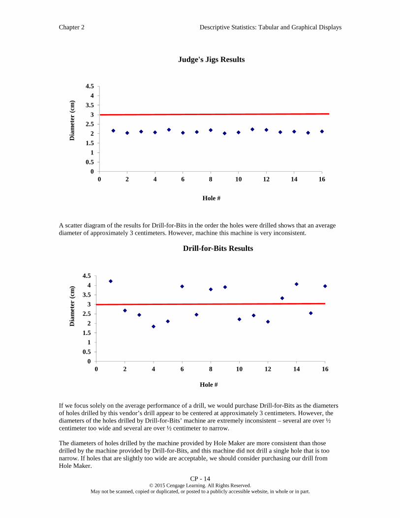
A scatter diagram of the results for Drill-for-Bits in the order the holes were drilled shows that an average diameter of approximately 3 centimeters. However, machine this machine is very inconsistent.
If we focus solely on the average performance of a drill, we would purchase Drill-for-Bits as the diameters of holes drilled by this vendor’s drill appear to be centered at approximately 3 centimeters. However, the diameters of the holes drilled by Drill-for-Bits’ machine are extremely inconsistent – several are over ½ centimeter too wide and several are over ½ centimeter to narrow.
The diameters of holes drilled by the machine provided by Hole Maker are more consistent than those drilled by the machine provided by Drill-for-Bits, and this machine did not drill a single hole that is too narrow. If holes that are slightly too wide are acceptable, we should consider purchasing our drill from Hole Maker.
0
0.5
1
1.5
2
2.5
3
3.5
4
4.5
0 2 4 6 8 10 12 14 16
Dia
met
er (
cm)
Hole #
Judge's Jigs Results
0
0.5
1
1.5
2
2.5
3
3.5
4
4.5
0 2 4 6 8 10 12 14 16
Dia
met
er (
cm)
Hole #
Drill-for-Bits Results

Chapter 2 Descriptive Statistics: Tabular and Graphical Displays
CP - 15 © 2015 Cengage Learning. All Rights Reserved.
May not be scanned, copied or duplicated, or posted to a publicly accessible website, in whole or in part.
The diameters of holes drilled by the machine provided by Shafts & Slips are similar in consistency to the holes by the machine provided by Hole Maker, and this machine did not drill a single hole that is too wide. If holes that are slightly too small are acceptable, we should consider purchasing our drill from Shafts & Slips.
The diameters of holes drilled by the machine provided by Judge’s Jigs are far more consistent than holes by the machine provided any of the other vendors, but these holes are far too narrow. We should determine if this drill can be recalibrated to that the mean size of holes drilled is approximately 3 centimeters. If this can be done, we should consider purchasing our drill from Judge’s Jigs and recalibrating the drill; this would give us a machine that consistently drills holes of approximately 3 centimeters.
However, before we make a decision we should scrutinize the way that these data were collected. We were told that Weideman started all four machines at 8:00 a.m. and let them warm up for two hours. We also see from the data that the drill provided by Hole-Maker was tested from 10:00 a.m. to noon, the drill provided by Shafts & Slips, Inc. was tested from noon to 2:00 p.m., the drill provided by Judge’s Jigs was tested from 2:00 p.m. to 4:00 p.m., and the drill provided by Drill-for-Bits was tested from 4:00 p.m. to 6:00 p.m. Were all drills allowed to keep running after the 8:00 a.m. – 10:00 a.m. warm-up period? Either way, this could bias the results.
We also see from the data that Ms. Ames ran the test drills from 10:00 a.m. to 4:00 p.m. when the drills provided by Hole-Maker, Shafts & Slips, and Judge’s Jigs were tested. Mr. Silver ran the test drill from 4:00 p.m. to 6:00 p.m. when the drill provided by Drill-for- Bits was tested. If these two employees are not equally competent, this could bias the results. Furthermore, did Ms. Ames become fatigued as the day progressed? Did she take a break for lunch or take a break at any other time?
We also note that we only tested one drill for each vendor. If the drill provided by a vendor is not representative of the drills that vendor produced, this could bias the results.
The data for this test should have been collected through an experimental study in which the four machine were all warmed up for the same amount of time and then left running as eight holes were drilled by each employee using the drill provided by each vendor in a random order. A design such as this would have eliminated the potential sources of bias we have identified and resulted in the collection of more reliable data, which would lead to a superior decision.

Chapter 2 Descriptive Statistics: Tabular and Graphical Displays
CP - 1 © 2015 Cengage Learning. All Rights Reserved.
May not be scanned, copied or duplicated, or posted to a publicly accessible website, in whole or in part.
Solutions to Case Problems
Chapter 2 Descriptive Statistics: Tabular and Graphical Displays
Case Problem 1: Pelican Stores
1. There were 70 Promotional customers and 30 Regular customers. Because there are 100 observations in the sample, the frequency and percent frequency distribution are the same. Percent frequency distributions for many of the variables are given.
No. of Items Percent Frequency 1 29 2 27 3 10 4 10 5 9 6 7
7 or more 8 Total: 100
Net Sales Percent Frequency 0.00 - 24.99 9
25.00 - 49.99 30 50.00 - 74.99 25 75.00 - 99.99 10
100.00 - 124.99 12 125.00 - 149.99 4 150.00 - 174.99 3 175.00 - 199.99 3
200 or more 4 Total: 100
Method of Payment Percent Frequency American Express 2 Discover 4 MasterCard 14 Proprietary Card 70 Visa 10
Total: 100
Gender Percent Frequency Female 93 Male 7
Total: 100

Chapter 2 Descriptive Statistics: Tabular and Graphical Displays
CP - 2 © 2015 Cengage Learning. All Rights Reserved.
May not be scanned, copied or duplicated, or posted to a publicly accessible website, in whole or in part.
Martial Status Percent Frequency Married 84 Single 16
Total: 100
Age Percent Frequency 20 - 29 10 30 - 39 30 40 - 49 33 50 - 59 16 60 - 69 7 70 - 79 4
Total: 100
These percent frequency distributions provide a profile of Pelican's customers. Many observations are possible, including:
A large majority of the customers use National Clothing’s proprietary credit card. Over half of the customers purchase 1 or 2 items, but a few make numerous purchases. The percent frequency distribution of net sales shows that 61% of the customers spent $50 or
more. Customers are distributed across all adult age groups. The overwhelming majority of customers are female. Most of the customers are married.
2.
3. A crosstabulation of type of customer versus net sales is shown.
Net Sales
Customer 0- 25
25-50
50-75
75-100
100-125
125-175
175-200
200-225
225-250
250-275
275-300
Total
Promotional 7 17 17 8 9 3 2 3 1 2 1 70Regular 2 13 8 2 3 1 1 30Total 9 30 25 10 12 4 3 3 1 2 1 100
From the crosstabulation it appears that net sales are larger for promotional customers.

Chapter 2 Descriptive Statistics: Tabular and Graphical Displays
CP - 3 © 2015 Cengage Learning. All Rights Reserved.
May not be scanned, copied or duplicated, or posted to a publicly accessible website, in whole or in part.
4. A scatter diagram of net Sales vs. age is shown below. A trendline has been fitted to the data. From this, it appears that there is no relationship between net sales and age.
Age is not a factor in determining net sales.
0.00
50.00
100.00
150.00
200.00
250.00
300.00
350.00
0 10 20 30 40 50 60 70 80 90
Net
Sa
les
Age

Chapter 2 Descriptive Statistics: Tabular and Graphical Displays
CP - 4 © 2015 Cengage Learning. All Rights Reserved.
May not be scanned, copied or duplicated, or posted to a publicly accessible website, in whole or in part.
Case Problem 2: The Motion Picture Industry
This case provides the student with the opportunity to use tabular and graphical presentations to analyze data from the motion picture industry. Developing and interpreting frequency distributions, percent frequency distributions and scatter diagrams are emphasized. The interpretations and insights can be quite varied. We illustrate some below.
Frequency Distribution and Percent Frequency Distribution
The choice of the classes for frequency distributions or percent frequency distributions can be expected to vary. The frequency distributions we developed are as follows:
Opening Gross Sales (millions)
Frequency (or percentage)
0-9.99 11
10-19.99 44
20-29.99 17
30-39.99 14
40-49.99 1
50-59.99 4
60-69.99 3
70-79.99 0
80-89.99 2
90-99.99 2
100-109.99 0
110-119.99 0
120-129.99 0
130-139.99 1
140-149.99 0
150-159.99 0
160-169.99 1
More 0
Toal 100
Total Gross Sales (Millions) Frequency $0 – 49.99 33 50 – 99.99 37
100 – 149.99 15 150 – 199.99 8 200 – 249.99 3 250 – 299.99 2 300 – 349.99 0 350 – 399.99 2
Total 100
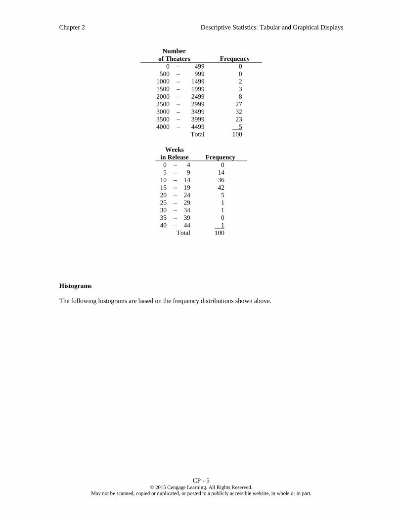
Chapter 2 Descriptive Statistics: Tabular and Graphical Displays
CP - 5 © 2015 Cengage Learning. All Rights Reserved.
May not be scanned, copied or duplicated, or posted to a publicly accessible website, in whole or in part.
Number of Theaters Frequency
0 – 499 0 500 – 999 0
1000 – 1499 2 1500 – 1999 3 2000 – 2499 8 2500 – 2999 27 3000 – 3499 32 3500 – 3999 23 4000 – 4499 5
Total 100
Weeks in Release Frequency 0 – 4 0 5 – 9 14
10 – 14 36 15 – 19 42 20 – 24 5 25 – 29 1 30 – 34 1 35 – 39 0 40 – 44 1
Total 100
Histograms
The following histograms are based on the frequency distributions shown above.
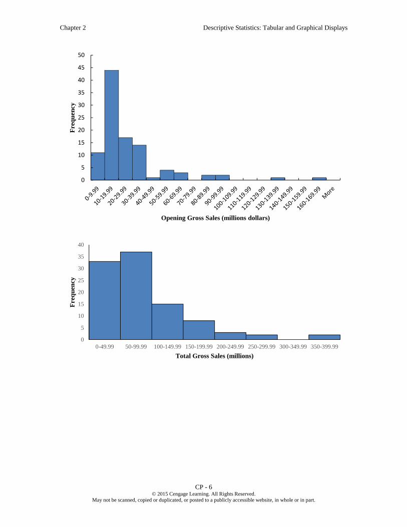
Chapter 2 Descriptive Statistics: Tabular and Graphical Displays
CP - 6 © 2015 Cengage Learning. All Rights Reserved.
May not be scanned, copied or duplicated, or posted to a publicly accessible website, in whole or in part.
0
5
10
15
20
25
30
35
40
45
50
Fre
qu
ency
Opening Gross Sales (millions dollars)
0
5
10
15
20
25
30
35
40
0-49.99 50-99.99 100-149.99 150-199.99 200-249.99 250-299.99 300-349.99 350-399.99
Fre
qu
ency
Total Gross Sales (millions)

Chapter 2 Descriptive Statistics: Tabular and Graphical Displays
CP - 7 © 2015 Cengage Learning. All Rights Reserved.
May not be scanned, copied or duplicated, or posted to a publicly accessible website, in whole or in part.
Interpretation
Opening Weekend Gross Sales. The distribution is skewed to the right with relatively few motion pictures having opening weekend gross sales of at least $40 million (14%), and only 2% had opening weekend gross sales of $100 million or more. Relatively few motion pictures had opening weekend gross sales less than $10 million. 75% of the motion pictures had opening weekend gross sales between $10 million and $40 million, and the vast majority of those motion pictures (44 out of 75) had opening weekend gross sales between $10 million and $20 million. Unless there is something unusually attractive about the motion picture, an opening weekend gross sales between $10 million and $40 million appears typical.
Total Gross Sales. This distribution is also skewed to the right, with 70% of the motion pictures having total gross sales less than $100 million and 85% less than $150 million. Highly successful blockbuster motion pictures are rare. Total gross sales over $200 million occurred only 7% of the time and over $350 million occurred only 2% of the time. No motion picture reported $400 million in total gross sales. Unless there is something unusually attractive about the motion picture, a total gross sales less than $100 million appears typical.
Number of Theaters. This distribution is skewed to the left. The number of theaters range from less than 500 to almost 4500. 82% of these motion pictures had extensive market exposure with the number of
0
5
10
15
20
25
30
35
0-499 500-599 1000-1499 1500-1999 2000-2499 2500-2999 3000-3499 3500-3999 4000-4499
Fre
qu
ency
Number of Theaters
0
5
10
15
20
25
30
35
40
45
0-4 5-9 10-14 15-19 20-24 25-29 30-34 35-39 40-44
Fre
qu
ency
Weeks in Release

Chapter 2 Descriptive Statistics: Tabular and Graphical Displays
CP - 8 © 2015 Cengage Learning. All Rights Reserved.
May not be scanned, copied or duplicated, or posted to a publicly accessible website, in whole or in part.
theaters between 2500 and 4000. As would be expected for these motion pictures, and small percentage (5%) appeared in fewer than 2000 theaters. 2500 to 4000 theaters is typical for these motion pictures.
Weeks in Release. This distribution is skewed to the right. Each of these motion pictures spent at least 5 weeks in release, with most (86%) in release for 10 or more weeks. Very few of these motion pictures (8%) lasted at least twenty weeks in release, and only one was in release for more than forty weeks.
General Observations. The data show that although many of these motion pictures had moderate opening weekend gross sales, most were in distribution in many theaters over several weeks and earned a relatively high total gross sales. It appears that many of the most successful films for this year were able to succeed without a big opening weekend at the box office.
Scatter Diagrams
Three scatter diagrams are suggested to show how Total Gross Sales is related to each of the other three variables.
0
50
100
150
200
250
300
350
400
450
0 20 40 60 80 100 120 140 160 180
To
tal
Gro
ss S
ale
s
Opening Weekend Gross Sales
0
50
100
150
200
250
300
350
400
450
0 1,000 2,000 3,000 4,000 5,000
To
tal
Gro
ss S
ale
s
Number of Theaters

Chapter 2 Descriptive Statistics: Tabular and Graphical Displays
CP - 9 © 2015 Cengage Learning. All Rights Reserved.
May not be scanned, copied or duplicated, or posted to a publicly accessible website, in whole or in part.
Interpretation
Opening Weekend Gross Sales. The scatter plot of total gross sales and opening weekend gross sales shows a strong positive relationship. Motion pictures with the highest total gross sales were generally the motion pictures with the highest opening weekend gross sales. How the motion picture does during its opening weekend should be a very good predictor of how the motion picture will do in terms of total gross sales. Note in the scatter diagram that the majority of the motion pictures show a low opening weekend gross sales and a low total gross sales.
Number of Theaters. The scatter plot of the total gross sales and number of theaters also shows a positive nonlinear relationship. The relationship between total gross sales and the number of theaters for motion pictures playing in less than 3000 theaters is flat, but for motion pictures playing in more than 3000 theaters the relationship between total gross sales and the number of theaters is positive and relatively steep. Perhaps blockbuster motion pictures playing in over 4000 theaters have neared the maximum number of theaters in which they can play, and at that point the number of people who attend per showing increases to accommodate the large number of people who want to see a blockbuster film.
Weeks in Release. The scatter plot of the total gross sales and weeks in release shows a positive relationship, but this relationship appears to be the weakest of the three relationships studied. Generally, the higher gross sales motion pictures are in release for the highest number of weeks. However, this is not always the case. The five motion pictures with the highest total gross sales were in release less than 20 weeks. At the same time, three of the six motion pictures with over 20 weeks in release had total gross sales of less than $100 million. This suggests that in some cases blockbuster movies with high gross sales may run their course quickly and not have an excessively long release. At the same time, perhaps quality motion pictures with a limited audience may not generate the high total gross sales but may still be in release for more than 20 weeks. The number of weeks in release does not appear to the best predictor of total gross sales.
0
50
100
150
200
250
300
350
400
450
0 5 10 15 20 25 30 35 40 45
To
tal
Gro
ss S
ale
s
Weeks in Release

Chapter 2 Descriptive Statistics: Tabular and Graphical Displays
CP - 10 © 2015 Cengage Learning. All Rights Reserved.
May not be scanned, copied or duplicated, or posted to a publicly accessible website, in whole or in part.
Case Problem 3: Queen City
This case provides the student with the opportunity to use basic tabular and graphical presentations to describe data from the annual expenditures for the city of Cincinnati, Ohio. The data set is large relative to others in the text. It contains 5,427 records of expenditures. As such, one point of this case is to expose students to a larger data set and help them understand that the pivot tables and charts can be used on a larger data set. In some cases, the student will have to copy, paste, and aggregate data to create the desired tables and charts. Style of presentation may vary by student (for example, vertical versus horizontal bar charts may be used). We illustrate with results and comments below.
Expenditures by Category
The pivot table shows expenditures and percentage of total expenditures by category. The bar chart shows percentage of total expenditures by category (both the table and the bar chart are sorted in descending order). Capital expenditures and payroll account for over 50% of all expenditures. Total expenditures are over $660 million. Debt Service seems somewhat high, as it is over 10% of total expenditures.
Category Total Expenditures % of Total Expenditures
Capital $198,365,854 29.98%
Payroll $145,017,555 21.92%
Debt Service $86,913,978 13.14%
Contractual Services $85,043,249 12.85%
Fringe Benefits $66,053,340 9.98%
Fixed Costs $53,732,177 8.12%
Materials and Supplies $19,934,710 3.01%
Inventory $6,393,394 0.97%
Payables $180,435 0.03%
Grand Total $661,634,693 100.0%
0.00% 5.00% 10.00% 15.00% 20.00% 25.00% 30.00%
Payables
Inventory
Materials and Supplies
Fixed Costs
Fringe Benefits
Contractual Services
Debt Service
Payroll
Capital
% of Total Expenditures
Category

Chapter 2 Descriptive Statistics: Tabular and Graphical Displays
CP - 11 © 2015 Cengage Learning. All Rights Reserved.
May not be scanned, copied or duplicated, or posted to a publicly accessible website, in whole or in part.
Expenditures by Department
The following table and bar chart show the percentages of total expenditures incurred by department. Note that we have combined all departments that individually incurred less than 1% of the total expenditures. There are 119 departments, and 96 each account for less than 1% of the total expenditures. As shown below, only six individual departments incur 5% or more of the total expenditures. These include, Police, Sewers, Transportation Engineering (Engineering). Fire, Sewer Debt Service and Finance/Risk Management. Debt service on sewers as a percentage of total expenditures appears to be very high.
Department % of Total
Expenditures
Department of Police 9.7%
Department of Sewers 8.8%
Transportation and Engineering, (Engineering) 8.7%
Department of Fire 7.2%
Sewers, Debt Service 6.6%
Finance, Risk Management 5.4%
SORTA Operations 3.6%
Water Works, Debt Service 3.2%
Department of water Works 3.1%
Finance, Treasury 2.8%
Economic Development 2.1%
Division of Parking Services 1.9%
Community Development, Housing 1.7%
Enterprise Technology Solutions 1.7%
Public Services, Fleet Services 1.7%
Finance, Accounts & Audits 1.7%
Transportation and Engineering, Planning 1.6%
Public Services, Neighborhood Operations 1.4%
Sewers, Millcreek 1.3%
Health, Primary Health Care Centers 1.2%
Water Works, Water Supply 1.2%
Public Services, Facilities Management 1.1%
Sewers, Wastewater Administration 1.0%
Other Depts. (< 1% each) 21.2%
Total 100.0%

Chapter 2 Descriptive Statistics: Tabular and Graphical Displays
CP - 12 © 2015 Cengage Learning. All Rights Reserved.
May not be scanned, copied or duplicated, or posted to a publicly accessible website, in whole or in part.
Expenditures by Fund
The following bar table and bar chart show the percentages of total expenditures charged by fund used to pay. Note that we have combined those funds that each cover less than 1% of the total expenditures. There are 129 funds in the data base, and 117 of these funds each account for less than 1% of total expenditures.
Fund % of Total Expenditures Covered
050 - GENERAL FUND 25.5%
980 - CAPITAL PROJECTS 16.0%
701 - METROPOLITAN SEWER DISTRICT OF GREATER CINCINNATI 12.7%
704 - METROPOLITAN SEWER DISTRICT CAPITAL IMPROVEMENTS 8.8%
101 - WATER WORKS 7.9%
711 - RISK MANAGEMENT 4.9%
759 - INCOME TAX – TRANSIT 3.7%
151 - BOND RETIREMENT – CITY 2.4%
202 - FLEET SERVICES 1.7%
898 - WATER WORKS IMPROVEMENT 12 1.3%
897 - WATER WORKS IMPROVEMENT 11 1.3%
302 - INCOME TAX – INFRASTRUCTURE 1.1%
Other (< 1 % each). 12.9%
Total 100.0%
0% 5% 10% 15% 20% 25%
Sewers, Wastewater AdministrationPublic Services, Facilities Management
Water Works, Water SupplyHealth, Primary Health Care Centers
Sewers, MillcreekPublic Services, Neighborhood OperationsTransportation and Engineering, Planning
Finance, Accounts & AuditsPublic Services, Fleet Services
Enterprise Technology SolutionsCommunity Development, Housing
Division of Parking ServicesEconomic Development
Finance, TreasuryDepartment of water WorksWater Works, Debt Service
SORTA OperaitionsFinance, Risk Management
Sewers, Debt ServiceDepartment of Fire
Transportation and Engineering, EngineeringDepartment of SewersDepartment of Police
Other Depts (< 1% each)
Percentage of Total Expenditures
Department
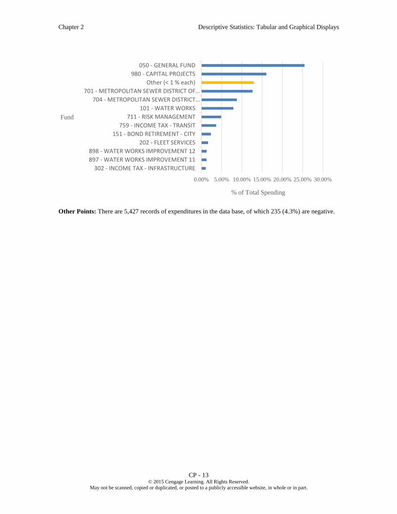
Chapter 2 Descriptive Statistics: Tabular and Graphical Displays
CP - 13 © 2015 Cengage Learning. All Rights Reserved.
May not be scanned, copied or duplicated, or posted to a publicly accessible website, in whole or in part.
Other Points: There are 5,427 records of expenditures in the data base, of which 235 (4.3%) are negative.
0.00% 5.00% 10.00% 15.00% 20.00% 25.00% 30.00%
302 - INCOME TAX - INFRASTRUCTURE
897 - WATER WORKS IMPROVEMENT 11
898 - WATER WORKS IMPROVEMENT 12
202 - FLEET SERVICES
151 - BOND RETIREMENT - CITY
759 - INCOME TAX - TRANSIT
711 - RISK MANAGEMENT
101 - WATER WORKS
704 - METROPOLITAN SEWER DISTRICT…
701 - METROPOLITAN SEWER DISTRICT OF…
Other (< 1 % each)
980 - CAPITAL PROJECTS
050 - GENERAL FUND
% of Total Spending
Fund
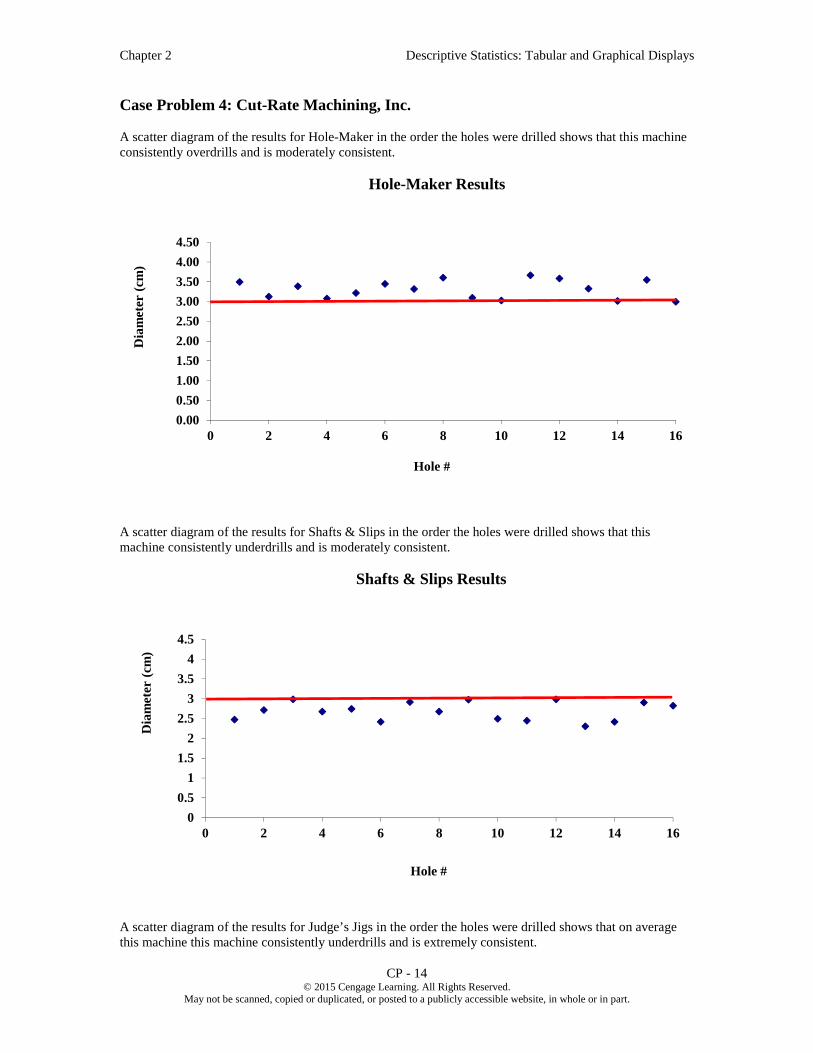
Chapter 2 Descriptive Statistics: Tabular and Graphical Displays
CP - 14 © 2015 Cengage Learning. All Rights Reserved.
May not be scanned, copied or duplicated, or posted to a publicly accessible website, in whole or in part.
Case Problem 4: Cut-Rate Machining, Inc.
A scatter diagram of the results for Hole-Maker in the order the holes were drilled shows that this machine consistently overdrills and is moderately consistent.
A scatter diagram of the results for Shafts & Slips in the order the holes were drilled shows that this machine consistently underdrills and is moderately consistent.
A scatter diagram of the results for Judge’s Jigs in the order the holes were drilled shows that on average this machine this machine consistently underdrills and is extremely consistent.
0.00
0.50
1.00
1.50
2.00
2.50
3.00
3.50
4.00
4.50
0 2 4 6 8 10 12 14 16
Dia
met
er (
cm)
Hole #
Hole-Maker Results
0
0.5
1
1.5
2
2.5
3
3.5
4
4.5
0 2 4 6 8 10 12 14 16
Dia
met
er (
cm)
Hole #
Shafts & Slips Results

Chapter 2 Descriptive Statistics: Tabular and Graphical Displays
CP - 15 © 2015 Cengage Learning. All Rights Reserved.
May not be scanned, copied or duplicated, or posted to a publicly accessible website, in whole or in part.
A scatter diagram of the results for Drill-for-Bits in the order the holes were drilled shows that an average diameter of approximately 3 centimeters. However, machine this machine is very inconsistent.
If we focus solely on the average performance of a drill, we would purchase Drill-for-Bits as the diameters of holes drilled by this vendor’s drill appear to be centered at approximately 3 centimeters. However, the diameters of the holes drilled by Drill-for-Bits’ machine are extremely inconsistent – several are over ½ centimeter too wide and several are over ½ centimeter to narrow.
The diameters of holes drilled by the machine provided by Hole Maker are more consistent than those drilled by the machine provided by Drill-for-Bits, and this machine did not drill a single hole that is too narrow. If holes that are slightly too wide are acceptable, we should consider purchasing our drill from Hole Maker.
0
0.5
1
1.5
2
2.5
3
3.5
4
4.5
0 2 4 6 8 10 12 14 16
Dia
met
er (
cm)
Hole #
Judge's Jigs Results
0
0.5
1
1.5
2
2.5
3
3.5
4
4.5
0 2 4 6 8 10 12 14 16
Dia
met
er (
cm)
Hole #
Drill-for-Bits Results

Chapter 2 Descriptive Statistics: Tabular and Graphical Displays
CP - 16 © 2015 Cengage Learning. All Rights Reserved.
May not be scanned, copied or duplicated, or posted to a publicly accessible website, in whole or in part.
The diameters of holes drilled by the machine provided by Shafts & Slips are similar in consistency to the holes by the machine provided by Hole Maker, and this machine did not drill a single hole that is too wide. If holes that are slightly too small are acceptable, we should consider purchasing our drill from Shafts & Slips.
The diameters of holes drilled by the machine provided by Judge’s Jigs are far more consistent than holes by the machine provided any of the other vendors, but these holes are far too narrow. We should determine if this drill can be recalibrated to that the mean size of holes drilled is approximately 3 centimeters. If this can be done, we should consider purchasing our drill from Judge’s Jigs and recalibrating the drill; this would give us a machine that consistently drills holes of approximately 3 centimeters.
However, before we make a decision we should scrutinize the way that these data were collected. We were told that Weideman started all four machines at 8:00 a.m. and let them warm up for two hours. We also see from the data that the drill provided by Hole-Maker was tested from 10:00 a.m. to noon, the drill provided by Shafts & Slips, Inc. was tested from noon to 2:00 p.m., the drill provided by Judge’s Jigs was tested from 2:00 p.m. to 4:00 p.m., and the drill provided by Drill-for-Bits was tested from 4:00 p.m. to 6:00 p.m. Were all drills allowed to keep running after the 8:00 a.m. – 10:00 a.m. warm-up period? Either way, this could bias the results.
We also see from the data that Ms. Ames ran the test drills from 10:00 a.m. to 4:00 p.m. when the drills provided by Hole-Maker, Shafts & Slips, and Judge’s Jigs were tested. Mr. Silver ran the test drill from 4:00 p.m. to 6:00 p.m. when the drill provided by Drill-for- Bits was tested. If these two employees are not equally competent, this could bias the results. Furthermore, did Ms. Ames become fatigued as the day progressed? Did she take a break for lunch or take a break at any other time?
We also note that we only tested one drill for each vendor. If the drill provided by a vendor is not representative of the drills that vendor produced, this could bias the results.
The data for this test should have been collected through an experimental study in which the four machine were all warmed up for the same amount of time and then left running as eight holes were drilled by each employee using the drill provided by each vendor in a random order. A design such as this would have eliminated the potential sources of bias we have identified and resulted in the collection of more reliable data, which would lead to a superior decision.

© 2018 Cengage Learning. May not be scanned, copied or duplicated, or posted to a publicly accessible website, in whole or in part, except for use as permitted in a license distributed with a certain product or service or otherwise on a password-protected website or school-approved learning management system for classroom use.
Modern Business Statistics (6e)
Modern Business Statistics (6e)
Anderson, Sweeney, Williams, Camm, Cochran
© 2018 Cengage Learning
1

© 2018 Cengage Learning. May not be scanned, copied or duplicated, or posted to a publicly accessible website, in whole or in part, except for use as permitted in a license distributed with a certain product or service or otherwise on a password-protected website or school-approved learning management system for classroom use.
Modern Business Statistics (6e)
Chapter 2, Part A -Descriptive Statistics:
Tabular and Graphical Displays
Summarizing Data for a Categorical Variable
• Categorical data use labels or names to identify categories of like items.
Summarizing Data for a Quantitative Variable
• Quantitative data are numerical values that indicate how much or how many.
2

© 2018 Cengage Learning. May not be scanned, copied or duplicated, or posted to a publicly accessible website, in whole or in part, except for use as permitted in a license distributed with a certain product or service or otherwise on a password-protected website or school-approved learning management system for classroom use.
Modern Business Statistics (6e)
Summarizing Categorical Data
Frequency Distribution
Relative Frequency Distribution
Percent Frequency Distribution
Bar Chart
Pie Chart
3

© 2018 Cengage Learning. May not be scanned, copied or duplicated, or posted to a publicly accessible website, in whole or in part, except for use as permitted in a license distributed with a certain product or service or otherwise on a password-protected website or school-approved learning management system for classroom use.
Modern Business Statistics (6e)
A frequency distribution is a tabular summary of data showing the number (frequency) of observations in each of several non-overlapping categories or classes.
The objective is to provide insights about the data that cannot be quickly obtained by looking only at the original data.
Frequency Distribution
4

© 2018 Cengage Learning. May not be scanned, copied or duplicated, or posted to a publicly accessible website, in whole or in part, except for use as permitted in a license distributed with a certain product or service or otherwise on a password-protected website or school-approved learning management system for classroom use.
Modern Business Statistics (6e)
Example
Soft drink purchasers were asked to select one among the five popular soft drinks: Coca-cola, Diet coke, Dr.Pepper, Pepsi and Sprite.
Soft drink selected by a sample of 20 purchasers are:
Frequency Distribution
Coca-Cola Pepsi Dr. Pepper
Diet Coke Dr. Pepper Dr. Pepper
Dr. Pepper Pepsi Pepsi
Pepsi Coca-Cola Diet Coke
Pepsi Diet Coke Dr. Pepper
Pepsi Pepsi Sprite
Pepsi Pepsi
5

© 2018 Cengage Learning. May not be scanned, copied or duplicated, or posted to a publicly accessible website, in whole or in part, except for use as permitted in a license distributed with a certain product or service or otherwise on a password-protected website or school-approved learning management system for classroom use.
Modern Business Statistics (6e)
Frequency Distribution
Example
6
Rating Frequency
Coca-Cola 2
Diet Coke 3
Dr. Pepper 5
Pepsi 9
Sprite 1
Total 20
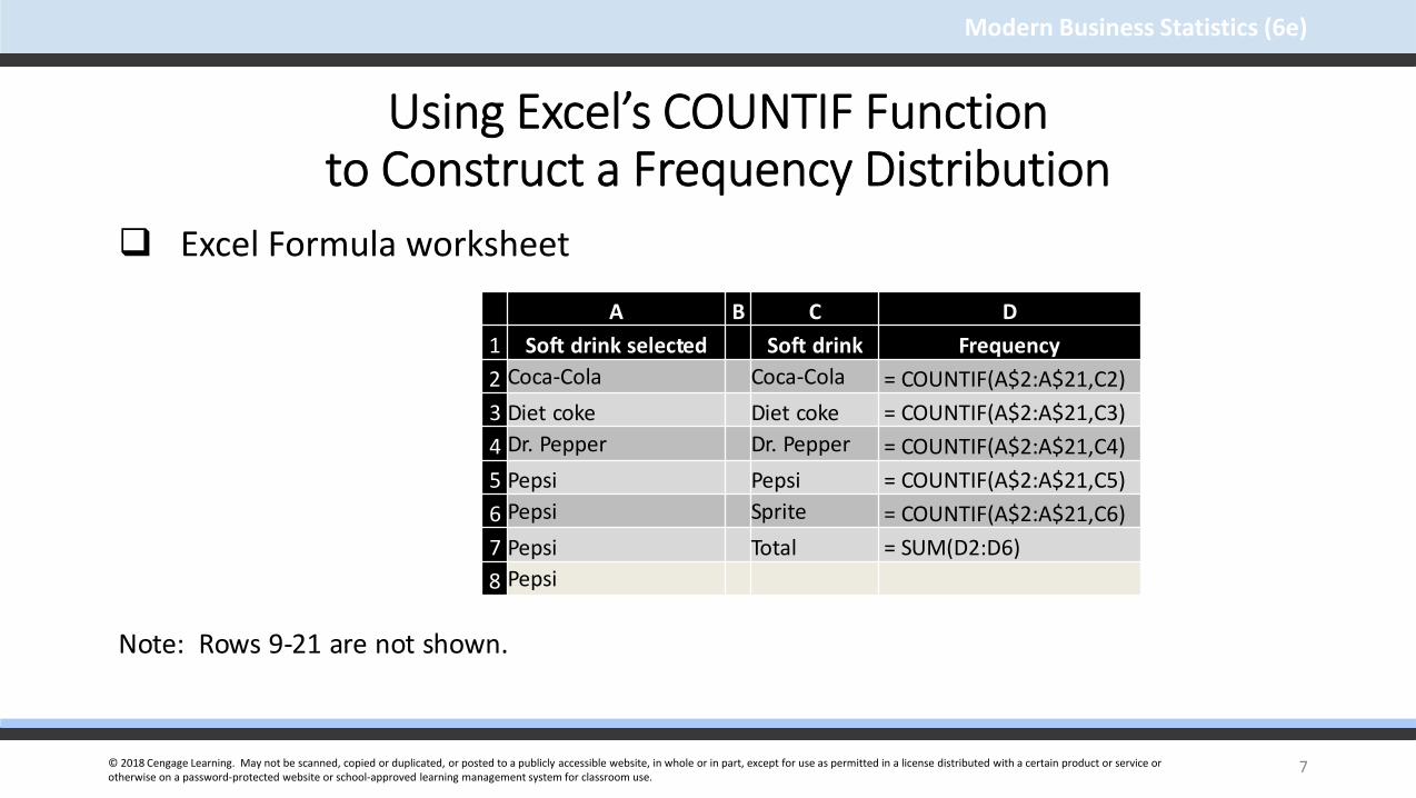
© 2018 Cengage Learning. May not be scanned, copied or duplicated, or posted to a publicly accessible website, in whole or in part, except for use as permitted in a license distributed with a certain product or service or otherwise on a password-protected website or school-approved learning management system for classroom use.
Modern Business Statistics (6e)
Using Excel’s COUNTIF Functionto Construct a Frequency Distribution
Excel Formula worksheet
Note: Rows 9-21 are not shown.
7
A B C D
1 Soft drink selected Soft drink Frequency
2 Coca-Cola Coca-Cola = COUNTIF(A$2:A$21,C2)
3 Diet coke Diet coke = COUNTIF(A$2:A$21,C3)
4 Dr. Pepper Dr. Pepper = COUNTIF(A$2:A$21,C4)
5 Pepsi Pepsi = COUNTIF(A$2:A$21,C5)
6 Pepsi Sprite = COUNTIF(A$2:A$21,C6)
7 Pepsi Total = SUM(D2:D6)
8 Pepsi

© 2018 Cengage Learning. May not be scanned, copied or duplicated, or posted to a publicly accessible website, in whole or in part, except for use as permitted in a license distributed with a certain product or service or otherwise on a password-protected website or school-approved learning management system for classroom use.
Modern Business Statistics (6e)
Using Excel’s COUNTIF Functionto Construct a Frequency Distribution
Excel value worksheet
Note: Rows 9-21 are not shown.
8
A B C D1 Soft drink selected Soft drink Frequency
2Coca-Cola Coca-Cola
2
3 Diet coke Diet coke 3
4 Dr. Pepper Dr. Pepper 5
5 Pepsi Pepsi 9
6 Pepsi Sprite 1
7 Pepsi Total 20
8 Pepsi

© 2018 Cengage Learning. May not be scanned, copied or duplicated, or posted to a publicly accessible website, in whole or in part, except for use as permitted in a license distributed with a certain product or service or otherwise on a password-protected website or school-approved learning management system for classroom use.
Modern Business Statistics (6e)
The relative frequency of a class is the fraction or proportion of the total number of data items belonging to a class.
A relative frequency distribution is a tabular summary of a set of data showing the relative frequency for each class.
=
9
Relative Frequency Distribution

© 2018 Cengage Learning. May not be scanned, copied or duplicated, or posted to a publicly accessible website, in whole or in part, except for use as permitted in a license distributed with a certain product or service or otherwise on a password-protected website or school-approved learning management system for classroom use.
Modern Business Statistics (6e)
The percent frequency of a class is the relative frequency multiplied by 100.
A percent frequency distribution is a tabular summary of a set of data showing the percent frequency for each class.
10
Percent Frequency Distribution

© 2018 Cengage Learning. May not be scanned, copied or duplicated, or posted to a publicly accessible website, in whole or in part, except for use as permitted in a license distributed with a certain product or service or otherwise on a password-protected website or school-approved learning management system for classroom use.
Modern Business Statistics (6e)
Relative Frequency and Percent Frequency Distributions
Example
11
Rating Relative Frequency Percent Frequency
Coca-Cola .10 10
Diet Coke .15 15
Dr.Pepper .25 25
Pepsi .45 45
Sprite .05 5
Total 1.00 100
.10(100) = 10
1/20 = 0.05

© 2018 Cengage Learning. May not be scanned, copied or duplicated, or posted to a publicly accessible website, in whole or in part, except for use as permitted in a license distributed with a certain product or service or otherwise on a password-protected website or school-approved learning management system for classroom use.
Modern Business Statistics (6e)
Using Excel to Construct Relative Frequency and Percent Frequency Distributions
Excel Formula worksheet
Note: Columns A-B and rows 9-21 and are not shown.
12
C D E F
1 Soft drink FrequencyRelative
FrequencyPercent
Frequency
2Coca-Cola = COUNTIF(A$2:A$21,C2) = D2/$D$7 = E2*100
3Diet coke = COUNTIF(A$2:A$21,C3) = D3/$D$7 = E3*100
4Dr. Pepper = COUNTIF(A$2:A$21,C4) = D4/$D$7 = E4*100
5Pepsi = COUNTIF(A$2:A$21,C5) = D5/$D$7 = E5*100
6Sprite = COUNTIF(A$2:A$21,C6) = D6/$D$7 = E6*100
7Total = SUM(D2:D6) = SUM(E2:E6) = SUM(F2:F6)
8

© 2018 Cengage Learning. May not be scanned, copied or duplicated, or posted to a publicly accessible website, in whole or in part, except for use as permitted in a license distributed with a certain product or service or otherwise on a password-protected website or school-approved learning management system for classroom use.
Modern Business Statistics (6e)
C D E F
1 Soft drink FrequencyRelative
FrequencyPercent
Frequency
2 Coca-Cola 2 0.1 10
3 Diet coke 3 0.15 15
4 Dr. Pepper 5 0.25 25
5 Pepsi 9 0.45 45
6 Sprite 1 0.05 5
7 Total 20 1.00 100
8
Using Excel to Construct Relative Frequency and Percent Frequency Distributions
Excel value worksheet
Note: Columns A-B and rows 9-21 and are not shown.
13

© 2018 Cengage Learning. May not be scanned, copied or duplicated, or posted to a publicly accessible website, in whole or in part, except for use as permitted in a license distributed with a certain product or service or otherwise on a password-protected website or school-approved learning management system for classroom use.
Modern Business Statistics (6e)
Bar Chart
A bar chart is a graphical display for depicting qualitative data.
On one axis (usually the horizontal axis), we specify the labels that are used for each of the classes.
A frequency, relative frequency, or percent frequency scale can be used for the other axis (usually the vertical axis).
Using a bar of fixed width drawn above each class label, we extend the height appropriately.
The bars are separated to emphasize the fact that each class is separate.
14

© 2018 Cengage Learning. May not be scanned, copied or duplicated, or posted to a publicly accessible website, in whole or in part, except for use as permitted in a license distributed with a certain product or service or otherwise on a password-protected website or school-approved learning management system for classroom use.
Modern Business Statistics (6e)
15
Bar Chart
0
1
2
3
4
5
6
7
8
9
10
Coca-Cola Diet Coke Dr. Pepper Pepsi Sprite
Freq
uen
cy
Soft Drink
Bar Chart for Purchase of Soft Drink

© 2018 Cengage Learning. May not be scanned, copied or duplicated, or posted to a publicly accessible website, in whole or in part, except for use as permitted in a license distributed with a certain product or service or otherwise on a password-protected website or school-approved learning management system for classroom use.
Modern Business Statistics (6e)
Using Excel’s Recommended Charts Toolto Construct a Bar Chart
Step 1 - Select cells C1:D6
Step 2 - Click Insert on the Ribbon
Step 3 - In the Charts group, click Recommended Charts (a preview showing of bar chart appears)
Step 4 - Click OK (the bar chart will appear in a new worksheet)
…… editing options
16

© 2018 Cengage Learning. May not be scanned, copied or duplicated, or posted to a publicly accessible website, in whole or in part, except for use as permitted in a license distributed with a certain product or service or otherwise on a password-protected website or school-approved learning management system for classroom use.
Modern Business Statistics (6e)
Using Excel’s Recommended Charts Toolto Construct a Bar Chart
Step 1 – Click the Chart Title and replace it with Bar chart of Soft Drink Purchases
Step 2 - Click the Chart Elements button
Step 2 - When the list of chart elements appears: Click Axis Titles
Step 3 - Click the Horizontal (Category) Axis Title and replace it with Soft Drink
Step 4 - Click the Vertical (Value) Axis Title and replace it with Frequency
17

© 2018 Cengage Learning. May not be scanned, copied or duplicated, or posted to a publicly accessible website, in whole or in part, except for use as permitted in a license distributed with a certain product or service or otherwise on a password-protected website or school-approved learning management system for classroom use.
Modern Business Statistics (6e)
Using Excel’s Recommended Charts Toolto Construct a Bar Chart
18
0
5
10
15
20
25
30
35
40
45
50
Coca-Cola Diet Coke Dr. Pepper Pepsi Sprite
Perc
ent
Freq
uen
cy
Softdrink
Bar chart for Purchase of Soft Drink

© 2018 Cengage Learning. May not be scanned, copied or duplicated, or posted to a publicly accessible website, in whole or in part, except for use as permitted in a license distributed with a certain product or service or otherwise on a password-protected website or school-approved learning management system for classroom use.
Modern Business Statistics (6e)
Pareto Diagram
In quality control, bar charts are used to identify the most important causes of problems.
When the bars are arranged in descending order of height from left to right (with the most frequently occurring cause appearing first) the bar chart is called a Pareto diagram.
This diagram is named for its founder, Vilfredo Pareto, an Italian economist.
19

© 2018 Cengage Learning. May not be scanned, copied or duplicated, or posted to a publicly accessible website, in whole or in part, except for use as permitted in a license distributed with a certain product or service or otherwise on a password-protected website or school-approved learning management system for classroom use.
Modern Business Statistics (6e)
Pie Chart
The pie chart is a commonly used graphical display for presenting relative frequency and percent frequency distributions for categorical data.
First draw a circle; then use the relative frequencies to subdivide the circle into sectors that correspond to the relative frequency for each class.
Since there are 360 degrees in a circle, a class with a relative frequency of .25 would consume .25(360) = 90 degrees of the circle.
20

© 2018 Cengage Learning. May not be scanned, copied or duplicated, or posted to a publicly accessible website, in whole or in part, except for use as permitted in a license distributed with a certain product or service or otherwise on a password-protected website or school-approved learning management system for classroom use.
Modern Business Statistics (6e)
Pie Chart
21
Coca-Cola10%
Diet Coke15%
Dr. Pepper25%
Pepsi45%
Sprite5%
Coca-Cola
Diet Coke
Dr. Pepper
Pepsi
Sprite

© 2018 Cengage Learning. May not be scanned, copied or duplicated, or posted to a publicly accessible website, in whole or in part, except for use as permitted in a license distributed with a certain product or service or otherwise on a password-protected website or school-approved learning management system for classroom use.
Modern Business Statistics (6e)
Example
Inferences from the Pie Chart
Almost one-half of the customers surveyed preferred Pepsi (looking at the left side of the pie).
The second preference is for Dr. Pepper with 25% of the customers opting for it.
Only 5% of the customers opted for Sprite.
Pie Chart
22

© 2018 Cengage Learning. May not be scanned, copied or duplicated, or posted to a publicly accessible website, in whole or in part, except for use as permitted in a license distributed with a certain product or service or otherwise on a password-protected website or school-approved learning management system for classroom use.
Modern Business Statistics (6e)
Using Excel’s Recommended Charts Toolto Construct a Pie Chart
To display a pie chart, click anywhere in the bar chart to display three tabs (Analyze, Design, and Format) located on the ribbon under the heading PivotChart Tools.
Click the Design tab and choose the Change Chart Type option to display the Change Chart Type dialog box.
Click the Pie option and then OK.
23
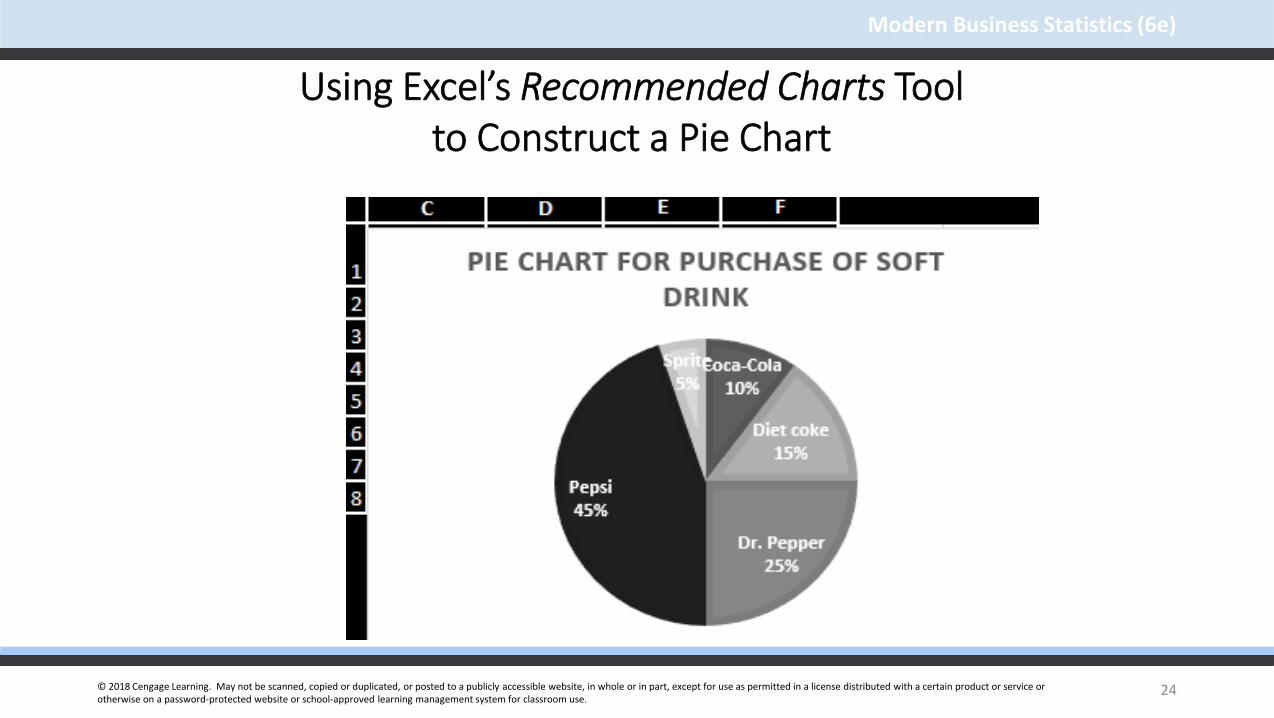
© 2018 Cengage Learning. May not be scanned, copied or duplicated, or posted to a publicly accessible website, in whole or in part, except for use as permitted in a license distributed with a certain product or service or otherwise on a password-protected website or school-approved learning management system for classroom use.
Modern Business Statistics (6e)
Using Excel’s Recommended Charts Toolto Construct a Pie Chart
24

© 2018 Cengage Learning. May not be scanned, copied or duplicated, or posted to a publicly accessible website, in whole or in part, except for use as permitted in a license distributed with a certain product or service or otherwise on a password-protected website or school-approved learning management system for classroom use.
Modern Business Statistics (6e)
Summarizing Quantitative Data Frequency Distribution
Relative Frequency and Percent Frequency Distributions
Dot Plot
Histogram
Cumulative Distributions
Stem-and-Leaf Display
25

© 2018 Cengage Learning. May not be scanned, copied or duplicated, or posted to a publicly accessible website, in whole or in part, except for use as permitted in a license distributed with a certain product or service or otherwise on a password-protected website or school-approved learning management system for classroom use.
Modern Business Statistics (6e)
Frequency Distribution
Example
Sanderson and Clifford, a small public accounting firm wants to determine time in days required to complete year end audits. It takes a sample of 20 clients.
26

© 2018 Cengage Learning. May not be scanned, copied or duplicated, or posted to a publicly accessible website, in whole or in part, except for use as permitted in a license distributed with a certain product or service or otherwise on a password-protected website or school-approved learning management system for classroom use.
Modern Business Statistics (6e)
Frequency Distribution
Example: Sanderson and Clifford
Year-end Audit Time (in Days)
27
1215202214
1415272118
1918223316
1817232813
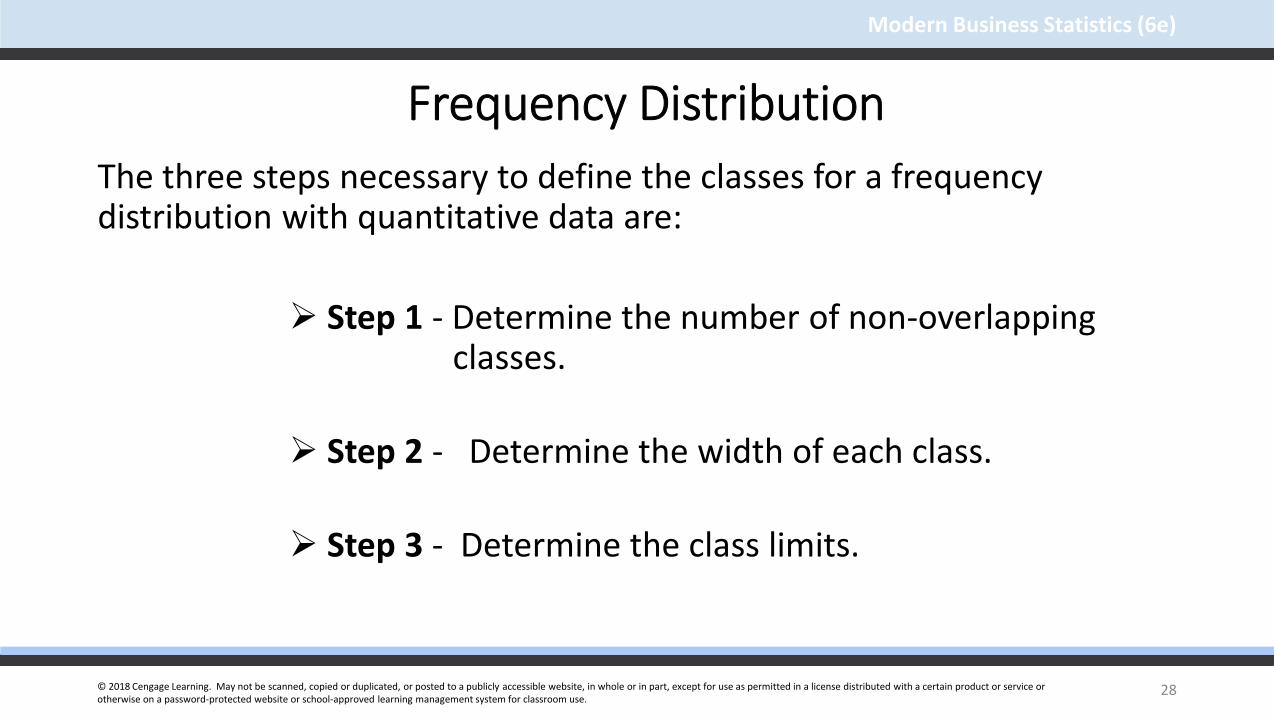
© 2018 Cengage Learning. May not be scanned, copied or duplicated, or posted to a publicly accessible website, in whole or in part, except for use as permitted in a license distributed with a certain product or service or otherwise on a password-protected website or school-approved learning management system for classroom use.
Modern Business Statistics (6e)
Frequency Distribution
The three steps necessary to define the classes for a frequency distribution with quantitative data are:
Step 1 - Determine the number of non-overlapping classes.
Step 2 - Determine the width of each class.
Step 3 - Determine the class limits.
28

© 2018 Cengage Learning. May not be scanned, copied or duplicated, or posted to a publicly accessible website, in whole or in part, except for use as permitted in a license distributed with a certain product or service or otherwise on a password-protected website or school-approved learning management system for classroom use.
Modern Business Statistics (6e)
Frequency DistributionGuidelines for Determining the Number of Classes
Use between 5 and 20 classes.
Data sets with a larger number of elements usually require a larger number of classes.
Smaller data sets usually require fewer classes.
The goal is to use enough classes to show the variation in the data, but not so many classes that some contain only a few data items.
29

© 2018 Cengage Learning. May not be scanned, copied or duplicated, or posted to a publicly accessible website, in whole or in part, except for use as permitted in a license distributed with a certain product or service or otherwise on a password-protected website or school-approved learning management system for classroom use.
Modern Business Statistics (6e)
Frequency Distribution
Guidelines for Determining the Width of Each Class
Use classes of equal width.
Approximate Class Width =
Making the classes the same width reduces the chance of inappropriate interpretations.
30

© 2018 Cengage Learning. May not be scanned, copied or duplicated, or posted to a publicly accessible website, in whole or in part, except for use as permitted in a license distributed with a certain product or service or otherwise on a password-protected website or school-approved learning management system for classroom use.
Modern Business Statistics (6e)
Frequency Distribution
Note on Number of Classes and Class Width
In practice, the number of classes and the appropriate class width are determined by trial and error.
Once a possible number of classes is chosen, the appropriate class width is found.
The process can be repeated for a different number of classes.
Ultimately, the analyst uses judgment to determine the combination of the number of classes and class width that provides the best frequency distribution for summarizing the data.
31

© 2018 Cengage Learning. May not be scanned, copied or duplicated, or posted to a publicly accessible website, in whole or in part, except for use as permitted in a license distributed with a certain product or service or otherwise on a password-protected website or school-approved learning management system for classroom use.
Modern Business Statistics (6e)
Frequency DistributionGuidelines for Determining the Class Limits
Class limits must be chosen so that each data item belongs to one and only one class.
The lower class limit identifies the smallest possible data value assigned to the class.
The upper class limit identifies the largest possible data value assigned to the class.
The appropriate values for the class limits depend on the level of accuracy of the data.
An open-end class requires only a lower class limit or an upper class limit.
32

© 2018 Cengage Learning. May not be scanned, copied or duplicated, or posted to a publicly accessible website, in whole or in part, except for use as permitted in a license distributed with a certain product or service or otherwise on a password-protected website or school-approved learning management system for classroom use.
Modern Business Statistics (6e)
Frequency Distribution
Class Midpoint
In some cases, we want to know the midpoints of the classes in a frequency distribution for quantitative data.
The class midpoint is the value halfway between the lower and upper class limits.
33

© 2018 Cengage Learning. May not be scanned, copied or duplicated, or posted to a publicly accessible website, in whole or in part, except for use as permitted in a license distributed with a certain product or service or otherwise on a password-protected website or school-approved learning management system for classroom use.
Modern Business Statistics (6e)
Frequency Distribution
Example: Sanderson and Clifford
If we choose five classes:
Approximate Class Width = (33 - 12)/5 = 4.2 4
34
Time in days Frequency
10-14 4
15-19 8
20-24 5
25-29 2
30-34 1
Total 20

© 2018 Cengage Learning. May not be scanned, copied or duplicated, or posted to a publicly accessible website, in whole or in part, except for use as permitted in a license distributed with a certain product or service or otherwise on a password-protected website or school-approved learning management system for classroom use.
Modern Business Statistics (6e)
Using Excel’s PivotTableto Construct a Frequency Distribution
Step 1 – Select any cell in the data set
Step 2 – Click Insert on the Ribbon
Step 3 – In the Tables group click Pivot Table
Step 4 - When the Create PivotTable dialog box appears: Click
(a PivotTable and PivotTable Fields dialog box will appear in a
new worksheet)
35

© 2018 Cengage Learning. May not be scanned, copied or duplicated, or posted to a publicly accessible website, in whole or in part, except for use as permitted in a license distributed with a certain product or service or otherwise on a password-protected website or school-approved learning management system for classroom use.
Modern Business Statistics (6e)
Using Excel’s PivotTableto Construct a Frequency Distribution
Step 5 - In the PivotTable Fields dialog box:
Drag Audit time to the Rows area
Drag Audit time to the Values area
Step 6 - Click on Sum of Audit time in the Values area
Step 7 - Click Value Field Settings from the list of options
Step 8 - When the Value Field Settings dialog box appears: Under Summarize value field by, choose Count Click OK
36

© 2018 Cengage Learning. May not be scanned, copied or duplicated, or posted to a publicly accessible website, in whole or in part, except for use as permitted in a license distributed with a certain product or service or otherwise on a password-protected website or school-approved learning management system for classroom use.
Modern Business Statistics (6e)
Using Excel’s PivotTableto Construct a Frequency Distribution
To construct the frequency distribution, we must group the rows containing audit time.
Step 1 - Right click any cell in the PivotTable report containing a an audit time.
Step 2 - Choose Group from the list of options that appears
Step 3 - When the Grouping dialog box appears: Enter 10 in the Starting at boxEnter 34 in the Ending at box Enter 5 in the By boxClick OK
37

© 2018 Cengage Learning. May not be scanned, copied or duplicated, or posted to a publicly accessible website, in whole or in part, except for use as permitted in a license distributed with a certain product or service or otherwise on a password-protected website or school-approved learning management system for classroom use.
Modern Business Statistics (6e)
Using Excel’s Pivot table to construct a frequency distribution
38

© 2018 Cengage Learning. May not be scanned, copied or duplicated, or posted to a publicly accessible website, in whole or in part, except for use as permitted in a license distributed with a certain product or service or otherwise on a password-protected website or school-approved learning management system for classroom use.
Modern Business Statistics (6e)
Relative Frequency and Percent Frequency Distributions
Example: Sanderson and Clifford
39
Audit time(in days)
Relative Frequency Percent Frequency
10 – 14 .20 (4/20) 20 (0.2 * 100)
15 – 19 .40 40
20 – 25 .25 25
25 – 29 .10 10
30 – 34 .05 5
Total 1.00 100

© 2018 Cengage Learning. May not be scanned, copied or duplicated, or posted to a publicly accessible website, in whole or in part, except for use as permitted in a license distributed with a certain product or service or otherwise on a password-protected website or school-approved learning management system for classroom use.
Modern Business Statistics (6e)
Relative Frequency and Percent Frequency Distributions
Example: Sanderson and Clifford
Insights obtained from the Percent Frequency Distribution:
40% of the audits required from 15 to 19 days.
Another 25% of the audits required 20 to 25 days.
Only 5% of the audits required more than 30 days.
40

© 2018 Cengage Learning. May not be scanned, copied or duplicated, or posted to a publicly accessible website, in whole or in part, except for use as permitted in a license distributed with a certain product or service or otherwise on a password-protected website or school-approved learning management system for classroom use.
Modern Business Statistics (6e)
Dot Plot
One of the simplest graphical summaries of data is a dot plot.
A horizontal axis shows the range of data values.
Then each data value is represented by a dot placed above the axis.
41
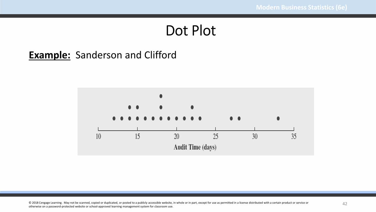
© 2018 Cengage Learning. May not be scanned, copied or duplicated, or posted to a publicly accessible website, in whole or in part, except for use as permitted in a license distributed with a certain product or service or otherwise on a password-protected website or school-approved learning management system for classroom use.
Modern Business Statistics (6e)
Dot Plot
Example: Sanderson and Clifford
42

© 2018 Cengage Learning. May not be scanned, copied or duplicated, or posted to a publicly accessible website, in whole or in part, except for use as permitted in a license distributed with a certain product or service or otherwise on a password-protected website or school-approved learning management system for classroom use.
Modern Business Statistics (6e)
Histogram
Another common graphical display of quantitative data is a histogram.
The variable of interest is placed on the horizontal axis.
A rectangle is drawn above each class interval with its height corresponding to the interval’s frequency, relative frequency, or percent frequency.
Unlike a bar graph, a histogram has no natural separation between rectangles of adjacent classes.
43

© 2018 Cengage Learning. May not be scanned, copied or duplicated, or posted to a publicly accessible website, in whole or in part, except for use as permitted in a license distributed with a certain product or service or otherwise on a password-protected website or school-approved learning management system for classroom use.
Modern Business Statistics (6e)
Histogram
Example: Sanderson and Clifford
44

© 2018 Cengage Learning. May not be scanned, copied or duplicated, or posted to a publicly accessible website, in whole or in part, except for use as permitted in a license distributed with a certain product or service or otherwise on a password-protected website or school-approved learning management system for classroom use.
Modern Business Statistics (6e)
Using Excel’s Recommended Charts Toolto Construct a Histogram
Step 1 - Select any cell in the PivotTable report
Step 2 - Click Insert on the Ribbon
Step 3 - In the Charts group, click Recommended Charts
Step 4 - Click OK
… editing options
45
© 2018 Cengage Learning. May not be scanned, copied or duplicated, or posted to a publicly accessible website, in whole or in part, except for use as permitted in a license distributed with a certain product or service or otherwise on a password-protected website or school-approved learning management system for classroom use.
Modern Business Statistics (6e)
Using Excel’s Recommended Charts Toolto Construct a Histogram
Step 1 – Right-click any bar in the chart and choose
Format Data Series from the list of options
Step 2 - When the Format Data Series dialog box appears:
Go to the Series Options section
Set the Gap Width to 0
Click the Close button at the top right
Step 3 - Click the Chart Title and replace it with Audit time data
Step 4 - Click the Chart Elements button (in top right corner of the chart)
46

© 2018 Cengage Learning. May not be scanned, copied or duplicated, or posted to a publicly accessible website, in whole or in part, except for use as permitted in a license distributed with a certain product or service or otherwise on a password-protected website or school-approved learning management system for classroom use.
Modern Business Statistics (6e)
Using Excel’s Recommended Charts Toolto Construct a Histogram
Step 5 – When the list of chart elements appears:
Click Axis Titles
Click Legend (to remove check in Legend box)
Step 6 - Click the Horizontal (Category) Axis Title and
replace it with Audit time (days)
Click the Close button at the top right
Step 7 - Click the Vertical (Value) Axis Title and replace
it with Frequency
47

© 2018 Cengage Learning. May not be scanned, copied or duplicated, or posted to a publicly accessible website, in whole or in part, except for use as permitted in a license distributed with a certain product or service or otherwise on a password-protected website or school-approved learning management system for classroom use.
Modern Business Statistics (6e)
Using Excel’s Recommended Charts Toolto Construct a Histogram
Example
48

© 2018 Cengage Learning. May not be scanned, copied or duplicated, or posted to a publicly accessible website, in whole or in part, except for use as permitted in a license distributed with a certain product or service or otherwise on a password-protected website or school-approved learning management system for classroom use.
Modern Business Statistics (6e)
Histograms Showing Skewness Symmetric
Left tail is the mirror image of the right tail
Example: Heights of People
49
Re
lativ
e F
req
ue
ncy

© 2018 Cengage Learning. May not be scanned, copied or duplicated, or posted to a publicly accessible website, in whole or in part, except for use as permitted in a license distributed with a certain product or service or otherwise on a password-protected website or school-approved learning management system for classroom use.
Modern Business Statistics (6e)
Re
lativ
e F
req
ue
ncy
Histograms Showing Skewness Moderately Skewed Left A longer tail to the left
Example: Exam Scores
50

© 2018 Cengage Learning. May not be scanned, copied or duplicated, or posted to a publicly accessible website, in whole or in part, except for use as permitted in a license distributed with a certain product or service or otherwise on a password-protected website or school-approved learning management system for classroom use.
Modern Business Statistics (6e)
Re
lativ
e F
req
ue
ncy
Histograms Showing Skewness Moderately Right Skewed A Longer tail to the right
Example: Housing Values
51

© 2018 Cengage Learning. May not be scanned, copied or duplicated, or posted to a publicly accessible website, in whole or in part, except for use as permitted in a license distributed with a certain product or service or otherwise on a password-protected website or school-approved learning management system for classroom use.
Modern Business Statistics (6e)
Re
lativ
e F
req
ue
ncy
Histograms Showing Skewness Highly Skewed Right A very long tail to the right
Example: Executive Salaries
52
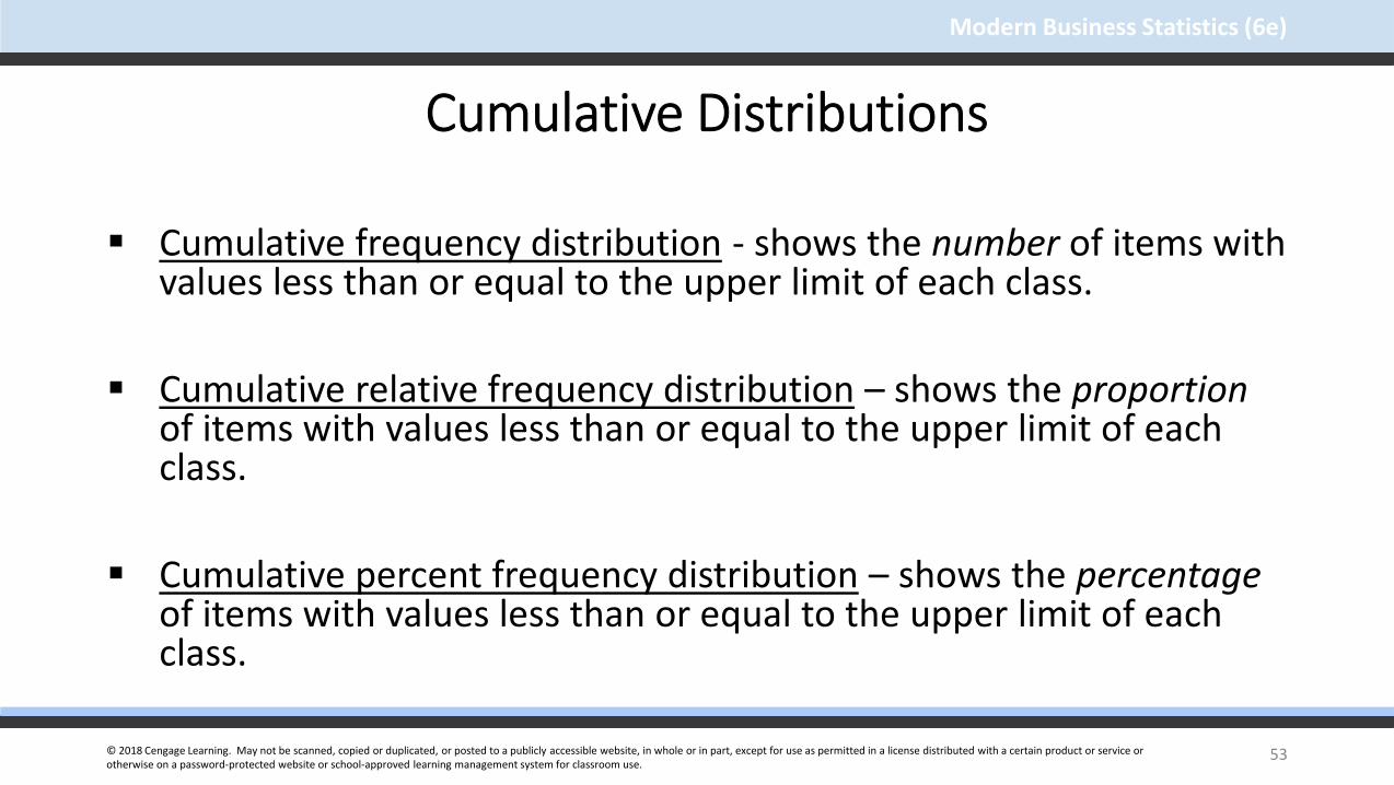
© 2018 Cengage Learning. May not be scanned, copied or duplicated, or posted to a publicly accessible website, in whole or in part, except for use as permitted in a license distributed with a certain product or service or otherwise on a password-protected website or school-approved learning management system for classroom use.
Modern Business Statistics (6e)
Cumulative Distributions
Cumulative frequency distribution - shows the number of items with values less than or equal to the upper limit of each class.
Cumulative relative frequency distribution – shows the proportionof items with values less than or equal to the upper limit of each class.
Cumulative percent frequency distribution – shows the percentageof items with values less than or equal to the upper limit of each class.
53

© 2018 Cengage Learning. May not be scanned, copied or duplicated, or posted to a publicly accessible website, in whole or in part, except for use as permitted in a license distributed with a certain product or service or otherwise on a password-protected website or school-approved learning management system for classroom use.
Modern Business Statistics (6e)
Cumulative Distributions
The last entry in a cumulative frequency distribution always equals the total number of observations.
The last entry in a cumulative relative frequency distribution always equals 1.00.
The last entry in a cumulative percent frequency distribution always equals 100.
54

© 2018 Cengage Learning. May not be scanned, copied or duplicated, or posted to a publicly accessible website, in whole or in part, except for use as permitted in a license distributed with a certain product or service or otherwise on a password-protected website or school-approved learning management system for classroom use.
Modern Business Statistics (6e)
Cumulative Distributions
Example: Sanderson and Cliffords
55
Audit time (Days) Cumulative Frequency
Cumulative Relative Frequency
Cumulative Percent Frequency
≤ 14 4 .20 20
≤ 19 12 .60 60
≤ 24 17 .85 85
≤ 29 19 .95 95
≤ 34 20 1.00 100

© 2018 Cengage Learning. May not be scanned, copied or duplicated, or posted to a publicly accessible website, in whole or in part, except for use as permitted in a license distributed with a certain product or service or otherwise on a password-protected website or school-approved learning management system for classroom use.
Modern Business Statistics (6e)
Stem-and-Leaf Display
A stem-and-leaf display shows both the rank order and shape of the distribution of the data.
It is similar to a histogram on its side, but it has the advantage of showing the actual data values.
The first digits of each data item are arranged to the left of a vertical line.
To the right of the vertical line we record the last digit for each item in rank order.
Each line (row) in the display is referred to as a stem.
Each digit on a stem is a leaf.
56

© 2018 Cengage Learning. May not be scanned, copied or duplicated, or posted to a publicly accessible website, in whole or in part, except for use as permitted in a license distributed with a certain product or service or otherwise on a password-protected website or school-approved learning management system for classroom use.
Modern Business Statistics (6e)
Stem-and-Leaf Display
Example
The number of questions answered correctly on an aptitude test by 50 students analysed with the help of a Stem – and – leaf display here. The relevant data is given in the following table.
57

© 2018 Cengage Learning. May not be scanned, copied or duplicated, or posted to a publicly accessible website, in whole or in part, except for use as permitted in a license distributed with a certain product or service or otherwise on a password-protected website or school-approved learning management system for classroom use.
Modern Business Statistics (6e)
112 73 126 82 92 115 95 84 68 100
72 92 128 104 108 76 141 119 98 85
69 76 118 132 96 91 81 113 115 94
97 86 127 134 100 102 80 98 106 106
107 73 124 83 92 81 106 75 95 119
Stem-and-Leaf DisplayNumber of questions answered correctly by 50 students
58

© 2018 Cengage Learning. May not be scanned, copied or duplicated, or posted to a publicly accessible website, in whole or in part, except for use as permitted in a license distributed with a certain product or service or otherwise on a password-protected website or school-approved learning management system for classroom use.
Modern Business Statistics (6e)
Stem-and-Leaf Display
59
6 9 8
7 2 3 6 3 6 5
8 6 2 3 1 1 0 4 5
9 7 2 2 6 2 1 5 8 8 5 4
10 7 4 8 0 2 6 6 0 6
11 2 8 5 9 3 5 9
12 6 8 7 4
13 2 4
14 1
Stem Leaf

© 2018 Cengage Learning. May not be scanned, copied or duplicated, or posted to a publicly accessible website, in whole or in part, except for use as permitted in a license distributed with a certain product or service or otherwise on a password-protected website or school-approved learning management system for classroom use.
Modern Business Statistics (6e)
Stretched Stem-and-Leaf Display
If we believe the original stem-and-leaf display has condensed the data too much, we can stretch the display vertically by using two stems for each leading digit(s).
Whenever a stem value is stated twice, the first value corresponds to leaf values of 0 - 4, and the second value corresponds to leaf values of 5 - 9.
60

© 2018 Cengage Learning. May not be scanned, copied or duplicated, or posted to a publicly accessible website, in whole or in part, except for use as permitted in a license distributed with a certain product or service or otherwise on a password-protected website or school-approved learning management system for classroom use.
Modern Business Statistics (6e)
Stretched Stem-and-Leaf Display
61
6 8 9
7 2 3 3
7 5 6 6
8 0 1 1 2 3 4
8 5 6
9 1 2 2 2 4
9 5 5 6 7 8 8
10 0 0 2 4
10 6 6 6 7 8
11 2 3
11 5 5 8 9 9
12 4
12 6 7 8
13 2 4
14 1

© 2018 Cengage Learning. May not be scanned, copied or duplicated, or posted to a publicly accessible website, in whole or in part, except for use as permitted in a license distributed with a certain product or service or otherwise on a password-protected website or school-approved learning management system for classroom use.
Modern Business Statistics (6e)
Stem-and-Leaf DisplayLeaf Units
A single digit is used to define each leaf.
In the preceding example, the leaf unit was 1.
Leaf units may be 100, 10, 1, 0.1, and so on.
Where the leaf unit is not shown, it is assumed to equal 1.
The leaf unit indicates how to multiply the stem-and-leaf numbers in order to approximate the original data.
62

© 2018 Cengage Learning. May not be scanned, copied or duplicated, or posted to a publicly accessible website, in whole or in part, except for use as permitted in a license distributed with a certain product or service or otherwise on a password-protected website or school-approved learning management system for classroom use.
Modern Business Statistics (6e)
Stem-and-Leaf Display
Example: Leaf Unit = 0.1
If we have data with values such as
8.6 11.7 9.4 9.1 10.2 11.0 8.8
63
8
9
10
11
Leaf Unit = 0.1
6 8
1 4
2
0 7

© 2018 Cengage Learning. May not be scanned, copied or duplicated, or posted to a publicly accessible website, in whole or in part, except for use as permitted in a license distributed with a certain product or service or otherwise on a password-protected website or school-approved learning management system for classroom use.
Modern Business Statistics (6e)
Stem-and-Leaf DisplayExample: Leaf Unit = 10
If we have data with values such as
1806 1717 1974 1791 1682 1910 1838
The 82 in 1682 is rounded down to 80 and is represented as an 8.
64
16
17
18
19
Leaf Unit = 10
8
1 9
0 3
1 7

© 2018 Cengage Learning. May not be scanned, copied or duplicated, or posted to a publicly accessible website, in whole or in part, except for use as permitted in a license distributed with a certain product or service or otherwise on a password-protected website or school-approved learning management system for classroom use.
Modern Business Statistics (6e)
End of Chapter 2, Part A
65

© 2018 Cengage Learning. May not be scanned, copied or duplicated, or posted to a publicly accessible website, in whole or in part, except for use as permitted in a license distributed with a certain product or service or otherwise on a password-protected website or school-approved learning management system for classroom use.
Modern Business Statistics (6e)
Slides by
JohnLoucks
St. Edward’sUniversity
1
Anderson, Sweeney, Williams, Camm, Cochran
© 2018 Cengage Learning
Modern Business Statistics (6e)

© 2018 Cengage Learning. May not be scanned, copied or duplicated, or posted to a publicly accessible website, in whole or in part, except for use as permitted in a license distributed with a certain product or service or otherwise on a password-protected website or school-approved learning management system for classroom use.
Modern Business Statistics (6e)
Chapter 2, Part BDescriptive Statistics: Tabular and Graphical Displays
Summarizing Data for Two Variables Using Tables
Summarizing Data for Two Variables Using Graphical Displays
Data Visualization: Best Practices in Creating Effective Graphical Displays
2
© 2018 Cengage Learning. May not be scanned, copied or duplicated, or posted to a publicly accessible website, in whole or in part, except for use as permitted in a license distributed with a certain product or service or otherwise on a password-protected website or school-approved learning management system for classroom use.
Modern Business Statistics (6e)
Summarizing Data for Two Variables using Tables
Thus far we have focused on methods that are used to summarize the data for one variable at a time.
Often a manager is interested in tabular and graphical methods that will help understand the relationship between two variables.
Crosstabulation is a method for summarizing the data for two variables.
3

© 2018 Cengage Learning. May not be scanned, copied or duplicated, or posted to a publicly accessible website, in whole or in part, except for use as permitted in a license distributed with a certain product or service or otherwise on a password-protected website or school-approved learning management system for classroom use.
Modern Business Statistics (6e)
Crosstabulation
A crosstabulation is a tabular summary of data for two variables.
Crosstabulation can be used when:
• one variable is categorical and the other is quantitative,
• both variables are categorical, or
• both variables are quantitative.
• The left and top margin labels define the classes for the two variables.
4

© 2018 Cengage Learning. May not be scanned, copied or duplicated, or posted to a publicly accessible website, in whole or in part, except for use as permitted in a license distributed with a certain product or service or otherwise on a password-protected website or school-approved learning management system for classroom use.
Modern Business Statistics (6e)
Crosstabulation
Example: Zagat’s Restaurant Review
Crosstabulation of quality rating and meal price data for 300
Los angeles restaurants is given here.
5

© 2018 Cengage Learning. May not be scanned, copied or duplicated, or posted to a publicly accessible website, in whole or in part, except for use as permitted in a license distributed with a certain product or service or otherwise on a password-protected website or school-approved learning management system for classroom use.
Modern Business Statistics (6e)
Crosstabulation
Example: Zagat’s Restaurant Review
Insights Gained from Preceding Crosstabulation
Greatest number of restaurants in the sample (64) have a very good rating and the meal price in the $20-29 range.
Only 2 restaurants have an excellent rating and a meal price in the range of $10-19 range
6

© 2018 Cengage Learning. May not be scanned, copied or duplicated, or posted to a publicly accessible website, in whole or in part, except for use as permitted in a license distributed with a certain product or service or otherwise on a password-protected website or school-approved learning management system for classroom use.
Modern Business Statistics (6e)
Crosstabulation
Example: Zagat’s Restaurant Review
7

© 2018 Cengage Learning. May not be scanned, copied or duplicated, or posted to a publicly accessible website, in whole or in part, except for use as permitted in a license distributed with a certain product or service or otherwise on a password-protected website or school-approved learning management system for classroom use.
Modern Business Statistics (6e)
Crosstabulation: Row or Column Percentages
Converting the entries in the table into row percentages or column percentages can provide additional insight about the relationship between the two variables.
8

© 2018 Cengage Learning. May not be scanned, copied or duplicated, or posted to a publicly accessible website, in whole or in part, except for use as permitted in a license distributed with a certain product or service or otherwise on a password-protected website or school-approved learning management system for classroom use.
Modern Business Statistics (6e)
Crosstabulation: Row PercentagesExample: Zagat’s Restaurant Review
Good restaurants charging a meal price of $10-19/Total number of good restaurants i.e 42/84 * 100 = 50%.
9
Meal Price
Quality Rating $10-19 $20-29 $30-39 $40-49 Total
Good 50 47.6 2.4 0 100Very Good 22.7 42.7 30.6 4 100
Excellent 3 21.2 42.4 33.4 100

© 2018 Cengage Learning. May not be scanned, copied or duplicated, or posted to a publicly accessible website, in whole or in part, except for use as permitted in a license distributed with a certain product or service or otherwise on a password-protected website or school-approved learning management system for classroom use.
Modern Business Statistics (6e)
Crosstabulation: Simpson’s Paradox
Data in two or more crosstabulations are often aggregated to produce a summary crosstabulation.
We must be careful in drawing conclusions about the relationship between the two variables in the aggregated crosstabulation.
In some cases the conclusions based upon an aggregated crosstabulation can be completely reversed if we look at the unaggregated data. The reversal of conclusions based on aggregate and unaggregated data is called Simpson’s paradox.
10

© 2018 Cengage Learning. May not be scanned, copied or duplicated, or posted to a publicly accessible website, in whole or in part, except for use as permitted in a license distributed with a certain product or service or otherwise on a password-protected website or school-approved learning management system for classroom use.
Modern Business Statistics (6e)
Summarizing Data for Two VariablesUsing Graphical Displays
In most cases, a graphical display is more useful than a table for recognizing patterns and trends.
Displaying data in creative ways can lead to powerful insights.
Scatter diagrams and trendlines are useful in exploring the relationship between two variables.
11

© 2018 Cengage Learning. May not be scanned, copied or duplicated, or posted to a publicly accessible website, in whole or in part, except for use as permitted in a license distributed with a certain product or service or otherwise on a password-protected website or school-approved learning management system for classroom use.
Modern Business Statistics (6e)
Scatter Diagram and Trendline
A scatter diagram is a graphical presentation of the relationship between two quantitative variables.
One variable is shown on the horizontal axis and the other variable is shown on the vertical axis.
The general pattern of the plotted points suggests the overall relationship between the variables.
A trendline provides an approximation of the relationship.
12

© 2018 Cengage Learning. May not be scanned, copied or duplicated, or posted to a publicly accessible website, in whole or in part, except for use as permitted in a license distributed with a certain product or service or otherwise on a password-protected website or school-approved learning management system for classroom use.
Modern Business Statistics (6e)
Scatter Diagram
A Positive Relationship
13

© 2018 Cengage Learning. May not be scanned, copied or duplicated, or posted to a publicly accessible website, in whole or in part, except for use as permitted in a license distributed with a certain product or service or otherwise on a password-protected website or school-approved learning management system for classroom use.
Modern Business Statistics (6e)
Scatter Diagram
A Negative Relationship
14

© 2018 Cengage Learning. May not be scanned, copied or duplicated, or posted to a publicly accessible website, in whole or in part, except for use as permitted in a license distributed with a certain product or service or otherwise on a password-protected website or school-approved learning management system for classroom use.
Modern Business Statistics (6e)
Scatter Diagram
No Apparent Relationship
15

© 2018 Cengage Learning. May not be scanned, copied or duplicated, or posted to a publicly accessible website, in whole or in part, except for use as permitted in a license distributed with a certain product or service or otherwise on a password-protected website or school-approved learning management system for classroom use.
Modern Business Statistics (6e)
Scatter Diagram
Example:
A Stereo and sound equipment store in San Franscisco wants to analyze the relationship between sales and advertising. Sample data for ten weeks with sales in hundreds of dollars is shown below:
16
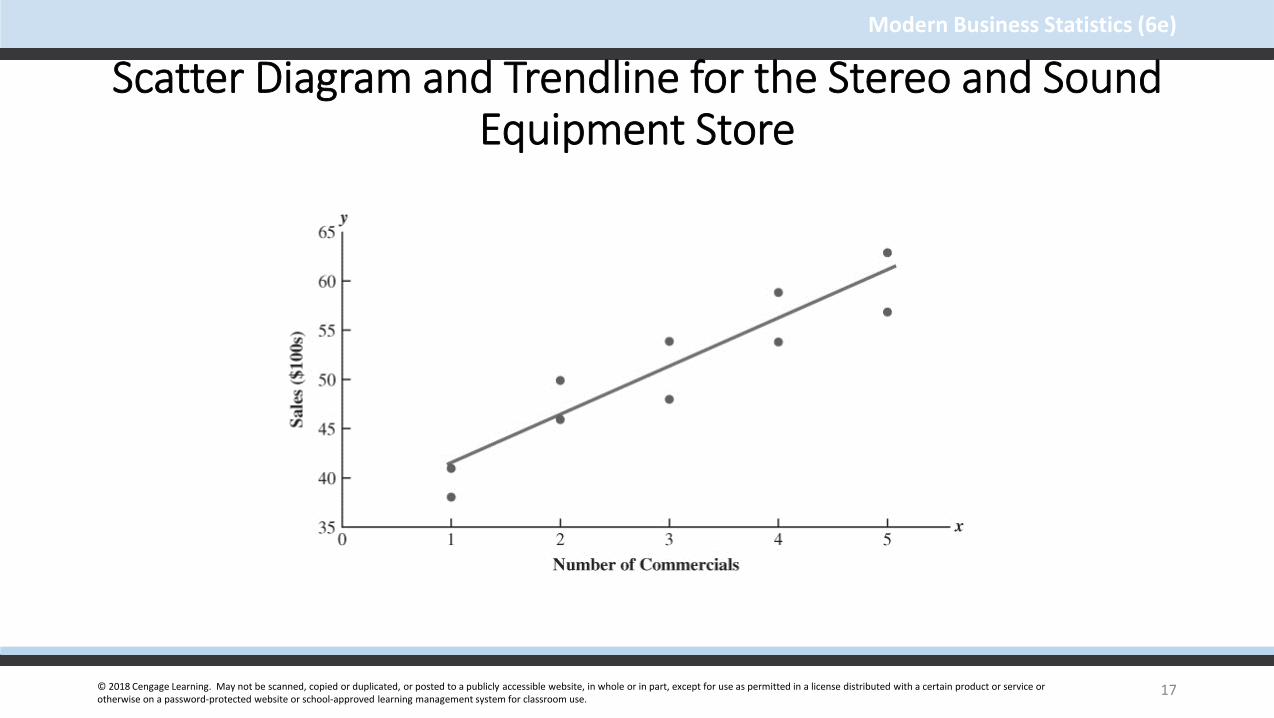
© 2018 Cengage Learning. May not be scanned, copied or duplicated, or posted to a publicly accessible website, in whole or in part, except for use as permitted in a license distributed with a certain product or service or otherwise on a password-protected website or school-approved learning management system for classroom use.
Modern Business Statistics (6e)
Scatter Diagram and Trendline for the Stereo and Sound Equipment Store
17

© 2018 Cengage Learning. May not be scanned, copied or duplicated, or posted to a publicly accessible website, in whole or in part, except for use as permitted in a license distributed with a certain product or service or otherwise on a password-protected website or school-approved learning management system for classroom use.
Modern Business Statistics (6e)
Scatter DiagramExample
Insights Gained from the Stereo and Sound Equipment store Scatter Diagram
The scatter diagram indicates a positive relationship between the number of commercials and sales.
Higher sales is associated with greater number of commercials.
The relationship is not perfect; all plotted points in the scatter diagram are not on a straight line.
18

© 2018 Cengage Learning. May not be scanned, copied or duplicated, or posted to a publicly accessible website, in whole or in part, except for use as permitted in a license distributed with a certain product or service or otherwise on a password-protected website or school-approved learning management system for classroom use.
Modern Business Statistics (6e)
Using Excel to Constructa Scatter Diagram and a Trendline
Step 1 - Select cells A2:B6
Step 2 - Click the Insert tab on the Ribbon
Step 3 - In the Charts group, click Insert Scatter (X,Y)or Bubble Chart
Step 4 - When the list of scatter diagram subtypes appears:Click Scatter (the chart in the upper left corner)
. . . Editing options
19

© 2018 Cengage Learning. May not be scanned, copied or duplicated, or posted to a publicly accessible website, in whole or in part, except for use as permitted in a license distributed with a certain product or service or otherwise on a password-protected website or school-approved learning management system for classroom use.
Modern Business Statistics (6e)
Using Excel to Constructa Scatter Diagram and a Trendline
Step 1 - Click the Chart Title and replace it with Scatter
Diagram for the Stereo and Sound equipment store
Step 2 - Click the Chart Elements button (located next to
the top right corner of the chart)
Step 3 - When the list of chart elements appears:
Click Axis Titles (creates placeholder for titles)
Click Gridlines (to deselect Gridlines option)
Click Trendline
20
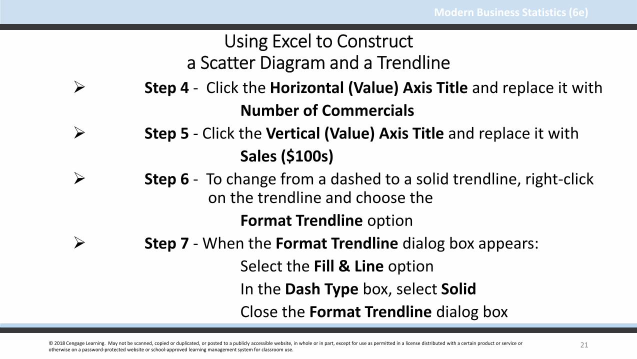
© 2018 Cengage Learning. May not be scanned, copied or duplicated, or posted to a publicly accessible website, in whole or in part, except for use as permitted in a license distributed with a certain product or service or otherwise on a password-protected website or school-approved learning management system for classroom use.
Modern Business Statistics (6e)
Using Excel to Constructa Scatter Diagram and a Trendline
Step 4 - Click the Horizontal (Value) Axis Title and replace it with
Number of Commercials
Step 5 - Click the Vertical (Value) Axis Title and replace it with
Sales ($100s)
Step 6 - To change from a dashed to a solid trendline, right-click on the trendline and choose the
Format Trendline option
Step 7 - When the Format Trendline dialog box appears:
Select the Fill & Line option
In the Dash Type box, select Solid
Close the Format Trendline dialog box
21

© 2018 Cengage Learning. May not be scanned, copied or duplicated, or posted to a publicly accessible website, in whole or in part, except for use as permitted in a license distributed with a certain product or service or otherwise on a password-protected website or school-approved learning management system for classroom use.
Modern Business Statistics (6e)
Using Excel to Constructa Scatter Diagram and a Trendline
Excel Worksheet
22

© 2018 Cengage Learning. May not be scanned, copied or duplicated, or posted to a publicly accessible website, in whole or in part, except for use as permitted in a license distributed with a certain product or service or otherwise on a password-protected website or school-approved learning management system for classroom use.
Modern Business Statistics (6e)
Side-by-Side Bar Chart
A side-by-side bar chart is a graphical display for depicting multiple bar charts on the same display.
Each cluster of bars represents one value of the first variable.
Each bar within a cluster represents one value of the second variable.
23

© 2018 Cengage Learning. May not be scanned, copied or duplicated, or posted to a publicly accessible website, in whole or in part, except for use as permitted in a license distributed with a certain product or service or otherwise on a password-protected website or school-approved learning management system for classroom use.
Modern Business Statistics (6e)
24
Side-by-Side Bar Chart
0
10
20
30
40
50
60
$10-19 $20-29 $30-39 $40-49
Fre
qu
en
cy
Meal Price ($)
Side by Side Bar Chart for the Quality and Price Meal Data
Good Very Good Excellent

© 2018 Cengage Learning. May not be scanned, copied or duplicated, or posted to a publicly accessible website, in whole or in part, except for use as permitted in a license distributed with a certain product or service or otherwise on a password-protected website or school-approved learning management system for classroom use.
Modern Business Statistics (6e)
Stacked Bar Chart
A stacked bar chart is another way to display and compare two variables on the same display.
It is a bar chart in which each bar is broken into rectangular segments of a different color.
If percentage frequencies are displayed, all bars will be of the same height (or length), extending to the 100% mark.
25

© 2018 Cengage Learning. May not be scanned, copied or duplicated, or posted to a publicly accessible website, in whole or in part, except for use as permitted in a license distributed with a certain product or service or otherwise on a password-protected website or school-approved learning management system for classroom use.
Modern Business Statistics (6e)
Stacked Bar Chart
26
0%
10%
20%
30%
40%
50%
60%
70%
80%
90%
100%
$10-19 $20-29 $30-39 $40-49
Pe
rce
nta
ge f
req
ue
ncy
Meal Price ($)
Stacked bar chart for the quality rating and meal price data
Good Very Good Excellent

© 2018 Cengage Learning. May not be scanned, copied or duplicated, or posted to a publicly accessible website, in whole or in part, except for use as permitted in a license distributed with a certain product or service or otherwise on a password-protected website or school-approved learning management system for classroom use.
Modern Business Statistics (6e)
Data Visualization: Best Practicesin Creating Effective Graphical Displays
Data visualization describes the use of graphical displays to summarize and present information about a data set.
The goal is to communicate as effectively and clearly as possible the key information about the data.
27

© 2018 Cengage Learning. May not be scanned, copied or duplicated, or posted to a publicly accessible website, in whole or in part, except for use as permitted in a license distributed with a certain product or service or otherwise on a password-protected website or school-approved learning management system for classroom use.
Modern Business Statistics (6e)
Creating Effective Graphical Displays
Creating effective graphical displays is as much art as it is science.
Here are some guidelines . . .
Give the display a clear and concise title.
Keep the display simple.
Clearly label each axis and provide the units of measure.
If colors are used, make sure they are distinct.
If multiple colors or lines are used, provide a legend.
28
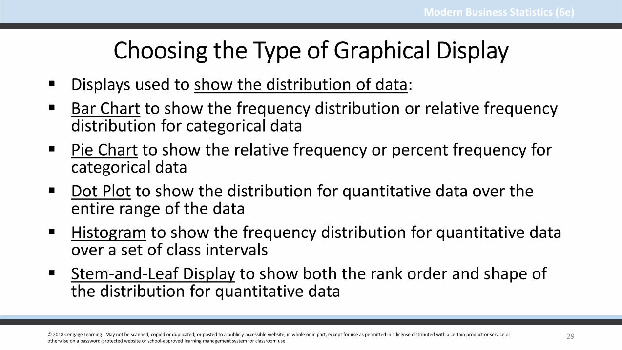
© 2018 Cengage Learning. May not be scanned, copied or duplicated, or posted to a publicly accessible website, in whole or in part, except for use as permitted in a license distributed with a certain product or service or otherwise on a password-protected website or school-approved learning management system for classroom use.
Modern Business Statistics (6e)
Choosing the Type of Graphical Display Displays used to show the distribution of data:
Bar Chart to show the frequency distribution or relative frequency distribution for categorical data
Pie Chart to show the relative frequency or percent frequency for categorical data
Dot Plot to show the distribution for quantitative data over the entire range of the data
Histogram to show the frequency distribution for quantitative data over a set of class intervals
Stem-and-Leaf Display to show both the rank order and shape of the distribution for quantitative data
29

© 2018 Cengage Learning. May not be scanned, copied or duplicated, or posted to a publicly accessible website, in whole or in part, except for use as permitted in a license distributed with a certain product or service or otherwise on a password-protected website or school-approved learning management system for classroom use.
Modern Business Statistics (6e)
Choosing the Type of Graphical Display
Displays used to make comparisons:
Side-by-Side Bar Chart to compare two variables
Stacked Bar Chart to compare the relative frequency or Percent frequency of two categorical variables
30

© 2018 Cengage Learning. May not be scanned, copied or duplicated, or posted to a publicly accessible website, in whole or in part, except for use as permitted in a license distributed with a certain product or service or otherwise on a password-protected website or school-approved learning management system for classroom use.
Modern Business Statistics (6e)
Choosing the Type of Graphical Display
Displays used to show relationships:
Scatter Diagram to show the relationship between two quantitative variables
Trendline to approximate the relationship of data in a scatter diagram
31

© 2018 Cengage Learning. May not be scanned, copied or duplicated, or posted to a publicly accessible website, in whole or in part, except for use as permitted in a license distributed with a certain product or service or otherwise on a password-protected website or school-approved learning management system for classroom use.
Modern Business Statistics (6e)
Data Dashboards
A data dashboard is a widely used data visualization tool.
It organizes and presents key performance indicators (KPIs) used to monitor an organization or process.
It provides timely, summary information that is easy to read, understand, and interpret.
Some additional guidelines include . . .
• Minimize the need for screen scrolling.
• Avoid unnecessary use of color or 3D.
• Use borders between charts to improve readability.
32

© 2018 Cengage Learning. May not be scanned, copied or duplicated, or posted to a publicly accessible website, in whole or in part, except for use as permitted in a license distributed with a certain product or service or otherwise on a password-protected website or school-approved learning management system for classroom use.
Modern Business Statistics (6e)
Data Dashboard Example
33

© 2018 Cengage Learning. May not be scanned, copied or duplicated, or posted to a publicly accessible website, in whole or in part, except for use as permitted in a license distributed with a certain product or service or otherwise on a password-protected website or school-approved learning management system for classroom use.
Modern Business Statistics (6e)
Tabular and Graphical Displays
• FrequencyDistribution
• Rel. Freq. Dist.• Percent Freq.
Distribution• Crosstabulation
• Bar Chart• Pie Chart• Side-by-Side
Bar Chart• Stacked
Bar Chart
• Frequency Dist.• Rel. Freq. Dist.• % Freq. Dist.• Cum. Freq. Dist.• Cum. Rel. Freq. Dist.• Cum. % Freq. Dist. • Crosstabulation
• Dot Plot• Histogram• Stem-and-
Leaf Display• Scatter
Diagram
Categorical Data Quantitative Data
TabularDisplays
TabularDisplays
GraphicalDisplays
GraphicalDisplays
Data
34

© 2018 Cengage Learning. May not be scanned, copied or duplicated, or posted to a publicly accessible website, in whole or in part, except for use as permitted in a license distributed with a certain product or service or otherwise on a password-protected website or school-approved learning management system for classroom use.
Modern Business Statistics (6e)
End of Chapter 2, Part B
35