Organizational disasters: why they happen and how they may be prevented
You make it happen: Document demand, typeface design
Gerry Leonidas
Text published in: Kochan, B. (ed.) Granshan: design & identity. Typographische Gesellschaft München , Munich, Germany, pp. 142–149
Abstract
This paper is based a presentation in the Granshan Conference, Bangkok, 2013. It intro-duces notions of interrelation between the wider culture and especially ephemeral or ver-nacular production, and typeface design.
1. Introduction
The basic premise of this paper is that typefaces reflect, and respond to, the conditions of making and using documents. The combination of a narrow acceptable topology for func-tionally acceptable letters and paragraphs, and a wide range of possibilities to express these topologies, offers a revealing tool for examining changes in the perceptions of pro-fessionals in visual communication. Beyond technical issues, the choices of document makers allow insights into wider trends such as urbanisation, demographic changes, edu-cation standards, and wider issues of visual literacy. (N.B. About a third of the images used in the original presentation that this paper is based on are reproduced here. The rest were used to elaborate on or add contextual information, and to aid the flow of the lecture. I have also left out references that only conference atten-dees would relate to.) [Image 2]
2. People, places, and conditions of making
Typefaces tell stories. They are a mirror of their times: the place, the people, the condi-tions of document-making and reading. Through them we can see the limitations of tech-nology and economy, and the opportunities of human endeavour and imagination. Type-faces evolve rapidly to respond to the new globalised, multi-script, multi-language typo-graphic environments, with sensitivity to the complexities of each community. In the process, typeface design reveals the crucial dialogue between tradition and modernity that communities constantly engage in.
Our aim, as typographers, type designers, and educators is to do this with linguistic, cultural and typographic integrity. Linguistic integrity may well be the more straightfor-ward to cover. There is a well-established community of researchers that provide a run-ning update on the form of each language. Problems there are focused only on the pres-ence and capacity of channels between typographers, type designers, and linguists. Al-though these communities do not interact as a matter of course, mutual awareness and recognition is growing. [Image 3]
! / !1 13
A very simple example may be a name that has diacritics in its native form, but aban-dons them online. Legacy technology is partly to blame, as are hardware issues and train-ing habits -- even if current technology allows us full use of diacritics. This gradual shift in usage offers insights into users, but at the same time is evidence of language adaptation in action. In this case, a flexibility in transcription, as well as interpretation is imposed.
Similarly, we see how users may develop a flexibility for writing that they would not contemplate if it were requested explicitly. For example, would an Arab or Persian speak-ers accept the idea of abandoning their script in favour of the Latin? And yet, driven by the limitations of early PCs and relatively recent mobile phones, this is exactly what happened. Again, this cross-script transcription perseveres, regardless of the technology's capability to encode the Arabic script sufficiently well.
Cultural identity is more difficult to pinpoint, partly because it is multifaceted, and is manifested in many parallel expressions. Demographic, geographic, educational, and community factors all contribute, and are constantly in flux. More often than not, they are in tension, if not in conflict, as a society develops at differing rates across the spectrum of its members. Typeface designers cannot know all the answers, but must know all the ques-tions to ask. [Image 4]
Taking an example integral to my own identity, the iconography and symbolism of clas-sical antiquity are associated with specific letterforms. These are typically on inscriptions that list civic representatives, and members of office. They are neat and regular, and quite focused in their forms. In contrast, an informal and even potentially subversive inscription on the foot of a temple in Delphi, may have letterforms that are irregular, and bear Roman influences. This is as close as we get to inscriptional graffiti, but its location and antiquity canonise it. [Image 5]
On the other hand, it is possible to make eclectic references to historical models with-out falling into the trap of pastiche or parody. The exuberant references to formal writing of the grec-du-roi can bequeath a stress and counter structure to a modern typeface that will show its legacy only to professionals; to readers it will convey fairly abstract values associated with tradition and honesty. Indeed, the most difficult challenge for the typeface designer is the absence of specific context that lettering enjoys. In the remnants of a Byzantine fresco a style that is culturally loaded may seem perfectly at home, whereas it will appear entirely out of place blown out of proportion in an urban storefront. [Image 6]
We notice that many commercial documents have very familiar layouts (and, therefore, reading strategies). This spread in Thai may be unreadable to me, but its hierarchy and reading sequence, and the use of layering and grouping, are entirely transparent. In this case the cultural references are clear: this document speaks of urban middle classes, the differentiation through consumer choices, and branding as a pervasive presence that crosses continents. [Image 7]
Typographic integrity flows very easily from these observations. Indeed, a random issue of an international magazine shows how coherent typographic compositions with precisely defined specifications for typefaces and spacing construct very different identities. For readers of the original edition this may be confirming expected patterns, whereas for the Thai readers this may express modernity and a break with traditional social models. of This is where typeface design supports, but also expresses, the cultural identity of a com-munity. In this case, the combination of a bold sans heading in English over a convention-
! / !2 13
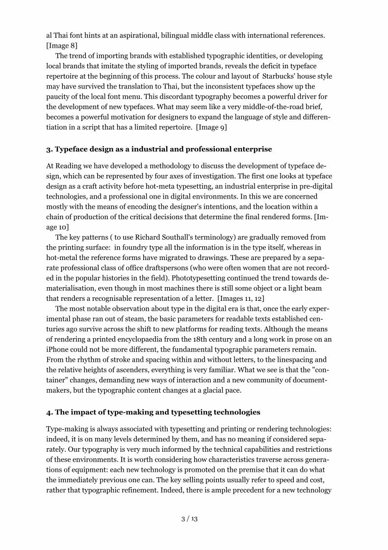
al Thai font hints at an aspirational, bilingual middle class with international references. [Image 8]
The trend of importing brands with established typographic identities, or developing local brands that imitate the styling of imported brands, reveals the deficit in typeface repertoire at the beginning of this process. The colour and layout of Starbucks' house style may have survived the translation to Thai, but the inconsistent typefaces show up the paucity of the local font menu. This discordant typography becomes a powerful driver for the development of new typefaces. What may seem like a very middle-of-the-road brief, becomes a powerful motivation for designers to expand the language of style and differen-tiation in a script that has a limited repertoire. [Image 9]
3. Typeface design as a industrial and professional enterprise
At Reading we have developed a methodology to discuss the development of typeface de-sign, which can be represented by four axes of investigation. The first one looks at typeface design as a craft activity before hot-meta typesetting, an industrial enterprise in pre-digital technologies, and a professional one in digital environments. In this we are concerned mostly with the means of encoding the designer's intentions, and the location within a chain of production of the critical decisions that determine the final rendered forms. [Im-age 10]
The key patterns ( to use Richard Southall's terminology) are gradually removed from the printing surface: in foundry type all the information is in the type itself, whereas in hot-metal the reference forms have migrated to drawings. These are prepared by a sepa-rate professional class of office draftspersons (who were often women that are not record-ed in the popular histories in the field). Phototypesetting continued the trend towards de-materialisation, even though in most machines there is still some object or a light beam that renders a recognisable representation of a letter. [Images 11, 12]
The most notable observation about type in the digital era is that, once the early exper-imental phase ran out of steam, the basic parameters for readable texts established cen-turies ago survive across the shift to new platforms for reading texts. Although the means of rendering a printed encyclopaedia from the 18th century and a long work in prose on an iPhone could not be more different, the fundamental typographic parameters remain. From the rhythm of stroke and spacing within and without letters, to the linespacing and the relative heights of ascenders, everything is very familiar. What we see is that the "con-tainer" changes, demanding new ways of interaction and a new community of document-makers, but the typographic content changes at a glacial pace.
4. The impact of type-making and typesetting technologies
Type-making is always associated with typesetting and printing or rendering technologies: indeed, it is on many levels determined by them, and has no meaning if considered sepa-rately. Our typography is very much informed by the technical capabilities and restrictions of these environments. It is worth considering how characteristics traverse across genera-tions of equipment: each new technology is promoted on the premise that it can do what the immediately previous one can. The key selling points usually refer to speed and cost, rather that typographic refinement. Indeed, there is ample precedent for a new technology
! / !3 13

justifying a noticeable drops in typographic quality through production efficiency. From the design restrictions of the hot-metal unit systems, to the – often brutal – character set limitations, we can see echoes of past technologies even today, nearly thirty years into the platform-independent digital type era. (It is also worth mentioning the pervasive, but mostly unacknowledged, influence of typewriters on typography. They have often set the bare minimum character complement and behaviour for a script, and through this have become de facto guides for engineers. Their impact can be traced in typefaces even today.) [Images 13, 14]
5. Changes in type-making and typesetting environments
On the other hand, we can detect design decisions that have been enabled by, or respond to, changes on the environments for designing typefaces and documents. The character-glyph model of Unicode and the extended character sets of OpenType stem from function-al rationales, but have had a clear impact on the design of typefaces: most notable is the increased correlation of dimensions and the sharing of shapes across scripts, and the rein-forcement of a refined stylistic coherence within a single font. Equally, the capacity of the the format to substitute iteratively has allowed designers to routinely abandon the combi-natorial restrictions of early digital typefaces. This has enabled designers to create typo-graphically competent systems that capture the vitality of scripts based strongly on writ-ing. [Images 15, 16, 17]
6 The tension between tradition and modernity
Lastly, the examination of the tension between tradition and modernity in each culture offers unique insights into the acceptance or marginalisation of a new typeface. This is also the area where research in typeface design departs from the historical archives and the literature. From the higher end of the market for printed books, to the intensity of news-papers, to targeted magazines, to ephemera and disposables like packaging, to lettering and casual writing: all these instances of texts follow only partially overlapping paths, each at its own pace. For example, a typeface imitating writing may be acceptable initially just on youth-orientated packaging as a novelty, but the style may easily come to be associated with a specific demographic, and be associated with novelty or youthfulness. From that point it is an easy step to more permanent documents, such as booklets for young adults. It is then quite likely that the style may drift into the mainstream. Sometimes the variant “new” style begins to influence the models for the mainstream text typefaces, and a virtu-ous cycle begins. [Images 18, 19, 20]
What is most interesting is the fact that this process does not rely at all on the specific shapes of letters. The notions of tradition and modernity are utterly context-dependant, and can be encapsulated by the difference of what existed during the designers' formative years, and what represents the period of their beginning to form and independent profes-sional identity. These kind of deliberations are rarely captured, but this letter by Walter Tracy defines “novelty” as a deviation from pre-existing forms within the genre, even if similar shapes exist abundantly in very different circumstances (type vs. hand-made bill-boards). [Image 21]
! / !4 13

7. Conclusion
I will close with an example from a student at Reading, Igor Labudovic, who developed a family covering the Latin, Arabic, and Hebrew scripts. (He also experimented with Greek, but his focus was on the very real scenario of the three scripts used alongside one another.) His project, and others like it from the last decade and a half, represent a depar-ture from traditional typeface design. Here the family is planned with sensitivity to the typographic requirements of each script, and as much as possible parity across them. There is no explicit hierarchy in the family: variants for emphasis and strength are consis-tent. The task requires a more enlightened approach than a one-to-one correspondence would allow, not least because some pairings would be impossible. For example, the con-cept of italics is alien to both Arabic and Hebrew. Yet the designer may be inspired by local practice, and possibly look at the matter unencumbered by the cultural baggage of the lo-cals. [Images 22, 23, 24]
It is often in these situations that the more groundbreaking innovations take place. This new typographic world we occupy is global not only in reach, but also in participation and contribution.
Author address
Department of Typography & Graphic Communication University of Reading 2 Earley Gate Reading RG6 6AU UK
! / !5 13

Image 2
Image 3
Image 4
! / !6 13
People, places, and conditions of document-making and document-reading
Linguistic, cultural and typographic integrity
Linguistic, cultural and typographic integrity
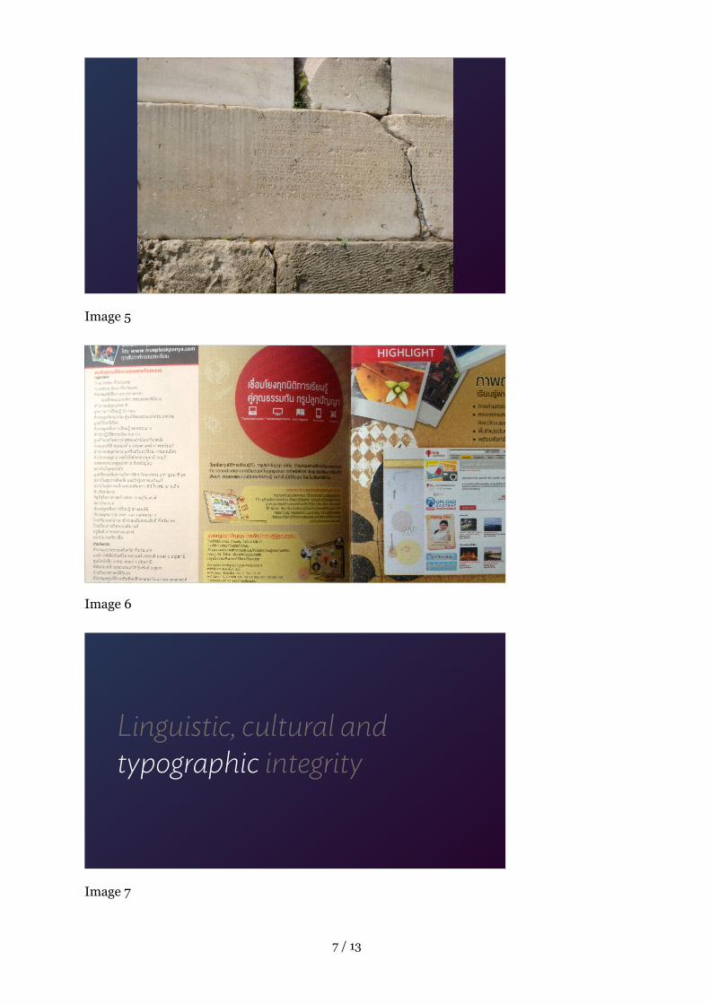
Image 5
Image 6
Image 7
! / !7 13
Linguistic, cultural and typographic integrity
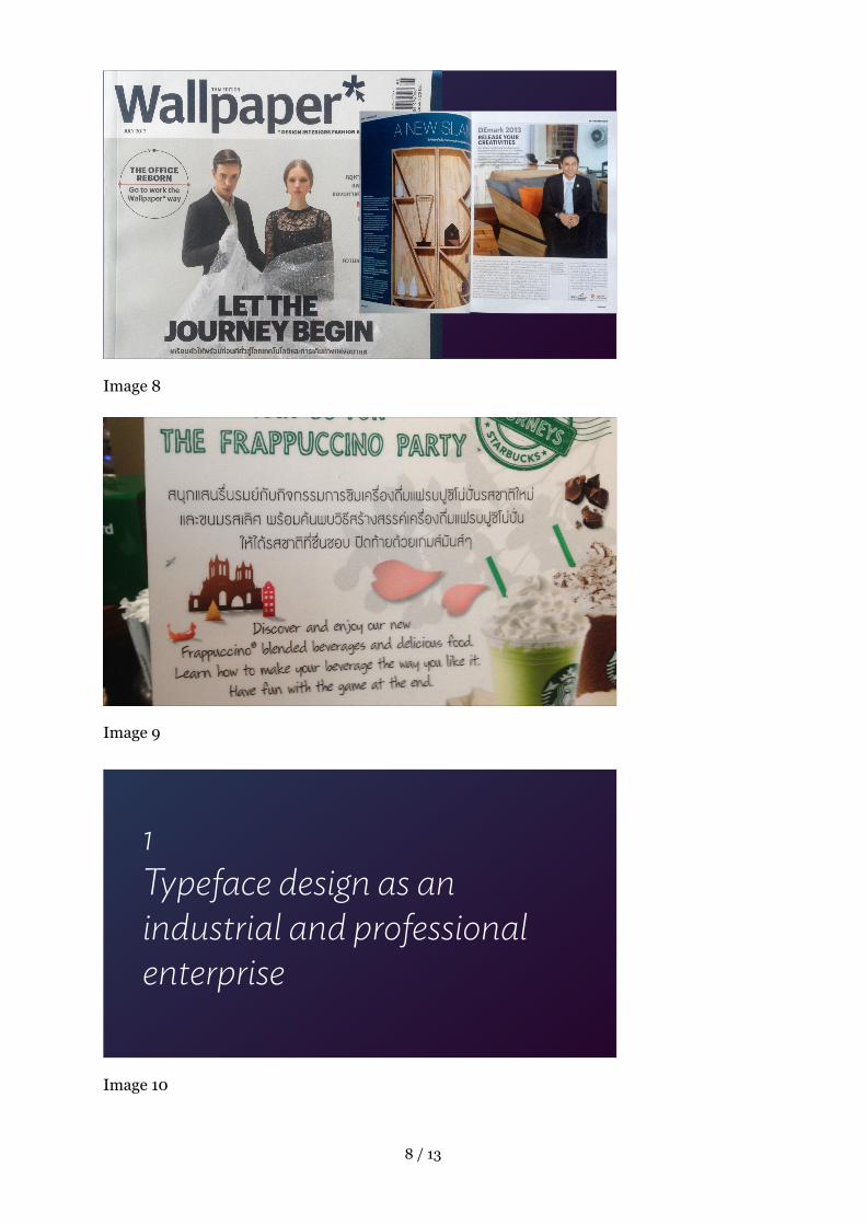
Image 8
Image 9
Image 10
! / !8 13
1 Typeface design as an industrial and professional enterprise

Image 11
Image 12 Image 13
! / !9 13
2 The impact of type-making and typesetting technologies on the forms of letters

Image 14
Image 15
Image 16
! / !10 13
3 Typographic decisions that reflect changes in type-making and typesetting environments

Image 17
Image 18
Image 19
! / !11 13
4 The tension between tradition and modernity

Image 20
Image 21
Image 22
! / !12 13
New approaches

Image 23
Image 24
! / !13 13
Copyright © 2022 FDOKUMEN