Statistical Project ...(Stat in Business)..
68
Group no:-4 Submitted By: Bilal Ahmad () Zahoor Hussain () Atif Nazir () Faisal Haqani () Fasialhaqani (13-ARID-37)
-
Upload
independent -
Category
Documents
-
view
3 -
download
0
Transcript of Statistical Project ...(Stat in Business)..
Group no:-4
Submitted By:Bilal Ahmad () Zahoor Hussain ()Atif Nazir ()Faisal Haqani ()
Fasialhaqani (13-ARID-37)

Hafiz Zahor contributionpage no( 1 to 18)
CHAPTER 1 DATA AND STATISTICS
STATISTICS
Definition:
Statistics is the process of data collection, organizing, analyzingthe data and make decisions.
TWO MAJOR FORMS OF STATISTICS
Descriptive statistics Inference Statistics
Descriptive Statistics:
Descriptive Statistics consists of the methods of collecting,organizing, displaying and describing data by using tables, graphsand summary measures. It may be in tabular, graphical and numericalform. We show the graphical and tabular summary of the data.
For Example: The shooting percentage in basketball is a descriptivestatistic that summarizes the performance of a player or a team.This number is the number of shots made divided by the number ofshots taken or the grade point average. As The single numberdescribes the general performance of a student across the range oftheir course experiences
Inferential statistics:
Inferential statistics is the process of describing populationbased on sample results. This includes estimations and predictionsthat are made using the data. Two important terms used in this typeof statistics are:
1

Population: It is the set of all the elements of interesting in aparticular study. The individual in population is called the studyunit.
Sample: Sample is any part of population which is selected frompopulation. The sample is studied and on the basis of this we tryto know something about the population.
For Example: Suppose we want to have an idea about the percentageof illiterates in our country. We take a sample from the populationand find the proportion of illiterates in the sample. This sampleproportion with the help of probability enables us to make someinferences about the population proportion. This study belongsto inferential statistics.
Application of Statistic in Business and Economics
In today’s global world everyone is using a huge amount ofstatistical information.
Accounting
Public accounting firms use statistical sampling procedures whenconducting audits for their client’s. A bank works on theassumption that all depositors do not withdrawal their deposit onthe same day. The banker use statistical approach based onprobability to estimate the numbers of deposit.
Finance
Financial analysts use a variety of statistical information,including price-earnings ratios and dividend yields, to guide theirinvestment recommendations. The amount of premium for the insurancepolicies is based on life table.
Marketing
2

Electronic point-of-sale scanners at retail checkout counters arebeing used to collect data for a variety of marketing researchapplications. Statistical research helps inform business decisionsby defining the target consumer. Using statistical research,businesses can get a better idea of what sorts of productsconsumers need, how they will use them and what they will be ableto pay.
Production
A variety of statistical quality control charts are used to monitorthe output of a production process. It starts with plotting yourproduction on a graph. When you have done that for a while you takea step back and look at the graph in order to see how you aredoing. You can monitor your personal production on daily basis withthe help of statistics.
Economics
Economists use statistical information in making forecasts aboutthe future of the economy or some aspect of it. . The relationshipbetween supply and demand is studied by statistical method and thedecision is supported by observed data. Import and export, theinflation rate, the percapita income these are the problems whichrequire good knowledge of statistics.
DATA
Data is a collection of numbers or facts that is used as a basisfor making conclusions. It could be in raw form we can collectthese data from entities and collection of data is called data set.
TYPES OF DATA
Qualitative data Quantitative data
3
Qualitative Data:
The data that is in non-numeric form refers to qualitative data. Itis not in terms of numbers, but rather by means of a naturallanguage description. It is also called categorical data. It ismeasured with the help of nominal scale. The variable withQualitative data is called Qualitative variable.
For Example: Intelligence of student.Intelligence is the quality ofthe student we can simply examine whether intelligence is presentin the student or not. We can use “yes” for intelligence and “no”for non-intelligence and data thus obtained will be qualitativedata.
Quantitative Data:
This type of data is always in the form of numeric figures. Thevariable with quantitative data is called quantitative variable.
For Example: We can count the number of students in a school if wesay there are 50 students in each class and there are 10 classes inschool then there will be 500 students in a school and this willrepresent quantitative Data.
TYPES OF QUANTITATIVE DATA
Discrete data Continuous data
Discrete data:
Data whose possible values are countable is called discrete data.The discrete data type usually represents a count of something.
For Example: Number of people in a household, number of cigarettessmoked per day, number of defective light bulbs on a productionline,
Continuous data:
4
Data whose possible values are uncountable and which may assume anyvalue in an interval is called continues data.e.g. Data that hasdecimals figures.
For Example: Varying temperature from maximum to minimum point on aparticular day is a continuous data. Continuous data would belength.
Some important terms uses in statistics are:
Element
Elements are entities on which data is collected.
Variable
These are the properties of interest for the element.
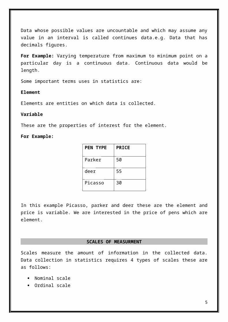
For Example:
PEN TYPE PRICE
Parker 50
deer 55
Picasso 30
In this example Picasso, parker and deer these are the element andprice is variable. We are interested in the price of pens which areelement.
SCALES OF MEASURMENT
Scales measure the amount of information in the collected data.Data collection in statistics requires 4 types of scales these areas follows:
Nominal scale Ordinal scale
5
Interval scale Ratio scale
Nominal scale:
The nominal data measurement scale is used for data that isexpressed with the purpose of identifying some kind of attribute.It can be expressed using either a numeric code or some kind ofnonnumeric label.
For Example: male and female. We can assign numeric values to themfor example if we use1 for male and 2 for female.
Ordinal scale:
The ordinal data measurement scale is used when you want toclassify information based on a specific order or rank that isnecessary. Like nominal data, the information can be expressedeither in a numeric or nonnumeric way.
For Example: strongly agree, agree, neutral, dissatisfied andstrongly dissatisfied. In this first we divide them into categoriesand then give them order.
Interval scale:
The interval data measurement scale is used for numeric data thatis expressed in intervals of some kind of fixed measurement.
For example: If student 1 scores 615-545=60 points more thanstudent 2, while student 2 scores 545-465=70 points more thanstudent 3 so there is proper interval between these.
Ratio scale:
The ratio data measurement scale is used to express the ratio ofsome of the values of interval data. The ratio of two values isalways meaningful.
For example:If a school is trying to create a data set of how manycredit hours students have taken, they could state that student Ahas taken 10 hours, while student B has taken 20 hours. Using the
6
ratio method, they could say that student B has taken twice as manycredit hours of classes then student A took.
DATA SOURCES
Data can be obtained from two types of sources:
Existing sources Statistical studies
EXISTING SOURCSES
Existing records will be the source of important data in manyevaluations, particularly when conducting a needs assessment. Inthis type of source you do not need to collect the data again andagain. Here are some sources for existing data:
Data base:Some companies maintain record about their employees,customers and about their business operations. For examplethey use the name, address and age of employee for somepurpose. In case of customer companies maintain completecustomer profile.
Industries and interest organizations:Industry associations and interest organization are alsomaintaining data. They maintain data about the travel ratethat how many tourists travel and their expenditures aswell.travel industries are interested in this type of data.
Internet:Internet is the most important and reliable source of data.Every organization maintains their data for their customers ontheir websites. Customer can get the data about product likeproduct price or product properties. So customer can easilymake their order by using the information.
Government agencies:
7

Some government agencies maintain the data about thepopulation, individual income, GDP,unemploymentrate,import,export etc. many companies use these types of datafor their researches and for other purpose.
STATISTICAL STUDIES:
Sometimes data needed is not available for particular application.In this case we use statistical study. There are two type ofstatistical study:
Experimental Observational
Experimental study:
In experimental study treatment is applied to specific experimentalunits such as person, group and then proceeds to observe the effectof the treatments on the experimental units.
Example: When launching new product marketers first apply theexperimental study to find out whether the product is effective ornot.
Observational study:
It is also called the non-observational study. In this type ofstudy there is no variable of interest or no experimental units.The most important type of this study is surveys.
Example: For this project we have done observational study. Wefirst identify the research questions. And through these questionswecollect the data for further use.
Data acquisition errors:
Data acquisition errors occurs when we obtained the wrong data orWhen after processing the data the result is not equal to actualresult. Working with wrong data is actually very dangerous. Theseerrors may occur in number of ways. If the data is not correct thenthere will be bad decisions.
8
Example: when selecting students on the basis of serial numberssome time wrong serial number is entered in the list so these typesof mistakes create error.
CHAPTER 2
DISCRIPTIVE STATISTICS TABULAR AND GRAPHICAL
9

QUALITATIVE DATA
Tabular formsforpresentation of qualitative data
1. Frequency Distribution:
A frequency distribution is a tabular summary of data showing thenumber of items in each mutually exclusive class. It is a simplestway of showing unorganized data in the form of table.
Data sample
OTHER, MBA,MS,MBA,MBA,MS, OTHER, BBA, BBA, MBA , BBA,BBA, BBA,MBA ,MBA,BBA, BBA, BBA, BBA,
10
Data
Qualitative
Tabular Form
Frequency
DistributionRelative
Frequency
DistributionPercent
Frequency
DistributionCross
Tabulation
Gaphical form
Bar Graph
Pie Chart
Quantitative
Tabular Form
Frequency
DistributionRelative
Frequency
DistributionPercent
Frequency
DistributionCumulative
Frequency Distribut
ionCross
Tabulation
Graphical form
Dot plot
Histogram
Ogive
Scatter Diagram
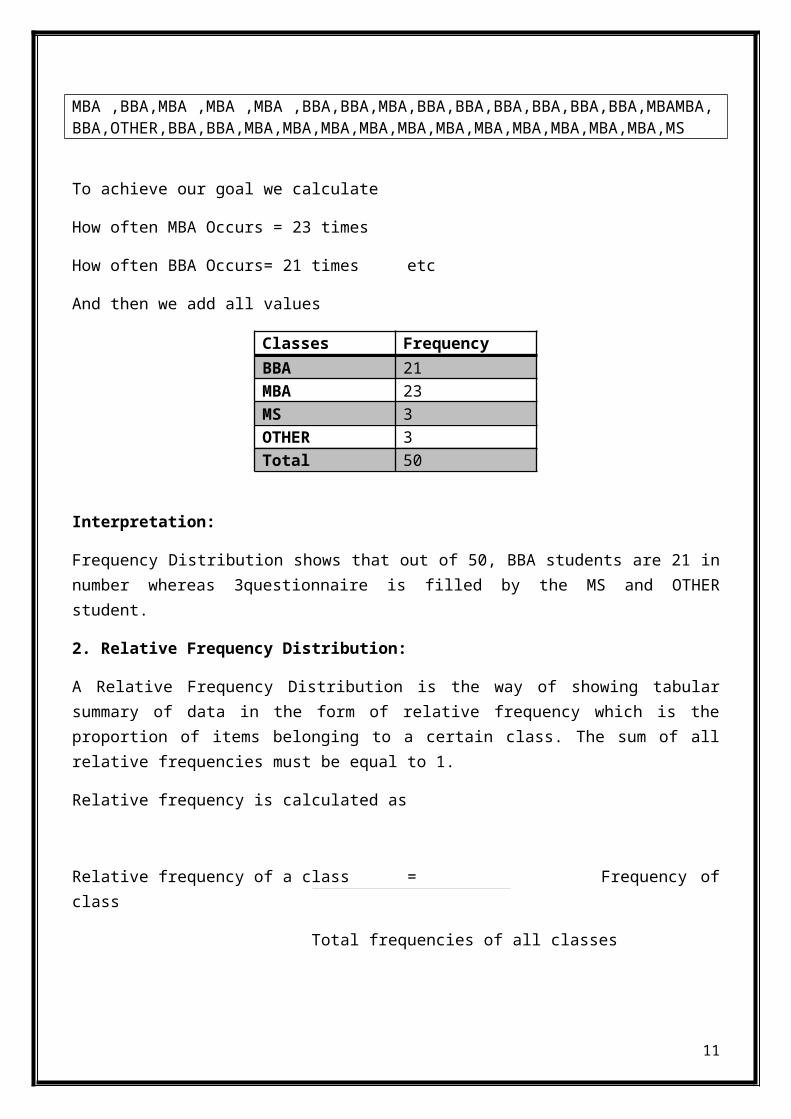
MBA ,BBA,MBA ,MBA ,MBA ,BBA,BBA,MBA,BBA,BBA,BBA,BBA,BBA,BBA,MBAMBA,BBA,OTHER,BBA,BBA,MBA,MBA,MBA,MBA,MBA,MBA,MBA,MBA,MBA,MBA,MBA,MS
To achieve our goal we calculate
How often MBA Occurs = 23 times
How often BBA Occurs= 21 times etc
And then we add all values
Classes FrequencyBBA 21MBA 23MS 3OTHER 3Total 50
Interpretation:
Frequency Distribution shows that out of 50, BBA students are 21 innumber whereas 3questionnaire is filled by the MS and OTHERstudent.
2. Relative Frequency Distribution:
A Relative Frequency Distribution is the way of showing tabularsummary of data in the form of relative frequency which is theproportion of items belonging to a certain class. The sum of allrelative frequencies must be equal to 1.
Relative frequency is calculated as
Relative frequency of a class = Frequency ofclass
Total frequencies of all classes
11
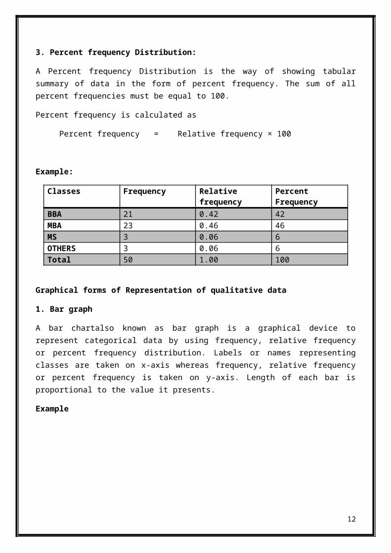
3. Percent frequency Distribution:
A Percent frequency Distribution is the way of showing tabularsummary of data in the form of percent frequency. The sum of allpercent frequencies must be equal to 100.
Percent frequency is calculated as
Percent frequency = Relative frequency × 100
Example:
Classes Frequency Relativefrequency
PercentFrequency
BBA 21 0.42 42MBA 23 0.46 46MS 3 0.06 6OTHERS 3 0.06 6Total 50 1.00 100
Graphical forms of Representation of qualitative data
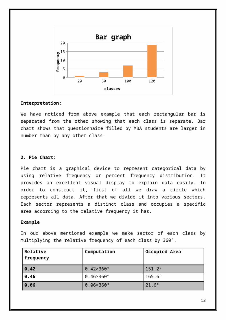
1. Bar graph
A bar chartalso known as bar graph is a graphical device torepresent categorical data by using frequency, relative frequencyor percent frequency distribution. Labels or names representingclasses are taken on x-axis whereas frequency, relative frequencyor percent frequency is taken on y-axis. Length of each bar isproportional to the value it presents.
Example
12
20 50 100 1200
5
10
15
20Bar graph
classes
freq
uency
Interpretation:
We have noticed from above example that each rectangular bar isseparated from the other showing that each class is separate. Barchart shows that questionnaire filled by MBA students are larger innumber than by any other class.
2. Pie Chart:
Pie chart is a graphical device to represent categorical data byusing relative frequency or percent frequency distribution. Itprovides an excellent visual display to explain data easily. Inorder to construct it, first of all we draw a circle whichrepresents all data. After that we divide it into various sectors.Each sector represents a distinct class and occupies a specificarea according to the relative frequency it has.
Example
In our above mentioned example we make sector of each class bymultiplying the relative frequency of each class by 360°.
Relativefrequency
Computation Occupied Area
0.42 0.42×360° 151.2°0.46 0.46×360° 165.6°0.06 0.06×360° 21.6°
13

0.06 0.06×360° 21.6°Total 360°
3%
10%
23%
63%
pie chart
2050100120
Interpretation:
Above chart shows that most of its area is occupied by MBA studentswhereas MS and OTHER students cover only 3% of the area
QUANTITATIVE DATA
Tabular forms for representation of quantitative data
1. Frequency Distribution:
A frequency distribution is a tabular summary of data showing thenumber of items in each mutually exclusive class. It is a simplestway of showing unorganized data in the form of table.
To define the classes, three steps must be followed
1. Determine the number of classes 2. Determine the width of each class3. Determine the class limits
14

Number of classes:
In this step classes we specified the ranges in order to makeclasses for grouped data. Number of classes depends upon the numberof items. Larger the number of items, larger will be the number ofclasses and if the number of items is small, the number of classeswill also be small. Generally it is recommended that number ofclasses should between 5 and 20.
Width of classes:
In this step we find the width of class which should be same foreach class. If number of classes are larger, class width would besmall. Class width can be calculated by the following formula:
Class width = Largest data value – Smallest data value
Number of classes
Example
Time taken (in seconds) by20 students in a class to answer a simplescience question is given below
Class width = 34 – 8 = 4.33
5
6
The smallest value in the above data is 8 and the largest is 34.The interval from 8 to 34 is broken up into smaller subintervals(called class intervals). For each class interval, the amount ofdata items falling in this interval is counted. This number iscalled the frequency of that class interval.
Class limits:
15
20 25 24 33 1326 8 19 31 1116 21 17 11 3414 15 21 18 17
Class limit must be chosen in a way so that each data item mustbelong to one and only one class. There are two types of classlimits
Lower class limit represents the smallest data value of acertain class
Upper class limit represents the largest data value of acertain class
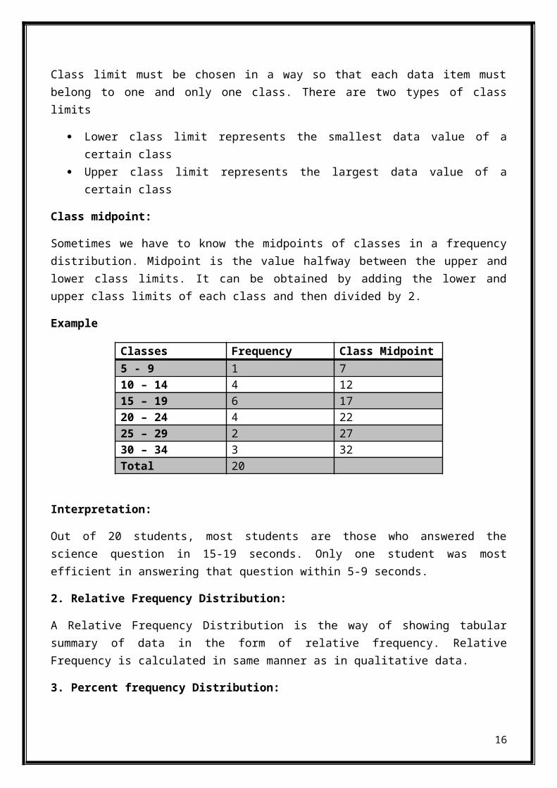
Class midpoint:
Sometimes we have to know the midpoints of classes in a frequencydistribution. Midpoint is the value halfway between the upper andlower class limits. It can be obtained by adding the lower andupper class limits of each class and then divided by 2.
Example
Classes Frequency Class Midpoint5 - 9 1 710 – 14 4 1215 – 19 6 1720 – 24 4 2225 – 29 2 2730 – 34 3 32Total 20
Interpretation:
Out of 20 students, most students are those who answered thescience question in 15-19 seconds. Only one student was mostefficient in answering that question within 5-9 seconds.
2. Relative Frequency Distribution:
A Relative Frequency Distribution is the way of showing tabularsummary of data in the form of relative frequency. RelativeFrequency is calculated in same manner as in qualitative data.
3. Percent frequency Distribution:
16
A Percent frequency Distribution is the way of showing tabularsummary of data in the form of percent frequency. Percent frequencyis calculated in same manner as in qualitative data.
Example
Interpretation:
30 % students answered the question within 15-19 seconds 15 % students take longest time and answered within 30-34
seconds 5 % students take least time to answer
Graphical forms of Representation of quantitative data:
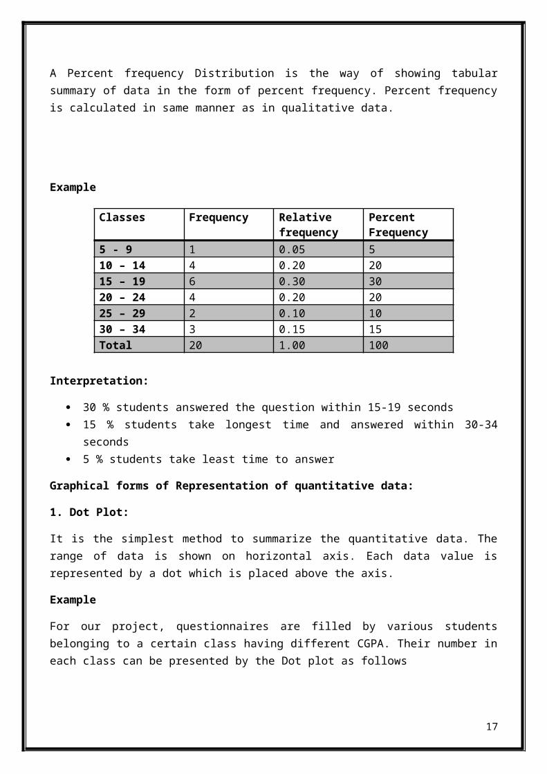
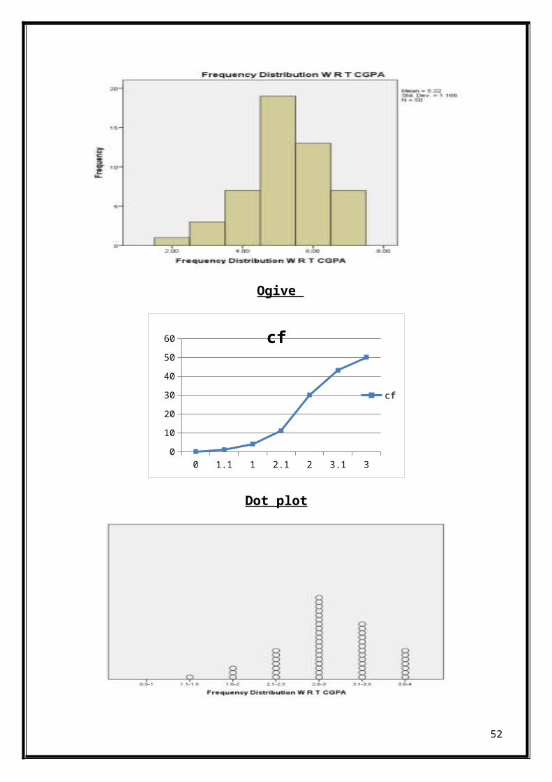
1. Dot Plot:
It is the simplest method to summarize the quantitative data. Therange of data is shown on horizontal axis. Each data value isrepresented by a dot which is placed above the axis.
Example
For our project, questionnaires are filled by various studentsbelonging to a certain class having different CGPA. Their number ineach class can be presented by the Dot plot as follows
17
Classes Frequency Relativefrequency
PercentFrequency
5 - 9 1 0.05 510 – 14 4 0.20 2015 – 19 6 0.30 3020 – 24 4 0.20 2025 – 29 2 0.10 1030 – 34 3 0.15 15Total 20 1.00 100
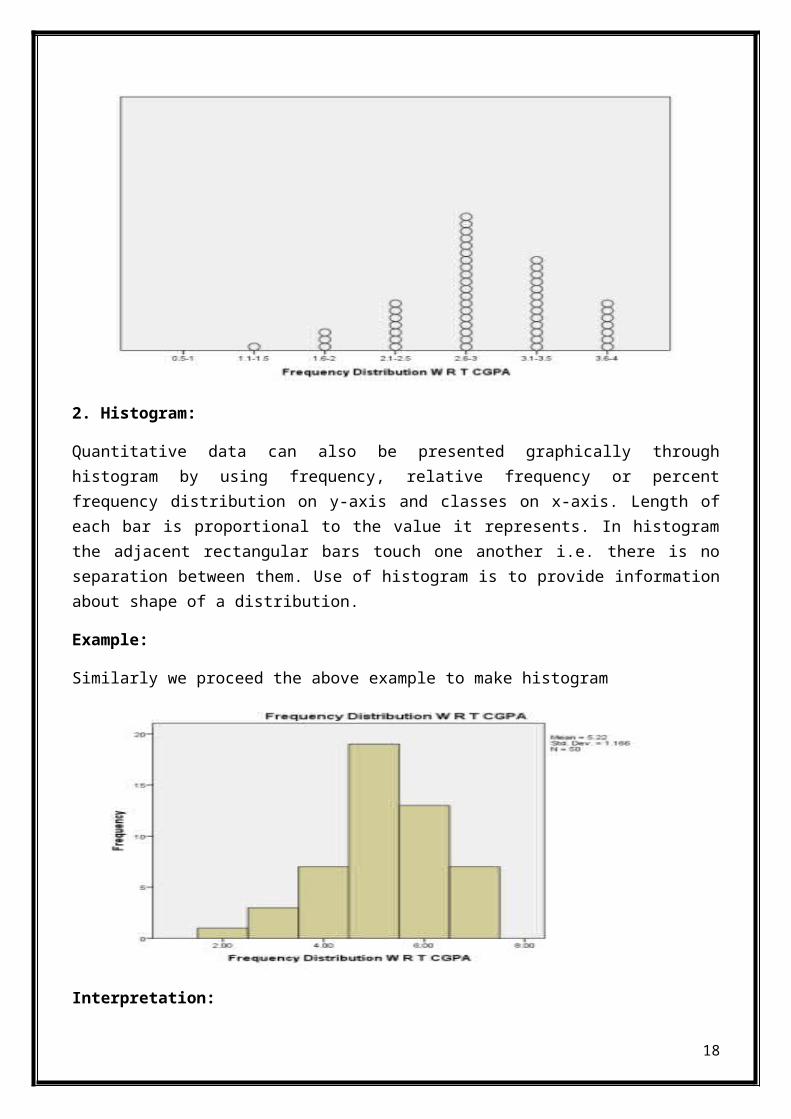
2. Histogram:
Quantitative data can also be presented graphically throughhistogram by using frequency, relative frequency or percentfrequency distribution on y-axis and classes on x-axis. Length ofeach bar is proportional to the value it represents. In histogramthe adjacent rectangular bars touch one another i.e. there is noseparation between them. Use of histogram is to provide informationabout shape of a distribution.
Example:
Similarly we proceed the above example to make histogram
Interpretation:
18

Each graph shows that most of the questionnaires filled by thestudents having CGPA ranging from 2.6-3.0 (5) and no questionnaireswas filled by the by the student having CGPA from 0.5-1 (1) .
Cumulative Distributions:
1. Cumulative Frequency distribution:
Cumulative frequency distribution shows the number of data itemsless than or equal to the upper class limit of each class by usingthe number of classes, class width and class limits developed forthe frequency distribution.
Calculation:
The cumulative frequency is calculated from a frequency table, byadding each frequency to the total of the frequencies of all datavalues before it in the data set. The graph always starts at zeroat the lowest class boundary and the last value for the cumulativefrequency will always be equal to the total number of data values.
2. Cumulative Relative Frequency distribution:
A Cumulative Relative Frequency Distribution is the way of showingtabular summary of data in the form of cumulative relativefrequency which is the proportion of items with values less than orequal to the upper limit of each class.
3. Cumulative Percent Frequency distribution:
A Cumulative Percent frequency Distribution is the way of showingtabular summary of data in the form of Cumulative percent frequencyof data items with values less than or equal to the upper limit ofeach class.
Example:
19
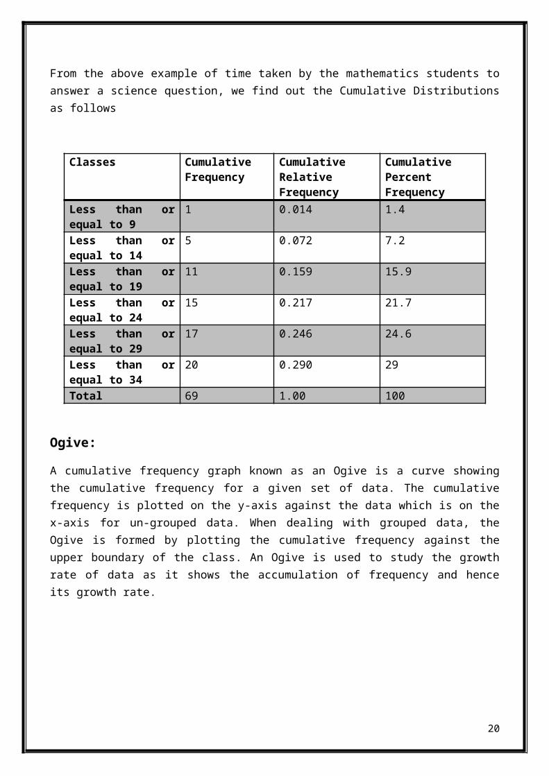
From the above example of time taken by the mathematics students toanswer a science question, we find out the Cumulative Distributionsas follows
Classes CumulativeFrequency
CumulativeRelativeFrequency
CumulativePercent Frequency
Less than orequal to 9
1 0.014 1.4
Less than orequal to 14
5 0.072 7.2
Less than orequal to 19
11 0.159 15.9
Less than orequal to 24
15 0.217 21.7
Less than orequal to 29
17 0.246 24.6
Less than orequal to 34
20 0.290 29
Total 69 1.00 100
Ogive:
A cumulative frequency graph known as an Ogive is a curve showingthe cumulative frequency for a given set of data. The cumulativefrequency is plotted on the y-axis against the data which is on thex-axis for un-grouped data. When dealing with grouped data, theOgive is formed by plotting the cumulative frequency against theupper boundary of the class. An Ogive is used to study the growthrate of data as it shows the accumulation of frequency and henceits growth rate.
20
5 10 15 20 25 30 35 400
5
10
15
20
25
Time
Cumu
lative
Frequ
ency
CROSS TABULATION AND SCATTER DIAGRAMS
A manager often comes across a situation in which he/she has todevelop and understand the relationship between two variables. Forthis purpose of computation, two methods are used.
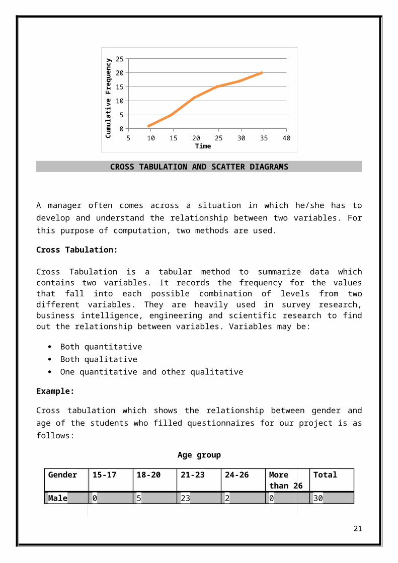
Cross Tabulation:
Cross Tabulation is a tabular method to summarize data whichcontains two variables. It records the frequency for the valuesthat fall into each possible combination of levels from twodifferent variables. They are heavily used in survey research,business intelligence, engineering and scientific research to findout the relationship between variables. Variables may be:
Both quantitative Both qualitative One quantitative and other qualitative
Example:
Cross tabulation which shows the relationship between gender andage of the students who filled questionnaires for our project is asfollows:
Age group
Gender 15-17 18-20 21-23 24-26 Morethan 26
Total
Male 0 5 23 2 0 30
21

Female 0 10 8 2 0 20Total 0 15 31 4 0 50
Interpretation:
More males fall in the age group of 21-23
More female are fall in the age group of 18-20
No male and female is in the age group of 15-17 and more than26
Scatter Diagram:
Scatter Diagram(Scatter Plot) is a graphical presentation of therelationship between two variables. These variables must be ofquantitative nature. The approximation of relationship is providedby the ‘Trend Line’.
To construct a scatter diagram collect the pairs of data to checkthe relationship between them. Independent variable must be on x-axis while that of dependent on y-axis. Check the pattern of pointscarefully.The more the diagram resembles a straight line, thestronger the relationship is.
Type of relationships depicted by scatter diagrams:
22
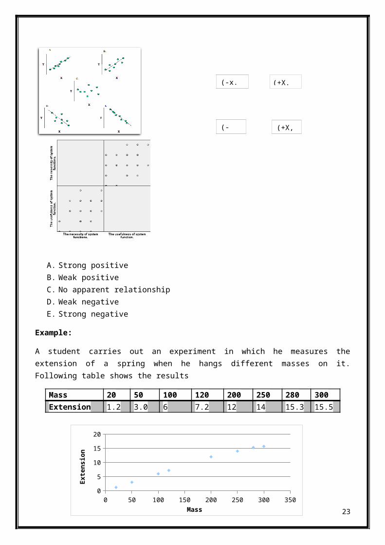
A. Strong positiveB. Weak positiveC. No apparent relationshipD. Weak negativeE. Strong negative
Example:
A student carries out an experiment in which he measures theextension of a spring when he hangs different masses on it.Following table shows the results
Mass 20 50 100 120 200 250 280 300Extension 1.2 3.0 6 7.2 12 14 15.3 15.5
23
(-x. (+X.
(+X,(-
0 50 100 150 200 250 300 3500
5
10
15
20
Mass
Exte
nsion
Interpretation:
The above diagram shows a positive relationship between mass andextension. Extension increases as the student increases the mass.
CHAPTER NO 3
DESCRITIVE STATISTICS: NUMERICAL MEASURES
MEASURES OF LOCATION
A fundamental task in many statistical analyses is to estimate alocation parameter for the distribution; i.e. to find a typical orcentral value that best describes the data which includes:
faisal contribution page no (19 to36) Mean (A.M, G.M and H. M) Median Mode Percentiles Quartiles
MEAN
The mean is the sum of the data points divided by the number ofdata points. The mean is that value that is most commonly referredto as the average. We will use the term average as a synonym forthe mean and the term typical value to refer generically tomeasures of location.
Mean for grouped data:
An estimate, of the mean of the population from which the data aredrawn can be calculated from the grouped data as:
24
Weighted Mean

Mean=∑fx∑f
Where: x is the average value of the lower and upper limits of theclass.
f is the frequency of the class.Example:Work out an estimate for the mean height, when the heights of 23people are given by the first two columns of this table:
Height (cm)
Number ofPeople (f)
Midpoint (x) Fx
201-220 1 110.5 110.5221-230 3 125.5 376.5231-240 5 135.5 677.5241-250 7 145.5 1018.5251-260 4 155.5 622261-270 2 165.5 331271-290 1 180.5 180.5
Now fx (add up all of the values in the last column) = 3316.5∑
f = 23∑
So an estimate of the mean is 3316.5/23 = 144cm.
Mean for ungrouped data:
For sample
For sample it is denoted as
Mean=∑xn
Example:
Data: 9, 15, 11, 12, 3, 5, 10, 20, 14, 6, 8, 8, 12, 12, 18, 15, 6,9, 18, 11
25
x̄
Mean =9+15+11+12+3+5+10+20+14+6+8+8+12+12+18+15+6+9+18+11/20= 11.1
For population
For population it is denoted as µ
µ=∑xN
ARITHEMATIC MEAN
Arithmetic Mean (ungroup-data):
Formula:
Mean = sum of elements / number of elements
= a1+a2+a3+.....+an/n
Arithmetic Mean = Σx/n
Where
x = Individual value
n = Total number of values
Arithmetic Mean (group-data):
Formula:
Arithmetic Mean = Σfx/Σf
Where
x = Individual value
f = Frequency
GEOMETRIC MEAN
The GM is for situations we want the average used in amultiplicative situation.
26

The customary economic evaluation application is in determining"average" inflation or rate of return across several timeperiods. In calculating the GM, the numbers must all be positive.
Geometric Mean (ungrouped-data):
Geometric mean for a value x containing n values such as x1,x2,…..,xn is denoted by G.M of x and given as under:
Geometric Mean (group-data):
If we have a series of n positive values with repeated values suchas x1,x2,…..,xn are repeated f1,f2,……,fn times respectivelythen geometric mean will become:
HARMONIC MEAN
Harmonic Mean (ungroup-data):
The harmonic mean H.M of the positive real numbers x1, x2… xn > 0 isdefined to be
Harmonic Mean (group-data):
MEDIAN
The median is the middle value of the data when arranged inascending order.
For odd number of values:
27
G.M=antilog [∑log xn ]
G.M=antilog [∑ (flogx)∑f ]
H.M.= n
∑(1X )
H.M.= ∑f
∑f(1X )

The median is the middle value.
For even number of values:
The median is the average of the two middle values.
To find the Median, place the numbers you are given in valueorder and find the middle number.
Median for ungrouped data:
Example:
For even numbers we need to find the middle pair of numbers, andthen find the value that would be half way between them.
This is easily done by adding them together and dividing by two.
An example will help:
3, 13, 7, 5, 21, 23, 23, 40, 23, 14, 12, 56, 23, 29
If we put those numbers in order we have:
3, 5, 7, 12, 13, 14, 21, 23, 23, 23, 23, 29, 40, 56
There are now fourteen numbers and so we don't have just one middlenumber, we have a pair of middle numbers:
3, 5, 7, 12, 13, 14, 21, 23, 23, 23, 23, 29, 40, 56
In this example the middle numbers are 21 and 23.
To find the value half-way between them, add them together anddivide by 2:
21 + 23 = 4444 ÷ 2 = 22
And, so, the Median in this example is 22.
Median for grouped data:
Median = L + h/f (n/2 - c)
Where: L is the lower class boundary of median class
28
h is the size of median class i.e. difference between upper and lower class boundaries of median class f is the frequency of median class c is previous cumulative frequency of the median class n/2 is total no. of observations divided by 2
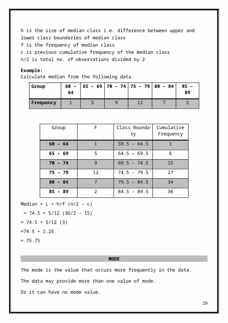
Example:Calculate median from the following data.
Group 60 –64
65 – 69 70 – 74 75 – 79 80 – 84 85 –89
Frequency 1 5 9 12 7 2
Median = L + h/f (n/2 - c) = 74.5 + 5/12 (36/2 - 15)= 74.5 + 5/12 (3)=74.5 + 1.25= 75.75
MODE
The mode is the value that occurs more frequently in the data.
The data may provide more than one value of mode.
Or it can have no mode value.
29
Group F Class Boundary
CumulativeFrequency
60 – 64 1 59.5 – 64.5 1
65 – 69 5 64.5 – 69.5 6
70 – 74 9 69.5 – 74.5 15
75 – 79 12 74.5 – 79.5 27
80 – 84 7 79.5 – 84.5 34
85 – 89 2 84.5 – 89.5 36

To find the mode, or modal value, first put the numbers in order,then count how many of each number.
Mode for ungrouped data:
Example:
3, 7, 5, 13, 20, 24, 39, 24, 40, 24, 14, 12, 56, 24, 29
In order these numbers are:
3, 5, 7, 12, 13, 14, 20, 24, 24, 24, 24, 29, 39, 40, 56
This makes it easy to see which numbers appear most often.
In this case the mode is 24.
More Than One Mode
You can have more than one mode.
Example:
{1, 2, 2, 2, 4, 4, 6, 6, 6, 9}
2 appear three times, as does 6.
So there are two modes: at 2 and 6
Having two modes is called "bimodal".
Having more than two modes is called "multimodal".
Mode for grouped data:
Mode = L + [(fm-f1) / (fm-f1) + (fm-f2)] x h
where: L is the lower class boundary of modal class fm is the Frequency of the model class f1 is the previous frequency of the model class f2 is the next frequency of the model class h is the size of model class i.e. difference between upper and
30
lower class boundaries of model class. Model class is a class with the maximum frequency.
Example:
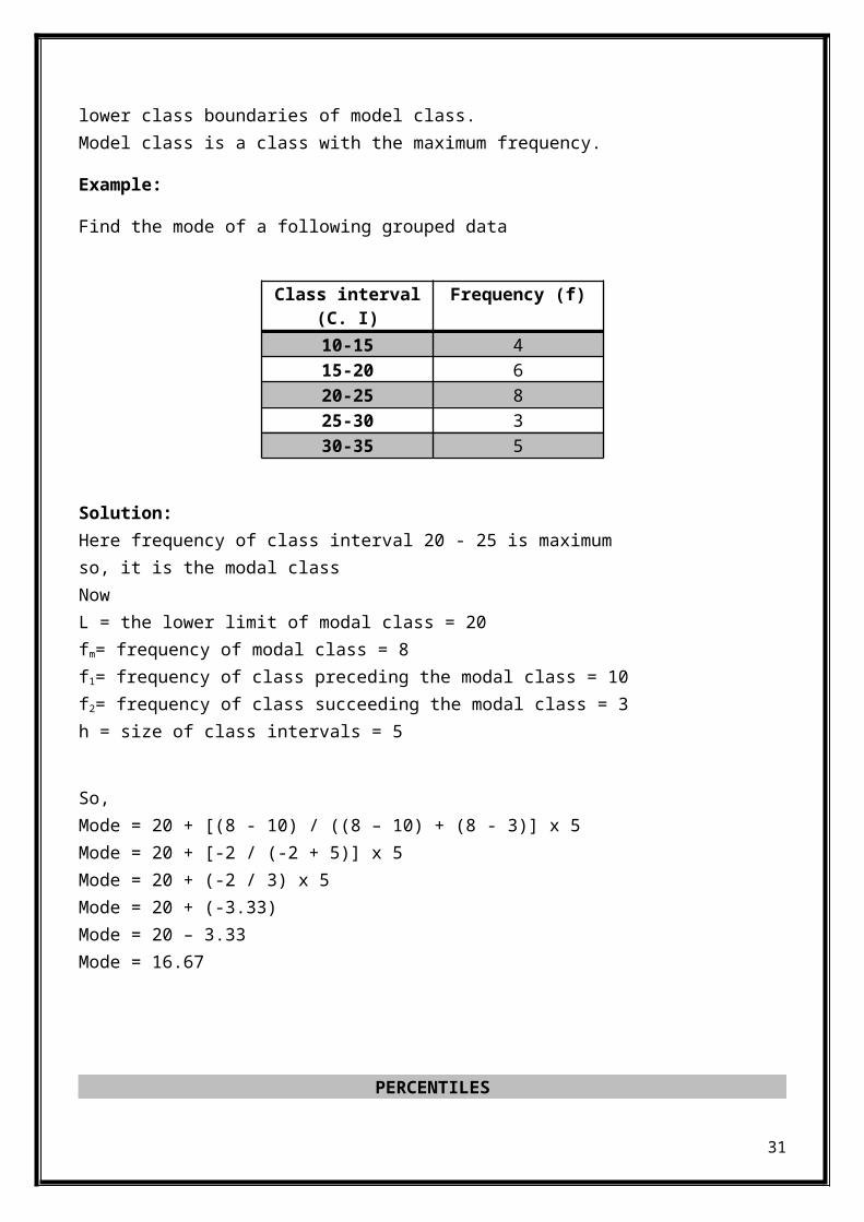
Find the mode of a following grouped data
Class interval(C. I)
Frequency (f)
10-15 415-20 620-25 825-30 330-35 5
Solution: Here frequency of class interval 20 - 25 is maximumso, it is the modal class Now L = the lower limit of modal class = 20 fm= frequency of modal class = 8 f1= frequency of class preceding the modal class = 10 f2= frequency of class succeeding the modal class = 3 h = size of class intervals = 5
So, Mode = 20 + [(8 - 10) / ((8 – 10) + (8 - 3)] x 5 Mode = 20 + [-2 / (-2 + 5)] x 5 Mode = 20 + (-2 / 3) x 5 Mode = 20 + (-3.33) Mode = 20 – 3.33 Mode = 16.67
PERCENTILES
31

A percentile provides information about how the data are spreadover the interval from the smallest value to the largest value.The pth percentile of a data set is a value such that at least p%of the items take on this value or less and at least (100 -p) % ofthe items take on this value or more.
To calculate percentile, take percentile as Pm where m representsthe percentile we're finding, for example for the tenthpercentile, m} would be 10. Given that the total number of elementsin the data set is n
Pm = m100
×n
Procedure:1. Arrange the data in ascending order.2. Compute index i, the position of the pth percentile = (p/100) nwhere n is the sample size3. If i is not an integer, round it up to the next integer. Thenext integer greater than i denote the position of the pthpercentile. 4. If i is an integer, the pth percentile is the average of thevalues in positions i and i+1.
Example:For 25 test scores: 43, 54, 56, 61, 62, 66, 68, 69, 69, 70, 71, 72,77, 78, 79, 85, 87, 88, 89, 93, 95, 96, 98, 99, 99. Find the 90thpercentile for these (ordered) scores. Pm = 90% × 25
= 0.90 × 25
= 22.5 (the index).
Rounding up to the nearest whole number, you get 23.
Counting from left to right (from the smallest to the largest valuein the data set), you go until you find the 23rd value in the dataset.
That value is 98, and it’s the 90th percentile for this data set.
Find the 20th percentile.
32
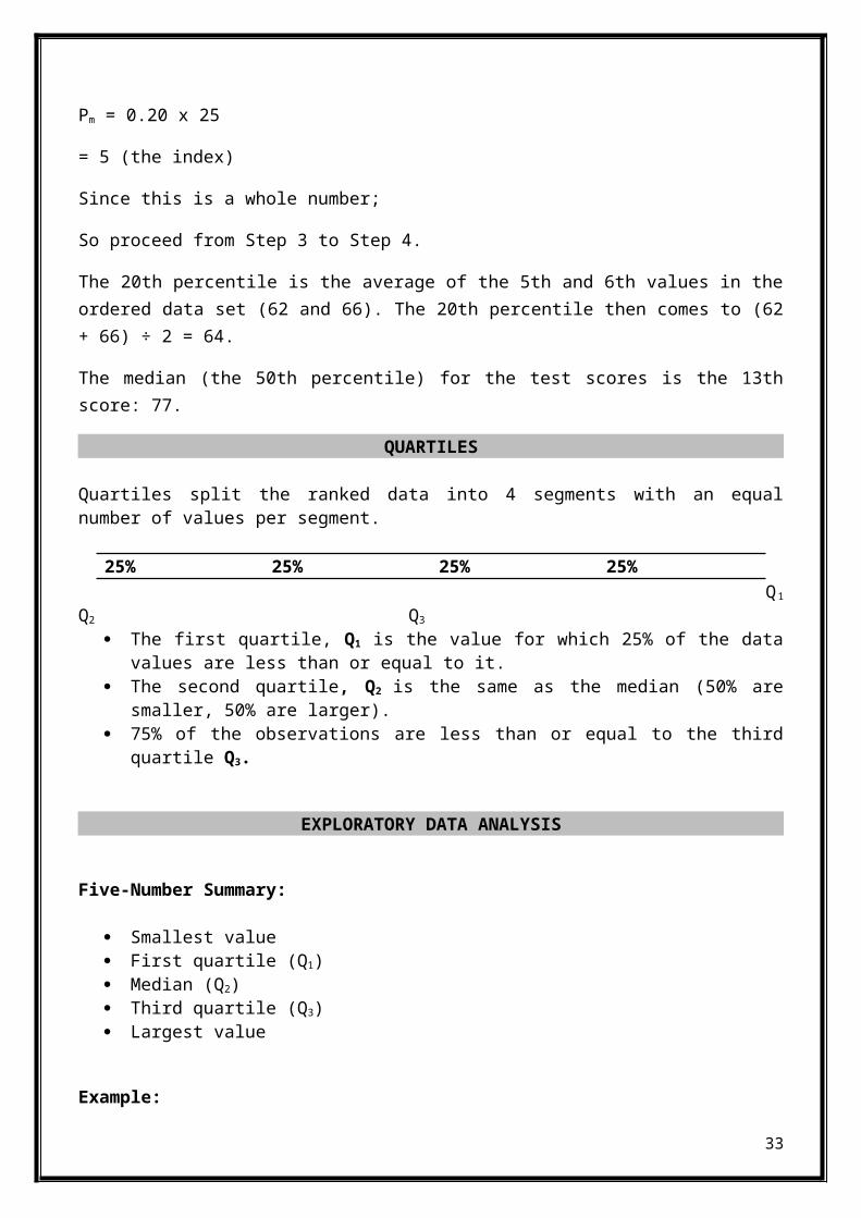
Pm = 0.20 x 25
= 5 (the index)
Since this is a whole number;
So proceed from Step 3 to Step 4.
The 20th percentile is the average of the 5th and 6th values in theordered data set (62 and 66). The 20th percentile then comes to (62+ 66) ÷ 2 = 64.
The median (the 50th percentile) for the test scores is the 13thscore: 77.
QUARTILES
Quartiles split the ranked data into 4 segments with an equalnumber of values per segment.
25% 25% 25% 25% Q1
Q2 Q3
The first quartile, Q1 is the value for which 25% of the datavalues are less than or equal to it.
The second quartile, Q2 is the same as the median (50% aresmaller, 50% are larger).
75% of the observations are less than or equal to the thirdquartile Q3.
EXPLORATORY DATA ANALYSIS
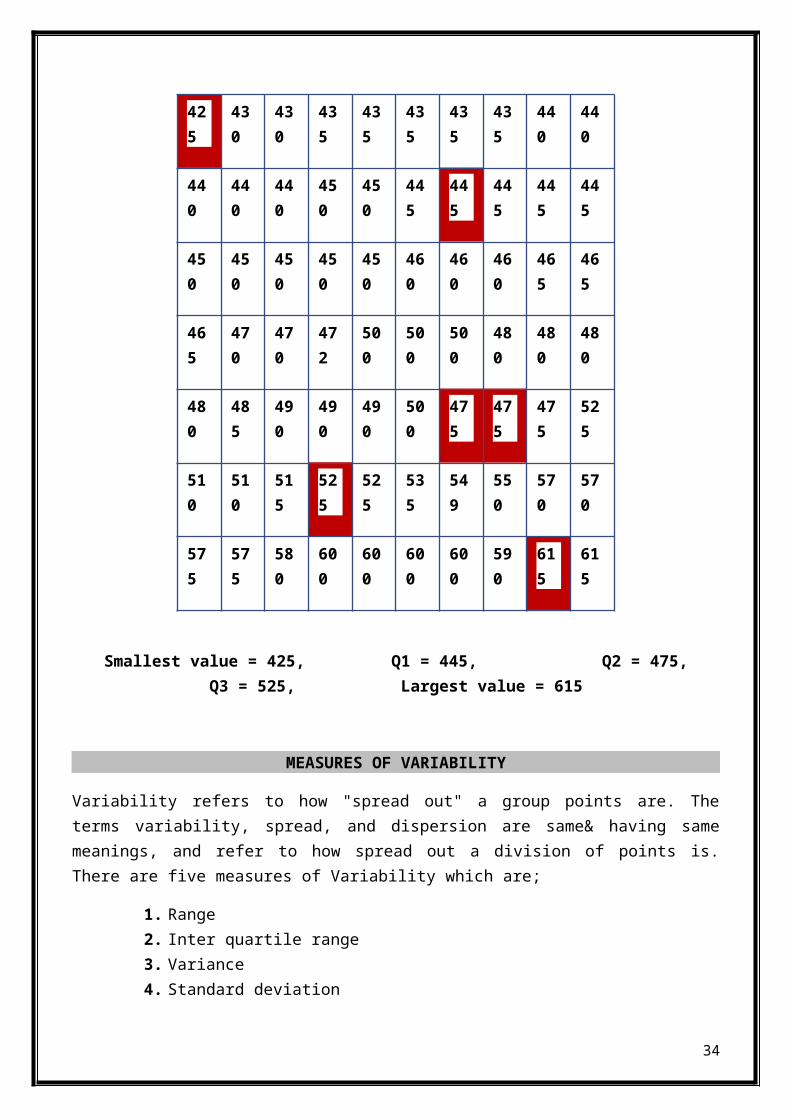
Five-Number Summary:
Smallest value First quartile (Q1) Median (Q2) Third quartile (Q3) Largest value
Example:
33
425
430
430
435
435
435
435
435
440
440
440
440
440
450
450
445
445
445
445
445
450
450
450
450
450
460
460
460
465
465
465
470
470
472
500
500
500
480
480
480
480
485
490
490
490
500
475
475
475
525
510
510
515
525
525
535
549
550
570
570
575
575
580
600
600
600
600
590
615
615
Smallest value = 425, Q1 = 445, Q2 = 475,Q3 = 525, Largest value = 615
MEASURES OF VARIABILITY
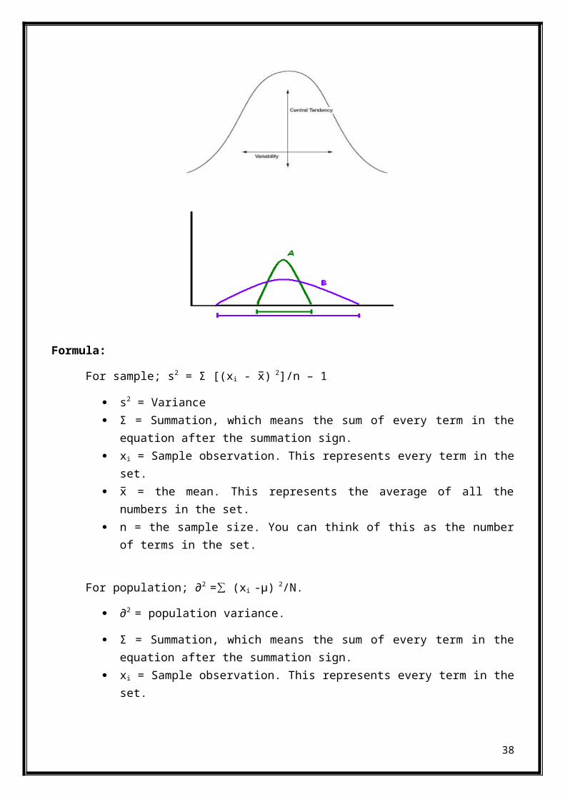
Variability refers to how "spread out" a group points are. Theterms variability, spread, and dispersion are same& having samemeanings, and refer to how spread out a division of points is.There are five measures of Variability which are;
1. Range2. Inter quartile range3. Variance4. Standard deviation
34

5. Co-efficient of variance
Why we study Variability:
Measure of average like median and mean represent the average &usual value of a dataset. Within the dataset the actual values areusually different from one another and from the average value. Theextent that median and mean are good representatives of the valuesin the original dataset depends upon the variability or dispersionin the data. Datasets having high dispersion when they containvalues which are vary higher and lower than the mean value.
Advantages:
Measures the reliability& conforms validity of mean ofdataset.
Helps to generate& arises comparison of data. Helps to measure other descriptive data analysis applications. Measure of dispersion is important for describing the spread
of the data points. It measures variation of data around a central value the mean
of the data.
Note:
A small value of measure of variability shows data is gatheredclosely (the mean is the representative of data).A large value ofmeasure of variability shows that data is scattered (the mean isnot the representative of data& that shows it is not reliable).
1. Range:
It is the simplest measure of dispersion variability & and it isthe difference between the lowest and highest values in adataset. Largest value subtract the smallest value gave the rangeof that data.
Formula:
Range = Largest value – Smallest value.
Advantages:
35
The range is simplest calculation to compute and is usefulwhen you wish to judge the whole of a dataset.
The range is useful for showing the spread& variability withina dataset and for comparing the spread between similardatasets.
The calculation of the range is very straight forward; nospecific& extra knowledge is required.
It isn’t time consuming &easy to calculate.
Limitations:
The range is a very crude& unrefined measurement of the spreadof data because it is extremely sensitive to outliers.
A single data value the maximum or minimum can greatly affectthe value of the range.
Range doesn’t provide direction &accurate picture ofvariability& dispersion.
2. Inter quartile range:
The interquartile range (IQR) is also the range of the values ofa variable over the middle part of a distribution. Especially itis the range from the 25th to the 75th percentile of the data set.Measure of statistical dispersion, it is equal to the differencebetween the upper and lower quartiles. The inter-quartile rangeis a measure that indicates the extent to which the central 50%of values within the dataset are dispersed or variable.
Formula:
IQR = Q3 – Q1, IQR = 75th percentile -25th percentile.
Advantages:
The interquartile range that it indicates the spread orconcentration for the middle one-half of the distribution,ignoring the extreme values of the dataset.
The IQR eliminates the effect of extreme values. It can be used in open end frequency distribution.
Limitations:
36

Defect/limitation of the IQR as a measure of variation ordispersion is that it is based on only two specificpercentiles the 25% & 75%, and does not take other values ofthe data set into account.
It is largely affected by sampling& data set variablesfluctuation.
It ignores the middle value the fifty present50 %( middlevalue).
Example
Structure of Banking & finance is Abstract (SD to SA)
X Arranging ofdata
8 6
7 7
17 8
12 12
6 17
Range: R = Largest value – Smallest value.
R = 17 – 6 = 11
Inter quartile range:
IQR = Q3 − Q1
IQR = 4th – 2th, IQR = 5.
2. Variance:Variance measures how far a set of numbers is spreadout or dispersed. A small value of variance indicates that thedata points placed very close to the mean (expected value)and henceto each other, while a high value of variance indicates that thedata points are very spread out from the mean and from each other,they are dispersed.
37
Formula:
For sample; s2 = Σ [(xi - x̅) 2]/n – 1
s2 = Variance Σ = Summation, which means the sum of every term in the
equation after the summation sign. xi = Sample observation. This represents every term in the
set. x̅ = the mean. This represents the average of all the
numbers in the set. n = the sample size. You can think of this as the number
of terms in the set.
For population; ∂2 = (x∑ i -µ) 2/N.
∂2 = population variance.
Σ = Summation, which means the sum of every term in theequation after the summation sign.
xi = Sample observation. This represents every term in theset.
38

µ = the mean. This represents the average of all thenumbers in the set.
N = Population size.
For grouped data;
For sample; s2 = Σfi [(xi - x̅) 2]/n – 1
For population; ∂2 = f∑ i (xi -µ) 2/N.
Advantages:
Finding the variance of a population gives the completeinformation about how the population varies amongindividuals or dispersed around mean of data set.
Finding the variance of a population means that there willbe no error in prediction using formulas that includestandard deviation statistic.
Limitations:
Finding the variance of a population is not an easy task. Ifthe population of which variance is being calculated is large,then finding the variance will require much time.
Most of the statistical observers do not expect variance toplay important role in statistical analyses & calculatingdispersion of data. One result related to this fact is thatmost statistical computer software does not take in varianceas input.
4. Standard Deviation:
Standard deviation shows how much variation or dispersion from theaverage is present. A low standard deviation indicates that thedata points tend to be very close to the mean (also called expectedvalue). A high standard deviation indicates that the data pointsare spread out over a large range of values from the mean.
Formula:
For sample; S = √s2
For population; ∂ = √∂2
39
Steps to calculate:
1. First step is to find out the mean.2. Second step is to take difference between mean and value.3. Then take square of the differences.4. Sum up the square of the differences.5. Then Divide the answer of above operation by n-1 for sample &
N for Population.6. Last step is to take square root to get the standard deviation
of the data set.
Advantages:
Its advantage is that it gives you a better picture of yourdata than just the mean only.
Standard deviation make use of all data to calculate thespread of data from average while range only uses two data,same is the case with interquartile range which measures onthe basis of only two percentile of dataset i.e. the largestvalue data and the smallest value data, so standard deviationis a more accurate measure.
Standard deviation can be used in the statistical analysis tocheck its authenticity e.g. hypothesis testing.
Standard deviation gives weightage to the positive andnegative deviation of the data from the mean too.
Standard deviation is a more accurate measure of spread ofdata as compared to the range as a measure of the spread orvariability of data.
Limitations:
Limitation is that it doesn't tell you the full range of thedata.
Limitation of Standard deviation as measure of dispersion isthat it is more complicated to calculate consumes a lot oftime to calculate.
5. Co-efficient of variance:
40
A statistical measure of the dispersion of data points in a dataseries around the mean. The coefficient of variation represents theratio of the standard deviation to the mean, and it is a usefulstatistic for comparing the degree of variation from one dataseries to another, even if the means are drastically different fromeach other.
Formula:
For sample;C.V =(S/x×100)%.
For population; C.V =(∂ / µ ×100)%.
Advantages:
Useful forcompairing the degree of variation from one dataseries to another even if mean are drastically different fromeach other.
Example Structure of Banking & finance is Adaptable (SD to SA)
xi x̅ (xi - x̅) (xi - x̅)2
3 10 -7 49
7 10 -3 9
15 10 5 25
22 10 12 144
3 10 -3 9
Variance s2 = Σ [(xi - x̅) 2]/n – 1 s2 = 59
Standard deviation S = √s2, S = 7.68
Co-efficient of variance C.V =( S/x×100)%, C.V = 76.8%.
MEASUES OF RELATIVE LOCATION
Z-score is the quantity which can be used to measure the relativelocation of the data points in dataset. Z-score, referred as thestandardized value for measuring relative location of data points
41

in dataset. Two things would be discussed under heading of measureof relative location.
1. Z-Score. 2. Detecting outliers.
1. Z- Score:
The z-score for a given data value x is the number of standarddeviations that x is above or below of the mean of the data. A Z-Score is a statistical measurement of a score's relationship to themean in a group of scores. A Z-score of 0 means the score is thesame as the mean. A Z-score can also be positive or negative,indicating whether it is above or below the mean and by how manystandard deviations. It is also known as Standard score &Normalscore.
Formula:
For sample; Z = (xi - x̅)/S
(xi - x̅) = value of data subtract mean. S = Standard deviation of sample.
For population; Z = (xi -µ)/∂
µ = Mean of the population. ∂ = Standard deviation of population.
How to calculate Z- score:
To find the Z score of a sample, you'll need to find the standarddeviation and mean of a set of data, find the difference betweenthat sample and the mean, and divide it by the standard deviationto get the Z-score.
How to interpret z-scores:
A value of z-score less than 0 represent an element less thanthe mean.
A value of z-score greater than 0 represents an elementgreater than the mean.
A value of z-score equal to 0 represents an element equal tothe mean.
42

A value of z-score equal to 1 represents an element that is 1standard deviation greater than the mean; a z-score equal to2, 2 standard deviations greater than the mean; etc.
A value of z-score equal to -1 represents an element that is 1standard deviation less than the mean; a z-score equal to -2,2 standard deviations less than the mean; etc.
Advantages:
The z-scores allow two unlike distributions to be comparedwith standard values. As an example, one distribution withmean 100 and variance 10 is difficult to compare to anotherdistribution with mean -0.5 and variance .2. Using a z-score,however, these two distributions become standardized in thevalues that can be easily compared to one another.
Limitations:
Because a person’s score is expressed relative to the groupmean, the same person can have different z-scores whenassessed in different samples.
2. Detecting outliers:
An outlier is an observation point that is distant from otherobservations. An outlier may be due to variability/dispersion inthe measurement or it may indicate experimental error; the latterare sometimes excluded from the data set. Outliers, being the mostextreme observations, may include the sample maximum or sampleminimum, or both, depending on whether they are extremely high orlow. However, the sample maximum and minimum points are not alwaysoutliers because they may not be unusually far from otherobservations in data set.
How to Find/identify:To identify the outliers, we can use the z-score& box-plot. Theoutliers identified by the box-plot are those data outside theupper limit or lower limit while the outliers identified by z-scoreare those values having z-score smaller than –3 or greater than 3.Example: Structure of Banking & finance profession is changing (SDto SA).
43

xi x̅ (xi - x̅) S Z-score.
8 10 -2 3.24 -0.62
8 10 -2 3.24 -0.62
14 10 4 3.24 1.23
7 10 -3 3.24 -0.93
13 10 -3 3.24 -0.93
Result: There are no outliers in the above data as the values ofthe Z-score lie b/w -3&3.
MEASURE OF ASSOCIATION BETWEEN TWO VARIABLES
An association is any relationship between two measure quantitiesthat renders them statistically dependent. The term “association”refers broadly to any such relationship whereas the narrow termcorrelation” refers to a linear relationship between twoquantities.
There are many statistical measures of association that can be usedto infer the presence or absence of an association in a sampleof data. Examples of such measures include the product momentcorrelation coefficient, used mainly for quantitative measurements,and the odds ratio, used for dichotomous measurements. Othermeasures of association are the distance correlation,tetrachoriccorrelation coefficient, Goodman and Kruskal's lambda,Tschuprow's T and Cramér's V. Among these two widely used are:
1. Co-variance.2. Correlation of Co-efficient.
1. Co- variance:
44
Covariance is a measure of how much two random variables changetogether. If the greater values of one variable mainly correspondwith the greater values of the other variable, and the same holdsfor the smaller values, i.e.
The variables tend to show similar behavior, the covariance ispositive. In the opposite case, when the greater values of onevariable mainly correspond to the smaller values of the other,i.e., the variables tend to show opposite behavior, the covarianceis negative.
The sign of the covariance therefore shows the tendency in thelinear relationship between the variables. The magnitude of thecovariance is not easy to interpret. The normalized version of thecovariance, the correlation coefficient, however, shows by itsmagnitude the strength of the linear relation.
What it shows:
Two variables that are linearly related are said to bepositively associated when above average values of onevariable are associated with above average values of thecorresponding variable. That is, two variables are positivelyassociated when the values of the predictor variable increase,the values of the response variable also increase.
Two variables that are linearly related are said to benegatively associated when above average values of onevariable are associated with below average values of thecorresponding variable. That is, two variables are negativelyassociated when the values of the predictor variable increase,the values of the response variable decrease.
It gave the direction of the relationship b/w two variables.
Formula:
For Sample; Sxy = (x∑ i - x̅) (yi– ӯ)/n-1
For population; ∂xy= (∑ xi- µx) (yi - µy)/N
Interpretation of co-variance:
45
Positive co-variance shows positive relation between twovariables.
Negative co-variance shows negative relation between twovariables.
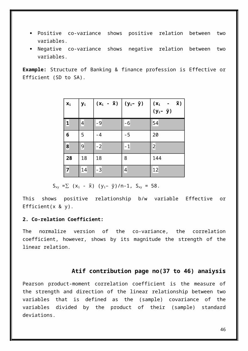
Example: Structure of Banking & finance profession is Effective orEfficient (SD to SA).
xi yi (xi - x̅) (yi– ӯ) (xi - x̅)(yi– ӯ)
1 4 -9 -6 54
6 5 -4 -5 20
8 9 -2 -1 2
28 18 18 8 144
7 14 -3 4 12
Sxy = (x∑ i - x̅) (yi– ӯ)/n-1, Sxy = 58.
This shows positive relationship b/w variable Effective orEfficient(x & y).
2. Co-relation Coefficient:
The normalize version of the co-variance, the correlationcoefficient, however, shows by its magnitude the strength of thelinear relation.
Atif contribution page no(37 to 46) anaiysis
Pearson product-moment correlation coefficient is the measure ofthe strength and direction of the linear relationship between twovariables that is defined as the (sample) covariance of thevariables divided by the product of their (sample) standarddeviations.
46
Formula:
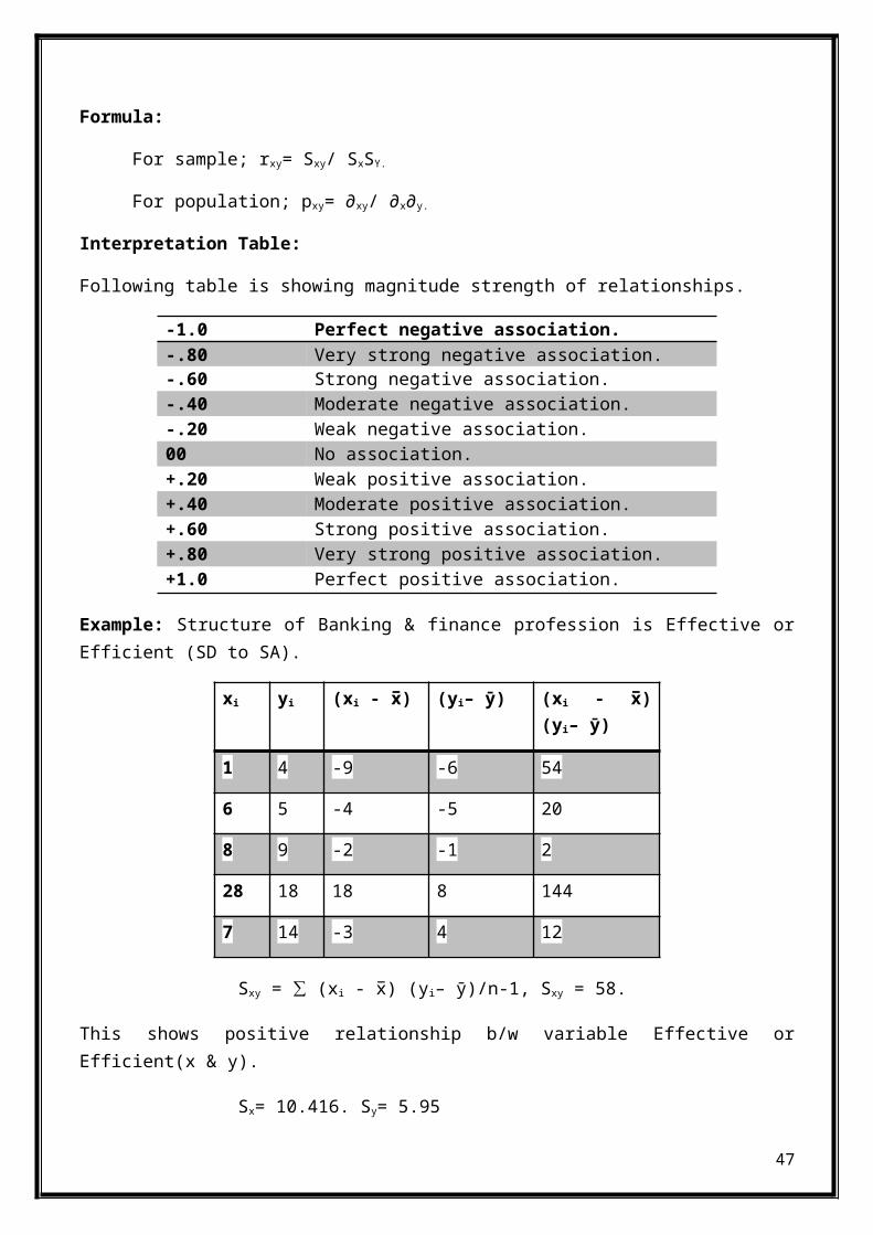
For sample; rxy= Sxy/ SxSY.
For population; pxy= ∂xy/ ∂x∂y.
Interpretation Table:
Following table is showing magnitude strength of relationships.
-1.0 Perfect negative association.-.80 Very strong negative association.-.60 Strong negative association.-.40 Moderate negative association.-.20 Weak negative association.00 No association.+.20 Weak positive association.+.40 Moderate positive association.+.60 Strong positive association.+.80 Very strong positive association.+1.0 Perfect positive association.
Example: Structure of Banking & finance profession is Effective orEfficient (SD to SA).
xi yi (xi - x̅) (yi– ӯ) (xi - x̅)(yi– ӯ)
1 4 -9 -6 54
6 5 -4 -5 20
8 9 -2 -1 2
28 18 18 8 144
7 14 -3 4 12
Sxy = (x∑ i - x̅) (yi– ӯ)/n-1, Sxy = 58.
This shows positive relationship b/w variable Effective orEfficient(x & y).
Sx= 10.416. Sy= 5.95
47

rxy= Sxy/ SxSY.rxy = 0.93
Interpretation:
As; 0.80 = Very strong positive association. & 1.00 = Perfectpositive association.
So there relationship b/w variable Effective or Efficient(x & y) isin between strong &positive association.
SystemqualitySystem quality contains working of network processing speed andreliability of system .approximately our lab consist of 60 system,our system function is not reliable. The response time of system inneutral. Sometime it provide quick response to our queries.
Group-4QUESTIONNAIRE
48
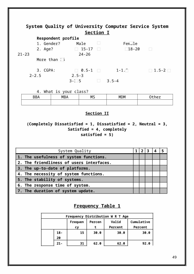
System Quality of University Computer Service SystemSection I
Respondent profile1. Gender? Male Female2. Age? 15-17 18-20
21-23 24-26 More than 35
3. CGPA: 0.5-1 1-1.5 1.5-22-2.5 2.5-3
3-3.5 3.5-4
4. What is your class?BBA MBA MS MDM Other
Section II
(Completely Dissatisfied = 1, Dissatisfied = 2, Neutral = 3,Satisfied = 4, completely
satisfied = 5)
System Quality 1 2 3 4 51. The usefulness of system functions.2. The friendliness of users interfaces.3. The up-to-date of platforms.4. The necessity of system functions.5. The stability of systems.6. The response time of system.7. The duration of system update.
Frequency Table 1
Frequency Distribution W R T AgeFrequen
cyPercen
tValidPercent
CumulativePercent
18-20
15 30.0 30.0 30.0
21- 31 62.0 62.0 92.0
49
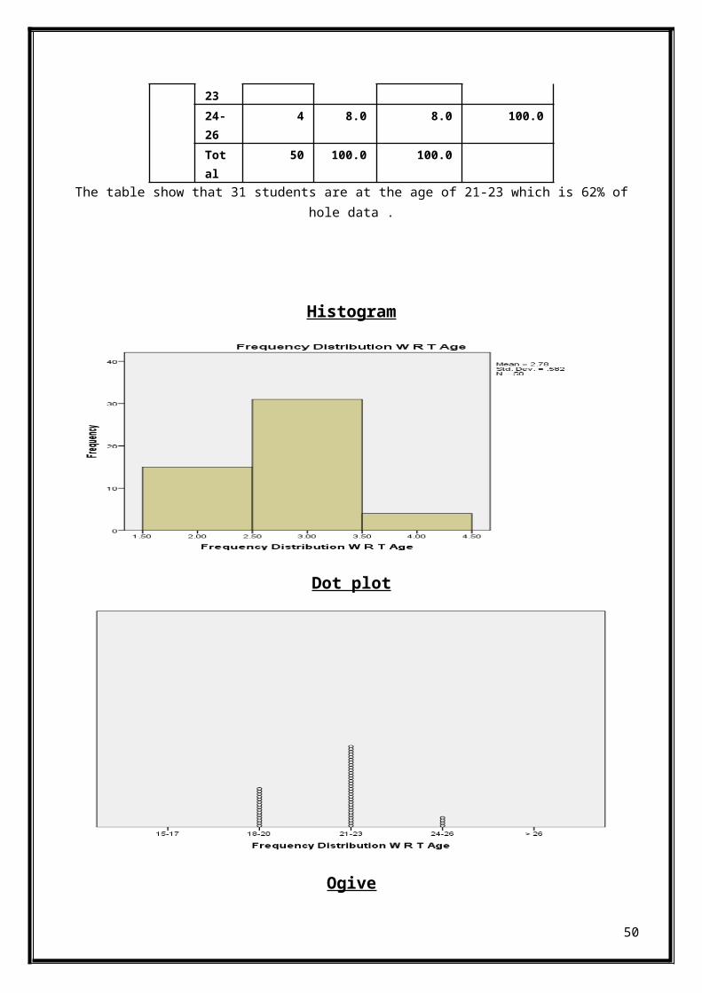
2324-26
4 8.0 8.0 100.0
Total
50 100.0 100.0
The table show that 31 students are at the age of 21-23 which is 62% ofhole data .
Histogram
Dot plot
Ogive
50
0.5-1 1.1-1.5 1.6-20
1
2
3
4
5 ogive
cf
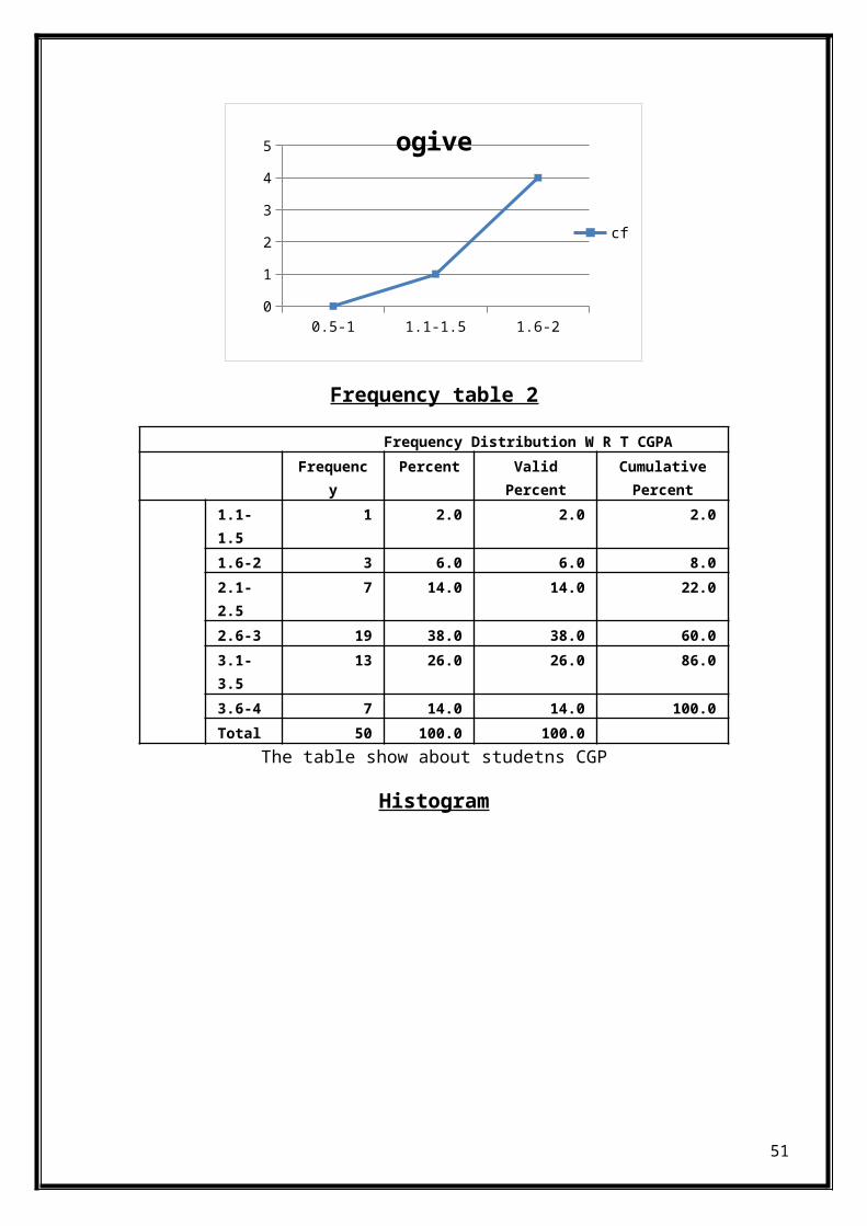
Frequency table 2
Frequency Distribution W R T CGPAFrequenc
yPercent Valid
PercentCumulativePercent
1.1-1.5
1 2.0 2.0 2.0
1.6-2 3 6.0 6.0 8.02.1-2.5
7 14.0 14.0 22.0
2.6-3 19 38.0 38.0 60.03.1-3.5
13 26.0 26.0 86.0
3.6-4 7 14.0 14.0 100.0Total 50 100.0 100.0
The table show about studetns CGP
Histogram
51
Ogive
0 1.1 1 2.1 2 3.1 30
10
20
30
40
50
60 cf
cf
Dot plot
52
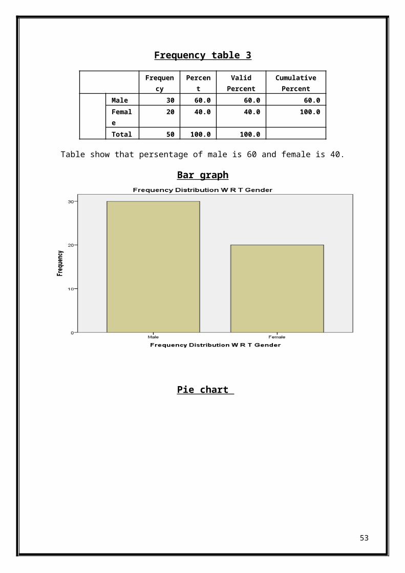
Frequency table 3
Table show that persentage of male is 60 and female is 40.
Bar graph
Pie chart
53
Frequency
Percent
ValidPercent
CumulativePercent
Male 30 60.0 60.0 60.0Female
20 40.0 40.0 100.0
Total 50 100.0 100.0
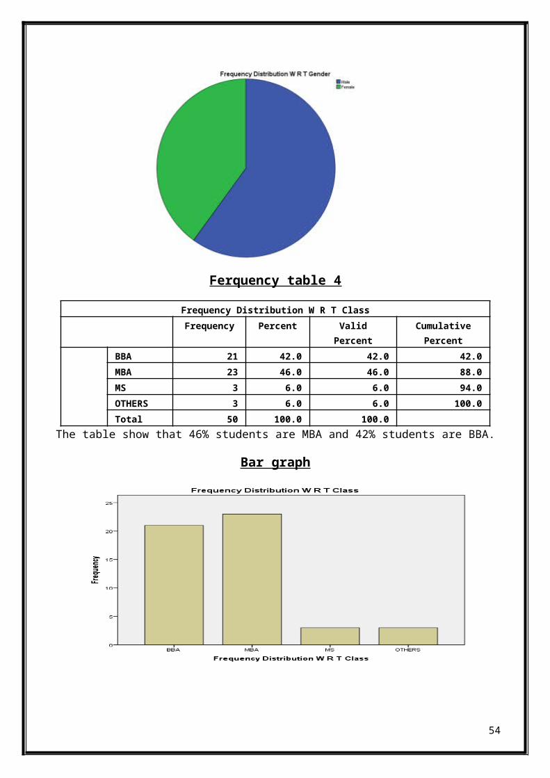
Ferquency table 4
Frequency Distribution W R T ClassFrequency Percent Valid
PercentCumulativePercent
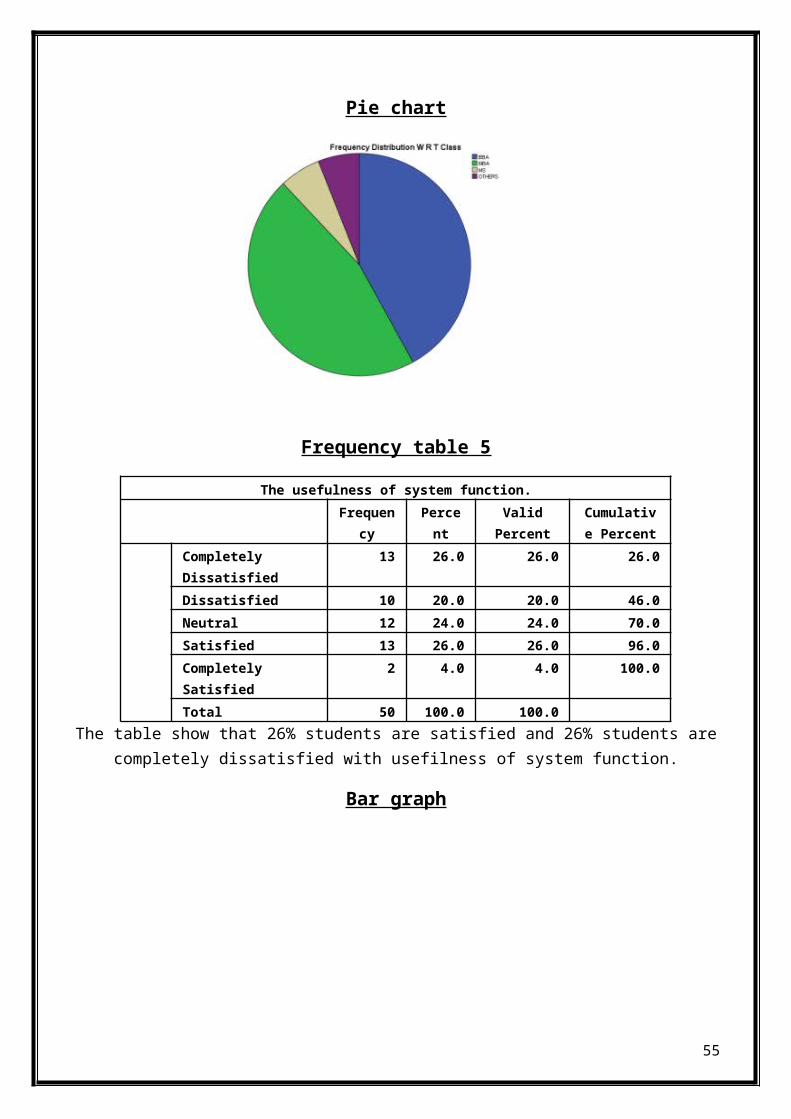
BBA 21 42.0 42.0 42.0MBA 23 46.0 46.0 88.0MS 3 6.0 6.0 94.0OTHERS 3 6.0 6.0 100.0Total 50 100.0 100.0
The table show that 46% students are MBA and 42% students are BBA.
Bar graph
54
Pie chart
Frequency table 5
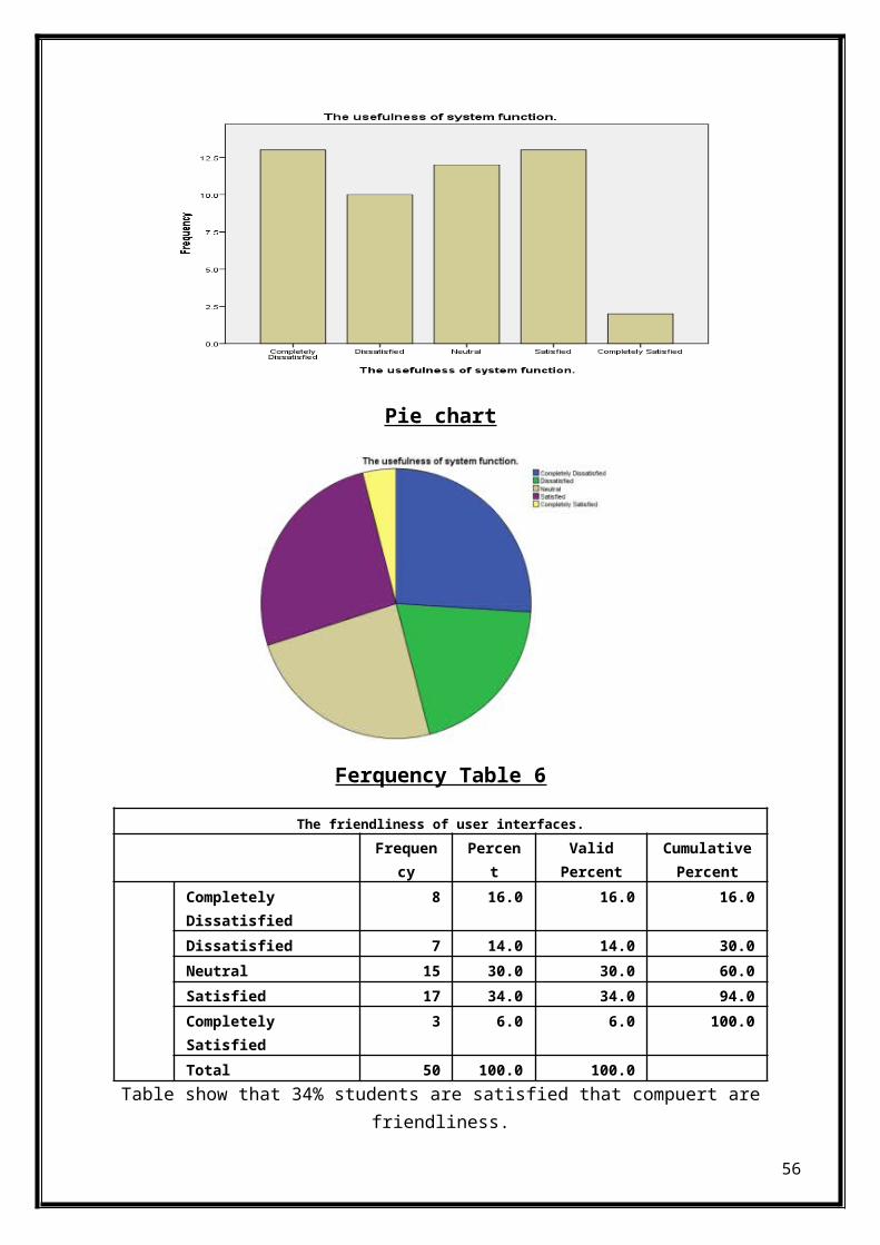
The usefulness of system function.Frequen
cyPercent
ValidPercent
Cumulative Percent
Completely Dissatisfied
13 26.0 26.0 26.0
Dissatisfied 10 20.0 20.0 46.0Neutral 12 24.0 24.0 70.0Satisfied 13 26.0 26.0 96.0Completely Satisfied
2 4.0 4.0 100.0
Total 50 100.0 100.0The table show that 26% students are satisfied and 26% students are
completely dissatisfied with usefilness of system function.
Bar graph
55
Pie chart
Ferquency Table 6
The friendliness of user interfaces.Frequen
cyPercen
tValidPercent
CumulativePercent
Completely Dissatisfied
8 16.0 16.0 16.0
Dissatisfied 7 14.0 14.0 30.0Neutral 15 30.0 30.0 60.0Satisfied 17 34.0 34.0 94.0Completely Satisfied
3 6.0 6.0 100.0
Total 50 100.0 100.0Table show that 34% students are satisfied that compuert are
friendliness.
56
Bar graph
Pie chart
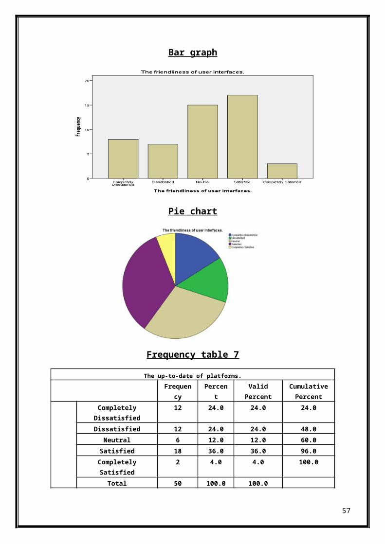
Frequency table 7
The up-to-date of platforms.Frequen
cyPercen
tValidPercent
CumulativePercent
CompletelyDissatisfied
12 24.0 24.0 24.0
Dissatisfied 12 24.0 24.0 48.0Neutral 6 12.0 12.0 60.0Satisfied 18 36.0 36.0 96.0CompletelySatisfied
2 4.0 4.0 100.0
Total 50 100.0 100.0
57

The table show that 36% students are satisfied that computer systemare up-to-date.
Bar graph
Pie chart
Bilal contribution page no(47 to 56)
Frequency table 8
The necessity of system functions.Frequen
cyPercen
tValidPercent
CumulativePercent
58

CompletelyDissatisfied
7 14.0 14.0 14.0
Dissatisfied 8 16.0 16.0 30.0Neutral 14 28.0 28.0 58.0Satisfied 16 32.0 32.0 90.0CompletelySatisfied
5 10.0 10.0 100.0
Total 50 100.0 100.0The table show that 32% students aresatisfied with the necessity of
system functions.
Bar graph
Pie chart
Ferqueny table 9
59
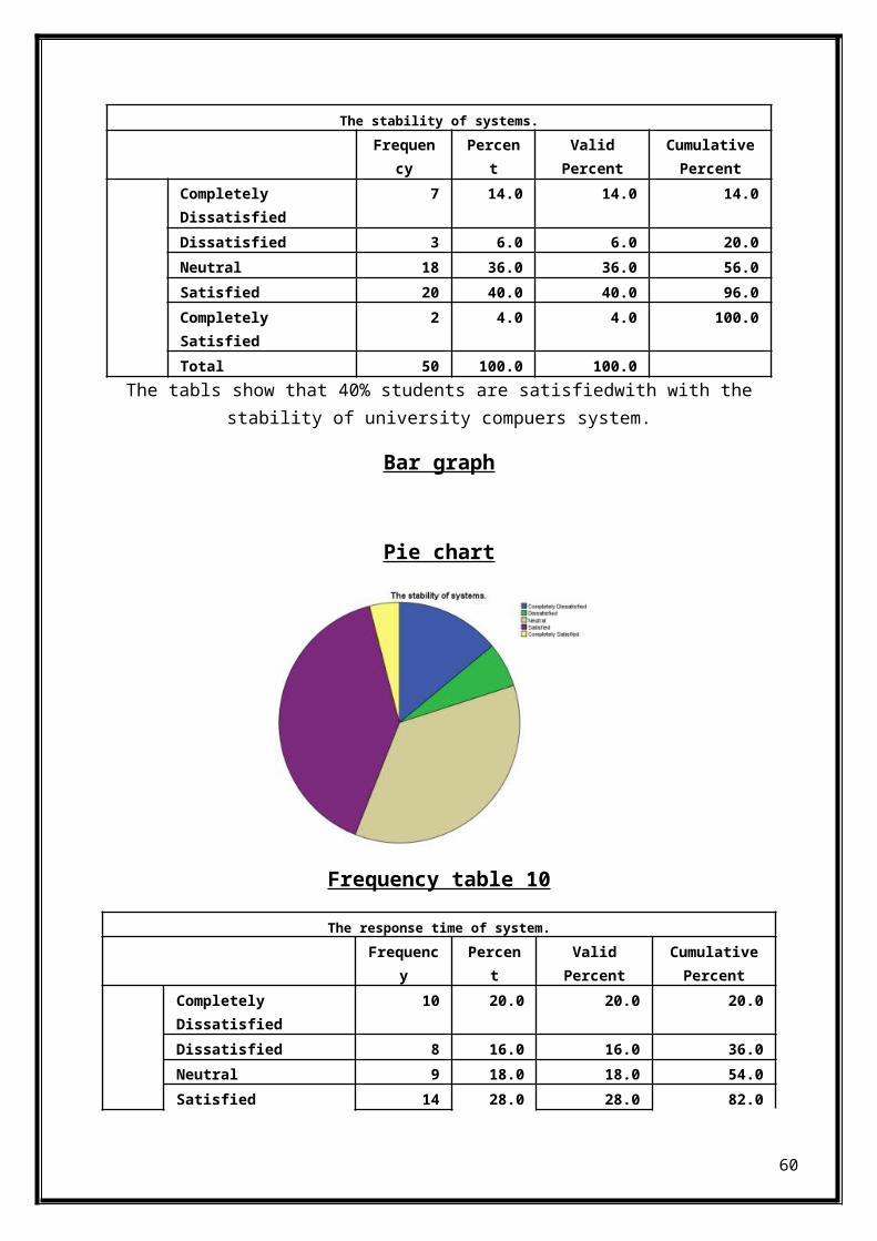
The stability of systems.Frequen
cyPercen
tValidPercent
CumulativePercent
Completely Dissatisfied
7 14.0 14.0 14.0
Dissatisfied 3 6.0 6.0 20.0Neutral 18 36.0 36.0 56.0Satisfied 20 40.0 40.0 96.0Completely Satisfied
2 4.0 4.0 100.0
Total 50 100.0 100.0The tabls show that 40% students are satisfiedwith with the
stability of university compuers system.
Bar graph
Pie chart
Frequency table 10
The response time of system.Frequenc
yPercen
tValidPercent
CumulativePercent
Completely Dissatisfied
10 20.0 20.0 20.0
Dissatisfied 8 16.0 16.0 36.0Neutral 9 18.0 18.0 54.0Satisfied 14 28.0 28.0 82.0
60
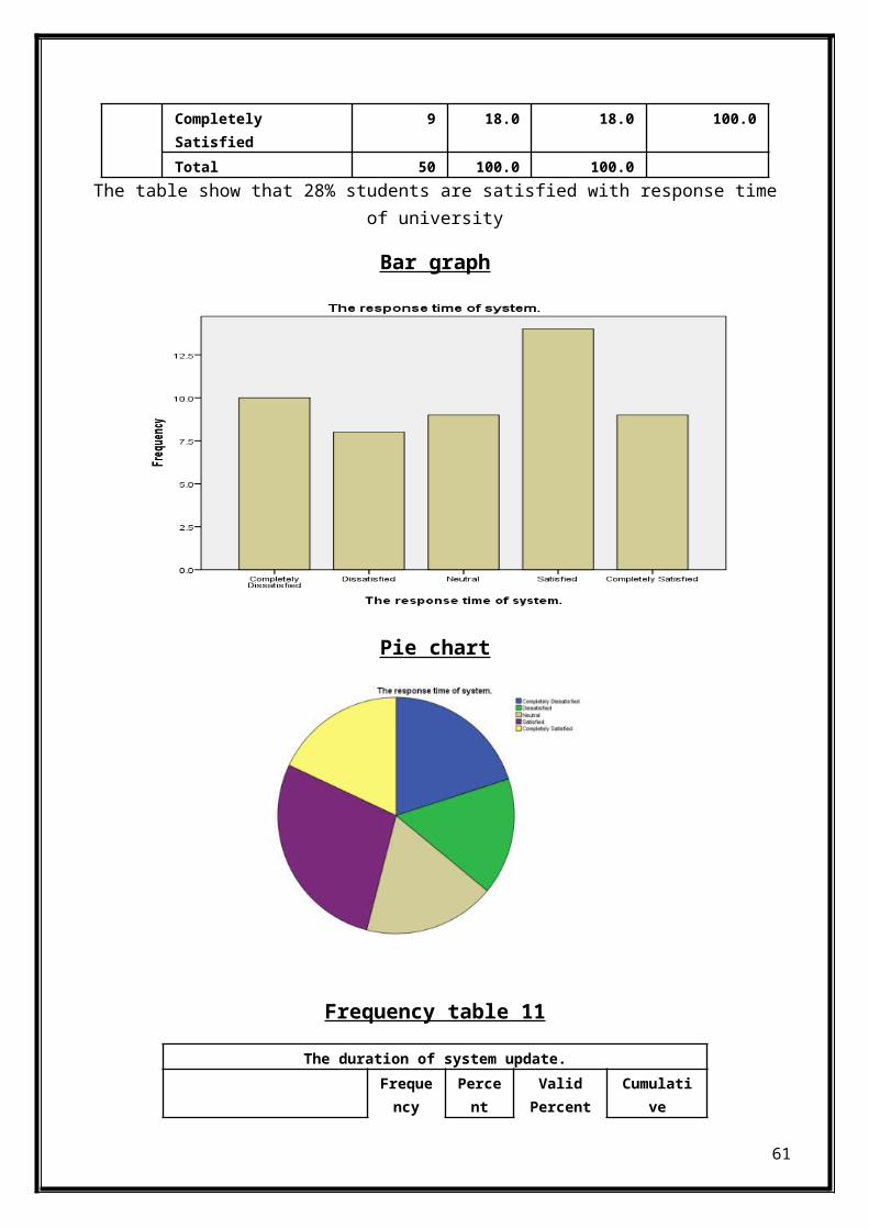
Completely Satisfied
9 18.0 18.0 100.0
Total 50 100.0 100.0The table show that 28% students are satisfied with response time
of university
Bar graph
Pie chart
Frequency table 11
The duration of system update.Frequency
Percent
ValidPercent
Cumulative
61
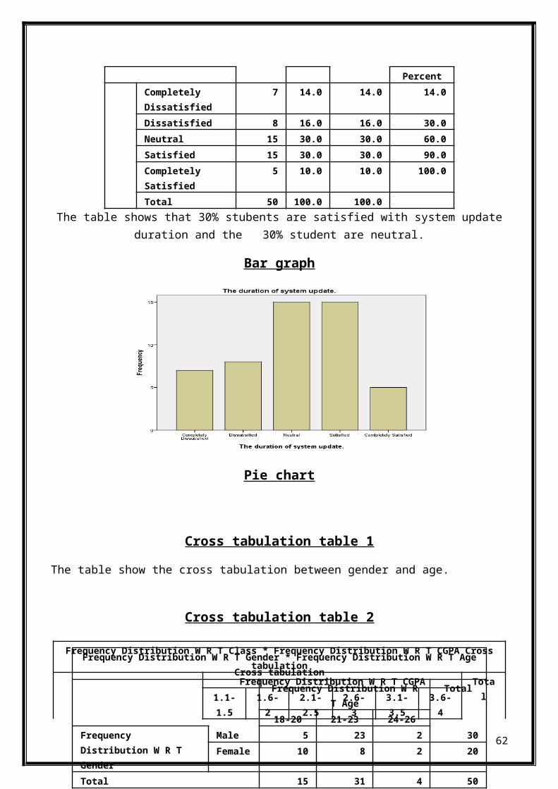
PercentCompletely Dissatisfied
7 14.0 14.0 14.0
Dissatisfied 8 16.0 16.0 30.0Neutral 15 30.0 30.0 60.0Satisfied 15 30.0 30.0 90.0Completely Satisfied
5 10.0 10.0 100.0
Total 50 100.0 100.0The table shows that 30% stubents are satisfied with system update
duration and the 30% student are neutral.
Bar graph
Pie chart
Cross tabulation table 1
The table show the cross tabulation between gender and age.
Cross tabulation table 2
Frequency Distribution W R T Class * Frequency Distribution W R T CGPA Crosstabulation
Frequency Distribution W R T CGPA Total1.1-
1.51.6-2
2.1-2.5
2.6-3
3.1-3.5
3.6-4
62
Frequency Distribution W R T Gender * Frequency Distribution W R T AgeCross tabulation
Frequency Distribution W RT Age
Total
18-20 21-23 24-26Frequency Distribution W R T Gender
Male 5 23 2 30Female 10 8 2 20
Total 15 31 4 50

Frequency Distribution W R T Class
BBA 0 2 1 5 8 5 21MBA 0 1 6 11 4 1 23MS 1 0 0 1 0 1 3OTHERS
0 0 0 2 1 0 3
Total 1 3 7 19 13 7 50
The table show cross tabulation between Cgpa and Classes.
Following table show the mean,median,mod,std.devation,variance,range,minimum,maximum,persentiles and quartiles with respect to question about university computer systems .
Theusefulness ofsystemfunctio
n.
Thefriendlinessof userinterfaces.
The up-to-date
ofplatforms.
Thenecessity ofsystemfunctions.
Thestability ofsystemfunctions.
Theresponse timeof
system.
Theduration ofsystemupdate.
Mean 2.6200 3.0000 2.7200 3.0800 3.1400 3.0800 3.0600
Median 3.0000 3.0000 3.0000 3.0000 3.0000 3.0000 3.0000
Mode 1.00a 4.00 4.00 4.00 4.00 4.00 3.00a
Std. Deviation
1.24360 1.17803 1.29426 1.20949 1.08816 1.41190 1.20221
Variance 1.547 1.388 1.675 1.463 1.184 1.993 1.445
Range 4.00 4.00 4.00 4.00 4.00 4.00 4.00
Minimum 1.00 1.00 1.00 1.00 1.00 1.00 1.00
Maximum 5.00 5.00 5.00 5.00 5.00 5.00 5.00
Q25 1.0000 2.0000 1.7500 2.0000 3.0000 2.0000 2.0000
Q50 3.0000 3.0000 3.0000 3.0000 3.0000 3.0000 3.0000Q75 4.0000 4.0000 4.0000 4.0000 4.0000 4.0000 4.0000Q80 4.0000 4.0000 4.0000 4.0000 4.0000 4.0000 4.0000
63

Following table show the mean,median,mod,std.devation,variance,range,minimum,maximum,persentiles and quartiles with respect to Age ,Gender ,CGPA and class .
Frequency Distribution W R T Gender
Frequency Distribution W R T Age
Frequency Distribution W R T CGPA
Frequency Distribution W R T Class
Mean 1.4000 2.7800 5.2200 1.8200Median 1.0000 3.0000 5.0000 2.0000Mode 1.00 3.00 5.00 2.00Std. Deviation .49487 .58169 1.16567 1.00387Variance .245 .338 1.359 1.008Range 1.00 2.00 5.00 4.00Minimum 1.00 2.00 2.00 1.00Maximum 2.00 4.00 7.00 5.00Percentiles
Q25 1.0000 2.0000 5.0000 1.0000Q50 1.0000 3.0000 5.0000 2.0000Q75 2.0000 3.0000 6.0000 2.0000Q80 2.0000 3.0000 6.0000 2.0000
Z-SCORE
Descriptive StatisticsN Minimum Maximum Mean Std.
DeviationFrequency Distribution W R T Gender
50 1.00 2.00 1.4000 .49487
Frequency Distribution W R T Age
50 2.00 4.00 2.7800 .58169
Frequency Distribution W R T CGPA
50 2.00 7.00 5.2200 1.16567
64

Frequency Distribution W R T Class
50 1.00 5.00 1.8200 1.00387
The usefulness of system function.
50 1.00 5.00 2.6200 1.24360
The friendliness of user interfaces.
50 1.00 5.00 3.0000 1.17803
The up-to-date of platforms.
50 1.00 5.00 2.7200 1.29426
The necessity of system functions.
50 1.00 5.00 3.0800 1.20949
The stability of system functions.
50 1.00 5.00 3.1400 1.08816
The response time of system.
50 1.00 5.00 3.0800 1.41190
The duration of system update.
50 1.00 5.00 3.0600 1.20221
Valid N (listwise) 50
FrequencyDistribution W
R T Gender
FrequencyDistribution W
R T Age
FrequencyDistribution W
R T CGPA
FrequencyDistribution W
R T Class
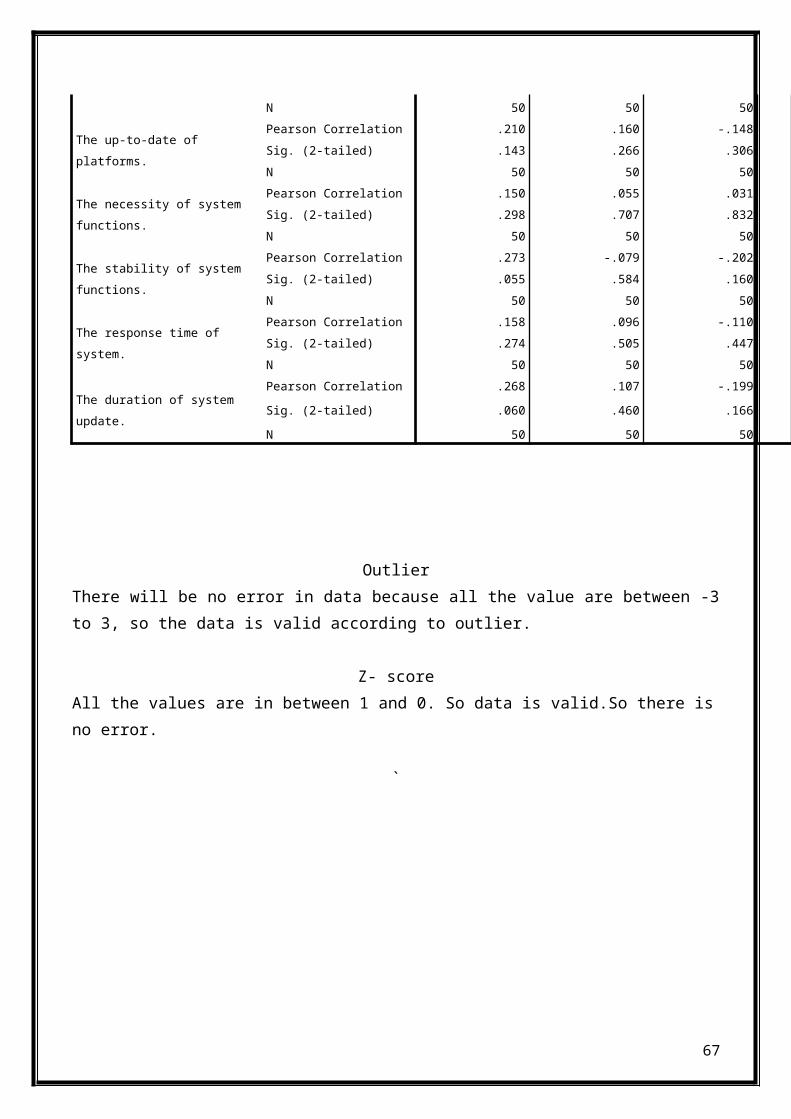
Frequency Distribution W R T Gender
Pearson Correlation 1 -.255 .269Sig. (2-tailed) .074 .059N 50 50 50
Frequency Distribution W R T Age
Pearson Correlation -.255 1 -.258Sig. (2-tailed) .074 .070N 50 50 50
Frequency Distribution W R T CGPA
Pearson Correlation .269 -.258 1Sig. (2-tailed) .059 .070N 50 50 50
Frequency Distribution W R T Class
Pearson Correlation -.016 .036 -.157Sig. (2-tailed) .910 .806 .275N 50 50 50
The usefulness of system function.
Pearson Correlation -.013 -.118 .031Sig. (2-tailed) .927 .415 .832N 50 50 50
The friendliness of user interfaces.
Pearson Correlation .315* -.179 -.119Sig. (2-tailed) .026 .214 .411
65
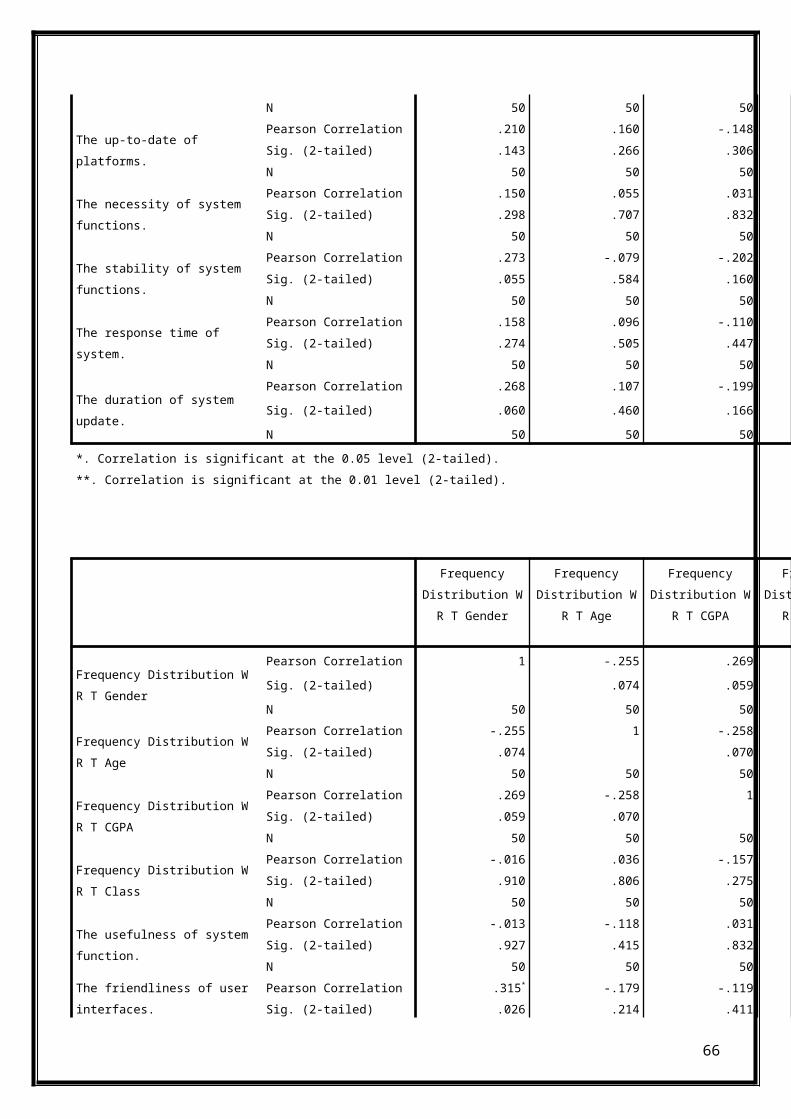
N 50 50 50
The up-to-date of platforms.
Pearson Correlation .210 .160 -.148Sig. (2-tailed) .143 .266 .306N 50 50 50
The necessity of system functions.
Pearson Correlation .150 .055 .031Sig. (2-tailed) .298 .707 .832N 50 50 50
The stability of system functions.
Pearson Correlation .273 -.079 -.202Sig. (2-tailed) .055 .584 .160N 50 50 50
The response time of system.
Pearson Correlation .158 .096 -.110Sig. (2-tailed) .274 .505 .447N 50 50 50
The duration of system update.
Pearson Correlation .268 .107 -.199Sig. (2-tailed) .060 .460 .166N 50 50 50
*. Correlation is significant at the 0.05 level (2-tailed).**. Correlation is significant at the 0.01 level (2-tailed).
FrequencyDistribution W
R T Gender
FrequencyDistribution W
R T Age
FrequencyDistribution W
R T CGPA
FrequencyDistribution W
R T Class
Frequency Distribution W R T Gender
Pearson Correlation 1 -.255 .269Sig. (2-tailed) .074 .059N 50 50 50
Frequency Distribution W R T Age
Pearson Correlation -.255 1 -.258Sig. (2-tailed) .074 .070N 50 50 50
Frequency Distribution W R T CGPA
Pearson Correlation .269 -.258 1Sig. (2-tailed) .059 .070N 50 50 50
Frequency Distribution W R T Class
Pearson Correlation -.016 .036 -.157Sig. (2-tailed) .910 .806 .275N 50 50 50
The usefulness of system function.
Pearson Correlation -.013 -.118 .031Sig. (2-tailed) .927 .415 .832N 50 50 50
The friendliness of user interfaces.
Pearson Correlation .315* -.179 -.119Sig. (2-tailed) .026 .214 .411
66
N 50 50 50
The up-to-date of platforms.
Pearson Correlation .210 .160 -.148Sig. (2-tailed) .143 .266 .306N 50 50 50
The necessity of system functions.
Pearson Correlation .150 .055 .031Sig. (2-tailed) .298 .707 .832N 50 50 50
The stability of system functions.
Pearson Correlation .273 -.079 -.202Sig. (2-tailed) .055 .584 .160N 50 50 50
The response time of system.
Pearson Correlation .158 .096 -.110Sig. (2-tailed) .274 .505 .447N 50 50 50
The duration of system update.
Pearson Correlation .268 .107 -.199Sig. (2-tailed) .060 .460 .166N 50 50 50
OutlierThere will be no error in data because all the value are between -3to 3, so the data is valid according to outlier.
Z- scoreAll the values are in between 1 and 0. So data is valid.So there isno error.
`
67